❌

Vue normale

  • ✇Yanko Design
  • LiberNovo’s motorized office chair reclines to 160 degrees, has seat cooling, and is up to 42% discount
    In 1976, two designers gave the office a chair that moved when you did. The Met calls Emilio Ambasz and Giancarlo Piretti’s Vertebra the first automatically adjustable office chair. Fifty years later, plenty of us still tug knobs and crank levers like we’re docking a spaceship. LiberNovo’s Maxis picks up that old idea and sizes it for bigger frames. Its Black Friday sale opens November 19, with up to 42% off in the US. The Maxis is LiberNovo’s first line built from the ground up for big and tal
     

LiberNovo’s motorized office chair reclines to 160 degrees, has seat cooling, and is up to 42% discount

9 novembre 2026 à 21:45

In 1976, two designers gave the office a chair that moved when you did. The Met calls Emilio Ambasz and Giancarlo Piretti’s Vertebra the first automatically adjustable office chair. Fifty years later, plenty of us still tug knobs and crank levers like we’re docking a spaceship. LiberNovo’s Maxis picks up that old idea and sizes it for bigger frames. Its Black Friday sale opens November 19, with up to 42% off in the US.

The Maxis is LiberNovo’s first line built from the ground up for big and tall users, rated to 399 lbs (181 kg) and certified to BIFMA X5.11, and fitted for people between 5’10” and 6’7″ (178 to 200 cm). Instead of scaling up a standard chair, LiberNovo resized the parts that tend to fail on larger bodies, from the seat depth to the headrest travel. It comes in three versions: Manual, Electric, and Airflow. List prices run $1,299, $1,799, and $1,859, which makes for one big leap and one tiny hop. Let’s walk the staircase one step at a time.

Designer: LiberNovo

Click Here to Buy Now: Black Friday Deals End Soon!

What all three Maxis versions share

Maxis Manual

All three versions of the Maxis share the same big-body frame. The seat is 20.5 inches (52 cm) deep, with a multi-density cushion that runs firmer at the rear and softer at the front edge, where the backs of your thighs rest. The backrest spans 16.9 inches at the shoulders and flares to 20.5 inches at the waist. The U-shaped headrest travels 5.5 inches up and down and 4.7 inches in and out. Arc-shaped armrests open from 15.7 to 23.6 inches wide, so they don’t crowd your waist.

Lean back in a Maxis and the neck support, backrest, armrests, and seat all move together, a many-jointed cousin of the Vertebra’s idea. The eight-panel backrest flexes on 14 dual-link points and 16 ball joints. Six springs engage progressively by angle and weight, which LiberNovo says keeps the recline smooth under a heavier load. Five stops run from 105 degrees (Deep Focus) to 160 degrees (Spine Flow), and LiberNovo suggests 115 to 125 degrees for most of the day. Do the four-step setup once, and LiberNovo says you’ll rarely touch the controls again.

What the $500 step from Manual to Electric adds

Maxis Electric

The Manual keeps lumbar support on a dial, with no motor and no battery, which suits anyone who wants a chair that never needs charging. The Electric swaps that dial for the ErgoPulse motor and carries a 2,200 mAh battery. The motor moves the lumbar zone in or out until it meets your lower back, forming an S-curve, so there’s no reaching behind you to twist a knob. Lumbar is step one of the Maxis setup, so you’ll feel this feature on day one. That’s the first half of what the extra $500 buys.

OmniStretch is the other half, a five-minute motorized stretch sequence that runs while you’re in deep recline. Both the Electric and the Airflow include it, and the Manual skips it. LiberNovo describes it as an in-chair stretch and reset, which makes it a handy pause between long work sessions and the walk to the kitchen. Whether it’s worth a share of $500 depends on how often you’d actually use it. If the honest answer is every afternoon, the math gets friendly fast.

The $60 Airflow upgrade, and how the sale works

Maxis Airflow

The Airflow adds a seat fan to everything the Electric does. A 4,000 RPM centrifugal fan pulls air through a five-layer seat on two levels, and an occupancy sensor pauses it when you stand up, so it never spins for an empty chair. The battery grows from 2,200 to 3,000 mAh, and LiberNovo lists fan noise under 45 dB. The upholstery is Danish Gabriel Atlantic fabric, rated by its maker at more than 100,000 abrasion rubs. At list price, all of that sits $60 above the Electric, which is the easiest call on the page.

LiberNovo’s holiday sale opens November 19 and builds toward Black Friday and Cyber Monday, with up to 42% off in the US. Eligible purchases carry 30-day price protection, so buying early comes with a safety net for qualifying price changes. Every LiberNovo chair is backed by a 6-year frame warranty and a 2-year warranty on electronics. Orders unlock gift tiers by spending, topping out at a travel kit with an inflatable neck pillow, eye mask, and earplugs. US buyers can split the bill into four 0% Klarna payments. Fifty years after the Vertebra, the best pitch for a chair that moves with you is still the simplest: you stop thinking about it.

Click Here to Buy Now: Black Friday Deals End Soon!

The post LiberNovo’s motorized office chair reclines to 160 degrees, has seat cooling, and is up to 42% discount first appeared on Yanko Design.

  • ✇Yanko Design
  • 8BitDo’s $40 Xbox controller has a cable, a headphone jack, and drift-resistant sticks
    Wired earbuds staged a comeback a couple of years ago, helped by Gen Z deciding a dangling white cable looks cooler than an AirPods case. Wired gaming controllers could use some of that goodwill. 8BitDo’s new Ultimate 3C+ Wired Controller for Xbox skips the battery entirely and plugs straight into your console over USB-C. It costs $39.99, carries an official Xbox license, and brings tunable TMR sticks to the lowest-priced model in the Ultimate 3 family. You trade a little freedom of movement fo
     

8BitDo’s $40 Xbox controller has a cable, a headphone jack, and drift-resistant sticks

9 novembre 2026 à 18:30

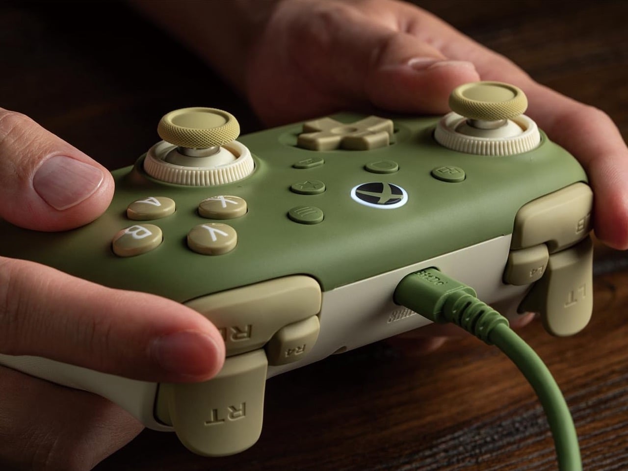
Wired earbuds staged a comeback a couple of years ago, helped by Gen Z deciding a dangling white cable looks cooler than an AirPods case. Wired gaming controllers could use some of that goodwill. 8BitDo’s new Ultimate 3C+ Wired Controller for Xbox skips the battery entirely and plugs straight into your console over USB-C. It costs $39.99, carries an official Xbox license, and brings tunable TMR sticks to the lowest-priced model in the Ultimate 3 family. You trade a little freedom of movement for a controller that never needs charging, pairing, or a panicked hunt for a dongle.

There’s no battery to degrade over years of late-night Call of Duty sessions, and a 3.5mm jack sends game audio straight to your headset. The controller works with Xbox Series X|S, Xbox One, and Windows 10 or later. It arrives a few weeks after the wireless Ultimate 3C+, which launched in October for PC and Android at the same price. The Xbox version is built for console players who would rather never think about charge levels again. The included cable stretches 8.2 feet (2.5m), so measure your couch distance accordingly.

Designer: 8BitDo

TMR sticks you can tune for shooters or racing

8BitDo’s Dual Force Ring sticks combine adjustable tension with a soft-stop silicone ring under each stick to cushion the moment it hits the edge of its travel. Increase the tension if you prefer firmer resistance when aiming in shooters, or loosen it for the long, sweeping inputs of racing games. A 12-bit ADC sampling chip and a 216MHz processor read the stick position, which 8BitDo says improves precision and response. The sensors are TMR, short for tunneling magnetoresistance, and track stick position magnetically, without sliding electrical contacts. Potentiometer sticks rely on contacts that physically wear, which can cause stick drift.

Earlier this year, 8BitDo’s fanciest stick tech lived in controllers costing $99 and up. The Ultimate 3 series kicked off at CES 2026 with the $149.99 Ultimate 3E, and the $99 Ultimate 3 for Xbox brought force rings along in May. Now that adjustable tension sits inside a $39.99 controller with a cable hanging off it. Compare that with Microsoft’s Xbox Nano Controller, a $49.99 pocket pad that still ships with conventional potentiometer sticks. If your last Xbox controller died of drift, that difference in sensor tech may be the most persuasive line on this spec sheet.

Switchable triggers, extra bumpers, and lockable back buttons

A switch flips the triggers between linear Hall Effect mode and short micro-switch mode. Linear gives you the full analog pull for feathering a throttle, while micro-switch turns each trigger into something closer to a mouse click. Impulse Trigger rumble lives inside the triggers, with more vibration tucked into the grips. 8BitDo says a dedicated rapid-stop chip cuts vibration off quickly, so a gunshot’s rumble doesn’t linger. The idea is that when an explosion fades on screen, your palms stop buzzing too.

Two extra bumpers, labeled R4 and L4, join the standard shoulder buttons and can be remapped without software. Two back buttons sit under the grips, and a lock disables them when you would rather not trigger a reload by accident. 8BitDo describes the D-pad as clicky but smooth, says it has refined the ABXY buttons, and lists wear-resistant stick rings. It also widened the grip angle compared with the older Ultimate C Wired, stretching the body to 5.96 inches (151.5mm) long. It weighs 7.9 ounces (224g), just 8 grams more than its predecessor, with the revised grip intended to offer a more relaxed hold.

Ten dollars less than the Xbox Nano

Compared with the wireless 3C+, the Xbox model drops the turbo function and its sibling’s polling rate of up to 1,000Hz. It also skips the cardboard DIY stand that ships in the wireless box, a minor tragedy for anyone who enjoys a little arts and crafts with their unboxing. In return, you get the headphone jack, full Xbox console support, and an official license. Competitive players chasing every millisecond may miss the higher polling rate. For couch play, cable reach is likely to be the more immediate concern.

At $39.99, the 3C+ Wired undercuts the $49.99 Xbox Nano by ten dollars and Microsoft’s standard $64.99 controller by twenty-five. It also costs just $5 more than the older Ultimate C Wired for Xbox, which paired Hall Effect sticks with an RGB light ring. 8BitDo swapped that light show for tunable TMR sticks, which seems a useful trade for anyone more interested in stick feel than desk glow. Pre-orders are live on the 8BitDo eShop and Amazon in the US, with Matcha Green and Charcoal Gray units shipping November 16.

The post 8BitDo’s $40 Xbox controller has a cable, a headphone jack, and drift-resistant sticks first appeared on Yanko Design.

  • ✇Yanko Design
  • The $179 Magic Screen gives any MacBook a touchscreen with stylus support
    Hidden around a modern MacBook display are magnets used to tell the laptop you shut the lid. Intricuit, a small hardware startup, looked at those magnets and saw a free mounting system. Its Magic Screen uses them to snap a touch-sensitive glass panel over your display, adding tap, swipe, and pinch controls to the MacBook you already own. It costs $179 on Kickstarter. Apple’s approach is the new MacBook Pro with PROLED XDR Display, which starts at $2,899, or roughly sixteen Magic Screens with ch
     

The $179 Magic Screen gives any MacBook a touchscreen with stylus support

9 novembre 2026 à 15:20

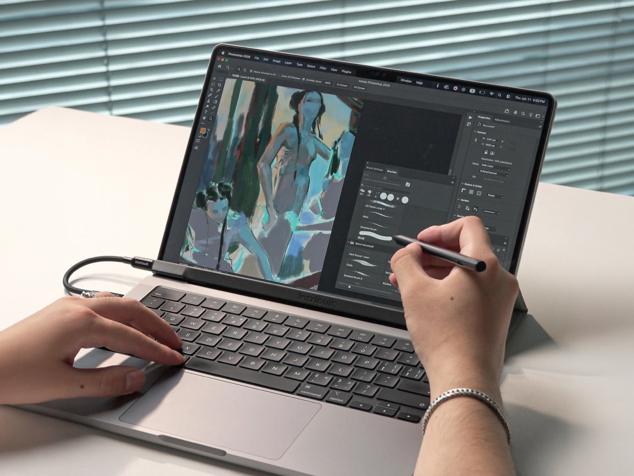
Hidden around a modern MacBook display are magnets used to tell the laptop you shut the lid. Intricuit, a small hardware startup, looked at those magnets and saw a free mounting system. Its Magic Screen uses them to snap a touch-sensitive glass panel over your display, adding tap, swipe, and pinch controls to the MacBook you already own. It costs $179 on Kickstarter. Apple’s approach is the new MacBook Pro with PROLED XDR Display, which starts at $2,899, or roughly sixteen Magic Screens with change left over for snacks. That’s a whole laptop rather than an accessory, but it’s a steep entry price if touch is all you’re after.

Apple integrates the touch sensor into a tandem OLED panel and uses a stiffer hinge designed to limit screen bounce when you tap it. It also supports zero styluses, Apple Pencil included, which is a little funny coming from the company that sells the Apple Pencil. The Magic Screen ships with a pen that reads 4,096 pressure levels, previews its tip position as it hovers, and supports palm rejection while you draw. Intricuit lists compatibility with M1 and newer MacBook Pros, M2 and newer Airs, and even the $599 MacBook Neo, bringing that last combination to $778.

Designer: Intricuit

Snap, Plug, Tap: How the Glass Registers Your Fingers

The panel is tempered glass with a capacitive digitizer built in, the same kind of touch technology your phone uses, tracking up to ten fingers at once. Intricuit lists transparency at 99% or better and a response time of 8ms. A single USB-C cable carries the touch data and draws a claimed 0.6 watts from your MacBook, so there’s no extra battery to babysit. The 14-inch MacBook Pro version weighs 4.3 ounces (122.8 grams), and the 16-inch version comes in at 6.1 ounces (172.6 grams). Basic touch works without the app; Intricuit’s software for macOS Sonoma or later adds further controls.

Tom’s Guide spent three weeks with a Magic Screen and came away convinced macOS is far more touch-ready than Apple ever let on. Taps open apps, a press-and-hold summons the right-click menu, and familiar trackpad gestures carry over to the glass. Intricuit demos it triggering clips in Resolume Arena, orbiting models in SketchUp, and shoving sticky notes around Miro boards, all situations where reaching for something directly has an obvious appeal. It also works with iPhone Mirroring, letting you tap through your phone’s apps on the larger display. Fingerprints land on the overlay rather than directly on your MacBook’s screen.

The Stylus Apple Skipped Comes in the Box

The included pen uses USI 2.0, the Universal Stylus Initiative standard supported by compatible Chromebooks, and reads 4,096 levels of pressure. That gives you control over line weight, from a light hairline to a fat brushstroke, while palm rejection is designed to let you rest your hand on the glass as you draw. Hover detection starts about 0.4 inches (10mm) away, previewing the tip’s position before it touches down. Intricuit rates the battery at 100 hours, with a 40-minute USB-C recharge and no Bluetooth pairing required. Your Apple Pencil isn’t compatible, though it won’t work on Apple’s new MacBook Pro either.

Pop the Magic Screen off and it becomes a flat pen tablet, a familiar setup for anyone who has used a Wacom. Drawing on an upright laptop screen means working against gravity and a hinge, while laying the panel on a desk lets you rest your arm. The folio case folds into a stand for this mode. When the panel goes back on your display, the case braces against the lid to reduce wobble under your fingers. Apple’s Sidecar offers another route to drawing on a Mac, but requires an iPad and an Apple Pencil alongside the laptop. Intricuit puts the touch panel and pen in one $179 box, provided you already own a compatible MacBook.

What $2,899 Gets You at the Apple Store

Apple’s price buys a complete laptop with a tandem OLED panel rated to peak at 2,000 nits and an integrated touch sensor. The hinge is stiffer, the 14-inch body weighs 3 pounds, and the glowing Apple logo is back on the lid for the nostalgics. That package costs $400 more than the equivalent standard MacBook Pro. The Magic Screen comes with its own compromises: a cable occupying a port and a panel you need to remove before closing the lid. Intricuit built a stopper into the bottom edge to keep the lid from closing onto it, a bit of idiot-proofing that could save an expensive mistake.

The Magic Screen is available for $179 after a successful crowdfunding run, a $60 discount off its planned $239 retail price. Pick your size carefully, since each of the five versions is fitted to a specific MacBook display, and the M1 MacBook Air sits this one out. Each box includes the panel, stylus, folio case, USB-C cable, and a polishing cloth for the inevitable fingerprints.

The post The $179 Magic Screen gives any MacBook a touchscreen with stylus support first appeared on Yanko Design.

  • ✇Yanko Design
  • This Logitech Surgical Kit Concept Turns XR Controllers Into Medical Instruments
    Before a pilot flies you to Cancún, they’ve logged hours in a simulator crashing planes that don’t exist. Surgical training has had a harder time getting there, and residents often get thin hands-on practice before working on living patients. Niklas Andreasen, a graduate of Sweden’s Umeå Institute of Design, set out to fix that with MX Surgical, a mixed reality training kit he developed with Logitech. It pairs replica surgical instruments with a headset, so trainees can rehearse procedures anyw
     

This Logitech Surgical Kit Concept Turns XR Controllers Into Medical Instruments

9 novembre 2026 à 14:20

Before a pilot flies you to Cancún, they’ve logged hours in a simulator crashing planes that don’t exist. Surgical training has had a harder time getting there, and residents often get thin hands-on practice before working on living patients. Niklas Andreasen, a graduate of Sweden’s Umeå Institute of Design, set out to fix that with MX Surgical, a mixed reality training kit he developed with Logitech. It pairs replica surgical instruments with a headset, so trainees can rehearse procedures anywhere they can open a case. Call it a flight sim for scalpels, and a lot more portable than the six-figure simulator rigs some hospitals bolt to the floor.

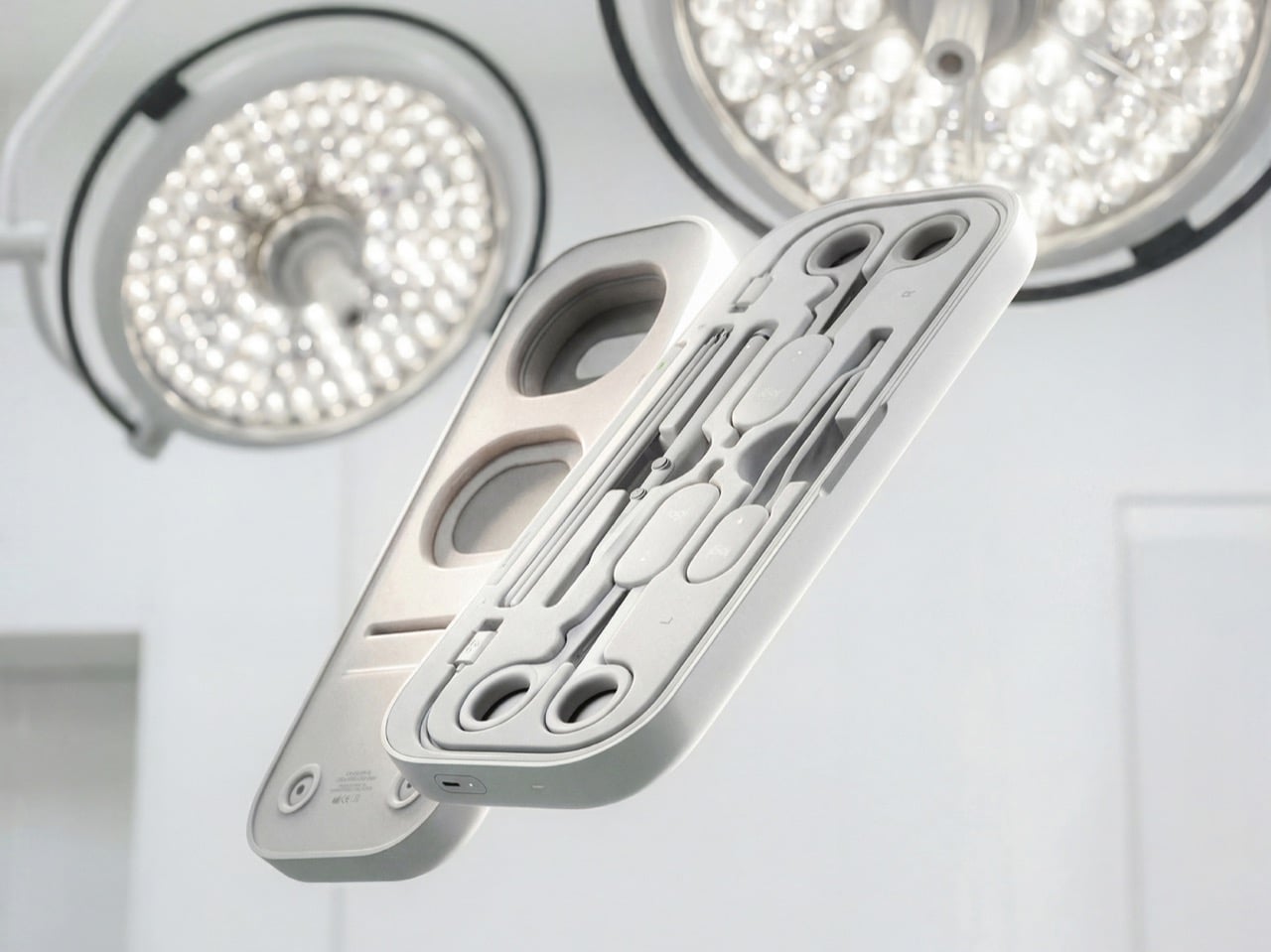
Andreasen grouped surgical tools into three mechanical families (ring-handled scissors and clamps, forceps, and pen-grip instruments), then designed one reconfigurable controller for each. Sensors and adjustable resistance mechanics inside recreate how each tool pushes back in your hand, and layered pads give you something to actually cut into. The headset handles the anatomy, while a companion platform scores you on precision, force, and timing like a very strict video game. It’s a concept for now, with no pricing or launch plans. Even so, it has already picked up Emerging Product Designer of the Year at the 2026 European Product Design Awards, three Core77 student wins, and a nomination for Red Dot’s Peter Zec Prize.

Designer: Niklas Andreasen (Umeå Institute of Design, in collaboration with Logitech)

Three Controllers, One Entire Instrument Tray

A real surgical tray can hold dozens of instruments, and building a replica of each one would turn the kit into a hardware store. Andreasen sidestepped that by mapping what instruments have in common mechanically. Scissors, needle holders, and clamps all pivot on a ring-handled scissor action. Forceps pinch, and scalpels and probes ride in a pen grip. Each MX Surgical controller covers one of those families, tuning its spring tension and range of motion in real time so the same body can feel like a fine dissecting scissor one minute and a stiff clamp the next.

Logitech has spent over four decades shaping mice, keyboards, and controllers around human hands, and the collaboration shows. The kit wears the MX family’s soft radii and matte warm grays, so anyone who owns Logitech’s MX Ink stylus for Meta Quest will feel right at home. Three mentors from Logitech, Nick Jinkinson, Andreas Connellan, and Aidan Kehoe, guided the project. The cutaway renders show a rotary mechanism tucked right at the pivot, where the resistance needs to happen, inside ring handles your fingers already know from the real tool. Compare that with FundamentalXR, a leading haptic surgical platform that has traditionally relied on desk-mounted haptic arms.

Layered Pads Handle the Feel, the Headset Handles the Gore

Haptics can only fake so much, so MX Surgical gives your hands something physical to work on. Layered training pads stand in for tissue at different depths, and they slot into a die-cut tray inside the case. As you work through a procedure, the mixed reality overlay progressively reveals deeper layers of anatomy and shifts to match what you’re doing. Hospitals and universities can stock a material library of swappable pads and components, tailoring the kit to a specialty or a specific case. Residents without a headset aren’t stuck either, because a simpler screen-based version handles the visual side.

This hybrid approach borrows from both ends of current surgical training. On one end are cheap suturing pads that residents practice stitches on at home, which feel real but teach nothing about context. On the other end are VR simulations that show you an entire operating room but feel like waving a remote around. MX Surgical splits the job, letting the pad handle touch and the headset handle everything you need to see. The whole thing packs into a slim carry case, which makes it something you can take home, practice with at 11pm, and toss in a bag for your next rotation.

A Scorecard for Skills Surgeons Used to Pick Up by Osmosis

Every practice session gets logged by the companion platform, which tracks motor patterns, motion efficiency, accuracy, force control, and response timing. Those numbers describe the stuff a senior surgeon notices from across the room, like a hand that hesitates or grips too hard. The platform adjusts difficulty as you improve, keeps a digital anatomy atlas on hand, and lets mentors review your sessions remotely. Residents can train alone or in teams, then sit down with an attending to go through the results together. Andreasen’s own framing is that this data captures knowledge residency has always passed down person to person without ever writing it down.

That puts MX Surgical in direct conversation with William Halsted, who founded the surgical residency program at Johns Hopkins in 1890 around a simple motto: see one, do one, teach one. A century later, a design student added a fourth step, practice one, and made it look like something that belongs next to your keyboard. Andreasen built it through interviews and observation sessions with surgeons and educators in Sweden and Germany, with mentors from Logitech, Intuitive Surgical, and IDEO. In a Red Dot interview, he said he looks for ideas that “earn and defend their place.” A kit that lets a resident make their first mistake on a pad instead of a person sounds like one of those ideas.

The post This Logitech Surgical Kit Concept Turns XR Controllers Into Medical Instruments first appeared on Yanko Design.

  • ✇Yanko Design
  • Lift Ocean’s ONE Lifts Boats Above Water Without a New Hull
    A speedboat that rises above the water is an easy visual sell. The less glamorous question is what happens to the perfectly usable boat someone already owns. Replacing an entire vessel to get a smoother, more efficient ride is a fairly extravagant upgrade path. Norwegian company Lift Ocean is working on another option: ONE, a hydrofoil system designed to fit conventional boats rather than demand a completely new hull. I like that starting point. ONE is a tested system, but it isn’t a weekend in
     

Lift Ocean’s ONE Lifts Boats Above Water Without a New Hull

9 novembre 2026 à 10:20

A speedboat that rises above the water is an easy visual sell. The less glamorous question is what happens to the perfectly usable boat someone already owns. Replacing an entire vessel to get a smoother, more efficient ride is a fairly extravagant upgrade path. Norwegian company Lift Ocean is working on another option: ONE, a hydrofoil system designed to fit conventional boats rather than demand a completely new hull. I like that starting point.

ONE is a tested system, but it isn’t a weekend installation project for individual owners. According to New Atlas’s November 8 report, orders are currently limited to boat manufacturers and fleet operators, with shipping expected in 2027. That makes the immediate story a supplier offering foiling technology to the industry, rather than an accessory you can order for next Saturday’s lake trip. The distinction matters before anyone starts clearing space in the garage.

Designer: Lift Ocean

The hardware has an understandable layout: one foil assembly at the bow and two at the stern, flanking a single outboard motor. Each assembly places a movable underwater wing at the bottom of a vertical mast. As speed builds, those wings generate lift and raise the hull above the water. It’s an unusual-looking arrangement, but the logic is straightforward. Less hull moving through the water means an opportunity to reduce resistance.

Keeping that arrangement stable takes more than attaching wings. Lift Ocean’s active control system automatically adjusts their angles to maintain ride height and manage banked turns. The driver still uses steering and throttle, rather than learning to balance the boat manually. To me, that’s the right place to put the complexity: inside the controls, where it can do useful work, instead of turning a familiar activity into a new skill test.

The retractable wings are equally important, although they’re less likely to get top billing than the flying-boat footage. Lift Ocean says retracting them allows conventional planing, reduces marine growth, and makes maintenance easier. Its CEO also says the arrangement accommodates a conventional trailer. Those are sensible priorities. A boat still has to come home, sit unused, and get cleaned. I’d judge the design partly by how gracefully it handles those unphotogenic hours.

Compatibility is another appealing decision. ONE is designed to work with gasoline or electric outboards, so adopting the system doesn’t inherently require changing energy sources. An automatic engine lift bracket moves the motor vertically to keep its propeller submerged while the boat rises. That detail deserves attention: lifting the hull is only useful if propulsion continues working properly. The bracket addresses a problem created by the very feature everyone came to admire.

The efficiency claim is substantial. Lift Ocean told New Atlas that measurements from its test boats and client samples showed roughly a 50 percent reduction in fuel consumption, while emphasizing that results vary between boats. I’d treat that as a company-reported result, not a guaranteed discount at the fuel dock. Still, reducing the energy needed to move an existing hull is a compelling direction. It makes efficiency a question of how the boat travels, alongside what powers it.

I also appreciate that Lift Ocean acknowledges installation differences. In an interview with Marine Industry News, CEO Petter Mørland Pedersen explained that some modifications are normally required, depending on the vessel. “Bolt-on” shouldn’t be mistaken for universally effortless. Manufacturers still have integration work to do, and a standardized system doesn’t erase the individual boat’s structure or proportions. That caveat makes the proposition more credible to me, because it leaves room for the actual engineering.

Before calling ONE a practical upgrade, I’d want to see the installed price, maintenance requirements, and fuel savings on a specific boat. But as a design proposition, it has my attention. The appeal is being able to improve a familiar object without treating the entire object as obsolete. If boatbuilders can make that integration convincing, the most satisfying feature might be the hull you didn’t have to replace.

The post Lift Ocean’s ONE Lifts Boats Above Water Without a New Hull first appeared on Yanko Design.

  • ✇Yanko Design
  • 8 Best Desk Accessories of October 2026 to Upgrade Your Workspace
    Your desk does not need another gadget simply because there is room for one. The worthwhile additions are the ones that change how the space works or feels: a light that leaves the surface clear, a mouse that packs flat, or a notebook alternative that lets your ideas move around. Sometimes, the right accessory does something less practical but equally personal, giving an otherwise ordinary setup a little more character. These eight designs approach the workspace from different directions, balan
     

8 Best Desk Accessories of October 2026 to Upgrade Your Workspace

9 novembre 2026 à 07:40

Your desk does not need another gadget simply because there is room for one. The worthwhile additions are the ones that change how the space works or feels: a light that leaves the surface clear, a mouse that packs flat, or a notebook alternative that lets your ideas move around. Sometimes, the right accessory does something less practical but equally personal, giving an otherwise ordinary setup a little more character.

These eight designs approach the workspace from different directions, balancing useful everyday tools with objects that make sitting down feel more inviting. Sony’s miniature 3D display leads the selection, joined by adaptable storage, sculptural stationery, thoughtful lighting, and portable technology. The connecting thread is considered design rather than a matching aesthetic, with each accessory offering a distinct reason to claim some space beside your computer, sketchbook, or morning coffee cup.

1. Sony ELF-MN1 Spatial Reality Display

Sony’s ELF-MN1 takes the familiar desk collectible and replaces the physical figure with a digital character on a six-inch display. Its glasses-free 3D presentation makes compatible content appear to have depth without asking you to wear a headset. The transparent stand keeps the enclosure visually light, which suits an object intended to sit beside a monitor rather than compete with it. This is the personality piece of the group, not another screen pretending to be essential office equipment.

The interesting design decision is making digital collecting feel more like displaying an object than opening another window on your computer. Eye tracking adjusts the stereoscopic image for the viewer, although the effect is intended for one person rather than everyone around the desk. You will need a compatible smartphone or PC and supported content, so this is not a universal digital picture frame.

What we like

  • The combination of a compact enclosure and glasses-free depth gives digital collectibles a distinctive desktop presence.
  • It adds personality without requiring a headset.

What we dislike

  • The stereoscopic effect is intended for a single viewer.
  • Compatible hardware and content are required, and the product is not shipping yet.

2. MagBoard Clipboard

A notebook gives your thoughts a home, but it also decides where every page belongs. The MagBoard Clipboard takes a more flexible approach, using a magnet and lever mechanism to secure loose sheets inside a simple cover. Pages can be removed, replaced, or rearranged as a project develops. For a desk covered with sketches, meeting notes, and half-finished ideas, that makes it an appealing middle ground between a conventional bound notebook and an increasingly unruly stack of loose paper.

Designed by Hirock Design Office and made in Japan, the clipboard has a rigid cover that also provides a writing surface away from your desk. The shop specifies a capacity of up to 30 sheets, enough for a focused working collection rather than an entire archive. A5 and A4 sizes let you choose between compact notes and larger drawings. Available configurations start at $45, making this the simplest selection for readers who would rather reorganize their paper than digitize everything.

Click Here to Buy Now: $45.00

What we like

  • Loose pages can follow the changing order of a project.
  • The rigid cover provides support when a tabletop is unavailable.

What we dislike

  • The stated 30-sheet capacity limits how much material it can hold.
  • It costs more than a basic clipboard and still requires managing individual sheets.

3. Divoom Astrotoo

The Divoom Astrotoo looks like a tiny computer from a future imagined several decades ago. Its rounded housing, raised keys, and joystick give it a tangible character that a plain speaker grille rarely achieves. Behind that playful appearance sits a 20W speaker and a 3.95-inch display for photographs, clock faces, pixel art, and music visualizations. It offers a way to bring music and personal imagery into the same small object, rather than adding separate accessories to your desk.

Physical controls handle everyday interactions, while the Divoom app manages visual customization. That division gives the buttons a purpose beyond completing the retro look, although the phone remains part of the experience. Divoom lists Bluetooth, WiFi, microSD playback, and battery operation, with up to six hours claimed between charges. At $199.99 and listed in stock, Astrotoo is a substantial purchase for its size. Its appearance is easy to appreciate; sound quality needs listening rather than assumptions based on its specifications.

What we like

  • The physical keys and joystick make the retro styling functional.
  • Music playback and a customizable display share one compact enclosure.

What we dislike

  • Visual customization still involves a phone app.
  • The claimed six-hour battery life does not cover a full eight-hour workday.

4. BenQ iScreenBar

A desk lamp can improve a workspace while also becoming another object you have to work around. BenQ’s iScreenBar removes the base from that equation by attaching to a compatible iMac through a magnetic mounting system. The aluminum body follows the computer’s restrained material language, while cable management helps keep the addition visually contained. It is a particularly relevant accessory for an already crowded desk, where the best place to put another useful object may be above the work surface.

The mounting arrangement is designed to leave the camera, microphones, and speakers unobstructed, while asymmetric optics direct illumination toward the desk. BenQ also provides automatic brightness adjustment and software controls, giving the light more flexibility than its minimal appearance suggests. The important qualification is compatibility: the magnetic clip supports iMac models from 2021 onward, not earlier iMacs or Apple’s standalone displays. Listed at $189, it makes sense as a tailored lighting solution, not as a universal recommendation for every computer.

What we like

  • The mounted design leaves the desktop free of a lamp base.
  • Its attachment and cable routing are designed specifically around the iMac.

What we dislike

  • Compatibility excludes earlier iMacs and Apple’s standalone displays.
  • The specialized mounting makes it less transferable if you change computer setups.

5. Levitating Pen 3.0

Most pens disappear into a drawer until they are needed. The Levitating Pen 3.0 makes putting one down part of its appeal. Supported magnetically, it balances on a pinpoint at a 60-degree angle, creating a poised silhouette above its pedestal. The effect gives an ordinary writing instrument the presence of a small kinetic sculpture. Beside Sony’s digital display, it offers a different kind of desktop spectacle, using a physical balance mechanism rather than another illuminated screen to attract attention.

The pen remains a writing tool, which matters when the novelty wears off. The available 2-in-1 configuration can switch between fountain and rollerball formats by changing the grip, offering a practical reason to look beyond the stand. That version was listed at $149 when checked, while standalone fountain and rollerball variants were marked sold out. Its strongest appeal is the relationship between object and holder, so consider whether you want to dedicate permanent desk space to the pedestal.

Click Here to Buy Now: $149.00

What we like

  • The magnetic balance turns storage into a distinctive part of the design.
  • The available 2-in-1 version offers fountain and rollerball configurations.

What we dislike

  • The pedestal occupies more space than simply storing a pen in a tray.
  • At $149 for the available configuration, its sculptural appeal carries a premium.

6. DailyObjects Node Charging Ecosystem

Charging accessories often arrive one device at a time, eventually leaving a desk with several unrelated stands and cables. Designed by LAYER for DailyObjects, Node treats them as components of a shared system instead. A dock supports interchangeable modules, allowing the arrangement to change with the devices and routines around it. The collection includes a wireless phone stand, charging disk, Apple Watch stand, and portable lamp. Its rounded forms make the charging setup feel like a deliberate group of objects.

The flexibility extends beyond rearranging pieces on a base. LAYER describes modules that can work independently, with a battery-equipped phone stand and portable lamp allowing selected functions to move elsewhere. That could suit someone who works at a desk during the day and wants the same accessories nearby later. The distinction between configurations matters, since a pictured collection should not be mistaken for one included package. Current pricing and regional purchase availability could not be independently confirmed during checking.

What we like

  • Interchangeable modules allow the setup to respond to different needs.
  • The phone stand and portable lamp bring mobility into a usually stationary category.

What we dislike

  • Buyers need to check exactly which modules a configuration includes.
  • Current pricing and regional availability remain unconfirmed.

7. Orbitkey Grid Desk Organizer

A fixed compartment organizer works beautifully until the things you need to store change. Orbitkey’s Grid Desk Organizer makes that limitation its starting point, using movable dividers that snap into a perforated tray floor. Instead of finding objects that fit the compartments, you arrange the compartments around your objects.

That is a useful distinction for a desk that alternates between stationery, charging cables, earbuds, and small tools, where yesterday’s tidy arrangement can quickly become today’s awkward collection of empty spaces. Stackable trays add another layer of adaptability, while the lid can serve as a phone stand. The design is promising, but its production status needs to stay visible beside the attractive imagery.

What we like

  • Movable dividers let the storage layout follow the objects.
  • Stackable layers offer a way to organize vertically.

What we dislike

  • Accessing lower trays involves moving or sliding the layers above them.
  • Fulfillment remains pending, so it is not an immediate desk upgrade.

8. OrigamiSwift Mouse

The OrigamiSwift Mouse addresses a familiar frustration with portable work tools: the shape that suits your hand rarely suits your bag. Its folding body opens into a raised mouse form, then flattens for storage when the workday moves elsewhere. The triangular geometry gives that transformation a visual logic rather than disguising the folds. Designed by Horace Lam, it belongs on this list because the mechanism changes how the object travels, not simply because its appearance differs from a conventional mouse.

Bluetooth connectivity and USB-C charging keep the practical specifications familiar, while the listed 40-gram weight reinforces the portability story. The shop claims up to three months of use per charge, a figure that should be treated as a product claim rather than a tested result. Black and Gray versions are listed at $85, with Titanium Silver at $95. The folding design is appealing for shared tables and mobile setups, although comfort over long sessions still needs individual assessment.

Click Here to Buy Now: $85.00

What we like

  • The folding mechanism reduces thickness for packing and storage.
  • Its lightweight construction suits a workspace that moves between locations.

What we dislike

  • Folding flatter does not necessarily mean occupying less tabletop area.
  • The unusual shape warrants a personal comfort check before replacing an everyday mouse.

A Better Desk Does Not Need Everything

The most convincing desk upgrade is usually the one that answers a specific frustration. MagBoard gives loose notes a more flexible home, BenQ moves lighting off the work surface, and OrigamiSwift changes what a mouse needs to occupy inside your bag. None requires the rest of the collection to make sense. Choosing one useful improvement is a better starting point than assembling an entire setup around a photograph you admire.

There is also room for objects that make the desk feel more personal, whether that means a magnetically balanced pen or a digital character beside your monitor. The distinction is knowing what you are buying and why. Check compatibility, available configurations, and delivery status before committing, particularly with forthcoming designs. A considered workspace should reflect the way you actually spend time there, with enough room left for the work itself.

The post 8 Best Desk Accessories of October 2026 to Upgrade Your Workspace first appeared on Yanko Design.

  • ✇Yanko Design
  • A $25 Water Bottle That Packs Snacks Without an Extra Bag
    A water bottle in one hand and a bag of trail mix in the other works perfectly well until you need your phone. Then the snack bag gets stuffed into a pocket or buried somewhere inconvenient. The FLPSDE XR Dual Chamber Water Bottle tackles that small but familiar packing problem by giving your drink and your snacks separate spaces inside one bottle. I like the premise: fewer loose things to keep track of, without abandoning the snacks. Designed by Ben Bazis, whose name appears on FLPSDE’s contai
     

A $25 Water Bottle That Packs Snacks Without an Extra Bag

9 novembre 2026 à 05:15

A water bottle in one hand and a bag of trail mix in the other works perfectly well until you need your phone. Then the snack bag gets stuffed into a pocket or buried somewhere inconvenient. The FLPSDE XR Dual Chamber Water Bottle tackles that small but familiar packing problem by giving your drink and your snacks separate spaces inside one bottle. I like the premise: fewer loose things to keep track of, without abandoning the snacks.

Designed by Ben Bazis, whose name appears on FLPSDE’s container patent, the XR is a retail product rather than a concept waiting for production. It’s the plastic version of the brand’s dual-chamber bottle, with drinking access at the top and storage accessed by flipping it over. That arrangement makes sense for an afternoon out when bringing a whole lunch bag feels excessive, but pretending you won’t get hungry feels optimistic.

Designer: Ben Bazis

The capacity needs a little unpacking. FLPSDE lists 32 ounces overall, but that’s divided between a 25-ounce drinking chamber and a 7-ounce storage compartment. You’re not getting a full 32-ounce water supply plus a bonus snack container. Some of the bottle’s interior is committed to storage, which seems like a reasonable exchange for short outings. For a longer walk with limited refill opportunities, I’d give water capacity priority over the convenience of consolidated packing.

Visually, the XR makes its unusual construction easy to understand. The product image shows a snack chamber nested inside the lower portion of a translucent blue body, with water occupying the space above and around it. You can see the contents rather than treating the base like a mystery compartment. I prefer that openness here. Seeing the remaining cashews is a useful reminder that you packed them, and an equally useful warning that you’re almost out.

The lid gets attention, too. FLPSDE includes a straw, a carry handle, and a wide opening for adding ice, along with the option to drink without the straw. Those are sensible accommodations for different habits, although the storage is still the reason this bottle deserves a look. I’m more interested in that practical combination than in another bottle asking me to appreciate its color alone. The XR does offer colors you can mix and match, if that’s your thing.

The lower compartment isn’t restricted to food. FLPSDE suggests keys or lip balm, and says it can also hold a separate cold drink, including electrolytes or cold coffee. The company describes the chambers as independently sealed. I’d use it for dry snacks first, simply because that’s the clearest benefit for my own packing preferences. A small second beverage has its appeal, but keeping a handful of nuts from disappearing into the bottom of a backpack feels more broadly useful.

Cleaning is where a clever container can become a chore. FLPSDE says the XR disassembles completely and that all parts are top-rack dishwasher safe. That matters more to me than the prospect of carrying two drinks. A bottle that holds food needs to be approachable after the outing, too. Disassembly is a sensible design choice, though it also means more pieces to wash and reassemble. Combining containers doesn’t make their maintenance disappear; it brings the jobs together.

At a listed $24.98, the XR is priced modestly enough to make its extra function worth considering. FLPSDE gives dimensions of 10.25 inches tall and 3.25 inches wide, and says it fits most cup holders. That last detail is worth checking against your own car or bag rather than assuming every holder agrees. The useful question is whether its shape fits the places where you already carry a bottle.

I wouldn’t replace a perfectly good bottle solely to acquire a snack compartment. But for someone already shopping, the XR offers a specific reason to choose it: the food travels with the water. Its appeal depends on how you pack, not how enthusiastically you collect drinkware. If a bottle is already coming along, giving it responsibility for the trail mix seems like a fair assignment.

The post A $25 Water Bottle That Packs Snacks Without an Extra Bag first appeared on Yanko Design.

  • ✇Yanko Design
  • Someone built a PlayStation arcade cabinet on ebay, and now I want to play Tekken
    The PlayStation 5 is having a wild autumn. Modders have cracked it wide open, and people are now hauling Steam games onto the console and PS5 games onto their PCs, like two neighbors who swapped houses just to see what happens. Meanwhile, an eBay seller called arcadeplug has gone in the opposite direction, building a PlayStation-themed bartop arcade cabinet that plays the original PS1 library old-school style, standing up with a joystick in hand. It runs on a Raspberry Pi 4 with RetroPie, uses
     

Someone built a PlayStation arcade cabinet on ebay, and now I want to play Tekken

8 novembre 2026 à 21:45

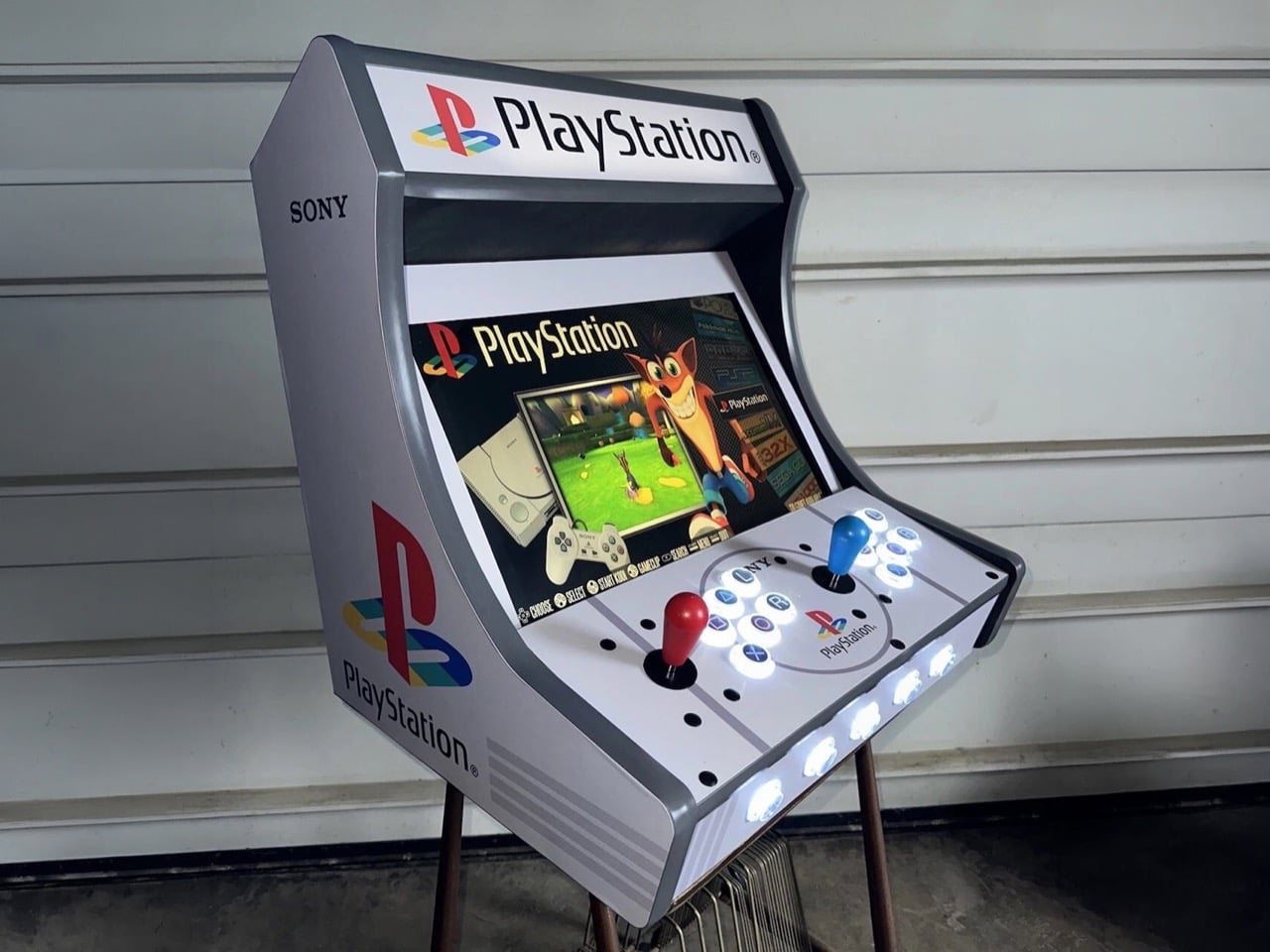
The PlayStation 5 is having a wild autumn. Modders have cracked it wide open, and people are now hauling Steam games onto the console and PS5 games onto their PCs, like two neighbors who swapped houses just to see what happens. Meanwhile, an eBay seller called arcadeplug has gone in the opposite direction, building a PlayStation-themed bartop arcade cabinet that plays the original PS1 library old-school style, standing up with a joystick in hand. It runs on a Raspberry Pi 4 with RetroPie, uses a 19-inch screen, and costs $1,029.99. Sony never made this machine. Somebody with a lot of vinyl and a free weekend decided the universe needed it anyway.

I’ll admit the first photo got me. The gray body, the four-color PS logo on the side, and the glowing triangle, circle, cross, and square buttons hit the same part of my brain that still remembers the PS1 boot-up sound. It’s a fan build in official-looking clothes, and the clothes are excellent. The funny part is the history, because PlayStation hardware actually powered ’90s arcade cabinets, running Tekken on Namco’s System 11 board months before the console launched. Those machines wore other companies’ art. This one wears Sony’s art with zero Sony hardware inside, which is a deliciously backwards way to close the loop.

Designer: arcadeplug

Sony Snuck the PlayStation Into Arcades Before It Hit Living Rooms

Tekken’s road to the arcade ran through a 1993 meeting where Sony’s Ken Kutaragi walked Namco’s Shegeichi Nakamura through the early PlayStation specs. Namco had been building Tekken for its pricey System 22 board, a machine meant to slug it out with Sega’s Virtua Fighter 2. After that meeting, the project moved to System 11, a cheaper board built on PlayStation architecture. The plan was simple economics, leaving Sega the big arcades while Tekken chased the smaller ones that couldn’t afford premium hardware. Bringing the game home was easy, since the arcade board and the console were basically siblings. An upgraded System 12 followed, debuting with Tekken 3 in March 1997.

Sony also built its own arcade boards, the ZN-1 and ZN-2, and handed them to studios like Capcom, Taito, and Tecmo. Street Fighter EX, Battle Arena Toshinden 2, and Tetris: The Grand Master all ran on PlayStation-derived silicon, though nothing on the cabinets told you so. Sony kept the boards unbranded, letting each publisher put its own name and art on the outside. My favorite slip comes from Acclaim, whose NBA Jam Extreme manual casually calls it the “Sony Play Station Arcade Board.” Sony’s arcade boards were PlayStations in disguise. This cabinet is the disguise with no PlayStation inside.

Why the PS1’s Graphic Design Looks This Good Blown Up

Teiyu Goto, the designer behind the original PlayStation and its controller, picked shapes for the face buttons because every rival was using letters. Each shape carried a meaning, with the circle and cross standing for yes and no, the triangle for a viewpoint, and the square for a sheet of paper or a menu. He gave them colors too, and had to convince management that the red circle and blue cross were intentional. Three decades later, those four shapes work as a logo in their own right. On this cabinet, they sit on translucent arcade buttons lit from within, and you can read them from across the room.

Manabu Sakamoto’s 1994 PS logo takes over the side panels, printed big enough to study how it works. Sakamoto wanted the mark to suggest 3D without simply adding thickness, so he stood the P upright and laid the S flat behind it, using four primary colors. At cabinet scale, that illusion of depth looks better than it ever did on a console lid. The body borrows the PS1’s light gray, and a ring around the center of the control panel frames another PS logo, which reads to me like a nod to the original console’s round disc lid. All of it is laminated vinyl, and it sells the fantasy completely.

A Raspberry Pi, Six Buttons, and a $1,029.99 Price Tag

Inside sits a Raspberry Pi 4 with a 128GB build running RetroPie, the open-source software that bundles emulators for the Pi. Games play out on a 19-inch LCD, backed by a pair of 4-inch speakers, Sanwa-clone joysticks and buttons, and LED lighting throughout. Each player gets one stick and six buttons, the four PlayStation symbols plus an L and an R. That layout drops the original controller’s second pair of shoulder buttons, which suits Tekken and Street Fighter Alpha far better than a 40-hour Final Fantasy run. You’ll also be standing the whole time, which feels right for a fighter and slightly brutal for a JRPG.

On eBay, the Custom PlayStation Multicade cabinet goes for $1,029.99 or best offer, shipping from Ohio with a one-year warranty covering the speakers, buttons, and Pi. For scale, Arcade1Up’s licensed Street Fighter II cabinets run roughly $350 to $650, and a SuperStation One FPGA console costs about $210 to $250 if you just want PS1 games on a TV. Neither comes dressed like this, though. The timing makes me smile, because Sony is ending physical game disc production in 2028, and here’s a shrine to the console that made CDs the default for a generation. Modders are prying the PS5 open to see what it can become. Somebody in Ohio gave the PS1 the arcade cabinet it never had.

The post Someone built a PlayStation arcade cabinet on ebay, and now I want to play Tekken first appeared on Yanko Design.

  • ✇Yanko Design
  • Two Hidden Mechanical Movements Power One Slim Louis Erard Watch
    Two riveted portholes occupy the face of the Louis Erard × Vianney Halter Futur Antérieur, making it look like submarine equipment that escaped into a jewelry case. One window tells the hours and minutes. The other gives the seconds their own stage. I like the extravagance of that arrangement, especially because this limited-edition mechanical watch tackles a specific design challenge: delivering Halter’s distinctive aesthetic in a less prohibitively expensive package. At roughly $6,000 before
     

Two Hidden Mechanical Movements Power One Slim Louis Erard Watch

8 novembre 2026 à 15:15

Two riveted portholes occupy the face of the Louis Erard × Vianney Halter Futur Antérieur, making it look like submarine equipment that escaped into a jewelry case. One window tells the hours and minutes. The other gives the seconds their own stage. I like the extravagance of that arrangement, especially because this limited-edition mechanical watch tackles a specific design challenge: delivering Halter’s distinctive aesthetic in a less prohibitively expensive package.

At roughly $6,000 before taxes, “less expensive” needs context. Halter’s Antiqua, the perpetual-calendar watch he introduced in 1998, occupies a six-figure collecting universe. The Futur Antérieur translates its porthole architecture into a simpler watch that tells the time. Nobody needs to pretend that makes it affordable. Still, I appreciate a collaboration that preserves an independent watchmaker’s recognizable ideas rather than borrowing a famous name and printing it on an otherwise ordinary dial.

Designers: Louis Erard × Vianney Halter

The cleverest decision sits behind those windows. Two separate Sellita SW100 automatic movements power the displays, one handling hours and minutes, the other running the seconds. That sounds wonderfully excessive for such basic information, and it is. But it also gives each dial its own mechanical foundation. Rather than developing an elaborate mechanism to reposition the indications, the designers have used two small, existing movements to support the layout they wanted.

Two movements might suggest a second time zone, but that isn’t what you get. Design Milk reports that Louis Erard chose running seconds partly because keeping two movements sufficiently aligned for dual-time use would be difficult at the intended price. That’s useful context, and a reminder that the extra mechanism serves the design more than the feature list. I’d approach this as an expressive object, not a purchase justified by having more functions.

The dimensions help that expression avoid becoming a costume. Its stainless-steel case measures 38mm across and 44mm long, with a thickness of just 8.85mm. Those numbers matter because the raised windows and prominent crowns could easily suggest a much chunkier watch in photographs. On paper, the profile is restrained. I haven’t worn it, but I appreciate the decision to keep this much visual activity within relatively compact dimensions.

Look closer and the metalwork carries much of the personality. Each bezel has 12 yellow-gilt rivets, while each crown gets six. Brushed steel sits beside polished edges, and the blue steel hands introduce a cooler color against those warm accents. In the product images, the separate nameplates feel almost like labels attached to an old scientific instrument. The appeal, for me, comes from those specific details rather than the broad steampunk label.

The two versions pull that character in slightly different directions. Gold combines gold-toned dials with a black ostrich-leather strap. Silver pairs silver-toned dials with blue ostrich leather, picking up the color of the hands. I’d choose Silver. Its cooler palette lets the little gold rivets register as individual details instead of joining a larger wash of gold. The asymmetrical layout already has plenty to say without needing a louder color scheme.

There are ordinary ownership considerations beneath the unusual face. Louis Erard specifies a minimum 38-hour power reserve for each movement, with 42 hours typical. Leave it unworn for a weekend and you may return to a stopped watch. Quick-change strap bars offer a more convenient detail, letting owners change the strap without making that another complicated operation. These are worth considering alongside the sculptural appeal.

Each version is limited to 178 pieces and listed at CHF 4,950 before taxes. As of November 6, 2026, both are marked sold out on Louis Erard’s website. That scarcity limits the accessibility argument, even at this lower price. Still, the design itself makes sense to me: keep the familiar task of reading hours and minutes, then spend the mechanical extravagance on giving the passing seconds an unnecessarily handsome room of their own.

The post Two Hidden Mechanical Movements Power One Slim Louis Erard Watch first appeared on Yanko Design.

  • ✇Yanko Design
  • Optoma’s $599 4K Projector casts a 150-inch Screen for the price of an Android Phone
    My first apartment had a living room wall the size of a parking space and a TV budget the size of a parking ticket. Had the Optoma Photon Life PK31 existed back then, I would have eaten instant noodles for a month to buy it. This 4K projector can cast an image up to 150 inches, and it currently sells for around $599, which is what you’d pay for a decent midrange Android phone. One gives you a 6-inch screen. The other fills a wall, and I know which one my 25-year-old self would’ve picked. The PK
     

Optoma’s $599 4K Projector casts a 150-inch Screen for the price of an Android Phone

8 novembre 2026 à 13:20

My first apartment had a living room wall the size of a parking space and a TV budget the size of a parking ticket. Had the Optoma Photon Life PK31 existed back then, I would have eaten instant noodles for a month to buy it. This 4K projector can cast an image up to 150 inches, and it currently sells for around $599, which is what you’d pay for a decent midrange Android phone. One gives you a 6-inch screen. The other fills a wall, and I know which one my 25-year-old self would’ve picked.

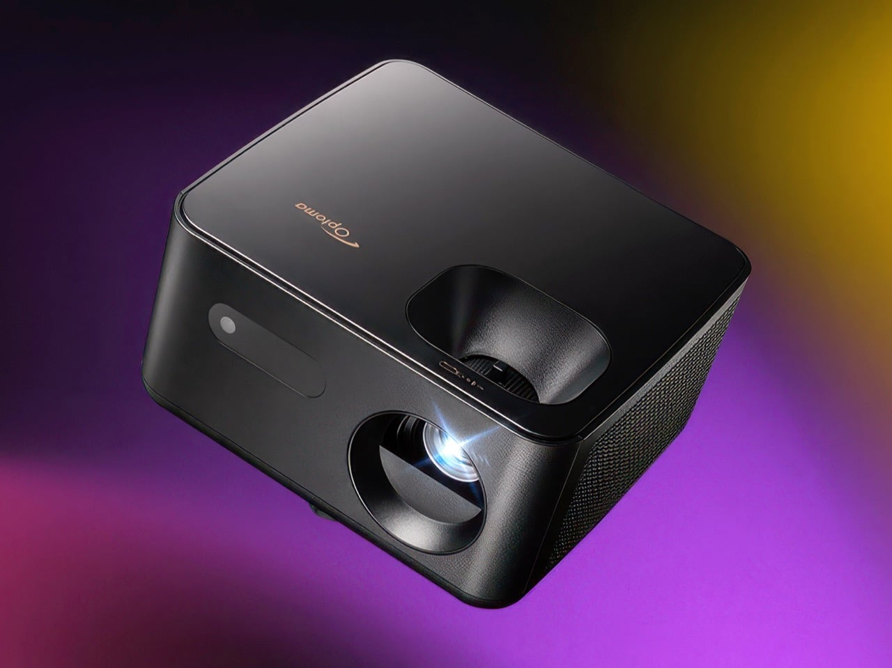
The PK31 is a compact, 5.2-pound projector that looks more like a smart speaker than the beige AV boxes projectors used to be. A smooth top shell sits over a textured matte body, a perforated grille wraps around the side, and the lens sits inside a deep circular cowl. It uses a Texas Instruments DLP chip and an RGB LED light source, with claimed coverage of 95% of the DCI-P3 color space. At a rated 900 lumens, it’s best suited to a dark room. Input lag is rated as low as 4.6ms, though that’s at 1080p and 240Hz, not 4K.

Click Here to Buy Now

A Projector Built to Live on Your Bookshelf

The body measures 9.37 x 8.46 x 4.64 inches (238 x 215 x 118 mm), roughly the footprint of a hardcover cookbook lying flat. That lets it sit on a shelf between the plants and the Bluetooth speaker without looking like it wandered in from a conference room. Optoma prints its logo in copper on the top panel, a small, warm accent against the all-black body. Every port sits inside a recessed panel on the back, keeping connections out of sight from the front. The grille wraps around the side, helping the cooling vents blend into the textured body.

The lens sits off to the right, balanced on the left by a pill-shaped window for the IR receiver, giving the front a friendly, slightly lopsided face. Its 1.5 to 1.65 throw ratio translates to about 11 feet (3.4 meters) of distance for a 100-inch picture. The full 150 inches needs roughly 17 feet (5.2 meters), so this suits a long living room better than a cramped studio. Focus and the 1.1x zoom use manual rings, and a twist-adjust foot handles tilt. A standard tripod thread underneath adds mounting flexibility, while four-corner correction and a warp tool help adjust the image to an uneven wall or an inflatable backyard screen.

Sharp 4K and Low-Lag Gaming

The 0.47-inch Texas Instruments chip uses microscopic mirrors to direct light toward the screen. XPR pixel shifting shifts the projected image by fractions of a pixel to produce a 3840 x 2160 picture. Separate red, green, and blue LEDs handle color, and the projector supports HDR10 and HLG. Projector Reviews measured 862 lumens in the brightest mode, close to Optoma’s 900-lumen rating. The reviewer also rated its color as good as or better than that of any RGB LED compact projector he’d tested.

That review recommends about 90 inches for everyday content and 75 to 80 inches for HDR, so don’t expect the same brightness at the maximum 150-inch size. Gamers get the bigger surprise. Input lag, the delay between a button press and the corresponding action on screen, is rated at 4.6ms at 1080p and 240Hz, 8ms at 1080p and 120Hz, and 16ms at 4K and 60Hz. The reviewer’s lag tester confirmed those figures. One catch: low-latency mode disables keystone correction, so line the projector up straight before the boss fight.

How It Stacks Up Against TCL, BenQ, and Hisense

TCL sells a smart projector for considerably less: the TCL C1 normally goes for about $250 with Google TV, Wi-Fi, and Bluetooth built in. The fine print says 1080p, though, and its “4K support” means it accepts a 4K signal and scales it down. The PK31 produces a 4K image but skips the smart OS, Wi-Fi, and Bluetooth entirely. Its single HDMI 2.0 port takes a Roku or Fire TV Stick, and the USB-A port can supply power to it, letting the setup run from one wall outlet. A 5W mono speaker provides onboard audio, and a 3.5mm jack connects external speakers for movie night.

Another 4K option is the BenQ GP520, a cube-shaped projector with a higher 2,600-lumen rating and Google TV. It launched at $1,499 and now has a street price closer to $999. Optoma’s own PK32 adds an amber LED, autofocus, and two HDMI ports for $1,299, while the Hisense M2 Pro costs the same with Android TV on board. The PK31 launched at $1,099 and now sells for about $599 at Walmart and Amazon. At that price, you could add a streaming stick and still spend considerably less than you would on those three.

Click Here to Buy Now

The post Optoma’s $599 4K Projector casts a 150-inch Screen for the price of an Android Phone first appeared on Yanko Design.

  • ✇Yanko Design
  • This LEGO Fujifilm Quicksnap is a 1:1 tribute to the camera on its 40th anniversary (box included!)
    Fujifilm celebrated the QuickSnap’s 40th birthday this year the way any responsible camera company would, by announcing new models. The QuickSnap Black and White ($22.90) and the waterproof QuickSnap Active ($24.75) are due this fall, marking the first time Fujifilm has loaded black-and-white film into a QuickSnap. One LEGO Ideas builder took a different approach to the celebration, reaching for green, black, red, and white bricks to rebuild the Japanese version at full size. Of the two birthda
     

This LEGO Fujifilm Quicksnap is a 1:1 tribute to the camera on its 40th anniversary (box included!)

8 novembre 2026 à 11:20

Fujifilm celebrated the QuickSnap’s 40th birthday this year the way any responsible camera company would, by announcing new models. The QuickSnap Black and White ($22.90) and the waterproof QuickSnap Active ($24.75) are due this fall, marking the first time Fujifilm has loaded black-and-white film into a QuickSnap. One LEGO Ideas builder took a different approach to the celebration, reaching for green, black, red, and white bricks to rebuild the Japanese version at full size. Of the two birthday presents, I know which one hits the nostalgia button harder.

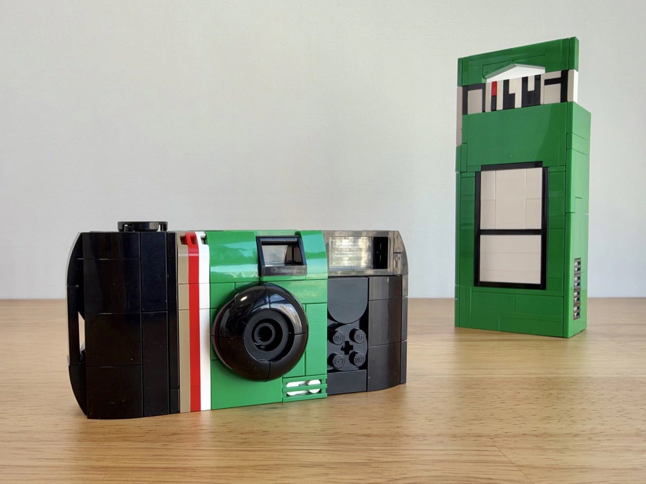
That builder is MarshallThrilledLobster, and the subject is the Simple Ace, known in Japan as Utsurundesu, which roughly means “It takes pictures!” The name came from a Fujifilm employee who blurted it out when someone asked whether the camera would really work. It might be the best product naming story in camera history. The LEGO version sits at 1:1 scale, comes with a full-size brick replica of its retail box, and packs a few working details. Fujifilm designed the original cameras to be collected after use, taken apart, and rebuilt, making them a fitting subject for LEGO.

Designer: MarshallThrilledLobster

A 1:1 Simple Ace, Right Down to the Clicking Wheel

The real Simple Ace measures 4.25 by 2.1 by 1.3 inches (108 by 54 by 34mm), and this build recreates it at full size. That works out to 13.5 studs across, an awkward number that helps explain why so much of the build runs sideways using SNOT (studs not on top) techniques. The green body wears its red and white stripes, with a domed black lens right where your finger used to block every third shot. Up top, a half-buried Technic gear stands in for the winding wheel. Turn it and it clicks, like advancing a fresh frame.

The viewfinder is a clear tunnel that lines up front to back, so you can actually squint through it. That’s more faithful than it sounds, since the real camera uses a simple reverse-Galilean plastic finder, essentially a tunnel with two lenses. A strap loop is worked into the side of the shell, and the outer surfaces are tiled smooth with no exposed studs. The result reads as molded plastic from across the room. Only up close do the seams give away that this camera came out of a parts bin.

The Box Gets the Brick Treatment Too

My favorite detail, though, is the packaging. The builder recreated the Simple Ace’s tall retail box at full size, with the 写ルンです logo rendered in blocky pixel lettering and barcode details built from black and white tiles. Stand it next to the camera and you’ve got a Tokyo convenience store shelf on your desk. It doubles as a display stand, giving the small camera some height and context. For anyone who grew up with these, the box is half the memory, since tearing it open meant the vacation had officially started.

Packaging as an accessory has precedent in LEGO Ideas. The Polaroid OneStep SX-70, which started as a fan build by Marc of Minibrick Productions, became set 21345 in 2024 with a buildable film pack and three illustrated photos. That set established a precedent for collaborating with a real camera brand, while this QuickSnap remains a fan proposal. A full-size retail box goes further than a film pack, giving Fujifilm’s graphic design the same care as its industrial design. That feels right for packaging this recognizable in Japan.

A Disposable Built for Second Lives, Now Up for a Vote

Fujifilm opened a QuickSnap recycling center in 1988, just two years after the camera launched. By 1998, it was running an automated factory that disassembled returned cameras, inspected the parts, and built new cameras from them. In the US today, up to 60% of each QuickSnap is made with reused camera materials. The builder frames the project around that idea: a so-called disposable product designed for a second life. LEGO bricks have been taken apart and rebuilt since 1958, though their next life might be a spaceship.

The Fujifilm QuickSnap build went live on LEGO Ideas on November 6 and has 105 supporters as of this writing, with 425 days left to reach the 1,000-supporter milestone. Fans submit builds, and projects that reach 10,000 supporters get reviewed by LEGO for an official set. That’s a long climb for a camera most people know as a $20 impulse buy. If you’ve got a shoebox of fuzzy prints somewhere, head to the LEGO Ideas page and give it your vote. It’s the one QuickSnap you’ll never have to drop off at the lab.

The post This LEGO Fujifilm Quicksnap is a 1:1 tribute to the camera on its 40th anniversary (box included!) first appeared on Yanko Design.

  • ✇Yanko Design
  • The 5 Best Outdoor Gear of November 2026
    A campsite gets complicated through small inconveniences: a flashlight that’s running low, cookware competing for space, nowhere inviting to sit once dinner is done. Those are useful starting points for an outdoor gear roundup. This November’s selection looks at designs that address the practical business of spending time outside, with room for a telescope that gives you a reason to stay out long after the dishes have been put away. These are our editorial picks for November 2026, selected for
     

The 5 Best Outdoor Gear of November 2026

7 novembre 2026 à 07:40

A campsite gets complicated through small inconveniences: a flashlight that’s running low, cookware competing for space, nowhere inviting to sit once dinner is done. Those are useful starting points for an outdoor gear roundup. This November’s selection looks at designs that address the practical business of spending time outside, with room for a telescope that gives you a reason to stay out long after the dishes have been put away.

These are our editorial picks for November 2026, selected for their approach to carrying, setting up, and using outdoor equipment. They aren’t five releases from the same month, and this isn’t a ranking based on comparative field testing. Each offers a specific design detail worth considering, along with compromises that deserve attention before anything joins your packing list. Think of the collection as five different possibilities, not one mandatory kit.

1. Olight Baton 4 Premium Edition

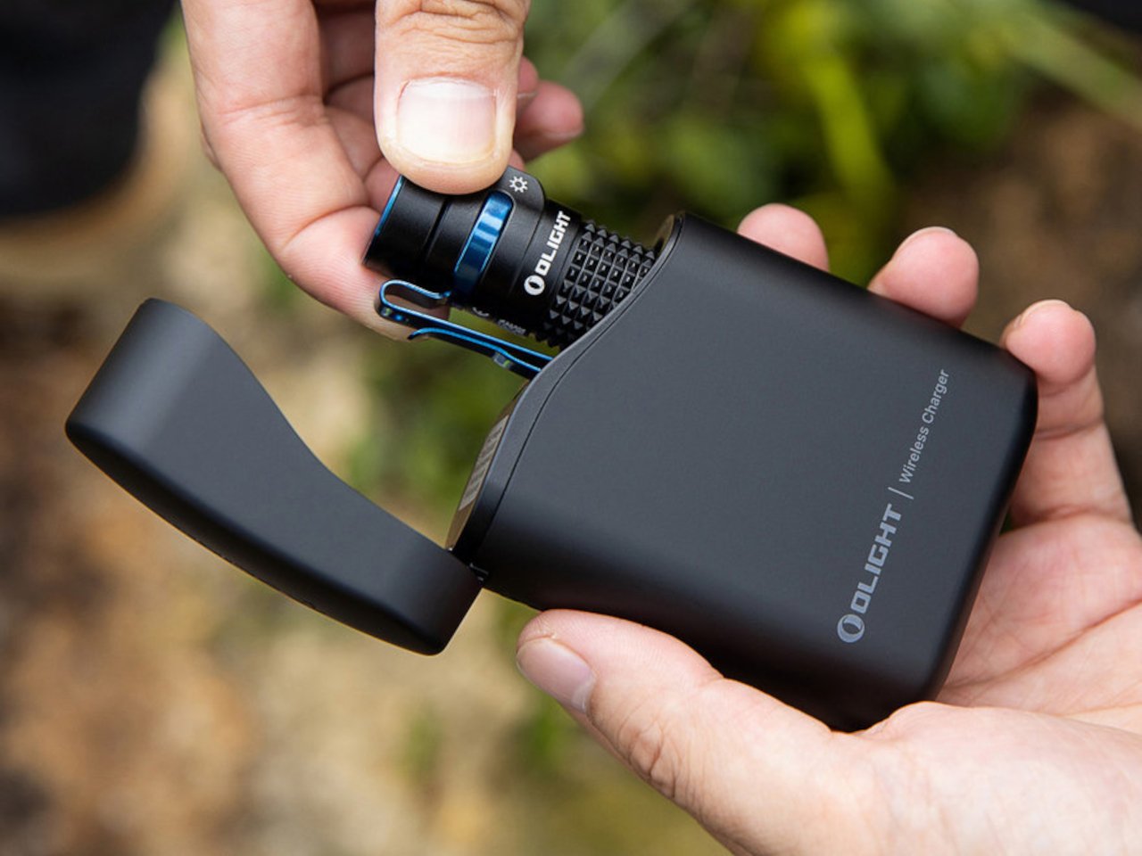
The smartest part of Olight’s Baton 4 Premium Edition is the case. Its flip-top enclosure carries a 5,000mAh battery, recharges the flashlight, and lets you operate the light without removing it. Open the lid, press the case’s button, and the flashlight can illuminate while remaining docked. Holding the button adjusts brightness. That gives the enclosure a useful role beyond storage, particularly when you only need a quick look inside a bag or around the campsite before putting everything away again.

The flashlight itself measures just 2.48 inches long and weighs 52.5 grams with its battery. Olight rates its maximum output at 1,300 lumens, though the manual shows that turbo brightness begins stepping down after 90 seconds. The case also supplies USB-C power to external devices, offering backup charging without another dedicated battery pack. There’s a packing tradeoff: the 142-gram case weighs considerably more than the light. Bring both when charging flexibility matters; carrying only the flashlight keeps things much lighter.

What we like

  • The flashlight remains usable while docked in its charging case.
  • USB-C output gives the case a second job: powering other devices.

What we dislike

  • The charging case adds considerably more weight than the flashlight alone.
  • The 1,300-lumen maximum is a brief turbo setting, not sustained output.

2. DWARFLAB Draco Smart Telescope

DWARFLAB’s Draco is the indulgence in this selection: a preorder smart telescope designed for photographing the night sky. Its 90mm aperture, folded optics, and integrated cameras bring several astronomy components into one portable instrument. The particularly interesting mechanism is a rotating imaging sensor that compensates for field rotation, the apparent twisting of stars across an image during an exposure. DWARFLAB advertises single exposures of up to 300 seconds, with guiding hardware built into the telescope instead of attached as another accessory.

The practical appeal is how much setup the system takes on. Through the DWARFLAB app, Draco automates focusing, targeting, tracking, and image stacking, while its wide-angle and telephoto cameras can capture simultaneously. Scheduled shooting also makes an overnight session possible without constant supervision. At 5.5 kilograms, though, this is equipment to transport rather than casually add to a hiking bag.

Click Here to Buy Now: $1599

What we like

  • Integrated guiding and automated capture reduce the number of separate components to manage.
  • Simultaneous wide-angle and telephoto imaging offers two views of the same night.

What we dislike

  • A 5.5-kilogram body makes this a substantial addition to your luggage.
  • Preorder status rules it out as a dependable purchase for an imminent trip.

3. Zempire Stealth-Jet Wide Camp Stove

Zempire’s Stealth-Jet Wide addresses a familiar packing problem: a camp kitchen can occupy a surprising amount of the trunk. This two-burner stove closes into a powder-coated pressed-steel body just 2 inches thick. Its packed footprint remains a substantial 23.2 by 12 inches, but the shallow profile gives you a flatter object to arrange around other equipment. Open it, and the extra width provides space for larger pots and pans, with independently controlled burners rated at up to 10,000 BTUs each.

The supporting details are refreshingly practical. Rear and side wind shields surround the cooking area, pull-switch piezo ignition removes the need for matches during normal operation, and a removable pot stand provides access for cleaning. The $210 stove includes a propane canister hose connector, though fuel is separate. At 10 pounds, 13 ounces, its thinness solves storage bulk rather than backpack weight. That makes it a sensible design to consider for car camping, where fitting equipment matters more than carrying it.

What we like

  • The 2-inch packed profile reduces the stove’s storage bulk.
  • Two independently controlled burners provide flexibility for cooking a meal.

What we dislike

  • Its nearly 11-pound weight makes it poorly suited to backpacking.
  • A compatible propane canister and fuel must be purchased separately.

4. Nike ACG x Helinox Chair Zero LT

The Nike ACG x Helinox Chair Zero LT makes its construction the visual attraction. An orange frame sits beneath translucent Ghostgrid fabric, drawing attention to the supporting structure rather than hiding it under a substantial upholstered seat. Helinox describes Ghostgrid as a monofilament mesh with a reinforced ripstop grid, developed to balance low weight with resistance to abrasion and tearing. It’s an appropriate material story for a chair whose appeal depends on how little furniture you’re willing to carry outdoors.

The specifications make that argument concrete: 534 grams packed, a 265-pound stated capacity, and a carry case measuring 14 by 4.5 by 4.5 inches. Shock-corded aluminum poles form the frame, while an included X-Strap increases ground contact area to help reduce sinking on softer surfaces. Fit deserves attention before the branding: Helinox identifies adults under 5 feet, 9 inches among its ideal users.

What we like

  • A 534-gram packed weight makes the case for carrying a separate seat.
  • The included X-Strap addresses sinking on softer ground.

What we dislike

  • Helinox’s stated ideal-user guidance makes fit worth checking for taller buyers.
  • The collaboration is currently sold out on the US site.

5. Clip&Go Radio

The Clip&Go Radio puts its carrying method directly into the body. A built-in carabiner attaches the 220-gram device to a backpack or other gear, keeping its AM, FM, and shortwave radio accessible without assigning it an interior pocket. The design makes particular sense for something combining everyday listening with backup functions. There’s a flashlight, an audible SOS alarm with a flashing light, and a replaceable 2,000mAh battery that can also supply power to compatible smartphones.

The charging hierarchy is worth understanding before heading out. USB-C is the recommended primary method, with the shop listing approximately two hours for a full charge. The hand crank and solar panel are emergency alternatives, with listed charging times of approximately six and 67 hours, respectively. Neither should be mistaken for a quick substitute for plugging in. The replaceable 18650 cell is the more appealing ownership detail: when the battery wears out, you can replace it rather than retire the radio.

Click Here to Buy Now: $60.00

What we like

  • The integrated carabiner keeps it accessible.
  • Its 18650 battery is replaceable.

What we dislike

  • Solar charging is extremely slow.
  • Hand-crank charging is a lengthy backup method.

Packing Around the Trip

Before adding any of these to your equipment, decide what kind of outing you’re packing for. A trunk, a bicycle pannier, and a backpack impose different limits. Put the complete setup on the scale, including cases, cables, fuel, and accessories, rather than judging an object by its headline measurement. A thin stove still needs room around it; a compact instrument can still represent a substantial share of what you’re carrying.

It’s also worth separating the job you need done from the extra functions that sound appealing on a product page. Choose lighting around how you’ll use it, seating around your body, and specialist equipment around an activity you genuinely enjoy. Multifunctional gear earns its place when those functions match your habits. The better purchase may be the object that replaces something awkward, rather than another addition to an already crowded bag.

The post The 5 Best Outdoor Gear of November 2026 first appeared on Yanko Design.

  • ✇Yanko Design
  • This $129 Portable Jacuzzi turns any bathtub into a personal spa
    Installing a jetted tub usually means a new tub, a plumber, a dedicated electrical circuit, and some tile you never planned on replacing. That’s a lot of renovation for the simple pleasure of moving water. WAVORA’s Z1 shrinks the whole idea into a cordless puck that fits in your palm and suction-mounts inside the tub you already own. It’s roughly a hockey puck’s chubbier cousin, and it runs on a rechargeable battery, so there’s no cord dangling over the edge or near the water. Think of it as a
     

This $129 Portable Jacuzzi turns any bathtub into a personal spa

6 novembre 2026 à 21:45

Installing a jetted tub usually means a new tub, a plumber, a dedicated electrical circuit, and some tile you never planned on replacing. That’s a lot of renovation for the simple pleasure of moving water. WAVORA’s Z1 shrinks the whole idea into a cordless puck that fits in your palm and suction-mounts inside the tub you already own. It’s roughly a hockey puck’s chubbier cousin, and it runs on a rechargeable battery, so there’s no cord dangling over the edge or near the water. Think of it as a jetted tub’s greatest hit with the remodel left out.

WAVORA, a Louisville, Kentucky brand, sealed the Z1’s motor away from the bath water entirely, so there’s no spinning shaft poking through a rubber seal and waiting to leak. Most compact pumps use a rotating shaft that passes through the housing, guarded by a dynamic seal that rubs and wears every time the motor spins. The Z1 separates the drive from the transmission and closes everything up with static seals, which have no moving surfaces to grind down. The surrounding water doubles as coolant, pulling heat off the housing while it runs, which is a neat bit of free engineering. Your bath, in other words, is also the radiator.

Designer: WAVORA

Click Here to Buy Now: $129 $235 (45% off) Hurry! Only 6 days left.

A Grapefruit-Sized Jet That Mounts on the Wall or the Floor

The Z1 measures 4.3 by 3.5 inches (109 x 89mm) and weighs about 19 ounces (545g), which puts it in medium-sized citric fruit territory. Its form is a soft, cream-white drum with a slatted grille where the water exits and two control buttons on its flank. Small indicator LEDs glow through the shell, so you can check the setting without fishing the thing out. Most cordless bath jets on Amazon are taller cylinders with swiveling nozzles, and they tend to look like pool equipment. The Z1 reads closer to a diffuser or a candle, which helps when it’s sitting on a shelf between soaks.

A double-sided suction mount does the holding, sticking to the tub on one face and the Z1 on the other. It grips best on smooth, non-porous surfaces, which covers acrylic, enamel, glass, polished stainless steel, and glazed tile, so most American tubs qualify. Mount it on the side wall and you get a directional stream that sweeps across the tub like a classic jet aimed at your back. Set it on the floor and the water pushes upward through the bath instead, closer to a spring welling up from below. Swapping between the two takes seconds, which means you pick where the movement starts every night, something a built-in jet can never do.

Three Flow Modes and Up to Five Hours Per Charge

Gentle Flow keeps a soft, steady current moving around you, perfect for a bath with a book in one hand. Power Flow cranks up circulation and shoves water and existing bath foam around the whole tub, which is the setting for sore legs after a long run. Spa Rhythm pulses the intensity up and down in waves, mimicking the ebb and surge of a proper spa jet. One button cycles through all three, so switching moods doesn’t require reading a manual with wet hands. The Z1 moves water rather than injecting air, so the fizzy, aerated feel of a whirlpool comes from your bath bombs, which the launch bundle conveniently includes.

Gentle Flow runs for up to five hours on one charge, Power Flow for about two, and the pulsing Spa Rhythm for around an hour. Five hours in the gentlest mode covers several evening soaks before you need to think about a cable, unless you’re the type who refills the hot water three times. Charging happens over the included USB cable outside the tub, so the only thing near the water is a sealed puck on battery power. Being cordless also frees the Z1 from the nearest outlet, which in most bathrooms sits over by the sink. Corded rivals solve that with a 13-foot cable, which is a lot of wire to drape around a tub of water.

An Outlet You Can Rinse in the Sink, and a $129 Launch Price

Built-in jets have a reputation, and anyone who has fired one up after months of disuse has seen the flakes that come out of the plumbing. The Z1’s outlet section detaches completely, so hair, petals, and bath bomb debris get rinsed out at the sink instead of building up inside. Smaller snags come off by hand without removing anything. The entire water path lives inside a body you can hold under a faucet, so there’s no hidden pipework for gunk to colonize. Budget bath jets on Amazon run about $30 to $70, and their swiveling nozzle assemblies offer more nooks for that gunk to settle into.

The Z1 launches at $129 in a Spa Ritual Set, against a $235 MSRP, bundled with a USB charging cable, the double-sided suction mount, and a manual. WAVORA throws in six botanical bath bombs, six bath liners, and a mesh pouch, which turns the box into a ready-made gift. A single cream-white finish appears across the launch materials, with no other colors announced. Orders ship worldwide, including the US, with delivery estimated for January 2027. WAVORA hasn’t listed warranty terms yet, so check the product page before ordering. That’s a jetted tub’s worth of moving water for the price of a nice dinner, and the tile gets to stay exactly where it is.

Click Here to Buy Now: $129 $235 (45% off) Hurry! Only 6 days left.

The post This $129 Portable Jacuzzi turns any bathtub into a personal spa first appeared on Yanko Design.

  • ✇Yanko Design
  • This fan-made LEGO McDonald’s combo comes with everything except the McFlurry
    In 1999, LEGO sold an official McDonald’s restaurant brickset through its Shop at Home catalog in the US, and it was adorably tiny. Set 3438 used 98 pieces to build a little drive-through window, a car, and an umbrella table, with stickers doing most of the branding work. The employee was basically a standard LEGO chef with the logo slapped on his chest. One collector paid $75 for a sealed copy back in 2011, for a set that cost around ten bucks new. Twenty-seven years later, a fan builder think
     

This fan-made LEGO McDonald’s combo comes with everything except the McFlurry

6 novembre 2026 à 18:30

In 1999, LEGO sold an official McDonald’s restaurant brickset through its Shop at Home catalog in the US, and it was adorably tiny. Set 3438 used 98 pieces to build a little drive-through window, a car, and an umbrella table, with stickers doing most of the branding work. The employee was basically a standard LEGO chef with the logo slapped on his chest. One collector paid $75 for a sealed copy back in 2011, for a set that cost around ten bucks new. Twenty-seven years later, a fan builder thinks the next LEGO McDonald’s should skip the building entirely and go straight for the food.

Called McDonald’s Menu, brickbybrick_’s LEGO Ideas submission rebuilds a classic combo big enough to hold its own on a shelf. There’s a red tray with giant Golden Arches in the middle, a cheeseburger, a red carton overflowing with fries, and a white cup loaded with transparent ice and a striped straw. Zero minifigures, zero drive-through, all lunch. The project went up on October 29 and is already sitting at 1,440 supporters, which tells me a lot of AFOLs (adult fans of LEGO) are hungry. I’m one of them, and I’m writing this before lunch.

Designer: brickbybrick_

Red plates form the tray, finished with a raised, rounded rim and a handle at each end, so it reads as molded plastic instead of a stack of bricks. A big yellow set of Golden Arches sits dead center, breaking up what would otherwise be a whole lot of red. The food is arranged in the classic triangle: burger front left, cup at the back, fries off to the right. It’s the exact layout you’d find on any table at your local McDonald’s around noon. That framing makes the build look like a meal someone just set down, which is half the fun of it.

The cheeseburger starts with a dome of tan curved elements, smooth on top like a plain hamburger bun. Under it sits a red layer that reads as tomato, then bright green leaf pieces fanning out as lettuce, a slice of yellow cheese, and a dark brown patty. Those leaves are a nice bit of NPU (nice part usage, for the uninitiated), taking foliage meant for LEGO gardens and jungles and turning it into a salad. Each layer sticks out at slightly uneven angles, giving the burger that freshly squished look of something just pulled from its wrapper. Real fast food never comes perfectly stacked, and this one looks like it survived a lunch rush.

A pile of yellow plates and bricks spills out of the red fry carton at every angle, some standing tall and some flopped over the edge the way the last few always are. The carton gets the real thing’s shape right, the one McDonald’s introduced in 1970 with a wide mouth for quick scooping and a profile that keeps the fries from falling out. The Golden Arches appear on its face in yellow, the same red-and-yellow combo that has been selling fries for over five decades. Building fries in LEGO is easy, but making them look casually messy takes real effort. My only complaint is that I can’t salt them.

My favorite detail, though, is the drink. The white cup’s top is left open, showing a load of transparent pieces packed in as ice, with a red-and-white striped straw sticking out at a jaunty angle. That straw does three jobs at once. It gives the composition its tallest point, adds a splash of red to an otherwise white element, and nods to a real McDonald’s quirk, since the chain says its straws are slightly wider than average so more Coke hits your taste buds. The ice tells its own story, because McDonald’s pre-chills its syrup and sets the ratio expecting the ice to melt. Leaving the lid off is what lets you see all of it.

Back in 2021, adammark’s McDonald’s Franchise 1955-1969, a walk-up burger stand with a Speedee System kitchen, hit 10,000 supporters and reached the Third 2021 Review. It was one of 36 projects in that round, and Hocus Pocus ended up as the only one approved. brickbybrick_ takes a different route, shrinking the subject from a restaurant down to a single meal sized for a shelf. The build is unlicensed, so those Golden Arches are a fan’s tribute, and any official version would need McDonald’s on board. The two companies have teamed up before, going back to LEGO’s first Happy Meal promotion in 1983, so the precedent exists.

McDonald’s Menu currently has 1,440 supporters and 599 days left to reach its next milestone of 5,000. LEGO Ideas runs on community momentum: fans submit their builds, supporters rally behind the ones they love, and projects that hit 10,000 get reviewed by LEGO for a shot at becoming real sets. It’s a long climb for a lunch order, but every Ideas set on store shelves started at zero votes. If you’d like to see this combo in a box, head to the LEGO Ideas page and give it your vote. Personally, I’m holding out for a Super Size edition, which McDonald’s retired in 2004 but LEGO is more than welcome to bring back.

The post This fan-made LEGO McDonald’s combo comes with everything except the McFlurry first appeared on Yanko Design.

  • ✇Yanko Design
  • Midea’s award-winning blender concept can both heat and cool your mixture down
    Picture a blender with a stovetop hidden in its base, so it can turn soybeans into hot soy milk or rice into congee without you touching a pot. Heated blenders like this are a breakfast staple across China, and most share one annoying flaw: the drink comes out scalding, leaving you to blow on it like it owes you money. Midea’s Fully Automatic Air Flow Blender targets that wait with an airflow system designed to help with both cooking and cooling. Midea claims it brings drinks down to 131°F (55°
     

Midea’s award-winning blender concept can both heat and cool your mixture down

6 novembre 2026 à 15:20

Picture a blender with a stovetop hidden in its base, so it can turn soybeans into hot soy milk or rice into congee without you touching a pot. Heated blenders like this are a breakfast staple across China, and most share one annoying flaw: the drink comes out scalding, leaving you to blow on it like it owes you money. Midea’s Fully Automatic Air Flow Blender targets that wait with an airflow system designed to help with both cooking and cooling. Midea claims it brings drinks down to 131°F (55°C) within five minutes of finishing. That’s roughly where breakfast stops being a dare and starts being breakfast.

The machine comes from Guangdong Midea Consumer Electric, with a design team led by Peng Xi and Wang Jin, and it received a Red Dot Award: Design Concept 2026 in the Ready for Market track. That track recognizes near-finished products that haven’t reached shelves, judged partly on whether they can realistically ship within a year. Midea says the airflow lets the motor blend at full power without soy milk foaming over. A built-in water tank sits alongside the blending jar, and the linen-textured shell looks ready for a Scandinavian café. The Chinese-language interface suggests a launch in China first, though there’s no word yet on US availability.

Designers: Peng Xi, Wang Jin, Li Qianlun, Jo Jeongmin, Ru Guanhong & Wang Xingzhe

Soybeans contain saponins, compounds that contribute to soy milk’s bubble-bath foam when heated. Heated blenders typically manage this by blending in short bursts and pausing the heat to keep the foam from reaching the lid. That stop-start rhythm helps explain why a batch of soy milk on Midea’s existing machines takes around 30 minutes. The company credits its airflow system with cutting prep time in half, though it hasn’t detailed how the system controls foam.

A freshly cooked batch of soy milk or congee can come out near 212°F (100°C), then sit in the jar cooling a degree at a time while you wait. Midea’s existing heated blenders hold drinks at 131°F (55°C) on keep-warm for up to six hours, so the target is familiar territory for the brand. The new machine’s trick is getting there fast: Midea says cooling takes about five minutes. That’s roughly the time it takes to find your shoes and your keys. Paired with overnight scheduling, it could have freshly made soy milk ready to drink when you wake up.

Visually, the appliance splits into two towers that share a figure-eight footprint. On the left, a linen-textured column holds a water tank that lifts straight out from the top, with a corrugated grip that echoes the ribbed base beneath the glass jar. On the right, the jar wears a copper-colored lid ring that appears to double as a status light. Midea’s description of the surface as a linen texture suggests a molded finish rather than real cloth, a sensible call next to a jar of hot congee. The touch panel flips up for easier reading and carries illustrated buttons for soy milk, juices and milkshakes, porridges, and cleaning, including one porridge program labeled for better sleep.

The closest thing US readers will recognize is the Ninja Foodi Cold & Hot Blender, which pairs an 800-watt heating element with a 64-ounce glass pitcher and sells for around $200 at Walmart. It can cook soup from raw ingredients, but you’re still the one pouring in water and waiting for everything to cool. Midea’s pitch is to automate more of that work, drawing water from the built-in tank and offering a high-temperature wash and drying cycle through the menu. The tank will still need refilling, of course. There’s no price or US release date yet, so this one stays on the wishlist.

The post Midea’s award-winning blender concept can both heat and cool your mixture down first appeared on Yanko Design.

  • ✇Yanko Design
  • The Nubeo Ecliptic watch puts a tiny spacecraft control panel on your wrist
    Hollywood loves a sequel, and so does the watch world, though watch sequels trade explosions and cameos for colorways. Nubeo’s Ecliptic Retrograde Dual Time first landed in October 2024, and the square-cased space watch is back for 2026 in six new colorways, from the blue-strapped Firewater Blue to the moodily named Steel Phantom. The core recipe stays put: a 45mm steel case, a matte black dial, and a second time zone displayed by a hand that sweeps a retrograde arc before snapping back to zero
     

The Nubeo Ecliptic watch puts a tiny spacecraft control panel on your wrist

6 novembre 2026 à 14:20

Hollywood loves a sequel, and so does the watch world, though watch sequels trade explosions and cameos for colorways. Nubeo’s Ecliptic Retrograde Dual Time first landed in October 2024, and the square-cased space watch is back for 2026 in six new colorways, from the blue-strapped Firewater Blue to the moodily named Steel Phantom. The core recipe stays put: a 45mm steel case, a matte black dial, and a second time zone displayed by a hand that sweeps a retrograde arc before snapping back to zero.

That hand crawls from 0 to 24 across the lower dial, then flies back to the start like it just remembered it left the stove on. Nubeo pairs it with a big date, a 24-hour subdial, and a caseback engraved with the sun, Earth, and the ecliptic plane. That last detail explains the name, since the ecliptic is the path the sun appears to trace across our sky over a year. Every colorway runs on a Japanese quartz movement and lists for $250, with an advertised 20% launch discount bringing it to $200.

Designer: Nubeo

A Dial Built Like a Spacecraft Control Panel

Nubeo stacks this dial in layers, starting with a matte black honeycomb mesh at the base. A raised chapter ring sits above it with a printed 05 to 55 minute track, while an oversized applied 12 anchors the top. The 24-hour subdial sits near 9 o’clock, the framed date window is at 4, and the dual time arc wraps across the bottom third. Applied indices and hands carry Japanese lume for low-light visibility. Each colorway also changes the accents on a few of these elements.

Putting the second time zone on its own arc separates it from the main time display, a useful distinction on a dial this busy. A traditional GMT, like the Rolex GMT-Master, adds a fourth hand that points to a 24-hour scale around the edge. The Ecliptic moves that reading to the lower dial instead. On the blacked-out version, green lume emphasizes the hands and markers. The coil-spring details at the four corners are decorative, reinforcing the spacecraft-control-panel look. Honestly, this dial looks like it should come with a launch sequence.

Square, Steel, and 155 Grams of Attitude

The stainless steel case measures 45mm across (about 1.77 inches), 45mm lug to lug, and 16mm thick (0.63 inches). Square cases tend to wear larger than round ones of the same width because the corners fill out more of the wrist. The matching width and lug-to-lug measurements keep the case from extending farther along the wrist, but this is still a substantial watch at 155 grams (5.5 ounces), paired with a 26mm rubber strap. An anti-reflective mineral crystal covers the dial, and water resistance is rated at 5 ATM.

The square sports case has plenty of precedent, from Bell & Ross’s cockpit-instrument BR 03 to Hublot’s Square Bang. Nubeo takes a similar instrument-panel approach, adding recessed channels with exposed screws along the case flanks and a crown finished in each colorway’s accent shade. Inside sits a Japanese quartz movement, though Nubeo doesn’t name the specific caliber. Quartz makes sense for a dual time watch that might spend a week in a drawer between trips, keeping both time displays running without winding.

Six New Colorways, Same Cosmic Recipe

The 2026 lineup includes Firewater Blue, Cardinal Teal, Forest Veil, Royal Twilight, Dark Alloy, and Steel Phantom, all built on the same matte black dial. The differences are in the dial accents, crown color, case finish, and rubber strap. Across the lineup, you’ll find yellow straps, blue straps, gray straps with yellow details, and a blacked-out case for anyone allergic to shiny things. The original 2024 variants included Space Blue, Hazard Red, and Golden Black, which Nubeo sold as limited editions. The caseback in the press images carries a limited-edition marking too, though Nubeo hasn’t listed an edition size for the new run.

The Ecliptic fits into Nubeo’s catalog, which leans heavily on space and pop culture with collaborations like the Space Invaders Automatic and the Atari Asteroids watches. This one draws on astronomy rather than a licensed property and costs considerably less than those collaborations. Citizen’s Eco-Drive BR0120 offers retrograde dual time too, wrapped in a classic round case for the buttoned-up crowd. The Ecliptic is the more conspicuous option, with its square case, layered dial, and bright strap choices. Nubeo lists it at $250 before the launch discount, with free shipping and a two-year warranty.

The post The Nubeo Ecliptic watch puts a tiny spacecraft control panel on your wrist first appeared on Yanko Design.

  • ✇Yanko Design
  • Urban Desk Saves Space Without Making You Move Your Monitor
    A monitor is an awkward thing to put away at the end of a workday. The screen, stand, cables, and nearby lamp make packing up feel like a small relocation project. Leave everything out, though, and the living room keeps looking like an office long after you’ve closed your laptop. Urban Desk, from German furniture brand UrbanNature, addresses that everyday friction by letting part of the workspace retreat while the equipment stays put. Designed by Jörg Brachmann, the desk takes a refreshingly mo
     

Urban Desk Saves Space Without Making You Move Your Monitor

6 novembre 2026 à 12:20

A monitor is an awkward thing to put away at the end of a workday. The screen, stand, cables, and nearby lamp make packing up feel like a small relocation project. Leave everything out, though, and the living room keeps looking like an office long after you’ve closed your laptop. Urban Desk, from German furniture brand UrbanNature, addresses that everyday friction by letting part of the workspace retreat while the equipment stays put.

Designed by Jörg Brachmann, the desk takes a refreshingly modest approach to working in a room that also has other jobs. Its lower work surface pulls forward for use and slides back afterward. A fixed upper structure holds the monitor and other accessories, so changing the desk’s configuration doesn’t require rebuilding your setup. It’s an existing product offered through UrbanNature’s online store, rather than a concept asking us to imagine the practical details.

Designer: UrbanNature

The distinction between a moving surface and a stationary shelf is the important design decision here. According to the project’s Green Product Award entry, the tabletop extends horizontally without lowering or tilting, while the rigid upper structure accommodates a monitor. I like that the transformation has a limited, understandable purpose. You’re bringing more work surface toward you, then returning it when you’re done. The furniture doesn’t need to perform an elaborate disappearing act to earn its place.

UrbanNature lists the movable worktop at approximately 16.5 inches deep when retracted and 26 inches when extended. That’s roughly 9.4 inches of additional depth during use. The base itself is about 19.7 inches deep, so the smaller worktop measurement shouldn’t be mistaken for the entire desk’s footprint. Those distinctions matter when you’re measuring a bedroom corner or deciding how much passage space you’ll have beside a sofa.

For me, the appeal is permission to leave a functional setup alone. A space-saving design loses some of its usefulness if putting it away becomes another chore. Here, the separation between equipment and working surface suggests a less demanding routine. You still have to manage whatever you’ve spread across the moving section, of course. A notebook doesn’t file itself because the furniture has a clever mechanism.

The materials also suit that domestic role. UrbanNature specifies solid ash or oak alongside a blockboard worktop finished with linoleum, plus exposed wooden joints. Two A4-sized drawers sit beneath the monitor shelf. Those are useful places for notebooks, pens, and charging accessories, rather than an invitation to accumulate an entire office archive. I’d rather have a little storage close to hand than add another cabinet beside a desk chosen to save space.

There’s a fair compromise in the name of this arrangement: your office never fully disappears. The monitor remains visible, as does the desk. Core77 aptly describes it as a partial hideaway. That won’t satisfy someone who wants work equipment completely out of sight during dinner. Personally, I find the compromise reasonable. Keeping a screen ready for tomorrow can be worth more than achieving a perfectly office-free room tonight.

I’d want to check the setup against my own equipment before buying, particularly the monitor’s position and how comfortably the extended surface meets a chair. The fixed upper shelf establishes part of that arrangement for you. UrbanNature itself notes that an appropriate chair and correct screen height still matter. A compact footprint is useful, but it shouldn’t become the only measurement that gets your attention.

The online listing currently ranges from €995 to €1,429, including VAT. International buyers would need to confirm delivery and the total cost; the shipping policy notes possible additional charges outside the EU. At that price, I’d want the pull-out surface to earn its keep daily. The strongest argument for Urban Desk is simple: it lets you keep a ready-to-use workstation while asking a little less of the room once work is over.

The post Urban Desk Saves Space Without Making You Move Your Monitor first appeared on Yanko Design.

  • ✇Yanko Design
  • WOLOLOW’s UFO Lamp Uses a Bulb You Can Actually Replace
    A bedside lamp ought to survive a burned-out bulb, especially when its shape is the reason you bought it. I’d hate to retire a little flying saucer over a lighting component. That’s the practical appeal of WOLOLOW Night Lamp Ver 2.0: beneath its Space Age exterior sits a replaceable LED bulb. The object gets to keep its personality when the light source needs changing, a sensible priority for something designed to be displayed. Designed by Arthur Koshatahyan and Kostya Trunov, the lamp is curre
     

WOLOLOW’s UFO Lamp Uses a Bulb You Can Actually Replace

6 novembre 2026 à 10:20

A bedside lamp ought to survive a burned-out bulb, especially when its shape is the reason you bought it. I’d hate to retire a little flying saucer over a lighting component. That’s the practical appeal of WOLOLOW Night Lamp Ver 2.0: beneath its Space Age exterior sits a replaceable LED bulb. The object gets to keep its personality when the light source needs changing, a sensible priority for something designed to be displayed.

Designed by Arthur Koshatahyan and Kostya Trunov, the lamp is currently a Kickstarter project, with a working prototype documented by its makers. Its flattened, elliptical body has a ring of oval portholes and stands on three angled metal legs. The reference is wonderfully specific: Matti Suuronen’s 1968 Futuro House, translated into an object you can put beside your bed rather than climb into for the weekend.

Designers: Arthur Koshatahyan and Kostya Trunov

The architectural backstory gives that familiar UFO silhouette a little more substance. Futuro began with a commission for a ski lodge that could be assembled on difficult terrain and heated quickly. Its rounded plastic shell belonged to an optimistic vision of how people might live. I like seeing that ambition brought down to nightstand scale. You don’t need to know its history to enjoy the lamp, but knowing it makes the reference feel less arbitrary.

At 10 inches across and 6.5 inches tall, WOLOLOW 2.0 needs a meaningful patch of tabletop. The campaign specifies an ABS plastic body, polycarbonate windows, and a metal base with coated tips. Those dimensions are worth checking against your nightstand before getting attached to the miniature-house idea. It may be a small building, but it isn’t an especially tiny bedside accessory.

The five proposed finishes give the same silhouette quite different personalities: white, yellow, orange, sky blue, and mirror chrome. My vote goes to orange, which feels comfortably committed to the retro-futurist premise. Chrome makes a stronger decorative statement, while white would be my choice for a room that already has plenty happening. Color matters here because the lamp has such a recognizable outline. It doesn’t need a dramatic finish to announce itself.

Version 2.0 also drops the previous generation’s integrated battery in favor of external power. I’m comfortable with that trade for a lamp intended to stay beside a bed. A cord is less appealing if you want to move it around frequently, but keeping another decorative object charged wouldn’t be my preference either. The more consequential change is the user-replaceable bulb, which makes the lighting hardware less permanently tied to the sculptural shell.

Inside is a socket for a compatible 12V MR16 LED with a GU5.3 base. Smart features depend on the bulb you install, rather than being built into WOLOLOW itself. A compatible smart bulb could provide dimming, colors, or scheduling, but the prototype demonstration uses a standard warm-white bulb. The makers haven’t demonstrated smart operation in that video, so compatibility deserves attention before buying an upgrade.

The campaign lists a warm-white bulb and magnetic USB power cable as included, with the cable connecting beneath the lamp. A wall adapter and optional smart bulb are separate purchases. Individual lamp rewards currently carry an estimated March 2027 delivery date, which remains a crowdfunding target rather than a confirmed arrival. I’d approach it as backing a design still headed toward production, not ordering a lamp already sitting in a warehouse.

For me, the appeal comes down to giving an everyday object enough character that you’d want to keep it. The little windows make sense as part of the architectural reference and as openings for light; the legs give the saucer its landed posture. WOLOLOW is playful without asking the owner to treat it as a joke. I’d happily leave the smart-bulb possibilities alone and let the warm-white version do its thing. A small illuminated house beside the bed already has a pretty good job.

The post WOLOLOW’s UFO Lamp Uses a Bulb You Can Actually Replace first appeared on Yanko Design.

  • ✇Yanko Design
  • Peak Design’s Charging Station Folds Flat to Charge Two Phones
    Charging a phone and a pair of earbuds is easy enough, but sharing that same stand with another phone is a different matter. Peak Design’s new Charging Station addresses that problem with two equally capable magnetic pads and a hinged arm. Stand it up beside your laptop, or lay it flat so two phones can recharge without competing for the better spot. The shape is straightforward, with a narrow metal arm linking two rounded-square charging surfaces. Die-cast aluminum and zinc form the chassis, w
     

Peak Design’s Charging Station Folds Flat to Charge Two Phones

Par : JC Torres
4 novembre 2026 à 10:20

Charging a phone and a pair of earbuds is easy enough, but sharing that same stand with another phone is a different matter. Peak Design’s new Charging Station addresses that problem with two equally capable magnetic pads and a hinged arm. Stand it up beside your laptop, or lay it flat so two phones can recharge without competing for the better spot.

The shape is straightforward, with a narrow metal arm linking two rounded-square charging surfaces. Die-cast aluminum and zinc form the chassis, while the machined aluminum stem provides the moving structure. Laminated Clarino covers the pads, and a non-slip TPU foot sits underneath. Black and Moon finishes keep the color choices restrained, rather than turning your nightstand into a brightly branded electronics display.

Designer: Peak Design

Two hinges let you adjust the arm and upper pad separately, positioning a phone for a video call or a glance at your calendar. Magnetic attachment supports portrait and landscape orientations, so changing what you’re doing doesn’t require another stand. An earbud case can sit on the lower pad while the phone stays raised, keeping both devices within the same small desktop footprint.

The lower pad gets more interesting when you fold the station flat. Peak Design rates both Qi2.2 pads for up to 25W simultaneously, allowing two compatible phones to recharge at once without assigning one a slower accessory spot. That doesn’t mean every magnetically attached phone will receive 25W, though. The device’s own charging support still determines how much power it can accept.

That folding movement also changes how the charger travels. Packed flat, it measures 6.3 by 2.7 by 0.6 inches, with the arm tucked alongside the body instead of projecting into your bag. At 9.7 ounces, it still adds weight to a travel kit, but you aren’t packing a rigid desktop stand just to keep a phone propped up in a hotel room.

A separate USB-C output makes room for a third device, although this connection is wired. Its 7.5W output is suited to smaller accessories rather than replacing a laptop charger. A watch still needs its own charging cable or puck, so this isn’t a dedicated three-device wireless dock. It simply gives that extra cable somewhere to connect without occupying another outlet on the wall.

The $99.95 price also leaves out the wall adapter. Peak Design includes a fabric-wrapped USB-C cable rated for 100W, but specifies at least a 45W power supply to operate the station and 75W or more for maximum dual charging speed. That makes the adapter part of the buying decision, particularly if your existing charger is already committed to powering something else at home.

The post Peak Design’s Charging Station Folds Flat to Charge Two Phones first appeared on Yanko Design.

  • ✇Yanko Design
  • The 5 Best EDC Designs of November 2026
    The most interesting EDC upgrade here begins with something that already fits a pocket: a Zippo case. Open the lid, and there’s no lighter inside, just a miniature ratchet and carefully arranged bits. That little reversal sets the tone for this November selection. These designs aren’t trying to turn you into a survivalist. They reconsider the objects you reach for when something needs tightening, illuminating, carrying, organizing, or writing down. We’ve brought together one DIY project and fou
     

The 5 Best EDC Designs of November 2026

4 novembre 2026 à 07:40

The most interesting EDC upgrade here begins with something that already fits a pocket: a Zippo case. Open the lid, and there’s no lighter inside, just a miniature ratchet and carefully arranged bits. That little reversal sets the tone for this November selection. These designs aren’t trying to turn you into a survivalist. They reconsider the objects you reach for when something needs tightening, illuminating, carrying, organizing, or writing down.

We’ve brought together one DIY project and four retail designs, including a swiveling flashlight, a cork wallet, and a pencil that skips sharpening. This is our November edit of existing designs, not a roundup of November launches. The common thread is thoughtful use of limited space, whether that means fitting tools inside a familiar shell or removing an annoyance from something as ordinary as the keys you carry every day.

1. DIY Zippo Toolkit

Tiny Tool Shop’s Zippo conversion makes a persuasive case for designing around an enclosure rather than starting again. A custom-printed insert holds a micro ratchet, two Steinwhale bits, and a Klein utility knife extension inside the emptied lighter shell. Each component gets its own recess, turning the interior into a fitted tray rather than a loose collection of hardware. The recognizable metal case supplies the hinge, lid, and compact outline, while the insert gives it an entirely different purpose.

The best detail addresses the obvious drawback of tight packing: getting the ratchet back out. A spring salvaged from a disposable Bic lighter helps push it through an opening in the case. It’s a satisfying piece of resourcefulness, but this remains a maker project, not a finished product sold by Zippo. Reproducing it involves sourcing compatible tools, producing the insert, and modifying the shell. It also replaces the lighter function completely, trading a flame for a very small repair kit.

What we like

  • Reuses a familiar hinged enclosure with a fitted layout for the tools.
  • Spring-assisted retrieval makes tightly packed components easier to access.

What we dislike

  • Requires fabrication, compatible components, and modifications to the case.
  • The insert’s dedicated recesses limit flexibility when changing the tool selection.

2. Painless Key Ring

Most key rings make you use your fingernails as miniature pry bars. The Painless Key Ring changes the entry geometry instead, using a continuous wave shape to guide a key onto the ring. You’re still working with a springy metal loop, but without the same tightly stacked starting point as a conventional split ring. It’s a modest redesign with a clear purpose: make changing keys less fiddly without turning the key ring into another complicated mechanism you need to carry around.

Made from stainless spring steel, the ring is listed at 0.8mm thick and weighs three grams. The silver set costs $30 and includes one large ring plus three small ones, giving you separate attachment points for different keys. The appeal isn’t adding another tool to your pocket. It improves the connection between what you already have. If you rarely change keys, the benefit may not justify the price. For someone regularly swapping house, office, and shared keys, the geometry is more compelling.

Click Here to Buy Now: $30.00

What we like

  • Wave-shaped entry offers an alternative to prying apart a conventional split ring.
  • The set includes smaller rings for organizing separate keys.

What we dislike

  • At $30 for the silver set, it’s a deliberate upgrade to a basic accessory.
  • Keys still need threading around the ring rather than releasing through a gate.

3. WUBEN G5 Compact Flashlight

The WUBEN G5 puts its most useful feature above the body: a head that rotates through 180 degrees. Rather than repositioning the entire flashlight whenever the beam misses your work, you can change its direction while the body stays attached. An adjustable clip and tail magnet give you different mounting options, particularly useful when both hands are occupied. The flat form also avoids the rolling habit of cylindrical flashlights, making this a small lighting tool with several sensible working positions.

WUBEN lists the standard G5 at approximately 52 grams, with USB Type-C charging and maximum white output of 400 lumens. Its current specification gives an IP65 rating, which means this is not a light to treat as submersible. At $19.99 for standard colors, it’s an accessible alternative to reaching for your phone. The limitation is endurance: WUBEN’s longest runtime figure belongs at the lowest output, not maximum brightness. Choose it for short tasks rather than prolonged use at maximum brightness.

What we like

  • Rotating head, clip, and magnet provide several ways to position the beam.
  • The compact, flat body suits pocket carry without rolling away when set down.

What we dislike

  • Maximum brightness and maximum runtime describe different operating settings.
  • Its IP65 rating does not cover immersion.

4. Pocket Everlasting All-Metal Pencil

A pocket pencil needs to survive being carried before it can be useful on paper. Sun-Star’s Pocket Everlasting All-Metal Pencil approaches that problem with a metal body, protective cap, and a writing tip that doesn’t need sharpening. At 4.7 inches long, it gives you a dedicated place to put a measurement, sketch, or passing thought without unlocking a screen. There’s no elaborate deployment mechanism, just a compact writing instrument ready to accompany a notebook.

The tip uses graphite and alloy particles to make an erasable mark. That makes it better understood as an alternative pencil technology than a pen that happens to look metallic. At $19.95, it’s also one of the less expensive objects in this selection. The name needs a little perspective: “Everlasting” isn’t a literal promise of infinite use. Its appeal is avoiding routine sharpening, while your preference for line darkness and feel still determines whether it earns space beside your keys.

Click Here to Buy Now: $19.95

What we like

  • A capped metal body gives the writing tip protection during carry.
  • Erasable marks and no routine sharpening make it an interesting notebook companion.

What we dislike

  • At 4.7 inches, it still needs more space than a miniature keychain tool.
  • Pencil marks aren’t a substitute for ink when permanent writing is needed.

5. Corkor Front-Pocket Cork Wallet

Corkor’s Front-Pocket Cork Wallet provides a welcome break from machined metal. Its cork fabric exterior has an irregular grain that gives a familiar card holder a distinct material identity. The layout stays straightforward: three card slots, an ID window, and two compartments for folded bills. Rather than adding moving parts to make a wallet interesting, Corkor keeps the construction restrained and lets the surface do the work. It suits an edited daily carry better than a collection of forgotten receipts.

The Portuguese maker lists an empty weight of 20 grams and dimensions of 110 by 80 by 10 millimeters. That last figure matters: adding cards and folded notes will change how much room it occupies. Corkor makes the $59 holder in Portugal and includes RFID-blocking construction, though the more tangible benefit is its simple organization. There’s no coin pocket, and cash takes more preparation than sliding notes into a full billfold. Those are deliberate compromises for someone who wants to downsize.

What we like

  • Cork fabric offers an animal-free alternative to a conventional leather exterior.
  • Separate card, ID, and cash compartments keep the layout easy to understand.

What we dislike

  • There’s nowhere dedicated to loose change.
  • Bills must be folded, making cash less convenient to sort.

Small Improvements Worth Carrying

The Zippo conversion is the conversation starter, but the quieter designs may make the bigger difference to a particular routine. A ring that’s easier to load helps someone changing keys. A swiveling light helps someone working with both hands. A simpler wallet helps someone trying to carry less. None needs to solve every problem to justify its place; it just needs to address one you actually encounter with some regularity.

These five designs aren’t a checklist to buy in full. The Zippo project asks for making time rather than a quick checkout, while the wallet asks you to reconsider what deserves carrying at all. Start with the small frustration you already recognize, then consider the space, upkeep, and setup its solution requires. A useful everyday carry should make your day feel less encumbered, not simply leave your pockets more fully equipped.

The post The 5 Best EDC Designs of November 2026 first appeared on Yanko Design.

❌