❌

Vue normale

  • ✇Yanko Design
  • This fan-made LEGO McDonald’s combo comes with everything except the McFlurry
    In 1999, LEGO sold an official McDonald’s restaurant brickset through its Shop at Home catalog in the US, and it was adorably tiny. Set 3438 used 98 pieces to build a little drive-through window, a car, and an umbrella table, with stickers doing most of the branding work. The employee was basically a standard LEGO chef with the logo slapped on his chest. One collector paid $75 for a sealed copy back in 2011, for a set that cost around ten bucks new. Twenty-seven years later, a fan builder think
     

This fan-made LEGO McDonald’s combo comes with everything except the McFlurry

6 novembre 2026 à 18:30

In 1999, LEGO sold an official McDonald’s restaurant brickset through its Shop at Home catalog in the US, and it was adorably tiny. Set 3438 used 98 pieces to build a little drive-through window, a car, and an umbrella table, with stickers doing most of the branding work. The employee was basically a standard LEGO chef with the logo slapped on his chest. One collector paid $75 for a sealed copy back in 2011, for a set that cost around ten bucks new. Twenty-seven years later, a fan builder thinks the next LEGO McDonald’s should skip the building entirely and go straight for the food.

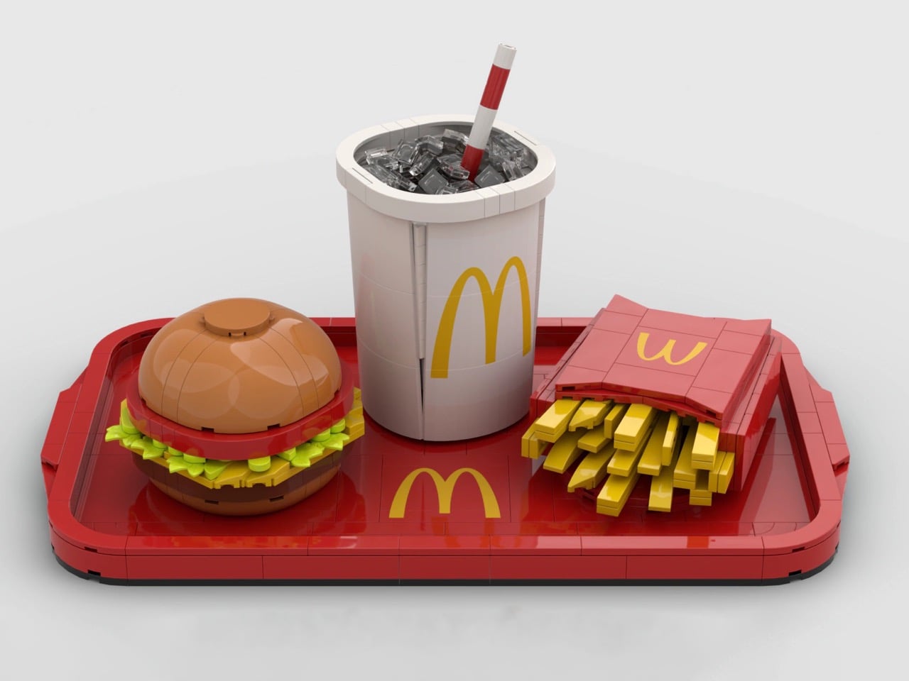
Called McDonald’s Menu, brickbybrick_’s LEGO Ideas submission rebuilds a classic combo big enough to hold its own on a shelf. There’s a red tray with giant Golden Arches in the middle, a cheeseburger, a red carton overflowing with fries, and a white cup loaded with transparent ice and a striped straw. Zero minifigures, zero drive-through, all lunch. The project went up on October 29 and is already sitting at 1,440 supporters, which tells me a lot of AFOLs (adult fans of LEGO) are hungry. I’m one of them, and I’m writing this before lunch.

Designer: brickbybrick_

Red plates form the tray, finished with a raised, rounded rim and a handle at each end, so it reads as molded plastic instead of a stack of bricks. A big yellow set of Golden Arches sits dead center, breaking up what would otherwise be a whole lot of red. The food is arranged in the classic triangle: burger front left, cup at the back, fries off to the right. It’s the exact layout you’d find on any table at your local McDonald’s around noon. That framing makes the build look like a meal someone just set down, which is half the fun of it.

The cheeseburger starts with a dome of tan curved elements, smooth on top like a plain hamburger bun. Under it sits a red layer that reads as tomato, then bright green leaf pieces fanning out as lettuce, a slice of yellow cheese, and a dark brown patty. Those leaves are a nice bit of NPU (nice part usage, for the uninitiated), taking foliage meant for LEGO gardens and jungles and turning it into a salad. Each layer sticks out at slightly uneven angles, giving the burger that freshly squished look of something just pulled from its wrapper. Real fast food never comes perfectly stacked, and this one looks like it survived a lunch rush.

A pile of yellow plates and bricks spills out of the red fry carton at every angle, some standing tall and some flopped over the edge the way the last few always are. The carton gets the real thing’s shape right, the one McDonald’s introduced in 1970 with a wide mouth for quick scooping and a profile that keeps the fries from falling out. The Golden Arches appear on its face in yellow, the same red-and-yellow combo that has been selling fries for over five decades. Building fries in LEGO is easy, but making them look casually messy takes real effort. My only complaint is that I can’t salt them.

My favorite detail, though, is the drink. The white cup’s top is left open, showing a load of transparent pieces packed in as ice, with a red-and-white striped straw sticking out at a jaunty angle. That straw does three jobs at once. It gives the composition its tallest point, adds a splash of red to an otherwise white element, and nods to a real McDonald’s quirk, since the chain says its straws are slightly wider than average so more Coke hits your taste buds. The ice tells its own story, because McDonald’s pre-chills its syrup and sets the ratio expecting the ice to melt. Leaving the lid off is what lets you see all of it.

Back in 2021, adammark’s McDonald’s Franchise 1955-1969, a walk-up burger stand with a Speedee System kitchen, hit 10,000 supporters and reached the Third 2021 Review. It was one of 36 projects in that round, and Hocus Pocus ended up as the only one approved. brickbybrick_ takes a different route, shrinking the subject from a restaurant down to a single meal sized for a shelf. The build is unlicensed, so those Golden Arches are a fan’s tribute, and any official version would need McDonald’s on board. The two companies have teamed up before, going back to LEGO’s first Happy Meal promotion in 1983, so the precedent exists.

McDonald’s Menu currently has 1,440 supporters and 599 days left to reach its next milestone of 5,000. LEGO Ideas runs on community momentum: fans submit their builds, supporters rally behind the ones they love, and projects that hit 10,000 get reviewed by LEGO for a shot at becoming real sets. It’s a long climb for a lunch order, but every Ideas set on store shelves started at zero votes. If you’d like to see this combo in a box, head to the LEGO Ideas page and give it your vote. Personally, I’m holding out for a Super Size edition, which McDonald’s retired in 2004 but LEGO is more than welcome to bring back.

The post This fan-made LEGO McDonald’s combo comes with everything except the McFlurry first appeared on Yanko Design.
  • ✇Yanko Design
  • Midea’s award-winning blender concept can both heat and cool your mixture down
    Picture a blender with a stovetop hidden in its base, so it can turn soybeans into hot soy milk or rice into congee without you touching a pot. Heated blenders like this are a breakfast staple across China, and most share one annoying flaw: the drink comes out scalding, leaving you to blow on it like it owes you money. Midea’s Fully Automatic Air Flow Blender targets that wait with an airflow system designed to help with both cooking and cooling. Midea claims it brings drinks down to 131°F (55°
     

Midea’s award-winning blender concept can both heat and cool your mixture down

6 novembre 2026 à 15:20

Picture a blender with a stovetop hidden in its base, so it can turn soybeans into hot soy milk or rice into congee without you touching a pot. Heated blenders like this are a breakfast staple across China, and most share one annoying flaw: the drink comes out scalding, leaving you to blow on it like it owes you money. Midea’s Fully Automatic Air Flow Blender targets that wait with an airflow system designed to help with both cooking and cooling. Midea claims it brings drinks down to 131°F (55°C) within five minutes of finishing. That’s roughly where breakfast stops being a dare and starts being breakfast.

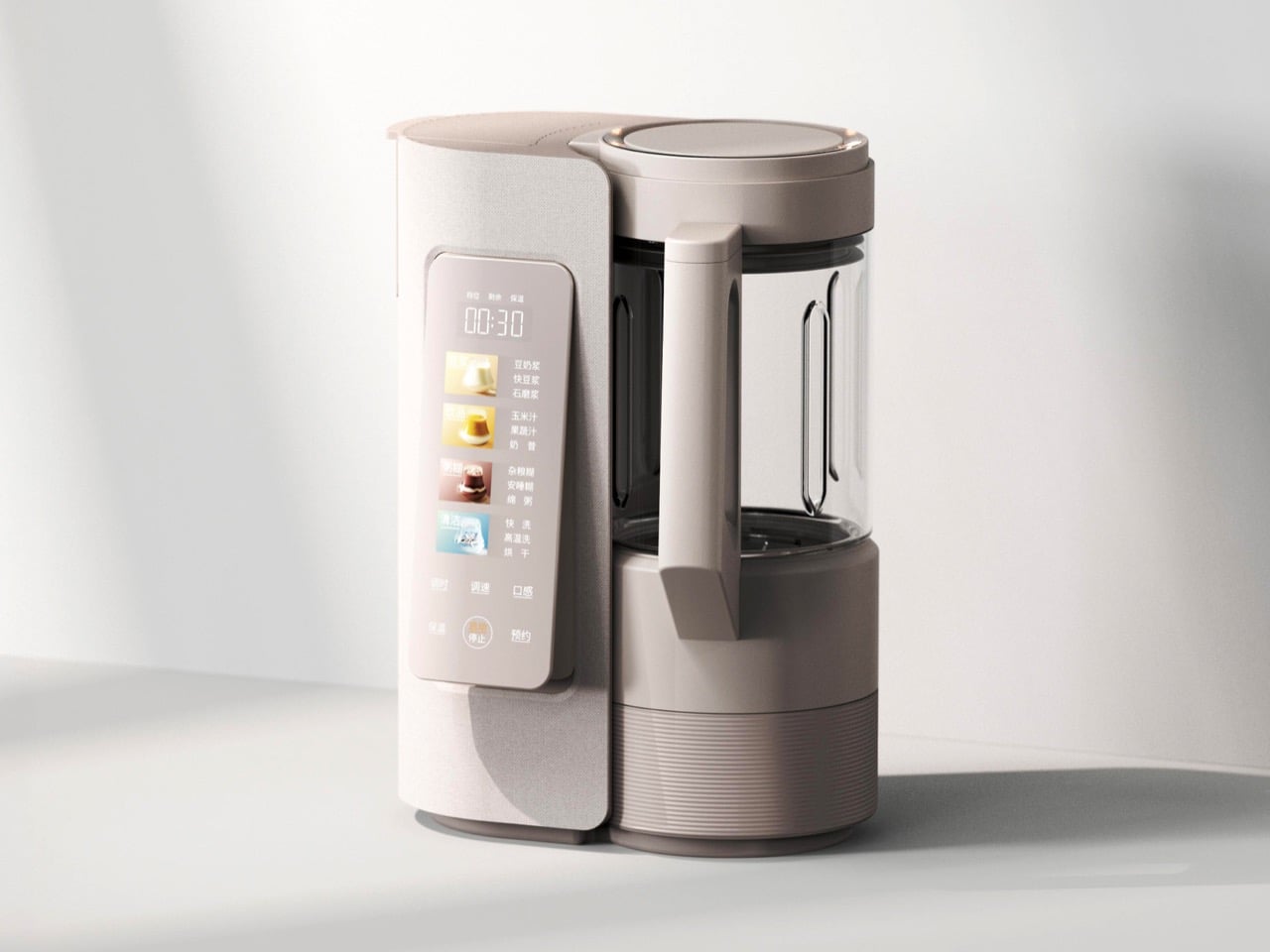
The machine comes from Guangdong Midea Consumer Electric, with a design team led by Peng Xi and Wang Jin, and it received a Red Dot Award: Design Concept 2026 in the Ready for Market track. That track recognizes near-finished products that haven’t reached shelves, judged partly on whether they can realistically ship within a year. Midea says the airflow lets the motor blend at full power without soy milk foaming over. A built-in water tank sits alongside the blending jar, and the linen-textured shell looks ready for a Scandinavian café. The Chinese-language interface suggests a launch in China first, though there’s no word yet on US availability.

Designers: Peng Xi, Wang Jin, Li Qianlun, Jo Jeongmin, Ru Guanhong & Wang Xingzhe

Soybeans contain saponins, compounds that contribute to soy milk’s bubble-bath foam when heated. Heated blenders typically manage this by blending in short bursts and pausing the heat to keep the foam from reaching the lid. That stop-start rhythm helps explain why a batch of soy milk on Midea’s existing machines takes around 30 minutes. The company credits its airflow system with cutting prep time in half, though it hasn’t detailed how the system controls foam.

A freshly cooked batch of soy milk or congee can come out near 212°F (100°C), then sit in the jar cooling a degree at a time while you wait. Midea’s existing heated blenders hold drinks at 131°F (55°C) on keep-warm for up to six hours, so the target is familiar territory for the brand. The new machine’s trick is getting there fast: Midea says cooling takes about five minutes. That’s roughly the time it takes to find your shoes and your keys. Paired with overnight scheduling, it could have freshly made soy milk ready to drink when you wake up.

Visually, the appliance splits into two towers that share a figure-eight footprint. On the left, a linen-textured column holds a water tank that lifts straight out from the top, with a corrugated grip that echoes the ribbed base beneath the glass jar. On the right, the jar wears a copper-colored lid ring that appears to double as a status light. Midea’s description of the surface as a linen texture suggests a molded finish rather than real cloth, a sensible call next to a jar of hot congee. The touch panel flips up for easier reading and carries illustrated buttons for soy milk, juices and milkshakes, porridges, and cleaning, including one porridge program labeled for better sleep.

The closest thing US readers will recognize is the Ninja Foodi Cold & Hot Blender, which pairs an 800-watt heating element with a 64-ounce glass pitcher and sells for around $200 at Walmart. It can cook soup from raw ingredients, but you’re still the one pouring in water and waiting for everything to cool. Midea’s pitch is to automate more of that work, drawing water from the built-in tank and offering a high-temperature wash and drying cycle through the menu. The tank will still need refilling, of course. There’s no price or US release date yet, so this one stays on the wishlist.

The post Midea’s award-winning blender concept can both heat and cool your mixture down first appeared on Yanko Design.

  • ✇Yanko Design
  • Masa’s Wavy Tray Is Sculpture You Can Actually Serve Snacks On
    Six burgers, a pile of fries, and generous spoonfuls of caviar are a pretty good way to explain dumæ’s Masa Tray. In the brand’s photographs, the food sits on a rippling brass surface that looks more like a small sculpture than standard serving ware. I like the slightly ridiculous pairing. It also makes the tray’s purpose clear: give dinner a visually interesting home without adding a separate decorative centerpiece. Designed by Los Angeles brand dumæ and handcrafted in India, Masa addresses th
     

Masa’s Wavy Tray Is Sculpture You Can Actually Serve Snacks On

20 octobre 2026 à 09:20

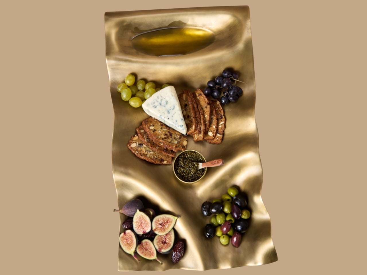
Six burgers, a pile of fries, and generous spoonfuls of caviar are a pretty good way to explain dumæ’s Masa Tray. In the brand’s photographs, the food sits on a rippling brass surface that looks more like a small sculpture than standard serving ware. I like the slightly ridiculous pairing. It also makes the tray’s purpose clear: give dinner a visually interesting home without adding a separate decorative centerpiece.

Designed by Los Angeles brand dumæ and handcrafted in India, Masa addresses that familiar divide between the serving pieces you use and the decorative objects you leave out. Its project description says the brass tray is finished to be food-safe, allowing it to move between both roles. The appeal is having one substantial object that doesn’t need to disappear when everyone finishes eating.

Designer: dumæ

The starting point is the movement of waves, translated into broad rises and shallow dips rather than a literal seashell outline. IADA’s announcement traces the reference to Point Dume, the stretch of coast where dumæ founder Kym Gold grew up. I appreciate that the backstory isn’t required reading. Even without knowing the geography, you can see how the curves break up what could otherwise be a rather stern metal rectangle.

In the close-up photographs, light collects along the higher ridges while the depressions fall into softer shadow. That gives the surface a sense of movement even when it’s covered with crackers and grapes. The edges rise and dip with the rest of the form, so the shape feels continuous rather than decorated afterward. To my eye, that’s the strongest design decision here. The visual interest comes from the tray itself, without needing a pattern applied on top.

Those undulations also deserve a practical look. A sculpted surface offers a different proposition from a flat platter, particularly if you’re arranging small bowls or setting down glasses. I’d treat Masa primarily as a tabletop serving piece rather than assume it’s the ideal tray for carrying drinks across a room. The photographs make a convincing case for loosely arranged food. They don’t establish how securely every vessel would sit, and the distinction matters when the surface is this expressive.

The handcrafting adds another layer. According to the announcement, small differences in form and finish occur from piece to piece. That feels appropriate for a design built around irregular movement; perfect repetition would almost work against the idea. Still, handmade isn’t a performance specification. The individuality is a reason to appreciate the object visually, not evidence that it will resist scratches or survive every kind of use. I’d want the maker’s specific care guidance before treating it as everyday workhorse tableware.

Retail listings put its footprint at approximately 21.5 by 11.5 inches, with a height of 3 inches. That’s worth measuring against your table before imagining a generous spread surrounded by dinner plates. The Happy Kangaroo lists Masa at $595, although it’s marked sold out at the time of writing. At that price, this is a considered decorative purchase with a serving function, and its appeal depends on wanting to see it between meals.

Masa received Platinum recognition in both Kitchen & Dining Room Design and Homewear & Decor at the International Architecture & Design Awards 2026. Those categories neatly reflect its intended overlap: something for the table that can also hold its own elsewhere in the house. The recognition is useful context, though the more persuasive argument is still visible in the photographs: food looks inviting against those broad brass curves.

I’m most persuaded by the burger arrangement. The cheese, figs, and carefully grouped grapes are lovely, but takeout gives the tray a less precious personality. It suggests that owning a sculptural serving piece doesn’t require hosting a perfectly coordinated dinner party. I’d rather see an object like this earn its space under a heap of fries than spend its life waiting for an occasion formal enough to deserve it. The waves are already doing the decorating.

The post Masa’s Wavy Tray Is Sculpture You Can Actually Serve Snacks On first appeared on Yanko Design.

  • ✇Yanko Design
  • This $70 Plate Is for People Who Refuse to Let Fried Food Sit in Its Own Oil
    Now that I’m learning to cook more, I’m pretty excited to experiment with dishes I see online. The results aren’t always ready for other people to try. I still have a lot to figure out. On some days, though, I keep it simple and fry something. That brings up a familiar problem: getting rid of excess oil before the food reaches my plate. Usually, I move it from the pan to a rack or paper towel, then transfer it again when I’m ready to eat. What if I could skip one of those transfers? The Half-Mo
     

This $70 Plate Is for People Who Refuse to Let Fried Food Sit in Its Own Oil

8 octobre 2026 à 07:40

Now that I’m learning to cook more, I’m pretty excited to experiment with dishes I see online. The results aren’t always ready for other people to try. I still have a lot to figure out. On some days, though, I keep it simple and fry something. That brings up a familiar problem: getting rid of excess oil before the food reaches my plate. Usually, I move it from the pan to a rack or paper towel, then transfer it again when I’m ready to eat. What if I could skip one of those transfers?

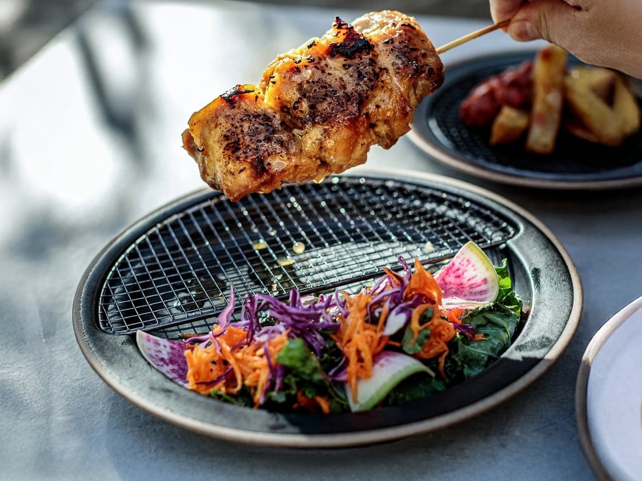
The Half-Moon Plate is more than a nicer way to serve food for a photo. It pairs a ceramic plate with a half-moon-shaped rack that sits over one side. You can place fried food on the rack to let excess oil and moisture drain away while leaving the other side available for a salad, vegetables, rice, or another side dish. Instead of draining food in one place and serving it in another, the plate brings those steps together.

Click Here to Buy Now: Starting at $70

That arrangement matters when timing is everything. If you’ve made tempura, fried chicken, or crispy potatoes, you probably don’t want them sitting in a puddle of oil while you finish getting dinner ready. Elevating the food gives the oil somewhere to go and may help it stay crisp until you eat. You still need to give freshly fried food time to drain; the plate simply gives you a way to do it at the table or as part of your final plating.

I also like that the design doesn’t make the rack the whole story. The open half of the plate leaves room for the rest of the meal, so the fried food doesn’t have to take over. You can see everything together before you sit down, rather than juggling a cooling rack, paper towels, and a separate serving dish. For someone cooking in a small kitchen, or someone who just wants fewer things on the counter, that’s an appealing idea.

The half-moon shape gives the plate its visual identity, but it also creates a natural division between the main dish and its sides. If you’re trying to be more mindful of portions, that division may be a useful visual cue. It won’t measure a balanced meal for you, and draining surface oil doesn’t make fried food automatically healthy. What it can do is encourage you to think about what else belongs on the plate alongside your crispy favorite.

Compared with an everyday dinner plate from a big brand such as IKEA, the Half-Moon Plate asks a little more of its design. A conventional plate gives you one uninterrupted surface and works with almost any meal. This one is more specialized: the rack makes the most sense when food needs to drain or when you want to keep it elevated before eating. That makes it less of an all-purpose replacement for your existing dishes and more of an addition for meals where its distinctive layout earns its place. The plate is listed starting at $70.

Of course, a plate like this won’t eliminate every step. You’ll still need to handle hot food carefully, wait for it to drain, and wash the rack afterward. Those are worth considering if you’re looking for the quickest possible cleanup. But if you already make fried food regularly, combining a draining surface and a serving plate could make the trip from pan to table feel more organized. When you don’t need the rack, you can lift it off and use the ceramic plate on its own. That flexibility is important: a design meant for one kind of meal is easier to justify when it can still be useful on other days. I’d reach for the rack when I’m making something crisp and use the plate by itself when dinner calls for a simpler presentation.

The Half-Moon Plate won’t make me a better cook overnight. I’ll still have to get the timing, seasoning, and frying right. But it does address one small frustration I know well: watching something come out of the pan beautifully crisp, only to wonder where to put it while I finish the meal. If it helps me serve dinner with fewer transfers and a little less fuss, that’s a design choice I can appreciate.

The post This $70 Plate Is for People Who Refuse to Let Fried Food Sit in Its Own Oil first appeared on Yanko Design.

  • ✇Yanko Design
  • Nespresso x Swarovski: A $299 Coffee Machine Nobody Ignores
    Coffee machines have an awkward relationship with the kitchen counter. We need them within reach every morning, but once the coffee is made, many look like appliances we would rather tuck away. The Nespresso x Swarovski collection takes that small design problem seriously. Its crystal-embellished CitiZ Platinum is a machine meant to stay visible, giving the coffee corner a reason to look considered even when nobody is making a cup. That does not mean your morning coffee needs an audience. Most
     

Nespresso x Swarovski: A $299 Coffee Machine Nobody Ignores

4 octobre 2026 à 11:20

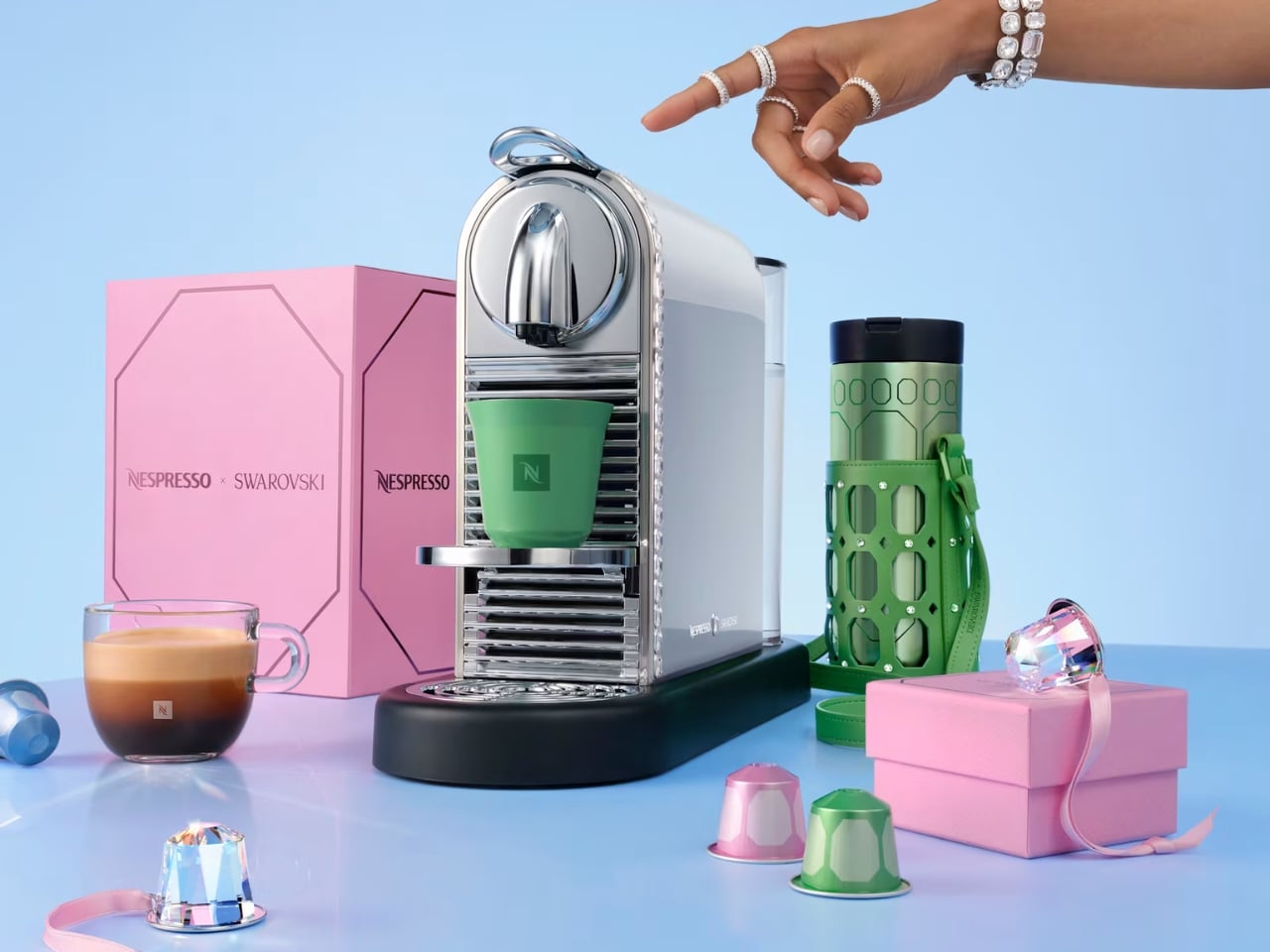
Coffee machines have an awkward relationship with the kitchen counter. We need them within reach every morning, but once the coffee is made, many look like appliances we would rather tuck away. The Nespresso x Swarovski collection takes that small design problem seriously. Its crystal-embellished CitiZ Platinum is a machine meant to stay visible, giving the coffee corner a reason to look considered even when nobody is making a cup.

That does not mean your morning coffee needs an audience. Most of us just want a reliable routine before the day gets loud. But a machine that sits out all day affects how a kitchen feels long after its job is done. I like the idea of treating that presence as part of the design, rather than pretending a frequently used appliance can somehow vanish between cups.

Designer: Nespresso x Swarovski

The limited-edition CitiZ Platinum has a silvery finish, with Swarovski crystals placed around its border. It is a noticeable change, though the machine remains recognizable as a CitiZ Platinum. That balance matters. Covering every surface in sparkle might make for a memorable photograph, but the more useful question is whether you would enjoy seeing it beside your favorite mugs on an ordinary Tuesday.

For me, the answer has less to do with luxury than with attention. Kitchens collect objects by necessity: a toaster, a kettle, a jar of spoons, the mug that never quite makes it back into the cabinet. A crystal-accented coffee machine cannot tidy that counter for you. It can, however, make one of its most permanent residents feel intentional.

The collaboration stretches beyond the machine. Nespresso and Swarovski have carried the festive look into coffee, accessories, and capsule-inspired ornaments. The collection’s packaging draws on Swarovski’s octagonal shape and color palette, so the visual idea follows you from the machine to the smaller things around it. I appreciate that continuity. A special-edition appliance can feel oddly isolated when everything accompanying it looks like business as usual.

There are limited-edition coffees in the collection, too, including Crystal Spark options for Nespresso’s Original and Vertuo systems. That gives the partnership a place in the cup as well as on the counter, though I would keep the two appeals separate. The crystals are a design choice, not a claim that the machine brews better coffee because it has been dressed up.

That distinction makes the product easier to appreciate. You do not have to believe every appliance needs a glamorous makeover to see who this is for. If you have spent time arranging a coffee station, choosing cups you enjoy holding, or finding a spot where the morning light hits just right, the machine fits into an interest you already have. It offers convenience without asking you to give up the pleasure of looking at your space.

It also makes sense as a gift for someone who already has very specific tastes. Coffee can be hard to buy for another person, especially when their preferred capsules and flavors are settled. A design-led machine is a more personal gesture, provided you know it suits their setup. I would check compatibility and availability before getting attached to the idea, particularly with a limited-edition collection.

Of course, sparkle is a matter of taste. Some kitchens look best with almost nothing on the counter; others are happier with color, collections, and objects that start conversations. This CitiZ Platinum belongs to the second group. It asks for a little space and attention, and that is either its charm or a good reason to admire it from afar.

What makes the Nespresso x Swarovski collection interesting is its modest premise beneath all the shine: everyday tools deserve design consideration, too. The machine still has coffee to make. But when that job is done, it remains part of the room. For anyone tired of choosing between a useful counter and a beautiful one, that is a lovely place to start.

The post Nespresso x Swarovski: A $299 Coffee Machine Nobody Ignores first appeared on Yanko Design.

  • ✇Yanko Design
  • L’Objet Secretly Built Its Best Tableware Around a Single Shell
    I’ve always thought shells are underrated as design references. They’re one of nature’s most perfect spirals, built by something soft and unassuming, yet the shape ends up looking engineered on purpose. L’Objet and jewelry designer Jessica McCormack clearly feel the same way, because their new collaboration turns that spiral into the backbone of an entire tableware collection, and it works because the shape never feels decorative for its own sake. It feels structural, like the whole line was bu
     

L’Objet Secretly Built Its Best Tableware Around a Single Shell

19 septembre 2026 à 09:20

I’ve always thought shells are underrated as design references. They’re one of nature’s most perfect spirals, built by something soft and unassuming, yet the shape ends up looking engineered on purpose. L’Objet and jewelry designer Jessica McCormack clearly feel the same way, because their new collaboration turns that spiral into the backbone of an entire tableware collection, and it works because the shape never feels decorative for its own sake. It feels structural, like the whole line was built around it rather than sprinkled with it.

The problem this collection solves is a simple one. Most home collections borrow a motif and slap it everywhere until it loses meaning. A shell shows up on a napkin ring, then again on a candle, then again on a coaster, and by the third repetition it’s just noise. McCormack and L’Objet avoid that trap by treating the shell and its spiral as a load-bearing idea rather than a sticker. The swirl becomes a vase, its opening tilted just enough that flowers spill out at an angle instead of standing at attention. The same spiral, cast in gold, becomes a standalone object on a pedestal, polished until it looks like something pulled from a jewelry vitrine rather than a shelf.

Designer: Jessica McCormack

What sells the whole thing is the rope detail running through nearly every piece. Twisted cord, the kind you’d expect on a jewelry clasp or the trim of an old evening bag, wraps around the rim of an ice bucket, lines the edge of gold-rimmed plates, and forms the handle on a champagne cooler tucked into a velvet scallop-back chair in one of the campaign shots. It’s a small, consistent gesture, and that consistency is what makes the collection read as a single idea rather than a grab bag of pretty objects. You see the rope on the frame of a picture, then again on the handle of a fish server, and your eye starts connecting dots without anyone telling you to.

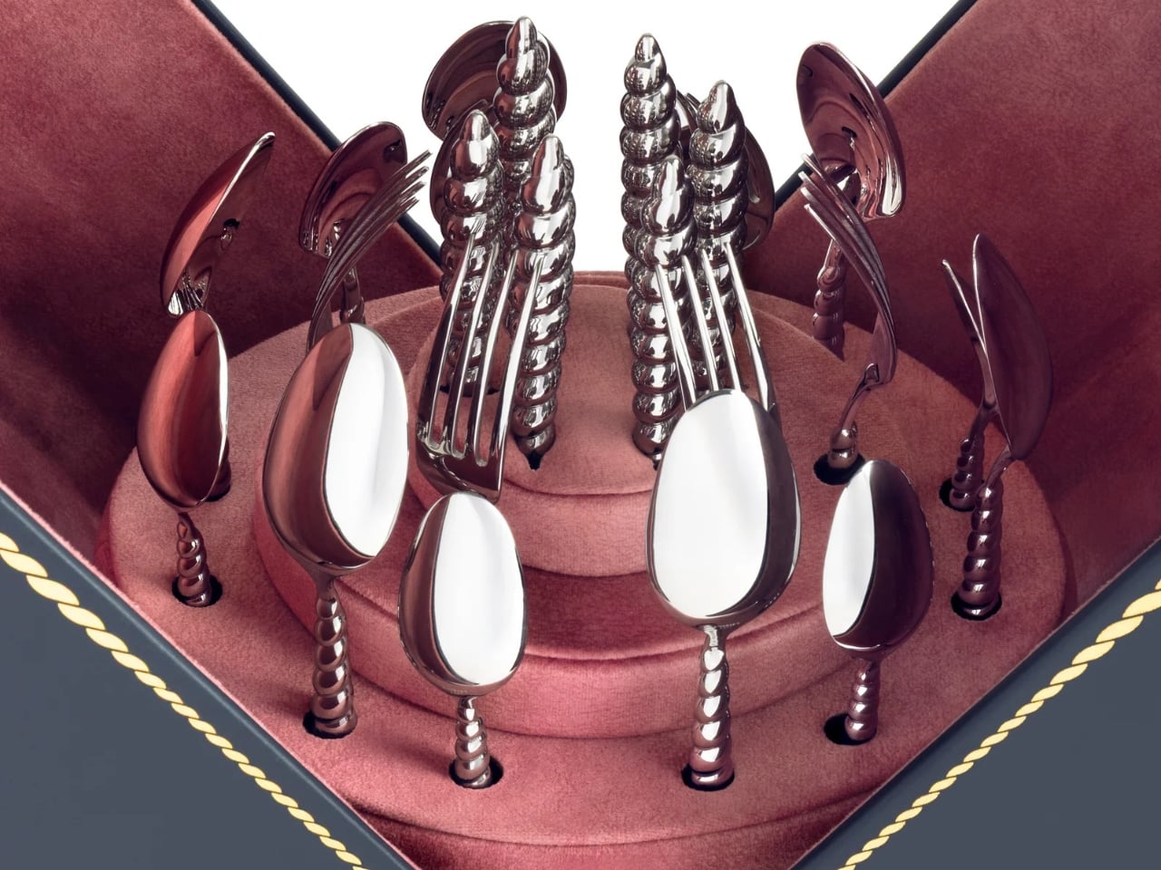
That fish server is part of the collection’s biggest milestone, even if it doesn’t announce itself as one. This marks L’Objet’s first-ever cutlery collection, and the brand chose to debut it wrapped entirely in the shell-and-rope language rather than starting with something safer. The flatware handles curl into spiraled shells, cast in the same gold finish as the rest of the tableware, so a fork looks less like an accessory to the collection and more like a piece of jewelry that happens to also feed people. For a house that’s spent years building a name in porcelain and glass, launching into cutlery through this particular design vocabulary feels less like a cautious first step and more like a statement about what the shape can do.

The serving pieces are where the shell shape gets the most literal, and that’s the right call. A bowl shaped like a conch shell, glazed in white with a gold-lined interior, holds a pile of cherry tomatoes in one shot and looks completely at home doing it. It’s not pretending to be a jewelry box. It’s a bowl that happens to have grown out of a shape usually reserved for something you’d wear. Two shell-handled forks pierce a pair of roasted fish on a rope-trimmed platter in another image, and the detail barely announces itself. You’d have to be looking for it. That’s the quiet confidence running through this whole release. Nothing here is shouting for attention, even when the materials, fine porcelain, hand-gilded gold, polished metal, would give it every right to.

McCormack’s jewelry has always leaned into antique reference points without feeling costumey, and that instinct translates cleanly into tableware, cutlery included. Her Georgian-era motifs, the twisted rope, the shell curves, were never really about the ocean specifically. They were about movement frozen into something solid, the same way a chain looks like it’s still swaying even when it’s sitting still on a table. L’Objet’s Mediterranean sensibility meets that idea halfway, and the result feels less like two brands cross-promoting and more like two people who see the same shape in different materials and decided to build a table setting, flatware and all, out of the overlap.

None of this needed a marine theme to feel cohesive. Shells and spirals could easily have read as a summer gimmick, gone by September. Instead they’re used as structure, the same way a good building leans on a repeated column rather than a repeated slogan. A gold-rimmed teacup, a swirl-handled vase, a shell-handled fork resting beside a scallop-backed chair holding an ice bucket shaped like the same curve, none of it needs an explanation once you notice the pattern. It just clicks into place, the way a good spiral always does, curling back toward its own center without ever quite repeating itself.

The post L’Objet Secretly Built Its Best Tableware Around a Single Shell first appeared on Yanko Design.

  • ✇Yanko Design
  • Miele’s G8 Dishwasher Photographs Your Dirty Dishes Before Auto-Selecting The Cycle: Hands-on at IFA 2026
    Miele’s new G8 Diamond snaps a photo of your dirty dishes before it washes them. The moment the door swings toward shut, a light inside blinks on, a camera grabs one frame, the light dies, and the AutoVision system studies what it caught. If it sees a bottle, it calls up BottleClean and drives the spray harder. If it sees a pot, the cleaning intensity climbs. If it sees plastics, it runs the new hot air drying harder, because plastic containers are famously terrible at drying themselves. Miele
     

Miele’s G8 Dishwasher Photographs Your Dirty Dishes Before Auto-Selecting The Cycle: Hands-on at IFA 2026

2 septembre 2026 à 18:30

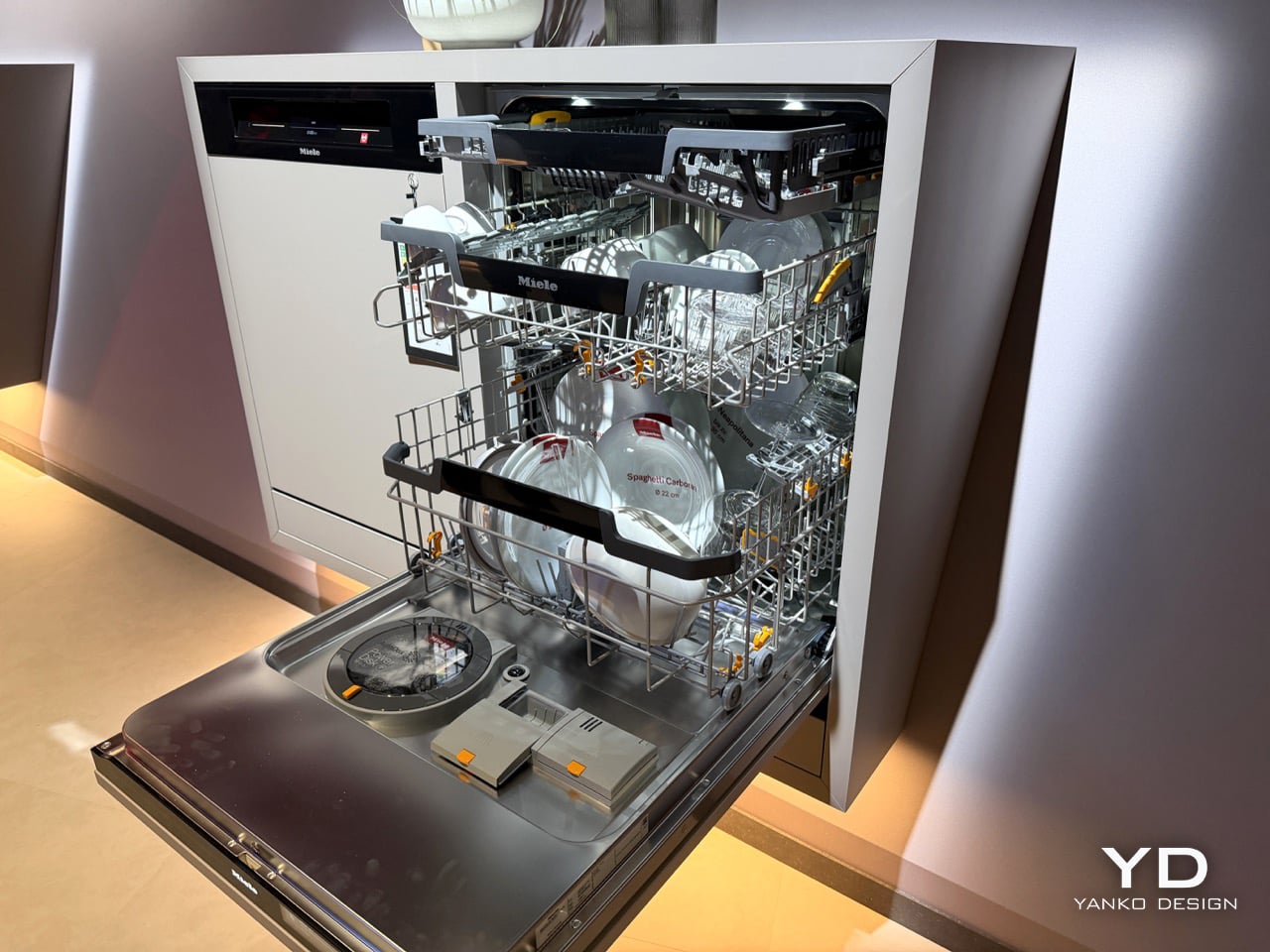
Miele’s new G8 Diamond snaps a photo of your dirty dishes before it washes them. The moment the door swings toward shut, a light inside blinks on, a camera grabs one frame, the light dies, and the AutoVision system studies what it caught. If it sees a bottle, it calls up BottleClean and drives the spray harder. If it sees a pot, the cleaning intensity climbs. If it sees plastics, it runs the new hot air drying harder, because plastic containers are famously terrible at drying themselves. Miele showed it for the first time at IFA 2026 in Berlin, and it lands in Germany, Austria and Switzerland in April 2027.

A camera in a dishwasher makes the headline, but the memory is what makes the design. The G8 holds onto that bottle it clocked at breakfast, so stacking dinner plates on top of it by eight in the evening changes nothing. Layer in AutoDos and its PowerDisk granulate, measuring out its own detergent since 2018, then set an app rule that says wait until 80 percent full and never before 10pm, and the machine stops consulting you altogether. Miele has spent decades selling dishwashers on the promise that they scrub so you do not have to. This one wants to think so you do not have to.

Designer: Miele

Here’s the part that actually impressed me. AutoVision doesn’t run a video feed you can scrub through in the app. It fires once, right as the door clicks shut, and the machine works from that single image for the entire cycle. Load a wine bottle at breakfast, stack it under a mountain of lunch plates by evening, and the G8 still treats it as a bottle, because it saw it once and that was enough. The only real caveat came from Miele’s own team at IFA: keep bottles roughly central and pots in the lower basket, since the spray arm still struggles to reach the far corners. Vision only helps if the water can follow it there.

What makes this genuinely new isn’t the word AI, which every appliance brand at IFA 2026 was throwing around like confetti. Most of those claims are turbidity sensors, the kind that read how murky the wash water has become and adjust accordingly. LG’s SenseClean works that way, and Samsung has filed similarly around soil detection. A turbidity sensor knows the water is dirty. It has no idea why. Miele’s camera identifies the actual object sitting in the rack, a considerably harder computer vision problem, and one that both LG and Bosch have patented around for years without shipping a consumer dishwasher built on it. Miele is putting an object-recognition camera inside a box you can buy next spring, not just inside a patent filing.

Around that camera sits a decade of quieter automation finally clicking into place. AutoDos, with its PowerDisk granulate, has been dosing detergent on its own since 2018, and Miele still claims nobody else in the category offers true automatic dispensing. ExcellentDry adds a hot air system with three fixed levels, chosen once and then applied forever, aimed squarely at the plastic containers that usually come out of a cycle still damp at the base. The cutlery drawer becomes a genuine third tier, one side droppable for coffee cups, and a new touch display replaces the old dial logic. Set the app to run only past 10pm and only above 80 percent full, or tie it to your solar output, and the dishwasher stops asking permission for anything.

None of this works if you don’t trust the camera’s judgment, and Miele knows it. “Intelligence can be programmed. Trust has to be earned,” said Dr. Axel Kniehl, the company’s Executive Director of Marketing and Sales, at the IFA press conference, and it’s the one line from the whole reveal that actually admits the stakes. AutoVision only functions if enabled by the user, according to Miele’s own release, which suggests it ships switched off by default. Fair enough. Handing a machine the authority to decide how hard to scrub your grandmother’s pans is a bigger ask than letting it dose its own detergent, and Miele seems to know it needs to earn that permission slowly rather than assume it.

The G8 Diamond won’t reach a single kitchen before April 2027, and even then only in Germany, Austria and Switzerland, so everything here is still a promise rather than a lived-in product. But the promise is the interesting part. For a century, appliance makers competed on how much physical labor they could remove. Miele is the first one at this scale betting the next fight is over who you trust to make the fifty tiny decisions labor never touched in the first place.

The post Miele’s G8 Dishwasher Photographs Your Dirty Dishes Before Auto-Selecting The Cycle: Hands-on at IFA 2026 first appeared on Yanko Design.

❌