Vue normale

Il y a de nouveaux articles disponibles, cliquez pour rafraîchir la page.
À partir d’avant-hierFlux principal

G-Shock Just Turned a Japanese Paper Lantern Into Wearable Art

Par : Ida Torres
19 juin 2026 à 19:15

G-Shock has always known how to make a statement. From its reckless-by-design origins in 1983 to its cult status across military barracks, skate parks, and high-fashion runways, the brand has never really needed to justify itself. It just shows up. But with the new Aka-Chochin collection, built around the DW-5600AKA-4 and DW-6900AKA-4, G-Shock isn’t just showing up. It’s glowing.

The concept behind these two watches is, genuinely, one of the more thoughtful design moves I’ve seen from the brand in a while. “Aka-Chochin” translates to “red lantern,” a reference to the traditional paper lanterns that hang outside izakayas, the beloved Japanese taverns where people gather after long days for food, drinks, and the kind of conversation that only happens past 9 p.m. These lanterns, which date back to the early Edo period in the 17th century, weren’t decorative in the precious sense. They were practical and symbolic at once, signaling warmth, welcome, and the specific pleasure of slowing down. Casio took that idea and pushed it into two of its most iconic silhouettes.

Designer: G-Shock

The result is unapologetically red. Not a subtle, wine-at-dinner red. A full-on, stop-what-you’re-doing red that covers the resin case, bezel, and band from top to bottom. On paper, it sounds like a lot. In practice, it earns its confidence. Both watches carry kanji characters down the face of the dial, reading “耐衝撃,” which means “shock resistance,” one of G-Shock’s founding promises. The characters are split between the bezel and the LCD display, and when the LED backlight activates, the two halves complete each other like a puzzle piece lighting up from within. It’s a detail you have to see in person to fully appreciate, and it’s the kind of thing that elevates a colorway from a gimmick to a genuine design choice.

The bezels on both models also feature hot-stamped grooves that mimic the ribbed texture of a paper lantern, and that same motif carries through to the edges of the strap. It’s not subtle, but it is cohesive. G-Shock committed to the bit, and the commitment pays off.

Now, I’ll say this upfront: the Aka-Chochin aesthetic is polarizing. All-red anything tends to divide opinion, and a digital watch in this colorway is not trying to blend in. If your instinct is to gravitate toward muted, understated timepieces, these are probably not for you, and that’s fine. But if you’ve ever wanted a watch that reads as confident and culturally curious at the same time, the DW-5600AKA-4 and DW-6900AKA-4 make a genuinely compelling argument.

The choice of silhouettes is also worth noting. The DW-5600 is essentially G-Shock’s origin story made physical, the square case that started everything, a design so clean and deliberate it has barely needed updating in four decades. The DW-6900 is its more expressive sibling, with that distinctive triple-window dial and wider case presence. Pairing both with the same concept gives collectors and casual buyers alike an entry point, whether you’re drawn to the classic restraint of the 5600 or the bolder graphic energy of the 6900.

At $190 each, neither watch is a budget impulse buy, but it’s not a stretch, either. G-Shock has always occupied that interesting middle ground between functional tool watch and cultural artifact, and the Aka-Chochin collection lands squarely in that territory. You’re not just buying a watch that tells time reliably. You’re buying into a very specific idea about where design, heritage, and streetwear culture converge.

Red lanterns were built to be seen at night, to cut through the dark and draw people in. G-Shock’s interpretation of that idea works for the same reason. Bold doesn’t have to mean reckless. Sometimes it just means knowing exactly what you want to say and saying it clearly, wrist and all.

The post G-Shock Just Turned a Japanese Paper Lantern Into Wearable Art first appeared on Yanko Design.

This Luxury Italian Watch Has a Triple-Axis Tourbillon and Looks Like a Ferrari Dashboard

Par : Sarang Sheth
7 avril 2026 à 20:30

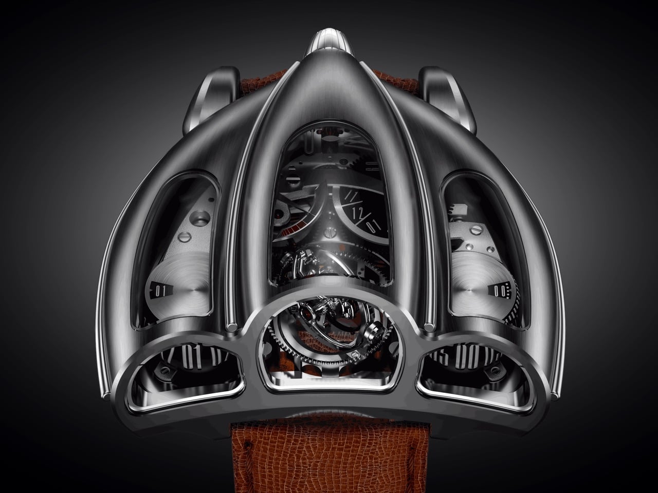
Old sports cars had analog instrument clusters that told you everything through three or four circular gauges mounted in brushed metal housings, each dial showing a different slice of what the engine was doing at any given moment. The information was direct, mechanical, and laid out with the kind of functional clarity that only made sense if you understood how the car worked. Tachometers sat next to oil pressure gauges, fuel levels next to coolant temps, all of it visible through a steering wheel while you were doing 140 km/h on a mountain pass. Desder’s D001 takes that exact visual language and translates it into a wristwatch with a triple-axis tourbillon spinning where the tachometer used to be.

The watch displays time on two separate cylinders, one for jumping hours and one for continuous minutes, flanked by a GMT indicator on the right and a power reserve gauge on the left. Luca Soprana, the master watchmaker who cofounded the Ateliers 7h38 workshop that builds complications for Jacob & Co, designed the caliber with the same obsessive attention to architectural clarity that defined mid-century dashboard design. Mo Coppoletta, the tattoo artist and designer behind collaborations with Bulgari and Montblanc, shaped the case to follow the teardrop aerodynamics of 1920s and 1930s race cars. The watch debuted in April 2026 from Modena, in the heart of Italy’s Motor Valley, limited to six unique pieces. The case wraps around the movement like a coachbuilt body over a chassis, every surface flowing from the mechanical geometry underneath.

Designers: Mo Coppoletta, Luca Soprana (Desder)

Soprana’s caliber is a study in mechanical complexity made legible. The triple-axis tourbillon sits dead center, rotating on three independent axes to counteract gravitational effects on timekeeping accuracy. The movement beats at 3Hz with a 45-hour power reserve, hand-wound through a crown that feels more like a machine interface than a watch component. German silver forms the mainplate and bridges, chosen for its rigidity and traditional finishing properties. Titanium components reduce weight where it matters, while phynox, a high-performance alloy known for extreme strength and corrosion resistance, handles stress points. The entire movement comprises 465 parts, every single one made by hand in Soprana’s Vaumarcus atelier near Neuchâtel. The jumping hour mechanism snaps forward with the kind of mechanical decisiveness that makes you want to watch it cycle through an entire day.

The case construction follows Italian coachbuilding philosophy, where form and function develop together rather than in sequence. Coppoletta designed the case around the movement’s architecture, letting the mechanical volumes dictate the external silhouette. The teardrop shape references 1920s and 1930s aerodynamics, when wind tunnel testing was still a decade away and designers shaped metal based on intuition about airflow. Flowing surfaces connect the cylindrical time displays, each one sitting under domed sapphire crystal that distorts and magnifies depending on viewing angle. The brushed metal finish catches light the way a hand-formed fender does, with subtle variations in surface texture that reveal the construction process. Sculpted lugs integrate directly into the case body without visible seams, continuing the coachbuilt language where every panel flows into the next.

Each of the six pieces carries subtle variations that make it genuinely unique. Coppoletta, whose background in tattooing taught him to treat every commission as an individual artwork, approached each watch as a separate design exercise within the same architectural framework. Different finishing patterns on the case, variations in how the sapphire crystals dome over the displays, minor differences in how the lugs taper into the case body. These aren’t the superficial variations you get when a brand changes dial colors across a limited run. These are structural differences that change how the watch sits on a wrist and how light interacts with the metal surfaces.

The D001 competes with MB&F and Greubel Forsey in the kinetic sculpture category, but carves its own space by grounding the design in automotive heritage rather than abstract futurism. Where MB&F builds machines that look like they belong in science fiction and Greubel Forsey chases chronometric precision with architectural movements, Desder anchors everything in the tangible history of Italian industrial design. The watch references a specific moment when cars were still shaped by hand and instruments were analog by necessity. Pricing is on request, which in this category typically signals seven figures. For collectors who view watches as functional art and value radical design integrated with mechanical innovation, the D001 delivers both. Just don’t expect to wear it through airport security without some explaining.

The post This Luxury Italian Watch Has a Triple-Axis Tourbillon and Looks Like a Ferrari Dashboard first appeared on Yanko Design.

❌
❌