Vue normale

  • ✇Yanko Design
  • Your iPhone’s Portrait Mode Was Fake for a Decade – The iPhone 18 Pro Changes That With A Real Aperture
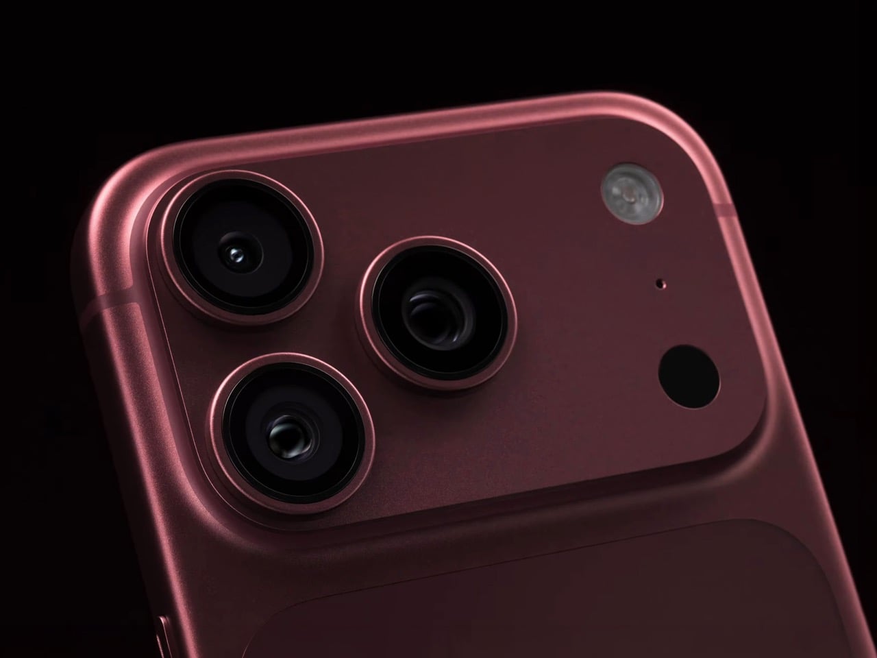
    Would you be shocked to hear that the “Portrait Mode” on your iPhone all these years was ‘fake’? Well, it’s real as in the background is actually blurred, but it isn’t blurred because the camera captured it that way, it’s all been software trickery for the past decade… until now. Six laser cut blades, each thinner than a human hair, are about to change that. The iPhone 18 Pro’s new main camera can physically open and close its lens for the first time in iPhone history, and that single mechanica
     

Your iPhone’s Portrait Mode Was Fake for a Decade – The iPhone 18 Pro Changes That With A Real Aperture

9 septembre 2026 à 18:30

Would you be shocked to hear that the “Portrait Mode” on your iPhone all these years was ‘fake’? Well, it’s real as in the background is actually blurred, but it isn’t blurred because the camera captured it that way, it’s all been software trickery for the past decade… until now. Six laser cut blades, each thinner than a human hair, are about to change that. The iPhone 18 Pro’s new main camera can physically open and close its lens for the first time in iPhone history, and that single mechanical change rewrites how the blur behind your subject actually gets made.

Here’s the quick version of how Portrait Mode has worked since 2016. Your iPhone takes the shot, uses a second lens or depth data to figure out roughly where you end and the background begins, then runs software over the image to blur everything behind that outline. It’s a clever guess dressed up as photography, and it’s why hair strands sometimes disappear into a smudge or a stray earring gets blurred along with the wall behind it. The new aperture system skips the guessing entirely. The lens itself controls how much of the scene stays sharp, the same way it’s always worked on a real camera.

Designer: Apple

So how does a phone this thin pull off something that usually needs a chunky lens barrel? Apple built a system of six laser cut blades, each one thinner than a strand of hair, arranged around the main lens and moved by a tiny rotor mechanism. Together they shift the aperture through four stops, all the way down to f/1.48, with the camera defaulting to a f/1.8 for everyday portraits and opening or closing automatically depending on what it’s looking at. In low light it opens wider to pull in around 50 percent more light, which should mean cleaner night shots and sharper astrophotography without cranking up the ISO and adding grain.

Because this is optical now instead of computational, the depth falls off the way it would on an actual camera lens. Hair, glasses, jewelry, the fine stuff that always tripped up the old software blur, should render properly instead of getting smeared into the background by accident. Close the aperture down and you get more of the scene in focus for group shots, which is the same tradeoff photographers have been making with real cameras for a century. It’s just that now your phone gets to make that tradeoff too.

Apple didn’t stop at making the hardware smarter, it also handed a lot of that control directly to you. The redesigned camera app now includes Pro Controls, letting you manually pick one of the four aperture settings yourself, check exposure with an actual histogram, dial in white balance, and adjust shutter speed for motion blur or freeze frame shots. Third party camera apps are getting access to the same aperture system through an updated API, so this isn’t going to stay locked inside Apple’s own app for long. Photography folks who like getting hands on with their settings finally have a real reason to poke around the camera app instead of leaving everything on auto.

The upgrade carries over into video too. Cinematic mode effects can now be applied after you’ve already shot the footage, and it supports 60fps for smoother half speed slow motion. Time-lapse jumps to 4K with Dolby Vision HDR. None of that depends directly on the aperture blades, but it’s part of the same larger push this year to hand serious creative control to people who just want to point their phone and shoot something that looks intentional.

All of this sits inside a redesigned Pro body that now uses color matched aluminum and back glass, available in Black, Silver, the new Glacier, and a genuinely gorgeous Burgundy that photographs beautifully next to the camera module. The iPhone 18 Pro starts at $1,199 and the Pro Max at $1,299, both up for preorder September 12 and shipping September 18. For a feature that lives entirely inside a few hair thin blades you’ll never actually see moving, it might end up being the most noticeable camera change Apple has made in years.

The post Your iPhone’s Portrait Mode Was Fake for a Decade – The iPhone 18 Pro Changes That With A Real Aperture first appeared on Yanko Design.

  • ✇Yanko Design
  • Apple’s Coolest Watch Feature Has Nothing To Do With Health… It Lets You Rewind Time.
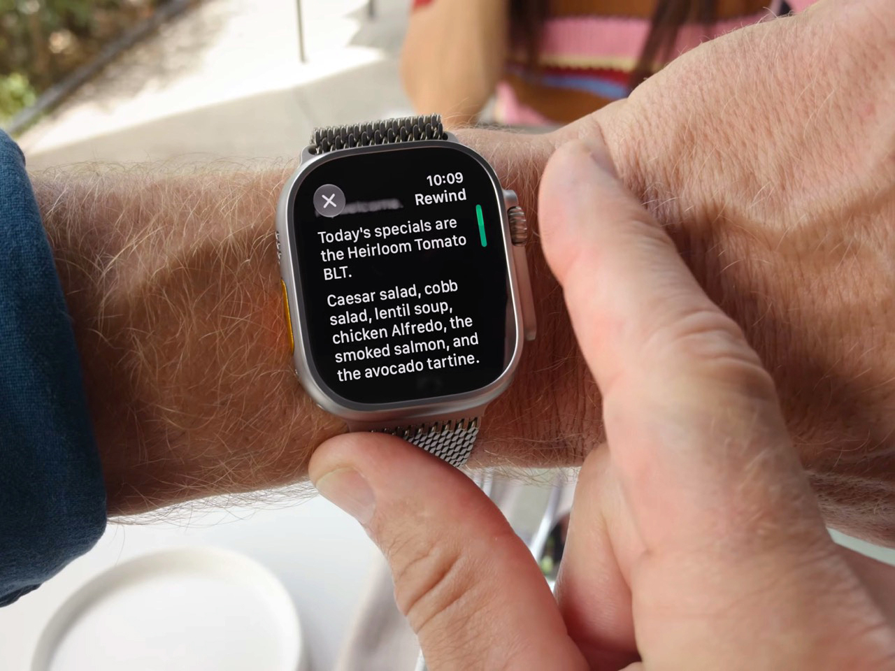
    “Could you come again?” “Pardon?” “Huh?” “Wait, say that one more time?” These are examples of phrases that make you seem dumber than you really are. Nothing destroys aura more than unironically asking someone to repeat something they said because A. you weren’t listening, or B. you were but just didn’t happen to comprehend what they were saying. Apple has a solution for that, and it’s wrapped up in their latest smartwatch. The new Live Rewind feature, powered by Apple’s new S11 chip, allows yo
     

Apple’s Coolest Watch Feature Has Nothing To Do With Health… It Lets You Rewind Time.

9 septembre 2026 à 16:30

“Could you come again?” “Pardon?” “Huh?” “Wait, say that one more time?” These are examples of phrases that make you seem dumber than you really are. Nothing destroys aura more than unironically asking someone to repeat something they said because A. you weren’t listening, or B. you were but just didn’t happen to comprehend what they were saying. Apple has a solution for that, and it’s wrapped up in their latest smartwatch. The new Live Rewind feature, powered by Apple’s new S11 chip, allows you to instantly transcribe the past 15 seconds of any conversation and read its chat logs. Press the digital crown on the new Watch twice, and you pretty much get ‘subtitles’ for the past 15 seconds, so you don’t have to “excuse me” your way into a repetition.

Your watch, just like your phone, earbuds, smart speaker, and smart home hub, is always listening. It’s waiting for the magic words “Hey Siri” or Alexa, or Google depending on which ecosystem you’re tied into. The point is, it’s always listening, so Apple simply created a way to package that into a feature that feels impressive rather than invasive. Think of how a dashcam can auto-log the past 3 minutes of video AFTER an accident occurs (using a feature called loop recording), Apple just brought that to your watch, packaged as a part of its new Audio Intelligence suite of features. Impressive, no?

Designer: Apple

Once you’ve got the transcript, you can ask Siri about it directly, or save it into the new Siri app to dig up later. Say your coworker rattles off a Wi-Fi password or a colleague mentions a book recommendation mid-hallway chat. Instead of fumbling for your phone, you catch it on your wrist and move on. Apple says none of this gets recorded in the traditional sense. Audio flows into a secure buffer inside the S11’s Secure Exclave, a hardware compartment isolated from the rest of the system, and once the transcript is generated, the raw audio is gone. No file, no clip, nothing to subpoena, because nothing exists.

Sitting next to Live Rewind is Siri Recap, which does the same basic trick but for an entire conversation instead of a 15 second clip. Turn it on before a meeting or a parent teacher conference, and Apple Intelligence quietly builds a title, a summary, and a list of key points you can review afterward in the Siri app. You control the boundaries here more than you’d expect. Leave it running all day, schedule it for work hours only, or flip it off entirely from Control Center whenever the conversation turns private. Summaries auto delete after seven days unless you save them, and saved ones sync end to end encrypted, so not even Apple can read them back.

Audio Intelligence isn’t just built for eavesdropping on your own life. Sound Recognition listens for sirens, alarms, doorbells, and crying babies, then buzzes your wrist even when your phone is nowhere nearby, which makes it a genuinely useful accessibility tool for anyone who is deaf or hard of hearing. Shazam gets folded in too, sitting in the Smart Stack and naming whatever song is playing around you without you having to pull out a phone. Four features, one microphone, and one chip doing the quiet work behind all of them.

Both Live Rewind and Siri Recap need Siri AI to function, and Siri AI is still in beta, so expect this to roll out gradually starting in English before other languages follow. You’ll also need an iPhone 16 or newer paired to the Watch, so the 16e and anything older is out of luck. Apple Watch Series 12 itself starts at $399, is available for preorder today, and ships September 18. The health sensors got a real upgrade this generation too, but for once, that isn’t the headline. The mic is.

The post Apple’s Coolest Watch Feature Has Nothing To Do With Health… It Lets You Rewind Time. first appeared on Yanko Design.

  • ✇Yanko Design
  • The iPhone Duo just killed the Dynamic Island, the SIM tray, and the demand for an iPad Mini
    Spare a thought for the iPad Mini, which had a perfectly good career until this morning. Apple’s $1,999 iPhone Duo arrives October 23 with a 7.6-inch inner display that takes Apple Pencil with USB-C later this year and runs two apps side by side, which covers roughly everything the Mini was for, except the Mini does not fit in your jeans. It also killed the dynamic island, swapping it for a punch hole outside and a FaceTime camera tucked under the inner screen. And it killed the SIM tray worldw
     

The iPhone Duo just killed the Dynamic Island, the SIM tray, and the demand for an iPad Mini

9 septembre 2026 à 15:11

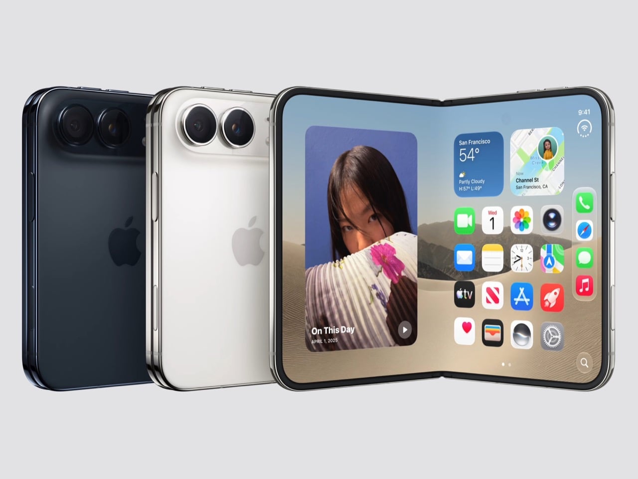
Spare a thought for the iPad Mini, which had a perfectly good career until this morning. Apple’s $1,999 iPhone Duo arrives October 23 with a 7.6-inch inner display that takes Apple Pencil with USB-C later this year and runs two apps side by side, which covers roughly everything the Mini was for, except the Mini does not fit in your jeans. It also killed the dynamic island, swapping it for a punch hole outside and a FaceTime camera tucked under the inner screen. And it killed the SIM tray worldwide, because the thinnest iPhone ever made had no room left for sentiment.

Apple never announces any of this. It ships the replacement and lets the old thing stop making sense on its own schedule. The Duo is a whole product built out of things Apple decided to stop carrying, and the interesting part is how little you miss any of them once you see what moved into the empty space. John Ternus called it the most transformational change to iPhone since the original, which I not only agree with, I think I’d take it a step further by saying – this is such a dramatic leap for the iPhone that it stops being an iPhone. It isn’t an iPad either. It’s something completely different.

Designer: Apple

Apple refused to build a squarish slab that happens to close, and said so from the stage, calling out rivals whose square inner screens box movies into oversized black bars. The Duo lands at roughly passport size, with an asymmetric profile: two rounded corners on the right, squared geometry at the hinge. That asymmetry does something clever, because it tells your hand which edge to open before your brain gets involved. It reads like a small hardcover you want to crack open, which is a strange compliment to pay a phone. Somebody fought for that shape in a review meeting, and I am glad they won.

Both displays share a single aspect ratio, which is the decision the whole product rests on. Closed, the 5.4-inch outer panel delivers 90 percent of an iPhone 18 Pro’s screen area, so it works as a complete phone rather than a notification window. Open, the 7.6-inch inner canvas runs 50 percent larger than an 18 Pro Max. Because the proportions match, content scales between the two instead of reflowing awkwardly every time you fold, and the movie you started on the cover screen simply gets bigger. Every foldable before this one asked you to accept a jarring transition, and Apple designed the jarring part out.

Content flows between the two displays as the phone opens, expanding out of the cover screen and settling into the larger canvas without a stutter. I would put that transition ahead of anything Samsung, Google or Oppo has shipped on a folding device, and it is the single most beautiful piece of UI in the category right now. The matched aspect ratio is what makes it possible, because there is no reflow to disguise, only a scale. Controls stay locked in place along the side while the content grows around them. Watching it happen is the closest a phone has come to feeling like sleight of hand.

The crease is the thing people notice first on a foldable, and Apple has more or less made it disappear. A matte nano-texture finish across the inner display cuts glare and flattens how the fold reads, so the eye stops finding the seam. It also solves the other foldable complaint nobody talks about, which is the cheap plastic feel of a folding panel under your fingertip. Real glass sits above and below the display, and the whole stack is built to stop the panel distorting after a few thousand folds. Nine years of waiting bought Apple a fold you have to hunt for.

Grade 5 titanium forms the frame, polished to a mirror finish and broken by a hinge cover in contrasting micro-blasted texture. That pairing is the sharpest visual detail on the object, a bright reflective body interrupted by one matte band at the spine, and it gives the closed device a piece of jewelry quality that photographs beautifully in star white. Ceramic Shield protects the back, Ceramic Shield 2 the front, and the whole thing carries an IP68 rating. Pulling that dust and water rating across a moving joint is genuinely difficult engineering. The night sky colorway, a deep navy, is the one I would actually buy.

The dock is vertical now. iOS 27 moved essential controls to the side of the screen, freeing vertical space for content and landing the buttons under your thumb, which rewrites a layout convention Apple has held since 2007. The status bar compresses into a corner and the Dynamic Island turns sideways along the edge of both displays. Every first-party app had to be relaid out to make this coherent, and the fact that it still reads unmistakably as iOS is the real achievement here. Nobody outside Apple would have been permitted to move that dock.

Fold it halfway and iOS slides content away from the crease, giving you a laptop-style prop for video calls, a hands-free camera rig, and a bedside alarm face that wakes you with a gentle glow. StandBy now runs even when the phone is off charge, turning it into a photo frame or widget hub the moment you set it down. The speakers retune themselves depending on how far apart the two halves are sitting. One device, half a dozen legible postures, all of them designed rather than discovered by users after launch. The alarm clock pose alone will sell a few thousand units.

The cameras take advantage of having a second screen. Duo Preview throws a live feed onto the outer display so your subject can see themselves and fix their own framing, which ends a decade of “can you take it again.” Kid Cue plays Peanuts animations to make toddlers look at the lens. Smart Take watches the scene and fires the shutter once everyone is finally posed, killing the timer scramble. A 48MP Fusion Main with a 2x telephoto handles the actual imaging, alongside the same 48MP Ultra Wide found on the iPhone 18 Pro.

Going eSIM only across every market freed the internal volume for one battery per side, managed so the pair behaves as a single cell, delivering 31 hours of video on the inner display and 44 on the outer. I will miss the tray as a traveler, and I also suspect Apple has wanted it gone for years, because a physical port punched through the frame is a liability on a device chasing IP68 across a hinge. A20 Pro drives both panels, and fast charging reaches 50 percent in around 20 minutes. Some deletions are grief. This one is mostly relief.

Touch ID in the side button is a real step back from Face ID on a two thousand dollar phone, and it exists because a TrueDepth array had nowhere to live. Apple Pencil support arrives later this year rather than at launch, which softens the iPad Mini argument for a few months. The bezels look chunky beside a Galaxy Z Fold 8, and the folded body still reads thick in the hands-on shots. At $1,999, a hundred dollars over the Fold 8 and five hundred under what everyone predicted, Apple showed up nine years late and priced like it was early. Pre-orders open October 16.

The post The iPhone Duo just killed the Dynamic Island, the SIM tray, and the demand for an iPad Mini first appeared on Yanko Design.

  • ✇Yanko Design
  • Keycap-shaped Perfume Bottle Bridges Nerd Culture and Fashion Fragrances
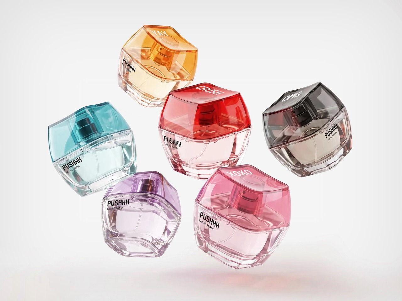
    Somebody who has strong opinions about Cherry MX switch actuation force is not, statistically speaking, somebody who wears cologne. I say this with love, having been both people at different points. Igor Mitin’s PUSHHH concept ignores that overlap problem entirely and builds a perfume around the keyboard key, putting a chunky square cap on the bottle that doubles as the plunger. Mitin runs with that mismatch instead of avoiding it, treating the cap less like hardware and more like a gesture eve
     

Keycap-shaped Perfume Bottle Bridges Nerd Culture and Fashion Fragrances

8 septembre 2026 à 20:30

Somebody who has strong opinions about Cherry MX switch actuation force is not, statistically speaking, somebody who wears cologne. I say this with love, having been both people at different points. Igor Mitin’s PUSHHH concept ignores that overlap problem entirely and builds a perfume around the keyboard key, putting a chunky square cap on the bottle that doubles as the plunger. Mitin runs with that mismatch instead of avoiding it, treating the cap less like hardware and more like a gesture everyone already knows from their phone. One push, and the bottle behaves like a message you just fired off to someone.

Mitin works out of Melbourne as an art director who has spent his career on fragrance and beauty packaging, picking up a Pentawards Gold in 2024 and a Red Dot Design Concept award in 2022, on top of a Best of the Best Red Dot Design Concept win back in 2011. PUSHHH is his own self initiated project, built without a client breathing over his shoulder, which probably explains why it gets to be this playful. Each scent carries a one word name you would actually type, CRUSH, XOXO, COOL, YAY, and OMG, printed straight across the face of the cap. The glass underneath is a squat rounded square in transparent red, pink, amber, and teal, sized closer to something you would clip onto a bag than something you would park on a dresser.

Designer: Igor Mitin

Keyboard people take their keycaps seriously, hunting down artisan sculpts through drops that sell out before the page finishes loading, and PUSHHH lifts that exact silhouette and plants it on a category that usually behaves nothing like that. Perfume branding loves hushed minimalism, black serif type, a name in French nobody can pronounce right. PUSHHH walks in the opposite direction entirely, leans all the way into the keyboard bit, and somehow the whole thing still reads as a coherent, good looking object rather than a gimmick bolted onto glass.

The system around the bottle keeps the joke going in the best way. Keychain minis, collectible colorways, and personalized gift editions all stretch the one push idea into things you would genuinely want to wear, and campaign lines like “Say it. Spray it. Wear it.” lean into the texting bit with a straight face. Mitin’s own flat lays stage the bottles next to headphones, sunglasses, a Casio, and keyring charms, and that styling choice tells you exactly what PUSHHH thinks it is. Not a fragrance counter object. A bag charm sitting proudly next to your Labubu.

What I like most is how specific the whole thing is. A lot of concept fragrance work chases a vague mood, some smoke and a moodboard and a name that sounds expensive. PUSHHH picked one clean idea, the keyboard key as plunger, and let every other decision follow from it, the colors, the words, the merch, the styling. That kind of discipline is rare even in briefed, paid work, let alone something Mitin built purely because the idea was fun enough to chase. I would buy the CRUSH bottle off a shelf the second it existed, and honestly, that is the whole review.

The post Keycap-shaped Perfume Bottle Bridges Nerd Culture and Fashion Fragrances first appeared on Yanko Design.

  • ✇Yanko Design
  • Reolink’s OMVI 2i Ultra Wireless Security Camera can look in two directions at once: Hands-on at IFA 2026
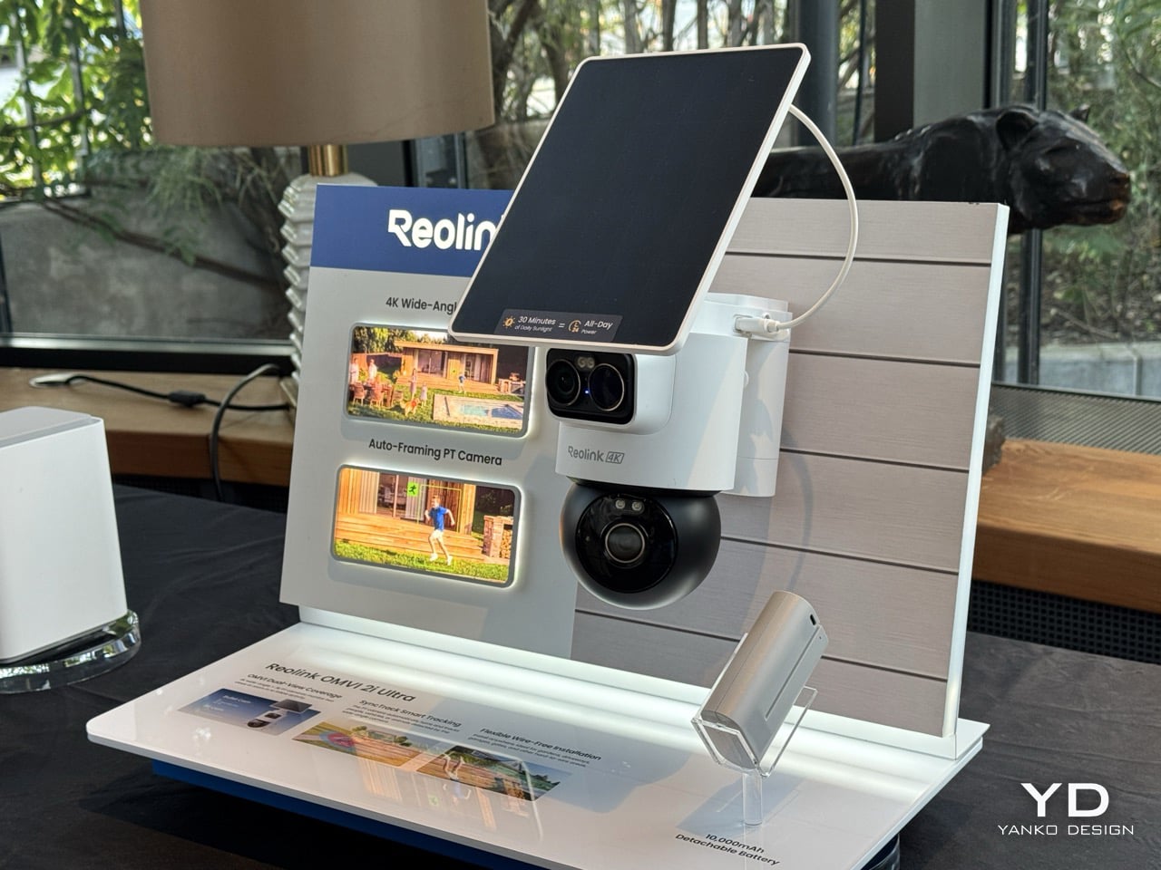
    Picture a courier walking up your driveway while someone else quietly tries your side gate. A normal pan-tilt camera picks one of them and forgets the other exists. Reolink’s OMVI 2i Ultra handles it by carrying two cameras at once: a fixed 4K wide lens on top that never stops watching the full scene, and a 5MP pan-tilt ball below that spins 355 degrees to lock onto whatever the wide lens flags. Both feeds record at the same time, and you can tap anywhere on the wide view to slew the turret str
     

Reolink’s OMVI 2i Ultra Wireless Security Camera can look in two directions at once: Hands-on at IFA 2026

4 septembre 2026 à 03:00

Picture a courier walking up your driveway while someone else quietly tries your side gate. A normal pan-tilt camera picks one of them and forgets the other exists. Reolink’s OMVI 2i Ultra handles it by carrying two cameras at once: a fixed 4K wide lens on top that never stops watching the full scene, and a 5MP pan-tilt ball below that spins 355 degrees to lock onto whatever the wide lens flags. Both feeds record at the same time, and you can tap anywhere on the wide view to slew the turret straight to that spot. It debuted at IFA 2026 in Berlin, ships late October, and costs between $200 and $250.

A detachable 10,000mAh pack claims six months per charge, and the 6W SolarEase panel says it needs about thirty minutes of daily sun to stay topped up, against the one to two hours Reolink quotes for rivals like Eufy’s S340 and the Tapo C675D. Those are Reolink’s own numbers, so hold them loosely until somebody leaves one on a north-facing wall through a British winter. The rest is easier to verify. Wi-Fi 6 across both bands, up to 512GB of local microSD with no subscription attached, colour night vision from twin spotlights, a siren, and IP65 sealing. At a kilogram with the bracket, it is a proper lump of hardware rather than something you tuck on a shelf.

Designer: Reolink

Pan-tilt cameras have quietly lied to buyers since the format existed. Sell someone a camera that turns to follow motion and you have also sold them a camera that stops watching everywhere else the instant it does. Reolink’s fix is embarrassingly simple once you see it. Stop asking one lens to be both the guard and the chaser, and give it a second lens that only guards. The wide 4K unit up top runs at 110 degrees horizontal and never rotates, so the scene it opened on is the scene it keeps recording no matter where the PT ball below it wanders off to. Reolink calls this SyncTrack, but the actual idea is closer to division of labour than any clever algorithm. One camera commits to context, the other commits to pursuit, and neither has to compromise for the sake of the other.

This is the third time Reolink has built this exact idea in 2026, and each version has been a slightly different argument about what matters most. The X16 landed at CES in January as a 24MP full metal flagship with 16x optical zoom, but it needs an ethernet run to function, which puts a hard ceiling on where it can live. The 3i followed in June with PoE and wired Wi-Fi options at $319.99, still asking for a nearby outlet even in its most flexible form. The 2i Ultra drops the combined resolution to 8MP plus 5MP and, in exchange, cuts the cord entirely. The trade-off is the clever bit, because being able to pop a camera on a fence or a backyard without worrying about wiring is much more convenient than haggling over megapixels.

A squared-off dual-lens head sits above a separate motorized ball, with a solar panel tilting on its own hinge overhead, and the whole assembly weighs a full kilogram once the bracket is attached. Compare that to Reolink’s own Argus MagiCam, a 108-gram cube you stick to a fridge with a magnet, and the difference in ambition is obvious at a glance. This is not a camera trying to disappear into a bookshelf. It reads more like a small piece of maritime equipment bolted under an eave, and that visible mechanical presence is doing some of the deterrence work before the siren ever gets involved.

That dual-lens design is quite literally baked into the name. OMVI reads like omni-vision, a camera built to watch in every direction at once instead of picking a lane. Arlo’s Ultra flagship still wants a wall plug or a proprietary base station to unlock its best tricks, and Nest’s outdoor cameras have quietly stayed wired-first for years now, which makes the 2i Ultra’s fully wire-free build feel like it is actually catching up to how people install things rather than how manufacturers wish they would. No drilled conduit, no hub tucked in a closet, just a battery, a solar panel, and a spot on the fence you actually wanted the camera to go.

That is the real flex against the flagships twice its price. You are not paying for a wall socket you have to plan your whole install around, and you are not paying for a bulky base station eating an outlet indoors either. You get two lenses doing genuinely different jobs, a battery that outlasts most of the category on paper, and a name that finally means something instead of just sounding techy. At $200 to $250, the OMVI 2i Ultra is the version of omni-vision security that shows up ready to mount anywhere the moment you take it out of the box.

The post Reolink’s OMVI 2i Ultra Wireless Security Camera can look in two directions at once: Hands-on at IFA 2026 first appeared on Yanko Design.

  • ✇Yanko Design
  • Reolink’s $65 Tiny Magnetic Security Camera Runs 9 Months on 2 AA Batteries: Hands-On at IFA 2026
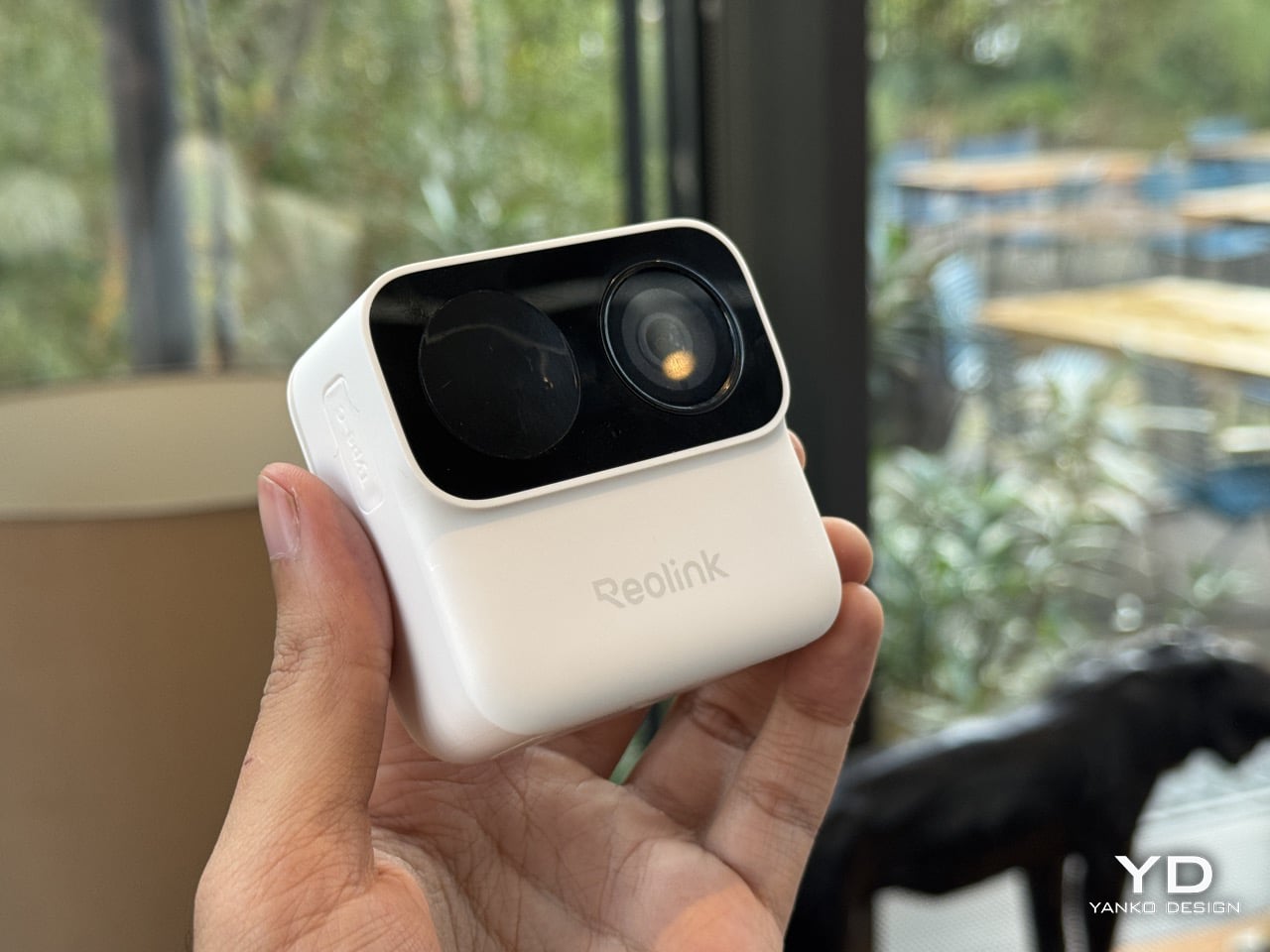
    The worst part of owning a security camera has never been the camera. It is the ladder, the drill, the wall plug, and the moment you realize you aimed the thing eight degrees too far left. Reolink’s Argus MagiCam deletes all of that with a magnet. The 68mm  GoPro-looking cube slaps onto any metal surface in about two seconds, or onto an included magnetic puck with a swivel arm for everything else, turning any surface into a security surveillance monitor (you can even mount it in your car as a d
     

Reolink’s $65 Tiny Magnetic Security Camera Runs 9 Months on 2 AA Batteries: Hands-On at IFA 2026

4 septembre 2026 à 03:00

The worst part of owning a security camera has never been the camera. It is the ladder, the drill, the wall plug, and the moment you realize you aimed the thing eight degrees too far left. Reolink’s Argus MagiCam deletes all of that with a magnet. The 68mm  GoPro-looking cube slaps onto any metal surface in about two seconds, or onto an included magnetic puck with a swivel arm for everything else, turning any surface into a security surveillance monitor (you can even mount it in your car as a dashcam)… and here’s the kicker. It runs up to nine months on two AA lithium batteries. Nine. Whole. Months. I repositioned it three times in under a minute at IFA 2026, which is three more times than I have ever moved a camera bolted to a wall.

Sixty-five dollars buys 1080p, IP67 weatherproofing, dual-band Wi-Fi, on-device person detection, and local microSD storage with no monthly fee attached. Flip the cube over and the back panel detaches to a bay holding two ordinary AAs, the SD slot and the reset button, all serviceable with a coin and a spare hand. Reolink built it around Qualcomm’s QCC730 micro-power Wi-Fi chip for its Power Efficient Series, shown in Hall 1.2 next to the OMVI 2i Ultra. A USB-C port hides under a rubber flap for 24/7 recording when you want it wired. Three colours: black, white, and a mint green that has no business looking this good.

Designer: Reolink

A matte PIR dome sits on the left, a glossy ringed lens sits on the right, and a pinhole mic hides between them, the whole cluster raised on a squared-off black module that reads more like a GoPro’s lens housing than anything borrowed from traditional security hardware. Security cameras have spent two decades pretending they belong on a parking structure, all bullet housings and matte black anonymity. This one borrows its language from action cameras instead, small, chunky, built to be picked up and repositioned rather than mounted once and forgotten, which is exactly why the mint colorway makes sense sitting on a bookshelf instead of bolted above a garage. That GoPro reference is not incidental either. It signals a camera meant to be handled, not just installed.

The battery bay is the real argument here. Somewhere along the way, the smart home industry decided sealed rechargeable packs looked cleaner on a spec sheet, and quietly handed every camera, doorbell, and earbud an expiry date measured in a couple of years. Reolink went the other direction, and the QCC730 chip is what makes that reversal viable rather than nostalgic, since its whole job is sipping power in standby instead of gulping it. Blink has claimed two years off two AA lithiums since its Outdoor 4 launched, though independent testing has repeatedly landed closer to a few months once real motion traffic gets involved. Nine months against a heavier five minutes of daily recording, verified in Reolink’s own side by side tests, reads like the more honest number in the room.

What you give up for all that convenience is resolution, and it barely registers as a cost. This is a 1080p sensor at a moment when 4K battery cameras exist, sure, but 1080p is still plenty sharp for spotting a face at the door or a raccoon in the bin, and the fixed bitrate keeps file sizes sane on a modest microSD card. Night vision runs through a single mono IR LED instead of anything approaching colour, which is standard fare at this tier, not a shortfall specific to Reolink. For a camera this cheap, this easy to place, and this forgiving on power, trading a few thousand pixels feels like a fair swap rather than a compromise. The MagiCam was never trying to be the sharpest eye on your property. It is trying to be the one you actually keep charged, and on that specific promise, the AA drawer you have been ignoring for a decade just became a legitimate accessory again.

The post Reolink’s $65 Tiny Magnetic Security Camera Runs 9 Months on 2 AA Batteries: Hands-On at IFA 2026 first appeared on Yanko Design.

  • ✇Yanko Design
  • Plaud One Hands-On at IFA 2026: AI Earbuds That Transcribe Meetings, Then Draft Emails And Decks For You
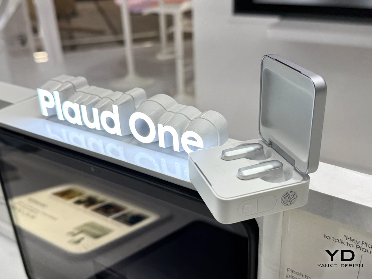
    For three years, Plaud made very good tape recorders with a PhD. You pressed a button, it captured a meeting, and mere minutes later a summary showed up. The Plaud One, launched at IFA 2026 for €249.90, reverses that arrow. Its charging case now holds four beamforming mics, a speaker, an agent button and a built in eSIM, so it stays online without a phone nearby. Hold the agent button and the AI talks back, asks what you meant, then builds the deck or drafts the email while you get on with your
     

Plaud One Hands-On at IFA 2026: AI Earbuds That Transcribe Meetings, Then Draft Emails And Decks For You

3 septembre 2026 à 20:28

For three years, Plaud made very good tape recorders with a PhD. You pressed a button, it captured a meeting, and mere minutes later a summary showed up. The Plaud One, launched at IFA 2026 for €249.90, reverses that arrow. Its charging case now holds four beamforming mics, a speaker, an agent button and a built in eSIM, so it stays online without a phone nearby. Hold the agent button and the AI talks back, asks what you meant, then builds the deck or drafts the email while you get on with your day.

That flip from recording to doing needed hardware nobody had built yet. Not a pendant, not a pin, not another app crammed onto a phone you were already staring at. Plaud built a palm sized aluminum box with a fluted lid that looks like a Rimowa suitcase went through a shrink ray, sitting on a table, listening across a room, and talking back like a colleague who never needs coffee. The Explorer Edition opens for pre order now, capped at 2,000 units worldwide, with deliveries landing in Q4. A public version follows in 2027, once Plaud has watched two thousand early adopters put the thing through its paces.

Designer: Plaud

The original Plaud Note clipped onto a phone and did one job, listen to a meeting and hand back a transcript once it ended. The Note Pro added a screen and better mics. The NotePin S shrank the format onto a lanyard clip. Every generation stayed reactive by design, a smart recorder waiting for you to press stop before it did anything useful. That business built Plaud’s 2.5 million user base and reportedly crossed $100 million in annual software revenue by June, which is exactly the kind of runway that lets a company gamble on reinventing its own hardware category from scratch.

Vertical fluting runs down the case’s aluminum lid, the same visual trick Rimowa has stamped into cabin luggage since the 1950s, giving a 62 gram object a sense of density it has no right to carry. Flip it open and the earbuds sit half in ear, silver capped, in a tray that reads closer to a jewelry box than a charging dock. A speaker grille, a record button and a separate agent button line the case’s edge, the three controls that turn a charger into a device you actually talk to. None of it apes a phone. It reads like furniture for a desk, not gear for a pocket.

Earlier Plaud devices leaned on your phone for both processing and connectivity, so the intelligence always sat one hop away from the microphone. Plaud One’s case carries its own 4G LTE connection through a built in eSIM, closing that gap entirely. Capture, transcription and agent response now run in one box, independent of any other screen in your life. Leave your phone in a bag, walk into a cafe, and the case still records the table’s conversation, answers a question out loud through its speaker, or fires off a follow up email on command. Every pendant and pin that came before this quietly depended on a phone doing the real work behind the scenes. Plaud One is the first in the category that genuinely does not.

Plaud Agent drafts a follow up email the moment a client call ends. Feed it a meeting and it builds a slide deck while you sit through your next call, then drops the finished file straight into Notion with zero copy pasting. The platform connects to Gmail, Google Workspace, Microsoft Teams, Slack and Notion today, with more integrations promised as the software matures. Set it loose on a standing task, a monthly competitor scan for instance, and it runs quietly in the background, waiting with a finished report the next time you check. This is the actual bet Plaud is making, that an assistant worth having has to act, not just remember.

Pre orders for the Explorer Edition are open now at €249.90, with the first 2,000 units shipping in Q4. Buyers get $200 in Plaud Credits toward the heavier agent features on top of a starter transcription plan, so the price buys a running start on the software as much as the hardware. Calling this an Explorer Edition rather than a finished release is the honest move, an open beta wearing genuinely sharp industrial design. Plaud spent three years building the best possible way to listen. Plaud One is its first real attempt at building something worth talking to.

The post Plaud One Hands-On at IFA 2026: AI Earbuds That Transcribe Meetings, Then Draft Emails And Decks For You first appeared on Yanko Design.

  • ✇Yanko Design
  • This $119 Ultrasonic Cutter Sense Materials And Auto-Adjusts To Cut EVA Foam, Resin, PLA 3D Prints
    There are power tools, and then there are smart tools. A power tool gives you brute force; a smart tool gives you controlled, consistent results. Think of a simple drill that just spins versus one that manages its own torque to avoid stripping a screw. For delicate work like trimming EVA foam for a cosplay project or cleaning up support structures on a 3D print, you definitely want the smart one. The problem is, most handheld cutters are pretty basic, giving you one speed and just hoping for th
     

This $119 Ultrasonic Cutter Sense Materials And Auto-Adjusts To Cut EVA Foam, Resin, PLA 3D Prints

2 septembre 2026 à 21:45

There are power tools, and then there are smart tools. A power tool gives you brute force; a smart tool gives you controlled, consistent results. Think of a simple drill that just spins versus one that manages its own torque to avoid stripping a screw. For delicate work like trimming EVA foam for a cosplay project or cleaning up support structures on a 3D print, you definitely want the smart one. The problem is, most handheld cutters are pretty basic, giving you one speed and just hoping for the best.

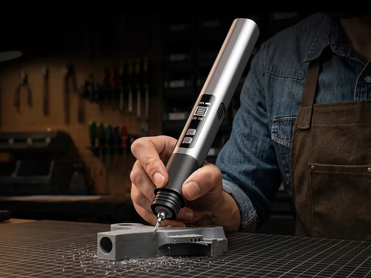
The SonicMax Slice 10 is aiming for that higher IQ. It’s a cordless ultrasonic cutter that senses the material you’re cutting and adjusts its own power output in real time. Slice through dense plastic and it pushes harder; trim the thin walls of a resin print and it eases back. This adaptive system, combined with cooling that prevents heat-related power drops, makes it feel like proper workshop equipment in the palm of your hand. It runs at 40kHz, delivers up to 50 watts of dynamic peak power, and does all of this without a single cable getting in your way.

Designer: SonicMax

Click Here to Buy Now: $119 $215 (45% off). Hurry, only 13/500 left! Raised over $124,000.

Most ultrasonic cutters on the market use transducers with a mechanical quality factor, or Qm, somewhere between 150 and 250. A higher Qm means the transducer converts electrical energy into vibration more efficiently, which directly translates to less heat generated during use. SonicMax claims a Qm of over 500 for the Slice 10, and lab data backs that up with a verified measurement of 541.1. That’s roughly two to three times higher than a typical competing tool, and it’s the foundational reason the Slice 10 can sustain longer sessions without thermal drama. That single transducer decision cascades into everything else, from runtime and cut quality to how comfortable the tool actually stays in your hand.

As the blade meets resistance, the Slice 10’s Smart Material Auto-Detection reads that feedback and adjusts power output and vibration frequency without you touching anything. Cutting through a stiff chunk of EVA foam feels different from trimming the thin walls of a resin print, and the tool responds to each material accordingly. You’re not locked into a fixed setting that works okay for most things but perfectly for nothing. The system also preserves cut quality across a long session, where material resistance can shift as the blade warms. The result is consistent cuts from the first pass to the last, regardless of what you’re running the blade through.

Heat is the reason most cordless ultrasonic cutters force you to stop every five to ten minutes, and the Slice 10 attacks that problem from two directions. Corded bench tools sidestep this issue by drawing steady power and dissipating heat more easily, but you give all of that up the moment you cut the cord. The high-efficiency transducer generates less heat from the start, and the built-in active cooling fan manages whatever thermal load does build up during a session. Overheat protection kicks in automatically at 80 degrees Celsius at the motherboard level, so the tool protects itself without you having to babysit it. You only appreciate how good this is after you’ve spent a session on a cutter that kept shutting itself off on you mid-cut.

A 5000mAh 21700 lithium-ion battery powers the Slice 10, and SonicMax made it user-replaceable, which you’ll end up appreciating far more than any spec sheet number. The 21700 is a high-performance cell format found in premium flashlights and power tools, so sourcing replacements from SonicMax or compatible third-party brands should never be a problem. SonicMax’s own branded replacement cell is rated for 500 charge cycles at 80% capacity retention, a reasonable lifespan for a tool you’re actually putting to work regularly. An 18W USB-C pass-through charging system brings it from zero to full in about 70 minutes, and the tool keeps running while plugged in. Claimed runtime sits at up to four hours, and when you run low mid-project, swapping in a spare takes seconds.

Blade choice gives the Slice 10 a lot of its bench-tool personality. SonicMax offers five blade styles that let the same handheld body take on very different jobs: a Standard Utility Blade for everyday trimming, a Precision Long Blade for tighter access and more delicate reach, a Fine Chisel Blade for careful cleanup work, a Heavy Duty Chisel Blade for more aggressive material removal, and a Wide Flat Scraper Blade for broader surface work. That range matters because it turns the Slice 10 into something closer to a compact cutting system than a one-trick knife. If you’re the kind of maker who bounces between foam, plastic, supports, edges, and surface cleanup in the same afternoon, this is where the tool starts looking properly versatile.

Lift-to-Activate sensing turns the tool on when you pick it up and off when you set it down, keeping your fingers away from controls mid-session and preventing accidental activation on the bench. A small OLED display shows real-time power output and battery level, so you’re never left guessing how much runtime remains. Built-in LED lighting illuminates the cut line, which sounds like a minor detail until you’re trying to trace a clean edge on a dark-colored print at your desk at some ungodly hour. Auto-shutdown kicks in after five minutes of idle, and low-battery protection activates before the cell drops to a damaging voltage. Together, these details make the Slice 10 feel like a tool that respects your workflow rather than constantly asking you to manage it.

The Slice 10 measures 260.5mm long and 28mm across, weighing 236 grams, keeping it firmly in single-hand, pen-grip territory across long sessions. Just the Slice 10 is available for a discounted $119, and ships with 10 replaceable Standard Utility blades. Upgrade to the Maker’s Bundle for $169 and you get the Slice 10 along with 50 blades spread across the five blade profiles (standard, precision long, fine chisel, heavy duty chisel, and flat scraper) as well as a 5000mAh replacement battery. If you’re looking for versatility and pushing your prints to the max, the $50 price bump does bring a fair share of value. You can also buy extra blades and batteries as add-ons. Shipping is expected to begin mid-October 2026 with worldwide delivery available, and SonicMax has not publicly confirmed warranty terms at the time of writing.

Click Here to Buy Now: $119 $215 (45% off). Hurry, only 13/500 left! Raised over $124,000.

The post This $119 Ultrasonic Cutter Sense Materials And Auto-Adjusts To Cut EVA Foam, Resin, PLA 3D Prints first appeared on Yanko Design.

  • ✇Yanko Design
  • Unofficial Audi A8 Concept Keeps Classic Sedan Proportions and a Traditional Grille
    The Audi A8 died in early 2026, quietly, the way flagships die now. Order books shut in Germany, production wound down, and the Q9 SUV inherited the crown after the A8 managed 1,406 US sales in a year the Q8 did 10,881. Audi swears a fifth generation arrives around 2030. Luca Serafini apparently decided four years is a long time to sit around, so he built one himself. His version borrows the Concept C’s monolithic surfacing and four-element light signature, then quietly refuses the vertical Sin
     

Unofficial Audi A8 Concept Keeps Classic Sedan Proportions and a Traditional Grille

2 septembre 2026 à 20:30

The Audi A8 died in early 2026, quietly, the way flagships die now. Order books shut in Germany, production wound down, and the Q9 SUV inherited the crown after the A8 managed 1,406 US sales in a year the Q8 did 10,881. Audi swears a fifth generation arrives around 2030. Luca Serafini apparently decided four years is a long time to sit around, so he built one himself. His version borrows the Concept C’s monolithic surfacing and four-element light signature, then quietly refuses the vertical Singleframe, running a full-width horizontal bar with the four rings lit at center instead, plus twin exhausts in the diffuser.

Everything else on the car is doing less on purpose. Six-spoke wheels with cross-drilled discs behind them, blacked-out pillars, flush glass, a shoulder line so soft you have to hunt for it, and a titanium-silver finish borrowed straight from Concept C’s anodized aluminum look. Those illuminated rings front and rear go dark the second any regulator sees them, and the front overhang is shorter than crash structure would ever allow. Neither problem makes the renders less convincing. They just mark exactly where a designer stopped negotiating with reality.

Designer: Luca Serafini, LS Design

The vertical Singleframe remains the most argued-about thing Audi has done in a decade, and Serafini declines it outright. Massimo Frascella built that upright slab for the Concept C by reaching back to the 1936 Auto Union Type C and the 2004 A6, and when we spent forty minutes with the car in Munich it absolutely worked at roadster scale. Stretch the same face across five-plus meters of limousine, though, and authority starts sliding toward novelty toothpaste tube. What replaces it is a wide horizontal aperture with the rings glowing dead center, flanked by the four-element light graphic Audi now uses front and rear. Autoevolution called the result tame. I’d call it a designer knowing what a big car’s face has to do.

Audi built the slipperiest sedan on the planet in 1982 by bonding the side glass flush with the bodywork, hitting a drag coefficient of 0.30 and calling itself the aerodynamics world champion. Forty-four years later the same instinct gets rebranded as radical simplicity. Serafini’s A8 runs the C3 playbook almost literally, with flush glazing, no visible door handles, blacked-out pillars, and a body carrying zero character lines. The whole surface works on volume and reflection alone, which is the hardest thing to pull off in car design and the easiest to botch. Broad rear haunches and a near-vertical Kamm tail keep it from reading as a bar of soap.

Twin oval outlets sit in the black rear diffuser, which rules out any A8 e-tron reading immediately. That looks prophetic rather than backward-facing, given Audi scrapped its 2033 combustion cutoff and then dropped the 987-hp Nuvolari, a 4.0-liter twin-turbo V8 with three axial-flux motors and a 10,000 rpm redline, in the exact year it once promised to go electric-only. A green vertical accent in the lower intake muddles the story slightly, since it reads like a charge-status indicator on a car with tailpipes. Serafini has been running Concept C surfacing across an imaginary Audi lineup since last September, covering an SUV, a hot hatch, an A2 revival and an R8 Spyder. This flagship is his second run at the A8.

Frascella’s rule now is that Audi shows nothing it cannot build, which makes independent work like this the only place ambition still runs unsupervised. Serafini works in Blender, 3DS Max and Unreal with AI in the pipeline, so the images are staged rather than surfaced from production CAD, and a few details fall apart under close reading. His Ferrari single seater from yesterday had the same quality, gorgeous and structurally impossible in roughly equal measure. What this A8 proves is that the segment’s problem was never the shape. Audi walked away from the sedan because buyers did, and a car this composed makes that math feel like a shame.

The post Unofficial Audi A8 Concept Keeps Classic Sedan Proportions and a Traditional Grille first appeared on Yanko Design.

  • ✇Yanko Design
  • Miele’s G8 Dishwasher Photographs Your Dirty Dishes Before Auto-Selecting The Cycle: Hands-on at IFA 2026
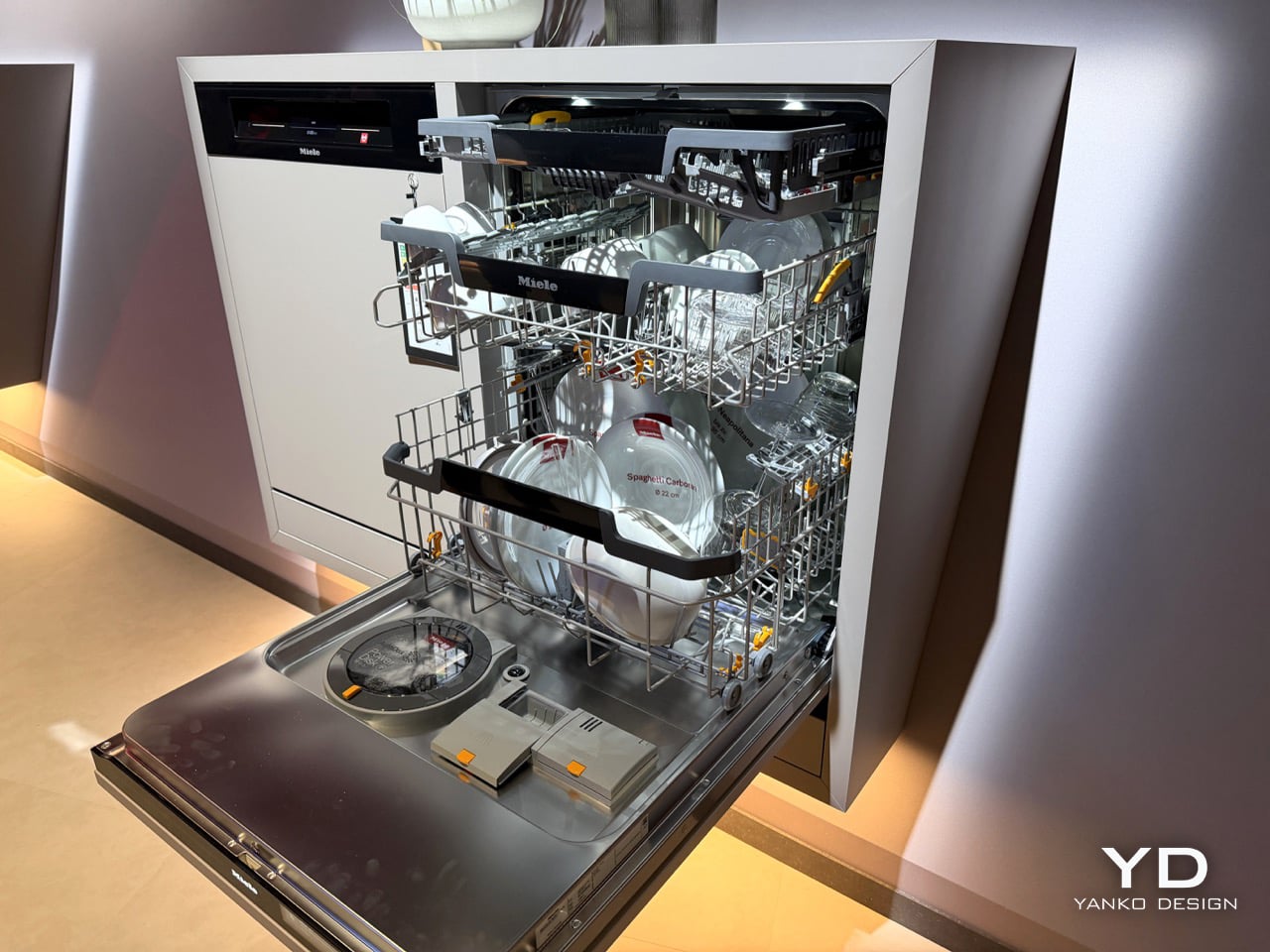
    Miele’s new G8 Diamond snaps a photo of your dirty dishes before it washes them. The moment the door swings toward shut, a light inside blinks on, a camera grabs one frame, the light dies, and the AutoVision system studies what it caught. If it sees a bottle, it calls up BottleClean and drives the spray harder. If it sees a pot, the cleaning intensity climbs. If it sees plastics, it runs the new hot air drying harder, because plastic containers are famously terrible at drying themselves. Miele
     

Miele’s G8 Dishwasher Photographs Your Dirty Dishes Before Auto-Selecting The Cycle: Hands-on at IFA 2026

2 septembre 2026 à 18:30

Miele’s new G8 Diamond snaps a photo of your dirty dishes before it washes them. The moment the door swings toward shut, a light inside blinks on, a camera grabs one frame, the light dies, and the AutoVision system studies what it caught. If it sees a bottle, it calls up BottleClean and drives the spray harder. If it sees a pot, the cleaning intensity climbs. If it sees plastics, it runs the new hot air drying harder, because plastic containers are famously terrible at drying themselves. Miele showed it for the first time at IFA 2026 in Berlin, and it lands in Germany, Austria and Switzerland in April 2027.

A camera in a dishwasher makes the headline, but the memory is what makes the design. The G8 holds onto that bottle it clocked at breakfast, so stacking dinner plates on top of it by eight in the evening changes nothing. Layer in AutoDos and its PowerDisk granulate, measuring out its own detergent since 2018, then set an app rule that says wait until 80 percent full and never before 10pm, and the machine stops consulting you altogether. Miele has spent decades selling dishwashers on the promise that they scrub so you do not have to. This one wants to think so you do not have to.

Designer: Miele

Here’s the part that actually impressed me. AutoVision doesn’t run a video feed you can scrub through in the app. It fires once, right as the door clicks shut, and the machine works from that single image for the entire cycle. Load a wine bottle at breakfast, stack it under a mountain of lunch plates by evening, and the G8 still treats it as a bottle, because it saw it once and that was enough. The only real caveat came from Miele’s own team at IFA: keep bottles roughly central and pots in the lower basket, since the spray arm still struggles to reach the far corners. Vision only helps if the water can follow it there.

What makes this genuinely new isn’t the word AI, which every appliance brand at IFA 2026 was throwing around like confetti. Most of those claims are turbidity sensors, the kind that read how murky the wash water has become and adjust accordingly. LG’s SenseClean works that way, and Samsung has filed similarly around soil detection. A turbidity sensor knows the water is dirty. It has no idea why. Miele’s camera identifies the actual object sitting in the rack, a considerably harder computer vision problem, and one that both LG and Bosch have patented around for years without shipping a consumer dishwasher built on it. Miele is putting an object-recognition camera inside a box you can buy next spring, not just inside a patent filing.

Around that camera sits a decade of quieter automation finally clicking into place. AutoDos, with its PowerDisk granulate, has been dosing detergent on its own since 2018, and Miele still claims nobody else in the category offers true automatic dispensing. ExcellentDry adds a hot air system with three fixed levels, chosen once and then applied forever, aimed squarely at the plastic containers that usually come out of a cycle still damp at the base. The cutlery drawer becomes a genuine third tier, one side droppable for coffee cups, and a new touch display replaces the old dial logic. Set the app to run only past 10pm and only above 80 percent full, or tie it to your solar output, and the dishwasher stops asking permission for anything.

None of this works if you don’t trust the camera’s judgment, and Miele knows it. “Intelligence can be programmed. Trust has to be earned,” said Dr. Axel Kniehl, the company’s Executive Director of Marketing and Sales, at the IFA press conference, and it’s the one line from the whole reveal that actually admits the stakes. AutoVision only functions if enabled by the user, according to Miele’s own release, which suggests it ships switched off by default. Fair enough. Handing a machine the authority to decide how hard to scrub your grandmother’s pans is a bigger ask than letting it dose its own detergent, and Miele seems to know it needs to earn that permission slowly rather than assume it.

The G8 Diamond won’t reach a single kitchen before April 2027, and even then only in Germany, Austria and Switzerland, so everything here is still a promise rather than a lived-in product. But the promise is the interesting part. For a century, appliance makers competed on how much physical labor they could remove. Miele is the first one at this scale betting the next fight is over who you trust to make the fifty tiny decisions labor never touched in the first place.

The post Miele’s G8 Dishwasher Photographs Your Dirty Dishes Before Auto-Selecting The Cycle: Hands-on at IFA 2026 first appeared on Yanko Design.

  • ✇Yanko Design
  • This Georgian Residential Complex Rejects Straight Lines on its Floor Plan, Mimicking The Ocean
    Straight lines are easy. Any architect can slap a rectangular tower on a plot and call it a day, and most beachfront developers do exactly that because straight lines are cheap, fast to build, and easy to sell off a brochure. Georgia’s Adjara coast just got a project that looked at that playbook and said absolutely not. Montemar Residential, a three tower complex rising in the seaside town of Gonio, ditches the grid entirely in favor of forms that ripple, curve, and cantilever like something dr
     

This Georgian Residential Complex Rejects Straight Lines on its Floor Plan, Mimicking The Ocean

23 août 2026 à 16:45

Straight lines are easy. Any architect can slap a rectangular tower on a plot and call it a day, and most beachfront developers do exactly that because straight lines are cheap, fast to build, and easy to sell off a brochure. Georgia’s Adjara coast just got a project that looked at that playbook and said absolutely not. Montemar Residential, a three tower complex rising in the seaside town of Gonio, ditches the grid entirely in favor of forms that ripple, curve, and cantilever like something dragged up from the Black Sea itself. It is the kind of building that makes you stop scrolling, then immediately want to know who signed off on it and how.

Designed by Irakli Emiridze and Irina Chkonia of Alpha Architecture, the complex sits on a 10,000 square meter plot within a UNESCO listed stretch of coastline, right where Adjara’s oddly tropical microclimate runs into the Black Sea. Each of the three 16 story towers tops out around 48 to 52 meters and wears a dramatic aluminum crown that flares out over the roofline like a mushroom cap, or if you squint, a seashell caught mid opening. Parking for 300 vehicles sits tucked below grade, keeping the ground plane free for landscaping and plazas. It is a lot of building, and it wants you to know it.

Designers: Irakli Emiridze and Irina Chkonia

The seashell inspiration shows up in how the facade behaves. The balcony edges do not stack in the usual identical, floor by floor grid you see on every coastal high rise from Miami to Marbella. Instead they undulate, staggering in and out like sediment ridges carved by tidal movement, which gives each tower a texture closer to a geological formation than a construction product. Aluminum embossed sheet cladding wraps the crowning terraces, catching light in a way that concrete or glass simply cannot, and it is the detail that separates Montemar from the generic curved tower trend that has been creeping through Gulf and Black Sea resort markets alike.

The space between the three towers is treated as public terrain rather than leftover setback, with green plantings, plazas, and communal zones designed to pull residents out of their units and into shared space. Panoramic apartments come with private terraces and jacuzzis angled toward the water, the kind of amenity that used to be penthouse exclusive and is now standard issue on any coastal development trying to compete for buyers. Whether that democratization of the infinity view holds up once the cranes clear out is the real test, since renderings are notoriously generous with light, weather, and empty beaches.

Gonio is a strange place for this kind of architectural swing. It is a historic town, not a resort capital, and Montemar is betting that sculptural ambition can coexist with a UNESCO designation next door rather than clash with it. If the finished towers deliver even half of what the renders promise, this stretch of the Adjara coast is about to become a lot more interesting to watch than its neighbors on the Black Sea.

The post This Georgian Residential Complex Rejects Straight Lines on its Floor Plan, Mimicking The Ocean first appeared on Yanko Design.

  • ✇Yanko Design
  • CUKTECH’s 300W Desktop Charger Wants to Replace Your Entire Drawer of Power Bricks
    If you have ever charged a Xiaomi phone with the bundled brick, there is a decent chance CUKTECH’s engineers had a hand in it, even though the name never made it onto the packaging. The company started in 2016 as a straight up OEM, building chargers behind the scenes for Xiaomi and other big players, before merging with ZMI in 2022 and finally launching products under its own name. It is the classic story of a supplier deciding it was tired of being invisible. That decision has paid off. The CU
     

CUKTECH’s 300W Desktop Charger Wants to Replace Your Entire Drawer of Power Bricks

23 août 2026 à 13:20

If you have ever charged a Xiaomi phone with the bundled brick, there is a decent chance CUKTECH’s engineers had a hand in it, even though the name never made it onto the packaging. The company started in 2016 as a straight up OEM, building chargers behind the scenes for Xiaomi and other big players, before merging with ZMI in 2022 and finally launching products under its own name. It is the classic story of a supplier deciding it was tired of being invisible.

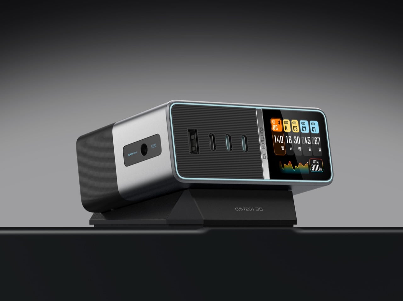
That decision has paid off. The CUKTECH 30 Charging Station Ultra just picked up two wins at the European Product Design Award, one for computer accessories and one for office appliances, thanks to a 300W GaN powered design from Chong Wang and Ziyao Wang. We have followed the brand’s climb as its power banks and chargers kept getting screens, better materials, and sharper industrial design with every release. This latest charging station, with its five ports and a live readout of exactly what your gear is pulling, is the moment the sleeper brand stops sleeping.

Designers: Chong Wang & Ziyao Wang

Three USB-C ports, one USB-A port, and a dedicated DC output share the front face, and together they can push out up to 300W total. The two primary USB-C ports handle up to 140W each under PD 3.1, which covers most modern laptops without breaking a sweat, but the real number only shows up when you route power through the DC port. That single line is built to talk directly to compatible laptops and can hit the full 300W ceiling on its own, essentially replacing the oversized proprietary brick that usually ships in the box. I have three of those bricks sitting in a drawer right now doing absolutely nothing, and a single box that can outmuscle all of them at once is exactly the kind of consolidation I did not know I needed.

Third generation GaN sits at the core of the whole system, paired with what CUKTECH calls a PFC plus LLC dual architecture, a combination chosen specifically to keep five simultaneous charging sessions stable without the unit turning into a space heater. Gallium nitride has become the default material for anyone chasing high wattage in a small footprint, since it switches more efficiently than older silicon designs and sheds heat faster under sustained load. Thirteen fast charging protocols are baked in, including PD 3.1, PPS, Xiaomi’s own 120W standard, UFCS, Huawei SCP, and both QC and AFC, which is a genuinely broad net for a single charger to cast. Intelligent power allocation reads what is plugged in and redistributes wattage on the fly, with specific tuning for handhelds like the Steam Deck and ROG Ally that tend to confuse less sophisticated multi port chargers.

A 1.83 inch IPS display sits front and center, color coded per port, tracking wattage, voltage, and current across all five connections in real time, with a small running graph of total load underneath. Most chargers ask you to trust a single LED and hope for the best. This one just tells you, continuously, which is a small shift that changes how the object feels to live with on a desk. Nine layers of protection cover temperature, over-voltage, and over-current scenarios, which matters more than usual given how much power is moving through a chassis this size.

The form itself leans minimal, angled slightly on a magnetic tilting base so the screen stays readable without craning your neck, and finished in a two tone silver and black that reads more like studio monitor than power strip. A right angle DC cable keeps the desk tidier than the usual straight jack, and the grounded three pin AC cable is a small nod to safety that a lot of competitors skip to save a few cents.

None of this would matter much if the pricing did not make sense, and at $159.99 it lands right where a serious desk upgrade should, undercutting rivals capped at 140W or 200W while offering meaningfully more headroom. CUKTECH spent a decade building other companies’ chargers before it ever put its own name on a box. Two design award wins later, it is clear that decade taught them exactly which details actually matter.

The post CUKTECH’s 300W Desktop Charger Wants to Replace Your Entire Drawer of Power Bricks first appeared on Yanko Design.

  • ✇Yanko Design
  • Apple is Building a Short, Wide iPhone Ultra… Now It Owes Us an Actual iPhone Mini
    I have a friend who still uses an iPhone 13 mini held together by a case and pure spite, and every single time a new iPhone launches, she asks me the same question. Is it small yet. It never is. Apple has spent years telling us, implicitly, that small phones do not sell, that the market has spoken, that everyone wants a bigger canvas for videos and games and doomscrolling. Fine, sure, the sales numbers backed that up in 2023. But sales numbers do not mean the desire disappeared, they mean the a
     

Apple is Building a Short, Wide iPhone Ultra… Now It Owes Us an Actual iPhone Mini

23 août 2026 à 11:20

I have a friend who still uses an iPhone 13 mini held together by a case and pure spite, and every single time a new iPhone launches, she asks me the same question. Is it small yet. It never is. Apple has spent years telling us, implicitly, that small phones do not sell, that the market has spoken, that everyone wants a bigger canvas for videos and games and doomscrolling. Fine, sure, the sales numbers backed that up in 2023. But sales numbers do not mean the desire disappeared, they mean the alternative was not good enough to fight for.

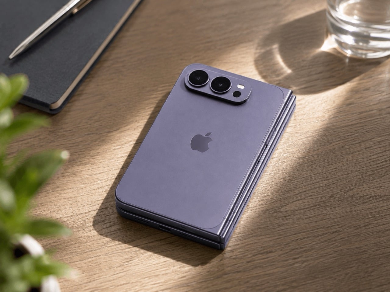
Which brings me to the iPhone Ultra, Apple’s rumored first foldable, expected to close into a short, squat, almost passport-shaped little brick before you unfold it into something the size of an iPad mini. That folded shape is the closest thing to mini energy Apple has shown in years, and it is buried inside a two thousand dollar folding phone nobody asked to be the delivery method. My friend does not want an iPad mini that folds. She wants her 13 mini, but new. Apple already built the shape. It just built it around the wrong phone.

Designer: Apple

The Air existed to answer a question almost nobody was asking at checkout, namely how thin can a phone get before the internals start filing complaints. It was a genuine engineering flex, the kind of thing that looks incredible in a teardown video and slightly pointless in daily use. I understood what it was trying to prove. I just never needed it proven to me personally, and I doubt I was alone in that.

The Ultra is rumored to repeat that exact flex, except this time the thinness gets folded in half, closing down to somewhere between 9 and 9.5mm shut and reportedly as thin as 4.5mm open, according to recent leaks. That is a genuinely wild number for a phone with a hinge in it. Apple is once again proving it can do the hard, borderline unnecessary engineering thing. The difference is that this time, buried inside that flex, is an actual shape people have been begging for since 2023. Apple just does not seem to have noticed it yet.

Go back and look at what the 13 mini actually was for a second, because I think people forget how unremarkable the compromise really was. It measured 131.5mm tall, 64.2mm wide, weighed 141 grams, and ran the exact same A15 chip as the standard 13. You gave up battery life and screen real estate. You did not give up the flagship experience shrunk down to fit an actual hand. Compare that to where the standard iPhone lineup sits today, regularly north of 6.1 inches before you even get to Pro Max territory, and the gap the mini used to fill has only gotten wider and lonelier.

Now put the Ultra’s folded footprint next to that. Reports point to a 5.5 inch cover display when shut, in a short, wide, passport style shell that is about as close to mini adjacent proportions as Apple has shipped since the mini died. The catch is that this compact shell only exists as a doorway into a 7.8 inch, 4:3 inner screen and a starting price rumored to land somewhere between 1,999 and 2,499 dollars. Nobody buying that phone is buying it to have something small in their pocket. They are buying an iPad mini that happens to fold shut, which is a completely different pitch than the one my friend has been asking me about for three years running.

There has been some loose speculation, mostly a 9to5Mac piece from last year, that Apple’s new staggered launch schedule could theoretically clear a runway for a smaller phone somewhere down the line. Even that piece called the odds slim to none, and nothing currently on Apple’s roadmap for the 18, 18e, 18 Pro, or Ultra includes a mini in any form. Samsung, for what it is worth, has stuck with its Z Flip clamshell as its own answer to compact, so the appetite for small has not vanished industry wide, it has just gone unanswered on Apple’s side of the fence for a while now.

So here is the pitch, and it is not a complicated one. Apple has now proven twice, once with the Air and once with the Ultra’s folded shell, that it can engineer real compactness without breaking anything important. Skip the fold. Skip the tablet trapped inside a phone shaped envelope. Take that exact short, wide, passport sized footprint and wrap a single, non folding screen around it, call it a mini, and ship it. Apple does not need a new idea here. It already built one. It just keeps hiding it inside features nobody was asking it to attach to.

The post Apple is Building a Short, Wide iPhone Ultra… Now It Owes Us an Actual iPhone Mini first appeared on Yanko Design.

  • ✇Yanko Design
  • Lando Norris’ New LEGO Helmet Is Weirdly Emotional to Build
    McLaren just hit 1,000 Grands Prix, which in Formula 1 years is basically ancient royalty status. Only Ferrari has been around longer in this sport, and Ferrari acts like it too. So when a team crosses a milestone like that, you throw a party, you paint a special livery on the car, and apparently, you also get LEGO to build you a commemorative brick helmet with your driver’s face on the box. That is exactly what happened with Lando Norris’s set, a 793 piece build that packs his signature yellow
     

Lando Norris’ New LEGO Helmet Is Weirdly Emotional to Build

23 août 2026 à 09:20

McLaren just hit 1,000 Grands Prix, which in Formula 1 years is basically ancient royalty status. Only Ferrari has been around longer in this sport, and Ferrari acts like it too. So when a team crosses a milestone like that, you throw a party, you paint a special livery on the car, and apparently, you also get LEGO to build you a commemorative brick helmet with your driver’s face on the box.

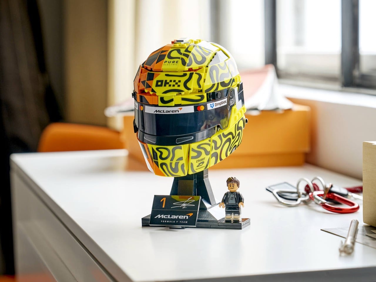
That is exactly what happened with Lando Norris’s set, a 793 piece build that packs his signature yellow and black “blob” design (his words, not mine) onto one side of a papaya orange helmet shell. It is McLaren history and Norris’s personal branding smashed together into a display piece, and somehow LEGO made that combination look genuinely good instead of like a marketing fever dream.

Designer: LEGO Design Team, co-created with Lando Norris

What makes this one different from your average licensed tie in set is that Norris was actually in the room for it. This was not LEGO grabbing some reference photos and calling it a day. The drivers worked directly with LEGO’s design team to shape both the Norris helmet and its companion piece for teammate Oscar Piastri, and the real helmets both drivers wore trackside at Monaco were based on the LEGO designs, not the other way around. That is a genuinely rare flex for a toy company. Daniel Meehan, LEGO’s Creative Lead for F1, put it well when he said building organic helmet curves at this scale “presents exciting opportunities for exploring new building techniques and creative parts usage,” which is design speak for “yeah, this was hard and we are proud we pulled it off.”

And they did pull it off. The papaya orange half and the neon yellow squiggle half meet along a seam that somehow still reads as one continuous helmet, not two mismatched shells taped together. Printed tiles handle every sponsor logo along the brow, McLaren, Mastercard, Dropbox, OKX, all sitting exactly where they would on the real thing. The back of the helmet is where the emotional weight lives though. LEGO printed “1.000 GP” and “1963” across the rear in bold anniversary numerals, with a small nod to “Bruce / Mal Est. 1963,” a reference to Bruce McLaren founding the team over sixty years ago. “NEVER STOP RACING” runs along the base of the visor. It is a lot of history packed into a helmet the size of a grapefruit.

My favorite detail, though, is buried in the yellow side paneling where LEGO snuck in a tiny printed minifig head, smiling face and all, hidden right inside Norris’s own design pattern. It is such a small thing, but it is basically LEGO signing its own work, and it tells you the people building this actually cared about more than just slapping a logo on a shelf piece.

The set comes mounted on a black display stand with Norris’s number 1 and a printed signature plaque, plus a minifigure of Norris himself in off track team gear, reportedly the first time he has been rendered as a LEGO minifig. It also plugs into the LEGO Builder app so you can rotate and zoom your progress mid build, which is a nice touch if you like tracking your pit stops digitally.

This helmet drops right after LEGO built ten full size, actually driveable F1 cars for a stunt at last year’s Miami Grand Prix, so the brand’s relationship with the sport is clearly only ramping up. The Lando Norris McLaren Mastercard F1 Team Helmet (set 43023) is available now for $89.99 on LEGO.com and through McLaren’s official store, alongside the matching Oscar Piastri edition if you want the full garage set.

The post Lando Norris’ New LEGO Helmet Is Weirdly Emotional to Build first appeared on Yanko Design.

  • ✇Yanko Design
  • Tecno Camon 50 Ultra 5G Review: A $420 AI Phone With Built-in Gemini, ChatGPT, DeepSeek, and Grok
    PROS: EllaClaw is one of the most impressive phone AI experiences available right now Multi-model AI support, including Gemini, ChatGPT, Grok, DeepSeek, Meta AI, and Ella Strong 2-day battery life from the 6500mAh cell Competitive value in the mid-range segment CONS: Single speaker setup sounds tinny and lacks bass Curved waterfall display is prone to accidental palm touches No wireless charging or Qi2 (MagSafe) RATINGS: AESTHETICSERGONOMICSPERFORMANCESUSTAINABILITY /
     

Tecno Camon 50 Ultra 5G Review: A $420 AI Phone With Built-in Gemini, ChatGPT, DeepSeek, and Grok

16 août 2026 à 21:46

PROS:


  • EllaClaw is one of the most impressive phone AI experiences available right now

  • Multi-model AI support, including Gemini, ChatGPT, Grok, DeepSeek, Meta AI, and Ella

  • Strong 2-day battery life from the 6500mAh cell

  • Competitive value in the mid-range segment

CONS:


  • Single speaker setup sounds tinny and lacks bass

  • Curved waterfall display is prone to accidental palm touches

  • No wireless charging or Qi2 (MagSafe)

RATINGS:

AESTHETICS
ERGONOMICS
PERFORMANCE
SUSTAINABILITY / REPAIRABILITY
VALUE FOR MONEY

EDITOR'S QUOTE:

The Camon 50 Ultra 5G feels like Tecno looked at the current AI phone race, skipped the walled garden nonsense, and built the first assistant experience that actually shows you why you’d want to use it in the first place.

Apple has Apple Intelligence. Google Pixel has Gemini. Samsung has Galaxy AI. Tecno has everything else. Packed into its EllaClaw agent is the ability to use Gemini, ChatGPT, Grok, and DeepSeek, because a walled garden never benefited anyone. Tecno’s Camon 50 Ultra 5G is a great phone, but what makes it worth doing a double take for is EllaClaw, an agentic AI built into the phone that offers a phone AI experience I have yet to see on any smartphone so far. EllaClaw is currently an invite-only closed Beta feature limited to just this phone, but seeing it in action gave me everything I needed to understand where other phones are going wrong with their on-board AI, and where they can learn from Tecno.

The wild part is how approachable it all feels. EllaClaw does not sit around waiting for you to guess the perfect command like some moody genie. It actively shows you what it can do, which makes the whole experience feel far less intimidating than Gemini or Apple Intelligence currently do. Within minutes, I was jumping between message summaries, creative tools, settings help, and different AI models without feeling like I needed a tutorial or a prayer.

Aesthetics

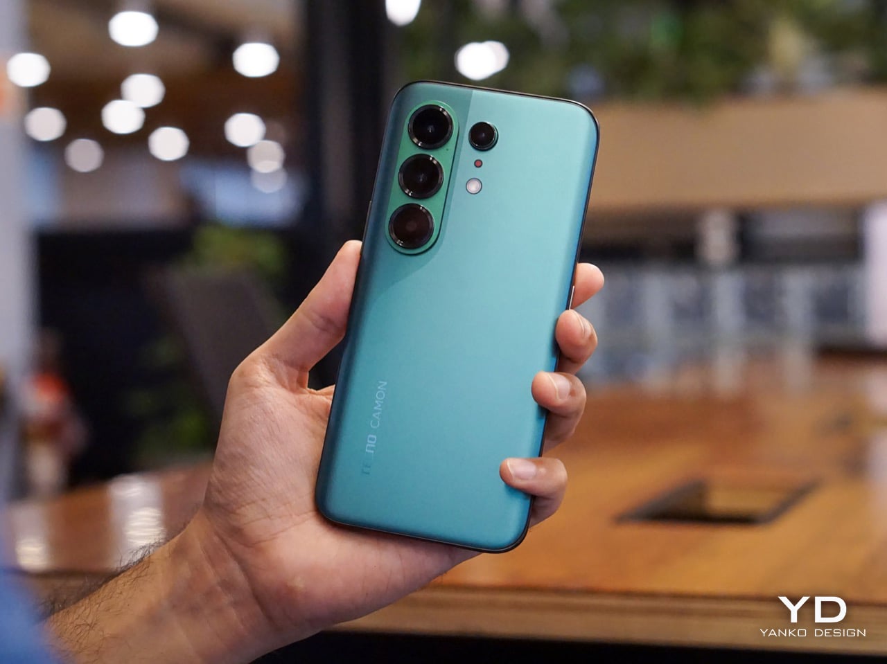
The moment I unboxed the Camon 50 Ultra 5G, I was hit with a serious case of déjà vu. The green variant has a gorgeous satin finish that gives it a silky, metallic glow under the light, and it immediately sent me down a memory lane trip to my old OnePlus 8 Pro which I faithfully used from 2020 to 2024. The color, the texture, even the way the camera module is arranged, it all felt so familiar and, frankly, so premium. Tecno absolutely nailed the flagship-esque feel here. The back is smooth to the touch, resists fingerprints reasonably well, and has a subtle elegance that a lot of phones in this bracket just do not bother with.

The front is where the design language gets a little more complicated, at least for me. Tecno went with a waterfall display, which means the screen curves dramatically around the sides. It looks stunning when the phone is off or when you are watching a video, creating an immersive, almost bezel-free experience. But I have always had a love-hate relationship with these displays. They are beautiful, no doubt, but they can be a magnet for accidental palm touches. While the software does its best to ignore them, I still found myself occasionally tapping something I did not mean to. It is a classic case of striking aesthetics meeting the messy reality of how we hold our phones. I do have to say that Tecno’s Liquid Glass homage does look much better on a waterfall display than on a bezel-ridden iPhone.

Ergonomics

That waterfall display has a big effect on how the phone feels in your hand. The curved edges melt away into the frame, making the Camon 50 Ultra 5G incredibly comfortable to hold. There are no sharp, flat corners digging into your palm, which is great for long sessions of scrolling or gaming. The trade-off, of course, is that the phone can feel a little slippery if you are not paying attention. It has that smooth, polished-stone feel that is lovely to touch but always feels one careless gesture away from a gravity experiment. It is a phone that practically begs to be put in a case, even if it feels like a shame to cover up the design.

The button layout is personally feels a little little bit tricky. On the left, you have a dedicated AI key that summons EllaClaw, a shortcut I ended up using constantly. You can remap it, but having a one-press gateway to the AI is a smart touch. The right side, however, is where my muscle memory started to complain. There is a power button and a fairly short, single-piece volume rocker. Because the rocker is slightly compact, I often found myself fumbling, unsure if my thumb was on volume up, down, or about to lock the screen. It is a small pain, but a tiny indent in the middle of the volume button would have made all the difference. The buttons themselves are slightly sharp and textured, a necessary choice for a phone with curved edges, but it does not quite solve the problem of telling them apart by feel alone.

Performance

EllaClaw is where the Camon 50 Ultra 5G earns its stripes. The dashboard (which you access by swiping towards the left – where you’d see Google Discover on most Android phones) keeps surfacing prompts, shortcuts, and suggestions, making the AI feel alive and accessible rather than buried under three layers of settings. Most phone AI treats users like they should already know what they want. EllaClaw meets you halfway, and that changes everything about how you interact with the phone.

The deeper layer, EllaClaw Pro, is genuinely impressive. It reaches into the phone’s apps and system functions in a way that feels ahead of where the conversation currently is. I asked it to summarize my text messages without opening the messages app, and it did exactly that, handling the whole thing on its own. That kind of agentic behavior is the next logical step for phone assistants, and right now, Tecno seems to be ahead of the pack. Nothing reassured me that the AI wasn’t reading my messages to enhance its database though, so the privacy conscious might have a thing or two to worry about.

Tecno’s decision to build EllaClaw as a multi-model hub is one of the smartest software calls I have seen this year. My unit offered access to DeepSeek, Gemini, ChatGPT, Grok, and Meta AI alongside Ella’s own model, all in one dashboard. Claude is conspicuously missing, but everything else is here and free to use (at least during the Beta period). Daily limits are applied on AI use which reset every 24 hours, and you can buy extra credits in case you overshoot. In all my hours of testing, I never needed to purchase extra credits, which means image generation, video generation, and sketch-to-photo tools were all available at no additional cost.

EllaClaw is still being refined, though. The dashboard lagged occasionally, and the AI sometimes took longer to load than felt comfortable. Restarting the app always sorted it out, but it is a reminder that this experience has not fully grown into its ambition yet. Users in certain regions may also need a VPN to get the full experience running, which is worth knowing upfront.

The camera system is built around a 50MP Sony LYT-700C main sensor with OIS, paired with a 50MP telephoto lens offering 3x optical zoom (70mm equivalent) and an 8MP ultrawide. That telephoto is a proper standout for a phone at this price point, and the software leans into it with confidence. You get 60x hybrid zoom, which is mostly digital exaggeration past the 3x mark, but the results between 3x and 10x are still usable in decent light. The main camera performs well across a range of scenarios, especially in good light, and night mode is aggressive without getting too soupy. The front camera is a 50MP sensor with autofocus, which makes a noticeable difference in selfie sharpness compared to the fixed-focus cameras on cheaper phones.

Tecno stuffs the camera app with modes including dual-cam, underwater mode, document scanning, super night mode, and super macro. FlashSnap is the standout, though. It watches your scene and captures the most dramatic moment automatically, so if someone is mid-jump or mid-throw, the phone clicks at exactly the right time without you having to think about it. It made me look like a considerably better photographer than I actually am. Video recording tops out at 4K at 30fps, which is fine but not particularly exciting.

Battery life is one of the phone’s most quietly satisfying qualities. The 6500mAh cell pushed comfortably through two full days of use without needing a charge, which is more than my current flagship iPhone manages. At some point I just stopped thinking about charging altogether, which is the best thing a battery can do. The phone supports 45W wired charging, which is fast enough to feel civilized without being record-breaking.

The display is a 6.78-inch AMOLED panel with a 1.5K resolution (1208 x 2644 pixels, 429 ppi) and a 144Hz refresh rate with LTPO support for adaptive refresh. It is vibrant, sharp, and performs well in low light. The 144Hz refresh makes scrolling and gaming feel smooth, and the high PWM dimming (2160Hz) helps reduce flicker for those sensitive to it. The curved waterfall edges are a design choice I have already aired my reservations about, and this section will not relitigate that argument. It looks great. It catches accidental touches. Moving on.

Speakers are a weak spot, and a noticeable one. There is a single grille at the bottom right, so stereo is off the table, and the audio leans tinny with very little bass to speak of. For a phone this polished everywhere else, it feels like a department that got the budget cut.

Gaming held up well for everything I tried. Tecno’s dedicated gaming software manages frame rates and battery draw sensibly, and the Dimensity 7400 handled casual to moderate sessions without complaint. The 144Hz display helps make fast-paced games feel responsive, and the phone stayed well within comfortable temperature ranges throughout. Nothing I played caused any real issues, thermal throttling never became a concern, and the large battery meant I could game for extended sessions without nervously watching the percentage drop.

Sustainability

Tecno is promising 3 years of Android OS upgrades and 5 years of security patches for the Camon 50 Ultra 5G, which puts it roughly in line with brands like Motorola and slightly ahead of OnePlus, though still behind Nothing’s 6-year security support.That is a meaningful commitment for a phone at this price, especially if you are someone who plans to use the device well beyond the usual two-year upgrade cycle.

Tecno also claims the battery is built for durability, marketing it as a “5-Year Durability Battery” with TÜV certification and a 72-month lag-free guarantee. Whether that holds true in practice is something only time will tell, but the fact that the company is willing to stake that claim suggests they are at least thinking about longevity beyond the usual marketing fluff. The 6500mAh capacity itself helps, because the less frequently you need to charge, the slower the battery degrades. If you are getting two full days of use out of a charge right now, that headroom means the phone should still feel usable years down the line when the cell inevitably loses some of its capacity.

Value

The Tecno Camon 50 Ultra 5G is priced at $420 for the 8GB + 256GB variant (that’s based on its ₹40,000 Indian price, since the phone hasn’t officially launched in the US). For a phone with a 50MP telephoto, a 144Hz AMOLED display, and a 6500mAh battery, that positioning feels competitive in the under-40K segment, especially when you factor in the AI ambitions.

What feels less competitive is the setup experience. When I powered on the phone and began the initial configuration, India was not listed in the countries menu. Hilariously enough, Palestine was available as an option. The world’s most populated country, nowhere on the list. I eventually had to select a different region just to proceed, which immediately felt awkward for a phone launching in India. Later, I also needed a VPN to access EllaClaw, which could have been a software issue tied to my initial region selection, or it could point to broader availability constraints. Obviously this won’t be the case for everyone since mine was a review unit with the EllaClaw beta program probably tied to a certain region. Either way, it is a frustrating first impression for a feature that is supposed to be the phone’s main selling point.

As for EllaClaw Pro and its credits system, Tecno does offer a credit-based structure for premium AI features like image generation and video creation. In my testing, I never hit a paywall or needed to purchase add-on credits, which suggests the included allocation is generous enough for typical use, at least initially. How sustainable that remains over time, or whether Tecno tightens the limits later, is harder to predict. For now, though, the experience feels surprisingly open, which is a rare thing in the AI phone space.

Verdict

The Tecno Camon 50 Ultra 5G delivers a lot of value for $420. The camera is genuinely impressive, with super night mode shots and 60x zoom that feel bonkers for this price range, and the battery life makes it easy to forget about charging anxiety for days at a time. But I am not recommending this phone for its camera, or its battery, or even its design, as much as I enjoyed all of those things. I am recommending it for EllaClaw, because it is the closest I have come to using a phone AI that feels like it was built for actual humans.

EllaClaw is everything Gemini and Apple Intelligence hope to achieve, and a bit more. I did not think I would see a phone that lets me choose the LLM for its AI assistant, swapping between models depending on what I need. I definitely did not expect an AI assistant dashboard to genuinely give me so much insight and value into how I can use the AI, rather than just sitting through a keynote, nodding along to feature lists, and then forgetting half of them the moment I leave the room. Tecno has cracked something here that bigger brands are still struggling with, which is making AI feel approachable, integrated, and genuinely useful instead of intimidating or buried.

The phone has a few tiny flaws that feel manageable if you’re more driven by the AI chops. The speakers are tinny, the curved display catches palm touches, EllaClaw occasionally lags, and the setup process was a bit of a hassle given I needed a VPN to get EllaClaw to work (but that’s just my China-bound review unit). But if you are looking for a phone that shows you what AI on mobile should feel like when it grows up, the Camon 50 Ultra 5G is worth your attention. It is not perfect, but it is ambitious in all the right ways. Google, Apple, and Samsung could surely take notes.

The post Tecno Camon 50 Ultra 5G Review: A $420 AI Phone With Built-in Gemini, ChatGPT, DeepSeek, and Grok first appeared on Yanko Design.

  • ✇Yanko Design
  • The Pixel 11’s Coolest New Feature Is Actually 10 Years Old
    The Pixel 11 lineup arrived this week with a genuinely great redesign. The camera bar is 40 percent thinner, the glass runs edge to edge, and for the first time in a while a Pixel actually looks like it evolved instead of just got a new coat of paint. And then there’s HiLight, the one piece of new hardware Google actually wants you to talk about. A small LED cluster tucked into the corner of that same camera bar, ready to glow when Gemini is thinking or when someone you love is calling. It is,
     

The Pixel 11’s Coolest New Feature Is Actually 10 Years Old

12 août 2026 à 17:30

The Pixel 11 lineup arrived this week with a genuinely great redesign. The camera bar is 40 percent thinner, the glass runs edge to edge, and for the first time in a while a Pixel actually looks like it evolved instead of just got a new coat of paint. And then there’s HiLight, the one piece of new hardware Google actually wants you to talk about. A small LED cluster tucked into the corner of that same camera bar, ready to glow when Gemini is thinking or when someone you love is calling.

It is, in essence, Google finally admitting it missed the old Nexus notification LED and bringing it back. Five colors, a glow for Gemini, a glow for your favorite caller, and that’s the whole feature list on day one. Nothing to complain about here, except that Nothing exists. The London phone brand has spent years turning its own version of this idea into an actual playground, mini-games, custom widgets, an SDK anyone can build on. Google clearly has the engineering muscle to do something just as ambitious with HiLight down the line. It just chose not to, at least not yet.

Designer: Google

Before we get into that though, credit where it’s due. Hold a Pixel 11 next to a Pixel 10 and the difference is immediate, not the kind that only shows up in marketing photos. The bar sits almost flush now, and Google’s claim that it’s basically bumpless with a case on actually checks out in person. Under that glass, Tensor G6 lands on a 2nm node, Google’s first, promising 25 percent faster browsing, 15 percent quicker app launches, and on-device AI running up to 3.5 times faster while using less power. The Pixel 11 gets a new 48MP main sensor with 56 percent more light sensitivity and a telephoto stretching to 30x Super Zoom. This is a very complete phone before you even get to the Pro models.

The Pro and Pro XL push further with a 50MP main sensor, a redesigned 48MP telephoto, Portrait Mode at 5x, and 120x Pro Zoom, sitting under a 3,600-nit display that Google claims is twice as scratch resistant as last year’s. Titan M3 adds quantum-safe boot security on top. The Pixel 11 Pro Fold deserves its own mention here too. It shed almost 10 percent of its weight and a millimeter of thickness, down to 10.1mm closed, while Google claims triple the durability thanks to a redesigned gearless hinge. The crease is genuinely harder to spot than last year’s, and the whole thing folds flat enough to stop feeling like a novelty. If you told me a year ago Google would have the most convincing foldable in its own lineup, I would not have believed you.

Now, the part everyone will bring up regardless of how the rest of this goes: RAM. The Pro and Pro XL start at 12GB in their base 256GB configs, down from 16GB last year, and Google is blaming this on a supplier RAM shortage hitting the entire industry. Memory manufacturers have been shifting production capacity toward AI server chips, and consumer RAM and NAND prices have spiked hard enough this year that people are half-jokingly calling it RAMageddon. It is a real problem, and Google is far from the only phone maker feeling it. Storage doubling to 256GB as a base softens the blow a little, but a $100 price bump alongside a RAM cut is still a hard sell. Fair enough on the supply chain excuse. Less fair asking Pro buyers to pay more for less unless they climb a storage tier.

Back to HiLight, because it deserves the real estate. That LED cluster sits right where the temperature sensor used to live on older Pixels, which is a strange trade to make for something this limited. Google’s official pitch is that HiLight keeps you informed without the distraction of staring at a screen, which is a very polished way of saying there weren’t enough ideas to fill the space. Glowing when Gemini talks and flashing a color for favorite callers is a fine start, not an entire feature. Compare that to what’s happening across the pond. Nothing’s Glyph Matrix on the Phone (3) packs 489 individually lit LEDs into what functions as a tiny secondary screen, complete with an open SDK that lets anyone build their own widgets and games. People made a working ball maze. A tilt-controlled Magic 8 Ball. A contact dialer you can use without touching the main display. None of it is essential, but all of it is fun, and fun counts for something when you’re asking someone to pay a premium for a light.

Google clearly has the horsepower for something bigger here. Tensor G6 alone proves the company isn’t short on engineering muscle, and the camera bar redesign shows the industrial design team knows exactly what it’s doing right now. HiLight feels like the output of a team that had a great idea, then stopped one meeting short of making it good. I want to see where this goes in a year or two, because the foundation Google just built, the hardware, the placement, even the name, is genuinely solid. It just needs an actual reason to exist beyond telling you Gemini is thinking.


The post The Pixel 11’s Coolest New Feature Is Actually 10 Years Old first appeared on Yanko Design.

  • ✇Yanko Design
  • Google’s Pixel Tag is making the same ‘boring’ design mistake that Apple, Samsung, and Xiaomi made
    The Pixel Tag comes in exactly one color, a grey green called Fog, wrapped around stainless steel with a G logo stamped right on the front. It’s the same script Apple wrote with the AirTag and Samsung copied with the SmartTag2. A tracker spends its entire life clipped to your keys or your dog’s collar or tucked into a backpack pocket, which makes it one of the most personal objects you own. Google, of all companies, knows how to make hardware feel less like hardware. It just didn’t bother here.
     

Google’s Pixel Tag is making the same ‘boring’ design mistake that Apple, Samsung, and Xiaomi made

12 août 2026 à 15:15

The Pixel Tag comes in exactly one color, a grey green called Fog, wrapped around stainless steel with a G logo stamped right on the front. It’s the same script Apple wrote with the AirTag and Samsung copied with the SmartTag2. A tracker spends its entire life clipped to your keys or your dog’s collar or tucked into a backpack pocket, which makes it one of the most personal objects you own. Google, of all companies, knows how to make hardware feel less like hardware. It just didn’t bother here.

Somebody at DJI figured out that a $60 microphone could come with snap-on decals, because apparently even a tiny accessory deserves a little personality. Motorola figured out something similar with the Moto Tag, which actually ships in sage green and a soft blue instead of the usual black or white default. So it’s not like nobody in tech has thought about this. It’s just that almost nobody applies it to trackers, and now Google has joined the long list of companies that had the chance and passed.

Designer: Google

The excuse I keep hearing, and I use that word deliberately, is durability. Metal survives drops, fabric doesn’t, case closed. Except my phone survives daily abuse inside a woven case, and so does yours, and so does every rugged Kevlar sleeve sold by the millions for devices far more fragile than a coin sized tracker. Nobody worries their phone case is going to disintegrate because it has some texture on it. A tracker being too delicate for color or grip is not a real constraint. It’s a decision that got dressed up as one.

Underneath that decision is genuinely solid engineering, for what it’s worth. The Pixel Tag measures 1.8 by 1.1 inches and just 5.4mm thick, which makes it noticeably slimmer than the AirTag’s 8mm body. It runs on a replaceable CR2032 battery rated for about a year, carries an IP67 rating for dust and water, and pairs instantly over Fast Pair with any Android 9 device or newer. The headline feature is Ultra Wideband combined with Bluetooth Channel Sounding, which gives you a literal on-screen arrow and distance reading instead of a vague “getting warmer” signal, though that trick needs Android 16 and Bluetooth 6.0 to actually work. It taps into Find Hub, Google’s network of over a billion Android phones, so a lost item can get spotted even when it is nowhere near your own devices. You can share access with up to ten people, ring it from a Pixel Watch, or ask Gemini through your Pixel Buds to ring it for you. All of that ships November 11 for $29, or $99 for a four pack.

Google already knows how to wrap good engineering in an object people actually want to look at, because it solved the exact same brief years ago with its speakers. The Nest Mini gets a soft, woven top because Google understood people don’t want to display a hunk of bare plastic on their kitchen counter. The Nest Audio does the same thing, fabric front, rounded edges, an object designed to belong in a room rather than announce itself as a gadget in one. That instinct exists inside the same company that just shipped a keychain accessory in one shade of grey with a logo dead center, like it needed to remind you it’s tech.

A tracker’s entire job is to sit quietly on the stuff you actually care about. It should feel like something you chose, not something you tolerated because the tech underneath happened to be good. Find Hub integration, UWB precision finding, a battery that lasts a year, all of that is genuinely solid work. But solid engineering wrapped in a logo stamped on steel isn’t a finished product. It’s half of one, and Google, weirdly, is the company with the least excuse for stopping there.

The post Google’s Pixel Tag is making the same ‘boring’ design mistake that Apple, Samsung, and Xiaomi made first appeared on Yanko Design.

  • ✇Yanko Design
  • This $2,999 Device Turns Your Desktop Into A Custom Apparel Printing Factory (With Air Purification)
    Let’s talk about the math for starting a small apparel brand. You have the designs, the drive, and a growing list of people who want to buy your stuff. Then you look up the gear. Aside from the thousands in hardware, materials, and a good air-purification system (because breathing is generally a good thing), you’re also looking at a massive space investment. Suddenly, you’re nearly $10k in, and need an entire garage for something the XtraMaker M1 Series offers in a tabletop format for a fractio
     

This $2,999 Device Turns Your Desktop Into A Custom Apparel Printing Factory (With Air Purification)

5 août 2026 à 21:45

Let’s talk about the math for starting a small apparel brand. You have the designs, the drive, and a growing list of people who want to buy your stuff. Then you look up the gear. Aside from the thousands in hardware, materials, and a good air-purification system (because breathing is generally a good thing), you’re also looking at a massive space investment. Suddenly, you’re nearly $10k in, and need an entire garage for something the XtraMaker M1 Series offers in a tabletop format for a fraction of the price. With a modular printhead design no less, allowing for customization all within the form factor of a large microwave oven.

This is where the XtraMaker M1 Series finally brings apparel creation into the desktop factory era. It takes that sprawling, expensive production line and collapses it into a single, self-contained unit for $2,999. This is the micro-factory for fabric we’ve been waiting for, handling everything from printing the transfer to curing the adhesive inside a fume-filtered system that fits on a desk. It’s the machine that makes the business plan finally make sense, shrinking the startup cost by two-thirds and proving that the next big apparel brand doesn’t need an industrial loan to get started; it just needs a desktop.

Designer: XtraMaker

Click Here to Buy Now: $2999 $6499 ($3500 off). Hurry, only 38/50 left! Raised over $331,000.

The M1’s core innovation is condensing the entire five-step DTF relay race into a single, autonomous sprint. It prints, powders, shakes, cures, and purifies its own air without any manual handoff between stages. This integrated workflow is critical for a desktop machine, as it eliminates the mess and fumes that make traditional DTF printing impossible in a home or small studio. The enclosed system uses a multi-layer filter to capture stray adhesive powder and neutralize the chemical smell from the curing process, keeping the workspace clean and breathable. This turns what was once a multi-machine, garage-only operation into a clean, one-click process you can run from a spare room.

Print quality is anchored to commercial standards, with G7 Master-certified color accuracy ensuring that on-screen RGB designs translate faithfully to the final CMYK print. At a resolution of 1440×1440 DPI, the M1 Series produces sharp, detailed transfers where fine lines and photo-realistic gradients come through cleanly. The resulting prints are just 0.5mm thick, allowing them to blend seamlessly with the fabric’s texture rather than sitting on top like a stiff, plastic patch. This professional-grade output works across a huge range of materials, from cotton, denim, and polyester to more delicate fabrics like silk, giving creators a massive canvas for their ideas.

XtraMaker’s engineers clearly obsessed over reliability, building in a suite of defensive systems to prevent common failures. The most notorious issue in DTF printing, white ink clogging, is addressed by the LoopMaster™ system, which uses automatic 15-minute circulation cycles and continuous cartridge stirring to keep the dense ink from settling and drying in the lines (the white ink circulation system operates with zero ink consumption too). Even more impressive is the built-in UPS battery. If power cuts out, the battery instantly triggers a flush, replacing the ink with a protective fluid to save the printhead from drying out. The UPS battery also powers the printer’s auto-maintenance system while the machine is on standby or powered off. This enables the machine to automatically fill the ink channels with moisturizing liquid and keep the white ink stirring continuously for up to 30 days. Combined with over 20 sensors that monitor the machine’s health and ink levels in real-time, all this creates a system that actively works to prevent the most expensive and frustrating problems before they happen.

The entire package is tailored for small business growth, from the software to the hardware options. The XtraMaker Studios app includes a cost estimation tool that calculates ink and film usage, giving you a precise per-print cost so you can price your products profitably. A 3D preview feature also lets you see how a design will look on a finished garment, saving time and materials. The M1 itself comes in two sizes: the standard M1 for A4-sized prints, perfect for logos and chest graphics, and the larger M1 Pro, which handles A3+ prints for full-back designs on hoodies and jackets. This gives a growing brand a clear upgrade path as their product line and ambitions expand.

XtraMaker’s M1 Series is aimed squarely at the new wave of creators: Etsy sellers, independent streetwear labels, and craft fair operators who need professional output without the industrial overhead. While other desktop DTF printers exist, none integrate the entire five-step workflow, the advanced anti-clog and power-loss protection, and the built-in air purification into a single unit at this price. It’s a machine that understands that for a small business, the real costs are complexity, downtime, and mess.

Click Here to Buy Now: $2999 $6499 ($3500 off). Hurry, only 38/50 left! Raised over $331,000.

The post This $2,999 Device Turns Your Desktop Into A Custom Apparel Printing Factory (With Air Purification) first appeared on Yanko Design.

  • ✇Yanko Design
  • Nothing killed the Glyph Interface. This Teenage Engineering synth concept argues that was a mistake
    Nothing spent three phone generations convincing us that a few light strips on the back of a device counted as a personality. The Glyph Interface was the whole brand in one gesture, a Morse code of notifications you could read with the phone face-down on a bar table. Then Phone (3) arrived in July 2025 with the Glyph Matrix instead, a small dot matrix circle tucked in the corner, and the comment sections held a funeral. “NO GLYPH” became the shortest and angriest review of the year. Which makes
     

Nothing killed the Glyph Interface. This Teenage Engineering synth concept argues that was a mistake

4 août 2026 à 20:30

Nothing spent three phone generations convincing us that a few light strips on the back of a device counted as a personality. The Glyph Interface was the whole brand in one gesture, a Morse code of notifications you could read with the phone face-down on a bar table. Then Phone (3) arrived in July 2025 with the Glyph Matrix instead, a small dot matrix circle tucked in the corner, and the comment sections held a funeral. “NO GLYPH” became the shortest and angriest review of the year. Which makes it pretty funny that the most convincing argument for reviving that light language has come from a fan concept for a synthesizer.

Abdelrahman Shaapan’s Mini OP-3 wraps a semi-transparent rear panel around a compact synth, with LED effects and dynamic graphics that pulse along to whatever you’re playing. Flip it over and the front is pure Teenage Engineering, a clamshell with a touchscreen lid and a control deck of encoders, transport keys, numbered pattern buttons, and one red COPY key doing a lot of emotional labor. Shaapan calls the project an exercise in translating the design DNA of both brands into a single object. He also added a charm attachment point on the screen corner, because it is 2026 and everything needs a little guy hanging off it. The pitch is a smaller OP that keeps you off your laptop during production and live sets.

Designer: Abdelrahman Shaapan

Ten function keys run across the top of the deck, covering waveform and tape banks, sync, split, copy, paste, metronome, scissors, monitoring, and loop. Below them sit eight encoders arranged in a greyscale gradient from black to white, which is the single most OP-1 gesture available to any designer working in this language. A transport row follows with record, play, and numbered pattern keys, then a modifier row carrying shift, divide, ramp, and a random button. The hinge hides a perforated speaker band, and the front edge packs two USB-C ports beside four 3.5mm jacks. Every control is round, tactile, and spaced like it expects to be hit fast in a dark room.

Nothing built its identity on light as an interface, then retired it on the Phone (3) in favour of a dot matrix that most owners still describe as a downgrade. Shaapan’s rear panel puts that language back to work, running LED effects and dynamic graphics that respond to your audio in real time. On a phone, reactive lighting was always slightly decorative, a party trick for incoming calls and little else. On an instrument, it has an actual job, giving you a visual read on your track from across a stage or a crowded studio. Relocating the Glyph to the one product category where it earns its keep is a sharper piece of brand analysis than most fan concepts manage.

Shaapan rendered the whole thing in KeyShot. The soft-touch black body, the subtle sheen on the encoder caps, and that partially translucent rear panel with internals showing through all read as convincingly manufacturable rather than aspirational. The charm attachment point is the detail I keep coming back to, since TE has always sold straps and cases as identity objects and phone charms are having a genuine cultural moment. We covered a Teenage Engineering DJ console concept a couple of years back, and this one clears that bar comfortably. The presentation is good enough to be mistaken for a leak.

One thing undercuts the pitch. Shaapan says the goal was minimizing laptop dependence, but three renders show Ableton Live running on the touchscreen, which means the device became a laptop instead of replacing one. Ableton’s own Push 3 already solves the standalone problem and charges around two thousand dollars for it. That gap between the stated intent and the renders is the part a real product team would have to close first. Everything else here, though, is a better Nothing product than Nothing’s last one.

The post Nothing killed the Glyph Interface. This Teenage Engineering synth concept argues that was a mistake first appeared on Yanko Design.

  • ✇Yanko Design
  • Michelangelo’s iconic David bust gets recreated in LEGO, turning plastic into sculpted marble
    If you ever took a drawing class, you have met this face. Art schools spent about two centuries buying plaster casts of David’s head and parking them on shelves so students could sit there for six hours learning to render a nostril. The Victoria and Albert Museum owns a full size cast of the whole statue, and famously kept a plaster fig leaf on standby in case Queen Victoria dropped by and needed the shock absorbed. So David has been getting copied, shrunk, cast, and occasionally censored for a
     

Michelangelo’s iconic David bust gets recreated in LEGO, turning plastic into sculpted marble

4 août 2026 à 17:30

If you ever took a drawing class, you have met this face. Art schools spent about two centuries buying plaster casts of David’s head and parking them on shelves so students could sit there for six hours learning to render a nostril. The Victoria and Albert Museum owns a full size cast of the whole statue, and famously kept a plaster fig leaf on standby in case Queen Victoria dropped by and needed the shock absorbed. So David has been getting copied, shrunk, cast, and occasionally censored for a very long time. Turning him into a toy is not the sacrilege it sounds like. It’s basically the family business.

Which brings us to Ysien, a LEGO Ideas builder who decided the next material in that lineage should be ABS plastic. The build renders David’s head, neck, shoulders and upper chest as a classical bust, entirely in white, sitting on a proper stepped pedestal. No color, no minifigure, no cheeky accessories. Just light and shadow doing all the work, exactly like the plaster casts it descends from.

Designer: Ysien

The hair is the whole reason this MOC (My Own Creation) works. Hair is where sculptors get found out, because faces have anatomy underneath that you can reason your way through, while hair is a mass of overlapping nothing that somehow has to read as soft. Michelangelo’s answer was a tangle of deep drilled curls. Ysien’s answer is a genuinely absurd stack of curved slopes and half arch elements layered at varying depths, so each curl throws its own little shadow instead of flattening into texture. “The hair was one of the greatest challenges, with each curl contributing to the overall silhouette, depth, rhythm, and movement,” he says, which is a very polite way of describing what must have been several evenings of quiet suffering.

My favorite decision, though, is that the seams stay visible. Ysien could have chased a smooth marble finish and lost, because bricks do not do smooth. Instead he let the geometry become part of the sculpture, so the thing reads as a portrait from across the room and as unmistakable LEGO up close. The eyes get a similar treatment, built from inverted round elements that give David that vacant classical stare, which is a nice accident given the real statue has heart shaped pupils drilled into it. Monochrome white does the rest, forcing every bit of the anatomy to be described by shadow alone. There’s no piece count listed yet, although I wouldn’t be surprised if it was in the high hundreds.

Ysien’s David is currently sitting at just over 400 supporters with 424 days on the clock, which means there is a long road to the 10,000 votes that trigger an official LEGO review. LEGO Ideas is where fan builds get their shot at becoming retail sets, and this one deserves a look. The only thing I’d add is a black variant, because a basalt David would be an absolute menace on a shelf. You can head to the LEGO Ideas page and cast your vote!

The post Michelangelo’s iconic David bust gets recreated in LEGO, turning plastic into sculpted marble first appeared on Yanko Design.

❌