❌

Vue normale

  • ✇Yanko Design
  • The 5 Best Outdoor Gear of November 2026
    A campsite gets complicated through small inconveniences: a flashlight that’s running low, cookware competing for space, nowhere inviting to sit once dinner is done. Those are useful starting points for an outdoor gear roundup. This November’s selection looks at designs that address the practical business of spending time outside, with room for a telescope that gives you a reason to stay out long after the dishes have been put away. These are our editorial picks for November 2026, selected for
     

The 5 Best Outdoor Gear of November 2026

7 novembre 2026 à 07:40

A campsite gets complicated through small inconveniences: a flashlight that’s running low, cookware competing for space, nowhere inviting to sit once dinner is done. Those are useful starting points for an outdoor gear roundup. This November’s selection looks at designs that address the practical business of spending time outside, with room for a telescope that gives you a reason to stay out long after the dishes have been put away.

These are our editorial picks for November 2026, selected for their approach to carrying, setting up, and using outdoor equipment. They aren’t five releases from the same month, and this isn’t a ranking based on comparative field testing. Each offers a specific design detail worth considering, along with compromises that deserve attention before anything joins your packing list. Think of the collection as five different possibilities, not one mandatory kit.

1. Olight Baton 4 Premium Edition

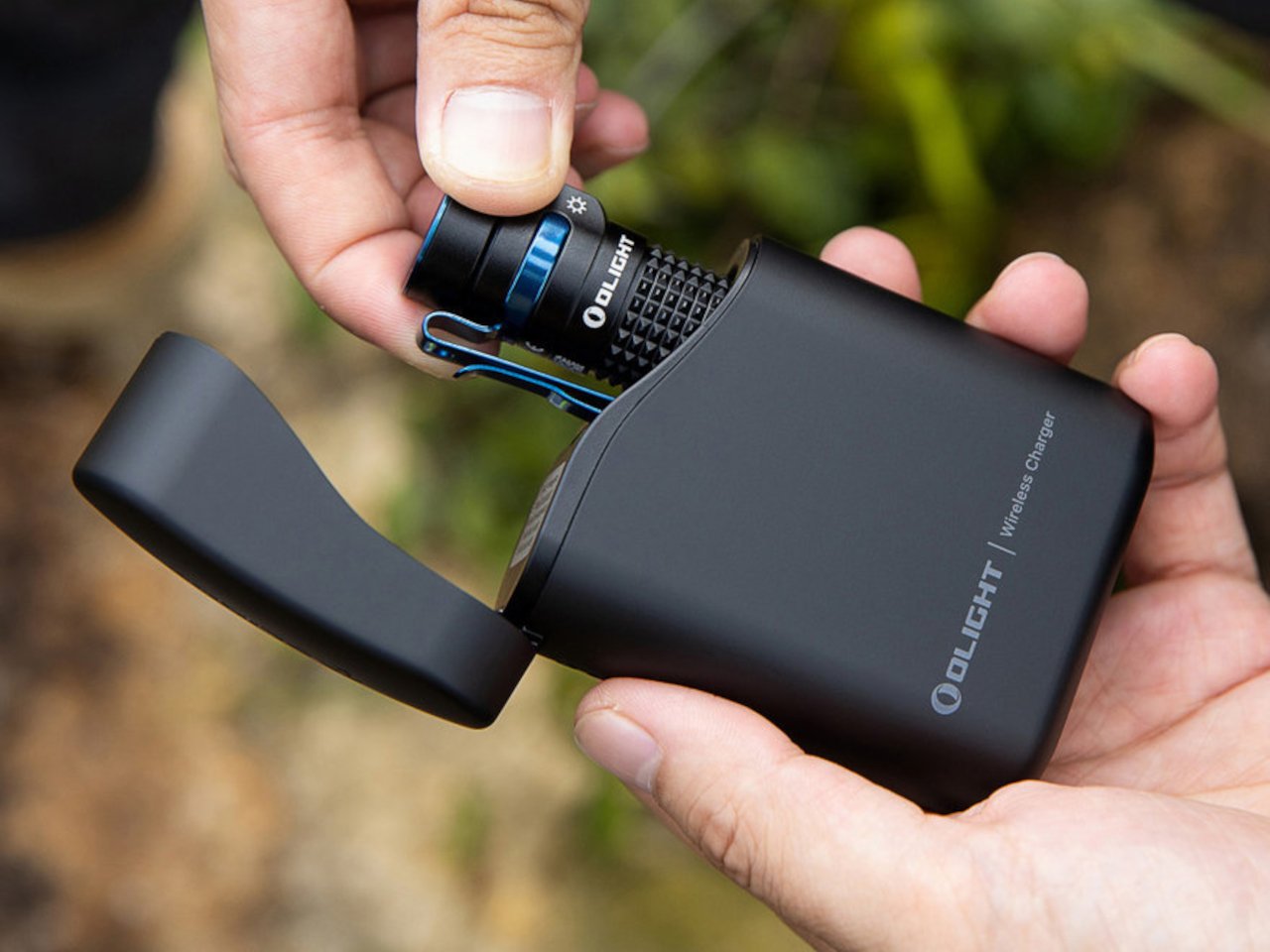
The smartest part of Olight’s Baton 4 Premium Edition is the case. Its flip-top enclosure carries a 5,000mAh battery, recharges the flashlight, and lets you operate the light without removing it. Open the lid, press the case’s button, and the flashlight can illuminate while remaining docked. Holding the button adjusts brightness. That gives the enclosure a useful role beyond storage, particularly when you only need a quick look inside a bag or around the campsite before putting everything away again.

The flashlight itself measures just 2.48 inches long and weighs 52.5 grams with its battery. Olight rates its maximum output at 1,300 lumens, though the manual shows that turbo brightness begins stepping down after 90 seconds. The case also supplies USB-C power to external devices, offering backup charging without another dedicated battery pack. There’s a packing tradeoff: the 142-gram case weighs considerably more than the light. Bring both when charging flexibility matters; carrying only the flashlight keeps things much lighter.

What we like

  • The flashlight remains usable while docked in its charging case.
  • USB-C output gives the case a second job: powering other devices.

What we dislike

  • The charging case adds considerably more weight than the flashlight alone.
  • The 1,300-lumen maximum is a brief turbo setting, not sustained output.

2. DWARFLAB Draco Smart Telescope

DWARFLAB’s Draco is the indulgence in this selection: a preorder smart telescope designed for photographing the night sky. Its 90mm aperture, folded optics, and integrated cameras bring several astronomy components into one portable instrument. The particularly interesting mechanism is a rotating imaging sensor that compensates for field rotation, the apparent twisting of stars across an image during an exposure. DWARFLAB advertises single exposures of up to 300 seconds, with guiding hardware built into the telescope instead of attached as another accessory.

The practical appeal is how much setup the system takes on. Through the DWARFLAB app, Draco automates focusing, targeting, tracking, and image stacking, while its wide-angle and telephoto cameras can capture simultaneously. Scheduled shooting also makes an overnight session possible without constant supervision. At 5.5 kilograms, though, this is equipment to transport rather than casually add to a hiking bag.

Click Here to Buy Now: $1599

What we like

  • Integrated guiding and automated capture reduce the number of separate components to manage.
  • Simultaneous wide-angle and telephoto imaging offers two views of the same night.

What we dislike

  • A 5.5-kilogram body makes this a substantial addition to your luggage.
  • Preorder status rules it out as a dependable purchase for an imminent trip.

3. Zempire Stealth-Jet Wide Camp Stove

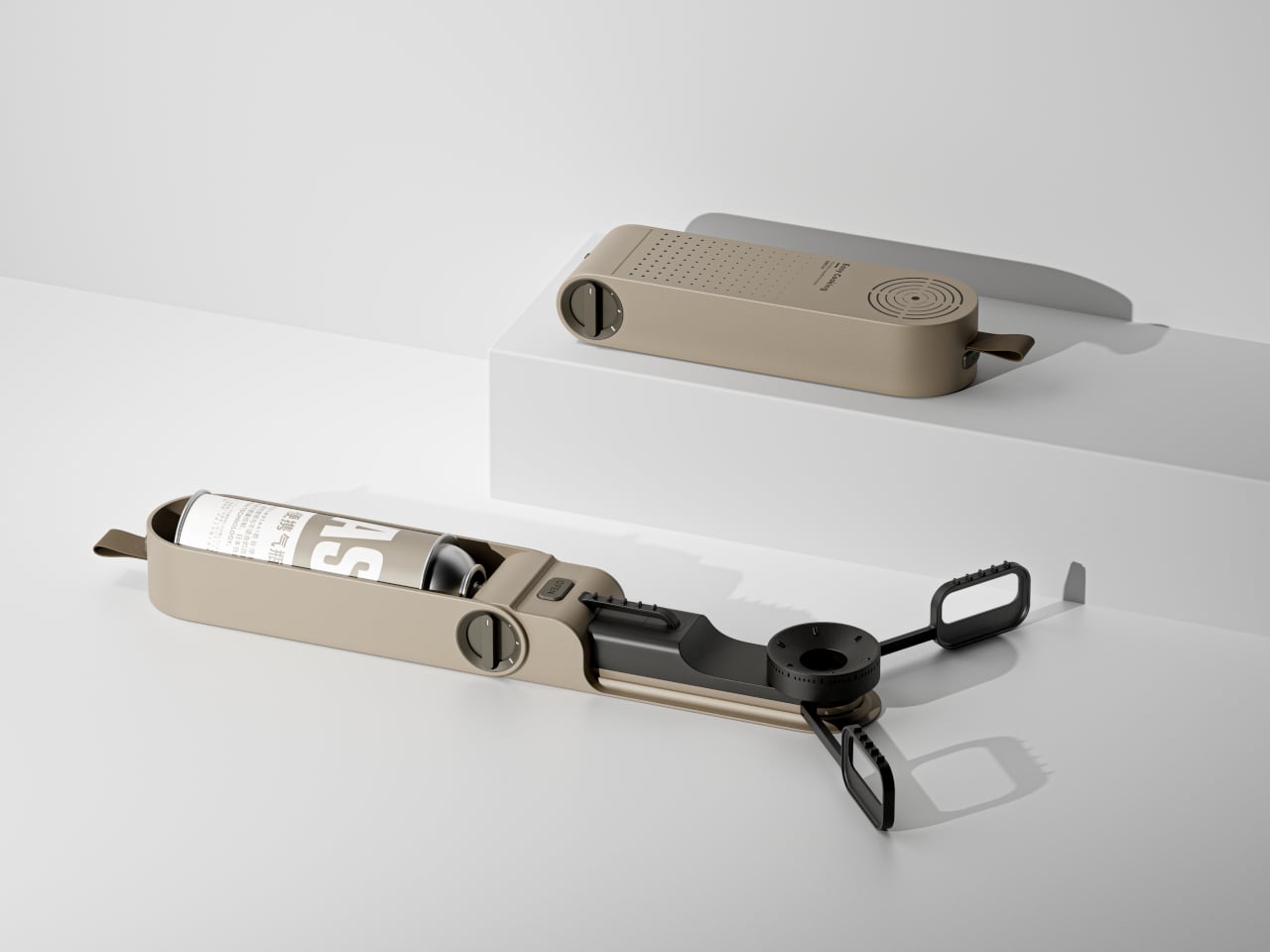
Zempire’s Stealth-Jet Wide addresses a familiar packing problem: a camp kitchen can occupy a surprising amount of the trunk. This two-burner stove closes into a powder-coated pressed-steel body just 2 inches thick. Its packed footprint remains a substantial 23.2 by 12 inches, but the shallow profile gives you a flatter object to arrange around other equipment. Open it, and the extra width provides space for larger pots and pans, with independently controlled burners rated at up to 10,000 BTUs each.

The supporting details are refreshingly practical. Rear and side wind shields surround the cooking area, pull-switch piezo ignition removes the need for matches during normal operation, and a removable pot stand provides access for cleaning. The $210 stove includes a propane canister hose connector, though fuel is separate. At 10 pounds, 13 ounces, its thinness solves storage bulk rather than backpack weight. That makes it a sensible design to consider for car camping, where fitting equipment matters more than carrying it.

What we like

  • The 2-inch packed profile reduces the stove’s storage bulk.
  • Two independently controlled burners provide flexibility for cooking a meal.

What we dislike

  • Its nearly 11-pound weight makes it poorly suited to backpacking.
  • A compatible propane canister and fuel must be purchased separately.

4. Nike ACG x Helinox Chair Zero LT

The Nike ACG x Helinox Chair Zero LT makes its construction the visual attraction. An orange frame sits beneath translucent Ghostgrid fabric, drawing attention to the supporting structure rather than hiding it under a substantial upholstered seat. Helinox describes Ghostgrid as a monofilament mesh with a reinforced ripstop grid, developed to balance low weight with resistance to abrasion and tearing. It’s an appropriate material story for a chair whose appeal depends on how little furniture you’re willing to carry outdoors.

The specifications make that argument concrete: 534 grams packed, a 265-pound stated capacity, and a carry case measuring 14 by 4.5 by 4.5 inches. Shock-corded aluminum poles form the frame, while an included X-Strap increases ground contact area to help reduce sinking on softer surfaces. Fit deserves attention before the branding: Helinox identifies adults under 5 feet, 9 inches among its ideal users.

What we like

  • A 534-gram packed weight makes the case for carrying a separate seat.
  • The included X-Strap addresses sinking on softer ground.

What we dislike

  • Helinox’s stated ideal-user guidance makes fit worth checking for taller buyers.
  • The collaboration is currently sold out on the US site.

5. Clip&Go Radio

The Clip&Go Radio puts its carrying method directly into the body. A built-in carabiner attaches the 220-gram device to a backpack or other gear, keeping its AM, FM, and shortwave radio accessible without assigning it an interior pocket. The design makes particular sense for something combining everyday listening with backup functions. There’s a flashlight, an audible SOS alarm with a flashing light, and a replaceable 2,000mAh battery that can also supply power to compatible smartphones.

The charging hierarchy is worth understanding before heading out. USB-C is the recommended primary method, with the shop listing approximately two hours for a full charge. The hand crank and solar panel are emergency alternatives, with listed charging times of approximately six and 67 hours, respectively. Neither should be mistaken for a quick substitute for plugging in. The replaceable 18650 cell is the more appealing ownership detail: when the battery wears out, you can replace it rather than retire the radio.

Click Here to Buy Now: $60.00

What we like

  • The integrated carabiner keeps it accessible.
  • Its 18650 battery is replaceable.

What we dislike

  • Solar charging is extremely slow.
  • Hand-crank charging is a lengthy backup method.

Packing Around the Trip

Before adding any of these to your equipment, decide what kind of outing you’re packing for. A trunk, a bicycle pannier, and a backpack impose different limits. Put the complete setup on the scale, including cases, cables, fuel, and accessories, rather than judging an object by its headline measurement. A thin stove still needs room around it; a compact instrument can still represent a substantial share of what you’re carrying.

It’s also worth separating the job you need done from the extra functions that sound appealing on a product page. Choose lighting around how you’ll use it, seating around your body, and specialist equipment around an activity you genuinely enjoy. Multifunctional gear earns its place when those functions match your habits. The better purchase may be the object that replaces something awkward, rather than another addition to an already crowded bag.

The post The 5 Best Outdoor Gear of November 2026 first appeared on Yanko Design.

  • ✇Yanko Design
  • This $129 Portable Jacuzzi turns any bathtub into a personal spa
    Installing a jetted tub usually means a new tub, a plumber, a dedicated electrical circuit, and some tile you never planned on replacing. That’s a lot of renovation for the simple pleasure of moving water. WAVORA’s Z1 shrinks the whole idea into a cordless puck that fits in your palm and suction-mounts inside the tub you already own. It’s roughly a hockey puck’s chubbier cousin, and it runs on a rechargeable battery, so there’s no cord dangling over the edge or near the water. Think of it as a
     

This $129 Portable Jacuzzi turns any bathtub into a personal spa

6 novembre 2026 à 21:45

Installing a jetted tub usually means a new tub, a plumber, a dedicated electrical circuit, and some tile you never planned on replacing. That’s a lot of renovation for the simple pleasure of moving water. WAVORA’s Z1 shrinks the whole idea into a cordless puck that fits in your palm and suction-mounts inside the tub you already own. It’s roughly a hockey puck’s chubbier cousin, and it runs on a rechargeable battery, so there’s no cord dangling over the edge or near the water. Think of it as a jetted tub’s greatest hit with the remodel left out.

WAVORA, a Louisville, Kentucky brand, sealed the Z1’s motor away from the bath water entirely, so there’s no spinning shaft poking through a rubber seal and waiting to leak. Most compact pumps use a rotating shaft that passes through the housing, guarded by a dynamic seal that rubs and wears every time the motor spins. The Z1 separates the drive from the transmission and closes everything up with static seals, which have no moving surfaces to grind down. The surrounding water doubles as coolant, pulling heat off the housing while it runs, which is a neat bit of free engineering. Your bath, in other words, is also the radiator.

Designer: WAVORA

Click Here to Buy Now: $129 $235 (45% off) Hurry! Only 6 days left.

A Grapefruit-Sized Jet That Mounts on the Wall or the Floor

The Z1 measures 4.3 by 3.5 inches (109 x 89mm) and weighs about 19 ounces (545g), which puts it in medium-sized citric fruit territory. Its form is a soft, cream-white drum with a slatted grille where the water exits and two control buttons on its flank. Small indicator LEDs glow through the shell, so you can check the setting without fishing the thing out. Most cordless bath jets on Amazon are taller cylinders with swiveling nozzles, and they tend to look like pool equipment. The Z1 reads closer to a diffuser or a candle, which helps when it’s sitting on a shelf between soaks.

A double-sided suction mount does the holding, sticking to the tub on one face and the Z1 on the other. It grips best on smooth, non-porous surfaces, which covers acrylic, enamel, glass, polished stainless steel, and glazed tile, so most American tubs qualify. Mount it on the side wall and you get a directional stream that sweeps across the tub like a classic jet aimed at your back. Set it on the floor and the water pushes upward through the bath instead, closer to a spring welling up from below. Swapping between the two takes seconds, which means you pick where the movement starts every night, something a built-in jet can never do.

Three Flow Modes and Up to Five Hours Per Charge

Gentle Flow keeps a soft, steady current moving around you, perfect for a bath with a book in one hand. Power Flow cranks up circulation and shoves water and existing bath foam around the whole tub, which is the setting for sore legs after a long run. Spa Rhythm pulses the intensity up and down in waves, mimicking the ebb and surge of a proper spa jet. One button cycles through all three, so switching moods doesn’t require reading a manual with wet hands. The Z1 moves water rather than injecting air, so the fizzy, aerated feel of a whirlpool comes from your bath bombs, which the launch bundle conveniently includes.

Gentle Flow runs for up to five hours on one charge, Power Flow for about two, and the pulsing Spa Rhythm for around an hour. Five hours in the gentlest mode covers several evening soaks before you need to think about a cable, unless you’re the type who refills the hot water three times. Charging happens over the included USB cable outside the tub, so the only thing near the water is a sealed puck on battery power. Being cordless also frees the Z1 from the nearest outlet, which in most bathrooms sits over by the sink. Corded rivals solve that with a 13-foot cable, which is a lot of wire to drape around a tub of water.

An Outlet You Can Rinse in the Sink, and a $129 Launch Price

Built-in jets have a reputation, and anyone who has fired one up after months of disuse has seen the flakes that come out of the plumbing. The Z1’s outlet section detaches completely, so hair, petals, and bath bomb debris get rinsed out at the sink instead of building up inside. Smaller snags come off by hand without removing anything. The entire water path lives inside a body you can hold under a faucet, so there’s no hidden pipework for gunk to colonize. Budget bath jets on Amazon run about $30 to $70, and their swiveling nozzle assemblies offer more nooks for that gunk to settle into.

The Z1 launches at $129 in a Spa Ritual Set, against a $235 MSRP, bundled with a USB charging cable, the double-sided suction mount, and a manual. WAVORA throws in six botanical bath bombs, six bath liners, and a mesh pouch, which turns the box into a ready-made gift. A single cream-white finish appears across the launch materials, with no other colors announced. Orders ship worldwide, including the US, with delivery estimated for January 2027. WAVORA hasn’t listed warranty terms yet, so check the product page before ordering. That’s a jetted tub’s worth of moving water for the price of a nice dinner, and the tile gets to stay exactly where it is.

Click Here to Buy Now: $129 $235 (45% off) Hurry! Only 6 days left.

The post This $129 Portable Jacuzzi turns any bathtub into a personal spa first appeared on Yanko Design.

  • ✇Yanko Design
  • This fan-made LEGO McDonald’s combo comes with everything except the McFlurry
    In 1999, LEGO sold an official McDonald’s restaurant brickset through its Shop at Home catalog in the US, and it was adorably tiny. Set 3438 used 98 pieces to build a little drive-through window, a car, and an umbrella table, with stickers doing most of the branding work. The employee was basically a standard LEGO chef with the logo slapped on his chest. One collector paid $75 for a sealed copy back in 2011, for a set that cost around ten bucks new. Twenty-seven years later, a fan builder think
     

This fan-made LEGO McDonald’s combo comes with everything except the McFlurry

6 novembre 2026 à 18:30

In 1999, LEGO sold an official McDonald’s restaurant brickset through its Shop at Home catalog in the US, and it was adorably tiny. Set 3438 used 98 pieces to build a little drive-through window, a car, and an umbrella table, with stickers doing most of the branding work. The employee was basically a standard LEGO chef with the logo slapped on his chest. One collector paid $75 for a sealed copy back in 2011, for a set that cost around ten bucks new. Twenty-seven years later, a fan builder thinks the next LEGO McDonald’s should skip the building entirely and go straight for the food.

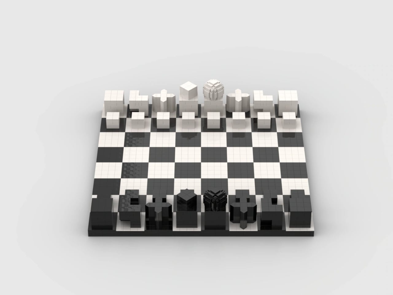
Called McDonald’s Menu, brickbybrick_’s LEGO Ideas submission rebuilds a classic combo big enough to hold its own on a shelf. There’s a red tray with giant Golden Arches in the middle, a cheeseburger, a red carton overflowing with fries, and a white cup loaded with transparent ice and a striped straw. Zero minifigures, zero drive-through, all lunch. The project went up on October 29 and is already sitting at 1,440 supporters, which tells me a lot of AFOLs (adult fans of LEGO) are hungry. I’m one of them, and I’m writing this before lunch.

Designer: brickbybrick_

Red plates form the tray, finished with a raised, rounded rim and a handle at each end, so it reads as molded plastic instead of a stack of bricks. A big yellow set of Golden Arches sits dead center, breaking up what would otherwise be a whole lot of red. The food is arranged in the classic triangle: burger front left, cup at the back, fries off to the right. It’s the exact layout you’d find on any table at your local McDonald’s around noon. That framing makes the build look like a meal someone just set down, which is half the fun of it.

The cheeseburger starts with a dome of tan curved elements, smooth on top like a plain hamburger bun. Under it sits a red layer that reads as tomato, then bright green leaf pieces fanning out as lettuce, a slice of yellow cheese, and a dark brown patty. Those leaves are a nice bit of NPU (nice part usage, for the uninitiated), taking foliage meant for LEGO gardens and jungles and turning it into a salad. Each layer sticks out at slightly uneven angles, giving the burger that freshly squished look of something just pulled from its wrapper. Real fast food never comes perfectly stacked, and this one looks like it survived a lunch rush.

A pile of yellow plates and bricks spills out of the red fry carton at every angle, some standing tall and some flopped over the edge the way the last few always are. The carton gets the real thing’s shape right, the one McDonald’s introduced in 1970 with a wide mouth for quick scooping and a profile that keeps the fries from falling out. The Golden Arches appear on its face in yellow, the same red-and-yellow combo that has been selling fries for over five decades. Building fries in LEGO is easy, but making them look casually messy takes real effort. My only complaint is that I can’t salt them.

My favorite detail, though, is the drink. The white cup’s top is left open, showing a load of transparent pieces packed in as ice, with a red-and-white striped straw sticking out at a jaunty angle. That straw does three jobs at once. It gives the composition its tallest point, adds a splash of red to an otherwise white element, and nods to a real McDonald’s quirk, since the chain says its straws are slightly wider than average so more Coke hits your taste buds. The ice tells its own story, because McDonald’s pre-chills its syrup and sets the ratio expecting the ice to melt. Leaving the lid off is what lets you see all of it.

Back in 2021, adammark’s McDonald’s Franchise 1955-1969, a walk-up burger stand with a Speedee System kitchen, hit 10,000 supporters and reached the Third 2021 Review. It was one of 36 projects in that round, and Hocus Pocus ended up as the only one approved. brickbybrick_ takes a different route, shrinking the subject from a restaurant down to a single meal sized for a shelf. The build is unlicensed, so those Golden Arches are a fan’s tribute, and any official version would need McDonald’s on board. The two companies have teamed up before, going back to LEGO’s first Happy Meal promotion in 1983, so the precedent exists.

McDonald’s Menu currently has 1,440 supporters and 599 days left to reach its next milestone of 5,000. LEGO Ideas runs on community momentum: fans submit their builds, supporters rally behind the ones they love, and projects that hit 10,000 get reviewed by LEGO for a shot at becoming real sets. It’s a long climb for a lunch order, but every Ideas set on store shelves started at zero votes. If you’d like to see this combo in a box, head to the LEGO Ideas page and give it your vote. Personally, I’m holding out for a Super Size edition, which McDonald’s retired in 2004 but LEGO is more than welcome to bring back.

The post This fan-made LEGO McDonald’s combo comes with everything except the McFlurry first appeared on Yanko Design.

  • ✇Yanko Design
  • Midea’s award-winning blender concept can both heat and cool your mixture down
    Picture a blender with a stovetop hidden in its base, so it can turn soybeans into hot soy milk or rice into congee without you touching a pot. Heated blenders like this are a breakfast staple across China, and most share one annoying flaw: the drink comes out scalding, leaving you to blow on it like it owes you money. Midea’s Fully Automatic Air Flow Blender targets that wait with an airflow system designed to help with both cooking and cooling. Midea claims it brings drinks down to 131°F (55°
     

Midea’s award-winning blender concept can both heat and cool your mixture down

6 novembre 2026 à 15:20

Picture a blender with a stovetop hidden in its base, so it can turn soybeans into hot soy milk or rice into congee without you touching a pot. Heated blenders like this are a breakfast staple across China, and most share one annoying flaw: the drink comes out scalding, leaving you to blow on it like it owes you money. Midea’s Fully Automatic Air Flow Blender targets that wait with an airflow system designed to help with both cooking and cooling. Midea claims it brings drinks down to 131°F (55°C) within five minutes of finishing. That’s roughly where breakfast stops being a dare and starts being breakfast.

The machine comes from Guangdong Midea Consumer Electric, with a design team led by Peng Xi and Wang Jin, and it received a Red Dot Award: Design Concept 2026 in the Ready for Market track. That track recognizes near-finished products that haven’t reached shelves, judged partly on whether they can realistically ship within a year. Midea says the airflow lets the motor blend at full power without soy milk foaming over. A built-in water tank sits alongside the blending jar, and the linen-textured shell looks ready for a Scandinavian café. The Chinese-language interface suggests a launch in China first, though there’s no word yet on US availability.

Designers: Peng Xi, Wang Jin, Li Qianlun, Jo Jeongmin, Ru Guanhong & Wang Xingzhe

Soybeans contain saponins, compounds that contribute to soy milk’s bubble-bath foam when heated. Heated blenders typically manage this by blending in short bursts and pausing the heat to keep the foam from reaching the lid. That stop-start rhythm helps explain why a batch of soy milk on Midea’s existing machines takes around 30 minutes. The company credits its airflow system with cutting prep time in half, though it hasn’t detailed how the system controls foam.

A freshly cooked batch of soy milk or congee can come out near 212°F (100°C), then sit in the jar cooling a degree at a time while you wait. Midea’s existing heated blenders hold drinks at 131°F (55°C) on keep-warm for up to six hours, so the target is familiar territory for the brand. The new machine’s trick is getting there fast: Midea says cooling takes about five minutes. That’s roughly the time it takes to find your shoes and your keys. Paired with overnight scheduling, it could have freshly made soy milk ready to drink when you wake up.

Visually, the appliance splits into two towers that share a figure-eight footprint. On the left, a linen-textured column holds a water tank that lifts straight out from the top, with a corrugated grip that echoes the ribbed base beneath the glass jar. On the right, the jar wears a copper-colored lid ring that appears to double as a status light. Midea’s description of the surface as a linen texture suggests a molded finish rather than real cloth, a sensible call next to a jar of hot congee. The touch panel flips up for easier reading and carries illustrated buttons for soy milk, juices and milkshakes, porridges, and cleaning, including one porridge program labeled for better sleep.

The closest thing US readers will recognize is the Ninja Foodi Cold & Hot Blender, which pairs an 800-watt heating element with a 64-ounce glass pitcher and sells for around $200 at Walmart. It can cook soup from raw ingredients, but you’re still the one pouring in water and waiting for everything to cool. Midea’s pitch is to automate more of that work, drawing water from the built-in tank and offering a high-temperature wash and drying cycle through the menu. The tank will still need refilling, of course. There’s no price or US release date yet, so this one stays on the wishlist.

The post Midea’s award-winning blender concept can both heat and cool your mixture down first appeared on Yanko Design.

  • ✇Yanko Design
  • The Nubeo Ecliptic watch puts a tiny spacecraft control panel on your wrist
    Hollywood loves a sequel, and so does the watch world, though watch sequels trade explosions and cameos for colorways. Nubeo’s Ecliptic Retrograde Dual Time first landed in October 2024, and the square-cased space watch is back for 2026 in six new colorways, from the blue-strapped Firewater Blue to the moodily named Steel Phantom. The core recipe stays put: a 45mm steel case, a matte black dial, and a second time zone displayed by a hand that sweeps a retrograde arc before snapping back to zero
     

The Nubeo Ecliptic watch puts a tiny spacecraft control panel on your wrist

6 novembre 2026 à 14:20

Hollywood loves a sequel, and so does the watch world, though watch sequels trade explosions and cameos for colorways. Nubeo’s Ecliptic Retrograde Dual Time first landed in October 2024, and the square-cased space watch is back for 2026 in six new colorways, from the blue-strapped Firewater Blue to the moodily named Steel Phantom. The core recipe stays put: a 45mm steel case, a matte black dial, and a second time zone displayed by a hand that sweeps a retrograde arc before snapping back to zero.

That hand crawls from 0 to 24 across the lower dial, then flies back to the start like it just remembered it left the stove on. Nubeo pairs it with a big date, a 24-hour subdial, and a caseback engraved with the sun, Earth, and the ecliptic plane. That last detail explains the name, since the ecliptic is the path the sun appears to trace across our sky over a year. Every colorway runs on a Japanese quartz movement and lists for $250, with an advertised 20% launch discount bringing it to $200.

Designer: Nubeo

A Dial Built Like a Spacecraft Control Panel

Nubeo stacks this dial in layers, starting with a matte black honeycomb mesh at the base. A raised chapter ring sits above it with a printed 05 to 55 minute track, while an oversized applied 12 anchors the top. The 24-hour subdial sits near 9 o’clock, the framed date window is at 4, and the dual time arc wraps across the bottom third. Applied indices and hands carry Japanese lume for low-light visibility. Each colorway also changes the accents on a few of these elements.

Putting the second time zone on its own arc separates it from the main time display, a useful distinction on a dial this busy. A traditional GMT, like the Rolex GMT-Master, adds a fourth hand that points to a 24-hour scale around the edge. The Ecliptic moves that reading to the lower dial instead. On the blacked-out version, green lume emphasizes the hands and markers. The coil-spring details at the four corners are decorative, reinforcing the spacecraft-control-panel look. Honestly, this dial looks like it should come with a launch sequence.

Square, Steel, and 155 Grams of Attitude

The stainless steel case measures 45mm across (about 1.77 inches), 45mm lug to lug, and 16mm thick (0.63 inches). Square cases tend to wear larger than round ones of the same width because the corners fill out more of the wrist. The matching width and lug-to-lug measurements keep the case from extending farther along the wrist, but this is still a substantial watch at 155 grams (5.5 ounces), paired with a 26mm rubber strap. An anti-reflective mineral crystal covers the dial, and water resistance is rated at 5 ATM.

The square sports case has plenty of precedent, from Bell & Ross’s cockpit-instrument BR 03 to Hublot’s Square Bang. Nubeo takes a similar instrument-panel approach, adding recessed channels with exposed screws along the case flanks and a crown finished in each colorway’s accent shade. Inside sits a Japanese quartz movement, though Nubeo doesn’t name the specific caliber. Quartz makes sense for a dual time watch that might spend a week in a drawer between trips, keeping both time displays running without winding.

Six New Colorways, Same Cosmic Recipe

The 2026 lineup includes Firewater Blue, Cardinal Teal, Forest Veil, Royal Twilight, Dark Alloy, and Steel Phantom, all built on the same matte black dial. The differences are in the dial accents, crown color, case finish, and rubber strap. Across the lineup, you’ll find yellow straps, blue straps, gray straps with yellow details, and a blacked-out case for anyone allergic to shiny things. The original 2024 variants included Space Blue, Hazard Red, and Golden Black, which Nubeo sold as limited editions. The caseback in the press images carries a limited-edition marking too, though Nubeo hasn’t listed an edition size for the new run.

The Ecliptic fits into Nubeo’s catalog, which leans heavily on space and pop culture with collaborations like the Space Invaders Automatic and the Atari Asteroids watches. This one draws on astronomy rather than a licensed property and costs considerably less than those collaborations. Citizen’s Eco-Drive BR0120 offers retrograde dual time too, wrapped in a classic round case for the buttoned-up crowd. The Ecliptic is the more conspicuous option, with its square case, layered dial, and bright strap choices. Nubeo lists it at $250 before the launch discount, with free shipping and a two-year warranty.

The post The Nubeo Ecliptic watch puts a tiny spacecraft control panel on your wrist first appeared on Yanko Design.

  • ✇Yanko Design
  • Urban Desk Saves Space Without Making You Move Your Monitor
    A monitor is an awkward thing to put away at the end of a workday. The screen, stand, cables, and nearby lamp make packing up feel like a small relocation project. Leave everything out, though, and the living room keeps looking like an office long after you’ve closed your laptop. Urban Desk, from German furniture brand UrbanNature, addresses that everyday friction by letting part of the workspace retreat while the equipment stays put. Designed by Jörg Brachmann, the desk takes a refreshingly mo
     

Urban Desk Saves Space Without Making You Move Your Monitor

6 novembre 2026 à 12:20

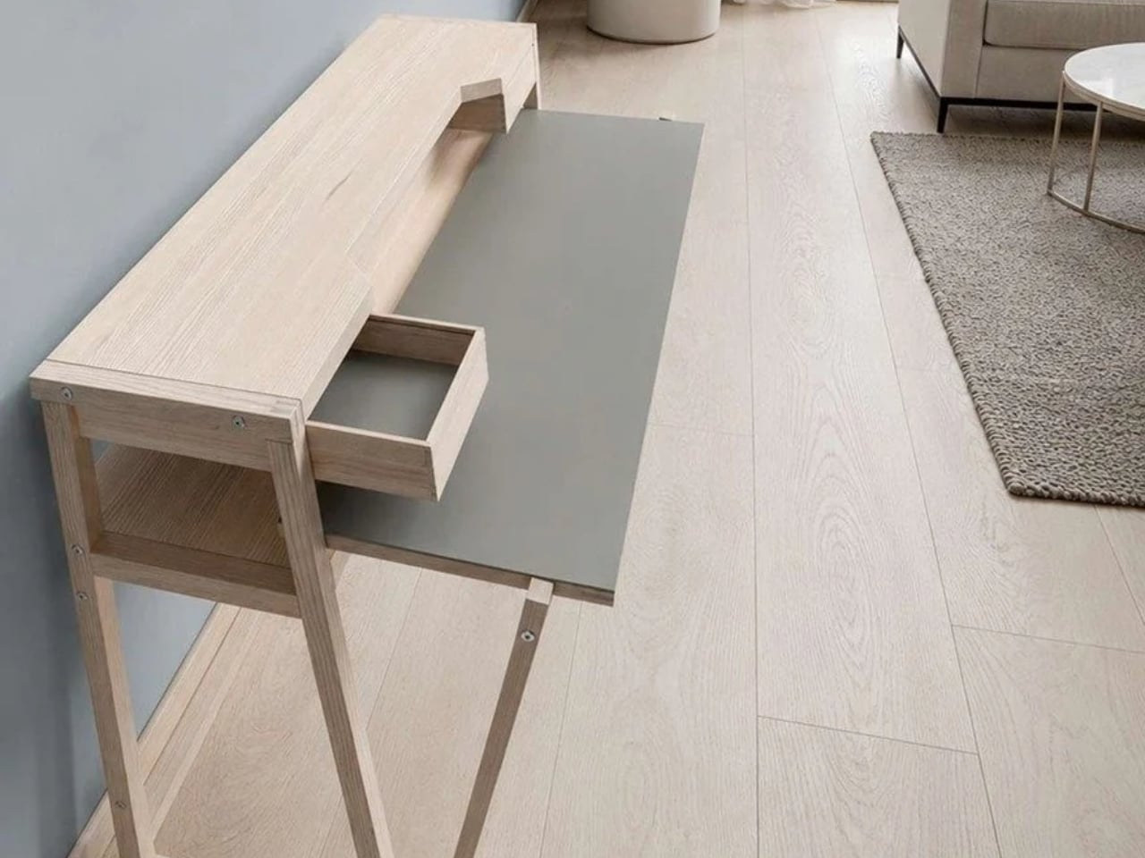
A monitor is an awkward thing to put away at the end of a workday. The screen, stand, cables, and nearby lamp make packing up feel like a small relocation project. Leave everything out, though, and the living room keeps looking like an office long after you’ve closed your laptop. Urban Desk, from German furniture brand UrbanNature, addresses that everyday friction by letting part of the workspace retreat while the equipment stays put.

Designed by Jörg Brachmann, the desk takes a refreshingly modest approach to working in a room that also has other jobs. Its lower work surface pulls forward for use and slides back afterward. A fixed upper structure holds the monitor and other accessories, so changing the desk’s configuration doesn’t require rebuilding your setup. It’s an existing product offered through UrbanNature’s online store, rather than a concept asking us to imagine the practical details.

Designer: UrbanNature

The distinction between a moving surface and a stationary shelf is the important design decision here. According to the project’s Green Product Award entry, the tabletop extends horizontally without lowering or tilting, while the rigid upper structure accommodates a monitor. I like that the transformation has a limited, understandable purpose. You’re bringing more work surface toward you, then returning it when you’re done. The furniture doesn’t need to perform an elaborate disappearing act to earn its place.

UrbanNature lists the movable worktop at approximately 16.5 inches deep when retracted and 26 inches when extended. That’s roughly 9.4 inches of additional depth during use. The base itself is about 19.7 inches deep, so the smaller worktop measurement shouldn’t be mistaken for the entire desk’s footprint. Those distinctions matter when you’re measuring a bedroom corner or deciding how much passage space you’ll have beside a sofa.

For me, the appeal is permission to leave a functional setup alone. A space-saving design loses some of its usefulness if putting it away becomes another chore. Here, the separation between equipment and working surface suggests a less demanding routine. You still have to manage whatever you’ve spread across the moving section, of course. A notebook doesn’t file itself because the furniture has a clever mechanism.

The materials also suit that domestic role. UrbanNature specifies solid ash or oak alongside a blockboard worktop finished with linoleum, plus exposed wooden joints. Two A4-sized drawers sit beneath the monitor shelf. Those are useful places for notebooks, pens, and charging accessories, rather than an invitation to accumulate an entire office archive. I’d rather have a little storage close to hand than add another cabinet beside a desk chosen to save space.

There’s a fair compromise in the name of this arrangement: your office never fully disappears. The monitor remains visible, as does the desk. Core77 aptly describes it as a partial hideaway. That won’t satisfy someone who wants work equipment completely out of sight during dinner. Personally, I find the compromise reasonable. Keeping a screen ready for tomorrow can be worth more than achieving a perfectly office-free room tonight.

I’d want to check the setup against my own equipment before buying, particularly the monitor’s position and how comfortably the extended surface meets a chair. The fixed upper shelf establishes part of that arrangement for you. UrbanNature itself notes that an appropriate chair and correct screen height still matter. A compact footprint is useful, but it shouldn’t become the only measurement that gets your attention.

The online listing currently ranges from €995 to €1,429, including VAT. International buyers would need to confirm delivery and the total cost; the shipping policy notes possible additional charges outside the EU. At that price, I’d want the pull-out surface to earn its keep daily. The strongest argument for Urban Desk is simple: it lets you keep a ready-to-use workstation while asking a little less of the room once work is over.

The post Urban Desk Saves Space Without Making You Move Your Monitor first appeared on Yanko Design.

  • ✇Yanko Design
  • WOLOLOW’s UFO Lamp Uses a Bulb You Can Actually Replace
    A bedside lamp ought to survive a burned-out bulb, especially when its shape is the reason you bought it. I’d hate to retire a little flying saucer over a lighting component. That’s the practical appeal of WOLOLOW Night Lamp Ver 2.0: beneath its Space Age exterior sits a replaceable LED bulb. The object gets to keep its personality when the light source needs changing, a sensible priority for something designed to be displayed. Designed by Arthur Koshatahyan and Kostya Trunov, the lamp is curre
     

WOLOLOW’s UFO Lamp Uses a Bulb You Can Actually Replace

6 novembre 2026 à 10:20

A bedside lamp ought to survive a burned-out bulb, especially when its shape is the reason you bought it. I’d hate to retire a little flying saucer over a lighting component. That’s the practical appeal of WOLOLOW Night Lamp Ver 2.0: beneath its Space Age exterior sits a replaceable LED bulb. The object gets to keep its personality when the light source needs changing, a sensible priority for something designed to be displayed.

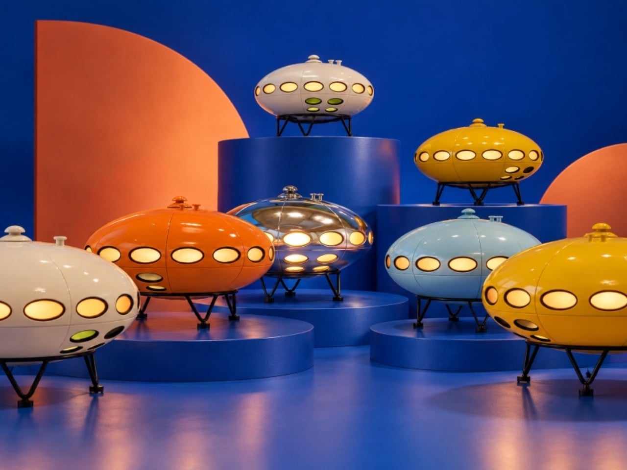
Designed by Arthur Koshatahyan and Kostya Trunov, the lamp is currently a Kickstarter project, with a working prototype documented by its makers. Its flattened, elliptical body has a ring of oval portholes and stands on three angled metal legs. The reference is wonderfully specific: Matti Suuronen’s 1968 Futuro House, translated into an object you can put beside your bed rather than climb into for the weekend.

Designers: Arthur Koshatahyan and Kostya Trunov

The architectural backstory gives that familiar UFO silhouette a little more substance. Futuro began with a commission for a ski lodge that could be assembled on difficult terrain and heated quickly. Its rounded plastic shell belonged to an optimistic vision of how people might live. I like seeing that ambition brought down to nightstand scale. You don’t need to know its history to enjoy the lamp, but knowing it makes the reference feel less arbitrary.

At 10 inches across and 6.5 inches tall, WOLOLOW 2.0 needs a meaningful patch of tabletop. The campaign specifies an ABS plastic body, polycarbonate windows, and a metal base with coated tips. Those dimensions are worth checking against your nightstand before getting attached to the miniature-house idea. It may be a small building, but it isn’t an especially tiny bedside accessory.

The five proposed finishes give the same silhouette quite different personalities: white, yellow, orange, sky blue, and mirror chrome. My vote goes to orange, which feels comfortably committed to the retro-futurist premise. Chrome makes a stronger decorative statement, while white would be my choice for a room that already has plenty happening. Color matters here because the lamp has such a recognizable outline. It doesn’t need a dramatic finish to announce itself.

Version 2.0 also drops the previous generation’s integrated battery in favor of external power. I’m comfortable with that trade for a lamp intended to stay beside a bed. A cord is less appealing if you want to move it around frequently, but keeping another decorative object charged wouldn’t be my preference either. The more consequential change is the user-replaceable bulb, which makes the lighting hardware less permanently tied to the sculptural shell.

Inside is a socket for a compatible 12V MR16 LED with a GU5.3 base. Smart features depend on the bulb you install, rather than being built into WOLOLOW itself. A compatible smart bulb could provide dimming, colors, or scheduling, but the prototype demonstration uses a standard warm-white bulb. The makers haven’t demonstrated smart operation in that video, so compatibility deserves attention before buying an upgrade.

The campaign lists a warm-white bulb and magnetic USB power cable as included, with the cable connecting beneath the lamp. A wall adapter and optional smart bulb are separate purchases. Individual lamp rewards currently carry an estimated March 2027 delivery date, which remains a crowdfunding target rather than a confirmed arrival. I’d approach it as backing a design still headed toward production, not ordering a lamp already sitting in a warehouse.

For me, the appeal comes down to giving an everyday object enough character that you’d want to keep it. The little windows make sense as part of the architectural reference and as openings for light; the legs give the saucer its landed posture. WOLOLOW is playful without asking the owner to treat it as a joke. I’d happily leave the smart-bulb possibilities alone and let the warm-white version do its thing. A small illuminated house beside the bed already has a pretty good job.

The post WOLOLOW’s UFO Lamp Uses a Bulb You Can Actually Replace first appeared on Yanko Design.

  • ✇Yanko Design
  • Peak Design’s Charging Station Folds Flat to Charge Two Phones
    Charging a phone and a pair of earbuds is easy enough, but sharing that same stand with another phone is a different matter. Peak Design’s new Charging Station addresses that problem with two equally capable magnetic pads and a hinged arm. Stand it up beside your laptop, or lay it flat so two phones can recharge without competing for the better spot. The shape is straightforward, with a narrow metal arm linking two rounded-square charging surfaces. Die-cast aluminum and zinc form the chassis, w
     

Peak Design’s Charging Station Folds Flat to Charge Two Phones

Par : JC Torres
4 novembre 2026 à 10:20

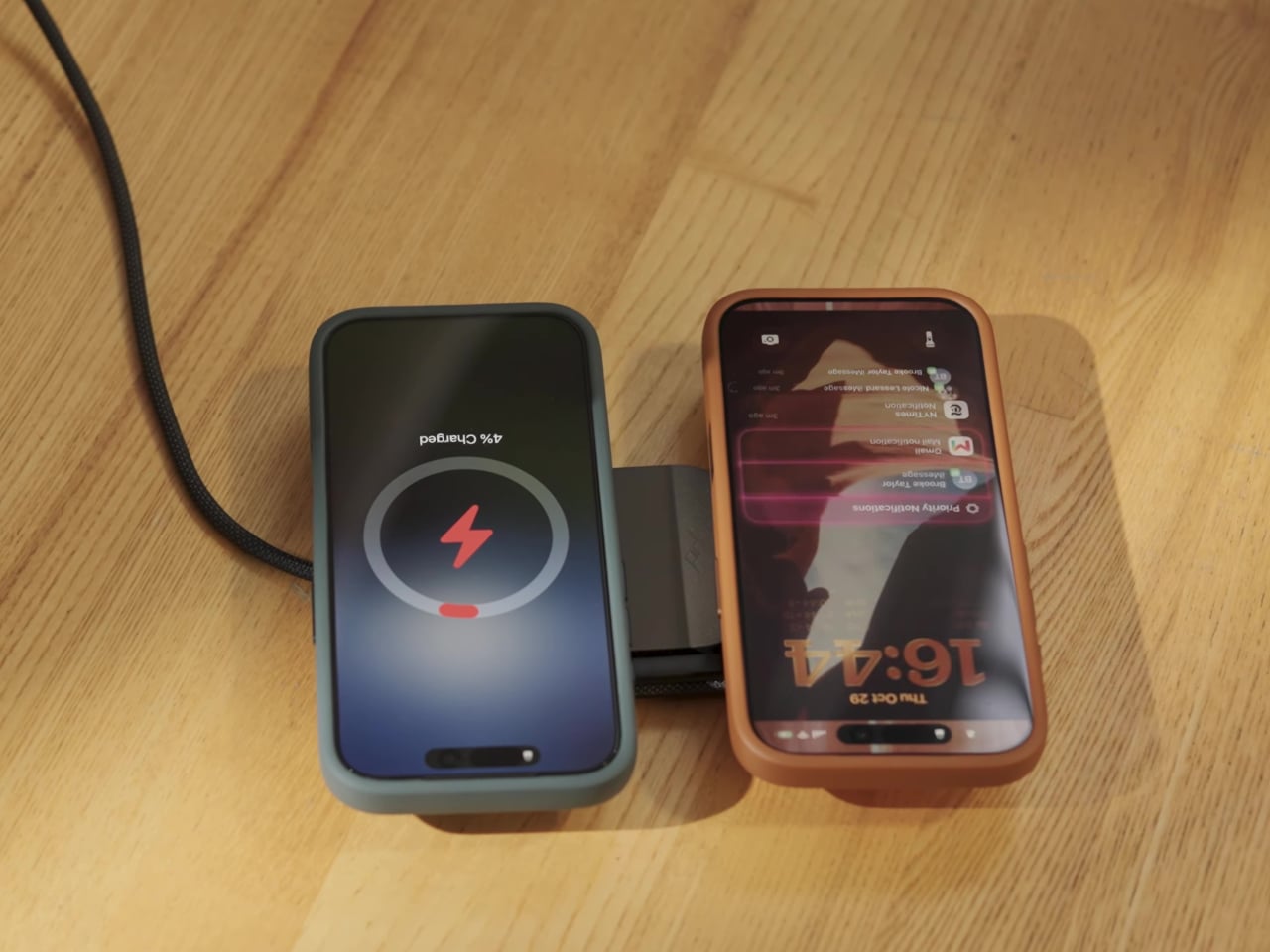
Charging a phone and a pair of earbuds is easy enough, but sharing that same stand with another phone is a different matter. Peak Design’s new Charging Station addresses that problem with two equally capable magnetic pads and a hinged arm. Stand it up beside your laptop, or lay it flat so two phones can recharge without competing for the better spot.

The shape is straightforward, with a narrow metal arm linking two rounded-square charging surfaces. Die-cast aluminum and zinc form the chassis, while the machined aluminum stem provides the moving structure. Laminated Clarino covers the pads, and a non-slip TPU foot sits underneath. Black and Moon finishes keep the color choices restrained, rather than turning your nightstand into a brightly branded electronics display.

Designer: Peak Design

Two hinges let you adjust the arm and upper pad separately, positioning a phone for a video call or a glance at your calendar. Magnetic attachment supports portrait and landscape orientations, so changing what you’re doing doesn’t require another stand. An earbud case can sit on the lower pad while the phone stays raised, keeping both devices within the same small desktop footprint.

The lower pad gets more interesting when you fold the station flat. Peak Design rates both Qi2.2 pads for up to 25W simultaneously, allowing two compatible phones to recharge at once without assigning one a slower accessory spot. That doesn’t mean every magnetically attached phone will receive 25W, though. The device’s own charging support still determines how much power it can accept.

That folding movement also changes how the charger travels. Packed flat, it measures 6.3 by 2.7 by 0.6 inches, with the arm tucked alongside the body instead of projecting into your bag. At 9.7 ounces, it still adds weight to a travel kit, but you aren’t packing a rigid desktop stand just to keep a phone propped up in a hotel room.

A separate USB-C output makes room for a third device, although this connection is wired. Its 7.5W output is suited to smaller accessories rather than replacing a laptop charger. A watch still needs its own charging cable or puck, so this isn’t a dedicated three-device wireless dock. It simply gives that extra cable somewhere to connect without occupying another outlet on the wall.

The $99.95 price also leaves out the wall adapter. Peak Design includes a fabric-wrapped USB-C cable rated for 100W, but specifies at least a 45W power supply to operate the station and 75W or more for maximum dual charging speed. That makes the adapter part of the buying decision, particularly if your existing charger is already committed to powering something else at home.

The post Peak Design’s Charging Station Folds Flat to Charge Two Phones first appeared on Yanko Design.

  • ✇Yanko Design
  • The 5 Best EDC Designs of November 2026
    The most interesting EDC upgrade here begins with something that already fits a pocket: a Zippo case. Open the lid, and there’s no lighter inside, just a miniature ratchet and carefully arranged bits. That little reversal sets the tone for this November selection. These designs aren’t trying to turn you into a survivalist. They reconsider the objects you reach for when something needs tightening, illuminating, carrying, organizing, or writing down. We’ve brought together one DIY project and fou
     

The 5 Best EDC Designs of November 2026

4 novembre 2026 à 07:40

The most interesting EDC upgrade here begins with something that already fits a pocket: a Zippo case. Open the lid, and there’s no lighter inside, just a miniature ratchet and carefully arranged bits. That little reversal sets the tone for this November selection. These designs aren’t trying to turn you into a survivalist. They reconsider the objects you reach for when something needs tightening, illuminating, carrying, organizing, or writing down.

We’ve brought together one DIY project and four retail designs, including a swiveling flashlight, a cork wallet, and a pencil that skips sharpening. This is our November edit of existing designs, not a roundup of November launches. The common thread is thoughtful use of limited space, whether that means fitting tools inside a familiar shell or removing an annoyance from something as ordinary as the keys you carry every day.

1. DIY Zippo Toolkit

Tiny Tool Shop’s Zippo conversion makes a persuasive case for designing around an enclosure rather than starting again. A custom-printed insert holds a micro ratchet, two Steinwhale bits, and a Klein utility knife extension inside the emptied lighter shell. Each component gets its own recess, turning the interior into a fitted tray rather than a loose collection of hardware. The recognizable metal case supplies the hinge, lid, and compact outline, while the insert gives it an entirely different purpose.

The best detail addresses the obvious drawback of tight packing: getting the ratchet back out. A spring salvaged from a disposable Bic lighter helps push it through an opening in the case. It’s a satisfying piece of resourcefulness, but this remains a maker project, not a finished product sold by Zippo. Reproducing it involves sourcing compatible tools, producing the insert, and modifying the shell. It also replaces the lighter function completely, trading a flame for a very small repair kit.

What we like

  • Reuses a familiar hinged enclosure with a fitted layout for the tools.
  • Spring-assisted retrieval makes tightly packed components easier to access.

What we dislike

  • Requires fabrication, compatible components, and modifications to the case.
  • The insert’s dedicated recesses limit flexibility when changing the tool selection.

2. Painless Key Ring

Most key rings make you use your fingernails as miniature pry bars. The Painless Key Ring changes the entry geometry instead, using a continuous wave shape to guide a key onto the ring. You’re still working with a springy metal loop, but without the same tightly stacked starting point as a conventional split ring. It’s a modest redesign with a clear purpose: make changing keys less fiddly without turning the key ring into another complicated mechanism you need to carry around.

Made from stainless spring steel, the ring is listed at 0.8mm thick and weighs three grams. The silver set costs $30 and includes one large ring plus three small ones, giving you separate attachment points for different keys. The appeal isn’t adding another tool to your pocket. It improves the connection between what you already have. If you rarely change keys, the benefit may not justify the price. For someone regularly swapping house, office, and shared keys, the geometry is more compelling.

Click Here to Buy Now: $30.00

What we like

  • Wave-shaped entry offers an alternative to prying apart a conventional split ring.
  • The set includes smaller rings for organizing separate keys.

What we dislike

  • At $30 for the silver set, it’s a deliberate upgrade to a basic accessory.
  • Keys still need threading around the ring rather than releasing through a gate.

3. WUBEN G5 Compact Flashlight

The WUBEN G5 puts its most useful feature above the body: a head that rotates through 180 degrees. Rather than repositioning the entire flashlight whenever the beam misses your work, you can change its direction while the body stays attached. An adjustable clip and tail magnet give you different mounting options, particularly useful when both hands are occupied. The flat form also avoids the rolling habit of cylindrical flashlights, making this a small lighting tool with several sensible working positions.

WUBEN lists the standard G5 at approximately 52 grams, with USB Type-C charging and maximum white output of 400 lumens. Its current specification gives an IP65 rating, which means this is not a light to treat as submersible. At $19.99 for standard colors, it’s an accessible alternative to reaching for your phone. The limitation is endurance: WUBEN’s longest runtime figure belongs at the lowest output, not maximum brightness. Choose it for short tasks rather than prolonged use at maximum brightness.

What we like

  • Rotating head, clip, and magnet provide several ways to position the beam.
  • The compact, flat body suits pocket carry without rolling away when set down.

What we dislike

  • Maximum brightness and maximum runtime describe different operating settings.
  • Its IP65 rating does not cover immersion.

4. Pocket Everlasting All-Metal Pencil

A pocket pencil needs to survive being carried before it can be useful on paper. Sun-Star’s Pocket Everlasting All-Metal Pencil approaches that problem with a metal body, protective cap, and a writing tip that doesn’t need sharpening. At 4.7 inches long, it gives you a dedicated place to put a measurement, sketch, or passing thought without unlocking a screen. There’s no elaborate deployment mechanism, just a compact writing instrument ready to accompany a notebook.

The tip uses graphite and alloy particles to make an erasable mark. That makes it better understood as an alternative pencil technology than a pen that happens to look metallic. At $19.95, it’s also one of the less expensive objects in this selection. The name needs a little perspective: “Everlasting” isn’t a literal promise of infinite use. Its appeal is avoiding routine sharpening, while your preference for line darkness and feel still determines whether it earns space beside your keys.

Click Here to Buy Now: $19.95

What we like

  • A capped metal body gives the writing tip protection during carry.
  • Erasable marks and no routine sharpening make it an interesting notebook companion.

What we dislike

  • At 4.7 inches, it still needs more space than a miniature keychain tool.
  • Pencil marks aren’t a substitute for ink when permanent writing is needed.

5. Corkor Front-Pocket Cork Wallet

Corkor’s Front-Pocket Cork Wallet provides a welcome break from machined metal. Its cork fabric exterior has an irregular grain that gives a familiar card holder a distinct material identity. The layout stays straightforward: three card slots, an ID window, and two compartments for folded bills. Rather than adding moving parts to make a wallet interesting, Corkor keeps the construction restrained and lets the surface do the work. It suits an edited daily carry better than a collection of forgotten receipts.

The Portuguese maker lists an empty weight of 20 grams and dimensions of 110 by 80 by 10 millimeters. That last figure matters: adding cards and folded notes will change how much room it occupies. Corkor makes the $59 holder in Portugal and includes RFID-blocking construction, though the more tangible benefit is its simple organization. There’s no coin pocket, and cash takes more preparation than sliding notes into a full billfold. Those are deliberate compromises for someone who wants to downsize.

What we like

  • Cork fabric offers an animal-free alternative to a conventional leather exterior.
  • Separate card, ID, and cash compartments keep the layout easy to understand.

What we dislike

  • There’s nowhere dedicated to loose change.
  • Bills must be folded, making cash less convenient to sort.

Small Improvements Worth Carrying

The Zippo conversion is the conversation starter, but the quieter designs may make the bigger difference to a particular routine. A ring that’s easier to load helps someone changing keys. A swiveling light helps someone working with both hands. A simpler wallet helps someone trying to carry less. None needs to solve every problem to justify its place; it just needs to address one you actually encounter with some regularity.

These five designs aren’t a checklist to buy in full. The Zippo project asks for making time rather than a quick checkout, while the wallet asks you to reconsider what deserves carrying at all. Start with the small frustration you already recognize, then consider the space, upkeep, and setup its solution requires. A useful everyday carry should make your day feel less encumbered, not simply leave your pockets more fully equipped.

The post The 5 Best EDC Designs of November 2026 first appeared on Yanko Design.

  • ✇Yanko Design
  • A Real Eiffel Tower Light Becomes a Lamp Without the Kitsch
    A miniature Eiffel Tower tells you where someone went, but rarely gives you much reason to look closer. I’m more interested in souvenirs that carry a little of a place’s actual history, especially when they earn their space at home. The challenge is giving that history a useful role without polishing away everything that makes it worth preserving. That’s the appeal of the La Tour Eiffel Diamond Light, designed by A+A Cooren Design Studio with Lagardère x Arteum. Built around a retired fixture f
     

A Real Eiffel Tower Light Becomes a Lamp Without the Kitsch

4 novembre 2026 à 04:15

A miniature Eiffel Tower tells you where someone went, but rarely gives you much reason to look closer. I’m more interested in souvenirs that carry a little of a place’s actual history, especially when they earn their space at home. The challenge is giving that history a useful role without polishing away everything that makes it worth preserving.

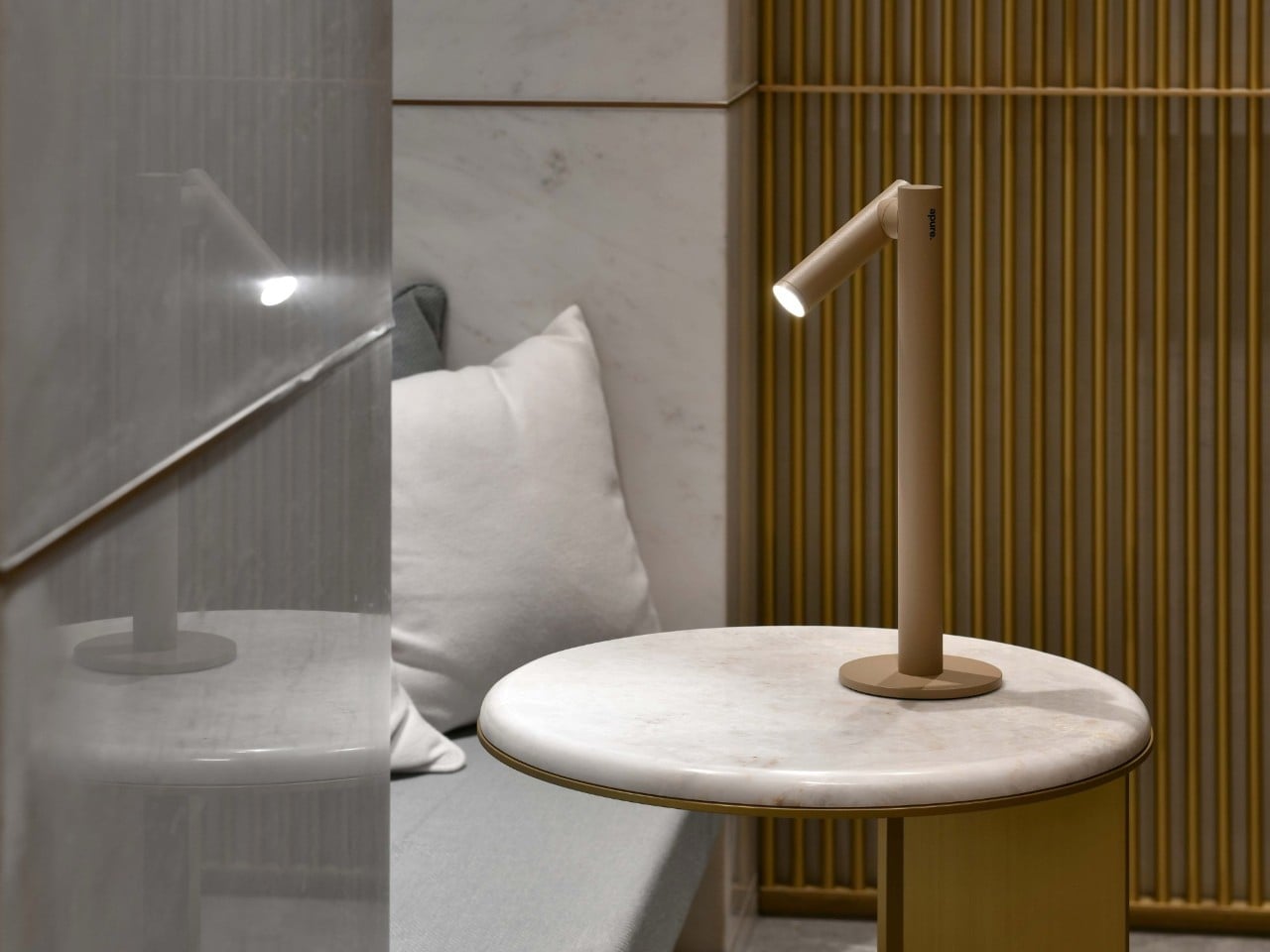
That’s the appeal of the La Tour Eiffel Diamond Light, designed by A+A Cooren Design Studio with Lagardère x Arteum. Built around a retired fixture from the Eiffel Tower’s sparkling illumination, it turns a piece of lighting infrastructure into a working tabletop lamp. The preserved paint marks are part of the point. Rather than manufacture another miniature monument, the designers have given an actual component a reason to stay switched on.

Designers: A+A Cooren Design Studio and Lagardère x Arteum (LxA)

The iron-alloy base makes the architectural connection without turning the whole object into another miniature tower. Drawing from Gustave Eiffel’s historical blueprints, its arches and cross-bracing reinterpret the structure near the monument’s top. I prefer that approach to a literal replica. You get enough of the tower’s visual language to recognize the reference, while the lamp keeps its own proportions and identity as an object for a room.

In the official photographs, the faceted upper section sits above that open metal framework like an oversized jewel in an industrial setting. The brown finish helps the two parts feel related, despite their different origins. It looks substantial without relying on a large footprint, and the exposed latticework gives your eye somewhere to travel beneath the light.

The lighting modes make the connection to Paris more than visual. One provides a steady warm glow. Another alternates 55 minutes of steady illumination with five minutes of twinkling. A third leaves the lamp dark for 55 minutes before its five-minute sparkle sequence. I’d probably favor the steady setting most evenings, but the timed sparkle has an appealingly specific purpose: it brings the monument’s lighting rhythm into the room, rather than simply making a souvenir flash.

A four-position rotary switch handles the three modes and off setting. That feels appropriate for an object whose appeal is so physical. At roughly 10.4 inches tall and 2.9 pounds, it’s a tabletop piece rather than a floor-standing statement. The specifications list 24 LEDs, and the store describes it as ambient lighting. I’d treat it as a decorative accent, not buy it expecting a reading lamp.

It also improves on an earlier idea in a meaningful way. Diamond of Light editions offered in 2016 and 2017 were collectible objects, not functioning lamps. The 2026 version adds an everyday reason to interact with the preserved component. To me, that’s a stronger design move than simply finding a more elaborate way to display it.

Each of the 500 numbered pieces comes with an official certificate of authenticity and a wooden case. The presentation embraces its collector’s-item status, which seems fair enough here. If the attraction is owning an actual piece of the Eiffel Tower’s lighting, documentation of its origin matters considerably more than another decorative flourish on the base.

The price puts that appeal in perspective. The official store lists it at €990 including VAT, before shipping, with worldwide delivery available. You’re paying for provenance, limited production, and the design work around the reclaimed fixture. As a straightforward lighting purchase, it’s difficult to justify on function alone. As a collectible that also has a place in daily life, the proposition makes more sense.

I wouldn’t want the weathering polished away or hidden behind a pristine cover. Those irregularities are what make the premise convincing. The strongest choice here is giving the old component enough new structure to work in a home while letting it remain visibly old. A souvenir becomes more interesting when its previous life is still allowed to show.

The post A Real Eiffel Tower Light Becomes a Lamp Without the Kitsch first appeared on Yanko Design.

  • ✇Yanko Design
  • Buy the printer, make the presents: Snapmaker’s U1 drops to $699 for Black Friday
    The Snapmaker U1 drops to $699 this Black Friday, down 30% from its $999 list price, and it might be the smartest buy on your holiday list, mostly because it can make plenty of the gifts on it. The U1 is a four-toolhead 3D printer that prints in up to four colors or materials in a single go. That covers personalized ornaments, figurines, and fidget toys, all printed in multicolor on your desk. It ships with four spools of PLA and 30 ready-to-print models, so after unboxing and automatic calibra
     

Buy the printer, make the presents: Snapmaker’s U1 drops to $699 for Black Friday

3 novembre 2026 à 21:45

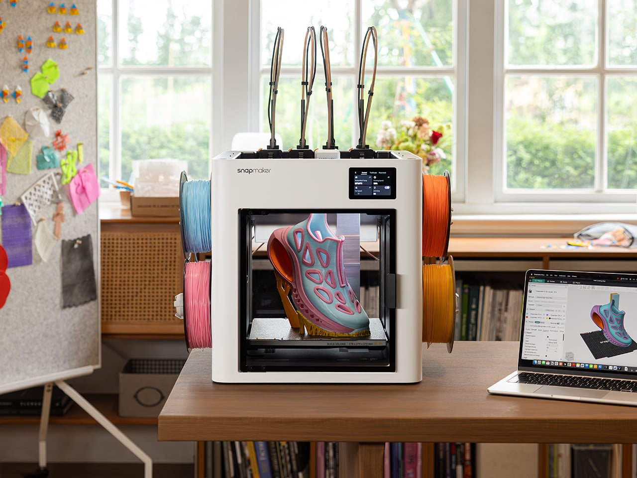
The Snapmaker U1 drops to $699 this Black Friday, down 30% from its $999 list price, and it might be the smartest buy on your holiday list, mostly because it can make plenty of the gifts on it. The U1 is a four-toolhead 3D printer that prints in up to four colors or materials in a single go. That covers personalized ornaments, figurines, and fidget toys, all printed in multicolor on your desk. It ships with four spools of PLA and 30 ready-to-print models, so after unboxing and automatic calibration, you can print your first model on day one. A good chunk of your Christmas list, sorted.

Four-head printers are rare at this price. Tool changers like the Prusa XL have historically cost well north of $2,000. Snapmaker’s SnapSwap system keeps four print heads loaded and swaps between them in about five seconds, while single-nozzle setups like Bambu’s AMS flush filament at every color change. Fewer purges mean faster prints and, by Snapmaker’s count, up to 85% less wasted plastic. More than 20,000 Kickstarter backers already bought in, making the U1 the most-funded 3D printer campaign in the platform’s history, with now more than 150,000 users worldwide.

Designer: Snapmaker

Click Here to Buy Now: Black Friday Sale. Hurry, deal ends soon!

Five-Second Swaps and a Lot Less Printer Poop

Each of the U1’s four print heads sits docked and preheated with its own filament. When a print calls for a new color, the printer parks the active head and grabs the next one. A steel-ball coupling and a mechanical lock seat each head in the exact same spot every time, and Snapmaker says the mechanism survived over a million continuous swaps with zero mechanical failures. The printer then auto-calibrates all four heads to within 0.04mm (about 0.0016 inches) of each other. That keeps the white trim on a Santa hat right where it belongs.

Single-nozzle printers handle color changes by shoving the old filament out until the new one runs clean. Snapmaker pegs that process at roughly two minutes per swap, and on a busy multicolor model the purged plastic can outweigh the model itself. The U1 only purges small amounts at the start of a job and during calibration. Print a tray of four-color ornaments and those savings stack up fast, in both hours and filament. Your filament budget ends up on the tree instead of in the trash.

A Personalized Ornament, From Download to Gift Box

Four heads can hold four different materials as easily as four colors, so flexible TPU or dissolvable supports can share a print with rigid plastic. For most holiday gifts, though, four colors of PLA do the heavy lifting. Snapmaker’s Full Spectrum feature stretches that palette by stacking thin alternating layers of your four filaments, which your eye reads as new in-between shades. Results depend on the filament, the model’s shape, and your settings, so a quick test print helps. Load red, green, white, and gold, and you’ve basically got Christmas in a box.

Personalizing a gift takes about as much skill as sending a text. Open an ornament model in Snapmaker Orca, add a name with the slicer’s text tool, and assign one of your four colors to each part. A palm-sized ornament uses only a few grams of filament, so each one costs pocket change in plastic. Hit print, and the U1 handles every color swap on its own while you get on with your evening. Repeat for each name on your list, and nobody else at the party will show up with those.

Smart Enough for First-Timers, Cheap Enough for Black Friday

Snapmaker Space, the company’s model library (currently in open beta), offers ready-to-print multicolor models, so beginners can skip 3D modeling entirely. Auto bed leveling helps your first layer stick, and input shaping reduces vibration for smoother walls, with speeds topping out at 500mm/s (about 20 inches per second). Filament loads itself, RFID tags on Snapmaker spools fill in settings for you, and Backup Mode switches to a matching spool when one runs dry. A built-in camera with AI monitoring can flag spaghetti failures and ping your phone. Tinkerers get Klipper firmware and OrcaSlicer support.

Click Here to Buy Now: Black Friday Sale. Hurry, deal ends soon!

The post Buy the printer, make the presents: Snapmaker’s U1 drops to $699 for Black Friday first appeared on Yanko Design.

  • ✇Yanko Design
  • Salvador Dalí’s melting clocks are now a 3D LEGO diorama, ants included
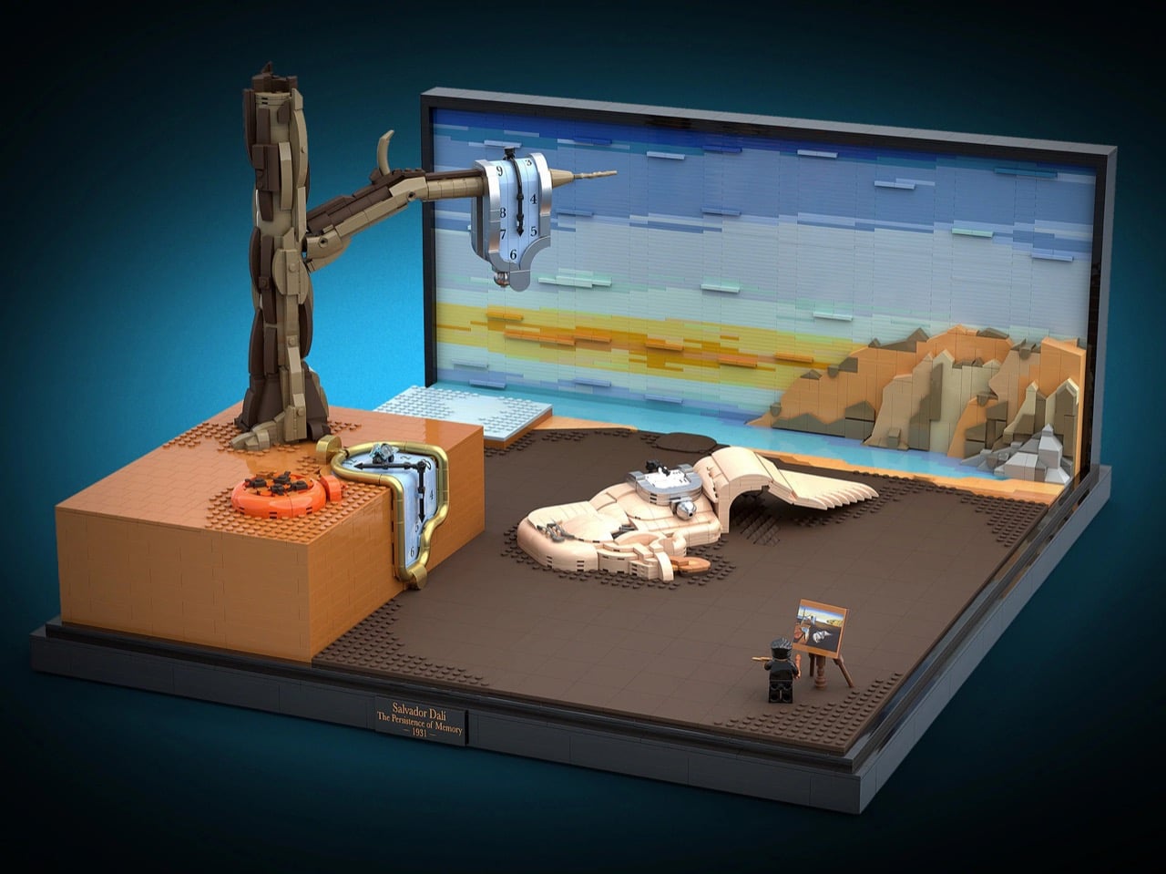
    MoMA owns The Starry Night, The Persistence of Memory, and a set of LEGO bricks designed by Godtfred Kirk Christiansen in the 1950s. The museum brought two of those together in 2022, when it partnered with LEGO on the Starry Night set that grew out of a LEGO Ideas submission. A new Ideas project wants to complete the triangle. BrickRelativity has rebuilt Salvador Dalí’s 1931 painting of melting clocks as a 3D brick diorama, complete with the dead tree, the ant-covered watch, and the weird sleep
     

Salvador Dalí’s melting clocks are now a 3D LEGO diorama, ants included

3 novembre 2026 à 19:30

MoMA owns The Starry Night, The Persistence of Memory, and a set of LEGO bricks designed by Godtfred Kirk Christiansen in the 1950s. The museum brought two of those together in 2022, when it partnered with LEGO on the Starry Night set that grew out of a LEGO Ideas submission. A new Ideas project wants to complete the triangle. BrickRelativity has rebuilt Salvador Dalí’s 1931 painting of melting clocks as a 3D brick diorama, complete with the dead tree, the ant-covered watch, and the weird sleeping figure sprawled across the beach. If MoMA wanted a sequel, it wouldn’t even need to leave the building.

Dalí’s original is tiny, just 9.5 by 13 inches (24 by 33 cm), which catches plenty of first-time visitors off guard. The brick version spreads the scene across a black display base with a gallery plaque and a sky built from horizontal bands of blue, aqua, and sunset-yellow plates. BrickRelativity says the central blob was one of the toughest challenges, since soft, shapeless forms and rigid LEGO elements get along about as well as cats and bathtubs. The clocks came a close second, their faces rebuilt from tile grids that warp along with the melt. LEGO Art has already worked through Hokusai, Van Gogh, and Monet, so Surrealism feels overdue.

Designer: BrickRelativity

Three clocks melt across the scene, and each gets its own construction trick. The one hanging off the tree branch wears a pearl-silver bezel that folds over the wood, with a small silver ball at its lowest point standing in for the drip. The pocket watch sliding off the orange ledge swaps silver for pearl-gold tube elements that kink around corners, with a transparent fly perched on its face. The third clock drapes over the sleeping figure in the middle, following the curve of the body underneath it. Numerals were applied as decals directly to the curved surfaces, while every clock hand is built from LEGO elements.

My favorite detail, though, is the face of that gold pocket watch. BrickRelativity built it from a grid of light-blue tiles, and as the face slumps over the ledge, the seams between them bend with it. The result looks like graph paper caught in a heat wave. The grid also gives the numerals a place to sit and recalls the stud-by-stud mosaics of LEGO Art, now visibly coming apart. A warped coordinate system feels very Einstein, which is funny, because Dalí insisted his soft watches came from cheese rather than relativity.

Dalí reportedly based the sleeping figure on a rock formation at Cap de Creus, and it’s generally read as a squashed self-portrait. BrickRelativity layered curved slopes in tan and pale flesh tones until the blob looked properly boneless. Dark gray bars and curves form a closed eye with long lashes, and a wing-like membrane of stacked plates trails off behind it. Back on the ledge, the closed orange pocket watch is a ring of curved elements with a little crown nub. A cluster of tiny ants made from dark clip plates swarms its lid, turning Dalí’s recurring symbol of decay into a minifig-scale infestation.

The landscape skips a printed backdrop entirely. Horizontal bands of blue, aqua, pale yellow, and orange plates build up the sunset sky. The Cap de Creus cliffs on the right use stepped wedges and slopes in tan, dark tan, orange, and gray, placed at different depths to make the coastline recede. Dark brown tiles cover the beach, with patches of exposed studs breaking up the flat surface like scrubby ground. Viewed head-on, that depth collapses back into the painting’s flat composition. BrickRelativity has some practice with perspective tricks: previous Ideas projects turned M.C. Escher’s impossible staircases into bricks.

Down in the front corner, a tiny Dalí minifig with swept gray hair, a patterned tie, and that famous upturned mustache paints at an easel holding a miniature copy of the painting. It’s a direct callback to the Van Gogh minifig and easel that shipped with the Starry Night set. A black base and a small plaque bearing the artist’s name, the title, and the year finish the gallery look. Fan builders have been chasing this museum energy all year, from a 1,117-piece Picasso portrait to a Brick Dangerous melting clock that just qualified for LEGO’s third 2026 review. Dalí’s copyright is managed by the Fundació Gala-Salvador Dalí, so any official version would need the estate’s blessing.

The project currently sits at 1,849 supporters, with 602 days left to hit the next milestone of 5,000. LEGO Ideas lets fans submit builds and rack up supporters, and projects that reach 10,000 move on to LEGO’s official review for a shot at becoming a real set. You can head to the LEGO Ideas page and give BrickRelativity your vote, which costs nothing but a LEGO account. Dalí already turned this painting into floating bricks once, in his 1954 sequel The Disintegration of the Persistence of Memory. Seems only fair to let someone finish the job properly, with clutch power this time.

The post Salvador Dalí’s melting clocks are now a 3D LEGO diorama, ants included first appeared on Yanko Design.

  • ✇Yanko Design
  • The P1 Terminal is the Severance computer I’d actually want to use
    Severance did something no tech company has managed in decades: it made people want a trackball again. The MDR terminals on Lumon’s severed floor, with their cream shells, tiny glowing screens, and built-in trackballs, have become weird objects of desire for a show about corporate horror. Designer Shaun Wellens has dreamed up the computer I imagine Lumon would roll out for its next rebrand. The P1 Terminal is a CGI concept from a made-up 1970s company called Push / Pull, designed as a shared co
     

The P1 Terminal is the Severance computer I’d actually want to use

3 novembre 2026 à 17:30

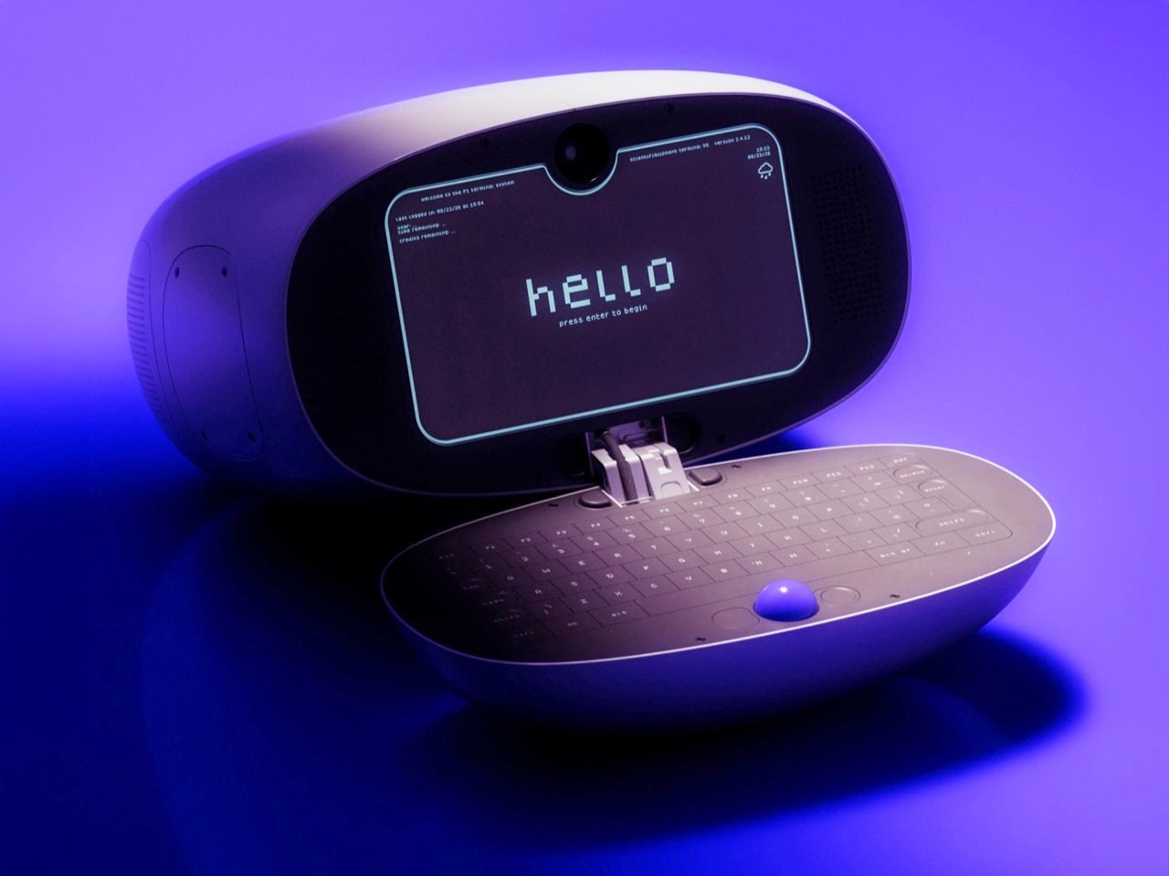
Severance did something no tech company has managed in decades: it made people want a trackball again. The MDR terminals on Lumon’s severed floor, with their cream shells, tiny glowing screens, and built-in trackballs, have become weird objects of desire for a show about corporate horror. Designer Shaun Wellens has dreamed up the computer I imagine Lumon would roll out for its next rebrand. The P1 Terminal is a CGI concept from a made-up 1970s company called Push / Pull, designed as a shared computer for people living in a communal space. It has a soft white clamshell body, a phosphor-style display, and a blue trackball that looks good enough to lick (please don’t).

Wellens says the P1 was inspired by a computer used to support experiments aboard the Space Shuttle, which makes sense once you notice the clamshell form. Then he wraps the whole thing in fake history. In his story, the P1 launched in 1972 for people living in underground communities called “pockets,” where it handled mail, bulletin boards, and shopping. It sold badly, its users adored it, and it got a sequel, which is basically the life story of every cult-classic gadget ever made. He also admits to sneaking deliberate flaws into his fictional designs so the imaginary engineers can fix them in the next version, and I love that level of commitment.

Designer: Shaun Wellens

The shell is a rounded off-white pod, with a sage-gray handle module sitting on top like the carrying grip on a vintage TV. That handle has a recessed slot and a tinted window that recall the iMac G3 and the 1999 clamshell iBook. The open renders show the two halves joined by a stacked metal hinge at the center, the one visibly mechanical part on an otherwise pebble-smooth body. The Space Shuttle inspiration was the GRiD Compass, a magnesium clamshell designed by Bill Moggridge that flew aboard Columbia in 1983 as the Shuttle Portable Onboard Computer, or SPOC.

Inside the lid sits a dark, rounded-rectangle display with cyan-green text that recalls an old phosphor CRT. A camera pokes through a tiny notch at the top center, which is a hilarious thing to find on a computer that supposedly shipped in 1972. Perforated speaker grilles flank the screen. The interface boots to a pixel-font “hello” and drops you into a numbered menu of services, a text-only setup that would sit comfortably next to a Lumon file full of scary numbers. Wellens calls it a lightning-fast graphical interface anyway. In his fictional timeline, it arrived a full year before the Xerox Alto, the pioneering 1973 GUI computer.

The bottom half is a dark oval tray holding a full keyboard, with the blue trackball parked dead center below the keys. That ball is the loudest color on the entire product, and it deserves to be. Trackballs have appeared in early terminals, arcade cabinets, and Logitech’s TrackMan, while Severance gave them another memorable role on the MDR desks. Putting it in the middle also makes sense for a shared machine, since lefties and righties get equal access. The oval keyboard looks a little cramped at the edges, but it matches the pebble shell so neatly that I’m happy to call it one of his intentional flaws.

A chunky, multi-jointed arm that looks borrowed from a robotics lab supports the terminal. It’s designed to let the P1 swing out, tilt, and tuck away, useful movements for a shared machine in a cramped communal space. In one render, the cable drops in from above, suggesting a ceiling- or wall-mounted setup like a dental lamp waiting for its next patient. Residents could walk up, pull it down, check their mail, and push it back, which might explain the Push / Pull name (my theory, Wellens hasn’t confirmed it). That setup makes the P1 feel closer to a payphone or a library catalog terminal than a personal computer.

Wellens’ conceptual history lands surprisingly close to the real thing. In August 1973, the Community Memory Project put a public bulletin board terminal in Leopold’s Records in Berkeley, with later terminals appearing in libraries and laundromats around town. A decade later, France was distributing free Minitel terminals that let people shop, bank, and message each other from home. The service lasted until 2012. The P1 mashes both ideas into one glossy pod for people living underground. Wellens even mocked up a period magazine ad with a big serif headline over a violet product shot, and it’s convincing enough that I briefly wanted to mail away for one.

Severance production designer Jeremy Hindle already gave us the most covetable fake office tech on television, so consider this a friendly nudge. Somebody on the show’s crew should get Wellens on the phone, because the P1 looks like a terminal Lumon would install somewhere much friendlier than the Break Room. He has form here too, having already dreamed up the Kriket 3000, a pastel retro robot that would look right at home wandering the severed floor’s hallways. The guy clearly loves building machines for a timeline that never happened, which is more or less the Lumon design brief. Hire him, throw him a waffle party, and let him build whatever strange hardware the next season needs.

The post The P1 Terminal is the Severance computer I’d actually want to use first appeared on Yanko Design.

  • ✇Yanko Design
  • First look of Rockstar Games x Travis Scott x Nike Air Force 1 Low “Grand Theft Auto” in Black dropped
    The most anticipated video game of all time is launching within a few weeks. It’s 19 November, to be precise, when Rockstar Games will release Grand Theft Auto VI, and everyone, including Nike, wants to tap into the fanfare building up to the launch. No wonder then, the footwear giant has teamed up with rapper Travis Scott and Rockstar Games for a pair of Nike Air Force 1 Low themed after the upcoming game. We have seen some Nike and Travis Scott collaborations in the past. The usual obvious wi
     

First look of Rockstar Games x Travis Scott x Nike Air Force 1 Low “Grand Theft Auto” in Black dropped

3 novembre 2026 à 15:20

The most anticipated video game of all time is launching within a few weeks. It’s 19 November, to be precise, when Rockstar Games will release Grand Theft Auto VI, and everyone, including Nike, wants to tap into the fanfare building up to the launch. No wonder then, the footwear giant has teamed up with rapper Travis Scott and Rockstar Games for a pair of Nike Air Force 1 Low themed after the upcoming game.

We have seen some Nike and Travis Scott collaborations in the past. The usual obvious with their releases has been their limited availability. Considering this one is based on a game whose fanfare is already blowing out of the roof, these won’t be an easy buy either.

Designer: Nike

If the leaked Travis Scott’s Cactus Jack x Rockstar Games x Nike Air Force 1 Low “Grand Theft Auto” is released in limited quantity, there is going to be a fight to get them. Anyway, we do not have that information at the moment, what we know from leaked images is that the shoes will have the reverse swoosh logo on their lateral side, which is a signature of Travis Scott x Nike sneakers. The surfaced images show the GTA sneaker in Black avatar with Grand Theft Auto-inspired accents such as a pink toe-box money band and a pink six-star wanted level graphic.

The Nike Air Force 1 Low “Grand Theft Auto” features a leather upper and will reportedly be available in three colorways: White and Pink, Black and Pink, and a Multicolored option. It is rumored that the sneaker will retail for $130 and will be available for purchase starting 19 November, the same day as the game’s release.

As a nod to Grand Theft Auto VI, the Travis Scott x Rockstar Games x Nike Air Force 1 Low features the six-star wanted level iconography in the outsole. In addition to the star motif, the black sneaker in the pictures is highlighted with the pink rubber money band wrapped around the toe box. It features branding for all involved parties in the collaborative Air Force 1 Low, and comes with an extra set of laces in pink color to contrast with the black all-over look of the sneaker.

For a more intriguing change, it’s reported that the collaborative Air Force 1 replaces the “AIR” lettering on the midsole with GTA, which is an evident reference to the upcoming game. Since there are very limited images that have leaked, we don’t have a picture of what’s on the inside of these sneakers, so we’ll reserve our comment for now, until more information comes in.

The post First look of Rockstar Games x Travis Scott x Nike Air Force 1 Low “Grand Theft Auto” in Black dropped first appeared on Yanko Design.

  • ✇Yanko Design
  • The “Desktop 95” Watch is a love-letter to the greatest Windows OS of all time
    There was a time when a computer’s biggest annoyance was a progress bar inching slowly or a dial-up modem screeching and hissing its way online. Nobody pinged you on Teams, Copilot didn’t offer to rewrite your emails, and the worst thing your PC could do was crash in the middle of Solitaire. Benlywatch’s Desktop 95 bottles that era and straps it to your wrist. The limited-edition analog watch puts a Windows 95-style desktop on its dial, complete with teal wallpaper, beveled windows, and a dialo
     

The “Desktop 95” Watch is a love-letter to the greatest Windows OS of all time

3 novembre 2026 à 14:20

There was a time when a computer’s biggest annoyance was a progress bar inching slowly or a dial-up modem screeching and hissing its way online. Nobody pinged you on Teams, Copilot didn’t offer to rewrite your emails, and the worst thing your PC could do was crash in the middle of Solitaire. Benlywatch’s Desktop 95 bottles that era and straps it to your wrist. The limited-edition analog watch puts a Windows 95-style desktop on its dial, complete with teal wallpaper, beveled windows, and a dialog box that reads “Loading memories…” Honestly, that progress bar is the most accurate thing anyone has written about millennials.

Two pixel cursors serve as the hands, a SYSTEM “Ready” dialog sits near the center, and a taskbar runs along the bottom of the dial. It all lives in a 39mm-wide, 10mm-thick case made from 316L stainless steel, with a Swiss quartz movement and a 5 ATM water-resistance rating. You get a blue or white dial with a leather strap, Milanese mesh, or steel bracelet, plus a numbered caseback. The edition is limited to 500 pieces. Pre-orders are open at $159, with shipping slated for November 2026. The only notification it will ever send you is the time.

Designer: Benly Watch

Pixel Cursor Hands and Two Desktop Dials

One hand is a classic arrow pointer, and the other is the little pointing hand that appeared whenever you hovered over a link. Together they move around the dial telling the time, which is the most productive thing a cursor has done since the invention of the screensaver. Everything else on the dial stays put. On the blue version, an ARCHIVE window with File, Edit, and View menus holds WORK, PHOTOS, and NOTES icons, while DESK, SAVE, and FILES shortcuts line the left edge. Chunky pixel numerals mark 12, 3, 6, and 9, and the taskbar reads MENU, ARCHIVE, and READY, speaker icon included.

The white dial swaps teal for a creamy beige and renames the main window DESKTOP, with COMPUTER, FILES, and DISK icons and a simpler “Loading…” bar. Its numerals almost disappear into the background, so it looks like a screenshot someone shrank down and laminated. I like that the two dials feel like two moods of the same machine. Blue is the cheerful default everybody remembers from the family PC. White is the office computer in accounting that never got its wallpaper changed. Both keep that SYSTEM “Ready” box parked near the center like a promise.

The Windows 95 Design Behind the Dial

Windows 95 launched on August 24, 1995, backed by a $300 million marketing push, a launch event hosted by Jay Leno, and people lining up at midnight to buy an operating system. Its startup sound was composed by Brian Eno, which remains a wild sentence to type. The interface reflected the work of a design team led by Virginia Howlett, a painter by training. Those teals, royal blues, and medium grays came partly from the limited color palettes of graphics cards at the time. Hardware limits, basically, turned into an aesthetic people now pay money to recreate.

Three decades later, Windows comes with Copilot, Teams, and a Solitaire that serves you ads, and Howlett herself has called the Windows 95 years a “kinder, gentler time.” The Desktop 95 taps into that feeling. It’s a desktop with no updates, no pop-ups to dismiss, and no assistant asking how it can help. The only thing missing is Clippy, though in fairness he didn’t arrive until Office 97, and the dial is probably better off without a backseat driver.

Case Specs, Pricing, and Availability

The case measures 39mm across and 44.5mm long, and at 10mm thick it should slip under a shirt cuff without a fight. It’s made from 316L stainless steel, with a matching steel caseback engraved with the Desktop 95 name and an individual edition number. The leather strap is 20mm wide and fits wrists from 5.3 to 8.1 inches (13.5 to 20.5cm), with Milanese mesh and steel bracelet versions also available. Inside is a Swiss quartz movement, which suits the theme, because nobody in 1995 wanted to wind anything except a VHS tape. Water resistance is rated at 5 ATM.

Most of Benlywatch’s catalog is retro-futurist digital hardware with OLED and LCD screens, from the Cybertruck-inspired Future Warrior to its 1970s-style Stargazer. The Desktop 95 takes a different approach, recreating a screen on an analog dial. It’s listed at $159 on pre-order through Benlywatch’s website, limited to 500 pieces, with shipping expected in November 2026. Free worldwide shipping is included, and the brand covers import taxes and duties.

The post The “Desktop 95” Watch is a love-letter to the greatest Windows OS of all time first appeared on Yanko Design.

  • ✇Yanko Design
  • Easy Cooking Stove Concept Folds Its Burner and Pot Supports Into One Case
    Camping stoves can be awkward things to pack, especially when the burner and pot supports insist on keeping their cooking shape inside your bag. Easy Cooking approaches that problem with a folding stove concept that tucks its parts into an elongated, rounded case. Developed in 2023, it proposes a smaller package for the trip without making you assemble a kitchen from loose pieces. The closed body has a sandy beige finish, interrupted by black details and a short fabric loop at one end. Concentr
     

Easy Cooking Stove Concept Folds Its Burner and Pot Supports Into One Case

Par : JC Torres
3 novembre 2026 à 12:20

Camping stoves can be awkward things to pack, especially when the burner and pot supports insist on keeping their cooking shape inside your bag. Easy Cooking approaches that problem with a folding stove concept that tucks its parts into an elongated, rounded case. Developed in 2023, it proposes a smaller package for the trip without making you assemble a kitchen from loose pieces.

The closed body has a sandy beige finish, interrupted by black details and a short fabric loop at one end. Concentric slots near the opposite end echo the circular burner hidden inside, while a field of smaller perforations breaks up the broad face. It’s a restrained way to give camping equipment some character without covering it in rugged-looking armor or oversized branding.

Designers: Hao Kong, Qi Qiu

Opening it changes the relationship between those parts. The burner extends away from the housing, and three serrated pot supports spread around it to create a cooking position wider than the packed form. Folded inward, those supports nest alongside the burner. The proposal concentrates on rearranging what a stove needs, rather than giving a conventional rectangular cooktop a handle and calling it portable.

The fuel cartridge sits lengthwise inside the open housing, keeping the supply beside the burner rather than requiring a separate fuel hose. A large rotary dial occupies the side, and an OPEN label marks a separate control on top. Those familiar physical cues suggest where to begin, although the presentation doesn’t explain the ignition system or the cartridge’s locking and release mechanisms.

That arrangement would make sense for a quick outdoor meal, when you want to put a kettle on without unpacking a boxy tabletop appliance. The enclosure serves two jobs: concealing the burner for transport and accommodating the cartridge once the stove is deployed. Its usefulness would depend on how easily those parts move, especially after grit and food residue get into the joints.

There’s a precedent for this kind of transformation. Snow Peak’s Home & Camp Burner, released in 2019, also folds its burner into an enclosure that holds a butane cartridge during use. Easy Cooking explores that packing problem with a flatter, capsule-like outline. The shared idea makes the details of deployment more interesting than any suggestion that folding a stove is entirely new.

Easy Cooking remains a concept rather than an established retail product. There’s no mention of dimensions or weight figures to demonstrate how much space it saves, and material grades aren’t specified. The folding supports leave practical questions about how a full pot would be held above the ground, particularly when stirring or lifting it could shift the load across that narrow structure.

Heat management matters as much as the folding trick. Snow Peak warns that certain cookware can radiate enough heat toward its canister to create a hazard, a reminder of what’s at stake when fuel and flame share a small footprint. Making the stove disappear for travel is appealing; keeping its fuel from overheating once a pan goes on top demands more care.

The post Easy Cooking Stove Concept Folds Its Burner and Pot Supports Into One Case first appeared on Yanko Design.

OpenAI Expands AI Engineering Tests From Devices to Vehicles

4 novembre 2026 à 11:26

OpenAI tests AI for hardware design and vehicle engineering. Explore manufacturing limits and what businesses should check before adopting these tools.

The post OpenAI Expands AI Engineering Tests From Devices to Vehicles appeared first on TechRepublic.

  • ✇Yanko Design
  • The 8 Best Tech Gadgets of November 2026
    A phone with a screen beside its rear camera is a literal way to improve a selfie. A mouse that folds flat takes a direct approach to an overstuffed laptop bag. Our November gadget selection starts with those practical ideas, then moves through music players, a camera, a keyboard, and a handheld console that makes its electronics part of the view. Each earns its place through a specific design decision. These are our editorial picks for November 2026, not eight November launches or winners from
     

The 8 Best Tech Gadgets of November 2026

3 novembre 2026 à 07:40

A phone with a screen beside its rear camera is a literal way to improve a selfie. A mouse that folds flat takes a direct approach to an overstuffed laptop bag. Our November gadget selection starts with those practical ideas, then moves through music players, a camera, a keyboard, and a handheld console that makes its electronics part of the view. Each earns its place through a specific design decision.

These are our editorial picks for November 2026, not eight November launches or winners from a comparative test. The selection includes products offered for purchase, announced hardware, and projects still working toward production, with those differences identified below. We’ve favored useful mechanisms, distinctive controls, and objects that offer something beyond another spec upgrade. Consider it a guide to what deserves attention, with availability treated as carefully as the industrial design itself.

1. Acer Sospiro A70 5G Phone

The Acer Sospiro A70 gives its rear camera a useful companion: a 1.88-inch display that doubles as a selfie viewfinder. Instead of guessing your framing when using the 64MP main camera, you can check it on the back of the phone. That small screen sits inside a broad, V-shaped camera module, giving the handset an identity beyond its logo. Senwa Global, which licenses the Acer name for phones in Latin America, is the company behind this particular Acer-branded 5G model.

The rest of the hardware preserves options many buyers still value: a 3.5mm headphone jack, 256GB of storage, and microSD expansion up to 1TB. A 5,000mAh battery accompanies the 6.67-inch main display, although its 120Hz refresh rate comes with a modest 720 × 1600 resolution. That’s the compromise behind the feature list. Pricing and the launch date remain unconfirmed in our sources, and a US release hasn’t been established, so this belongs on a watchlist rather than a shopping cart.

What we like

  • The rear display provides framing when taking selfies with the main camera.
  • A headphone jack and expandable storage preserve useful everyday options.

What we dislike

  • The main screen pairs a large panel with relatively low resolution.
  • Pricing, launch timing, and US availability remain unresolved.

2. OrigamiSwift Folding Mouse

A conventional mouse is awkward luggage because its useful shape becomes wasted volume when you close the laptop. Horace Lam’s OrigamiSwift addresses that with a folding, origami-inspired body that rises into a working mouse and flattens for storage. At 40 grams, it adds little weight to a mobile setup. The more interesting achievement is giving the mouse two distinct shapes for two different jobs, rather than asking you to work all afternoon with a permanently shrunken travel accessory in hand.

Bluetooth 5.2 handles the connection, while USB-C recharges a battery that rates for up to three months of use. The $85 asking price buys a more considered packing solution, not a promise that every hand will prefer its angular form. There’s also a dimensional catch worth understanding: the flattened body spreads to roughly 4.8 by 5 inches, and the sensor housing stays thicker than the panels. It’s better suited to a slim laptop sleeve than a tiny pocket.

Click Here to Buy Now: $85.00

What we like

  • Folding construction reduces the thickness needed for storage.
  • Its 40-gram weight makes it a modest addition to a laptop bag.

What we dislike

  • The flattened shape still occupies an almost five-inch-square footprint.
  • The thicker sensor housing prevents a uniformly flat profile.

3. OnePlus Ice Card Mini

OnePlus’s Ice Card Mini is a China-listed magnetic phone cooler with a refreshingly restrained shape. At about 50 grams and 70 by 53.4mm, it resembles a small card accessory more than the clip-on fans associated with gaming phones. Inside, thermoelectric cooling works alongside an air-cooling system. The appeal is straightforward: an external accessory intended to manage heat without turning the phone into something that needs its own carrying case. It’s a focused answer to an accessory category prone to bulk.

The Mini takes power over USB-C, drawing up to 3.5W according to the published specifications. You can power it from the phone, a power bank, or an adapter, but that means the magnetic attachment doesn’t make the setup wireless. An included magnetic plate extends compatibility to phones without built-in magnets. That flexibility is welcome, especially if you change handsets regularly. The remaining questions are practical ones: case compatibility, the effect on your games, and availability outside its initial Chinese market.

What we like

  • The compact magnetic format avoids a bulky clamping mechanism.
  • USB-C power allows several options beyond a wall outlet.

What we dislike

  • It requires a power connection during use.
  • Cooling performance and US availability need confirmation.

4. ClearFrame Speaker CD Player

The ClearFrame Speaker CD Player gives an album two jobs: something to play and something to display. Its transparent body reveals the spinning disc and circuitry, while an included tray lets you insert the album artwork instead. That makes its appearance change with your listening rather than stay fixed behind a manufacturer’s grille. This is the speaker-equipped version of ClearFrame, with a built-in 40mm driver and bass diaphragm, so it can play your CDs without an additional speaker beside it.

At 27mm thick, the $240 player has proportions closer to a book than a conventional stereo component. It features six to seven hours of speaker playback, with USB-C charging and a 3.5mm headphone output. Bluetooth 5.3 sends CD audio to compatible headphones or speakers; it doesn’t receive music from your phone. That distinction matters if you’re imagining a transparent Bluetooth speaker. A display stand and wall mount cost extra, so budget for the arrangement you want at home.

Click Here to Buy Now: $240.00

What we like

  • Album artwork becomes part of the player’s appearance.
  • The built-in speaker removes the need for a separate listening setup.

What we dislike

  • Bluetooth transmits CD audio but cannot receive music from a phone.
  • Display accessories and wall-mounting hardware aren’t included.

5. Sudo Music Player

Tangerine Sudo music player shown from front and back, with playlists menu on screen and tactile wheel below

Silver Sudo music player held in one hand, thumb resting on the tactile wheel

New Matter’s Sudo revisits the dedicated music player with an interface built around a capacitive scroll wheel and haptic feedback, paired with a touchscreen. The appeal is choosing an album on a device whose main purpose is listening, rather than opening another destination on your phone. Planned hardware includes a Cirrus Logic DAC, a 3.5mm headphone jack, and USB-C digital audio output. This is upcoming hardware, though, with New Matter expecting the first batch to ship in early Q4 2027.

The specification gives that familiar format room to grow: 64GB of internal storage, microSD expansion up to 2TB, and support for formats including FLAC, MP3, and WAV. New Matter also lists Wi-Fi and Bluetooth, so the throwback controls don’t mean abandoning connectivity. A refundable $50 reservation goes toward an expected $249 purchase price, rather than buying a finished player today. For anyone rebuilding a local music library, it’s worth following, but the production schedule makes patience part of the proposition.

What we like

  • A dedicated wheel gives music navigation its own control surface.
  • Expandable storage accommodates a growing local library.

What we dislike

  • Expected shipping is in Q4 2027, not this November.
  • The $249 price remains an estimate, not a finalized retail figure.

6. AULA Neos 75 Keyboard

AULA’s Neos 75 puts a small control console beside an otherwise compact keyboard. Two metal knobs, round media buttons, and a 2.3-inch color display give the right edge the look of a miniature hi-fi component. The useful part is having volume and playback controls where your hand already works, without requiring another desk accessory. Designed by AULA.New Renaissance, the 84-key board also uses a CNC-machined aluminum chassis and aluminum keycaps, extending that hardware-focused approach across the surface you actually touch.

Custom low-profile Kailh switches sit in hot-swappable sockets, letting you change switches without soldering. A gasket mount supports the typing assembly, and wired, Bluetooth, and 2.4GHz connections offer different ways to connect your devices. China preorders opened in October, while wider regional availability needs checking before purchase. The physical compromise is right there in the layout: a compact 75% key arrangement doesn’t produce the smallest possible keyboard when a separate control console occupies the space along its entire right edge.

What we like

  • Dedicated knobs and media buttons put frequent controls within reach.
  • Hot-swappable switches leave room to change the typing setup.

What we dislike

  • The side console expands the footprint of the compact key layout.
  • A confirmed official US rollout remains unclear.

7. Fujifilm Instax Mini Evo 2

Fujifilm’s Instax Mini Evo 2 makes printing a choice rather than the unavoidable outcome of pressing the shutter. The hybrid camera lets you review and adjust a digital image before committing it to Instax Mini film. Its lens-effect dial, film-effect dial, and print lever preserve physical actions alongside a 4.5-inch touchscreen. For someone who likes the idea of instant photography but hates wasting film on an accidental exposure, that division of labor makes more sense than nostalgia on its own.

The camera offers 10 lens effects and 10 film effects, giving you 100 combinations before printing. Expanded View shows the area beyond the intended print frame, while the updated app supports printing smartphone photos and remote shooting. Fujifilm lists a US MSRP of $289.95, with availability expected toward the end of November. Film remains a separate purchase, and the new short-movie feature needs a microSD card. Those ongoing costs deserve just as much consideration as the camera’s appealing physical controls.

What we like

  • Reviewing images before printing gives you control over film use.
  • Physical effect dials complement the touchscreen rather than disappearing into it.

What we dislike

  • Instax Mini film adds an ongoing expense.
  • The short-movie feature requires a separately purchased microSD card.

8. Arduview Transparent Gaming Handheld

Arduview takes transparent electronics beyond a clear shell. Louis Huang’s handheld also uses a see-through circuit board and display, leaving the background visible around its illuminated cyan pixels. It’s an unusually direct way to turn the workings of a gadget into its visual identity. This isn’t only a rendering trick: VGC reports using a working unit and confirms that the transparent screen functions as shown. The project is now crowdfunding, rather than sitting on a shop shelf ready for delivery.

Built on the open Arduboy platform, the 50-gram device is pitched around 400 preloaded games and USB-C charging. That makes it a small, focused alternative to a phone full of gaming apps, with room for enthusiasts to explore the underlying platform. Arduview’s maker projects February 2027 shipping for early supporters, rather than November availability. Its appeal rests on a deliberately narrow gaming experience and a display construction; neither should be confused with the capabilities of a larger, mainstream handheld console.

What we like

  • Transparency extends to the screen, not merely the enclosure.
  • The open Arduboy platform offers scope for tinkering beyond preloaded games.

What we dislike

  • February 2027 shipping is a projection, not immediate availability.
  • Its niche Arduboy library won’t suit someone seeking mainstream console games.

Match the Gadget to the Habit

The most useful way to approach this list is to start with a recurring annoyance, not an empty spot on the desk. A mouse that packs differently has a clear job. So does a CD player that lets an existing collection leave the cupboard. More specialized hardware needs a closer match to your habits: a phone cooler only matters if heat is a problem you actually encounter while using it.

Timing deserves the same scrutiny as design. A reservation, a crowdfunding pledge, and a retail order are different commitments, even when the product photography makes them look equally finished. If you need something for this month, check the version, delivery estimate, and accessories before paying. If you’re following an upcoming design, keep the expected date in view. An interesting object can be worth watching without being the right purchase today.

The post The 8 Best Tech Gadgets of November 2026 first appeared on Yanko Design.
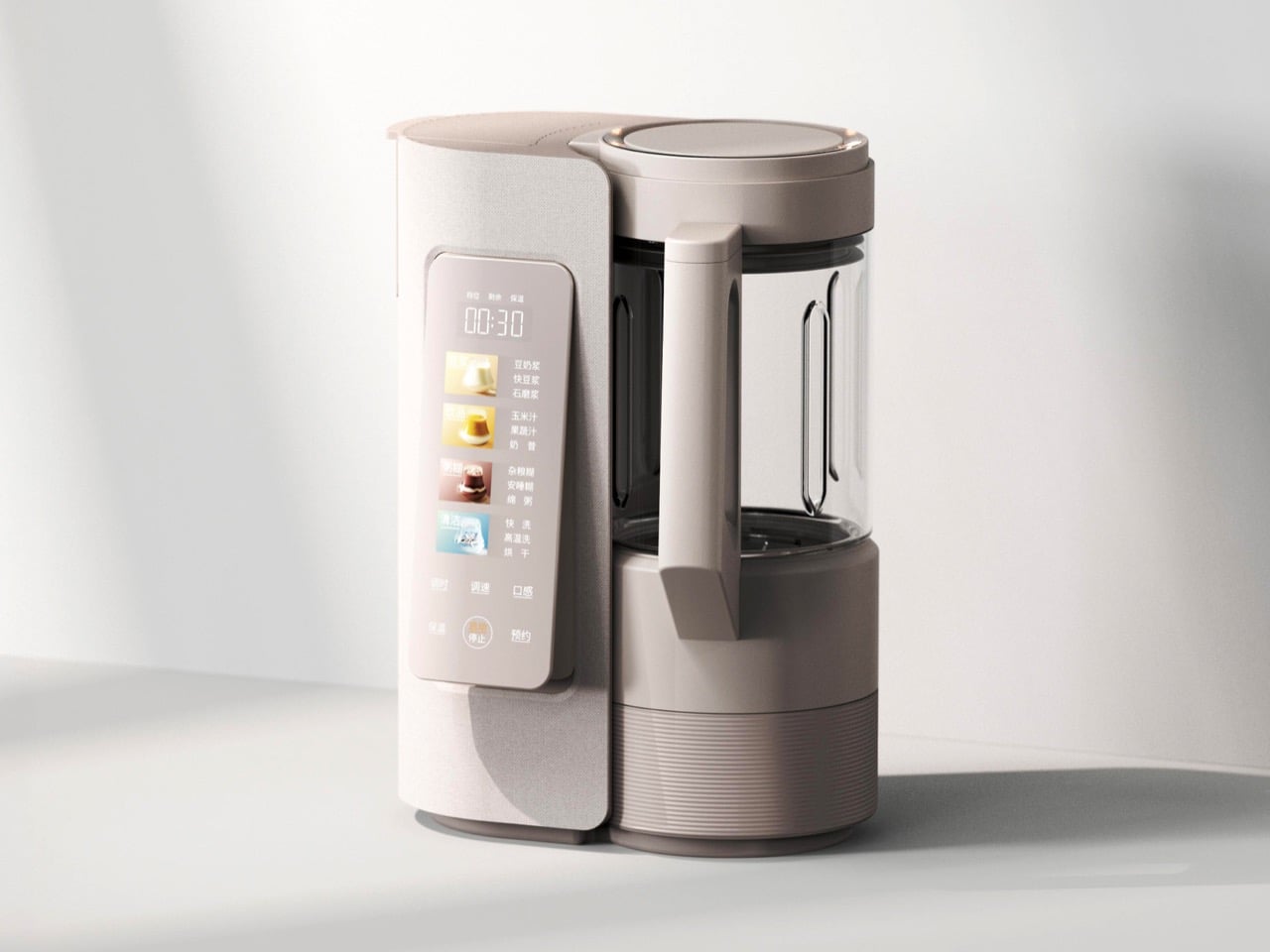
  • ✇Yanko Design
  • NOX Cordless Lamp Lets You Carry the Beam Without the Base
    Cordless table lamps let you move the whole fixture, but sometimes you only need to take the light. Studio Apure’s NOX makes that distinction with a magnetic head that lifts away from its stand and becomes a small flashlight. The stand can stay beside your chair while its illuminated tip follows you down a dark hallway, without carrying the base along for company. The shape gives that arrangement a surprisingly tidy home. A slender upright rises from a flat circular foot, with a shorter cylinde
     

NOX Cordless Lamp Lets You Carry the Beam Without the Base

Par : JC Torres
3 novembre 2026 à 06:07

Cordless table lamps let you move the whole fixture, but sometimes you only need to take the light. Studio Apure’s NOX makes that distinction with a magnetic head that lifts away from its stand and becomes a small flashlight. The stand can stay beside your chair while its illuminated tip follows you down a dark hallway, without carrying the base along for company.

The shape gives that arrangement a surprisingly tidy home. A slender upright rises from a flat circular foot, with a shorter cylinder attached near the top. There’s no broad shade or long articulated arm competing for space above a bedside table. Onyx Black, Nimbus Grey, and Dune Beige keep the finish choices subdued, letting the changing angle of the head supply most of the character.

Designer: Studio Apure (via The Curation)

That head rotates through 360 degrees, so you can redirect the beam without shifting everything else on the table. An adjustable lens changes its spread from a broad glow to a concentrated spot. You might keep the light wide during dinner, then narrow it toward a book afterward, giving the same small fixture two different jobs without changing where the stand sits.

Brightness gets its own adjustment, separate from the beam’s width. Tap the top of the head to switch the LED on or off, and hold to dim it between 5% and 100%. Its 140-lumen output has a warm 3000K color temperature. The touch control stays with the detachable head, so it remains accessible when you’re carrying the light without its supporting stand.

Taking it off the stand changes the scale of what you’re carrying. You can check behind a sofa or retrieve something from a dark closet without balancing an entire lamp in one hand. Return the head to its magnetic attachment, and its battery recharges from the stand. That gives the removable part a parking spot, which is useful for something so small.

Studio Apure estimates 12 to 14 hours of cordless operation for the complete lamp and up to an hour for the detached flashlight, both at full brightness. Recharging the lamp takes about seven hours using the supplied dock and adapter. The stand is therefore the longer-lasting arrangement, while the little light you pull away is better suited to shorter trips around home.

Outdoor trips still come with a few restrictions. NOX carries an IP54 rating, but Studio Apure restricts it to indoor or covered outdoor settings and advises avoiding direct water contact. A sheltered patio table fits that brief; leaving it exposed in the garden doesn’t. Cordless operation removes the outlet from the seating arrangement, not the need to bring the lamp under cover.

Listed at $385, NOX puts a substantial price on that flexibility. Its 2.03-pound weight still lets you carry the whole lamp when you want light somewhere else, while a flashing red ring warns you when it’s time to recharge. You’ll just need to return the head to its stand, since a magnetic connection can’t recharge something you’ve abandoned in a kitchen drawer.

The post NOX Cordless Lamp Lets You Carry the Beam Without the Base first appeared on Yanko Design.
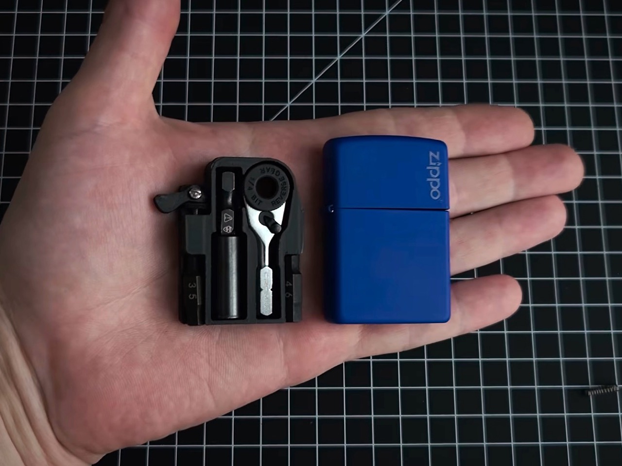
  • ✇Yanko Design
  • LEGO Bauhaus Chess Concept Has Hidden Clues to Its Moves
    A knight’s horse-shaped head is easy to recognize, but it offers no clue about that peculiar L-shaped move. That’s a small frustration with learning chess: identifying the pieces and remembering what they do are two separate tasks. I like the idea of giving their shapes a little more responsibility, especially when the alternative is explaining the knight’s movement for the fifth time. Pinke Gans’s Bauhaus Chess Set, a LEGO Ideas fan concept, takes that possibility as its starting point. Accord
     

LEGO Bauhaus Chess Concept Has Hidden Clues to Its Moves

3 novembre 2026 à 04:15

A knight’s horse-shaped head is easy to recognize, but it offers no clue about that peculiar L-shaped move. That’s a small frustration with learning chess: identifying the pieces and remembering what they do are two separate tasks. I like the idea of giving their shapes a little more responsibility, especially when the alternative is explaining the knight’s movement for the fifth time.

Pinke Gans’s Bauhaus Chess Set, a LEGO Ideas fan concept, takes that possibility as its starting point. According to the designer, the idea emerged during a summer visit to the Bauhaus Museum in Weimar, Germany, where Josef Hartwig’s geometric chess pieces brought LEGO bricks to mind. It’s an appealing connection: a construction system built around basic shapes meets a chess set designed to make those shapes meaningful.

Designer: Pinke Gans

Hartwig designed his Bauhaus chess set in 1923, while working at the school in Weimar. Its abstraction wasn’t simply a matter of removing decorative details. The pieces used their forms to communicate their movement, replacing familiar figures with a geometric vocabulary. A minimalist chess set can still leave you memorizing arbitrary symbols; Hartwig’s approach gives some of those symbols a practical explanation.

The knight is the clearest example. Its stepped shape echoes its L-shaped movement, while the bishop’s diagonal cross relates to its diagonal paths across the board. Pinke Gans’s version carries those recognizable forms into bricks. These are useful memory cues, not a complete substitute for learning the rules. Nobody should expect a small cube to explain every complication of a pawn’s first move or capture.

In the supplied images, the queen provides the most conspicuous departure from all those straight edges. Its rounded top becomes a faceted, layered construction, with individual elements visible around its surface. Nearby, the king has a smaller cube turned relative to its base. Together, they introduce enough variation to interrupt the rows of blocks. The brick-built approximation of a sphere gives the queen a texture of its own.

That translation is more interesting to me than a perfectly smooth replica would be. Historical examples of Hartwig’s set were made in wood, so rebuilding the forms in LEGO changes how their surfaces read. Here, joints and tile seams remain visible. They establish a second, finer grid within the larger chessboard pattern, making the construction legible even where exposed studs don’t dominate the design.

The board itself stays restrained: black and white squares, a dark perimeter, and no elaborate scenery competing with the pieces. From the lower viewing angles, the arrangement resembles a small collection of architectural models. I could see this earning its place on a living room table because the visual interest comes from proportion and repetition, rather than decoration.

There is a potential usability tradeoff, though. If you already recognize conventional chess silhouettes instantly, a geometric set asks you to learn a different identification system before its logic becomes helpful. A blocky king and a rounded queen might be clear once explained, but that doesn’t establish faster recognition during play. The images also can’t tell us how securely the pieces hold together when repeatedly picked up.

The project is presented as a LEGO Ideas proposal, rather than an announced retail set. That distinction deserves to stay attached to the enthusiasm. Fan product ideas that reach 10,000 supporters may be considered for production, but reaching that threshold doesn’t itself put a box on store shelves. This submission shouldn’t be treated as a confirmed release or given an imagined price.

For me, the strongest reason to want it is the opportunity to assemble the shapes before playing with them. Building a knight’s stepped form could make its design rationale more tangible than simply reading an explanation beside a finished piece. You’d still need to learn chess. But spending a little time constructing the thing that represents a move seems like a particularly appropriate introduction to Hartwig’s idea.

The post LEGO Bauhaus Chess Concept Has Hidden Clues to Its Moves first appeared on Yanko Design.
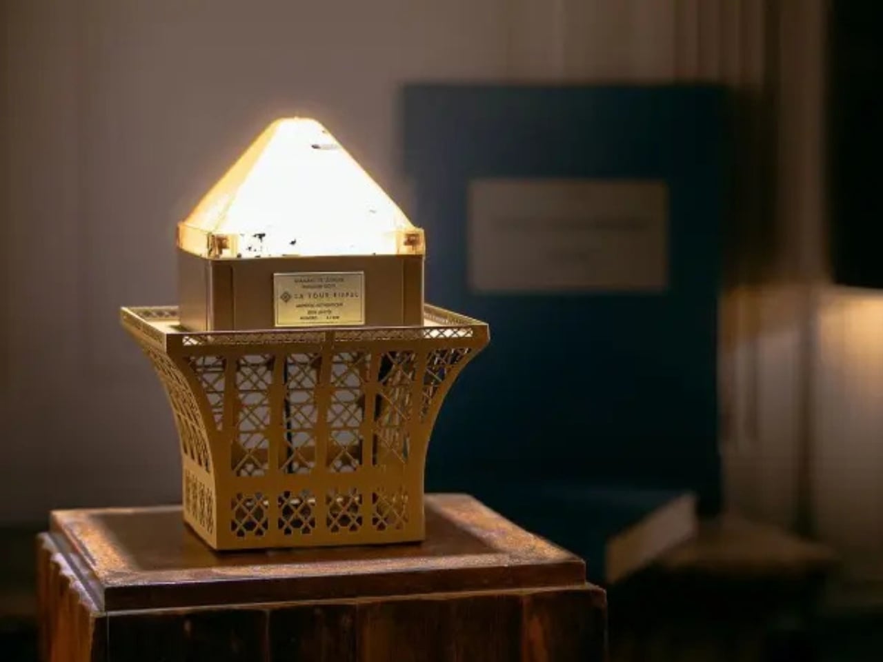
❌