❌

Vue normale

  • ✇Yanko Design
  • Apple’s iPhone 18 is getting a ‘cheaper’ A20 chip to keep the overall phone affordable
    Apple has a long habit of handing last year’s brain to this year’s regular iPhone. The iPhone 15 shipped with the A16 chip while the 15 Pro got the shiny new A17 Pro, and nobody stormed Cupertino with pitchforks. It works because people shop for cameras and battery life, and nobody has ever asked a store clerk about die size. The iPhone 18 is about to run the same play with a twist. This time the regular model gets a brand new A20 chip, except it arrives months after everyone else’s. The chip i
     

Apple’s iPhone 18 is getting a ‘cheaper’ A20 chip to keep the overall phone affordable

7 octobre 2026 à 20:30

Apple has a long habit of handing last year’s brain to this year’s regular iPhone. The iPhone 15 shipped with the A16 chip while the 15 Pro got the shiny new A17 Pro, and nobody stormed Cupertino with pitchforks. It works because people shop for cameras and battery life, and nobody has ever asked a store clerk about die size. The iPhone 18 is about to run the same play with a twist. This time the regular model gets a brand new A20 chip, except it arrives months after everyone else’s.

The chip is the A20, and a leaked solder ball map analyzed on Weibo by user 白饭炒白米饭 (reported by Notebookcheck on October 1) suggests it is a slimmed down sibling of the A20 Pro. That Pro chip already powers the iPhone 18 Pro, starting at $1,199, and the iPhone Duo, starting at $1,999. Both reportedly use TSMC’s 2nm process, but the standard version supposedly keeps the AI hardware and trims the GPU, cache, and clock speeds. The base iPhone 18 is expected in spring 2027, and Apple has announced no price or date. So what does Apple cut when it wants a cheaper 2nm chip, and what does it refuse to touch?

Designer: Demon’s Tech

A Smaller Die Than Last Year’s Chip, on a Pricier 2nm Node

The standard A20’s bare die is estimated at 70 to 80 mm², which would make it smaller than the A19 at 82.8 mm² and well under the A20 Pro’s 98.8 mm². A die is the actual slab of silicon, and every square millimeter you shave off means more chips per wafer and a lower bill. On 2nm the savings count for more, since Notebookcheck’s report notes those wafers cost significantly more than earlier nodes. Our own look at the base iPhone 18 pegged its body as basically an iPhone 17 in disguise, so there is no fresh industrial design to pay for either. Apple looks to be spending the budget on silicon instead.

Apple reportedly gets there by halving the cache. The standard A20 is expected to carry 8 MB of L2 cache for its two super cores and 4 MB for its four efficiency cores, which is 50% less than the A20 Pro. Cache is the small, ultra fast memory sitting right next to the processor cores, so a smaller helping can mean slightly more trips out to slower memory under heavy load. It is also one of the most direct ways to shrink a die, because SRAM, the circuitry cache is built from, has scaled poorly on recent chip nodes. Honestly, it is the smartest corner to trim, since you will never see a cache spec on a phone box.

Why the A20 Pro Gets Fancy Packaging and the A20 Skips It

The A20 Pro reportedly uses WMCM, short for wafer-level multi-chip module, which places the processor and its memory side by side instead of stacking one on the other. That layout lets the chip connect straight to the vapor chamber, the cooling plate Apple introduced with the iPhone 17 Pro. Apple says the new Pro design delivers up to 40% better sustained performance than the 17 Pro. The standard A20 is expected to stay with traditional package-on-package, where the memory sits on top of the chip like a hat. A hat is cheap and compact, but it also traps heat right where you do not want it.

Packaging is how Apple reportedly gets the A20 Pro to 4.93 GHz, a figure from the leak analysis that Apple has never confirmed. The standard A20 is expected to clock considerably lower, so it likely does not need the same cooling tricks. Pair that with an expected 5-core GPU against the Pro’s 7 cores, and the gap could show up in a long gaming session. Past base chips trailed their Pro siblings by one GPU core, so a two-core deficit would be wider than usual. The vapor chamber stole the show in the iPhone 17 Pro teardown we covered, and the leak says nothing about the base model getting similar cooling.

The AI Hardware Apple Keeps, and What Spring 2027 Looks Like

The AI side of the chip reportedly survives the cuts largely intact. The leak says the A20 keeps the same dual 16-core Neural Engine as the Pro, the dedicated block that handles on-device AI tasks, along with its own 4 MB cache. The system-level cache, a shared pool of memory every part of the chip can tap, may grow from the A19’s 12 MB to 16 MB. The memory bus is also expected to widen to 96 bits, matching the Pro, which means more data can flow to the chip per second. In real life that means live translation and photo cleanup running on the phone instead of waiting on a server.

The iPhone Duo (the one with the open and close animation we gushed over) runs the same A20 Pro, so Apple’s fall lineup now shares one chip. The base model is expected to follow in spring 2027 with a lighter version of that platform. Apple has confirmed no date, price, or chip for it, so every number here is a leak. The iPhone 17 started at $799 and the Pros just rose $100, so the base model’s price is the number to watch. Back in the A16 days the hand-me-down chip was a consolation prize, but this time the regular iPhone gets a fresh 2nm brain with a little muscle trimmed, a deal I would happily take.

The post Apple’s iPhone 18 is getting a ‘cheaper’ A20 chip to keep the overall phone affordable first appeared on Yanko Design.

  • ✇Korben
  • Du dev iPhone sans Mac sur Omarchy
    Mise à jour du 8 octobre 2026 : depuis la publication de cet article, j'ai découvert les idées que diffuse DHH, le créateur d'Omarchy. Je ne recommande plus cette distribution, et je vous explique pourquoi dans Omarchy, non merci . Omarchy-apple-dev , c'est un projet qui vous permet de compiler une app codée en SwiftUI, l'installer sur votre iPhone via le cable USB et l'envoyer à TestFlight d'Apple, tout ça depuis une machine Linux sous Omarchy... Oui oui, sans Mac
     

Du dev iPhone sans Mac sur Omarchy

7 octobre 2026 à 05:30

Mise à jour du 8 octobre 2026 : depuis la publication de cet article, j'ai découvert les idées que diffuse DHH, le créateur d'Omarchy. Je ne recommande plus cette distribution, et je vous explique pourquoi dans Omarchy, non merci .

Omarchy-apple-dev , c'est un projet qui vous permet de compiler une app codée en SwiftUI, l'installer sur votre iPhone via le cable USB et l'envoyer à TestFlight d'Apple, tout ça depuis une machine Linux sous Omarchy... Oui oui, sans Mac !

Le gros du boulot est assuré par xtool , qui sait déjà compiler, signer et installer une app iOS sous Linux, mais ce dépôt omarchy-apple-dev y ajoute un script ship.sh, qui permet de créer le .ipa, d'y renseigner les clés de build que le traitement App Store lit, puis d'envoyer tout ça à Apple comme un grand.

Bref, en langage clair, ça veut dire que vous pouvez être développeur iOS depuis votre PC Linux. Cool hein ?

Pour l'installer, c'est juste 3 lignes avec install du SDK d'Apple.

git clone https://github.com/joshuaswarren/omarchy-apple-dev
cd omarchy-apple-dev
./install-toolchain.sh

Les morceaux du SDK iOS n'existant que dans la distribution Xcode d'Apple, il faut donc télécharger le Xcode.xip sur developer.apple.com avec un Apple ID gratuit, depuis n'importe quel OS. Vous relancez ensuite le script avec XCODE_XIP=/chemin/Xcode.xip, puis device-run.sh installera l'app sur l'iPhone branché. Un compte gratuit suffit pour ça, mais Apple le limite à 3 apps par appareil avec des profils qui expirent au bout de 7 jours. Pour TestFlight, il faudra par contre un compte développeur payant et une clé d'API App Store Connect.

Après, les CGU d'Apple pour Xcode et ses SDK disent bien que ces logiciels ne sont autorisés uniquement sur un produit de marque Apple tournant sous macOS, et que tout autre usage est une violation du contrat. Sa clause 2.5 interdit aussi d'utiliser les SDK séparément ou de les faire tourner sur du matériel qui n'est pas Apple. Or le SDK que le script installe vient forcément d'un Xcode d'Apple. Voilà, au moins vous savez...

Bref, pour bricoler sur votre iPhone avec un compte gratuit, ça peut le faire... Après, pour l'App Store, sachez qu'Apple exige en plus depuis avril dernier, que vos apps soient compilées avec Xcode 26 ou plus récente alors qu'ici, ce bon vieux script contourne ça... Donc à voir si vous voulez tenter votre chance.

Au pire, pour la phase finale (la compilation de la release de votre app), vous sortez un Mac rien que pour ça et le reste du temps, vous codez et compilez vos tests à 100% dans Omarchy. A vous de voir :)

  • ✇Yanko Design
  • Would you pay $14,000 for an iPhone Duo without any cameras?
    Imagine sitting at a table with friends and whipping your phone out. Your friends see it’s a foldable… then as you unfold it, the animation looks suspiciously like the iPhone Duo. Your friends are impressed, they designate you as the group photo taker… and you tell them regrettably that your iPhone Duo has no cameras. Then you add… not only does it not sport any cameras, it also costs fourteen grand. To be honest, that scenario is entirely imaginary. Mainly for a bunch of key reasons. Caviar bu
     

Would you pay $14,000 for an iPhone Duo without any cameras?

1 octobre 2026 à 16:30

Imagine sitting at a table with friends and whipping your phone out. Your friends see it’s a foldable… then as you unfold it, the animation looks suspiciously like the iPhone Duo. Your friends are impressed, they designate you as the group photo taker… and you tell them regrettably that your iPhone Duo has no cameras. Then you add… not only does it not sport any cameras, it also costs fourteen grand.

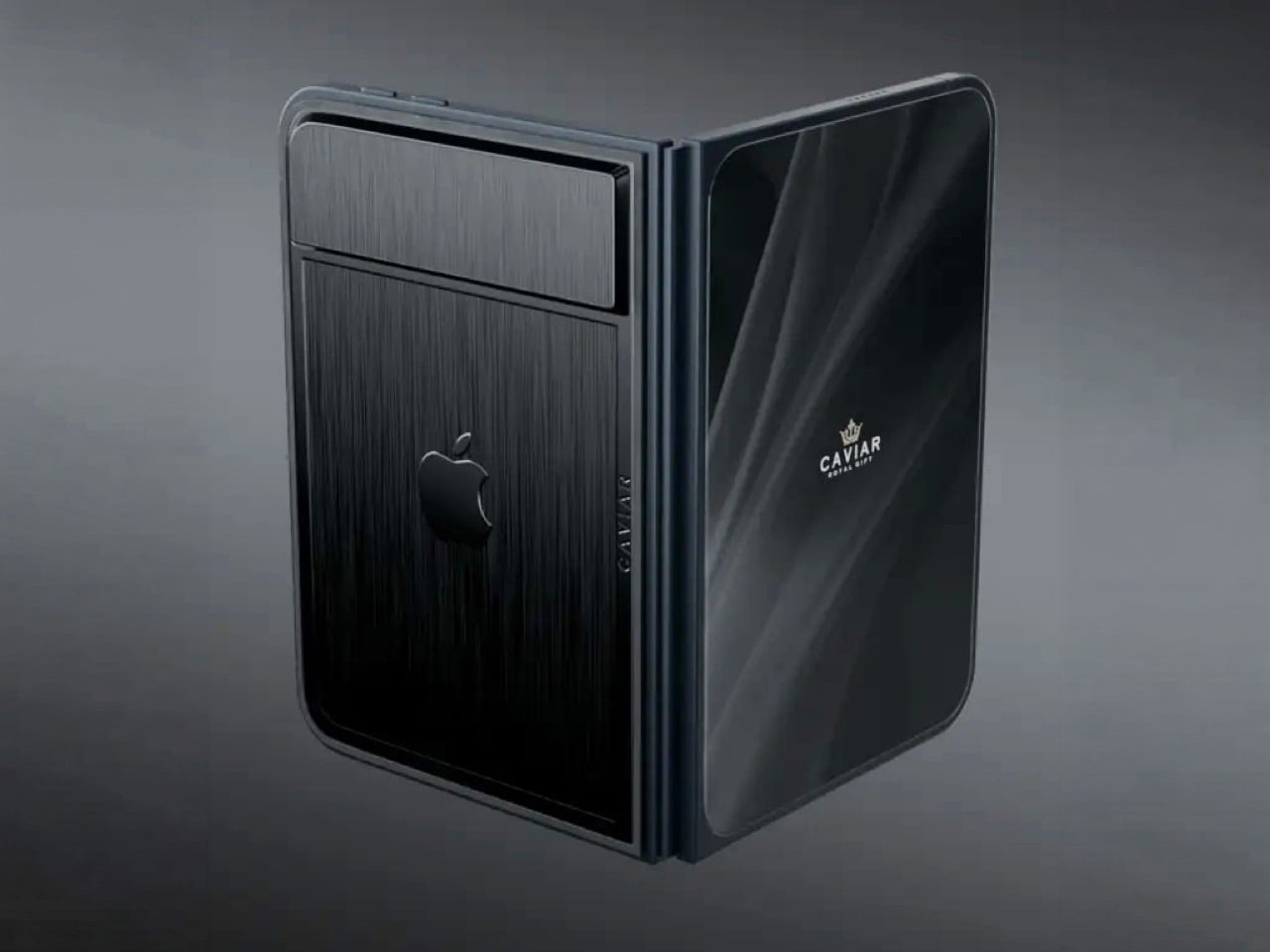
To be honest, that scenario is entirely imaginary. Mainly for a bunch of key reasons. Caviar built this version of the iPhone Duo for privacy, championing what they call “Privacy, Minimalism, and a Refined Masculine Style.” Someone who sees truth in that ethos isn’t designated photographer material. And if they were, shelling 14k on a phone means you probably have a few extra grand to hire a photographer wherever you go. The only reason someone buys this hare-brained version of the iPhone Duo is because they can. Plain and simple.

Designer: Caviar Global

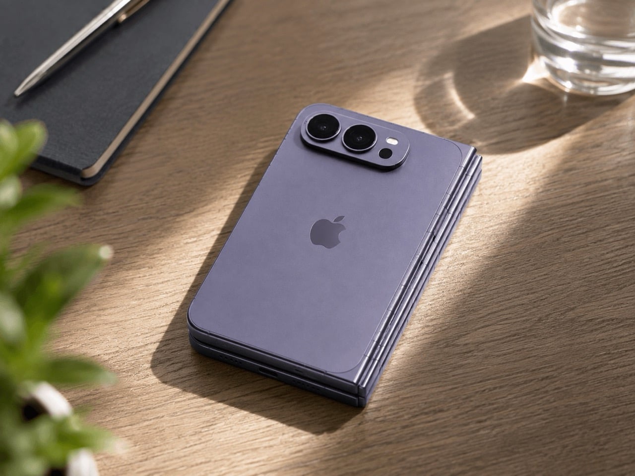
Removing the camera stack from the back of the iPhone Duo does something unexpected: the phone becomes genuinely beautiful. That rear panel, normally dominated by the triple-lens module, turns into a single flat sheet of satin-finished black titanium. No bumps, no rings, no glass circles competing for visual real estate, just one uninterrupted surface that shifts character depending on the light hitting it. Caviar calls the inspiration “supersonic aviation aesthetics,” which sounds like marketing speak until you actually look at the product photos. A blacked-out Apple logo sits flush in the titanium, the Caviar crown marks the opposite panel in a swept fabric-like texture, and the whole thing looks less like a phone and more like a prop from a very expensive spy film.

Apple’s decision to use Touch ID for the iPhone Duo, abandoning Face ID, turns out to be what makes Caviar’s camera-free execution actually hold up. A Face ID phone needs its front camera array to function as a biometric sensor, so pulling that out would mean a very pretty device that cannot unlock. Touch ID lives in the frame rather than behind the screen, so Caviar could strip the entire camera stack, front hole-punch and rear module both, without breaking anything fundamental. Based on product images, the inner display on the Ultimate appears completely clean, no hole-punch interrupting the screen, which makes the inside as seamless as the outside. Two separate design decisions from two separate companies ended up fitting together better than either could have planned.

Caviar made 19 of these total. Each unit ships in a custom lockable black luxury box, presented the way a jeweler presents a watch rather than the way Apple ships a phone. A smaller gold-colored wooden case inside holds what appears to be a gold-plated commemorative coin, the kind of object that exists purely to make the unboxing feel like a ceremony. The side of the phone is engraved with a serial number too, for exclusivity. Caviar knows exactly who they are selling to, and made sure the packaging matches the energy.

Caviar has been doing this for years, taking flagship Apple hardware somewhere Apple would never go, for clients who appreciate the gesture. The formula is consistent: start with the most premium Apple product on the market, make it rarer, make it more dramatic, and let the price be the final statement. We have covered their gold-plated and titanium iPhone builds here before, and none of them committed this hard to stripping features as a form of self-expression. At $13,990 for 19 units (mind you, that’s just the 512GB variant), the Ultimate is the purest version of the Caviar argument: a phone that costs seven times its base price because it does less, and somehow makes that sound like the point.

The post Would you pay $14,000 for an iPhone Duo without any cameras? first appeared on Yanko Design.

  • ✇Korben
  • AirCard - Relookez vos cartes bancaires dans Apple Pay
    AirCard , c'est une appli macOS gratuite qui permet de remplacer l'image par défaut d'une carte dans Apple Wallet, directement depuis votre Mac relié à l'iPhone par un câble USB et tout ça sans jailbreak. Je l'ai essayée sur mon iPhone 16 Pro Max et ça marche du tonnerre. Attention quand même, l'appli n'a aucun bouton pour revenir en arrière, mais ne vous inquiétez pas je vais tout vous expliquer. Ce tour de passe-passe nous vient d'AirLift, une faille du service AirTraffic, celui
     

AirCard - Relookez vos cartes bancaires dans Apple Pay

1 octobre 2026 à 11:28

AirCard , c'est une appli macOS gratuite qui permet de remplacer l'image par défaut d'une carte dans Apple Wallet, directement depuis votre Mac relié à l'iPhone par un câble USB et tout ça sans jailbreak. Je l'ai essayée sur mon iPhone 16 Pro Max et ça marche du tonnerre. Attention quand même, l'appli n'a aucun bouton pour revenir en arrière, mais ne vous inquiétez pas je vais tout vous expliquer.

Ce tour de passe-passe nous vient d'AirLift, une faille du service AirTraffic, celui là même qui synchronise les médias d'un Mac vers iOS. Et AirLift s'en sert pour lire et écrire dans des dossiers qu'il n'est pas censé toucher, depuis un Mac déjà appairé avec l'iPhone. Cette petite vuln a été testée à partir de iOS 18.0, et Apple peut évidement la corriger quand elle veut mais ce serait quand même vraiment dommage parce que c'est bien cool. Maintenant rassurez vous, côté paiement, rien ne bouge ou n'est transféré ou créé. On ne change que l'image d'une carte du wallet c'est tout !

Je vous propose maintenant de rentrer dans le dur.

Installer AirCard et brancher l'iPhone

Il vous faut donc un Mac (Apple Silicon ou Intel), un iPhone, un câble USB qui transmet les données et une carte déjà ajoutée à Wallet. Téléchargez AirCard.dmg dans les releases du dépôt, ouvrez-le et glissez l'appli dans le dossier des Applications. Si macOS refuse de la lancer parce que l'éditeur est inconnu, faites un clic droit sur l'appli, Ouvrir, puis Ouvrir une seconde fois. Sinon, faut passer par Sentinel ou par cette commande qui retire le blocage :

sudo xattr -cr /Applications/AirCard.app

Détecter la carte

Branchez l'iPhone au Mac en USB, déverrouillé, et acceptez de faire confiance à l'ordinateur. Dans AirCard, restez sur l'onglet Apple Wallet et cliquez sur Scan Cards. Sur l'iPhone, double-cliquez sur le bouton latéral et Apple Pay s'ouvrira comme quand vous faites un paiement, avec Face ID. Une fois authentifié, touchez la carte à relooker, et une deuxième fois si rien ne bouge. Ce geste permet en fait à AirCard de récupérer l'identifiant de la carte (un hash), et elle peut apparaître ensuite dans la fenêtre du Mac.

Si le scan ne trouve rien, ouvrez Log dans AirCard et cherchez "Connected to the unified device log stream". Relancez ensuite un scan, authentifiez-vous et touchez vraiment la carte, ou passez d'une carte à l'autre. Si ça bloque encore, débranchez, déverrouillez l'iPhone et rebranchez. Des utilisateurs disent sur le GitHub du projet que le scan ne détecte pas toutes les cartes voire aucune avec cette 1.2.5. Moi j'ai pas eu de problème mais il arrive parfois que iOS remplace certaines valeurs par "private", et le scanner ne peut alors pas les récupérer.

Choisir l'image et flasher

Ensuite, cliquez sur l'emplacement de la carte où il y a le symbole +, ou glissez-y directement une image. AirCard la recadre alors automatiquement en 1536 × 969 pixels bien centrée avec le ratio d'une carte. Cela veut dire que peu importe le design que vous voulez utiliser, gardez bien ce qui est important pour vous au centre de l'image. Ensuite cliquez sur Flash Skins et ça appliquera votre image sur votre carte dans Apple Wallet. Chez moi, l'opération a pris entre 30 secondes jusqu'à parfois 1 min (j'ai pas super chronométré non plus, hein) mais le flash est allé jusqu'au bout à chaque fois.

Ensuite quittez Wallet depuis le sélecteur d'apps et relancez-le, ou redémarrez carrément l'iPhone et hop, votre nouveau visuel de carte apparaîtra.

J'ai donc comme beaucoup commencé par un skin d'Amex Black, sans chichi sur l'une de mes CB, histoire de frimer...

Puis sur ma seconde CB, je me suis fait un skin de carte Vitale maison. Au départ, je me suis fait un PNG avec Pixelmator, tout ce qu'il y a de plus normal avec la bonne taille et tout et tout, mais ça n'a jamais voulu se mettre sur ma carte. Donc, j'ai refait l'image en important simplement mon visuel dans l' éditeur de cardart.cc , qui exporte un PNG clean au bon format en 1536 × 969 et ça a fonctionné.

Et voilà, quand je paie en sans contact, maintenant ça donne ça... Je pense que les caissier.es vont flipper.

D'ailleurs, si vous cherchez d'autres visuels, il y en a plein sur cardart en téléchargement gratuit. La carte d'identité de Bob l'Eponge m'a tenté aussi, je l'avoue....

Le clavier du code, le Mac en moins, et le piège

Notez que AirCard sait aussi habiller le clavier du code de verrouillage avec des thèmes en .passthm. Suffit de vous rendre dans l'onglet Passcode, vous glissez le fichier passthm, vous l'appliquez puis vous redémarrez, et là, normalement, vous avez un super beau clavier. Pour ma part, je n'ai pas essayé parce que je m'en fous un peu, mais bon, c'est là.

Ah et sinon, si vous n'avez pas de Mac, il y a aussi une version AirCard-iOS qui fera le taf uniquement depuis l'iPhone, mais ça exige iOS 18 minimum, une installation par sideload (SideStore, AltStore, TrollStore ou LiveContainer) et un appairage par le mode développeur. Donc, c'est un peu plus relou qu'avec l'application pour macOS.

Et le petit piège dont je vous parle au début, c'est que la version 1.2.5 de Aircard n'a pas de bouton pour restaurer le visuel d'origine. Donc, si celui-ci ne vous plaît plus, vous pouvez soit le remplacer par un autre, soit vous devez retrouver votre visuel d'origine en téléchargement sur le web. Après, peut-être qu'en supprimant la carte du wallet et en la recréant, ça réparera le visuel, je ne sais pas... Faudra tester !

Source : AirCard

  • ✇WinCentral
  • Apple Releases watchOS 27.0.1 to Fix Random Restarts on New Apple Watch Models
    Apple has released watchOS 27.0.1, a small but important update aimed at fixing unexpected restarts affecting some of its newest Apple Watch models. The update arrives roughly a week after the launch of watchOS 27 and is specifically focused on improving stability rather than introducing new features. watchOS 27.0.1 Targets Unexpected Apple Watch Restarts The […]
     

Apple Releases watchOS 27.0.1 to Fix Random Restarts on New Apple Watch Models

Par : Nisha
24 septembre 2026 à 01:01
Apple has released watchOS 27.0.1, a small but important update aimed at fixing unexpected restarts affecting some of its newest Apple Watch models. The update arrives roughly a week after the launch of watchOS 27 and is specifically focused on improving stability rather than introducing new features. watchOS 27.0.1 Targets Unexpected Apple Watch Restarts The […]

  • ✇Yanko Design
  • This $21 Charger Powers Your iPhone, Apple Watch, and AirPods at Once
    Most of us have two or more gadgets that need constant charging, plus several chargers and cables to keep them all juiced up. That’s probably fine if you have an entire outlet strip at home or in the office, but when you’re working with a small space, or you’re traveling and on the go, it can be a real challenge to charge multiple devices at once. You end up with a tangle of cords and charging heads, or sometimes you even have to take turns charging your gadgets. If you mostly own Apple devices
     

This $21 Charger Powers Your iPhone, Apple Watch, and AirPods at Once

19 septembre 2026 à 16:45

Most of us have two or more gadgets that need constant charging, plus several chargers and cables to keep them all juiced up. That’s probably fine if you have an entire outlet strip at home or in the office, but when you’re working with a small space, or you’re traveling and on the go, it can be a real challenge to charge multiple devices at once. You end up with a tangle of cords and charging heads, or sometimes you even have to take turns charging your gadgets.

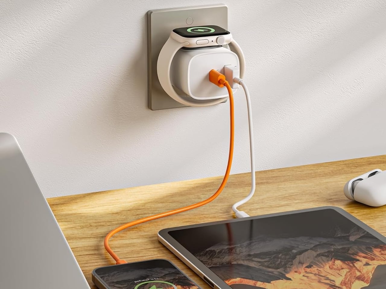
If you mostly own Apple devices or other USB-C-powered gear, the TESSAN 3-in-1 USB-C Charger may actually solve that problem for you. It’s a compact wall charger with a USB-C port, a USB-A port, and a built-in magnetic Apple Watch dock, so you only need one outlet to power up three devices at the same time.

Designer: TESSAN

This 3-in-1 charger is especially handy when you only have one outlet available but need to power up three different devices. A few years ago, this wouldn’t have been much of an issue, since most of us only had one phone to worry about. But now that owning multiple devices is the norm, charging has become an everyday hassle. What do you do when you’ve got a phone, a pair of AirPods, and a smartwatch that all need power at the same time?

TESSAN’s charger features fast charging through its 20W USB-C port, so you can get a device like the iPhone 15 up to 55 percent battery in just 30 minutes. At the same time, its 18W USB-A port can juice up an accessory simultaneously while your main device charges. It also offers broad compatibility, working with everything from the latest iPhone models to AirPods and other USB-powered devices. The real star of the show, though, is the built-in magnetic charger for your Apple Watch. There’s no separate puck or cable needed here. Instead, you get a self-aligning dock, so you won’t have to fuss with positioning your watch every time you need to charge it.

The charger comes in four finishes (white, black, pink, and blue) and is clearly designed to double as a small desk-aesthetic item, though it will likely still read as “just a charger” to most people, especially in the white colorway. Where it really shines is portability: it’s a travel-friendly device you can toss in a bag without a second thought, instead of hauling around three separate chargers that eat up space and weight in your carry-on.

How does it stack up against the competition? The most obvious comparison is Belkin, whose 3-in-1 MagSafe charging stands are the gold standard in this category. Belkin’s BoostCharge Pro and UltraCharge Pro docks charge an iPhone, Apple Watch, and AirPods wirelessly and look considerably more premium sitting on a nightstand, but they also run anywhere from $95 to $150 and require more desk real estate. TESSAN’s charger, at $20.99, skips the wireless charging bells and whistles in favor of a compact, plug-in design that’s built more for function and travel than for a styled bedside setup. If you want a showpiece charging stand for your living room, Belkin is still hard to beat. But if you want something inexpensive, pocketable, and fast enough to get you out the door in the morning, TESSAN makes a compelling case for itself as the budget-friendly, travel-first alternative.

At the end of the day, this isn’t a charger trying to be a lifestyle centerpiece. It’s a charger trying to solve a genuinely annoying, everyday problem: too many devices, not enough outlets, and not enough patience to wait in line for your turn at the power strip. For $20.99, the TESSAN 3-in-1 USB-C Charger delivers fast charging, broad compatibility, and a clever built-in Apple Watch dock in a package small enough to disappear into a laptop bag or a nightstand drawer. It won’t turn heads the way a sleek charging stand might, but it will quietly keep your phone, watch, and earbuds powered up without the usual cord chaos. For anyone juggling multiple Apple devices on a daily basis, or packing for a trip and dreading the tangle of cables, this little charger earns its spot on the “actually useful” list.

The post This $21 Charger Powers Your iPhone, Apple Watch, and AirPods at Once first appeared on Yanko Design.

  • ✇Korben
  • Apple Configurator - Pour transformer votre iPhone en Dumbphone
    Apple Configurator est un outil gratuit qu'Apple fournit aux écoles et aux entreprises pour préparer des iPhone par paquets de cent. Si ça vous dit quelque chose, c'est parce que c'est aussi l'outil que j'ai utilisé pour mon tuto sur le pair locking . Mais cela ne veut pas dire que vous ne pouvez pas l'utiliser pour votre propre plaisir ! En effet, rien n'empêche de le lancer sur le vôtre, et ce qu'il vous permet alors de faire est plutôt radical : faire disparaître l'App Store de
     

Apple Configurator - Pour transformer votre iPhone en Dumbphone

14 septembre 2026 à 04:30

Apple Configurator est un outil gratuit qu'Apple fournit aux écoles et aux entreprises pour préparer des iPhone par paquets de cent. Si ça vous dit quelque chose, c'est parce que c'est aussi l'outil que j'ai utilisé pour mon tuto sur le pair locking . Mais cela ne veut pas dire que vous ne pouvez pas l'utiliser pour votre propre plaisir ! En effet, rien n'empêche de le lancer sur le vôtre, et ce qu'il vous permet alors de faire est plutôt radical : faire disparaître l'App Store de l'écran d'accueil.

Vous branchez l'iPhone sur un Mac en USB, vous le passez en mode supervisé, puis vous vous fabriquez un profil de configuration que vous lui poussez. Cela permet par exemple de limiter la présence de certaines app pour ainsi transformer votre téléphone en dumbphone . Ça permet donc de lutter contre vos démons de la perte de temps que sont par exemple les réseaux sociaux.

La case à décocher dans Configurator s'appelle "Autoriser l'installation d'apps à l'aide de l'App Store". Une fois que c'est fait et que le profil est déployé sur le téléphone, l'icône de l'App Store n'apparaît plus sur l'écran d'accueil, et l'utilisateur ne peut plus installer ni mettre à jour ses apps (snif).

Les trois sous-cases de l'installation d'apps, toutes marquées "appareils supervisés"

Ensuite, reste à empêcher le propriétaire du téléphone (c'est-à-dire vous) de retirer ce profil 5 minutes plus tard. Ça se règle dans l'onglet Général du profil, avec un menu qui contrôle quand celui-ci peut être supprimé, et que vous basculez sur "Jamais".

Sauf que Jamais ne veut pas vraiment dire jamais. En effet, Apple documente lui-même la sortie de secours... Pour virer ce profil, il faut effacer l'intégralité du contenu et des réglages, ce qui arrête la supervision, et le profil s'en va avec. Ce n'est donc pas une vraie prison, mais plutôt une grosse friction, et son prix c'est le contenu entier de votre téléphone.

Les apps déjà installées, elles, ne bougeront pas d'un pixel. Elles gardent leurs notifications et leur compte connecté, parce que la restriction n'efface rien du tout... Elle vous retire seulement la possibilité d'en réinstaller une. Le ménage se fait donc avant, pas après. Et avant même ça, il y a un péage puisque la supervision ne s'active que sur un iPhone neuf ou entièrement effacé, avant que l'assistant de réglages n'apparaisse pour la première fois.

La première étape consiste donc à vider votre téléphone, sauvegarde comprise. Ensuite, tant que le profil tient, plus une seule app ne se met à jour, correctifs de sécurité compris. Et une app supprimée par mégarde (votre appli bancaire, votre générateur de codes à deux facteurs) ne reviendra pas avant que vous soyez rentré rebrancher le Mac. Ça peut être problématique en voyage, donc je vous conseille aussi de décocher la case "Autoriser la suppression d'apps (appareils supervisés)" pour justement empêcher aussi la désinstallation des apps.

L'idée de mettre en place un profil comme ceci nous vient de Stepan Parunashvili, qui raconte sur son site être passé de 4 à 2 heures d'écran par jour en deux mois. Sa bidouille ne s'arrête d'ailleurs pas à l'App Store, puisqu'il y ajoute aussi un filtre de contenu réglé sur les sites autorisés uniquement, sans quoi les services dont on vient de retirer les applications resteraient accessibles par le web.

Si ça vous chauffe de mettre ça en place pour gagner du temps de vie, comptez deux heures d'installation environ, une remise à zéro complète de votre smartphone, et deux bonnes semaines avant que votre liste d'apps soit la bonne.

Maintenant, si ça vous semble disproportionné, ça l'est un peu. Dumb Phone , que je vous présentais en janvier, vise le même résultat avec les API de temps d'écran et sans rien effacer... mais il se désactive aussi super facilement.

Bref, c'est la méthode brutale, pour ceux que les méthodes douces n'aident pas.

Source

iOS 27.2 Beta Brings Apple’s Biggest Health App Redesign Yet With AI Insights

Par : Nayan
17 septembre 2026 à 00:44
Apple has wasted no time moving beyond iOS 27. Just two days after the public release of iOS 27, Apple has started testing iOS 27.2, skipping an iOS 27.1 beta entirely. The biggest surprise in the first beta is the redesigned Apple Health app, which is getting a major overhaul built around Apple Intelligence. The […]

  • ✇Yanko Design
  • Apple is Working on Two iPhone Game Controllers Under its Beats Brand
    Concept Image Apple and the gaming crowd have always had one of those relationships where you nod at each other across a party and never actually walk over. Apple makes the chips, brags about them beating a PS5 in some benchmark slide, then goes right back to talking about spreadsheets and stargazing apps. Gamers, meanwhile, buy a Steam Deck or a Switch and never think about the iPhone in their pocket as a gaming device at all. Bloomberg’s Mark Gurman just reported that Apple wants to finally cr
     

Apple is Working on Two iPhone Game Controllers Under its Beats Brand

13 septembre 2026 à 16:45
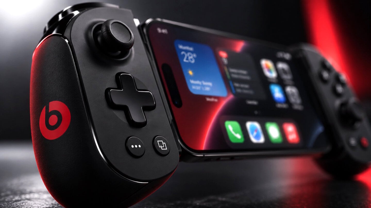
Concept Beats branded iPhone game controller, close-up on the right grip showing X, Y, A, B face buttons, thumbstick, and red Beats logo, with the clamped iPhone home screen visible at left, lit in red.

Concept Image

Apple and the gaming crowd have always had one of those relationships where you nod at each other across a party and never actually walk over. Apple makes the chips, brags about them beating a PS5 in some benchmark slide, then goes right back to talking about spreadsheets and stargazing apps. Gamers, meanwhile, buy a Steam Deck or a Switch and never think about the iPhone in their pocket as a gaming device at all. Bloomberg’s Mark Gurman just reported that Apple wants to finally cross the room, having spent over a year quietly developing its own gaming controllers for the iPhone. The bigger twist is who gets to wear the name tag. Rather than an Apple logo, the hardware is reportedly launching under Beats, the audio label Apple has been slowly turning into its lifestyle catch-all since buying it in 2014.

Code unearthed in a leaked macOS 26.7 build gives the rumor real teeth, naming two unreleased devices, T6502 and T1057, each carrying its own dedicated controller profile instead of placeholder code. Both come with the standard gamepad vocabulary, sticks, triggers, a D-pad, face buttons, the stuff every controller on the planet already has. T6502 keeps things simple and wired. T1057 adds Bluetooth, motion sensors, and a noticeably different haptic engine, suggesting more than one idea is being tested at once. Nothing is priced, dated, or confirmed, but the code alone says this has moved well past a mood board.

Designer: Apple

Concept Beats branded iPhone game controller shown fully assembled with an iPhone clamped in the center, both grips visible with D-pad, thumbsticks, and red Beats logos, set against a dark background with a large red Beats logo behind it.

Gurman’s sourcing on the branding is the part I keep chewing on. He says Beats executives are leading both the engineering and the product concept, not just slapping a logo on something Apple’s industrial design team already finished. His reasoning is that the culture and lifestyle around gaming controllers fits Beats better than it fits Apple, and that the sub-brand gives the company room to use cheaper materials and a louder design without dragging down the premium finish people expect from anything wearing the actual Apple logo. Read between the lines and that is Apple admitting its own aesthetic has a ceiling. Titanium and glass photograph beautifully, but nobody wants to grip a cold slab for a three-hour Genshin Impact session. Beats, with its glossy plastics and its very unserious relationship with color, is a far more honest home for an object designed to be squeezed, dropped, and thrown in a backpack pocket.

Concept Beats branded iPhone game controller in two separated halves with the iPhone floating above, left grip showing D-pad and right grip showing face buttons, both with red Beats logos, resting on a dark reflective surface.

There is a decent trade-off lurking here too, and it is worth naming before anyone gets too excited. T6502, the wired one, is basic by design, which means it will likely be the cheaper, more disposable option with none of the motion sensing or richer haptics that make a controller feel alive. T1057 sounds like the one worth wanting, but Bluetooth controllers introduce pairing friction and battery anxiety that a simple USB-C plug-in never has to deal with. Apple will have to pick a lane, or price the two far enough apart that the choice makes sense, and so far there is no signal on either price or release window. History also isn’t fully on Apple’s side. The company has floated controller ideas for years without shipping one, and it once required developers to support the Siri Remote’s accelerometer as a de facto gaming input before quietly dropping that mandate. A leaked profile in a beta build is not a keynote slide.

Close-up of the left grip of a concept Beats branded iPhone game controller, showing the D-pad, thumbstick, and red Beats logo, with the clamped iPhone visible in soft focus behind it.

Where this actually matters long term is the software Apple has already built around it. iOS 26 shipped a dedicated Games app that pulls your library, your Game Center friends, and Apple Arcade into one hub across iPhone, iPad, Mac, and Apple TV, and Arcade itself has quietly grown past 250 titles for $6.99 a month. A first-party controller, even a scrappy Beats-branded one, gives all of that infrastructure something physical to plug into, which is a very different goal from just selling more hardware. It also puts Apple in the odd position of competing with its own shelf space, since the Apple Store already sells the Backbone One and the SteelSeries Nimbus, and we covered how Backbone’s own Pro model already chases full-size ALPS sticks and forty-hour battery life at a premium price. Razer’s brand new Prio takes the opposite approach entirely, folding down to credit card size for people who would rather not carry a controller-shaped commitment at all. Apple showing up now, later than everyone, wearing someone else’s logo, says less about gaming and more about how Apple treats every category it enters late. Quietly, sideways, and only once it has found a version of itself that does not feel like Apple at all.

The post Apple is Working on Two iPhone Game Controllers Under its Beats Brand first appeared on Yanko Design.
  • ✇WinCentral
  • Apple Could Put Ads Inside Visual Intelligence as Sponsored Results Appear in iPhone Code
    Apple may be preparing to bring advertising to one of the most useful parts of its iPhone AI experience. Code discovered in Apple’s software reportedly points to the possibility of sponsored results appearing inside Visual Intelligence, potentially allowing search providers and other services to insert paid product placements alongside normal visual search results. The feature […]
     

Apple Could Put Ads Inside Visual Intelligence as Sponsored Results Appear in iPhone Code

Par : Nayan
11 septembre 2026 à 00:55
Apple may be preparing to bring advertising to one of the most useful parts of its iPhone AI experience. Code discovered in Apple’s software reportedly points to the possibility of sponsored results appearing inside Visual Intelligence, potentially allowing search providers and other services to insert paid product placements alongside normal visual search results. The feature […]

  • ✇Yanko Design
  • The 5 Best Apple Accessories Of September 2026 That Actually Improve How You Use Your Devices
    The Apple ecosystem runs deep, but the devices themselves only go so far. The iPhone, Apple Watch, and iPad are remarkable pieces of hardware on their own, and yet a small category of accessories has figured out exactly what each one is missing. Not cases that just protect or cables that just charge, but objects that change the way a device feels, sounds, looks, or works from the moment you pick it up. These five accessories do exactly that. They come from different corners of the Apple world,
     

The 5 Best Apple Accessories Of September 2026 That Actually Improve How You Use Your Devices

12 septembre 2026 à 13:20

The Apple ecosystem runs deep, but the devices themselves only go so far. The iPhone, Apple Watch, and iPad are remarkable pieces of hardware on their own, and yet a small category of accessories has figured out exactly what each one is missing. Not cases that just protect or cables that just charge, but objects that change the way a device feels, sounds, looks, or works from the moment you pick it up.

These five accessories do exactly that. They come from different corners of the Apple world, covering the watch, the phone, the iPad, and the kind of audio experience Apple never built its own hardware around. Each one earns its place not because it carries a name worth recognizing, but because it solves a specific frustration that was always there waiting to be noticed. Here are the ones worth knowing about right now.

1. NightWatch

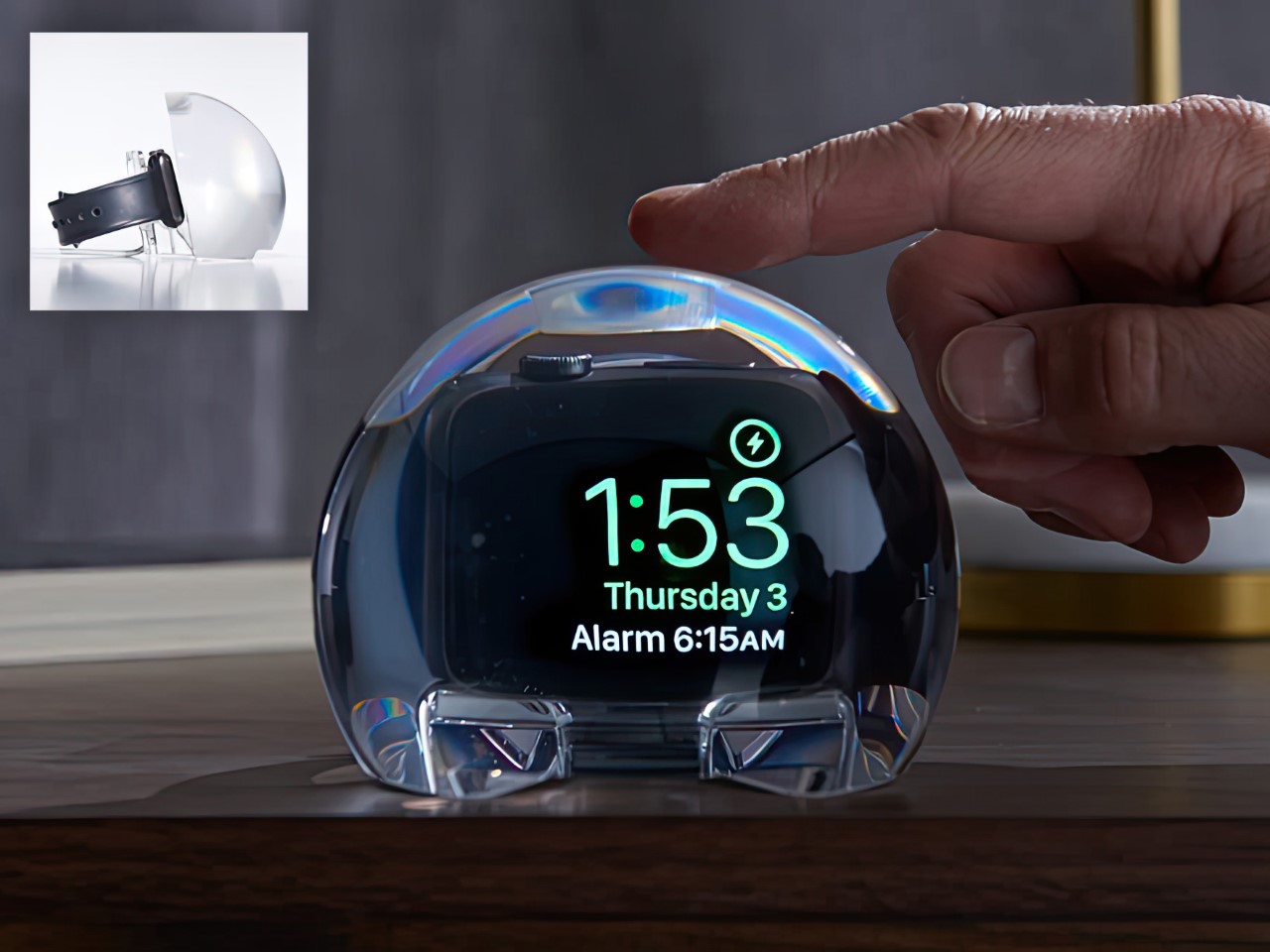
Most Apple Watch docks are functional and forgettable, a plastic puck with a magnetic charger and no ambition beyond getting your watch off your wrist for the night. The NightWatch is not that. It is a clear glass orb, roughly the size of a generous paperweight, that you set your Apple Watch inside at night. The result transforms the watch’s nightstand charging face into a magnified, glowing clock that is genuinely easier to read from across a dark room than the device alone would ever allow.

The dock works by treating the Apple Watch display as a light source and the glass sphere as a lens, drawing the time out of a small wrist-bound rectangle and spreading it into a real visual presence on the nightstand. It also includes a built-in audio amplifier that boosts the sound of your alarm, so quiet mornings stay that way until you actually need them not to be. At $69.99, it is priced more like a considered object than a cable management solution, which is exactly the spirit it deserves to be received in.

What we like

  • The magnification effect turns the Apple Watch display into a legitimate bedside clock without additional screens, apps, or setup
  • The built-in audio amplifier addresses the one genuine weakness of relying on Apple Watch nightstand mode as a morning alarm

What we dislike

  • The orb form factor is visually dominant enough that it will not suit minimalist nightstands where a small footprint matters
  • At $69.99, it costs more than several competing dock designs that handle charging equally well without the visual statement

2. Rock Paper Pencil 4.0

The Apple Pencil is a precision instrument that has never quite figured out how to feel like one. The glass surface beneath it is smooth and frictionless, and while that works fine for certain tasks, illustrators and note-takers spending hours drawing have always wanted something closer to real paper. Astropad’s Rock Paper Pencil addresses that gap directly: a removable, reusable nano-texture screen protector paired with custom Apple Pencil tips, and version 4.0 makes the system meaningfully better than it has ever been.

The upgrade introduces a new graphite POM tip alongside the existing steel ballpoint option, and the difference is immediately legible. The graphite tip mimics the toothy drag of a 2B pencil, a sensation that makes expressive sketching and shading feel deliberate and controlled rather than slippery and approximate. Each kit now ships with four tips in total, two graphite and two ballpoint, alongside a screen cleaning kit that should have been included from the beginning. The protector attaches via NanoCling static cling rather than adhesive, meaning it lifts off without residue and goes back on without a bubble.

What we like

  • The NanoCling system is genuinely removable and reusable, giving iPad owners a paper-feel surface on demand without permanently altering the display
  • Having both graphite and ballpoint tips in a single kit covers two distinct working styles without requiring a separate accessory purchase

What we dislike

  • The graphite tip wears down noticeably faster than the ballpoint option, which will matter to anyone putting in long, intensive drawing sessions regularly
  • The friction that makes sketching feel natural also makes smooth, fast swiping across the screen feel slightly resistant during ordinary everyday use

3. Battery-Free Amplifying iSpeakers

Every speaker you own asks something of you before it makes a sound. The Bluetooth speaker needs charging, and the charging case needs its own cable. The smart speaker needs a wall outlet, a WiFi password, and a company’s servers to stay online on a random Tuesday. The Battery-Free Amplifying iSpeakers, designed by Ooi Masato of Pit-A-Pat for Shimawa and made in Japan, need none of it. They need your iPhone and the physics of a sound wave moving through precision-machined metal, and that is the complete brief.

The design is straightforward: a Duralumin metal body with a slot for the phone and golden-ratio speaker apertures that channel and amplify sound through acoustic resonance, the same principle that powered phonographs before electricity reached most homes. There is no pairing, no app, no battery level to check. You set your phone in the slot, and your music gets louder and fuller, immediately.

Click Here to Buy Now: $179.00

What we like

  • Zero setup and zero charging requirements make it the simplest speaker in any room, with no ritual standing between you and better sound
  • The precision-machined Duralumin construction means there is nothing to break, replace, update, or charge, ever

What we dislike

  • At $179, it competes on price with capable Bluetooth speakers that offer far more volume, range, and flexibility for larger spaces or outdoor use
  • The phone slot is sized for specific handsets, so case thickness and phone dimensions will determine how well it actually cradles your device

4. Nomad Leather Folio

Phone cases tend to fall into two camps: those that protect the device and those that try to say something. Nomad’s Leather Folio attempts something harder: a single object that does both without looking like it is trying to do either. Crafted from Horween leather inside and out, with MagSafe compatibility and RFID blocking built in, it folds over the front of the iPhone Duo and turns what is already an expensive device into a combination that reads less like a phone and more like something a person who still carries a leather notebook would reach for without thinking twice.

Priced at $129, it is not a cheap case, but it is not pretending to be. The leather cover closes over the screen, which is either a feature or a nuisance depending entirely on how you use your phone, though for anyone who already drops it face-down out of habit, the protection is real and the payoff is legitimate. MagSafe integration means the phone charges normally through the case, and the RFID blocking handles the handful of situations where that actually matters. The overall effect is a device that feels deliberately considered in a way most cases never manage to pull off.

What we like

  • Horween leather develops a patina with use rather than aging badly, which gives the case a genuinely long useful life most materials cannot match
  • MagSafe compatibility and RFID blocking are both included without any visible hardware bulk or added thickness to the profile

What we dislike

  • The full front flap adds a step to every screen interaction that will feel like friction until the habit settles, and that adjustment can take longer than expected
  • At $129, it sits in an awkward price band between affordable everyday cases and truly premium leather goods, which makes the value case harder to land cleanly

5. RePod C1

The click wheel was never just an interface. It was a tactile experience that gave early iPods a sense of ceremony that touchscreens have never quite replaced, a physical scroll mechanism that made navigating a playlist feel like it was worth doing slowly. Techpod’s RePod C1 is a $60 Apple Watch case that wraps the watch in an iPod-style shell and brings that wheel back, and what keeps it from being a novelty is one mechanical detail: the click wheel connects directly to the Apple Watch’s Digital Crown, so turning it actually does something real.

The case uses an open-back design that leaves all of the watch’s sensors fully accessible, meaning heart rate monitoring, ECG, and Apple Pay all continue to work normally. Antenna cutouts preserve Wi-Fi, Bluetooth, and cellular connectivity without compromise. The more interesting side effect is what it does to the device’s identity: sliding the watch into a pocket during a run or a commute and navigating with the Crown from inside the shell turns the Apple Watch into something that feels far more like a small, deliberate music player than a wrist-worn notification machine.

What we like

  • The mechanical connection between the click wheel and the Digital Crown makes the nostalgia functional rather than cosmetic, which is a meaningful distinction
  • The open-back design keeps every sensor and connectivity feature fully intact, so nothing about the watch’s capabilities changes when the case goes on

What we dislike

  • Adding any case to the Apple Watch introduces bulk to a device whose appeal partly depends on being thin and unobtrusive on the wrist
  • The iPod aesthetic lands clearly for one generation and reads as entirely opaque to anyone who came to Apple after the click wheel era ended

The Best Accessories Are the Ones Apple Didn’t Think to Make

Apple’s hardware is precise enough that the accessories worth paying attention to are the ones that noticed a gap the company chose not to fill. The NightWatch saw a dim nightstand clock. Astropad saw a frictionless drawing surface. Ooi Masato saw a speaker that required too much setup before it made a sound. Nomad saw a phone that could carry itself differently. Techpod saw a scroll mechanism nobody had brought back with anything real underneath it.

None of these are essential in the way a charging cable is essential. They are optional in the best sense, the kind of thing that makes a device feel more considered in the hands of whoever chose it. Whether your Apple device is a watch, a phone, or an iPad, something on this list has already figured out what was missing before you had the words for it.

The post The 5 Best Apple Accessories Of September 2026 That Actually Improve How You Use Your Devices first appeared on Yanko Design.

  • ✇Yanko Design
  • 5 Things the iPhone Duo Got Right That Samsung Still Hasn’t
    Samsung has had the folding phone conversation to itself for six years now, tweaking hinges, shrinking creases, and figuring out what a cover screen is even for. Apple waited, watched, and let its rival make every mistake first. That patience shows in the iPhone Duo, a first-generation foldable that skipped straight past problems Samsung’s Galaxy Z Fold8 still hasn’t fully solved. None of that comes cheap, though. The Duo starts at $1,999 and costs more than the Fold8’s $1,899.99, weighs in at
     

5 Things the iPhone Duo Got Right That Samsung Still Hasn’t

Par : JC Torres
12 septembre 2026 à 08:10

Samsung has had the folding phone conversation to itself for six years now, tweaking hinges, shrinking creases, and figuring out what a cover screen is even for. Apple waited, watched, and let its rival make every mistake first. That patience shows in the iPhone Duo, a first-generation foldable that skipped straight past problems Samsung’s Galaxy Z Fold8 still hasn’t fully solved.

None of that comes cheap, though. The Duo starts at $1,999 and costs more than the Fold8’s $1,899.99, weighs in at roughly nine ounces against the Fold8’s seven, and folds up thicker in your pocket, besides. Samsung still wins those arguments outright, and we’ll get back to that later. But set weight and price aside, because here are five places where Apple’s first foldable actually beat Samsung’s eighth attempt.

Designer: Apple

The Camera That Disappears

A foldable phone’s whole pitch is the screen, one continuous surface that opens up into something closer to a small tablet. Every notch or punch-hole cut into that surface breaks the illusion a little, reminding you that the software is still working around a sensor buried in the glass. Samsung’s Galaxy Z Fold8 has never quite escaped that compromise, even eight generations in.

The Galaxy Z Fold8 carries a 10-megapixel camera punched into both the inner and cover displays, a hole you notice every time the screen lights up. The Duo takes a different route entirely, tucking its inner selfie camera under the panel itself so nothing interrupts the display when you’re watching a movie or scrolling through photos with both halves open. The outer screen keeps a single, smaller cutout.

A Stylus Samsung Gave Up On

Samsung built its whole Note legacy around the S Pen, then carried that stylus into the first few generations of the Galaxy Z Fold before quietly dropping it this cycle. Neither the Galaxy Z Fold8 nor the Galaxy Z Fold8 Ultra bring it back, leaving a gap for anyone who used to sketch, sign, or jot notes onto that big inner display. It’s a strange retreat for a company built on that exact feature.

Samsung Galaxy Z Fold6

Apple Pencil support changes that, working on both the 5.4-inch cover screen and the 7.6-inch inner display, once it arrives. Dual-screen support lands through a software update later this year rather than at launch, so early buyers will have to wait a bit for the full experience. Still, it means signing a document or sketching an idea won’t require unfolding the phone first, something Samsung’s lineup can no longer offer.

Built to Survive the Mess

Dust is the part of durability testing everyone forgets about until it’s too late, and a folding hinge is the worst possible place for grit to sneak into. Water resistance ratings get all the marketing attention, but the dust half of an IP rating tells you whether sand at the beach or fine construction dust will actually make it past the seals and start scratching at the mechanism underneath.

The iPhone Duo carries an IP68 rating, meaning the seal is dust-tight; nothing gets through, full stop. The Galaxy Z Fold8 only manages IP48, which covers water fine but leaves that dust digit low enough that fine particles, sand, and powder aren’t actually kept out. For anyone who takes their foldable to a beach, a workshop, or just a dusty backpack, that gap matters more than it looks.

Room for Everything You Shoot

A foldable’s bigger inner screen practically begs you to shoot more video and drag around heavier files, whether that’s 4K footage, a stack of RAW photos, or a library of apps you’d never bother installing on a regular phone. Storage stops being an afterthought pretty quickly once you’re using the extra screen real estate the way it’s meant to be used, for actual creative work instead of just bigger icons.

Apple tops out the iPhone Duo at 2TB of storage, double what the Galaxy Z Fold8 offers at its 1TB ceiling. That’s the difference between planning around your camera roll on a long trip and simply forgetting storage exists as a problem. For anyone who treats their foldable as a mobile production tool rather than a bigger email client, that extra headroom ends up mattering more than the megapixel count.

Fighting the Fold’s Oldest Flaw

The crease down the middle of a folding screen has been the one problem no manufacturer has fully cracked, Samsung included, no matter how many generations they’ve shipped. Apple’s approach to the Duo’s hinge stacks a nano-texture matte layer over glide-adhesive glass and backs the whole assembly with a titanium plate, an engineering answer to a problem that’s mostly been treated as unavoidable elsewhere in the industry.

Early impressions from outlets with briefing access suggest the crease is still visible. Nobody’s claiming otherwise, but it doesn’t catch your finger or your attention the way it does on most rivals, the Galaxy Z Fold8 included. That’s worth flagging as an early read rather than a verified result, since neither phone has landed in reviewers’ hands yet. Outdoor glare handling gets similar praise, though the real test comes once these ship.

What Samsung Still Gets Right

None of this makes the Galaxy Z Fold8 a bad phone, and Samsung still wins the arguments that matter most to plenty of buyers. It’s $99.01 cheaper, noticeably lighter at roughly seven ounces against the Duo’s nine, and thinner whether it’s folded shut in your pocket or opened flat on a desk. Those are real, measurable advantages, not consolation prizes.

Apple iPhone Duo

Samsung Galaxy Z Fold8

What you’re really choosing between is a phone that’s been refined for eight generations and one making its very first attempt, price and weight included. A first try that already beats its rival on a camera, a stylus, a durability rating, storage, and a hinge design is a strong opening argument, whatever it costs to get there. Samsung’s turn to respond comes next year.

The post 5 Things the iPhone Duo Got Right That Samsung Still Hasn’t first appeared on Yanko Design.
Apple's iPhone Duo announcement contains a trolling Surface Easter egg

Apple unveiled the iPhone Duo this week, taking the tech world by storm and dominating social media. While folding phones are hardly new, Apple used some clever tricks to make the iPhone Duo stand out. Apple's classic approach of perfecting a product category after other companies have tested the waters is fully on display.

Windows Central readers and Surface enthusiasts were quick to point out that Apple's new foldable has a remarkably similar name to the Surface Duo. Multitasking on the iPhone Duo also works in a similar way to split-screen work on the Surface Duo.

From the passport-like aspect ratio to multitasking to the literal name of the device, it's clear that Apple took inspiration from Microsoft's foldable. It appears that someone in the Apple marketing department had a bit of fun with this fact.

So it turns out, it's more than just the name that Apple borrowed. iPhone Duo is the first folding phone I've seen copy the Surface Duo's unique multitasking and windowing system pretty much 1:1!https://t.co/4KDClS9JxgiPhone Duo can treat each half of the folding display as… pic.twitter.com/gtsnIcbSEXSeptember 10, 2026

In a video demonstrating the multitasking capabilities of the iPhone Duo, Apple chose to have an article from Surface Magazine appear on the screen. That piece is not just a mockup made by Apple, it's a real article that was published in 2018.

X users @zenbookpro1 spotted the Surface article.

It's an interesting read about how Comporta, Portugal became a hot spot for architecture and how the area evolved from its agricultural roots. It also seems to have nothing to do with the iPhone Duo, at least directly.

Blank Pixel

I confess that I'm not an Apple historian. There is a chance that Comporta's rich architectural history is somehow related to the iPhone Duo, but that seems unlikely.

Before joining Windows Central full time, I worked for a company that presented on stage at WWDC. While I wasn't part of making that presentation, I have experience working on a team that makes videos for that audience.

Marketing videos are meticulously edited. At a company the size of Apple, every single frame that appears on stage will have been looked over several times by an entire team of people. There's almost no chance that the word "Surface" appeared by accident. The only debate that's possible is arguing that there's some other reason for it to appear.

Easter eggs like this are commonplace in the tech industry. Heck, Office 97 had an Easter egg that was not discovered until this year.

I suspect the appearance of Surface in the iPhone Duo announcement is a mixture of a playful jab at Microsoft and a nod to the work done on foldables to refine the category.

Click to join us on r/WindowsCentral

Join us on Reddit at r/WindowsCentral to share your insights and discuss our latest news, reviews, and more.

  • ✇Yanko Design
  • Nomad’s Leather Folio Turns Your iPhone Duo Into A $1999 Bifold Wallet
    The folio case for smartphones remains an entirely boomer product offering. Having a case with a flap that covers your screen and needs to be folded open like a book to answer calls or use your phone is an innately ‘old-soul’ experience. The flap protects your screen but it also obscures it. Fold the flap to the back and it reveals your screen but blocks your camera. It isn’t for millennials or Gen-Z phone owners, but for anyone who wears reading glasses, this folio style case is as addictive a
     

Nomad’s Leather Folio Turns Your iPhone Duo Into A $1999 Bifold Wallet

10 septembre 2026 à 16:30

The folio case for smartphones remains an entirely boomer product offering. Having a case with a flap that covers your screen and needs to be folded open like a book to answer calls or use your phone is an innately ‘old-soul’ experience. The flap protects your screen but it also obscures it. Fold the flap to the back and it reveals your screen but blocks your camera. It isn’t for millennials or Gen-Z phone owners, but for anyone who wears reading glasses, this folio style case is as addictive as their generation’s Candy Crush habit. With Apple launching the iPhone Duo just yesterday, Nomad developed a similar folio style case for the Apple foldable.

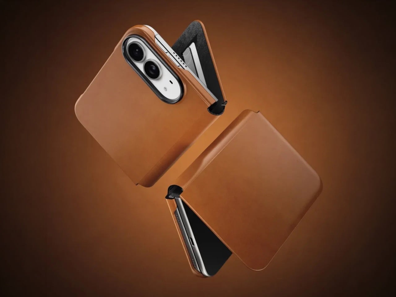
Nomad’s Folio case for the Duo is a strange little thing. While most folio cases turn candybar phones into bifolds, Nomad’s case sort of turns it into a trifold, if you will… or a bifold with a partition. The case is a single-piece leather and plastic design, created to wrap your phone not just from the back but also the front. The front flap magnetically snaps to your phone’s outer display, and lets you open your phone in two ways – firstly, by just disengaging the flap to see the outer screen, but also by disengaging the flap and outer screen together to see the inner screen… and like any good folio case, the flap’s inside packs a card-holder for your payment, ID, and access cards so you don’t need a MagSafe wallet ruining your iPhone Duo’s design.

Designer: Nomad

Like all of Nomad’s leather cases, this one’s made from Horween leather, crafted from a single piece of hide that’s been tanned, bent, crimped, and buffed to absolute beauty. The leather gracefully wraps around the edges, keeping the buttons exposed and accessible, while also covering the hinge in a way that creates that bifold feeling. The leather then transitions upwards ever so slightly before cutting off to a plastic lip around the camera bump, cushioning your phone’s precious shooters from accidental drops and bumps.

On the inside, the leather’s reinforced by a microfiber layer that protects the iPhone’s glass panels from damage. Sure, Apple touts Ceramic Shield on both the front and back, but nothing breaks your heart faster than seeing a cut or a scratch running down the glass body from abrasive action caused by objects in your pocket or even your table. Meanwhile, a slot on the front stores two cards from the looks of it, so your iPhone Duo doubles as a card holder beyond what Apple Pay already lets you do.

Like all good leather cases, this one’s designed to age gracefully with time. Chances are, if you’re an iPhone Duo buyer, you will probably use this phone as your ride or die for another 2 years. In that time, Nomad says the case will patina gorgeously with time, aging uniquely based on how you use the phone. Luckily, the case isn’t too expensive. Priced at $129, you can grab the Nomad iPhone Duo Traditional Folio in one of three colors – Saddle, Rustic Brown, and Black, with global shipping starting November 14th.

The post Nomad’s Leather Folio Turns Your iPhone Duo Into A $1999 Bifold Wallet first appeared on Yanko Design.
  • ✇WinCentral
  • Apple iPhone Duo Foldable and iPhone 18 Pro: The Biggest iPhone Upgrades Yet
    Apple is reportedly making a major push into a new era of iPhone design with the introduction of the iPhone Duo foldable, alongside significant camera and performance upgrades for the iPhone 18 Pro and iPhone 18 Pro Max. The iPhone Duo is the headline addition, bringing Apple’s take on a book-style foldable while attempting to […]
     

Apple iPhone Duo Foldable and iPhone 18 Pro: The Biggest iPhone Upgrades Yet

Par : Nisha
10 septembre 2026 à 00:13
Apple is reportedly making a major push into a new era of iPhone design with the introduction of the iPhone Duo foldable, alongside significant camera and performance upgrades for the iPhone 18 Pro and iPhone 18 Pro Max. The iPhone Duo is the headline addition, bringing Apple’s take on a book-style foldable while attempting to […]

  • ✇Yanko Design
  • Your iPhone’s Portrait Mode Was Fake for a Decade – The iPhone 18 Pro Changes That With A Real Aperture
    Would you be shocked to hear that the “Portrait Mode” on your iPhone all these years was ‘fake’? Well, it’s real as in the background is actually blurred, but it isn’t blurred because the camera captured it that way, it’s all been software trickery for the past decade… until now. Six laser cut blades, each thinner than a human hair, are about to change that. The iPhone 18 Pro’s new main camera can physically open and close its lens for the first time in iPhone history, and that single mechanica
     

Your iPhone’s Portrait Mode Was Fake for a Decade – The iPhone 18 Pro Changes That With A Real Aperture

9 septembre 2026 à 18:30

Would you be shocked to hear that the “Portrait Mode” on your iPhone all these years was ‘fake’? Well, it’s real as in the background is actually blurred, but it isn’t blurred because the camera captured it that way, it’s all been software trickery for the past decade… until now. Six laser cut blades, each thinner than a human hair, are about to change that. The iPhone 18 Pro’s new main camera can physically open and close its lens for the first time in iPhone history, and that single mechanical change rewrites how the blur behind your subject actually gets made.

Here’s the quick version of how Portrait Mode has worked since 2016. Your iPhone takes the shot, uses a second lens or depth data to figure out roughly where you end and the background begins, then runs software over the image to blur everything behind that outline. It’s a clever guess dressed up as photography, and it’s why hair strands sometimes disappear into a smudge or a stray earring gets blurred along with the wall behind it. The new aperture system skips the guessing entirely. The lens itself controls how much of the scene stays sharp, the same way it’s always worked on a real camera.

Designer: Apple

So how does a phone this thin pull off something that usually needs a chunky lens barrel? Apple built a system of six laser cut blades, each one thinner than a strand of hair, arranged around the main lens and moved by a tiny rotor mechanism. Together they shift the aperture through four stops, all the way down to f/1.48, with the camera defaulting to a f/1.8 for everyday portraits and opening or closing automatically depending on what it’s looking at. In low light it opens wider to pull in around 50 percent more light, which should mean cleaner night shots and sharper astrophotography without cranking up the ISO and adding grain.

Because this is optical now instead of computational, the depth falls off the way it would on an actual camera lens. Hair, glasses, jewelry, the fine stuff that always tripped up the old software blur, should render properly instead of getting smeared into the background by accident. Close the aperture down and you get more of the scene in focus for group shots, which is the same tradeoff photographers have been making with real cameras for a century. It’s just that now your phone gets to make that tradeoff too.

Apple didn’t stop at making the hardware smarter, it also handed a lot of that control directly to you. The redesigned camera app now includes Pro Controls, letting you manually pick one of the four aperture settings yourself, check exposure with an actual histogram, dial in white balance, and adjust shutter speed for motion blur or freeze frame shots. Third party camera apps are getting access to the same aperture system through an updated API, so this isn’t going to stay locked inside Apple’s own app for long. Photography folks who like getting hands on with their settings finally have a real reason to poke around the camera app instead of leaving everything on auto.

The upgrade carries over into video too. Cinematic mode effects can now be applied after you’ve already shot the footage, and it supports 60fps for smoother half speed slow motion. Time-lapse jumps to 4K with Dolby Vision HDR. None of that depends directly on the aperture blades, but it’s part of the same larger push this year to hand serious creative control to people who just want to point their phone and shoot something that looks intentional.

All of this sits inside a redesigned Pro body that now uses color matched aluminum and back glass, available in Black, Silver, the new Glacier, and a genuinely gorgeous Burgundy that photographs beautifully next to the camera module. The iPhone 18 Pro starts at $1,199 and the Pro Max at $1,299, both up for preorder September 12 and shipping September 18. For a feature that lives entirely inside a few hair thin blades you’ll never actually see moving, it might end up being the most noticeable camera change Apple has made in years.

The post Your iPhone’s Portrait Mode Was Fake for a Decade – The iPhone 18 Pro Changes That With A Real Aperture first appeared on Yanko Design.
  • ✇Yanko Design
  • Apple’s Coolest Watch Feature Has Nothing To Do With Health… It Lets You Rewind Time.
    “Could you come again?” “Pardon?” “Huh?” “Wait, say that one more time?” These are examples of phrases that make you seem dumber than you really are. Nothing destroys aura more than unironically asking someone to repeat something they said because A. you weren’t listening, or B. you were but just didn’t happen to comprehend what they were saying. Apple has a solution for that, and it’s wrapped up in their latest smartwatch. The new Live Rewind feature, powered by Apple’s new S11 chip, allows yo
     

Apple’s Coolest Watch Feature Has Nothing To Do With Health… It Lets You Rewind Time.

9 septembre 2026 à 16:30

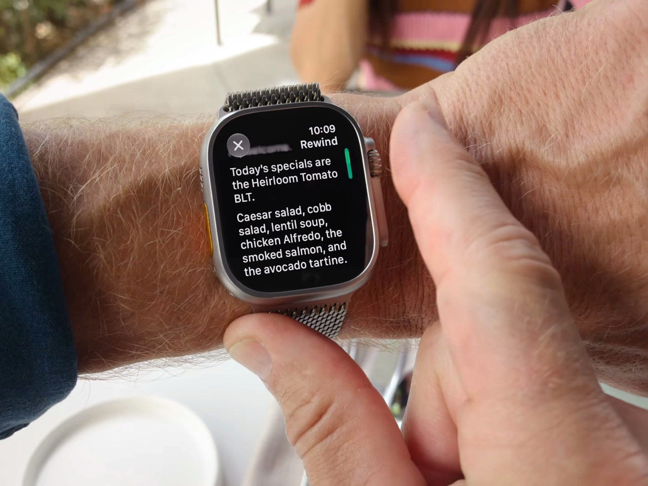
“Could you come again?” “Pardon?” “Huh?” “Wait, say that one more time?” These are examples of phrases that make you seem dumber than you really are. Nothing destroys aura more than unironically asking someone to repeat something they said because A. you weren’t listening, or B. you were but just didn’t happen to comprehend what they were saying. Apple has a solution for that, and it’s wrapped up in their latest smartwatch. The new Live Rewind feature, powered by Apple’s new S11 chip, allows you to instantly transcribe the past 15 seconds of any conversation and read its chat logs. Press the digital crown on the new Watch twice, and you pretty much get ‘subtitles’ for the past 15 seconds, so you don’t have to “excuse me” your way into a repetition.

Your watch, just like your phone, earbuds, smart speaker, and smart home hub, is always listening. It’s waiting for the magic words “Hey Siri” or Alexa, or Google depending on which ecosystem you’re tied into. The point is, it’s always listening, so Apple simply created a way to package that into a feature that feels impressive rather than invasive. Think of how a dashcam can auto-log the past 3 minutes of video AFTER an accident occurs (using a feature called loop recording), Apple just brought that to your watch, packaged as a part of its new Audio Intelligence suite of features. Impressive, no?

Designer: Apple

Once you’ve got the transcript, you can ask Siri about it directly, or save it into the new Siri app to dig up later. Say your coworker rattles off a Wi-Fi password or a colleague mentions a book recommendation mid-hallway chat. Instead of fumbling for your phone, you catch it on your wrist and move on. Apple says none of this gets recorded in the traditional sense. Audio flows into a secure buffer inside the S11’s Secure Exclave, a hardware compartment isolated from the rest of the system, and once the transcript is generated, the raw audio is gone. No file, no clip, nothing to subpoena, because nothing exists.

Sitting next to Live Rewind is Siri Recap, which does the same basic trick but for an entire conversation instead of a 15 second clip. Turn it on before a meeting or a parent teacher conference, and Apple Intelligence quietly builds a title, a summary, and a list of key points you can review afterward in the Siri app. You control the boundaries here more than you’d expect. Leave it running all day, schedule it for work hours only, or flip it off entirely from Control Center whenever the conversation turns private. Summaries auto delete after seven days unless you save them, and saved ones sync end to end encrypted, so not even Apple can read them back.

Audio Intelligence isn’t just built for eavesdropping on your own life. Sound Recognition listens for sirens, alarms, doorbells, and crying babies, then buzzes your wrist even when your phone is nowhere nearby, which makes it a genuinely useful accessibility tool for anyone who is deaf or hard of hearing. Shazam gets folded in too, sitting in the Smart Stack and naming whatever song is playing around you without you having to pull out a phone. Four features, one microphone, and one chip doing the quiet work behind all of them.

Both Live Rewind and Siri Recap need Siri AI to function, and Siri AI is still in beta, so expect this to roll out gradually starting in English before other languages follow. You’ll also need an iPhone 16 or newer paired to the Watch, so the 16e and anything older is out of luck. Apple Watch Series 12 itself starts at $399, is available for preorder today, and ships September 18. The health sensors got a real upgrade this generation too, but for once, that isn’t the headline. The mic is.

The post Apple’s Coolest Watch Feature Has Nothing To Do With Health… It Lets You Rewind Time. first appeared on Yanko Design.
  • ✇Yanko Design
  • The iPhone Duo just killed the Dynamic Island, the SIM tray, and the demand for an iPad Mini
    Spare a thought for the iPad Mini, which had a perfectly good career until this morning. Apple’s $1,999 iPhone Duo arrives October 23 with a 7.6-inch inner display that takes Apple Pencil with USB-C later this year and runs two apps side by side, which covers roughly everything the Mini was for, except the Mini does not fit in your jeans. It also killed the dynamic island, swapping it for a punch hole outside and a FaceTime camera tucked under the inner screen. And it killed the SIM tray worldw
     

The iPhone Duo just killed the Dynamic Island, the SIM tray, and the demand for an iPad Mini

9 septembre 2026 à 15:11

Spare a thought for the iPad Mini, which had a perfectly good career until this morning. Apple’s $1,999 iPhone Duo arrives October 23 with a 7.6-inch inner display that takes Apple Pencil with USB-C later this year and runs two apps side by side, which covers roughly everything the Mini was for, except the Mini does not fit in your jeans. It also killed the dynamic island, swapping it for a punch hole outside and a FaceTime camera tucked under the inner screen. And it killed the SIM tray worldwide, because the thinnest iPhone ever made had no room left for sentiment.

Apple never announces any of this. It ships the replacement and lets the old thing stop making sense on its own schedule. The Duo is a whole product built out of things Apple decided to stop carrying, and the interesting part is how little you miss any of them once you see what moved into the empty space. John Ternus called it the most transformational change to iPhone since the original, which I not only agree with, I think I’d take it a step further by saying – this is such a dramatic leap for the iPhone that it stops being an iPhone. It isn’t an iPad either. It’s something completely different.

Designer: Apple

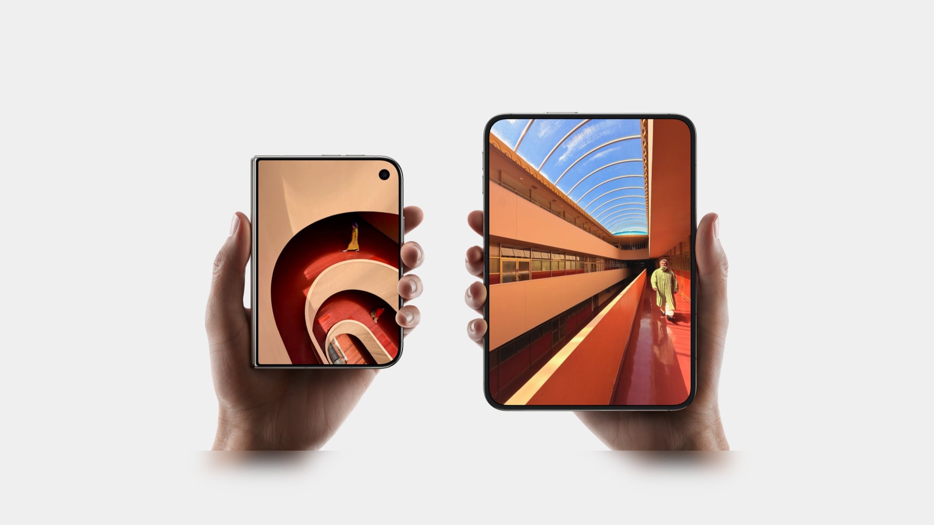
Apple refused to build a squarish slab that happens to close, and said so from the stage, calling out rivals whose square inner screens box movies into oversized black bars. The Duo lands at roughly passport size, with an asymmetric profile: two rounded corners on the right, squared geometry at the hinge. That asymmetry does something clever, because it tells your hand which edge to open before your brain gets involved. It reads like a small hardcover you want to crack open, which is a strange compliment to pay a phone. Somebody fought for that shape in a review meeting, and I am glad they won.

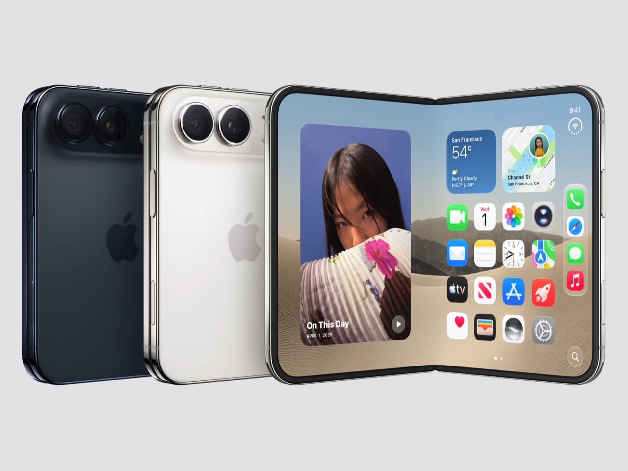
Both displays share a single aspect ratio, which is the decision the whole product rests on. Closed, the 5.4-inch outer panel delivers 90 percent of an iPhone 18 Pro’s screen area, so it works as a complete phone rather than a notification window. Open, the 7.6-inch inner canvas runs 50 percent larger than an 18 Pro Max. Because the proportions match, content scales between the two instead of reflowing awkwardly every time you fold, and the movie you started on the cover screen simply gets bigger. Every foldable before this one asked you to accept a jarring transition, and Apple designed the jarring part out.

Content flows between the two displays as the phone opens, expanding out of the cover screen and settling into the larger canvas without a stutter. I would put that transition ahead of anything Samsung, Google or Oppo has shipped on a folding device, and it is the single most beautiful piece of UI in the category right now. The matched aspect ratio is what makes it possible, because there is no reflow to disguise, only a scale. Controls stay locked in place along the side while the content grows around them. Watching it happen is the closest a phone has come to feeling like sleight of hand.

The crease is the thing people notice first on a foldable, and Apple has more or less made it disappear. A matte nano-texture finish across the inner display cuts glare and flattens how the fold reads, so the eye stops finding the seam. It also solves the other foldable complaint nobody talks about, which is the cheap plastic feel of a folding panel under your fingertip. Real glass sits above and below the display, and the whole stack is built to stop the panel distorting after a few thousand folds. Nine years of waiting bought Apple a fold you have to hunt for.

Grade 5 titanium forms the frame, polished to a mirror finish and broken by a hinge cover in contrasting micro-blasted texture. That pairing is the sharpest visual detail on the object, a bright reflective body interrupted by one matte band at the spine, and it gives the closed device a piece of jewelry quality that photographs beautifully in star white. Ceramic Shield protects the back, Ceramic Shield 2 the front, and the whole thing carries an IP68 rating. Pulling that dust and water rating across a moving joint is genuinely difficult engineering. The night sky colorway, a deep navy, is the one I would actually buy.

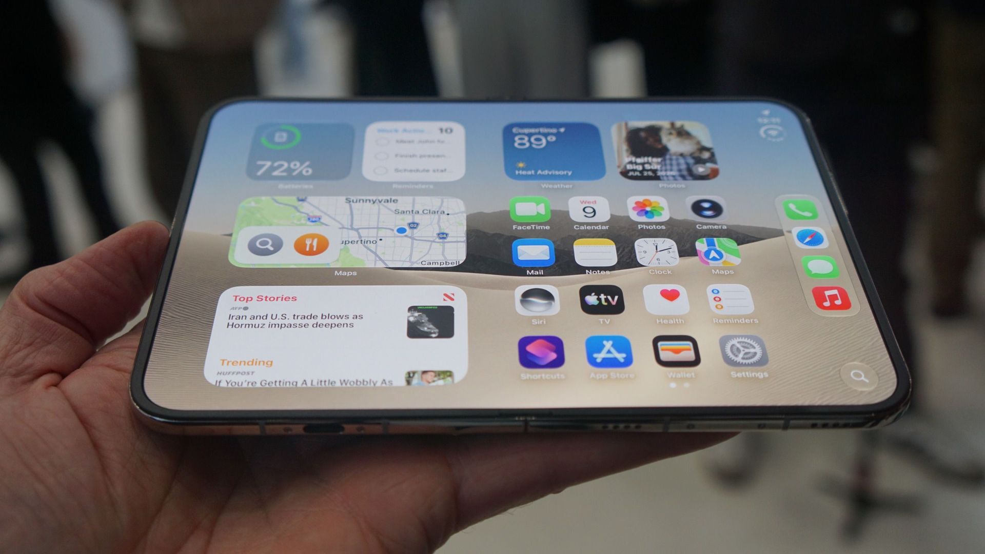
The dock is vertical now. iOS 27 moved essential controls to the side of the screen, freeing vertical space for content and landing the buttons under your thumb, which rewrites a layout convention Apple has held since 2007. The status bar compresses into a corner and the Dynamic Island turns sideways along the edge of both displays. Every first-party app had to be relaid out to make this coherent, and the fact that it still reads unmistakably as iOS is the real achievement here. Nobody outside Apple would have been permitted to move that dock.

Fold it halfway and iOS slides content away from the crease, giving you a laptop-style prop for video calls, a hands-free camera rig, and a bedside alarm face that wakes you with a gentle glow. StandBy now runs even when the phone is off charge, turning it into a photo frame or widget hub the moment you set it down. The speakers retune themselves depending on how far apart the two halves are sitting. One device, half a dozen legible postures, all of them designed rather than discovered by users after launch. The alarm clock pose alone will sell a few thousand units.

The cameras take advantage of having a second screen. Duo Preview throws a live feed onto the outer display so your subject can see themselves and fix their own framing, which ends a decade of “can you take it again.” Kid Cue plays Peanuts animations to make toddlers look at the lens. Smart Take watches the scene and fires the shutter once everyone is finally posed, killing the timer scramble. A 48MP Fusion Main with a 2x telephoto handles the actual imaging, alongside the same 48MP Ultra Wide found on the iPhone 18 Pro.

Going eSIM only across every market freed the internal volume for one battery per side, managed so the pair behaves as a single cell, delivering 31 hours of video on the inner display and 44 on the outer. I will miss the tray as a traveler, and I also suspect Apple has wanted it gone for years, because a physical port punched through the frame is a liability on a device chasing IP68 across a hinge. A20 Pro drives both panels, and fast charging reaches 50 percent in around 20 minutes. Some deletions are grief. This one is mostly relief.

Touch ID in the side button is a real step back from Face ID on a two thousand dollar phone, and it exists because a TrueDepth array had nowhere to live. Apple Pencil support arrives later this year rather than at launch, which softens the iPad Mini argument for a few months. The bezels look chunky beside a Galaxy Z Fold 8, and the folded body still reads thick in the hands-on shots. At $1,999, a hundred dollars over the Fold 8 and five hundred under what everyone predicted, Apple showed up nine years late and priced like it was early. Pre-orders open October 16.

The post The iPhone Duo just killed the Dynamic Island, the SIM tray, and the demand for an iPad Mini first appeared on Yanko Design.

Apple’s “Surprise and Shine” Event Could Be the Biggest iPhone Launch of 2026

Par : Nayan
8 septembre 2026 à 02:03
Apple may be preparing for one of its most important product events in years, with the company expected to unveil not one, but two major iPhone stories. The spotlight is reportedly set to fall on Apple’s first foldable iPhone and the upcoming iPhone 18 Pro and iPhone 18 Pro Max. If the rumors are accurate, […]

  • ✇Yanko Design
  • Apple is Building a Short, Wide iPhone Ultra… Now It Owes Us an Actual iPhone Mini
    I have a friend who still uses an iPhone 13 mini held together by a case and pure spite, and every single time a new iPhone launches, she asks me the same question. Is it small yet. It never is. Apple has spent years telling us, implicitly, that small phones do not sell, that the market has spoken, that everyone wants a bigger canvas for videos and games and doomscrolling. Fine, sure, the sales numbers backed that up in 2023. But sales numbers do not mean the desire disappeared, they mean the a
     

Apple is Building a Short, Wide iPhone Ultra… Now It Owes Us an Actual iPhone Mini

23 août 2026 à 11:20

I have a friend who still uses an iPhone 13 mini held together by a case and pure spite, and every single time a new iPhone launches, she asks me the same question. Is it small yet. It never is. Apple has spent years telling us, implicitly, that small phones do not sell, that the market has spoken, that everyone wants a bigger canvas for videos and games and doomscrolling. Fine, sure, the sales numbers backed that up in 2023. But sales numbers do not mean the desire disappeared, they mean the alternative was not good enough to fight for.

Which brings me to the iPhone Ultra, Apple’s rumored first foldable, expected to close into a short, squat, almost passport-shaped little brick before you unfold it into something the size of an iPad mini. That folded shape is the closest thing to mini energy Apple has shown in years, and it is buried inside a two thousand dollar folding phone nobody asked to be the delivery method. My friend does not want an iPad mini that folds. She wants her 13 mini, but new. Apple already built the shape. It just built it around the wrong phone.

Designer: Apple

The Air existed to answer a question almost nobody was asking at checkout, namely how thin can a phone get before the internals start filing complaints. It was a genuine engineering flex, the kind of thing that looks incredible in a teardown video and slightly pointless in daily use. I understood what it was trying to prove. I just never needed it proven to me personally, and I doubt I was alone in that.

The Ultra is rumored to repeat that exact flex, except this time the thinness gets folded in half, closing down to somewhere between 9 and 9.5mm shut and reportedly as thin as 4.5mm open, according to recent leaks. That is a genuinely wild number for a phone with a hinge in it. Apple is once again proving it can do the hard, borderline unnecessary engineering thing. The difference is that this time, buried inside that flex, is an actual shape people have been begging for since 2023. Apple just does not seem to have noticed it yet.

Go back and look at what the 13 mini actually was for a second, because I think people forget how unremarkable the compromise really was. It measured 131.5mm tall, 64.2mm wide, weighed 141 grams, and ran the exact same A15 chip as the standard 13. You gave up battery life and screen real estate. You did not give up the flagship experience shrunk down to fit an actual hand. Compare that to where the standard iPhone lineup sits today, regularly north of 6.1 inches before you even get to Pro Max territory, and the gap the mini used to fill has only gotten wider and lonelier.

Now put the Ultra’s folded footprint next to that. Reports point to a 5.5 inch cover display when shut, in a short, wide, passport style shell that is about as close to mini adjacent proportions as Apple has shipped since the mini died. The catch is that this compact shell only exists as a doorway into a 7.8 inch, 4:3 inner screen and a starting price rumored to land somewhere between 1,999 and 2,499 dollars. Nobody buying that phone is buying it to have something small in their pocket. They are buying an iPad mini that happens to fold shut, which is a completely different pitch than the one my friend has been asking me about for three years running.

There has been some loose speculation, mostly a 9to5Mac piece from last year, that Apple’s new staggered launch schedule could theoretically clear a runway for a smaller phone somewhere down the line. Even that piece called the odds slim to none, and nothing currently on Apple’s roadmap for the 18, 18e, 18 Pro, or Ultra includes a mini in any form. Samsung, for what it is worth, has stuck with its Z Flip clamshell as its own answer to compact, so the appetite for small has not vanished industry wide, it has just gone unanswered on Apple’s side of the fence for a while now.

So here is the pitch, and it is not a complicated one. Apple has now proven twice, once with the Air and once with the Ultra’s folded shell, that it can engineer real compactness without breaking anything important. Skip the fold. Skip the tablet trapped inside a phone shaped envelope. Take that exact short, wide, passport sized footprint and wrap a single, non folding screen around it, call it a mini, and ship it. Apple does not need a new idea here. It already built one. It just keeps hiding it inside features nobody was asking it to attach to.

The post Apple is Building a Short, Wide iPhone Ultra… Now It Owes Us an Actual iPhone Mini first appeared on Yanko Design.
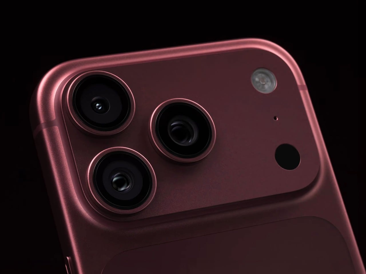
❌