Vue normale

  • ✇Yanko Design
  • When Your Sideboard Swallows Your Books (On Purpose)
    Most furniture does exactly what it promises. A shelf holds things. A table provides surface. A sideboard stores what you don’t want to look at. Deniz Aktay, a Stuttgart-based designer, seems to find that level of literalism a little boring. His latest piece, the “Slot” Sideboard, is a sleek metal sideboard that does something I haven’t seen before: it swallows your books whole. Or nearly whole. The top surface features book-shaped cutouts, slots sized just right to accept a few volumes that th
     

When Your Sideboard Swallows Your Books (On Purpose)

1 avril 2026 à 12:20

Most furniture does exactly what it promises. A shelf holds things. A table provides surface. A sideboard stores what you don’t want to look at. Deniz Aktay, a Stuttgart-based designer, seems to find that level of literalism a little boring.

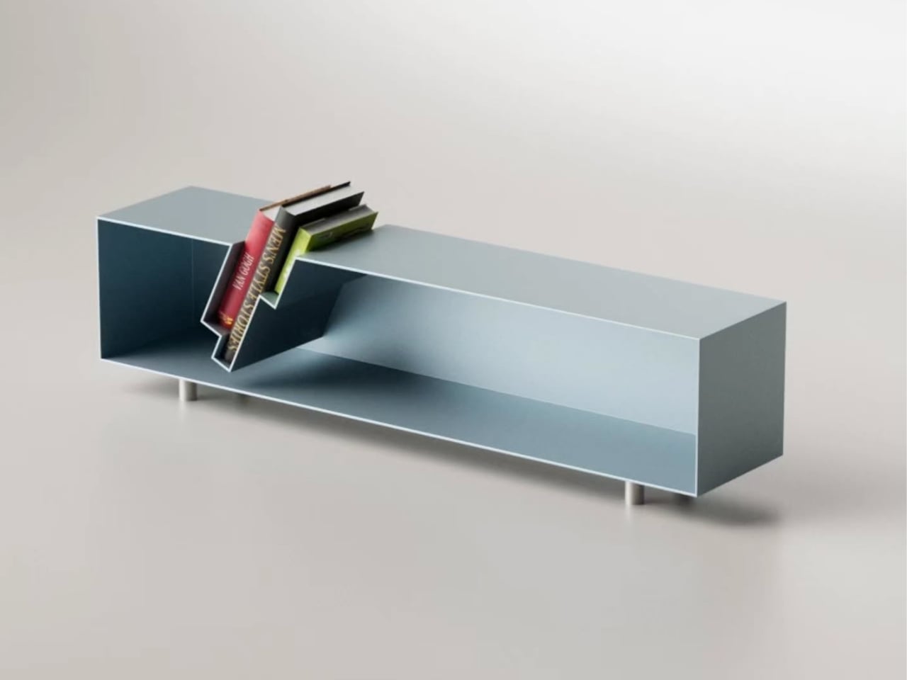
His latest piece, the “Slot” Sideboard, is a sleek metal sideboard that does something I haven’t seen before: it swallows your books whole. Or nearly whole. The top surface features book-shaped cutouts, slots sized just right to accept a few volumes that then slide partway through, hovering suspended between the top of the sideboard and the interior shelf below. Spines tilted at an angle, partially disappearing into the furniture itself, the books aren’t hidden. They’re put on stage.

Designer: Deniz Aktay

The visual effect is genuinely arresting. From straight on, it looks like the books are simply leaning through the sideboard, defying the expected logic of furniture. The steel body, finished in a dusty blue-grey, stays completely clean and minimal, which only makes the books pop harder. They become the focal point. The design knows this and leans into it.

Aktay trained as an architect at the University of Stuttgart before founding his own design studio, DEZIN, in 2020. You can feel the architectural thinking in the Slot Sideboard. The slots aren’t decoration. They are a structural decision that reorganizes how the object functions. By cutting through the plane of the top surface, Aktay collapses the boundary between storage and display. The books don’t live behind a door or on top of the piece as an afterthought. They are literally built into its architecture.

This matters more than it might seem. One of the persistent design problems with books is exactly this tension: do you store them, or do you show them? Traditional bookshelves say store, with display as a side effect. Coffee table styling says display, with access sacrificed. The Slot Sideboard says both, simultaneously, and solves the problem by making books a structural element rather than an accessory.

I appreciate that the piece doesn’t shout about this. It’s not a novelty object with an obvious gimmick printed on the side. At rest, without books, the sideboard is clean and almost brutally minimal, the stepped slot openings looking like an architectural section drawing. Add a few books, and the whole thing shifts register. It becomes warmer, more personal, more lived-in. That kind of dual identity in a single object is hard to pull off.

Aktay’s philosophy centers on finding the right balance between proportion, material, and functionality. The Slot Sideboard is a good example of that balance working. The proportions are long and low, giving the piece the kind of horizontal calm that makes a room feel settled. The metal construction is precise without feeling cold. And the function is genuinely expanded by the design, not just dressed up.

The one thing I keep thinking about is the practical question of how many books actually fit, and at what angle. The promotional images show a small cluster, maybe three or four volumes, tilted together in the slot. It reads beautifully. Whether it reads the same with a thicker, heavier hardback, or with books of wildly different heights, is a detail that a real-world test would answer. That’s not a criticism so much as natural curiosity. Good design always makes you want to live with it.

The broader trend here is worth noting. Furniture design has been slowly, quietly moving away from pure storage and toward what you might call narrative objects, pieces that make a room tell a story. The Slot Sideboard fits into that movement while having its own specific logic. It isn’t just pretty. It has a point of view about what books are for and where they belong. They belong where people can see them. Where they’re part of the room. Not filed away. Whether or not Aktay set out to make a statement about books and visibility, the piece makes one. And it makes it beautifully.

The post When Your Sideboard Swallows Your Books (On Purpose) first appeared on Yanko Design.

  • ✇Yanko Design
  • Evercade Nexus upgrades retro gaming with widescreen play and refreshed modern controls
    For retro gaming enthusiasts, few platforms have embraced nostalgia with the same dedication as the Evercade lineup. Developed by Blaze Entertainment, the Evercade ecosystem has steadily carved out a niche by doing something many modern gaming platforms have abandoned, delivering classic games through collectible physical cartridges. Since the original Evercade gaming handheld console arrived in 2020, the brand has built a reputation for preserving classic titles while presenting them in a cura
     

Evercade Nexus upgrades retro gaming with widescreen play and refreshed modern controls

1 avril 2026 à 11:20

For retro gaming enthusiasts, few platforms have embraced nostalgia with the same dedication as the Evercade lineup. Developed by Blaze Entertainment, the Evercade ecosystem has steadily carved out a niche by doing something many modern gaming platforms have abandoned, delivering classic games through collectible physical cartridges.

Since the original Evercade gaming handheld console arrived in 2020, the brand has built a reputation for preserving classic titles while presenting them in a curated, officially licensed format. Now the company is taking a more ambitious step forward with the Evercade Nexus, a device designed to modernize the handheld experience without losing the retro soul that defines the platform.

Designer: Evercade

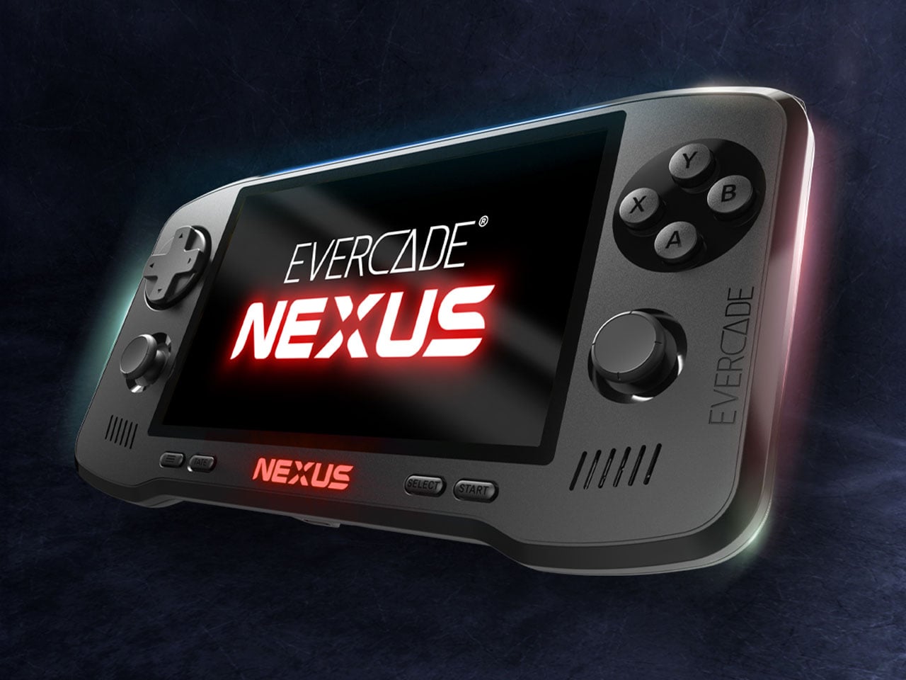
The Nexus is a significant leap in hardware compared to earlier Evercade devices. One of the most noticeable changes is the 5.89-inch IPS screen (with 840×512 resolution) having a wider 16:9 aspect ratio. Previous Evercade systems focused primarily on the classic 4:3 format used by older consoles, but the wider screen allows the Nexus to better support enhanced versions of classic games as well as titles that benefit from a broader viewing area. The larger display also improves overall comfort for handheld play, giving retro games more space while maintaining the pixel clarity enthusiasts expect.

Controls have also received a major update. For the first time in the Evercade lineup, the Nexus includes dual analog sticks alongside the traditional D-pad and face buttons. While retro gaming is often associated with simpler control layouts, the addition of analog sticks expands the handheld’s compatibility with early 3D titles and games that demand more precise movement. The system also introduces TATE mode, allowing the console to be rotated vertically. This feature is particularly useful for classic arcade shooters originally designed for upright cabinets, recreating their intended orientation on a handheld device.

Under the hood, the Evercade Nexus runs on a quad-core processor clocked at around 1.5GHz. Power comes from a 5,000mAh battery that provides roughly five hours of gameplay on a single charge, while modern conveniences such as wireless headphone support bring the device closer to contemporary handheld expectations without sacrificing portability. Another notable addition is EverSync, a wireless multiplayer feature that allows two Nexus systems to connect locally. With EverSync, players can temporarily share a game from a single cartridge so both devices can participate, offering a simple way to enjoy multiplayer titles without requiring multiple copies.

Like every Evercade device, the Nexus remains fully compatible with the platform’s growing library of physical cartridges. The ecosystem now includes more than 700 officially licensed retro games spread across dozens of curated collections from classic publishers and arcade developers. Instead of relying on digital downloads, the Evercade philosophy continues to center on physical ownership and preservation. At launch, the Evercade Nexus will include a special cartridge featuring enhanced versions of classic titles such as Banjo‑Kazooie and Banjo‑Tooie, optimized for the handheld’s widescreen display.

Evercade Nexus handheld is up for preorder at $199.99 with release set for October 2026, which is a long time away if you are already curious. You can also go for the $229.99 Nexus 64 Edition, which boasts an exclusive Hard Shell EVA Case themed with the Evercade Nexus 64 Edition style, screen protectors, and of course, the certificate of authenticity. It is going to be limited to 2,000 units with pre-order availability on Funstock.

The post Evercade Nexus upgrades retro gaming with widescreen play and refreshed modern controls first appeared on Yanko Design.

  • ✇Yanko Design
  • LEGO and Crocs Finally Made the $89 Collab Nobody Knew They Needed
    No matter how you feel about Crocs, you cannot deny the brand has a remarkable talent for finding partners that make you stop and say, “wait, actually… that works.” We’ve seen Krispy Kreme clogs dripping in donut-glazed energy, Windows XP nostalgia packed into a wearable throwback, and Ghostbusters uniforms distilled down to clog form. Every time I think Crocs has peaked its collab game, another partnership resets the bar. This time, they’ve linked up with LEGO for the Creativity Clogs collecti
     

LEGO and Crocs Finally Made the $89 Collab Nobody Knew They Needed

1 avril 2026 à 10:20

No matter how you feel about Crocs, you cannot deny the brand has a remarkable talent for finding partners that make you stop and say, “wait, actually… that works.” We’ve seen Krispy Kreme clogs dripping in donut-glazed energy, Windows XP nostalgia packed into a wearable throwback, and Ghostbusters uniforms distilled down to clog form. Every time I think Crocs has peaked its collab game, another partnership resets the bar. This time, they’ve linked up with LEGO for the Creativity Clogs collection, and this one lands a little differently.

The appeal is almost embarrassingly obvious in hindsight. Both LEGO and Crocs are built around the same core philosophy: take something simple, make it endlessly customizable, and let people go wild with it. LEGO gave us the stud system; Crocs gave us Jibbitz holes. Jibbitz charms are basically a wearable LEGO build. The two brands have been spiritually aligned for decades without anyone thinking to actually put them together, and the fact that it took this long feels like a design oversight that’s now been corrected.

Designers: LEGO x Crocs

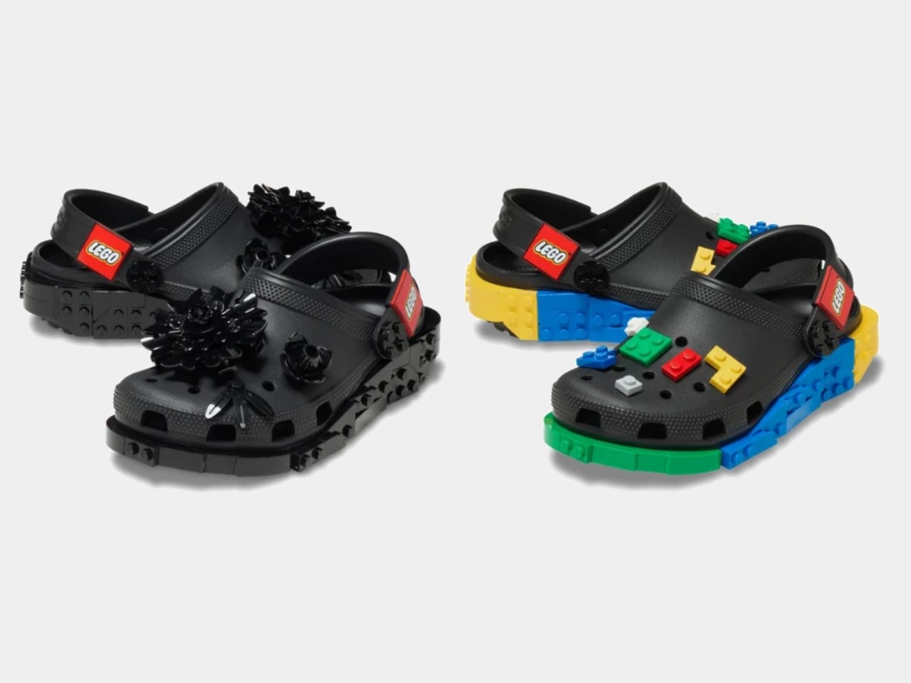
The collection spans several configurations. The base Creativity Clog starts at $79.99, keeping things relatively clean with colorful LEGO bricks along the sole and a Jibbitz-ready upper waiting to be personalized. There is also a Kids’ Creativity Clog at $59.99, because LEGO is a multigenerational brand whether anyone admits it or not.

The Masterbrand Creativity Clog at $89.99 is the one that goes all in. It arrives with 12 LEGO brick Jibbitz charms already loaded onto the upper and around the sole, plus a LEGO Minifigure tucked into the box. That detail genuinely made me smile. It is the kind of considered touch that separates a real collaboration from a brand simply slapping a logo on an existing product.

The Midnight Garden Creativity Clog takes the same design language in a different direction. Where the other colorways lean into LEGO’s signature primary palette, this version opts for a darker, more subdued aesthetic that feels almost grown-up by comparison. It is the right pick for someone who wants to quietly signal their appreciation for the collab without committing to the full crayon-box energy of the others.

Visually, these clogs strike a balance I did not expect. The brick texture runs along the sole without overtaking the whole shoe, so you are not walking around in something that looks like a toy store exploded on your feet. It is restrained enough to wear in public while still being obviously, joyfully LEGO. The Jibbitz-ready holes mean you can keep building on top of the base, swapping in dedicated LEGO charm packs depending on your mood. That is exactly the kind of open-ended customization that makes both brands tick.

The LEGO Group and Crocs announced their multi-year global partnership in January 2026, and the Creativity Clogs dropped on March 19, with LEGO Insiders getting a three-day head start. Certain sizes sold out quickly, which tells you all you need to know about the appetite for this one.

My honest read is that this collaboration is smarter than its predecessor. The original LEGO Brick Clogs were built for viral moments and display shelves. Giant foam bricks make a statement, but they do not go anywhere useful. The Creativity Clogs are the real follow-through, translating LEGO as a design language into something you would actually wear to a theme park, a farmers market, or around the house on a slow Tuesday. The playfulness is baked in without demanding you commit to a costume to participate.

That said, $89.99 for a pair of Crocs is a price point worth sitting with, even if the included Minifigure does technically sweeten the deal. Crocs collabs have always commanded a premium over the core classics, and by now the brand’s audience is accustomed to paying for the concept as much as the shoe itself. Whether the LEGO x Crocs Creativity Clog earns its place in your rotation will probably depend on how much real estate your inner kid still occupies. For a lot of people, that answer is quite a bit of space.

The post LEGO and Crocs Finally Made the $89 Collab Nobody Knew They Needed first appeared on Yanko Design.

  • ✇Yanko Design
  • Samsung’s $400 Tab Keyboard Costs More Than Apple’s: Worth It?
    The tablet-as-laptop pitch has been a hard sell for years, and a lot of the blame lands on the accessories. Keyboard covers for Android tablets have historically been thin on features and even thinner on build quality, which makes the whole productivity argument feel shakier than it should. Samsung’s $1,200 Galaxy Tab S11 Ultra is serious hardware, and for a while, its keyboard options weren’t keeping up. The Galaxy Tab S11 Ultra Pro Keyboard is Samsung’s answer to that. Available in Gray and S
     

Samsung’s $400 Tab Keyboard Costs More Than Apple’s: Worth It?

Par : JC Torres
1 avril 2026 à 09:20

The tablet-as-laptop pitch has been a hard sell for years, and a lot of the blame lands on the accessories. Keyboard covers for Android tablets have historically been thin on features and even thinner on build quality, which makes the whole productivity argument feel shakier than it should. Samsung’s $1,200 Galaxy Tab S11 Ultra is serious hardware, and for a while, its keyboard options weren’t keeping up.

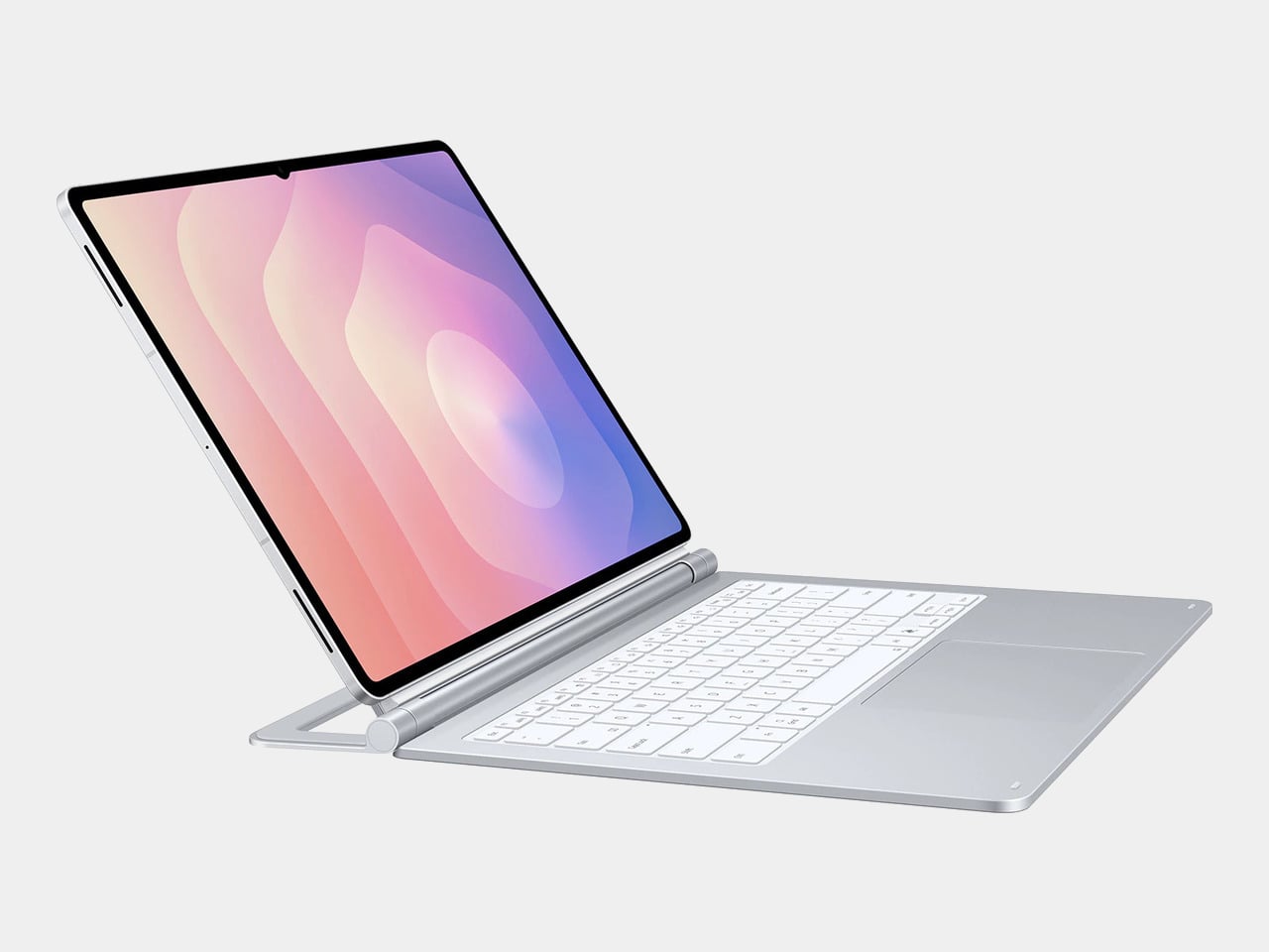
The Galaxy Tab S11 Ultra Pro Keyboard is Samsung’s answer to that. Available in Gray and Silver for $399.99, it connects via pogo pins at the rear of the tablet, with no Bluetooth pairing or cables required. Opening the lid wakes the device, and closing it puts everything to sleep, so the whole thing behaves less like an accessory and more like a laptop right from the start.

Designer: Samsung

The build quality reflects the price in most of the right ways. The body is aluminum alloy, the hinge is reinforced metal, and a secondary kickstand at the rear props the whole assembly into a stable, laptop-like posture at whatever angle you prefer. The result looks noticeably more considered than Samsung’s Book Cover Keyboard Slim, which never really felt like it belonged on a $1,200 device.

The 80-key layout goes beyond a standard QWERTY arrangement. A dedicated DeX key switches the Tab S11 Ultra into Samsung’s desktop mode, where apps run in freely movable windows, closer in feel to Windows than Android. A Galaxy AI key gives you one-press access to AI tools without switching apps, and three customizable function keys can each be mapped to open whatever you need most.

For long stretches of writing or working across multiple documents, those shortcuts matter more than they might look on a spec sheet. The pogo pin connection also eliminates the Bluetooth pairing and dropout issues that plague most wireless keyboard accessories. And since the Pro Keyboard draws power directly from the tablet, there’s no separate battery to charge, and nothing to run out at an inconvenient moment.

The trackpad is 14.6% larger than the one on Samsung’s previous keyboard accessory, a small percentage that translates to real estate you’ll actually notice in DeX mode. The extra surface area gives you more room for precise gestures and window management, and that significantly reduces the number of times you’re forced to reach up and touch the screen during long work sessions.

At $399.99, the Pro Keyboard is nearly twice the price of Samsung’s own Book Cover Keyboard Slim and $50 more than Apple’s Magic Keyboard for the 13-inch iPad Pro. Adding it to the Galaxy Tab S11 Ultra’s $1,200 starting price puts the total at around $1,600, which puts you in comfortable MacBook Air territory, minus the dedicated operating system and the convenience of a unified device.

There are also some obvious gaps at this price. The Pro Keyboard has no backlighting, a noticeable oversight for anyone who regularly works late or in dim spaces. It also doesn’t protect the back of the tablet, which is a curious omission for a $400 accessory. And since it’s designed exclusively for the Galaxy Tab S11 Ultra, there’s no using it with anything else in Samsung’s lineup.

The post Samsung’s $400 Tab Keyboard Costs More Than Apple’s: Worth It? first appeared on Yanko Design.

  • ✇Yanko Design
  • 8 Best Desk Gadgets Every Digital Nomad Quietly Keeps in Their Bag & Finally Deserves a Permanent Home
    Most desk setups are inherited. The nomad’s is earned. Everything that makes it into the bag has already passed a strict and largely unconscious test — weight, versatility, the ability to make a stranger’s table feel like a place worth working from. Over months and years of moving between cities, time zones, and co-working spaces, the digital nomad ends up with a carefully curated set of tools that are small by necessity but thoughtful by design. The interesting thing about these objects is wha
     

8 Best Desk Gadgets Every Digital Nomad Quietly Keeps in Their Bag & Finally Deserves a Permanent Home

1 avril 2026 à 07:40

Most desk setups are inherited. The nomad’s is earned. Everything that makes it into the bag has already passed a strict and largely unconscious test — weight, versatility, the ability to make a stranger’s table feel like a place worth working from. Over months and years of moving between cities, time zones, and co-working spaces, the digital nomad ends up with a carefully curated set of tools that are small by necessity but thoughtful by design.

The interesting thing about these objects is what happens when the travel slows down. When a lease gets signed, a proper desk arrives, and the bag starts being unpacked with more intention. The tools that survived the road do not lose their relevance on a permanent surface. Many of them were built with the kind of considered design that rewards exactly this kind of scrutiny. They look better than most things bought specifically for a home office, hold up longer, and carry the kind of personal history that makes a workspace feel genuinely inhabited. This is for that moment. Eight objects that lived in the bag for a reason, and deserve a permanent home for the same one.

1. OrigamiSwift Folding Mouse

The OrigamiSwift is what happens when industrial design takes portability seriously. Weighing just 40 grams and folding flat to a profile thin enough to slip between notebook pages, it removes the usual tension between compact and comfortable. On a desk, it unfolds in under half a second, snapping into a full-sized ergonomic shape that sits naturally in the hand. For anyone who has suffered through the cramped mechanics of a standard travel mouse, this feels like a genuine upgrade.

The Bluetooth connectivity is quick, and the origami-inspired fold keeps the mechanism tactile enough that using it becomes a small ritual rather than a chore. At the desk, it earns a permanent spot not because it compensates for a lack of options, but because the transformation itself is satisfying. It is the kind of tool that makes you reconsider how you work, and then makes the work feel slightly more considered. Portable by design, permanent by choice.

Click Here to Buy Now: $85.00

What we like

  • Folds to near-invisible thinness at just 4.5mm, making it one of the most carry-friendly mice ever built without compromising on ergonomic full-size comfort
  • Activates in under half a second with a single flip, making the transition from travel bag to working mouse feel immediate and effortless

What we dislike

  • At 40 grams, the lightweight build may feel insubstantial for users accustomed to the heft and resistance of a traditional full-sized mouse
  • Bluetooth-only connectivity means no wired fallback for tasks where even minor wireless latency becomes a frustration

2. Fidget Cube

The Fidget Cube arrived at a time when open-plan offices made visible restlessness a liability and invisible anxiety a norm. Antsy Labs built something straightforward in response: a small cube with six distinct tactile surfaces, each mapped to a different kind of fidget. Click. Glide. Flip. Breathe. Roll. Spin. The vocabulary is simple, the execution is precise, and the result is a desk object that earns its keep without demanding attention from anyone but you.

For digital nomads who have spent years suppressing the impulse to tap or spin something through a long layover or tense client call, the Fidget Cube offers quiet permission. On a permanent desk, it sits within reach without asking for attention. The black and graphite colorways blend cleanly into most setups, looking less like a toy and more like a considered detail. It is not a gimmick. It is self-awareness shaped into an object.

What we like

  • Six distinct tactile surfaces cover a wide range of fidgeting behaviors in a single pocket-sized cube, making it genuinely versatile across different stress responses and focus modes
  • Discreet colorways like Midnight Black and Graphite blend seamlessly into professional setups without drawing unwanted attention in shared or client-facing workspaces

What we dislike

  • The clicking surfaces can produce audible sounds that may distract colleagues in quiet, open-plan, or library-style work environments
  • The cube format offers no digital or productivity-tracking integration for users who want data on their focus habits or stress patterns

3. Nothing Power (1) Battery Bank

Nothing built its reputation on the Glyph interface, a grid of LED lights that turned the back of a phone into a notification display and a design statement. The Power (1) carries that language into a battery bank, using transparent layers, bold light paths, and illuminated interactions to make a utilitarian object feel worth looking at. The design philosophy is direct: good design is not just about appearance, it is about how an object makes you feel when you reach for it.

For a nomad who has charged devices from airport benches and café stools, a power bank is rarely a display piece. The Nothing Power (1) challenges that. Sitting on a desk, the Glyph illumination gives charging status a visual presence that feels more like an ambient display than a simple indicator light. It treats the desk as a stage and every object on it as a conscious choice. Few battery banks have ever earned that kind of consideration.

What we like

  • The Glyph interface turns a charging indicator into a visual experience, making it arguably the only power bank designed to look genuinely intentional, sitting on a desk permanently
  • Transparent design layers reflect Nothing’s ethos of honest, open construction, giving the object a premium quality that stands apart from every other battery bank on the market

What we dislike

  • The Nothing Power (1) is currently a concept design and is not yet available as a finished commercial product
  • Exact battery capacity, output wattage, and pricing remain unconfirmed, making direct comparison with available alternatives difficult at this stage

4. HubKey Gen2

Desk clutter tends to accumulate in layers: a dock for the monitor, an adapter for the second screen, a hub for storage. Somewhere between them sits a tangle of cables that each solves a single problem in isolation. The HubKey Gen2 treats that as a design problem worth solving from the inside out. It is an 11-in-1 USB-C hub with a hardware control surface on top, offering programmable shortcut keys, a central dial, 100W power delivery, and 2.5Gbps Ethernet in a compact cube footprint.

The display support is what separates it from a standard hub. Two HDMI ports, each running a 4K display at 60Hz, mean a laptop becomes a proper dual-monitor workstation without extra adapters. For a nomad settling in, that shift from single-screen café work to a dual-screen editing setup is significant. The shortcut keys and central dial bring a physical control layer to software-heavy workflows, keeping hands on the desk rather than hunting through menus on a trackpad.

What we like

  • Dual 4K HDMI outputs at 60Hz eliminate the need for a separate display dock when transitioning from a travel setup to a full home workstation
  • The programmable shortcut keys and central knob return a satisfying physical dimension to digital workflows, reducing time spent navigating software menus

What we dislike

  • The compact cube form factor may feel crowded once all 11 ports are simultaneously in active use, which limits clean cable management around the unit
  • Fully customizing the shortcut keys requires additional software configuration, adding a setup investment before the productivity benefit becomes fully apparent

5. Rolling World Clock

Keeping track of time zones is one of the quieter friction points of nomadic life. The Rolling World Clock solves it most physically: you roll it. A 12-sided form with each face representing a major timezone city, a single hand reads the local time wherever it lands. London. Tokyo. New York. The gesture is intuitive, and the result is a genuinely useful desk object without trying to be more.

Available in black and white, this is the kind of object that earns its place through curiosity rather than scale. Guests pick it up. Colleagues ask about it. It turns a functional necessity into a small conversation. For the nomad who has lived across time zones and built relationships across continents, there is something quietly satisfying about having those cities represented not on a screen, but held in your hand.

Click Here to Buy Now: $49.00

What we like

  • The tactile rolling interaction makes checking international time a deliberate, physical gesture rather than a reflexive phone unlock
  • Covers 12 major timezone cities in a clean, minimalist form that works equally well as a functional desk piece or a shelf object

What we dislike

  • Limited to 12 preset cities, which may not include every timezone relevant to users with contacts in less commonly represented regions
  • The single analog hand offers general time orientation rather than precise minute-level accuracy, which may not suit users with tight cross-timezone scheduling needs

6. Orbitkey Desk Mat Slim

A desk mat either disappears into the background or it becomes the visual anchor of the entire setup. The Orbitkey Desk Mat Slim is built for the second outcome, designed with the restraint of the first. Made from premium vegan leather on top and 100% recycled PET felt underneath, it layers material integrity with practical function. The anti-slip backing holds the mat planted, while the magnetic cable holder keeps wires from drifting toward the edges, where they become a distraction.

Notes, receipts, and napkin sketches are the inevitable artifacts of nomadic work, and they tend to pile up without a clear home. The document hideaway is the detail that tips this mat from surface to organizer. The slim front pocket keeps loose papers horizontal, accessible, and out of sight. For someone accustomed to a shared café counter or a hotel tray table, this level of surface order feels less like a feature and more like a quiet exhale.

What we like

  • The document hideaway pocket reduces visible desk clutter without adding bulk, making it one of the more intelligent storage details found on any desk mat
  • Vegan leather and recycled PET felt construction deliver both a refined visual quality and a material responsibility that most desk accessories still lack

What we dislike

  • The slim format may feel too narrow for users with wide multi-monitor setups who need significant horizontal coverage across their full desk surface
  • The magnetic cable holder works best with a small number of cables and may become less effective in more heavily wired configurations

7. Flow Timer

The Pomodoro method has been around since the late 1980s, and most people who use it rely on a phone timer or a browser tab. Neither is ideal. The Flow Timer replaces that with something solid. Cast in metal, with dual customizable presets for focus and break intervals, it lives on the desk as a functional timer and an object of intention. The visual arc tells you where you are in the session without a notification or a screen unlock.

For nomads who have long been their own productivity managers, a physical timer brings a different quality of commitment than a screen-based one. The act of setting it is deliberate. The focus-to-break transition is automatic. Sitting in a permanent spot, it becomes a small anchor for the rhythm of the day. Available in three colorways, the Flow Timer is one of those rare accessories that improves both how you work and how the desk looks while you do it.

What we like

  • Automatic switching between focus and break intervals removes the friction of resetting a timer mid-session, keeping the workflow continuous and uninterrupted
  • Solid metal construction and three considered colorways make it an aesthetic desk object as much as a productivity tool

What we dislike

  • The absence of a digital display means reading the visual arc requires a brief adjustment period before the feedback becomes truly instinctive
  • As a dedicated single-function device, it competes for surface space against multi-purpose tools in more minimal or compact desk setups

8. Memento Business Card Log

There is a specific quality to the business cards that collect at the bottom of a travel bag. Each one marks a moment, a conversation, a person worth remembering. The Memento Business Card Log was made for exactly this. Designed by Re+g, a Japanese brand with roots in thoughtful stationery craft, it holds up to 120 cards with a dedicated handwriting space beside each one for a characteristic, a date, or a detail that brings the memory back clearly.

The two-point slit system keeps cards secure without sleeves or adhesive, and the special binding allows pages to be easily reordered as professional relationships evolve. For a nomad building a network across cities and industries, this is the kind of object that earns its desk placement not through technology but through intention. It is a record of everywhere you have been and everyone who mattered enough to keep. That is rare, and the design knows it.

Click Here to Buy Now: $35.00

What we like

  • The two-point slit system and reorderable binding make the organization genuinely flexible, allowing the log to grow and shift alongside a professional network over time
  • Handwritten note spaces beside each card transform a simple storage product into a meaningful personal archive of the conversations that shaped a career on the road

What we dislike

  • A maximum of 120 cards may feel limiting for high-volume networkers who accumulate contacts rapidly across multiple cities, conferences, and industries
  • The analog format, while entirely intentional, offers no digital sync or search capability for users who need to cross-reference contacts across devices

These Gadgets Were Never Just for the Bag

There is a moment in every nomad’s life when the bag starts feeling less like freedom and more like a deadline. When the tools that carried you through airports and co-working spaces deserve something more settled. These eight objects were always portable by design, but built with the kind of intention that reads just as well on a permanent desk. Good design does not ask where it is. It just works.

The idea here is not to stop moving. It is to stop treating permanence as a downgrade. A folding mouse, a tactile timer, a rolling clock, a mat that holds your cables and your notes — taken together, they form a desk that feels chosen rather than assembled. The nomad who gives these a home is not giving anything up. They are just finally working somewhere worthy of the tools they already carry.

The post 8 Best Desk Gadgets Every Digital Nomad Quietly Keeps in Their Bag & Finally Deserves a Permanent Home first appeared on Yanko Design.

  • ✇Yanko Design
  • Razer Just Proved Ergonomic Keyboards Don’t Have to Be Miserable
    Ergonomic keyboards have a reputation problem. They work, technically, but most of them look like they were designed by someone who’d never sat through a full workday. The splits are too wide, the angles too aggressive, and the learning curve steep enough to make you miss the flat keys you’ve always known. Plenty of people give it a try and quietly go back to what they had before. Razer’s answer is the Pro Type Ergo, its first wireless split ergonomic keyboard, built with that frustration clear
     

Razer Just Proved Ergonomic Keyboards Don’t Have to Be Miserable

Par : JC Torres
1 avril 2026 à 06:07

Ergonomic keyboards have a reputation problem. They work, technically, but most of them look like they were designed by someone who’d never sat through a full workday. The splits are too wide, the angles too aggressive, and the learning curve steep enough to make you miss the flat keys you’ve always known. Plenty of people give it a try and quietly go back to what they had before.

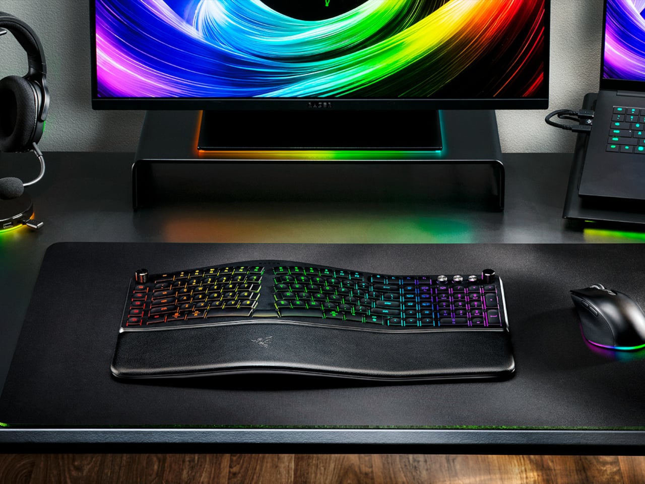
Razer’s answer is the Pro Type Ergo, its first wireless split ergonomic keyboard, built with that frustration clearly in mind. Rather than throwing you into a radical new layout, it’s tuned to feel approachable from the very first keystroke. The split gently angles your hands into a more natural alignment, easing the sideways reach that makes most forearms ache by mid-afternoon, without asking you to completely relearn how to type.

Designer: Razer

One of the more interesting layout choices is the dual “B” key arrangement, with one on each side of the split, along with an extra backspace tucked between two space bars. The idea is that both thumbs take on common actions, so you’re reaching less and crossing your fingers over each other less throughout the day. It’s a small shift that makes more sense the longer you sit with it.

The keycaps are ultra-low-profile, fitted with subtle spherical indents that nudge your fingertips into the right position without you having to think about it. Sound-dampening layers and tuned stabilizers underneath keep the typing noise low enough for open offices and video calls. Shorter key travel also means less physical effort per keystroke, which doesn’t sound like much until you’ve been at your desk for six hours straight.

The wrist rest is permanently integrated rather than removable, which turns out to be a feature rather than a limitation. It’s just always there, supporting your wrists from the moment you sit down without any extra setup. A 10-degree base slope sets the starting angle, and five tilt positions, from flat to seven degrees forward or back, let you dial in the fit depending on your desk height and preference.

A Razer Command Dial lets you assign up to eight functions, expandable to 100 via Razer Synapse, while five macro keys along the left side keep your most-used shortcuts within easy reach. There’s also a dedicated AI Prompt Master key that handles things like drafting emails, summarizing blocks of text, or kicking off a research query in a single press, without pulling you out of whatever window you’re already in.

Connectivity spans Razer HyperSpeed Wireless at 2.4 GHz, three Bluetooth profiles, and USB-C wired mode, with support for up to five devices total. Razer Chroma RGB backlighting covers 19 customizable zones and can be switched off entirely for offices where animated key lighting might not go over well. The design is clean and understated, a far cry from the aggressively lit gaming keyboards Razer is better known for.

The Pro Type Ergo retails at $189.99, about $30 more than Razer’s conventional Pro Type Ultra from 2021. For anyone who types for a living and has been quietly working around the ache of a standard keyboard layout, that extra cost starts to feel a lot less significant once you’ve spent a full day on something that actually fits how your hands are supposed to sit.

The post Razer Just Proved Ergonomic Keyboards Don’t Have to Be Miserable first appeared on Yanko Design.

  • ✇Yanko Design
  • This $299 Android Phone Says Glowing Screens Are Already Obsolete
    For most people, the smartphone screen is where focus goes to die. Even when you pick one up with a purpose, the bright OLED glare, the notifications, and the endless scroll have a way of pulling you elsewhere. Screen fatigue is real, blue light is a genuine concern, and the push for digital wellness has grown loud enough that even tech companies have started quietly acknowledging it. The Bigme HiBreak Plus takes a different approach to the smartphone entirely. Built around a 6.13-inch E Ink Ka
     

This $299 Android Phone Says Glowing Screens Are Already Obsolete

Par : JC Torres
1 avril 2026 à 04:45

For most people, the smartphone screen is where focus goes to die. Even when you pick one up with a purpose, the bright OLED glare, the notifications, and the endless scroll have a way of pulling you elsewhere. Screen fatigue is real, blue light is a genuine concern, and the push for digital wellness has grown loud enough that even tech companies have started quietly acknowledging it.

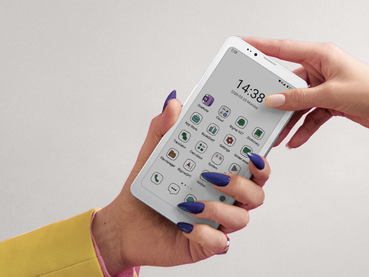
The Bigme HiBreak Plus takes a different approach to the smartphone entirely. Built around a 6.13-inch E Ink Kaleido 3 color display, it runs on Android 14 with full Google Play support and connects via dual 4G SIM, making it a genuinely functional phone. But unlike everything else in your pocket, it defaults to a mode that’s easier on the eyes and harder to mindlessly abuse.

Designer: Bigme

E Ink displays on smartphones have always had one obvious weakness: the refresh rate. Previous devices refreshed so slowly that casual scrolling felt like a real chore. The HiBreak Plus addresses that with a remarkably high 52 FPS refresh rate for an E Ink display, making it responsive enough for reading, annotating, and light browsing without the ghost-image flicker that dogged earlier E Ink phones.

The display’s advantages don’t stop at being easy to look at. E Ink panels are naturally readable under direct sunlight without any brightness cranked up, which means you can check maps, take notes outdoors, or read in the afternoon light without squinting. There’s no backlight shining toward your face either, just a soft, paper-like surface that reflects the ambient light around it.

A front light with 36 brightness levels handles the dimmer end of things. It reads the surrounding environment and automatically calibrates brightness and color temperature, going from a cool, crisp tone for morning work to a warm amber glow at night. There’s no digging through menus or manually adjusting sliders; the phone handles it quietly in the background, adapting to wherever you happen to be.

Handwriting support, via an optional stylus, adds another layer to what the phone can do. Writing directly on the E Ink surface feels closer to putting pen to paper than tapping on glass. It makes the HiBreak Plus a natural fit for jotting down thoughts during a commute, capturing ideas in a meeting, or working through a long reading session with annotations in the margins.

The rest of the specs are functional rather than flashy: an octa-core processor, 4GB of RAM, 64GB of storage, GPS, a fingerprint sensor in the power button, and a 4500 mAh battery that should comfortably outlast most conventional smartphones thanks to the energy-efficient E Ink display. The whole package weighs just 193g, light enough to slip into a shirt pocket without a second thought.

Of course, there are some downsides as well, ones that go beyond the screen refresh rate and color vibrancy. Although not exactly outdated, 4G LTE caps data speed significantly, and the rather modest RAM and storage capacity don’t do it any favors either. That said, at a $299 price point ($249 on pre-order), you are getting a pocket-sized color e-reader that can also make calls and connect to the Internet, without the usual distracting trappings of a smartphone.

The post This $299 Android Phone Says Glowing Screens Are Already Obsolete first appeared on Yanko Design.

  • ✇Yanko Design
  • Apple Turns 50, and Its Most Ambitious Phone Hasn’t Even Launched Yet — 5 iPhone Fold Concepts
    On April 1st, 2026, Apple turns 50. For a company that has spent half a century rewriting the rules of consumer technology, the milestone deserves something genuinely transformative. The Macintosh redefined personal computing. The iPod gave an entire generation a new relationship with music. The original iPhone, unveiled in 2007, combined a phone, a music player, and the internet into a single glass rectangle and made every competitor look outdated overnight. The iPhone Fold is real, and it’s c
     

Apple Turns 50, and Its Most Ambitious Phone Hasn’t Even Launched Yet — 5 iPhone Fold Concepts

31 mars 2026 à 21:45

On April 1st, 2026, Apple turns 50. For a company that has spent half a century rewriting the rules of consumer technology, the milestone deserves something genuinely transformative. The Macintosh redefined personal computing. The iPod gave an entire generation a new relationship with music. The original iPhone, unveiled in 2007, combined a phone, a music player, and the internet into a single glass rectangle and made every competitor look outdated overnight. The iPhone Fold is real, and it’s coming.

Leaks from early 2026 paint a detailed picture: a book-style foldable powered by the A20 Pro chip on a 2nm process, backed by a 5,500mAh battery, with a 7.8-inch creaseless OLED inner display and a 5.5-inch outer screen. Pricing is expected to start around $2,400, and while a September announcement seems likely, most analysts believe shipments may not begin until December. Designers, modders, and concept artists have spent years filling the void with their own visions of a folding iPhone, each carrying a distinct theory about what Apple should prioritize. These five concepts map the full range of that imagination and capture exactly how much is riding on the real thing.

1. iPhone iFold by Michal Dufka — The Clamshell That Makes Sense

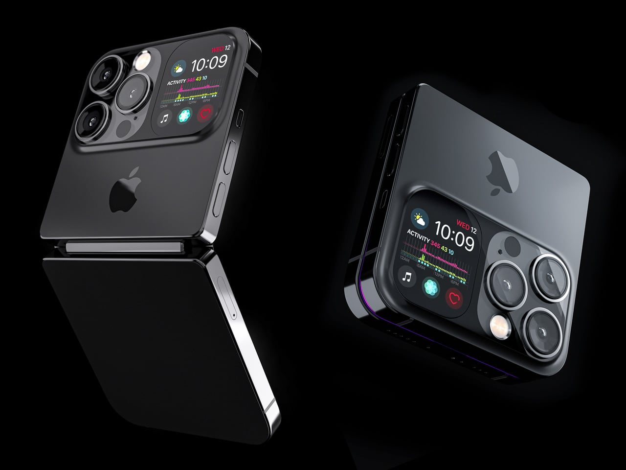
Designer Michal Dufka’s iPhone iFold is built on restraint. Rather than reinventing the iPhone’s entire identity, it applies a clamshell fold to the form factor people already love, drawing direct inspiration from the MotoRAZR and Samsung Galaxy Z Flip. The phone closes into a compact, pocketable square and opens into a full iPhone experience with a generously large display. For anyone who has quietly missed a phone that actually fits in a jeans pocket, this concept speaks to that feeling.

What sets the iFold apart is the secondary display placed beside the camera bump. When the phone is closed, that smaller screen surfaces notifications, time, and essential stats without requiring you to open the device at all. It functions almost like an Apple Watch built into the back of the phone. With Apple’s always-on display technology mature enough for this kind of ambient use, the dual-display setup feels less like speculation and more like a logical next step.

What We Like

  • The secondary display mirrors Apple Watch notification behavior, making glanceable information genuinely useful without ever opening the phone
  • The clamshell format makes the iPhone pocket-friendly for the first time in years without sacrificing screen size when it matters

What We Dislike

  • The clamshell form limits overall screen real estate compared to the expanded tablet surface that a book-style foldable provides
  • Hinge durability over sustained daily use is entirely unexplored here, and it remains the most critical engineering question for any clamshell design

2. iPhone Fold Ultra by 4RMD — When the Specs Match the Ambition

Design studio 4RMD’s iPhone Fold Ultra is grounded in credibility. Built directly from reported leaks rather than pure creative license, the concept presents a book-style foldable with dual 48MP rear cameras, a 24MP ultra-wide front camera, and the A20 Pro chip running on a 2nm process. Three color options appear across the renders: White, Black, and Deep Purple. At an estimated $2,299, this concept sits at the very top of Apple’s lineup with total conviction.

That Deep Purple colorway deserves its own moment. It is a deliberate callback to the iPhone 14 Pro’s most celebrated finish, and it lands differently on a book-style foldable. Something about that color on a device this ambitious reads as genuinely luxurious, the kind of finish that reframes a $2,299 price tag from a shock into a statement. 4RMD clearly understands Apple’s visual grammar, and this concept shows what happens when research and aesthetics share the same design space.

What We Like

  • Specs pulled from verified leaks give this concept real credibility, making it feel like a preview of what is actually coming rather than pure speculation
  • The Deep Purple colorway is a smart, crowd-pleasing callback to one of Apple’s most recognized and beloved finishes

What We Dislike

  • The “Ultra” label sets an expectation that demands exceptional build quality, and no concept can fully address whether the real device will deliver on that promise
  • Crease visibility across the inner display remains unaddressed, which continues to be the most persistent criticism of every book-style foldable on the market

3. iPhone Fold by Svyatoslav Alexandrov — The One That Replaces Two Devices

Svyatoslav Alexandrov’s iPhone Fold concept, created for the YouTube channel ConceptsiPhone, thinks in bigger terms than anything else on this list. Starting as a standard smartphone with a 6.3-inch outer display, it unfolds into a squarish 8-inch tablet that sits clearly in iPad Mini territory. This is not a phone with a bonus screen bolted on. It is a device designed to make carrying both an iPhone and an iPad feel genuinely redundant.

Alexandrov replaces Face ID with a full-display Touch ID fingerprint sensor, keeping the front notch minimal and clean. The rear carries the iPhone 12 Pro’s complete camera array: wide, ultra-wide, telephoto lenses, a LiDAR scanner, and flash. MagSafe compatibility and 5G readiness are already confirmed in the concept, adding meaningful weight to its productivity pitch. Whether the device supports the Apple Pencil is left open, but given an 8-inch inner display, its absence would feel like a missed opportunity.

What We Like

  • The full-display Touch ID is a clean and creative solution that keeps the front uncluttered while solving Face ID’s known complications on foldable form factors
  • The iPad Mini-sized inner screen makes a practical, real-world case for consolidating two devices into one without any meaningful compromise

What We Dislike

  • Removing Face ID eliminates one of the iPhone’s most seamless and trusted authentication features, which most users rely on dozens of times every day
  • Leaving Apple Pencil support unconfirmed weakens what should naturally be this concept’s strongest argument for productivity

4. iPhone Fold by Mechanical Pixel — The Foldable That Doesn’t Actually Fold

Mechanical Pixel’s concept takes the most unconventional approach on this list, and the reasoning is worth understanding. Rather than bending the iPhone itself, the design keeps the main body completely rigid and attaches a separate foldable display to the rear panel instead. The core phone experience remains exactly as people know it, maintaining the familiar dimensions and feel that iPhone users already rely on. That additional screen only enters the picture when a larger surface is specifically needed.

That rear foldable panel sits raised on a platform above the phone’s back, unfolding outward into a larger, squarish tablet surface when required. The layered profile is clearly visible from the side, giving the device a deliberately experimental and modular quality. The camera module remains in its standard position, completely unaffected by the additional display layer. The logic is unconventional, but the core argument of preserving the primary iPhone experience from any foldable compromise is genuinely hard to dismiss.

What We Like

  • Keeping the main body rigid entirely sidesteps the crease and long-term hinge durability problems that define every conventional foldable on the market today
  • The modular approach means the everyday iPhone experience is never degraded or compromised by the mechanics of the foldable element

What We Dislike

  • The raised rear platform creates an unrefined, layered side profile that sits well outside anything Apple’s design language has ever produced or endorsed
  • The prototype-like aesthetic makes it very difficult to imagine this direction surviving Apple’s notoriously demanding and detail-oriented product design process

5. iPhone V — The One Someone Actually Built

Every concept on this list exists as a digital render. The iPhone V is different. A YouTuber modder physically dismantled an iPhone X, extracted its internal components, and rebuilt the entire device inside a Motorola Razr chassis. The result is a working, folding iPhone that runs real iOS, carries a Retina-quality display, and folds in half like a classic flip phone. As a proof of concept, it is extraordinary. As a finished product, every question comes flooding in.

What makes the iPhone V genuinely compelling is not fit, finish, or polish, because it has none in any conventional sense. It is the straightforward fact that someone cared enough to prove the idea could actually work using parts that already exist. The folding mechanism and device thickness still need serious refinement. A working clamshell iPhone running authentic iOS is, in the end, a more persuasive argument for this form factor than any polished render has managed to be.

What We Like

  • The iPhone V is the only entry on this list that is fully functional, running real iOS inside an actual working clamshell device
  • Its physical existence proves the clamshell iPhone concept is viable using genuine Apple hardware, well beyond anything a render can demonstrate

What We Dislike

  • The repurposed Motorola Razr chassis produces a build that falls far short of consumer-grade fit, finish, and structural refinement
  • Hinge mechanism quality and overall device thickness remain significant engineering challenges that the mod cannot resolve, and they are exactly what Apple needs to solve

The Concepts That Made the Wait Worthwhile

Fifty years in, Apple is still the company that makes you wait. The iPhone Fold concepts here are not just exercises in creative imagination — they are a record of what designers and makers have been asking for, year after year. Some nailed the form factor. Others got the specs exactly right. A few did both. Together, they have shaped the entire conversation around a device that already feels utterly inevitable.

When the real iPhone Fold arrives, it will be measured against each of these visions. That is the power of concept design — it sets the bar before the product ships. Apple turning 50 while holding back its most ambitious device is pure theater. The design community has been writing this script for years. The only question is whether the real thing can live up to what the imagination has already built.

The post Apple Turns 50, and Its Most Ambitious Phone Hasn’t Even Launched Yet — 5 iPhone Fold Concepts first appeared on Yanko Design.

  • ✇Yanko Design
  • Leaked iPhone 18 Pro Screen Protector Shows A 35% Smaller Dynamic Island
    Four years is a long time in smartphone design, long enough for entire product categories to rise, peak, and fade. Samsung has cycled through multiple foldable generations. Google has rebooted its Pixel lineup twice. Nothing has gone from startup curiosity to legitimate contender. Apple, meanwhile, has kept the Dynamic Island exactly where it was when it debuted with the iPhone 14 Pro, same width, same height, same visual footprint. Leaked screen protectors for the iPhone 18 Pro, sourced from W
     

Leaked iPhone 18 Pro Screen Protector Shows A 35% Smaller Dynamic Island

31 mars 2026 à 20:30

Four years is a long time in smartphone design, long enough for entire product categories to rise, peak, and fade. Samsung has cycled through multiple foldable generations. Google has rebooted its Pixel lineup twice. Nothing has gone from startup curiosity to legitimate contender. Apple, meanwhile, has kept the Dynamic Island exactly where it was when it debuted with the iPhone 14 Pro, same width, same height, same visual footprint. Leaked screen protectors for the iPhone 18 Pro, sourced from Weibo, suggest that Apple has finally decided four years is long enough.

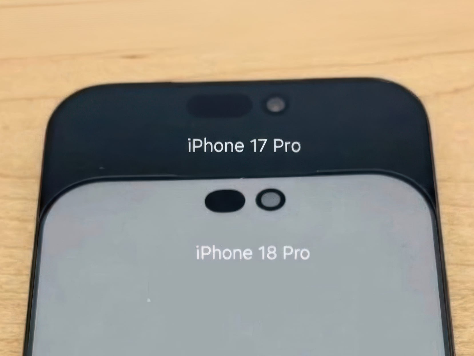
According to the leak, the infrared flood illuminator that powers Face ID is moving under the display on the iPhone 18 Pro, leaving only the infrared camera requiring a physical cutout alongside the front-facing lens. The result is a Dynamic Island roughly 35% smaller than what ships on the iPhone 17 Pro today. Apple is also expected to pair this with its first 2nm chip, the A20 Pro, along with a variable aperture system on the main camera. The 20th anniversary iPhone in 2027 is widely expected to go further with a fully clean display, but the 18 Pro represents the clearest signal yet that Apple is working its way there on a deliberate schedule.

Image Credits: Weibo

The size reduction is more significant than the percentage suggests when you look at the two side by side. The iPhone 17 Pro’s Island is a wide, commanding presence even at rest. The 18 Pro’s leaked cutout reads almost delicate by comparison, a narrow pill sitting unobtrusively at the top of the screen. Apple will still need to revisit four years of Live Activities design and the entire interaction vocabulary built around the existing Island’s dimensions, which is a reasonable explanation for why this transition is taking as long as it is.

Android manufacturers have shipped under-display cameras for years, with visible quality tradeoffs that Apple’s user base simply would not accept on a thousand-dollar phone. Holding the line until the technology meets the standard, rather than shipping it to win a spec sheet argument, is the kind of call that frustrates people in the short term and builds loyalty over time. The iPhone 18 Pro may read as a modest update on paper. That smaller pill tells a different story.

The post Leaked iPhone 18 Pro Screen Protector Shows A 35% Smaller Dynamic Island first appeared on Yanko Design.

  • ✇Yanko Design
  • This Tiny House Has 30 Feet of Glass and Feels Nothing Like a Tiny House
    The tiny house world has long wrestled with one unavoidable tension — the desire for light, openness, and space against the hard constraints of a compact footprint. Escape’s Shoreline Glass House doesn’t just address that tension; it dissolves it entirely. This recently completed park model is one of the most spatially generous and light-saturated tiny homes to come out of the category in recent memory, and it earns that distinction without resorting to multi-level gymnastics or lofted sleeping
     

This Tiny House Has 30 Feet of Glass and Feels Nothing Like a Tiny House

31 mars 2026 à 19:30

The tiny house world has long wrestled with one unavoidable tension — the desire for light, openness, and space against the hard constraints of a compact footprint. Escape’s Shoreline Glass House doesn’t just address that tension; it dissolves it entirely. This recently completed park model is one of the most spatially generous and light-saturated tiny homes to come out of the category in recent memory, and it earns that distinction without resorting to multi-level gymnastics or lofted sleeping quarters.

What immediately sets the Shoreline Glass House apart is its commitment to single-floor living. It has a length of 47 ft (14.3 m) and an increased width of 12 ft (3.6 m), which makes for a much larger interior than is typical for the format, comparable in fact to a small apartment. That extra width is the key differentiator. Where most tiny homes feel like corridors with furniture squeezed in, the Shoreline opens up laterally, giving rooms a genuine sense of proportion that doesn’t demand you constantly recalibrate your spatial expectations.

Designer: Escape

The name earns its keep on the exterior, too. The Shoreline Glass House features a light-filled interior thanks to 30 ft (9 m) of glazing running along one wall, flooding every corner of the home with natural light throughout the day. It’s a design move that blurs the line between inside and out, making the home feel anchored to its surroundings rather than sealed off from them. Entry is through a large enclosed porch, a smart buffer zone that expands the functional living area while adding that coveted semi-outdoor layer that tiny home dwellers often sacrifice first.

Inside, the layout is open-plan, with the living and kitchen area flowing seamlessly from one end to the other. The bathroom includes a large glass-enclosed shower with a width of 5 ft (1.5 m), a specification that sounds modest until you realize most tiny house showers are barely wide enough to raise both arms. A walk-in closet rounds out the domestic comforts, alongside an oversized sofa that signals Escape’s intent clearly: this is a home designed for staying in, not just passing through.

As a non-towable park model, the Shoreline Glass House isn’t chasing the nomadic lifestyle that defines much of the tiny house market. It’s built for permanence, or at least long-term settlement, and the design reflects that. Every decision, from the floor-to-ceiling glazing to the full-width bathroom, prioritizes livability over portability. The result is a tiny house that finally makes the case that going small doesn’t have to mean giving anything up.

The post This Tiny House Has 30 Feet of Glass and Feels Nothing Like a Tiny House first appeared on Yanko Design.

❌