Vue normale

Il y a de nouveaux articles disponibles, cliquez pour rafraîchir la page.
Hier — 11 juillet 2026Flux principal
À partir d’avant-hierFlux principal

VitaLink Just Put a 13-Inch Screen and Keyboard Into One Foldable Slab

Par : JC Torres
17 avril 2026 à 01:45

Working on the go rarely looks as tidy as productivity-tool adverts suggest. Most people who travel with serious work needs end up carrying at least two or three things that don’t quite fit together: a tablet or laptop, a compact keyboard if the touchscreen isn’t enough, maybe a portable monitor, and a cable situation that somehow multiplies every time you pack.

VitaLink is trying to simplify that. The concept combines a full-size keyboard and a large touch display into one foldable object in a CNC aluminum shell. Connect it to any USB-C device and your workspace expands immediately, without a separate stand, a monitor arm, or a bag pocket devoted to adapters. It folds down to 20mm and opens into something that feels genuinely designed.

Designer: VitaLink

Click Here to Buy Now: $279 $658 (58% off). Hurry, only 491/600 left! Raised over $37,000.

The integrated 13-inch display sits directly above the keyboard in what amounts to a compact laptop form factor. The screen runs at a 3840×1600 pixel resolution, a 2.4:1 ultra-wide format rather than a standard 16:9 panel, giving it an unusual amount of horizontal room. There’s enough space to keep two apps open side by side without either feeling squeezed into a corner.

The 180-degree hinge is what makes the compact form actually practical. When you’re done, everything closes into a flat 20mm slab that slips into a laptop sleeve without awkward bulk. The open footprint sits at around 34 × 15 cm, compact enough for a plane tray table, a crowded café counter, or a hotel desk that never seems to fit anything comfortably.

The panel supports 10-point touch, runs at 60 Hz, and delivers 298 PPI pixel density with 100% sRGB color coverage. Touching a screen this size changes how you interact with content. You can swipe, drag, and tap directly on the display while still using the keyboard below, which means managing layers in an editor, scrubbing a timeline, or pulling up references doesn’t require switching between input modes.

The keyboard uses scissor-switch mechanisms with 0.8mm of key travel and wider-than-typical spacing. That added spacing sounds like a minor detail until you’ve spent an hour trying to type accurately on a portable board that prioritizes size above everything else. Three RGB backlight modes let you set the visual tone, and the keys are designed to stay quiet enough for cafés and shared offices.

Two USB-C ports handle video, data, and power delivery through a single cable, and the plug-and-play setup works across Windows, macOS, Linux, iOS, and Android without requiring additional drivers. That compatibility extends to mini PCs, tablets, and handheld gaming consoles, so VitaLink isn’t tied to one kind of device. You’re not locked into a single workflow or a single ecosystem, which is most of the appeal.

Think about what that actually means. You’re in a hotel room with just your iPad and need a proper keyboard and enough screen space to write, edit, and reference something at once. Or you’re at a café with a mini PC and want a setup that doesn’t take over the whole table. Those are the moments where having the keyboard and the display in one object makes a real difference.

The aluminum body does more than keep things thin. CNC-machined aluminum with a frosted anodized finish gives it a rigidity that plastic travel accessories rarely have, protecting the display in transit and keeping the keyboard deck from flexing during typing sessions. It carries more like a slim hardcover notebook than a peripheral, which is a meaningful difference for anyone who’s dealt with a flimsy portable monitor in a crowded bag.

There’s something worth noting in the fact that portable work setups have gotten faster without necessarily getting more cohesive. The bag is still a loose collection of things that don’t quite belong together. VitaLink is at least making a case that the keyboard and the display belong in a single intentional object, built from the start for people whose work doesn’t stay in one place.

Click Here to Buy Now: $279 $658 (58% off). Hurry, only 491/600 left! Raised over $37,000.

The post VitaLink Just Put a 13-Inch Screen and Keyboard Into One Foldable Slab first appeared on Yanko Design.

Pictures of iPhone Fold appear online, just before Apple’s supposed foldable hits engineering challenges

Par : Gaurav Sood
8 avril 2026 à 19:15


Apple’s first foldable phone, the Apple’s first foldable phone, iPhone Fold (if that’s how it will be called) is one of the most anticipated smartphones in recent memory. While Apple remains tight-lipped about anything concerning the awaited device, rumors, leaks, and concepts have flooded our memories over the years with what the iPhone Fold is and what it will be like.

2026 is suggestively the magical year when Apple is expected to launch the foldable iPhone. It has been an unperturbed timeline in almost all the reports we have seen. In the same loop – but without a timeline – a recognized Apple leaker, Majin Bu has shown “actual design of the iPhone Fold” in the latest leaked pictures.

Designer: Apple

It’s “more beautiful than the previous one,” Bu notes in his update on X, stating that he believes this is “the final design of the future iPhone Fold.” How much context there is in the claim, only time will tell, but Bu has had some correct Apple-related predictions in the past, which suggests he could have some substance to back his claim.

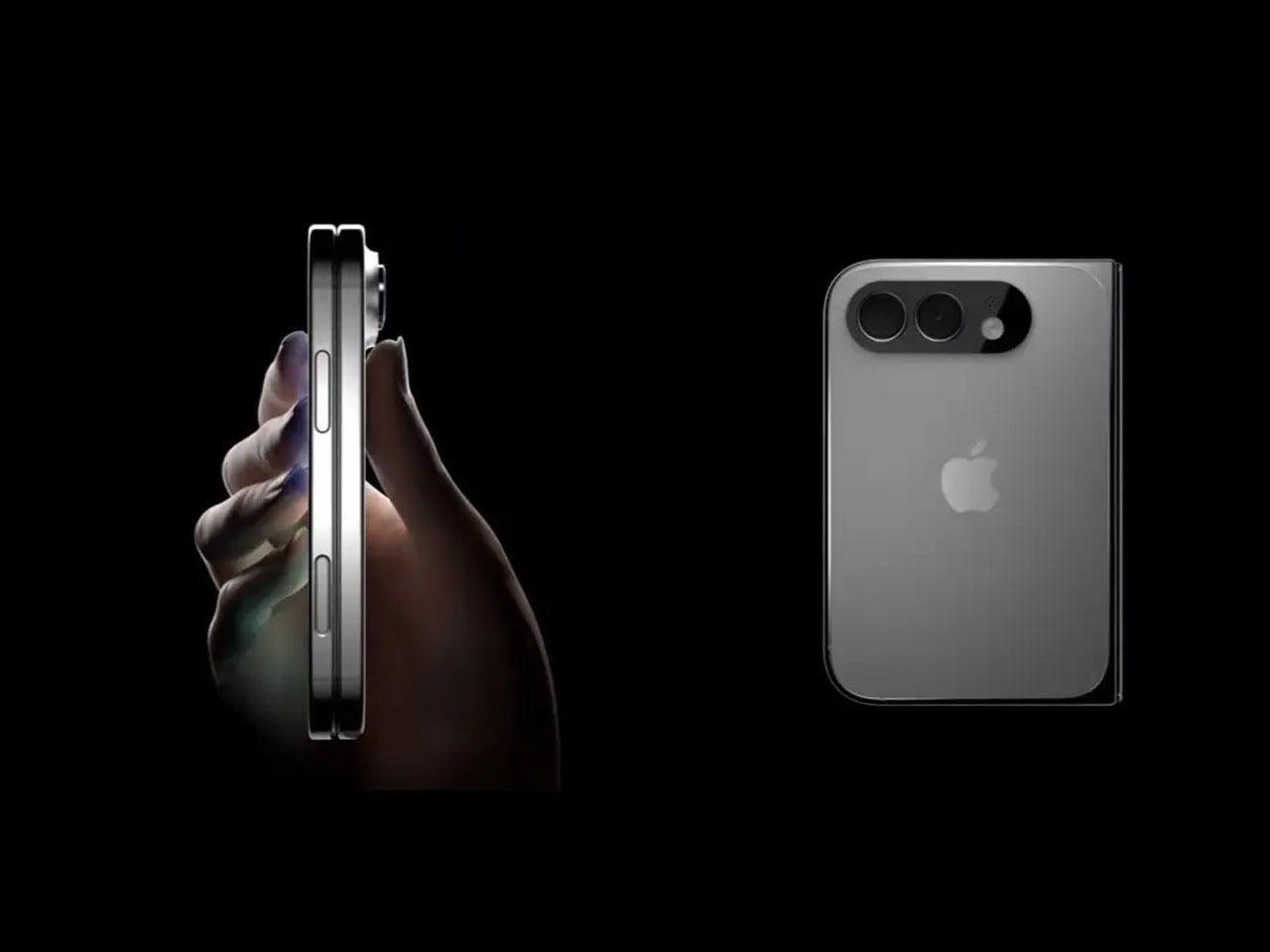
From the leaked pictures, one can visually notice that the camera bump on the back of the foldable device is significantly smaller than that seen in previously rumored designs. The images appear more than renders and supposedly of a prototype, showing the iPhone in a book-style foldable form factor. Appearing to open horizontally to reveal a tablet-like display on the inside.

If the 2026 timeline is to go by – it’s Apple’s golden jubilee year as well – the iPhone Fold should ship alongside the iPhone 18 Pro slated for release in fall this year. But according to a new report from Nikkei Asia, the launch could be delayed. Nikkei reports that Apple has encountered a major setback in the engineering test phase of the foldable iPhone. There have been previously report concerning the foldable display’s crease, but this time, the report notes that the Cupertino giant is facing “more complex engineering challenges than anticipated.” If the issues persist, they could, “in a worst-case scenario,” delay the iPhone Fold launch schedule by some months. It could even mean a postponement until 2027.

Earlier this year, it was rumored that Apple had entered into the manufacturing phase of its first foldable device at Foxconn. New revelations, however, suggest Apple is “notifying” its component suppliers about the possibility of a delay in the “component production schedule for the new foldable iPhone.”

Despite the reports and unauthorized leaks, one thing is definite now. Foldable iPhone – by whatever moniker it comes – is clearly on the horizon. Apple will soon have a competitor for the Samsung Fold and other foldable smartphones on the market. If it is anything like the iPhones that rocked the smartphone world in the late 2000s, the iPhone Fold could repeat that in the late 2020s.

The post Pictures of iPhone Fold appear online, just before Apple’s supposed foldable hits engineering challenges first appeared on Yanko Design.

Satechi’s $130 Foldable 3-in-1 Charger Now Hits 25W for iPhones

Par : JC Torres
8 avril 2026 à 10:07

Wireless charging was supposed to simplify things. Instead, most Apple users end up with a tangle of pads and cables on the nightstand, one for the iPhone, another for the Apple Watch, and a separate spot for the AirPods. The technology meant to reduce friction has become its own kind of mess, especially for anyone who’s ever scrambled for a Watch charger before a morning flight.

Satechi’s 3-in-1 Foldable Wireless Charging Stand with Qi2 25W takes aim at that problem. The San Diego brand has updated its best-selling foldable charger with a meaningful upgrade, bumping wireless power delivery for compatible iPhones to 25W, a notable jump from the 15W ceiling most MagSafe-compatible pads have been stuck at. It’s built as a proper desktop stand, not just something you tolerate next to the lamp.

Designer: Satechi

Set the phone down on the magnetic charging surface, and Qi2’s built-in alignment snaps it into position so you don’t lose power from an off-center placement. The Apple Watch sits at a comfortable angle on its dedicated fast-charge module, while the AirPods rest on their own pad below. All three charge simultaneously from a single cable going to the wall, with nothing to juggle.

Apple Watch fast charging requires MFi certification, and Satechi has that covered. The stand supports Series 7 and newer, including Ultra and SE models. Advanced safety protections manage heat and prevent power loss when all three pads are active at once. The magnetic surface on the phone pad also ensures it stays correctly positioned even if you accidentally nudge it during the night.

Then there’s the folding design, which is where the stand earns its keep as a travel companion. It collapses into a flat form that fits easily in a carry-on without much bulk, then unfolds into the same stable stand you’re used to at home. There’s no need to rethink your charging setup just because you’ve checked into a different room across town or across the world.

Satechi also includes a 45W USB-C power adapter in the box, which sounds like a minor detail until you’re unpacking in a foreign hotel room. The adapter ships with US, EU, and UK plug attachments, meaning it works across different countries without needing a separate travel adapter. That’s a small but thoughtful decision for anyone whose travels take them to multiple regions throughout the year.

Available now on Satechi.com and Amazon, the stand retails for $129.99 in Space Black. It’s a higher investment than a single-device pad, but consolidating three separate chargers into one that travels as well as it sits on a desk makes that gap easier to justify. For Apple ecosystem users tired of the cable pile next to the bed, this stand offers a much cleaner end to every day.

The post Satechi’s $130 Foldable 3-in-1 Charger Now Hits 25W for iPhones first appeared on Yanko Design.

Apple Turns 50, and Its Most Ambitious Phone Hasn’t Even Launched Yet — 5 iPhone Fold Concepts

1 avril 2026 à 01:45

On April 1st, 2026, Apple turns 50. For a company that has spent half a century rewriting the rules of consumer technology, the milestone deserves something genuinely transformative. The Macintosh redefined personal computing. The iPod gave an entire generation a new relationship with music. The original iPhone, unveiled in 2007, combined a phone, a music player, and the internet into a single glass rectangle and made every competitor look outdated overnight. The iPhone Fold is real, and it’s coming.

Leaks from early 2026 paint a detailed picture: a book-style foldable powered by the A20 Pro chip on a 2nm process, backed by a 5,500mAh battery, with a 7.8-inch creaseless OLED inner display and a 5.5-inch outer screen. Pricing is expected to start around $2,400, and while a September announcement seems likely, most analysts believe shipments may not begin until December. Designers, modders, and concept artists have spent years filling the void with their own visions of a folding iPhone, each carrying a distinct theory about what Apple should prioritize. These five concepts map the full range of that imagination and capture exactly how much is riding on the real thing.

1. iPhone iFold by Michal Dufka — The Clamshell That Makes Sense

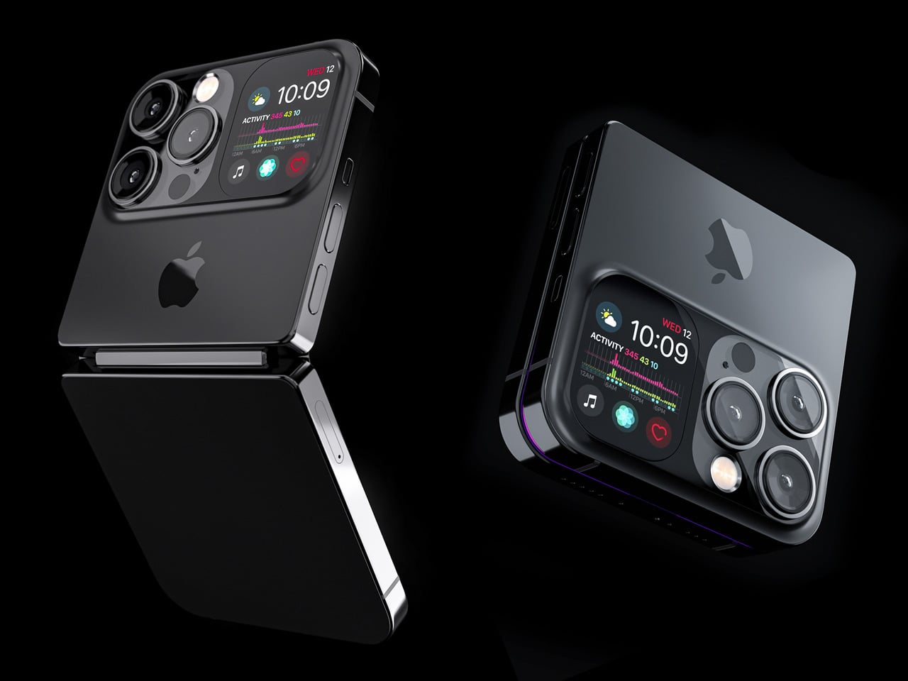
Designer Michal Dufka’s iPhone iFold is built on restraint. Rather than reinventing the iPhone’s entire identity, it applies a clamshell fold to the form factor people already love, drawing direct inspiration from the MotoRAZR and Samsung Galaxy Z Flip. The phone closes into a compact, pocketable square and opens into a full iPhone experience with a generously large display. For anyone who has quietly missed a phone that actually fits in a jeans pocket, this concept speaks to that feeling.

What sets the iFold apart is the secondary display placed beside the camera bump. When the phone is closed, that smaller screen surfaces notifications, time, and essential stats without requiring you to open the device at all. It functions almost like an Apple Watch built into the back of the phone. With Apple’s always-on display technology mature enough for this kind of ambient use, the dual-display setup feels less like speculation and more like a logical next step.

What We Like

  • The secondary display mirrors Apple Watch notification behavior, making glanceable information genuinely useful without ever opening the phone
  • The clamshell format makes the iPhone pocket-friendly for the first time in years without sacrificing screen size when it matters

What We Dislike

  • The clamshell form limits overall screen real estate compared to the expanded tablet surface that a book-style foldable provides
  • Hinge durability over sustained daily use is entirely unexplored here, and it remains the most critical engineering question for any clamshell design

2. iPhone Fold Ultra by 4RMD — When the Specs Match the Ambition

Design studio 4RMD’s iPhone Fold Ultra is grounded in credibility. Built directly from reported leaks rather than pure creative license, the concept presents a book-style foldable with dual 48MP rear cameras, a 24MP ultra-wide front camera, and the A20 Pro chip running on a 2nm process. Three color options appear across the renders: White, Black, and Deep Purple. At an estimated $2,299, this concept sits at the very top of Apple’s lineup with total conviction.

That Deep Purple colorway deserves its own moment. It is a deliberate callback to the iPhone 14 Pro’s most celebrated finish, and it lands differently on a book-style foldable. Something about that color on a device this ambitious reads as genuinely luxurious, the kind of finish that reframes a $2,299 price tag from a shock into a statement. 4RMD clearly understands Apple’s visual grammar, and this concept shows what happens when research and aesthetics share the same design space.

What We Like

  • Specs pulled from verified leaks give this concept real credibility, making it feel like a preview of what is actually coming rather than pure speculation
  • The Deep Purple colorway is a smart, crowd-pleasing callback to one of Apple’s most recognized and beloved finishes

What We Dislike

  • The “Ultra” label sets an expectation that demands exceptional build quality, and no concept can fully address whether the real device will deliver on that promise
  • Crease visibility across the inner display remains unaddressed, which continues to be the most persistent criticism of every book-style foldable on the market

3. iPhone Fold by Svyatoslav Alexandrov — The One That Replaces Two Devices

Svyatoslav Alexandrov’s iPhone Fold concept, created for the YouTube channel ConceptsiPhone, thinks in bigger terms than anything else on this list. Starting as a standard smartphone with a 6.3-inch outer display, it unfolds into a squarish 8-inch tablet that sits clearly in iPad Mini territory. This is not a phone with a bonus screen bolted on. It is a device designed to make carrying both an iPhone and an iPad feel genuinely redundant.

Alexandrov replaces Face ID with a full-display Touch ID fingerprint sensor, keeping the front notch minimal and clean. The rear carries the iPhone 12 Pro’s complete camera array: wide, ultra-wide, telephoto lenses, a LiDAR scanner, and flash. MagSafe compatibility and 5G readiness are already confirmed in the concept, adding meaningful weight to its productivity pitch. Whether the device supports the Apple Pencil is left open, but given an 8-inch inner display, its absence would feel like a missed opportunity.

What We Like

  • The full-display Touch ID is a clean and creative solution that keeps the front uncluttered while solving Face ID’s known complications on foldable form factors
  • The iPad Mini-sized inner screen makes a practical, real-world case for consolidating two devices into one without any meaningful compromise

What We Dislike

  • Removing Face ID eliminates one of the iPhone’s most seamless and trusted authentication features, which most users rely on dozens of times every day
  • Leaving Apple Pencil support unconfirmed weakens what should naturally be this concept’s strongest argument for productivity

4. iPhone Fold by Mechanical Pixel — The Foldable That Doesn’t Actually Fold

Mechanical Pixel’s concept takes the most unconventional approach on this list, and the reasoning is worth understanding. Rather than bending the iPhone itself, the design keeps the main body completely rigid and attaches a separate foldable display to the rear panel instead. The core phone experience remains exactly as people know it, maintaining the familiar dimensions and feel that iPhone users already rely on. That additional screen only enters the picture when a larger surface is specifically needed.

That rear foldable panel sits raised on a platform above the phone’s back, unfolding outward into a larger, squarish tablet surface when required. The layered profile is clearly visible from the side, giving the device a deliberately experimental and modular quality. The camera module remains in its standard position, completely unaffected by the additional display layer. The logic is unconventional, but the core argument of preserving the primary iPhone experience from any foldable compromise is genuinely hard to dismiss.

What We Like

  • Keeping the main body rigid entirely sidesteps the crease and long-term hinge durability problems that define every conventional foldable on the market today
  • The modular approach means the everyday iPhone experience is never degraded or compromised by the mechanics of the foldable element

What We Dislike

  • The raised rear platform creates an unrefined, layered side profile that sits well outside anything Apple’s design language has ever produced or endorsed
  • The prototype-like aesthetic makes it very difficult to imagine this direction surviving Apple’s notoriously demanding and detail-oriented product design process

5. iPhone V — The One Someone Actually Built

Every concept on this list exists as a digital render. The iPhone V is different. A YouTuber modder physically dismantled an iPhone X, extracted its internal components, and rebuilt the entire device inside a Motorola Razr chassis. The result is a working, folding iPhone that runs real iOS, carries a Retina-quality display, and folds in half like a classic flip phone. As a proof of concept, it is extraordinary. As a finished product, every question comes flooding in.

What makes the iPhone V genuinely compelling is not fit, finish, or polish, because it has none in any conventional sense. It is the straightforward fact that someone cared enough to prove the idea could actually work using parts that already exist. The folding mechanism and device thickness still need serious refinement. A working clamshell iPhone running authentic iOS is, in the end, a more persuasive argument for this form factor than any polished render has managed to be.

What We Like

  • The iPhone V is the only entry on this list that is fully functional, running real iOS inside an actual working clamshell device
  • Its physical existence proves the clamshell iPhone concept is viable using genuine Apple hardware, well beyond anything a render can demonstrate

What We Dislike

  • The repurposed Motorola Razr chassis produces a build that falls far short of consumer-grade fit, finish, and structural refinement
  • Hinge mechanism quality and overall device thickness remain significant engineering challenges that the mod cannot resolve, and they are exactly what Apple needs to solve

The Concepts That Made the Wait Worthwhile

Fifty years in, Apple is still the company that makes you wait. The iPhone Fold concepts here are not just exercises in creative imagination — they are a record of what designers and makers have been asking for, year after year. Some nailed the form factor. Others got the specs exactly right. A few did both. Together, they have shaped the entire conversation around a device that already feels utterly inevitable.

When the real iPhone Fold arrives, it will be measured against each of these visions. That is the power of concept design — it sets the bar before the product ships. Apple turning 50 while holding back its most ambitious device is pure theater. The design community has been writing this script for years. The only question is whether the real thing can live up to what the imagination has already built.

The post Apple Turns 50, and Its Most Ambitious Phone Hasn’t Even Launched Yet — 5 iPhone Fold Concepts first appeared on Yanko Design.

Small, Aggressive, and Under $80: Meet The Kansept Wasp Button Lock Knife

Par : Sarang Sheth
26 mars 2026 à 00:30

A wasp’s design is a lesson in efficiency. It combines a potent stinger with a small, agile frame to create a threat that commands respect far beyond its physical size. Koch Tools Design captured this spirit perfectly with the Kansept Wasp, a folder where compact dimensions and aggressive geometry work in concert. The knife’s upswept Harpoon Wharncliffe tip acts as a visual stinger, while the sub-3-inch length ensures it remains a nimble and unobtrusive carry. This folder embodies a philosophy of calculated capability, proving that a small tool can still project a serious and purposeful presence.

At its core, the Wasp is a button lock folder built from a 2.36-inch 154CM blade and textured G10 handle scales. The Koch Tools collaboration provides the confident stance and deliberate lines, which Kansept executes with a durable gray TiCn blade coating on several models. This finish offers both corrosion resistance and a sharp visual contrast against the vibrant handle options. The button lock itself sits neatly flush with the spine, allowing for a clean profile when closed and delivering a satisfying snap upon deployment. Priced at $75.89, the Wasp targets the intersection where enthusiast-level design becomes accessible to a much broader audience.

Designer: Koch Tools Design

The Harpoon Wharncliffe blade profile delivers exceptional tip control for detail work and piercing tasks. The upswept curve terminates in a fine point that excels at controlled cuts, while the flat cutting edge provides clean slicing performance across its full 2.36-inch length. Aggressive jimping runs along the spine, offering secure thumb purchase during precision work or when applying forward pressure. A tactical swedge grinds down the spine near the tip, reducing drag and sharpening the visual aggression of the blade. The 154CM steel handles daily cutting tasks with reliable edge retention, and the gray TiCn coating hardens the surface against wear while adding a matte finish that reads as tactical rather than decorative.

Button locks remain a standout feature at this price point. Most folders under $80 default to liner locks or frame locks, mechanisms that work fine but lack the tactile satisfaction and mechanical interest of a button system. The Wasp’s button sits recessed into the handle spine, protected from accidental activation while remaining easy to locate by feel. Deployment feels crisp and deliberate, with the blade snapping into lockup with authority. The mechanism adds a layer of fidget-worthiness that liner locks simply can’t match, which matters when a knife spends most of its time sitting in a pocket waiting to be used.

Handle construction splits across multiple G10 variants, each delivering a different personality. The light gray and orange versions feature solid scales with diagonal texturing that provides grip without being abrasive. Yellow and jade colorways introduce skeletonized cutouts that reduce weight and create visual drama through negative space. The handle shape tapers toward the base, aiding retention during use and preventing the knife from feeling blocky despite its compact proportions. Closed length measures just over 3 inches, placing the Wasp comfortably in the keychain-compatible category while still offering enough real estate for a full three-finger grip when deployed.

The Wasp competes directly with knives like the Civivi Elementum and CJRB Feldspar, both of which hover around the same price and size. The button lock and Koch Tools pedigree give it an edge in that comparison, offering mechanical and design credibility that budget folders often lack. For collectors chasing variety, the multiple colorways mean there’s likely a version that fits personal taste without compromising on function.

The post Small, Aggressive, and Under $80: Meet The Kansept Wasp Button Lock Knife first appeared on Yanko Design.

Galaxy Z Fold 8 Renders: Same Look, Bigger Battery, and S Pen Is Back

Par : JC Torres
25 mars 2026 à 13:20

Foldable phones have reached a point where the form factor itself is no longer the talking point it once was. The big, dramatic “look how it folds” moment has settled into a quieter rhythm of iterative refinement, with each generation tweaking dimensions and chasing thinner profiles. Most buyers know what a modern book-style foldable looks like, and the language of change has shifted from shape to substance.

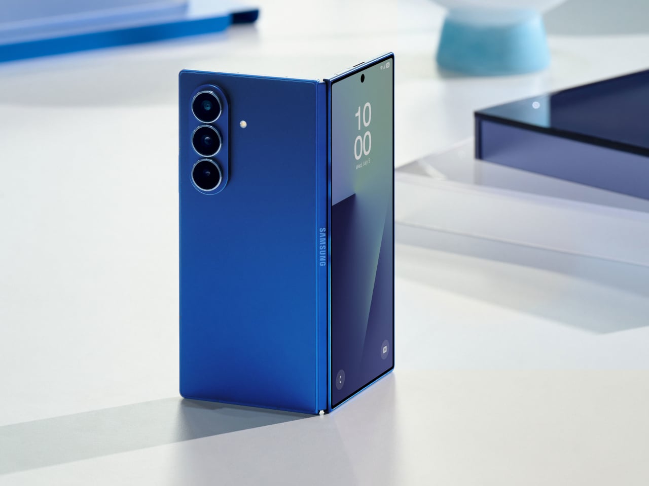
That’s the situation shaping the Samsung Galaxy Z Fold 8 conversation right now. Leaked CAD-based renders show a design that’s nearly indistinguishable from the Z Fold 7 pictured above: same flat sides, same sharp corners, same camera layout. The cover screen sits at 6.5 inches and the inner display at 8 inches, both unchanged. If you handed someone these renders without context, they’d probably just guess it was another angle of last year’s model.

Designer: Steve Hemmerstoffer/OnLeaks (Renders) via AndroidHeadlines

There’s one notable external difference, though, and it actually goes in the wrong direction. The leaked dimensions put the Z Fold 8 at 4.5mm thick when open and 9mm folded, compared to the Fold 7’s 4.2mm and 8.9mm. That’s a slight regression for a phone that went to considerable lengths to slim down the year prior. It’s not dramatic, but for a device that made a point of its thinness, it’s worth flagging. That said, the 4.5mm figure includes the protruding bezels around the display; it’s actually just 3.9mm thin.

The likely reason for that extra thickness is one of the better leaks so far: the possible return of S Pen support. Samsung dropped the stylus from the Fold 7, and that’s been a consistent complaint from the people who actually used it for note-taking or sketching on that wide inner canvas. If the S Pen does come back, a fraction of a millimeter is a fair trade for most of those users.

The battery theory, however, is probably more probable. A jump from 4,400 mAh to a rumored 5,000 mAh would mark the first capacity upgrade since the Galaxy Z Fold 3, and pairing that with 45W wired charging, up from 25W, addresses one of the more persistent frustrations with this lineup. Spending less time near an outlet matters more on a device you’re likely using across more tasks throughout the day.

The camera is also in line for a significant upgrade, according to the same leak. The main sensor is rumored to still be 200MP, and the ultrawide jumps from 12MP to 50MP. That ultrawide improvement in particular has been a long time coming. The gap between the Fold’s main and ultrawide cameras has been noticeable enough that it’s affected how people use the phone outdoors.

All of this is still leak territory, of course, pulled from CAD renders and a specs tipster ahead of what’s expected to be a July 2026 Unpacked announcement. Samsung hasn’t confirmed any of it, and final specs frequently shift between early renders and launch day. The Z Fold 8 is shaping up to be a phone that looks familiar and updates what actually needs updating, but none of that is official yet.

Galaxy Z Fold7

The post Galaxy Z Fold 8 Renders: Same Look, Bigger Battery, and S Pen Is Back first appeared on Yanko Design.

This E Ink Foldable Phone Concept Punishes Doomscrolling by Design

Par : JC Torres
21 mars 2026 à 17:20

Most smartphones are designed to be impossible to put down. The screen faces up on every table, the display lights up for every notification, and the cost of checking it one more time is exactly zero. That’s not an accident. The hardware removes friction from compulsive use because removing friction is what makes these devices feel indispensable. The tinyBook Flip concept asks a different question entirely: what if the phone were designed to get out of the way?

The tinyBook Flip is a vertical foldable phone concept built around a 6.1-inch E Ink display. Closed, it collapses into a compact, near-square form with rounded corners and a matte white finish, something closer in proportion to a folded notecard than a smartphone. The screen disappears entirely when the device is closed shut. No glowing rectangle sitting face-up on the desk, no ambient reminder that there are things to check. Just a small, quiet object.

Designer: Pixel Dynamics

That folded form is doing more work than it might seem. Opening the phone requires a deliberate physical action, and that small added step changes the behavioral math. A reflexive grab becomes a conscious decision. The friction is minimal in absolute terms, maybe two seconds, but two seconds of resistance is often enough to interrupt the loop. The concept treats that interruption as a design feature, which puts it in genuinely different territory from most phones.

The E Ink display adds a second layer of resistance, and this one is less subtle. E ink refreshes slowly, renders in grayscale or muted colors, and handles fast-moving content poorly. Social media feeds become tedious. Short-form video becomes unwatchable. Anything built around color, motion, and rapid visual feedback stops working the way it was designed to. This is precisely the point. The screen’s limitations aren’t engineering compromises left over from an earlier era of display technology; they’re structural properties that make certain behaviors genuinely unpleasant to sustain.

What E Ink handles well is a shorter list, but a coherent one. Text reading, messaging, calendars, and static interfaces are all comfortable at E Ink’s native pace. The renders of the tinyBook Flip show a UI built around exactly these strengths: a large clock face, a calendar widget, and a grayscale illustrated wallpaper. The interface doesn’t reach for capabilities the display can’t support. The phone isn’t trying to do everything; it’s trying to do a narrower set of things without apology.

Foldable E Ink panels aren’t a speculative technology. The hardware exists at the component level and has already appeared in experimental e-readers, though no consumer phone has shipped with one in any meaningful volume. The tinyBook Flip isn’t imagining impossible components; it’s proposing a form factor that manufacturers haven’t yet committed to producing. The distance between those two things is largely commercial, not technical.

There’s also something worth noticing about how the device reads as a physical object in social space. Closed, the tinyBook Flip looks like almost nothing. No visible screen, no status indicators, no glow. A phone that carries no visual weight when it’s not in use sends a different signal than one that’s always broadcasting its presence. Putting it down means it actually disappears from the environment, not just from your hand.

That said, the concept leaves some real friction points unaddressed, and not the intentional kind. E Ink handles camera use, live navigation, video calls, and authentication apps poorly. A foldable hinge adds mechanical complexity and thickness that clean renders tend to obscure. The tinyBook Flip looks resolved in this form, but a production version would have to make tradeoffs that these images don’t show and the concept doesn’t acknowledge.

Still, the more interesting question isn’t whether this specific device could ship. It’s whether a phone that makes itself harder to misuse is a reasonable design goal at all, or whether that’s just a way of describing a phone that most people wouldn’t actually want. The tinyBook Flip lands firmly on one side of that question. Whether the market agrees is a different problem entirely.

The post This E Ink Foldable Phone Concept Punishes Doomscrolling by Design first appeared on Yanko Design.

XbooK’s $1,999 Triple-Screen Laptop Is One Bag Instead of Three Monitors

Par : JC Torres
21 mars 2026 à 15:20

Anyone who has worked remotely long enough knows the moment a single laptop screen stops being enough. It’s usually the day you’re cross-referencing three documents at once, or the morning you realize your financial model needs a live chart in one window while you edit formulas in another. The standard fix is an external monitor or a portable screen extender, which works fine until you’re hauling a bag that feels like it’s punishing you for being productive.

The XbooK takes a different approach by folding three full 14-inch touchscreens into a single aluminum laptop body that closes to just 1.5 inches thick. At 7.5 lbs, it’s heavier than a typical ultrabook. The tradeoff, though, is straightforward: you’re not carrying a laptop plus accessories. You’re carrying the whole setup in one piece.

Designer: XbooK

All three screens run at 1920×1080 with 400 nits of brightness each. The machine is powered by an Intel Core Ultra 7 with 32GB of DDR5 RAM and a 1TB SSD, with Wi-Fi 7 and Bluetooth 5.0 onboard. That’s capable hardware, though nothing unusual for a mid-to-high-range laptop in 2025. What makes those specs interesting here is what they’re pushing: 42 inches of combined touchscreen that unfolds in seconds without a single cable involved.

In full Workstation Mode, all three screens run simultaneously alongside an embedded mechanical keyboard and a 10-point touchpad. Connectivity covers Thunderbolt 4, two USB-C ports, and an AUX jack, with a 1,600×1,200 front camera that’s sharper than most built-in laptop cameras. The 70Wh battery has to power all of that, and battery life under a three-screen load is something any serious buyer should push the company on before committing.

For days when the full spread is overkill, the XbooK also works in a two-screen mode or as a conventional single-screen laptop. The latter folds everything up and makes the device look surprisingly ordinary from the outside, except for the two thick slabs sitting underneath the keyboard. That adaptability is one of the more genuinely practical aspects of the design: you’re not locked into the workstation configuration every time you open the lid.

At $1,999 (down from a listed $2,999), it’s priced for professionals who already spend that much on monitors and docking stations. XbooK ships from the US with orders promised to be processed within 3 to 5 business days. The refund-before-shipping policy and fulfillment language have the texture of a startup still scaling up. Spending that much on a device from a company with no established hardware track record is a different kind of commitment than buying from a brand with a decade of products behind it.

Screen real estate is one of the last things portable computing has consistently failed to solve, and most multi-screen laptop concepts have been either too fragile or too awkward for daily travel. The XbooK has a cleaner physical premise than anything built around magnets or external rails. How the hinges and chassis hold up after a year on the road, though, is still an open question that no amount of spec-sheet confidence can close.

The post XbooK’s $1,999 Triple-Screen Laptop Is One Bag Instead of Three Monitors first appeared on Yanko Design.

❌
❌