Vue normale

  • ✇Yanko Design
  • SteelSeries Aeon Pro switches between PC and console without re-pairing
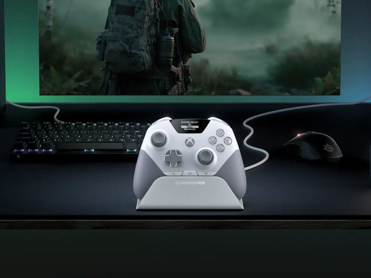
    There is something slightly ridiculous about having a PC and an Xbox sitting on the same desk, then needing to re-pair a gaming controller every time you move from one to the other.  SteelSeries thinks the controller should simply know where it needs to go. That is the idea behind the Aeon Pro. The new wireless gamepad is built around a QuickSwitch Dock that can stay connected to both a PC and an Xbox. Instead of disconnecting one system, pairing with the other, and repeating the process later,
     

SteelSeries Aeon Pro switches between PC and console without re-pairing

9 septembre 2026 à 11:20

There is something slightly ridiculous about having a PC and an Xbox sitting on the same desk, then needing to re-pair a gaming controller every time you move from one to the other.  SteelSeries thinks the controller should simply know where it needs to go. That is the idea behind the Aeon Pro.

The new wireless gamepad is built around a QuickSwitch Dock that can stay connected to both a PC and an Xbox. Instead of disconnecting one system, pairing with the other, and repeating the process later, the controller can switch between them from the dock. SteelSeries says the system is patent-pending and describes it as the first of its kind for Xbox and PC.

Designer: SteelSeries

The dock is also where the Aeon Pro gets its other unusual trick. It holds a second battery while the first one is being used in the controller. When that battery runs low, it can be swapped for the charged one rather than plugging the controller into a cable and waiting. The batteries are the same type used in SteelSeries’ Arctis Nova Pro headsets, which makes the system particularly interesting for anyone already invested in that ecosystem. SteelSeries calls this its Infinite Power System. The numbers are up to 25 hours over 2.4GHz wireless or 28 hours over Bluetooth, although those figures account for the combined use of the two batteries rather than one battery lasting that long on its own. The Aeon Pro can also connect through USB-C and Bluetooth, and supports mobile devices alongside Xbox and PC.

The controller itself follows the now-familiar premium gamepad formula, but pushes it fairly far. Its thumbsticks use Hall-effect sensors, while the triggers can switch between full travel and a shorter hair-trigger setting. There are 18 mechanical switches across the controller and four programmable rear paddles, giving players plenty of ways to alter how they interact with a game. SteelSeries has also avoided burying every adjustment inside an app. A small OLED display built into the controller can show the active device, battery status, and profiles, while letting users remap controls and change settings directly.

PC players can go deeper through SteelSeries GG, including trigger and button configuration, rumble adjustments, and software profiles. Then there are the smaller touches. The thumbsticks are interchangeable, with different shapes and heights supplied in the box, and the spare pieces can be stored in the dock. A textured grip runs around the controller, while its 310-gram weight makes it considerably heavier than a standard Xbox controller, though still lighter than Microsoft’s Elite model.

The catch is the $259.99 price tag. The Aeon Pro costs more than most premium gamepads, including Microsoft’s own Elite-class controller in many markets. That makes the QuickSwitch dock and battery system more than clever conveniences. They are the features that need to justify why this particular controller deserves a permanent spot on a gaming desk.

The post SteelSeries Aeon Pro switches between PC and console without re-pairing first appeared on Yanko Design.

  • ✇Yanko Design
  • The Laptop Bag That Finally Doubles as Your Desk
    Gone are the days when you have to stay inside a cubicle the entire day just to get your work done. A lot of jobs now give people the freedom to work wherever they want, setting up a mini mobile office at a café, in the park, or in the middle of the airport. The challenge for those lucky enough to have that kind of job is lugging around all their so-called tools of the trade. U Space is one of those things you can use to set up a temporary office wherever you need to work. It’s a Swiss-designed
     

The Laptop Bag That Finally Doubles as Your Desk

9 septembre 2026 à 10:20

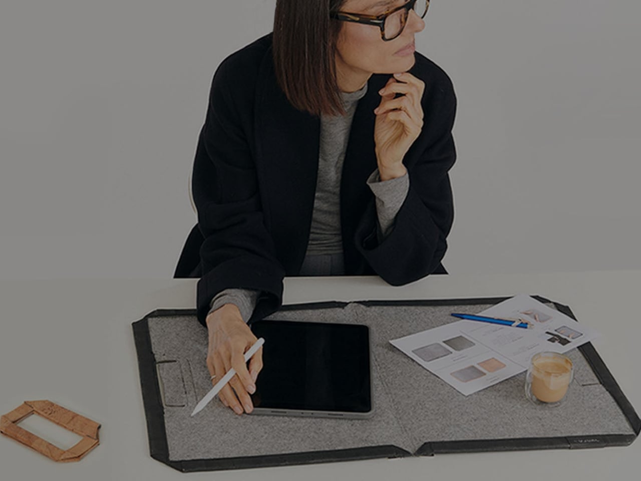
Gone are the days when you have to stay inside a cubicle the entire day just to get your work done. A lot of jobs now give people the freedom to work wherever they want, setting up a mini mobile office at a café, in the park, or in the middle of the airport. The challenge for those lucky enough to have that kind of job is lugging around all their so-called tools of the trade.

U Space is one of those things you can use to set up a temporary office wherever you need to work. It’s a Swiss-designed laptop bag also inspired by the Japanese art of origami. It doesn’t just serve as storage while you’re walking around; it transforms into a mini workspace the moment you unfold it.

Designer: UJUAL

U Space is a “bag that becomes a desk,” and it lets you work in places where it can otherwise be hard to set up office. Even though it’s inspired by origami, it isn’t nearly as complicated as the Japanese art can be. In just one flip-and-fold motion, it unfolds into a flat working surface, making it far more convenient to work on your laptop or notebook while sitting on a chair, at a café table, on a park bench, or even on your lap if there’s nowhere else to work.

When it’s not doubling as your mobile desk, U Space is a multi-mode bag you can wear as a briefcase, messenger bag, or backpack. It’s versatile enough to carry with you whether you’re commuting, walking, or getting around any other way. It also has a three-layer magnet system, so you can quickly grab items like your phone, cables, or pens without digging through the whole bag or even unzipping it.

The bag can carry around 44 pounds (20 kilograms) of gear securely and is built using sustainable, durable materials. It’s available in finishes like Oak Beige, Ebony Black, Sumac Kaki, and Beech Grey, but it can also be customized with different colors and artwork. U Space also comes in a few different sizes, so there’s a version to fit whatever device you’re carrying, whether that’s a compact tablet or a full-size 16-inch laptop.

How does U Space measure up against the competition? Compared to established names like Peak Design, known for its modular Everyday Backpack lineup and its own magnetic accessory system, U Space is playing in a similar space of minimalist design and thoughtful organization. Peak Design has built a loyal following among photographers and digital nomads for how well-organized its bags are, but at the end of the day, even its most versatile bags are still just really good bags. U Space, on the other hand, pushes the idea further by literally changing what a bag can be. Rather than just holding your gear more efficiently, it unfolds into a physical work surface, something you won’t find in mainstream backpack brands. That single feature is what sets U Space apart in a crowded market of laptop bags competing mostly on pockets, zippers, and padding.

At a time when more people are trading their desks for whatever surface is available, U Space offers a genuinely useful solution instead of just another bag with a fresh coat of paint. It’s the kind of product that quietly earns its price by solving a problem you didn’t realize had such a simple fix: not having anywhere to actually put your laptop down. Whether you’re a freelancer bouncing between coffee shops, a student who needs a stable surface between classes, or a frequent traveler tired of balancing a laptop on your knees at the gate, U Space is built with that lifestyle in mind. It’s proof that good design isn’t always about adding more features; sometimes it’s about rethinking the object itself. For anyone whose “office” changes location every day, U Space might be the one accessory that finally keeps up.

The post The Laptop Bag That Finally Doubles as Your Desk first appeared on Yanko Design.

  • ✇Yanko Design
  • IKEA’s Tiny Houses Quietly Admit Your Messy Home Is Fine
    Even though I have enough space to have people over, the fact that my place is terribly messy stops me from inviting family and friends. I don’t want to spend an entire day just stuffing stuff I want to hide into my boxes and closets. That’s not a design problem. That’s a me problem and more specifically, a modern life problem, and it happens to be the exact one IKEA just built a series of dollhouses to talk about. The company recently installed handcrafted miniature homes, built at a precise 1
     

IKEA’s Tiny Houses Quietly Admit Your Messy Home Is Fine

9 septembre 2026 à 09:20

Even though I have enough space to have people over, the fact that my place is terribly messy stops me from inviting family and friends. I don’t want to spend an entire day just stuffing stuff I want to hide into my boxes and closets. That’s not a design problem. That’s a me problem and more specifically, a modern life problem, and it happens to be the exact one IKEA just built a series of dollhouses to talk about.

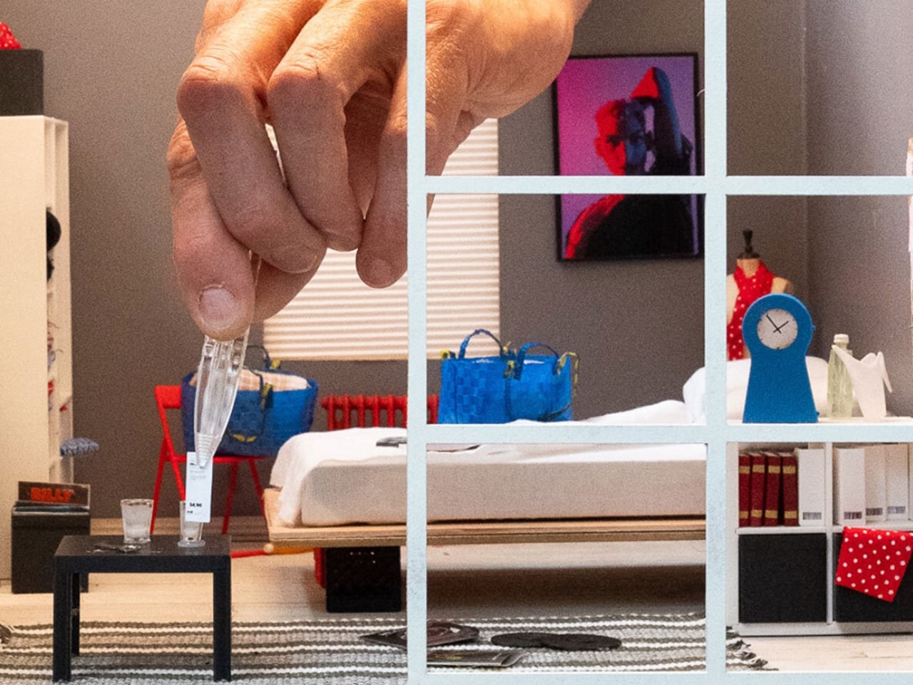
The company recently installed handcrafted miniature homes, built at a precise 1:12 scale, in public spaces across Melbourne, Chengdu, and Beijing. They’re gorgeous, obsessively detailed little things made by Stockholm-based miniature artist Christopher Robin Nordström, who goes by TokyoBuild online. But they’re not really about scale-model furniture. They’re about the fact that our homes are now expected to be office, gym, classroom, and sanctuary all at once, in the same square footage we’ve always had, while somehow still looking like a magazine spread. That expectation is exhausting, and most of us already know it.

Designer: Christopher Robin Nordström for IKEA

IKEA backed this up with a survey of more than 30,000 people across 31 countries, and the headline number is the kind of thing you want to text a friend: 59 percent said they’d rather live somewhere characterful than somewhere manicured. Not a landslide, but a real majority, and a fairly clear rejection of the sterile, everything-matches aesthetic we’ve been sold for the last decade.

I like that the tiny houses lean into locality instead of pretending every home looks the same everywhere. The Melbourne model has a miniature BILLY bookcase stacked with tiny novels and sports memorabilia. The Chengdu and Beijing versions center on scaled-down METOD kitchens instead, because that’s where those homes actually live and breathe. It’s a small choice, but it says the quiet part out loud: nobody’s home is supposed to look like a showroom, because nobody’s life actually happens in a showroom.

Nordström said something that stuck with me more than any stat in the report. He explained that when you build in miniature, you can’t include everything, so every object has to earn its place, and you realize a home isn’t defined by how much it contains but by what people choose to make room for. That’s a graceful way to describe editing your life down to what matters, and it applies just as well at full scale as it does at one twelfth of it.

The behavioral data is where this stops feeling like a marketing campaign and starts feeling like a mirror. Nearly one in five people admit to keeping gifts they never wanted, just to avoid hurting someone’s feelings. More than a quarter hide mementos from past relationships, a habit slightly more common among men. Ten percent have actually canceled plans with friends because their place felt too messy to host, and over a third shuffle clutter from room to room right before guests arrive. Some people use their oven purely for storage, which, if I’m honest, sounds familiar to at least one junk drawer I refuse to open around visitors.

What strikes me isn’t that people are messy. It’s that so many of us are quietly performing tidiness for other people instead of actually living in our own space. IKEA’s pitch, wrapped up in tiny bookshelves and miniature kitchens, is refreshingly modest: you don’t need a renovation to fix that. You need smarter storage and permission to stop apologizing for your actual life.

The tiny houses tour wraps up soon, but IKEA Open House continues in stores through September, built around the same idea at real scale, with the kind of affordable, small-footprint fixes most of us can actually use. Whether or not you ever walk through it, the message is worth sitting with. Perfect homes are rare. Honest ones are just about everywhere, once you stop hiding them.

The post IKEA’s Tiny Houses Quietly Admit Your Messy Home Is Fine first appeared on Yanko Design.

  • ✇Yanko Design
  • 5 EDC Essentials Every College Student Actually Carries This Fall
    Move into a dorm room, and the first thing you learn is that space decides everything. Drawers fill fast, surfaces disappear under notebooks and cables, and whatever doesn’t earn its spot in the first month ends up in a box under the bed. Everyday carry gear gets judged harder here than anywhere else, because there is no junk drawer to hide in and no car trunk to quietly store the things that didn’t make the cut. The five picks below passed that test. Each one solves a specific friction point t
     

5 EDC Essentials Every College Student Actually Carries This Fall

9 septembre 2026 à 07:40

Move into a dorm room, and the first thing you learn is that space decides everything. Drawers fill fast, surfaces disappear under notebooks and cables, and whatever doesn’t earn its spot in the first month ends up in a box under the bed. Everyday carry gear gets judged harder here than anywhere else, because there is no junk drawer to hide in and no car trunk to quietly store the things that didn’t make the cut.

The five picks below passed that test. Each one solves a specific friction point that shows up constantly once the semester starts, whether that is a package piling up at a dorm door, a dark campus path at midnight, a desk that swallows small objects whole, furniture that wobbles on move-in day, or a box that needs opening without scissors nobody can find. Form that earns its place through use, not novelty.

1. Olight Baton 4 Flashlight

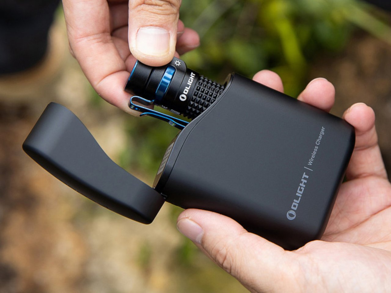
A phone flashlight is a dead end. It drains the battery you need for everything else and delivers a washed-out circle of light that barely reaches ten feet. The Olight Baton 4 solves that with 1,300 lumens in a body that measures 2.48 inches long and weighs 1.85 ounces, small enough to pocket next to a chapstick. A 170-meter throw covers a dark campus path, a parking lot, or a hallway that lost power during a finals week study session.

Five modes handle the full range of real use cases, from the 0.5-lumen moonlight setting that reads battery level without waking a sleeping roommate, all the way up to the turbo burst for actual emergencies. A magnetic base lets it stand upright on a metal desk surface and double as a hands-free lantern, and the two-way clip keeps it on a bag strap without adding meaningful bulk. Charging runs through a proprietary magnetic cable that snaps into position flush with the body, leaving no exposed port to collect dust or wear out.

What We Like

  • 1,300 lumens in a sub-3-inch, 1.85-ounce body means it genuinely replaces a larger light without compromise on output or carry weight
  • The magnetic base converts it from a directional flashlight into a standing lantern, covering two distinct use cases with one object

What We Dislike

  • The proprietary magnetic charging cable means a lost cable is a real problem, with no USB-C fallback to borrow from a classmate
  • Turbo mode steps down automatically after a short burst to manage heat, so sustained maximum brightness requires cycling back up manually

2. CraftMaster EDC Utility Knife

Most utility knives are an afterthought, a plastic slider from a hardware store that lives forgotten in a junk drawer until the blade rusts shut. The CraftMaster treats the utility knife as a precision instrument. At 4.72 inches long and just 8mm thick, it carries like a pen and sits on a desk without looking out of place beside a laptop. The rotating knob that deploys the OLFA blade adds a deliberateness that a standard slider simply never delivers.

The magnetic back docks a companion metal scale, turning a single object into a two-piece system with a built-in blade-breaker for snapping off dull edges without hunting for a separate tool. A 15-degree curvature on the ruler protects fingers during cuts, and the 45-degree inclination geometry handles box opening without risk to whatever is packed inside. OLFA blade compatibility keeps replacement costs low and means refills are available at any hardware store, with no proprietary cartridge system to track down mid-semester.

Click Here to Buy Now: $80.00

What We Like

  • The magnetic scale dock creates a two-piece cutting system without requiring a separate case, sleeve, or additional carry weight
  • OLFA blade compatibility keeps long-term costs minimal and replacements universally available without planning around a proprietary format

What We Dislike

  • The utility blade format limits versatility outside of cutting and scoring tasks compared to a folding knife with a more general-purpose tip geometry
  • The 8mm profile, while genuinely slim for a utility knife category, still feels rigid compared to a traditional folding knife for one-handed carry

3. Orbitkey Grid Organizer

Every dorm desk looks the same by the second week of classes: a charging cable coiled around a pen, loose change mixed with an SD card, and two pens that stopped working sometime during the first lecture. The Orbitkey Grid Organizer is a modular tray built around that exact situation, with a customizable divider layout that separates small objects by category rather than letting everything pool into an indistinguishable pile at the corner of a desk that doubles as a living space.

Orbitkey spent years refining the idea of contained carry, beginning with its key organizer and continuing through the Nest desktop tray. The Grid Organizer applies the same logic to desk surfaces rather than pockets, with soft tactile materials and a compact footprint that fits even the smallest dormitory desk without eating the working area under a laptop. The understated color palette reads as intentional rather than as office supply clutter, which matters considerably when a desk is simultaneously a workspace, a dining surface, and the only flat space in the room.

What We Like

  • The modular grid layout adapts to what you actually own rather than forcing a fixed compartment system onto objects that don’t fit neatly
  • The compact footprint fits a dorm desk without consuming the working area directly under a laptop or monitor

What We Dislike

  • Dividers follow a fixed grid pattern rather than a fully freeform arrangement, so oddly shaped items still end up wedged at uncomfortable angles
  • It solves desktop organization at home base but contributes nothing once you step out the door, which limits its usefulness to a single context

4. ClearSlide Box Opener

Every semester opens with the same ritual: a stack of deliveries outside a dorm door, a search for scissors, then a search for a box cutter, then giving up and tearing tape by hand. The ClearSlide exists specifically for that recurring problem. A transparent polycarbonate body lets you watch the internal mechanism shift between lock, cutter, and scissors modes with a single thumb motion, and each position locks in with a distinct click before the blade engages. Nothing is guessed at or fumbled.

The blade extends only 0.12 inches, deep enough to slice through packing tape without threatening whatever is packed inside, and a strap hole at the base means it clips to a backpack rather than disappearing into a drawer until the next delivery arrives. The transparent shell is the detail that separates it from every other box opener in this category. Watching the mechanism move is genuinely satisfying in a way that makes it the tool you actually reach for, rather than the one you remember only after the package is already open.

Click Here to Buy Now: $30.00

What We Like

  • The transparent polycarbonate shell reveals the internal mechanism shifting in real time, making a mundane daily task feel considered and deliberate
  • The 0.12-inch blade depth protects package contents during cuts without requiring a guard, a cover, or any extra step before use

What We Dislike

  • The shallow blade depth requires two or three passes on thick double-taped moving boxes rather than delivering one clean, single-motion slice
  • The strap hole keeps it accessible, but there is no integrated pocket clip, so keeping it truly on-person requires a carabiner or lanyard to make it work

5. CRKT Septimo Multi-Tool

Dorm furniture wobbles. Bottles need opening. Something always requires a screwdriver that nobody in the building seems to own. The CRKT Septimo was designed by Jeremy Valdez, a veteran of the 7th Special Forces Group, around the premise that a folding knife alone cannot cover the situations a student actually encounters week to week. Fold it open, and a bottle opener, a flathead and Phillips screwdriver, and an adjustable wrench are all present in a single body that fits in a jeans pocket.

The 2.86-inch American Tanto blade uses a liner lock and Veff serrations for cutting tasks from trimming cord to opening shipping tape, while a glass breaker tip and black oxide finish give it the durability that a cheap multi-tool never manages past the first semester. At 4.4 ounces with a pocket clip, it carries without becoming dead weight in a bag side pouch, and the adjustable wrench alone covers the kind of furniture fixes and move-in assembly tasks that a standard pocket knife is simply not built to handle.

What We Like

  • A real adjustable wrench folded into a knife-sized body covers furniture repairs and hardware tasks that a standard pocket knife ignores entirely
  • The liner lock and Veff serrations add genuine cutting utility without inflating the overall profile or carry weight

What We Dislike

  • The screwdriver covers only one Phillips size and a small flathead, which limits usefulness for anything requiring a larger or more specific bit
  • The Tanto tip excels at piercing and cord cutting but handles general everyday slicing tasks less elegantly than a drop point or clip point geometry would

The Gear That Actually Stays

None of these five objects is designed to impress at first glance. A flashlight, a utility knife, a desk tray, a multi-tool, and a box opener do not photograph like a product launch, and that is the point. They photograph like what they are: tools that solve specific, recurring problems without asking you to think about them. That kind of restraint is genuinely harder to design than it looks, and considerably more valuable in a dorm room than gear that costs twice as much.

What ties them together is the same quality that makes good everyday carry work in a small shared space: each one earns its place through repeated use rather than novelty, and none of them needs a junk drawer to disappear into. They stay out on the desk or clipped to the bag because they get reached for often enough to justify it. That is the real standard for EDC, and it is harder for most products to meet than their marketing ever admits.

The post 5 EDC Essentials Every College Student Actually Carries This Fall first appeared on Yanko Design.

  • ✇Yanko Design
  • Laptops Sealed Computers Shut, ARTISAN ALTO Snaps Them Back Open
    Home computers used to snap open like toolboxes, cartridges sliding in for a new game or a new skill. That idea mostly disappeared once sealed laptops took over, but the ARTISAN ALTO AT-101 brings it back with a vermilion shell that looks like it walked straight out of 1984 and a system built for how people actually tinker today. It’s a machine designed to grow alongside whatever you’re currently obsessed with. The trapezoidal red housing wastes no time signaling its intentions. Sculpted, conca
     

Laptops Sealed Computers Shut, ARTISAN ALTO Snaps Them Back Open

Par : JC Torres
9 septembre 2026 à 06:07

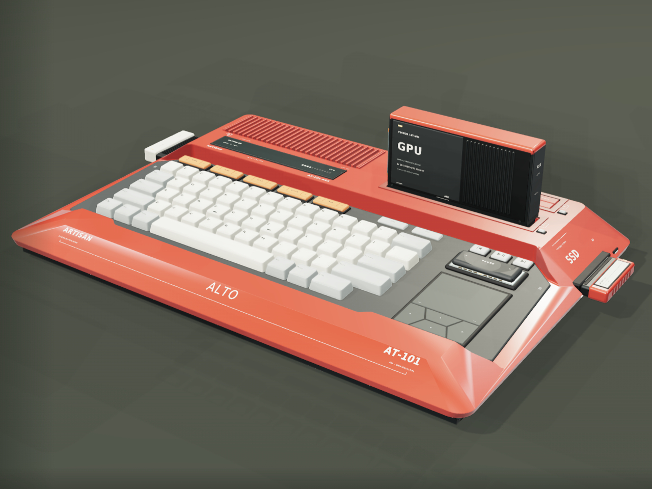
Home computers used to snap open like toolboxes, cartridges sliding in for a new game or a new skill. That idea mostly disappeared once sealed laptops took over, but the ARTISAN ALTO AT-101 brings it back with a vermilion shell that looks like it walked straight out of 1984 and a system built for how people actually tinker today. It’s a machine designed to grow alongside whatever you’re currently obsessed with.

The trapezoidal red housing wastes no time signaling its intentions. Sculpted, concave ivory keycaps sit beside red cooling louvres, and a keyboard opening cuts diagonally through the sloping side, turning what could’ve been a flat slab into something with genuine presence on a desk. This is a machine built to be looked at, not tucked behind a monitor.

Designer: Leo Botinelly

That vintage-inspired shell hides a distinctly modern expansion idea. Upright cartridges slot into place to add graphics power, sound capability, retrocomputing modes, or an AI companion, while smaller side modules handle specialist interfaces and individual projects. Recording a demo, building out a more ambitious scene, or reviving an old favorite game all become a matter of swapping in the right module rather than replacing the whole machine.

The standout pairing puts VECTOR, a compute cartridge, alongside COMPANION, an AI agent module with its own ivory-crowned housing. Together they form what the concept calls a personal cyberdeck, one where your context and your processing power both live in the same two bays. Everything from your conversation history to your working files stays local, an intentional counterpoint to how most AI tools currently function.

Five multifunction keys handle creative shortcuts without forcing a trip through a menu, while a dedicated PAUSE rocker lets you freeze, rewind, or speed through whatever’s running, treating time itself as something you can grab and adjust mid-task. A touchpad and four flush cursor keys merge into a single continuous surface on the right side, keeping navigation under the same hand that’s already resting there.

Flip the machine over and the same philosophy continues. Memory access sits in the open rather than buried under layers of casing, rear supports adjust to match your desk setup, and a single screw releases the service clamp entirely. Every one of these choices treats a computer’s insides as something worth respecting, not hiding behind warranty stickers and proprietary screws.

Around back, a compact connector panel handles the practical side of daily use. USB-C power sits alongside labeled ports for two cartridges, additional USB-C connections, LAN, HDMI, USB-A, and audio, all routed cleanly to keep cables from tangling across the front of a desk. Even the exhaust vents get a considered shape, flanking the connector panel like a pair of small turbines venting heat from all that cartridge-driven ambition.

The post Laptops Sealed Computers Shut, ARTISAN ALTO Snaps Them Back Open first appeared on Yanko Design.

  • ✇Yanko Design
  • Clear-Shell Game Boys Never Made the Screen Transparent, Arduview Did
    Every gadget on a desk is built to hide what makes it work. Phones, consoles, controllers, they’re all sealed slabs designed to keep the copper and silicon out of sight. Arduview refuses that logic entirely. Its shell is clear, its circuit board is clear, and its OLED display lets you watch pixels light up while seeing straight through to the components producing them. Retro handhelds have flirted with transparency before. Clear-shell Game Boys and modded Miyoo units let you glimpse a shadow of
     

Clear-Shell Game Boys Never Made the Screen Transparent, Arduview Did

Par : JC Torres
9 septembre 2026 à 05:15

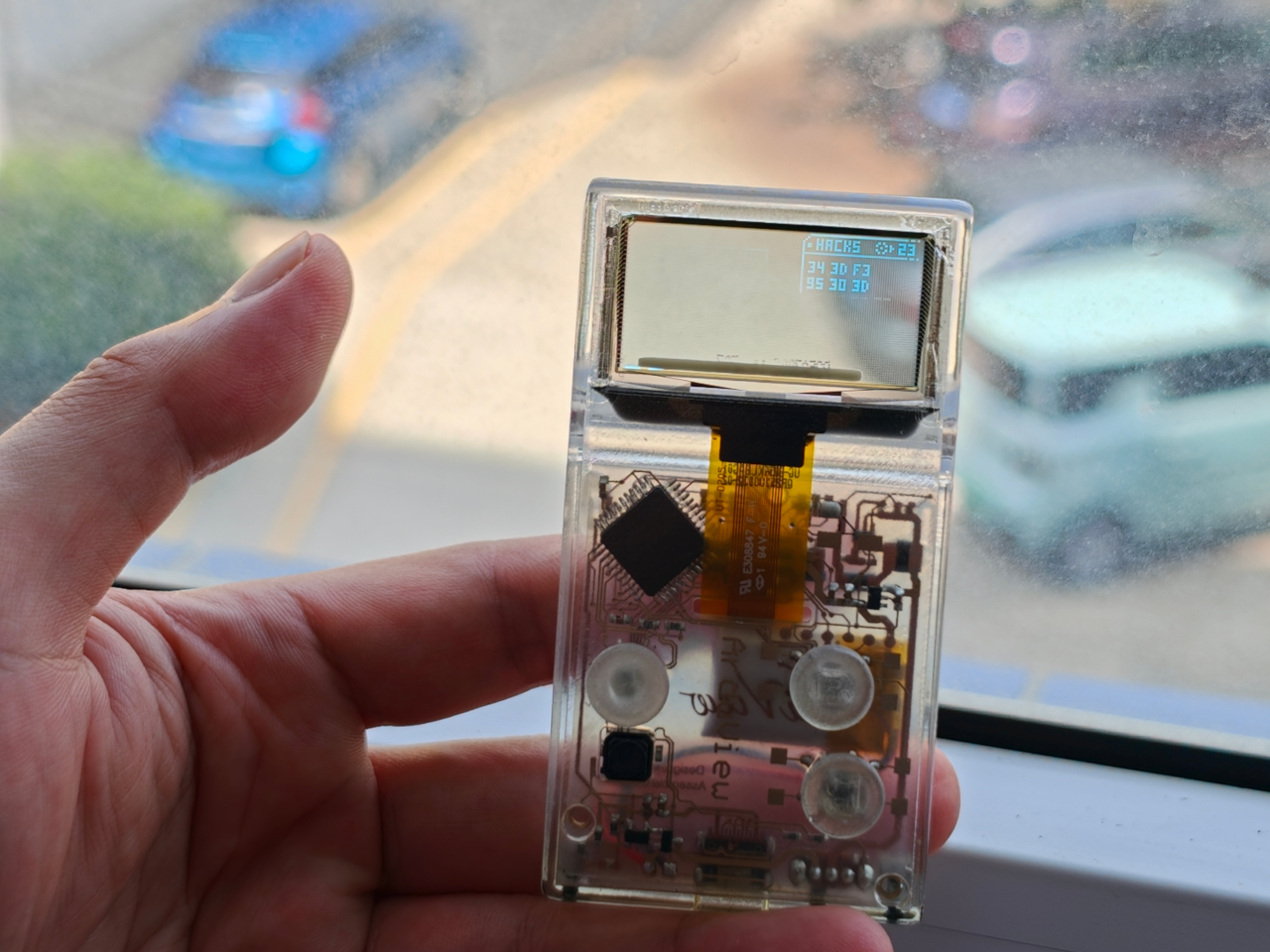
Every gadget on a desk is built to hide what makes it work. Phones, consoles, controllers, they’re all sealed slabs designed to keep the copper and silicon out of sight. Arduview refuses that logic entirely. Its shell is clear, its circuit board is clear, and its OLED display lets you watch pixels light up while seeing straight through to the components producing them.

Retro handhelds have flirted with transparency before. Clear-shell Game Boys and modded Miyoo units let you glimpse a shadow of the board through tinted plastic, but the display itself stayed opaque, a black rectangle sitting in an otherwise see-through frame. Arduview closes that gap by making the screen itself transparent, so nothing on the device breaks the illusion of looking clean through it.

Designer: Louis Huang

Peer through the front and the internals aren’t just visible; they’re the entire visual identity. The board, the chip, an orange copper flex cable, the button domes, and the USB-C port all sit in plain view, arranged the way a watchmaker might arrange gears behind sapphire crystal. Nothing here was designed to be hidden later. It was designed to be looked at from day one.

That philosophy extends to how the thing works, not just how it looks. Built on Arduboy, an open-source handheld platform, Arduview skips the layers that usually complicate small electronics. There’s no app store hunting, no Wi-Fi pairing, no account setup standing between you and 400 preloaded games. Power it on and it plays, the same instant gratification that made simple handhelds addictive in the first place.

At 50 grams and roughly the footprint of a credit card, the size does real work here. A device this small and this light stops being a dedicated gaming session and starts being something you carry the way you’d carry a keychain or a pocketknife, small enough to disappear until the moment you want it. Pull it out on a train platform or set it on a desk between meetings, and it reads less like a toy and more like a curiosity someone can’t resist picking up.

That reaction seems to be the entire point. A transparent gadget invites touching in a way an opaque one never does, because there’s an implicit dare in showing your internals: come look closer. Arduview leans into that dare completely, treating the space usually reserved for a case as prime real estate for the very thing most companies spend their design budgets concealing.

Retro gaming has always had a strong current of nostalgia running through it: chunky buttons, pixel art, low-resolution charm. Arduview borrows all of that while adding something genuinely new to the mix: a device that looks like it belongs in a display case at a design museum as much as it belongs in a pocket.

The post Clear-Shell Game Boys Never Made the Screen Transparent, Arduview Did first appeared on Yanko Design.

  • ✇Yanko Design
  • The 8BitDo Ultimate 3E Is the LEGO Set of Gaming Controllers
    Most controllers ask you to adapt to them. The 8BitDo Ultimate 3E flips that arrangement entirely, building a controller around the idea that your hands, your genre, and your platform should decide its shape instead of the factory floor. The face buttons, the d-pad, and even the joystick tops snap in and out as swappable modules, turning what’s usually a sealed, one-size-fits-all object into something closer to a toolkit. Pop off the magnetic faceplate and the accessory pack reveals its real pu
     

The 8BitDo Ultimate 3E Is the LEGO Set of Gaming Controllers

Par : JC Torres
9 septembre 2026 à 04:15

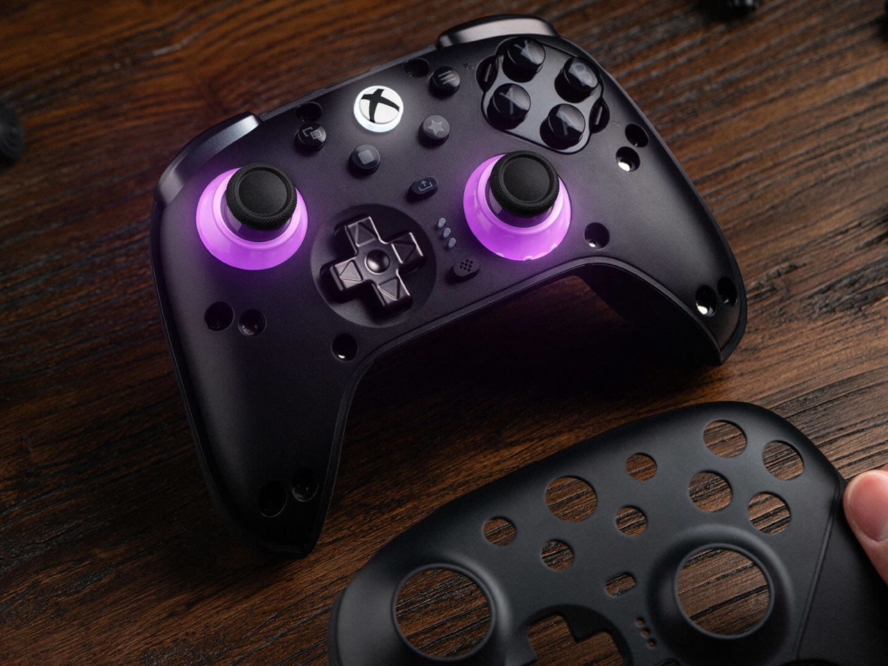
Most controllers ask you to adapt to them. The 8BitDo Ultimate 3E flips that arrangement entirely, building a controller around the idea that your hands, your genre, and your platform should decide its shape instead of the factory floor. The face buttons, the d-pad, and even the joystick tops snap in and out as swappable modules, turning what’s usually a sealed, one-size-fits-all object into something closer to a toolkit.

Pop off the magnetic faceplate and the accessory pack reveals its real purpose. A silicone membrane d-pad sits next to a tactile micro-switch version, and the joysticks come in tall, dome, and thick-neck shapes, each suited to a different grip or genre. Racing games favor a different thumb position than platformers, and for once, the hardware bends to match instead of forcing a single compromise across everything you play.

Designer: 8BitDo

Underneath those swappable caps, the joysticks themselves run on Tunneling Magnetoresistance sensors, a technology built specifically to resist the drift that eventually creeps into analog sticks after enough hours of use. Interactive RGB fire rings pulse around the base of each stick, translating movement into visual feedback in real time, a small touch that turns an otherwise invisible input into something you can actually watch respond.

The triggers carry their own bit of adaptability. Hall-effect sensors power two selectable trigger-stop positions, letting a shooter’s hair-trigger tap coexist with a racing game’s need for a longer, more gradual pull. Switching between them takes a flick of a physical switch, not a trip through a menu, which matters when a genre change happens mid-session rather than between them.

Connectivity spreads just as wide as the physical customization. The Ultimate 3E runs 2.4G wireless and wired modes for Xbox and PC, and switches to Bluetooth for mobile devices, now backed by a USB-C signal adapter for steadier range across more rooms and setups. Apple has officially signed off on compatibility too, covering iPhone, iPad, Mac, Apple TV, and even Apple Vision Pro, stretching the controller’s use well past the console it was designed around.

An integrated wireless charging dock handles power without cables cluttering a desk, while two pro-level back buttons and a pair of extra-fast bumpers add inputs for players who map more complex combinations. Three custom profiles let different games, or different people, keep their own configuration ready to load instantly, and a 3.5mm jack keeps wired headphones in the mix for anyone who still prefers a physical connection over Bluetooth audio.

None of this treats customization as an afterthought bolted onto a finished product. Every swappable piece, every sensor choice, feels like it was scoped out before the shell was ever molded, built around the idea that serious players tend to have very specific, very personal preferences about how a controller should feel in their hands.

The post The 8BitDo Ultimate 3E Is the LEGO Set of Gaming Controllers first appeared on Yanko Design.

  • ✇Yanko Design
  • Your Second Screen Can Finally Work With No Cables and No Outlet
    Desks are overrated. So are the cables that come with them. The 4URPC is a 15.6-inch wireless touchscreen monitor built for people who’d rather not be chained to an outlet just to get a bigger screen. It’s slim, self-powered, and ready to mirror whatever’s on your phone, tablet, or laptop the moment you need more room to work, watch, or play. Cutting the cord doesn’t mean cutting functionality. The monitor mirrors an iPhone or Android device through a peer-to-peer wireless connection, no home W
     

Your Second Screen Can Finally Work With No Cables and No Outlet

Par : JC Torres
8 septembre 2026 à 21:45

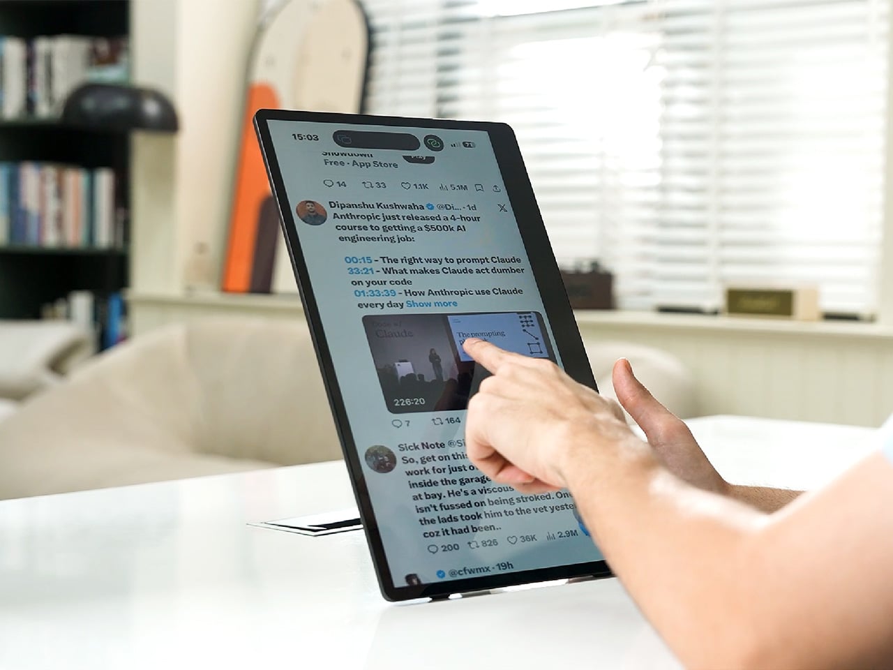
Desks are overrated. So are the cables that come with them. The 4URPC is a 15.6-inch wireless touchscreen monitor built for people who’d rather not be chained to an outlet just to get a bigger screen. It’s slim, self-powered, and ready to mirror whatever’s on your phone, tablet, or laptop the moment you need more room to work, watch, or play.

Cutting the cord doesn’t mean cutting functionality. The monitor mirrors an iPhone or Android device through a peer-to-peer wireless connection, no home Wi-Fi or app required. For streaming platforms like YouTube, Netflix, or Hulu, connecting to Wi-Fi and tapping the built-in TV Cast icon sends video to the screen. Either way, there’s no dongle to lose or cable to untangle before the movie starts.

Designer: 4URPC

Click Here to Buy Now: $219 $399 (45% off). Hurry, only 451/600 left! Raised over $181,000.

The more interesting trick happens after mirroring starts. The 10-point touchscreen can send input back to the connected phone, turning the monitor into a larger, shared control surface. Flip through photos with a friend, walk a colleague through a presentation, or hand someone the reins without handing over your phone. It’s a shift that makes shared screen time less awkward.

None of this would matter much if the monitor were bulky. At half an inch thick and just over 2 pounds, it’s built to disappear into a backpack rather than dominate it. The matte, textured shell keeps fingerprints and glare to a minimum, and a fold-out kickstand on the back means setup takes seconds on a desk, a kitchen counter, or the arm of a couch.

A built-in 4,000 mAh battery backs up that portability by taking the wall outlet out of the equation. Setting up on a train, in a hotel room, or on a patio doesn’t mean scouting for the nearest plug first. That same battery can lend a charge to a connected phone, turning the monitor into a backup power bank when the moment calls for it.

Plug it into a laptop with a USB-C cable, and the 4URPC switches roles, becoming an extended display rather than a wireless mirror. Dragging a browser tab, a chat window, or a reference document onto the second screen takes a second, and the touchscreen works over the wired connection. The laptop stays focused on the main task while the extra display handles everything else.

The screen also rotates between landscape and portrait without any fuss, which sounds minor until it changes how you use it day to day. Landscape suits video calls, games, and spreadsheets, while portrait mode fits scrolling through documents, reading long articles, or checking social feeds. Switching between the two takes a twist of the stand, not a trip through a settings menu.

Compatibility runs wide enough that most people won’t need to think twice before connecting. Wireless mirroring covers iPhones, Android phones running version 10 or later, MacBooks, and most Windows laptops, while the wired USB-C or HDMI input works with game consoles, streaming boxes, and the Nintendo Switch. There’s no software to install and nothing to configure; connecting the device and turning it on is the entire setup process.

Under the glass sits a 1920×1080 matte IPS panel running at 60 Hz, built more for comfortable, glare-free sessions than eye-popping color numbers. Dual USB-C ports split power delivery and video duties, small stereo speakers cover casual audio, and a VESA mount plus a standard camera screw thread add mounting options beyond the built-in stand. It’s a practical set of choices rather than a flashy one.

There’s something telling about a monitor that assumes you won’t always be sitting at the same desk tomorrow. Work has scattered across kitchen tables, coffee shops, and airport gates for a while now, and screens are only starting to catch up. The 4URPC doesn’t try to be the sharpest or brightest display around; it just tries to be wherever you happen to land next.

Click Here to Buy Now: $219 $399 (45% off). Hurry, only 451/600 left! Raised over $181,000.

The post Your Second Screen Can Finally Work With No Cables and No Outlet first appeared on Yanko Design.

  • ✇Yanko Design
  • Keycap-shaped Perfume Bottle Bridges Nerd Culture and Fashion Fragrances
    Somebody who has strong opinions about Cherry MX switch actuation force is not, statistically speaking, somebody who wears cologne. I say this with love, having been both people at different points. Igor Mitin’s PUSHHH concept ignores that overlap problem entirely and builds a perfume around the keyboard key, putting a chunky square cap on the bottle that doubles as the plunger. Mitin runs with that mismatch instead of avoiding it, treating the cap less like hardware and more like a gesture eve
     

Keycap-shaped Perfume Bottle Bridges Nerd Culture and Fashion Fragrances

8 septembre 2026 à 20:30

Somebody who has strong opinions about Cherry MX switch actuation force is not, statistically speaking, somebody who wears cologne. I say this with love, having been both people at different points. Igor Mitin’s PUSHHH concept ignores that overlap problem entirely and builds a perfume around the keyboard key, putting a chunky square cap on the bottle that doubles as the plunger. Mitin runs with that mismatch instead of avoiding it, treating the cap less like hardware and more like a gesture everyone already knows from their phone. One push, and the bottle behaves like a message you just fired off to someone.

Mitin works out of Melbourne as an art director who has spent his career on fragrance and beauty packaging, picking up a Pentawards Gold in 2024 and a Red Dot Design Concept award in 2022, on top of a Best of the Best Red Dot Design Concept win back in 2011. PUSHHH is his own self initiated project, built without a client breathing over his shoulder, which probably explains why it gets to be this playful. Each scent carries a one word name you would actually type, CRUSH, XOXO, COOL, YAY, and OMG, printed straight across the face of the cap. The glass underneath is a squat rounded square in transparent red, pink, amber, and teal, sized closer to something you would clip onto a bag than something you would park on a dresser.

Designer: Igor Mitin

Keyboard people take their keycaps seriously, hunting down artisan sculpts through drops that sell out before the page finishes loading, and PUSHHH lifts that exact silhouette and plants it on a category that usually behaves nothing like that. Perfume branding loves hushed minimalism, black serif type, a name in French nobody can pronounce right. PUSHHH walks in the opposite direction entirely, leans all the way into the keyboard bit, and somehow the whole thing still reads as a coherent, good looking object rather than a gimmick bolted onto glass.

The system around the bottle keeps the joke going in the best way. Keychain minis, collectible colorways, and personalized gift editions all stretch the one push idea into things you would genuinely want to wear, and campaign lines like “Say it. Spray it. Wear it.” lean into the texting bit with a straight face. Mitin’s own flat lays stage the bottles next to headphones, sunglasses, a Casio, and keyring charms, and that styling choice tells you exactly what PUSHHH thinks it is. Not a fragrance counter object. A bag charm sitting proudly next to your Labubu.

What I like most is how specific the whole thing is. A lot of concept fragrance work chases a vague mood, some smoke and a moodboard and a name that sounds expensive. PUSHHH picked one clean idea, the keyboard key as plunger, and let every other decision follow from it, the colors, the words, the merch, the styling. That kind of discipline is rare even in briefed, paid work, let alone something Mitin built purely because the idea was fun enough to chase. I would buy the CRUSH bottle off a shelf the second it existed, and honestly, that is the whole review.

The post Keycap-shaped Perfume Bottle Bridges Nerd Culture and Fashion Fragrances first appeared on Yanko Design.

  • ✇Yanko Design
  • Japanese Designers Just Solved the Dead Battery Diffuser Problem
    There are several times a day when you’ll want to sit down and take in the aroma of your favorite essential oils. It might be early in the morning to help you wake up, right when you start work and need a boost of energy, at the end of the day when you’re relaxing, journaling, or reading, or right before bed so the scent can help you settle into a good night’s sleep. At any of those moments, your oil diffuser is your best friend, that is, unless it runs out of battery or charge right in the mid
     

Japanese Designers Just Solved the Dead Battery Diffuser Problem

8 septembre 2026 à 19:30

There are several times a day when you’ll want to sit down and take in the aroma of your favorite essential oils. It might be early in the morning to help you wake up, right when you start work and need a boost of energy, at the end of the day when you’re relaxing, journaling, or reading, or right before bed so the scent can help you settle into a good night’s sleep. At any of those moments, your oil diffuser is your best friend, that is, unless it runs out of battery or charge right in the middle of your routine.

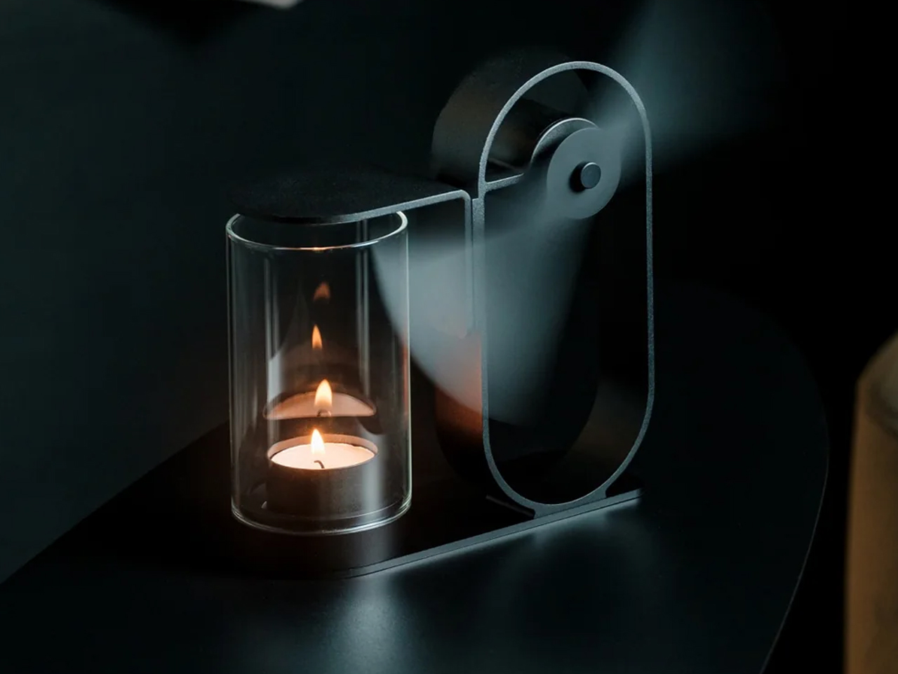
If you’re using the Battery-Free Aroma Diffuser, that’s one problem you’ll never have. As the name suggests, it’s completely battery-free and skips the fancy ultrasonic tech found in most diffusers on the market. All you need is a candle; its rising heat spins a built-in propeller that carries the scent of your essential oil of choice, and you’re all set to relax or recharge, whichever one you need. Setting it up becomes part of your morning or nighttime ritual, giving you what’s been called “magic powered by a single flame.”

Click Here to Buy Now: $290.00

This diffuser was designed by Yu Ito and Yoshimi Kemmotsu of SOL style. Most diffusers on the market run on batteries, charging cables, and plastic ultrasonic components. This one skips all of that and works on nothing more than physics, heat, and fire. Its minimalist, elegant design only adds to the “magic” of the experience, as you watch your essential oils fill the room in a way that feels almost mystical. Because so much of the piece is transparent, you can see exactly how it works, from the flickering candle flame to the visibly spinning propeller above it.

The process of using the diffuser is refreshingly simple and doesn’t involve a lot of steps. Start by placing your essential oil of choice in the dedicated compartment located at the center of the propeller. Light a candle and set the cover in place. Wait about two to three minutes for the rising heat to spin the built-in propeller, and once it’s turning, it will carry the scent of your oils and fill the space around you.

The diffuser itself is built from aluminum, glass, and iron, materials chosen for being sustainable and long-lasting, so you’re not contributing to the pile of dead batteries or broken plastic housings that come with most electric diffusers. Because it needs no outlet and no batteries, it’s also completely portable. Set it up on your dining table, your nightstand, or even take it outside for a quiet evening on the patio.

If you’ve shopped for a diffuser before, you’ve likely come across a big name like Vitruvi, whose Stone Diffuser is frequently ranked among the best overall by outlets like Wirecutter and InStyle. Vitruvi’s design is genuinely beautiful, but it’s still an electric, ultrasonic device that needs to be plugged in or charged to run. More budget-friendly brands like InnoGear and Urpower take a similar ultrasonic approach at a much lower price, but they typically trade craftsmanship and material quality for affordability, leaning on plastic components that don’t hold up as well over time.

The Battery-Free Aroma Diffuser doesn’t try to compete on mist output, app connectivity, or color-changing lights. Instead, it carves out its own lane by focusing on ritual, sustainability, and craftsmanship. You won’t get smart features or adjustable settings, but you also won’t ever need to charge it, replace a battery, or worry about internal electronics failing. It does come at a premium, priced around $249 compared to the roughly $30 to $130 range most ultrasonic diffusers occupy, but for design lovers and sustainability-minded shoppers, that price reflects a genuinely different kind of product rather than just another gadget competing on specs.

At the end of the day, the Battery-Free Aroma Diffuser isn’t trying to be the most powerful or the most tech-forward diffuser on your shelf, it’s trying to be the most memorable. Whether you’re using it to ease into your morning coffee, get into a work groove, unwind after a long day, or settle in before bed, lighting that single candle and watching the propeller slowly spring to life feels far more intentional than simply pressing a power button. It won’t die mid-session, won’t need a replacement battery, and won’t end up as e-waste a few years down the line. For anyone looking to turn aromatherapy into an actual experience rather than just another appliance to switch on, this quiet, flame-powered design might be one of the most beautiful ways to get there.

The post Japanese Designers Just Solved the Dead Battery Diffuser Problem first appeared on Yanko Design.

  • ✇Yanko Design
  • The $100 Keypad That Puts Each AI Coding Tool Behind Its Own Button
    Every developer juggling AI agents right now knows the feeling of context switching until the whole workflow blurs together. Copilot suggests something in one window, Claude Code runs a task in another, and a dozen prompts live scattered across notes and muscle memory. The Logitech MX Keypad exists to collapse all of that into nine small screens sitting next to the keyboard, each one a physical shortcut into a specific piece of that chaos. Every key on the keypad carries its own full-color LCD
     

The $100 Keypad That Puts Each AI Coding Tool Behind Its Own Button

Par : JC Torres
8 septembre 2026 à 10:20

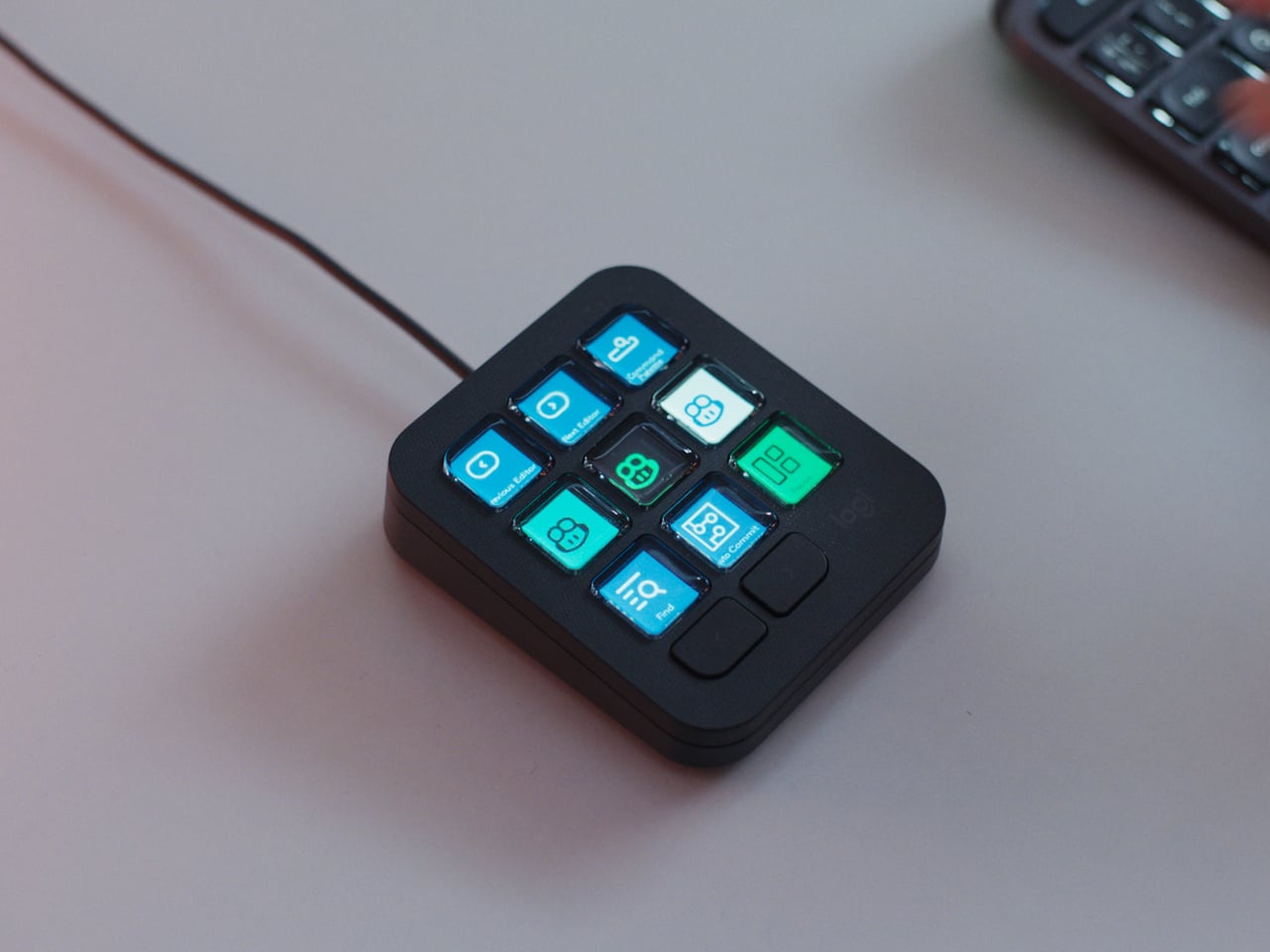
Every developer juggling AI agents right now knows the feeling of context switching until the whole workflow blurs together. Copilot suggests something in one window, Claude Code runs a task in another, and a dozen prompts live scattered across notes and muscle memory. The Logitech MX Keypad exists to collapse all of that into nine small screens sitting next to the keyboard, each one a physical shortcut into a specific piece of that chaos.

Every key on the keypad carries its own full-color LCD display, so instead of memorizing which function key does what, you glance down and see an icon that actually represents the command underneath it. Press one, and it can refactor a function, trigger a prompt macro, or hand off a task to an AI agent entirely. That small visual feedback loop turns an abstract keyboard shortcut into something closer to a labeled button on a control panel.

Designer: Logitech

What makes the hardware worth paying attention to is where Logitech chose to draw the compatibility line. Instead of building this around one coding environment, the MX Keypad works across GitHub Copilot, Claude Code, VS Code, and IntelliJ IDEA at once. A developer bouncing between an IDE and a terminal-based AI agent doesn’t need separate tools for each, just a different page of keys pulled up on the same nine buttons.

That pattern of paging matters more than it sounds. The keypad can hold multiple profiles, so switching from a Python project running through Copilot to a JavaScript refactor handled by Claude Code becomes a single tap rather than a mental reset. Anyone who has lost a train of thought hunting through browser tabs for the right prompt will recognize the value in never breaking eye contact with the code itself.

Underneath the surface, the MX Keypad ships with prebuilt plugins that Logitech had developers test directly against real coding platforms, rather than shipping generic templates and hoping they fit. An SDK opens the door further, letting teams build their own tools around internal workflows, while a community marketplace means the plugin library keeps growing without waiting on Logitech’s own release schedule.

None of that ambition comes wrapped in bulky, wasteful materials either. The body is made with recycled plastics, keeping the hardware in line with the sustainability commitments Logitech has built into its broader MX ecosystem. It is a small detail, but for a device meant to live permanently on a desk, it matters that the object itself doesn’t feel disposable.

At $99.99, the MX Keypad occupies a strange but clarifying position in a developer’s setup. It doesn’t replace a keyboard, and it doesn’t try to be an AI tool in its own right. Instead, it works like a translator between fast-moving human intent and the growing swarm of coding agents developers now manage daily, one labeled key at a time.

The post The $100 Keypad That Puts Each AI Coding Tool Behind Its Own Button first appeared on Yanko Design.

  • ✇Yanko Design
  • An Android Drawing Tablet With 127 Layers That Still Feels Like Paper
    Most Android drawing tablets make you choose between a screen that feels like paper and hardware fast enough to keep up with a real workflow. The Kamvas Pad 12 refuses that trade-off. Huion built a 12.2-inch standalone tablet around a textured, paper-like display and paired it with enough processing power to hold 127 layers open without stuttering, treating the screen as a genuine canvas rather than a stylus afterthought. That screen runs a 3:2 aspect ratio instead of the usual 16:9, and the di
     

An Android Drawing Tablet With 127 Layers That Still Feels Like Paper

Par : JC Torres
8 septembre 2026 à 09:20

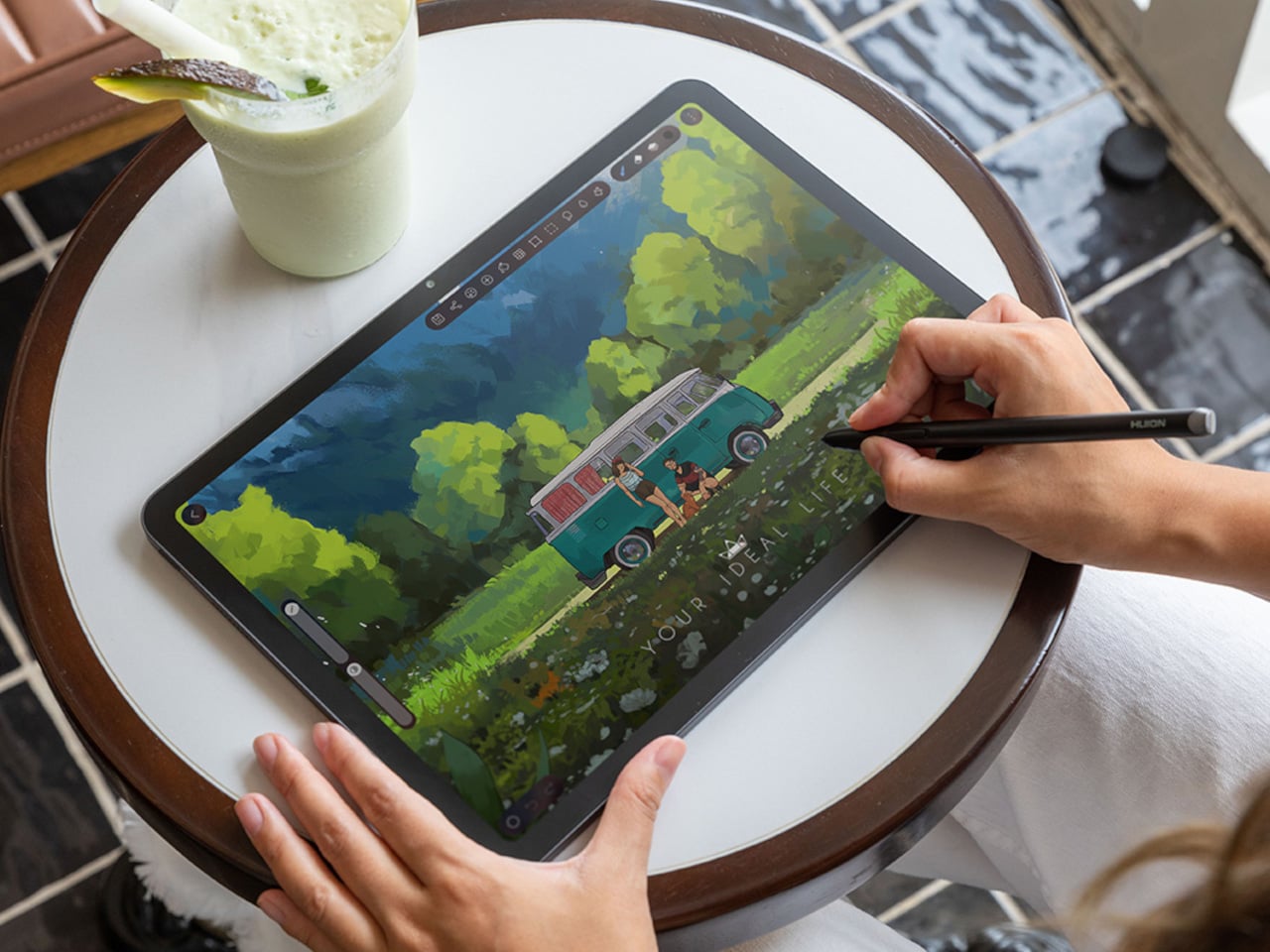
Most Android drawing tablets make you choose between a screen that feels like paper and hardware fast enough to keep up with a real workflow. The Kamvas Pad 12 refuses that trade-off. Huion built a 12.2-inch standalone tablet around a textured, paper-like display and paired it with enough processing power to hold 127 layers open without stuttering, treating the screen as a genuine canvas rather than a stylus afterthought.

That screen runs a 3:2 aspect ratio instead of the usual 16:9, and the difference shows up the moment you start sketching. A wider canvas means fewer awkward crops when composing a portrait or a page layout, and it doubles as a better shape for reading documents or comics without letterboxing. Combined with a 90Hz refresh rate, linework tracks the pen smoothly instead of lagging a beat behind your hand.

Designer: Huion

Canvas Glass 3.0 does the quieter work here. The surface is nano-etched for texture, so the pen tip grips the way it would on actual paper, while a soft-light treatment and anti-glare coating keep long sessions from turning into eye strain. Setting up near a window or working outdoors doesn’t wash out the display, which matters more than most spec sheets give it credit for.

The PW600C pen leans into that same philosophy of getting out of the way. It’s battery-free, weighs just 12 grams, and snaps magnetically onto the tablet body instead of needing a separate case or loop. Someone sketching on a train can toss the pen against the tablet’s edge between stops and trust it’ll still be there, without fishing through a bag for a charging cable or a lost cap.

Underneath, an eight-core MediaTek Genio 720 chip and 8GB of RAM handle the kind of multitasking that used to choke budget Android tablets, running multiple layers and apps without the frame drops that make digital painting frustrating. At 16,384 pressure levels and 60-degree tilt support, the stylus itself translates a feather-light highlight or a bold ink stroke with the kind of nuance that used to be reserved for pricier displays.

Storage tops out at 256GB onboard with room to expand to 1TB, so a growing library of finished pieces, reference photos, and half-done sketches doesn’t force anyone into constant cleanup. Android 16 and full Google Play access mean the tablet isn’t locked into a single app either. Clip Studio Paint, ibisPaint X, MediBang Paint, and Huion’s own HiPaint all come preloaded, ready for whichever workflow fits the project at hand.

Battery life rounds out the case for treating this as a genuine mobile setup instead of a tethered accessory. An 8,000mAh cell inside a 7.8mm metal body keeps the Kamvas Pad 12 running for roughly eight hours, long enough for a full day of sketching at a café or a cross-country flight without hunting for an outlet. That kind of stamina turns a drawing tablet into something closer to a sketchbook you never outgrow.

The post An Android Drawing Tablet With 127 Layers That Still Feels Like Paper first appeared on Yanko Design.

  • ✇Yanko Design
  • The 5 Home Upgrades Every Pet Parent Actually Uses (Not Just Buys)
    Pet furniture & products have operated under a different standard than everything else in the home for too long. The scratchy beige tower. The plastic bowl by the radiator. The mat that looks like an afterthought. That gap between what owners expect from their own furniture and what they accept for their pets is closing, and the designs collected here are evidence of that shift. These are objects that take the animal’s life seriously without surrendering the room. This is not a list for own
     

The 5 Home Upgrades Every Pet Parent Actually Uses (Not Just Buys)

8 septembre 2026 à 07:40

Pet furniture & products have operated under a different standard than everything else in the home for too long. The scratchy beige tower. The plastic bowl by the radiator. The mat that looks like an afterthought. That gap between what owners expect from their own furniture and what they accept for their pets is closing, and the designs collected here are evidence of that shift. These are objects that take the animal’s life seriously without surrendering the room.

This is not a list for owners who want to spoil their pets. It is a list for owners who want their home to feel coherent, and who understand that coherence includes the animal living in it. A vacuum that maps your dog’s favourite spots. A bowl that keeps a fast eater honest. A table built around the fact that the cat is going to be there anyway. Five upgrades, and one shared premise.

1. Chunky Cat Tree

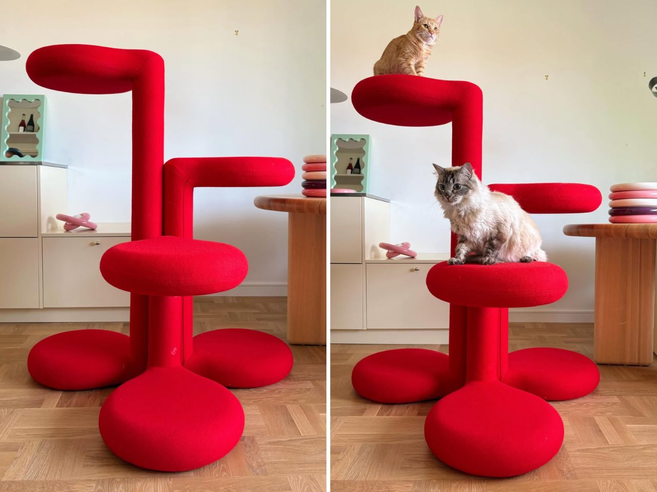
Cat trees solve a specific problem and fail at everything else. They anchor the room in exactly the wrong way, and most owners spend years working around them rather than with them. Gustaf Westman’s Chunky Cat Tree asks whether the category has to operate this way at all. The Swedish designer, known for his Chunky collection of ceramics, glassware, and home objects, has applied that same rounded vocabulary to a cat climbing structure. The result is a piece you place rather than hide.

The form carries all of Westman’s signatures: stacked volumes, inflated proportions, a material presence that reads as warm and deliberate. Made to order in Sweden, the tree is upholstered in wool across five colourways: red, yellow, purple, blue, and cobalt blue. Westman has said he designed it after years of seeing ugly cat trees and deciding the category deserved better. The comment captures the larger idea behind the object. Everything can be designed better, including the things we have come to accept as visually unpleasant.

What we like:

  • Treats cat furniture as a design category worth the same formal attention as any other home object
  • Wool upholstery and sculptural proportions earn placement in the room rather than tolerance of it

What we dislike:

  • Made to order in Sweden means lead times and pricing that will not suit everyone who falls for the visual
  • No confirmed US retail availability or price at time of writing

2. Narwal Flow 2 White

Robot vacuums and pet homes have always had a complicated relationship. Hair wraps around the brush, filters clog faster than the maintenance schedule allows, and the machine ends up parked in the corner half the time. The Narwal Flow 2 White addresses that at the hardware level before asking for any trust. A certified detangling system eliminates hair tangling. A 31,000 Pa motor handles the volume that stops most competitors mid-session. Pet Mode maps your animal’s active zones and adjusts cleaning paths accordingly.

The white colourway matters more than it sounds. Most robot vacuums read as appliances, objects you notice when working and ignore otherwise. The Flow 2 White sits closer to quiet luxury, a thing you leave in the room rather than hiding beneath furniture. Find My Pet uses the onboard camera to locate your animal from your phone on demand. A FlowWash mopping system heats water to 140 degrees for a result that goes well beyond what surface-level mop attachments typically deliver at any price.

Click Here to Buy Now: $1069.99 $1499.99 ($430 off, use coupon code “YDNARWAL”). Hurry, deal ends in 48-hours! Website Link Here.

What we like:

  • Pet Mode and the certified detangling system treat pet ownership as a design constraint rather than a marketing hook
  • Find My Pet and AI Floor Tag add genuine daily utility beyond the core cleaning function

What we dislike:

  • At $1,099.99 launch price, the commitment is significant for a category with a historically patchy reliability record

3. Sloddy

Slow feeders solve the problem once. Most dogs need about a week to learn the maze, and then mealtime returns to its previous five-second format. Designer Kyung-seo Yoo built Sloddy around that specific failure mode. The bowl ships with multiple interchangeable puzzle inserts at increasing difficulty levels, and you rotate them as the dog adapts. The challenge stays real. The eating pace stays controlled. It is a straightforward idea that the rest of the category never thought to try.

An adjustable MDF wood stand raises or lowers the bowl to match shoulder height, addressing a posture and digestion concern that most pet owners encounter long after they needed the fix. Every component disassembles fully for cleaning, with no corners that trap food beyond reach. The peachy-orange palette and warm wood base sit somewhere between kitchen object and design piece, and the recyclable cardboard packaging doubles as a storage shelf for the spare inserts once the box is opened.

What we like:

  • The modular difficulty system is the first meaningful update to the slow feeder format in years
  • Full disassembly for cleaning eliminates the trapped-food problem that makes most slow feeders a short-term purchase

What we dislike

  • The modular system only works if the owner actively manages the insert rotation — it requires consistent owner effort, and most households will default to leaving the same insert in indefinitely
  • The MDF wood stand, while visually warm, is vulnerable to water damage and splashing at feeding time, which is a daily reality with most dogs

 4. Pet Paws

Paws are how the outdoors follows your dog into every room. Mud, grit, bacteria, and allergens come in with every return from outside, and a doormat or a towel handles it partially at best. This portable mat was designed to close that gap by combining three functions- cleaning, drying, and disinfecting- in a single object that sits where the problem actually begins. The all-in-one approach trades the multi-step routine by the door for something that takes seconds and requires nothing else.

The portability is part of the logic. A fixed solution only works at one entry point; a mat you can move adapts to wherever the animal actually comes in, which is rarely the same door every day. For households where paw hygiene connects directly to allergy management or general cleanliness standards, shortening the threshold routine without eliminating it offers something most door products never attempt: cleaning, drying, and treating in the same step, without a trip to the sink.

What we like:

  • Three-in-one functionality handles the most repetitive daily pet hygiene task without multiple products
  • Portable format adapts to wherever the animal actually enters, not just the main door

What we dislike:

  • The disinfecting function almost certainly requires a cleaning solution or refill, adding an ongoing cost and supply dependency that the headline promise of a single portable mat quietly glosses over
  • Dogs that resist paw handling or unfamiliar textures underfoot will need consistent training before the mat becomes a reliable part of the routine rather than something they walk around

5. Dinos Cat WFH Table

Anyone who works from home with a cat recognizes the pattern. The animal locates the warmest, most centrally placed surface in the room and treats it as its own. The desk. The keyboard. The notebook. Japanese furniture company Dinos designed a table that accepts this behavior as a given and builds around it rather than against it. A center cavity in the tabletop creates a through-hole, and a hidden perching shelf beneath gives the cat a settled spot at the same level as everything happening above.

The logic is quiet and functional. Rather than competing with the animal for desk space, the table distributes the surface so both uses fit without interrupting each other. The cat sits close enough to its owner to settle down, without walking across the keyboard to get there. For anyone who has rearranged a work setup around a cat’s habits anyway, this just makes the accommodation honest, building it into the object rather than improvising it daily with a cardboard box and a folded blanket.

What we like:

  • Treats the cat as a design parameter from the start rather than an inconvenience to be managed around
  • The hidden perching shelf reduces desk negotiation without requiring any behavioral change from the animal

What we dislike

  • The center cavity is sized and designed specifically for cats, making it a non-starter for dog owners and narrowing the audience of this roundup in a way worth flagging before recommending
  • The table assumes the cat will use the designated perch, and cats are reliably indifferent to designated anything, meaning the design works best for animals already inclined to settle rather than roam

Good Design Has No Exceptions

Pet ownership has changed faster than the objects designed around it. The animals have moved into bedrooms, onto sofas, into daily routines in ways the existing product categories have not kept pace with. What this list represents is a small group of designers who noticed that gap and decided to close it, not by producing novelties, but by applying real design thinking to objects that have been overlooked or tolerated for too long.

None of these are impulse purchases or quick fixes. They are considered responses to specific problems, and that distinction matters. A cat tree that earns its spot. A vacuum that accounts for hair before it becomes a problem. A bowl that stays challenging. A mat that completes the threshold routine in one step. A table that accepts the cat before it ever arrives. That is what good design looks like when it reaches the right problems.

The post The 5 Home Upgrades Every Pet Parent Actually Uses (Not Just Buys) first appeared on Yanko Design.

  • ✇Yanko Design
  • Xiaomi 18 Fold Hands-On: Got Here Before Apple, Can It Beat Samsung?
    Xiaomi has chosen an interesting moment to return to foldables. The company has not released a book-style foldable since the Mix Fold 4, which launched in 2024, and now it is back with the Xiaomi 18 Fold just as compact foldables are starting to get more attention. Samsung has also added a foldable in this compact format to its lineup, and Apple is widely expected to unveil its first foldable iPhone at its September 9 event with a similar form factor in mind. That puts the Xiaomi 18 Fold in an
     

Xiaomi 18 Fold Hands-On: Got Here Before Apple, Can It Beat Samsung?

Par : Aki Ukita
8 septembre 2026 à 03:40

Xiaomi has chosen an interesting moment to return to foldables. The company has not released a book-style foldable since the Mix Fold 4, which launched in 2024, and now it is back with the Xiaomi 18 Fold just as compact foldables are starting to get more attention. Samsung has also added a foldable in this compact format to its lineup, and Apple is widely expected to unveil its first foldable iPhone at its September 9 event with a similar form factor in mind.

That puts the Xiaomi 18 Fold in an interesting spot. It is not just Xiaomi coming back to foldables after a break. It is also arriving just as this smaller book-style format looks like it could become the next big thing.

Designer: Xiaomi

Xiaomi is positioning the 18 Fold as its first mid-size flagship foldable. It weighs 7.73 ounces (219g), measures 0.42 inches thick when folded (10.68mm), and opens out to just 0.20 inches thick (5.02mm), with a folded footprint of 4.64 x 3.29 inches (117.8 x 83.6mm). In person, it feels thin, though not unusually thin by the standards of today’s premium foldables. More importantly, it feels expensive in a good way. The matte texture on the back and frame gives it a softer, understated finish, while the rounded corners and flat frame help the phone look clean and modern.

The unit I handled was the deep red version, and it is a bold color in person. It stands out more than the usual black or silver foldable palette without feeling too loud. It also happens to echo the deep red finish rumored for Apple’s first foldable, which makes the comparison hard to miss. The 18 Fold comes in Black, White, Red, and a Ceramic Version.

In practice, though, this is still a two-handed phone whether it is folded or unfolded. Even closed, the body is compact in one sense but still broad enough that I did not think of it as something built for easy one-handed use. That is not really a criticism. It just comes with the territory.

The outer display is a 5.38-inch panel, while the inside opens up to a 7.58-inch main screen. Xiaomi says both displays share the same aspect ratio, which is meant to make the transition from one to the other feel more natural. I could not fully judge how well that works in daily use from a short demo, but one benefit stood out right away. Video felt more immersive than on squarer foldables because there was less black bar space above and below the image.

The software also looked well suited to the shape. Animations felt smooth in my brief demo, and I did see split-screen and floating window support in action. The unfolded UI felt more like a small tablet than a stretched phone, which is what you want on a device like this. Xiaomi has also placed one speaker on the top edge and another on the bottom edge on the opposite side, which should help give the phone a more balanced stereo effect when it is open.

The hinge left a good first impression too. I cannot really say whether it felt especially firm or especially smooth, because my time with the device was limited, but it did feel sturdy. The crease was handled well too. Looking straight at the display, I only really noticed it from certain angles rather than all the time. More importantly, I could barely feel it when running a finger across the center, which was better than I expected.

Left: Xiaomi 18 Fold, Right: Galaxy Z Fold 8

Left: Galaxy Z Fold 8, Right: Xiaomi 18 Fold

Left: Galaxy Z Fold 8, Right: Xiaomi 18 Fold

I also compared the Xiaomi 18 Fold side by side with Samsung’s Galaxy Z Fold 8. Samsung’s device measures 4.88 x 3.22 x 0.38 inches when folded (123.9 x 81.9 x 9.7mm), 6.35 x 4.88 x 0.18 inches when unfolded (161.4 x 123.9 x 4.5cm), and weighs 7.09 ounces (201g), so it is a little lighter and a bit thinner than Xiaomi’s foldable in some areas. But the difference was not just about dimensions. Samsung’s inner screen was noticeably brighter to my eyes. At the same time, the Xiaomi 18 Fold had one practical advantage that stood out immediately. When placed on a desk, it did not wobble, while the Samsung did.

Left: Galaxy Z Fold 8, Right: Xiaomi 18 Fold

Left: Galaxy Z Fold 8, Right: Xiaomi 18 Fold

Top: Xiaomi 18 Fold, Bottom: Galaxy Z Fold 8

The biggest surprise for me was the camera. Xiaomi is using a 200MP Leica triple-camera system, led by a 200MP main camera and backed by a 50MP Leica periscope telephoto with an 80mm equivalent focal length. In my short time with the phone, the telephoto camera was the part that stuck with me most. I tried zoom, and the 3.5x telephoto setup immediately felt like one of the most interesting parts of the device. Stability also felt good even at higher magnification, which made the zoom feel more usable, not just more dramatic. The camera bump also did not seem overly large, and its oval-shaped, two-step raised design gives it some presence without taking over the whole back.

My time with the Xiaomi 18 Fold was brief, and this hands-on really only scratched the surface. Even so, the phone already feels like a polished return to book-style foldables. Pricing starts at RMB 10,999, or roughly $1,640, for the 12GB/256GB model, and Xiaomi said it will be available in China only for now.

The post Xiaomi 18 Fold Hands-On: Got Here Before Apple, Can It Beat Samsung? first appeared on Yanko Design.

  • ✇Yanko Design
  • This Japanese Bottle Opener Catches the Cap So You Never Chase It Again
    When you come home after a long, hectic day, sometimes all you want to do is sink into the couch, scroll through your phone, and crack open a cold drink. But when that “cold one” happens to be a bottle of beer or soda, things do not always go according to plan. The opener slips, the cap bends and gets mangled, or it pops off and goes skittering across the counter or under the couch. It is a minor inconvenience, sure, but it has a funny way of taking a little of the relaxation out of what should
     

This Japanese Bottle Opener Catches the Cap So You Never Chase It Again

7 septembre 2026 à 13:20

When you come home after a long, hectic day, sometimes all you want to do is sink into the couch, scroll through your phone, and crack open a cold drink. But when that “cold one” happens to be a bottle of beer or soda, things do not always go according to plan. The opener slips, the cap bends and gets mangled, or it pops off and goes skittering across the counter or under the couch. It is a minor inconvenience, sure, but it has a funny way of taking a little of the relaxation out of what should be a simple, satisfying moment.

The First Pour Bottle Opener was built to fix exactly that. Made by Suwada, a legendary Japanese blacksmith house, it is an elegantly crafted tool designed to let you enjoy your drink in peace. Its flowing, sculptural silhouette also makes it a genuine piece of design rather than a purely functional gadget you shove in a drawer and forget about.

Click Here to Buy Now: $65.00

The bottle opener is forged from solid, corrosion-resistant stainless steel and finished with a hand-applied satin coat that gives it a soft, understated shine. Its shape isn’t flashy or complicated, and that’s exactly the point: the stripped-down, minimalist form is what makes it look right at home sitting out on your kitchen counter, bar cart, or shelf, instead of buried in a drawer with your corkscrews and other odds and ends. It’s also a quiet nod to Suwada’s roots. The company has been forging blades and metal tools in Tsubame-Sanjo, a Japanese region famous for generations of metalworking mastery, so the craftsmanship behind this little opener runs a lot deeper than its price tag might suggest.

Where the First Pour really earns its keep is in the details. It opens bottle caps cleanly without bending or denting them, so you’re not left with a crushed, jagged souvenir every time you crack open a drink. It also has a built-in magnet that catches the cap the instant it pops free, rather than letting it clatter onto the counter, roll under the fridge, or scuff up your countertop. It’s a small addition, but it’s the kind of thoughtful touch a lot of openers skip entirely, and one that makes a genuine difference every single time you use it.

For comparison, a mainstream option like the OXO Good Grips Bottle Opener retails for around $10 and gets the job done just fine, thanks to a soft, non-slip handle built for everyday comfort. It’s a reliable, no-frills tool, and there’s nothing wrong with that. But it is purely utilitarian: there’s no magnet to catch the cap, no display-worthy design, and no real story behind how it’s made. At $65, the First Pour Bottle Opener costs several times more, but you’re paying for hand-applied craftsmanship, a heritage that spans centuries, corrosion-resistant stainless steel, and a magnetic cap-catch that solves a problem most openers on the market, including OXO’s, simply don’t address. It’s less an “opener versus opener” comparison and more a question of whether you want a tool that just works, or one that works beautifully and looks the part while doing it.

I don’t usually think much about something like a bottle opener when I’m shopping for my kitchen. It’s one of those tools you buy once and only think about again when it fails you. But something like the First Pour Bottle Opener makes you reconsider how small changes, whether to design or function, can matter more than you’d expect. Using it turns a mundane, thoughtless task into a small, satisfying ritual, one you can look forward to with that end-of-day (or, let’s be honest, middle-of-the-day) cold drink. Sometimes it really is the small things that make a good moment feel a little better, and this humble little tool is proof that even the objects we take for granted deserve a second look.

The post This Japanese Bottle Opener Catches the Cap So You Never Chase It Again first appeared on Yanko Design.

  • ✇Yanko Design
  • Open-Plan Offices Killed the Private Desk, and This Pod Brings It Back
    Most office furniture solves privacy by sealing someone off completely: four walls and a door that shuts out everyone else, along with any sense of connection to the room. The Seed Pod skips that tradeoff. It wraps a single desk and seat inside a radiating fan of white wooden slats, open enough to see through, dense enough to feel like a room of your own. That slat pattern isn’t just decorative. Vertical wooden ribs curve outward from a tall arched spine at the back, fanning shorter toward the
     

Open-Plan Offices Killed the Private Desk, and This Pod Brings It Back

Par : JC Torres
7 septembre 2026 à 12:20

Most office furniture solves privacy by sealing someone off completely: four walls and a door that shuts out everyone else, along with any sense of connection to the room. The Seed Pod skips that tradeoff. It wraps a single desk and seat inside a radiating fan of white wooden slats, open enough to see through, dense enough to feel like a room of your own.

That slat pattern isn’t just decorative. Vertical wooden ribs curve outward from a tall arched spine at the back, fanning shorter toward the open front, so the whole structure reads like something caught mid-bloom rather than a static box. Gaps between each slat let light and sound pass through freely, creating enclosure without ever fully cutting the occupant off from whatever’s happening around them.

Designer: Michael Jantzen

Step inside and a bright green bench seat waits at the center, paired with built-in storage tucked into the lower walls on either side. Small wedge-shaped shelves hold whatever a workday requires nearby, papers, supplies, a bag, without eating into the already compact footprint. The contrast between crisp white slats outside and that saturated green interior gives the whole thing a distinct, almost botanical identity rather than reading as generic office equipment.

A sliding desktop surface handles the actual work. Sized specifically for a laptop, it can be repositioned to different spots under the main desk, adjusting to whatever posture or task someone needs at that moment rather than locking them into one fixed arrangement. Slide it back, and the same space clears out for someone to step in or out without maneuvering around a stationary tabletop.

Mobility matters just as much as the seating arrangement. The entire structure sits on wheels and plugs into any standard electrical outlet nearby, meaning it can roll into a corner of a shared office floor one week and relocate to a quiet spot at home the next. Nothing about setup requires special wiring or a dedicated room built around it.

Picture an open-plan office where video calls and side conversations blur together constantly, or a home where the only quiet corner left is also the one everyone walks through. Rolling a Seed Pod into either space carves out somewhere to actually concentrate, without requiring a renovation or a door that locks. Multiple units can sit side by side too, each occupant getting their own pocket of focus inside a shared room.

What makes the design work is restraint rather than enclosure. The slats do the job walls usually do, marking a boundary, without asking anyone to give up daylight, airflow, or the sense of still being present in the room they’re sitting in.

The post Open-Plan Offices Killed the Private Desk, and This Pod Brings It Back first appeared on Yanko Design.

  • ✇Yanko Design
  • A Clock That Refuses to Just Tell You the Time
    I check the time roughly forty times a day, and I couldn’t tell you what any of those glances felt like. A phone screen lights up, a number flashes, and I move on before the information even registers. That’s the strange thing about how we live with time now: we have more ways than ever to know what hour it is, and less reason than ever to actually notice it. Digital displays don’t ask anything of us. They just report, and we absorb, and nothing about the moment sticks. That’s the gap a new pie
     

A Clock That Refuses to Just Tell You the Time

7 septembre 2026 à 11:20

I check the time roughly forty times a day, and I couldn’t tell you what any of those glances felt like. A phone screen lights up, a number flashes, and I move on before the information even registers. That’s the strange thing about how we live with time now: we have more ways than ever to know what hour it is, and less reason than ever to actually notice it. Digital displays don’t ask anything of us. They just report, and we absorb, and nothing about the moment sticks.

That’s the gap a new piece from Istanbul studio Omora Lusso seems built to close. Instead of showing the hour as flat information, it makes you wait for it, watch for it, and experience it as something closer to a small performance than a readout. The studio calls it Muvaqqit 60, and as the press materials put it, it’s a 60-centimetre kinetic time artwork that transforms the reading of time into a recurring physical ritual.

Designer: Omora Lusso

The name itself carries weight before the mechanism even moves. Muvaqqit takes its name from the historical timekeeper responsible for determining and regulating time through astronomy and exact observation, and in Ottoman cities, muvakkithanes were dedicated timekeeping rooms, often associated with mosque complexes, where prayer times were calculated and astronomical knowledge was practised. I appreciate that Omora Lusso didn’t try to costume this piece in false antiquity. The studio does not reproduce the instruments or forms of these spaces; instead, it reinterprets their culture of precision, contemplation and measured time through contemporary kinetic design. That distinction matters. It would have been easy, and a little lazy, to slap old astronomical symbols onto a modern object and call it heritage. This is a harder, more honest route: borrowing the spirit of a tradition rather than its skin.

The piece itself only reveals what it can do once a minute, and that restraint is the whole point. Once each minute, Muvaqqit performs a time-indication sequence: a comet-like progression of light moves through its layered scales as a mirror-silvered kinetic bird rises into position, while the hour, five-minute interval and minute increment are read across three curved scales, with an AM/PM display and an illuminated moon-phase arc completing the temporal composition. The rest of the time, it stays quiet on purpose. Between these moments, the work remains visually restrained, allowing anticipation to become part of the experience. There’s a kind of confidence in a product that chooses to stay dark and still for fifty-nine seconds just so the sixtieth means something. Most gadgets are terrified of silence. This one leans into it.

Omer Fatih Sevinctekin, the studio’s founder, frames the whole project as a question rather than a solution, which I found refreshing given how many product launches arrive dressed as answers. He describes it as beginning with the question of whether time can be experienced as a ritual rather than simply read as information, wanting the work to connect Istanbul’s culture of precise timekeeping with a contemporary language of motion, light and material.

Materially, the Noir Silver edition plays a straightforward but effective contrast game. It pairs a soft-black metal frame and anthracite inner dial with a hand-polished, mirror-silvered brass bird, presented behind a four-millimetre glass front, with a controlled palette designed to sharpen the contrast between stillness and movement, and between the dark architectural body and the brief illumination of the time ritual. Nothing about it is loud until the moment it needs to be.

This isn’t a mass object, and it was never going to be. Muvaqqit 60 Noir Silver is limited to 50 pieces worldwide, offered at USD 6,000, with each work produced in Istanbul and accompanied by a Certificate of Authenticity, a dedicated wooden presentation case, art-handling gloves and operating materials. That price and scarcity will keep it out of most homes, and I won’t pretend otherwise. But the idea underneath it, that time deserves a moment of attention instead of a passing glance, doesn’t require owning the object to land. The studio’s broader collection treats time not as a static reading but as an event, a sequence that can be anticipated, observed and remembered, and that’s a quietly radical stance in a culture that mostly wants its information delivered instantly and forgotten just as fast.

The post A Clock That Refuses to Just Tell You the Time first appeared on Yanko Design.

  • ✇Yanko Design
  • Finally Focus Without Your Phone: The $54 Wooden To-Do Kit
    As someone who enjoys making lists, whether it’s productivity lists, pop culture rankings, journaling spreads, or actual listicles for work, I have accumulated more notebooks and apps than I probably need. Sometimes, though, what you really need isn’t another app or another notebook. What you need is something that forces you to focus on the one task that actually matters instead of getting distracted by pop-up windows, social media notifications, or the colorful pens and stickers calling your
     

Finally Focus Without Your Phone: The $54 Wooden To-Do Kit

4 septembre 2026 à 06:07

As someone who enjoys making lists, whether it’s productivity lists, pop culture rankings, journaling spreads, or actual listicles for work, I have accumulated more notebooks and apps than I probably need. Sometimes, though, what you really need isn’t another app or another notebook. What you need is something that forces you to focus on the one task that actually matters instead of getting distracted by pop-up windows, social media notifications, or the colorful pens and stickers calling your name from the journaling aisle.

The To-Do Desk Kit from Oakywood wants to solve exactly that problem by narrowing your focus down to a single piece of paper, placed on a small wooden card holder, sitting right at eye level on your desk. It’s a simple, minimalist tool, but it’s designed with a clear purpose: to bring a bit of analog calm back to what is probably a screen-cluttered and object-cluttered workspace. Sure, you could just grab a notepad or scribble on a whiteboard, but this is a far more aesthetic and intentional way to work on your productivity, and it looks good doing it.

Design: Oakywood

Oakywood, the brand behind the kit, is known for handcrafted wooden desk accessories, and this piece fits right into that world. The holder itself is made from solid oak or solid walnut, with a black finish also available if you prefer a more subdued look. There’s a slot to hold one or two cards vertically at eye level, so you can glance over whenever you need a reminder of what you’re supposed to be accomplishing, whether you’re deep in work on your computer or handling something entirely analog. Behind that visible card, the holder can actually stack up to eight more, so you’re never digging through a pile of loose paper to find your list.

One of my favorite small details is the contoured groove carved into the block, which doubles as a pen dock. Instead of hunting around your desk for a pen every time you want to add a task or cross one off, it’s already sitting right there, built into the design. The base is lined with natural cork, too, which means it stays put on your desk and won’t leave scratches behind, no matter what material your desk is made of. It’s a small touch, but it shows the kind of thoughtful design that Oakywood puts into all of its pieces.

The kit also comes with a starter pack of 100 To-Do Cards, printed with a soft dotted grid on the front, similar to what you’d find in a bullet journal, and a completely blank back if you want more freedom. That blank side is a nice bonus for anyone who occasionally needs to sketch out an idea, map out a plan, or jot down something that does not fit neatly into a to-do list format. The cards are printed on premium 250-gram uncoated, FSC-certified offset paper, so pens, pencils, and even fountain pens will not smudge or bleed through. Refill packs are sold separately once you run through the starter set, though you could just as easily swap in your own card stock if you want to write your own affirmations, motivational quotes, or reminders instead.

It’s also worth mentioning that Oakywood plants a tree for every product sold, and the cards themselves are made from FSC-certified paper. If you already own an Oakywood laptop stand, pen tray, or wireless charger, the To-Do Desk Kit fits right into that same warm, wood-toned ecosystem, making your desk feel like one cohesive space instead of a pile of mismatched gadgets.

Priced at around fifty dollars, give or take a discount depending on when you catch it on sale, the To-Do Desk Kit isn’t just a productivity gadget. It’s a small, tactile object that makes sitting down to work feel a little more intentional. For anyone who loves collecting beautifully made desk pieces as much as they love checking things off a list, this feels like an easy addition to a growing collection, and an even easier way to talk yourself into finally starting that task you have been putting off. Sometimes all it takes is one card, one pen, and one clear line of sight to get moving again.

The post Finally Focus Without Your Phone: The $54 Wooden To-Do Kit first appeared on Yanko Design.

  • ✇Yanko Design
  • UGREEN’s Power Bank Uses Liquid Cooling, and You Can Actually Watch It
    UGREEN’s MagFlow Pro treats overheating as a design problem worth solving with actual engineering, not just a bigger heat sink. This 10,000mAh magnetic power bank borrows liquid cooling from gaming PCs and squeezes it into a pocket-sized charger, aiming to keep wireless charging fast without turning your phone into a hand warmer along the way. Qi2 charging has always had a dirty secret hiding under its magnetic convenience. Wireless systems lose up to 30% of their power as heat during transfer,
     

UGREEN’s Power Bank Uses Liquid Cooling, and You Can Actually Watch It

Par : JC Torres
4 septembre 2026 à 05:15

UGREEN’s MagFlow Pro treats overheating as a design problem worth solving with actual engineering, not just a bigger heat sink. This 10,000mAh magnetic power bank borrows liquid cooling from gaming PCs and squeezes it into a pocket-sized charger, aiming to keep wireless charging fast without turning your phone into a hand warmer along the way.

Qi2 charging has always had a dirty secret hiding under its magnetic convenience. Wireless systems lose up to 30% of their power as heat during transfer, which means a phone sitting at 25W often throttles down within minutes to avoid overheating. UGREEN built the MagFlow Pro around fixing that exact bottleneck rather than just chasing a bigger battery number.

Designer: UGREEN

Inside sits CryoPulse, a cooling system built around a micro-pump that circulates liquid coolant past the charging coil and other heat-generating components. Copper foil spreads that heat further, while a layout that physically separates key parts keeps warmth from concentrating in one spot. It is a scaled-down version of what keeps a gaming rig from throttling under load, just built to survive inside a phone charger.

A transparent panel on the front turns that entire process into something you can actually watch, showing coolant moving through the internal channels while your phone charges. It is an odd, almost theatrical touch for a power bank, but it doubles as reassurance that the system is doing its job. UGREEN calls it the Cyber Window, and it is hard to look away from once it is running.

That cooling translates into real numbers, too. UGREEN claims the system keeps peak surface temperatures on a phone up to 18°F below its own reference benchmark, letting a device hold onto higher wattage for longer instead of stepping down early. In practice, that means someone topping up before a flight or during a commute gets closer to advertised charging speeds instead of a slow crawl once things heat up.

A small display embedded in the shell keeps track of charging wattage, remaining battery percentage, cycle count, and cooling status, turning what used to be a guessing game into actual visible data. Paired with a built-in USB-C cable capable of 30W and a combined output of up to 45W, the MagFlow Pro can charge a phone, tablet, and another accessory simultaneously without demanding a bag full of extra cables.

If the battery degraded quickly, all of those fancy features would be pointless, so UGREEN built the cell around Dymondcell 2.0 protection, retaining more than 80% of its capacity after 800 charge cycles. It also survived seven hours of continuous overcharge testing without failure, a detail aimed squarely at anyone who leaves their charger plugged in overnight out of habit rather than necessity.

At $149.99, the MagFlow Pro costs considerably more than other 10,000mAh power banks on the market, and that price tag puts real weight behind its cooling claims. It is a bet that people charging phones daily care as much about consistent performance and battery longevity as they do about raw capacity, and that a bit of visible engineering can justify paying extra for it.

The post UGREEN’s Power Bank Uses Liquid Cooling, and You Can Actually Watch It first appeared on Yanko Design.

  • ✇Yanko Design
  • TCL’s P80 Pro and Ultra Are the Phones That Replaced Your Kindle Too
    TCL’s P80 Ultra and P80 Pro prove a phone screen doesn’t have to pick one personality and stick with it. Unveiled at IFA 2026 in Berlin, both handsets fold a vivid AMOLED panel and TCL’s paper-like NXTPAPER technology into the same sheet of glass, letting the display shift moods with a flick of a switch instead of forcing a trade-off between color and comfort. Run a finger along the frame, and you’ll find a thin slider, a small physical detail that carries plenty of weight in daily use. Slide i
     

TCL’s P80 Pro and Ultra Are the Phones That Replaced Your Kindle Too

Par : JC Torres
4 septembre 2026 à 04:15

TCL’s P80 Ultra and P80 Pro prove a phone screen doesn’t have to pick one personality and stick with it. Unveiled at IFA 2026 in Berlin, both handsets fold a vivid AMOLED panel and TCL’s paper-like NXTPAPER technology into the same sheet of glass, letting the display shift moods with a flick of a switch instead of forcing a trade-off between color and comfort.

Run a finger along the frame, and you’ll find a thin slider, a small physical detail that carries plenty of weight in daily use. Slide it, and the 6.83-inch panel drops its saturation, taking on a warmer, textured look that mimics a printed page. A commuter buried in a novel or someone proofreading a document late at night gets a screen that behaves like paper, without losing the sharpness underneath.

Designer: TCL

Push that same slider one notch further, and the screen drops color entirely for Max Ink Mode, a stripped layout that silences notifications except for calls and texts. It reads like a design decision as much as a software one, TCL betting people want to quiet their phone rather than mute it completely. The payoff is a battery that can stretch across roughly a week of steady reading.

That reading-first mindset carries into the software too. Both phones can convert e-books into audiobooks or podcast-style narration using on-device AI, giving Max Ink Mode a voice to lean on when eyes need a break instead of ears. It is a small addition, but it treats the slower, paper-like mode as a genuine feature rather than a bolted-on gimmick for a keynote slide.

None of that would matter if the screen looked washed out the rest of the time, so TCL leaned on a 1.5K AMOLED panel that hits 3,200 nits and covers the full DCI-P3 color range. A Nano Crystal Shield coating cuts glare enough to keep the display readable under direct sun, marking TCL’s first pairing of NXTPAPER with OLED rather than the LCD panels it used before.

The frame wrapping that screen is aluminum rather than the plastic often found at this price, giving both phones a sturdier grip without piling on bulk. TCL backs that up with an IP68 rating against dust and water, plus MIL-STD-810H certification for the inevitable drop. Buyers get to pick between Sunlit Gold, Burgundy, and Midnight Blue, three finishes that lean more toward jewelry-box color choices than typical slab-of-glass smartphone palettes.

Where the two models part ways is around the back. The P80 Ultra carries a 50-megapixel main camera next to a 50-megapixel periscope lens for 3x optical zoom, tucked into a housing shaped to avoid throwing off the phone’s balance. The P80 Pro drops the periscope for a simpler dual-camera arrangement, trading reach for a slimmer build that still shares the same main sensor and 8-megapixel ultrawide.

TCL is rolling both phones out across Europe first, with the P80 Ultra priced from €549 (around $635) and the P80 Pro starting at €429 (around $500), before a Latin American launch follows in October. A wider release is expected to reach additional regions afterward. In a category full of identical glass rectangles, these two phones actually behave differently depending on what someone needs from them that day.

The post TCL’s P80 Pro and Ultra Are the Phones That Replaced Your Kindle Too first appeared on Yanko Design.

❌