❌

Vue normale

  • ✇Yanko Design
  • Edifier’s $52 gaming soundbar lets you ditch your headset without losing voice chat
    Gaming soundbars became popular in the 2017s, but the trend faded; in the last couple of years, this category of audio accessories has seen renewed interest. Razer kicked off the new wave, with several mainstream brands and some offbeat makers releasing their own versions. Creative recently launched their B3 soundbar for gamers at a very affordable price, and now Edifier is upping the ante with an even sweeter deal. The China-based audio accessories maker, known for high-end bookshelf speakers,
     

Edifier’s $52 gaming soundbar lets you ditch your headset without losing voice chat

12 octobre 2026 à 11:20

Gaming soundbars became popular in the 2017s, but the trend faded; in the last couple of years, this category of audio accessories has seen renewed interest. Razer kicked off the new wave, with several mainstream brands and some offbeat makers releasing their own versions. Creative recently launched their B3 soundbar for gamers at a very affordable price, and now Edifier is upping the ante with an even sweeter deal.

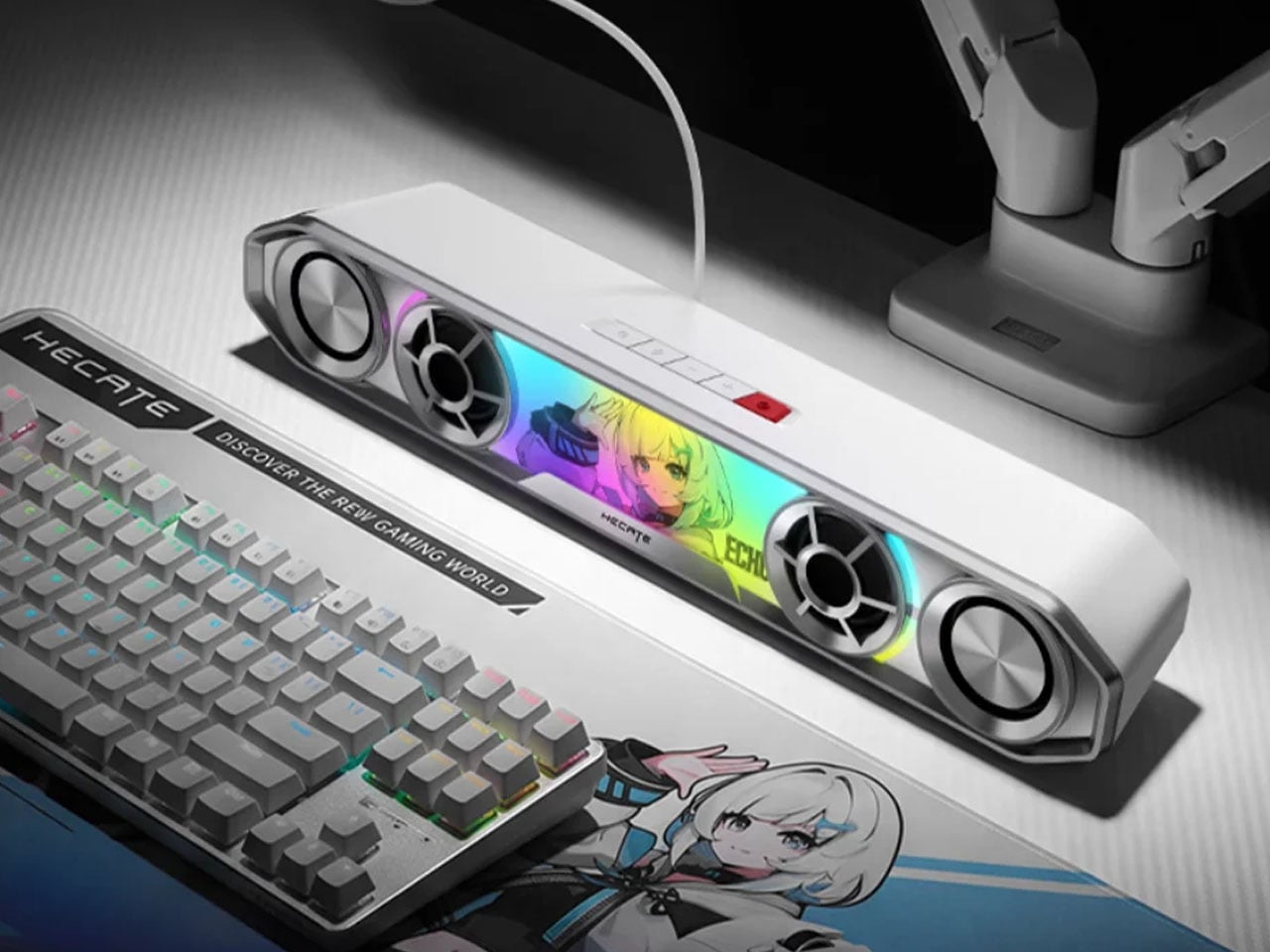
The China-based audio accessories maker, known for high-end bookshelf speakers, has come up with a very cool-looking soundbar for gamers. Dubbed the Hecate G2000 Bar, the desktop audio boomer is all set to be available from 16 October onwards for a price tag of 349 yuan ($52), which is an introductory price slashed from the normal price of 387 yuan ($58).

Designer: Edifier

The G2000 Bar combines a compact footprint with an angular, mecha-inspired design intended to fit into a gaming setup without taking up much desk space. It will be available in black and white, with a built-in five-degree upward tilt that directs sound toward the listener rather than across the desktop. Five interchangeable themed stickers let users customize the front panel, while 12 RGB lighting effects, including rainbow and flowing-light patterns, add some visual flair. Lighting can be adjusted via the Edifier Connect mobile app or Hecate PC software.

Under the hood, the soundbar uses two 56mm full-range drivers with copper-clad aluminum wire voice coils, paired with two 60mm passive radiators. The arrangement is designed to deliver fuller audio and reinforce low frequencies without requiring a separate subwoofer. Output is rated at 3W per channel, or 6W in total, with peak power reaching 12W. The stated frequency response spans 67Hz to 20kHz.

For gaming, the G2000 Bar supports THX 7.1.4 spatial audio processing, which aims to create a more immersive, surround-like listening experience from a desktop soundbar. Six dedicated audio presets cater to different gaming genres, including first-person shooters, role-playing games, and racing titles. These modes give players a way to tailor the sound to different types of gameplay without manually adjusting equalizer settings.

The other notable addition is a detachable microphone mounted on top. It uses AEC 2.0 acoustic echo cancellation, a dedicated digital signal processor, and AI-assisted noise reduction to limit background sounds and reduce audio feedback from the speakers. This could make voice chat more convenient for players who prefer open speakers to a gaming headset, although performance will depend on the surrounding environment.

Connectivity includes Bluetooth 6.0 and USB sound-card input, allowing the soundbar to work with compatible PCs, laptops, mobile devices, and consoles. An independent 9V DC power adapter supplies power, while physical controls on the top metallic panel provide access to volume adjustment, microphone muting, and audio-mode switching.

With its compact design, customizable lighting, spatial audio processing, and integrated voice-chat features, the Hecate G2000 Bar brings several gaming-focused conveniences to an affordable desktop soundbar. Its initial pricing makes it an interesting option for players looking to simplify their setup without committing to a separate speaker system and microphone.

The post Edifier’s $52 gaming soundbar lets you ditch your headset without losing voice chat first appeared on Yanko Design.

  • ✇Yanko Design
  • Divoom Astrotoo Is a Desktop Speaker Dressed as a Retro Computer
    Desktop speakers usually have a pretty straightforward job and an equally straightforward appearance. That makes sense when all you want is music, but it doesn’t leave much room for personality. Divoom’s Astrotoo takes a different approach, putting a display and oversized physical controls into a speaker that looks like a tiny computer terminal. It definitely gives your desk something playful and personal, and your friends something to be jealous of. The rounded housing and recessed side panels
     

Divoom Astrotoo Is a Desktop Speaker Dressed as a Retro Computer

Par : JC Torres
12 octobre 2026 à 06:07

Desktop speakers usually have a pretty straightforward job and an equally straightforward appearance. That makes sense when all you want is music, but it doesn’t leave much room for personality. Divoom’s Astrotoo takes a different approach, putting a display and oversized physical controls into a speaker that looks like a tiny computer terminal. It definitely gives your desk something playful and personal, and your friends something to be jealous of.

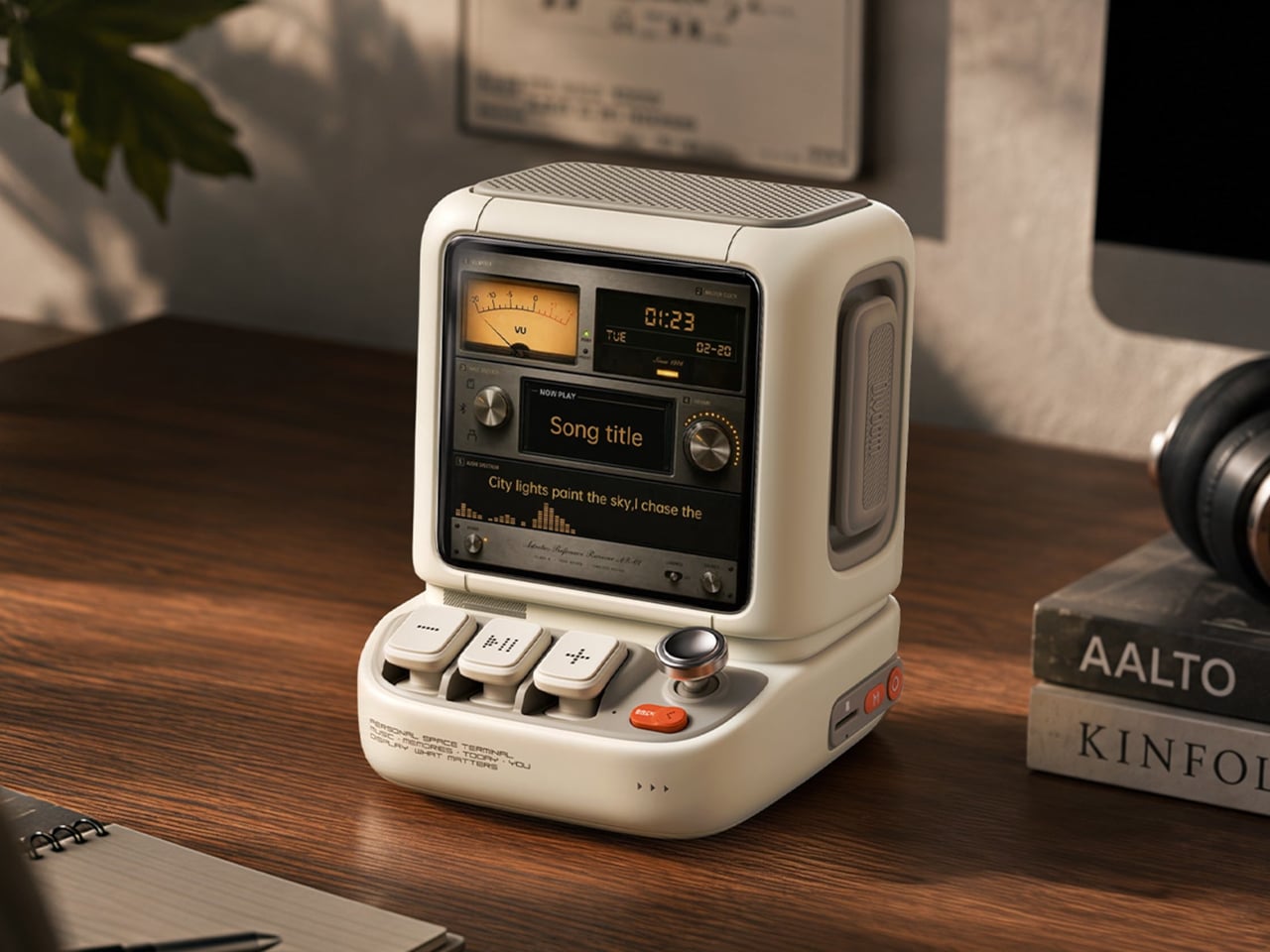
The rounded housing and recessed side panels give Astrotoo the appearance of equipment from an imagined future, albeit one with chunky buttons. White, pink, and green finishes offer different levels of restraint. At roughly 4.2 by 4.3 inches across its base, it won’t need the space of a computer, although its upright screen certainly makes it harder to overlook than a conventional speaker.

Designer: Divoom

Of course, those buttons aren’t simply there to complete the retro disguise. Three raised mechanical keys, a joystick, and an orange Back button handle music and display functions. You can reach over to control playback without opening another app, though customizing the display still involves your phone. It’s a familiar division of labor, with physical controls for everyday actions and software for the changes.

Despite the pixel art theme, Astrotoo doesn’t limit you to blocky characters and low-resolution graphics. Its 3.95-inch IPS display has a 480×480 pixel resolution, accommodating photographs and detailed clock faces as well. That means you can keep a family photo beside your monitor without making room for another frame. Music visualizations are also available, if you’d rather have your speaker put on a show.

The Divoom app lets you change visual content and clock faces, giving the device something to do when the music stops. Weather and stock information bring a more practical side to that small screen. That said, another dashboard isn’t necessarily what a busy desk needs. A favorite picture might be a better companion than financial numbers quietly competing for your attention all afternoon.

Divoom positions the 20W speaker for listening nearby, so the desktop proportions aren’t entirely about appearance. Playing music while answering emails or listening to a podcast during a break fits that purpose. Of course, the power rating doesn’t tell us how balanced the sound will be. The styling is easier to judge than the audio, which needs listening rather than a specification sheet.

Bluetooth 6.0 handles wireless audio, while microSD playback lets you bring a collection of stored music along without keeping a phone connected. Wi-Fi supports the connected display features. There’s also a battery, with Divoom claiming up to six hours of operation. That’s enough to move it between rooms for a while, but don’t expect it to stay unplugged through an entire workday.

The $199.99 US price makes this a considered desk accessory rather than a casual decoration. Divoom lists approximately 3.5 hours for USB-C charging, so it probably makes sense to leave a cable nearby. You can dress the screen as a futuristic control panel, but there’s nothing futuristic about discovering that your tiny computer needs plugging in before the afternoon playlist.

The post Divoom Astrotoo Is a Desktop Speaker Dressed as a Retro Computer first appeared on Yanko Design.

  • ✇Yanko Design
  • Habity’s E-Paper Bedside Clock Makes a Case for a Phone-Free Nightstand
    Smartphones have become rather good at convincing us they belong beside the bed, if only because we need an alarm in the morning. Unfortunately, that also puts every source of distraction within reach the moment you open your eyes. To fight that, Habity’s E-Paper Bedside Clock takes over the alarm, sleep sounds, and nightlight duties with physical controls and a display that doesn’t glow continuously, giving your phone fewer reasons to stay. The clock has a rounded rectangular body and a slight
     

Habity’s E-Paper Bedside Clock Makes a Case for a Phone-Free Nightstand

Par : JC Torres
12 octobre 2026 à 05:15

Smartphones have become rather good at convincing us they belong beside the bed, if only because we need an alarm in the morning. Unfortunately, that also puts every source of distraction within reach the moment you open your eyes. To fight that, Habity’s E-Paper Bedside Clock takes over the alarm, sleep sounds, and nightlight duties with physical controls and a display that doesn’t glow continuously, giving your phone fewer reasons to stay.

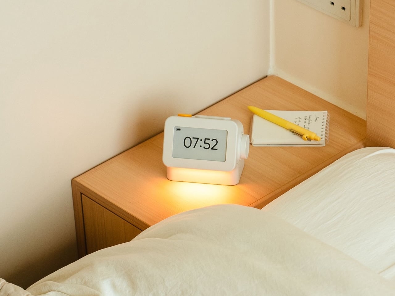
The clock has a rounded rectangular body and a slightly tilted face, but its most useful details are the ones your fingers encounter. A large side dial handles settings and volume through turning and pressing. On top, a yellow stop button sits beside a broad snooze key. Their different shapes separate two decisions you probably don’t want to confuse when you’re half asleep.

Designers: Peter Arvad, Jesper Westendahl

Of course, the screen is where Habity really parts ways with your phone. Its 3.7-inch e-paper display reflects ambient light rather than relying on continuous illumination. That means darkness calls for a little help. Interacting with the clock activates a warm frontlight for 10 seconds, enough for a quick check without leaving the time glowing beside your pillow all night long.

There’s also a built-in speaker for sleep sounds, which don’t need an app or subscription. Rain and ocean waves are familiar choices, but a sleeping dog and dishwasher bring a surprisingly domestic touch to the collection. Double-press the snooze button to start playback and turn the dial to change volume. Sessions can last up to eight hours, without borrowing your phone for the soundtrack.

Mornings get a little more flexibility than a single repeating alarm. Habity lets you choose weekday schedules or different wake-up times for individual days, although you’re limited to one wake-up alarm per day. The built-in light can gradually brighten up to 30 minutes beforehand. Once the alarm sounds, that broad snooze button grants another five minutes, as many times as you care to negotiate.

Perhaps the most curious detail is what happens when you stop touching the clock. After 10 minutes, an optional idle screen introduces an illustrated face and shrinks the time. The hour is still there, just less prominent. It’s a small concession for people who don’t want a constant reminder of how late it’s getting, and you can disable it if you’d rather keep watching the, er, watch.

Despite those straightforward controls, Habity hasn’t completely shut the door on connected features. Optional Wi-Fi provides automatic time setting and integrations with Philips Hue Bridge, Home Assistant, and Homey. That requires USB-C power, however. Leave it offline and the alarms and sounds still work, so your morning routine doesn’t need to depend on whether the router is having a good day.

Habity estimates two weeks of battery life, depending on use, but a full recharge can take up to 24 hours. You’ll want to plan that USB-C top-up rather than squeeze it in before bedtime if you’re using it unplugged. Getting one won’t move your phone to another room, of course, so you’ll still have to decide where it spends each night.

The post Habity’s E-Paper Bedside Clock Makes a Case for a Phone-Free Nightstand first appeared on Yanko Design.

  • ✇Yanko Design
  • Razer Wolverine V4 Pro has four back buttons, but none have to stay
    Extra buttons on a game controller can be handy, at least until they get in the way of holding it. Razer’s Wolverine V4 Pro gives players a little more say in that arrangement, with magnetic back buttons you can remove instead of simply ignoring them. Available for Xbox and PC, the wireless controller also lets you change its thumbstick caps and even take off its faceplate. The four rear buttons come off without tools, making it possible to keep all of them, use only a pair, or clear the back e
     

Razer Wolverine V4 Pro has four back buttons, but none have to stay

Par : JC Torres
12 octobre 2026 à 04:15

Extra buttons on a game controller can be handy, at least until they get in the way of holding it. Razer’s Wolverine V4 Pro gives players a little more say in that arrangement, with magnetic back buttons you can remove instead of simply ignoring them. Available for Xbox and PC, the wireless controller also lets you change its thumbstick caps and even take off its faceplate.

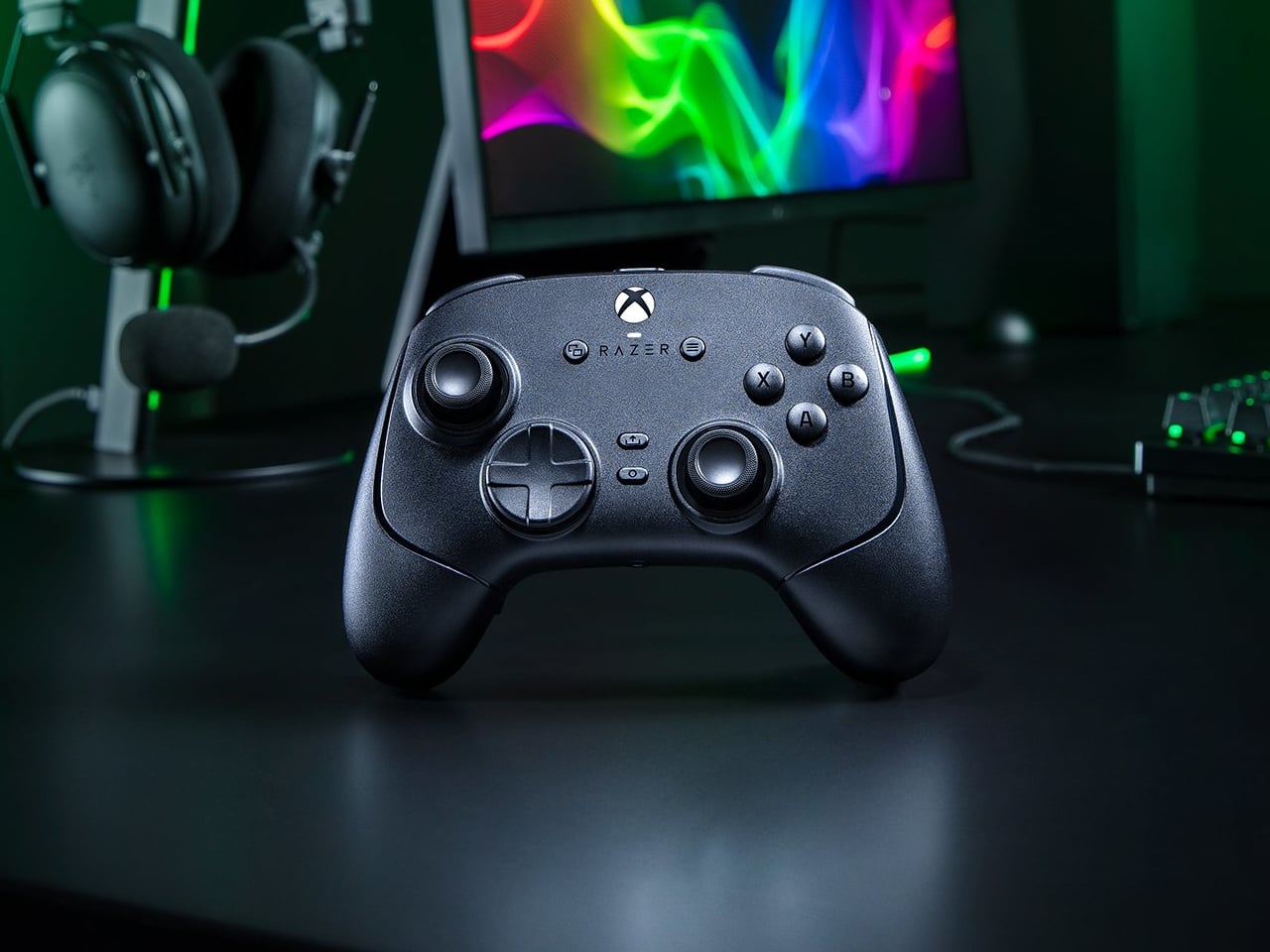
The four rear buttons come off without tools, making it possible to keep all of them, use only a pair, or clear the back entirely. Blank inserts replace the unwanted controls, following the controller’s contours rather than leaving little gaps behind. It’s a small detail, but an important one when that surface is where your fingers spend most of their time during a game.

Designer: Razer

Of course, keeping those buttons attached makes sense when you’re juggling several actions at once. Their mouse-click switches can handle commands such as jumping or reloading, letting your thumbs stay on the sticks while your other fingers do the work. Two additional shoulder buttons bring the total to six remappable inputs, giving frequently used actions somewhere to go besides the familiar face buttons.

The thumbsticks get their own set of options, changing both their height and the surface beneath your thumbs. Short convex caps provide a rounded surface, while tall concave versions give your thumb a recessed resting spot and more height to work with. Razer recommends the taller caps for precise aiming. You can mix the supplied options, but swapping caps doesn’t mean you’re replacing the sensors underneath.

That flexibility continues with the triggers, which can switch between a short mouse-click action and a full analog pull using rear-mounted locks. The shorter setting suits firing in a shooter, while the longer travel lets you ease onto the throttle in a racing game. Through Razer Synapse, you can also adjust each trigger’s activation point to suit how you play.

Even the exterior is open to a little tinkering, thanks to a magnetic faceplate that lifts off without tools. Personalize that panel, or leave it off entirely to reveal the translucent housing underneath. The working components remain enclosed, so you’re changing the controller’s outer appearance rather than exposing its electronics. It’s an option for people who prefer seeing a bit of machinery.

The software takes care of the changes you can’t make with magnets. Four onboard profiles hold different button assignments and sensitivity settings, so a racing setup doesn’t have to overwrite your shooter preferences. You can also adjust thumbstick dead zones, deciding how much movement registers as input. That said, greater sensitivity can pick up tiny thumb movements you didn’t intend.

At $199.99 in the US, this level of customization doesn’t come cheap, and there’s no included carrying case to keep the removable pieces together. You’ll have to find your own place for spare caps and unused buttons. After spending that much on a controller you can rearrange, a dedicated home for the bits you’ve removed would have been rather welcome.

The post Razer Wolverine V4 Pro has four back buttons, but none have to stay first appeared on Yanko Design.

  • ✇Yanko Design
  • Garmin’s New Watches Go 320 Hours Without Dying on You
    The most frustrating moment for a sports watch to fail is when you need it most: halfway through a long route with no easy way to recharge, or standing over a golf shot on an unfamiliar course with no clear sense of the distance. Garmin’s Enduro 4 and Approach S72 tackle different versions of that problem. One is built to keep working deep into an adventure. The other puts more useful information within reach before and after every swing. They make an interesting pair because neither treats des
     

Garmin’s New Watches Go 320 Hours Without Dying on You

8 octobre 2026 à 09:20

The most frustrating moment for a sports watch to fail is when you need it most: halfway through a long route with no easy way to recharge, or standing over a golf shot on an unfamiliar course with no clear sense of the distance. Garmin’s Enduro 4 and Approach S72 tackle different versions of that problem. One is built to keep working deep into an adventure. The other puts more useful information within reach before and after every swing.

They make an interesting pair because neither treats design as decoration. The Enduro 4 favors battery life, low weight and quick access to maps. The Approach S72 gives golfers a brighter, more visual way to understand the course and their game. Both have premium materials and comfortable fabric bands, but their real appeal is how those choices serve the person wearing them.

Designer: Garmin

Garmin Enduro

For the Enduro 4, battery life is the headline. Garmin rates it for up to 320 hours in activity mode or up to 90 days in smartwatch mode, with solar charging under the conditions behind those estimates. That is a meaningful promise for someone planning an ultramarathon, a backpacking trip or several days away from an outlet. I would still treat those numbers as best-case figures, but the design priority is clear: spend less time managing the watch and more time moving.

Its 51mm case is substantial, yet Garmin says the watch weighs 66 grams. A titanium bezel and scratch-resistant Power Sapphire lens bring durability, while a fiber-reinforced polymer case helps keep the weight down. The 1.4-inch MIP display is less showy than a vivid AMOLED screen, but paired with the solar lens, it suits a watch built around endurance. The fabric band and white-and-red LED flashlight are thoughtful details for long days that may turn into nights.

The improvements are not limited to how long the watch lasts. Garmin says the Enduro 4 has 50% more RAM than the Enduro 3 and map panning that is 30% faster. Grade-adjusted pace tools offer a better way to judge effort on hills, while stamina features help athletes see how their endurance changes during training. Garmin Epic can group activities across multiple days. Together, those features address a familiar problem: plenty of data, but not always enough context to use it.

Garmin Approach S72

The Approach S72 takes the opposite visual approach. Available in 43mm and 47mm sizes, it has a bright AMOLED display, a titanium bezel, a sapphire lens and a lightweight ComfortFit fabric band. I like the choice of two sizes here. A golf watch needs enough screen space to make a hole legible at a glance, but it also has to feel comfortable through a round and look at home afterward.

Its most intriguing idea is connecting golf performance to what is happening with the player. The watch can show heart-rate trends alongside a completed round, while swing metrics include hand speed, backswing length and wrist rotation. On the driving range, golfers can log practice sessions rather than leaving that work outside their broader activity record. None of this guarantees a lower score, but it could make practice feel more purposeful than guessing which part of a swing went wrong.

The course tools are more immediate. Green reading uses contour data to help golfers judge a line on select courses, while aerial imagery provides a clearer look at the hole ahead. Post-round putting analytics can reveal tendencies in speed, direction and make rate. These are the features that could save a few uncertain decisions during play, then give someone a specific thing to work on afterward. Some require a Garmin Golf membership, a detail worth checking before buying.

Battery life matters here, too, though on a different scale. Garmin rates the 47mm S72 for up to 20 hours of golf activity or 16 days in smartwatch mode; the 43mm model is rated for up to 15 hours and 10 days, respectively. Add heart-rate, stress and sleep tracking, and it becomes easier to see why Garmin designed this as an everyday watch rather than a device you pull out only for tee time.

Neither watch is trying to do everything for everyone. The Enduro 4 makes the strongest case for people whose plans regularly outlast ordinary battery life; the S72 is for golfers who want clearer decisions and better feedback. What connects them is a useful design principle: the best sports technology should reduce the little uncertainties that distract you from the activity you came to enjoy.

The post Garmin’s New Watches Go 320 Hours Without Dying on You first appeared on Yanko Design.

  • ✇Yanko Design
  • PocketBook Gave Its $198 E-Reader the One Trick Old Nokia Phones Had
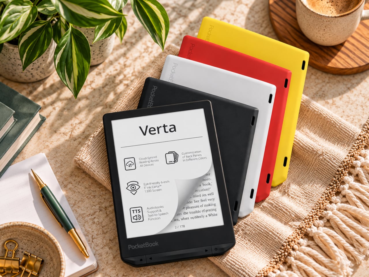
    E-readers are supposed to replace physical books, but they strangely come mostly in black or gray, unlike colorful and distinctive book covers. Although not a complete design overhaul, Pocketbook’s new Verta and Verta Color e-readers offer a simple fix, and no, it doesn’t require slapping on a case. You can change the color of the e-reader by swapping the back panel while maintaining its slim shape and keeping the screen and page-turn buttons uncovered. That’s a rather different approach to per
     

PocketBook Gave Its $198 E-Reader the One Trick Old Nokia Phones Had

Par : JC Torres
8 octobre 2026 à 06:07

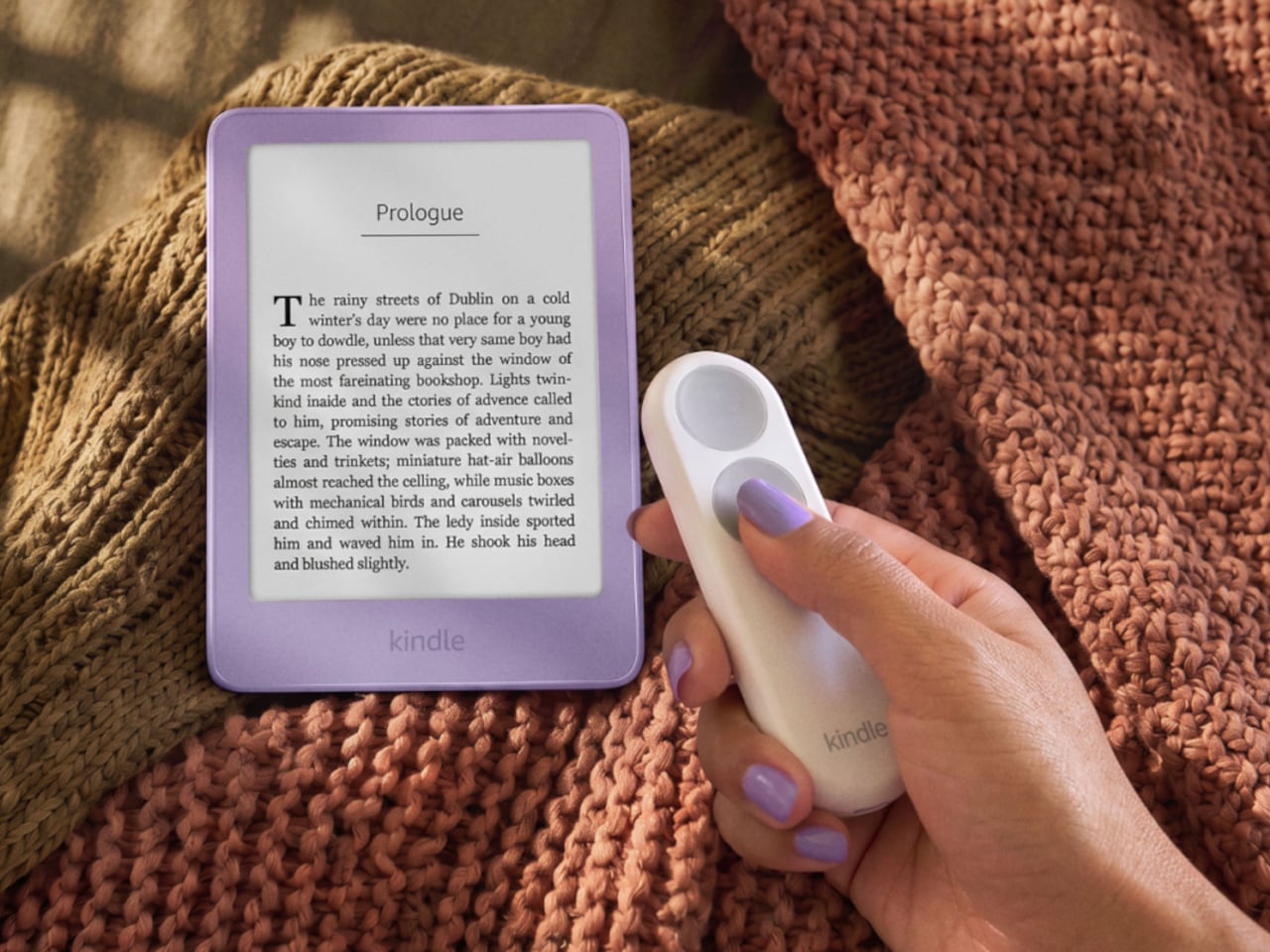
E-readers are supposed to replace physical books, but they strangely come mostly in black or gray, unlike colorful and distinctive book covers. Although not a complete design overhaul, Pocketbook’s new Verta and Verta Color e-readers offer a simple fix, and no, it doesn’t require slapping on a case. You can change the color of the e-reader by swapping the back panel while maintaining its slim shape and keeping the screen and page-turn buttons uncovered.

That’s a rather different approach to personalization than slipping on a protective cover. The interchangeable panels are sold separately, so you can keep a few colors around and switch when your taste changes. More importantly, they replace the back rather than wrapping over the front. There’s no extra flap to fold behind the reader when you settle into a chair with a book.

Designer: PocketBook

The front stays familiar in the best way. Both readers have a 6-inch touchscreen and enlarged page-turn buttons beneath it, giving your thumb another way forward when the screen is smudged or your hands are occupied. Each measures just 0.28 inches thick and weighs about 4.9 ounces, a size that suits a jacket pocket or an overstuffed bag on the commute.

Choose the regular Verta, and you get a 6-inch E Ink Carta 1300 display at 300 pixels per inch, built for the sort of long novel that makes you miss your stop. SMARTlight lets you adjust brightness and warmth as daylight disappears. It also offers Dark Mode, so you can keep reading in bed without a bright white page facing the person beside you.

The Verta Color is for readers who want their covers, illustrated pages, and comics to retain some color. Its E Ink Kaleido 3 screen renders monochrome text at 300 pixels per inch, but color drops to 150 pixels per inch. Those numbers matter if you read fine print in graphic novels; the color option gives illustrations some life, not the punch of a tablet.

Both have 16GB of storage, Wi-Fi for downloading books, and Bluetooth audio for audiobooks or text-to-speech, though you’ll need headphones or another compatible listening device. PocketBook also supports a broad range of file formats and borrowing through library apps. That flexibility comes in handy when the next book you want isn’t sitting in a single company’s store waiting for you.

An IPX4 rating gives the pair protection against splashes, not an invitation to use them in the bath. Their 1,500mAh batteries are meant to last up to two months, depending on how you read, although that figure comes from PocketBook rather than an independent test. The removable backs add personality, but they’re not a replacement for a protective case if the reader needs one.

PocketBook plans to release both in November 2026, pricing the Verta at €169 (about $198) and the Verta Color at €179 (about $209). Both are marked as coming soon on its storefront. The cleverest trick, though, is letting you change the color of something you hold for hours on end without asking a protective case to do the decorating for you.

The post PocketBook Gave Its $198 E-Reader the One Trick Old Nokia Phones Had first appeared on Yanko Design.

  • ✇Yanko Design
  • A $249 Smart Lock That Still Opens When You’ve Forgotten to Charge It
    Smart locks sound like the future until you’re standing outside with groceries and the lock won’t wake up because of a dead battery. Although there are different methods to address that, Ring’s first-ever Smart Lock has a rather ingenious solution: an almost literal crank. Simply turn a dial a few times to power the keypad just long enough to key in your code. It’s simple yet effective, and it doesn’t require you to fumble for a cover to replace the battery. The knurled dial sits beneath the b
     

A $249 Smart Lock That Still Opens When You’ve Forgotten to Charge It

Par : JC Torres
8 octobre 2026 à 04:15

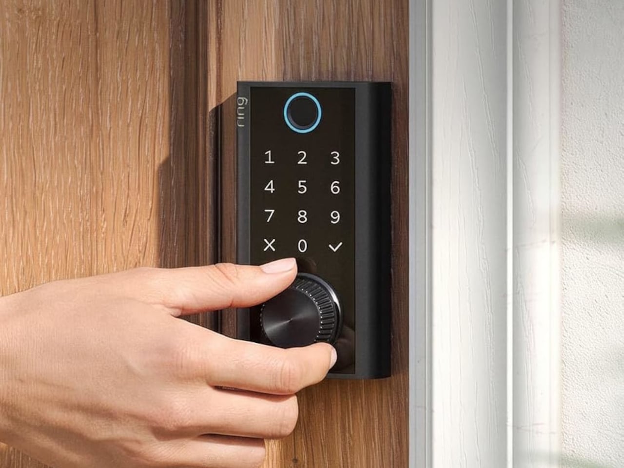
Smart locks sound like the future until you’re standing outside with groceries and the lock won’t wake up because of a dead battery. Although there are different methods to address that, Ring’s first-ever Smart Lock has a rather ingenious solution: an almost literal crank. Simply turn a dial a few times to power the keypad just long enough to key in your code.

It’s simple yet effective, and it doesn’t require you to fumble for a cover to replace the battery. The knurled dial sits beneath the backlit touchscreen keypad, with a circular fingerprint reader topping them all. All in all, the design looks more like a stack of controls instead of a deadbolt with electronics just bolted on.

Designer: Amazon

On regular days or nights, you can simply touch the fingerprint reader instead of digging for keys in your bag or pocket. You can also give a visitor a PIN that only works during a set time window. The Ring app also offers yet another way to let you in, and it also allows you to check the lock remotely, including Alexa voice control. These are the typical features you’d expect from a smart lock, but Ring does one better.

Most keyless locks require a cable or a spare battery before they even wake up, which isn’t exactly the fastest or the easiest when you only have one hand free. Ring puts that backup in that same free hand, figuratively. Simply turn the dial to “charge” the lock, almost like cranking some lever for power. It’s an almost comical analogy, but it gets the job done.

Of course, you don’t charge the Ring Smart Lock by turning the dial endlessly. That’s what the Quick Release Ultra Battery Pack is for. That battery is rechargeable, which means you don’t need to worry about extra wiring or hardware when installing the Smart Lock. It works with a standard single-cylinder deadbolt, making it immediately compatible with many doors.

One thing to note is that remote features depend on Amazon Sidewalk rather than your home Wi-Fi. That could spare you a trip back to check whether the door locked, or let you admit someone while you’re away, provided there’s coverage where you live. Ring says unlocking at the door happens locally, but Sidewalk remains a requirement for the connected functions. It’s a condition beneath the promise of convenience.

The lock can share the Ring app’s activity feed with Ring’s other products such as doorbell, cameras, and alarms, so you get a more holistic view of everything that happens at home even when you’re away. That said, it doesn’t have a camera of its own, which is a subtle nudge to get a Ring doorbell, too.

Black, silver, and brass finishes are planned, with a $249 price and U.S. availability expected in early 2027, pending regulatory authorization. For now, some details about the Ring Smart Lock have yet to be fully disclosed, including battery life. Regardless, it’s an interesting and low-tech solution to a high-tech problem that makes you feel you’re in control, even in such an emergency.

The post A $249 Smart Lock That Still Opens When You’ve Forgotten to Charge It first appeared on Yanko Design.

  • ✇Yanko Design
  • This $175 Wii-style Smart paddle turns your TV into a pickleball court
    Pickleball has officially escaped the court. At some point in the last two years, it stopped being ironic and became a lifestyle: parking lots of suburban rec centers filled up, TikTok feeds followed, then came the celebrity investors, the professional leagues, the branded paddle drops, and the kind of mainstream saturation that tells you a sport has officially graduated from niche to undeniable. Getting turned into a Wii-style digital pastime is, at this point, a rite of passage for any sport
     

This $175 Wii-style Smart paddle turns your TV into a pickleball court

7 octobre 2026 à 21:45

Pickleball has officially escaped the court. At some point in the last two years, it stopped being ironic and became a lifestyle: parking lots of suburban rec centers filled up, TikTok feeds followed, then came the celebrity investors, the professional leagues, the branded paddle drops, and the kind of mainstream saturation that tells you a sport has officially graduated from niche to undeniable. Getting turned into a Wii-style digital pastime is, at this point, a rite of passage for any sport that has truly made it. Tennis got there. Golf got there. Boxing, baseball, bowling. MegaShot Pickl+ is the moment pickleball collects that particular badge, and it does so with an actual sensor-embedded pickleball racket for authentic gameplay, not some generic rectangular controller.

The smart paddle pairs with your phone, tablet, or laptop over Bluetooth and sends the game to your TV (via an included cable) for big-screen play, mimicking your real swing movements on screen and firing haptic feedback through the handle on every hit. A split-screen mode lets you play multiplayer on the same screen too, making it a great family entertainer. No court reservation, no weather to negotiate with. The Wii taught an entire generation that swinging something in your living room could feel surprisingly real. Pickl+ is betting that a generation raised on that premise is ready to do it again, this time for the sport that has genuinely taken over the world, and without an extra console to add to the mix. The Starter Edition is on Kickstarter now for $175, down from a planned retail price of $249 and the campaign has been backed 500% in just 24 hours! Pickl+ will be compatible with sports like tennis, ping pong, and badminton with more racket sports planned for the same smart-paddle platform.

Designer: MegaShot

Click Here to Buy Now: $175 $249 (30% off). Hurry, only a few left!

Under the hood, Pickl+ is built around a 9-axis sensor that reads the angle, speed, and arc of every swing for precise motion tracking. The haptic feedback responds distinctly to different kinds of hits, making the on-screen action feel genuinely tied to what your arm is actually doing. The paddle weighs around 300 grams, carries a 2000 mAh battery rated for up to five hours of continuous play, and charges over USB-C. Bluetooth 5.2 handles the wireless pairing, while an MHL cable connects your phone to the TV when the living room demands a proper screen. The app runs on Android 14+, iOS 18+, Windows, and macOS. Setup is as minimal as it sounds: download, charge, pair, connect, play. Unlike the Wii, Switch, or the Meta Quest, no extra console or hardware needed.

Most gaming hardware asks you to adapt to the machine: learn the buttons, the gestures, the control scheme. Pickl+ goes the other direction. You know how to hold a paddle, and you know what a swing feels like. Rather than turning a conventional controller into a sports accessory, Pickl+ turns the sports object itself into the controller. The technology is essentially trying to disappear into the physical experience, which is part of what makes it a more interesting object than just a clever game controller.

Ten-plus game modes ship at launch, including Streak, Practice, Split Mode, Career, Local Multiplayer, Target, and Beach Mode, with more already in the pipeline. VIP unlocks exclusive virtual courts, daily bonus challenges, glowing paddle effects, custom ball trails, and profile cosmetics.

Before the Kickstarter campaign went live, the beta version of the paddle was showcased at New York Toy Fair, where people across different age groups, including gaming enthusiasts and industry experts, got hands-on time with the motion tracking, gameplay, etc. It gave MegaShot an early real-world read on how quickly people understood and enjoyed the experience. Motion gaming can look impressive in a controlled demo; the real test is whether someone can pick up the paddle, understand what to do, and immediately have fun. New York Toy Fair gave MegaShot that read before asking anyone to back the campaign.

MegaShot arrived at this with receipts. Before Pickl+, the company built a smart bat, which sounds hyperlocal until the numbers land: 100,000+ units sold worldwide, 2,700+ Amazon reviews, and ratings above 4.5 across Google, Amazon, the Play Store, and iOS. The Smart Bat earned the team a spot on Shark Tank India, coverage across major publications, and placement on Walmart shelves. Cricket was a demanding proving ground, the kind of sport where precision hardware lives or dies by real player feedback. That foundation gave MegaShot a validated tech stack, a battle-tested supply chain, and the track record that earns trust going into a bigger, more globally ambitious launch.

Pickleball is the entry point for something larger. The same paddle hardware is designed to eventually support tennis, badminton, table tennis, and squash, with the VIP Pass carrying across sports as they are added. That roadmap turns Pickl+ from a single-sport product into a platform for multiple racket-sport experiences, which changes the value calculation considerably. The most globally accessible racket sport of this decade is also, as it turns out, the perfect vehicle for a company that built its credibility in one market and is now ready to find out how far a smart paddle can travel.

The Starter Edition, one smart paddle and an MHL cable, is available at its $175 Kickstarter launch price, versus a planned $249 retail price. Duo packs start at $275 for two paddles with a cable, while the Starter VIP Duo Pack, which throws in a VIP Pass, runs $315.

The Signature Edition, the premium single-paddle option, comes in at $349. The Signature Duo Edition bundles two premium paddles with cables, a VIP Pass, and protective sleeves for $499. Worldwide shipping begins in early 2027, covering the US, Canada, the UK, Germany, Australia, New Zealand, UAE, and India.

Click Here to Buy Now: $175 $249 (30% off). Hurry, only a few left!

The post This $175 Wii-style Smart paddle turns your TV into a pickleball court first appeared on Yanko Design.

  • ✇Yanko Design
  • 5 Gadgets Gen Z Actually Wants to Own Right Now
    Something shifted. The generation that grew up with every song, show, and photo living inside a glass rectangle is now buying CD players, handheld consoles, and standalone cameras that do exactly one thing. It is not purely nostalgia driving this. It is the particular relief of owning something that does not send notifications, update itself overnight, or ask for your location. These are objects that simply work. What connects these five is not a shared aesthetic or price point but a shared res
     

5 Gadgets Gen Z Actually Wants to Own Right Now

5 octobre 2026 à 07:40

Something shifted. The generation that grew up with every song, show, and photo living inside a glass rectangle is now buying CD players, handheld consoles, and standalone cameras that do exactly one thing. It is not purely nostalgia driving this. It is the particular relief of owning something that does not send notifications, update itself overnight, or ask for your location. These are objects that simply work.

What connects these five is not a shared aesthetic or price point but a shared resistance. Each gives your hands something real to do, something that clicks, spins, or frames a shot without a screen mediating the exchange. Gen Z did not fall out of love with technology. They fell out of love with technology that treats their attention as the product. These five objects treat it as something worth protecting.

1. Syitren R400 Bluetooth CD Player

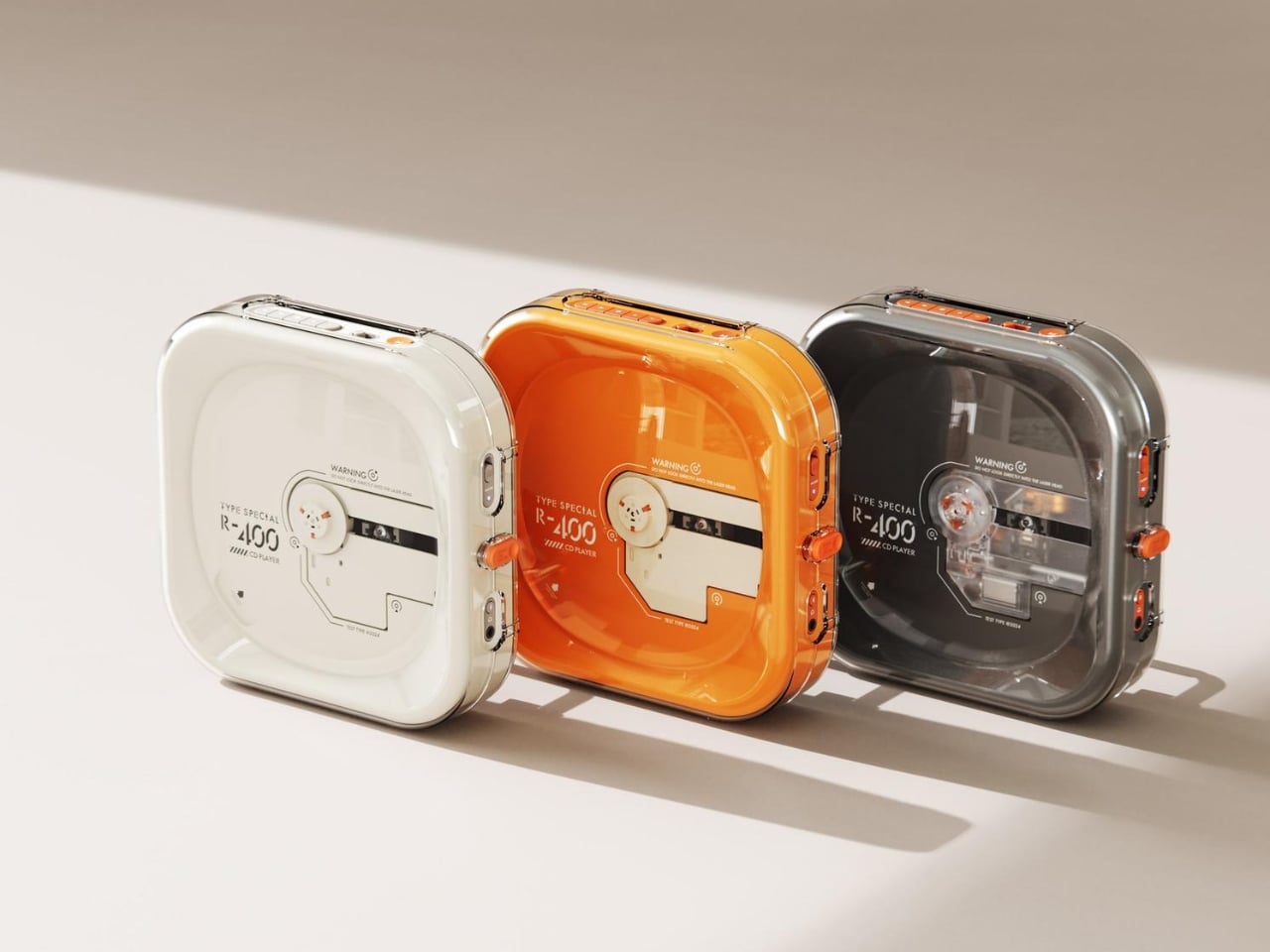
Portable CD players never disappeared, but they did stop trying. For years, the category was defined by bulky Sony boomboxes built around FM radio and cassette tapes as much as CDs. The R400, designed by ORGDOT for Syitren, is the first player in a long time that feels built for how people actually listen today. It is compact, Bluetooth 5.3-first, and designed to look as good on a desk or shelf as it does in your hand on a commute.

Under the shell, a custom Syitren pure CD core delivers a 70dB signal-to-noise ratio for clean, high-fidelity sound. Anti-vibration engineering keeps things skip-free while commuting or walking around. The shell is detachable and customizable, and a sunken charging compartment with a built-in wire groove keeps the cable from bending or fraying over time. Bluetooth or wired, car stereo or headphones, four-plus hours of continuous playback per charge, at a price that doesn’t make you choose between good design and good sound.

What we like

  • The detachable, customizable shell makes it something you can call your own, not just another piece of consumer electronics sitting on a desk.
  • Anti-vibration engineering means it is genuinely designed to be carried around, not just displayed.

What we dislike

  • Four hours of battery covers a workday comfortably but cuts short anything longer without access to a charge.
  • Sony has been quietly pulling back from portable CD players, meaning the R400 steps into a space with almost no competition to pressure it on price or performance.

2. Game Bub

The Game Boy Advance’s design patents expired years ago, and most of what followed has been cheap emulation boxes wearing a familiar shape. Game Bub from Crowd Supply is different. It uses FPGA technology rather than software emulation, recreating the original Game Boy, Game Boy Color, and Game Boy Advance hardware at a circuit level with accuracy that emulators cannot match. The transparent shell, available in Purple and White, makes the whole thing look exactly as it should.

The horizontal GBA form factor is a deliberate choice in a market that keeps going vertical. Button placement feels natural; the shoulder buttons are where your fingers expect them, and dual one-watt stereo speakers handle classic soundtracks properly. USB-C charging, a headphone jack, a microSD slot for firmware updates, display output for big-screen play, Bluetooth Low Energy, 2.4GHz Wi-Fi, and a 3000mAh battery round out a device that earns the word ambitious.

What we like

  • FPGA accuracy means your cartridge collection plays exactly as it was designed to, not approximately as software emulation allows.
  • The horizontal form factor respects what made the GBA comfortable for long sessions, which most of the competition has quietly abandoned.

What we dislike

  • Hardware-level FPGA accuracy comes at a price point that locks out buyers who would otherwise be genuinely interested.
  • Open-source FPGA handhelds tend to have longer firmware update timelines, which requires patience from anyone buying early.

3. Clip&Go Radio

A radio that clips to your backpack and plays FM stations does not sound like a gadget Gen Z would want. The Clip&Go reframes the premise. It is compact enough to attach directly to your gear without thinking about it, built around the idea that the best emergency tool is one already useful before anything goes wrong. A built-in flashlight, hand crank, and solar panel mean it carries more utility than the dial on top suggests.

The physical radio format fits the same logic as the CD player and the handheld. It is a single-purpose device with no algorithm, no autoplay, and no recommendations. You tune a station, clip it on, and go. In a landscape where every device competes for your attention, a radio that does not know you exist feels quietly radical. At $60, it is also the most immediately ownable thing on this list.

Click Here to Buy Now: $60.00

What we like

  • The built-in hand crank and solar panel mean it works when other devices cannot, giving it a utility case that goes well beyond aesthetics.
  • The clip attachment means it genuinely travels with you rather than waiting in a bag pocket to be pulled out.

What we dislike

  • FM signal quality is location-dependent, making the listening experience inconsistent wherever coverage is thin.
  • At $60, it competes with Bluetooth speakers that do more on paper. The case for owning it rests on the single-purpose philosophy, not the spec sheet.

4. Camera (1)

The impulse to pick up a standalone camera again is not about megapixels. It is about separating the act of taking a photograph from the act of being on your phone. Camera (1) is a concept by designer Rishikesh Puthukudy that imagines what a modern compact could feel like if built around physical controls rather than touchscreen menus. Metal body, softly rounded corners, every main control reachable without shifting your grip or glancing away from the scene you are trying to capture.

All the main controls live on one edge: a shutter, a circular mode dial with a dot-matrix glyph display showing simple icons for stills and video, and a D-pad your thumb can reach without looking down. A light strip around the lens pulses for the self-timer, confirms focus, and signals when recording is live, replacing multi-layer software navigation with immediate, readable feedback. The design language pulls from Nothing’s transparent, hardware-forward aesthetic and pushes it into something you would actually want to carry.

What we like

  • Every main control sits within reach of one thumb and index finger, keeping your eyes on the subject rather than hunting through a menu.
  • The light strip communicates camera state through peripheral vision, a smarter solution than burying status information inside a touchscreen.

What we dislike

  • Camera (1) is a concept with no confirmed manufacturer, production timeline, or pricing, which is a real limitation for anyone wanting to own one today.
  • The visual language is closely referential to Nothing’s established aesthetic, which may read as derivative to anyone already familiar with that design direction.

5. elrow miniphone

Full smartphones feel like overkill for a generation quietly walking back from maximalism. The Apple Watch on your wrist handles glances but stays awkward for anything more deliberate, and wearing both a smartwatch and an analog watch on the same arm is its own kind of compromise. The elrow miniphone is a 3D-printed case that turns an Apple Watch into a narrow, palm-sized device worn on a lanyard. The Standard fits the 46mm Series 10 and 11. The Ultra fits Apple Watch Ultra 1, 2, and 3.

Both stand around 95mm tall with textured translucent bodies and visible screws that do not attempt to hide how they were built. The back stays open so you can charge without disassembling the case. What elrow industries built is less a gadget and more a posture, a way to carry connectivity without wearing it on your wrist, freeing that space for the mechanical or analog watch you actually want to wear while keeping notifications, Apple Pay, and quick replies within reach.

What we like

  • The open back lets you charge without disassembly, removing the most frustrating everyday friction of any case.
  • Wearing connectivity on a lanyard rather than your wrist opens the door to the analog watch you have been quietly sidelining.

What we dislike

  • As a 3D-printed case, it depends entirely on which Apple Watch model you already own and is not a standalone device.
  • A lanyard-worn device requires real behavioral change to make useful day-to-day rather than just conceptually interesting.

Ownership Is the Point

What this list describes is not a generation running from technology. It is a generation learning to be selective about which technology gets to run on them. A CD player that skips the algorithm. A handheld that plays cartridges at hardware level. A camera built around a shutter click. A lanyard device that frees your wrist. A radio that does not know your name. Five objects. Five things that simply work.

The broader shift is less about any individual product and more about what owning something actually means. Streaming everything is convenient right up until nothing feels like yours. A CD on a shelf, a cartridge in a slot, a photo taken with a camera you held in your hand: these are forms of possession the subscription model quietly erased. Gen Z is taking them back, one physical object at a time.

The post 5 Gadgets Gen Z Actually Wants to Own Right Now first appeared on Yanko Design.

  • ✇Yanko Design
  • The Selfie Camera on Your Phone Has Always Been in the Wrong Place
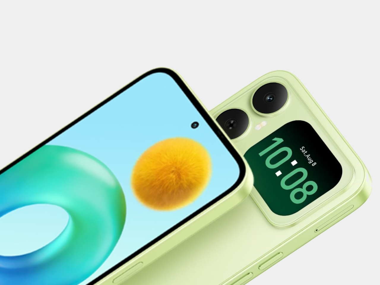
    Most budget phones have one screen you stare at and a back you think about. The Honor X5d s makes that back worth a second look by placing a 2.01-inch touchscreen next to its rear camera. It shows the time and alerts, handles music, and helps you take selfies with the better camera. That’s a useful design trick for an inexpensive phone. The camera island looks like it was built around that display, rather than having a screen tacked on afterward. Two dark circles sit beside it, although Honor l
     

The Selfie Camera on Your Phone Has Always Been in the Wrong Place

Par : JC Torres
5 octobre 2026 à 06:20

Most budget phones have one screen you stare at and a back you think about. The Honor X5d s makes that back worth a second look by placing a 2.01-inch touchscreen next to its rear camera. It shows the time and alerts, handles music, and helps you take selfies with the better camera. That’s a useful design trick for an inexpensive phone.

The camera island looks like it was built around that display, rather than having a screen tacked on afterward. Two dark circles sit beside it, although Honor lists only one rear camera. Forest Green makes the island pop against a pale back, while Midnight Black keeps things subdued. Either way, the phone’s most interesting feature is visible before you even wake it.

Designer: Honor

That rear screen makes sense when you’re trying to get everyone into a photo. Instead of extending your arm, guessing at the framing, and discovering that someone’s head is missing, you can see the shot while using the 50-megapixel rear camera. A tap on the back takes the picture. There’s also a 5-megapixel front camera, but this arrangement gives selfies another option.

Of course, a phone can’t spend all day posing for pictures. Leave the X5d s face down on a desk, and its little window can still show the time or a call alert. Music controls live there too, so skipping a song doesn’t require turning the whole device over. It’s a small convenience, but those are often the ones you keep using.

On the other side, there’s a 6.78-inch LCD for more than a glance. Its size makes room for videos, messages, and the photos you took, although the 1,576×720 resolution isn’t particularly sharp for such a large panel. The rear display doesn’t fix that limitation. It simply gives quick tasks their own place instead of asking the bigger screen to do everything.

There’s a 6,000mAh battery to keep both screens running, though the phone’s 15W wired charging might test your patience when it finally needs a refill. Honor also provides 64GB of storage and a three-card slot, letting you add a microSD card without sacrificing either SIM. That’s handy if you keep your photos and music on the phone rather than in the cloud.

Inside, the Unisoc T610 processor and 4GB of RAM tell a more familiar budget-phone story. The side-mounted fingerprint reader is convenient, but there’s nothing particularly exotic about the rest of the hardware. In South Africa, the 4GB/64GB version costs R2,499 (about $150), which puts the extra screen in reach of people who aren’t shopping for a flagship just to get a conversation-starting feature.

That display won’t replace your phone’s main screen, nor will it make the X5d s a better choice for demanding games. But it changes the small interactions that fill a day: a glance at a call, a tap to skip a song, a preview before taking a selfie. At this price, giving the back something useful to do feels refreshing.

The post The Selfie Camera on Your Phone Has Always Been in the Wrong Place first appeared on Yanko Design.

  • ✇Yanko Design
  • 4 Times a Day the StillFrame Headphones Switch Jobs For You
    A lot of people spend the entire eight hours of a working day just sitting in front of their screens. You probably have your speakers on or put on your headphones to listen to some background music or for online meetings. But for those of us who don’t want to spend one-third of the day like this, we go through different “phases,” which means that the audio that accompanies us throughout the day also changes. From commuting to work to sitting down at your workstation to going on a dinner date an
     

4 Times a Day the StillFrame Headphones Switch Jobs For You

3 octobre 2026 à 19:30

A lot of people spend the entire eight hours of a working day just sitting in front of their screens. You probably have your speakers on or put on your headphones to listen to some background music or for online meetings. But for those of us who don’t want to spend one-third of the day like this, we go through different “phases,” which means that the audio that accompanies us throughout the day also changes. From commuting to work to sitting down at your workstation to going on a dinner date and finally relaxing at home, you don’t want the same setting all day.

That’s the more interesting way to look at the StillFrame Headphones. Rather than asking them to create one uninterrupted listening session, imagine taking them through a day full of stops and starts. They offer Noise Cancelling and Transparency modes, Bluetooth 5.4 connectivity, a USB-C wired option, and dual microphones with noise control. Each feature has a place in that routine, even if no two days follow quite the same route.

Click Here to Buy Now: $245

The first part of the day for most of those who go to a regular office is the morning commute. You might be on a noisy train with a lot of people talking or walking along a busy street with a lot of city noise. StillFrame’s Noise Cancelling mode will help you focus on what you’re listening to and drown out some of the chaotic noise around you. It is always there as an option for times when you want to immerse yourself in your playlist or the next chapter of the book you’re listening to.

When you do need to let the world back in, you don’t have to turn off your podcast episode at a crucial moment. The headphones have a Transparency Mode option that’s there with a tap for moments when you need to order a coffee or you’re walking somewhere that requires your full attention. Just tap between the two modes for what you need at the moment without having to pause or stop what you’re listening to. It’s also a good reminder that the world isn’t always a distraction.

When you finally reach your office, you might have a scheduled meeting sometime during the day. StillFrame is useful even for work things, as it has dual microphones with noise control so you can shift from consuming audio to communicating with others using the headphones. That doesn’t mean every conversation will sound perfect in every environment. It does mean you can move from a podcast or playlist to a meeting without reaching for a separate pair of headphones just because your role in the audio has changed.

When you finally get home to your cozy bed, you sometimes still want to continue listening to that audiobook, start a new podcast episode, or let some soothing music lull you to sleep. You can choose to continue using your StillFrame headphones over Bluetooth 5.4 or use the USB-C wired option if you’d rather plug in. Either way, the wired option is an alternative to wireless listening and not a reason to assume the headphones will work after their battery runs out.

A few other details help round out the picture. StillFrame weighs 103 grams and has a stainless-steel headband, a minimalist frame, and 40mm drivers. Its ear cushions attach magnetically, making them easy to swap; the white model comes with extra pairs in light gray and turquoise. Battery life is rated at up to 24 hours per charge, though actual use may vary. Those details aren’t the main story here, but they help explain what you’re carrying from one part of the day to the next.

No pair of headphones can make a commute quiet, a meeting short, or a busy day slow down. What StillFrame Headphones offer is a set of ways to respond as those moments change. You can focus, let the world in, take a call, or settle into an evening listen. The best setting isn’t one you choose in the morning and keep all day. It’s the one that fits where you are now.

The post 4 Times a Day the StillFrame Headphones Switch Jobs For You first appeared on Yanko Design.

  • ✇Yanko Design
  • A Pocket Concept Built to Catch Design Ideas Before They Get Away
    Good ideas don’t always wait until you’ve found the right pen and an empty page. For industrial designers, a quick sketch can turn into a note, then vanish while they’re looking for something to write on. Ideo is a pocket-sized concept that puts a sticky-note pad, a crank-set timer, and a random-word prompt in one place, giving those fleeting thoughts somewhere to land. The trick isn’t to replace a sketchbook or ask a computer to finish your thinking. It’s to keep the small tools for getting st
     

A Pocket Concept Built to Catch Design Ideas Before They Get Away

Par : JC Torres
3 octobre 2026 à 18:30

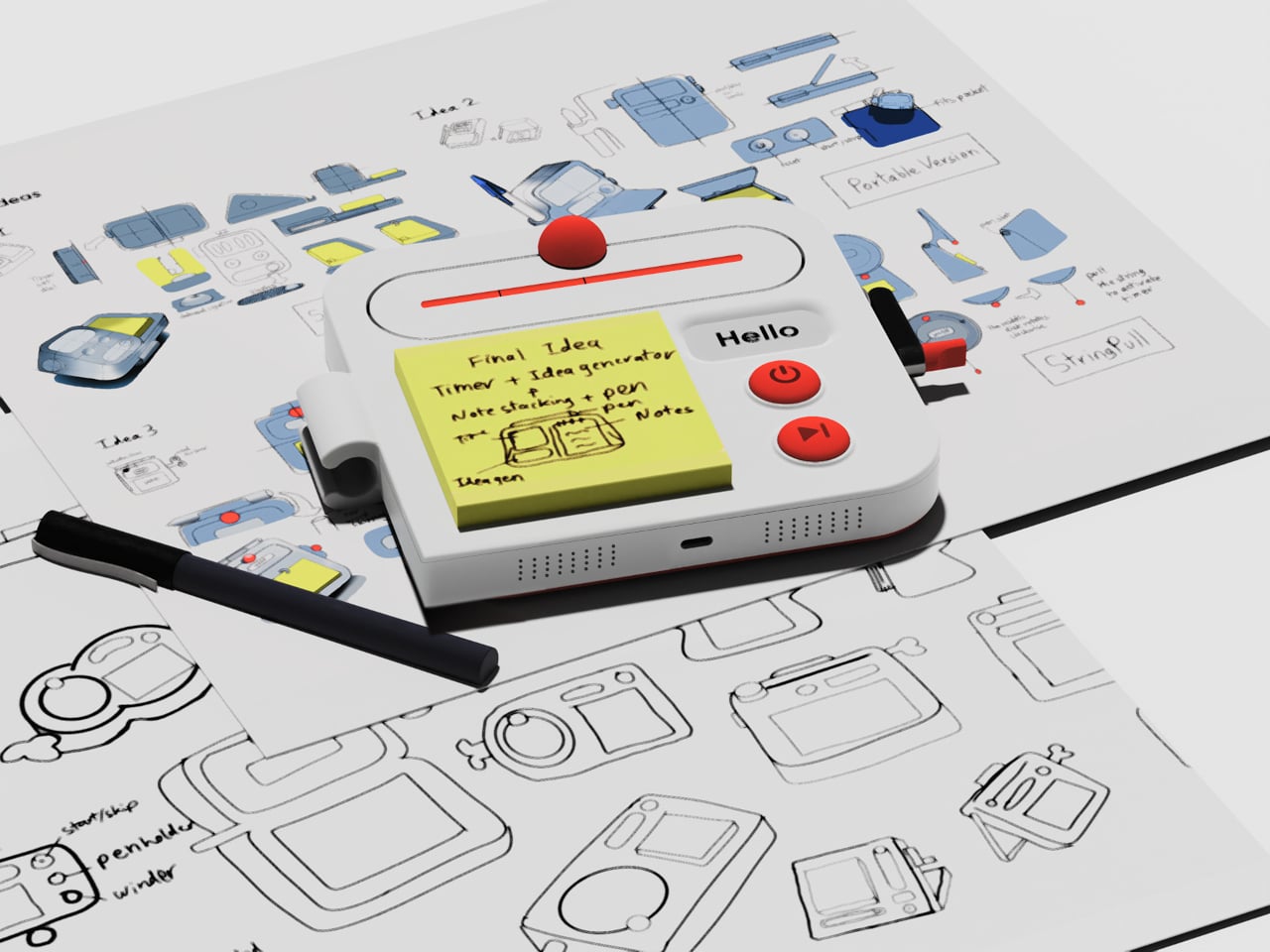
Good ideas don’t always wait until you’ve found the right pen and an empty page. For industrial designers, a quick sketch can turn into a note, then vanish while they’re looking for something to write on. Ideo is a pocket-sized concept that puts a sticky-note pad, a crank-set timer, and a random-word prompt in one place, giving those fleeting thoughts somewhere to land.

The trick isn’t to replace a sketchbook or ask a computer to finish your thinking. It’s to keep the small tools for getting started within reach. A pen clips to one side of the rounded body, while a stack of sticky notes takes up much of the front. You can jot down a shape, a measurement, or a question before it slips away.

Designer: Aditya Rajiv

Then there’s the timer, which makes the device a little stranger than an ordinary stationery holder. Turn the crank on the side until the orange bar reaches your chosen duration, and a bright ball moves along the track as time passes. When its cycle finishes, the concept calls for a sound. That gives a short sketching session a visible beginning and end.

A blank note can be surprisingly intimidating when someone asks you for three different directions before lunch. Ideo responds with an e-ink display that presents a random word, such as “tiger” or “apple,” to nudge your thoughts somewhere unexpected. If the word doesn’t help, a physical button skips to another. This isn’t some AI that tries to take over your thinking process but, rather, a nudge to keep your pen moving.

During a workshop, you might have a few minutes to sketch a handle before the group moves on to another idea. The timer keeps that deadline obvious, while the note stays attached to the device until you’re ready to place it beside other sketches. Having the prompt nearby could help when your first drawing feels too much like the one you made yesterday.

There’s a playful contrast between the quiet white housing and its red controls, with the yellow notes taking up nearly half the front. The broad knob and two large buttons look approachable rather than like the controls on a complicated drawing tablet. It almost looks like a child’s toy, which is the perfect idiom for playful and unhindered ideation.

The concept understands a small but familiar delay: the moment between having an idea and finding a place for it. A notepad and pen handle that first step, while the timer and word generator give you a reason to start drawing instead of staring at a blank sheet. Ideo is still a concept, of course, but the scramble for a pen makes its arrangement seem practical.

The post A Pocket Concept Built to Catch Design Ideas Before They Get Away first appeared on Yanko Design.

  • ✇Yanko Design
  • Huawei MatePad Pro 12” Review: Stunning Hardware, One Familiar Caveat
    PROS: Gorgeous PaperMatte display Very thin and light formfactor Big battery Good speaker CONS: No built-in Google Play Store Long-term software support remains unclear RATINGS: AESTHETICSERGONOMICSPERFORMANCESUSTAINABILITY / REPAIRABILITYVALUE FOR MONEYEDITOR'S QUOTE:The MatePad Pro 12" is stylish, light, and lovely to use, with a PaperMatte display that does a lot of the heavy lifting. Huawei’s tablet lineup is not doing itself many favors right now. The names suggest one
     

Huawei MatePad Pro 12” Review: Stunning Hardware, One Familiar Caveat

Par : Aki Ukita
2 octobre 2026 à 11:20

PROS:


  • Gorgeous PaperMatte display

  • Very thin and light formfactor

  • Big battery

  • Good speaker

CONS:


  • No built-in Google Play Store

  • Long-term software support remains unclear

RATINGS:

AESTHETICS
ERGONOMICS
PERFORMANCE
SUSTAINABILITY / REPAIRABILITY
VALUE FOR MONEY

EDITOR'S QUOTE:

The MatePad Pro 12" is stylish, light, and lovely to use, with a PaperMatte display that does a lot of the heavy lifting.

Huawei’s tablet lineup is not doing itself many favors right now. The names suggest one thing, the products suggest another, and if you are just a normal person trying to work out which model is which, the whole range can feel oddly muddled. The MatePad Air sounds like it should be the lighter, breezier option, yet the MatePad Pro 12″ is actually the one that feels lighter and more effortless in the hand.

The MatePad Pro Max, by contrast, is much easier to understand. It is the big brother in the family, and it looks the part too, with a very similar design language to the MatePad Pro 12″. That makes this tablet feel like the middle child in Huawei’s lineup, not in a bad way, but in the sense that it sits between the easy-to-place Max and the more confusingly named Air.

Designer: Huawei

The good news is that the product itself is much easier to understand than the naming. The MatePad Pro 12″ is a slim, striking tablet that clearly wants to be useful as well as beautiful. It aims to cover work, entertainment, note-taking, and creative play in one polished package, and for the most part, it succeeds by being pleasant to use rather than merely impressive on paper.

Aesthetics

The MatePad Pro 12″ looks a lot like a smaller MatePad Pro Max, which is no bad thing. The two share the same slim, polished design language, and that gives the Pro 12″ an immediately premium feel. If anything, this size makes the look more approachable. It still has that high-end flagship polish, just in a form that feels a little less dramatic and easier to live with.

Both tablets come in Blue and Space Gray, and the Blue version I received is especially attractive. It has a soft shimmer finish that catches the light nicely without tipping into anything too flashy or fussy. There is also a nice contrast between the shimmer back panel and the glossy side frame, while the slightly rounded edges keep the tablet from feeling too sharp or severe. Together with the circular camera bump, these details give the design a bit more warmth and character without taking away from its clean, premium feel.

Ergonomics

For a 12-inch tablet, the MatePad Pro 12″ is impressively easy to handle. It measures about 10.4 x 6.8 inches (264.2 x 172.9 mm) and is just 0.19 inches thick (4.7 mm), but at 454g, or about 1 pound, it feels lighter in the hand than its size suggests. That makes a real difference in daily use. It is easy enough to hold one-handed for short stretches, and it never feels as cumbersome as some larger tablets do.

Just as importantly, it does not feel flimsy. Despite how thin and light it is, the MatePad Pro 12″ still feels solid and premium in the hand. That balance matters, because a tablet this slim could easily have tipped into feeling delicate. Instead, it feels refined without feeling fragile.

I also received the optional Huawei Glide Keyboard, which weighs 399g, or about 14.1 ounces, and turns the tablet into something much closer to a compact laptop. The typing experience is good, and one detail I especially appreciated is the way the keyboard neatly nests the stylus. It gives the pen a proper place to sit, which means there is less chance of it going missing while you are carrying the tablet around. Small touches like that make the whole setup feel more thought through.

That said, the keyboard is not perfect. The touchpad is a little too easy to trigger, and I often found myself accidentally brushing it while typing, so I ended up turning off Tap to Click. There is also only one viewing angle, which limits flexibility a bit, and the keyboard is not backlit. None of these issues are deal-breakers on their own, but together they make the accessory feel a little less polished than the tablet itself.

Performance

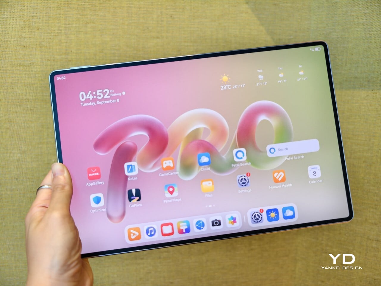
The display of the MatePad Pro 12″ is the obvious star. Huawei’s PaperMatte screens remain one of the company’s best ideas, and that is true here as well. The 12-inch OLED panel looks sharp, bright, and vibrant, while the slim 3.5mm bezels help give it a more immersive feel. Huawei has also embedded the front camera neatly into that thin border, which keeps the front looking clean and uninterrupted rather than broken up by a notch or thicker framing.

What really makes the screen stand out, though, is the PaperMatte finish. Huawei’s PaperMatte displays have impressed me before, and this one is no exception. The matte treatment cuts down on glare without making the panel look flat or dull, which is not always easy to pull off. Huawei says anti-reflection performance is 30 percent better than the previous generation, and that feels believable in everyday use. Even in bright environments, the screen comes remarkably close to reflection-free, and with up to 1600 nits of peak brightness, it stays comfortable for reading, browsing, and longer work sessions without constantly fighting the light.

The speakers are another pleasant surprise. The MatePad Pro 12″ uses a four-speaker setup, and for something this thin and light, it gets plenty loud and has more bass presence than you might expect, which gives music, dialogue, and video a bit more body than a device this slim really ought to manage. It never quite feels like the sound is coming from such a small and thin tablet. The audio can get a little sharp at times, especially at higher volume, but for casual listening and streaming, it still does a very good job.

Battery life has been solid in my use. The MatePad Pro 12″ packs a 10,400mAh battery, and in a fairly normal day of writing, emails, keeping up with my team on Slack, web browsing, and YouTube, it got through to the end of the day without me worrying too much about battery. Huawei rates it for up to 14.7 hours of local video playback, and there is also 40W reverse charging if you need to top up another device.

Software is where the MatePad Pro 12″ becomes a more conditional recommendation. The tablet runs Harmony OS 4.3 out of the box, and there is no built-in support for the Google Play Store or Google Mobile Services here, and while there are workarounds, there is no guarantee every app you rely on will work exactly as expected. That is the main thing potential buyers need to understand going in. The hardware is easy to appreciate straight away. The software side asks for a bit more patience and flexibility.

Huawei’s AppGallery does offer options like GBox, which can help you access apps that depend on Google services, but the experience is not always seamless. In my testing, GBox did not support split-screen, which felt limiting on a tablet that is otherwise clearly built for multitasking. I had better luck with apps downloaded through Aurora, which did work in split-screen, but that still leaves you deciding how comfortable you are relying on third-party app sources. For some people, that will be a manageable compromise. For others, it will be reason enough to hesitate.

On the plus side, Huawei’s own built-in apps for productivity and creativity are genuinely quite capable. GoPaint, in particular, feels feature-rich, with a wide variety of brushes and granular control over how they behave. There are also more ambitious tools like animation, which appears to build movement from your layers, and a timelapse feature that lets you replay a drawing from start to finish. Even if not everyone will use those tools seriously, they help the app feel more than just a token extra.

The Notes app is also packed with features, including AI handwriting-to-text. In my case, the results were not always perfectly accurate, but that may say as much about my handwriting as it does about the software. Either way, it is another example of Huawei putting real effort into its own app ecosystem. So while the lack of built-in Google support remains the bigger issue, the tablet’s first-party software is stronger than you might expect.

Sustainability

Sustainability is not the strongest part of Huawei’s pitch here, at least not from the information currently available. There is plenty of talk about thinness, portability, and productivity, but much less about things like recycled materials, repairability, or broader environmental commitments. More notably, Huawei has not made any official statement about how long the MatePad Pro 12″ will receive software support, which makes it harder to judge the tablet’s long-term value from a sustainability point of view.

What Huawei does emphasize is durability. The company says the MatePad Pro 12″ offers 50 percent better bend resistance than the previous generation, which is a meaningful improvement for a device this thin. A tablet that is less likely to flex or fail in everyday use is at least more likely to stay in service longer. That is not the same thing as a full sustainability strategy, but it still counts for something.

Value

Value is where the MatePad Pro 12″ becomes more complicated. Pricing starts at €1,199, or about $1,330, for the 12GB and 256GB model with a folio cover, rises to €1,299, or roughly $1,440, with the Glide Keyboard, and reaches €1,449, or around $1,610, for the 12GB and 512GB version with the keyboard. For context, Apple’s 11-inch iPad Pro with 256GB of storage starts at $1,199 in the U.S., so Huawei is clearly pricing this in direct flagship territory.

Judged purely on hardware, the MatePad Pro 12″ feels convincingly premium. It is slim, light, beautifully made, and fitted with an excellent display. The problem is that the software caveats do not disappear just because the hardware is this polished. The lack of built-in support for the Google Play Store or Google Mobile Services still makes this a more selective recommendation than the price might suggest. If you are already comfortable with Huawei’s ecosystem, the value makes more sense. If not, the asking price may feel harder to justify.

Verdict

The Huawei MatePad Pro 12″ makes its strongest case through hardware. It is slim, light, beautifully made, and fitted with a PaperMatte display that remains one of Huawei’s real strengths. The speakers are better than you might expect from something this thin, battery life has been solid in my use, and the overall experience feels properly premium. It is the kind of tablet that makes a strong first impression and, for the most part, keeps earning it.

What stops it from being an easy recommendation is software. There is no built-in support for the Google Play Store or Google Mobile Services, and while workarounds exist, they are still workarounds. For buyers already comfortable with Huawei’s ecosystem, that may be manageable. For everyone else, it adds friction to a tablet that is otherwise polished and appealing. The MatePad Pro 12″ is a very good piece of hardware, but it is not the most straightforward premium tablet to buy.

The post Huawei MatePad Pro 12” Review: Stunning Hardware, One Familiar Caveat first appeared on Yanko Design.

  • ✇Yanko Design
  • Mobvoi TicNote smartwatch has one button, and it’s built to remember what you often forget
    I know you will relate to one of these telltale moments. A meeting ends, someone gives you three useful details, and by the time you reach your desk, only one remains. The same thing happens after an interview, a doctor’s appointment, a lecture, or when someone rattles off directions while you’re already trying to keep up. We like to think we remember conversations better than we actually do. Mobvoi’s TicNote Watch is designed to cover that very human failure. Instead of asking you to open an a
     

Mobvoi TicNote smartwatch has one button, and it’s built to remember what you often forget

2 octobre 2026 à 09:20

I know you will relate to one of these telltale moments. A meeting ends, someone gives you three useful details, and by the time you reach your desk, only one remains. The same thing happens after an interview, a doctor’s appointment, a lecture, or when someone rattles off directions while you’re already trying to keep up. We like to think we remember conversations better than we actually do.

Mobvoi’s TicNote Watch is designed to cover that very human failure. Instead of asking you to open an app, find a recorder, or reach for your phone, it gives the watch a dedicated physical recording button. Press and hold it to start recording. The recording can happen without a phone and even works offline. To me, the idea seems pretty interesting for capturing my team’s briefing.

Designer: Mobvoi

Mobvoi TicNote does the heavy lifting for you


Most smartwatches are defined by everything they can do. Notifications, workouts, calls, apps, payments, music, health tracking – the list keeps getting longer. TicNote Watch is different though, as its most important interaction is deliberately narrow. Just press a button and remember what just happened. That makes the hardware control more interesting than it might initially seem. There is something satisfying about a product that behaves more like a lighter, a film camera’s shutter, or a staple gun than another miniature touchscreen computer. The action is physical and doesn’t require you to navigate an interface while somebody is still talking.

In a world where dedicated controls have increasingly disappeared behind glass, putting one back on the wrist becomes a design statement. This smartwatch isn’t trying to make every interaction smarter; rather, it aims to make one interaction nearly impossible to mess up. The double-press gesture adds a smaller version of the same idea, letting users capture a quick thought of up to 60 seconds.

Simple input, surprisingly busy output

What happens after the button press is where the AI kicks in. TicNote Watch can transcribe conversations on the wrist, with live text supporting 17 languages, and users can tap to highlight important statements while a conversation is happening. Once the recording ends, the system can generate an AI summary and mind map. The intended audience for the wearable can be a journalist leaving an interview, a recruiter moving between candidates, a consultant bouncing between meetings, or a graduate student sitting through a campus lecture. For someone spending much of the day listening rather than typing, removing the act of note-taking can be genuinely useful.

There is, however, an obvious social wrinkle. A recorder that lives on your wrist is easy to reach for, but that doesn’t mean everyone around you will be comfortable being recorded. Consent and workplace etiquette matter, particularly in meetings or shared spaces. Mobvoi also claims more than 24 hours of continuous recording and up to 200 hours of local storage, so this isn’t unlimited memory in literal terms. At $249, with a limited-time introductory price of $199, TicNote Watch isn’t really competing on how many smartwatch features it can squeeze onto your wrist. It is built around a premise that doesn’t try to replace your phone, your notebook, and your entire day.


The post Mobvoi TicNote smartwatch has one button, and it’s built to remember what you often forget first appeared on Yanko Design.

  • ✇Yanko Design
  • HP’s $699 OmniBook 5 Has the One Thing the MacBook Neo Doesn’t
    Affordable laptops often make you choose between a nice screen and a machine you’d want to carry. HP’s $699.99 OmniBook 5 14 makes a different pitch against Apple’s MacBook Neo: an OLED touchscreen wrapped in a slim, colorful aluminum body. It’s an appealing combination for someone moving between classes, work, and a movie, though the price doesn’t buy every specification HP advertises for the series. HP treats color as part of the laptop, rather than something to add with a sticker. Starlit Bl
     

HP’s $699 OmniBook 5 Has the One Thing the MacBook Neo Doesn’t

Par : JC Torres
2 octobre 2026 à 06:07

Affordable laptops often make you choose between a nice screen and a machine you’d want to carry. HP’s $699.99 OmniBook 5 14 makes a different pitch against Apple’s MacBook Neo: an OLED touchscreen wrapped in a slim, colorful aluminum body. It’s an appealing combination for someone moving between classes, work, and a movie, though the price doesn’t buy every specification HP advertises for the series.

HP treats color as part of the laptop, rather than something to add with a sticker. Starlit Blue, Peony Pink, Soft Honeydew, and Smoke Silver give the aluminum chassis some character, with a tone-on-tone keyboard to keep the look together. At 2.6 pounds and 0.46 inches thick, it could slip into a bag without looking like an anonymous office machine when it comes back out.

Designer: HP

Open the lid and the 14-inch OLED touchscreen becomes the reason to look twice. Its 16:10 proportions leave more vertical room for a document or editing tools, while touch makes a quick tap feel natural. But the $699.99 model has a 1920×1200 resolution and a 300-nit brightness rating, not the up-to-2.5K, 620-nit display mentioned in HP’s broader launch announcement.

The 180-degree hinge is a smaller detail, but it might be the one you appreciate when sharing a draft across a cafe table. Lay the laptop flat, turn it toward a friend, and neither of you has to hunch over the keyboard. The backlit keys make a difference when that conversation stretches into the evening, although this isn’t a tablet you can fold backward.

HP also makes room for an HDMI 2.1 port, two USB-C connections, and a headphone jack. If you need to show a presentation on a meeting room display or connect a monitor at work, you might not need to hunt for an adapter. The catch is that there’s no USB-A port listed, so an older mouse or flash drive could still send you looking.

Underneath the colorful shell, this configuration has an Intel Core 5 320 processor, 8GB of onboard memory, and a 256GB SSD. Those numbers should keep expectations in check if you juggle large creative files and a dozen browser tabs. There’s a 512GB storage option, but it shouldn’t be confused with what the starting price includes.

Battery life deserves careful reading. HP touts up to 42 hours for the series, but that figure comes from local video playback, not a day of calls, spreadsheets, and multitasking. The listed 60Wh battery and a claimed 50% charge in about 30 minutes are useful details when you’re planning a day out. Neither tells you when you’ll need an outlet.

The HP OmniBook 5’s challenge to the MacBook Neo isn’t about winning every specification. It offers a different set of priorities: a touchscreen, OLED contrast, cheerful colors, and ports that could save you from carrying an adapter. The modest memory and storage are harder to overlook. Still, it’s good to see an affordable laptop make its strongest argument the moment you open it.

The post HP’s $699 OmniBook 5 Has the One Thing the MacBook Neo Doesn’t first appeared on Yanko Design.

  • ✇Yanko Design
  • Google’s Fix for One-Handed Typing Is a Rolling Belt of Letters
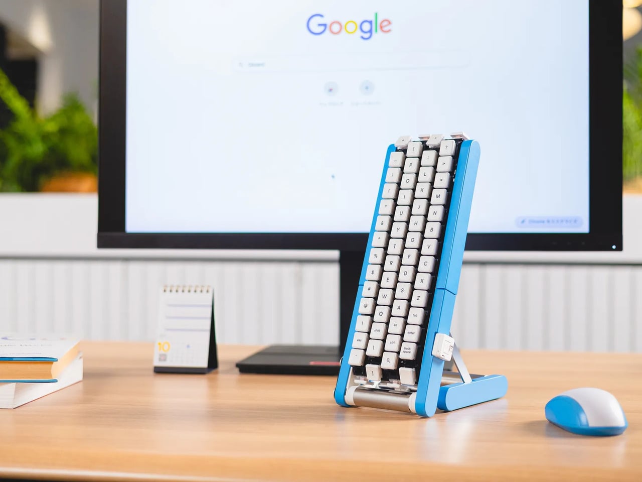
    Typing with one hand usually means stretching a finger across a keyboard while the other hand holds a drink or works a mouse. Google’s Gboard team has a wonderfully impractical fix: put the keys on a conveyor belt and let them come to you. Its Rotating Keyboard stands upright on a desk, asking your finger to stay put while the letters keep moving. Regular keyboards assume your hands will travel between stationary keys, a reasonable arrangement that has survived decades of typing. Google reverse
     

Google’s Fix for One-Handed Typing Is a Rolling Belt of Letters

Par : JC Torres
2 octobre 2026 à 05:15

Typing with one hand usually means stretching a finger across a keyboard while the other hand holds a drink or works a mouse. Google’s Gboard team has a wonderfully impractical fix: put the keys on a conveyor belt and let them come to you. Its Rotating Keyboard stands upright on a desk, asking your finger to stay put while the letters keep moving.

Regular keyboards assume your hands will travel between stationary keys, a reasonable arrangement that has survived decades of typing. Google reverses that relationship by mounting rows of keycaps on loops that travel around rollers. The tall blue frame and angled stand make the moving assembly feel closer to a miniature factory machine than a computer peripheral, which is probably part of the joke.

Designer: Google Japan

Instead of looking down for a letter, you watch for the right key to arrive and press it as it passes. Google says each belt carries 29 keys and can input both uppercase and lowercase letters. That might let one hand stay near the same spot, though it also turns typing into a timing exercise, especially when the next letter takes its time coming around.

Imagine answering an email with a cup of tea in your free hand. On a conventional keyboard, you’d either put the cup down or hunt for letters one finger at a time. Here, the moving keys do the traveling while you wait at the front of the machine. Google also suggests using your free hand on a mouse, which sounds suspiciously like extra work.

There’s an oddly earnest design lesson underneath the silliness. Questions about ergonomics often begin with who a familiar object was made for, and Google has taken that thought to a ridiculous extreme. The upright arrangement might use less horizontal desk space than a full keyboard, but it trades that footprint for height, moving parts, and the need to watch every passing key.

Google plays along with its own premise, floating ideas for faster movement, longer belts with more characters, shorter versions for phones, and different colors. None of those variations is a promised product. Even the keyboard itself isn’t headed for stores; the team has released open-source plans for a similar device instead. That keeps the joke open to anyone curious enough to build one.

The date is part of the gag, too. Google chose October 1 as a nod to the familiar 101-key keyboard, rather than waiting for April Fools’ Day. It’s the team’s 15th keyboard proposal, continuing a habit of treating ordinary typing as a problem that needs an absurdly elaborate solution. A conveyor belt is hardly the first thing most people would try.

You’re unlikely to write a novel by chasing letters around this contraption, and that isn’t really the point. Google has built a physical answer to a question no keyboard maker was asking: what if the keys did all the moving? It’s a ridiculous way to type an email, but an effective way to notice how much we expect our fingers to do.

The post Google’s Fix for One-Handed Typing Is a Rolling Belt of Letters first appeared on Yanko Design.

  • ✇Yanko Design
  • Amazon Gave Kindles Their Missing Buttons Back, as Accessories
    Kindles once let your thumb turn pages, but physical buttons disappeared from most of Amazon’s newer readers. That might not seem like a big loss until you’re holding a Kindle and trying not to disturb your comfortable grip. Amazon’s Kindle Click remote and Page Turn Cover offer two ways to bring that familiar press back, without adding buttons to the Kindle itself. Of the two, Kindle Click makes the most sense when the device isn’t in your hands at all. Prop your Kindle on a pillow or a stand,
     

Amazon Gave Kindles Their Missing Buttons Back, as Accessories

Par : JC Torres
2 octobre 2026 à 04:15

Kindles once let your thumb turn pages, but physical buttons disappeared from most of Amazon’s newer readers. That might not seem like a big loss until you’re holding a Kindle and trying not to disturb your comfortable grip. Amazon’s Kindle Click remote and Page Turn Cover offer two ways to bring that familiar press back, without adding buttons to the Kindle itself.

Of the two, Kindle Click makes the most sense when the device isn’t in your hands at all. Prop your Kindle on a pillow or a stand, pull a blanket over your shoulders, and the next page is a button press away. Other e-reader brands, including Boox, have already explored remotes, but Amazon’s Bluetooth version works without clipping a mechanical gadget onto the screen.

Designer: Amazon

The $34.99 Kindle Click has two large, tactile buttons for moving forward or back, with smaller controls on the side for changing the screen brightness. Press both side buttons to put the Kindle to sleep, or change which main button turns forward in the settings. Its rounded body fits either hand, and a woven wrist lanyard keeps it nearby when you get up.

There’s still a little maintenance involved. Amazon says the rechargeable battery lasts for weeks, but the USB-C cable and adapter aren’t included. More importantly, Kindle Click only pairs with models released in 2024 or later. That leaves out plenty of readers who might want it most, including owners of the 2022 Kindle and 11th-generation Paperwhite. At least it doesn’t demand a particular cover.

The Page Turn Cover takes the opposite approach. Instead of leaving the Kindle propped up, you hold it like any other folio-covered reader, with page-turn buttons built into the case. Fold the front back flat, and those controls remain part of your grip. The cover attaches magnetically and uses pogo pins to connect, so there’s no separate battery, Bluetooth pairing, or charging routine.

That simplicity carries through to the materials. The cover opens and closes to wake or sleep the Kindle, while a microfiber lining sits against the screen. Amazon says its plant-based leather contains more than 70% renewable biomaterials, with polyurethane making up the remainder. Graphite, Seaglass Green, and Fig offer three different looks, and both the cover and compatible Kindles carry an IPX8 water-resistance rating.

But the buttons come with a rather narrow invitation. The $79.99 cover fits only the 2026 Paperwhite Signature Edition and Colorsoft Signature Edition, so older Kindles and the standard models are out. That’s a considerable price for something that won’t fit most Kindles already in use. If you prefer reading without a case, the extra layer might also feel like an awkward trade.

Amazon hasn’t put physical page-turn buttons back on the readers themselves, and that distinction matters. The remote keeps your hand warm under the blanket while the Kindle stays put; the cover gives your thumb somewhere familiar to land when you’re holding it. Neither approach will suit every Kindle owner, but it’s nice to choose where the buttons belong instead of reaching for the screen again.

The post Amazon Gave Kindles Their Missing Buttons Back, as Accessories first appeared on Yanko Design.

  • ✇Yanko Design
  • Samsung’s SmartTag3 Refuses to Die at 790 Days Battery Life
    I’m the kind of person who can set down my keys, turn around, and immediately forget where they went. Wallets, earbuds, and bags have a way of disappearing at the least convenient moment, too. A smart tracker can spare you a frantic search, but only if its battery is working and its location can still be found. That makes battery life and the ability to locate an item beyond your phone’s immediate range just as important as a good-looking design. Designed by Samsung, the Galaxy SmartTag3 aims t
     

Samsung’s SmartTag3 Refuses to Die at 790 Days Battery Life

1 octobre 2026 à 13:20

I’m the kind of person who can set down my keys, turn around, and immediately forget where they went. Wallets, earbuds, and bags have a way of disappearing at the least convenient moment, too. A smart tracker can spare you a frantic search, but only if its battery is working and its location can still be found. That makes battery life and the ability to locate an item beyond your phone’s immediate range just as important as a good-looking design.

Designed by Samsung, the Galaxy SmartTag3 aims to address those everyday frustrations in a smaller package. Its rounded, nearly square shape gives it a clean look, while its reduced size should make it less noticeable on the things you carry. That matters more than it might seem. A tracker attached to a set of keys needs to be easy to live with every day, not just useful on the rare occasion those keys go missing.

Design: Samsung

The change in shape also raises a practical question: how will you attach it to your belongings? Samsung offers a silicone case with an integrated keyring and a loop case, giving users different ways to secure the tracker to keys or a bag. The smoother outline may look better on its own, but anyone buying one for their keys should consider which attachment will work best.

Samsung says the SmartTag3 is 35% smaller by volume and 33% lighter than its predecessor. It also retains an IP67 rating, indicating resistance to dust and water under specified test conditions. That offers reassurance if the tag gets caught in the rain, though it does not mean the device is waterproof in every situation.

Battery life may be the more meaningful upgrade for anyone who has discovered a dead tracker while looking for a lost item. Samsung says the SmartTag3 can run for up to 550 days under standard usage or up to 790 days in Power Saving Mode. Those figures are based on Samsung’s testing, not a promise that every user will get the same result. Still, a tracker that needs attention less often is less likely to let you down because you forgot to check its battery.

Finding something nearby should be easier, too. Compass View uses Bluetooth 6.0 Channel Sounding to provide distance and directional guidance from up to 60 meters away, about three times farther than on the previous model, according to Samsung. It could help you narrow down where to look before you’re close enough to spot the missing item. Compass View is not available on iOS.

The other finding features are intended to help in different situations. If you leave a tagged bag behind, a Left Behind Alert could prompt you to go back for it, although that feature is also unavailable on iOS. Place Notification is designed to alert you when a tagged item enters or leaves an area you define. Location History and Movement Detection Alert may provide additional clues about where an item has been or whether it has moved. Together, these tools could help you notice a problem sooner and narrow down where to look.

Lost Mode addresses a different problem: helping someone return an item they find. With a compatible phone, a finder can scan the tag using NFC to see the contact information or short message you have registered. That could be useful for a bag left at a café or luggage separated from you during a trip. When an item is beyond your phone’s range, however, location updates depend on nearby participating Galaxy devices. The SmartTag3 should not be treated as a continuous, real-time GPS tracker.

The SmartTag3’s appeal is the combination of a compact design, long claimed battery life, and features that help at several stages of a search. It cannot prevent you from leaving your keys behind, and its alerts will not replace paying attention to your belongings. But if it helps you catch a forgotten bag before you get home, or gives you a useful clue when something disappears, it has done what a well-designed tracker should: made a small, stressful problem easier to manage.

The post Samsung’s SmartTag3 Refuses to Die at 790 Days Battery Life first appeared on Yanko Design.

❌