Vue normale

Windows 11 File Explorer Just Fixed Key Bugs Impacting Network Drives and Everyday Navigation

Par : Nisha
4 août 2026 à 07:55
If you’ve ever been frustrated by File Explorer resetting your custom layout or throwing bizarre security warnings when you’re just trying to open a file from a work server, Microsoft is finally rolling out a fix. The latest batch of Windows 11 updates brings a wave of welcome quality-of-life improvements and bug fixes directly to […]

MacBook Air Delays Could Complicate Laptop Rollouts

4 août 2026 à 05:56

MacBook Air delays are turning Apple’s everyday laptop into a planning issue for buyers counting on quick delivery.

The post MacBook Air Delays Could Complicate Laptop Rollouts appeared first on TechRepublic.

  • ✇Yanko Design
  • The Echo Chair Makes 3D Printing Feel Refined
    ZHA has collaborated with Spanish design brand Nagami to create the Echo Chair, a 3D-printed seat made from recycled plastic waste. Formerly known as Zaha Hadid Architects, the studio developed the chair through parametric design and large-scale additive manufacturing. Its form is fluid and sculptural, with an arched backrest that extends towards the floor and a seat that curves upwards at the sides. The two parts look separate at first, but they are printed as one continuous piece. Both surfac
     

The Echo Chair Makes 3D Printing Feel Refined

4 août 2026 à 18:30

ZHA has collaborated with Spanish design brand Nagami to create the Echo Chair, a 3D-printed seat made from recycled plastic waste. Formerly known as Zaha Hadid Architects, the studio developed the chair through parametric design and large-scale additive manufacturing. Its form is fluid and sculptural, with an arched backrest that extends towards the floor and a seat that curves upwards at the sides.

The two parts look separate at first, but they are printed as one continuous piece. Both surfaces grow from the same structural edge and share the same underlying geometry. One becomes the seat, while the other rises to form the backrest and support.

Designer: ZHA and Nagami

This continuous construction gives the chair a clear sense of logic. The shape is doing several jobs at once: supporting the body, holding the structure together, and defining the overall visual character.

The Echo Chair was developed through an iterative research process at ZHA Lab and manufactured by Nagami, a brand known for its work in large-format 3D printing. The studios used recycled PETG sourced from industrial waste, including single-use medical plastics.

As the chair is printed layer by layer, the process leaves a ribbed texture across its surface. Those lines have been kept visible rather than hidden or polished away. That decision gives the chair much of its character. The texture follows the curves closely and makes the manufacturing process easy to read. It also gives the recycled plastic a more tactile, less generic appearance.

There is something useful in that honesty. The material is not being forced to look like timber, stone or metal. It keeps the visual qualities created by the printing process and uses them as part of the design. The surface does still reference natural materials in a subtle way. Its layered finish recalls mineral formations and carved stone, which helps the chair feel less industrial when placed in an interior.

ZHA and Nagami developed four colourways for the chair: white, black, a white-to-translucent gradient and a caramel tone made using a bio-based cork composite. The colour choices help shift the mood of the design. White makes the form feel lighter and more architectural, while black gives it a stronger, more graphic presence. The translucent version draws attention to the printing layers, and the caramel finish adds warmth to what could otherwise feel like a very technical object.

The caramel version is especially successful because it softens the synthetic quality of the plastic. It feels easier to imagine in a home, hotel lobby or lounge space, rather than only in a gallery or design exhibition. According to ZHA project design director Sebastian Andia, the goal was to turn an abundant and overlooked material into something people would genuinely want to live with. That idea matters because recycled material alone is rarely enough to make a product successful. People still need to like the object, find it comfortable and see a place for it in their environment.

The Echo Chair handles this well. Its sustainable story supports the design, rather than becoming the whole design. The seat’s raised sides create a more enclosed sitting position, while the curved backrest gives the chair a supportive and almost cocooned feel. The shape is expressive, but it still looks usable. Its scale and neutral colour options also make it easier to place than the form might suggest. It has enough presence to work as a statement piece, yet it does not depend on bright colour or decoration to stand out.

The 3D-printing process allows the chair to be produced without visible joints or separate components. This gives it a seamless appearance and keeps the connection between the digital model and final object very direct.

That connection is one of the strongest parts of the project. The manufacturing process does not sit behind the design. It shapes the design. The ribs, curves and continuous structure all come from the same production method. Each part of the chair feels related because it has been developed through the same system.

The Echo Chair continues ZHA and Nagami’s existing collaboration. Nagami launched its first collection of 3D-printed chairs in 2018, which included two designs by the architecture studio. Their latest project shows how much more refined large-scale 3D printing has become. The chair feels less like a technical experiment and more like a finished product with a clear place in contemporary interiors.

The Echo Chair is currently on display as part of London Creates at The Truman Brewery. What makes the chair interesting is the way it brings together material, form and manufacturing without overcomplicating the idea. Recycled plastic is treated as a starting point for the design, rather than something that needs to be disguised.

The post The Echo Chair Makes 3D Printing Feel Refined first appeared on Yanko Design.

  • ✇Korben
  • Un développeur fait tourner les cinématiques de Command & Conquer sur un Atari ST de 1985
    Jonas Eschenburg se tape un petit délire cet été, en portant Command & Conquer sur Atari ST, et il vient de s'occuper des cinématiques du jeu, le tout sur une machine équipée d'un Motorola 68000 cadencé à 8 MHz. Le même garçon avait déjà fait tourner Doom dessus. Le décalage vaut le détour. Command & Conquer sort en 1995 sur PC, en VGA 256 couleurs, soit dix ans après l'Atari ST, qui affiche lui 16 couleurs en 320 par 200 points. Envoyer les pixels bruts à l'écran est hors de question su
     

Un développeur fait tourner les cinématiques de Command & Conquer sur un Atari ST de 1985

5 août 2026 à 01:41

Jonas Eschenburg se tape un petit délire cet été, en portant Command & Conquer sur Atari ST, et il vient de s'occuper des cinématiques du jeu, le tout sur une machine équipée d'un Motorola 68000 cadencé à 8 MHz. Le même garçon avait déjà fait tourner Doom dessus.

Le décalage vaut le détour. Command & Conquer sort en 1995 sur PC, en VGA 256 couleurs, soit dix ans après l'Atari ST, qui affiche lui 16 couleurs en 320 par 200 points.

Envoyer les pixels bruts à l'écran est hors de question sur ce genre de matériel. La machine n'a ni le débit de lecture ni la puissance de calcul pour ça.

Ce clic autorise une connexion à Google : adresse IP transmise et traceurs possibles. En savoir plus Voir cette vidéo sur YouTube

Eschenburg a donc écrit son propre codec, baptisé STV, adapté du format VQA que Westwood utilisait à l'époque pour ses vidéos. Le principe repose sur un codebook, autrement dit un dictionnaire de petits carrés de pixels : au lieu de transmettre chaque image entière, le fichier envoie surtout des numéros qui pointent vers des motifs déjà connus du lecteur.

L'astuce est en réalité ailleurs. Les blocs sont découpés pour tomber pile sur l'organisation mémoire de l'Atari, qui range ses couleurs en plans séparés plutôt qu'en pixels contigus, ce qui permet au processeur de recopier les motifs sans passer son temps à réorganiser les bits.

La palette et le dictionnaire se mettent à jour en continu pendant la lecture, et pas une fois pour toutes au début du fichier. Ça évite le gros pâté de blocs baveux qu'on attendrait d'une compression aussi agressive.

Le tout fonctionne sur un 8 MHz d'origine. Sans accélérateur. A priori, aucun jeu Atari ST n'avait affiché de vidéo plein écran avant celui-là.

Le jeu, lui, reste beaucoup plus poussif pour le moment : quelques images par seconde en 16 couleurs, correct seulement à partir d'un Falcon, et il réclame 4 Mo de mémoire. Autour du codec, Eschenburg a publié une dizaine d'utilitaires, dont un encodeur pour fabriquer les fichiers STV et un lecteur natif pour les regarder sur la machine.

Tout est sous licence GPL sur GitHub, le portage se récupère sur itch.io, et il faut fournir ses propres fichiers du jeu d'origine puisque le projet n'a rien à voir avec EA.

Détail amusant, le son ne sort que sur STe et Falcon. Sur un ST de base, les cinématiques défilent en silence complet. La question étant maintenant de savoir si tout ça ne m'a pas donné envie de rejouer à Command and Conquer, pour ressortir mon premier pseudo de game : Moissonneuse killer (vraiment).

Source : Hackaday

  • ✇Yanko Design
  • The Sculptural Rocking Chair That Started as a Single Idea
    Most furniture design starts with a question: How do people sit? Aleks Forystek Studio started with a completely different one. What happens when a heavy sphere presses into a structural loop? The answer, it turns out, is a chair. But not just any chair. It’s Dooal, and it might be the most conceptually satisfying piece of furniture I’ve seen this year. The premise sounds almost too simple. A sphere meets a loop. The loop yields under the weight, compressing and curving into a form that becomes
     

The Sculptural Rocking Chair That Started as a Single Idea

3 août 2026 à 09:20

Most furniture design starts with a question: How do people sit? Aleks Forystek Studio started with a completely different one. What happens when a heavy sphere presses into a structural loop? The answer, it turns out, is a chair. But not just any chair. It’s Dooal, and it might be the most conceptually satisfying piece of furniture I’ve seen this year.

The premise sounds almost too simple. A sphere meets a loop. The loop yields under the weight, compressing and curving into a form that becomes, all at once, a backrest, a seat, a leg rest, and a rocking base. One gesture, one cause-and-effect sequence, and suddenly you have a fully resolved object. The audacity of that economy is hard not to admire.

Designer: Aleks Forystek Studio

I’ll admit my first instinct when I saw the images was purely aesthetic. The black and white photography does everything right. The curves catch light in a way that makes the chair look more like a cast sculpture than a functional object, and the close-up shots reveal a fine-lined ribbed texture that layers real depth onto an already commanding silhouette. Shot in near-darkness, Dooal looks cinematic. It has the kind of presence that makes you stop mid-scroll and just sit with it for a moment.

But the longer I looked, the more the concept started doing something to me. Forystek’s Chicago-land studio describes its work as committed to “destabilizing the familiar,” and that phrase lands differently once you understand the logic behind Dooal. The chair is familiar enough, a seat you can rock in, a shape the body immediately recognizes. Yet the process that created it is almost foreign to how we typically think about furniture. No separate components engineered together. No piece-by-piece assembly of form and function. Just a single physical interaction, preserved.

That’s a philosophical statement as much as a design one. The studio’s whole methodology centers on finding the latent potential within ordinary objects, pushing past the surface of what something is to explore what it could become when a single variable changes. With Dooal, that variable is weight. Pressure. The simple, undeniable force of a sphere doing exactly what gravity asks it to do.

What makes this feel significant right now is the context we’re sitting in. We live in an era of maximal complexity, where products get layered with features, materials compete for attention, and design often signals effort rather than intelligence. Dooal does the opposite. It argues that constraint is where creativity actually lives. That stripping a design down to one decisive action can produce something richer and more resolved than a process built on a dozen competing decisions.

And it’s not just theoretical. The rocking chair is one of the oldest, most human pieces of furniture we have. It exists in farmhouse porches and modernist living rooms with equal ease. It’s comfort distilled into motion. The fact that Dooal arrives at that form through a logic of compression rather than craft tradition feels both subversive and strangely inevitable. Like the chair was always there, waiting to be discovered rather than designed.

That sphere at the base of the loop is easy to overlook in the photographs. It’s small, nestled low, nearly swallowed by shadow. But without it, none of this exists. It’s the cause the entire object is an effect of, and the fact that it remains visible in the final form is a choice that rewards people who look closely. That kind of embedded storytelling, where the origin of an object is literally written into its body, is rare in furniture design. It elevates Dooal from chair to argument.

Aleks Forystek Studio is not a household name yet. But Dooal is the kind of work that earns attention quietly. Not because it’s loud, but because it’s precise. Because it asks a stubborn, specific question and then answers it completely. Whether you care about objects for their beauty, their ideas, or the story behind them, this chair has all three. And it got there with one moment of contact.

The post The Sculptural Rocking Chair That Started as a Single Idea first appeared on Yanko Design.

  • ✇Yanko Design
  • The $599 AI Guitar That Finally Makes Playing Easy
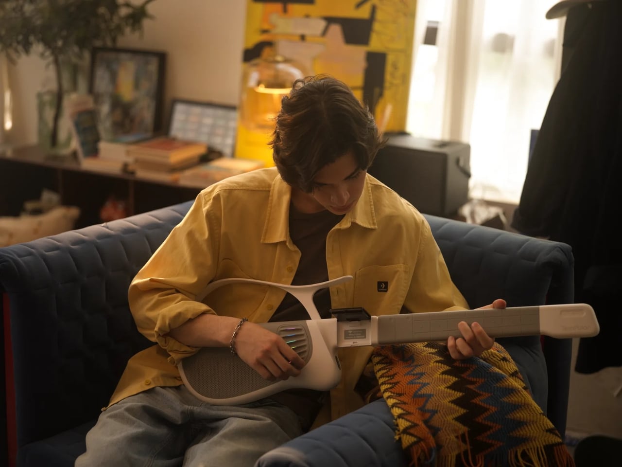
    At some point in their life, almost everyone has picked up a guitar, struggled with a C chord for ten minutes, and quietly put it back down. The fingertip pain. The out-of-tune strings. The YouTube tutorial that somehow assumes you already know what a fret is. Learning guitar has always had a steep and slightly humiliating entry curve, and most of us just gave up. The TemPolor Melo-D thinks that’s a problem worth solving, and the design it came up with is genuinely hard to ignore. Designed by i
     

The $599 AI Guitar That Finally Makes Playing Easy

3 août 2026 à 04:45

At some point in their life, almost everyone has picked up a guitar, struggled with a C chord for ten minutes, and quietly put it back down. The fingertip pain. The out-of-tune strings. The YouTube tutorial that somehow assumes you already know what a fret is. Learning guitar has always had a steep and slightly humiliating entry curve, and most of us just gave up. The TemPolor Melo-D thinks that’s a problem worth solving, and the design it came up with is genuinely hard to ignore.

Designed by inDare Design Strategy Limited, the Melo-D is billed as the world’s first generative AI guitar, and even that description barely scratches the surface of what it actually is. On the outside, it looks like a guitar that a product designer and a tech enthusiast co-parented together. The body is sleek, the finish is pearl white, and it has a foldable build that makes it compact enough to take almost anywhere. But the real story is what happens when you turn it on.

Designer: inDare Design Strategy Limited

The neck is embedded with LED lights that illuminate exactly which notes to press, removing the guesswork for beginners entirely. A built-in 2.4″ LCD flip screen on the body handles chord guidance and ambient visuals without you ever needing to prop up a phone nearby. These feel like small details, but they represent a real design philosophy: the instrument itself should carry the full experience. You shouldn’t need a separate ecosystem of apps and accessories just to get started.

What makes the Melo-D genuinely interesting is the AI engine running underneath all of it. The guitar operates in three modes: solo, sing-along, and AI creation. In AI creation mode, you can hum a melody and the guitar transcribes it into a guitar solo. You can type a text prompt and it generates a song. Upload an audio file and it converts the music into playable tabs or chord charts. It even generates personalized backing tracks using emotional tags, so the sound starts to feel like yours rather than something borrowed from a practice app.

The “AI everything” wave has made it easy to be skeptical every time a product slaps the word generative onto its marketing. But the Melo-D doesn’t read as a gimmick dressed up in smart-instrument clothing. The six-string silicone system allows for real, note-by-note playing, which means it isn’t just a toy approximating the feel of music. It’s an actual instrument with training wheels you can choose to remove. The goal isn’t to replace the skill of playing guitar. It’s to lower the barrier enough that more people actually get through the door.

inDare’s design work here deserves its own mention. The studio, known for thoughtful human-centered industrial design, brought a lot of restraint to a product that could have easily become overcrowded with features. The foldable form factor, the integrated flip screen, and the silicone strings all feel like deliberate decisions, not afterthoughts. The Melo-D has also earned recognition at the iF Design Awards, which makes sense, because from a design standpoint it reads as a product with a clear and confident point of view rather than a collection of specs looking for a shell to live in.

At $599, it’s available for pre-order now with an expected ship date in September 2026. For a piece of hardware this layered, that number asks you to take it seriously, which feels appropriate for what it’s trying to do.

Learning guitar used to mean a real commitment: years of practice, a teacher, calluses, patience, and a certain willingness to sound terrible for a while. The Melo-D isn’t trying to skip all of that, but it is offering a more honest entry point for people who actually want to try. Whether you’re a complete beginner or someone who has quietly given up on the guitar more than once, it meets you where you are. And sometimes, that’s exactly the invitation you need to actually show up.

The post The $599 AI Guitar That Finally Makes Playing Easy first appeared on Yanko Design.

  • ✇Yanko Design
  • 3D-Printed Ukulele Transforms Into an Electric Guitar In Just 2 Seconds
    Every kid who grew up watching cars turn into robots has a soft spot for things that are not what they seem. Musician and maker Mattias Krantz never quite grew out of that phase, except instead of turning a truck into Optimus Prime, he set his sights on something smaller and arguably harder to pull off without CGI. He wanted a ukulele that could become a full size guitar on command, without falling apart in his hands. That meant solving three problems at once: growing the neck by roughly ten in
     

3D-Printed Ukulele Transforms Into an Electric Guitar In Just 2 Seconds

2 août 2026 à 16:45

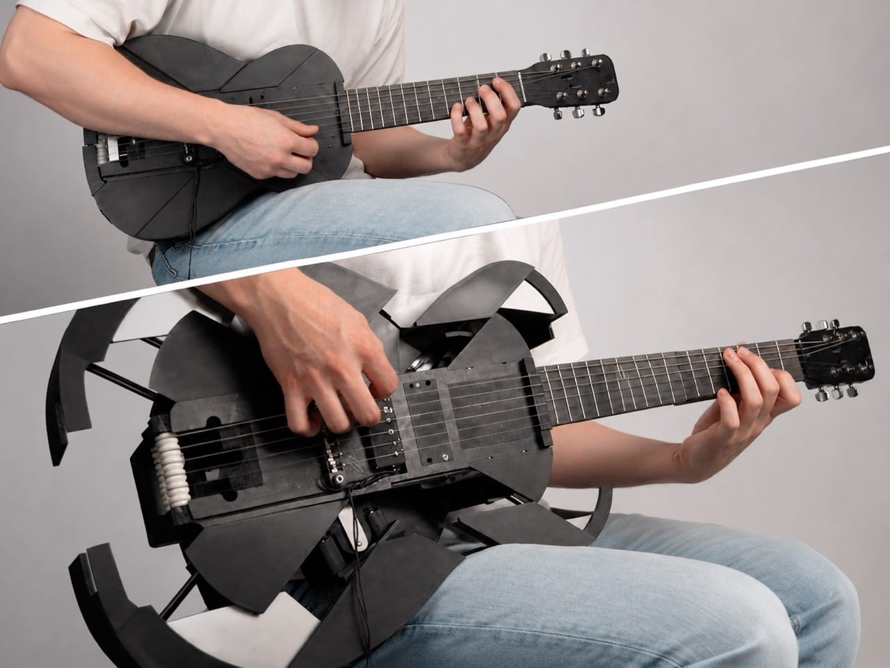
Every kid who grew up watching cars turn into robots has a soft spot for things that are not what they seem. Musician and maker Mattias Krantz never quite grew out of that phase, except instead of turning a truck into Optimus Prime, he set his sights on something smaller and arguably harder to pull off without CGI. He wanted a ukulele that could become a full size guitar on command, without falling apart in his hands. That meant solving three problems at once: growing the neck by roughly ten inches, keeping the strings in tune through that change, and expanding the body into a real guitar shape instead of a symmetrical blob. Each one turned out to be its own small nightmare.

The motivation was refreshingly petty. Ukulele players get less respect than guitar players no matter how good they get, and Krantz wanted to flip that on its head. Getting there took months of failed prototypes and a collaboration with mechanical engineer Adam Damato, who stepped in once the physics of a growing, string bearing neck got too gnarly to solve alone. What began as a joke became a real feat of mechanical design, borrowing tricks from telescoping tools, fishing reels, and an obscure folk instrument. By the end, the ukulele fit in a backpack and unfolded into a stage ready guitar in seconds.

Designers: Mattias Krantz, Adam Damato

The neck telescopes straight out of the ukulele’s tiny frame, sliding one section into the next until it locks at full guitar length, gaining roughly ten inches without ever detaching from the body. A steel core runs through the sliding sections, and the joints are cut so they interlock and brace against each other the instant the neck reaches full extension. That bracing is what lets it survive eighty pounds of string tension without bowing like a fishing rod. Getting there took two failed attempts first. A folding neck, borrowed from an old instrument called the cithara orbo, worked fine on a full size guitar but was useless on a ukulele, since half a neck sat exactly where a hand needed to grip. The telescoping version solved the length problem right away, but only stopped bending once Damato worked in the steel core and reinforced joints.

The strings are custom made, roughly twice the length of a normal set, and thread onto strategically placed rollers hidden inside the neck and body. Pull the neck out and the rollers feed slack forward, push it back in and they wind the excess back up, so the same six strings carry the instrument through both tunings without coming off. That roller system only exists because everything simpler failed first. Rubber bands solved the stretch problem but sounded worse than the ukulele they replaced. A fishing reel style rig using rope worked until the rope itself stretched, turning every transformation into tuning roulette, and swapping in non stretch rope traded that for a rope that kept snapping, once badly enough to take the guitar apart. Custom strings, ordered special and worth a twenty day wait, were the fix that finally held.

The body expands through six independently moving panels that fan outward from the ukulele’s compact shell, each one traveling a different distance and angle so the outline settles into a real guitar’s curves instead of a bloated circle. An early version of that mechanism grew symmetrically in every direction, fine for something like a banjo but wrong for an instrument with a pinched waist. Getting six panels to move independently instead of in lockstep turned one mechanical problem into six. The first panel alone took three attempts before it worked reliably, and even then only about ninety percent of the time. Adding the rest of the panels made things worse, since a hub inside was quietly blocking outward movement and jamming the whole assembly. Swapping plastic components for metal fixed it, and two days assembling hundreds of parts produced a body that finally held its shape.

None of this would matter if the transformation felt gimmicky in person, but the reception says otherwise. Onlookers at Krantz’s street performances wrote it off as just another ukulele until it unfolded mid song and changed their opinion of him. A band let him bring it on stage, and the transformation held together well enough to draw applause rather than confusion. Transforming gadgets are nothing new, but the engineering here, steel joints, custom rollers, six moving panels, earns real attention over a gimmick label. Krantz and Damato spent months on problems most builders would abandon, and the payoff works under tension, every time.

The post 3D-Printed Ukulele Transforms Into an Electric Guitar In Just 2 Seconds first appeared on Yanko Design.

  • ✇Yanko Design
  • Bang & Olufsen’s New Speaker Concept Is a Ritual, Not a Device
    Most speakers are designed to disappear. They sit on a shelf, blend into a bookcase, or hide in a cabinet, quietly doing their job until you need them and then fading back into the background. Mårten Malmnäs, a graduate from the Umeå Institute of Design, designed something that pushes back against all of that. The Beosound Tableau is a wall-mounted audio object developed in collaboration with Bang & Olufsen. Malmnäs calls it “a fireplace for music,” an instrument not just for listening, but
     

Bang & Olufsen’s New Speaker Concept Is a Ritual, Not a Device

2 août 2026 à 13:20

Most speakers are designed to disappear. They sit on a shelf, blend into a bookcase, or hide in a cabinet, quietly doing their job until you need them and then fading back into the background. Mårten Malmnäs, a graduate from the Umeå Institute of Design, designed something that pushes back against all of that.

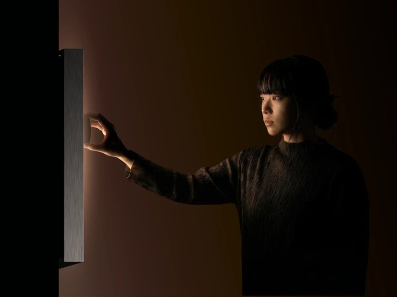
The Beosound Tableau is a wall-mounted audio object developed in collaboration with Bang & Olufsen. Malmnäs calls it “a fireplace for music,” an instrument not just for listening, but for living. The moment I read that, I had to stop. Because I’ve never heard a speaker described that way before, and suddenly, I couldn’t think of a more fitting comparison.

Designer: Mårten Malmnäs

Think about what a fireplace actually does. Yes, it produces heat, but that’s almost beside the point. A fireplace creates presence. It becomes the thing a room organizes itself around. People pull their chairs toward it, conversations happen because of it, and its absence is genuinely felt. That’s a completely different design brief than “fits on your desk” or “connects to your phone.”

Malmnäs started the project with a design probe, a research method that explores the relationships people have with their homes, and from that came a set of experiments around values and behaviors. Eight experimental directions emerged from the ideation phase, spanning different input and output formats. Three of those directions clearly answered the design responsibilities he’d set for the project, and their shared qualities pointed toward one resolved object.

Here’s where it gets interesting. The original concept for the Tableau was screen-based, but a method called Wizard of Oz testing, where a human simulates the system to observe how people actually interact with it, pushed the design somewhere more honest. The interaction model shifted from screens to navigation by sound. And the principle that came out of it became the foundation of the whole concept: the most honest interface for a music object is music itself.

That’s a provocative idea. We’ve spent years layering more and more visual UI on top of audio experiences. Every streaming service competes on the complexity of its recommendation algorithm, the visual polish of its playlist covers, the grid of album art. Malmnäs argued the opposite, that sound should speak for sound. The result is the Sonic Token, a physical object that mediates between the listener and the Tableau. Tactile, intentional, and completely different from scrolling a touchscreen.

The Tableau is positioned as a focal thing for the home. An object to gather around and tend to. That language is deliberate, and it’s also a little radical. “Tending” to an audio object implies care and attention, a relationship rather than a transaction. You don’t tend to a Bluetooth speaker. You don’t gather around an app.

Bang & Olufsen has always occupied a rare space in the audio world, where design and sound hold equal weight, and where a product can belong in a design museum and still deliver extraordinary sound. But even by B&O’s standards, the Tableau concept asks a genuinely new question: what if the speaker were the focal point of the room, rather than just a feature of it?

There are fair questions about how a concept like this survives beyond a graduate show. The hands-on, material-driven process Malmnäs used, with 1:1 mock-ups and rigorous testing of the Sonic Token’s form and function, suggests this isn’t a vague idea dressed up in renders. It was built and tested as a real object. Whether it eventually reaches production or stays as a collaborative concept between a student designer and one of the world’s most revered audio brands is another matter.

But the value of the Beosound Tableau isn’t only in whether it ships. It’s in the question it refuses to let go of: why have we settled for speakers that ask nothing of us? The alternative, a speaker that earns its place on the wall, makes music feel like a gathering, and treats sound like something worth being present for, sounds like exactly what the living room has been missing.

The post Bang & Olufsen’s New Speaker Concept Is a Ritual, Not a Device first appeared on Yanko Design.

Meta’s Personal AI Agents Face EU Data and Profiling Rules

31 juillet 2026 à 09:12

Meta’s push toward personal AI agents is colliding with Europe’s strict rules on profiling, sensitive data, consent, and cross-platform data use.

The post Meta’s Personal AI Agents Face EU Data and Profiling Rules appeared first on TechRepublic.

Windows 11 KB5101684 Preview Update Delivers 42 Fixes for Intune, SMB, and File Explorer

30 juillet 2026 à 16:23

Microsoft’s Windows 11 KB5101684 preview update delivers 42 fixes for Intune, SMB, File Explorer, Search, Windows Hello, and more.

The post Windows 11 KB5101684 Preview Update Delivers 42 Fixes for Intune, SMB, and File Explorer appeared first on TechRepublic.

GitHub Automatically Holds Suspicious Actions Runs, but Repository Owners Must Approve Them

30 juillet 2026 à 09:30

GitHub’s new Actions safeguard pauses potentially malicious workflow runs before execution, leaving repository owners to decide who can approve them and what checks must come first.

The post GitHub Automatically Holds Suspicious Actions Runs, but Repository Owners Must Approve Them appeared first on TechRepublic.

  • ✇WinCentral
  • Windows 11 Narrator Now Supports Plug-and-Play HID Braille Displays
    Microsoft is rolling out another major accessibility improvement in the latest Windows 11 Insider Preview release for the Experimental (Future Platforms) channel. The update introduces native support for HID (Human Interface Device) braille displays in Narrator, making refreshable braille devices significantly easier to connect and use. The change eliminates complicated setup procedures, enabling true plug-and-play […]
     

Windows 11 Narrator Now Supports Plug-and-Play HID Braille Displays

Par : Nisha
28 juillet 2026 à 11:51
Microsoft is rolling out another major accessibility improvement in the latest Windows 11 Insider Preview release for the Experimental (Future Platforms) channel. The update introduces native support for HID (Human Interface Device) braille displays in Narrator, making refreshable braille devices significantly easier to connect and use. The change eliminates complicated setup procedures, enabling true plug-and-play […]

Microsoft Rolls Out New Updates for Notepad, Calculator, Media Player, and Clock Apps on Windows 11

Par : Nisha
28 juillet 2026 à 02:59
Microsoft has released a fresh wave of updates for several built-in Windows 11 apps, bringing improvements to Notepad, Calculator, Media Player, and Clock. While this month’s release focuses more on reliability and quality enhancements than major new features, the updates include several welcome fixes that improve the overall Windows experience for Insiders. The latest app […]

Microsoft Threat Intelligence Portal Retires in August: 4 Checks Before the Cutoff

29 juillet 2026 à 11:23

Microsoft is retiring its legacy Threat Intelligence portal on August 1. Security teams should verify licenses, permissions, investigation projects, APIs, and automated workflows before the cutoff.

The post Microsoft Threat Intelligence Portal Retires in August: 4 Checks Before the Cutoff appeared first on TechRepublic.

Cursor Quietly Patches High-Severity Git Vulnerability After Seven-Month Delay

28 juillet 2026 à 13:15

Cursor has patched a high-severity Windows vulnerability that allowed malicious Git repositories to execute code, highlighting security risks in AI coding environments.

The post Cursor Quietly Patches High-Severity Git Vulnerability After Seven-Month Delay appeared first on TechRepublic.

  • ✇Korben
  • OTI - Le lien à usage unique que les bots ne crament plus
    Si vous avez déjà envoyé un lien à usage unique qui est arrivé mort chez votre collègue, c'est probablement la prévisualisation de la messagerie qui a ouvert le lien en premier et qui a cramé le secret accompagnant le lien. La bonne nouvelle c'est que Oğuzhan Karacabay vient de publier une grosse mise à jour d' OTI , son service open source auto-hébergeable qui génère des liens de partage consultables une seule fois, avec chiffrement dans le navigateur.
     

OTI - Le lien à usage unique que les bots ne crament plus

29 juillet 2026 à 04:42

Si vous avez déjà envoyé un lien à usage unique qui est arrivé mort chez votre collègue, c'est probablement la prévisualisation de la messagerie qui a ouvert le lien en premier et qui a cramé le secret accompagnant le lien.

La bonne nouvelle c'est que Oğuzhan Karacabay vient de publier une grosse mise à jour d' OTI , son service open source auto-hébergeable qui génère des liens de partage consultables une seule fois, avec chiffrement dans le navigateur.

Vous collez un mot de passe, une clé d'API ou un bout de config dans OTI, le navigateur chiffre, le serveur lui ne stocke que du charabia, et le destinataire reçoit une jolie URL qui ne fonctionnera bien qu'une fois.

Ce qui change, c'est que le lien ne meurt plus tout seul. En chargeant la page, votre destinataire voit un compte à rebours et un bouton "Decrypt Message", rien d'autre. Du coup, tant que personne ne clique, le message continue son roupillon.

Comme ça, un bot qui déroule les URLs pour fabriquer une jolie vignette repart bredouille. Après si c'est un vrai scanner de sécurité qui charge vraiment la page dans un navigateur automatisé, vous ne pourrez pas éviter le problème.

L'autre nouveauté dans OTI c'est à la création d'un nouveau lien. Le service vous génère en fait 2 liens. Il y a celui que vous envoyez et un second que vous gardez pour vous. Ce dernier vous permettra de consulter l'état du message sans jamais afficher son contenu.

Côté crypto, le contenu est chiffré en AES-256-GCM via WebCrypto, et cette clé AES est elle-même emballée dans une paire RSA-2048 générée dans votre navigateur. La clé privée voyage dans le fragment de l'URL, la partie après le #, que les navigateurs n'envoient jamais au serveur.

Le principe zero-knowledge utilisé par OTI est quasi le même que celui de PrivateBin ou d' Enclosed où la clé ne quitte jamais le navigateur.

Par contre, ça donne des liens obèses puisque le mien faisait 1825 caractères, dont 1728 rien que pour le fragment, et c'est déjà compressé en zlib. Bon courage donc pour le dicter au téléphone ^^ (il y a un QR code, heureusement !)

Le reste, c'est du confort... Fichiers .txt jusqu'à 100 Ko validés dans le navigateur avant chiffrement, mot de passe optionnel par-dessus, expiration au choix entre 5 minutes et 7 jours, limitation de débit via Redis et une tâche planifiée qui balaie les secrets périmés toutes les 30 minutes.

Pour l'héberger, c'est de l'AdonisJS 6 en TypeScript avec Dockerfile, docker-compose et migrations fournis, en licence MIT. Redis peut céder sa place au limiteur en mémoire si vous montez juste un petit truc perso.

Notez quand même que pour le moment, le projet n'a pas été audité et est maintenu par un gars tout seul, donc évitez de l'utiliser pour des secrets d'État.

La démo est en ligne si vous voulez essayer avant d'installer.

  • ✇Korben
  • Hammer - Votre roman en fichiers texte, pas dans le cloud
    Hammer, l'outil dont je vais vous parler aujourd'hui, est né d'un manuscrit perdu. En septembre 2020, son développeur Adam Brown vivait dans un van et écrivait dans des coins souvent très isolés, avec un logiciel gratuit qui se présentait comme fonctionnant hors ligne. Mais malheureusement, au bout d'une semaine sans réseau, le soft a cessé de fonctionner. De retour en ville quelques jours plus tard, il a alors remis la main sur une connexion, et le logiciel est reparti, mais son manuscrit avait
     

Hammer - Votre roman en fichiers texte, pas dans le cloud

29 juillet 2026 à 04:08

Hammer, l'outil dont je vais vous parler aujourd'hui, est né d'un manuscrit perdu. En septembre 2020, son développeur Adam Brown vivait dans un van et écrivait dans des coins souvent très isolés, avec un logiciel gratuit qui se présentait comme fonctionnant hors ligne. Mais malheureusement, au bout d'une semaine sans réseau, le soft a cessé de fonctionner.

De retour en ville quelques jours plus tard, il a alors remis la main sur une connexion, et le logiciel est reparti, mais son manuscrit avait disparu !

Alors, dégoûté, il s'est dit qu'il allait coder son propre éditeur offline pour éviter que ça se reproduise, car hé, on n'est jamais aussi bien servi que par soi-même ! Et c'est pourquoi quand vous écrivez avec Hammer , chaque scène est un fichier texte enregistré sur votre disque dans le répertoire que vous avez spécifiquement choisi. Et c'est pareil pour tout ce qui est contenu annexe comme les notes et les fiches d'encyclopédie qui accompagnent les scènes.

Grâce à Hammer, qui est un logiciel gratuit sous licence MIT, vos idées sont rassemblées sous la forme d'un projet d'écriture avec tout ce qu'il faut pour prendre des notes, mettre des tags, faire des liens...etc.

L'éditeur de Hammer, avec la scène, son plan et ses notes sur le même écran.

Pour autant ce n'est pas un bloc-notes déguisé. Les scènes se réordonnent au glisser-déposer, ce qui est pratique quand vous décidez que deux personnages doivent se croiser trois chapitres plus tôt. L'encyclopédie catalogue les personnages, les lieux et les événements avec leurs images, et Hammer lit vos scènes pour repérer tout seul qui apparaît où.

La synchronisation entre vos appareils, elle, est totalement optionnelle. Et depuis la dernière version, le serveur de sync a une image Docker officielle . Un petit docker compose up -d et c'est en route, avec un volume pour vos données et le PostgreSQL embarqué directement dans le conteneur.

Si vous débutez en auto-hébergement , sachez quand même que le serveur ne parle que HTTP en local alors que les clients Hammer exigent du HTTPS, donc il faudra mettre en place un reverse proxy ou un certificat devant.

Et si vous n'avez pas envie de gérer un serveur, sachez que l'instance officielle hammer.ink est utilisable si vous êtes abonné au Patreon du projet. Vous pouvez aussi vous en passer et poser le dossier dans Syncthing ou Dropbox, mais ça ne marchera qu'entre vos ordinateurs, car les clients mobiles (Android / iOS) Hammer supportent uniquement le protocole intégré.

Bref, un super outil pour les écrivains, les journalistes et autres producteurs de contenu qui aiment bosser offline. Et si Hammer s'arrête de fonctionner un jour, votre roman sera encore avec vous.

  • ✇Korben
  • Votre vieux Morrowind se relance dans le navigateur
    Si vous êtes fan de The Elder Scrolls III: Morrowind, j'ai une bonne nouvelle pour vous : vous allez pouvoir y jouer directement dans un onglet de navigateur ! En effet, c'est ce que nous propose openmw-web , signé Virtastic et sorti il y a quelques jours ! openmw-web fait donc tourner Morrowind dans un browser en recompilant OpenMW vers WebAssembly avec Emscripten. OpenMW, c'est le moteur libre qui réimplémente de zéro celui du jeu, et l'avoir en WebAssembly, ça p
     

Votre vieux Morrowind se relance dans le navigateur

28 juillet 2026 à 04:11

Si vous êtes fan de The Elder Scrolls III: Morrowind, j'ai une bonne nouvelle pour vous : vous allez pouvoir y jouer directement dans un onglet de navigateur ! En effet, c'est ce que nous propose openmw-web , signé Virtastic et sorti il y a quelques jours !

openmw-web fait donc tourner Morrowind dans un browser en recompilant OpenMW vers WebAssembly avec Emscripten. OpenMW, c'est le moteur libre qui réimplémente de zéro celui du jeu, et l'avoir en WebAssembly, ça permet de le faire tourner localement sur votre machine dans le navigateur.

Si vous voulez tester, il y a deux façons de vous lancer. Soit via le monde de démo livré avec OpenMW qui est jouable direct avec un petit village, ses PNJ, ses gardes et des créatures qui rôdent autour.

Ou alors vous pointez le navigateur vers le dossier Data Files de votre propre installation. Les fichiers sont alors lus en streaming depuis le disque via la File System Access API, rien n'est uploadé nulle part, et Tribunal, Bloodmoon et vos mods en .esp, .esm ou .bsa sont détectés tout seuls.

Dans ce mode, les sauvegardes atterrissent ensuite sous la forme de vrais fichiers dans un sous-dossier openmw-web-saves, donc vider le cache du navigateur ne les effacera pas. Alors que sur le monde de démo, elles resteront dans le stockage du navigateur, et là si vous videz votre cache en mode bourrin, vous perdrez votre avancement.

J'ai lancé la démo, et je dois dire que ça tourne plutôt bien.

Ce clic autorise une connexion à Google : adresse IP transmise et traceurs possibles. En savoir plus Voir cette vidéo sur YouTube

Virtastic est une boîte dont c'est le métier de recompiler des logiciels desktop en applis web. Ils vendent la prestation de conversion, la maintenance et l'hébergement, et licencient leur bibliothèque de dépendances déjà cross-compilées vers WebAssembly, genre Qt, CPython, OpenCASCADE ou FFmpeg.

Donc Morrowind c'est leur vitrine, avec FreeCAD et Jagged Alliance 2 en preview et Blender annoncé. Ça explique la finition du truc, car le gros du travail était surtout dans la chaîne de dépendances, et pas forcément dans le jeu.

Notez que de ce que j'ai lu dans la doc, sous Windows, visiblement le navigateur refuse d'ouvrir un dossier situé dans Program Files, là où Steam installe par défaut. Il faut donc copier Data Files sur le Bureau ou dans Documents avant de le sélectionner.

Le développeur a évoqué également un mode multijoueur parmi les fonctions à venir, ce que le jeu n'a jamais eu d'origine. Et sur le dépôt, il tient sa roadmap sous forme de tickets qu'il s'ouvre à lui-même.

Je vous parlais d'OpenMW en 2012 , quand c'était encore un moteur prometteur en cours d'écriture et nous voilà 14 ans plus tard, et ce même moteur tourne dans un Chrome OKLM. C'est beau non ? Dans le genre vieux logiciel qui déménage dans le navigateur, y'a aussi ce émulateur x86 en WebAssembly qui reste mon autre chouchou.

Amusez-vous bien !

Source

  • ✇Korben
  • Sa boîte à goûter fait tourner un LLM en local
    Si vous avez eu une boîte à goûter M.A.S.K. dans les années 80 pour transporter vos BN, alors celle de RadioactiveArtist va vous plaire. Dans sa boite à goûter, pas de Princes ni de Balisto... lui, il embarque un Raspberry Pi 5, un écran tactile de 7 pouces et une IA qui tourne sans internet. Le clin d'œil est calculé puisque M.A.S.K., c'était ce dessin animé de 85-86 dont les objets du quotidien planquaient tous une seconde vie. Fermé, l'engin reste donc une boîte à goûter d'épo
     

Sa boîte à goûter fait tourner un LLM en local

28 juillet 2026 à 01:56

Si vous avez eu une boîte à goûter M.A.S.K. dans les années 80 pour transporter vos BN, alors celle de RadioactiveArtist va vous plaire. Dans sa boite à goûter, pas de Princes ni de Balisto... lui, il embarque un Raspberry Pi 5, un écran tactile de 7 pouces et une IA qui tourne sans internet.

Le clin d'œil est calculé puisque M.A.S.K., c'était ce dessin animé de 85-86 dont les objets du quotidien planquaient tous une seconde vie. Fermé, l'engin reste donc une boîte à goûter d'époque. Mais ouverte, elle devient un cyberdeck complet, avec clavier et enceintes noyés dans la partie basse + un écran qui se redresse sur sa propre charnière.

Ce clic autorise une connexion à Google : adresse IP transmise et traceurs possibles. En savoir plus Voir cette vidéo sur YouTube

Un cyberdeck, pour ceux qui débarquent des âges farouches (vous l'avez ?), c'est un ordinateur portable assemblé à la main dans un boîtier détourné, fait pour être réparé et modifié plutôt qu'acheté.

Dedans, y'a donc un Pi 5 avec 16 Go de RAM et une microSD de 128 Go. L'alimentation passe par un HAT UPS Geekworm, la carte d'onduleur qui se clipse sur le Pi, nourrie par 4 accus 18650. En façade, des lecteurs de cartes, des ports USB 3 et un jack casque, plus un hub audio USB Waveshare qui pilote les enceintes. Par contre, on ne sait rien de son autonomie...

L'Ethernet a été une vraie plaie apparemment puisqu'aucun adaptateur du marché ne rentrait dans l'espace disponible. Il a donc poncé à fond un connecteur RJ45 nu jusqu'à ce qu'il clipse dans le port. Les charnières, elles, se sont révélées bien plus dures que prévu, et les pattes du circuit imprimé de l'écran n'étaient pas faites pour encaisser cette tension. Une plaque ABS récupérée sur une vieille caisse de transport a réglé le problème.

Et la boîte ressort intacte !

Puis je sais pas si vous avez vu dans la vidéo, mais il y a aussi un LLM là-dedans. Un modèle de 3 milliards de paramètres via Ollama, qui répond sans la moindre connexion. L'écran de boot, l'écran de login et les icônes maison, eux, ont été codés avec Claude Code, qu'il a installé sur la machine le temps de la configuration.

Si le format vous parle, le Hackberry Pi CM5 dont je vous ai parlé joue dans la même cour, et les cyberdecks faits maison ont droit à leur guide sur le site.

Bref, à moitié jouet, à moitié machine de terrain, et zéro trou dans la boîte ça, c'est du respect pour l'objet !!

Source

  • ✇Korben
  • Firefox ressort le mode compact du placard, 5 ans après
    En 2021, Mozilla a estimé que le mode compact de Firefox intéressait trop peu de monde pour mériter sa place dans l'interface. Le bug qui actait sa suppression a énervé pas mal de monde, mais la justification à l'époque, c'était que cette densité est "difficile à découvrir, et on suppose qu'elle est peu utilisée". Faut dire que ce mode compact réduit sacrément l'espacement des barres d'outils et des onglets pour gagner de la place à l'écran. Mozilla le destine explicitement aux petits écrans. Ma
     

Firefox ressort le mode compact du placard, 5 ans après

27 juillet 2026 à 13:00

En 2021, Mozilla a estimé que le mode compact de Firefox intéressait trop peu de monde pour mériter sa place dans l'interface. Le bug qui actait sa suppression a énervé pas mal de monde, mais la justification à l'époque, c'était que cette densité est "difficile à découvrir, et on suppose qu'elle est peu utilisée".

Faut dire que ce mode compact réduit sacrément l'espacement des barres d'outils et des onglets pour gagner de la place à l'écran. Mozilla le destine explicitement aux petits écrans.

Mais devant la levée de boucliers, Mozilla a dû faire machine arrière mais à moitié ^^. En avril 2021, un second bug acte le compromis : ceux qui utilisaient déjà le mode compact le gardent, les autres doivent aller l'activer à la main dans about:config via browser.compactmode.show.

Puis au bout d'un moment dans le menu de personnalisation, l'option réapparaît en juin 2021 dans Firefox 89 sous le doux nom de "Compact (not supported)". C'est la version qui embarquait la refonte Proton dont je vous parlais à l'époque .

Nous sommes 5 ans plus tard, et Mozilla remet le couvert avec le mode compact ! En effet, le nouveau design de Firefox est arrivé aujourd'hui dans Nightly, et ce mode compact fait partie du package. "Les gens nous ont dit que ça leur manquait, et on les a écoutés", explique l'équipe.

Sauf que ce n'est pas exactement un retour à la case départ. Dans le code de Nightly 155, le mode compact ne revient pas dans le menu de personnalisation. En réalité, il déménage dans les réglages, sous une rubrique "Window density" qui propose Automatique, Standard, Compact et Tactile.

Mais surtout Firefox sait maintenant basculer en compact tout seul. C'est une préférence fraîchement débarquée, browser.compactmode.auto.threshold, qui fixe le déclencheur à 0.05. Cela veut dire que si la barre d'onglets s'apprête à bouffer plus de 5 % de la hauteur de votre fenêtre, le navigateur passe en densité réduite sans rien vous demander.

Même logique sur la largeur avec la barre latérale repliée avec un garde-fou plutôt propre qui fait que si un utilisateur a choisi lui-même une densité, il ne se fait jamais écraser son réglage.

Le reste de la refonte, baptisée Project Nova en interne , n'est pas mal non plus. Les onglets prennent une forme plus douce avec un léger dégradé sur l'onglet actif, la palette s'inspire du feu avec des violets fumés, et les icônes sont redessinées pour tenir la route en thème clair comme en sombre. Mozilla a d'ailleurs publié les teintes avec leurs codes, du Cream #FFF4EE au Midnight Purple #210340.

Les réglages sont réorganisés au passage, avec une entrée dédiée aux contrôles IA pour couper entièrement ces fonctions, et un réglage du niveau de protection contre le pistage. Mozilla annonce aussi 9 % de gain sur les temps de chargement du contenu principal des pages sur un an.

Bon voilà, ce que je peux vous dire, c'est que comme d'habitude, avec Firefox, les gens vont encore gueuler pour rien. En 2014, la refonte Australis avait provoqué le même genre de problème, au point qu' une extension entière avait été codée pour restaurer l'ancienne apparence .

La différence, cette fois, c'est que Mozilla range la personnalisation du côté des réglages officiels au lieu de la laisser aux extensions et à about:config.

Pour voir tout ça, il vous faut la version Nightly et rien d'autre. Dans le code source, la préférence globale browser.nova.enabled n'est activée que sur les builds Nightly, elle reste à false partout ailleurs. Le déploiement large est annoncé pour cette année, sans date. En attendant, la branche stable continue d'avancer de son côté avec les conteneurs natifs arrivés dans Firefox 153 .

Source

❌