Microsoft Is Finally Fixing Windows 11 Taskbar and Start Menu Frustrations
![]()
![]()

![]()
![]()

METMO has a talent for taking the visual drama of engineering and translating it into objects people want to touch, turn, and carry. The Grip reimagined the adjustable wrench after nearly 130 years of design stagnation. The Pen turned a dual-thread screw mechanism from 1892 into a fidget object. The Fractal Vise made a complex machinist’s tool into something people keep on their desks purely for the pleasure of operating it. Each time, the Leeds-based team finds a mechanical idea that was ahead of its moment, and rebuilds it with the precision and material quality the original never had.
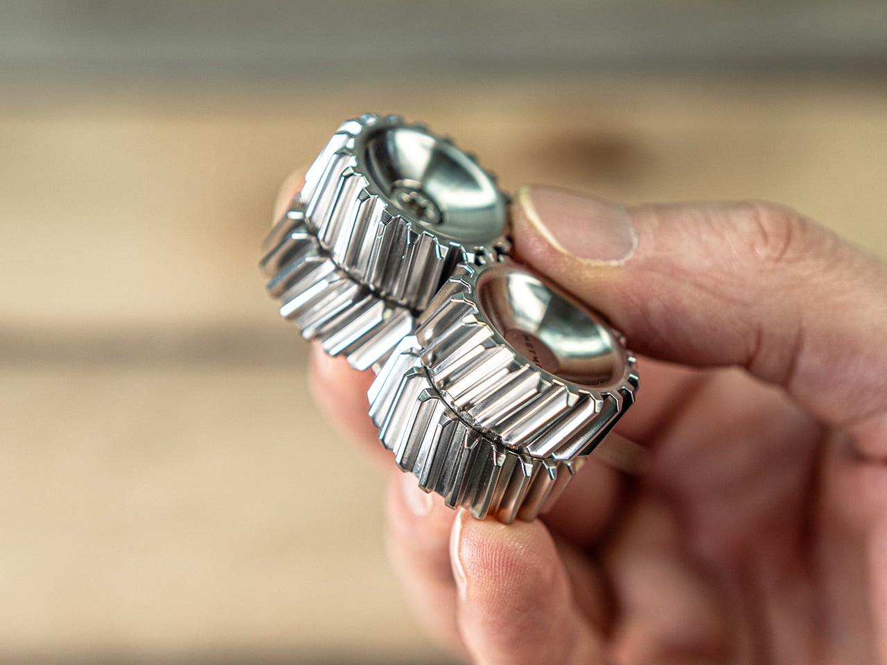
Helico follows that lineage, but takes a noticeably different turn. Where most METMO products carry a clear functional premise, this one leads with pure tactile indulgence, arriving as a compact magnetic form that looks carved from the DNA of helical gears. Every surface seems designed to catch the thumb, reflect light, and reward movement. It comes in four material variants, brass, stainless steel, Grade 5 titanium, and nylon, with each one shifting the personality of the object in a way that feels deliberate rather than cosmetic.
Designers: Sean Sykes & James Whitfield
Two cylindrical modules stack vertically, held together by nickel-coated neodymium magnets sandwiched between each section. The magnets are strong enough to keep the stack stable in your hand but calibrated to let you pull sections apart, rotate them, and snap them back together without fighting the object. That separation-and-reconnection loop is where the fidget factor lives, and it turns out to be deeply satisfying in a way that is genuinely hard to articulate. The snap of two sections realigning carries a small but precise reward signal, the kind that makes you do it again immediately. METMO has effectively built a tactile feedback machine disguised as a gear stack.
The angled herringbone grooves channel the thumb naturally while turning every surface into a structure that catches and shifts light as the object rotates. Rolling Helico between your fingers produces a continuous tactile rhythm, a frequency of peaks and valleys that keeps your hands occupied without demanding any conscious attention. The geometry is more considered than it first looks, with the pitch and depth of each tooth calibrated to feel satisfying rather than sharp or aggressive. On the inside of each module, a smooth machined cup creates a deliberate contrast, a quiet surface that makes the exterior texture feel even more intentional by comparison. It is the kind of detail that shows up in product photos but only fully registers when you are holding the thing.
Brass is the version that photographs best and probably sells the story hardest. High tensile HTB1 brass carries real weight, that dense satisfying heft that makes an object feel purposeful rather than precious. It also ages, picking up patina in the spots where your fingers land most often, building a record of use that the steel and titanium versions simply do not. Stainless steel, machined from 316 grade stock, takes the opposite approach: clean, cool to the touch, corrosion-resistant, and visually neutral in a way that lets the geometry do all the talking. Between the two, I would call stainless the everyday carry option and brass the collector’s piece.
Grade 5 titanium is lighter than either brass or stainless, and that shift in weight changes the feel of the object more than you might expect. The same herringbone geometry that feels dense and substantial in brass becomes almost nimble in titanium, sitting in the pocket without any real presence until you reach for it. Titanium also carries those aerospace-adjacent associations that the EDC world never quite gets tired of, and METMO leans into that without apologizing for it. Nylon, specifically PA16, is the outlier of the four, lighter still and matte where everything else is reflective, making Helico feel more casual and approachable. It is the version for people who want the tactile experience on a budget, or who simply prefer their desk objects without the weight class.
Every instinct in the EDC market seems to demand that small objects justify their existence with a list of functions, bottle opener here, hex bit storage there, ruler along the side. Helico skips all of that entirely, and the confidence of that decision is a big part of what makes it interesting. There is no hidden tool, no secondary feature, no apologetic add-on to make the price feel earned. What you are paying for is the machining quality, the material, the magnet calibration, and the sensory experience of an object designed from the ground up to be handled. That kind of object is rare in a product category that too often dresses fidget toys as tools and tools as fidget toys.
The four material variants give Helico a range that most desk objects cannot claim, each one tuned differently enough to appeal to a genuinely different buyer. Brass for the collector who wants something that ages with them, titanium for the EDC enthusiast building a curated pocket, stainless for the person who wants precision without warmth, and nylon for everyone who just wants to fidget without overthinking it. METMO has always been good at making objects that look like they belong in a museum and work like they belong in a toolbox, and Helico sits at an interesting point on that spectrum, leaning harder toward the former than anything the studio has made before. Whether that signals a deliberate pivot or just a smart product line expansion is worth watching. Either way, it would be very easy to put one on your desk and never move it again.
The post This strangely addictive gear-inspired magnetic fidget from METMO comes in brass, titanium, steel, and nylon first appeared on Yanko Design.

Air purifiers have become a common fixture in homes and offices, quietly working to keep indoor air breathable. Most of them follow the same basic formula, drawing air through a dry filter that captures dust, pollen, and airborne particles over time. When that filter reaches its limit, you throw it away and buy a replacement, or wash it if it’s the reusable kind. It’s a familiar routine, but not exactly a thoughtful one.
CUE Air Washer from Watervation is a 2-in-1 purifier and humidifier that takes a noticeably different approach. Rather than filtering air through a dry medium that slowly fills with grime, it washes the air with water, borrowing from how rain naturally clears the atmosphere of dust and pollen. It’s a concept that sounds simple in hindsight but actually changes quite a bit about how air care works.
Designer: Watervation
Click Here to Buy Now: $299 $575 (48% off). Hurry, only 41/975 left! Raised over $411,000.
The idea at the heart of CUE is surprisingly intuitive. Instead of holding contamination inside a dry filter, the device draws air through a water-based medium that strips airborne particles and gases from the air. Once the water turns dirty, you empty it, rinse the tank, and refill it, giving the device a clean start every day. There’s nothing to replace, and nothing to accumulate.
The technology behind CUE is Watervation’s patented RainTec system, and its most notable quality is what it doesn’t rely on. Most air washers need motorized water pumps to circulate liquid, but RainTec uses fluid dynamics instead. A spinning rotor generates a vacuum that draws water upward without any pump, eliminating the most common failure point in these devices and keeping the design considerably simpler.
What makes CUE genuinely practical is how naturally it handles two common problems at once. Dry air and airborne pollutants tend to go hand in hand, especially in bedrooms during winter or in home offices that don’t have great ventilation. Instead of running two separate appliances for purification and humidity, CUE handles both, covering spaces up to 300 sq ft, which fits most personal and domestic environments.
The ownership story is where CUE makes the strongest case for itself. Conventional air purifiers can cost over $100 per year in filter replacements alone, a figure that doesn’t stop growing the longer you use the device. CUE cuts that entirely by using water as its only medium. The maintenance routine comes down to emptying the tank, rinsing it, and refilling it with fresh water.
CUE is also one of those rare appliances that’s genuinely pleasant to leave out in the open. The cylindrical device has a dark upper housing and a clear lower tank that lets you watch the water action inside. There’s something calming about it. The swirling motion of water being spun and atomized gives the cleaning process a visible, almost meditative quality that isn’t common in this product category.
Performance testing by Korea Conformity Laboratories gives the product’s claims some independent backing. Results showed a 93.5% reduction in fine particulate matter, a 99.5% reduction in acetic acid, a 99% reduction in ammonia, and a 90% reduction in formaldehyde. The device also includes a built-in UV-C sterilization module that continuously disinfects the water tank while running, keeping the water hygienic throughout each cycle.
There’s a growing appetite for home appliances that earn their place on a shelf rather than hiding behind it. CUE Air Washer fits that thinking, handling air quality in a way that’s quieter, cleaner, and far less dependent on consumables than what came before. Watervation’s direction with this product hints at what home air care could look like when the design is as considered as the engineering behind it.
Click Here to Buy Now: $299 $575 (48% off). Hurry, only 41/975 left! Raised over $411,000.
The post Air Purifier Filters Cost $100 a Year, but CUE Uses Water Instead first appeared on Yanko Design.

Summer has a way of changing the rules for RV travel. What was a relaxed weekend trip for one or two people becomes a full-blown family expedition, with everyone’s routines packed into the same tight space. Showers get longer, dishes pile up faster, and the morning rush gets more competitive. The systems you barely thought about in cooler months suddenly start to matter a great deal.
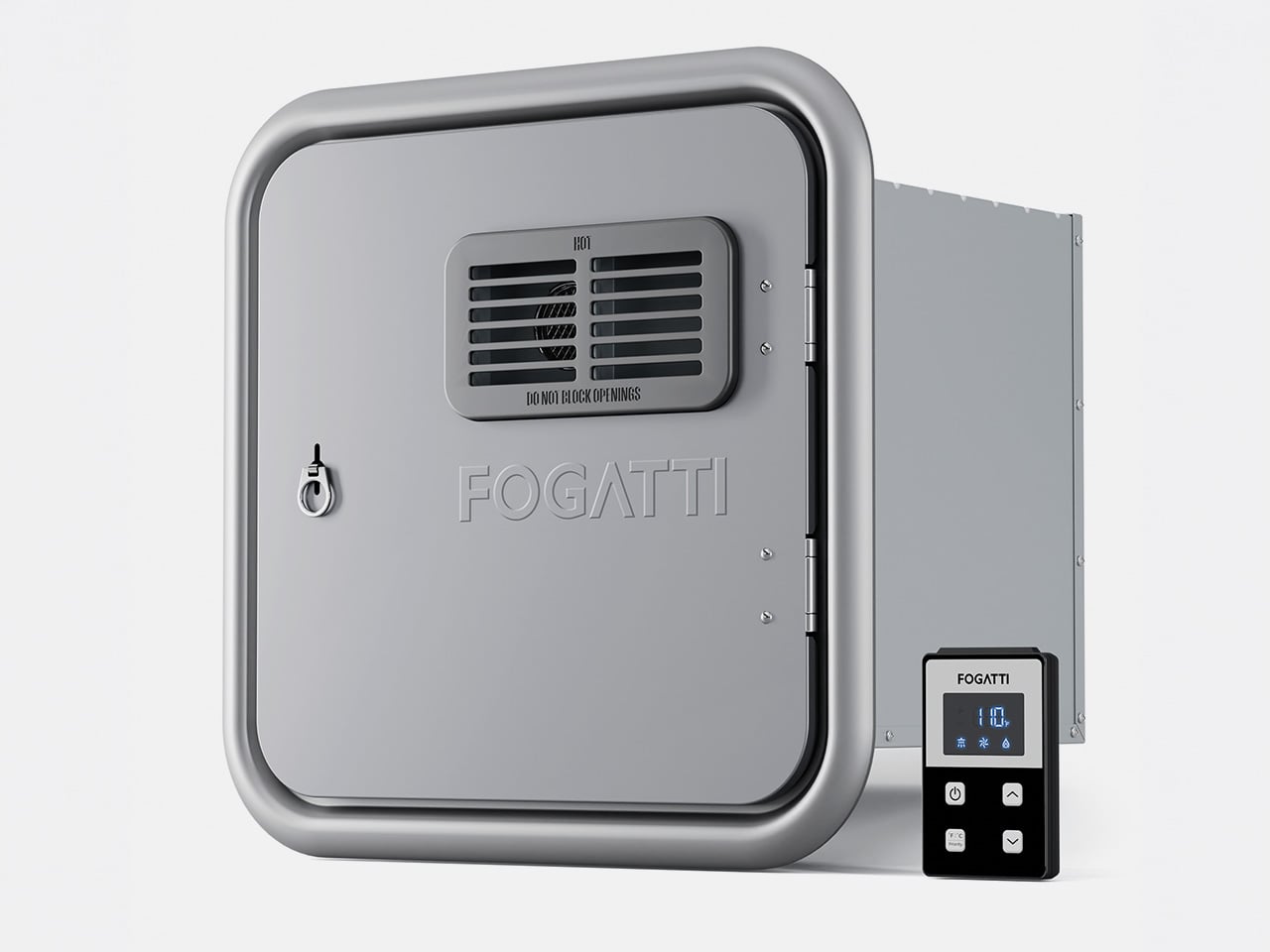
Hot water is one of the first things you notice when an RV can’t keep up. Waiting for the tank to recover, a cold burst just as you find a comfortable temperature, or having to ration usage when multiple people need the sink, these aren’t exactly the highlights of a road trip. The Fogatti InstaShower Ultra is a propane tankless water heater designed to change all of that.
Designer: Fogatti
Click Here to Buy Now: $799.99 $899.99 ($100 off). Hurry, deal ends in 48-hours. Website Link Here.
Picture a typical summer morning at a campground. Someone’s in the shower while another is getting breakfast going, and a third is at the sink washing up before everyone heads out for the day. That kind of simultaneous demand used to be a problem. With 66,000 BTU of rapid heating power and a maximum flow rate of 3.9 GPM, the InstaShower Ultra handles it without much fuss.
The end of a summer day outdoors tells a different story. Whether you’ve been hiking dusty trails, splashing around a lake, or just sitting in the heat all afternoon, everyone comes back to the RV needing a proper wash. A strong, steady shower makes that feel less like a chore and more like a reward, and you don’t have to queue up for it.
One of the more thoughtful bits of engineering is a built-in pre-mix system with a small mixing tank that balances temperature at startup. It addresses a familiar tankless annoyance, namely the cold burst before the heating kicks in. Once that’s handled, water comes out warm right away, and it’s the kind of improvement you only appreciate once it stops being a problem.
Temperature management doesn’t stop there, either. The heater uses segmented combustion that automatically adjusts heat output based on conditions. On a scorching summer afternoon, it scales back to prevent overheating. On a cool mountain evening or at higher altitudes, it ramps up accordingly. It’s a neat bit of self-regulation that keeps water temperature consistent, whether you’re parked in a sun-baked valley or somewhere up at 9,800 feet.
The InstaShower Ultra also activates at a flow rate as low as 0.5 GPM, which is considerably lower than what most standard tankless heaters require to kick on. That might seem like a minor detail, but it matters quite a bit on longer off-grid trips where every gallon counts. You aren’t forced to run the tap wide open just to get the heater going.
The weather is something a lot of buyers don’t think about until it’s too late. Summer storms roll in fast, and a water heater that can’t cope with heavy rain or strong gusts becomes a liability. HydroShield-Tech gives the InstaShower Ultra both windproof and waterproof resistance, with a NIDEC high-performance fan backing up the wind protection, so the heater keeps running when conditions outside take a turn.
For those still running on an older four- or six-gallon storage water heater, the InstaShower Ultra is a practical replacement. It comes with a door measuring 15 x 15 inches, designed to fit the cutout left by those older tanks, along with a decorative frame. Optional larger door frames are also available separately if your RV’s opening calls for a different fit.
Summer trips have a way of exposing which parts of the RV are actually ready for extended life on the road. A water heater might not top the pre-trip checklist, but it touches nearly every part of the daily routine, from the first shower of the morning to cleaning up after a late campfire dinner. Getting it right makes those routines a lot less stressful, and that’s the peace of mind that the Fogatti InstaShower Ultra delivers.
Click Here to Buy Now: $799.99 $899.99 ($100 off). Hurry, deal ends in 48-hours. Website Link Here.
The post No More Waiting in Line for Hot Water, This RV Heater Has 66,000 BTU first appeared on Yanko Design.

![]()
![]()

![]()
![]()

Every first-generation Apple product is essentially a beta test with a premium price tag, and the iPhone Air was no exception. The engineering was genuinely remarkable: 5.6mm thin, a large ProMotion display, A19 Pro performance, and battery life that surprised nearly everyone who reviewed it. What wasn’t remarkable were the two omissions that showed up in every single hands-on: one camera and one speaker, on a phone that cost $999. Those two complaints alone handed buyers a perfectly logical reason to spend the same money on a Pro instead. The Air needed a second generation the moment the first one shipped.
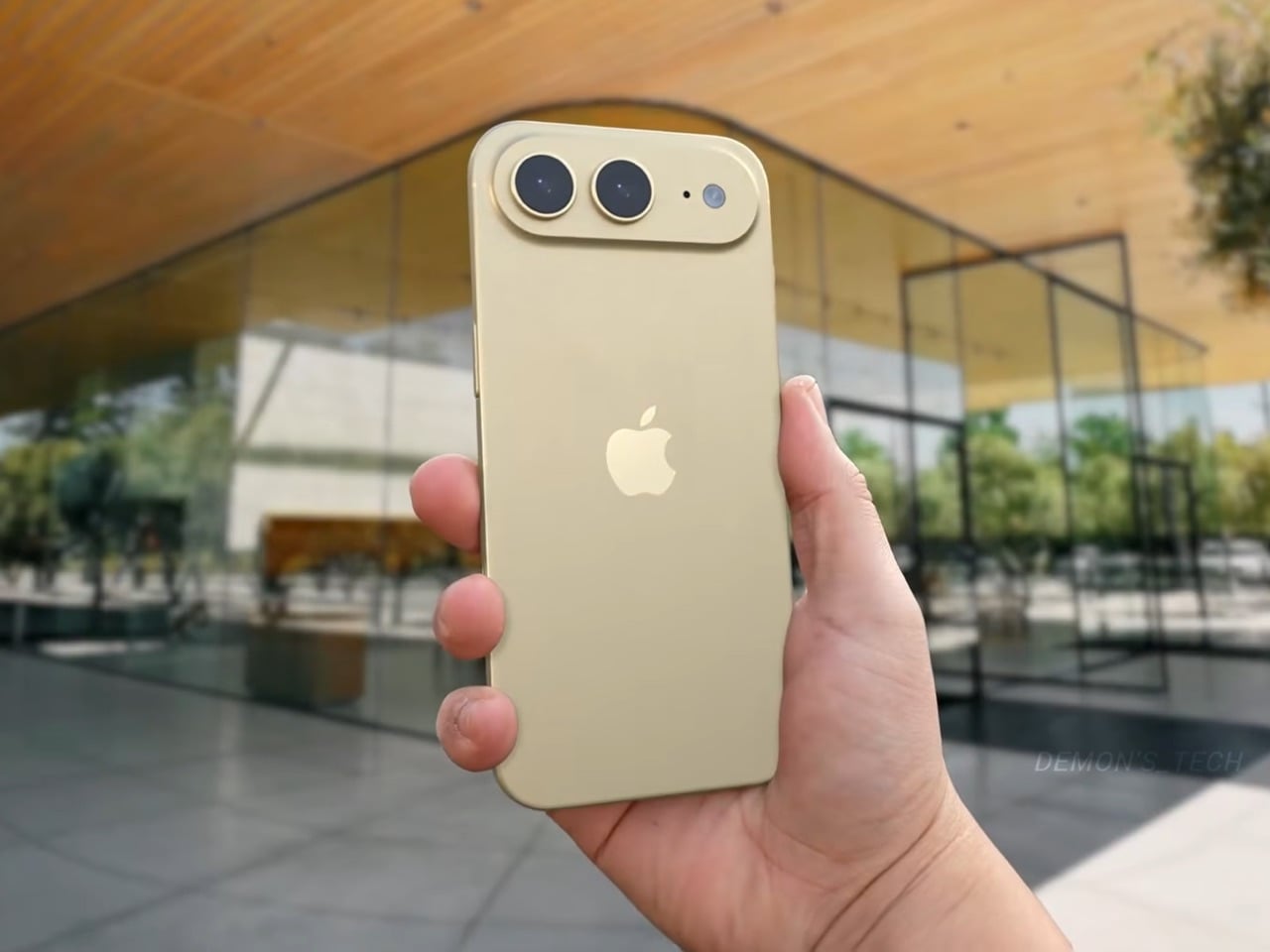
Demon’s Tech has imagined exactly what that second generation could look like, and the concept renders suggest Apple already has a clear path to making the Air the phone it should have been from the start. The dual-camera bar is wide and confident across the top of the phone, housing two lenses with room to spare. The rest of the body is pure restraint, a flat back, centered Apple logo, and a color range vivid enough to give the phone a personality that its specs can now actually back up. If the rumored stereo speaker and efficiency-focused N2 chip join that camera upgrade, the Air 2 goes from interesting to genuinely compelling.
Designer: Demon’s Tech
![]()
Two 48-megapixel sensors reportedly sit inside the pill-shaped housing, one primary and one ultrawide, which aligns with leaks from Chinese tipster Digital Chat Station suggesting Apple is going for a main-plus-ultrawide configuration rather than a telephoto. That choice makes sense for the Air’s positioning. Telephoto glass demands physical depth that a sub-6mm chassis simply cannot accommodate, and ultrawide coverage is what most non-Pro users actually miss day-to-day. The original Air’s single-lens bar always looked slightly incomplete, like a sentence that trailed off mid-thought, and Demon’s Tech addresses that by stretching the new pill-shaped housing almost the full width of the phone’s upper third, sitting flush and purposeful rather than apologetic. It is a small change on paper that transforms the entire visual logic of the back panel.
![]()
![]()
Apple shipped the original Air in four relatively restrained options: cloud white, sky blue, light gold, and matte space black. Demon’s Tech blows that palette wide open, running through violet, cobalt, mint green, and vivid red alongside the sandy gold seen in the hero shots, which is closer to what the iPhone 5C attempted in 2013, a phone that led with color as a statement rather than a courtesy. The Air’s lifestyle positioning actually supports this approach in a way the 5C’s budget framing never quite did. A phone you buy partly because it is extraordinarily thin is a phone you buy to be noticed, and being noticed in muted gold is considerably less fun than being noticed in electric blue. The renders make a quiet argument that Apple’s colorway restraint on the original Air was a missed opportunity, not a deliberate choice.
![]()
![]()
Twelve gigabytes of RAM paired with the A20 Pro keeps the performance story simple: this is a phone that matches the Pro lineup on silicon even if it concedes on optics. The sleeper upgrade is Apple’s rumored N2 efficiency chip, because getting better battery life out of a body that physically has less room for cells requires exactly this kind of architectural work, the same discipline that let the original Air post competitive endurance numbers despite its dimensions. Add stereo sound from a bottom speaker alongside the existing top one, and the two most common complaints about the first Air evaporate inside a single product cycle. That is a more focused corrective than Apple managed with either the Mini or the Plus, both of which spent multiple generations struggling to justify their existence. If Apple lands all of this at the same $999 price point, the value math finally starts working in the Air’s favor.
![]()
Apple has confirmed the Air line continues, with the second generation reportedly targeting a spring 2027 release window, landing after the iPhone 18 Pro, Pro Max, and foldable models ship in fall 2026. That later window gives Apple’s engineering teams more time to solve the thermal and battery challenges that come with building capable hardware into an impossibly thin frame, and it gives the Air its own launch moment rather than forcing it to compete for attention against a foldable iPhone. Demon’s Tech’s concept is the best visual argument yet for what that launch moment could look like: a phone that carries its thinness as a given rather than an excuse, and finally has the camera system and audio to back up everything the form factor promises.
The post This iPhone Air 2 Concept Adds Two Cameras and Suddenly the Phone Makes More Sense first appeared on Yanko Design.

![]()
Most chairs are built on compromise. You stack the legs, screw the seat, bolt the back, and somewhere in that assembly, a little bit of the original idea gets lost to the necessity of structure. Davide Bozzo’s ZERO Chair refuses to play that game entirely.
The concept is almost confrontationally simple: one single ribbon of metal, bent and curved into a complete chair. No welds holding two pieces together. No joints disguised under upholstery. No hardware quietly doing the heavy lifting behind the scenes. Just one continuous piece of material pushed into a form that includes the base, the cantilevered seat, and the backrest all at once. The name isn’t branding. It’s a philosophy.
Designer: Davide Bozzo
![]()
Looking at the photographs, the first thing I kept circling back to was the sheer audacity of the backrest. It doesn’t connect to the base through hidden brackets or clever joinery. It simply rises from the same ribbon, curving upward and backward in a motion that looks more like a wave caught mid-break than anything you’d typically call furniture. It’s graceful in a way that makes you slightly suspicious of it. How is this thing holding anyone’s weight?
The answer lies in what Bozzo describes as structural tension. Form doesn’t just follow function here. It is the function. The material itself carries the engineering logic. Every curve has a reason, and every bend is calculated to distribute load through the continuity of the form rather than through added components. It’s the same principle behind suspension bridge cables or the way a curved shell is structurally stronger than a flat panel. Applied to a chair, it feels almost radical.
![]()
I’ll be honest. My first instinct was skepticism. A single-piece metal chair sounds like one of those design school exercises that makes for great renderings but falls apart under real scrutiny. But looking at the close-up photographs, especially the one capturing the S-curve where the seat meets the backrest, you start to believe it. The brushed metal finish shows actual material depth and actual intentionality in how the surface was treated. This isn’t a concept render floating in a void. It has weight and presence.
![]()
That said, I do have questions. Comfort is conspicuously absent from the conversation. Metal, even beautifully formed metal, is hard. The cantilevered seat gives some flexibility, which should help, but a chair without cushioning asks something significant of the person sitting in it. Bozzo’s design makes a statement about material honesty and structural purity, which I respect deeply, but at some point a chair has to be sat in. That’s the tension that makes it interesting rather than just pretty.
The piece also reads as a quiet counterargument to the current era of maximalist furniture. We’ve spent years surrounded by bouclé armchairs, curved velvet sofas, and furniture dressed up in layers of texture and warmth. Bozzo’s chair strips all of that away and asks whether furniture can earn your attention through restraint and engineering alone. My honest opinion? It can. Whether it earns a place in your living room is a different question entirely.
![]()
The chair also does something that doesn’t get discussed enough in design coverage: it makes the negative space part of the design. The open rectangle formed by the base creates a void that’s almost as deliberate as the metal itself. In the lifestyle image set against a Japanese garden backdrop, that void frames the gravel and ground beyond it. The chair becomes a viewfinder. That’s not accidental. That’s a designer who understands that what you leave out is just as powerful as what you put in.
Bozzo has been building a reputation for material-forward work. His stainless steel pet bowl Dune explored similar ideas around fluid curves in a single medium, but the ZERO Chair feels like a significant step up in ambition. It’s the kind of piece that stops you mid-scroll, makes you set your phone down, and actually think. That, more than any material specification, is probably the point.
![]()
The post The ZERO Chair Has No Welds, No Joints, No Apologies first appeared on Yanko Design.

![]()
Somewhere along the Huadi River in Foshan, China, a cluster of old grain storage warehouses has been turned into one of the most quietly poetic pieces of architecture I’ve seen all year. The Yongping Warehouse Renovation, completed in 2025 by Guangzhou-based Atelier cnS, is exactly the kind of project that makes you stop scrolling and actually look.
The site sits in Dali Town, Nanhai District, a former industrial pocket of the Pearl River Delta that’s been gradually shedding its factory-town skin in favor of something more livable and publicly accessible. These particular warehouses, lined up along the riverfront, were derelict grain storage buildings with no obvious future. Not exactly glamorous source material. But Atelier cnS didn’t flinch, and the result is a project that earns its attention without asking for it loudly.
Designer: Atelier cnS
![]()
Because the site has a narrow footprint, the architects pushed the public space upward, placing a landscaped rooftop park above the commercial interiors below. Vertical programming isn’t a new idea, but what makes Yongping feel different is how thoughtfully the transition between levels was handled. The gaps between warehouse blocks weren’t sealed or filled in. Instead, they were preserved and widened into passageways, so as you move through the building, you catch glimpses of the river framed by walls before the whole view opens up at the top. It’s a slow reveal, and it’s deliberate.
![]()
![]()
And then there are the canopies. A series of translucent, domed structures built from hexagonal frames cluster across the roofline like a quiet gathering of clouds. Atelier cnS actually named the project “A Wisp of Cloud” over Huadi River, and the photos earn that name completely. The domes are light-diffusing, casting shade without blocking river views. They create zones for sitting, moving, and play without ever feeling like they’re closing the space in. They look like they arrived gently, rather than being imposed on the building below them.
![]()
![]()
The rooftop itself is shaped into slopes, steps, and play surfaces that echo the original pitched forms of the warehouse roofs. It’s one of those details that most visitors probably won’t consciously register, but it’s exactly the kind of architectural memory that makes a renovation feel grounded rather than gratuitous. The old buildings aren’t being pretended out of existence. The new design is in active conversation with what was there before.
![]()
![]()
I’m genuinely drawn to this project because it gets the balance right in a way that many adaptive reuse projects don’t quite manage. Too often, the renovations that attract the most attention are the ones where the new design overwhelms the original structure, turning the old building into nothing more than a convenient shell. Yongping avoids that trap. The warehouses are still very much present. Their bones dictate the rhythm, the circulation, and some of the visual language of the final result. You can feel the history of the place without having to read about it first.
![]()
Atelier cnS has been developing this kind of thinking for years. The studio’s earlier work on elevated public circulation, including a “roof-hopping” design approach explored in their White House Guesthouse project, signals a long-running interest in finding new life in existing structures. Yongping feels like a maturation of that sensibility. More refined, more integrated, and more tuned in to the texture of a neighborhood mid-transition.
![]()
The project spans 4,311 square meters, and it’s worth noting what it does beyond the architecture itself. Turning a commercial renovation into a publicly accessible rooftop park, in a district shifting away from its industrial past, is a real act of generosity. A park on a roof could easily read as a private amenity. Here, it reads like a gift to the neighborhood, a place to walk, rest, and look out at the river without needing a reason to be there.
![]()
Architecture doesn’t always need to announce itself to be worth paying attention to. The Yongping Warehouse Renovation is understated, purposeful, and lit from above by a cluster of translucent domes that look, from a distance, exactly like a wisp of cloud over the river.
![]()
The post Foshan’s Forgotten Warehouses Got a Rooftop Park Under Floating Domes first appeared on Yanko Design.

Working on the go rarely looks as tidy as productivity-tool adverts suggest. Most people who travel with serious work needs end up carrying at least two or three things that don’t quite fit together: a tablet or laptop, a compact keyboard if the touchscreen isn’t enough, maybe a portable monitor, and a cable situation that somehow multiplies every time you pack.
VitaLink is trying to simplify that. The concept combines a full-size keyboard and a large touch display into one foldable object in a CNC aluminum shell. Connect it to any USB-C device and your workspace expands immediately, without a separate stand, a monitor arm, or a bag pocket devoted to adapters. It folds down to 20mm and opens into something that feels genuinely designed.
Designer: VitaLink
Click Here to Buy Now: $279 $658 (58% off). Hurry, only 491/600 left! Raised over $37,000.
The integrated 13-inch display sits directly above the keyboard in what amounts to a compact laptop form factor. The screen runs at a 3840×1600 pixel resolution, a 2.4:1 ultra-wide format rather than a standard 16:9 panel, giving it an unusual amount of horizontal room. There’s enough space to keep two apps open side by side without either feeling squeezed into a corner.
The 180-degree hinge is what makes the compact form actually practical. When you’re done, everything closes into a flat 20mm slab that slips into a laptop sleeve without awkward bulk. The open footprint sits at around 34 × 15 cm, compact enough for a plane tray table, a crowded café counter, or a hotel desk that never seems to fit anything comfortably.
The panel supports 10-point touch, runs at 60 Hz, and delivers 298 PPI pixel density with 100% sRGB color coverage. Touching a screen this size changes how you interact with content. You can swipe, drag, and tap directly on the display while still using the keyboard below, which means managing layers in an editor, scrubbing a timeline, or pulling up references doesn’t require switching between input modes.
The keyboard uses scissor-switch mechanisms with 0.8mm of key travel and wider-than-typical spacing. That added spacing sounds like a minor detail until you’ve spent an hour trying to type accurately on a portable board that prioritizes size above everything else. Three RGB backlight modes let you set the visual tone, and the keys are designed to stay quiet enough for cafés and shared offices.
Two USB-C ports handle video, data, and power delivery through a single cable, and the plug-and-play setup works across Windows, macOS, Linux, iOS, and Android without requiring additional drivers. That compatibility extends to mini PCs, tablets, and handheld gaming consoles, so VitaLink isn’t tied to one kind of device. You’re not locked into a single workflow or a single ecosystem, which is most of the appeal.
Think about what that actually means. You’re in a hotel room with just your iPad and need a proper keyboard and enough screen space to write, edit, and reference something at once. Or you’re at a café with a mini PC and want a setup that doesn’t take over the whole table. Those are the moments where having the keyboard and the display in one object makes a real difference.
The aluminum body does more than keep things thin. CNC-machined aluminum with a frosted anodized finish gives it a rigidity that plastic travel accessories rarely have, protecting the display in transit and keeping the keyboard deck from flexing during typing sessions. It carries more like a slim hardcover notebook than a peripheral, which is a meaningful difference for anyone who’s dealt with a flimsy portable monitor in a crowded bag.
There’s something worth noting in the fact that portable work setups have gotten faster without necessarily getting more cohesive. The bag is still a loose collection of things that don’t quite belong together. VitaLink is at least making a case that the keyboard and the display belong in a single intentional object, built from the start for people whose work doesn’t stay in one place.
Click Here to Buy Now: $279 $658 (58% off). Hurry, only 491/600 left! Raised over $37,000.
The post VitaLink Just Put a 13-Inch Screen and Keyboard Into One Foldable Slab first appeared on Yanko Design.

8849tech introduced the Tank Pad last year, leaving the tech world in awe. With the ability to double as a projector, the rugged tablet leapt beyond the already highlighted multitasking capabilities of a normal tablet. Now the beast is back in an improved version to polish out the kinks of the OG version, adding more capabilities for users who demand that little extra.
The Tank Pad Ultra has the same promise of all-weather performance, reliability, and durability as its predecessor. If you’re hoping to buy a sleek, lightweight tablet, this one, weighing 1,345 grams and measuring 170.3×268.3×23.6 mm, is not for you. The device is targeted towards professionals and power users who are constantly exposed to challenging environments. Slated to launch two days from now, the rugged tablet is designed for a niche audience with a specific set of needs.
Designer: 8849tech
![]()
![]()
Specifications are the key here as the tab boasts a 10.95-inch, 1920 x 1200 pixel display, which is better than the previous version. Powering the gut is a MediaTek Dimensity 8200 processor, which is a tad slower than the Tank Pad, which has a Dimensity 8300 processor. To support multiple open apps, the 16GB RAM and storage capacity of 512GB (expandable via a microSD card) make things easy for users. Coming onto the integrated DLP projector, it has a 1920 x 1080 pixel resolution. 260 lumens of brightness and auto-focus support. These numbers are technically better than the Tank Pad, which has a 854 x 480 pixel resolution and 100 lumens maximum brightness.
![]()
![]()
The battery also gets a bump up to 23,400 mAh from the previous 21,000 mAh in the original model. However, both have support for 66W charging, which should be enough to juice up the device for short bursts or power usage in case charging options are limited out in the wild. The Tank Pad Ultra comes with a USB 2.0 Type-C port and the ability to reverse charge your other gadgets. For people who are all-in for a wired multimedia experience, the 3.5mm audio jack is a welcome addition. Since the tablet is going to be used out in unknown environments, it comes loaded with a gyroscope, accelerometer, compass, ambient light sensor, and distance sensor. It also comes with an independent camping light built in to explore in the dark hours.
![]()
![]()
Of course, a mobile device needs to have shooting capabilities, so the Tank Pad Ultra has a 50MP primary camera (with Sony IMX766 sensor) for daylight shooting and a 64MP night vision camera (OV64B) for more awareness of the environment in the dark hours. In the mix is a 32MP front-facing camera (IMX616 sensor), which is potent enough to take video calls in high quality. 8849 has included dual nano SIM card slots with support for 5G NR and 4G LTE networks, which is essential in inhospitable conditions. For a more laid-back connectivity when you arrive back home, the tab has WiFi 6, Bluetooth 5.3, and NFC support.
![]()
![]()
There’s no word yet on the pricing of this rugged tablet, but going by the price of the previous model, it should be around $550. That information should present itself in a couple of days when the tablet is finally launched.
![]()
![]()
![]()
![]()
![]()
![]()
![]()
![]()
![]()
![]()
![]()
The post Tank Pad Ultra is a rugged tablet that doubles as a short throw projector first appeared on Yanko Design.

Wireless charging was supposed to simplify things. Instead, most Apple users end up with a tangle of pads and cables on the nightstand, one for the iPhone, another for the Apple Watch, and a separate spot for the AirPods. The technology meant to reduce friction has become its own kind of mess, especially for anyone who’s ever scrambled for a Watch charger before a morning flight.
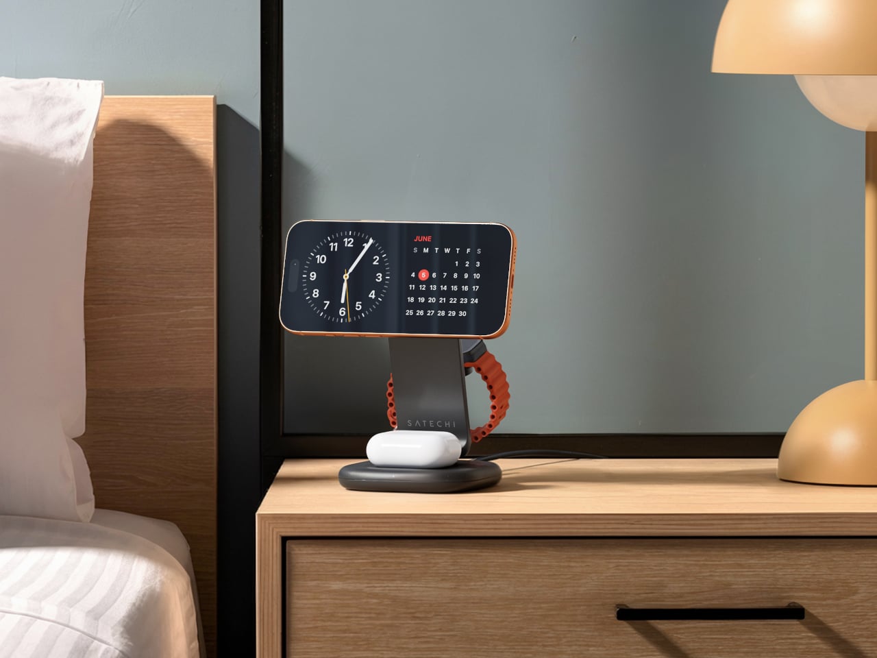
Satechi’s 3-in-1 Foldable Wireless Charging Stand with Qi2 25W takes aim at that problem. The San Diego brand has updated its best-selling foldable charger with a meaningful upgrade, bumping wireless power delivery for compatible iPhones to 25W, a notable jump from the 15W ceiling most MagSafe-compatible pads have been stuck at. It’s built as a proper desktop stand, not just something you tolerate next to the lamp.
Designer: Satechi
![]()
![]()
Set the phone down on the magnetic charging surface, and Qi2’s built-in alignment snaps it into position so you don’t lose power from an off-center placement. The Apple Watch sits at a comfortable angle on its dedicated fast-charge module, while the AirPods rest on their own pad below. All three charge simultaneously from a single cable going to the wall, with nothing to juggle.
![]()
Apple Watch fast charging requires MFi certification, and Satechi has that covered. The stand supports Series 7 and newer, including Ultra and SE models. Advanced safety protections manage heat and prevent power loss when all three pads are active at once. The magnetic surface on the phone pad also ensures it stays correctly positioned even if you accidentally nudge it during the night.
![]()
![]()
Then there’s the folding design, which is where the stand earns its keep as a travel companion. It collapses into a flat form that fits easily in a carry-on without much bulk, then unfolds into the same stable stand you’re used to at home. There’s no need to rethink your charging setup just because you’ve checked into a different room across town or across the world.
![]()
![]()
Satechi also includes a 45W USB-C power adapter in the box, which sounds like a minor detail until you’re unpacking in a foreign hotel room. The adapter ships with US, EU, and UK plug attachments, meaning it works across different countries without needing a separate travel adapter. That’s a small but thoughtful decision for anyone whose travels take them to multiple regions throughout the year.
![]()
Available now on Satechi.com and Amazon, the stand retails for $129.99 in Space Black. It’s a higher investment than a single-device pad, but consolidating three separate chargers into one that travels as well as it sits on a desk makes that gap easier to justify. For Apple ecosystem users tired of the cable pile next to the bed, this stand offers a much cleaner end to every day.
![]()
The post Satechi’s $130 Foldable 3-in-1 Charger Now Hits 25W for iPhones first appeared on Yanko Design.

Minimalism in product design has gotten boring. We’re swimming in smooth white rectangles, touch controls that offer zero feedback, and devices designed to vanish. Apple spent two decades training the industry to sand away every visible seam, and now we live in a world where a Bluetooth speaker looks like a cylinder because a cylinder offends nobody. Bang & Olufsen understood early that audio equipment could occupy space like sculpture, could earn its place in a room through presence instead of absence. Teenage Engineering proved that mechanical honesty and playful geometry could coexist with premium materials. Both approaches work because they have a point of view.
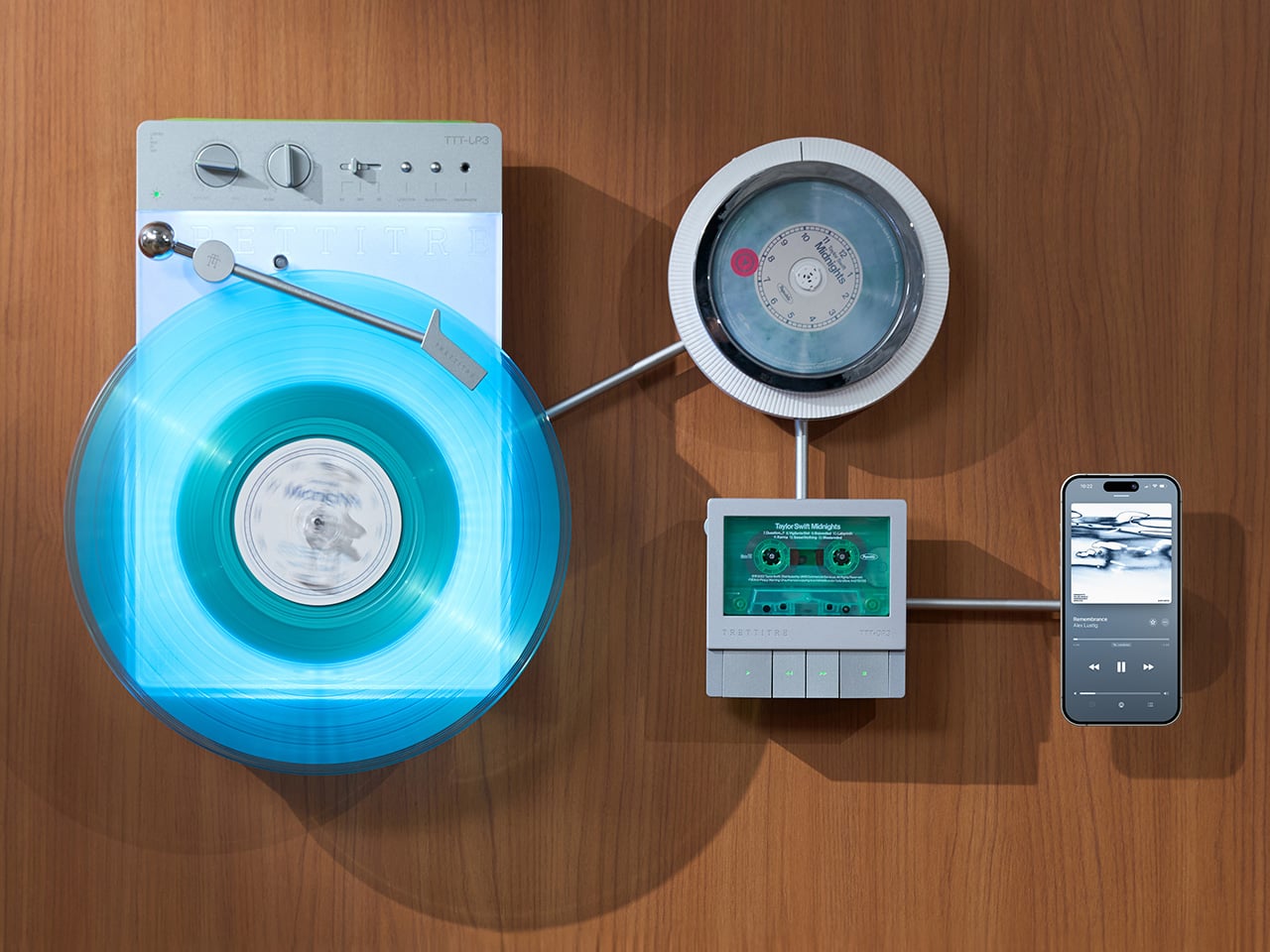
TRETTITRE’s TTT series combines those instincts into something harder to categorize. The TTT-LP3 wireless vinyl player uses CNC-machined aluminum for the main frame and features a diffused lighting panel that spreads light evenly across the surface when music plays. The TTT-DP3 Bluetooth CD player takes inspiration from a UFO-like form with a transparent magnetic cover that rotates open to reveal the spinning disc. The TTT-CP3 cassette player uses a metal housing with sharp geometric lines and mechanical transport keys that deliver clear physical response. All three mount on the TTT-W magnetic modular wall rack, turning physical media playback into a visible, functional part of interior design.
Designers: Noah – Founder & Designer, Trettitre
Click Here to Buy Now: $229 $449 ($220 off). Hurry, only 55/99 left! Raised over $654,000.
The back of the LP3 includes a hidden mounting structure that allows it to hang directly on a wall. You can mount it vertically so the record becomes part of the visual display, or go for the classic horizontal layout. When you want to move it, you lift the silicone leather handle at the top and take it down. The player detaches easily and gives you the freedom to listen wherever you choose. Traditional turntables usually stay exactly where you put them, limiting your options for when and where you listen. The LP3 works a little differently because of the battery and the wall mount’s wireless charging system, which keeps it powered without a visible cable.
Behind the LP3 sits a diffused lighting panel that spreads light evenly across the surface of the unit. When it’s on, the entire body of the player glows softly, designed to feel closer to ambient lighting than decorative lighting. You can change the lighting effects with the touch of a button. When a record spins, the moving shadows create a quiet visual effect. You can also leave the player mounted on the wall as a soft light source even when no music is playing. That ambient quality pushes the LP3 from well-designed product into something more considered: a slow, breathing light fixture that happens to play records.
The LP3 uses a self-balancing tonearm system that automatically sets the correct pressure when the player powers on. You place the record on the platter and lower the needle, and the system handles the rest. Many turntables require careful calibration before they can be used properly, with tonearm balance, tracking pressure, and counterweight adjustment all part of the process. For experienced collectors that process can be enjoyable, but for beginners it often feels complicated. The LP3 removes that barrier entirely while preserving the tactile experience people enjoy. The player supports both 33 RPM and 45 RPM records, and includes a manual control dial that allows small adjustments to playback speed (roughly ±0.5%), useful for older records that may not spin perfectly at their original speed anymore.
Wireless audio is handled through Qualcomm Bluetooth v5.3 with SBC, aptX, aptX HD, and aptX Adaptive, which allows higher-quality and lower-latency wireless audio than basic Bluetooth streaming. For wired setups, the player also includes a 3.5mm audio output. The built-in battery provides up to 6 hours of vinyl playback or up to 3 hours when used purely as an ambient light source. Full specs: dimensions 342×233×87mm, weight 1430g, Audio-Technica AT3600L moving magnet stereo cartridge, CNC-machined aluminum frame with silicone leather carrying strap. The LP3 arrives in June 2026 for Early Bird backers, May 2026 for Fast Delivery backers.
The DP3 keeps the reliability of CDs but gives the player a different visual presence. The design takes inspiration from a UFO-like form with a transparent magnetic cover. When the cover rotates open, the disc is partially visible as it spins, turning something simple into a small visual moment. A CD player shaped like a flying saucer with a rotating transparent lid is an audacious idea, and it works because it doesn’t try to evoke nostalgia. It reframes a CD player as a mechanical object of curiosity, something you watch as much as use.
The control buttons include raised tactile dots combined with a gold-embossed finish, making it easy to identify the buttons by touch alone. You can pause or skip tracks without needing to look down at the player. A small OLED display on the player shows track numbers, playback status, and battery level. The interface is intentionally simple so the information you need is visible immediately. A built-in battery allows the DP3 to run for several hours on its own, so you can move it from room to room, bring it to a small gathering, or take it while traveling. Full specs: Ø170×27mm, 324g, supports CD-DA and HDCD formats, Bluetooth 5.4, SNR >70dB, THD <3%, ABS+PC+Metal construction. The DP3 ships in May 2026.
The CP3 keeps the tactile mechanical elements people associate with tapes while updating the electronics inside. The player uses a metal housing with sharp geometric lines that give it a distinctly industrial appearance. Instead of trying to imitate retro plastic designs, the CP3 leans into a more modern interpretation of cassette hardware. The playback controls use independent mechanical keys similar to piano keys. Each press has a clear physical response. Play, rewind, and stop feel deliberate instead of soft or mushy.
Inside the CP3 sits a Bluetooth module that allows cassette audio to stream wirelessly to speakers or headphones. The player decodes analog audio signals with high precision, helping reduce background noise and preserve more detail from the original recording. The result still sounds like cassette tape, but with greater clarity. Full specs: 122×120×32mm, 360g, supports Type I-IV cassette cartridges, Bluetooth 5.4, SNR ≥55dB, THD <3.5%, Metal+PC+ABS construction. The CP3 ships in May 2026.
The TTT-W Magnetic Modular Wall Rack uses an all-metal geometric structure that allows multiple TTT players to be arranged into a clean wall display while keeping them organized and ready to use. The rack integrates magnetic alignment and wireless charging for the vinyl player, so the LP3 can stay powered without visible cables while being part of the room’s design. Two configurations are available: a T-shaped rack (263×196×27mm, 300g) and a magnetic modular wall rack (612×302×27mm, 775g, combined style T+3). Both support wireless charging at 5-10W and use USB-C 5V 2A input.
TRETTITRE offers a range of add-ons designed to complement the TTT system. The TreSound1 Speaker arrives in concrete and wooden editions, delivering 2×30W + 1×60W output power with a 1″ tweeter, 2.75″ mid-range, and 5.25″ subwoofer for 30Hz-25KHz frequency response. The conical speaker features 360° surround sound, Bluetooth 5.2 with Qualcomm aptX HD, and a sculptural form that occupies space like a piece of furniture. The TreSound Mini is a portable Bluetooth speaker with a 5200mAh battery, 30W RMS output, and 360° surround sound. The TTT-E3 in-ear headphones use a 13mm planar magnetic driver with a 4-strand silver-copper hybrid conductor, available in 3.5mm and 4.4mm configurations. An aluminum alloy side table (300×300×750mm, 1.75kg, max load 50kg) rounds out the ecosystem.
The TTT-LP3 wireless vinyl player is available at $229 for Early Bird backers (June 2026 delivery), down from a planned $449 MSRP. The TTT-DP3 Bluetooth CD player is priced at $79 standalone ($179 MSRP), while the TTT-CP3 cassette player is also $79 standalone ($199 MSRP). If you’re a bonafide audiophile, a $399 bundle gets you all three devices. Optional add-ons include the TreSound Mini Bluetooth Speaker at $169 ($299 MSRP), TreSound1 Wooden Edition at $449 ($659 MSRP), TreSound1 Concrete Edition at $499 ($799 MSRP), TTT-E3 planar IEMs at $139 ($239 MSRP), and the TTT Side Table at $89 ($199 MSRP). The campaign runs through April 9, 2026, with worldwide delivery beginning May 15, 2026.
Click Here to Buy Now: $229 $449 ($220 off). Hurry, only 55/99 left! Raised over $654,000.
The post MUJI-Meets-Cyberpunk Vinyl Record Player Glows Like an Ambient Light and Charges Wirelessly first appeared on Yanko Design.

![]()
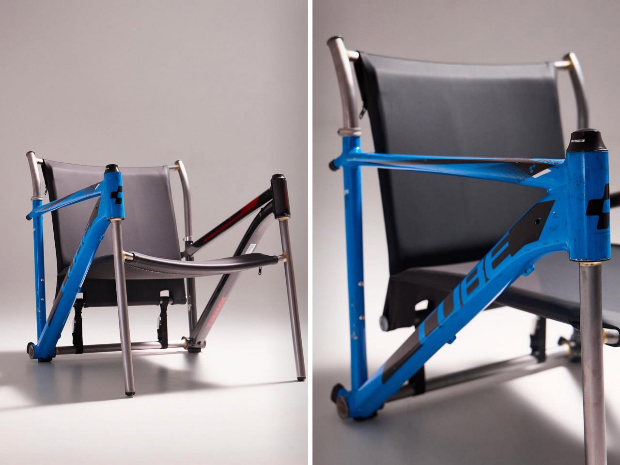
Most upcycling projects ask you to forget what something used to be. Omri Piko Kahan’s bike frame chairs ask the opposite. The geometry is still unmistakably a bicycle frame, the head tube, the top tube, the triangulated rear triangle, all of it present and accounted for, just oriented sideways and asked to hold a person instead of propel one. Kahan, an industrial designer based in Israel, builds lounge chairs from pairs of retired frames, and the whole point is that the donor material remains fully readable, repurposed without being disguised.
Structurally, the approach is clean and considered. Each frame pair is positioned symmetrically, fork and chainstay ends touching the floor as legs, the top tube running horizontally as an armrest. A slung seat and backrest in leather or canvas complete the form. The result has the relaxed posture of a Barcelona chair and the material honesty of something that was clearly built, not styled.
Designer: Omri Piko Kahan
![]()
Bicycle frames are absurdly overbuilt for what Kahan is asking them to do. A modern aluminum road frame is engineered to survive repeated impact loads from a rider pushing 300 watts through rough tarmac, and it does that while weighing somewhere between 1,000 and 1,400 grams. The structural surplus in that kind of engineering is enormous, which is why two of them positioned as a chair frame and asked to support a seated adult is, from a load-bearing standpoint, almost comically within spec. The geometry does the rest. Bicycle frames already resolve forces through triangulated sections, and a lounge chair asks for exactly that kind of lateral and compressive stability.
![]()
![]()
What Kahan has figured out is the orientation problem. Flip a frame on its side and the existing tube angles don’t automatically produce a useful chair geometry. The fork legs and chainstay ends need to hit the floor at the right height relative to each other, the top tube needs to land at armrest height, and the whole thing needs to produce a seat rake that doesn’t pitch you forward or swallow you whole. The matched top tube angles across both frames in the Cube and Trek build suggest this took real iteration, because they align with a precision that reads as deliberate rather than lucky. Filed fillets at the junctions and a custom setback upper support holding the sling confirm someone was paying close attention to finish quality.
![]()
![]()
The two builds photographed so far, one pairing a blue Cube road frame with a Trek, another combining a GT Transeo 3.0 with what appears to be a Supreme-branded MTB frame, show how much the donor bikes drive the final character of each piece. The GT build in particular has a longer wheelbase geometry that gives the chair a wider, more reclined stance than the Cube version. Kahan is taking custom orders, with pricing worked out per commission, which makes sense given that no two donor frame combinations will produce the same structural or ergonomic outcome.
![]()
The post These Old Bike Frames Upcycled Into Armchairs Are The Coolest Thing You’ll See Today first appeared on Yanko Design.

Spending hours in front of a glowing screen is unavoidable for most people, and the toll it takes on the eyes is a problem the monitor industry hasn’t truly solved. E Ink displays offer a gentler, paper-like alternative that’s far easier to stare at for long stretches, but most of them are painfully slow, limited in resolution, and not really up to the demands of daily computing.
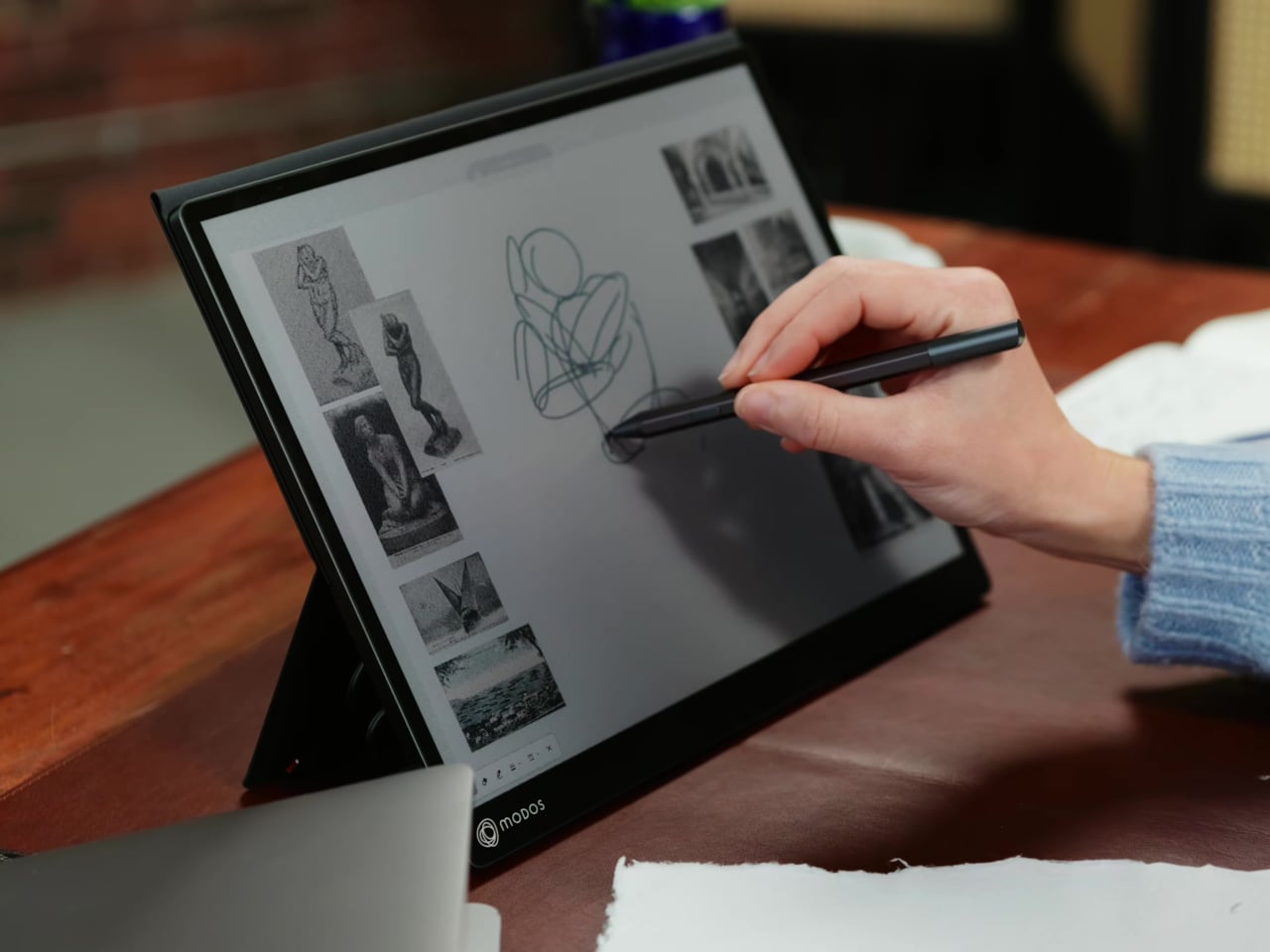
The Modos Flow is Modos Tech’s answer to that problem. Built by a Boston-based hardware startup, it’s a 13.3-inch E Ink portable monitor designed not just for casual reading but for all-day, focused work. It targets the kind of person who needs a real secondary screen but wants to spend less time squinting and more time actually getting things done.
Designer: Modos Tech
![]()
![]()
Most E Ink monitors struggle as daily drivers because of their refresh rate. Traditional panels tend to crawl, making anything beyond static document reading a frustrating experience. The Modos Flow uses a custom board with open-source firmware to push its display to 60 Hz, enough to scroll through pages, type without noticeable lag, and use the screen as a functional everyday monitor rather than a glorified e-reader.
![]()
Resolution is also where the Modos Flow separates itself. In black-and-white mode, it renders at 3,200 x 2,400 pixels with a pixel density of 300 PPI, making text crisp enough to satisfy anyone used to retina-grade displays. Color mode brings the resolution down to 1,600 x 1,200 pixels at 150 PPI, which is a fair trade given how rarely E Ink panels offer color at all.
![]()
![]()
Touch and stylus support round out what’s becoming a surprisingly versatile display. Modos brought the latency down to under 100ms, so annotating a document, sketching ideas, or jotting notes with a stylus actually responds the way you’d want it to. It won’t replace a dedicated drawing tablet, but for someone who routinely works between a laptop and a secondary screen, having that input option without swapping devices is genuinely useful.
Its physical design is straightforward and practical. A built-in cover doubles as a stand and folds flat for travel, while VESA mounting holes on the back make it easy to attach to a monitor arm or desk mount. Three side buttons let you adjust brightness, contrast, and display mode without touching your computer. Connectivity runs through USB-C with DisplayPort Alt-Mode support, which keeps the setup clean with a single cable.
![]()
![]()
One of the quieter advantages of E Ink over LCD or OLED is power consumption, and that matters here. When connected to a laptop via USB-C, the Modos Flow draws significantly less power than a conventional secondary monitor, meaning your battery isn’t taking nearly the hit it normally would. It works with Windows, macOS, and Linux out of the box, so there’s no particular setup hurdle to clear. Pricing hasn’t been confirmed yet, but Modos has indicated it should be comparable to other portable monitors.
![]()
The post This Color E Ink Monitor Runs at 60Hz: Real Work, No Eye Strain first appeared on Yanko Design.

![]()
![]()

![]()
We are living through a slow, quiet rebellion against digital everything. Vinyl record sales have been climbing for years. Film cameras are back on shelves. People are buying paper planners again. And now, a wooden perpetual wall calendar made in France in the 1970s is having a moment through a Korean design shop called Wertwerk, and I am completely on board.
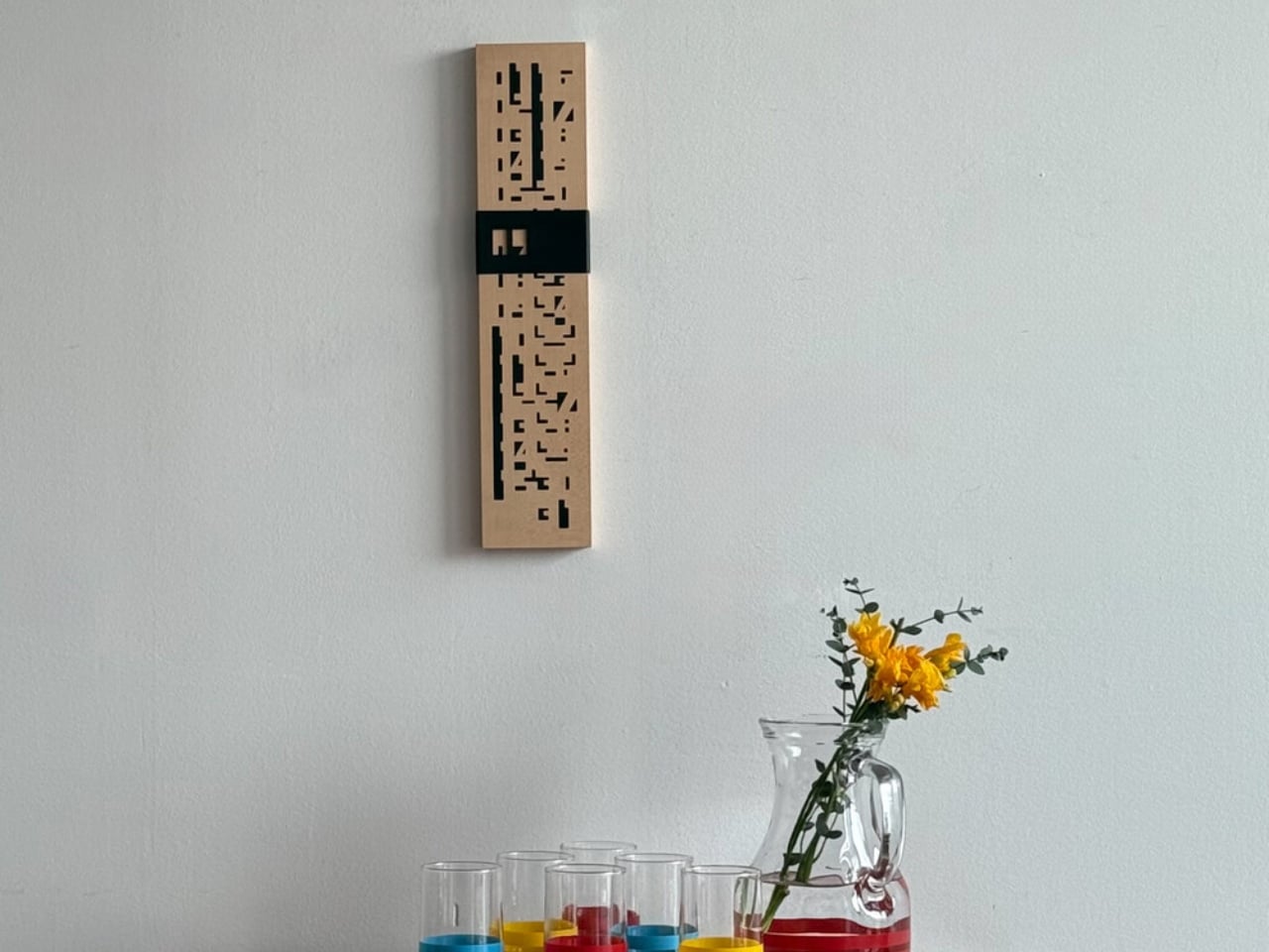
The piece is exactly what it sounds like: a wall-mounted calendar built from a warm wood base, with a row of plastic sliders numbered 1 through 31 that you manually shift to mark the date. No batteries. No notifications. No algorithm nudging you toward anything. Just wood, a little plastic, and the deliberate act of moving a slider every morning. That’s the whole thing. And yet, it manages to do something almost no digital tool can: make you stop and actually notice what day it is.
Designer Name: Wertwerk
![]()
![]()
What makes this particular object so interesting is the decade it comes from. The 1970s were a sweet spot in product design, especially in France, where makers were beginning to marry natural materials like wood with the new optimism of plastic. The result was objects that felt warm and industrial at the same time, organic and modern, useful and beautiful. A wooden calendar with plastic sliders is a textbook example of that tension. It doesn’t feel like a throwback. It feels like a design decision that simply worked the first time and never needed revisiting.
![]()
![]()
The word “perpetual” is doing a lot of heavy lifting here, and it deserves a moment. A perpetual calendar doesn’t expire. It doesn’t have a year printed on it. It covers every day and every month indefinitely, because those numbers don’t change; only the arrangement does. You can hang this on your wall and it will be just as functional in 2045 as it was in 1975. Compare that to your phone’s calendar app, which will feel dated in five years and be incompatible with something in ten. The perpetual calendar was designed with an understanding that good things don’t need to be replaced, just updated slightly, by hand, once a day.
![]()
![]()
Wertwerk is the Seoul-based shop behind this particular find, and they deserve full credit for the eye. Their name pulls from the German words for “worth” and “work,” and that philosophy runs through everything they source. They’ve built a devoted following by seeking out vintage objects that carry actual value beyond nostalgia. Their pieces sell out fast, sometimes within hours. They’re not selling aesthetics for aesthetics’ sake. They’re making a case that a well-made object from fifty years ago can do something a new one cannot: carry the evidence of its own history.
![]()
![]()
I’ll admit I’m biased toward objects that reward you for paying attention to them. The wooden perpetual calendar does exactly that. Each time you slide the date, you’re reminded that time is something you track, not something that tracks you. It’s a small distinction, but it adds up over days and months. Moving a physical date marker is categorically different from glancing at a lock screen, and not in a pretentious way. It’s just more deliberate.
![]()
![]()
The design also photographs beautifully, which is partly why it’s gaining traction in design communities. The wood grain set against the geometric order of numbered sliders reads as both nostalgic and contemporary. It’s the kind of object that looks intentional in a space, not decorative for decoration’s sake, but genuinely considered.
![]()
![]()
If you’ve ever bought something because it made you feel a certain way before you even used it, this is that kind of object. It quietly tells anyone who notices it that you care about how things are made and how long they last. Not everyone reads a wall calendar that way. But for those who do, this one from Wertwerk is worth finding before it disappears, and based on how fast their inventory moves, that won’t take long.
![]()
The post Your Phone Has 12 Calendar Apps. None of Them Look Like This first appeared on Yanko Design.

![]()
At a time when living spaces are shrinking while expectations from them continue to expand, this design presents a thoughtful response that is both rooted in tradition and aligned with contemporary needs.
Emerging from the context of rising housing pressures in Taiwan, where compact homes are increasingly becoming the norm, the project addresses a fundamental question: how can furniture adapt to limited space without compromising comfort or experience? Rather than treating furniture as static, single-purpose objects, the designer reimagines them as dynamic systems capable of transformation.
Designer: Che-Chia Hsu
![]()
At the heart of this piece lies a deep engagement with traditional Chinese woodworking techniques, particularly the precision of tenon joints. These joints move beyond being structural solutions and become expressions of calculated craftsmanship, where geometry, material behavior, and human interaction converge. The result is a construction that feels both minimal and robust, relying on accuracy instead of excess.
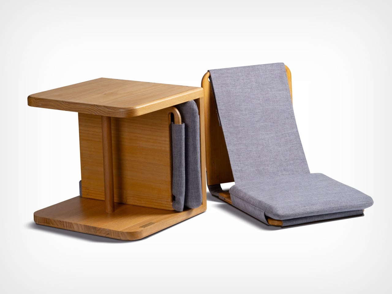
The furniture set is designed to integrate storage and seating within a compact footprint. A chair is concealed within the table and can be pulled out, unfolded, and expanded into a functional seat. The process is intuitive: the chair is extracted, the seat and backrest are opened, and the backrest angle is adjusted using velcro. The transformation is smooth and unobtrusive, allowing the object to shift roles effortlessly.
![]()
What distinguishes this design is its reliance on the user’s own body as part of the structural system. Instead of depending entirely on rigid supports, the chair uses the tension generated by the sitter to stabilize the backrest. This introduces a subtle interaction between user and object, where the act of sitting becomes integral to how the design performs. The experience feels efficient, responsive, and quietly intelligent.
Material choices reinforce this balance between function and experience. Lightweight pine wood panels provide durability while ensuring ease of movement. Paired with gray cotton linen fabric, the design introduces a tactile softness that enhances comfort. The fabric is breathable and visually understated, complementing the natural warmth of the wood. Together, these materials create a calm, cohesive aesthetic suited to contemporary interiors.
![]()
The development of the project reflects a layered and rigorous process. The designer began by studying traditional joinery techniques through literature, followed by hands-on training under a woodcraft master. This immersion enabled a deeper understanding of the craft beyond theory. Building on this foundation, the designer explored ways to translate these techniques into a modern, functional context through research and experimentation.
What emerges is a design that treats constraint as a starting point rather than a limitation. The piece brings together traditional knowledge and contemporary living patterns, shaping an object that adapts, responds, and participates in everyday use. It reflects a way of designing where space, material, and human interaction are considered together, resulting in furniture that feels considered, purposeful, and in tune with the realities of modern living.
![]()
The post A Transforming Table-Chair That Turns Tradition into Space-Saving Intelligence first appeared on Yanko Design.

![]()
It’s rare to come across a capable mobile living unit built onto the back of a Midsize Light Commercial Vehicle (LCV). The versatile delivery truck platform has the power and capacity to carry a living unit, but it’s not a preferred conversion choice for obvious reasons: It wouldn’t go beyond the convenient city and semi-urban paths.
If you’re someone who is content with camping in designated sites and parks at accessible distances over a weekend; the Ari 458 Pro electric camper van is tailored for your ‘compact, efficient and consistently sustainable’ lifestyle. For those who prefer the rugged wilderness, look over for other options.
Designer: Ari Motors
![]()
Created in Germany by Ari Motors, the Ari 458 Pro doesn’t have the rugged appearance: It’s not meant to be a mean adventure rig. The docile appearance may not be German, but the quality of what you get onboard the motorhome – space-saving design with maximum flexibility for living and traveling – is definitely German, if you know what I mean.
Designed to be Germany’s smallest electric camper van out there, Ari 458 Pro is created keeping in mind adventurers and family campers interested in short vacations. The mini-camper with 30 square feet of living space has a top speed of 70 km/h (44 mph) and about 230 kilometers (143 miles) range. It draws power from a solitary 23.5kWh electric motor, which produces up to 20 horsepower. A choice of 15kWh battery is also available. It will perhaps reduce the range from 143 to roughly 112 miles.
![]()
It comes based on a resilient chassis with an integrated power supply, solar and water systems, while the interior is left out as a blank canvas for the individual to customize to their different requirement. Users can choose to customize the 12.5 feet long, 4.9 feet wide, and 6 feet high (headroom) camper interior from a minimalist solution for sleeping to a fully-equipped home with kitchenette, storage, couch, bed and other necessities.
![]()
Created small and compact, the Ari 458 Pro camper van can park conveniently in any parking space, and as the company says, ‘fit narrow roads where larger motorhomes cannot go.’ Its cockpit is interestingly furnished with two seats, a digital display, and a reversing camera to ensure safety. The camper van is currently available in Germany and is priced at €30,381 ($35,100). We do not have a word on the Air 458 Pro’s international availability, but for the interested, the Ari 458 Pro is available in the country in over 30 different variants: food truck, box van, flatbed, tipper, or even a compact garbage truck. These configurations start at €15,790 ($18,200).
![]()
The post Ari 458 Pro is Germany’s smallest electric camper and we love its approach first appeared on Yanko Design.

![]()
Desks have gotten more crowded. Between the laptop, the monitor, the phone, and whatever Bluetooth peripherals have accumulated over the past few years, keeping everything charged without making a mess has become its own challenge. Power strips have always been the go-to solution, but most still end up on the floor or behind furniture, at the end of a cable that creates the very clutter it was supposed to fix.
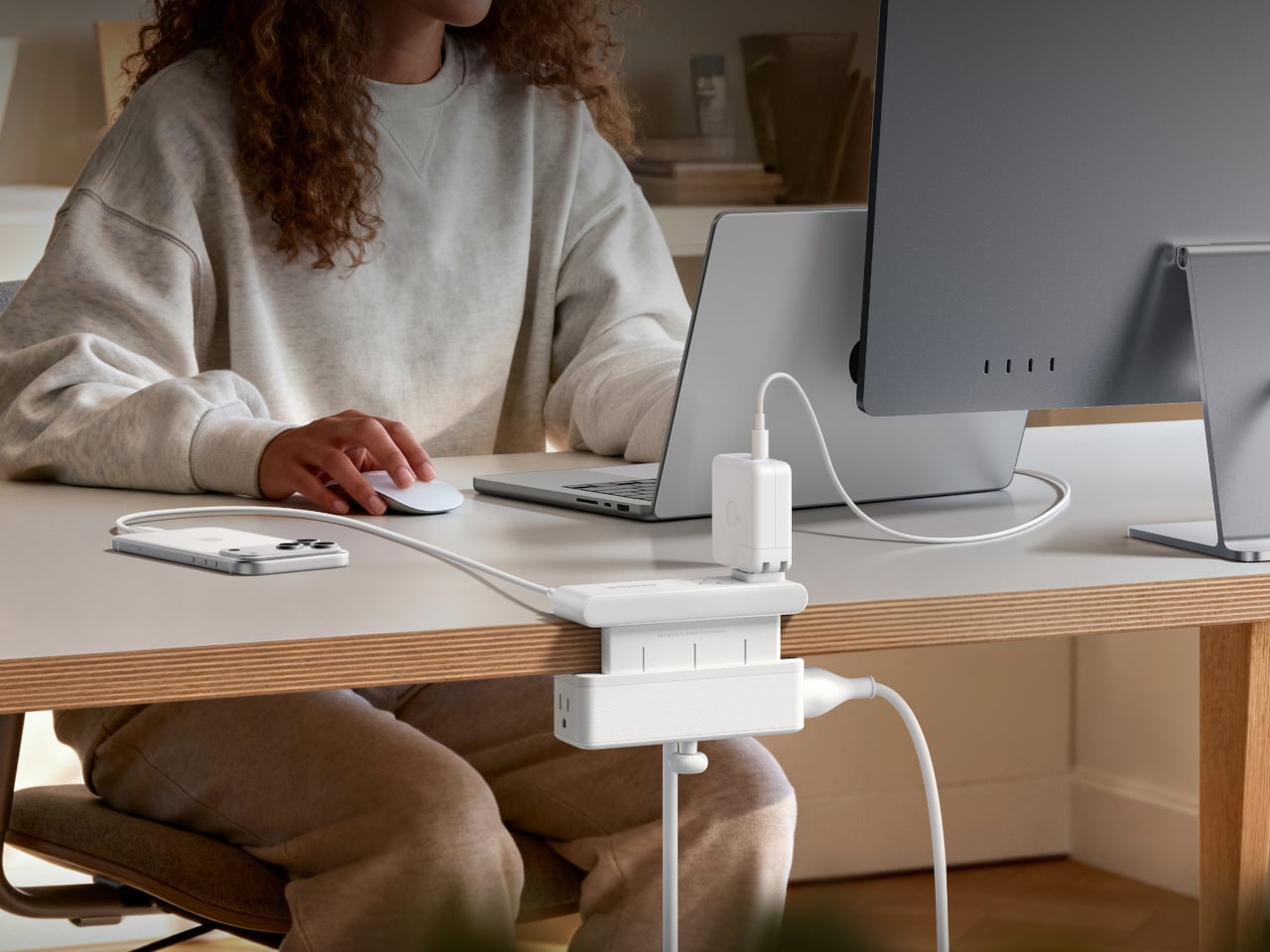
Anker’s Nano Power Strip (10-in-1, 70W, Clamp) approaches that problem from a different angle, quite literally. Instead of sitting on a surface or hiding under a desk, it clamps onto the desk edge, putting 10 ports right where they’re actually useful. First unveiled at CES 2026 and now available in the US for $69.99, it aims to reduce the mess that most power strips quietly make worse.
Designer: Anker
![]()
![]()
The clamp structure sits on either side of the desk edge, with ports distributed across its upper and lower sections. Six AC outlets handle the larger plugs, while two USB-A and two USB-C ports take care of smaller devices. Splitting the ports between two zones keeps things from crowding on one side, a small but practical detail that makes the strip feel properly considered rather than just generously stocked.
![]()
The USB-C charging capability is where the performance stands out. A single USB-C port can deliver up to 70W, enough to run a MacBook or most other laptops without needing a separate wall adapter. That output relies on GaN technology, which keeps the strip slim at just 0.75 inches thick despite the power output, and avoids the extra heat and bulk that older charging components tend to generate.
![]()
Installing it takes seconds. The adjustable clamp fits desk edges between 0.6 and 1.8 inches thick, covering most standard desks, and locks in firmly enough for one-hand use. That might sound like a minor detail, but plugging in a cable while the strip shifts around is exactly the kind of daily irritation that compounds. A stable mount means you’re not bracing the strip with your other hand every single time.
![]()
Anker also built in 1,500J of surge protection, along with a smart overload mechanism that includes a reset button. When it trips, the button pops out to cut power instantly. Press it again, and it’s back to normal. It’s a simple failsafe, but a useful one on a strip mounted at desk height, where a sudden power surge or overloaded circuit could easily go unnoticed until something stops working.
![]()
Anker markets it for gaming and office setups alike, and it’s easy to see why. Gaming desks accumulate powered accessories faster than most, from peripherals to controllers to headset chargers. The dual-zone layout helps spread those cables rather than pile them in one corner, and the 0.75-inch profile doesn’t take up surface space or interfere with the kind of clean, organized desk that people actually put effort into building.
Cable clutter isn’t going anywhere, but it can at least be contained. The Nano Power Strip doesn’t reinvent the power strip so much as it rethinks where one should live. At $69.99, it’s a reasonable ask for 10 ports, 70W of GaN-powered fast charging, and a desk-mounted solution that keeps the tangle off the floor and closer to where it actually gets used.
![]()
The post Anker’s $70 Power Strip Clamps to Your Desk, Keeps Cables Off Floors first appeared on Yanko Design.