Vue normale

Reçu — 12 mai 2026 Techs Design
  • ✇Yanko Design
  • This Ceramic Vase Is Actually a Phone Speaker That Needs No Power
    The home has become increasingly cluttered with gadgets that need charging, pairing, and their own dedicated spaces. Even something as simple as playing music from a smartphone often involves a Bluetooth speaker sitting on a shelf, waiting for its battery to drain. There’s been a quiet counter-movement in product design, where objects do their jobs without power and sit in a room the way a vase or a mug would. Kenji Abe’s ECHO is exactly that kind of object. It’s an analog speaker that amplifie
     

This Ceramic Vase Is Actually a Phone Speaker That Needs No Power

Par : JC Torres
12 mai 2026 à 12:20

The home has become increasingly cluttered with gadgets that need charging, pairing, and their own dedicated spaces. Even something as simple as playing music from a smartphone often involves a Bluetooth speaker sitting on a shelf, waiting for its battery to drain. There’s been a quiet counter-movement in product design, where objects do their jobs without power and sit in a room the way a vase or a mug would.

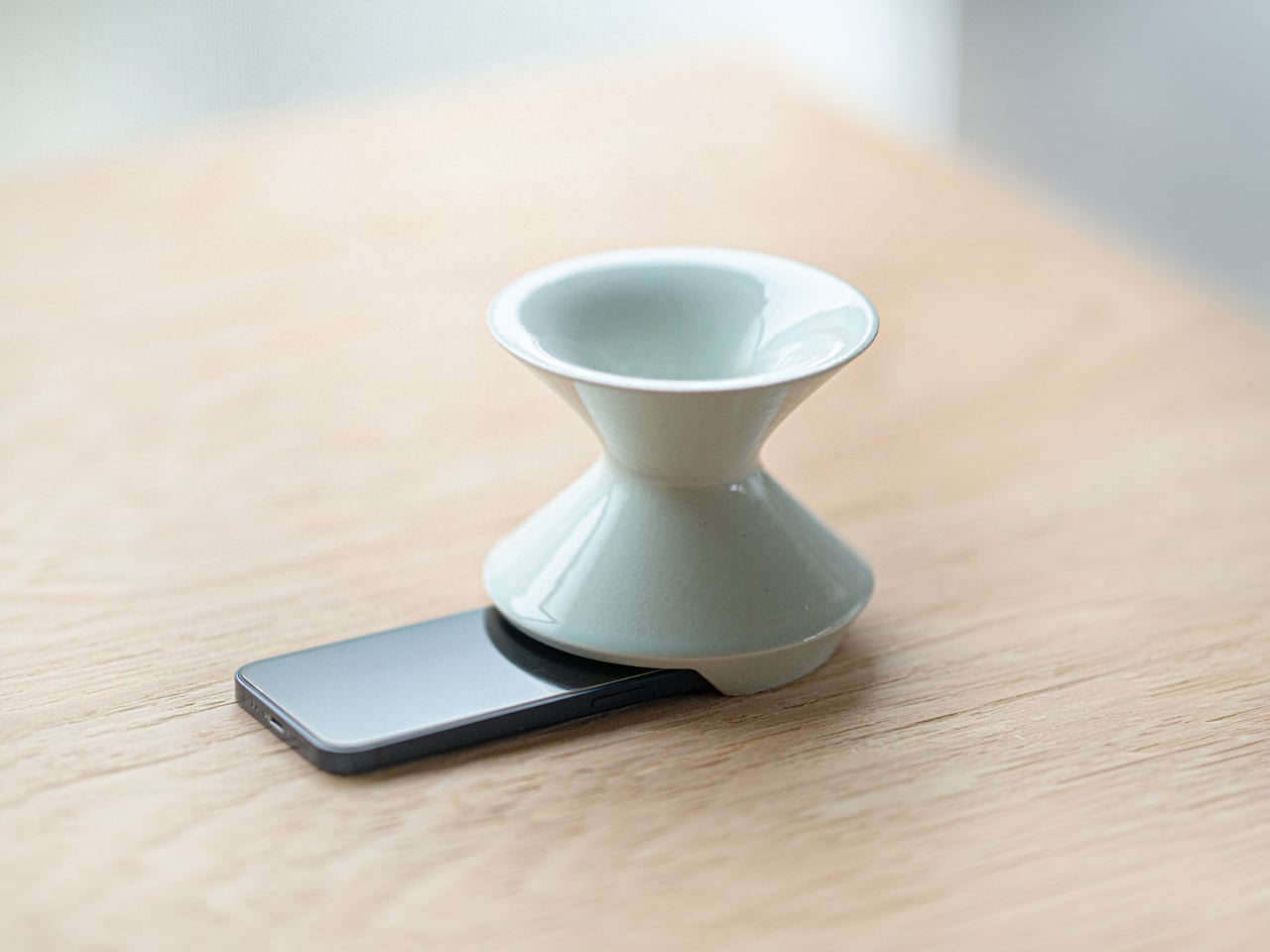
Kenji Abe’s ECHO is exactly that kind of object. It’s an analog speaker that amplifies smartphone audio simply by being set on top of the phone, requiring no power, no pairing, and no setup beyond placing it down. The concept takes its cues from wind instruments and seashells, two forms that have been shaping and projecting sound for centuries without the help of electricity.

Designer: Kenji Abe

The inside of ECHO works like a chamber, built to catch the phone’s audio and carry it outward in soft, diffused waves rather than projecting it directly. The geometry draws from the same logic as a cupped hand, but with more control over how sound travels. The result isn’t a dramatic volume boost so much as a room-filling quality that feels warmer than a powered speaker on a desk.

The choice of material makes as much of a statement as the form. Abe uses glazed ceramic, the same material found in vases, mugs, and tableware, giving ECHO a texture and presence that belongs in a home rather than on a tech shelf. It doesn’t look like an accessory. It looks like something that was always there, something that simply happened to be placed near a phone.

That quality matters when the phone is on the kitchen counter and you want music while cooking, or on a desk where you’d rather not have a speaker taking up permanent residence. ECHO doesn’t need to live next to a charging cable or be put away between uses. It sits on the table and becomes part of the room, as unobtrusive as any other ceramic piece nearby.

A guest walking in wouldn’t necessarily clock it as a tech product. That’s partly the point. The glazed surface catches light the way pottery does, and the form is quiet enough to sit beside books or plants without demanding attention. When a phone is slid underneath it, it starts doing its job. When the phone is gone, it just stays there, still looking like it belongs. The same underlying principle runs through the Battery-free Amplifying iSpeakers, where a Duralumin metal enclosure amplifies a smartphone’s audio without any power.

Abe designed ECHO to exist comfortably in a room even when it isn’t doing anything, a goal most speakers never consider. Most audio accessories announce themselves. This one quietly waits, and when a phone is close enough to fill the cavity with sound, the room gets a little warmer and a little fuller without anyone having to reach for a power button.

The post This Ceramic Vase Is Actually a Phone Speaker That Needs No Power first appeared on Yanko Design.

  • ✇Yanko Design
  • This pocket-sized cyberdesk built inside Altoids Tin is a portable workstation for geeks
    What do you do with your Altoids tins after devouring the mints? Maybe for keeping your coins, hand it over to your mom for storing the sewing accessories, for keeping handy a first aid, or perhaps keep the watercolor paint for your little niece. DIYer “Exercising Ingenuity,” however, has a very unique use for the aluminium container. The inventive YouTuber wanted to build a fully functional Cyberdesk inside of the Altoids tin. Sounds bizarre? Surely it is, given the size of the thing. In his v
     

This pocket-sized cyberdesk built inside Altoids Tin is a portable workstation for geeks

12 mai 2026 à 11:20

What do you do with your Altoids tins after devouring the mints? Maybe for keeping your coins, hand it over to your mom for storing the sewing accessories, for keeping handy a first aid, or perhaps keep the watercolor paint for your little niece. DIYer “Exercising Ingenuity,” however, has a very unique use for the aluminium container.

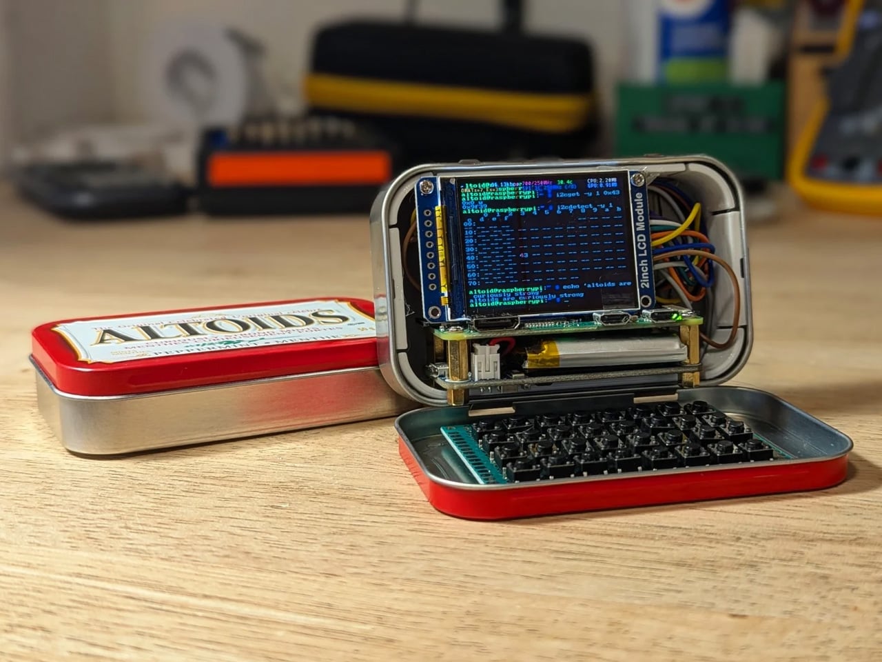
The inventive YouTuber wanted to build a fully functional Cyberdesk inside of the Altoids tin. Sounds bizarre? Surely it is, given the size of the thing. In his video, he asked himself, “That looks like a tiny computer?” It was clear from the outset that the assembly would require the utmost level of detail and sourcing all the hardware inside the tiny housing. While it might not be the most powerful machine you can own, it surely is ultra-portable and quite nice nonetheless.

Designer: Exercising Ingenuity

Normally, Cyberdesks are built inside ammo cans, rugged Pelican cases, or anything that has a boxy form factor. The machines piqued in popularity during the 1980s after the science fiction novel Neuromancer. Altoid tins have all these attributes, just the smaller size makes them a very odd proposition in the Cyberdesk world. That said, he set out anyway on putting together the hardware. For the CPU, he used the Raspberry Pi Zero W he had lying around, and a 2-inch LCD from another unfinished project. The power comes from a 750mAh lithium-ion polymer battery.

The real challenge was to find the tiny mechanical keyboard and fit it inside the small space. According to him, this was the most enjoyable part of the project, even though the video suggests it was a difficult one. It required learning how to construct the diode matrix for configuring the input, along with the assembling and soldering methodology of each of the keys. The final step here involved painting the keys with a white ink pen. Once this bit was taken care of, the DIY headed into the moderate level difficulty (at least for us). The next step was to create a 3D-printed frame to keep all the components inside the tin in place.

Wiring had to be kept to a minimum, and soldering of other components had to be done efficiently, as space was a premium. As a last step to make more room for components like the UPS HAT board and the display, the original hinge was extended with another Altoids tin hinge for a makeshift, slightly bigger replacement. Once all the hardware components were secured properly inside the tin, it was just a matter of running the system using the software. To make the thing look and feel like a vintage desktop computer, the DIYer painted the front panel beige.

The post This pocket-sized cyberdesk built inside Altoids Tin is a portable workstation for geeks first appeared on Yanko Design.

  • ✇Yanko Design
  • Alberto Essesi Just Designed the Lamp That Celebrates Mistakes
    If you’ve ever assembled furniture, built a shelf, or wired anything with your own two hands, you know the feeling. You step back, you look at your work, and then you see it. That one thing. The screw facing the wrong way. The panel installed backwards. The “how did I miss that?” moment that you either have to fix or quietly learn to live with. Alberto Essesi, an L.A.-based industrial designer, decided to immortalize exactly that feeling, and then turned it into a lamp. The Oops lamp is precise
     

Alberto Essesi Just Designed the Lamp That Celebrates Mistakes

12 mai 2026 à 10:20

If you’ve ever assembled furniture, built a shelf, or wired anything with your own two hands, you know the feeling. You step back, you look at your work, and then you see it. That one thing. The screw facing the wrong way. The panel installed backwards. The “how did I miss that?” moment that you either have to fix or quietly learn to live with. Alberto Essesi, an L.A.-based industrial designer, decided to immortalize exactly that feeling, and then turned it into a lamp.

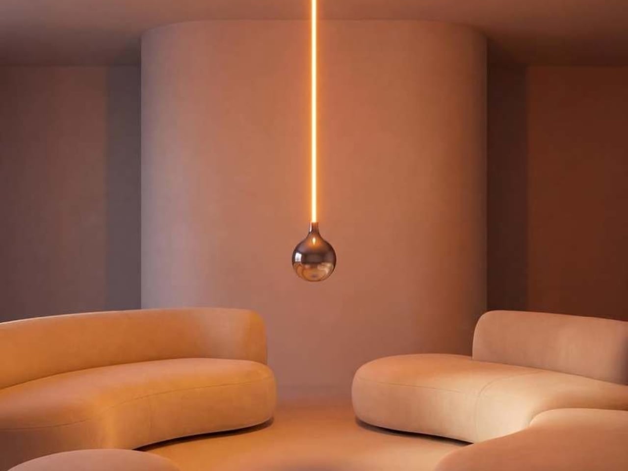
The Oops lamp is precisely what it sounds like. A hanging fixture that, at first glance, looks like something went sideways during installation. The design inverts the expected, which is Essesi’s own phrasing, and it delivers on that premise with clean, understated confidence. It doesn’t shout. It doesn’t over-explain itself. It just makes you look twice, register the joke, and then probably smile.

Designer: Alberto Essesi

Look at it long enough and the concept becomes delightfully clear. A slender, glowing rod descends from a ceiling mount, warm light running its full length like a lit fuse. At the very bottom sits a polished chrome globe, round and reflective, the universal shape of a light bulb. Except the globe isn’t glowing. The rod is. The light is coming from exactly where you wouldn’t expect it, and the bulb, the part that’s supposed to be the whole point, is just sitting there at the bottom looking beautiful and slightly confused. That’s the joke. That’s also, somehow, the most elegant part of the entire object.

The chrome finish on the globe isn’t incidental. It picks up the amber warmth of the glowing rod above it and bounces it softly into the room, so the globe contributes light without technically being a light source. It’s a small design decision that could have easily been an afterthought, but it ends up being one of the most considered details in the whole piece. The lamp works as a room object even before you process the humor in it.

Essesi has said this idea has been rattling around in his head for years. “This has been an idea I’ve had for a few years and always laugh when I think about it,” he shared when unveiling the design. That kind of creative patience is rare, and it shows in the final execution. The Oops lamp doesn’t feel rushed or gimmicky. It feels like exactly the right amount of thought went into it, no more, no less. Sometimes a concept just needs time to ripen before it’s ready to exist in the world.

Design humor is genuinely hard to pull off. Most attempts either try too hard or land too soft. The joke gets buried under layers of irony, or it gets explained to death until any charm it originally had is long gone. The Oops lamp sidesteps all of that. The humor is baked into the form itself. You don’t need a placard or a press release to get it. You just get it. That’s the mark of a strong design concept: the idea communicates itself without any assistance.

Essesi didn’t reach for something ornate or architecturally complex to subvert. He took the most ordinary object and made one small, deliberate deviation from it. That restraint is what makes the whole thing work. The joke only lands because the rest of the design plays it completely straight. The rod is precise. The globe is perfectly spherical. The ceiling mount is minimal and clean. Every element is serious, which makes the absurdity of the overall form land even harder.

A large version has also been added to the mix, which tells me Essesi is taking this seriously as a product concept and not just a portfolio piece. No production plans have been officially confirmed yet, but that feels like a matter of when rather than if. A design this instantly readable and this universally relatable has a built-in audience. People are genuinely tired of objects that require context. They want things that communicate the moment they enter a room.

That’s the real conversation the Oops lamp is opening. It’s a small but clear reminder that good design doesn’t have to be earnest all the time. It can have a point of view. It can be a little funny. A lamp named Oops, made by a designer who let the idea sit for years until it was truly ready, might be the most quietly optimistic object to come out of this year.

The post Alberto Essesi Just Designed the Lamp That Celebrates Mistakes first appeared on Yanko Design.

  • ✇Yanko Design
  • Hario’s V60 Gets Its First Real Upgrade in 20 Years for $23
    The original Hario V60 is the kind of object that earns its own mythology. Released in 2004, it became the face of the third-wave coffee movement: a simple cone of heat-resistant glass (or ceramic, or plastic, depending on how serious you are) that turned the morning cup into a ritual of patience and precision. Baristas loved it. Coffee nerds obsessed over it. And somewhere along the way, it became as recognizable as a kitchen object can get without appearing on a museum shelf. That legacy make
     

Hario’s V60 Gets Its First Real Upgrade in 20 Years for $23

12 mai 2026 à 09:20

The original Hario V60 is the kind of object that earns its own mythology. Released in 2004, it became the face of the third-wave coffee movement: a simple cone of heat-resistant glass (or ceramic, or plastic, depending on how serious you are) that turned the morning cup into a ritual of patience and precision. Baristas loved it. Coffee nerds obsessed over it. And somewhere along the way, it became as recognizable as a kitchen object can get without appearing on a museum shelf.

That legacy makes the V60 Dripper NEO an interesting proposition. Hario could have left well enough alone. Instead, they spent two years quietly engineering a redesign that touches the one part of the V60 nobody talks about but everyone deals with: the ribs.

Designer: Hario

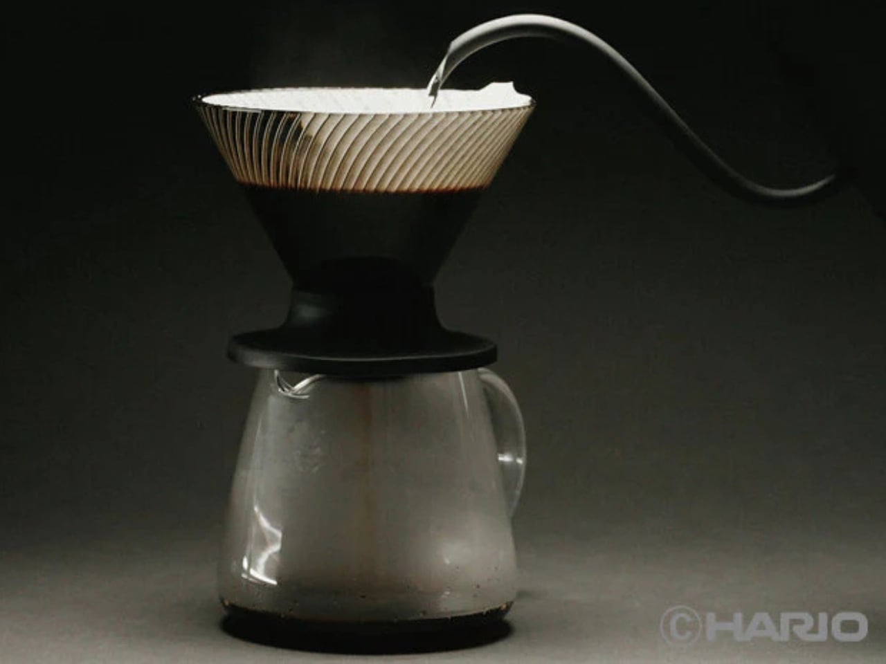
The original V60’s spiral ribs are the reason it works the way it does. They create space between the paper filter and the cone wall, allowing air to escape as water flows through. The result is a controlled extraction, but one that demands attention. Get your grind wrong, pour too fast, let your focus wander, and the brew either stalls or races past the point of no return. The V60 has always been a beautiful, slightly unforgiving thing.

The NEO changes that equation with a genuinely clever structural update. Instead of a single spiral rib pattern, it introduces 72 ultra-fine vertical ribs along the upper walls of the cone, which then converge into 9 deeper ribs near the base. This dual-zone design guides water evenly down the entire wall before accelerating it through the outlet. The effect is a faster, more uniform extraction that minimizes bitterness from water lingering too long in contact with the grounds. The cup you get out the other end is cleaner, sweeter, and more vibrant, with a balanced acidity that doesn’t tip into sourness.

Two years of testing went into getting this right. Hario’s engineers ran exhaustive trials on rib counts, angles, and flow dynamics before landing on this configuration. The fact that they filed a utility model patent on the structure suggests they believe it is genuinely novel, not just cosmetically different.

The material choice is also worth noting. The NEO is made from Tritan resin, a lightweight, high-clarity plastic that handles heat retention better than standard plastic alternatives. It keeps the brewing temperature more stable from the first pour to the last, which matters more than people think. Temperature consistency is one of those variables that separates a good cup from a great one, and the NEO addresses it without requiring you to do anything differently.

For anyone already embedded in the V60 ecosystem, the compatibility factor is a quiet win. The NEO works with all existing V60 switch bases, so you don’t have to rebuild your setup from scratch. It comes in two sizes, both made in Japan, and retails for around $23.50, which is an accessible price point for a piece of equipment that functions this thoughtfully.

Not everyone is convinced, though. Since hitting the market, the NEO has sparked a genuinely divided response from the coffee community. Users describe the brew as cleaner and more tea-like, which sounds appealing until you realize that some people loved the original V60 precisely for its acidic punch and intensity. One Reddit user put it plainly: the NEO presents coffee “differently,” not necessarily better. For experienced brewers who spent years dialing in their pour technique to coax specific flavors from the classic cone, the NEO’s smoother, more forgiving nature feels less like an upgrade and more like a personality change. That’s a fair criticism. Hario didn’t make a bad V60. They made a different one, and that distinction is exactly what has the coffee internet divided.

Pour-over coffee has always had a slight gatekeeping problem. The ritual appeals to people who love it precisely because it requires care, but that same learning curve turns off anyone who just wants a good cup without turning their kitchen into a science experiment. The V60 NEO doesn’t eliminate that ritual. It just makes the margin for error a little more forgiving, which means more people get to enjoy the result without years of practice behind them.

The original V60 deserved its legacy. The NEO earns its own, just a slightly different one.

The post Hario’s V60 Gets Its First Real Upgrade in 20 Years for $23 first appeared on Yanko Design.

  • ✇Yanko Design
  • The 5 Best Tech Gadgets of May 2026
    May 2026 is a good time to be paying attention. Gadgets aren’t just getting faster or thinner; the best ones this month are getting more intentional. There’s a shared thread running through every standout: each was built around a real constraint, a real behavior, or a real cultural moment, rather than a spec sheet searching for an audience. Five products rose above the rest, and each earns its spot for a distinctly different reason. From a foldable phone that demolishes the category’s $800 pric
     

The 5 Best Tech Gadgets of May 2026

12 mai 2026 à 07:40

May 2026 is a good time to be paying attention. Gadgets aren’t just getting faster or thinner; the best ones this month are getting more intentional. There’s a shared thread running through every standout: each was built around a real constraint, a real behavior, or a real cultural moment, rather than a spec sheet searching for an audience. Five products rose above the rest, and each earns its spot for a distinctly different reason.

From a foldable phone that demolishes the category’s $800 price floor to a Nintendo Switch add-on that turns a gaming console into a live production rig, the range here is unusually wide. What connects them is the quality of thinking underneath. These aren’t renders looking for investment. They’re real objects designed to change how you work, listen, create, and move through a day. That’s the only brief that actually matters.

1. NASA Artemis Watch 2.0

NASA’s Artemis II lifted off from Kennedy Space Center on April 1, 2026, carrying four astronauts on humanity’s first crewed lunar journey in over 50 years. CircuitMess timed the NASA Artemis Watch 2.0 directly into that cultural gravity. At $129, it’s a fully assembled, ready-to-use programmable smartwatch built around a dual-core ESP32 microcontroller, with a full-color LCD screen, accelerometer, gyroscope, compass, and temperature sensor packed into a wristband designed for anyone aged nine and up who wants more than a fitness tracker strapped to their wrist.

What makes it worth your attention is the depth it offers without demanding anything upfront. Out of the box, it pairs with iOS and Android over Bluetooth for activity tracking and notifications. When curiosity takes over, the firmware is fully open-source and reprogrammable in Python, CircuitBlocks, or the Arduino IDE. Build custom watch faces, write your own apps, and modify sensor behavior as far down as you want to go. The Artemis Watch 2.0 is one of the rarer gadgets at this price: it genuinely grows with the person wearing it.

What we like

  • Fully open-source firmware supports Python, CircuitBlocks, and Arduino, giving both beginners and experienced coders meaningful room to explore and build
  • Ships fully assembled and ready to use straight out of the box, lowering the barrier to entry without removing any of the technical depth underneath

What we dislike

  • At $129, it asks for more commitment than most impulse purchases in the kids’ tech category allow for
  • Screen performance in direct sunlight hasn’t been addressed in any available documentation

2. OrigamiSwift Mouse

Every frequent traveler has made the same quiet compromise: leave the proper mouse at home or carry something too small to work with comfortably for more than an hour. OrigamiSwift was built precisely around that problem. It’s a Bluetooth mouse that folds flat when not in use, weighs just 40 grams, and opens into full working position in under half a second. The origami-inspired form isn’t a styling exercise. It’s a structural answer to the oldest tension in portable peripherals: comfort has always cost you size.

The ergonomic shaping holds up across extended work sessions, which matters more than most product pages acknowledge. Whether you’re finalizing a presentation at an airport gate or editing documents in a co-working space, OrigamiSwift stays comfortable in your hand and disappears into a bag when you’re done. The ultra-thin profile and minimal build weight mean it never adds anything meaningful to your load. For anyone who genuinely works from wherever they happen to be, this is the mouse that finally makes sense to own.

Click Here to Buy Now: $85.00

What we like

  • 40-gram weight and flat-fold profile make it practically invisible in any bag, disappearing entirely until you actually need it
  • Sub-0.5-second activation means there’s no friction at all between being packed and being productive

What we dislike

  • Available listings don’t confirm DPI range or scroll wheel responsiveness for anyone doing precision work
  • Bluetooth-only connectivity may create compatibility friction with older desktop setups that lack wireless support

3. Ai+ Nova Flip

The foldable phone category has spent five years convincing itself that the flip experience carries a natural premium of $800 or more. Ai+ is testing that assumption head-on with the Nova Flip, launched in India at Rs 29,999, roughly $320, making it the most accessible foldable phone on the market. The inner display is a 6.9-inch AMOLED panel resolving at 2790 x 1188 pixels, complemented by a 3.1-inch AMOLED cover screen. MediaTek’s Dimensity 7300 handles processing, paired with 8GB of LPDDR4X RAM and 256GB of internal storage.

The spec list doesn’t read like a budget compromise. A 50-megapixel primary camera, a 32-megapixel front shooter, and a 4325mAh battery with 33W wired charging all hold credibly against devices at double the price. 5G, NFC, and an IP64 dust and splash rating close out a package that would feel serious in any category. The Nova Flip doesn’t just undercut the competition on price. It quietly forces a harder conversation about what the flip form factor has genuinely been worth at $1,000 all along.

What we like

  • $320 pricing opens the foldable phone experience to an entirely new audience that the category has ignored since its beginning
  • The 4325mAh battery is a genuinely surprising capacity for the flip form factor at any price point, let alone this one

What we dislike

  • The 2-megapixel depth lens reads as the weakest component in an otherwise strong and well-considered camera array
  • Long-term hinge durability at this price tier is unproven and worth tracking carefully over time

4. Akai MPC Switch

Alquemy’s Akai MPC Switch concept asks a question that feels obvious the moment someone finally puts it to you: if laptop-grade software can run on portable hardware, why can’t a capable gaming console handle serious music production? The MPC Switch is a pair of controller units designed to snap directly onto the sides of a Nintendo Switch, replacing the Joy-Cons with MIDI inputs, outputs, and a full DAW running on the console’s own screen. The control layout reflects real production workflows rather than a stylized render built for social media.

The appeal runs deeper than the novelty of the form. The concept treats the Switch as a legitimate interface surface: something you game on when you need to and produce or perform on when the moment calls for it. Swap the Joy-Cons for the MIDI setup, and you’re there. Whether Nintendo or Akai ever moves this into production is a separate question entirely, but Alquemy has made a persuasive case that the idea deserves a real answer. The best concepts don’t just look good. They make you wonder why nobody shipped it first.

What we like

  • MIDI integration and a credible DAW interface position the Switch as a serious production platform rather than a novelty peripheral
  • The Joy-Con snap mechanism makes the transition between gaming and music production genuinely seamless in concept

What we dislike

  • No confirmed production timeline means this remains aspirational, with no clear path in your hands
  • The Switch’s processing ceiling may be a real constraint for complex, multi-layer production sessions

5. StillFrame Headphones

Most headphone designs land at one of two poles: the over-ear build that announces itself before you even put it on, and the in-ear solution that disappears but gives nothing back in soundstage. StillFrame lands somewhere more considered than either. At 103 grams, it sits closer to weightless than wearable. The 40mm drivers are tuned for a wide, open soundstage that pulls spatial detail and melodic texture out of tracks that most headphones flatten into undifferentiated background noise.

Active noise cancellation closes you off when focus demands it. Transparency mode reconnects you to the room when the world around you matters more. Battery holds at 24 hours, covering a full workday, an overnight flight, and the morning after with no cable required. Switching between modes takes a single tap. StillFrame was designed around the premise that how you listen should adapt to where you are, not the other way around. That’s a harder brief to execute cleanly than it sounds, and the weight alone suggests it’s been taken seriously.

Click Here to Buy Now: $245.00

What we like

  • 103 grams is a genuinely rare achievement for an over-ear headphone carrying both ANC and full-size 40mm drivers
  • 24-hour battery life covers the kind of all-day, real-world use that most headphones in this category only claim to handle

What we dislike

  • No published information on codec support, like LDAC or aptX, for listeners who prioritize wireless audio fidelity
  • Colorway and finish options appear limited in current listings, which may be a sticking point for buyers who care about visual identity

The Only Standard That Matters Is the One You Can Feel

May 2026’s strongest gadgets share something harder to write into a spec sheet than battery life or pixel count. Each was designed around a specific friction point and resolved it with a precision that feels purposeful rather than accidental. The Artemis Watch converts a cultural moment into a learning platform. The Nova Flip resets the floor of an entire category. The OrigamiSwift solves a portability problem that dozens of mice before it never genuinely addressed.

StillFrame and the Akai MPC Switch represent opposite ends of the development spectrum, one shipping and one conceptual, but both make the same underlying argument: that considered design changes the terms of what a product is allowed to be. Whether you’re optimizing a travel bag or rethinking a music studio from a gaming console, the standard these five set is worth taking seriously. The best gadgets this month aren’t the loudest ones in the room. They’re the most resolved.

The post The 5 Best Tech Gadgets of May 2026 first appeared on Yanko Design.

  • ✇Yanko Design
  • d64 Just Packed an Entire Dice Collection Into a Tiny 1980s Computer
    Tabletop roleplaying games have an accessory problem. The dice alone can take over a corner of any gaming table, each one representing a different die type that the rules will inevitably call for at the least convenient moment. Tracking down the right d10 mid-session, or explaining to a new player why there are two different ten-sided dice in the bag, is just one of those small but reliable annoyances that experienced players have long since stopped questioning. The Console’88 from d64Computing
     

d64 Just Packed an Entire Dice Collection Into a Tiny 1980s Computer

Par : JC Torres
12 mai 2026 à 05:16

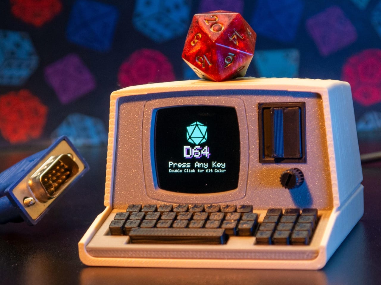
Tabletop roleplaying games have an accessory problem. The dice alone can take over a corner of any gaming table, each one representing a different die type that the rules will inevitably call for at the least convenient moment. Tracking down the right d10 mid-session, or explaining to a new player why there are two different ten-sided dice in the bag, is just one of those small but reliable annoyances that experienced players have long since stopped questioning.

The Console’88 from d64Computing is a compact digital dice roller that handles the entire set from d4 through d100 in a single device, the size of a pocket calculator. What makes it genuinely interesting, though, isn’t just the function; it’s that the designer chose to dress it up as a miniature 1980s computer, complete with a CGA color display, vector graphics, boot-screen text, and the kind of visual language that looks like it was pulled straight out of a 1984 computer catalog.

Designer: d64Computing

Selecting a die type is done through a rotary dial and a button underneath the faux keyboard, which fits the era aesthetically and keeps the interaction simple. Spin it to the die you want, and get your result. The randomness runs at microsecond precision, so the results are genuinely unpredictable rather than cycling through a predictable sequence. For anyone who’s ever side-eyed an app-based roller and wondered about its actual randomness, that’s a meaningful detail.

The sounds are what push it over from clever gadget into something with real personality. The Console’88 plays 1980s video game audio when you roll, and it apparently has dedicated sound effects for critical successes and critical failures, which is the kind of contextually appropriate design decision that’s easy to appreciate at an actual gaming table. A crit that’s announced by a triumphant eight-bit jingle lands differently than a number quietly appearing on a phone screen.

There’s an argument to be made for physical dice that has nothing to do with practicality. Rolling actual dice is tactile, dramatic, and central to the experience for a lot of players. But for anyone who travels frequently to gaming sessions, runs games for beginners without their own dice, or simply wants something that takes up less space on an already crowded table, a single device covering every die type is a reasonable swap to make.

The design commitment here is what separates the Console’88 from a generic electronic dice app. This thing looks like it belongs on a desk next to a Commodore 64, and reviews consistently call out the visual quality of the vector graphics and the charm of the retro computer case. It’s a product that clearly started from an aesthetic vision rather than pure function, and the function turned out to be genuinely good on top of it.

The post d64 Just Packed an Entire Dice Collection Into a Tiny 1980s Computer first appeared on Yanko Design.

  • ✇Yanko Design
  • This 4-in-1 Hands-free Flashlight Clips To Clothes, Snaps to Your Phone, and Stands on Its Own
    A Red Dot Design Award and a $210,000 Kickstarter campaign are two very different kinds of validation. One comes from a jury of design professionals evaluating form, function, and coherence. The other comes from tens of thousands of people who looked at a product and handed over money before it shipped. SparkO, the compact wearable EDC flashlight from California’s ScoutLite, earned both. That combination suggests something specific about the object: it reads clearly to designers and solves some
     

This 4-in-1 Hands-free Flashlight Clips To Clothes, Snaps to Your Phone, and Stands on Its Own

11 mai 2026 à 21:45

A Red Dot Design Award and a $210,000 Kickstarter campaign are two very different kinds of validation. One comes from a jury of design professionals evaluating form, function, and coherence. The other comes from tens of thousands of people who looked at a product and handed over money before it shipped. SparkO, the compact wearable EDC flashlight from California’s ScoutLite, earned both. That combination suggests something specific about the object: it reads clearly to designers and solves something real for everyday people. At $45.99 and 40 grams, the barrier to entry is low enough that hesitation becomes difficult to justify.

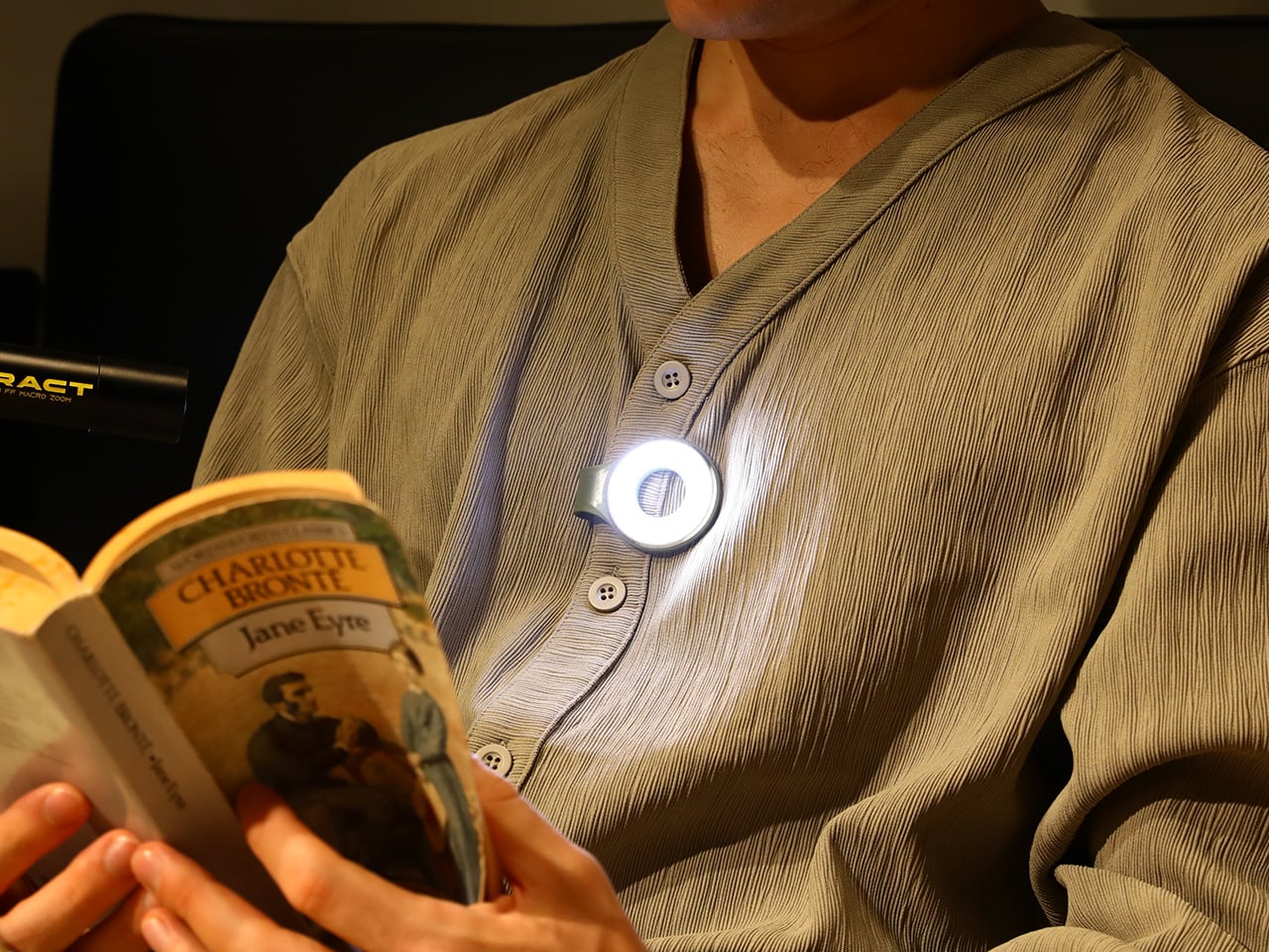
Two photos of SparkO are enough to grasp the concept: a disc-shaped body, a silicone loop that clips and doubles as a kickstand arm, and a circular LED array wrapped in a fine prismatic lens ring. The anodized metal bezel is color-matched to whichever of the four options you pick, Forest Moss, Basalt Black, Glacier Blue, or Canyon Clay. It clips to a bag strap or jacket, snaps magnetically to a MagSafe iPhone, props upright on the optional ring stand, or rides on clothing as a hands-free wearable. That range of deployment is the whole argument for SparkO, and ScoutLite backs it with 300 lumens, three color temperatures, four brightness levels, a red light mode, CRI 95+ rendering, a 14.5-hour runtime, and USB-C charging. At a campsite, a workbench, or a dim restaurant table, the light adapts to the situation rather than demanding you adapt to it.

Designer: Ten

Click Here to Buy Now: $41.40 $45.99 (10% off, use coupon code “YK10”). Hurry, deal ends in 48-hours!

The disc form is a real departure from the cylindrical tube that has defined flashlight design for over a century. A cylinder forces you to hold it; a disc invites you to wear it, clip it, or set it down facing wherever light needs to go. The silicone loop is soft enough to flex over thick fabric and structured enough to hold position once seated, its geometry doubling as the kickstand arm when the magnetic ring base enters the picture. The circular LED face is surrounded by a concentric prismatic lens ring that distributes light broadly and evenly, borrowing visual language from photography ring lights rather than from tactical torches. That framing signals the breadth of SparkO’s intended audience: the tradesperson and the camper, but equally the commuter, the hobbyist, and the photographer working in low light.

Clipped to a chest pocket or jacket collar, SparkO illuminates whatever your hands are working on without requiring you to hold anything, which is the core use case that conventional EDC lights have historically fumbled. Snapped to the back of an iPhone Pro via the magnetic base, it becomes a fill light for close-up photography, turning a phone into something resembling a professional lighting rig for the cost of a decent lunch. The ring stand converts the same unit into a bedside reading lamp or a compact task light with a footprint smaller than a drink coaster. Each scenario calls for a different mounting method, and the transitions between them take seconds rather than a setup ritual. Four modes sounds like a marketing stretch right up until you’ve run through all of them in a single day, and then it starts to feel like the accurate count.

Three hundred lumens is the right range for a light this size: capable outdoors, tolerable at close range, and not so aggressive that it becomes a problem in tight spaces. The three color temperature options matter more than the lumen figure in daily use, covering the gap between a warm amber reading mode and a cooler beam suited to detailed work. CRI 95+ color rendering is what sets SparkO apart from most of the EDC lighting field, reproducing colors accurately enough that the light reads close to natural daylight, which makes a genuine difference for craftspeople and photographers. The red mode preserves night-adapted vision on a trail or at a campsite, a small but real addition for outdoor use. Runtime at 14.5 hours and USB-C charging put SparkO on a weekly recharge cycle with a cable it shares with everything else in a modern carry kit.

ScoutLite has built a product that lands on the right side of the three virtues the EDC community consistently responds to: compact, accessibly priced, and solving a problem the existing field handles poorly. The Red Dot Award carries credibility for an audience that pays attention to such things, while the $210,000 Kickstarter result is a harder signal to argue with, because crowdfunding backers are betting on a design that communicates its own value clearly enough that waiting feels unnecessary. At $45.99, the decision practically makes itself, especially given that the clip, the magnet, the stand, and the wearable mode collectively cover more scenarios than most EDC kits manage with multiple dedicated tools. Whether ScoutLite follows this up with accessories or a higher-output variant, SparkO sets a credible benchmark for what a wearable EDC light should cost, weigh, and do. The category has needed something this considered for a while.

Click Here to Buy Now: $41.40 $45.99 (10% off, use coupon code “YK10”). Hurry, deal ends in 48-hours!

The post This 4-in-1 Hands-free Flashlight Clips To Clothes, Snaps to Your Phone, and Stands on Its Own first appeared on Yanko Design.

  • ✇Yanko Design
  • Sony’s PS6 Could Triple the PS5’s Power. It Could Also Cost $800 and Land in 2029
    Seven years is a strange unit of time. Long enough to finish a PhD, short enough to remember an event vividly, and apparently, exactly long enough for Sony to build, test, manufacture, and ship a new generation of PlayStation hardware. PS3 to PS4, PS4 to PS5: seven years, twice, with the precision of a Swiss movement. The console industry built its entire release calendar ecosystem around that cadence. Publishers scheduled their biggest titles around it. Retailers planned inventory cycles for i
     

Sony’s PS6 Could Triple the PS5’s Power. It Could Also Cost $800 and Land in 2029

11 mai 2026 à 20:30

Seven years is a strange unit of time. Long enough to finish a PhD, short enough to remember an event vividly, and apparently, exactly long enough for Sony to build, test, manufacture, and ship a new generation of PlayStation hardware. PS3 to PS4, PS4 to PS5: seven years, twice, with the precision of a Swiss movement. The console industry built its entire release calendar ecosystem around that cadence. Publishers scheduled their biggest titles around it. Retailers planned inventory cycles for it. Analysts forecast revenue curves based on it. So the news that Sony has not yet decided when the PS6 will launch, with Bloomberg and MST International both pointing toward 2028 at the earliest (if not 2029), carries weight well beyond a single product launch.

The culprit is DDR7 memory, or more precisely, the catastrophic shortage of it, as AI data centers absorb the global supply of high-bandwidth RAM faster than Samsung, SK Hynix, and Micron can produce it. One year of delay sounds manageable until you zoom out. GTA6, announced in December 2023 for a 2025 launch, has been publicly delayed three separate times and is currently targeting November 2026, with bettors still skeptical. Beyond the Spider-Verse slipped from March 2024 to June 2027, a three-year crater in the release calendar of one of the most acclaimed animated franchises in history. Apple is formally retiring the single annual iPhone event in favor of a split premium-then-standard cadence. The PS6 delay is a symptom of something structural, and the structure is bending.

Image Credits: Latif Ghouali

The memory crisis at the root of Sony’s problem is unlike previous supply chain disruptions in one important way: it is being driven by a competitor class that simply outclasses consumer electronics on every financial dimension. Samsung, SK Hynix, and Micron have made a calculated pivot toward high-bandwidth memory for AI accelerators, with demand expected to grow 70 percent year-over-year in 2026 alone. Meanwhile, Alphabet and Amazon have announced capital expenditure plans of roughly $185 billion and $200 billion respectively this year, among the largest in corporate history, further intensifying competition for advanced memory. Sony is not losing a bidding war. It is sitting in a market that has structurally reorganized around different priorities, and the PS6 is waiting at the back of a very long, very expensive queue.

Sony President and CEO Hiroki Totoki addressed the uncertainty directly at the FY2025 earnings briefing, saying through a translator: “We have not yet decided on at what timing we will launch the new console, or at what prices. So we would like to really observe and follow the situation.” That is an extraordinary statement from the head of one of the most strategically disciplined hardware companies on the planet. Sony does not typically observe and follow. It plans, announces, and executes. The fact that Totoki’s language sounds more like a macroeconomist reading a volatile market than a product chief managing a launch calendar tells you everything about how abnormal this moment is.

The hardware itself, when it arrives, looks genuinely transformative. Leakers and supply chain sources indicate Sony awarded the PS6 chip contract to AMD back in 2022, with the console expected to feature a custom Zen 6 CPU and RDNA 5 GPU architecture, targeting roughly triple the PS5’s rasterization performance with 4K gaming at 120 frames per second and advanced ray tracing. A companion handheld codenamed Project Canis is reportedly riding alongside the main console as part of a unified two-device platform strategy, which would represent the most significant structural shift in PlayStation’s hardware philosophy since the PS3’s disastrous Cell processor gamble. The specs, in other words, are not the problem. The atoms are.

The delay also arrives at a peculiar competitive moment. If supply chains stabilize by 2027, Sony could target a late 2028 launch with multiple SKUs and the handheld companion. If shortages persist, the PS6 could slip to 2029 or beyond, risking market momentum loss to rivals. Microsoft has been conspicuously quiet about its own next-generation plans, and a scenario where Xbox gets to market first, even with a smaller install base, would hand the competition a narrative advantage that Sony has not faced since the PS3 era. As of early April 2026, prediction markets showed only about 25 percent probability that Sony would announce the PS6 before 2027. The crowd is not optimistic.

What the PS6 situation actually exposes is the fragility of product cycles that have been treated as laws of nature rather than engineered outcomes. GTA6 has been delayed not once or twice but three times since its December 2023 reveal, bouncing from a 2025 window to May 2026, then to its current November 19, 2026 target, with Take-Two CEO Strauss Zelnick deploying identical “we feel really good about it” language each time a new date was announced. Beyond the Spider-Verse, a sequel to a film that grossed $690 million and earned a near-universal critical consensus as a generational achievement in animation, has been pushed from March 2024 to June 2027, a three-year gap that would have been unthinkable for a franchise at that level of commercial and artistic momentum. And Apple, the company that arguably invented the modern product launch as cultural event, is now formally splitting its iPhone releases across a fall premium window and a spring standard window, with Mark Gurman reporting the expectation that this pattern continues for years to come. Clockwork, everywhere, is slipping.

Sony will ship the PS6. The hardware is real, the AMD partnership is locked, and the performance targets are serious enough to make the wait feel justified when the box finally lands on a shelf. But the seven-year cycle, that beautiful, reliable, industry-organizing drumbeat, is not coming back on its original terms. The PS6 will arrive when the memory market allows it, which is to say when AI infrastructure spending pauses long enough for consumer electronics to get a turn. That is a sentence that would have read like science fiction in 2020, when the PS5 launched on schedule into a pandemic and sold out globally within minutes. The world has reorganized itself around different priorities. The PlayStation, for the first time in a long time, has to wait in line like everyone else.

The post Sony’s PS6 Could Triple the PS5’s Power. It Could Also Cost $800 and Land in 2029 first appeared on Yanko Design.

  • ✇Yanko Design
  • This Stationary Tiny Home Has More Room Than Most City Apartments
    Most tiny houses ask you to make a trade-off. You get the romance of compact living, but sacrifice the one thing that makes a home feel like a home — space. Craft House, a modular builder operating across Poland, Austria, and Ireland, decided to flip that script entirely with the Samuel, a non-towable module house that prioritizes spacious full-time living over the freedom to hitch and go. The Samuel sits at 10 meters (32 ft) long and an unusually generous 3.2 meters (10.6 ft) wide, measurement
     

This Stationary Tiny Home Has More Room Than Most City Apartments

11 mai 2026 à 19:30

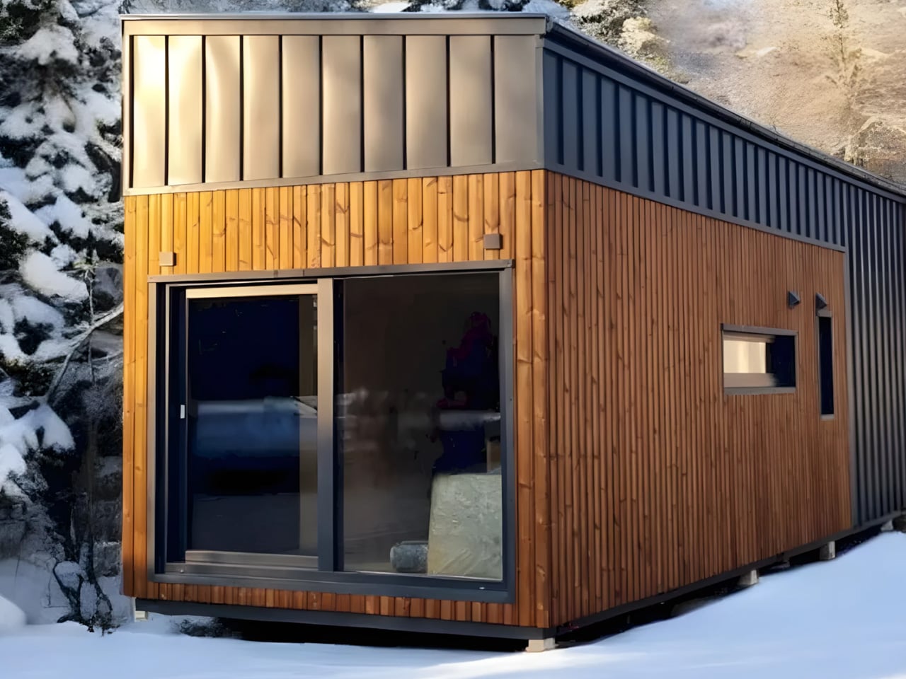
Most tiny houses ask you to make a trade-off. You get the romance of compact living, but sacrifice the one thing that makes a home feel like a home — space. Craft House, a modular builder operating across Poland, Austria, and Ireland, decided to flip that script entirely with the Samuel, a non-towable module house that prioritizes spacious full-time living over the freedom to hitch and go.

The Samuel sits at 10 meters (32 ft) long and an unusually generous 3.2 meters (10.6 ft) wide, measurements that push well beyond the European tiny home average. That extra width is deliberate. It’s what allows the interior to breathe in a way that most towable models simply can’t, opening up a layout that reads less like a cleverly compressed box and more like a well-considered apartment. The structure wears a single-pitched roof, topping out at 4.1 meters at the ridge, and is finished in engineered wood and metal, a clean pairing that reads industrial without feeling cold.

Designer: Craft House

Inside, the ground floor spans 26 square meters, with a 13-square-meter mezzanine sitting above and a 4.3-square-meter bathroom rounding out the floor plan. The layout makes room for two distinct sleeping areas, and the volume created by the sloped ceiling gives the mezzanine level a loft-like quality that larger homes often fail to capture. Optional off-grid upgrades are also on the table, making the Samuel a realistic candidate for plots far beyond urban infrastructure.

What Craft House understood when designing the Samuel is that the tiny home market has two very different buyers. There’s the nomad, always ready to hitch the trailer and head somewhere new. Then there’s the person who simply wants a well-designed, right-sized home that doesn’t carry the financial weight of a conventional build. Samuel is clearly built for the latter. By dropping the wheels and leaning into a fixed footprint, Craft House was able to allocate width and volume in ways that towable structures prohibit by law and logistics.

Priced at around US$72,000, the Samuel lands in a range that makes it a genuinely viable alternative to traditional housing in several European markets. It isn’t trying to be everything. You won’t be parking it in a new location every season. What it offers instead is something arguably more valuable: a permanent, considered space that proves small doesn’t have to mean cramped, and that the best tiny homes aren’t always the ones with the biggest adventures, but the ones that make staying put feel worth it.

The post This Stationary Tiny Home Has More Room Than Most City Apartments first appeared on Yanko Design.

  • ✇Yanko Design
  • This Sculptural Glass Object Makes Flowers Feel Like a Van Gogh Painting
    There is something instantly familiar about patterned glass. We have seen it in old windows, cabinet doors, bathroom partitions, and quiet corners of homes where privacy and light needed to exist together. It is a material that usually stays in the background, doing its job quietly. With Violet Frosted, designer Marius Boekhorst brings that overlooked material forward and turns it into something sculptural, expressive, and quietly poetic. At its heart, Violet Frosted is a geometric glass object
     

This Sculptural Glass Object Makes Flowers Feel Like a Van Gogh Painting

11 mai 2026 à 18:30

There is something instantly familiar about patterned glass. We have seen it in old windows, cabinet doors, bathroom partitions, and quiet corners of homes where privacy and light needed to exist together. It is a material that usually stays in the background, doing its job quietly. With Violet Frosted, designer Marius Boekhorst brings that overlooked material forward and turns it into something sculptural, expressive, and quietly poetic.

At its heart, Violet Frosted is a geometric glass object that plays with flowers, light, color, and texture. What makes it interesting is the way it changes how we see what is placed behind it. The frosted, patterned glass softens the flowers, turning bright petals and stems into blurred fields of color. A flower becomes a shadow, a brushstroke, a violet glow, or a faded green line depending on where you stand.

Designer: Marius Boekhorst

That is where the charm of the piece begins. Instead of presenting flowers directly, Violet Frosted filters them. It creates a gentle distance between the viewer and the arrangement. That distance makes you look closer. It asks you to slow down and notice how color shifts through glass, how a shape becomes unclear, and how something ordinary can feel painterly when it is partly hidden.

In many ways, Violet Frosted feels like a still life painting brought into the real world. Traditional still lifes capture flowers in one fixed composition, frozen in paint and time. This piece lets the still life move. The flowers change as they bloom and fade. The light changes throughout the day. The view changes as you move around it. From one angle, the arrangement may feel bold and graphic. From another, it becomes soft, quiet, and almost dreamlike.

The design feels especially beautiful because it does not try too hard. It avoids excess decoration. The form is clean and almost architectural, while the patterned glass gives it warmth and character. It feels contemporary without losing the memory of where the material comes from. That balance between old and new gives the piece its quiet confidence.

Violet Frosted also carries a museum-like feeling, though it never feels precious or untouchable. It brings the mood of a gallery into everyday space. A table, shelf, or windowsill suddenly feels more considered. A simple floral arrangement becomes an experience. You are looking at flowers through atmosphere, texture, and light.

Violet Frosted reminds us that design does not need to shout to stay with us. Sometimes, the most memorable objects are the ones that shift how we see familiar things. By turning patterned glass into a living frame, Marius Boekhorst creates a piece that sits between a vase, a sculpture, and a painting. It is functional, emotional, and deeply visual. It holds flowers, and it holds a moment.

The post This Sculptural Glass Object Makes Flowers Feel Like a Van Gogh Painting first appeared on Yanko Design.

❌