Vue normale

  • ✇Yanko Design
  • This E Ink Foldable Phone Concept Punishes Doomscrolling by Design
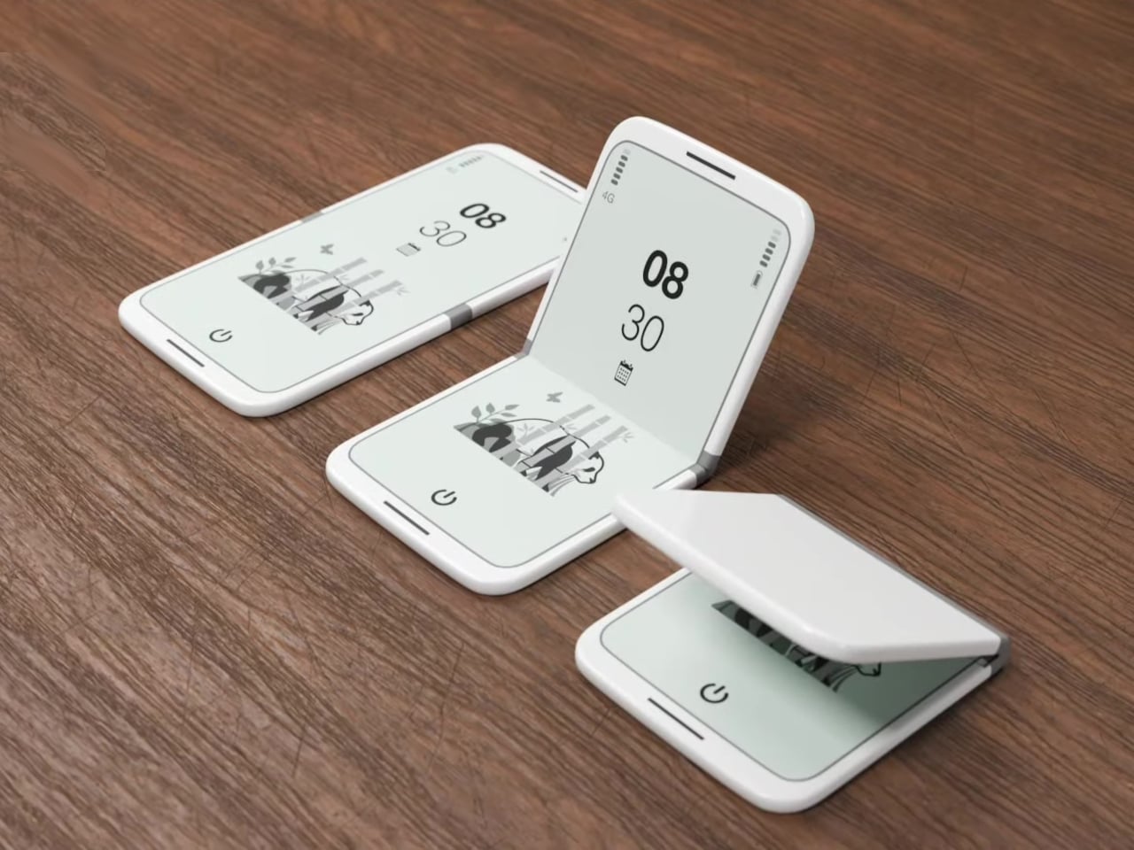
    Most smartphones are designed to be impossible to put down. The screen faces up on every table, the display lights up for every notification, and the cost of checking it one more time is exactly zero. That’s not an accident. The hardware removes friction from compulsive use because removing friction is what makes these devices feel indispensable. The tinyBook Flip concept asks a different question entirely: what if the phone were designed to get out of the way? The tinyBook Flip is a vertical f
     

This E Ink Foldable Phone Concept Punishes Doomscrolling by Design

Par : JC Torres
21 mars 2026 à 13:20

Most smartphones are designed to be impossible to put down. The screen faces up on every table, the display lights up for every notification, and the cost of checking it one more time is exactly zero. That’s not an accident. The hardware removes friction from compulsive use because removing friction is what makes these devices feel indispensable. The tinyBook Flip concept asks a different question entirely: what if the phone were designed to get out of the way?

The tinyBook Flip is a vertical foldable phone concept built around a 6.1-inch E Ink display. Closed, it collapses into a compact, near-square form with rounded corners and a matte white finish, something closer in proportion to a folded notecard than a smartphone. The screen disappears entirely when the device is closed shut. No glowing rectangle sitting face-up on the desk, no ambient reminder that there are things to check. Just a small, quiet object.

Designer: Pixel Dynamics

That folded form is doing more work than it might seem. Opening the phone requires a deliberate physical action, and that small added step changes the behavioral math. A reflexive grab becomes a conscious decision. The friction is minimal in absolute terms, maybe two seconds, but two seconds of resistance is often enough to interrupt the loop. The concept treats that interruption as a design feature, which puts it in genuinely different territory from most phones.

The E Ink display adds a second layer of resistance, and this one is less subtle. E ink refreshes slowly, renders in grayscale or muted colors, and handles fast-moving content poorly. Social media feeds become tedious. Short-form video becomes unwatchable. Anything built around color, motion, and rapid visual feedback stops working the way it was designed to. This is precisely the point. The screen’s limitations aren’t engineering compromises left over from an earlier era of display technology; they’re structural properties that make certain behaviors genuinely unpleasant to sustain.

What E Ink handles well is a shorter list, but a coherent one. Text reading, messaging, calendars, and static interfaces are all comfortable at E Ink’s native pace. The renders of the tinyBook Flip show a UI built around exactly these strengths: a large clock face, a calendar widget, and a grayscale illustrated wallpaper. The interface doesn’t reach for capabilities the display can’t support. The phone isn’t trying to do everything; it’s trying to do a narrower set of things without apology.

Foldable E Ink panels aren’t a speculative technology. The hardware exists at the component level and has already appeared in experimental e-readers, though no consumer phone has shipped with one in any meaningful volume. The tinyBook Flip isn’t imagining impossible components; it’s proposing a form factor that manufacturers haven’t yet committed to producing. The distance between those two things is largely commercial, not technical.

There’s also something worth noticing about how the device reads as a physical object in social space. Closed, the tinyBook Flip looks like almost nothing. No visible screen, no status indicators, no glow. A phone that carries no visual weight when it’s not in use sends a different signal than one that’s always broadcasting its presence. Putting it down means it actually disappears from the environment, not just from your hand.

That said, the concept leaves some real friction points unaddressed, and not the intentional kind. E Ink handles camera use, live navigation, video calls, and authentication apps poorly. A foldable hinge adds mechanical complexity and thickness that clean renders tend to obscure. The tinyBook Flip looks resolved in this form, but a production version would have to make tradeoffs that these images don’t show and the concept doesn’t acknowledge.

Still, the more interesting question isn’t whether this specific device could ship. It’s whether a phone that makes itself harder to misuse is a reasonable design goal at all, or whether that’s just a way of describing a phone that most people wouldn’t actually want. The tinyBook Flip lands firmly on one side of that question. Whether the market agrees is a different problem entirely.

The post This E Ink Foldable Phone Concept Punishes Doomscrolling by Design first appeared on Yanko Design.

  • ✇Yanko Design
  • XbooK’s $1,999 Triple-Screen Laptop Is One Bag Instead of Three Monitors
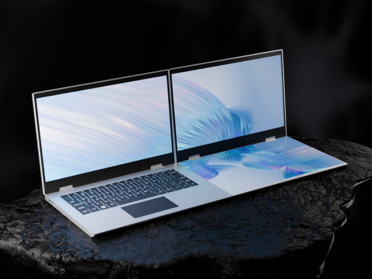
    Anyone who has worked remotely long enough knows the moment a single laptop screen stops being enough. It’s usually the day you’re cross-referencing three documents at once, or the morning you realize your financial model needs a live chart in one window while you edit formulas in another. The standard fix is an external monitor or a portable screen extender, which works fine until you’re hauling a bag that feels like it’s punishing you for being productive. The XbooK takes a different approach
     

XbooK’s $1,999 Triple-Screen Laptop Is One Bag Instead of Three Monitors

Par : JC Torres
21 mars 2026 à 11:20

Anyone who has worked remotely long enough knows the moment a single laptop screen stops being enough. It’s usually the day you’re cross-referencing three documents at once, or the morning you realize your financial model needs a live chart in one window while you edit formulas in another. The standard fix is an external monitor or a portable screen extender, which works fine until you’re hauling a bag that feels like it’s punishing you for being productive.

The XbooK takes a different approach by folding three full 14-inch touchscreens into a single aluminum laptop body that closes to just 1.5 inches thick. At 7.5 lbs, it’s heavier than a typical ultrabook. The tradeoff, though, is straightforward: you’re not carrying a laptop plus accessories. You’re carrying the whole setup in one piece.

Designer: XbooK

All three screens run at 1920×1080 with 400 nits of brightness each. The machine is powered by an Intel Core Ultra 7 with 32GB of DDR5 RAM and a 1TB SSD, with Wi-Fi 7 and Bluetooth 5.0 onboard. That’s capable hardware, though nothing unusual for a mid-to-high-range laptop in 2025. What makes those specs interesting here is what they’re pushing: 42 inches of combined touchscreen that unfolds in seconds without a single cable involved.

In full Workstation Mode, all three screens run simultaneously alongside an embedded mechanical keyboard and a 10-point touchpad. Connectivity covers Thunderbolt 4, two USB-C ports, and an AUX jack, with a 1,600×1,200 front camera that’s sharper than most built-in laptop cameras. The 70Wh battery has to power all of that, and battery life under a three-screen load is something any serious buyer should push the company on before committing.

For days when the full spread is overkill, the XbooK also works in a two-screen mode or as a conventional single-screen laptop. The latter folds everything up and makes the device look surprisingly ordinary from the outside, except for the two thick slabs sitting underneath the keyboard. That adaptability is one of the more genuinely practical aspects of the design: you’re not locked into the workstation configuration every time you open the lid.

At $1,999 (down from a listed $2,999), it’s priced for professionals who already spend that much on monitors and docking stations. XbooK ships from the US with orders promised to be processed within 3 to 5 business days. The refund-before-shipping policy and fulfillment language have the texture of a startup still scaling up. Spending that much on a device from a company with no established hardware track record is a different kind of commitment than buying from a brand with a decade of products behind it.

Screen real estate is one of the last things portable computing has consistently failed to solve, and most multi-screen laptop concepts have been either too fragile or too awkward for daily travel. The XbooK has a cleaner physical premise than anything built around magnets or external rails. How the hinges and chassis hold up after a year on the road, though, is still an open question that no amount of spec-sheet confidence can close.

The post XbooK’s $1,999 Triple-Screen Laptop Is One Bag Instead of Three Monitors first appeared on Yanko Design.

  • ✇Yanko Design
  • 8 Best Desk Accessories for Men That Don’t Look Like They Came From a Corporate Supply Closet
    There’s a version of a desk setup that communicates everything about how little thought went into it. A black mesh organizer from the bottom shelf of a supply closet. A mouse pad that came free with something else. A cable clip in beige. The desk functions, technically, and does so with a level of visual enthusiasm that matches a waiting room. The accessories below were designed by people who thought about this harder. Some carry authentic 1970s Italian design heritage. Some are running AI in t
     

8 Best Desk Accessories for Men That Don’t Look Like They Came From a Corporate Supply Closet

21 mars 2026 à 07:40

There’s a version of a desk setup that communicates everything about how little thought went into it. A black mesh organizer from the bottom shelf of a supply closet. A mouse pad that came free with something else. A cable clip in beige. The desk functions, technically, and does so with a level of visual enthusiasm that matches a waiting room.

The accessories below were designed by people who thought about this harder. Some carry authentic 1970s Italian design heritage. Some are running AI in the background to actively shape your environment. One contains material roughly 20 million years older than the Earth it now rests on. What they share is a quality of intentionality. Each was built as an object worth keeping on a desk, not just stashing in a drawer, because it earns its surface area through how it works, how it looks, or both at once. For men who have graduated from the corporate supply closet aesthetic, these eight represent a meaningfully different set of options.

1. Lenovo AI Workmate Concept

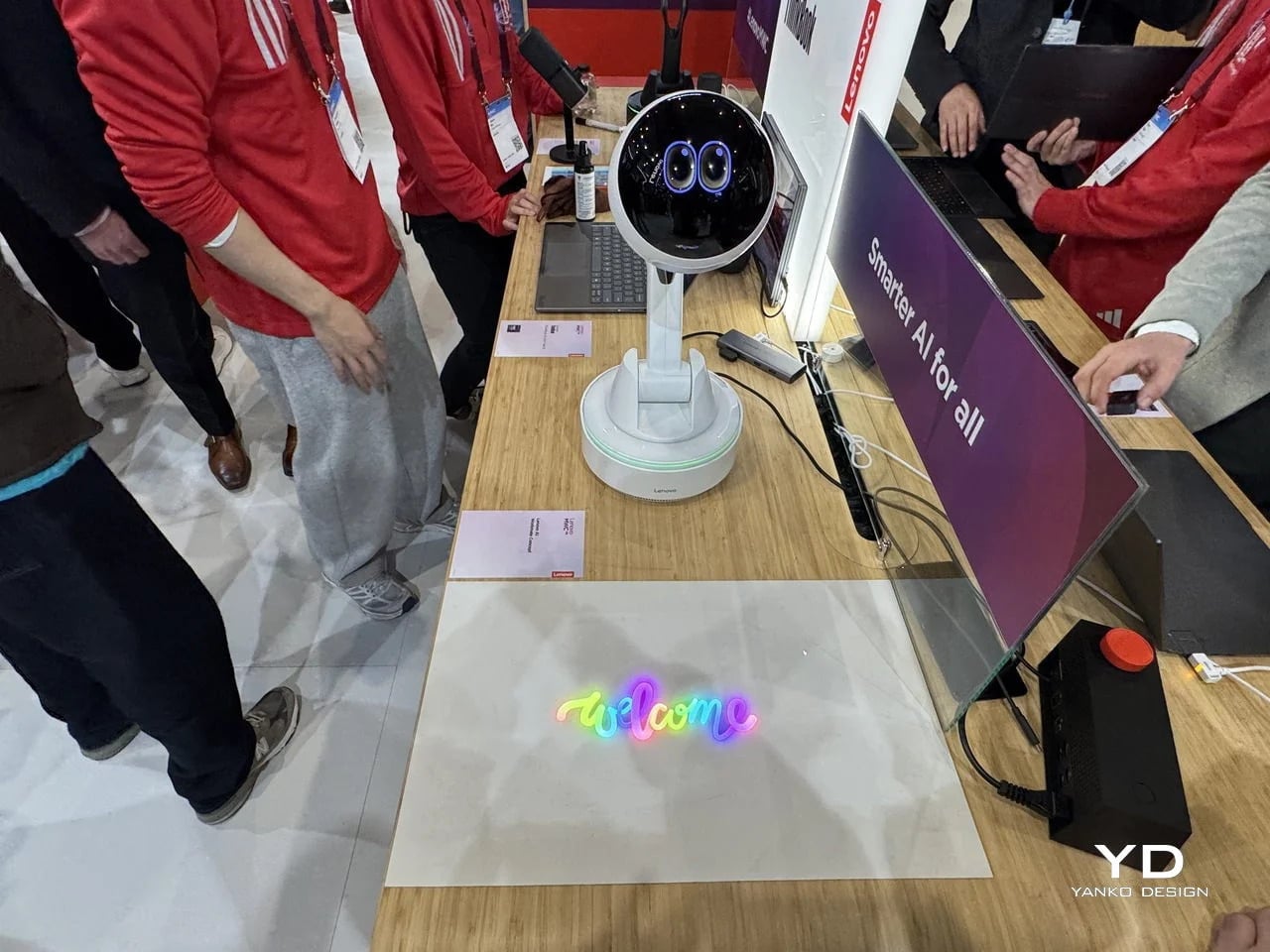
Working alone all day carries a specific kind of friction that most desk setups quietly ignore. Questions accumulate, decisions pile up, and the AI tools meant to support you sit behind a keyboard input that gives nothing back spatially or visually. Lenovo’s AI Workmate Concept, unveiled at MWC 2026, takes that problem seriously enough to build a physical object around it. The result is a desk companion in the most literal sense: a spherical head on an articulated arm mounted on a circular base, with animated eyes on its front display that shift and orient as it processes and responds. The form is compact, the presence is deliberate, and the intent is clear from the first time it moves.

The arm is the most consequential design decision here. Because it moves, the Workmate can orient itself toward whatever holds attention in front of it, a document laid flat on the desk, a person leaning back in their chair, or something happening at the periphery. That range of motion is what separates it from a smart speaker that has been given a screen and called a companion. Spatial awareness is embedded in its posture, not just its software. For men who spend long hours alone at a desk and find text-based AI interaction increasingly impersonal and context-free, the Workmate proposes something more honest about what presence and assistance can look like from an object sharing your workspace.

What We Like

  • Articulated arm gives the device genuine spatial awareness, orienting toward objects and people rather than remaining static
  • Animated eyes on the front display make AI interaction feel more present and less transactional than any screen-based interface

What We Dislike

  • Currently a concept unveiled at MWC 2026, with availability, pricing, and final specs still unconfirmed
  • The novelty of animated eyes may carry more emotional weight than the practical functionality justifies over time

2. Levitating Pen 2.0: Cosmic Meteorite Edition

Most pens sit on a desk and do nothing interesting when they’re not being used. The Levitating Pen 2.0 Cosmic Meteorite Edition refuses that arrangement entirely. It floats at a 23.5-degree angle above its magnetic base, creating a suspension that stops people mid-sentence when they notice it. The design draws from spacecraft aesthetics, specifically the visual language of the USS Enterprise, and the tip incorporates a genuine fragment of Muonionalusta meteorite, a material approximately 20 million years older than the Earth it now rests on. It functions as a working ballpoint pen, which means it is simultaneously a collector’s object, a desk focal point, and a writing tool occupying the same physical form.

What keeps this from reading as pure novelty is how it behaves in your hands. The Levitating Pen is fidget-worthy in the best sense, the kind of object you reach for during a long call or a pause between tasks without consciously planning to. For men who collect objects with a verifiable reason behind them, the meteorite tip offers something most limited editions simply don’t: provenance with a story that doesn’t require a certificate to feel real. You’re holding material from beyond the solar system. That fact changes the weight of the object in your hand when you stop to think about it, and that shift is exactly what separates a desk accessory from a desk object worth keeping.

Click Here to Buy Now: $399.00

What We Like

  • Genuine Muonionalusta meteorite tip connects the pen to a tangible, verifiable piece of cosmic history
  • Magnetic levitation display creates a desk focal point that requires no ongoing maintenance once positioned

What We Dislike

  • The floating display requires a flat, stable surface, limiting where it can sit effectively
  • Limited edition production means restocking after sellout is not guaranteed for future buyers

3. BOB Desk Organizer

Joe Colombo designed BOB in 1970, at a time when desk organizers were either plastic trays with zero intentionality or overengineered systems that looked more complicated than the mess they were supposed to fix. He chose neither direction. BOB is a compact polyurethane gel form, elongated and low-profile, almost pill-shaped when viewed from above, with one end rising into a soft dome and the other tapering nearly flat. B-Line, an Italian label dedicated to reissuing objects from discontinued original molds, brought it back in 2023 across five colorways: terracotta, slate blue, mustard yellow, warm white, and a frosted translucent version called ice. The selection alone suggests a designer thinking about rooms rather than offices.

The top surface divides into three functional zones without any visible partition between them. The dome end opens into a large oval scoop for bulkier items. The center holds a three-by-four grid of individual circular holes, each sized precisely for a single pen or brush. The tapered tail offers two horizontal slot grooves for flat objects like rulers or small notebooks. None of this reads as a feature list in person. It reads as a single continuous gesture that happens to keep things organized along the way. For men who want a desk object with actual design history behind it rather than a branding story retrofitted over generic injection molding, BOB is nearly impossible to improve on.

What We Like

  • Rooted in authentic 1970s Italian design history, reissued from Joe Colombo’s original mold by B-Line
  • Three distinct functional zones are built into one continuous organic form with no visible hardware or dividers

What We Dislike:

  • Polyurethane gel construction may show surface wear or discoloration with extended daily use
  • The low-profile form works best for lighter objects and may not support heavier desk tools effectively

4. DEEP

DEEP operates on a premise most desk lamps don’t bother with: the working environment around you should configure itself to match what you are about to do, rather than waiting for you to adjust it manually. Switch it on with a spinning-top-inspired power button, tell it whether you’re studying, coding, reading, or doing creative work, and it adjusts both light quality and ambient sound before you’ve had to think about either. A camera positioned at eye level monitors your focus state in real time, functioning like a built-in productivity coach without requiring a separate app or a separate device taking up additional surface area.

What separates DEEP from a connected lamp with a smart home feature set is what it does across repeated sessions. The system saves your manual adjustments over time, builds a personal profile from the conditions that consistently work best for you, and begins applying them automatically without being prompted. Side buttons allow precise overrides for days when the default doesn’t fit. For men whose desks have become cluttered with single-function devices that each do one thing adequately, DEEP represents a genuine consolidation. It folds a lamp, an ambient sound environment, and a passive focus monitor into a single object that becomes more attuned to how you work the longer it stays on your desk.

What We Like

  • AI builds a personal focus profile across sessions and applies your optimal working conditions automatically over time
  • Combines lighting, ambient sound, and real-time focus monitoring without requiring any additional hardware

What We Dislike

  • Camera-based focus tracking may feel uncomfortable for users sensitive to passive environmental monitoring
  • Ambient sound adjustment effectiveness varies significantly based on an individual’s working environment and noise tolerance

5. Rolling World Clock

Every desk clock tells you one thing. This one tells you twelve. The Rolling World Clock is a 12-sided object with a single hand and an operation that couldn’t be more direct: set it on any face, and the hand reads the correct local time for the city printed on that side. The twelve cities span the major global time zones, including London, Paris, Cape Town, Moscow, Los Angeles, Karachi, Mexico City, New York, Shanghai, Tokyo, Sydney, and New Caledonia. For men who manage work across multiple time zones or simply have family spread across continents, the mental arithmetic of figuring out what time it is somewhere else is one of the more persistent small irritations in a working day, and this object removes it without adding a screen.

The design decision that makes this worth keeping on a desk rather than just owning is the total absence of anything unnecessary. No digital display. No charging cable. No app. Just a tactile, rollable object you turn to the city you need and set down. Available in black and white, it occupies desk or shelf space without reading as a gadget or demanding attention it hasn’t earned. There’s a quiet pleasure to the interaction that most clocks don’t provide: the act of picking it up, choosing a place in the world, and reading the time. There is a physical engagement with global time that a phone screen never manages to replicate.

Click Here to Buy Now: $49.00

What We Like

  • Covers twelve major time zones in a single tactile object with no digital display, no app, and no charging required
  • Minimal form reads equally well on a desk or shelf without visually registering as a tech accessory

What We Dislike

  • A single clock hand requires slightly more reading attention than a digital display for precise timekeeping
  • The 12-city selection covers major zones well, but may not include every specific time zone a user needs regularly

6. Fidget Cube

The case for keeping a dedicated fidget object on a desk is more rational than it sounds from the outside. Restless hands during long calls, slow-loading processes, or decisions you’re turning over without fully committing to are a real and recurring part of working at a desk, and the Fidget Cube was built precisely for that condition. Six sides offer six different tactile surfaces: a cluster of clickable buttons, a gliding joystick, a row of flip switches, a smooth surface designed for the thumb’s natural breathing motion, a rolling ball set into one face, and a spinning disc. The variety means your hands will find a preferred surface quickly and return to it across the session without thinking about it.

What keeps this from reading as a toy is the restraint built into how it was designed. It doesn’t look out of place on a desk or conference table, particularly in the Midnight black colorway, which sits visually neutral among the standard dark objects that populate most professional environments. For men who have noticed that physical repetitive movement genuinely sharpens how they think through a problem, this is one of the more honest tools available at any price point. It takes a real behavioral truth seriously and gives your hands a quiet, clean way to act on it without disrupting anyone around you or drawing attention to what you’re doing.

What We Like

  • Six distinct tactile surfaces address a wide range of fidgeting habits within one compact, pocketable object
  • Discreet colorways, particularly Midnight black, keep it visually neutral in professional desk environments

What We Dislike

  • Some click mechanisms can produce an audible sound in quiet rooms or during video calls
  • Serves no secondary organizational function on a desk, occupying surface space with a purely tactile purpose

7. MOFT Z Sit-Stand Desk

Sit-stand desks have spent years being expensive, physically large, or permanently locked to a specific room. The MOFT Z takes a completely different approach, collapsing to something closer to a slim notebook in thickness while delivering a full ergonomic range through an origami-inspired Z-structure. It provides one standing mode and three seated position angles, which is enough postural variety to meaningfully shift how you feel across a long working session. For men who divide their time between home, a co-working space, a client’s office, or anywhere other than a fixed desk, the ability to carry a sit-stand setup in a bag removes an ergonomic compromise that most standing desk products are structurally incapable of solving.

The weight is what makes it a genuine solution rather than a clever concept. Ergonomic equipment that stays home because it’s too heavy or awkward to transport defeats the purpose of improving how you work across different locations. The MOFT Z doesn’t have that problem. Unfold it in seconds, set your laptop on the surface, and you’ve built the same ergonomic posture you’d have at a standing desk that costs several times more and cannot leave the floor it occupies. For anyone who has watched their posture decline steadily across a long afternoon of flat laptop work, this is a practical correction that goes where you go and requires no tools, no assembly, and no installation to use.

What We Like

  • Origami Z-structure provides one standing mode and three seated positions with no setup tools required
  • Ultra-lightweight, paper-thin folded profile makes it genuinely portable across different working locations

What We Dislike

  • Surface area restricts how much additional equipment can sit alongside a laptop in standing mode
  • Stability may be reduced under heavier setups or on surfaces that aren’t completely flat and firm

8. LEGO-Style Silicone Cable Organizer

Cable management has a way of being solved temporarily and then quietly abandoned. The solution works for a week, then a new cable enters the setup, or the organizer shifts position, or it turns out the adhesive left a mark on the desk. This silicone cable organizer approaches the problem differently. Shaped after a lozenge pack, it uses peg-topped cylindrical columns to wrap and hold individual cables in separate, stable positions. Multiple units can be stacked or arranged in rows, and three sizes cover the range from a single charging cable to a full multi-device setup: a 2×2 mini, a 3×3 medium, and a 2×5 large, with the option to place two cables on top of each other within the same row.

The design was born from a specific personal frustration: cables tangling with other items inside a bag, the kind of small recurring annoyance that accumulates into a genuine grievance over time. That origin shows in how focused the solution is. There’s no overengineering, no branded clip mechanism, no custom routing system that only works with certain cable gauges. The micro suction tape base grips the desk surface firmly without permanent adhesion, meaning it moves when the setup changes and holds when it doesn’t. For men who have gone through two or three cable management products and quietly abandoned all of them, the directness here is precisely the argument for this being the last one you need.

What We Like

  • Three modular sizes cover setups from a single cable to a full multi-device workspace without custom parts
  • Micro suction tape base holds securely without permanent adhesion, leaving the desk surface undamaged

What We Dislike

  • Silicone material collects lint and dust more readily than hard plastic alternatives
  • The LEGO-inspired visual style reads as playful and may not suit every desk aesthetic preference

The Best Desk Is One You Actually Thought About

A desk says something whether you intend it to or not. It communicates how seriously you take the hours you spend there, what kind of work you believe deserves a proper environment, and whether the objects around you were chosen or simply accumulated. The eight accessories above represent a different kind of accumulation, one where every item on the surface has a reason to be there, a story worth telling, or a function that genuinely improves how the day moves.

None of them require a complete overhaul. One rolling clock, one floating pen, one lamp that learns how you work — any single object from this list shifts the energy of a desk in a direction worth going. The corporate supply closet aesthetic isn’t inevitable. It just tends to win by default when no one pays attention. These eight are the case for paying attention.

The post 8 Best Desk Accessories for Men That Don’t Look Like They Came From a Corporate Supply Closet first appeared on Yanko Design.

  • ✇Yanko Design
  • The Shargeek 300 is a Cyberpunk-style Power Bank that can charge two MacBook Pros
     Power banks have spent years being boring on purpose. Black rectangles, white rectangles, the occasional textured finish. The category settled into a kind of utilitarian invisibility, as if the industry collectively decided that anything carrying electrons should look like a bar of soap. SHARGE never got that memo. The Shargeek 300 looks like a prop from a near-future thriller, with transparent panels revealing glowing circuitry beneath, RGB light bars running along its flanks, and a CNC alum
     

The Shargeek 300 is a Cyberpunk-style Power Bank that can charge two MacBook Pros

20 mars 2026 à 21:45

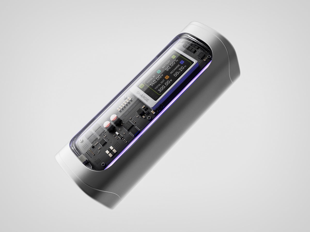
Power banks have spent years being boring on purpose. Black rectangles, white rectangles, the occasional textured finish. The category settled into a kind of utilitarian invisibility, as if the industry collectively decided that anything carrying electrons should look like a bar of soap. SHARGE never got that memo. The Shargeek 300 looks like a prop from a near-future thriller, with transparent panels revealing glowing circuitry beneath, RGB light bars running along its flanks, and a CNC aluminum body that catches light the way expensive things tend to. It belongs on a desk you’d actually want to show people.

Founded in 2020, SHARGE built its identity around the conviction that charging hardware deserves the same design attention as the devices it powers. The original Shargeek 100, launched in 2021, was the proof of concept: a transparent, display-equipped power bank with DC charging that found a devoted audience almost immediately. The Shargeek 300 is what four years of that bet looks like fully cashed in. It pushes 300 watts of total output, enough to charge two 16-inch MacBook Pros simultaneously while still fast-charging a smartphone on a third port. The 24,000mAh battery lands at 86.4Wh, sitting just under the 100Wh threshold airlines enforce for carry-on batteries. Recharge time from flat to full is 75 minutes with a 140W input. The whole unit is roughly the size of a 330ml can of cola. SHARGE spent 40 months getting here, and the result makes most rivals in the category look underprepared.

Designer: Sharge

Click Here to Buy Now: $159 $199 ($40 off) Hurry! Only 6 days left.

That meticulous attention to detail is most obvious in the physical construction. The main body is a matte silver CNC aluminum frame, which is then given a 180-grit sandblasted, anodized finish for a smooth, premium feel. The company’s head of production is even quoted as personally comparing the feel of every unit to an iPhone to ensure they are equally premium. The signature transparent casing is not just a window, but a piece of safety equipment, made from V0 flame-retardant, UL94-certified polycarbonate that resists both scratches and heat. The dual RGB light bars are fully customizable, allowing users to adjust brightness, change colors, and cycle through effects via the onboard display, turning a functional object into a piece of personalized desk art.

Inside that striking shell is technology that sets a new benchmark for portable power. The Shargeek 300 is the first power bank to use the same Full-Tab Battery Cell technology pioneered by Tesla. This design significantly lowers internal resistance compared to conventional cells, a change that unlocks faster charging speeds, higher sustained output, and superior heat dissipation. This internal efficiency is the key to how a device this compact can safely manage a 300W total output without overheating or degrading quickly. The advanced battery structure results in a longer-lasting, more stable power source that can handle the demanding, continuous power draws required by high-performance laptops and other professional equipment, putting truly next-generation power in your hands.

This power is routed through a versatile array of four output ports designed to handle nearly any device. The stars of the show are the two USB-C ports, both of which support the Power Delivery 3.1 standard to deliver a massive 140W of power each. This is what allows the Shargeek 300 to simultaneously fast-charge two 16-inch MacBook Pros at their maximum charging speed. A third USB-A port provides up to 20W for legacy devices and smartphones. The fourth and most unique port is the adjustable DC barrel port, a feature carried over from the Shargeek 100. It now supports up to 140W and its voltage can be manually set between 5V and 28V, unlocking compatibility with a world of gear that USB-C cannot serve, from professional camera equipment to high-performance drones. The 24,000mAh capacity provides enough energy for approximately one full charge of a modern MacBook Pro, six charges for an iPhone 16 Pro, or two charges for an iPad Pro.

The user experience is managed through a 1.9-inch IPS display, which is 60% larger than the screen on the previous model. It provides a level of control that is unheard of in this category. Beyond showing real-time input and output wattage, the display allows you to monitor battery health, track charging cycles, and check internal temperatures. You can use it to precisely adjust the DC output voltage, set a custom welcome message, and configure the RGB lighting. This smart display transforms the power bank from a simple battery into an intelligent power hub. This intelligence extends to its handling of delicate electronics. A dedicated Low-current Mode ensures that devices like earbuds, smartwatches, and fitness trackers receive a safe, optimized charge, preventing the overcharging that can damage the small batteries in those devices.

This combination of raw power and intelligent control is backed by a comprehensive suite of safety features, including overvoltage, undervoltage, short-circuit, and real-time temperature protection. This commitment to safety extends to its travel-readiness. Crucially, the power bank’s 24,000mAh capacity is engineered to a rating of 86.4Wh, keeping it comfortably under the 100Wh limit imposed by airlines for carry-on luggage. This makes it one of the most powerful charging solutions that can be legally carried onto a plane, a critical detail for mobile professionals. The low standby power consumption is another practical benefit, allowing the Shargeek 300 to retain over 90% of its charge after 15 days of inactivity. For anyone who has pulled a power bank from a bag after weeks only to find it unexpectedly dead, this is a genuinely valuable feature.

The Shargeek 300 starts at $199 but is available at a discounted $159 price for earlybird backers. Cobble together $209 and you can get the power bank along with its companion Pixel 140W PD 3.1 wall charger from Sharge with its adorable pixel-matrix display. The Shargeek 300 comes with a 12-month warranty, and ships globally as early as May 2026.

Click Here to Buy Now: $159 $199 ($40 off) Hurry! Only 6 days left.

The post The Shargeek 300 is a Cyberpunk-style Power Bank that can charge two MacBook Pros first appeared on Yanko Design.

  • ✇Yanko Design
  • When Your Speaker Is Also a Puzzle, Music Hits Different
    Most speaker designs ask a pretty simple question: how do we make this thing louder and smaller? Merge asks a completely different one. How do we make music something you can actually take apart? Created by a five-person design team, Junchuan Shi, Junhao Lv, Xiangzhao Meng, Ping He, and Genghao Ma, from a cross-institutional collaboration across Sichuan Vocational and Technical College, CityU Macau, TUT, and QZUIE, Merge is a conceptual speaker system that just picked up a 2025 European Product
     

When Your Speaker Is Also a Puzzle, Music Hits Different

20 mars 2026 à 20:30

Most speaker designs ask a pretty simple question: how do we make this thing louder and smaller? Merge asks a completely different one. How do we make music something you can actually take apart?

Created by a five-person design team, Junchuan Shi, Junhao Lv, Xiangzhao Meng, Ping He, and Genghao Ma, from a cross-institutional collaboration across Sichuan Vocational and Technical College, CityU Macau, TUT, and QZUIE, Merge is a conceptual speaker system that just picked up a 2025 European Product Design Award in the Consumer Electronics category. It’s the kind of student concept that makes you wonder why no major brand has thought of it first.

Designers: Junchuan Shi, Junhao Lv, Xiangzhao Meng, Ping He, Genghao Ma

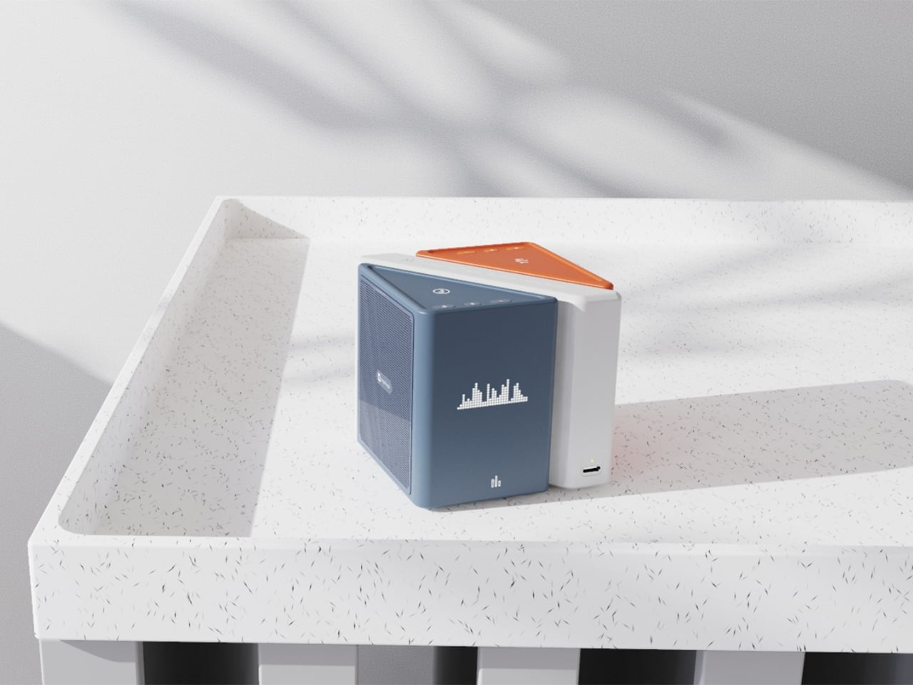
The central idea is deceptively clever. Merge physically separates music into its component layers: the accompaniment on one module, the vocals on another, and the full combined sound handled by the complete assembly. You choose what you hear depending on how the pieces are arranged. Pull the vocal module away, and you’ve got an instant karaoke track. Keep just the vocal module, and you hear a singer stripped back from all the production. Snap everything together and you get the whole song. It sounds gimmicky when you describe it that way, but it really isn’t. It’s an intuitive way to interact with music that streaming apps, for all their data and algorithms, still haven’t cracked with the same sense of physical satisfaction.

The three modules connect via electromagnetic induction, which also handles charging between units. That detail matters more than it sounds. It means the product doesn’t rely on fiddly clips or pins; the connection is seamless and the experience stays clean. When you hold all three pieces assembled, they sit together like a solid little object. When you pull them apart, you’re not wrestling with latches. You’re just… separating music.

Visually, the design is confident without being loud. The modules are geometric and compact: a rectangular flat piece, a squared speaker body, and a triangular wedge that caps the top when assembled. The whole thing sits in your palm like a premium toy, which is very much the point. The team describes the tactile experience of rearranging the modules as analogous to playing with building blocks, and that framing is spot on. Listening becomes a physical act rather than a passive one. You’re not adjusting a slider on an app; you’re literally picking up a piece of the song and putting it somewhere else.

The color language is considered too. The renders show options in slate blue, orange-coral, silver metallic, and white-grey, each colorway with its own character but all sharing the same graphic vocabulary: pixel waveform icons and quiet typography showing floating lyrics directly on the module surface. It reads like something between a well-designed toy and a serious piece of consumer electronics, which is an interesting space for a speaker to occupy.

I’ll be upfront: Merge is still a concept. It won in the EPDA’s conceptual category, and it hasn’t crossed into production territory yet. That’s a long road, and the audio technology behind splitting tracks in real time at the hardware level would require serious engineering. The images are renders and physical prototypes, not retail-ready products. But the best conceptual design has always worked like that. It shows an industry where something should go, even when the technology and the business case haven’t fully caught up yet.

What makes Merge genuinely compelling is that it treats the listener as someone with curiosity rather than just convenience-seeking habits. The assumption baked into most audio product design is that people want everything done for them, simplified, smoothed over. Merge assumes the opposite: that people might actually enjoy engaging with the layers of a song, touching them, moving them around. Given how obsessed the current cultural moment is with stems, remixes, and stripped-back sessions, that assumption feels exactly right.

Whether it ever becomes a product you can buy, Merge is already doing the thing good design is supposed to do. It makes you look at something ordinary and ask why it was never done this way before.

The post When Your Speaker Is Also a Puzzle, Music Hits Different first appeared on Yanko Design.

  • ✇Yanko Design
  • Snøhetta Built a Metro Station in Riyadh That Reflects the Entire City Back at You
    There is a moment, the architects at Snøhetta will tell you, when you step off the train at Qasr AlHokm and look up, and the entire city of Riyadh looks back at you. That is not a metaphor. It is exactly what happens beneath the station’s sweeping, mirror-polished stainless steel canopy, where a 360-degree reflection of the surrounding cityscape floats above commuters like a living panorama. It is disorienting in the best possible way, and entirely intentional. Completed in 2025, the Qasr AlHok
     

Snøhetta Built a Metro Station in Riyadh That Reflects the Entire City Back at You

20 mars 2026 à 19:30

There is a moment, the architects at Snøhetta will tell you, when you step off the train at Qasr AlHokm and look up, and the entire city of Riyadh looks back at you. That is not a metaphor. It is exactly what happens beneath the station’s sweeping, mirror-polished stainless steel canopy, where a 360-degree reflection of the surrounding cityscape floats above commuters like a living panorama. It is disorienting in the best possible way, and entirely intentional.

Completed in 2025, the Qasr AlHokm Metro Station is one of four primary hubs within Riyadh’s expansive new metro network, a system now carrying up to 3.6 million passengers daily since it entered full operation in January 2025. The station sits in the heart of the historic Al Qiri district, adjacent to an Eid prayer field and a mosque, and within walking distance of the old palace grounds, a location that demanded both architectural sensitivity and civic ambition.

Designer: Snøhetta

Snøhetta, working in collaboration with One Works and Cremonesi Workshop (Crew), first won the competition brief in 2012. The central concept remained remarkably consistent from that early vision: a transit station designed as an open urban plaza, where the threshold between city and subway is dissolved rather than defined. The bowl-shaped canopy, its underside ground to a flawless mirror finish, acts as what the team describes as an urban periscope. From above ground, the city is reflected downward into the station. From below, the underground world is projected back out. “Likewise, if you’re coming from the city, you look up into the canopy, and it mirrors everything that happens below,” explained Snøhetta partner Robert Greenwood.

Sloped terrazzo floors draw visitors naturally under the canopy and into the station’s layered interior. There, a truncated cone-shaped atrium wall, its surface perforated by triangular openings drawn from the regional Najdi architectural tradition, encloses one of the station’s most unexpected gestures: a lush underground garden. In a city defined by heat and aridity, this green pocket offers genuine respite. Indigenous tree planting, natural ventilation, and photovoltaic panels complete a sustainability framework that goes well beyond a token gesture.

The building has not gone unrecognized. In November 2025, the Prix Versailles, presented under the patronage of UNESCO and the International Chamber of Commerce, named Qasr AlHokm one of the seven most beautiful train stations in the world, placing it alongside some of global architecture’s most celebrated transit spaces. What Snøhetta has built here is more than a station. It is a civic room, a place where infrastructure earns the right to be called architecture.

The post Snøhetta Built a Metro Station in Riyadh That Reflects the Entire City Back at You first appeared on Yanko Design.

  • ✇Yanko Design
  • A Wind-Powered Tumbleweed That Heals the Desert as It Rolls
    I have to be upfront: I did not expect a tumbleweed to be one of the most exciting design concepts I’d encounter this year. Tumbleweeds, in the cultural imagination, belong to Westerns and dusty ghost towns. They’re the kind of thing that drifts across an empty street right before a showdown, the universal shorthand for desolation. So when I first came across the Wasteland Nomads: Bionic Tumbleweed Sower System by Yizhuo Guo, I laughed a little. But as I looked closer, I started getting impress
     

A Wind-Powered Tumbleweed That Heals the Desert as It Rolls

20 mars 2026 à 18:30

I have to be upfront: I did not expect a tumbleweed to be one of the most exciting design concepts I’d encounter this year. Tumbleweeds, in the cultural imagination, belong to Westerns and dusty ghost towns. They’re the kind of thing that drifts across an empty street right before a showdown, the universal shorthand for desolation. So when I first came across the Wasteland Nomads: Bionic Tumbleweed Sower System by Yizhuo Guo, I laughed a little. But as I looked closer, I started getting impressed.

Guo is a multidisciplinary designer with a master’s degree in Material Futures from Central Saint Martins, and she has previously collaborated with Google DeepMind. Her work appeared at Milan Design Week 2024. She is, in other words, someone who operates at the intersection of cutting-edge materials science and ecological design thinking. With Wasteland Nomads, developed alongside Daheng Chu through the University of the Arts London and Imperial College London, she took the one plant most associated with barren landscapes and used it as a blueprint for restoring them. The logic is almost poetic. The tumbleweed doesn’t fight the desert. It works with it. It uses wind as its engine and travels wherever the landscape allows. Guo’s question, essentially, was: what if we could engineer something that did exactly the same thing, but deliberately seeded the ground as it went?

Designer: yizhuo guo

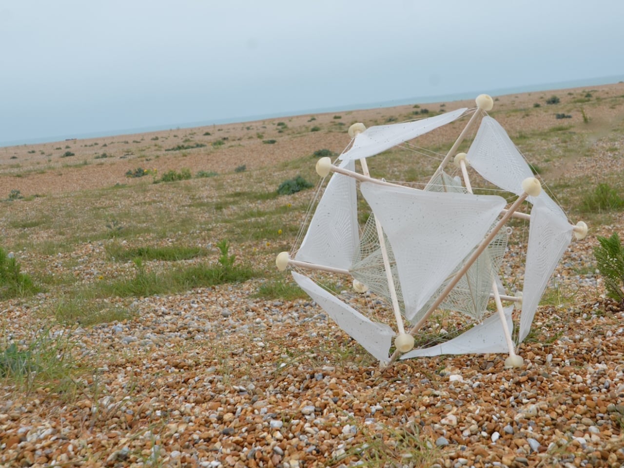
The result is a biomimetic seeding device built entirely on the principles of passive robotics. No batteries, no circuits, no external power source required. Lightweight biodegradable support rods form a tensile, hollow spherical structure that mirrors the tumbleweed’s own elastic form. The outer skin is made from a moisture-responsive biodegradable composite, and seeds are housed within it. When the device rolls into an environment where humidity conditions are right, the skin begins to break down and disperse those seeds directly into the soil. It boosts soil oxygen, contributes to carbon sequestration, and by the very end of its journey, the device has fully merged with the ground it was trying to restore. No waste. No remnants. Just land.

That last part is the detail I keep returning to. Most ecological technology, even the well-intentioned kind, still leaves something behind. A plastic housing. A metal component. A depleted battery that needs to go somewhere. This dissolves into the very ecosystem it is trying to rebuild. The design does not just mimic nature. It eventually becomes nature. That is a fundamentally different relationship between technology and environment than what we are used to seeing, and it matters more than it might initially seem.

The project took home a 2025 European Product Design Award in the Eco Design Products category, which feels well deserved, though I suspect this is only the beginning of the conversation around it. Guo has already accumulated a striking list of recognitions, including the iF Design Award in Germany and multiple honors from Chinese design institutions. She is clearly a designer who thinks at the systems level, not just asking what something looks like, but how it lives, decays, and eventually reintegrates.

Climate design can sometimes feel exhausting in its abstraction. We have all scrolled past enough speculative renderings of glowing, utopian landscapes to develop a healthy skepticism toward the genre. Wasteland Nomads doesn’t do that. It starts with a specific, urgent problem, the accelerating degradation of viable land across arid regions of the planet, and it finds the answer not in some new synthetic innovation but in a plant that has been quietly solving the same problem for millions of years. The tumbleweed has been moving seeds across hostile terrain since long before we were here to watch it. We just never thought to pay close enough attention.

That, I think, is what makes this design genuinely moving. Biomimicry at its most honest is not about clever engineering. It’s about being willing to slow down long enough to watch how the world already works, and being humble enough to follow what you find. Guo was clearly paying attention. Now let’s see where it rolls.

The post A Wind-Powered Tumbleweed That Heals the Desert as It Rolls first appeared on Yanko Design.

  • ✇Yanko Design
  • Stay Classy, San Diego: This LEGO Anchorman Set Recreates the Entire Channel 4 Newsroom in 1,500 Bricks
    Anchorman: The Legend of Ron Burgundy turned twenty in 2024, and somehow, the film has only gotten funnier with age. What started as a Will Ferrell comedy about a hilariously fragile male ego navigating the very real 1970s newsroom gender wars became one of the most quoted, most meme’d, most endlessly rewatchable comedies in modern American film history. “I’m kind of a big deal,” “I love lamp,” “60% of the time it works every time” – the lines are so deeply embedded in pop culture at this point
     

Stay Classy, San Diego: This LEGO Anchorman Set Recreates the Entire Channel 4 Newsroom in 1,500 Bricks

20 mars 2026 à 16:45

Anchorman: The Legend of Ron Burgundy turned twenty in 2024, and somehow, the film has only gotten funnier with age. What started as a Will Ferrell comedy about a hilariously fragile male ego navigating the very real 1970s newsroom gender wars became one of the most quoted, most meme’d, most endlessly rewatchable comedies in modern American film history. “I’m kind of a big deal,” “I love lamp,” “60% of the time it works every time” – the lines are so deeply embedded in pop culture at this point that people quote them without even knowing where they came from. San Diego’s most legendary fictional anchor deserves better than a passing reference in a listicle, and LEGO Ideas builder footonabrick clearly agrees.

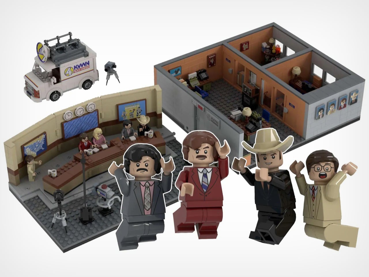
The result is a just-over-1,500-piece MOC (My Own Creation) that reconstructs the Channel 4 News Team’s world with an almost obsessive attention to detail, covering the broadcast studio, the newsroom offices, and even the KVWN news van parked out front. The studio section is immediately recognizable: a curved tan backdrop wall, three wall clocks ticking away above the anchor desk, dual blue Channel 4 News Team screens flanking the set, and the full team seated behind that iconic brown desk with their Channel 4 mugs. It looks like a freeze-frame from the film, and that’s entirely the point.

Designer: footonabrick

The broadcast desk is the centerpiece, and footonabrick nails the warm tan-and-brown palette of that gloriously dated 70s newsroom aesthetic. Ron and Veronica sit front and center behind their Channel 4 mugs, with Brian Fantana, Champ Kind, and Brick Tamland flanking them across the curved desk. The curved wall behind them is one of the trickier builds to pull off cleanly in LEGO, and the segmented panel construction keeps it looking smooth without losing the layered depth of the real set. Camera equipment on the studio floor, a boom-arm mic stand, and a vanity mirror station on the side round out the production floor detail beautifully.

Turn to the office areas and you’ll find a bunch of details and easter eggs. Ron’s private office has his nameplate desk, a glass of scotch rendered in a transparent amber round piece, and a “Missing” poster for Baxter tucked onto a side shelf. Brian Fantana’s cologne closet, one of the film’s most beloved gags, is recreated with an open cabinet stocked with colourful brick-built bottles, with a “Brian Fantana” book sitting on his desk for good measure. The hallway outside features a glass-panel wall looking into Ron’s office, and a Ron Burgundy door nameplate that even Veronica would have to respect. My favorite detail, though, is the row of four team portrait tiles mounted on the exterior office wall, each one a miniature LEGO-art-style illustration of the Channel 4 crew. Tiny, considered, and completely unnecessary in the best way.

The eight minifigures are pitch-perfect. Ron arrives in his burgundy suit with a jazz flute and a scowl that says “I have many leather-bound books.” Brick Tamland, naturally, comes with his trident. Champ has his signature cowboy hat, Fantana carries what appears to be a cologne bottle, and Veronica is rendered in her pink suit with that particular expression of someone perpetually tolerating Ron’s nonsense. Baxter the dog is included as a separate figure, and there’s even a bonus Ron on a tiny red bicycle, which is exactly the kind of specific deep-cut that separates a good MOC from a great one.

footonabrick’s Anchorman set is currently gathering votes on LEGO Ideas, the community platform where fan-created MOCs (My Own Creations) need 10,000 supporters to trigger an official LEGO review and potential retail production. With 344 votes on the board and 421 days left on the clock, there’s plenty of runway. If you want to see this land on store shelves, head to the LEGO Ideas page and cast your vote. You stay classy.

The post Stay Classy, San Diego: This LEGO Anchorman Set Recreates the Entire Channel 4 Newsroom in 1,500 Bricks first appeared on Yanko Design.

  • ✇Yanko Design
  • Track Trailer reinvents Tvan, one of the toughest off-roading trailers with roomier MK6 model
    Track Trailer, the name behind the famous Tvan off-road camper trailers, needs little introduction. It has been powering the overlanding experience in Australia and worldwide for a good part of four decades now. Over the years, we have seen some interesting variants of the Tvan, which has now reached the MK6. The sixth iteration in the successful portfolio, Tvan MK6 Model, retains the same aluminum body, which runs in the bloodline, but is more spacious and even more comfortable. As the appeara
     

Track Trailer reinvents Tvan, one of the toughest off-roading trailers with roomier MK6 model

20 mars 2026 à 15:15

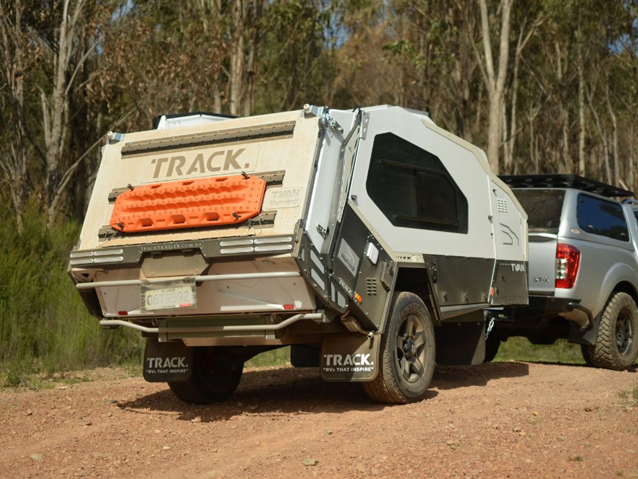
Track Trailer, the name behind the famous Tvan off-road camper trailers, needs little introduction. It has been powering the overlanding experience in Australia and worldwide for a good part of four decades now. Over the years, we have seen some interesting variants of the Tvan, which has now reached the MK6. The sixth iteration in the successful portfolio, Tvan MK6 Model, retains the same aluminum body, which runs in the bloodline, but is more spacious and even more comfortable.

As the appearance suggests, the new Tvan MK6 is available in four variants and is almost identical to its predecessors. What changes are the interior space and the headroom, which make the MK6 a different entrant in the same effective branding of the world’s toughest off-roading trailer.

Designer: Track Trailer

Track Trailer first tried reworking the interior space with the MK5 model. It was done staying within the confines of the Tvan styling: no pop-up roof attachment, but a slight raise in roof height. With the MK6, the company has also stayed true to its design ideology. It has only increased headroom, stretched the neck forward, and pushed the sides of the trailer outward to increase the interior space by up to 20%.

The expansion to the trailer permits more natural light inside the cabin, which is constructed using an aluminum sandwich-panel construction. Moreover, the MK6 features a durable chassis based on an advanced suspension system that enables it to roll comfortably on rugged terrains and off-road destinations. With its ruggedness assured, the camping trailer is ideal for all types of adventures, which is facilitated by its quick setup and clever storage designed throughout its exterior and also on the inside.

MK6 measures 16-foot-long and 6.3 feet wide, the trailer has an interesting storage cabinet in the extended nose up front, comprising a pantry and up to 95 liters fridge/freezer. Slightly further back is the slide-out kitchen with a three-burner gas stove, a full-size sink connected to a 108L fresh water tank, and a storage drawer topped with a prep area.

The most interesting part of the MK6 camping trailer is the rear hatch design. It features Track Trailer’s patented Skyward Lift Up Deck, which combines the hatch and the hard-floor deck. The electric lock system allows the two to lift up in unison for quick and direct access into the living space of the trailer. Just when you need it, a tent can be attached to the trailer to increase the living quarters.

Inside is a double bed surrounded by large windows and overhead and sidewall storage. LED lighting and dual roof hatches complete the design. Since the MK6 is available in four variants, each is designed differently for off-the-grid living. The entry-level Inspire features a 125Ah lithium battery that draws energy from a 200W rooftop solar panel, while a 350W inverter takes care of the power backup. Firetail accommodates a pair of 125Ah batteries, a 2000W inverter, and some premium features in the kitchen.

Tvan MK6 Murranji adds a 200W solar panel to the Firetail setup, but leaves out the inverter. The top-of-the-line, Lightning, on the other hand, comes with a 500Ah battery. It features a 2,000W inverter and a 360W solar panel to complete its all-electric setup. Each of these models can have further upgrades with add-ons like awnings and more. MK6 starts at AU$69,900 (approximately $50,000) with the mentioned amenities.

The post Track Trailer reinvents Tvan, one of the toughest off-roading trailers with roomier MK6 model first appeared on Yanko Design.

  • ✇Yanko Design
  • This Fan Made the Sony-Nintendo Handheld the Companies Never Would
    The retro handheld market has a strange problem. The hardware keeps getting better, the screens get sharper, the processors get faster, and yet most of these devices land looking like prototypes someone forgot to finish. Generic shells, forgettable proportions, and LED lighting as a substitute for actual design thinking. For a category built entirely on nostalgia, very few of these devices actually look like they belong to any era at all. That tension is what one Reddit user decided to address.
     

This Fan Made the Sony-Nintendo Handheld the Companies Never Would

Par : JC Torres
20 mars 2026 à 13:20

The retro handheld market has a strange problem. The hardware keeps getting better, the screens get sharper, the processors get faster, and yet most of these devices land looking like prototypes someone forgot to finish. Generic shells, forgettable proportions, and LED lighting as a substitute for actual design thinking. For a category built entirely on nostalgia, very few of these devices actually look like they belong to any era at all.

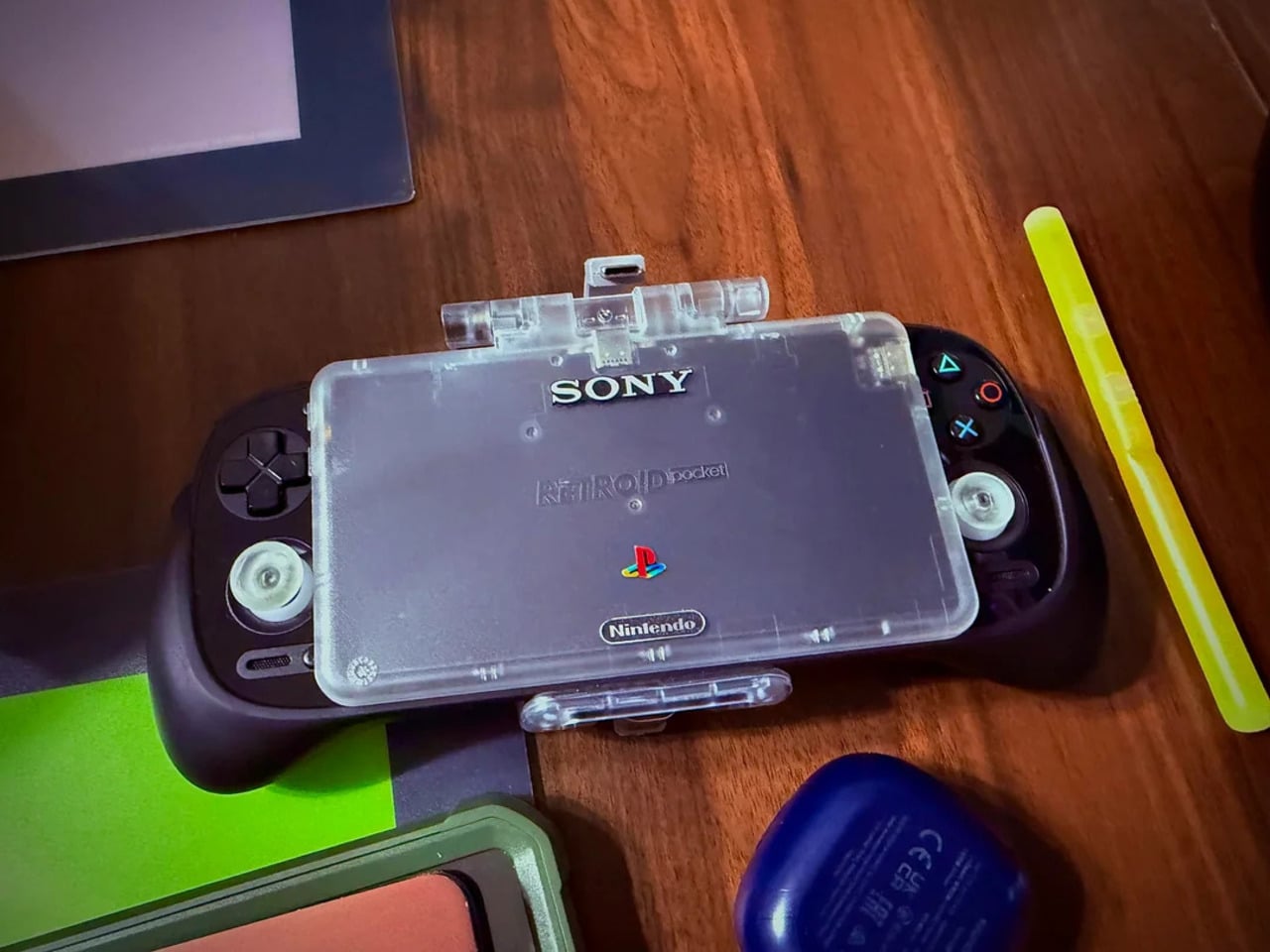
That tension is what one Reddit user decided to address. Starting with a Retroid Pocket 5, a $199 Android handheld running a Snapdragon 865 and a 5.5-inch AMOLED display, the mod layers Sony and Nintendo branding onto the same shell. Vinyl decals, translucent polycarbonate, a 3D-printed volume rocker from Etsy, and a cable replaced in PS2 color. The result looks less like a sticker job and more like a concept render from an alternate 1999.

Designer: Mitchieyan

The translucent shell is doing most of the work. It pulls from the visual language of the N64’s Funtastic series, those clear and atomic-purple controllers Nintendo released in the late 1990s, where showing the circuitry was the design choice rather than concealing it. Over a piano-black grip body with PlayStation-colored face buttons, the frosted polycarbonate shifts from grey to near-white depending on the light. It shouldn’t feel considered. It does.

The branding placement is where intent becomes clear. The Sony wordmark sits centered on the upper face, exactly where it appeared on a PSOne. Below it, the PlayStation four-color logo. At the bottom bezel, the Nintendo badge mirrors its position on a Game Boy Advance SP. None of it is licensed, of course. These are adhesive vinyls placed by someone who grew up with both systems and wanted their coexistence on one device to feel inevitable rather than absurd.

Not everything here reaches backward. The analog sticks are translucent caps over hall-effect sensors, lit teal on the left and purple on the right, owing nothing to 1999. That generation didn’t have RGB anything. The lighting reads as a concession to the present; the one feature announcing this is still an Android device in 2025, not a prototype from some alternate Sony-Nintendo licensing meeting. Whether it sits comfortably alongside the retro shell is a fair question.

The rear view shifts the frame again. A large dual-grip body in smooth black rubber dominates the back, a clear plastic hinge connecting the screen to grip in full view, structural and unapologetic. The 3D-printed volume rocker at the top edge puts a physical control where fingers naturally land. The back half feels closer to a DualShock than a Game Boy, which is either the point or the problem, depending on what you wanted this thing to be.

Flip to the front screen, and the emulator grid makes the whole thing literal. DuckStation for PS1, Dolphin for GameCube, PPSSPP for PSP, melonDS for Nintendo DS, and a live PS2 wallpaper cycling behind all of it. This device runs both companies’ libraries simultaneously without asking permission from either. The branding on the shell, in that context, stops being a novelty and starts reading as a plain statement of what the hardware already does.

The retro handheld category is large enough now that sameness has become its default. The Retroid Pocket 6, the current flagship from the same manufacturer, drew community criticism for being indistinguishable from competitors: glass front, LED sticks, rounded edges, and no particular character. A fan mod building identity out of borrowed logos is one response to a problem the manufacturers haven’t solved. It’s also just someone enjoying a hobby and being honest about what they want.

The hardware to play PS1, PS2, GameCube, and Game Boy Advance all on one screen already exists and costs under $200. What the market hasn’t resolved is what that device should actually look like, or whose name should go on it. This mod doesn’t answer either question. It just makes the gap between what’s technically possible and what anyone has bothered to design feel a little harder to dismiss.

The post This Fan Made the Sony-Nintendo Handheld the Companies Never Would first appeared on Yanko Design.

❌