Vue normale

  • ✇Yanko Design
  • Students Just Designed a Suitcase That Dries Your Clothes on the Go
    Every seasoned traveler has their version of the wet clothes problem. You step out of the rain during a city walk, catch a wave at the beach on day one of a five-day trip, or try to hand-wash a blouse in the sink only to end up draping it over a radiator, a towel rack, a chair, basically anything with a surface. It is one of travel’s most persistent minor disasters, and most of us have accepted it as simply part of the deal. Designers Tongye Wang and Zhichen Hu apparently refused to accept that
     

Students Just Designed a Suitcase That Dries Your Clothes on the Go

19 juin 2026 à 16:45

Every seasoned traveler has their version of the wet clothes problem. You step out of the rain during a city walk, catch a wave at the beach on day one of a five-day trip, or try to hand-wash a blouse in the sink only to end up draping it over a radiator, a towel rack, a chair, basically anything with a surface. It is one of travel’s most persistent minor disasters, and most of us have accepted it as simply part of the deal. Designers Tongye Wang and Zhichen Hu apparently refused to accept that deal.

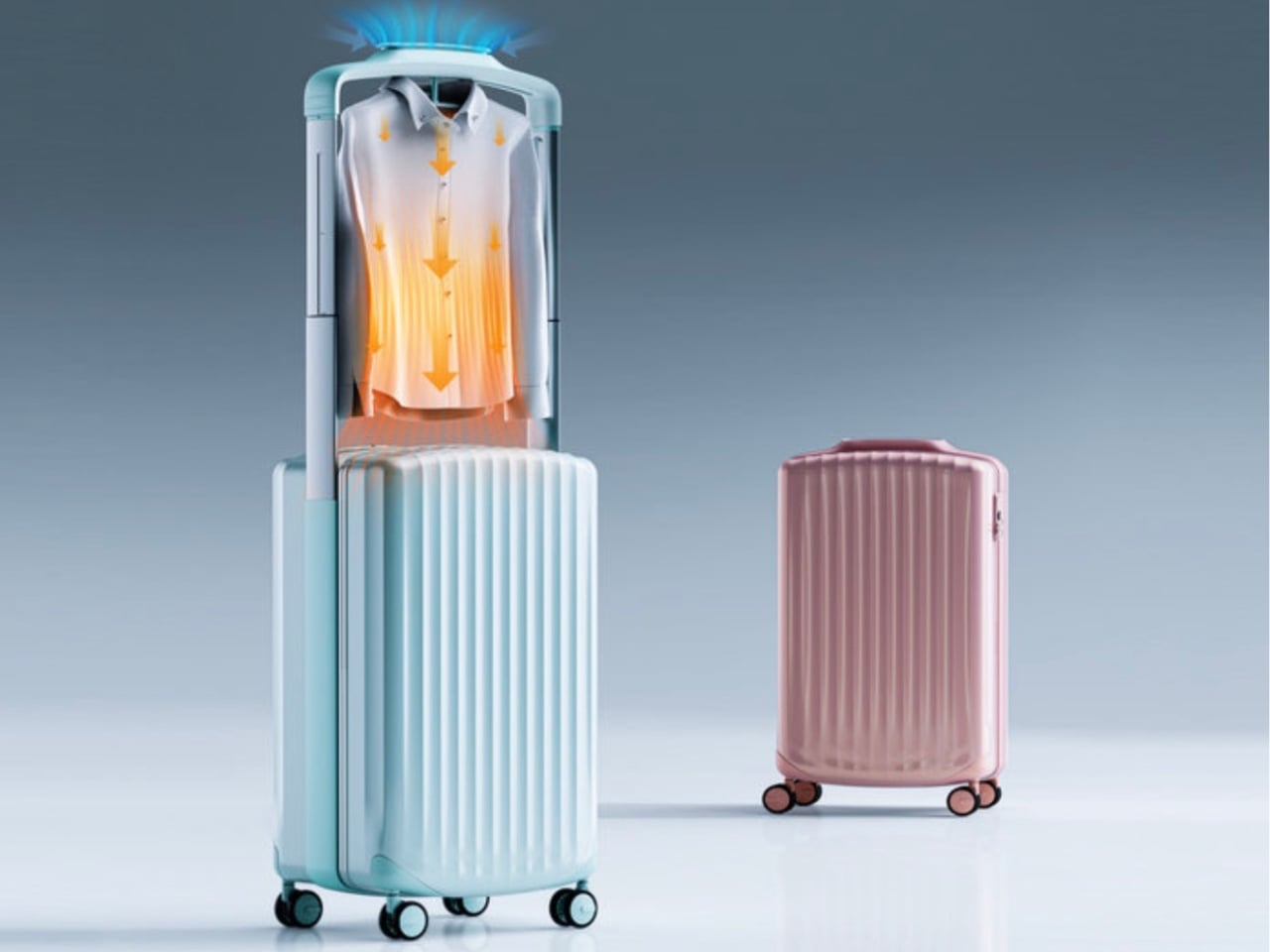
Their concept, a suitcase with an integrated clothes drying system, is the kind of idea that makes you wonder why it took this long. It is a student project that has been picking up recognition on the design awards circuit, and it is not hard to see why. The concept takes a problem that affects virtually every traveler and bakes the solution directly into the luggage itself, no extra gadgets, no separate appliances, no hunting for a laundromat in a foreign city.

Designers: Tongye Wang & Zhichen Hu

Here is how it works. The suitcase operates on a telescoping structure that lets it shift seamlessly between two modes: standard luggage mode and drying mode. When you switch it over, an internal frame extends, built-in hangers fold out so you can hang your clothes, and a control display activates automatically. From there, you can set your preferred drying temperature and time based on whatever fabric you are working with. The internal airflow system distributes heat evenly throughout the compartment so you are not just blasting one side of a shirt while the other stays damp.

The part that genuinely surprised me was the energy source. The suitcase’s wheels contain a kinetic energy conversion system, meaning the act of rolling your luggage through an airport or down a sidewalk actually generates and stores electricity. That stored energy then helps power the drying function, reducing how much you need to rely on an external outlet. It does not eliminate the need for power entirely, but it meaningfully offsets it. For a student concept, that level of systems thinking is notable.

I will be honest: my first reaction to the premise was mild skepticism. Luggage designers have been pitching smart suitcase concepts for years, most of them solving problems that never really felt like problems. A built-in scale. A USB charger. A GPS tracker. These features read more like tech for tech’s sake, and many ended up adding weight and complexity without meaningfully changing the travel experience. This feels different. Wet clothes are a real, recurring frustration, and the solution here is structural rather than gimmicky. It is built into the form of the object, not bolted on as an afterthought.

The visual design reinforces that integration. Wang and Hu went with angular geometric surfaces and concave detailing that give the suitcase a strong, sculptural presence. It does not look like a box with a machine stuffed inside. It looks intentional, like the form and function were designed together from the start, because they were.

Whether this ever makes it to full production is an open question. The gap between an award-winning student concept and a retail product involves manufacturing constraints, safety certifications, cost engineering, and consumer testing that can fundamentally change an original vision. The kinetic energy generation system in particular would need rigorous real-world testing to prove its reliability across different surfaces and travel conditions.

But that is not really the point right now. What Wang and Hu have done is ask a better question about an object most designers stopped questioning decades ago. The suitcase has been a box on wheels for a long time. Treating it as a platform for active problem-solving rather than passive storage opens up a conversation that the travel and luggage industry probably needs to be having more seriously. At the very least, the next time I am draping a wet jacket over a hotel bathroom door, I will know someone is already working on a better answer.

The post Students Just Designed a Suitcase That Dries Your Clothes on the Go first appeared on Yanko Design.
  • ✇Yanko Design
  • G-Shock Just Turned a Japanese Paper Lantern Into Wearable Art
    G-Shock has always known how to make a statement. From its reckless-by-design origins in 1983 to its cult status across military barracks, skate parks, and high-fashion runways, the brand has never really needed to justify itself. It just shows up. But with the new Aka-Chochin collection, built around the DW-5600AKA-4 and DW-6900AKA-4, G-Shock isn’t just showing up. It’s glowing. The concept behind these two watches is, genuinely, one of the more thoughtful design moves I’ve seen from the brand
     

G-Shock Just Turned a Japanese Paper Lantern Into Wearable Art

19 juin 2026 à 15:15

G-Shock has always known how to make a statement. From its reckless-by-design origins in 1983 to its cult status across military barracks, skate parks, and high-fashion runways, the brand has never really needed to justify itself. It just shows up. But with the new Aka-Chochin collection, built around the DW-5600AKA-4 and DW-6900AKA-4, G-Shock isn’t just showing up. It’s glowing.

The concept behind these two watches is, genuinely, one of the more thoughtful design moves I’ve seen from the brand in a while. “Aka-Chochin” translates to “red lantern,” a reference to the traditional paper lanterns that hang outside izakayas, the beloved Japanese taverns where people gather after long days for food, drinks, and the kind of conversation that only happens past 9 p.m. These lanterns, which date back to the early Edo period in the 17th century, weren’t decorative in the precious sense. They were practical and symbolic at once, signaling warmth, welcome, and the specific pleasure of slowing down. Casio took that idea and pushed it into two of its most iconic silhouettes.

Designer: G-Shock

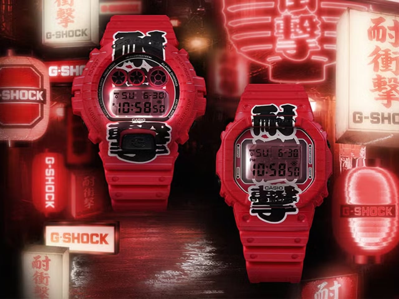
The result is unapologetically red. Not a subtle, wine-at-dinner red. A full-on, stop-what-you’re-doing red that covers the resin case, bezel, and band from top to bottom. On paper, it sounds like a lot. In practice, it earns its confidence. Both watches carry kanji characters down the face of the dial, reading “耐衝撃,” which means “shock resistance,” one of G-Shock’s founding promises. The characters are split between the bezel and the LCD display, and when the LED backlight activates, the two halves complete each other like a puzzle piece lighting up from within. It’s a detail you have to see in person to fully appreciate, and it’s the kind of thing that elevates a colorway from a gimmick to a genuine design choice.

The bezels on both models also feature hot-stamped grooves that mimic the ribbed texture of a paper lantern, and that same motif carries through to the edges of the strap. It’s not subtle, but it is cohesive. G-Shock committed to the bit, and the commitment pays off.

Now, I’ll say this upfront: the Aka-Chochin aesthetic is polarizing. All-red anything tends to divide opinion, and a digital watch in this colorway is not trying to blend in. If your instinct is to gravitate toward muted, understated timepieces, these are probably not for you, and that’s fine. But if you’ve ever wanted a watch that reads as confident and culturally curious at the same time, the DW-5600AKA-4 and DW-6900AKA-4 make a genuinely compelling argument.

The choice of silhouettes is also worth noting. The DW-5600 is essentially G-Shock’s origin story made physical, the square case that started everything, a design so clean and deliberate it has barely needed updating in four decades. The DW-6900 is its more expressive sibling, with that distinctive triple-window dial and wider case presence. Pairing both with the same concept gives collectors and casual buyers alike an entry point, whether you’re drawn to the classic restraint of the 5600 or the bolder graphic energy of the 6900.

At $190 each, neither watch is a budget impulse buy, but it’s not a stretch, either. G-Shock has always occupied that interesting middle ground between functional tool watch and cultural artifact, and the Aka-Chochin collection lands squarely in that territory. You’re not just buying a watch that tells time reliably. You’re buying into a very specific idea about where design, heritage, and streetwear culture converge.

Red lanterns were built to be seen at night, to cut through the dark and draw people in. G-Shock’s interpretation of that idea works for the same reason. Bold doesn’t have to mean reckless. Sometimes it just means knowing exactly what you want to say and saying it clearly, wrist and all.

The post G-Shock Just Turned a Japanese Paper Lantern Into Wearable Art first appeared on Yanko Design.
  • ✇Yanko Design
  • The Fortune Cookie Redesigned With Braille Is Pure Genius
    Fortune cookies are one of those small rituals that carry more weight than they should. You crack it open, fish out the slip of paper, and read whatever odd little prophecy is inside. It’s silly, sure. But it’s also communal. The whole table does it. Everyone compares fortunes, laughs at the vague predictions, and tucks the good ones into their wallets for luck. It’s a shared moment disguised as a throwaway snack. And for visually impaired individuals, that moment stops at the crack of the shel
     

The Fortune Cookie Redesigned With Braille Is Pure Genius

19 juin 2026 à 12:20

Fortune cookies are one of those small rituals that carry more weight than they should. You crack it open, fish out the slip of paper, and read whatever odd little prophecy is inside. It’s silly, sure. But it’s also communal. The whole table does it. Everyone compares fortunes, laughs at the vague predictions, and tucks the good ones into their wallets for luck. It’s a shared moment disguised as a throwaway snack. And for visually impaired individuals, that moment stops at the crack of the shell.

Korean designer Hyerim Yoo’s response to that gap is Fortune Dot, a tactile device that lets visually impaired users independently read a daily fortune in Braille. But describing it that way undersells what makes it genuinely remarkable. Because Yoo didn’t just solve the accessibility problem. She solved it beautifully.

Designer: Hyerim Yoo

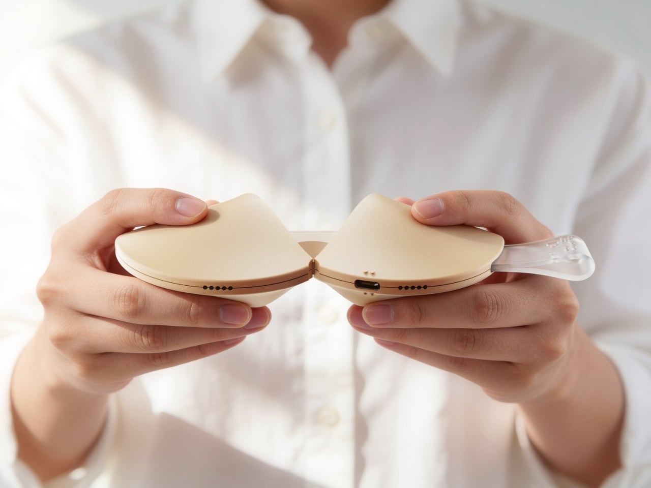
The object is shaped exactly like a fortune cookie. Same rounded form, same warm beige palette, same satisfying heft. A small translucent tab sticks out from the side, the only visual tell that this isn’t actually food. That tab is the “fortune paper,” a design detail so considered it almost makes you laugh. When you pull the two halves apart, the gesture mirrors breaking a real cookie open, and what you find inside is a refreshable Braille display with raised pin cells arranged in neat rows across a recessed panel. The message is there, waiting to be read with your fingertips, exactly as Yoo’s tagline describes it: today’s luck, felt at your fingertips.

The engineering inside is worth pausing on. The exploded views of the device reveal individual Braille cell modules, each capable of raising and lowering their pins to form different characters. It’s a compact, mechanical system tucked into something that looks like it belongs on a dessert plate. The bottom edge carries a USB-C port for charging, nearly invisible from the outside. The whole thing is small enough to drop into a pouch alongside a pair of AirPods and a lip balm, which is apparently exactly what Yoo intended.

What makes this design stand apart from most inclusive design projects, though, is the color system. Fortune Dot comes in three variants named Soft Bake, Signature Bake, and Dark Bake. The names follow the logic of actual cookie baking, and the colors range from a pale cream to a deep chocolate brown. It’s a playful, smart branding decision that does real work. It removes any clinical association from the product. It makes Fortune Dot feel like something you’d want to own and carry, not something assigned to you by necessity.

The branding extends outward into a full identity system. The Fortune Dot logo uses a dot-based pattern that quietly references Braille without spelling it out. It appears on a branded coffee cup in one of the campaign shots, wrapped in wired earbuds, Fortune Dot perched on top. That image alone communicates something most accessible product design never manages to: that this object belongs in the texture of everyday life, not apart from it.

The packaging holds up the same way. A light blue box lid features Braille text running across the top, the Fortune Dot wordmark sitting below it in clean type, and a cutout that reveals the cookie silhouette inside. When you lift the lid, the device sits nested in a cream interior, the translucent fortune tab pointing upward. It’s the kind of unboxing that feels like it was designed to be experienced by touch as much as by sight, which, of course, it was.

I’ve seen a lot of inclusive design work that gets the intention right but misses in execution, products that function well but feel set apart, designed for a category of user rather than a person. Fortune Dot doesn’t feel like that. It feels like something a designer fell genuinely in love with, in the best possible way, the kind of love that shows up in every detail, from the baking-level color names to the translucent paper tab to the way the hinges split open just so. That level of care is rare. When you see it, you notice.

The post The Fortune Cookie Redesigned With Braille Is Pure Genius first appeared on Yanko Design.
Reçu — 16 mai 2026 Techs Design
  • ✇Yanko Design
  • Objects With Opinions: Ronen Kadushin’s Pieces
    There are designers who make beautiful things, and then there are designers who make things that make you think. Ronen Kadushin belongs firmly in the second camp, and his latest collection, Pieces, is proof that a home accessory can be both genuinely useful and quietly subversive. The collection consists of three objects: a candle holder called Echoes, a tealight holder called Reality TV, and a Piggybank. On paper, that sounds like a fairly ordinary lineup for a home accessories range. In pract
     

Objects With Opinions: Ronen Kadushin’s Pieces

16 mai 2026 à 09:20

There are designers who make beautiful things, and then there are designers who make things that make you think. Ronen Kadushin belongs firmly in the second camp, and his latest collection, Pieces, is proof that a home accessory can be both genuinely useful and quietly subversive.

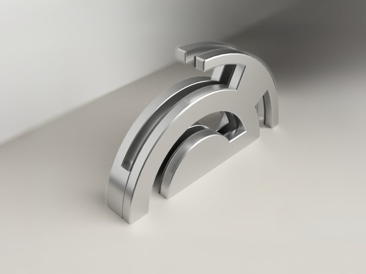
The collection consists of three objects: a candle holder called Echoes, a tealight holder called Reality TV, and a Piggybank. On paper, that sounds like a fairly ordinary lineup for a home accessories range. In practice, it’s anything but. The Pieces collection is an elegantly formed, humorously thought-provoking group of home accessories that highlight the tension between function and cultural narrative.

Designer: Ronen Kadushin

Each piece starts life as a flat sheet of laser-cut stainless steel, executed with Kadushin’s signature Twist-Hinge detail, making them easy and intuitive to bend by hand. They invite you to engage with the designs and co-create pieces that are an aesthetic statement with an edgy commentary. It’s a deliberate choice, not a shortcut. By asking you to participate in the assembly, Kadushin is making a point about who gets to be part of the creative process. You’re not just buying a finished object; you’re completing it.

That philosophy runs through everything he does. Kadushin is a pioneer of Open Design, freely sharing his designs to promote creativity, personal expression, and a positive social and economic impact. He embraces a “from the machine to the customer” approach, where extra manual processes and finishes are minimal, with pieces self-produced in Berlin in small-batch runs from high-grade stainless steel. There’s no bloated supply chain, no mass-market compromise. Just precision fabrication and a designer who has thought very carefully about what he wants his objects to communicate.

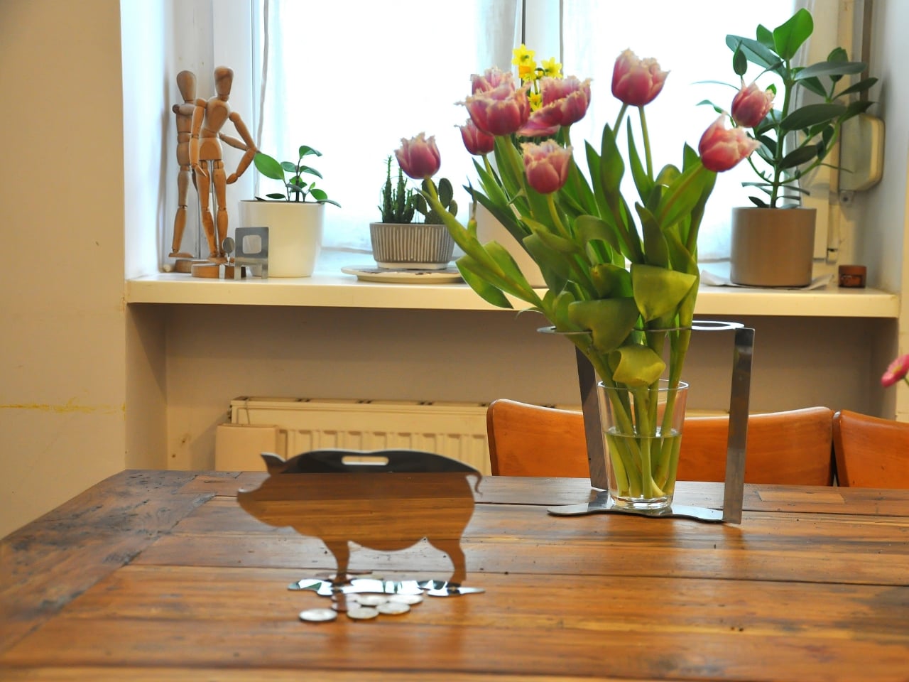
And communicate they do. The Piggybank is perhaps the most pointed piece in the collection. A traditional object redesigned to reflect a reality where saving is an illusion, it wears its cynicism openly. The pig is rendered as a flat stainless steel silhouette with a coin slot at the top, but there’s no belly to hold anything. Your coins rest on the surface. It’s funny, and it’s bleak, and it manages to be both of those things at once in the way that only good design pulls off. At a time when most people are watching their savings get swallowed by inflation, putting this on your shelf feels less like irony and more like cathartic honesty.

The Reality TV tealight holder takes a different angle. Shaped like a boxy, retro television set, it frames a tealight where the screen should be. When the flame is lit, you’ve got a broadcast. “Reflecting reality live, 24/7.” The concept is sharp without being heavy-handed. It makes you smirk, and then, a moment later, makes you think about the fact that we genuinely do stare at glowing rectangles all day as a form of comfort. Having a warm, flickering version of that sitting on your dinner table feels like Kadushin winking at us all.

Echoes, the candle holder, is the most sculptural of the three. A nuanced sculptural object echoing iconic 60s and 70s aesthetics with a contemporary edge, it’s the kind of object that earns a second and third look. The stacked, interlocking forms feel almost architectural, like a detail pulled from a midcentury design catalogue and rebuilt in stainless steel. Placed on a shelf without a candle, it still looks like it belongs in a gallery. With one lit, it earns its keep.

What ties Pieces together is the refusal to be decorative for decoration’s sake. Kadushin’s work is sculptural and communicates clever wit and free expression, and he designs user-assembled pieces that are an invitation to enjoy and participate in the creative process. The objects are funny, but they’re not novelty items. They’re precise, considered, and built from high-grade stainless steel that will still look good long after the trend cycle has moved on.

If you’re the kind of person who thinks about what your home objects say about you, and more and more people are, then Pieces is a collection worth paying attention to. Good design doesn’t just fill space. At its best, it holds an opinion. Kadushin’s does both.

The post Objects With Opinions: Ronen Kadushin’s Pieces first appeared on Yanko Design.
  • ✇Yanko Design
  • Woven by Hand in the Philippines, Sold in Milan
    Most lamps just sit there. They do their job, emit their light, and fade into the background of a room. Mirei Monticelli’s lamps are the kind you keep looking at. The Milan-based Filipina designer has built her practice around a single material: banaca, a woven textile made from the fibers of the banana-abaca plant, harvested by hand on the island of Catanduanes in the Bicol region of the Philippines. It’s not exactly the kind of material you’d expect to find at the center of a glossy Milanese
     

Woven by Hand in the Philippines, Sold in Milan

15 mai 2026 à 18:30

Most lamps just sit there. They do their job, emit their light, and fade into the background of a room. Mirei Monticelli’s lamps are the kind you keep looking at.

The Milan-based Filipina designer has built her practice around a single material: banaca, a woven textile made from the fibers of the banana-abaca plant, harvested by hand on the island of Catanduanes in the Bicol region of the Philippines. It’s not exactly the kind of material you’d expect to find at the center of a glossy Milanese design studio, and that’s exactly the point.

Designer: Mirei Monticelli

Monticelli studied at Politecnico di Milano, earning her Masters in Design and Engineering, but her roots have always pulled her back to the Philippines. Her mother, celebrated fashion designer Ditta Sandico, actually pioneered the banaca textile itself, a blend of banana and abaca fibers that is both remarkably durable and incredibly malleable. Working with renowned rattan designer Kenneth Cobonpue also shaped her early understanding of how natural, traditional materials can carry enormous aesthetic power. In 2019, she founded Studiomirei, and by the end of that same year, her Nebula lamp had already won the Salone Satellite Award at Milan Design Week.

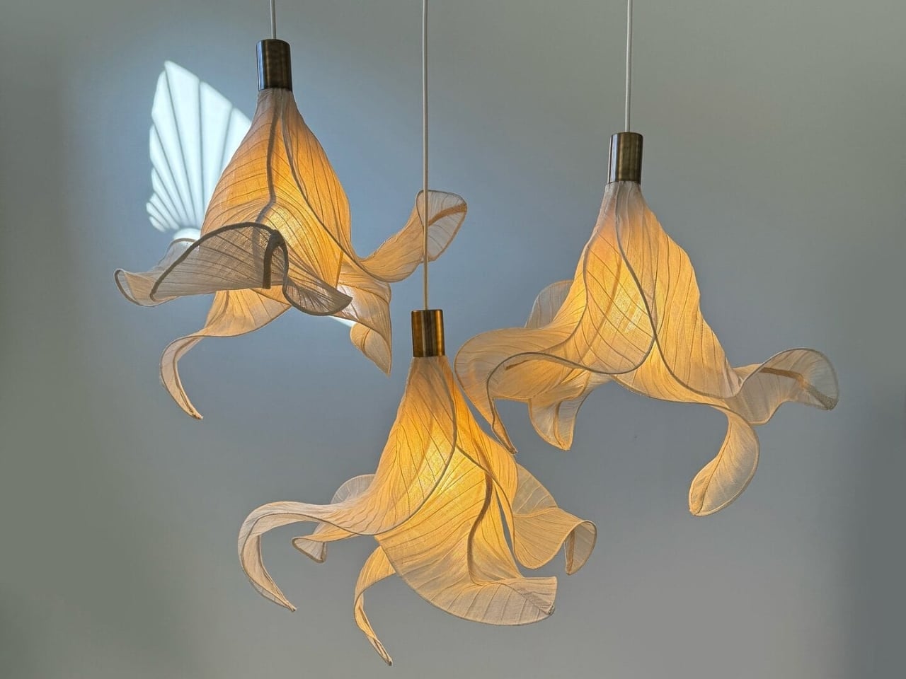
Since then, she has used banaca almost exclusively for her lighting pieces, and the results are genuinely hard to categorize. They hover somewhere between sculpture and utility, between craft object and fine art. When light passes through the woven fibers, the pieces seem to breathe. The way the material catches and filters illumination gives each lamp a softness you don’t usually expect from a functional object. The forms manage to feel both ancient and completely contemporary.

The newest work carries that same visual language forward. Biomorphic shapes, swells and folds that recall sea creatures, coral reefs, and natural formations, seem to suspend mid-motion. The organic quality of banaca lends itself to this perfectly. Unlike glass or metal, the material doesn’t impose rigidity; it holds form while still suggesting movement. Looking at them, you get the sense that if you turned the light off, the shape might slowly release and unfold.

The material story goes deeper than aesthetics, and it’s the part that tends to get overlooked in design coverage. Each lamp is the result of an entire chain of human hands. Farmers in Bicol harvest the banana-abaca trunks by hand when the plants reach maturity. The fibers are extracted, brought to the community, and woven by artisans using techniques passed down through generations. By the time a finished lamp reaches a room in Milan, it carries the labor and heritage of an entire province in the Philippines.

Monticelli has said explicitly that her studio works at the intersection of sustainable materials, craft, technology, and community empowerment. It sounds like a mission statement, and maybe it is, but the work itself proves it isn’t just positioning. The banaca lamps are not mass-produced. They are made to order, with lead times that reflect the reality of handcraft. Customizable in size and color, they are objects you commission with intention rather than objects you add to a cart.

A real tension exists in sustainable luxury design between the genuine and the performative, and it’s worth naming. Many brands talk about ethical sourcing while scaling in ways that hollow out what made the material meaningful in the first place. Monticelli’s studio, still rooted in direct relationships with the farmers and weavers of Bicol, has navigated that tension well. The limited production isn’t a constraint; it’s the whole point.

The design world loves a good material story, and banaca has a genuinely good one. A plant grown on a remote Philippine island, harvested by hand, woven by a community of artisans, shaped by a designer navigating two cultures, and ultimately glowing softly in rooms that could not be further from the landscape that produced it. That kind of distance, traveled with integrity, is what turns a lamp into something worth writing about.

The post Woven by Hand in the Philippines, Sold in Milan first appeared on Yanko Design.
Reçu — 12 mai 2026 Techs Design
  • ✇Yanko Design
  • Alberto Essesi Just Designed the Lamp That Celebrates Mistakes
    If you’ve ever assembled furniture, built a shelf, or wired anything with your own two hands, you know the feeling. You step back, you look at your work, and then you see it. That one thing. The screw facing the wrong way. The panel installed backwards. The “how did I miss that?” moment that you either have to fix or quietly learn to live with. Alberto Essesi, an L.A.-based industrial designer, decided to immortalize exactly that feeling, and then turned it into a lamp. The Oops lamp is precise
     

Alberto Essesi Just Designed the Lamp That Celebrates Mistakes

12 mai 2026 à 10:20

If you’ve ever assembled furniture, built a shelf, or wired anything with your own two hands, you know the feeling. You step back, you look at your work, and then you see it. That one thing. The screw facing the wrong way. The panel installed backwards. The “how did I miss that?” moment that you either have to fix or quietly learn to live with. Alberto Essesi, an L.A.-based industrial designer, decided to immortalize exactly that feeling, and then turned it into a lamp.

The Oops lamp is precisely what it sounds like. A hanging fixture that, at first glance, looks like something went sideways during installation. The design inverts the expected, which is Essesi’s own phrasing, and it delivers on that premise with clean, understated confidence. It doesn’t shout. It doesn’t over-explain itself. It just makes you look twice, register the joke, and then probably smile.

Designer: Alberto Essesi

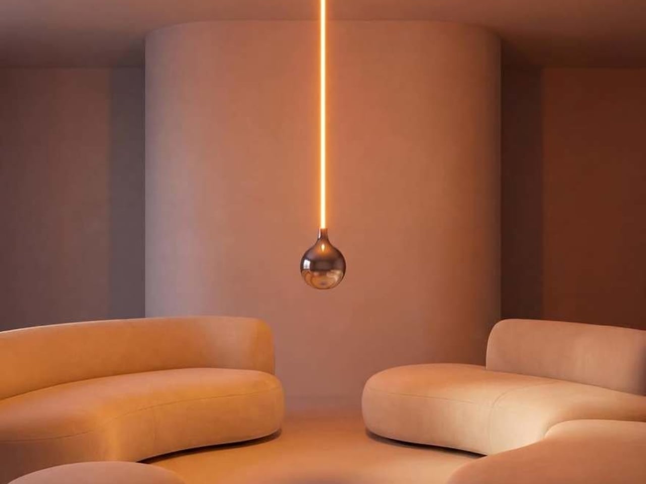
Look at it long enough and the concept becomes delightfully clear. A slender, glowing rod descends from a ceiling mount, warm light running its full length like a lit fuse. At the very bottom sits a polished chrome globe, round and reflective, the universal shape of a light bulb. Except the globe isn’t glowing. The rod is. The light is coming from exactly where you wouldn’t expect it, and the bulb, the part that’s supposed to be the whole point, is just sitting there at the bottom looking beautiful and slightly confused. That’s the joke. That’s also, somehow, the most elegant part of the entire object.

The chrome finish on the globe isn’t incidental. It picks up the amber warmth of the glowing rod above it and bounces it softly into the room, so the globe contributes light without technically being a light source. It’s a small design decision that could have easily been an afterthought, but it ends up being one of the most considered details in the whole piece. The lamp works as a room object even before you process the humor in it.

Essesi has said this idea has been rattling around in his head for years. “This has been an idea I’ve had for a few years and always laugh when I think about it,” he shared when unveiling the design. That kind of creative patience is rare, and it shows in the final execution. The Oops lamp doesn’t feel rushed or gimmicky. It feels like exactly the right amount of thought went into it, no more, no less. Sometimes a concept just needs time to ripen before it’s ready to exist in the world.

Design humor is genuinely hard to pull off. Most attempts either try too hard or land too soft. The joke gets buried under layers of irony, or it gets explained to death until any charm it originally had is long gone. The Oops lamp sidesteps all of that. The humor is baked into the form itself. You don’t need a placard or a press release to get it. You just get it. That’s the mark of a strong design concept: the idea communicates itself without any assistance.

Essesi didn’t reach for something ornate or architecturally complex to subvert. He took the most ordinary object and made one small, deliberate deviation from it. That restraint is what makes the whole thing work. The joke only lands because the rest of the design plays it completely straight. The rod is precise. The globe is perfectly spherical. The ceiling mount is minimal and clean. Every element is serious, which makes the absurdity of the overall form land even harder.

A large version has also been added to the mix, which tells me Essesi is taking this seriously as a product concept and not just a portfolio piece. No production plans have been officially confirmed yet, but that feels like a matter of when rather than if. A design this instantly readable and this universally relatable has a built-in audience. People are genuinely tired of objects that require context. They want things that communicate the moment they enter a room.

That’s the real conversation the Oops lamp is opening. It’s a small but clear reminder that good design doesn’t have to be earnest all the time. It can have a point of view. It can be a little funny. A lamp named Oops, made by a designer who let the idea sit for years until it was truly ready, might be the most quietly optimistic object to come out of this year.

The post Alberto Essesi Just Designed the Lamp That Celebrates Mistakes first appeared on Yanko Design.
  • ✇Yanko Design
  • Hario’s V60 Gets Its First Real Upgrade in 20 Years for $23
    The original Hario V60 is the kind of object that earns its own mythology. Released in 2004, it became the face of the third-wave coffee movement: a simple cone of heat-resistant glass (or ceramic, or plastic, depending on how serious you are) that turned the morning cup into a ritual of patience and precision. Baristas loved it. Coffee nerds obsessed over it. And somewhere along the way, it became as recognizable as a kitchen object can get without appearing on a museum shelf. That legacy make
     

Hario’s V60 Gets Its First Real Upgrade in 20 Years for $23

12 mai 2026 à 09:20

The original Hario V60 is the kind of object that earns its own mythology. Released in 2004, it became the face of the third-wave coffee movement: a simple cone of heat-resistant glass (or ceramic, or plastic, depending on how serious you are) that turned the morning cup into a ritual of patience and precision. Baristas loved it. Coffee nerds obsessed over it. And somewhere along the way, it became as recognizable as a kitchen object can get without appearing on a museum shelf.

That legacy makes the V60 Dripper NEO an interesting proposition. Hario could have left well enough alone. Instead, they spent two years quietly engineering a redesign that touches the one part of the V60 nobody talks about but everyone deals with: the ribs.

Designer: Hario

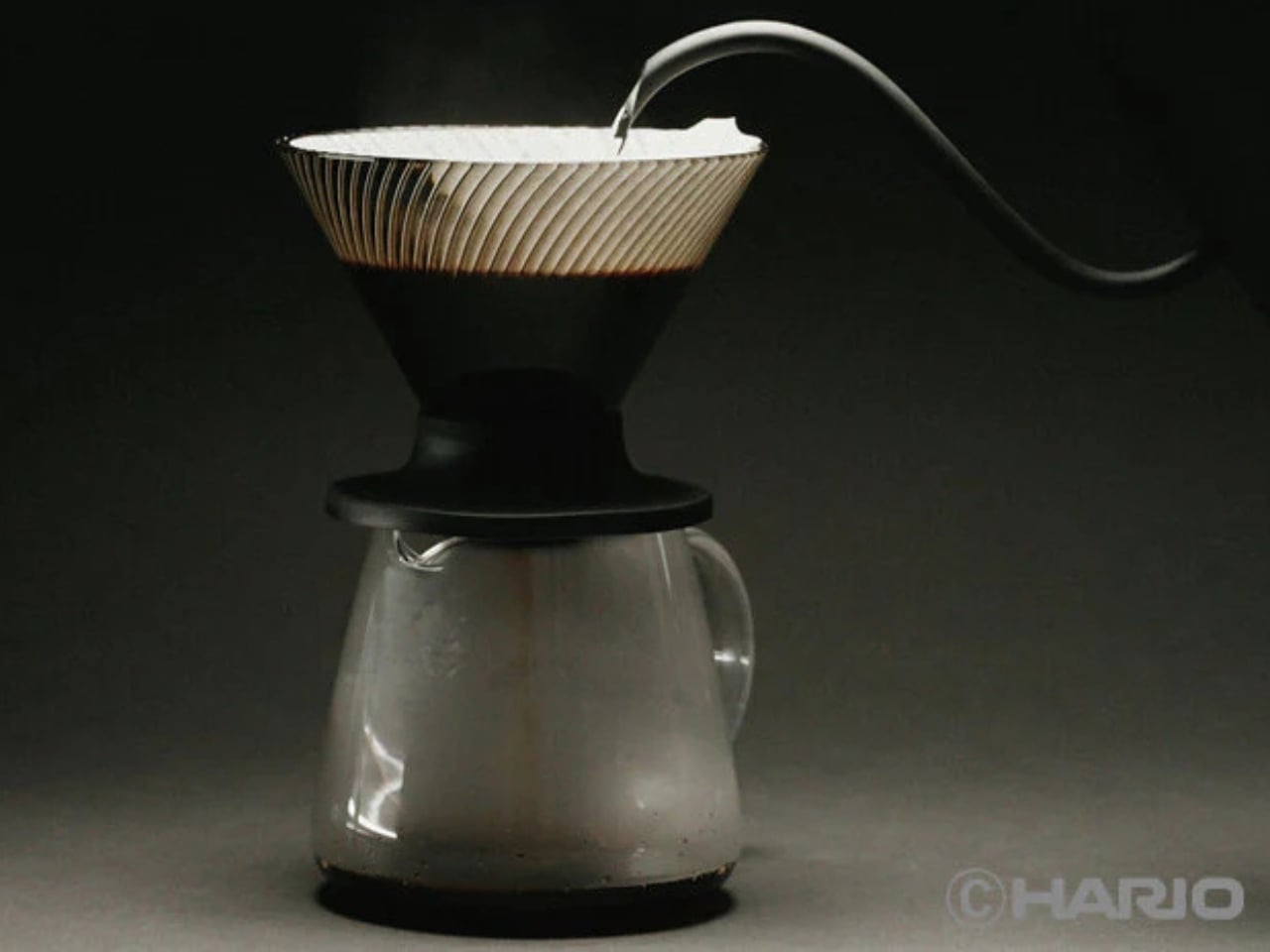
The original V60’s spiral ribs are the reason it works the way it does. They create space between the paper filter and the cone wall, allowing air to escape as water flows through. The result is a controlled extraction, but one that demands attention. Get your grind wrong, pour too fast, let your focus wander, and the brew either stalls or races past the point of no return. The V60 has always been a beautiful, slightly unforgiving thing.

The NEO changes that equation with a genuinely clever structural update. Instead of a single spiral rib pattern, it introduces 72 ultra-fine vertical ribs along the upper walls of the cone, which then converge into 9 deeper ribs near the base. This dual-zone design guides water evenly down the entire wall before accelerating it through the outlet. The effect is a faster, more uniform extraction that minimizes bitterness from water lingering too long in contact with the grounds. The cup you get out the other end is cleaner, sweeter, and more vibrant, with a balanced acidity that doesn’t tip into sourness.

Two years of testing went into getting this right. Hario’s engineers ran exhaustive trials on rib counts, angles, and flow dynamics before landing on this configuration. The fact that they filed a utility model patent on the structure suggests they believe it is genuinely novel, not just cosmetically different.

The material choice is also worth noting. The NEO is made from Tritan resin, a lightweight, high-clarity plastic that handles heat retention better than standard plastic alternatives. It keeps the brewing temperature more stable from the first pour to the last, which matters more than people think. Temperature consistency is one of those variables that separates a good cup from a great one, and the NEO addresses it without requiring you to do anything differently.

For anyone already embedded in the V60 ecosystem, the compatibility factor is a quiet win. The NEO works with all existing V60 switch bases, so you don’t have to rebuild your setup from scratch. It comes in two sizes, both made in Japan, and retails for around $23.50, which is an accessible price point for a piece of equipment that functions this thoughtfully.

Not everyone is convinced, though. Since hitting the market, the NEO has sparked a genuinely divided response from the coffee community. Users describe the brew as cleaner and more tea-like, which sounds appealing until you realize that some people loved the original V60 precisely for its acidic punch and intensity. One Reddit user put it plainly: the NEO presents coffee “differently,” not necessarily better. For experienced brewers who spent years dialing in their pour technique to coax specific flavors from the classic cone, the NEO’s smoother, more forgiving nature feels less like an upgrade and more like a personality change. That’s a fair criticism. Hario didn’t make a bad V60. They made a different one, and that distinction is exactly what has the coffee internet divided.

Pour-over coffee has always had a slight gatekeeping problem. The ritual appeals to people who love it precisely because it requires care, but that same learning curve turns off anyone who just wants a good cup without turning their kitchen into a science experiment. The V60 NEO doesn’t eliminate that ritual. It just makes the margin for error a little more forgiving, which means more people get to enjoy the result without years of practice behind them.

The original V60 deserved its legacy. The NEO earns its own, just a slightly different one.

The post Hario’s V60 Gets Its First Real Upgrade in 20 Years for $23 first appeared on Yanko Design.
Reçu — 10 mai 2026 Techs Design
  • ✇Yanko Design
  • The Roomba Guy Just Built a Robot Pet You Might Actually Love
    If you’ve ever watched your Roomba bump helplessly into a chair leg for the third time and thought, “I deserve better from my robots,” you’re not alone. And apparently, neither did Colin Angle. The co-founder of iRobot, the man who essentially put a hockey puck-shaped vacuum in millions of homes, left the company in 2024 with a new question rattling around in his head: what if a robot could actually feel like it cares about you? The answer is the Familiar, the first prototype from his new start
     

The Roomba Guy Just Built a Robot Pet You Might Actually Love

9 mai 2026 à 18:30

If you’ve ever watched your Roomba bump helplessly into a chair leg for the third time and thought, “I deserve better from my robots,” you’re not alone. And apparently, neither did Colin Angle. The co-founder of iRobot, the man who essentially put a hockey puck-shaped vacuum in millions of homes, left the company in 2024 with a new question rattling around in his head: what if a robot could actually feel like it cares about you? The answer is the Familiar, the first prototype from his new startup, Familiar Machines & Magic. And it is not your average robot.

Picture a creature somewhere between a soft-eared dog and a round, slightly abstract bear. It has four legs, huge paws, and doe eyes that make it immediately charming in a way that no Roomba ever attempted to be. It’s furry, expressive, and was designed with the help of former Disney Imagineers, which explains why it looks like it belongs in an animated feature rather than a tech showcase. The Familiar has 23 degrees of freedom, meaning it can wiggle its ears, tilt its head, and wag a small nub of a tail with the kind of fluidity that feels less mechanical and more… alive. Its coat is touch-sensitive, built specifically to encourage physical interaction between you and it.

Designer: Familiar Machines & Magic

It also doesn’t talk. That detail feels deliberate and, to me, very smart. Voice assistants have trained us to think of robots as tools we command. The Familiar is going for something completely different. It’s designed to read your tone of voice, your body language, your overall energy, and respond accordingly. Angle calls it “Consumer Physical AI,” and while the label sounds like something off a product white paper, the idea behind it is genuinely compelling.

The name itself is worth noting. A “familiar” in folklore refers to the supernatural animal companion of a witch or magical figure, a creature bonded to a person not through ownership but through genuine connection. Angle’s team chose that name deliberately, and I think it sets the tone for what they’re trying to build. The goal isn’t to sell you a novelty gadget. It’s to create a new kind of relationship between humans and machines, one built on trust, attentiveness, and something approaching care.

Now, I’ll be upfront: I have feelings about this. Part of me finds it genuinely beautiful as a design concept. The Familiar was clearly approached the way good industrial design should be, with deep thought about how an object makes you feel, not just what it does. The choice to make it animal-like rather than humanoid is interesting, too. There’s far less of the uncanny valley unease that tends to follow humanoid robots around, and more of the universal warmth that most people already extend toward animals.

But another part of me wonders about the emotional stakes here. We’re already watching people form attachments to AI chatbots. A touch-sensitive, furry, expressive robot that mirrors your emotional state is a much more potent version of that. Angle has said he wants it to feel like the machine actually cares about him. That’s a lovely vision. It’s also a design brief that puts enormous responsibility on the creators to get it right, because the flip side of emotional bonding is emotional dependence.

Still, I’d be lying if I said the Familiar didn’t make me curious in the best possible way. The prototype images are almost disarmingly sweet. It looks like something you’d want sitting on the couch next to you while you read, or settled quietly in the corner while you work. If any robot was ever designed to move through your life rather than just function within it, this might be it.

The Familiar is still in the prototype stage, with no confirmed price or release date. But as debut concepts go, it’s a strong one. Whether or not it ever makes it into our homes, it raises questions about what we actually want from the machines we live with. And those questions feel well overdue.

The post The Roomba Guy Just Built a Robot Pet You Might Actually Love first appeared on Yanko Design.
  • ✇Yanko Design
  • UNO and Vrbo Are Renting Vacation Homes for $4 a Night
    Brand collaborations are everywhere these days, but every once in a while, one lands so perfectly that you have to stop and appreciate the logic behind it. The UNO x Vrbo partnership is exactly that kind of collab. Not because it’s flashy or trying to be something it’s not, but because it genuinely makes sense. Starting May 15, Mattel and Vrbo are opening bookings for six limited-time vacation home stays built entirely around the spirit of game night. Six properties across the U.S., two tiers o
     

UNO and Vrbo Are Renting Vacation Homes for $4 a Night

9 mai 2026 à 16:45

Brand collaborations are everywhere these days, but every once in a while, one lands so perfectly that you have to stop and appreciate the logic behind it. The UNO x Vrbo partnership is exactly that kind of collab. Not because it’s flashy or trying to be something it’s not, but because it genuinely makes sense.

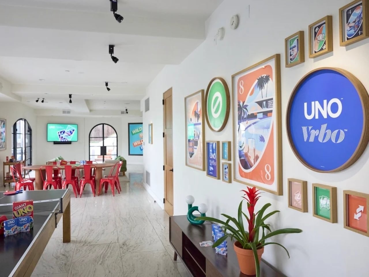
Starting May 15, Mattel and Vrbo are opening bookings for six limited-time vacation home stays built entirely around the spirit of game night. Six properties across the U.S., two tiers of experience, and one very clever price point: $4 per night. That last part is a deliberate nod to UNO’s iconic Draw 4 card (which can make or break relationships), and it’s the kind of detail that makes you smile whether you’re a brand person or not.

Designers: UNO x Vrbo

The stays are divided into two experiences. At the top end sit the two “Wild Card” homes, located in the Hollywood Hills and Texas Hill Country. These are the full production: UNO-themed décor, organized game nights, and an in-home dining experience. They’re designed for groups of up to 10 guests who want the whole immersive package, the kind of weekend that’s more curated getaway than casual vacation. Then there are the four “Play It Your Way” stays in Winter Park, Colorado; Palm Desert, California; Panama City Beach, Florida; and Atlanta, Georgia. These are a little more relaxed, but still come with a co-branded UNO x Vrbo Welcome Kit, a game room, and either a pool or hot tub. Essentially, they’re the version for people who want the fun without the fuss. All six properties are bookable for one three-night stay, Friday to Monday, on a first-come, first-served basis. Bookings open May 15 at 1 PM ET. I’ll be honest: at $4 a night, they are going to go fast.

What makes this collaboration genuinely interesting, beyond the price tag, is the attention that went into the actual product. A custom UNO deck was commissioned for this collab, illustrated by Pietari Posti, with artwork inspired by travel destinations and vacation themes. It also comes with an exclusive rule called the “Vacation Rental Swap,” which lets players swap hands with anyone at the table. It’s a small thing, but it shows that the two brands weren’t just slapping logos on a vacation home and calling it a day. They put real creative thought into what the collaboration could actually feel like to experience.

That’s the part that tends to separate a genuinely good brand collab from a lazy one. Anyone can license a logo and stick it on merchandise. Fewer brands take the time to ask what the experience should feel like from the inside, and build something around that answer. UNO, at its core, is a game about chaos and connection. You play it with people you like and you inevitably end up yelling at them. It’s social in the most fundamental way. Vrbo, meanwhile, is about giving groups a private space to actually be together without the interruptions of a hotel. Put those two things in the same room and you get something that doesn’t need to be explained.

It also helps that this collab is part of a growing relationship between Mattel and Expedia Group, Vrbo’s parent company. Mattel already appeared in an Expedia Super Bowl commercial earlier this year through the Barbie universe. So this isn’t a one-off stunt; it reads more like two brands actively figuring out how to build something together over time. For anyone who grew up playing UNO at a kitchen table, there’s an undeniable nostalgia pull here. But the campaign doesn’t lean into nostalgia as a crutch. It uses the game’s identity as a starting point and builds forward from it, which is ultimately why it works. The best collaborations don’t just remind you of something you loved. They give you a new reason to love it again.

The post UNO and Vrbo Are Renting Vacation Homes for $4 a Night first appeared on Yanko Design.
Reçu — 8 mai 2026 Techs Design
  • ✇Yanko Design
  • Your Knife Block Has No Business Looking This Good
    Most kitchen accessories come with an unspoken agreement: you accept that they look utilitarian, and in return, they do their job quietly in the background. Knife holders, in particular, have always been the least glamorous residents of the countertop. The wooden block is fine. The magnetic wall strip is practical. But neither has ever made anyone stop and stare. Samyuktha S’s Eclipse Edge concept breaks that agreement entirely, and I’m genuinely glad it does. The Eclipse Edge is a magnetic kni
     

Your Knife Block Has No Business Looking This Good

8 mai 2026 à 12:20

Most kitchen accessories come with an unspoken agreement: you accept that they look utilitarian, and in return, they do their job quietly in the background. Knife holders, in particular, have always been the least glamorous residents of the countertop. The wooden block is fine. The magnetic wall strip is practical. But neither has ever made anyone stop and stare. Samyuktha S’s Eclipse Edge concept breaks that agreement entirely, and I’m genuinely glad it does.

The Eclipse Edge is a magnetic knife holder inspired by the geometry of a lunar eclipse, specifically the moment when Earth aligns between the sun and moon, casting that iconic half-shadow silhouette into the sky. That form, an abstracted arc built from layered, concentric half-circles, becomes the entire design language here. Looking at it on a countertop, you wouldn’t immediately guess what it does. You’d probably assume it was a sculpture. That confusion is precisely the point.

Designer: Samyuktha S

Samyuktha’s design brief was direct: create a kitchen storage accessory that bridges functional utility and structural statement decor. The goal was to reimagine a standard tool organizer as a decorative landmark within the home, elevating it to a high-end sculptural piece. She achieved this without resorting to the usual tricks of adding color or unconventional materials. The Eclipse Edge is sand-casted aluminum with a hand-carved finish, and it leans entirely into that material’s dual nature: raw and refined at the same time.

The mechanics are equally considered. Hidden magnetic sheets inside the form hold knives parallel to the surface, which means blades are secured safely without any visible hardware or slots cutting into that clean silhouette. The oil and waterproof protective layering is built into the construction. Multiple knife sizes are accommodated without compromising the holder’s structural integrity or visual lines. It’s the kind of detail work that separates a pretty sketch from a design that actually holds up under scrutiny.

The ideation pages on Samyuktha’s Behance project tell you a lot. There are dozens of iterations, circular forms, crescent variations, abstracted lunar shapes explored and discarded before arriving at the stacked arch that became the final concept. Getting from a celestial reference to something that can hold a chef’s knife at the right angle and still look like contemporary sculpture takes a specific kind of problem-solving patience. The sketches make clear that nothing was accidental.

A physical prototype was also produced through aluminum sand casting using an MDF pattern, which means this design was tested in the real world, not just rendered beautifully and left to live on a screen. Seeing the actual object in photos alongside actual kitchen knives brings the concept into sharp focus. It looks grounded and serious in person, the kind of object that would hold its own on any well-styled countertop without asking for too much attention.

I do think about the practical day-to-day reality of owning something like this. Keeping polished aluminum pristine in a working kitchen takes effort, and the hand-carved finish, while gorgeous, would need care. But that’s not necessarily a flaw in the design. High-end kitchen objects have always required a little more commitment. A copper pot needs polishing. A cast iron pan needs seasoning. The Eclipse Edge feels like it belongs in that same category of objects you choose deliberately and tend to over time.

The broader conversation around kitchenware has been shifting for a while now. People increasingly want their kitchen tools to reflect how they live and what they care about, not just what they cook. The Eclipse Edge speaks to that shift with real confidence. It doesn’t apologize for being beautiful. It doesn’t hide its utility behind a costume. It just quietly insists that a knife holder can be, at the same time, an object worth looking at. Samyuktha S’s Eclipse Edge is a concept for now, but it’s the kind of concept that feels ready. The thinking is there. The craft is there. The prototype is there. Sometimes the only thing standing between a student project and a product is someone willing to bet on it.

The post Your Knife Block Has No Business Looking This Good first appeared on Yanko Design.
Reçu — 3 mai 2026 Techs Design
  • ✇Yanko Design
  • Forget Smarter AI, This Robot Thinks Presence Is the Point
    We keep building AI to do more. More answers, more speed, more certainty. Designer Mehrnaz Amouei looked at that trajectory and asked a fundamentally different question: what if we built AI to be more present instead? The result is POCO, a soft robotic companion that might be one of the most quietly radical design concepts to emerge in recent years. It doesn’t talk over you, doesn’t flood you with information, and it doesn’t pretend to know things it doesn’t know. POCO sits with you. Literally.
     

Forget Smarter AI, This Robot Thinks Presence Is the Point

2 mai 2026 à 16:45

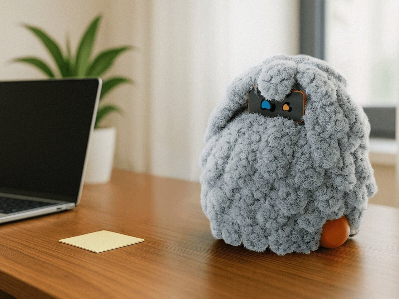
We keep building AI to do more. More answers, more speed, more certainty. Designer Mehrnaz Amouei looked at that trajectory and asked a fundamentally different question: what if we built AI to be more present instead? The result is POCO, a soft robotic companion that might be one of the most quietly radical design concepts to emerge in recent years. It doesn’t talk over you, doesn’t flood you with information, and it doesn’t pretend to know things it doesn’t know. POCO sits with you. Literally.

At its core, POCO is a soft, tactile object that pairs with a smartphone, which serves as its computational brain and face. A soft textile body wraps around the device, transforming rigid, glass-and-metal technology into something that moves, breathes, and gestures in response to your presence. Together, they create something that sits somewhere between object, creature, and companion, and that deliberate ambiguity is very much intentional. You’re not quite sure what to call it, and that’s entirely the point.

Designer: Mehrnaz Amouei

Amouei developed POCO through research at the University of Illinois at Chicago, grounding the project in studies on loneliness and trust. Her findings indicated that people don’t actually want AI that projects certainty or control. They want availability and responsiveness. They want something that shows up without taking over. From those findings came the concept of “constructive interdependence,” a design philosophy where POCO’s limitations aren’t bugs to be patched but features embedded directly into the interaction model itself. The robot communicates what it can and cannot do through its behavior and physical states, which is a level of honesty you don’t often get from technology that typically overpromises and underdelivers.

I think that matters more than it might initially seem. The dominant conversation around AI right now is almost entirely about expansion: more capability, more integration, more autonomy. POCO pushes back on that without being preachy about it. It reframes the question of what good AI design actually looks like, and the answer it offers isn’t “smarter,” it’s “more trustworthy.” That is a genuinely different value system, and it feels overdue.

The sustainability dimension is also worth paying attention to. Rather than introducing new hardware and generating more electronic waste, POCO repurposes a device most people already own. That decision isn’t just a nice bonus; it’s built into the concept from the start, aligning with the UN’s Sustainable Development Goals around mental well-being and responsible consumption. In product design terms, that means the project was developed with a broader cultural and environmental context in mind, not just a user persona sitting in a lab.

Physically, POCO responds to touch, movement, and environmental cues. It adapts to a user’s preferences while maintaining a consistent identity, which is a surprisingly nuanced balance to strike in any product, let alone one sitting at the intersection of soft robotics and emotional design. Because interaction happens through touch rather than voice commands or screen taps, there’s an intentional slowing down embedded in the experience. You can’t rush a tactile exchange the same way you can type faster or speak louder. That shift from speed to presence feels like a meaningful counter-proposal to how most tech is currently designed. We’ve grown so accustomed to interfaces that demand our attention that a device asking only for our company reads almost as radical.

POCO has already earned an Honorable Mention from the International Design Awards and drawn coverage from major design publications. Whether it ever moves into consumer production remains an open question. But as a design statement, it’s doing exactly what the best concept work should: prompting us to reconsider what we actually want from the technology we live with, and whether expanding capability was ever really the right goal. Maybe the most interesting AI isn’t the one that knows the most. Maybe it’s the one that knows when to just stay close.

The post Forget Smarter AI, This Robot Thinks Presence Is the Point first appeared on Yanko Design.
  • ✇Yanko Design
  • McDonald’s New Drinks Come With a $58 Fashion Accessory
    Fast food collaborations have a way of catching me off guard at this point. I’ve accepted that pretty much any brand can team up with pretty much any designer, and the result will land somewhere between genuinely inspired and deeply confusing. But when McDonald’s announced a partnership with New York-based designer Susan Alexandra to launch a collection of hand-beaded drink carriers, I had to stop scrolling. The timing is intentional. McDonald’s is rolling out its first-ever lineup of Refresher
     

McDonald’s New Drinks Come With a $58 Fashion Accessory

2 mai 2026 à 09:20

Fast food collaborations have a way of catching me off guard at this point. I’ve accepted that pretty much any brand can team up with pretty much any designer, and the result will land somewhere between genuinely inspired and deeply confusing. But when McDonald’s announced a partnership with New York-based designer Susan Alexandra to launch a collection of hand-beaded drink carriers, I had to stop scrolling.

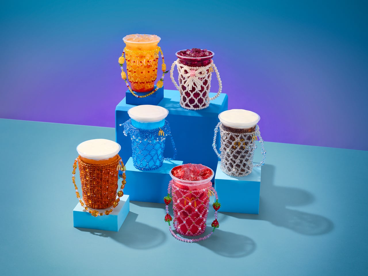
The timing is intentional. McDonald’s is rolling out its first-ever lineup of Refreshers and crafted sodas starting May 6, six new drinks that range from a Mango Pineapple Refresher to a Dirty Dr Pepper, each with a personality loud enough to inspire its own aesthetic. Think freeze-dried fruit, popping boba, cold foam. The drinks are clearly built for a generation that treats a beverage order as a mood, not just a thirst solution. And Susan Alexandra, who has spent years turning beaded bags and accessories into cult objects, is exactly the right collaborator for that energy.

Designer: McDonalds x Susan Alexandra

The collection includes six hand-beaded carriers, one for each new drink. Each design pulls color and texture directly from its corresponding flavor. The Strawberry Watermelon Refresher carrier is red and pink, soft and berry-bright. The Blackberry Passion Fruit version leans into dainty white beads. The Mango Pineapple has tropical warmth written all over it. These are not subtle pieces. They are made to be seen, and that is the entire point.

Susan Alexandra’s work has always operated in that specific visual register where maximalism meets handcraft. Her bags are the kind of thing you notice from across a room, the kind of accessories that start conversations. Matching that energy to a McDonald’s cup feels odd on paper, but when you actually look at the carriers, the logic holds. The drinks are colorful, slightly chaotic, and unapologetically fun. The accessories match.

Prices range from $48 to $58 depending on the design, which I know will prompt some eye-rolling. It’s a drink carrier. For McDonald’s. But that framing also misses the point. Susan Alexandra pieces are collectibles, objects that people hold onto not because they are practical but because they carry a specific cultural moment with them. A $48 beaded carrier that references a fast food soda is not a purely functional purchase. It is a souvenir. A more interesting souvenir, I’d argue, than most things that get sold under a collab banner.

The carriers are sold exclusively on SusanAlexandra.com starting May 6, in limited quantities. Each one also comes with a $10 McDonald’s Arch Card, which is a small but genuinely clever touch. The idea is that you buy the carrier, then go get the drink it was made for. As brand strategy goes, it’s actually pretty smart. It ties the accessory back to the experience rather than letting it float into the abstract realm of limited edition merch.

What makes this collaboration land is that it doesn’t feel like a desperation move from either side. McDonald’s is genuinely expanding its beverage program in a significant way, and it needs the launch to feel like a cultural moment rather than just a menu update. Susan Alexandra brings a specific visual language and a loyal customer base that overlaps with exactly the kind of person who cares about aesthetics down to what’s in their cup holder. The match is less random than it first appears, and the choice of collaborator signals how seriously McDonald’s is taking this particular moment.

I’m not saying everyone needs a hand-beaded carrier for their Sprite Berry Blast. But I do think there’s real craft in how this collaboration was conceived. The carriers are not just branded merchandise. They are wearable interpretations of a drink, which is a genuinely strange and interesting design brief that Susan Alexandra executed with her signature commitment to color and detail. Fast food has been flirting with fashion for a while now. This is one of the better executions I’ve seen, and I’ll be curious whether any of the six designs sell out before you even finish reading this.

The post McDonald’s New Drinks Come With a $58 Fashion Accessory first appeared on Yanko Design.
  • ✇Yanko Design
  • Dórica Just Proved Good Design Belongs on Your Kitchen Counter
    Most of us have at least one object in our home we’ve never actually looked at. The napkin holder. The fruit basket. The candle holder that’s been sitting on the same shelf for three years. We use these things daily, sometimes multiple times, and yet they exist in this strange invisible space between functional and forgotten. That’s exactly the space that Sebastián Ángeles decided to design for. Ángeles is the founder and creative director of Dórica, a Mexico City-based contemporary furniture b
     

Dórica Just Proved Good Design Belongs on Your Kitchen Counter

17 avril 2026 à 17:30

Most of us have at least one object in our home we’ve never actually looked at. The napkin holder. The fruit basket. The candle holder that’s been sitting on the same shelf for three years. We use these things daily, sometimes multiple times, and yet they exist in this strange invisible space between functional and forgotten. That’s exactly the space that Sebastián Ángeles decided to design for.

Ángeles is the founder and creative director of Dórica, a Mexico City-based contemporary furniture brand that has spent years building a quiet but increasingly well-regarded reputation for pieces that prioritize longevity over trend. Their chairs, benches, and credenzas have found their way into residential, commercial, and hospitality spaces, and the brand has been recognized as one of the most relevant contemporary furniture names coming out of Mexico. But with Prea, released in February 2026 and recently featured by Wallpaper, Ángeles shifted his focus somewhere more intimate: the objects you reach for without thinking.

Designer: Sebastián Ángeles for Dórica

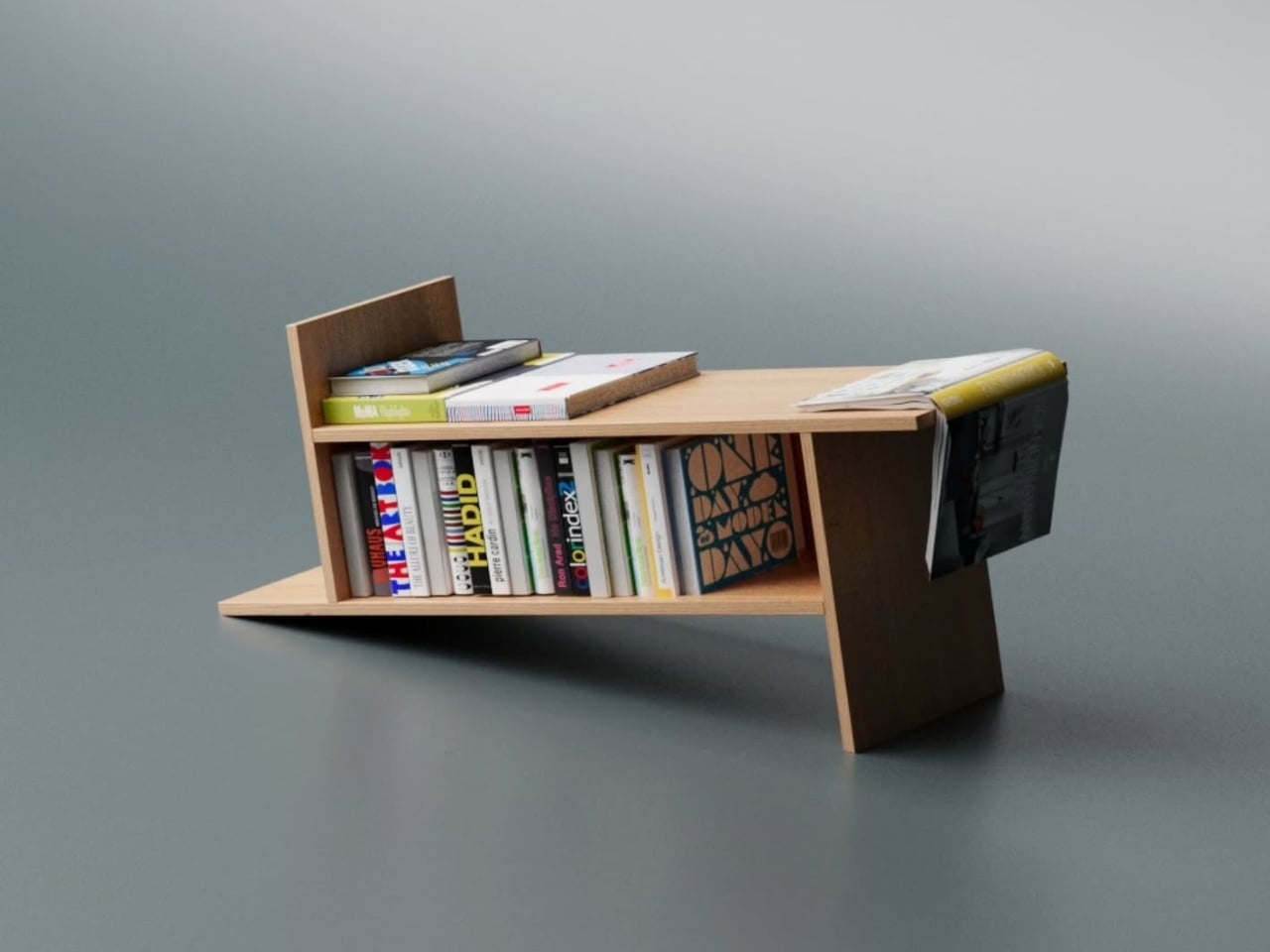
Prea is labeled “Chapter II” in Dórica’s story, and the brand describes it as their first collection of everyday objects. It’s a small but considered group of pieces, including an egg basket, a fruit basket, a candelabra, and a napkin holder, each designed and produced in Mexico with a clear emphasis on wood and ceramic, clean lines, and what the brand calls “material honesty.” The pieces are not elaborate. They don’t announce themselves when you walk into a room. And that restraint is, I think, the entire point.

Wallpaper described Prea as “a study in restraint,” and that feels right. But I’d push it further. Prea is actually a philosophical statement wrapped in a very practical object. The brand’s own language around the collection is striking: “Design here does not decorate. It holds. It supports. It allows the ordinary to be seen.” That’s not the kind of copy you expect from a brand selling a napkin holder. It’s the kind of thought that makes you pause.

We talk constantly in design circles about the gap between high design and everyday life, between the gallery object and the kitchen counter. Dórica seems genuinely uninterested in that gap existing at all. The premise of Prea is that the objects living alongside our daily rituals, the things we touch without registering that we’re touching them, deserve the same level of intentionality that goes into a statement chair or a sculptural lamp. Not to make them more important than they are, but to acknowledge that they already are important. We just stopped noticing.

There’s a Mexican design perspective embedded in this that feels worth acknowledging. The brand has always positioned itself around craftsmanship and longevity rather than novelty, and Prea continues that ethos into a new category. It’s a move that says something about how Ángeles sees the role of design in everyday life: not as a luxury layer applied to living, but as something woven into the texture of it.

I’ll be honest, when I first looked at the collection, my instinct was that it seemed minimal to the point of simplicity. A fruit basket is a fruit basket. But the more I sat with the images and the thinking behind the work, the more that restraint started to feel like confidence. These pieces don’t need to perform. They just need to be present, well-made, and honest. In a market saturated with objects begging for your attention, that’s a harder thing to pull off than it looks.

Prea is also a smart move for Dórica as a brand. Entering the everyday objects category at this level of intention signals a maturity that not every furniture brand is willing to commit to. It’s easier to scale up into bigger, more visible pieces. Scaling down into the egg basket, and making it mean something, takes a different kind of confidence. If you’re the kind of person who has ever picked up a beautifully made object and held it for just a second longer than you needed to, this collection is worth seeking out.

The post Dórica Just Proved Good Design Belongs on Your Kitchen Counter first appeared on Yanko Design.
  • ✇Yanko Design
  • The ZERO Chair Has No Welds, No Joints, No Apologies
    Most chairs are built on compromise. You stack the legs, screw the seat, bolt the back, and somewhere in that assembly, a little bit of the original idea gets lost to the necessity of structure. Davide Bozzo’s ZERO Chair refuses to play that game entirely. The concept is almost confrontationally simple: one single ribbon of metal, bent and curved into a complete chair. No welds holding two pieces together. No joints disguised under upholstery. No hardware quietly doing the heavy lifting behind
     

The ZERO Chair Has No Welds, No Joints, No Apologies

17 avril 2026 à 10:20

Most chairs are built on compromise. You stack the legs, screw the seat, bolt the back, and somewhere in that assembly, a little bit of the original idea gets lost to the necessity of structure. Davide Bozzo’s ZERO Chair refuses to play that game entirely.

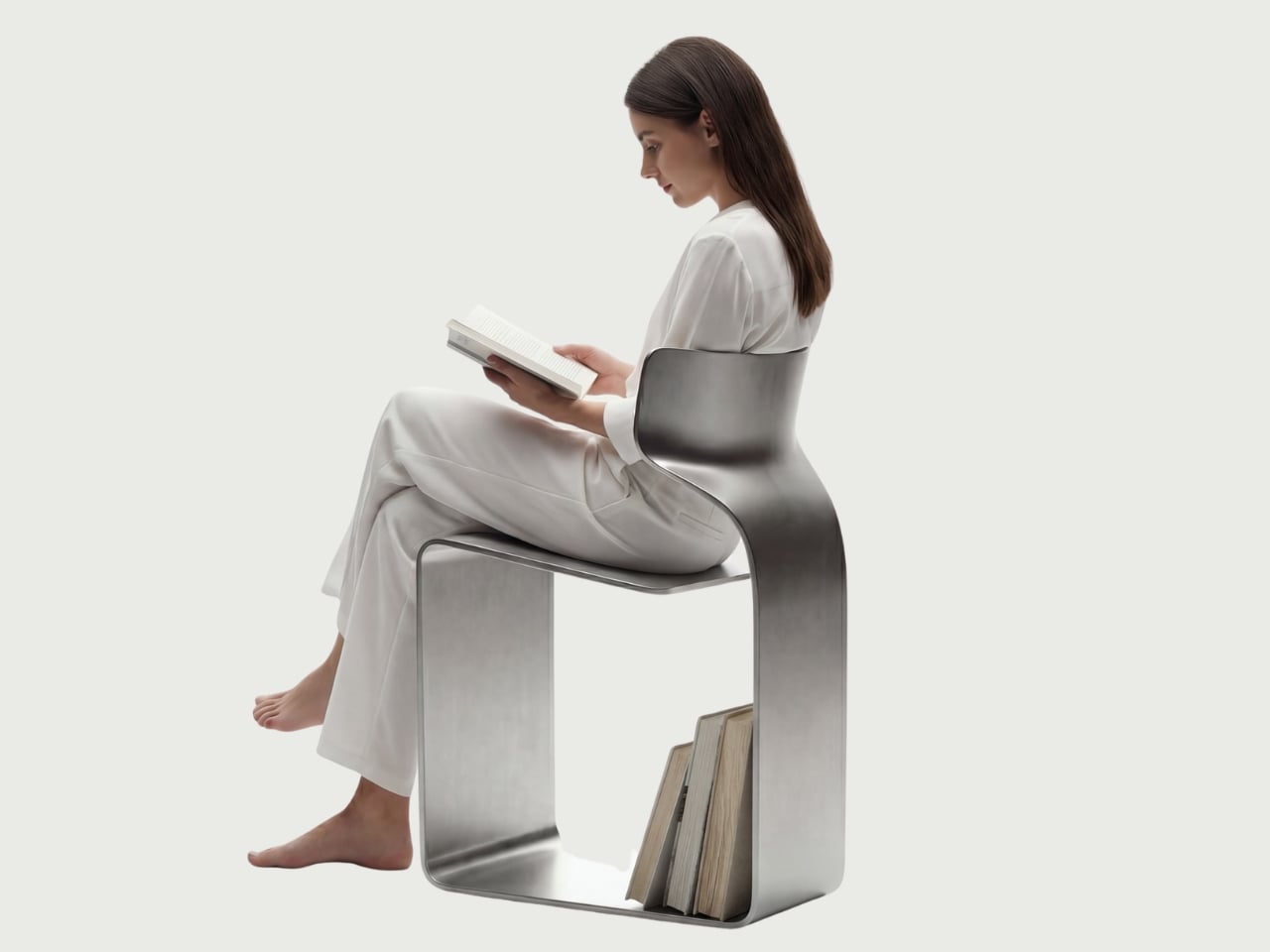
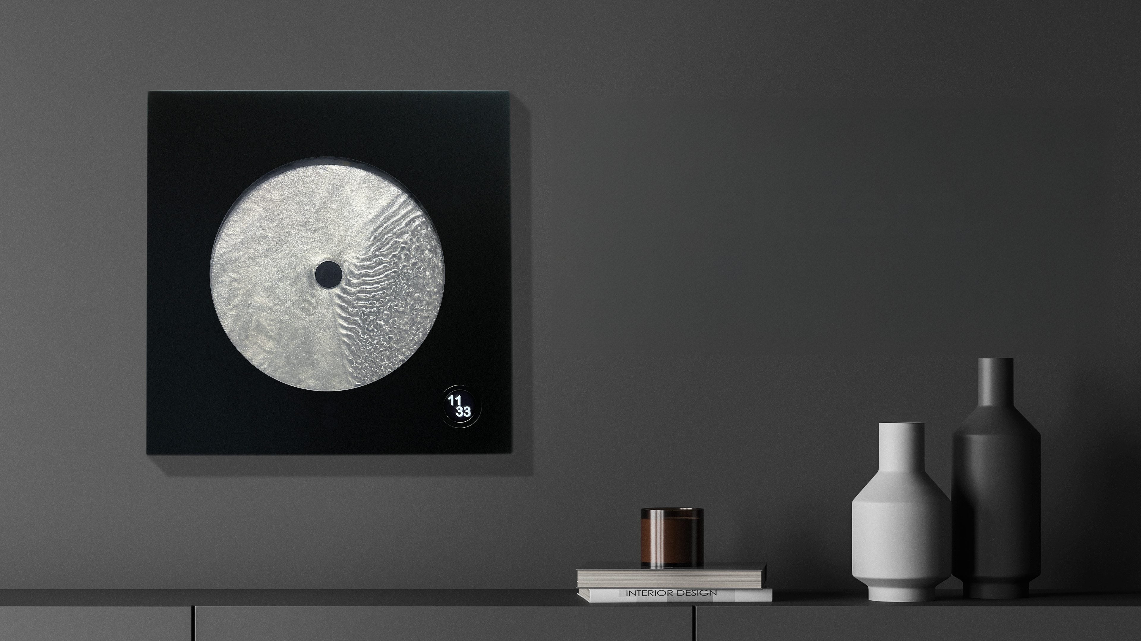
The concept is almost confrontationally simple: one single ribbon of metal, bent and curved into a complete chair. No welds holding two pieces together. No joints disguised under upholstery. No hardware quietly doing the heavy lifting behind the scenes. Just one continuous piece of material pushed into a form that includes the base, the cantilevered seat, and the backrest all at once. The name isn’t branding. It’s a philosophy.

Designer: Davide Bozzo

Looking at the photographs, the first thing I kept circling back to was the sheer audacity of the backrest. It doesn’t connect to the base through hidden brackets or clever joinery. It simply rises from the same ribbon, curving upward and backward in a motion that looks more like a wave caught mid-break than anything you’d typically call furniture. It’s graceful in a way that makes you slightly suspicious of it. How is this thing holding anyone’s weight?

The answer lies in what Bozzo describes as structural tension. Form doesn’t just follow function here. It is the function. The material itself carries the engineering logic. Every curve has a reason, and every bend is calculated to distribute load through the continuity of the form rather than through added components. It’s the same principle behind suspension bridge cables or the way a curved shell is structurally stronger than a flat panel. Applied to a chair, it feels almost radical.

I’ll be honest. My first instinct was skepticism. A single-piece metal chair sounds like one of those design school exercises that makes for great renderings but falls apart under real scrutiny. But looking at the close-up photographs, especially the one capturing the S-curve where the seat meets the backrest, you start to believe it. The brushed metal finish shows actual material depth and actual intentionality in how the surface was treated. This isn’t a concept render floating in a void. It has weight and presence.

That said, I do have questions. Comfort is conspicuously absent from the conversation. Metal, even beautifully formed metal, is hard. The cantilevered seat gives some flexibility, which should help, but a chair without cushioning asks something significant of the person sitting in it. Bozzo’s design makes a statement about material honesty and structural purity, which I respect deeply, but at some point a chair has to be sat in. That’s the tension that makes it interesting rather than just pretty.

The piece also reads as a quiet counterargument to the current era of maximalist furniture. We’ve spent years surrounded by bouclé armchairs, curved velvet sofas, and furniture dressed up in layers of texture and warmth. Bozzo’s chair strips all of that away and asks whether furniture can earn your attention through restraint and engineering alone. My honest opinion? It can. Whether it earns a place in your living room is a different question entirely.

The chair also does something that doesn’t get discussed enough in design coverage: it makes the negative space part of the design. The open rectangle formed by the base creates a void that’s almost as deliberate as the metal itself. In the lifestyle image set against a Japanese garden backdrop, that void frames the gravel and ground beyond it. The chair becomes a viewfinder. That’s not accidental. That’s a designer who understands that what you leave out is just as powerful as what you put in.

Bozzo has been building a reputation for material-forward work. His stainless steel pet bowl Dune explored similar ideas around fluid curves in a single medium, but the ZERO Chair feels like a significant step up in ambition. It’s the kind of piece that stops you mid-scroll, makes you set your phone down, and actually think. That, more than any material specification, is probably the point.

The post The ZERO Chair Has No Welds, No Joints, No Apologies first appeared on Yanko Design.

  • ✇Yanko Design
  • Foshan’s Forgotten Warehouses Got a Rooftop Park Under Floating Domes
    Somewhere along the Huadi River in Foshan, China, a cluster of old grain storage warehouses has been turned into one of the most quietly poetic pieces of architecture I’ve seen all year. The Yongping Warehouse Renovation, completed in 2025 by Guangzhou-based Atelier cnS, is exactly the kind of project that makes you stop scrolling and actually look. The site sits in Dali Town, Nanhai District, a former industrial pocket of the Pearl River Delta that’s been gradually shedding its factory-town sk
     

Foshan’s Forgotten Warehouses Got a Rooftop Park Under Floating Domes

17 avril 2026 à 09:20

Somewhere along the Huadi River in Foshan, China, a cluster of old grain storage warehouses has been turned into one of the most quietly poetic pieces of architecture I’ve seen all year. The Yongping Warehouse Renovation, completed in 2025 by Guangzhou-based Atelier cnS, is exactly the kind of project that makes you stop scrolling and actually look.

The site sits in Dali Town, Nanhai District, a former industrial pocket of the Pearl River Delta that’s been gradually shedding its factory-town skin in favor of something more livable and publicly accessible. These particular warehouses, lined up along the riverfront, were derelict grain storage buildings with no obvious future. Not exactly glamorous source material. But Atelier cnS didn’t flinch, and the result is a project that earns its attention without asking for it loudly.

Designer: Atelier cnS

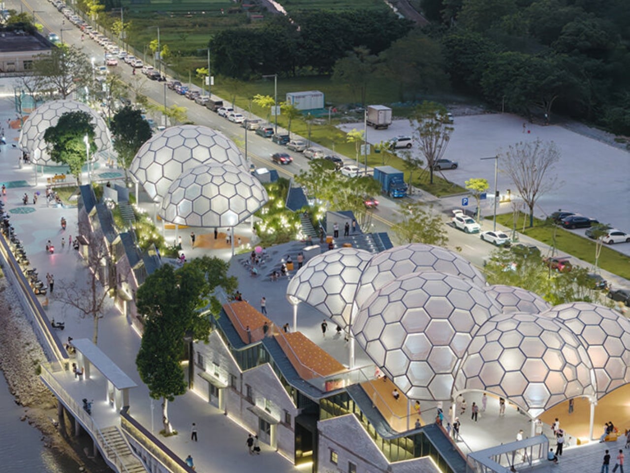
Because the site has a narrow footprint, the architects pushed the public space upward, placing a landscaped rooftop park above the commercial interiors below. Vertical programming isn’t a new idea, but what makes Yongping feel different is how thoughtfully the transition between levels was handled. The gaps between warehouse blocks weren’t sealed or filled in. Instead, they were preserved and widened into passageways, so as you move through the building, you catch glimpses of the river framed by walls before the whole view opens up at the top. It’s a slow reveal, and it’s deliberate.

And then there are the canopies. A series of translucent, domed structures built from hexagonal frames cluster across the roofline like a quiet gathering of clouds. Atelier cnS actually named the project “A Wisp of Cloud” over Huadi River, and the photos earn that name completely. The domes are light-diffusing, casting shade without blocking river views. They create zones for sitting, moving, and play without ever feeling like they’re closing the space in. They look like they arrived gently, rather than being imposed on the building below them.

The rooftop itself is shaped into slopes, steps, and play surfaces that echo the original pitched forms of the warehouse roofs. It’s one of those details that most visitors probably won’t consciously register, but it’s exactly the kind of architectural memory that makes a renovation feel grounded rather than gratuitous. The old buildings aren’t being pretended out of existence. The new design is in active conversation with what was there before.

I’m genuinely drawn to this project because it gets the balance right in a way that many adaptive reuse projects don’t quite manage. Too often, the renovations that attract the most attention are the ones where the new design overwhelms the original structure, turning the old building into nothing more than a convenient shell. Yongping avoids that trap. The warehouses are still very much present. Their bones dictate the rhythm, the circulation, and some of the visual language of the final result. You can feel the history of the place without having to read about it first.

Atelier cnS has been developing this kind of thinking for years. The studio’s earlier work on elevated public circulation, including a “roof-hopping” design approach explored in their White House Guesthouse project, signals a long-running interest in finding new life in existing structures. Yongping feels like a maturation of that sensibility. More refined, more integrated, and more tuned in to the texture of a neighborhood mid-transition.

The project spans 4,311 square meters, and it’s worth noting what it does beyond the architecture itself. Turning a commercial renovation into a publicly accessible rooftop park, in a district shifting away from its industrial past, is a real act of generosity. A park on a roof could easily read as a private amenity. Here, it reads like a gift to the neighborhood, a place to walk, rest, and look out at the river without needing a reason to be there.

Architecture doesn’t always need to announce itself to be worth paying attention to. The Yongping Warehouse Renovation is understated, purposeful, and lit from above by a cluster of translucent domes that look, from a distance, exactly like a wisp of cloud over the river.

The post Foshan’s Forgotten Warehouses Got a Rooftop Park Under Floating Domes first appeared on Yanko Design.

  • ✇Yanko Design
  • Rimowa Just Made the Classiest Excuse to Never Unpack
    Most people treat their Rimowa suitcase like a very expensive houseguest: it arrives looking spectacular, gets shoved in a closet, and stays there until the next trip. Rimowa, apparently, has thoughts about this. And so does Lehni. The two brands have just unveiled a limited-edition furniture collaboration at Salone del Mobile 2026 in Milan, and it might be the most quietly audacious thing either brand has done in recent memory. The collection consists of two pieces: a Bench and a Drawer, both
     

Rimowa Just Made the Classiest Excuse to Never Unpack

17 avril 2026 à 06:07

Most people treat their Rimowa suitcase like a very expensive houseguest: it arrives looking spectacular, gets shoved in a closet, and stays there until the next trip. Rimowa, apparently, has thoughts about this. And so does Lehni.

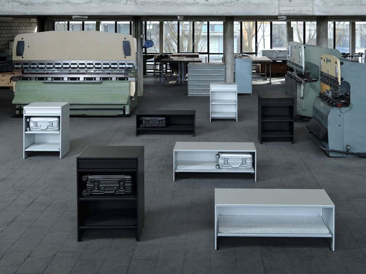
The two brands have just unveiled a limited-edition furniture collaboration at Salone del Mobile 2026 in Milan, and it might be the most quietly audacious thing either brand has done in recent memory. The collection consists of two pieces: a Bench and a Drawer, both crafted in anodized aluminum, both designed to hold cabin-sized Rimowa suitcases inside your home. Not in a storage room. Not under your bed. On display, like they were always meant to be there. Which, if you’ve ever owned a Rimowa, you’d know they kind of were.

Designers: Rimowa x Lehni

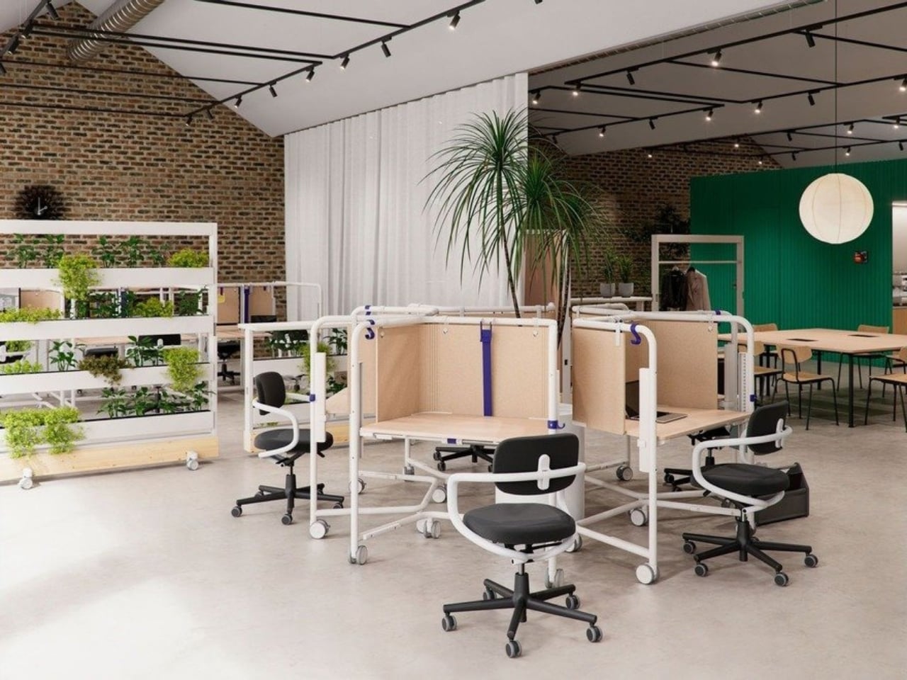
The Bench is an open-shelving unit that holds two cabin-sized suitcases side by side. It is clean, low-slung, and just architectural enough to look at home next to a mid-century credenza or a spare Scandinavian sofa. The Drawer offers a different kind of storage: a sculptural, closed-frame unit with a built-in drawer for smaller items. Both pieces come in silver and black anodized aluminum, and both carry the embossed Grid pattern that echoes the grooved exterior of a classic Rimowa Original. That detail is not accidental. It’s the kind of material continuity that makes a collection feel cohesive rather than like a brand licensing deal gone slightly off the rails.

The craft side of this is worth paying attention to. Lehni has been working with aluminum since 1922, when Rudolf Lehni opened a sheet metal workshop in Zürich that quickly became a gathering place for artists and architects. That legacy still shows. Today, the company is run by the fourth generation of the Lehni family out of Dübendorf, and every piece is handmade in their Zurich factory. Each shelf on the Bench, for instance, is lined with a specially developed scratch-resistant felt mat to protect the cases stored on it. You notice that kind of thinking. These are small decisions that add up to something much larger than the sum of their parts.

Rimowa, for its part, has been on a quiet but consistent streak of repositioning itself as something more than a travel brand. The aluminum suitcase has already crossed over into fashion and streetwear culture through collaborations with names like Dior, Supreme, and Porsche. Moving into furniture feels like the next logical step, and frankly, it makes more sense than most luxury crossovers I’ve seen. The material language stays the same. The level of craft stays the same. The only thing that changes is the context, which is exactly what makes this feel like a genuine design idea rather than a marketing exercise.

That said, let’s be real: this is not furniture for everyone. The Bench is priced at $4,275, the collection is limited-edition, and in the US it’s only available in the continental states by contacting Rimowa’s client services directly. There’s no add-to-cart button. That purchasing friction is intentional, and it’s the kind of intentional that has a very specific audience in mind: the person who already owns the suitcase, already loves it, and wants their home to reflect the same aesthetic sensibility. I don’t think that’s a bad audience to build for. Niche, yes. But well-defined.

My honest take is that the Rimowa Lehni collection succeeds because it doesn’t try to explain itself too hard. It doesn’t need to. Two brands that both work in aluminum, both care about precision, and both have long histories with good design sat down and made something that looks exactly like what you’d expect from that pairing. The result is a bench and a drawer that feel less like a product launch and more like an obvious conclusion. Sometimes the best collaborations aren’t the surprising ones. They’re the ones that make you wonder why it took this long.

The post Rimowa Just Made the Classiest Excuse to Never Unpack first appeared on Yanko Design.

  • ✇Yanko Design
  • Belgium’s Most Striking Concrete Villa Was Designed by the Dunes
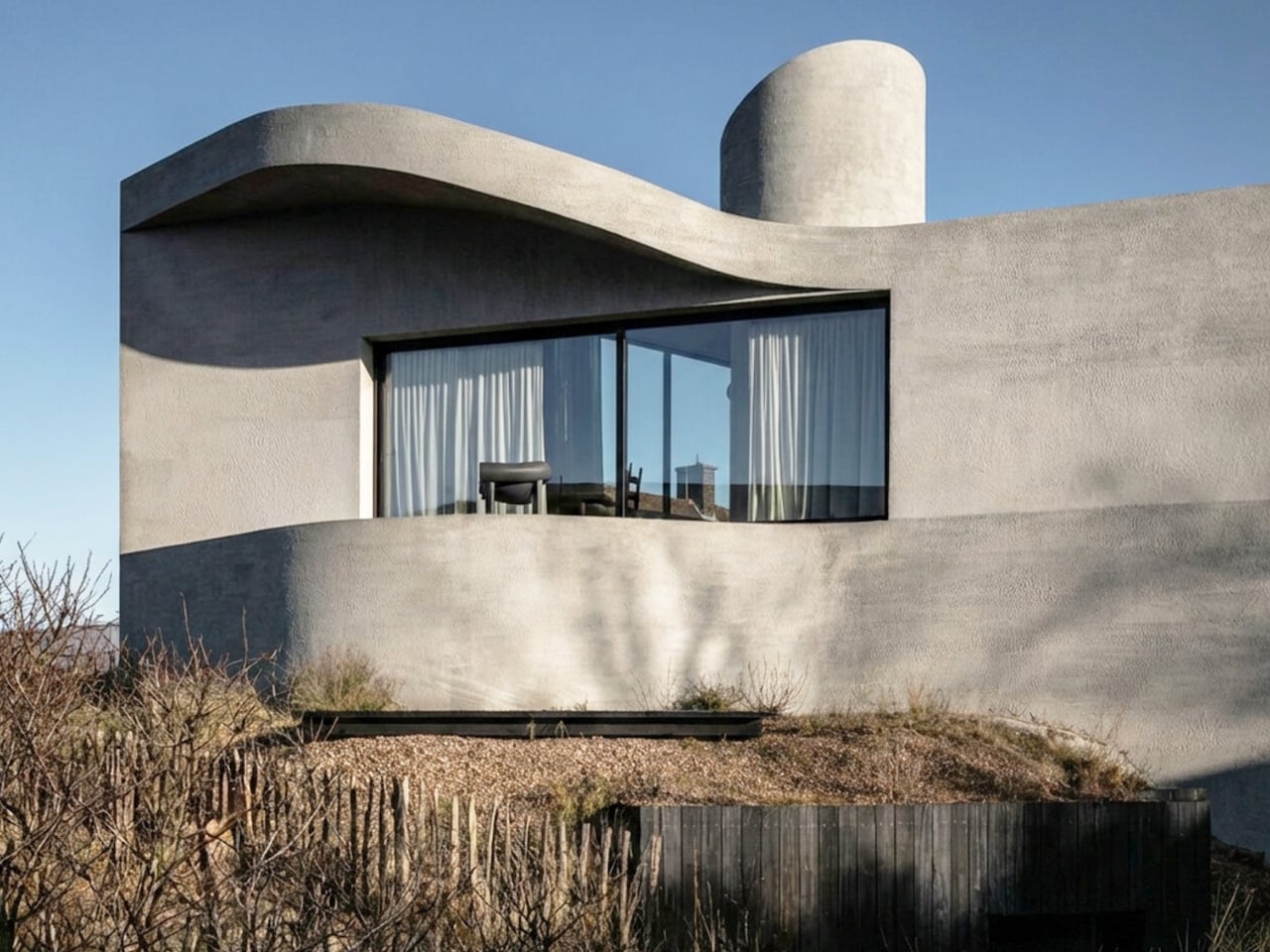
    If you’ve ever stood on a beach and watched the tide pull back, you know that moment right before the water retreats completely, when it leaves those delicate horizontal lines etched across wet sand. That’s what the facade of Villa Nouvelle Vague looks like. Not metaphorically. Literally. Belgian architect Magalie Munters designed the concrete surface of this seaside villa in Oostduinkerke with a horizontal grain that mirrors the striations the North Sea leaves behind at low tide. The reference
     

Belgium’s Most Striking Concrete Villa Was Designed by the Dunes

8 avril 2026 à 19:30

If you’ve ever stood on a beach and watched the tide pull back, you know that moment right before the water retreats completely, when it leaves those delicate horizontal lines etched across wet sand. That’s what the facade of Villa Nouvelle Vague looks like. Not metaphorically. Literally. Belgian architect Magalie Munters designed the concrete surface of this seaside villa in Oostduinkerke with a horizontal grain that mirrors the striations the North Sea leaves behind at low tide. The reference isn’t decorative, it’s structural. And that distinction matters.

The villa sits on a corner plot at the edge of a protected dune reserve in Oostduinkerke, a small coastal town already known for a few wonderfully eccentric things: a ship-shaped restaurant and fishermen who harvest shrimp on horseback. Into this landscape, Munters has introduced something that manages to be arresting without being loud. The form is sculptural and unmistakably modern, but it doesn’t shout. It settles.

Designer: Magalie Munters

The name “Nouvelle Vague” borrows from the French New Wave film movement, and the reference is apt in ways that go beyond the obvious nod to style. The French New Wave was defined by breaking conventional rules while remaining deeply committed to craft. Munters is working in a similar register. For years, her Ghent-based boutique studio has been developing residential architecture with organic geometries, pushing against the idea that construction methods should set the ceiling on what architecture can achieve. “Through that ongoing research, I developed a way of building in which construction and technology no longer act as a limitation to the architecture,” she explains. Villa Nouvelle Vague is where that research cashes out.

The concrete form is completely curved across the entire volume, not just as a surface treatment but as a governing logic, carried through every detail: the absent roof edges, the curved garage opening, even the way the house integrates into the ground. The bedrooms are half-buried in the dunes, which is both a functional and a conceptual move. The house doesn’t sit on the landscape. It’s anchored into it. Above those buried rooms, the living spaces rise toward the horizon, pulling in light and opening out to views of the dunes in a way that feels earned rather than forced.

The way you move through the house is where Munters’ admiration for Le Corbusier becomes most legible. She’s spoken about his influence, specifically in “the rooftop solarium, in the way spaces expand and contract, and in the vertical shafts that structure movement through the house.” You enter through a vertical shaft that climbs toward the roof before expanding into the main living space. The compression-then-release is theatrical in the best sense. The house is working on your nervous system before you’ve even sat down.

I keep coming back to that word: deliberate. Munters uses it herself: “What might appear as a free form is in fact the result of a very deliberate construction logic.” That’s the tension the villa lives in, and frankly, it’s what makes it interesting. Nothing here is freehand improvisation. The curves look fluid because the logic behind them is airtight. The concrete looks like it grew from the dunes because the architect studied the dunes before she touched a drawing. That’s different from a building that mimics nature for aesthetic points. It’s rarer, and harder.

Belgian architecture doesn’t always get the international visibility it deserves, and Magalie Munters is one of those names worth paying attention to even if residential architecture isn’t usually your thing. Villa Nouvelle Vague is the kind of project that earns its name. It has the confidence of something that knows exactly what it is, and the intelligence not to over-explain itself. Just like the best films of the movement it references.

The post Belgium’s Most Striking Concrete Villa Was Designed by the Dunes first appeared on Yanko Design.

  • ✇Yanko Design
  • A Bookrack That Started as a Rectangle and Refused to Stay One
    Most furniture design starts with a question about function and ends there. Deniz Aktay, the designer behind the studio @dezinobjects, apparently decided to start with geometry instead, and the result is one of the most quietly clever storage pieces I’ve come across in a while: the Barrow Bookrack. The concept is almost laughably simple to explain, which is exactly why it works. Take a rectangle. Extend each of its lines on one side only. That’s it. That’s the whole idea. And yet, what comes ou
     

A Bookrack That Started as a Rectangle and Refused to Stay One

8 avril 2026 à 18:30

Most furniture design starts with a question about function and ends there. Deniz Aktay, the designer behind the studio @dezinobjects, apparently decided to start with geometry instead, and the result is one of the most quietly clever storage pieces I’ve come across in a while: the Barrow Bookrack.

The concept is almost laughably simple to explain, which is exactly why it works. Take a rectangle. Extend each of its lines on one side only. That’s it. That’s the whole idea. And yet, what comes out the other end of that single decision is a bookrack that feels caught mid-motion, leaning into itself, its proportions oddly satisfying in a way that’s difficult to immediately place. On paper, it barely sounds like a design at all. In person, it’s all you notice.

Designer: Deniz Aktay

Looking at it from a distance, the Barrow tilts at an angle that initially reads as precarious. It looks like it could tip at any moment, like a shelf that forgot to stand up straight. But it doesn’t. The asymmetry is intentional and controlled, and that’s exactly the kind of design choice that separates a well-considered piece from something that only looks interesting in renders. The structure holds, both physically and visually. The angular feet, the jutting top ledge, the open body sitting between them: everything is doing something.

The name is worth pausing on. A barrow, the traditional kind, is a simple carrying frame stripped back to its essential parts. Nothing extra, nothing decorative, just the minimum structure required to move something from one place to another. Aktay’s Barrow carries that same philosophy. Every extended edge and protruding surface earns its place. The result is a range of storage spots, each with its own character. Books stand upright in the central cavity. Larger volumes or stacked titles settle onto the flat extended surfaces. A magazine slipped sideways into one of the outer ledges feels like it was always meant to sit there.

This is the kind of piece that rewards being actually used. A lot of beautiful storage objects suffer from what I’d call the trophy problem: they look better empty than full. Barrow is the opposite. Load it with design books, art monographs, a worn paperback or two, and it genuinely improves. The varying heights, the mix of orientations, the textures of spines pressed against pale wood, it all adds up into something that feels lived in rather than staged. The structure becomes a frame for your reading life rather than something competing with it.

Aktay has explored this kind of thinking before. His earlier Bookgroove piece was a sculptural bookrack-table hybrid that played with the idea of furniture as form. Barrow feels like a sharper, more edited version of that same instinct: fewer moves, more precision. There’s less drama in the silhouette, but the restraint makes it more liveable. A piece like this can sit in a living room, a studio, or a bedroom and feel contextually right without demanding too much visual real estate from the room around it. It has presence without insistence, which is a harder balance to strike than it sounds.

The part that keeps pulling me back to this design is how naturally it moves from a flat idea to a physical one. The Barrow is essentially a graphic concept made tangible, a line drawing that decided to become furniture. The form evolved directly from extending lines on a flat surface before anything was actually built, and seeing that logic translated so cleanly into wood makes the whole thing click. The render and the physical piece are telling the same story, which is rarer in furniture design than it ought to be.

Furniture, at its best, makes you reconsider something you assumed was already settled. You’ve seen hundreds of bookshelves. You’ve probably owned a few. The Barrow doesn’t try to be revolutionary. It just extends a line a little further than expected, and somehow that’s enough to change the whole conversation.

The post A Bookrack That Started as a Rectangle and Refused to Stay One first appeared on Yanko Design.

  • ✇Yanko Design
  • The F1 Engineer Who Turned Time Into a Kinetic Sculpture
    Most clocks are honest about what they are. They count. They tick. They remind you, with mild urgency, that you are late or almost late or about to be. Robert Spillner’s Luna is not a clock that measures time. It stages it. That’s a subtle but loaded distinction, and it’s exactly why this object is worth paying attention to. Luna is a fluid wall object that translates the principle of the single-hand watch into a kinetic sculpture, making the moment between past and future perceptible. Behind t
     

The F1 Engineer Who Turned Time Into a Kinetic Sculpture

8 avril 2026 à 12:20

Most clocks are honest about what they are. They count. They tick. They remind you, with mild urgency, that you are late or almost late or about to be. Robert Spillner’s Luna is not a clock that measures time. It stages it. That’s a subtle but loaded distinction, and it’s exactly why this object is worth paying attention to.

Luna is a fluid wall object that translates the principle of the single-hand watch into a kinetic sculpture, making the moment between past and future perceptible. Behind the hand, a trace of turbulent patterns marks the touched past. Ahead of it stretches calm liquid: the untouched future. The present is the thin, moving line between them. It sounds poetic because it is, but it’s also technically precise, which is kind of the whole point.

Designer: Robert Spillner

Spillner trained as an engineer and initially developed components for Formula 1 cars, used by numerous teams, in a culture where speed, optimization, and victory are everything. With Luna, that paradigm is reversed. Instead of lap times, the focus is on mindful observation; instead of chasing the fastest, it is about pausing, about stillness. The pivot reads like a philosophical reversal, not just a career change, and that tension is embedded in the object itself.

At the heart of Luna is a specially developed fluid Spillner calls Zero Flow Technology. Its core consists of distilled water, additives, micro-particles, and a minimal quantity of genuine lunar dust. The exact composition remains deliberately undisclosed, part of the mystery that invites the observer to immerse themselves in the visual experience rather than merely explain it technically. I think that’s the right call. Part of what makes Luna compelling is that it resists easy explanation. You’re not supposed to look at it and think “clever fluid dynamics.” You’re supposed to feel like time has texture.

The lunar dust takes the cosmic concept to its logical conclusion. These are particles billions of years old that once fell from space to Earth, and they are now carriers of time. Each piece comes with a certificate of authenticity documenting the origin of this cosmic additive. That detail is not just a marketing flourish. It changes the nature of the object.

Aesthetically, Luna presents itself as a square wall or stand object, approximately 400 by 400 millimeters, with a black front and a cast acrylic glass pane at its centre that becomes the stage for the fluid time, framed by a solid, matte-black wooden frame. A small LCD touchscreen, 35 millimeters in diameter, merges the cosmic and digital realms. Time and display brightness can be adjusted easily. The screen is discreet enough that it doesn’t compete with the fluid for visual dominance. It supports the piece without stealing from it, and that balance isn’t easy to pull off.

Luna is handcrafted in Germany as a limited edition. The fluid mixture, developed over years in collaboration with a laboratory, requires weeks of fine-tuning for each unique piece. Every Luna carries an engraved serial number and year of manufacture, signed by the artist, and comes with a certificate for the meteorite dust. Only 99 pieces per year are planned, all made on demand. Luna defines itself clearly as an art object with a time function, not as an industrial small series. That self-awareness matters.

The question people tend to ask about objects like this is whether they’re worth it. I’d reframe the question. Luna isn’t competing with your iPhone or your smartwatch. It’s not trying to optimize anything in your day. It’s making an argument about how we relate to time, which is a thing most of us don’t think about until we’re running out of it. The fact that it’s beautiful while doing this isn’t a bonus. It’s the method. Design, when it’s working at its best, changes how you see the thing it’s describing. Luna does that with time. And for an object that started life inside Formula 1 engineering labs, that’s a remarkable distance to travel.

The post The F1 Engineer Who Turned Time Into a Kinetic Sculpture first appeared on Yanko Design.

  • ✇Yanko Design
  • Konstantin Grcic Finally Designed the Office Desk We Needed
    We’ve been designing office desks essentially the same way for decades. Four legs, a flat surface, maybe a drawer if you’re lucky, and an ergonomic chair that costs more than your first car. So when Vitra and German industrial designer Konstantin Grcic quietly dropped the Scout Work Mobile just last month, I paid close attention. The Scout Work Mobile is part of a larger family of workstation and meeting tables simply called Scout, launched on March 19 of this year. The collection comprises fiv
     

Konstantin Grcic Finally Designed the Office Desk We Needed

8 avril 2026 à 10:20

We’ve been designing office desks essentially the same way for decades. Four legs, a flat surface, maybe a drawer if you’re lucky, and an ergonomic chair that costs more than your first car. So when Vitra and German industrial designer Konstantin Grcic quietly dropped the Scout Work Mobile just last month, I paid close attention.

The Scout Work Mobile is part of a larger family of workstation and meeting tables simply called Scout, launched on March 19 of this year. The collection comprises five pieces ranging from stationary desks to mobile variants, and it’s Grcic’s response to how offices actually function today versus how they were designed to function twenty years ago. The Scout Work Mobile is the one that caught my eye: a compact, trapezoidal desk on wheels with a tubular steel frame that rises up and encircles the work surface.

Designer: Konstantin Grcic

That frame is the whole story, really. It’s not decorative. It’s not there to look good in a mood board (though it absolutely does). The frame acts as a grab handle when you’re rolling the thing across a room, a mounting point for privacy screens, and a place to hang accessories. Without any attachments, it still creates what Vitra describes as a “room-within-a-room” effect, a bit of visual and psychological separation from whatever chaos is happening around you. For those of us who’ve had to MacGyver focus time in open-plan offices using noise-cancelling headphones and pure denial, that feels like a genuine design insight rather than a marketing afterthought.

Grcic is known for what Vitra calls a “severely simple” aesthetic. He doesn’t add things for the sake of adding them, and the Scout Work Mobile reflects that clearly: the height adjustment and tilting function work entirely without electricity. No motors, no app, no firmware updates required. It adjusts by hand. That might sound unremarkable, but compared to the increasingly tech-dependent office furniture being released right now, it reads almost like a radical statement.

The mobile aspect of Scout is where the design really earns its name. Return-to-office mandates are reshaping how companies think about their physical spaces, and the rigid assigned-desk model is quietly becoming a liability. Hot-desking, collaborative hubs, project clusters, training rooms that double as focus spaces. Modern offices are being asked to do a lot more with the same square footage. Scout was built for exactly that kind of environment. You grab it, roll it where you need it, work, and move on. No teardown required. No reconfiguration meeting on the calendar.

Grcic put it plainly in an interview with Vitra Magazine: “The aim is not to replace what already exists. Rather, the system is an extension or complementary offering that responds to different levels and styles of work.” That kind of restraint is rare in product design, where the temptation is always to pitch your thing as the only thing. Scout doesn’t ask to own your whole office. It just wants to be useful wherever you put it.

Aesthetically, it sits in that satisfying middle ground between industrial and refined. The tubular steel frame reads as utilitarian at first glance, but the trapezoidal silhouette and deliberate proportions make it feel considered rather than clinical. It’s the kind of furniture that would look at home in a forward-thinking tech company, a design school studio, or a well-curated co-working space. It isn’t trying to disappear into the background, and it certainly doesn’t need to.

What makes Scout genuinely interesting is that it treats mobility as a first principle rather than a feature tacked on after the fact. Desks on wheels have existed forever, but most of them feel like an afterthought, as if someone just bolted casters onto a standard table and called it agile. Grcic designed the Scout Work Mobile from the ground up with movement in mind, and the difference is visible in every element. Office furniture rarely makes me stop and think twice. The Scout Work Mobile managed to.

The post Konstantin Grcic Finally Designed the Office Desk We Needed first appeared on Yanko Design.

❌