❌

Vue normale

  • ✇Yanko Design
  • Hollow Clock V Trades a Solid Dial for a Ring of Hidden Gears
    Most clocks give their hands somewhere obvious to stand, usually a solid face hiding the mechanism behind it. Hollow Clock V leaves that space empty, making its hands appear to hover inside a slender ring. This working DIY project uses 3D-printed parts, hidden gears, and magnets to pull off a trick that doesn’t require a transparent panel to work. The minute hand provides the first clue, since its outer end connects to a rotating ring concealed within the frame. Its center supports the hour han
     

Hollow Clock V Trades a Solid Dial for a Ring of Hidden Gears

Par : JC Torres
9 novembre 2026 à 13:20

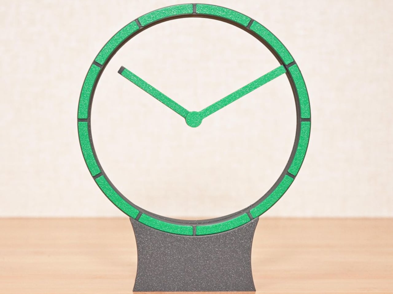
Most clocks give their hands somewhere obvious to stand, usually a solid face hiding the mechanism behind it. Hollow Clock V leaves that space empty, making its hands appear to hover inside a slender ring. This working DIY project uses 3D-printed parts, hidden gears, and magnets to pull off a trick that doesn’t require a transparent panel to work.

The minute hand provides the first clue, since its outer end connects to a rotating ring concealed within the frame. Its center supports the hour hand on a small pivot, so the pair isn’t actually levitating. The hour hand’s position is controlled magnetically by another rotating ring, allowing it to keep pointing at the right hour while the longer hand travels around.

Designer: Shinsaku Hiura

That second ring carries two neodymium magnets, which interact with a third tucked into the hour hand. Their T-shaped arrangement helps keep the hand aligned without adding a connection across the opening. Down in the base, a stepper motor and a combination of worm and bevel gears drive the minute ring 12 times faster than the hour ring, without a bulky central hub.

All that machinery makes the spare appearance deceptive. The ring has a border only about 0.28 inches wide, with hour markers replacing a conventional numbered dial. Screws are kept out of sight when the clock is assembled, apart from the central hand fastener. A rear USB-C connection sends the cable away from the front, leaving the open center to do the distracting.

The finish is also shaped by the way the parts are printed, rather than treated as an afterthought. Front surfaces sit against the printer’s build plate, picking up its texture instead of exposing filament paths across the face. Changing filament during printing gives the markers a contrasting color. It’s a small manufacturing decision that makes the homemade object look a little more deliberate.

Setting the time stays physical, too. You lift the display ring out of the base, freeing it from the drive gears, move the hands to the desired time, and slot it back in. There’s no tiny adjustment knob to hunt for behind the housing. For a clock that hides so much of its mechanism, this particular interaction is refreshingly easy to understand.

Getting to that point takes more effort than the finished clock lets on. The project involves printing, soldering, loading firmware, and assembling the moving parts, although the supplied print orientations don’t require supports. Smooth gear surfaces matter, and the guide includes lubrication and tuning advice. The uncluttered desk ornament is also a small mechanical project, with patience required before it starts keeping time.

The ratchet is designed to compensate for missed motor steps, though it also introduces a reason to think twice about bedside placement. The guide describes removing its hook for quiet operation only when the mechanism runs smoothly enough. On a desk or shelf, that choice comes down to how much of the clock’s engineering you’re prepared to hear as well as admire.

The post Hollow Clock V Trades a Solid Dial for a Ring of Hidden Gears first appeared on Yanko Design.


  • ✇Yanko Design
  • This Modular Building Concept Assembles Homes From Four-Foot-Wide Slices
    Changing a home’s layout usually means working around walls that have no intention of moving. The Segmented Building System concept approaches that problem by treating a building as a series of four-foot-wide sections, rather than one permanent shell. This unconventional architecture proposes a house that could be dismantled and reassembled instead of demolished when circumstances change. Each section is conceived as a slice through a building, combining floor, wall, and roof panels into a comp
     

This Modular Building Concept Assembles Homes From Four-Foot-Wide Slices

Par : JC Torres
9 novembre 2026 à 12:20

Changing a home’s layout usually means working around walls that have no intention of moving. The Segmented Building System concept approaches that problem by treating a building as a series of four-foot-wide sections, rather than one permanent shell. This unconventional architecture proposes a house that could be dismantled and reassembled instead of demolished when circumstances change.

Each section is conceived as a slice through a building, combining floor, wall, and roof panels into a complete or partial profile. Structural insulated foam panels would form these pieces, which could arrive separately or already assembled. The four-foot measurement describes the segment’s width, not the room’s overall span, so the proposal isn’t asking anyone to squeeze into a very narrow little house.

Designer: Michael Jantzen

Repeating those slices would let a building stretch, while combining full and half profiles would allow it to branch sideways. Their varying heights could give a shared living area a taller ceiling and keep adjoining spaces lower. Rather than committing to a single box-shaped module, the idea is to assemble different volumes from related parts, with their rooflines following the changes below.

The more interesting move, however, is to slide neighboring profiles out of alignment. Glass would fill the gaps, turning the joints between sections into narrow openings for daylight. Those openings could continue from the walls into the roof, bringing light into a tall central space. Instead of treating every seam as something to hide, the concept makes some of them part of the architecture.

The exterior isn’t tied to its mustard-yellow finish, either. Metal or cement-composite boards are proposed as cladding options, applied before delivery or after assembly on site. That gives the same underlying system room for different appearances, rather than making one facade part of the deal. Solar panels could also attach to the segments, with off-grid operation among the ambitions for the system.

Of course, rearranging a house wouldn’t be quite as casual as rearranging its furniture. The segments would attach to a prefabricated concrete perimeter foundation shaped for the chosen layout. Moving them elsewhere would still mean preparing a suitable base and reconnecting the building’s services. The proposal describes reusable sections, not a finished home you can simply pick up and drop onto any empty plot.

The point of taking those sections apart would be to use them again, perhaps in a different arrangement at another location. That’s a useful distinction from grinding a demolished building into material for something else. The ambition is to keep a usable building section intact. A change of address or layout wouldn’t require giving up the pieces that already made up your home.

The post This Modular Building Concept Assembles Homes From Four-Foot-Wide Slices first appeared on Yanko Design.
  • ✇Yanko Design
  • HOA A1 Camera Lets You Stay Face-to-Face While Taking Photos
    Taking someone’s photograph often means hiding your own face behind a camera or phone. That’s a rather strange way to capture a shared moment, especially when you’re trying to keep a conversation going. HOA’s upcoming A1 camera takes a different approach, using a large, open frame as its viewfinder so you can look directly at the person you’re photographing with both eyes open. The shape is almost comically simple, leaving a rectangular border, a solid lower section, and a circular lens assembl
     

HOA A1 Camera Lets You Stay Face-to-Face While Taking Photos

Par : JC Torres
9 novembre 2026 à 09:20

Taking someone’s photograph often means hiding your own face behind a camera or phone. That’s a rather strange way to capture a shared moment, especially when you’re trying to keep a conversation going. HOA’s upcoming A1 camera takes a different approach, using a large, open frame as its viewfinder so you can look directly at the person you’re photographing with both eyes open.

The shape is almost comically simple, leaving a rectangular border, a solid lower section, and a circular lens assembly that overlaps the opening. Rather than squeezing a tiny viewfinder into one corner, the body gives you a generous space to look through. The lens still occupies part of that view, of course, but there’s considerably less camera standing between you and your subject.

Designer: Lutra

That could make photographing friends feel a little less like asking them to perform for a gadget. You can keep talking, watch their expressions, and press the shutter without switching your attention to a live preview. Accurate composition is another matter, however. How closely that opening matches the final photograph, particularly as you move it away from your face, still needs testing.

Inside that unusual outline is a Sony 16MP sensor paired with an autofocus lens offering a 26mm-equivalent field of view. That’s a wide-angle perspective suited to keeping some surroundings in the picture, rather than concentrating on a distant face. HOA lists a weight of about 4.9 ounces and a battery rated for up to 90 minutes of continuous shooting on a single charge.

Your phone returns to the process when it’s time to see what you’ve captured. HOA says tapping a smartphone against the camera’s back will let you view photographs, although detailed instructions are still pending. You can shoot without Wi-Fi, so a walk with your camera doesn’t require finding an internet connection first. Getting authentication certificates through the companion app requires going online, however.

Those certificates belong to ShootProof, HOA’s proposed system for checking whether a photograph has changed since capture. The company says a secure chip signs each image’s digital fingerprint, with that record entered into a blockchain registry. That’s a record of the file’s integrity, not a guarantee that the scene was truthful. Photographing something staged doesn’t make it honest, certificate or no certificate.

There’s a more personal kind of signature as well, and this one actually appears in the photograph. An optional Signature mode places your chosen mark in a corner of each shot, much like signing a print. You can leave a little trace of yourself on photographs of friends or familiar places, rather than adding your signature to every individual photograph by hand afterward.

The planned December 21 release is limited to 100 numbered First Edition cameras, priced at $289. That makes the A1 an unusual purchase before its image quality and phone workflow are fully demonstrated. Its open frame offers an appealing way to keep looking at people while photographing them, but the photographs still have to justify carrying another device alongside your phone.

The post HOA A1 Camera Lets You Stay Face-to-Face While Taking Photos first appeared on Yanko Design.
  • ✇Yanko Design
  • Twelve South’s Cablesnap 65W Charger Packs Its Cable So You Don’t Have To
    Chargers have become smaller and more capable, but their cables still have a habit of becoming a tangled mess in our bags. Even remembering to pack one doesn’t guarantee you’ve brought the other. Twelve South’s Cablesnap 65W charger tackles that familiar problem with a retractable USB-C cable, keeping the wire tucked inside its body until you actually need to plug something in. The idea is pretty straightforward, although it addresses a chore that’s easy to overlook. Pull out the USB-C connecto
     

Twelve South’s Cablesnap 65W Charger Packs Its Cable So You Don’t Have To

Par : JC Torres
9 novembre 2026 à 04:15

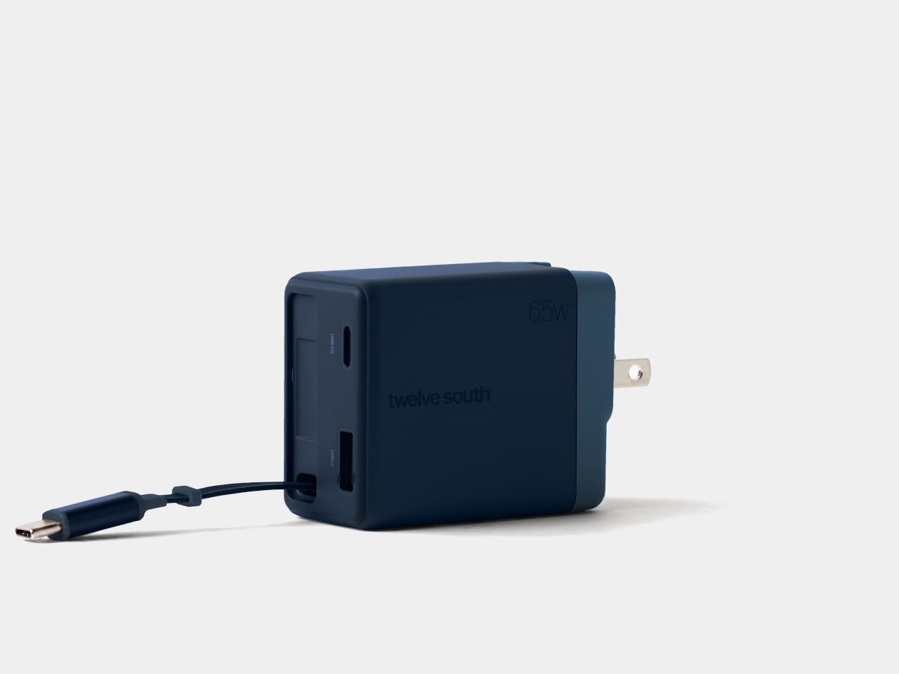
Chargers have become smaller and more capable, but their cables still have a habit of becoming a tangled mess in our bags. Even remembering to pack one doesn’t guarantee you’ve brought the other. Twelve South’s Cablesnap 65W charger tackles that familiar problem with a retractable USB-C cable, keeping the wire tucked inside its body until you actually need to plug something in.

The idea is pretty straightforward, although it addresses a chore that’s easy to overlook. Pull out the USB-C connector and the flat cable extends up to 29 inches, giving you some freedom to position your device. When you’re done, a small tug sends it back into the housing. There’s no need to wrap the cord around the charger and hope it stays put.

Designer: Twelve South

The connector has its own recessed resting place beside the extra ports, so there isn’t a loose tip dangling outside after the cable disappears. That leaves a rounded rectangular body with relatively little visual clutter and a contrasting end section. Coastal blue, Dune, and Slate finishes give it some personality, especially if you’ve grown tired of the usual anonymous black or white chargers.

That disappearing trick does come with a catch, of course. A 29-inch cable works best when the outlet is already reasonably close to where you want your device. A desk socket is one thing; an outlet hidden behind a hotel bed is another matter. You can avoid having extra wire spread across the table, but you can’t pull out length that isn’t there.

Fortunately, the built-in cable isn’t your only connection. An additional USB-C port and a USB-A port let you charge up to three devices together, which could cover a laptop, phone, and wireless earbuds at the end of the day. You’ll still need separate cables for those extra ports, though, so this particular arrangement hasn’t made your entire cable collection obsolete just yet.

The advertised 65W, however, needs a little explanation. That’s the charger’s total available output, rather than what each device receives when everything is plugged in. The USB-A port tops out at 18W, while the overall power budget is shared. Charging a compatible laptop alongside your other gadgets is convenient, but you shouldn’t expect it to receive the full 65W in that particular arrangement.

The US plug folds into the body as well, keeping its prongs from sticking out while the charger is packed away. Included Type G and Type C adapters accommodate compatible UK and European outlets, saving you from sourcing those pieces separately. Between the folding plug and retractable cable, there’s less to arrange before slipping the charger back into your crowded travel bag.

At $49.99, the Cablesnap 65W puts a price on not having to coil a cable every time you move between desks or pack for a trip. The integrated design does raise a question about replacing that cable, something Twelve South doesn’t explain. You still have the spare USB-C port if needed, but using it brings a loose cord back into your bag.

The post Twelve South’s Cablesnap 65W Charger Packs Its Cable So You Don’t Have To first appeared on Yanko Design.

  • ✇Yanko Design
  • This Light-Charging E Ink Frame Gives Your Photos a Home Beyond Your Phone
    Taking photographs has become almost effortless, but getting them off our phones is another matter. There’s always a favorite vacation snapshot that deserves better than being buried between screenshots and receipts. Inkanva is developing a color E Ink canvas that gives those pictures a more permanent place at home, with a paper-like display and indoor-light charging on its two smaller models. The difference starts with what the display doesn’t do. There’s no backlight turning a family portrai
     

This Light-Charging E Ink Frame Gives Your Photos a Home Beyond Your Phone

Par : JC Torres
7 novembre 2026 à 21:45

Taking photographs has become almost effortless, but getting them off our phones is another matter. There’s always a favorite vacation snapshot that deserves better than being buried between screenshots and receipts. Inkanva is developing a color E Ink canvas that gives those pictures a more permanent place at home, with a paper-like display and indoor-light charging on its two smaller models.

The difference starts with what the display doesn’t do. There’s no backlight turning a family portrait into another glowing rectangle in the living room. Instead, E Ink Spectra 6 reflects ambient light and uses six physical pigments to create color. Like a printed photograph, it needs light to be seen, which makes its relationship with the room quite different from a backlit tablet’s.

Designer: Inkanva

Click Here to Buy Now: $159 $239 (34% off). Hurry, only a few left! Raised over $358,000

1

Light also has another job here. The 7.09-inch and 13.3-inch editions include a perovskite photovoltaic component that harvests indoor light to replenish the battery. That’s a rather technical way of addressing a familiar decorating problem: finding somewhere for an electronic object without planning around a nearby power outlet. The component attaches magnetically and can be removed without opening the display housing.

Of course, the room still has a say in how that works. Charging depends on available light and how often you change the picture, so a dim corner isn’t the same as a well-lit shelf. E Ink helps by retaining a static image without continuous display power. The aim is fewer charging interruptions, rather than a promise of unlimited activity.

1

1

Changing the picture follows a routine that should feel familiar to anyone who’s edited a photo on a phone. Choose an image in the Inkanva app, adjust the crop, and send it over Wi-Fi. A trip to the coast could replace last year’s family portrait without another print order, leaving the physical frame where it is while the memory inside changes.

There’s room for less conventional contributions, too. The app offers AI tools that turn spoken ideas or doodles into artwork, giving a quick sketch another direction to explore. A child’s drawing could become the starting point for something new, although there’s no obligation to involve AI at all. Your own photograph can take the same place without being reinterpreted by software.

1

Those who’d rather manage their pictures closer to home have a separate local mode with a browser interface and its own image library. It’s an alternative to app-based management, rather than another remote control running alongside it. Home Assistant support also leaves room for custom routines, such as putting a different artwork on display for the start of the week.

The surrounding frame matters almost as much as the image, especially when it shares a room with furniture you’ve chosen carefully. On the 13.3-inch edition, a separate decorative wood surround can be swapped without replacing the display. Moving it from a study to a living room doesn’t have to mean keeping the same finish, even if the photograph stays exactly as it was.

1

Scale changes that relationship as well. The 7.09-inch canvas suggests a personal photograph beside a desk, while the 13.3-inch version gives an image more presence on a shelf or wall. There’s also a 28.5-inch edition for a larger wall composition, although it doesn’t include the light-harvesting panel.

A photograph doesn’t need to change every morning to deserve a place on the wall. It might stay there for months, gathering the sort of familiarity that makes a room feel like yours. Inkanva leaves that decision with the person living beside it. When another picture finally earns the spot, you can change what’s inside without taking down the frame.

Click Here to Buy Now: $159 $239 (34% off). Hurry, only a few left! Raised over $358,000

The post This Light-Charging E Ink Frame Gives Your Photos a Home Beyond Your Phone first appeared on Yanko Design.
  • ✇Yanko Design
  • Micro Journal Rev.2.1.MINI Writing Laptop Pairs a Wide Screen With Just 48 Keys
    Opening a laptop to write a paragraph can quickly turn into checking messages, rearranging windows, and forgetting the sentence you had in mind. The Micro Journal Rev.2.1.MINI, nicknamed Baby Shark, puts writing at the center of a small, folding computer instead. Its wide screen and compact mechanical keyboard give your words their own space, while Linux supplies the editing tools beneath that colorful clamshell. The chunky enclosure doesn’t try to resemble a slim aluminum laptop. A bright red
     

Micro Journal Rev.2.1.MINI Writing Laptop Pairs a Wide Screen With Just 48 Keys

Par : JC Torres
7 novembre 2026 à 18:30

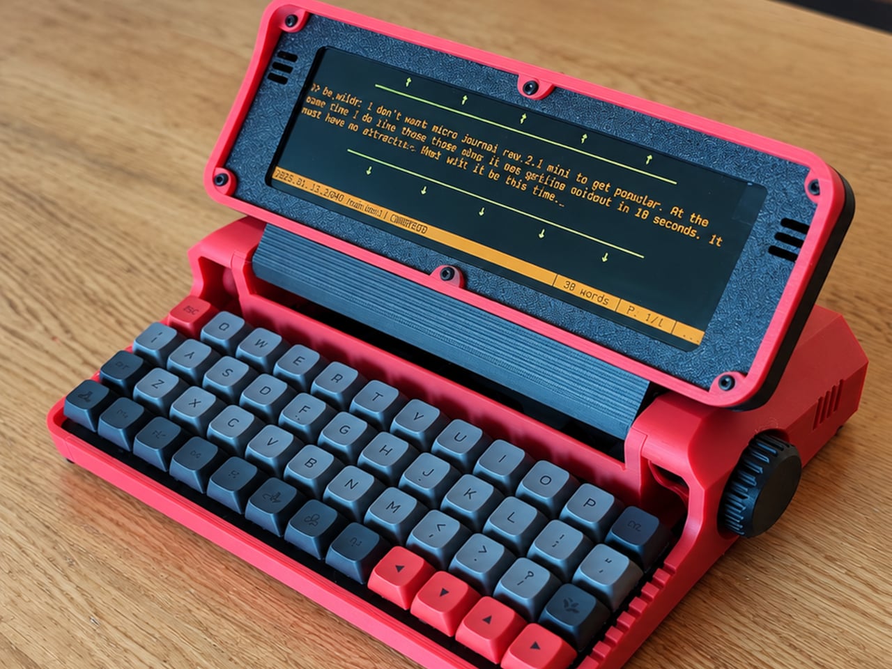
Opening a laptop to write a paragraph can quickly turn into checking messages, rearranging windows, and forgetting the sentence you had in mind. The Micro Journal Rev.2.1.MINI, nicknamed Baby Shark, puts writing at the center of a small, folding computer instead. Its wide screen and compact mechanical keyboard give your words their own space, while Linux supplies the editing tools beneath that colorful clamshell.

The chunky enclosure doesn’t try to resemble a slim aluminum laptop. A bright red shell, dark panels, exposed screws, and ridged side knobs give it the character of a little workshop instrument. Its hinged display folds down over the keyboard when you’re finished. The 3D-printed construction makes color part of the customization, rather than limiting everyone to another black rectangle in their bag.

Designer: Un Kyu Lee

The 8-inch LCD is unusually wide and shallow, with a 1280×400 resolution that stretches a document across the device. It leaves space for your passage without offering the vertical expanse of a conventional laptop screen. That’s a useful distinction for drafting: there’s room to work through a sentence, but reviewing several pages still means scrolling rather than shrinking everything into an overview.

The keyboard makes a similar trade. Its 48 keys form a four-row, 12-column grid, rather than the staggered rows most typists know. Numbers and additional symbols live on layers accessed by holding another key, which keeps the footprint small while asking your fingers to learn new combinations. Vial software lets you remap assignments, and hot-swappable switches let you change the feel without soldering.

A Raspberry Pi Zero 2 W runs Linux inside, with WordGrinder and nano available for drafting and editing. That gives you somewhere to revise yesterday’s work as well as start today’s entry. Files can leave through a USB flash drive or a browser-based interface on your local network, so a writing session doesn’t have to end with retyping everything on your main computer.

Portability also depends on what you put inside. Baby Shark takes up to four replaceable 18650 cells, sold separately, or runs directly from USB power. The connector is USB-C, but the documented setup requires a USB-A charger and a USB-A-to-USB-C cable, not USB Power Delivery. That means the charger already serving your laptop may not be the one this little writing machine needs.

Linux brings a pause before the writing starts: the seller estimates about 30 seconds to boot. This isn’t an instant-on notebook, and closing the screen isn’t a substitute for shutting the system down properly. On the other hand, published enclosure files, circuit-board designs, and firmware give owners ways to repair or modify it, instead of treating the device as a sealed appliance.

Baby Shark is sold as a DIY project even when ordered assembled, with no seller warranty. Later batches are planned without the Raspberry Pi, leaving buyers to supply it themselves. There’s considerable room to make both the hardware and software your own, provided that adjusting the keyboard doesn’t become another way to postpone the paragraph you originally sat down to write. There’s also a Purple Black Mint Green, nicknamed Witch, version inspired by the EVA-01 from the famed anime, Evangelion.

The post Micro Journal Rev.2.1.MINI Writing Laptop Pairs a Wide Screen With Just 48 Keys first appeared on Yanko Design.
  • ✇Yanko Design
  • Aina’s AI Ring Puts an OLED Screen and Joystick on Your Finger
    Reaching for your phone to pause a song can easily turn into reading messages you weren’t planning to open. Aina Ring proposes keeping those small decisions on your hand instead, with a display and thumb-operated control built into a substantial titanium band. The upcoming wearable is designed to handle quick commands and AI suggestions while your iPhone stays tucked away in your pocket. The design doesn’t pretend to be an ordinary piece of jewelry. A rectangular OLED display sits above the ind
     

Aina’s AI Ring Puts an OLED Screen and Joystick on Your Finger

Par : JC Torres
7 novembre 2026 à 16:45

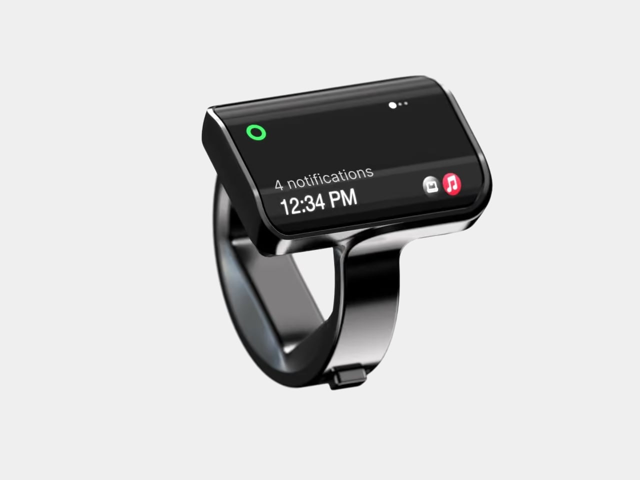
Reaching for your phone to pause a song can easily turn into reading messages you weren’t planning to open. Aina Ring proposes keeping those small decisions on your hand instead, with a display and thumb-operated control built into a substantial titanium band. The upcoming wearable is designed to handle quick commands and AI suggestions while your iPhone stays tucked away in your pocket.

The design doesn’t pretend to be an ordinary piece of jewelry. A rectangular OLED display sits above the index finger, with glass covering its face and rounded edges easing the transition to the band. Four titanium body parts enclose 140 components. Eclipse Black, Amber Gold, Mercury Silver, and Slate Titanium offer different finishes, although none makes that raised screen disappear into a conventional ring.

Designer: Aina

The more interesting detail sits beside your thumb. A joystick-like button on the band accepts seven gesture types, including directional flicks, presses, and holds. Depending on the current task, flicking upward can approve a suggestion, answer a call, or pause music. Displayed hints explain the next action, giving that tiny screen a role beyond repeating notifications from a device you already carry.

Aina calls its suggestions Cues and says its software learns from your routines and calendar. A regular departure time might bring up a ride suggestion; an approaching meeting could offer a shortcut to join. The important design choice is that approval remains yours. Ignore the suggestion and nothing happens, rather than letting a guessed preference quietly become a booking you didn’t request.

Voice provides another route when a flick isn’t enough. Hold the button to dictate a note or set a reminder through the built-in microphone, while a speaker enables calls from the ring. On a Mac, that same control can dictate into applications. It’s a way to catch a thought during a walk, without stopping to compose it on a phone keyboard.

The ring remains an accessory to Apple’s ecosystem, not an independent phone. It requires an iPhone running iOS 18 or later, with macOS 15 or later for Mac features; Android and Windows aren’t supported. Meeting controls depend on the nearby Mac and Aina’s app, so muting from your finger doesn’t mean you can leave the computer behind and keep every function.

Aina claims up to 18 hours per charge, with a cube-shaped dock included for overnight charging. Sizes run from 7 through 13, but only the band changes; the display stays the same. A smaller finger therefore doesn’t get a less conspicuous screen. The IP65 rating allows everyday splashes, although the company says to remove the ring before swimming or showering.

Starting at $399 for early-access preorders, against a $499 list price, Aina is scheduled to ship in early 2027. That leaves the usefulness of its predictions and the comfort of its substantial shape to be established beyond launch demonstrations. A thumb-sized shortcut might save a trip into an app, but wearing it all day needs a better reason than simply having somewhere else to check incoming notifications.

The post Aina’s AI Ring Puts an OLED Screen and Joystick on Your Finger first appeared on Yanko Design.
  • ✇Yanko Design
  • Raven Prism Smart Glasses Put a Linux Computer in the Corner of Your Eye
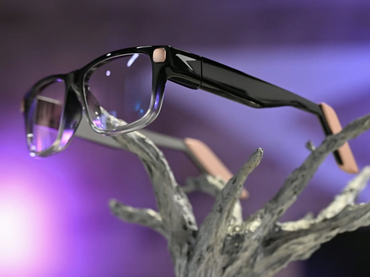
    Checking a recipe with flour on your fingers is a good reminder that a touchscreen isn’t always the most convenient interface. Raven Resonance’s Prism glasses propose keeping those instructions in the corner of your vision instead, with eye controls leaving your hands free. The reservation-stage wearable puts a Linux computer inside familiar-looking frames, rather than simply supplying another screen tethered to your phone. The frames make some concessions to everything packed inside. Thick tem
     

Raven Prism Smart Glasses Put a Linux Computer in the Corner of Your Eye

Par : JC Torres
6 novembre 2026 à 13:20

Checking a recipe with flour on your fingers is a good reminder that a touchscreen isn’t always the most convenient interface. Raven Resonance’s Prism glasses propose keeping those instructions in the corner of your vision instead, with eye controls leaving your hands free. The reservation-stage wearable puts a Linux computer inside familiar-looking frames, rather than simply supplying another screen tethered to your phone.

The frames make some concessions to everything packed inside. Thick temples run back from a dark brow, while clearer lower rims soften the outline around the lenses. Pale end pieces add a contrasting finish without covering the front in conspicuous branding. There’s still more hardware beside your head than ordinary glasses would carry, so familiar styling shouldn’t be confused with proven comfort.

Designer: Raven Resonance

The display occupies the right eye’s periphery, using a full-color waveguide with a 30-degree diagonal field of view. Its position is meant to make a recipe or reference image available when you glance over, rather than filling your central view. That arrangement suits checking the next instruction while cooking, although looking away from your hands still requires choosing a sensible moment to pause.

Eye control gives that arrangement its practical purpose. Raven’s software framework includes buttons you activate by holding your gaze on them, along with gaze-based navigation. You wouldn’t need to tap a temple every time your hands were occupied. The challenge is distinguishing a deliberate selection from an ordinary glance, something the developer guidance acknowledges by recommending large targets and avoiding crowded layouts.

Privacy gets a physical control rather than just a settings menu. A cover must be moved manually before the 13-megapixel camera can operate, and lights in the rims signal when it’s active. Raven also says speech recognition runs locally and cloud sharing requires consent. Those choices make the intended boundaries clearer, but they don’t amount to an independent security audit of the system.

Keeping prescription glasses usable while their electronics recharge takes another physical solution. Raven Wings are removable battery modules, designed to swap without shutting down your apps. Two pairs and a charging case are included, letting one set recharge while you wear the other. That makes the all-day ambition about exchanging batteries, not a published promise of uninterrupted runtime from a single pair.

Underneath that eyewear is Raven OS, running on a quad-core ARM processor with up to 4GB of memory. Developers can connect remotely and build compatible applications, but Linux underneath doesn’t mean every desktop program fits a tiny wearable display. Navigation directions and other phone-supplied information also remain part of the pitch, so standalone computing shouldn’t be mistaken for making your phone redundant.

Prism is priced at $1,499, including supported prescription lenses, with initial US shipments planned for January 2027. New reservations currently fall into a summer 2027 batch, not that first delivery window. Its usefulness will depend on whether these small interactions feel easier than reaching for a phone, and whether you’re comfortable keeping the screen, batteries, and computer on your face all day.

The post Raven Prism Smart Glasses Put a Linux Computer in the Corner of Your Eye first appeared on Yanko Design.
  • ✇Yanko Design
  • Keychron’s $35 Keypad Turns AI Shortcuts Into Four Physical Buttons
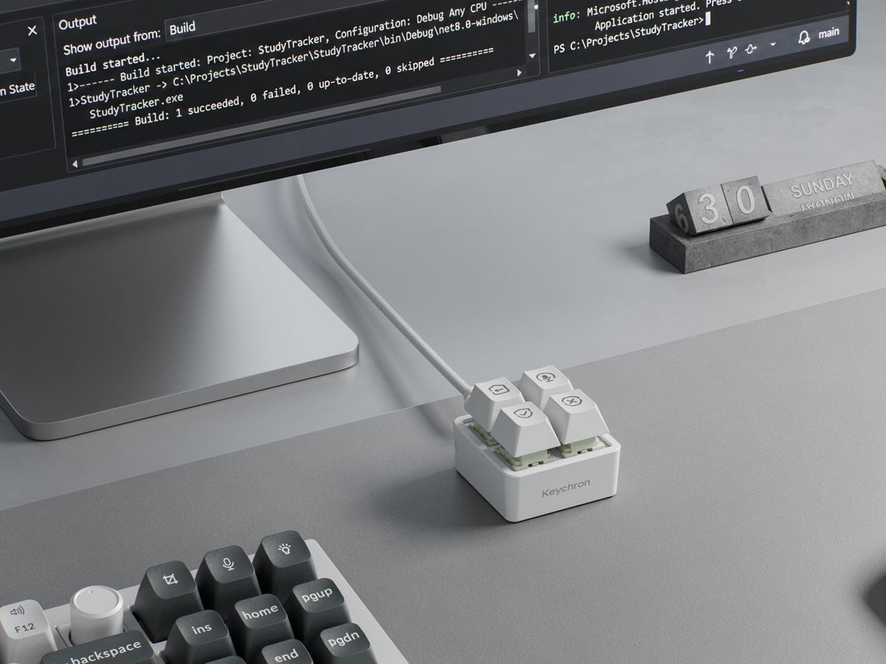
    Working with an AI coding assistant can mean repeating the same handful of commands while your fingers hunt across a keyboard full of other possibilities. Keychron’s F4 HE 8K Vibe Coding Keypad gives those repeated decisions their own little patch of desk. Four programmable keys put prompting, dictation, approval, and rejection within reach, without asking you to replace the keyboard you already use. The square body measures just 1.77 inches on each side, although its tall keycaps bring the hei
     

Keychron’s $35 Keypad Turns AI Shortcuts Into Four Physical Buttons

Par : JC Torres
6 novembre 2026 à 09:20

Working with an AI coding assistant can mean repeating the same handful of commands while your fingers hunt across a keyboard full of other possibilities. Keychron’s F4 HE 8K Vibe Coding Keypad gives those repeated decisions their own little patch of desk. Four programmable keys put prompting, dictation, approval, and rejection within reach, without asking you to replace the keyboard you already use.

The square body measures just 1.77 inches on each side, although its tall keycaps bring the height to 1.35 inches. Available in black or white, it looks like someone neatly cut a corner from a mechanical keyboard. An ABS plastic enclosure surrounds an aluminum plate, leaving the switch housings visible beneath the caps instead of hiding them behind a broad decorative surround.

Designer: Keychron

Those caps do more than supply a place to press. Keychron provides 15 icon options in dye-sublimated PBT, so a microphone, check mark, or cross can identify what you’ve assigned underneath. Per-key RGB adds another cue, letting you color an approval key green and a rejection key red. These are physical labels and configured colors, not screens that update when you switch applications.

The intended routine is familiar if you’ve spent time reviewing generated code. Start a conversation, dictate a change, then accept or reject what comes back, using mappings suited to your software. Keychron supplies Codex and Claude presets through its browser-based Launcher. The microphone icon needs particular attention, though: there’s no microphone inside this little box, so voice input still needs one elsewhere.

Launcher also handles ordinary shortcuts and recorded macros, giving the keypad something to do when you’re finished negotiating with an AI. A meeting mute button or a window-snapping shortcut might earn its place just as easily. Settings save to the device, but the relevant shortcuts still need to work on the next computer. Onboard memory carries your assignments, not the applications they control.

The magnetic switches add a less obvious kind of customization. You can choose how far a key travels before registering, making a shallow press sufficient or requiring a more deliberate movement. Dynamic Keystrokes can assign up to four actions across pressing and releasing one key. That’s extra flexibility, although remembering several hidden actions might undermine the simplicity of having four clearly labeled buttons.

Keychron advertises 8,000 reports per second over USB-C with a suitable cable, a gaming-oriented specification rather than evidence that AI will answer faster. More immediately relevant is another wire trailing from such a small accessory. The listed box contents include the keypad, 11 extra caps, and a manual, but no cable, so you’ll need to provide that part of the setup yourself.

The F4 costs $34.99, but the featured Launcher version remains in beta ahead of its planned November 9, 2026 release. That caveat aside, the question is how often you’re repeating the same commands. Four dedicated buttons are appealing when they remove a daily nuisance, less so when they’re another thing to remember beside your perfectly functional keyboard.

The post Keychron’s $35 Keypad Turns AI Shortcuts Into Four Physical Buttons first appeared on Yanko Design.

  • ✇Yanko Design
  • Razer’s New Hammerhead Earbuds Bring Back the Cable, Not the Headphone Jack
    Wireless earbuds can make a short gaming break depend on whether you remembered to charge their case the night before. Razer’s Hammerhead V3 Chroma takes that worry off the list with a cable that carries audio and power through USB-C. There’s no headphone jack involved in this return to wired listening, and the angled plug has been shaped around the hands holding your phone. The connector has a 90-degree bend, letting the cable run alongside a compatible device rather than sticking straight int
     

Razer’s New Hammerhead Earbuds Bring Back the Cable, Not the Headphone Jack

Par : JC Torres
6 novembre 2026 à 06:07

Wireless earbuds can make a short gaming break depend on whether you remembered to charge their case the night before. Razer’s Hammerhead V3 Chroma takes that worry off the list with a cable that carries audio and power through USB-C. There’s no headphone jack involved in this return to wired listening, and the angled plug has been shaped around the hands holding your phone.

The connector has a 90-degree bend, letting the cable run alongside a compatible device rather than sticking straight into your palm. That matters when you rotate a phone for a game and wrap both hands around its ends. It’s a small adjustment to an unglamorous component, but one that addresses one immediate objection to putting a wire back into a handheld setup.

Designer: Razer

The wire also gives Razer somewhere to put controls that don’t have to share space with an ear tip. An in-line remote handles volume, playback, and active noise cancellation (ANC), with raised controls you can locate by touch rather than tapping an earbud. Its omnidirectional microphone supports calls and team chat, keeping the interactions on the cable instead of behind another phone menu.

Of course, subtlety isn’t really the point of a bright green cable hanging from black earbuds. Circular outer caps carry illuminated Razer logos, with Chroma RGB offering 16.8 million color options. The glossy housings and short stems aren’t particularly dramatic by themselves, but the color makes the whole arrangement unmistakably gaming hardware, even when you’re simply listening to music on the bus.

Inside each earbud, a dynamic driver works alongside a dedicated tweeter, dividing the work between lower and higher frequencies. Razer includes feed-forward ANC, intended to reduce surrounding noise during a commute or a match in a shared room. Noise cancellation brings a familiar wireless-earbud convenience to a wired pair, although neither the driver arrangement nor the connection guarantees great sound on its own.

Four presets cover Gaming, Music, Movies, and Call, alongside a custom equalizer profile for anyone who prefers adjusting the balance themselves. Moving to a PC adds THX Surround Sound 7.1 through Razer Synapse 4. That’s a software-dependent extra, not something the earbuds automatically deliver on every phone, so the same connection doesn’t mean an identical feature set everywhere you plug them in.

The IPX4 rating allows for splashes and sweat, which makes sense for earbuds that might move from a desk to a drizzly commute. It doesn’t turn them into waterproof gear. The cable needs managing: it can catch on clothing or pull against the phone when you reach too far. A bent connector changes its direction, not the distance you’re able to move.

Launched on November 5, 2026, the Hammerhead V3 Chroma costs $79.99 in the US. The trade is straightforward: fewer batteries to remember, but a cable and an occupied USB-C port in return. If that’s your phone’s only charging connection, you’ll need another way to top it up while listening. The earbuds need no charging, but your phone doesn’t get the same night off.

The post Razer’s New Hammerhead Earbuds Bring Back the Cable, Not the Headphone Jack first appeared on Yanko Design.

  • ✇Yanko Design
  • Peak Design’s Charging Station Folds Flat to Charge Two Phones
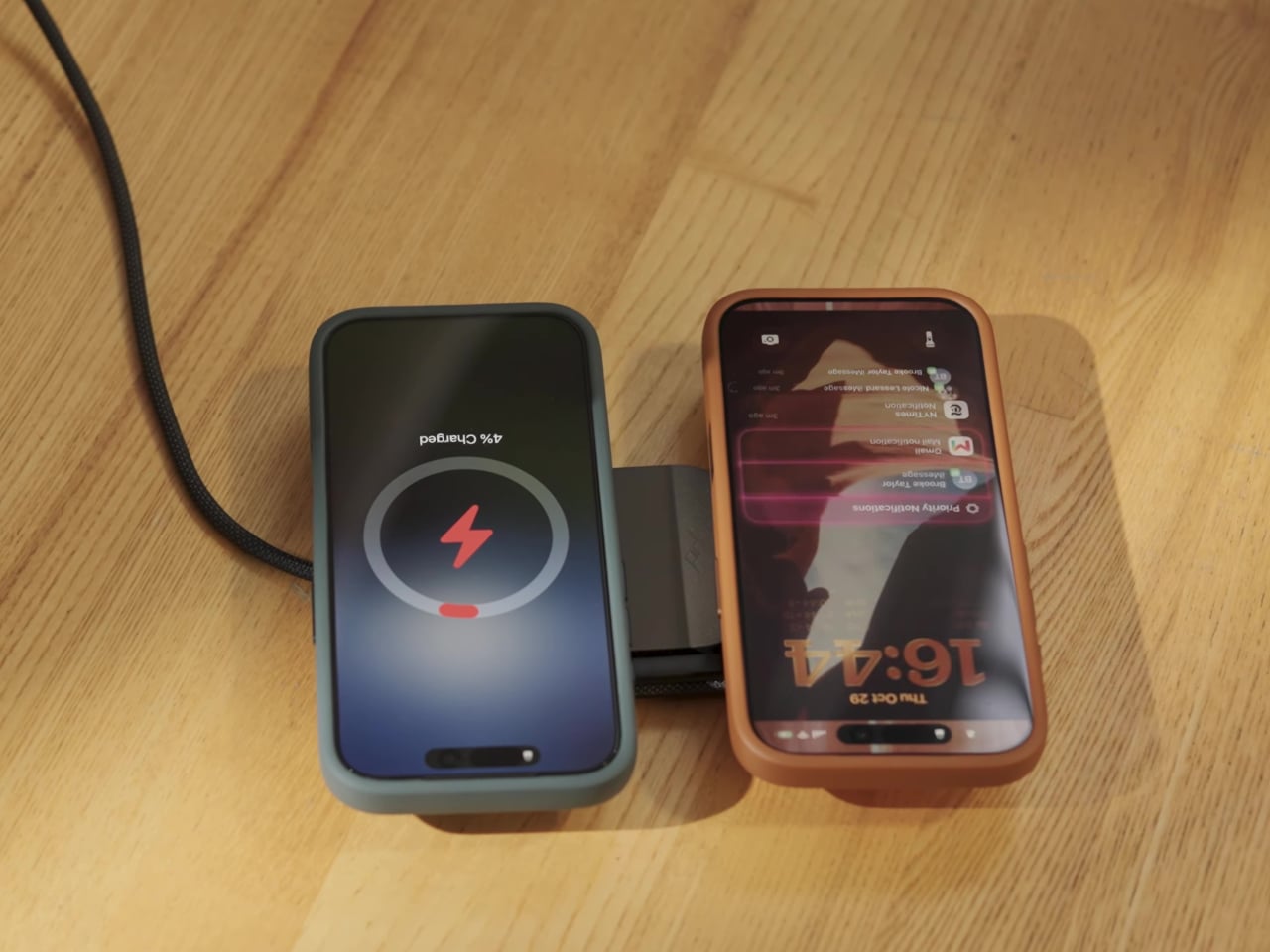
    Charging a phone and a pair of earbuds is easy enough, but sharing that same stand with another phone is a different matter. Peak Design’s new Charging Station addresses that problem with two equally capable magnetic pads and a hinged arm. Stand it up beside your laptop, or lay it flat so two phones can recharge without competing for the better spot. The shape is straightforward, with a narrow metal arm linking two rounded-square charging surfaces. Die-cast aluminum and zinc form the chassis, w
     

Peak Design’s Charging Station Folds Flat to Charge Two Phones

Par : JC Torres
4 novembre 2026 à 10:20

Charging a phone and a pair of earbuds is easy enough, but sharing that same stand with another phone is a different matter. Peak Design’s new Charging Station addresses that problem with two equally capable magnetic pads and a hinged arm. Stand it up beside your laptop, or lay it flat so two phones can recharge without competing for the better spot.

The shape is straightforward, with a narrow metal arm linking two rounded-square charging surfaces. Die-cast aluminum and zinc form the chassis, while the machined aluminum stem provides the moving structure. Laminated Clarino covers the pads, and a non-slip TPU foot sits underneath. Black and Moon finishes keep the color choices restrained, rather than turning your nightstand into a brightly branded electronics display.

Designer: Peak Design

Two hinges let you adjust the arm and upper pad separately, positioning a phone for a video call or a glance at your calendar. Magnetic attachment supports portrait and landscape orientations, so changing what you’re doing doesn’t require another stand. An earbud case can sit on the lower pad while the phone stays raised, keeping both devices within the same small desktop footprint.

The lower pad gets more interesting when you fold the station flat. Peak Design rates both Qi2.2 pads for up to 25W simultaneously, allowing two compatible phones to recharge at once without assigning one a slower accessory spot. That doesn’t mean every magnetically attached phone will receive 25W, though. The device’s own charging support still determines how much power it can accept.

That folding movement also changes how the charger travels. Packed flat, it measures 6.3 by 2.7 by 0.6 inches, with the arm tucked alongside the body instead of projecting into your bag. At 9.7 ounces, it still adds weight to a travel kit, but you aren’t packing a rigid desktop stand just to keep a phone propped up in a hotel room.

A separate USB-C output makes room for a third device, although this connection is wired. Its 7.5W output is suited to smaller accessories rather than replacing a laptop charger. A watch still needs its own charging cable or puck, so this isn’t a dedicated three-device wireless dock. It simply gives that extra cable somewhere to connect without occupying another outlet on the wall.

The $99.95 price also leaves out the wall adapter. Peak Design includes a fabric-wrapped USB-C cable rated for 100W, but specifies at least a 45W power supply to operate the station and 75W or more for maximum dual charging speed. That makes the adapter part of the buying decision, particularly if your existing charger is already committed to powering something else at home.

The post Peak Design’s Charging Station Folds Flat to Charge Two Phones first appeared on Yanko Design.
  • ✇Yanko Design
  • Xbox Put a Working Series X Inside a Giant Fake Alligator
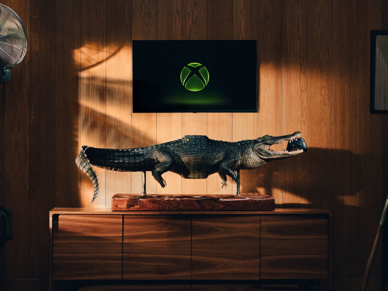
    Finding a place for a game console usually means clearing a shelf, not making room for a reptile. Microsoft’s Xbox Series X-BITE puts a working Series X inside an artificial alligator measuring more than five feet long. The one-off creation trades a discreet electronics box for something closer to a wildlife exhibit, complete with a controller between its teeth. The alligator rests on slim posts above a rectangular, wood-grain base, with its legs hanging below and its tail curling toward the fl
     

Xbox Put a Working Series X Inside a Giant Fake Alligator

Par : JC Torres
4 novembre 2026 à 09:20

Finding a place for a game console usually means clearing a shelf, not making room for a reptile. Microsoft’s Xbox Series X-BITE puts a working Series X inside an artificial alligator measuring more than five feet long. The one-off creation trades a discreet electronics box for something closer to a wildlife exhibit, complete with a controller between its teeth.

The alligator rests on slim posts above a rectangular, wood-grain base, with its legs hanging below and its tail curling toward the floor. Dark, ridged scales and a lighter belly give it the appearance of a mounted specimen. That familiar display format does much of the work, making the oversized enclosure feel deliberately theatrical rather than like an ordinary console wearing a novelty cover.

Designer: Microsoft (Xbox)

A raised section on its back interrupts those scales, with an illuminated Xbox Nexus symbol worked into the surface. It’s the clearest clue that the animal has supposedly swallowed something it shouldn’t. The branding stays small against the length of the body, allowing the fabrication to carry the joke before the glowing logo explains why there’s an alligator underneath your television in the first place.

The head gets a less subtle treatment. Xbox-green irises surround pupils shaped around the Nexus symbol, turning the creature’s stare into another brand reference. Between the open jaws sits a custom Xbox Wireless Controller with artificial bite marks. It gives the sculpture a little unfinished business, as though the console wasn’t quite enough of a meal and the accessories were next on the menu.

The commission went to creature-effects specialists, who used 3D modeling, sculpting, and fabrication to build the animal around the hardware. That process gives a promotional console the attention normally associated with a film prop. Florida supplied the inspiration, according to Xbox, although the animal itself is entirely artificial. No actual alligators were used or harmed in creating this unusually elaborate console enclosure.

For the person who eventually owns it, the obvious challenge is finding a suitable place to put it. More than five feet of reptile won’t disappear into the usual gap beside a television. Its long base asks for a substantial display surface, and the raised mounting makes the whole assembly something to plan a room around rather than tuck away.

There’s also a qualification behind the playable-console claim. Xbox says the Series X inside works, but its fine print recommends the finished creation for display. The announcement doesn’t explain ventilation, access to ports, or servicing inside the sculpted body. That leaves a distinction between functioning hardware and a practical replacement for the console you switch on every evening after work.

Only one Series X-BITE exists, and it’s being offered through a sweepstakes rather than a retail release. There isn’t a shelf price to weigh against a standard console or a choice of less toothy finishes. The appeal is owning the fabrication itself, with a working Xbox as its unlikely inhabitant. The controller has a home, provided you don’t mind the teeth.

The post Xbox Put a Working Series X Inside a Giant Fake Alligator first appeared on Yanko Design.
  • ✇Yanko Design
  • Easy Cooking Stove Concept Folds Its Burner and Pot Supports Into One Case
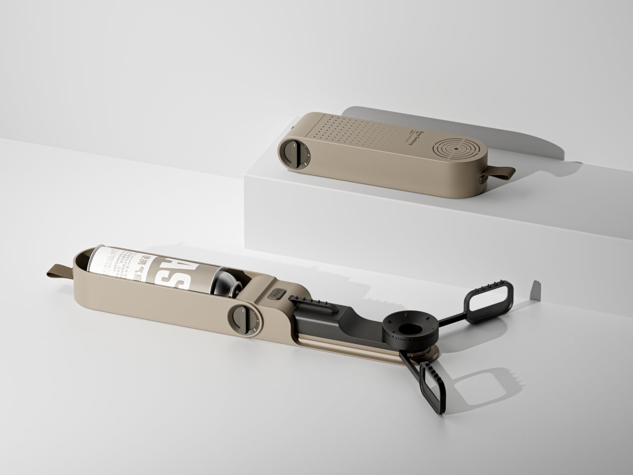
    Camping stoves can be awkward things to pack, especially when the burner and pot supports insist on keeping their cooking shape inside your bag. Easy Cooking approaches that problem with a folding stove concept that tucks its parts into an elongated, rounded case. Developed in 2023, it proposes a smaller package for the trip without making you assemble a kitchen from loose pieces. The closed body has a sandy beige finish, interrupted by black details and a short fabric loop at one end. Concentr
     

Easy Cooking Stove Concept Folds Its Burner and Pot Supports Into One Case

Par : JC Torres
3 novembre 2026 à 12:20

Camping stoves can be awkward things to pack, especially when the burner and pot supports insist on keeping their cooking shape inside your bag. Easy Cooking approaches that problem with a folding stove concept that tucks its parts into an elongated, rounded case. Developed in 2023, it proposes a smaller package for the trip without making you assemble a kitchen from loose pieces.

The closed body has a sandy beige finish, interrupted by black details and a short fabric loop at one end. Concentric slots near the opposite end echo the circular burner hidden inside, while a field of smaller perforations breaks up the broad face. It’s a restrained way to give camping equipment some character without covering it in rugged-looking armor or oversized branding.

Designers: Hao Kong, Qi Qiu

Opening it changes the relationship between those parts. The burner extends away from the housing, and three serrated pot supports spread around it to create a cooking position wider than the packed form. Folded inward, those supports nest alongside the burner. The proposal concentrates on rearranging what a stove needs, rather than giving a conventional rectangular cooktop a handle and calling it portable.

The fuel cartridge sits lengthwise inside the open housing, keeping the supply beside the burner rather than requiring a separate fuel hose. A large rotary dial occupies the side, and an OPEN label marks a separate control on top. Those familiar physical cues suggest where to begin, although the presentation doesn’t explain the ignition system or the cartridge’s locking and release mechanisms.

That arrangement would make sense for a quick outdoor meal, when you want to put a kettle on without unpacking a boxy tabletop appliance. The enclosure serves two jobs: concealing the burner for transport and accommodating the cartridge once the stove is deployed. Its usefulness would depend on how easily those parts move, especially after grit and food residue get into the joints.

There’s a precedent for this kind of transformation. Snow Peak’s Home & Camp Burner, released in 2019, also folds its burner into an enclosure that holds a butane cartridge during use. Easy Cooking explores that packing problem with a flatter, capsule-like outline. The shared idea makes the details of deployment more interesting than any suggestion that folding a stove is entirely new.

Easy Cooking remains a concept rather than an established retail product. There’s no mention of dimensions or weight figures to demonstrate how much space it saves, and material grades aren’t specified. The folding supports leave practical questions about how a full pot would be held above the ground, particularly when stirring or lifting it could shift the load across that narrow structure.

Heat management matters as much as the folding trick. Snow Peak warns that certain cookware can radiate enough heat toward its canister to create a hazard, a reminder of what’s at stake when fuel and flame share a small footprint. Making the stove disappear for travel is appealing; keeping its fuel from overheating once a pan goes on top demands more care.

The post Easy Cooking Stove Concept Folds Its Burner and Pot Supports Into One Case first appeared on Yanko Design.
  • ✇Yanko Design
  • NOX Cordless Lamp Lets You Carry the Beam Without the Base
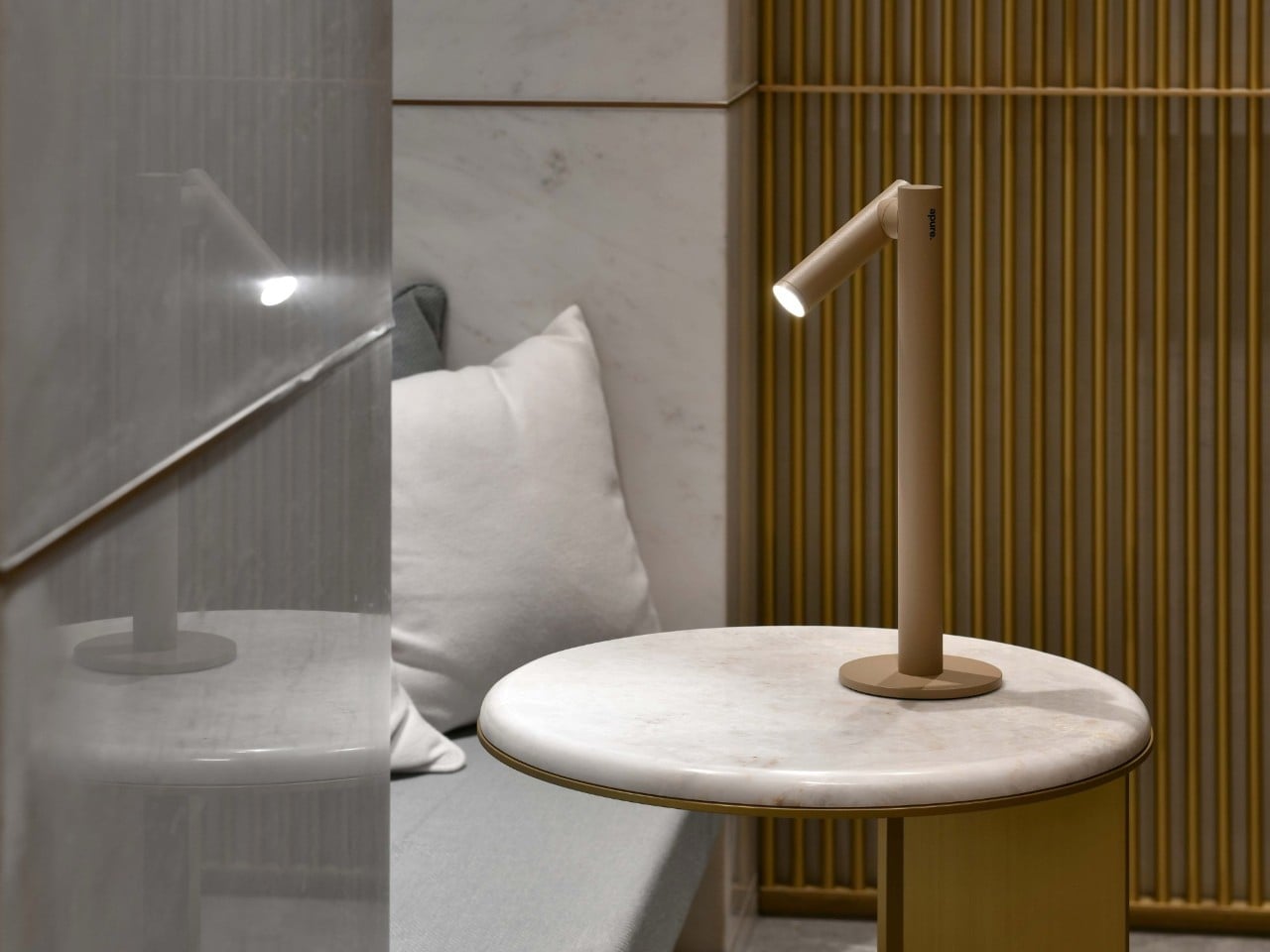
    Cordless table lamps let you move the whole fixture, but sometimes you only need to take the light. Studio Apure’s NOX makes that distinction with a magnetic head that lifts away from its stand and becomes a small flashlight. The stand can stay beside your chair while its illuminated tip follows you down a dark hallway, without carrying the base along for company. The shape gives that arrangement a surprisingly tidy home. A slender upright rises from a flat circular foot, with a shorter cylinde
     

NOX Cordless Lamp Lets You Carry the Beam Without the Base

Par : JC Torres
3 novembre 2026 à 06:07

Cordless table lamps let you move the whole fixture, but sometimes you only need to take the light. Studio Apure’s NOX makes that distinction with a magnetic head that lifts away from its stand and becomes a small flashlight. The stand can stay beside your chair while its illuminated tip follows you down a dark hallway, without carrying the base along for company.

The shape gives that arrangement a surprisingly tidy home. A slender upright rises from a flat circular foot, with a shorter cylinder attached near the top. There’s no broad shade or long articulated arm competing for space above a bedside table. Onyx Black, Nimbus Grey, and Dune Beige keep the finish choices subdued, letting the changing angle of the head supply most of the character.

Designer: Studio Apure (via The Curation)

That head rotates through 360 degrees, so you can redirect the beam without shifting everything else on the table. An adjustable lens changes its spread from a broad glow to a concentrated spot. You might keep the light wide during dinner, then narrow it toward a book afterward, giving the same small fixture two different jobs without changing where the stand sits.

Brightness gets its own adjustment, separate from the beam’s width. Tap the top of the head to switch the LED on or off, and hold to dim it between 5% and 100%. Its 140-lumen output has a warm 3000K color temperature. The touch control stays with the detachable head, so it remains accessible when you’re carrying the light without its supporting stand.

Taking it off the stand changes the scale of what you’re carrying. You can check behind a sofa or retrieve something from a dark closet without balancing an entire lamp in one hand. Return the head to its magnetic attachment, and its battery recharges from the stand. That gives the removable part a parking spot, which is useful for something so small.

Studio Apure estimates 12 to 14 hours of cordless operation for the complete lamp and up to an hour for the detached flashlight, both at full brightness. Recharging the lamp takes about seven hours using the supplied dock and adapter. The stand is therefore the longer-lasting arrangement, while the little light you pull away is better suited to shorter trips around home.

Outdoor trips still come with a few restrictions. NOX carries an IP54 rating, but Studio Apure restricts it to indoor or covered outdoor settings and advises avoiding direct water contact. A sheltered patio table fits that brief; leaving it exposed in the garden doesn’t. Cordless operation removes the outlet from the seating arrangement, not the need to bring the lamp under cover.

Listed at $385, NOX puts a substantial price on that flexibility. Its 2.03-pound weight still lets you carry the whole lamp when you want light somewhere else, while a flashing red ring warns you when it’s time to recharge. You’ll just need to return the head to its stand, since a magnetic connection can’t recharge something you’ve abandoned in a kitchen drawer.

The post NOX Cordless Lamp Lets You Carry the Beam Without the Base first appeared on Yanko Design.
  • ✇Yanko Design
  • Board’s Tabletop Console Uses Toy Spoons and Spaceships Instead of Gamepads
    Touchscreens have plenty of games, but tapping on glass doesn’t quite replace moving a piece across a board. The Board, a tabletop console from the company of the same name, makes that physical interaction central to its design. Its 24-inch screen responds to toy utensils, spaceships, and robots, giving players something to hold while keeping the action on the table between them. The broad, wood-finished frame gives it more in common with a serving tray than a television console. Rounded corner
     

Board’s Tabletop Console Uses Toy Spoons and Spaceships Instead of Gamepads

Par : JC Torres
2 novembre 2026 à 13:20

Touchscreens have plenty of games, but tapping on glass doesn’t quite replace moving a piece across a board. The Board, a tabletop console from the company of the same name, makes that physical interaction central to its design. Its 24-inch screen responds to toy utensils, spaceships, and robots, giving players something to hold while keeping the action on the table between them.

The broad, wood-finished frame gives it more in common with a serving tray than a television console. Rounded corners and gently curved edges soften its rectangular outline, while the large screen lies flat so people can gather around it. At 25.7 inches wide and 1.5 inches thick, it’s a substantial tabletop object, not something you’ll casually hold in one hand between turns.

Designer: Board

The clever part is underneath those playful pieces. Each has a distinct conductive pattern on its base that the screen can recognize through capacitive sensing, the same general touch technology used in phones and tablets. According to Board, the pieces contain no batteries, sensors, or electronics. There’s nothing to charge or pair before a plastic spaceship can become your controller for the evening.

That recognition happens through PieceSense, Board’s system for identifying pieces and following their position and rotation. Its machine learning runs on the device rather than sending those interactions to the cloud. It’s also designed to filter out accidental palm touches. That’s an important distinction when several people lean over the same screen, although Board’s developer guidance acknowledges that very fast movements can interrupt tracking.

Chop Chop puts that relationship between shape and action to work. You use a little knife to slice and a spoon to stir, rather than memorizing which button handles each task. The physical tools give the digital kitchen a familiar vocabulary. Passing a utensil across the table also puts some of the game’s coordination outside the screen, where everyone can see it.

Strata takes a different approach, using chunky blocks to build upward and claim territory. Here, the pieces contribute height instead of standing in for characters on a flat display. A new game can redraw the playing field, while different pieces give your hands another way to interact. Of course, those pieces will need a home when it’s time to put everything away.

Board currently lists the console at $339 in the US, reduced from $399, with seven games and their pieces included. There’s no required subscription, and additional individual titles range from free to $34.95. Software downloads directly to the console, while any corresponding pieces ship to your door. Expanding the collection can involve waiting for a package, rather than simply tapping another download button.

There is a power cord to consider, though. Board runs from a wall outlet, so its place on the coffee table depends on where you can plug it in. It’s still another screen in the living room, of course. The interesting design decision is giving everyone an object to move on that screen, with the players sitting close enough to steal your actual spoon.

The post Board’s Tabletop Console Uses Toy Spoons and Spaceships Instead of Gamepads first appeared on Yanko Design.

  • ✇Yanko Design
  • Hero Keyboard Packs a Windows 11 PC and Borrows Your Tablet’s Screen
    Carrying a tablet and a laptop means packing two screens when what you really need is another operating system. Hero Devices’ upcoming Hero Keyboard puts a Windows 11 PC inside a keyboard with its own trackpad and battery, leaving the display to a compatible tablet or monitor. The idea is to carry your computer without committing to the screen attached to it. That makes Hero look rather like a laptop that’s misplaced its lid. Its Midnight Merlot enclosure has rounded corners, black keys, and a
     

Hero Keyboard Packs a Windows 11 PC and Borrows Your Tablet’s Screen

Par : JC Torres
2 novembre 2026 à 12:20

Carrying a tablet and a laptop means packing two screens when what you really need is another operating system. Hero Devices’ upcoming Hero Keyboard puts a Windows 11 PC inside a keyboard with its own trackpad and battery, leaving the display to a compatible tablet or monitor. The idea is to carry your computer without committing to the screen attached to it.

That makes Hero look rather like a laptop that’s misplaced its lid. Its Midnight Merlot enclosure has rounded corners, black keys, and a broad trackpad, with none of the hinge hardware anchoring a display behind it. The aluminum body measures about 10.04 by 7.48 inches and just 0.46 inches thick, although that compact footprint doesn’t leave room for a separate number pad.

Designer: Hero Devices

Inside, Hero specifies an Intel Core Ultra 5 125H processor, 16 GB of memory, and a 512 GB SSD. Windows runs on that hardware, not on the tablet, which simply supplies the display and supported touch inputs. That’s critical when you need a Windows application your tablet can’t run natively, without replacing the mobile software you already enjoy using on it.

Using a tablet as the display takes some software, though. Hero Port uses a standard USB-C data cable for wired video, while touch and stylus inputs travel separately over Bluetooth Low Energy. Hero’s companion app targets iPadOS 17 and later and Android 7 and later, but its product page still marks it as forthcoming. iPhone users are directed to third-party alternatives, such as Duet.

At a desk, a compatible USB-C monitor can provide both a display connection and power through one cable. Move elsewhere, and the same files and applications travel inside the keyboard, rather than needing another PC to pick up the work. The optional $50 Sidekick case gives those separate parts a home, carrying Hero and an 11-inch iPad while doubling as a tablet stand.

Hero has a role when you don’t need Windows. Switch off its PC, and the keyboard and trackpad can still serve a tablet over Bluetooth. You could answer messages in your tablet’s native apps, then switch back to Windows for work that needs it. There’s no need to pack a second keyboard just because you’ve changed operating systems rather than changing screens.

Of course, leaving out the screen doesn’t make the rest weightless. Hero alone weighs about 1.59 pounds, before adding a tablet, stand, or charger. The company promises up to nine hours of battery life and includes a 100-watt USB-C charger, but those figures don’t establish how long your workload will last. The tablet supplying your display also has its own battery to manage.

The Founders Edition is listed at $999 for preorder in the US and Canada, with initial shipments planned for the fourth quarter of 2026. That’s a substantial price for something that still needs a separate display. Its appeal depends on already owning the right screen and wanting Windows enough to accept a cable, an app, and a less self-contained setup than a laptop.

The post Hero Keyboard Packs a Windows 11 PC and Borrows Your Tablet’s Screen first appeared on Yanko Design.

  • ✇Yanko Design
  • This DIY PlayStation 2 Handheld Gives a Foldable Phone Screen a New Job
    The PlayStation 2 was never something you could casually slip into a bag, unless you planned to bring a screen and controller along for the ride. The PlayStation 2 DUO brings those pieces together in an unofficial DIY handheld with an unusual trick. Its screen actually bends in the middle, letting you fold the console when it’s time to put the game away. There’s plenty of familiar territory around that unfamiliar fold. A purple shell surrounds the display, with a D-pad and the four recognizable
     

This DIY PlayStation 2 Handheld Gives a Foldable Phone Screen a New Job

Par : JC Torres
28 octobre 2026 à 12:20

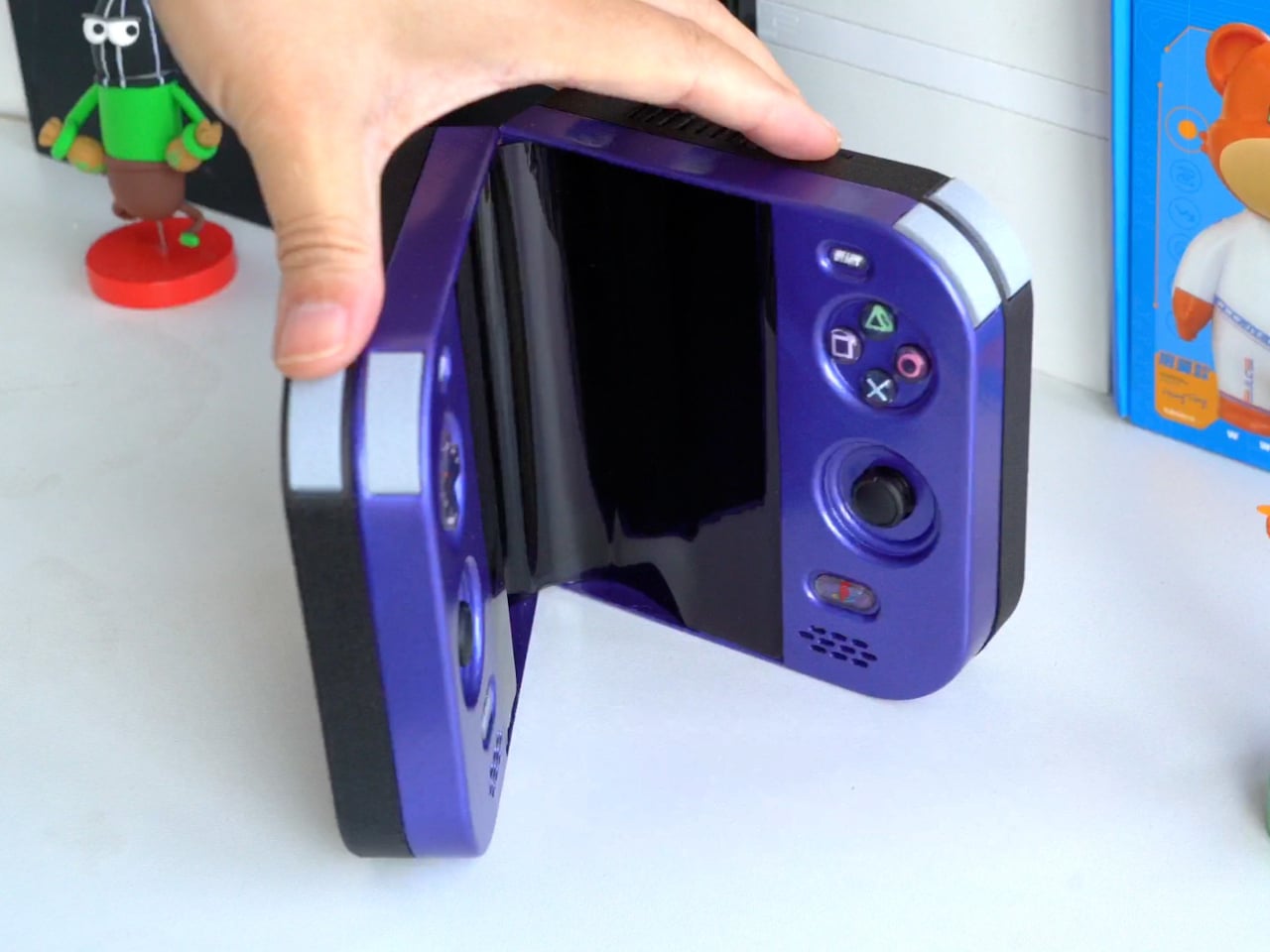
The PlayStation 2 was never something you could casually slip into a bag, unless you planned to bring a screen and controller along for the ride. The PlayStation 2 DUO brings those pieces together in an unofficial DIY handheld with an unusual trick. Its screen actually bends in the middle, letting you fold the console when it’s time to put the game away.

There’s plenty of familiar territory around that unfamiliar fold. A purple shell surrounds the display, with a D-pad and the four recognizable PlayStation symbols sitting above two analog sticks. Start and Select occupy the upper corners, while speaker grilles sit below the controls. The arrangement looks reassuringly conventional, which is probably helpful when the screen between your hands is doing something rather unconventional.

Designer: LCLDIY

That screen is a single flexible panel, rather than two separate displays interrupted by a hinge. The project’s earlier development notes describe a 7.8-inch screen salvaged from a foldable phone. It gives the DUO a generous central canvas when opened, without committing the handheld to that same width inside a bag. Of course, making a screen bend doesn’t make its limitations magically disappear.

The panel needs room to curve, and forcing it into a sharp fold would damage it. That requirement shaped the casing and its hinge, leaving a broad bend instead of squeezing the halves completely flat together. It’s a less tidy package than a closed clamshell might suggest, but the extra space has a practical purpose: keeping that delicate display in one piece.

There’s genuine PlayStation 2 hardware inside as well, rather than a newer computer pretending to be Sony’s console. Getting it to fit required cutting down the original motherboard and rearranging its supporting electronics. A 3D-printed enclosure brings everything together, turning equipment once tethered to a television into something you can hold between both hands. The nostalgia extends beyond the buttons, in other words.

The folding body makes the electronics more complicated, of course. Separate control boards occupy the two sides, with a ribbon cable linking them across the center. The trimmed motherboard also carries a small cooling fan and heatsink. There’s quite a bit happening underneath that playful exterior, particularly for a device whose moving parts include the surface you’re supposed to be staring at.

Folding it up reduces the footprint, but doesn’t automatically make this a pocket console. The published project information doesn’t establish its weight, closed dimensions, or battery runtime, so there’s little reason to start planning an entire flight around it. More importantly, this is a completed hobby build, not an upcoming Sony handheld with a price tag and a place on store shelves.

Enclosure printing files and a PCB archive are available on the project page, although they don’t amount to a complete assembly guide. Recreating the DUO still involves board modification and careful work around a flexible display. That might temper the urge to make one immediately, especially if your experience with PlayStation hardware mostly involves inserting discs rather than cutting up circuit boards.

The post This DIY PlayStation 2 Handheld Gives a Foldable Phone Screen a New Job first appeared on Yanko Design.

  • ✇Yanko Design
  • Strapsicle’s iPad Cases Trade Gripping the Edges for a Silicone Hand Strap
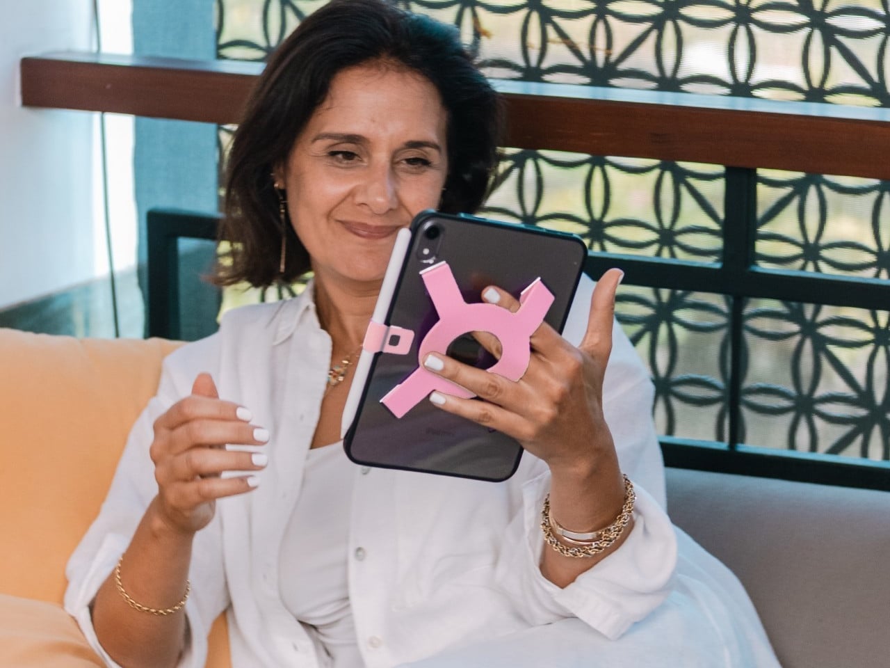
    Apple spends plenty of effort making the iPad thin and light, but that doesn’t mean holding one for an entire chapter feels effortless. A protective case can give it more bulk without giving your fingers much help. Strapsicle’s iPad cases take a different approach, adding a silicone strap that lets your hand support the tablet from behind instead of constantly squeezing its edges. The most conspicuous part of the design is also its most useful idea. Strapsicle calls it the XO strap, a circular
     

Strapsicle’s iPad Cases Trade Gripping the Edges for a Silicone Hand Strap

Par : JC Torres
28 octobre 2026 à 11:20

Apple spends plenty of effort making the iPad thin and light, but that doesn’t mean holding one for an entire chapter feels effortless. A protective case can give it more bulk without giving your fingers much help. Strapsicle’s iPad cases take a different approach, adding a silicone strap that lets your hand support the tablet from behind instead of constantly squeezing its edges.

The most conspicuous part of the design is also its most useful idea. Strapsicle calls it the XO strap, a circular center with four diagonal arms attached to the case. Slide your fingers underneath, and the flexible silicone sits across the back of your hand. That gives the iPad another point of support without turning it into something with a bulky carrying handle.

Designer: Strapsicle

That arrangement also leaves room to change how you hold the tablet. Your fingers can slip under different parts of the strap for portrait reading or landscape browsing, with either hand taking a turn. Of course, the case doesn’t make an iPad weightless. It’s intended to reduce reliance on pinching the edges, not remove the need to support the device at all.

Eventually, though, even the most interesting book has to make way for something else. The front cover folds along its geometric creases to become a stand, offering portrait support for reading and a steeper 75° landscape position for watching videos. There’s also an 8° setup for typing and drawing, bringing the screen closer to the tabletop rather than holding it almost upright.

The cover doesn’t have to follow you through every activity, thankfully. It detaches completely, leaving the rear strap accessible without a folded flap competing for space behind your hand. Small pins connect it to the shell rather than magnets, so removing it is a deliberate step. Put it back on when you’re finished, and the screen has a cover for the trip home.

There’s a smaller silicone loop along the edge for an Apple Pencil, keeping the stylus with the tablet instead of loose in a bag. The main straps are interchangeable, too, so changing colors doesn’t require replacing the whole case. Pink, dark teal, and black give that unusual rear shape a little personality, while the transparent back leaves the iPad’s own finish visible.

Strapsicle lists two sizes, fitting the sixth- and seventh-generation iPad mini or the 10th-generation iPad and iPad (A16). Its announced US launch prices are $69.99 for the mini case and $79.99 for the larger version. The company says they’re shipping now, with the October 26, 2026, announcement marking their B&H retail debut. DataVision sales are scheduled to follow in November.

There is a tradeoff to all that extra support, however. Strapsicle lists the complete mini case at about six ounces and the larger version at 9.8 ounces, including their covers and straps. You’re adding weight to something you’ll still have to hold. Taking the cover off for a chapter on the couch makes sense, then, provided you remember to put it back before heading out.

The post Strapsicle’s iPad Cases Trade Gripping the Edges for a Silicone Hand Strap first appeared on Yanko Design.

  • ✇Yanko Design
  • km5’s Sp1 Speaker and Mp1 Mixer Give CD Listening a DJ-Style Twist
    There’s something satisfying about choosing a CD, even if most of us have become accustomed to tapping a screen instead. The trouble is finding audio equipment you’d actually want to leave on display. km5’s newly announced Sp1 speaker and Mp1 mixer give its Cp1 CD player some equally minimalist company, letting you listen to favorite albums or try your hand at mixing them. Both borrow the Cp1’s flat, frame-like format, with black or white finishes that let the pieces sit together without lookin
     

km5’s Sp1 Speaker and Mp1 Mixer Give CD Listening a DJ-Style Twist

Par : JC Torres
28 octobre 2026 à 06:07

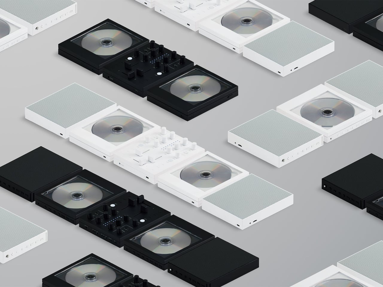
There’s something satisfying about choosing a CD, even if most of us have become accustomed to tapping a screen instead. The trouble is finding audio equipment you’d actually want to leave on display. km5’s newly announced Sp1 speaker and Mp1 mixer give its Cp1 CD player some equally minimalist company, letting you listen to favorite albums or try your hand at mixing them.

Both borrow the Cp1’s flat, frame-like format, with black or white finishes that let the pieces sit together without looking like an assortment of unrelated electronics. The Sp1 puts a perforated grille where the player displays its disc, while the Mp1 fills that space with knobs and sliders. They share the same size, but each makes its purpose clear through its front surface.

Designer: km5

The speaker has a few surprises behind that otherwise quiet appearance. A dot-matrix display sits beneath the grille, showing the time and playback information without carving out a separate screen on the front. Physical buttons occupy the top edge alongside a retractable metal antenna. That last detail gives away the Sp1’s other role as an FM radio that doesn’t need to borrow your phone.

Inside are two 1.77-inch full-range drivers and two passive radiators, though their presence alone doesn’t tell us how convincing the bass will be. Bluetooth and microSD playback offer other ways to listen, and you can record radio programs, too. Pairing two Sp1 units provides stereo playback, letting a single speaker become part of a larger arrangement rather than something you’ve outgrown.

The Mp1, meanwhile, invites you to do something with the music beyond pressing play. Its two channels have separate level sliders, with a crossfader below for blending between sources. Three-band EQ controls adjust the bass, midrange, and treble, while filters change the sound further. Loop buttons repeat sections of a track, giving a favorite passage permission to stick around a little longer.

Two Bluetooth inputs let the mixer receive music from sources such as a Cp1 and a smartphone, then send the combined sound wirelessly to a compatible speaker. You aren’t required to own an entire matching set, thankfully. Line inputs and outputs also accommodate wired connections, though the published information doesn’t establish how much delay the completely wireless arrangement introduces when you’re trying to mix.

Built-in batteries make it easier to move the arrangement away from a desk, with km5 quoting approximately 12 hours for the speaker and six for the mixer. Optional wall-mount accessories offer another way to free up a surface. The mixer can even be operated on the wall, an unusual invitation to get up from the sofa and fiddle with the music yourself.

Preorders are scheduled to open on November 16, 2026, with km5 expecting shipments in February 2027 or later, though pricing remains unconfirmed. There’s also a practical limit to that portable party setup. The speaker’s quoted battery life is twice the mixer’s, so it might be ready for another album when your DJ booth is looking for a charger.

The post km5’s Sp1 Speaker and Mp1 Mixer Give CD Listening a DJ-Style Twist first appeared on Yanko Design.

  • ✇Yanko Design
  • Logitech’s MX Master 4 Developer Edition Is a Mouse Full of Coding Easter Eggs
    Productivity mice aren’t usually the most expressive things on a desk. Their unusual curves and extra buttons often say more about work than the person doing it. Logitech’s MX Master 4 Developer Edition takes a slightly different approach, covering its familiar shape in programming references. The limited-edition mouse keeps the standard model’s features, but gives developers something a little more personal to reach for. Rather than stick to a single muted color, the mouse pairs light gray but
     

Logitech’s MX Master 4 Developer Edition Is a Mouse Full of Coding Easter Eggs

Par : JC Torres
28 octobre 2026 à 04:15

Productivity mice aren’t usually the most expressive things on a desk. Their unusual curves and extra buttons often say more about work than the person doing it. Logitech’s MX Master 4 Developer Edition takes a slightly different approach, covering its familiar shape in programming references. The limited-edition mouse keeps the standard model’s features, but gives developers something a little more personal to reach for.

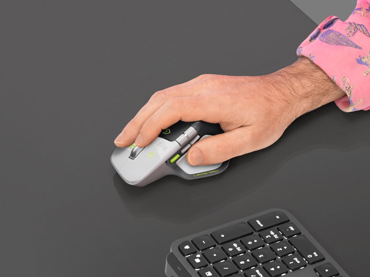
Rather than stick to a single muted color, the mouse pairs light gray buttons with a dark palm rest and bright yellow-green accents. Fine circuit-like lines spread across the front, while coding symbols sit beside the controls. It’s a busier treatment than the regular version, of course, but the graphics follow the mouse’s existing divisions instead of covering everything in one continuous pattern.

Designer: Logitech

Some references are easier to recognize than others. A Hello, World greeting runs along the thumb rest, while smaller markings include 0xFF + 1 and 09.17. Logitech links those last two to Programmers’ Day and the Linux kernel’s release date. You don’t have to understand them to use the mouse, thankfully, although knowing the references does make its decoration feel rather less random.

Underneath that artwork, the familiar sculpted body remains, including a raised back and a broad platform for your right thumb. That thumb gets quite a few responsibilities, with a horizontal scroll wheel, side buttons, and the Haptic Sense Panel within reach. The asymmetric shape hasn’t become ambidextrous for this edition, so left-handed programmers are still left admiring the graphics from the wrong side.

The MagSpeed wheel handles the more familiar business of moving through long documents and code. It switches between stepped scrolling and free-spinning movement, letting you work line by line or move farther through a page. The thumb wheel provides horizontal navigation, which is useful when the thing you’re working on refuses to fit neatly inside a window, as spreadsheets have a habit of doing.

The ripples on the thumb panel hint at another kind of feedback. Rather than relying entirely on what happens onscreen, the mouse can deliver vibrations for supported actions and notifications. Logitech lets users adjust their intensity and customize app-specific feedback through Logi Options+. That doesn’t mean every application suddenly gains a sense of touch, but compatible interactions can have a physical cue.

Pressing the panel also opens Actions Ring, an onscreen collection of shortcuts arranged around the cursor. You can assign tools and macros through Options+, putting frequently used commands near where you’re already working. There is a small irony here, however. Despite the Linux reference on the shell, Logitech doesn’t provide a Linux version of Options+ for configuring that particular shortcut system.

The Developer Edition is listed for US preorder at $119.99, with shipping scheduled to start October 31, 2026. Since its functions match the standard MX Master 4, the choice comes down to how much personality you’d like under your hand. Existing owners won’t find new capabilities here, though the temptation to coordinate a keyboard, desk mat, and everything else remains.

The post Logitech’s MX Master 4 Developer Edition Is a Mouse Full of Coding Easter Eggs first appeared on Yanko Design.

❌