❌

Vue normale

  • ✇Yanko Design
  • After 15 Years, Patek Philippe Returns With a Hand-Wound Chronograph That Stores Energy Like a Bow
    Perpetual calendar chronographs are Patek Philippe’s version of a solar eclipse. They do not happen often, and when they do, everyone stops what they’re doing to look up. The last one arrived back in 2011, which in watch years is basically a geological era. The wait is over, and Patek did not play it safe on the comeback. The new Ref. 5978P-010 is the first watch to combine the brand’s hand-wound chronograph movement with an instantaneous perpetual calendar, a mechanism usually reserved for its
     

After 15 Years, Patek Philippe Returns With a Hand-Wound Chronograph That Stores Energy Like a Bow

4 octobre 2026 à 16:45

Perpetual calendar chronographs are Patek Philippe’s version of a solar eclipse. They do not happen often, and when they do, everyone stops what they’re doing to look up. The last one arrived back in 2011, which in watch years is basically a geological era.

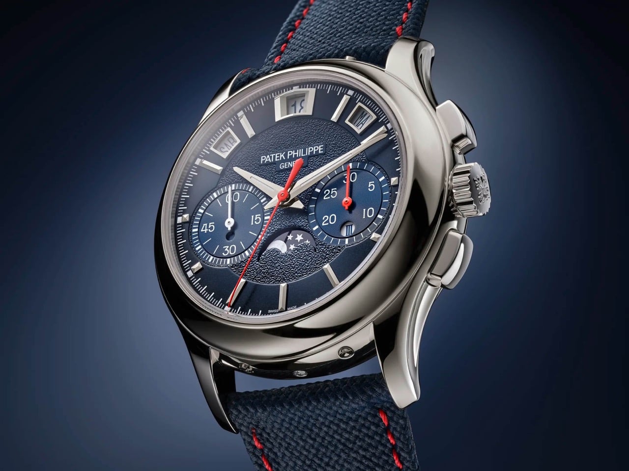
The wait is over, and Patek did not play it safe on the comeback. The new Ref. 5978P-010 is the first watch to combine the brand’s hand-wound chronograph movement with an instantaneous perpetual calendar, a mechanism usually reserved for its most serious grand complications, where every calendar display jumps simultaneously in under 30 milliseconds instead of dragging itself forward at midnight. It debuted at Patek’s seventh Watch Art Grand Exhibition in Milan, limited to 120 platinum pieces at $337,585 each, with a navy dial, red chronograph hands, and calendar text printed in Italian for the occasion. Rare watch, rare city, apparently rare patience too.

Designer: Patek Philippe

The new caliber inside the 5978P-010 is called the CH 29-535 PS QI, a hand-wound movement built from 500 parts. Patek fused two things it already had, the CH 29-535 PS chronograph base from 2009 and the instantaneous calendar module developed for the R CHR 27 PS QI inside references like the 5207, 5308, and 5208. The result is a watch where the day, date, month, leap year, and day and night indicators do not creep forward through the night. Instead, they wait, then snap into their new position together in roughly 30 milliseconds. Even the chronograph’s 30-minute counter gets the same instantaneous treatment, jumping to its next position in one clean motion rather than crawling minute by minute.

Rather than letting a spring slowly push the calendar discs forward, the movement spends hours steadily storing tension, then releases it all at once like a drawn bow. A progressive perpetual calendar can leave a date disc caught mid-flip for a few minutes around midnight, which looks fine until you actually need to read it. This one simply will not do that. The caliber beats at 28,800 vibrations per hour on a Breguet balance spring, and because it is hand-wound, there is no rotor blocking the view, so the full chronograph architecture sits exposed through the sapphire caseback.

The 42mm (1.65 inch) platinum case measures 14.24mm (0.56 inch) thick, with a concave bezel and scalloped lugs lifted from the Calatrava-style cases of the 5208 and 5205, a departure from the ornate shapes Patek usually reserves for this complication. A single diamond sits at 6 o’clock, the hallmark Patek adds to every platinum watch in its catalog. The sunburst navy dial fades into a black-gradient rim around a textured center, with white gold faceted markers and dauphine hands finished in white luminescent coating. Red varnished hands carry the chronograph and small seconds, the only flash of color on the dial. Calendar apertures ring the top of the dial between 10 and 2 o’clock, with the moon phase sitting at 6 and the instantaneous 30-minute counter opposite it at 3.

Patek’s own marketing describes the 5978P-010 as a sporty look timepiece, which is a strange way to describe a platinum perpetual calendar chronograph until you look at it. The navy and red color scheme, paired with a composite strap finished in a fabric weave rather than alligator, borrows more from the Aquanaut than from anything in the formal grand complications catalog. It is not the first time Patek has let its sportier instincts bleed into serious territory. We covered the Cubitus back when it launched, a watch that took the Nautilus’s DNA and reshaped it into something squarer and more divisive. The 5978P-010 is a subtler version of that same impulse, applied to a complication that has spent 85 years dressed for black tie.

The calendar windows on the 5978P-010 are printed in Italian, so Saturday reads SAB instead of SAT, a detail that only makes sense once you know this watch was built for Milan. The strap repeats the gesture in miniature, with a stopping point stitched in the colors of the Italian flag just before the clasp. Patek built the watch for its seventh Watch Art Grand Exhibition, which opened October 2 inside Milan’s CityOval and runs free through October 18. It is one of seven limited editions made for this stop on the tour, a group that also includes enamel-dialed World Time minute repeaters and three carbon-patterned Calatravas in the same tricolore palette. Altogether those seven references add up to 685 pieces, a genuinely small run by Patek’s standards.

There is a catch for anyone outside Italy who wants this watch: all seven Milan editions, including the 5978P-010, sell exclusively through Patek retailers inside the country. Buyers elsewhere wait for one to surface at auction, where past exhibition pieces have historically carried a premium over retail. At $337,585, this was never going to be an impulse buy, and the exclusivity only adds to that. What sticks with me is not the price, it is the choice to dress the brand’s most formal complication pairing in a strap that would not look out of place on a dive watch. Eighty five years after the 1518 started this lineage in stern black and gold, Patek just sent its most serious watch out wearing red sneakers, and somehow it works.

The post After 15 Years, Patek Philippe Returns With a Hand-Wound Chronograph That Stores Energy Like a Bow first appeared on Yanko Design.
  • ✇Yanko Design
  • Would you pay $14,000 for an iPhone Duo without any cameras?
    Imagine sitting at a table with friends and whipping your phone out. Your friends see it’s a foldable… then as you unfold it, the animation looks suspiciously like the iPhone Duo. Your friends are impressed, they designate you as the group photo taker… and you tell them regrettably that your iPhone Duo has no cameras. Then you add… not only does it not sport any cameras, it also costs fourteen grand. To be honest, that scenario is entirely imaginary. Mainly for a bunch of key reasons. Caviar bu
     

Would you pay $14,000 for an iPhone Duo without any cameras?

1 octobre 2026 à 16:30

Imagine sitting at a table with friends and whipping your phone out. Your friends see it’s a foldable… then as you unfold it, the animation looks suspiciously like the iPhone Duo. Your friends are impressed, they designate you as the group photo taker… and you tell them regrettably that your iPhone Duo has no cameras. Then you add… not only does it not sport any cameras, it also costs fourteen grand.

To be honest, that scenario is entirely imaginary. Mainly for a bunch of key reasons. Caviar built this version of the iPhone Duo for privacy, championing what they call “Privacy, Minimalism, and a Refined Masculine Style.” Someone who sees truth in that ethos isn’t designated photographer material. And if they were, shelling 14k on a phone means you probably have a few extra grand to hire a photographer wherever you go. The only reason someone buys this hare-brained version of the iPhone Duo is because they can. Plain and simple.

Designer: Caviar Global

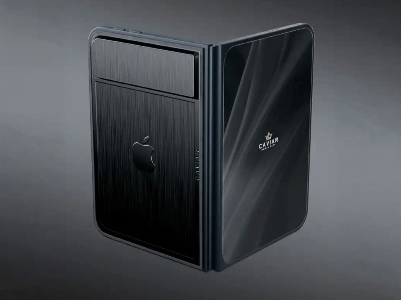
Removing the camera stack from the back of the iPhone Duo does something unexpected: the phone becomes genuinely beautiful. That rear panel, normally dominated by the triple-lens module, turns into a single flat sheet of satin-finished black titanium. No bumps, no rings, no glass circles competing for visual real estate, just one uninterrupted surface that shifts character depending on the light hitting it. Caviar calls the inspiration “supersonic aviation aesthetics,” which sounds like marketing speak until you actually look at the product photos. A blacked-out Apple logo sits flush in the titanium, the Caviar crown marks the opposite panel in a swept fabric-like texture, and the whole thing looks less like a phone and more like a prop from a very expensive spy film.

Apple’s decision to use Touch ID for the iPhone Duo, abandoning Face ID, turns out to be what makes Caviar’s camera-free execution actually hold up. A Face ID phone needs its front camera array to function as a biometric sensor, so pulling that out would mean a very pretty device that cannot unlock. Touch ID lives in the frame rather than behind the screen, so Caviar could strip the entire camera stack, front hole-punch and rear module both, without breaking anything fundamental. Based on product images, the inner display on the Ultimate appears completely clean, no hole-punch interrupting the screen, which makes the inside as seamless as the outside. Two separate design decisions from two separate companies ended up fitting together better than either could have planned.

Caviar made 19 of these total. Each unit ships in a custom lockable black luxury box, presented the way a jeweler presents a watch rather than the way Apple ships a phone. A smaller gold-colored wooden case inside holds what appears to be a gold-plated commemorative coin, the kind of object that exists purely to make the unboxing feel like a ceremony. The side of the phone is engraved with a serial number too, for exclusivity. Caviar knows exactly who they are selling to, and made sure the packaging matches the energy.

Caviar has been doing this for years, taking flagship Apple hardware somewhere Apple would never go, for clients who appreciate the gesture. The formula is consistent: start with the most premium Apple product on the market, make it rarer, make it more dramatic, and let the price be the final statement. We have covered their gold-plated and titanium iPhone builds here before, and none of them committed this hard to stripping features as a form of self-expression. At $13,990 for 19 units (mind you, that’s just the 512GB variant), the Ultimate is the purest version of the Caviar argument: a phone that costs seven times its base price because it does less, and somehow makes that sound like the point.

The post Would you pay $14,000 for an iPhone Duo without any cameras? first appeared on Yanko Design.

  • ✇Yanko Design
  • L’Objet Secretly Built Its Best Tableware Around a Single Shell
    I’ve always thought shells are underrated as design references. They’re one of nature’s most perfect spirals, built by something soft and unassuming, yet the shape ends up looking engineered on purpose. L’Objet and jewelry designer Jessica McCormack clearly feel the same way, because their new collaboration turns that spiral into the backbone of an entire tableware collection, and it works because the shape never feels decorative for its own sake. It feels structural, like the whole line was bu
     

L’Objet Secretly Built Its Best Tableware Around a Single Shell

19 septembre 2026 à 09:20

I’ve always thought shells are underrated as design references. They’re one of nature’s most perfect spirals, built by something soft and unassuming, yet the shape ends up looking engineered on purpose. L’Objet and jewelry designer Jessica McCormack clearly feel the same way, because their new collaboration turns that spiral into the backbone of an entire tableware collection, and it works because the shape never feels decorative for its own sake. It feels structural, like the whole line was built around it rather than sprinkled with it.

The problem this collection solves is a simple one. Most home collections borrow a motif and slap it everywhere until it loses meaning. A shell shows up on a napkin ring, then again on a candle, then again on a coaster, and by the third repetition it’s just noise. McCormack and L’Objet avoid that trap by treating the shell and its spiral as a load-bearing idea rather than a sticker. The swirl becomes a vase, its opening tilted just enough that flowers spill out at an angle instead of standing at attention. The same spiral, cast in gold, becomes a standalone object on a pedestal, polished until it looks like something pulled from a jewelry vitrine rather than a shelf.

Designer: Jessica McCormack

What sells the whole thing is the rope detail running through nearly every piece. Twisted cord, the kind you’d expect on a jewelry clasp or the trim of an old evening bag, wraps around the rim of an ice bucket, lines the edge of gold-rimmed plates, and forms the handle on a champagne cooler tucked into a velvet scallop-back chair in one of the campaign shots. It’s a small, consistent gesture, and that consistency is what makes the collection read as a single idea rather than a grab bag of pretty objects. You see the rope on the frame of a picture, then again on the handle of a fish server, and your eye starts connecting dots without anyone telling you to.

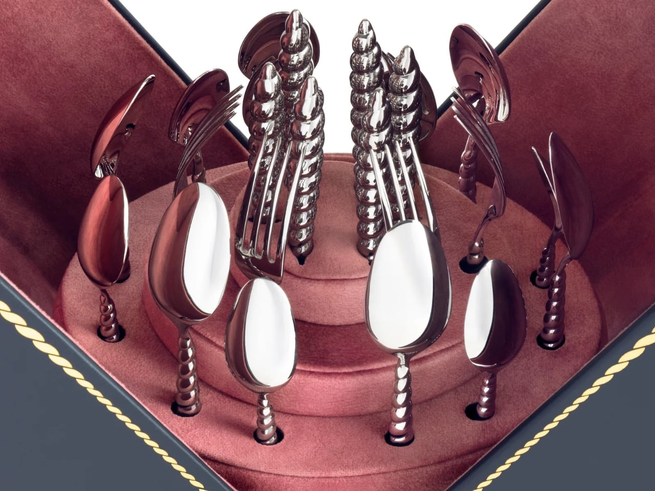
That fish server is part of the collection’s biggest milestone, even if it doesn’t announce itself as one. This marks L’Objet’s first-ever cutlery collection, and the brand chose to debut it wrapped entirely in the shell-and-rope language rather than starting with something safer. The flatware handles curl into spiraled shells, cast in the same gold finish as the rest of the tableware, so a fork looks less like an accessory to the collection and more like a piece of jewelry that happens to also feed people. For a house that’s spent years building a name in porcelain and glass, launching into cutlery through this particular design vocabulary feels less like a cautious first step and more like a statement about what the shape can do.

The serving pieces are where the shell shape gets the most literal, and that’s the right call. A bowl shaped like a conch shell, glazed in white with a gold-lined interior, holds a pile of cherry tomatoes in one shot and looks completely at home doing it. It’s not pretending to be a jewelry box. It’s a bowl that happens to have grown out of a shape usually reserved for something you’d wear. Two shell-handled forks pierce a pair of roasted fish on a rope-trimmed platter in another image, and the detail barely announces itself. You’d have to be looking for it. That’s the quiet confidence running through this whole release. Nothing here is shouting for attention, even when the materials, fine porcelain, hand-gilded gold, polished metal, would give it every right to.

McCormack’s jewelry has always leaned into antique reference points without feeling costumey, and that instinct translates cleanly into tableware, cutlery included. Her Georgian-era motifs, the twisted rope, the shell curves, were never really about the ocean specifically. They were about movement frozen into something solid, the same way a chain looks like it’s still swaying even when it’s sitting still on a table. L’Objet’s Mediterranean sensibility meets that idea halfway, and the result feels less like two brands cross-promoting and more like two people who see the same shape in different materials and decided to build a table setting, flatware and all, out of the overlap.

None of this needed a marine theme to feel cohesive. Shells and spirals could easily have read as a summer gimmick, gone by September. Instead they’re used as structure, the same way a good building leans on a repeated column rather than a repeated slogan. A gold-rimmed teacup, a swirl-handled vase, a shell-handled fork resting beside a scallop-backed chair holding an ice bucket shaped like the same curve, none of it needs an explanation once you notice the pattern. It just clicks into place, the way a good spiral always does, curling back toward its own center without ever quite repeating itself.

The post L’Objet Secretly Built Its Best Tableware Around a Single Shell first appeared on Yanko Design.

❌