❌

Vue normale

  • ✇Yanko Design
  • This DIY PlayStation 2 Handheld Gives a Foldable Phone Screen a New Job
    The PlayStation 2 was never something you could casually slip into a bag, unless you planned to bring a screen and controller along for the ride. The PlayStation 2 DUO brings those pieces together in an unofficial DIY handheld with an unusual trick. Its screen actually bends in the middle, letting you fold the console when it’s time to put the game away. There’s plenty of familiar territory around that unfamiliar fold. A purple shell surrounds the display, with a D-pad and the four recognizable
     

This DIY PlayStation 2 Handheld Gives a Foldable Phone Screen a New Job

Par : JC Torres
28 octobre 2026 à 12:20

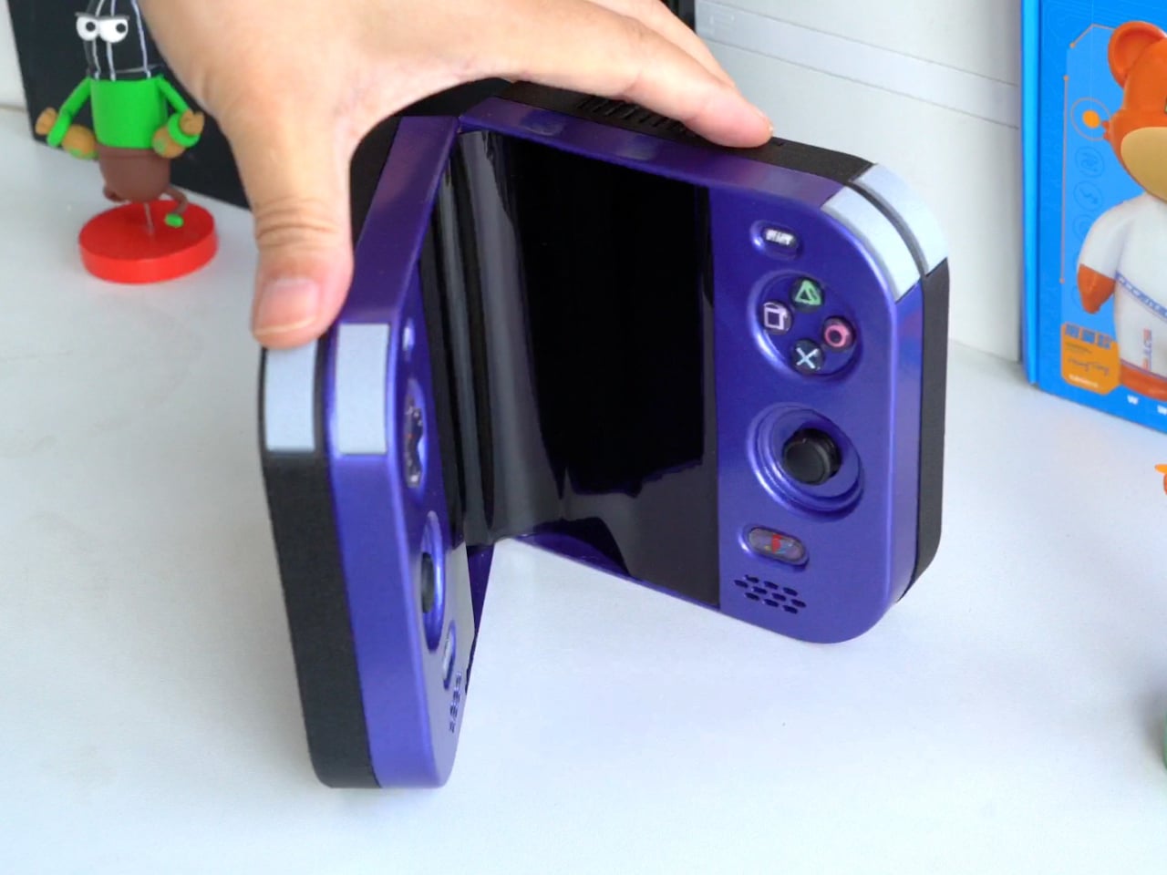
The PlayStation 2 was never something you could casually slip into a bag, unless you planned to bring a screen and controller along for the ride. The PlayStation 2 DUO brings those pieces together in an unofficial DIY handheld with an unusual trick. Its screen actually bends in the middle, letting you fold the console when it’s time to put the game away.

There’s plenty of familiar territory around that unfamiliar fold. A purple shell surrounds the display, with a D-pad and the four recognizable PlayStation symbols sitting above two analog sticks. Start and Select occupy the upper corners, while speaker grilles sit below the controls. The arrangement looks reassuringly conventional, which is probably helpful when the screen between your hands is doing something rather unconventional.

Designer: LCLDIY

That screen is a single flexible panel, rather than two separate displays interrupted by a hinge. The project’s earlier development notes describe a 7.8-inch screen salvaged from a foldable phone. It gives the DUO a generous central canvas when opened, without committing the handheld to that same width inside a bag. Of course, making a screen bend doesn’t make its limitations magically disappear.

The panel needs room to curve, and forcing it into a sharp fold would damage it. That requirement shaped the casing and its hinge, leaving a broad bend instead of squeezing the halves completely flat together. It’s a less tidy package than a closed clamshell might suggest, but the extra space has a practical purpose: keeping that delicate display in one piece.

There’s genuine PlayStation 2 hardware inside as well, rather than a newer computer pretending to be Sony’s console. Getting it to fit required cutting down the original motherboard and rearranging its supporting electronics. A 3D-printed enclosure brings everything together, turning equipment once tethered to a television into something you can hold between both hands. The nostalgia extends beyond the buttons, in other words.

The folding body makes the electronics more complicated, of course. Separate control boards occupy the two sides, with a ribbon cable linking them across the center. The trimmed motherboard also carries a small cooling fan and heatsink. There’s quite a bit happening underneath that playful exterior, particularly for a device whose moving parts include the surface you’re supposed to be staring at.

Folding it up reduces the footprint, but doesn’t automatically make this a pocket console. The published project information doesn’t establish its weight, closed dimensions, or battery runtime, so there’s little reason to start planning an entire flight around it. More importantly, this is a completed hobby build, not an upcoming Sony handheld with a price tag and a place on store shelves.

Enclosure printing files and a PCB archive are available on the project page, although they don’t amount to a complete assembly guide. Recreating the DUO still involves board modification and careful work around a flexible display. That might temper the urge to make one immediately, especially if your experience with PlayStation hardware mostly involves inserting discs rather than cutting up circuit boards.

The post This DIY PlayStation 2 Handheld Gives a Foldable Phone Screen a New Job first appeared on Yanko Design.
  • ✇Yanko Design
  • Strapsicle’s iPad Cases Trade Gripping the Edges for a Silicone Hand Strap
    Apple spends plenty of effort making the iPad thin and light, but that doesn’t mean holding one for an entire chapter feels effortless. A protective case can give it more bulk without giving your fingers much help. Strapsicle’s iPad cases take a different approach, adding a silicone strap that lets your hand support the tablet from behind instead of constantly squeezing its edges. The most conspicuous part of the design is also its most useful idea. Strapsicle calls it the XO strap, a circular
     

Strapsicle’s iPad Cases Trade Gripping the Edges for a Silicone Hand Strap

Par : JC Torres
28 octobre 2026 à 11:20

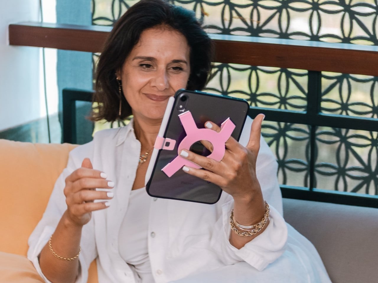
Apple spends plenty of effort making the iPad thin and light, but that doesn’t mean holding one for an entire chapter feels effortless. A protective case can give it more bulk without giving your fingers much help. Strapsicle’s iPad cases take a different approach, adding a silicone strap that lets your hand support the tablet from behind instead of constantly squeezing its edges.

The most conspicuous part of the design is also its most useful idea. Strapsicle calls it the XO strap, a circular center with four diagonal arms attached to the case. Slide your fingers underneath, and the flexible silicone sits across the back of your hand. That gives the iPad another point of support without turning it into something with a bulky carrying handle.

Designer: Strapsicle

That arrangement also leaves room to change how you hold the tablet. Your fingers can slip under different parts of the strap for portrait reading or landscape browsing, with either hand taking a turn. Of course, the case doesn’t make an iPad weightless. It’s intended to reduce reliance on pinching the edges, not remove the need to support the device at all.

Eventually, though, even the most interesting book has to make way for something else. The front cover folds along its geometric creases to become a stand, offering portrait support for reading and a steeper 75° landscape position for watching videos. There’s also an 8° setup for typing and drawing, bringing the screen closer to the tabletop rather than holding it almost upright.

The cover doesn’t have to follow you through every activity, thankfully. It detaches completely, leaving the rear strap accessible without a folded flap competing for space behind your hand. Small pins connect it to the shell rather than magnets, so removing it is a deliberate step. Put it back on when you’re finished, and the screen has a cover for the trip home.

There’s a smaller silicone loop along the edge for an Apple Pencil, keeping the stylus with the tablet instead of loose in a bag. The main straps are interchangeable, too, so changing colors doesn’t require replacing the whole case. Pink, dark teal, and black give that unusual rear shape a little personality, while the transparent back leaves the iPad’s own finish visible.

Strapsicle lists two sizes, fitting the sixth- and seventh-generation iPad mini or the 10th-generation iPad and iPad (A16). Its announced US launch prices are $69.99 for the mini case and $79.99 for the larger version. The company says they’re shipping now, with the October 26, 2026, announcement marking their B&H retail debut. DataVision sales are scheduled to follow in November.

There is a tradeoff to all that extra support, however. Strapsicle lists the complete mini case at about six ounces and the larger version at 9.8 ounces, including their covers and straps. You’re adding weight to something you’ll still have to hold. Taking the cover off for a chapter on the couch makes sense, then, provided you remember to put it back before heading out.

The post Strapsicle’s iPad Cases Trade Gripping the Edges for a Silicone Hand Strap first appeared on Yanko Design.
New Glucose Monitor Enters Human Testing: No Skin-Worn Device Needed

28 octobre 2026 à 11:03

Senseonics has begun testing Freedom, an implanted glucose monitor that could track blood sugar for a year without wearable hardware. Here's how it would work.

The post New Glucose Monitor Enters Human Testing: No Skin-Worn Device Needed appeared first on TechRepublic.

  • ✇Yanko Design
  • Instax Mini Evo 2 Brings Retro Fun Without Giving Up Digital
    One of the things that I’d like to explore more in 2027 is taking more photos of the things around me and the things I’ll be experiencing in the new year. I’m still not good enough to warrant getting a DSLR camera, but I would be willing to try out digital cameras where I can experiment and play around with filters and textures while also being able to make the photos live outside of my camera roll. Fujifilm’s Instax Mini Evo 2 is one such camera, with tactile controls, a large touchscreen, 10
     

Instax Mini Evo 2 Brings Retro Fun Without Giving Up Digital

28 octobre 2026 à 10:20

One of the things that I’d like to explore more in 2027 is taking more photos of the things around me and the things I’ll be experiencing in the new year. I’m still not good enough to warrant getting a DSLR camera, but I would be willing to try out digital cameras where I can experiment and play around with filters and textures while also being able to make the photos live outside of my camera roll.

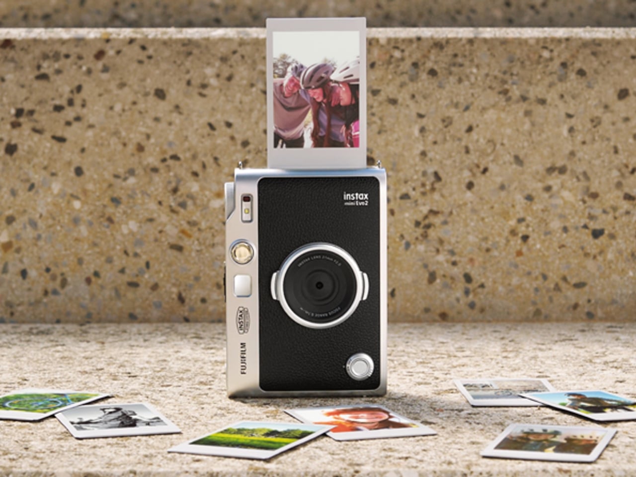
Fujifilm’s Instax Mini Evo 2 is one such camera, with tactile controls, a large touchscreen, 10 lens effects and 10 film effects to create 100 combinations, and, of course, the ability to print photos. This second generation of the hybrid instant camera and photo printer keeps its predecessor’s retro feel and range of creative combinations while adding some modern conveniences.

Designer: Fujifilm

The camera’s tactile controls add a tangible interface to this digital camera, giving it an analog-inspired way of operating. You have a lens dial to change from one lens effect to another, while the film-effect dial lets you go through the 10 different film effects. There’s also a lever that you pull to print out the photo, making printing a separate, deliberate action.

The 4.5-inch touchscreen is larger than the original Mini Evo’s display. Its Expanded View mode displays the area outside your intended print frame. You get a framing guide to show you what the photo will actually include, giving you an added layer of compositional awareness. This could be useful when you’re waiting for a moving subject to enter the frame. The touchscreen complements the dials by handling settings, image browsing, and editing, including cropping and adjustments to brightness, contrast, and saturation. You can make those changes on the camera before deciding which pictures deserve a print.

The Mini Evo 2 also now has an Immersive Movie feature that captures the four seconds leading up to your photo, producing a five-second silent clip that includes the shutter moment. It requires a separately sold microSD card. Rather than reducing the still photo to a smaller size, Fujifilm lists separate recording resolutions: 2144 × 2860 pixels for normal still images and 560 × 992 pixels for video. The short clip gives you a little more of what happened around the photograph, although it isn’t a replacement for recording longer videos.

For still photos, the camera can also record at approximately 13 megapixels when a microSD card is inserted and Expanded View is turned off. That gives you a higher-resolution option, but it isn’t the default for every shot. It’s worth knowing the conditions rather than assuming that every image you take will have the same resolution.

What appeals to me most is having a dedicated digital camera that encourages a little more playing around. I’d like to spend more time choosing how a photo looks before taking it, rather than scrolling through editing options afterward. The combination of physical dials and a touchscreen feels like an interesting way to approach that, with familiar digital controls alongside something you can actually turn.

The built-in printer adds to the appeal of having two devices in one. It works with photos taken on the camera and pictures from your smartphone through the Instax Mini Evo app. The app also supports remote shooting, so you can join a group photo instead of always being the person behind the camera. Your phone still has a role, but it doesn’t have to handle every part of taking the picture. Combining a digital camera and printer isn’t new for Fujifilm, so the novelty here is more about how the pieces work together. The larger touchscreen and new shooting modes give me more reasons to be interested in the camera itself, beyond the photographs it can print.

For my 2027 photography plans, I’d like a camera that makes me curious enough to keep picking it up. Trying a different effect or paying closer attention to what enters the frame seems like a manageable place to start. I don’t need every picture to become a keepsake; I’d be happy to develop a habit of noticing more. Fujifilm announced the Mini Evo 2 on October 27, 2026, with availability scheduled to begin November 27, 2026.

The post Instax Mini Evo 2 Brings Retro Fun Without Giving Up Digital first appeared on Yanko Design.
  • ✇Yanko Design
  • $229 Galaxy Buds On arrive with hands-free AI operation and smooth gestures
    The clip-on buds form factor is here to stay and not merely a fad. Samsung has joined the bandwagon with its first-ever clip-ons that compete in the flagship segment. The South Korean giant’s Buds4 Pro earbuds have already impressed us with their excellent call quality, ANC, and comfort. So we expect the same from the new Galaxy Buds On. With Bose Ultra Open, Sony LinkBuds, Huawei FreeBuds 6, Nothing Ear (open), and CMF Clip Pro giving outdoor audio lovers plenty of options, the Samsung clip-on
     

$229 Galaxy Buds On arrive with hands-free AI operation and smooth gestures

28 octobre 2026 à 09:20

The clip-on buds form factor is here to stay and not merely a fad. Samsung has joined the bandwagon with its first-ever clip-ons that compete in the flagship segment. The South Korean giant’s Buds4 Pro earbuds have already impressed us with their excellent call quality, ANC, and comfort. So we expect the same from the new Galaxy Buds On.

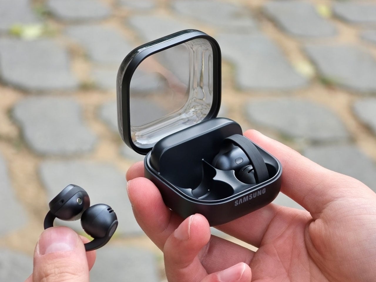
With Bose Ultra Open, Sony LinkBuds, Huawei FreeBuds 6, Nothing Ear (open), and CMF Clip Pro giving outdoor audio lovers plenty of options, the Samsung clip-ons have a strong case with the features on offer. Their first-ever clip-on wireless buds sit inside the ear, while the ergonomic shape comfortably hugs the ear for a snug fit even while working out. According to Samsung, the buds were developed after analyzing different ear shapes to optimize speaker placement and the built-in battery.

Designer: Samsung

Galaxy Buds On are focused on spatial awareness without losing out on the music quality, thanks to the TwinBoost speakers that deliver low-frequency performance. The automatic volume control toggles the audio level depending on the outside ambient noise, so that you don’t miss out on any of the important audio streams or call conversations. The introductory video clearly highlights the fact that the buds seamlessly integrate into daily life and personal listening space. Unlike some buds that have left and right distinction, these don’t have one, which is both a downside and an advantage when it comes to freedom of use.

The IP54 buds are powered by the Snapdragon S7 Gen 1 Sound platform paired with the high-efficiency Class-D amplifier, which optimizes things at the hardware level for final performance. This ensures a nonstop 9.5 hours of continuous music playback after a single charge. The buds come with a bone conduction vibration sensor that helps detect if the wearer is speaking to someone, so that the transparency mode can be enhanced and background noise reduced. As seen in the launch video, the buds can be triggered hands-free with the “Hey Google, let’s talk live” command for natural AI conversations.

Head gestures are also a part of the mix and more reliable given the bone conduction tech is at the helm. You can take or reject calls, read message notifications, dismiss alarms, or even adjust volume or equalizer on Galaxy devices. Samsung has also addressed the audio leakage issue, which is common to most clip-ons, with the Audio Leakage Reduction tech. The accompanying case brings the total battery life to an impressive 38 hours. With each of the buds weighing 6.65g and the case at 41g, the Buds On have a strong case for people in the Galaxy ecosystem. For a price of $229, they are flush in the flagship dominance race, and it will ultimately boil down to the real-world performance of the buds.


The post $229 Galaxy Buds On arrive with hands-free AI operation and smooth gestures first appeared on Yanko Design.
  • ✇Yanko Design
  • km5’s Sp1 Speaker and Mp1 Mixer Give CD Listening a DJ-Style Twist
    There’s something satisfying about choosing a CD, even if most of us have become accustomed to tapping a screen instead. The trouble is finding audio equipment you’d actually want to leave on display. km5’s newly announced Sp1 speaker and Mp1 mixer give its Cp1 CD player some equally minimalist company, letting you listen to favorite albums or try your hand at mixing them. Both borrow the Cp1’s flat, frame-like format, with black or white finishes that let the pieces sit together without lookin
     

km5’s Sp1 Speaker and Mp1 Mixer Give CD Listening a DJ-Style Twist

Par : JC Torres
28 octobre 2026 à 06:07

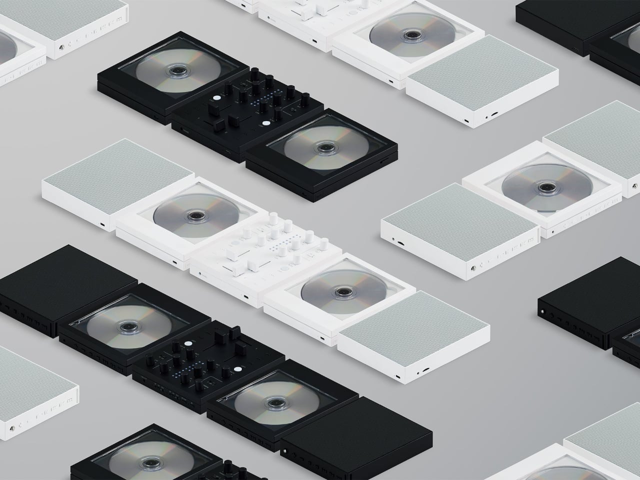
There’s something satisfying about choosing a CD, even if most of us have become accustomed to tapping a screen instead. The trouble is finding audio equipment you’d actually want to leave on display. km5’s newly announced Sp1 speaker and Mp1 mixer give its Cp1 CD player some equally minimalist company, letting you listen to favorite albums or try your hand at mixing them.

Both borrow the Cp1’s flat, frame-like format, with black or white finishes that let the pieces sit together without looking like an assortment of unrelated electronics. The Sp1 puts a perforated grille where the player displays its disc, while the Mp1 fills that space with knobs and sliders. They share the same size, but each makes its purpose clear through its front surface.

Designer: km5

The speaker has a few surprises behind that otherwise quiet appearance. A dot-matrix display sits beneath the grille, showing the time and playback information without carving out a separate screen on the front. Physical buttons occupy the top edge alongside a retractable metal antenna. That last detail gives away the Sp1’s other role as an FM radio that doesn’t need to borrow your phone.

Inside are two 1.77-inch full-range drivers and two passive radiators, though their presence alone doesn’t tell us how convincing the bass will be. Bluetooth and microSD playback offer other ways to listen, and you can record radio programs, too. Pairing two Sp1 units provides stereo playback, letting a single speaker become part of a larger arrangement rather than something you’ve outgrown.

The Mp1, meanwhile, invites you to do something with the music beyond pressing play. Its two channels have separate level sliders, with a crossfader below for blending between sources. Three-band EQ controls adjust the bass, midrange, and treble, while filters change the sound further. Loop buttons repeat sections of a track, giving a favorite passage permission to stick around a little longer.

Two Bluetooth inputs let the mixer receive music from sources such as a Cp1 and a smartphone, then send the combined sound wirelessly to a compatible speaker. You aren’t required to own an entire matching set, thankfully. Line inputs and outputs also accommodate wired connections, though the published information doesn’t establish how much delay the completely wireless arrangement introduces when you’re trying to mix.

Built-in batteries make it easier to move the arrangement away from a desk, with km5 quoting approximately 12 hours for the speaker and six for the mixer. Optional wall-mount accessories offer another way to free up a surface. The mixer can even be operated on the wall, an unusual invitation to get up from the sofa and fiddle with the music yourself.

Preorders are scheduled to open on November 16, 2026, with km5 expecting shipments in February 2027 or later, though pricing remains unconfirmed. There’s also a practical limit to that portable party setup. The speaker’s quoted battery life is twice the mixer’s, so it might be ready for another album when your DJ booth is looking for a charger.

The post km5’s Sp1 Speaker and Mp1 Mixer Give CD Listening a DJ-Style Twist first appeared on Yanko Design.

  • ✇Yanko Design
  • Logitech’s MX Master 4 Developer Edition Is a Mouse Full of Coding Easter Eggs
    Productivity mice aren’t usually the most expressive things on a desk. Their unusual curves and extra buttons often say more about work than the person doing it. Logitech’s MX Master 4 Developer Edition takes a slightly different approach, covering its familiar shape in programming references. The limited-edition mouse keeps the standard model’s features, but gives developers something a little more personal to reach for. Rather than stick to a single muted color, the mouse pairs light gray but
     

Logitech’s MX Master 4 Developer Edition Is a Mouse Full of Coding Easter Eggs

Par : JC Torres
28 octobre 2026 à 04:15

Productivity mice aren’t usually the most expressive things on a desk. Their unusual curves and extra buttons often say more about work than the person doing it. Logitech’s MX Master 4 Developer Edition takes a slightly different approach, covering its familiar shape in programming references. The limited-edition mouse keeps the standard model’s features, but gives developers something a little more personal to reach for.

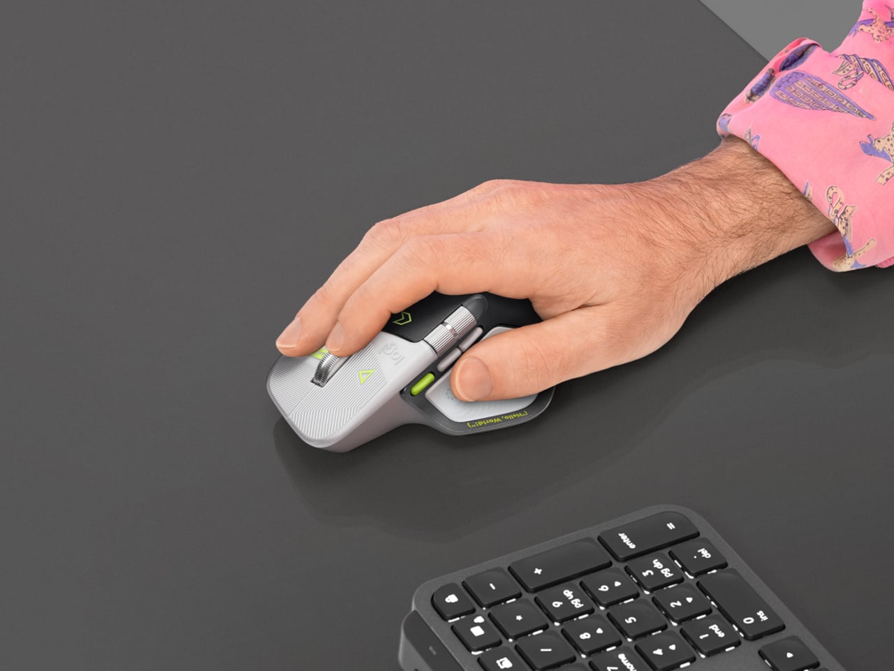
Rather than stick to a single muted color, the mouse pairs light gray buttons with a dark palm rest and bright yellow-green accents. Fine circuit-like lines spread across the front, while coding symbols sit beside the controls. It’s a busier treatment than the regular version, of course, but the graphics follow the mouse’s existing divisions instead of covering everything in one continuous pattern.

Designer: Logitech

Some references are easier to recognize than others. A Hello, World greeting runs along the thumb rest, while smaller markings include 0xFF + 1 and 09.17. Logitech links those last two to Programmers’ Day and the Linux kernel’s release date. You don’t have to understand them to use the mouse, thankfully, although knowing the references does make its decoration feel rather less random.

Underneath that artwork, the familiar sculpted body remains, including a raised back and a broad platform for your right thumb. That thumb gets quite a few responsibilities, with a horizontal scroll wheel, side buttons, and the Haptic Sense Panel within reach. The asymmetric shape hasn’t become ambidextrous for this edition, so left-handed programmers are still left admiring the graphics from the wrong side.

The MagSpeed wheel handles the more familiar business of moving through long documents and code. It switches between stepped scrolling and free-spinning movement, letting you work line by line or move farther through a page. The thumb wheel provides horizontal navigation, which is useful when the thing you’re working on refuses to fit neatly inside a window, as spreadsheets have a habit of doing.

The ripples on the thumb panel hint at another kind of feedback. Rather than relying entirely on what happens onscreen, the mouse can deliver vibrations for supported actions and notifications. Logitech lets users adjust their intensity and customize app-specific feedback through Logi Options+. That doesn’t mean every application suddenly gains a sense of touch, but compatible interactions can have a physical cue.

Pressing the panel also opens Actions Ring, an onscreen collection of shortcuts arranged around the cursor. You can assign tools and macros through Options+, putting frequently used commands near where you’re already working. There is a small irony here, however. Despite the Linux reference on the shell, Logitech doesn’t provide a Linux version of Options+ for configuring that particular shortcut system.

The Developer Edition is listed for US preorder at $119.99, with shipping scheduled to start October 31, 2026. Since its functions match the standard MX Master 4, the choice comes down to how much personality you’d like under your hand. Existing owners won’t find new capabilities here, though the temptation to coordinate a keyboard, desk mat, and everything else remains.

The post Logitech’s MX Master 4 Developer Edition Is a Mouse Full of Coding Easter Eggs first appeared on Yanko Design.
Block Previews Dessa, an AI Voice Model Trained Without Text

26 octobre 2026 à 11:40

Block previews Dessa, a voice AI model trained without text. Explore its local hardware claims, safety risks, and what businesses should assess next.

The post Block Previews Dessa, an AI Voice Model Trained Without Text appeared first on TechRepublic.

  • ✇Yanko Design
  • NUS Researchers Turn Electronic Threads Into a Touchscreen Sleeve
    Checking your sleeve usually means looking for a stain, not opening a calculator. Researchers at the National University of Singapore have given that familiar piece of clothing a rather different purpose, threading a working touchscreen into its fabric. The research prototype displays images, responds to presses, and bends around the forearm without relying on a rigid panel strapped on top of it. The interesting part is how the screen becomes part of the garment. Each electronic fiber carries a
     

NUS Researchers Turn Electronic Threads Into a Touchscreen Sleeve

Par : JC Torres
26 octobre 2026 à 10:20

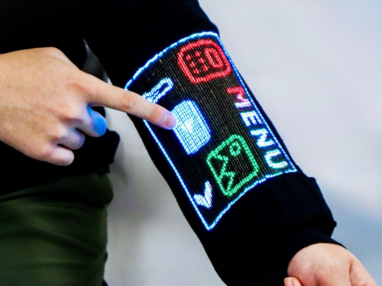
Checking your sleeve usually means looking for a stain, not opening a calculator. Researchers at the National University of Singapore have given that familiar piece of clothing a rather different purpose, threading a working touchscreen into its fabric. The research prototype displays images, responds to presses, and bends around the forearm without relying on a rigid panel strapped on top of it.

The interesting part is how the screen becomes part of the garment. Each electronic fiber carries a row of LEDs and a touch-sensitive layer beneath them, all within a thread about 0.04 inches thick. Pressing the fiber closes a circuit, allowing the system to locate your finger. You aren’t poking through fabric at a hidden glass screen; the thread itself detects the press.

Designers: Heng Fu, Ziang Li, Swetika Chaturvedi, Xiaoyu Zhang, Xiaolong Li, Qianyi Li & Tural Khudiyev (National University of Singapore)

The sleeve combines 54 of those fibers, each carrying 96 LEDs, into a display roughly 6.6 inches by 4.1 inches. Its 96-by-54-pixel resolution isn’t going to replace your phone’s display, although the prototype can show pictures and play video. Large icons make more sense here than tiny menus, giving the interface a chunky character that suits a screen wrapped around a moving arm.

That placement puts simple tools within reach without fishing through a pocket. The team demonstrated a calculator, compass, photo viewer, and voice commands, along with Bluetooth image transfers. Video runs at 30 frames per second, dropping to 25 with synchronized audio. Those aren’t smartphone specifications to brag about, of course, but checking a direction doesn’t demand a miniature movie theater on your sleeve.

Other fibers carry a microphone, speaker, and sensors for movement, light, direction, and temperature. That lets the interface rotate with the arm and adjust its brightness automatically. A temperature-sensing fiber positioned under the arm can send a reading to the sleeve, suggesting how clothing might eventually make personal measurements easier to check. That doesn’t mean it’s ready to replace your thermometer, though.

Of course, clothing has to survive more than a few demonstrations. NUS reports that light output and touch response barely changed after 50 detergent washes and 1,000 bends. The washing procedure used a laundry bag and a gentle cycle, rather than treating the electronics like gym socks. That’s encouraging, though a laundry test isn’t a promise of surviving years of careless washing.

There’s also a difference between making the display flexible and making the entire computer disappear. Separate controller circuits and battery packs still support this prototype, so the electronics haven’t all become yarn. The researchers report breathability comparable to common fabrics, including cotton and denim, but a wearable system also has to account for where its power supply and other hardware sit during use.

For now, this remains a laboratory garment, with no announced retail price or release date. Higher resolution and more integrated electronics are among the challenges ahead. There’s a practical design question underneath the glowing sleeve, too. If the interface lives in your clothes, charging, repairing, and eventually replacing it become wardrobe decisions, alongside the ordinary matter of choosing something that fits comfortably.

The post NUS Researchers Turn Electronic Threads Into a Touchscreen Sleeve first appeared on Yanko Design.
Microsoft’s AI Diagnoses 83% of Complex Cases, but Can It Work in Hospitals?

26 octobre 2026 à 10:07

Microsoft's MAI-DxO AI outperformed generalist doctors on diagnostic benchmarks, but real-world hospital testing is still needed to assess its clinical value.

The post Microsoft’s AI Diagnoses 83% of Complex Cases, but Can It Work in Hospitals? appeared first on TechRepublic.

  • ✇Yanko Design
  • DeWalt’s Tool Batteries Can Charge Laptops Without an Outlet
    A charged drill battery and a dying laptop can sit on the same table and still be useless to each other. That feels like an unnecessarily strict division of labor. DeWalt’s DCB094K USB Charging Kit addresses that disconnect by letting compatible tool batteries power USB devices through an attachable adapter. If you already have spare packs in the garage, the appeal is straightforward: stored energy becomes available to something besides the tool it normally clicks into. The better detail is tha
     

DeWalt’s Tool Batteries Can Charge Laptops Without an Outlet

26 octobre 2026 à 09:20

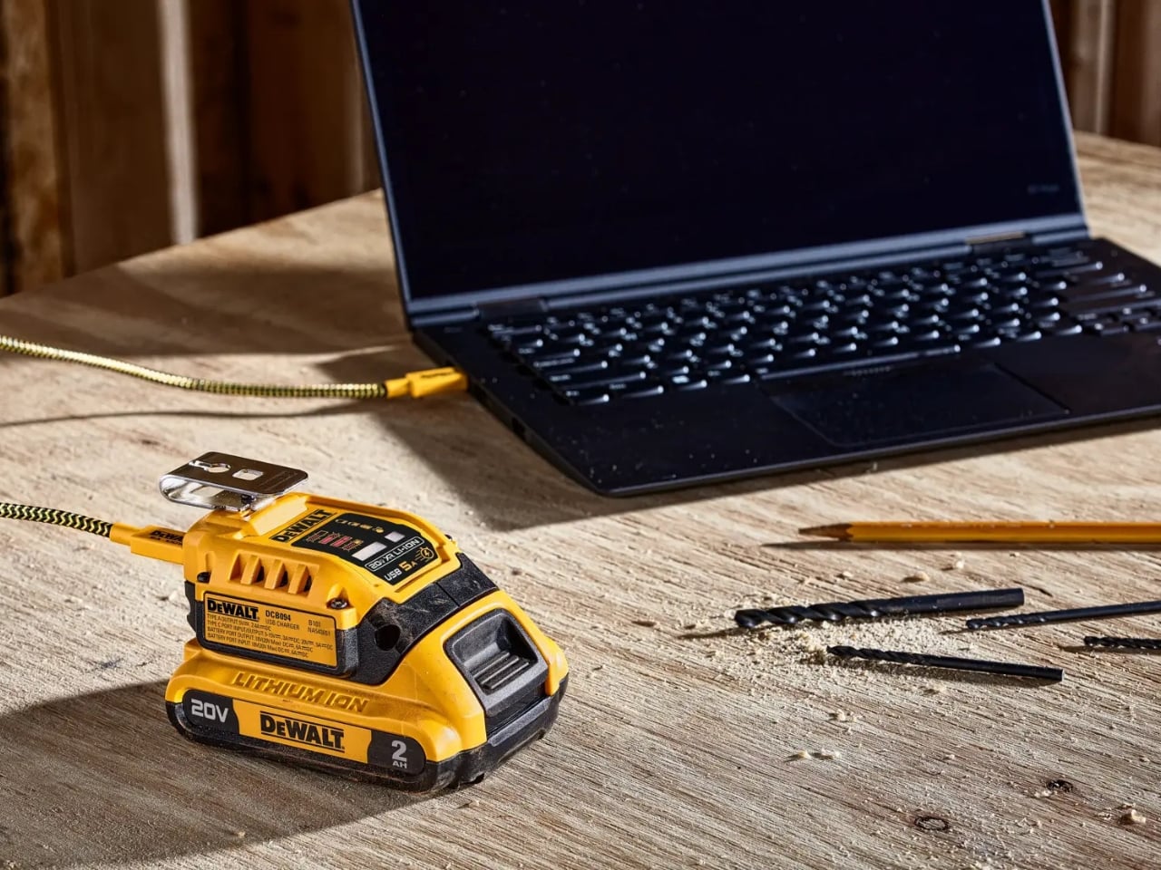
A charged drill battery and a dying laptop can sit on the same table and still be useless to each other. That feels like an unnecessarily strict division of labor. DeWalt’s DCB094K USB Charging Kit addresses that disconnect by letting compatible tool batteries power USB devices through an attachable adapter. If you already have spare packs in the garage, the appeal is straightforward: stored energy becomes available to something besides the tool it normally clicks into.

The better detail is that power can travel the other way, too. The kit’s DCB094 adapter has a bidirectional USB-C port, so it can recharge a DeWalt battery from a suitable USB power supply as well as draw from that battery to charge personal electronics. That solves a second annoyance: needing a dedicated tool-battery charging dock when a compatible USB supply could do the job. It’s this return trip that makes the accessory interesting to me.

Designer: DeWalt

Visually, DeWalt hasn’t tried to disguise it as a sleek desk accessory. The yellow-and-black housing sits on the battery like a smaller piece of power-tool equipment, complete with ventilation slots and a metal belt hook. In the product photograph, the attached battery still accounts for much of the assembly’s bulk. I like that lack of pretense. It looks appropriate beside drill bits and a pencil, even when the cable coming out of it leads to a laptop.

The headline specification deserves a closer look, though. DeWalt rates the USB-C connection for up to 100 watts in either direction, but the kit includes a 65-watt wall supply. You also get a 100-watt-rated USB cable and the belt hook, but no battery. In other words, the adapter’s maximum capability and the supplied wall charger’s output are different numbers. The included charger cannot deliver a 100-watt input simply because the port can accept it. That distinction matters more than the big number on the listing.

Compatibility also needs a little attention. DeWalt lists support for its 20V MAX and FLEXVOLT batteries, while the adapter provides a USB-A output rated at up to 12 watts alongside USB-C. The latter is the connection to consider for a compatible laptop, but check the computer’s charging requirements first. A USB-C socket alone doesn’t establish that a laptop accepts charging through it, and this adapter isn’t a universal substitute for every computer’s power brick.

One interface choice feels less intuitive than the overall idea. The adapter’s indicator lights report charging activity for the DeWalt battery, not the phone or laptop receiving power. DeWalt’s manual specifically notes that the LEDs won’t illuminate while charging personal devices. I’d prefer an obvious output indicator, particularly on an accessory that changes roles depending on what’s connected. As designed, you’ll need to look at the receiving device to confirm that it’s getting power.

The workbench appearance shouldn’t be mistaken for permission to leave it in the weather, either. The manual says to keep the charger out of rain and snow and provide a dry location outdoors. It also instructs owners to detach the battery when the adapter isn’t being used to avoid draining the pack in storage.

Runnings currently lists the kit at $119, which makes this a considered accessory purchase rather than an automatic addition to the cart. I’d find it easier to justify with compatible batteries already on hand. Buying a battery as well would mean paying for an entire setup when the actual need might simply be keeping a phone charged. The useful question is how often those existing packs could cover a charging need away from an outlet.

For someone who moves between DIY projects and laptop work, the two-way charging is the strongest argument. I’d rather add a useful connection to equipment I already own than collect another battery solely for occasional backup duty. The DCB094K makes that possible, provided its price and your device’s requirements line up.

The post DeWalt’s Tool Batteries Can Charge Laptops Without an Outlet first appeared on Yanko Design.
WHOOP to Study Wearable Coaching for Blood Sugar and Blood Pressure

26 octobre 2026 à 07:24

WHOOP plans to test whether wearable coaching can help improve blood sugar and blood pressure. See how its Abu Dhabi study could affect future health wearables.

The post WHOOP to Study Wearable Coaching for Blood Sugar and Blood Pressure appeared first on TechRepublic.

  • ✇Yanko Design
  • Statik PowerStand turns a USB-C cable into a folding phone stand
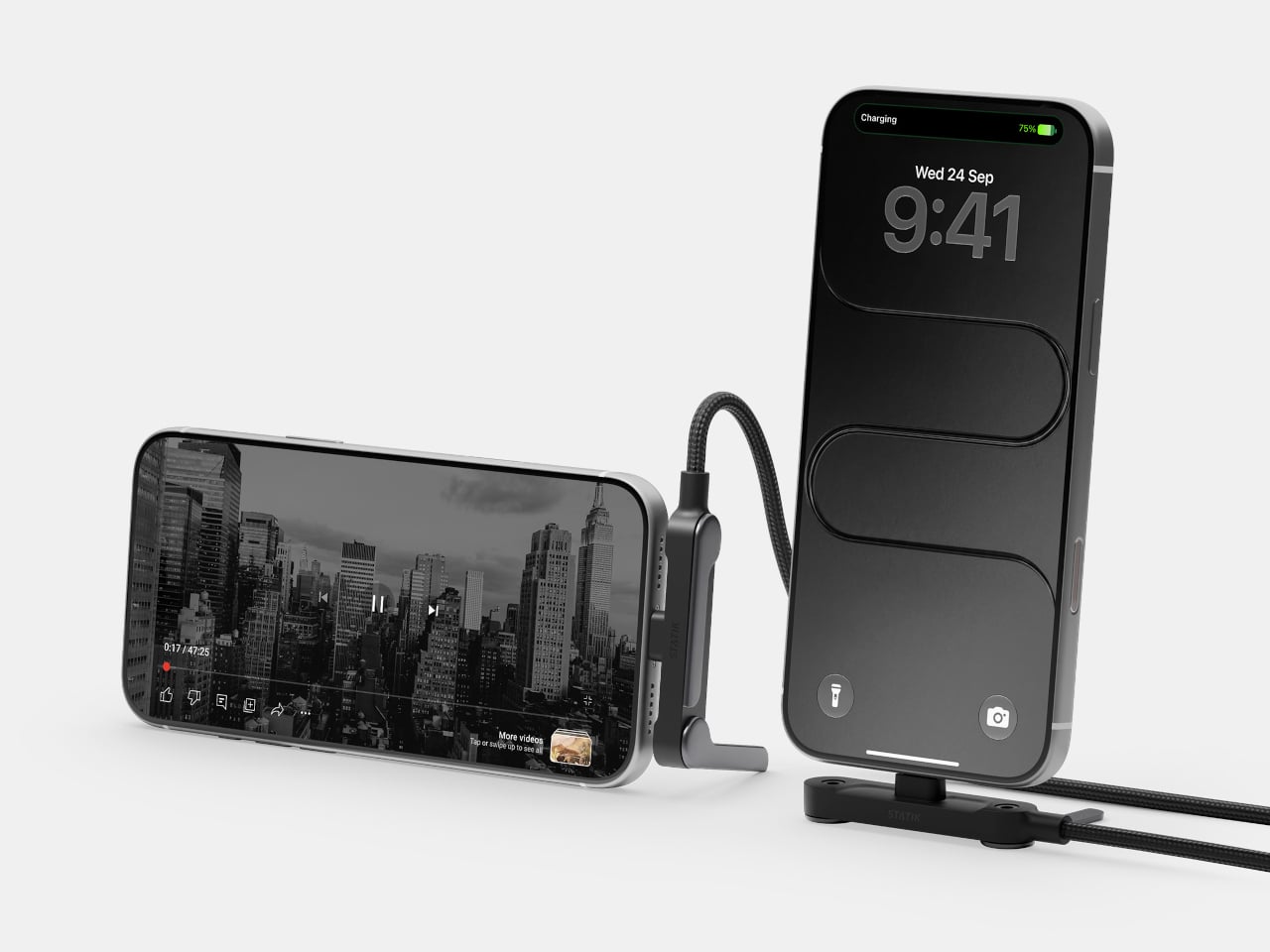
    A phone charging flat on a desk isn’t particularly useful when you want to follow a recipe or join a video call. Statik’s PowerStand gives that familiar cable an extra job, building a folding stand directly into its USB-C connector. The $19.99 retail accessory lets your phone stay propped up while plugged in, without adding a separate cradle to the table. Most of the work happens in a broad connector housing that sits across the phone’s bottom edge. Two legs pivot out from its ends, turning the
     

Statik PowerStand turns a USB-C cable into a folding phone stand

Par : JC Torres
26 octobre 2026 à 06:07

A phone charging flat on a desk isn’t particularly useful when you want to follow a recipe or join a video call. Statik’s PowerStand gives that familiar cable an extra job, building a folding stand directly into its USB-C connector. The $19.99 retail accessory lets your phone stay propped up while plugged in, without adding a separate cradle to the table.

Most of the work happens in a broad connector housing that sits across the phone’s bottom edge. Two legs pivot out from its ends, turning the plug into a little support structure for portrait or landscape viewing. Fold those legs back against the housing when you’re finished, and the stand travels with the cable rather than becoming another loose accessory to forget.

Designer: Statik

That arrangement makes particular sense beside a laptop, where a phone can sit upright for calls while the computer handles everything else. Turn it sideways, and the same support becomes useful for watching a video over lunch. There’s no magnetic ring or special case to attach first, although you do have to plug the stand end into the phone to use it.

The connector’s shape matters even when you aren’t using the stand. Its right-angle layout sends the cord along the phone’s edge instead of straight out into your hand, a useful distinction when holding it horizontally for a game. Statik also extends the plug’s shaft to reach through most cases, though that isn’t a promise that every bulky protective cover will fit.

Putting a wide piece of hardware underneath a phone creates another problem, since that space often contains speakers and microphones. PowerStand’s housing includes molded channels that Statik says direct sound toward the listener while keeping those openings clear. It’s a thoughtful response to the connector’s added width, although the available evidence doesn’t establish a measurable improvement in volume or call quality.

Statik rates the cable for up to 240W using USB Power Delivery 3.1, allowing it to serve compatible laptops when paired with an appropriate charger. That figure describes the cable’s capacity, not what every connected device will receive. Data transfers are limited to USB 2.0’s 480Mbps, making this a charging-first accessory rather than a particularly speedy file-transfer cable for large video projects and backups.

At 6.6 feet, the cord gives you some room between the outlet and whatever patch of desk or kitchen counter you’re using. It has a braided nylon jacket and reinforced strain relief, while the connector combines TPE plastic and aluminum. The rest of the lead remains a conventional cable, with a standard USB-C plug at the opposite end rather than another folding mechanism.

Of course, putting a stand inside a connector means accepting a much wider plug, even on days when you only want to charge. There’s no getting around that tradeoff by folding the feet away. But for someone who regularly props a phone beside a keyboard or hotel bed, though, that extra width buys a more useful resting place than the nearest coffee mug on the nightstand.

The post Statik PowerStand turns a USB-C cable into a folding phone stand first appeared on Yanko Design.

  • ✇Yanko Design
  • The Slurptop DIY Laptop Pairs Power-Tool Styling With a Swappable Battery
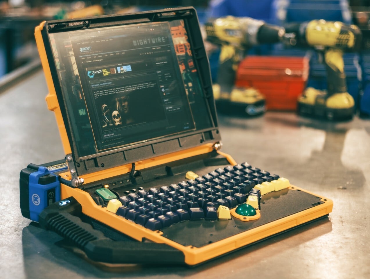
    The Slurptop borrows its battery from the toolbox, and its body doesn’t bother pretending otherwise. This homemade cyberdeck wraps mini PC hardware in a chunky yellow-and-black clamshell, complete with an integrated carry handle and mechanical keys. It’s a completed personal project rather than a retail laptop, designed around coding, light design work, and controls that don’t apologize for taking up some extra space. The angular, 3D-printed enclosure takes its cues from power tools, with simil
     

The Slurptop DIY Laptop Pairs Power-Tool Styling With a Swappable Battery

Par : JC Torres
26 octobre 2026 à 05:15

The Slurptop borrows its battery from the toolbox, and its body doesn’t bother pretending otherwise. This homemade cyberdeck wraps mini PC hardware in a chunky yellow-and-black clamshell, complete with an integrated carry handle and mechanical keys. It’s a completed personal project rather than a retail laptop, designed around coding, light design work, and controls that don’t apologize for taking up some extra space.

The angular, 3D-printed enclosure takes its cues from power tools, with similarly conspicuous controls. The yellow frame uses glass-fiber-filled plastic, while black components use carbon-fiber-filled filaments. An aluminum bar reinforces the hinge area, with shared bolts securing several structural layers. The handle fits between sections of the case, so assembling the housing locks it into position before its own mounting screws are added.

Designer: Slurpburgers

Open the lid, and the keyboard immediately takes over. Its 82 mechanical keys sit in angled groups rather than the straight rows you’d expect on a laptop, leaving a green trackball near the front center. That ball runs on three ceramic bearings above a sensor salvaged from a gaming mouse. You can move the pointer without clearing desk space for a separate mouse.

The display keeps things relatively conventional, pairing a 14-inch panel with a 1920-by-1200 resolution and a 16:10 aspect ratio. Behind the custom shell is hardware from a GMKtec M5 Ultra mini PC, including an AMD Ryzen 7 7730U processor, 64GB of RAM, and a 500GB SSD. CachyOS supplies the familiar Linux desktop, so there’s a recognizable computing environment beneath all that workshop character.

An XP-Pen drawing tablet also gets its own holder behind the display, adding pen input without displacing the keyboard or trackball. Connected beside the laptop, it provides a separate surface for sketching or editing artwork, leaving the main display free to show what you’re working on. That keeps everything together for travel, although actually drawing still calls for some extra desk space.

The power arrangement follows the same willingness to borrow useful parts. A 24V Kobalt tool battery supplies the machine through a converter that adjusts its output to the PC’s required 19V. A separate cutoff board guards against draining the pack too far. The battery remains an obvious external attachment, making its removal part of the operating routine instead of a repair procedure.

That decision comes with a catch, naturally. The Slurptop doesn’t charge the battery itself, so the pack has to visit its tool charger. Wall power can run the computer independently, and a switching module transfers between the adapter and battery. Keeping it plugged in lets the owner change packs without shutting down, but there’s no uninterrupted battery swap away from an outlet.

The builder reports more than four hours of writing and coding on a 4Ah battery, with some charge remaining. That’s a useful reference, not an independently measured endurance rating. The power-tool styling doesn’t come with a documented weatherproofing or drop rating, either. You can carry this homemade workstation by its handle, but treating it like a drill would be an unfortunate misunderstanding.

The post The Slurptop DIY Laptop Pairs Power-Tool Styling With a Swappable Battery first appeared on Yanko Design.

  • ✇Yanko Design
  • HMD 2660 Flip Senior Edition Brings AI Conversations to an Old-School Phone
    Making a phone call shouldn’t feel like learning a new piece of software. The HMD 2660 Flip Senior Edition responds to that familiar frustration with big buttons, a folding body, and an unexpected addition called Mary. This AI companion from inTouch brings conversation to a basic phone, letting older adults try the technology without trading their keypad for a touchscreen full of apps. The hardware doesn’t stray far from the regular HMD 2660 Flip introduced in 2025. Open the clamshell, and ther
     

HMD 2660 Flip Senior Edition Brings AI Conversations to an Old-School Phone

Par : JC Torres
26 octobre 2026 à 04:15

Making a phone call shouldn’t feel like learning a new piece of software. The HMD 2660 Flip Senior Edition responds to that familiar frustration with big buttons, a folding body, and an unexpected addition called Mary. This AI companion from inTouch brings conversation to a basic phone, letting older adults try the technology without trading their keypad for a touchscreen full of apps.

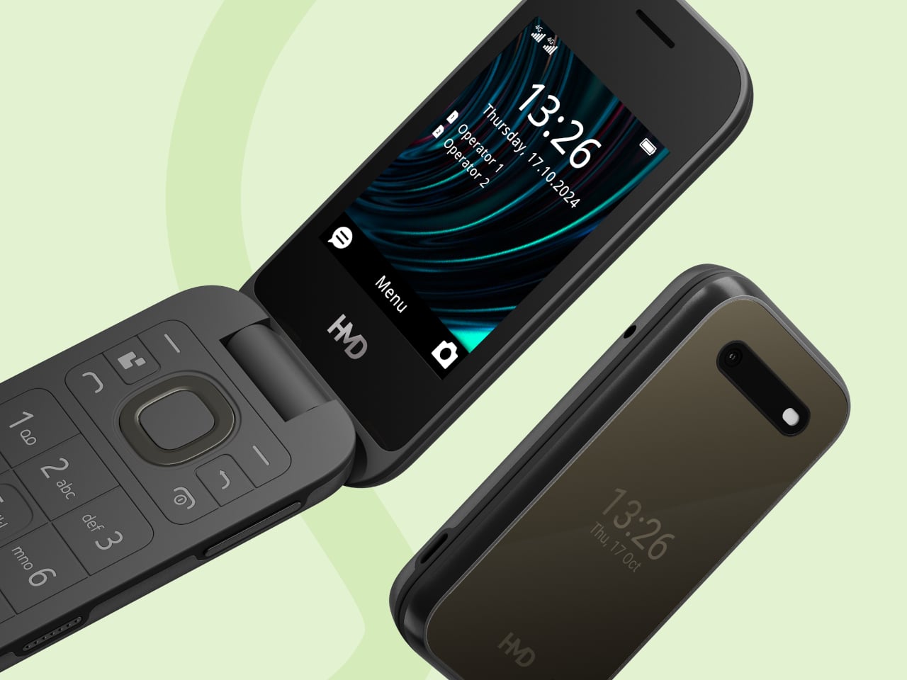
The hardware doesn’t stray far from the regular HMD 2660 Flip introduced in 2025. Open the clamshell, and there’s a 2.8-inch screen above a generously sized number pad, with a navigation control separating the two. Answering or ending a call can be tied to opening or closing the phone, giving those actions a physical beginning and end that a touchscreen doesn’t quite offer.

Designer: HMD Global

The outside gets its own smaller display, so checking the time doesn’t require unfolding the whole thing. Its dark body and rounded corners stick to the recognizable flip-phone formula rather than dressing the device up as medical equipment. That restraint matters here. The phone offers an alternative way to stay in touch, without announcing that its owner needs an entirely different category of gadget.

Mary adds a different kind of contact to the phone, one that’s available for a casual conversation around the clock. HMD says the companion speaks slowly, leaves room for replies, and remembers earlier conversations. A chat might involve history, a favorite memory, or a game. The interesting choice is delivering those interactions through speech, instead of asking someone to type their thoughts.

Of course, an AI feature can easily complicate a supposedly simple phone. Here, Mary appears in the main menu, and selecting her icon before pressing the call button starts the conversation. There’s no separate app to install or number to memorize. Activation still involves a website or QR code, though, so the simplest experience comes after someone has handled that initial setup.

The less glamorous details haven’t disappeared beneath the AI pitch. A removable 1,450mAh battery and USB-C charging keep the basics familiar, while HMD rates the body IP54 for protection against dust and splashes. A replaceable battery also means you can swap a worn component, rather than treating the whole phone as something that has reached retirement age.

The UK listing puts the phone at £79.99 (about $107), including a five-hour trial of Mary. Continuing the service costs £16.90 (about $23) monthly, with carrier charges potentially adding to that. The trial doesn’t automatically become a paid plan, but inTouch’s general terms say paid subscriptions renew automatically. It can be canceled, but ongoing conversations introduce another expense alongside ordinary phone service.

There’s an important distinction between making conversation easier to access and replacing human company. Mary is software, and her availability shouldn’t be confused with evidence that she reduces loneliness. The change here is how someone reaches that software. They can keep the familiar ritual of opening a phone and making a call, and still use their handset after the AI subscription ends.

The post HMD 2660 Flip Senior Edition Brings AI Conversations to an Old-School Phone first appeared on Yanko Design.

  • ✇Yanko Design
  • Titanium Smart Glasses Concept Refuses to Hide Its Tech
    Fitting a computer into a pair of glasses creates an awkward design problem: the electronics need room, but the result still has to belong on someone’s face. Povilas Grigas approaches that tension without pretending it can disappear. His Glasses concept gives the hardware a deliberately different silhouette, treating smart eyewear as its own design category rather than ordinary frames with a technological secret. I like that starting point. Developed for his 2024 design BA thesis, the mixed-rea
     

Titanium Smart Glasses Concept Refuses to Hide Its Tech

25 octobre 2026 à 11:20

Fitting a computer into a pair of glasses creates an awkward design problem: the electronics need room, but the result still has to belong on someone’s face. Povilas Grigas approaches that tension without pretending it can disappear. His Glasses concept gives the hardware a deliberately different silhouette, treating smart eyewear as its own design category rather than ordinary frames with a technological secret. I like that starting point.

Developed for his 2024 design BA thesis, the mixed-reality concept imagines an alternative to being tethered to a phone or desktop screen. The ambition is to make computing available through something worn rather than something you continually look down at or sit in front of. That’s an appealing proposition, although moving digital information closer to your eyes doesn’t automatically make it less demanding of your attention.

Designer: Povilas Grigas

Visually, these glasses have enough personality to carry that discussion. The broad, rounded lens openings sit within a flowing silver-colored frame, while the bridge has two dark circular elements above an oval opening. In the front view, that arrangement almost resembles a tiny surprised face. It’s an unexpectedly playful detail in an otherwise polished object. To my eye, the overall effect lands somewhere between sculptural eyewear and a science-fiction costume department with unusually good taste.

Grigas specifies CNC-milled, polished grade 5 titanium for the frame and optically polished sapphire crystal for the lenses. Those are proposed material choices, not evidence that the finished glasses would feel featherlight or survive everyday abuse. Still, I appreciate the intention behind them. A computer worn this prominently deserves the material attention we give a watch or a favorite pair of glasses, especially if the expectation is that it becomes part of someone’s daily appearance.

The frame’s outline follows the bones around the eyes, according to Grigas, and the vision sensors occupy the bridge for a centered point of view. That placement gives the front a clear organizing feature. Rather than scattering visually competing details across the brow and corners, the design concentrates its most conspicuous technology near the middle. It’s a convincing composition, even if a convincing composition is only one part of making wearable computing practical.

From the side, the arms look substantial, with long, smooth surfaces that curve downward behind the ears. Their thickness is part of the visual identity rather than a detail the presentation tries to conceal. I’d rather see that volume handled deliberately than watch a designer chase thinness at the expense of the overall shape. Here, the broad arms and generous front feel like parts of the same object.

The personal question is whether I’d want such a distinctive object defining my face every day. I’m not sure, and that uncertainty is worth keeping in the conversation. Glasses are unusually intimate technology because people look through them while other people look at them. A frame can be beautifully resolved and still feel wrong for an individual wearer. I’d want more than an impressive image before deciding these belonged in my routine.

The proposed leather charging case helps make that routine easier to imagine. The glasses fold flat inside it, and the presentation shows a dark, textured exterior with visible stitching and a circular metal closure. It reads as an eyeglass accessory rather than a miniature electronics bag. More importantly, putting the glasses away feels like a recognizable action. I find that more reassuring than an expectation that a wearable computer should remain on your body indefinitely.

For now, this is an academic design proposal, not a demonstrated replacement for your laptop. Its presentation doesn’t establish battery endurance, display quality, or long-term comfort, so those questions remain open. What earns my interest is the willingness to give computing a visible presence without making the frame look apologetic. I wouldn’t ask these glasses to pass as ordinary eyewear. I would ask whether their eventual usefulness could earn the space they occupy on my face.

The post Titanium Smart Glasses Concept Refuses to Hide Its Tech first appeared on Yanko Design.

  • ✇Yanko Design
  • This AI Assistant Looks Like a Tiny Monitor but Actually Operates Your Computer
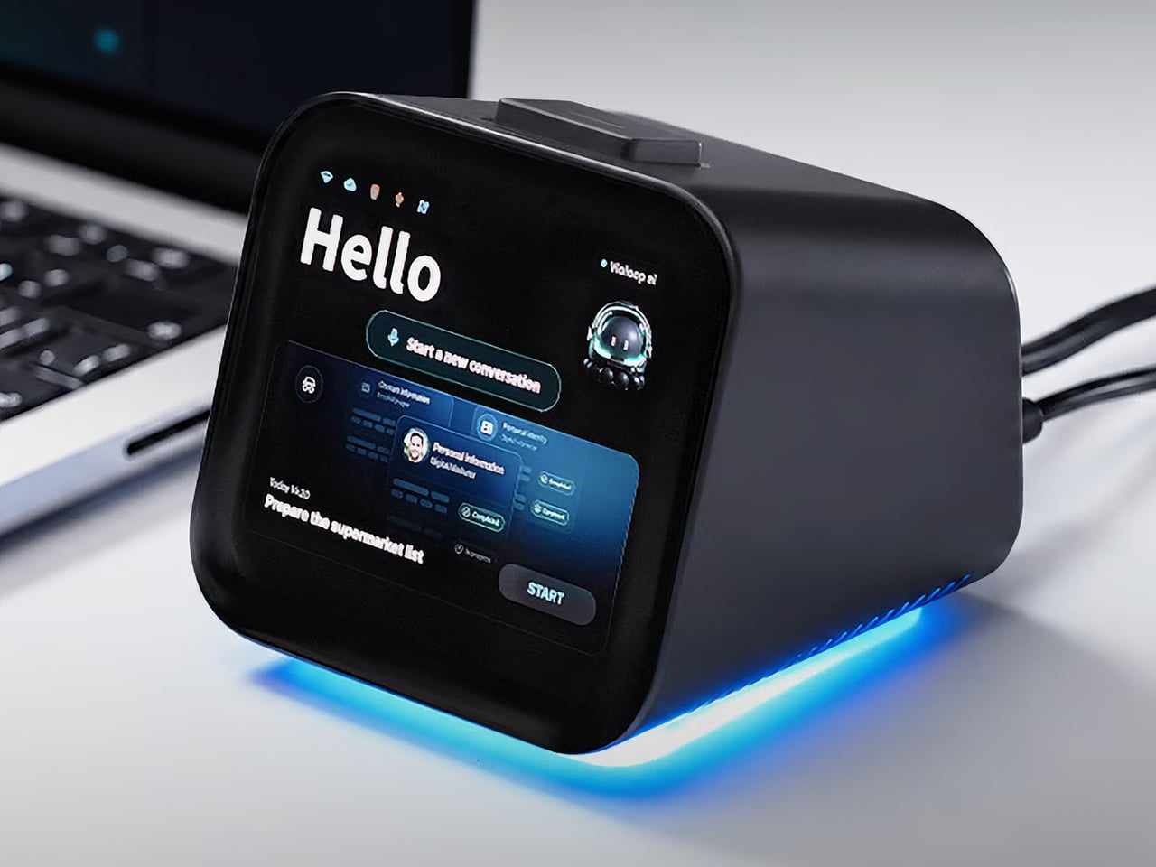
    Copying customer details from a message into a spreadsheet probably isn’t anyone’s idea of a good afternoon. Unfortunately, even a perfectly capable computer still leaves plenty of that work to you. Bvio’s Violoop is a plug-in AI operator designed to handle those repetitive steps, giving your existing computer an assistant without asking you to replace the machine you’re already comfortable using. You can tell Violoop what you need in ordinary language, such as finding customer information in a
     

This AI Assistant Looks Like a Tiny Monitor but Actually Operates Your Computer

Par : JC Torres
24 octobre 2026 à 19:30

Copying customer details from a message into a spreadsheet probably isn’t anyone’s idea of a good afternoon. Unfortunately, even a perfectly capable computer still leaves plenty of that work to you. Bvio’s Violoop is a plug-in AI operator designed to handle those repetitive steps, giving your existing computer an assistant without asking you to replace the machine you’re already comfortable using.

You can tell Violoop what you need in ordinary language, such as finding customer information in a WhatsApp conversation and entering it into a customer relationship management (CRM) system. That might sound like a small convenience, until you’ve spent an afternoon repeating the same routine. The aim is to let you explain the task instead of manually carrying every detail from one window to another.

Designer: Team Violoop

Click Here to Buy Now: $399 $699 (43% off). Hurry, only a few left! Raised over $2.8 million.

To do that, Violoop interprets what’s on the screen and interacts with applications through keyboard and mouse controls. Its companion software supports Windows, macOS, and Linux, while the screen-based approach means it doesn’t need a dedicated integration for each application. You’re still working with familiar programs, only with assistance intended to bridge the gaps between them, and without the need to learn programming to give it instructions.

Of course, customer records are only part of the paperwork that follows a small business around. Invoice details need entering into spreadsheets, documents need organizing, and files rarely end up where they belong without some encouragement. Violoop is designed to help with that preparation, taking on the repetitive handling while leaving you to check the information and decide what to do with it.

Email offers another familiar example. Having something sensible to edit can be easier than staring at an empty reply box, especially when several messages need similar responses. Violoop can prepare replies as drafts for review, giving you a starting point while keeping the final wording in your hands. You can add the context that a customer relationship or a delicate conversation actually needs.

There’s also a reason this assistant takes up physical space on your desk. Its compact enclosure and angled touchscreen give ongoing tasks a place of their own, rather than burying everything in another software window. Inside, the tiny device packs a punch of up to 26 trillion operations per second (TOPS) of AI processing. That hardware is intended to support local screen understanding and other AI work on Violoop itself.

That local processing also supports a more personal approach to recurring work. Violoop keeps personal memory on the device, retaining preferences and context so you don’t have to explain the same habits every time. Local memory doesn’t mean every task stays offline, however. Depending on the selected mode, Violoop can also connect to cloud services or larger AI models when additional help is needed.

The most interesting control might be the button on top. Violoop separates AI processing from a dedicated security controller, with an approval step for sensitive actions. The physical confirmation button gives that pause a tangible form. Preparing information and committing to an action are different responsibilities, after all, and the design puts a deliberate checkpoint between what the AI proposes and what happens next.

You don’t have to stay beside it to keep an eye on progress, either. Phone access lets you check tasks, send further instructions, and approve sensitive actions while you’re away from the desk, provided the computer remains on and connected. That’s useful when you need to step out but still want to see how things are going, without returning to the keyboard for every update.

An organized spreadsheet won’t decide which project you should take on next, and a drafted reply doesn’t know everything about the person receiving it. Those parts still belong to you. Violoop’s role is to help get the surrounding work ready, using a device that keeps progress visible and approval close at hand. That leaves the final email waiting for something decidedly familiar: your own words.

Click Here to Buy Now: $399 $699 (43% off). Hurry, only a few left! Raised over $2.8 million.

The post This AI Assistant Looks Like a Tiny Monitor but Actually Operates Your Computer first appeared on Yanko Design.

Barclays Plans 5,000 Job Cuts as AI Boosts Productivity

23 octobre 2026 à 14:18

Barclays plans 5,000 job cuts in 2026 as AI and restructuring improve efficiency. Learn what the changes mean for developers, IT staffing, and budgets.

The post Barclays Plans 5,000 Job Cuts as AI Boosts Productivity appeared first on TechRepublic.

  • ✇Yanko Design
  • Mori the Mushroom Robot Offers Company Without Saying a Word
    A mushroom with glowing eyes is an easier sell for my nightstand than a miniature humanoid. OKA’s Mori takes that approachable shape and gives it a specific job: offering a little company and a reason to pause, without making another screen the center of attention. Currently offered through an early-purchase program, the companion robot uses light, sound, and movement to bring some presence to a quiet room. The ambition is modest enough to feel appealing. For anyone who wants to unwind without
     

Mori the Mushroom Robot Offers Company Without Saying a Word

23 octobre 2026 à 14:20

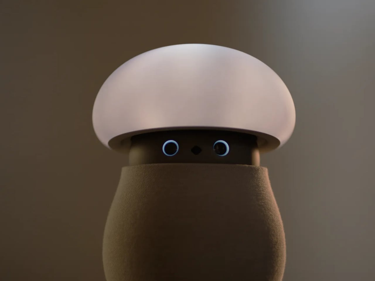
A mushroom with glowing eyes is an easier sell for my nightstand than a miniature humanoid. OKA’s Mori takes that approachable shape and gives it a specific job: offering a little company and a reason to pause, without making another screen the center of attention. Currently offered through an early-purchase program, the companion robot uses light, sound, and movement to bring some presence to a quiet room. The ambition is modest enough to feel appealing.

For anyone who wants to unwind without reaching for their phone, the physical design makes a good opening argument. Mori stands just under 12 inches tall at its maximum height, with a broad illuminated cap above a rounded, fabric-covered body. Two eyes peek out from underneath and the fabric contains 25 percent real wool. In the supplied photographs, the proportions suggest a small table lamp that wandered into an animated movie, then decided to stay. I’d happily make room for that silhouette.

Designer: OKA

The backstory gives that friendliness some purpose. OKA cofounder Hua Wang said he spent a decade designing mechanisms that brought people back to their phones. With Mori, he wanted a robot that belonged in a home rather than a large, intrusive machine. That’s a useful starting point. A domestic robot has to earn its place among your furniture before its intelligence becomes particularly interesting.

Mori’s controls lean into that furniture-friendly character. According to OKA, placing both hands on its base starts a guided breathing session, while patting its head makes the cap retract and turns it into a lamp. Light and natural soundscapes provide the setting for those breaks. I like the directness of those gestures. Touching an object to change its behavior feels appropriate here, especially when the proposed activity is stepping away from the usual sequence of opening an app, choosing a menu, and adjusting settings.

Importantly, Mori doesn’t speak in words. Its vocabulary consists of sounds, expressions, light, and movement. That limitation might be its most attractive feature. I don’t particularly want a bedside object to become another conversational obligation. A glance or a small movement leaves more room for interpretation, much like an animated character whose personality comes through before it says anything. The lamp setting also gives its owner a way to dial that personality down, with most companion reactions reduced. Cute still needs an off-ramp.

Of course, those expressive eyes come with a less whimsical consideration: sensing people inside their homes. OKA’s privacy policy says Mori’s core AI runs locally, with camera and microphone inputs processed on the device. Raw audio and image frames are discarded after processing, while recognition information can remain locally to distinguish users. The policy separately allows collection of account, device, and diagnostic information. That distinction matters. Local processing is a welcome design decision, but I’d still read the permissions before inviting a camera-equipped companion onto the dresser.

OKA also says Mori learns and becomes more individual through repeated interaction. That’s the promise I’d reserve judgment on until longer-term use establishes what actually changes. A familiar gesture could become endearing, or simply predictable. The interesting design challenge is giving Mori enough variation to sustain affection without making it demand attention. Its quiet role sets a higher bar than the adorable appearance initially suggests: it needs to remain pleasant when the novelty has worn off.

At $649 before taxes and shipping for First Access orders, Mori is an expensive experiment in companionship. That purchase includes two years of its Nature Time subscription; OKA says basic functions won’t require a paid plan, and the included subscription won’t automatically become a paid one. I’m drawn to the object, but the price makes its everyday behavior more important than its introductory charm. The real payoff would be a robot you enjoy having nearby even when you aren’t actively playing with it. A mushroom-shaped lamp already has a place in a home. Mori has to make the eyes worth paying for.

The post Mori the Mushroom Robot Offers Company Without Saying a Word first appeared on Yanko Design.

  • ✇Yanko Design
  • AYN Odin 3 Portal Handheld Pairs a Flat Glass Front With Sculpted Grips
    Putting a large screen on a gaming handheld is easy compared with making the whole thing comfortable to hold. AYN’s Odin 3 Portal approaches that problem with a 7-inch OLED up front and sculpted grips behind it. Now available for preorder, the Android handheld combines a broad, glass-covered face with physical controls that give your fingers somewhere other than the screen to go. That front surface stretches across the display and surrounding control areas, giving the device a flatter, more uni
     

AYN Odin 3 Portal Handheld Pairs a Flat Glass Front With Sculpted Grips

Par : JC Torres
23 octobre 2026 à 10:20

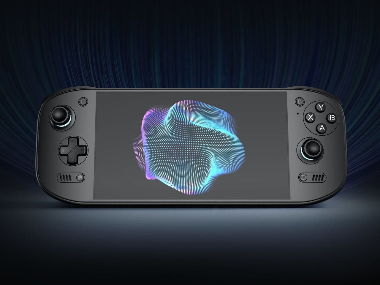
Putting a large screen on a gaming handheld is easy compared with making the whole thing comfortable to hold. AYN’s Odin 3 Portal approaches that problem with a 7-inch OLED up front and sculpted grips behind it. Now available for preorder, the Android handheld combines a broad, glass-covered face with physical controls that give your fingers somewhere other than the screen to go.

That front surface stretches across the display and surrounding control areas, giving the device a flatter, more unified appearance than a screen dropped into a chunky frame. Black keeps the boundary between panel and housing less conspicuous, while White and Cold Grey emphasize it. The latter’s purple buttons add retro flavor without turning the machine into a tribute to another console.

Designer: AYN

Turn it over, and the shape becomes less concerned with looking flat. Rounded bulges give your palms somewhere to settle, while textured shoulder buttons meet your index fingers above. The full-size Hall-effect sticks have ridged edges, and a dome D-pad sits below the left stick. These details aim to improve control, though actual comfort will depend on your hands and how you play.

The screen is a 1920×1080 OLED with a 120Hz refresh rate, giving supported games room to show smoother motion without asking you to peer at a tiny display. That doesn’t mean every game will run at 120 frames per second, of course, nor should you always crank it up. It depends on the game, settings, and your remaining battery.

Behind that screen is Qualcomm’s Dragonwing Q8 processor, paired with Android 15 and active cooling. A broad rear grille gives the internal fan room to draw air, making ventilation part of the exterior rather than hiding it completely. That’s worth remembering when you settle in with the handheld against a cushion, since the cooling system still needs an unobstructed path to breathe.

Power comes from a 9,000mAh battery, with support for 60W charging when you need to plug back in. Actual playtime will depend on the game and screen settings, so that capacity doesn’t translate into a guaranteed afternoon away from an outlet. At about 15.9 ounces, the handheld puts weight behind that screen, especially when a quick session somehow becomes an entire evening.

Storage starts at 128GB with 12GB of RAM, while the top model offers 1TB and 16GB of RAM. There’s also a microSD slot, so choosing less built-in storage doesn’t close off future expansion. AYN specifies that no games come preinstalled, however. You’re buying the hardware for your own library and setup, not a ready-made collection of nostalgic favorites waiting behind the power button.

Launch pricing starts at $399, with the 1TB version reaching $669 and shipping expected to begin in early November 2026. The pricier configuration doesn’t buy a different screen or processor, just more memory and storage than the base model. That leaves a practical choice between keeping a larger library installed and keeping the price down, particularly when a memory card remains an option.

The post AYN Odin 3 Portal Handheld Pairs a Flat Glass Front With Sculpted Grips first appeared on Yanko Design.

❌