❌

Vue normale

  • ✇Yanko Design
  • CleanMyMac just made a Screen Cleaning Perfume for your MacBook that smells like a pine forest
    Apple’s official answer to a smudgy MacBook screen is a $9 Polishing Cloth, which, to be fair, is ten bucks cheaper than the version everyone roasted in 2021. MacPaw has a more extravagant answer. The Ukrainian company behind CleanMyMac just revealed CleanMyMac Mist, its first physical product, a screen and keyboard cleaner dressed up as a bottle of designer fragrance. One spritz on a microfiber cloth is meant to lift the fingerprints and leave your laptop smelling like a frosty pine forest. Yo
     

CleanMyMac just made a Screen Cleaning Perfume for your MacBook that smells like a pine forest

12 octobre 2026 à 16:30

Apple’s official answer to a smudgy MacBook screen is a $9 Polishing Cloth, which, to be fair, is ten bucks cheaper than the version everyone roasted in 2021. MacPaw has a more extravagant answer. The Ukrainian company behind CleanMyMac just revealed CleanMyMac Mist, its first physical product, a screen and keyboard cleaner dressed up as a bottle of designer fragrance. One spritz on a microfiber cloth is meant to lift the fingerprints and leave your laptop smelling like a frosty pine forest. Your candles, your hand soap and your car already have signature scents, so honestly, the MacBook was overdue.

MacPaw calls the scent Frosted Juniper, picked because juniper grows both in Ukraine, where the company was founded, and in California, where the Mac was born. That’s a little sentimental, and I’m completely here for it. The notes run from camphor, ozone and citrus up top to fir needle, cedar leaf and green apple at the base, and the brief was to smell clean without smelling like a cleaning product. Pole, a design and small-batch production studio in Ivano-Frankivsk, made the glass atomizer, its metal case, and a pink box loud enough to see from across the office. Only 100 bottles exist, and they’re up for grabs via a CleanMyMac Instagram and TikTok giveaway until October 23, so don’t go hunting for a price tag.

Designers: MacPaw & Pole

Every design choice here borrows from the perfume counter instead of the cleaning aisle. A slim glass atomizer sits inside a cylindrical metal case, and its silver-and-gray finish would sit happily next to any MacBook. The box flips the mood entirely, with a hot pink tray holding the Mist, a microfiber cloth, a small brush and a scent card, which is basically a perfume blotter for your laptop. The whole package is designed to live on your desk in plain view, far away from the Windex under the kitchen sink. Le Labo pulled a similar trick with its hand-cast concrete diffuser, treating a fragrance gadget as decor first.

Apple’s own cleaning guide warns against aerosol sprays, so the Mist uses a pump atomizer, and you spritz the cloth instead of the screen. That small habit change tackles a real problem, since one in three US Mac owners in MacPaw’s survey admitted to damaging their machine while cleaning it. The product site names the usual culprits: glass cleaners that strip anti-reflective coatings, paper towels that leave micro-scratches, and the hoodie sleeve that only feels like it’s doing something. Apple Stores reportedly keep their display units spotless with WHOOSH!, so dedicated screen formulas are nothing new. MacPaw’s twist is making the formula something you’d happily smell on your fingertips afterward, though nano-texture displays should still stick to Apple’s dry cloth.

As a longtime CleanMyMac user, I find the whole thing delightfully on the nose. The app launched in 2008, has racked up 29 million downloads sweeping caches, logs and leftover app files out of Macs, and MacPaw says it cleans a million machines a day. For 18 years, “clean” was a metaphor for digital housekeeping, and now the metaphor has a nozzle and a note pyramid. MacPaw handed the physical side to Pole, a design and production center in Ivano-Frankivsk with metal, wood, ceramics and biolab workshops under one roof. Pole specializes in runs of 1 to 500 units and built elements for Ukraine’s pavilion at Expo 2025 in Osaka, so a 100-bottle drop sits right in its comfort zone.

The Mist isn’t for sale, and the only way to get a bottle is a giveaway on CleanMyMac’s Instagram and TikTok that closes at 11:59 PM EST on October 23. MacPaw will pick 10 winners on Instagram and 5 on TikTok, so the odds are slim, but every entrant still gets a 20% CleanMyMac coupon. The full scent breakdown and entry details live at cleanmymacmist.com. Millions of Mac owners already trust MacPaw with the inside of their machines, and I suspect plenty of them would buy a refill to keep the outside smelling like a snowy forest. Frosted Juniper makes a great first edition, though I’m already lobbying for a cozy sandalwood one by December.

The post CleanMyMac just made a Screen Cleaning Perfume for your MacBook that smells like a pine forest first appeared on Yanko Design.

  • ✇Yanko Design
  • Why CMF’s New Milk Carton Speakers Are So Irresistible To Look At
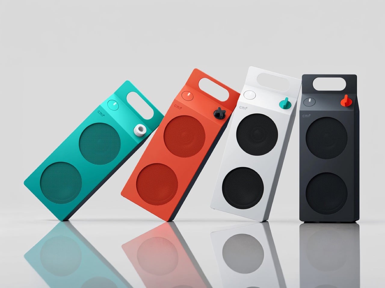
    Everyone has held a milk carton, which is exactly why CMF’s new speakers are so hard to stop looking at. CMF, the budget sub-brand of Nothing, shaped its first Bluetooth speakers like gable-top cartons, a form that toy manufacturer John Van Wormer of Toledo, Ohio, patented in 1915 as the Pure-Pak. Your brain files that silhouette under breakfast, fridge door, and home before it even registers the grille. Then the colors and a deliberately mismatched knob finish the job. Black cylinders and bric
     

Why CMF’s New Milk Carton Speakers Are So Irresistible To Look At

12 octobre 2026 à 15:20

Everyone has held a milk carton, which is exactly why CMF’s new speakers are so hard to stop looking at. CMF, the budget sub-brand of Nothing, shaped its first Bluetooth speakers like gable-top cartons, a form that toy manufacturer John Van Wormer of Toledo, Ohio, patented in 1915 as the Pure-Pak. Your brain files that silhouette under breakfast, fridge door, and home before it even registers the grille. Then the colors and a deliberately mismatched knob finish the job. Black cylinders and bricks have run the speaker aisle for a decade, so a carton is practically a plot twist.

The CMF Speaker S ($59) and Speaker M ($109) launched October 12 at nothing.tech and select retailers, in white, dark grey, turquoise, and orange. CMF’s own product pages cite a carton’s sharp geometry as the inspiration, so the resemblance is deliberate. A sloped roof carries the knob where a carton’s screw cap would sit, and the M’s top fin doubles as a carry handle. The front panel and knob pop off, which turns each speaker into a base for swapping or 3D printing. Both are IP68 too, so the carton can sit on a patio table without a worry.

Designer: CMF by Nothing

The carton’s anatomy, rebuilt as a speaker face

A carton has three recognizable parts, and CMF kept all three. The sloped gable roof becomes the top edge of a folded color panel that wraps over from the front face. The sealed top seam becomes the M’s raised fin with a handle cutout, while the S settles for a round cutout in the corner. The screw cap, a carton upgrade Elopak dates to 1991, becomes a knob you press and turn. On the orange and turquoise models, a dark grey body sits behind the panel, so the color reads like printed paperboard around a core.

The grilles do the decorating. On the turquoise model the mesh is a deeper teal, on the orange it turns brick red, and on white and dark grey it goes black, so each face is a flat field with big circles punched in. The M stacks two of them, the S gets one, and a small pixel-style cmf wordmark sits above like a tiny brand stamp. An oval button with a white light bar is the only other mark besides the knob. That is very few elements, all of them deliberate.

Pint-and-quart proportions and a color system with a mismatched knob

The S measures 5.1 by 3.3 by 1.7 inches (130.5 by 85 by 44mm). The M stretches to 8.7 inches (220mm) tall at the same 85mm width, so the pair reads like a pint and a quart of the same product. Helen Sanematsu’s 1999 AIGA Journal essay on milk packaging argued that cartons get their punch from standing in rows, with color separating the varieties. CMF’s launch imagery lines up four colors across two sizes, which plays that exact game. Put them on a shelf together and you get a dairy case designed by someone with great taste.

Each colorway gets its own knob: a black X on orange, a white ring on turquoise, a red paddle on dark grey, and a teal paddle on white. That deliberate mismatch gives every speaker a single accent, like a bright cap on a carton. Pop it off and you can mix freely or 3D print your own, a habit that follows the CMF Phone 1, whose community printed everything from Lego-friendly backs to a foam dart launcher. We once featured a fan concept for a CMF speaker that went retro radio. The carton is the braver call.

Drivers, battery life, and durability behind the carton

The S pairs a 1.8 inch (45mm) driver with two passive radiators, unpowered diaphragms that beef up bass, for 10W. The M adds a 2.8 inch (70mm) woofer and 0.6 inch (16mm) tweeter for 35W RMS, a continuous power rating. Both claim 18 hours at 50 percent volume with Ultra Bass on, enough for a workday and the commute. A 10 minute charge buys an hour while you hunt for your keys. They survive 30 minutes in nearly 5 feet (1.5 meters) of water and passed a 30 inch (0.76 meter) drop test.

The S costs $59 and the M $109, and both are on sale now at nothing.tech and select retailers. That puts a distinctive object within impulse-buy range, which is unusual for a design this committed. It is the rare budget speaker that makes you want to rearrange a shelf. Van Wormer’s carton survived a century by being easy to hold, stack, and carry, and a portable speaker wants the same three traits. Somebody finally noticed a great speaker shape was sitting in your fridge door all along.

The post Why CMF’s New Milk Carton Speakers Are So Irresistible To Look At first appeared on Yanko Design.

  • ✇Yanko Design
  • Edifier’s $52 gaming soundbar lets you ditch your headset without losing voice chat
    Gaming soundbars became popular in the 2017s, but the trend faded; in the last couple of years, this category of audio accessories has seen renewed interest. Razer kicked off the new wave, with several mainstream brands and some offbeat makers releasing their own versions. Creative recently launched their B3 soundbar for gamers at a very affordable price, and now Edifier is upping the ante with an even sweeter deal. The China-based audio accessories maker, known for high-end bookshelf speakers,
     

Edifier’s $52 gaming soundbar lets you ditch your headset without losing voice chat

12 octobre 2026 à 11:20

Gaming soundbars became popular in the 2017s, but the trend faded; in the last couple of years, this category of audio accessories has seen renewed interest. Razer kicked off the new wave, with several mainstream brands and some offbeat makers releasing their own versions. Creative recently launched their B3 soundbar for gamers at a very affordable price, and now Edifier is upping the ante with an even sweeter deal.

The China-based audio accessories maker, known for high-end bookshelf speakers, has come up with a very cool-looking soundbar for gamers. Dubbed the Hecate G2000 Bar, the desktop audio boomer is all set to be available from 16 October onwards for a price tag of 349 yuan ($52), which is an introductory price slashed from the normal price of 387 yuan ($58).

Designer: Edifier

The G2000 Bar combines a compact footprint with an angular, mecha-inspired design intended to fit into a gaming setup without taking up much desk space. It will be available in black and white, with a built-in five-degree upward tilt that directs sound toward the listener rather than across the desktop. Five interchangeable themed stickers let users customize the front panel, while 12 RGB lighting effects, including rainbow and flowing-light patterns, add some visual flair. Lighting can be adjusted via the Edifier Connect mobile app or Hecate PC software.

Under the hood, the soundbar uses two 56mm full-range drivers with copper-clad aluminum wire voice coils, paired with two 60mm passive radiators. The arrangement is designed to deliver fuller audio and reinforce low frequencies without requiring a separate subwoofer. Output is rated at 3W per channel, or 6W in total, with peak power reaching 12W. The stated frequency response spans 67Hz to 20kHz.

For gaming, the G2000 Bar supports THX 7.1.4 spatial audio processing, which aims to create a more immersive, surround-like listening experience from a desktop soundbar. Six dedicated audio presets cater to different gaming genres, including first-person shooters, role-playing games, and racing titles. These modes give players a way to tailor the sound to different types of gameplay without manually adjusting equalizer settings.

The other notable addition is a detachable microphone mounted on top. It uses AEC 2.0 acoustic echo cancellation, a dedicated digital signal processor, and AI-assisted noise reduction to limit background sounds and reduce audio feedback from the speakers. This could make voice chat more convenient for players who prefer open speakers to a gaming headset, although performance will depend on the surrounding environment.

Connectivity includes Bluetooth 6.0 and USB sound-card input, allowing the soundbar to work with compatible PCs, laptops, mobile devices, and consoles. An independent 9V DC power adapter supplies power, while physical controls on the top metallic panel provide access to volume adjustment, microphone muting, and audio-mode switching.

With its compact design, customizable lighting, spatial audio processing, and integrated voice-chat features, the Hecate G2000 Bar brings several gaming-focused conveniences to an affordable desktop soundbar. Its initial pricing makes it an interesting option for players looking to simplify their setup without committing to a separate speaker system and microphone.

The post Edifier’s $52 gaming soundbar lets you ditch your headset without losing voice chat first appeared on Yanko Design.

  • ✇Yanko Design
  • FUSEBOOX’s Hidden Home Office Slides Away After Work
    Putting a laptop away doesn’t solve every problem with working from home. A video call still needs some privacy, and recording a voiceover beside the dishwasher is a negotiation nobody particularly wants. I like furniture that helps a room do more, but a folding desk only addresses half the issue. Sometimes the missing piece is a door. FUSEBOOX, designed by Czech architect Vojtěch Kolínský of Prague studio Indivizual, proposes a home office that slides out when needed and retracts into the surr
     

FUSEBOOX’s Hidden Home Office Slides Away After Work

12 octobre 2026 à 09:20

Putting a laptop away doesn’t solve every problem with working from home. A video call still needs some privacy, and recording a voiceover beside the dishwasher is a negotiation nobody particularly wants. I like furniture that helps a room do more, but a folding desk only addresses half the issue. Sometimes the missing piece is a door.

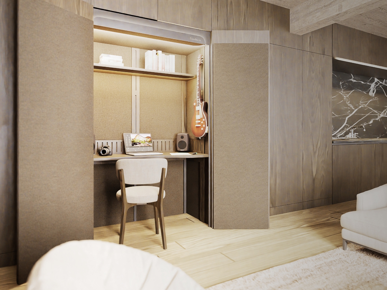
FUSEBOOX, designed by Czech architect Vojtěch Kolínský of Prague studio Indivizual, proposes a home office that slides out when needed and retracts into the surrounding interior afterward. It’s a built-in acoustic workspace, presented at DesignBlok 2026, rather than another freestanding booth asking for permanent floor space. The problem it tackles is straightforward: finding somewhere to concentrate without dedicating an entire room to it.

Designer: Vojtěch Kolínský

The module has three positions. Open, it works as a desk within the larger room, so you can stay connected to whatever’s happening around you. Extended and closed, it becomes a private enclosure intended to reduce noise traveling in and out. Retracted, the workspace disappears behind its exterior panels. A custom-developed mechanism handles extension and retraction automatically, according to the maker. That’s a more useful distinction than simply calling it a disappearing desk.

In the supplied images, the interior looks invitingly domestic. Pale wood-grain surfaces, textured wall panels, a narrow shelf, and warm lighting surround a compact desk. The exhibition setup includes a microphone and a metronome, while another image shows a guitar mounted above the worktop. Those details suggest a space for practicing and making things, not merely surviving the next calendar invitation. I’d rather see that than a miniature corporate meeting room.

The acoustic ambition deserves a closer look. FUSEBOOX describes a multilayer construction with sealed contact edges that limits sound transmission, alongside treatment intended to control reflections and reverberation inside. In practical terms, keeping household noise out and reducing echo around a microphone are separate jobs, and the design aims to address both. The supplied release promises studio-quality sound, but provides no measured isolation figures or independent testing to establish that claim.

Ventilation and adjustable lighting are included, with the website specifying variable brightness and color temperature. These are sensible priorities for a small enclosed workspace. I’d want airflow and lighting considered alongside the moving panels, because a booth that looks good from the couch still has to make sense from the chair. The tall glazed side panels visible in the images also keep the enclosure from looking like an opaque cabinet.

The hidden position is the strongest part of the idea for me. Closing a laptop leaves the desk, cables, and unfinished work in view. Closing up an entire workspace could give the living room a more convincing end to the workday. That isn’t a promise of better productivity or instant relaxation. It’s a physical boundary you can see, which feels more useful than another reminder to log off.

Of course, the module doesn’t manufacture extra square footage. Its built-in portion still occupies space, and the extended enclosure needs clear floor area in front. A coffee table or an awkward circulation path could complicate the arrangement. I see it as borrowing space at different times, rather than making space disappear. That makes the surrounding room layout just as important as the mechanism.

FUSEBOOX is designed and made in the Czech Republic, with configurable layouts, materials, fittings, upholstery, and exterior finishes. The company plans to open preorders in January 2027; prices and detailed dimensions haven’t been published yet. Those omissions matter for anyone picturing it at home. A custom built-in belongs in a renovation conversation, and renters would need to discuss installation with their landlord.

I’m drawn to the restraint of the proposal. The images suggest you could finish the exterior to read as ordinary cabinetry, leaving the more elaborate engineering behind it. A home office doesn’t always need to announce itself from across the room. If the acoustics and installation prove convincing, FUSEBOOX could offer something genuinely useful: a place to work, followed by permission to stop looking at it.

The post FUSEBOOX’s Hidden Home Office Slides Away After Work first appeared on Yanko Design.

  • ✇Yanko Design
  • 8 Best Gear & Gadgets of October 2026 That Turn Any Living Room Into Game Day Central
    Football season turns living rooms into something closer to a clubhouse for a few hours every weekend. The right gear makes that shift effortless, pulling together sound, screen, food, and drink into one setup that actually works for a full slate of games rather than falling apart by halftime. None of these eight picks are trying to reinvent the sport itself. They’re solving the real logistics of hosting: the can that never pours right, the cooler that goes warm by the second quarter, the speak
     

8 Best Gear & Gadgets of October 2026 That Turn Any Living Room Into Game Day Central

12 octobre 2026 à 07:40

Football season turns living rooms into something closer to a clubhouse for a few hours every weekend. The right gear makes that shift effortless, pulling together sound, screen, food, and drink into one setup that actually works for a full slate of games rather than falling apart by halftime.

None of these eight picks are trying to reinvent the sport itself. They’re solving the real logistics of hosting: the can that never pours right, the cooler that goes warm by the second quarter, the speaker setup that can’t keep up with a packed room full of noise.

1. DraftPro Top Can Opener

There’s a reason the first pour matters so much on game day. DraftPro removes the entire top of a can instead of just puncturing it, turning a beer or sparkling water into something closer to a glass pour, aroma included. Designed by Shu Kanno and built in Japan, the motion is smooth and controlled, with a clean edge that’s safe to drink from directly. For you, that means handing a guest a can that actually tastes like it was poured properly, without reaching for a single glass all game.

It works for more than beer too. Drop ice straight into the can for instant chilling when the cooler’s running warm, or mix a quick cocktail right inside it with zero cleanup. Compatible with domestic and international cans, it travels well between the kitchen and the couch, and the clean cut even lets you repurpose empties into planters or pen holders once the game’s over.

Click Here to Buy Now: $60.00

What We Like

  • Removes the entire top for a smooth, glass-like drinking experience
  • Works as a makeshift cocktail shaker with no extra dishes to wash

What We Dislike

  • Only a handful of units were listed in stock at the time of writing
  • Limited to cans, so bottles need a separate opener nearby

2. PhaseTherma

A great drink setup falls apart the moment the ice turns to water. Freezill solves that with PhaseTherma, a phase-change cooling core that keeps ice solid for up to 150 hours without any external power source. For you, that means setting up the drink station once before kickoff and not thinking about it again until the final whistle of a doubleheader weekend, no refills, no plugging anything in.

At $149, it reads less like a cooler and more like premium travel gear that happens to double as game day equipment. The zero power draw also means it works just as well on a porch or in a garage as it does parked next to the couch, so the setup goes wherever the crowd ends up sitting.

What We Like

  • PhaseTherma core keeps ice solid for up to 150 hours
  • Needs zero external power to maintain its cooling performance

What We Dislike

  • $149 is a real investment for what is, at its core, a cooler
  • Premium design means it’s built for care, not for rough outdoor use

3. Battery-free Amplifying iSpeakers

Every other speaker in the room needs something: a charge, a pairing sequence, a Wi-Fi password. This one needs nothing but your phone. Designed by Ooi Masato and machined from Duralumin, the same vibration-resistant aluminum alloy used in aircraft, it amplifies a smartphone’s built-in speaker purely through acoustic geometry. For you, that means setting it down on a side table and having sound fill the room without a single cable in sight.

The chamber’s proportions were shaped using the golden ratio, which is less a gimmick and more the reason the sound comes out as focused as it does. No app, no Bluetooth, no battery to die mid-game. Just a slot for the phone and a noticeably louder room a second later.

Click Here to Buy Now: $179.00

What We Like

  • Needs zero power, batteries, or pairing to work
  • Golden ratio proportions make it as much a desk object as a speaker

What We Dislike

  • Volume ceiling is naturally lower than a powered Bluetooth speaker
  • Only works with a phone placed inside it, not as a standalone unit

4. Xiaomi Redmi Projector 5 Pro

The screen is where game day actually lives, and this one makes a big one affordable. Native 1080p scales up to 120 inches, backed by 1,000 CVIA lumens, HDR10, and a 120Hz refresh rate running at just 5ms of latency. For you, that means a crisp, responsive picture that can fill an entire wall for less than the cost of a year of streaming subscriptions combined.

A metal gimbal arm swings 150 degrees, so the projector adjusts to whatever angle the room demands without needing a dedicated mount or stand. Dual HDMI and Wi-Fi 6 round out the connections, meaning a streaming box, a console, and a laptop can all stay hooked up at once without a single cable getting swapped out between games.

What We Like

  • 120-inch scaling at $281 undercuts most home theater setups by a wide margin
  • Gimbal arm adjusts 150 degrees without needing a separate mount

What We Dislike

  • 1080p native resolution means it’s not a true 4K experience
  • HDR10 support only goes so far without a properly darkened room

5. LG xBoom Stage 501

Halftime needs its own kind of energy, and this speaker is built specifically for that shift in mood. Up to 220W of output runs through dual 2.5-inch woofers and Peerless tweeters, loud enough to carry a packed room without distortion. For you, that means the moment the game pauses, the room doesn’t go quiet; it just changes gears.

The real party piece is AI Karaoke Master, which strips vocals from any song in real time using deep learning trained on more than 10,000 songs. Built around what LG calls late-night living-room chaos, it turns a halftime break into its own event, no separate karaoke machine or backing track search required.

What We Like

  • 220W output with dedicated tweeters handles a full room without strain
  • AI Karaoke Master removes vocals from any song on the spot

What We Dislike

  • At $499.99, it’s a serious commitment for occasional halftime use
  • Karaoke feature works best with a crowd actually willing to sing

6. Death Star Popcorn Maker

Snacks are half of game day, and this one earns its spot by being genuinely good at the one thing it does. A hot air vortex pops corn with close to a 98 percent success rate, no oil or butter required, while the whole unit folds back into a Death Star display piece once the popping’s done. For you, that means a snack station that’s actually fun to look at sitting on the counter between rounds, not just a plastic appliance shoved in a cabinet.

It’s a lighter note in the lineup, a conversation starter as much as a kitchen tool, and a reminder that not every piece of game day gear needs to be purely functional to earn its place in the rotation.

What We Like

  • Close to a 98 percent popping success rate without oil or butter
  • Folds back into a display piece instead of looking like leftover kitchen clutter

What We Dislike

  • Novelty shape won’t appeal to everyone’s kitchen aesthetic
  • Limited to popcorn, so it’s a single-purpose appliance taking up cabinet space

7. Took Foldable Chair

Every host eventually runs out of couch space before they run out of guests. This chair collapses into a compact case about the size of a soundbar, with a strap handle and a one-touch hinge mechanism that opens it in seconds. For you, that means extra seating that lives in a closet the rest of the week and shows up the moment the guest list grows past what the furniture can hold.

It closes the lineup on a practical note: the kind of object that doesn’t need to be clever so much as ready, there when the room fills up and out of the way the second it empties back out.

What We Like

  • Folds to the footprint of a soundbar for easy storage
  • One-touch hinge means setup takes seconds, not a wrestling match

What We Dislike

  • A folding chair will never match a couch for comfort over a long game
  • Durability of the hinge mechanism depends on how often it gets folded and unfolded

8.WiiM Bar Soundbar

For the games that deserve real sound, not just loud sound, this soundbar fills that gap. True 3.0.2 Dolby Atmos runs through an eight-driver array, three front mid-woofers, three front tweeters, and two upward-firing full-range drivers, backed by four passive radiators for low end that doesn’t need a separate subwoofer. For you, that means commentary, crowd noise, and the snap of a tackle all land with the kind of separation a standard TV speaker can’t touch.

A 2.1-inch round touch display sits embedded in the bar’s front face, giving quick access to inputs and volume without digging for a remote between plays. It sits under the TV rather than competing for space, built for the room rather than announcing itself as the centerpiece.

What We Like

  • Eight-driver array delivers genuine Dolby Atmos without a subwoofer
  • Touch display built into the bar simplifies control mid-game

What We Dislike

  • A setup this capable asks for a TV and source worth the upgrade
  • Four passive radiators still can’t fully replace a dedicated subwoofer in a large room

The Setup That Covers the Whole Afternoon

None of these eight pieces are trying to be the loudest thing in the room. The projector and the two speaker options handle the screen and the sound, the cooler and the can opener handle the drinks, and the popcorn maker and the folding chair round out the food and seating without asking for much space in return.

What makes this lineup work isn’t novelty; it’s that each piece solves one real problem well. A host doesn’t need everything to be smart or connected. Sometimes the best upgrade is a can that pours like a glass, or a chair that disappears into a closet until the room needs it most.

The post 8 Best Gear & Gadgets of October 2026 That Turn Any Living Room Into Game Day Central first appeared on Yanko Design.

  • ✇Yanko Design
  • Razer Wolverine V4 Pro has four back buttons, but none have to stay
    Extra buttons on a game controller can be handy, at least until they get in the way of holding it. Razer’s Wolverine V4 Pro gives players a little more say in that arrangement, with magnetic back buttons you can remove instead of simply ignoring them. Available for Xbox and PC, the wireless controller also lets you change its thumbstick caps and even take off its faceplate. The four rear buttons come off without tools, making it possible to keep all of them, use only a pair, or clear the back e
     

Razer Wolverine V4 Pro has four back buttons, but none have to stay

Par : JC Torres
12 octobre 2026 à 04:15

Extra buttons on a game controller can be handy, at least until they get in the way of holding it. Razer’s Wolverine V4 Pro gives players a little more say in that arrangement, with magnetic back buttons you can remove instead of simply ignoring them. Available for Xbox and PC, the wireless controller also lets you change its thumbstick caps and even take off its faceplate.

The four rear buttons come off without tools, making it possible to keep all of them, use only a pair, or clear the back entirely. Blank inserts replace the unwanted controls, following the controller’s contours rather than leaving little gaps behind. It’s a small detail, but an important one when that surface is where your fingers spend most of their time during a game.

Designer: Razer

Of course, keeping those buttons attached makes sense when you’re juggling several actions at once. Their mouse-click switches can handle commands such as jumping or reloading, letting your thumbs stay on the sticks while your other fingers do the work. Two additional shoulder buttons bring the total to six remappable inputs, giving frequently used actions somewhere to go besides the familiar face buttons.

The thumbsticks get their own set of options, changing both their height and the surface beneath your thumbs. Short convex caps provide a rounded surface, while tall concave versions give your thumb a recessed resting spot and more height to work with. Razer recommends the taller caps for precise aiming. You can mix the supplied options, but swapping caps doesn’t mean you’re replacing the sensors underneath.

That flexibility continues with the triggers, which can switch between a short mouse-click action and a full analog pull using rear-mounted locks. The shorter setting suits firing in a shooter, while the longer travel lets you ease onto the throttle in a racing game. Through Razer Synapse, you can also adjust each trigger’s activation point to suit how you play.

Even the exterior is open to a little tinkering, thanks to a magnetic faceplate that lifts off without tools. Personalize that panel, or leave it off entirely to reveal the translucent housing underneath. The working components remain enclosed, so you’re changing the controller’s outer appearance rather than exposing its electronics. It’s an option for people who prefer seeing a bit of machinery.

The software takes care of the changes you can’t make with magnets. Four onboard profiles hold different button assignments and sensitivity settings, so a racing setup doesn’t have to overwrite your shooter preferences. You can also adjust thumbstick dead zones, deciding how much movement registers as input. That said, greater sensitivity can pick up tiny thumb movements you didn’t intend.

At $199.99 in the US, this level of customization doesn’t come cheap, and there’s no included carrying case to keep the removable pieces together. You’ll have to find your own place for spare caps and unused buttons. After spending that much on a controller you can rearrange, a dedicated home for the bits you’ve removed would have been rather welcome.

The post Razer Wolverine V4 Pro has four back buttons, but none have to stay first appeared on Yanko Design.

  • ✇Korben
  • P.T. - Le couloir de Kojima en natif sur Windows et Linux
    Le P.T. de Kojima, ce "playable teaser" de Silent Hills que Konami a retiré du PlayStation Store en 2015, a maintenant un portage natif pour Windows et Linux et c'est signé Lorean Xavier. Pour ceux qui ne connaissent pas ce jeu, P.T. est sorti gratuitement sur PS4 en août 2014, sous le nom d'un studio qui n'existait pas, 7780s Studio. On y parcourt un couloir en L qui tourne en boucle, en marchant et en zoomant, pendant que Lisa, un fantôme, nous traque. Et si elle nous attrape, eh bien la boucl
     

P.T. - Le couloir de Kojima en natif sur Windows et Linux

9 octobre 2026 à 04:27

Le P.T. de Kojima, ce "playable teaser" de Silent Hills que Konami a retiré du PlayStation Store en 2015, a maintenant un portage natif pour Windows et Linux et c'est signé Lorean Xavier.

Pour ceux qui ne connaissent pas ce jeu, P.T. est sorti gratuitement sur PS4 en août 2014, sous le nom d'un studio qui n'existait pas, 7780s Studio. On y parcourt un couloir en L qui tourne en boucle, en marchant et en zoomant, pendant que Lisa, un fantôme, nous traque. Et si elle nous attrape, eh bien la boucle infernale recommence encore et encore... Et bien sûr, ce maudit couloir change à chaque tour réussi !

Ensuite, une fois la dernière énigme résolue, on avait droit à un trailer annonçant Silent Hills, réalisé par Hideo Kojima et Guillermo del Toro avec Norman Reedus dans le rôle principal. Le vrai jeu a ensuite été malheureusement annulé, et P.T. n'a survécu depuis uniquement sur les PS4 qui l'avaient conservé ou via l'émulation.

Ce clic autorise une connexion à Google : adresse IP transmise et traceurs possibles. En savoir plus Voir cette vidéo sur YouTube

Mais c'était sans compter sur Lorean qui l'a recompilé pour en faire un portage natif, comme celui d'Animal Crossing dont je vous parlais en juillet. La logique du jeu a été intégralement reconstruite en C++ à partir du comportement de l'original et le rendu tourne sur Vulkan, alors que les niveaux, les modèles, les textures, les sons et les cinématiques, eux, sont lus lors de l'exécution à l'aide de votre propre copie PS4 (ce qui évite de diffuser du contenu sous copyright donc).

Tout ce que le portage ajoute est désactivé ou calé sur l'original par défaut. On y retrouve donc des upscalers (FSR 3.1 et XeSS sur n'importe quel GPU récent, DLSS 4.5 sur GeForce RTX, sous Windows seulement), un mode photo sur F7 et un dossier de mods qui accepte des scripts Lua.

Côté fidélité, Lance McDonald, le dataminer qui avait fouillé P.T. à l'époque, y voit, autant qu'il puisse en juger, un portage 1:1 de toute la base de code, qui reproduit tous les comportements non documentés qu'il connaît. Et bien sûr, même si le dev de ce portage a dû gérer l'archi du code de A à Z, c'est l'IA qui s'est occupée du dev et du debugging.

Bref, comme je vous le disais, ce portage ne contient aucun fichier de Konami, donc c'est à vous de fournir le jeu. Il vous faudra donc un dossier dump sorti de votre console (ou d'une archive en ligne si vous êtes un affreux criminel ^^), ou un faux PKG fabriqué à partir de ce dump. Un PKG du store ne marchera pas par contre puisqu'il est chiffré pour la console qui le possède. Et bien sûr, seule la version américaine (CUSA01127) a été testée. A tester donc avec les versions européenne et japonaise pour voir si ça passe.

Côté machine, il vous faudra à minima un Windows 10 ou 11 en 64 bits, ou un Linux x86-64 avec glibc 2.38 minimum (Ubuntu 24.04, Debian 13, Fedora 39, Arch ou SteamOS ça passe.), ainsi qu'un GPU compatible Vulkan 1.3. Sur Steam Deck, l'installation se fera depuis le mode bureau, puis faudra ajouter le jeu comme jeu non-Steam.

De son côté, macOS est annoncé pour la 1.0.2, mais ses paquets ne sont pas encore téléchargeables (faudra compiler les amis !). Pour le reste, les menus et les sous-titres sont disponibles en français, mais les voix restent en anglais, et le passage où le jeu a besoin de votre micro peut être joué au clavier quand même, si vous n'avez pas le matos.

Voilà... Je ne m'en souvenais pas, mais en faisant mes recherches, j'ai appris que ce n'est pas la première tentative de portage de P.T. sur PC. Il y a eu un remake de Qimsar, fan de 17 ans, qui est sorti gratos en juillet 2018 et malheureusement, Konami l'a fait fermer quelques jours plus tard pour des raisons légales, tout en lui proposant un stage (beaux joueurs quand même).

On verra à quelle sauce ce projet sous licence MIT se fera manger ou pas.

Sachez que si vous avez déjà votre copie de P.T. sous la main, les installeurs Windows et Linux sont sur la page Releases du dépôt GitHub !

Source : PC Gamer

  • ✇WinCentral
  • Windows 11 Driver Quality Initiative: How Intel’s 26H2 GPU Drivers Stop Kernel Crashes
    For decades, the standard Windows experience has occasionally been disrupted by sudden Blue Screens of Death (BSOD), unexpected thermal throttling, or battery drain. While users often point fingers directly at the operating system, Microsoft has officially acknowledged a reality long understood behind closed doors: a single faulty, low-quality driver running in kernel space can bring […]
     

Windows 11 Driver Quality Initiative: How Intel’s 26H2 GPU Drivers Stop Kernel Crashes

Par : Nisha
9 octobre 2026 à 06:37
For decades, the standard Windows experience has occasionally been disrupted by sudden Blue Screens of Death (BSOD), unexpected thermal throttling, or battery drain. While users often point fingers directly at the operating system, Microsoft has officially acknowledged a reality long understood behind closed doors: a single faulty, low-quality driver running in kernel space can bring […]

  • ✇Yanko Design
  • PocketBook Gave Its $198 E-Reader the One Trick Old Nokia Phones Had
    E-readers are supposed to replace physical books, but they strangely come mostly in black or gray, unlike colorful and distinctive book covers. Although not a complete design overhaul, Pocketbook’s new Verta and Verta Color e-readers offer a simple fix, and no, it doesn’t require slapping on a case. You can change the color of the e-reader by swapping the back panel while maintaining its slim shape and keeping the screen and page-turn buttons uncovered. That’s a rather different approach to per
     

PocketBook Gave Its $198 E-Reader the One Trick Old Nokia Phones Had

Par : JC Torres
8 octobre 2026 à 06:07

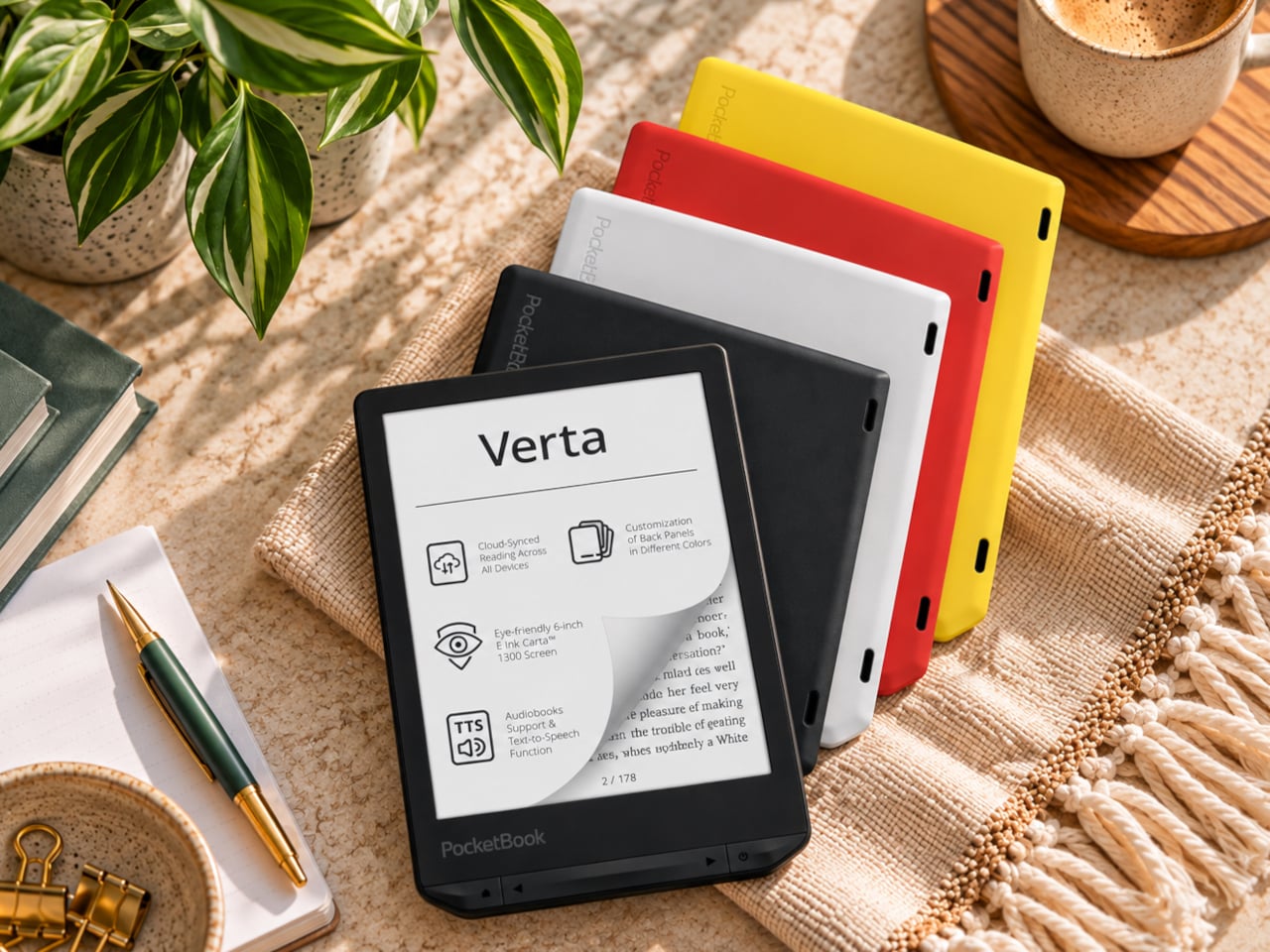
E-readers are supposed to replace physical books, but they strangely come mostly in black or gray, unlike colorful and distinctive book covers. Although not a complete design overhaul, Pocketbook’s new Verta and Verta Color e-readers offer a simple fix, and no, it doesn’t require slapping on a case. You can change the color of the e-reader by swapping the back panel while maintaining its slim shape and keeping the screen and page-turn buttons uncovered.

That’s a rather different approach to personalization than slipping on a protective cover. The interchangeable panels are sold separately, so you can keep a few colors around and switch when your taste changes. More importantly, they replace the back rather than wrapping over the front. There’s no extra flap to fold behind the reader when you settle into a chair with a book.

Designer: PocketBook

The front stays familiar in the best way. Both readers have a 6-inch touchscreen and enlarged page-turn buttons beneath it, giving your thumb another way forward when the screen is smudged or your hands are occupied. Each measures just 0.28 inches thick and weighs about 4.9 ounces, a size that suits a jacket pocket or an overstuffed bag on the commute.

Choose the regular Verta, and you get a 6-inch E Ink Carta 1300 display at 300 pixels per inch, built for the sort of long novel that makes you miss your stop. SMARTlight lets you adjust brightness and warmth as daylight disappears. It also offers Dark Mode, so you can keep reading in bed without a bright white page facing the person beside you.

The Verta Color is for readers who want their covers, illustrated pages, and comics to retain some color. Its E Ink Kaleido 3 screen renders monochrome text at 300 pixels per inch, but color drops to 150 pixels per inch. Those numbers matter if you read fine print in graphic novels; the color option gives illustrations some life, not the punch of a tablet.

Both have 16GB of storage, Wi-Fi for downloading books, and Bluetooth audio for audiobooks or text-to-speech, though you’ll need headphones or another compatible listening device. PocketBook also supports a broad range of file formats and borrowing through library apps. That flexibility comes in handy when the next book you want isn’t sitting in a single company’s store waiting for you.

An IPX4 rating gives the pair protection against splashes, not an invitation to use them in the bath. Their 1,500mAh batteries are meant to last up to two months, depending on how you read, although that figure comes from PocketBook rather than an independent test. The removable backs add personality, but they’re not a replacement for a protective case if the reader needs one.

PocketBook plans to release both in November 2026, pricing the Verta at €169 (about $198) and the Verta Color at €179 (about $209). Both are marked as coming soon on its storefront. The cleverest trick, though, is letting you change the color of something you hold for hours on end without asking a protective case to do the decorating for you.

The post PocketBook Gave Its $198 E-Reader the One Trick Old Nokia Phones Had first appeared on Yanko Design.

  • ✇WinCentral
  • Windows 11 Narrator Elevates Math Accessibility with Intelligent Equation Navigation
    For students, researchers, and visually impaired professionals, navigating complex mathematical equations on digital screens has historically been a tedious process. Standard screen readers often struggle with technical notation, reading out characters sequentially rather than conveying the contextual structure of fractions, matrices, or exponents. Microsoft is addressing this gap directly with a major accessibility update for […]
     

Windows 11 Narrator Elevates Math Accessibility with Intelligent Equation Navigation

Par : Nisha
8 octobre 2026 à 03:22
For students, researchers, and visually impaired professionals, navigating complex mathematical equations on digital screens has historically been a tedious process. Standard screen readers often struggle with technical notation, reading out characters sequentially rather than conveying the contextual structure of fractions, matrices, or exponents. Microsoft is addressing this gap directly with a major accessibility update for […]

  • ✇Yanko Design
  • A Pen Holder That Actually Looks Like Desk Art
    When it comes to stationery and my work and leisure desk, I consider my aesthetic to be messycore and maximalist. Having a lot of pens and other supplies on hand whether for work or for my journaling sessions is normal for me. I tried to use some desk organizers, but it seems that there is order in my chaos and I can still find what I need when I need it, although it doesn’t really look all that Instagrammable. That hasn’t stopped me from looking at and exploring desk organizers and pen holders
     

A Pen Holder That Actually Looks Like Desk Art

7 octobre 2026 à 18:30

When it comes to stationery and my work and leisure desk, I consider my aesthetic to be messycore and maximalist. Having a lot of pens and other supplies on hand whether for work or for my journaling sessions is normal for me. I tried to use some desk organizers, but it seems that there is order in my chaos and I can still find what I need when I need it, although it doesn’t really look all that Instagrammable. That hasn’t stopped me from looking at and exploring desk organizers and pen holders, especially ones that look different from the usual.

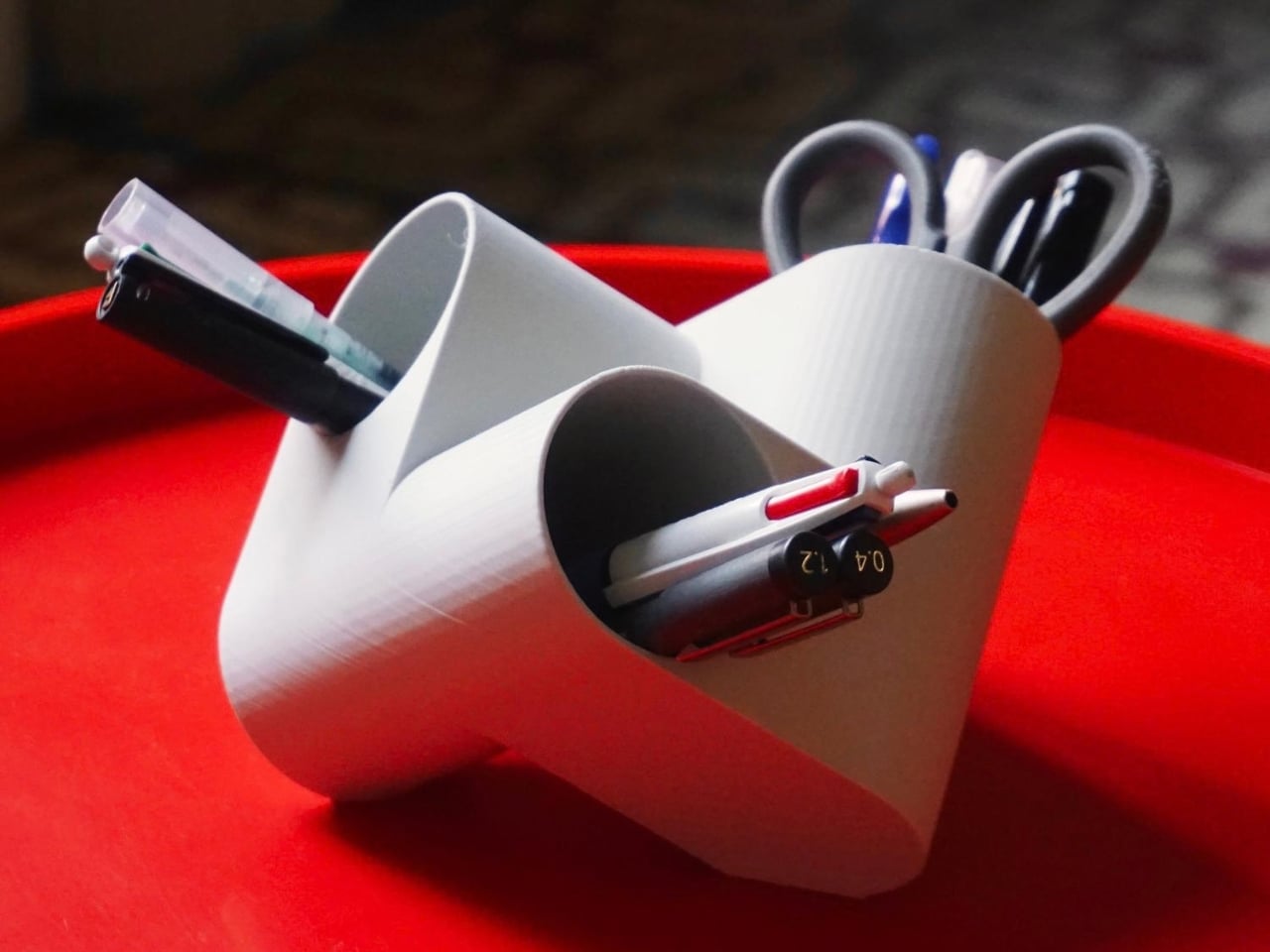
Ciclo is one such pen holder from Spanish industrial designer Eduardo Blanco. The way it’s designed is for you to have more space for your various stationery items and also to give your desk a kind of sculptural-looking organizer that looks good in person and also when you decide to do a post of how your desk looks at the moment. The inspiration for the design actually comes from mathematics and the name itself has ties to it.

Designer: Eduardo Blanco

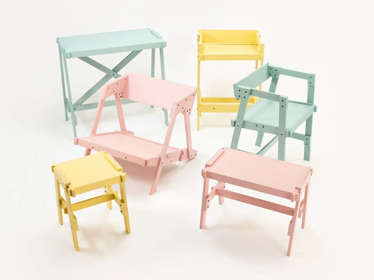
Blanco said he wanted something that didn’t look banal on his desk. The inspiration comes from the Cartesian coordinate system, using three cylinders repeated around the same axis that are stacked and joined one on top of the other. Think about the X, Y, Z axes discussed during math classes (which I would rather forget) but brought to life as a sculptural stationery object. What would normally be a mundane or ordinary object is transformed into a well-designed piece that would look at home at an office desk, a creative workspace, or your side table. Aside from looking beautiful just sitting there, it also means you have three spaces to put your pencils, pens, markers, scissors, cutter, and other supplies you need to organize on your desk.

And honestly, that’s where Ciclo wins me over. Even for someone like me, whose desk looks like a stationery store had a very good time, there’s something undeniably appealing about having one piece that anchors the whole thing visually. You don’t have to be a minimalist to appreciate a beautiful object. If anything, if you’re already going the maximalist route, you might as well make sure some of those items on your desk are actually worth looking at, and Ciclo definitely qualifies. There’s also something kind of fun about having a mathematically inspired piece sitting among your journaling supplies and highlighter collection.

What I also find interesting about Ciclo is the way it challenges how seriously we take the objects we use every day. Most of us grab whatever cheap plastic pen cup is on sale at the office supply store, and that’s perfectly fine. It works. But Blanco’s approach asks a simple but quietly radical question: why settle for something that just works when you could have something that also makes you pause for a second and go, “huh, that’s actually really cool”? That shift in thinking is kind of what separates good design from great design, and it’s exactly what makes Ciclo stand out in a product category that designers have largely ignored.

It’s also worth noting that Ciclo was selected as part of Lagranja Design’s Open Design Editions 2026, a program that spotlights emerging and thoughtful design work, and was presented during Barcelona Design Week. That’s not a small nod. It means the design community sees real value in what Blanco created here, and that Ciclo is more than just a pretty object to put on display.

Whether you keep a very tidy, carefully curated desk or your workspace is a glorious organized mess like mine, Ciclo is the kind of object that earns its spot. It’s a pen holder, sure, but it’s also a small, quiet statement that the things you keep close while you work or create don’t have to be boring. And in a world where so many of us spend a huge chunk of our day at our desks, that feels like it actually matters.

The post A Pen Holder That Actually Looks Like Desk Art first appeared on Yanko Design.

  • ✇Yanko Design
  • Corsair’s Xeneon Edge is the Stream Deck you always wanted, but bigger and better
    Elgato unveiled a little box of 15 LCD buttons in 2017, priced at $149.95, and it quietly rearranged how streamers sat at their desks. The Stream Deck got so popular that Corsair bought Elgato’s gaming business in 2018. Then the obvious question hung around for years: what if the buttons were just a screen? A screen can be any button, any dial, any chart, or any chat window, and it never runs out of room for one more shortcut. Anyone who has maxed out a 15-key pad knows that pain. Corsair event
     

Corsair’s Xeneon Edge is the Stream Deck you always wanted, but bigger and better

7 octobre 2026 à 16:30

Elgato unveiled a little box of 15 LCD buttons in 2017, priced at $149.95, and it quietly rearranged how streamers sat at their desks. The Stream Deck got so popular that Corsair bought Elgato’s gaming business in 2018. Then the obvious question hung around for years: what if the buttons were just a screen? A screen can be any button, any dial, any chart, or any chat window, and it never runs out of room for one more shortcut. Anyone who has maxed out a 15-key pad knows that pain. Corsair eventually got around to answering.

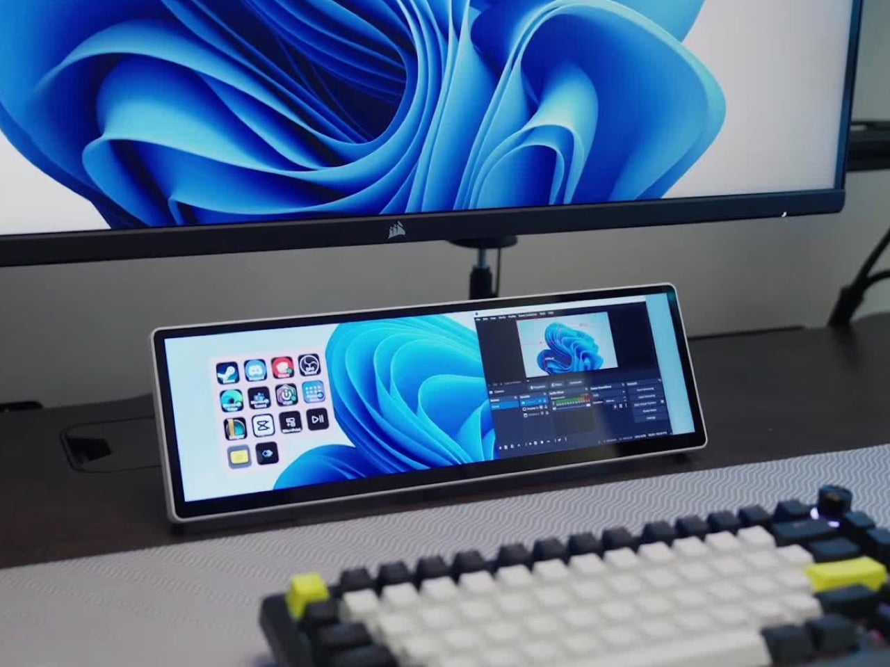
The answer is the Xeneon Edge, a 14.5-inch touchscreen with a 2560 x 720 panel and a 32:9 shape that sits under your main monitor like a very ambitious soundbar. It runs Elgato’s Stream Deck software, so your old button grid gets a much bigger canvas. Fourteen magnets, a detachable stand, and two ¼-20 threads let it live on a desk, a steel panel, or inside your PC case. It lists at $249.99 and is currently $199.99 at Corsair in the US, in all five colors.

Designer: Corsair

A 32:9 strip built for the stuff you only glance at

Think of 32:9 as two 16:9 monitors glued side by side, then shrunk until they fit beneath your main screen. The body measures about 14.6 by 4.7 by 0.8 inches (372 x 120 x 20mm) and weighs roughly 2.2 pounds (1 kg). That works out to about 183 pixels per inch, tighter than the 163 you get on a 27-inch 4K monitor, so small text stays crisp. At 720 pixels tall, the screen is shallow enough to tuck under a monitor without crowding your view. It also rotates to portrait, which turns it into a tall column beside your main display.

On a typical Tuesday, Spotify, Discord, a calendar, and your GPU temps all want a window, and your main screen is busy with actual work. Park them on the Edge and they stay put, one glance away, while you do your thing above. Video calls can live there too, so a meeting you only half-care about stays visible without eating your spreadsheet. Nothing needs alt-tabbing, and nothing gets lost behind a browser with 40 tabs. It’s the same idea as a phone propped next to your keyboard, except it’s wider, brighter, and plugged into your PC.

Fourteen magnets, two threads, and a 360mm radiator slot

Fourteen magnets sit under the plastic shell, so the Edge sticks to any steel surface without scratching it. That includes a steel desk, a PC side panel, a monitor stand, and yes, a fridge, if the cable is long enough. Inside a case, it takes the place of a 360mm radiator, a slot built for three 120mm fans, and it’s thinner than a regular case fan, so clearance is rarely an issue. Corsair also sells an LCD kit that mounts it into the side panel of the Frame 4000D and 5000D cases. Your build’s best view just got a clock and a temperature gauge.

Two ¼-20 threads on the back, the same screw size camera gear uses, let you hang the Edge from Elgato Multi-Mount hardware or any standard AV arm. That mount-anywhere thinking echoes the Elgato accessory support on Corsair’s Platform:6 desk, which we covered at its Gamescom reveal. Corsair also posts free 3D-printable accessories on Printables, including a taller stand that raises the screen behind a keyboard. The community has jumped in too, and Corsair has spotlighted a modular adapter mount from a creator named Naaackers. If you can think of a place for a screen, someone has either printed a bracket for it or soon will.

Widgets in iCUE and the Elgato Marketplace

Plug it in and Windows treats the Edge as an ordinary second monitor, touch included. Corsair’s iCUE software for Windows adds widgets on top: a clock, a calendar, weather, news headlines, a task list, and system sensors showing CPU and GPU temps. Each widget lands on a grid you arrange yourself, so your layout can look as busy or as clean as you like. Since May 2026, widgets live on the Elgato Marketplace, where anyone can download or build one. Corsair’s developer docs even point to AI coding tools as a shortcut, which means a custom widget can start as a plain-English wish.

The widget that matters most for old Stream Deck fans is the native Stream Deck widget in iCUE. It drops a full grid of tappable keys onto the Edge, and you add actions in Elgato’s Stream Deck software exactly as you would for a physical deck. Resize the grid and you get more keys than any 15-button pad ever offered. Launch a game, mute your mic, switch an OBS scene, or toggle your desk lights, each with one tap. Because the screen is still a screen, the same strip can show your calendar or GPU temps right next to the keys.

A bright 2560 x 720 panel and touch that behaves like a phone

The panel is AHVA, Corsair’s version of IPS, so colors and viewing angles hold up even when you’re looking at it from the side. It runs 2560 x 720 at 60Hz with 350 nits of peak brightness, plenty for a desk lit by a window and a lamp. Touch is 5-point capacitive, the same technology as your phone, so tapping, swiping, and pinching all feel familiar. A single USB-C cable with DP Alt Mode (video over USB-C) can carry picture and power when your PC supports it. HDMI 2.0 covers everything else, and Corsair includes cables for both in the box.

Not every shell is black, either. Colors include black, white, and the translucent Atomic Purple, Crystal, and Smoke, which channel the see-through plastic of late-90s gadgets. We’ve seen that look return in a fully transparent Game Boy Color mod and Analogue’s Game Boy Color-inspired Pocket, and it suits a desk accessory just as well. Translucent plastic also makes the stand look like part of the design, not an afterthought. Pick whichever matches your keyboard, or your mood, or your last impulse buy.

Price, rivals, and where the Edge fits on your desk

The Xeneon Edge lists at $249.99 and is currently $199.99 at Corsair in the US, across all five colors, with a three-year warranty and a zero-dead-pixel guarantee. For comparison, Elgato’s 15-key Stream Deck MK.2 lists at $149.99, and the 32-key Stream Deck XL lists at $249.99. The Edge costs the same as the XL and brings an actual display to the party. ASUS makes the closest rival, the ProArt PA147CDV, a 14-inch 32:9 touchscreen with a physical dial and pen support, but it runs a lower 1920 x 550 resolution and sells for roughly twice the Edge’s list price. Cheap no-name touchscreens exist too, but most skip the magnets, the threads, and the Stream Deck tie-in.

The Stream Deck taught desks that a small control room beside the keyboard beats hunting through menus. The Edge keeps that lesson and swaps the plastic keys for pixels that can become anything. It mounts where you want it, shows what you need, and gets better as the widget library grows. It’s available now at Corsair’s site for $199.99 in the US while the current sale runs, with $249.99 as the regular price. Fifteen buttons were a good start. A 14.5-inch strip of pixels is a much better sequel.

The post Corsair’s Xeneon Edge is the Stream Deck you always wanted, but bigger and better first appeared on Yanko Design.

  • ✇Yanko Design
  • This $59 Cork Wallet Makes Your Overstuffed Bifold Look Embarrassing
    Most wallets don’t start out bulky. They get there one receipt, spare card, and folded bill at a time, until slipping one into a front pocket feels like packing a book. Corkor’s slim card holder asks you to carry less, then makes that decision feel less austere with a cork exterior. Its appeal lies in the material as well as its size. Cork is something you pull from a bottle or pin notes into, not what you reach for when paying for coffee. Here, its irregular grain gives the wallet character wi
     

This $59 Cork Wallet Makes Your Overstuffed Bifold Look Embarrassing

Par : JC Torres
7 octobre 2026 à 13:20

Most wallets don’t start out bulky. They get there one receipt, spare card, and folded bill at a time, until slipping one into a front pocket feels like packing a book. Corkor’s slim card holder asks you to carry less, then makes that decision feel less austere with a cork exterior. Its appeal lies in the material as well as its size.

Cork is something you pull from a bottle or pin notes into, not what you reach for when paying for coffee. Here, its irregular grain gives the wallet character without needing decorative hardware or branding. Stitched edges and stacked pockets keep the shape familiar, but the surface feels different from the smooth leather and synthetic finishes that dominate everyday carry.

Designer: Corkor

The layout keeps your most-used cards in three slots, with an ID window and two compartments for folded bills. A small opening on the front helps you nudge a card upward rather than digging at its edge. Keep only the cards you actually use, though, because squeezing too many into those pockets would inevitably change how slim the wallet feels in your pocket.

At 4.3 inches tall, 3.2 inches wide, and 0.4 inches thick when empty, the holder takes up less room than a traditional bifold. It weighs just 0.70 ounces before you add anything. You can leave home with a payment card, an ID, and a little cash without carrying a stack of compartments you’ll never open during a long, busy day away from home.

Cork has a purpose beyond its unusual appearance. The thin, pliable material lets the holder bend gently instead of feeling like a rigid little case, and Corkor describes it as water-repellent and easy to clean. For someone who wants an animal-free alternative to leather, that makes the material choice part of the daily experience rather than a claim printed on a label.

The cork comes from Portugal, where Corkor also makes the holder in-house. That doesn’t mean a wallet can settle every question about sustainability, but it does give this one a clear material identity. Corkor says its packaging is recyclable or compostable, and the card holder is certified vegan. Those details matter most when they’re paired with something you actually want to keep using.

Of course, minimalism has limits. There’s no coin pocket, and those folded bills won’t be as quick to sort through as cash in a full-size wallet. RFID-blocking construction is included to help protect compatible cards from skimming, but it won’t prevent other kinds of theft. This is a holder for an edited pocket, not a place to stash whatever the day hands you.

Corkor prices the holder at $59, which might seem steep for something designed to carry so little. That small footprint is precisely the point. The soft, mottled cork makes a familiar stack of slots feel unexpectedly personal, while the slim layout encourages you to leave the clutter behind. Once you’ve pared things down, that front pocket might finally have room for more than your wallet.

The post This $59 Cork Wallet Makes Your Overstuffed Bifold Look Embarrassing first appeared on Yanko Design.

  • ✇Yanko Design
  • Bloom Built a Cat Tower Around the Cat You Haven’t Got Yet
    A kitten might be happy with a hideaway, but give it a few months and that same nook starts looking cramped. Add another cat, and a single perch becomes contested territory. Bloom takes that problem literally, building a cat tower from separate cylindrical modules that can be arranged as its occupants grow. It starts small instead of demanding space for a feline family. Most cat towers arrive as a collection of platforms, posts, and houses, whether your cat needs all of them or not. Their bulk
     

Bloom Built a Cat Tower Around the Cat You Haven’t Got Yet

Par : JC Torres
7 octobre 2026 à 12:20

A kitten might be happy with a hideaway, but give it a few months and that same nook starts looking cramped. Add another cat, and a single perch becomes contested territory. Bloom takes that problem literally, building a cat tower from separate cylindrical modules that can be arranged as its occupants grow. It starts small instead of demanding space for a feline family.

Most cat towers arrive as a collection of platforms, posts, and houses, whether your cat needs all of them or not. Their bulk can make a living room feel as if it has been furnished around the pet. Bloom swaps that predetermined silhouette for a cluster of open tubes, each one a place to curl up, climb through, or watch the room.

Designers: Joonseo Choi, Taewoon Kang

Those cylinders come in several diameters, so arranging them feels closer to stacking play objects than assembling pet furniture. A smaller cat can settle into a tighter opening, while a larger one has room to stretch out in a wider tube. The circles also give Bloom its character: soft, repeating forms that can take different shapes instead of committing your room to one tower.

Of course, loose tubes wouldn’t make much of a cat tower once the occupants started leaping about. Bloom uses orange straps to hold the modules together, with hook-and-loop fastening that makes them easier to attach and detach. The straps add a punch of color to the pale cylinders, but their important job is letting you change the arrangement without committing to a rebuild.

You might begin with two tubes near the sofa, then add another when your kitten starts climbing above everybody’s heads. If a second cat joins the household, a wider cluster could give each animal somewhere to pause without fighting over the same opening. The exact layout can follow the cats, rather than asking them to adapt to whatever configuration came in a box.

The holes along the sides serve another purpose beyond giving the straps somewhere to attach. Slide a toy toward one, and a cat tucked inside has something to investigate, while you get a way to join the game without reaching into the tube. It’s a detail, but it turns the enclosed space into somewhere for interaction rather than just another hiding place.

There are still questions a concept can’t answer. A tall arrangement would need to stay steady under a cat’s weight, especially if one launches itself at an upper opening. Bloom doesn’t specify load limits or explain how every possible configuration would be supported, so that flexibility shouldn’t be mistaken for unlimited stacking. For now, its flexibility remains an intriguing, unproven design proposition.

Still, Bloom understands something about cats that a fixed tower often misses: the creature you bring home won’t always be small, and it might not always be alone. Its tubes can be rearranged as that story changes, while its openings leave room for curiosity. The furniture doesn’t need to grow overnight; it can take shape alongside the animals that claim it.

The post Bloom Built a Cat Tower Around the Cat You Haven’t Got Yet first appeared on Yanko Design.

  • ✇Korben
  • Issued - Pour lire vos Comics / BDs depuis votre navigateur
    Si vous avez un dossier blindé de comics / BDs au format CBZ ou en CBR, rangé à "votre sauce" par éditeur, par série ou carrément en bordel (ce qui est mon cas, je suis bordélique...), Issued est un petit serveur à installer chez vous qui va vous rendre de fiers services. En effet, ce soft scannera votre dossier tel quel, ne réorganisera rien parce que c'est pas votre mère, mais par contre, il reconstruira sa bibliothèque autour de vos dossiers, pour que vous puissiez lire tout ç
     

Issued - Pour lire vos Comics / BDs depuis votre navigateur

7 octobre 2026 à 01:54

Si vous avez un dossier blindé de comics / BDs au format CBZ ou en CBR, rangé à "votre sauce" par éditeur, par série ou carrément en bordel (ce qui est mon cas, je suis bordélique...), Issued est un petit serveur à installer chez vous qui va vous rendre de fiers services. En effet, ce soft scannera votre dossier tel quel, ne réorganisera rien parce que c'est pas votre mère, mais par contre, il reconstruira sa bibliothèque autour de vos dossiers, pour que vous puissiez lire tout ça depuis un navigateur ou une appli de lecture, en ayant l'impression que "Oh dis donc c'est bien rangé"

Une seule règle à respecter quand même c'est de ne pas mélanger des comics et des sous-dossiers dans un même dossier puisque pour Issued, un dossier qui contient des comics, c'est une série. Ah et les fichiers aux formats CB7 et les PDF passeront aussi sans souci.

Côté lecture, le lecteur web affiche les derniers ajouts et les comics entamés à reprendre. Et si vous suivez des séries encore en cours de parution, vous les marquez avec le bouton Ongoing, et la page du même nom vous montre le dernier numéro ajouté, le nombre de numéros et ceux qui manquent peut-être à l'appel... Sur mobile, vous pouvez aussi ajouter son catalogue OPDS dans Panels ou Chunky Reader sur iOS, ou dans Moon+ Reader sur Android.

Son dev dit l'utiliser avec environ 4 500 comics (mais quel pirate ^^) et pense que ça tiendra le choc à 10 000 voire 20 000 BDs. Les vignettes, de leur côté, sont générées une seule fois, sur un seul thread, pour ne pas saturer votre serveur qui fait déjà tourner d'autres conteneurs et la surveillance du dossier, qui ajoute les nouveaux comics toute seule, se coupe dans la config si vous préférez laisser roupiller vos disques (un bouton permet alors de relancer le scan à la main).

Attention par contre au mot de passe que vous mettrez car celui que vous pouvez définir dans config.ini ne protègera que le lecteur web. En effet, le catalogue OPDS reste accessible sans session et c'est ce catalogue qui permet de télécharger les archives. Donc pour lire vos comics depuis l'extérieur, n'ouvrez pas le port 8181 de votre box en mode neuneu ! Non, restez absolument sur votre réseau local, ou passez par un reverse proxy qui gère l'authentification ou encore un VPN local type Tailscale (Qu'est ce que j'aime ce truc).

Pour l'installer, le plus simple c'est comme d'hab Docker (l'image embarque déjà unrar pour les CBR) :

docker run -d --name issued \
 --restart unless-stopped \
 -p 8181:8181 \
 -v /path/to/your/comics:/comics:ro \
 -v issued_data:/app/data \
 ghcr.io/metalogico/issued:latest

Remplacez alors le chemin par celui de votre dossier de comics, et le lecteur web répondra sur le port 8181, dans /reader/, et le catalogue OPDS dans /opds/. Et si vous n'avez pas Docker, il existe aussi des exécutables pour macOS, Linux et Windows. Voilà... Le tout est sous licence MIT et sachez également que si vous avez besoin de plusieurs comptes, ou de servir aussi des mangas et des ebooks, la bibliothèque Komga et le serveur Kavita en feront un peu beaucoup plus ^^.

Ah et si vous vous demandez pourquoi tout est violet dans l'interface, c'est parce que la fille du développeur s'appelle Viola (pas de "vert caca d'oie" donc, désolé pour les amateurs de treillis ^^).

Source : noted.lol

  • ✇Korben
  • OpenMouse - Réglez votre souris gaming depuis le navigateur
    Si vous avez la chance de rentrer de manif avec vos 2 mains, parce que hé, "c'est la démocratie", voici un outil qui va vous intéresser ! Ça s'appelle OpenMouse et c'est un configurateur de souris gaming qui fonctionne direct dans le navigateur. Vous branchez votre souris, vous ouvrez le site dans Chrome ou Edge, et vous réglez le DPI, le polling rate, et les boutons et le RGB (selon ce que votre modèle sait faire). L'outil n'envoie aucune donnée à l'extérieur et en plus, c'est g
     

OpenMouse - Réglez votre souris gaming depuis le navigateur

6 octobre 2026 à 03:55

Si vous avez la chance de rentrer de manif avec vos 2 mains, parce que hé, "c'est la démocratie", voici un outil qui va vous intéresser ! Ça s'appelle OpenMouse et c'est un configurateur de souris gaming qui fonctionne direct dans le navigateur. Vous branchez votre souris, vous ouvrez le site dans Chrome ou Edge, et vous réglez le DPI, le polling rate, et les boutons et le RGB (selon ce que votre modèle sait faire).

L'outil n'envoie aucune donnée à l'extérieur et en plus, c'est gratuit et sous licence AGPL. Maintenant, est-ce que ça va fonctionner avec votre souris ? C'est la grande question ! La liste du projet suit actuellement 746 appareils, dont 232 sont taggés comme "Compatible", c'est-à-dire confirmés fonctionnels avec un driver enregistré. Les autres sont des modèles demandés par la communauté, ou qui attendent un test matériel ou un driver.

Chez Logitech par exemple, la G502, la MX Master 3S et la G Pro X Superlight en font partie. Chez Razer, la DeathAdder V3 et la Viper V3 Pro aussi, mais la Basilisk V3 attend encore un test sur du vrai matériel.

Après, "Compatible" ne veut pas dire que tout se règle direct. La Corsair Nightsword RGB est marqué comme tel et pourtant, elle est en lecture seule (il faut fermer l'outil iCUE avant), et plusieurs autres modèles de la marque affichent "Driver nécessaire".

Et si vous avez une Razer sous Windows ?

Alors là, il vous faudra un utilitaire en plus car depuis Chrome 153, une page web ne peut plus toucher à la souris via l'interface que Razer utilise. En effet, Chrome a corrigé un bug Windows qui, d'après le billet d'OpenMouse daté du 12 septembre dernier, laissait cet accès ouvert depuis des années. Les Razer ont donc cessé de s'y connecter, ce qui fait que pour le projet, la seule solution c'est Bridge , un utilitaire optionnel qui s'installe sur l'ordi et qui permet de faire le lien entre la souris et l'app web.

Bridge est cool parce qu'elle permet aussi d'utiliser OpenMouse sous Firefox (Safari n'est pas encore supporté), ainsi que d'appliquer un profil de réglages au lancement d'un jeu, ou encore de vous prévenir quand la batterie de votre souris sans fil passe sous 20 %.

Par contre, c'est encore une bêta donc il n'y a aucune garantie ! À tester !

  • ✇Korben
  • Googlebook - Le débloquer oui, mais le rooter pas encore
    J'sais pas si vous avez vu, mais Google vient de mettre en ligne une page d'aide qui explique comment déverrouiller le bootloader d'un Googlebook ! Je pensais pas écrire ça un jour. Les Googlebook, ce sont des portables mi-Android mi-ChromeOS qui sont commercialisé en France depuis hier, pour la modique somme de 1 099 euros. Perso, je ne vois toujours pas l'intérêt d'acheter ce truc... Je vois vraiment ça comme un PC bridé, ou un Android avec un gros clavier et je pense que c'est
     

Googlebook - Le débloquer oui, mais le rooter pas encore

6 octobre 2026 à 03:08

J'sais pas si vous avez vu, mais Google vient de mettre en ligne une page d'aide qui explique comment déverrouiller le bootloader d'un Googlebook ! Je pensais pas écrire ça un jour. Les Googlebook, ce sont des portables mi-Android mi-ChromeOS qui sont commercialisé en France depuis hier, pour la modique somme de 1 099 euros.

Perso, je ne vois toujours pas l'intérêt d'acheter ce truc...

Je vois vraiment ça comme un PC bridé, ou un Android avec un gros clavier et je pense que c'est bien se compliquer la vie que d'acheter ce truc plutôt que de prendre un vrai PC ou un petit Macbook. Sauf, évidemment, si on est une personne qui n'a pas envie de s'emmerder la vie à apprendre quoique ce soit de nouveau, et qu'on veut juste aller sur le site de La Poste consulter le prix des timbres, ou faire un Mappy pour savoir comment se rendre au bureau de vote le plus proche.

Mais grâce à cette "possibilité" de déverrouillage, John Wu, le créateur de Magisk , a annoncé travailler sur une version de Magisk pour ces machines.

Pour déverrouiller le Googlebook, vous devez donc activer le déverrouillage OEM dans les options pour développeurs, vous passez ensuite en mode récupération avec Échap + F2 puis le bouton d'alimentation, et l'option "Unlock bootloader" se trouvera dans les options avancées. Google précise également que ça efface toutes les données, que ça désactive la sécurité de l'appareil, que les modifications ne sont pas supportées et que la garantie peut y passer.

Et côté root, Wu a posté dans la nuit du 4 au 5 octobre "Magisk on Googlebook", en promettant du code et des instructions dans les jours suivants.

Son profil indique d'ailleurs qu'il bosse sur Android chez Google, et il voit dans le Googlebook la plateforme idéale pour bidouiller ! En effet, sur un téléphone rooté, les applis bancaires et de paiement cassent, alors qu'ici vous pouvez y accédez depuis le navigateur, comme sur n'importe quel portable.

Le blocage, selon lui, vient du mode utilisateur du système. Googlebook OS fait tourner Android en Headless System User Mode, c'est-à-dire que l'utilisateur 0 reste en arrière-plan et que vous travaillez sur un compte secondaire, alors que Magisk part du principe qu'il n'y a qu'un utilisateur principal. Le support de ce mode a été fusionné dans la branche principale du dépôt dans la nuit du 5 au 6 octobre, par contre, aucun commit ne cite pour le moment le Googlebook.

Reste que rien n'est livré officiellement encore... La dernière version stable de Magisk, la 30.7, date de février et donc aucune version stable ne contient ce code. Sans oublier que pour flasher la machine, Wu explique que le fastboot par USB ne marche pas sans câbles spécialisés. Cependant, il dit avoir trouvé une solution, sans la détailler.

Donc voilà... aujourd'hui, le root d'un Googlebook n'a aucune méthode publique, et le déverrouiller maintenant en suivant la technique de Google, revient à couper la sécurité de la machine sans rien pouvoir en faire de plus côté root. Donc autant attendre les instructions de Wu pour Magisk qui devraient arriver dans les jours qui viennent.

Source : 9to5Google

  • ✇Yanko Design
  • The Selfie Camera on Your Phone Has Always Been in the Wrong Place
    Most budget phones have one screen you stare at and a back you think about. The Honor X5d s makes that back worth a second look by placing a 2.01-inch touchscreen next to its rear camera. It shows the time and alerts, handles music, and helps you take selfies with the better camera. That’s a useful design trick for an inexpensive phone. The camera island looks like it was built around that display, rather than having a screen tacked on afterward. Two dark circles sit beside it, although Honor l
     

The Selfie Camera on Your Phone Has Always Been in the Wrong Place

Par : JC Torres
5 octobre 2026 à 06:20

Most budget phones have one screen you stare at and a back you think about. The Honor X5d s makes that back worth a second look by placing a 2.01-inch touchscreen next to its rear camera. It shows the time and alerts, handles music, and helps you take selfies with the better camera. That’s a useful design trick for an inexpensive phone.

The camera island looks like it was built around that display, rather than having a screen tacked on afterward. Two dark circles sit beside it, although Honor lists only one rear camera. Forest Green makes the island pop against a pale back, while Midnight Black keeps things subdued. Either way, the phone’s most interesting feature is visible before you even wake it.

Designer: Honor

That rear screen makes sense when you’re trying to get everyone into a photo. Instead of extending your arm, guessing at the framing, and discovering that someone’s head is missing, you can see the shot while using the 50-megapixel rear camera. A tap on the back takes the picture. There’s also a 5-megapixel front camera, but this arrangement gives selfies another option.

Of course, a phone can’t spend all day posing for pictures. Leave the X5d s face down on a desk, and its little window can still show the time or a call alert. Music controls live there too, so skipping a song doesn’t require turning the whole device over. It’s a small convenience, but those are often the ones you keep using.

On the other side, there’s a 6.78-inch LCD for more than a glance. Its size makes room for videos, messages, and the photos you took, although the 1,576×720 resolution isn’t particularly sharp for such a large panel. The rear display doesn’t fix that limitation. It simply gives quick tasks their own place instead of asking the bigger screen to do everything.

There’s a 6,000mAh battery to keep both screens running, though the phone’s 15W wired charging might test your patience when it finally needs a refill. Honor also provides 64GB of storage and a three-card slot, letting you add a microSD card without sacrificing either SIM. That’s handy if you keep your photos and music on the phone rather than in the cloud.

Inside, the Unisoc T610 processor and 4GB of RAM tell a more familiar budget-phone story. The side-mounted fingerprint reader is convenient, but there’s nothing particularly exotic about the rest of the hardware. In South Africa, the 4GB/64GB version costs R2,499 (about $150), which puts the extra screen in reach of people who aren’t shopping for a flagship just to get a conversation-starting feature.

That display won’t replace your phone’s main screen, nor will it make the X5d s a better choice for demanding games. But it changes the small interactions that fill a day: a glance at a call, a tap to skip a song, a preview before taking a selfie. At this price, giving the back something useful to do feels refreshing.

The post The Selfie Camera on Your Phone Has Always Been in the Wrong Place first appeared on Yanko Design.

  • ✇Korben
  • Test du Narwal Freo 20, le robot laveur qui s'entretient tout seul
    - Contient des liens affiliés Amazon - On a passé une grosse quinzaine de jours avec le Freo 20 , le nouveau robot aspirateur laveur de Narwal présenté à l'IFA de Berlin début septembre. Autant le dire tout de suite, c'est un des appareils du genre les plus aboutis qu'on ait fait tourner. Sur le papier, l'aspiration grimpe à 31 000 pascals, soit le haut du panier actuel, et dans la vraie vie ça se vérifie : miettes, poussière, poils d'animaux, tout part en un seul passage, y
     

Test du Narwal Freo 20, le robot laveur qui s'entretient tout seul

5 octobre 2026 à 05:22
- Contient des liens affiliés Amazon -

On a passé une grosse quinzaine de jours avec le Freo 20 , le nouveau robot aspirateur laveur de Narwal présenté à l'IFA de Berlin début septembre. Autant le dire tout de suite, c'est un des appareils du genre les plus aboutis qu'on ait fait tourner.

Sur le papier, l'aspiration grimpe à 31 000 pascals, soit le haut du panier actuel, et dans la vraie vie ça se vérifie : miettes, poussière, poils d'animaux, tout part en un seul passage, y compris le long des plinthes.

Le vrai truc qui le différencie de la concurrence, c'est côté lavage. Narwal a laissé tomber les serpillières rondes rotatives qu'on voit partout pour un rouleau microfibre de 26 cm qui couvre quasiment toute la largeur du robot, pressé au sol avec 12 newtons et alimenté en eau chauffée à 60 degrés.

Ce rouleau se rince en continu à l'eau propre pendant qu'il travaille, du coup la crasse de la cuisine ne finit pas étalée dans le salon. Une tache de café séchée disparaît sans qu'on ait besoin de repasser trois fois derrière. C'est franchement impressionnant.

Le Freo 20 va surtout très loin sur l'entretien automatique. De retour à la station, la serpillière est lavée à 100 degrés puis séchée à l'air chaud, histoire d'éviter ces odeurs de serpillière humide qui plombent la moitié des robots laveurs du marché.

La station remplit aussi le réservoir d'eau propre du robot, nettoie elle-même son bac d'eau sale et compacte la poussière dans un sac de 2,4 litres annoncé pour environ quatre mois. En pratique, on ne touche à rien, ou presque.

Les cheveux et les poils longs, le cauchemar habituel de ces machines, sont gérés par un système anti-enchevêtrement qui fait plutôt bien le job. Après plus d'une semaine avec un chat à la maison, la brosse n'a pas réclamé un seul démêlage.

Côté navigation, deux caméras couplées à de la lumière structurée, autrement dit une projection lumineuse qui mesure le relief de la pièce, reconnaissent plusieurs centaines d'objets. Câbles, chaussettes et gamelles ont été contournés proprement, et le robot franchit des seuils de 4 cm.

L'application est claire, avec une carte précise, des zones à exclure et un mode multi-cartes si vous avez un étage. Vous n'aurez qu'à porter le robot là-haut, il se repère tout seul.

La station de charge est assez grande, il faut avoir la place, mais c'est souvent le cas avec les robots aspirateurs laveurs de ce genre. Si vous avez la place ça n'est pas un problème, les finitions sont belles, le revêtement texturé ne marque ni les doigts ni la poussière, et le robot lui-même, avec ses 9,5 cm de haut, se faufile sous la plupart des meubles.

Le Freo 20 ramène sous la barre des 850 euros ( 835 euros en ce moment ) des prestations qu'on trouvait jusqu'ici sur des machines facturées 1 400 euros et plus. Pour un foyer avec des sols durs et des animaux, c'est, si vous voulez mon avis, un des meilleurs achats du moment.

En quinze jours de test, on n'a pas touché une seule fois à la serpillière. Si vous n'avez pas d'aspirateur robot chez vous, considérez sérieusement cette option ! Il est actuellement en promo sur Amazon d'ailleurs, en cliquant ici.

  • ✇Yanko Design
  • Flat-Pack Furniture That Actually Survives Your Next Move
    Flat-pack furniture is easy to appreciate on the day it arrives. It fits through the door, and you can usually put it together without much help. The harder test comes later: can it survive a move, come apart cleanly, or be repaired when something goes wrong? FLAT/FORM, a collection by designer Satoshi Itasaka of h220430, is built around those questions. Its pieces use bolts and nuts so they can be assembled, disassembled, repaired, and transported again. That might sound like a modest ambition
     

Flat-Pack Furniture That Actually Survives Your Next Move

5 octobre 2026 à 04:15

Flat-pack furniture is easy to appreciate on the day it arrives. It fits through the door, and you can usually put it together without much help. The harder test comes later: can it survive a move, come apart cleanly, or be repaired when something goes wrong? FLAT/FORM, a collection by designer Satoshi Itasaka of h220430, is built around those questions. Its pieces use bolts and nuts so they can be assembled, disassembled, repaired, and transported again.

That might sound like a modest ambition, but it changes how I look at the furniture. A dining chair is rarely a one-time purchase for a single room. It may follow you through different apartments, sit beside several tables, and get carried up more stairs than you care to count. FLAT/FORM treats that ongoing life as part of the design brief, rather than leaving it to chance after the first assembly.

Designer: h220430

The material gives the project its character. FLAT/FORM uses 15-millimeter-thick veneer panels made from Japanese cedar trees more than 100 years old, with timber supplied by Miyazaki-based forestry company GROWTHRING. A dining chair and a low table are among the pieces in the collection. Both start from flat panels, a straightforward idea that lets the wood grain do some of the visual work while the construction remains easy to understand.

I like that balance. The collection does not try to disguise how it is made. Its flat planes and visible connections make assembly feel like a considered feature, not an awkward step between opening a box and enjoying the result. That distinction matters because a piece can be visually quiet without feeling anonymous. Here, the simple construction gives the furniture a recognizable point of view, while leaving room for the cedar to be the thing you notice first.

The choice of older cedar also invites a little care in how we talk about the project. Wood with a compelling history does not automatically make a product sustainable, and a furniture collection cannot solve every problem associated with consumption. What FLAT/FORM can offer is a more specific proposition: furniture intended to come apart, travel, and be repaired instead of being treated as finished when its first arrangement stops working. That seems more useful to me than a sweeping environmental promise.

There is a practical kindness to that approach. Moving is already expensive and tiring; furniture should not add a puzzle you are afraid to solve twice. Bolts and nuts are familiar hardware, and the collection’s assembly system is intended to make disassembly possible. None of that guarantees that every move will be effortless. It does mean the designer has acknowledged that people relocate and rearrange their lives, and that a chair ought to have some chance of keeping up.

I would still want to sit in the dining chair before making any grand claims about it. Photographs can tell you plenty about proportion and material, but not how a seat feels through a long dinner. Nor does an elegant assembly concept tell you what the collection costs or how its surfaces will age in a busy home. Those are fair questions for any furniture meant to last, particularly furniture whose appeal rests partly on the idea of keeping it around.

Even with those questions open, FLAT/FORM feels refreshing because it gives flat-pack design a different priority. Convenience at delivery is helpful, but convenience at every stage afterward may be the better measure. A table that can leave one home and settle into another without becoming a burden has a value that is easy to overlook when shopping by appearance alone. Itasaka’s collection makes that overlooked part of ownership visible.

Perhaps that is the quietest, strongest idea here: furniture should be allowed to have a future. FLAT/FORM does not need to look complicated to make that point. It uses flat cedar panels and ordinary fasteners to ask a sensible question of a familiar category: what if getting a piece into your home were only the beginning of a good design? That is a question worth asking before the next box arrives at the door.

The post Flat-Pack Furniture That Actually Survives Your Next Move first appeared on Yanko Design.

❌