Vue normale

  • ✇Yanko Design
  • UGREEN’s Power Bank Uses Liquid Cooling, and You Can Actually Watch It
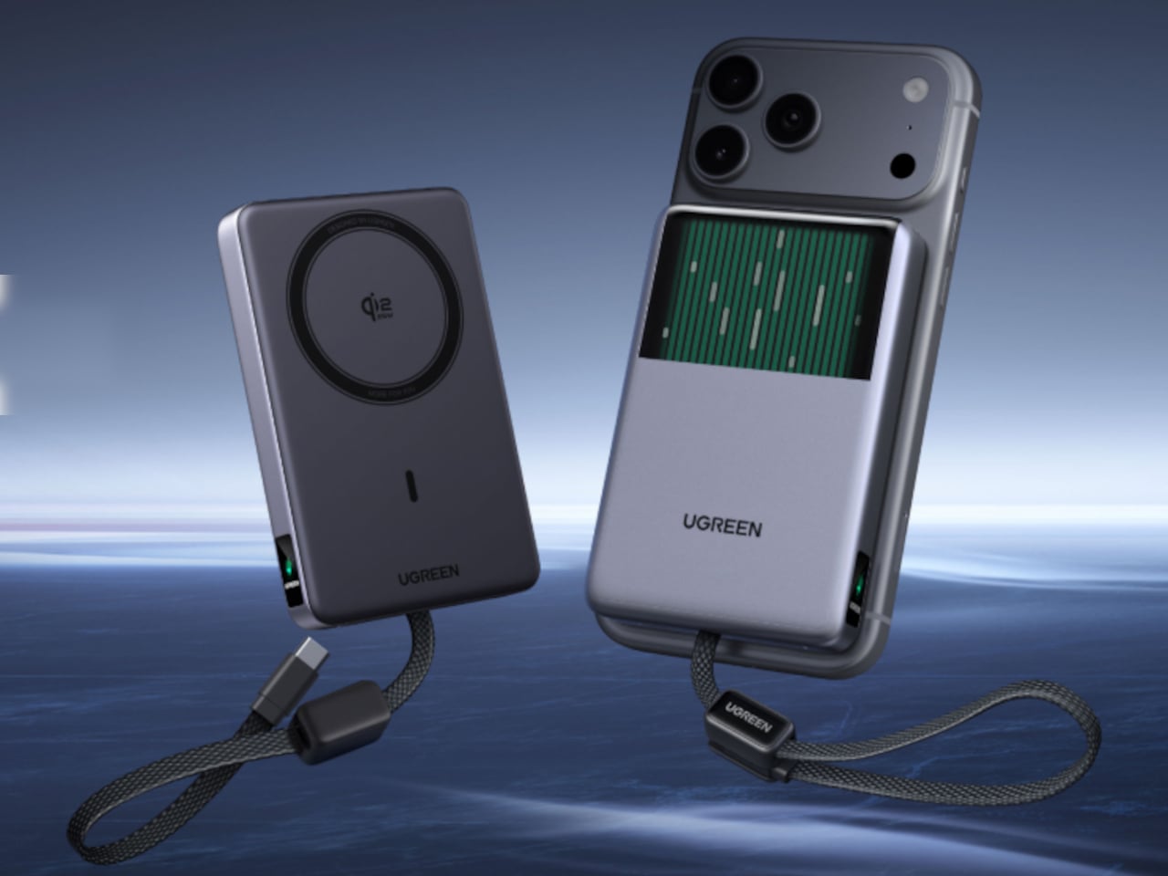
    UGREEN’s MagFlow Pro treats overheating as a design problem worth solving with actual engineering, not just a bigger heat sink. This 10,000mAh magnetic power bank borrows liquid cooling from gaming PCs and squeezes it into a pocket-sized charger, aiming to keep wireless charging fast without turning your phone into a hand warmer along the way. Qi2 charging has always had a dirty secret hiding under its magnetic convenience. Wireless systems lose up to 30% of their power as heat during transfer,
     

UGREEN’s Power Bank Uses Liquid Cooling, and You Can Actually Watch It

Par : JC Torres
4 septembre 2026 à 05:15

UGREEN’s MagFlow Pro treats overheating as a design problem worth solving with actual engineering, not just a bigger heat sink. This 10,000mAh magnetic power bank borrows liquid cooling from gaming PCs and squeezes it into a pocket-sized charger, aiming to keep wireless charging fast without turning your phone into a hand warmer along the way.

Qi2 charging has always had a dirty secret hiding under its magnetic convenience. Wireless systems lose up to 30% of their power as heat during transfer, which means a phone sitting at 25W often throttles down within minutes to avoid overheating. UGREEN built the MagFlow Pro around fixing that exact bottleneck rather than just chasing a bigger battery number.

Designer: UGREEN

Inside sits CryoPulse, a cooling system built around a micro-pump that circulates liquid coolant past the charging coil and other heat-generating components. Copper foil spreads that heat further, while a layout that physically separates key parts keeps warmth from concentrating in one spot. It is a scaled-down version of what keeps a gaming rig from throttling under load, just built to survive inside a phone charger.

A transparent panel on the front turns that entire process into something you can actually watch, showing coolant moving through the internal channels while your phone charges. It is an odd, almost theatrical touch for a power bank, but it doubles as reassurance that the system is doing its job. UGREEN calls it the Cyber Window, and it is hard to look away from once it is running.

That cooling translates into real numbers, too. UGREEN claims the system keeps peak surface temperatures on a phone up to 18°F below its own reference benchmark, letting a device hold onto higher wattage for longer instead of stepping down early. In practice, that means someone topping up before a flight or during a commute gets closer to advertised charging speeds instead of a slow crawl once things heat up.

A small display embedded in the shell keeps track of charging wattage, remaining battery percentage, cycle count, and cooling status, turning what used to be a guessing game into actual visible data. Paired with a built-in USB-C cable capable of 30W and a combined output of up to 45W, the MagFlow Pro can charge a phone, tablet, and another accessory simultaneously without demanding a bag full of extra cables.

If the battery degraded quickly, all of those fancy features would be pointless, so UGREEN built the cell around Dymondcell 2.0 protection, retaining more than 80% of its capacity after 800 charge cycles. It also survived seven hours of continuous overcharge testing without failure, a detail aimed squarely at anyone who leaves their charger plugged in overnight out of habit rather than necessity.

At $149.99, the MagFlow Pro costs considerably more than other 10,000mAh power banks on the market, and that price tag puts real weight behind its cooling claims. It is a bet that people charging phones daily care as much about consistent performance and battery longevity as they do about raw capacity, and that a bit of visible engineering can justify paying extra for it.

The post UGREEN’s Power Bank Uses Liquid Cooling, and You Can Actually Watch It first appeared on Yanko Design.

  • ✇Yanko Design
  • Cloud AI Means Someone Else Has Your Data, MINISFORUM Fixes That
    Running a serious AI model at home usually means renting someone else’s cloud server and hoping your data stays private along the way. MINISFORUM built its newest pairing to remove that trade-off entirely. The AI Agent NAS N5 MAX-P495 and AI Mini Workstation MS-S1 MAX-P495 combine for up to 131 TOPS of AI compute performance, 192GB of memory at 8533 MT/s, and up to 160GB of graphics memory, enough headroom to keep the heavy lifting on a desk instead of in a data center. The N5 MAX-P495 takes th
     

Cloud AI Means Someone Else Has Your Data, MINISFORUM Fixes That

Par : JC Torres
4 septembre 2026 à 00:00

Running a serious AI model at home usually means renting someone else’s cloud server and hoping your data stays private along the way. MINISFORUM built its newest pairing to remove that trade-off entirely. The AI Agent NAS N5 MAX-P495 and AI Mini Workstation MS-S1 MAX-P495 combine for up to 131 TOPS of AI compute performance, 192GB of memory at 8533 MT/s, and up to 160GB of graphics memory, enough headroom to keep the heavy lifting on a desk instead of in a data center.

The N5 MAX-P495 takes the shape of a compact black cube, but what it holds inside matters more than how it looks sitting on a shelf. It combines powerful AI computing with up to 200TB of local storage, enabling users to store, manage, and process large volumes of data within a single AI platform. That capacity turns a spare corner of an office into a private archive large enough to hold years of project files, footage, or research without ever touching a third-party server.

Designer: MINISFORUM

Storage alone doesn’t make an AI system useful, so MINISFORUM built the N5 to run the AI itself. From RAG knowledge bases and AI models to embeddings, databases, and AI agents such as OpenClaw and Hermes, N5 MAX-P495 keeps data and AI workloads local, enabling continuous and private AI operations. A small business could lean on that setup to run its own customer-support agent without routing conversations through an outside company’s servers.

That local-first approach extends to how the N5 fits into a larger setup. Designed to work alongside AI computing devices, N5 MAX-P495 serves as a centralized backend for data, models, knowledge, and long-running AI workloads, bringing storage and computing together at the edge. It’s less a standalone gadget and more a quiet engine room, built to keep working in the background while something faster handles the parts people actually interact with.

That faster half of the pairing is the MS-S1 MAX-P495, a compact tower wrapped in a ventilated, diamond-textured front panel that looks more like a piece of desk sculpture than a workstation. It delivers powerful local AI computing for demanding model inference, AI development, and computationally intensive workloads, built for intensive local AI tasks, engineering, and workflows in an ultra-compact footprint. Developers get workstation-class muscle without giving up desk space to a full tower case.

Speed matters just as much as raw power for certain jobs, and MINISFORUM designed the MS-S1 with that in mind. Designed for low-latency AI workloads, MS-S1 MAX-P495 enables responsive local inference for AI agents, computer vision, generative AI, and other real-time applications. A security camera system or a live creative tool built on generative AI benefits directly from that kind of immediate response instead of waiting on a round trip to the cloud.

Connectivity rounds out the workstation’s role in a larger setup. With extensive connectivity and expansion capabilities, MS-S1 MAX-P495 serves as a powerful AI compute frontend, supporting models, applications, and connected devices across flexible edge AI environments. That flexibility means the same box can sit at the center of a home lab or plug into a small studio’s existing hardware without forcing a rebuild.

Paired together, the two devices split the work the way a good team would. The MS-S1 MAX-P495 and N5 MAX-P495 form a complete edge AI computing system, delivering high-performance AI compute at the frontend while integrating compute, massive storage, data, and AI knowledge at the backend, providing a powerful foundation for real-time inference, persistent AI workloads, and scalable local AI applications. It’s a compact answer to a question more households and small teams are starting to ask: whether AI still needs to live somewhere else at all.

The post Cloud AI Means Someone Else Has Your Data, MINISFORUM Fixes That first appeared on Yanko Design.

  • ✇Yanko Design
  • The 8 Best Gadgets of September 2026
    September always arrives with a different energy. The summer concept season wraps up, the shipping boxes start showing up, and the gadgets worth keeping finally separate from the ones that were only ever interesting in a render. This month’s lineup is unusually strong: a $2,000 iPhone that finally killed the foldable crease, a Dyson toothbrush with a camera inside the brush head, and a telescope that fits in a bag you could carry onto a plane. What connects all eight is not a price bracket or a
     

The 8 Best Gadgets of September 2026

3 septembre 2026 à 21:45

September always arrives with a different energy. The summer concept season wraps up, the shipping boxes start showing up, and the gadgets worth keeping finally separate from the ones that were only ever interesting in a render. This month’s lineup is unusually strong: a $2,000 iPhone that finally killed the foldable crease, a Dyson toothbrush with a camera inside the brush head, and a telescope that fits in a bag you could carry onto a plane.

What connects all eight is not a price bracket or a category. It is the feeling that the designers started with a known compromise and refused to accept it. Foldable phones have always had a crease. Astrophotography has always needed a trunk full of gear. CD players have always been opaque boxes. Each gadget below found that exact problem and built past it. September’s best gear does not update existing things. It quietly makes them look dated.

1. iPhone Ultra

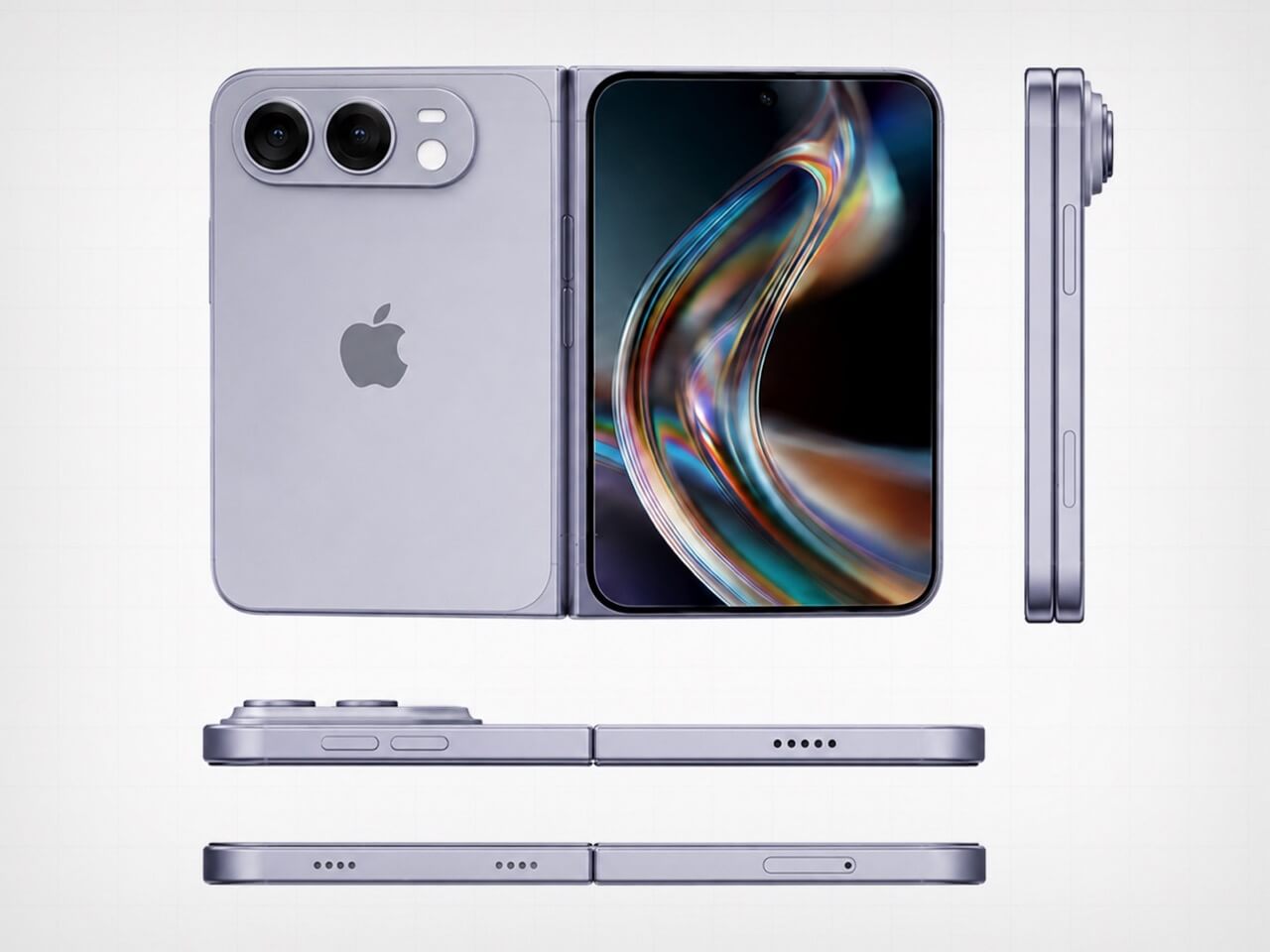
Apple saved its most aggressive design argument for last. The iPhone Ultra lands September 18 at $2,000, and the headline detail is the one that sounds impossible until you hold it — the visible crease is gone. Foldable phones have carried that horizontal line across the display since the format began, and every manufacturer called it a reasonable engineering compromise. Apple did not agree. The crease is gone, which means either the engineering problem is finally solved or a new one was quietly created in its place.

At $2,000, it is the most expensive iPhone Apple has shipped, and the price will be the loudest objection for most people. That is fair. It is also a phone that, when unfolded, gives you a display large enough to genuinely replace a small tablet, without the crease that made every foldable feel like a prototype. Whether the price is justified depends on how much that line across the screen has bothered you. For a certain buyer, the number will feel completely reasonable.

What We Like

  • The visible crease is gone, a problem every other foldable has simply accepted as permanent
  • September 18 availability means no waiting on a vague launch window

What We Dislike

  • $2,000 is a significant ask even for the most committed Apple buyer
  • At that price, the upgrade calculus is genuinely difficult for anyone coming from a recent iPhone

2. Dyson CameraJet Toothbrush

Dyson hid a 1mm camera directly under the brush head, and it reads 28 images a second while you brush. Within 100 milliseconds of detecting a gap in your coverage, the feedback loop kicks in. This is not an app that grades you on timing or buzzes when two minutes are up. It sees exactly where the bristles are not reaching and responds in real time, which is a fundamentally different answer to a problem the toothbrush industry has spent decades pretending does not exist.

The $499 price reads as absurd until you consider what it replaces. Most people spend years brushing the same spots and missing the same gaps, and no timer-based electric toothbrush has fixed that because timers do not know where your brush is. The camera does. Dyson also redesigned the toothpaste to work alongside the system, which suggests they understood that this product was not adding a feature to an existing object but rebuilding the assumptions around one entirely.

What We Like

  • A 1mm camera reading 28 frames per second gives real-time coverage feedback no other toothbrush can match
  • Dyson redesigned the toothpaste alongside the brush, showing the depth of thinking behind the product

What We Dislike

  • $499 is a difficult number for a toothbrush regardless of what it does
  • Proprietary toothpaste dependency is a meaningful lock-in that will frustrate buyers over time

3. ZWO Seestar S50 Pro

Astrophotography has always had a reputation problem. Getting a decent image of a nebula or galaxy traditionally meant a telescope, a tracking mount, a camera body, a set of filters, a laptop running capture software, and a location dark enough to make the whole trip worth it. The ZWO Seestar S50 Pro compresses that entire setup into something you could carry in a camera bag. That compression is not a minor convenience. It is the difference between astrophotography being a hobby you have and one you actually practice.

The S50 Pro is not a crowdfunded concept or a prototype. It is a shipping device sold through B&H, Amazon, and ZWO directly, part of a line that has been refining the smart telescope format for several years. For people who have wanted to try astrophotography without committing to a several-thousand-dollar hardware stack, it is the most credible entry point available right now, and the images it produces at this size are the kind that still feel surprising every time you see them.

What We Like

  • Compresses a full astrophotography rig into one bag without requiring a tracking mount or separate laptop
  • Sold through established US retailers with confirmed availability, not a waitlist product

What We Dislike

  • Smart telescopes in this class still need a reasonably dark sky to produce compelling results
  • The app-dependent workflow means the imaging experience is only as good as the software behind it

4. Camera With Digital Film


Every digital photo you have ever taken lives in a folder. Most of them stay there. The Camera with Digital Film changes the end of that process by ejecting a physical e-paper cartridge when you fire the shutter. Because e-paper holds its image without power, that small rectangle stays a picture permanently. You can lean it against a monitor, pin it to a wall, or hand it directly to the person you just photographed, and none of that requires a printer, an app, or a subscription to anything.

This is a personal maker build, not a retail product, which means you cannot order one. But the project is documented and open, which is its own kind of contribution. Instant cameras eject paper prints that fade over years. This ejects a display that does not. The object you walk away with is not a printout of a photo. It is the photo, held in a piece of hardware that draws no power to stay that way. The difference is not subtle once you hold one.

What We Like

  • E-paper holds the image without power indefinitely, making every shot a permanent physical object
  • The format lets you hand a photo to someone in the moment without a printer anywhere nearby

What We Dislike

  • This is a maker build with no purchase option — you build it, or you do not have it
  • E-paper’s limited color range means images read closer to a graphic print than a full-color photograph

5. ClearFrame Speaker + CD Player

The ClearFrame puts a CD player and a speaker into a frame you can see straight through, and the transparent design earns its place by making the mechanical parts of the player the visual feature rather than something hidden behind matte plastic. Watching a disc spin inside a clear housing is a different experience from staring at a closed box, and the ClearFrame is built around the idea that the hardware itself is worth looking at. The mechanism is the aesthetic. Nothing about that is accidental.

For anyone building a desk around objects that hold their own visually, the ClearFrame gives the CD player a reason to be out in the open rather than tucked away. The disc, the mechanism, the speaker housing: all of it visible, all of it intentional. It is not a nostalgia product. It is a design argument about what audio hardware looks like when it stops hiding its own workings.

Click Here to Buy Now: $240.00

What We Like

  • The transparent frame turns the mechanical components into the centerpiece rather than concealing them
  • Combines a CD player and speaker into one object with a coherent visual identity

What We Dislike

  • Listed under upcoming drops only, so exact pricing and shipping timeline are not yet confirmed
  • A clear housing will need regular cleaning to maintain the effect it is entirely built around

6. Cyberpunk 2077 x Commodore 64

The Commodore 64 launched in 1982. Cyberpunk 2077, the game, is set in 2077. The gap between those two years is roughly the entire history of consumer computing, and this collab leans into that distance rather than papering over it. The result sits at the intersection of two very specific aesthetics: the beige plastic of early home computing and the neon-drenched maximalism of Night City. Somehow they feel like they were always related. The Retro Games Ltd license makes it a real retail product, not a limited drop built on hype.

For people who grew up with a C64 or remember it as the machine that first felt like a home computer, this collab has a logic that is hard to argue with. Cyberpunk’s world is built on the idea that technology accumulates rather than replaces, and a computer from 1982 sitting alongside a game set in 2077 makes that point visually without needing to explain itself. It is the kind of object that earns its shelf space because it means something beyond what it does.

What We Like

  • The 95-year gap between the C64’s launch and the game’s setting is the entire premise, and the design commits to it
  • A real licensed retail product through Retro Games Ltd, not a concept or an event-exclusive run

What We Dislike

  • The appeal is almost entirely to people with an attachment to either the C64 or Cyberpunk 2077 specifically
  • As a niche collab object, it will be difficult to track down outside dedicated retro gaming retailers

7. OrigamiSwift Folding Mouse

Standard mice do not pack flat. They sit awkwardly in bags, take up more space than their function warrants, and feel like a compromise every time you travel with a laptop. The OrigamiSwift uses an origami-influenced folding structure that collapses the mouse into something genuinely flat: the kind of object you forget is in your bag until you need it.

Travel mice as a category have existed for a long time, but most of them solve portability by making the mouse physically smaller rather than foldable. Smaller mice are less comfortable to use for any extended session. The OrigamiSwift’s approach is different: it folds to pack and unfolds to a full grip, which means you are not choosing between portability and comfort every time you pull it out. For anyone who works from multiple locations, that trade-off has been the quiet frustration with every travel mouse that came before this one.

Click Here to Buy Now: $85.00

What We Like

  • Folds flat for packing without reducing grip size for use, a problem most travel mice simply ignore

What We Dislike

  • Folding mechanisms introduce hinge wear over time that rigid designs never have to account for
  • Travel-first positioning may mean trade-offs in sensor performance compared to a dedicated desk mouse

8. ROG Ally X Dual-Screen Mod

Dual-screen handhelds usually mean buying an entirely new device built around that feature from the ground up. This ROG Ally X mod skips that purchase. It snaps a 120Hz secondary display onto an existing Ally X using a mount system that removes just as easily, which means you get the dual-screen setup when you want it and a standard handheld when you do not. The engineering problem this solves is not new, but the solution here is additive rather than architectural, which makes it the more interesting answer.

It is a maker project, which means you build it rather than buy it, and the plans are documented and freely available. That limits its audience to people comfortable with a hobbyist build. Within that group, it is one of the more compelling uses of a gaming handheld’s form factor to surface this year. The 120Hz refresh rate on the secondary screen is not a placeholder spec either — it keeps up with the primary display rather than undercutting it, which has been the consistent weakness of every dual-screen attempt before this one.

What We Like

  • Snaps on and off without permanently modifying the Ally X itself
  • 120Hz on the secondary screen matches the primary display rather than being a visible step down

What We Dislike

  • No kit to order — you source and assemble the components yourself, or you do not have it
  • A second active display will draw additional power from the Ally X battery, which is already a known constraint on the device

September is not a month that usually swings this hard. Three products you can buy today, two from the YD shop, a maker build you can start this weekend, and an iPhone that lands in 16 days at a price that will generate more conversation than almost anything Apple has shipped in years. The range across eight picks is wider than usual, and that width is the point.

The through line is stubbornness. Every one of these objects exists because someone decided the accepted version of the thing was not good enough and built a different answer. A crease-free fold. A toothbrush that watches you brush in real time. A CD player you can see straight through. A photo that ejects itself from a camera. That kind of thinking does not happen every month. September had a good one.

The post The 8 Best Gadgets of September 2026 first appeared on Yanko Design.

  • ✇Yanko Design
  • Acer’s Packard Bell Crashed IFA 2026 Like a Box of Crayons
    Packard Bell spent a century teaching people that new technology doesn’t have to feel intimidating, and its 100th birthday present to itself leans hard into that idea. Under Acer’s ownership, the brand relaunched at IFA 2026 with a philosophy it calls “Tech it easy,” built around a lineup that trades beige plastic and quiet corporate design for colors loud enough to notice from across a room. Four products anchor that comeback, and each one argues that everyday tech gains something when it stop
     

Acer’s Packard Bell Crashed IFA 2026 Like a Box of Crayons

Par : JC Torres
3 septembre 2026 à 06:07

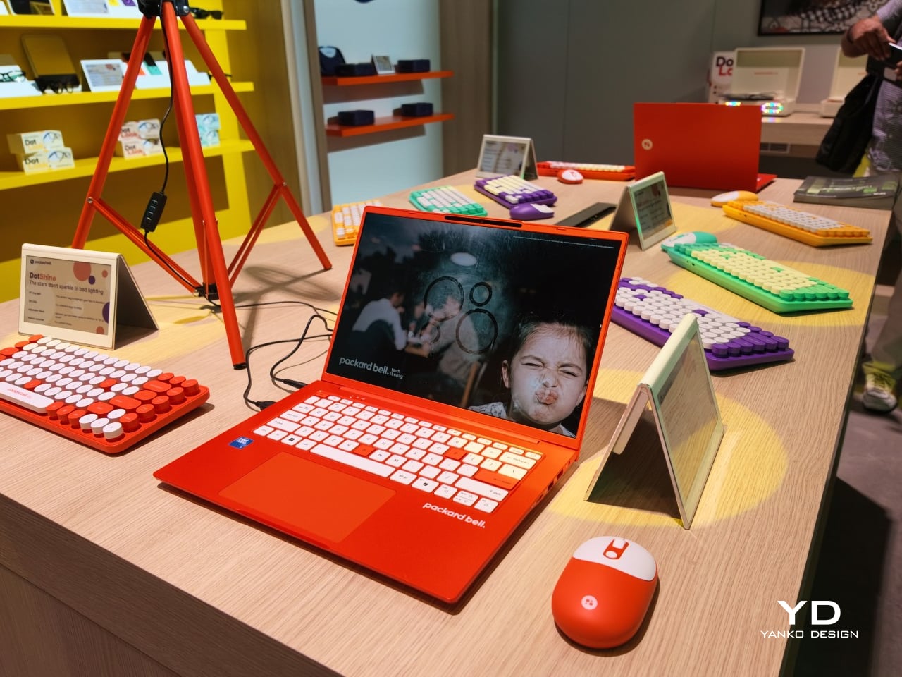
Packard Bell spent a century teaching people that new technology doesn’t have to feel intimidating, and its 100th birthday present to itself leans hard into that idea. Under Acer’s ownership, the brand relaunched at IFA 2026 with a philosophy it calls “Tech it easy,” built around a lineup that trades beige plastic and quiet corporate design for colors loud enough to notice from across a room. Four products anchor that comeback, and each one argues that everyday tech gains something when it stops taking itself so seriously.

The DotBook carries the heaviest expectations as the collection’s flagship, a 14.5-inch laptop finished in a red-orange shell bright enough to spot on a crowded coffee shop table. Weighing under 1.3 kg and measuring just 17.9mm thin, it’s built for browsing, streaming, and everyday work rather than chasing benchmark scores, backed by up to 512GB of storage and 16GB of memory running quietly under Windows 11. It’s a laptop designed to disappear into a bag, not a spec sheet debate.

Designer: Acer

Where the DotBook plays it relatively straight, the DotLoop commits fully to spectacle. Housed inside an actual briefcase shell with a 1970s silhouette, the turntable pops open to reveal a working tonearm flanked by RGB-lit speaker grilles that glow while a record spins. Two built-in 3W speakers handle sound on their own, though Bluetooth and RCA outputs let the DotLoop hand audio off to a proper stereo system whenever the moment calls for something louder.

That willingness to have fun with format extends into the DotLine, a feature phone built for anyone tired of feeding a smartphone’s constant appetite for attention. A 2.8-inch display and physical keypad keep the experience deliberately simple, while an 1800mAh battery stretches across roughly two weeks between charges, a number that sounds almost mythical next to a modern flagship’s overnight anxiety. Four color options keep it from feeling like a consolation prize.

Rounding out the focus lineup, the DotCombo bundles a keyboard and mouse into a single color-matched purchase, eliminating the usual mismatched beige-on-black desk setup that so many peripherals default to. Both pieces run on rechargeable batteries good for hundreds of charge cycles, connecting over Bluetooth or a 2.4GHz receiver without a single AA battery required. Round keycaps borrowed from typewriter design give the whole thing a tactile, almost toy-like presence on a desk.

Beyond these four, Packard Bell rounds out its centennial collection with a portable speaker (DotTune), audio glasses (DotLook), a ring light for creators (DotShine), matching headphones (DotBass), and even a countertop food steamer (Steasy), all sharing the same saturated color palette and straightforward pricing. None of them ask for much attention individually, but together they paint a lineup unwilling to blend into a beige office shelf.

Pricing stays approachable across the board, with the DotBook starting around €499 (around $578), the DotLoop at €149 (around $173), the DotLine at €69 (around $80), and the DotCombo at just €39 (around $45). Packard Bell’s return proves that a century-old brand can still find something new to say, mostly by refusing to whisper it.

The post Acer’s Packard Bell Crashed IFA 2026 Like a Box of Crayons first appeared on Yanko Design.

  • ✇Yanko Design
  • Finally, a Smart Home You Can Control Without Your Phone
    For some years now, the idea of a smart home has been more than just science fiction. We’ve watched lights, thermostats, speakers, security systems, and countless other devices become “smarter.” One issue with these connected homes, though, is that most of their controls are app-based, meaning you always need your phone handy just to turn something on or off. That’s why a dedicated smart home hub is such a welcome idea: a control center that doesn’t live inside your phone. The Homey Portal, cre
     

Finally, a Smart Home You Can Control Without Your Phone

3 septembre 2026 à 05:15

For some years now, the idea of a smart home has been more than just science fiction. We’ve watched lights, thermostats, speakers, security systems, and countless other devices become “smarter.” One issue with these connected homes, though, is that most of their controls are app-based, meaning you always need your phone handy just to turn something on or off. That’s why a dedicated smart home hub is such a welcome idea: a control center that doesn’t live inside your phone.

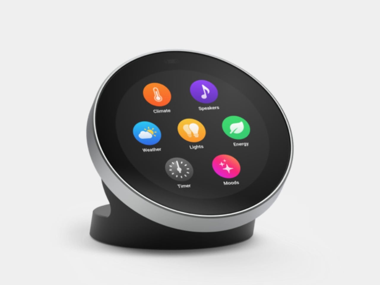
The Homey Portal, created by Dutch company Athom, is a physical smart home controller with a tactile surface that helps you manage all your connected devices. It lets anyone in your household do things like turn the lights on or off, see who’s at the door, check how much energy you’re using, find out what’s playing on your speaker, and trigger various other smart functions you’ve set up.

Designer: Athom

Having a physical smart home controller can be more convenient than relying on a phone-based one, and Homey proves it with this newly launched device. It features a 2.8-inch round touchscreen wrapped in a stainless-steel rotary ring. You can tap the screen to select and toggle your smart devices on or off, then twist the rotary dial to adjust things like brightness, volume, and temperature.

There’s a lot you can do with this little hub. If you have smart lights, you can turn them on and off and then twist the dial to dim or brighten them. It can also show the real-time temperature and humidity of your room, and you can twist the dial to adjust the temperature accordingly. If you’re playing something on your smart speaker, the screen displays the artist, track, and even the album art. From there, you can twist the dial to adjust the volume or swipe on the touchscreen to skip to the next song or go back to the previous one.

You can also set up Flow-based alerts, like a reminder to water your plants or a snapshot from your doorbell camera showing who just rang the bell. If you pair the Portal with a Homey Energy Dongle or another supported energy tracker, you can even check real-time household wattage, solar yield, and the cheapest hours to run your appliances.

The device itself is small enough to mount on a wall or simply place on your desk, side table, or countertop, whichever works best for you and the people you live with. It’s designed to work with the more than 70,000 devices from 2,000-plus brands that Homey already supports, as well as the broader Homey ecosystem, including Homey Pro, Homey Pro Mini, and Homey Cloud. The Homey Portal is available for pre-order now at an introductory price of $249, with the regular price set to rise to $299 once the first batch sells out. Orders are expected to start shipping before the end of the year, and every unit comes with both a desk stand and a wall mount included in the box, so you won’t need to buy any extra accessories to set it up wherever you like.

At its core, the Homey Portal is trying to solve a problem most of us didn’t even realize we’d accepted: that “smart” homes had quietly made simple tasks more complicated. Turning on a light shouldn’t require unlocking a phone, opening an app, and tapping through menus, and the Portal brings back the simplicity of just walking up to a dial and giving it a twist.

It also solves a more personal problem, since not everyone in a household wants to install an app or learn a new system just to turn off a lamp. Because each Portal can be placed in a specific room and used by anyone who walks by, it turns the smart home into something the whole family can actually share, not just the one person who set it all up. Whether it ends up on a kitchen wall, a bedroom nightstand, or a home office desk, it’s a small device aiming to make an increasingly complicated corner of our homes feel simple again.

The post Finally, a Smart Home You Can Control Without Your Phone first appeared on Yanko Design.

  • ✇Yanko Design
  • This $119 Ultrasonic Cutter Sense Materials And Auto-Adjusts To Cut EVA Foam, Resin, PLA 3D Prints
    There are power tools, and then there are smart tools. A power tool gives you brute force; a smart tool gives you controlled, consistent results. Think of a simple drill that just spins versus one that manages its own torque to avoid stripping a screw. For delicate work like trimming EVA foam for a cosplay project or cleaning up support structures on a 3D print, you definitely want the smart one. The problem is, most handheld cutters are pretty basic, giving you one speed and just hoping for th
     

This $119 Ultrasonic Cutter Sense Materials And Auto-Adjusts To Cut EVA Foam, Resin, PLA 3D Prints

2 septembre 2026 à 21:45

There are power tools, and then there are smart tools. A power tool gives you brute force; a smart tool gives you controlled, consistent results. Think of a simple drill that just spins versus one that manages its own torque to avoid stripping a screw. For delicate work like trimming EVA foam for a cosplay project or cleaning up support structures on a 3D print, you definitely want the smart one. The problem is, most handheld cutters are pretty basic, giving you one speed and just hoping for the best.

The SonicMax Slice 10 is aiming for that higher IQ. It’s a cordless ultrasonic cutter that senses the material you’re cutting and adjusts its own power output in real time. Slice through dense plastic and it pushes harder; trim the thin walls of a resin print and it eases back. This adaptive system, combined with cooling that prevents heat-related power drops, makes it feel like proper workshop equipment in the palm of your hand. It runs at 40kHz, delivers up to 50 watts of dynamic peak power, and does all of this without a single cable getting in your way.

Designer: SonicMax

Click Here to Buy Now: $119 $215 (45% off). Hurry, only 13/500 left! Raised over $124,000.

Most ultrasonic cutters on the market use transducers with a mechanical quality factor, or Qm, somewhere between 150 and 250. A higher Qm means the transducer converts electrical energy into vibration more efficiently, which directly translates to less heat generated during use. SonicMax claims a Qm of over 500 for the Slice 10, and lab data backs that up with a verified measurement of 541.1. That’s roughly two to three times higher than a typical competing tool, and it’s the foundational reason the Slice 10 can sustain longer sessions without thermal drama. That single transducer decision cascades into everything else, from runtime and cut quality to how comfortable the tool actually stays in your hand.

As the blade meets resistance, the Slice 10’s Smart Material Auto-Detection reads that feedback and adjusts power output and vibration frequency without you touching anything. Cutting through a stiff chunk of EVA foam feels different from trimming the thin walls of a resin print, and the tool responds to each material accordingly. You’re not locked into a fixed setting that works okay for most things but perfectly for nothing. The system also preserves cut quality across a long session, where material resistance can shift as the blade warms. The result is consistent cuts from the first pass to the last, regardless of what you’re running the blade through.

Heat is the reason most cordless ultrasonic cutters force you to stop every five to ten minutes, and the Slice 10 attacks that problem from two directions. Corded bench tools sidestep this issue by drawing steady power and dissipating heat more easily, but you give all of that up the moment you cut the cord. The high-efficiency transducer generates less heat from the start, and the built-in active cooling fan manages whatever thermal load does build up during a session. Overheat protection kicks in automatically at 80 degrees Celsius at the motherboard level, so the tool protects itself without you having to babysit it. You only appreciate how good this is after you’ve spent a session on a cutter that kept shutting itself off on you mid-cut.

A 5000mAh 21700 lithium-ion battery powers the Slice 10, and SonicMax made it user-replaceable, which you’ll end up appreciating far more than any spec sheet number. The 21700 is a high-performance cell format found in premium flashlights and power tools, so sourcing replacements from SonicMax or compatible third-party brands should never be a problem. SonicMax’s own branded replacement cell is rated for 500 charge cycles at 80% capacity retention, a reasonable lifespan for a tool you’re actually putting to work regularly. An 18W USB-C pass-through charging system brings it from zero to full in about 70 minutes, and the tool keeps running while plugged in. Claimed runtime sits at up to four hours, and when you run low mid-project, swapping in a spare takes seconds.

Blade choice gives the Slice 10 a lot of its bench-tool personality. SonicMax offers five blade styles that let the same handheld body take on very different jobs: a Standard Utility Blade for everyday trimming, a Precision Long Blade for tighter access and more delicate reach, a Fine Chisel Blade for careful cleanup work, a Heavy Duty Chisel Blade for more aggressive material removal, and a Wide Flat Scraper Blade for broader surface work. That range matters because it turns the Slice 10 into something closer to a compact cutting system than a one-trick knife. If you’re the kind of maker who bounces between foam, plastic, supports, edges, and surface cleanup in the same afternoon, this is where the tool starts looking properly versatile.

Lift-to-Activate sensing turns the tool on when you pick it up and off when you set it down, keeping your fingers away from controls mid-session and preventing accidental activation on the bench. A small OLED display shows real-time power output and battery level, so you’re never left guessing how much runtime remains. Built-in LED lighting illuminates the cut line, which sounds like a minor detail until you’re trying to trace a clean edge on a dark-colored print at your desk at some ungodly hour. Auto-shutdown kicks in after five minutes of idle, and low-battery protection activates before the cell drops to a damaging voltage. Together, these details make the Slice 10 feel like a tool that respects your workflow rather than constantly asking you to manage it.

The Slice 10 measures 260.5mm long and 28mm across, weighing 236 grams, keeping it firmly in single-hand, pen-grip territory across long sessions. Just the Slice 10 is available for a discounted $119, and ships with 10 replaceable Standard Utility blades. Upgrade to the Maker’s Bundle for $169 and you get the Slice 10 along with 50 blades spread across the five blade profiles (standard, precision long, fine chisel, heavy duty chisel, and flat scraper) as well as a 5000mAh replacement battery. If you’re looking for versatility and pushing your prints to the max, the $50 price bump does bring a fair share of value. You can also buy extra blades and batteries as add-ons. Shipping is expected to begin mid-October 2026 with worldwide delivery available, and SonicMax has not publicly confirmed warranty terms at the time of writing.

Click Here to Buy Now: $119 $215 (45% off). Hurry, only 13/500 left! Raised over $124,000.

The post This $119 Ultrasonic Cutter Sense Materials And Auto-Adjusts To Cut EVA Foam, Resin, PLA 3D Prints first appeared on Yanko Design.

  • ✇Yanko Design
  • Finally, a Compass That Works Without Opening Google Maps
    Anyone who has wandered around an unfamiliar neighborhood searching for a boutique that Google Maps insists is “on your left” when it is actually tucked behind a parking garage knows the specific frustration I am talking about. Small, independent stores rarely have the budget for a flashy storefront, and a pin on a map that is close enough to be tantalizing and far enough to be maddening is usually all you get. A Pow Studio designed something to fix exactly that: a small NFC-embedded fixture ca
     

Finally, a Compass That Works Without Opening Google Maps

2 septembre 2026 à 17:30

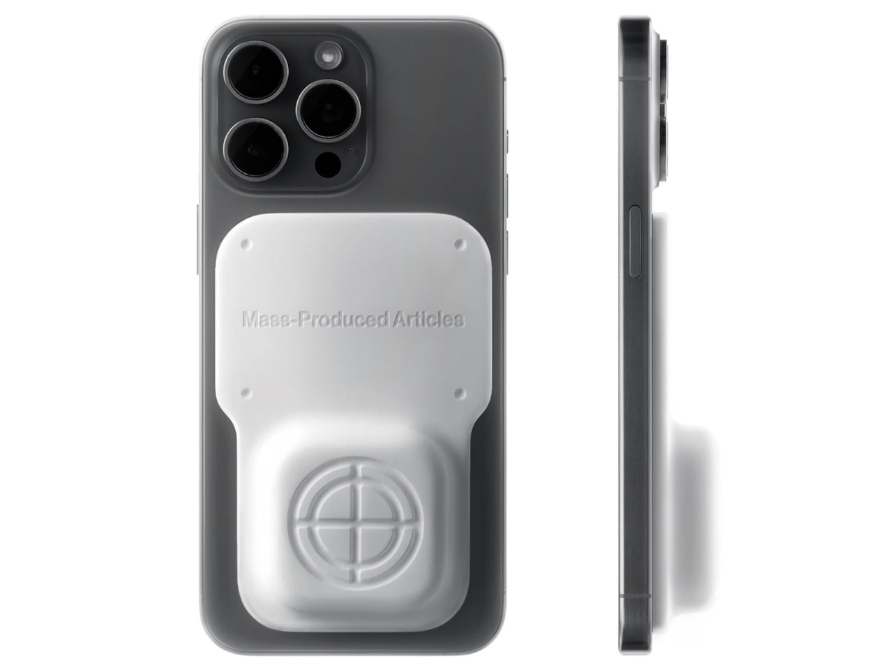
Anyone who has wandered around an unfamiliar neighborhood searching for a boutique that Google Maps insists is “on your left” when it is actually tucked behind a parking garage knows the specific frustration I am talking about. Small, independent stores rarely have the budget for a flashy storefront, and a pin on a map that is close enough to be tantalizing and far enough to be maddening is usually all you get. A Pow Studio designed something to fix exactly that: a small NFC-embedded fixture called the Navigation Tool that turns a single phone tap into a live compass, guiding you down the block to a physical destination without asking you to download anything.

That solves the first problem. The second one is subtler but just as real. Even after you find the store and walk through the door, most brands have no clean way to hand you off to their digital world. You try something on, feel vaguely inspired, and leave with no easy path to the website, the product specs, or the broader catalog. The Navigation Tool closes that gap too. The same NFC chip, this time embedded into the store’s hanging display system, redirects your phone tap to an online page loaded with product details and brand information. Two taps, two problems solved, zero apps required.

Designer: A Pow Studio

The mechanics are genuinely elegant. Outside, you tap your phone on the tool and a search bar appears asking for the coordinates of your destination. The system pulls from Location-Based Services and your phone’s built-in gyroscope to calculate real-time distance and direction, then renders everything as a clean, minimal compass interface on your screen. MagSafe compatibility is built in so the phone can physically attach to the tool while you navigate, which is a small detail but the kind that signals someone actually thought about what your hands are doing when you are half-lost and moving.

No app to download, no QR code cluttering a window decal, no clunky onboarding screen asking you to create an account you will use exactly once. You tap, and it works, the same quiet mechanism already living in Apple Pay or a subway fare card, just pointed at a completely different problem. American shoppers are already fluent in tap-to-pay and tap-to-unlock behavior, so repurposing that same gesture for navigation feels less like a gimmick and more like an overdue extension of something we already trust.

It also lands at an interesting moment for retail. Brick-and-mortar shopping has been quietly reasserting itself as something people actually want, not just tolerate, but brands still need their physical spaces to feed the digital ecosystem that keeps the business running. A tool like this treats the store not as a dead end or a photo backdrop but as one stop in a longer, connected journey. That feels like a more honest way to think about retail design than another Instagram wall ever could.

The visual language matches the intention. The compass interface on screen is stripped back to the point of being almost architectural: a circle, a crosshair, a tilt reading, a direction bearing. Nothing decorative, nothing unnecessary. It looks like something a navigator or a cinematographer would recognize before a tech blogger would, which feels right. Precise without being cold, minimal without being precious.

I do wonder about scale. A single boutique installing this is a lovely, considered gesture. A mall trying to retrofit hundreds of storefronts with individual NFC compass units is a different logistical conversation entirely, and I am not convinced every brand needs this level of ceremony just to get someone through the door. But as a proof of concept, it is a genuinely smart answer to a problem most retailers pretend does not exist. Sometimes the best design solution is not a flashier app. It is a small, physical object that refuses to overcomplicate the walk from curiosity to the front door.

The post Finally, a Compass That Works Without Opening Google Maps first appeared on Yanko Design.

Garmin Fenix 9 vs Fenix 9 Pro: Is the $100 Upgrade Worth It?

2 septembre 2026 à 13:51

The $100 jump to Garmin’s fēnix 9 Pro buys a titanium case and access to solar and inReach configurations, not a completely different watch platform.

The post Garmin Fenix 9 vs Fenix 9 Pro: Is the $100 Upgrade Worth It? appeared first on TechRepublic.

Xbox Series X25 vs Xbox Series X: Is the $100 Premium Worth It?

2 septembre 2026 à 12:33

Xbox Series X25 costs $100 more than the standard Series X without adding performance. Here’s what the anniversary premium actually buys.

The post Xbox Series X25 vs Xbox Series X: Is the $100 Premium Worth It? appeared first on TechRepublic.

Sennheiser Momentum True Wireless 5: Key Features and Price

2 septembre 2026 à 10:26

Sennheiser’s $299.95 Momentum True Wireless 5 adds user-replaceable batteries to both the earbuds and charging case, plus longer battery life and Bluetooth 6.0.

The post Sennheiser Momentum True Wireless 5: Key Features and Price appeared first on TechRepublic.

HONOR Watch 6: Everything You Need to Know

2 septembre 2026 à 09:43

HONOR Watch 6 combines long battery life, dual-band GPS, health tracking, and NFC, but some features depend on your phone, bank, and region.

The post HONOR Watch 6: Everything You Need to Know appeared first on TechRepublic.

  • ✇Yanko Design
  • This Foldable A2 Scanner Fits in a Bag and Doubles as a Live Presenter
    Scanners haven’t changed much in how they occupy a workspace. A flatbed sits in the middle and claims that real estate whether it’s in use or not. Overhead models are more flexible, but they still tend to take up a fixed spot in any setup. For anyone working from a compact home office or shared studio, that trade-off rarely gets a proper answer. Joyusing’s ScanMax 320 approaches the problem from a different angle, quite literally. Rather than occupying the center of a workspace, it’s built to s
     

This Foldable A2 Scanner Fits in a Bag and Doubles as a Live Presenter

Par : JC Torres
22 août 2026 à 21:45

Scanners haven’t changed much in how they occupy a workspace. A flatbed sits in the middle and claims that real estate whether it’s in use or not. Overhead models are more flexible, but they still tend to take up a fixed spot in any setup. For anyone working from a compact home office or shared studio, that trade-off rarely gets a proper answer.

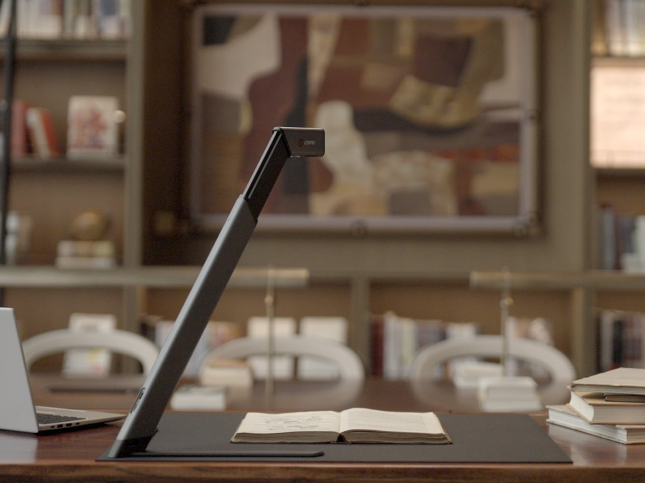
Joyusing’s ScanMax 320 approaches the problem from a different angle, quite literally. Rather than occupying the center of a workspace, it’s built to sit at the edge of a desk, positioned in the corner while its arm reaches overhead. It handles documents, books, artwork, and large-format materials up to A2 size, without taking over the surface it’s meant to serve.

Designer: JOYUSING

Click Here to Buy Now: $379 $649 (42% off). Hurry, only 32/220 left! Raised over $88,000.

Folded down, the ScanMax 320 measures 355mm x 68mm x 51mm, slim enough to slip into the included carrying bag and move between rooms without any effort. It runs entirely on USB-C power, so getting started means plugging in a single cable. There’s no proprietary adapter to hunt down, no driver installation ritual, and nothing complicated to deal with before the first scan. You can directly use the ScanMax 320 as a live presenter camera, and scanning as well as other advanced features simply require the free Joyusing Scanner intelligence software.

The shooting area extends to a full A2, or 594mm x 420mm, with a 32-megapixel sensor capturing at up to 380 DPI. That covers blueprints, double-page book spreads, large technical drawings, and oversized artwork in a single pass. An intelligent auto-switching system detects whether the material is A2 or A3 and adjusts accordingly, so there’s no manual input needed between sessions.

Overhead scanners tend to have a lighting problem, particularly near edges or when capturing materials that aren’t perfectly flat. The ScanMax 320 uses a rectangular illumination system shaped to match the scanning area, distributing light evenly and keeping shadows from washing out fine detail near the sides. Three brightness levels, at 30%, 70%, and 100%, are accessible with a single touch for quick adjustments in different environments.

Book scanning is where overhead devices tend to earn their keep, and also where they tend to frustrate. Pages curve at the spine, fingers get in the way, and binding shadows creep in from the edges. The ScanMax 320’s software handles most of this automatically, applying auto-flattening, finger removal, de-skewing, and shadow removal without manual adjustment. Book mode, paired with the included finger cots, keeps pages steady for continuous capture.

Once everything is captured, the software’s OCR engine converts printed text into editable, searchable files, with support for 180 languages and export options including Word, PDF, and TXT. A page of Japanese text, a technical report, or a multilingual research paper can go from physical to fully searchable in seconds, turning raw captures into documents you can actually search, copy, and share.

What’s less obvious about the ScanMax 320, and arguably more interesting, is that it also functions as a live visual presenter. Point it at a printed page, a hand-drawn sketch, or a physical object, and the feed goes live to whatever screen or projector it’s connected to. For a teacher going through annotated notes or a designer reviewing a layout with a client, that extra mode earns its place quickly.

Software compatibility covers Windows, macOS, and several Linux distributions including CentOS, Ubuntu, and Debian, though macOS users will find some features limited compared to the Windows version. Everything connects over USB-C, keeping the setup free of dongles and extra cables. Built-in annotation tools allow for direct markup of scanned content, which makes it easier to prepare materials before presenting or sharing them.

There’s something refreshingly considered about a scanner built to work with your desk rather than on top of it. The ScanMax 320 doesn’t ask you to clear space or rearrange anything. It folds, parks at the edge, and gets on with the job. Whether you’re archiving a collection, digitizing a sketchbook, or presenting something in a meeting, the fact that it stays in its corner is, in itself, the point.

Click Here to Buy Now: $379 $649 (42% off). Hurry, only 32/220 left! Raised over $88,000.

The post This Foldable A2 Scanner Fits in a Bag and Doubles as a Live Presenter first appeared on Yanko Design.

Samsung Galaxy H1 Leak Points to New Over-Ear Headphones: What We Know

17 août 2026 à 07:10

Samsung may be preparing a return to full-size wireless headphones with a device reportedly known as Galaxy H1. App code offers the first clues, but key details remain unconfirmed.

The post Samsung Galaxy H1 Leak Points to New Over-Ear Headphones: What We Know appeared first on TechRepublic.

  • ✇Yanko Design
  • This $99 Trackball Has Gesture Controls That Work Without Any Software
    The computer peripheral market has always been more experimental at its edges than in the mainstream. Ergonomic trackballs, in particular, have attracted a devoted following among power users, but the options tend to cluster at two extremes: consumer-facing products with locked-down firmware, and niche open-source hardware that trades polished finish for deep customizability. Finding something that genuinely does both has rarely been straightforward. Ploopy’s Adept trackball made a compelling c
     

This $99 Trackball Has Gesture Controls That Work Without Any Software

Par : JC Torres
17 août 2026 à 13:20

The computer peripheral market has always been more experimental at its edges than in the mainstream. Ergonomic trackballs, in particular, have attracted a devoted following among power users, but the options tend to cluster at two extremes: consumer-facing products with locked-down firmware, and niche open-source hardware that trades polished finish for deep customizability. Finding something that genuinely does both has rarely been straightforward.

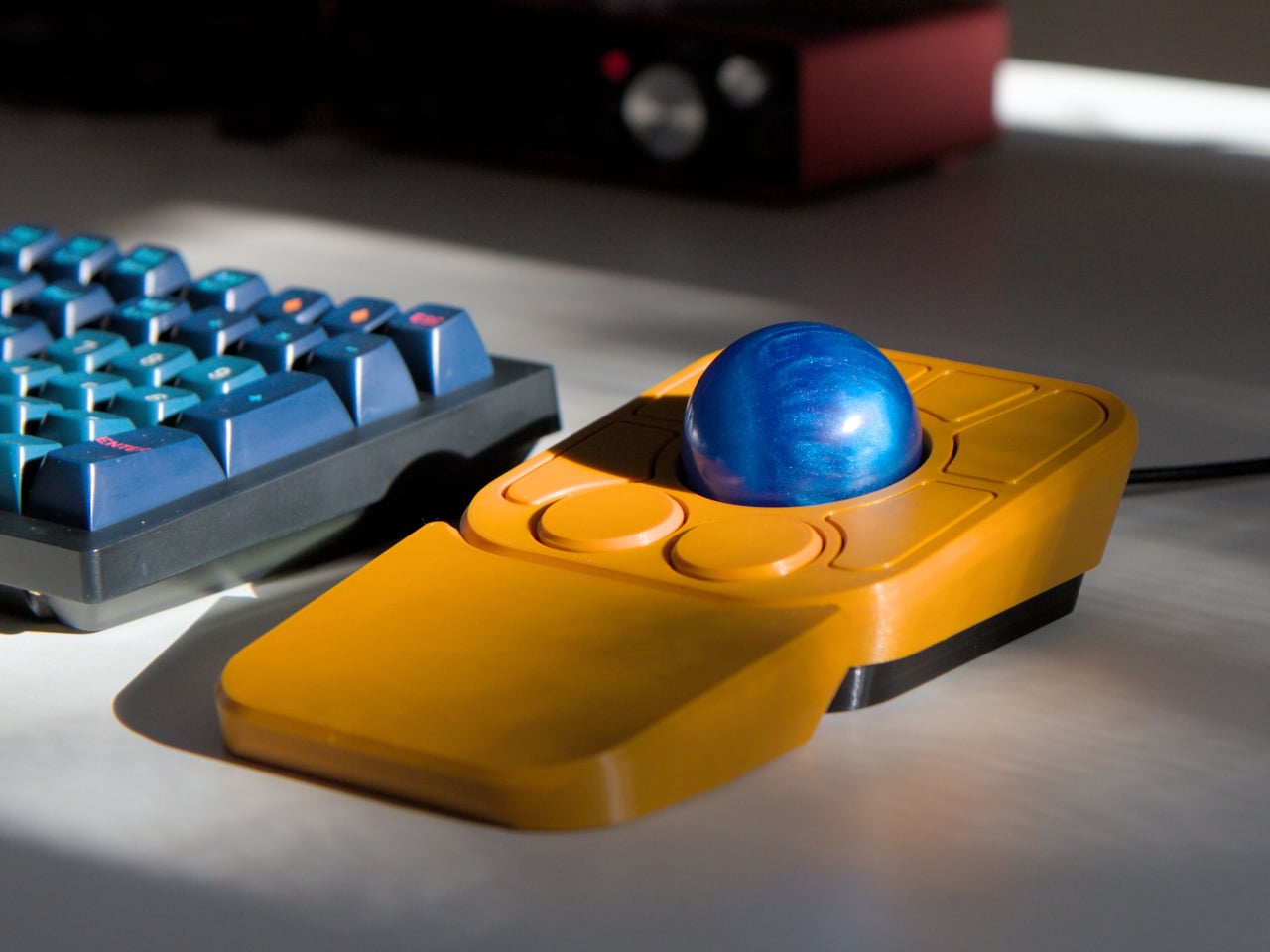
Ploopy’s Adept trackball made a compelling case for the latter category, earning a loyal following with its open-source, 3D-printed design and QMK compatibility. But it always felt like it had more to say. Its circuit board had always reserved space for two more switches that never made it to production, and the base had slots for a wrist rest that never materialized. The A+ is that unfinished story, now finished.

Designer: Ploopy

The most visible addition is the button count. The Adept had six; the A+ has eight, two of which also function as knobs. Out of the box, the knobs handle high-resolution vertical and horizontal scrolling, but both are fully reprogrammable for other functions. That dual-purpose approach keeps navigation and control within a single hand without needing a separate scroll wheel or accessory sitting alongside it.

The gesture system is arguably the more interesting addition. Hold a button and flick the ball in any of eight directions, and the device fires a command. By default, the left knob activates cut, copy, paste, desktop switching, and media controls. For someone who lives inside a browser and a text editor all day, that’s a significant amount of functionality without ever lifting a hand off the device.

Layers add another dimension. The A+ has two: a navigation layer for everyday use and a control layer accessed via the right knob. The control layer handles on-device configuration, covering left-hand mode switching, toggling between high-resolution and stepped scrolling, and other adjustments. It’s the first trackball to bring this kind of layered behavior, working entirely without any software running on the host computer. There are also two bright LEDs that can be used to visually tell you what layer you’re on without having to rely on some embedded screen.

The detachable wrist rest is another long-promised feature that finally arrives with the A+. It slots in or out during use and can be screwed on permanently if preferred. The device stays ambidextrous throughout, and its 3D-printed shell means the community can print modified bodies, alter the layout, or swap in custom colors. That kind of adaptability isn’t an afterthought; it’s part of how the whole thing is designed.

The Pixart PMW-3360 sensor carries over from the Adept, running at a 1,000Hz polling rate with the tracking accuracy that has made it a standard for performance-oriented pointing devices. Omron D2LS-21 switches handle the physical buttons. The firmware remains QMK, configurable through VIA, with all design files, firmware, and assembly instructions freely available on GitHub. Kits start at $99 CAD.

The post This $99 Trackball Has Gesture Controls That Work Without Any Software first appeared on Yanko Design.

  • ✇Yanko Design
  • Google’s Pixel Tag is making the same ‘boring’ design mistake that Apple, Samsung, and Xiaomi made
    The Pixel Tag comes in exactly one color, a grey green called Fog, wrapped around stainless steel with a G logo stamped right on the front. It’s the same script Apple wrote with the AirTag and Samsung copied with the SmartTag2. A tracker spends its entire life clipped to your keys or your dog’s collar or tucked into a backpack pocket, which makes it one of the most personal objects you own. Google, of all companies, knows how to make hardware feel less like hardware. It just didn’t bother here.
     

Google’s Pixel Tag is making the same ‘boring’ design mistake that Apple, Samsung, and Xiaomi made

12 août 2026 à 15:15

The Pixel Tag comes in exactly one color, a grey green called Fog, wrapped around stainless steel with a G logo stamped right on the front. It’s the same script Apple wrote with the AirTag and Samsung copied with the SmartTag2. A tracker spends its entire life clipped to your keys or your dog’s collar or tucked into a backpack pocket, which makes it one of the most personal objects you own. Google, of all companies, knows how to make hardware feel less like hardware. It just didn’t bother here.

Somebody at DJI figured out that a $60 microphone could come with snap-on decals, because apparently even a tiny accessory deserves a little personality. Motorola figured out something similar with the Moto Tag, which actually ships in sage green and a soft blue instead of the usual black or white default. So it’s not like nobody in tech has thought about this. It’s just that almost nobody applies it to trackers, and now Google has joined the long list of companies that had the chance and passed.

Designer: Google

The excuse I keep hearing, and I use that word deliberately, is durability. Metal survives drops, fabric doesn’t, case closed. Except my phone survives daily abuse inside a woven case, and so does yours, and so does every rugged Kevlar sleeve sold by the millions for devices far more fragile than a coin sized tracker. Nobody worries their phone case is going to disintegrate because it has some texture on it. A tracker being too delicate for color or grip is not a real constraint. It’s a decision that got dressed up as one.

Underneath that decision is genuinely solid engineering, for what it’s worth. The Pixel Tag measures 1.8 by 1.1 inches and just 5.4mm thick, which makes it noticeably slimmer than the AirTag’s 8mm body. It runs on a replaceable CR2032 battery rated for about a year, carries an IP67 rating for dust and water, and pairs instantly over Fast Pair with any Android 9 device or newer. The headline feature is Ultra Wideband combined with Bluetooth Channel Sounding, which gives you a literal on-screen arrow and distance reading instead of a vague “getting warmer” signal, though that trick needs Android 16 and Bluetooth 6.0 to actually work. It taps into Find Hub, Google’s network of over a billion Android phones, so a lost item can get spotted even when it is nowhere near your own devices. You can share access with up to ten people, ring it from a Pixel Watch, or ask Gemini through your Pixel Buds to ring it for you. All of that ships November 11 for $29, or $99 for a four pack.

Google already knows how to wrap good engineering in an object people actually want to look at, because it solved the exact same brief years ago with its speakers. The Nest Mini gets a soft, woven top because Google understood people don’t want to display a hunk of bare plastic on their kitchen counter. The Nest Audio does the same thing, fabric front, rounded edges, an object designed to belong in a room rather than announce itself as a gadget in one. That instinct exists inside the same company that just shipped a keychain accessory in one shade of grey with a logo dead center, like it needed to remind you it’s tech.

A tracker’s entire job is to sit quietly on the stuff you actually care about. It should feel like something you chose, not something you tolerated because the tech underneath happened to be good. Find Hub integration, UWB precision finding, a battery that lasts a year, all of that is genuinely solid work. But solid engineering wrapped in a logo stamped on steel isn’t a finished product. It’s half of one, and Google, weirdly, is the company with the least excuse for stopping there.

The post Google’s Pixel Tag is making the same ‘boring’ design mistake that Apple, Samsung, and Xiaomi made first appeared on Yanko Design.

  • ✇Yanko Design
  • Phones Turn Reminders Into Distractions, This Magnetic Display Won’t
    Smartphones have made information permanently accessible, but that accessibility comes at a price. The same device that shows you a reminder also delivers a notification for something unrelated, which leads to one more app opened, one more five-minute detour, and one more afternoon where the task you meant to remember sits unfinished somewhere in a mental stack. The problem isn’t access to information. It’s the medium through which it arrives. The ZecTrix Note 4 approaches that with a different
     

Phones Turn Reminders Into Distractions, This Magnetic Display Won’t

Par : JC Torres
6 août 2026 à 10:20

Smartphones have made information permanently accessible, but that accessibility comes at a price. The same device that shows you a reminder also delivers a notification for something unrelated, which leads to one more app opened, one more five-minute detour, and one more afternoon where the task you meant to remember sits unfinished somewhere in a mental stack. The problem isn’t access to information. It’s the medium through which it arrives.

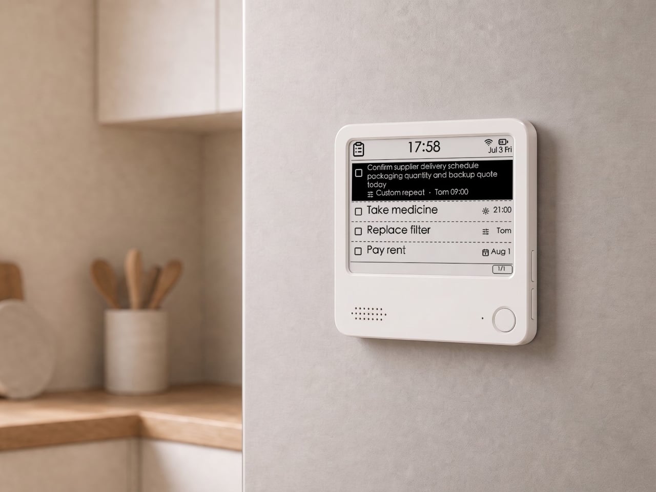
The ZecTrix Note 4 approaches that with a different premise: what if the display that shows your tasks doesn’t connect to your attention the same way a phone screen does? It’s a 4.2-inch e-paper smart display, about the size of a palm, that attaches magnetically to a metal surface and stays there showing whatever you most need to remember, using almost no power to do it.

Designer: ZecTrix

The interaction model is deliberately minimal. Press the physical button, speak your task or reminder, and the device converts that into text and adds it to the display. The built-in AI voice assistant handles the transcription and task management, and the e-paper screen holds whatever it’s showing without any power draw between updates. The display also handles weather, clocks, focus timers, handwritten notes, images, and custom templates.

Hardware underneath is solid for something this compact. An ESP32-S3 dual-core processor with 8 MB of PSRAM and 16 MB of flash handles the AI processing and connectivity, backed by a 2,000 mAh battery, 2.4 GHz Wi-Fi, Bluetooth 5.0, NFC, a speaker, a microphone, and a USB Type-C port for charging. GPIO expansion is also available, which opens the platform to custom hardware additions.

The 97mm x 97mm x 8.75mm square chassis comes in three enclosure variants: an injection-molded Minimal Premium Edition designed for clean desk or kitchen wall placement, a standard Everyday Edition for DIY-minded users, and a Color Edition with open-source 3D model files for those who want to print their own. The magnetic backplate sticks firmly to any suitable metal surface without adhesive or mounting hardware.

For users who want more than a black-and-white display, there’s the Note 4C, which replaces the monochrome panel with a four-color E Ink screen that adds red and yellow to the palette. It runs on the same hardware platform but ships without the consumer AI firmware, positioning it instead as an open development device for people with ESP32 experience. The color panel is slower to refresh, typically over ten seconds per full update, making it better suited to status labels, family photo cards, or API dashboards that update occasionally rather than continuously.

The two products are deliberately distinct rather than tiered versions of the same thing. The Note 4 is a finished product with a lifetime AI voice service included; the Note 4C is an open starting point for a custom build. Both share the same physical form, so the choice comes down to how much of the software someone wants to supply themselves.

The post Phones Turn Reminders Into Distractions, This Magnetic Display Won’t first appeared on Yanko Design.

  • ✇Yanko Design
  • This $2,999 Device Turns Your Desktop Into A Custom Apparel Printing Factory (With Air Purification)
    Let’s talk about the math for starting a small apparel brand. You have the designs, the drive, and a growing list of people who want to buy your stuff. Then you look up the gear. Aside from the thousands in hardware, materials, and a good air-purification system (because breathing is generally a good thing), you’re also looking at a massive space investment. Suddenly, you’re nearly $10k in, and need an entire garage for something the XtraMaker M1 Series offers in a tabletop format for a fractio
     

This $2,999 Device Turns Your Desktop Into A Custom Apparel Printing Factory (With Air Purification)

5 août 2026 à 21:45

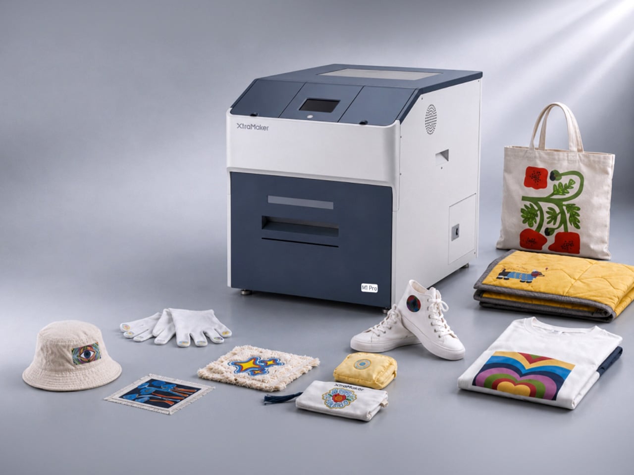
Let’s talk about the math for starting a small apparel brand. You have the designs, the drive, and a growing list of people who want to buy your stuff. Then you look up the gear. Aside from the thousands in hardware, materials, and a good air-purification system (because breathing is generally a good thing), you’re also looking at a massive space investment. Suddenly, you’re nearly $10k in, and need an entire garage for something the XtraMaker M1 Series offers in a tabletop format for a fraction of the price. With a modular printhead design no less, allowing for customization all within the form factor of a large microwave oven.

This is where the XtraMaker M1 Series finally brings apparel creation into the desktop factory era. It takes that sprawling, expensive production line and collapses it into a single, self-contained unit for $2,999. This is the micro-factory for fabric we’ve been waiting for, handling everything from printing the transfer to curing the adhesive inside a fume-filtered system that fits on a desk. It’s the machine that makes the business plan finally make sense, shrinking the startup cost by two-thirds and proving that the next big apparel brand doesn’t need an industrial loan to get started; it just needs a desktop.

Designer: XtraMaker

Click Here to Buy Now: $2999 $6499 ($3500 off). Hurry, only 38/50 left! Raised over $331,000.

The M1’s core innovation is condensing the entire five-step DTF relay race into a single, autonomous sprint. It prints, powders, shakes, cures, and purifies its own air without any manual handoff between stages. This integrated workflow is critical for a desktop machine, as it eliminates the mess and fumes that make traditional DTF printing impossible in a home or small studio. The enclosed system uses a multi-layer filter to capture stray adhesive powder and neutralize the chemical smell from the curing process, keeping the workspace clean and breathable. This turns what was once a multi-machine, garage-only operation into a clean, one-click process you can run from a spare room.

Print quality is anchored to commercial standards, with G7 Master-certified color accuracy ensuring that on-screen RGB designs translate faithfully to the final CMYK print. At a resolution of 1440×1440 DPI, the M1 Series produces sharp, detailed transfers where fine lines and photo-realistic gradients come through cleanly. The resulting prints are just 0.5mm thick, allowing them to blend seamlessly with the fabric’s texture rather than sitting on top like a stiff, plastic patch. This professional-grade output works across a huge range of materials, from cotton, denim, and polyester to more delicate fabrics like silk, giving creators a massive canvas for their ideas.

XtraMaker’s engineers clearly obsessed over reliability, building in a suite of defensive systems to prevent common failures. The most notorious issue in DTF printing, white ink clogging, is addressed by the LoopMaster™ system, which uses automatic 15-minute circulation cycles and continuous cartridge stirring to keep the dense ink from settling and drying in the lines (the white ink circulation system operates with zero ink consumption too). Even more impressive is the built-in UPS battery. If power cuts out, the battery instantly triggers a flush, replacing the ink with a protective fluid to save the printhead from drying out. The UPS battery also powers the printer’s auto-maintenance system while the machine is on standby or powered off. This enables the machine to automatically fill the ink channels with moisturizing liquid and keep the white ink stirring continuously for up to 30 days. Combined with over 20 sensors that monitor the machine’s health and ink levels in real-time, all this creates a system that actively works to prevent the most expensive and frustrating problems before they happen.

The entire package is tailored for small business growth, from the software to the hardware options. The XtraMaker Studios app includes a cost estimation tool that calculates ink and film usage, giving you a precise per-print cost so you can price your products profitably. A 3D preview feature also lets you see how a design will look on a finished garment, saving time and materials. The M1 itself comes in two sizes: the standard M1 for A4-sized prints, perfect for logos and chest graphics, and the larger M1 Pro, which handles A3+ prints for full-back designs on hoodies and jackets. This gives a growing brand a clear upgrade path as their product line and ambitions expand.

XtraMaker’s M1 Series is aimed squarely at the new wave of creators: Etsy sellers, independent streetwear labels, and craft fair operators who need professional output without the industrial overhead. While other desktop DTF printers exist, none integrate the entire five-step workflow, the advanced anti-clog and power-loss protection, and the built-in air purification into a single unit at this price. It’s a machine that understands that for a small business, the real costs are complexity, downtime, and mess.

Click Here to Buy Now: $2999 $6499 ($3500 off). Hurry, only 38/50 left! Raised over $331,000.

The post This $2,999 Device Turns Your Desktop Into A Custom Apparel Printing Factory (With Air Purification) first appeared on Yanko Design.

  • ✇Yanko Design
  • Forget Tracking Kids After School, This Cute Device Lets Them Check In
    Working parents of school-age children face a particular kind of worry during the hours between the end of the school day and the end of the workday. Phone calls get missed, text messages go unread, and the ones that do get through usually carry just enough information to confirm a child made it home. What they rarely carry is any sense of how the child is actually doing, and that gap tends to get filled with parental anxiety rather than reassurance. Keylo is a conceptual companion device desig
     

Forget Tracking Kids After School, This Cute Device Lets Them Check In

Par : JC Torres
3 août 2026 à 06:07

Working parents of school-age children face a particular kind of worry during the hours between the end of the school day and the end of the workday. Phone calls get missed, text messages go unread, and the ones that do get through usually carry just enough information to confirm a child made it home. What they rarely carry is any sense of how the child is actually doing, and that gap tends to get filled with parental anxiety rather than reassurance.

Keylo is a conceptual companion device designed around that specific gap. Rather than giving children another screen to manage or another app to navigate, it offers a single, tactile interaction: a tap that lets them express how they’re feeling. No typing, no calling, no notification chain. The child touches the device, cycles through a color to represent their emotional state, and the parent’s app receives it.

Designer: Miaonan Li

The system consists of three physical parts. The main companion unit sits on a home dock, usually somewhere a child passes when they get home. A smaller key fob clips to a backpack and travels with the child throughout the day. Both are made from soft matte silicone and deliberately avoid any screen or complex interface, giving the object a quality that’s closer to a familiar household item than a piece of consumer electronics.

The four emotional states Keylo recognizes are kept intentionally broad. A soft orange glow indicates the child feels relaxed; bright yellow signals something more playful or energetic; a neutral white tone signals a preference for quiet or personal space; and a calm blue light carries a specific message from child to parent: I’m thinking of you. Each one is simple enough for a young child to understand and expressive enough to actually mean something when it arrives on a parent’s phone.

That arrival is handled by the companion app, which mirrors the same color language as the physical device. The distinction the project draws between this and conventional parental monitoring is deliberate. Rather than showing parents a location, a screen time report, or a camera feed, the app delivers a single emotional moment. A notification that says a child is feeling calm and playful carries a different quality of information than a location ping, and it asks for a different kind of response.

The device is designed to work without any input from the child beyond that single tap. There are no prompts to answer, no questions to read, and no follow-up required. For a child who has just walked in the door after school, the low threshold is significant; the gesture stays small enough that it doesn’t feel like a chore, which is probably the main reason most family communication apps get abandoned within a few weeks of being set up.

What Keylo explores through its design is how much emotional information can be conveyed through the simplest possible interaction. A color chosen by a child carries less data than a voice call but far more than no contact at all, and it arrives without interrupting anyone’s afternoon in the way a ringing phone does. The project makes a case for the idea that the volume of communication matters less than whether it happens at all, and on terms that feel natural to the person sending it.

The post Forget Tracking Kids After School, This Cute Device Lets Them Check In first appeared on Yanko Design.

  • ✇Yanko Design
  • Bang & Olufsen’s New Speaker Concept Is a Ritual, Not a Device
    Most speakers are designed to disappear. They sit on a shelf, blend into a bookcase, or hide in a cabinet, quietly doing their job until you need them and then fading back into the background. Mårten Malmnäs, a graduate from the Umeå Institute of Design, designed something that pushes back against all of that. The Beosound Tableau is a wall-mounted audio object developed in collaboration with Bang & Olufsen. Malmnäs calls it “a fireplace for music,” an instrument not just for listening, but
     

Bang & Olufsen’s New Speaker Concept Is a Ritual, Not a Device

2 août 2026 à 13:20

Most speakers are designed to disappear. They sit on a shelf, blend into a bookcase, or hide in a cabinet, quietly doing their job until you need them and then fading back into the background. Mårten Malmnäs, a graduate from the Umeå Institute of Design, designed something that pushes back against all of that.

The Beosound Tableau is a wall-mounted audio object developed in collaboration with Bang & Olufsen. Malmnäs calls it “a fireplace for music,” an instrument not just for listening, but for living. The moment I read that, I had to stop. Because I’ve never heard a speaker described that way before, and suddenly, I couldn’t think of a more fitting comparison.

Designer: Mårten Malmnäs

Think about what a fireplace actually does. Yes, it produces heat, but that’s almost beside the point. A fireplace creates presence. It becomes the thing a room organizes itself around. People pull their chairs toward it, conversations happen because of it, and its absence is genuinely felt. That’s a completely different design brief than “fits on your desk” or “connects to your phone.”

Malmnäs started the project with a design probe, a research method that explores the relationships people have with their homes, and from that came a set of experiments around values and behaviors. Eight experimental directions emerged from the ideation phase, spanning different input and output formats. Three of those directions clearly answered the design responsibilities he’d set for the project, and their shared qualities pointed toward one resolved object.

Here’s where it gets interesting. The original concept for the Tableau was screen-based, but a method called Wizard of Oz testing, where a human simulates the system to observe how people actually interact with it, pushed the design somewhere more honest. The interaction model shifted from screens to navigation by sound. And the principle that came out of it became the foundation of the whole concept: the most honest interface for a music object is music itself.

That’s a provocative idea. We’ve spent years layering more and more visual UI on top of audio experiences. Every streaming service competes on the complexity of its recommendation algorithm, the visual polish of its playlist covers, the grid of album art. Malmnäs argued the opposite, that sound should speak for sound. The result is the Sonic Token, a physical object that mediates between the listener and the Tableau. Tactile, intentional, and completely different from scrolling a touchscreen.

The Tableau is positioned as a focal thing for the home. An object to gather around and tend to. That language is deliberate, and it’s also a little radical. “Tending” to an audio object implies care and attention, a relationship rather than a transaction. You don’t tend to a Bluetooth speaker. You don’t gather around an app.

Bang & Olufsen has always occupied a rare space in the audio world, where design and sound hold equal weight, and where a product can belong in a design museum and still deliver extraordinary sound. But even by B&O’s standards, the Tableau concept asks a genuinely new question: what if the speaker were the focal point of the room, rather than just a feature of it?

There are fair questions about how a concept like this survives beyond a graduate show. The hands-on, material-driven process Malmnäs used, with 1:1 mock-ups and rigorous testing of the Sonic Token’s form and function, suggests this isn’t a vague idea dressed up in renders. It was built and tested as a real object. Whether it eventually reaches production or stays as a collaborative concept between a student designer and one of the world’s most revered audio brands is another matter.

But the value of the Beosound Tableau isn’t only in whether it ships. It’s in the question it refuses to let go of: why have we settled for speakers that ask nothing of us? The alternative, a speaker that earns its place on the wall, makes music feel like a gathering, and treats sound like something worth being present for, sounds like exactly what the living room has been missing.

The post Bang & Olufsen’s New Speaker Concept Is a Ritual, Not a Device first appeared on Yanko Design.

  • ✇Yanko Design
  • The Foldable E Ink Book Is Finally Taking Shape
    The e-reader has been one of the most static product categories of the past two decades. Since the first Kindle appeared in 2007, the form factor has barely evolved: a single screen, a flat back, and dimensions roughly matching a paperback. These devices have gotten lighter, sharper, and more waterproof, but the fundamental design assumption has stayed the same. They’re books without the book part. A growing number of designers have been working on a different premise: what if an e-reader actua
     

The Foldable E Ink Book Is Finally Taking Shape

Par : JC Torres
29 juillet 2026 à 13:20

The e-reader has been one of the most static product categories of the past two decades. Since the first Kindle appeared in 2007, the form factor has barely evolved: a single screen, a flat back, and dimensions roughly matching a paperback. These devices have gotten lighter, sharper, and more waterproof, but the fundamental design assumption has stayed the same. They’re books without the book part.

A growing number of designers have been working on a different premise: what if an e-reader actually opened like a book? One with two E Ink panels and a real hinge, held the way you’d hold a paperback, where left and right pages exist as physical space. That shared ambition has driven a small but serious cluster of projects building quietly over the past five years.

The proof that e-paper could bend

The idea of folding an E Ink display isn’t new. Back in 2020, E Ink Corporation demonstrated a hinged prototype showing that a bending e-paper panel could survive the mechanical stress of being folded. It never reached retail shelves, but it answered the one question that mattered most at the time: whether the material itself could handle the geometry of a real book.

Designer: E Ink

That prototype didn’t solve everything. It was a controlled demonstration with no commercial roadmap, no software, no battery life to speak of, and no clear form factor beyond the fold itself. What it gave the industry was proof that flexible e-paper was a viable building block rather than a permanent research curiosity. Every foldable E Ink project that came after built on that understanding.

The book illusion finally made real

Readmoo’s Mooink V was the first design to make the flexible E Ink concept feel emotionally legible to a general audience. It’s built around an 8-inch Gallery 3 color e-paper display developed in collaboration with E Ink, one that folds down the middle to make the device small enough to pocket when closed and wide enough to feel like a slim paperback when open.

Designer: Readmoo

The color display matters more than it might seem. Gallery 3 renders close to 50,000 colors at 300 PPI, expanding the format beyond plain text to illustrated books, comics, and magazines. The fold reportedly passed 200,000 bending tests during development, and when fully open, the crease isn’t dramatic enough to register as a flaw so much as an honest design trade-off.

Mooink V hasn’t had the smoothest road to market, though. Despite genuine buzz at trade shows including Touch Taiwan and SID Display Week, no confirmed retail availability or street price had materialized as of mid-2026. The design made the foldable E Ink book look and feel tangible in a way earlier prototypes hadn’t. Whether it gets there commercially is a different and still open question.

Two screens, no crease

Not everyone building a book-shaped e-reader was willing to bet on a single flexible panel. A parallel design school took a more pragmatic approach: pair two conventional E Ink screens with a well-engineered hinge and let the gutter do the work. The result avoids crease anxiety entirely since neither panel has to bend, though it trades the seamless page illusion for a visible seam you’d have to accept.

Designer: LCFC (Hefei) (a Lenovo Subsidiary)

LCFC’s Gemini took the productivity angle furthest, giving both E Ink panels enough real estate to function almost like a laptop, with reading material open on one side and an active workspace on the other. The InkReader Duo concept took a more compact approach, fitting two E Ink screens into a phone-sized form, which made it feel less like a desk tool and more like a pocket notebook.

Diptyx went in a different direction altogether. Rather than chasing consumer polish, the project leaned into open-source principles, building a two-panel hinged e-reader without the lock-in that defines most commercial platforms. It isn’t the most refined interpretation of the book-shaped reader, but it made a clear point: the hardware problem was increasingly solvable, and the real challenge was getting the software and ecosystem right.

Designer: Martijn den Hoed

When a second screen isn’t enough

Not every dual-screen device fits cleanly into this story. The Bluegen OKPad pairs an E Ink panel with a regular LCD screen, which makes for a versatile tablet but undermines the unified reading experience that makes an E Ink book feel coherent. Switching between two fundamentally different display types introduces a visual disconnect that software bridging alone can’t fully smooth over.

Designer: Bluegen

Bigme’s HiBreak Dual 2 runs into a different kind of problem. It’s a smartphone with a secondary E Ink display on the back, which is a genuinely clever idea for managing notifications and extending battery endurance, but it’s shaped and used like a phone rather than a book. A second screen doesn’t automatically recreate the spatial logic of reading a bound object.

Designer: Bigme

Inkleaf and the case for two pages

Inkleaf is the most pragmatic entry in the foldable E Ink space so far. Instead of chasing a seamless fold, it pairs two 10.3-inch Carta E Ink panels in a notebook-style hinge, with one side for reading and the other for writing. The seam between them works as a gutter rather than a flaw, and the design doesn’t try to hide it.

That workflow proposition is what makes Inkleaf interesting beyond its form factor. Having reference material on one panel while taking notes on the other removes a friction point that every single-screen reader quietly ignores. You don’t need to switch apps, scroll back, or memorize what you just read before writing something down. It’s aimed at a different kind of reader than a Kindle typically serves.

Designer: Kameron Yu

Inkleaf is currently collecting early-access signups ahead of an August 2026 launch, with a broader public release targeted for 2027. That’s a staggered timeline worth noting: the hardware still has to prove itself beyond initial demos, and the software will matter as much as the panels themselves. Carta E Ink is a sensible fit for a writing-focused device, but actual daily use remains the real test.

What Kindle still has to answer for

None of this means the Kindle is suddenly irrelevant. Amazon’s device still wins on price, ecosystem depth, and a friction-free reading experience built up through years of software refinement. If all you want to do is buy a book and read it on a train, nothing in this group of foldable experiments beats a Paperwhite for simplicity. The incumbents aren’t losing sleep yet.

What these devices do expose is a design gap Amazon hasn’t seriously tried to close. A Kindle displays text efficiently, but it doesn’t recreate the spatial logic of reading a bound book: two visible pages, a sense of position, a natural place for margin thoughts. Those aren’t features that get patched in through a software update, which is why the form-factor conversation is overdue.

That’s what this group of foldable and dual-screen E Ink devices has been quietly building toward for the past five years. Not a product category defined by any single winner, but a shared argument about what a digital reading device could look like if it started from the book rather than the screen. Whether any of them fully delivers on that is a question 2027 will help answer.

The post The Foldable E Ink Book Is Finally Taking Shape first appeared on Yanko Design.

❌