Vue normale

  • ✇Yanko Design
  • MUJI-Meets-Cyberpunk Vinyl Record Player Glows Like an Ambient Light and Charges Wirelessly
    Minimalism in product design has gotten boring. We’re swimming in smooth white rectangles, touch controls that offer zero feedback, and devices designed to vanish. Apple spent two decades training the industry to sand away every visible seam, and now we live in a world where a Bluetooth speaker looks like a cylinder because a cylinder offends nobody. Bang & Olufsen understood early that audio equipment could occupy space like sculpture, could earn its place in a room through presence instea
     

MUJI-Meets-Cyberpunk Vinyl Record Player Glows Like an Ambient Light and Charges Wirelessly

7 avril 2026 à 21:45

Minimalism in product design has gotten boring. We’re swimming in smooth white rectangles, touch controls that offer zero feedback, and devices designed to vanish. Apple spent two decades training the industry to sand away every visible seam, and now we live in a world where a Bluetooth speaker looks like a cylinder because a cylinder offends nobody. Bang & Olufsen understood early that audio equipment could occupy space like sculpture, could earn its place in a room through presence instead of absence. Teenage Engineering proved that mechanical honesty and playful geometry could coexist with premium materials. Both approaches work because they have a point of view.

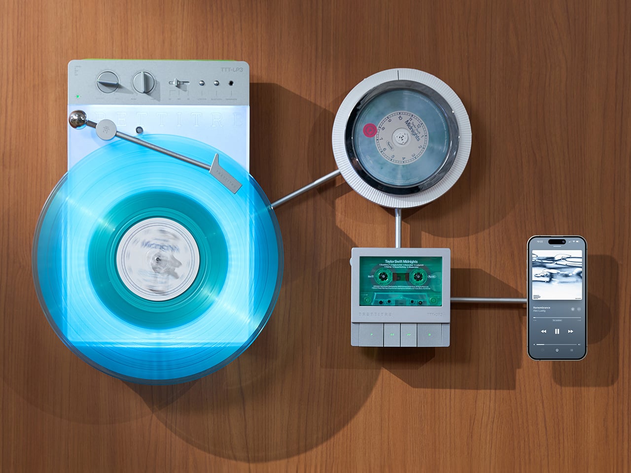
TRETTITRE’s TTT series combines those instincts into something harder to categorize. The TTT-LP3 wireless vinyl player uses CNC-machined aluminum for the main frame and features a diffused lighting panel that spreads light evenly across the surface when music plays. The TTT-DP3 Bluetooth CD player takes inspiration from a UFO-like form with a transparent magnetic cover that rotates open to reveal the spinning disc. The TTT-CP3 cassette player uses a metal housing with sharp geometric lines and mechanical transport keys that deliver clear physical response. All three mount on the TTT-W magnetic modular wall rack, turning physical media playback into a visible, functional part of interior design.

Designers: Noah – Founder & Designer, Trettitre

Click Here to Buy Now: $229 $449 ($220 off). Hurry, only 55/99 left! Raised over $654,000.

TTT-LP3: A Vinyl Player That Doubles as Ambient Light

The back of the LP3 includes a hidden mounting structure that allows it to hang directly on a wall. You can mount it vertically so the record becomes part of the visual display, or go for the classic horizontal layout. When you want to move it, you lift the silicone leather handle at the top and take it down. The player detaches easily and gives you the freedom to listen wherever you choose. Traditional turntables usually stay exactly where you put them, limiting your options for when and where you listen. The LP3 works a little differently because of the battery and the wall mount’s wireless charging system, which keeps it powered without a visible cable.

Behind the LP3 sits a diffused lighting panel that spreads light evenly across the surface of the unit. When it’s on, the entire body of the player glows softly, designed to feel closer to ambient lighting than decorative lighting. You can change the lighting effects with the touch of a button. When a record spins, the moving shadows create a quiet visual effect. You can also leave the player mounted on the wall as a soft light source even when no music is playing. That ambient quality pushes the LP3 from well-designed product into something more considered: a slow, breathing light fixture that happens to play records.

The LP3 uses a self-balancing tonearm system that automatically sets the correct pressure when the player powers on. You place the record on the platter and lower the needle, and the system handles the rest. Many turntables require careful calibration before they can be used properly, with tonearm balance, tracking pressure, and counterweight adjustment all part of the process. For experienced collectors that process can be enjoyable, but for beginners it often feels complicated. The LP3 removes that barrier entirely while preserving the tactile experience people enjoy. The player supports both 33 RPM and 45 RPM records, and includes a manual control dial that allows small adjustments to playback speed (roughly ±0.5%), useful for older records that may not spin perfectly at their original speed anymore.

Wireless audio is handled through Qualcomm Bluetooth v5.3 with SBC, aptX, aptX HD, and aptX Adaptive, which allows higher-quality and lower-latency wireless audio than basic Bluetooth streaming. For wired setups, the player also includes a 3.5mm audio output. The built-in battery provides up to 6 hours of vinyl playback or up to 3 hours when used purely as an ambient light source. Full specs: dimensions 342×233×87mm, weight 1430g, Audio-Technica AT3600L moving magnet stereo cartridge, CNC-machined aluminum frame with silicone leather carrying strap. The LP3 arrives in June 2026 for Early Bird backers, May 2026 for Fast Delivery backers.

TTT-DP3: Giving the Compact Disc Its Aura Back

The DP3 keeps the reliability of CDs but gives the player a different visual presence. The design takes inspiration from a UFO-like form with a transparent magnetic cover. When the cover rotates open, the disc is partially visible as it spins, turning something simple into a small visual moment. A CD player shaped like a flying saucer with a rotating transparent lid is an audacious idea, and it works because it doesn’t try to evoke nostalgia. It reframes a CD player as a mechanical object of curiosity, something you watch as much as use.

The control buttons include raised tactile dots combined with a gold-embossed finish, making it easy to identify the buttons by touch alone. You can pause or skip tracks without needing to look down at the player. A small OLED display on the player shows track numbers, playback status, and battery level. The interface is intentionally simple so the information you need is visible immediately. A built-in battery allows the DP3 to run for several hours on its own, so you can move it from room to room, bring it to a small gathering, or take it while traveling. Full specs: Ø170×27mm, 324g, supports CD-DA and HDCD formats, Bluetooth 5.4, SNR >70dB, THD <3%, ABS+PC+Metal construction. The DP3 ships in May 2026.

TTT-CP3: Cassette Hardware for Modern Audio Setups

The CP3 keeps the tactile mechanical elements people associate with tapes while updating the electronics inside. The player uses a metal housing with sharp geometric lines that give it a distinctly industrial appearance. Instead of trying to imitate retro plastic designs, the CP3 leans into a more modern interpretation of cassette hardware. The playback controls use independent mechanical keys similar to piano keys. Each press has a clear physical response. Play, rewind, and stop feel deliberate instead of soft or mushy.

Inside the CP3 sits a Bluetooth module that allows cassette audio to stream wirelessly to speakers or headphones. The player decodes analog audio signals with high precision, helping reduce background noise and preserve more detail from the original recording. The result still sounds like cassette tape, but with greater clarity. Full specs: 122×120×32mm, 360g, supports Type I-IV cassette cartridges, Bluetooth 5.4, SNR ≥55dB, THD <3.5%, Metal+PC+ABS construction. The CP3 ships in May 2026.

When Storage Becomes Part of the Spectacle

The TTT-W Magnetic Modular Wall Rack uses an all-metal geometric structure that allows multiple TTT players to be arranged into a clean wall display while keeping them organized and ready to use. The rack integrates magnetic alignment and wireless charging for the vinyl player, so the LP3 can stay powered without visible cables while being part of the room’s design. Two configurations are available: a T-shaped rack (263×196×27mm, 300g) and a magnetic modular wall rack (612×302×27mm, 775g, combined style T+3). Both support wireless charging at 5-10W and use USB-C 5V 2A input.

The Supporting Cast, from Sculptural Speakers to Planar IEMs

TRETTITRE offers a range of add-ons designed to complement the TTT system. The TreSound1 Speaker arrives in concrete and wooden editions, delivering 2×30W + 1×60W output power with a 1″ tweeter, 2.75″ mid-range, and 5.25″ subwoofer for 30Hz-25KHz frequency response. The conical speaker features 360° surround sound, Bluetooth 5.2 with Qualcomm aptX HD, and a sculptural form that occupies space like a piece of furniture. The TreSound Mini is a portable Bluetooth speaker with a 5200mAh battery, 30W RMS output, and 360° surround sound. The TTT-E3 in-ear headphones use a 13mm planar magnetic driver with a 4-strand silver-copper hybrid conductor, available in 3.5mm and 4.4mm configurations. An aluminum alloy side table (300×300×750mm, 1.75kg, max load 50kg) rounds out the ecosystem.

What It Costs to Build the Setup, and When It Ships

The TTT-LP3 wireless vinyl player is available at $229 for Early Bird backers (June 2026 delivery), down from a planned $449 MSRP. The TTT-DP3 Bluetooth CD player is priced at $79 standalone ($179 MSRP), while the TTT-CP3 cassette player is also $79 standalone ($199 MSRP). If you’re a bonafide audiophile, a $399 bundle gets you all three devices. Optional add-ons include the TreSound Mini Bluetooth Speaker at $169 ($299 MSRP), TreSound1 Wooden Edition at $449 ($659 MSRP), TreSound1 Concrete Edition at $499 ($799 MSRP), TTT-E3 planar IEMs at $139 ($239 MSRP), and the TTT Side Table at $89 ($199 MSRP). The campaign runs through April 9, 2026, with worldwide delivery beginning May 15, 2026.

Click Here to Buy Now: $229 $449 ($220 off). Hurry, only 55/99 left! Raised over $654,000.

The post MUJI-Meets-Cyberpunk Vinyl Record Player Glows Like an Ambient Light and Charges Wirelessly first appeared on Yanko Design.
  • ✇Yanko Design
  • A Double-Sided Clock That Turns Walls into Living Moments of Time
    Double-sided wall clocks are not new. They have existed for decades, quietly moving between public and private spaces. While many people associate them with railway stations and institutional corridors across Europe, they also made their way into homes in earlier times, often as decorative yet functional pieces in hallways or larger living spaces. Over time, however, they faded out of domestic interiors, replaced by flatter, more minimal wall clocks designed to sit quietly against a surface. Tu
     

A Double-Sided Clock That Turns Walls into Living Moments of Time

7 avril 2026 à 20:30

Double-sided wall clocks are not new. They have existed for decades, quietly moving between public and private spaces. While many people associate them with railway stations and institutional corridors across Europe, they also made their way into homes in earlier times, often as decorative yet functional pieces in hallways or larger living spaces. Over time, however, they faded out of domestic interiors, replaced by flatter, more minimal wall clocks designed to sit quietly against a surface.

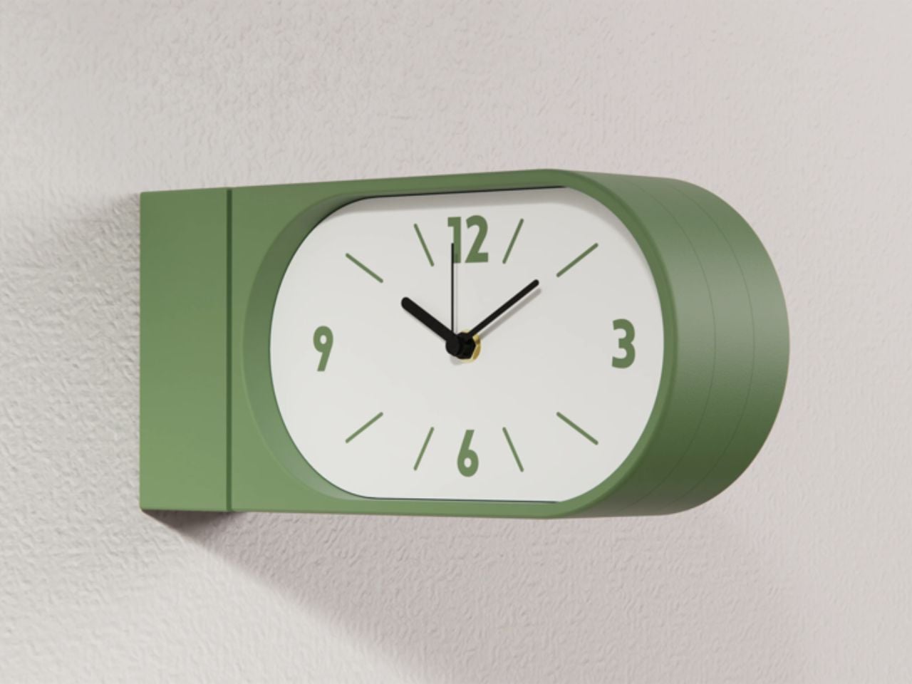
Turin-based brand Goofball is bringing this format back, but with a distinctly modern lens. Their Perch clock does not just revive an old idea; it reframes it for how we live today.

Designer: Goofball

At first glance, the concept feels familiar. A clock that extends out from the wall, visible from both sides. But in a home setting, this simple shift changes everything. Instead of being something you look at from one fixed position, the clock becomes part of how you move through a space. Whether you are walking into a room, passing through a corridor, or glancing back as you leave, time is always within sight. It feels less like an object placed on a wall and more like something integrated into the rhythm of the room.

The functional decisions are just as thoughtful. The clock runs on two AA batteries, which means there is no need for wiring or complicated installation. It hangs on a bracket and can be easily lifted off when the batteries need to be changed. It is the kind of detail that you might not notice immediately, but it makes living with the product feel effortless.

Visually, the Perch clock embraces minimalism in a way that feels warm rather than clinical. It comes in three colors, allowing it to blend into different interiors while still holding its own presence. The design is clean and restrained, making it suitable for contemporary homes, yet it carries a quiet reference to its past. There is something unmistakably reminiscent of old railway clocks, those objects that once defined shared notions of time and movement.

That sense of nostalgia is part of its charm. It brings a subtle character into a space without feeling overly decorative. It introduces depth to a wall, quite literally, and creates a small moment of curiosity. Guests notice it. People interact with it differently. It becomes a conversation piece without trying too hard.

What makes this product particularly compelling is how it challenges a default assumption. We have grown used to thinking of wall clocks as flat, one-directional objects. This design questions the norm and reminds us that even the most familiar objects can be reimagined.

The response so far reflects this shift in perspective. The first batch sold out quickly, suggesting that people are ready for products that feel both nostalgic and new at the same time. Goofball is currently preparing the second batch, expected to be available in the coming weeks.

In the end, this clock is more than just a timekeeping device. It is a small but meaningful intervention in how we experience space. It takes something we already know, brings back its forgotten domestic presence, and gives it a contemporary voice. It does not just sit on a wall. It changes how the wall and the room around it are perceived.

The post A Double-Sided Clock That Turns Walls into Living Moments of Time first appeared on Yanko Design.

  • ✇Yanko Design
  • These Old Bike Frames Upcycled Into Armchairs Are The Coolest Thing You’ll See Today
    Most upcycling projects ask you to forget what something used to be. Omri Piko Kahan’s bike frame chairs ask the opposite. The geometry is still unmistakably a bicycle frame, the head tube, the top tube, the triangulated rear triangle, all of it present and accounted for, just oriented sideways and asked to hold a person instead of propel one. Kahan, an industrial designer based in Israel, builds lounge chairs from pairs of retired frames, and the whole point is that the donor material remains
     

These Old Bike Frames Upcycled Into Armchairs Are The Coolest Thing You’ll See Today

7 avril 2026 à 19:30

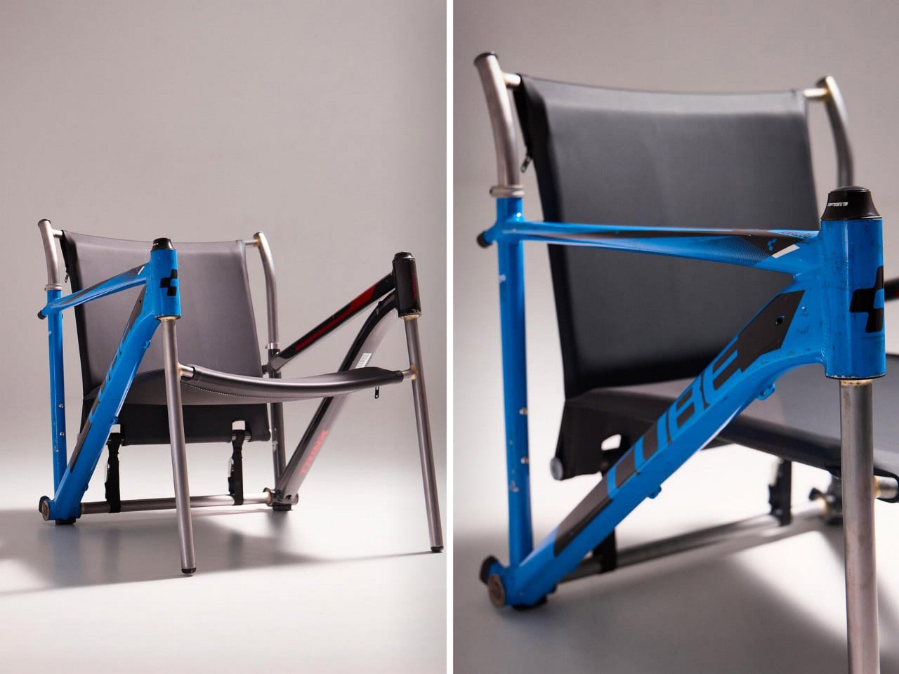
Most upcycling projects ask you to forget what something used to be. Omri Piko Kahan’s bike frame chairs ask the opposite. The geometry is still unmistakably a bicycle frame, the head tube, the top tube, the triangulated rear triangle, all of it present and accounted for, just oriented sideways and asked to hold a person instead of propel one. Kahan, an industrial designer based in Israel, builds lounge chairs from pairs of retired frames, and the whole point is that the donor material remains fully readable, repurposed without being disguised.

Structurally, the approach is clean and considered. Each frame pair is positioned symmetrically, fork and chainstay ends touching the floor as legs, the top tube running horizontally as an armrest. A slung seat and backrest in leather or canvas complete the form. The result has the relaxed posture of a Barcelona chair and the material honesty of something that was clearly built, not styled.

Designer: Omri Piko Kahan

Bicycle frames are absurdly overbuilt for what Kahan is asking them to do. A modern aluminum road frame is engineered to survive repeated impact loads from a rider pushing 300 watts through rough tarmac, and it does that while weighing somewhere between 1,000 and 1,400 grams. The structural surplus in that kind of engineering is enormous, which is why two of them positioned as a chair frame and asked to support a seated adult is, from a load-bearing standpoint, almost comically within spec. The geometry does the rest. Bicycle frames already resolve forces through triangulated sections, and a lounge chair asks for exactly that kind of lateral and compressive stability.

What Kahan has figured out is the orientation problem. Flip a frame on its side and the existing tube angles don’t automatically produce a useful chair geometry. The fork legs and chainstay ends need to hit the floor at the right height relative to each other, the top tube needs to land at armrest height, and the whole thing needs to produce a seat rake that doesn’t pitch you forward or swallow you whole. The matched top tube angles across both frames in the Cube and Trek build suggest this took real iteration, because they align with a precision that reads as deliberate rather than lucky. Filed fillets at the junctions and a custom setback upper support holding the sling confirm someone was paying close attention to finish quality.

The two builds photographed so far, one pairing a blue Cube road frame with a Trek, another combining a GT Transeo 3.0 with what appears to be a Supreme-branded MTB frame, show how much the donor bikes drive the final character of each piece. The GT build in particular has a longer wheelbase geometry that gives the chair a wider, more reclined stance than the Cube version. Kahan is taking custom orders, with pricing worked out per commission, which makes sense given that no two donor frame combinations will produce the same structural or ergonomic outcome.

The post These Old Bike Frames Upcycled Into Armchairs Are The Coolest Thing You’ll See Today first appeared on Yanko Design.
  • ✇Yanko Design
  • Studioninedots’ Light House Is a Vertical Amsterdam Home Built From Playfully Stacked Boxes
    What does a home look like when you throw out the floor plan entirely? For Amsterdam-based firm Studioninedots, the answer is a tower of playfully stacked boxes, each one dedicated to a single moment in life, that rises above one of the Dutch capital’s newest neighborhoods. Completed in 2025, Light House sits on Centrumeiland, a newly developed artificial island district defined by its self-build culture and strong sustainability ambitions. The project began with a simple brief from a couple wi
     

Studioninedots’ Light House Is a Vertical Amsterdam Home Built From Playfully Stacked Boxes

7 avril 2026 à 18:30

What does a home look like when you throw out the floor plan entirely? For Amsterdam-based firm Studioninedots, the answer is a tower of playfully stacked boxes, each one dedicated to a single moment in life, that rises above one of the Dutch capital’s newest neighborhoods. Completed in 2025, Light House sits on Centrumeiland, a newly developed artificial island district defined by its self-build culture and strong sustainability ambitions.

The project began with a simple brief from a couple with two children who wanted a home that would genuinely bring them together. Rather than anchoring daily life to the ground floor the way most houses do, Studioninedots dedicated each of the family’s key activities — eating, gathering, cooking, relaxing — to its own distinct volume, then arranged those volumes vertically into a single, tightly considered composition. The result is a 257-square-meter residence that feels less like a stacked building and more like a small vertical neighborhood.

Designer: Studioninedots

Movement through the home unfolds through a sequence of open passages and compressed zones, where shifts in scale produce entirely different spatial moods. Smaller, enclosed areas carve out space for focused, quieter activities, while larger voids open up visual connections across levels, dissolving any conventional sense of what is above and what is below. Hovering above the kitchen is a sheltered, secluded volume ideal for yoga or film watching, while the journey through the house culminates at the top in what the architects describe as a “holiday home” within the city. Flanked by arched ceiling-height glass openings, this 14-metre-high gathering room commands panoramic views across the IJmeer lake.

The facade does a lot of the design’s heavy lifting. A wall of square glass blocks wraps the front of the building, filtering natural light into the interior while abstracting the life inside, offering privacy without sacrificing the warmth of daylight. At night, the facade glows from within, giving the house an almost lantern-like presence on the street.

Sustainability is baked into the structure itself. Light House is built as a lightweight system using prefabricated timber components inside a steel frame, a circular and modular method that allows for flexibility, long-term adaptability, and ease of disassembly. The layout is not fixed either, as children grow and priorities shift, the home can be reconfigured to meet whatever the family needs next. Light House is a rare thing: a home that feels entirely personal yet completely considered, one where architecture quietly gets out of the way and lets life fill the space.

The post Studioninedots’ Light House Is a Vertical Amsterdam Home Built From Playfully Stacked Boxes first appeared on Yanko Design.

  • ✇Yanko Design
  • Semicircular Wings give this Hybrid eVTOL an 800 Mile Range with 30% Less Power Consumption
    Could the most efficient VTOL design of the 21st century have been sitting in a patent office since 1928? Willard Ray Custer thought so, and spent decades trying to prove it. His channel wing concept, which set propellers into semicircular cutouts in each wing to blast high-velocity air across the lifting surface at low forward speeds, worked well enough that his team demonstrated near-vertical liftoff decades before the term eVTOL existed. Aviation’s mainstream never adopted it, partly because
     

Semicircular Wings give this Hybrid eVTOL an 800 Mile Range with 30% Less Power Consumption

7 avril 2026 à 17:30

Could the most efficient VTOL design of the 21st century have been sitting in a patent office since 1928? Willard Ray Custer thought so, and spent decades trying to prove it. His channel wing concept, which set propellers into semicircular cutouts in each wing to blast high-velocity air across the lifting surface at low forward speeds, worked well enough that his team demonstrated near-vertical liftoff decades before the term eVTOL existed. Aviation’s mainstream never adopted it, partly because the aircraft of that period were too heavy and partly because the jet age arrived and swept most unconventional configurations off the table. The concept sat in aerospace history books, occasionally surfacing in academic papers and NASA wind tunnel tests, never finding its way into a production aircraft.

HopFlyt is the company making the argument that the wait is finally over. Founded in 2016 by Rob Winston, a former NASA engineer and Marine Corps test pilot, the Maryland-based startup has built the Cyclone, a hybrid VTOL drone that pairs Custer’s channel wing geometry with pivoting mounts, modern composites, and a hybrid electric-fuel drivetrain. The channels orient rearward for vertical takeoff, pivot beneath the wing for forward cruise, and can even act as aerodynamic brakes on descent. HopFlyt claims the configuration cuts climb power consumption by a third compared to conventional VTOLs, holds fuel burn to under three gallons per hour, and enables cargo runs of 250 lbs across 800-plus miles of range. A 2027 commercial launch is the target, aimed squarely at naval resupply, offshore energy logistics, and medical delivery markets.

Designer: HopFlyt

The engineering logic behind the channel wing is cleaner than it might first appear. A conventional fixed wing generates lift by moving through air fast enough for pressure differentials to do their work, which means you need significant forward velocity before the wing becomes useful. Custer’s insight was to bring the air to the wing instead, using a propeller seated inside a curved half-channel to accelerate flow across the lifting surface regardless of forward speed. HopFlyt’s pivoting channel takes this further, allowing the geometry to optimize for hover and cruise independently rather than compromising between them. Chief Engineer Neil Winston, whose background spans NAVAIR flight test, puts it plainly: the ideas were always there, but the digital control systems, electric motors, and lightweight materials needed to execute them simply did not exist until now.

The hybrid drivetrain is what gives the Cyclone its range credentials and separates it from the crowded field of pure-electric eVTOLs currently chasing urban air taxi certifications. Battery power handles the vertical takeoff and hover phases, where the channel wing’s efficiency advantage is most pronounced, while a turbogenerator takes over for forward cruise, extending endurance far beyond what any battery pack realistically supports today. HopFlyt puts the operational cost savings at 90 percent compared to helicopters performing equivalent missions, a figure that, if it holds up under real-world conditions, makes the Cyclone genuinely disruptive in sectors where helicopter logistics are currently the only viable option. Offshore energy platforms and naval resupply operations run on helicopter economics right now, and those economics are punishing.

HopFlyt has reached this point on a fraction of the capital that comparable advanced air mobility startups have burned through, operating out of a private hangar in Maryland with a team whose combined aerospace experience runs to over a century. The company is currently in a Series A raise to fund hybrid-electric prototype development and initiate flight demonstrations ahead of that 2027 target. Whether the Cyclone becomes the aircraft that finally vindicates Willard Ray Custer’s century-old intuition depends on what those demonstrations produce. The aerodynamics have always been sound. Now the rest of the technology has caught up.

The post Semicircular Wings give this Hybrid eVTOL an 800 Mile Range with 30% Less Power Consumption first appeared on Yanko Design.
  • ✇Yanko Design
  • This Luxury Italian Watch Has a Triple-Axis Tourbillon and Looks Like a Ferrari Dashboard
    Old sports cars had analog instrument clusters that told you everything through three or four circular gauges mounted in brushed metal housings, each dial showing a different slice of what the engine was doing at any given moment. The information was direct, mechanical, and laid out with the kind of functional clarity that only made sense if you understood how the car worked. Tachometers sat next to oil pressure gauges, fuel levels next to coolant temps, all of it visible through a steering whe
     

This Luxury Italian Watch Has a Triple-Axis Tourbillon and Looks Like a Ferrari Dashboard

7 avril 2026 à 16:30

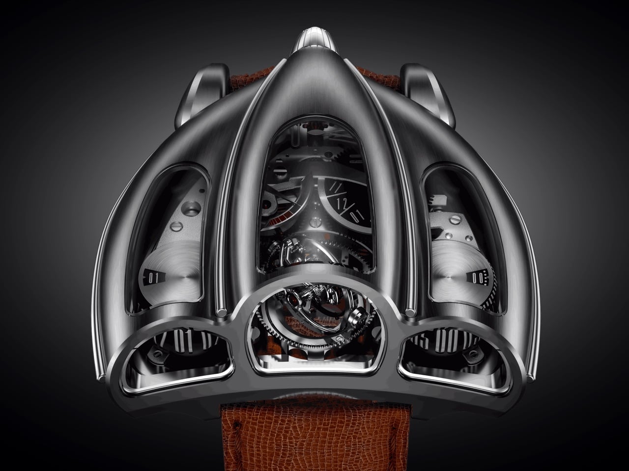
Old sports cars had analog instrument clusters that told you everything through three or four circular gauges mounted in brushed metal housings, each dial showing a different slice of what the engine was doing at any given moment. The information was direct, mechanical, and laid out with the kind of functional clarity that only made sense if you understood how the car worked. Tachometers sat next to oil pressure gauges, fuel levels next to coolant temps, all of it visible through a steering wheel while you were doing 140 km/h on a mountain pass. Desder’s D001 takes that exact visual language and translates it into a wristwatch with a triple-axis tourbillon spinning where the tachometer used to be.

The watch displays time on two separate cylinders, one for jumping hours and one for continuous minutes, flanked by a GMT indicator on the right and a power reserve gauge on the left. Luca Soprana, the master watchmaker who cofounded the Ateliers 7h38 workshop that builds complications for Jacob & Co, designed the caliber with the same obsessive attention to architectural clarity that defined mid-century dashboard design. Mo Coppoletta, the tattoo artist and designer behind collaborations with Bulgari and Montblanc, shaped the case to follow the teardrop aerodynamics of 1920s and 1930s race cars. The watch debuted in April 2026 from Modena, in the heart of Italy’s Motor Valley, limited to six unique pieces. The case wraps around the movement like a coachbuilt body over a chassis, every surface flowing from the mechanical geometry underneath.

Designers: Mo Coppoletta, Luca Soprana (Desder)

Soprana’s caliber is a study in mechanical complexity made legible. The triple-axis tourbillon sits dead center, rotating on three independent axes to counteract gravitational effects on timekeeping accuracy. The movement beats at 3Hz with a 45-hour power reserve, hand-wound through a crown that feels more like a machine interface than a watch component. German silver forms the mainplate and bridges, chosen for its rigidity and traditional finishing properties. Titanium components reduce weight where it matters, while phynox, a high-performance alloy known for extreme strength and corrosion resistance, handles stress points. The entire movement comprises 465 parts, every single one made by hand in Soprana’s Vaumarcus atelier near Neuchâtel. The jumping hour mechanism snaps forward with the kind of mechanical decisiveness that makes you want to watch it cycle through an entire day.

The case construction follows Italian coachbuilding philosophy, where form and function develop together rather than in sequence. Coppoletta designed the case around the movement’s architecture, letting the mechanical volumes dictate the external silhouette. The teardrop shape references 1920s and 1930s aerodynamics, when wind tunnel testing was still a decade away and designers shaped metal based on intuition about airflow. Flowing surfaces connect the cylindrical time displays, each one sitting under domed sapphire crystal that distorts and magnifies depending on viewing angle. The brushed metal finish catches light the way a hand-formed fender does, with subtle variations in surface texture that reveal the construction process. Sculpted lugs integrate directly into the case body without visible seams, continuing the coachbuilt language where every panel flows into the next.

Each of the six pieces carries subtle variations that make it genuinely unique. Coppoletta, whose background in tattooing taught him to treat every commission as an individual artwork, approached each watch as a separate design exercise within the same architectural framework. Different finishing patterns on the case, variations in how the sapphire crystals dome over the displays, minor differences in how the lugs taper into the case body. These aren’t the superficial variations you get when a brand changes dial colors across a limited run. These are structural differences that change how the watch sits on a wrist and how light interacts with the metal surfaces.

The D001 competes with MB&F and Greubel Forsey in the kinetic sculpture category, but carves its own space by grounding the design in automotive heritage rather than abstract futurism. Where MB&F builds machines that look like they belong in science fiction and Greubel Forsey chases chronometric precision with architectural movements, Desder anchors everything in the tangible history of Italian industrial design. The watch references a specific moment when cars were still shaped by hand and instruments were analog by necessity. Pricing is on request, which in this category typically signals seven figures. For collectors who view watches as functional art and value radical design integrated with mechanical innovation, the D001 delivers both. Just don’t expect to wear it through airport security without some explaining.

The post This Luxury Italian Watch Has a Triple-Axis Tourbillon and Looks Like a Ferrari Dashboard first appeared on Yanko Design.

  • ✇Yanko Design
  • 100-Meter A100 concept yacht redefines luxury sailing with massive interior volume
    Modern sailing superyachts often struggle to balance two competing priorities: the elegance and efficiency of wind-powered travel and the expansive living spaces typically associated with large motor yachts. The A100 sailing yacht concept approaches this challenge with a bold rethink of traditional yacht architecture. Developed through a collaboration between Van Geest Design and Rob Doyle Design, the 100-meter vessel proposes a layout that delivers the interior volume of a motor yacht while ma
     

100-Meter A100 concept yacht redefines luxury sailing with massive interior volume

7 avril 2026 à 15:15

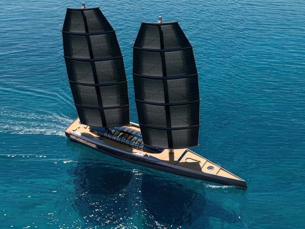
Modern sailing superyachts often struggle to balance two competing priorities: the elegance and efficiency of wind-powered travel and the expansive living spaces typically associated with large motor yachts. The A100 sailing yacht concept approaches this challenge with a bold rethink of traditional yacht architecture. Developed through a collaboration between Van Geest Design and Rob Doyle Design, the 100-meter vessel proposes a layout that delivers the interior volume of a motor yacht while maintaining the identity and performance of a sailing superyacht.

At the core of the concept is a design strategy that maximizes usable space. Traditional sailing yachts require wide side decks for crew movement and sail handling, which limits interior width. The A100 concept reduces the width of these side decks, allowing the main deck to stretch nearly the full beam of the yacht. This architectural shift creates significantly larger interior spaces than typically found on sailing yachts of comparable size.

Designer: Van Geest Design and Rob Doyle Design

The main deck is designed as the primary social and living area. Here, the owner’s suite occupies a substantial portion of the deck, offering a level of space rarely seen on sailing yachts. Adjacent to the suite is a central lounge and formal dining area intended for gatherings and entertaining. An additional space can function as a library or a private cinema, adding flexibility to the interior layout. Large sections of glass surround these living areas, filling the interior with natural light and offering uninterrupted views of the ocean.

Below deck, the yacht accommodates guest cabins along with a variety of leisure-focused facilities. This level also houses a dedicated diving room and storage for water toys such as jet skis and e-foils, allowing guests to transition between onboard relaxation and water activities easily. The layout is designed to maintain a strong visual connection with the surrounding seascape while ensuring privacy and comfort for those on board.

Outdoor areas play an equally important role in this larger-than-life superyacht design. The upper deck includes the navigation and steering stations, along with flexible lounge spaces for relaxation or wellness activities. At the stern, a large beach club spans the full width of the yacht, creating a welcoming space for guests to gather close to the water. Toward the bow, storage areas accommodate tenders and recreational equipment without disrupting the clean lines of the deck.

The sailing system is based on two free-standing DynaRig masts, a modern configuration used on some of the world’s largest sailing yachts. The system employs curved yards that support multiple sails, all of which can be deployed and adjusted electronically at the push of a button. The rotating masts simplify sail handling while maintaining efficient propulsion for a vessel of this scale.

Beyond its layout and sailing system, the A100 concept also reflects growing interest in more sustainable superyacht designs. By relying heavily on wind propulsion supported by advanced onboard energy systems, the concept explores ways to reduce reliance on conventional engine power. If brought to life, the A100 would stand among the largest sailing yachts ever built!

The post 100-Meter A100 concept yacht redefines luxury sailing with massive interior volume first appeared on Yanko Design.

  • ✇Yanko Design
  • Preciosa To Make Light Feel Like a Living Thing at Milan 2026
    Light has always been design’s most underrated material. We talk endlessly about furniture, textiles, and surfaces, but light? It usually plays the supporting role, the thing that makes everything else look good. Preciosa Lighting is quietly changing that conversation, and their latest collection, Drifting Lights, might be the most convincing argument they’ve made yet. The Czech brand has been doing this long enough to know the difference between novelty and genuine craft. Their heritage is roo
     

Preciosa To Make Light Feel Like a Living Thing at Milan 2026

7 avril 2026 à 13:20

Light has always been design’s most underrated material. We talk endlessly about furniture, textiles, and surfaces, but light? It usually plays the supporting role, the thing that makes everything else look good. Preciosa Lighting is quietly changing that conversation, and their latest collection, Drifting Lights, might be the most convincing argument they’ve made yet.

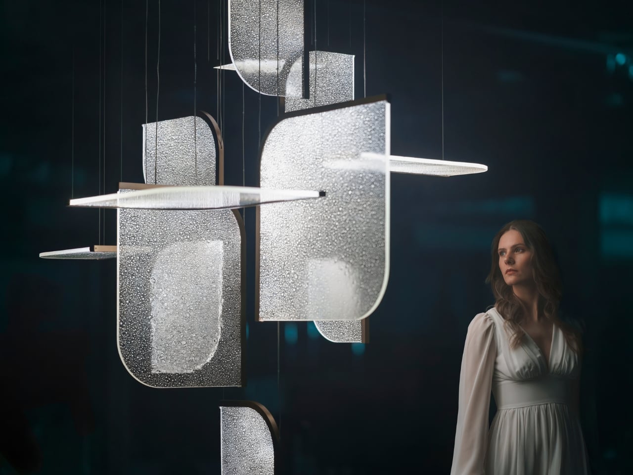
The Czech brand has been doing this long enough to know the difference between novelty and genuine craft. Their heritage is rooted in traditional glassmaking, but what they’ve built with Drifting Lights feels like a very deliberate step forward. Each piece is made up of oblong and square glass panels slotted into a stainless-steel frame that discreetly conceals an LED strip. Inside each panel, the glass has been infused with countless tiny air bubbles. When light passes through, it doesn’t just illuminate the glass. It gets lost in it, scattering through those bubbles in a way that looks less like electricity and more like light deciding where it wants to go.

Designer: Preciousa Lighting

For Milan Design Week 2026, Preciosa is bringing the full Drifting Lights experience to the Tempesta Art Gallery in Brera, and the scale alone is worth paying attention to. The installation spans approximately 30 square metres and features 60 glass panels suspended vertically and horizontally, forming a structure measuring 8.7 by 3.2 by 3 metres. Set against a dark interior, the panels will be animated using 3D spatial mapping and RGBW technology, cycling through colour sequences from red to pink to green. Co-Creative Directors Michael Vasku and Andreas Klug put it plainly: the installation aims at “creating space to slow down, pause and wonder.”

I appreciate that framing, because Milan Design Week is genuinely relentless. Every brand is competing for the loudest moment, the most shareable installation, the boldest statement. There is a real temptation to optimise for the 15-second video clip rather than the actual experience of standing in a room. Preciosa is betting on the opposite, and I think that’s the smarter play. The colour sequence from red to pink to green reads like an emotional arc rather than a tech demo, referencing love, passion, and inner peace. Whether or not you buy the symbolism, you can’t argue with the atmosphere it creates.

A design object earns its place when it works just as well outside a gallery as inside one, and Drifting Lights has clearly been thought through on that level. The panels come in ten sizes, with different metal frame finishes and the option to orient them vertically or horizontally. The same collection can fill a grand hotel lobby or anchor a living room without losing its character. For bespoke projects, Preciosa can apply a painting technique that introduces pigment bubbles into the glass, giving each panel a layer of quiet individuality. The bubbled glass can also be enhanced with their Fused Veil pattern, which shifts the direction of light and adds even more visual complexity.

Under static illumination, Drifting Lights is calm and composed. Switch to dynamic mode and the panels come alive, with light moving from one to the next like ink dispersing through water. The gradients bloom, soften, and recombine. It’s the kind of effect that makes you stay in a room longer than you planned, which is, ultimately, what great lighting is supposed to do.

Preciosa has had a strong run at Fuorisalone in recent years, with recognised installations at Zona Tortona and Euroluce. The move to Tempesta on Foro Buonaparte suits the work well: a contemporary art gallery setting that lets the installation breathe without competing with showroom furniture. It’s a confident choice for a collection that clearly doesn’t need much help making a room feel different. If you’re heading to Milan, the installation runs April 20 to 26 at the Tempesta Art Gallery on Foro Buonaparte, and this one is worth the detour.

The post Preciosa To Make Light Feel Like a Living Thing at Milan 2026 first appeared on Yanko Design.

  • ✇Yanko Design
  • A Tiny Pinwheel Is Doing What AI Giants Won’t
    Every time you type a prompt into ChatGPT, something happens somewhere far away. Servers spin up. Electricity moves. Carbon gets generated. The whole transaction is so clean and invisible on your end that it might as well not be happening. That’s by design, and it’s worth thinking about. Although with the way we use technology these days, we seldom think about the consequences on our environment. London-based creative studio Oio wants to change that, starting with a small 3D-printed box and a b
     

A Tiny Pinwheel Is Doing What AI Giants Won’t

7 avril 2026 à 12:20

Every time you type a prompt into ChatGPT, something happens somewhere far away. Servers spin up. Electricity moves. Carbon gets generated. The whole transaction is so clean and invisible on your end that it might as well not be happening. That’s by design, and it’s worth thinking about. Although with the way we use technology these days, we seldom think about the consequences on our environment.

London-based creative studio Oio wants to change that, starting with a small 3D-printed box and a bright yellow pinwheel. Their project, the Hot Air Factory, is a domestic AI device that processes your questions and requests locally, without connecting to the cloud, and every time it thinks, it physically exhales. Hot air pushes out of the top of the device and spins that cheerful little pinwheel. The harder it thinks, the faster it spins. You’re watching computation happen in real time, which turns out to be a surprisingly powerful thing.

Designer: Oio

The concept is simple: make the invisible visible. We know AI uses energy. We’ve read the headlines. But knowing abstractly that data centers are energy-hungry is different from watching a pinwheel turn every time you ask your AI assistant to summarize something. One is a statistic. The other is a moment of honest accountability.

What makes the Hot Air Factory smart, beyond its obvious design appeal, is how it translates cost into human-readable terms. It doesn’t give you kilowatt-hours because most people have no idea what that means. Instead, it tells you something like “that prompt cost the equivalent of brewing a cup of tea” or “watching Netflix for five minutes.” Suddenly the math becomes personal. Suddenly you start wondering whether you really needed a 500-word AI response to a question you could have Googled.

Oio co-founder Matteo Loglio describes it as “a small, domestic AI that reveals the hidden energy cost behind every prompt.” The factory also lets you dial up or down the level of intelligence it uses. Want a quick answer? Use a lighter model, spend less energy. Need something more complex? Crank it up, and watch that pinwheel work for it. You can even schedule your heavier prompts for the night shift, when energy is cleaner and the grid is quieter. These are design decisions that carry real ethical weight, and they’re baked in with zero condescension.

The playfulness and the seriousness aren’t in conflict here. They’re exactly the point. The Hot Air Factory is built in a Frutiger Aero visual language, all soft curves and clean optimism, the kind of aesthetic that makes you want to put it on a shelf next to your plants. But underneath that approachable exterior is a genuinely complicated machine running open-source large language models on a local GPU. It looks like something a friendly robot would carry. It functions like a small act of protest.

AI companies have very little incentive to make their energy costs legible to users. Invisibility is convenient. It keeps things frictionless. It keeps you prompting without thinking about the bill. A report from the US Department of Energy projected that by 2028, data centers could account for 12% of total electricity consumed in the US. That’s not a small number, and it keeps growing every time we treat AI like it runs on good intentions and cloud magic.

The Hot Air Factory isn’t saying AI is bad. It isn’t demanding you stop using it. What it’s doing is quieter and more persuasive than that. It’s asking you to look. To see. To feel, just a little, what your digital habits cost in the physical world. That’s the argument made not through a lecture or a campaign, but through a yellow pinwheel spinning in your living room.

Design can do that. Sometimes a small, well-made object says more than a policy paper ever could. The Hot Air Factory is currently looking for collaborators to help bring it to a wider audience, still working its way from experiment to something anyone can own. If the goal is conscious computing, the first step might just be this: a tiny box, a spinning fan, and the quiet discomfort of watching a machine breathe.

The post A Tiny Pinwheel Is Doing What AI Giants Won’t first appeared on Yanko Design.

  • ✇Yanko Design
  • This Color E Ink Monitor Runs at 60Hz: Real Work, No Eye Strain
    Spending hours in front of a glowing screen is unavoidable for most people, and the toll it takes on the eyes is a problem the monitor industry hasn’t truly solved. E Ink displays offer a gentler, paper-like alternative that’s far easier to stare at for long stretches, but most of them are painfully slow, limited in resolution, and not really up to the demands of daily computing. The Modos Flow is Modos Tech’s answer to that problem. Built by a Boston-based hardware startup, it’s a 13.3-inch E
     

This Color E Ink Monitor Runs at 60Hz: Real Work, No Eye Strain

Par : JC Torres
7 avril 2026 à 11:20

Spending hours in front of a glowing screen is unavoidable for most people, and the toll it takes on the eyes is a problem the monitor industry hasn’t truly solved. E Ink displays offer a gentler, paper-like alternative that’s far easier to stare at for long stretches, but most of them are painfully slow, limited in resolution, and not really up to the demands of daily computing.

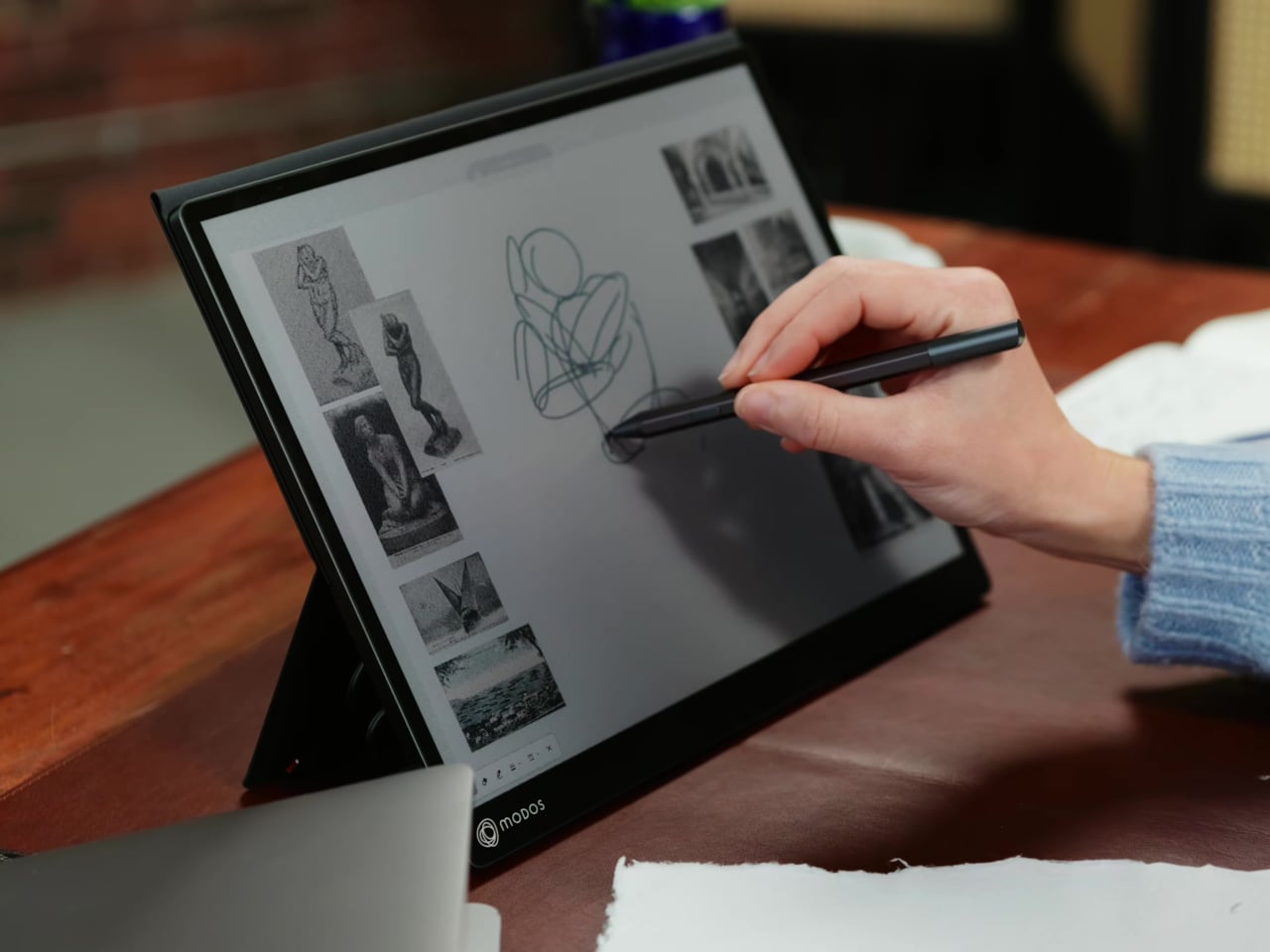
The Modos Flow is Modos Tech’s answer to that problem. Built by a Boston-based hardware startup, it’s a 13.3-inch E Ink portable monitor designed not just for casual reading but for all-day, focused work. It targets the kind of person who needs a real secondary screen but wants to spend less time squinting and more time actually getting things done.

Designer: Modos Tech

Most E Ink monitors struggle as daily drivers because of their refresh rate. Traditional panels tend to crawl, making anything beyond static document reading a frustrating experience. The Modos Flow uses a custom board with open-source firmware to push its display to 60 Hz, enough to scroll through pages, type without noticeable lag, and use the screen as a functional everyday monitor rather than a glorified e-reader.

Resolution is also where the Modos Flow separates itself. In black-and-white mode, it renders at 3,200 x 2,400 pixels with a pixel density of 300 PPI, making text crisp enough to satisfy anyone used to retina-grade displays. Color mode brings the resolution down to 1,600 x 1,200 pixels at 150 PPI, which is a fair trade given how rarely E Ink panels offer color at all.

Touch and stylus support round out what’s becoming a surprisingly versatile display. Modos brought the latency down to under 100ms, so annotating a document, sketching ideas, or jotting notes with a stylus actually responds the way you’d want it to. It won’t replace a dedicated drawing tablet, but for someone who routinely works between a laptop and a secondary screen, having that input option without swapping devices is genuinely useful.

Its physical design is straightforward and practical. A built-in cover doubles as a stand and folds flat for travel, while VESA mounting holes on the back make it easy to attach to a monitor arm or desk mount. Three side buttons let you adjust brightness, contrast, and display mode without touching your computer. Connectivity runs through USB-C with DisplayPort Alt-Mode support, which keeps the setup clean with a single cable.

One of the quieter advantages of E Ink over LCD or OLED is power consumption, and that matters here. When connected to a laptop via USB-C, the Modos Flow draws significantly less power than a conventional secondary monitor, meaning your battery isn’t taking nearly the hit it normally would. It works with Windows, macOS, and Linux out of the box, so there’s no particular setup hurdle to clear. Pricing hasn’t been confirmed yet, but Modos has indicated it should be comparable to other portable monitors.

The post This Color E Ink Monitor Runs at 60Hz: Real Work, No Eye Strain first appeared on Yanko Design.

❌