Carrying less shouldn’t have to mean giving up a tent that supports itself. That’s the appeal of Field Record’s FR-SCD, a one-person shelter with a listed body-and-pole weight of just 490 grams, or about 1.1 pounds. It addresses a recognizable backpacking dilemma: how to trim the load without switching to a shelter that depends on trekking poles for its structure.
That number deserves a little unpacking before anyone starts rearranging their gear closet. The 490 grams covers the tent and its Ea
Carrying less shouldn’t have to mean giving up a tent that supports itself. That’s the appeal of Field Record’s FR-SCD, a one-person shelter with a listed body-and-pole weight of just 490 grams, or about 1.1 pounds. It addresses a recognizable backpacking dilemma: how to trim the load without switching to a shelter that depends on trekking poles for its structure.
That number deserves a little unpacking before anyone starts rearranging their gear closet. The 490 grams covers the tent and its Easton carbon fiber poles, not the complete packed kit. Carry bags, stakes, and guy lines aren’t included in that figure. It’s still remarkably light, but I’d rather know what’s on the scale than fall in love with a number that leaves the accessories off it.
Designer: Field Record
Field Record comes from designer Kouichi Okamoto of Kyouei Design, and the brand says it handles design, cutting, sewing, and seam processing in-house. The FR-SCD also isn’t a fresh launch disguised by a recent round of attention. It appeared in the brand’s 2023 lineup, with a special 470-gram version developed alongside trail runner Shogo Mochizuki. The production model uses a different Dyneema fabric. That history gives the weight-saving ambition some useful context.
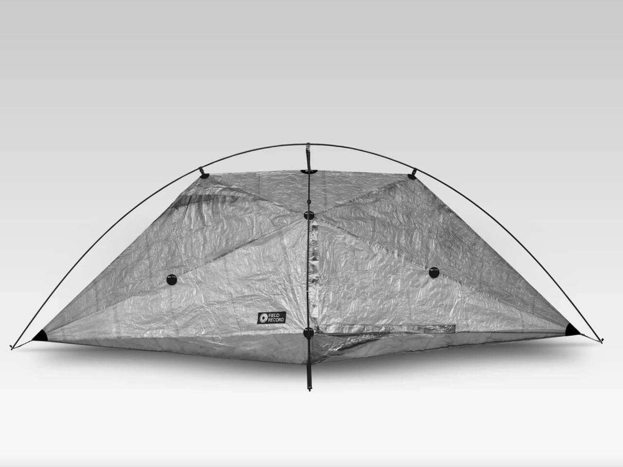
Visually, it’s an appealingly strange little object. The photographed shelter has a crinkled, translucent skin stretched beneath two crossing arcs, with pointed ends that make the overhead view resemble an elongated kite. I like how little effort it spends looking conventionally rugged. You can read the frame and the fabric as separate elements, and the shape feels more interesting for making that relationship so visible.
The construction is specific. Field Record pairs a Dyneema Composite Fabric body with Easton carbon poles, then applies bonded seam treatment after sewing. Twelve bonded reinforcement points support the construction. Those details matter because this isn’t merely a thin sheet draped over a frame. The maker has put reinforcement into selected locations while pursuing that low overall weight, a more interesting design exercise than indiscriminately removing material.
Ventilation is where the idea meets a less glamorous camping reality. Moisture inside a tent can be as unwelcome as rain outside it. Field Record says the FR-SCD’s form and four ventilation points encourage airflow to reduce condensation. That’s a design intention, not proof of consistently dry mornings. Ventilation is an established way to manage condensation, but I’d want field testing before treating these openings as a complete solution.
Space is another negotiation. The published dimensions are approximately 101.6 inches long, 42.5 inches wide, and 37.4 inches high. Those are overall measurements, not a rectangular sleeping area. Looking at the sharply tapered outline, I wouldn’t read the length and width as permission to sprawl. The low roof also makes this look like a place to sleep rather than a comfortable room for waiting out an entire afternoon.
Freestanding shouldn’t be mistaken for unanchored, either. A frame that holds the shelter’s shape is useful, but wind still makes staking and guying important. Sierra Designs’ tent guidance makes that distinction explicitly, even for freestanding models. I appreciate the convenience this architecture offers, provided the weight conversation doesn’t encourage anyone to leave necessary anchoring gear behind. Saving ounces shouldn’t depend on ignoring the campsite.
Then comes the price: ¥149,600, approximately $950 in New Atlas’s report. Field Record currently lists a roughly three-month lead time and offers international shipping, with customs charges left to the buyer. That puts it firmly in specialist territory. For me, the cost makes more sense as payment for a particular construction and manufacturing approach than as an obvious upgrade for anyone who occasionally spends a weekend outdoors.
I’m drawn to the FR-SCD because its priorities are easy to understand, even if they wouldn’t match everyone’s packing list. I’d want more evidence about livability before choosing it for a trip. As a design, though, it makes a persuasive case for keeping the convenience of a frame while being unusually disciplined about everything that frame has to carry.
Microsoft is testing a Windows 11 update that lets users enter their PIN without waiting for Windows Hello biometrics. Here's how it works and who can try it.
The post Windows 11 Is Fixing an Annoying Sign-In Problem: Here’s What Changes appeared first on TechRepublic.
Microsoft is testing a Windows 11 update that lets users enter their PIN without waiting for Windows Hello biometrics. Here's how it works and who can try it.
Before a pilot flies you to Cancún, they’ve logged hours in a simulator crashing planes that don’t exist. Surgical training has had a harder time getting there, and residents often get thin hands-on practice before working on living patients. Niklas Andreasen, a graduate of Sweden’s Umeå Institute of Design, set out to fix that with MX Surgical, a mixed reality training kit he developed with Logitech. It pairs replica surgical instruments with a headset, so trainees can rehearse procedures anyw
Before a pilot flies you to Cancún, they’ve logged hours in a simulator crashing planes that don’t exist. Surgical training has had a harder time getting there, and residents often get thin hands-on practice before working on living patients. Niklas Andreasen, a graduate of Sweden’s Umeå Institute of Design, set out to fix that with MX Surgical, a mixed reality training kit he developed with Logitech. It pairs replica surgical instruments with a headset, so trainees can rehearse procedures anywhere they can open a case. Call it a flight sim for scalpels, and a lot more portable than the six-figure simulator rigs some hospitals bolt to the floor.
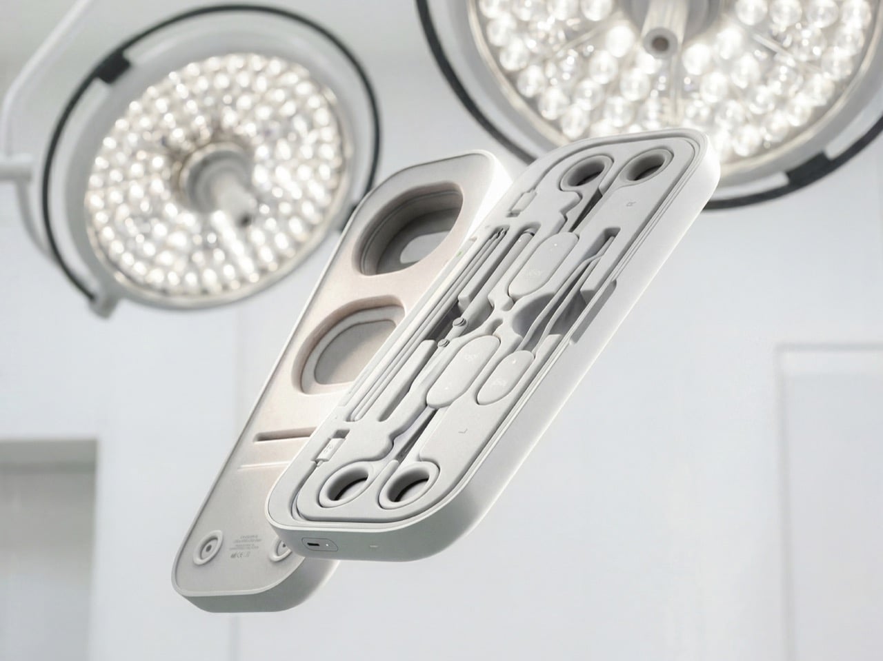
Andreasen grouped surgical tools into three mechanical families (ring-handled scissors and clamps, forceps, and pen-grip instruments), then designed one reconfigurable controller for each. Sensors and adjustable resistance mechanics inside recreate how each tool pushes back in your hand, and layered pads give you something to actually cut into. The headset handles the anatomy, while a companion platform scores you on precision, force, and timing like a very strict video game. It’s a concept for now, with no pricing or launch plans. Even so, it has already picked up Emerging Product Designer of the Year at the 2026 European Product Design Awards, three Core77 student wins, and a nomination for Red Dot’s Peter Zec Prize.
Designer: Niklas Andreasen (Umeå Institute of Design, in collaboration with Logitech)
Three Controllers, One Entire Instrument Tray
A real surgical tray can hold dozens of instruments, and building a replica of each one would turn the kit into a hardware store. Andreasen sidestepped that by mapping what instruments have in common mechanically. Scissors, needle holders, and clamps all pivot on a ring-handled scissor action. Forceps pinch, and scalpels and probes ride in a pen grip. Each MX Surgical controller covers one of those families, tuning its spring tension and range of motion in real time so the same body can feel like a fine dissecting scissor one minute and a stiff clamp the next.
Logitech has spent over four decades shaping mice, keyboards, and controllers around human hands, and the collaboration shows. The kit wears the MX family’s soft radii and matte warm grays, so anyone who owns Logitech’s MX Ink stylus for Meta Quest will feel right at home. Three mentors from Logitech, Nick Jinkinson, Andreas Connellan, and Aidan Kehoe, guided the project. The cutaway renders show a rotary mechanism tucked right at the pivot, where the resistance needs to happen, inside ring handles your fingers already know from the real tool. Compare that with FundamentalXR, a leading haptic surgical platform that has traditionally relied on desk-mounted haptic arms.
Layered Pads Handle the Feel, the Headset Handles the Gore
Haptics can only fake so much, so MX Surgical gives your hands something physical to work on. Layered training pads stand in for tissue at different depths, and they slot into a die-cut tray inside the case. As you work through a procedure, the mixed reality overlay progressively reveals deeper layers of anatomy and shifts to match what you’re doing. Hospitals and universities can stock a material library of swappable pads and components, tailoring the kit to a specialty or a specific case. Residents without a headset aren’t stuck either, because a simpler screen-based version handles the visual side.
This hybrid approach borrows from both ends of current surgical training. On one end are cheap suturing pads that residents practice stitches on at home, which feel real but teach nothing about context. On the other end are VR simulations that show you an entire operating room but feel like waving a remote around. MX Surgical splits the job, letting the pad handle touch and the headset handle everything you need to see. The whole thing packs into a slim carry case, which makes it something you can take home, practice with at 11pm, and toss in a bag for your next rotation.
A Scorecard for Skills Surgeons Used to Pick Up by Osmosis
Every practice session gets logged by the companion platform, which tracks motor patterns, motion efficiency, accuracy, force control, and response timing. Those numbers describe the stuff a senior surgeon notices from across the room, like a hand that hesitates or grips too hard. The platform adjusts difficulty as you improve, keeps a digital anatomy atlas on hand, and lets mentors review your sessions remotely. Residents can train alone or in teams, then sit down with an attending to go through the results together. Andreasen’s own framing is that this data captures knowledge residency has always passed down person to person without ever writing it down.
That puts MX Surgical in direct conversation with William Halsted, who founded the surgical residency program at Johns Hopkins in 1890 around a simple motto: see one, do one, teach one. A century later, a design student added a fourth step, practice one, and made it look like something that belongs next to your keyboard. Andreasen built it through interviews and observation sessions with surgeons and educators in Sweden and Germany, with mentors from Logitech, Intuitive Surgical, and IDEO. In a Red Dot interview, he said he looks for ideas that “earn and defend their place.” A kit that lets a resident make their first mistake on a pad instead of a person sounds like one of those ideas.
OnePlus 16 could launch in India after new reports suggest a change in plans. Here's what we know about its rumored price, specifications, and availability.
The post OnePlus 16 India Launch: New Report Suggests a Surprise Release appeared first on TechRepublic.
OnePlus 16 could launch in India after new reports suggest a change in plans. Here's what we know about its rumored price, specifications, and availability.
Changing a home’s layout usually means working around walls that have no intention of moving. The Segmented Building System concept approaches that problem by treating a building as a series of four-foot-wide sections, rather than one permanent shell. This unconventional architecture proposes a house that could be dismantled and reassembled instead of demolished when circumstances change.
Each section is conceived as a slice through a building, combining floor, wall, and roof panels into a comp
Changing a home’s layout usually means working around walls that have no intention of moving. The Segmented Building System concept approaches that problem by treating a building as a series of four-foot-wide sections, rather than one permanent shell. This unconventional architecture proposes a house that could be dismantled and reassembled instead of demolished when circumstances change.
Each section is conceived as a slice through a building, combining floor, wall, and roof panels into a complete or partial profile. Structural insulated foam panels would form these pieces, which could arrive separately or already assembled. The four-foot measurement describes the segment’s width, not the room’s overall span, so the proposal isn’t asking anyone to squeeze into a very narrow little house.
Repeating those slices would let a building stretch, while combining full and half profiles would allow it to branch sideways. Their varying heights could give a shared living area a taller ceiling and keep adjoining spaces lower. Rather than committing to a single box-shaped module, the idea is to assemble different volumes from related parts, with their rooflines following the changes below.
The more interesting move, however, is to slide neighboring profiles out of alignment. Glass would fill the gaps, turning the joints between sections into narrow openings for daylight. Those openings could continue from the walls into the roof, bringing light into a tall central space. Instead of treating every seam as something to hide, the concept makes some of them part of the architecture.
The exterior isn’t tied to its mustard-yellow finish, either. Metal or cement-composite boards are proposed as cladding options, applied before delivery or after assembly on site. That gives the same underlying system room for different appearances, rather than making one facade part of the deal. Solar panels could also attach to the segments, with off-grid operation among the ambitions for the system.
Of course, rearranging a house wouldn’t be quite as casual as rearranging its furniture. The segments would attach to a prefabricated concrete perimeter foundation shaped for the chosen layout. Moving them elsewhere would still mean preparing a suitable base and reconnecting the building’s services. The proposal describes reusable sections, not a finished home you can simply pick up and drop onto any empty plot.
The point of taking those sections apart would be to use them again, perhaps in a different arrangement at another location. That’s a useful distinction from grinding a demolished building into material for something else. The ambition is to keep a usable building section intact. A change of address or layout wouldn’t require giving up the pieces that already made up your home.
Vital Lyfe’s Access promises up to 22.7 liters of drinking water per hour from seawater. Explore its estimated $749 price, battery limits, and business uses.
The post Vital Lyfe’s Portable Desalination Device Promises 23 Liters an Hour appeared first on TechRepublic.
Vital Lyfe’s Access promises up to 22.7 liters of drinking water per hour from seawater. Explore its estimated $749 price, battery limits, and business uses.
The November 2026 TIOBE Index puts Java ahead of C++ as Go replaces Rust in the top 10. See Python's ranking, R's climb, and Dart's top-20 debut.
The post TIOBE Index for November 2026: Go Knocks Rust Out of Top 10 appeared first on TechRepublic.
Google will delete remaining Firebase Studio workspace data on March 22, 2027. Here's how to move your projects to AI Studio or Antigravity without losing important files.
The post Google Is Shutting Down Firebase Studio: How to Migrate Before March 2027 appeared first on TechRepublic.
Google will delete remaining Firebase Studio workspace data on March 22, 2027. Here's how to move your projects to AI Studio or Antigravity without losing important files.
- Contient des liens affiliés Amazon -
Alors ça n'est pas le premier test de câble avec écran que je vous propose, j'ai déjà testé des modèles "no name" plus ou moins efficaces.
Depuis trois semaines, un nouveau câble USB-C me dit exactement combien de watts avalent mon MacBook, ma liseuse ou la manette de la console, et cette fois c'est un peu plu ssérieux, puisque ça vient de la marque réputée UGREEN qu'on vous teste régulièrement par ici. Le
UGREEN
loge donc un minuscule
Alors ça n'est pas le premier test de câble avec écran que je vous propose, j'ai déjà testé des modèles "no name" plus ou moins efficaces.
Depuis trois semaines, un nouveau câble USB-C me dit exactement combien de watts avalent mon MacBook, ma liseuse ou la manette de la console, et cette fois c'est un peu plu ssérieux, puisque ça vient de la marque réputée UGREEN qu'on vous teste régulièrement par ici. Le
UGREEN
loge donc un minuscule écran LCD directement dans le connecteur, et cet écran affiche la puissance qui circule pour de vrai, pas celle que promet le chargeur.
Trois semaines après son acquisition, je regarde encore les chiffres défiler, et c'est bien pratique.
Ce qui est intéressant, c'est qu'on découvre très vite que la moitié des chargeurs, souvent des "no name" là aussi, de la maison, racontent n'importe quoi. Le bloc qui traîne sur la table de nuit depuis des années sort péniblement ses 10 W quand le téléphone en accepterait le double, et le port USB du moniteur du bureau, lui, n'alimente presque rien. J'ai mis deux chargeurs à la poubelle dès la première semaine, en toute connaissance de cause cette fois.
UGREEN annonce 240 W au maximum, soit le plafond de la norme USB Power Delivery 3.1 avec ses 48 volts sous 5 ampères, une puissance qu'aucun de mes appareils n'approche puisqu'un MacBook Pro 16 pouces réclame 140 W dans le pire des cas. La puce E-Mark cachée dans le connecteur négocie de toute façon la tension avec l'appareil avant de laisser passer quoi que ce soit, donc aucun risque de griller votre téléphone avec cette réserve de puissance.
La gaine en nylon tressé et les connecteurs en aluminium ont passé trois semaines dans mon sac sans marquer, et le câble s'emmêle assez peu, ce qui relève du petit miracle dans mon bordel.
Ce câble ne transporte que du courant, il ne vous servira donc pas pour la data, il faut le savoir. Mais si vous le brancher à votre bloc chargeur, il fera parfaitement son job, et c'est ce qu'on lui demande.
Avant de commander, regardez aussi bien la longueur, parce qu'il existe en plusieurs tailles. UGREEN vend du
1 mètre autour de 13 euros
, du 2 mètres vers 15 euros, la version testée ici, et du 3 mètres qui rend service à ceux qui rechargent depuis le canapé, plus des lots de deux câbles pour équiper bureau et maison d'un coup,
pour 20 euros à peu près
.
Voilà, c'est clairement très pratique, je vous recommander d'en garder un branché quelque part dans votre boîte à câbles !
En février,
je vous ai présenté Reticulum
, une pile réseau chiffrée de Mark Qvist qui n'a besoin ni de TCP/IP ni d'Internet. Et cette fois, on va aller un peu plus loin en passant à la pratique avec NomadNet, un programme du même auteur qui permet de servir des pages et des fichiers par-dessus Reticulum.
À la fin de ce tuto, vous aurez alors une page d'accueil et quelques fichiers à télécharger, diffusés par votre propre nœud.
Pour ce tuto, je me suis aidé de VMs et de la doc que
En février,
je vous ai présenté Reticulum
, une pile réseau chiffrée de Mark Qvist qui n'a besoin ni de TCP/IP ni d'Internet. Et cette fois, on va aller un peu plus loin en passant à la pratique avec NomadNet, un programme du même auteur qui permet de servir des pages et des fichiers par-dessus Reticulum.
À la fin de ce tuto, vous aurez alors une page d'accueil et quelques fichiers à télécharger, diffusés par votre propre nœud.
NomadNet est tout simplement un paquet Python qui va chercher Reticulum pour l'installer. Il suffit d'invoquer pip comme ceci :
pip install nomadnet
Sur les Debian et Ubuntu récentes, qui bloquent pip, vous pouvez utiliser pipx à la place comme ceci :
pipx install nomadnet
pipx install rns
Et voilà, vous devriez normalement vous retrouver avec NomadNet 1.5.0 et rns 1.6.0.
NomadNet 1.5.0 installé par pipx
Le paquet rns apporte rnstatus et les autres utilitaires de Reticulum 1.6.0
Le second paquet n'est pas obligatoire certes, mais il apporte des utilitaires de Reticulum plutôt cools et pratiques comme rnstatus, qui affiche l'état de vos interfaces.
Lancez ensuite nomadnet une première fois. Le programme s'ouvrira alors sur son guide, dans le terminal, et créera au passage 2 fichiers de configuration : ~/.reticulum/config pour la pile réseau et ~/.nomadnetwork/config pour NomadNet.
Le premier lancement, sur le guide
Ce guide recommande un terminal d'au moins 135 colonnes sur 32 lignes, donc agrandissez un peu la fenêtre si vous voyez que c'est moche et si vous voyez des petits carrés à la place des lettres de l'alphabet, c'est que vous devez installer les
Nerd Fonts
. Ou vous en passer en changer dans la section [textui] dans le fichier ~/.nomadnetwork/config, le paramètre glyphs = nerdfont par :
glyphs = unicode
Relancez ensuite NomadNet pour que le changement prenne effet.
Côté réseau, la config par défaut n'active qu'une seule interface : l'AutoInterface. Elle permet de découvrir les autres nœuds Reticulum par IPv6 en lien local et transporte les paquets en UDP, sans routeur ni DHCP. Mais elle ne parle qu'aux pairs Reticulum de votre réseau local. Donc si un pare-feu tourne sur la machine et bloque ce trafic, faudra lui ouvrir les ports UDP 29716 et 42671, sinon personne ne vous trouvera et ça c'est triste... snif.
Entre mes deux machines virtuelles, ça a marché sans toucher à rien, puisque le pare-feu ufw est désactivé par défaut dans Ubuntu.
Activer le nœud
Par défaut, NomadNet est un simple client de messagerie. Pour qu'il serve des pages web, ouvrez ~/.nomadnetwork/config, cherchez la section [node] et passez enable_node à yes.
Le node_name est le nom que votre nœud diffuse à tout le réseau donc je compte sur vous pour choisir un truc cool. Quant à disable_propagation, il sert à faire un nœud qui ne sert que des pages, sans stocker ni relayer les messages chiffrés des autres utilisateurs. En version 1.5.0 c'est déjà le réglage par défaut, donc pas de stress. Relancez ensuite NomadNet, ou faites-le tourner sans interface avec la commande : nomadnet --daemon.
La section [node] de la config, nœud activé
Chez moi, une fois le nœud activé, un onglet My Node est alors apparu dans l'interface, avec l'explorateur des pages et des fichiers, ainsi qu'un éditeur de langage micron (j'y viens après) et un aperçu en direct, soit de quoi se passer de nano.
Sans Nerd Font, des carrés remplacent les icônes de l'onglet My Node
La page provisoire d'un nœud encore vide et la fenêtre de saisie d'adresse, dans une version antérieure de NomadNet
Écrire la page et poser les fichiers
Tant que vous n'avez rien déposé, le nœud sert une page d'accueil générée automatiquement. Comme je vous le disais, les pages s'écrivent en micron, un petit langage de balisage de NomadNet, et vont dans ~/.nomadnetwork/storage/pages. Créez donc d'abord un fichier index.mu, puisque c'est la page servie par défaut à quiconque se connectera à votre noeud.
Les fichiers à partager vont ensuite dans le dossier ~/.nomadnetwork/storage/files, et pour qu'un visiteur puisse en télécharger un, il faudra un lien vers ce même fichier dans une de vos pages.
Voici une page minimale, assemblée à partir des exemples du guide :
>Bienvenue sur mon nœud
Quelques fichiers à récupérer :

`[Le PDF du jour`:/file/document.pdf]
La page index.mu et le PDF posés dans le stockage du nœud
À l'essai, ce lien fonctionne, mais il s'affiche chez le visiteur du texte ordinaire tout moche, alors pour qu'il ressorte un peu mieux, je vous invite à l'entourer d'une couleur et d'un petit soulignement avec ces codes : F79d` et _ pour ouvrir, ``_ et ``f` pour refermer :
`F79d`_`[Le PDF du jour`:/file/document.pdf]`_`f
Notre page vue depuis la seconde machine : le lien ne se distingue pas du texte ordinaire
Avec ses balises de couleur, le lien sort en bleu souligné
L'éditeur micron de l'onglet My Node et son aperçu en direct
L'adresse :/file/document.pdf pointe donc vers un fichier local, posé dans storage/files mais attention par contre, NomadNet ne dressera la liste de ces deux dossiers qu'au démarrage, puisque page_refresh_interval et file_refresh_interval sont à 0 par défaut. Donc après chaque ajout, soit vous redémarrez votre noeud, soit vous donnez à ces deux réglages un intervalle en minutes pour que ça s'auto-refresh tous les X.
Ainsi, une page déjà existante que l'on modifie s'affichera aussitôt chez le visiteur dans sa nouvelle version pour peu qu'il refresh, par contre, une page ajoutée par la suite sera en "Request failed" tant que le nœud n'a pas redémarré.
L'adresse complète d'une page se compose donc d'un hash de destination du nœud, qui fait 32 caractères hexadécimaux, suivi de :/page/index.mu. Dans l'onglet Network de NomadNet, Ctrl+U ouvre la boîte de saisie d'URL, et le programme se charge de trouver le nœud et de s'y connecter. Depuis une autre machine du même réseau local, c'est là aussi que votre page devrait s'afficher.
Notre nœud "Mon site" dans le flux d'annonces du voisin
Maintenant le plus simple pour la trouver, c'est encore de passer par le flux d'annonces de l'onglet Network, où votre nœud apparaît sous son nom, puis de cliquer dessus et de choisir Connect. Et si vous passez par Ctrl+U, chez moi la boîte de dialogue est arrivée préremplie avec l'adresse de la page en cours, qu'il a donc fallu effacer avant de taper la mienne, avec l'adresse du nœud lue sur sa fiche, à la ligne Addr.
La boîte de saisie d'URL avec l'adresse complète de la page
Reste le téléchargement, et là, sur mon Ubuntu en français, ça a coincé car NomadNet enregistre par défaut dans ~/Downloads, un dossier qui n'existe pas chez moi puisqu'il s'appelle Téléchargements. Et donc chez moi le transfert est resté figé sur "Receiving response 100%", sans un message à l'écran. L'erreur n'apparaissait que dans ~/.nomadnetwork/logfile. Donc si ce dossier n'existe pas chez vous non plus, corrigez ça sur la machine du visiteur, à la ligne downloads_path de la section [client] de ~/.nomadnetwork/config :
downloads_path = ~/Téléchargements
Le dossier de téléchargement corrigé dans la config de NomadNet
Chez moi, après un redémarrage de NomadNet, le PDF est arrivé ensuite en une fraction de seconde, avec une empreinte SHA-256 identique à celle de l'original.
Le PDF enregistré, 13,12 Ko, identique à l'original
Le forum rns.recipes ouvert dans le navigateur intégré de NomadNet, son adresse de page en haut
Sortir du réseau local
Maintenant pour être joignable depuis l'extérieur, il faut en général ajouter une interface dans ~/.reticulum/config, sous [interfaces], à moins qu'un autre système de votre réseau local, configuré en passerelle, ne le fasse déjà pour vous. Pour passer par Internet, la forme que donne la doc est celle-ci, où target_host et target_port sont ceux d'un point d'entrée que vous aurez choisi :
Le projet ne fournit plus d'adresse toute faite, puisque son testnet public a été fermé donc la doc renvoie vers deux annuaires communautaires, directory.rns.recipes et rmap.world, et conseille de mettre en place plusieurs connexions plutôt qu'une seule. Sachez aussi que si Reticulum chiffre ses échanges par défaut, TCP lui ne chiffre rien. Cela veut dire que l'adresse IP des deux bouts est visible pour qui inspecte la connexion, et il peut aussi en déduire que vous faites tourner Reticulum. Donc si vous voulez masquer réellement ces adresses, faudra mettre en place une interface I2P au prix d'un démon i2pd à faire tourner à côté (une fois encore tout est dans la doc).
Dans l'annuaire directory.rns.recipes on a 71 points d'entrée TCP, dont 40 sont actuellement en ligne, chacun avec pour chacun son bloc de configuration prêt à copier. J'ai ajouté RMAP et SWISS RNS sur la machine du visiteur, relancé NomadNet, et une minute plus tard, une dizaine de nœuds figuraient déjà dans la liste, le mien compris :
Dix nœuds listés une minute après l'ajout des deux points d'entrée, le mien compris, les noms des autres étant floutés
rnstatus avec l'AutoInterface et les deux interfaces TCP actives
Je n'ai fait ce test que dans ce sens, le visiteur voit des nœuds d'Internet, mais je n'ai pas vérifié qu'un inconnu pouvait atteindre notre nœud, puisque seule la machine du visiteur avait ces deux interfaces.
Ce que votre nœud montre
Une fois en ligne, le nœud s'annonce au démarrage puis toutes les 360 minutes, et cette annonce diffuse son nom en clair. Et d'après le code de NomadNet (Node.py), le nœud réutilise l'identité principale du programme, celle qui sert aussi à votre messagerie, donc n'importe qui peut relier votre site à votre adresse de messagerie.
Et ça se voit, puisque chez le visiteur, la fiche de votre nœud affiche une ligne Oprtr qui n'est autre que votre adresse de messagerie
LXMF
, en clair.
La fiche du nœud chez le visiteur, avec l'adresse de messagerie de l'opérateur en face d'Oprtr
Les pages et fichiers que vous déposez sont publics, sauf si vous posez à côté un fichier du même nom suivi de .allowed, qui liste les identités autorisées. Et surtout, hors Windows, un fichier exécutable placé dans pages est lancé comme un programme quand un visiteur autorisé le demande, puisque c'est comme ça que NomadNet génère ses pages dynamiques. Donc vérifiez les droits de ce que vous y copiez.
Reste la question de la maturité car pour le moment Reticulum n'a fait l'objet d'aucun audit de sécurité externe, NomadNet est en bêta, y'a eu quelques failles de sécu corrigées depuis et les dépôts GitHub ne sont plus que des miroirs figés.
Ajoutez à ça la licence maison, la Reticulum License, qui interdit tout usage dans un système conçu pour nuire aux humains et toute utilisation dans la création d'une IA ou de ses données d'entraînement. Bref,
les défenseurs d'Omarchy repasseront
, loool. Voilà, donc pour un petit site entre voisins ou entre amis, c'est jouable mais pour quelque chose de sensible, je vous conseille d'attendre un audit et surtout de bien lire la doc.
Caviar’s Zodiac Duo may be on your wish list this year. Well, at least if you’re an Apple fan drawn to the idea of a foldable iPhone with a rather extravagant finish. Caviar presents the customization for the iPhone Duo, itself already a sort of luxury item. If you want to make your phone a bit different from all the others, this may just be the one you’d want to spend your money on. And I mean a lot of money.
The Zodiac Duo isn’t simply a specially designed case featuring one of the 12 astrolo
Caviar’s Zodiac Duo may be on your wish list this year. Well, at least if you’re an Apple fan drawn to the idea of a foldable iPhone with a rather extravagant finish. Caviar presents the customization for the iPhone Duo, itself already a sort of luxury item. If you want to make your phone a bit different from all the others, this may just be the one you’d want to spend your money on. And I mean a lot of money.
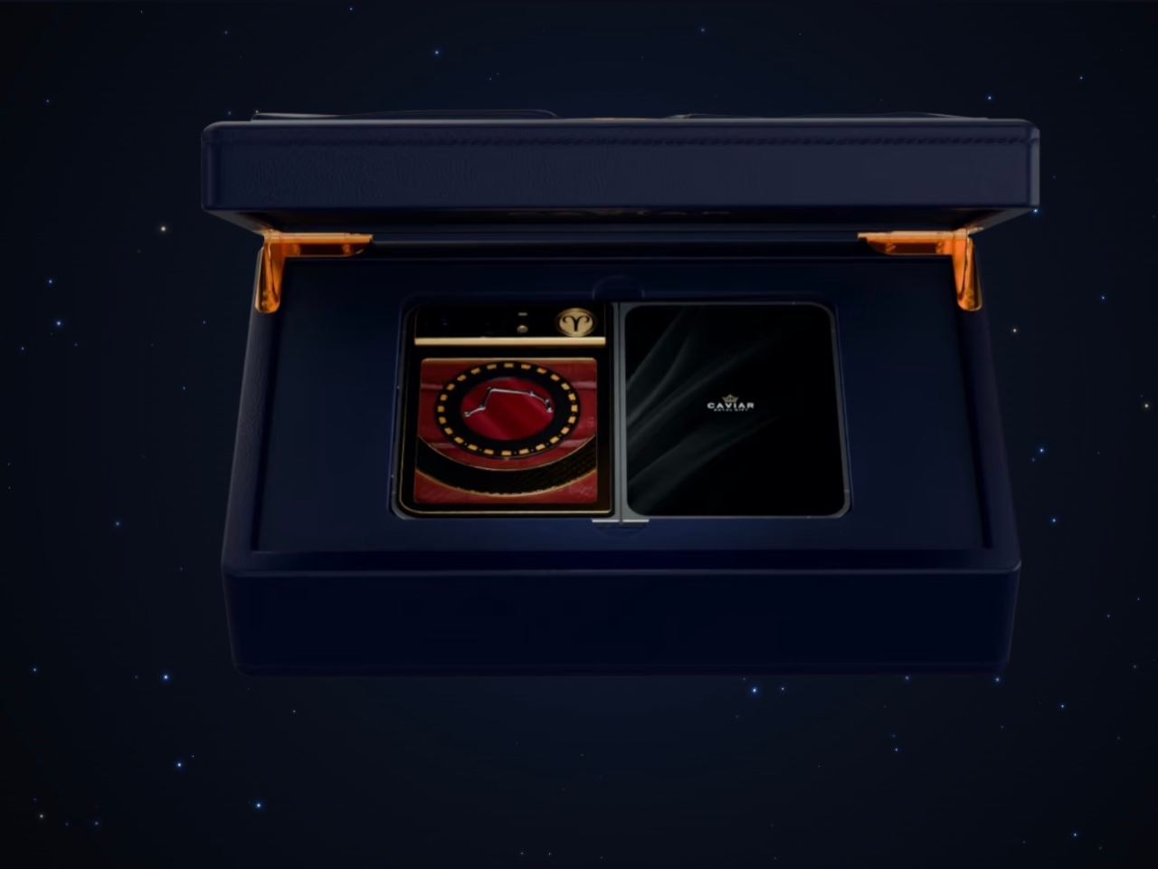
The Zodiac Duo isn’t simply a specially designed case featuring one of the 12 astrological signs. It’s a made-to-order customization offering with 12 zodiac-themed starting designs. There are eight steps to customize and personalize your phone, including changing things like the constellation, metal finish, decorative elements, and back-plate materials. Caviar says its jewelers will assemble the finished piece according to your specifications. So don’t expect this to be a simple or affordable kind of customization.
Designer: Caviar
The personalization aspect changes the decorative composition of your phone, rather than just its color or a generic zodiac symbol tacked onto it. You can configure several visually separate components, including the zodiac circle, medallion, frame, and decorative panel. The zodiac circle gives the design a visual structure, with the constellation and sign symbol guiding the rest of your choices. This way, you won’t just have various luxury materials scattered around a surface. There’s a recognizable theme holding everything together, even if your material choices are on the extravagant side.
Caviar lists silver, yellow and rose gold, and natural or black titanium among its metal options, although the exact construction depends on your configuration. Some components are specified as gold-plated rather than solid gold. For decoration, the choices include jewelry enamel, diamonds, sapphires, rubies, Swarovski crystals, and meteorite. The back plate can use crocodile, python, calfskin, or forged carbon. That’s quite a different set of decisions from choosing between a clear case and a silicone one. It also leaves room to decide how much sparkle you actually want.
The surface treatments deserve some attention, too. Caviar offers guilloché and clous de Paris hobnail patterns, adding intricate repeating details to the metal surfaces. These give you something else to consider beyond color and shine. A textured metal surface paired with leather suggests a different visual character from one surrounded by bright stones, even when both designs begin with the same zodiac sign.
For someone who follows astrology, the appeal is having a daily object connected to something personally meaningful. It could also make a very specific gift, assuming you know the recipient’s sign and taste well enough. The benefit here is self-expression. There’s no reason to expect a jeweled constellation to make your apps run faster or your photos look better.
The online configurator lets you see an estimated price as you make your selections. You can then save the design as a link or send it to a Caviar manager. That makes the process more manageable than trying to describe your preferred combination from scratch. Still, Caviar says the configurator image is illustrative, with the final appearance agreed upon with a manager. Those selections are the beginning of a conversation about the finished phone.
One configuration carries an estimated price of $16,629, but that isn’t a confirmed price for every possible combination. Buyers should request a configuration-specific quote and delivery information from Caviar. Before committing, I’d also want answers about the finished phone’s weight, charging compatibility, warranty, and repair options. Those practical details matter when the object you’re decorating still needs to function as your everyday phone.
The more interesting long-term question is what happens when that phone needs replacing. A zodiac sign won’t become outdated, but the device carrying it eventually will. At this price, knowing whether the decorative work can be repaired or reused would matter almost as much as choosing the right constellation.
A water bottle in one hand and a bag of trail mix in the other works perfectly well until you need your phone. Then the snack bag gets stuffed into a pocket or buried somewhere inconvenient. The FLPSDE XR Dual Chamber Water Bottle tackles that small but familiar packing problem by giving your drink and your snacks separate spaces inside one bottle. I like the premise: fewer loose things to keep track of, without abandoning the snacks.
Designed by Ben Bazis, whose name appears on FLPSDE’s contai
A water bottle in one hand and a bag of trail mix in the other works perfectly well until you need your phone. Then the snack bag gets stuffed into a pocket or buried somewhere inconvenient. The FLPSDE XR Dual Chamber Water Bottle tackles that small but familiar packing problem by giving your drink and your snacks separate spaces inside one bottle. I like the premise: fewer loose things to keep track of, without abandoning the snacks.
Designed by Ben Bazis, whose name appears on FLPSDE’s container patent, the XR is a retail product rather than a concept waiting for production. It’s the plastic version of the brand’s dual-chamber bottle, with drinking access at the top and storage accessed by flipping it over. That arrangement makes sense for an afternoon out when bringing a whole lunch bag feels excessive, but pretending you won’t get hungry feels optimistic.
Designer: Ben Bazis
The capacity needs a little unpacking. FLPSDE lists 32 ounces overall, but that’s divided between a 25-ounce drinking chamber and a 7-ounce storage compartment. You’re not getting a full 32-ounce water supply plus a bonus snack container. Some of the bottle’s interior is committed to storage, which seems like a reasonable exchange for short outings. For a longer walk with limited refill opportunities, I’d give water capacity priority over the convenience of consolidated packing.
Visually, the XR makes its unusual construction easy to understand. The product image shows a snack chamber nested inside the lower portion of a translucent blue body, with water occupying the space above and around it. You can see the contents rather than treating the base like a mystery compartment. I prefer that openness here. Seeing the remaining cashews is a useful reminder that you packed them, and an equally useful warning that you’re almost out.
The lid gets attention, too. FLPSDE includes a straw, a carry handle, and a wide opening for adding ice, along with the option to drink without the straw. Those are sensible accommodations for different habits, although the storage is still the reason this bottle deserves a look. I’m more interested in that practical combination than in another bottle asking me to appreciate its color alone. The XR does offer colors you can mix and match, if that’s your thing.
The lower compartment isn’t restricted to food. FLPSDE suggests keys or lip balm, and says it can also hold a separate cold drink, including electrolytes or cold coffee. The company describes the chambers as independently sealed. I’d use it for dry snacks first, simply because that’s the clearest benefit for my own packing preferences. A small second beverage has its appeal, but keeping a handful of nuts from disappearing into the bottom of a backpack feels more broadly useful.
Cleaning is where a clever container can become a chore. FLPSDE says the XR disassembles completely and that all parts are top-rack dishwasher safe. That matters more to me than the prospect of carrying two drinks. A bottle that holds food needs to be approachable after the outing, too. Disassembly is a sensible design choice, though it also means more pieces to wash and reassemble. Combining containers doesn’t make their maintenance disappear; it brings the jobs together.
At a listed $24.98, the XR is priced modestly enough to make its extra function worth considering. FLPSDE gives dimensions of 10.25 inches tall and 3.25 inches wide, and says it fits most cup holders. That last detail is worth checking against your own car or bag rather than assuming every holder agrees. The useful question is whether its shape fits the places where you already carry a bottle.
I wouldn’t replace a perfectly good bottle solely to acquire a snack compartment. But for someone already shopping, the XR offers a specific reason to choose it: the food travels with the water. Its appeal depends on how you pack, not how enthusiastically you collect drinkware. If a bottle is already coming along, giving it responsibility for the trail mix seems like a fair assignment.
Chargers have become smaller and more capable, but their cables still have a habit of becoming a tangled mess in our bags. Even remembering to pack one doesn’t guarantee you’ve brought the other. Twelve South’s Cablesnap 65W charger tackles that familiar problem with a retractable USB-C cable, keeping the wire tucked inside its body until you actually need to plug something in.
The idea is pretty straightforward, although it addresses a chore that’s easy to overlook. Pull out the USB-C connecto
Chargers have become smaller and more capable, but their cables still have a habit of becoming a tangled mess in our bags. Even remembering to pack one doesn’t guarantee you’ve brought the other. Twelve South’s Cablesnap 65W charger tackles that familiar problem with a retractable USB-C cable, keeping the wire tucked inside its body until you actually need to plug something in.
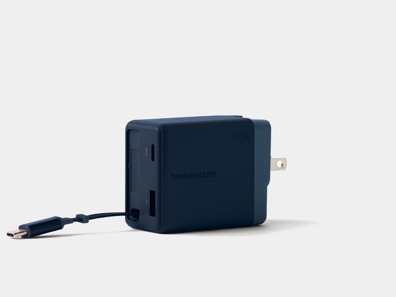
The idea is pretty straightforward, although it addresses a chore that’s easy to overlook. Pull out the USB-C connector and the flat cable extends up to 29 inches, giving you some freedom to position your device. When you’re done, a small tug sends it back into the housing. There’s no need to wrap the cord around the charger and hope it stays put.
The connector has its own recessed resting place beside the extra ports, so there isn’t a loose tip dangling outside after the cable disappears. That leaves a rounded rectangular body with relatively little visual clutter and a contrasting end section. Coastal blue, Dune, and Slate finishes give it some personality, especially if you’ve grown tired of the usual anonymous black or white chargers.
That disappearing trick does come with a catch, of course. A 29-inch cable works best when the outlet is already reasonably close to where you want your device. A desk socket is one thing; an outlet hidden behind a hotel bed is another matter. You can avoid having extra wire spread across the table, but you can’t pull out length that isn’t there.
Fortunately, the built-in cable isn’t your only connection. An additional USB-C port and a USB-A port let you charge up to three devices together, which could cover a laptop, phone, and wireless earbuds at the end of the day. You’ll still need separate cables for those extra ports, though, so this particular arrangement hasn’t made your entire cable collection obsolete just yet.
The advertised 65W, however, needs a little explanation. That’s the charger’s total available output, rather than what each device receives when everything is plugged in. The USB-A port tops out at 18W, while the overall power budget is shared. Charging a compatible laptop alongside your other gadgets is convenient, but you shouldn’t expect it to receive the full 65W in that particular arrangement.
The US plug folds into the body as well, keeping its prongs from sticking out while the charger is packed away. Included Type G and Type C adapters accommodate compatible UK and European outlets, saving you from sourcing those pieces separately. Between the folding plug and retractable cable, there’s less to arrange before slipping the charger back into your crowded travel bag.
At $49.99, the Cablesnap 65W puts a price on not having to coil a cable every time you move between desks or pack for a trip. The integrated design does raise a question about replacing that cable, something Twelve South doesn’t explain. You still have the spare USB-C port if needed, but using it brings a loose cord back into your bag.
My first apartment had a living room wall the size of a parking space and a TV budget the size of a parking ticket. Had the Optoma Photon Life PK31 existed back then, I would have eaten instant noodles for a month to buy it. This 4K projector can cast an image up to 150 inches, and it currently sells for around $599, which is what you’d pay for a decent midrange Android phone. One gives you a 6-inch screen. The other fills a wall, and I know which one my 25-year-old self would’ve picked.
The PK
My first apartment had a living room wall the size of a parking space and a TV budget the size of a parking ticket. Had the Optoma Photon Life PK31 existed back then, I would have eaten instant noodles for a month to buy it. This 4K projector can cast an image up to 150 inches, and it currently sells for around $599, which is what you’d pay for a decent midrange Android phone. One gives you a 6-inch screen. The other fills a wall, and I know which one my 25-year-old self would’ve picked.
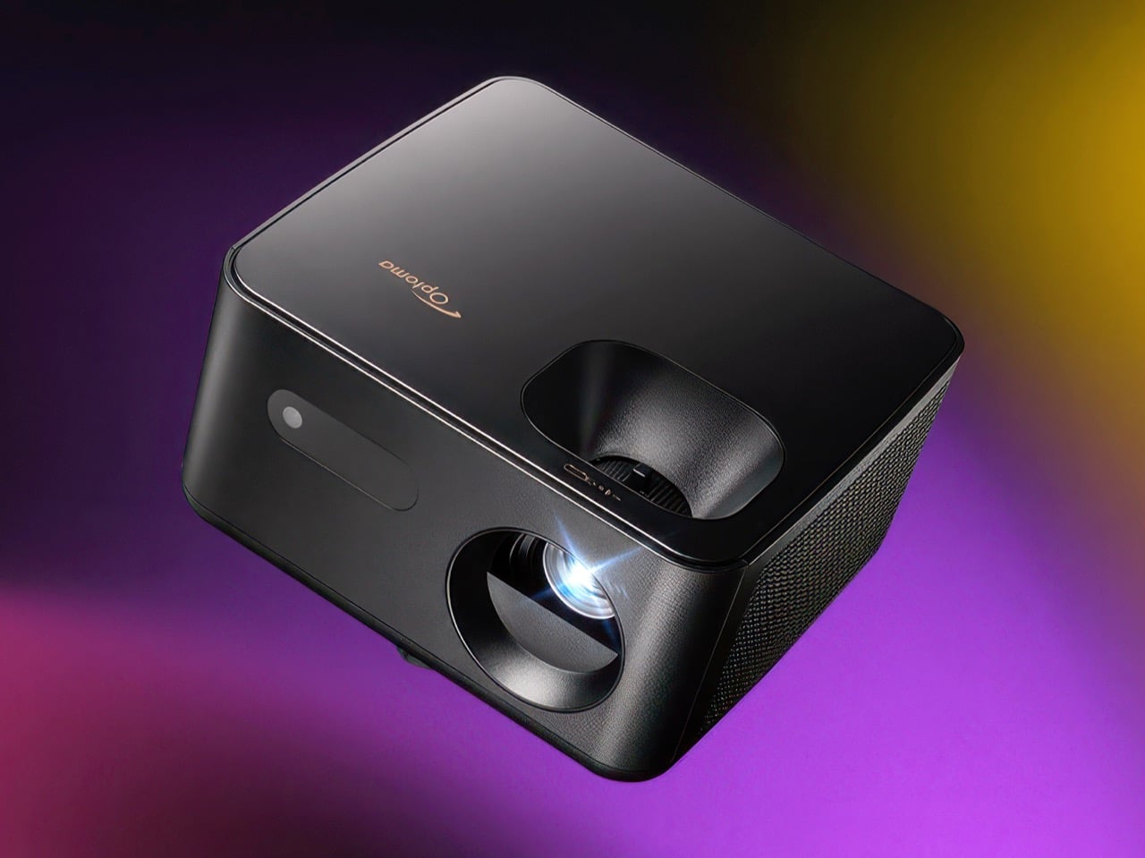
The PK31 is a compact, 5.2-pound projector that looks more like a smart speaker than the beige AV boxes projectors used to be. A smooth top shell sits over a textured matte body, a perforated grille wraps around the side, and the lens sits inside a deep circular cowl. It uses a Texas Instruments DLP chip and an RGB LED light source, with claimed coverage of 95% of the DCI-P3 color space. At a rated 900 lumens, it’s best suited to a dark room. Input lag is rated as low as 4.6ms, though that’s at 1080p and 240Hz, not 4K.
The body measures 9.37 x 8.46 x 4.64 inches (238 x 215 x 118 mm), roughly the footprint of a hardcover cookbook lying flat. That lets it sit on a shelf between the plants and the Bluetooth speaker without looking like it wandered in from a conference room. Optoma prints its logo in copper on the top panel, a small, warm accent against the all-black body. Every port sits inside a recessed panel on the back, keeping connections out of sight from the front. The grille wraps around the side, helping the cooling vents blend into the textured body.
The lens sits off to the right, balanced on the left by a pill-shaped window for the IR receiver, giving the front a friendly, slightly lopsided face. Its 1.5 to 1.65 throw ratio translates to about 11 feet (3.4 meters) of distance for a 100-inch picture. The full 150 inches needs roughly 17 feet (5.2 meters), so this suits a long living room better than a cramped studio. Focus and the 1.1x zoom use manual rings, and a twist-adjust foot handles tilt. A standard tripod thread underneath adds mounting flexibility, while four-corner correction and a warp tool help adjust the image to an uneven wall or an inflatable backyard screen.
Sharp 4K and Low-Lag Gaming
The 0.47-inch Texas Instruments chip uses microscopic mirrors to direct light toward the screen. XPR pixel shifting shifts the projected image by fractions of a pixel to produce a 3840 x 2160 picture. Separate red, green, and blue LEDs handle color, and the projector supports HDR10 and HLG. Projector Reviews measured 862 lumens in the brightest mode, close to Optoma’s 900-lumen rating. The reviewer also rated its color as good as or better than that of any RGB LED compact projector he’d tested.
That review recommends about 90 inches for everyday content and 75 to 80 inches for HDR, so don’t expect the same brightness at the maximum 150-inch size. Gamers get the bigger surprise. Input lag, the delay between a button press and the corresponding action on screen, is rated at 4.6ms at 1080p and 240Hz, 8ms at 1080p and 120Hz, and 16ms at 4K and 60Hz. The reviewer’s lag tester confirmed those figures. One catch: low-latency mode disables keystone correction, so line the projector up straight before the boss fight.
How It Stacks Up Against TCL, BenQ, and Hisense
TCL sells a smart projector for considerably less: the TCL C1 normally goes for about $250 with Google TV, Wi-Fi, and Bluetooth built in. The fine print says 1080p, though, and its “4K support” means it accepts a 4K signal and scales it down. The PK31 produces a 4K image but skips the smart OS, Wi-Fi, and Bluetooth entirely. Its single HDMI 2.0 port takes a Roku or Fire TV Stick, and the USB-A port can supply power to it, letting the setup run from one wall outlet. A 5W mono speaker provides onboard audio, and a 3.5mm jack connects external speakers for movie night.
Another 4K option is the BenQ GP520, a cube-shaped projector with a higher 2,600-lumen rating and Google TV. It launched at $1,499 and now has a street price closer to $999. Optoma’s own PK32 adds an amber LED, autofocus, and two HDMI ports for $1,299, while the Hisense M2 Pro costs the same with Android TV on board. The PK31 launched at $1,099 and now sells for about $599 at Walmart and Amazon. At that price, you could add a streaming stick and still spend considerably less than you would on those three.
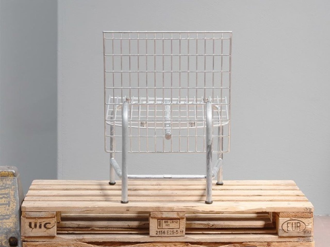
A wire-grid lounge chair sounds like a hard sell for an afternoon off. Yet Moritz Schmid’s Patio Chair for Swiss furniture maker Embru has a visual ease that makes me want to give it a chance. The open seat and back leave much of the chair transparent, while the frame gives it a clear outline. Its more persuasive detail, though, addresses a familiar frustration: having to replace an entire object because one part has given up.
Embru describes the construction as modular, with individual compone
A wire-grid lounge chair sounds like a hard sell for an afternoon off. Yet Moritz Schmid’s Patio Chair for Swiss furniture maker Embru has a visual ease that makes me want to give it a chance. The open seat and back leave much of the chair transparent, while the frame gives it a clear outline. Its more persuasive detail, though, addresses a familiar frustration: having to replace an entire object because one part has given up.
Embru describes the construction as modular, with individual components that can be replaced or repaired. A specially developed mounting system accommodates different seating surfaces. That makes the announced chair interesting beyond its appearance. If the seat becomes damaged, the design allows the remaining structure to stay in use. I’d rather see that possibility built into a chair from the beginning than encounter it as an expensive customer-service question later.
The visible connection between backrest and frame is worth a closer look. In Embru’s detail photograph, a circular metal fitting interrupts the blue grid, making the attachment point part of the composition. It’s a small, deliberate-looking piece of hardware, and I like that it hasn’t been disguised. You can read the chair as an assembly of parts. Visually, that gives the repairability story a little credibility before anyone starts explaining the engineering.
The material options give that construction another purpose. Embru plans an outdoor grid version and an indoor version with wood-veneer panels, including oak, ash, black ash, and walnut. Listed finishes include wine red, gray-blue, black, and silver hot-dip galvanizing. My preference would be the gray-blue grid: it gives the industrial geometry enough color to feel intentional without turning the chair into the loudest object on the patio.
The wood version changes the visual balance considerably. Where the grid lets the background pass through, the broad panels create solid planes. The rear view of the black version makes this especially clear: the backrest reads almost like a sheet suspended above the slender frame. That’s a useful distinction for anyone who likes the underlying shape but doesn’t want outdoor furniture setting the tone inside their living room.
Schmid has explored related territory with Embru before. His earlier Park Chair uses a tubular steel frame, with curved rear legs that give a straightforward garden chair an unexpectedly animated profile. Embru says that design was developed around the manufacturing capabilities at its Rüti factory. I appreciate that context because it makes the Patio Chair feel less like an isolated styling exercise. There’s an ongoing conversation here between a designer, a material, and the people equipped to shape it.
Appearance only gets a lounge chair so far, of course. I’d want to sit in the grid version before calling it an all-afternoon favorite. The photographs establish its shape, not how the seating surface feels after an hour with a book. For me, that’s the unresolved question that matters most. An appealing frame and replaceable parts are good reasons to pay attention, but neither substitutes for getting comfortable. The word “lounge” still has work to do.
Embru currently expects the Patio Chair to become available at the end of 2026. Its preview doesn’t provide a price or confirm US availability. I’d also want to know how replacement parts will be ordered and priced. Designing a component to come off is valuable; making its replacement straightforward to obtain is what turns that decision into a useful ownership benefit.
Still, the premise earns my interest. I don’t need every chair to become a family heirloom, and I’m wary of furniture being described as timeless before anyone has lived with it. I do want the option to keep a chair I like when one component wears out. The Patio Chair gives that ordinary expectation a considered form. Provided the parts support follows through, its most attractive feature may become apparent years after the first photograph.
Since I live alone, listening to music or podcasts before I sleep is not really an issue, as there’s no one to complain about the sound. But when I share a hotel room or someone sleeps over, this may become a problem. Sure, there are earbuds, but I have this irrational fear that they may get buried deep in my ears when I fall asleep and move around. One possible solution would be speakers that can sit under the pillow and play close to my ears, with the aim of keeping the sound from bothering o
Since I live alone, listening to music or podcasts before I sleep is not really an issue, as there’s no one to complain about the sound. But when I share a hotel room or someone sleeps over, this may become a problem. Sure, there are earbuds, but I have this irrational fear that they may get buried deep in my ears when I fall asleep and move around. One possible solution would be speakers that can sit under the pillow and play close to my ears, with the aim of keeping the sound from bothering other people in the room.
The Baseus Sleep SK1 is one such speaker. It uses what Baseus calls micro-vibration conduction to carry audio through the pillow to your ears. Basically, your pillow becomes part of the audio system, while two sound-producing units are intended to direct the music, audiobook, or podcast toward the sleeper’s head. The idea is to keep the listening area small rather than fill the bedroom with sound.
Designer: Baseus
The Sleep SK1 looks like a Bluetooth speaker, with two circular pods joined by a narrow, curved bridge. It looks more like connected pucks than a bedside speaker. Its reported dimensions are about 6.5 by 1.8 by 0.55 inches, and it weighs roughly 1.55 ounces. The low profile is designed to minimize intrusion, although that doesn’t mean you won’t feel it through a compressed pillow. Comfort would still need to be tested.
The device has three physical buttons around the edge of one pod for operating the speaker. There’s also a digital display integrated into one circular face, showing the time, operating mode, and remaining battery level. That gives you another way to check the time when you wake up in the middle of the night instead of automatically reaching for your phone. Of course, you’d still have to uncover the display if it’s underneath your pillow.
For people who prefer background sounds to music or conversation, Baseus says its companion app offers more than 100 sound options, including rain, ocean waves, campfire sounds, and ASMR. You can also set up to 10 alarms for different schedules. The alarms use the same pillow-directed approach, which could be useful if you need to get up before the person sleeping beside you.
Baseus claims more than 10 hours of playback from the built-in 300 mAh battery, which would cover an overnight listening session if it holds up in practice. Charging is via USB-C, with a full charge reportedly taking about two hours. For something intended to stay beneath a pillow, the useful part is having enough battery life to use it without leaving a charging cable attached.
Your pillow is an important part of the setup, though. The Gadgeteer reports that Baseus recommends pillows up to about 3.1 inches thick and suggests increasing the volume for thicker pillows or when sleeping on your back. That makes pillow thickness and sleeping position things to consider before buying. Turning the volume up may help you hear, but whether it stays quiet enough for someone nearby is another question.
The SK1 is listed on JD.com in China, with a reported price of 184 yuan. That shouldn’t be mistaken for a confirmed US retail price, and an official US release hasn’t been established in the available sources. It’s worth checking regional availability and app support rather than assuming an imported unit will offer the same experience everywhere.
For me, the appeal is being able to listen without putting anything in my ears. But I’d want to know how clearly a podcast comes through my own pillow and how much of it someone else can hear. Those would be the deciding factors for me. If the SK1 can keep a familiar voice close to my pillow without sharing the whole conversation with the room, that would be a good enough reason to consider it.
The Swift 16 AI is one of the latest Windows laptops featuring Intel's "Panther Lake" processors (Core Ultra Series 3) that balance productivity, power, and efficiency for all-day battery life, plus Acer's stunning OLED touchscreen.It's already on sale for just $999.99 at Best Buy long before Black Friday, with a hefty $550 discount that knocks 35% off its listing price. With 16GB of RAM and 1TB of storage, it's a great option for anyone looking to upgrade their
The Swift 16 AI is one of the latest Windows laptops featuring Intel's "Panther Lake" processors (Core Ultra Series 3) that balance productivity, power, and efficiency for all-day battery life, plus Acer's stunning OLED touchscreen.
It's already on sale for just $999.99 at Best Buy long before Black Friday, with a hefty $550 discount that knocks 35% off its listing price. With 16GB of RAM and 1TB of storage, it's a great option for anyone looking to upgrade their everyday laptop without spending the usual ~$1,200+ costs.
Side-view of the Acer Swift 16 AI laptop. (Image credit: Tom's Guide (Tony Polanco) | Acer)
Powered by Intel's Core Ultra Series 3 "Panther Lake" X7 358H processor and integrated Arc B390 graphics, the Swift 16 AI delivers plenty of performance for everyday productivity workloads, including multitasking across dozens of browser tabs, content creation, and even some gaming. That integrated B390 graphics chip is far more powerful than its lower-end variants; in fact, you'll find the same one in high-end gaming handhelds.
Beyond that, Acer boasts a full day of usable battery life in a laptop with a thin chassis and a sharp 3K (2880x1800) OLED touchscreen. That means vibrant colors, strong contrast, and even a super-smooth 120Hz refresh rate as a bump over the usual 60Hz standard you'd find in many others.
You'll get dual USB-C ports alongside two more traditional USB-A ports, HDMI-out for external monitors, and a 3.5mm audio jack for wired headphones, reducing the need for too many dongles when you're traveling. Plenty of peripherals are wireless these days, but it's always nice to have the option for wired alternatives.
Acer's bigger trackpad might not suit everyone, and the speakers were never made for movie-watching, but neither detracts from what is otherwise a well-rounded productivity laptop. Alternatively, an AMD-based Swift 16 AI with a WUXGA (1920x1200) touchscreen is also on sale for $799.99 at Walmart. However, it is sold by a reseller, not Walmart itself, so there's a chance it will disappear much faster.
Should I wait for Black Friday for a better deal?
Even if you're hesitant to buy before Black Friday, Best Buy's 'Price Match Guarantee' may allow eligible customers to request a refund of the difference if Best Buy lowers its own price during the applicable return window: "If our price goes lower during the holiday season, we’ll match it."
Is it good for gaming?
The Acer Swift 16 AI is surprisingly competent at running games for a non-gaming laptop. It can run graphically intensive games like Cyberpunk 2077 at 1080p on medium settings, and lower-end games like Fortnite at 1080p at 60 FPS or higher.
Can you adjust the trackpad?
You can shrink its detection range by a quarter or half its size within the included AcerSense software app to prevent accidental clicks.
Join us on Reddit at r/WindowsCentral to share your insights and discuss our latest news, reviews, and more.
METR finds faster Anthropic AI benchmark progress, but key evidence remains redacted. Learn what IT buyers should check before adopting new model releases.
The post Anthropic’s AI Progress Nearly Doubles: What IT Buyers Should Know appeared first on TechRepublic.
METR finds faster Anthropic AI benchmark progress, but key evidence remains redacted. Learn what IT buyers should check before adopting new model releases.
See what you missed in Daily Tech Insider from Nov. 2–6.
The post This Week in Tech: AI Expands Everywhere as Security Threats and Infrastructure Pressures Mount appeared first on TechRepublic.
Cursor's new Build Live Apps feature creates and deploys web applications with databases, authentication, and hosting. Here's what's included and what it costs.
The post Cursor Can Now Build and Deploy Web Apps From Prompts: What’s Included? appeared first on TechRepublic.
Cursor's new Build Live Apps feature creates and deploys web applications with databases, authentication, and hosting. Here's what's included and what it costs.

 Connexion