Vue normale

  • ✇Yanko Design
  • Students Just Designed a Suitcase That Dries Your Clothes on the Go
    Every seasoned traveler has their version of the wet clothes problem. You step out of the rain during a city walk, catch a wave at the beach on day one of a five-day trip, or try to hand-wash a blouse in the sink only to end up draping it over a radiator, a towel rack, a chair, basically anything with a surface. It is one of travel’s most persistent minor disasters, and most of us have accepted it as simply part of the deal. Designers Tongye Wang and Zhichen Hu apparently refused to accept that
     

Students Just Designed a Suitcase That Dries Your Clothes on the Go

19 juin 2026 à 16:45

Every seasoned traveler has their version of the wet clothes problem. You step out of the rain during a city walk, catch a wave at the beach on day one of a five-day trip, or try to hand-wash a blouse in the sink only to end up draping it over a radiator, a towel rack, a chair, basically anything with a surface. It is one of travel’s most persistent minor disasters, and most of us have accepted it as simply part of the deal. Designers Tongye Wang and Zhichen Hu apparently refused to accept that deal.

Their concept, a suitcase with an integrated clothes drying system, is the kind of idea that makes you wonder why it took this long. It is a student project that has been picking up recognition on the design awards circuit, and it is not hard to see why. The concept takes a problem that affects virtually every traveler and bakes the solution directly into the luggage itself, no extra gadgets, no separate appliances, no hunting for a laundromat in a foreign city.

Designers: Tongye Wang & Zhichen Hu

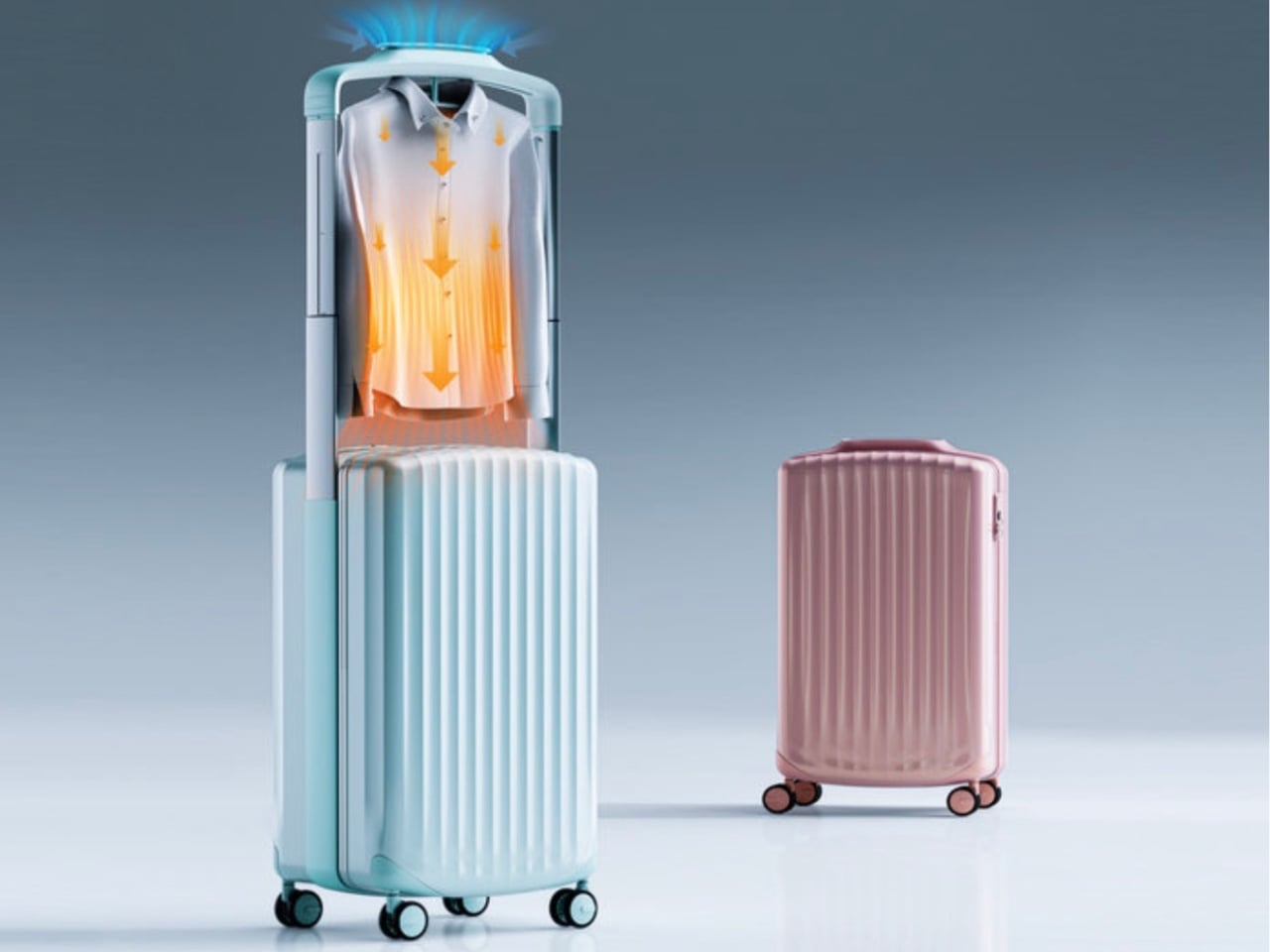
Here is how it works. The suitcase operates on a telescoping structure that lets it shift seamlessly between two modes: standard luggage mode and drying mode. When you switch it over, an internal frame extends, built-in hangers fold out so you can hang your clothes, and a control display activates automatically. From there, you can set your preferred drying temperature and time based on whatever fabric you are working with. The internal airflow system distributes heat evenly throughout the compartment so you are not just blasting one side of a shirt while the other stays damp.

The part that genuinely surprised me was the energy source. The suitcase’s wheels contain a kinetic energy conversion system, meaning the act of rolling your luggage through an airport or down a sidewalk actually generates and stores electricity. That stored energy then helps power the drying function, reducing how much you need to rely on an external outlet. It does not eliminate the need for power entirely, but it meaningfully offsets it. For a student concept, that level of systems thinking is notable.

I will be honest: my first reaction to the premise was mild skepticism. Luggage designers have been pitching smart suitcase concepts for years, most of them solving problems that never really felt like problems. A built-in scale. A USB charger. A GPS tracker. These features read more like tech for tech’s sake, and many ended up adding weight and complexity without meaningfully changing the travel experience. This feels different. Wet clothes are a real, recurring frustration, and the solution here is structural rather than gimmicky. It is built into the form of the object, not bolted on as an afterthought.

The visual design reinforces that integration. Wang and Hu went with angular geometric surfaces and concave detailing that give the suitcase a strong, sculptural presence. It does not look like a box with a machine stuffed inside. It looks intentional, like the form and function were designed together from the start, because they were.

Whether this ever makes it to full production is an open question. The gap between an award-winning student concept and a retail product involves manufacturing constraints, safety certifications, cost engineering, and consumer testing that can fundamentally change an original vision. The kinetic energy generation system in particular would need rigorous real-world testing to prove its reliability across different surfaces and travel conditions.

But that is not really the point right now. What Wang and Hu have done is ask a better question about an object most designers stopped questioning decades ago. The suitcase has been a box on wheels for a long time. Treating it as a platform for active problem-solving rather than passive storage opens up a conversation that the travel and luggage industry probably needs to be having more seriously. At the very least, the next time I am draping a wet jacket over a hotel bathroom door, I will know someone is already working on a better answer.

The post Students Just Designed a Suitcase That Dries Your Clothes on the Go first appeared on Yanko Design.
  • ✇Yanko Design
  • G-Shock Just Turned a Japanese Paper Lantern Into Wearable Art
    G-Shock has always known how to make a statement. From its reckless-by-design origins in 1983 to its cult status across military barracks, skate parks, and high-fashion runways, the brand has never really needed to justify itself. It just shows up. But with the new Aka-Chochin collection, built around the DW-5600AKA-4 and DW-6900AKA-4, G-Shock isn’t just showing up. It’s glowing. The concept behind these two watches is, genuinely, one of the more thoughtful design moves I’ve seen from the brand
     

G-Shock Just Turned a Japanese Paper Lantern Into Wearable Art

19 juin 2026 à 15:15

G-Shock has always known how to make a statement. From its reckless-by-design origins in 1983 to its cult status across military barracks, skate parks, and high-fashion runways, the brand has never really needed to justify itself. It just shows up. But with the new Aka-Chochin collection, built around the DW-5600AKA-4 and DW-6900AKA-4, G-Shock isn’t just showing up. It’s glowing.

The concept behind these two watches is, genuinely, one of the more thoughtful design moves I’ve seen from the brand in a while. “Aka-Chochin” translates to “red lantern,” a reference to the traditional paper lanterns that hang outside izakayas, the beloved Japanese taverns where people gather after long days for food, drinks, and the kind of conversation that only happens past 9 p.m. These lanterns, which date back to the early Edo period in the 17th century, weren’t decorative in the precious sense. They were practical and symbolic at once, signaling warmth, welcome, and the specific pleasure of slowing down. Casio took that idea and pushed it into two of its most iconic silhouettes.

Designer: G-Shock

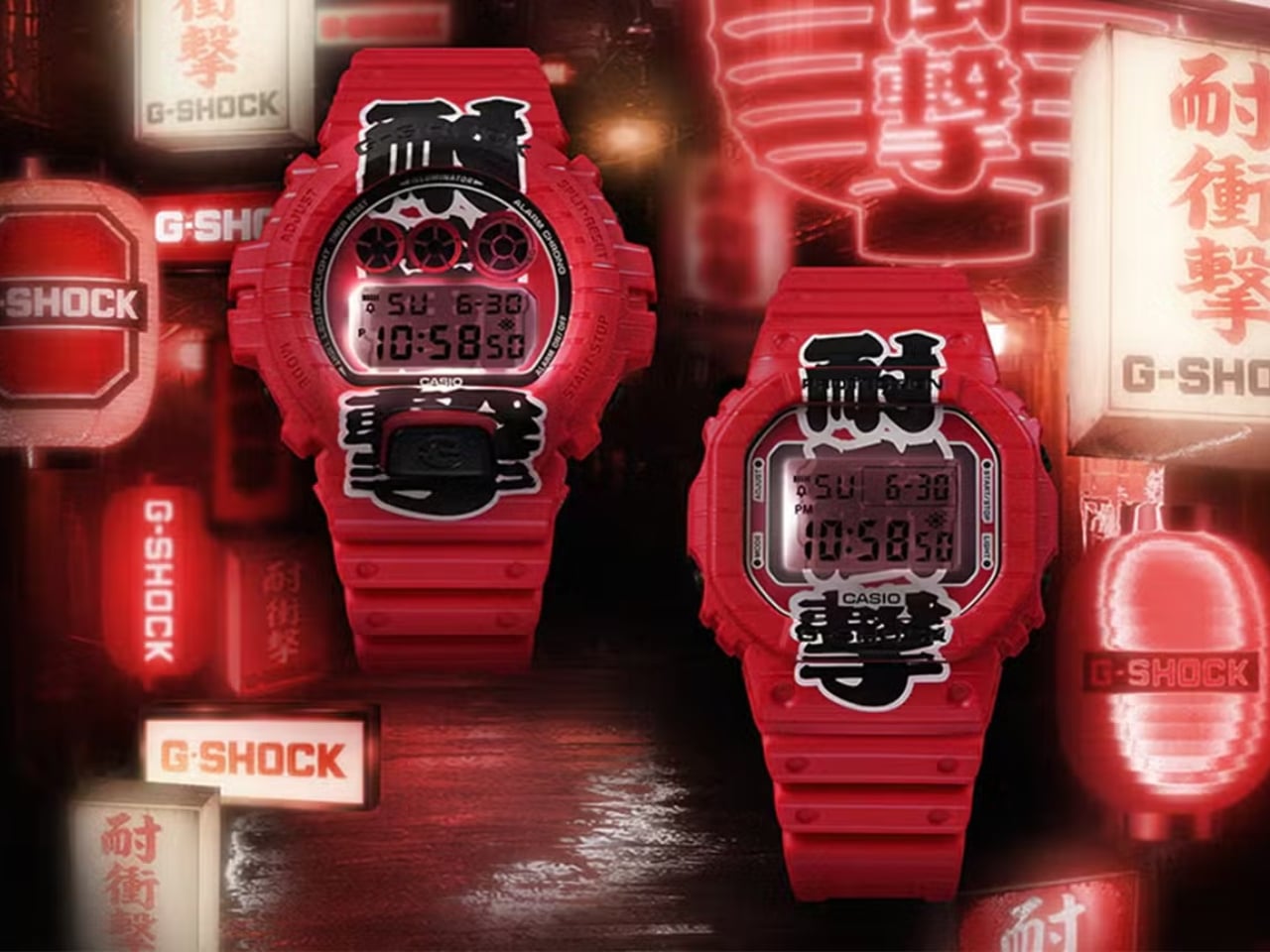
The result is unapologetically red. Not a subtle, wine-at-dinner red. A full-on, stop-what-you’re-doing red that covers the resin case, bezel, and band from top to bottom. On paper, it sounds like a lot. In practice, it earns its confidence. Both watches carry kanji characters down the face of the dial, reading “耐衝撃,” which means “shock resistance,” one of G-Shock’s founding promises. The characters are split between the bezel and the LCD display, and when the LED backlight activates, the two halves complete each other like a puzzle piece lighting up from within. It’s a detail you have to see in person to fully appreciate, and it’s the kind of thing that elevates a colorway from a gimmick to a genuine design choice.

The bezels on both models also feature hot-stamped grooves that mimic the ribbed texture of a paper lantern, and that same motif carries through to the edges of the strap. It’s not subtle, but it is cohesive. G-Shock committed to the bit, and the commitment pays off.

Now, I’ll say this upfront: the Aka-Chochin aesthetic is polarizing. All-red anything tends to divide opinion, and a digital watch in this colorway is not trying to blend in. If your instinct is to gravitate toward muted, understated timepieces, these are probably not for you, and that’s fine. But if you’ve ever wanted a watch that reads as confident and culturally curious at the same time, the DW-5600AKA-4 and DW-6900AKA-4 make a genuinely compelling argument.

The choice of silhouettes is also worth noting. The DW-5600 is essentially G-Shock’s origin story made physical, the square case that started everything, a design so clean and deliberate it has barely needed updating in four decades. The DW-6900 is its more expressive sibling, with that distinctive triple-window dial and wider case presence. Pairing both with the same concept gives collectors and casual buyers alike an entry point, whether you’re drawn to the classic restraint of the 5600 or the bolder graphic energy of the 6900.

At $190 each, neither watch is a budget impulse buy, but it’s not a stretch, either. G-Shock has always occupied that interesting middle ground between functional tool watch and cultural artifact, and the Aka-Chochin collection lands squarely in that territory. You’re not just buying a watch that tells time reliably. You’re buying into a very specific idea about where design, heritage, and streetwear culture converge.

Red lanterns were built to be seen at night, to cut through the dark and draw people in. G-Shock’s interpretation of that idea works for the same reason. Bold doesn’t have to mean reckless. Sometimes it just means knowing exactly what you want to say and saying it clearly, wrist and all.

The post G-Shock Just Turned a Japanese Paper Lantern Into Wearable Art first appeared on Yanko Design.

  • ✇Yanko Design
  • The Fortune Cookie Redesigned With Braille Is Pure Genius
    Fortune cookies are one of those small rituals that carry more weight than they should. You crack it open, fish out the slip of paper, and read whatever odd little prophecy is inside. It’s silly, sure. But it’s also communal. The whole table does it. Everyone compares fortunes, laughs at the vague predictions, and tucks the good ones into their wallets for luck. It’s a shared moment disguised as a throwaway snack. And for visually impaired individuals, that moment stops at the crack of the shel
     

The Fortune Cookie Redesigned With Braille Is Pure Genius

19 juin 2026 à 12:20

Fortune cookies are one of those small rituals that carry more weight than they should. You crack it open, fish out the slip of paper, and read whatever odd little prophecy is inside. It’s silly, sure. But it’s also communal. The whole table does it. Everyone compares fortunes, laughs at the vague predictions, and tucks the good ones into their wallets for luck. It’s a shared moment disguised as a throwaway snack. And for visually impaired individuals, that moment stops at the crack of the shell.

Korean designer Hyerim Yoo’s response to that gap is Fortune Dot, a tactile device that lets visually impaired users independently read a daily fortune in Braille. But describing it that way undersells what makes it genuinely remarkable. Because Yoo didn’t just solve the accessibility problem. She solved it beautifully.

Designer: Hyerim Yoo

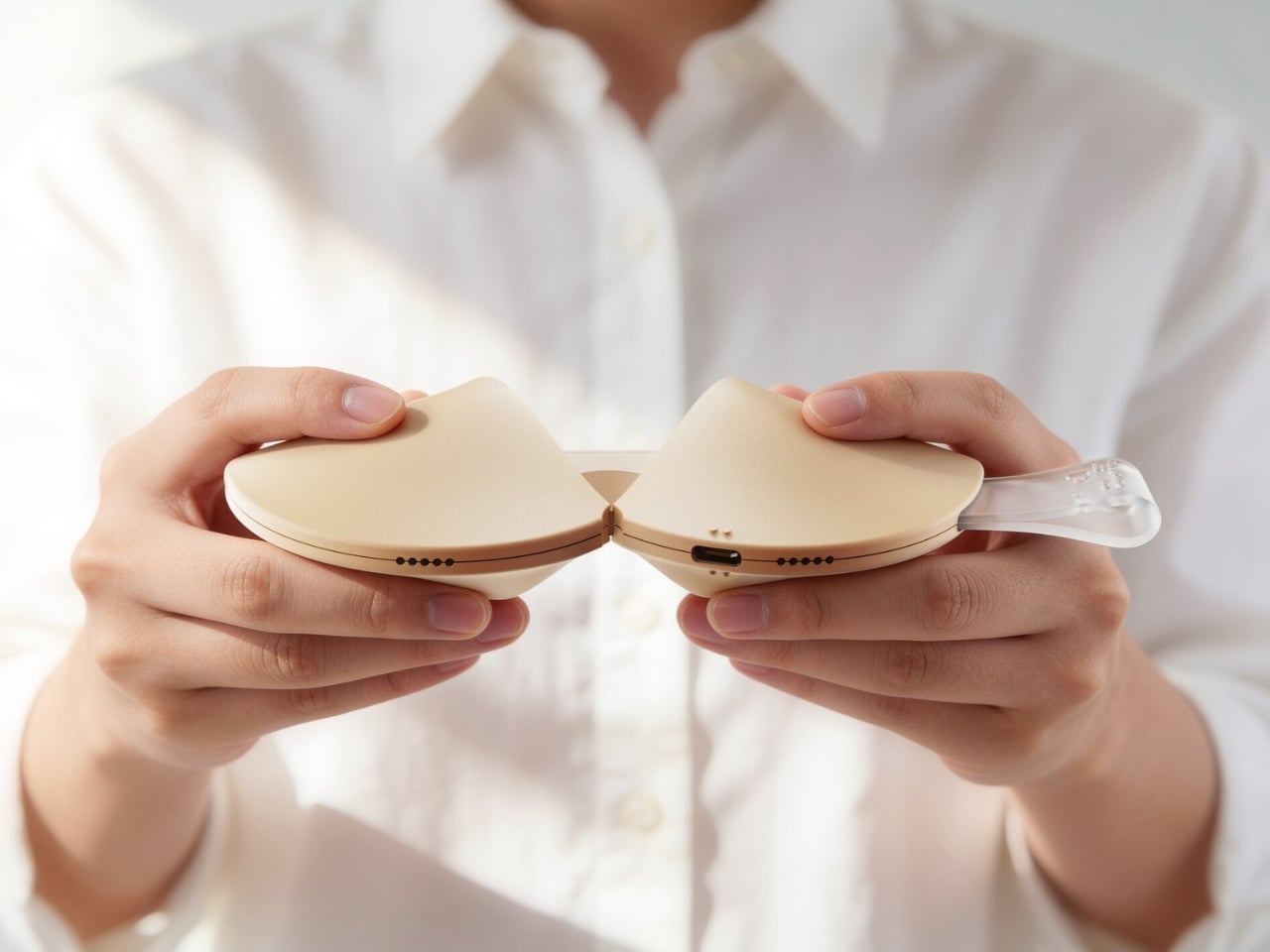
The object is shaped exactly like a fortune cookie. Same rounded form, same warm beige palette, same satisfying heft. A small translucent tab sticks out from the side, the only visual tell that this isn’t actually food. That tab is the “fortune paper,” a design detail so considered it almost makes you laugh. When you pull the two halves apart, the gesture mirrors breaking a real cookie open, and what you find inside is a refreshable Braille display with raised pin cells arranged in neat rows across a recessed panel. The message is there, waiting to be read with your fingertips, exactly as Yoo’s tagline describes it: today’s luck, felt at your fingertips.

The engineering inside is worth pausing on. The exploded views of the device reveal individual Braille cell modules, each capable of raising and lowering their pins to form different characters. It’s a compact, mechanical system tucked into something that looks like it belongs on a dessert plate. The bottom edge carries a USB-C port for charging, nearly invisible from the outside. The whole thing is small enough to drop into a pouch alongside a pair of AirPods and a lip balm, which is apparently exactly what Yoo intended.

What makes this design stand apart from most inclusive design projects, though, is the color system. Fortune Dot comes in three variants named Soft Bake, Signature Bake, and Dark Bake. The names follow the logic of actual cookie baking, and the colors range from a pale cream to a deep chocolate brown. It’s a playful, smart branding decision that does real work. It removes any clinical association from the product. It makes Fortune Dot feel like something you’d want to own and carry, not something assigned to you by necessity.

The branding extends outward into a full identity system. The Fortune Dot logo uses a dot-based pattern that quietly references Braille without spelling it out. It appears on a branded coffee cup in one of the campaign shots, wrapped in wired earbuds, Fortune Dot perched on top. That image alone communicates something most accessible product design never manages to: that this object belongs in the texture of everyday life, not apart from it.

The packaging holds up the same way. A light blue box lid features Braille text running across the top, the Fortune Dot wordmark sitting below it in clean type, and a cutout that reveals the cookie silhouette inside. When you lift the lid, the device sits nested in a cream interior, the translucent fortune tab pointing upward. It’s the kind of unboxing that feels like it was designed to be experienced by touch as much as by sight, which, of course, it was.

I’ve seen a lot of inclusive design work that gets the intention right but misses in execution, products that function well but feel set apart, designed for a category of user rather than a person. Fortune Dot doesn’t feel like that. It feels like something a designer fell genuinely in love with, in the best possible way, the kind of love that shows up in every detail, from the baking-level color names to the translucent paper tab to the way the hinges split open just so. That level of care is rare. When you see it, you notice.

The post The Fortune Cookie Redesigned With Braille Is Pure Genius first appeared on Yanko Design.

❌