Vue normale

Reçu — 10 mai 2026 Yanko Design
  • ✇Yanko Design
  • BEYOND Expo 2026: Asia’s Biggest Tech Event Just Told the World That AI Software Was Only the Warm-Up
    Every major tech conference eventually finds its thesis statement. CES landed on “everything is connected.” SXSW staked out culture-meets-technology. BEYOND Expo‘s thesis for 2026 is more specific, and honestly more timely: AI has spent years proving itself in software, and the interesting question now is what happens when it leaves the screen. The official theme, “AI: Digital to Physical,” takes over from last year’s theme of Transforming Uncertainty into a Trigger for Innovation. Timed perfec
     

BEYOND Expo 2026: Asia’s Biggest Tech Event Just Told the World That AI Software Was Only the Warm-Up

10 mai 2026 à 19:30

Every major tech conference eventually finds its thesis statement. CES landed on “everything is connected.” SXSW staked out culture-meets-technology. BEYOND Expo‘s thesis for 2026 is more specific, and honestly more timely: AI has spent years proving itself in software, and the interesting question now is what happens when it leaves the screen. The official theme, “AI: Digital to Physical,” takes over from last year’s theme of Transforming Uncertainty into a Trigger for Innovation. Timed perfectly around the global speculation that AI’s a bubble, it’s a genuine reflection of where the most consequential AI work is actually happening right now, in robotics labs, automotive platforms, wearables, and manufacturing floors across the Greater Bay Area.

BEYOND has been building toward this moment since Dr. Lu Gang launched it during a global lockdown in 2021, a decision he’s called delusional in hindsight during an interview with Yanko Design, but with the kind of grin that says he’d do it again. The original problem he was solving was simpler than people realize: Asia’s most interesting founders kept showing up at CES and Web Summit as attendees rather than headliners. A hardware startup out of Shenzhen with genuinely world-class AI chops would get a 3×3 booth on a back wall while the stage went to the usual suspects. BEYOND was built to fix that imbalance, and five years in, it’s working.

Click Here to know more about the BEYOND Expo 2026

The 2026 edition is aiming for 30,000 attendees, a significant jump from 2024’s 20,000, and the programming reflects a maturing event that knows its own strengths. The summit lineup spans Humanoid Robotics and Embodied AI, Enterprise Agentic Workflows, Autonomous Driving, AI-Integrated Wearables, and a PayFi and Decentralized AI track that will either feel prescient or premature depending on your priors. What ties all of it together is the through-line of AI becoming something you interact with physically, not just through a chat interface. That’s a meaningful editorial choice, and one that puts BEYOND in a different conversation than conferences still treating large language models as the whole story.

The most interesting addition this year is the GBA Innovation Tour, which gives international attendees direct access to Greater Bay Area manufacturing infrastructure. This matters more than it might sound. Lu Gang has argued for years that what makes Asia’s tech ecosystem genuinely different isn’t just the innovation pipeline, it’s the compression of the distance between idea and physical product. Watching an AI concept move from prototype to production in a Shenzhen facility in weeks rather than months is something you can describe in a keynote, but apparently you need to see it to really understand the scale and speed involved. The tour is BEYOND’s way of making that argument visceral rather than theoretical.

Last year’s theme, “Unveiling Possibilities,” was about reframing uncertainty as creative fuel, which was the right message for a chaotic moment. “AI: Digital to Physical” is more declarative, more confident. It names a specific transition that the industry is mid-stride through, and plants BEYOND squarely in the middle of it. Registration and exhibition details are live at beyondexpo.com.

Click Here to know more about the BEYOND Expo 2026

The post BEYOND Expo 2026: Asia’s Biggest Tech Event Just Told the World That AI Software Was Only the Warm-Up first appeared on Yanko Design.

  • ✇Yanko Design
  • This Quebec Home Doesn’t Fight the Forest – It Disappears Into It
    Certain kinds of architecture don’t announce themselves. La Maraude, the latest project by Nathalie Thibodeau Architecte, is exactly that — a compact residential dwelling tucked into the dense woodlands of Boileau, in Quebec’s Outaouais region, that earns its presence through restraint rather than spectacle. Completed in 2024, it’s one of the more quietly compelling houses to come out of Canada in recent memory. The name itself carries meaning. ‘Maraude’ — to roam, to forage — hints at the rela
     

This Quebec Home Doesn’t Fight the Forest – It Disappears Into It

10 mai 2026 à 18:30

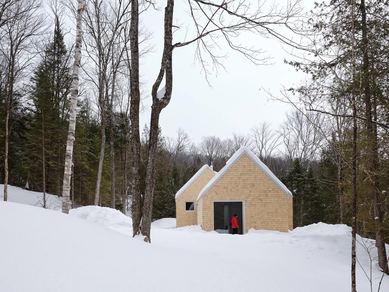
Certain kinds of architecture don’t announce themselves. La Maraude, the latest project by Nathalie Thibodeau Architecte, is exactly that — a compact residential dwelling tucked into the dense woodlands of Boileau, in Quebec’s Outaouais region, that earns its presence through restraint rather than spectacle. Completed in 2024, it’s one of the more quietly compelling houses to come out of Canada in recent memory.

The name itself carries meaning. ‘Maraude’ — to roam, to forage — hints at the relationship the house cultivates with its surroundings. Rather than claiming a dominant position along the river’s edge, the architects deliberately set the home deeper within the treeline, orienting the house’s interior life entirely toward the forest. It’s a gesture that shapes everything else about the project.

Designer: Nathalie Thibodeau Architects

The design draws directly from Quebec’s vernacular architectural tradition — steeply pitched rooflines, grounded proportions, and a material palette that feels native to the region. The exterior is clad in natural cedar shingles and topped with a metal roof, two materials with deep roots in the local building culture. These aren’t nostalgic choices. They’re translated through a contemporary lens, stripped of ornament, reduced to their essential geometry. “Designed with particular attention to simplicity, functionality, and respect for traditional codes, La Maraude embodies a successful dialogue between contemporary architecture and local traditions,” says Nathalie Thibodeau Architecte.

What makes the spatial sequence genuinely interesting is the use of two courtyards as organizing devices. The plan doesn’t simply open to the outdoors — it pulls the forest in, fragmenting the landscape into a series of framed views that shift with the seasons. One courtyard faces north, more sheltered and partly enclosed by the building itself, oriented toward higher ground. The other faces south, brighter and more expansive, drawing the eye down toward the lower terrain. The result is a house that reads differently in every light condition, every month of the year.

The second volume, arranged over two levels in response to the site’s slope, plays a more introverted role. Openings here are smaller and precisely placed to frame specific moments within the tree canopy — quiet apertures rather than panoramic statements.

Photographed by Maxime Brouillet, La Maraude has the look of a project that will age well, both materially and culturally. It’s already being discussed as a potential anchor for a broader ensemble of small retreats on the site — a first building in what could become a considered, evolving conversation between architecture and landscape.

The post This Quebec Home Doesn’t Fight the Forest – It Disappears Into It first appeared on Yanko Design.

  • ✇Yanko Design
  • Nocturne’s Free App Turns Your Bricked Spotify Car Thing Into Something Better Than the Original
    The open-source community has a long history of doing more with abandoned hardware than the original manufacturers ever did. The PSP got emulators Sony never approved. The Wii got homebrew loaders that ran software Nintendo pretended didn’t exist. The pattern repeats because the hardware is always fine; it’s the corporate support structure around it that evaporates. The Spotify Car Thing joined that lineage in December 2024 when Spotify killed server-side authentication and turned every unit in
     

Nocturne’s Free App Turns Your Bricked Spotify Car Thing Into Something Better Than the Original

10 mai 2026 à 16:45

The open-source community has a long history of doing more with abandoned hardware than the original manufacturers ever did. The PSP got emulators Sony never approved. The Wii got homebrew loaders that ran software Nintendo pretended didn’t exist. The pattern repeats because the hardware is always fine; it’s the corporate support structure around it that evaporates. The Spotify Car Thing joined that lineage in December 2024 when Spotify killed server-side authentication and turned every unit into an expensive knob with a screen attached.

Nocturne picked up where Spotify dropped off. The project launched in October 2024, anticipating the shutdown, and has shipped four major versions since. V4.0.0, currently in beta with a public release imminent, finally delivers true Bluetooth connectivity without phone tethering, a companion app, and a feature set that makes the original Spotify firmware look like a rough draft.

Developer: Nocturne Team (Brandon Saldan, Dominic Frye, and contributors)

The Car Thing runs a 512MB RAM, 4GB storage Amlogic S905D2 SoC, which is a polite way of saying it has the processing power of a mid-range router from 2015. Early versions of Nocturne required a Raspberry Pi as a co-processor just to get the thing online, which was a heroic workaround but not exactly mainstream-friendly. V3 replaced that with Bluetooth tethering through your phone’s hotspot. V4 cuts the tether entirely, pairing directly via Bluetooth through the new Nocturne Companion app, which requires a Nocturne+ subscription to fund the team’s continued development.

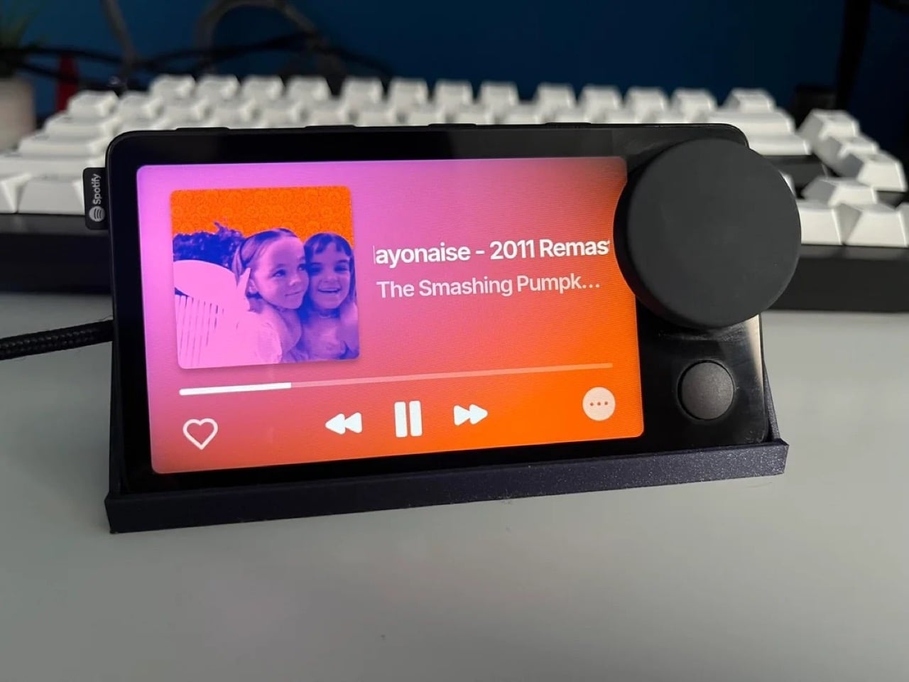
What the photos make immediately clear is how clean the UI actually looks in practice. The now-playing screen pulls album art and renders it as a full bleed gradient background, the same visual logic Spotify used but executed with noticeably more polish in edge cases. The typography is large and glanceable. The playlist browser view is dense but organized, using album thumbnails and track titles in a layout that navigates naturally with the knob. Image 3 shows a subtle ambient lighting effect around the screen border, a rainbow glow that responds to the current track, which is the kind of detail you wouldn’t expect from a community firmware project running on 2021 budget hardware.

The gesture control, OTA updates, Spotify Connect device switcher, podcast support, local file playback, and DJ mode all carried over from V3. The V4 architecture also bakes in full offline functionality, meaning the firmware survives without Spotify’s servers being cooperative, which was precisely the failure mode that bricked every original unit in the first place.

Nocturne’s GitHub currently lists V3.0.0 as the stable release, with V4.0.0 accessible to donors via Discord while the team finishes the public build. If you’ve got a Car Thing in a drawer, the installation guide at usenocturne.com is the next tab you should open.

The post Nocturne’s Free App Turns Your Bricked Spotify Car Thing Into Something Better Than the Original first appeared on Yanko Design.

  • ✇Yanko Design
  • This Expandable Popup Micro Camper Turns Your EV Into a Fully Equipped Tiny Home for Off-Grid Escapes
    Wheelhome is a budding compact camping solutions enterprise in the United Kingdom. It is changing the way camping is perceived and how all-electric camping trips can be made more convenient. First, it launched the electric rooftop camper for the Tesla’s popular Model 3, and now it is offering other lighter vehicle owners an alternative for solo or two-person camping with the new Dashaway ECT micro camping trailers. Designed for efficient electric camping trips, the Dashaway ECT trailer comes in
     

This Expandable Popup Micro Camper Turns Your EV Into a Fully Equipped Tiny Home for Off-Grid Escapes

10 mai 2026 à 15:15

Wheelhome is a budding compact camping solutions enterprise in the United Kingdom. It is changing the way camping is perceived and how all-electric camping trips can be made more convenient. First, it launched the electric rooftop camper for the Tesla’s popular Model 3, and now it is offering other lighter vehicle owners an alternative for solo or two-person camping with the new Dashaway ECT micro camping trailers.

Designed for efficient electric camping trips, the Dashaway ECT trailer comes in two variants: a solo version and a two-person model. The campers are packed with all the amenities and facilities one needs, from a lounge to beds and a toilet to a kitchen, so they can be fully packed for all sorts of camping requirements.

Designer: Wheelhome

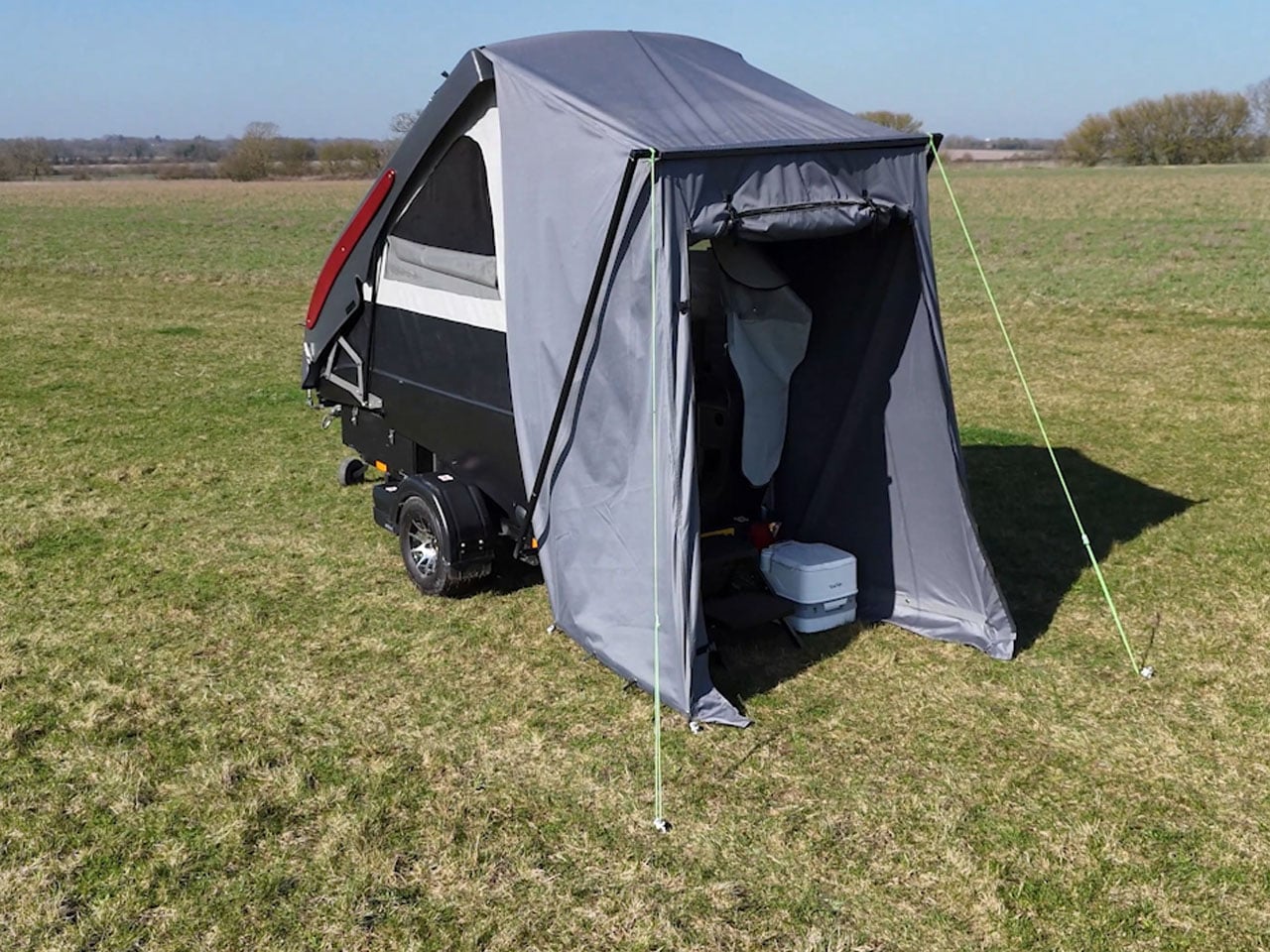
A provided awning is one of the major highlights of the Dashaway ECT series. It is part of the trailer and delivers an additional outer space that can be used for a portable toilet. Of course, it is optional, but with awning rolled up on the front of the trailer when riding, you have the option of expanding the living space. It can unfurl easily and attach to the roof and two side poles to create a sizable space. Besides the awning, the trailer is otherwise similar to the other options on the market, measuring 12.5 feet long and about 5.3 feet wide, but it differentiates itself in the convenience campers can have inside.

When in drive mode, the Dashaway ECTS one berth and the ECT 2 two berth pack down to a height of 3.8 feet. At the camp, both models can pop up to the height of 6 feet. Setting up the trailers is as easy as it can get. No additional tools or any specific training is necessary. The process takes a few minutes. First, using a motorized mover the trailer can be positioned using a remote control, without even the tow vehicle. When in place, the stabilizer legs are lowered and the roof can be lifted up using a gas strut-assisted crank and the fabric side-walled camp is ready to live.

However, before you start living, you can access the camper via single rear entry and layout the furniture and furnishing inside (which folds down when the camper is packed for the road). The interior has the kitchen setup at the entrance complete with an induction hob, kettle, air fryer, and microwave, and then is the seating lounge facing outward, toward the camp entry. The seat also accommodates a 12L fridge underneath. The lounge – depending on the berth configuration you have picked – is either one seat or two. the seats flatten down into a single or double bed at night. The sides are provided with large windows covered with mesh, which light up the interior.

Wheelhome provides the ECT series with ample storage cabinets and compartments under the seat(s). The trailer features a 3-kWh lithium battery, 200-watt rooftop solar panel connected to a 3,000 W inverter. Dashaway ECTS is available for a starting price of £19,750 (roughly $26,000), and the ECT2 is priced at £26,225 (about $35,000).

The post This Expandable Popup Micro Camper Turns Your EV Into a Fully Equipped Tiny Home for Off-Grid Escapes first appeared on Yanko Design.

  • ✇Yanko Design
  • Phone Cases Are Boring, This One Puts a Living Terrarium Inside
    Phone cases have largely settled into two camps: the ones that protect your phone without anyone noticing they exist, and the ones that make a statement with printed graphics, colors, or textures. Neither approach has found a way to make the back of a phone genuinely interesting rather than just decorated. Designer Daniel Idle found a third option that neither camp seems to have considered. The Terrarium Phone Case is a clear resin case for the iPhone 16 Pro Max with an actual planted environme
     

Phone Cases Are Boring, This One Puts a Living Terrarium Inside

Par : JC Torres
10 mai 2026 à 13:20

Phone cases have largely settled into two camps: the ones that protect your phone without anyone noticing they exist, and the ones that make a statement with printed graphics, colors, or textures. Neither approach has found a way to make the back of a phone genuinely interesting rather than just decorated. Designer Daniel Idle found a third option that neither camp seems to have considered.

The Terrarium Phone Case is a clear resin case for the iPhone 16 Pro Max with an actual planted environment sealed inside the back cavity. Moss, small-leafed plants, and a stabilized soil substrate are embedded within the transparent shell, creating a thin cross-section of living terrain that you carry around with you wherever the phone goes. It’s a working phone case, a functional terrarium, and an oddly calming thing to have in your pocket all at once.

Designer: Daniel Idle

The construction involved 3D modeling and fabrication in clear resin, producing a case with enough depth in the back wall to house soil, roots, and plant matter. The plants are packed using a stabilized substrate that keeps the arrangement intact when the phone is picked up, rotated, tilted, or slipped into a bag. The camera cutout is fully preserved; the charging port at the bottom remains accessible; the phone continues to work exactly as it always did.

What keeps everything alive inside the sealed cavity is a closed-loop moisture system. The plants and soil generate humidity, which evaporates toward the inner surface of the resin, condenses back into droplets, and cycles down again. Light passing through the clear shell feeds the plants from outside, while the substrate provides gradual nutrient release. The whole thing is, in a fairly literal sense, a miniature ecosystem that sustains itself without any intervention from the person carrying it.

The condensation that forms on the inside of the shell during high-humidity moments is part of the visual appeal rather than a flaw to be engineered away. Seeing that vapor cycle through the case is a reminder that something in there is alive, actively breathing and responding to its environment, in the same pocket or bag as a device specifically engineered to minimize all biological interference.

There’s a running thread through design culture about bringing nature back into objects and spaces that have drifted too far from it. Biophilic design has become a recognizable term for everything from moss walls in offices to plant-filled shelving in apartments. Most of those applications treat plants as decoration layered on top of an existing design. Idle’s approach is different because the plant system isn’t decoration; it’s structural, sealed directly into the object’s body as a core component rather than an afterthought.

Of course, there will be some reservations about putting moisture and soil so close to your phone, which might be resistant to water and dust, but only from brief encounters. Good thing, then, that it’s still a concept project right now. But as a thought experiment about what a phone case could reasonably contain, it lands somewhere between genuinely novel and gently absurd, which is probably the most honest place for a good idea to start.

The post Phone Cases Are Boring, This One Puts a Living Terrarium Inside first appeared on Yanko Design.

  • ✇Yanko Design
  • DIY Raspberry Pi Camera Turns Your Photos into Glitch Art, and the Results Are Incredible
    You currently have two options if you want to apply effects and filters to your photos: use an app that will inevitably harvest your data for training their AI model (we’re watching you, Instagram), or actually edit your photos manually, which requires time, software subscriptions, and the patience of a saint. Reddit user sharkbiscuit101 unlocked a third option, and it involves a Raspberry Pi 4, a rotary encoder, a gamepad, and a frankly unreasonable amount of ingenuity. The build produces glit
     

DIY Raspberry Pi Camera Turns Your Photos into Glitch Art, and the Results Are Incredible

10 mai 2026 à 11:20

You currently have two options if you want to apply effects and filters to your photos: use an app that will inevitably harvest your data for training their AI model (we’re watching you, Instagram), or actually edit your photos manually, which requires time, software subscriptions, and the patience of a saint. Reddit user sharkbiscuit101 unlocked a third option, and it involves a Raspberry Pi 4, a rotary encoder, a gamepad, and a frankly unreasonable amount of ingenuity. The build produces glitch photography on the pixel level, in real time, through a custom script running entirely offline on hardware you can source yourself. No cloud upload, no terms of service, and crucially, no algorithm deciding what your creative output should look like. This is your camera, running your parameters, answering to nobody.

The camera itself works exactly how you’d want a dedicated glitch tool to work. Hit the shutter button, but before you do, twist the rotary dial to control how aggressively the Pi’s script mangles the RGB channels of whatever you’re pointing at. The result lands somewhere between a corrupted memory card and a fever dream, and the specific character of the glitch is entirely yours to tune through on-screen sliders before you commit to a shot. A small preview screen shows you the live feed so you can watch the image fall apart in real time, which is exactly as satisfying as it sounds. The rotary encoder also handles preset saves, so when you find a combination of settings that produces something genuinely beautiful and broken, you can lock it in and recall it later.

Designer: sharkbiscuit101

The physical design is wonderfully unashamed about what it is. A transparent acrylic chassis sandwich holds the Pi 4 and an Arducam module at the center, with a small HDMI screen on the front face showing the preview, and a Adafruit gamepad breakout board mounted beside it for navigation. A Sharge battery pack, the rectangular kind you’d find at Amazon, clamps to the side and handles power duties. Since the Pi 4 has no dedicated power button, the battery’s own switch becomes the on-off toggle, which is one of those practical workarounds that somehow feels more elegant than a purpose-built solution. Brass standoffs hold the whole sandwich together, giving the build a satisfying mechanical solidity that belies its component-bin origins.

Sharkbiscuit101 hasn’t released the script or component list publicly yet, though the Reddit thread is essentially one long, enthusiastic demand that they do exactly that. The sample images they’ve posted, saturated cascades of cyan and red over a person’s silhouette, a park scene dissolved into chromatic noise, a building rendered in kaleidoscopic symmetry, make a compelling case for why people want to replicate this. When the files do drop, expect a flood of variations, because this is precisely the kind of open-ended hardware that the maker community will run with in seventeen different directions simultaneously.

The post DIY Raspberry Pi Camera Turns Your Photos into Glitch Art, and the Results Are Incredible first appeared on Yanko Design.

  • ✇Yanko Design
  • Inside the Log-and-Glass Home Olson Kundig Built for a Builder on Salt Spring Island
    Salt Spring Island doesn’t need much convincing — it already has the cliffs, the meadows, and the trees. The name sounds more like a childhood storybook setting than an architectural statement — and that tension is exactly the point. Nestled amidst the trees and rugged cliffs of Salt Spring Island, BC, the Daisy Ranch is Olson Kundig’s most recent residential project, led by design principal Tom Kundig. It’s casual. It’s rugged. And it’s entirely, unapologetically itself. The house sits at the
     

Inside the Log-and-Glass Home Olson Kundig Built for a Builder on Salt Spring Island

10 mai 2026 à 09:20

Salt Spring Island doesn’t need much convincing — it already has the cliffs, the meadows, and the trees. The name sounds more like a childhood storybook setting than an architectural statement — and that tension is exactly the point. Nestled amidst the trees and rugged cliffs of Salt Spring Island, BC, the Daisy Ranch is Olson Kundig’s most recent residential project, led by design principal Tom Kundig. It’s casual. It’s rugged. And it’s entirely, unapologetically itself.

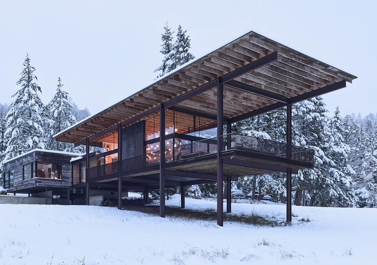
The house sits at the edge of a sweeping meadow, anchored by a log structure that feels like it could have always been there. The primary move is a rugged glass box paired with a long, cantilevered roof that stretches over a generous deck — a roof that earns its keep through BC’s shifting seasons, offering shelter without closing anything off. What makes it work visually is the layering: large square-cut logs and glass soften the rust-colored patina of weathered steel cladding, giving the exterior a palette that feels earned rather than designed.

Designer: Olsun Kundig

The plan is organized along a clean linear axis, with two distinct volumes bisected by an eastern entry stairway. The front door is tucked under a generous overhang — a small but considered gesture that grounds the arrival sequence without dramatizing it. The northern volume, clad in wood and steel, handles the private program: a primary suite and additional bedrooms, with framed view corridors that offer deliberate glimpses of the landscape rather than full exposure. Privacy and connection, calibrated carefully.

Inside, the bathroom is where the project gets most personal. Widespread use of wood infuses the space with warmth, while a clawfoot tub set before corner windows underscores the home’s persistent connection to the landscape outside. It’s the kind of detail that feels borrowed from an older, more tactile way of building — which is precisely the intention.

The project was designed in close collaboration with the client, Patrick Powers, a builder and fabricator who also served as general contractor. That relationship left its mark. The house doesn’t feel like it was delivered to a site; it feels like it was made with the site, material decision by material decision.

As Kundig put it: “There’s a lineage at play in this project, a quiet innovation that comes from the shared DNA of materials and relationships.” The Daisy Ranch is the kind of project that doesn’t need to announce itself. It sits lightly on its land, opens wide to its meadow, and gets on with the business of being lived in.

The post Inside the Log-and-Glass Home Olson Kundig Built for a Builder on Salt Spring Island first appeared on Yanko Design.

  • ✇Yanko Design
  • 5 Mountain Homes That Look Carved From the Cliffs They Stand On
    There is a rare, almost cinematic stillness found only in homes perched high above the world. At elevations ranging from 5,000 to over 10,000 feet, mountain residences occupy a space where clouds drift below terraces and horizons stretch endlessly. By contrast, most cities sit between sea level and roughly 1,500 feet, shaped by density, noise, and constant movement. Life at altitude reshapes perception. The air feels sharper, the light more vivid, and architecture must respond with both resilie
     

5 Mountain Homes That Look Carved From the Cliffs They Stand On

10 mai 2026 à 07:40

There is a rare, almost cinematic stillness found only in homes perched high above the world. At elevations ranging from 5,000 to over 10,000 feet, mountain residences occupy a space where clouds drift below terraces and horizons stretch endlessly. By contrast, most cities sit between sea level and roughly 1,500 feet, shaped by density, noise, and constant movement.

Life at altitude reshapes perception. The air feels sharper, the light more vivid, and architecture must respond with both resilience and sensitivity. Today’s mountain retreats move beyond the heavy, dark enclosures of the past, embracing openness, sustainability, and panoramic immersion. Here is how these homes are not just shelters but experiences designed around silence, scale, and awe.

1. A Natural Extension of the Landscape

The most refined mountain homes are conceived not as objects placed upon terrain, but as forms emerging from it. Architects study slope, wind, and geology, shaping structures that echo the lines of ridges and the layered patterns of exposed rock. Locally sourced stone, textured concrete, and weathered timber allow the residence to visually dissolve into its surroundings.

This approach softens the boundary between built space and wilderness. Walls appear to grow from the hillside, terraces align with natural contours, and expansive glazing draws the mountain indoors. The result is a dwelling that feels anchored, quiet, and inevitable, as though the landscape itself had composed the architecture.

Geometric white hotel built among tall evergreen trees, with angular façades and a central tower labeled 'ELA'.

Modern wooden building with glass lattice walls, warm interior lights, and a row of potted evergreens along the entrance.

Modern hotel bedroom with a large angular window wall, a king bed with white bedding and decorative pillows, and a seating nook nearby

Perched high above the Naggar Valley in Himachal Pradesh, India, Eila emerges with quiet restraint rather than spectacle. Designed by MOFA Studio, the art retreat appears to rise organically from the mountainside, its fluid forms tracing the land’s natural contours instead of reshaping them. Developed through advanced computational processes, the cottages respond sensitively to slope, sunlight, and distant horizons, making the architecture feel discovered rather than imposed. A stepped masterplan descends gently along the steep terrain, preserving topsoil and natural rainwater channels while choreographing a gradual spatial experience. The journey begins at the Gate of Confluence, a stone pavilion marking the threshold into a contemplative environment where landscape, art, and structure unfold in quiet dialogue.

A spacious library lounge with white geometric ceiling, colorful wrapped columns, and circular patterned seating surrounded by bookshelves.

Modern white angular building beside a rectangular pool with glass railing and lounge chairs on a sunny day.

Modern hotel room with geometric white walls, a wooden bed and seating area, and panoramic mountain view through angular windows

At Eila, artificial intelligence assists in refining structural and environmental performance, while human intuition guides final decisions. Biomorphic cottages formed from lightweight steel frames and thin concrete shells minimize energy use and visual impact, blending subtly into the Himalayan setting. Skylights and apertures frame the valley like living canvases, drawing light and scenery deep indoors. Locally sourced materials and vegetation-ready shells allow the retreat to evolve with its surroundings, ensuring it settles into the landscape rather than competing with it.

2. The Modern Mountain Home

The modern mountain home embraces a design language defined by clarity, restraint, and structural precision. Glass and steel replace heavy ornamentation, creating spaces that feel visually open and effortlessly connected to the outdoors. Expansive floor-to-ceiling windows dissolve traditional barriers, allowing shifting light, snow, and distant peaks to become part of the interior experience.

Beyond aesthetics, this approach is deeply functional. Industrial materials provide strength against wind, temperature swings, and heavy snowfall, while minimalist forms reduce visual weight. Clean lines, open-plan layouts, and a carefully edited palette produce a home that feels light, airy, and quietly dramatic against the rugged mountain backdrop.

Modern multi‑story house nestled in a dense pine forest with mountains in the background at sunset. A curved-roof garage is visible on the left.

Contemporary multi-story house in a forest, gray exterior, large glass windows, and a rooftop gravel terrace with seating.

Modern multi-level house with large windows in a pine forest, featuring a rooftop deck and outdoor seating.

Set among the pines of Colorado and overlooking the protected expanse of Indian Peaks Wilderness, this residence by Robert Chisholm Architects embodies a grounded interpretation of mountain living. Each room is carefully oriented to frame the surrounding landscape, creating views that feel composed yet effortless. Organized around a central courtyard, the house draws daylight and mountain air deep into its core, establishing a quiet internal anchor. The spatial layout gently distinguishes communal and private zones, allowing moments of gathering and retreat to coexist without disruption. Expansive glazing pulls the horizon indoors, while walnut floors, solid fir doors, and a sculptural fireplace lend warmth and permanence to interiors defined by clarity and restraint.

Bright living room with floor-to-ceiling windows overlooking evergreen trees, leather sofas, and a wooden coffee table.

Bright living room with a wall of tall windows, a black wood stove, and a wooden coffee table.

Rooftop patio with two wooden Adirondack chairs and a small table, overlooking trees and distant mountains.

The kitchen balances durability with artistry, anchored by a deep blue granite island that subtly mirrors the shifting mountain sky. Ash cabinetry and integrated appliances support daily routines and larger gatherings, while a discreet butler’s pantry preserves visual calm. Outdoor living unfolds across a sheltered deck and open rooftop terraces, encouraging seamless movement between interior comfort and alpine air. Practical elements, including radiant floors, dual EV chargers, and a heated garage with built-in storage, reflect thoughtful foresight. Fire-mitigated forest edges and private trails extend the experience beyond the walls, reinforcing a life closely attuned to the land.

3. Bold Angled Geometry

Snow is a breathtaking presence, but its weight demands intelligent design. Contemporary mountain architecture responds with bold, angled geometry, where steeply pitched roofs and sharply defined lines transform necessity into visual drama. These dynamic forms efficiently shed heavy snowfall while giving the structure a sense of movement and tension against the landscape.

Inside, the impact is equally compelling. Angled rooflines generate soaring ceilings, unexpected volumes, and striking plays of light. Cantilevered decks and elevated viewpoints extend living spaces outward, framing valleys and ridges like curated vistas. The result is architecture that feels daring yet purposeful, balancing engineering logic with an unmistakable sculptural presence.

Modern two-story house with a stone base and white upper volume, wooden garage doors, set in a snowy landscape under a blue sky.

Modern house with white angular upper block and stone lower walls on a snowy hillside with forested mountains in the background.

Modern bedroom with a low wooden bed, angled headboard, light bedding, and decorative deer silhouettes on the wall.

Nestled in the Helmos Mountains of Kalavryta, near the Kalavryta Ski Center, Snowfall House occupies a generous 4,000-square-metre site immersed in forested terrain. Designed by Design Over The Norms, the residence unfolds as three intersecting volumes that echo the geometry of the surrounding peaks. Two stone-clad base structures sit diagonally against the slope, anchoring the home firmly to the land, while a third white volume rests above them like a layer of settled snow. This sculptural composition allows natural light to stream through the interiors and frames uninterrupted views of the mountainous landscape throughout the day.

Contemporary two-story house with white and stone exterior sits on a snowy hillside against a mountainous backdrop.

Modern white cubic house with a stone tower and driveway leading to a wooden garage, set in a snowy hillside forest. (Informative)

Suspended black spherical fireplace hanging in a corner with panoramic forest and snow outside, flame visible inside the stove.

The primary rectangular volume accommodates the communal living spaces and master suite, while a smaller ground-level wing functions as a private guest suite. Additional bedrooms are housed within the elevated white structure, and an underground garage discreetly conceals vehicles to preserve the natural setting. Wood and stone define the material palette, capturing the rugged textures of the region. Where the volumes intersect, a sheltered courtyard emerges, offering year-round comfort from both summer sun and winter chill. Inside, clean white walls, herringbone wood floors, and understated furnishings create a calm, timeless retreat in the Greek mountains.

4. Refined Cottage Design

For those drawn to warmth and nostalgia, the mountain cottage offers a gentler architectural expression. Stone chimneys, gabled roofs, and carefully layered façades create a sense of familiarity that feels timeless rather than trendy. Every detail, right from the window proportions to handcrafted woodwork, contributes to an atmosphere of charm and shelter.

Though often modest in scale, cottage interiors deliver a rich emotional experience. Nested layouts, soft lighting, and tactile materials cultivate a deep sense of coziness. This intimate environment forms a comforting counterpoint to the vast, windswept landscape outside, making the retreat feel protective, inviting, and profoundly human.

A modern A-frame cabin with vertical wooden slats on the upper story, glass walls on the ground floor, and a stone retaining wall surrounding the base at sunset.

Wooden cabin with a steep metal roof, framed by pine trees under a blue sky

Wooden cabin with a steep metal roof in a forested mountain landscape.

The Kohútka Cottage by SENAA architekti sits naturally within the Javorníky mountains in the Czech Republic, blending tradition with contemporary living. Designed by Jan Sedláček and Václav Navrátil, the retreat was envisioned for a local mountain complex seeking an authentic Wallachian character without compromising modern comfort. Approached from the east, the cottage reflects regional heritage through its compact windows, deep roof overhangs, and familiar log-cabin silhouette. Its steep roof and restrained detailing respond thoughtfully to the harsh mountain climate, embracing forms that have endured for generations while maintaining refined architectural clarity.

Modern timber house with a steep triangular roof, glass walls, and warm interior lights at night.

Cozy modern living room with wood panel ceiling and a large glass wall opening to a rocky outdoor area; a wooden dining table with moss centerpiece in foreground and a beige sofa area to the left.

Modern living room with wood ceiling, beige sofa, and a large glass wall opening to an outdoor area.

From the west, however, the home opens dramatically with expansive glazing that frames sweeping valley views, transforming the interior into a panoramic observatory. Constructed using prefabricated timber panels assembled in a single day, the structure minimised environmental impact while meeting low-energy standards. Inside, the sloping terrain accommodates a lower-level wellness zone with sauna and relaxation spaces, while mechanical functions remain discreetly tucked away. The result is a timeless mountain dwelling that balances sustainability, performance, and contextual sensitivity.

5. The Essential Cabin Design

The cabin remains the original archetype of mountain living, now reinterpreted through a contemporary lens. From classic A-frames to refined log structures, today’s cabins celebrate essentialism or a return to clarity, function, and honest materials. Designs emphasize compact footprints, efficient layouts, and craftsmanship that prioritizes durability over ornamentation.

At the heart of the cabin is simplicity with purpose. A central hearth anchors the space, natural textures create warmth, and every element serves a role. The aesthetic is unpretentious yet deeply intentional, fostering a direct connection to the surrounding forest. This modernized cabin embodies an off-grid spirit, where minimalism meets comfort and quiet retreat.

Cliffside wooden domed cabins with curved roofs, extended decks, and outdoor seating among tall pines on a rocky slope.

Circular wooden pod house with curved lattice roof nestled among tall trees on a rocky hillside.

Three rounded wooden cabins perched on a rocky cliff edge among pine trees, connected by decks with chairs and loungers.",

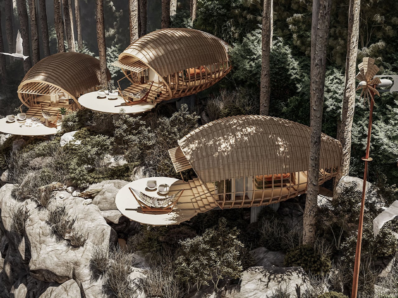
The mountain-edge cabin designed by Jorge Luis Veliz Quintana is defined by its organic geometry and strong contextual integration. Each 150 sqm unit adopts a cocoon-like form, positioned directly on large natural boulders to minimize ground intervention. The structural system combines curved timber lattices with concrete platforms that mirror the grey tonalities of the surrounding cliffs. This deliberate material, color, and finish strategy allows the architecture to visually dissolve into the rocky terrain. The sculptural envelope extends outward to form a generous terrace, reinforcing the linear relationship between interior spaces and the expansive mountain views.

Circular wooden pavilion under construction on a deck with striped hammock, two modern chairs, and cushions amid trees and desert mountains in the background.

Curved wooden tunnel lounge with beds, chairs and hanging lanterns, casting striped shadows.

The layout is organized across two levels, responding to both topography and climate. An open-plan upper floor accommodates the bedroom and bathroom, oriented to maximize 360-degree panoramas through continuous glazing. A secondary semi-outdoor level enhances cross-ventilation and environmental responsiveness. The project was developed digitally using SketchUp for three-dimensional modelling, Lumion for rendering and environmental simulation, and Photoshop for final visual refinement, ensuring precision in form, texture, and lighting.

Wooden treehouse pod with curved lattice shell, overlooking a forest, featuring a round deck and lounge chairs on the patio.

Modern mountain homes embody a delicate union of endurance and emotion. They stand resilient against climate yet remain visually light, open, and deeply connected to nature. Whether sculptural and modern or intimate and rustic, these retreats reveal a simple truth: at greater heights, architecture must anchor us, calm us, and elevate the experience.

The post 5 Mountain Homes That Look Carved From the Cliffs They Stand On first appeared on Yanko Design.

  • ✇Yanko Design
  • The LUMO Grill Cooks With Light, Heats in Seconds, and Brings Charcoal Flavor Without the Smoke
    The George Foreman Grill sold more than a hundred million units, which tells you everything about how badly people want to cook without the setup, the smoke, and the outdoor requirement. What that number fails to explain is why, after thirty years of competing products, the fundamental problem remains unsolved. Every electric contact grill since 1994 has operated on the same basic principle: a hot plate pressing food against another hot plate, dripping grease onto a heating element, producing v
     

The LUMO Grill Cooks With Light, Heats in Seconds, and Brings Charcoal Flavor Without the Smoke

9 mai 2026 à 21:45

The George Foreman Grill sold more than a hundred million units, which tells you everything about how badly people want to cook without the setup, the smoke, and the outdoor requirement. What that number fails to explain is why, after thirty years of competing products, the fundamental problem remains unsolved. Every electric contact grill since 1994 has operated on the same basic principle: a hot plate pressing food against another hot plate, dripping grease onto a heating element, producing varying degrees of smoke and varying degrees of disappointment. The category has iterated endlessly on that geometry, adding digital timers and non-stick coatings and fold-flat designs, without ever questioning the physics underneath. Hong Kong startup COZYTIME is questioning them with the LUMO, a grill that cooks with focused far-infrared light instead of contact heat, and the approach changes the smoke problem by addressing it at the source.

Four precision reflectors focus infrared energy at food from multiple angles simultaneously, creating 360-degree heat coverage that cooks evenly from edge to center while retaining moisture, unlike hot-air convection heating, which dehydrates food. The side-mounted heating elements keep grease physically separated from any heat source, so drippings fall into a grease tray rather than the heating tube, preventing smoke from forming at the source. No filters, no fans, no workarounds. An AI system called CookPilot uses AI Vision and two built-in sensors to automatically detect food type, thickness, surface area, temperature, and weight, then selects the ideal cooking program from a library covering over 40 food types. A swappable Flavor Module lets you add authentic smoked taste to any cook by loading pellet fuels into the module, inserting it into the LUMO, and switching to Indoor Smoker Mode, where the enclosed chamber traps and circulates smoke around the food while a tight seal keeps the home clean. COZYTIME is pricing the LUMO at $329, against a retail price of $499. This pricing is exclusively available to crowdfunding backers, and the campaign will end on May 23! If you’re interested in LUMO, pledge now before it’s gone!

Designer: COZYTIME

Click Here to Buy Now: $329 $499 (34% off). Hurry, only 159/500 left! Raised over $344,000.

We covered LUMO hands-on at CES 2026 and came away calling it “genuinely novel in a category that’s seen mostly incremental tweaks for decades.” Far-infrared radiation transfers energy directly into food molecules rather than heating surrounding air first, which is how the LUMO reaches cooking temperature in a fraction of a second, using four precision reflectors to deliver full surround heating from multiple angles, cooking up to 4x faster than traditional appliances, without long preheat times or outdoor setups. Traditional contact grills heat the plate and then conduct that energy into the protein surface, a fundamentally different thermal pathway that drives more moisture out of food in the process. COZYTIME claims the infrared approach locks in 76.6 percent of natural food juices compared to conventional methods, a figure that, if it holds in real kitchen conditions, represents an actual cooking outcome improvement rather than a specification exercise. The four-reflector geometry is the physical enabler: each reflector focuses infrared energy at the food surface from a distinct angle, eliminating cold zones and removing any need to flip.

The unit handles thick steaks, skewers, quick snacks, large dinners, and even pizza, thanks to its TriForma StateShift System that allows for three different grill modes. In Indoor Smoker Mode, enclosed heating circulates warmth evenly to a maximum of 230°C (446°F), mimicking a full oven capable of pizza, casseroles, and slow-roasted steaks, and pairs with the Flavor Module for authentic smoked dishes like tender beef brisket. Fast Grill Mode hits a maximum of 270°C (518°F), where the semi-open lid concentrates heat for rapid grilling and juice-locking, delivering steakhouse-quality flavor in minutes, ideal for weeknight meals when time is short but standards aren’t. Flat Grill Mode opens to 180 degrees, creating two independent heating zones, so you can grill steaks on one side at high heat while roasting vegetables on the other, with no batch cooking and no waiting, which makes it particularly suited to dinner parties. Two heat zones running independently in a single countertop footprint is the kind of practical design decision that sounds obvious in retrospect but rarely makes it into a consumer appliance.

LUMO’s most compelling trick may be how seriously it treats flavor, because this is one of the more thoughtful attempts yet at bringing authentic charcoal-style cooking indoors. Plenty of indoor grills promise grill marks, very few deal convincingly with the taste itself. COZYTIME approaches that problem with a dedicated Flavor Module that burns pellets inside the unit’s enclosed chamber, allowing smoke to circulate around the food while the side-heat architecture keeps grease from hitting the heating elements and creating unwanted kitchen smoke. That separation is what makes the idea work. You get the smoky, grilled character people actually associate with charcoal cooking, without turning the room into part of the process. With the Flavor Module attached, the Heat Slider heats wood pellets to release rich smoky flavor during cooking, and when slid out with the griddle plate, it doubles as a high-heat searing surface for deep browning, crisp crusts, and smaller tasks like melting cheese or simmering sauces. LUMO also uses AI Vision to recognize different meats and automatically adjust heat and cooking time to match preferred doneness, from blue rare to well-done. Food-contact surfaces are made exclusively of premium food-grade stainless steel.

The LUMO app adds a layer of control that makes the grill feel more like a connected cooking platform than a standalone appliance. It offers three recipe paths, including curated official recipes from a cloud library, fully custom recipes with adjustable time and temperature for each step, and one-click AI-generated recipes created by CookPilot, with any recipe shareable through a code or posted to the LUMO community. From the app, users can track cooking progress and food status in real time, adjust temperature and timing remotely, and get notified when food is ready. That flexibility extends to the accessory ecosystem too. COZYTIME currently offers nine add-ons in total, including six cooking accessories and three additional accessories designed to broaden what the LUMO can do day to day. On the cooking side, there’s a wireless meat thermometer for real-time core temperature tracking, flavorwood pellets for smoke infusion through the Flavor Module, an extra stainless grill grate for back-to-back cooking, a fine mesh grill grate for smaller foods like shrimp and asparagus, and a Heat Slider griddle plate for intense high-heat searing up to 450°C.

Outside the cooking accessories, COZYTIME also offers a travel bag for transport and storage, plus extended coverage options for added peace of mind. Cleanup remains refreshingly low-friction, with food only touching stainless grill grates and grease trays that lift out for a quick wipe or rinse, while detachable parts are dishwasher-safe and the side-heat architecture keeps grease away from chamber walls, minimizing residue elsewhere in the unit. At 14.3 pounds, the LUMO is still portable enough to move between kitchen counter, balcony, and dining table without feeling like a project.

Retail pricing sits at $499, with the current order price at $329 – that’s a 34% reduction off the MSRP.Every unit ships with the LUMO itself with built-in Heat Slider, a region-appropriate power cord, a user manual, two stainless steel grill grates, the Flavor Module, two detachable grease trays, and a grill grate lifter. Shipping is free across the United States (excluding PR, HI, and AK), Canada, Mexico, Singapore, South Korea, Japan, Hong Kong, Australia, New Zealand, and most of Europe starting July 2026.

Click Here to Buy Now: $329 $499 (34% off). Hurry, only 159/500 left! Raised over $344,000.

The post The LUMO Grill Cooks With Light, Heats in Seconds, and Brings Charcoal Flavor Without the Smoke first appeared on Yanko Design.

  • ✇Yanko Design
  • Art Deco Furniture Is Back – and Salone 2026 Made It Official
    Image credit: Armani Casa After years dominated by pale oak, soft minimalism, and rounded silhouettes, Salone del Mobile 2026 signaled a clear shift toward richer and more expressive interiors. Held at Milan’s Rho Fiera fairgrounds from April 21 to April 26, 2026, the exhibition integrated Art Deco-inspired details such as chevrons, polished brass, chrome finishes, fan-shaped arches, and jewel-toned velvet upholstery, bringing glamour and structure back into contemporary furniture design. Across
     

Art Deco Furniture Is Back – and Salone 2026 Made It Official

9 mai 2026 à 19:30

Image credit: Armani Casa

After years dominated by pale oak, soft minimalism, and rounded silhouettes, Salone del Mobile 2026 signaled a clear shift toward richer and more expressive interiors. Held at Milan’s Rho Fiera fairgrounds from April 21 to April 26, 2026, the exhibition integrated Art Deco-inspired details such as chevrons, polished brass, chrome finishes, fan-shaped arches, and jewel-toned velvet upholstery, bringing glamour and structure back into contemporary furniture design.

Across Milan Design Week 2026, designers moved toward layered materials, geometric forms, and statement-making interiors. Instead of feeling nostalgic, the aesthetic appeared refined and updated for modern living. The resurgence also aligns with broader trend forecasts. Pinterest Predicts 2026 identified neo deco as one of the year’s defining interior styles, which is a cleaner, moodier reinterpretation of 1920s luxury.

Throughout Salone del Mobile 2026, recurring Deco-inspired forms and materials across installations and showroom launches pointed to a wider and more intentional design shift, reinforcing the growing influence of Art Deco furniture 2026 trends.

This shift is best understood by tracing how Neo Deco diverges from its historical origin.

What Is the Difference Between Original Art Deco and Neo Deco?

While both styles celebrate glamor and craftsmanship, Neo Deco reinterprets classic Art Deco for a more modern and livable aesthetic.

Characteristics of Original Art Deco

  • Strong geometric symmetry
  • Chevron patterns and fan-shaped arches
  • Heavy ornamentation and layered detailing
  • Glossy lacquer, marble, and polished brass
  • Bold jewel tones and dramatic interiors
  • Structured and formal furniture silhouettes

Characteristics of Neo Deco

  • Softer and more sculptural forms
  • Cleaner layouts with less visual excess
  • Refined brass and chrome accents
  • Selective use of velvet, marble, and glossy finishes
  • Open and contemporary interiors
  • Balanced mix of luxury and minimalism

Seen throughout Salone del Mobile 2026, neo deco keeps the elegance of classic Art Deco furniture but simplifies it for contemporary living. Additionally, Neo Deco keeps the glamour of classic Art Deco furniture while adapting it to modern interiors that prioritize comfort, simplicity, and sculptural design. This theoretical shift becomes most visible when translated into contemporary objects and reissued icons. Take a look at our pick of the top 7 Neo Deco pieces from Salone del Mobile Milan Design Week 2026.

1. Borgonuovo’s games table by Armani Casa

Image credit: Armani Casa

Image credit: Armani Casa

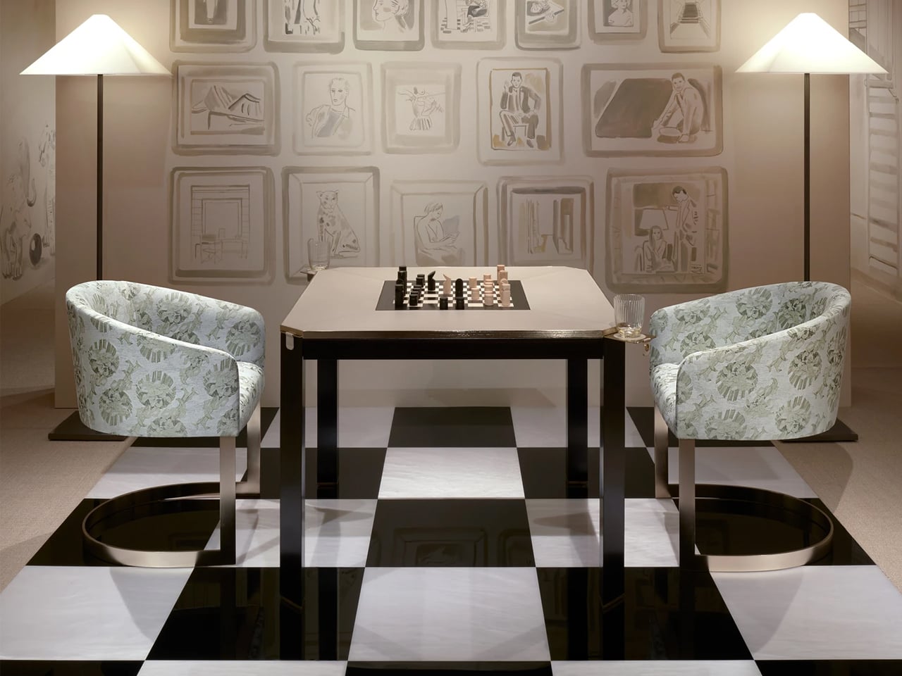
The Borgonuovo’s games table blends understated luxury with meticulous craftsmanship through a refined neo-deco design language. Crafted from ebony wood and topped with taupe leather, the piece conceals a rotating chess-and-checkers surface in ebony and maple wood. Satin-finished brass accents, sculptural triangular legs, discreet pull-out cup holders, and hidden storage drawers introduce geometric elegance and multifunctional sophistication without overwhelming the design.

Image credit: Armani Casa

Named after the Milan street once home to Giorgio Armani, the table reflects the restrained yet luxurious aesthetic of Armani Casa. Its clean forms and rich material palette also reference the timeless influence of Jean-Michel Frank, whose minimalist approach to luxury continues to shape the brand’s furniture and interior collections.

2. Delfi Madia Cabinet by Promemoria

Image Credit: Promemoria

Image Credit: Promemoria

The Delfi Madia Cabinet by Promemoria expresses a refined neo deco aesthetic through its architectural proportions, geometric detailing and restrained use of ornamentation. Unlike traditional Art Deco, which often emphasized dramatic symmetry and lavish decoration, this contemporary interpretation feels quieter and more sculptural. Defined by a solid wood frame and a recessed central groove that creates a strong vertical axis, the cabinet balances precision with softness, while subtle perimeter lighting enhances its sculptural presence with a warm ambient glow.

Image Credit: Promemoria

Image Credit: Promemoria

The cabinet doors become the focal point of the design, featuring layered wood veneers and repetitive patterns in varying tones that create a delicate three-dimensional effect. This interplay of geometry, texture, and craftsmanship recalls classic Deco influences but reworks them in a cleaner and more contemporary way. Functional yet expressive, the piece can shift from kitchen storage to an intimate bar setting.

3. ‘Pigreco’ Chair by Tobia Scarpa, Reissued by Tacchini

Image credit: Tacchini

Image credit: Tacchini

Image credit: Tacchini

The ‘Pigreco’ chair by Tobia Scarpa for Tacchini reinterprets neo deco through a refined balance of gloss, geometry, and sculptural elegance. Echoing the glamour of classic Art Deco furniture, the design pairs soft upholstery with lacquered structural elements that wrap around the chair like a polished architectural frame.

Image credit: Tacchini

Image credit: Tacchini

The reflective surfaces introduce depth and luminosity, transforming lacquer from a simple finish into a defining visual feature. Instead of embracing the excess of traditional Deco interiors, Pigreco adopts a more restrained and contemporary approach. Its silhouette moves fluidly between curves and sharp lines, while the careful balance of solids and voids gives the chair a sense of rhythm and precision.

4. The Elie Saab x Impatia Pool Table

Image Credit: Elie Saab

Image Credit: Elie Saab

Image Credit: Elie Saab

The billiards table by Elie Saab in collaboration with Impatia transforms a traditional game table into a striking expression of neo-deco design. This functional furniture piece interprets the Neo Deco style through sculptural geometry, luxurious materials, and refined detailing. Transparent glass elements lighten the structure visually, while a concealed slate core preserves performance.

Image Credit: Elie Saab

Image Credit: Elie Saab

Its Deco influence appears through layered material contrasts and architectural rhythm. A dark bronze metal frame provides structure, while ribbed glass panels reference geometric repetition. Beige leather edging softens the composition, while Patagonia marble rail tops introduce crystalline textures.

5. Louis Vuitton Omega Table (Reissue)

Image Credit: Louis Vuitton

Image Credit: Louis Vuitton

Louis Vuitton returned to Milan Design Week 2026 with a refined presentation of Objets Nomades, staged as a dialogue between archival design and contemporary craftsmanship. The showcase revisited early Art Deco furniture principles, not as nostalgia, but as a structural language rooted in proportion, geometry, and material clarity.

Image Credit: Louis Vuitton

A key highlight was the reissued Omega Table, originally designed by Pierre Legrain in 1921. Its distinctive curved profile remained intact, maintaining the tension between fluid line and architectural discipline that defined the original composition. Recrafted in lacquered wood and Nomade leather, the surface finish deepens its visual continuity, allowing the form to read as a piece of furniture alongside a sculptural object. The result preserves its historical identity while aligning it with a more contemporary sensibility of refined restraint and material precision.

6. Diamond Chocolate sideboard by Boca Do Lobo

Image Credit: Boca do Lobo

Image Credit: Boca do Lobo

The Diamond sideboard distils neo deco into a precise study of form, where geometry replaces ornament as the primary visual language. The design steps beyond decorative layering and is built around faceted surfaces that break light and shadow into controlled shifts across the object’s volume.

Image Credit: Boca do Lobo

Image Credit: Boca do Lobo

Its high-gloss exterior intensifies this effect, creating a reflective depth that changes with viewing angle and ambient light. The deep chocolate palette anchors the piece, introducing warmth and visual weight against its angular composition. Beneath its sculptural exterior, the craftsmanship remains tightly controlled, positioning the sideboard not as a decorative object, but as a structured, collectible form defined by clarity, precision, and material intensity.

7. Beacon Bar Cabinet by Ralph Lauren

Image Credit: Ralph Lauren Home

Image Credit: Ralph Lauren Home

The Beacon bar cabinet by Ralph Lauren Home operates at the intersection of architectural discipline and decorative refinement, expressed through a grounded yet sculptural oak structure within a Neo Deco sensibility. Its form is defined by strong vertical and horizontal logic, where proportion becomes the primary expressive tool rather than surface detailing.

Image Credit: Ralph Lauren Home

Behind its restrained exterior lies a carefully orchestrated system of concealed storage and engineered joinery, allowing functionality to disappear seamlessly into form. Subtle Deco influence appears through controlled symmetry and measured rhythm in its construction. The warmth of oak introduces a tactile counterbalance to its structural clarity, resulting in a piece that feels substantial and understated, anchored in material honesty and architectural calm.

Beyond individual objects, Neo Deco is also defined through its material language

Decoding Neo Deco Interiors Through Materiality

A return defined by materiality

Fluted wood, lacquer, burl veneer, brushed brass, and velvet have returned together within the neo deco revival. Their resurgence is driven by materiality itself and how surfaces hold light, absorb shadow, and create depth through texture rather than decoration.

Fluted wood creates rhythm through light

Fluted wood introduces quiet repetition and structure. Its grooves shift with light and shadow, giving surfaces a subtle architectural rhythm without visual heaviness.

Lacquer sharpens reflection and clarity

Lacquer brings a smooth, reflective finish that heightens colour and edge definition. It adds precision and a controlled luminosity to otherwise solid forms.

Burl veneer adds natural irregularity

Burl veneer introduces organic movement through its unpredictable grain. It softens geometry with a layered, expressive surface that feels distinctly unique.

Brushed brass introduces warmth and restraint

Brushed brass offers a muted metallic glow that grounds compositions. Its softened sheen balances richer materials without overpowering them.

Velvet brings depth and tactility

Velvet enriches interiors with softness, density, and colour saturation. It absorbs light, adding warmth and a more intimate spatial quality.

Why did they return together

In neo deco, these materials work through contrast via matte and gloss, soft and structured, natural and refined characteristics.

What Pinterest Predicts 2026 Actually Signals About Neo Deco

Pinterest search patterns show Neo Deco as a move toward complete spatial moods and not just isolated décor trends. Users are gravitating toward sculptural silhouettes, arched forms, and layered material compositions, suggesting interiors are now being imagined as unified architectural statements. This directly aligns with Milan Design Week 2026, where geometry, brass, lacquer, and Deco references appeared as part of the structure and not just surface styling.

To understand why this shift is happening now, it must be placed within the wider fatigue of minimalism-led interiors

Why Neo Deco Emerges After a Decade of Minimalism?

The rise of Neo Deco follows clear fatigue with Scandi-led minimalism. After years of soft oak, muted tones, and rounded neutrality, interiors have reached a point of visual saturation. Since 2024, designers have been signaling a shift toward more defined, expressive environments, marking a recalibration toward structure, contrast, and material presence.

Taken together, these signals point to a deeper change in how interiors are being conceived. What many interpretations miss is that Neo Deco is not a surface trend but is structural. The emphasis has moved from finishes and colour palettes to silhouette, proportion, and joinery. Furniture now operates as spatial architecture, shaping rhythm and atmosphere within a room. The logic is simple but decisive: the shift is no longer about what you apply to a space, but how the space is formed.

As a result, Neo Deco is not a revival of ornament but is a return to structure, where form itself becomes the new language of luxury.

The post Art Deco Furniture Is Back – and Salone 2026 Made It Official first appeared on Yanko Design.

  • ✇Yanko Design
  • The Roomba Guy Just Built a Robot Pet You Might Actually Love
    If you’ve ever watched your Roomba bump helplessly into a chair leg for the third time and thought, “I deserve better from my robots,” you’re not alone. And apparently, neither did Colin Angle. The co-founder of iRobot, the man who essentially put a hockey puck-shaped vacuum in millions of homes, left the company in 2024 with a new question rattling around in his head: what if a robot could actually feel like it cares about you? The answer is the Familiar, the first prototype from his new start
     

The Roomba Guy Just Built a Robot Pet You Might Actually Love

9 mai 2026 à 18:30

If you’ve ever watched your Roomba bump helplessly into a chair leg for the third time and thought, “I deserve better from my robots,” you’re not alone. And apparently, neither did Colin Angle. The co-founder of iRobot, the man who essentially put a hockey puck-shaped vacuum in millions of homes, left the company in 2024 with a new question rattling around in his head: what if a robot could actually feel like it cares about you? The answer is the Familiar, the first prototype from his new startup, Familiar Machines & Magic. And it is not your average robot.

Picture a creature somewhere between a soft-eared dog and a round, slightly abstract bear. It has four legs, huge paws, and doe eyes that make it immediately charming in a way that no Roomba ever attempted to be. It’s furry, expressive, and was designed with the help of former Disney Imagineers, which explains why it looks like it belongs in an animated feature rather than a tech showcase. The Familiar has 23 degrees of freedom, meaning it can wiggle its ears, tilt its head, and wag a small nub of a tail with the kind of fluidity that feels less mechanical and more… alive. Its coat is touch-sensitive, built specifically to encourage physical interaction between you and it.

Designer: Familiar Machines & Magic

It also doesn’t talk. That detail feels deliberate and, to me, very smart. Voice assistants have trained us to think of robots as tools we command. The Familiar is going for something completely different. It’s designed to read your tone of voice, your body language, your overall energy, and respond accordingly. Angle calls it “Consumer Physical AI,” and while the label sounds like something off a product white paper, the idea behind it is genuinely compelling.

The name itself is worth noting. A “familiar” in folklore refers to the supernatural animal companion of a witch or magical figure, a creature bonded to a person not through ownership but through genuine connection. Angle’s team chose that name deliberately, and I think it sets the tone for what they’re trying to build. The goal isn’t to sell you a novelty gadget. It’s to create a new kind of relationship between humans and machines, one built on trust, attentiveness, and something approaching care.

Now, I’ll be upfront: I have feelings about this. Part of me finds it genuinely beautiful as a design concept. The Familiar was clearly approached the way good industrial design should be, with deep thought about how an object makes you feel, not just what it does. The choice to make it animal-like rather than humanoid is interesting, too. There’s far less of the uncanny valley unease that tends to follow humanoid robots around, and more of the universal warmth that most people already extend toward animals.

But another part of me wonders about the emotional stakes here. We’re already watching people form attachments to AI chatbots. A touch-sensitive, furry, expressive robot that mirrors your emotional state is a much more potent version of that. Angle has said he wants it to feel like the machine actually cares about him. That’s a lovely vision. It’s also a design brief that puts enormous responsibility on the creators to get it right, because the flip side of emotional bonding is emotional dependence.

Still, I’d be lying if I said the Familiar didn’t make me curious in the best possible way. The prototype images are almost disarmingly sweet. It looks like something you’d want sitting on the couch next to you while you read, or settled quietly in the corner while you work. If any robot was ever designed to move through your life rather than just function within it, this might be it.

The Familiar is still in the prototype stage, with no confirmed price or release date. But as debut concepts go, it’s a strong one. Whether or not it ever makes it into our homes, it raises questions about what we actually want from the machines we live with. And those questions feel well overdue.

The post The Roomba Guy Just Built a Robot Pet You Might Actually Love first appeared on Yanko Design.

  • ✇Yanko Design
  • UNO and Vrbo Are Renting Vacation Homes for $4 a Night
    Brand collaborations are everywhere these days, but every once in a while, one lands so perfectly that you have to stop and appreciate the logic behind it. The UNO x Vrbo partnership is exactly that kind of collab. Not because it’s flashy or trying to be something it’s not, but because it genuinely makes sense. Starting May 15, Mattel and Vrbo are opening bookings for six limited-time vacation home stays built entirely around the spirit of game night. Six properties across the U.S., two tiers o
     

UNO and Vrbo Are Renting Vacation Homes for $4 a Night

9 mai 2026 à 16:45

Brand collaborations are everywhere these days, but every once in a while, one lands so perfectly that you have to stop and appreciate the logic behind it. The UNO x Vrbo partnership is exactly that kind of collab. Not because it’s flashy or trying to be something it’s not, but because it genuinely makes sense.

Starting May 15, Mattel and Vrbo are opening bookings for six limited-time vacation home stays built entirely around the spirit of game night. Six properties across the U.S., two tiers of experience, and one very clever price point: $4 per night. That last part is a deliberate nod to UNO’s iconic Draw 4 card (which can make or break relationships), and it’s the kind of detail that makes you smile whether you’re a brand person or not.

Designers: UNO x Vrbo

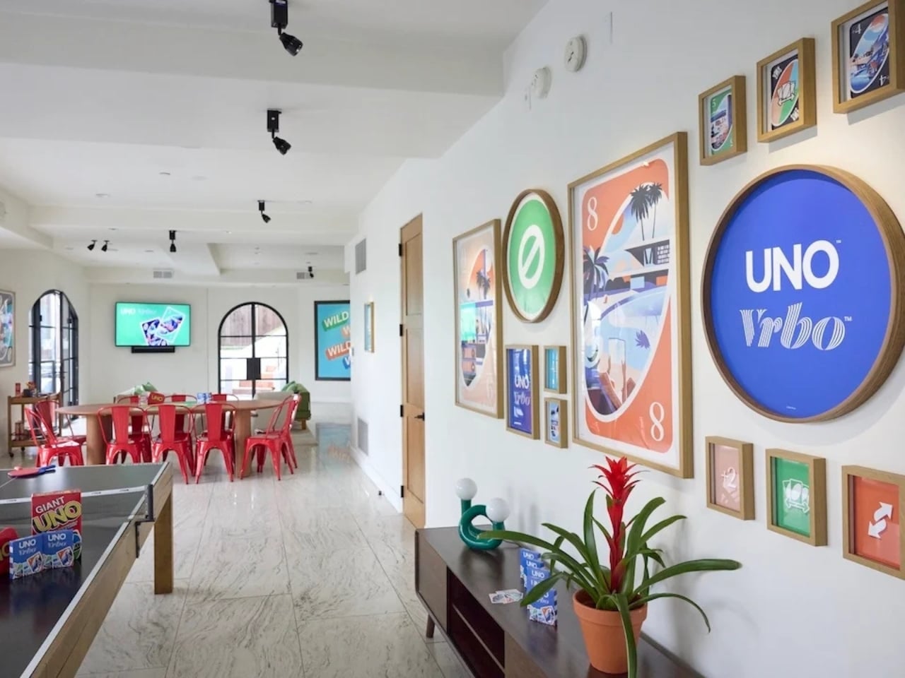
The stays are divided into two experiences. At the top end sit the two “Wild Card” homes, located in the Hollywood Hills and Texas Hill Country. These are the full production: UNO-themed décor, organized game nights, and an in-home dining experience. They’re designed for groups of up to 10 guests who want the whole immersive package, the kind of weekend that’s more curated getaway than casual vacation. Then there are the four “Play It Your Way” stays in Winter Park, Colorado; Palm Desert, California; Panama City Beach, Florida; and Atlanta, Georgia. These are a little more relaxed, but still come with a co-branded UNO x Vrbo Welcome Kit, a game room, and either a pool or hot tub. Essentially, they’re the version for people who want the fun without the fuss. All six properties are bookable for one three-night stay, Friday to Monday, on a first-come, first-served basis. Bookings open May 15 at 1 PM ET. I’ll be honest: at $4 a night, they are going to go fast.

What makes this collaboration genuinely interesting, beyond the price tag, is the attention that went into the actual product. A custom UNO deck was commissioned for this collab, illustrated by Pietari Posti, with artwork inspired by travel destinations and vacation themes. It also comes with an exclusive rule called the “Vacation Rental Swap,” which lets players swap hands with anyone at the table. It’s a small thing, but it shows that the two brands weren’t just slapping logos on a vacation home and calling it a day. They put real creative thought into what the collaboration could actually feel like to experience.

That’s the part that tends to separate a genuinely good brand collab from a lazy one. Anyone can license a logo and stick it on merchandise. Fewer brands take the time to ask what the experience should feel like from the inside, and build something around that answer. UNO, at its core, is a game about chaos and connection. You play it with people you like and you inevitably end up yelling at them. It’s social in the most fundamental way. Vrbo, meanwhile, is about giving groups a private space to actually be together without the interruptions of a hotel. Put those two things in the same room and you get something that doesn’t need to be explained.

It also helps that this collab is part of a growing relationship between Mattel and Expedia Group, Vrbo’s parent company. Mattel already appeared in an Expedia Super Bowl commercial earlier this year through the Barbie universe. So this isn’t a one-off stunt; it reads more like two brands actively figuring out how to build something together over time. For anyone who grew up playing UNO at a kitchen table, there’s an undeniable nostalgia pull here. But the campaign doesn’t lean into nostalgia as a crutch. It uses the game’s identity as a starting point and builds forward from it, which is ultimately why it works. The best collaborations don’t just remind you of something you loved. They give you a new reason to love it again.

The post UNO and Vrbo Are Renting Vacation Homes for $4 a Night first appeared on Yanko Design.

  • ✇Yanko Design
  • This AC Does 5 Jobs at Once and Looks Like Furniture on Your Wall
    The split air conditioner is one of the least loved objects in any home, which is a strange thing to say about something most people couldn’t live without. It works, technically, but it tends to make its presence known in all the wrong ways. The air is too direct, the noise is a constant background irritant, and the plastic box on the wall rarely belongs in any thoughtfully designed interior. From that frustration comes WellFlow, a concept that reframes what air conditioning is supposed to do f
     

This AC Does 5 Jobs at Once and Looks Like Furniture on Your Wall

Par : JC Torres
9 mai 2026 à 15:15

The split air conditioner is one of the least loved objects in any home, which is a strange thing to say about something most people couldn’t live without. It works, technically, but it tends to make its presence known in all the wrong ways. The air is too direct, the noise is a constant background irritant, and the plastic box on the wall rarely belongs in any thoughtfully designed interior.

From that frustration comes WellFlow, a concept that reframes what air conditioning is supposed to do for the people living around it. Rather than engineering a better cooling box, the designers built something closer to a wellness device. It’s a concept that received validation through the iF Design Award in 2026 and was first revealed at IFA Berlin 2025.

Designer: Merve Nur Sökmen, Zehra Sarıarslan

The most immediate shift is in how air actually moves. Conventional units push output in one direction, landing directly on whoever is in the room. WellFlow uses four-way diffusion to spread conditioned air from all sides without targeting anyone in particular. Sensors also monitor occupancy and steer airflow accordingly, so the unit quietly adapts to the room rather than expecting the room to tolerate it.

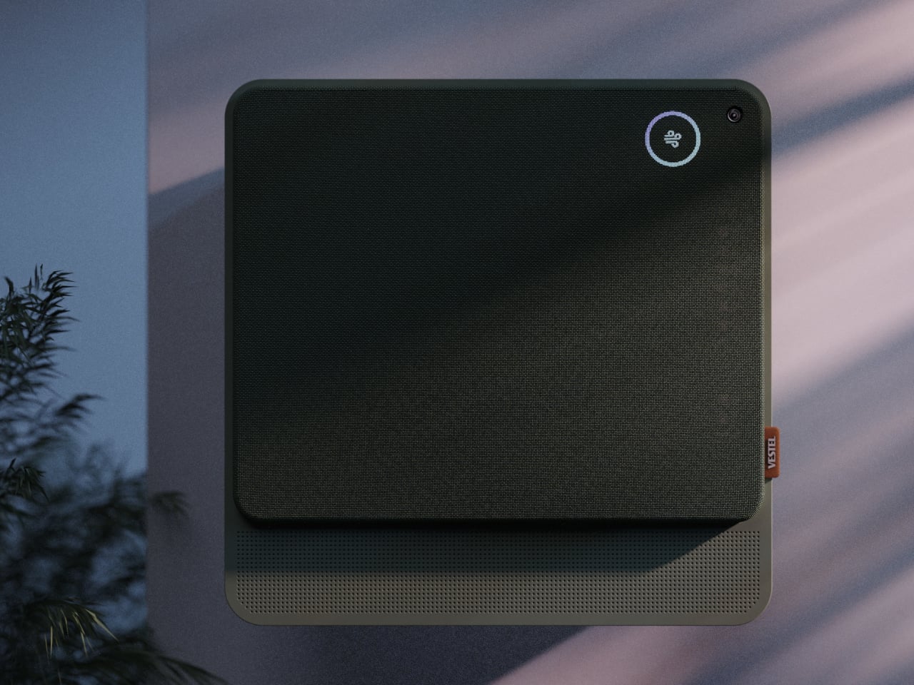
Beyond airflow, the system also handles humidity, air purity, ambient lighting, and sound. A built-in humidifier balances moisture levels rather than leaving the air artificially dry, which is one of the most common complaints about running a conventional unit through the night. Circadian lighting and integrated speakers complete the picture, creating conditions that support sleeping, concentrating, or quietly winding down, depending on what the moment calls for.

All of this adjusts automatically. The system continuously monitors temperature, humidity, and air quality, then fine-tunes its output without any manual input. A baby’s room needs different conditions than a home office or a gym corner, and WellFlow is designed to recognize those differences. Its behavior was shaped through user research spanning new parents, older adults, and people with respiratory sensitivities, groups that conventional air conditioners routinely fail to address.

The physical form is just as deliberate as the behavior. Most air conditioners are conspicuously technical, with plastic housings that fight against any interior aesthetic. WellFlow uses a woven textile front panel with rounded corners and a matte finish, giving it a material quality far more associated with furniture than appliances. An ambient light halo behind the unit softly signals its presence on the wall without demanding any attention.

A pull-out front filter makes maintenance visible and intuitive, addressing something the design team identified as a recurring trust issue with conventional units. People often aren’t sure when or how to clean their filters, and that uncertainty quietly chips away at confidence in the device. WellFlow removes that ambiguity. For a machine designed around human comfort, even that seemingly small detail ends up mattering quite a lot.

The post This AC Does 5 Jobs at Once and Looks Like Furniture on Your Wall first appeared on Yanko Design.

❌