❌

Vue normale

  • ✇Yanko Design
  • Pillowy Steel Furniture Without a Stitch of Upholstery
    The steel in Sarah Naghawi’s JAWF collection looks caught halfway between a box and a balloon. Surfaces bulge, dip, and crease, giving rigid metal the appearance of something you might squeeze. I like that moment of confusion, especially because the material remains so obviously metallic. Presented at Amman Design Week 2026, the Jordanian designer’s experimental collection explores how pressure can turn stainless-steel sheets into sculptural objects with their own internal spaces. The problem b
     

Pillowy Steel Furniture Without a Stitch of Upholstery

4 novembre 2026 à 06:07

The steel in Sarah Naghawi’s JAWF collection looks caught halfway between a box and a balloon. Surfaces bulge, dip, and crease, giving rigid metal the appearance of something you might squeeze. I like that moment of confusion, especially because the material remains so obviously metallic. Presented at Amman Design Week 2026, the Jordanian designer’s experimental collection explores how pressure can turn stainless-steel sheets into sculptural objects with their own internal spaces.

The problem being explored belongs to the workshop rather than the living room: how to give sheet metal volume, depth, and an interior through the forming process itself. Naghawi uses hydromechanical forming, introducing hydraulic fluid pressure into welded sheet assemblies so the metal expands and deforms. Pressure becomes a shaping tool, pushing the steel beyond its original flat condition. The attraction is that the resulting surface helps define both the object’s exterior and the space within it.

Designer: Sarah Naghawi (photos by ASPIRE Ali Saadi Photography)

That industrial terminology sounds less approachable than the result. Think of the principle of inflation, except the steel permanently retains the deformation created during fabrication. Outward curves and inward hollows remain as evidence of the forces applied to the material. This gives the objects a physical history you can read in their surfaces. The process hasn’t been hidden beneath a decorative finish; its effects supply much of the visual character.

The name helps explain why those hollows matter. JAWF comes from an Arabic word referring to an inner chamber or protected cavity. Naghawi treats that interior space as a starting point for design, with recesses suggesting possibilities for storage and enclosure. I appreciate that emphasis because sculptural furniture can sometimes ask us to admire its silhouette while leaving its practical purpose unresolved. Here, the cavity is central to the investigation, even if everyday usefulness still needs closer examination.

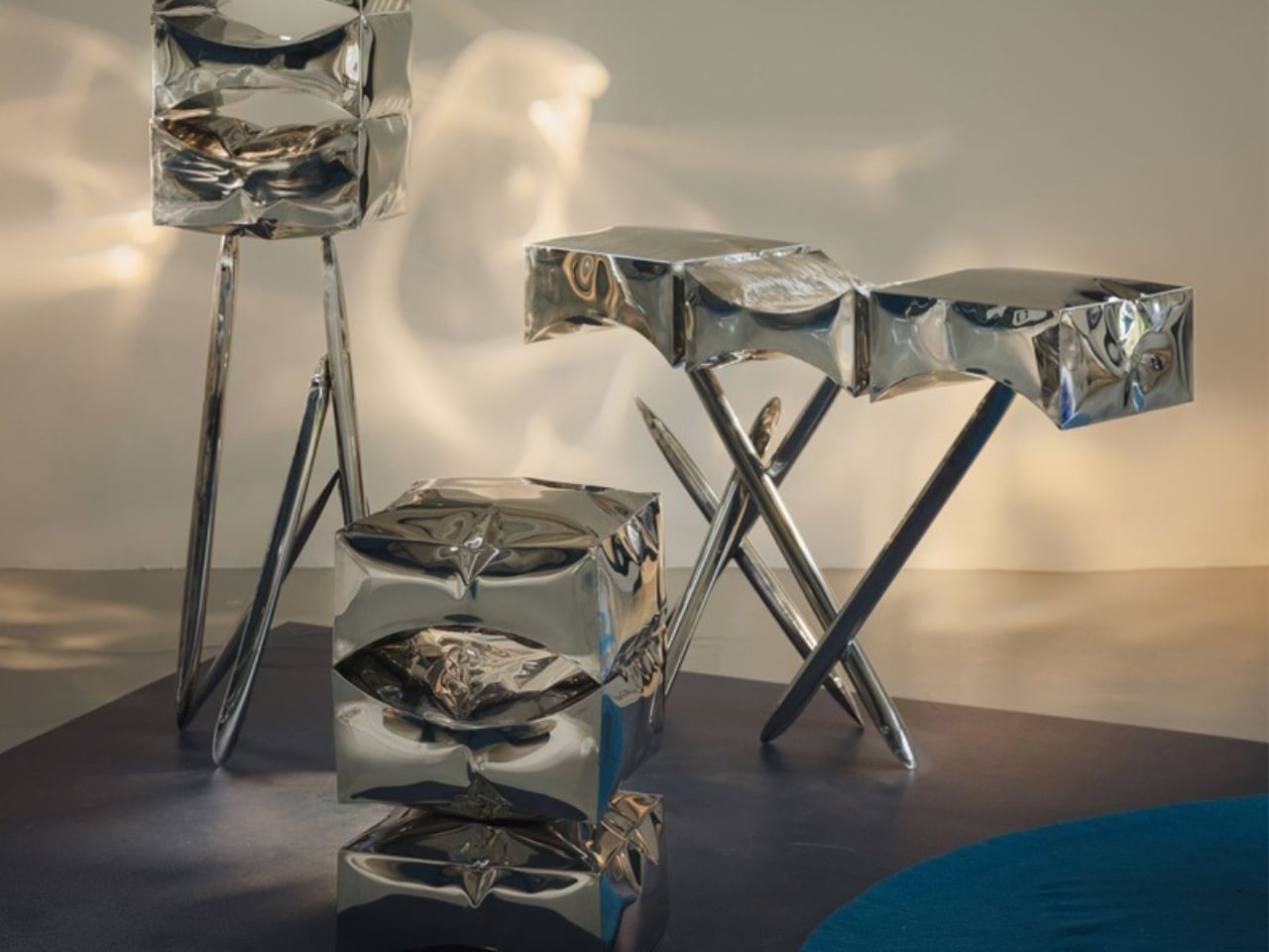
In the exhibition photographs, a tall rectangular piece stands on slender, splayed legs, with three pronounced recesses arranged vertically across its face. Nearby, a horizontal piece stretches across angled supports, its upper surface rising and falling rather than settling into a conventional flat plane. A smaller stacked form brings the same swelling geometry closer to the floor. The family resemblance comes through clearly, but each silhouette gives the pressure-shaped surfaces a different setting.

The reflective finish makes those shapes particularly animated in photographs. Blue from the exhibition floor and bright patches of window light break across the steel, making some edges easy to follow and others surprisingly difficult to locate. To my eye, the pieces sit somewhere between furniture and oversized, crumpled silver packaging. That comparison is affectionate. The familiar shine draws you in, while the uneven geometry prevents the objects from becoming another exercise in polished metallic perfection.

The studio’s balloon reference feels especially useful here. A balloon’s skin and its interior volume develop together under pressure; JAWF translates that relationship into a material that holds the resulting shape. The resemblance stops short of literal imitation, which is a good choice. These aren’t novelty balloons recreated in steel. Their boxy outlines, compressed areas, and deep cavities give them a more awkward, interesting presence. They look like objects negotiating with the force that made them.

I’d want dimensions, weight, pricing, and evidence of everyday usability before treating JAWF as a furniture recommendation. A striking recess doesn’t automatically make a convenient shelf, and an expressive surface doesn’t establish how comfortably an object fits into a home. Those questions don’t diminish the experiment. They establish where the next stage of development would become interesting: translating a compelling material study into pieces whose proportions and functions feel equally considered.

For now, I’m persuaded by the decision to leave the steel’s deformation visible. JAWF gives the eye plenty to enjoy, but it also makes fabrication part of that enjoyment. You can follow a bulge into a hollow and understand that the two belong to the same event. That’s a satisfying reason to look twice, even before deciding where the object might live.

The post Pillowy Steel Furniture Without a Stitch of Upholstery first appeared on Yanko Design.

  • ✇Yanko Design
  • San Siro’s Proposed Replacement Uses a Concrete X-Frame to Support Its Sweeping Roof
    I’m not a fan of either AC Milan or Inter Milan, but as a football fan, visiting Stadio Giuseppe Meazza, more popularly known as San Siro, is an item on my bucket list. However, time is running out for me to actually do that, as most of the iconic stadium is planned for demolition after its replacement opens. That’s because the clubs are planning Generali Stadium, the future shared home of two of the biggest football clubs in Italy. Now the proposed design for the 71,500-seat stadium, by archit
     

San Siro’s Proposed Replacement Uses a Concrete X-Frame to Support Its Sweeping Roof

4 novembre 2026 à 05:15

I’m not a fan of either AC Milan or Inter Milan, but as a football fan, visiting Stadio Giuseppe Meazza, more popularly known as San Siro, is an item on my bucket list. However, time is running out for me to actually do that, as most of the iconic stadium is planned for demolition after its replacement opens. That’s because the clubs are planning Generali Stadium, the future shared home of two of the biggest football clubs in Italy.

Now the proposed design for the 71,500-seat stadium, by architecture studios Foster + Partners and MANICA, has been unveiled. The clubs presented it on October 29, 2026. What’s most striking about the plans is how the X-frame makes the structure itself the architecture. The concrete frame extends from the colonnades, across the facade, and upward to support the roof. Its repeated geometry gives the building its identity while making its structural role visible.

Designers: Foster + Partners and MANICA

According to the clubs, that geometry draws on Italian engineering and the craftsmanship of Milan’s Duomo. The connection is an architectural reference rather than an attempt to reproduce the cathedral. What interests me more is the exposed supporting framework: the stadium’s most recognizable feature also explains something about how the enormous building stands up.

Inside, the focus shifts from concrete to the crowd. Two seating tiers form a continuous bowl around the field, with two steep supporter sections, or Curvas, behind the goals. Each would accommodate approximately 11,700 fans, with seating inclinations reaching 37 degrees. The arrangement is intended to bring supporters closer to the action. For a football fan, that relationship between the stands and the field is more compelling than another impressive exterior.

The double-curved roof also does more than shape the silhouette. The project website says it would incorporate 27,500 square meters of photovoltaic panels, while the clubs describe acoustic engineering intended to intensify the atmosphere. Those are useful ambitions, although the amount of solar electricity generated and the sound of a full stadium can’t be judged from renderings. A dramatic roof isn’t proof of either.

Arrival gets some attention, too. Diamond-shaped entrances would offer glimpses into the stadium before opening onto panoramic concourses with city views. Naturally ventilated colonnades form part of that approach. These spaces give the architecture a role before anyone reaches their seat, although open-looking entrances alone don’t establish how quickly thousands of spectators will actually move through them on matchday.

The plan also extends beyond the ticket gates. The stadium would anchor a 281,000-square-meter redevelopment incorporating public spaces, landscaped areas, retail, and leisure facilities. The aim is to give residents reasons to visit outside matchdays. That’s potentially the most useful part for people who aren’t interested in either club: somewhere to spend time without attending an event. Its everyday value will depend on how much space remains genuinely public and welcoming.

The clubs also promise enhanced accessibility, which deserves attention alongside the dramatic seating bowl. I’d want to know how step-free routes, companion seating, and views when neighboring supporters stand are handled. A designated space is only part of the experience; getting from the entrance to that space matters just as much.

For now, this remains a proposal moving through design and planning. Construction is expected to begin in 2028, with the first match targeted for the 2031/32 season, subject to approvals. That opening target should not be confused with a confirmed deadline for demolishing San Siro.

I can appreciate the logic of designing outward from the supporter sections, even while feeling reluctant about what this replacement means. Bringing fans closer and giving the neighborhood usable public space are worthwhile goals. The harder test will be whether ordinary supporters feel the new building belongs to them. The concrete frame will make the stadium recognizable; the experience of arriving, finding a seat, and watching a match will determine whether people want to return.

The post San Siro’s Proposed Replacement Uses a Concrete X-Frame to Support Its Sweeping Roof first appeared on Yanko Design.

  • ✇Yanko Design
  • A Real Eiffel Tower Light Becomes a Lamp Without the Kitsch
    A miniature Eiffel Tower tells you where someone went, but rarely gives you much reason to look closer. I’m more interested in souvenirs that carry a little of a place’s actual history, especially when they earn their space at home. The challenge is giving that history a useful role without polishing away everything that makes it worth preserving. That’s the appeal of the La Tour Eiffel Diamond Light, designed by A+A Cooren Design Studio with Lagardère x Arteum. Built around a retired fixture f
     

A Real Eiffel Tower Light Becomes a Lamp Without the Kitsch

4 novembre 2026 à 04:15

A miniature Eiffel Tower tells you where someone went, but rarely gives you much reason to look closer. I’m more interested in souvenirs that carry a little of a place’s actual history, especially when they earn their space at home. The challenge is giving that history a useful role without polishing away everything that makes it worth preserving.

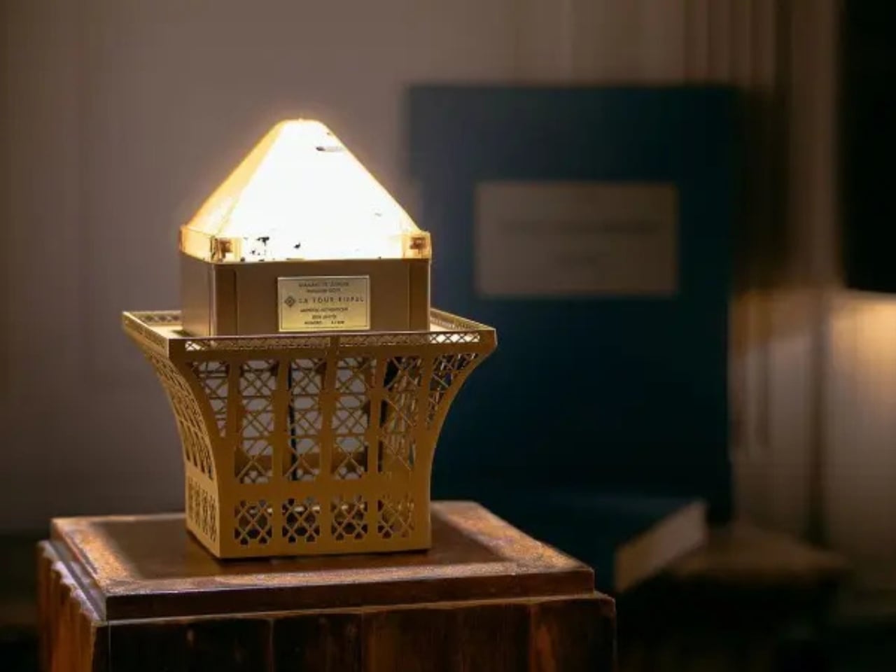
That’s the appeal of the La Tour Eiffel Diamond Light, designed by A+A Cooren Design Studio with Lagardère x Arteum. Built around a retired fixture from the Eiffel Tower’s sparkling illumination, it turns a piece of lighting infrastructure into a working tabletop lamp. The preserved paint marks are part of the point. Rather than manufacture another miniature monument, the designers have given an actual component a reason to stay switched on.

Designers: A+A Cooren Design Studio and Lagardère x Arteum (LxA)

The iron-alloy base makes the architectural connection without turning the whole object into another miniature tower. Drawing from Gustave Eiffel’s historical blueprints, its arches and cross-bracing reinterpret the structure near the monument’s top. I prefer that approach to a literal replica. You get enough of the tower’s visual language to recognize the reference, while the lamp keeps its own proportions and identity as an object for a room.

In the official photographs, the faceted upper section sits above that open metal framework like an oversized jewel in an industrial setting. The brown finish helps the two parts feel related, despite their different origins. It looks substantial without relying on a large footprint, and the exposed latticework gives your eye somewhere to travel beneath the light.

The lighting modes make the connection to Paris more than visual. One provides a steady warm glow. Another alternates 55 minutes of steady illumination with five minutes of twinkling. A third leaves the lamp dark for 55 minutes before its five-minute sparkle sequence. I’d probably favor the steady setting most evenings, but the timed sparkle has an appealingly specific purpose: it brings the monument’s lighting rhythm into the room, rather than simply making a souvenir flash.

A four-position rotary switch handles the three modes and off setting. That feels appropriate for an object whose appeal is so physical. At roughly 10.4 inches tall and 2.9 pounds, it’s a tabletop piece rather than a floor-standing statement. The specifications list 24 LEDs, and the store describes it as ambient lighting. I’d treat it as a decorative accent, not buy it expecting a reading lamp.

It also improves on an earlier idea in a meaningful way. Diamond of Light editions offered in 2016 and 2017 were collectible objects, not functioning lamps. The 2026 version adds an everyday reason to interact with the preserved component. To me, that’s a stronger design move than simply finding a more elaborate way to display it.

Each of the 500 numbered pieces comes with an official certificate of authenticity and a wooden case. The presentation embraces its collector’s-item status, which seems fair enough here. If the attraction is owning an actual piece of the Eiffel Tower’s lighting, documentation of its origin matters considerably more than another decorative flourish on the base.

The price puts that appeal in perspective. The official store lists it at €990 including VAT, before shipping, with worldwide delivery available. You’re paying for provenance, limited production, and the design work around the reclaimed fixture. As a straightforward lighting purchase, it’s difficult to justify on function alone. As a collectible that also has a place in daily life, the proposition makes more sense.

I wouldn’t want the weathering polished away or hidden behind a pristine cover. Those irregularities are what make the premise convincing. The strongest choice here is giving the old component enough new structure to work in a home while letting it remain visibly old. A souvenir becomes more interesting when its previous life is still allowed to show.

The post A Real Eiffel Tower Light Becomes a Lamp Without the Kitsch first appeared on Yanko Design.

  • ✇Yanko Design
  • A Bamboo Armchair Glows After Dark Without Electricity
    Crocheted flowers usually belong on a blanket or a cardigan, not in a conversation about lighting. Peiyang (Camille) Li gives them another job with She Blooms in the Dark, a sculptural seating project that combines a woven bamboo armchair with hand-crocheted blossoms that glow after dark. I like the premise immediately: familiar craft doing something unexpected, without needing to look like a gadget. The problem it addresses is a small but recognizable one: finding a sense of personal space wit
     

A Bamboo Armchair Glows After Dark Without Electricity

3 novembre 2026 à 18:30

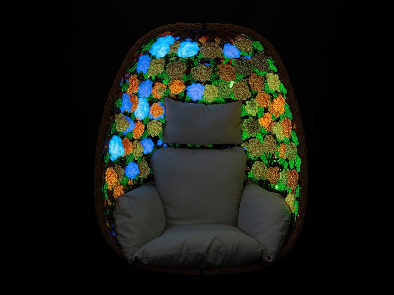
Crocheted flowers usually belong on a blanket or a cardigan, not in a conversation about lighting. Peiyang (Camille) Li gives them another job with She Blooms in the Dark, a sculptural seating project that combines a woven bamboo armchair with hand-crocheted blossoms that glow after dark. I like the premise immediately: familiar craft doing something unexpected, without needing to look like a gadget.

The problem it addresses is a small but recognizable one: finding a sense of personal space without having a separate room to escape into. Li frames the project around emotional vulnerability and protection. I read that as an attempt to make a seat feel like a boundary, a place where being alone might feel intentional rather than awkward. That’s a worthwhile ambition for a piece of furniture, even before the flowers start glowing.

Designer: Peiyang (Camille) Li

The curved, basket-like bamboo framework partially encloses the sitter, while its open lattice stops short of creating a solid shell. That balance matters. For a shared living room, I’d want a retreat that still lets me feel connected to the room, rather than a miniature booth. The shape suggests that possibility, although an open weave shouldn’t be mistaken for actual privacy. Think of it as a visual boundary, not a substitute for a door.

The glow comes from phosphorescent yarn, described in the project write-up as absorbing daylight and releasing a low-intensity glow in darkness, without electric fixtures. That’s an appealingly direct material choice: the flowers themselves provide the effect, instead of hiding a strip of LEDs underneath. I’m more drawn to that decision than I would be to a color-changing chair controlled through an app. The material gets to carry the surprise, and the premise is easy to understand.

It would be a mistake to treat it as a reading light, though. The published description doesn’t give brightness measurements or say how long the glow lasts. For me, the useful way to understand it is as an atmospheric effect, not a replacement for the lamp beside your favorite book. That distinction actually strengthens the idea. It lets the light remain intimate and decorative, rather than making a practical lighting promise the available information can’t support.

Crochet also makes sense here beyond the novelty of glowing yarn. A flower carries associations with care, growth, and decoration, at least in my reading, and working it by hand adds another layer to that impression. I appreciate that Li hasn’t chosen an abstract luminous panel. The floral language gives the project a slightly storybook quality. It could be too whimsical for a restrained living room, but I wouldn’t want that personality edited out.

That doesn’t mean the chair can promise calm on command. I’m wary of furniture being asked to solve an emotional condition simply because it wraps around a person. A more reasonable ambition is to offer an invitation: sit here, give yourself a moment, let this particular corner have a different purpose. She Blooms in the Dark makes sense to me on that modest scale. It doesn’t need a therapeutic claim to justify its existence.

There are everyday questions I’d want answered before imagining it at home. The published project information doesn’t include dimensions, a price, or purchasing details, and it isn’t enough to judge comfort or upkeep. I’d want to know how the flowers are attached and how you clean around them. Those aren’t objections to a sculptural project. They’re the questions that separate admiring a piece of furniture from deciding where it could live.

Still, I’m glad this chair takes such an idiosyncratic route to a familiar desire. I don’t need every quiet corner to look like a spa, and I don’t need every interesting light effect to arrive with another charger. A bamboo seat dressed in glowing crochet offers a more playful possibility. The appeal is being allowed a little enchantment at home, with enough recognizable craft to keep it from feeling like a special effect.

The post A Bamboo Armchair Glows After Dark Without Electricity first appeared on Yanko Design.

  • ✇Yanko Design
  • Old Bamboo Scaffolding Becomes a Retreat, but Not Forever
    The bamboo in Macau’s Bamboo Pagoda had already worked on construction sites before becoming a place to take a breather. I like that reversal. Scaffolding typically helps build the destination; here, it became the destination. Conceived as a temporary waterfront refuge, the pavilion addressed a familiar urban problem: having somewhere to go doesn’t necessarily mean having somewhere to pause. Its ambition was to give people that room. Designed by Impromptu Projects, the Macau practice led by Rit
     

Old Bamboo Scaffolding Becomes a Retreat, but Not Forever

3 novembre 2026 à 05:15

The bamboo in Macau’s Bamboo Pagoda had already worked on construction sites before becoming a place to take a breather. I like that reversal. Scaffolding typically helps build the destination; here, it became the destination. Conceived as a temporary waterfront refuge, the pavilion addressed a familiar urban problem: having somewhere to go doesn’t necessarily mean having somewhere to pause. Its ambition was to give people that room.

Designed by Impromptu Projects, the Macau practice led by Rita Machado and João Ó, Bamboo Pagoda stood approximately 43 feet tall along Sai Van Lake. Its roughly 270-square-foot footprint was modest for something with that much vertical presence. Organized by Ephemera Public Space Cooperative, the built installation had a short October 2026 program ending October 11. Permanence was never part of the brief.

Designer: Impromptu Projects (photos by Tang Kuok Hou, Gonçalo Lobo Pinheiro)

The structure borrowed from traditional pagoda geometry, rising from an octagonal base and tapering upward. Slender bamboo poles formed its exposed structural frame, joined using traditional scaffolding lashings. That construction gives the design its strongest architectural idea: the connections and supporting members remain part of the expression. I’d rather understand how a pavilion stands up than have its structure disappear behind a decorative surface. Here, the craft supplied both the framework and the character.

That craft also deserves more attention than a passing reference to tradition. Macau added bamboo scaffolding to its Inventory of Intangible Cultural Heritage in 2017, and local scaffolding contractor Seng Kei Pang Chong worked on the pagoda. Those credits matter. Architectural heritage depends on people who know how to make things, not simply designers who appreciate their appearance. Giving those skills a public-facing role strikes me as a meaningful way to keep them relevant.

A semi-translucent bamboo-fabric skin wrapped the frame, filtering daylight rather than enclosing it behind an opaque wall. The material choice makes sense for a place intended for contemplation: it establishes a boundary without treating the waterfront as something to shut out. I wouldn’t confuse that intention with proven acoustic quiet or weather protection. The more convincing proposition is spatial, giving visitors a defined place to stop beside the water.

Underfoot, the material story took an unexpected turn. Macau-based Zence Object Technology, also known as CHAZENCE, supplied composite floor panels made with recycled tea waste and discarded wood chips. Tea waste is an appealing detail, but its use as flooring is what makes it interesting. Here, a byproduct became part of a usable architectural surface. That’s a more substantial design decision than adding a recycled-material accent for visitors to admire and then forget.

Solar panels also powered the installation’s spotlights, according to local reporting. Alongside the previously used bamboo and tea-waste flooring, that gave the environmental intentions some specific substance. Still, those choices don’t establish the project’s total carbon footprint or prove that every component avoided waste. I find the individual decisions persuasive enough without asking them to support a sweeping sustainability claim. Knowing where a material came from is a useful place to start.

The brief lifespan is the tradeoff I’m less ready to romanticize. The public program lasted only a week, which limits the everyday usefulness of a space created for people to pause. A temporary pavilion can’t substitute for lasting access to welcoming public places. But it can make a proposal tangible. Instead of leaving the idea of a contemplative waterfront space in a planning document, the organizers gave visitors an actual structure to enter.

For me, Bamboo Pagoda’s appeal rests in the relationship between its scale and its purpose. A tower about 43 feet tall sounds like an attention-seeking gesture, yet the stated invitation was simply to stop and reconnect with the waterfront. The reused poles, visible construction, and small floor area kept that invitation grounded in a particular place and building culture. I’d like more public design to make room for an activity as undemanding as taking a pause.

The post Old Bamboo Scaffolding Becomes a Retreat, but Not Forever first appeared on Yanko Design.
  • ✇Yanko Design
  • LEGO Bauhaus Chess Concept Has Hidden Clues to Its Moves
    A knight’s horse-shaped head is easy to recognize, but it offers no clue about that peculiar L-shaped move. That’s a small frustration with learning chess: identifying the pieces and remembering what they do are two separate tasks. I like the idea of giving their shapes a little more responsibility, especially when the alternative is explaining the knight’s movement for the fifth time. Pinke Gans’s Bauhaus Chess Set, a LEGO Ideas fan concept, takes that possibility as its starting point. Accord
     

LEGO Bauhaus Chess Concept Has Hidden Clues to Its Moves

3 novembre 2026 à 04:15

A knight’s horse-shaped head is easy to recognize, but it offers no clue about that peculiar L-shaped move. That’s a small frustration with learning chess: identifying the pieces and remembering what they do are two separate tasks. I like the idea of giving their shapes a little more responsibility, especially when the alternative is explaining the knight’s movement for the fifth time.

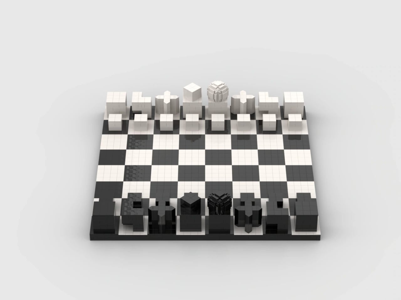
Pinke Gans’s Bauhaus Chess Set, a LEGO Ideas fan concept, takes that possibility as its starting point. According to the designer, the idea emerged during a summer visit to the Bauhaus Museum in Weimar, Germany, where Josef Hartwig’s geometric chess pieces brought LEGO bricks to mind. It’s an appealing connection: a construction system built around basic shapes meets a chess set designed to make those shapes meaningful.

Designer: Pinke Gans

Hartwig designed his Bauhaus chess set in 1923, while working at the school in Weimar. Its abstraction wasn’t simply a matter of removing decorative details. The pieces used their forms to communicate their movement, replacing familiar figures with a geometric vocabulary. A minimalist chess set can still leave you memorizing arbitrary symbols; Hartwig’s approach gives some of those symbols a practical explanation.

The knight is the clearest example. Its stepped shape echoes its L-shaped movement, while the bishop’s diagonal cross relates to its diagonal paths across the board. Pinke Gans’s version carries those recognizable forms into bricks. These are useful memory cues, not a complete substitute for learning the rules. Nobody should expect a small cube to explain every complication of a pawn’s first move or capture.

In the supplied images, the queen provides the most conspicuous departure from all those straight edges. Its rounded top becomes a faceted, layered construction, with individual elements visible around its surface. Nearby, the king has a smaller cube turned relative to its base. Together, they introduce enough variation to interrupt the rows of blocks. The brick-built approximation of a sphere gives the queen a texture of its own.

That translation is more interesting to me than a perfectly smooth replica would be. Historical examples of Hartwig’s set were made in wood, so rebuilding the forms in LEGO changes how their surfaces read. Here, joints and tile seams remain visible. They establish a second, finer grid within the larger chessboard pattern, making the construction legible even where exposed studs don’t dominate the design.

The board itself stays restrained: black and white squares, a dark perimeter, and no elaborate scenery competing with the pieces. From the lower viewing angles, the arrangement resembles a small collection of architectural models. I could see this earning its place on a living room table because the visual interest comes from proportion and repetition, rather than decoration.

There is a potential usability tradeoff, though. If you already recognize conventional chess silhouettes instantly, a geometric set asks you to learn a different identification system before its logic becomes helpful. A blocky king and a rounded queen might be clear once explained, but that doesn’t establish faster recognition during play. The images also can’t tell us how securely the pieces hold together when repeatedly picked up.

The project is presented as a LEGO Ideas proposal, rather than an announced retail set. That distinction deserves to stay attached to the enthusiasm. Fan product ideas that reach 10,000 supporters may be considered for production, but reaching that threshold doesn’t itself put a box on store shelves. This submission shouldn’t be treated as a confirmed release or given an imagined price.

For me, the strongest reason to want it is the opportunity to assemble the shapes before playing with them. Building a knight’s stepped form could make its design rationale more tangible than simply reading an explanation beside a finished piece. You’d still need to learn chess. But spending a little time constructing the thing that represents a move seems like a particularly appropriate introduction to Hartwig’s idea.

The post LEGO Bauhaus Chess Concept Has Hidden Clues to Its Moves first appeared on Yanko Design.
  • ✇Yanko Design
  • MagBoard Clipboard Rearranges Notes Without Tearing Pages
    I’m a big fan of notebooks, as evidenced by the ton of used and unused ones that I have sitting at home. But there are times when I’m working on a project and wish there were a way to rearrange my notes without having to tear the pages out because it hurts my heart to actually tear pages out of anything bound. Sure, you can use notepads with tearaway pages, but it’s hard to keep them together when needed. The MagBoard Clipboard is an alternative you can use if you don’t need a fixed notebook st
     

MagBoard Clipboard Rearranges Notes Without Tearing Pages

2 novembre 2026 à 19:30

I’m a big fan of notebooks, as evidenced by the ton of used and unused ones that I have sitting at home. But there are times when I’m working on a project and wish there were a way to rearrange my notes without having to tear the pages out because it hurts my heart to actually tear pages out of anything bound. Sure, you can use notepads with tearaway pages, but it’s hard to keep them together when needed.

The MagBoard Clipboard is an alternative you can use if you don’t need a fixed notebook structure but still want to keep those pages flexibly organized. It’s a hardcover, loose-sheet notepad and clipboard that uses a magnet-and-lever mechanism to hold the pages together. You can rearrange them when needed without keeping them permanently bound.

Click Here to Buy Now: $45

Unlike the pages of a notepad, which can be difficult to keep together once you’ve torn them from their binding, these loose sheets can be secured by the mechanism, then released and reorganized as needed. It can hold up to 30 sheets, which could be enough for your notes, sketches, and project plans for the specific thing you’re working on. It’s a working collection rather than somewhere to archive everything.

For example, you could keep your initial sketches next to your revised ideas instead of having them separated by several pages of unrelated notes. If a project changes direction, you can change the order of the pages along with it. You can also remove completed tasks and add fresh sheets without starting another notebook just because the existing one no longer feels organized.

The hardcover serves a practical purpose as well, aside from looking good. The seller says it provides support for taking notes or sketching while standing. This could be useful if you’re doing a walkthrough for an event, stopping to take notes while going through an exhibit, or attending a lecture where you’re not at a desk. Not every notebook or notepad provides enough support for writing without a table underneath it, so the clipboard aspect has a practical role here.

The cover is also described as water-resistant and easy to clean, but note that this doesn’t mean the paper inside is waterproof. It comes in two sizes: the smaller A5 option for a more compact way of taking notes and making sketches, and the A4 size, which gives you more space for larger drawings, printed references, and documents. The listed colors are silver, black, red, navy, and yellow, although availability may vary by size and color.

Of course, rearrangeable pages aren’t exclusive to MagBoard. Established stationery brand KOKUYO offers the Campus Smartring Slim Binder, whose A5 version holds up to 25 sheets and uses 20-hole loose-leaf paper. Its cover also folds back. MagBoard holds sheets with its magnet-and-lever clip rather than rings, so there’s no need to punch matching holes in the paper. KOKUYO makes sense if you like a ring-bound system, while MagBoard could appeal more if you want to keep unpunched sheets together. The difference is less about whether you can rearrange pages and more about how you want to hold them.

That freedom still comes with some organizing on your part. Once you remove a sheet, you’ll need somewhere to keep it if you want to refer to it later. A folder for finished work could help keep the clipboard focused on your current project. Otherwise, you’re back to the same loose-paper pile you were trying to avoid in the first place.

I don’t think something like this would replace all the notebooks sitting at home, especially the ones I use for keeping things in chronological order. But for projects that involve moving ideas around, combining references, and changing plans, the MagBoard Clipboard’s format makes sense. Sometimes, I don’t need a new notebook. I just need a way to keep my pages together without deciding that their order has to stay that way forever.

The post MagBoard Clipboard Rearranges Notes Without Tearing Pages first appeared on Yanko Design.
  • ✇Yanko Design
  • Voxel the Robot Wants to Tidy Your Home Without Looking Human
    A mustard-yellow body, rosy arms, and bent legs make this household robot look like it might wander out of an animated movie and ask where you keep the mugs. Its illuminated eyes sit low on a boxy torso, leaving a lot of forehead, if that’s even the right word. I like the awkward proportions. They give it character without trying to pass for a person. Called Voxel, the robot is being developed by New York company Tuesday Labs to tackle the little jobs that keep a home from staying tidy. Put the
     

Voxel the Robot Wants to Tidy Your Home Without Looking Human

2 novembre 2026 à 16:30

A mustard-yellow body, rosy arms, and bent legs make this household robot look like it might wander out of an animated movie and ask where you keep the mugs. Its illuminated eyes sit low on a boxy torso, leaving a lot of forehead, if that’s even the right word. I like the awkward proportions. They give it character without trying to pass for a person.

Called Voxel, the robot is being developed by New York company Tuesday Labs to tackle the little jobs that keep a home from staying tidy. Put the book away. Bring over a drink. Water the plants. Remember where the wallet went. Those are the four roles outlined for the robot: Home Reset, Fetch, Tend, and Find.

Designer: Tuesday Labs

For now, though, Voxel is a development prototype, not a household appliance you can order for next weekend. Tuesday Labs expects to substantially redesign its hardware before delivery, and its reservation agreement says appearance, capabilities, and specifications may change significantly. That distinction matters here because the version we’re admiring is also a design proposal, not a settled promise about what arrives at your door.

Still, I’m glad the proposal has a point of view. The warm colors and exposed joints make Voxel look approachable to me, while the unapologetically mechanical body avoids the strange social expectations of a realistic human face. Tuesday Labs works with illustrators, animators, and character designers on its robots. You can see why that matters: a machine sharing your kitchen has to be tolerable company, even when it isn’t doing anything.

The hardware description is more practical than the cartoon styling suggests. Each arm has seven degrees of freedom and an actuated wrist, intended to help it maneuver around counters, shelves, and doors. The grippers have just one degree of freedom. That’s a relatively simple hand for a complicated environment, and I’d judge it by how consistently it handles everyday objects rather than how convincingly it imitates fingers.

Find is the feature that makes the premise feel especially relatable. Tuesday Labs says Voxel would tell you where it last saw a misplaced object. That’s a modest but useful distinction: remembering the wallet on the counter is different from magically knowing where it is now. I’d take a dependable last sighting over a confident guess, particularly during the familiar scramble to get out the door.

The plant-watering brief also sets a sensible scale for the ambition. I don’t need a robot to perform an elaborate dinner routine to understand the appeal of getting small chores off my list. The harder question is how much setup and supervision those chores would require. A helper that needs constant rescuing would simply create another household responsibility.

That attentive presence raises a less photogenic design issue, too. Voxel’s listed vision system includes stereo RGB cameras and wide-field vision. Before putting one in my living room, I’d want clear answers about what gets recorded, what stays on the robot, and who can access it. The published privacy policy covers the website, purchases, and reservations; it doesn’t establish those operating details for a robot inside the home.

The financial commitment is equally worth slowing down for. Reservations cost $200 and are fully refundable before an order is placed. The estimated purchase price is $20,000, not a fixed final price, and deliveries are expected to begin in 2028, potentially later. A reservation buys an opportunity to purchase, not a finished machine or a guaranteed arrival date.

At that price, charm would get Voxel my attention, but it wouldn’t settle the decision. I’d want to watch it repeat the same ordinary tasks, unassisted, in a room that hadn’t been carefully arranged for it. Keep the odd proportions and the expressive eyes. Just make the useful behavior as convincing as the character. A robot earns its place beside the couch by giving you fewer reasons to get up.

The post Voxel the Robot Wants to Tidy Your Home Without Looking Human first appeared on Yanko Design.
  • ✇Yanko Design
  • Instax Mini Evo 2 Brings Retro Fun Without Giving Up Digital
    One of the things that I’d like to explore more in 2027 is taking more photos of the things around me and the things I’ll be experiencing in the new year. I’m still not good enough to warrant getting a DSLR camera, but I would be willing to try out digital cameras where I can experiment and play around with filters and textures while also being able to make the photos live outside of my camera roll. Fujifilm’s Instax Mini Evo 2 is one such camera, with tactile controls, a large touchscreen, 10
     

Instax Mini Evo 2 Brings Retro Fun Without Giving Up Digital

28 octobre 2026 à 10:20

One of the things that I’d like to explore more in 2027 is taking more photos of the things around me and the things I’ll be experiencing in the new year. I’m still not good enough to warrant getting a DSLR camera, but I would be willing to try out digital cameras where I can experiment and play around with filters and textures while also being able to make the photos live outside of my camera roll.

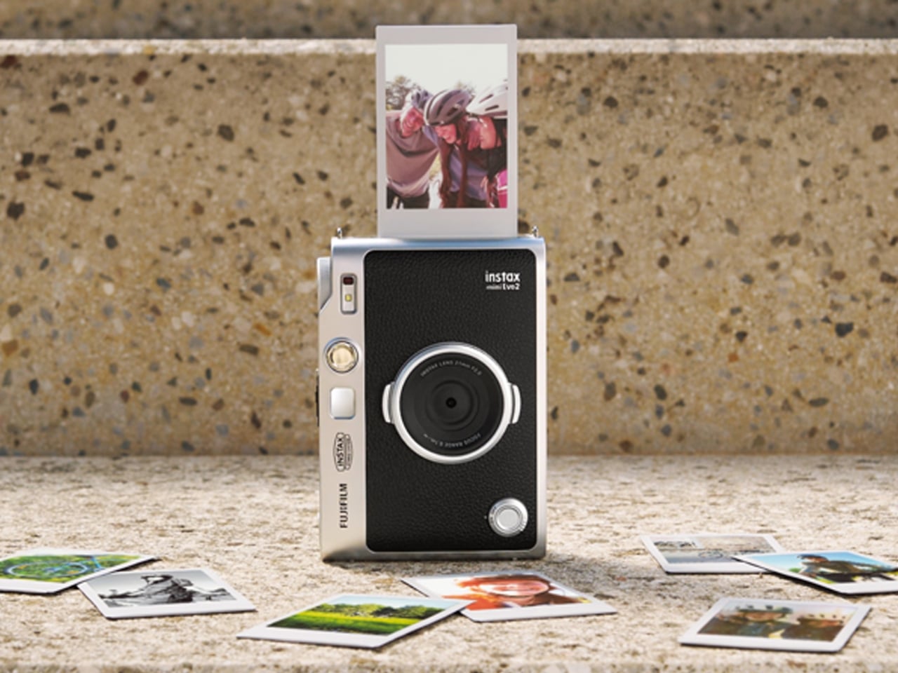
Fujifilm’s Instax Mini Evo 2 is one such camera, with tactile controls, a large touchscreen, 10 lens effects and 10 film effects to create 100 combinations, and, of course, the ability to print photos. This second generation of the hybrid instant camera and photo printer keeps its predecessor’s retro feel and range of creative combinations while adding some modern conveniences.

Designer: Fujifilm

The camera’s tactile controls add a tangible interface to this digital camera, giving it an analog-inspired way of operating. You have a lens dial to change from one lens effect to another, while the film-effect dial lets you go through the 10 different film effects. There’s also a lever that you pull to print out the photo, making printing a separate, deliberate action.

The 4.5-inch touchscreen is larger than the original Mini Evo’s display. Its Expanded View mode displays the area outside your intended print frame. You get a framing guide to show you what the photo will actually include, giving you an added layer of compositional awareness. This could be useful when you’re waiting for a moving subject to enter the frame. The touchscreen complements the dials by handling settings, image browsing, and editing, including cropping and adjustments to brightness, contrast, and saturation. You can make those changes on the camera before deciding which pictures deserve a print.

The Mini Evo 2 also now has an Immersive Movie feature that captures the four seconds leading up to your photo, producing a five-second silent clip that includes the shutter moment. It requires a separately sold microSD card. Rather than reducing the still photo to a smaller size, Fujifilm lists separate recording resolutions: 2144 × 2860 pixels for normal still images and 560 × 992 pixels for video. The short clip gives you a little more of what happened around the photograph, although it isn’t a replacement for recording longer videos.

For still photos, the camera can also record at approximately 13 megapixels when a microSD card is inserted and Expanded View is turned off. That gives you a higher-resolution option, but it isn’t the default for every shot. It’s worth knowing the conditions rather than assuming that every image you take will have the same resolution.

What appeals to me most is having a dedicated digital camera that encourages a little more playing around. I’d like to spend more time choosing how a photo looks before taking it, rather than scrolling through editing options afterward. The combination of physical dials and a touchscreen feels like an interesting way to approach that, with familiar digital controls alongside something you can actually turn.

The built-in printer adds to the appeal of having two devices in one. It works with photos taken on the camera and pictures from your smartphone through the Instax Mini Evo app. The app also supports remote shooting, so you can join a group photo instead of always being the person behind the camera. Your phone still has a role, but it doesn’t have to handle every part of taking the picture. Combining a digital camera and printer isn’t new for Fujifilm, so the novelty here is more about how the pieces work together. The larger touchscreen and new shooting modes give me more reasons to be interested in the camera itself, beyond the photographs it can print.

For my 2027 photography plans, I’d like a camera that makes me curious enough to keep picking it up. Trying a different effect or paying closer attention to what enters the frame seems like a manageable place to start. I don’t need every picture to become a keepsake; I’d be happy to develop a habit of noticing more. Fujifilm announced the Mini Evo 2 on October 27, 2026, with availability scheduled to begin November 27, 2026.

The post Instax Mini Evo 2 Brings Retro Fun Without Giving Up Digital first appeared on Yanko Design.

  • ✇Yanko Design
  • RAY’s 3D Print Scraper Concept Refuses to Be Another Rectangle
    The little rectangular blade gives RAY away. Without it, Marija Kucurski’s stingray-shaped design could pass for a small sculpture, all sweeping fins and a curling tail. It’s actually a concept for a 3D print scraper, a tool meant to help release stubborn plastic from a printer’s build surface. Presented through renderings on Render Weekly, it gives an unglamorous workshop accessory a silhouette I’d happily leave out on the bench. The practical problem is straightforward: a print needs to stay
     

RAY’s 3D Print Scraper Concept Refuses to Be Another Rectangle

28 octobre 2026 à 05:15

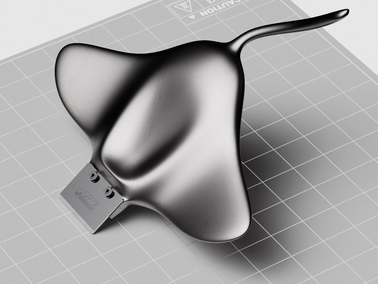
The little rectangular blade gives RAY away. Without it, Marija Kucurski’s stingray-shaped design could pass for a small sculpture, all sweeping fins and a curling tail. It’s actually a concept for a 3D print scraper, a tool meant to help release stubborn plastic from a printer’s build surface. Presented through renderings on Render Weekly, it gives an unglamorous workshop accessory a silhouette I’d happily leave out on the bench.

The practical problem is straightforward: a print needs to stay attached while it’s being made, but removing it afterward can take care. Prusa recommends letting its flexible steel sheets cool before bending them to release a print, sometimes using a spatula for assistance. RAY explores a handle for that scraping job while tackling a second, more personal frustration. Kucurski wanted to get away from the cubes, rounded rectangles, and racetrack shapes that had started to feel repetitive.

Designer: Marija Kucurski

In her project description, Kucurski compares working with SubD to playing with pizza dough or clay. That experimentation led her toward a stingray. I like how modest that explanation is. There’s no elaborate story about the ocean teaching us to scrape plastic more efficiently. She wanted to try a different shape, followed the modeling process, and arrived at an animal whose broad body gives the tool a recognizable identity. Sometimes that’s a perfectly worthwhile starting point.

Seen from above, RAY spreads outward into two rounded wings, with a raised central body flowing into a slender, curved tail. The dark, metallic-looking surface catches light across those changes in curvature, making the body feel more sculpted than assembled. That’s a visual effect in the renderings, not confirmation of a particular material. The blade sits at the front, interrupting those soft contours with a plain rectangle and two exposed fasteners.

A separate visualization makes the proposed grip clearer. A hand cradles the broad body, with the thumb resting near the center and fingers supporting the wings from underneath. The tail extends back toward the wrist rather than serving as a conventional narrow handle. That arrangement suggests a different relationship between hand and tool: more of a palm-supported object than something held by a stick. I’d be curious to see how that translates when applying pressure close to the build plate.

The blade attachment is a useful visual anchor. Two visible screw heads keep the business end legible, so the animal reference doesn’t completely swallow the tool’s purpose. I appreciate that decision. A perfectly uninterrupted stingray would make a cleaner sculpture, but the exposed hardware gives RAY a little workshop credibility. It also draws attention to the connection that would need to hold up during use.

My hesitation is mostly about the tail. It completes the stingray immediately, and removing it would make the design less memorable. But I’d want to know whether it contributes anything to handling or simply asks for extra space in a drawer. The wide wings raise a similar question about storage. Neither concern ruins the idea. They’re the ordinary negotiations that make a playful concept interesting once you imagine it sharing a bench with other tools.

The available presentation doesn’t establish grip comfort, scraping performance, or compatibility with particular build surfaces. Those details would matter more than the silhouette if RAY moved toward production. Even a beautiful scraper needs to respect the surface underneath it. Prusa specifically cautions against damaging the sheet when using a spatula and recommends slipping it beneath the model while the sheet is slightly bent, rather than digging into a flat surface.

Still, I’m glad Kucurski followed the less predictable shape. I don’t need every tool to resemble a sea creature, but I do enjoy a design that makes its maker’s curiosity visible. RAY earns attention through the sweep of its body and the almost comically practical blade attached to its front. The next step would be putting that expressive form to work, finding out which curves help the hand and which ones are simply along for the ride.

The post RAY’s 3D Print Scraper Concept Refuses to Be Another Rectangle first appeared on Yanko Design.

  • ✇Yanko Design
  • DeWalt’s Tool Batteries Can Charge Laptops Without an Outlet
    A charged drill battery and a dying laptop can sit on the same table and still be useless to each other. That feels like an unnecessarily strict division of labor. DeWalt’s DCB094K USB Charging Kit addresses that disconnect by letting compatible tool batteries power USB devices through an attachable adapter. If you already have spare packs in the garage, the appeal is straightforward: stored energy becomes available to something besides the tool it normally clicks into. The better detail is tha
     

DeWalt’s Tool Batteries Can Charge Laptops Without an Outlet

26 octobre 2026 à 09:20

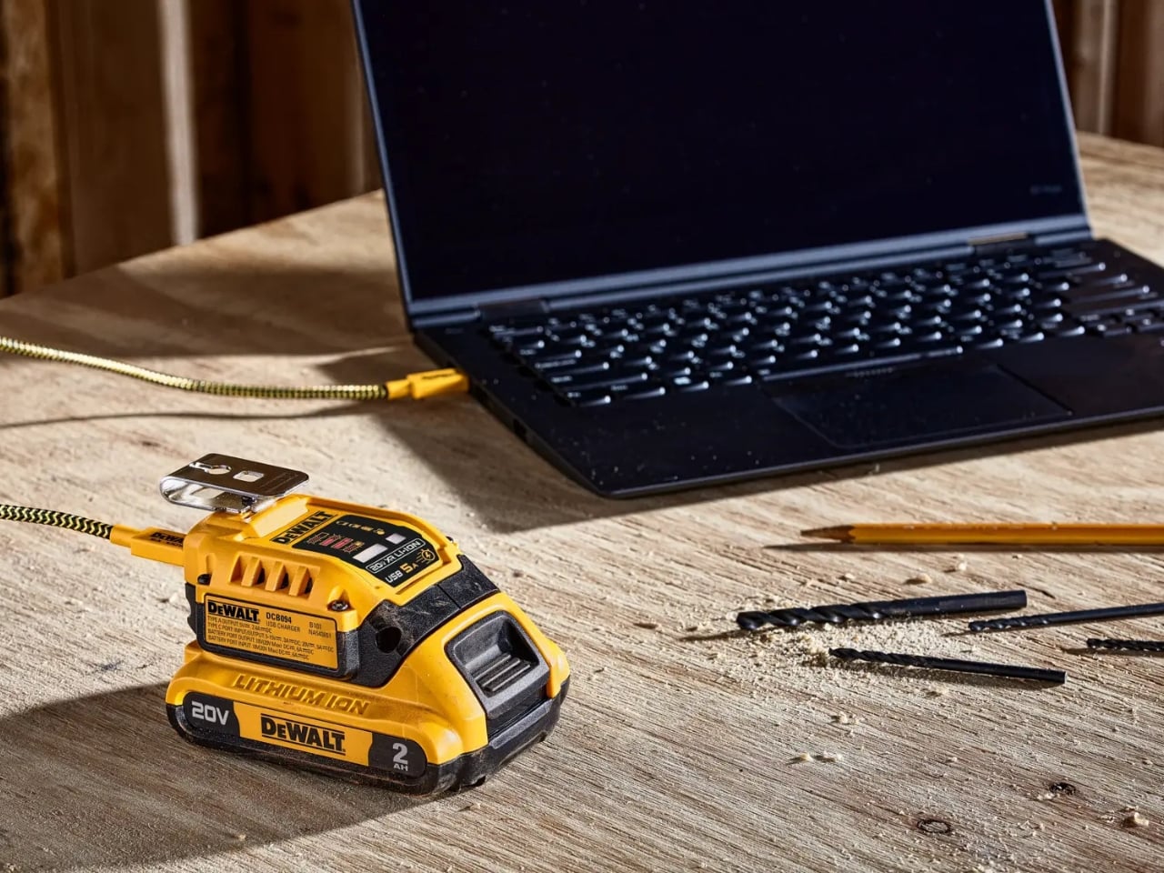
A charged drill battery and a dying laptop can sit on the same table and still be useless to each other. That feels like an unnecessarily strict division of labor. DeWalt’s DCB094K USB Charging Kit addresses that disconnect by letting compatible tool batteries power USB devices through an attachable adapter. If you already have spare packs in the garage, the appeal is straightforward: stored energy becomes available to something besides the tool it normally clicks into.

The better detail is that power can travel the other way, too. The kit’s DCB094 adapter has a bidirectional USB-C port, so it can recharge a DeWalt battery from a suitable USB power supply as well as draw from that battery to charge personal electronics. That solves a second annoyance: needing a dedicated tool-battery charging dock when a compatible USB supply could do the job. It’s this return trip that makes the accessory interesting to me.

Designer: DeWalt

Visually, DeWalt hasn’t tried to disguise it as a sleek desk accessory. The yellow-and-black housing sits on the battery like a smaller piece of power-tool equipment, complete with ventilation slots and a metal belt hook. In the product photograph, the attached battery still accounts for much of the assembly’s bulk. I like that lack of pretense. It looks appropriate beside drill bits and a pencil, even when the cable coming out of it leads to a laptop.

The headline specification deserves a closer look, though. DeWalt rates the USB-C connection for up to 100 watts in either direction, but the kit includes a 65-watt wall supply. You also get a 100-watt-rated USB cable and the belt hook, but no battery. In other words, the adapter’s maximum capability and the supplied wall charger’s output are different numbers. The included charger cannot deliver a 100-watt input simply because the port can accept it. That distinction matters more than the big number on the listing.

Compatibility also needs a little attention. DeWalt lists support for its 20V MAX and FLEXVOLT batteries, while the adapter provides a USB-A output rated at up to 12 watts alongside USB-C. The latter is the connection to consider for a compatible laptop, but check the computer’s charging requirements first. A USB-C socket alone doesn’t establish that a laptop accepts charging through it, and this adapter isn’t a universal substitute for every computer’s power brick.

One interface choice feels less intuitive than the overall idea. The adapter’s indicator lights report charging activity for the DeWalt battery, not the phone or laptop receiving power. DeWalt’s manual specifically notes that the LEDs won’t illuminate while charging personal devices. I’d prefer an obvious output indicator, particularly on an accessory that changes roles depending on what’s connected. As designed, you’ll need to look at the receiving device to confirm that it’s getting power.

The workbench appearance shouldn’t be mistaken for permission to leave it in the weather, either. The manual says to keep the charger out of rain and snow and provide a dry location outdoors. It also instructs owners to detach the battery when the adapter isn’t being used to avoid draining the pack in storage.

Runnings currently lists the kit at $119, which makes this a considered accessory purchase rather than an automatic addition to the cart. I’d find it easier to justify with compatible batteries already on hand. Buying a battery as well would mean paying for an entire setup when the actual need might simply be keeping a phone charged. The useful question is how often those existing packs could cover a charging need away from an outlet.

For someone who moves between DIY projects and laptop work, the two-way charging is the strongest argument. I’d rather add a useful connection to equipment I already own than collect another battery solely for occasional backup duty. The DCB094K makes that possible, provided its price and your device’s requirements line up.

The post DeWalt’s Tool Batteries Can Charge Laptops Without an Outlet first appeared on Yanko Design.
  • ✇Yanko Design
  • The Lamp That Refuses to Need an Outlet or a Charger
    There aren’t a lot of situations that would require me to pull a portable lamp out of my bag. But as someone who likes to journal on the go and read whenever I get the chance, I’ve run into more than a few moments where the available light just wasn’t enough. Even at home, a lamp comes in handy for those times when the main overhead lighting feels like way too much. The Anywhere-Use Lamp is built for exactly those moments. You don’t need an outlet, you don’t need an extension cord, and you don’
     

The Lamp That Refuses to Need an Outlet or a Charger

26 octobre 2026 à 07:40

There aren’t a lot of situations that would require me to pull a portable lamp out of my bag. But as someone who likes to journal on the go and read whenever I get the chance, I’ve run into more than a few moments where the available light just wasn’t enough. Even at home, a lamp comes in handy for those times when the main overhead lighting feels like way too much.

The Anywhere-Use Lamp is built for exactly those moments. You don’t need an outlet, you don’t need an extension cord, and you don’t need to panic if your battery is dead. This lamp works wherever you need it, whether that’s indoors on your desk or nightstand, or outdoors on a picnic table or inside a camping tent.

Click Here to Buy Now: $149

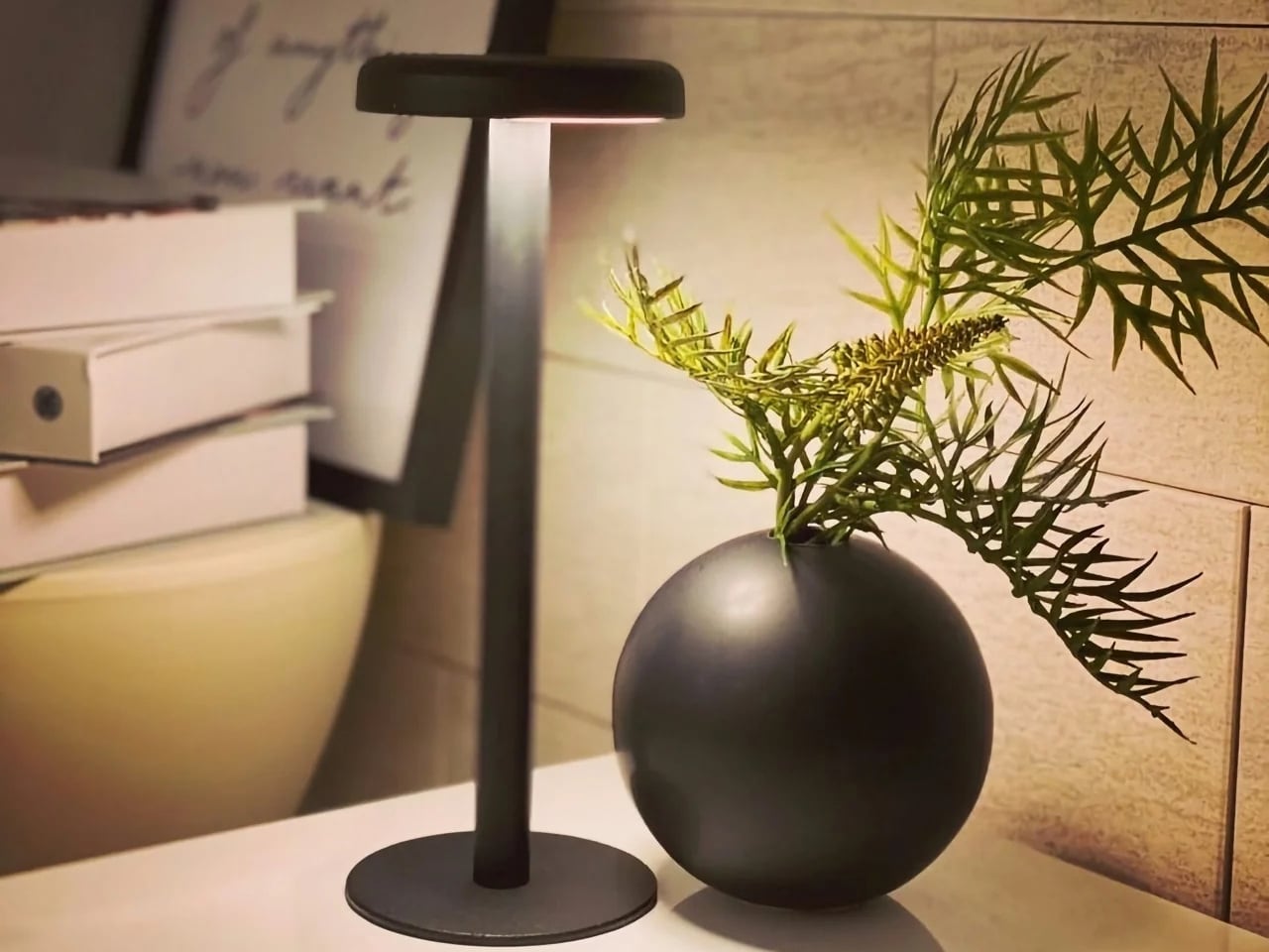
The lamp looks like a mushroom popping up out of the ground, with a soft, rounded cap sitting atop a slim stem base. It reads more like a small sculptural object thanks to its minimalist design, rather than the sleek, tech-forward look most portable gadgets go for. The metal base is “scratch-detailed,” meaning the wear and imperfections it picks up over time become part of its character instead of something you need to constantly wipe down or worry about.

Because it comes in a modular, pack-flat construction, you can assemble and disassemble the lamp quickly and toss it into your bag whenever you’re on the move. There are no dials or switches to fuss with, either. You simply press along any edge of the cap to cycle through brightness levels, and you’ll even feel a satisfying haptic click each time you adjust it, a small but memorable tactile detail that makes the whole interaction feel more considered than your average lamp.

The six high-CRI LEDs are built for light quality over quantity. The warm, soft glow settles gently into your space, functioning more like ambient lighting that supports your surroundings rather than a harsh task light glaring in your face. It runs entirely on AA batteries, so there’s no charging cable to hunt down. As long as you’re carrying a spare set, you can keep the light going for as long as you need.

If you’ve shopped for portable lamps before, you’ve probably come across the Philips Hue Go, one of the biggest names in the battery-powered lighting space. At $179.99, the Hue Go offers smart features the Anywhere-Use Lamp doesn’t try to compete with, including app control, millions of color options, and Alexa or Google Home compatibility. But that convenience comes with strings attached. It relies on a charging base, needs to be recharged every 5 to 48 hours depending on brightness, and works best when you’re connected to Wi-Fi or Bluetooth for full functionality.

The Anywhere-Use Lamp takes the opposite approach. At $149, it skips the smart home ecosystem entirely and leans into pure simplicity: no app, no charging base, no dead battery with nowhere to plug in. If you’re at a campsite, a beach house, or a hotel with an outlet that’s just out of reach, you can swap in fresh AAs and keep going, no Wi-Fi signal required. For readers who want dependable, no-fuss lighting over smart-home bells and whistles, that difference matters.

The true beauty of the Anywhere-Use Lamp is right there in its name. You can use it anywhere you want or need to, thanks to its thoughtful design and practical features. Whether you’re at home looking for a bit of mood lighting or out camping and need a reliable light source to finish up a task, this lamp is ready to be your go-to lighting companion.

At the end of the day, good lighting shouldn’t come with a long list of conditions attached. It shouldn’t require a nearby outlet, a fully charged battery pack, or a phone app just to turn on. The Anywhere-Use Lamp strips all of that away and hands you something refreshingly simple: warm, reliable light that goes exactly where you go. For anyone who values design as much as function, and who’s tired of being tied down by cords and chargers, this little mushroom-shaped lamp might just earn a permanent spot in your bag.

The post The Lamp That Refuses to Need an Outlet or a Charger first appeared on Yanko Design.
  • ✇Yanko Design
  • Titanium Smart Glasses Concept Refuses to Hide Its Tech
    Fitting a computer into a pair of glasses creates an awkward design problem: the electronics need room, but the result still has to belong on someone’s face. Povilas Grigas approaches that tension without pretending it can disappear. His Glasses concept gives the hardware a deliberately different silhouette, treating smart eyewear as its own design category rather than ordinary frames with a technological secret. I like that starting point. Developed for his 2024 design BA thesis, the mixed-rea
     

Titanium Smart Glasses Concept Refuses to Hide Its Tech

25 octobre 2026 à 11:20

Fitting a computer into a pair of glasses creates an awkward design problem: the electronics need room, but the result still has to belong on someone’s face. Povilas Grigas approaches that tension without pretending it can disappear. His Glasses concept gives the hardware a deliberately different silhouette, treating smart eyewear as its own design category rather than ordinary frames with a technological secret. I like that starting point.

Developed for his 2024 design BA thesis, the mixed-reality concept imagines an alternative to being tethered to a phone or desktop screen. The ambition is to make computing available through something worn rather than something you continually look down at or sit in front of. That’s an appealing proposition, although moving digital information closer to your eyes doesn’t automatically make it less demanding of your attention.

Designer: Povilas Grigas

Visually, these glasses have enough personality to carry that discussion. The broad, rounded lens openings sit within a flowing silver-colored frame, while the bridge has two dark circular elements above an oval opening. In the front view, that arrangement almost resembles a tiny surprised face. It’s an unexpectedly playful detail in an otherwise polished object. To my eye, the overall effect lands somewhere between sculptural eyewear and a science-fiction costume department with unusually good taste.

Grigas specifies CNC-milled, polished grade 5 titanium for the frame and optically polished sapphire crystal for the lenses. Those are proposed material choices, not evidence that the finished glasses would feel featherlight or survive everyday abuse. Still, I appreciate the intention behind them. A computer worn this prominently deserves the material attention we give a watch or a favorite pair of glasses, especially if the expectation is that it becomes part of someone’s daily appearance.

The frame’s outline follows the bones around the eyes, according to Grigas, and the vision sensors occupy the bridge for a centered point of view. That placement gives the front a clear organizing feature. Rather than scattering visually competing details across the brow and corners, the design concentrates its most conspicuous technology near the middle. It’s a convincing composition, even if a convincing composition is only one part of making wearable computing practical.

From the side, the arms look substantial, with long, smooth surfaces that curve downward behind the ears. Their thickness is part of the visual identity rather than a detail the presentation tries to conceal. I’d rather see that volume handled deliberately than watch a designer chase thinness at the expense of the overall shape. Here, the broad arms and generous front feel like parts of the same object.

The personal question is whether I’d want such a distinctive object defining my face every day. I’m not sure, and that uncertainty is worth keeping in the conversation. Glasses are unusually intimate technology because people look through them while other people look at them. A frame can be beautifully resolved and still feel wrong for an individual wearer. I’d want more than an impressive image before deciding these belonged in my routine.

The proposed leather charging case helps make that routine easier to imagine. The glasses fold flat inside it, and the presentation shows a dark, textured exterior with visible stitching and a circular metal closure. It reads as an eyeglass accessory rather than a miniature electronics bag. More importantly, putting the glasses away feels like a recognizable action. I find that more reassuring than an expectation that a wearable computer should remain on your body indefinitely.

For now, this is an academic design proposal, not a demonstrated replacement for your laptop. Its presentation doesn’t establish battery endurance, display quality, or long-term comfort, so those questions remain open. What earns my interest is the willingness to give computing a visible presence without making the frame look apologetic. I wouldn’t ask these glasses to pass as ordinary eyewear. I would ask whether their eventual usefulness could earn the space they occupy on my face.

The post Titanium Smart Glasses Concept Refuses to Hide Its Tech first appeared on Yanko Design.

  • ✇Yanko Design
  • Lavvu’s Tiny Home Has a Bathtub and Hidden Storage
    A full-size bathtub is a wonderfully stubborn thing to put inside a tiny home. Lavvu includes one in its published XL specification, despite having only about 237 square feet to work with. That choice gets straight to the problem these modular homes tackle: shrinking a dwelling without making everyday life feel like a series of concessions. I like that the answer leaves room for a soak. Lavvu offers four sizes, from roughly 108 to 237 square feet, with the XL credited to architecture studio Re:
     

Lavvu’s Tiny Home Has a Bathtub and Hidden Storage

25 octobre 2026 à 07:40

A full-size bathtub is a wonderfully stubborn thing to put inside a tiny home. Lavvu includes one in its published XL specification, despite having only about 237 square feet to work with. That choice gets straight to the problem these modular homes tackle: shrinking a dwelling without making everyday life feel like a series of concessions. I like that the answer leaves room for a soak.

Lavvu offers four sizes, from roughly 108 to 237 square feet, with the XL credited to architecture studio Re:Büro. The company is promoting the range for preorder, an important distinction between an appealing design and an immediately available place to live. These are furnished homes, but buyers shouldn’t assume that every size includes every feature shown in the company’s presentation. The XL is the clearest expression of the idea.

Designer: Lavvu

In the promotional imagery, rounded corners and vertically ribbed exterior surfaces give the cabins a slightly retro, almost transportation-inspired appearance. Inside, wood-toned surfaces soften that impression. The large glazed end is the visual centerpiece, framing the landscape rather than leaving it outside a small window. I prefer this approach to making a tiny house resemble a miniature suburban one. The proportions acknowledge that you’re occupying a compact space, while giving your eyes somewhere farther away to land.

The kitchen makes a more practical argument. Lavvu specifies a built-in refrigerator, dishwasher, and two-burner induction cooktop, along with a sliding island that adjusts to provide seated legroom or accommodate standing use. That movable surface is a detail I appreciate. A fixed counter has to commit to one relationship with your body. Letting it shift recognizes that breakfast, food preparation, and moving through a narrow room don’t all require the same arrangement. Small spaces need that kind of flexibility more than another decorative flourish.

Storage gets similar attention. The published XL description includes drawers beneath the bed, nearby shelves, and a wardrobe with hanging space and dedicated shoe storage. These aren’t especially glamorous features, which is precisely why they matter. I’m more persuaded by a place to put yesterday’s clothes than by an immaculate room with no visible possessions. Built-in storage gives the design a plausible way to absorb ordinary belongings, although it doesn’t remove the need to edit what you own.

All that glass makes the setting a meaningful part of the design decision, too. The imagery places the cabins beside water and trees, where openness is the attraction. I’d be less enthusiastic about the same arrangement facing a neighbor’s kitchen. For me, the panoramic end makes the most sense as a retreat with a carefully chosen outlook. Privacy deserves as much attention as the view when deciding where one belongs.

“Mobile” also needs a realistic reading here. Lavvu says its homes travel as fully assembled modules on a trailer or flatbed platform. That describes transportable architecture, not a camper you casually hitch up for a weekend. I see the appeal in having the interior assembled before delivery, but the destination still matters. Access arrangements and installation are questions to resolve with the maker, rather than details to mentally crop out of the scenic pictures.

The listed prices reinforce that this is a considered purchase: the smallest S module starts at €45,000, while the XL starts at €75,000, both before tax. Those are the company’s euro-denominated starting prices, not verified delivered prices for an American property. I’d want a site-specific quote, a confirmed equipment list, and delivery details before treating either number as a complete budget. The distinction matters more than a tempting headline price.

For me, Lavvu’s strongest idea is giving small routines enough space to remain recognizable. Sit at a counter with room for your knees. Put shoes away. Keep a book beside the bed. Take a bath if that’s your preferred way to end the day. I wouldn’t mistake this for an easy answer to every housing need, but as a compact retreat, its attention to ordinary domestic habits makes the design worth considering.

The post Lavvu’s Tiny Home Has a Bathtub and Hidden Storage first appeared on Yanko Design.

  • ✇Yanko Design
  • Neo-Brutalist Vases Look Like Tiny Towers, Even Without Flowers
    An empty vase can make a shelf look oddly unfinished, as though the flowers were supposed to do all the decorating. Aleksander Kozera’s Neo-Brutalist Vases offer a convincing way around that small domestic problem. Created under his Warsaw-based Yird Ceramics brand, these ceramic vessels have enough architectural detail to hold attention on their own. I’d be inclined to leave them empty before deciding what, if anything, belongs inside. Their cylindrical bodies are divided into rectangular pane
     

Neo-Brutalist Vases Look Like Tiny Towers, Even Without Flowers

24 octobre 2026 à 18:30

An empty vase can make a shelf look oddly unfinished, as though the flowers were supposed to do all the decorating. Aleksander Kozera’s Neo-Brutalist Vases offer a convincing way around that small domestic problem. Created under his Warsaw-based Yird Ceramics brand, these ceramic vessels have enough architectural detail to hold attention on their own. I’d be inclined to leave them empty before deciding what, if anything, belongs inside.

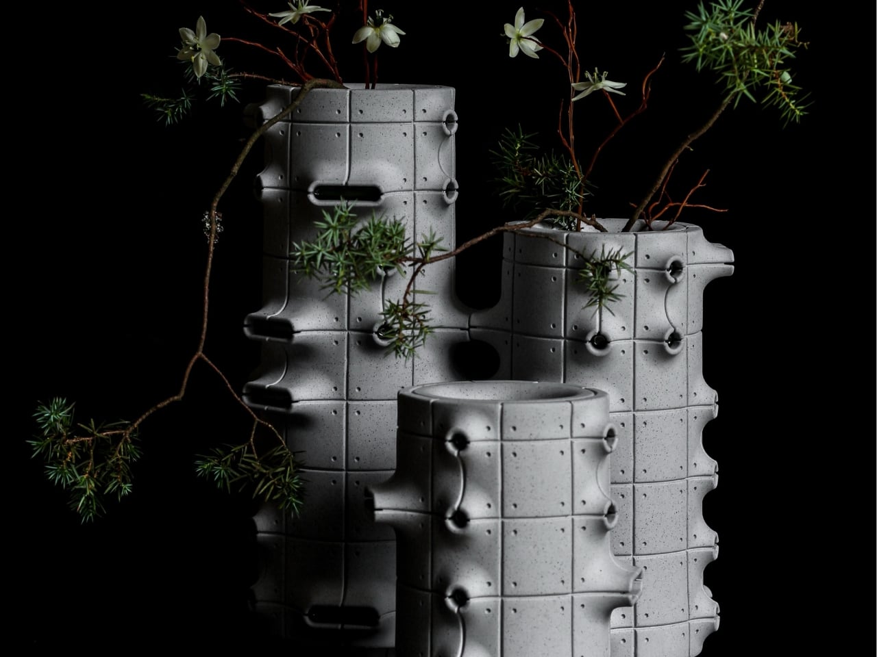
Their cylindrical bodies are divided into rectangular panels, with tiny indentations that suggest construction details on a concrete facade. Circular recesses interrupt that grid, while curved projections extend from the sides like abbreviated balconies or exposed joints. The effect lands somewhere between an architectural model and a piece of science-fiction set dressing. They look a little like infrastructure for a very small, very design-conscious civilization, which is part of their appeal.

Designer: Aleksander Kozera

The concrete resemblance comes from the ceramic body itself. According to the collection’s Łódź Design Festival description, Kozera uses porcelain casting slip with ceramic pigments and black grog to produce that raw, concrete-like finish. In the close-up photographs, dark speckles break up the gray surface. That texture matters visually: without it, the panel lines and repeated circles could read as a smooth plastic prop. Instead, the surface gives the geometry some grit.

The modular approach also makes the collection more interesting than a row of differently sized cylinders. The festival describes vessels that can be combined and arranged into larger compositions. In the photographs, neighboring forms create narrow gaps, overlapping projections, and changing silhouettes. I like the possibility of treating a shelf as a small architectural composition rather than lining up three matching accessories. The vessels share a vocabulary without looking identical from every angle.

Kozera’s broader studio process helps explain that controlled repetition. He describes beginning with digital modeling, then 3D-printing master forms used to make plaster molds for slip-casting porcelain. That’s a useful distinction for anyone assuming these are printed plastic objects or directly printed ceramics. Digital tools establish the geometry, while casting translates it into ceramic. The workshop photographs make that relationship tangible, showing shaped components and molds alongside vessels at different stages of production.

The finish introduces another layer of detail. The collection description specifies a translucent green glaze, with the small exterior “windows” individually glazed by hand. The green is restrained enough that the photographed pieces still read predominantly as gray architectural objects. I prefer that decision to an all-over glossy finish. Small glazed areas give the eye somewhere to pause without obscuring the panel divisions or competing with the speckled body.

Flowers change the balance considerably. In the styled photograph, branching stems stretch above and across the vessels, disrupting all those disciplined horizontal and vertical lines. The arrangement is sparse enough that the ceramic remains visible, which seems the right approach. A dense supermarket bouquet might conceal much of the detail that makes these worth looking at. A few irregular branches would let the architecture and the plant material each have some breathing room.

My reservation is mostly about where they would live. These are visually busy objects, even with their limited palette. On a shelf already crowded with books, collectibles, and patterned ceramics, the small recesses and projecting edges could get lost. I’d give one a relatively clear stretch of console or place a group against a plain wall. That’s a styling preference, but the design rewards enough space to read its silhouette.

These are physical ceramic works rather than render-only proposals, and the collection is listed as selected for the make me! 2026 exhibition at Łódź Design Festival. That listing does not establish retail pricing or US availability, so it shouldn’t be mistaken for a confirmed shopping announcement.

For me, the strongest choice is the attention given to the sides of each vessel. Turn one, and the relationship between grid, recess, and projection changes. That gives the object a reason to stay on display after the stems are gone, without asking an empty vase to pretend it’s waiting for its next assignment.

The post Neo-Brutalist Vases Look Like Tiny Towers, Even Without Flowers first appeared on Yanko Design.
  • ✇Yanko Design
  • A Hidden Mechanism Turns the Scissor Chair Into a Lounger
    Buying a chair for conversation and buying one for an evening with a book can feel like two separate furniture decisions. One asks you to sit up; the other invites you to sink back. If your living room doesn’t have space for both, the Scissor Chair offers an appealing compromise. Produced by the German company Wilhelm Knoll, this mid-century design changes its sitting position while keeping the appearance of an ordinary upholstered armchair. Its designer remains unknown, but the problem it addr
     

A Hidden Mechanism Turns the Scissor Chair Into a Lounger

23 octobre 2026 à 17:30

Buying a chair for conversation and buying one for an evening with a book can feel like two separate furniture decisions. One asks you to sit up; the other invites you to sink back. If your living room doesn’t have space for both, the Scissor Chair offers an appealing compromise. Produced by the German company Wilhelm Knoll, this mid-century design changes its sitting position while keeping the appearance of an ordinary upholstered armchair. Its designer remains unknown, but the problem it addresses is familiar.

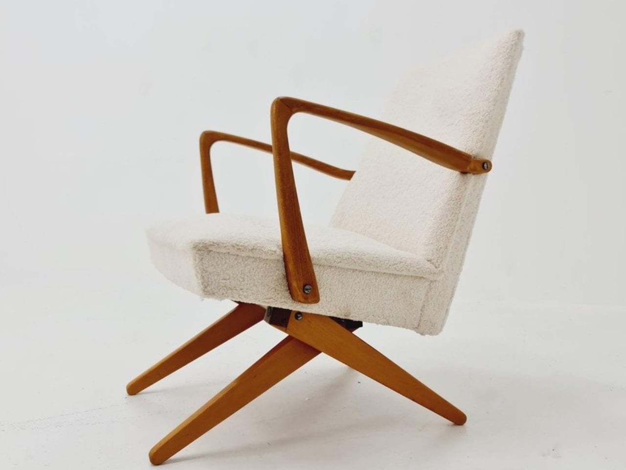
The name gives away the basic geometry. According to a vintage dealer’s description, lifting the armrests allows the crossed legs to unfold. The chair moves between a taller, more upright configuration and a lower lounging position. Instead of leaving the legs stationary while only the backrest moves, the transformation changes the stance of the chair itself. I like that the supporting structure participates in the adjustment. Those wooden legs have a job beyond providing a handsome silhouette.

Designer: Unknown (produced by Wilhelm Knoll)

In photographs of a cream-upholstered example, the narrow wooden arms trace an open shape around the seat and back. There’s plenty of air beneath the upholstery, and the legs remain visually separate rather than disappearing inside a boxy base. In the upright position, it looks quite composed. Lowered, the crossed supports become more obvious, and the chair takes on a relaxed, backward-leaning posture. The useful surprise is how little visual fuss accompanies that change.

The adjustment is more substantial than a slight tilt. One dealer lists seat heights of 45 and 36 centimeters for an example, roughly 18 and 14 inches. That’s a difference of about three and a half inches, enough to make these visibly different seating arrangements. Those are seller-provided measurements for a vintage piece, rather than a universal specification, but they help explain the appeal. You’re choosing between two distinct positions, with different relationships to the floor and surrounding furniture.

Underneath, the mechanism is considerably busier than the silhouette suggests. A dealer’s underside photograph reveals pivoting metal links, brackets, and a coil spring tucked between the wooden supports. I’d happily leave that view to someone servicing it. From a design perspective, though, the separation makes sense: the mechanical assembly sits beneath the upholstered seat, where it can do its work without dictating the appearance of every surface above it. The chair doesn’t need to look like workshop equipment to have moving parts.

For a smaller living room, I see the attraction as flexibility rather than some miraculous recovery of square footage. A chair that changes posture still needs room around it, especially when its stance changes. The more convincing benefit is having one seat that can suit a conversation and then offer a lower position for unwinding. That’s a modest promise, and a useful one. I’d rather have two clearly differentiated options than an elaborate transformation with no obvious purpose.

The Knoll name deserves a little care here. Wilhelm Knoll was a German business whose roots go back to a Stuttgart leather shop founded in 1865. It shouldn’t be casually confused with the American company Hans Knoll established in 1938, although the businesses share family history. Vintage dealers date Scissor Chair examples to the 1950s. Keeping the manufacturer credit separate from the unidentified designer matters, particularly with an object whose mechanism deserves more attention than a famous surname alone.

Of course, photographs can’t tell me how smoothly a surviving example adjusts or how supportive it feels after an hour. With a vintage moving chair, I’d want the mechanism demonstrated and its condition checked before buying. That practical reservation doesn’t diminish the idea. The Scissor Chair appeals to me because its cleverness is so specific: lift the arms, alter the stance, settle into a different position. A living room doesn’t always need another chair. Sometimes the chair already there could simply offer another way to sit.

The post A Hidden Mechanism Turns the Scissor Chair Into a Lounger first appeared on Yanko Design.
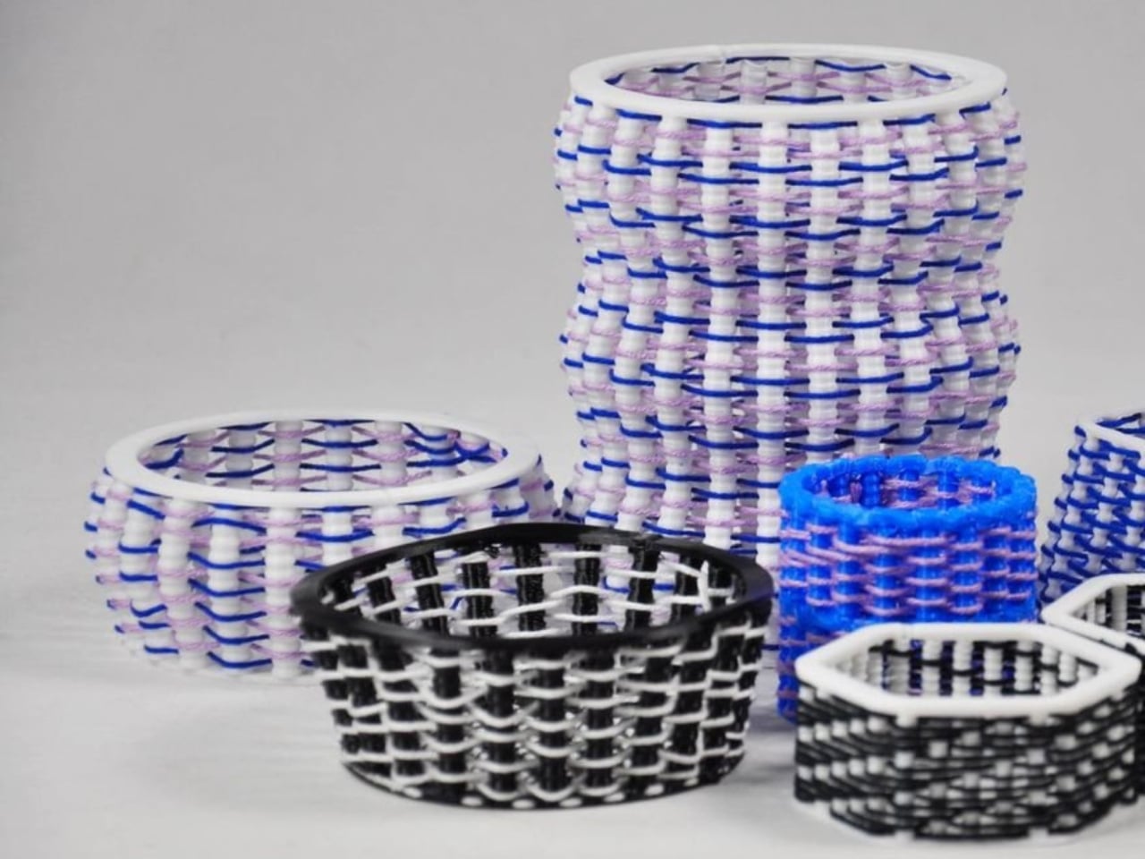
  • ✇Yanko Design
  • These Japanese-Made Guitar Scissors Come With Their Own Mini Stand
    Even though I already have drawers and boxes of various stationery items, I’m always on the lookout for things that are cute and unique but still useful for work and my hobbies. Scissors are one of those things you can never have too many of, especially if they serve different functions. There are pairs for everyday cutting, for journaling, for cutting things into cute shapes, and some that are just highly decorative. If you love stationery and music, the Rockstar Guitar Scissors may be your ne
     

These Japanese-Made Guitar Scissors Come With Their Own Mini Stand

23 octobre 2026 à 16:30

Even though I already have drawers and boxes of various stationery items, I’m always on the lookout for things that are cute and unique but still useful for work and my hobbies. Scissors are one of those things you can never have too many of, especially if they serve different functions. There are pairs for everyday cutting, for journaling, for cutting things into cute shapes, and some that are just highly decorative.

If you love stationery and music, the Rockstar Guitar Scissors may be your next tiny purchase. As the name suggests, it’s a pair of scissors shaped like an electric guitar. But more than just being uniquely shaped, the design itself has a role in storing and using the scissors. It’s the kind of item you might want to keep out of your office drawer, and it could also make a small gift or stocking stuffer this upcoming holiday season.

Click Here to Buy Now: Starting at $30

A lot of differently shaped stationery items can just be novelty things that are good to display on your desk. This one, though, has parts that were thought out to match the theme while making it a functional piece for everyday use. So forget about guitar graphics slapped onto a pair of conventional scissors. This one takes the idea further. Well, it still can’t play actual music, of course.

The guitar body separates into the handles, with the finger openings as part of the lower body of the instrument it’s imitating. The narrow neck of the “guitar” separates into the cutting blades. It even has a removable ABS cap that completes the headstock when the scissors are closed. According to the store’s description, the cap also covers the sharp point and prevents the scissors from opening while it’s in place. That gives a decorative detail a useful job when you’re putting the scissors away.

The scissors have stainless steel blades, while the handles and cap use ABS plastic and the stand is made from elastomer. You can choose from three color options: black, metallic blue, and pearl white. They measure about 7.8 inches overall, and the YD Select lists black at US$30; metallic blue and pearl white at US$40 each.

They even come with a stand that holds up your closed scissors like an actual guitar at rest on an instrument stand. For anyone who tends to lose smaller tools among notebooks and pen cases, having a dedicated spot could make them easier to find. Of course, the stand takes up some desk space, so this isn’t really a space-saving solution. It’s more about giving a useful item a place where you’ll actually notice it.

Made in Japan by Nikken Cutlery, the scissors are also known as Seki Sound. Nikken says craftspeople in Seki individually sharpen the blades, and it describes a fluorine-coated finish intended to reduce adhesive sticking when cutting tape. That’s a relevant feature if your stationery projects involve tape, although it shouldn’t be read as a promise that the blades will never need cleaning. The guitar detailing also includes six strings and frets, rather than relying only on the outline.

Compared with options from a big brand like Fiskars, the Rockstar Guitar Scissors put more emphasis on their display-ready shape. Fiskars offers SoftGrip handles, Easy Action spring-assisted opening, and nonstick models, while its MoMA collection puts artwork on familiar scissor handles. The Rockstar design instead turns the whole tool into a miniature instrument, complete with a cap and stand. There isn’t enough evidence to say it cuts better or feels more comfortable than those alternatives; its clearest distinction is how the guitar shape carries through to storage.

I wouldn’t expect the Rockstar Guitar Scissors to replace every specialty scissor in my drawers. What appeals to me is having something with a recognizable personality that still has a reason to be on my desk. For a stationery lover who also loves music, it could make a good holiday gift or stocking stuffer, especially if you’d rather give something useful than another ornament that just sits there. At least this little guitar has a job between its imaginary performances.

The post These Japanese-Made Guitar Scissors Come With Their Own Mini Stand first appeared on Yanko Design.

  • ✇Yanko Design
  • Mori the Mushroom Robot Offers Company Without Saying a Word
    A mushroom with glowing eyes is an easier sell for my nightstand than a miniature humanoid. OKA’s Mori takes that approachable shape and gives it a specific job: offering a little company and a reason to pause, without making another screen the center of attention. Currently offered through an early-purchase program, the companion robot uses light, sound, and movement to bring some presence to a quiet room. The ambition is modest enough to feel appealing. For anyone who wants to unwind without
     

Mori the Mushroom Robot Offers Company Without Saying a Word

23 octobre 2026 à 14:20

A mushroom with glowing eyes is an easier sell for my nightstand than a miniature humanoid. OKA’s Mori takes that approachable shape and gives it a specific job: offering a little company and a reason to pause, without making another screen the center of attention. Currently offered through an early-purchase program, the companion robot uses light, sound, and movement to bring some presence to a quiet room. The ambition is modest enough to feel appealing.

For anyone who wants to unwind without reaching for their phone, the physical design makes a good opening argument. Mori stands just under 12 inches tall at its maximum height, with a broad illuminated cap above a rounded, fabric-covered body. Two eyes peek out from underneath and the fabric contains 25 percent real wool. In the supplied photographs, the proportions suggest a small table lamp that wandered into an animated movie, then decided to stay. I’d happily make room for that silhouette.

Designer: OKA

The backstory gives that friendliness some purpose. OKA cofounder Hua Wang said he spent a decade designing mechanisms that brought people back to their phones. With Mori, he wanted a robot that belonged in a home rather than a large, intrusive machine. That’s a useful starting point. A domestic robot has to earn its place among your furniture before its intelligence becomes particularly interesting.

Mori’s controls lean into that furniture-friendly character. According to OKA, placing both hands on its base starts a guided breathing session, while patting its head makes the cap retract and turns it into a lamp. Light and natural soundscapes provide the setting for those breaks. I like the directness of those gestures. Touching an object to change its behavior feels appropriate here, especially when the proposed activity is stepping away from the usual sequence of opening an app, choosing a menu, and adjusting settings.

Importantly, Mori doesn’t speak in words. Its vocabulary consists of sounds, expressions, light, and movement. That limitation might be its most attractive feature. I don’t particularly want a bedside object to become another conversational obligation. A glance or a small movement leaves more room for interpretation, much like an animated character whose personality comes through before it says anything. The lamp setting also gives its owner a way to dial that personality down, with most companion reactions reduced. Cute still needs an off-ramp.

Of course, those expressive eyes come with a less whimsical consideration: sensing people inside their homes. OKA’s privacy policy says Mori’s core AI runs locally, with camera and microphone inputs processed on the device. Raw audio and image frames are discarded after processing, while recognition information can remain locally to distinguish users. The policy separately allows collection of account, device, and diagnostic information. That distinction matters. Local processing is a welcome design decision, but I’d still read the permissions before inviting a camera-equipped companion onto the dresser.

OKA also says Mori learns and becomes more individual through repeated interaction. That’s the promise I’d reserve judgment on until longer-term use establishes what actually changes. A familiar gesture could become endearing, or simply predictable. The interesting design challenge is giving Mori enough variation to sustain affection without making it demand attention. Its quiet role sets a higher bar than the adorable appearance initially suggests: it needs to remain pleasant when the novelty has worn off.

At $649 before taxes and shipping for First Access orders, Mori is an expensive experiment in companionship. That purchase includes two years of its Nature Time subscription; OKA says basic functions won’t require a paid plan, and the included subscription won’t automatically become a paid one. I’m drawn to the object, but the price makes its everyday behavior more important than its introductory charm. The real payoff would be a robot you enjoy having nearby even when you aren’t actively playing with it. A mushroom-shaped lamp already has a place in a home. Mori has to make the eyes worth paying for.

The post Mori the Mushroom Robot Offers Company Without Saying a Word first appeared on Yanko Design.

  • ✇Yanko Design
  • Teenage Engineering’s EP-35 Amp Has a Hidden Cable Compartment
    The back of Teenage Engineering’s EP-35 opens to reveal a compartment for cables and accessories. It’s a wonderfully unglamorous feature to put on a music gadget. An amp can look perfectly composed in a product photo, but taking it anywhere means figuring out where the supporting cast goes. Giving those loose pieces a home inside the speaker feels like an acknowledgment of how people actually use their equipment. That practical streak extends beyond storage. Listed for sale at $399, the EP-35 c
     

Teenage Engineering’s EP-35 Amp Has a Hidden Cable Compartment

23 octobre 2026 à 09:20

The back of Teenage Engineering’s EP-35 opens to reveal a compartment for cables and accessories. It’s a wonderfully unglamorous feature to put on a music gadget. An amp can look perfectly composed in a product photo, but taking it anywhere means figuring out where the supporting cast goes. Giving those loose pieces a home inside the speaker feels like an acknowledgment of how people actually use their equipment.

That practical streak extends beyond storage. Listed for sale at $399, the EP-35 combines a portable speaker, an instrument amplifier, and a USB audio interface. It accepts guitar, microphone, line-level, Bluetooth, and USB audio, with multiple sources able to play together. The problem it addresses is straightforward: playing guitar over a backing track, or adding vocals, shouldn’t require assembling a small equipment department. Here, those connections meet in one box.

Designer: Teenage Engineering

Visually, the EP-35 has the charm of equipment that might belong in a very stylish school science lab. Its gray body, square grille, integrated handle, and orange accents are deliberately matter-of-fact. I like that the speaker drivers remain visible behind the grid. They give the front a slightly awkward, almost characterful expression. Nothing about the proportions suggests an object desperate to disappear into your decor, which is part of its appeal.

The controls make a similar impression. There are physical dials for choosing effects and adjusting their intensity, with eight presets each for guitar and microphone. That’s an approachable arrangement: select a sound, turn a control, hear what changes. I’d rather see that direct relationship on something intended for casual playing than a screen full of options. The microphone effects even include presets called “robo choir” and “frog,” which gives you a fair idea of the intended mood.

The USB audio interface is less visually entertaining but potentially more useful. Connect the EP-35 to a computer and it can serve as a recording interface, giving the same object a role at a desk after it comes home. That continuity makes sense to me. A portable device earns its shelf space more easily when it doesn’t become redundant the moment you’re near a power outlet and a laptop.

Inside the storage compartment, Teenage Engineering has also included a small camp light. It can illuminate the compartment automatically when opened, stay on, or react to incoming audio in disco mode. Tilting the speaker backward makes those LEDs display the battery level. Some of this is useful, some is cheerfully unnecessary. I’m happy with that balance. Checking a battery through a small physical gesture is a more memorable interaction than another tiny percentage readout.

Portability does need a little perspective, though. At about seven pounds, the EP-35 is something you carry by its handle, not casually toss into a small shoulder bag. Teenage Engineering rates battery life at 12 hours with the volume set to five, so that figure shouldn’t be treated as an all-day guarantee at any loudness. It’s also splash-resistant rather than waterproof. Those distinctions matter if the appealing camp light has you mentally packing it for a weekend outdoors.

There’s room to expand the setup, too. Two EP-35s can play Bluetooth audio in stereo through broadcast mode. Teenage Engineering’s instructions let you assign left and right channels by tilting each speaker before starting that mode. Connected instruments take a different route: linking their sound between speakers requires a line-out-to-line-in cable. That’s worth understanding before imagining a completely wireless mini stage. The wireless convenience applies specifically to Bluetooth playback.

For me, the $399 price makes the most sense if those musical connections will get regular use. Someone who only wants background listening would be paying for considerable capability they might never touch. Sound quality still needs a listening test; clever packaging can’t settle that question. But I appreciate the attention paid to what happens between sessions. The music stops, the cables come out, and the EP-35 gives you somewhere to put them. That’s a modest design decision with a very recognizable payoff.

The post Teenage Engineering’s EP-35 Amp Has a Hidden Cable Compartment first appeared on Yanko Design.

  • ✇Yanko Design
  • FilaLoom Weaves Yarn Into 3D Prints Without Extra Motors
    Blue and lilac yarn snakes through white plastic ribs in one of FilaLoom’s samples, giving the object a basketlike appearance that makes me want to pick it up. The appeal is easy to understand: intricate geometry only gets you so far when you want an object with a textile character. FilaLoom brings actual yarn into the process, letting the fibers remain visibly, unapologetically themselves. Developed by industrial and computational designer Joram de Haas for his master’s thesis in Integrated Pr
     

FilaLoom Weaves Yarn Into 3D Prints Without Extra Motors

23 octobre 2026 à 06:07

Blue and lilac yarn snakes through white plastic ribs in one of FilaLoom’s samples, giving the object a basketlike appearance that makes me want to pick it up. The appeal is easy to understand: intricate geometry only gets you so far when you want an object with a textile character. FilaLoom brings actual yarn into the process, letting the fibers remain visibly, unapologetically themselves.

Developed by industrial and computational designer Joram de Haas for his master’s thesis in Integrated Product Design at TU Delft, FilaLoom lets a desktop 3D printer automatically weave yarn into printed objects. It addresses a practical fabrication problem: combining printed structures with thread without making yarn placement a separate manual task. It’s a working research project, with DIY files available, rather than a finished consumer accessory.

Designer: Joram de Haas

The prototype uses a Bambu Lab A1 fitted with a yarn-depositing tool and a parking station. The printer builds plastic anchor points, picks up the tool, and guides yarn between them. It then parks the tool and resumes printing, securing the yarn where needed. That alternating sequence allows the structure and its textile elements to develop together, rather than requiring someone to thread a completed plastic skeleton afterward.

I like the restraint in the mechanism. FilaLoom uses the printer’s existing movement system, with no additional electronics. A mechanical coupling handles tool changes, while a spring-loaded spool provides adjustable yarn tension. The machine already knows how to move precisely; this attachment gives that movement another useful job.

Visually, the blue-and-lilac sample is a persuasive introduction. Its white vertical elements remain clearly legible, while the colored yarn establishes a contrasting horizontal rhythm. Neither material disappears into the other. To my eye, that makes the construction more interesting than a uniformly textured surface. You can follow the relationship between the ribs and the thread, which gives the pattern a purpose beyond decoration. It looks assembled through its own making.

The thesis also explores soft yarn textures and cable-driven interactions, extending the idea beyond basketlike objects. That range matters because a recognizable woven pattern could easily become the project’s entire identity. I’d be more interested in seeing designers use the process to decide where an object should bend, where it needs structure, or where a different surface character would be welcome. Those are design questions worth experimenting with.

The DIY format gives curious makers somewhere to start. De Haas’s GitHub repository provides printable component files and Grasshopper scripts for generating compatible GCode, the instructions that direct the printer’s movements. Still, that’s a more involved proposition than downloading a decorative planter file and pressing print. For a general audience, the useful distinction is that FilaLoom is an invitation to experiment with a fabrication method, not a ready-made home gadget.

There are physical compromises, too. The researchers report that the attachment reduces the A1’s usable combined printing-and-weaving volume to 54% of its original build volume. Yarn tension also needs care: too much can deform a print or pull it off the build plate. These constraints make the prototype more convincing to me, because its expanded capabilities come with clearly described boundaries.

I wouldn’t judge this project by how quickly it might replace a familiar manufacturing process. Its more immediate value is giving designers a way to test combinations they might otherwise have to assemble by hand. Even a small sample can help answer whether a pattern deserves to become a larger object. That feels like an appropriately useful ambition for a research tool.

For me, the strongest outcome would be an object whose form genuinely needs both materials. The yarn shouldn’t have to justify itself as a decorative flourish, and the plastic shouldn’t merely serve as a bulky substitute for thread. FilaLoom makes that relationship available for exploration. I’d happily trade another perfectly smooth printed vase for an experiment that leaves a little more to discover under your fingertips.

The post FilaLoom Weaves Yarn Into 3D Prints Without Extra Motors first appeared on Yanko Design.

❌