❌

Vue normale

  • ✇Yanko Design
  • Buy the printer, make the presents: Snapmaker’s U1 drops to $699 for Black Friday
    The Snapmaker U1 drops to $699 this Black Friday, down 30% from its $999 list price, and it might be the smartest buy on your holiday list, mostly because it can make plenty of the gifts on it. The U1 is a four-toolhead 3D printer that prints in up to four colors or materials in a single go. That covers personalized ornaments, figurines, and fidget toys, all printed in multicolor on your desk. It ships with four spools of PLA and 30 ready-to-print models, so after unboxing and automatic calibra
     

Buy the printer, make the presents: Snapmaker’s U1 drops to $699 for Black Friday

3 novembre 2026 à 21:45

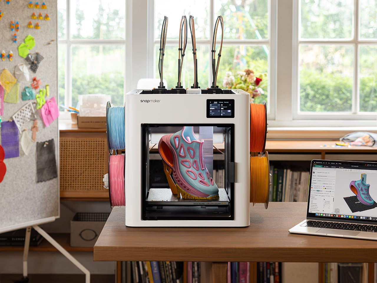
The Snapmaker U1 drops to $699 this Black Friday, down 30% from its $999 list price, and it might be the smartest buy on your holiday list, mostly because it can make plenty of the gifts on it. The U1 is a four-toolhead 3D printer that prints in up to four colors or materials in a single go. That covers personalized ornaments, figurines, and fidget toys, all printed in multicolor on your desk. It ships with four spools of PLA and 30 ready-to-print models, so after unboxing and automatic calibration, you can print your first model on day one. A good chunk of your Christmas list, sorted.

Four-head printers are rare at this price. Tool changers like the Prusa XL have historically cost well north of $2,000. Snapmaker’s SnapSwap system keeps four print heads loaded and swaps between them in about five seconds, while single-nozzle setups like Bambu’s AMS flush filament at every color change. Fewer purges mean faster prints and, by Snapmaker’s count, up to 85% less wasted plastic. More than 20,000 Kickstarter backers already bought in, making the U1 the most-funded 3D printer campaign in the platform’s history, with now more than 150,000 users worldwide.

Designer: Snapmaker

Click Here to Buy Now: Black Friday Sale. Hurry, deal ends soon!

Five-Second Swaps and a Lot Less Printer Poop

Each of the U1’s four print heads sits docked and preheated with its own filament. When a print calls for a new color, the printer parks the active head and grabs the next one. A steel-ball coupling and a mechanical lock seat each head in the exact same spot every time, and Snapmaker says the mechanism survived over a million continuous swaps with zero mechanical failures. The printer then auto-calibrates all four heads to within 0.04mm (about 0.0016 inches) of each other. That keeps the white trim on a Santa hat right where it belongs.

Single-nozzle printers handle color changes by shoving the old filament out until the new one runs clean. Snapmaker pegs that process at roughly two minutes per swap, and on a busy multicolor model the purged plastic can outweigh the model itself. The U1 only purges small amounts at the start of a job and during calibration. Print a tray of four-color ornaments and those savings stack up fast, in both hours and filament. Your filament budget ends up on the tree instead of in the trash.

A Personalized Ornament, From Download to Gift Box

Four heads can hold four different materials as easily as four colors, so flexible TPU or dissolvable supports can share a print with rigid plastic. For most holiday gifts, though, four colors of PLA do the heavy lifting. Snapmaker’s Full Spectrum feature stretches that palette by stacking thin alternating layers of your four filaments, which your eye reads as new in-between shades. Results depend on the filament, the model’s shape, and your settings, so a quick test print helps. Load red, green, white, and gold, and you’ve basically got Christmas in a box.

Personalizing a gift takes about as much skill as sending a text. Open an ornament model in Snapmaker Orca, add a name with the slicer’s text tool, and assign one of your four colors to each part. A palm-sized ornament uses only a few grams of filament, so each one costs pocket change in plastic. Hit print, and the U1 handles every color swap on its own while you get on with your evening. Repeat for each name on your list, and nobody else at the party will show up with those.

Smart Enough for First-Timers, Cheap Enough for Black Friday

Snapmaker Space, the company’s model library (currently in open beta), offers ready-to-print multicolor models, so beginners can skip 3D modeling entirely. Auto bed leveling helps your first layer stick, and input shaping reduces vibration for smoother walls, with speeds topping out at 500mm/s (about 20 inches per second). Filament loads itself, RFID tags on Snapmaker spools fill in settings for you, and Backup Mode switches to a matching spool when one runs dry. A built-in camera with AI monitoring can flag spaghetti failures and ping your phone. Tinkerers get Klipper firmware and OrcaSlicer support.

Click Here to Buy Now: Black Friday Sale. Hurry, deal ends soon!

The post Buy the printer, make the presents: Snapmaker’s U1 drops to $699 for Black Friday first appeared on Yanko Design.
  • ✇Yanko Design
  • Salvador Dalí’s melting clocks are now a 3D LEGO diorama, ants included
    MoMA owns The Starry Night, The Persistence of Memory, and a set of LEGO bricks designed by Godtfred Kirk Christiansen in the 1950s. The museum brought two of those together in 2022, when it partnered with LEGO on the Starry Night set that grew out of a LEGO Ideas submission. A new Ideas project wants to complete the triangle. BrickRelativity has rebuilt Salvador Dalí’s 1931 painting of melting clocks as a 3D brick diorama, complete with the dead tree, the ant-covered watch, and the weird sleep
     

Salvador Dalí’s melting clocks are now a 3D LEGO diorama, ants included

3 novembre 2026 à 19:30

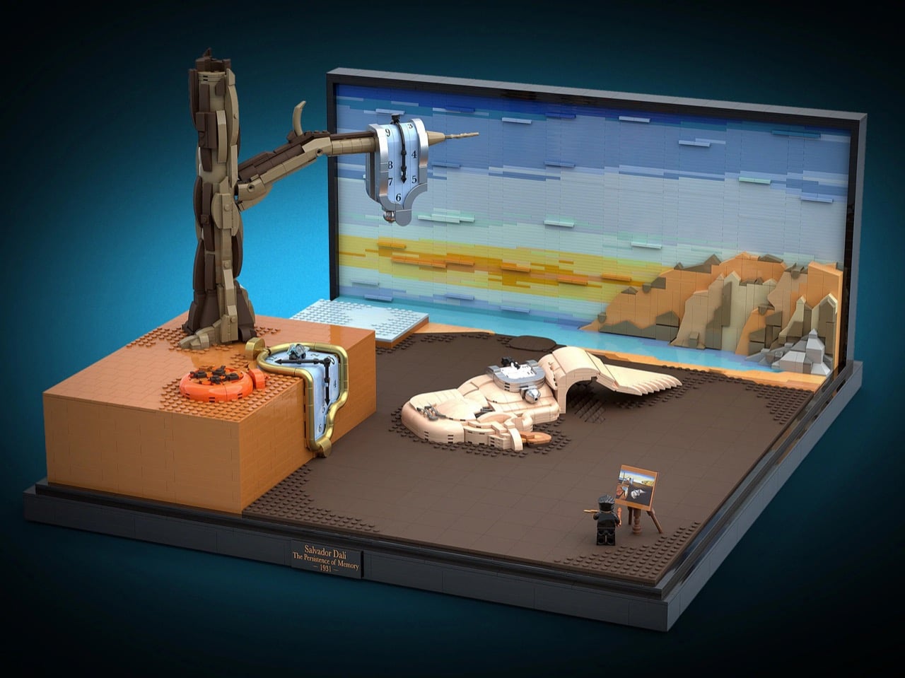
MoMA owns The Starry Night, The Persistence of Memory, and a set of LEGO bricks designed by Godtfred Kirk Christiansen in the 1950s. The museum brought two of those together in 2022, when it partnered with LEGO on the Starry Night set that grew out of a LEGO Ideas submission. A new Ideas project wants to complete the triangle. BrickRelativity has rebuilt Salvador Dalí’s 1931 painting of melting clocks as a 3D brick diorama, complete with the dead tree, the ant-covered watch, and the weird sleeping figure sprawled across the beach. If MoMA wanted a sequel, it wouldn’t even need to leave the building.

Dalí’s original is tiny, just 9.5 by 13 inches (24 by 33 cm), which catches plenty of first-time visitors off guard. The brick version spreads the scene across a black display base with a gallery plaque and a sky built from horizontal bands of blue, aqua, and sunset-yellow plates. BrickRelativity says the central blob was one of the toughest challenges, since soft, shapeless forms and rigid LEGO elements get along about as well as cats and bathtubs. The clocks came a close second, their faces rebuilt from tile grids that warp along with the melt. LEGO Art has already worked through Hokusai, Van Gogh, and Monet, so Surrealism feels overdue.

Designer: BrickRelativity

Three clocks melt across the scene, and each gets its own construction trick. The one hanging off the tree branch wears a pearl-silver bezel that folds over the wood, with a small silver ball at its lowest point standing in for the drip. The pocket watch sliding off the orange ledge swaps silver for pearl-gold tube elements that kink around corners, with a transparent fly perched on its face. The third clock drapes over the sleeping figure in the middle, following the curve of the body underneath it. Numerals were applied as decals directly to the curved surfaces, while every clock hand is built from LEGO elements.

My favorite detail, though, is the face of that gold pocket watch. BrickRelativity built it from a grid of light-blue tiles, and as the face slumps over the ledge, the seams between them bend with it. The result looks like graph paper caught in a heat wave. The grid also gives the numerals a place to sit and recalls the stud-by-stud mosaics of LEGO Art, now visibly coming apart. A warped coordinate system feels very Einstein, which is funny, because Dalí insisted his soft watches came from cheese rather than relativity.

Dalí reportedly based the sleeping figure on a rock formation at Cap de Creus, and it’s generally read as a squashed self-portrait. BrickRelativity layered curved slopes in tan and pale flesh tones until the blob looked properly boneless. Dark gray bars and curves form a closed eye with long lashes, and a wing-like membrane of stacked plates trails off behind it. Back on the ledge, the closed orange pocket watch is a ring of curved elements with a little crown nub. A cluster of tiny ants made from dark clip plates swarms its lid, turning Dalí’s recurring symbol of decay into a minifig-scale infestation.

The landscape skips a printed backdrop entirely. Horizontal bands of blue, aqua, pale yellow, and orange plates build up the sunset sky. The Cap de Creus cliffs on the right use stepped wedges and slopes in tan, dark tan, orange, and gray, placed at different depths to make the coastline recede. Dark brown tiles cover the beach, with patches of exposed studs breaking up the flat surface like scrubby ground. Viewed head-on, that depth collapses back into the painting’s flat composition. BrickRelativity has some practice with perspective tricks: previous Ideas projects turned M.C. Escher’s impossible staircases into bricks.

Down in the front corner, a tiny Dalí minifig with swept gray hair, a patterned tie, and that famous upturned mustache paints at an easel holding a miniature copy of the painting. It’s a direct callback to the Van Gogh minifig and easel that shipped with the Starry Night set. A black base and a small plaque bearing the artist’s name, the title, and the year finish the gallery look. Fan builders have been chasing this museum energy all year, from a 1,117-piece Picasso portrait to a Brick Dangerous melting clock that just qualified for LEGO’s third 2026 review. Dalí’s copyright is managed by the Fundació Gala-Salvador Dalí, so any official version would need the estate’s blessing.

The project currently sits at 1,849 supporters, with 602 days left to hit the next milestone of 5,000. LEGO Ideas lets fans submit builds and rack up supporters, and projects that reach 10,000 move on to LEGO’s official review for a shot at becoming a real set. You can head to the LEGO Ideas page and give BrickRelativity your vote, which costs nothing but a LEGO account. Dalí already turned this painting into floating bricks once, in his 1954 sequel The Disintegration of the Persistence of Memory. Seems only fair to let someone finish the job properly, with clutch power this time.

The post Salvador Dalí’s melting clocks are now a 3D LEGO diorama, ants included first appeared on Yanko Design.

  • ✇Yanko Design
  • The P1 Terminal is the Severance computer I’d actually want to use
    Severance did something no tech company has managed in decades: it made people want a trackball again. The MDR terminals on Lumon’s severed floor, with their cream shells, tiny glowing screens, and built-in trackballs, have become weird objects of desire for a show about corporate horror. Designer Shaun Wellens has dreamed up the computer I imagine Lumon would roll out for its next rebrand. The P1 Terminal is a CGI concept from a made-up 1970s company called Push / Pull, designed as a shared co
     

The P1 Terminal is the Severance computer I’d actually want to use

3 novembre 2026 à 17:30

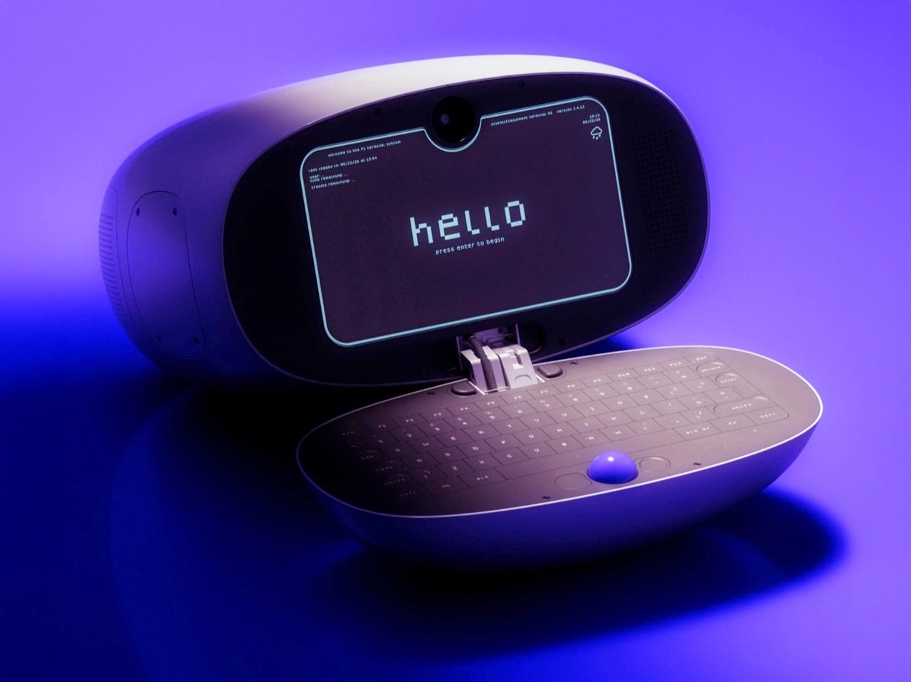
Severance did something no tech company has managed in decades: it made people want a trackball again. The MDR terminals on Lumon’s severed floor, with their cream shells, tiny glowing screens, and built-in trackballs, have become weird objects of desire for a show about corporate horror. Designer Shaun Wellens has dreamed up the computer I imagine Lumon would roll out for its next rebrand. The P1 Terminal is a CGI concept from a made-up 1970s company called Push / Pull, designed as a shared computer for people living in a communal space. It has a soft white clamshell body, a phosphor-style display, and a blue trackball that looks good enough to lick (please don’t).

Wellens says the P1 was inspired by a computer used to support experiments aboard the Space Shuttle, which makes sense once you notice the clamshell form. Then he wraps the whole thing in fake history. In his story, the P1 launched in 1972 for people living in underground communities called “pockets,” where it handled mail, bulletin boards, and shopping. It sold badly, its users adored it, and it got a sequel, which is basically the life story of every cult-classic gadget ever made. He also admits to sneaking deliberate flaws into his fictional designs so the imaginary engineers can fix them in the next version, and I love that level of commitment.

Designer: Shaun Wellens

The shell is a rounded off-white pod, with a sage-gray handle module sitting on top like the carrying grip on a vintage TV. That handle has a recessed slot and a tinted window that recall the iMac G3 and the 1999 clamshell iBook. The open renders show the two halves joined by a stacked metal hinge at the center, the one visibly mechanical part on an otherwise pebble-smooth body. The Space Shuttle inspiration was the GRiD Compass, a magnesium clamshell designed by Bill Moggridge that flew aboard Columbia in 1983 as the Shuttle Portable Onboard Computer, or SPOC.

Inside the lid sits a dark, rounded-rectangle display with cyan-green text that recalls an old phosphor CRT. A camera pokes through a tiny notch at the top center, which is a hilarious thing to find on a computer that supposedly shipped in 1972. Perforated speaker grilles flank the screen. The interface boots to a pixel-font “hello” and drops you into a numbered menu of services, a text-only setup that would sit comfortably next to a Lumon file full of scary numbers. Wellens calls it a lightning-fast graphical interface anyway. In his fictional timeline, it arrived a full year before the Xerox Alto, the pioneering 1973 GUI computer.

The bottom half is a dark oval tray holding a full keyboard, with the blue trackball parked dead center below the keys. That ball is the loudest color on the entire product, and it deserves to be. Trackballs have appeared in early terminals, arcade cabinets, and Logitech’s TrackMan, while Severance gave them another memorable role on the MDR desks. Putting it in the middle also makes sense for a shared machine, since lefties and righties get equal access. The oval keyboard looks a little cramped at the edges, but it matches the pebble shell so neatly that I’m happy to call it one of his intentional flaws.

A chunky, multi-jointed arm that looks borrowed from a robotics lab supports the terminal. It’s designed to let the P1 swing out, tilt, and tuck away, useful movements for a shared machine in a cramped communal space. In one render, the cable drops in from above, suggesting a ceiling- or wall-mounted setup like a dental lamp waiting for its next patient. Residents could walk up, pull it down, check their mail, and push it back, which might explain the Push / Pull name (my theory, Wellens hasn’t confirmed it). That setup makes the P1 feel closer to a payphone or a library catalog terminal than a personal computer.

Wellens’ conceptual history lands surprisingly close to the real thing. In August 1973, the Community Memory Project put a public bulletin board terminal in Leopold’s Records in Berkeley, with later terminals appearing in libraries and laundromats around town. A decade later, France was distributing free Minitel terminals that let people shop, bank, and message each other from home. The service lasted until 2012. The P1 mashes both ideas into one glossy pod for people living underground. Wellens even mocked up a period magazine ad with a big serif headline over a violet product shot, and it’s convincing enough that I briefly wanted to mail away for one.

Severance production designer Jeremy Hindle already gave us the most covetable fake office tech on television, so consider this a friendly nudge. Somebody on the show’s crew should get Wellens on the phone, because the P1 looks like a terminal Lumon would install somewhere much friendlier than the Break Room. He has form here too, having already dreamed up the Kriket 3000, a pastel retro robot that would look right at home wandering the severed floor’s hallways. The guy clearly loves building machines for a timeline that never happened, which is more or less the Lumon design brief. Hire him, throw him a waffle party, and let him build whatever strange hardware the next season needs.

The post The P1 Terminal is the Severance computer I’d actually want to use first appeared on Yanko Design.

  • ✇Yanko Design
  • The “Desktop 95” Watch is a love-letter to the greatest Windows OS of all time
    There was a time when a computer’s biggest annoyance was a progress bar inching slowly or a dial-up modem screeching and hissing its way online. Nobody pinged you on Teams, Copilot didn’t offer to rewrite your emails, and the worst thing your PC could do was crash in the middle of Solitaire. Benlywatch’s Desktop 95 bottles that era and straps it to your wrist. The limited-edition analog watch puts a Windows 95-style desktop on its dial, complete with teal wallpaper, beveled windows, and a dialo
     

The “Desktop 95” Watch is a love-letter to the greatest Windows OS of all time

3 novembre 2026 à 14:20

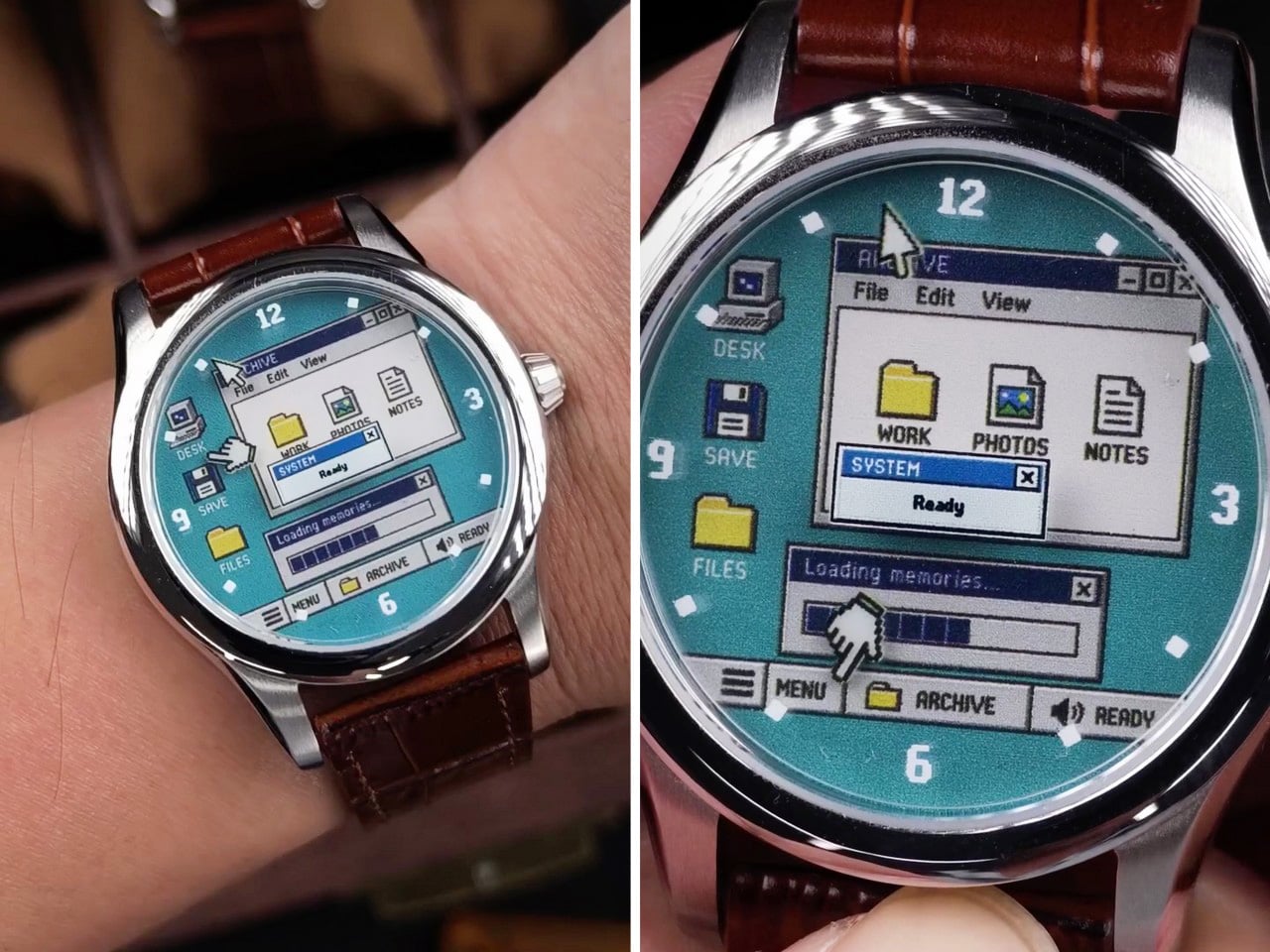
There was a time when a computer’s biggest annoyance was a progress bar inching slowly or a dial-up modem screeching and hissing its way online. Nobody pinged you on Teams, Copilot didn’t offer to rewrite your emails, and the worst thing your PC could do was crash in the middle of Solitaire. Benlywatch’s Desktop 95 bottles that era and straps it to your wrist. The limited-edition analog watch puts a Windows 95-style desktop on its dial, complete with teal wallpaper, beveled windows, and a dialog box that reads “Loading memories…” Honestly, that progress bar is the most accurate thing anyone has written about millennials.

Two pixel cursors serve as the hands, a SYSTEM “Ready” dialog sits near the center, and a taskbar runs along the bottom of the dial. It all lives in a 39mm-wide, 10mm-thick case made from 316L stainless steel, with a Swiss quartz movement and a 5 ATM water-resistance rating. You get a blue or white dial with a leather strap, Milanese mesh, or steel bracelet, plus a numbered caseback. The edition is limited to 500 pieces. Pre-orders are open at $159, with shipping slated for November 2026. The only notification it will ever send you is the time.

Designer: Benly Watch

Pixel Cursor Hands and Two Desktop Dials

One hand is a classic arrow pointer, and the other is the little pointing hand that appeared whenever you hovered over a link. Together they move around the dial telling the time, which is the most productive thing a cursor has done since the invention of the screensaver. Everything else on the dial stays put. On the blue version, an ARCHIVE window with File, Edit, and View menus holds WORK, PHOTOS, and NOTES icons, while DESK, SAVE, and FILES shortcuts line the left edge. Chunky pixel numerals mark 12, 3, 6, and 9, and the taskbar reads MENU, ARCHIVE, and READY, speaker icon included.

The white dial swaps teal for a creamy beige and renames the main window DESKTOP, with COMPUTER, FILES, and DISK icons and a simpler “Loading…” bar. Its numerals almost disappear into the background, so it looks like a screenshot someone shrank down and laminated. I like that the two dials feel like two moods of the same machine. Blue is the cheerful default everybody remembers from the family PC. White is the office computer in accounting that never got its wallpaper changed. Both keep that SYSTEM “Ready” box parked near the center like a promise.

The Windows 95 Design Behind the Dial

Windows 95 launched on August 24, 1995, backed by a $300 million marketing push, a launch event hosted by Jay Leno, and people lining up at midnight to buy an operating system. Its startup sound was composed by Brian Eno, which remains a wild sentence to type. The interface reflected the work of a design team led by Virginia Howlett, a painter by training. Those teals, royal blues, and medium grays came partly from the limited color palettes of graphics cards at the time. Hardware limits, basically, turned into an aesthetic people now pay money to recreate.

Three decades later, Windows comes with Copilot, Teams, and a Solitaire that serves you ads, and Howlett herself has called the Windows 95 years a “kinder, gentler time.” The Desktop 95 taps into that feeling. It’s a desktop with no updates, no pop-ups to dismiss, and no assistant asking how it can help. The only thing missing is Clippy, though in fairness he didn’t arrive until Office 97, and the dial is probably better off without a backseat driver.

Case Specs, Pricing, and Availability

The case measures 39mm across and 44.5mm long, and at 10mm thick it should slip under a shirt cuff without a fight. It’s made from 316L stainless steel, with a matching steel caseback engraved with the Desktop 95 name and an individual edition number. The leather strap is 20mm wide and fits wrists from 5.3 to 8.1 inches (13.5 to 20.5cm), with Milanese mesh and steel bracelet versions also available. Inside is a Swiss quartz movement, which suits the theme, because nobody in 1995 wanted to wind anything except a VHS tape. Water resistance is rated at 5 ATM.

Most of Benlywatch’s catalog is retro-futurist digital hardware with OLED and LCD screens, from the Cybertruck-inspired Future Warrior to its 1970s-style Stargazer. The Desktop 95 takes a different approach, recreating a screen on an analog dial. It’s listed at $159 on pre-order through Benlywatch’s website, limited to 500 pieces, with shipping expected in November 2026. Free worldwide shipping is included, and the brand covers import taxes and duties.

The post The “Desktop 95” Watch is a love-letter to the greatest Windows OS of all time first appeared on Yanko Design.

❌