Vue normale

Il y a de nouveaux articles disponibles, cliquez pour rafraîchir la page.
À partir d’avant-hierTechs Design

These MacOS-inspired flip flops are weird, playful, and sadly don’t come with Apple “Find My”

Par : Sarang Sheth
20 juin 2026 à 00:30

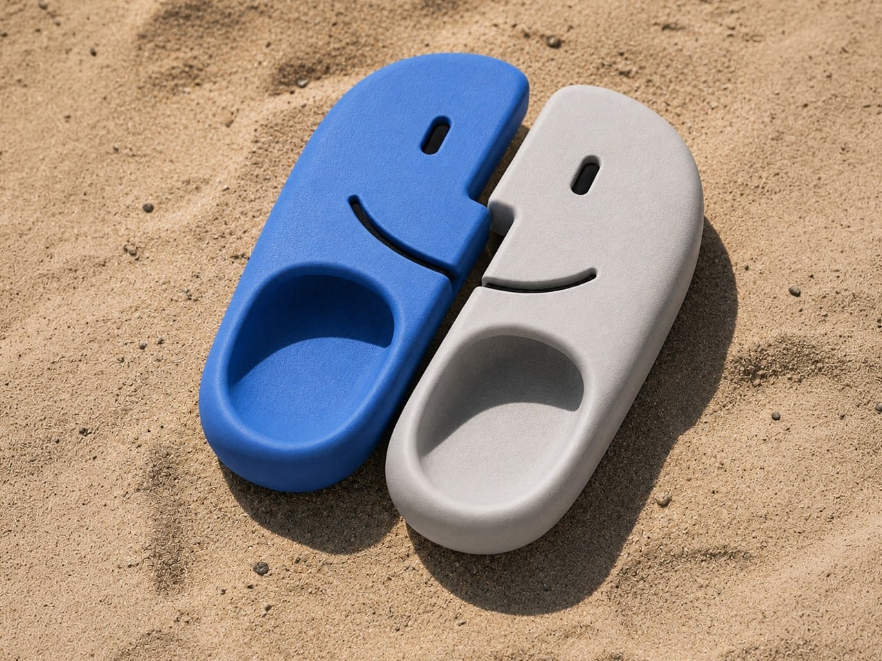
The mind of David Delahunty is something no LLM can capture. With the speed most marketing teams would be envious of, David churns out idea after idea on his Instagram, turning brands and visual icons into fun products that creatively challenge how you look at logos, shapes, and designs. We’ve covered a bunch before, including an MS Paint-inspired makeup kit, along with this Finder icon-inspired backpack. A recurring theme in Delahunty’s collection, the Finder icon ‘finds’ itself in a new avatar this time – interlocking flipflops.

A lot of his designs lean on heavy visual puns, which make for great eye-candy on Instagram, but on rare occasions they make for great products too! Delahunty’s made MacOS Finder-inspired necklaces (which you can still buy, btw), and it’s about time that these flipflops enter the production hall of fame too. They’re fairly uncomplicated, molded as a single-piece polyurethane flip-flop, with left and right units being blue and white respectively. And no, a Latina mother throwing these at a misbehaving child wouldn’t classify as ‘Airdrop’.

Designer: David Delahunty

When Bill Hernandez and Steve Jobs designed the original Finder icon, I doubt they realized what meme material it possessed. The icon is innately memorable, but it’s also easily reproducible as different products – Delahunty’s flipflops are a great example. The icon is split into two, making it perfect to turn into flipflops, although that weird jagged central cut is a sort of unique challenge when it comes to wearability. However, with a fair amount of planning, it’s easy to account for the fact that the flipflops aren’t entirely bilaterally symmetrical. I guess that’s the beauty about them.

Each shoe is made the same way Crocs are – molded as a single piece with no interlocking, stitching, or gluing of extra parts. This makes each flipflop incredibly strong, fairly comfortable, and long-lasting. The flipflops in question come with cutouts that depict the Finder icon’s face too, which I think is a great idea because they serve as ventilation, so your footwear doesn’t smell like death because the polyurethane isn’t particularly breathable. The cutouts are great for airing the footwear out after a day at the beach too, although try not to get sand into them through the cuts – it’s no fun dealing with gritty shoes rubbing against your feet like literal sandpaper.

Delahunty’s mind works much faster than most people’s hands, so a lot of his ideas get mocked up using AI (it’s honestly one of the best examples of AI enhancing someone’s workflow). That being said, a lot of tweaking needs to be done before these shoes hit production. If you do want to wear your love for macOS on your feet, however, give Delahunty a follow on Instagram and be sure to drop him a message!

The post These MacOS-inspired flip flops are weird, playful, and sadly don’t come with Apple “Find My” first appeared on Yanko Design.

This Floating Waterfall Off Madagascar Wants to Power a Nation, Heal a Society, and Become a Resort — All at Once

19 juin 2026 à 23:30

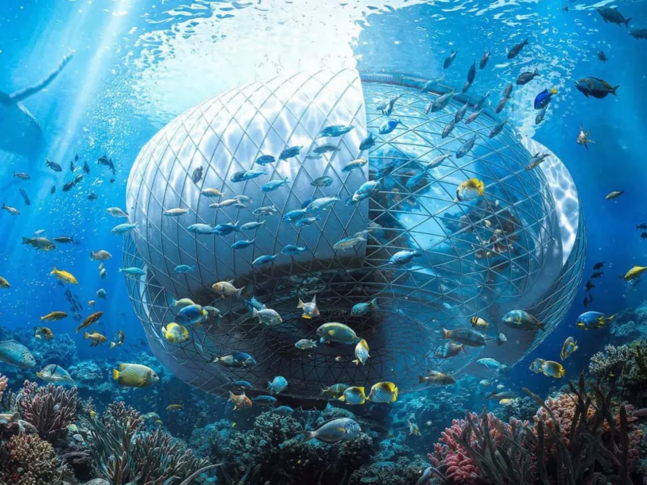
Off the southeast coast of Africa, more than 500 kilometers into the Indian Ocean, lies Madagascar — a country defined by extraordinary biodiversity, vast natural wealth, and a deepening energy crisis that leaves the majority of its population without electricity. It is here that designer Ahmad Eghtesad has set his most ambitious concept: the Baobab Waterfall, a floating mixed-use infrastructure that proposes to generate clean energy, rehabilitate society, and eventually evolve into a thriving resort — all from the open ocean.

The concept was developed as a competition entry for the prestigious Jacques Rougerie Foundation, which challenges architects and designers to imagine the future of maritime architecture. Eghtesad, working alongside collaborators Mohammad Aghaei and Nastaran Fazeli, drew his primary inspiration from the baobab tree itself — a native Malagasy symbol of resilience, capable of storing water and sustaining life in the harshest of environments. The architectural form mirrors this logic: wide at the crown, deeply rooted in its purpose, built to outlast the conditions that necessitated it.

Designer: Ahmad Eghtesad

At its core, the Baobab Waterfall operates as a continuous deep-ocean waterfall system. Ocean water is redirected and channeled through the structure on a massive scale, generating renewable electricity in volumes comparable to natural hydrological forces. The structure also integrates transparent greenhouses into its central tower, layering agricultural function into what is otherwise an industrial power plant. This dual programming — energy production and food cultivation — reflects a design philosophy that refuses singular solutions.

What makes the Baobab Waterfall genuinely provocative, though, is its social dimension. The structure is initially conceived as a rehabilitation center — a response to Madagascar’s overcrowded correctional facilities, themselves a symptom of poverty and energy-driven economic hardship. The idea is architectural optimism taken to its logical extreme: design not just infrastructure, but the conditions for social repair. As crime rates decline and the rehabilitation program matures, the complex is designed to seamlessly transition into a multipurpose resort and green energy hub, leaving behind a prosperous legacy rather than an institution.

Rendered with cinematic precision using Autodesk 3ds Max, Rhinoceros 3D, Grasshopper, and V-Ray, the visuals alone communicate the project’s ambition — dramatic contrasts between raw ocean forces and human engineering, scale that feels both monumental and quietly inevitable.

Whether or not the Baobab Waterfall ever leaves the realm of concept, it asks a question worth sitting with: what does it look like when architecture refuses to solve just one problem? Eghtesad’s answer floats somewhere off the coast of Madagascar, shaped like a tree that never stops giving.

The post This Floating Waterfall Off Madagascar Wants to Power a Nation, Heal a Society, and Become a Resort — All at Once first appeared on Yanko Design.

The Fortune Cookie Redesigned With Braille Is Pure Genius

Par : Ida Torres
19 juin 2026 à 16:20

Fortune cookies are one of those small rituals that carry more weight than they should. You crack it open, fish out the slip of paper, and read whatever odd little prophecy is inside. It’s silly, sure. But it’s also communal. The whole table does it. Everyone compares fortunes, laughs at the vague predictions, and tucks the good ones into their wallets for luck. It’s a shared moment disguised as a throwaway snack. And for visually impaired individuals, that moment stops at the crack of the shell.

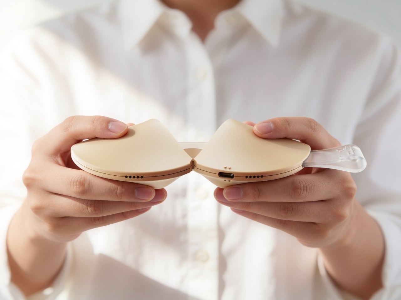
Korean designer Hyerim Yoo’s response to that gap is Fortune Dot, a tactile device that lets visually impaired users independently read a daily fortune in Braille. But describing it that way undersells what makes it genuinely remarkable. Because Yoo didn’t just solve the accessibility problem. She solved it beautifully.

Designer: Hyerim Yoo

The object is shaped exactly like a fortune cookie. Same rounded form, same warm beige palette, same satisfying heft. A small translucent tab sticks out from the side, the only visual tell that this isn’t actually food. That tab is the “fortune paper,” a design detail so considered it almost makes you laugh. When you pull the two halves apart, the gesture mirrors breaking a real cookie open, and what you find inside is a refreshable Braille display with raised pin cells arranged in neat rows across a recessed panel. The message is there, waiting to be read with your fingertips, exactly as Yoo’s tagline describes it: today’s luck, felt at your fingertips.

The engineering inside is worth pausing on. The exploded views of the device reveal individual Braille cell modules, each capable of raising and lowering their pins to form different characters. It’s a compact, mechanical system tucked into something that looks like it belongs on a dessert plate. The bottom edge carries a USB-C port for charging, nearly invisible from the outside. The whole thing is small enough to drop into a pouch alongside a pair of AirPods and a lip balm, which is apparently exactly what Yoo intended.

What makes this design stand apart from most inclusive design projects, though, is the color system. Fortune Dot comes in three variants named Soft Bake, Signature Bake, and Dark Bake. The names follow the logic of actual cookie baking, and the colors range from a pale cream to a deep chocolate brown. It’s a playful, smart branding decision that does real work. It removes any clinical association from the product. It makes Fortune Dot feel like something you’d want to own and carry, not something assigned to you by necessity.

The branding extends outward into a full identity system. The Fortune Dot logo uses a dot-based pattern that quietly references Braille without spelling it out. It appears on a branded coffee cup in one of the campaign shots, wrapped in wired earbuds, Fortune Dot perched on top. That image alone communicates something most accessible product design never manages to: that this object belongs in the texture of everyday life, not apart from it.

The packaging holds up the same way. A light blue box lid features Braille text running across the top, the Fortune Dot wordmark sitting below it in clean type, and a cutout that reveals the cookie silhouette inside. When you lift the lid, the device sits nested in a cream interior, the translucent fortune tab pointing upward. It’s the kind of unboxing that feels like it was designed to be experienced by touch as much as by sight, which, of course, it was.

I’ve seen a lot of inclusive design work that gets the intention right but misses in execution, products that function well but feel set apart, designed for a category of user rather than a person. Fortune Dot doesn’t feel like that. It feels like something a designer fell genuinely in love with, in the best possible way, the kind of love that shows up in every detail, from the baking-level color names to the translucent paper tab to the way the hinges split open just so. That level of care is rare. When you see it, you notice.

The post The Fortune Cookie Redesigned With Braille Is Pure Genius first appeared on Yanko Design.

Hario’s V60 Gets Its First Real Upgrade in 20 Years for $23

Par : Ida Torres
12 mai 2026 à 13:20

The original Hario V60 is the kind of object that earns its own mythology. Released in 2004, it became the face of the third-wave coffee movement: a simple cone of heat-resistant glass (or ceramic, or plastic, depending on how serious you are) that turned the morning cup into a ritual of patience and precision. Baristas loved it. Coffee nerds obsessed over it. And somewhere along the way, it became as recognizable as a kitchen object can get without appearing on a museum shelf.

That legacy makes the V60 Dripper NEO an interesting proposition. Hario could have left well enough alone. Instead, they spent two years quietly engineering a redesign that touches the one part of the V60 nobody talks about but everyone deals with: the ribs.

Designer: Hario

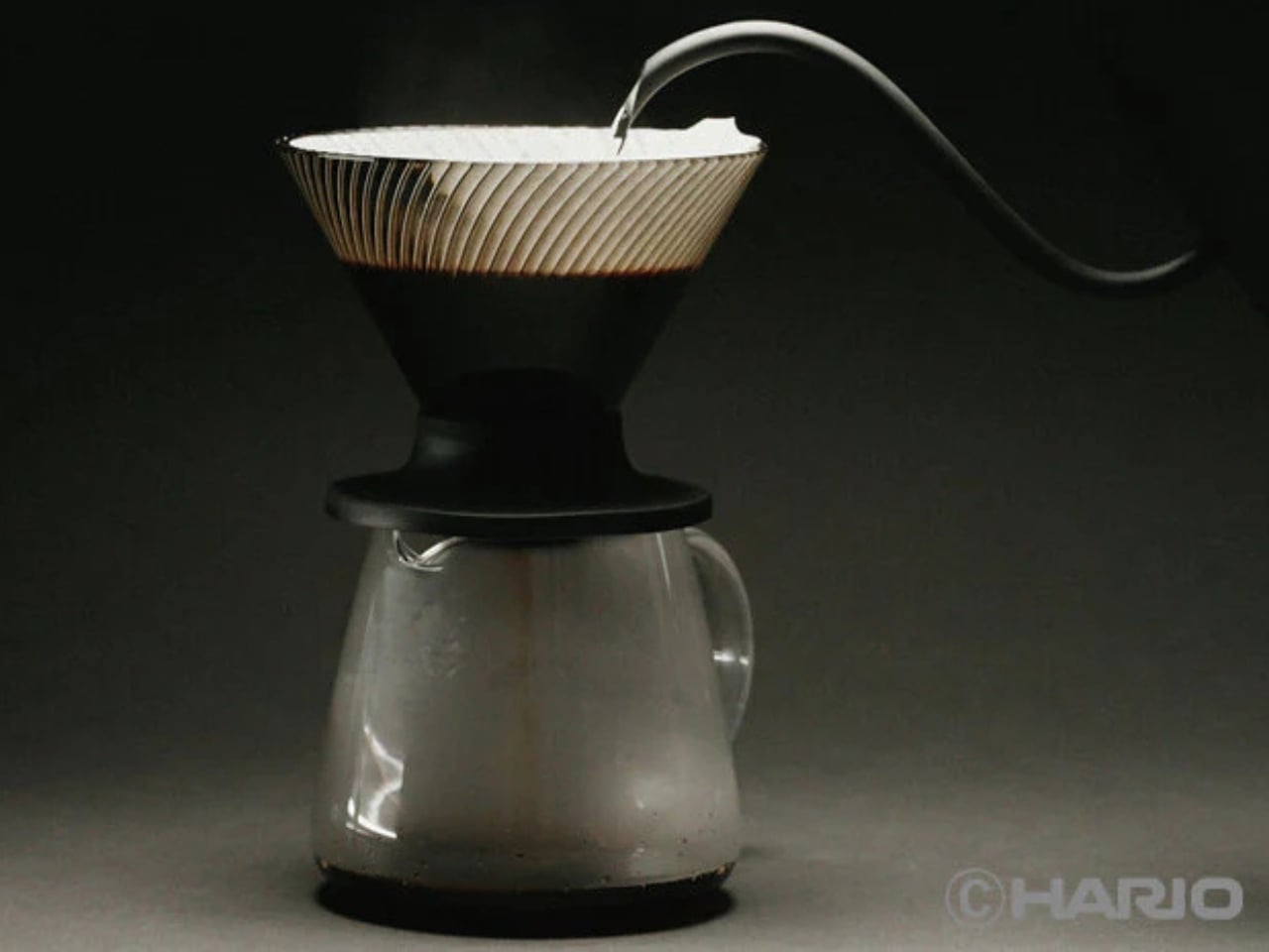
The original V60’s spiral ribs are the reason it works the way it does. They create space between the paper filter and the cone wall, allowing air to escape as water flows through. The result is a controlled extraction, but one that demands attention. Get your grind wrong, pour too fast, let your focus wander, and the brew either stalls or races past the point of no return. The V60 has always been a beautiful, slightly unforgiving thing.

The NEO changes that equation with a genuinely clever structural update. Instead of a single spiral rib pattern, it introduces 72 ultra-fine vertical ribs along the upper walls of the cone, which then converge into 9 deeper ribs near the base. This dual-zone design guides water evenly down the entire wall before accelerating it through the outlet. The effect is a faster, more uniform extraction that minimizes bitterness from water lingering too long in contact with the grounds. The cup you get out the other end is cleaner, sweeter, and more vibrant, with a balanced acidity that doesn’t tip into sourness.

Two years of testing went into getting this right. Hario’s engineers ran exhaustive trials on rib counts, angles, and flow dynamics before landing on this configuration. The fact that they filed a utility model patent on the structure suggests they believe it is genuinely novel, not just cosmetically different.

The material choice is also worth noting. The NEO is made from Tritan resin, a lightweight, high-clarity plastic that handles heat retention better than standard plastic alternatives. It keeps the brewing temperature more stable from the first pour to the last, which matters more than people think. Temperature consistency is one of those variables that separates a good cup from a great one, and the NEO addresses it without requiring you to do anything differently.

For anyone already embedded in the V60 ecosystem, the compatibility factor is a quiet win. The NEO works with all existing V60 switch bases, so you don’t have to rebuild your setup from scratch. It comes in two sizes, both made in Japan, and retails for around $23.50, which is an accessible price point for a piece of equipment that functions this thoughtfully.

Not everyone is convinced, though. Since hitting the market, the NEO has sparked a genuinely divided response from the coffee community. Users describe the brew as cleaner and more tea-like, which sounds appealing until you realize that some people loved the original V60 precisely for its acidic punch and intensity. One Reddit user put it plainly: the NEO presents coffee “differently,” not necessarily better. For experienced brewers who spent years dialing in their pour technique to coax specific flavors from the classic cone, the NEO’s smoother, more forgiving nature feels less like an upgrade and more like a personality change. That’s a fair criticism. Hario didn’t make a bad V60. They made a different one, and that distinction is exactly what has the coffee internet divided.

Pour-over coffee has always had a slight gatekeeping problem. The ritual appeals to people who love it precisely because it requires care, but that same learning curve turns off anyone who just wants a good cup without turning their kitchen into a science experiment. The V60 NEO doesn’t eliminate that ritual. It just makes the margin for error a little more forgiving, which means more people get to enjoy the result without years of practice behind them.

The original V60 deserved its legacy. The NEO earns its own, just a slightly different one.

The post Hario’s V60 Gets Its First Real Upgrade in 20 Years for $23 first appeared on Yanko Design.

This 4-in-1 Hands-free Flashlight Clips To Clothes, Snaps to Your Phone, and Stands on Its Own

Par : Sarang Sheth
12 mai 2026 à 01:45

A Red Dot Design Award and a $210,000 Kickstarter campaign are two very different kinds of validation. One comes from a jury of design professionals evaluating form, function, and coherence. The other comes from tens of thousands of people who looked at a product and handed over money before it shipped. SparkO, the compact wearable EDC flashlight from California’s ScoutLite, earned both. That combination suggests something specific about the object: it reads clearly to designers and solves something real for everyday people. At $45.99 and 40 grams, the barrier to entry is low enough that hesitation becomes difficult to justify.

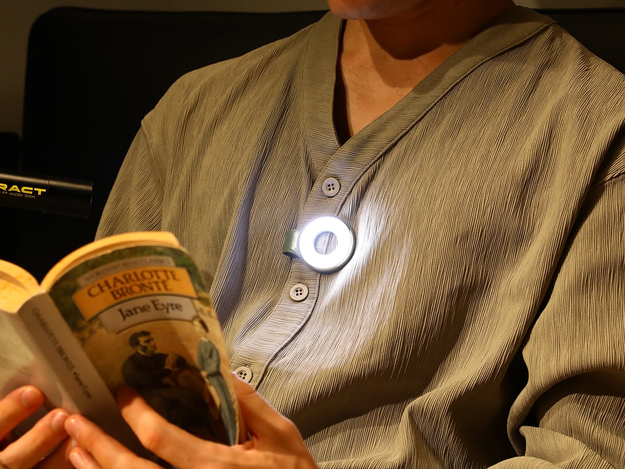
Two photos of SparkO are enough to grasp the concept: a disc-shaped body, a silicone loop that clips and doubles as a kickstand arm, and a circular LED array wrapped in a fine prismatic lens ring. The anodized metal bezel is color-matched to whichever of the four options you pick, Forest Moss, Basalt Black, Glacier Blue, or Canyon Clay. It clips to a bag strap or jacket, snaps magnetically to a MagSafe iPhone, props upright on the optional ring stand, or rides on clothing as a hands-free wearable. That range of deployment is the whole argument for SparkO, and ScoutLite backs it with 300 lumens, three color temperatures, four brightness levels, a red light mode, CRI 95+ rendering, a 14.5-hour runtime, and USB-C charging. At a campsite, a workbench, or a dim restaurant table, the light adapts to the situation rather than demanding you adapt to it.

Designer: Ten

Click Here to Buy Now: $41.40 $45.99 (10% off, use coupon code “YK10”). Hurry, deal ends in 48-hours!

The disc form is a real departure from the cylindrical tube that has defined flashlight design for over a century. A cylinder forces you to hold it; a disc invites you to wear it, clip it, or set it down facing wherever light needs to go. The silicone loop is soft enough to flex over thick fabric and structured enough to hold position once seated, its geometry doubling as the kickstand arm when the magnetic ring base enters the picture. The circular LED face is surrounded by a concentric prismatic lens ring that distributes light broadly and evenly, borrowing visual language from photography ring lights rather than from tactical torches. That framing signals the breadth of SparkO’s intended audience: the tradesperson and the camper, but equally the commuter, the hobbyist, and the photographer working in low light.

Clipped to a chest pocket or jacket collar, SparkO illuminates whatever your hands are working on without requiring you to hold anything, which is the core use case that conventional EDC lights have historically fumbled. Snapped to the back of an iPhone Pro via the magnetic base, it becomes a fill light for close-up photography, turning a phone into something resembling a professional lighting rig for the cost of a decent lunch. The ring stand converts the same unit into a bedside reading lamp or a compact task light with a footprint smaller than a drink coaster. Each scenario calls for a different mounting method, and the transitions between them take seconds rather than a setup ritual. Four modes sounds like a marketing stretch right up until you’ve run through all of them in a single day, and then it starts to feel like the accurate count.

Three hundred lumens is the right range for a light this size: capable outdoors, tolerable at close range, and not so aggressive that it becomes a problem in tight spaces. The three color temperature options matter more than the lumen figure in daily use, covering the gap between a warm amber reading mode and a cooler beam suited to detailed work. CRI 95+ color rendering is what sets SparkO apart from most of the EDC lighting field, reproducing colors accurately enough that the light reads close to natural daylight, which makes a genuine difference for craftspeople and photographers. The red mode preserves night-adapted vision on a trail or at a campsite, a small but real addition for outdoor use. Runtime at 14.5 hours and USB-C charging put SparkO on a weekly recharge cycle with a cable it shares with everything else in a modern carry kit.

ScoutLite has built a product that lands on the right side of the three virtues the EDC community consistently responds to: compact, accessibly priced, and solving a problem the existing field handles poorly. The Red Dot Award carries credibility for an audience that pays attention to such things, while the $210,000 Kickstarter result is a harder signal to argue with, because crowdfunding backers are betting on a design that communicates its own value clearly enough that waiting feels unnecessary. At $45.99, the decision practically makes itself, especially given that the clip, the magnet, the stand, and the wearable mode collectively cover more scenarios than most EDC kits manage with multiple dedicated tools. Whether ScoutLite follows this up with accessories or a higher-output variant, SparkO sets a credible benchmark for what a wearable EDC light should cost, weigh, and do. The category has needed something this considered for a while.

Click Here to Buy Now: $41.40 $45.99 (10% off, use coupon code “YK10”). Hurry, deal ends in 48-hours!

The post This 4-in-1 Hands-free Flashlight Clips To Clothes, Snaps to Your Phone, and Stands on Its Own first appeared on Yanko Design.

This Sculptural Glass Object Makes Flowers Feel Like a Van Gogh Painting

Par : Tanvi Joshi
11 mai 2026 à 22:30

There is something instantly familiar about patterned glass. We have seen it in old windows, cabinet doors, bathroom partitions, and quiet corners of homes where privacy and light needed to exist together. It is a material that usually stays in the background, doing its job quietly. With Violet Frosted, designer Marius Boekhorst brings that overlooked material forward and turns it into something sculptural, expressive, and quietly poetic.

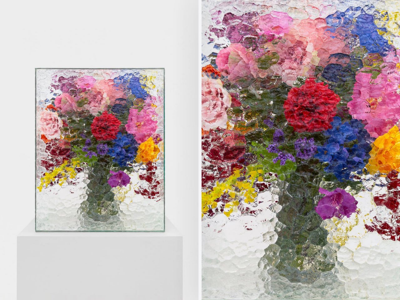
At its heart, Violet Frosted is a geometric glass object that plays with flowers, light, color, and texture. What makes it interesting is the way it changes how we see what is placed behind it. The frosted, patterned glass softens the flowers, turning bright petals and stems into blurred fields of color. A flower becomes a shadow, a brushstroke, a violet glow, or a faded green line depending on where you stand.

Designer: Marius Boekhorst

That is where the charm of the piece begins. Instead of presenting flowers directly, Violet Frosted filters them. It creates a gentle distance between the viewer and the arrangement. That distance makes you look closer. It asks you to slow down and notice how color shifts through glass, how a shape becomes unclear, and how something ordinary can feel painterly when it is partly hidden.

In many ways, Violet Frosted feels like a still life painting brought into the real world. Traditional still lifes capture flowers in one fixed composition, frozen in paint and time. This piece lets the still life move. The flowers change as they bloom and fade. The light changes throughout the day. The view changes as you move around it. From one angle, the arrangement may feel bold and graphic. From another, it becomes soft, quiet, and almost dreamlike.

The design feels especially beautiful because it does not try too hard. It avoids excess decoration. The form is clean and almost architectural, while the patterned glass gives it warmth and character. It feels contemporary without losing the memory of where the material comes from. That balance between old and new gives the piece its quiet confidence.

Violet Frosted also carries a museum-like feeling, though it never feels precious or untouchable. It brings the mood of a gallery into everyday space. A table, shelf, or windowsill suddenly feels more considered. A simple floral arrangement becomes an experience. You are looking at flowers through atmosphere, texture, and light.

Violet Frosted reminds us that design does not need to shout to stay with us. Sometimes, the most memorable objects are the ones that shift how we see familiar things. By turning patterned glass into a living frame, Marius Boekhorst creates a piece that sits between a vase, a sculpture, and a painting. It is functional, emotional, and deeply visual. It holds flowers, and it holds a moment.

The post This Sculptural Glass Object Makes Flowers Feel Like a Van Gogh Painting first appeared on Yanko Design.

BEYOND Expo 2026: Asia’s Biggest Tech Event Just Told the World That AI Software Was Only the Warm-Up

Par : Sarang Sheth
10 mai 2026 à 23:30

Every major tech conference eventually finds its thesis statement. CES landed on “everything is connected.” SXSW staked out culture-meets-technology. BEYOND Expo‘s thesis for 2026 is more specific, and honestly more timely: AI has spent years proving itself in software, and the interesting question now is what happens when it leaves the screen. The official theme, “AI: Digital to Physical,” takes over from last year’s theme of Transforming Uncertainty into a Trigger for Innovation. Timed perfectly around the global speculation that AI’s a bubble, it’s a genuine reflection of where the most consequential AI work is actually happening right now, in robotics labs, automotive platforms, wearables, and manufacturing floors across the Greater Bay Area.

BEYOND has been building toward this moment since Dr. Lu Gang launched it during a global lockdown in 2021, a decision he’s called delusional in hindsight during an interview with Yanko Design, but with the kind of grin that says he’d do it again. The original problem he was solving was simpler than people realize: Asia’s most interesting founders kept showing up at CES and Web Summit as attendees rather than headliners. A hardware startup out of Shenzhen with genuinely world-class AI chops would get a 3×3 booth on a back wall while the stage went to the usual suspects. BEYOND was built to fix that imbalance, and five years in, it’s working.

Click Here to know more about the BEYOND Expo 2026

The 2026 edition is aiming for 30,000 attendees, a significant jump from 2024’s 20,000, and the programming reflects a maturing event that knows its own strengths. The summit lineup spans Humanoid Robotics and Embodied AI, Enterprise Agentic Workflows, Autonomous Driving, AI-Integrated Wearables, and a PayFi and Decentralized AI track that will either feel prescient or premature depending on your priors. What ties all of it together is the through-line of AI becoming something you interact with physically, not just through a chat interface. That’s a meaningful editorial choice, and one that puts BEYOND in a different conversation than conferences still treating large language models as the whole story.

The most interesting addition this year is the GBA Innovation Tour, which gives international attendees direct access to Greater Bay Area manufacturing infrastructure. This matters more than it might sound. Lu Gang has argued for years that what makes Asia’s tech ecosystem genuinely different isn’t just the innovation pipeline, it’s the compression of the distance between idea and physical product. Watching an AI concept move from prototype to production in a Shenzhen facility in weeks rather than months is something you can describe in a keynote, but apparently you need to see it to really understand the scale and speed involved. The tour is BEYOND’s way of making that argument visceral rather than theoretical.

Last year’s theme, “Unveiling Possibilities,” was about reframing uncertainty as creative fuel, which was the right message for a chaotic moment. “AI: Digital to Physical” is more declarative, more confident. It names a specific transition that the industry is mid-stride through, and plants BEYOND squarely in the middle of it. Registration and exhibition details are live at beyondexpo.com.

Click Here to know more about the BEYOND Expo 2026

The post BEYOND Expo 2026: Asia’s Biggest Tech Event Just Told the World That AI Software Was Only the Warm-Up first appeared on Yanko Design.

This Quebec Home Doesn’t Fight the Forest – It Disappears Into It

10 mai 2026 à 22:30

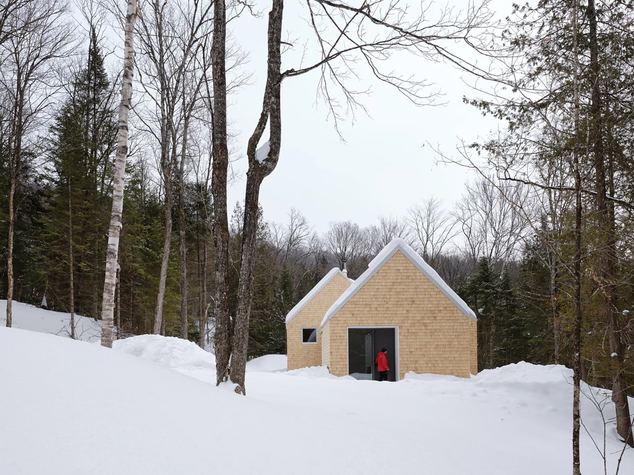
Certain kinds of architecture don’t announce themselves. La Maraude, the latest project by Nathalie Thibodeau Architecte, is exactly that — a compact residential dwelling tucked into the dense woodlands of Boileau, in Quebec’s Outaouais region, that earns its presence through restraint rather than spectacle. Completed in 2024, it’s one of the more quietly compelling houses to come out of Canada in recent memory.

The name itself carries meaning. ‘Maraude’ — to roam, to forage — hints at the relationship the house cultivates with its surroundings. Rather than claiming a dominant position along the river’s edge, the architects deliberately set the home deeper within the treeline, orienting the house’s interior life entirely toward the forest. It’s a gesture that shapes everything else about the project.

Designer: Nathalie Thibodeau Architects

The design draws directly from Quebec’s vernacular architectural tradition — steeply pitched rooflines, grounded proportions, and a material palette that feels native to the region. The exterior is clad in natural cedar shingles and topped with a metal roof, two materials with deep roots in the local building culture. These aren’t nostalgic choices. They’re translated through a contemporary lens, stripped of ornament, reduced to their essential geometry. “Designed with particular attention to simplicity, functionality, and respect for traditional codes, La Maraude embodies a successful dialogue between contemporary architecture and local traditions,” says Nathalie Thibodeau Architecte.

What makes the spatial sequence genuinely interesting is the use of two courtyards as organizing devices. The plan doesn’t simply open to the outdoors — it pulls the forest in, fragmenting the landscape into a series of framed views that shift with the seasons. One courtyard faces north, more sheltered and partly enclosed by the building itself, oriented toward higher ground. The other faces south, brighter and more expansive, drawing the eye down toward the lower terrain. The result is a house that reads differently in every light condition, every month of the year.

The second volume, arranged over two levels in response to the site’s slope, plays a more introverted role. Openings here are smaller and precisely placed to frame specific moments within the tree canopy — quiet apertures rather than panoramic statements.

Photographed by Maxime Brouillet, La Maraude has the look of a project that will age well, both materially and culturally. It’s already being discussed as a potential anchor for a broader ensemble of small retreats on the site — a first building in what could become a considered, evolving conversation between architecture and landscape.

The post This Quebec Home Doesn’t Fight the Forest – It Disappears Into It first appeared on Yanko Design.

Nocturne’s Free App Turns Your Bricked Spotify Car Thing Into Something Better Than the Original

Par : Sarang Sheth
10 mai 2026 à 20:45

The open-source community has a long history of doing more with abandoned hardware than the original manufacturers ever did. The PSP got emulators Sony never approved. The Wii got homebrew loaders that ran software Nintendo pretended didn’t exist. The pattern repeats because the hardware is always fine; it’s the corporate support structure around it that evaporates. The Spotify Car Thing joined that lineage in December 2024 when Spotify killed server-side authentication and turned every unit into an expensive knob with a screen attached.

Nocturne picked up where Spotify dropped off. The project launched in October 2024, anticipating the shutdown, and has shipped four major versions since. V4.0.0, currently in beta with a public release imminent, finally delivers true Bluetooth connectivity without phone tethering, a companion app, and a feature set that makes the original Spotify firmware look like a rough draft.

Developer: Nocturne Team (Brandon Saldan, Dominic Frye, and contributors)

The Car Thing runs a 512MB RAM, 4GB storage Amlogic S905D2 SoC, which is a polite way of saying it has the processing power of a mid-range router from 2015. Early versions of Nocturne required a Raspberry Pi as a co-processor just to get the thing online, which was a heroic workaround but not exactly mainstream-friendly. V3 replaced that with Bluetooth tethering through your phone’s hotspot. V4 cuts the tether entirely, pairing directly via Bluetooth through the new Nocturne Companion app, which requires a Nocturne+ subscription to fund the team’s continued development.

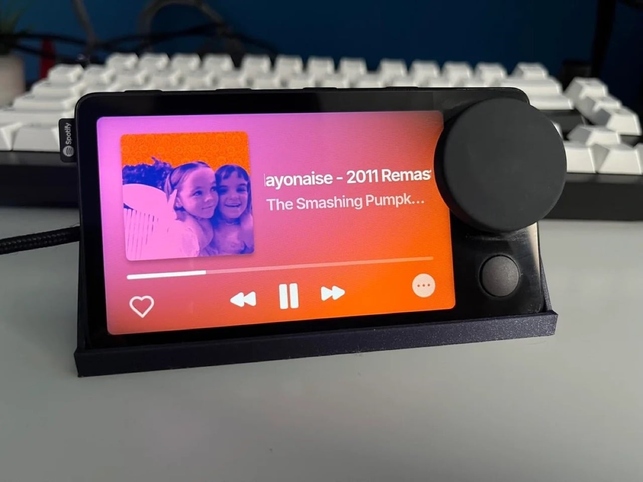
What the photos make immediately clear is how clean the UI actually looks in practice. The now-playing screen pulls album art and renders it as a full bleed gradient background, the same visual logic Spotify used but executed with noticeably more polish in edge cases. The typography is large and glanceable. The playlist browser view is dense but organized, using album thumbnails and track titles in a layout that navigates naturally with the knob. Image 3 shows a subtle ambient lighting effect around the screen border, a rainbow glow that responds to the current track, which is the kind of detail you wouldn’t expect from a community firmware project running on 2021 budget hardware.

The gesture control, OTA updates, Spotify Connect device switcher, podcast support, local file playback, and DJ mode all carried over from V3. The V4 architecture also bakes in full offline functionality, meaning the firmware survives without Spotify’s servers being cooperative, which was precisely the failure mode that bricked every original unit in the first place.

Nocturne’s GitHub currently lists V3.0.0 as the stable release, with V4.0.0 accessible to donors via Discord while the team finishes the public build. If you’ve got a Car Thing in a drawer, the installation guide at usenocturne.com is the next tab you should open.

The post Nocturne’s Free App Turns Your Bricked Spotify Car Thing Into Something Better Than the Original first appeared on Yanko Design.

Art Deco Furniture Is Back – and Salone 2026 Made It Official

9 mai 2026 à 23:30

Image credit: Armani Casa

After years dominated by pale oak, soft minimalism, and rounded silhouettes, Salone del Mobile 2026 signaled a clear shift toward richer and more expressive interiors. Held at Milan’s Rho Fiera fairgrounds from April 21 to April 26, 2026, the exhibition integrated Art Deco-inspired details such as chevrons, polished brass, chrome finishes, fan-shaped arches, and jewel-toned velvet upholstery, bringing glamour and structure back into contemporary furniture design.

Across Milan Design Week 2026, designers moved toward layered materials, geometric forms, and statement-making interiors. Instead of feeling nostalgic, the aesthetic appeared refined and updated for modern living. The resurgence also aligns with broader trend forecasts. Pinterest Predicts 2026 identified neo deco as one of the year’s defining interior styles, which is a cleaner, moodier reinterpretation of 1920s luxury.

Throughout Salone del Mobile 2026, recurring Deco-inspired forms and materials across installations and showroom launches pointed to a wider and more intentional design shift, reinforcing the growing influence of Art Deco furniture 2026 trends.

This shift is best understood by tracing how Neo Deco diverges from its historical origin.

What Is the Difference Between Original Art Deco and Neo Deco?

While both styles celebrate glamor and craftsmanship, Neo Deco reinterprets classic Art Deco for a more modern and livable aesthetic.

Characteristics of Original Art Deco

  • Strong geometric symmetry
  • Chevron patterns and fan-shaped arches
  • Heavy ornamentation and layered detailing
  • Glossy lacquer, marble, and polished brass
  • Bold jewel tones and dramatic interiors
  • Structured and formal furniture silhouettes

Characteristics of Neo Deco

  • Softer and more sculptural forms
  • Cleaner layouts with less visual excess
  • Refined brass and chrome accents
  • Selective use of velvet, marble, and glossy finishes
  • Open and contemporary interiors
  • Balanced mix of luxury and minimalism

Seen throughout Salone del Mobile 2026, neo deco keeps the elegance of classic Art Deco furniture but simplifies it for contemporary living. Additionally, Neo Deco keeps the glamour of classic Art Deco furniture while adapting it to modern interiors that prioritize comfort, simplicity, and sculptural design. This theoretical shift becomes most visible when translated into contemporary objects and reissued icons. Take a look at our pick of the top 7 Neo Deco pieces from Salone del Mobile Milan Design Week 2026.

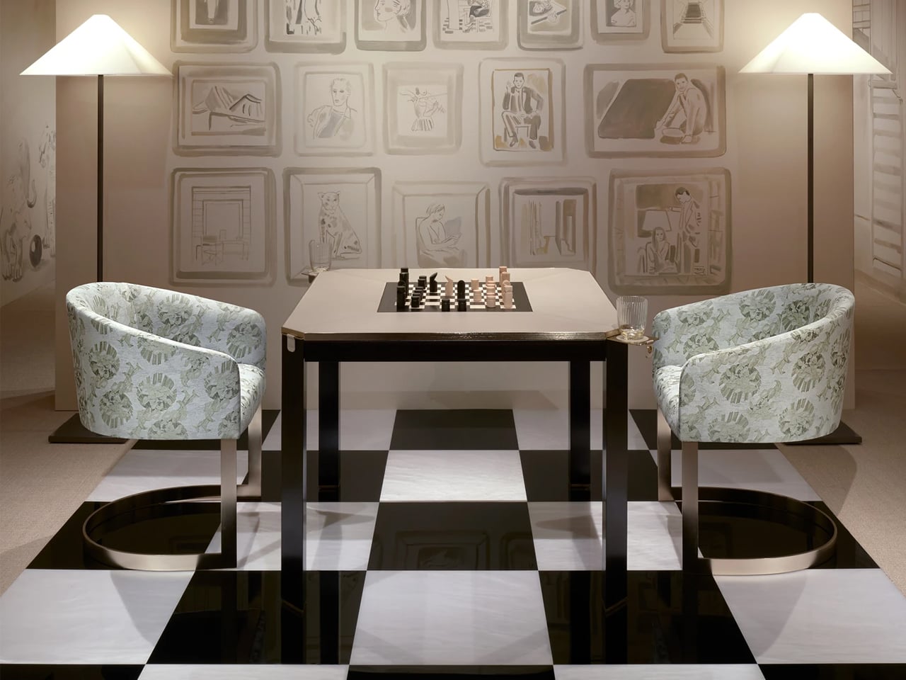
1. Borgonuovo’s games table by Armani Casa

Image credit: Armani Casa

Image credit: Armani Casa

The Borgonuovo’s games table blends understated luxury with meticulous craftsmanship through a refined neo-deco design language. Crafted from ebony wood and topped with taupe leather, the piece conceals a rotating chess-and-checkers surface in ebony and maple wood. Satin-finished brass accents, sculptural triangular legs, discreet pull-out cup holders, and hidden storage drawers introduce geometric elegance and multifunctional sophistication without overwhelming the design.

Image credit: Armani Casa

Named after the Milan street once home to Giorgio Armani, the table reflects the restrained yet luxurious aesthetic of Armani Casa. Its clean forms and rich material palette also reference the timeless influence of Jean-Michel Frank, whose minimalist approach to luxury continues to shape the brand’s furniture and interior collections.

2. Delfi Madia Cabinet by Promemoria

Image Credit: Promemoria

Image Credit: Promemoria

The Delfi Madia Cabinet by Promemoria expresses a refined neo deco aesthetic through its architectural proportions, geometric detailing and restrained use of ornamentation. Unlike traditional Art Deco, which often emphasized dramatic symmetry and lavish decoration, this contemporary interpretation feels quieter and more sculptural. Defined by a solid wood frame and a recessed central groove that creates a strong vertical axis, the cabinet balances precision with softness, while subtle perimeter lighting enhances its sculptural presence with a warm ambient glow.

Image Credit: Promemoria

Image Credit: Promemoria

The cabinet doors become the focal point of the design, featuring layered wood veneers and repetitive patterns in varying tones that create a delicate three-dimensional effect. This interplay of geometry, texture, and craftsmanship recalls classic Deco influences but reworks them in a cleaner and more contemporary way. Functional yet expressive, the piece can shift from kitchen storage to an intimate bar setting.

3. ‘Pigreco’ Chair by Tobia Scarpa, Reissued by Tacchini

Image credit: Tacchini

Image credit: Tacchini

Image credit: Tacchini

The ‘Pigreco’ chair by Tobia Scarpa for Tacchini reinterprets neo deco through a refined balance of gloss, geometry, and sculptural elegance. Echoing the glamour of classic Art Deco furniture, the design pairs soft upholstery with lacquered structural elements that wrap around the chair like a polished architectural frame.

Image credit: Tacchini

Image credit: Tacchini

The reflective surfaces introduce depth and luminosity, transforming lacquer from a simple finish into a defining visual feature. Instead of embracing the excess of traditional Deco interiors, Pigreco adopts a more restrained and contemporary approach. Its silhouette moves fluidly between curves and sharp lines, while the careful balance of solids and voids gives the chair a sense of rhythm and precision.

4. The Elie Saab x Impatia Pool Table

Image Credit: Elie Saab

Image Credit: Elie Saab

Image Credit: Elie Saab

The billiards table by Elie Saab in collaboration with Impatia transforms a traditional game table into a striking expression of neo-deco design. This functional furniture piece interprets the Neo Deco style through sculptural geometry, luxurious materials, and refined detailing. Transparent glass elements lighten the structure visually, while a concealed slate core preserves performance.

Image Credit: Elie Saab

Image Credit: Elie Saab

Its Deco influence appears through layered material contrasts and architectural rhythm. A dark bronze metal frame provides structure, while ribbed glass panels reference geometric repetition. Beige leather edging softens the composition, while Patagonia marble rail tops introduce crystalline textures.

5. Louis Vuitton Omega Table (Reissue)

Image Credit: Louis Vuitton

Image Credit: Louis Vuitton

Louis Vuitton returned to Milan Design Week 2026 with a refined presentation of Objets Nomades, staged as a dialogue between archival design and contemporary craftsmanship. The showcase revisited early Art Deco furniture principles, not as nostalgia, but as a structural language rooted in proportion, geometry, and material clarity.

Image Credit: Louis Vuitton

A key highlight was the reissued Omega Table, originally designed by Pierre Legrain in 1921. Its distinctive curved profile remained intact, maintaining the tension between fluid line and architectural discipline that defined the original composition. Recrafted in lacquered wood and Nomade leather, the surface finish deepens its visual continuity, allowing the form to read as a piece of furniture alongside a sculptural object. The result preserves its historical identity while aligning it with a more contemporary sensibility of refined restraint and material precision.

6. Diamond Chocolate sideboard by Boca Do Lobo

Image Credit: Boca do Lobo

Image Credit: Boca do Lobo

The Diamond sideboard distils neo deco into a precise study of form, where geometry replaces ornament as the primary visual language. The design steps beyond decorative layering and is built around faceted surfaces that break light and shadow into controlled shifts across the object’s volume.

Image Credit: Boca do Lobo

Image Credit: Boca do Lobo

Its high-gloss exterior intensifies this effect, creating a reflective depth that changes with viewing angle and ambient light. The deep chocolate palette anchors the piece, introducing warmth and visual weight against its angular composition. Beneath its sculptural exterior, the craftsmanship remains tightly controlled, positioning the sideboard not as a decorative object, but as a structured, collectible form defined by clarity, precision, and material intensity.

7. Beacon Bar Cabinet by Ralph Lauren

Image Credit: Ralph Lauren Home

Image Credit: Ralph Lauren Home

The Beacon bar cabinet by Ralph Lauren Home operates at the intersection of architectural discipline and decorative refinement, expressed through a grounded yet sculptural oak structure within a Neo Deco sensibility. Its form is defined by strong vertical and horizontal logic, where proportion becomes the primary expressive tool rather than surface detailing.

Image Credit: Ralph Lauren Home

Behind its restrained exterior lies a carefully orchestrated system of concealed storage and engineered joinery, allowing functionality to disappear seamlessly into form. Subtle Deco influence appears through controlled symmetry and measured rhythm in its construction. The warmth of oak introduces a tactile counterbalance to its structural clarity, resulting in a piece that feels substantial and understated, anchored in material honesty and architectural calm.

Beyond individual objects, Neo Deco is also defined through its material language

Decoding Neo Deco Interiors Through Materiality

A return defined by materiality

Fluted wood, lacquer, burl veneer, brushed brass, and velvet have returned together within the neo deco revival. Their resurgence is driven by materiality itself and how surfaces hold light, absorb shadow, and create depth through texture rather than decoration.

Fluted wood creates rhythm through light

Fluted wood introduces quiet repetition and structure. Its grooves shift with light and shadow, giving surfaces a subtle architectural rhythm without visual heaviness.

Lacquer sharpens reflection and clarity

Lacquer brings a smooth, reflective finish that heightens colour and edge definition. It adds precision and a controlled luminosity to otherwise solid forms.

Burl veneer adds natural irregularity

Burl veneer introduces organic movement through its unpredictable grain. It softens geometry with a layered, expressive surface that feels distinctly unique.

Brushed brass introduces warmth and restraint

Brushed brass offers a muted metallic glow that grounds compositions. Its softened sheen balances richer materials without overpowering them.

Velvet brings depth and tactility

Velvet enriches interiors with softness, density, and colour saturation. It absorbs light, adding warmth and a more intimate spatial quality.

Why did they return together

In neo deco, these materials work through contrast via matte and gloss, soft and structured, natural and refined characteristics.

What Pinterest Predicts 2026 Actually Signals About Neo Deco

Pinterest search patterns show Neo Deco as a move toward complete spatial moods and not just isolated décor trends. Users are gravitating toward sculptural silhouettes, arched forms, and layered material compositions, suggesting interiors are now being imagined as unified architectural statements. This directly aligns with Milan Design Week 2026, where geometry, brass, lacquer, and Deco references appeared as part of the structure and not just surface styling.

To understand why this shift is happening now, it must be placed within the wider fatigue of minimalism-led interiors

Why Neo Deco Emerges After a Decade of Minimalism?

The rise of Neo Deco follows clear fatigue with Scandi-led minimalism. After years of soft oak, muted tones, and rounded neutrality, interiors have reached a point of visual saturation. Since 2024, designers have been signaling a shift toward more defined, expressive environments, marking a recalibration toward structure, contrast, and material presence.

Taken together, these signals point to a deeper change in how interiors are being conceived. What many interpretations miss is that Neo Deco is not a surface trend but is structural. The emphasis has moved from finishes and colour palettes to silhouette, proportion, and joinery. Furniture now operates as spatial architecture, shaping rhythm and atmosphere within a room. The logic is simple but decisive: the shift is no longer about what you apply to a space, but how the space is formed.

As a result, Neo Deco is not a revival of ornament but is a return to structure, where form itself becomes the new language of luxury.

The post Art Deco Furniture Is Back – and Salone 2026 Made It Official first appeared on Yanko Design.

The Roomba Guy Just Built a Robot Pet You Might Actually Love

Par : Ida Torres
9 mai 2026 à 22:30

If you’ve ever watched your Roomba bump helplessly into a chair leg for the third time and thought, “I deserve better from my robots,” you’re not alone. And apparently, neither did Colin Angle. The co-founder of iRobot, the man who essentially put a hockey puck-shaped vacuum in millions of homes, left the company in 2024 with a new question rattling around in his head: what if a robot could actually feel like it cares about you? The answer is the Familiar, the first prototype from his new startup, Familiar Machines & Magic. And it is not your average robot.

Picture a creature somewhere between a soft-eared dog and a round, slightly abstract bear. It has four legs, huge paws, and doe eyes that make it immediately charming in a way that no Roomba ever attempted to be. It’s furry, expressive, and was designed with the help of former Disney Imagineers, which explains why it looks like it belongs in an animated feature rather than a tech showcase. The Familiar has 23 degrees of freedom, meaning it can wiggle its ears, tilt its head, and wag a small nub of a tail with the kind of fluidity that feels less mechanical and more… alive. Its coat is touch-sensitive, built specifically to encourage physical interaction between you and it.

Designer: Familiar Machines & Magic

It also doesn’t talk. That detail feels deliberate and, to me, very smart. Voice assistants have trained us to think of robots as tools we command. The Familiar is going for something completely different. It’s designed to read your tone of voice, your body language, your overall energy, and respond accordingly. Angle calls it “Consumer Physical AI,” and while the label sounds like something off a product white paper, the idea behind it is genuinely compelling.

The name itself is worth noting. A “familiar” in folklore refers to the supernatural animal companion of a witch or magical figure, a creature bonded to a person not through ownership but through genuine connection. Angle’s team chose that name deliberately, and I think it sets the tone for what they’re trying to build. The goal isn’t to sell you a novelty gadget. It’s to create a new kind of relationship between humans and machines, one built on trust, attentiveness, and something approaching care.

Now, I’ll be upfront: I have feelings about this. Part of me finds it genuinely beautiful as a design concept. The Familiar was clearly approached the way good industrial design should be, with deep thought about how an object makes you feel, not just what it does. The choice to make it animal-like rather than humanoid is interesting, too. There’s far less of the uncanny valley unease that tends to follow humanoid robots around, and more of the universal warmth that most people already extend toward animals.

But another part of me wonders about the emotional stakes here. We’re already watching people form attachments to AI chatbots. A touch-sensitive, furry, expressive robot that mirrors your emotional state is a much more potent version of that. Angle has said he wants it to feel like the machine actually cares about him. That’s a lovely vision. It’s also a design brief that puts enormous responsibility on the creators to get it right, because the flip side of emotional bonding is emotional dependence.

Still, I’d be lying if I said the Familiar didn’t make me curious in the best possible way. The prototype images are almost disarmingly sweet. It looks like something you’d want sitting on the couch next to you while you read, or settled quietly in the corner while you work. If any robot was ever designed to move through your life rather than just function within it, this might be it.

The Familiar is still in the prototype stage, with no confirmed price or release date. But as debut concepts go, it’s a strong one. Whether or not it ever makes it into our homes, it raises questions about what we actually want from the machines we live with. And those questions feel well overdue.

The post The Roomba Guy Just Built a Robot Pet You Might Actually Love first appeared on Yanko Design.

UNO and Vrbo Are Renting Vacation Homes for $4 a Night

Par : Ida Torres
9 mai 2026 à 20:45

Brand collaborations are everywhere these days, but every once in a while, one lands so perfectly that you have to stop and appreciate the logic behind it. The UNO x Vrbo partnership is exactly that kind of collab. Not because it’s flashy or trying to be something it’s not, but because it genuinely makes sense.

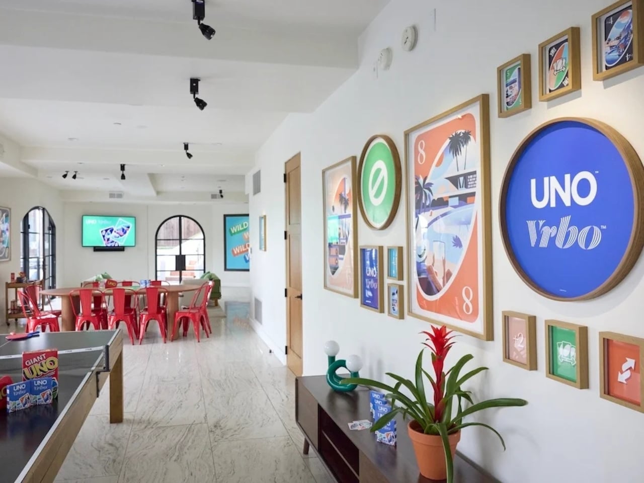
Starting May 15, Mattel and Vrbo are opening bookings for six limited-time vacation home stays built entirely around the spirit of game night. Six properties across the U.S., two tiers of experience, and one very clever price point: $4 per night. That last part is a deliberate nod to UNO’s iconic Draw 4 card (which can make or break relationships), and it’s the kind of detail that makes you smile whether you’re a brand person or not.

Designers: UNO x Vrbo

The stays are divided into two experiences. At the top end sit the two “Wild Card” homes, located in the Hollywood Hills and Texas Hill Country. These are the full production: UNO-themed décor, organized game nights, and an in-home dining experience. They’re designed for groups of up to 10 guests who want the whole immersive package, the kind of weekend that’s more curated getaway than casual vacation. Then there are the four “Play It Your Way” stays in Winter Park, Colorado; Palm Desert, California; Panama City Beach, Florida; and Atlanta, Georgia. These are a little more relaxed, but still come with a co-branded UNO x Vrbo Welcome Kit, a game room, and either a pool or hot tub. Essentially, they’re the version for people who want the fun without the fuss. All six properties are bookable for one three-night stay, Friday to Monday, on a first-come, first-served basis. Bookings open May 15 at 1 PM ET. I’ll be honest: at $4 a night, they are going to go fast.

What makes this collaboration genuinely interesting, beyond the price tag, is the attention that went into the actual product. A custom UNO deck was commissioned for this collab, illustrated by Pietari Posti, with artwork inspired by travel destinations and vacation themes. It also comes with an exclusive rule called the “Vacation Rental Swap,” which lets players swap hands with anyone at the table. It’s a small thing, but it shows that the two brands weren’t just slapping logos on a vacation home and calling it a day. They put real creative thought into what the collaboration could actually feel like to experience.

That’s the part that tends to separate a genuinely good brand collab from a lazy one. Anyone can license a logo and stick it on merchandise. Fewer brands take the time to ask what the experience should feel like from the inside, and build something around that answer. UNO, at its core, is a game about chaos and connection. You play it with people you like and you inevitably end up yelling at them. It’s social in the most fundamental way. Vrbo, meanwhile, is about giving groups a private space to actually be together without the interruptions of a hotel. Put those two things in the same room and you get something that doesn’t need to be explained.

It also helps that this collab is part of a growing relationship between Mattel and Expedia Group, Vrbo’s parent company. Mattel already appeared in an Expedia Super Bowl commercial earlier this year through the Barbie universe. So this isn’t a one-off stunt; it reads more like two brands actively figuring out how to build something together over time. For anyone who grew up playing UNO at a kitchen table, there’s an undeniable nostalgia pull here. But the campaign doesn’t lean into nostalgia as a crutch. It uses the game’s identity as a starting point and builds forward from it, which is ultimately why it works. The best collaborations don’t just remind you of something you loved. They give you a new reason to love it again.

The post UNO and Vrbo Are Renting Vacation Homes for $4 a Night first appeared on Yanko Design.

This AC Does 5 Jobs at Once and Looks Like Furniture on Your Wall

Par : JC Torres
9 mai 2026 à 19:15

The split air conditioner is one of the least loved objects in any home, which is a strange thing to say about something most people couldn’t live without. It works, technically, but it tends to make its presence known in all the wrong ways. The air is too direct, the noise is a constant background irritant, and the plastic box on the wall rarely belongs in any thoughtfully designed interior.

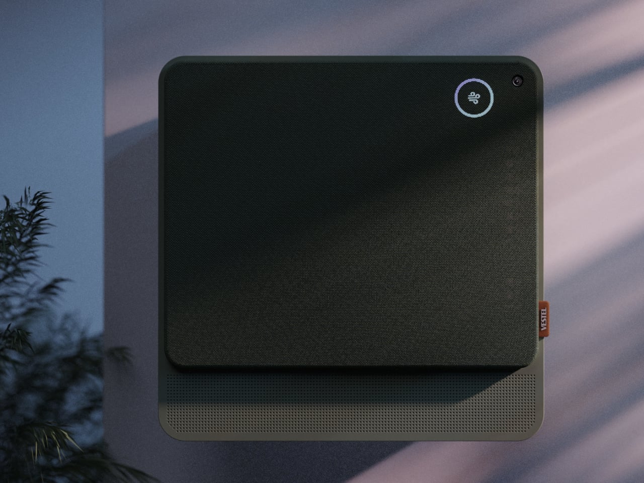
From that frustration comes WellFlow, a concept that reframes what air conditioning is supposed to do for the people living around it. Rather than engineering a better cooling box, the designers built something closer to a wellness device. It’s a concept that received validation through the iF Design Award in 2026 and was first revealed at IFA Berlin 2025.

Designer: Merve Nur Sökmen, Zehra Sarıarslan

The most immediate shift is in how air actually moves. Conventional units push output in one direction, landing directly on whoever is in the room. WellFlow uses four-way diffusion to spread conditioned air from all sides without targeting anyone in particular. Sensors also monitor occupancy and steer airflow accordingly, so the unit quietly adapts to the room rather than expecting the room to tolerate it.

Beyond airflow, the system also handles humidity, air purity, ambient lighting, and sound. A built-in humidifier balances moisture levels rather than leaving the air artificially dry, which is one of the most common complaints about running a conventional unit through the night. Circadian lighting and integrated speakers complete the picture, creating conditions that support sleeping, concentrating, or quietly winding down, depending on what the moment calls for.

All of this adjusts automatically. The system continuously monitors temperature, humidity, and air quality, then fine-tunes its output without any manual input. A baby’s room needs different conditions than a home office or a gym corner, and WellFlow is designed to recognize those differences. Its behavior was shaped through user research spanning new parents, older adults, and people with respiratory sensitivities, groups that conventional air conditioners routinely fail to address.

The physical form is just as deliberate as the behavior. Most air conditioners are conspicuously technical, with plastic housings that fight against any interior aesthetic. WellFlow uses a woven textile front panel with rounded corners and a matte finish, giving it a material quality far more associated with furniture than appliances. An ambient light halo behind the unit softly signals its presence on the wall without demanding any attention.

A pull-out front filter makes maintenance visible and intuitive, addressing something the design team identified as a recurring trust issue with conventional units. People often aren’t sure when or how to clean their filters, and that uncertainty quietly chips away at confidence in the device. WellFlow removes that ambiguity. For a machine designed around human comfort, even that seemingly small detail ends up mattering quite a lot.

The post This AC Does 5 Jobs at Once and Looks Like Furniture on Your Wall first appeared on Yanko Design.

James Bond-inspired Scubacraft SC3 turns your underwater adventure fantasy into reality

Par : Gaurav Sood
8 mai 2026 à 22:30

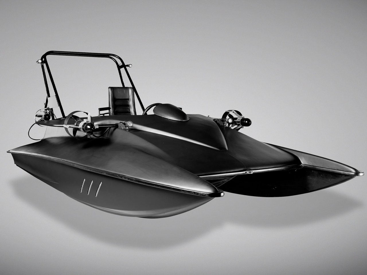
What you actually see here is a one-off submersible that is equally capable above the surface as it is underwater. For anyone who remembers the futuristic watercraft showcased in the James Bond film Spectre, there is now a rare opportunity to own one of the strangest and most ambitious vehicles ever built. Called the Scubacraft SC3, the experimental vessel was developed during the late 2000s as a functioning prototype that blurred the line between speedboat and personal submarine.

Unlike many fictional gadgets seen in Bond movies, the SC3 was not a movie prop designed solely for visual appeal. It was engineered as a real-world concept capable of operating both on the water’s surface and beneath it. The project reportedly attracted interest from the UK Special Boat Service and even DARPA because of its unconventional capabilities and military-style versatility before eventually making its way into the Bond universe. In Spectre, the matte-black machine appeared in Q’s workshop alongside the iconic Aston Martin DB10, instantly becoming one of the more memorable background vehicles in the film.

Designer: Bonhams

Now heading to auction through Bonhams, the SC3 remains the only prototype ever produced, making it less of a practical recreational craft and more of a collectible piece of engineering history. Its rarity is amplified by the fact that no production version ever followed, despite the concept demonstrating genuine functionality both above and below the waterline.

On the surface, the SC3 behaves much like a high-performance jet boat. It is powered by a Kawasaki 1,498cc inline four-cylinder engine connected to a jet-drive propulsion system, allowing it to skim across the water at impressive speeds. The real transformation begins once the craft enters deeper waters. With the underwater mode activated, electrically powered thrusters take over while hydrodynamic control surfaces guide the vessel beneath the surface at speeds of around three knots.

Unlike traditional submarines, however, the SC3 does not feature a sealed or pressurized cabin. Occupants are exposed directly to the surrounding water and must wear full diving gear before submersion. This open-water diving approach significantly reduces complexity and weight while creating an experience closer to underwater flight than conventional submarine travel. The setup accommodates three people, including the driver and two passengers, all seated in exposed racing-style seats integrated into the craft’s lightweight body.

Visually, the SC3 still looks every bit like a futuristic Bond vehicle. The original composite plastic bodywork remains intact, paired with carbon-fiber construction elements and upholstered leather racing seats that reinforce its cinematic personality. Its aggressive low-slung silhouette, combined with stealth-inspired matte-black paintwork, gives it an appearance that still feels ahead of its time more than a decade after it was built.

Vehicles attempting to combine marine and underwater transportation are exceptionally rare because of the engineering compromises involved. The SC3 stands out precisely because it became a fully operational prototype rather than a concept sketch or film mock-up. That achievement alone makes it one of the most unusual experimental watercraft ever created and an undeniably fascinating piece of Bond-related automotive history.

The post James Bond-inspired Scubacraft SC3 turns your underwater adventure fantasy into reality first appeared on Yanko Design.

The Hermès Birkin Finally Has a LEGO Version and It Opens to Reveal A Secret Runway Inside

Par : Sarang Sheth
8 mai 2026 à 19:15

The Hermès Birkin has one of the most theatrical purchasing rituals in luxury retail. You cannot simply walk into a boutique on Rue du Faubourg Saint-Honoré and buy one. Hermès makes you earn it, building a relationship with a sales associate over months, sometimes years, demonstrating cultural fluency with the house before they’ll even have the conversation. The result is an object that carries as much mythology as it does resale value, a handbag that has become shorthand for a particular kind of aspirational excess that the internet finds endlessly fascinating.

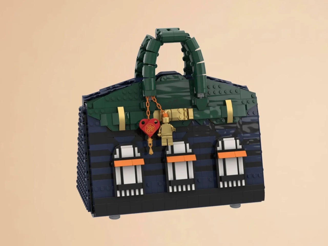
LEGO Ideas builders BOI_Design and KittyJW found a rather elegant workaround. Their MOC (My Own Creation) reimagines the Birkin 20 Faubourg, the special edition inspired by Hermès’s flagship Paris store, as approximately 1,400 bricks of deep navy, dark green, and gold. The exterior facade doubles as a miniature rendering of 24 Rue du Faubourg Saint-Honoré itself, complete with arched boutique windows and orange awnings. And it opens.

Designers: BOI_Design and KittyJW

The silhouette is immediately recognizable to anyone who has spent time in the vicinity of luxury retail, or, more realistically, scrolled past one on Instagram. The trapezoidal body is rendered in deep navy blue tiles, layered with a subtle horizontal banding that gives the surface genuine texture and depth. The handles arc overhead in dark green, assembled from linked Technic-adjacent elements that convincingly mimic the soft curve of the real bag’s leather grip. Gold hardware details sit at the clasp, at the side buckles, and along the turnlock assembly, and a tiny linked orange chain drops a red heart charm and a gold minifigure pendant in a detail that reads as both playful and surprisingly precise. Flip the bag around and the back panel is clean and quiet, just navy tiles and a gold Hermès tile sitting on a dark strap, which is exactly how the real thing looks.

The front face depicts three arched windows dressed with crisp white frames and orange awnings are spaced across the lower body, referencing the Haussmannian rhythm of the actual boutique facade at Faubourg Saint-Honoré. It takes a second to fully resolve in your eye, this thing that is simultaneously a handbag and a building, and that slight double-take is very much the point. The builders describe it as merging fashion and architecture into a single object, and looking at it straight on, that framing holds up completely.

My favorite detail, however, is what happens when you open it. The lid swings up to reveal a hidden interior scene that commits fully to the bit. Three pink minifigures, each carrying a tiny handbag, are posed on oversized primary-color bricks in red, yellow, and blue, the kind of bold, joyful color blocking that feels distinctly LEGO while also evoking a fashion week runway setup. Nestled alongside them is a miniature Birkin 20 Faubourg bag rendered at a smaller scale, a self-referential easter egg that will land immediately with anyone paying attention. The interior lining is lined in cream and tan tiles, a genuinely considered touch that mirrors how a real Birkin’s suede interior contrasts against its exterior leather. At 28.5 centimeters wide and 29 centimeters tall, the whole thing has real physical presence on a shelf.

The build is currently gathering votes on LEGO Ideas, the community platform where fan submissions need to reach 10,000 supporters before LEGO’s internal team will formally review them for potential production. It’s early days for this one, but the concept has the kind of crossover appeal, fashion collectors, LEGO enthusiasts, Paris romantics, people who just want the Birkin experience without the two-year waitlist, that could carry it a long way. You can head to the LEGO Ideas page here to cast your vote.

The post The Hermès Birkin Finally Has a LEGO Version and It Opens to Reveal A Secret Runway Inside first appeared on Yanko Design.

Your Knife Block Has No Business Looking This Good

Par : Ida Torres
8 mai 2026 à 16:20

Most kitchen accessories come with an unspoken agreement: you accept that they look utilitarian, and in return, they do their job quietly in the background. Knife holders, in particular, have always been the least glamorous residents of the countertop. The wooden block is fine. The magnetic wall strip is practical. But neither has ever made anyone stop and stare. Samyuktha S’s Eclipse Edge concept breaks that agreement entirely, and I’m genuinely glad it does.

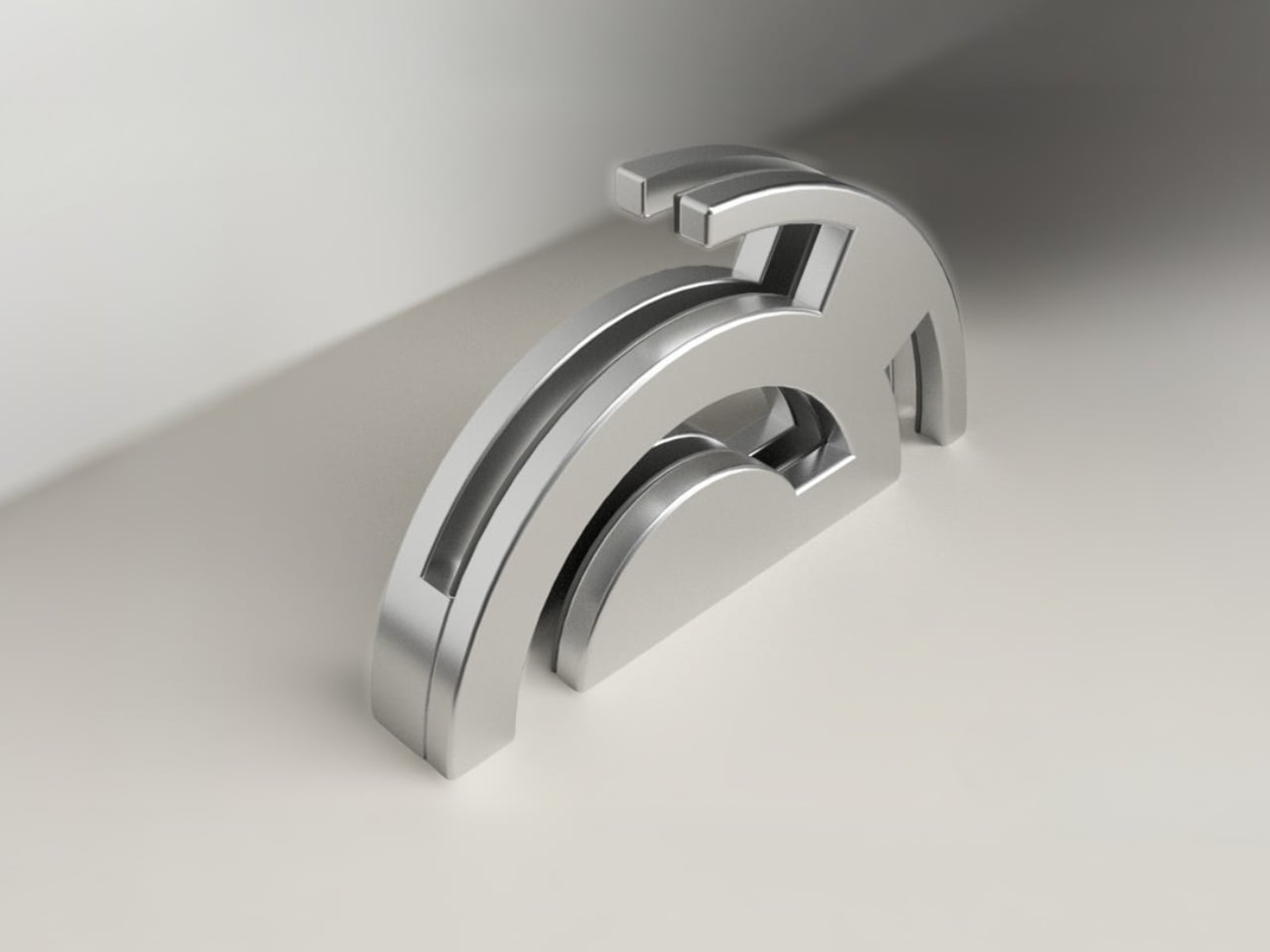
The Eclipse Edge is a magnetic knife holder inspired by the geometry of a lunar eclipse, specifically the moment when Earth aligns between the sun and moon, casting that iconic half-shadow silhouette into the sky. That form, an abstracted arc built from layered, concentric half-circles, becomes the entire design language here. Looking at it on a countertop, you wouldn’t immediately guess what it does. You’d probably assume it was a sculpture. That confusion is precisely the point.

Designer: Samyuktha S

Samyuktha’s design brief was direct: create a kitchen storage accessory that bridges functional utility and structural statement decor. The goal was to reimagine a standard tool organizer as a decorative landmark within the home, elevating it to a high-end sculptural piece. She achieved this without resorting to the usual tricks of adding color or unconventional materials. The Eclipse Edge is sand-casted aluminum with a hand-carved finish, and it leans entirely into that material’s dual nature: raw and refined at the same time.

The mechanics are equally considered. Hidden magnetic sheets inside the form hold knives parallel to the surface, which means blades are secured safely without any visible hardware or slots cutting into that clean silhouette. The oil and waterproof protective layering is built into the construction. Multiple knife sizes are accommodated without compromising the holder’s structural integrity or visual lines. It’s the kind of detail work that separates a pretty sketch from a design that actually holds up under scrutiny.

The ideation pages on Samyuktha’s Behance project tell you a lot. There are dozens of iterations, circular forms, crescent variations, abstracted lunar shapes explored and discarded before arriving at the stacked arch that became the final concept. Getting from a celestial reference to something that can hold a chef’s knife at the right angle and still look like contemporary sculpture takes a specific kind of problem-solving patience. The sketches make clear that nothing was accidental.

A physical prototype was also produced through aluminum sand casting using an MDF pattern, which means this design was tested in the real world, not just rendered beautifully and left to live on a screen. Seeing the actual object in photos alongside actual kitchen knives brings the concept into sharp focus. It looks grounded and serious in person, the kind of object that would hold its own on any well-styled countertop without asking for too much attention.

I do think about the practical day-to-day reality of owning something like this. Keeping polished aluminum pristine in a working kitchen takes effort, and the hand-carved finish, while gorgeous, would need care. But that’s not necessarily a flaw in the design. High-end kitchen objects have always required a little more commitment. A copper pot needs polishing. A cast iron pan needs seasoning. The Eclipse Edge feels like it belongs in that same category of objects you choose deliberately and tend to over time.

The broader conversation around kitchenware has been shifting for a while now. People increasingly want their kitchen tools to reflect how they live and what they care about, not just what they cook. The Eclipse Edge speaks to that shift with real confidence. It doesn’t apologize for being beautiful. It doesn’t hide its utility behind a costume. It just quietly insists that a knife holder can be, at the same time, an object worth looking at. Samyuktha S’s Eclipse Edge is a concept for now, but it’s the kind of concept that feels ready. The thinking is there. The craft is there. The prototype is there. Sometimes the only thing standing between a student project and a product is someone willing to bet on it.

The post Your Knife Block Has No Business Looking This Good first appeared on Yanko Design.

AI-powered earbuds with built-in camera expand your capabilities in the real world

Par : Gaurav Sood
8 mai 2026 à 15:20

Headphones and earbuds have, over the last couple of years, become staples of this fast-paced world for good reason. The little audio gear essentials can do a multitude of tasks with just the push of a tactile button or pinch gesture. They can trigger smart assistant support for a smarter you, and if this concept were to be imagined, they can give you a pair of smart eyes, too.

The idea of a pair of earbuds with integrated cameras is not new, as Emil Lukas imagined, and now another concept reinforces the merit in having a pair of lenses on earbuds. Dubbed Lightwear, the earbuds look something straight out of a sci-fi flick, but underneath, they are a pair of smart assistant earphones that enhance your environmental perception in real time.

Designer: Suosi Design

Touted as the world’s first AI-powered earphones, Lightwear comes with a set of HD camera lenses to expand the sense perception as a vision module to interpret the surroundings and deliver the desired result. One can detail them via voice command about any information required in real time, and the buds respond with a detailed set of instructions or navigation guidance. Having gesture control support, the buds can control the connected home devices remotely using just gesture commands. All the data fed into the smart data system is end-to-end encrypted and stored locally. For enhanced privacy and protection, the sensitive data is automatically cleared on a scheduled cycle.

Compared to Emil’s version, these earbuds have a very downplayed camera presence, which I prefer. They look and feel just like any normal earbud, but have a function that makes them stand out from most pairs of earbuds that have the predictable features. Unlike other AI-powered earbuds, these stand true to their name as they come with the added visual apparatus to put forth better results. The use of AI functions is not limited to the earbuds, since the charging case does the same. This removes the use-case scenario to just when the earbuds are being worn. Loaded with highly sensitive microphones, the AI features can be triggered anytime the user wants. Privacy is also taken care of, as the user can opt to activate the fingerprint unlock module to prevent any unauthorized use.

These have an over-the-ear design, reminiscent of the way IEMs sit flush on the ears. The battery resides in those lobes, and although the designers don’t specifically talk about the usage time, these should last longer than TWS earbuds. Nor is there a specific word about the sound quality, ANC levels, or the app features. But then it’s just a concept centred on the form factor and usability.

The post AI-powered earbuds with built-in camera expand your capabilities in the real world first appeared on Yanko Design.

This $45 Titanium Pocket Knife Uses Centrifugal Force and Neodymium Magnets Instead of A Button Lock

Par : Sarang Sheth
3 mai 2026 à 01:45

Most pocket knives are designed for the moment you need to cut something. The TiNova II is designed for that moment, but also for the five minutes after, when you find yourself opening and closing it just because the mechanism feels satisfying. That shift in priorities is intentional, and it required Ideaspark to rethink the entire knife after the first version shipped to over 1,300 Kickstarter backers in 2025.

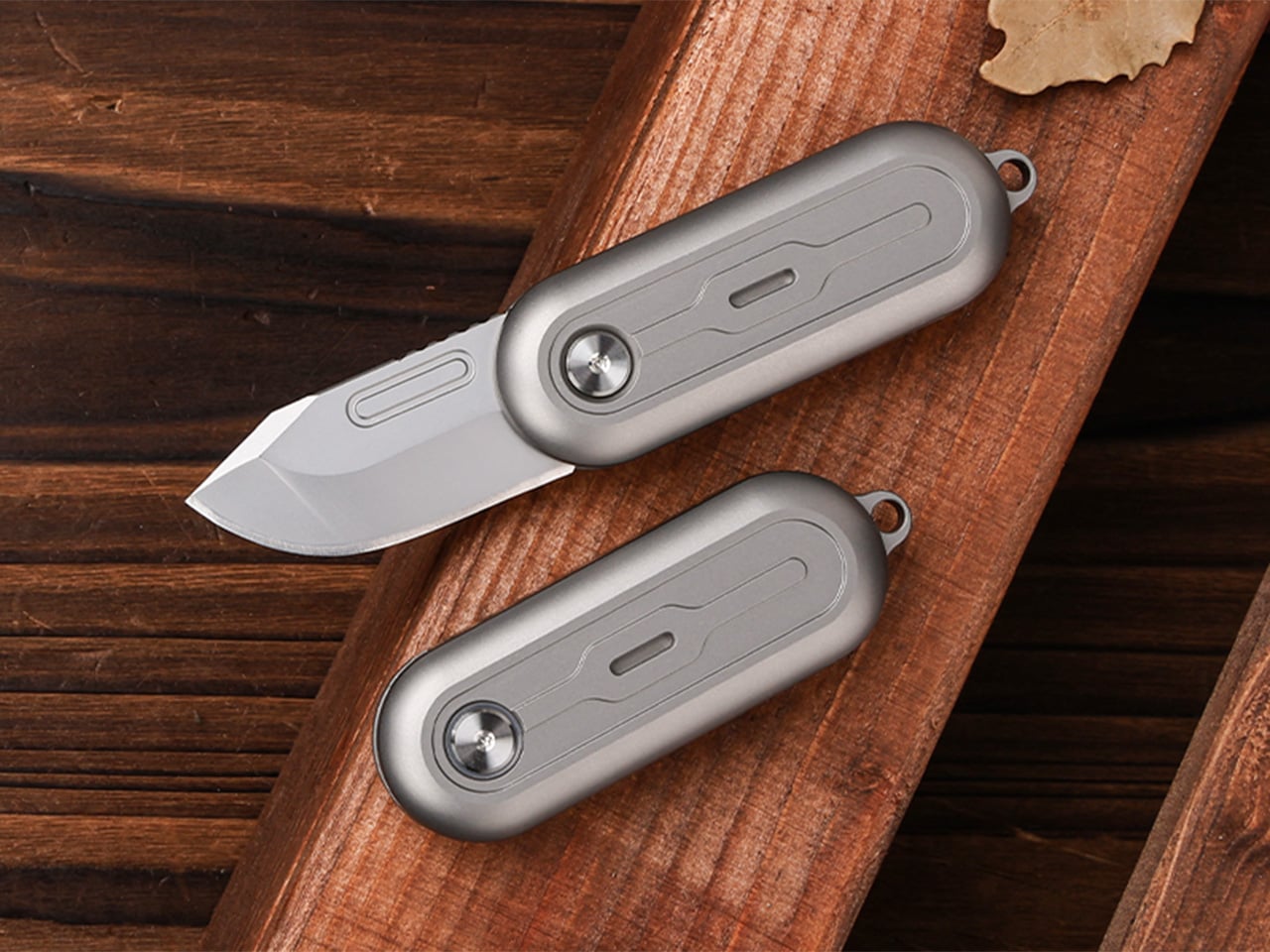
The mechanism itself is straightforward. Two titanium handle scales connect at a single roller bearing pivot point. One scale stays fixed, the other rotates a full 360 degrees around it. Neodymium magnets sit at strategic positions to create resistance, so when the blade swings open or closed, you get a crisp magnetic snap that locks it in place. Flick your wrist and the momentum carries the blade through a smooth rotation with a satisfying ‘click’. Hold it differently and you can coax out a slower, weighted spin. What changed between Gen 1 and Gen 2 is the body shape. The original had flat sides and sharp edges like a traditional folding knife. The TiNova II uses an oval profile that matches the natural curve your hand makes when your fingers relax into a loose fist. That single geometry change makes the knife feel completely different when you’re holding it, which matters when the whole point is creating something you’ll keep picking up. The magnetic resistance is tuned tight enough to keep the blade from accidentally deploying in your pocket, but smooth enough that you can flip it open one-handed without effort.

Designer: Ideaspark

Click Here to Buy Now: $49 $70 (30% off). Hurry, only 64/100 left! Raised over $62,000.

The handle scales are machined from Grade 5 titanium, the aerospace alloy that shows up in everything from jet engine components to high-end bike frames. The material delivers the strength-to-weight ratio you’d expect (the entire knife weighs 59.3 grams, roughly two U.S. quarters), but the more interesting property is how it wears. Titanium doesn’t corrode, rust, or tarnish the way steel does. Instead, it develops a patina over time, recording scratches and scuffs as a visual history of use. Every mark becomes permanent, which means the knife you carry for a year looks distinctly different from the one that arrived in the mail. Ideaspark leans into this with two finish options: a raw sandblasted titanium that shows wear immediately, and a black PVD coating that creates higher contrast when the underlying metal starts to peek through.

The blade is D2 tool steel, heat-treated to HRC 58-60. D2 sits in an interesting zone within the steel hierarchy. It holds an edge longer than most budget steels (think 8Cr13MoV or AUS-8), and is a go-to choice for premium knives. The choice here makes even more sense for a keychain knife where you’re cutting tape, breaking down cardboard, trimming threads, or slicing through packaging, with practically negligible wear and tear over time compared to a knife that experiences the brunt of rugged outdoor use. The blade profile is a drop-point with a full belly, which gives you a long cutting edge relative to the 40.5mm blade length. The curve naturally guides material into the sharpest part of the edge, making it effective for slicing motions even when you’re working with something as small as this.

At 64.4mm closed, the TiNova II is shorter than a standard credit card (85.6mm). Opened, the entire knife measures 100mm, just under four inches. The thickness is 12.4mm, slimmer than a stack of three coins. These dimensions put it squarely in the micro-folder category alongside knives like the CRKT Pilar or the Kershaw Chive, but the deployment method sets it apart. Most compact folders use a flipper tab or a thumb stud, mechanisms that require deliberate engagement. The TiNova II uses rotational momentum, which feels closer to spinning a fidget toy than opening a knife. The roller bearing does most of the work. Ideaspark uses what they call a Kugellager bearing (the German term for ball bearing), which is a pretty great way of saying their precision-made bearings boast the kind of well-engineered frictionless movement you’d expect from the Germans. The result is a glide that feels even smoother than air, with no grinding or resistance as the handle rotates.

The magnetic system does several jobs simultaneously. First, it holds the knife closed when it’s in your pocket, preventing accidental deployment. Second, it provides tactile and audible feedback at both the open and closed positions, giving you a satisfying click that confirms the blade is locked. Third, it creates just enough resistance during the spin to make the motion feel controlled rather than loose. The magnets are arranged to pull at the end of each rotation, which is why the knife doesn’t just spin freely like a bearing on a shaft. You feel the mechanism working with you, and that feedback loop is what makes the fidget factor so addictive. The physics here are simple but effective. The magnetic force increases as the scales approach their final position, so the last few degrees of rotation feel like they’re being pulled into place.

An elliptical body shape means there’s no fixed orientation when you’re holding it. You can rotate the knife in your palm, flip it between fingers, or just run your thumb along the curved surface. The absence of sharp edges or defined corners makes it comfortable to manipulate for extended periods, which sounds trivial until you compare it to a traditional rectangular folder that starts digging into your hand after a few minutes. Ideaspark claims this design philosophy came directly from user feedback on the Gen 1 model, where backers loved the mechanism but found the angular body uncomfortable during long fidget sessions. The oval profile solves that problem by removing pressure points entirely.

Two tritium slots run along the length of each handle scale, sized for 1.5mm x 6mm tubes. Tritium is a self-luminous isotope that glows continuously for around 25 years without batteries, charging, or external light. Drop a pair of green, blue, or orange vials into those slots and the knife becomes visible in complete darkness, which is useful for finding it in a bag or on a nightstand. The glow is subtle, not the kind of thing that lights up a room, but enough to catch your eye when you’re fumbling around in the dark. The tritium slots also add a small visual detail that breaks up the otherwise minimal design.

The blade deployment works two ways depending on how you hold it. The long spin involves gripping one handle scale and flicking your wrist, which uses centrifugal force to carry the other scale through a full 360-degree rotation. The motion is slow, weighted, and deliberate. The short flip is faster: a quick wrist snap that sends the blade open with a crisp tick as the magnets engage. Both methods work one-handed, and both feel satisfying in different ways. The long spin has a hypnotic, rolling quality. The short flip is sharp and immediate. You’ll find yourself alternating between them depending on your mood or how much time you’re killing during a meeting.

The knife comes with a keychain hole at one end, sized for a standard split ring. Slip it onto your keys and it disappears into the cluster, weighing less than most car fobs. The compact dimensions mean it works equally well on a wallet chain, a backpack strap, or worn as a necklace pendant if you’re leaning into the EDC-as-jewelry aesthetic. The tritium glow makes it viable as a functional piece of illuminated jewelry, though calling it that probably annoys traditional knife collectors who prefer their folders utilitarian and unadorned.

The TiNova II ships in two finishes: sandblasted (raw titanium) and black coated (PVD). Both finishes come with the same lifetime warranty, which covers manufacturing defects and structural failures. The knife is available now starting at $45 for the launch day special (36% off the $70 MSRP), with free worldwide shipping included. International shipping is scheduled for August 2026.

Click Here to Buy Now: $49 $70 (30% off). Hurry, only 64/100 left! Raised over $62,000.

The post This $45 Titanium Pocket Knife Uses Centrifugal Force and Neodymium Magnets Instead of A Button Lock first appeared on Yanko Design.

This strangely addictive gear-inspired magnetic fidget from METMO comes in brass, titanium, steel, and nylon

Par : Sarang Sheth
2 mai 2026 à 23:30

METMO has a talent for taking the visual drama of engineering and translating it into objects people want to touch, turn, and carry. The Grip reimagined the adjustable wrench after nearly 130 years of design stagnation. The Pen turned a dual-thread screw mechanism from 1892 into a fidget object. The Fractal Vise made a complex machinist’s tool into something people keep on their desks purely for the pleasure of operating it. Each time, the Leeds-based team finds a mechanical idea that was ahead of its moment, and rebuilds it with the precision and material quality the original never had.

Helico follows that lineage, but takes a noticeably different turn. Where most METMO products carry a clear functional premise, this one leads with pure tactile indulgence, arriving as a compact magnetic form that looks carved from the DNA of helical gears. Every surface seems designed to catch the thumb, reflect light, and reward movement. It comes in four material variants, brass, stainless steel, Grade 5 titanium, and nylon, with each one shifting the personality of the object in a way that feels deliberate rather than cosmetic.

Designers: Sean Sykes & James Whitfield

Click Here to Buy Now: $115.

Two cylindrical modules stack vertically, held together by nickel-coated neodymium magnets sandwiched between each section. The magnets are strong enough to keep the stack stable in your hand but calibrated to let you pull sections apart, rotate them, and snap them back together without fighting the object. That separation-and-reconnection loop is where the fidget factor lives, and it turns out to be deeply satisfying in a way that is genuinely hard to articulate. The snap of two sections realigning carries a small but precise reward signal, the kind that makes you do it again immediately. METMO has effectively built a tactile feedback machine disguised as a gear stack.

The angled herringbone grooves channel the thumb naturally while turning every surface into a structure that catches and shifts light as the object rotates. Rolling Helico between your fingers produces a continuous tactile rhythm, a frequency of peaks and valleys that keeps your hands occupied without demanding any conscious attention. The geometry is more considered than it first looks, with the pitch and depth of each tooth calibrated to feel satisfying rather than sharp or aggressive. On the inside of each module, a smooth machined cup creates a deliberate contrast, a quiet surface that makes the exterior texture feel even more intentional by comparison. It is the kind of detail that shows up in product photos but only fully registers when you are holding the thing.

Brass is the version that photographs best and probably sells the story hardest. High tensile HTB1 brass carries real weight, that dense satisfying heft that makes an object feel purposeful rather than precious. It also ages, picking up patina in the spots where your fingers land most often, building a record of use that the steel and titanium versions simply do not. Stainless steel, machined from 316 grade stock, takes the opposite approach: clean, cool to the touch, corrosion-resistant, and visually neutral in a way that lets the geometry do all the talking. Between the two, I would call stainless the everyday carry option and brass the collector’s piece.

Grade 5 titanium is lighter than either brass or stainless, and that shift in weight changes the feel of the object more than you might expect. The same herringbone geometry that feels dense and substantial in brass becomes almost nimble in titanium, sitting in the pocket without any real presence until you reach for it. Titanium also carries those aerospace-adjacent associations that the EDC world never quite gets tired of, and METMO leans into that without apologizing for it. Nylon, specifically PA16, is the outlier of the four, lighter still and matte where everything else is reflective, making Helico feel more casual and approachable. It is the version for people who want the tactile experience on a budget, or who simply prefer their desk objects without the weight class.

Every instinct in the EDC market seems to demand that small objects justify their existence with a list of functions, bottle opener here, hex bit storage there, ruler along the side. Helico skips all of that entirely, and the confidence of that decision is a big part of what makes it interesting. There is no hidden tool, no secondary feature, no apologetic add-on to make the price feel earned. What you are paying for is the machining quality, the material, the magnet calibration, and the sensory experience of an object designed from the ground up to be handled. That kind of object is rare in a product category that too often dresses fidget toys as tools and tools as fidget toys.

The four material variants give Helico a range that most desk objects cannot claim, each one tuned differently enough to appeal to a genuinely different buyer. Brass for the collector who wants something that ages with them, titanium for the EDC enthusiast building a curated pocket, stainless for the person who wants precision without warmth, and nylon for everyone who just wants to fidget without overthinking it. METMO has always been good at making objects that look like they belong in a museum and work like they belong in a toolbox, and Helico sits at an interesting point on that spectrum, leaning harder toward the former than anything the studio has made before. Whether that signals a deliberate pivot or just a smart product line expansion is worth watching. Either way, it would be very easy to put one on your desk and never move it again.

Click Here to Buy Now: $115.

The post This strangely addictive gear-inspired magnetic fidget from METMO comes in brass, titanium, steel, and nylon first appeared on Yanko Design.

❌
❌