Vue normale

Il y a de nouveaux articles disponibles, cliquez pour rafraîchir la page.
À partir d’avant-hierFlux principal

India’s Anthill House Has No AC and Stays Cool Anyway

Par : Ida Torres
27 juin 2026 à 13:20

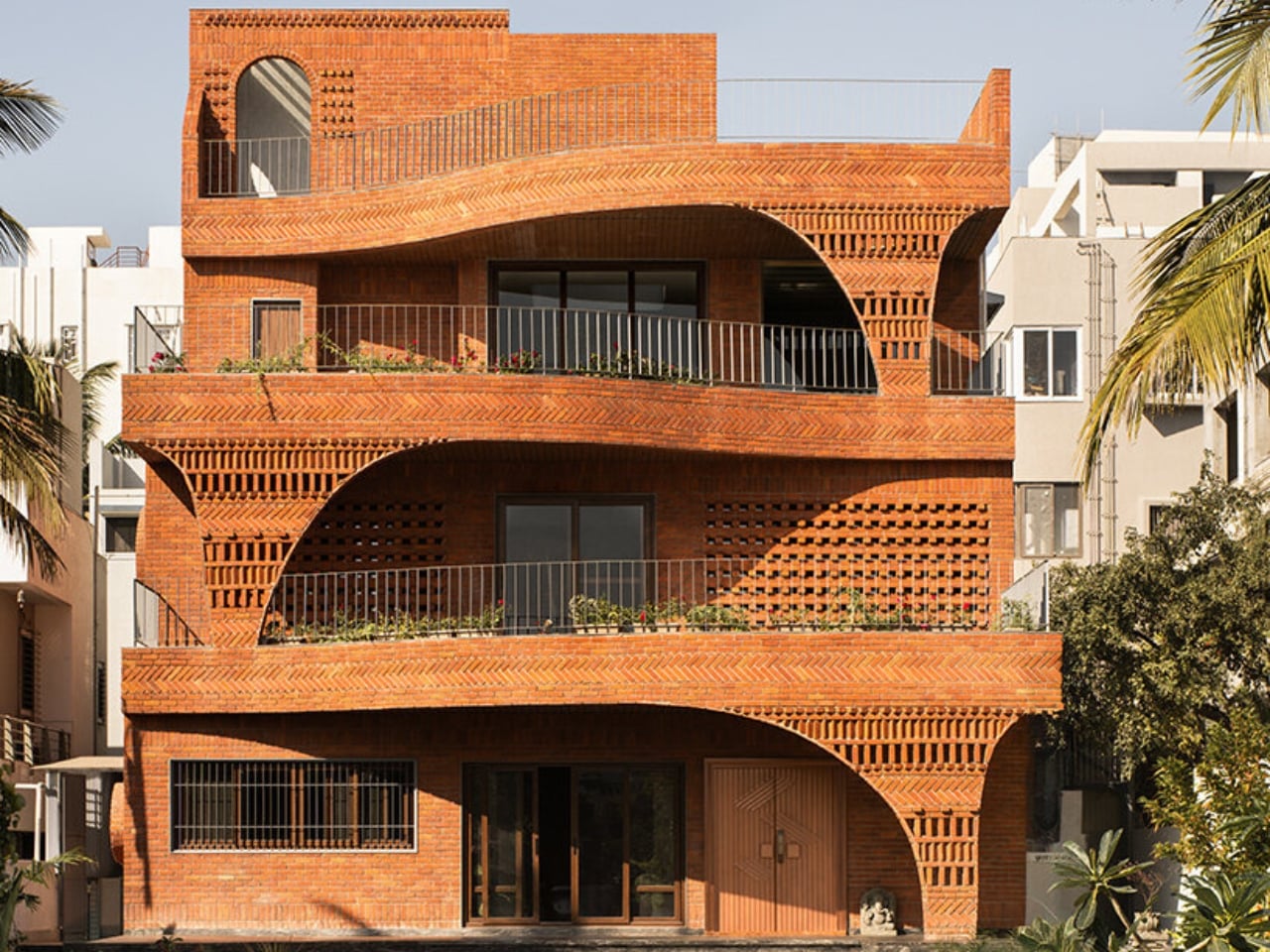
We’ve been building houses wrong. Not structurally, not legally, and not in any way that’s easy to name. But somewhere along the line, the conversation around home design shifted away from how does this building breathe toward what does this building look like on a feed. That’s why The Anthill, a new brick residence in Ahilyanagar, Maharashtra by Kaushal Tatiya Architects, feels like such a pointed correction. Not a provocation. A correction.

The premise sounds deceptively simple: a house modeled after an ant mound. Not the insect itself, but the engineering intelligence of what it builds. Ants have been solving thermal regulation, cross-ventilation, and spatial hierarchy problems for millions of years, with no blueprint, no software, and no electricity required. Kaushal Tatiya, the firm’s founder, described the anthill not as a literal form but as “an intelligent climatic organism,” one able to “regulate temperature, create ventilation through voids, and function through a network of interconnected chambers without any imposed geometry.” That single observation is what the entire project is built on, and it shows.

Designer: Kaushal Tatiya Architects (Photos by Avesh Gaur)

The house sits low in the landscape, almost terrain-like, its exposed brick facade functioning as much as an environmental filter as it does a structural shell. From the outside, it reads as deliberately introverted: solid walls and perforated surfaces that hold back the glare before it ever reaches the living spaces inside. The real architecture begins once you start moving through it. Rooms branch off from larger communal volumes, ceiling heights shift unexpectedly, and natural light arrives filtered and softened rather than harsh. The passage between spaces becomes the experience, not just a means of getting from one room to another.

This is a design principle modernism largely traded away in favor of open-plan everything and maximum sight lines. The Anthill doesn’t make that trade. Its stepped terraces and alternating balconies recall the traditional Indian rooftop concept of the chhat, creating layered, shaded thresholds that do the cooling work before the sun reaches the interior. A 12-foot cantilevered slab, supported through brick in compression, adds a more deliberate architectural gesture to the otherwise organic composition.

It’s worth pausing on the sustainability side of this project, because it earns more than a passing mention. The Anthill operates entirely on passive systems: cross ventilation, thermal mass, and shaded courtyards. No mechanical ventilation. In a region defined by extreme heat and intense sunlight, that isn’t a compromise. It’s a design strategy that trusts the building’s own intelligence. The idea that architecture should outlast any power grid it’s connected to feels increasingly important, and The Anthill makes that case without saying a word about it.

I think what gets undersold in conversations about sustainable design is how genuinely radical simplicity is. We’ve normalized a model where buildings are essentially sealed boxes, then mechanically conditioned to be habitable. That approach is energy-intensive, expensive, and fragile in ways we rarely acknowledge. The Anthill argues the opposite: that a building designed with enough spatial intelligence doesn’t need to fight its climate. It learns to negotiate with it instead.

The visual language of the project carries all of this without being heavy-handed. The brick is warm and earthy, the curves are organic without being theatrical, and the overall effect is of a building that looks like it belongs to the land rather than placed on top of it. Photography by Avesh Gaur shows a house that reads differently from every angle, which is always a sign that the architecture is meant to be inhabited rather than just photographed.

What The Anthill ultimately puts on the table is a question worth sitting with: what if the most intelligent design move isn’t to add more technology, but to study what natural systems already perfected? The answers, in this case, are sophisticated enough to build a house around. We talk a lot about future-proofing design. The Anthill is a case where the most forward-looking move was to look at something ancient.

The post India’s Anthill House Has No AC and Stays Cool Anyway first appeared on Yanko Design.

This Floating Waterfall Off Madagascar Wants to Power a Nation, Heal a Society, and Become a Resort — All at Once

19 juin 2026 à 23:30

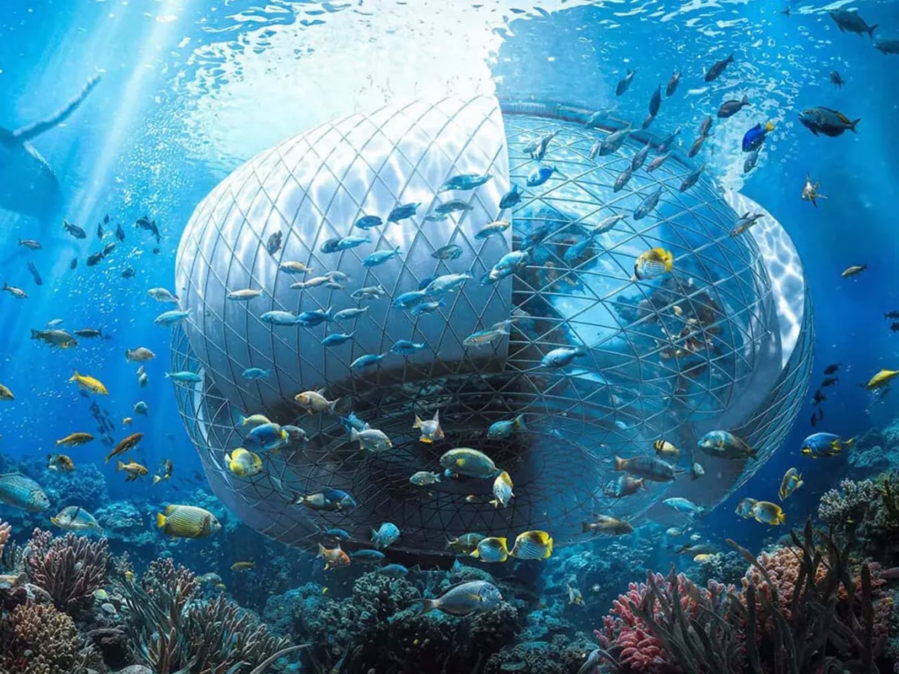
Off the southeast coast of Africa, more than 500 kilometers into the Indian Ocean, lies Madagascar — a country defined by extraordinary biodiversity, vast natural wealth, and a deepening energy crisis that leaves the majority of its population without electricity. It is here that designer Ahmad Eghtesad has set his most ambitious concept: the Baobab Waterfall, a floating mixed-use infrastructure that proposes to generate clean energy, rehabilitate society, and eventually evolve into a thriving resort — all from the open ocean.

The concept was developed as a competition entry for the prestigious Jacques Rougerie Foundation, which challenges architects and designers to imagine the future of maritime architecture. Eghtesad, working alongside collaborators Mohammad Aghaei and Nastaran Fazeli, drew his primary inspiration from the baobab tree itself — a native Malagasy symbol of resilience, capable of storing water and sustaining life in the harshest of environments. The architectural form mirrors this logic: wide at the crown, deeply rooted in its purpose, built to outlast the conditions that necessitated it.

Designer: Ahmad Eghtesad

At its core, the Baobab Waterfall operates as a continuous deep-ocean waterfall system. Ocean water is redirected and channeled through the structure on a massive scale, generating renewable electricity in volumes comparable to natural hydrological forces. The structure also integrates transparent greenhouses into its central tower, layering agricultural function into what is otherwise an industrial power plant. This dual programming — energy production and food cultivation — reflects a design philosophy that refuses singular solutions.

What makes the Baobab Waterfall genuinely provocative, though, is its social dimension. The structure is initially conceived as a rehabilitation center — a response to Madagascar’s overcrowded correctional facilities, themselves a symptom of poverty and energy-driven economic hardship. The idea is architectural optimism taken to its logical extreme: design not just infrastructure, but the conditions for social repair. As crime rates decline and the rehabilitation program matures, the complex is designed to seamlessly transition into a multipurpose resort and green energy hub, leaving behind a prosperous legacy rather than an institution.

Rendered with cinematic precision using Autodesk 3ds Max, Rhinoceros 3D, Grasshopper, and V-Ray, the visuals alone communicate the project’s ambition — dramatic contrasts between raw ocean forces and human engineering, scale that feels both monumental and quietly inevitable.

Whether or not the Baobab Waterfall ever leaves the realm of concept, it asks a question worth sitting with: what does it look like when architecture refuses to solve just one problem? Eghtesad’s answer floats somewhere off the coast of Madagascar, shaped like a tree that never stops giving.

The post This Floating Waterfall Off Madagascar Wants to Power a Nation, Heal a Society, and Become a Resort — All at Once first appeared on Yanko Design.

5 Geodesic Dome Homes That Prove Curved Living Is the Future

19 juin 2026 à 17:20

The dome is no longer just an architectural curiosity. It has emerged as one of the most structurally efficient forms ever designed. Leading design firms now recognize that its natural strength and exceptional volume-to-surface ratio provide a powerful foundation for sustainable luxury and long-term performance.

Beyond structure, the dome reshapes how space is experienced. It feels both ancient and forward-looking. Contemporary design increasingly favors spatial sequencing that calms the mind, and curved interiors deliver exactly that. A domed space becomes a biophilic cocoon—capturing soft natural light, enhancing psychological comfort, and offering a strong return on investment through well-being, durability, and timeless appeal.

1. Lightness as Structure

Inflatable domes represent the most refined expression of ephemeral architecture. These pressurized forms enable rapid spatial creation that rigid structures simply cannot achieve. Their value lies in speed, adaptability, and impact—allowing designers to construct immersive, temporary pavilions with a minimal carbon footprint using advanced high-tensile, translucent membranes.

What truly sets inflatable domes apart is their sensory quality. The gentle movement of the pneumatic skin creates a space that feels alive, forming a biophilic cocoon of air and light. Contemporary polymer materials make it possible to sculpt illumination itself, transforming a lightweight structure into a resilient, rhythmic architectural experience that feels both delicate and powerful.

Ark Nova redefined the idea of a concert venue by replacing permanence and grandeur with mobility and sculptural expression. Created through a collaboration between British artist Sir Anish Kapoor and Japanese architect Arata Isozaki, the inflatable hall appeared as a monumental, purple, organic form that challenged traditional architectural expectations. Its soft, self-supporting membrane transformed air into structure, creating a space that felt both futuristic and welcoming. When it arrived in Europe for the first time at Switzerland’s Lucerne Festival, Ark Nova marked a new chapter in its evolving cultural journey.

Originally conceived in 2013 as a response to the Fukushima earthquake and tsunami, Ark Nova was designed to bring music and collective healing to affected communities. Its pneumatic structure required no rigid framework, allowing it to be assembled quickly and adapt to different settings. Inside, light filtered gently through the membrane, shaping an intimate acoustic environment for diverse performances. More than a venue, Ark Nova stood as a symbol of resilience, accessibility, and the power of art to travel where it is needed most.

2. Curated Sculptural Domes

Within sculptural art, the dome becomes a powerful medium for exploring scale and perspective. It is no longer just a form, but a monumental tectonic presence that anchors and defines urban space. Artists are increasingly working with 3D-printed composites, crafting perforated shells that transform sunlight into a carefully choreographed play of shifting shadows.

This evolution lifts the dome from a utilitarian roof to an architectural poem. The cultural value it generates goes beyond aesthetics, creating a strong sense of place and collective memory. Bathed in diffused light, these spaces blur the boundary between art and architecture, merging both into a single, immersive experience.

Circle Dome Square transformed the space outside Louis Poulsen’s Copenhagen showroom into a striking architectural moment. Designed by Henrik Vibskov, the dome appeared like a vivid red form caught mid-bloom, its fabric panels radiating outward from a central core. Referencing the curves and spirit of Verner Panton’s iconic Panthella lamp, the installation translated a lighting object into an immersive structure. From a distance, the dome commanded attention with its explosive geometry, while up close, its layered textile construction revealed depth, movement, and careful spatial composition.

Inside the dome, the atmosphere shifted dramatically. The bold exterior gave way to a calm, enclosed environment where soft red light filtered through the fabric skin, creating a sense of warmth and stillness. The textile walls subtly shaped acoustics and scale, turning the dome into a temporary refuge within the urban setting. More than a visual statement, Circle Dome Square demonstrated how fabric, light, and form could work together to create an experiential space that invited pause, reflection, and quiet engagement.

3. Monolithic Living Domes

Dome housing has evolved from countercultural experimentation into a model of high-performance luxury living. Its inherent geometry delivers exceptional thermal efficiency, reducing air stagnation and heat loss while lowering long-term operational costs. The seamless, monolithic concrete shell reinforces material honesty, combining structural integrity with enduring performance.

Inside, the absence of corners allows space to flow naturally. Movement feels intuitive and unforced. The double-height apex draws the gaze upward, becoming a quiet focal point that connects the interior to the sky above. Living within a dome creates a biophilic cocoon—where light, acoustics, and form work together to produce a deep sense of calm, balance, and grounded serenity.

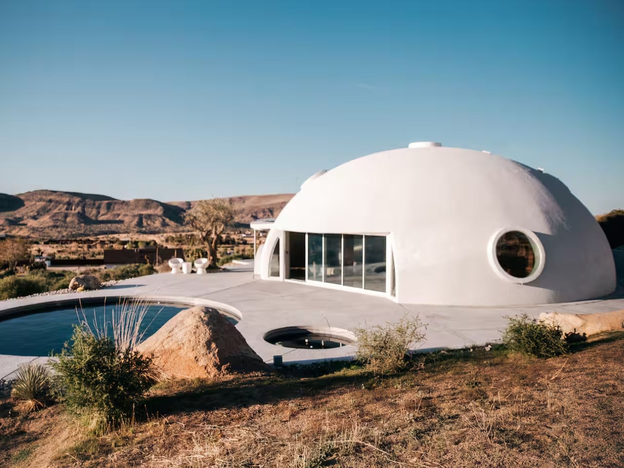
Rising unexpectedly from the desert landscape of Pioneertown, California, the HATA Dome looked like something straight out of a science-fiction film—but without any extraterrestrial mystery attached. Set against rugged terrain, the dome stood as a bold architectural presence, immediately capturing attention with its smooth, monolithic form. Rather than hinting at conspiracy, it offered something far more tangible: a place designed for human retreat and deep connection with the surrounding environment.

The HATA Dome was designed and built single-handedly by Anastasiya Dudik, guided by a “future primitive” philosophy that blended ancient building logic with contemporary thinking. Constructed using concrete, rebar, and shotcrete, the dome prioritised durability, fire resistance, and seismic safety while naturally regulating temperature through passive thermal mass. Inside, soaring ceilings, soft natural light, and sculpted interiors created a calm, immersive refuge. Both raw and refined, the dome functioned not just as an architectural statement but as a liveable, sustainable shelter or one that could be experienced firsthand as a desert escape.

4. Orchestrating the Ephemeral Glow

Lighting within a dome is less about fixtures and more about control. The curved surface naturally redistributes light, allowing illumination to be indirect, layered, and calm. By keeping sources discreet and concealed, light appears to emerge from the architecture itself rather than from visible hardware.

This method reinforces the purity of the form. Shadows soften, edges dissolve, and the space feels continuous rather than segmented. Light becomes a guiding force, shaping movement and mood without drawing attention to its origin. At night, the dome reads as a quiet, expansive enclosure—intimate, protective, and atmospherically balanced, where illumination supports presence rather than spectacle.

At first glance, the Dome lamp’s domical form draws you in with its quiet strength and sculptural presence. Shaped like a small architectural dome, the design feels grounded and balanced, transforming the lamp from a simple lighting object into a statement piece inspired by structural forms found in buildings.

The curved silhouette is paired with a bent bamboo strap that visually echoes the dome’s softness while adding warmth and contrast. Together, the rounded shade and flowing strap create a harmonious composition, where even the wire follows the curve, reinforcing the lamp’s cohesive, domed design language.

5. Biospheric Urban Farming

Urban agriculture finds a powerful ally in dome design. As cities move toward localized food systems, these biospheric structures offer a highly efficient growing environment. Their inherent thermal performance supports year-round cultivation, while the height-to-width ratio naturally accommodates vertical farming maximizing yield per square meter and reducing the carbon footprint of food production.

Beyond productivity, these agricultural domes act as biophilic anchors within dense urban fabric. They reconnect built form with landscape, reintroducing nature into the city core. Lightweight ETFE panel systems ensure optimal light transmission and climate control, allowing the interior to function as a resilient ecosystem delivering long-term value through food security, education, and improved community health.

At Expo 2025, the Osaka Health Pavilion hosted Inochi no Izumi, or Source of Life, a translucent, 21-foot-high dome that reimagined urban food systems. Inside, aquatic life and plants coexisted in a vertically stacked ecosystem, with fish swimming below and crops growing above. Four water zones including seawater, brackish water, and two freshwater layers supported different species, each paired with hydroponic plants suited to its conditions, forming parallel ecosystems within a single compact structure.

The system operated on a closed-loop aquaponic cycle. Fish waste was naturally converted into nutrients that fed the plants, which in turn returned purified water to the tanks below. Nothing was wasted and nothing left the dome. Enclosed within a lightweight geodesic shell designed to maximise sunlight and maintain a stable microclimate, the structure demonstrated how ecological intelligence and space-efficient design could work together.

Ultimately, the dome endures because it unites logic with feeling. Its geometry delivers resilience, efficiency, and longevity, while its form evokes calm and wonder.

The post 5 Geodesic Dome Homes That Prove Curved Living Is the Future first appeared on Yanko Design.

This Architect Built a 20m² Red Cabin on Her Family’s Greek Vineyard — and It’s the Antidote to Every Concrete Villa on the Island

16 mai 2026 à 17:20

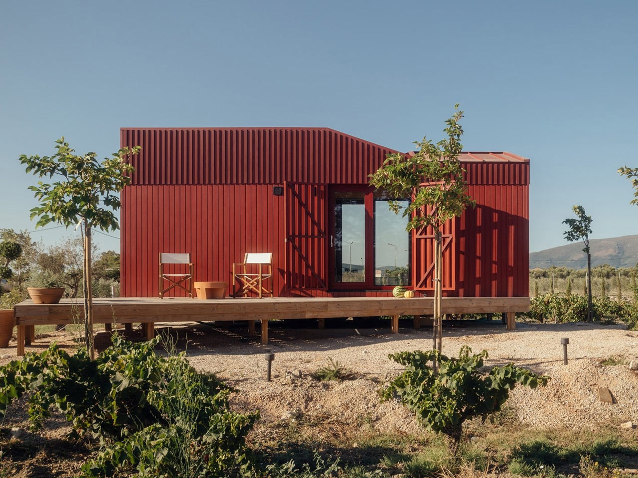
Somewhere between the olive groves and vine rows of Zakynthos, a deep-red timber cabin sits quietly in the Greek countryside, and it’s one of the most considered small structures to come out of Europe this year. The Root Cabin, designed by London-based studio Kasawoo, is a 20-square-metre prefabricated retreat that challenges the very idea of what a holiday home in Greece should look like.

The project is personal. Co-founder Katie Kasabalis owns the land in the village of Vanato, a site that has been in her family for decades and still holds the ruins of her grandmother’s old stone house. Together with co-founder Darius Woo, she set out to build something that felt of the place rather than imposed on it. The result sits at just 2.5 by 8 metres, slipping gently between rows of vines without disrupting the agricultural and historical fabric of the land.

Designer: Kasawoo

Built off-site in Romania and transported to Zakynthos fully prefabricated, the cabin is road-legal and designed to be relocatable, a detail that speaks directly to its low-intervention philosophy. “Nothing is superfluous,” the architects told Dezeen. “The project’s generosity lies in what it refuses to add.” In a part of Greece where sprawling concrete villas are accelerating across the countryside, that kind of restraint is quietly radical.

The exterior is wrapped in deep-red timber planks, a shade drawn from the historic villas of Zakynthos, and topped with a gently angled roofline that echoes the island’s mountainous horizon. It’s a structure that has absorbed its context rather than competed with it. Inside, the atmosphere shifts to something warmer and more immediate. Plywood lines the walls, ceilings, and all built-in furniture, creating a near-seamless, cocoon-like interior in which a bed, compact kitchen, sofa, and bookshelves are integrated into the structure.

The layout places the bedroom and bathroom at opposite ends, with a central living space defined by large sliding glass doors that open directly onto the landscape. Red details carry through from the exterior, while the bathroom shifts to soft blue tones, a quiet nod to the Ionian Sea nearby. Objects sourced from Greek makers, including ceramics and textiles, add another layer of local grounding to a space that already feels deeply rooted.

Passive ventilation and operable openings allow the cabin to function off-grid, reinforcing what Kasawoo describes as a “different kind of luxury,” one that measures itself not by square footage or spectacle, but by the quality of what’s been left out.

The post This Architect Built a 20m² Red Cabin on Her Family’s Greek Vineyard — and It’s the Antidote to Every Concrete Villa on the Island first appeared on Yanko Design.

This $35,000 Tiny Home Proves You Don’t Need More Than 161 Square Feet to Live Well

15 mai 2026 à 23:30

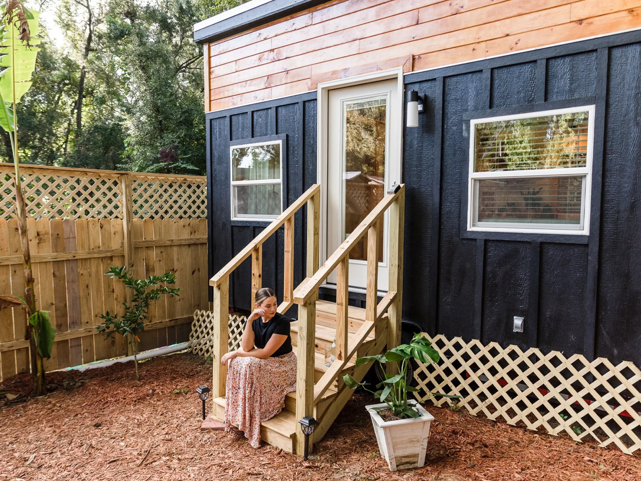
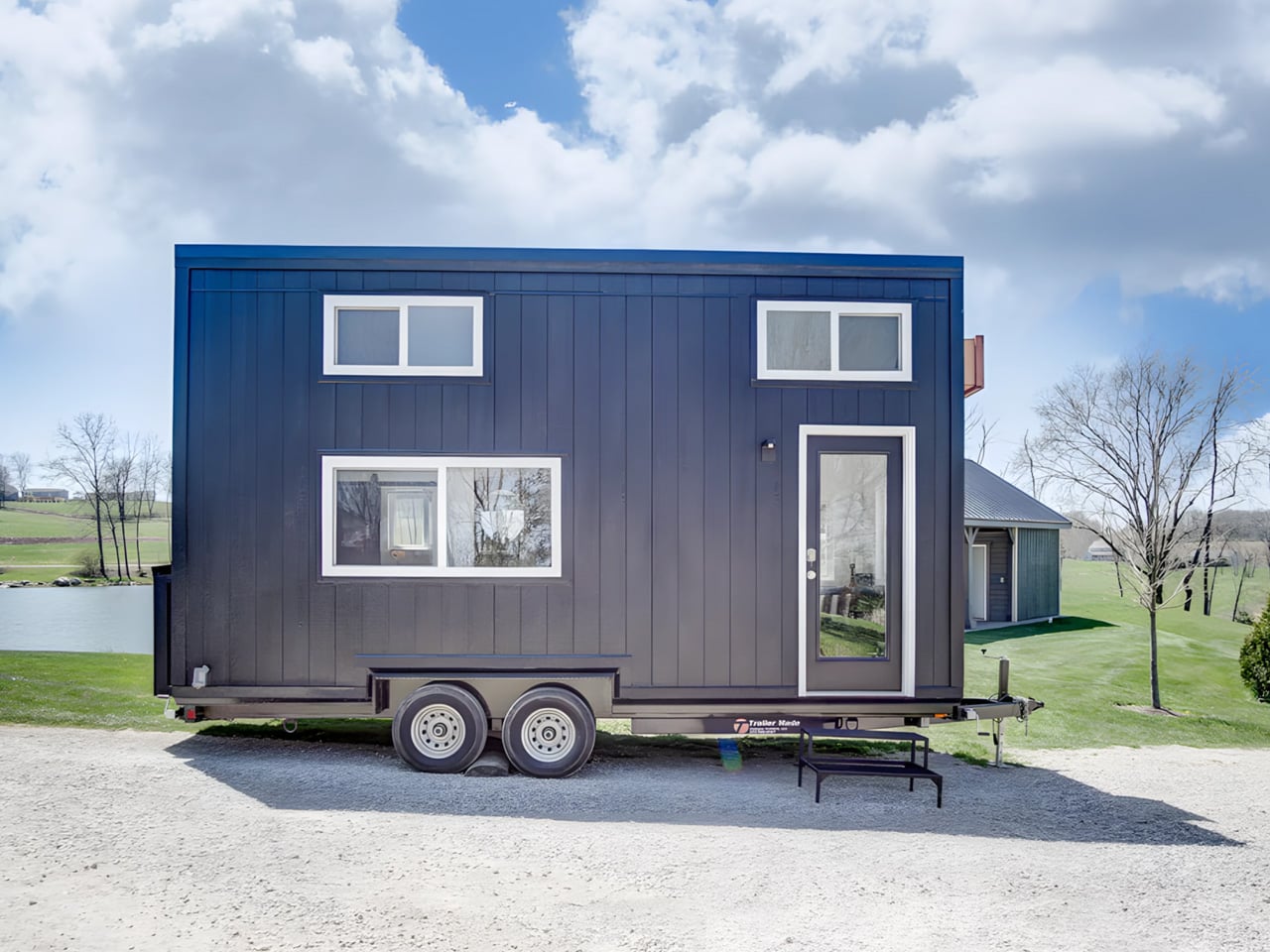
At 20 feet long and 8 feet wide, the Tulsi by Simplify Further Tiny Homes doesn’t try to be anything it isn’t. It has everything you need, and nothing you don’t. That restraint is exactly what makes it work. While the tiny home market is crowded with builds that either sacrifice livability for aesthetics or pile on features that inflate the price tag, the Tulsi threads the needle — landing at a starting price of $35,000 for a fully functional, NOAH-certified home on wheels.

The Florida-based builder behind it, Simplify Further, has built a reputation around the idea that quality and simplicity aren’t mutually exclusive. Their motto — “Simple Living, High Thinking” — runs through every design decision in the Tulsi. The build carries a BBB Accredited A+ rating, and its certification as an RV through NOAH means it meets a recognized standard for workmanship and safety.

Designer: Simplify Further Tiny Homes

At 161 square feet, the Tulsi packs in a kitchenette, a full bathroom with a shower stall, a flush toilet, a mini sink, a built-in seating area, a main-level queen-sized bedroom, and a loft. The loft measures 7 by 4 feet with a 36-inch height at the low side, accessible by ladder with black metal railings — tight, but functional. The height under the loft sits at 6 feet 4 inches, which means the main living area never feels like you’re ducking through a crawl space.

What sets the Tulsi apart from its contemporaries is its genuine flexibility. The main level bedroom isn’t a compromise — it’s a feature. For guests who don’t mind the loft, you could designate the loft as the main sleeping area and convert the downstairs bedroom to a living room. That kind of adaptability is rare at this price point. In the kitchen, buyers can opt for open shelving or swap seating for additional cabinet storage — a small but meaningful decision that shapes how the space actually lives day to day.

Simplify Further positions the Tulsi primarily as a guest house or mother-in-law suite — a secondary structure that gives visitors full independence without removing them from the property entirely. But the build has proven versatile enough to serve as a short-term rental, a starter home, or a full-time residence for someone drawn to the economy of small living. The Tulsi by Simplify Further seamlessly blends convenience and comfort, making it a charming addition to any property.

For a 161 square foot box on wheels, the Tulsi has quietly earned its place as one of the more thoughtfully designed entry points into tiny living — and the numbers back it up.

The post This $35,000 Tiny Home Proves You Don’t Need More Than 161 Square Feet to Live Well first appeared on Yanko Design.

This Stationary Tiny Home Has More Room Than Most City Apartments

11 mai 2026 à 23:30

Most tiny houses ask you to make a trade-off. You get the romance of compact living, but sacrifice the one thing that makes a home feel like a home — space. Craft House, a modular builder operating across Poland, Austria, and Ireland, decided to flip that script entirely with the Samuel, a non-towable module house that prioritizes spacious full-time living over the freedom to hitch and go.

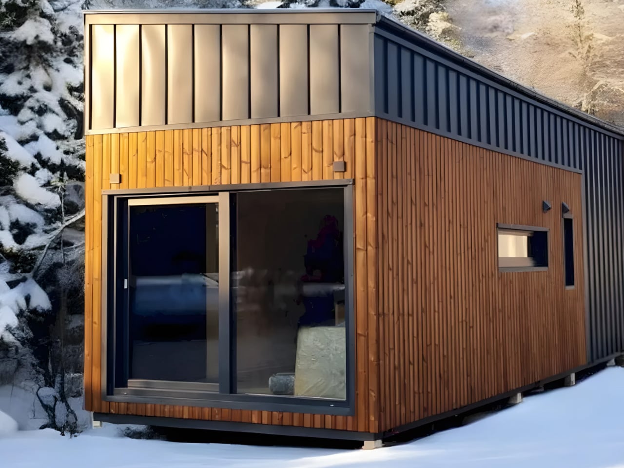
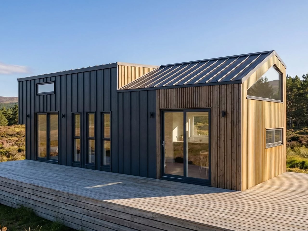
The Samuel sits at 10 meters (32 ft) long and an unusually generous 3.2 meters (10.6 ft) wide, measurements that push well beyond the European tiny home average. That extra width is deliberate. It’s what allows the interior to breathe in a way that most towable models simply can’t, opening up a layout that reads less like a cleverly compressed box and more like a well-considered apartment. The structure wears a single-pitched roof, topping out at 4.1 meters at the ridge, and is finished in engineered wood and metal, a clean pairing that reads industrial without feeling cold.

Designer: Craft House

Inside, the ground floor spans 26 square meters, with a 13-square-meter mezzanine sitting above and a 4.3-square-meter bathroom rounding out the floor plan. The layout makes room for two distinct sleeping areas, and the volume created by the sloped ceiling gives the mezzanine level a loft-like quality that larger homes often fail to capture. Optional off-grid upgrades are also on the table, making the Samuel a realistic candidate for plots far beyond urban infrastructure.

What Craft House understood when designing the Samuel is that the tiny home market has two very different buyers. There’s the nomad, always ready to hitch the trailer and head somewhere new. Then there’s the person who simply wants a well-designed, right-sized home that doesn’t carry the financial weight of a conventional build. Samuel is clearly built for the latter. By dropping the wheels and leaning into a fixed footprint, Craft House was able to allocate width and volume in ways that towable structures prohibit by law and logistics.

Priced at around US$72,000, the Samuel lands in a range that makes it a genuinely viable alternative to traditional housing in several European markets. It isn’t trying to be everything. You won’t be parking it in a new location every season. What it offers instead is something arguably more valuable: a permanent, considered space that proves small doesn’t have to mean cramped, and that the best tiny homes aren’t always the ones with the biggest adventures, but the ones that make staying put feel worth it.

The post This Stationary Tiny Home Has More Room Than Most City Apartments first appeared on Yanko Design.

This Quebec Home Doesn’t Fight the Forest – It Disappears Into It

10 mai 2026 à 22:30

Certain kinds of architecture don’t announce themselves. La Maraude, the latest project by Nathalie Thibodeau Architecte, is exactly that — a compact residential dwelling tucked into the dense woodlands of Boileau, in Quebec’s Outaouais region, that earns its presence through restraint rather than spectacle. Completed in 2024, it’s one of the more quietly compelling houses to come out of Canada in recent memory.

The name itself carries meaning. ‘Maraude’ — to roam, to forage — hints at the relationship the house cultivates with its surroundings. Rather than claiming a dominant position along the river’s edge, the architects deliberately set the home deeper within the treeline, orienting the house’s interior life entirely toward the forest. It’s a gesture that shapes everything else about the project.

Designer: Nathalie Thibodeau Architects

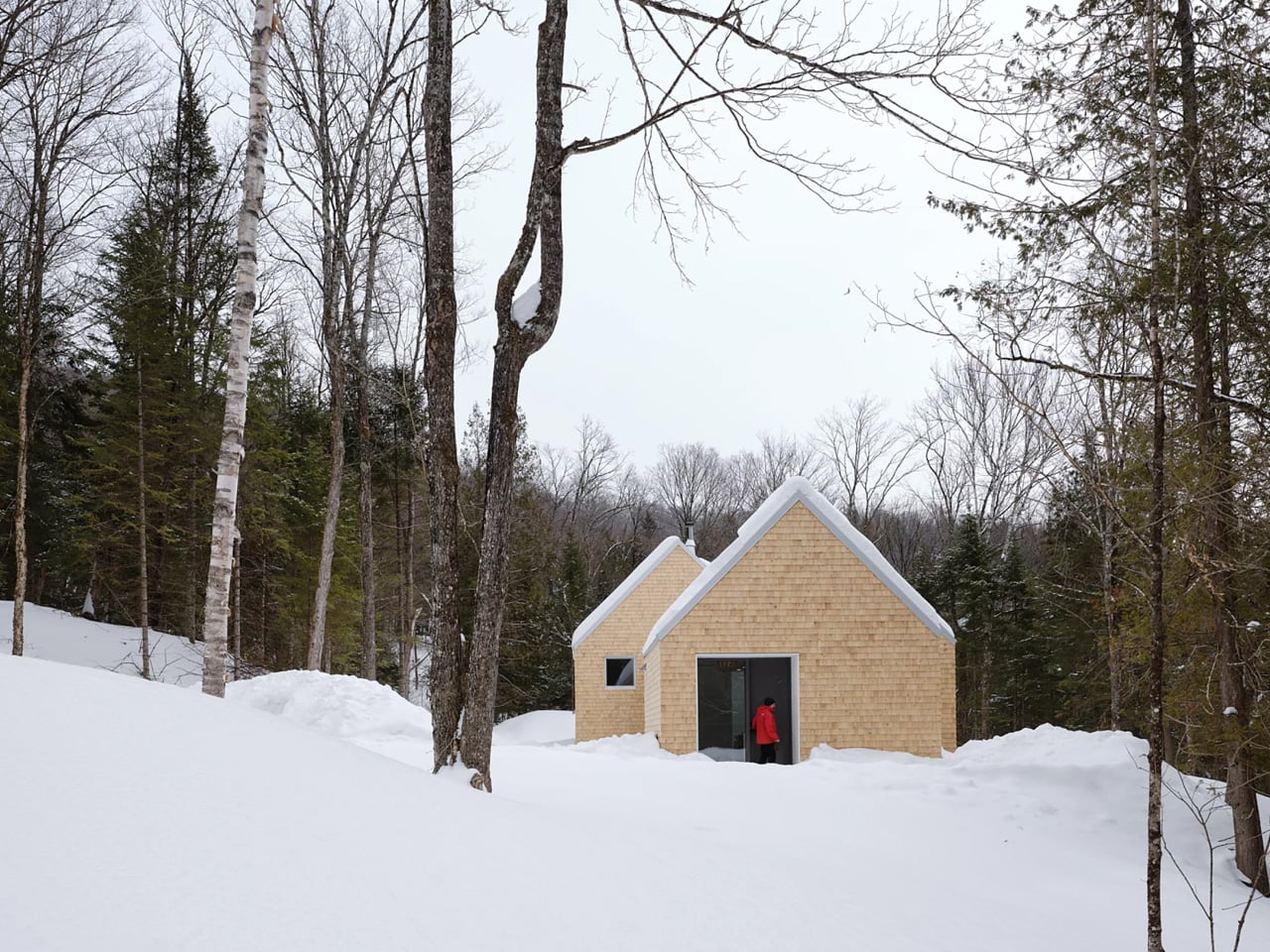
The design draws directly from Quebec’s vernacular architectural tradition — steeply pitched rooflines, grounded proportions, and a material palette that feels native to the region. The exterior is clad in natural cedar shingles and topped with a metal roof, two materials with deep roots in the local building culture. These aren’t nostalgic choices. They’re translated through a contemporary lens, stripped of ornament, reduced to their essential geometry. “Designed with particular attention to simplicity, functionality, and respect for traditional codes, La Maraude embodies a successful dialogue between contemporary architecture and local traditions,” says Nathalie Thibodeau Architecte.

What makes the spatial sequence genuinely interesting is the use of two courtyards as organizing devices. The plan doesn’t simply open to the outdoors — it pulls the forest in, fragmenting the landscape into a series of framed views that shift with the seasons. One courtyard faces north, more sheltered and partly enclosed by the building itself, oriented toward higher ground. The other faces south, brighter and more expansive, drawing the eye down toward the lower terrain. The result is a house that reads differently in every light condition, every month of the year.

The second volume, arranged over two levels in response to the site’s slope, plays a more introverted role. Openings here are smaller and precisely placed to frame specific moments within the tree canopy — quiet apertures rather than panoramic statements.

Photographed by Maxime Brouillet, La Maraude has the look of a project that will age well, both materially and culturally. It’s already being discussed as a potential anchor for a broader ensemble of small retreats on the site — a first building in what could become a considered, evolving conversation between architecture and landscape.

The post This Quebec Home Doesn’t Fight the Forest – It Disappears Into It first appeared on Yanko Design.

Inside the Log-and-Glass Home Olson Kundig Built for a Builder on Salt Spring Island

10 mai 2026 à 13:20

Salt Spring Island doesn’t need much convincing — it already has the cliffs, the meadows, and the trees. The name sounds more like a childhood storybook setting than an architectural statement — and that tension is exactly the point. Nestled amidst the trees and rugged cliffs of Salt Spring Island, BC, the Daisy Ranch is Olson Kundig’s most recent residential project, led by design principal Tom Kundig. It’s casual. It’s rugged. And it’s entirely, unapologetically itself.

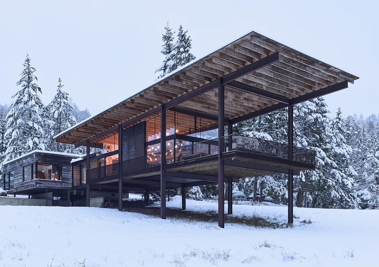
The house sits at the edge of a sweeping meadow, anchored by a log structure that feels like it could have always been there. The primary move is a rugged glass box paired with a long, cantilevered roof that stretches over a generous deck — a roof that earns its keep through BC’s shifting seasons, offering shelter without closing anything off. What makes it work visually is the layering: large square-cut logs and glass soften the rust-colored patina of weathered steel cladding, giving the exterior a palette that feels earned rather than designed.

Designer: Olsun Kundig

The plan is organized along a clean linear axis, with two distinct volumes bisected by an eastern entry stairway. The front door is tucked under a generous overhang — a small but considered gesture that grounds the arrival sequence without dramatizing it. The northern volume, clad in wood and steel, handles the private program: a primary suite and additional bedrooms, with framed view corridors that offer deliberate glimpses of the landscape rather than full exposure. Privacy and connection, calibrated carefully.

Inside, the bathroom is where the project gets most personal. Widespread use of wood infuses the space with warmth, while a clawfoot tub set before corner windows underscores the home’s persistent connection to the landscape outside. It’s the kind of detail that feels borrowed from an older, more tactile way of building — which is precisely the intention.

The project was designed in close collaboration with the client, Patrick Powers, a builder and fabricator who also served as general contractor. That relationship left its mark. The house doesn’t feel like it was delivered to a site; it feels like it was made with the site, material decision by material decision.

As Kundig put it: “There’s a lineage at play in this project, a quiet innovation that comes from the shared DNA of materials and relationships.” The Daisy Ranch is the kind of project that doesn’t need to announce itself. It sits lightly on its land, opens wide to its meadow, and gets on with the business of being lived in.

The post Inside the Log-and-Glass Home Olson Kundig Built for a Builder on Salt Spring Island first appeared on Yanko Design.

5 Mountain Homes That Look Carved From the Cliffs They Stand On

10 mai 2026 à 11:40

There is a rare, almost cinematic stillness found only in homes perched high above the world. At elevations ranging from 5,000 to over 10,000 feet, mountain residences occupy a space where clouds drift below terraces and horizons stretch endlessly. By contrast, most cities sit between sea level and roughly 1,500 feet, shaped by density, noise, and constant movement.

Life at altitude reshapes perception. The air feels sharper, the light more vivid, and architecture must respond with both resilience and sensitivity. Today’s mountain retreats move beyond the heavy, dark enclosures of the past, embracing openness, sustainability, and panoramic immersion. Here is how these homes are not just shelters but experiences designed around silence, scale, and awe.

1. A Natural Extension of the Landscape

The most refined mountain homes are conceived not as objects placed upon terrain, but as forms emerging from it. Architects study slope, wind, and geology, shaping structures that echo the lines of ridges and the layered patterns of exposed rock. Locally sourced stone, textured concrete, and weathered timber allow the residence to visually dissolve into its surroundings.

This approach softens the boundary between built space and wilderness. Walls appear to grow from the hillside, terraces align with natural contours, and expansive glazing draws the mountain indoors. The result is a dwelling that feels anchored, quiet, and inevitable, as though the landscape itself had composed the architecture.

Geometric white hotel built among tall evergreen trees, with angular façades and a central tower labeled 'ELA'.

Modern wooden building with glass lattice walls, warm interior lights, and a row of potted evergreens along the entrance.

Modern hotel bedroom with a large angular window wall, a king bed with white bedding and decorative pillows, and a seating nook nearby

Perched high above the Naggar Valley in Himachal Pradesh, India, Eila emerges with quiet restraint rather than spectacle. Designed by MOFA Studio, the art retreat appears to rise organically from the mountainside, its fluid forms tracing the land’s natural contours instead of reshaping them. Developed through advanced computational processes, the cottages respond sensitively to slope, sunlight, and distant horizons, making the architecture feel discovered rather than imposed. A stepped masterplan descends gently along the steep terrain, preserving topsoil and natural rainwater channels while choreographing a gradual spatial experience. The journey begins at the Gate of Confluence, a stone pavilion marking the threshold into a contemplative environment where landscape, art, and structure unfold in quiet dialogue.

A spacious library lounge with white geometric ceiling, colorful wrapped columns, and circular patterned seating surrounded by bookshelves.

Modern white angular building beside a rectangular pool with glass railing and lounge chairs on a sunny day.

Modern hotel room with geometric white walls, a wooden bed and seating area, and panoramic mountain view through angular windows

At Eila, artificial intelligence assists in refining structural and environmental performance, while human intuition guides final decisions. Biomorphic cottages formed from lightweight steel frames and thin concrete shells minimize energy use and visual impact, blending subtly into the Himalayan setting. Skylights and apertures frame the valley like living canvases, drawing light and scenery deep indoors. Locally sourced materials and vegetation-ready shells allow the retreat to evolve with its surroundings, ensuring it settles into the landscape rather than competing with it.

2. The Modern Mountain Home

The modern mountain home embraces a design language defined by clarity, restraint, and structural precision. Glass and steel replace heavy ornamentation, creating spaces that feel visually open and effortlessly connected to the outdoors. Expansive floor-to-ceiling windows dissolve traditional barriers, allowing shifting light, snow, and distant peaks to become part of the interior experience.

Beyond aesthetics, this approach is deeply functional. Industrial materials provide strength against wind, temperature swings, and heavy snowfall, while minimalist forms reduce visual weight. Clean lines, open-plan layouts, and a carefully edited palette produce a home that feels light, airy, and quietly dramatic against the rugged mountain backdrop.

Modern multi‑story house nestled in a dense pine forest with mountains in the background at sunset. A curved-roof garage is visible on the left.

Contemporary multi-story house in a forest, gray exterior, large glass windows, and a rooftop gravel terrace with seating.

Modern multi-level house with large windows in a pine forest, featuring a rooftop deck and outdoor seating.

Set among the pines of Colorado and overlooking the protected expanse of Indian Peaks Wilderness, this residence by Robert Chisholm Architects embodies a grounded interpretation of mountain living. Each room is carefully oriented to frame the surrounding landscape, creating views that feel composed yet effortless. Organized around a central courtyard, the house draws daylight and mountain air deep into its core, establishing a quiet internal anchor. The spatial layout gently distinguishes communal and private zones, allowing moments of gathering and retreat to coexist without disruption. Expansive glazing pulls the horizon indoors, while walnut floors, solid fir doors, and a sculptural fireplace lend warmth and permanence to interiors defined by clarity and restraint.

Bright living room with floor-to-ceiling windows overlooking evergreen trees, leather sofas, and a wooden coffee table.

Bright living room with a wall of tall windows, a black wood stove, and a wooden coffee table.

Rooftop patio with two wooden Adirondack chairs and a small table, overlooking trees and distant mountains.

The kitchen balances durability with artistry, anchored by a deep blue granite island that subtly mirrors the shifting mountain sky. Ash cabinetry and integrated appliances support daily routines and larger gatherings, while a discreet butler’s pantry preserves visual calm. Outdoor living unfolds across a sheltered deck and open rooftop terraces, encouraging seamless movement between interior comfort and alpine air. Practical elements, including radiant floors, dual EV chargers, and a heated garage with built-in storage, reflect thoughtful foresight. Fire-mitigated forest edges and private trails extend the experience beyond the walls, reinforcing a life closely attuned to the land.

3. Bold Angled Geometry

Snow is a breathtaking presence, but its weight demands intelligent design. Contemporary mountain architecture responds with bold, angled geometry, where steeply pitched roofs and sharply defined lines transform necessity into visual drama. These dynamic forms efficiently shed heavy snowfall while giving the structure a sense of movement and tension against the landscape.

Inside, the impact is equally compelling. Angled rooflines generate soaring ceilings, unexpected volumes, and striking plays of light. Cantilevered decks and elevated viewpoints extend living spaces outward, framing valleys and ridges like curated vistas. The result is architecture that feels daring yet purposeful, balancing engineering logic with an unmistakable sculptural presence.

Modern two-story house with a stone base and white upper volume, wooden garage doors, set in a snowy landscape under a blue sky.

Modern house with white angular upper block and stone lower walls on a snowy hillside with forested mountains in the background.

Modern bedroom with a low wooden bed, angled headboard, light bedding, and decorative deer silhouettes on the wall.

Nestled in the Helmos Mountains of Kalavryta, near the Kalavryta Ski Center, Snowfall House occupies a generous 4,000-square-metre site immersed in forested terrain. Designed by Design Over The Norms, the residence unfolds as three intersecting volumes that echo the geometry of the surrounding peaks. Two stone-clad base structures sit diagonally against the slope, anchoring the home firmly to the land, while a third white volume rests above them like a layer of settled snow. This sculptural composition allows natural light to stream through the interiors and frames uninterrupted views of the mountainous landscape throughout the day.

Contemporary two-story house with white and stone exterior sits on a snowy hillside against a mountainous backdrop.

Modern white cubic house with a stone tower and driveway leading to a wooden garage, set in a snowy hillside forest. (Informative)

Suspended black spherical fireplace hanging in a corner with panoramic forest and snow outside, flame visible inside the stove.

The primary rectangular volume accommodates the communal living spaces and master suite, while a smaller ground-level wing functions as a private guest suite. Additional bedrooms are housed within the elevated white structure, and an underground garage discreetly conceals vehicles to preserve the natural setting. Wood and stone define the material palette, capturing the rugged textures of the region. Where the volumes intersect, a sheltered courtyard emerges, offering year-round comfort from both summer sun and winter chill. Inside, clean white walls, herringbone wood floors, and understated furnishings create a calm, timeless retreat in the Greek mountains.

4. Refined Cottage Design

For those drawn to warmth and nostalgia, the mountain cottage offers a gentler architectural expression. Stone chimneys, gabled roofs, and carefully layered façades create a sense of familiarity that feels timeless rather than trendy. Every detail, right from the window proportions to handcrafted woodwork, contributes to an atmosphere of charm and shelter.

Though often modest in scale, cottage interiors deliver a rich emotional experience. Nested layouts, soft lighting, and tactile materials cultivate a deep sense of coziness. This intimate environment forms a comforting counterpoint to the vast, windswept landscape outside, making the retreat feel protective, inviting, and profoundly human.

A modern A-frame cabin with vertical wooden slats on the upper story, glass walls on the ground floor, and a stone retaining wall surrounding the base at sunset.

Wooden cabin with a steep metal roof, framed by pine trees under a blue sky

Wooden cabin with a steep metal roof in a forested mountain landscape.

The Kohútka Cottage by SENAA architekti sits naturally within the Javorníky mountains in the Czech Republic, blending tradition with contemporary living. Designed by Jan Sedláček and Václav Navrátil, the retreat was envisioned for a local mountain complex seeking an authentic Wallachian character without compromising modern comfort. Approached from the east, the cottage reflects regional heritage through its compact windows, deep roof overhangs, and familiar log-cabin silhouette. Its steep roof and restrained detailing respond thoughtfully to the harsh mountain climate, embracing forms that have endured for generations while maintaining refined architectural clarity.

Modern timber house with a steep triangular roof, glass walls, and warm interior lights at night.

Cozy modern living room with wood panel ceiling and a large glass wall opening to a rocky outdoor area; a wooden dining table with moss centerpiece in foreground and a beige sofa area to the left.

Modern living room with wood ceiling, beige sofa, and a large glass wall opening to an outdoor area.

From the west, however, the home opens dramatically with expansive glazing that frames sweeping valley views, transforming the interior into a panoramic observatory. Constructed using prefabricated timber panels assembled in a single day, the structure minimised environmental impact while meeting low-energy standards. Inside, the sloping terrain accommodates a lower-level wellness zone with sauna and relaxation spaces, while mechanical functions remain discreetly tucked away. The result is a timeless mountain dwelling that balances sustainability, performance, and contextual sensitivity.

5. The Essential Cabin Design

The cabin remains the original archetype of mountain living, now reinterpreted through a contemporary lens. From classic A-frames to refined log structures, today’s cabins celebrate essentialism or a return to clarity, function, and honest materials. Designs emphasize compact footprints, efficient layouts, and craftsmanship that prioritizes durability over ornamentation.

At the heart of the cabin is simplicity with purpose. A central hearth anchors the space, natural textures create warmth, and every element serves a role. The aesthetic is unpretentious yet deeply intentional, fostering a direct connection to the surrounding forest. This modernized cabin embodies an off-grid spirit, where minimalism meets comfort and quiet retreat.

Cliffside wooden domed cabins with curved roofs, extended decks, and outdoor seating among tall pines on a rocky slope.

Circular wooden pod house with curved lattice roof nestled among tall trees on a rocky hillside.

Three rounded wooden cabins perched on a rocky cliff edge among pine trees, connected by decks with chairs and loungers.",

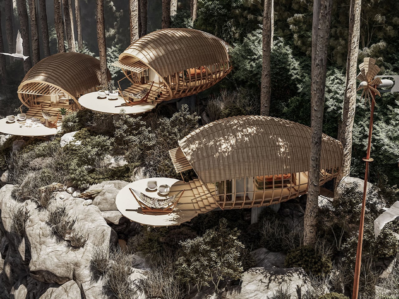
The mountain-edge cabin designed by Jorge Luis Veliz Quintana is defined by its organic geometry and strong contextual integration. Each 150 sqm unit adopts a cocoon-like form, positioned directly on large natural boulders to minimize ground intervention. The structural system combines curved timber lattices with concrete platforms that mirror the grey tonalities of the surrounding cliffs. This deliberate material, color, and finish strategy allows the architecture to visually dissolve into the rocky terrain. The sculptural envelope extends outward to form a generous terrace, reinforcing the linear relationship between interior spaces and the expansive mountain views.

Circular wooden pavilion under construction on a deck with striped hammock, two modern chairs, and cushions amid trees and desert mountains in the background.

Curved wooden tunnel lounge with beds, chairs and hanging lanterns, casting striped shadows.

The layout is organized across two levels, responding to both topography and climate. An open-plan upper floor accommodates the bedroom and bathroom, oriented to maximize 360-degree panoramas through continuous glazing. A secondary semi-outdoor level enhances cross-ventilation and environmental responsiveness. The project was developed digitally using SketchUp for three-dimensional modelling, Lumion for rendering and environmental simulation, and Photoshop for final visual refinement, ensuring precision in form, texture, and lighting.

Wooden treehouse pod with curved lattice shell, overlooking a forest, featuring a round deck and lounge chairs on the patio.

Modern mountain homes embody a delicate union of endurance and emotion. They stand resilient against climate yet remain visually light, open, and deeply connected to nature. Whether sculptural and modern or intimate and rustic, these retreats reveal a simple truth: at greater heights, architecture must anchor us, calm us, and elevate the experience.

The post 5 Mountain Homes That Look Carved From the Cliffs They Stand On first appeared on Yanko Design.

The SOMA Is the Three-Bedroom Tiny Mansion Families Have Been Waiting For

8 mai 2026 à 23:30

The tiny home movement has never quite figured out what to do with families. Removed Tiny Homes, a Brisbane-based builder specializing in off-grid, sustainable builds, has decided to challenge that assumption head-on. Their latest model, the SOMA, is a towable tiny house designed with families firmly in mind — three bedrooms, a generous open-plan layout, and a level of finish that earns the word “mansion” without irony.

The numbers tell a compelling story. The SOMA measures 10m x 3.4m x 4.5m, with an interior footprint of 52 square meters (560 sq ft). That 3.4-meter width is notably wider than the standard tiny house, and it shows — the interior breathes more like an apartment than a caravan. The bulk of that space is given to a large open-plan kitchen and living area, which anchors the home and keeps the social energy flowing between the kitchen island and the lounge, rather than forcing it through a narrow corridor.

Designer: Removed Tiny Homes

Three bedrooms is the headline, and it’s a legitimate one. One sits on the ground floor, while two loft bedrooms occupy the upper level — a layout that gives adults and children a sense of separated territory without requiring a second building. The bathroom is fully tiled, and early buyers receive a Luxury Living Upgrade Pack that layers in skylights and stone kitchen benchtops, elevating the interiors well beyond what you’d expect at this price point.

Outside, the SOMA arrives with a dual-siding facade — Colorbond metal panels paired with warm-toned composite or wood cladding — alongside a split roof profile and large sliding glass doors that open the interior to the outdoors. The display unit shown on the builder’s website sits on a large wooden deck, which extends the liveable footprint considerably and makes the home feel rooted, even when it isn’t.

Pricing starts at roughly USD $145,200, with further customization available at additional cost. For a three-bedroom, road-legal home of this caliber, that figure sits in a competitive space — especially when the alternative is a conventional build on land you may not be able to afford. The SOMA isn’t trying to squeeze a family into a clever floor plan. It’s making the case that tiny living, done right, doesn’t require compromise — just a smarter conversation about what space actually means.

The post The SOMA Is the Three-Bedroom Tiny Mansion Families Have Been Waiting For first appeared on Yanko Design.

Foshan’s Forgotten Warehouses Got a Rooftop Park Under Floating Domes

Par : Ida Torres
17 avril 2026 à 13:20

Somewhere along the Huadi River in Foshan, China, a cluster of old grain storage warehouses has been turned into one of the most quietly poetic pieces of architecture I’ve seen all year. The Yongping Warehouse Renovation, completed in 2025 by Guangzhou-based Atelier cnS, is exactly the kind of project that makes you stop scrolling and actually look.

The site sits in Dali Town, Nanhai District, a former industrial pocket of the Pearl River Delta that’s been gradually shedding its factory-town skin in favor of something more livable and publicly accessible. These particular warehouses, lined up along the riverfront, were derelict grain storage buildings with no obvious future. Not exactly glamorous source material. But Atelier cnS didn’t flinch, and the result is a project that earns its attention without asking for it loudly.

Designer: Atelier cnS

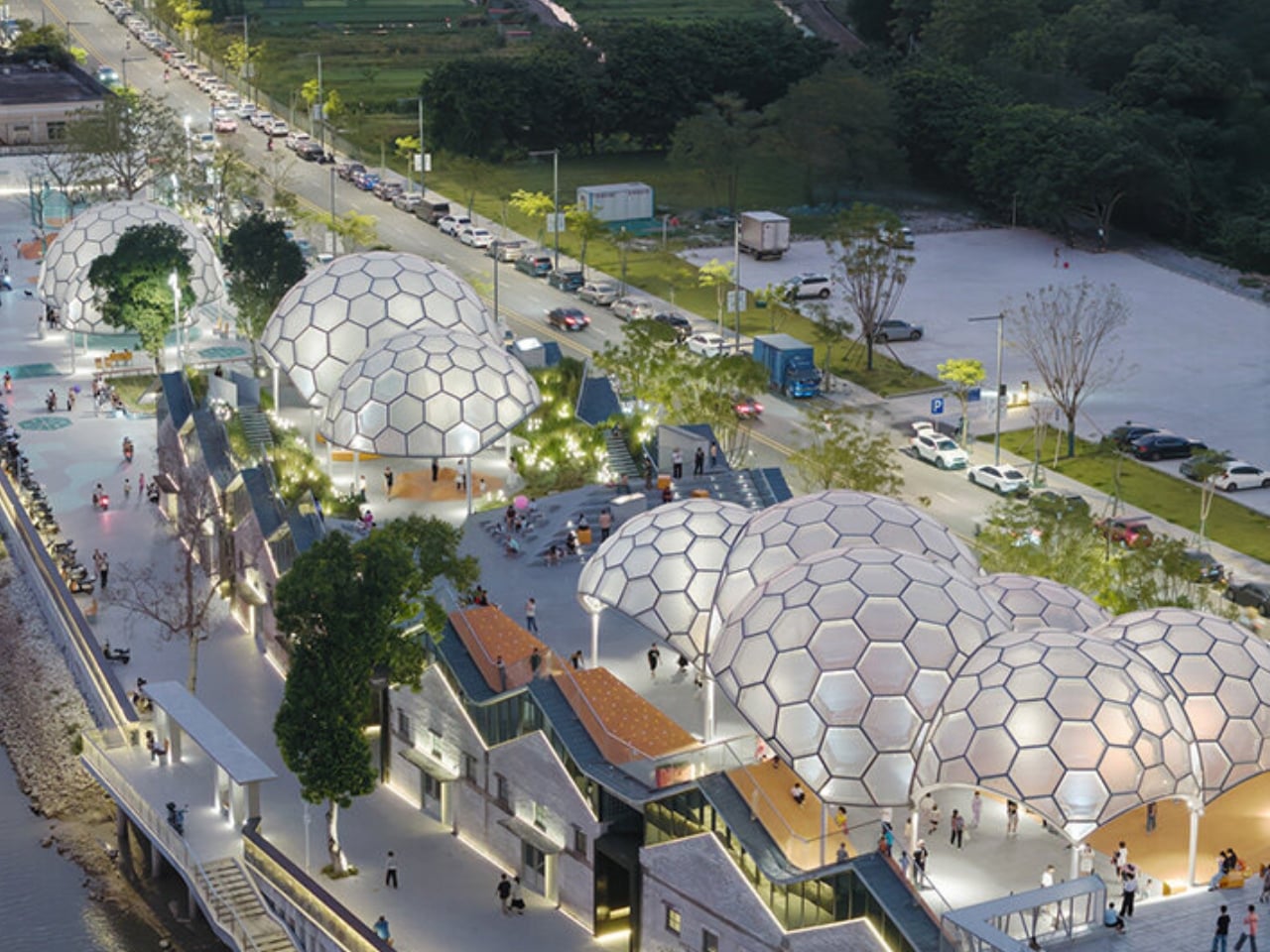
Because the site has a narrow footprint, the architects pushed the public space upward, placing a landscaped rooftop park above the commercial interiors below. Vertical programming isn’t a new idea, but what makes Yongping feel different is how thoughtfully the transition between levels was handled. The gaps between warehouse blocks weren’t sealed or filled in. Instead, they were preserved and widened into passageways, so as you move through the building, you catch glimpses of the river framed by walls before the whole view opens up at the top. It’s a slow reveal, and it’s deliberate.

And then there are the canopies. A series of translucent, domed structures built from hexagonal frames cluster across the roofline like a quiet gathering of clouds. Atelier cnS actually named the project “A Wisp of Cloud” over Huadi River, and the photos earn that name completely. The domes are light-diffusing, casting shade without blocking river views. They create zones for sitting, moving, and play without ever feeling like they’re closing the space in. They look like they arrived gently, rather than being imposed on the building below them.

The rooftop itself is shaped into slopes, steps, and play surfaces that echo the original pitched forms of the warehouse roofs. It’s one of those details that most visitors probably won’t consciously register, but it’s exactly the kind of architectural memory that makes a renovation feel grounded rather than gratuitous. The old buildings aren’t being pretended out of existence. The new design is in active conversation with what was there before.

I’m genuinely drawn to this project because it gets the balance right in a way that many adaptive reuse projects don’t quite manage. Too often, the renovations that attract the most attention are the ones where the new design overwhelms the original structure, turning the old building into nothing more than a convenient shell. Yongping avoids that trap. The warehouses are still very much present. Their bones dictate the rhythm, the circulation, and some of the visual language of the final result. You can feel the history of the place without having to read about it first.

Atelier cnS has been developing this kind of thinking for years. The studio’s earlier work on elevated public circulation, including a “roof-hopping” design approach explored in their White House Guesthouse project, signals a long-running interest in finding new life in existing structures. Yongping feels like a maturation of that sensibility. More refined, more integrated, and more tuned in to the texture of a neighborhood mid-transition.

The project spans 4,311 square meters, and it’s worth noting what it does beyond the architecture itself. Turning a commercial renovation into a publicly accessible rooftop park, in a district shifting away from its industrial past, is a real act of generosity. A park on a roof could easily read as a private amenity. Here, it reads like a gift to the neighborhood, a place to walk, rest, and look out at the river without needing a reason to be there.

Architecture doesn’t always need to announce itself to be worth paying attention to. The Yongping Warehouse Renovation is understated, purposeful, and lit from above by a cluster of translucent domes that look, from a distance, exactly like a wisp of cloud over the river.

The post Foshan’s Forgotten Warehouses Got a Rooftop Park Under Floating Domes first appeared on Yanko Design.

Belgium’s Most Striking Concrete Villa Was Designed by the Dunes

Par : Ida Torres
8 avril 2026 à 23:30

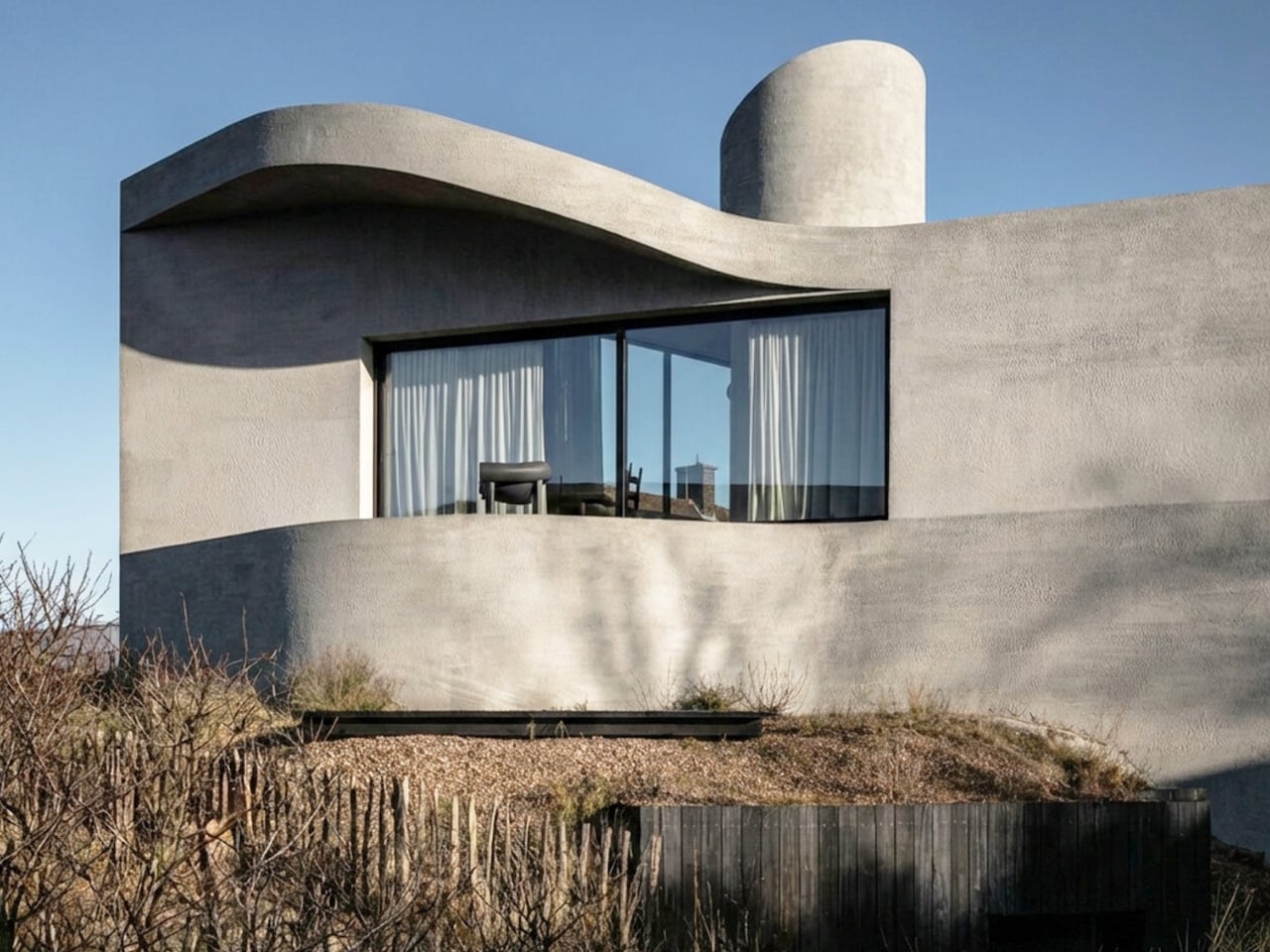
If you’ve ever stood on a beach and watched the tide pull back, you know that moment right before the water retreats completely, when it leaves those delicate horizontal lines etched across wet sand. That’s what the facade of Villa Nouvelle Vague looks like. Not metaphorically. Literally. Belgian architect Magalie Munters designed the concrete surface of this seaside villa in Oostduinkerke with a horizontal grain that mirrors the striations the North Sea leaves behind at low tide. The reference isn’t decorative, it’s structural. And that distinction matters.

The villa sits on a corner plot at the edge of a protected dune reserve in Oostduinkerke, a small coastal town already known for a few wonderfully eccentric things: a ship-shaped restaurant and fishermen who harvest shrimp on horseback. Into this landscape, Munters has introduced something that manages to be arresting without being loud. The form is sculptural and unmistakably modern, but it doesn’t shout. It settles.

Designer: Magalie Munters

The name “Nouvelle Vague” borrows from the French New Wave film movement, and the reference is apt in ways that go beyond the obvious nod to style. The French New Wave was defined by breaking conventional rules while remaining deeply committed to craft. Munters is working in a similar register. For years, her Ghent-based boutique studio has been developing residential architecture with organic geometries, pushing against the idea that construction methods should set the ceiling on what architecture can achieve. “Through that ongoing research, I developed a way of building in which construction and technology no longer act as a limitation to the architecture,” she explains. Villa Nouvelle Vague is where that research cashes out.

The concrete form is completely curved across the entire volume, not just as a surface treatment but as a governing logic, carried through every detail: the absent roof edges, the curved garage opening, even the way the house integrates into the ground. The bedrooms are half-buried in the dunes, which is both a functional and a conceptual move. The house doesn’t sit on the landscape. It’s anchored into it. Above those buried rooms, the living spaces rise toward the horizon, pulling in light and opening out to views of the dunes in a way that feels earned rather than forced.

The way you move through the house is where Munters’ admiration for Le Corbusier becomes most legible. She’s spoken about his influence, specifically in “the rooftop solarium, in the way spaces expand and contract, and in the vertical shafts that structure movement through the house.” You enter through a vertical shaft that climbs toward the roof before expanding into the main living space. The compression-then-release is theatrical in the best sense. The house is working on your nervous system before you’ve even sat down.

I keep coming back to that word: deliberate. Munters uses it herself: “What might appear as a free form is in fact the result of a very deliberate construction logic.” That’s the tension the villa lives in, and frankly, it’s what makes it interesting. Nothing here is freehand improvisation. The curves look fluid because the logic behind them is airtight. The concrete looks like it grew from the dunes because the architect studied the dunes before she touched a drawing. That’s different from a building that mimics nature for aesthetic points. It’s rarer, and harder.

Belgian architecture doesn’t always get the international visibility it deserves, and Magalie Munters is one of those names worth paying attention to even if residential architecture isn’t usually your thing. Villa Nouvelle Vague is the kind of project that earns its name. It has the confidence of something that knows exactly what it is, and the intelligence not to over-explain itself. Just like the best films of the movement it references.

The post Belgium’s Most Striking Concrete Villa Was Designed by the Dunes first appeared on Yanko Design.

Inside the Espresso: Modern Tiny Living’s 20-Foot Tiny House on Wheels That Proves Small Can Be Bold

8 avril 2026 à 17:20

There’s a version of small living that doesn’t ask you to compromise. The Espresso, built by Ohio-based Modern Tiny Living on their popular Mohican platform, makes that case in just 20 feet. Bold and daring, the Espresso is a tiny house on wheels defined by deep blacks, warm wood accents, and a design sensibility that punches well above its square footage.

At its core, the Espresso is a study in restraint done right. The main floor clocks in at 160 square feet, with a 70-square-foot queen bedroom loft above, complete with custom built-ins and shelving. It’s a tight footprint by any measure, but the way the space is organized keeps it from ever feeling like it. The living room anchors one end of the home with a pull-out bench, built-in shelving, and a drop-down dining table that doubles as a desk, making it equally suited to a quiet morning or a dinner for two.

Designer: Modern Tiny Living

The kitchen is where the Espresso’s aesthetic really comes into focus. An undermount black granite sink pairs with a pull-down matte black faucet, solid wood countertops, a 9.9 cubic foot refrigerator, a two-burner propane cooktop, and a microwave, all working within a palette that feels deliberate rather than default. The matte black hardware package runs throughout the home, tying each room back to the same considered thread. Across from the kitchen, an open closet leads into the bathroom, which keeps things equally functional with a fiberglass insert shower, a flush toilet, and open shelving.

On the outside, the Espresso sits on a double-axle trailer and is finished in engineered wood with a steel roof, keeping maintenance low and durability high. A small exterior storage box handles propane bottles and similar items, quietly solving the off-grid practicalities without interrupting the clean lines of the exterior. The home weighs approximately 9,000 pounds, and its closed-cell spray foam insulation — three inches in the walls and ceilings, four in the floors — means it’s built to handle varied climates without compromise.

What makes the Espresso work isn’t any single feature. It’s the way everything adds up: the convertible furniture, the considered storage, the finish quality that makes the space feel lived-in rather than merely occupied. Modern Tiny Living designed it to deliver all the comforts of modern living in a compact, move-in-ready package, and the result is a tiny home that earns its name in more ways than one. Rich, concentrated, and hard to forget.

The post Inside the Espresso: Modern Tiny Living’s 20-Foot Tiny House on Wheels That Proves Small Can Be Bold first appeared on Yanko Design.

Studioninedots’ Light House Is a Vertical Amsterdam Home Built From Playfully Stacked Boxes

7 avril 2026 à 22:30

What does a home look like when you throw out the floor plan entirely? For Amsterdam-based firm Studioninedots, the answer is a tower of playfully stacked boxes, each one dedicated to a single moment in life, that rises above one of the Dutch capital’s newest neighborhoods. Completed in 2025, Light House sits on Centrumeiland, a newly developed artificial island district defined by its self-build culture and strong sustainability ambitions.

The project began with a simple brief from a couple with two children who wanted a home that would genuinely bring them together. Rather than anchoring daily life to the ground floor the way most houses do, Studioninedots dedicated each of the family’s key activities — eating, gathering, cooking, relaxing — to its own distinct volume, then arranged those volumes vertically into a single, tightly considered composition. The result is a 257-square-meter residence that feels less like a stacked building and more like a small vertical neighborhood.

Designer: Studioninedots

Movement through the home unfolds through a sequence of open passages and compressed zones, where shifts in scale produce entirely different spatial moods. Smaller, enclosed areas carve out space for focused, quieter activities, while larger voids open up visual connections across levels, dissolving any conventional sense of what is above and what is below. Hovering above the kitchen is a sheltered, secluded volume ideal for yoga or film watching, while the journey through the house culminates at the top in what the architects describe as a “holiday home” within the city. Flanked by arched ceiling-height glass openings, this 14-metre-high gathering room commands panoramic views across the IJmeer lake.

The facade does a lot of the design’s heavy lifting. A wall of square glass blocks wraps the front of the building, filtering natural light into the interior while abstracting the life inside, offering privacy without sacrificing the warmth of daylight. At night, the facade glows from within, giving the house an almost lantern-like presence on the street.

Sustainability is baked into the structure itself. Light House is built as a lightweight system using prefabricated timber components inside a steel frame, a circular and modular method that allows for flexibility, long-term adaptability, and ease of disassembly. The layout is not fixed either, as children grow and priorities shift, the home can be reconfigured to meet whatever the family needs next. Light House is a rare thing: a home that feels entirely personal yet completely considered, one where architecture quietly gets out of the way and lets life fill the space.

The post Studioninedots’ Light House Is a Vertical Amsterdam Home Built From Playfully Stacked Boxes first appeared on Yanko Design.

Genji Kyoto Is a Hotel You Read Like a 1,000-Year-Old Book

Par : Ida Torres
6 avril 2026 à 23:30

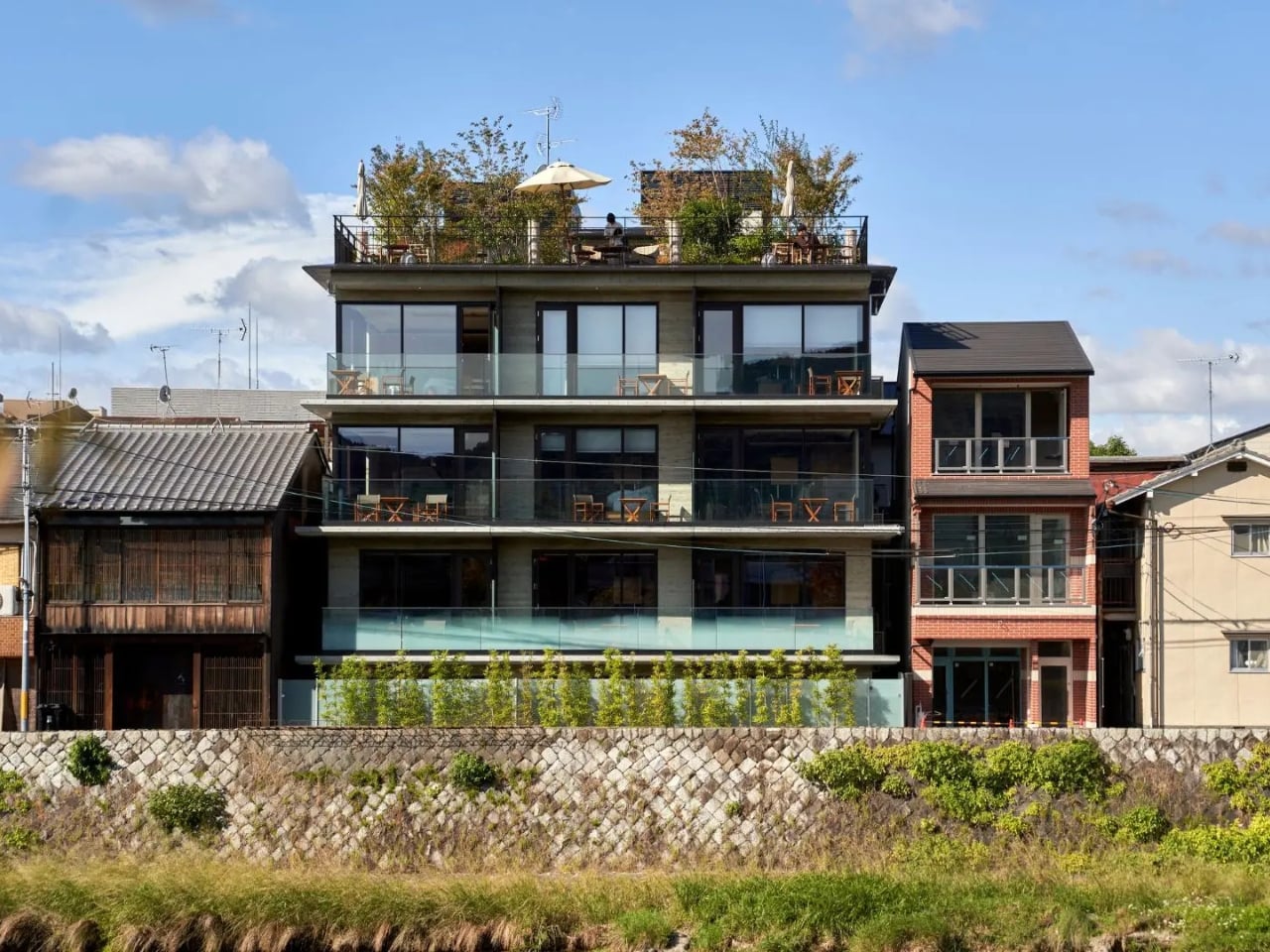
Most hotels ask you to check in. Genji Kyoto asks you to pay attention. Nestled along the Kamo River in Kyoto, Japan, this 19-room boutique hotel is the kind of place that architects talk about in hushed, reverent tones. And for good reason. It was designed by Geoffrey P. Moussas of Design 1st, a New York-born, MIT-trained architect who has called Kyoto home since 1994. That detail matters more than it might seem.

Moussas didn’t fly in with a mood board and a deadline. He has spent over three decades restoring and redesigning more than 40 traditional Japanese structures: machiya townhouses, tearooms, kura storehouses, and even a 400-year-old Buddhist temple. His work has been featured in the Financial Times, CNN, and NHK, and exhibited at Kiyomizu Temple and Nijo Castle. When someone like that builds a hotel, you’re not just booking a room. You’re stepping into a lifetime of accumulated understanding.

Designer: Geoffrey P. Moussas of Design 1st

The concept behind Genji Kyoto traces back to an 11th-century Japanese novel, The Tale of Genji, widely considered one of the world’s first novels. When the design team discovered that the hotel’s site was historically tied to the story’s actual locations in Kyoto, the whole project shifted. The design moved away from a simple machiya prototype and toward the aesthetic world of the Heian period, over a thousand years ago. But Moussas wasn’t interested in imitation. His approach was to distill the spirit of Heian architecture, specifically the Shinden Zukuri style, characterized by pavilions woven through interconnected gardens, rather than recreate its surface. That distinction is everything. It’s the difference between a themed restaurant and a genuinely good one.

The guiding philosophy here is a Japanese concept called Teioku Ichinyo, which translates roughly to “building and garden are one.” Every spatial decision at Genji Kyoto flows from this idea. Gardens aren’t decorative; they’re structural. They guide movement, frame views, and carry what the Japanese call ki, the life force that animates a space. Even the small tsubo pocket gardens tucked around the guest rooms, a tradition dating back to Heian palace residences, do serious work, turning what could be a blank interior wall into a living, breathing view.

The materials are just as considered. Cedar-imprinted concrete shows up throughout the hotel, hard surfaces pressed with the warmth of wood grain, creating a tension that reads as both ancient and completely new. Large-scale washi paper panels function as architectural elements, not just decoration. Guest rooms have solid cherry wood floors, tatami mats made from natural rush, and furniture entirely handmade by Kyoto craftsmen. Jun Tomita, who handled interior design alongside Moussas, drew motifs directly from The Tale of Genji for every custom piece. And then there’s the detail I keep coming back to: during construction, a heritage water basin and a small shrine were discovered on-site. Rather than remove them, the team built the garden around them. That kind of decision tells you everything about where the priorities were.

There are 19 rooms in total, each one different. River views, city views, garden views. No two stays are the same, and that’s by design. Each room also features an original painting by a Kyoto artist, with every piece drawing on a different theme from The Tale of Genji, so even the art tells a chapter of the same story. Moussas has said he wanted guests to have a different experience every time they return, and the hotel is built to make that true. The rooftop garden and bar take it further still, offering panoramic views that make the hotel feel like it belongs to the entire city, not just its footprint.

Genji Kyoto’s real achievement isn’t any single detail. It’s the commitment to depth over spectacle. A lot of contemporary design is about the first impression, the photograph, the wow moment. This hotel asks for more time than that. It reveals itself in layers, the way a good book does. You have to slow down. You have to look twice. That’s a rare ask in hospitality. And it’s a rarer thing to pull off.

The post Genji Kyoto Is a Hotel You Read Like a 1,000-Year-Old Book first appeared on Yanko Design.

❌
❌