❌

Vue lecture

Antonia Tiny House Offers a Bedroom Without the Climb
Loft bedrooms look efficient on paper. Move the bed upstairs, and suddenly there’s room for a proper kitchen or a sofa below. But that saved space comes with a compromise: stairs to navigate at night and a ceiling that may not let you stand upright. I’d rather have a little less cleverness in the floor plan and a bedroom I can simply walk into.

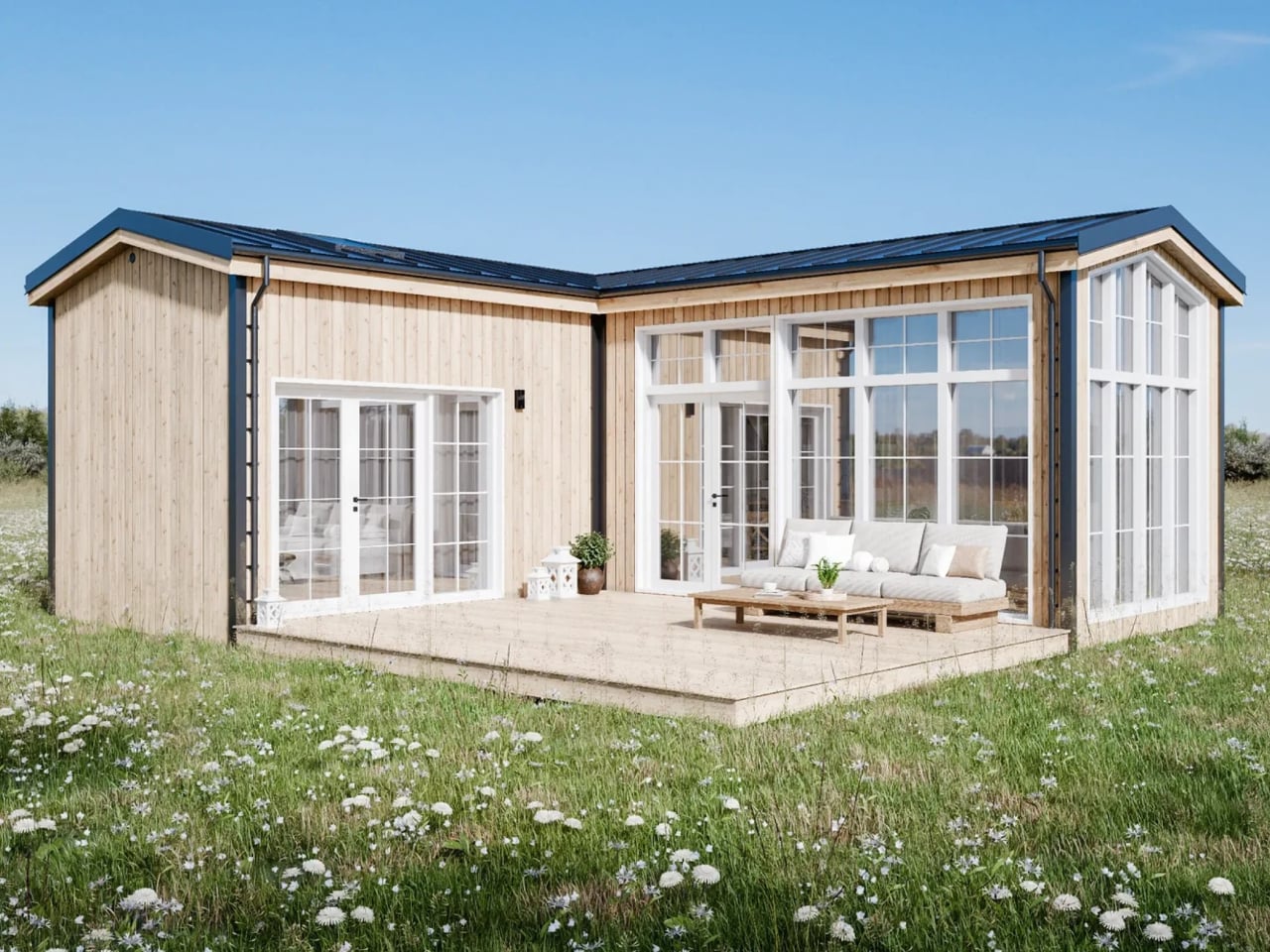
That’s the appeal of Antonia, an orderable modular home from Swedish company Vagabond Haven. Its main bedroom stays downstairs, while roughly 635 square feet across two levels leave room for a second sleeping area above. Two modules form an L around a terrace, giving the layout a useful bend rather than the proportions of a towable cabin. It’s designed to settle onto a foundation, delivered by truck and positioned by crane.

Designer: Vagabond Haven
That bend in the floor plan does useful work. The living area occupies one wing, while the bedroom, bathroom, and stairs occupy the other. Between them, the terrace sits inside the L, reached through glass doors from both the living room and the downstairs bedroom. In the published renderings, outdoor seating makes this corner read as another place to spend time, not merely a landing outside the door. The images are illustrative, so finishes and details may change.

I like that the outdoor space has a clear relationship to the rooms around it. A deck can be generous and still feel detached from daily life if getting there means walking around the house. Here, the layout suggests an easy route from cooking dinner to eating outside. That’s a more convincing use of limited space than counting every square foot of decking as though it were another climate-controlled room.
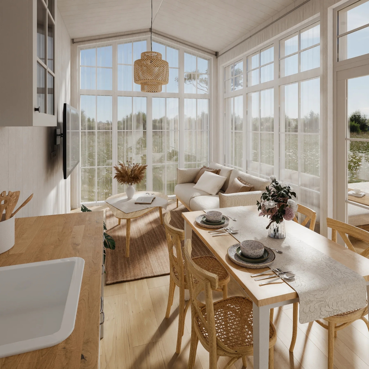
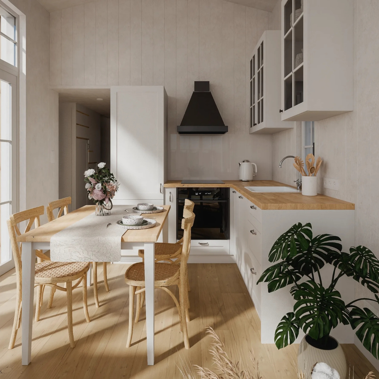
Indoors, the kitchen and living room share a high ceiling because the loft stays over the opposite wing. The kitchen follows its own L-shaped plan, with a sink, cooktop, oven, and refrigerator/freezer in the illustrated furnished setup. A dishwasher is optional, and a four-seat dining table sits nearby. The proportions matter more to me than the styling: a table that can remain a table is preferable to furniture that needs a nightly transformation.

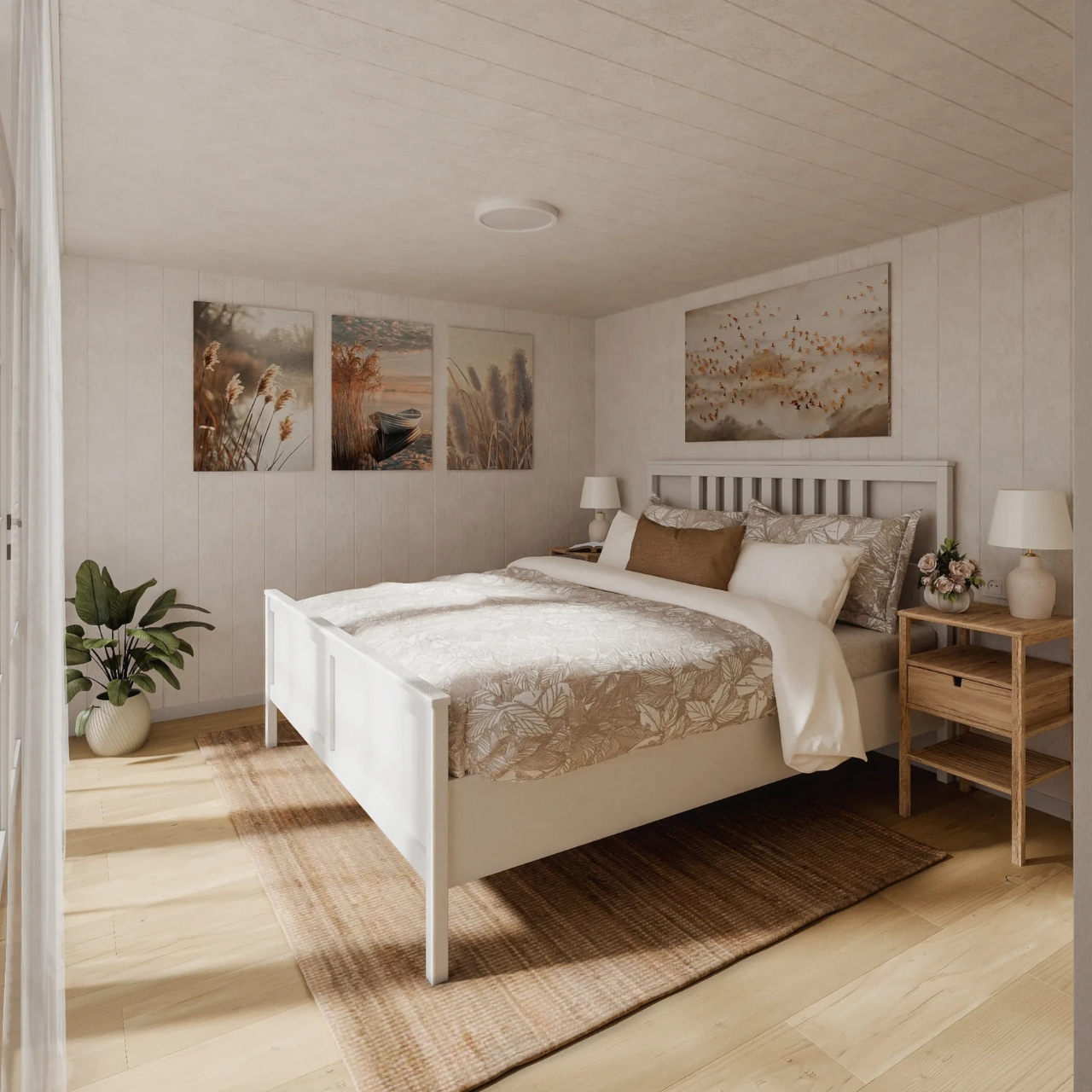
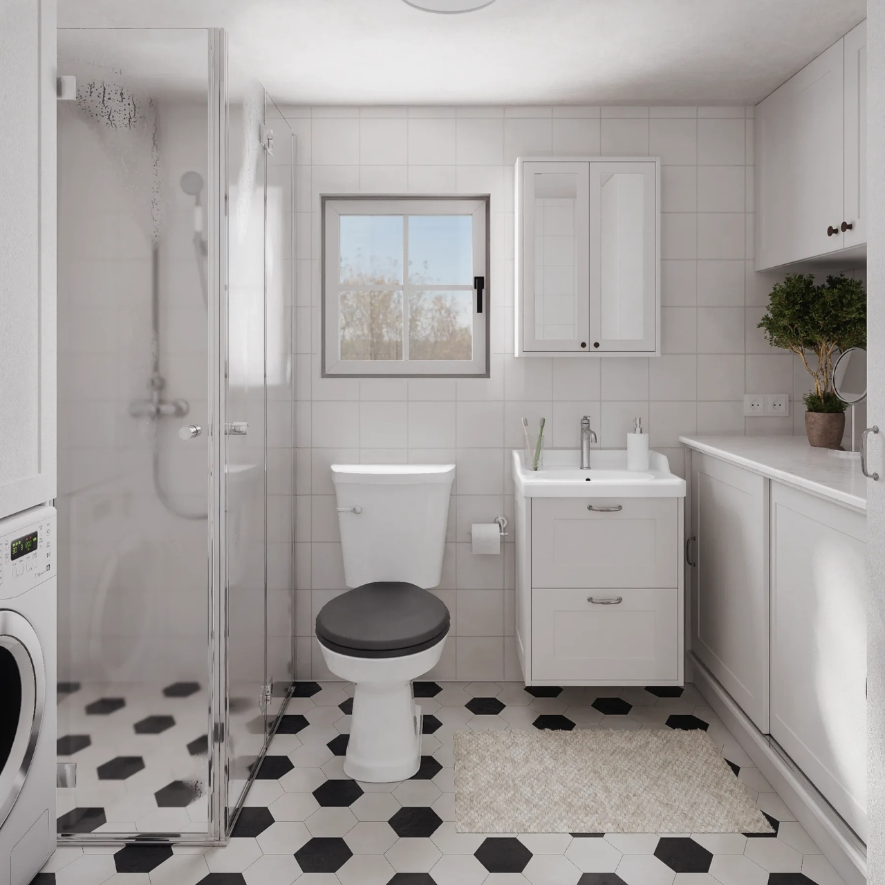
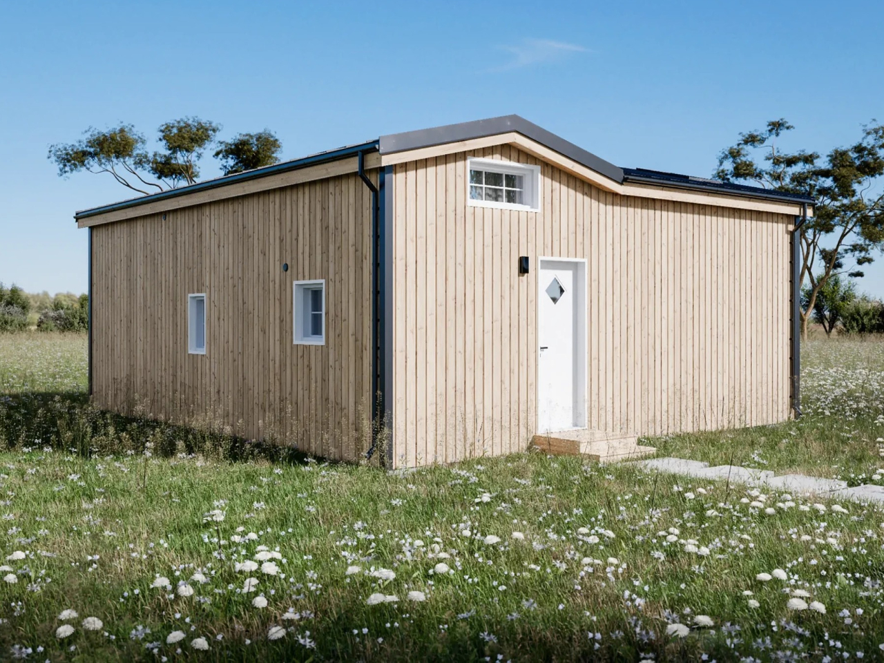
The material palette is restrained: vertical Thermopine siding outside, a steel-sheet roof, laminate flooring, and Forestia/Huntonit interior panels. White cabinetry and pale wood tones give the renderings a familiar cottage feel. More importantly, the ground-floor bedroom is shown with a double bed and fitted wardrobes, while the bathroom accommodates a shower, vanity, toilet, and washer/dryer. Those aren’t glamorous features. They’re the infrastructure that lets a small home function beyond a weekend.
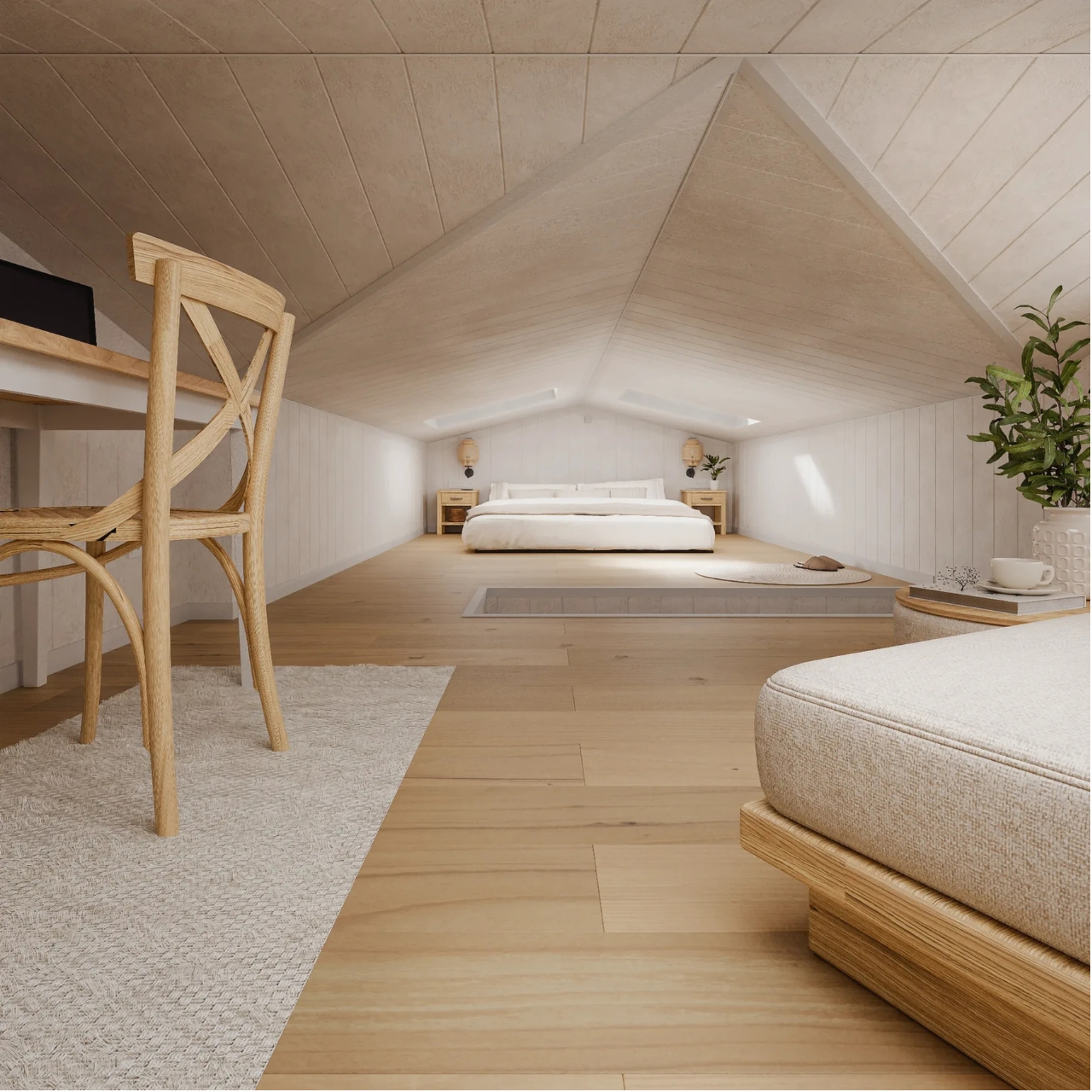
Upstairs, the compromise is more visible. The loft rendering shows a second double bed, a desk, and seating beneath a low pitched ceiling, with stairs providing access. I’d see this as useful guest space or an occasional work retreat before making it the primary bedroom. Keeping the downstairs option means the house doesn’t ask everyone to accept the same relationship with stairs, headroom, and getting up at night.

Pricing needs the same practical reading. Vagabond Haven lists the unfurnished Antonia at €67,500 before VAT, with a €77,500 furnished example configuration. The base price isn’t the price of the staged interior: the company excludes items including heating, appliances, bathroom fittings, the terrace, delivery, and utility connections. Its stated delivery market is Europe, so these figures shouldn’t be mistaken for a ready-to-install U.S. offer. A beautiful rendering doesn’t make those additional decisions disappear.

I’d pay particular attention to where it lands. With so much glass facing the terrace, choosing what those windows overlook would be part of making this layout work. A view of trees and a view of a neighbor’s kitchen aren’t interchangeable. Antonia makes an appealing case for letting outdoor space shape a small home, but that makes its eventual setting just as important as what arrives on the truck.
The post Antonia Tiny House Offers a Bedroom Without the Climb first appeared on Yanko Design.


  •  

The MUNCH Museum Turns the Journey Between Galleries Into a City View

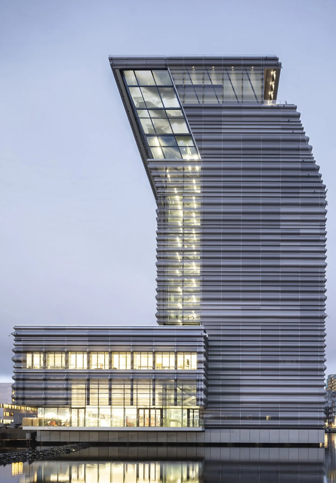
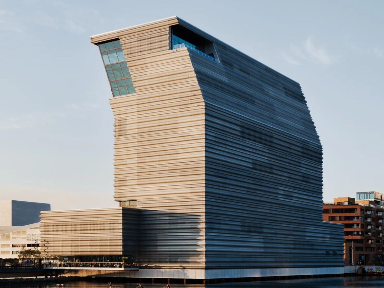
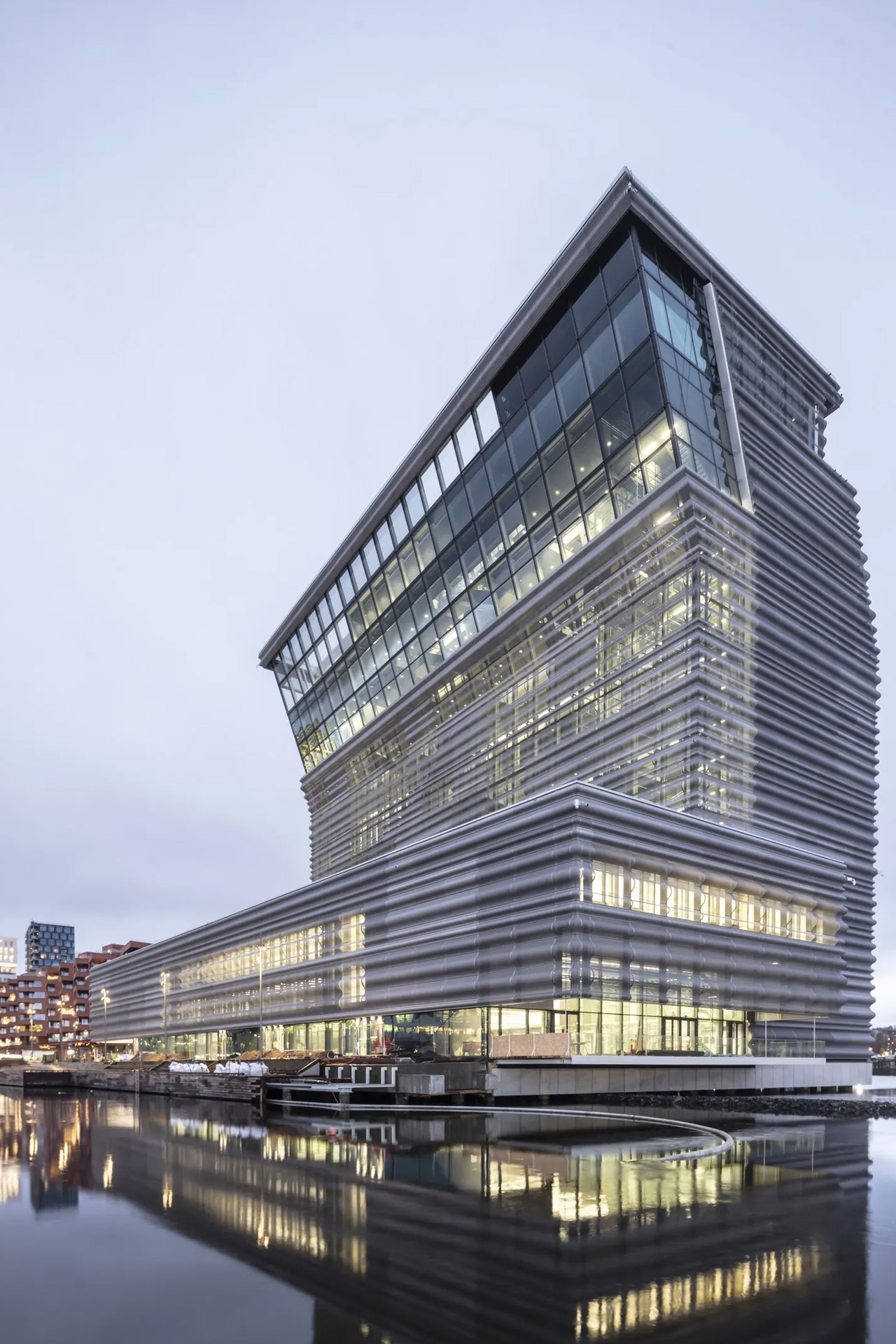
The bent upper section of Oslo’s MUNCH Museum makes an unmistakable mark on the waterfront. Yet the more interesting architectural move happens inside: the building separates spaces that protect art from spaces that open visitors’ attention to the city. Its tower turns the journey between galleries into a changing view of Oslo, rather than treating circulation as leftover space.

Opened on October 22, 2021, in the Bjørvika waterfront district, the museum was designed by estudio Herreros, led on the project by Juan Herreros and Jens Richter, with LPO Arkitekter as local architects. The completed building accommodates 11 exhibition halls within a 13-floor institution dedicated to Edvard Munch’s work and wider cultural programming.

Designer: Estudio Herreros

The layout divides the building into what the architects call static and dynamic zones. The static zone is an enclosed concrete structure containing galleries, where security, humidity, and daylight require careful control. Alongside it, the more transparent dynamic zone carries visitors between exhibition areas while maintaining views across the surrounding city. The distinction gives art and movement different architectural conditions.

For estudio Herreros, this ascending public route is the project’s central idea. The architects describe circulation as a viewpoint connecting the lobby with the upper terraces and observation spaces. Read this way, the tower offers a sequence of encounters with the collection and its urban setting, with neither confined to a single panoramic moment at the top.

That separation also has a practical environmental role. According to the museum, airlocks between the two zones help control temperature and humidity, allowing natural ventilation in the circulation areas without imposing those same conditions on the galleries. The architecture acknowledges that paintings and people do not always need precisely the same indoor environment.

The exterior’s undulating, perforated aluminum panels give the tower its textured surface. Cladding manufacturer Lindner supplied 4,018 panels, describing their role as solar screening that preserves a sense of transparency. The rippled profile adds depth to what could otherwise have been a flat metal wrapper, giving the large facade a finer scale of detail.

There is an unexpectedly logistical detail within that skin: Lindner says 100 panels can be opened to allow artworks to be lifted into the building. The facade must accommodate the collection’s movement as well as its protection, a useful reminder that museum architecture includes demanding backstage operations.

The lobby, conceived by the architects as a covered public space, extends this thinking beyond exhibition rooms. MUNCH’s strongest proposition is that a museum visit can include gathering, looking outward, and moving through the building with purpose. The kink attracts attention; the route gives that attention somewhere to go.

The post The MUNCH Museum Turns the Journey Between Galleries Into a City View first appeared on Yanko Design.
  •  

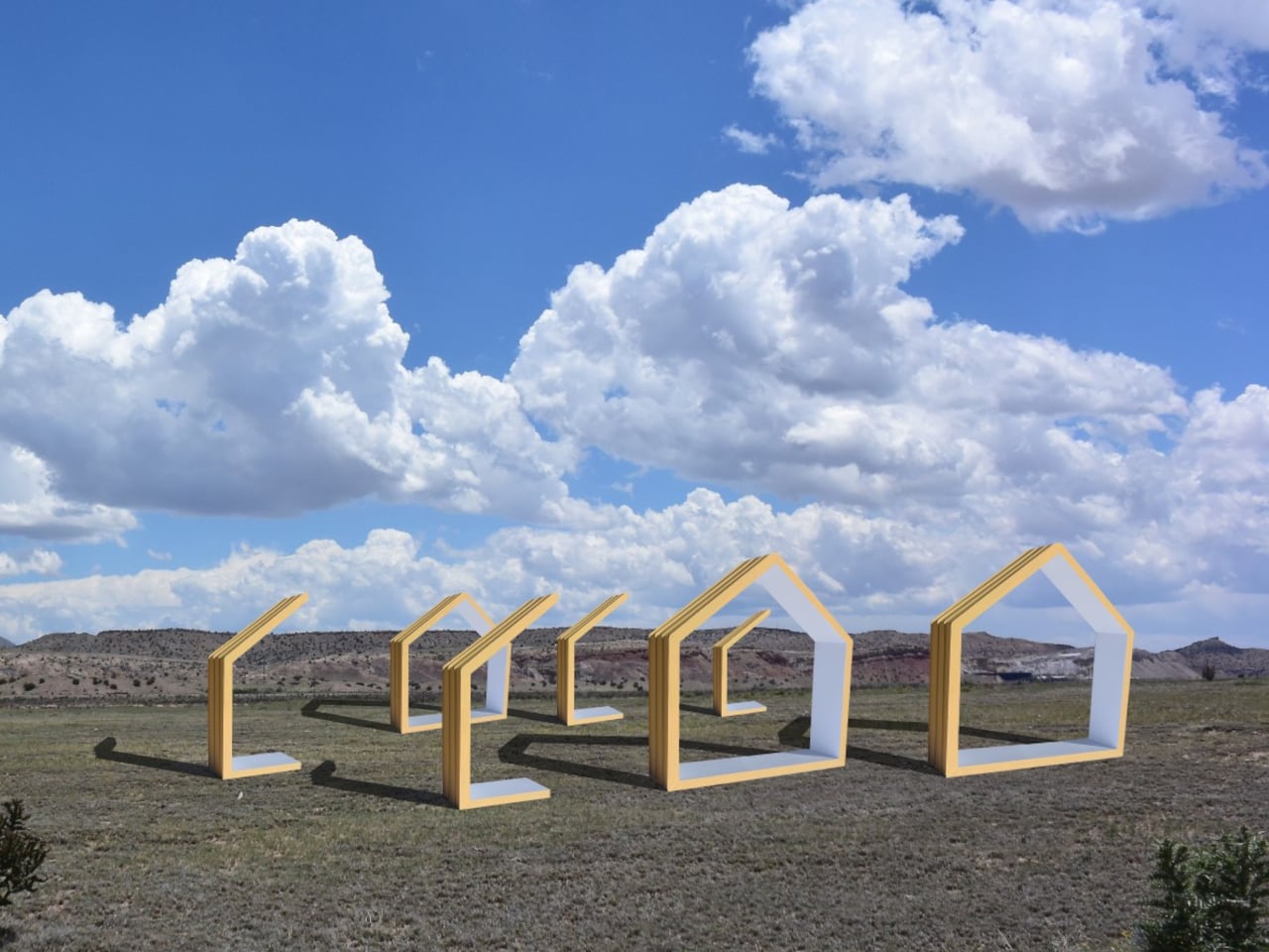
This Modular Building Concept Assembles Homes From Four-Foot-Wide Slices

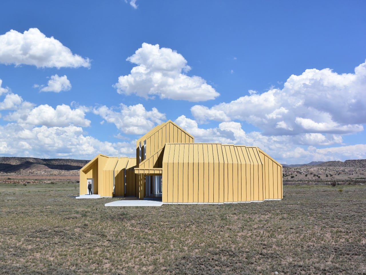
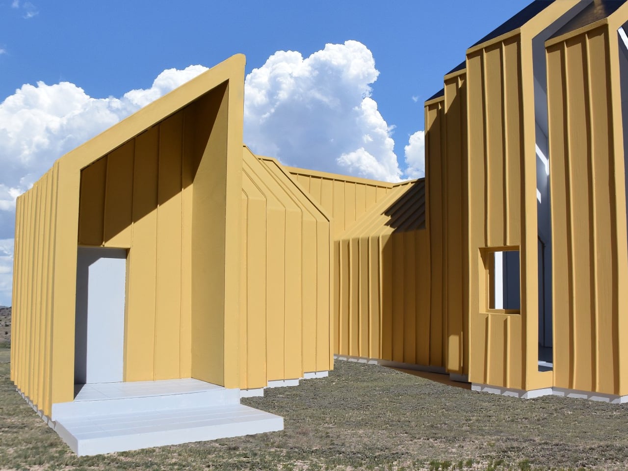
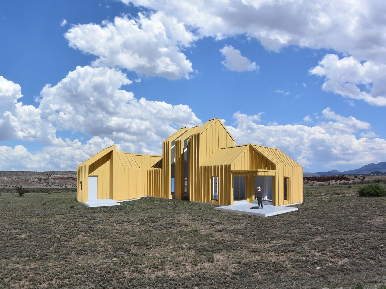
Changing a home’s layout usually means working around walls that have no intention of moving. The Segmented Building System concept approaches that problem by treating a building as a series of four-foot-wide sections, rather than one permanent shell. This unconventional architecture proposes a house that could be dismantled and reassembled instead of demolished when circumstances change.

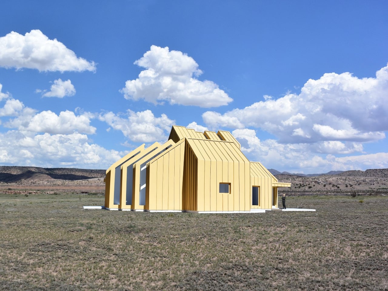
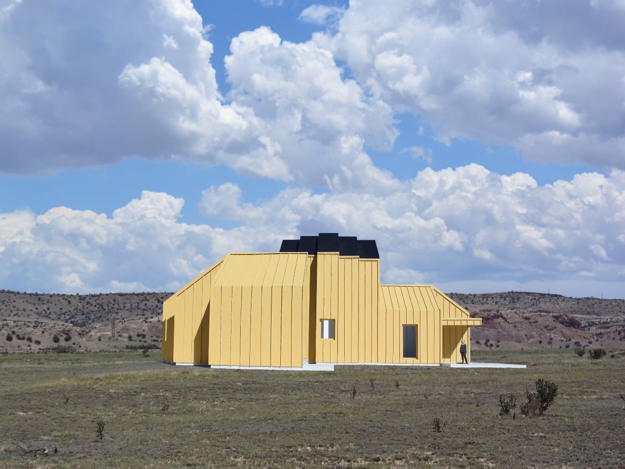
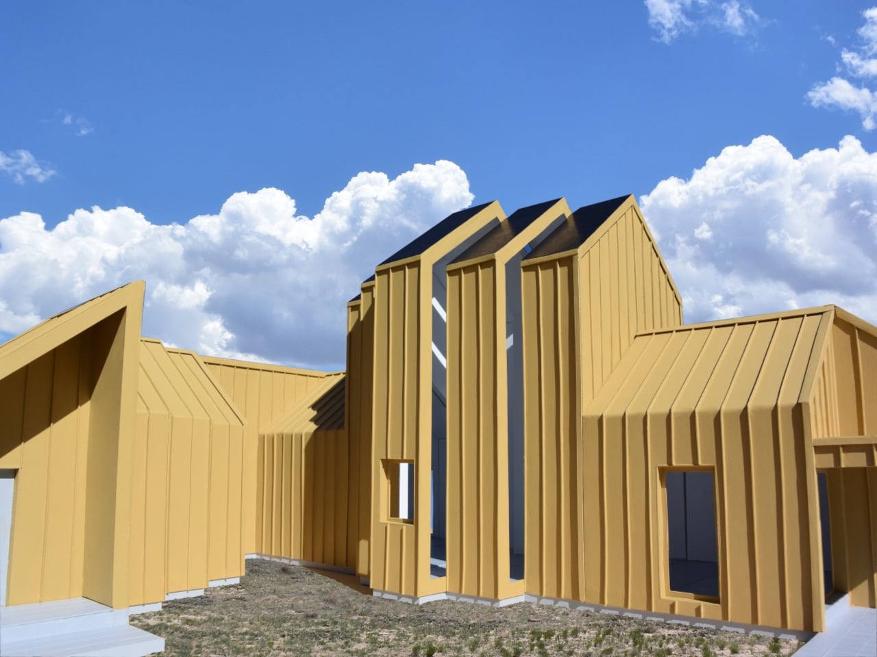
Each section is conceived as a slice through a building, combining floor, wall, and roof panels into a complete or partial profile. Structural insulated foam panels would form these pieces, which could arrive separately or already assembled. The four-foot measurement describes the segment’s width, not the room’s overall span, so the proposal isn’t asking anyone to squeeze into a very narrow little house.

Designer: Michael Jantzen

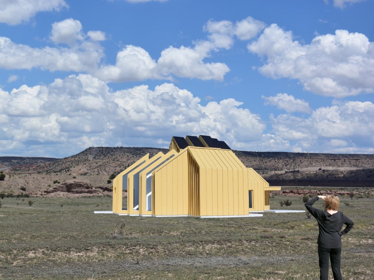
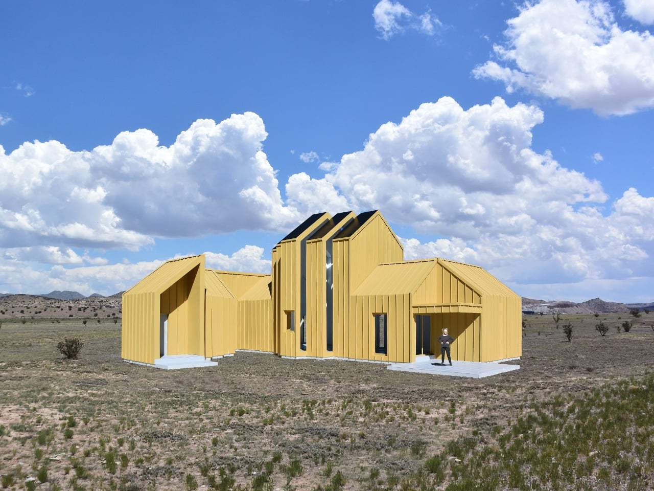
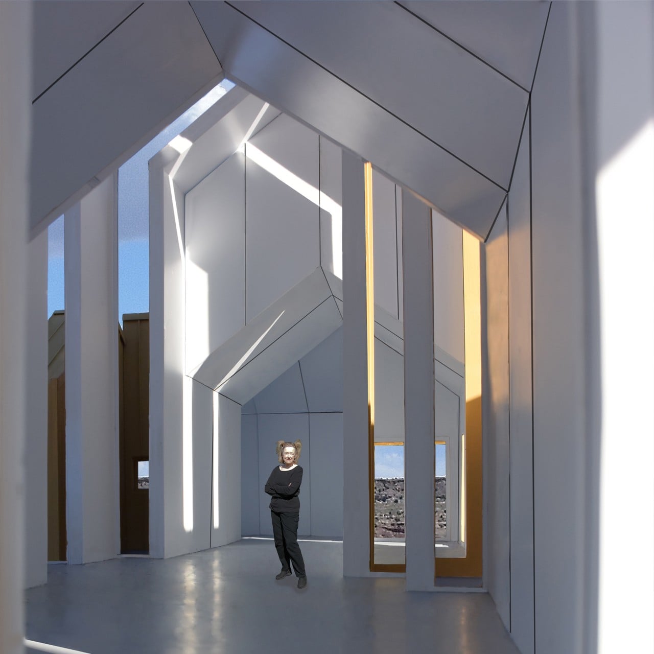
Repeating those slices would let a building stretch, while combining full and half profiles would allow it to branch sideways. Their varying heights could give a shared living area a taller ceiling and keep adjoining spaces lower. Rather than committing to a single box-shaped module, the idea is to assemble different volumes from related parts, with their rooflines following the changes below.

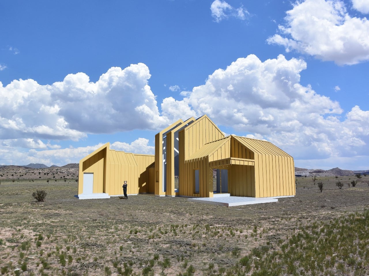
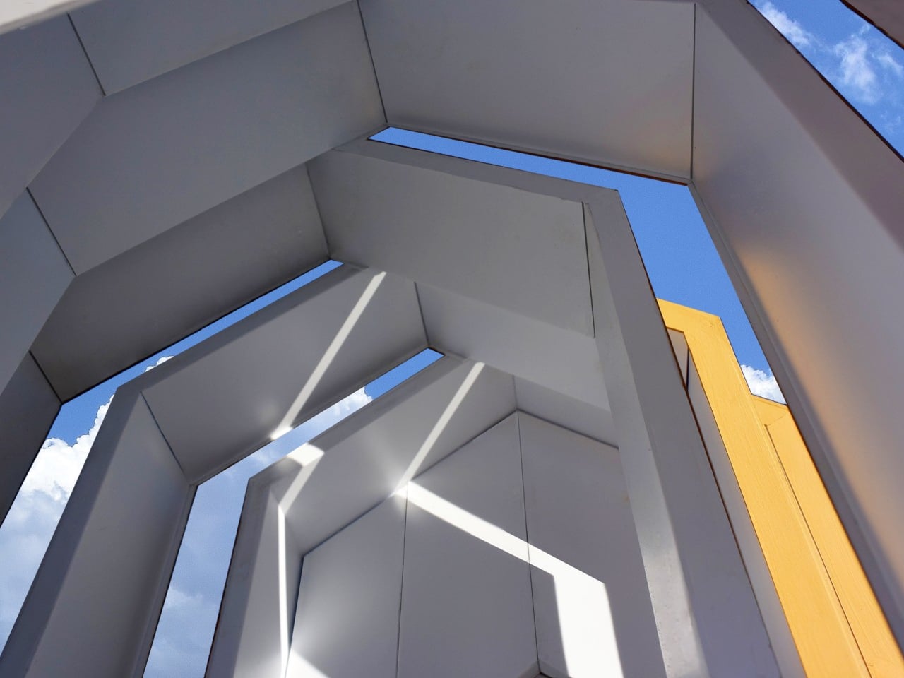
The more interesting move, however, is to slide neighboring profiles out of alignment. Glass would fill the gaps, turning the joints between sections into narrow openings for daylight. Those openings could continue from the walls into the roof, bringing light into a tall central space. Instead of treating every seam as something to hide, the concept makes some of them part of the architecture.

The exterior isn’t tied to its mustard-yellow finish, either. Metal or cement-composite boards are proposed as cladding options, applied before delivery or after assembly on site. That gives the same underlying system room for different appearances, rather than making one facade part of the deal. Solar panels could also attach to the segments, with off-grid operation among the ambitions for the system.

Of course, rearranging a house wouldn’t be quite as casual as rearranging its furniture. The segments would attach to a prefabricated concrete perimeter foundation shaped for the chosen layout. Moving them elsewhere would still mean preparing a suitable base and reconnecting the building’s services. The proposal describes reusable sections, not a finished home you can simply pick up and drop onto any empty plot.

The point of taking those sections apart would be to use them again, perhaps in a different arrangement at another location. That’s a useful distinction from grinding a demolished building into material for something else. The ambition is to keep a usable building section intact. A change of address or layout wouldn’t require giving up the pieces that already made up your home.

The post This Modular Building Concept Assembles Homes From Four-Foot-Wide Slices first appeared on Yanko Design.
  •  
❌