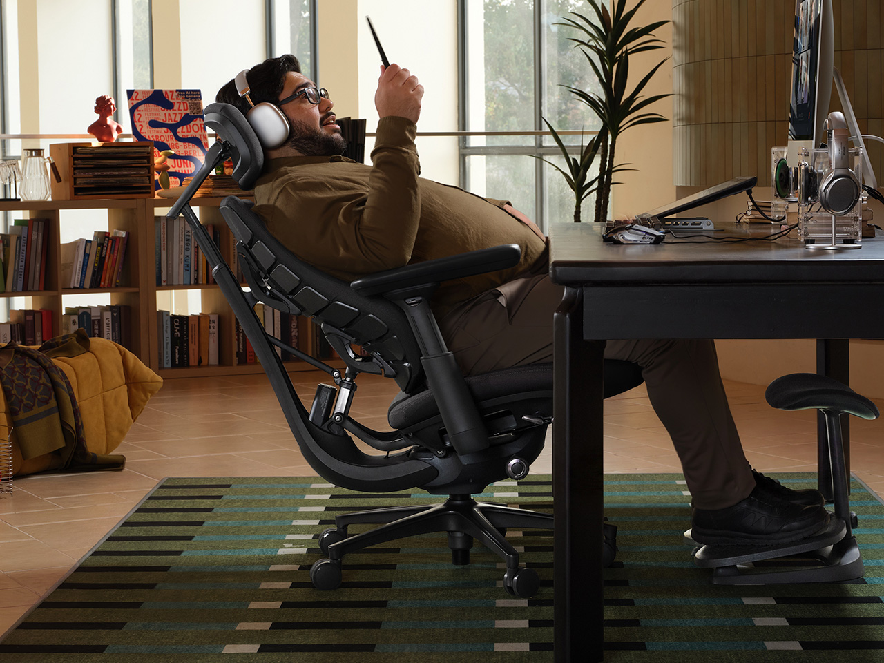
In 1976, two designers gave the office a chair that moved when you did. The Met calls Emilio Ambasz and Giancarlo Piretti’s Vertebra the first automatically adjustable office chair. Fifty years later, plenty of us still tug knobs and crank levers like we’re docking a spaceship. LiberNovo’s Maxis picks up that old idea and sizes it for bigger frames. Its Black Friday sale opens November 19, with up to 42% off in the US.
The Maxis is LiberNovo’s first line built from the ground up for big and tall users, rated to 399 lbs (181 kg) and certified to BIFMA X5.11, and fitted for people between 5’10” and 6’7″ (178 to 200 cm). Instead of scaling up a standard chair, LiberNovo resized the parts that tend to fail on larger bodies, from the seat depth to the headrest travel. It comes in three versions: Manual, Electric, and Airflow. List prices run $1,299, $1,799, and $1,859, which makes for one big leap and one tiny hop. Let’s walk the staircase one step at a time.
All three versions of the Maxis share the same big-body frame. The seat is 20.5 inches (52 cm) deep, with a multi-density cushion that runs firmer at the rear and softer at the front edge, where the backs of your thighs rest. The backrest spans 16.9 inches at the shoulders and flares to 20.5 inches at the waist. The U-shaped headrest travels 5.5 inches up and down and 4.7 inches in and out. Arc-shaped armrests open from 15.7 to 23.6 inches wide, so they don’t crowd your waist.
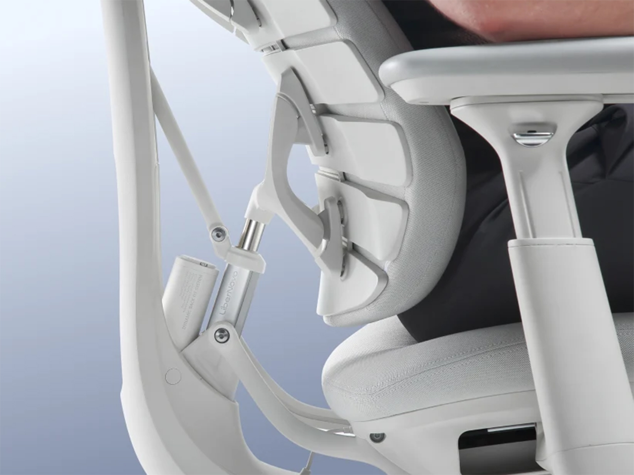
Lean back in a Maxis and the neck support, backrest, armrests, and seat all move together, a many-jointed cousin of the Vertebra’s idea. The eight-panel backrest flexes on 14 dual-link points and 16 ball joints. Six springs engage progressively by angle and weight, which LiberNovo says keeps the recline smooth under a heavier load. Five stops run from 105 degrees (Deep Focus) to 160 degrees (Spine Flow), and LiberNovo suggests 115 to 125 degrees for most of the day. Do the four-step setup once, and LiberNovo says you’ll rarely touch the controls again.
What the $500 step from Manual to Electric adds
Maxis Electric
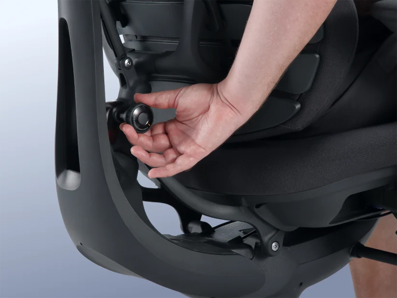
The Manual keeps lumbar support on a dial, with no motor and no battery, which suits anyone who wants a chair that never needs charging. The Electric swaps that dial for the ErgoPulse motor and carries a 2,200 mAh battery. The motor moves the lumbar zone in or out until it meets your lower back, forming an S-curve, so there’s no reaching behind you to twist a knob. Lumbar is step one of the Maxis setup, so you’ll feel this feature on day one. That’s the first half of what the extra $500 buys.
OmniStretch is the other half, a five-minute motorized stretch sequence that runs while you’re in deep recline. Both the Electric and the Airflow include it, and the Manual skips it. LiberNovo describes it as an in-chair stretch and reset, which makes it a handy pause between long work sessions and the walk to the kitchen. Whether it’s worth a share of $500 depends on how often you’d actually use it. If the honest answer is every afternoon, the math gets friendly fast.
The $60 Airflow upgrade, and how the sale works
Maxis Airflow
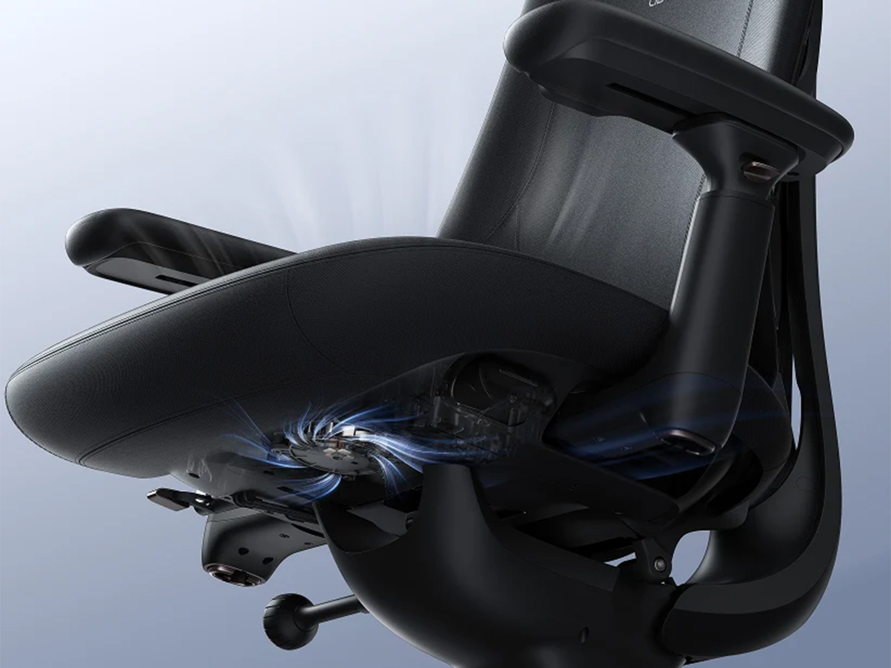
The Airflow adds a seat fan to everything the Electric does. A 4,000 RPM centrifugal fan pulls air through a five-layer seat on two levels, and an occupancy sensor pauses it when you stand up, so it never spins for an empty chair. The battery grows from 2,200 to 3,000 mAh, and LiberNovo lists fan noise under 45 dB. The upholstery is Danish Gabriel Atlantic fabric, rated by its maker at more than 100,000 abrasion rubs. At list price, all of that sits $60 above the Electric, which is the easiest call on the page.
LiberNovo’s holiday sale opens November 19 and builds toward Black Friday and Cyber Monday, with up to 42% off in the US. Eligible purchases carry 30-day price protection, so buying early comes with a safety net for qualifying price changes. Every LiberNovo chair is backed by a 6-year frame warranty and a 2-year warranty on electronics. Orders unlock gift tiers by spending, topping out at a travel kit with an inflatable neck pillow, eye mask, and earplugs. US buyers can split the bill into four 0% Klarna payments. Fifty years after the Vertebra, the best pitch for a chair that moves with you is still the simplest: you stop thinking about it.
Loft bedrooms look efficient on paper. Move the bed upstairs, and suddenly there’s room for a proper kitchen or a sofa below. But that saved space comes with a compromise: stairs to navigate at night and a ceiling that may not let you stand upright. I’d rather have a little less cleverness in the floor plan and a bedroom I can simply walk into.
That’s the appeal of Antonia, an orderable modular home from Swedish company Vagabond Haven. Its main bedroom stays downstairs, while roughly 635 square feet across two levels leave room for a second sleeping area above. Two modules form an L around a terrace, giving the layout a useful bend rather than the proportions of a towable cabin. It’s designed to settle onto a foundation, delivered by truck and positioned by crane.
Designer: Vagabond Haven
That bend in the floor plan does useful work. The living area occupies one wing, while the bedroom, bathroom, and stairs occupy the other. Between them, the terrace sits inside the L, reached through glass doors from both the living room and the downstairs bedroom. In the published renderings, outdoor seating makes this corner read as another place to spend time, not merely a landing outside the door. The images are illustrative, so finishes and details may change.
I like that the outdoor space has a clear relationship to the rooms around it. A deck can be generous and still feel detached from daily life if getting there means walking around the house. Here, the layout suggests an easy route from cooking dinner to eating outside. That’s a more convincing use of limited space than counting every square foot of decking as though it were another climate-controlled room.
Indoors, the kitchen and living room share a high ceiling because the loft stays over the opposite wing. The kitchen follows its own L-shaped plan, with a sink, cooktop, oven, and refrigerator/freezer in the illustrated furnished setup. A dishwasher is optional, and a four-seat dining table sits nearby. The proportions matter more to me than the styling: a table that can remain a table is preferable to furniture that needs a nightly transformation.
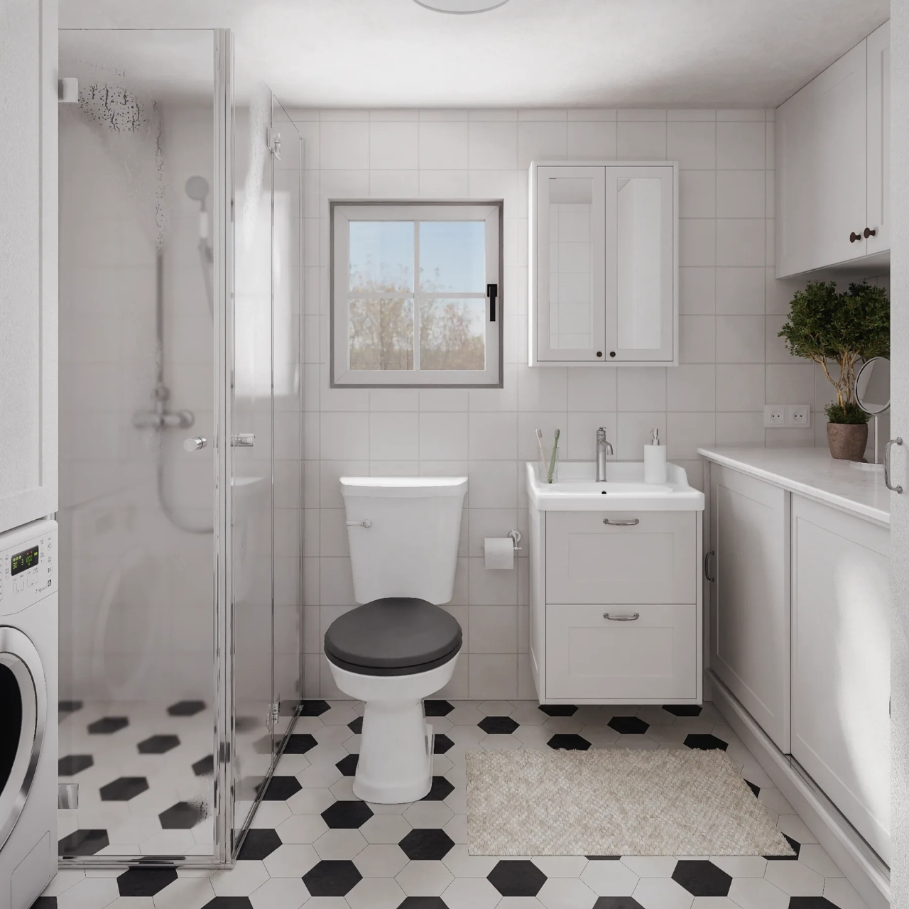
The material palette is restrained: vertical Thermopine siding outside, a steel-sheet roof, laminate flooring, and Forestia/Huntonit interior panels. White cabinetry and pale wood tones give the renderings a familiar cottage feel. More importantly, the ground-floor bedroom is shown with a double bed and fitted wardrobes, while the bathroom accommodates a shower, vanity, toilet, and washer/dryer. Those aren’t glamorous features. They’re the infrastructure that lets a small home function beyond a weekend.
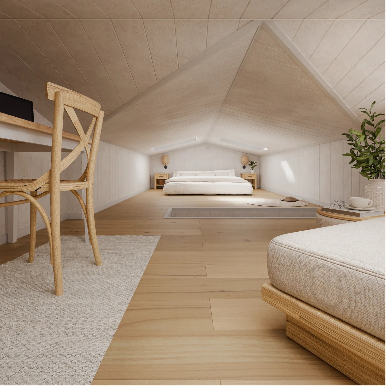
Upstairs, the compromise is more visible. The loft rendering shows a second double bed, a desk, and seating beneath a low pitched ceiling, with stairs providing access. I’d see this as useful guest space or an occasional work retreat before making it the primary bedroom. Keeping the downstairs option means the house doesn’t ask everyone to accept the same relationship with stairs, headroom, and getting up at night.
Pricing needs the same practical reading. Vagabond Haven lists the unfurnished Antonia at €67,500 before VAT, with a €77,500 furnished example configuration. The base price isn’t the price of the staged interior: the company excludes items including heating, appliances, bathroom fittings, the terrace, delivery, and utility connections. Its stated delivery market is Europe, so these figures shouldn’t be mistaken for a ready-to-install U.S. offer. A beautiful rendering doesn’t make those additional decisions disappear.
I’d pay particular attention to where it lands. With so much glass facing the terrace, choosing what those windows overlook would be part of making this layout work. A view of trees and a view of a neighbor’s kitchen aren’t interchangeable. Antonia makes an appealing case for letting outdoor space shape a small home, but that makes its eventual setting just as important as what arrives on the truck.
After years and years of anticipation, GTA VI will finally ship this week. In fact, the game may have already pre-loaded on your console if you pre-ordered it. Regardless of whether you pre-load the game or download it later, it will take up a lot of storage.
With the game being so large, you'll likely want additional storage so you can install GTA VI without clearing out other games to make space.
The good news is that the XBOX Series X and XBOX Series S support seamless storage expansion. The bad news is that stock of supported cards is extremely limited.
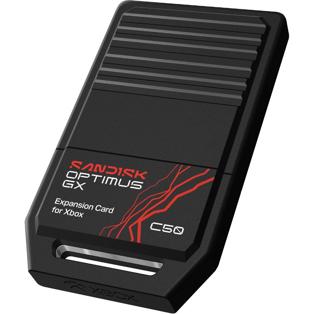
You may be able to find select individual XBOX storage cards in stock, but the only one I've been able to find available online consistently is the 2TB SANDISK Optimus GX C50 Xbox Storage Expansion Card.
This expansion card slots seamlessly into your XBOX Series X or XBOX Series S. Its performance matches the speed of the built-in storage of your console, allowing you to play games directly off the card.View Deal
Is the SANDISK Optimus GX C50 a good XBOX storage card?
(Image credit: SanDisk)
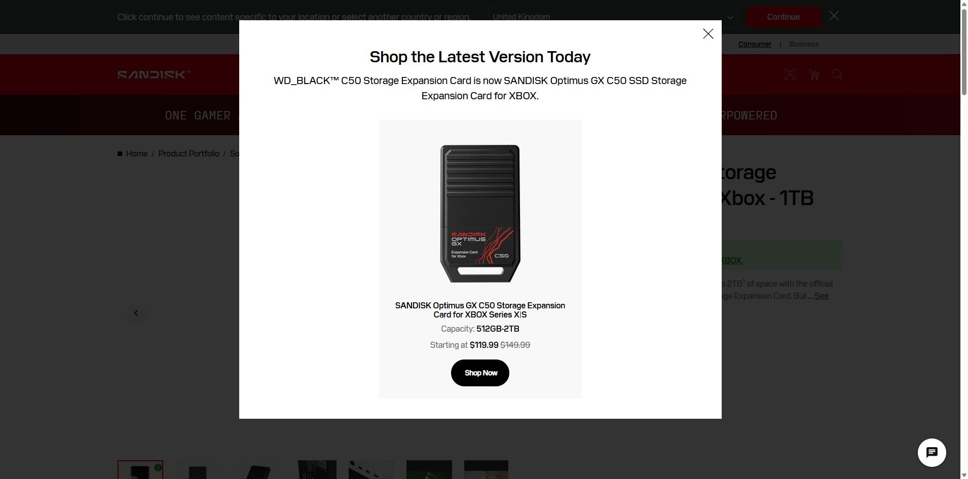
The SANDISK Optimus GX C50 is the WD_BLACK C50 Storage Expansion Card under a new name. If you search for the old WD_BLACK card on SANDISK's website, you'll see a prompt explaining the change (shown above).
Regardless of the name, the performance of the card is excellent. The SANDISK Optimus GX C50 fully supports features like Xbox Quick Resume. You can quickly transfer games back and forth between the card and your console as well.
In short, using the SANDISK Optimus GX C50 should feel exactly like having a game stored directly on your XBOX Series X|S.
Unless you care about the graphics and logo on the card, you can take a deeper dive into the SANDISK Optimus GX C50 by reading our WD_BLACK C50 Storage Expansion Card review. I'll warn you that doing so may make you cry when you see the launch price of that card.
Is now a good time to buy XBOX storage?
If you haven't shopped for a console or gaming accessories for a while, you're likely shocked by the price of additional storage. The $479.99 price of the 2TB SANDISK Optimus GX C50 is more than an XBOX Series X cost just a few years ago if you found a good deal.
The XBOX Series X launched at $499.99, but for years it was easy to find one for less. Heck, Verizon used to literally give them away if you signed up for broadband. But like laptops and other gadgets, gaming devices have skyrocketed in price over the years due to the global component shortage.
So, through the twisted lens of current gaming prices, you could almost say that $479.99 is a "fair" price for 2TB of storage. Maybe a better way to say it would be to call it an "expected" price.
With GTA VI pre-loading on consoles starting November 10 and the game launching on November 19, now is the perfect time to expand the storage of your XBOX Series X|S.
Join us on Reddit at r/WindowsCentral to share your insights and discuss our latest news, reviews, and more.
Vanderbilt University warns it is responding to a cyberattack claimed by the BYOD ransomware gang, which claims to have encrypted the university's databases and stolen sensitive student, employee, and research data. [...]
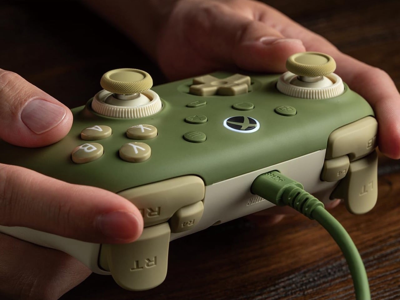
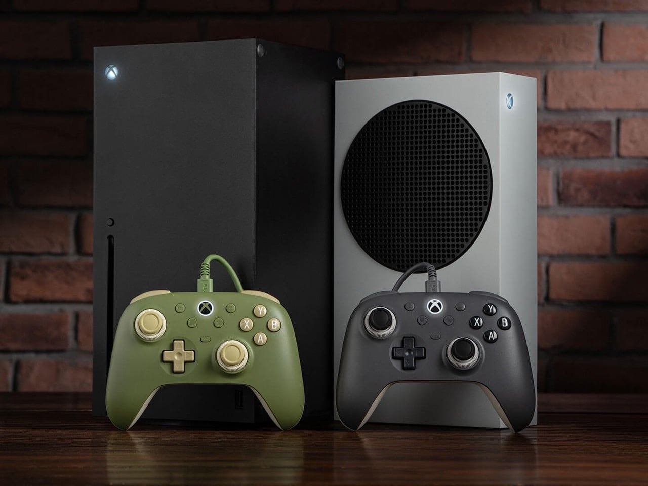
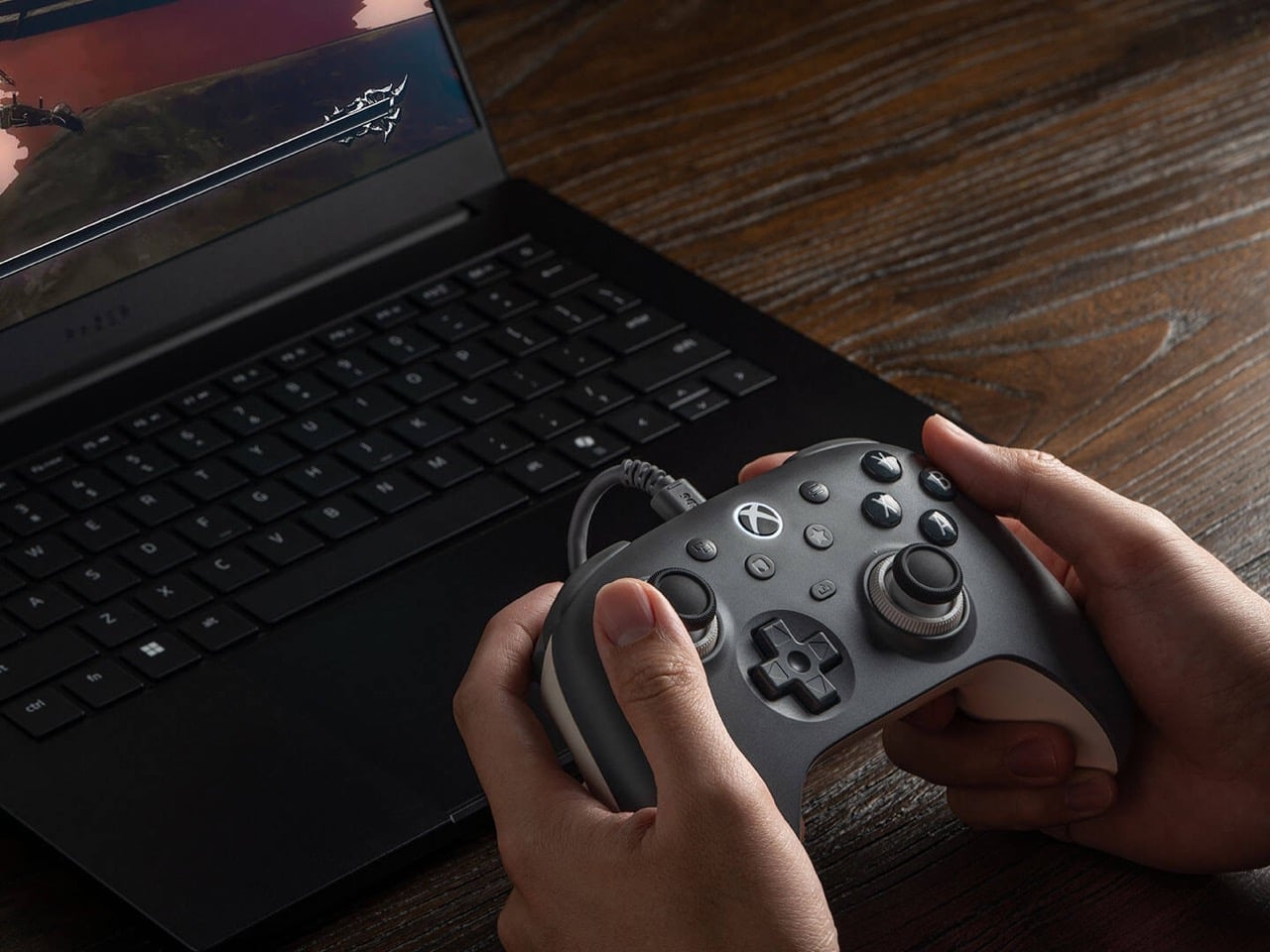
Wired earbuds staged a comeback a couple of years ago, helped by Gen Z deciding a dangling white cable looks cooler than an AirPods case. Wired gaming controllers could use some of that goodwill. 8BitDo’s new Ultimate 3C+ Wired Controller for Xbox skips the battery entirely and plugs straight into your console over USB-C. It costs $39.99, carries an official Xbox license, and brings tunable TMR sticks to the lowest-priced model in the Ultimate 3 family. You trade a little freedom of movement for a controller that never needs charging, pairing, or a panicked hunt for a dongle.
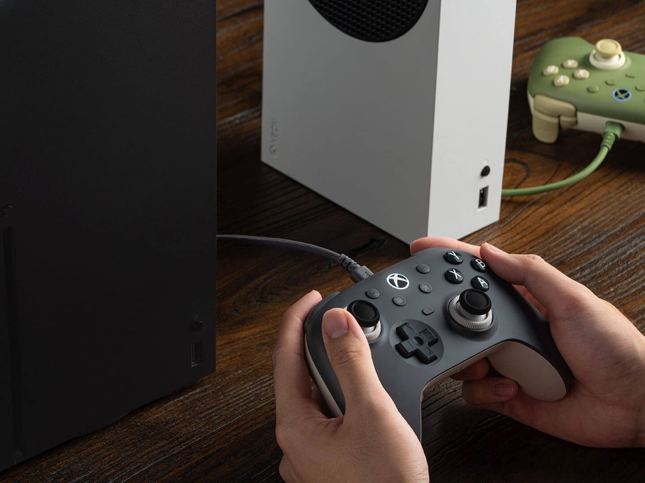
There’s no battery to degrade over years of late-night Call of Duty sessions, and a 3.5mm jack sends game audio straight to your headset. The controller works with Xbox Series X|S, Xbox One, and Windows 10 or later. It arrives a few weeks after the wireless Ultimate 3C+, which launched in October for PC and Android at the same price. The Xbox version is built for console players who would rather never think about charge levels again. The included cable stretches 8.2 feet (2.5m), so measure your couch distance accordingly.
Designer: 8BitDo
TMR sticks you can tune for shooters or racing
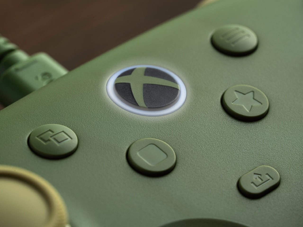
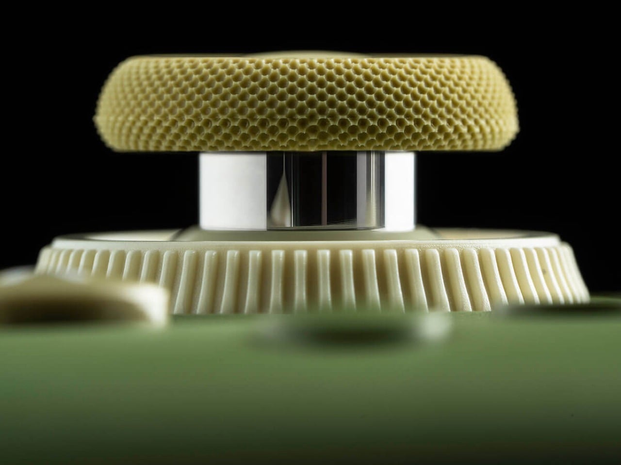
8BitDo’s Dual Force Ring sticks combine adjustable tension with a soft-stop silicone ring under each stick to cushion the moment it hits the edge of its travel. Increase the tension if you prefer firmer resistance when aiming in shooters, or loosen it for the long, sweeping inputs of racing games. A 12-bit ADC sampling chip and a 216MHz processor read the stick position, which 8BitDo says improves precision and response. The sensors are TMR, short for tunneling magnetoresistance, and track stick position magnetically, without sliding electrical contacts. Potentiometer sticks rely on contacts that physically wear, which can cause stick drift.
Earlier this year, 8BitDo’s fanciest stick tech lived in controllers costing $99 and up. The Ultimate 3 series kicked off at CES 2026 with the $149.99 Ultimate 3E, and the $99 Ultimate 3 for Xbox brought force rings along in May. Now that adjustable tension sits inside a $39.99 controller with a cable hanging off it. Compare that with Microsoft’s Xbox Nano Controller, a $49.99 pocket pad that still ships with conventional potentiometer sticks. If your last Xbox controller died of drift, that difference in sensor tech may be the most persuasive line on this spec sheet.
Switchable triggers, extra bumpers, and lockable back buttons
A switch flips the triggers between linear Hall Effect mode and short micro-switch mode. Linear gives you the full analog pull for feathering a throttle, while micro-switch turns each trigger into something closer to a mouse click. Impulse Trigger rumble lives inside the triggers, with more vibration tucked into the grips. 8BitDo says a dedicated rapid-stop chip cuts vibration off quickly, so a gunshot’s rumble doesn’t linger. The idea is that when an explosion fades on screen, your palms stop buzzing too.
Two extra bumpers, labeled R4 and L4, join the standard shoulder buttons and can be remapped without software. Two back buttons sit under the grips, and a lock disables them when you would rather not trigger a reload by accident. 8BitDo describes the D-pad as clicky but smooth, says it has refined the ABXY buttons, and lists wear-resistant stick rings. It also widened the grip angle compared with the older Ultimate C Wired, stretching the body to 5.96 inches (151.5mm) long. It weighs 7.9 ounces (224g), just 8 grams more than its predecessor, with the revised grip intended to offer a more relaxed hold.
Ten dollars less than the Xbox Nano
Compared with the wireless 3C+, the Xbox model drops the turbo function and its sibling’s polling rate of up to 1,000Hz. It also skips the cardboard DIY stand that ships in the wireless box, a minor tragedy for anyone who enjoys a little arts and crafts with their unboxing. In return, you get the headphone jack, full Xbox console support, and an official license. Competitive players chasing every millisecond may miss the higher polling rate. For couch play, cable reach is likely to be the more immediate concern.
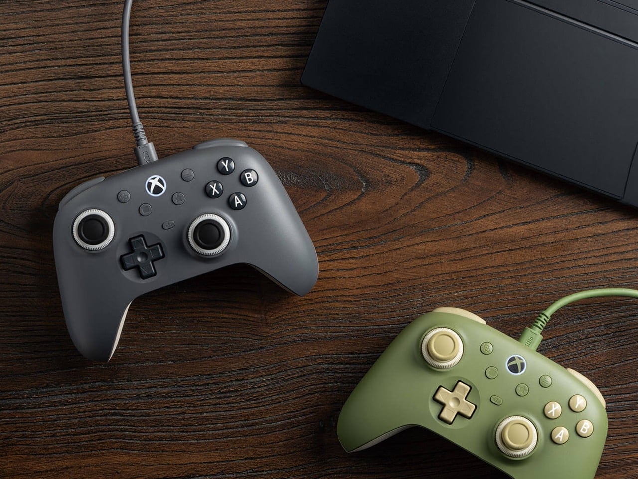
At $39.99, the 3C+ Wired undercuts the $49.99 Xbox Nano by ten dollars and Microsoft’s standard $64.99 controller by twenty-five. It also costs just $5 more than the older Ultimate C Wired for Xbox, which paired Hall Effect sticks with an RGB light ring. 8BitDo swapped that light show for tunable TMR sticks, which seems a useful trade for anyone more interested in stick feel than desk glow. Pre-orders are live on the 8BitDo eShop and Amazon in the US, with Matcha Green and Charcoal Gray units shipping November 16.
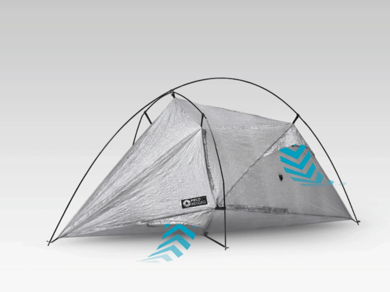
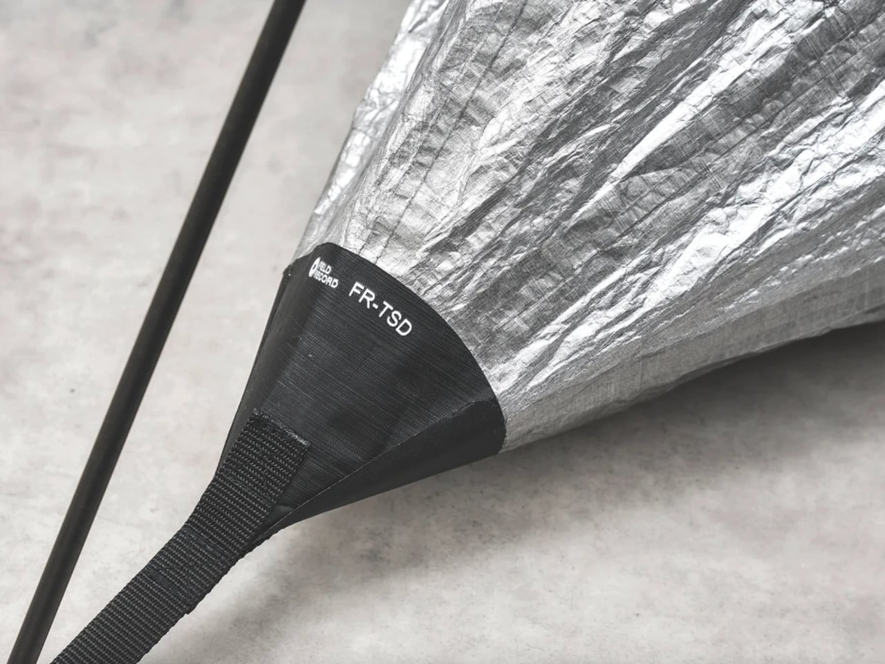
Carrying less shouldn’t have to mean giving up a tent that supports itself. That’s the appeal of Field Record’s FR-SCD, a one-person shelter with a listed body-and-pole weight of just 490 grams, or about 1.1 pounds. It addresses a recognizable backpacking dilemma: how to trim the load without switching to a shelter that depends on trekking poles for its structure.
That number deserves a little unpacking before anyone starts rearranging their gear closet. The 490 grams covers the tent and its Easton carbon fiber poles, not the complete packed kit. Carry bags, stakes, and guy lines aren’t included in that figure. It’s still remarkably light, but I’d rather know what’s on the scale than fall in love with a number that leaves the accessories off it.
Designer: Field Record
Field Record comes from designer Kouichi Okamoto of Kyouei Design, and the brand says it handles design, cutting, sewing, and seam processing in-house. The FR-SCD also isn’t a fresh launch disguised by a recent round of attention. It appeared in the brand’s 2023 lineup, with a special 470-gram version developed alongside trail runner Shogo Mochizuki. The production model uses a different Dyneema fabric. That history gives the weight-saving ambition some useful context.
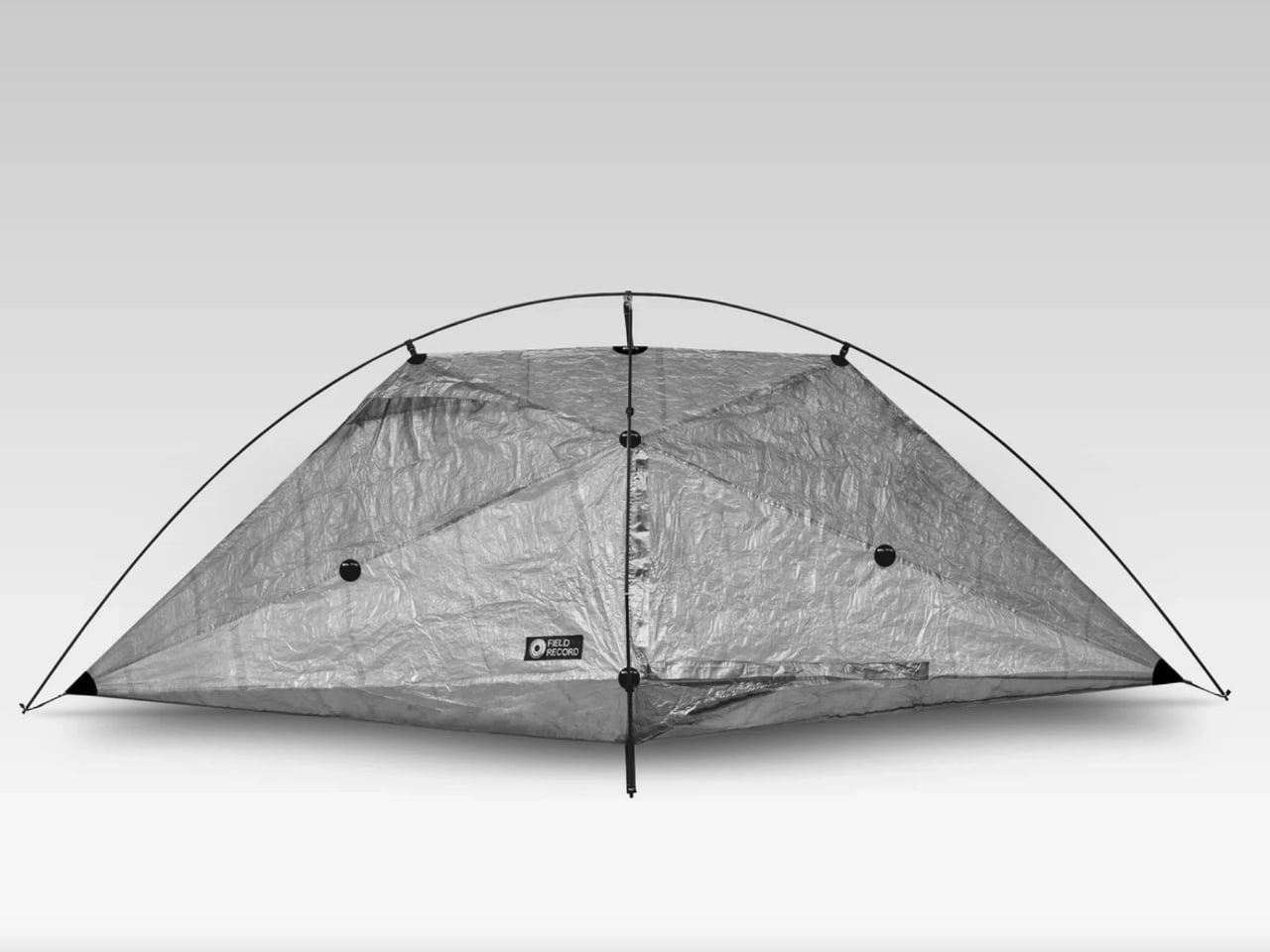
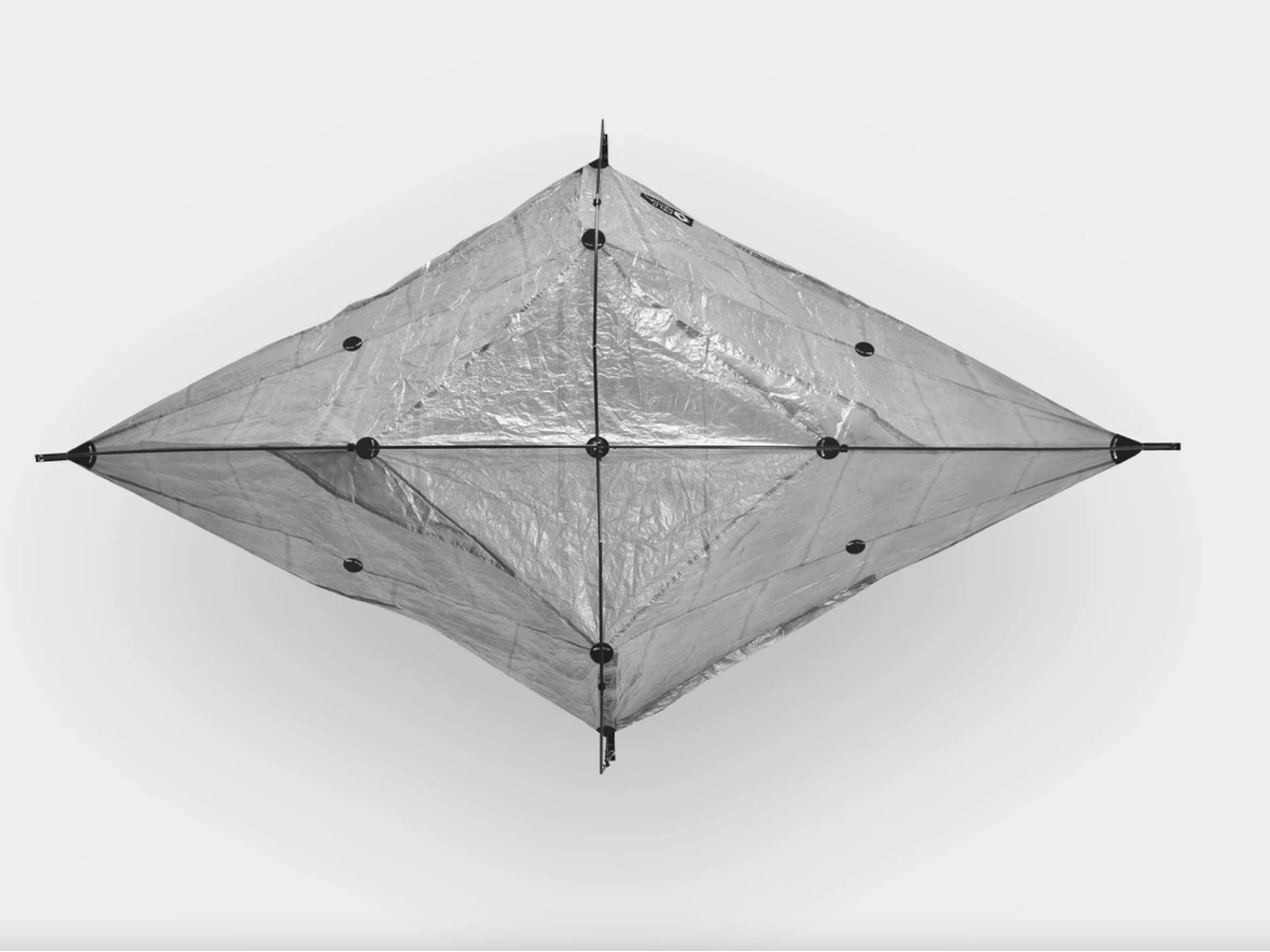
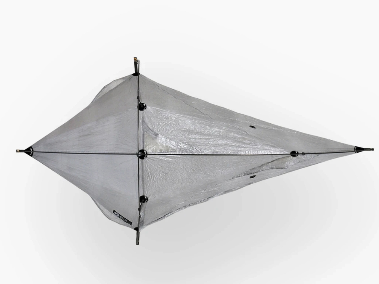
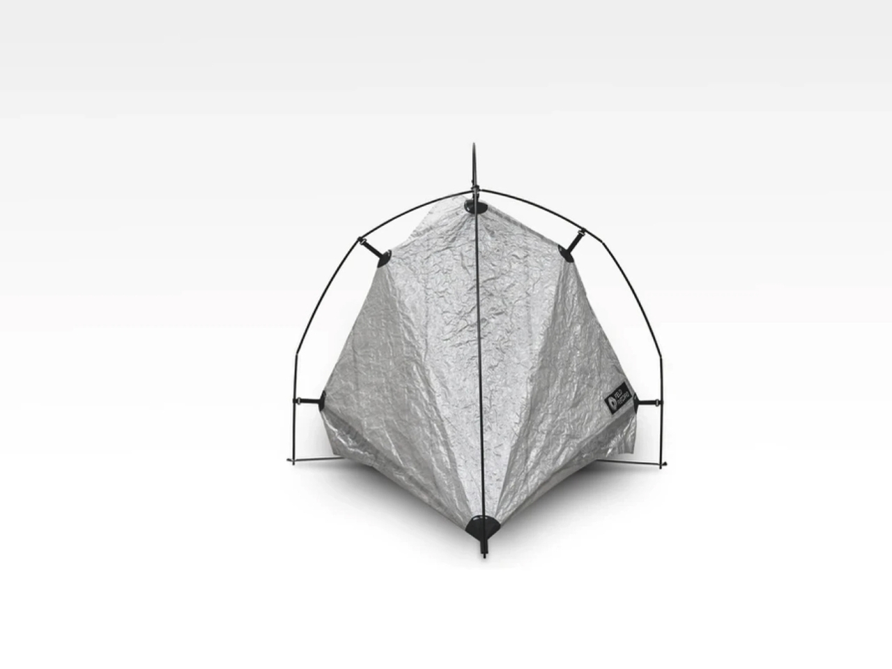
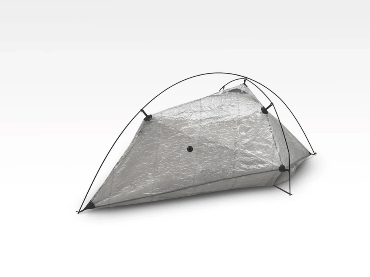
Visually, it’s an appealingly strange little object. The photographed shelter has a crinkled, translucent skin stretched beneath two crossing arcs, with pointed ends that make the overhead view resemble an elongated kite. I like how little effort it spends looking conventionally rugged. You can read the frame and the fabric as separate elements, and the shape feels more interesting for making that relationship so visible.
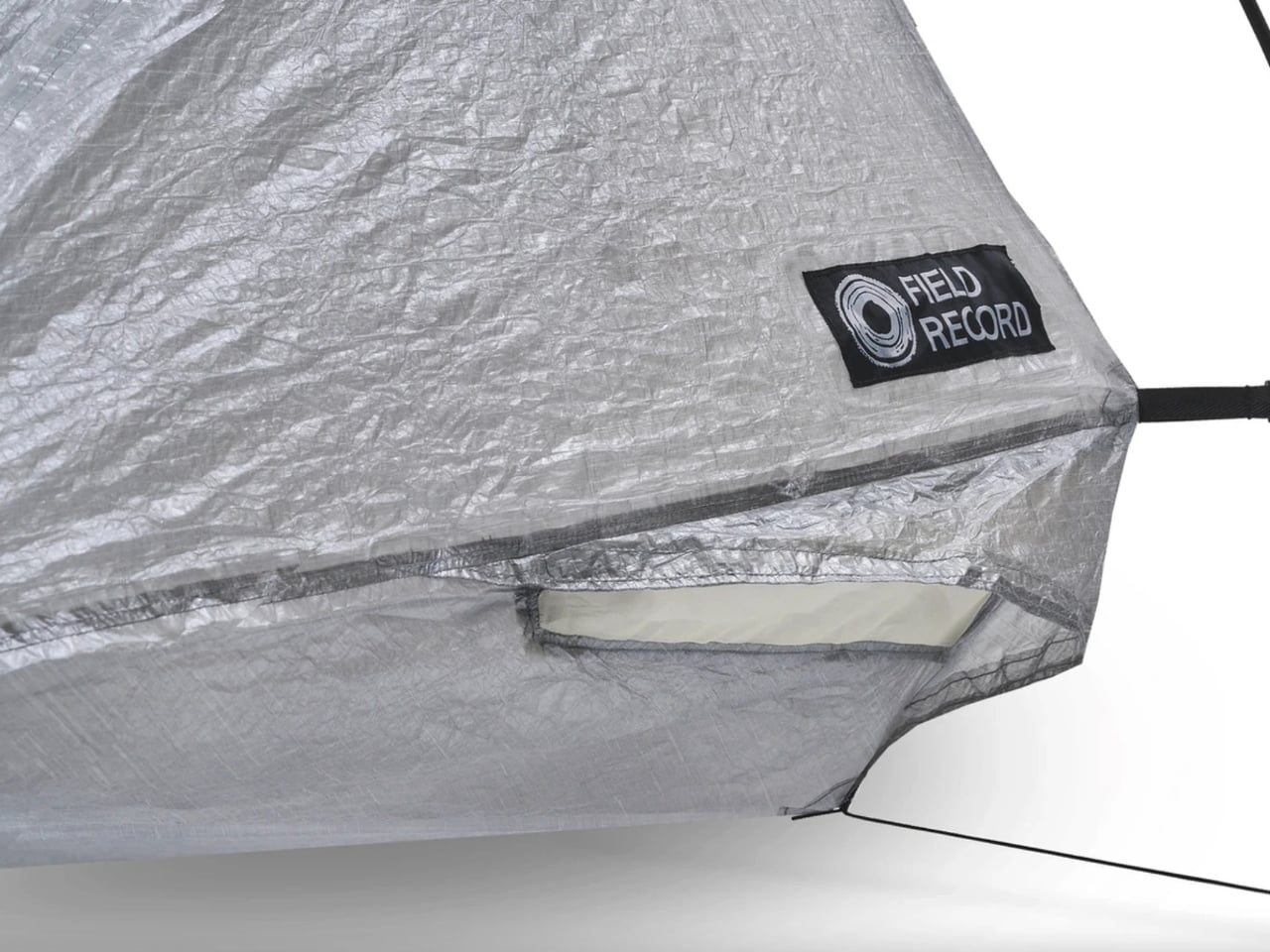
The construction is specific. Field Record pairs a Dyneema Composite Fabric body with Easton carbon poles, then applies bonded seam treatment after sewing. Twelve bonded reinforcement points support the construction. Those details matter because this isn’t merely a thin sheet draped over a frame. The maker has put reinforcement into selected locations while pursuing that low overall weight, a more interesting design exercise than indiscriminately removing material.
Ventilation is where the idea meets a less glamorous camping reality. Moisture inside a tent can be as unwelcome as rain outside it. Field Record says the FR-SCD’s form and four ventilation points encourage airflow to reduce condensation. That’s a design intention, not proof of consistently dry mornings. Ventilation is an established way to manage condensation, but I’d want field testing before treating these openings as a complete solution.
Space is another negotiation. The published dimensions are approximately 101.6 inches long, 42.5 inches wide, and 37.4 inches high. Those are overall measurements, not a rectangular sleeping area. Looking at the sharply tapered outline, I wouldn’t read the length and width as permission to sprawl. The low roof also makes this look like a place to sleep rather than a comfortable room for waiting out an entire afternoon.
Freestanding shouldn’t be mistaken for unanchored, either. A frame that holds the shelter’s shape is useful, but wind still makes staking and guying important. Sierra Designs’ tent guidance makes that distinction explicitly, even for freestanding models. I appreciate the convenience this architecture offers, provided the weight conversation doesn’t encourage anyone to leave necessary anchoring gear behind. Saving ounces shouldn’t depend on ignoring the campsite.
Then comes the price: ¥149,600, approximately $950 in New Atlas’s report. Field Record currently lists a roughly three-month lead time and offers international shipping, with customs charges left to the buyer. That puts it firmly in specialist territory. For me, the cost makes more sense as payment for a particular construction and manufacturing approach than as an obvious upgrade for anyone who occasionally spends a weekend outdoors.
I’m drawn to the FR-SCD because its priorities are easy to understand, even if they wouldn’t match everyone’s packing list. I’d want more evidence about livability before choosing it for a trip. As a design, though, it makes a persuasive case for keeping the convenience of a frame while being unusually disciplined about everything that frame has to carry.
Japanese gaming giant SEGA has disclosed that a data breach at its third-party newsletter provider, ARARA, exposed the email addresses of 2.2 million newsletter subscribers. [...]
The bent upper section of Oslo’s MUNCH Museum makes an unmistakable mark on the waterfront. Yet the more interesting architectural move happens inside: the building separates spaces that protect art from spaces that open visitors’ attention to the city. Its tower turns the journey between galleries into a changing view of Oslo, rather than treating circulation as leftover space.
Opened on October 22, 2021, in the Bjørvika waterfront district, the museum was designed by estudio Herreros, led on the project by Juan Herreros and Jens Richter, with LPO Arkitekter as local architects. The completed building accommodates 11 exhibition halls within a 13-floor institution dedicated to Edvard Munch’s work and wider cultural programming.
The layout divides the building into what the architects call static and dynamic zones. The static zone is an enclosed concrete structure containing galleries, where security, humidity, and daylight require careful control. Alongside it, the more transparent dynamic zone carries visitors between exhibition areas while maintaining views across the surrounding city. The distinction gives art and movement different architectural conditions.
For estudio Herreros, this ascending public route is the project’s central idea. The architects describe circulation as a viewpoint connecting the lobby with the upper terraces and observation spaces. Read this way, the tower offers a sequence of encounters with the collection and its urban setting, with neither confined to a single panoramic moment at the top.
That separation also has a practical environmental role. According to the museum, airlocks between the two zones help control temperature and humidity, allowing natural ventilation in the circulation areas without imposing those same conditions on the galleries. The architecture acknowledges that paintings and people do not always need precisely the same indoor environment.
The exterior’s undulating, perforated aluminum panels give the tower its textured surface. Cladding manufacturer Lindner supplied 4,018 panels, describing their role as solar screening that preserves a sense of transparency. The rippled profile adds depth to what could otherwise have been a flat metal wrapper, giving the large facade a finer scale of detail.
There is an unexpectedly logistical detail within that skin: Lindner says 100 panels can be opened to allow artworks to be lifted into the building. The facade must accommodate the collection’s movement as well as its protection, a useful reminder that museum architecture includes demanding backstage operations.
The lobby, conceived by the architects as a covered public space, extends this thinking beyond exhibition rooms. MUNCH’s strongest proposition is that a museum visit can include gathering, looking outward, and moving through the building with purpose. The kink attracts attention; the route gives that attention somewhere to go.
N-able has taken its hosted N-central environments offline and urged on-premises customers to shut down their servers after a security researcher publicly disclosed more than 30 alleged zero-day vulnerabilities, including exploits that could let attackers take over vulnerable systems. [...]
York University has announced it suffered a cybersecurity incident in which a threat actor stole personal information people submitted through online forms. [...]
Microsoft is testing a Windows 11 update that lets users enter their PIN without waiting for Windows Hello biometrics. Here's how it works and who can try it.
And yet the Razer keyboard I keep coming back to isn't a Huntsman.
It's the Reclusa.
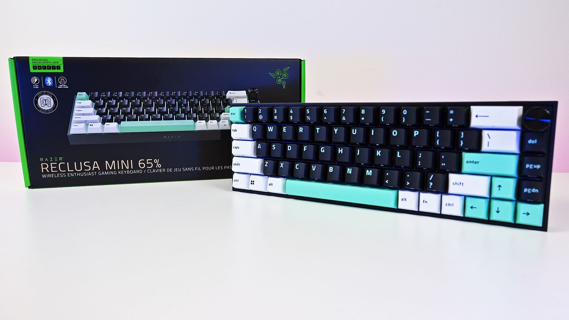
Razer first introduced this new enthusiast-focused family with the Reclusa X Mini 65%, a remarkably good little $49.99 keyboard with hot-swappable mechanical switches, dual-layer dampening, south-facing LEDs, and that distinctive black, white, and mint-green tri-tone design. I loved typing on it, and its price-to-quality ratio made it ridiculously easy to recommend.
Now we have its considerably more ambitious sibling.
At $129.99 (Best Buy or Razer.com), the Razer Reclusa Mini 65% costs $80 more, but Razer has stuffed most of its premium gaming technology inside while preserving what attracted me to the cheaper keyboard in the first place.
I've used it as my primary keyboard for two weeks. And despite having plenty of alternatives sitting nearby, I don't particularly want to switch back.
Razer had no input, nor did it see the contents of this review, prior to publication.
Same Reclusa formula, considerably more hardware
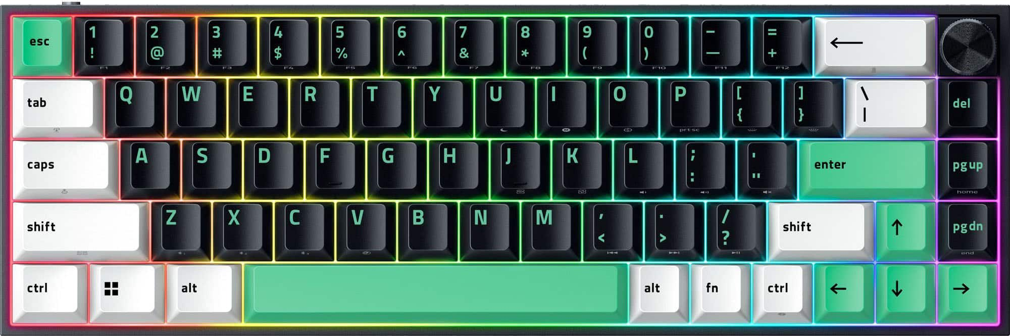
The compact 65% layout preserves dedicated arrow keys while eliminating the function row and numpad, leaving considerably more room on your desk. (Image credit: Daniel Rubino)
The overall aesthetic of the Raze Resclusa Mini 65% remains fantastic.
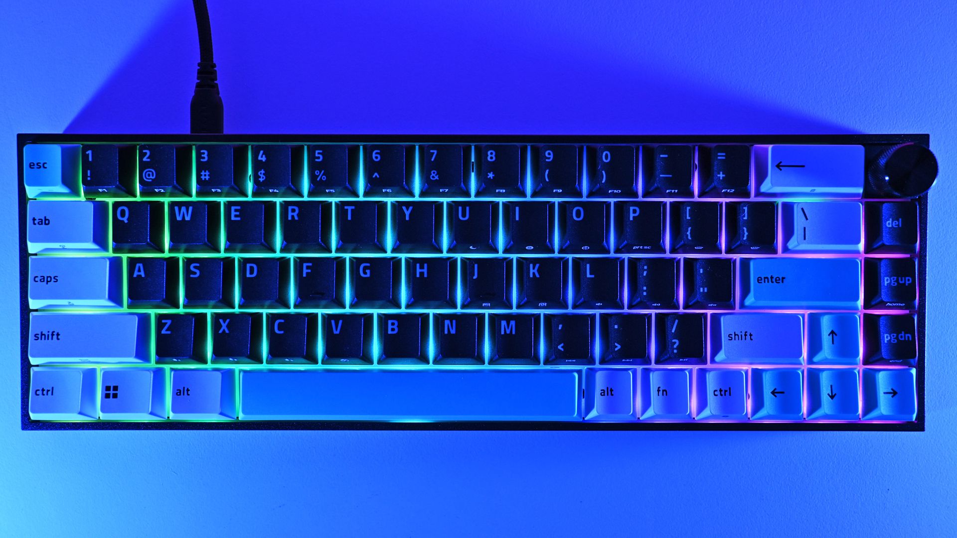
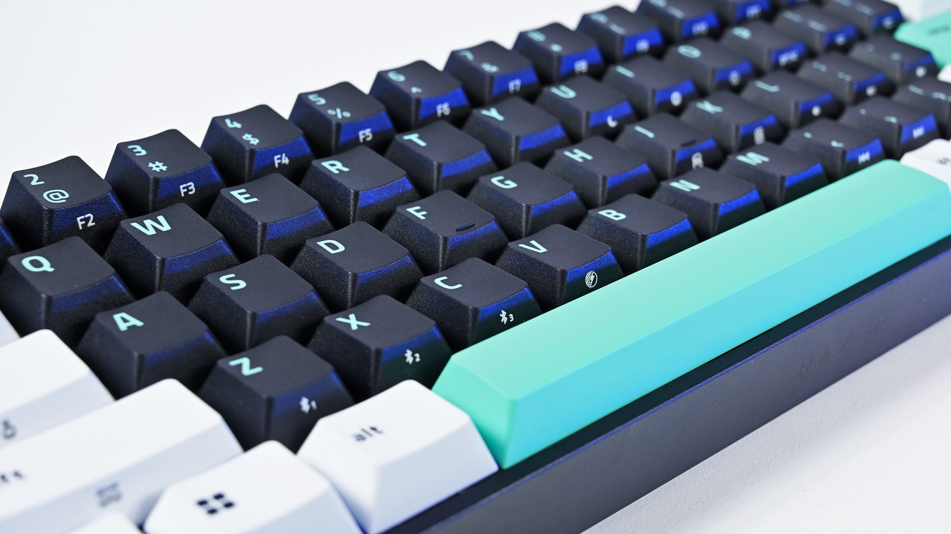
You still get the compact 65% layout, tri-tone keycaps, and bright mint accents that prevent this from becoming another anonymous black gaming rectangle. The lighting comes from south-facing per-key RGB LEDs rather than shine-through legends.
After two weeks as my primary keyboard, I don't want to take the Reclusa Mini 65% off my desk.
I do miss having the legends themselves illuminated, especially in a dark room, but I understand the decision. The Reclusa is supposed to feel like Razer's enthusiast keyboard family, rather than another variation of Huntsman.
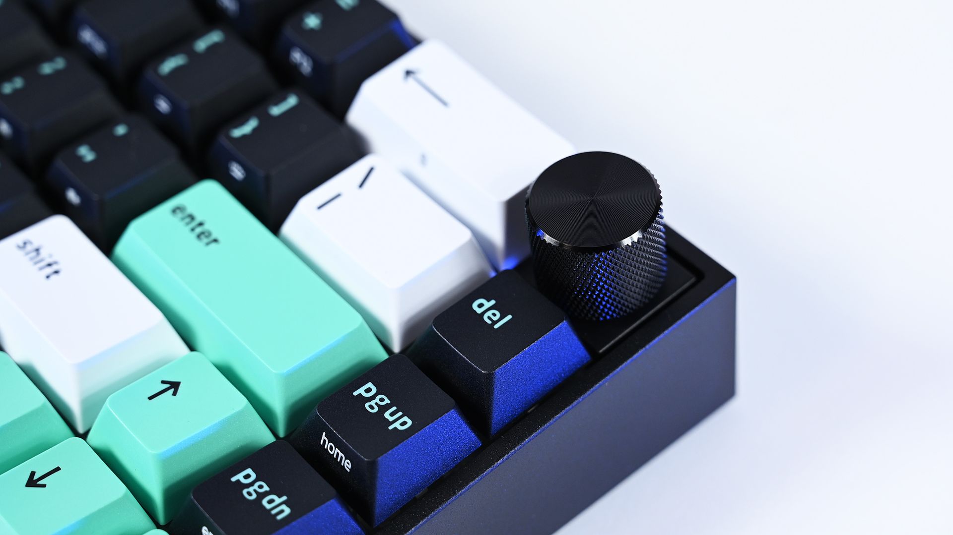
Where the premium model immediately wins me over is the multifunction dial in the upper-right corner. After missing dedicated media controls on the Reclusa X, having a conveniently positioned dial back for volume and other controls makes a surprisingly big difference to my everyday use.
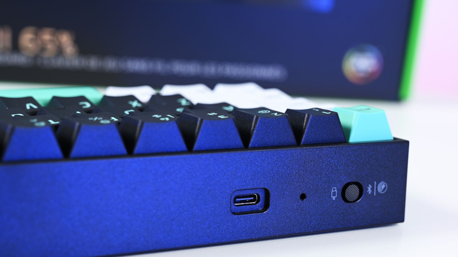
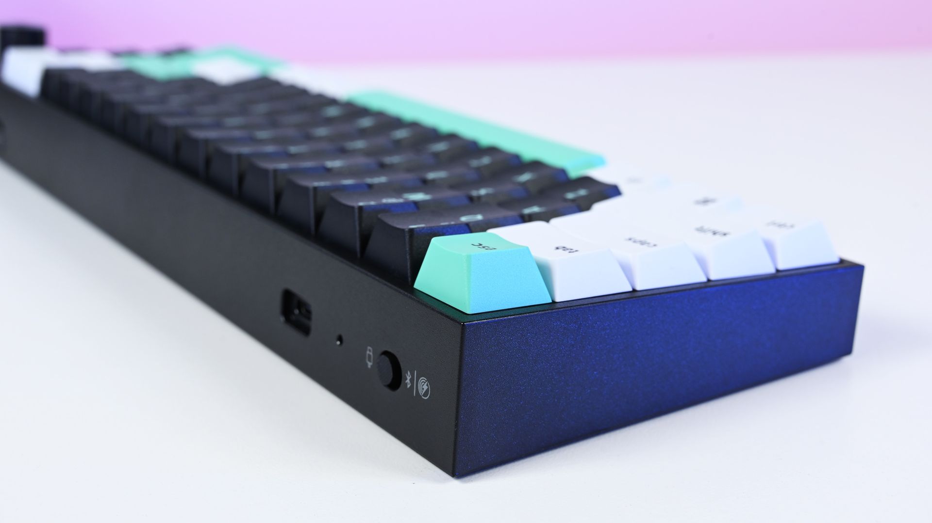
The Reclusa Mini 65% supports wired USB-C, Bluetooth, and 2.4GHz Razer HyperSpeed Wireless, with up to 8,000Hz polling available when wired. (Image credit: Daniel Rubino)
There's also more going on underneath those keycaps.
Razer uses a PPS plate, lubricated stabilizers, IXPE switch foam, and dual-layer silicone dampening. According to my product briefing, the IXPE layer was specifically added over the Reclusa X's acoustic system to further reduce unwanted resonance.
I can totally hear (and feel) it.
The Reclusa Mini sounds more controlled and dampened than the X. It's audible without producing the higher-pitched clacking that can become irritating in an office. The best way I can describe it is a satisfying"plunk."
Few gaming keyboards I've used strike this balance between excellent everyday typing, enthusiast customization, and genuinely advanced competitive features.
More importantly, this is probably the best typing experience I've had on any Razer keyboard.
That's quite a claim, considering how many Razer keyboards I've tested this year. I mean, they've all been great, but my hands feel happy with this one.
Reclusa goes magnetic
The Reclusa Mini 65% keeps the excellent tri-tone aesthetic of the cheaper Reclusa X, mixing black, white, and mint-green doubleshot ABS keycaps. (Image credit: Daniel Rubino)
The biggest change is replacing the X's conventional mechanical switches with Razer's linear Hall Effect Magnetic switches (read our primer on HE switches for controllers to get an idea of why they're great).
Actuation can be adjusted anywhere from 0.1mm to 4.0mm, compared with the fixed 2mm actuation of the Reclusa X, and the magnetic switches are hot-swappable for compatible third-party alternatives.
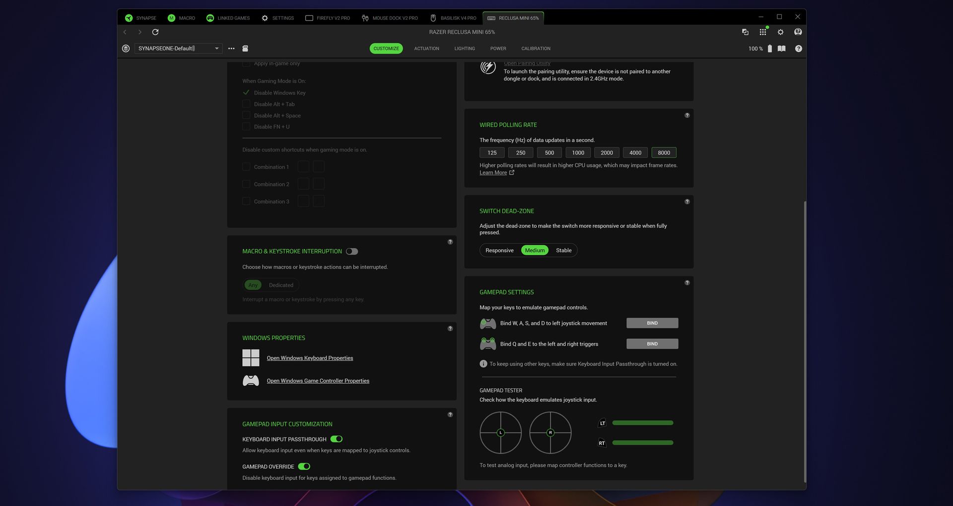
Razer Synapse exposes even more enthusiast-level controls, including up to 8,000Hz wired polling, switch dead-zone adjustment, and gamepad input customization. (Image credit: Daniel Rubino)
That opens the door to Razer's current collection of advanced input features, including Rapid Trigger, Snap Tap, Snap Flex, Dynamic Keystroke, and Dual-Keypress Priority (I explain those a bit more in my recent Huntsman review). Razer Synapse, its love/hated software, also provides individual switch calibration, something particularly useful if you begin swapping magnetic switches.
There's an enormous amount to play with, or you can just use some of the presets and not worry about it.
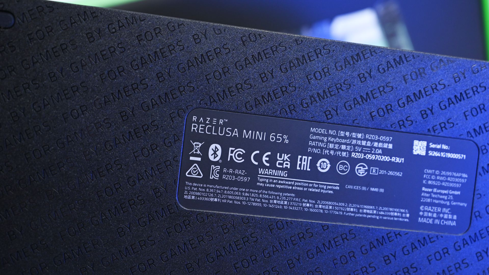
Even the underside receives some attention with Razer's repeating "FOR GAMERS. BY GAMERS." pattern, although there are no adjustable rear feet. (Image credit: Daniel Rubino)
I won't pretend every person buying this board needs to spend hours configuring individual actuation points, either. I'm perfectly happy using the Reclusa as a fantastic typing keyboard most of the day and taking advantage of its speed while gaming.
But if you're the kind of player who does obsess over these settings, Razer gives you the tools.
Polling jumps from 1,000Hz on the Reclusa X to 8,000Hz when wired, while wireless operates at up to 1,000Hz. The Reclusa Mini also supports 2.4GHz HyperSpeed, Bluetooth, wired USB-C, multi-device HyperSpeed pairing, and switching between three Bluetooth devices.
That's the real argument for paying $129.99.
An awkward $80 question
This little multifunction dial is a surprisingly important upgrade for me, restoring convenient volume control that I sorely missed on the cheaper Reclusa X. (Image credit: Daniel Rubino)
Ironically, the Reclusa Mini 65%'s biggest competitor might be Razer's own $49.99 Reclusa X Mini 65%.
I gave that keyboard 4.5 stars in my review because it nailed the fundamentals for an almost comically low price.
The premium Reclusa is better. It feels more substantial, sounds better, adds wireless connectivity, returns my beloved dial, dramatically expands switch configuration and brings Razer's current Hall Effect gaming technology along for the ride.
At $129.99, it's also competitively positioned within the enthusiast Hall Effect market. For context, Razer's own Huntsman V3 HE Magnetic TKL launched at $139.99, while the Mini 65% was $119.99. Wooting's plastic 60HE v2 launched at $179.99, with its aluminum version reaching $239.99.
A physical selector quickly switches between wired USB-C, Bluetooth, and Razer HyperSpeed Wireless connectivity, one of the biggest upgrades over the $49.99 Reclusa X. (Image credit: Daniel Rubino)
If you're plugging a keyboard into one PC, don't care about Rapid Trigger or adjustable actuation, and just want something excellent to type and game on, save the $80. The X remains absurdly good.
The Razer Reclusa Mini 65% delivers the best typing experience I've had on any Razer keyboard.
It's also worth mentioning the lack of adjustable rear feet. Curiously, this didn't bother me despite normally raising the back of my keyboards. The default angle works well enough that I stopped thinking about it.
And naturally, 65% remains 65%. I love the extra mouse space and compact footprint. If you depend on a function row or numpad, nothing about this keyboard will change your mind.
Should you buy the Razer Reclusa Mini 65%?
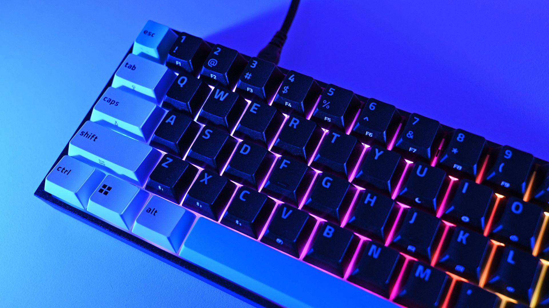
South-facing per-key Razer Chroma RGB creates an underglow around the keycaps, although I do miss having illuminated legends when using the keyboard at night. (Image credit: Daniel Rubino)
You should buy this if...
✅You loved the idea of the Reclusa X but wanted Razer's premium gaming technology.
✅You want adjustable Hall Effect switches, Rapid Trigger, 8KHz wired polling, and serious customization.
✅You need both excellent wireless connectivity and wired performance.
✅Typing feel and keyboard acoustics matter as much to you as gaming performance.
✅You want a compact keyboard without sacrificing a multifunction dial.
You shouldn't buy this if...
❌You don't need wireless or Hall Effect gaming features. Buy the $49.99 Reclusa X and pocket the $80.
❌You need a full-size or TKL layout.
❌Adjustable rear feet are important to your typing position.
Bottom line
I'm almost annoyed by how much I like this keyboard.
I've got Huntsmans. Lots of Huntsmans. Some of them have more premium materials, some have different switches, and one I've reviewed costs nearly four times as much.
But for the last two weeks, the Reclusa Mini 65% has been the keyboard sitting in front of me, and I'm in no rush to replace it.
Razer's $49.99 Reclusa X remains the rational recommendation for most people. It nails the core fundamentals and punches ludicrously far above its price. The $129.99 Reclusa Mini takes that unusually good foundation and adds the stuff enthusiasts and competitive gamers are more likely to appreciate: magnetic switches, adjustable actuation, 8KHz polling, sophisticated input controls, wireless connectivity, better acoustics, and that incredibly handy dial.
Do I need any of it?
Probably not.
But I'm keeping it on my desk anyway.
Razer
Razer Reclusa Mini 65% Wireless Gaming Keyboard
The Razer Reclusa Mini 65% takes the excellent foundation of the $49.99 Reclusa X and piles on nearly every enthusiast feature I could ask for: adjustable Hall Effect switches, Rapid Trigger, 8,000Hz wired polling, Bluetooth and HyperSpeed wireless, hot-swappable magnetic switches, better dampening, and my beloved media dial.
Join us on Reddit at r/WindowsCentral to share your insights and discuss our latest news, reviews, and more.
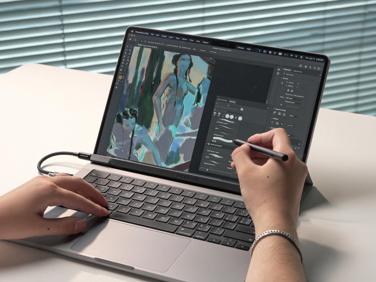
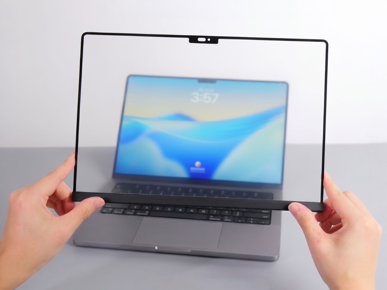
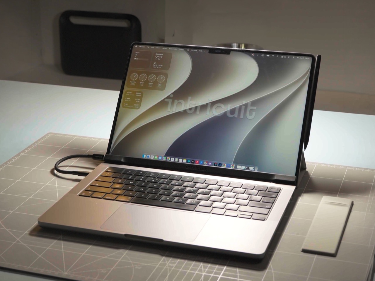
Hidden around a modern MacBook display are magnets used to tell the laptop you shut the lid. Intricuit, a small hardware startup, looked at those magnets and saw a free mounting system. Its Magic Screen uses them to snap a touch-sensitive glass panel over your display, adding tap, swipe, and pinch controls to the MacBook you already own. It costs $179 on Kickstarter. Apple’s approach is the new MacBook Pro with PROLED XDR Display, which starts at $2,899, or roughly sixteen Magic Screens with change left over for snacks. That’s a whole laptop rather than an accessory, but it’s a steep entry price if touch is all you’re after.
Apple integrates the touch sensor into a tandem OLED panel and uses a stiffer hinge designed to limit screen bounce when you tap it. It also supports zero styluses, Apple Pencil included, which is a little funny coming from the company that sells the Apple Pencil. The Magic Screen ships with a pen that reads 4,096 pressure levels, previews its tip position as it hovers, and supports palm rejection while you draw. Intricuit lists compatibility with M1 and newer MacBook Pros, M2 and newer Airs, and even the $599 MacBook Neo, bringing that last combination to $778.
Designer: Intricuit
Snap, Plug, Tap: How the Glass Registers Your Fingers
The panel is tempered glass with a capacitive digitizer built in, the same kind of touch technology your phone uses, tracking up to ten fingers at once. Intricuit lists transparency at 99% or better and a response time of 8ms. A single USB-C cable carries the touch data and draws a claimed 0.6 watts from your MacBook, so there’s no extra battery to babysit. The 14-inch MacBook Pro version weighs 4.3 ounces (122.8 grams), and the 16-inch version comes in at 6.1 ounces (172.6 grams). Basic touch works without the app; Intricuit’s software for macOS Sonoma or later adds further controls.
Tom’s Guide spent three weeks with a Magic Screen and came away convinced macOS is far more touch-ready than Apple ever let on. Taps open apps, a press-and-hold summons the right-click menu, and familiar trackpad gestures carry over to the glass. Intricuit demos it triggering clips in Resolume Arena, orbiting models in SketchUp, and shoving sticky notes around Miro boards, all situations where reaching for something directly has an obvious appeal. It also works with iPhone Mirroring, letting you tap through your phone’s apps on the larger display. Fingerprints land on the overlay rather than directly on your MacBook’s screen.
The Stylus Apple Skipped Comes in the Box
The included pen uses USI 2.0, the Universal Stylus Initiative standard supported by compatible Chromebooks, and reads 4,096 levels of pressure. That gives you control over line weight, from a light hairline to a fat brushstroke, while palm rejection is designed to let you rest your hand on the glass as you draw. Hover detection starts about 0.4 inches (10mm) away, previewing the tip’s position before it touches down. Intricuit rates the battery at 100 hours, with a 40-minute USB-C recharge and no Bluetooth pairing required. Your Apple Pencil isn’t compatible, though it won’t work on Apple’s new MacBook Pro either.
Pop the Magic Screen off and it becomes a flat pen tablet, a familiar setup for anyone who has used a Wacom. Drawing on an upright laptop screen means working against gravity and a hinge, while laying the panel on a desk lets you rest your arm. The folio case folds into a stand for this mode. When the panel goes back on your display, the case braces against the lid to reduce wobble under your fingers. Apple’s Sidecar offers another route to drawing on a Mac, but requires an iPad and an Apple Pencil alongside the laptop. Intricuit puts the touch panel and pen in one $179 box, provided you already own a compatible MacBook.
What $2,899 Gets You at the Apple Store
Apple’s price buys a complete laptop with a tandem OLED panel rated to peak at 2,000 nits and an integrated touch sensor. The hinge is stiffer, the 14-inch body weighs 3 pounds, and the glowing Apple logo is back on the lid for the nostalgics. That package costs $400 more than the equivalent standard MacBook Pro. The Magic Screen comes with its own compromises: a cable occupying a port and a panel you need to remove before closing the lid. Intricuit built a stopper into the bottom edge to keep the lid from closing onto it, a bit of idiot-proofing that could save an expensive mistake.
The Magic Screen is available for $179 after a successful crowdfunding run, a $60 discount off its planned $239 retail price. Pick your size carefully, since each of the five versions is fitted to a specific MacBook display, and the M1 MacBook Air sits this one out. Each box includes the panel, stylus, folio case, USB-C cable, and a polishing cloth for the inevitable fingerprints.
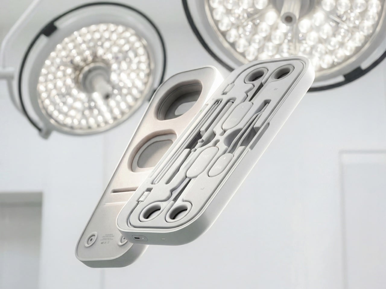
Before a pilot flies you to Cancún, they’ve logged hours in a simulator crashing planes that don’t exist. Surgical training has had a harder time getting there, and residents often get thin hands-on practice before working on living patients. Niklas Andreasen, a graduate of Sweden’s Umeå Institute of Design, set out to fix that with MX Surgical, a mixed reality training kit he developed with Logitech. It pairs replica surgical instruments with a headset, so trainees can rehearse procedures anywhere they can open a case. Call it a flight sim for scalpels, and a lot more portable than the six-figure simulator rigs some hospitals bolt to the floor.
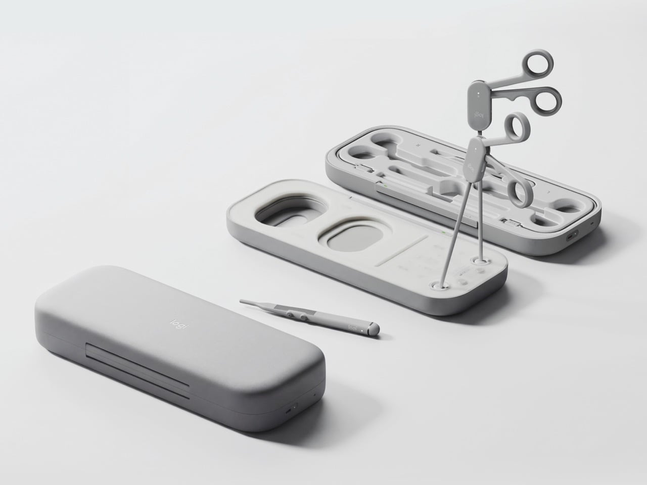
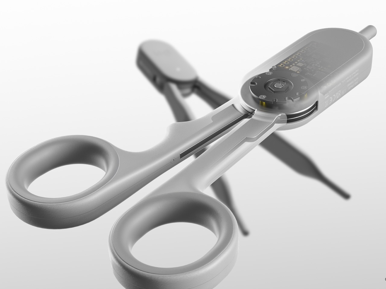
Andreasen grouped surgical tools into three mechanical families (ring-handled scissors and clamps, forceps, and pen-grip instruments), then designed one reconfigurable controller for each. Sensors and adjustable resistance mechanics inside recreate how each tool pushes back in your hand, and layered pads give you something to actually cut into. The headset handles the anatomy, while a companion platform scores you on precision, force, and timing like a very strict video game. It’s a concept for now, with no pricing or launch plans. Even so, it has already picked up Emerging Product Designer of the Year at the 2026 European Product Design Awards, three Core77 student wins, and a nomination for Red Dot’s Peter Zec Prize.
Designer: Niklas Andreasen (Umeå Institute of Design, in collaboration with Logitech)
Three Controllers, One Entire Instrument Tray
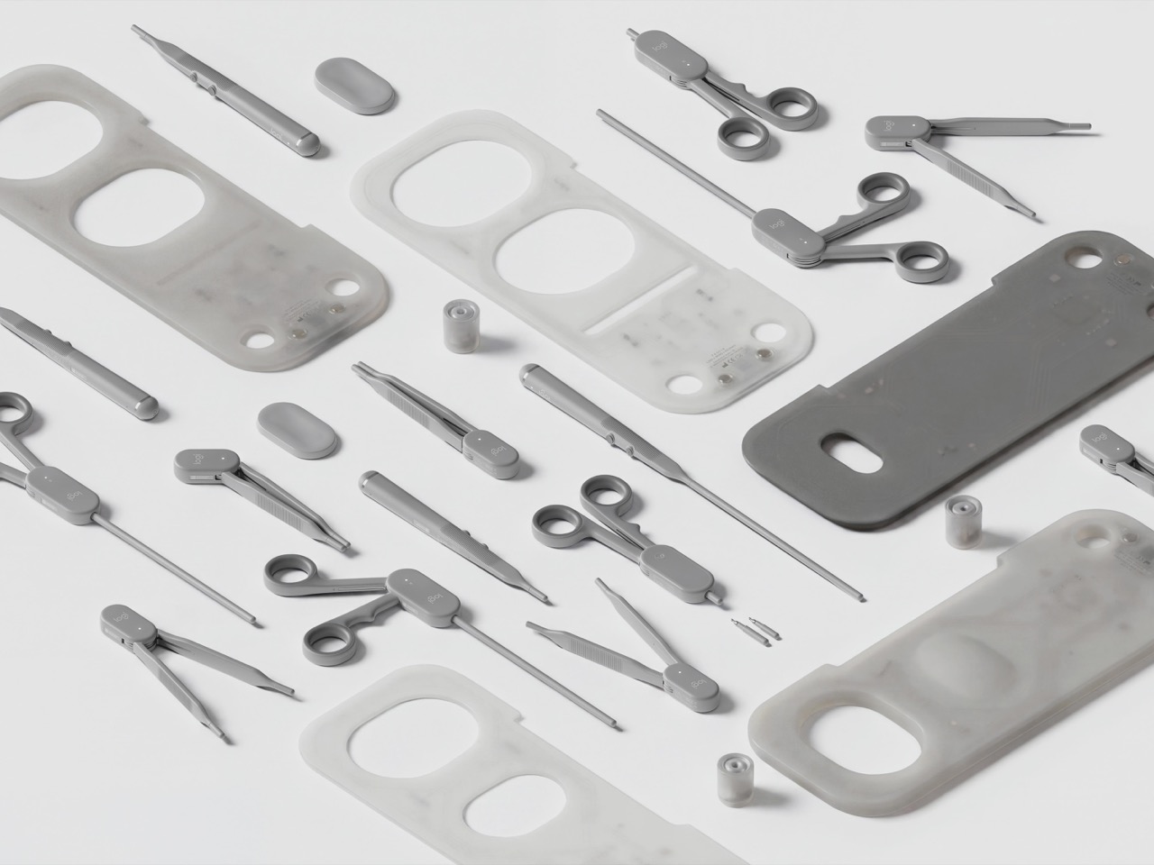
A real surgical tray can hold dozens of instruments, and building a replica of each one would turn the kit into a hardware store. Andreasen sidestepped that by mapping what instruments have in common mechanically. Scissors, needle holders, and clamps all pivot on a ring-handled scissor action. Forceps pinch, and scalpels and probes ride in a pen grip. Each MX Surgical controller covers one of those families, tuning its spring tension and range of motion in real time so the same body can feel like a fine dissecting scissor one minute and a stiff clamp the next.
Logitech has spent over four decades shaping mice, keyboards, and controllers around human hands, and the collaboration shows. The kit wears the MX family’s soft radii and matte warm grays, so anyone who owns Logitech’s MX Ink stylus for Meta Quest will feel right at home. Three mentors from Logitech, Nick Jinkinson, Andreas Connellan, and Aidan Kehoe, guided the project. The cutaway renders show a rotary mechanism tucked right at the pivot, where the resistance needs to happen, inside ring handles your fingers already know from the real tool. Compare that with FundamentalXR, a leading haptic surgical platform that has traditionally relied on desk-mounted haptic arms.
Layered Pads Handle the Feel, the Headset Handles the Gore
Haptics can only fake so much, so MX Surgical gives your hands something physical to work on. Layered training pads stand in for tissue at different depths, and they slot into a die-cut tray inside the case. As you work through a procedure, the mixed reality overlay progressively reveals deeper layers of anatomy and shifts to match what you’re doing. Hospitals and universities can stock a material library of swappable pads and components, tailoring the kit to a specialty or a specific case. Residents without a headset aren’t stuck either, because a simpler screen-based version handles the visual side.
This hybrid approach borrows from both ends of current surgical training. On one end are cheap suturing pads that residents practice stitches on at home, which feel real but teach nothing about context. On the other end are VR simulations that show you an entire operating room but feel like waving a remote around. MX Surgical splits the job, letting the pad handle touch and the headset handle everything you need to see. The whole thing packs into a slim carry case, which makes it something you can take home, practice with at 11pm, and toss in a bag for your next rotation.
A Scorecard for Skills Surgeons Used to Pick Up by Osmosis
Every practice session gets logged by the companion platform, which tracks motor patterns, motion efficiency, accuracy, force control, and response timing. Those numbers describe the stuff a senior surgeon notices from across the room, like a hand that hesitates or grips too hard. The platform adjusts difficulty as you improve, keeps a digital anatomy atlas on hand, and lets mentors review your sessions remotely. Residents can train alone or in teams, then sit down with an attending to go through the results together. Andreasen’s own framing is that this data captures knowledge residency has always passed down person to person without ever writing it down.
That puts MX Surgical in direct conversation with William Halsted, who founded the surgical residency program at Johns Hopkins in 1890 around a simple motto: see one, do one, teach one. A century later, a design student added a fourth step, practice one, and made it look like something that belongs next to your keyboard. Andreasen built it through interviews and observation sessions with surgeons and educators in Sweden and Germany, with mentors from Logitech, Intuitive Surgical, and IDEO. In a Red Dot interview, he said he looks for ideas that “earn and defend their place.” A kit that lets a resident make their first mistake on a pad instead of a person sounds like one of those ideas.
OnePlus 16 could launch in India after new reports suggest a change in plans. Here's what we know about its rumored price, specifications, and availability.
Nvidia backs Jensen Huang as its board investigates espionage reports. Here’s what IT buyers should watch on security, supplier risk, and AI chip access.
France has linked October cyberattacks that disrupted refrigeration systems at more than 700 supermarkets and other retail locations to Iranian state-backed hackers, saying the attacks caused food losses and sparked at least 15 fires. [...]
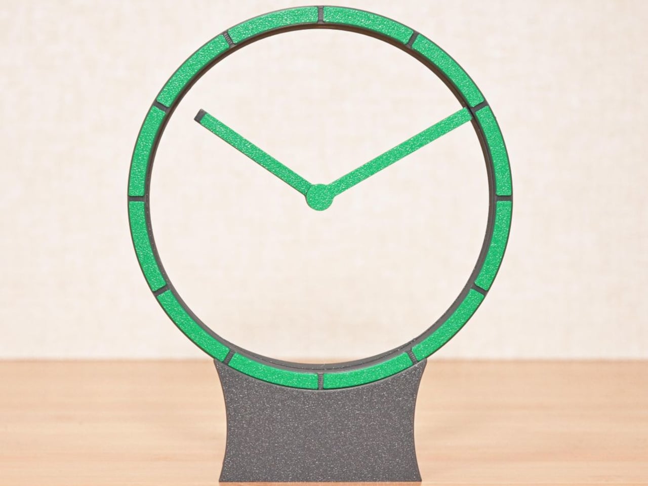
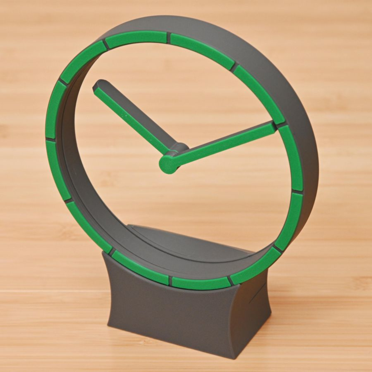
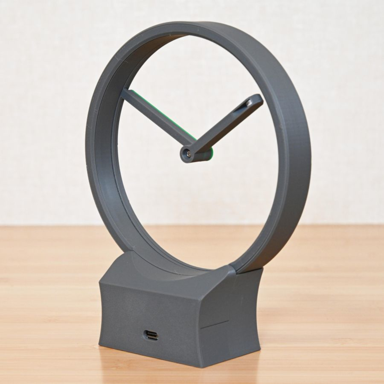
Most clocks give their hands somewhere obvious to stand, usually a solid face hiding the mechanism behind it. Hollow Clock V leaves that space empty, making its hands appear to hover inside a slender ring. This working DIY project uses 3D-printed parts, hidden gears, and magnets to pull off a trick that doesn’t require a transparent panel to work.
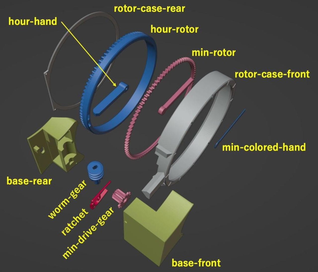
The minute hand provides the first clue, since its outer end connects to a rotating ring concealed within the frame. Its center supports the hour hand on a small pivot, so the pair isn’t actually levitating. The hour hand’s position is controlled magnetically by another rotating ring, allowing it to keep pointing at the right hour while the longer hand travels around.
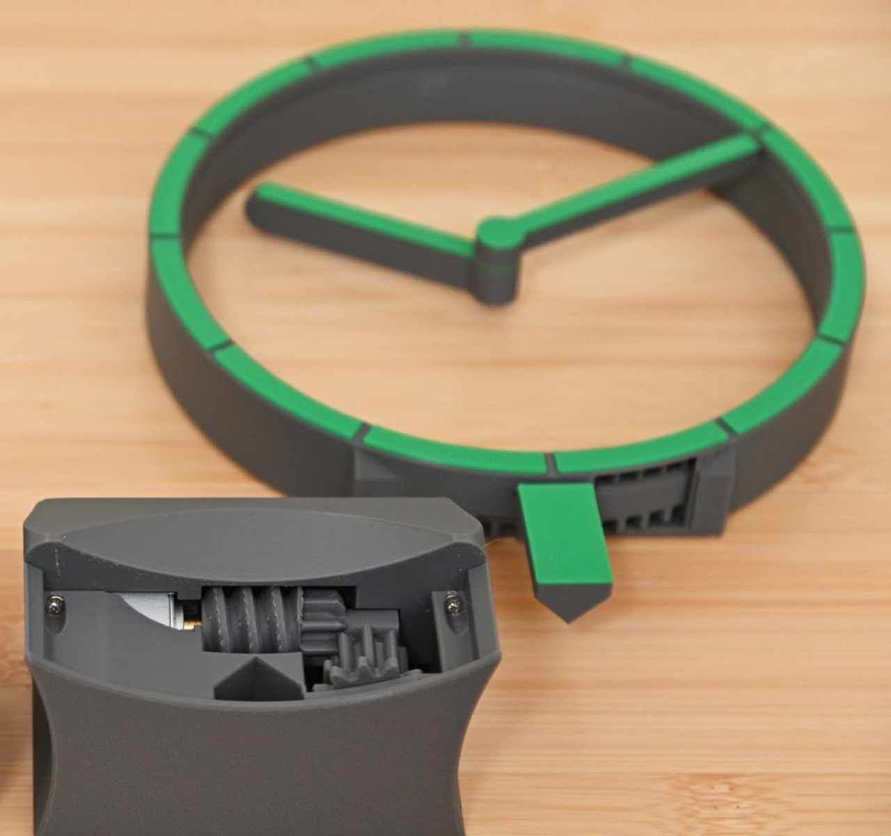
That second ring carries two neodymium magnets, which interact with a third tucked into the hour hand. Their T-shaped arrangement helps keep the hand aligned without adding a connection across the opening. Down in the base, a stepper motor and a combination of worm and bevel gears drive the minute ring 12 times faster than the hour ring, without a bulky central hub.
All that machinery makes the spare appearance deceptive. The ring has a border only about 0.28 inches wide, with hour markers replacing a conventional numbered dial. Screws are kept out of sight when the clock is assembled, apart from the central hand fastener. A rear USB-C connection sends the cable away from the front, leaving the open center to do the distracting.
The finish is also shaped by the way the parts are printed, rather than treated as an afterthought. Front surfaces sit against the printer’s build plate, picking up its texture instead of exposing filament paths across the face. Changing filament during printing gives the markers a contrasting color. It’s a small manufacturing decision that makes the homemade object look a little more deliberate.
Setting the time stays physical, too. You lift the display ring out of the base, freeing it from the drive gears, move the hands to the desired time, and slot it back in. There’s no tiny adjustment knob to hunt for behind the housing. For a clock that hides so much of its mechanism, this particular interaction is refreshingly easy to understand.
Getting to that point takes more effort than the finished clock lets on. The project involves printing, soldering, loading firmware, and assembling the moving parts, although the supplied print orientations don’t require supports. Smooth gear surfaces matter, and the guide includes lubrication and tuning advice. The uncluttered desk ornament is also a small mechanical project, with patience required before it starts keeping time.
The ratchet is designed to compensate for missed motor steps, though it also introduces a reason to think twice about bedside placement. The guide describes removing its hook for quiet operation only when the mechanism runs smoothly enough. On a desk or shelf, that choice comes down to how much of the clock’s engineering you’re prepared to hear as well as admire.

 Connexion