Connexion

The P1 Terminal is the Severance computer I’d actually want to use
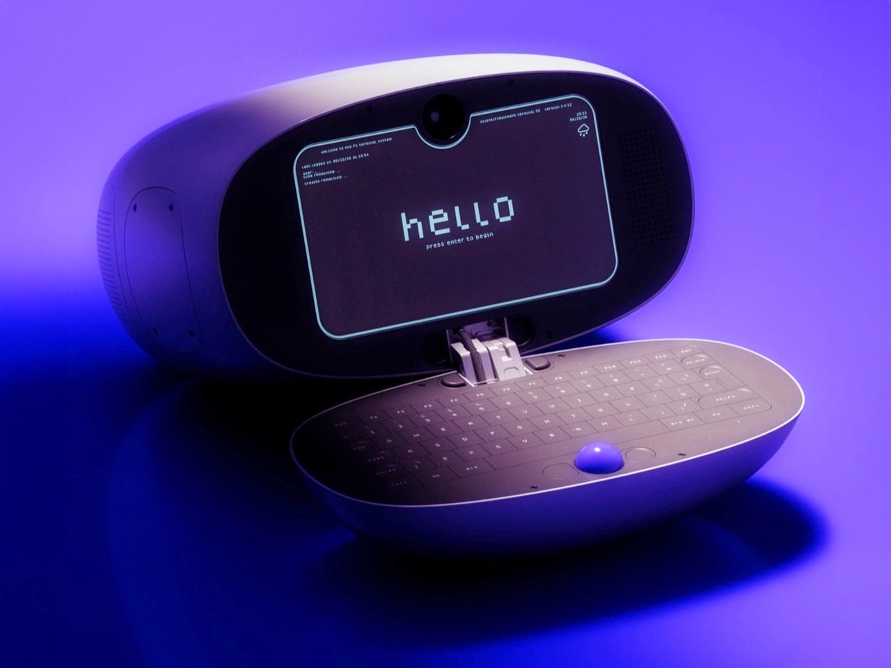
Severance did something no tech company has managed in decades: it made people want a trackball again. The MDR terminals on Lumon’s severed floor, with their cream shells, tiny glowing screens, and built-in trackballs, have become weird objects of desire for a show about corporate horror. Designer Shaun Wellens has dreamed up the computer I imagine Lumon would roll out for its next rebrand. The P1 Terminal is a CGI concept from a made-up 1970s company called Push / Pull, designed as a shared computer for people living in a communal space. It has a soft white clamshell body, a phosphor-style display, and a blue trackball that looks good enough to lick (please don’t).
Wellens says the P1 was inspired by a computer used to support experiments aboard the Space Shuttle, which makes sense once you notice the clamshell form. Then he wraps the whole thing in fake history. In his story, the P1 launched in 1972 for people living in underground communities called “pockets,” where it handled mail, bulletin boards, and shopping. It sold badly, its users adored it, and it got a sequel, which is basically the life story of every cult-classic gadget ever made. He also admits to sneaking deliberate flaws into his fictional designs so the imaginary engineers can fix them in the next version, and I love that level of commitment.
Designer: Shaun Wellens
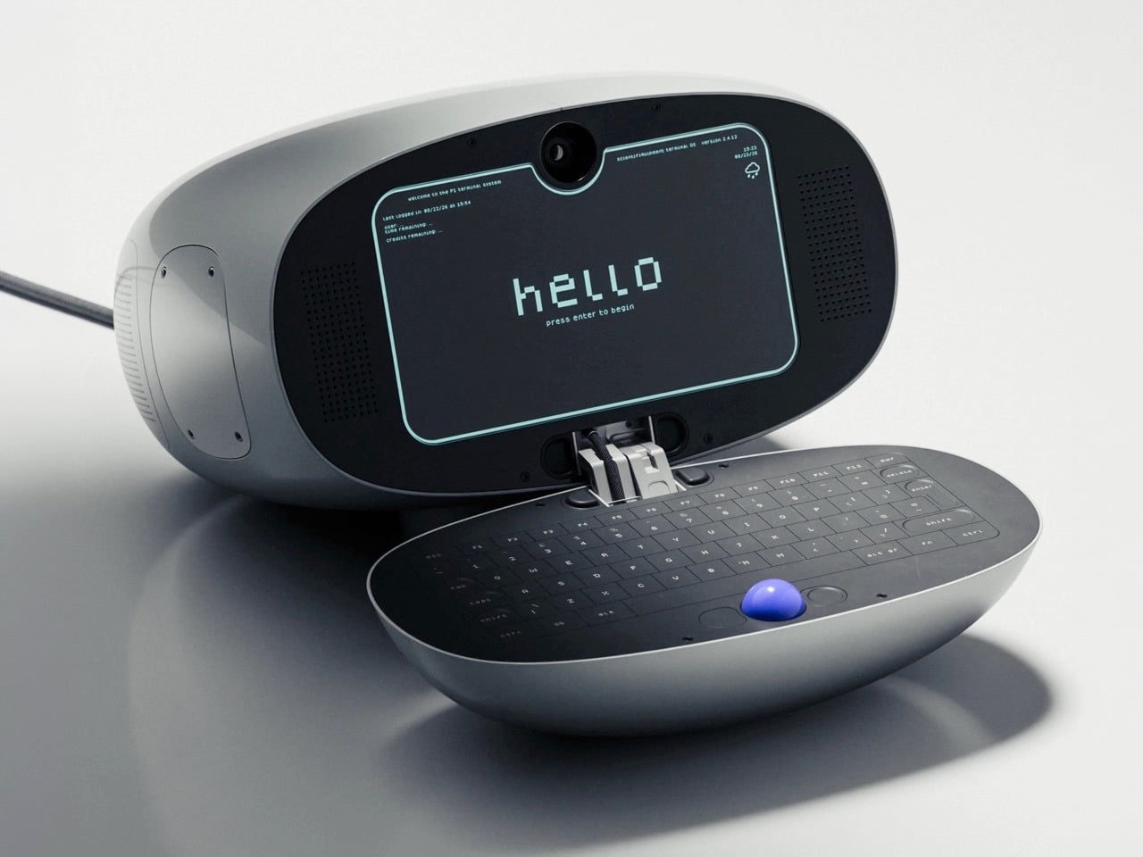
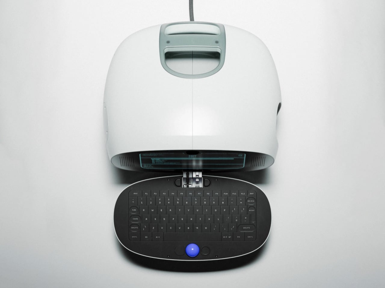
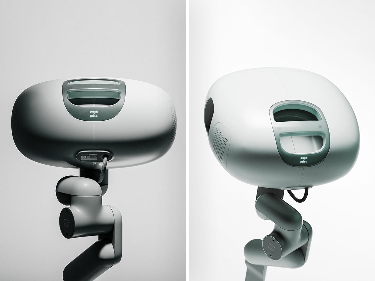
The shell is a rounded off-white pod, with a sage-gray handle module sitting on top like the carrying grip on a vintage TV. That handle has a recessed slot and a tinted window that recall the iMac G3 and the 1999 clamshell iBook. The open renders show the two halves joined by a stacked metal hinge at the center, the one visibly mechanical part on an otherwise pebble-smooth body. The Space Shuttle inspiration was the GRiD Compass, a magnesium clamshell designed by Bill Moggridge that flew aboard Columbia in 1983 as the Shuttle Portable Onboard Computer, or SPOC.
Inside the lid sits a dark, rounded-rectangle display with cyan-green text that recalls an old phosphor CRT. A camera pokes through a tiny notch at the top center, which is a hilarious thing to find on a computer that supposedly shipped in 1972. Perforated speaker grilles flank the screen. The interface boots to a pixel-font “hello” and drops you into a numbered menu of services, a text-only setup that would sit comfortably next to a Lumon file full of scary numbers. Wellens calls it a lightning-fast graphical interface anyway. In his fictional timeline, it arrived a full year before the Xerox Alto, the pioneering 1973 GUI computer.
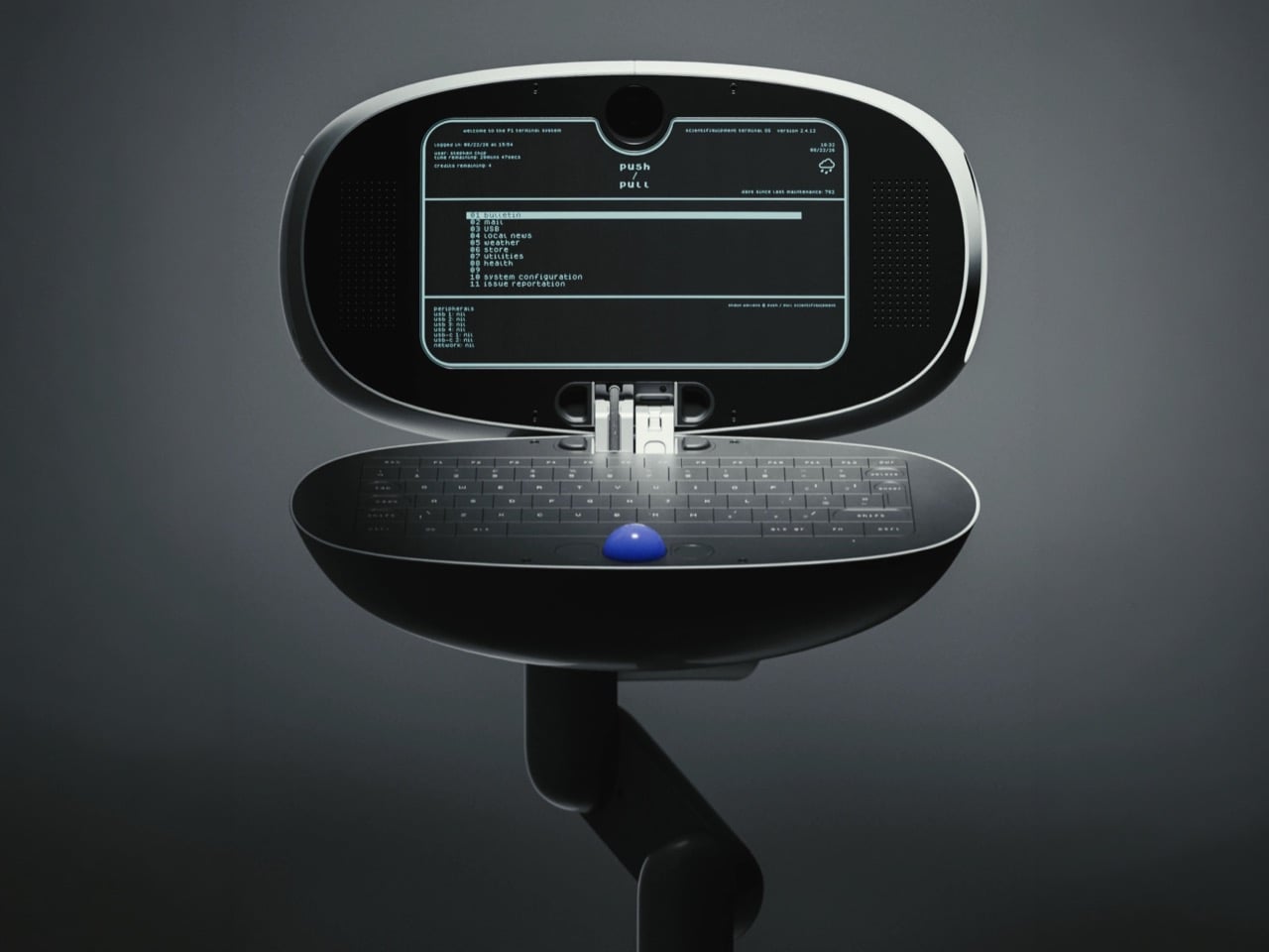
The bottom half is a dark oval tray holding a full keyboard, with the blue trackball parked dead center below the keys. That ball is the loudest color on the entire product, and it deserves to be. Trackballs have appeared in early terminals, arcade cabinets, and Logitech’s TrackMan, while Severance gave them another memorable role on the MDR desks. Putting it in the middle also makes sense for a shared machine, since lefties and righties get equal access. The oval keyboard looks a little cramped at the edges, but it matches the pebble shell so neatly that I’m happy to call it one of his intentional flaws.
A chunky, multi-jointed arm that looks borrowed from a robotics lab supports the terminal. It’s designed to let the P1 swing out, tilt, and tuck away, useful movements for a shared machine in a cramped communal space. In one render, the cable drops in from above, suggesting a ceiling- or wall-mounted setup like a dental lamp waiting for its next patient. Residents could walk up, pull it down, check their mail, and push it back, which might explain the Push / Pull name (my theory, Wellens hasn’t confirmed it). That setup makes the P1 feel closer to a payphone or a library catalog terminal than a personal computer.
Wellens’ conceptual history lands surprisingly close to the real thing. In August 1973, the Community Memory Project put a public bulletin board terminal in Leopold’s Records in Berkeley, with later terminals appearing in libraries and laundromats around town. A decade later, France was distributing free Minitel terminals that let people shop, bank, and message each other from home. The service lasted until 2012. The P1 mashes both ideas into one glossy pod for people living underground. Wellens even mocked up a period magazine ad with a big serif headline over a violet product shot, and it’s convincing enough that I briefly wanted to mail away for one.
Severance production designer Jeremy Hindle already gave us the most covetable fake office tech on television, so consider this a friendly nudge. Somebody on the show’s crew should get Wellens on the phone, because the P1 looks like a terminal Lumon would install somewhere much friendlier than the Break Room. He has form here too, having already dreamed up the Kriket 3000, a pastel retro robot that would look right at home wandering the severed floor’s hallways. The guy clearly loves building machines for a timeline that never happened, which is more or less the Lumon design brief. Hire him, throw him a waffle party, and let him build whatever strange hardware the next season needs.
The post The P1 Terminal is the Severance computer I’d actually want to use first appeared on Yanko Design.