❌

Vue lecture

San Siro’s Proposed Replacement Uses a Concrete X-Frame to Support Its Sweeping Roof
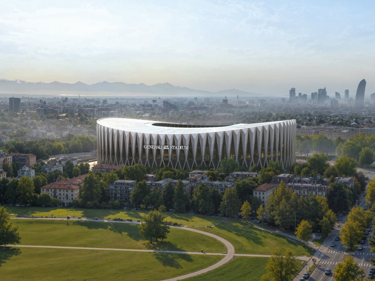
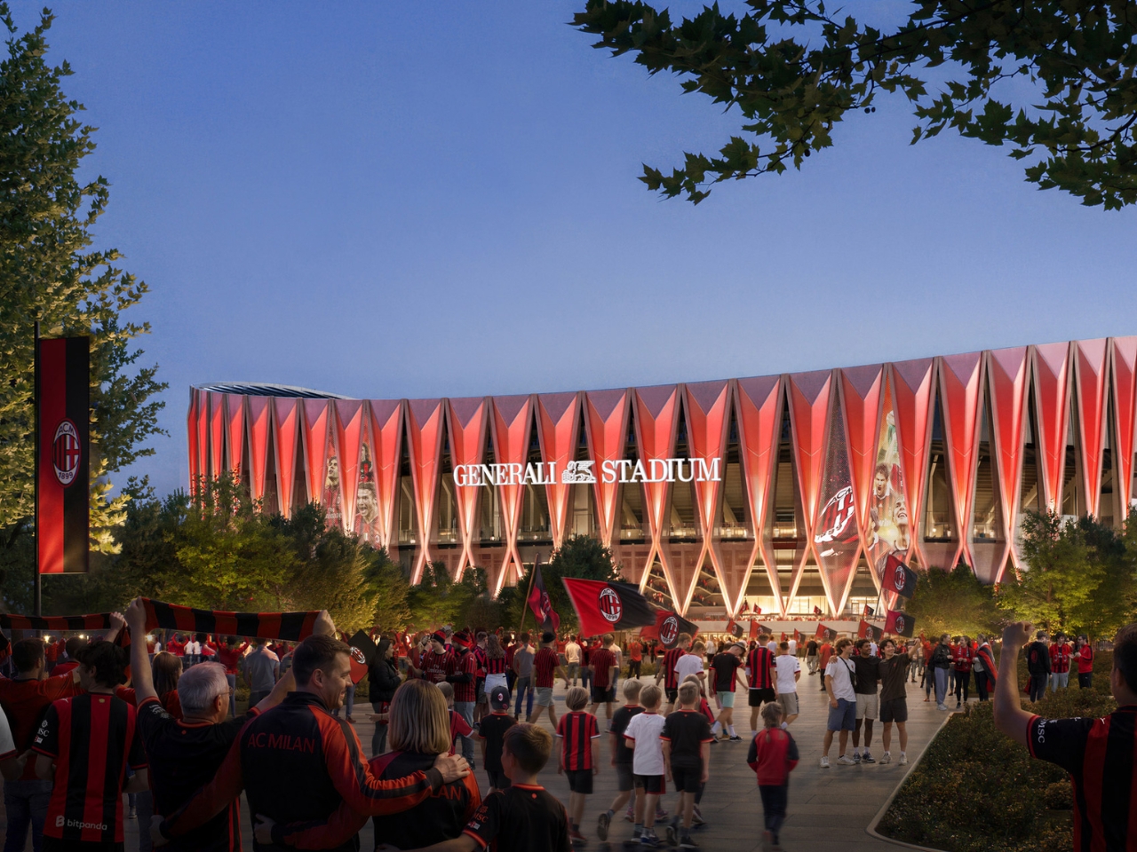
I’m not a fan of either AC Milan or Inter Milan, but as a football fan, visiting Stadio Giuseppe Meazza, more popularly known as San Siro, is an item on my bucket list. However, time is running out for me to actually do that, as most of the iconic stadium is planned for demolition after its replacement opens. That’s because the clubs are planning Generali Stadium, the future shared home of two of the biggest football clubs in Italy.

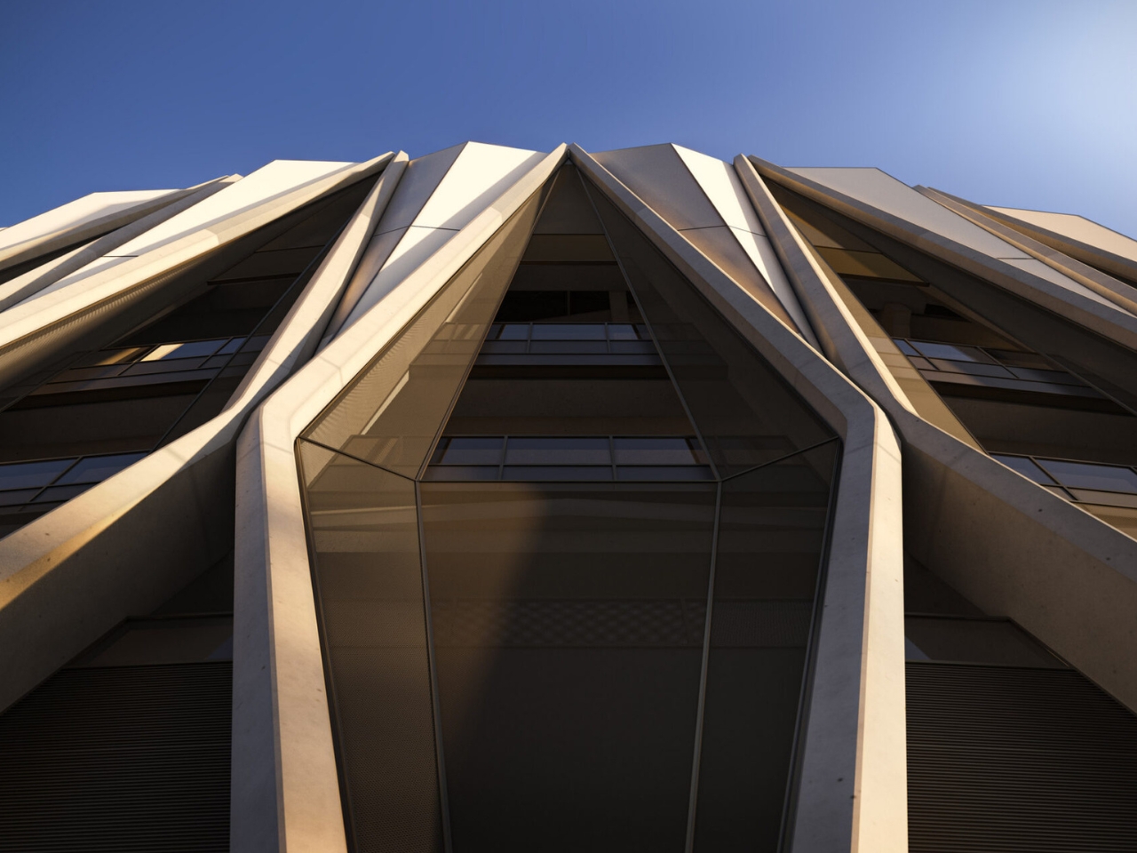
Now the proposed design for the 71,500-seat stadium, by architecture studios Foster + Partners and MANICA, has been unveiled. The clubs presented it on October 29, 2026. What’s most striking about the plans is how the X-frame makes the structure itself the architecture. The concrete frame extends from the colonnades, across the facade, and upward to support the roof. Its repeated geometry gives the building its identity while making its structural role visible.

Designers: Foster + Partners and MANICA
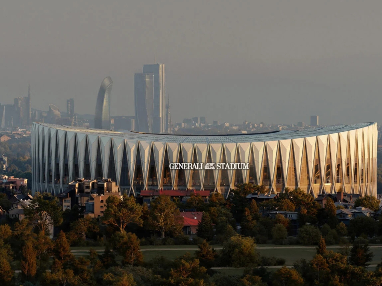
According to the clubs, that geometry draws on Italian engineering and the craftsmanship of Milan’s Duomo. The connection is an architectural reference rather than an attempt to reproduce the cathedral. What interests me more is the exposed supporting framework: the stadium’s most recognizable feature also explains something about how the enormous building stands up.

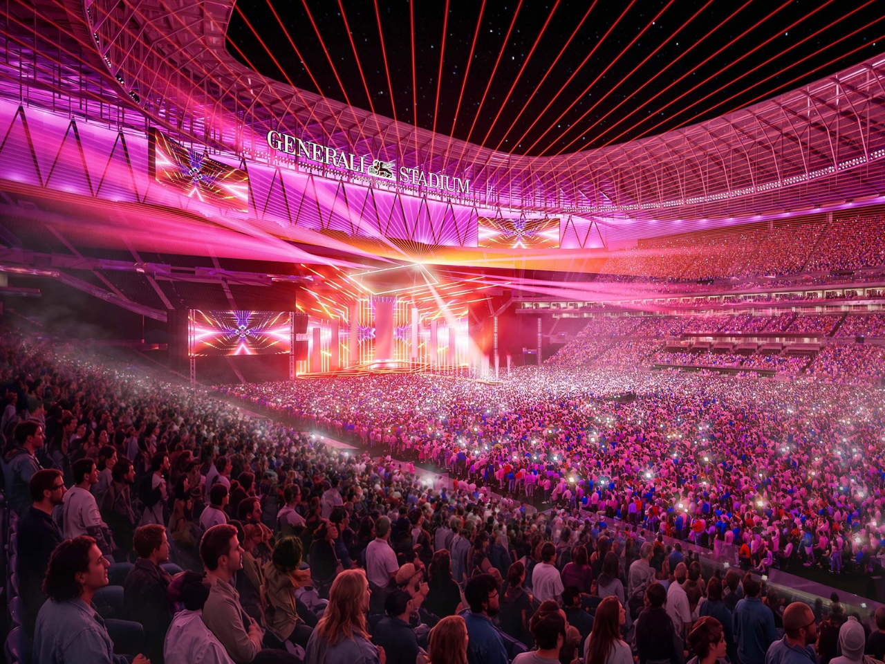
Inside, the focus shifts from concrete to the crowd. Two seating tiers form a continuous bowl around the field, with two steep supporter sections, or Curvas, behind the goals. Each would accommodate approximately 11,700 fans, with seating inclinations reaching 37 degrees. The arrangement is intended to bring supporters closer to the action. For a football fan, that relationship between the stands and the field is more compelling than another impressive exterior.
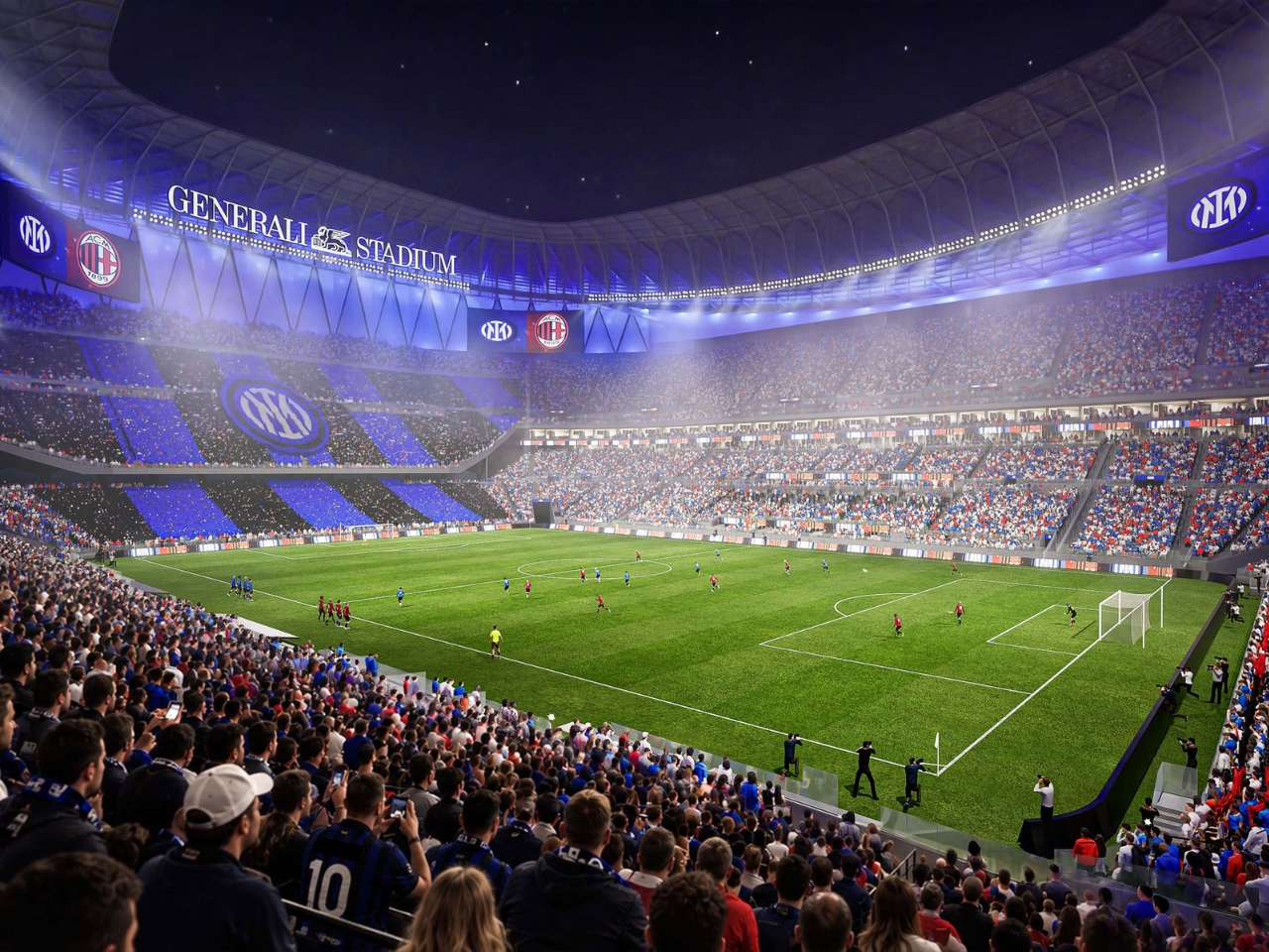

The double-curved roof also does more than shape the silhouette. The project website says it would incorporate 27,500 square meters of photovoltaic panels, while the clubs describe acoustic engineering intended to intensify the atmosphere. Those are useful ambitions, although the amount of solar electricity generated and the sound of a full stadium can’t be judged from renderings. A dramatic roof isn’t proof of either.

Arrival gets some attention, too. Diamond-shaped entrances would offer glimpses into the stadium before opening onto panoramic concourses with city views. Naturally ventilated colonnades form part of that approach. These spaces give the architecture a role before anyone reaches their seat, although open-looking entrances alone don’t establish how quickly thousands of spectators will actually move through them on matchday.
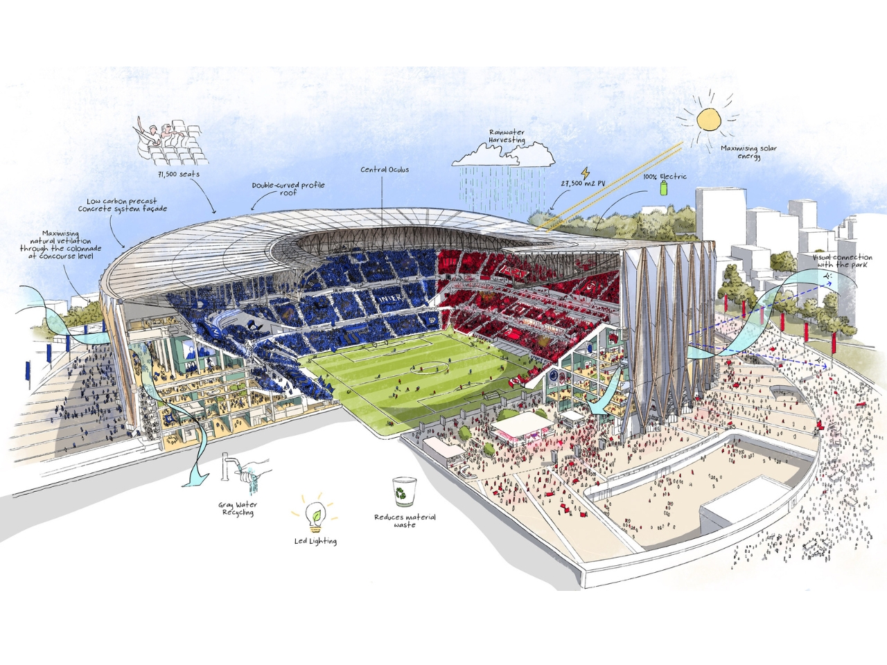
The plan also extends beyond the ticket gates. The stadium would anchor a 281,000-square-meter redevelopment incorporating public spaces, landscaped areas, retail, and leisure facilities. The aim is to give residents reasons to visit outside matchdays. That’s potentially the most useful part for people who aren’t interested in either club: somewhere to spend time without attending an event. Its everyday value will depend on how much space remains genuinely public and welcoming.

The clubs also promise enhanced accessibility, which deserves attention alongside the dramatic seating bowl. I’d want to know how step-free routes, companion seating, and views when neighboring supporters stand are handled. A designated space is only part of the experience; getting from the entrance to that space matters just as much.


For now, this remains a proposal moving through design and planning. Construction is expected to begin in 2028, with the first match targeted for the 2031/32 season, subject to approvals. That opening target should not be confused with a confirmed deadline for demolishing San Siro.

I can appreciate the logic of designing outward from the supporter sections, even while feeling reluctant about what this replacement means. Bringing fans closer and giving the neighborhood usable public space are worthwhile goals. The harder test will be whether ordinary supporters feel the new building belongs to them. The concrete frame will make the stadium recognizable; the experience of arriving, finding a seat, and watching a match will determine whether people want to return.
The post San Siro’s Proposed Replacement Uses a Concrete X-Frame to Support Its Sweeping Roof first appeared on Yanko Design.

  •  

SOM’s Sany IROOTECH Headquarters Hangs Its Floors From a Giant Steel Exoskeleton

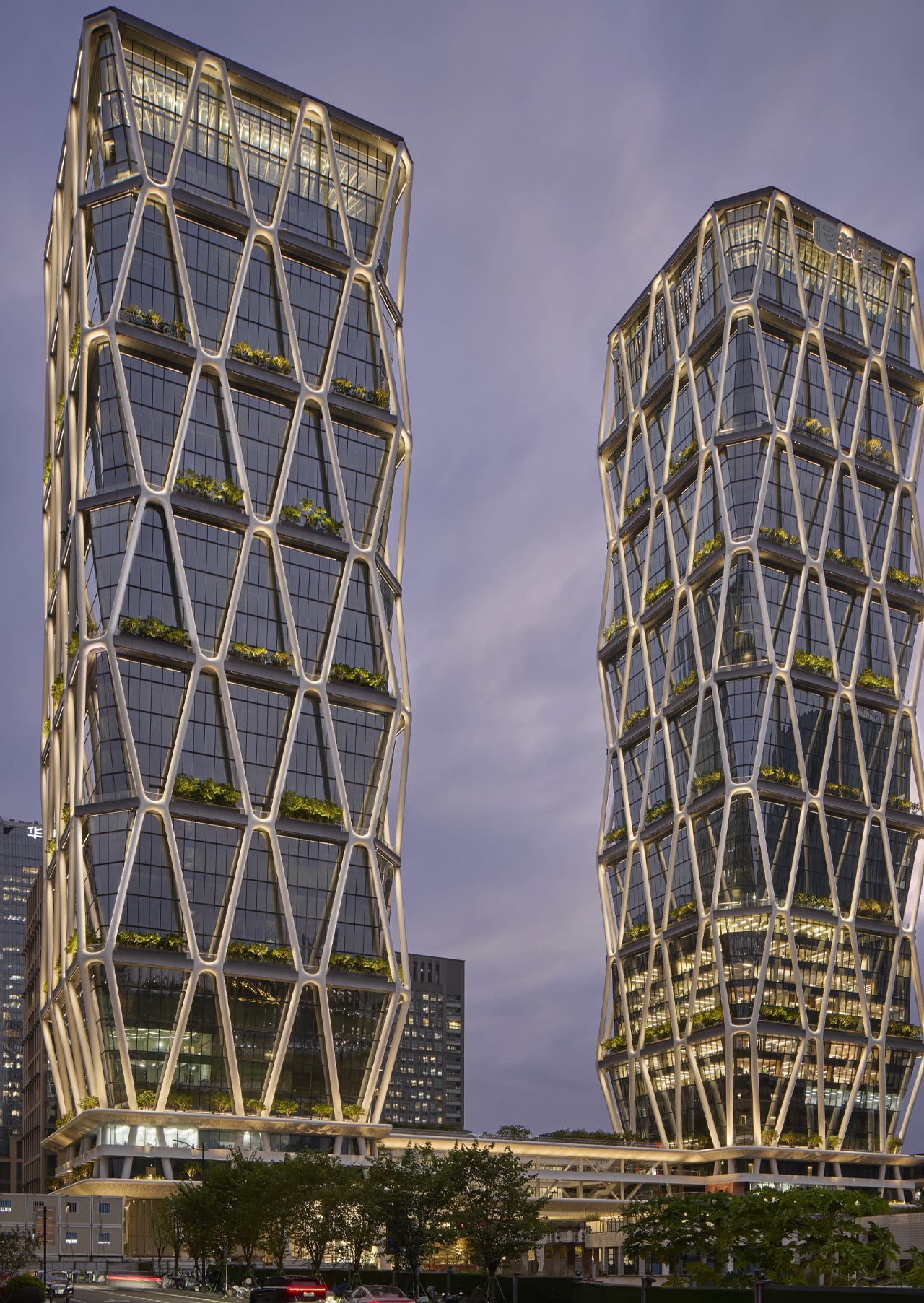
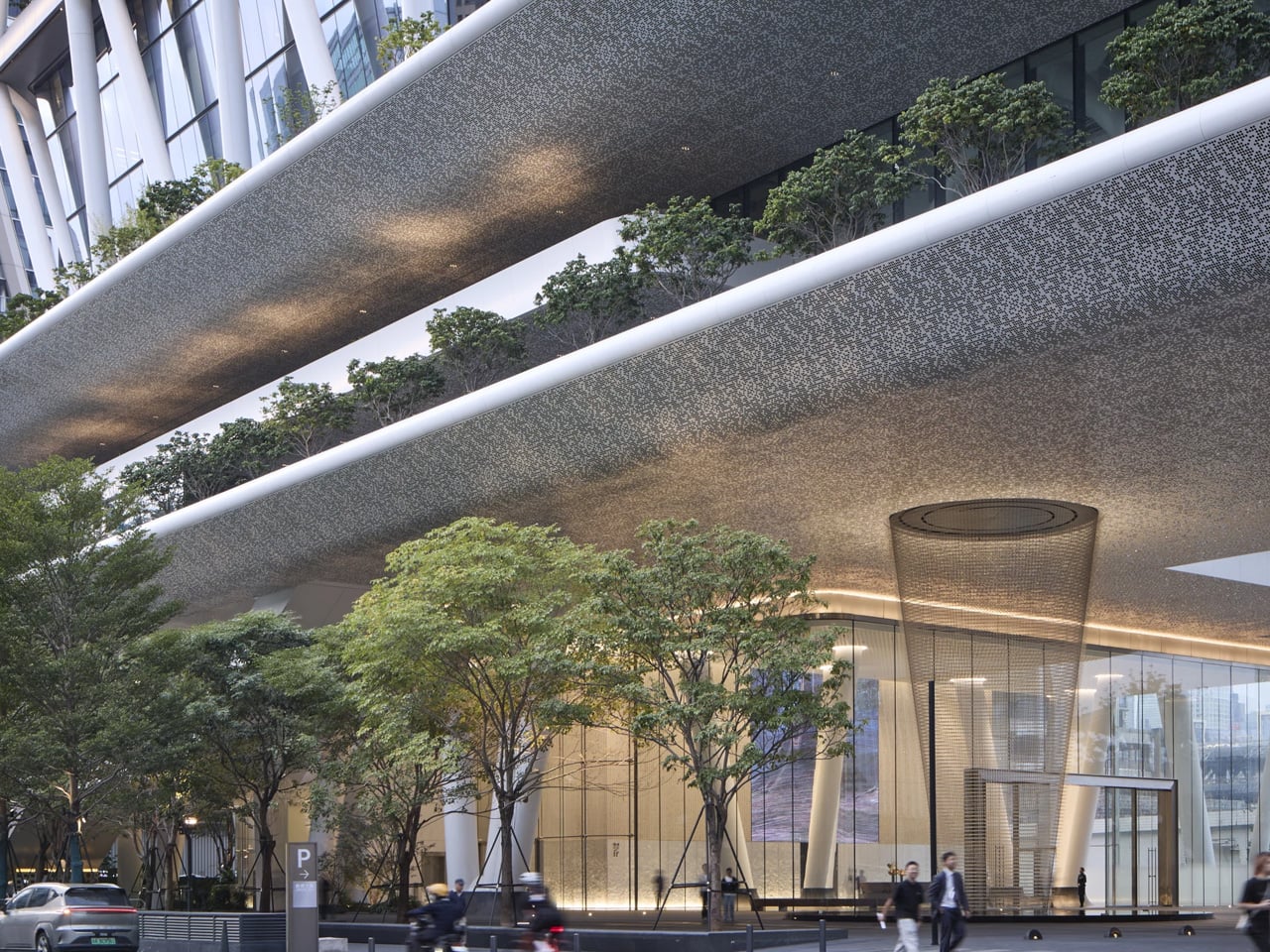
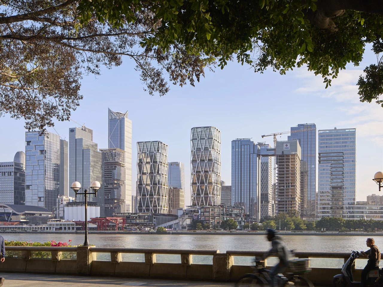
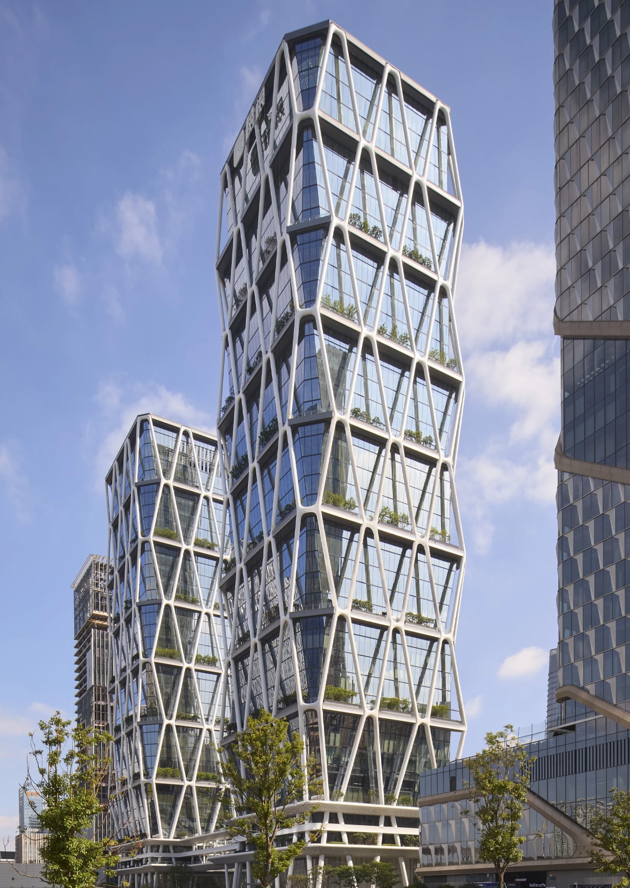
The most interesting space at Sany IROOTECH Headquarters might be the gap underneath it. In Guangzhou’s Pazhou business district, Skidmore, Owings & Merrill has connected two towers with an elevated podium, leaving room below for a shaded public plaza. Commissioned for construction equipment manufacturer Sany’s cloud technology venture, the completed complex gives a corporate headquarters something worth noticing at street level: space that people can enter without working there.

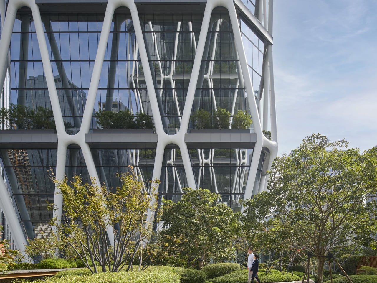
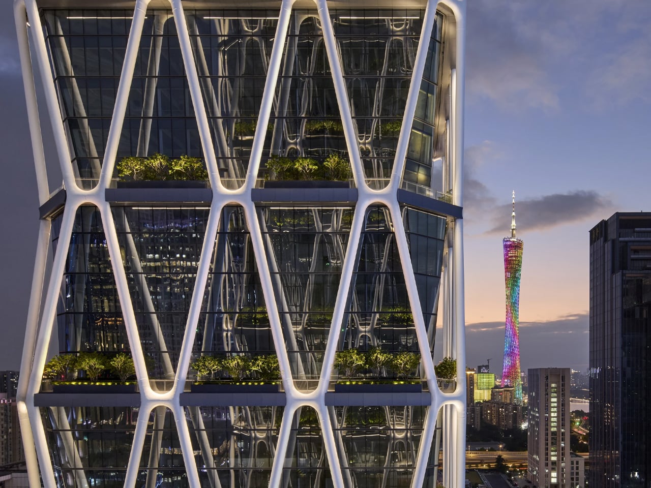
Designed with the Beijing Institute of Architectural Design serving as architect of record, the development makes its engineering unusually legible. A diamond-patterned steel exoskeleton wraps both towers, expressing the construction expertise behind the client’s business. Its purpose goes beyond establishing a recognizable silhouette. The external framework supports suspended floors, creating column-free interiors that can accommodate changing uses.

Designer: Skidmore, Owings & Merrill

SOM organizes the towers into five-story modules, with floors suspended from perimeter ring beams. Moving that supporting structure outward gives the interiors greater planning flexibility. According to SOM, the arrangement accommodates office, hotel, and residential programs, making the framework useful beyond the original headquarters brief. The architecture’s identity remains consistent even when what happens behind the glass changes.

That adaptability has already mattered. The client changed parts of the program during development, introducing plans for hotel and residential accommodation. The inward-leaning curtain walls also create terraces at the bottom of each five-level module while reducing direct solar exposure. These repeated outdoor spaces give the towers a rhythm tied to their construction, rather than an applied decorative pattern.

Guangzhou’s exposure to typhoons and seismic activity also shaped the engineering. SOM incorporated its patented pin-fuse joint system, which uses controlled movement and friction to dissipate earthquake energy. The firm describes rapid reoccupancy after extreme events as a design goal, an important distinction from claiming that the buildings have demonstrated that performance in an actual earthquake.

The podium extends the project’s structural ambition horizontally. Multistory trusses span 65 meters between the towers, sheltering the plaza beneath. A courtyard opening brings daylight into this covered space, while dimpled aluminum panels across the underside reflect light. Transparent glass lobbies keep the entrances visually separate from the heavier structure surrounding them.

Above, dining, retail, and exhibition spaces overlook the plaza. A public elevator operating around the clock connects the podium with the district’s covered walkway network. That connection is the project’s clearest civic gesture: the headquarters becomes part of a pedestrian route through Pazhou, giving people a reason to use its spaces beyond arriving for work or attending a meeting. The towers’ imposing frame makes the landmark; their lifted base makes the everyday connection.

The post SOM’s Sany IROOTECH Headquarters Hangs Its Floors From a Giant Steel Exoskeleton first appeared on Yanko Design.
  •  

Tiny Wooden Living Units Stack Into a Three-Story Tower

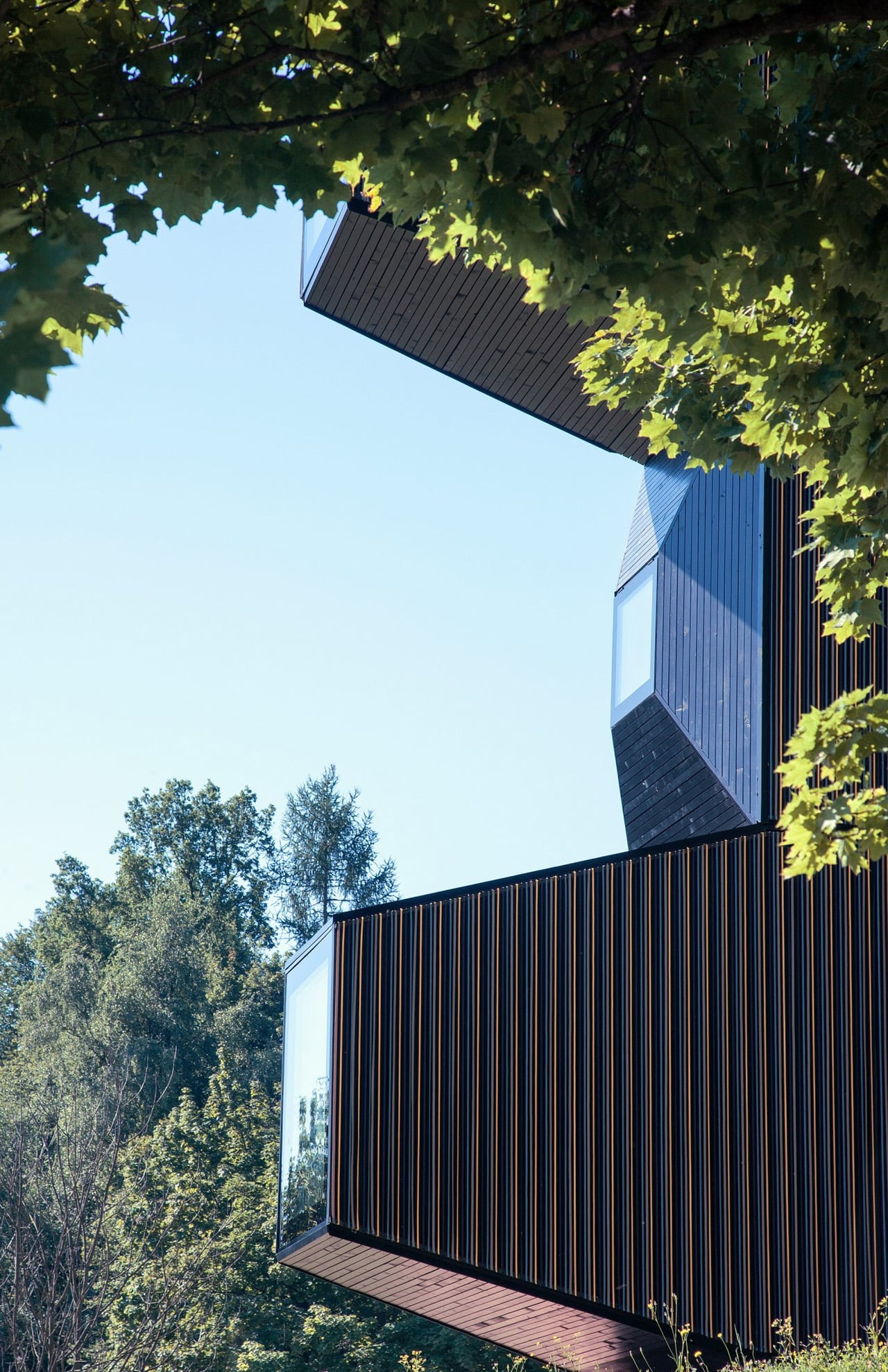
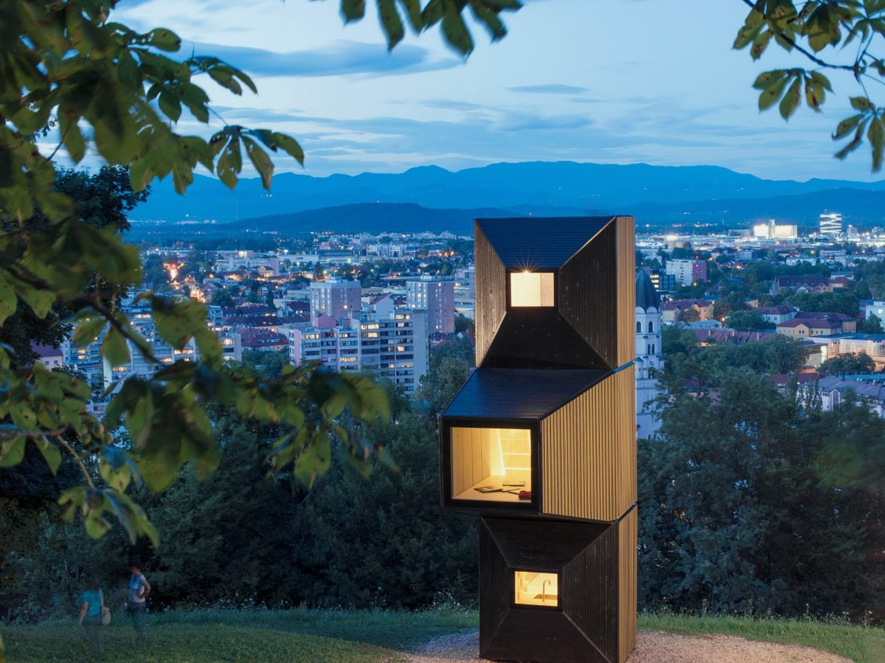
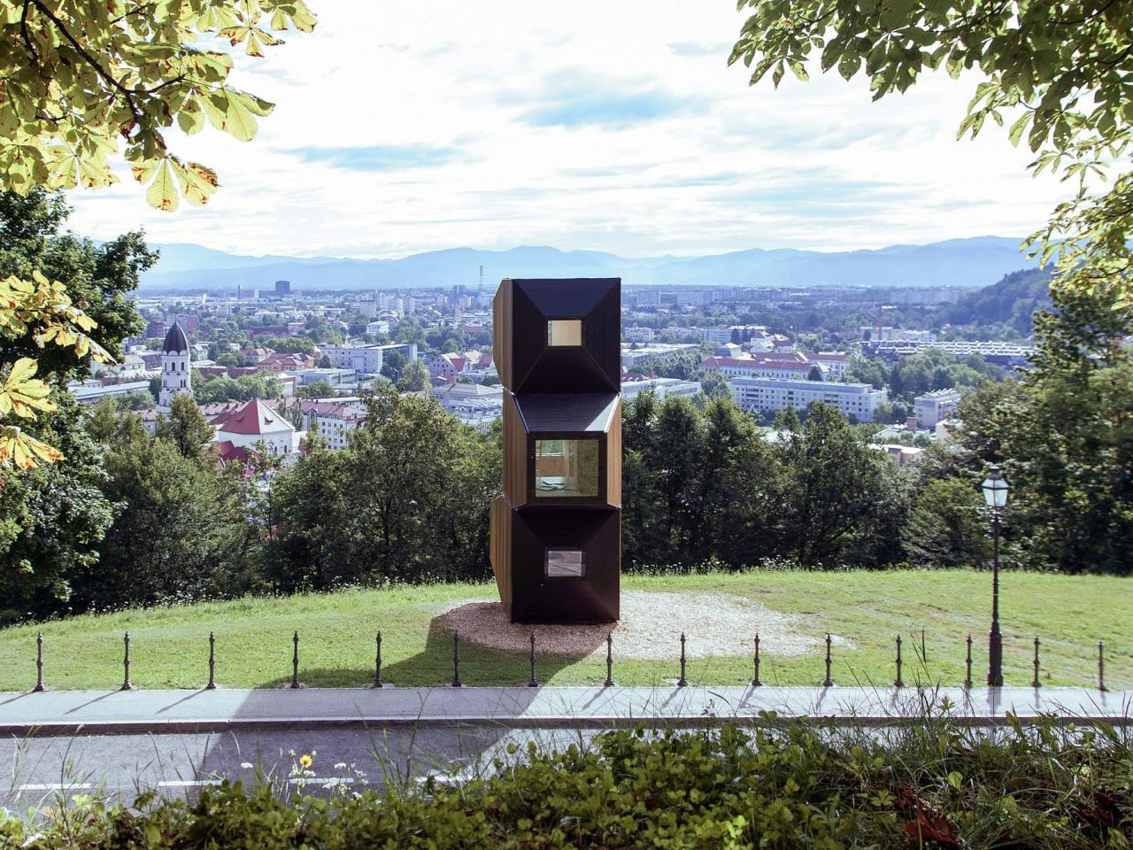
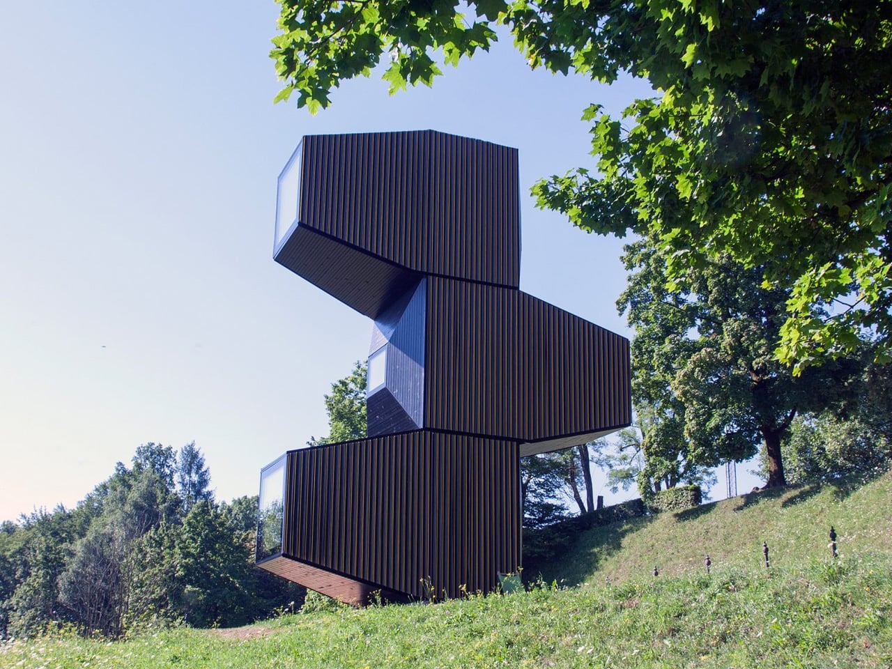
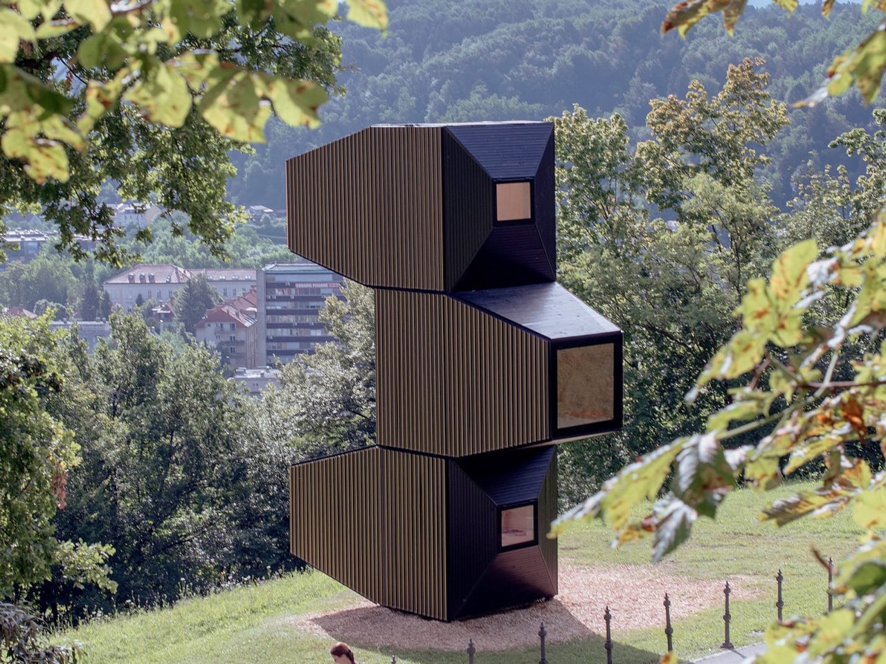
At Ljubljana Castle, three wooden rooms stack into a slender tower, their angular ends pointing toward the city. This built installation from 2017 demonstrates Living Unit, a modular architecture system developed by OFIS Arhitekti with C+C, C28, structural engineers AKT II, and contractor Permiz. The idea begins with a small, repeatable wooden shell.

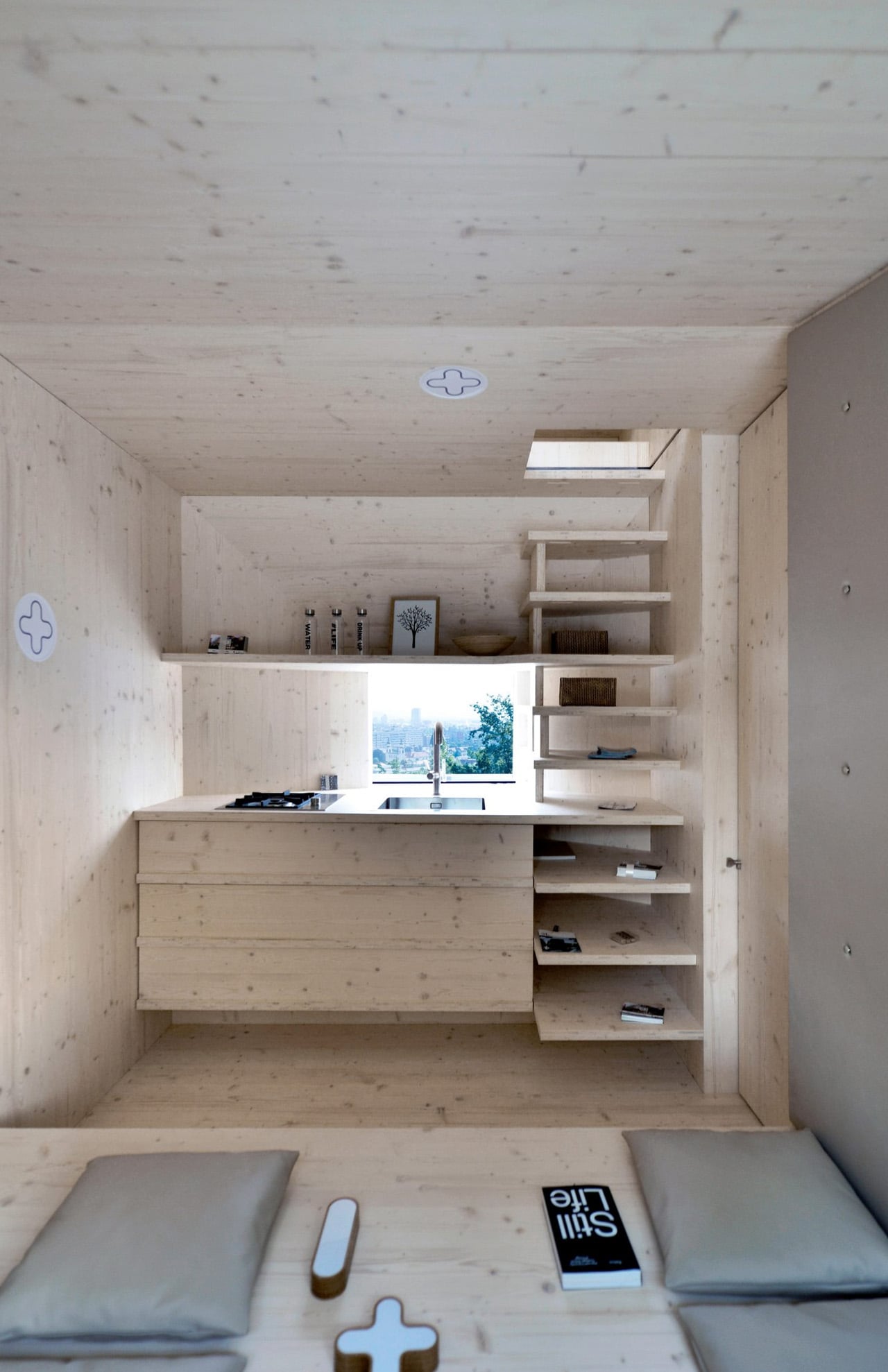
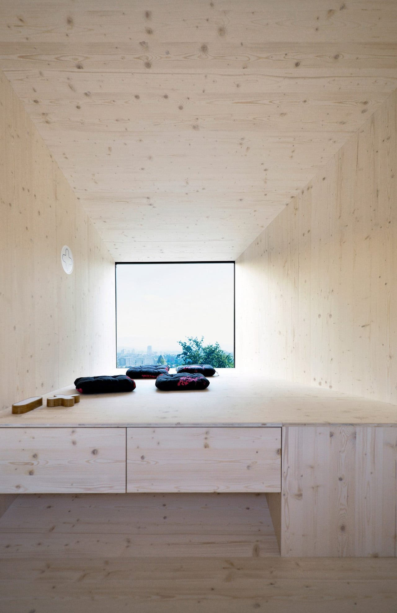
Each basic module measures 4.5 meters long, 2.5 meters wide, and 2.7 meters high, roughly 14.8 by 8.2 by 8.9 feet. Designed to accommodate two people, it can hold a double bed, wardrobe, table, and chairs, with provision for a bathroom and kitchenette. Those are compact cabin dimensions, rather than the proportions of a conventional apartment.

Designer: OFIS Arhitekti

The useful move is allowing that initial room to become part of something larger. Modules can connect horizontally or vertically, with combinations intended to accommodate four to six occupants. A single cabin might suit a short stay; several connected shells allow the domestic functions to spread out. The system therefore offers different arrangements without requiring an entirely different building vocabulary.

Its pointed geometry gives the project much of its character. The ends taper into truncated pyramids, with glazing at their tips. AKT II explains that these projecting forms add internal storage space while expressing the structure’s strength. Seen from outside, the alternating projections make the stacked version read as individual rooms, rather than one uninterrupted shaft.

Behind that silhouette is a prefabricated timber frame reinforced with plywood boards on both sides. The architects allow the exterior and interior finishes to change according to context. That distinction matters: the repeated element is the structural shell, not a compulsory decorative package. Different settings need not receive an identical-looking cabin simply because they share its underlying construction.

Ground connections are similarly adaptable. The units can be secured using steel anchors or removable concrete cubes instead of permanent foundations. The team proposes uses including holiday cabins, research accommodation, tourism, and shelter. These are intended applications, though, rather than proof that one specification will perform equally well across every climate and terrain.

The castle installation gives the system another role: a temporary library, with books organized across its levels and nearby outdoor areas intended for reading. It’s a useful demonstration of how the same shell can support a public program rather than accommodation. Here, the architecture supplies a small vertical destination within an existing landscape.

The sectional drawings also expose the compromise behind the tower’s small footprint. Compact steps and ladders connect its levels, making circulation an active part of occupying the stack. Horizontal expansion would avoid that particular arrangement but require more ground. Living Unit’s strongest proposition is this choice: repeat the room, then decide where the extra space should go.

The post Tiny Wooden Living Units Stack Into a Three-Story Tower first appeared on Yanko Design.
  •  

This 400-Square-Foot Tiny Cabin Opens Onto a Full-Width Porch

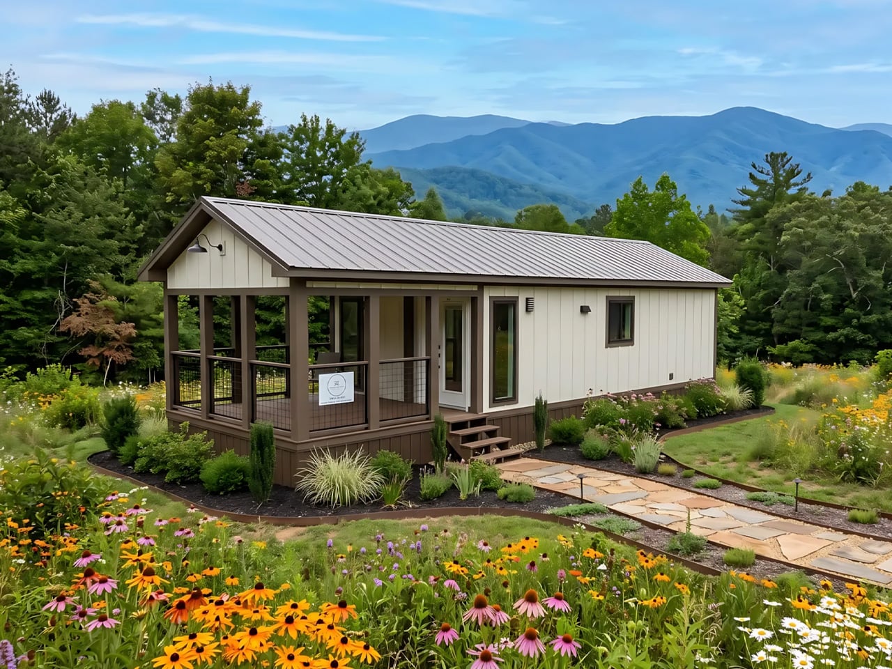
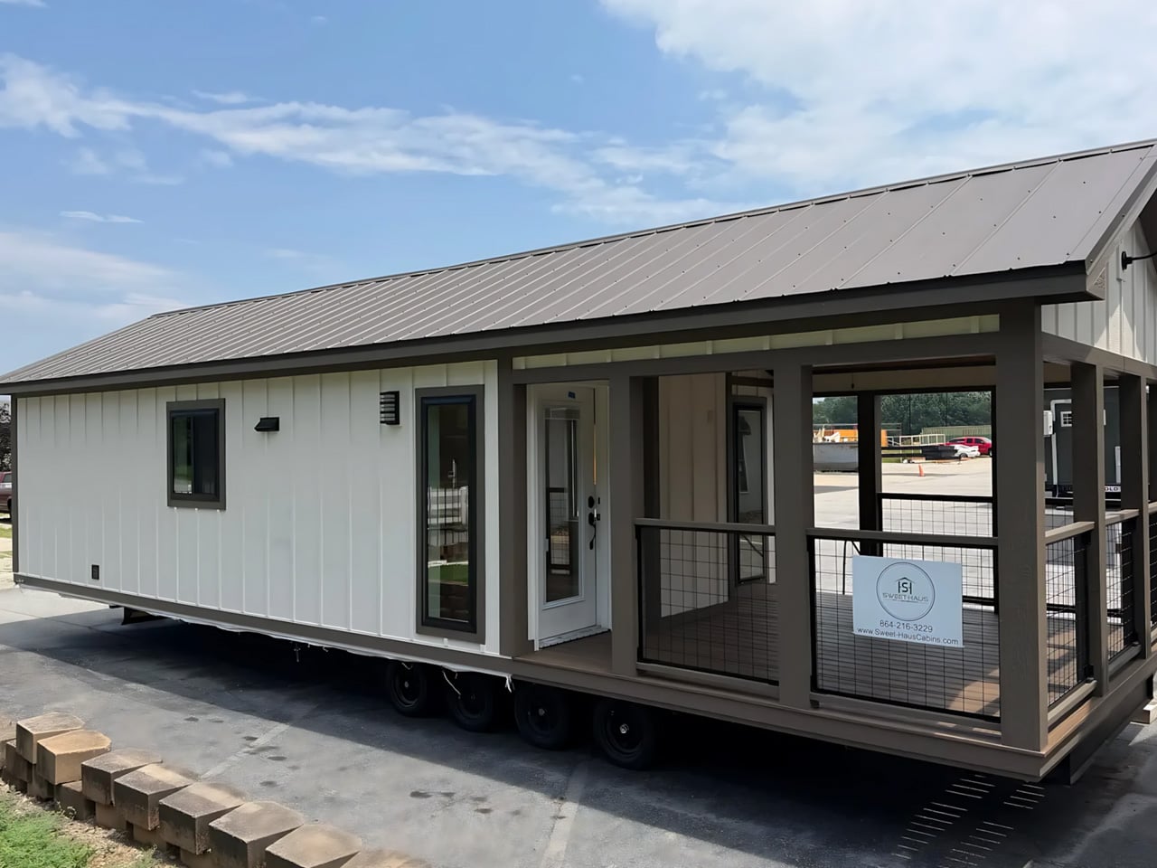
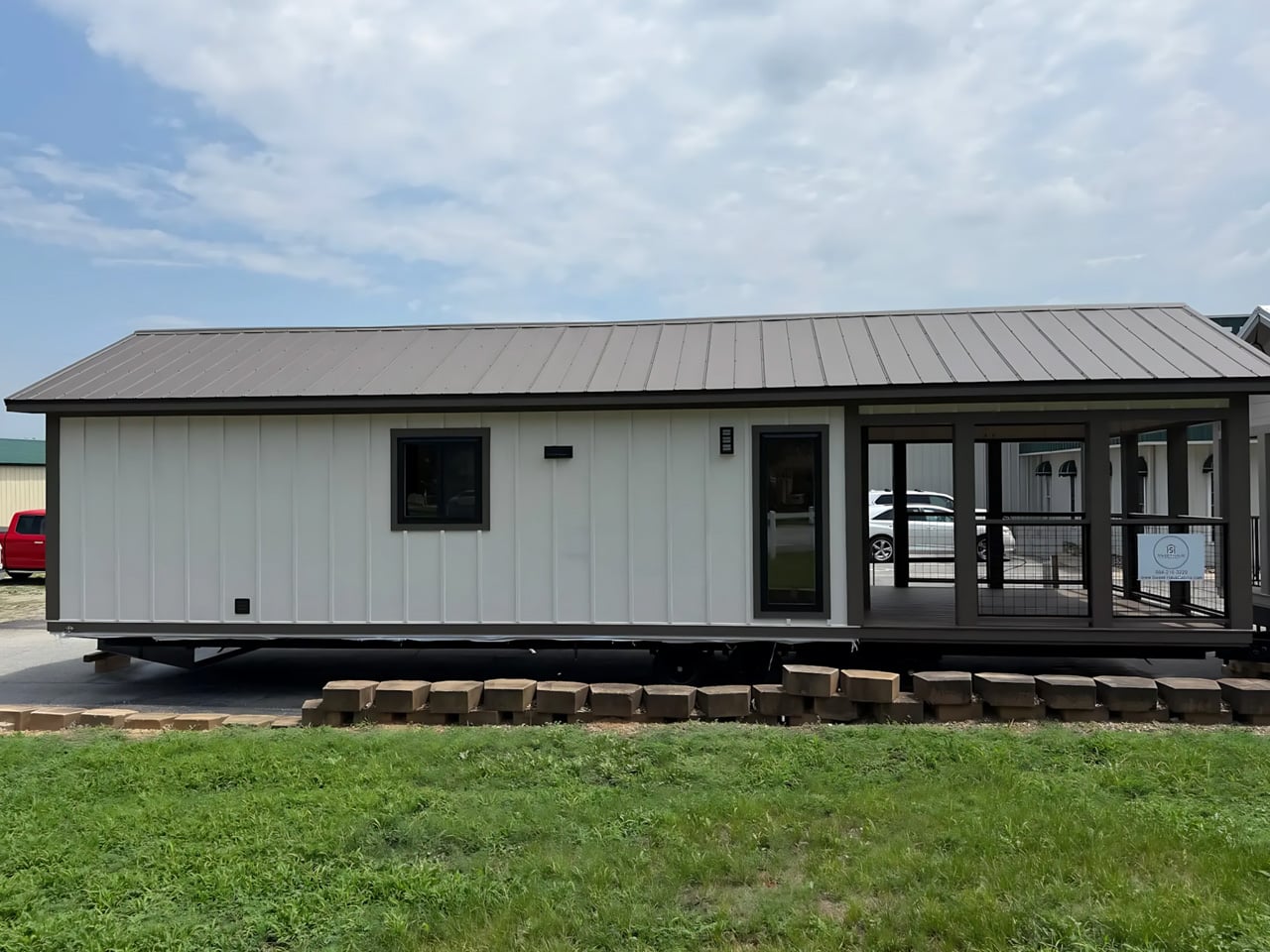
The Wildflower makes room for something tiny homes can easily squeeze out: a proper front porch. Built by South Carolina’s Sweet-Haus Tiny Cabin Company, this 400-square-foot park model pairs one bedroom and one bathroom with a covered outdoor sitting area. It’s an available model, starting at $115,000, with a layout that keeps daily life on one level.

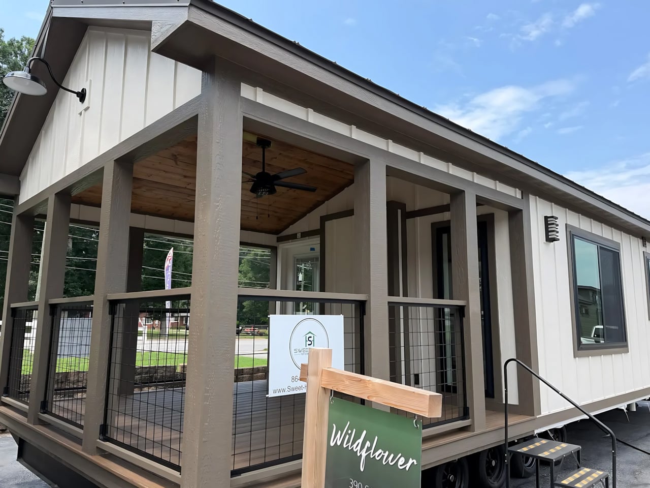
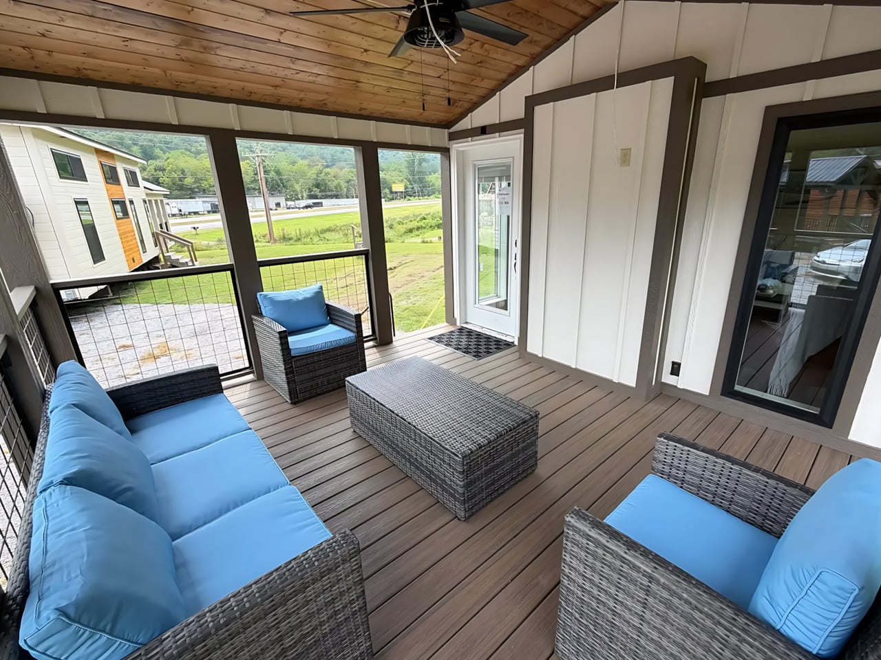
That porch spans the cabin’s width, sitting beneath the same gabled roof as the enclosed rooms. In the builder’s photographs, timber-toned posts and dark mesh railings frame an outdoor sofa and chairs. Trex composite decking is specified for the floor. Giving outdoor furniture its own sheltered zone means the indoor living room doesn’t have to accommodate every gathering when the weather cooperates.

Designer: Sweet-Haus Tiny Cabin Company

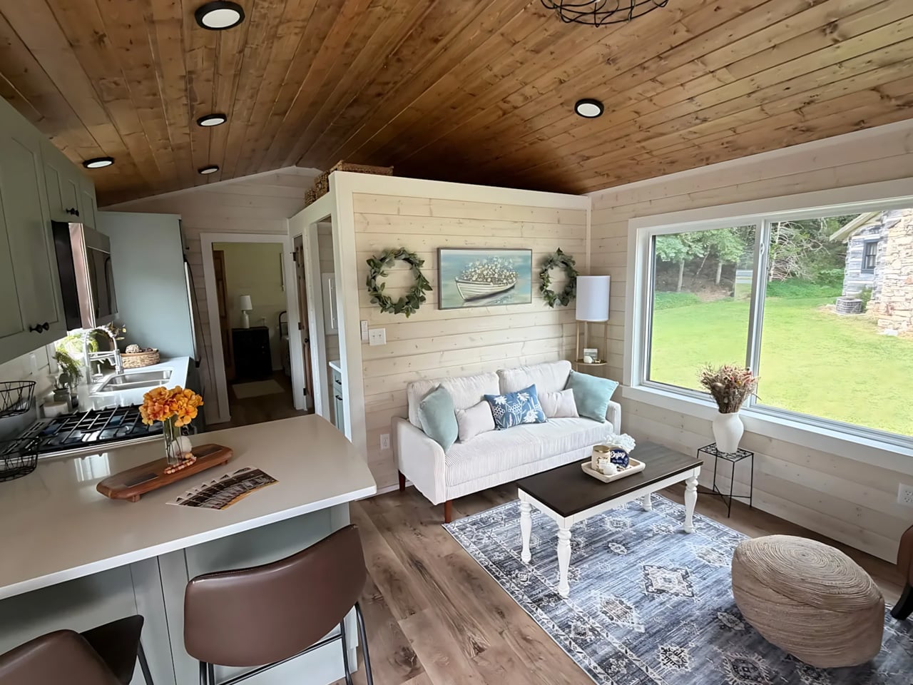
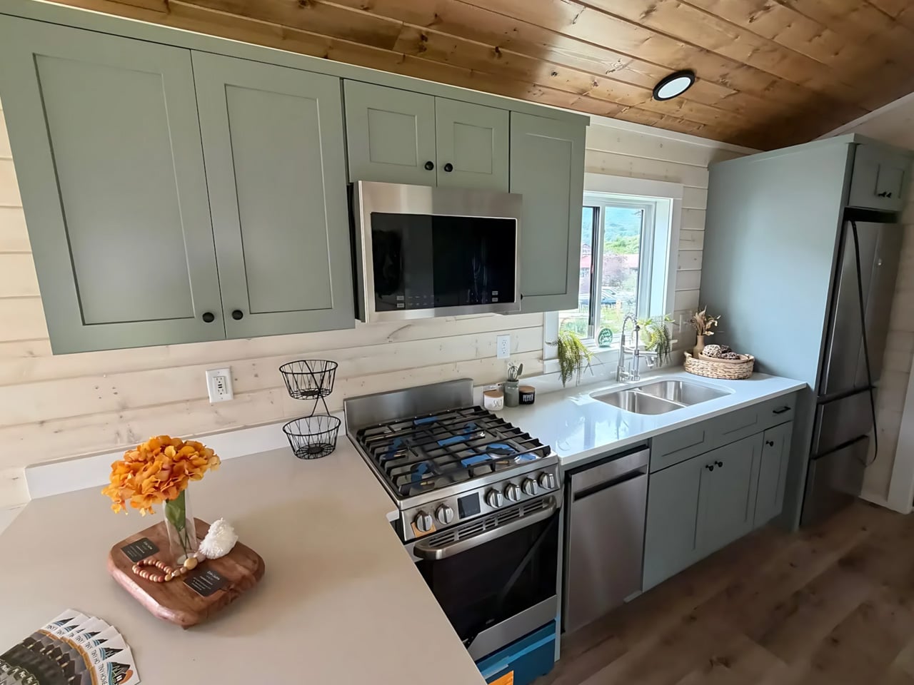
Inside, the photographed cabin has pale horizontal wall paneling, muted green cabinetry, and a wood ceiling that follows the roof’s pitch. The contrast gives the upper half of the room a stronger visual presence without covering every surface in dark timber. A breakfast counter provides seating beside the kitchen, leaving the opposite side available for a sofa, coffee table, and a large window.

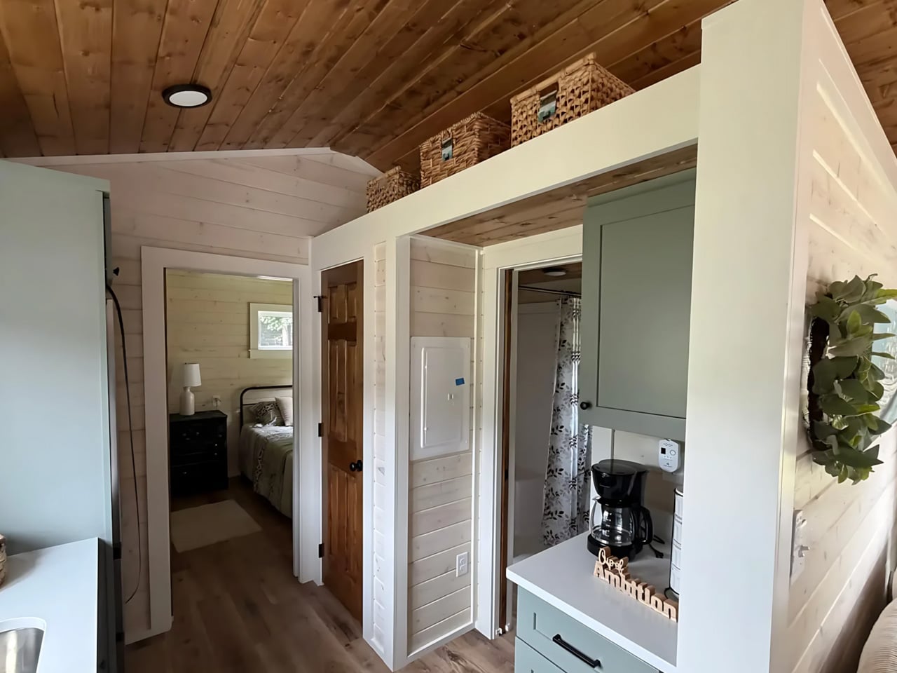
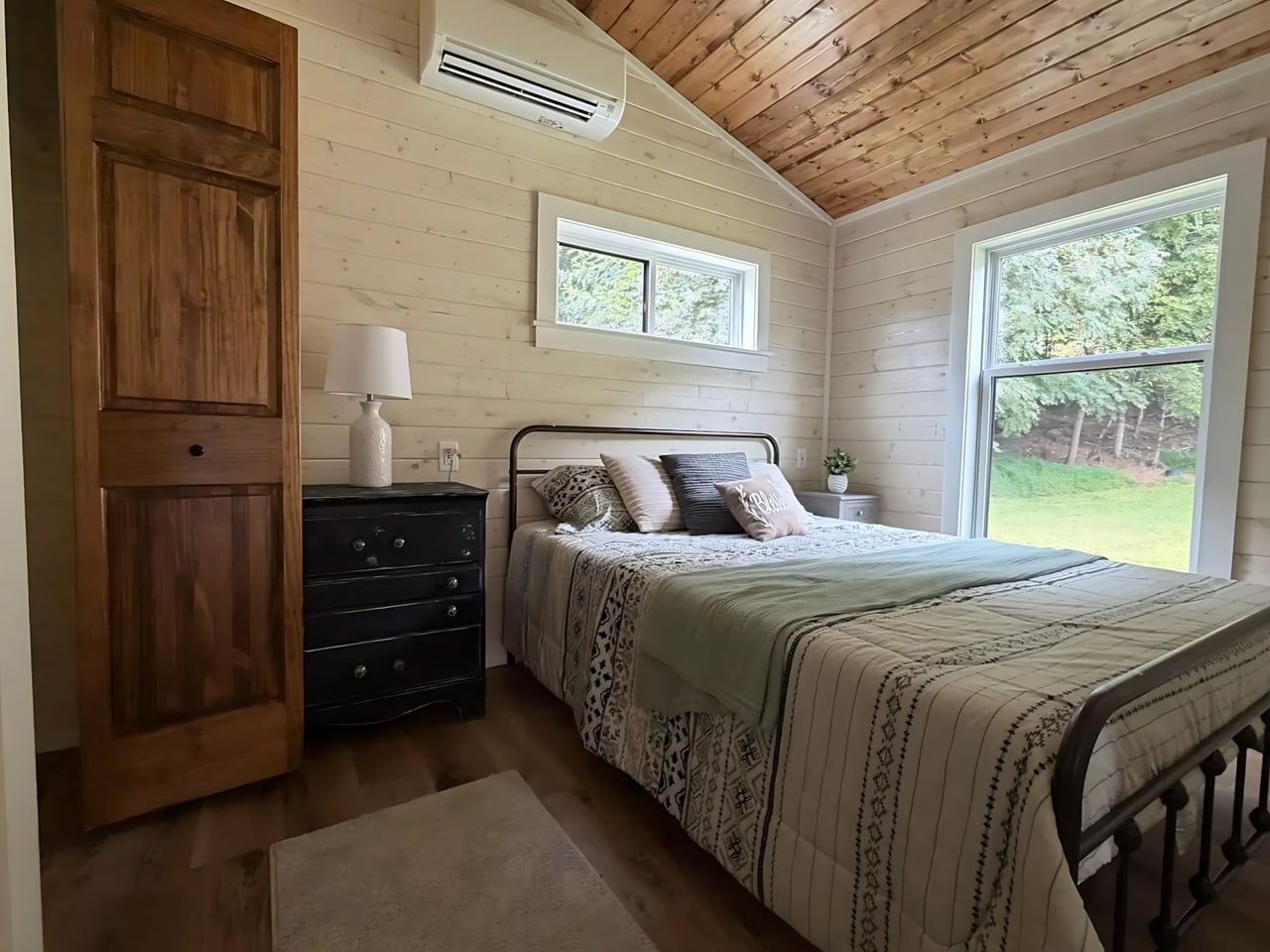
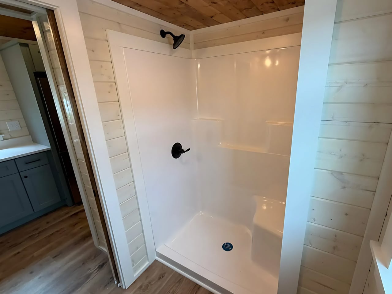
The published floor plan places the bedroom at the rear, beyond the kitchen, with the bathroom tucked alongside the route between them. A stacked washer and dryer occupy a dedicated position near the bedroom closet, while the bathroom includes a shower labeled 60 inches wide. A separate bedroom means going to bed doesn’t require converting the shared living area into a sleeping space each night.

Storage gets more attention than the footprint might suggest. Sweet-Haus lists a built-in pantry and two full closets, plus an electric fireplace feature wall with concealed storage. That last detail is particularly useful: a decorative focal point also earns its floor area by holding things. Custom soft-close cabinetry continues the approach, keeping everyday necessities behind doors rather than on display.

The construction package includes LP SmartSide siding, metal roofing, Low-E argon-filled windows, and a mini-split HVAC system. Buyers can choose finishes and explore upgrades, including a screened porch or built-in bed with nightstands. Those choices matter in a small cabin, where adding permanent furniture can settle the layout early. The photographs show one interpretation, rather than a fixed palette every buyer must accept.

The starting price covers the cabin, not a finished property. Delivery, setup, skirting, steps, and upgrades are separate charges, and Sweet-Haus says buyers must confirm local placement and occupancy rules for its park models. Land and utility preparation also need their own budget. Within those limits, the Wildflower’s most convincing decision is straightforward: it preserves a private bedroom, useful storage, and somewhere sheltered outside to sit, instead of making every activity compete for the same limited patch of indoor floor.

The post This 400-Square-Foot Tiny Cabin Opens Onto a Full-Width Porch first appeared on Yanko Design.
  •  
❌