❌

Vue lecture

Old Bamboo Scaffolding Becomes a Retreat, but Not Forever
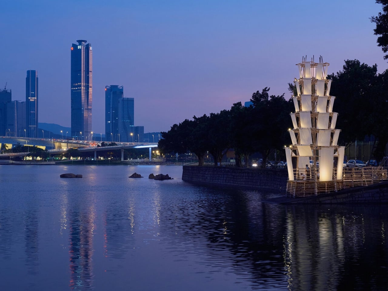
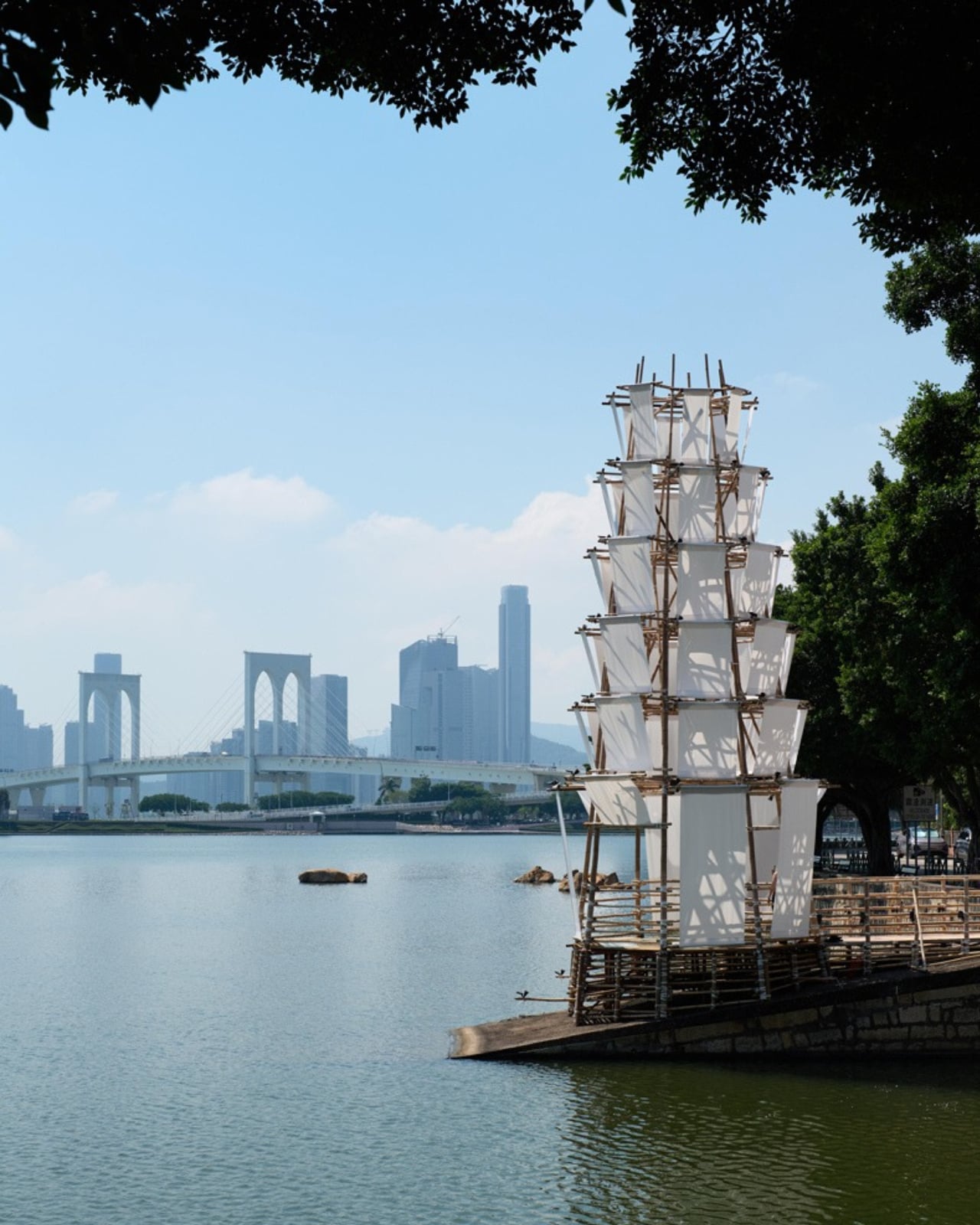
The bamboo in Macau’s Bamboo Pagoda had already worked on construction sites before becoming a place to take a breather. I like that reversal. Scaffolding typically helps build the destination; here, it became the destination. Conceived as a temporary waterfront refuge, the pavilion addressed a familiar urban problem: having somewhere to go doesn’t necessarily mean having somewhere to pause. Its ambition was to give people that room.

Designed by Impromptu Projects, the Macau practice led by Rita Machado and João Ó, Bamboo Pagoda stood approximately 43 feet tall along Sai Van Lake. Its roughly 270-square-foot footprint was modest for something with that much vertical presence. Organized by Ephemera Public Space Cooperative, the built installation had a short October 2026 program ending October 11. Permanence was never part of the brief.

Designer: Impromptu Projects (photos by Tang Kuok Hou, Gonçalo Lobo Pinheiro)
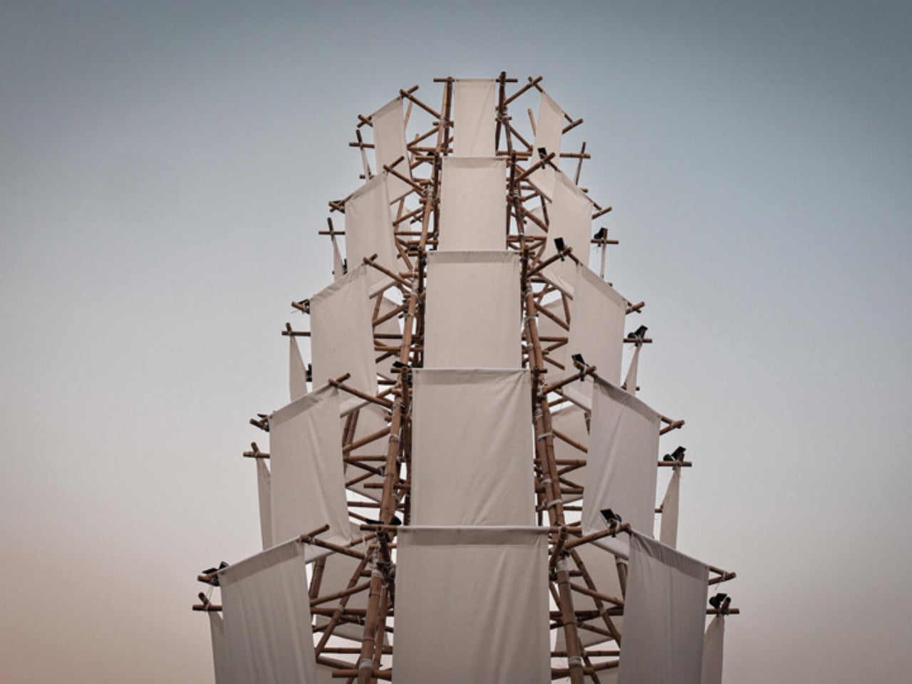
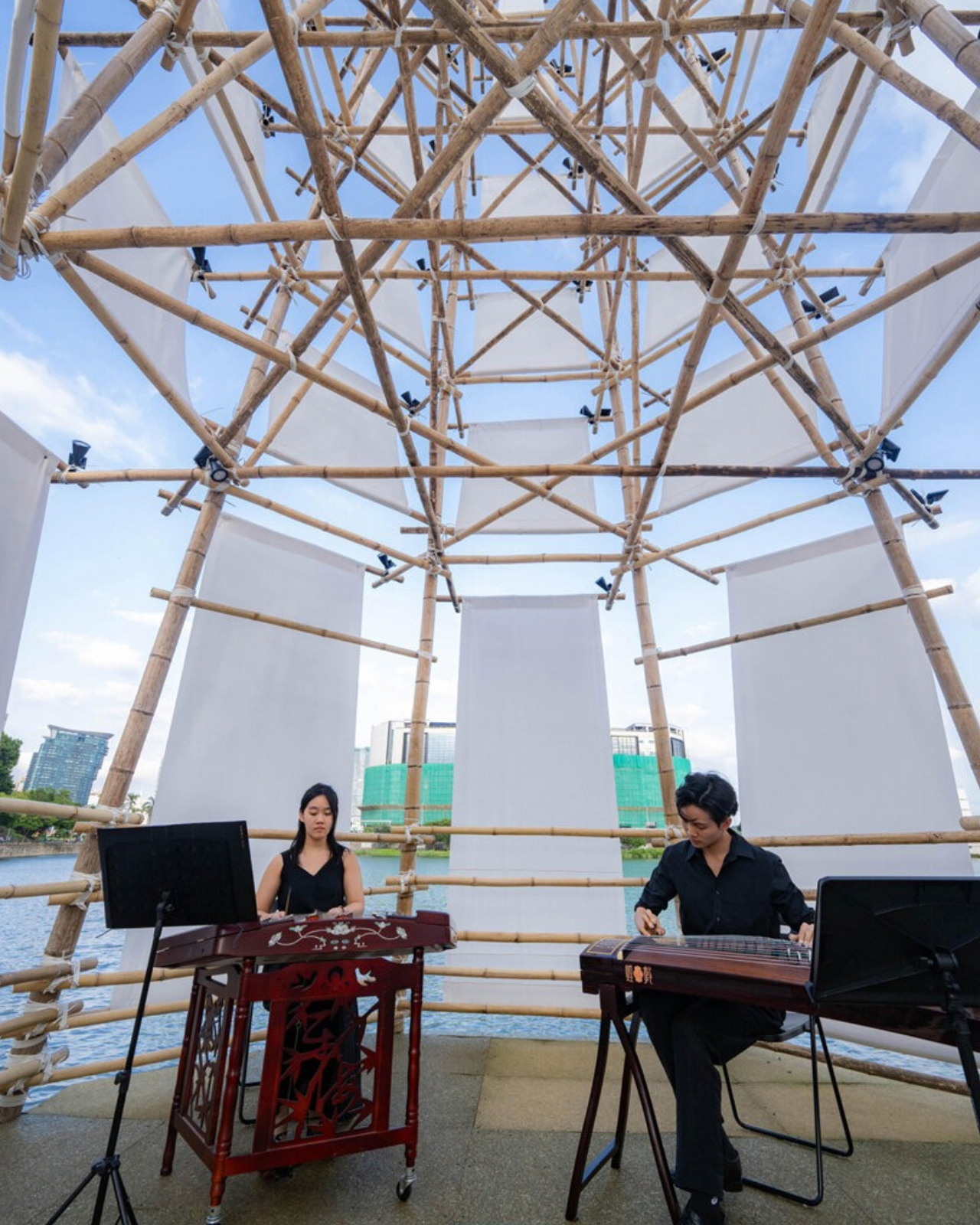
The structure borrowed from traditional pagoda geometry, rising from an octagonal base and tapering upward. Slender bamboo poles formed its exposed structural frame, joined using traditional scaffolding lashings. That construction gives the design its strongest architectural idea: the connections and supporting members remain part of the expression. I’d rather understand how a pavilion stands up than have its structure disappear behind a decorative surface. Here, the craft supplied both the framework and the character.

That craft also deserves more attention than a passing reference to tradition. Macau added bamboo scaffolding to its Inventory of Intangible Cultural Heritage in 2017, and local scaffolding contractor Seng Kei Pang Chong worked on the pagoda. Those credits matter. Architectural heritage depends on people who know how to make things, not simply designers who appreciate their appearance. Giving those skills a public-facing role strikes me as a meaningful way to keep them relevant.
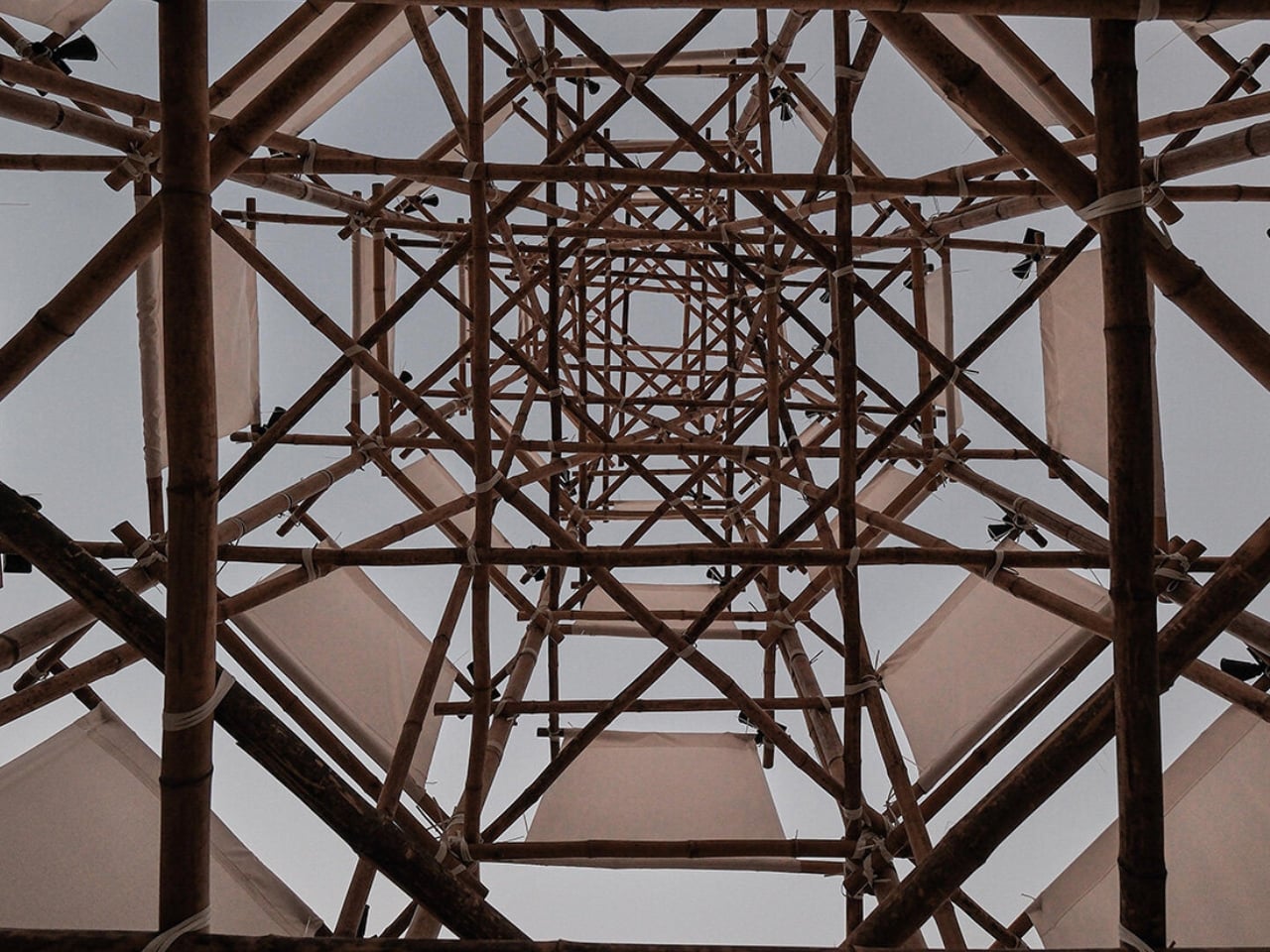
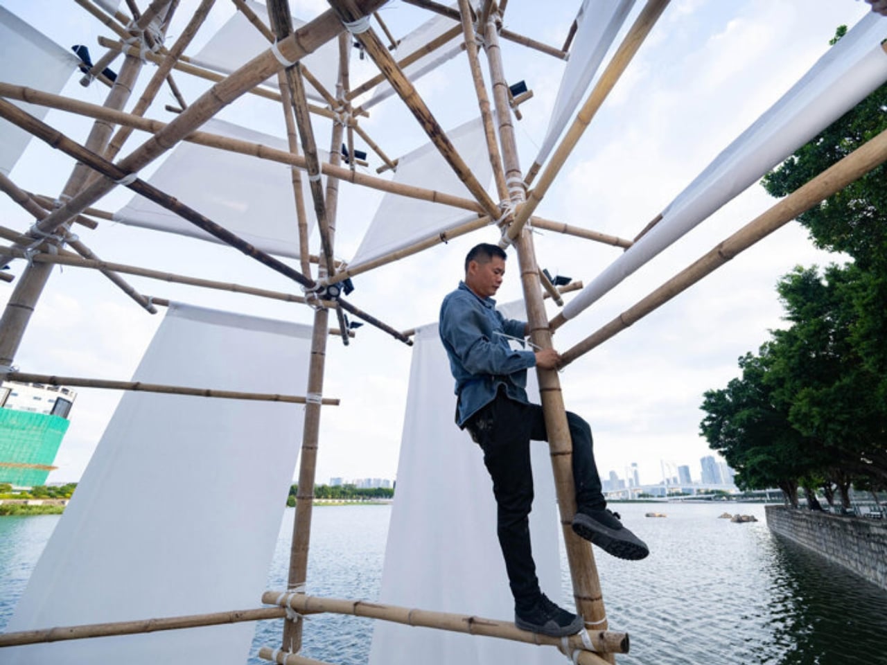
A semi-translucent bamboo-fabric skin wrapped the frame, filtering daylight rather than enclosing it behind an opaque wall. The material choice makes sense for a place intended for contemplation: it establishes a boundary without treating the waterfront as something to shut out. I wouldn’t confuse that intention with proven acoustic quiet or weather protection. The more convincing proposition is spatial, giving visitors a defined place to stop beside the water.

Underfoot, the material story took an unexpected turn. Macau-based Zence Object Technology, also known as CHAZENCE, supplied composite floor panels made with recycled tea waste and discarded wood chips. Tea waste is an appealing detail, but its use as flooring is what makes it interesting. Here, a byproduct became part of a usable architectural surface. That’s a more substantial design decision than adding a recycled-material accent for visitors to admire and then forget.
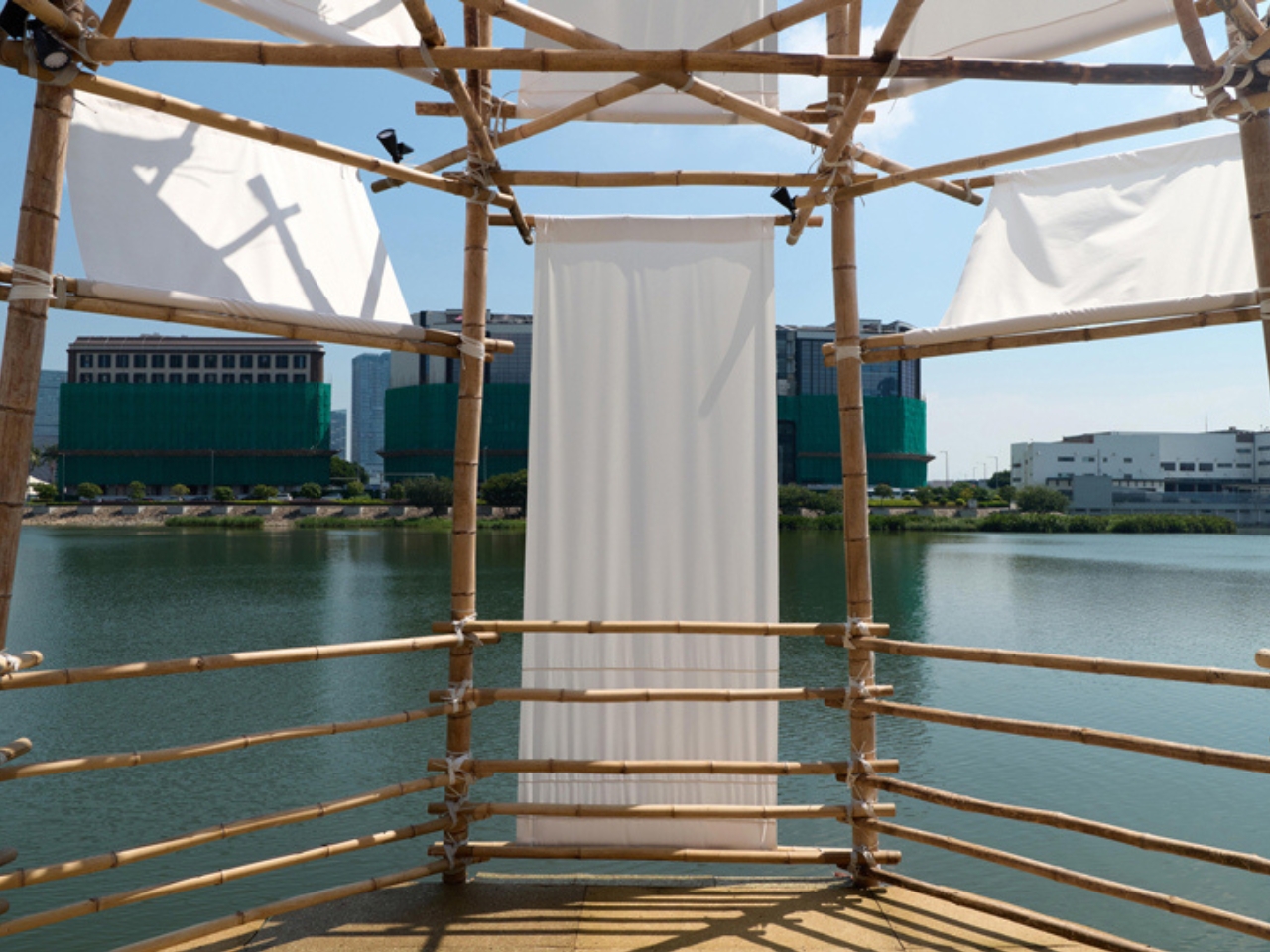
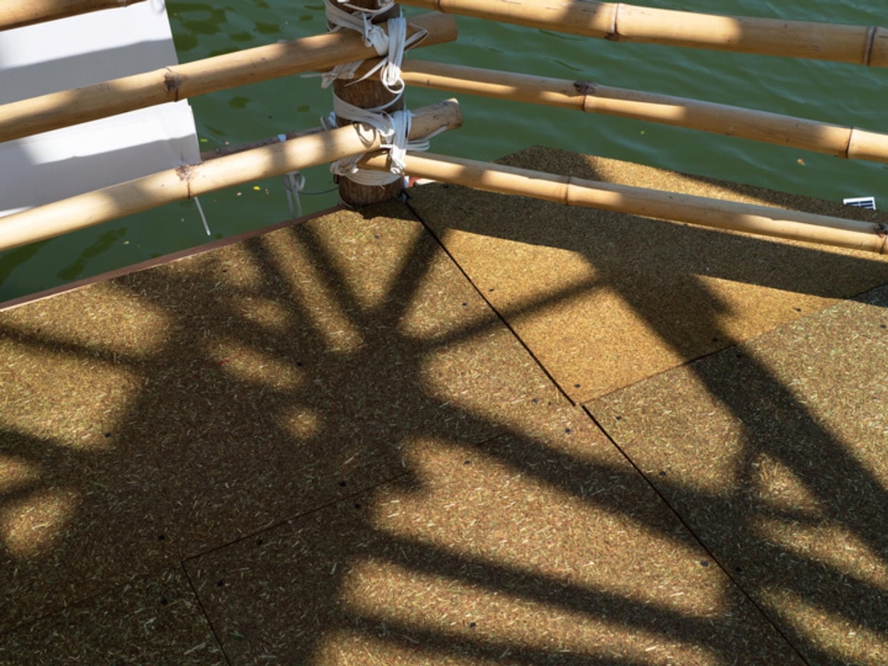
Solar panels also powered the installation’s spotlights, according to local reporting. Alongside the previously used bamboo and tea-waste flooring, that gave the environmental intentions some specific substance. Still, those choices don’t establish the project’s total carbon footprint or prove that every component avoided waste. I find the individual decisions persuasive enough without asking them to support a sweeping sustainability claim. Knowing where a material came from is a useful place to start.

The brief lifespan is the tradeoff I’m less ready to romanticize. The public program lasted only a week, which limits the everyday usefulness of a space created for people to pause. A temporary pavilion can’t substitute for lasting access to welcoming public places. But it can make a proposal tangible. Instead of leaving the idea of a contemplative waterfront space in a planning document, the organizers gave visitors an actual structure to enter.

For me, Bamboo Pagoda’s appeal rests in the relationship between its scale and its purpose. A tower about 43 feet tall sounds like an attention-seeking gesture, yet the stated invitation was simply to stop and reconnect with the waterfront. The reused poles, visible construction, and small floor area kept that invitation grounded in a particular place and building culture. I’d like more public design to make room for an activity as undemanding as taking a pause.

The post Old Bamboo Scaffolding Becomes a Retreat, but Not Forever first appeared on Yanko Design.
  •  

LEGO Bauhaus Chess Concept Has Hidden Clues to Its Moves

A knight’s horse-shaped head is easy to recognize, but it offers no clue about that peculiar L-shaped move. That’s a small frustration with learning chess: identifying the pieces and remembering what they do are two separate tasks. I like the idea of giving their shapes a little more responsibility, especially when the alternative is explaining the knight’s movement for the fifth time.

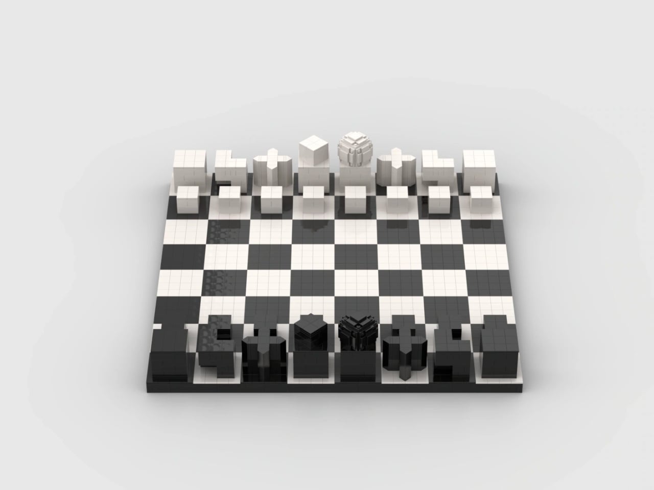
Pinke Gans’s Bauhaus Chess Set, a LEGO Ideas fan concept, takes that possibility as its starting point. According to the designer, the idea emerged during a summer visit to the Bauhaus Museum in Weimar, Germany, where Josef Hartwig’s geometric chess pieces brought LEGO bricks to mind. It’s an appealing connection: a construction system built around basic shapes meets a chess set designed to make those shapes meaningful.

Designer: Pinke Gans

Hartwig designed his Bauhaus chess set in 1923, while working at the school in Weimar. Its abstraction wasn’t simply a matter of removing decorative details. The pieces used their forms to communicate their movement, replacing familiar figures with a geometric vocabulary. A minimalist chess set can still leave you memorizing arbitrary symbols; Hartwig’s approach gives some of those symbols a practical explanation.

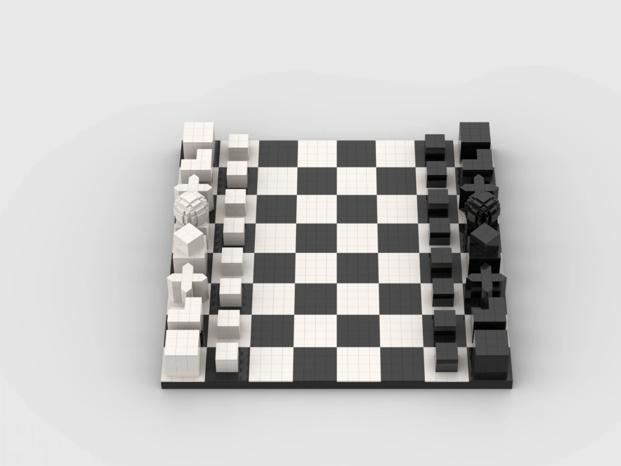
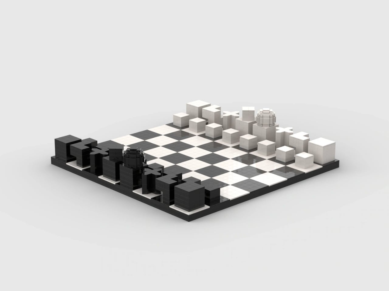
The knight is the clearest example. Its stepped shape echoes its L-shaped movement, while the bishop’s diagonal cross relates to its diagonal paths across the board. Pinke Gans’s version carries those recognizable forms into bricks. These are useful memory cues, not a complete substitute for learning the rules. Nobody should expect a small cube to explain every complication of a pawn’s first move or capture.

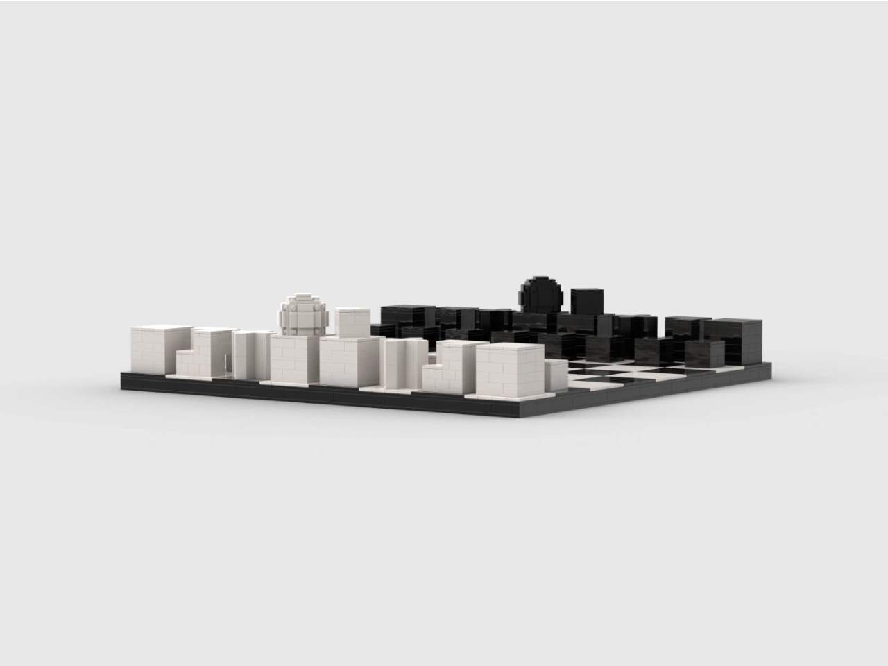
In the supplied images, the queen provides the most conspicuous departure from all those straight edges. Its rounded top becomes a faceted, layered construction, with individual elements visible around its surface. Nearby, the king has a smaller cube turned relative to its base. Together, they introduce enough variation to interrupt the rows of blocks. The brick-built approximation of a sphere gives the queen a texture of its own.

That translation is more interesting to me than a perfectly smooth replica would be. Historical examples of Hartwig’s set were made in wood, so rebuilding the forms in LEGO changes how their surfaces read. Here, joints and tile seams remain visible. They establish a second, finer grid within the larger chessboard pattern, making the construction legible even where exposed studs don’t dominate the design.

The board itself stays restrained: black and white squares, a dark perimeter, and no elaborate scenery competing with the pieces. From the lower viewing angles, the arrangement resembles a small collection of architectural models. I could see this earning its place on a living room table because the visual interest comes from proportion and repetition, rather than decoration.

There is a potential usability tradeoff, though. If you already recognize conventional chess silhouettes instantly, a geometric set asks you to learn a different identification system before its logic becomes helpful. A blocky king and a rounded queen might be clear once explained, but that doesn’t establish faster recognition during play. The images also can’t tell us how securely the pieces hold together when repeatedly picked up.

The project is presented as a LEGO Ideas proposal, rather than an announced retail set. That distinction deserves to stay attached to the enthusiasm. Fan product ideas that reach 10,000 supporters may be considered for production, but reaching that threshold doesn’t itself put a box on store shelves. This submission shouldn’t be treated as a confirmed release or given an imagined price.

For me, the strongest reason to want it is the opportunity to assemble the shapes before playing with them. Building a knight’s stepped form could make its design rationale more tangible than simply reading an explanation beside a finished piece. You’d still need to learn chess. But spending a little time constructing the thing that represents a move seems like a particularly appropriate introduction to Hartwig’s idea.

The post LEGO Bauhaus Chess Concept Has Hidden Clues to Its Moves first appeared on Yanko Design.
  •  

MagBoard Clipboard Rearranges Notes Without Tearing Pages

I’m a big fan of notebooks, as evidenced by the ton of used and unused ones that I have sitting at home. But there are times when I’m working on a project and wish there were a way to rearrange my notes without having to tear the pages out because it hurts my heart to actually tear pages out of anything bound. Sure, you can use notepads with tearaway pages, but it’s hard to keep them together when needed.

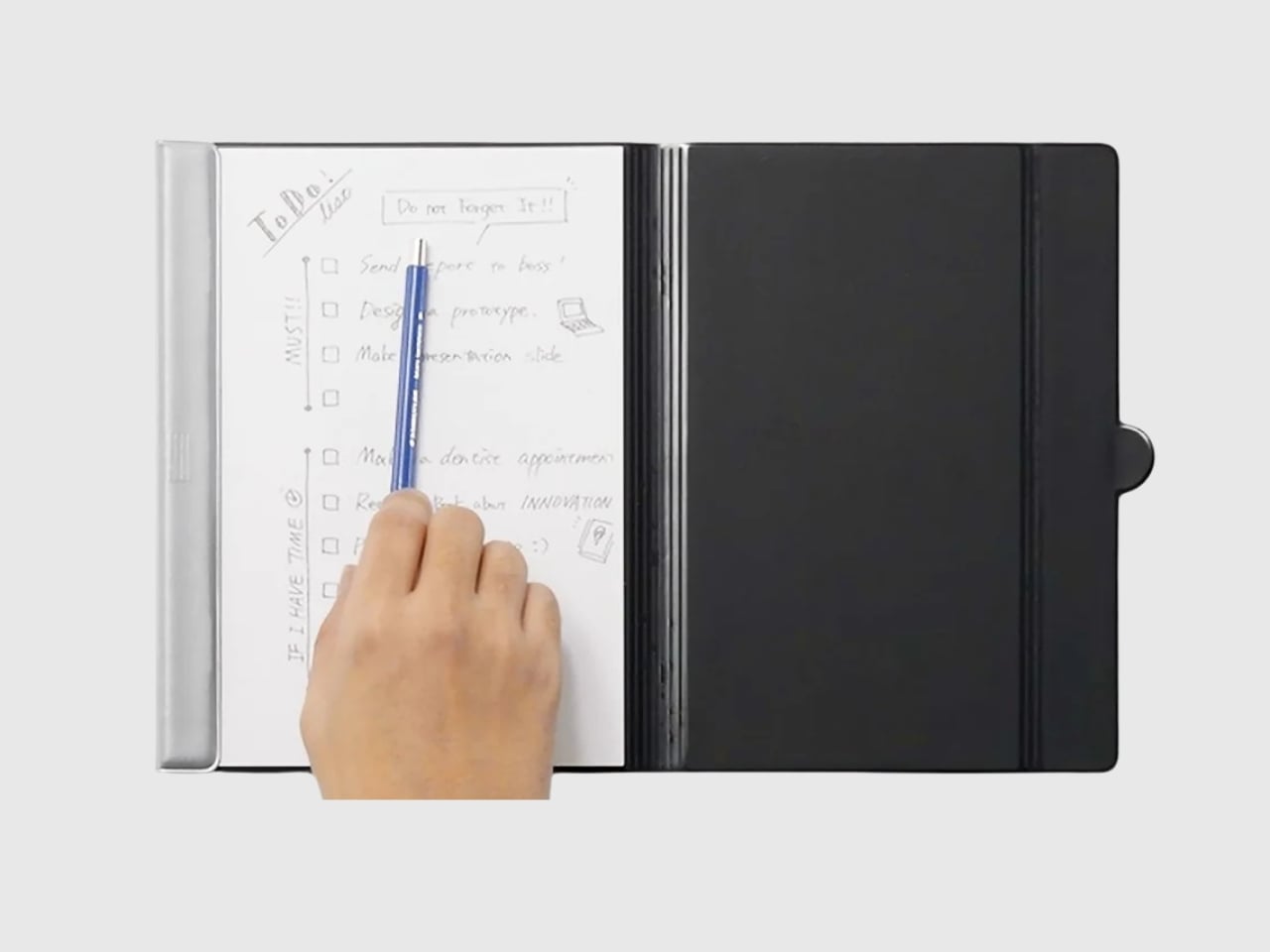
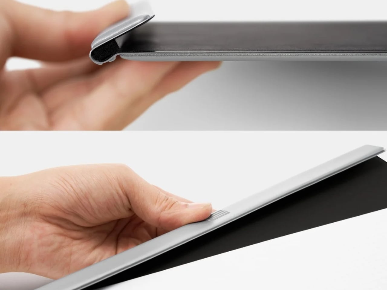
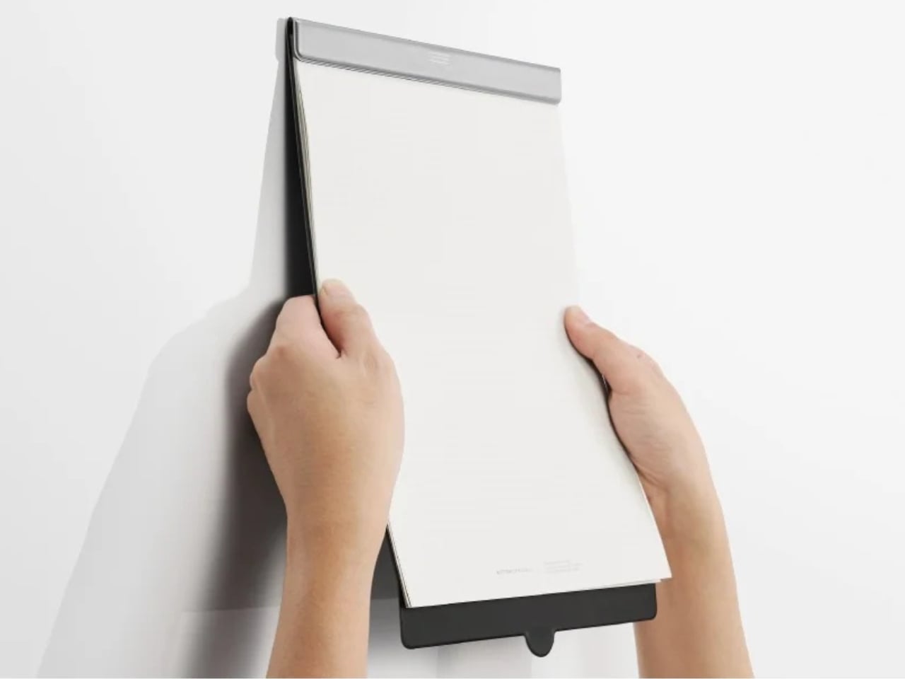
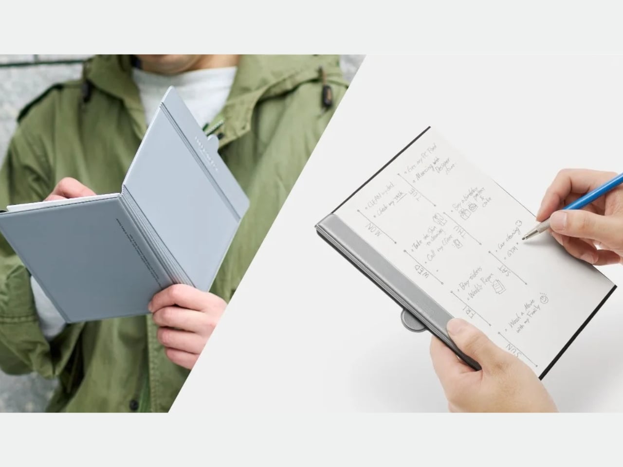
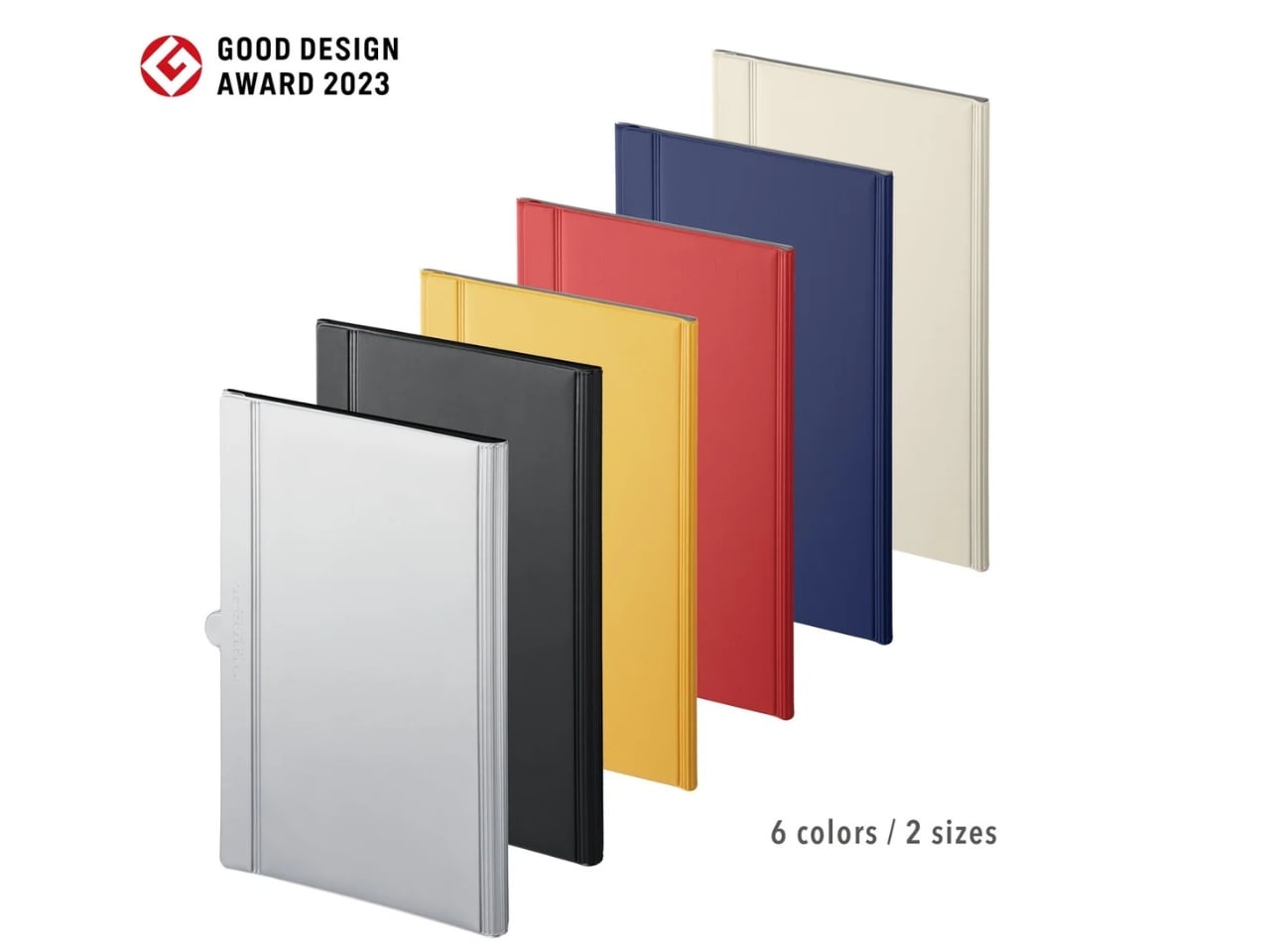
The MagBoard Clipboard is an alternative you can use if you don’t need a fixed notebook structure but still want to keep those pages flexibly organized. It’s a hardcover, loose-sheet notepad and clipboard that uses a magnet-and-lever mechanism to hold the pages together. You can rearrange them when needed without keeping them permanently bound.

Click Here to Buy Now: $45

Unlike the pages of a notepad, which can be difficult to keep together once you’ve torn them from their binding, these loose sheets can be secured by the mechanism, then released and reorganized as needed. It can hold up to 30 sheets, which could be enough for your notes, sketches, and project plans for the specific thing you’re working on. It’s a working collection rather than somewhere to archive everything.

For example, you could keep your initial sketches next to your revised ideas instead of having them separated by several pages of unrelated notes. If a project changes direction, you can change the order of the pages along with it. You can also remove completed tasks and add fresh sheets without starting another notebook just because the existing one no longer feels organized.

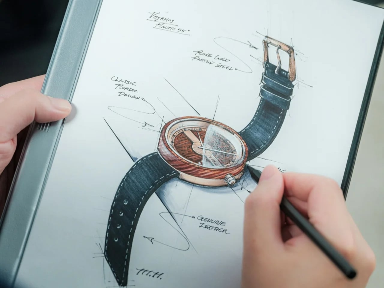
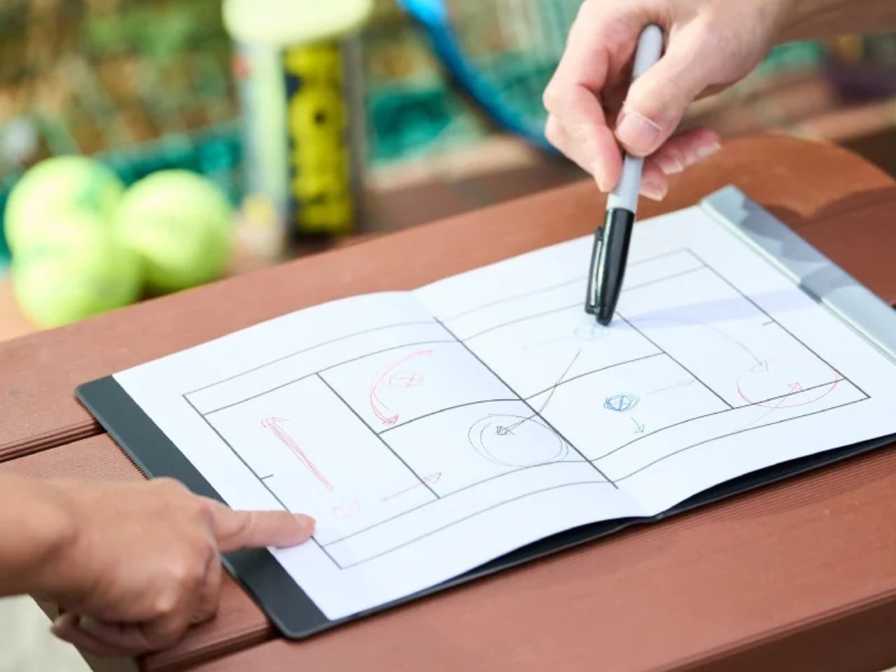
The hardcover serves a practical purpose as well, aside from looking good. The seller says it provides support for taking notes or sketching while standing. This could be useful if you’re doing a walkthrough for an event, stopping to take notes while going through an exhibit, or attending a lecture where you’re not at a desk. Not every notebook or notepad provides enough support for writing without a table underneath it, so the clipboard aspect has a practical role here.

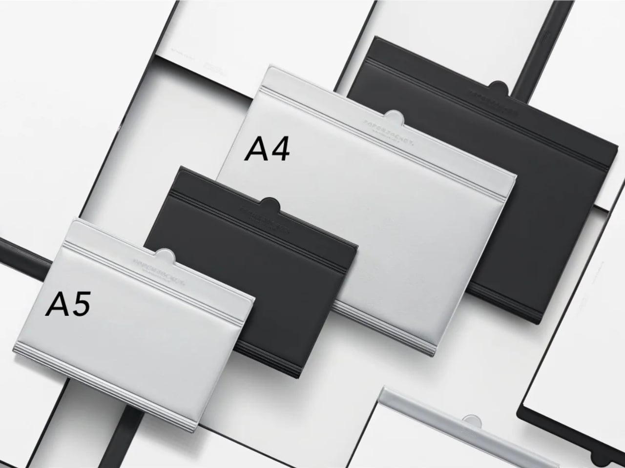
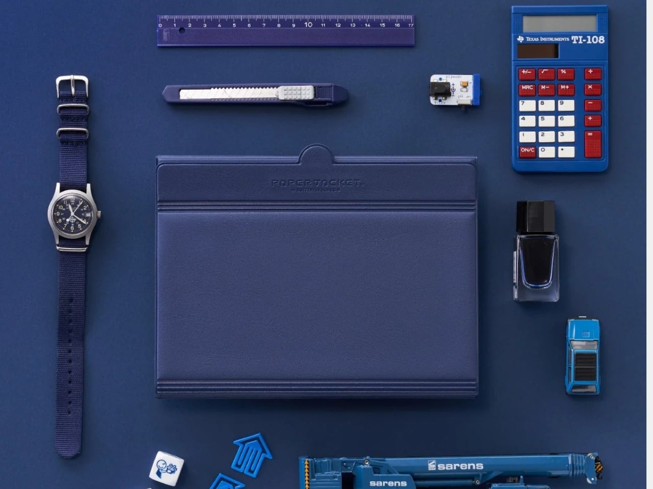
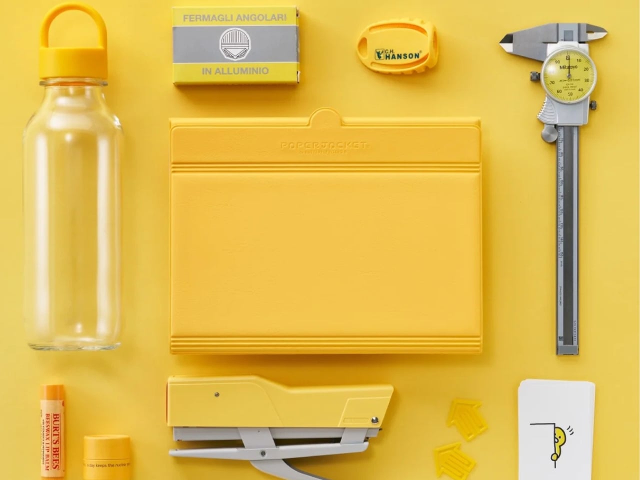
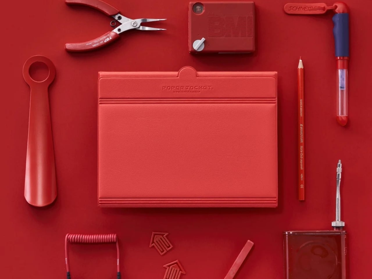
The cover is also described as water-resistant and easy to clean, but note that this doesn’t mean the paper inside is waterproof. It comes in two sizes: the smaller A5 option for a more compact way of taking notes and making sketches, and the A4 size, which gives you more space for larger drawings, printed references, and documents. The listed colors are silver, black, red, navy, and yellow, although availability may vary by size and color.

Of course, rearrangeable pages aren’t exclusive to MagBoard. Established stationery brand KOKUYO offers the Campus Smartring Slim Binder, whose A5 version holds up to 25 sheets and uses 20-hole loose-leaf paper. Its cover also folds back. MagBoard holds sheets with its magnet-and-lever clip rather than rings, so there’s no need to punch matching holes in the paper. KOKUYO makes sense if you like a ring-bound system, while MagBoard could appeal more if you want to keep unpunched sheets together. The difference is less about whether you can rearrange pages and more about how you want to hold them.

That freedom still comes with some organizing on your part. Once you remove a sheet, you’ll need somewhere to keep it if you want to refer to it later. A folder for finished work could help keep the clipboard focused on your current project. Otherwise, you’re back to the same loose-paper pile you were trying to avoid in the first place.

I don’t think something like this would replace all the notebooks sitting at home, especially the ones I use for keeping things in chronological order. But for projects that involve moving ideas around, combining references, and changing plans, the MagBoard Clipboard’s format makes sense. Sometimes, I don’t need a new notebook. I just need a way to keep my pages together without deciding that their order has to stay that way forever.

The post MagBoard Clipboard Rearranges Notes Without Tearing Pages first appeared on Yanko Design.
  •  

Voxel the Robot Wants to Tidy Your Home Without Looking Human

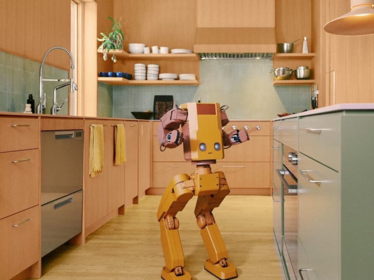
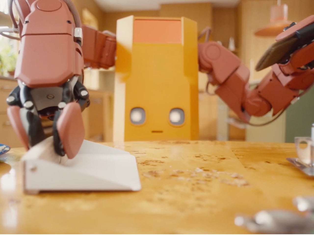
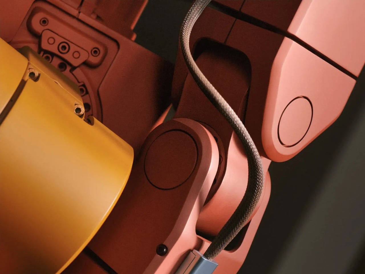
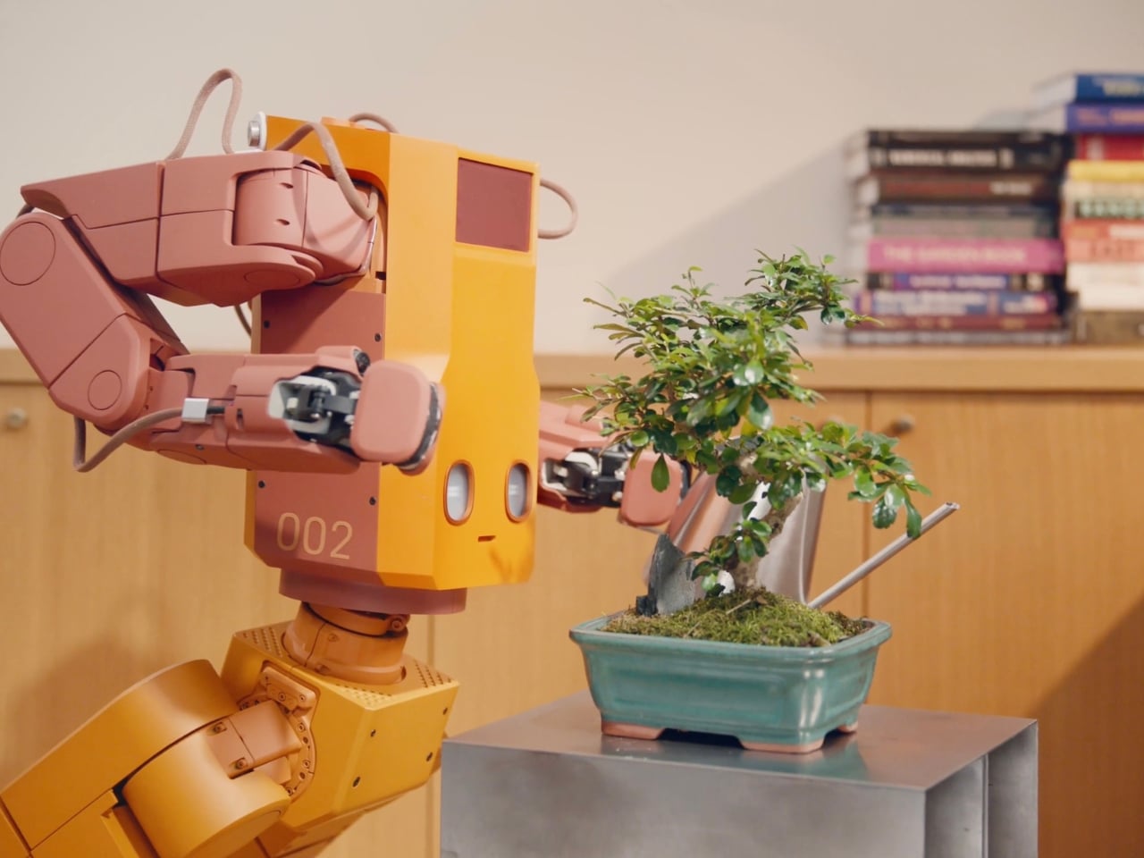
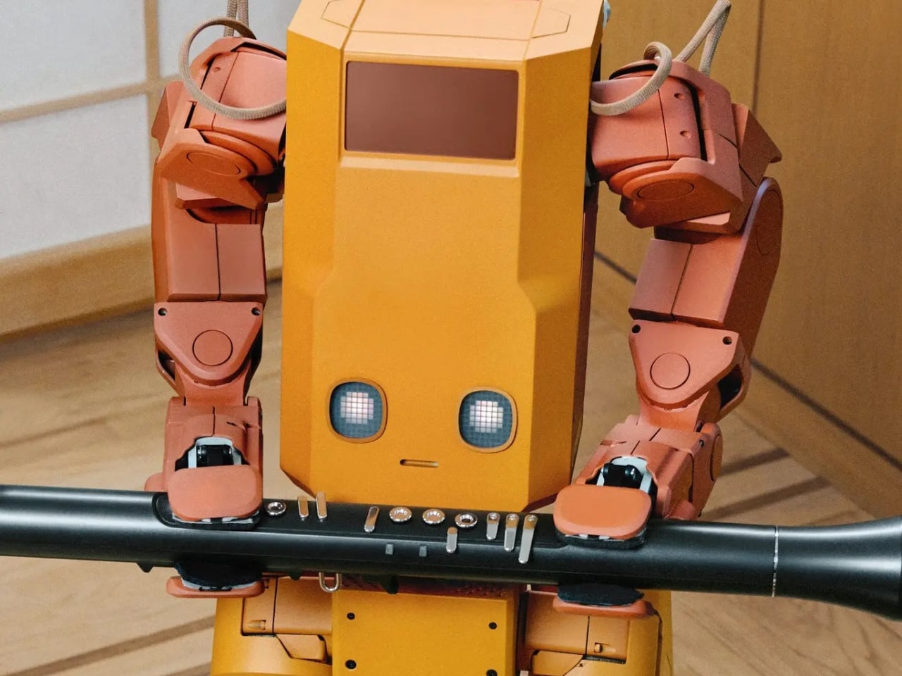
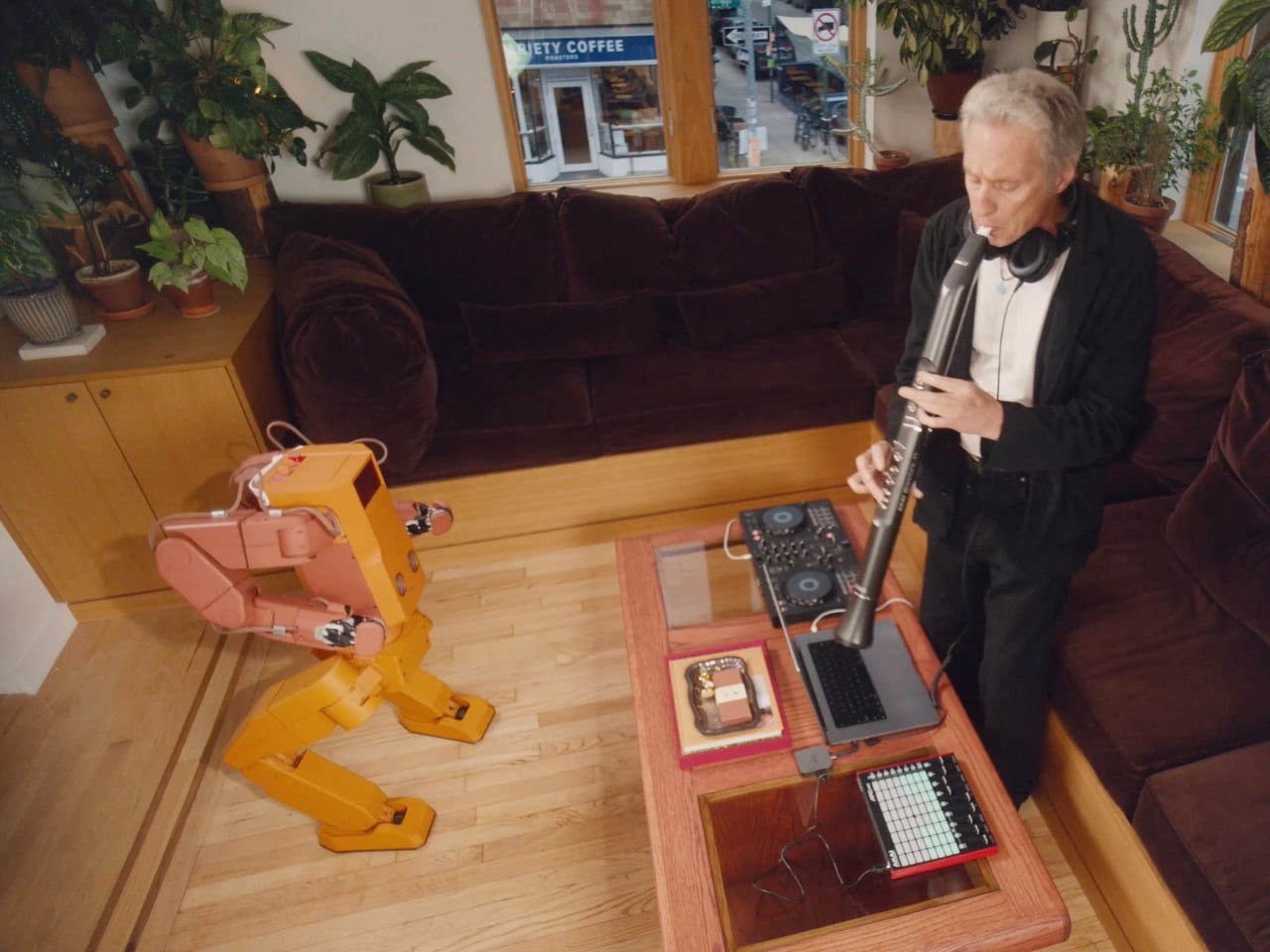
A mustard-yellow body, rosy arms, and bent legs make this household robot look like it might wander out of an animated movie and ask where you keep the mugs. Its illuminated eyes sit low on a boxy torso, leaving a lot of forehead, if that’s even the right word. I like the awkward proportions. They give it character without trying to pass for a person.

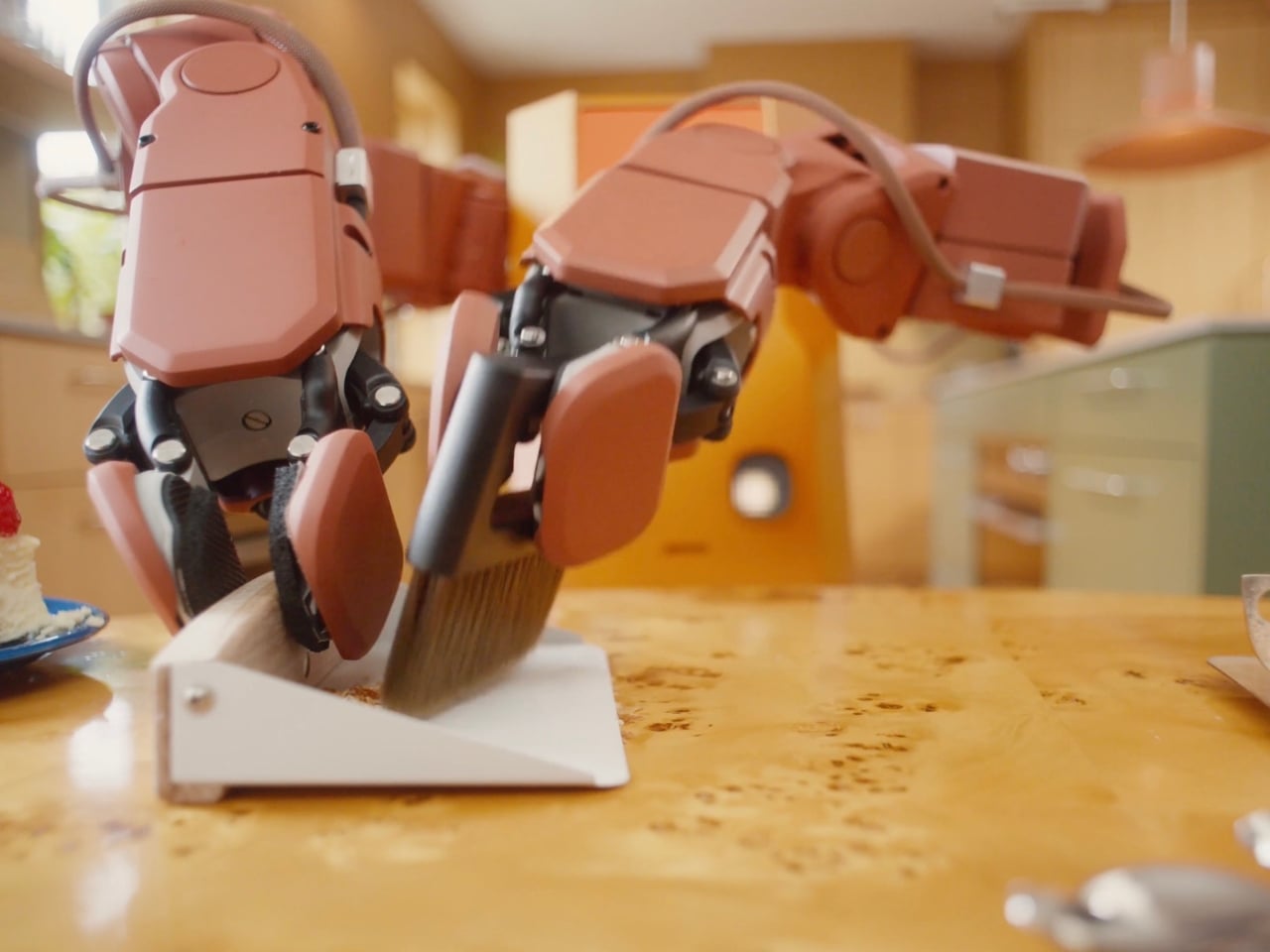
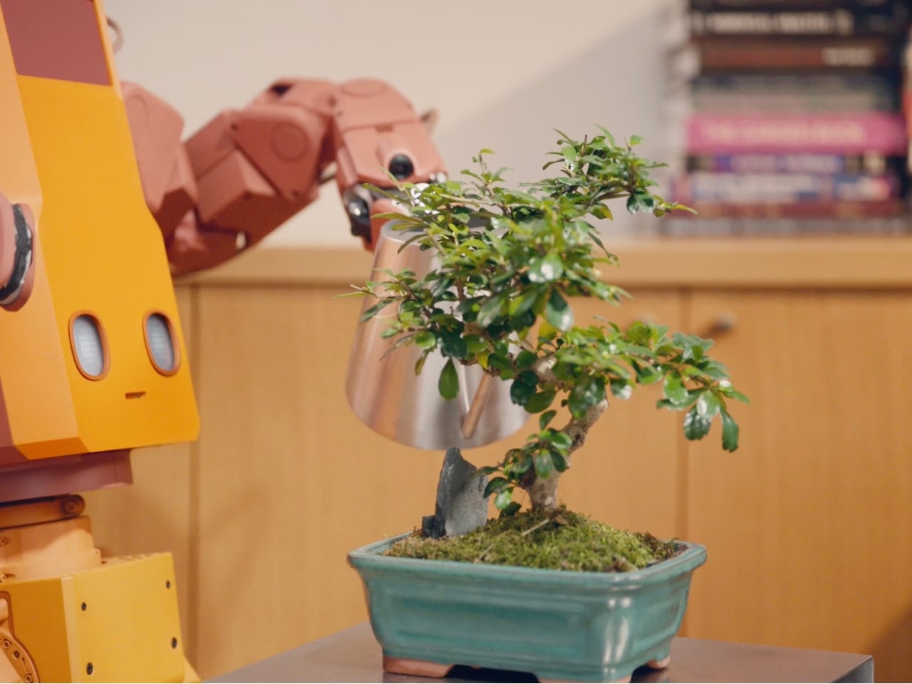
Called Voxel, the robot is being developed by New York company Tuesday Labs to tackle the little jobs that keep a home from staying tidy. Put the book away. Bring over a drink. Water the plants. Remember where the wallet went. Those are the four roles outlined for the robot: Home Reset, Fetch, Tend, and Find.

Designer: Tuesday Labs

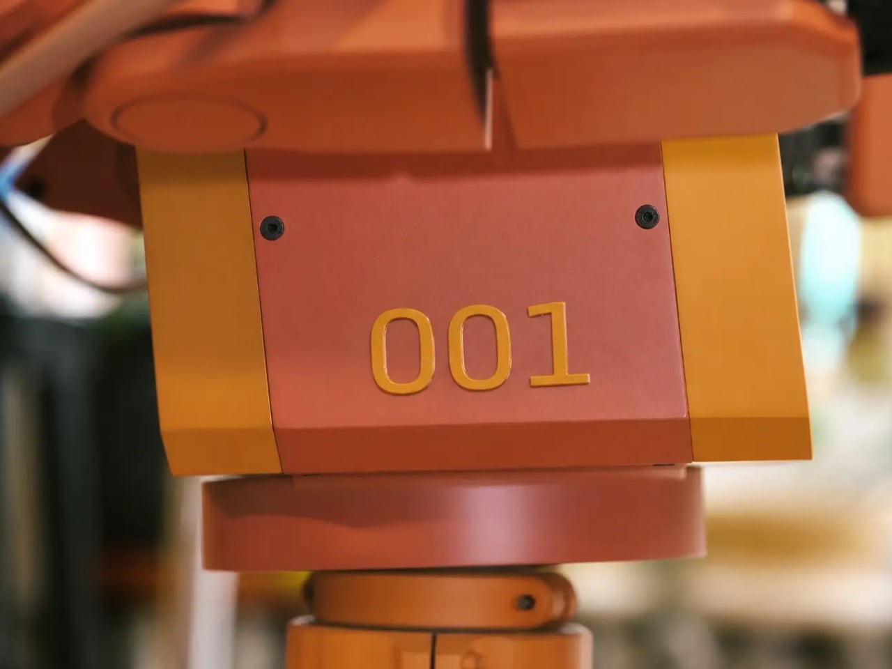
For now, though, Voxel is a development prototype, not a household appliance you can order for next weekend. Tuesday Labs expects to substantially redesign its hardware before delivery, and its reservation agreement says appearance, capabilities, and specifications may change significantly. That distinction matters here because the version we’re admiring is also a design proposal, not a settled promise about what arrives at your door.

Still, I’m glad the proposal has a point of view. The warm colors and exposed joints make Voxel look approachable to me, while the unapologetically mechanical body avoids the strange social expectations of a realistic human face. Tuesday Labs works with illustrators, animators, and character designers on its robots. You can see why that matters: a machine sharing your kitchen has to be tolerable company, even when it isn’t doing anything.

The hardware description is more practical than the cartoon styling suggests. Each arm has seven degrees of freedom and an actuated wrist, intended to help it maneuver around counters, shelves, and doors. The grippers have just one degree of freedom. That’s a relatively simple hand for a complicated environment, and I’d judge it by how consistently it handles everyday objects rather than how convincingly it imitates fingers.

Find is the feature that makes the premise feel especially relatable. Tuesday Labs says Voxel would tell you where it last saw a misplaced object. That’s a modest but useful distinction: remembering the wallet on the counter is different from magically knowing where it is now. I’d take a dependable last sighting over a confident guess, particularly during the familiar scramble to get out the door.

The plant-watering brief also sets a sensible scale for the ambition. I don’t need a robot to perform an elaborate dinner routine to understand the appeal of getting small chores off my list. The harder question is how much setup and supervision those chores would require. A helper that needs constant rescuing would simply create another household responsibility.

That attentive presence raises a less photogenic design issue, too. Voxel’s listed vision system includes stereo RGB cameras and wide-field vision. Before putting one in my living room, I’d want clear answers about what gets recorded, what stays on the robot, and who can access it. The published privacy policy covers the website, purchases, and reservations; it doesn’t establish those operating details for a robot inside the home.

The financial commitment is equally worth slowing down for. Reservations cost $200 and are fully refundable before an order is placed. The estimated purchase price is $20,000, not a fixed final price, and deliveries are expected to begin in 2028, potentially later. A reservation buys an opportunity to purchase, not a finished machine or a guaranteed arrival date.

At that price, charm would get Voxel my attention, but it wouldn’t settle the decision. I’d want to watch it repeat the same ordinary tasks, unassisted, in a room that hadn’t been carefully arranged for it. Keep the odd proportions and the expressive eyes. Just make the useful behavior as convincing as the character. A robot earns its place beside the couch by giving you fewer reasons to get up.

The post Voxel the Robot Wants to Tidy Your Home Without Looking Human first appeared on Yanko Design.
  •  
❌