Vue lecture

Never Lose Your Keys Again With a Tracker That Glows in the Dark
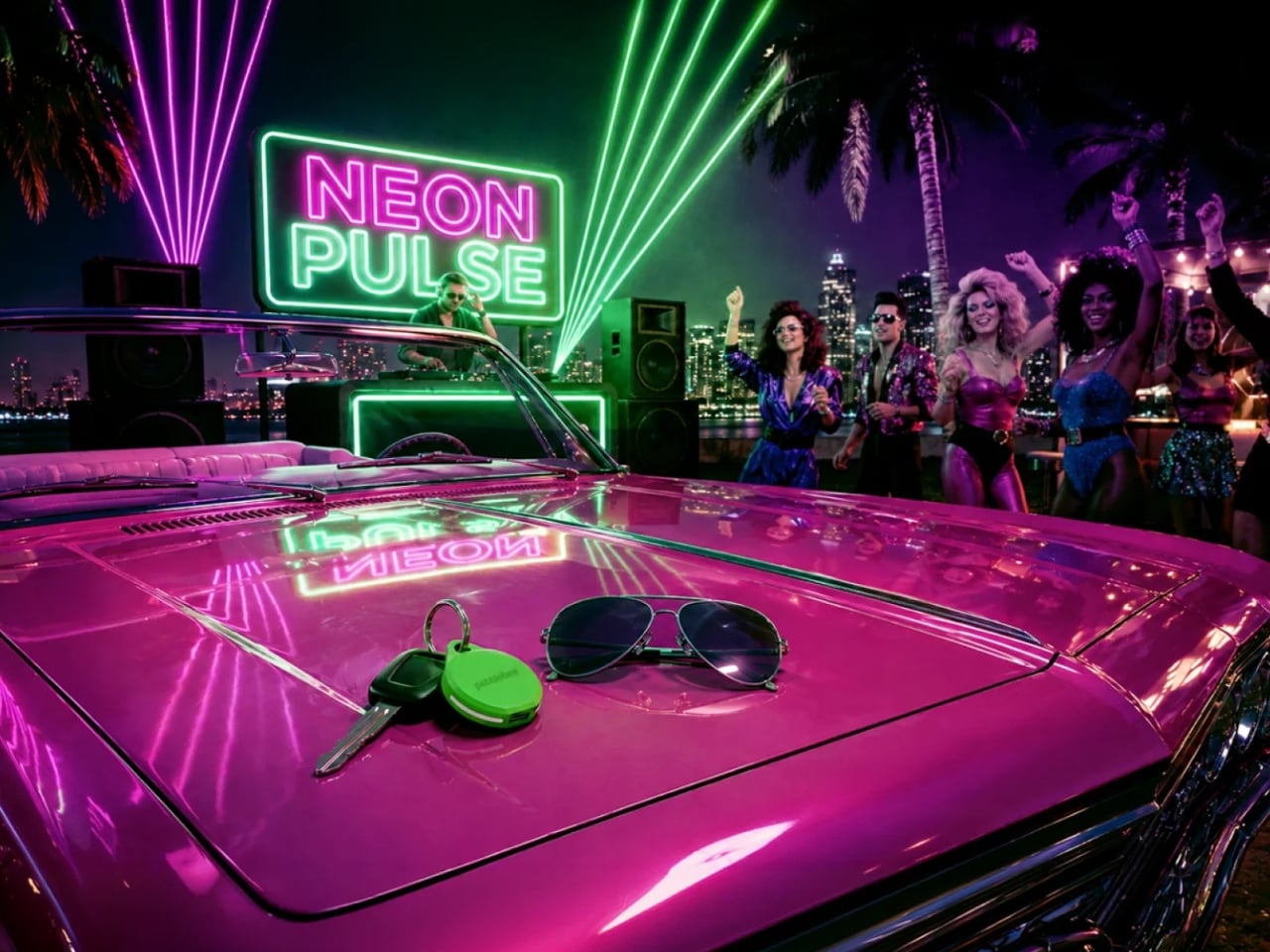
For forgetful people like me, trackers have basically become a must-have. Whether you’re clipping one onto your wallet, your car keys, your backpack, or whatever it is you absolutely cannot afford to lose, these little devices help you do exactly what they promise: keep track. The only catch is that a lot of trackers tend to look alike, and if you’re relying on appearance alone instead of the connected app, it’s easy to accidentally grab the wrong one.

If you’re after a tracker that actually stands out, and one that can even glow in the dark, Pebblebee’s latest Evercolor drop might be exactly what you need. Evercolor is the brand’s limited-edition color program built exclusively for its Clip 5 tracker, and the newest release, called Neon Pulse, comes in two eye-catching shades: Techno Lime and Hotline Pink. Pebblebee describes the collection as perfect for “bold self-expression and a fresh-season reset,” and honestly, it’s hard to disagree.

Designer: Pebblebee
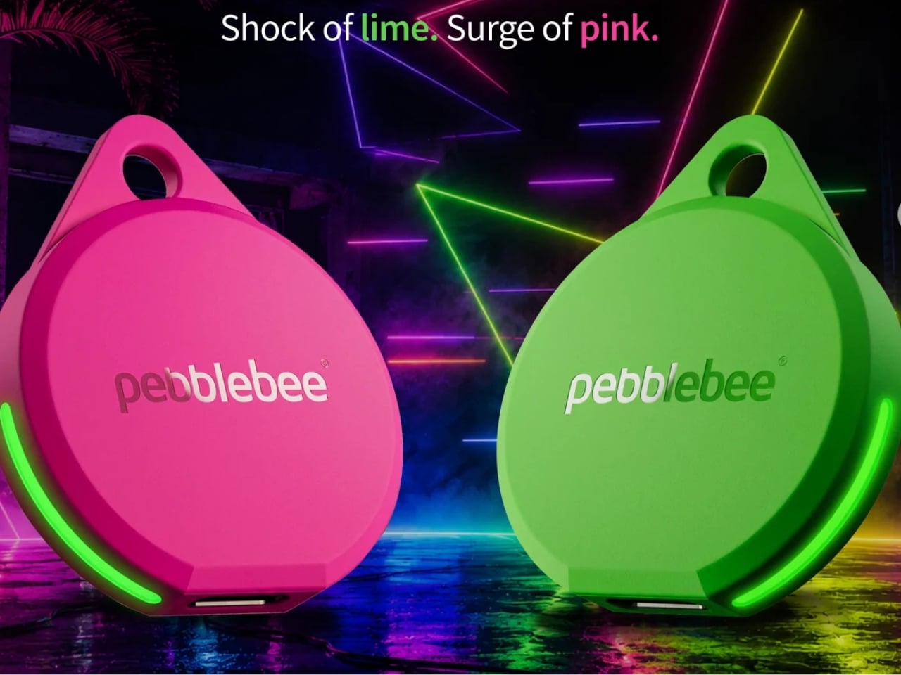
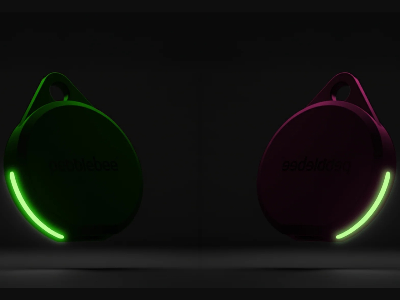
Evercolor has rolled out plenty of standout colors before, but Neon Pulse marks the first time the program has added glow-in-the-dark accents. That means your tracker stays visible even after its LED switches off, so you’re not just relying on the app to tell you where your item is. You can actually spot it in the dark, as long as it’s somewhere within eyesight.
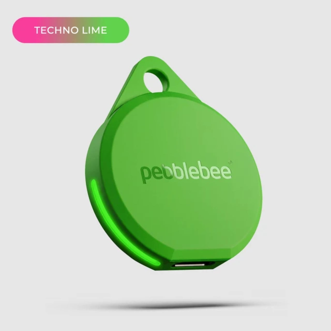
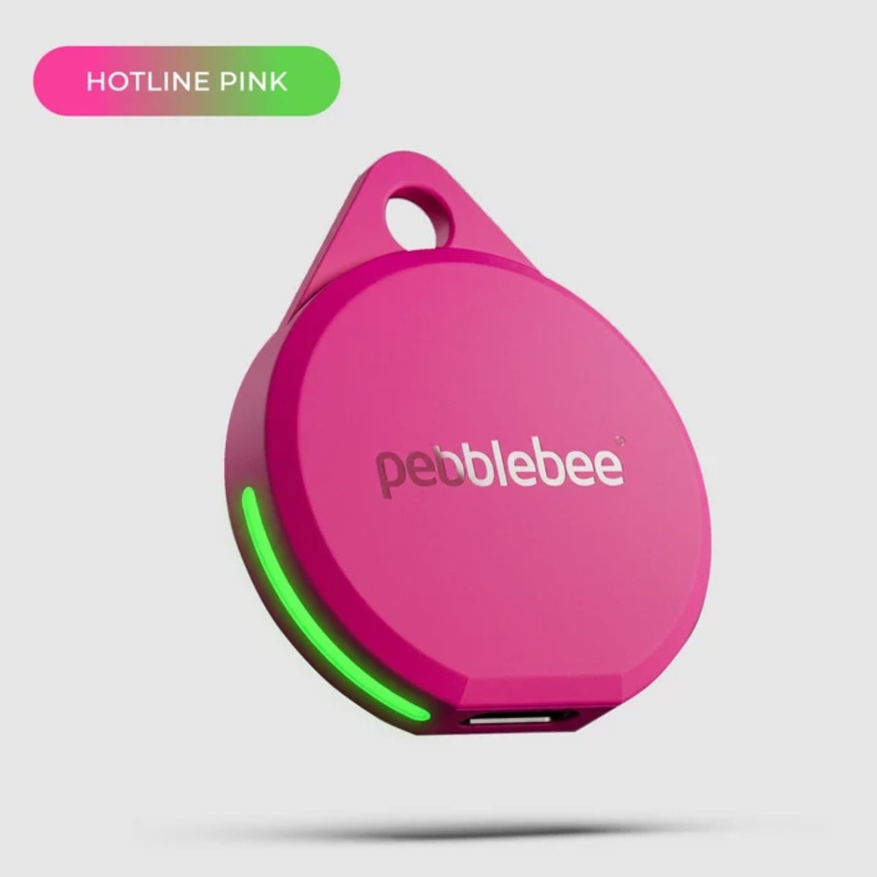
Keep in mind that this is a limited-edition release, so if hot pink and neon green happen to be your colors, you’ll want to grab them soon. Pebblebee rolls out new Evercolor shades every twelve weeks, and once a drop sells out, it’s gone for good, no restocks. Previous collections like Freeze Frame and Heatwave Hijinks have already sold out, so if Neon Pulse catches your eye, don’t wait too long to add it to your cart.


Underneath all that color, though, it’s still the same reliable Clip 5 that Pebblebee originally released. It works with both Apple and Android devices, so you don’t have to worry about switching phones down the line. The rechargeable battery lasts up to a year on a single USB-C charge, which means no more digging through drawers for spare coin batteries. It also boasts a direct Bluetooth range of about 500 feet, roughly double what a lot of competitors offer, plus access to a global crowd-network for finding your stuff even farther away. On top of that, you get a 130dB siren, a bright LED strobe, and IP66 water resistance, so it can handle a little rain or an accidental splash without missing a beat.


It’s also worth noting that Neon Pulse still costs the same $34.99 as the standard Clip 5, so you’re not paying extra just for the fresh colorway. There’s also a free built-in safety feature called Alert, which can notify you if an unfamiliar tracker seems to be following you, a nice bit of peace of mind on top of everything else. Design-wise, the compact clip-on shape makes it look less like a tech gadget and more like an accessory for your bag, wallet, or keychain. Add in the bright, playful colorway, and it becomes even more fashionable, dare we say, kind of cool. So if your main complaint about trackers has always been that they all look the same, Neon Pulse is built to solve exactly that problem.
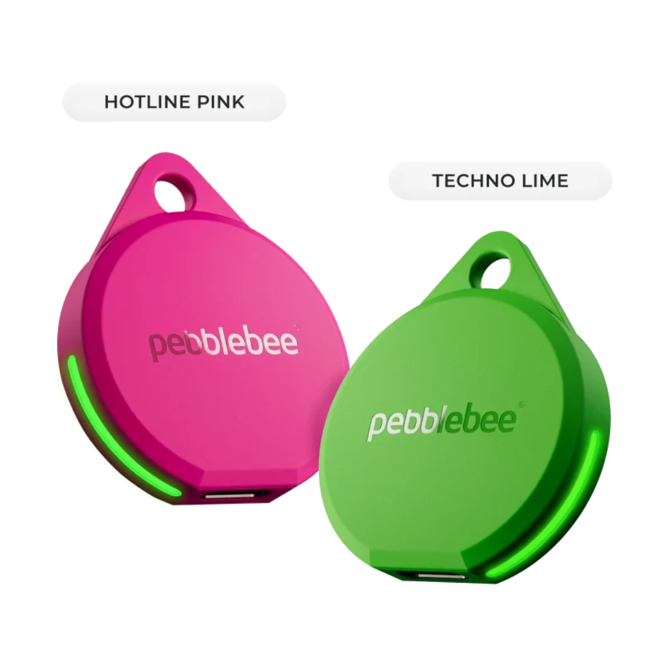
At the end of the day, a tracker is only useful if you can actually tell it apart from the pile of identical black and white gadgets everyone else seems to own, and if you enjoy using it enough to keep it clipped on in the first place. Pebblebee’s Neon Pulse drop checks both boxes, combining genuine utility with a design that feels personal rather than generic. Whether you’re the type who loses your keys weekly or you just want your tech to match your personality, this drop is worth a look before it disappears for good. And if pink and green aren’t quite your vibe, it might be worth keeping an eye on Pebblebee’s page anyway. With a new Evercolor drop landing every twelve weeks, there’s a good chance your perfect color combo is just around the corner.
The post Never Lose Your Keys Again With a Tracker That Glows in the Dark first appeared on Yanko Design.
  •  

This Photographer Spent Weeks in a Suzhou Silk Studio. Here’s What He Found

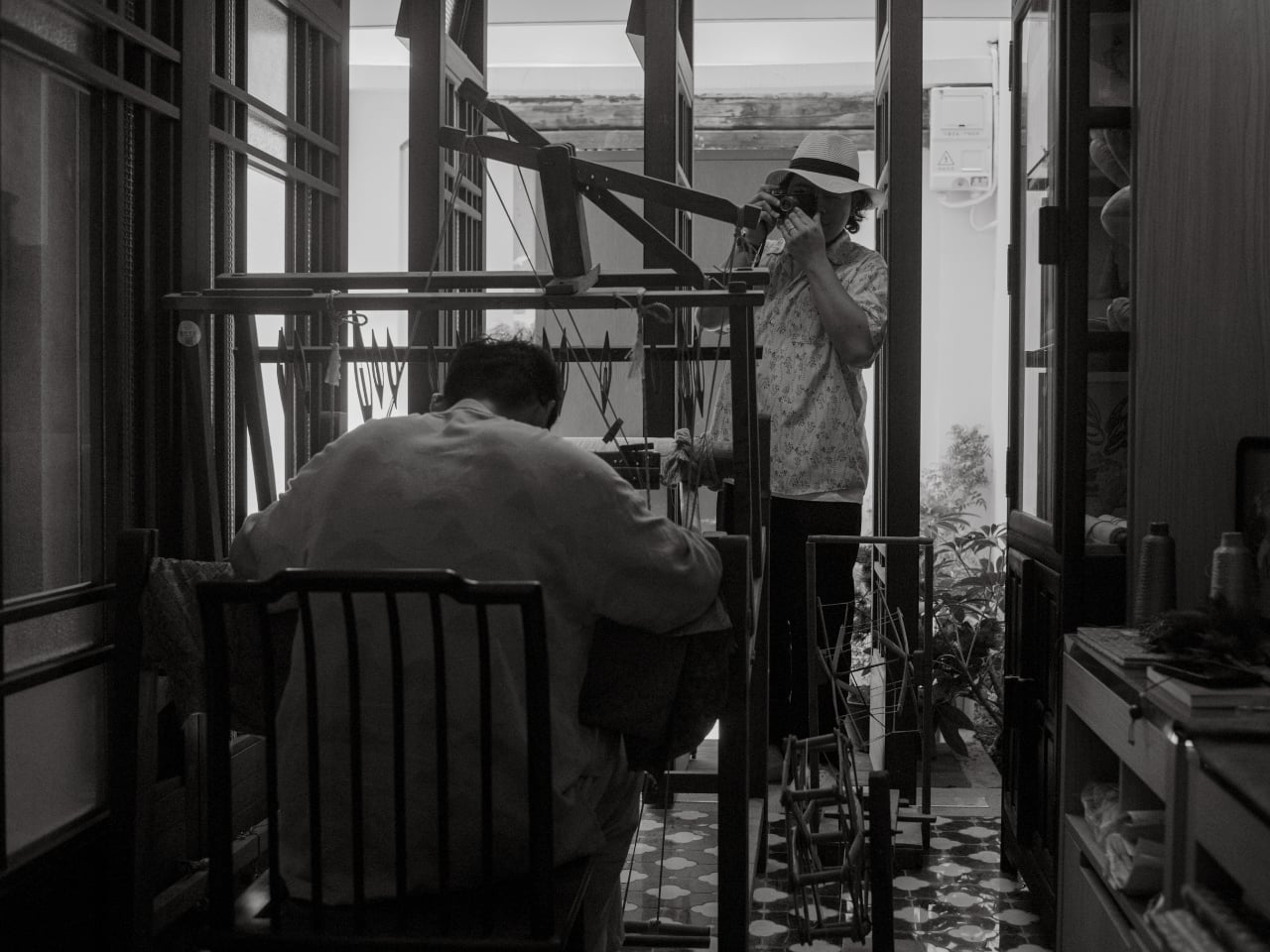
When Jing Huang walked into a kesi weaving studio in Suzhou, China, he made a decision that runs counter to almost everything happening in photography right now. He put away the instinct to explain and just started watching. For most photographers working today, that would feel like leaving something on the table. In a studio where a finished piece can take months to complete, it turned out to be the only approach that made sense.

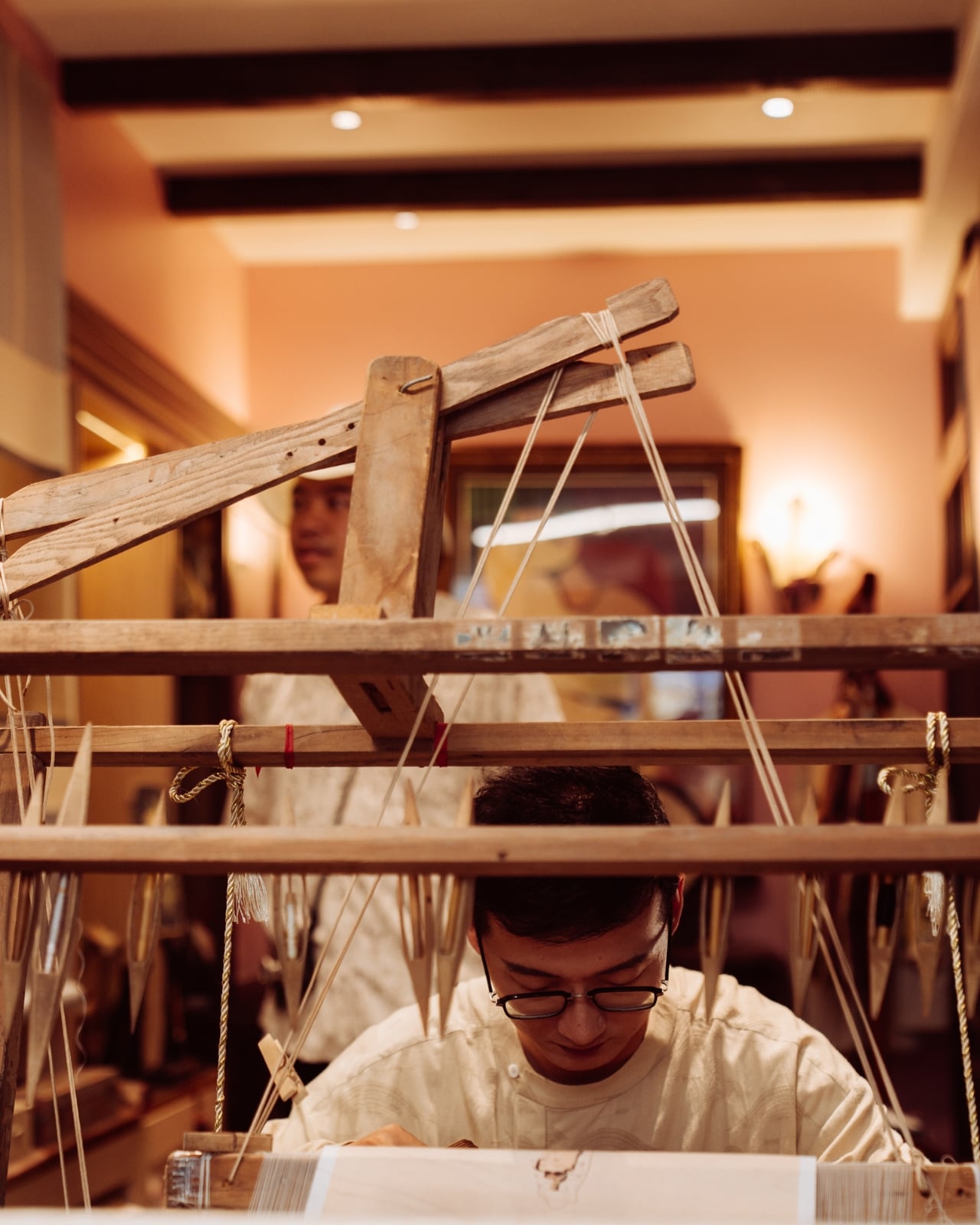
Huang is a photographer with serious credentials. He won the Leica Oskar Barnack Newcomer Award in 2011 for a series called Pure of Sight, and his visual style has always leaned toward stillness, restraint, and negative space rather than the kind of maximalist documentation that tends to flatten its subject. So when Lexar and Leica brought him to Suzhou to photograph kesi artist Hao Naiqiang, known professionally as Jingwei, the choice made sense on paper. What’s harder to predict is what happens when a photographer with that kind of discipline actually sits with a craft as slow and precise as kesi.

Artist: Hao Naiqiang (Jingwei) for Lexar and Leica

Photographer: Jing Huang

Kesi is a Chinese silk weaving technique that’s been around for centuries, and it operates on a logic completely alien to the way most things get made today. The artisan builds a piece thread by thread against a fixed warp, making constant decisions about color, contour, and rhythm with no automation, no shortcuts, and no undo button. There’s an old Chinese saying that captures it better than any technical description: an inch of kesi is worth an inch of gold. Jingwei has been practicing it for more than a decade and is formally recognized as a representative inheritor of the Suzhou tradition. Every finished piece represents a depth of time investment that genuinely earns that comparison.

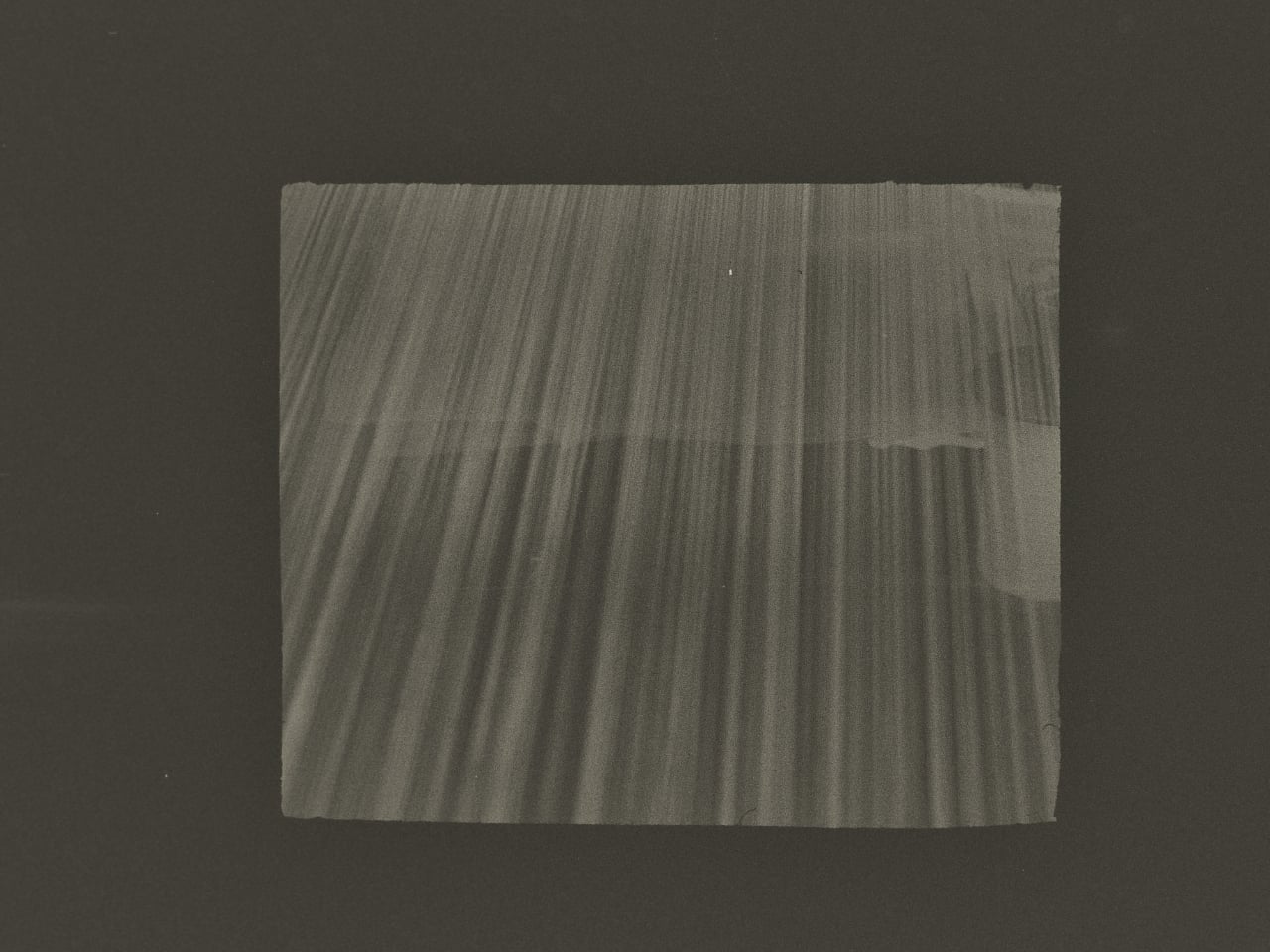
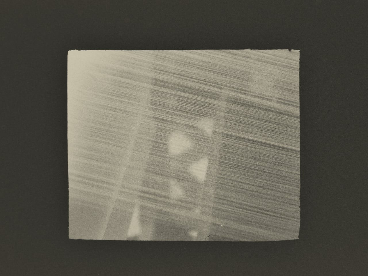
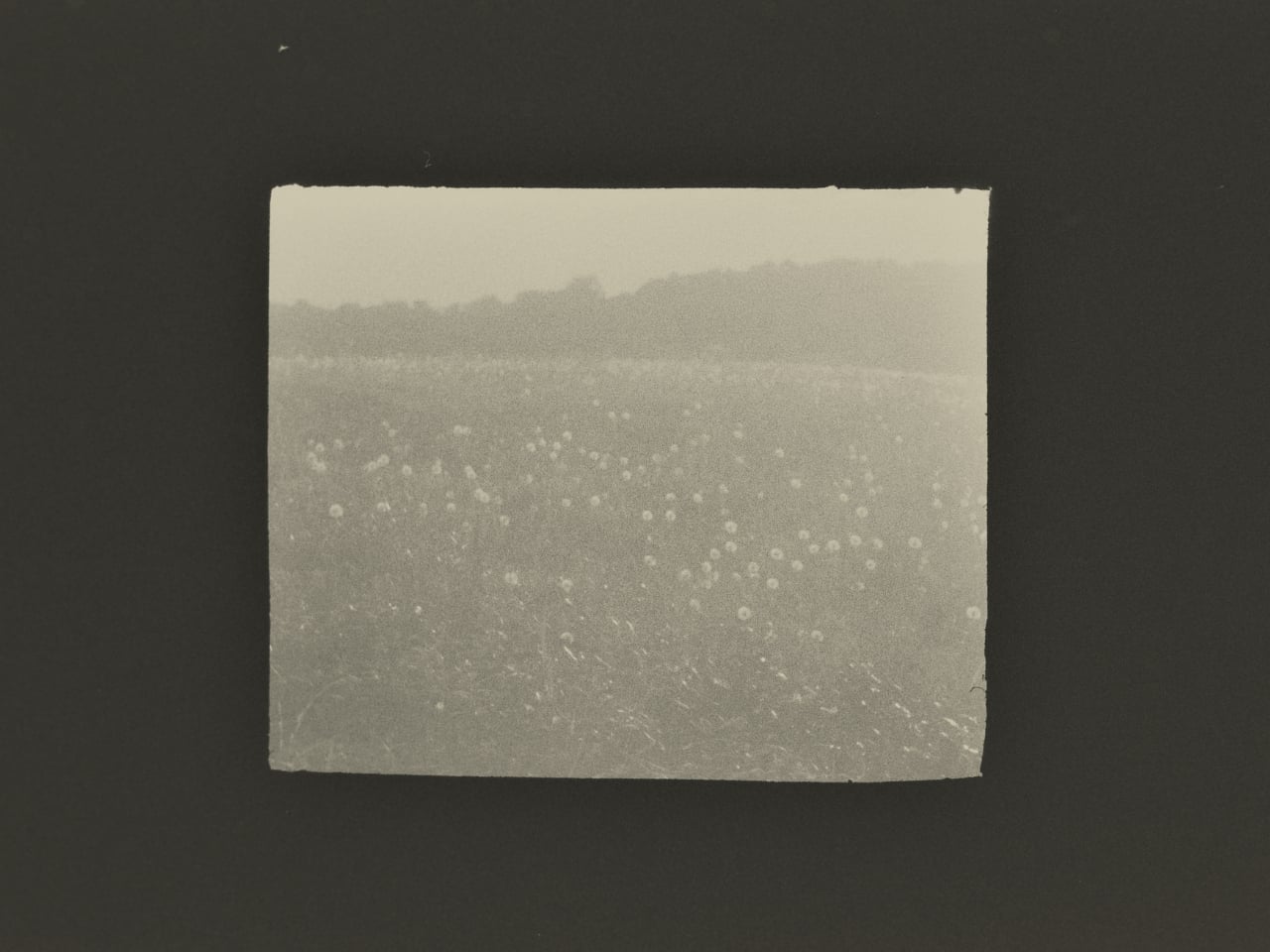
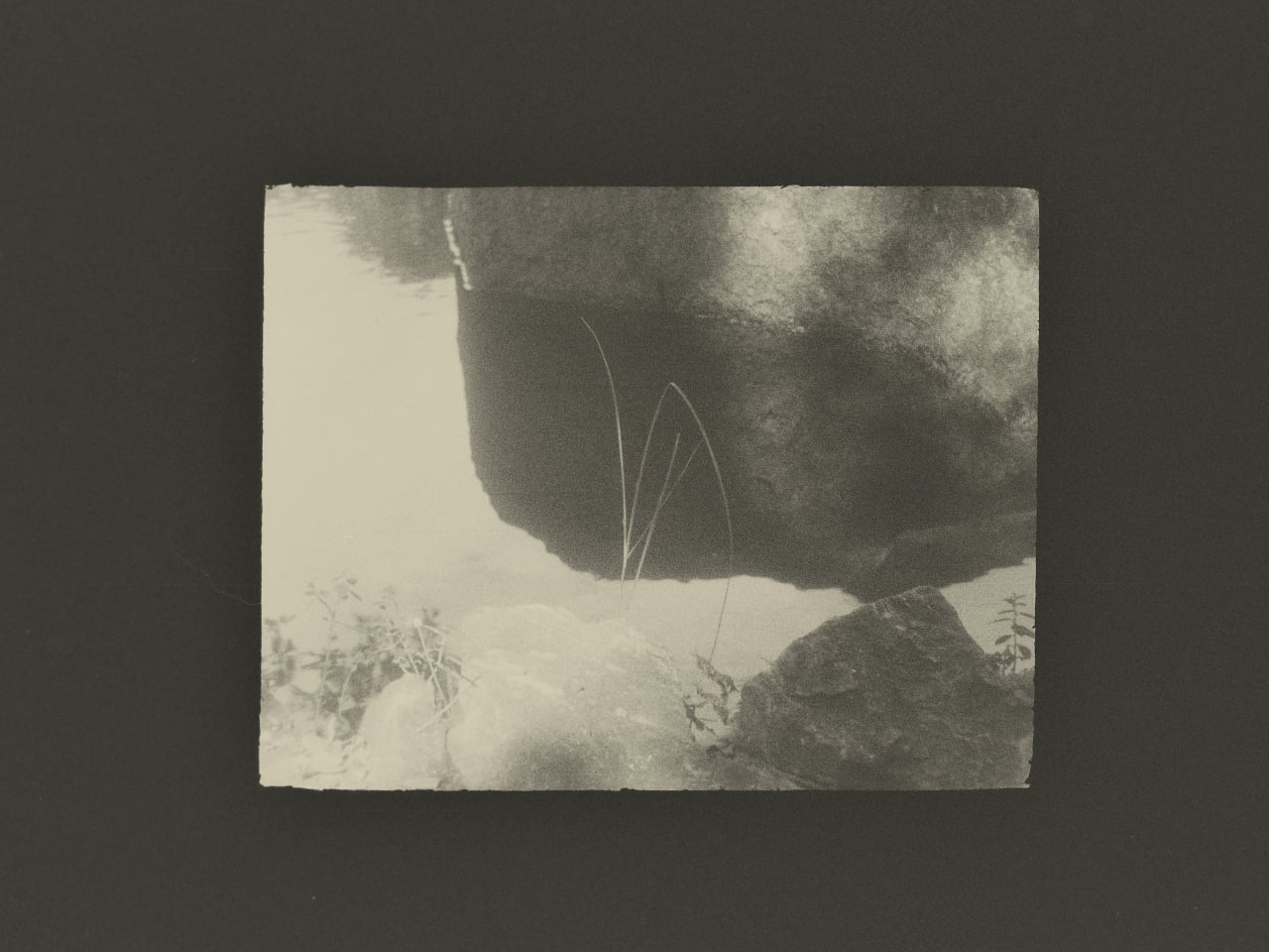
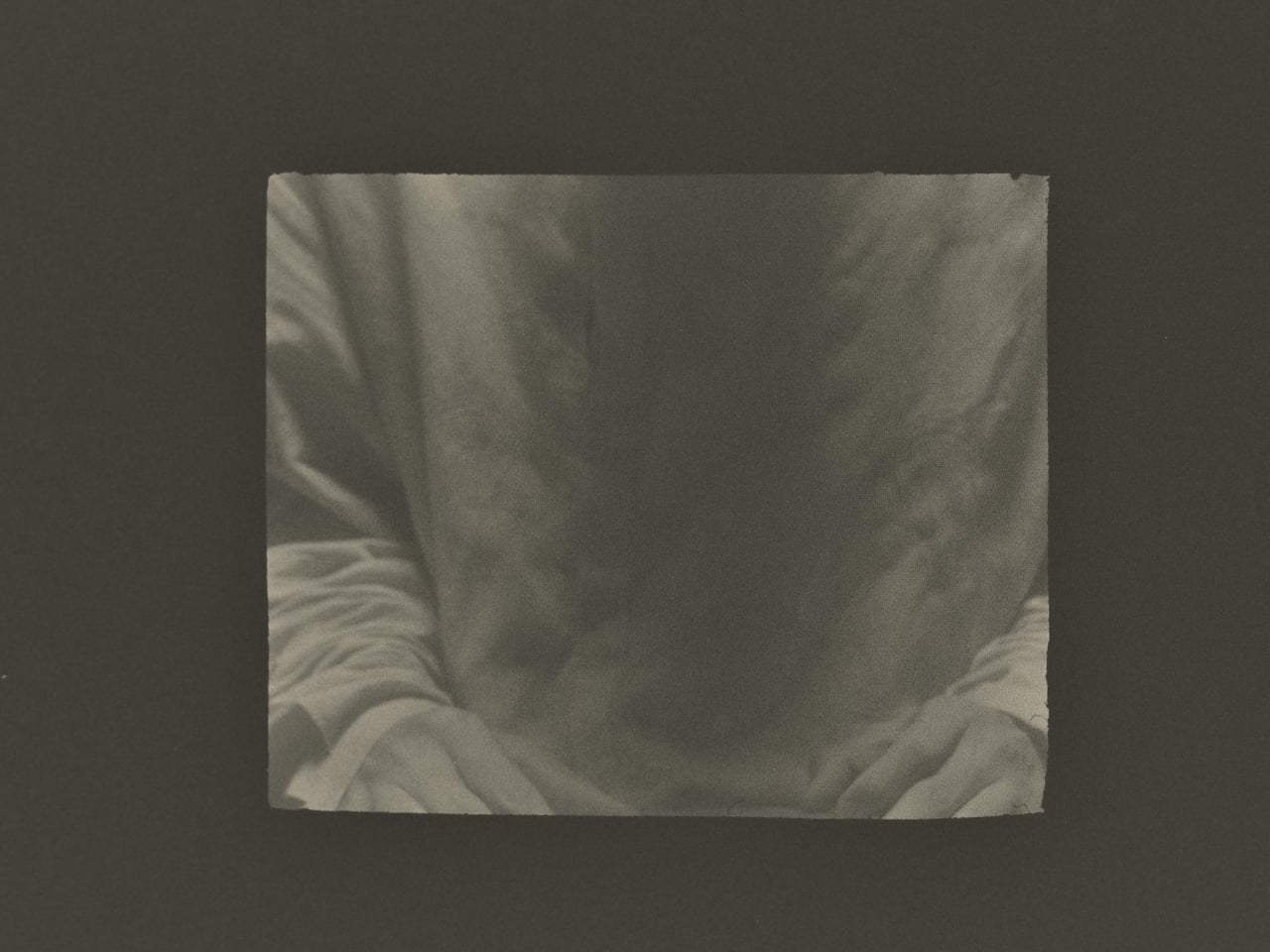
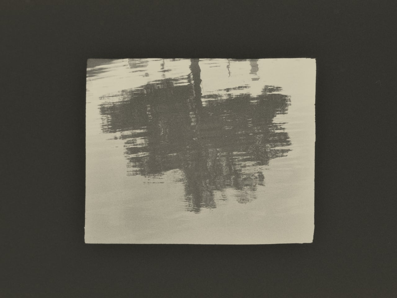
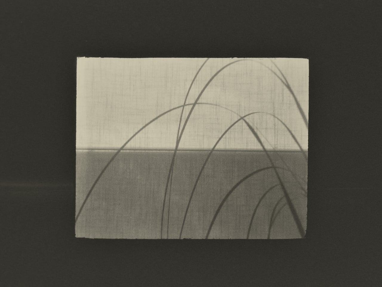
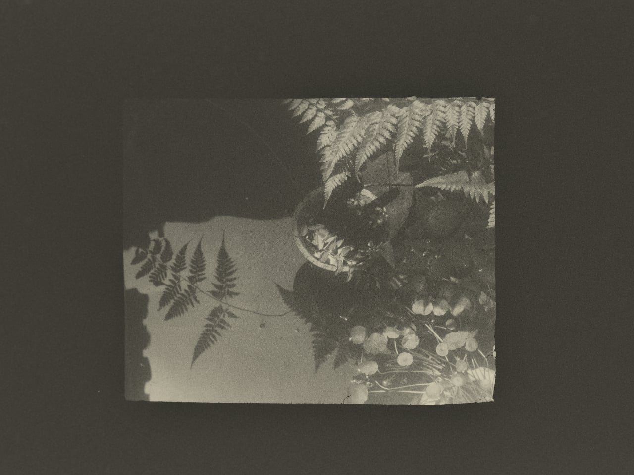
What Huang found in that studio wasn’t a process to document. It was an atmosphere to respond to. His photographs don’t walk you through kesi step by step the way a documentary would. They move between Jingwei’s hands, the threads, the studio details, and the quieter visual textures of Suzhou itself, using the same painterly restraint that shapes his broader work. He described his own approach in a way that cuts straight to the point: photography, he said, is sometimes about forgetting time rather than recording it. What stays in an image isn’t when it was taken but whether it still carries beauty once the moment is gone.

That’s a fairly specific thing to believe in 2026, when the surrounding conversation about images is almost entirely about speed and generation. Anyone can produce a technically competent photo of silk threads in soft light right now without a camera, a plane ticket, or a studio. What that won’t produce is the weeks of presence, of actually being in a room watching another person work, that shapes how Huang sees and frames a subject.

This is where Lexar’s role in the project stops being a footnote. Grace Su, who heads Lexar’s European operations, made the point directly: before any photograph becomes a print, a press image, or a cultural archive, it first exists as an original file that needs to survive. Leica captures the moment. Lexar protects the file behind it. It’s a clean division of labor that gives the brand a genuine reason to be part of this story rather than just attached to it for the optics.

The show itself, titled Threads of Time: A Journey Through Silk and Lens, is presented at Leica Gallery Amsterdam and runs September 11 to 15. Curator Linda Warmerdam framed the exhibition as a dialogue between the photographer’s eye and the artisan’s hand, and that framing holds up, because both of those things require a body in a specific place at a specific time. No model trained on existing images can reproduce that.

You don’t need to care about textile history or gallery culture for the underlying point to land. Some things take real time, happen once, and mean something precisely because they can’t be convincingly faked. Huang spent weeks in a Suzhou studio to understand what kesi actually is. The photographs are what he brought back.

The post This Photographer Spent Weeks in a Suzhou Silk Studio. Here’s What He Found first appeared on Yanko Design.
  •  

The $179 iPhone Speaker That Never Needs Charging

You’ve been waiting for your favorite artist to release their latest album, counting down the hours until it finally drops on your streaming service of choice. You open your phone and press play… and you’re a little disappointed. It’s not that the album isn’t great, it’s that your phone’s speaker doesn’t do it justice. You want something to amplify that sound right now, but your external Bluetooth speaker hasn’t been charged in weeks.

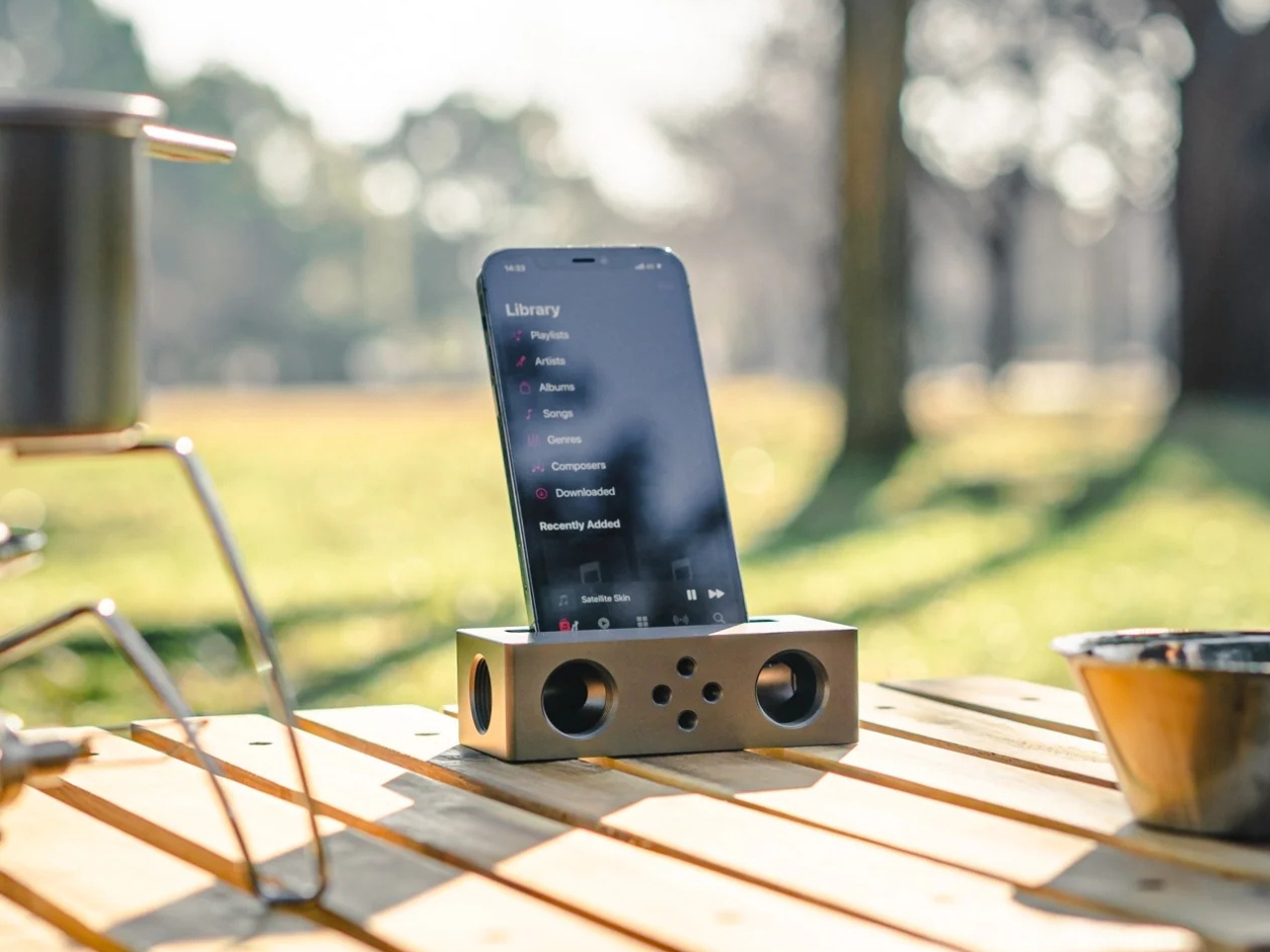
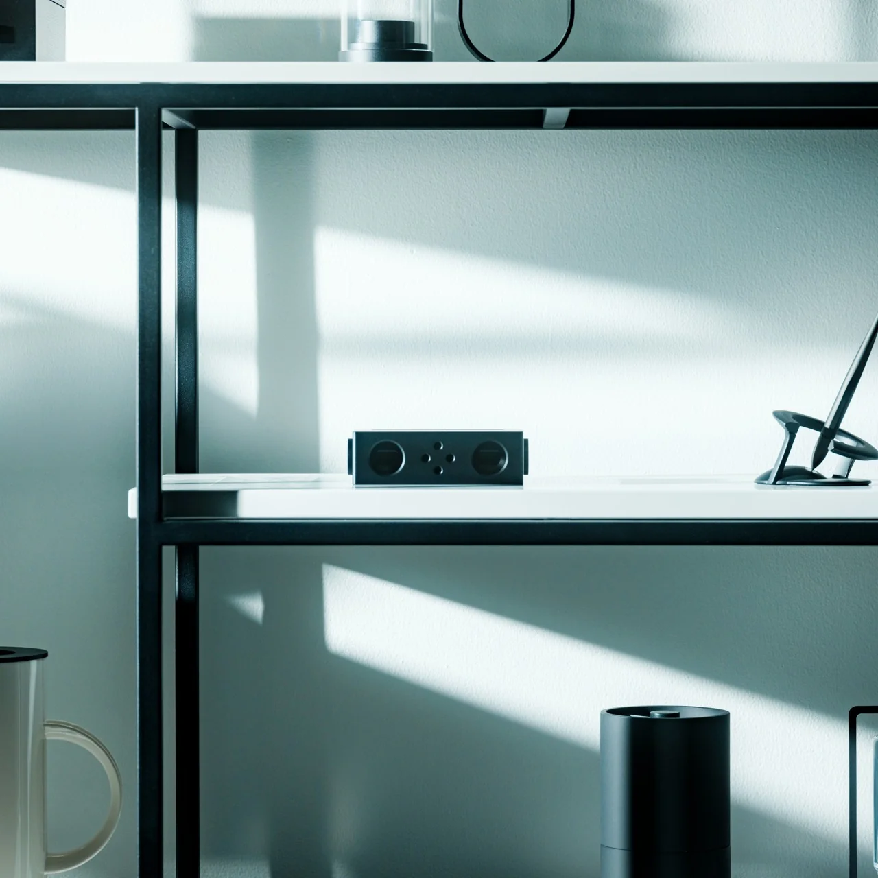
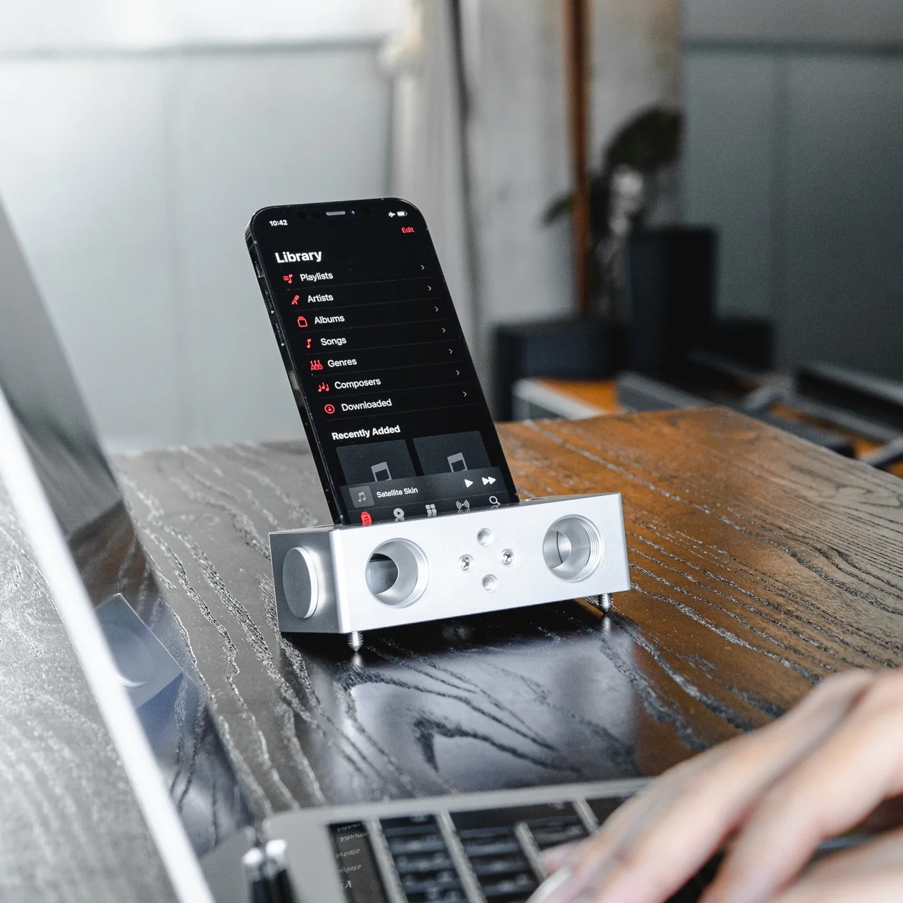
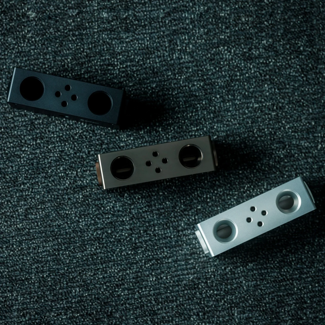
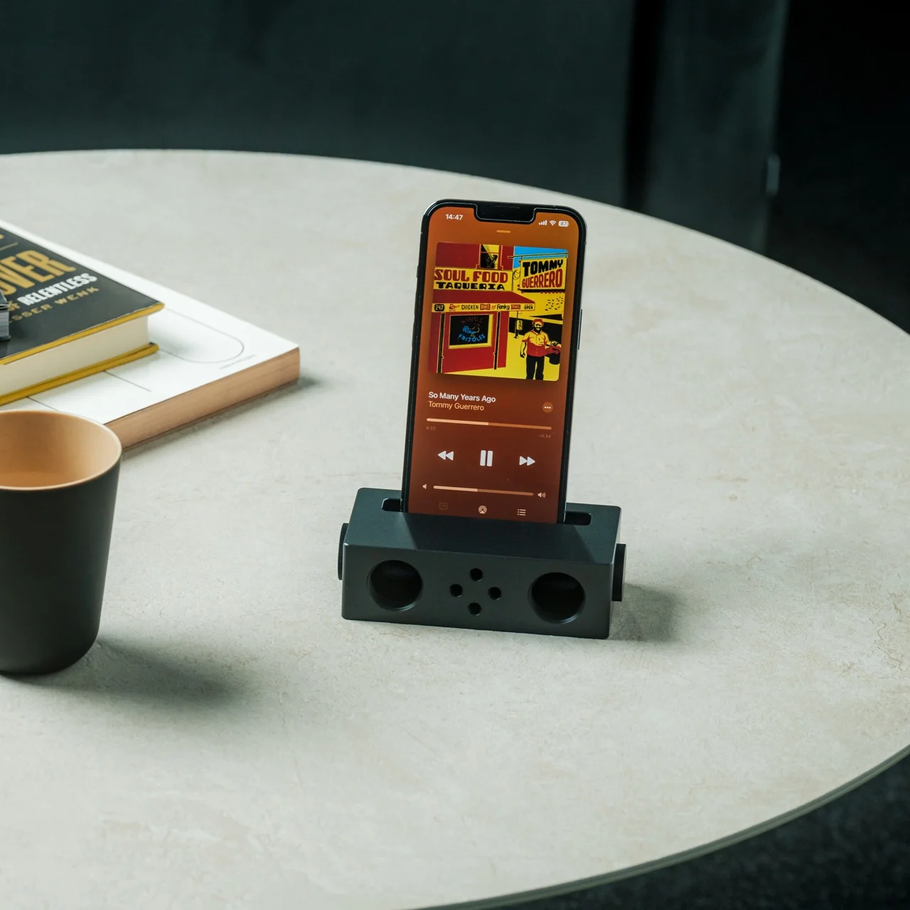
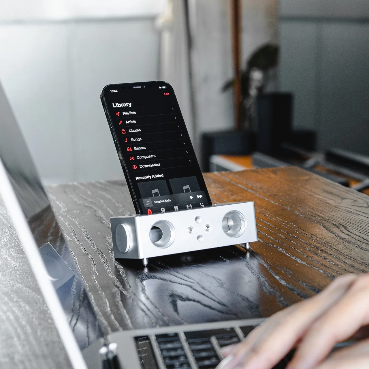
The Battery-free Amplifying iSpeakers can solve that problem for you, and you won’t need a single cable or Bluetooth connection to make it happen. This “dumb” speaker is actually smart enough to rely purely on acoustic engineering, channeling and amplifying the sound waves coming out of your phone so your music, podcast, or call sounds noticeably fuller than it would through your built-in speaker alone.

Click Here to Buy Now: $179.00

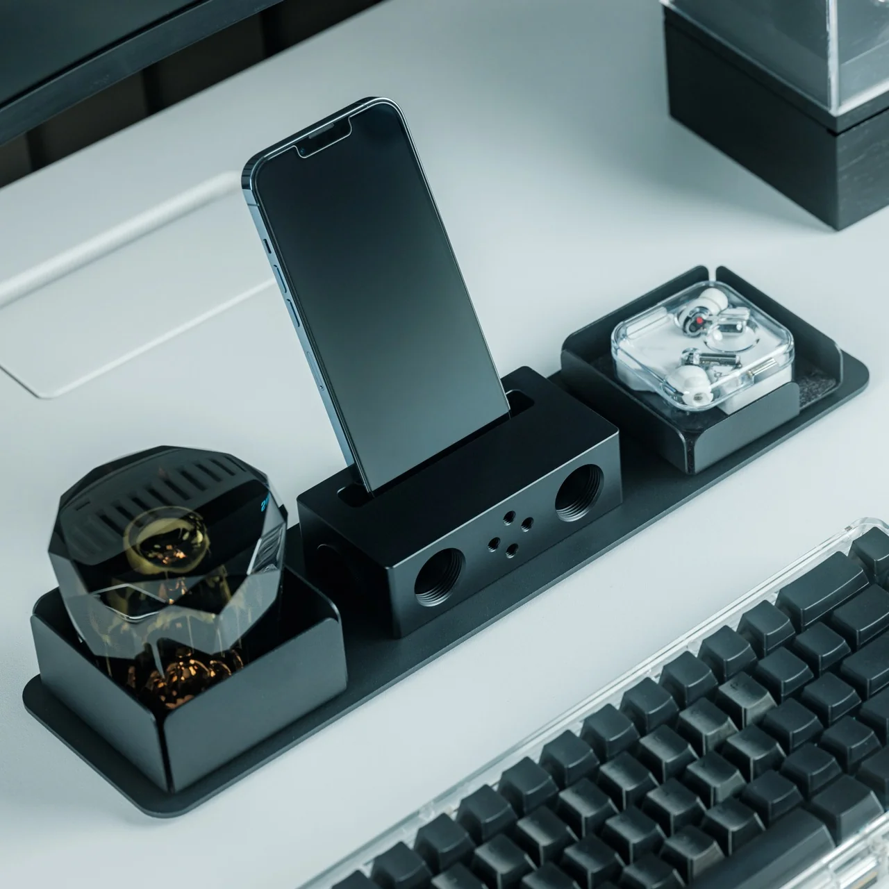
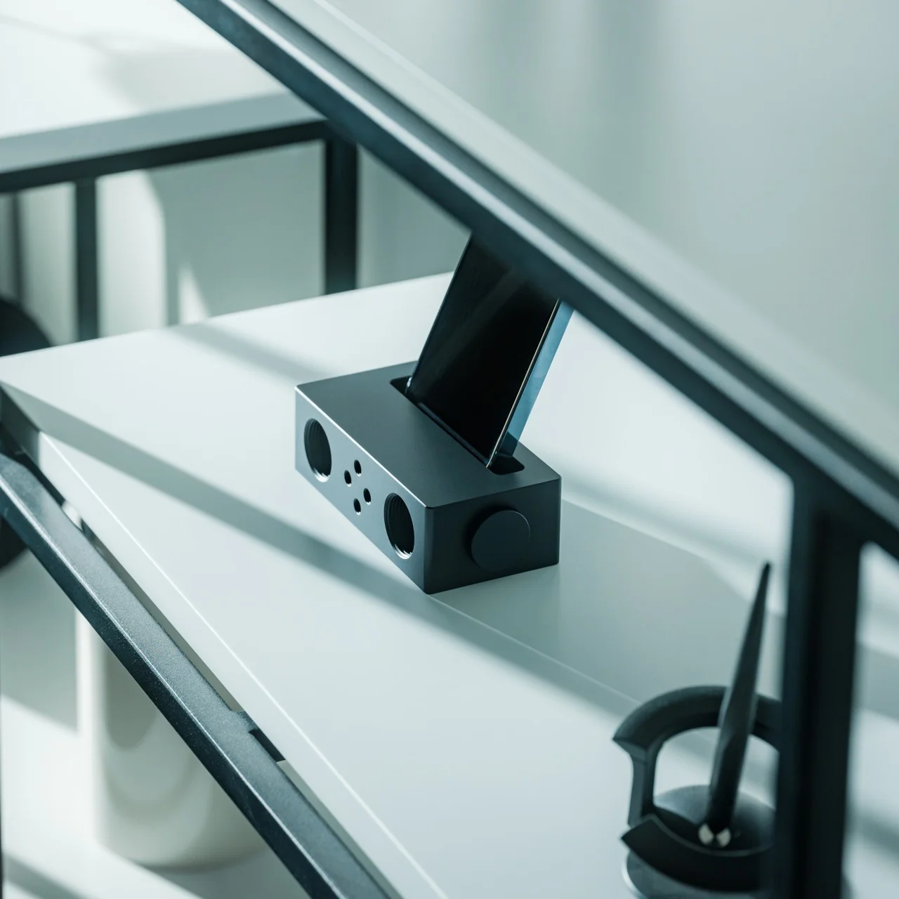
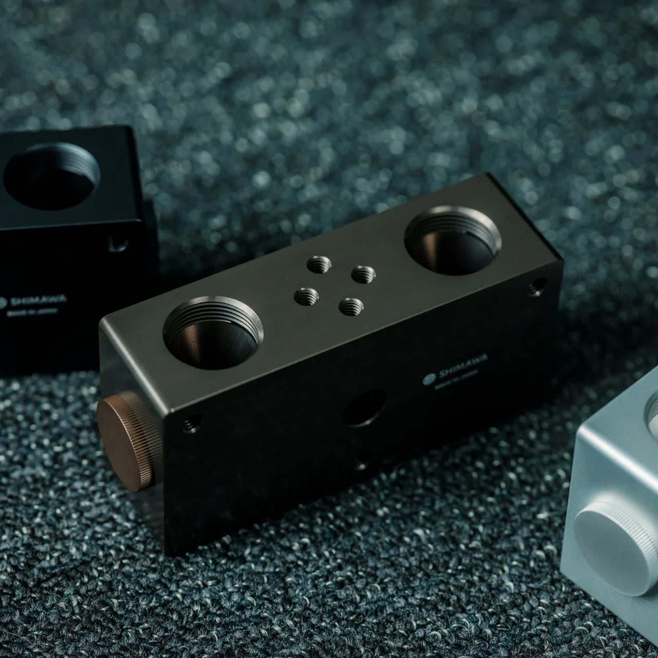
Designed by Ooi Masato and made in Japan, this battery-free device lives up to its name: it uses a precision-machined metal slot that cradles whatever phone you own, instantly amplifying whatever you’re playing. There’s no pairing process, no cord to plug in, and no anxious glance at a battery icon wondering if your speaker will cut out mid-song. You set your phone down, and it just works.

Design-wise, the iSpeakers follow a clean, minimalist aesthetic that looks just as at home on a cluttered work desk as it does on a nightstand or a bookshelf. The body is shaped around the golden ratio, giving it a visual balance that feels intentional rather than accidental (the kind of object you’d leave out on display rather than tuck into a drawer). It’s compact enough to toss in a bag, so you can bring your amplified sound with you to a picnic, a hotel room, or a friend’s backyard without hunting for an outlet. And because there’s no port, connector, or wireless protocol involved, it works with virtually any phone you own, including Apple’s freshly announced iPhone 18 Pro lineup and its first ever foldable, the iPhone Ultra, unveiled at today’s “Surprise and Shine” event. All you have to do is let the speaker slot cradle your phone’s speaker grille; there’s no compatibility chart to check and no software update to wait on.

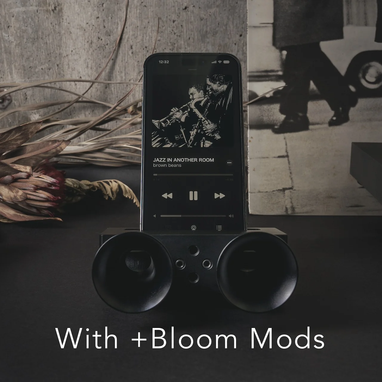
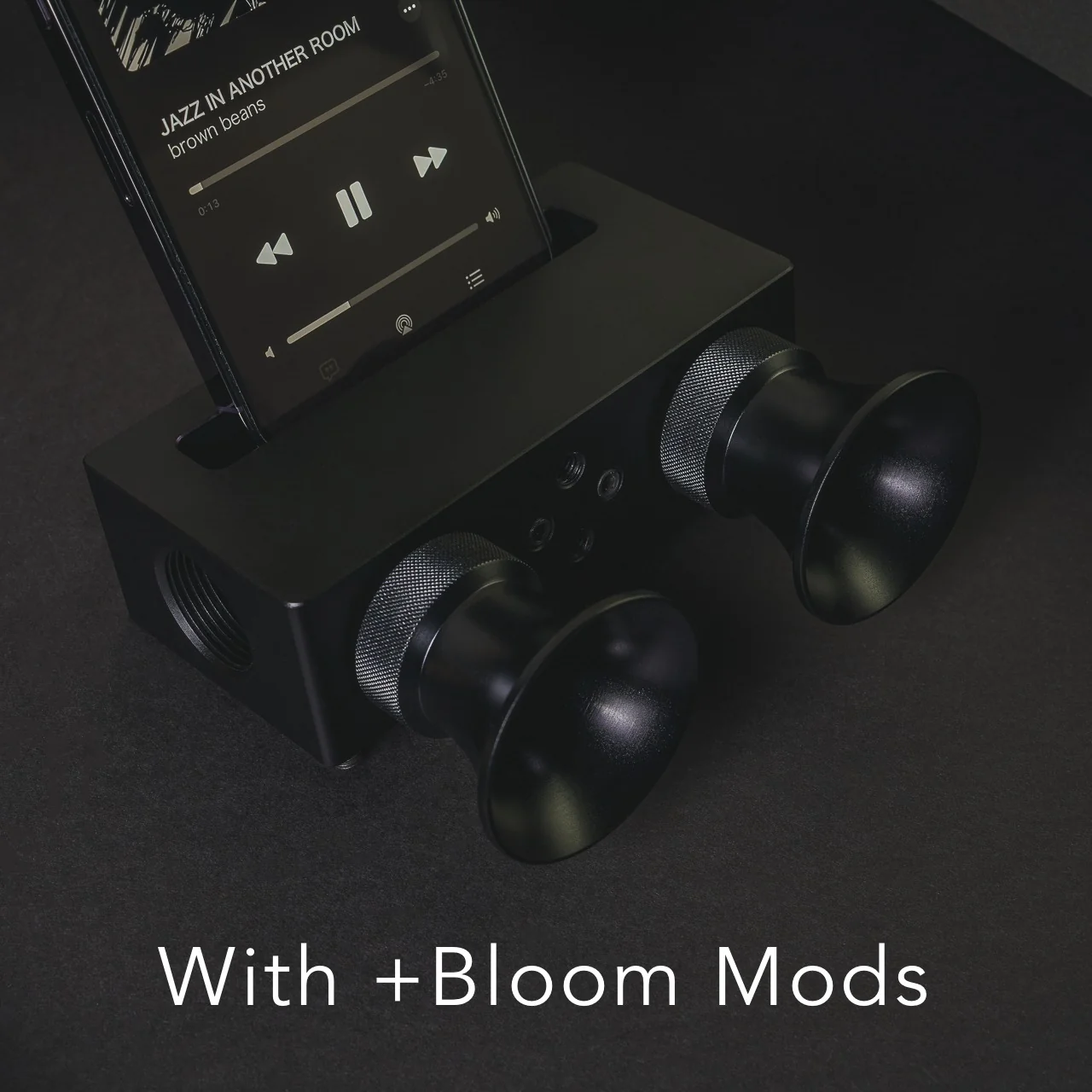
The speaker itself is milled from Duralumin, the same lightweight, vibration resistant alloy used in aircraft construction. That means you’re getting a premium feel along with genuine durability. This isn’t a flimsy accessory that’ll crack after a few drops in your bag. The Japanese craftsmanship and golden ratio proportions give it a quiet sophistication that fits in seamlessly next to your laptop or coffee mug. If you want to get more out of it, you can also pick up the +Bloom and +Jet attachments, which let you customize how the sound projects, whether that means directing it upward for a fuller room fill or downward for a more intimate listening experience.

So how does this stack up against the Bluetooth speakers already crowding your shelf? Take a brand like JBL, whose Flip series has become a go-to for portable audio. Those speakers sound great and pump out serious volume, but they still ask you to charge them, remember to pair them, and eventually deal with a battery that won’t hold a charge like it used to. The iSpeakers skip all of that by design. You’re trading a bit of raw volume and bass depth for something Bluetooth speakers simply can’t offer: a device that will sound exactly the same in ten years as it does today, with zero maintenance and zero electronic waste. At $179, it’s priced closer to a premium Bluetooth speaker than a budget one, but you’re paying for a very different kind of value: permanence, craftsmanship, and simplicity over specs and app connectivity.

At the end of the day, the Battery-free Amplifying iSpeakers isn’t trying to replace your Bluetooth speaker for a backyard party. It’s solving a much smaller, more common frustration: the moment when you just want your phone to sound better, right now, without any setup. For anyone tired of charging cords, pairing screens, and speakers that die at the worst possible moment, this is a refreshingly simple fix, and a genuinely beautiful object to boot. Sometimes the smartest tech is the kind that doesn’t need power at all.

The post The $179 iPhone Speaker That Never Needs Charging first appeared on Yanko Design.
  •  

Felipe Pantone’s Tennis Court Refuses to Look the Same Twice

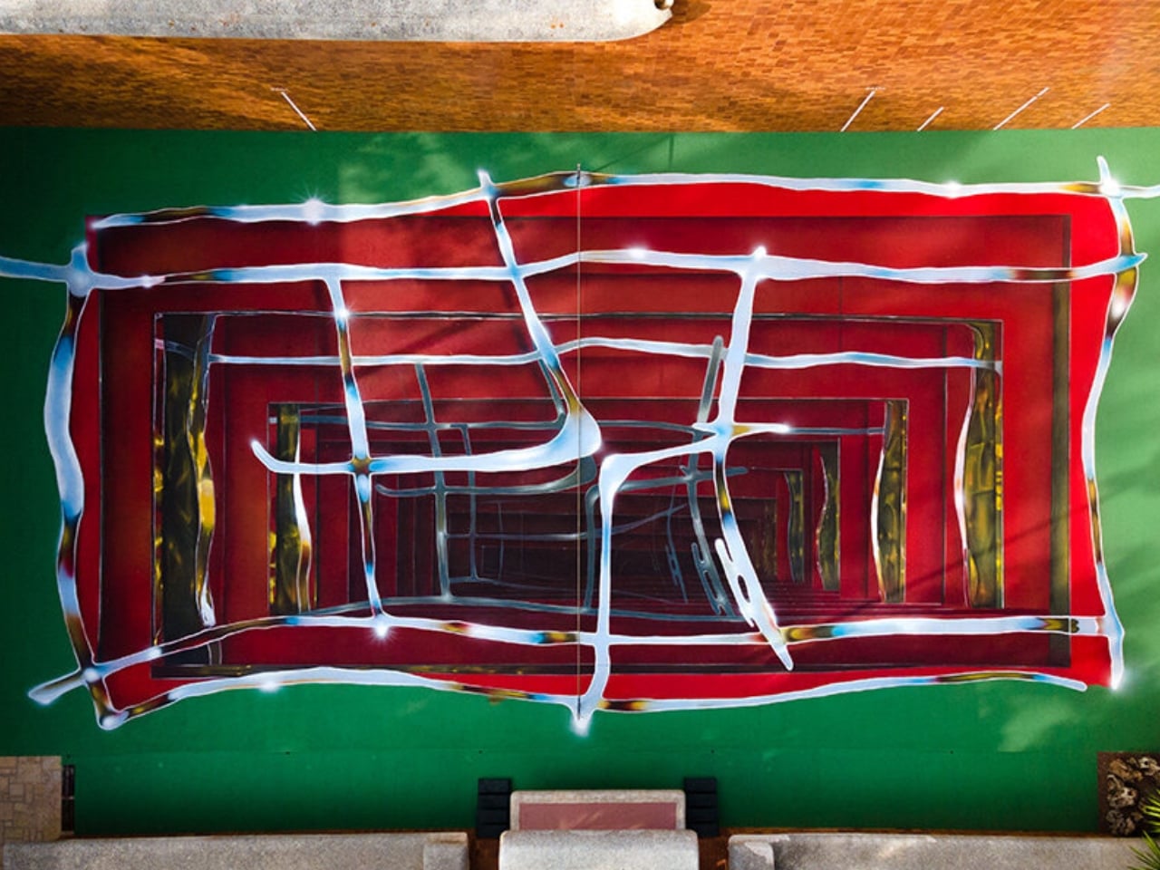
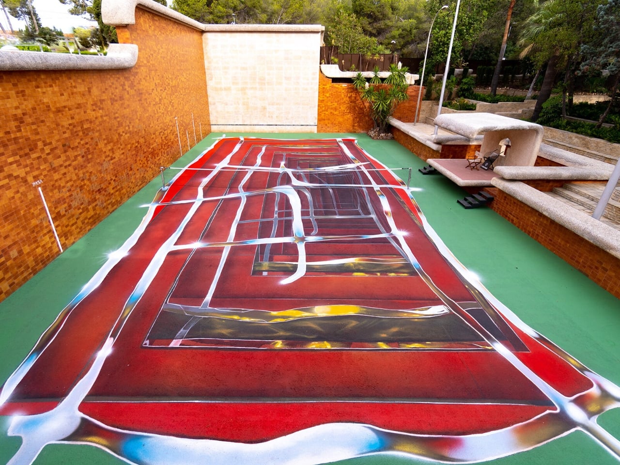
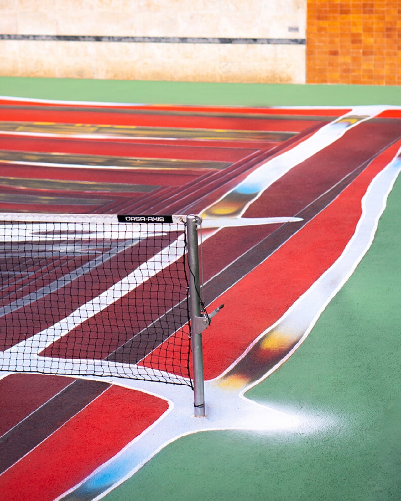
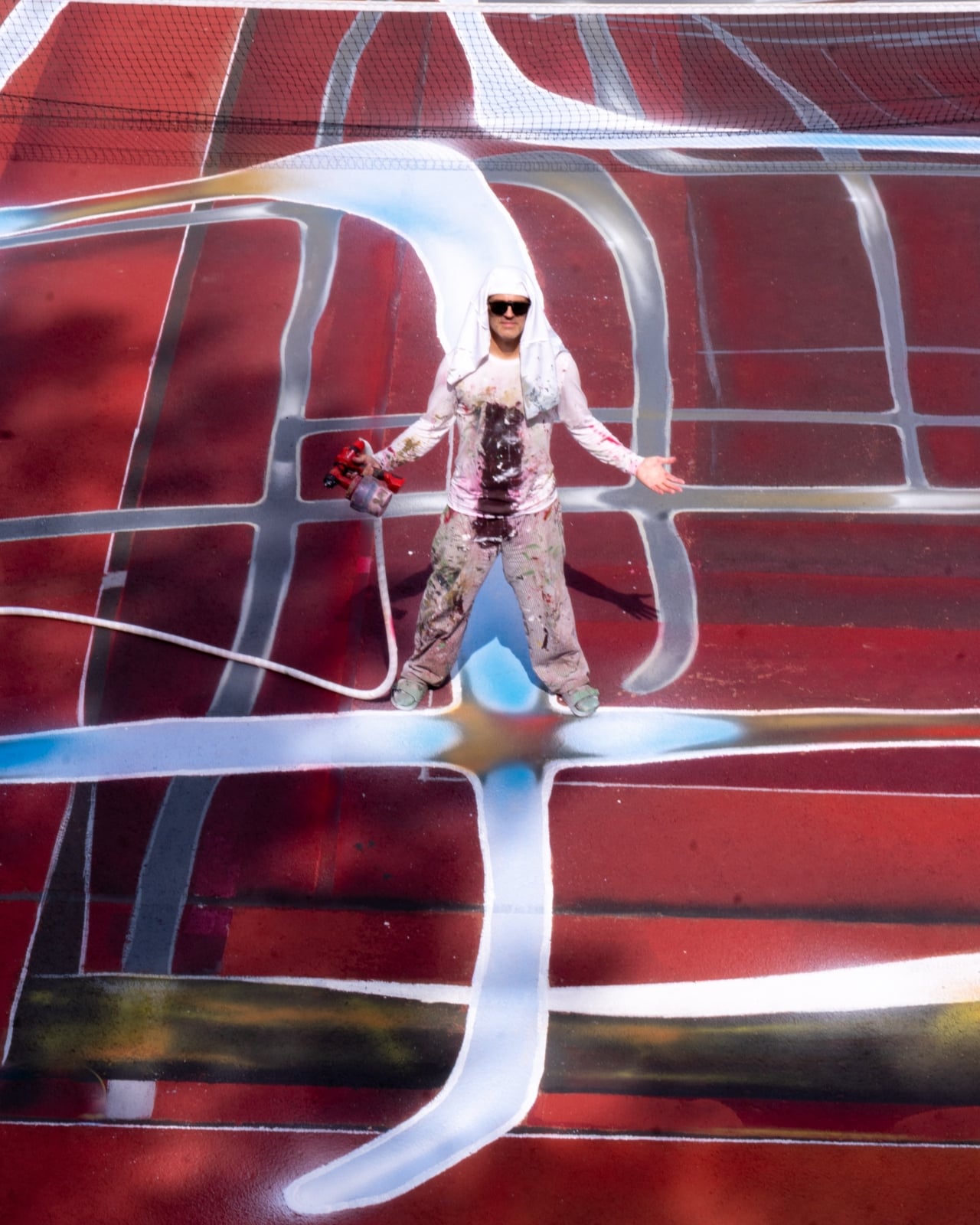
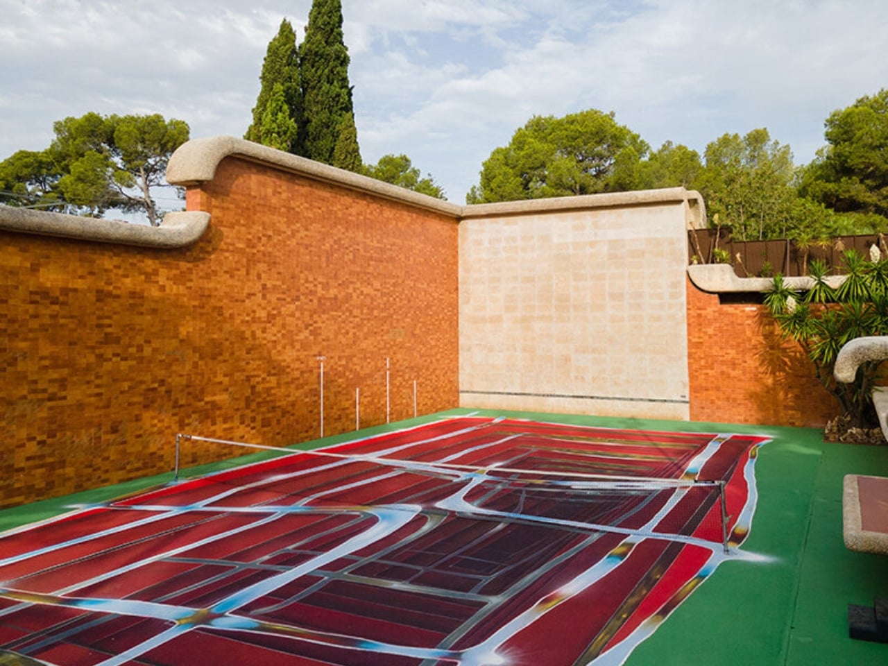
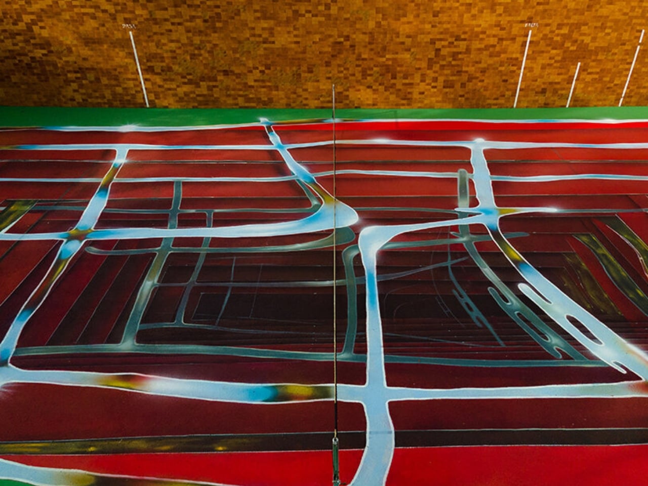
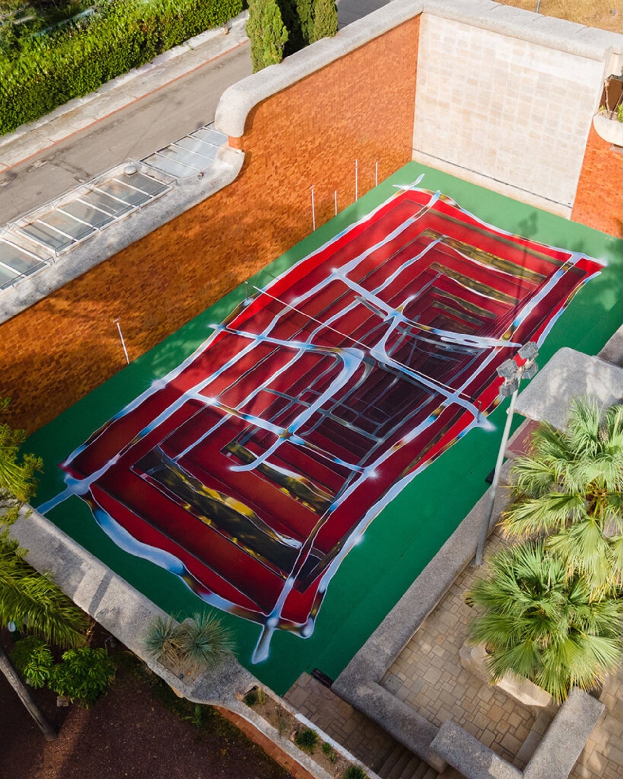
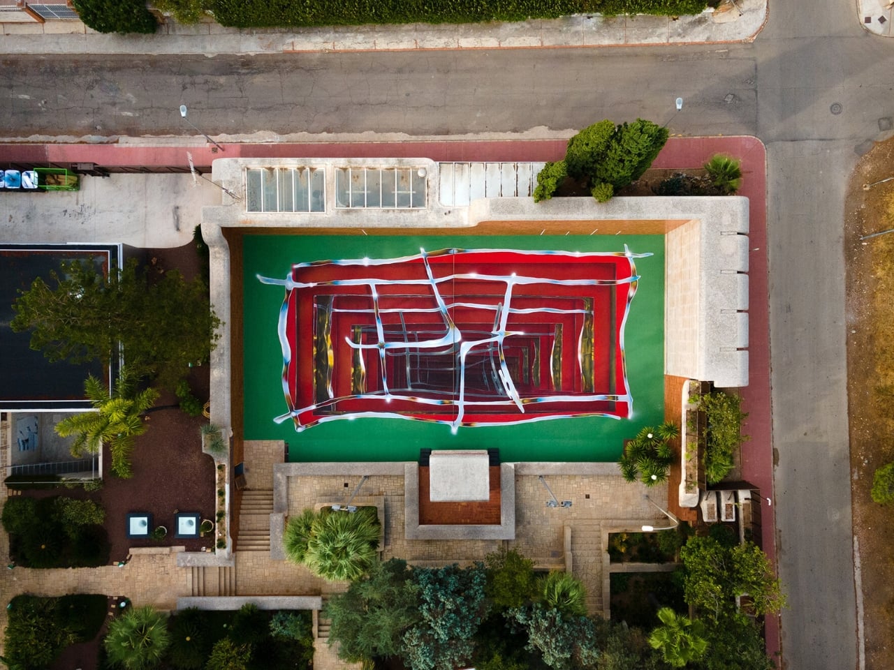
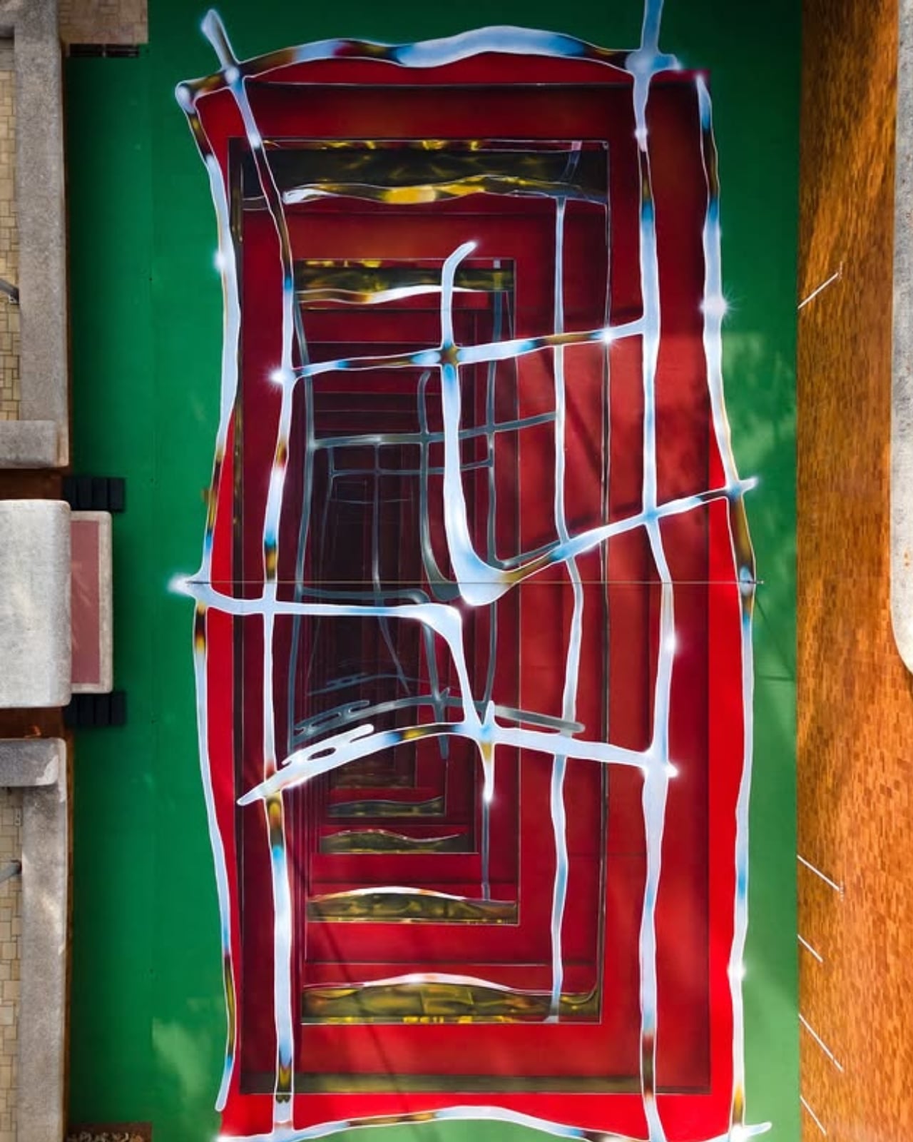
A tennis court in Valencia currently looks like it’s sinking into the ground. Walk up to the edge of the one at Casa Axis and the white lines that normally just mark boundaries start pulling inward, stacking through fake layers of chrome and burgundy until the whole surface reads like a hallway you could fall down. It’s called Hard Court 2, painted by Spanish artist Spok Brillor, and it treats a sports court like a living canvas instead of a slab of asphalt everyone stops noticing the week after the ribbon gets cut.

That’s usually the fate of most site-specific art. A muralist gets a wall, a brand throws a launch party, and within a year the piece turns into background noise nobody actually looks at anymore. Sports facilities have it worse. A court gets painted once, and it stays that exact shade of green or blue for a decade, because nobody budgets for touch-ups, let alone reinvention. Casa Axis, the art and design space Felipe Pantone runs out of a 1975 house outside Valencia, didn’t fix that with a bigger maintenance budget. It fixed it with a rule: the court has to change, every single year, by design.

Designer: Spok Brillor

The rule lives inside C.A.I.O., the Casa Axis International Open, a scrappy little tennis tournament for artists that launched in June 2026. No rankings, no categories, no portfolios required. Just instinct, apparently, and a healthy amount of frustration. The twist is what the winner actually takes home. Instead of a trophy, they get handed the responsibility of repainting the court before the next tournament. Win the match, inherit the canvas.

Lucas Benarroch, known as MRKA, painted the first version in 2025, loosening the court’s regulation markings into loose, hand-drawn lines that felt more like a sketch than a sports surface. He then went on to win the inaugural C.A.I.O., which technically put him back in charge of the next transformation. He passed the job to Spok Brillor instead, who had competed against him in the same tournament. That handoff is the part I find genuinely clever. The competition doesn’t just crown a winner, it forces the winner to make a choice about who gets to shape the space next, which quietly turns a tennis match into a succession plan for an ongoing art piece.

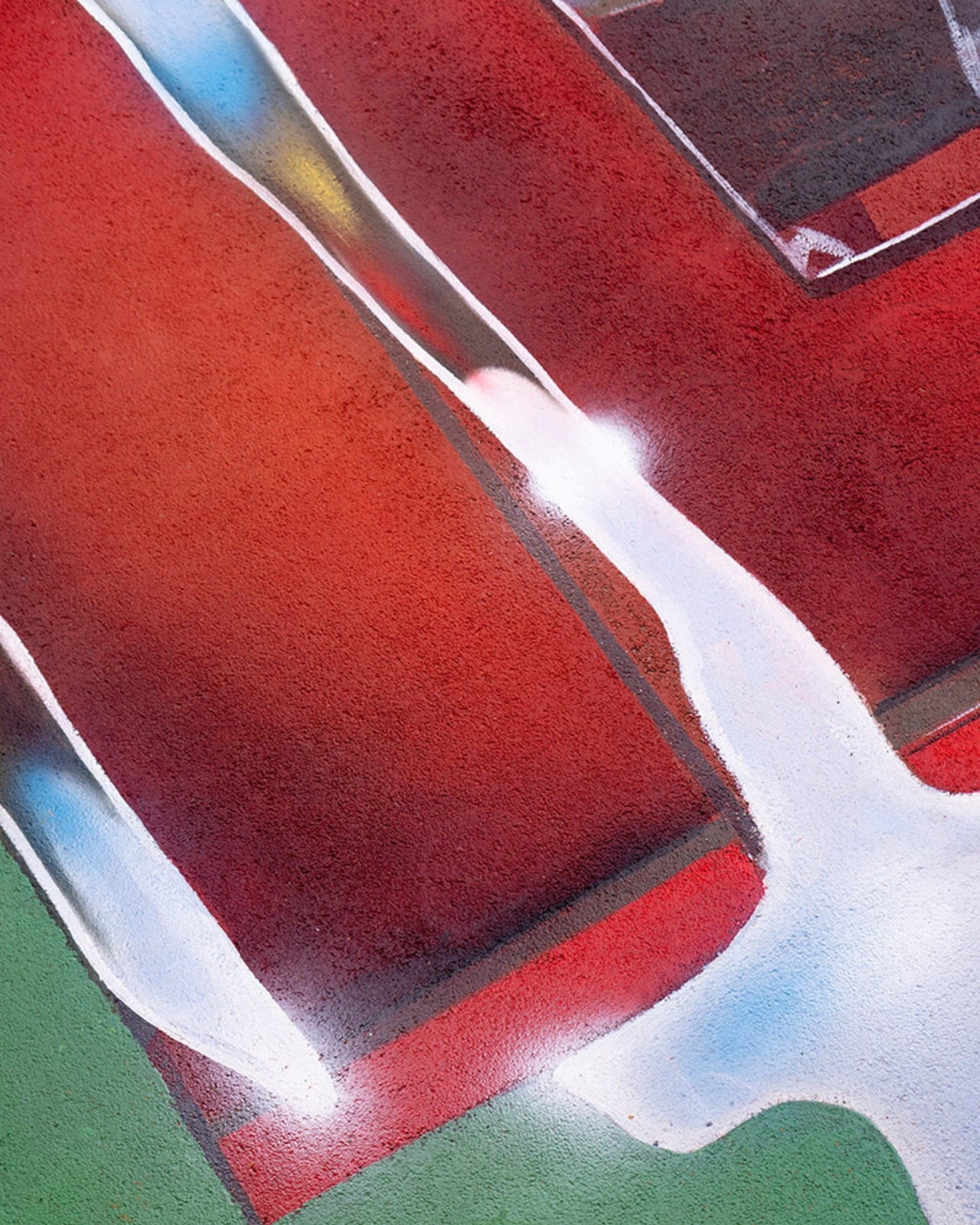
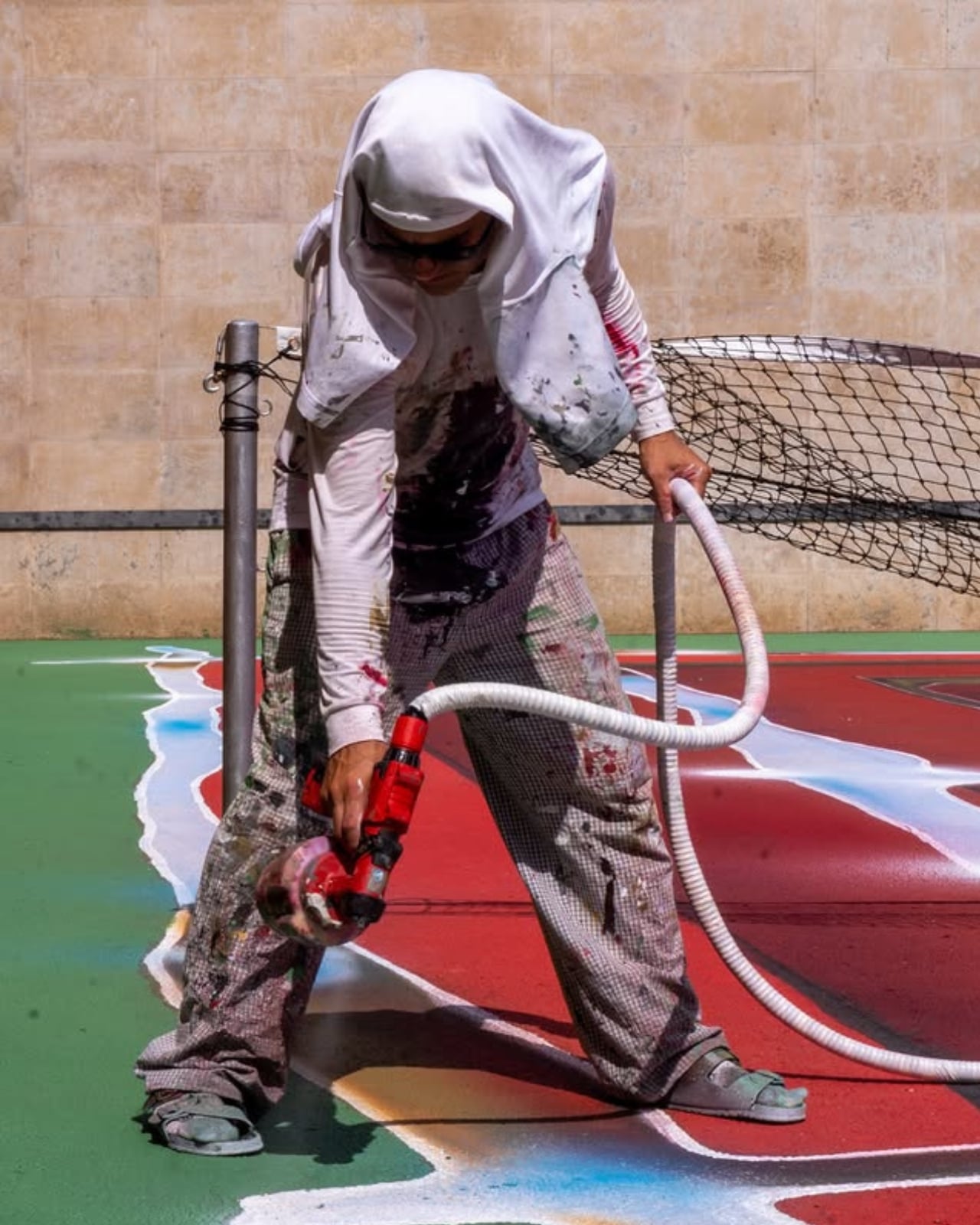
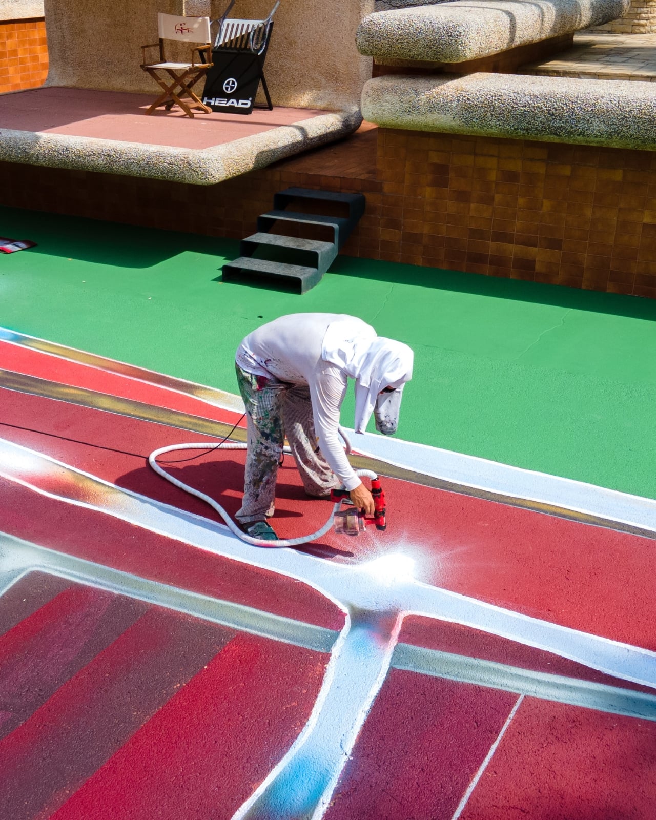
Spok took the opposite approach from MRKA. Where MRKA loosened the geometry, Spok tightened it, repeating the court’s own markings inward through metallic gradients until the actual boundaries get harder to read. Deep reds and burgundies contract through rectangular planes, pale blue and yellow lines cross the surface like reflected metal, and the whole thing sits somewhere between an architectural shaft and a painted portal. It took twelve days to finish, and it’s already scheduled to disappear under whoever wins next year.

I like that this thing is built to be temporary on purpose. Most design work chases permanence, a piece that survives, a brand that lasts forever, a finish that never fades. Hard Court 2 does the opposite. It’s designed to be beaten, literally, by the next person good enough to win a tennis match on top of it. That’s a genuinely strange model for how art gets commissioned, and it works specifically because nobody involved is trying to make something that outlives its usefulness.

There’s also something honest about tying the transformation to actual competition rather than a curator’s calendar. Nobody at Casa Axis decided in advance that the court needed a refresh this September. It changed because someone won a match and had to make good on the assignment. That’s a small distinction, but it changes how the whole project feels. It’s less a rotating gallery and more a living structure that happens to have paint on it.

Whether this idea scales beyond one backyard court in L’Eliana is a fair question, and probably a “no” for most places. But the instinct behind it, building change into the rules instead of hoping someone remembers to update things later, feels like it’s worth stealing for a lot more than tennis courts.

The post Felipe Pantone’s Tennis Court Refuses to Look the Same Twice first appeared on Yanko Design.
  •  
❌