Apple is reportedly making a major push into a new era of iPhone design with the introduction of the iPhone Duo foldable, alongside significant camera and performance upgrades for the iPhone 18 Pro and iPhone 18 Pro Max. The iPhone Duo is the headline addition, bringing Apple’s take on a book-style foldable while attempting to […]
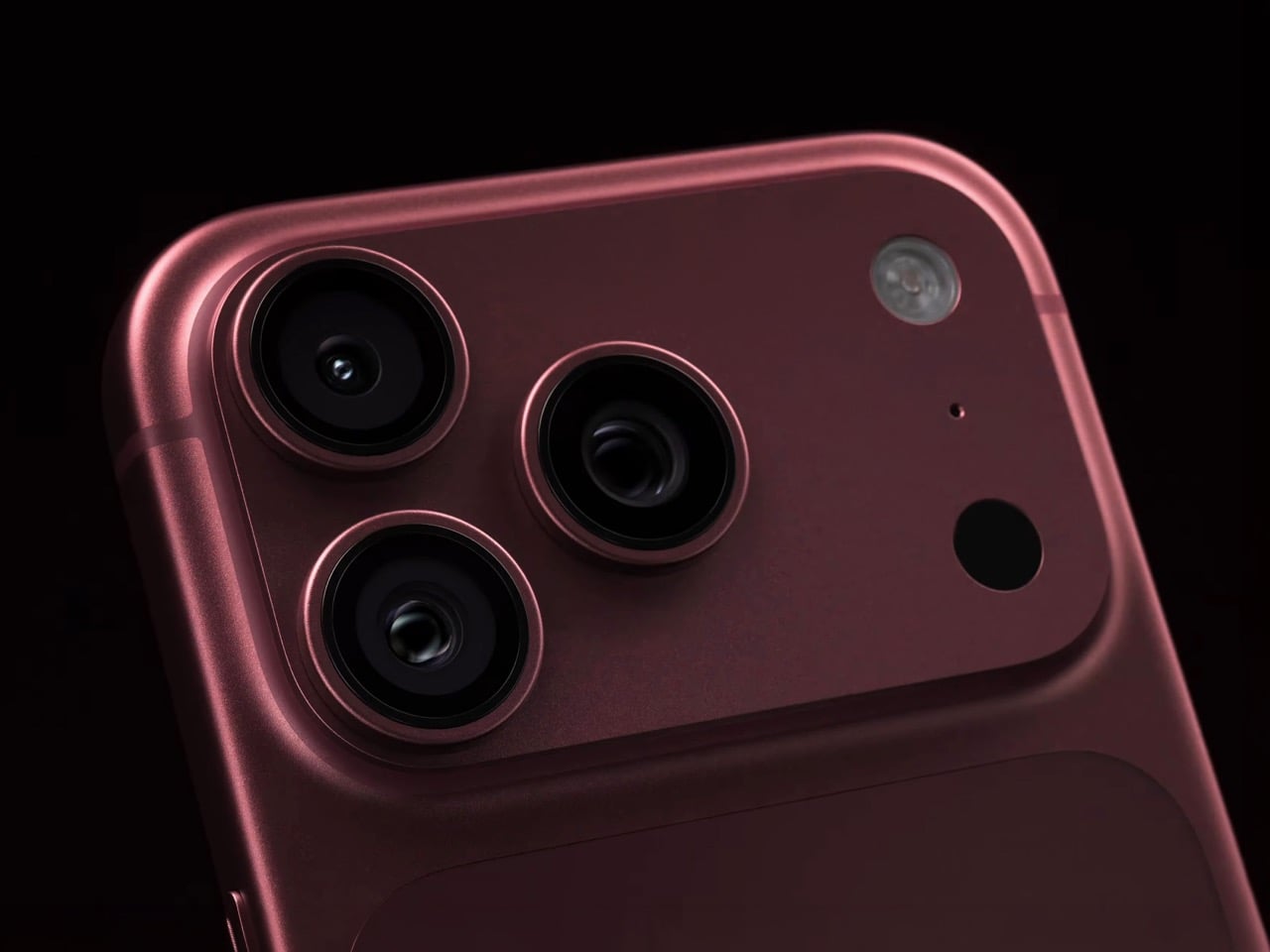
Would you be shocked to hear that the “Portrait Mode” on your iPhone all these years was ‘fake’? Well, it’s real as in the background is actually blurred, but it isn’t blurred because the camera captured it that way, it’s all been software trickery for the past decade… until now. Six laser cut blades, each thinner than a human hair, are about to change that. The iPhone 18 Pro’s new main camera can physically open and close its lens for the first time in iPhone history, and that single mechanical change rewrites how the blur behind your subject actually gets made.
Here’s the quick version of how Portrait Mode has worked since 2016. Your iPhone takes the shot, uses a second lens or depth data to figure out roughly where you end and the background begins, then runs software over the image to blur everything behind that outline. It’s a clever guess dressed up as photography, and it’s why hair strands sometimes disappear into a smudge or a stray earring gets blurred along with the wall behind it. The new aperture system skips the guessing entirely. The lens itself controls how much of the scene stays sharp, the same way it’s always worked on a real camera.
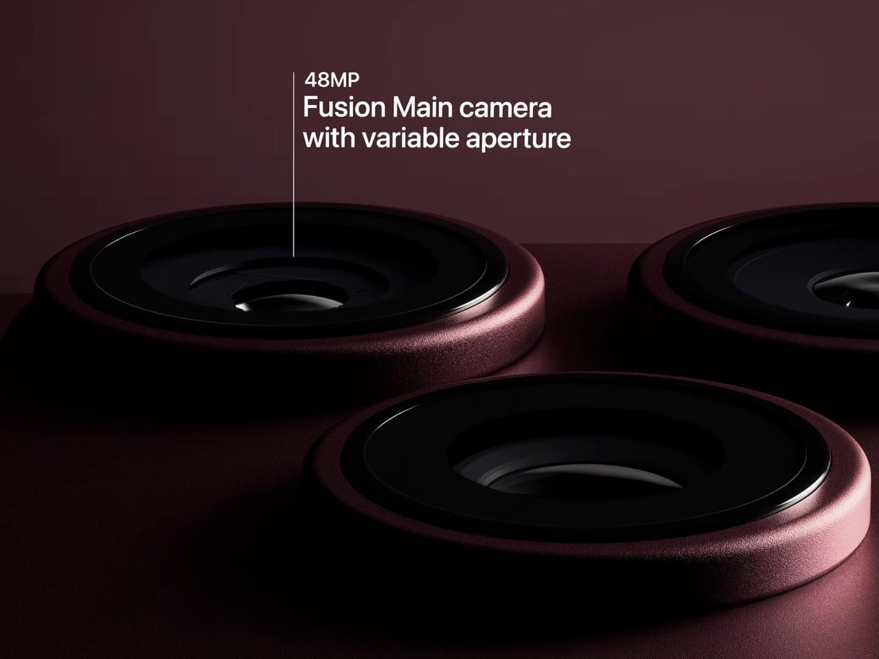
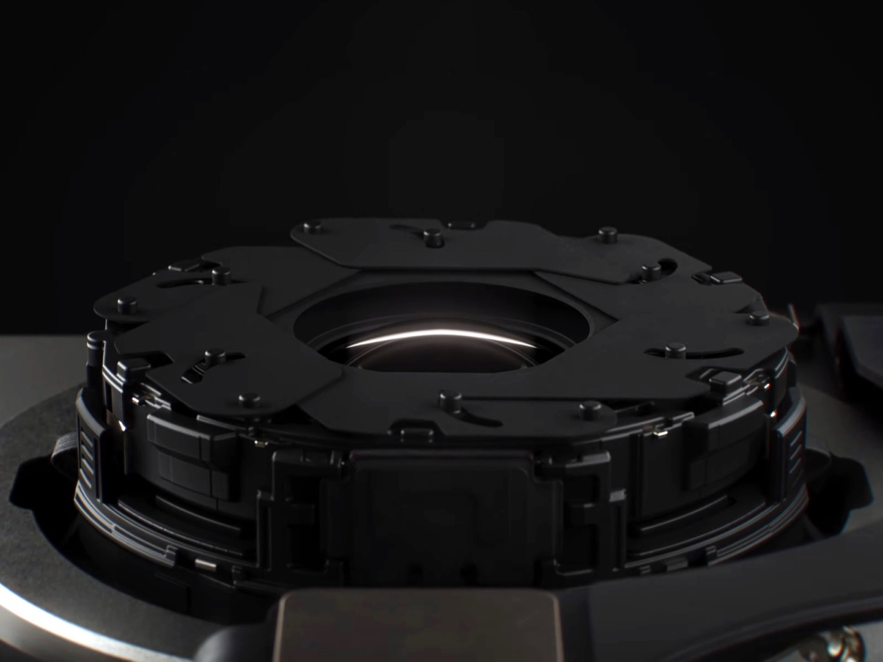
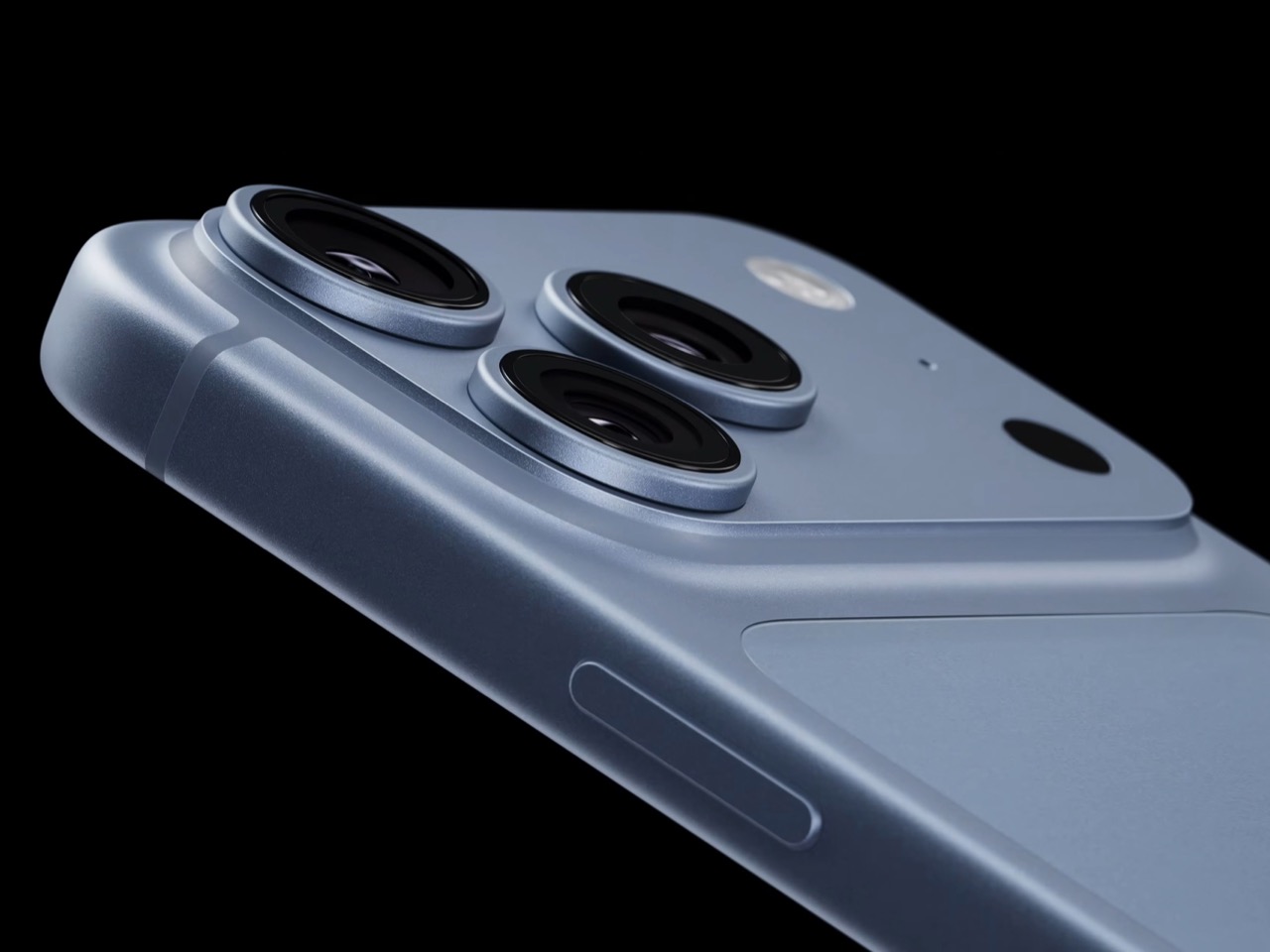
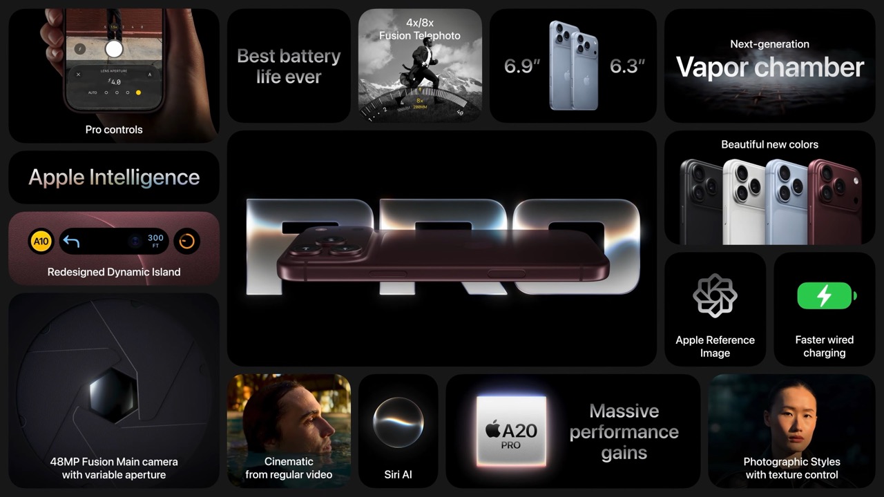
So how does a phone this thin pull off something that usually needs a chunky lens barrel? Apple built a system of six laser cut blades, each one thinner than a strand of hair, arranged around the main lens and moved by a tiny rotor mechanism. Together they shift the aperture through four stops, all the way down to f/1.48, with the camera defaulting to a f/1.8 for everyday portraits and opening or closing automatically depending on what it’s looking at. In low light it opens wider to pull in around 50 percent more light, which should mean cleaner night shots and sharper astrophotography without cranking up the ISO and adding grain.
Because this is optical now instead of computational, the depth falls off the way it would on an actual camera lens. Hair, glasses, jewelry, the fine stuff that always tripped up the old software blur, should render properly instead of getting smeared into the background by accident. Close the aperture down and you get more of the scene in focus for group shots, which is the same tradeoff photographers have been making with real cameras for a century. It’s just that now your phone gets to make that tradeoff too.
Apple didn’t stop at making the hardware smarter, it also handed a lot of that control directly to you. The redesigned camera app now includes Pro Controls, letting you manually pick one of the four aperture settings yourself, check exposure with an actual histogram, dial in white balance, and adjust shutter speed for motion blur or freeze frame shots. Third party camera apps are getting access to the same aperture system through an updated API, so this isn’t going to stay locked inside Apple’s own app for long. Photography folks who like getting hands on with their settings finally have a real reason to poke around the camera app instead of leaving everything on auto.
The upgrade carries over into video too. Cinematic mode effects can now be applied after you’ve already shot the footage, and it supports 60fps for smoother half speed slow motion. Time-lapse jumps to 4K with Dolby Vision HDR. None of that depends directly on the aperture blades, but it’s part of the same larger push this year to hand serious creative control to people who just want to point their phone and shoot something that looks intentional.
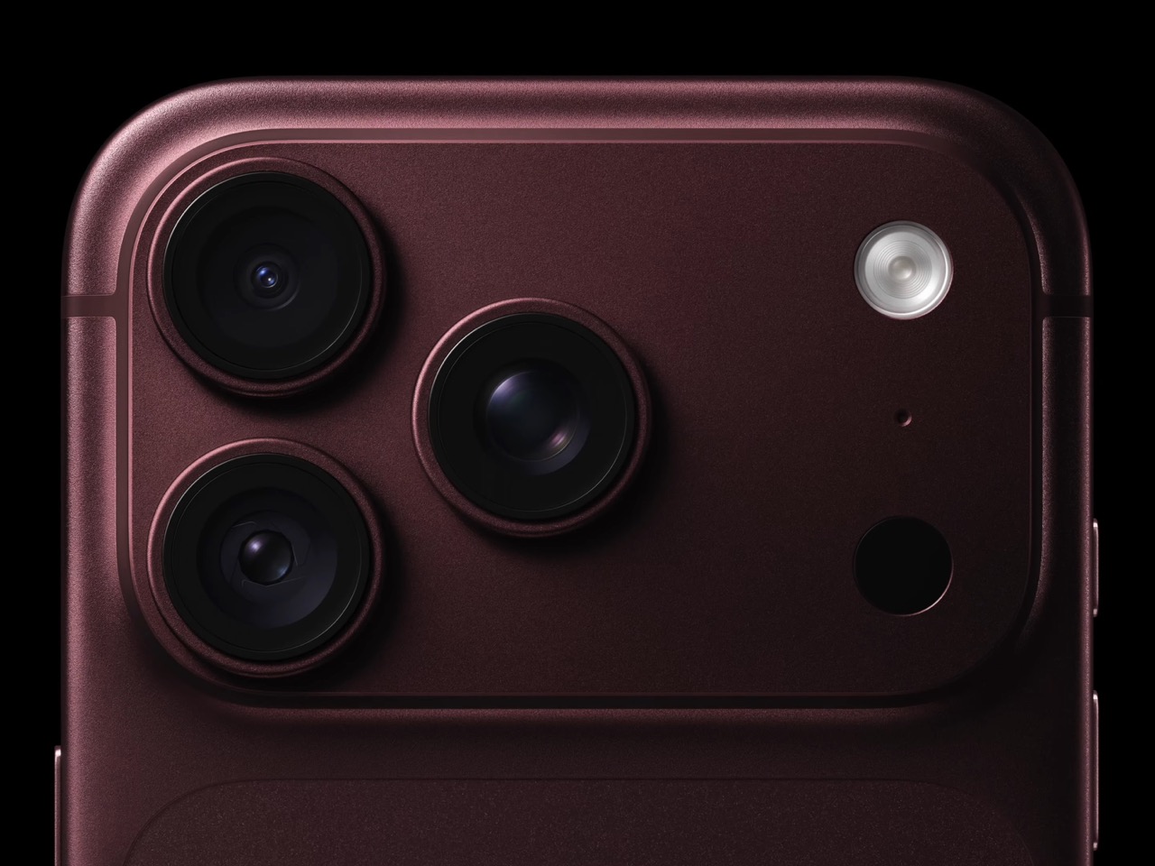
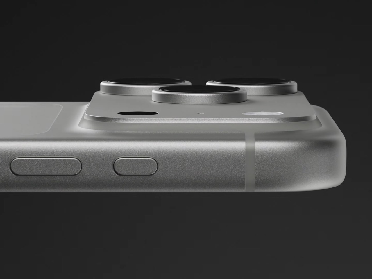
All of this sits inside a redesigned Pro body that now uses color matched aluminum and back glass, available in Black, Silver, the new Glacier, and a genuinely gorgeous Burgundy that photographs beautifully next to the camera module. The iPhone 18 Pro starts at $1,199 and the Pro Max at $1,299, both up for preorder September 12 and shipping September 18. For a feature that lives entirely inside a few hair thin blades you’ll never actually see moving, it might end up being the most noticeable camera change Apple has made in years.
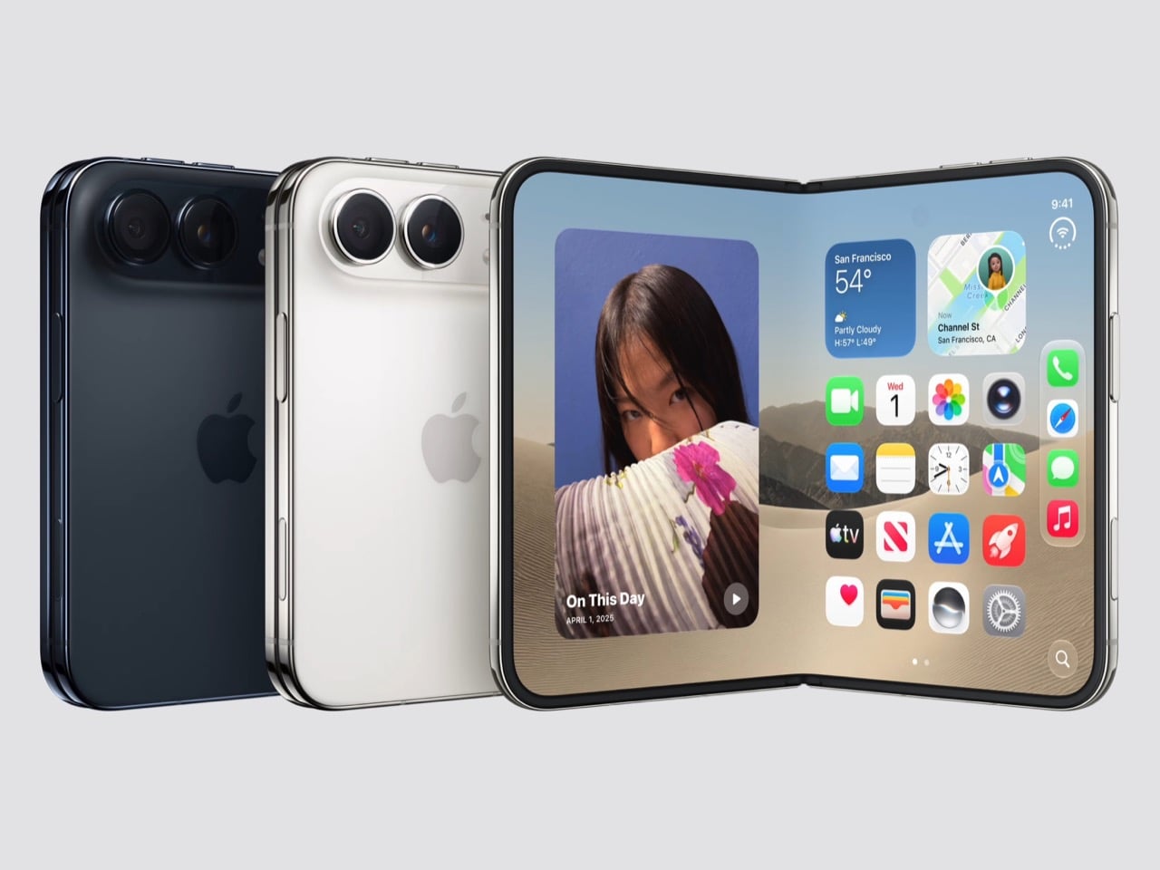
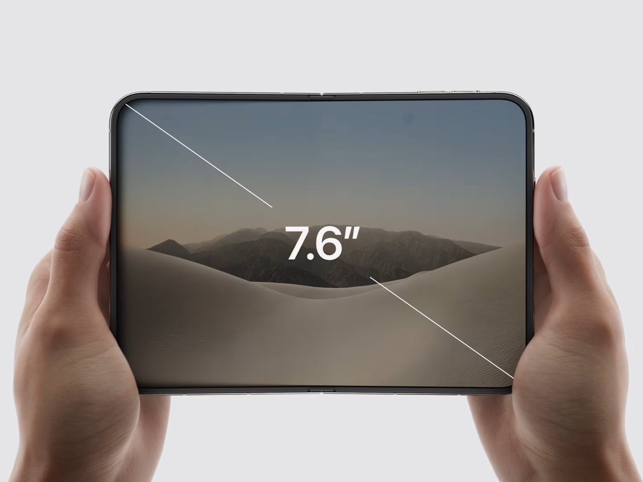
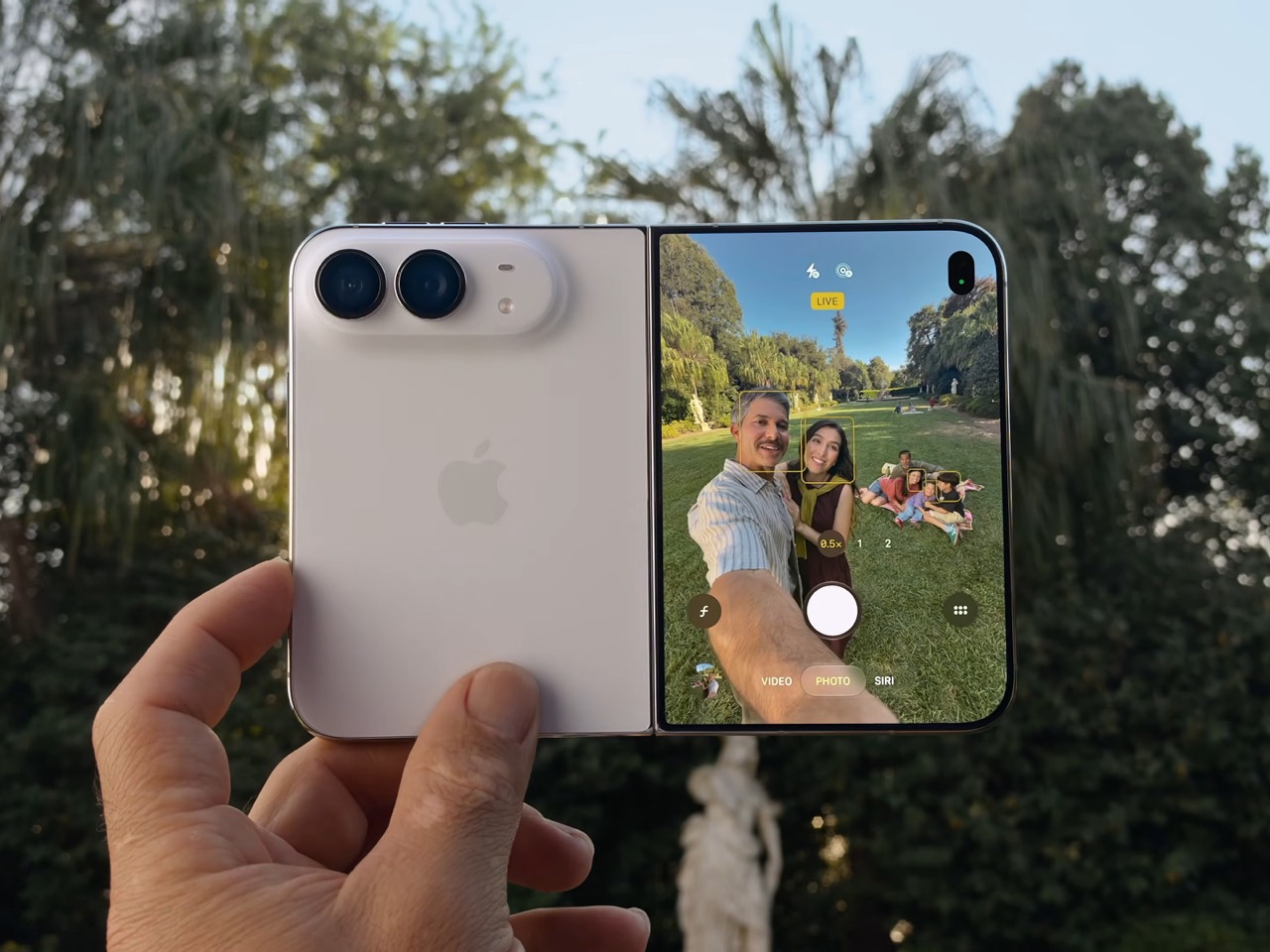
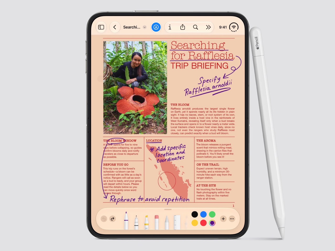
Spare a thought for the iPad Mini, which had a perfectly good career until this morning. Apple’s $1,999 iPhone Duo arrives October 23 with a 7.6-inch inner display that takes Apple Pencil with USB-C later this year and runs two apps side by side, which covers roughly everything the Mini was for, except the Mini does not fit in your jeans. It also killed the dynamic island, swapping it for a punch hole outside and a FaceTime camera tucked under the inner screen. And it killed the SIM tray worldwide, because the thinnest iPhone ever made had no room left for sentiment.
Apple never announces any of this. It ships the replacement and lets the old thing stop making sense on its own schedule. The Duo is a whole product built out of things Apple decided to stop carrying, and the interesting part is how little you miss any of them once you see what moved into the empty space. John Ternus called it the most transformational change to iPhone since the original, which I not only agree with, I think I’d take it a step further by saying – this is such a dramatic leap for the iPhone that it stops being an iPhone. It isn’t an iPad either. It’s something completely different.
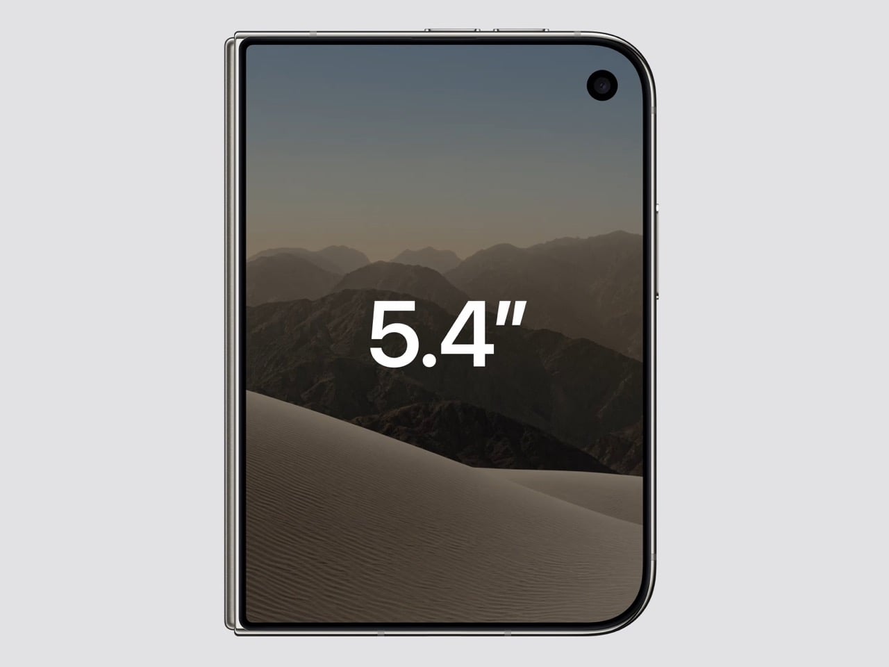
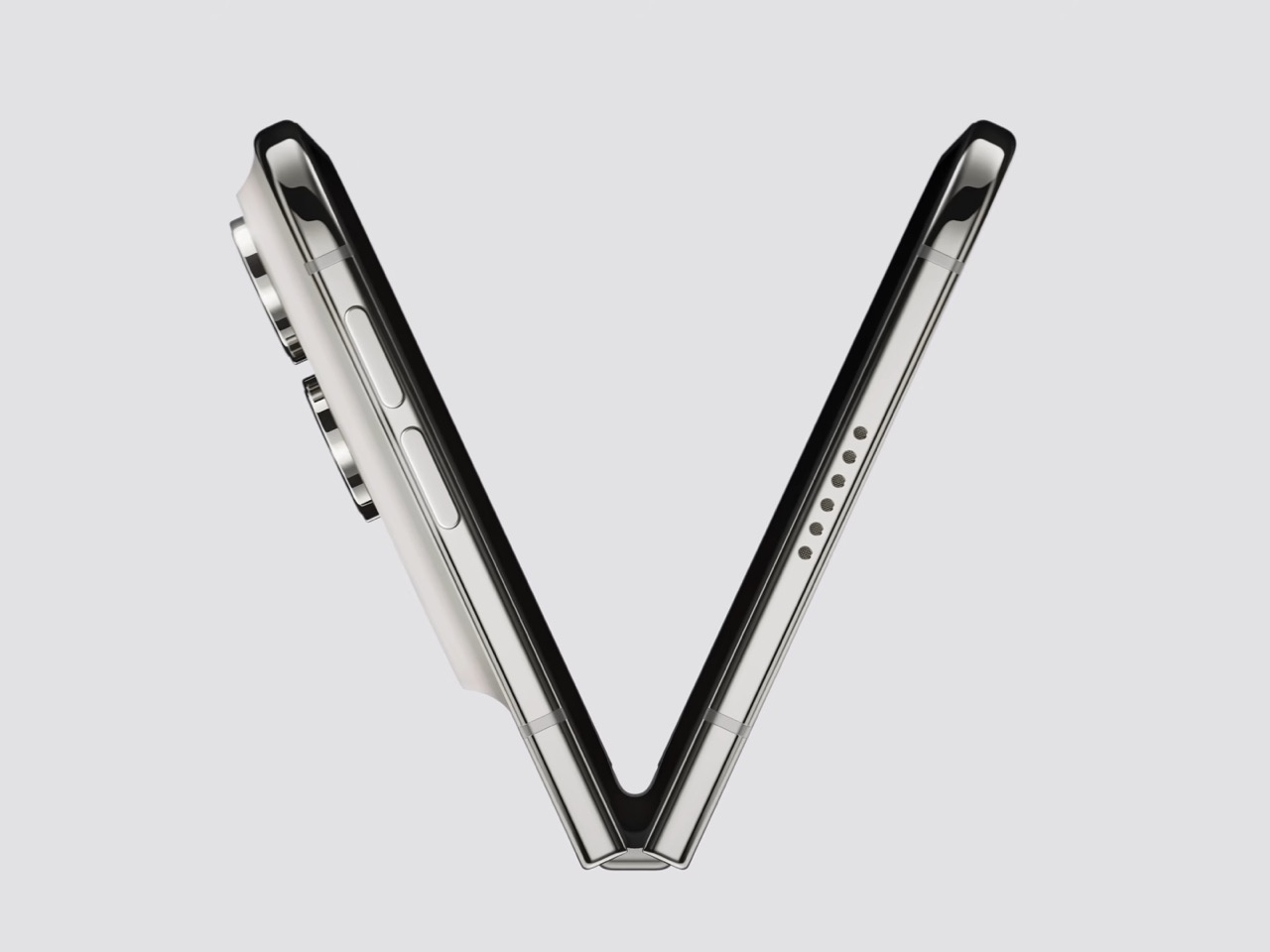
Apple refused to build a squarish slab that happens to close, and said so from the stage, calling out rivals whose square inner screens box movies into oversized black bars. The Duo lands at roughly passport size, with an asymmetric profile: two rounded corners on the right, squared geometry at the hinge. That asymmetry does something clever, because it tells your hand which edge to open before your brain gets involved. It reads like a small hardcover you want to crack open, which is a strange compliment to pay a phone. Somebody fought for that shape in a review meeting, and I am glad they won.
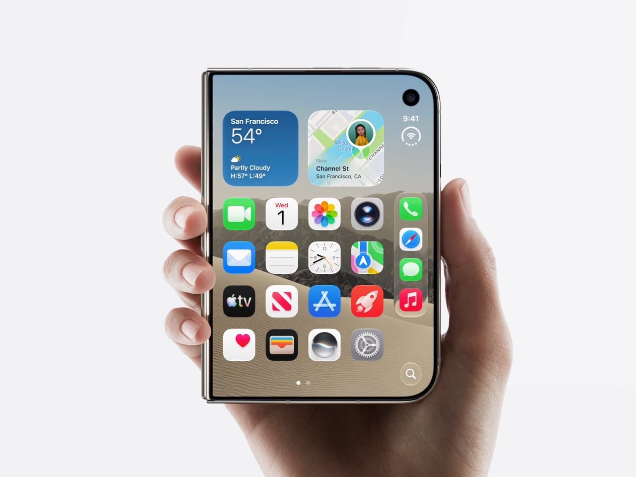
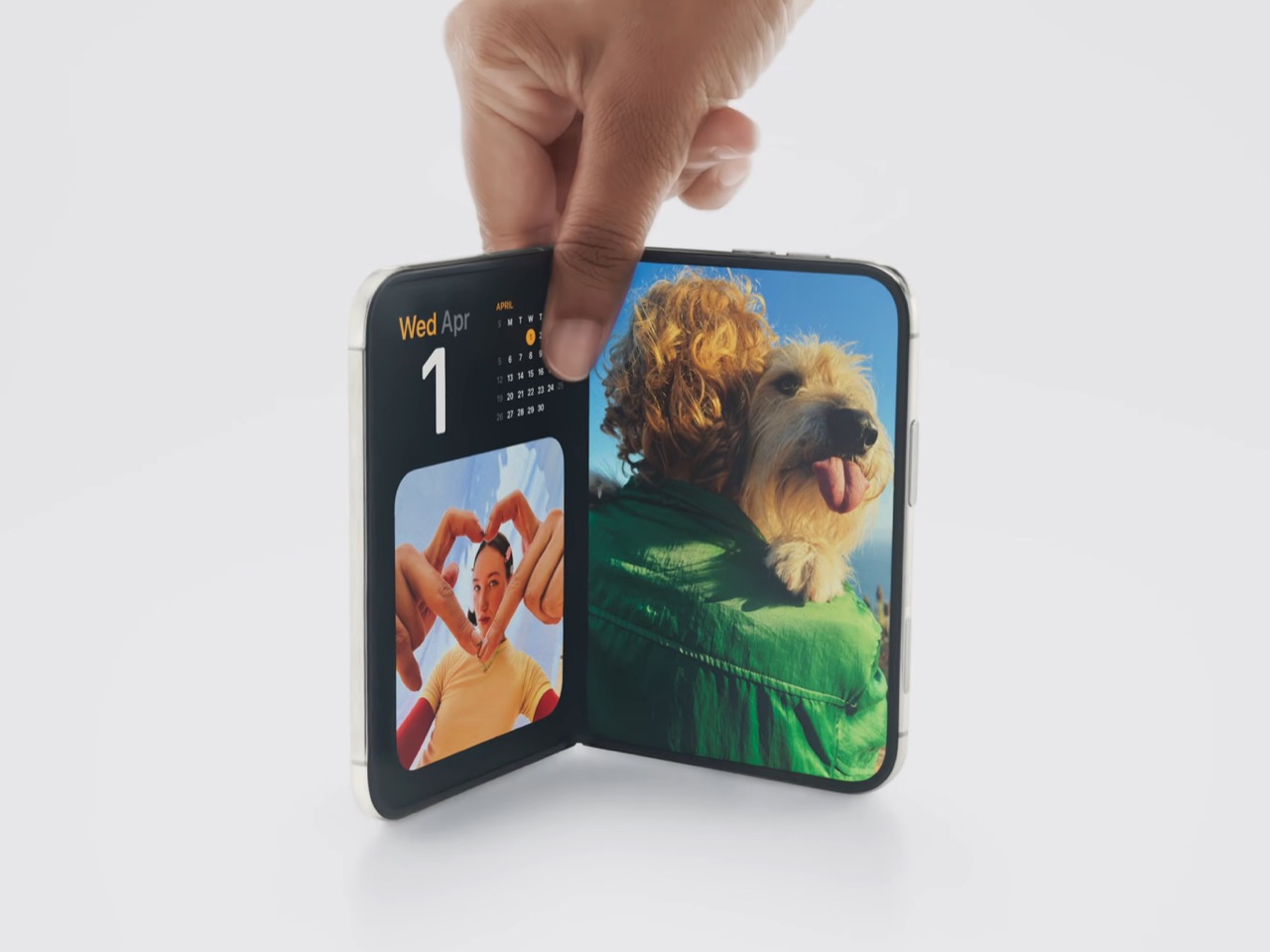
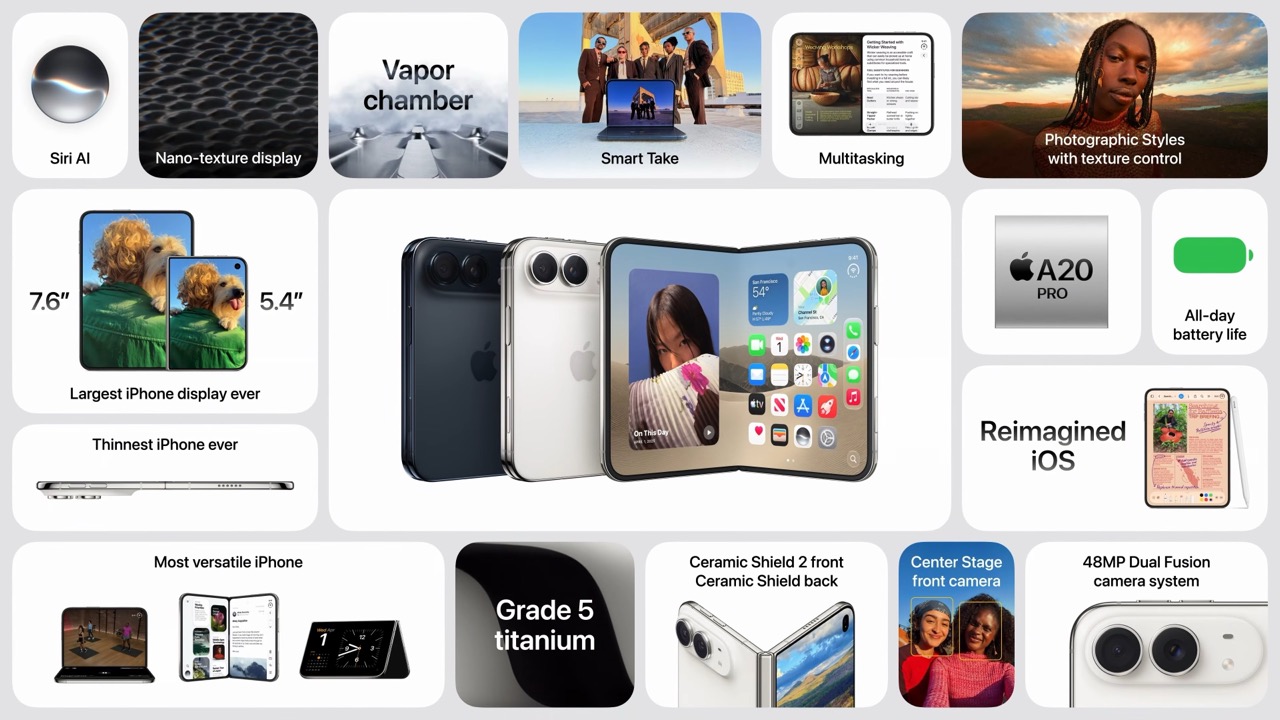
Both displays share a single aspect ratio, which is the decision the whole product rests on. Closed, the 5.4-inch outer panel delivers 90 percent of an iPhone 18 Pro’s screen area, so it works as a complete phone rather than a notification window. Open, the 7.6-inch inner canvas runs 50 percent larger than an 18 Pro Max. Because the proportions match, content scales between the two instead of reflowing awkwardly every time you fold, and the movie you started on the cover screen simply gets bigger. Every foldable before this one asked you to accept a jarring transition, and Apple designed the jarring part out.
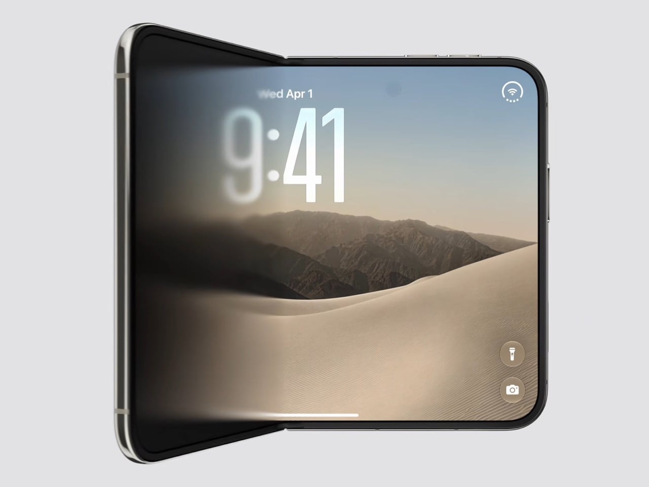
Content flows between the two displays as the phone opens, expanding out of the cover screen and settling into the larger canvas without a stutter. I would put that transition ahead of anything Samsung, Google or Oppo has shipped on a folding device, and it is the single most beautiful piece of UI in the category right now. The matched aspect ratio is what makes it possible, because there is no reflow to disguise, only a scale. Controls stay locked in place along the side while the content grows around them. Watching it happen is the closest a phone has come to feeling like sleight of hand.
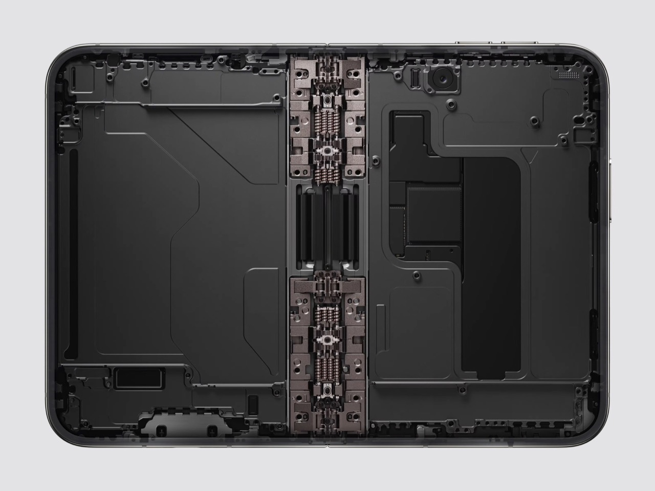
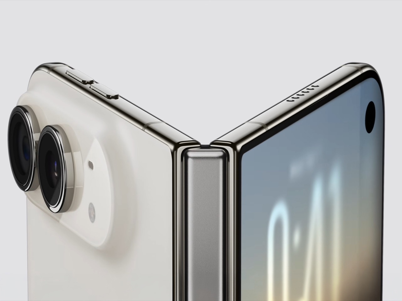
The crease is the thing people notice first on a foldable, and Apple has more or less made it disappear. A matte nano-texture finish across the inner display cuts glare and flattens how the fold reads, so the eye stops finding the seam. It also solves the other foldable complaint nobody talks about, which is the cheap plastic feel of a folding panel under your fingertip. Real glass sits above and below the display, and the whole stack is built to stop the panel distorting after a few thousand folds. Nine years of waiting bought Apple a fold you have to hunt for.
Grade 5 titanium forms the frame, polished to a mirror finish and broken by a hinge cover in contrasting micro-blasted texture. That pairing is the sharpest visual detail on the object, a bright reflective body interrupted by one matte band at the spine, and it gives the closed device a piece of jewelry quality that photographs beautifully in star white. Ceramic Shield protects the back, Ceramic Shield 2 the front, and the whole thing carries an IP68 rating. Pulling that dust and water rating across a moving joint is genuinely difficult engineering. The night sky colorway, a deep navy, is the one I would actually buy.
The dock is vertical now. iOS 27 moved essential controls to the side of the screen, freeing vertical space for content and landing the buttons under your thumb, which rewrites a layout convention Apple has held since 2007. The status bar compresses into a corner and the Dynamic Island turns sideways along the edge of both displays. Every first-party app had to be relaid out to make this coherent, and the fact that it still reads unmistakably as iOS is the real achievement here. Nobody outside Apple would have been permitted to move that dock.
Fold it halfway and iOS slides content away from the crease, giving you a laptop-style prop for video calls, a hands-free camera rig, and a bedside alarm face that wakes you with a gentle glow. StandBy now runs even when the phone is off charge, turning it into a photo frame or widget hub the moment you set it down. The speakers retune themselves depending on how far apart the two halves are sitting. One device, half a dozen legible postures, all of them designed rather than discovered by users after launch. The alarm clock pose alone will sell a few thousand units.
The cameras take advantage of having a second screen. Duo Preview throws a live feed onto the outer display so your subject can see themselves and fix their own framing, which ends a decade of “can you take it again.” Kid Cue plays Peanuts animations to make toddlers look at the lens. Smart Take watches the scene and fires the shutter once everyone is finally posed, killing the timer scramble. A 48MP Fusion Main with a 2x telephoto handles the actual imaging, alongside the same 48MP Ultra Wide found on the iPhone 18 Pro.
Going eSIM only across every market freed the internal volume for one battery per side, managed so the pair behaves as a single cell, delivering 31 hours of video on the inner display and 44 on the outer. I will miss the tray as a traveler, and I also suspect Apple has wanted it gone for years, because a physical port punched through the frame is a liability on a device chasing IP68 across a hinge. A20 Pro drives both panels, and fast charging reaches 50 percent in around 20 minutes. Some deletions are grief. This one is mostly relief.
Touch ID in the side button is a real step back from Face ID on a two thousand dollar phone, and it exists because a TrueDepth array had nowhere to live. Apple Pencil support arrives later this year rather than at launch, which softens the iPad Mini argument for a few months. The bezels look chunky beside a Galaxy Z Fold 8, and the folded body still reads thick in the hands-on shots. At $1,999, a hundred dollars over the Fold 8 and five hundred under what everyone predicted, Apple showed up nine years late and priced like it was early. Pre-orders open October 16.

 Connexion