Vue lecture

The 3 Best Japanese Kitchen Tools You Need to Buy August 2026

Japanese kitchen tools tend to arrive with a very specific philosophy attached. They do less than you expect on paper and more than you realize until you’ve used them for a week. The three objects below cover different ends of that idea: a precision appliance from one of Japan’s most storied engineering brands, a pair of scissors built for the demands of serious kitchen prep, and a clay pot that has been doing its job correctly since the Kamakura period.

What connects them isn’t aesthetic or price point. It’s the sense that each was designed by someone who had a genuine opinion about what the object should do, then made it do exactly that. August is a good month to pay attention to the kitchen — the produce is at its best, the cooking is more instinctive, and the tools you reach for most tend to reveal themselves. These three are worth reaching for.

1. Mitsubishi Bread Oven

The name requires a moment. Mitsubishi, the Japanese conglomerate better known for cars and precision electronics, makes one of the most exacting home bread ovens available. The machine applies the same engineering discipline to baking that Mitsubishi Electric brings to everything else it builds: controlled heat, precise internal timing, and an attention to the baking chamber environment that consumer appliances from Western brands rarely match. The result is a loaf with a crust and crumb structure most countertop machines simply cannot produce, regardless of recipe.

What makes it worth covering in a design publication isn’t only the output. The form is unmistakably Japanese in its restraint — minimal, white, without the button complexity that clutters European bread makers at comparable prices. It occupies counter space the way well-considered appliances should: as an object with a clear visual point of view rather than a machine that apologizes for being there. Bread that comes out of it tastes like something was genuinely thought about. Because it was.

What We Like

  • Precision heat management produces a crust and crumb that typical home bread makers don’t come close to replicating
  • The minimalist appliance design treats the machine as a considered object rather than a utility box competing for counter attention

What We Dislike

  • Sourcing outside Japan requires import channels, which adds cost and complicates any warranty or service process
  • The price point places this firmly in investment appliance territory — this is a deliberate purchase, not a casual one

2. Precision Chef Kitchen Scissors

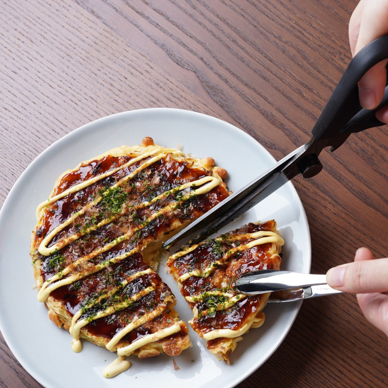
Kitchen scissors are one of those tools most cooks underestimate until they own a genuinely good pair. The Precision Chef Kitchen Scissors make the case for re-evaluation. Built with the material standards and blade geometry you’d expect from Japanese cutlery, they work through herbs, spring onions, dried chilies, and butcher twine without the handle torque that cheaper scissors force you to compensate for on every cut. Edge retention is where the quality gap between these and a supermarket pair becomes immediately obvious.

The design is deliberately restrained, which is exactly the right call for a kitchen tool that needs to sit in a drawer and get used without ceremony. Nothing superfluous in the grip, nothing decorative in the blade. Japanese kitchen scissors at this level function as precision instruments that happen to look like scissors. Once you’ve used a pair built this well for a full week of regular prep, the ones you owned before start to feel like a different category of object entirely.

Click Here to Buy Now: $95.00

What We Like

  • Edge retention and blade geometry handle repeated kitchen use without the performance drop that cheaper alternatives show within weeks
  • The restrained design means these function as tools first, rather than objects performing the idea of quality

What We Dislike

  • The refined aesthetic means they can disappear in a crowded kitchen drawer — worth designating a fixed home for them
  • Like most professional kitchen scissors, they require hand-washing to preserve edge quality, which adds a small but real step to cleanup

3. Iga-yaki Donabe Clay Pot
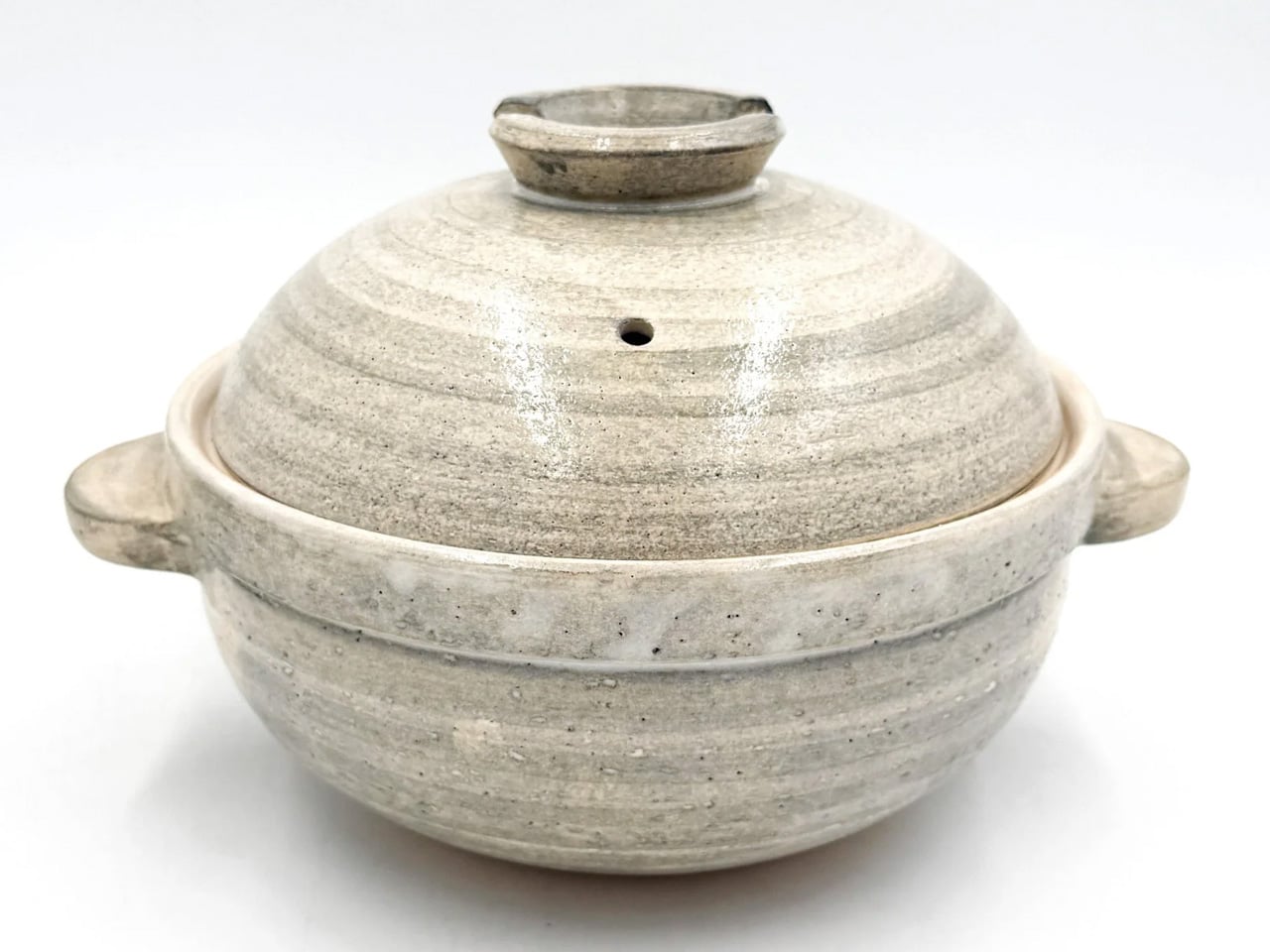
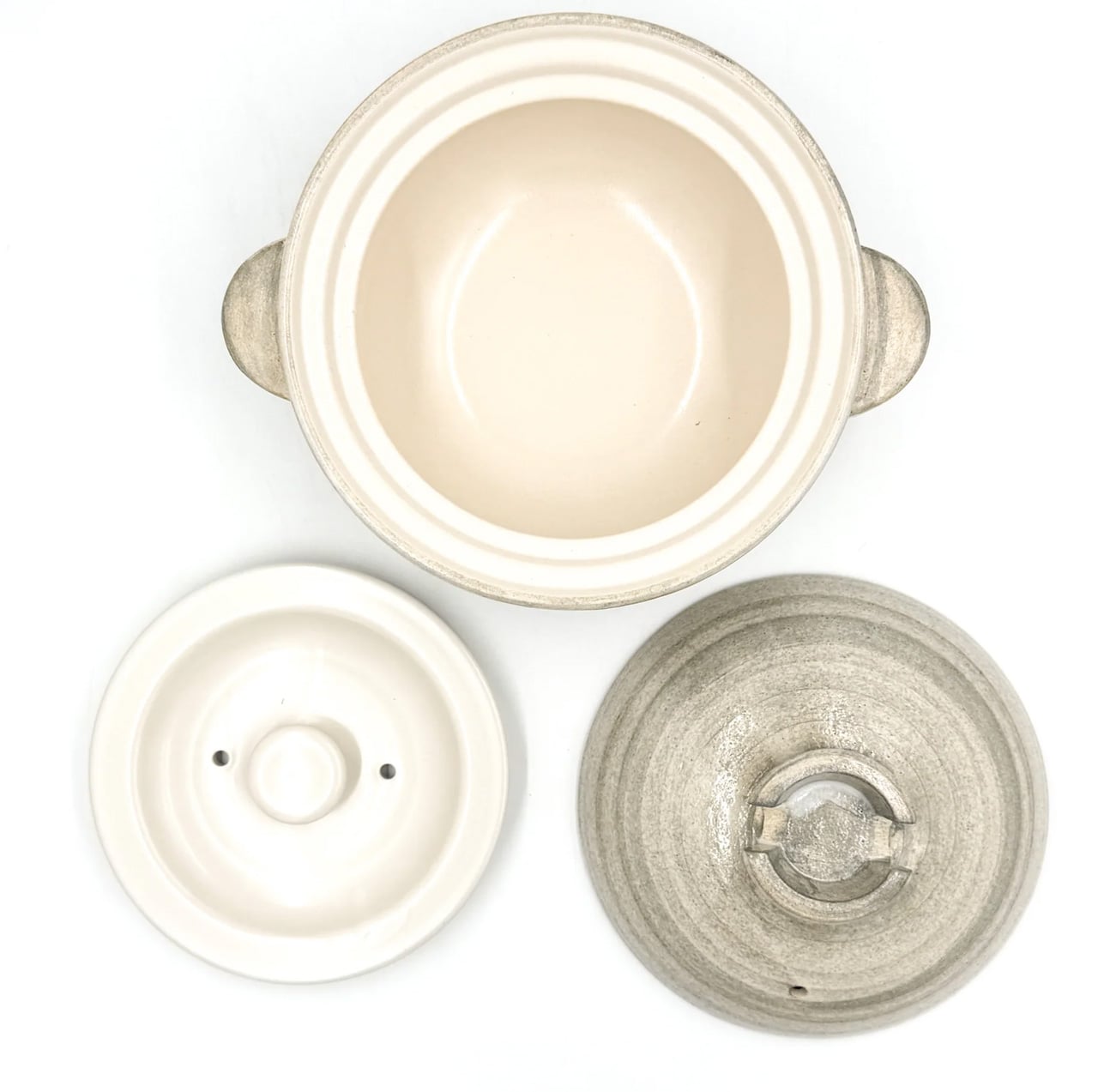
Iga clay comes from Mie Prefecture in Japan, where the local earth has been used for ceramics since at least the Kamakura period. The porous structure of Iga-yaki absorbs heat slowly and releases it with a consistency that metal pots structurally cannot replicate. Rice cooked in it sweetens. Broth deepens over a lower flame than you’d expect to produce it. The exterior stays rough and unfinished while the interior is glazed smooth — two surfaces on the same vessel, each doing exactly what it should.

Available from TOIRO Kitchen in several sizes, the donabe asks for a single seasoning step before first use — simmering rice water in the vessel — and then becomes one of the most reliable pots in the kitchen. It handles rice, hot pot, steaming, and slow braise with equal competence, which makes it the rare piece of cookware that earns its space by quietly replacing three other things. Store it with the lid off after washing, and it will be in your kitchen for decades.

What We Like

  • Iga clay’s heat retention produces results in rice and broth that no metal pot at any price point genuinely replicates
  • Real versatility across rice, hot pot, steaming, and slow cooking means one vessel covers what several usually would

What We Dislike

  • Requires a seasoning step before first use that the packaging doesn’t always communicate clearly upfront
  • The porous clay absorbs strong cooking odors over time and needs to be stored with the lid off after washing to stay fresh

Make the Kitchen Better, Not Faster

Three tools, three distinct registers of Japanese kitchen culture. Mitsubishi brings precision engineering to something as ordinary as a morning loaf. The scissors bring professional blade standards to daily prep work. The donabe brings centuries of ceramic craft to the kind of cooking that rewards patience over speed. None of them are trying to make the kitchen faster or more efficient. They’re trying to make it better, which is a different ambition and one worth paying for.

August is when most kitchens are running at full capacity — markets are abundant, evenings stretch long enough to cook properly. The tools you own in that window shape what’s actually possible in it. These three share a conviction that how something is made matters as much as what it does, and that conviction shows up every single time you reach for them. Start with whichever one your kitchen is currently missing most.

The post The 3 Best Japanese Kitchen Tools You Need to Buy August 2026 first appeared on Yanko Design.
  •  

A Coin-Sized Disc Just Reinvented the Multi-Tool Nobody Could Fix

The multi-tool has been around long enough that most people have developed a frustrated relationship with it. You carry one because having a blade, a screwdriver, and a bottle opener in one place sounds practical, and then you grumble when you actually need something. Getting to the right tool means prying at a tightly packed frame with both hands, and that dynamic hasn’t changed much in decades.

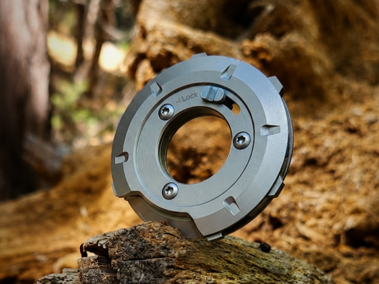
GEO, designed by Invento Design, takes issue with that familiar frustration. Rather than folding tools out from a layered frame, it uses a patent-pending rotating disc mechanism that cycles through five tools, exposing each one through a single opening. It’s a deceptively simple reframing of an old idea, and one that makes you wonder why nobody had taken this approach before.

Designer: Francisco Molina (Founder of Invento Design)

Click Here to Buy Now: $45 $70 (36% off). Hurry, only a few left!

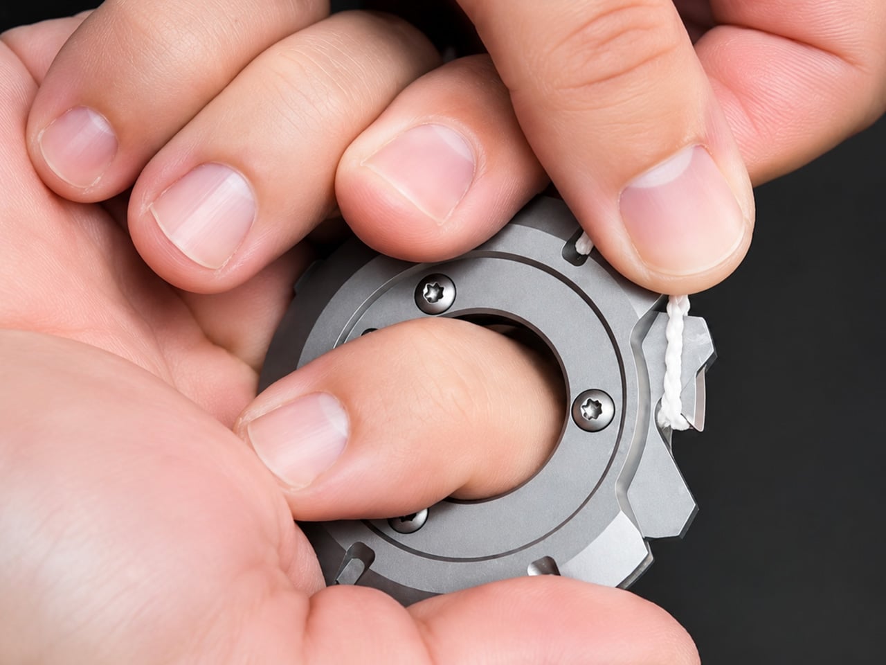
The way it works is fairly intuitive. Outer index levers let you rotate the internal mechanism until the tool you want lines up with the access window. A sliding lock then holds the selected tool in position before you start. The whole operation happens in one hand, without setting anything down first or needing a second hand to hold the frame steady.

The five tools cover a surprisingly practical range of everyday needs. You’d reach for the blade and scraper when a label refuses to peel cleanly, the box opener when a taped-up package isn’t cooperating, the bottle opener at the end of a long day, the flathead driver for a loose screw or a stubborn paint can lid, and the string cutter when scissors aren’t anywhere nearby.

Carrying something with a blade in your pocket raises the obvious question of what happens when it isn’t in use. GEO handles this with a dedicated safety mode, a neutral rotational position where no edges are exposed. The sliding lock serves a separate purpose, preventing the mechanism from turning mid-task. Together, they make it safe enough to pocket, clip to a belt, or drop into a bag.

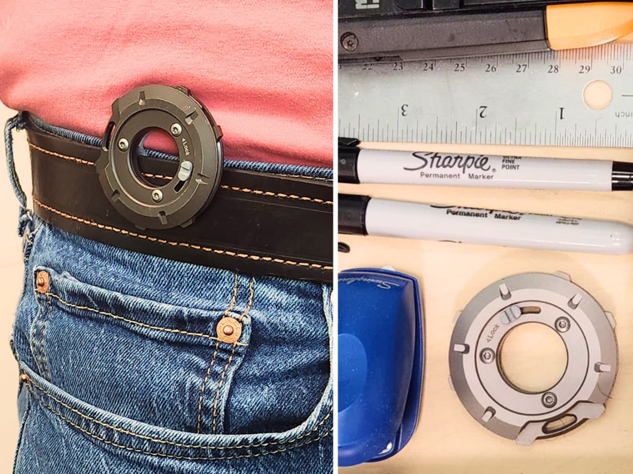
The form factor makes carrying it a fairly easy decision. At 53.5mm in diameter and only 8.7mm deep, GEO lands somewhere between a large coin and a watch face. The integrated belt clip adds some depth but keeps the total thickness under 15mm. It fits in a jeans pocket, clips to a gear bag, or disappears into a drawer without demanding much space.

There’s something worth noting about how it actually feels to use, too. The rotation isn’t purely functional but also incredibly satisfying. Each position clicks into place with enough tactile feedback that you know exactly where you’ve landed, and the smooth lever action makes it oddly enjoyable to cycle through even when nothing needs doing. It tends to stay in your hand a bit longer than the task requires.

The construction does a good job of reinforcing the premise. GEO’s tool body is milled from 440C stainless steel hardened to 57–59 HRC, placing it in the same material territory as quality kitchen blades. Cover panels come CNC-machined from either 6061-T6 aluminum or Grade 5 titanium, with internal hardware in 304 stainless steel throughout, a quietly serious specification for something this compact.

GEO isn’t meant to replace the full-size tools sitting in workshop drawers or on a fully loaded belt. It’s better understood as something for the other moments: the stubborn tape, the loose screw, the cord that needs a clean cut. Its compact, circular form makes it easy enough to keep close that reaching for it becomes the natural first move rather than an afterthought.

Click Here to Buy Now: $45 $70 (36% off). Hurry, only a few left!

The post A Coin-Sized Disc Just Reinvented the Multi-Tool Nobody Could Fix first appeared on Yanko Design.
  •  

Nothing killed the Glyph Interface. This Teenage Engineering synth concept argues that was a mistake

Nothing spent three phone generations convincing us that a few light strips on the back of a device counted as a personality. The Glyph Interface was the whole brand in one gesture, a Morse code of notifications you could read with the phone face-down on a bar table. Then Phone (3) arrived in July 2025 with the Glyph Matrix instead, a small dot matrix circle tucked in the corner, and the comment sections held a funeral. “NO GLYPH” became the shortest and angriest review of the year. Which makes it pretty funny that the most convincing argument for reviving that light language has come from a fan concept for a synthesizer.

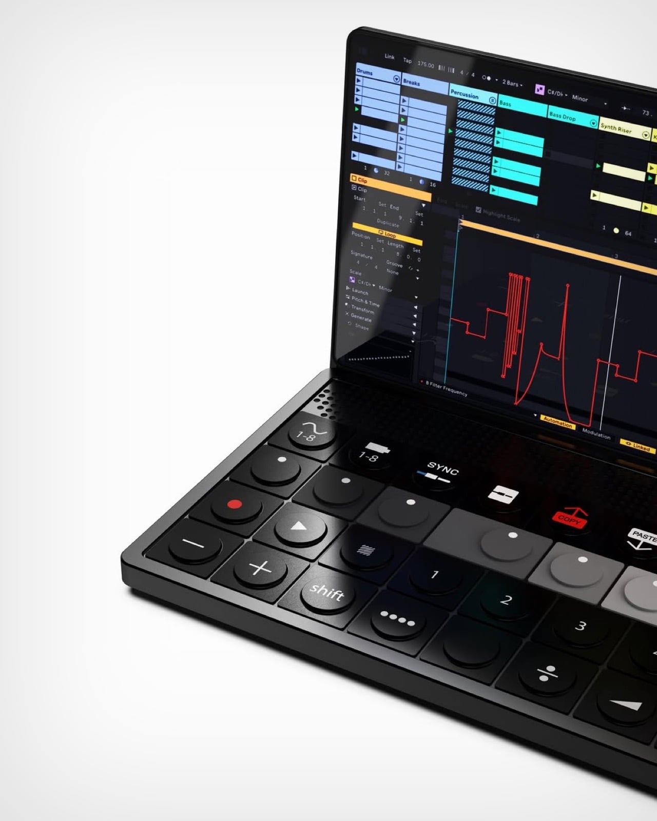
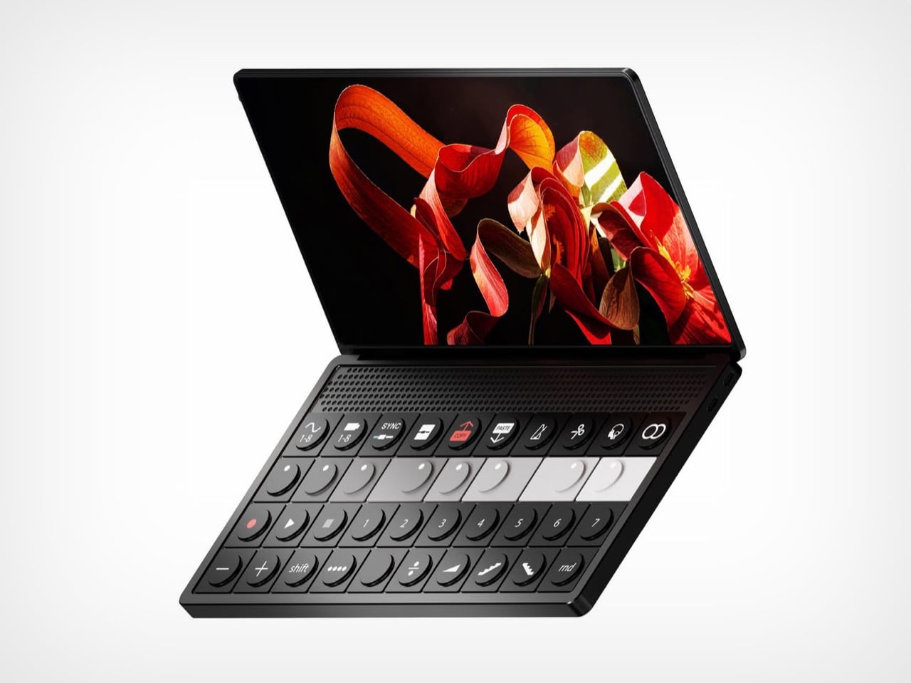
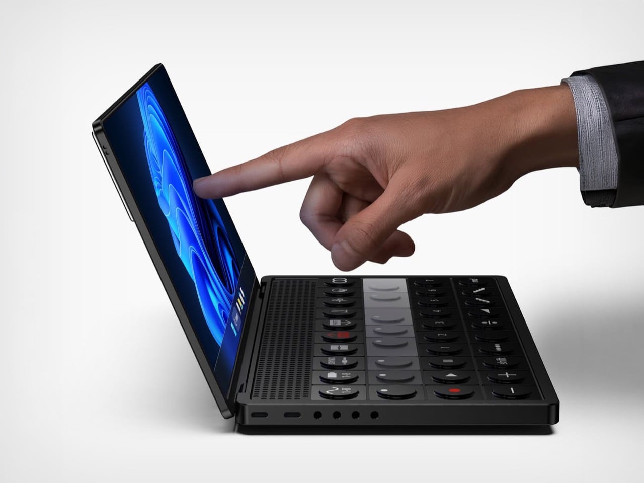
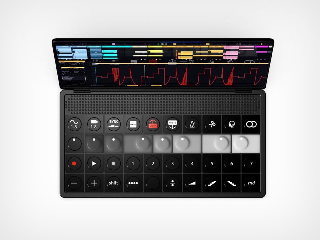
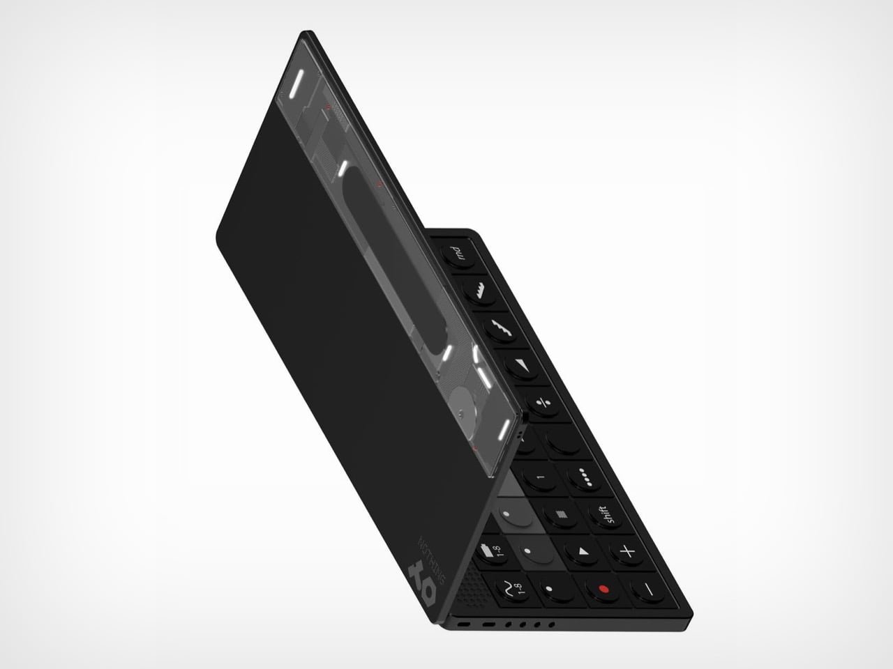
Abdelrahman Shaapan’s Mini OP-3 wraps a semi-transparent rear panel around a compact synth, with LED effects and dynamic graphics that pulse along to whatever you’re playing. Flip it over and the front is pure Teenage Engineering, a clamshell with a touchscreen lid and a control deck of encoders, transport keys, numbered pattern buttons, and one red COPY key doing a lot of emotional labor. Shaapan calls the project an exercise in translating the design DNA of both brands into a single object. He also added a charm attachment point on the screen corner, because it is 2026 and everything needs a little guy hanging off it. The pitch is a smaller OP that keeps you off your laptop during production and live sets.

Designer: Abdelrahman Shaapan

Ten function keys run across the top of the deck, covering waveform and tape banks, sync, split, copy, paste, metronome, scissors, monitoring, and loop. Below them sit eight encoders arranged in a greyscale gradient from black to white, which is the single most OP-1 gesture available to any designer working in this language. A transport row follows with record, play, and numbered pattern keys, then a modifier row carrying shift, divide, ramp, and a random button. The hinge hides a perforated speaker band, and the front edge packs two USB-C ports beside four 3.5mm jacks. Every control is round, tactile, and spaced like it expects to be hit fast in a dark room.

Nothing built its identity on light as an interface, then retired it on the Phone (3) in favour of a dot matrix that most owners still describe as a downgrade. Shaapan’s rear panel puts that language back to work, running LED effects and dynamic graphics that respond to your audio in real time. On a phone, reactive lighting was always slightly decorative, a party trick for incoming calls and little else. On an instrument, it has an actual job, giving you a visual read on your track from across a stage or a crowded studio. Relocating the Glyph to the one product category where it earns its keep is a sharper piece of brand analysis than most fan concepts manage.

Shaapan rendered the whole thing in KeyShot. The soft-touch black body, the subtle sheen on the encoder caps, and that partially translucent rear panel with internals showing through all read as convincingly manufacturable rather than aspirational. The charm attachment point is the detail I keep coming back to, since TE has always sold straps and cases as identity objects and phone charms are having a genuine cultural moment. We covered a Teenage Engineering DJ console concept a couple of years back, and this one clears that bar comfortably. The presentation is good enough to be mistaken for a leak.

One thing undercuts the pitch. Shaapan says the goal was minimizing laptop dependence, but three renders show Ableton Live running on the touchscreen, which means the device became a laptop instead of replacing one. Ableton’s own Push 3 already solves the standalone problem and charges around two thousand dollars for it. That gap between the stated intent and the renders is the part a real product team would have to close first. Everything else here, though, is a better Nothing product than Nothing’s last one.

The post Nothing killed the Glyph Interface. This Teenage Engineering synth concept argues that was a mistake first appeared on Yanko Design.
  •  

The Echo Chair Makes 3D Printing Feel Refined

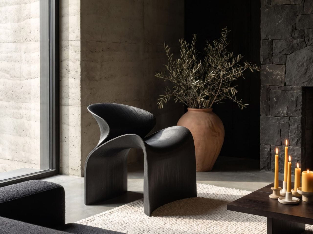
ZHA has collaborated with Spanish design brand Nagami to create the Echo Chair, a 3D-printed seat made from recycled plastic waste. Formerly known as Zaha Hadid Architects, the studio developed the chair through parametric design and large-scale additive manufacturing. Its form is fluid and sculptural, with an arched backrest that extends towards the floor and a seat that curves upwards at the sides.

The two parts look separate at first, but they are printed as one continuous piece. Both surfaces grow from the same structural edge and share the same underlying geometry. One becomes the seat, while the other rises to form the backrest and support.

Designer: ZHA and Nagami

This continuous construction gives the chair a clear sense of logic. The shape is doing several jobs at once: supporting the body, holding the structure together, and defining the overall visual character.

The Echo Chair was developed through an iterative research process at ZHA Lab and manufactured by Nagami, a brand known for its work in large-format 3D printing. The studios used recycled PETG sourced from industrial waste, including single-use medical plastics.

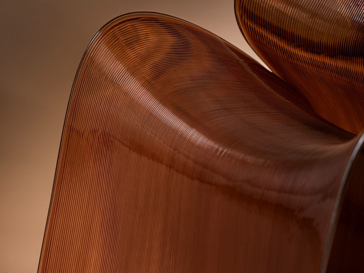
As the chair is printed layer by layer, the process leaves a ribbed texture across its surface. Those lines have been kept visible rather than hidden or polished away. That decision gives the chair much of its character. The texture follows the curves closely and makes the manufacturing process easy to read. It also gives the recycled plastic a more tactile, less generic appearance.

There is something useful in that honesty. The material is not being forced to look like timber, stone or metal. It keeps the visual qualities created by the printing process and uses them as part of the design. The surface does still reference natural materials in a subtle way. Its layered finish recalls mineral formations and carved stone, which helps the chair feel less industrial when placed in an interior.

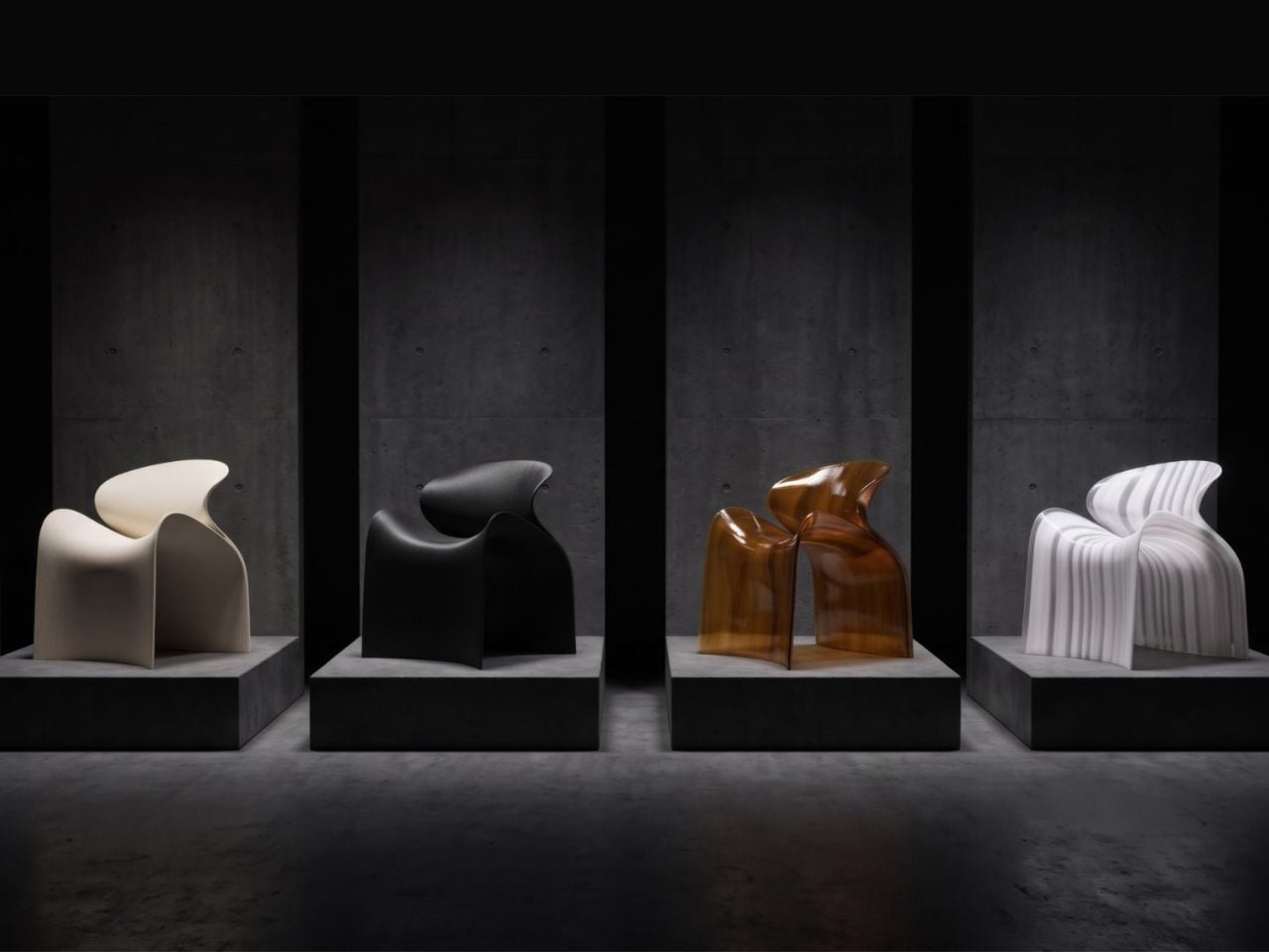
ZHA and Nagami developed four colourways for the chair: white, black, a white-to-translucent gradient and a caramel tone made using a bio-based cork composite. The colour choices help shift the mood of the design. White makes the form feel lighter and more architectural, while black gives it a stronger, more graphic presence. The translucent version draws attention to the printing layers, and the caramel finish adds warmth to what could otherwise feel like a very technical object.

The caramel version is especially successful because it softens the synthetic quality of the plastic. It feels easier to imagine in a home, hotel lobby or lounge space, rather than only in a gallery or design exhibition. According to ZHA project design director Sebastian Andia, the goal was to turn an abundant and overlooked material into something people would genuinely want to live with. That idea matters because recycled material alone is rarely enough to make a product successful. People still need to like the object, find it comfortable and see a place for it in their environment.

The Echo Chair handles this well. Its sustainable story supports the design, rather than becoming the whole design. The seat’s raised sides create a more enclosed sitting position, while the curved backrest gives the chair a supportive and almost cocooned feel. The shape is expressive, but it still looks usable. Its scale and neutral colour options also make it easier to place than the form might suggest. It has enough presence to work as a statement piece, yet it does not depend on bright colour or decoration to stand out.

The 3D-printing process allows the chair to be produced without visible joints or separate components. This gives it a seamless appearance and keeps the connection between the digital model and final object very direct.

That connection is one of the strongest parts of the project. The manufacturing process does not sit behind the design. It shapes the design. The ribs, curves and continuous structure all come from the same production method. Each part of the chair feels related because it has been developed through the same system.

The Echo Chair continues ZHA and Nagami’s existing collaboration. Nagami launched its first collection of 3D-printed chairs in 2018, which included two designs by the architecture studio. Their latest project shows how much more refined large-scale 3D printing has become. The chair feels less like a technical experiment and more like a finished product with a clear place in contemporary interiors.

The Echo Chair is currently on display as part of London Creates at The Truman Brewery. What makes the chair interesting is the way it brings together material, form and manufacturing without overcomplicating the idea. Recycled plastic is treated as a starting point for the design, rather than something that needs to be disguised.

The post The Echo Chair Makes 3D Printing Feel Refined first appeared on Yanko Design.
  •  

Michelangelo’s iconic David bust gets recreated in LEGO, turning plastic into sculpted marble

If you ever took a drawing class, you have met this face. Art schools spent about two centuries buying plaster casts of David’s head and parking them on shelves so students could sit there for six hours learning to render a nostril. The Victoria and Albert Museum owns a full size cast of the whole statue, and famously kept a plaster fig leaf on standby in case Queen Victoria dropped by and needed the shock absorbed. So David has been getting copied, shrunk, cast, and occasionally censored for a very long time. Turning him into a toy is not the sacrilege it sounds like. It’s basically the family business.

Which brings us to Ysien, a LEGO Ideas builder who decided the next material in that lineage should be ABS plastic. The build renders David’s head, neck, shoulders and upper chest as a classical bust, entirely in white, sitting on a proper stepped pedestal. No color, no minifigure, no cheeky accessories. Just light and shadow doing all the work, exactly like the plaster casts it descends from.

Designer: Ysien

The hair is the whole reason this MOC (My Own Creation) works. Hair is where sculptors get found out, because faces have anatomy underneath that you can reason your way through, while hair is a mass of overlapping nothing that somehow has to read as soft. Michelangelo’s answer was a tangle of deep drilled curls. Ysien’s answer is a genuinely absurd stack of curved slopes and half arch elements layered at varying depths, so each curl throws its own little shadow instead of flattening into texture. “The hair was one of the greatest challenges, with each curl contributing to the overall silhouette, depth, rhythm, and movement,” he says, which is a very polite way of describing what must have been several evenings of quiet suffering.

My favorite decision, though, is that the seams stay visible. Ysien could have chased a smooth marble finish and lost, because bricks do not do smooth. Instead he let the geometry become part of the sculpture, so the thing reads as a portrait from across the room and as unmistakable LEGO up close. The eyes get a similar treatment, built from inverted round elements that give David that vacant classical stare, which is a nice accident given the real statue has heart shaped pupils drilled into it. Monochrome white does the rest, forcing every bit of the anatomy to be described by shadow alone. There’s no piece count listed yet, although I wouldn’t be surprised if it was in the high hundreds.

Ysien’s David is currently sitting at just over 400 supporters with 424 days on the clock, which means there is a long road to the 10,000 votes that trigger an official LEGO review. LEGO Ideas is where fan builds get their shot at becoming retail sets, and this one deserves a look. The only thing I’d add is a black variant, because a basalt David would be an absolute menace on a shelf. You can head to the LEGO Ideas page and cast your vote!

The post Michelangelo’s iconic David bust gets recreated in LEGO, turning plastic into sculpted marble first appeared on Yanko Design.
  •  
❌