Vue lecture

The Redwood by Tiny Timber Homes Proves Small Living Doesn’t Mean Settling

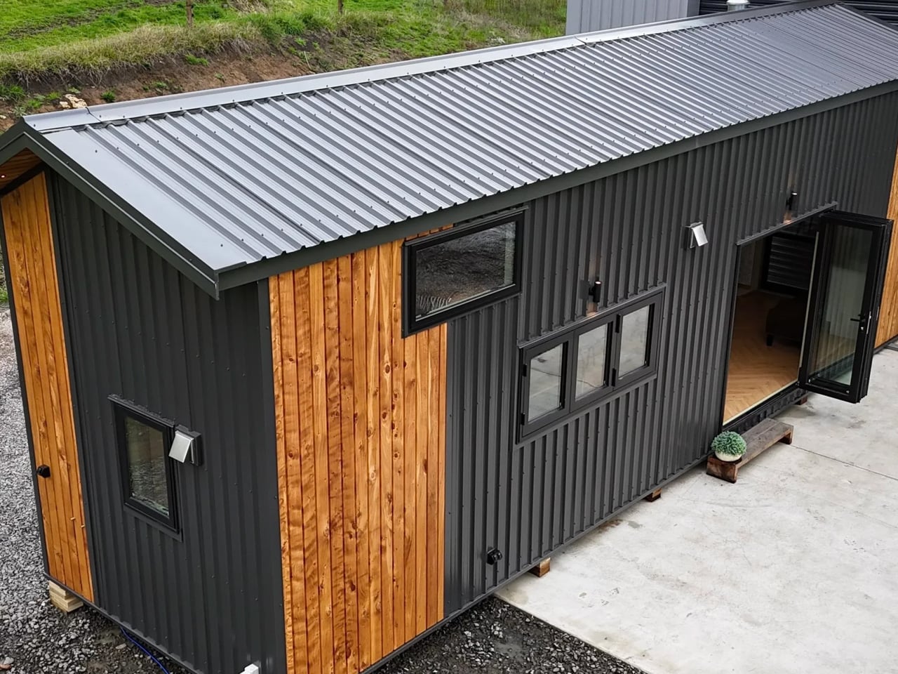
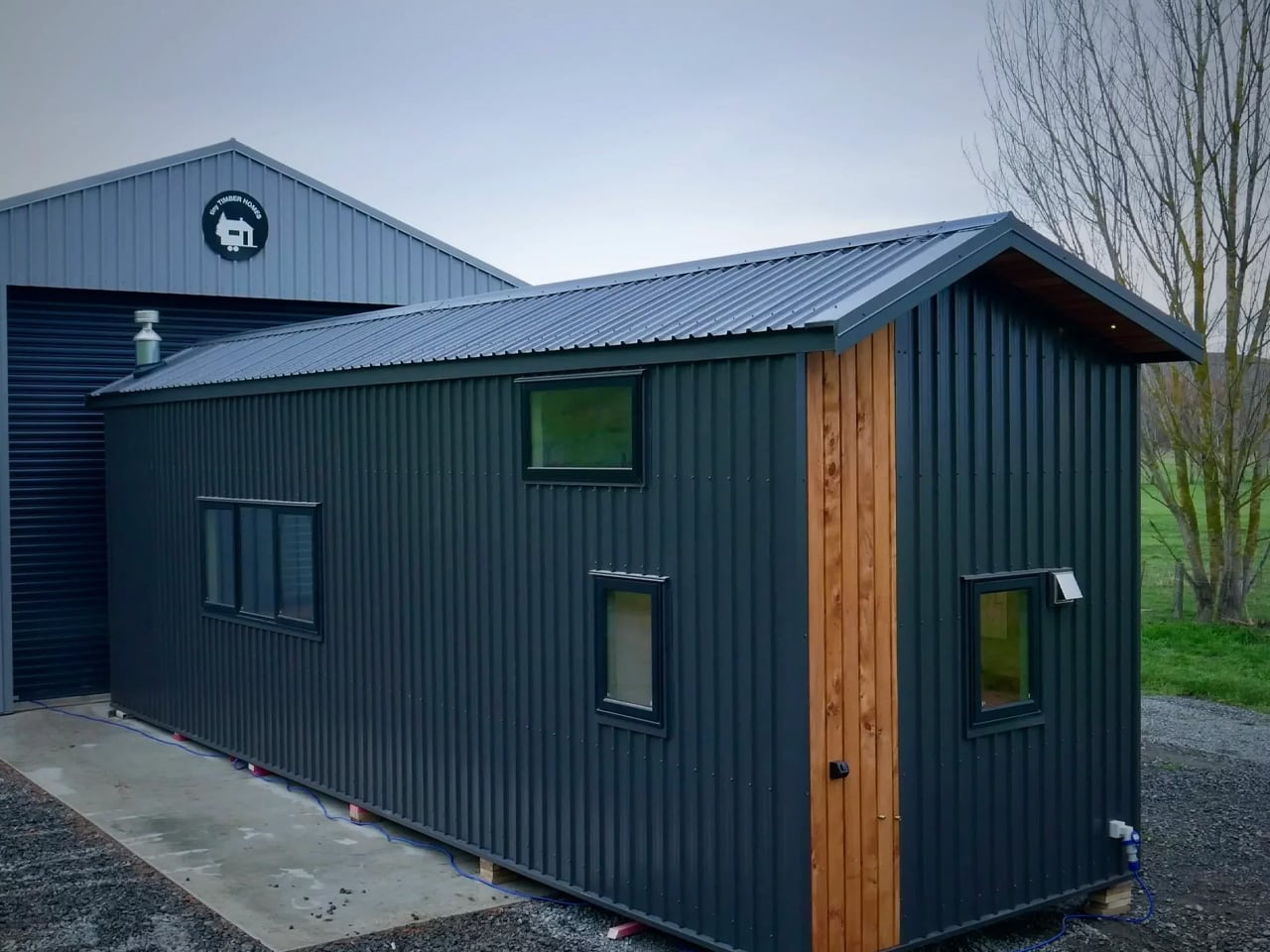
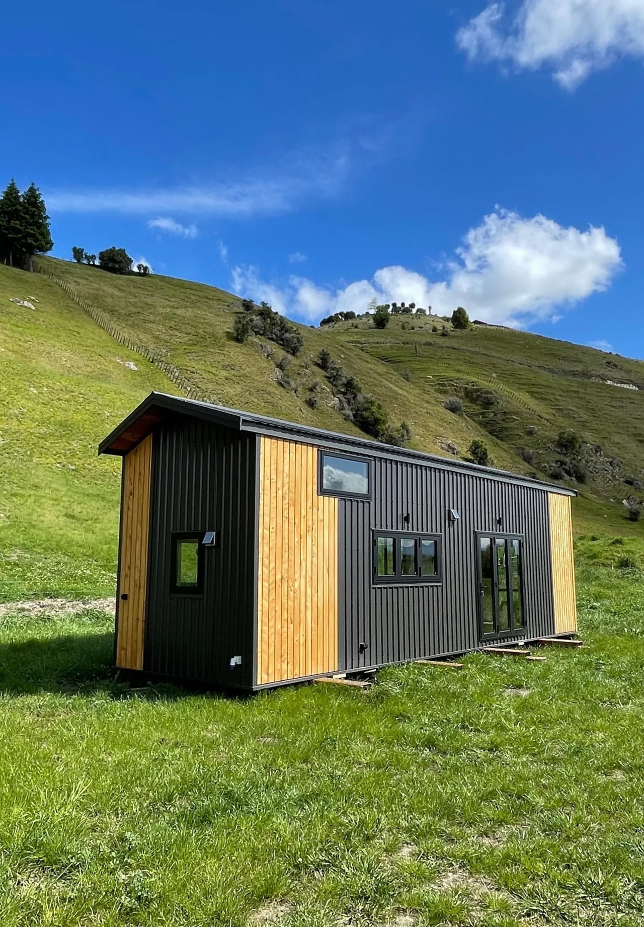
Wood has a way of telling you exactly where it’s been — and the Redwood by Tiny Timber Homes wears that history well. The Redwood leans into that quality completely — and the result is a tiny house that feels less like a compromise and more like a choice you’d make twice.

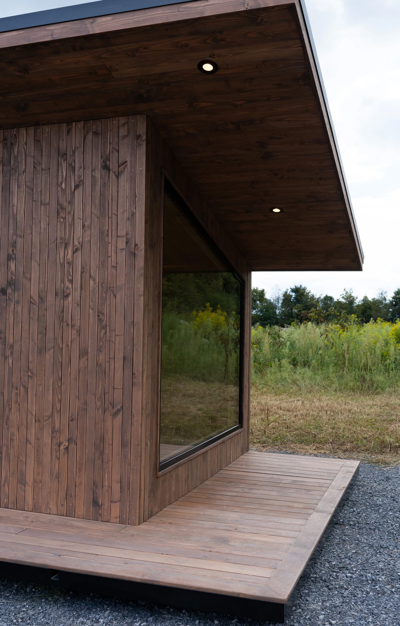
Tiny Timber Homes has built its reputation on one idea: that small spaces deserve the same craftsmanship as full-sized ones. The Redwood is perhaps the clearest expression of that philosophy. Its exterior reads immediately as intentional — warm wood cladding, clean rooflines, and a silhouette that sits confidently without trying to mimic a traditional house. It’s not cosplaying a cabin. It’s its own thing.

Designer: Tiny Timber Homes

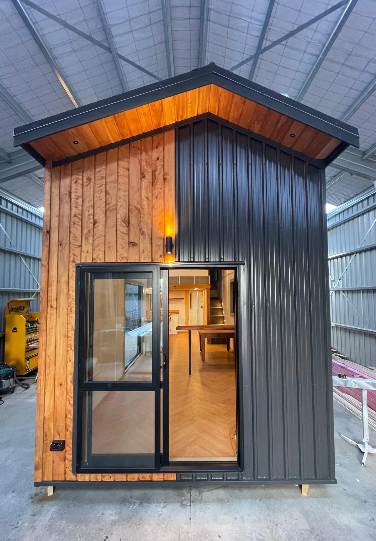
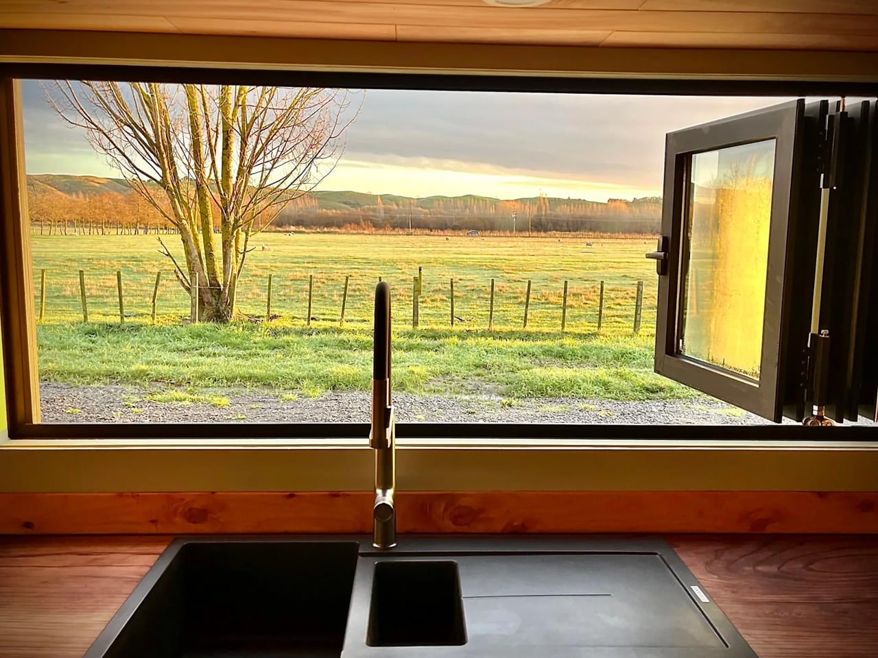
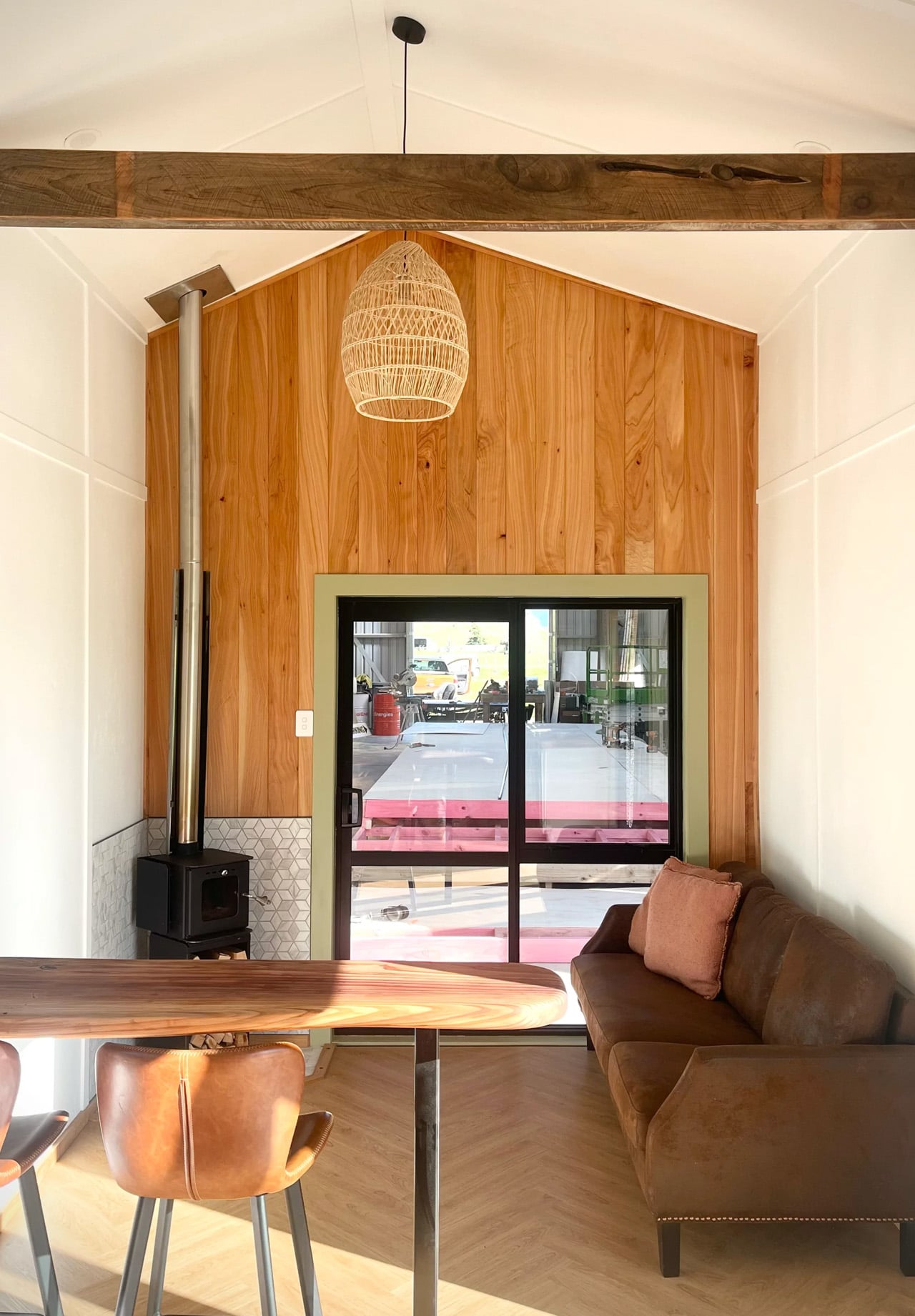
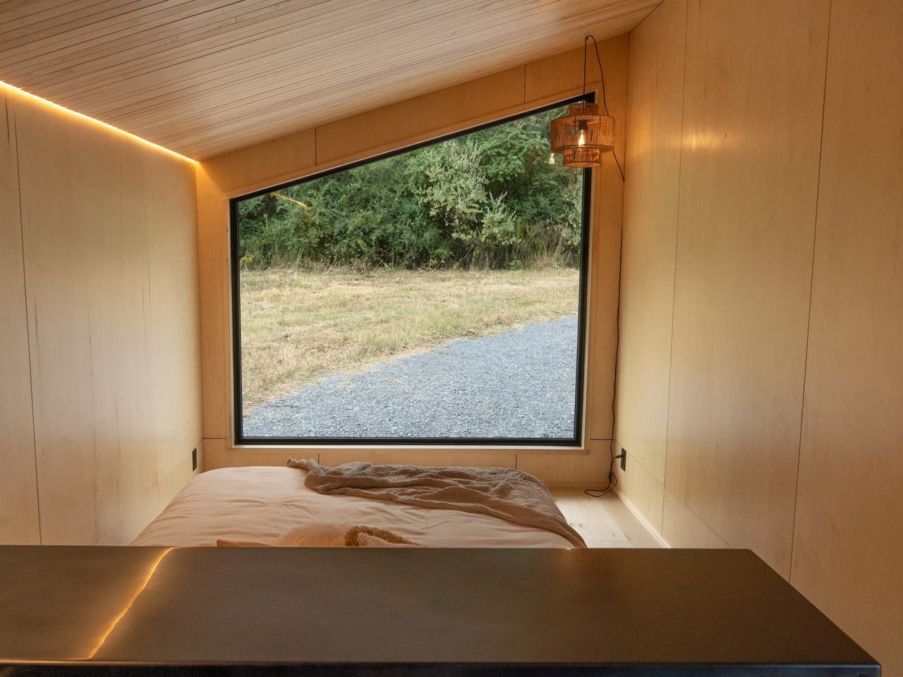
Step inside and the material language continues without interruption. Exposed timber framing lines the interior walls, giving every room a structural honesty that most tiny homes paper over with drywall and distraction. Natural light does the heavy lifting here — strategically placed windows pull the outdoors in and keep the interior from ever feeling like a box you’re trapped inside.

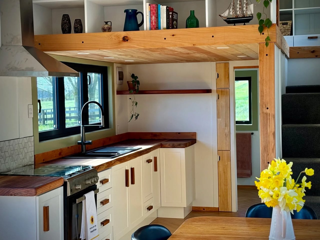
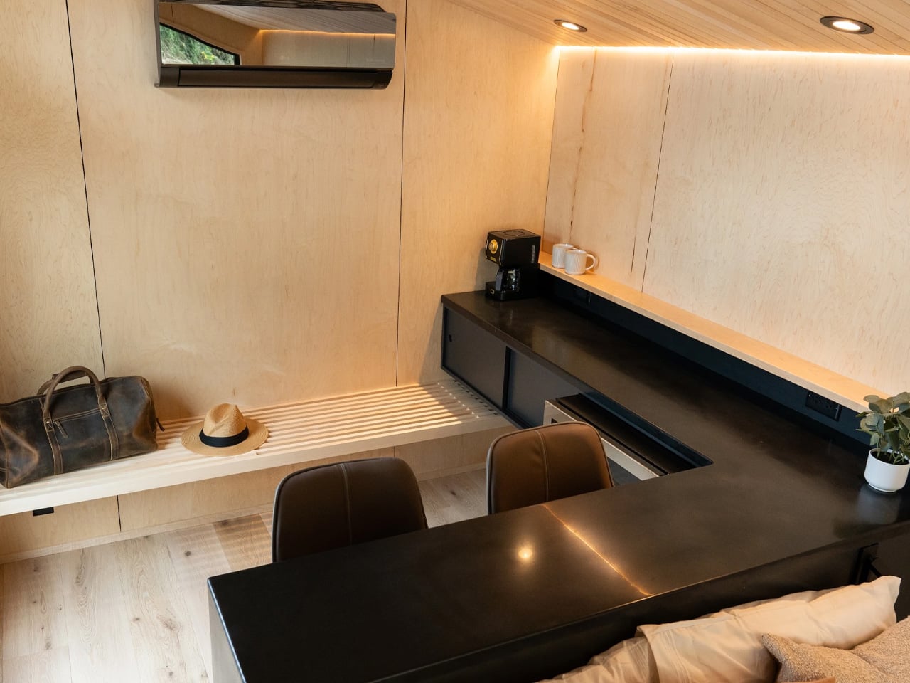
The kitchen is compact but considered. Counter space is used with real intention, storage is tucked where you’d actually look for it, and the layout doesn’t ask you to turn sideways to reach the sink. It’s the kind of kitchen that rewards a slower pace — coffee in the morning, dinner from scratch, no dishwasher you don’t need.

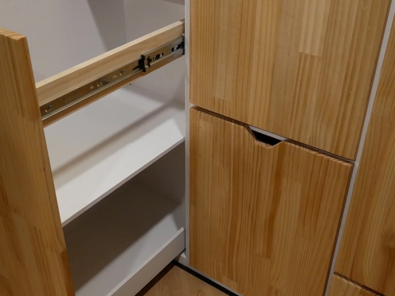
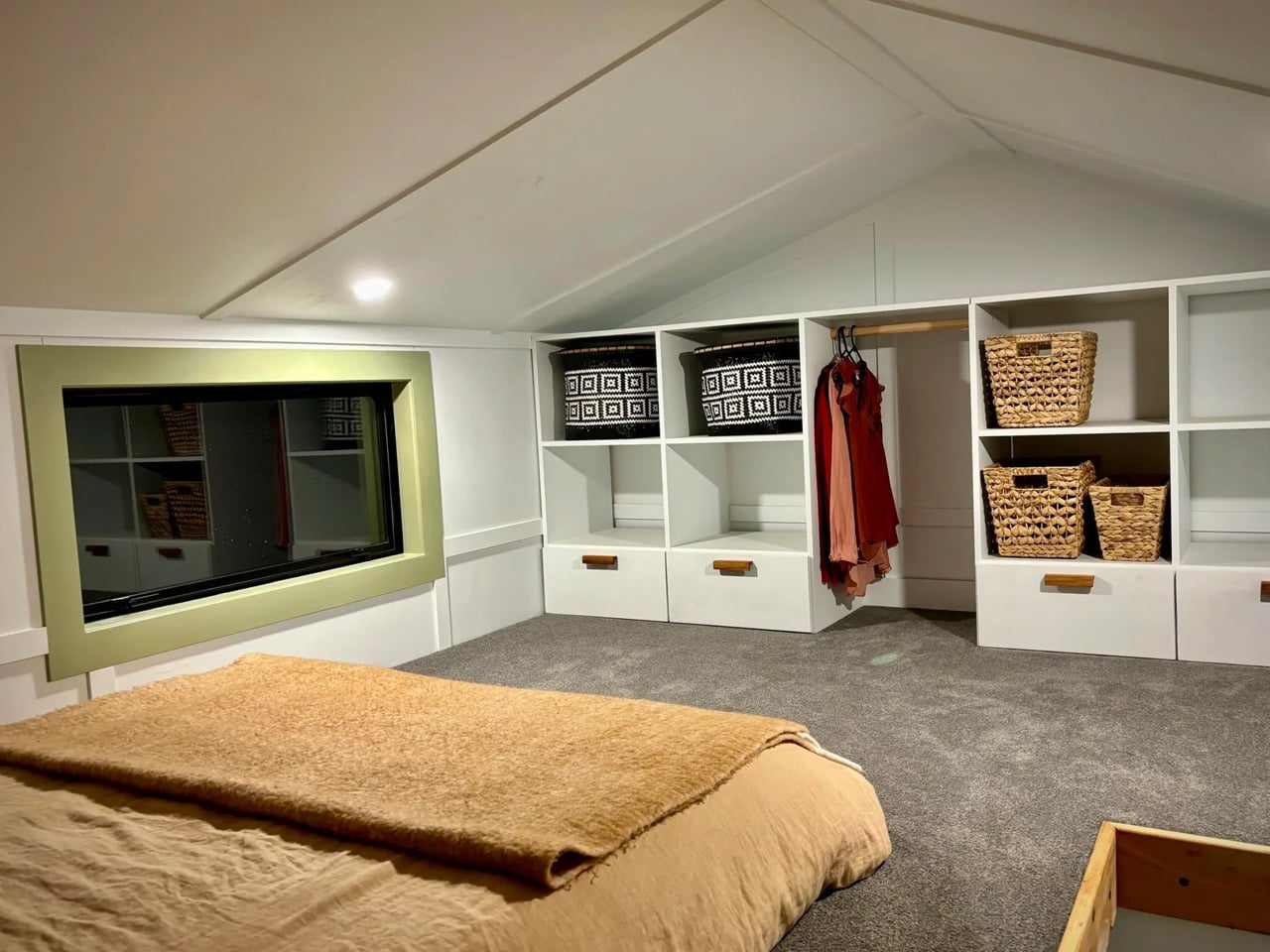
The sleeping loft sits above it all, accessible by a stair ladder that doubles as storage. From up there, the whole space reads differently. You see the structure, the grain of the wood, the way everything fits without forcing. It’s a perspective that makes you appreciate the design more, not less.

What separates the Redwood from the growing noise in the tiny home market is restraint. There’s no attempt to cram in features that don’t belong, no feature list that sacrifices livability for a spec sheet. What you get instead is a home that understands its own scale and works with it — not against it.

Tiny Timber Homes builds for people who’ve thought seriously about what they actually need from a home. The Redwood answers that question with timber, light, and a layout that respects the person living inside it. In a category full of aspirational renderings and underwhelming follow-through, that’s worth something. It looks like a home. It lives like one too.

The post The Redwood by Tiny Timber Homes Proves Small Living Doesn’t Mean Settling first appeared on Yanko Design.

  •  

This Tiny House on Wheels Lives Bigger Than It Has Any Right To

Most tiny homes ask you to make peace with the compromise. Wind River Built’s Rogue Mini skips that conversation entirely. Built in Tennessee by one of the most respected names in the tiny home space, the Rogue Mini is a trailer-mounted dwelling that treats small square footage not as a limitation, but as a design brief.

From the outside, the Rogue Mini reads clean. Board-and-batten siding, a pitched roofline, and restrained exterior detailing give it the visual composure of something far more permanent than its wheels suggest. Wind River Built has always leaned into quality construction over novelty, and the Rogue Mini reflects that. Every edge feels considered. Nothing about the exterior screams “novelty camper” — it looks like a house someone actually wants to live in.

Designer: Wind River Built

Step inside, and the interior continues that conversation. Wood-paneled walls and vaulted ceiling lines open the space upward, drawing the eye in a way that makes the square footage feel more generous than it is. The kitchen is compact but functional, with enough counter space to cook a real meal rather than reheat one. The sleeping loft sits above, accessible by a staircase or ladder depending on configuration, and offers a surprisingly comfortable retreat that feels separated from the main living area in the way a bedroom should.

What Wind River Built understands — and what a lot of tiny home builders get wrong — is that smallness only works when the details are right. Inadequate storage, poor natural light, and awkward transitions between zones make a small home feel punishing. The Rogue Mini sidesteps most of those pitfalls. Windows are placed deliberately, throwing light into corners that would otherwise collapse. Storage is woven into the structure rather than bolted on as an afterthought.

The Rogue Mini isn’t designed for the weekend warrior or the festival-goer chasing Instagram backdrops. It’s designed for someone who has genuinely decided to live differently — to trade square footage for mobility, and square footage for intention. That kind of design decision requires a builder who takes the task seriously, and Wind River Built clearly does.

At a time when housing feels increasingly abstract — prices climbing, spaces shrinking, and permanence fading — the Rogue Mini offers something rare. It chooses to make living small feel like an upgrade rather than a retreat. That’s not an easy thing to design. Wind River Built pulls it off.

The post This Tiny House on Wheels Lives Bigger Than It Has Any Right To first appeared on Yanko Design.

  •  

BIG Wraps Dymak’s Headquarters in Solar-Powered Timber

BIG’s new headquarters for Danish material supplier Dymak turns environmental performance into architecture. Rather than treating sustainability as a technical layer hidden within the building, the studio makes it central to the project’s form, materiality and identity.

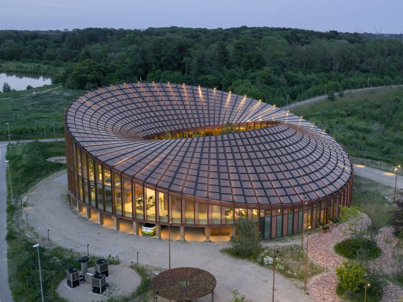
Located beside Glisholm Lake in Odense, Denmark, the 2,800-square-metre headquarters is organised as a circular mass-timber structure around an open-air courtyard. Above it, an undulating roof rises and falls across the building, creating a form that recalls a Möbius strip. The result is sculptural and highly recognisable, but it is also shaped by practical concerns.

Designer: BIG
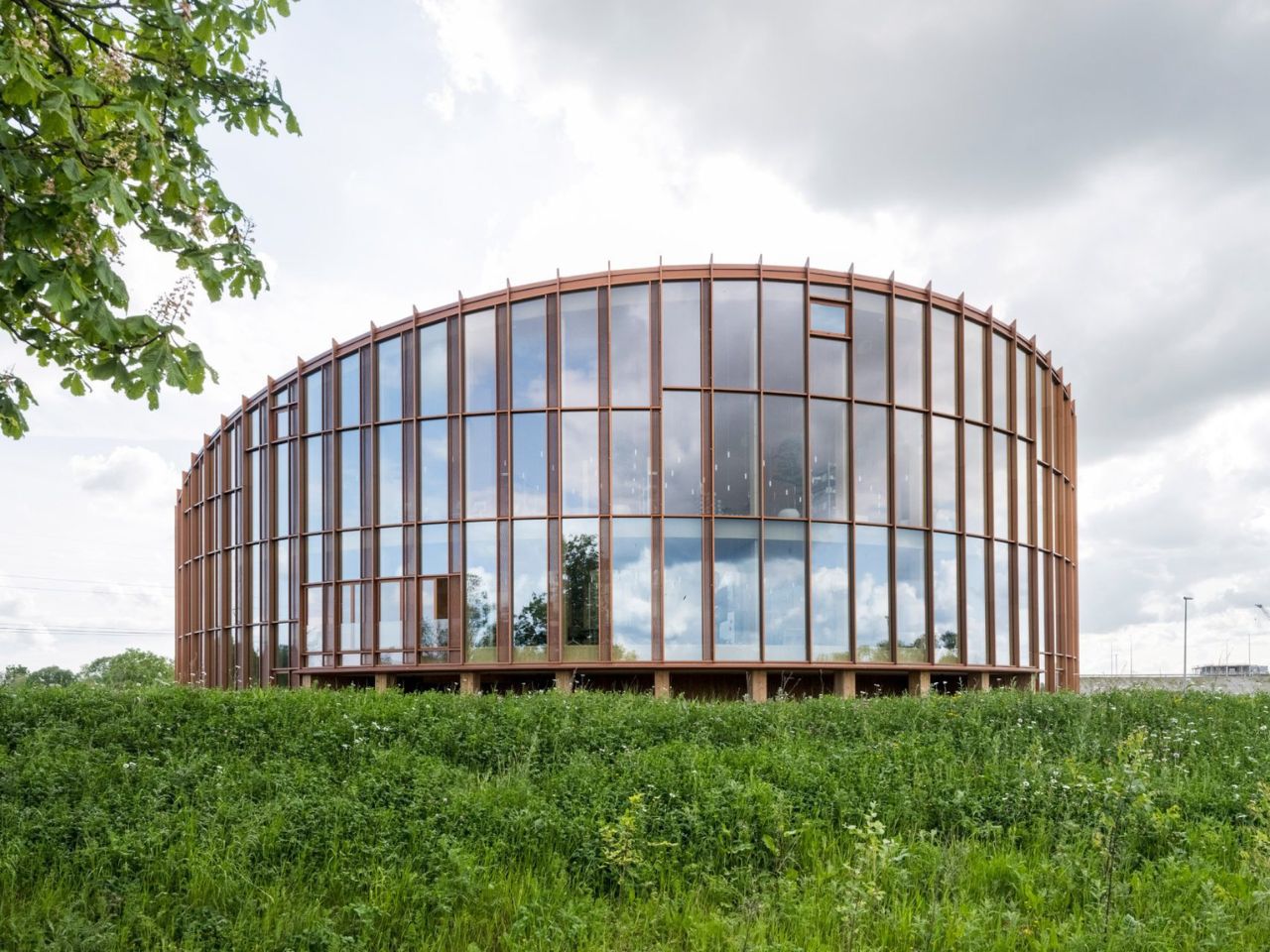
The roof rises towards the north to open views of the lake and surrounding forest, while sloping towards the south to provide shade and reduce solar heat gain. Its surface is covered with 880 custom-shaped photovoltaic panels, turning the roof into both an energy-producing system and the building’s main visual feature.

This combination of performance and spectacle is characteristic of BIG. The studio often transforms practical constraints into clear architectural gestures, and the Dymak headquarters follows the same approach. Solar orientation, shading and landscape views are not treated as separate problems. Instead, they are brought together within one continuous form.

The project also functions as a full-scale showcase for Dymak’s material portfolio. Mass timber forms the primary structure, while clay, cork, eelgrass and recycled paper fibres are used throughout the building. These materials are not displayed as isolated samples. They appear across the floors, ceilings, walls and structural elements, allowing visitors to experience them through texture, sound and scale.
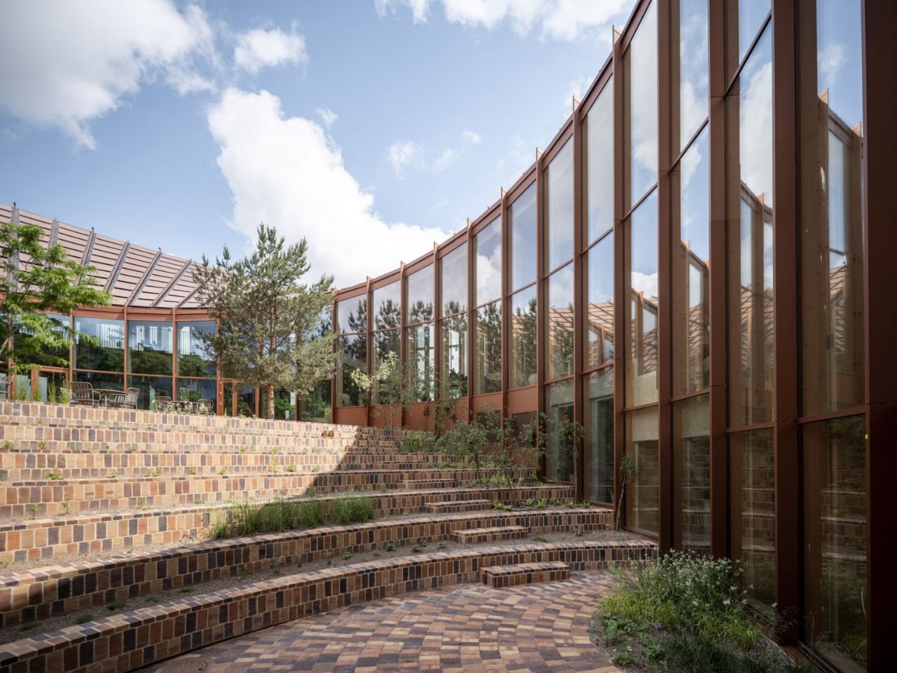
BIG describes the building as a “living catalogue”, and the phrase captures its dual role. It is both a workplace and a demonstration of what Dymak’s materials can achieve. The architecture becomes part of the company’s identity, communicating ideas of craftsmanship, sustainability and material innovation.

This gives the headquarters a warmer atmosphere than the polished glass-and-steel language commonly associated with corporate buildings. Timber remains visible, brick-tiled flooring extends across interior and exterior spaces, and natural fibres soften the ceilings. The materials create a sense of tactility that reinforces the company’s focus while making the workplace feel less formal.

At the same time, the building clearly operates as a branding tool. Its solar roof, natural finishes and landscaped spaces present Dymak as environmentally responsible and forward-looking. Sustainability is not simply part of the building’s performance; it becomes part of the company’s public image.
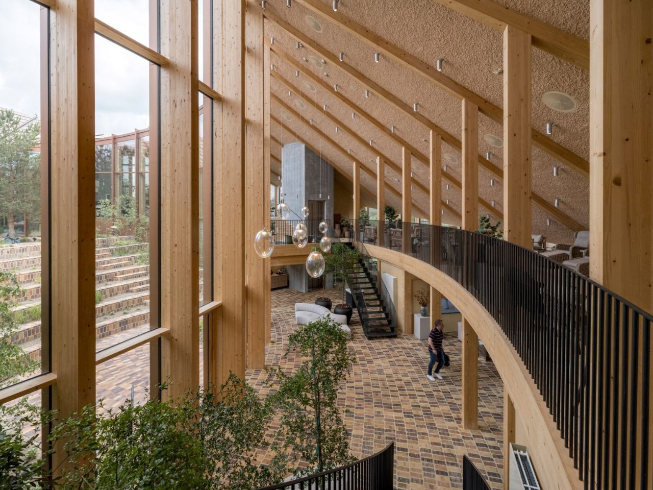
At the centre of the circular plan is a landscaped courtyard conceived as a green amphitheatre. Planted terraces and stepped seating create space for informal meetings, gatherings and moments of rest. The courtyard is surrounded by glazing, allowing daylight and vegetation to remain visible from the surrounding interiors.

Unlike the dramatic roof, the courtyard does not rely on a strong visual metaphor. Its value is more direct. It creates a protected outdoor space, brings nature into the workplace and offers an alternative to desks and enclosed meeting rooms. Brick flooring continues across the threshold, reducing the distinction between inside and outside and making the garden feel like an extension of the office.

The ground floor contains a showroom, photo studio and fitness facilities, while the upper level includes open-plan workspaces, meeting rooms and lounge areas. A mezzanine connects the two floors, and the circular layout creates a continuous route around the courtyard.
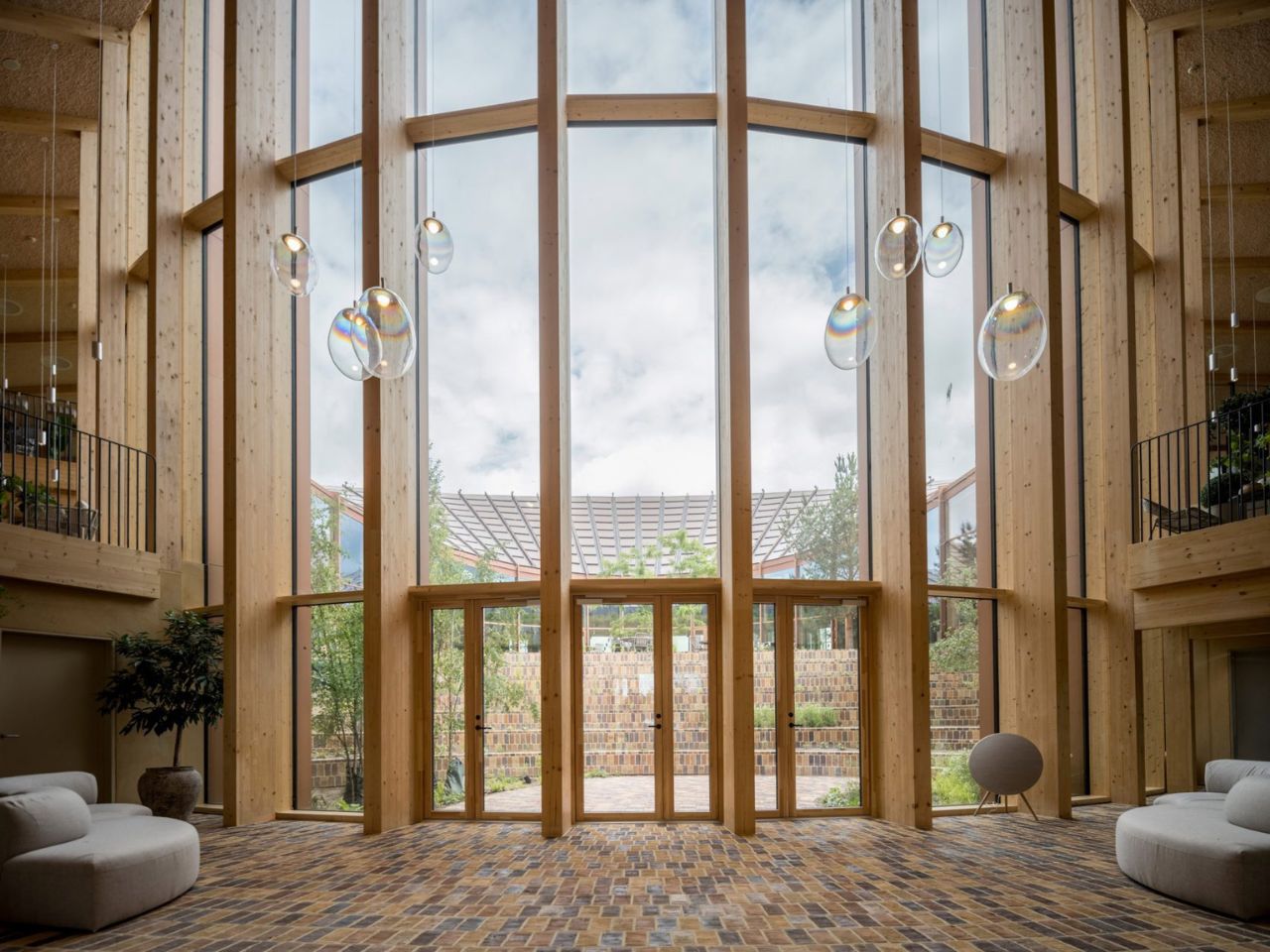
The headquarters succeeds most when its sustainable ideas are experienced rather than simply announced. The warmth of timber, the shaded interiors, the continuity of the brick flooring and the presence of landscape all influence how the building feels in everyday use.

Still, the roof is likely to dominate how the project is remembered. Its Möbius-strip form is visually striking and easy to communicate, but it risks overshadowing the building’s quieter achievements. The use of low-carbon and bio-based materials, the creation of shared social spaces and the careful relationship with the surrounding landscape may ultimately be more significant than the headline image.
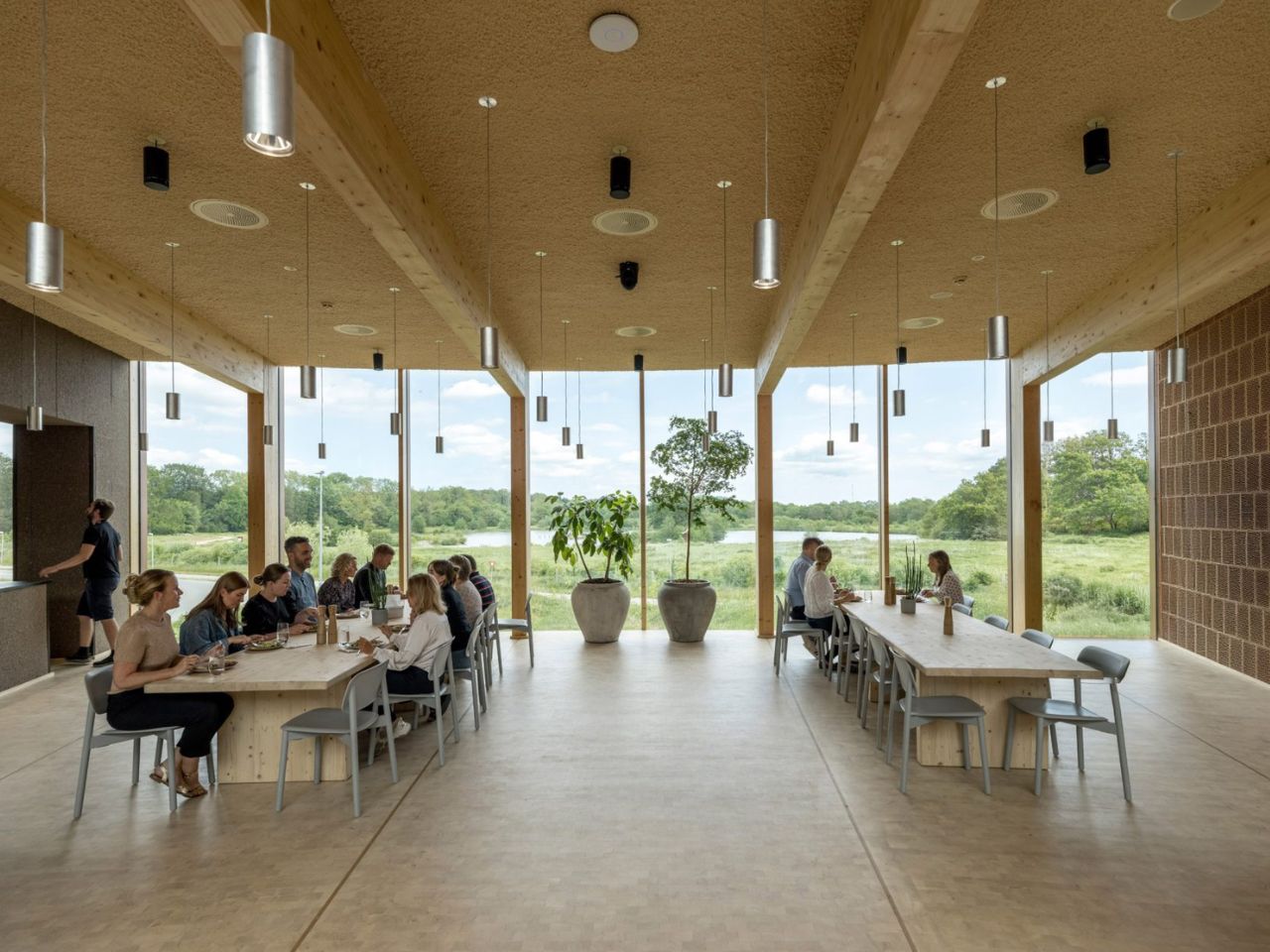
The project is not a universal model for office design. Its custom roof, circular plan and carefully selected materials make it highly specific to Dymak. Yet this specificity is also what makes it persuasive. By presenting timber, clay, eelgrass and recycled fibres within a polished corporate environment, the headquarters shows that low-carbon materials can support both technical performance and architectural ambition.

BIG’s Dymak headquarters does not attempt to disappear into the Danish landscape. It performs, advertises and turns sustainability into a statement. Its strength lies in showing that environmental responsibility can shape not only how a building performs, but also how it looks, feels and represents the organisation within it.

The post BIG Wraps Dymak’s Headquarters in Solar-Powered Timber first appeared on Yanko Design.

  •  
❌