Vue lecture

Firefox ressort le mode compact du placard, 5 ans après

En 2021, Mozilla a estimé que le mode compact de Firefox intéressait trop peu de monde pour mériter sa place dans l'interface. Le bug qui actait sa suppression a énervé pas mal de monde, mais la justification à l'époque, c'était que cette densité est "difficile à découvrir, et on suppose qu'elle est peu utilisée".

Faut dire que ce mode compact réduit sacrément l'espacement des barres d'outils et des onglets pour gagner de la place à l'écran. Mozilla le destine explicitement aux petits écrans.

Mais devant la levée de boucliers, Mozilla a dû faire machine arrière mais à moitié ^^. En avril 2021, un second bug acte le compromis : ceux qui utilisaient déjà le mode compact le gardent, les autres doivent aller l'activer à la main dans about:config via browser.compactmode.show.

Puis au bout d'un moment dans le menu de personnalisation, l'option réapparaît en juin 2021 dans Firefox 89 sous le doux nom de "Compact (not supported)". C'est la version qui embarquait la refonte Proton dont je vous parlais à l'époque .

Nous sommes 5 ans plus tard, et Mozilla remet le couvert avec le mode compact ! En effet, le nouveau design de Firefox est arrivé aujourd'hui dans Nightly, et ce mode compact fait partie du package. "Les gens nous ont dit que ça leur manquait, et on les a écoutés", explique l'équipe.

Sauf que ce n'est pas exactement un retour à la case départ. Dans le code de Nightly 155, le mode compact ne revient pas dans le menu de personnalisation. En réalité, il déménage dans les réglages, sous une rubrique "Window density" qui propose Automatique, Standard, Compact et Tactile.

Mais surtout Firefox sait maintenant basculer en compact tout seul. C'est une préférence fraîchement débarquée, browser.compactmode.auto.threshold, qui fixe le déclencheur à 0.05. Cela veut dire que si la barre d'onglets s'apprête à bouffer plus de 5 % de la hauteur de votre fenêtre, le navigateur passe en densité réduite sans rien vous demander.

Même logique sur la largeur avec la barre latérale repliée avec un garde-fou plutôt propre qui fait que si un utilisateur a choisi lui-même une densité, il ne se fait jamais écraser son réglage.

Le reste de la refonte, baptisée Project Nova en interne , n'est pas mal non plus. Les onglets prennent une forme plus douce avec un léger dégradé sur l'onglet actif, la palette s'inspire du feu avec des violets fumés, et les icônes sont redessinées pour tenir la route en thème clair comme en sombre. Mozilla a d'ailleurs publié les teintes avec leurs codes, du Cream #FFF4EE au Midnight Purple #210340.

Les réglages sont réorganisés au passage, avec une entrée dédiée aux contrôles IA pour couper entièrement ces fonctions, et un réglage du niveau de protection contre le pistage. Mozilla annonce aussi 9 % de gain sur les temps de chargement du contenu principal des pages sur un an.

Bon voilà, ce que je peux vous dire, c'est que comme d'habitude, avec Firefox, les gens vont encore gueuler pour rien. En 2014, la refonte Australis avait provoqué le même genre de problème, au point qu' une extension entière avait été codée pour restaurer l'ancienne apparence .

La différence, cette fois, c'est que Mozilla range la personnalisation du côté des réglages officiels au lieu de la laisser aux extensions et à about:config.

Pour voir tout ça, il vous faut la version Nightly et rien d'autre. Dans le code source, la préférence globale browser.nova.enabled n'est activée que sur les builds Nightly, elle reste à false partout ailleurs. Le déploiement large est annoncé pour cette année, sans date. En attendant, la branche stable continue d'avancer de son côté avec les conteneurs natifs arrivés dans Firefox 153 .

Source

  •  

Insta360’s foldable drone patent targets DJI Neo 2 at sub-250g

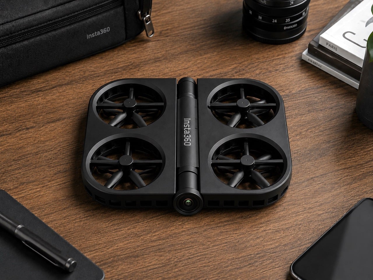
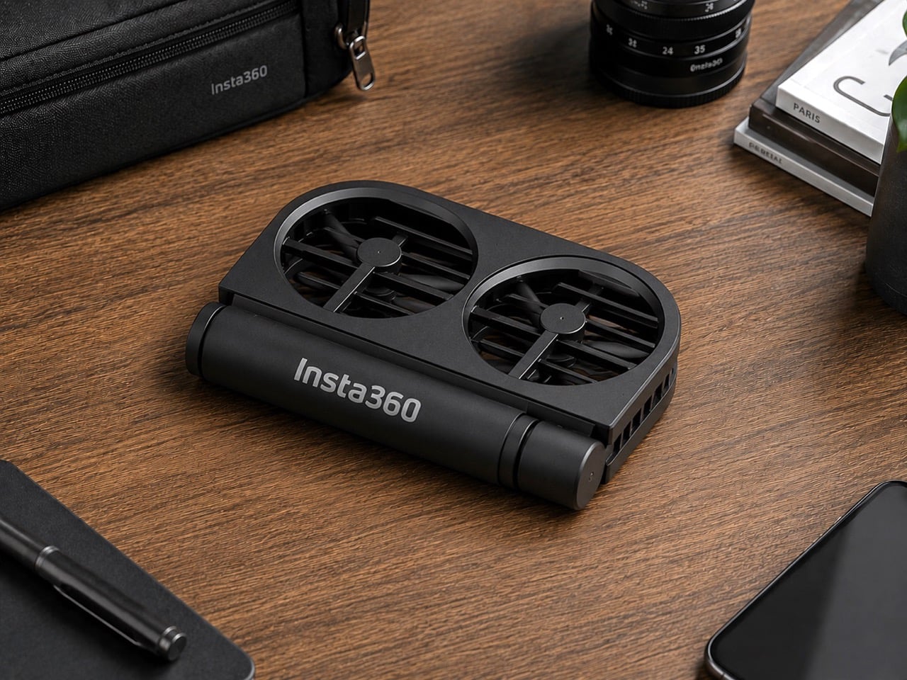
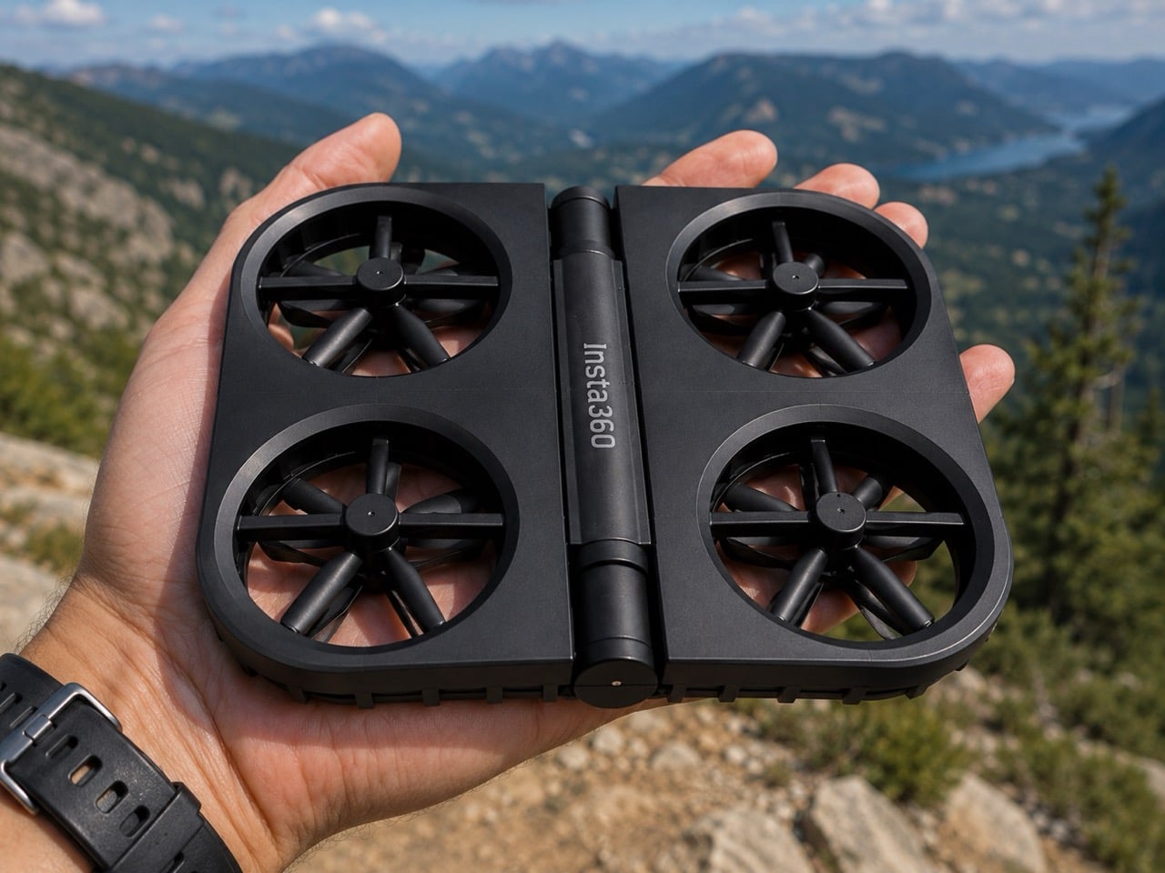
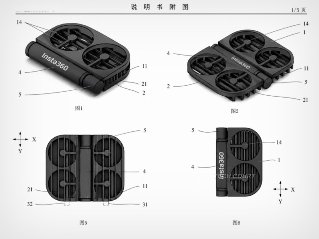
Insta360 built its reputation on cameras that see in every direction at once. It’s literally in their name. The X series made 360-degree capture accessible; the Luna Ultra brought Leica optics to a handheld gimbal. Flying something, though, is a different category of challenge, and the patent images that appeared in July 2026 show the company working through what a foldable drone looks like with Insta360 DNA. The illustrated design at the bottom shows folding arms, a ring-shaped propeller guard, and a dedicated locking mechanism, a form factor that prioritizes the moment of packing away just as much as the moment of takeoff.

DJI’s Neo 2 has the casual drone segment largely to itself in the sub-250g category, with a rigid one-piece frame and a 19-minute flight time that have made it a reliable default for creators who want aerial footage without the complexity of a serious drone setup. Insta360 entering that space would break what has effectively been a two-player market, with Zero Zero Robotics’ HoverAir as the only real alternative. The folding design alone gives Insta360 a structural argument against the Neo 2; a potential 360-degree camera, if it materializes, would give it a creative one. What a wonderful year for foldables, eh? We’re expecting a folding iPhone in September, and Insta360 might give us a folding drone too!

This isn’t just some forum rumor, either. The patent images (from patent file CN223865117U), which started making the rounds on July 16th and were highlighted by outlets like Tech Court, are pretty specific. They show a drone body with the “Insta360” logo stamped on it, with fully folding arms that tuck into the chassis and a distinctive ring-shaped guard protecting the propellers. There’s even a dedicated locking mechanism detailed, which tells you just how seriously they’re taking the whole “fold-and-go” concept. This is a design that screams it was made to be stuffed into a pocket, not carefully placed in a bespoke case.

But here’s the thing: this isn’t Insta360’s first aerial rodeo. Before they decided to put their own name on a drone, they sent in a scout team under the sub-brand Antigravity. The A1 drone they launched was, frankly, a bit of a monster: a sub-249g drone with a wild dual-lens setup that shot 8K 360-degree video and made the drone itself invisible in the footage. It was a spec-sheet beast and a clear shot across DJI’s bow, proving Insta360 had the engineering chops to compete in the sky. It was their way of testing the waters.

Now, it looks like they’re done testing. This new patent is the second, more direct shot. And here’s the kicker: for a company obsessed with 360-degree video, the patent images don’t show a fisheye lens. At all. It’s a huge question mark hanging over the whole project. Are they hiding the tech, or are they planning to launch a drone that, for the first time, doesn’t have their signature feature? If they’re aiming for a rumored sub-$200 price point, leaving the 360 camera on the cutting room floor might be the only way to get there. It’s a move that would be both shocking and, in a weird way, perfectly logical.

You also can’t forget that this is all happening while the two companies are actively suing each other in China. This isn’t friendly competition; it’s a full-blown hardware rivalry. Insta360 came for DJI’s gimbals, tested the drone market with a sub-brand, and is now preparing a direct assault on DJI’s most accessible drone. With a release window expected somewhere between late 2026 and early 2027, we’re not just watching a new product being born. We’re watching the next chapter in a tech soap opera, and it’s about to get very, very interesting.

The post Insta360’s foldable drone patent targets DJI Neo 2 at sub-250g first appeared on Yanko Design.

  •  

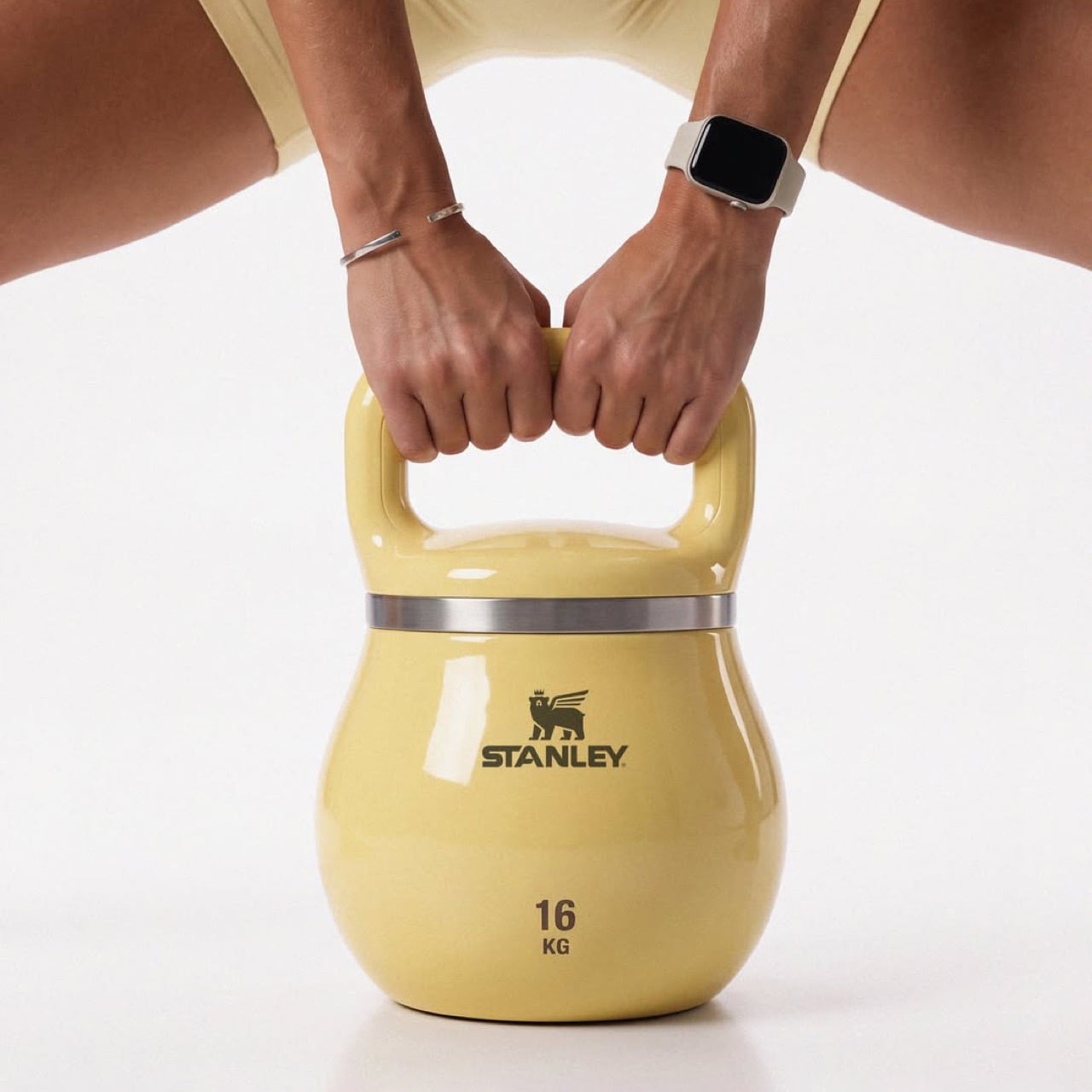
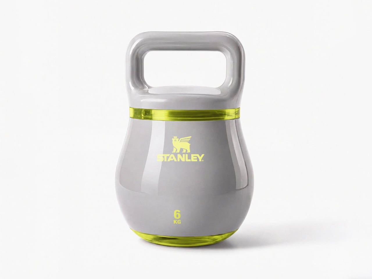
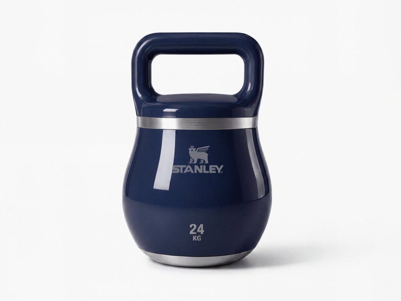
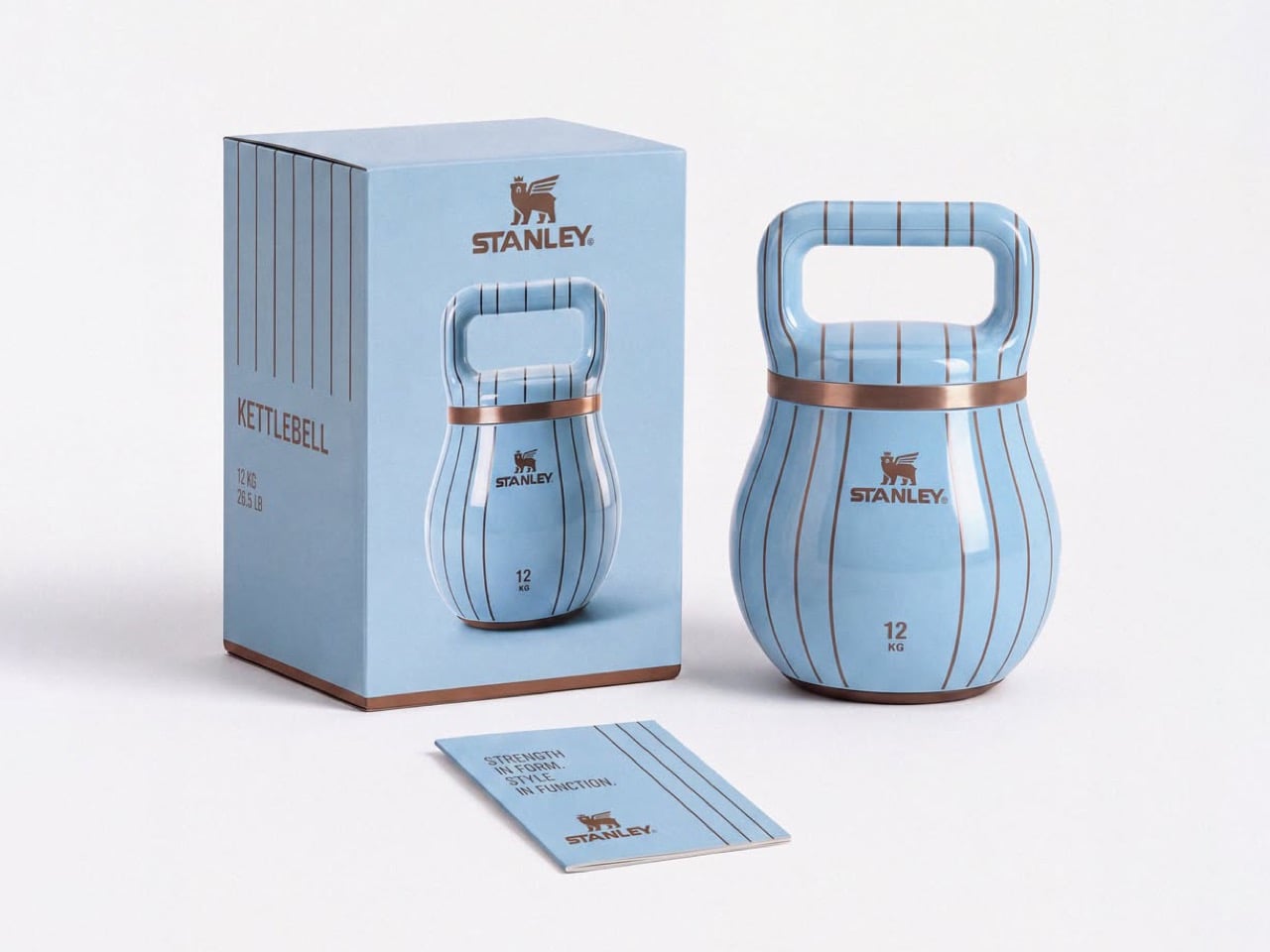
Stanley doesn’t make gym equipment… but this stylish kettlebell proves it should

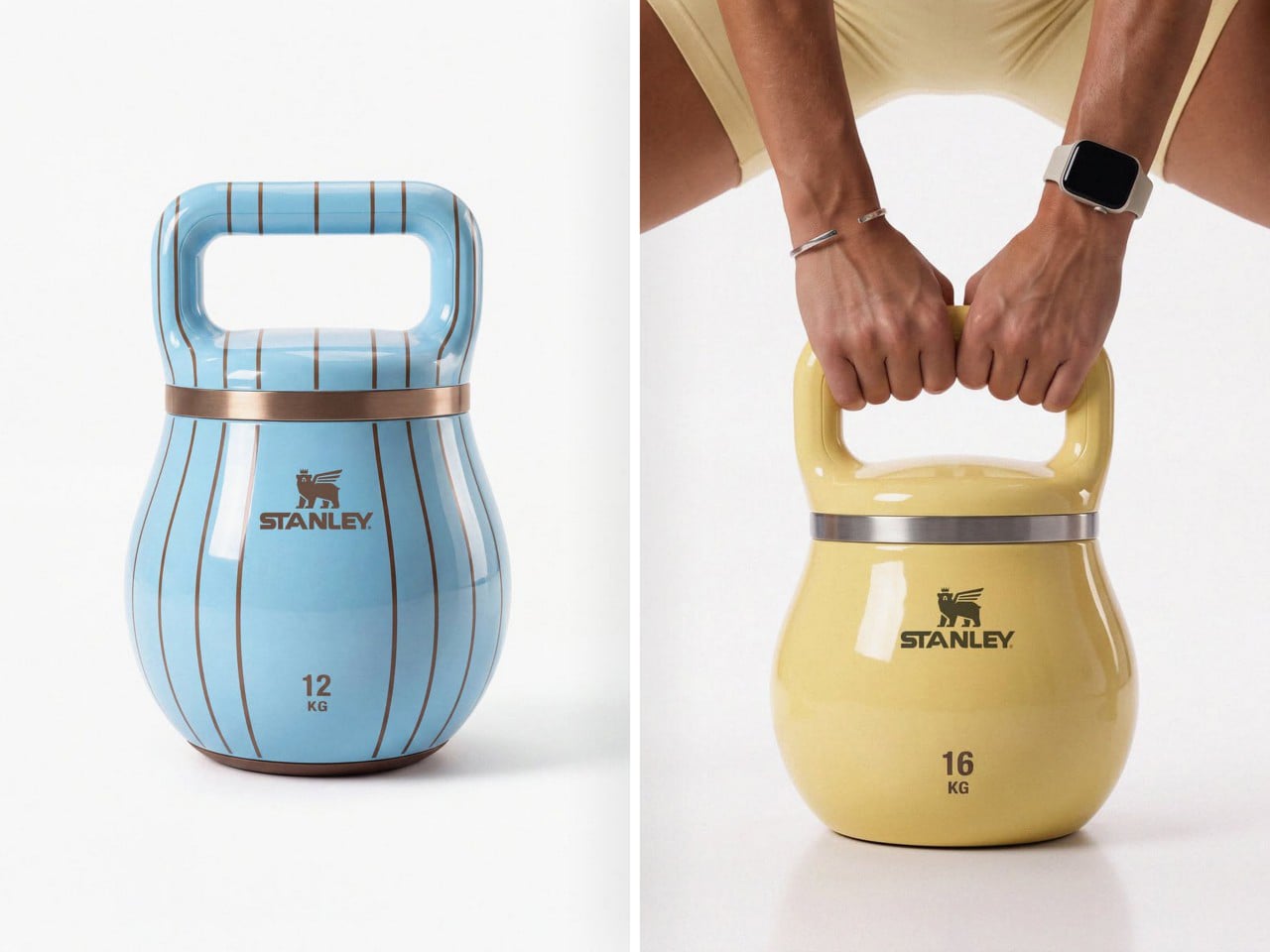
Fill a Stanley tumbler with a yogurt-based smoothie from bottom to top and you actually end up getting an arm workout. A 40oz Stanley cup can weigh close to 4lbs or upwards of 1.5 kilograms if filled to the brim with something dense like a smoothie or a thick latte. Jane Morelli just decided that if she was gonna give her arms a workout, why simultaneously rely on ugly looking kettlebells? Morelli superimposed Stanley’s design language onto kettlebells and the result looks just gorgeous.

Every gym equipment I’ve used has looked boringly functional. The kettlebells at my gym come in bright colors, but that’s just a color-code so you know the difference between a lighter and a heavier kettlebell even if the number on it wears off (it almost always does). Morelli’s design merely bridges two worlds together, and I won’t lie – the results look like the most seamless collab ever imagined. My only gripe is, I wish these kettlebells were actually tumblers too!

Designer: Emanuele Jane Morelli

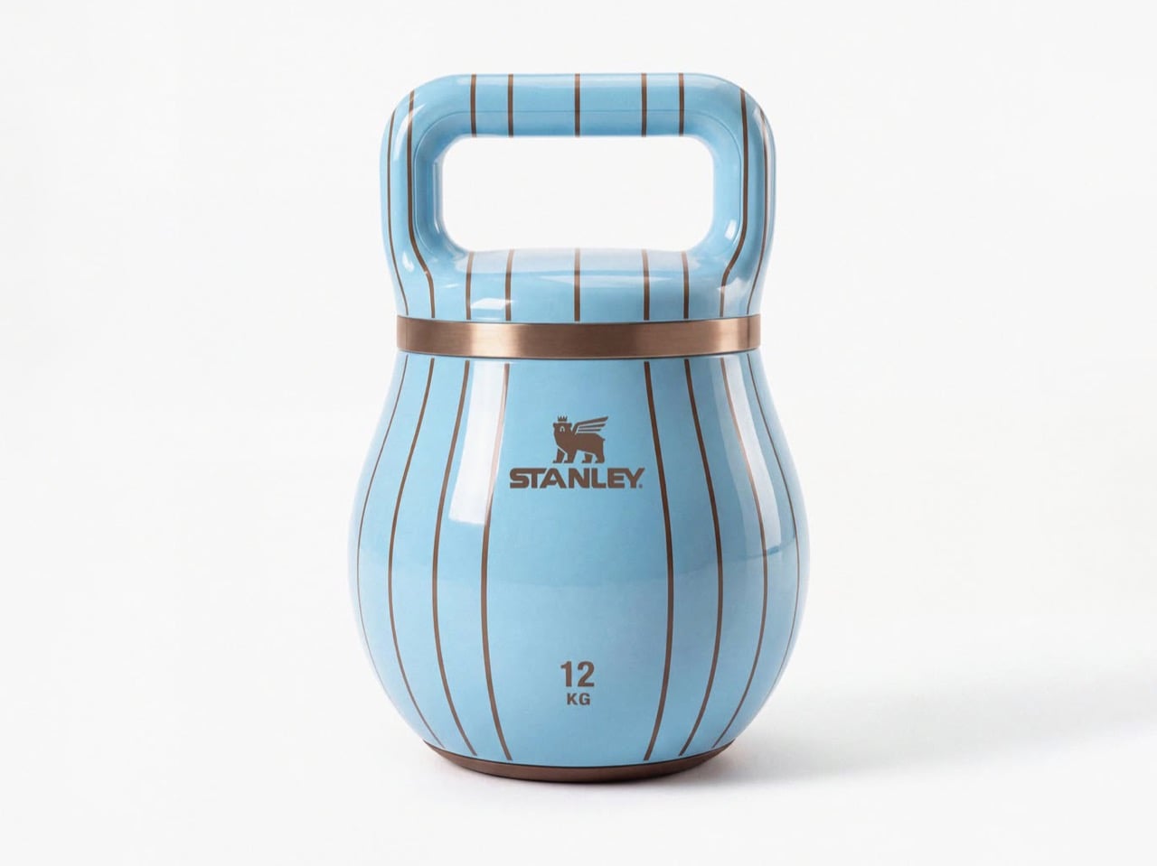
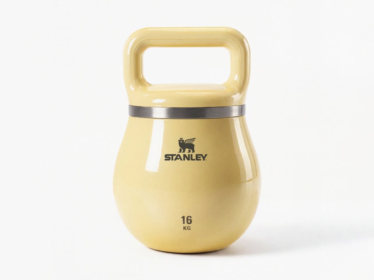
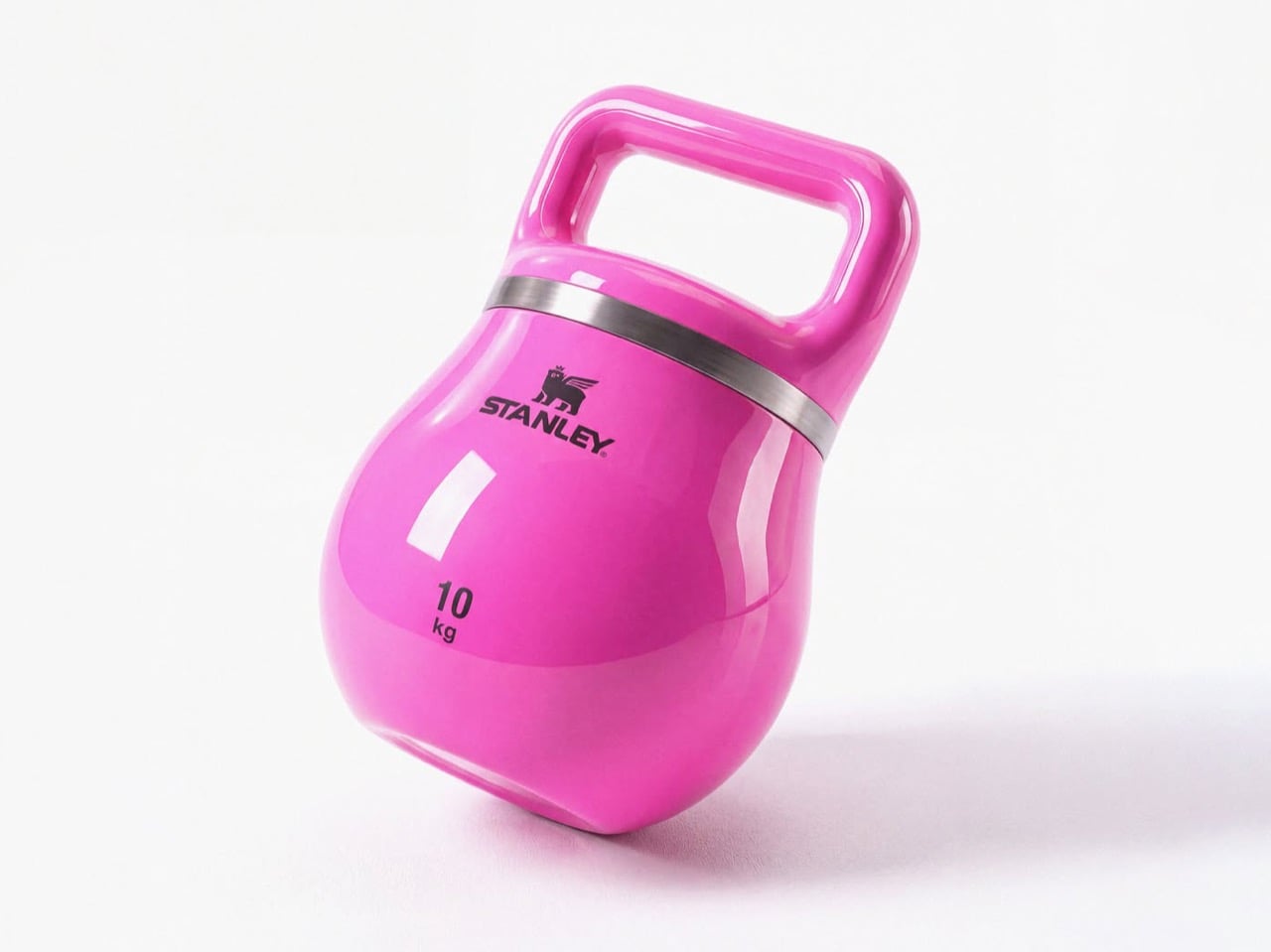
Haute gym equipment might not be a category but these kettlebells definitely make a case for it. Each one is styled with chic curves, and a color palette I’d only expect from companies like Hermès or Stanley. Subtle pastel shades, punctuated by just one hot pink color for the yoga-moms who need their gym equipment to be as flashy as their gym outfits. Each kettlebell has a lacquer-like sheen on it, along with the Stanley logo emblazoned on the front, larger than the weight units below it because that’s what matters more. The style statement.

I get that I can sound a little ironic, but I’m all for brand crossovers. (The only time I really object is when Tesla does stuff like manufacturing vodka or whistles because they seem to be obsessed with side quests and not really making any cars). This one piques my fancy because Stanley isn’t just a social statement, it’s perfect for fitness-freaks too who love chugging protein shakes from their 30-40oz cups, or sharing Strava stats superimposed against their Stanley cups just to paint a picture of how much ‘aura’ they have.

Morelli’s done a pretty remarkable job of simply yet effectively distilling Stanley’s brand language onto a piece of gym equipment, without necessarily caricaturing the Stanley cup’s silhouette. The kettlebells have a separate, distinct character, and the dual-band colors on each individual kettlebell represents a palette that feels distinctly high-fashion yet accessible. Quite like the company’s big, beautiful, nearly indestructible tumblers.

The post Stanley doesn’t make gym equipment… but this stylish kettlebell proves it should first appeared on Yanko Design.

  •  

Your Phone and Laptop Stand Could Be Made From Recycled Coffee Grounds

Every morning, millions of people brew their coffee, toss the grounds, and move on. It’s such a routine act of disposal that few of us stop to think about where all that spent coffee actually goes. MOFT apparently did think about it, and the result is one of the more genuinely interesting design stories to come out of the tech accessories space in recent memory.

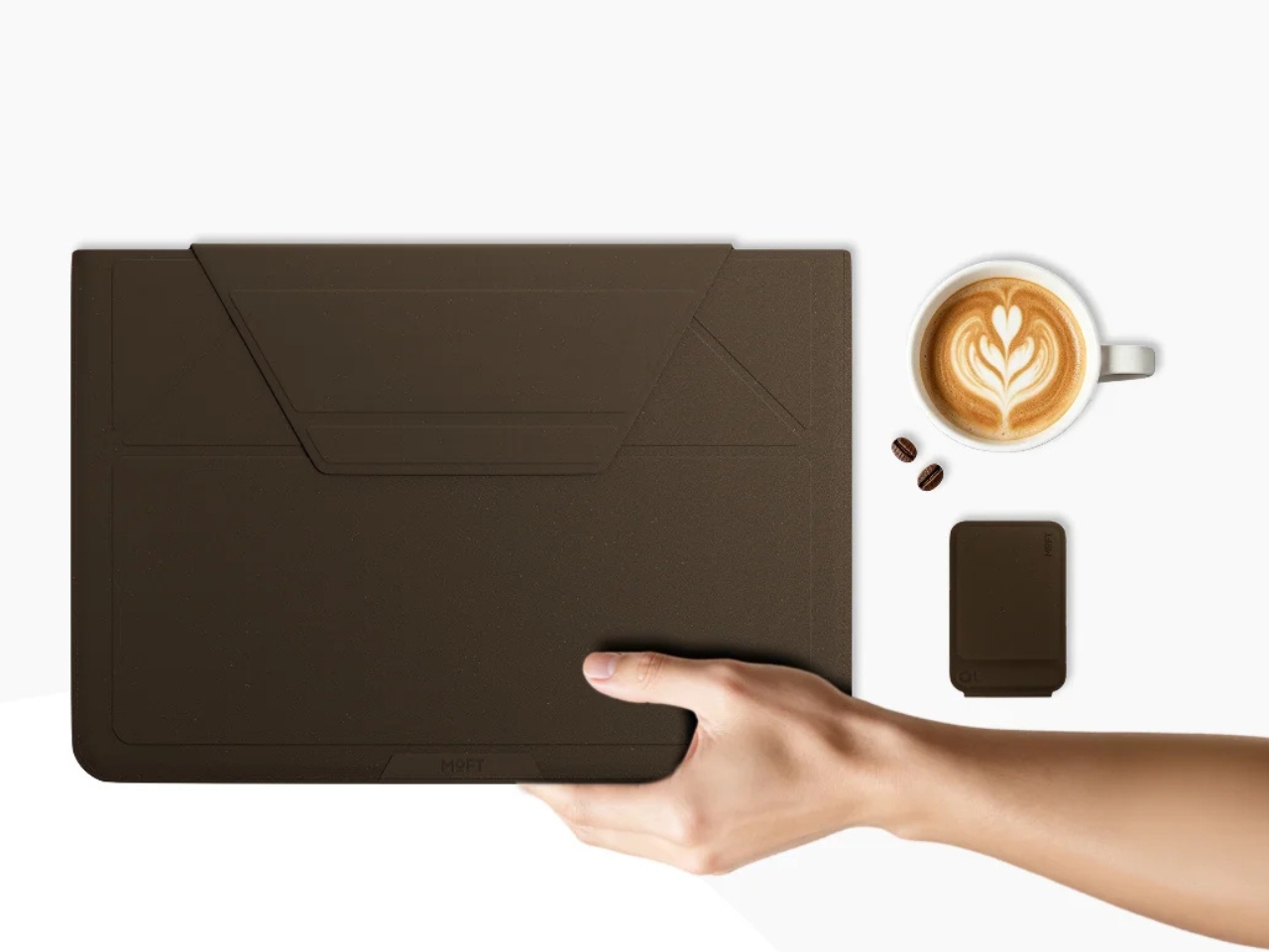
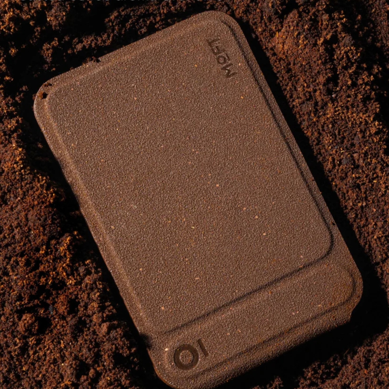
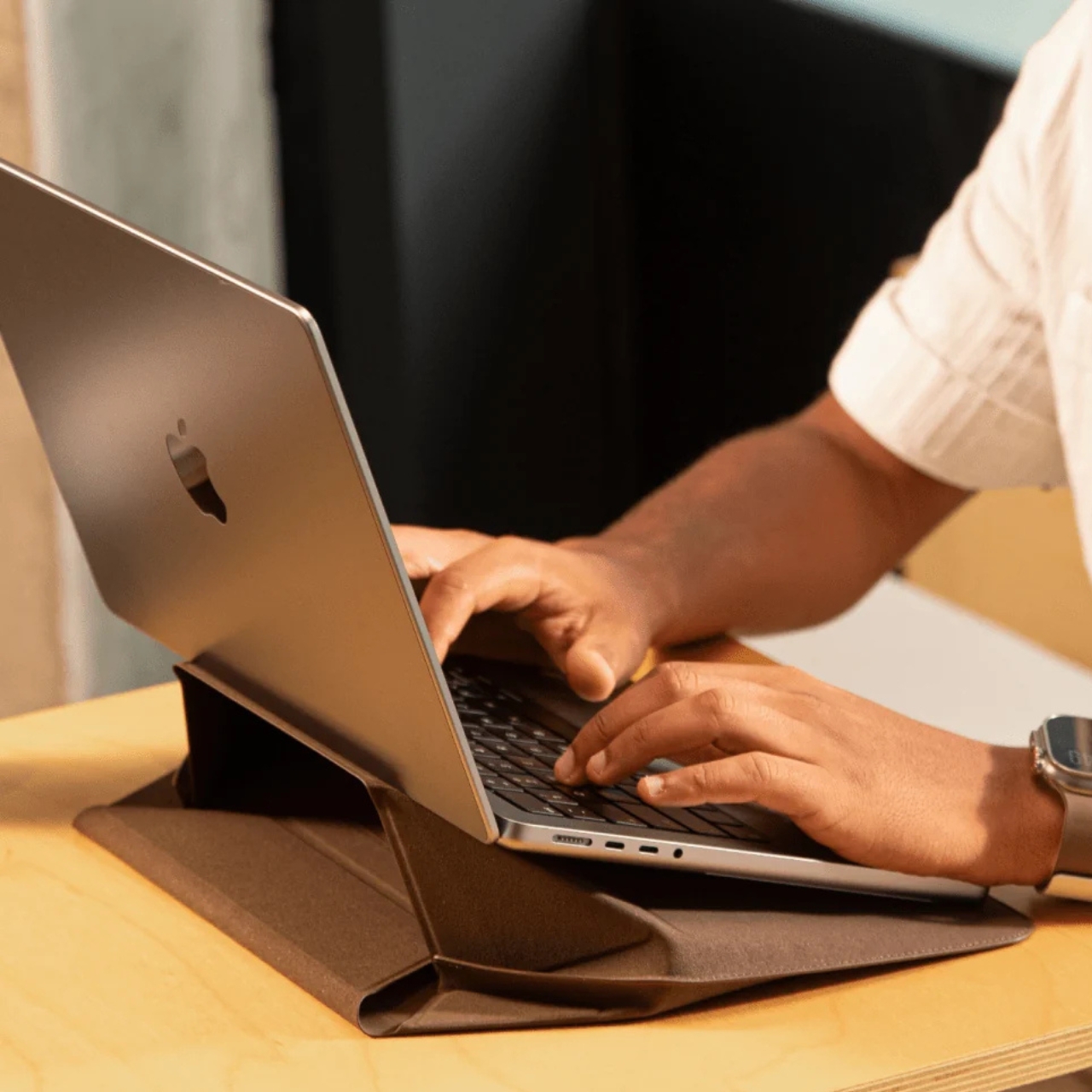
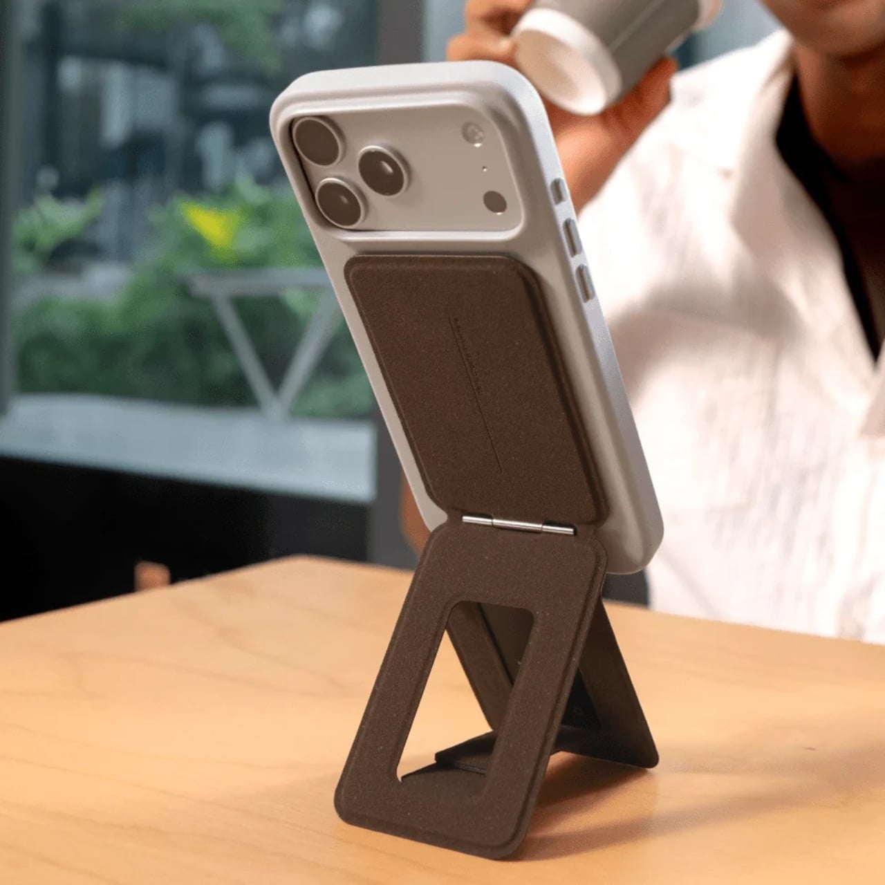
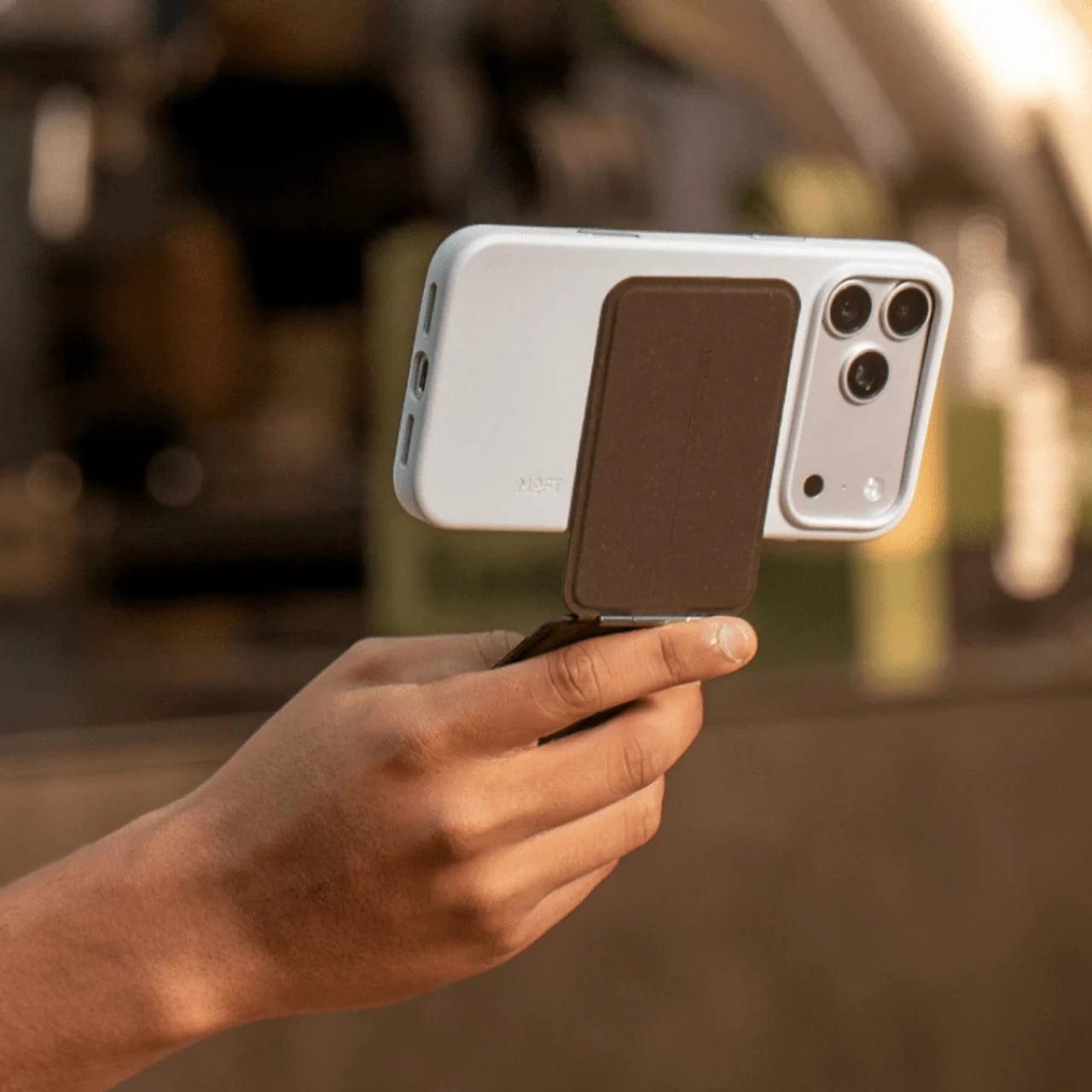
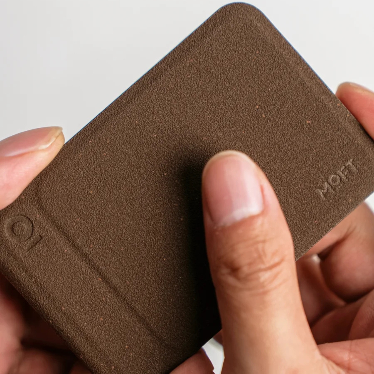
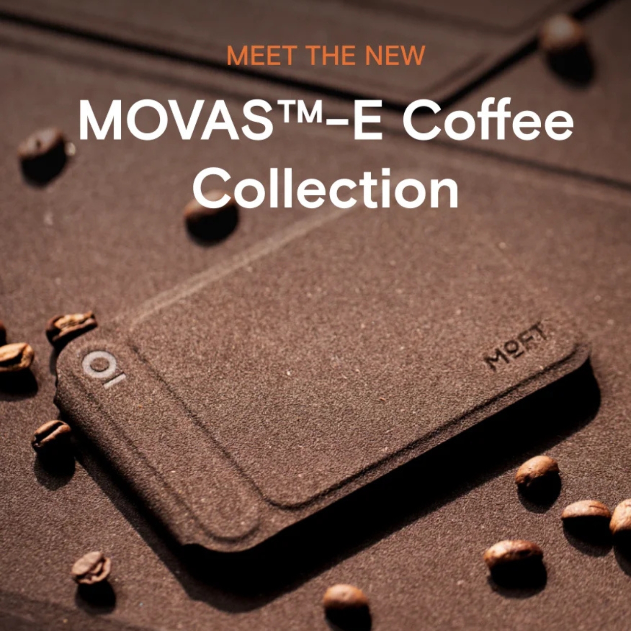
The MOFT MOVAS-E Coffee Collection is a new line of accessories built from a bio-based leather crafted from recycled coffee grounds. MOFT combined spent coffee grounds with waterborne bio-based polyurethane to create what they’re calling a new generation of bio-based leather. The material replaces both conventional leather and traditional synthetic alternatives, which makes the origin story feel less like a marketing angle and more like an actual shift in how the brand approaches materials.

Designer: MOFT

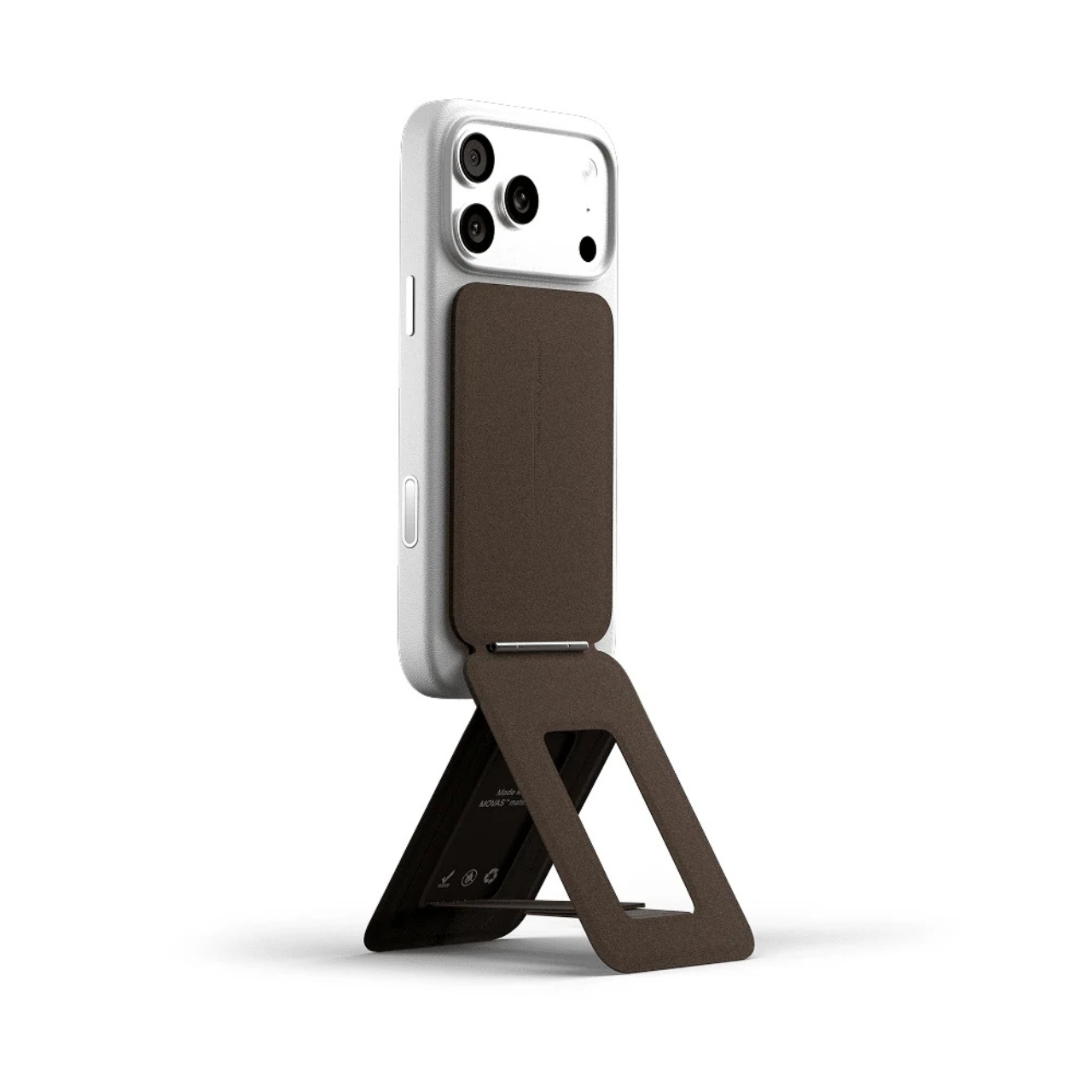
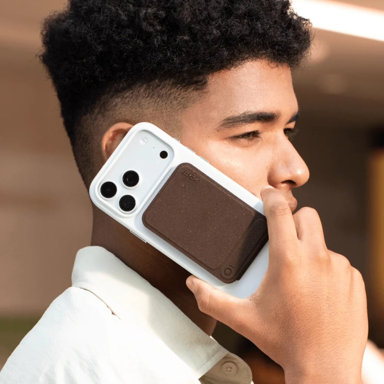
MOFT has already built a strong reputation for thoughtful material choices. Their MOVAS vegan leather line has been a staple in the premium accessories space for a while now, known for that soft, slightly textured finish that feels surprisingly luxurious on a phone MagSafe stand. The MOVAS-E Coffee Collection takes that established foundation and adds a genuine layer of purpose to it, pushing the material story well beyond aesthetics and into something more intentional.

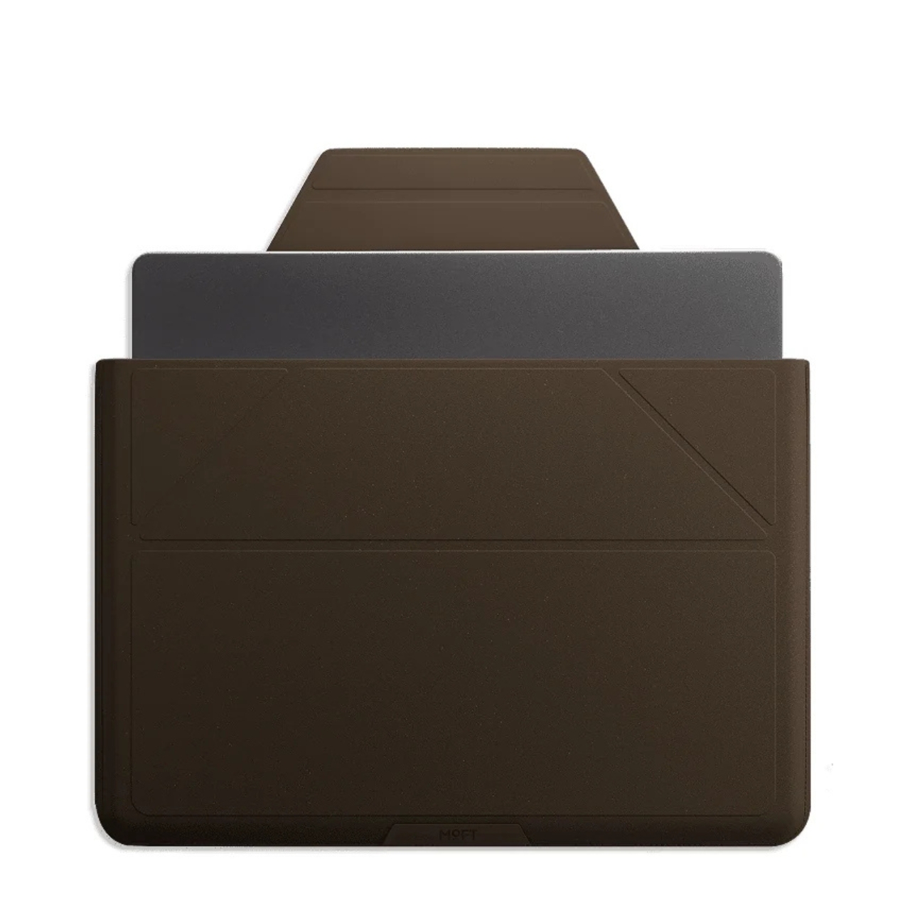
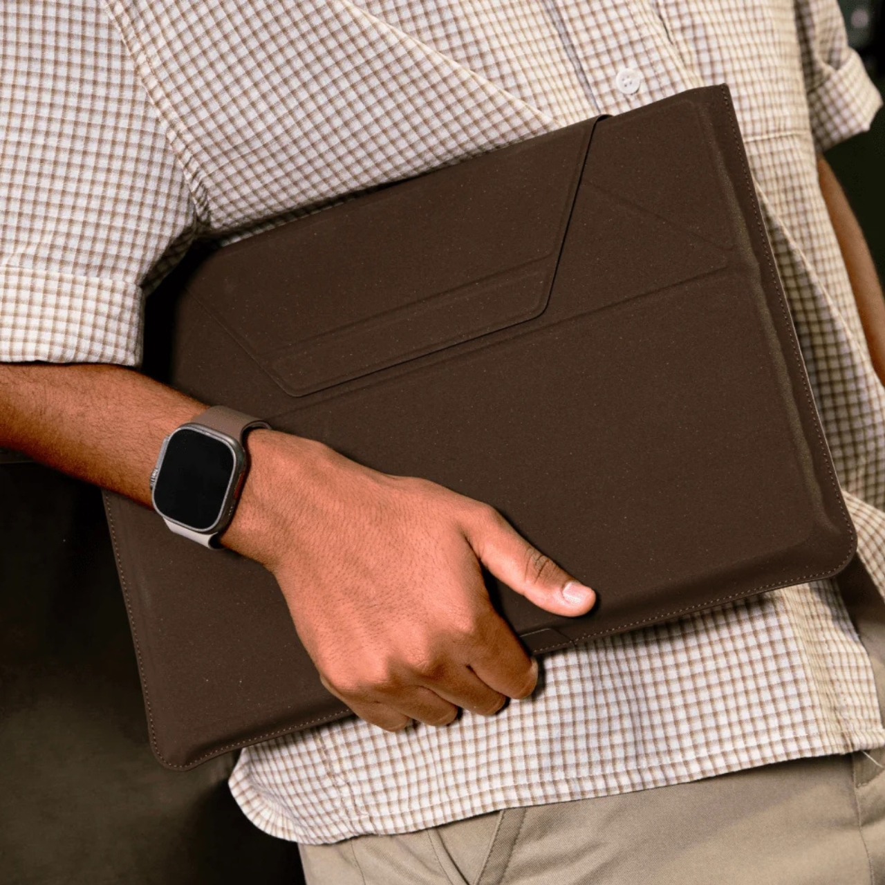
The collection includes products like a laptop Carry Sleeve, all finished in warm, coffee-toned colorways that look like they were pulled straight from a specialty café mood board. The tones are earthy and rich without veering into something overly minimal or clinical. If you’ve ever wished your tech accessories matched the aesthetic of a beautifully lit coffee shop corner, MOFT seems to have designed this one with exactly that feeling in mind. The tagline for the collection is “Brewed for Flow,” and it’s hard to argue with that framing.

The packaging is also part of the story. MOFT went with a frosted, minimalist design they describe as food-safe, durable, and fully recyclable. It’s the kind of packaging decision that often goes unnoticed by most buyers, but it signals that the sustainability angle here isn’t just surface-level. When a brand puts the same thought into the box as the product inside, that’s usually a sign the commitment runs deeper than a trend cycle.

I’ll be honest: the sustainable materials conversation in tech accessories can feel exhausting. Every other brand is slapping the word “eco” on something and calling it a revolution. MOFT’s approach feels different, not because they’ve reinvented the wheel, but because the product doesn’t sacrifice anything to get there. The MOVAS-E Coffee Bio-Leather still delivers the same premium tactile quality that made their original MOVAS line popular. It’s stain-resistant, smooth, and has that matte finish that photographs well without ever looking cheap. The material carries its origins gracefully.

The timing of this collection feels culturally right, too. Coffee has become more than a beverage. It’s an aesthetic, a lifestyle marker, a ritual that people build their mornings around. The idea that your phone stand or laptop sleeve could be a physical extension of that daily ritual is a small but clever act of brand storytelling. It doesn’t feel forced. It feels like a natural fit for the kind of person who already gravitates toward MOFT: someone who pays attention to the things they carry.

Whether or not bio-based leather made from coffee grounds becomes a broader standard for tech accessories, MOFT is asking the right questions here. What do we do with the waste streams already woven into our daily lives? How do we make sustainable choices feel desirable rather than merely dutiful? The MOVAS-E Coffee Collection doesn’t answer everything, but it’s a compelling and well-designed start.

If you’ve been looking for a reason to upgrade your tech carry, this collection offers one that goes a little deeper than color options. It’s the kind of purchase that earns a second look, and a story that’s surprisingly easy to tell when someone asks where you got your case.

The post Your Phone and Laptop Stand Could Be Made From Recycled Coffee Grounds first appeared on Yanko Design.

  •  
❌