❌

Vue lecture

The P1 Terminal is the Severance computer I’d actually want to use
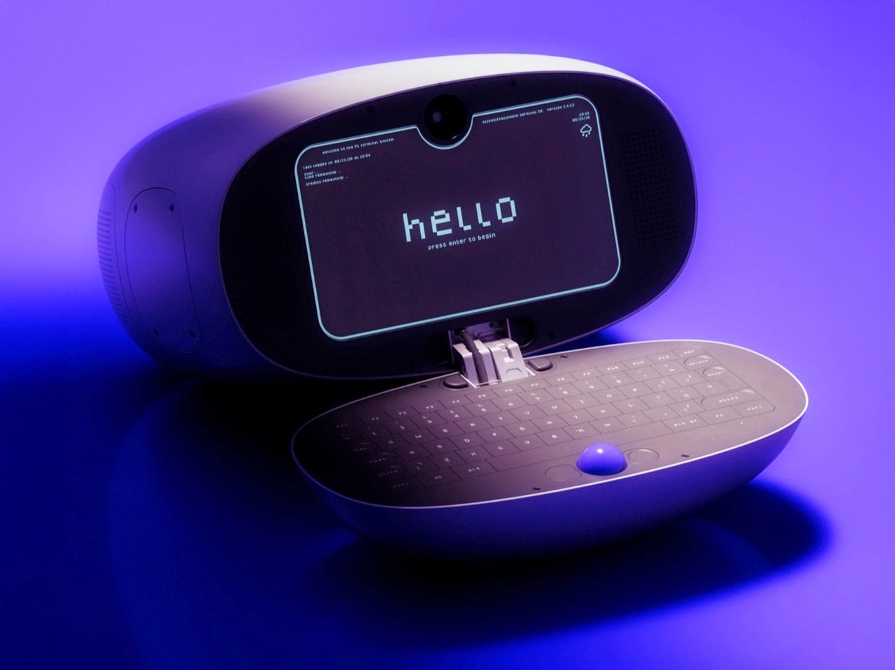
Severance did something no tech company has managed in decades: it made people want a trackball again. The MDR terminals on Lumon’s severed floor, with their cream shells, tiny glowing screens, and built-in trackballs, have become weird objects of desire for a show about corporate horror. Designer Shaun Wellens has dreamed up the computer I imagine Lumon would roll out for its next rebrand. The P1 Terminal is a CGI concept from a made-up 1970s company called Push / Pull, designed as a shared computer for people living in a communal space. It has a soft white clamshell body, a phosphor-style display, and a blue trackball that looks good enough to lick (please don’t).

Wellens says the P1 was inspired by a computer used to support experiments aboard the Space Shuttle, which makes sense once you notice the clamshell form. Then he wraps the whole thing in fake history. In his story, the P1 launched in 1972 for people living in underground communities called “pockets,” where it handled mail, bulletin boards, and shopping. It sold badly, its users adored it, and it got a sequel, which is basically the life story of every cult-classic gadget ever made. He also admits to sneaking deliberate flaws into his fictional designs so the imaginary engineers can fix them in the next version, and I love that level of commitment.

Designer: Shaun Wellens
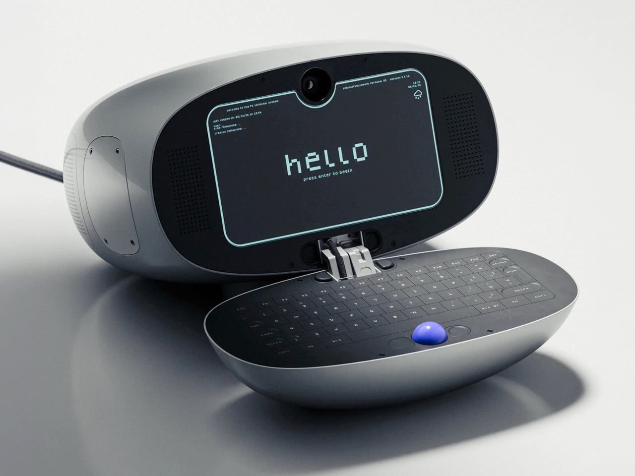
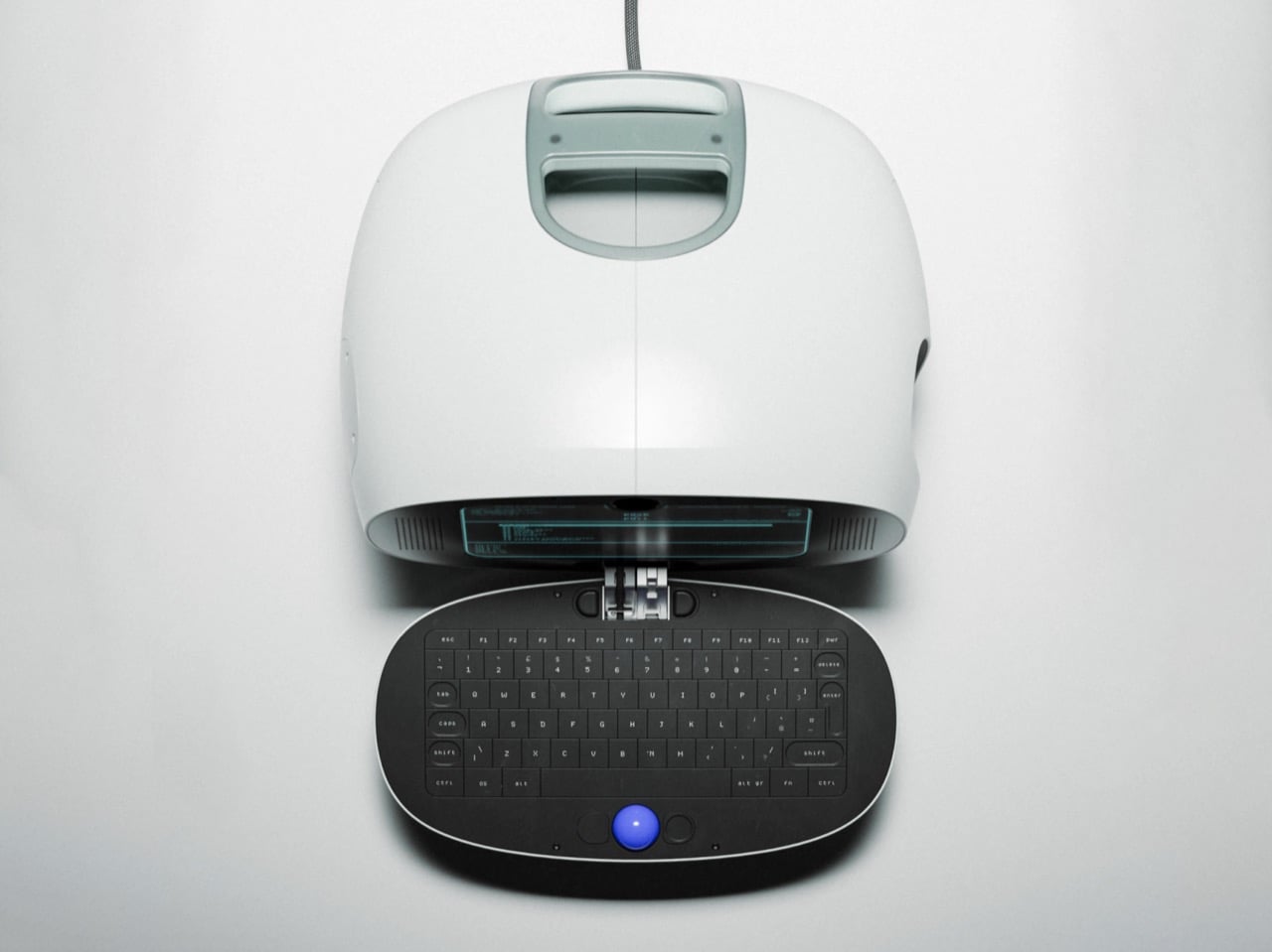
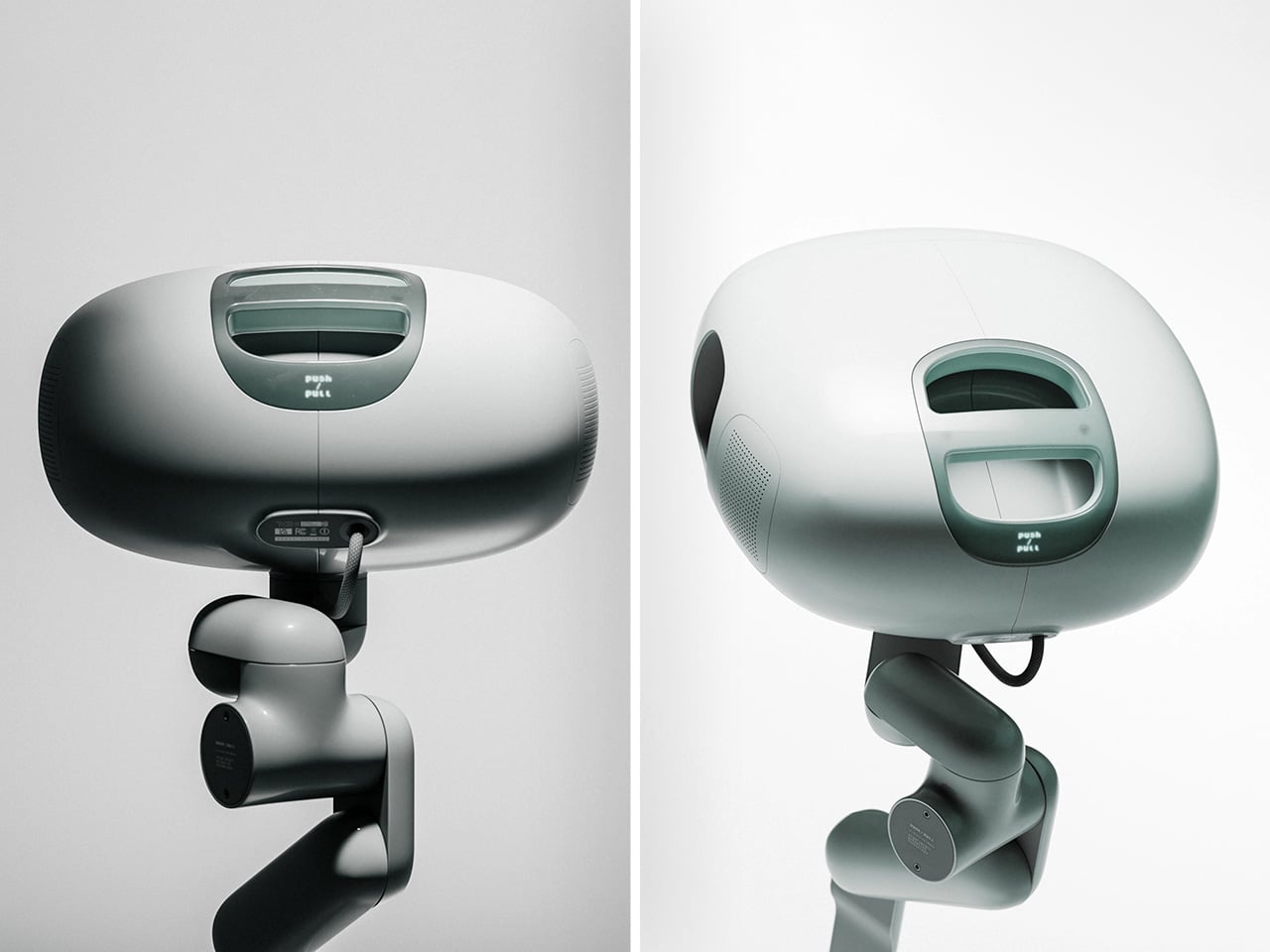
The shell is a rounded off-white pod, with a sage-gray handle module sitting on top like the carrying grip on a vintage TV. That handle has a recessed slot and a tinted window that recall the iMac G3 and the 1999 clamshell iBook. The open renders show the two halves joined by a stacked metal hinge at the center, the one visibly mechanical part on an otherwise pebble-smooth body. The Space Shuttle inspiration was the GRiD Compass, a magnesium clamshell designed by Bill Moggridge that flew aboard Columbia in 1983 as the Shuttle Portable Onboard Computer, or SPOC.

Inside the lid sits a dark, rounded-rectangle display with cyan-green text that recalls an old phosphor CRT. A camera pokes through a tiny notch at the top center, which is a hilarious thing to find on a computer that supposedly shipped in 1972. Perforated speaker grilles flank the screen. The interface boots to a pixel-font “hello” and drops you into a numbered menu of services, a text-only setup that would sit comfortably next to a Lumon file full of scary numbers. Wellens calls it a lightning-fast graphical interface anyway. In his fictional timeline, it arrived a full year before the Xerox Alto, the pioneering 1973 GUI computer.
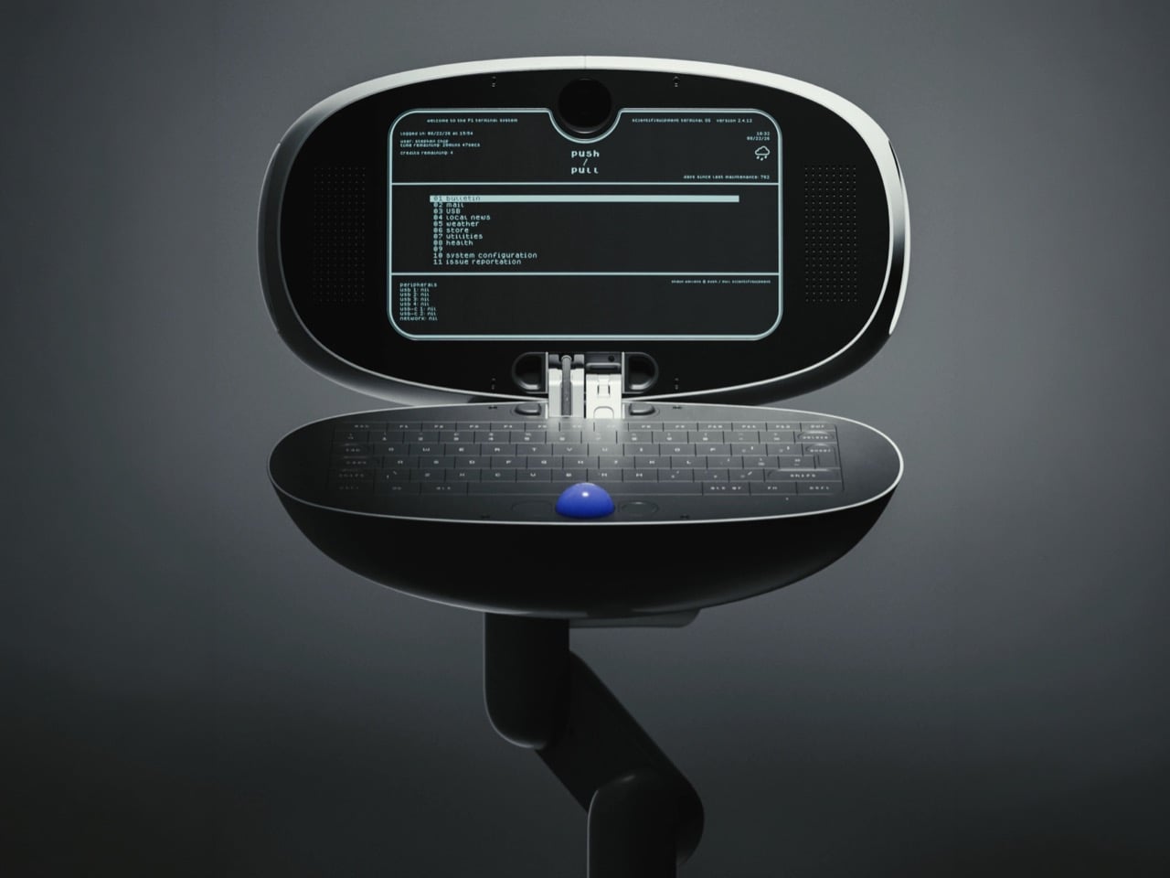
The bottom half is a dark oval tray holding a full keyboard, with the blue trackball parked dead center below the keys. That ball is the loudest color on the entire product, and it deserves to be. Trackballs have appeared in early terminals, arcade cabinets, and Logitech’s TrackMan, while Severance gave them another memorable role on the MDR desks. Putting it in the middle also makes sense for a shared machine, since lefties and righties get equal access. The oval keyboard looks a little cramped at the edges, but it matches the pebble shell so neatly that I’m happy to call it one of his intentional flaws.

A chunky, multi-jointed arm that looks borrowed from a robotics lab supports the terminal. It’s designed to let the P1 swing out, tilt, and tuck away, useful movements for a shared machine in a cramped communal space. In one render, the cable drops in from above, suggesting a ceiling- or wall-mounted setup like a dental lamp waiting for its next patient. Residents could walk up, pull it down, check their mail, and push it back, which might explain the Push / Pull name (my theory, Wellens hasn’t confirmed it). That setup makes the P1 feel closer to a payphone or a library catalog terminal than a personal computer.
Wellens’ conceptual history lands surprisingly close to the real thing. In August 1973, the Community Memory Project put a public bulletin board terminal in Leopold’s Records in Berkeley, with later terminals appearing in libraries and laundromats around town. A decade later, France was distributing free Minitel terminals that let people shop, bank, and message each other from home. The service lasted until 2012. The P1 mashes both ideas into one glossy pod for people living underground. Wellens even mocked up a period magazine ad with a big serif headline over a violet product shot, and it’s convincing enough that I briefly wanted to mail away for one.

Severance production designer Jeremy Hindle already gave us the most covetable fake office tech on television, so consider this a friendly nudge. Somebody on the show’s crew should get Wellens on the phone, because the P1 looks like a terminal Lumon would install somewhere much friendlier than the Break Room. He has form here too, having already dreamed up the Kriket 3000, a pastel retro robot that would look right at home wandering the severed floor’s hallways. The guy clearly loves building machines for a timeline that never happened, which is more or less the Lumon design brief. Hire him, throw him a waffle party, and let him build whatever strange hardware the next season needs.
The post The P1 Terminal is the Severance computer I’d actually want to use first appeared on Yanko Design.
  •  

The “Desktop 95” Watch is a love-letter to the greatest Windows OS of all time

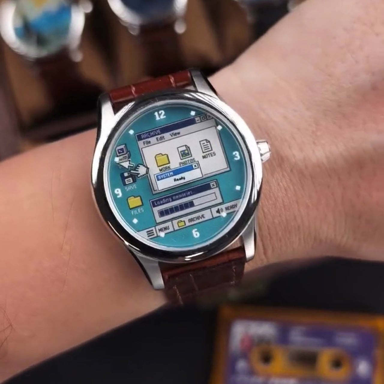
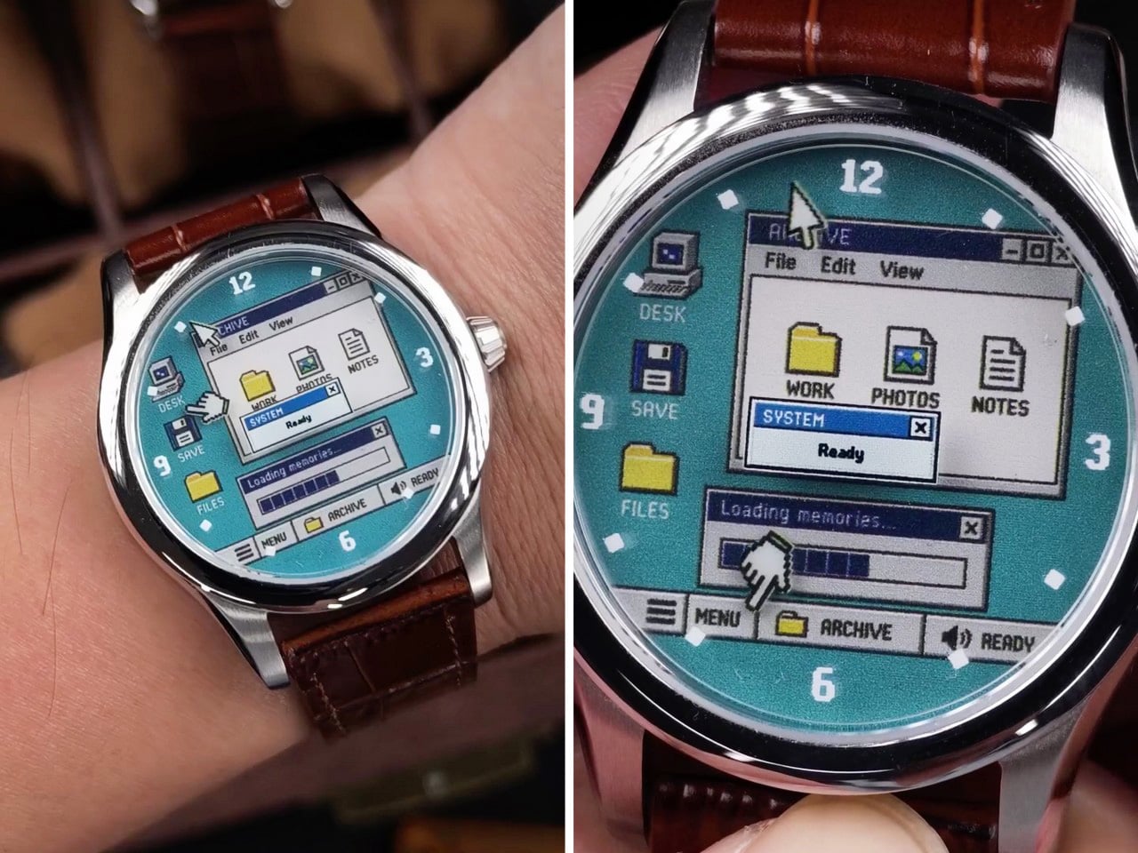
There was a time when a computer’s biggest annoyance was a progress bar inching slowly or a dial-up modem screeching and hissing its way online. Nobody pinged you on Teams, Copilot didn’t offer to rewrite your emails, and the worst thing your PC could do was crash in the middle of Solitaire. Benlywatch’s Desktop 95 bottles that era and straps it to your wrist. The limited-edition analog watch puts a Windows 95-style desktop on its dial, complete with teal wallpaper, beveled windows, and a dialog box that reads “Loading memories…” Honestly, that progress bar is the most accurate thing anyone has written about millennials.

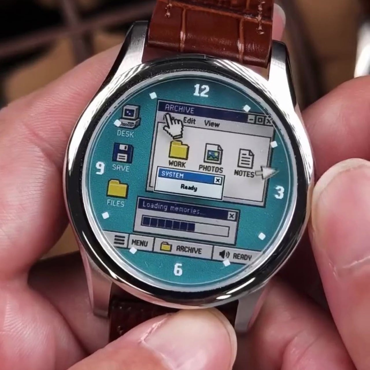
Two pixel cursors serve as the hands, a SYSTEM “Ready” dialog sits near the center, and a taskbar runs along the bottom of the dial. It all lives in a 39mm-wide, 10mm-thick case made from 316L stainless steel, with a Swiss quartz movement and a 5 ATM water-resistance rating. You get a blue or white dial with a leather strap, Milanese mesh, or steel bracelet, plus a numbered caseback. The edition is limited to 500 pieces. Pre-orders are open at $159, with shipping slated for November 2026. The only notification it will ever send you is the time.

Designer: Benly Watch

Pixel Cursor Hands and Two Desktop Dials

One hand is a classic arrow pointer, and the other is the little pointing hand that appeared whenever you hovered over a link. Together they move around the dial telling the time, which is the most productive thing a cursor has done since the invention of the screensaver. Everything else on the dial stays put. On the blue version, an ARCHIVE window with File, Edit, and View menus holds WORK, PHOTOS, and NOTES icons, while DESK, SAVE, and FILES shortcuts line the left edge. Chunky pixel numerals mark 12, 3, 6, and 9, and the taskbar reads MENU, ARCHIVE, and READY, speaker icon included.

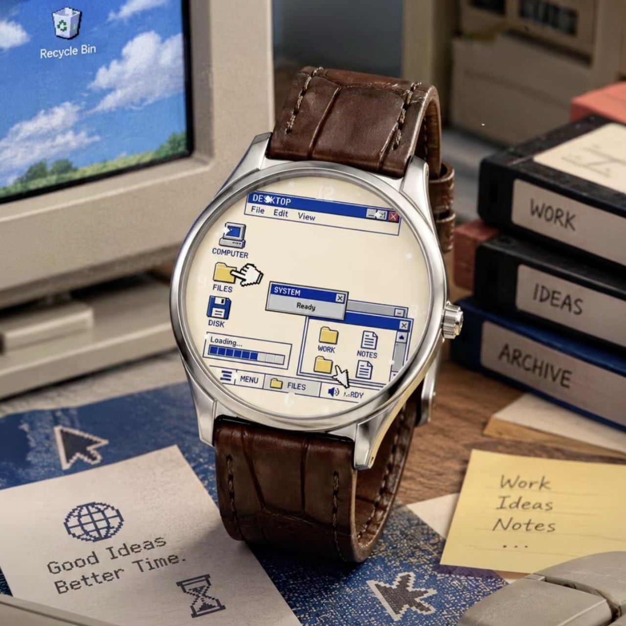
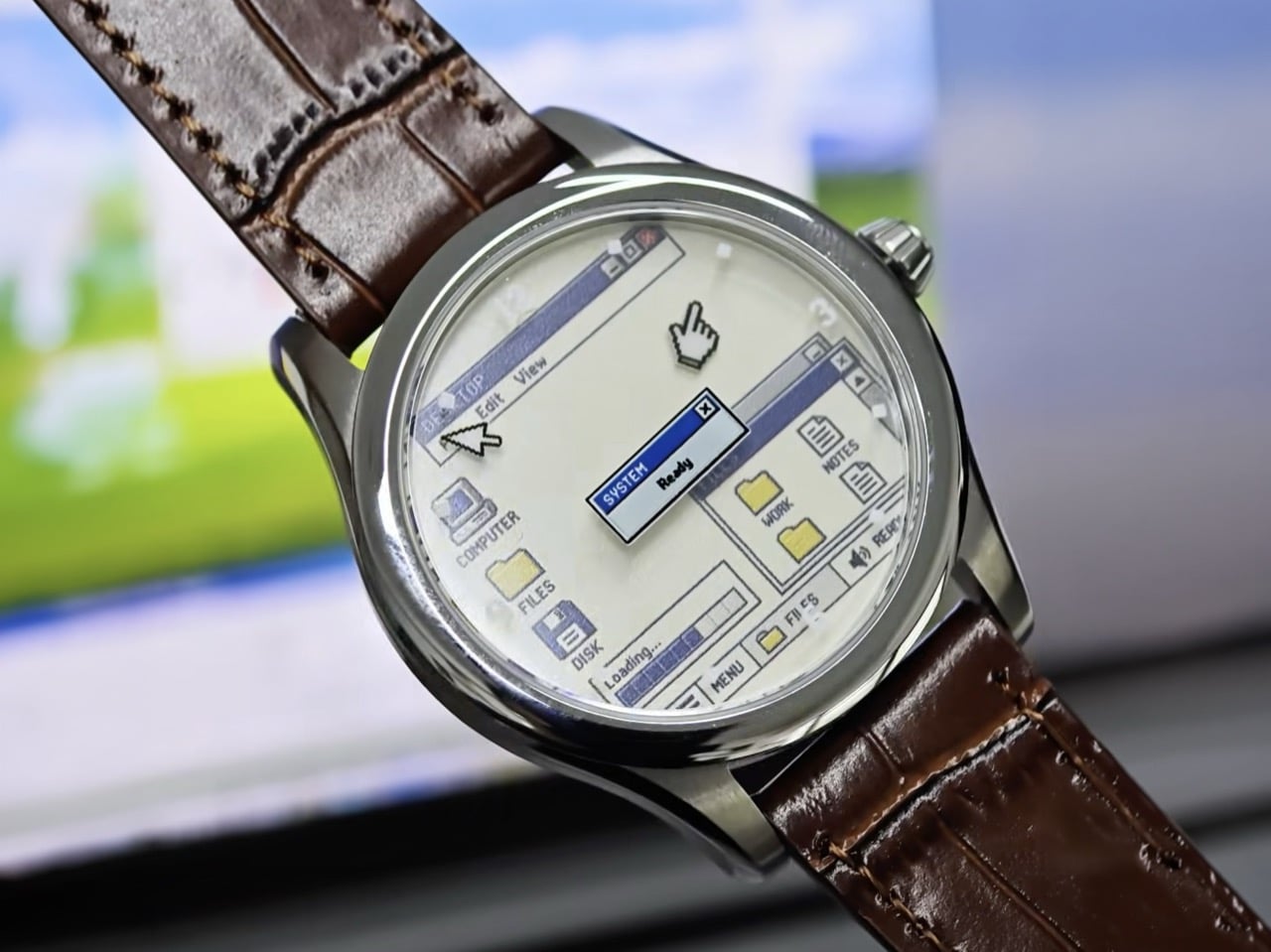
The white dial swaps teal for a creamy beige and renames the main window DESKTOP, with COMPUTER, FILES, and DISK icons and a simpler “Loading…” bar. Its numerals almost disappear into the background, so it looks like a screenshot someone shrank down and laminated. I like that the two dials feel like two moods of the same machine. Blue is the cheerful default everybody remembers from the family PC. White is the office computer in accounting that never got its wallpaper changed. Both keep that SYSTEM “Ready” box parked near the center like a promise.

The Windows 95 Design Behind the Dial

Windows 95 launched on August 24, 1995, backed by a $300 million marketing push, a launch event hosted by Jay Leno, and people lining up at midnight to buy an operating system. Its startup sound was composed by Brian Eno, which remains a wild sentence to type. The interface reflected the work of a design team led by Virginia Howlett, a painter by training. Those teals, royal blues, and medium grays came partly from the limited color palettes of graphics cards at the time. Hardware limits, basically, turned into an aesthetic people now pay money to recreate.

Three decades later, Windows comes with Copilot, Teams, and a Solitaire that serves you ads, and Howlett herself has called the Windows 95 years a “kinder, gentler time.” The Desktop 95 taps into that feeling. It’s a desktop with no updates, no pop-ups to dismiss, and no assistant asking how it can help. The only thing missing is Clippy, though in fairness he didn’t arrive until Office 97, and the dial is probably better off without a backseat driver.

Case Specs, Pricing, and Availability

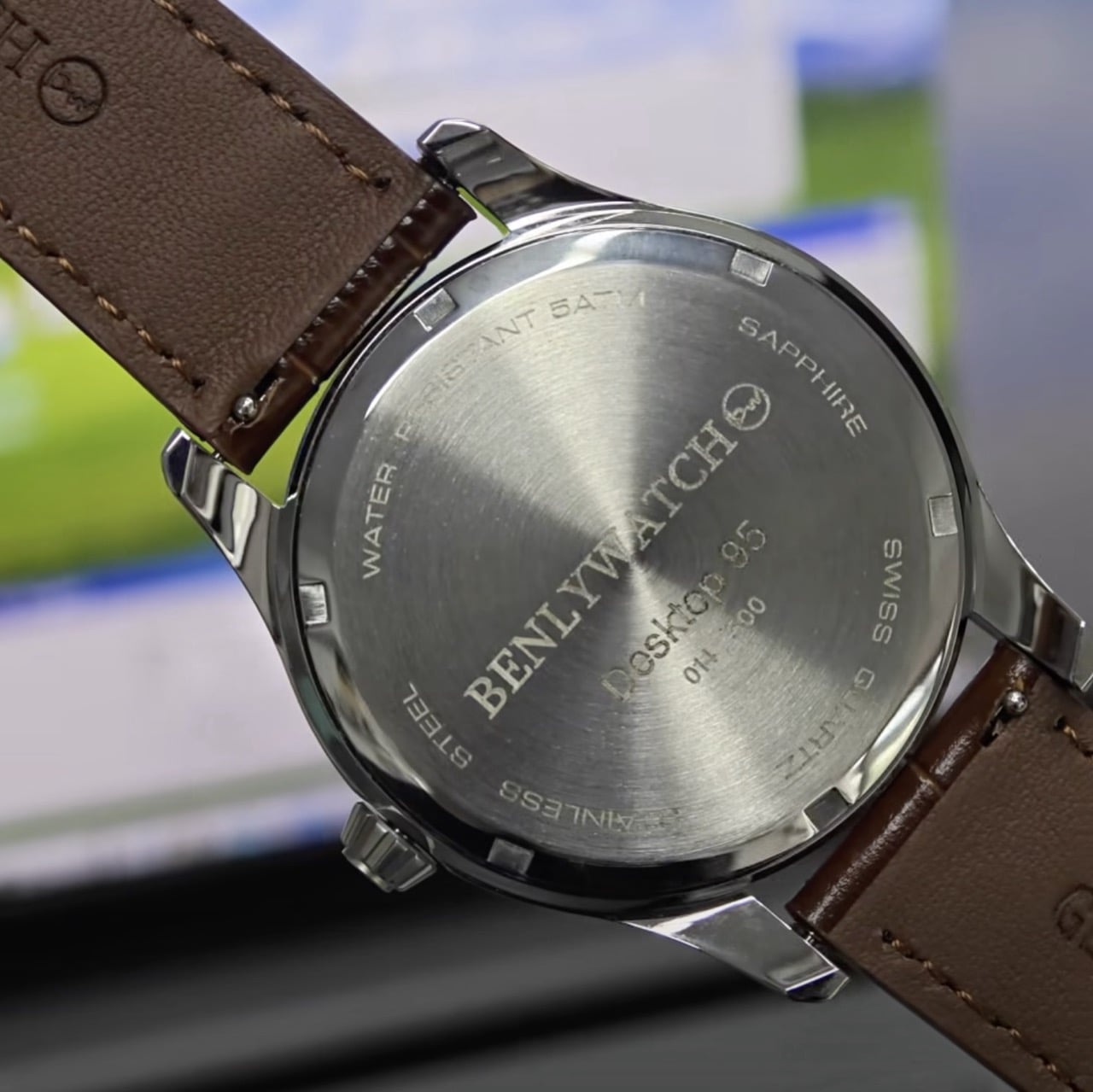
The case measures 39mm across and 44.5mm long, and at 10mm thick it should slip under a shirt cuff without a fight. It’s made from 316L stainless steel, with a matching steel caseback engraved with the Desktop 95 name and an individual edition number. The leather strap is 20mm wide and fits wrists from 5.3 to 8.1 inches (13.5 to 20.5cm), with Milanese mesh and steel bracelet versions also available. Inside is a Swiss quartz movement, which suits the theme, because nobody in 1995 wanted to wind anything except a VHS tape. Water resistance is rated at 5 ATM.

Most of Benlywatch’s catalog is retro-futurist digital hardware with OLED and LCD screens, from the Cybertruck-inspired Future Warrior to its 1970s-style Stargazer. The Desktop 95 takes a different approach, recreating a screen on an analog dial. It’s listed at $159 on pre-order through Benlywatch’s website, limited to 500 pieces, with shipping expected in November 2026. Free worldwide shipping is included, and the brand covers import taxes and duties.

The post The “Desktop 95” Watch is a love-letter to the greatest Windows OS of all time first appeared on Yanko Design.

  •  

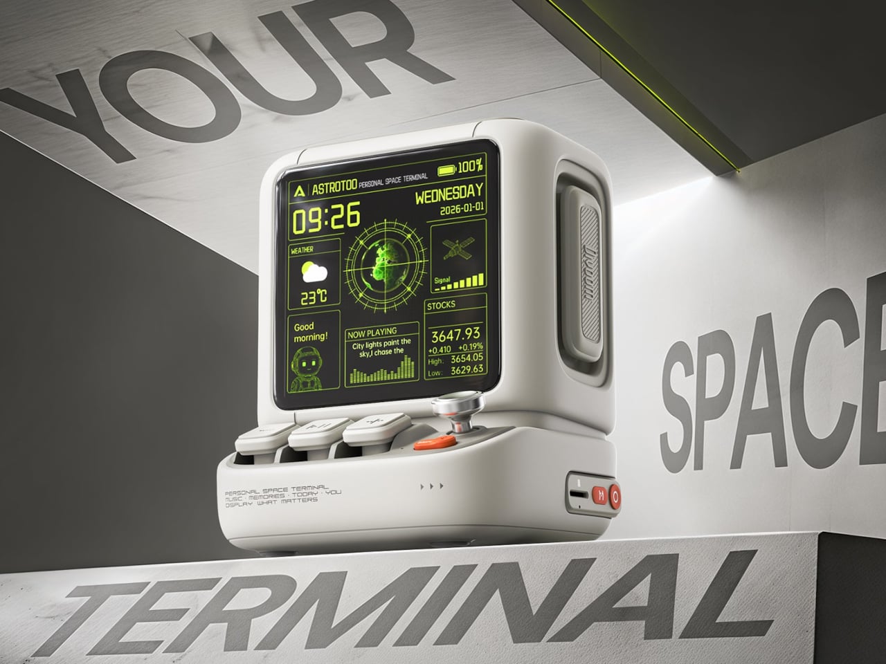
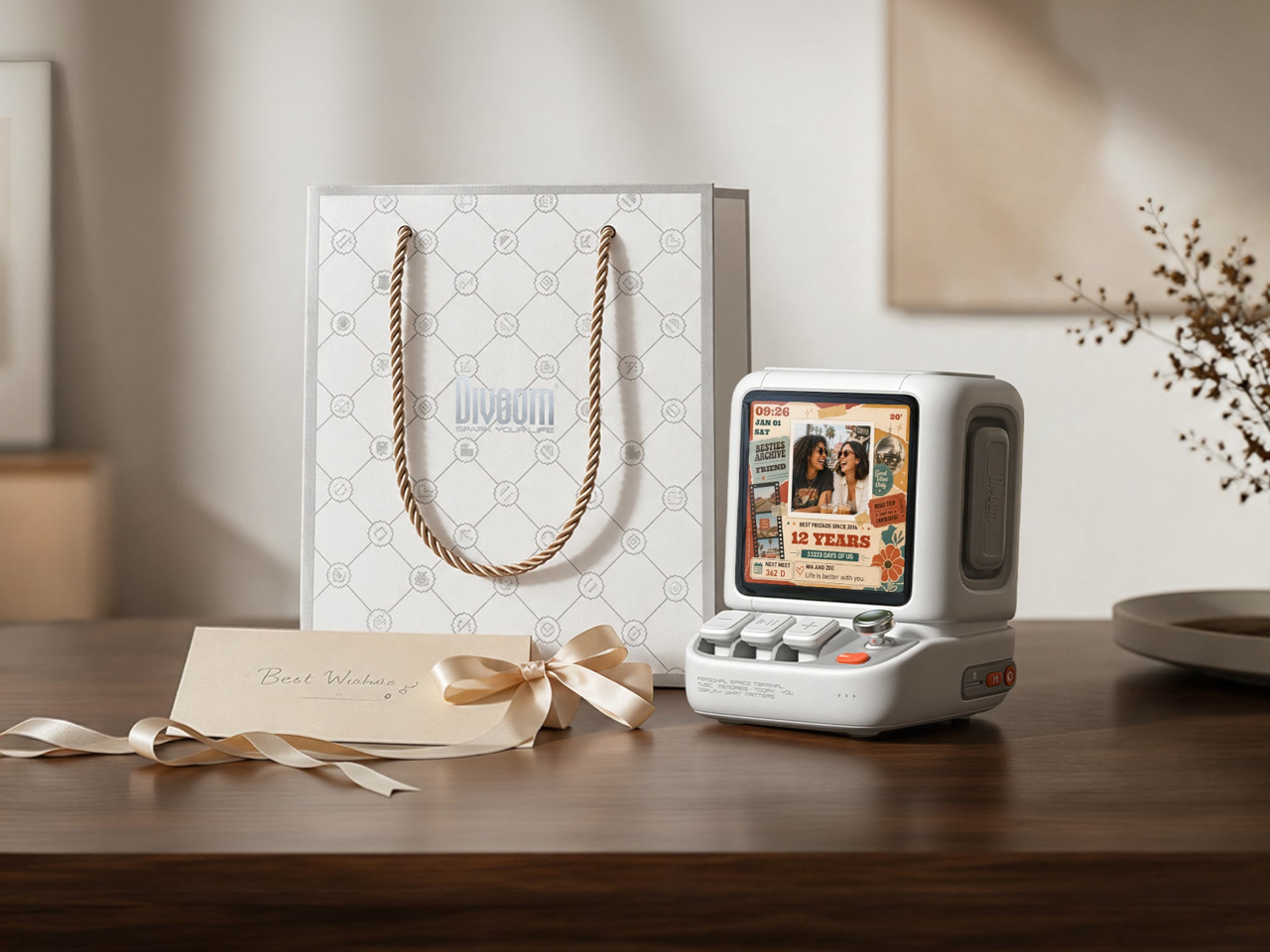
Divoom Astrotoo Is a Desktop Speaker Dressed as a Retro Computer

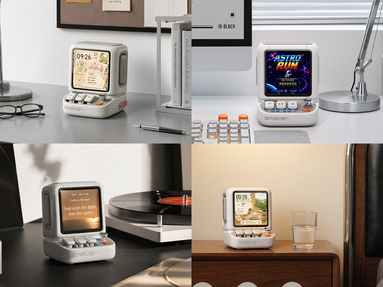
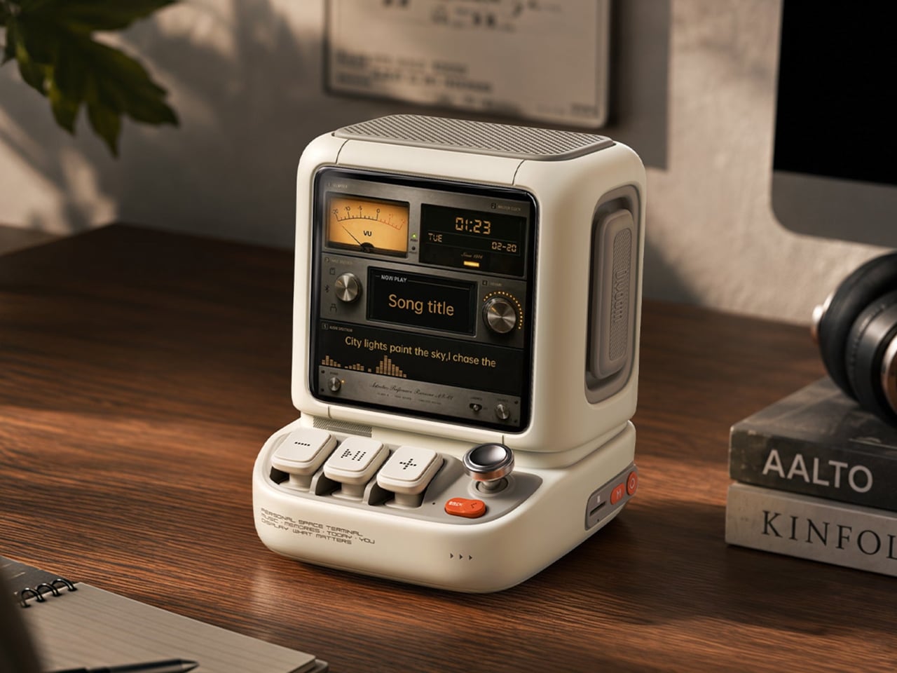
Desktop speakers usually have a pretty straightforward job and an equally straightforward appearance. That makes sense when all you want is music, but it doesn’t leave much room for personality. Divoom’s Astrotoo takes a different approach, putting a display and oversized physical controls into a speaker that looks like a tiny computer terminal. It definitely gives your desk something playful and personal, and your friends something to be jealous of.

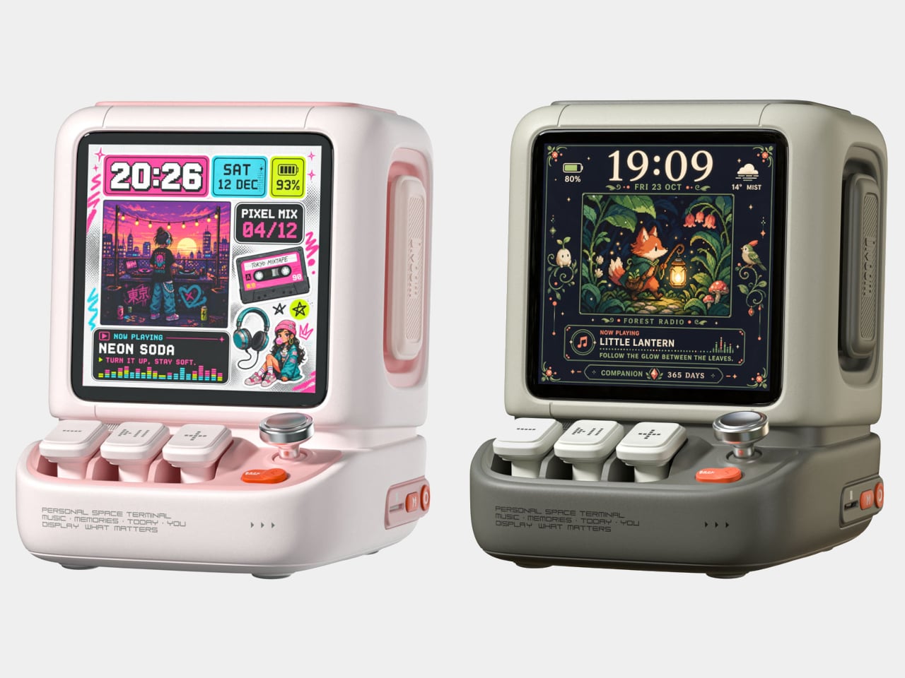
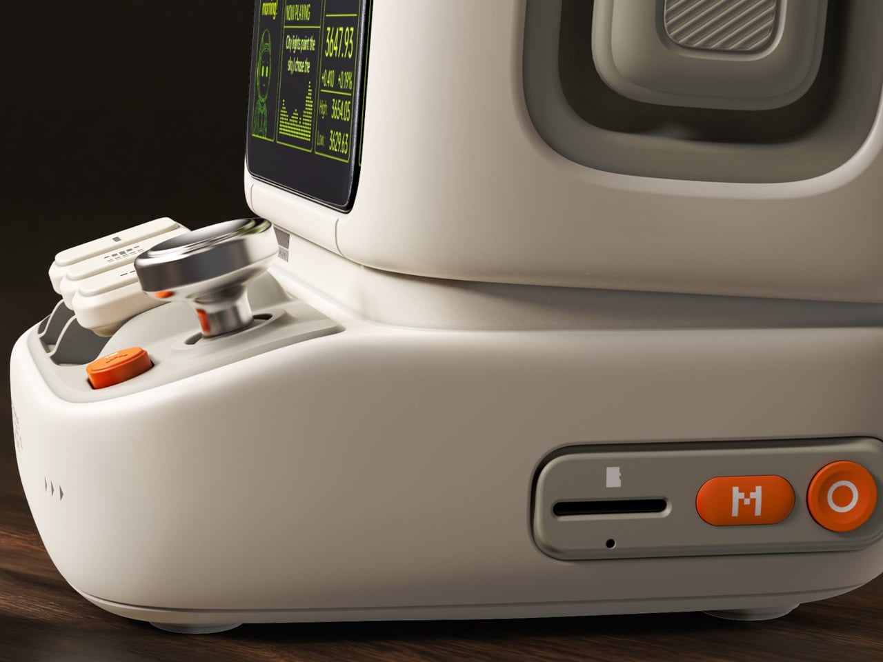
The rounded housing and recessed side panels give Astrotoo the appearance of equipment from an imagined future, albeit one with chunky buttons. White, pink, and green finishes offer different levels of restraint. At roughly 4.2 by 4.3 inches across its base, it won’t need the space of a computer, although its upright screen certainly makes it harder to overlook than a conventional speaker.

Designer: Divoom

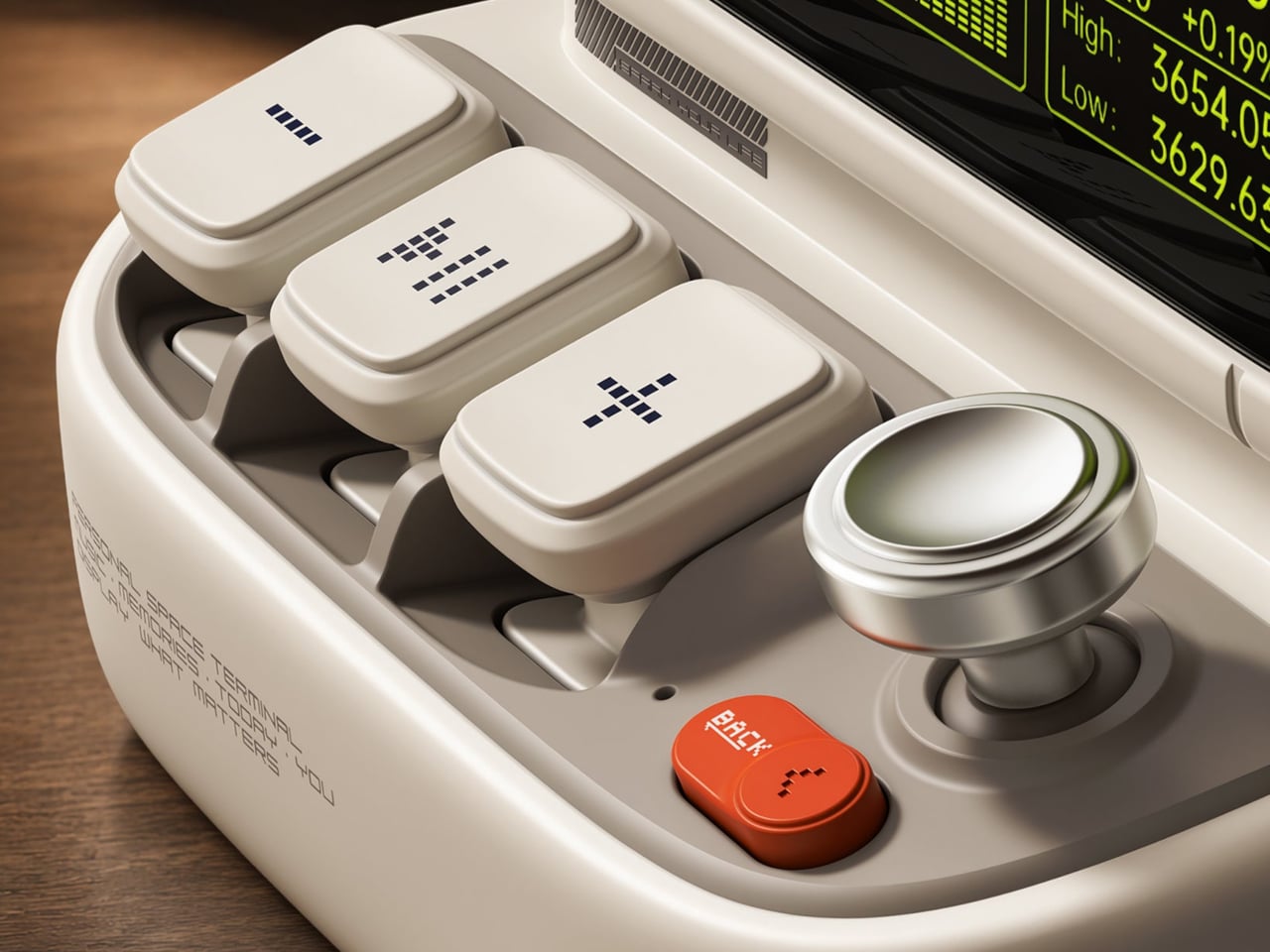
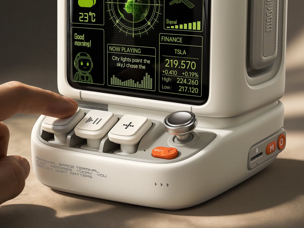
Of course, those buttons aren’t simply there to complete the retro disguise. Three raised mechanical keys, a joystick, and an orange Back button handle music and display functions. You can reach over to control playback without opening another app, though customizing the display still involves your phone. It’s a familiar division of labor, with physical controls for everyday actions and software for the changes.

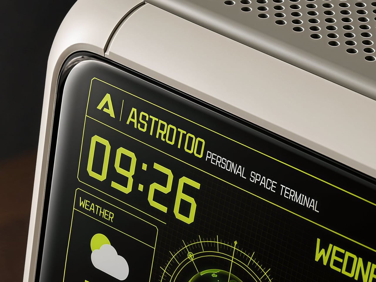
Despite the pixel art theme, Astrotoo doesn’t limit you to blocky characters and low-resolution graphics. Its 3.95-inch IPS display has a 480×480 pixel resolution, accommodating photographs and detailed clock faces as well. That means you can keep a family photo beside your monitor without making room for another frame. Music visualizations are also available, if you’d rather have your speaker put on a show.

The Divoom app lets you change visual content and clock faces, giving the device something to do when the music stops. Weather and stock information bring a more practical side to that small screen. That said, another dashboard isn’t necessarily what a busy desk needs. A favorite picture might be a better companion than financial numbers quietly competing for your attention all afternoon.

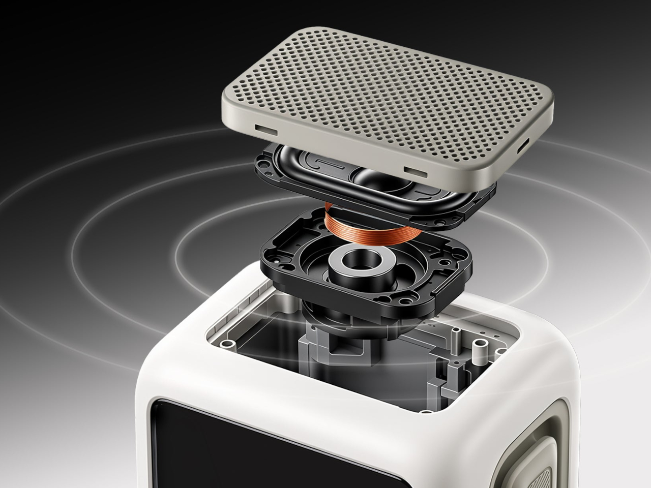
Divoom positions the 20W speaker for listening nearby, so the desktop proportions aren’t entirely about appearance. Playing music while answering emails or listening to a podcast during a break fits that purpose. Of course, the power rating doesn’t tell us how balanced the sound will be. The styling is easier to judge than the audio, which needs listening rather than a specification sheet.

Bluetooth 6.0 handles wireless audio, while microSD playback lets you bring a collection of stored music along without keeping a phone connected. Wi-Fi supports the connected display features. There’s also a battery, with Divoom claiming up to six hours of operation. That’s enough to move it between rooms for a while, but don’t expect it to stay unplugged through an entire workday.

The $199.99 US price makes this a considered desk accessory rather than a casual decoration. Divoom lists approximately 3.5 hours for USB-C charging, so it probably makes sense to leave a cable nearby. You can dress the screen as a futuristic control panel, but there’s nothing futuristic about discovering that your tiny computer needs plugging in before the afternoon playlist.

The post Divoom Astrotoo Is a Desktop Speaker Dressed as a Retro Computer first appeared on Yanko Design.

  •  

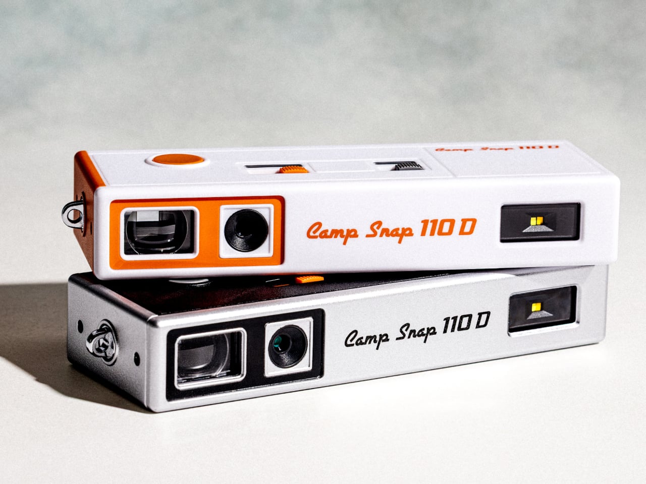
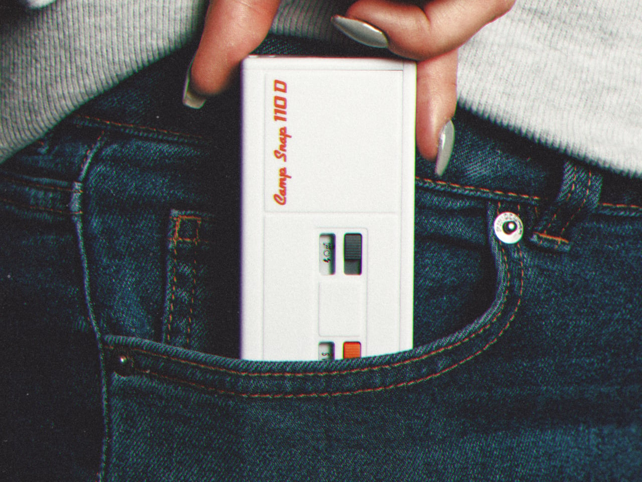
Camp Snap’s 110D Looks Like 1973 and Still Skips the Screen on Purpose

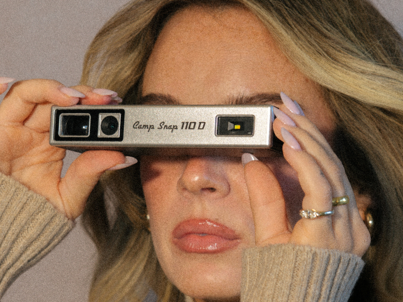
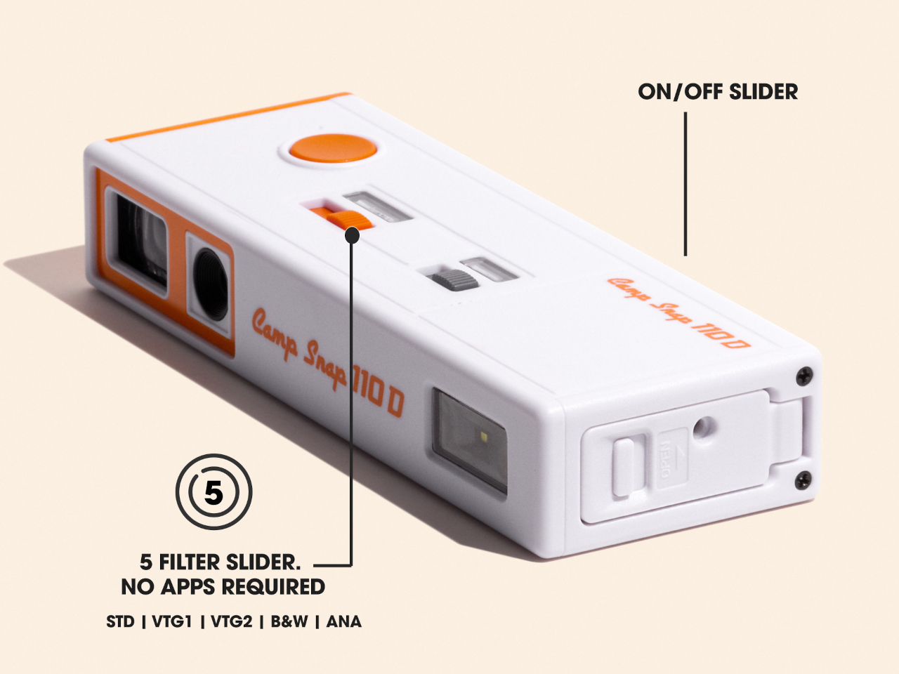
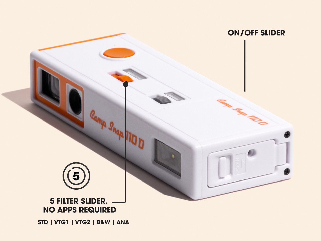
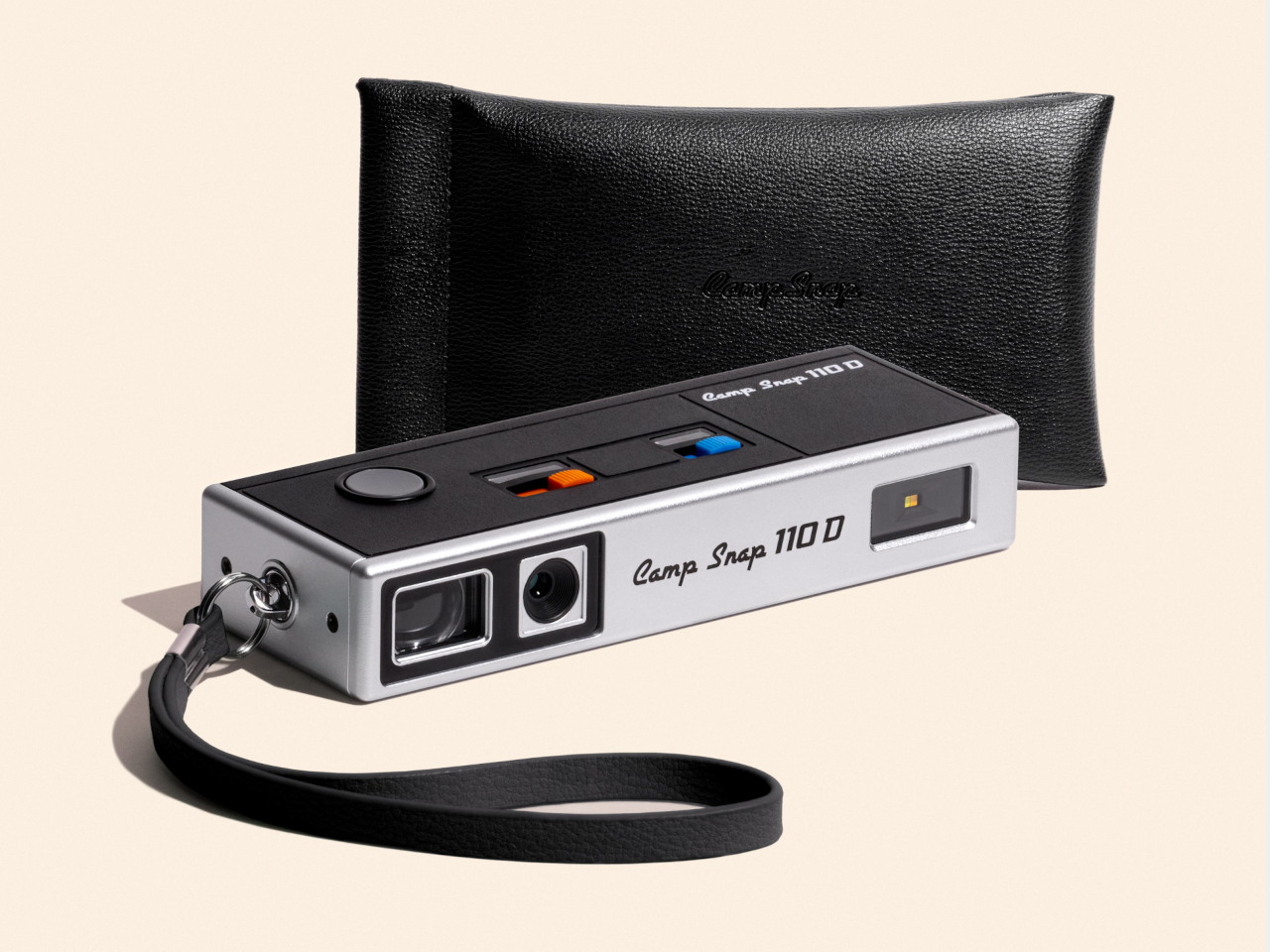
Camera design spent the last two decades chasing thinner phones and bigger screens, so a company deciding to revive a boxy, finger-length shape from the 1970s sounds like a step backward. The Camp Snap 110D proves otherwise. It borrows its elongated, pocketable body from the old 110 film format, then strips out the one feature every digital camera has trained us to expect: a screen for checking the shot you just took.

That missing screen isn’t a cost-cutting shortcut. It’s the entire point. Smartphone photography turns every outing into a loop of shooting, reviewing, deleting, and reshooting until a moment gets buried under a dozen nearly identical takes. The 110D breaks that loop by design, letting a photo exist the instant it’s taken and staying invisible until you plug the camera in later and actually look at what you captured.

Designer: Camp Snap

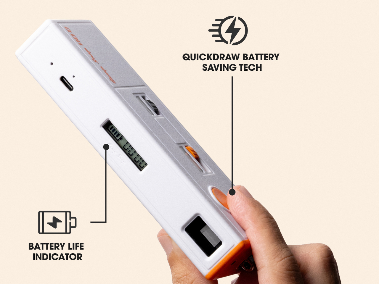
Living without a review screen also solves a problem the original 110 format never had to think about: battery life. Screens are usually the single biggest power drain in a compact camera, so removing one frees up room for improvements elsewhere. The 110D pairs that saved power with QuickDraw sleep and wake functionality, letting the camera snap awake fast enough to catch a moment instead of fumbling through a slow startup.

Inside that slim shell sits an 8-megapixel sensor, modest by phone camera standards on purpose, since chasing sharper resolution would work against the whole idea of embracing a lower-fidelity, more film-like result. Five built-in filters let a shooter pick a mood before pressing the shutter rather than fixing it afterward in an app, pushing the entire editing decision to before the photo exists instead of after.

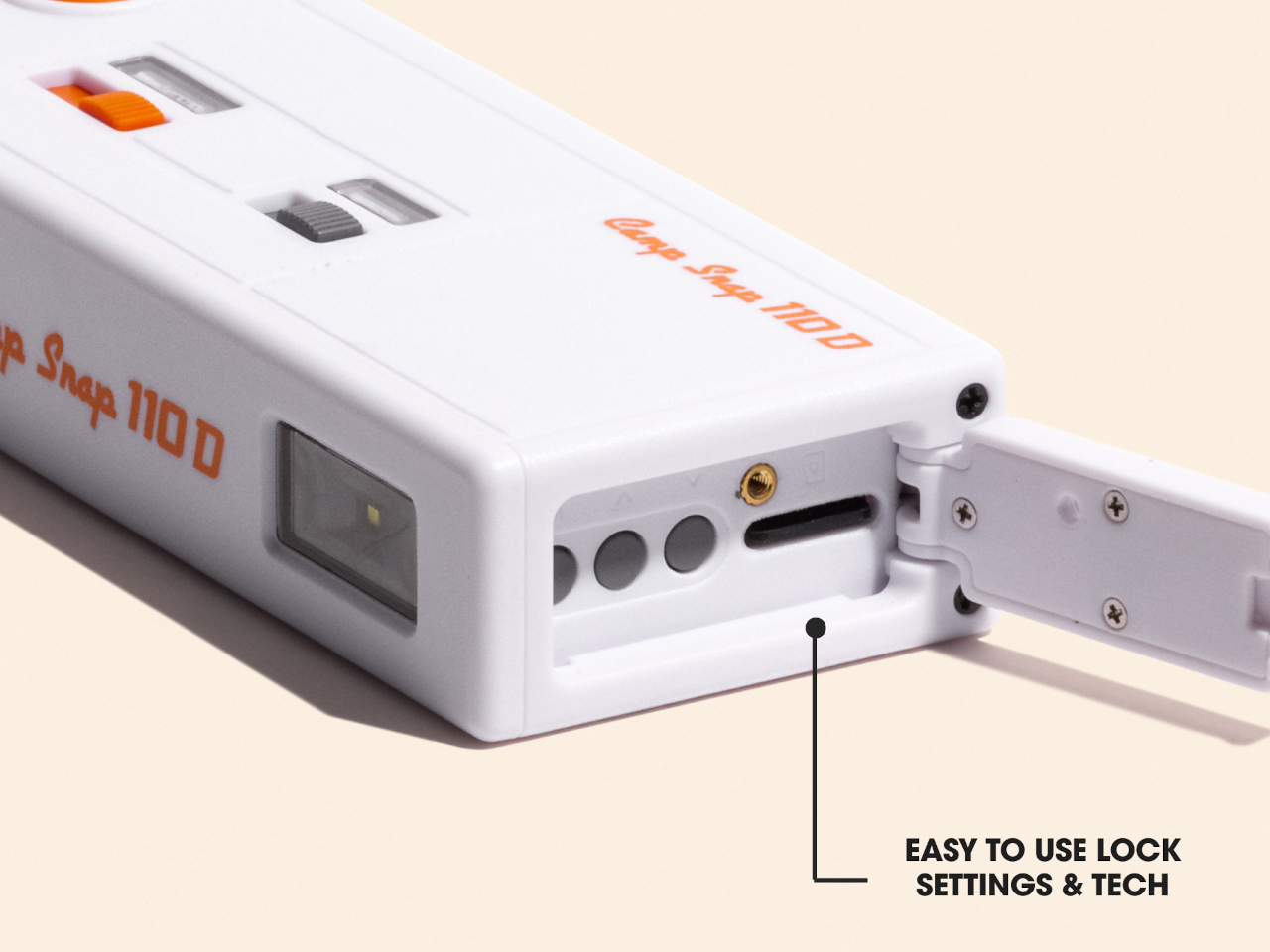
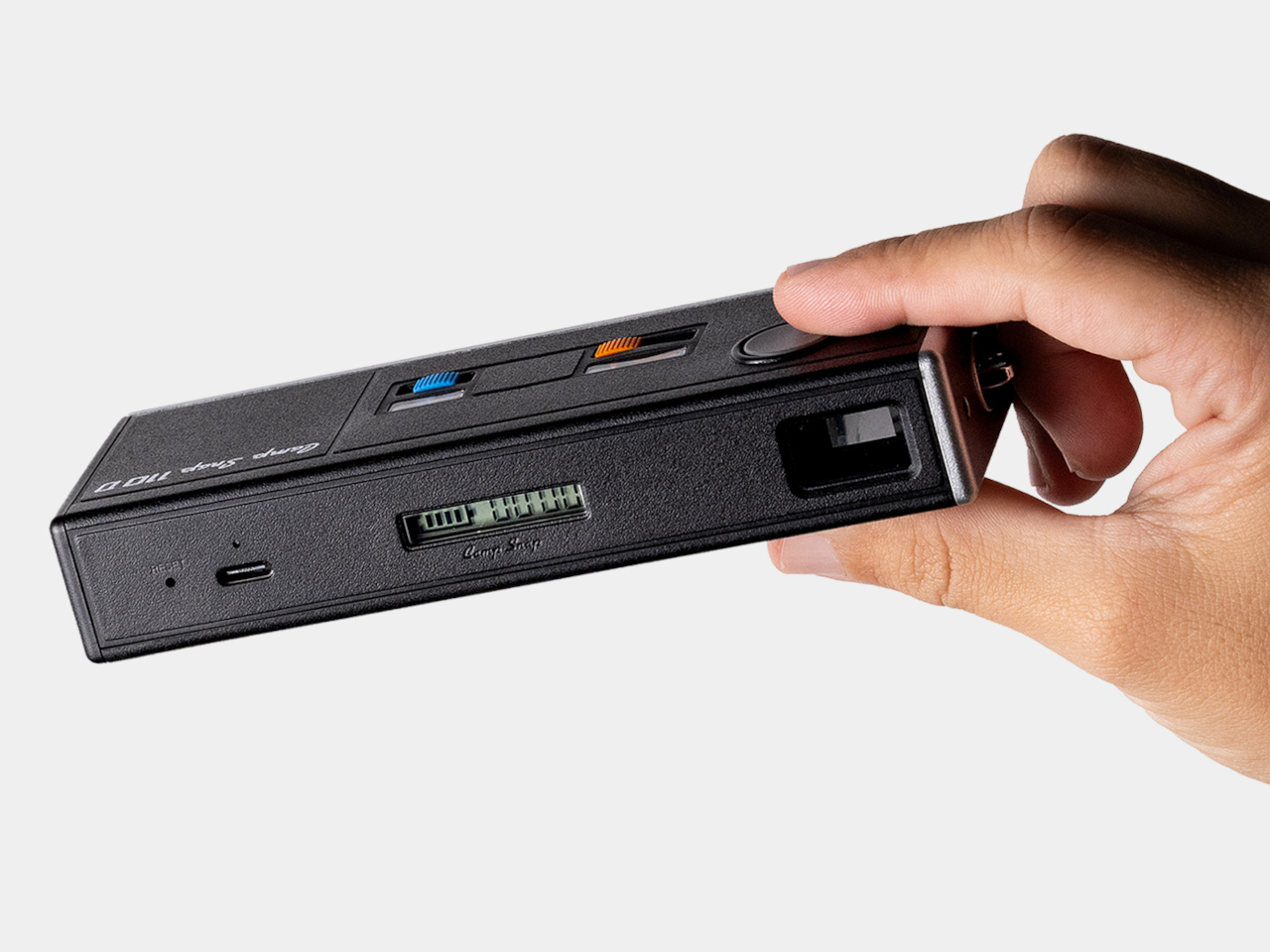
Storage runs on a microSD card, and images transfer out through a USB-C port, a small detail that keeps the retro shape from turning into an actual hassle to use. Charging works the same way, so nobody’s hunting for a proprietary cable or a dead battery with no replacement in sight. The vintage silhouette stays purely visual, while the internals stay entirely current.

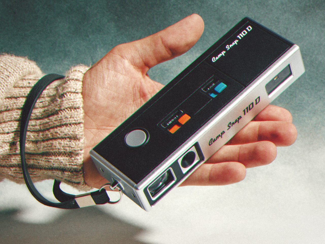
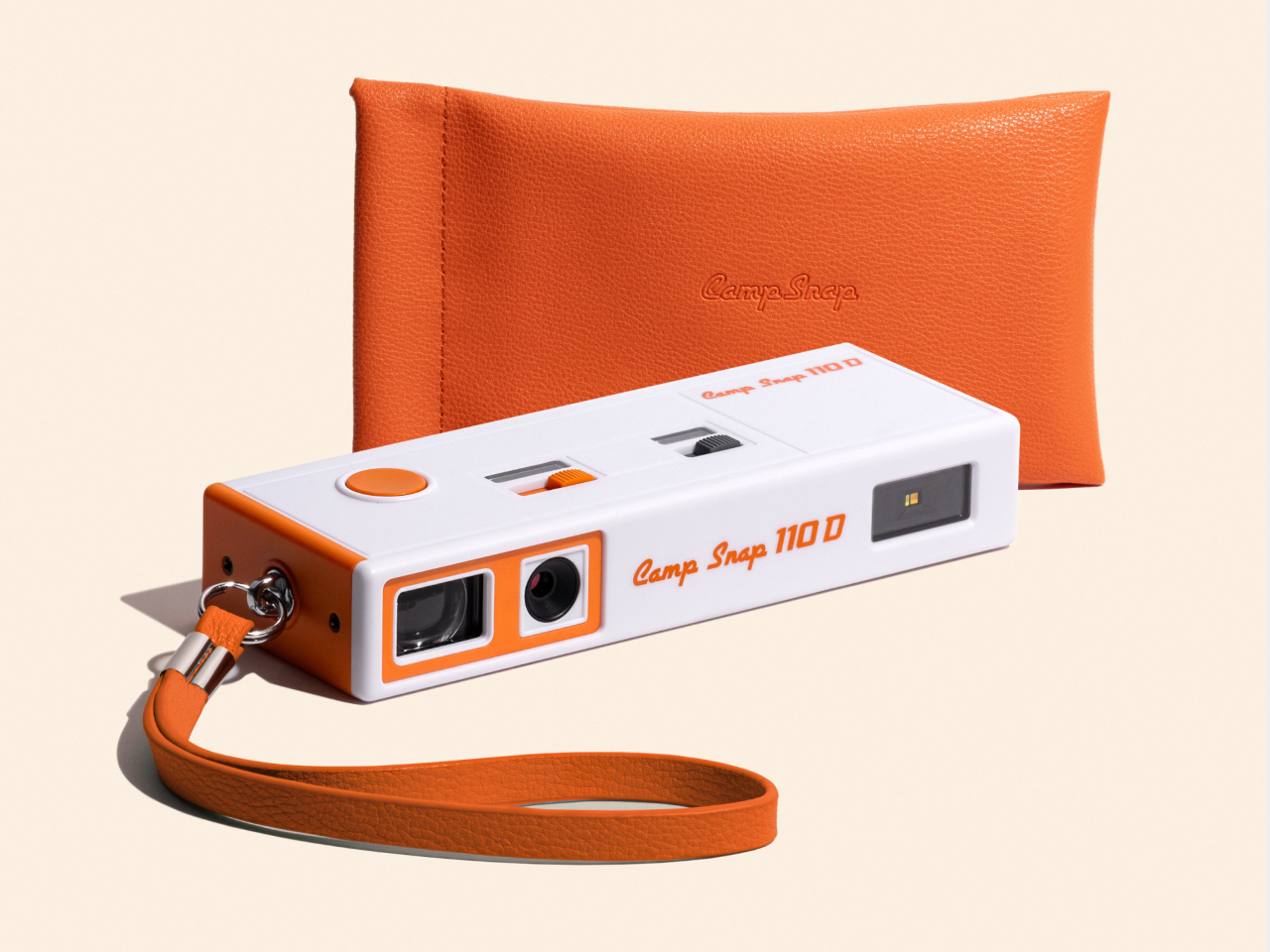
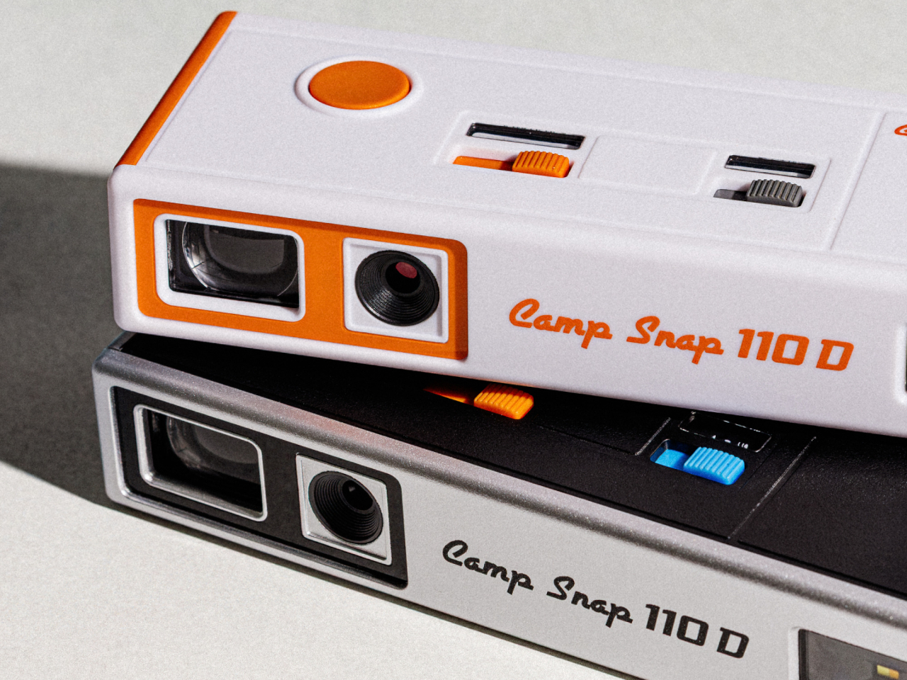
Two colorways round out the release: a black variant and a cream-and-orange combination that leans harder into the ’70s reference than the shape alone already does. Both ship with a wrist lanyard and a small carrying pouch, treating the camera less like a serious tool tucked into a bag and more like something meant to hang off a wrist at a party or a weekend trip without a second thought.

At $74.99, the 110D undercuts most instant cameras and plenty of higher-end toy cameras while offering something neither fully provides: a shape borrowed from actual photographic history rather than a generic plastic body built to look vaguely retro. That’s a specific kind of nostalgia, aimed at people who remember what a 110 camera looked like even if they never touched the film it used.

The post Camp Snap’s 110D Looks Like 1973 and Still Skips the Screen on Purpose first appeared on Yanko Design.
  •  

Laptops Sealed Computers Shut, ARTISAN ALTO Snaps Them Back Open

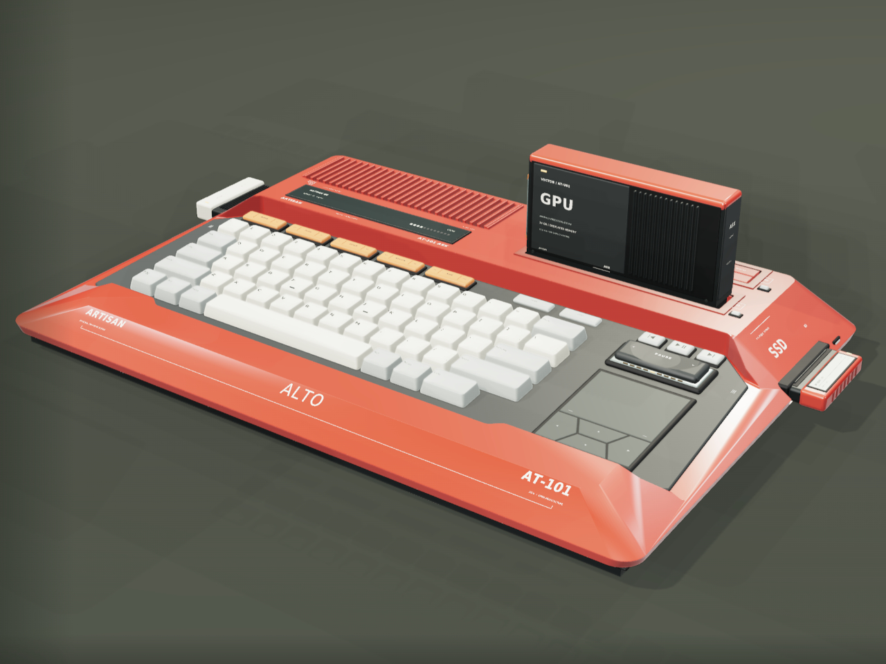
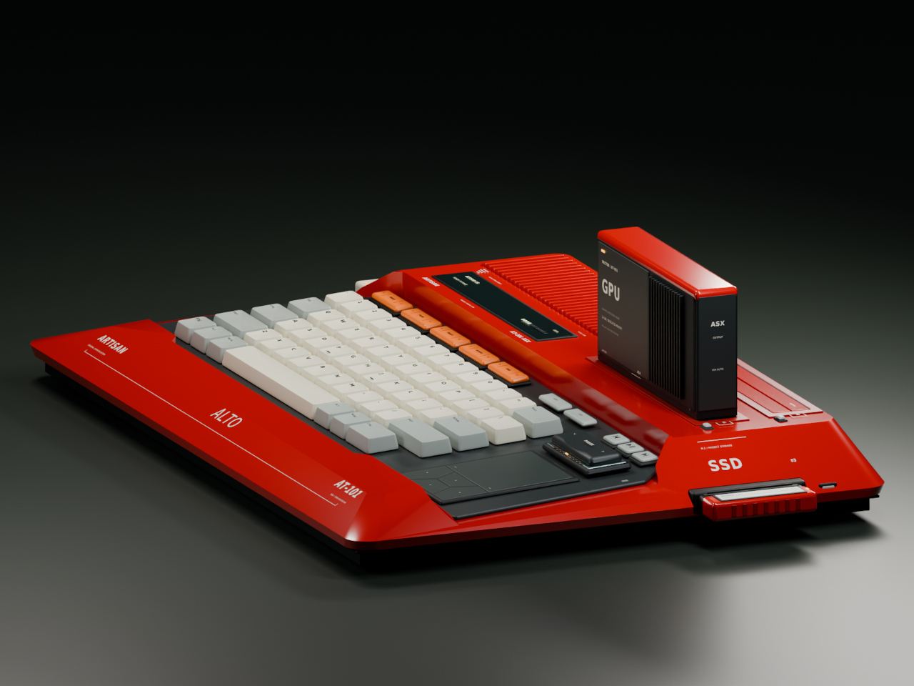
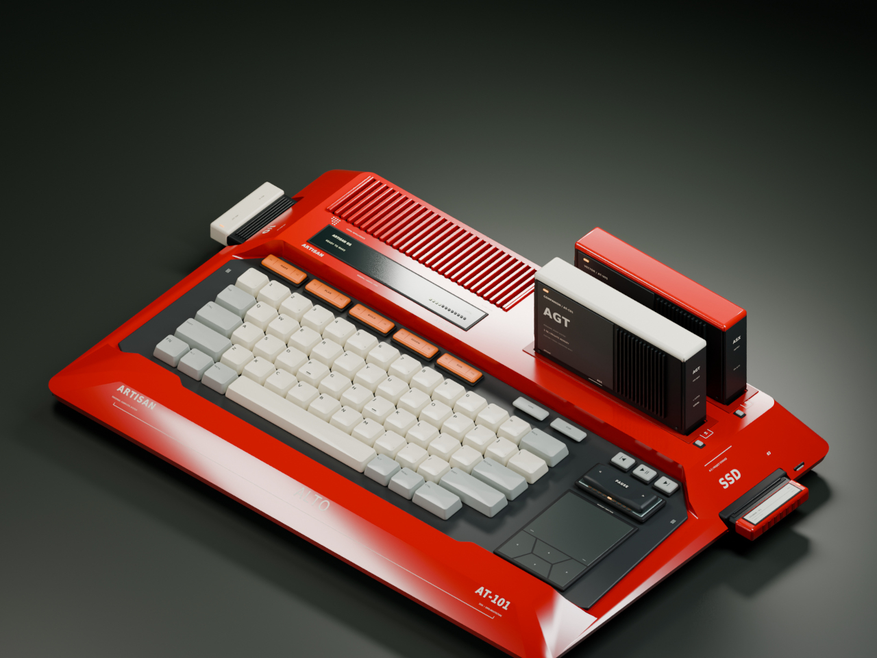
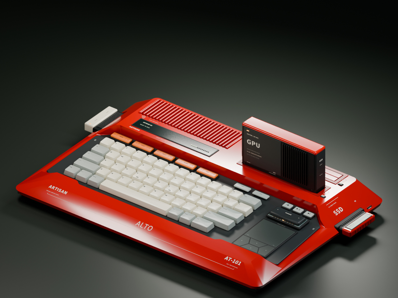
Home computers used to snap open like toolboxes, cartridges sliding in for a new game or a new skill. That idea mostly disappeared once sealed laptops took over, but the ARTISAN ALTO AT-101 brings it back with a vermilion shell that looks like it walked straight out of 1984 and a system built for how people actually tinker today. It’s a machine designed to grow alongside whatever you’re currently obsessed with.

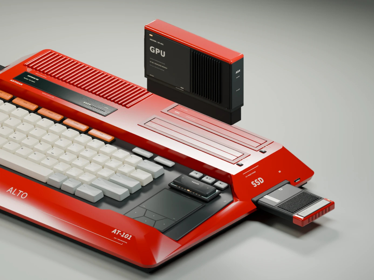
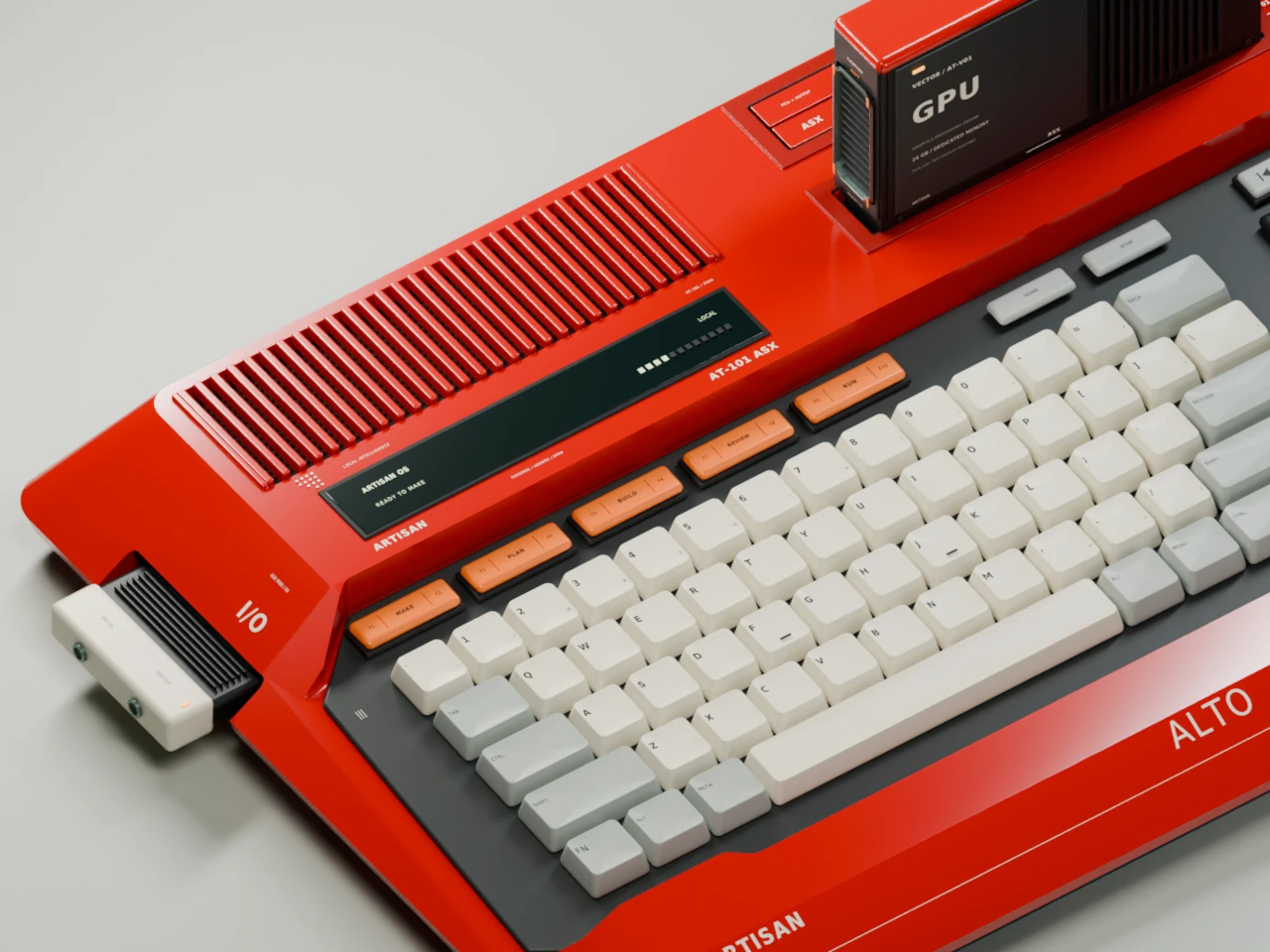
The trapezoidal red housing wastes no time signaling its intentions. Sculpted, concave ivory keycaps sit beside red cooling louvres, and a keyboard opening cuts diagonally through the sloping side, turning what could’ve been a flat slab into something with genuine presence on a desk. This is a machine built to be looked at, not tucked behind a monitor.

Designer: Leo Botinelly

That vintage-inspired shell hides a distinctly modern expansion idea. Upright cartridges slot into place to add graphics power, sound capability, retrocomputing modes, or an AI companion, while smaller side modules handle specialist interfaces and individual projects. Recording a demo, building out a more ambitious scene, or reviving an old favorite game all become a matter of swapping in the right module rather than replacing the whole machine.

The standout pairing puts VECTOR, a compute cartridge, alongside COMPANION, an AI agent module with its own ivory-crowned housing. Together they form what the concept calls a personal cyberdeck, one where your context and your processing power both live in the same two bays. Everything from your conversation history to your working files stays local, an intentional counterpoint to how most AI tools currently function.

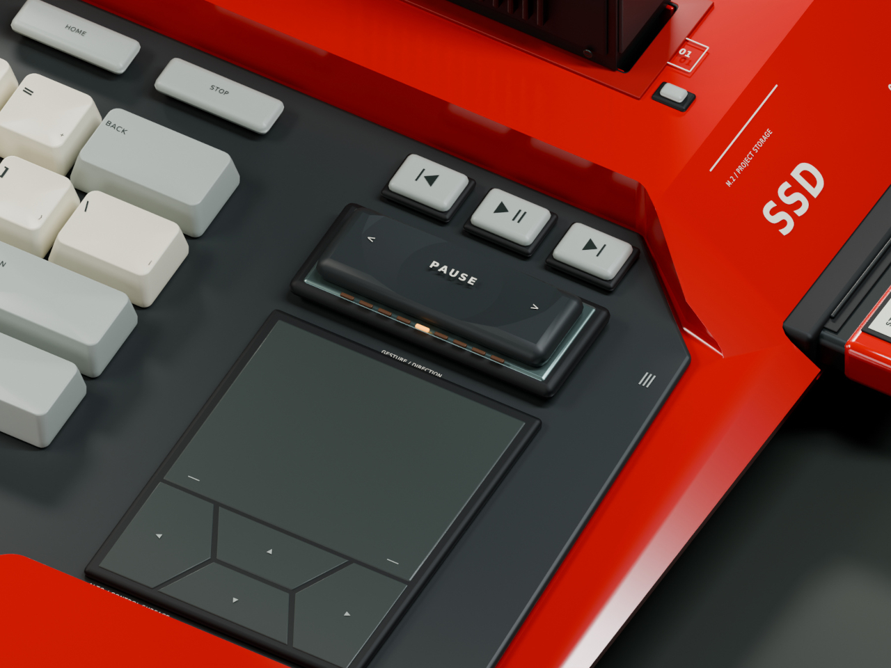
Five multifunction keys handle creative shortcuts without forcing a trip through a menu, while a dedicated PAUSE rocker lets you freeze, rewind, or speed through whatever’s running, treating time itself as something you can grab and adjust mid-task. A touchpad and four flush cursor keys merge into a single continuous surface on the right side, keeping navigation under the same hand that’s already resting there.

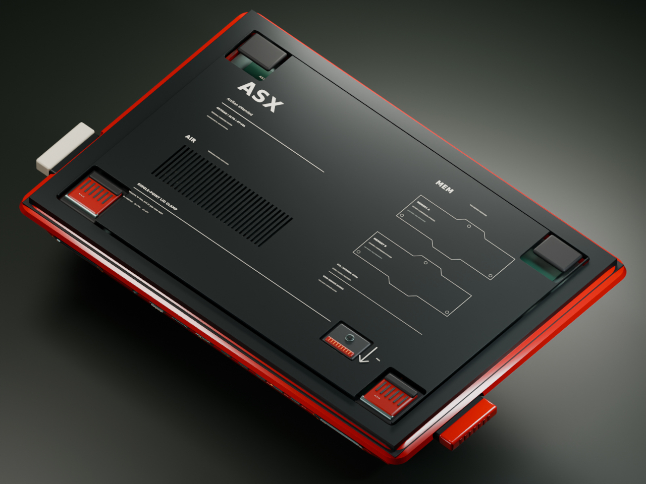
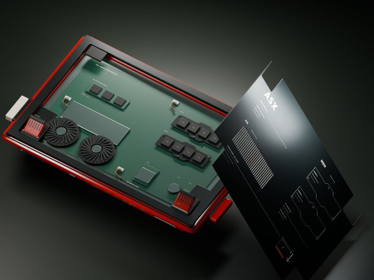
Flip the machine over and the same philosophy continues. Memory access sits in the open rather than buried under layers of casing, rear supports adjust to match your desk setup, and a single screw releases the service clamp entirely. Every one of these choices treats a computer’s insides as something worth respecting, not hiding behind warranty stickers and proprietary screws.

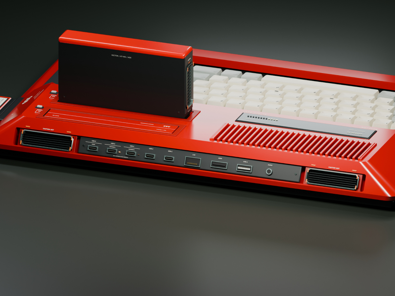
Around back, a compact connector panel handles the practical side of daily use. USB-C power sits alongside labeled ports for two cartridges, additional USB-C connections, LAN, HDMI, USB-A, and audio, all routed cleanly to keep cables from tangling across the front of a desk. Even the exhaust vents get a considered shape, flanking the connector panel like a pair of small turbines venting heat from all that cartridge-driven ambition.

The post Laptops Sealed Computers Shut, ARTISAN ALTO Snaps Them Back Open first appeared on Yanko Design.
  •  
❌