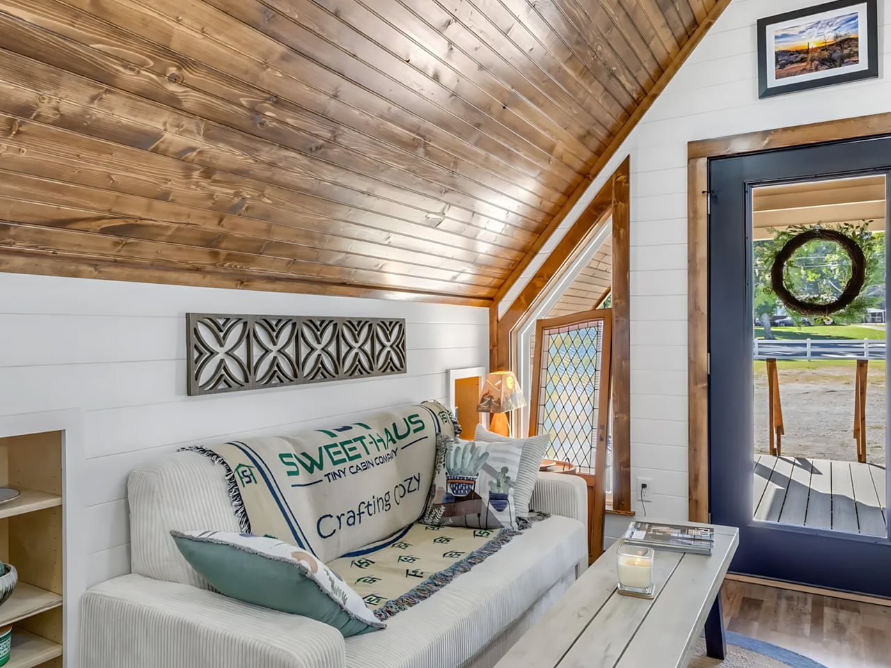
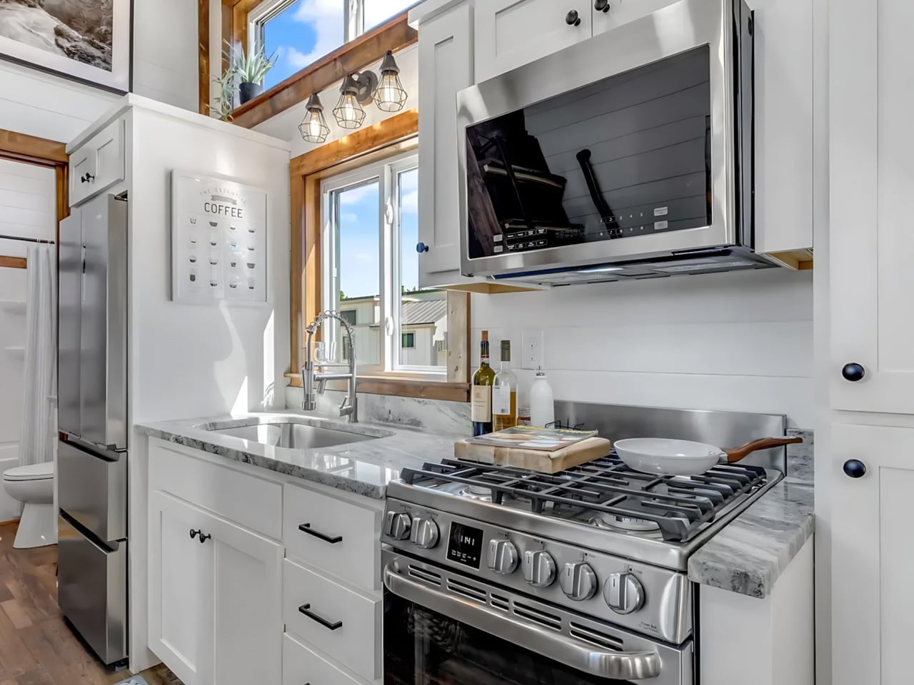
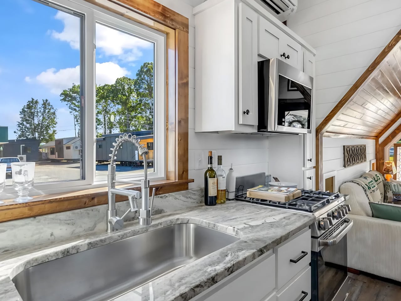
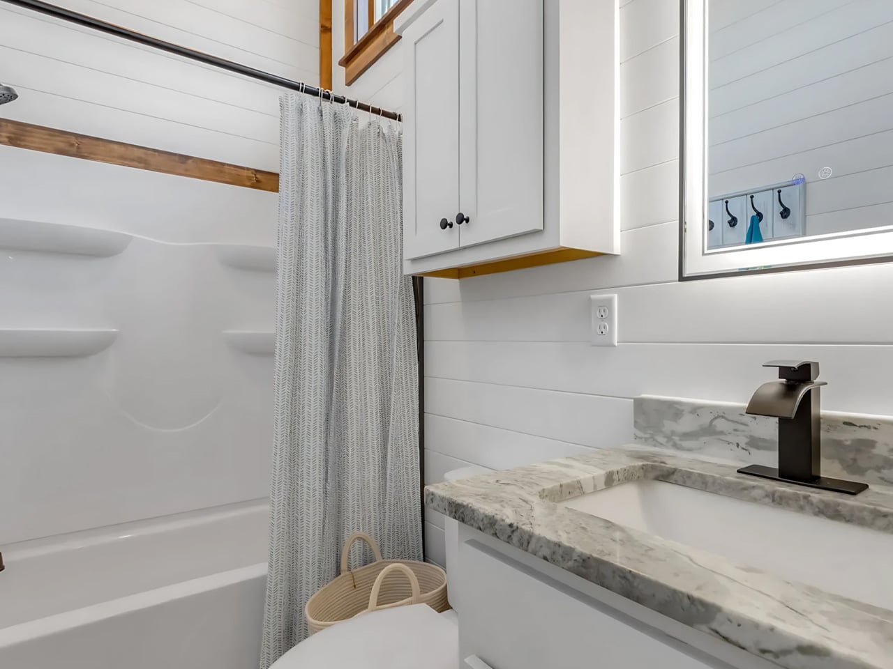
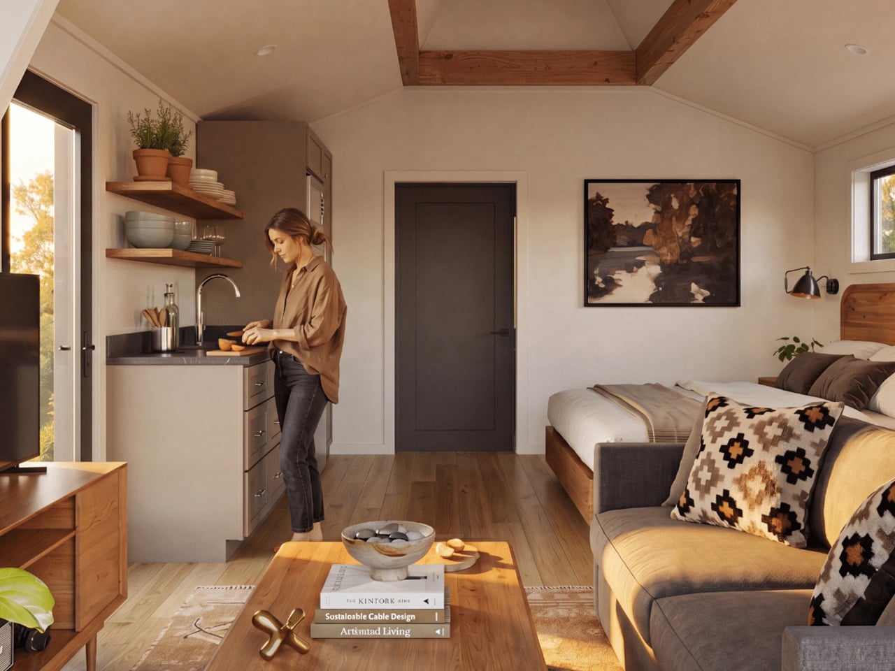
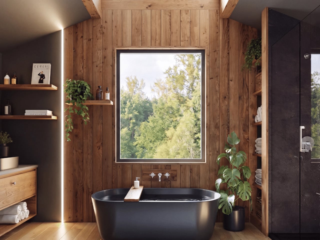
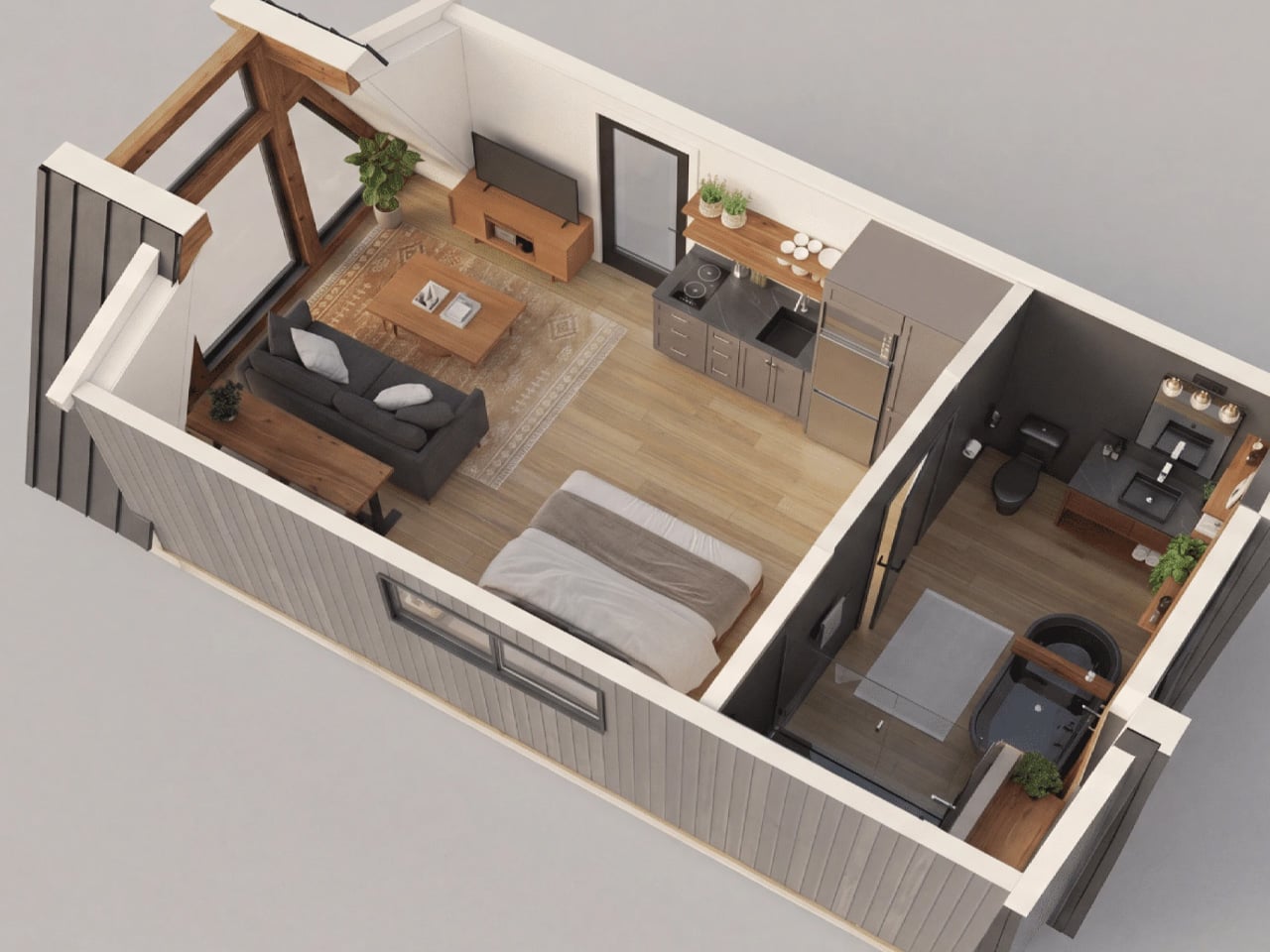
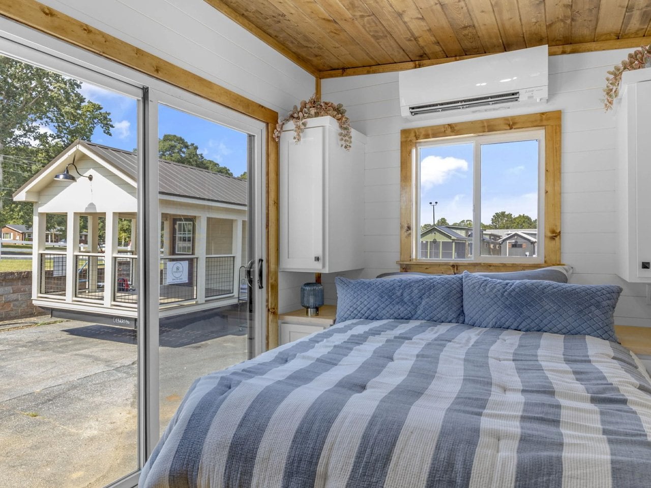
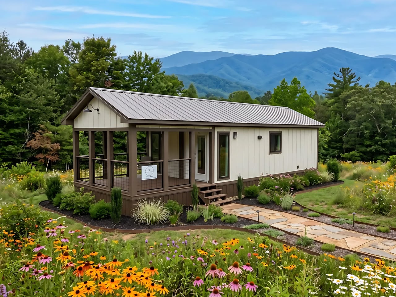
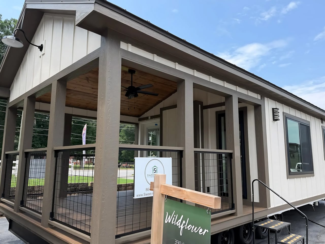
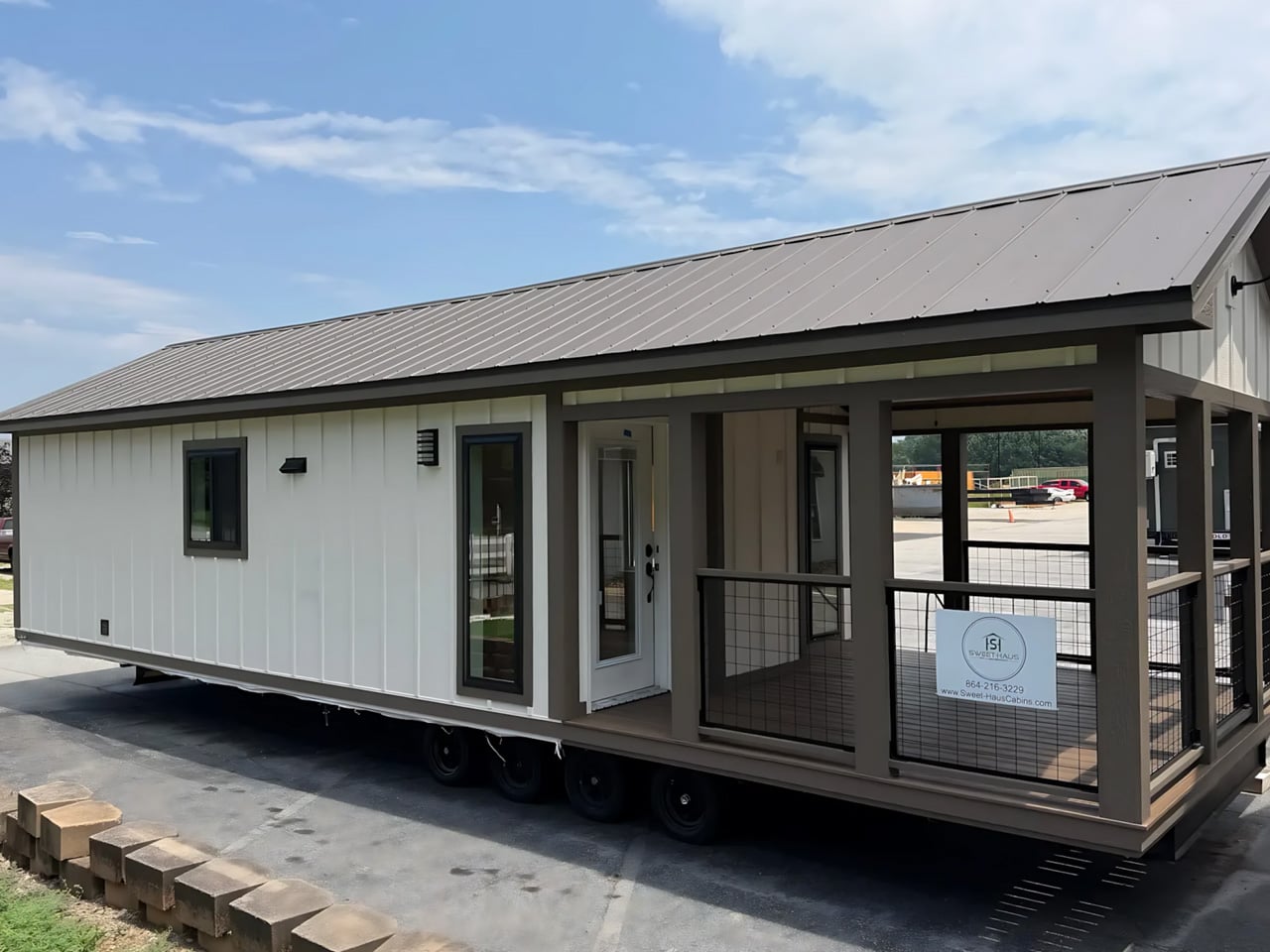
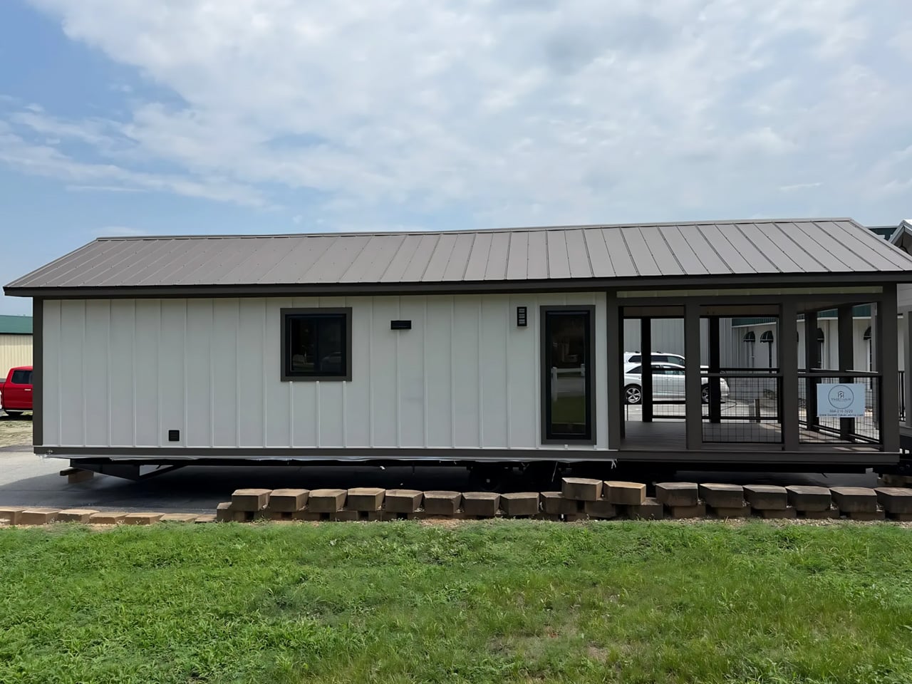
The Wildflower makes room for something tiny homes can easily squeeze out: a proper front porch. Built by South Carolina’s Sweet-Haus Tiny Cabin Company, this 400-square-foot park model pairs one bedroom and one bathroom with a covered outdoor sitting area. It’s an available model, starting at $115,000, with a layout that keeps daily life on one level.
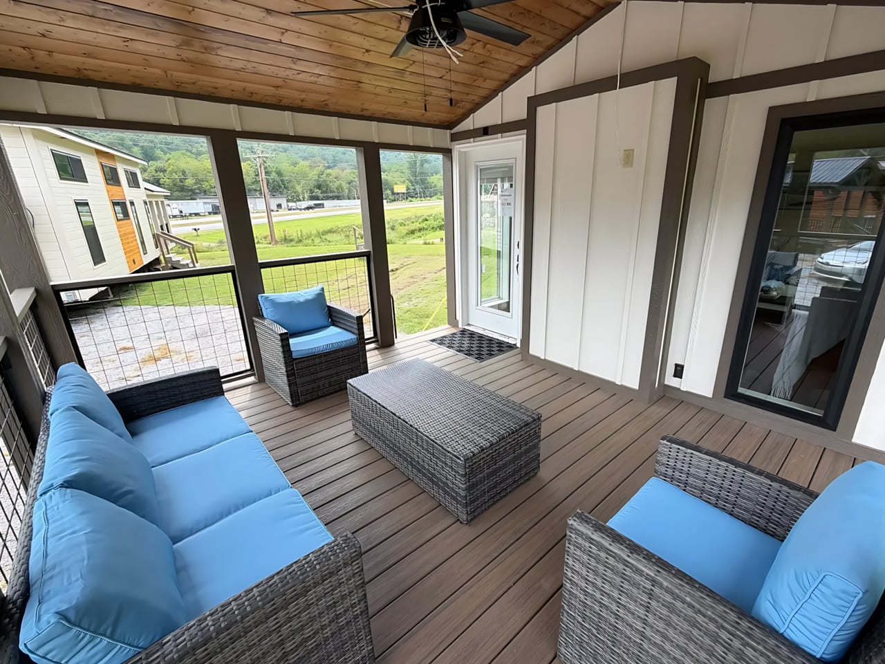
That porch spans the cabin’s width, sitting beneath the same gabled roof as the enclosed rooms. In the builder’s photographs, timber-toned posts and dark mesh railings frame an outdoor sofa and chairs. Trex composite decking is specified for the floor. Giving outdoor furniture its own sheltered zone means the indoor living room doesn’t have to accommodate every gathering when the weather cooperates.
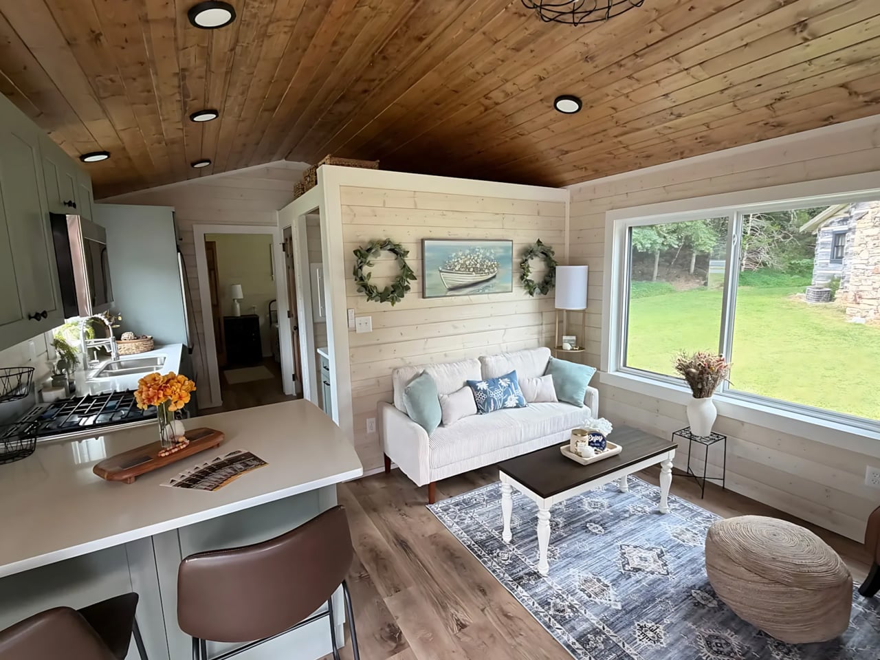
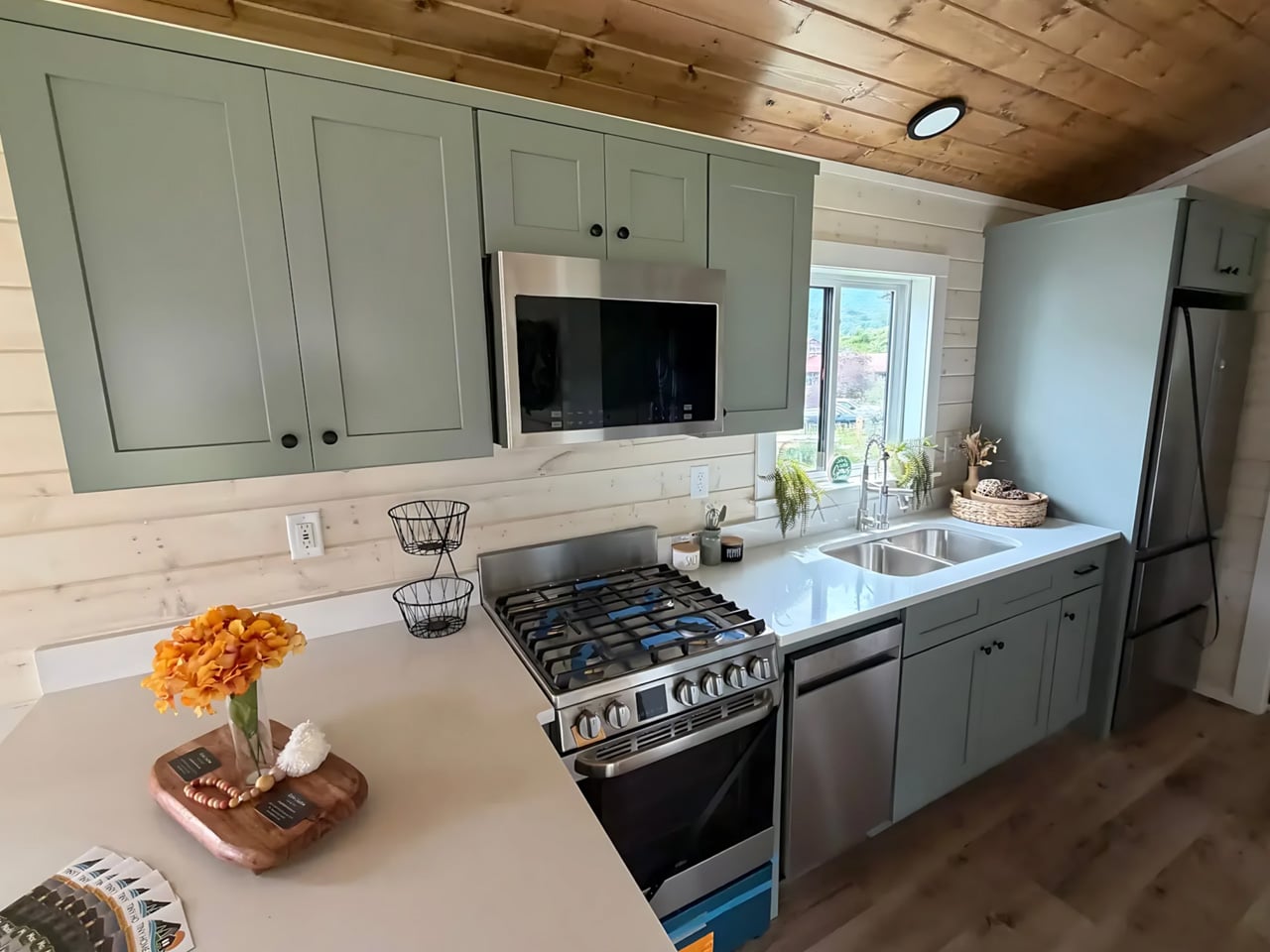
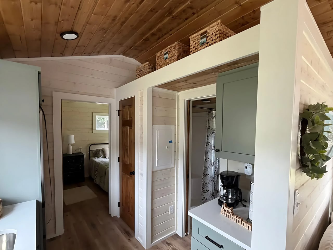
Inside, the photographed cabin has pale horizontal wall paneling, muted green cabinetry, and a wood ceiling that follows the roof’s pitch. The contrast gives the upper half of the room a stronger visual presence without covering every surface in dark timber. A breakfast counter provides seating beside the kitchen, leaving the opposite side available for a sofa, coffee table, and a large window.
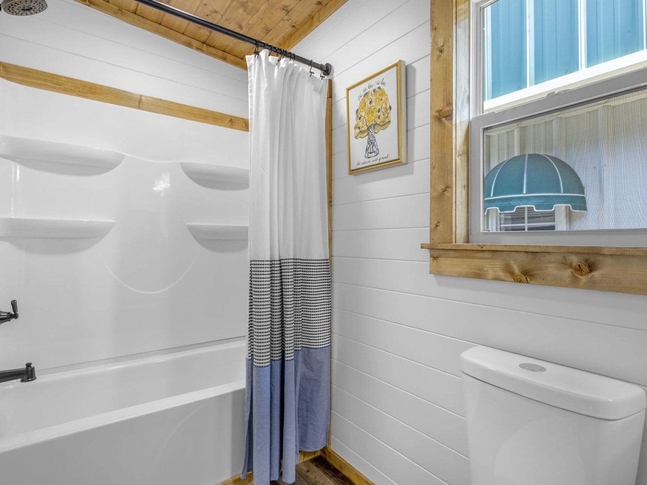
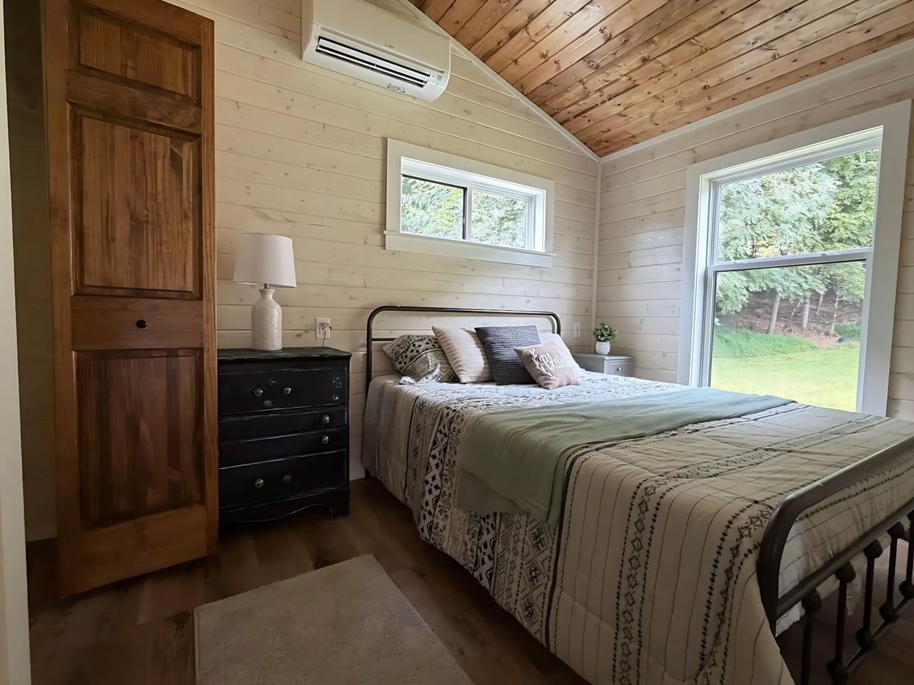
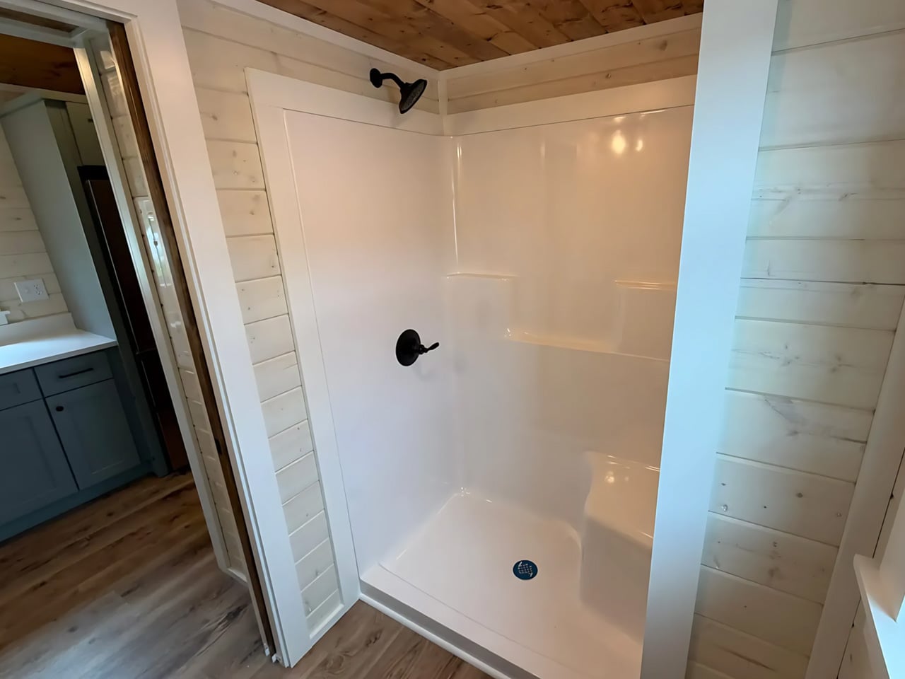
The published floor plan places the bedroom at the rear, beyond the kitchen, with the bathroom tucked alongside the route between them. A stacked washer and dryer occupy a dedicated position near the bedroom closet, while the bathroom includes a shower labeled 60 inches wide. A separate bedroom means going to bed doesn’t require converting the shared living area into a sleeping space each night.
Storage gets more attention than the footprint might suggest. Sweet-Haus lists a built-in pantry and two full closets, plus an electric fireplace feature wall with concealed storage. That last detail is particularly useful: a decorative focal point also earns its floor area by holding things. Custom soft-close cabinetry continues the approach, keeping everyday necessities behind doors rather than on display.
The construction package includes LP SmartSide siding, metal roofing, Low-E argon-filled windows, and a mini-split HVAC system. Buyers can choose finishes and explore upgrades, including a screened porch or built-in bed with nightstands. Those choices matter in a small cabin, where adding permanent furniture can settle the layout early. The photographs show one interpretation, rather than a fixed palette every buyer must accept.
The starting price covers the cabin, not a finished property. Delivery, setup, skirting, steps, and upgrades are separate charges, and Sweet-Haus says buyers must confirm local placement and occupancy rules for its park models. Land and utility preparation also need their own budget. Within those limits, the Wildflower’s most convincing decision is straightforward: it preserves a private bedroom, useful storage, and somewhere sheltered outside to sit, instead of making every activity compete for the same limited patch of indoor floor.
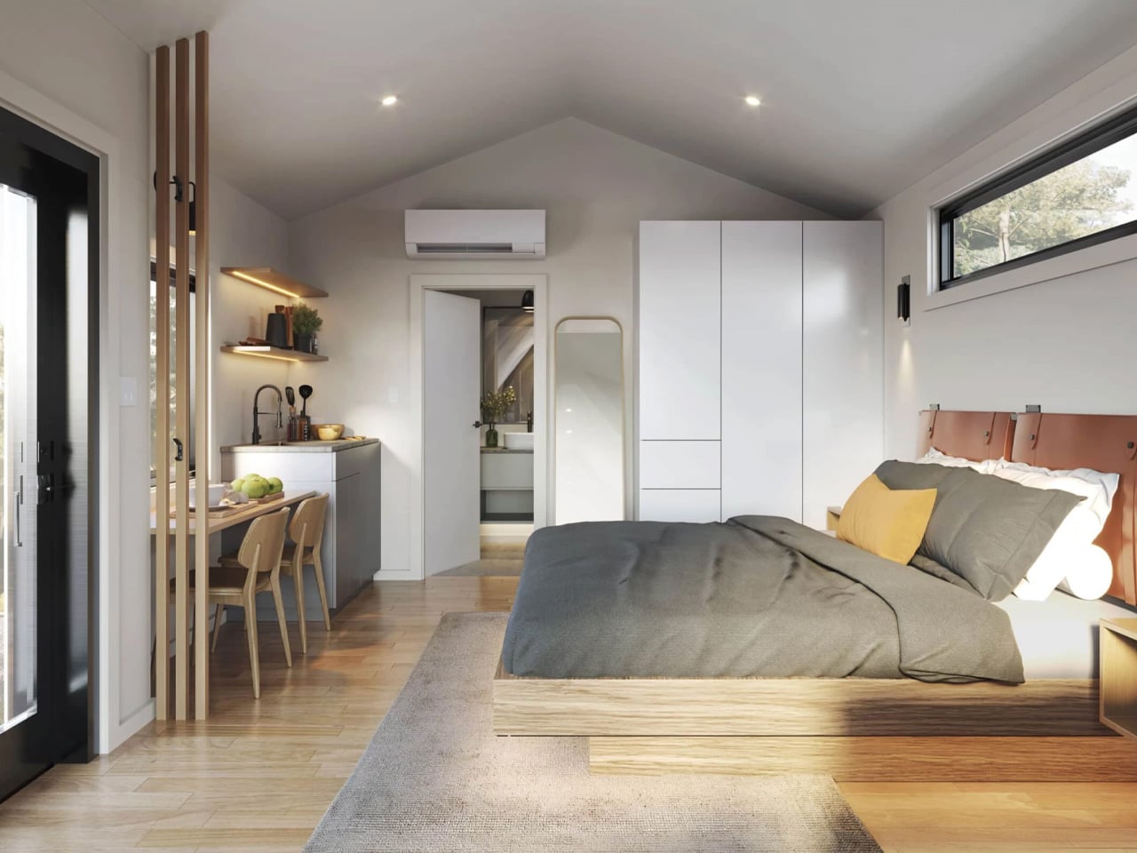
A king-size bed and a freestanding soaking tub are generous starting points for a 400-square-foot cabin. Zook Cabins’ A-Frame Studio makes both central to its layout, giving this compact retreat priorities closer to a hotel suite than a miniature family house. Designed for vacation getaways and short-term rentals, it’s an existing park-model product, with completed installations including one at Congaree and Penn in Jacksonville, Florida.
The floor plan keeps sleeping, cooking, and lounging together in one open room, with the bathroom enclosed at the opposite end from the glazed facade. There’s no loft ladder between the bed and a midnight bathroom trip. A sofa and chair occupy the window end, while the king-size bed sits farther back beside a wardrobe. Keeping those activities on one level avoids making daily circulation depend on climbing or rearranging furniture.
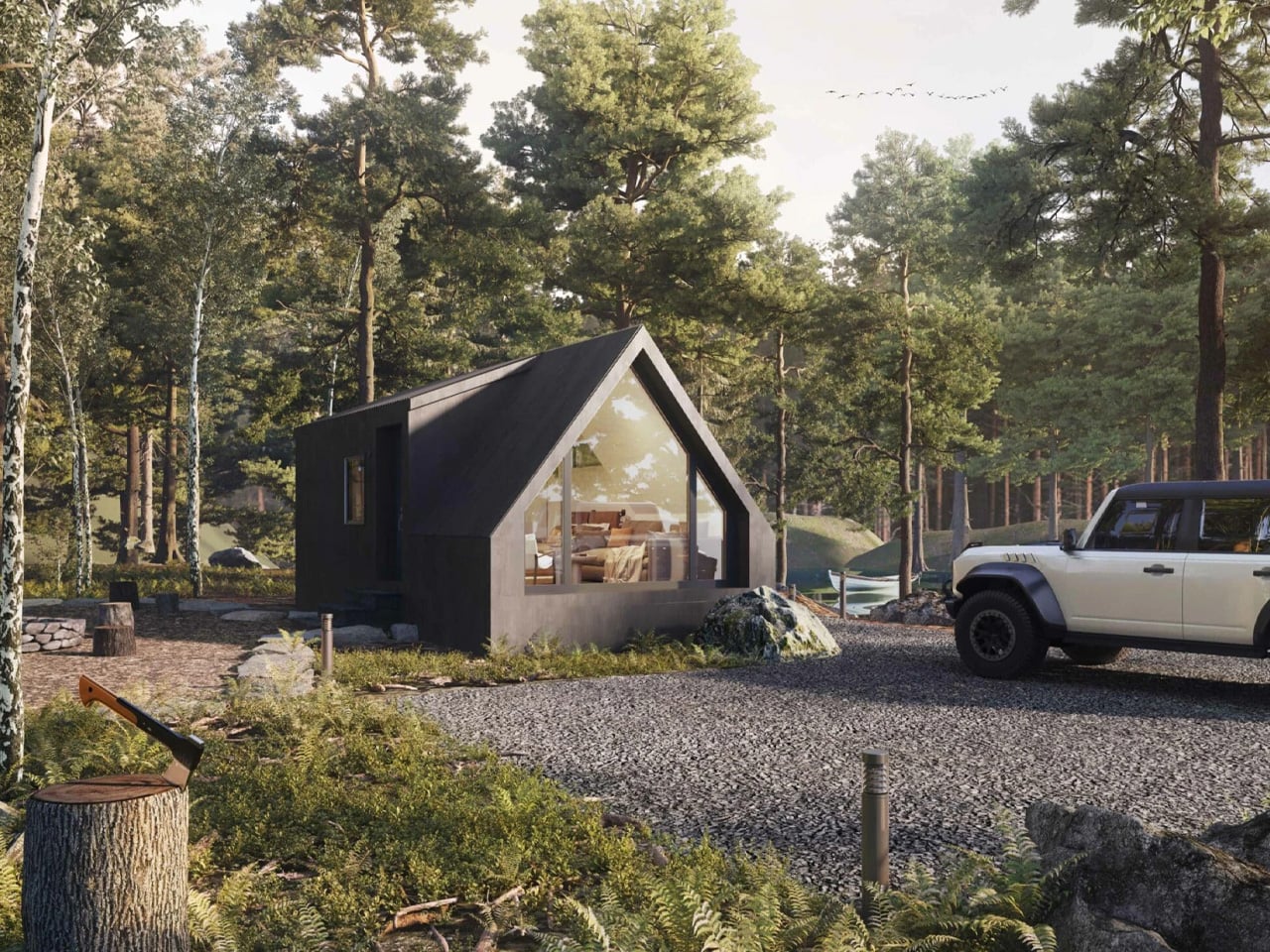
That arrangement also leaves a clear relationship between the sitting area and the large A-shaped window. In Zook’s published imagery, the glazing follows the pointed front profile, framed by a dark exterior. The cabin’s sides retain vertical walls beneath the roof, rather than carrying the slope down to the ground. Visually, it delivers the recognizable A-frame silhouette without turning the entire interior into a triangular tunnel.
The kitchenette stays compact, with an undercounter refrigerator, a two-burner electric cooktop, and a stainless steel sink set into a quartz countertop. Birch cabinetry has integrated bevel-edge handles, keeping projections off the cabinet fronts. Beside it, a built-in surface serves as either a desk or a dining table for two. Sharing that surface makes sense here: a separate workspace would compete directly with the open floor area around the bed.
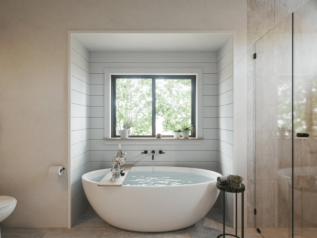
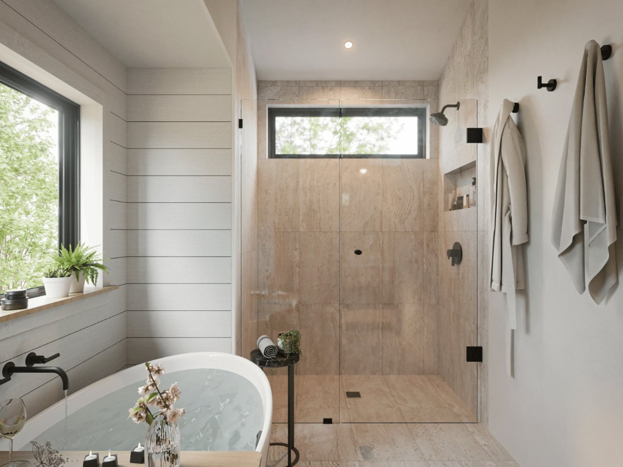
The bathroom receives an unusually substantial allocation of space. Zook’s published plan labels it at 80 square feet, accommodating a separate shower and tub rather than asking one fixture to perform both jobs. Specifications include a tiled curbless shower with a glass door, a 59-inch freestanding tub, and a wall-mounted vanity. It’s a deliberate tradeoff: more room for bathing means less space available for another enclosed sleeping area.
Its transportable construction still requires a prepared destination. Zook specifies a compacted gravel pad or concrete slab, along with electrical, water, and wastewater connections. The company distinguishes its park-model RV standards from local building-code compliance, so prospective owners need to establish what their site permits before ordering. Delivery doesn’t remove those responsibilities, and the cabin shouldn’t be mistaken for an off-grid shelter ready to occupy anywhere.
For a couple’s retreat, the layout’s restraint is its strongest quality. It spends limited space on a bed, somewhere to sit, and a bathroom worth lingering in, rather than maximizing the number of overnight occupants.
Tall, divided windows wrap around Leah’s living room, giving this small home the appearance of a glazed garden pavilion. Offered by Swedish builder Vagabond Haven, the modular design combines an open living area with a separate downstairs bedroom and a sleeping loft. The company’s illustrations show a cottage-like interior, with white paneling, pale wood tones, and space for conventional furniture.
Leah measures 12 meters long and 3.45 meters wide, with a stated living area of 52 square meters, approximately 560 square feet, including the loft. It accommodates four sleepers. This isn’t a towable retreat: its timber structure sits on a steel chassis without wheels, and transportation requires a low-bed truck and crane. Choosing a site means planning for that delivery.
The exterior uses vertical Thermopine siding beneath a steel-sheet roof. Vagabond Haven specifies 20 centimeters of mineral wool insulation in the walls and roof, alongside triple-glazed windows. Visually, the most consequential decision is concentrating the largest windows around the living area. That treatment gives the shared space a distinct identity, while smaller openings punctuate the more private rooms.
Inside, the illustrated kitchen follows an L-shaped arrangement, with a sink beneath a window and cabinetry extending around the corner. A freestanding dining table seats four beside the tall glazing. Keeping the table separate from the counter provides a dedicated eating surface, though it also occupies circulation space. Appliances and furnishings are configurable, so the pictured arrangement shouldn’t be mistaken for the base specification.
A corridor connects the communal area to the bathroom and main bedroom at the opposite end. That separation is useful: the bed doesn’t have to share the same open room as dinner, television, or visitors. The bedroom illustration includes a double bed, wardrobes, shelving, and a desk. Crucially, the primary sleeping space is downstairs, making the staircase optional for an owner’s nightly routine.
Upstairs, the loft is reached by stairs with integrated cabinets. The illustrated arrangement places a low bed beneath the pitched ceiling, with a desk nearby. Headroom remains the compromise here, particularly toward the roof edges. Roof windows are optional. Downstairs, bathroom choices include a glazed shower, washing machine provision, and flushing, composting, or incinerating toilets.
Leah costs approximately $66,300 unfurnished, $77,500 fully furnished, or $93,100 fully off-grid, excluding VAT. Those distinctions matter when budgeting: the lowest figure isn’t the illustrated, equipped interior. Leah’s strongest spatial choice is giving everyday living and the main bedroom proper downstairs rooms, while reserving the low-ceilinged loft for whoever actually wants to climb upstairs.
The Helena makes a straightforward case for keeping a tiny home on one floor: both bedrooms are reached through ordinary doors, with no loft ladder involved. Offered by Swedish manufacturer Vagabond Haven, this configurable modular home provides 45 square meters, roughly 484 square feet, of living space. Its layout gives sleeping, cooking, and relaxing their own clearly defined places.
Measuring 9.2 meters long and 5.98 meters wide, Helena occupies a broader footprint than its compact appearance might suggest. There are no wheels underneath its steel base. Delivery requires a low bed truck and a crane, and the house needs a foundation. That makes it a home to settle into, rather than something to hitch up for a weekend away.
Vagabond Haven’s illustrations show pale vertical timber siding beneath a shallow pitched metal roof. Large glazed sections punctuate the facade, while a proposed terrace wraps around the exterior. The relatively plain rear elevation makes the contrast noticeable: Helena directs its biggest openings toward the outdoor living areas. The images are illustrative, so finishes and details can vary with the order.
Inside, the floor plan divides the house into a shared living zone and two enclosed bedrooms. The bathroom sits between the lounge and primary bedroom, while the entrance opens beside the smaller bedroom. This arrangement keeps the lounge out of the main arrival route. A dining table occupies the glazed corner near the kitchen, giving meals a dedicated spot without introducing another room.
The kitchen follows an L-shaped arrangement, with cabinetry defining its edge rather than a separate partition. Buyers can specify induction or gas cooking, an oven, a built-in dishwasher, and a tall integrated refrigerator. These are configuration choices, not equipment to assume comes with the starting price. The illustrated dining setup seats four, despite the home’s stated three sleeping places.
The primary bedroom accommodates a double bed, with optional lifting frames offering storage beneath the mattress. The smaller room can combine a single bed with a desk and wardrobe, making its footprint useful beyond sleeping hours. Bathroom choices include a glazed corner shower, washing machine provision, and several toilet systems. Underfloor heating is optional too, rather than a standard inclusion.
Vagabond Haven lists mineral wool insulation measuring 20 centimeters in the walls and 25 centimeters in the roof, alongside triple glazing. Helena starts at approximately US$91,200 unfurnished, rising to US$102,400 fully furnished or US$117,500 for the off-grid version, all excluding VAT. Helena’s appeal rests in its allocation of space: two private bedrooms without sacrificing the ground-floor living area. The cost is a wider, permanently sited footprint.
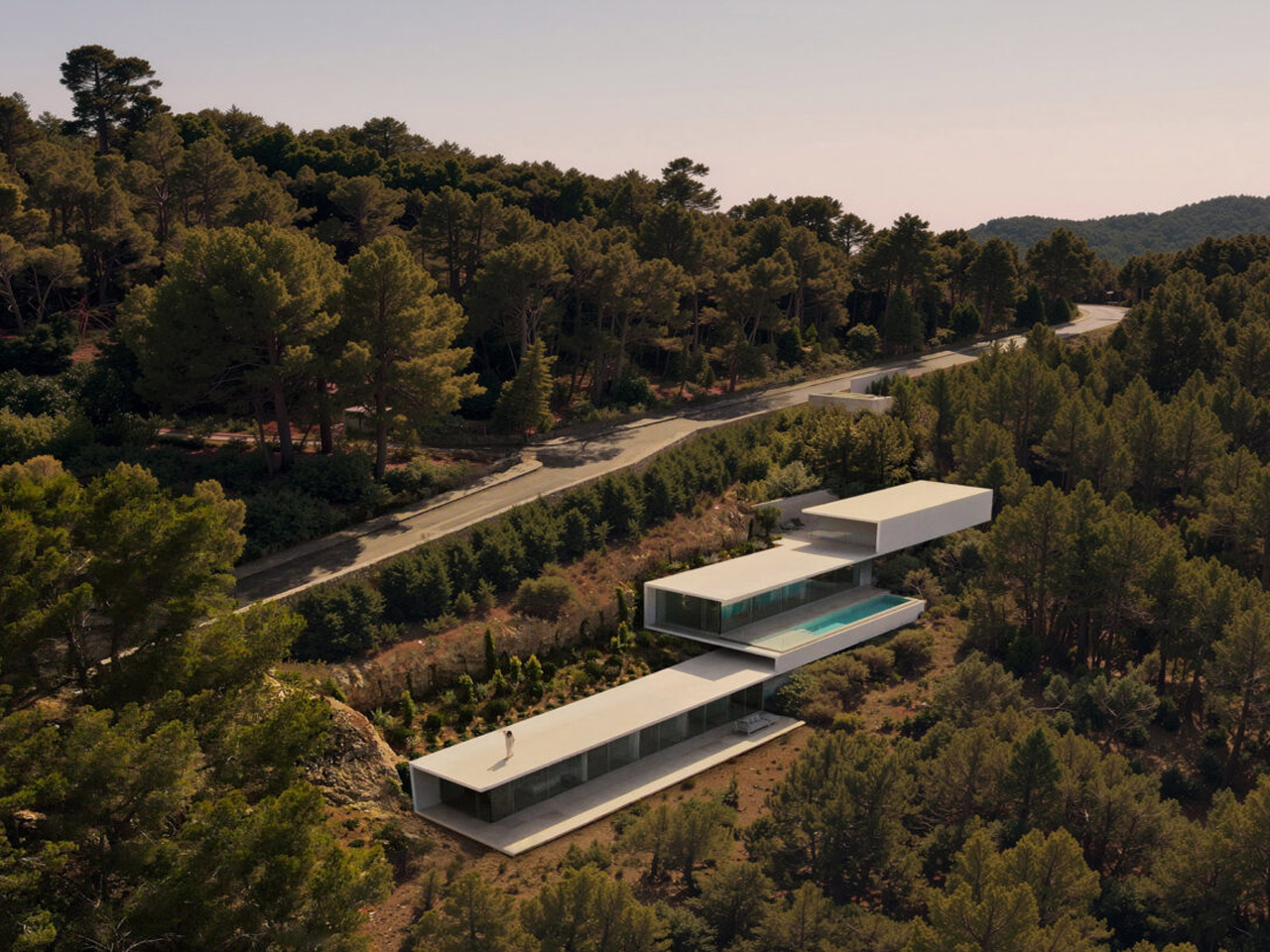
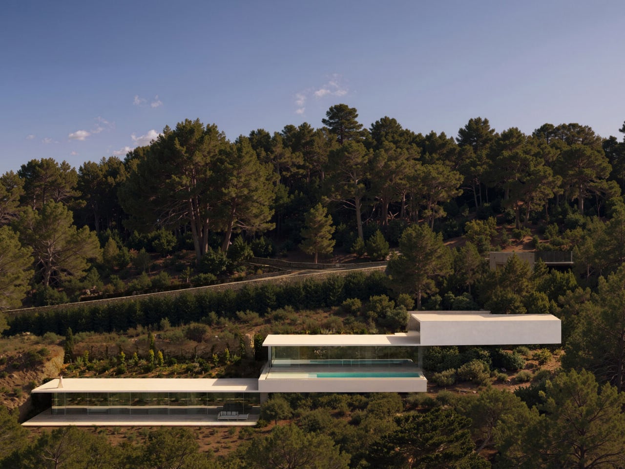
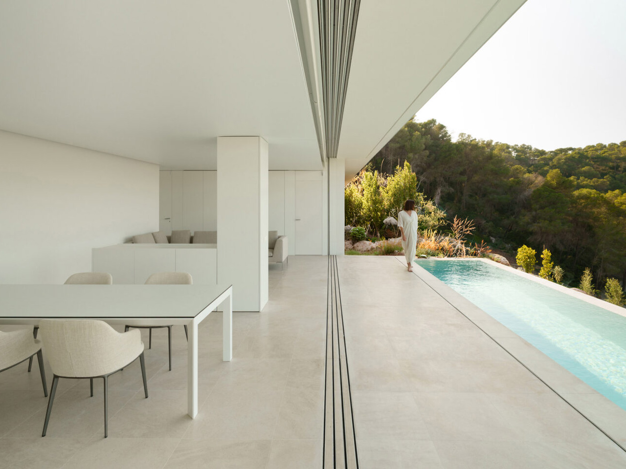
Bellavista 11 makes a hillside feel like the starting point of a home rather than a problem to solve. Designed by Fran Silvestre Arquitectos in Roca Llisa, Ibiza, the villa descends toward the Mediterranean through a sequence of white horizontal planes. Its most striking feature is not its size or its pool, but the way its roofs, floors, and terraces appear to belong to one continuous architectural gesture.
The house is the first completed residence in The Roca Views, a development of six homes by the studio. Across three low volumes, the arrangement follows the slope: arrival and garage at the top, shared living spaces in the middle, and five bedrooms below. This descending organization gives the building a legible rhythm, breaking its mass into layers rather than presenting one tall facade to the hillside.
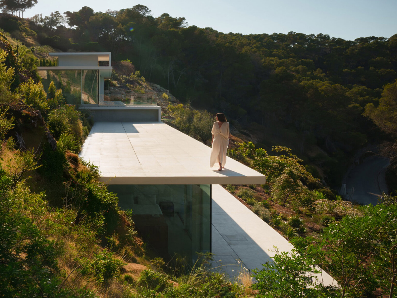
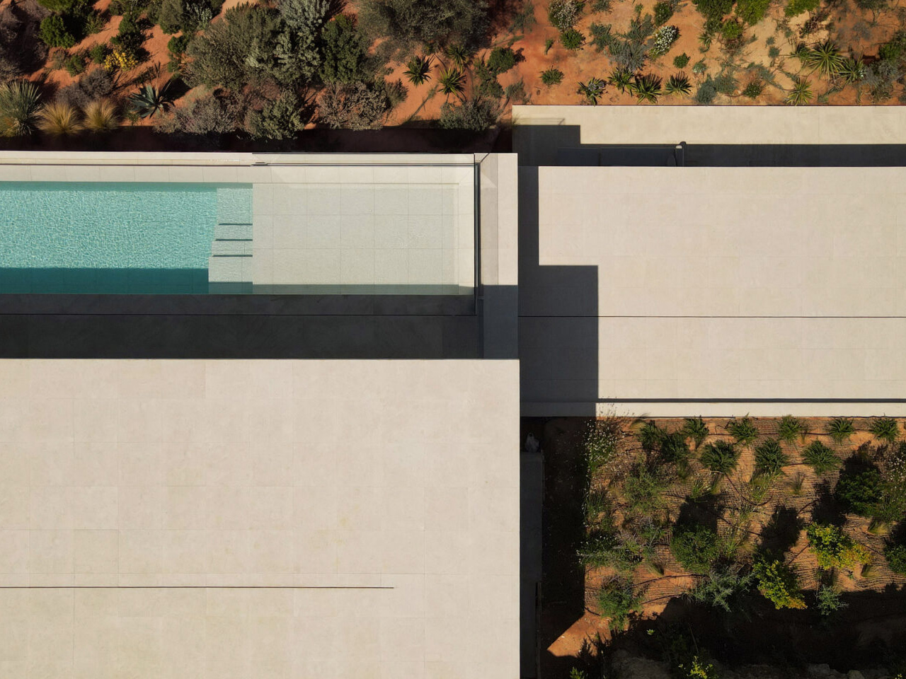
The defining white concrete plane is just 15 centimeters thick, approximately six inches. Its folds establish roof terraces above the lower volumes and extend outward to shelter outdoor areas. The appeal lies in this double duty: the geometry that gives the villa its identity also helps organize daily life around sun, shade, and time outside.
The central living level brings the kitchen, dining area, and lounge together beside the swimming pool. Full-height sliding glass doors use slender frames and concealed tracks to keep the threshold visually quiet. Open, they connect the rooms to their terraces; closed, they retain the expansive outlook. Below, the bedroom volume faces another outdoor seating area, giving the quieter part of the house its own relationship with the surrounding landscape.
Inside, the material palette softens the precision of the exterior. White walls sit alongside natural stone flooring, oak, and stretched textile ceilings, as detailed by the developer. These surfaces give sunlight different textures to move across, allowing warmth without relying on a busy mix of finishes. In the main bedroom, a private terrace extends the room outward, while motorized curtains offer control over daylight and privacy.
There is a practical counterpoint to all this apparent effortlessness: a house arranged down a slope moves to levels part of everyday living. The developer lists an elevator among the villa’s features, an important detail within such a strongly stepped plan. The project is therefore more interesting as a carefully organized hillside home than as an image of minimalism alone.
Bellavista 11 works best when its sculptural clarity is understood through those ordinary experiences: arriving, descending, opening a door, or finding shade beside the pool. The white planes provide a consistent frame, but the changing Mediterranean light and distant sea supply the variation. Its restraint gives the landscape room to remain the most compelling presence in the house every day.
An empty vase can make a shelf look oddly unfinished, as though the flowers were supposed to do all the decorating. Aleksander Kozera’s Neo-Brutalist Vases offer a convincing way around that small domestic problem. Created under his Warsaw-based Yird Ceramics brand, these ceramic vessels have enough architectural detail to hold attention on their own. I’d be inclined to leave them empty before deciding what, if anything, belongs inside.
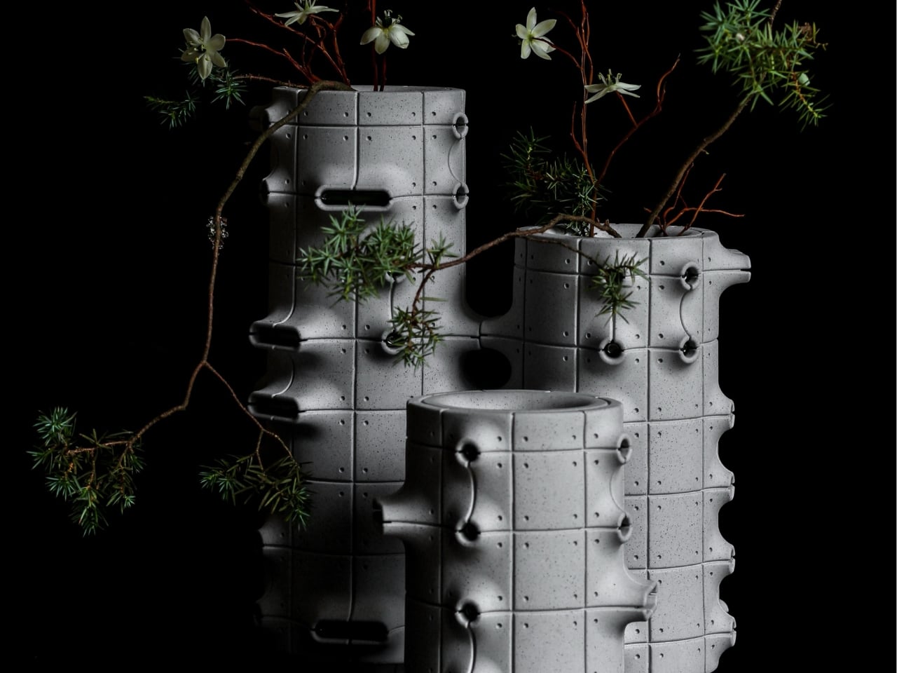
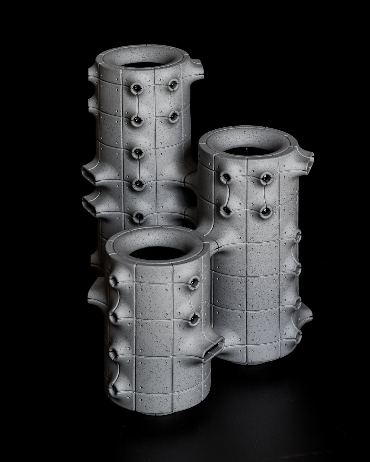
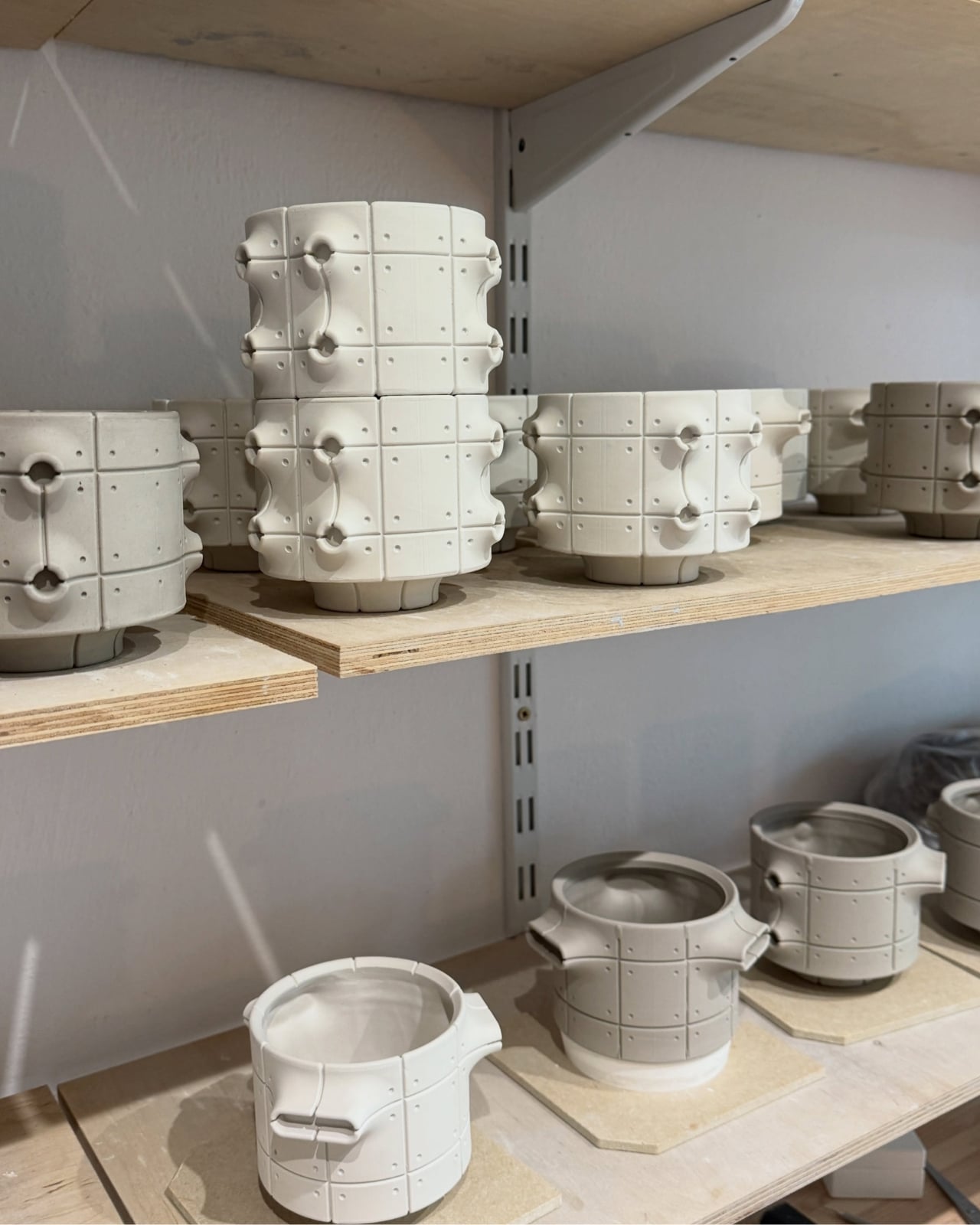
Their cylindrical bodies are divided into rectangular panels, with tiny indentations that suggest construction details on a concrete facade. Circular recesses interrupt that grid, while curved projections extend from the sides like abbreviated balconies or exposed joints. The effect lands somewhere between an architectural model and a piece of science-fiction set dressing. They look a little like infrastructure for a very small, very design-conscious civilization, which is part of their appeal.
The concrete resemblance comes from the ceramic body itself. According to the collection’s Łódź Design Festival description, Kozera uses porcelain casting slip with ceramic pigments and black grog to produce that raw, concrete-like finish. In the close-up photographs, dark speckles break up the gray surface. That texture matters visually: without it, the panel lines and repeated circles could read as a smooth plastic prop. Instead, the surface gives the geometry some grit.
The modular approach also makes the collection more interesting than a row of differently sized cylinders. The festival describes vessels that can be combined and arranged into larger compositions. In the photographs, neighboring forms create narrow gaps, overlapping projections, and changing silhouettes. I like the possibility of treating a shelf as a small architectural composition rather than lining up three matching accessories. The vessels share a vocabulary without looking identical from every angle.
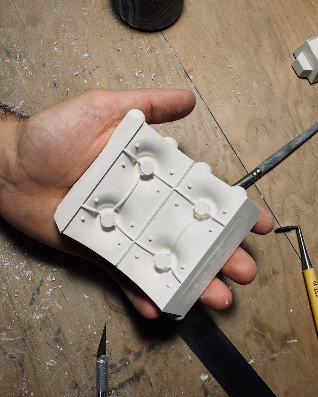
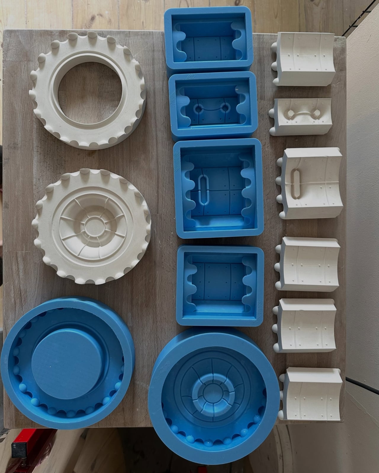
Kozera’s broader studio process helps explain that controlled repetition. He describes beginning with digital modeling, then 3D-printing master forms used to make plaster molds for slip-casting porcelain. That’s a useful distinction for anyone assuming these are printed plastic objects or directly printed ceramics. Digital tools establish the geometry, while casting translates it into ceramic. The workshop photographs make that relationship tangible, showing shaped components and molds alongside vessels at different stages of production.
The finish introduces another layer of detail. The collection description specifies a translucent green glaze, with the small exterior “windows” individually glazed by hand. The green is restrained enough that the photographed pieces still read predominantly as gray architectural objects. I prefer that decision to an all-over glossy finish. Small glazed areas give the eye somewhere to pause without obscuring the panel divisions or competing with the speckled body.
Flowers change the balance considerably. In the styled photograph, branching stems stretch above and across the vessels, disrupting all those disciplined horizontal and vertical lines. The arrangement is sparse enough that the ceramic remains visible, which seems the right approach. A dense supermarket bouquet might conceal much of the detail that makes these worth looking at. A few irregular branches would let the architecture and the plant material each have some breathing room.
My reservation is mostly about where they would live. These are visually busy objects, even with their limited palette. On a shelf already crowded with books, collectibles, and patterned ceramics, the small recesses and projecting edges could get lost. I’d give one a relatively clear stretch of console or place a group against a plain wall. That’s a styling preference, but the design rewards enough space to read its silhouette.
These are physical ceramic works rather than render-only proposals, and the collection is listed as selected for the make me! 2026 exhibition at Łódź Design Festival. That listing does not establish retail pricing or US availability, so it shouldn’t be mistaken for a confirmed shopping announcement.
For me, the strongest choice is the attention given to the sides of each vessel. Turn one, and the relationship between grid, recess, and projection changes. That gives the object a reason to stay on display after the stems are gone, without asking an empty vase to pretend it’s waiting for its next assignment.
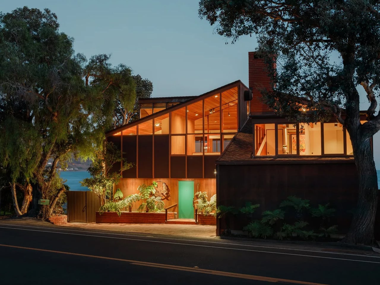
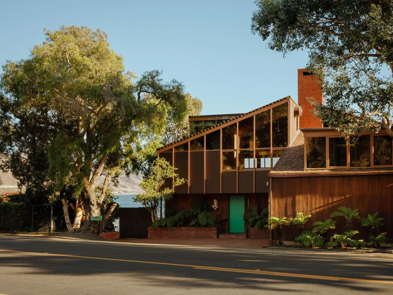
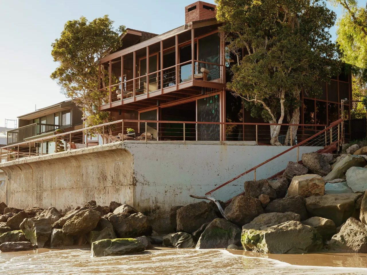
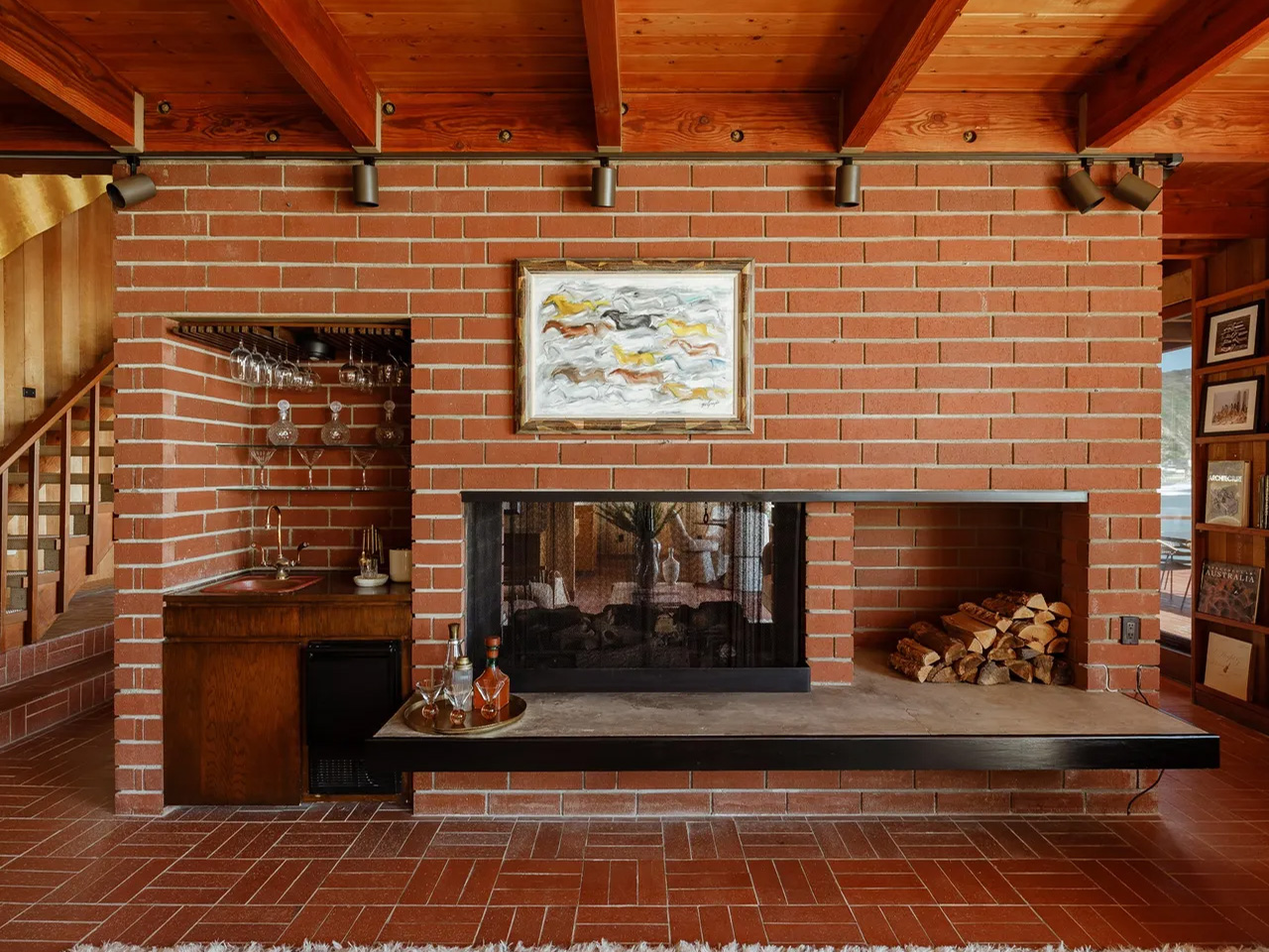
A substantial brick chimney rises through the center of Carl Maston’s Ventura beach house, giving the oceanfront home a surprisingly grounded heart. Completed in 1984, the Susman House sits above a sandy cove at Faria Beach, with views toward the Channel Islands. Its original brief was appealingly specific: preserve the spirit of a traditional California cabin within a contemporary home.
That request came from Tracy “Babs” Susman, who commissioned the house with her partner on land previously owned by her sister and brother-in-law. Maston answered with cedar siding, brick floors, generous glazing, and a roofline that creates a distinctive silhouette. The materials carry the cabin connection without making the house feel like an exercise in rustic nostalgia.
Design: Carl Maston
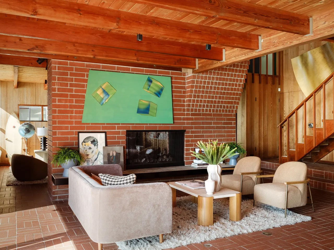
Across 2,640 square feet, the layout gives shared spaces a clear relationship to both the fireplace and the coastline. An informal lounge connects with the dining area and kitchen, while a double-sided fireplace also serves a den. A full bathroom sits behind a cedar wall. These divisions give the lower floor distinct places to settle without separating every activity into an enclosed room.
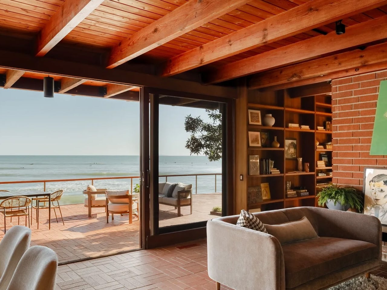
The living-room photographs reveal how much work the material palette does. Exposed timber beams establish a steady rhythm overhead, while brick flooring extends around the broad hearth. Wood paneling and shelving reinforce the sense of enclosure. Against that textured interior, the glazed openings become especially legible: they frame the coast while leaving plenty of solid, tactile surfaces around the seating area.
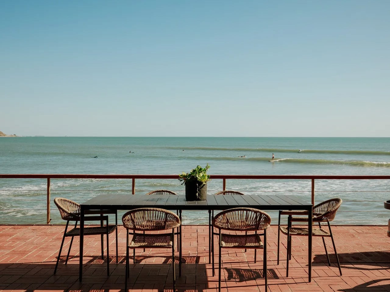
Floor-to-ceiling sliding doors open toward the ocean, and the brick paving continues onto the patio. Carrying the floor material outside gives the terrace a direct visual relationship with the rooms behind it. The kitchen keeps its own character through an original wood-slat ceiling, with a view of the bay available from the sink. Even the more ordinary household tasks have a place along the waterfront.
Upstairs, three bedrooms and a separate sitting area occupy the spaces beneath the sloping roof. A central atrium and landing wrap around the brick chimney, with internal glazing allowing light to reach deeper into the house. Rather than treating circulation as leftover space, Maston makes the route between rooms part of the architectural experience, linking the upper level visually with the living area below.
Photographs show timber-framed internal windows beside the chimney, their angular tops following the roof. That arrangement makes the building’s geometry readable from within. The house is currently listed for $5.1 million, and its selling appeal extends beyond the waterfront address. Maston gave the interior enough substance to hold attention even when the ocean is outside the frame.
They say AI will steal our jobs. Whoever trims that stubborn strip of grass along the lawn’s edge seems to have excellent job security. We’ve got robots driving around gardens, mapping their surroundings, and keeping the grass neatly cut, yet the border still has a habit of becoming someone’s weekend assignment. Personally, that’s a job I’d be delighted to hand over.
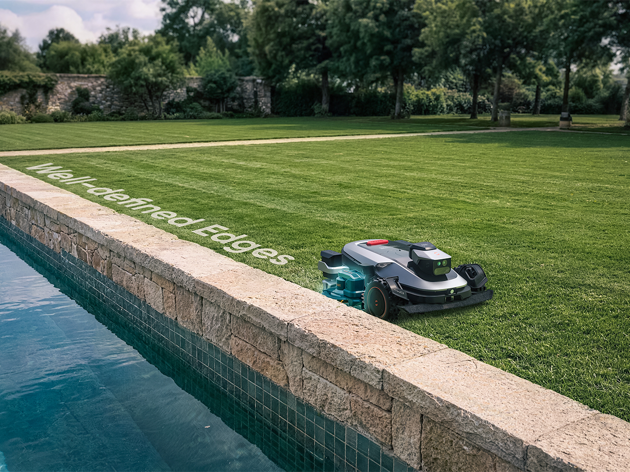
Sunseeker’s upcoming X8 Plus looks eager to apply. Its EdgeZero 2.0 trimming system targets a zero-inch edge gap, according to the company, putting that leftover strip squarely on the agenda. Set for a preview at Equip Expo 2026, the robotic mower also brings solid-state LiDAR, stereo vision, and network-assisted satellite positioning. An impressive résumé, although the edge-cutting hardware is what makes me want to schedule the interview.
A mower can follow a boundary accurately and still leave grass behind if its blades cannot reach it. Knowing where the border is and cutting right up to it are separate assignments. Sunseeker describes EdgeZero 2.0 as its answer to the second one, though the announcement leaves the mechanism’s finer details unexplained. That’s the part I’d want a closer look at: how the trimming tool reaches the border while the mower’s body stays clear. A clean pass beside a raised edge would tell a useful story.
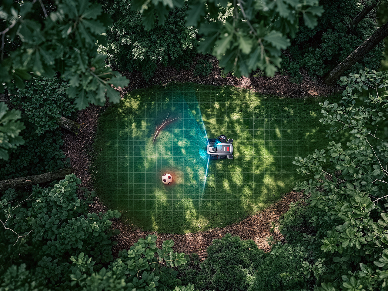
Getting into position is its own engineering task. The X8 Plus uses nRTK, a form of satellite positioning that draws correction data from a network of reference stations. In plain English, those corrections help tighten up the machine’s estimate of where it is. Sunseeker combines that positioning with solid-state LiDAR and stereo vision, giving the mower several sources of information as it navigates. Your garden may look peaceful from the patio; the robot has quite a bit to figure out down there.
Sharing the Lawn With the Locals
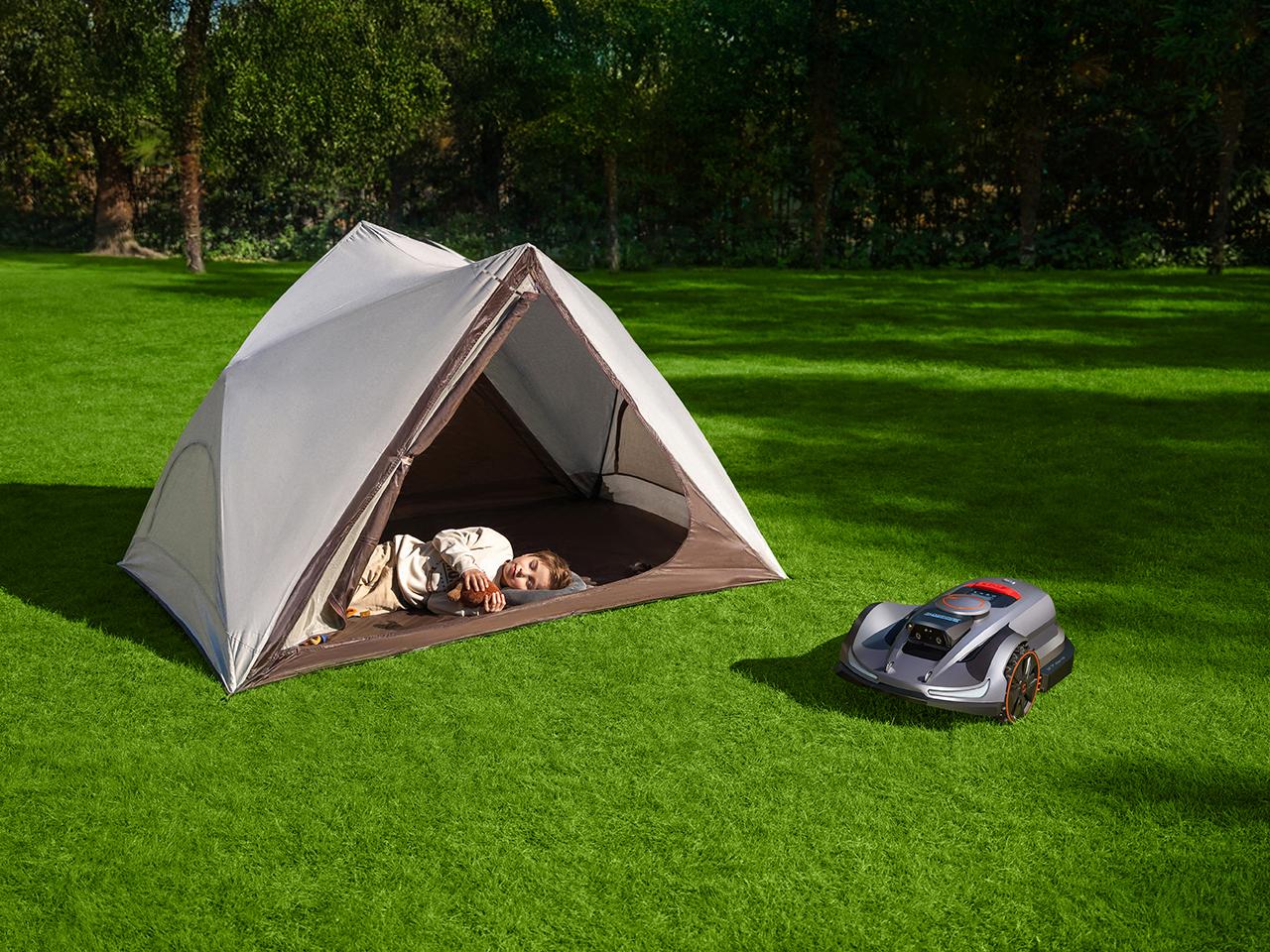
There’s an infrared camera in the mix, too, which Sunseeker says supports animal-friendly operation. That’s a worthwhile consideration for a machine sharing outdoor space with creatures that have never checked its mowing schedule. The announcement doesn’t establish exactly how the system identifies or responds to different animals, so I’d keep the promise modest for now. Still, accounting for the lawn’s other residents belongs in the design brief. The grass might stay put, but everything passing through it gets a vote in how smoothly an autonomous mower’s afternoon goes.
Sunseeker Elite already explores that relationship between sensing and physical movement in its existing X7 Gen 2 and X7 Plus Gen 2. Those models combine satellite positioning with visual mapping, while all-wheel drive and floating dual cutting discs address traction and uneven ground. That provides useful context for the X8 Plus: software has to work with wheels, blades, and the shape of the property. I like that the new preview brings attention back to the finishing work. A mower’s route can look beautifully organized on an app, but the result still gets judged from the garden chair.
A Closer Look at Equip Expo 2026
Equip Expo should provide a closer look at Sunseeker’s approach. The show runs October 20-23, 2026, at the Kentucky Exposition Center in Louisville, Kentucky, with Sunseeker at Indoor Booth #1190 and Outdoor Booth #7460D. The company plans an interactive mower-vision experience, letting visitors see imagery from a machine’s perspective, alongside outdoor slope demonstrations. Seeing what a mower perceives could make that long sensor list considerably easier to understand.
Pricing and retail availability for the X8 Plus aren’t specified in the announcement, so the zero-inch edge target remains a reason to watch its development rather than retire the trimmer immediately. For me, though, it’s a persuasive direction to pursue. Finishing the borders would remove a very specific reason for a person to follow the robot outside and pick up another tool. If Sunseeker can make that work reliably, I’m perfectly comfortable with this particular job disappearing. The person who used to do it can have Saturday morning back.
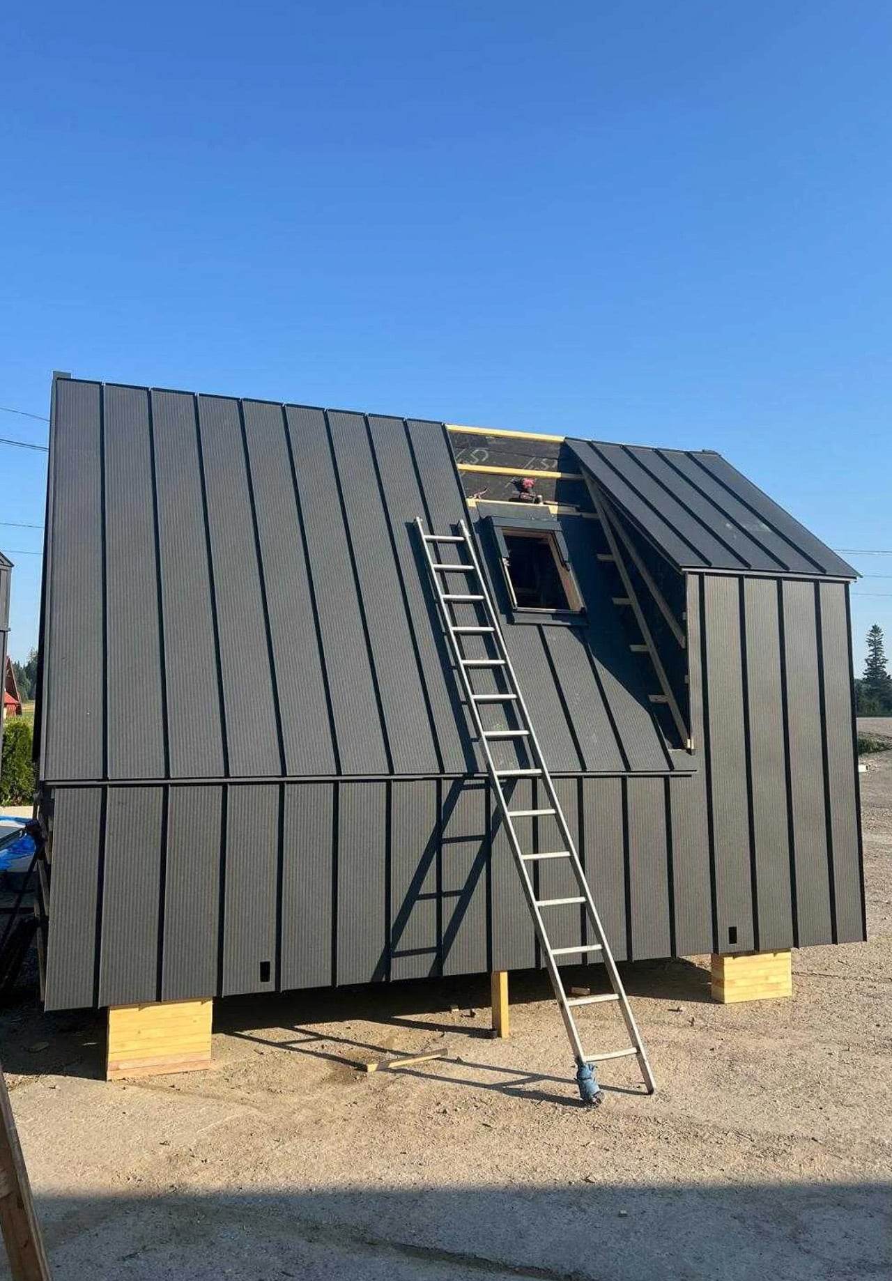
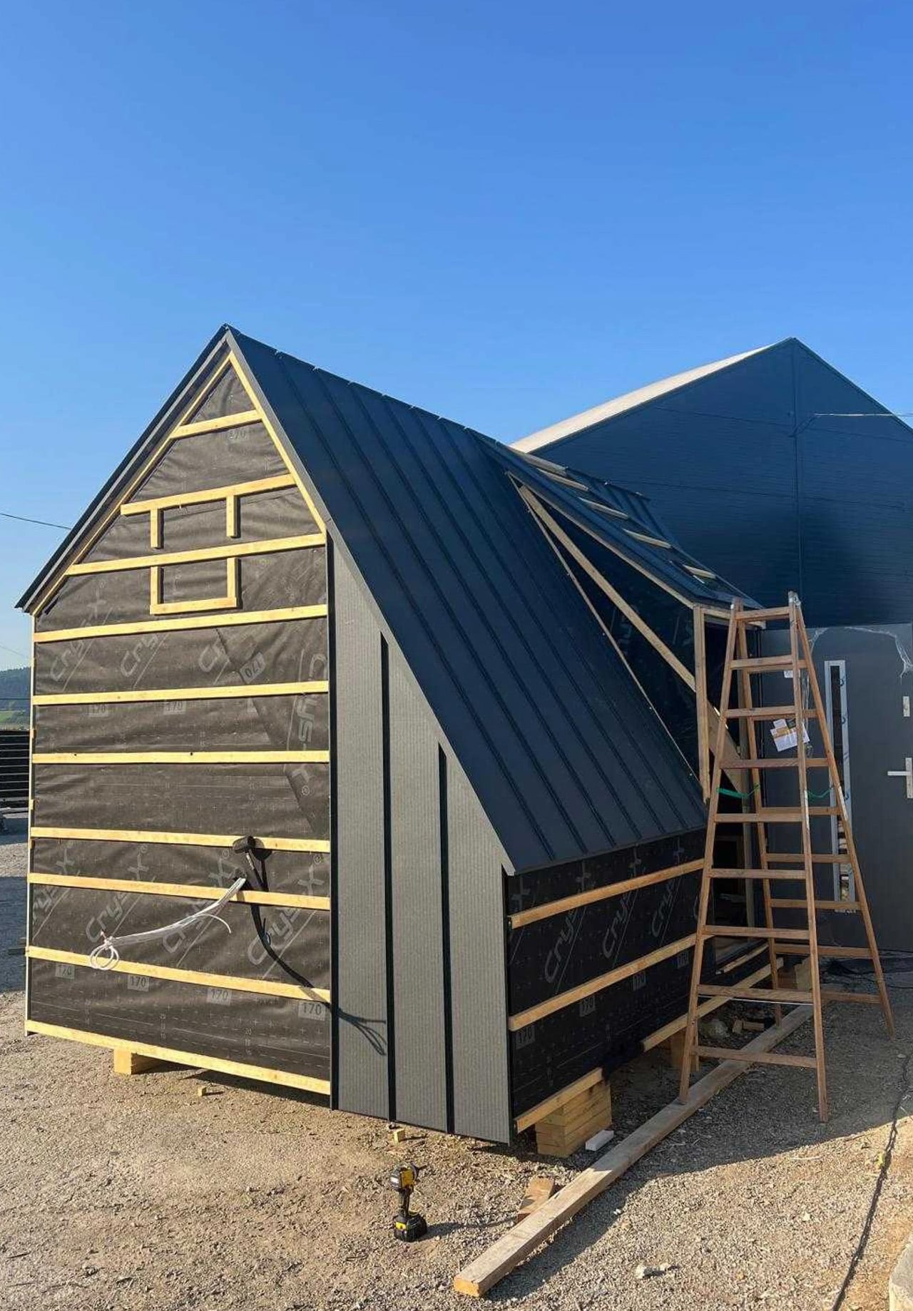
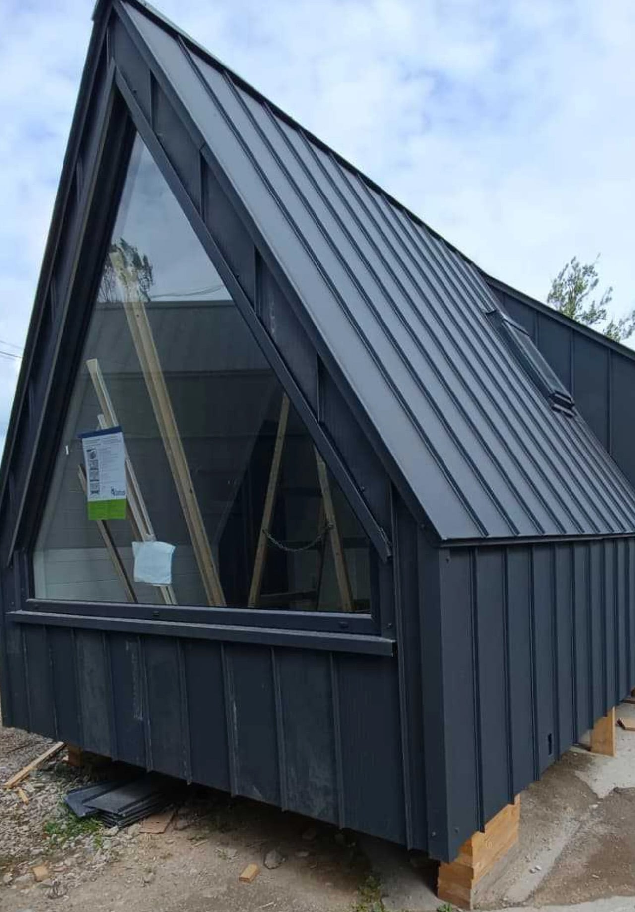
A large triangular window fills one end of the Mini Brda With Bay Window, giving this compact cabin a generous outlook. The entrance sits on the side, beneath its own projecting roof section, leaving the glazed end uninterrupted. Offered by Polish company Mini Domy, the design keeps its distinctive A-frame silhouette while making room for more than a bed beneath a pitched roof.
The model’s specification lists dimensions of 4.51 by 3.2 meters, giving it a footprint of approximately 155 square feet. Dark metal cladding covers the exterior, with pronounced seams emphasizing the steep roof. Those angled surfaces give the cabin its character, although they also make furnishing the edges less straightforward than arranging a conventional rectangular room.
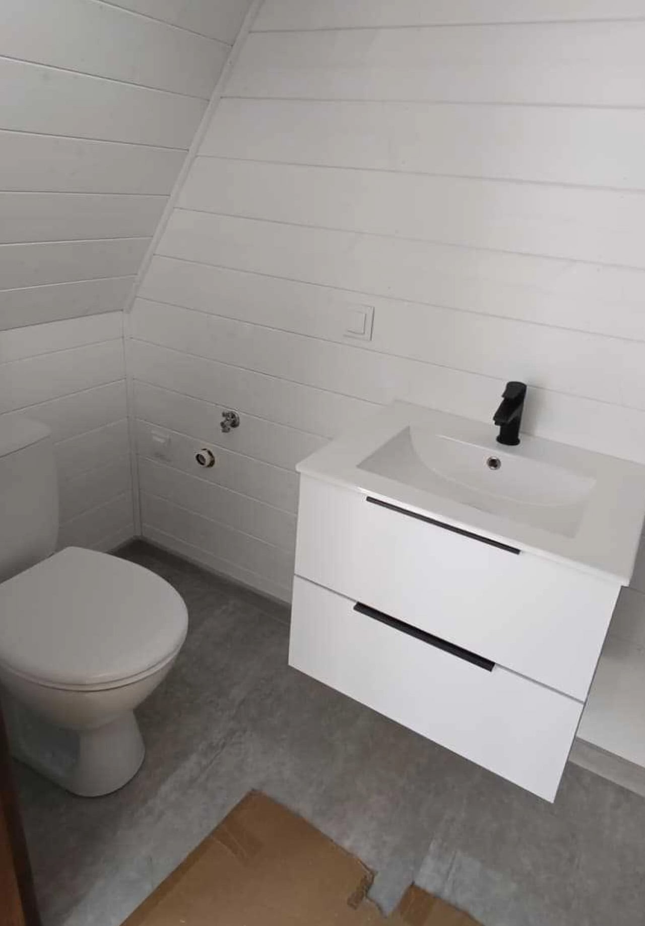
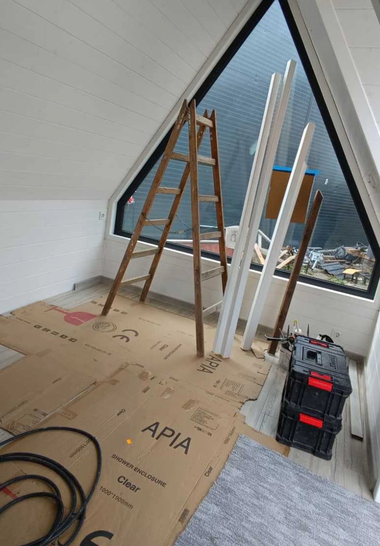
Inside, white-painted tongue-and-groove paneling follows the roof slopes, making the geometry visible rather than concealing it behind a flat ceiling. Wood-look flooring introduces a contrasting tone underfoot. Published photographs show the cabin before furnishing is complete, so the interior is best understood through a combination of construction images and the proposed layout.
Most of the accommodation occupies one shared room, combining cooking, lounging, and sleeping. A planned bed doubles as daytime seating, avoiding the floor-space demands of a separate sofa. There’s no sleeping loft or ladder to negotiate. The compromise is privacy: beyond the bathroom, daily activities share the same compact space, with little separation between preparing breakfast and making the bed.
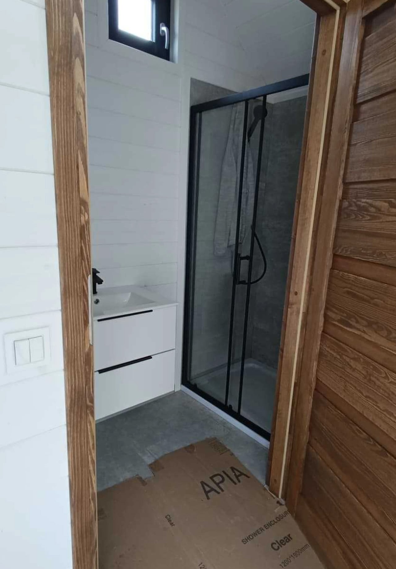
The kitchen specification is modest but useful, listing cabinetry, a sink, and a camping-style stove. That suggests simple holiday cooking rather than an apartment kitchen shrunk to fit. The separate bathroom includes a shower, basin, toilet, and water heater. Photographs show a wall-mounted vanity with drawers, providing storage without taking the cabinet all the way down to the floor.
Mini Domy’s offer specifies 10 centimeters of mineral-wool insulation, double-glazed windows, and air conditioning with a heating function. These are meaningful provisions for a small cabin, but they aren’t enough to establish comfort in every climate. The company itself qualifies year-round use on the broader Mini Brda page with the need for appropriate insulation and heating.
A dedicated trailer is optional rather than integral to the version pictured. The downloadable offer lists the cabin at US$15,000, though it also gives the quotation a two-month validity period without a visible issue date. Buyers should confirm current pricing, equipment, transport, and installation directly rather than treating that figure as a complete project budget. As a weekend retreat, the arrangement makes sense: keep the bathroom enclosed, let furniture do double duty, and reserve the glazed end for the view. Longer stays would make the shared room’s limits harder to ignore.
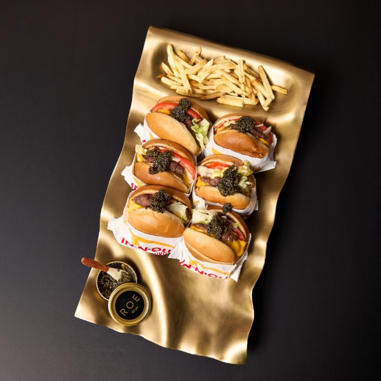
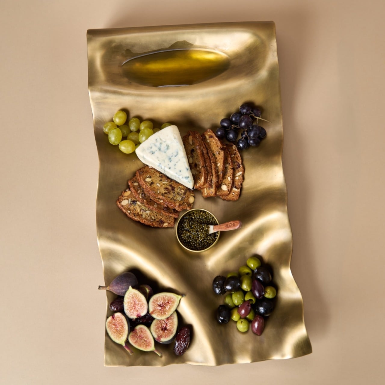
Six burgers, a pile of fries, and generous spoonfuls of caviar are a pretty good way to explain dumæ’s Masa Tray. In the brand’s photographs, the food sits on a rippling brass surface that looks more like a small sculpture than standard serving ware. I like the slightly ridiculous pairing. It also makes the tray’s purpose clear: give dinner a visually interesting home without adding a separate decorative centerpiece.
Designed by Los Angeles brand dumæ and handcrafted in India, Masa addresses that familiar divide between the serving pieces you use and the decorative objects you leave out. Its project description says the brass tray is finished to be food-safe, allowing it to move between both roles. The appeal is having one substantial object that doesn’t need to disappear when everyone finishes eating.
Designer: dumæ
The starting point is the movement of waves, translated into broad rises and shallow dips rather than a literal seashell outline. IADA’s announcement traces the reference to Point Dume, the stretch of coast where dumæ founder Kym Gold grew up. I appreciate that the backstory isn’t required reading. Even without knowing the geography, you can see how the curves break up what could otherwise be a rather stern metal rectangle.
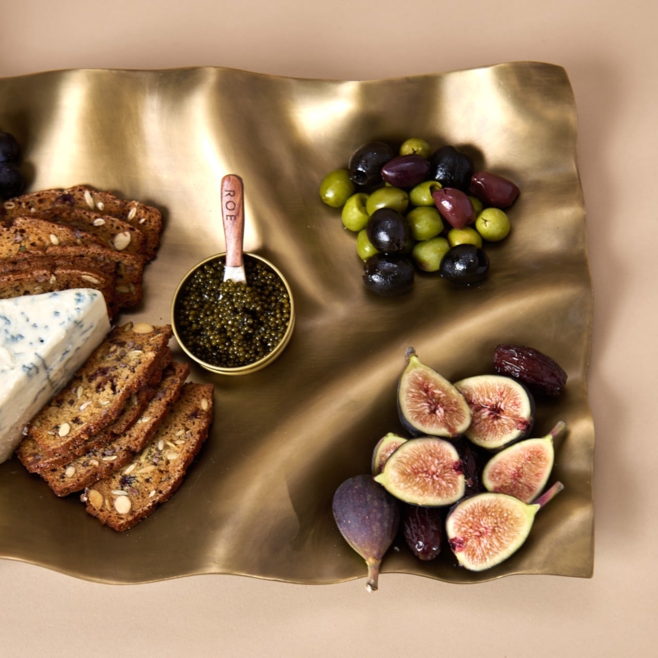
In the close-up photographs, light collects along the higher ridges while the depressions fall into softer shadow. That gives the surface a sense of movement even when it’s covered with crackers and grapes. The edges rise and dip with the rest of the form, so the shape feels continuous rather than decorated afterward. To my eye, that’s the strongest design decision here. The visual interest comes from the tray itself, without needing a pattern applied on top.
Those undulations also deserve a practical look. A sculpted surface offers a different proposition from a flat platter, particularly if you’re arranging small bowls or setting down glasses. I’d treat Masa primarily as a tabletop serving piece rather than assume it’s the ideal tray for carrying drinks across a room. The photographs make a convincing case for loosely arranged food. They don’t establish how securely every vessel would sit, and the distinction matters when the surface is this expressive.
The handcrafting adds another layer. According to the announcement, small differences in form and finish occur from piece to piece. That feels appropriate for a design built around irregular movement; perfect repetition would almost work against the idea. Still, handmade isn’t a performance specification. The individuality is a reason to appreciate the object visually, not evidence that it will resist scratches or survive every kind of use. I’d want the maker’s specific care guidance before treating it as everyday workhorse tableware.
Retail listings put its footprint at approximately 21.5 by 11.5 inches, with a height of 3 inches. That’s worth measuring against your table before imagining a generous spread surrounded by dinner plates. The Happy Kangaroo lists Masa at $595, although it’s marked sold out at the time of writing. At that price, this is a considered decorative purchase with a serving function, and its appeal depends on wanting to see it between meals.
Masa received Platinum recognition in both Kitchen & Dining Room Design and Homewear & Decor at the International Architecture & Design Awards 2026. Those categories neatly reflect its intended overlap: something for the table that can also hold its own elsewhere in the house. The recognition is useful context, though the more persuasive argument is still visible in the photographs: food looks inviting against those broad brass curves.
I’m most persuaded by the burger arrangement. The cheese, figs, and carefully grouped grapes are lovely, but takeout gives the tray a less precious personality. It suggests that owning a sculptural serving piece doesn’t require hosting a perfectly coordinated dinner party. I’d rather see an object like this earn its space under a heap of fries than spend its life waiting for an occasion formal enough to deserve it. The waves are already doing the decorating.
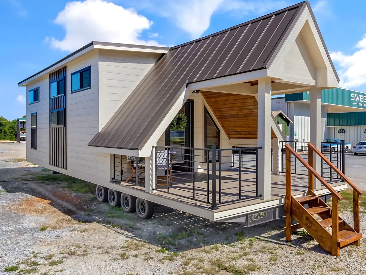
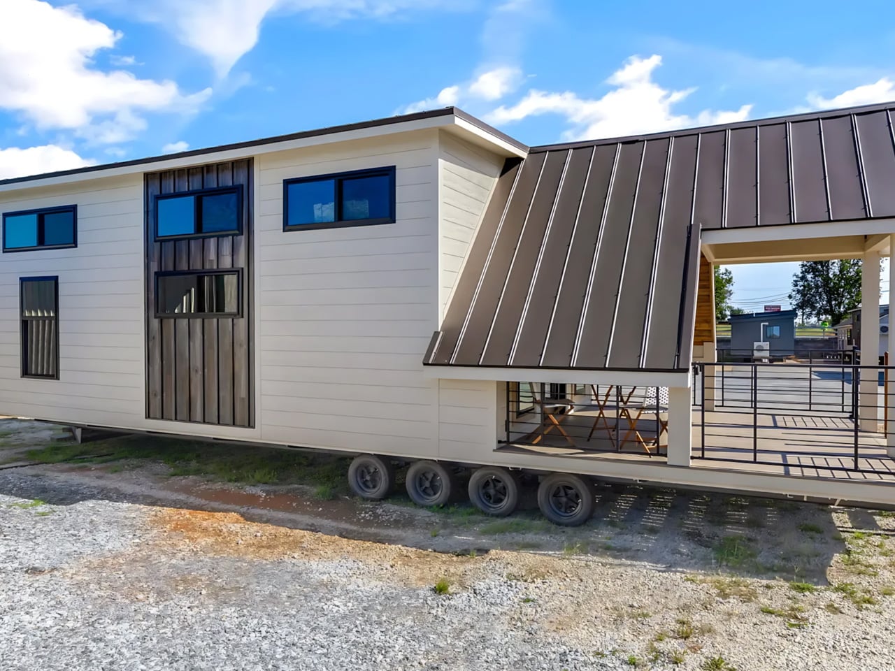
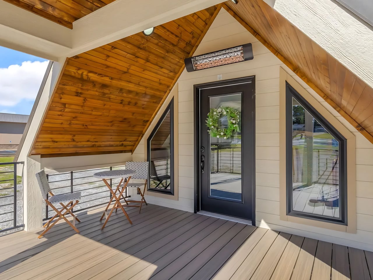
The Tinde’s most distinctive space sits outside its front door. A steeply pitched roof stretches over a generous covered porch, giving this tiny house the entrance of a woodland cabin. Built by South Carolina’s Sweet-Haus Tiny Cabin Company, the customizable park model measures 48 feet long and 14 feet wide, with a main-floor bedroom, a loft, and a flexible bonus room.
That porch gives the home a place to spread out without enclosing every available inch. In the photographed build, pale siding and dark railings frame the deck, while wood lining beneath the roof brings warmth to the entrance. The unusually sharp roofline dominates the front elevation, with a taller, more conventional volume rising behind it to accommodate the interior’s upper level.
Inside, the extra width allows a living room furnished with a sofa, coffee table, and separate armchair. A built-in counter with stool seating provides a spot for meals or laptop work without introducing another freestanding table. The arrangement leaves the central floor comparatively open, an important distinction in a home where the living area also handles circulation between the entrance and kitchen.
The kitchen gathers an oven, four-burner propane cooktop, microwave, and refrigerator into a compact working area, supported by overhead and lower cabinetry. Farther back, the bathroom includes a bathtub and shower combination, vanity, and flushing toilet. A separate bedroom keeps the primary sleeping space downstairs, so occupants don’t have to climb to the loft every night. That makes the upstairs accommodation an option rather than a daily obligation.
The bonus room offers the most consequential choice in the floor plan. Sweet-Haus lists potential uses including bunks, laundry, an office, or storage, allowing buyers to prioritize the activity that would otherwise crowd the main living space. The company says the bedroom, loft, and bonus room can accommodate up to six sleepers, depending on configuration. That’s sleeping capacity, rather than six equally private bedrooms.
There are useful distinctions between the available configurations. The bonus room comes as an open space, with single upper-bunk and double-bunk arrangements listed as upgrades. Bathroom options include a tub-shower or a walk-in shower without an upcharge. These decisions matter more than a paint selection: each changes how the limited interior can serve a household, particularly when guests, laundry, and working from home compete for space.
Sweet-Haus currently lists a starting price of $131,000 for the Tinde, while its options page identifies the dramatic A-frame roof as a $15,000 upgrade. Buyers should distinguish the photographed cabin from the base specification. Its appeal is clear: the design devotes substantial space to gathering, indoors and out, while leaving one small room available for whatever the household needs most.
Moss has been on this planet for around 450 million years, which means it predates dinosaurs, continents as we know them, and the concept of a watering schedule. The plant’s actual trick is that it has no roots and absorbs everything it needs directly through its surface, which makes it one of the most low-maintenance living things you could put in a room. Interior designers figured this out around 2015 and started installing living moss walls everywhere from hotel lobbies to coworking spaces, at which point the rest of us learned that professional moss wall installation costs roughly what a decent used car costs. A consumer-friendly version of that idea has been weirdly slow to materialize. MOSSLAB designed Moss Hexa around that natural biology, using a soil-free system that reduces day-to-day care while preserving the texture and presence of real moss.
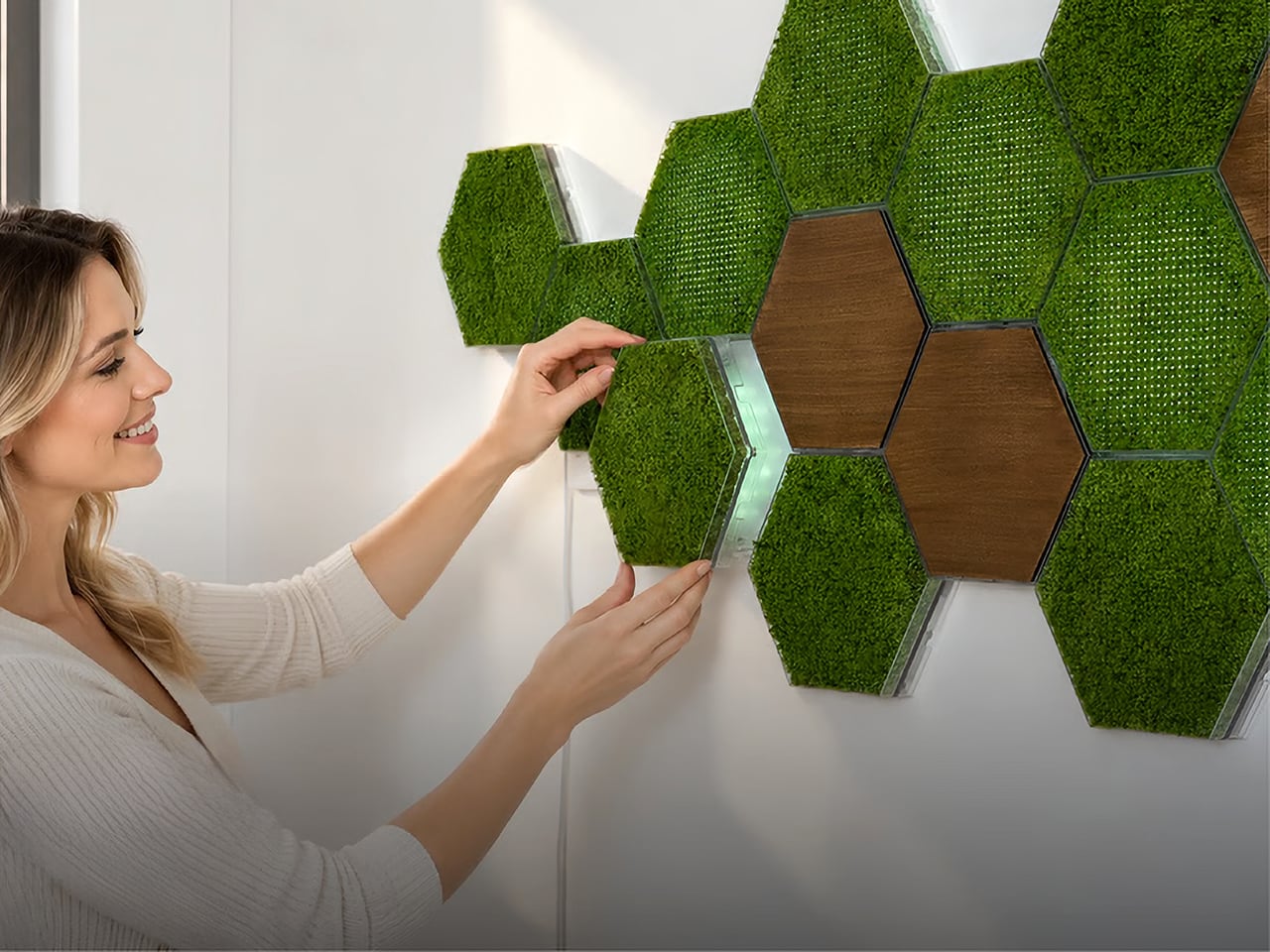
Moss Hexa is a modular moss system using 100% real moss panels in a hexagonal format, mounting via a proprietary magnetic system called HexaLock that lets you click panels into place, rearrange them, or swap them out without tools. Three panel types handle the main use cases: Basic for pure moss texture and color, Light for integrated LED ambient lighting with an auto-dimming sensor and app control, and Wood for warmth and visual rhythm as an accent. MOSSLAB, the South Korea-based studio behind the award-winning Moss Air and Moss Echo, built all three modules to share the same mounting hardware, making the whole system genuinely expandable over time without disturbing anything already on the wall. Pricing runs from a discounted $59 for the 3-panel Basic Starter Pack, with larger configurations available at campaign-exclusive pricing.
Hexagonal patterns appear throughout nature because they connect efficiently, repeat beautifully, and expand with minimal wasted space, from honeycomb structures to cellular geometry in biological tissue. MOSSLAB’s choice of the hexagon as Moss Hexa’s base unit is a structural decision that determines how the system scales and how freely it grows, and it pays off. Each panel measures 8.27 × 7.09 × 1.42 inches (210 × 180 × 36 mm), and because hexagons share flat, parallel edges on all sides, tiles can cluster in multiple directions without gaps or forced symmetry. The system offers preset configurations of 3, 9, and 15 panels, but the geometry means there’s nothing stopping you from building something in between. It holds up when you pull everything down six months later and try a completely different arrangement from scratch, which is the whole point.
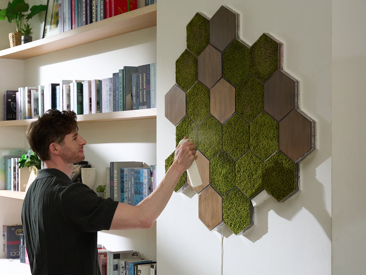
The Basic panel features 100% real moss that is naturally drought-tolerant, requires no direct sunlight, and needs only occasional light misting to stay at its best. Its frame is made from PC and steel, with magnetic components, and the whole panel weighs just 0.75 lb (338 g). The moss retains its color and three-dimensional texture between mistings, helping preserve the natural depth and organic character that distinguish real moss from artificial alternatives. The Wood panel uses the same HexaLock mounting footprint but replaces moss with a warm wood-finish surface, designed as a compositional accent rather than a primary surface. A mostly-moss arrangement with a few Wood panels breaking the pattern is the right call; the contrast reads as intentional interior design rather than a texture experiment that got away from you.
Each Light panel combines 100% real moss with built-in ambient lighting designed to bring out the moss’s natural depth, color, and texture while changing the atmosphere of the surrounding space. Brightness can be adjusted from 1–100%, with a maximum power draw of 7W per panel, while a built-in ambient light sensor automatically adapts the lighting as the environment changes. Light panels connect directly to one another through USB-C-to-USB-C connections, and one Control Hub & Power Adapter can support up to nine Light Panels. The Hexa App provides manual lighting control, lighting presets, and Natural Daily Rhythm scheduling, giving users more flexibility to shape the atmosphere throughout the day.
Sound absorption performance was independently measured by KCL, a KOLAS-accredited laboratory recognized under the international ILAC-MRA framework, using a Moss Echo installation made with the same real moss material used across MOSSLAB’s Moss product line. Covering nearly 11 m² with approximately 300 moss panels, the installation was tested in a large-scale interior setting. The test recorded sound absorption of 27% at common speech frequencies, increasing to 56% at frequencies associated with keyboard typing and up to 65% at higher frequencies associated with background chatter. Those results add a functional layer to real moss beyond its visual and tactile presence. Because the test was conducted using the same real moss material found in Moss Hexa, the takeaway is not that Hexa replaces dedicated acoustic treatment, but that the material itself brings measurable sound-absorbing properties into a system designed to change how a space feels.
Powered by the HexaLock magnetic mounting system, each panel snaps into place with a single click, no complicated measuring, no specialist tools, no installation experience needed. You attach the mounting guide to your chosen surface, and both screws and adhesive mounting options are included. The guide handles alignment automatically, so panels sit consistently without leveling. The key design call is that Basic, Light, and Wood panels all share the same HexaLock footprint, meaning you can swap any panel type for any other at any point without touching the wall hardware. You can start with 3 Basic panels, add Light panels as a seasonal upgrade, and work toward a 15-panel Signature Styling set across multiple additions, all from the same original wall installation. The dual mounting option, screws for homeowners and adhesive for renters, is a small detail MOSSLAB got right, and the kind of thing you only think to include if you’ve genuinely considered your customer’s actual living situation.
Moss Air earned a CES Innovation Award, an iF Design Award, and an IDEA Design Award, and MOSSLAB has also participated in an open innovation program with a major Korean conglomerate, and in 2025 was the only international startup chosen among five for Panasonic’s Electric Works accelerator program. These are production-level credentials, not concept-stage accolades, and they matter when evaluating a new product that ships internationally. The Basic Starter Pack (3 panels) will be available for $59 during the first 72 hours of the Kickstarter campaign launch, the Light Starter Pack (3 panels) at $99, and the 9-panel Basic and Light Standard Packs starting at $159 and $229, respectively. The 15-panel Signature Styling Pack, which combines Basic, Light, and Wood panels, starts at $339 during the same launch period. Individual add-ons are available at $25 for a Basic Panel, $40 for a Light Panel, and $24 for a Wood Panel, while an additional Control Hub & Power Adapter Set is $23. Estimated U.S. shipping starts at $25 for a 3-panel configuration, with fulfillment estimated to begin in June 2027.
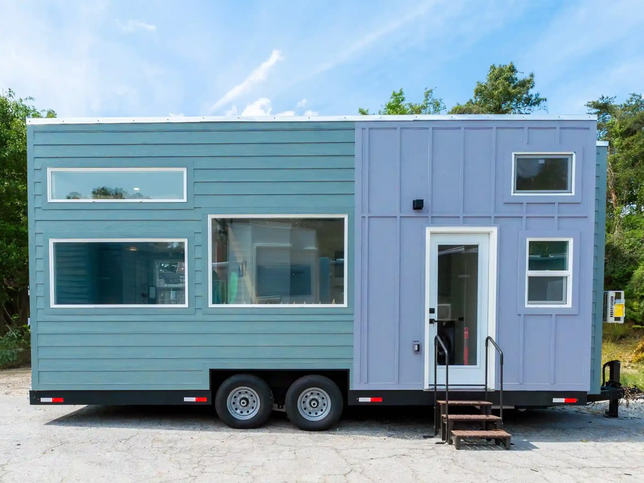
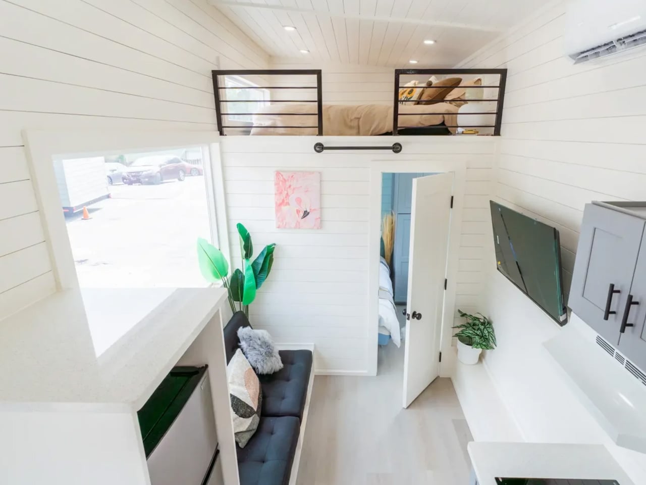
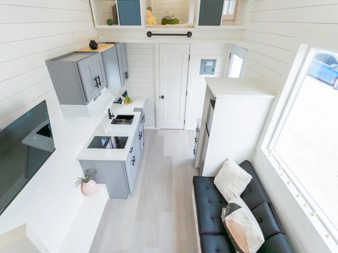
The updated Avalon 24 gives its most useful space-saving move to the bedroom: it keeps it downstairs. Dragon Tiny Homes pairs that main-level sleeping area with two lofts inside a 24-foot home on wheels, offering 204 square feet of floor space before counting the lofts. The completed, upgraded build is listed for sale, with built-in furniture and storage already fitted.
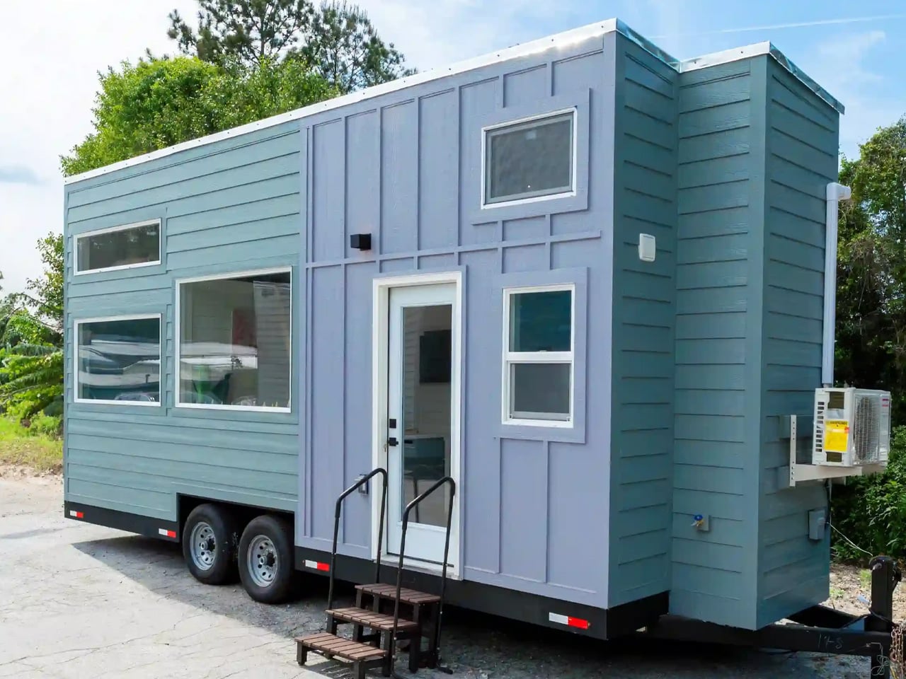
Outside, blue and lavender wood cladding gives this version a cheerful identity, topped by a metal roof and supported by a double-axle trailer. The color makes a welcome departure from the monochrome finishes common in compact housing, but the more consequential decisions happen inside. Here, sleeping space takes priority over a sprawling lounge.
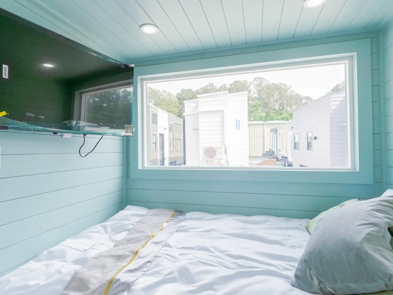
The downstairs bedroom accommodates a double bed, a dedicated storage cabinet, and a wall-mounted television. Keeping the primary bed at floor level removes the nightly ladder climb, although the room remains snug. Above it sits the main sleeping loft, while a smaller loft over the bathroom provides another potential sleeping area or storage space. Removable ladders serve both upper levels, so these spaces demand more agility than the downstairs room.
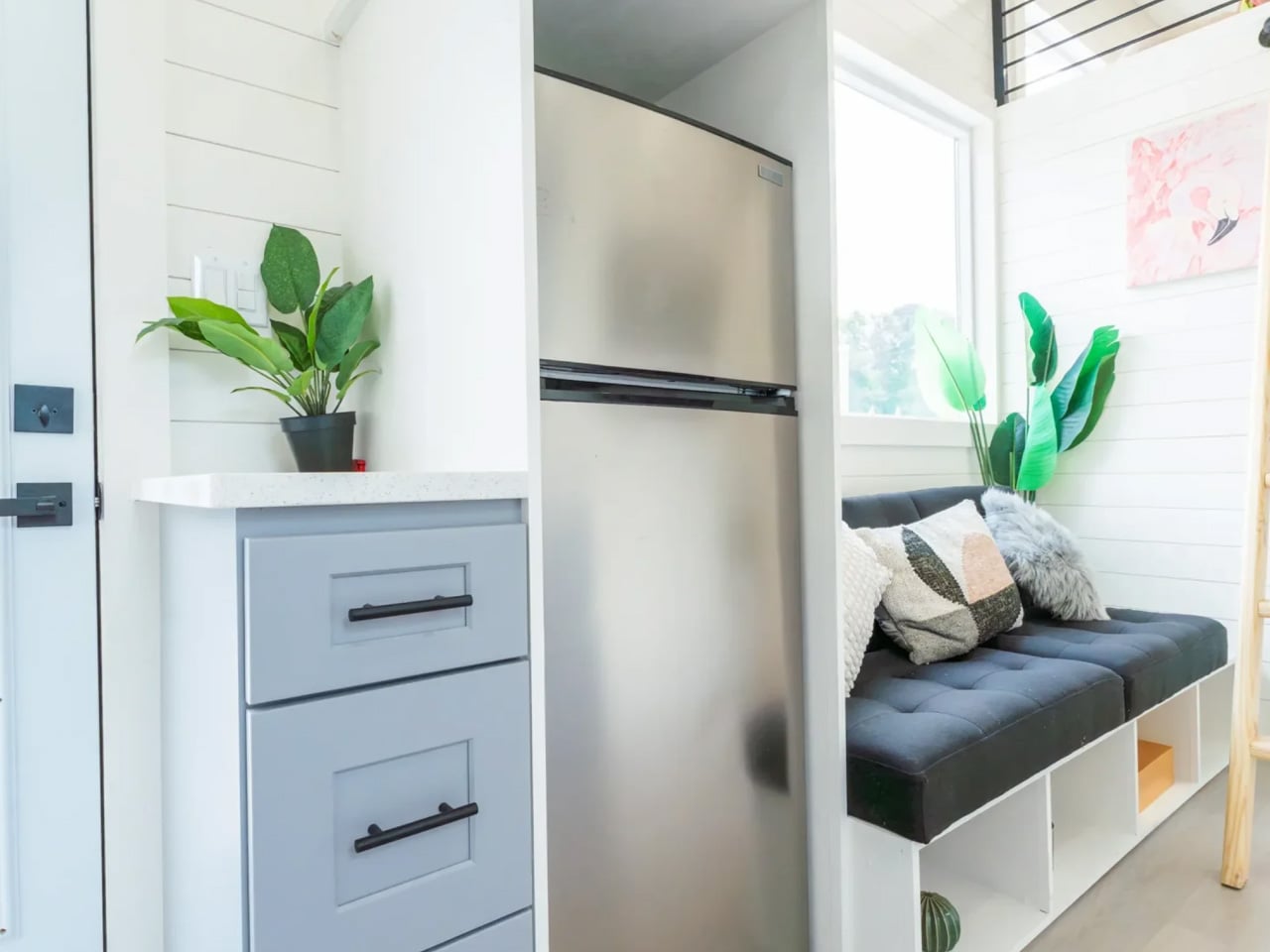
The living area uses a built-in couch platform rather than leaving furniture placement entirely to the owner. Integrated sofa storage adds another place to tuck belongings away, and a large picture window opens the room toward the outdoors. White horizontal wall paneling and dark loft railings keep the interior visually legible, with the upper sleeping platform clearly separate from the space below.
In the kitchen, the upgraded build includes a 7.1-cubic-foot refrigerator housed in cabinetry with three drawers, alongside upper cupboards, a floating shelf, and a range hood. The Avalon’s induction cooktop has two burners, and its quartz surfaces include a bar top intended for dining or work. Laundry space is provided in the layout, though buyers should confirm the appliance package for their particular build. The cabinetry gives everyday objects assigned homes instead of relying entirely on loose shelving.
The bathroom contains a shower, vanity, and flushing toilet, with the upgraded unit adding a mirrored medicine cabinet and accent finishes. Dragon also lists upgraded insulation, a ceiling fan, and LED lighting with a night-light function. Those are useful specification details, though the listing doesn’t establish measured thermal performance or energy savings.
The featured inventory home is advertised at $63,500, including $10,100 in selected upgrades and a $6,600 discount from its configured price. Dragon lists a weight of 14,000 pounds and recommends an F350 or similar towing vehicle. That combination makes the Avalon’s tradeoff clear: its downstairs bedroom is appealing, but moving this small home still requires serious equipment.
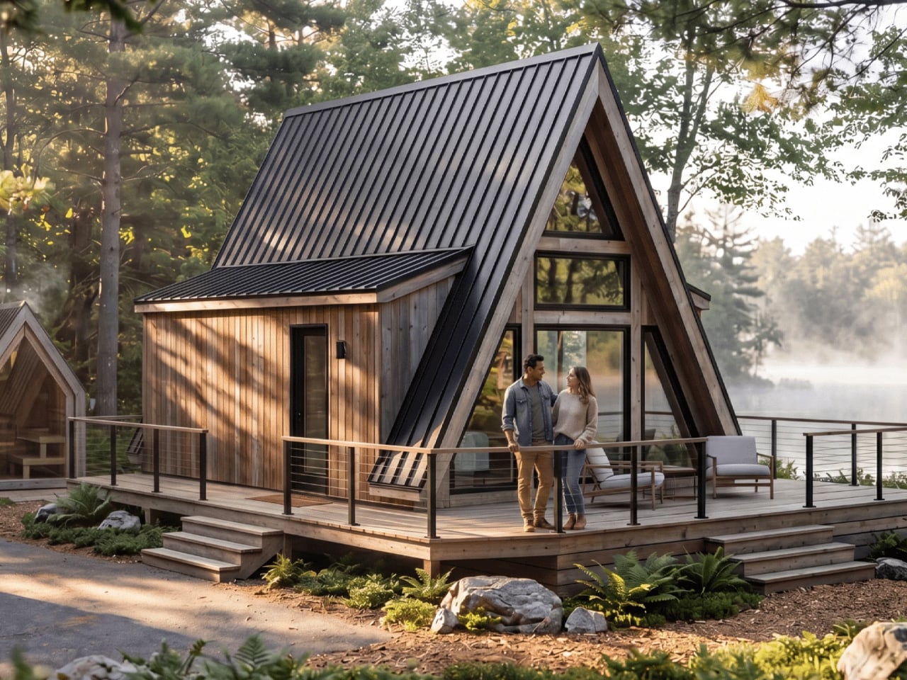
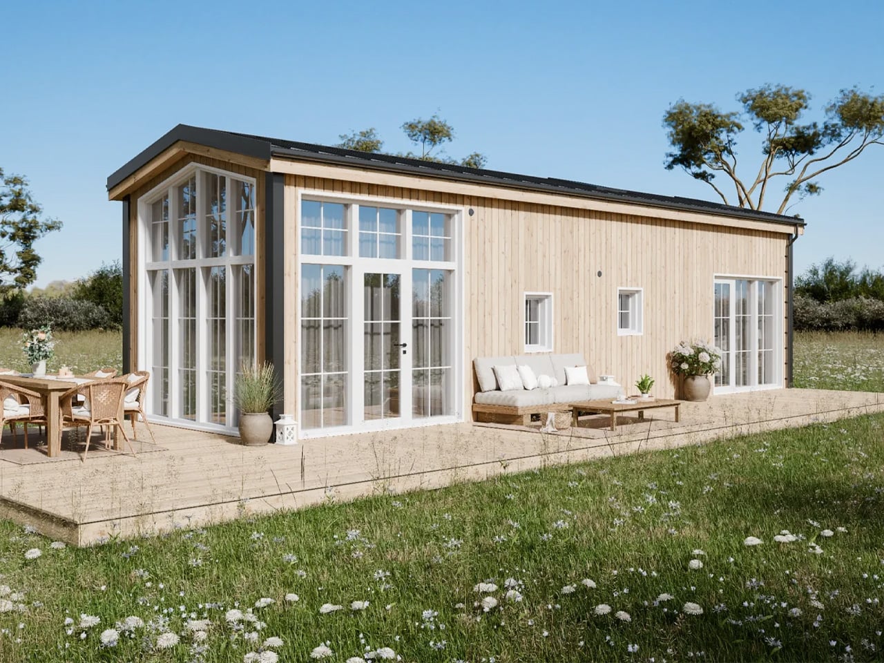
The A-Frame Retreat gives its most dramatic wall to glass, with windows climbing toward the roof’s sharp peak. Behind that familiar triangular silhouette, Zook Cabins has arranged 470 square feet of living space on a single floor, including a bathroom with a freestanding soaking tub. This is an available modular home, with a completed example at Zook Village in Gap, Pennsylvania, documented in March 2026.
A black metal roof and thermally modified Lunawood siding establish the exterior’s restrained palette. The more interesting move is the lower, box-like volume alongside the steep roof. In the company’s exterior rendering, it gives the cabin a vertical side wall and a sheltered entrance, while the glazed gable retains the recognizable A-frame profile. An optional deck extends the space outward without changing the enclosed footprint.
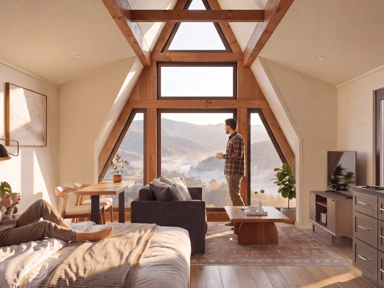
Inside, the published king-bed floor plan reads as a studio rather than a conventional one-bedroom house. Living, dining, sleeping, and kitchen areas share an open room, with the bathroom enclosed at the rear. The bed sits opposite the kitchen, while seating occupies the glazed end. Keeping these functions together avoids carving the compact interior into smaller rooms, though it also means there’s no bedroom door to separate sleep from conversation or cooking.
Cathedral ceilings preserve the roof’s height indoors, while painted cabinet-grade birch plywood covers the walls and ceilings. Vinyl plank flooring runs throughout. The interior rendering pairs these pale surfaces with exposed-looking timber elements and wooden furniture, giving the room visual warmth without covering every surface in wood. Straight wall sections also leave usable edges for cabinetry and furniture beneath the taller central space.
The kitchen takes a modest portion of the plan. Zook specifies painted shaker-style cabinets, quartz countertops, and spaces for a compact refrigerator and microwave. Those provisions deserve attention: space allocated for an appliance doesn’t establish that the appliance is included. The arrangement leaves more of the shared room available for the bed, dining table, and sitting area.
The bathroom receives a surprisingly generous allocation. Alongside the 60-inch freestanding soaking tub, the specifications list a separate glass-doored shower and a 48-inch vanity. The floor plan places these fixtures in their own enclosed room, giving bathing more privacy than sleeping. That’s a revealing priority for a small retreat: floor space goes toward a leisurely bathroom rather than a separate bedroom or another sleeping level. Delivery still requires planning. Zook says the cabin travels in one truckload, with two A-frame roof sections lifted into place on site. Its modern cabins require a permanent foundation and prepared utility connections. The small footprint simplifies the accommodation, but the installation remains a building project.
Now that I’m learning to cook more, I’m pretty excited to experiment with dishes I see online. The results aren’t always ready for other people to try. I still have a lot to figure out. On some days, though, I keep it simple and fry something. That brings up a familiar problem: getting rid of excess oil before the food reaches my plate. Usually, I move it from the pan to a rack or paper towel, then transfer it again when I’m ready to eat. What if I could skip one of those transfers?
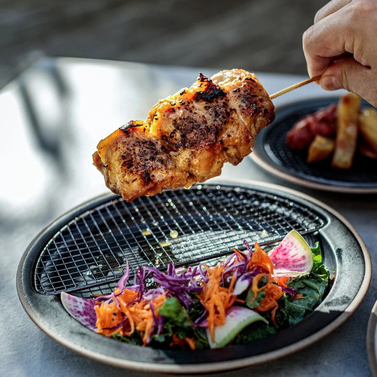
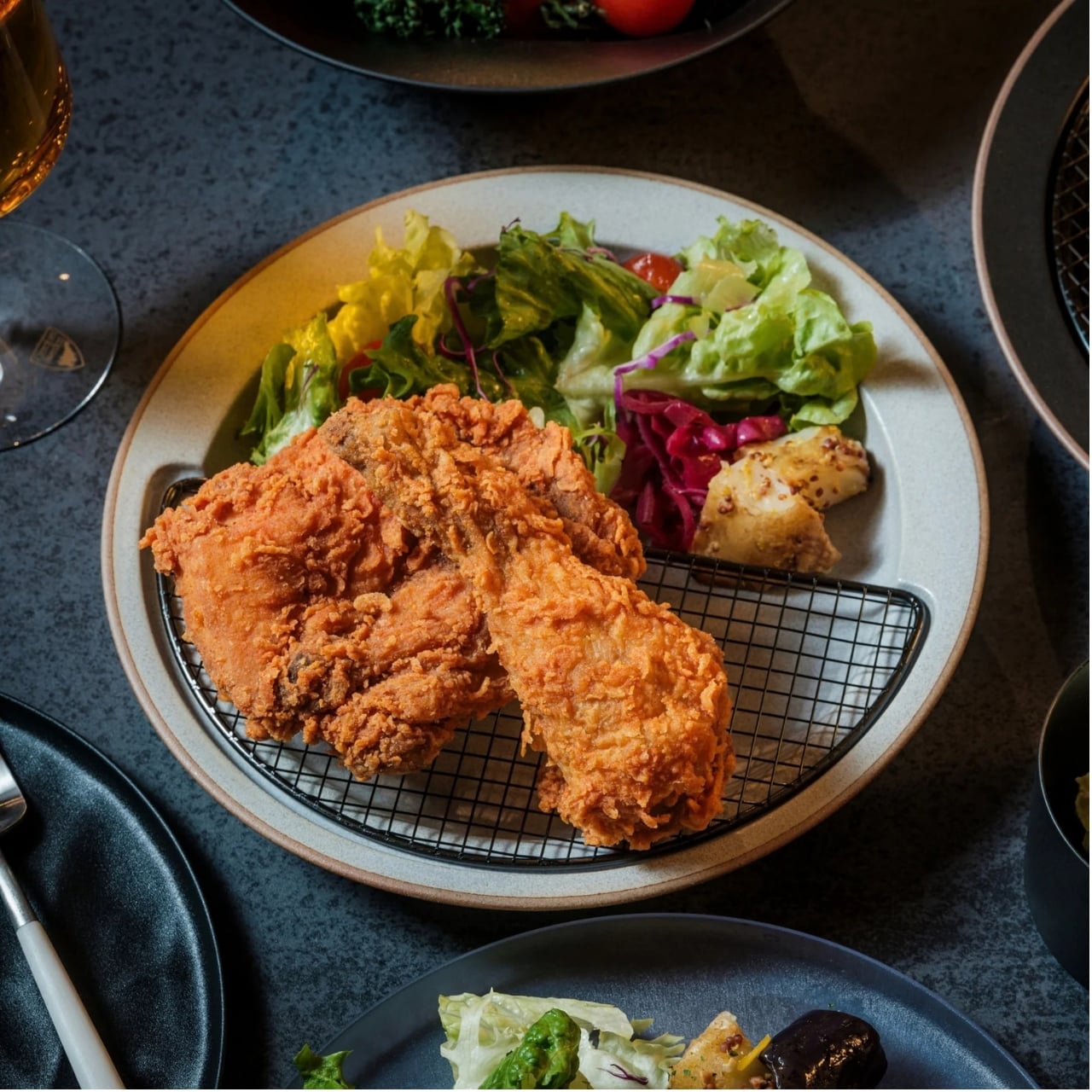
The Half-Moon Plate is more than a nicer way to serve food for a photo. It pairs a ceramic plate with a half-moon-shaped rack that sits over one side. You can place fried food on the rack to let excess oil and moisture drain away while leaving the other side available for a salad, vegetables, rice, or another side dish. Instead of draining food in one place and serving it in another, the plate brings those steps together.
That arrangement matters when timing is everything. If you’ve made tempura, fried chicken, or crispy potatoes, you probably don’t want them sitting in a puddle of oil while you finish getting dinner ready. Elevating the food gives the oil somewhere to go and may help it stay crisp until you eat. You still need to give freshly fried food time to drain; the plate simply gives you a way to do it at the table or as part of your final plating.
I also like that the design doesn’t make the rack the whole story. The open half of the plate leaves room for the rest of the meal, so the fried food doesn’t have to take over. You can see everything together before you sit down, rather than juggling a cooling rack, paper towels, and a separate serving dish. For someone cooking in a small kitchen, or someone who just wants fewer things on the counter, that’s an appealing idea.
The half-moon shape gives the plate its visual identity, but it also creates a natural division between the main dish and its sides. If you’re trying to be more mindful of portions, that division may be a useful visual cue. It won’t measure a balanced meal for you, and draining surface oil doesn’t make fried food automatically healthy. What it can do is encourage you to think about what else belongs on the plate alongside your crispy favorite.
Compared with an everyday dinner plate from a big brand such as IKEA, the Half-Moon Plate asks a little more of its design. A conventional plate gives you one uninterrupted surface and works with almost any meal. This one is more specialized: the rack makes the most sense when food needs to drain or when you want to keep it elevated before eating. That makes it less of an all-purpose replacement for your existing dishes and more of an addition for meals where its distinctive layout earns its place. The plate is listed starting at $70.
Of course, a plate like this won’t eliminate every step. You’ll still need to handle hot food carefully, wait for it to drain, and wash the rack afterward. Those are worth considering if you’re looking for the quickest possible cleanup. But if you already make fried food regularly, combining a draining surface and a serving plate could make the trip from pan to table feel more organized. When you don’t need the rack, you can lift it off and use the ceramic plate on its own. That flexibility is important: a design meant for one kind of meal is easier to justify when it can still be useful on other days. I’d reach for the rack when I’m making something crisp and use the plate by itself when dinner calls for a simpler presentation.
The Half-Moon Plate won’t make me a better cook overnight. I’ll still have to get the timing, seasoning, and frying right. But it does address one small frustration I know well: watching something come out of the pan beautifully crisp, only to wonder where to put it while I finish the meal. If it helps me serve dinner with fewer transfers and a little less fuss, that’s a design choice I can appreciate.
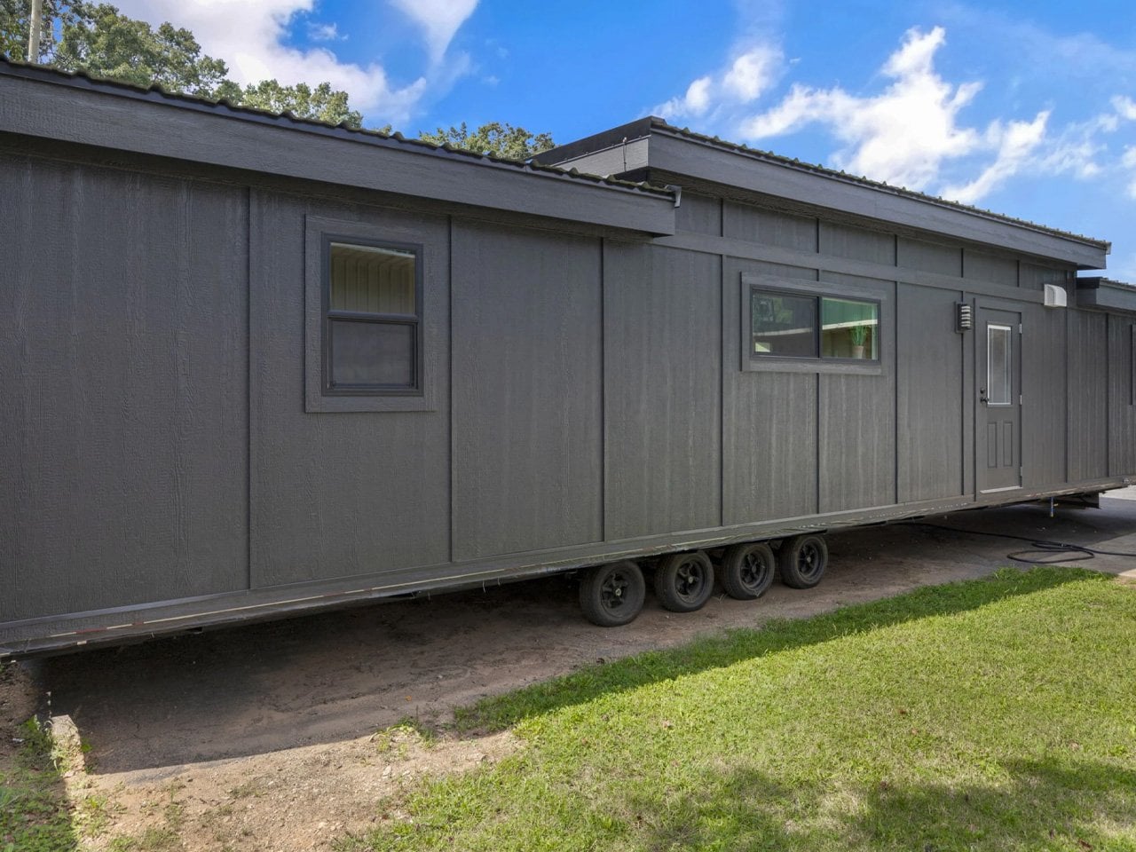
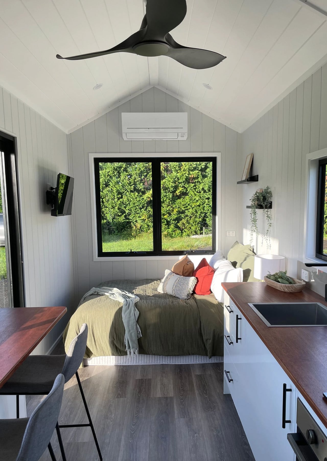
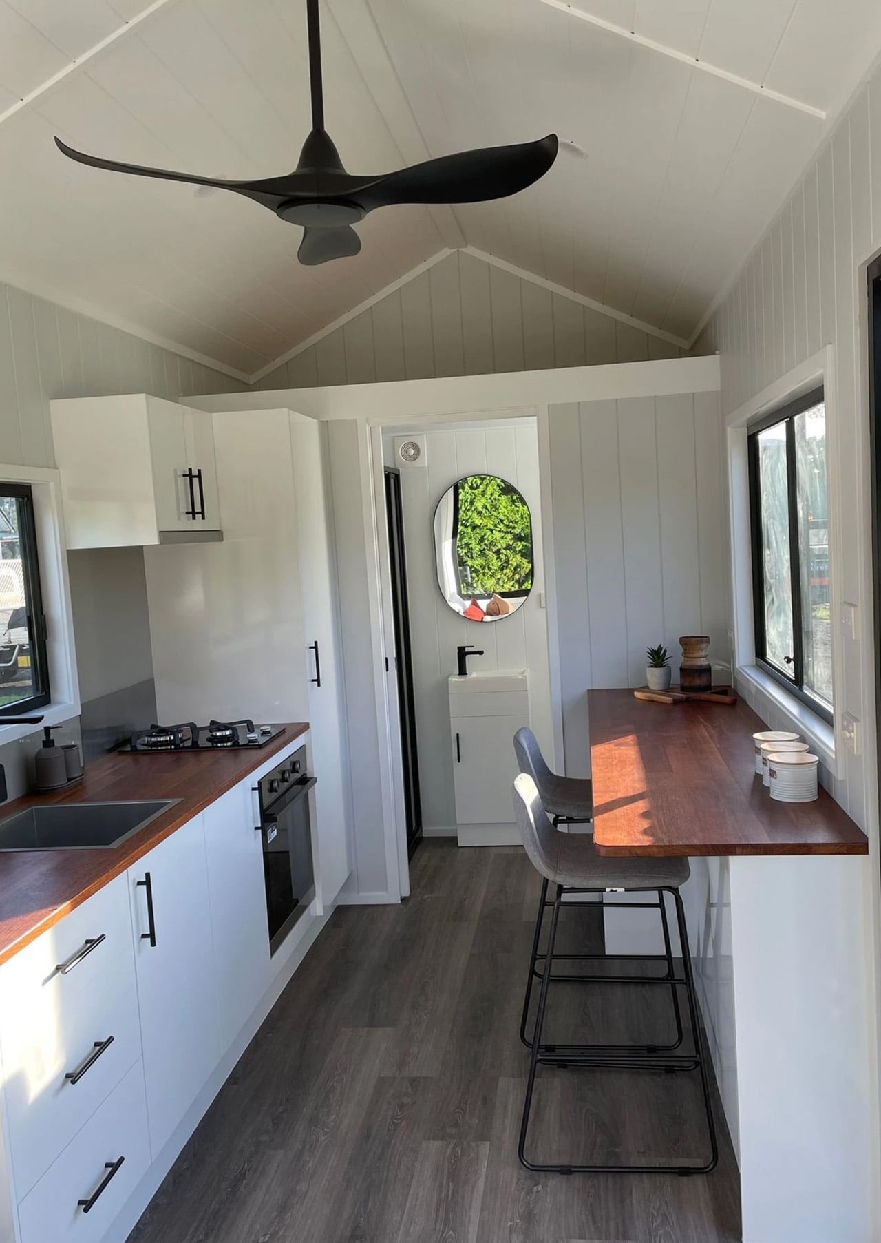
Some homes earn their square footage. The Acadia by Sweet-Haus Tiny Cabin Company is one of them — a 700-square-foot, single-level home that packs two bedrooms and two full bathrooms into a footprint that feels genuinely generous. It sits on a quad-axle trailer, stretching 50 feet in length and 13.6 feet wide, which puts it firmly in park model territory — the kind of home you place once and actually live in.
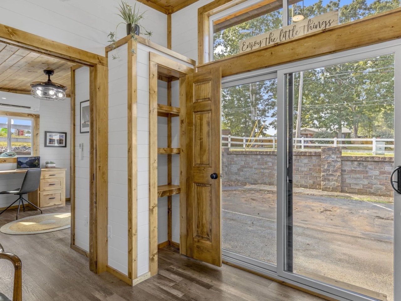
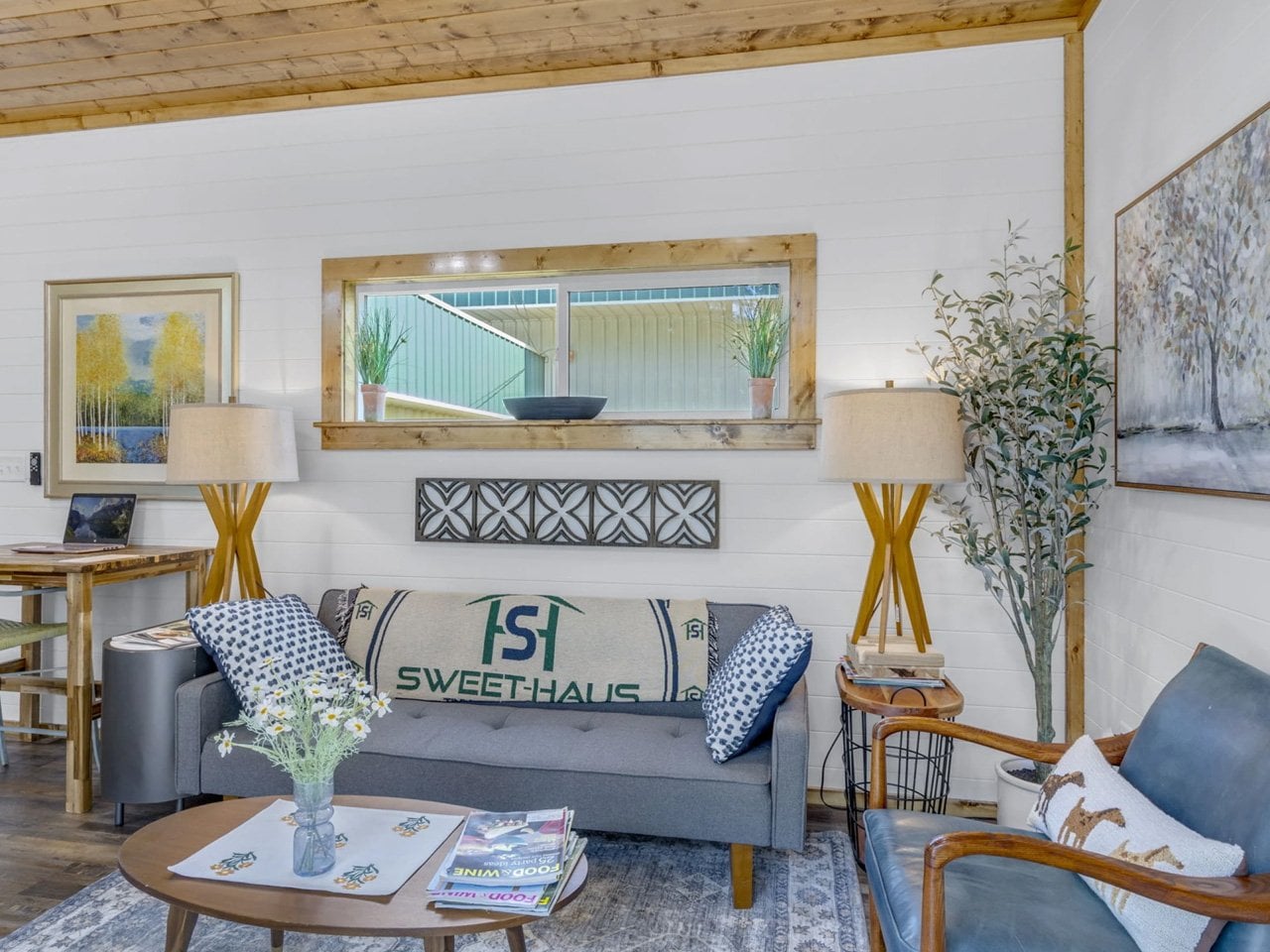
Sweet-Haus builds out of Chesnee, South Carolina, and the Acadia carries that craftsmanship through every detail. The open-concept layout keeps the living, dining, and kitchen spaces connected — no wasted hallways, no chopped-up rooms. Large black windows flood the interior with natural light, and the black LowE 3 windows with argon gas fill-in do real thermal work, keeping the home efficient without sacrificing the look. The crinkle-cut matte roof and Advantech subfloor round out a build quality that punches well above the $176,500 MSRP.
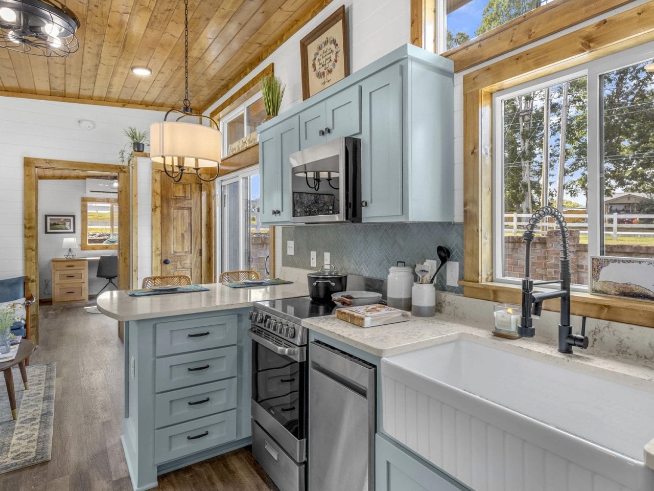
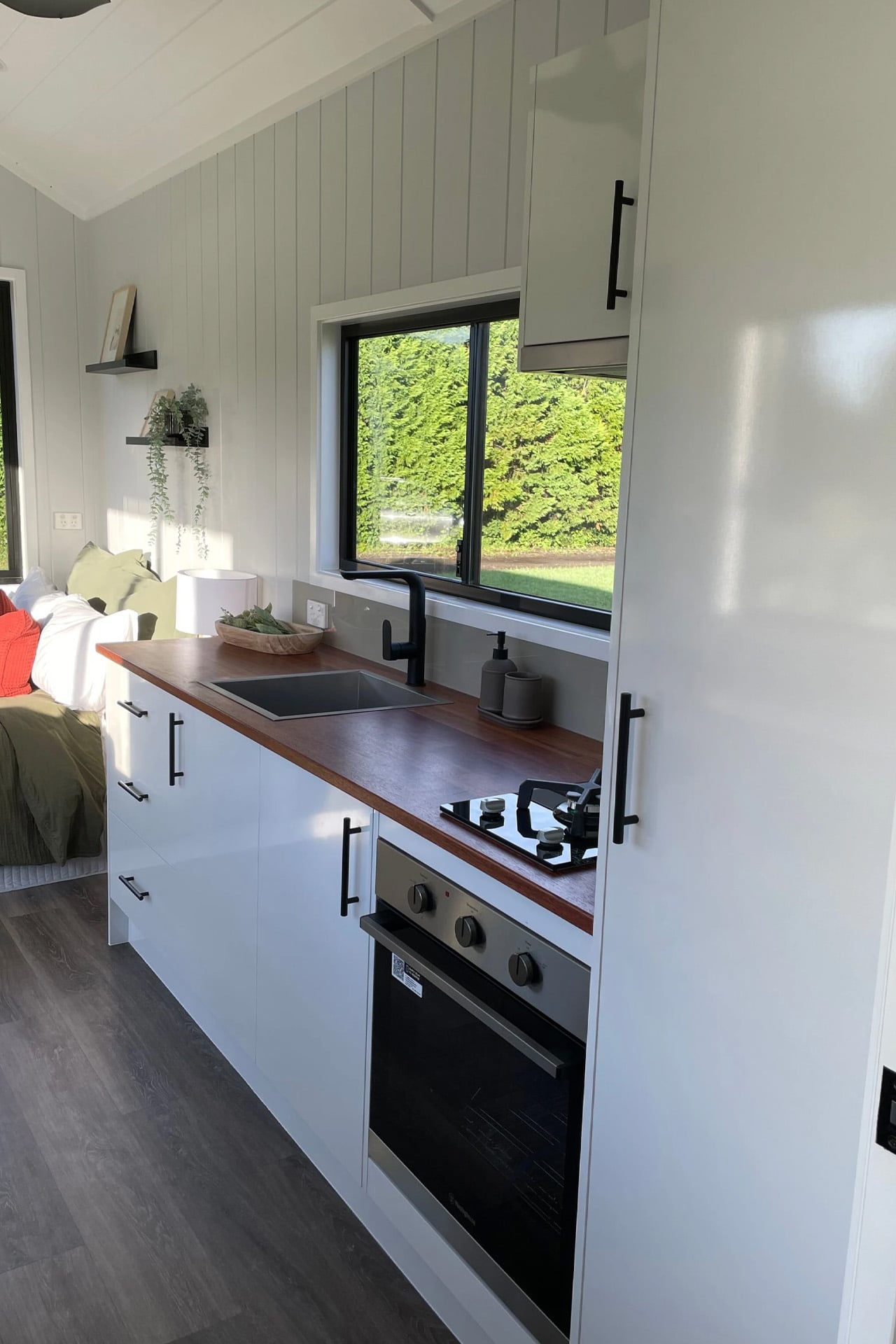
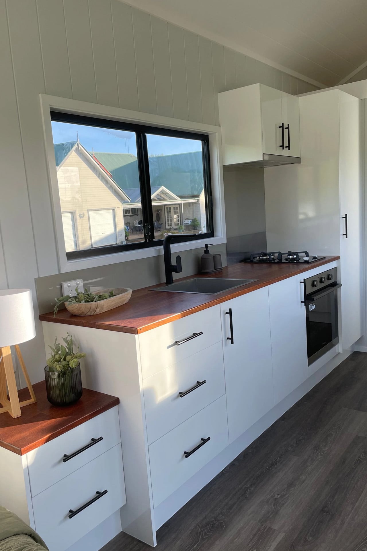
The kitchen is a full-size one, not a compromise version. It comes with a Haier stainless steel cabinet-depth fridge with bottom freezer, a 24″ Haier range, and an 18″ Haier dishwasher — a lineup that treats cooking as something that actually happens in this home. The cabinetry is custom Ergo-craft® millwork, milled from 3/4″ solid wood with soft-close hardware and custom-made pulls. It reads like furniture, not filler.
Both bedrooms accommodate a queen or king bed base with built-in storage drawers underneath, and each room connects to a full bathroom with a large vanity. The bathrooms offer a choice between a standalone shower or a tub/shower combo — a rare option at this scale. R19 insulation runs through the ceilings and floors, and a three-head HVAC system keeps the climate dialed in room by room. The Acadia is HUD-certified, which opens up financing options and simplifies placement in communities across South Carolina and North Carolina.
What Sweet-Haus has built with the Acadia is a home that doesn’t negotiate with itself. Most tiny homes ask you to give something up — ceiling height, counter space, closet room.
This one has built-in closets, two full baths, and a kitchen you’d actually cook in. At 700 square feet, it’s the version of tiny living where the word “tiny” stops mattering entirely.
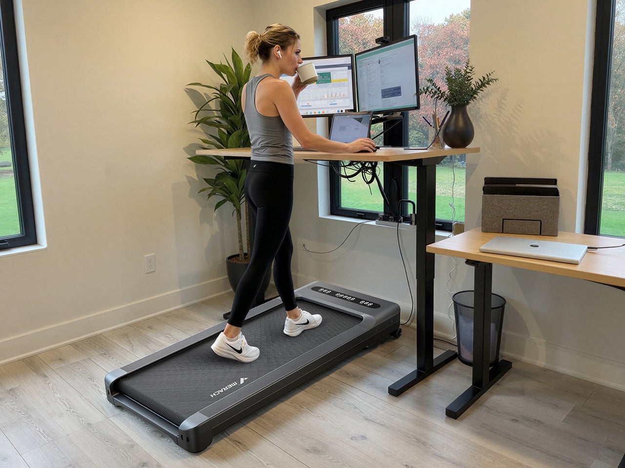
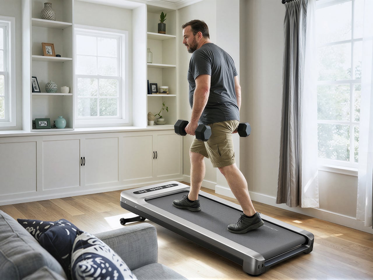
The under-desk treadmill had its moment, arriving as the perfect sidekick for our sudden work-from-home lives (can you believe it’s been six whole years?). It was the simple, brilliant answer to hitting a step count between calls and emails, and products like the original WalkingPad and the WalkingPad S1 were among the early heroes of that era. We all got one, or knew someone who did, turning home offices into miniature gyms where productivity and light cardio could finally coexist. The problem was that a lot of those machines, true to their budget price tags, started dying after six months of use. Walking pads got a reputation for being disposable, which was a shame, because the core concept was always worth taking seriously.
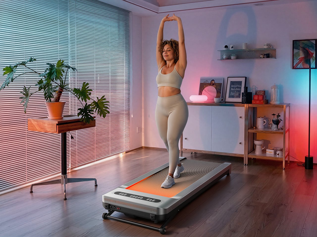
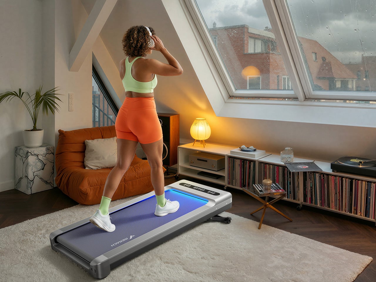
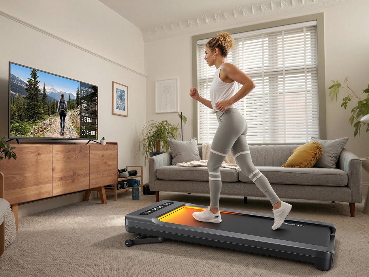
The UltraWalk W60 Plus is the clearest expression of what MERACH is building toward: a walking pad engineered with permanence at its core. When we caught the brand at IFA 2026, their first major trade show appearance despite an already loyal following built through e-commerce, the walking pad lineup stood out for build quality at a price most competitors couldn’t match. The W60 Plus has 12 automatic incline levels, a third-party SGS-certified motor, and a weight capacity that would make a full-size treadmill raise an eyebrow. Mood lighting and a Bluetooth speaker come along too, which sounds ridiculous until you realize how much more likely you are to use a machine that’s genuinely fun to be around.
Designer: MERACH
Click Here to Buy Now: $288$499.99 ($211.99 off, use coupon code “MERACHW60”). Hurry, deal ends in 48-hours!
A 3.5 HP Brushless Motor, SGS-Certified Performance, and a Frame Rated for 330 Lb
The W60 Plus runs on a 3.5 HP peak / 1.25 CHP brushless motor with a 42mm diameter and a Hall sensor for precision feedback. Brushless motors are generally more efficient and longer-lasting than brushed ones, and MERACH claims a lifespan of up to 15,000 hours here, which the brand puts against the 300 to 800-hour lifespans typical of budget walking pad motors. The weight capacity sits at 330 lbs under SGS-certified testing conditions. The heavy-duty steel frame doesn’t wobble under a real walking load, which matters more than most spec sheet comparisons. That stability is what separates a machine you’ll want to use from one you’ll come to resent.
The W60 Plus passed SGS’ performance specs evaluation with flying colors. The noise testing came back at under 54 dB at medium speed with a 75 kg test load, which sits comfortably below the ambient volume of a normal conversation. At maximum speed that figure climbs to 60 dB with load, and 55 dB without, meaning the machine stays apartment-friendly even when it’s working hard. There’s also a one-touch mute function for those moments when you absolutely need silence (hello, important video calls). That noise profile lets you walk and watch TV simultaneously without either experience suffering, which is, honestly, the whole point of this category.
Twelve Auto-Incline Levels, a 16.5-Inch-Wide Deck, and a Speed Range Built for Walking
Twelve levels of automatic incline is the feature that separates the W60 Plus from the flat-and-boring competition, and for a machine in this price tier, it’s genuinely unusual. At the highest setting, it shifts from a gentle recovery walk to something that meaningfully elevates your heart rate, particularly through the posterior chain. The speed range of 0.6 to 4.0 MPH keeps things firmly in walking and light jogging territory, and that 4 MPH ceiling is worth acknowledging: this machine won’t satisfy runners. What it will do is make a 3 MPH incline walk feel like real exercise, which for most desk-workers is entirely the point. Incline transitions between levels automatically and smoothly, a detail that matters when you’re trying to maintain a rhythm.
The running deck measures 16.5 inches wide by 41.3 inches long, which MERACH puts at roughly 33% wider than the category standard. That extra width makes for a more natural gait and stride, particularly for taller users or anyone with broader hips. The non-slip surface handles uphill walking and light jogging without issue, and the length means you’re not constantly worrying about the back edge. Team USA heptathlete Annie Kunz has been using the W60 Plus for active recovery and step accumulation, describing it as a way to “jump on here and there when I feel a burst of energy.” Multi-event athletes log enormous volumes of low-intensity cross-training, and a 12-level incline walking pad fits that workflow more naturally than a flat surface ever could.
Sound-Reactive RGB Lighting, a 5W Bluetooth Speaker, and Triple-Platform App Integration
MERACH’s RGB lighting system reacts to step frequency and syncs to audio rhythm, creating a feedback loop between movement, sound, and visual stimulus that turns a walking session into something engaging. A walking pad that’s boring ends up under the sofa permanently, and MERACH clearly treats engagement as a design constraint, not an afterthought. The lighting pairs with a built-in 5W Bluetooth speaker that fills a home office without headphones, which matters when you’re walking through calls or podcasts. The whole feature cluster borrows from the cozy cardio playbook, acknowledging that for most users, habit formation is a bigger obstacle than physical capability. Make the machine enjoyable to use, and the steps take care of themselves.
Full app integration spans MERACH’s own platform, Apple Health, and Google Fit, with real-time tracking of speed, incline, calories, distance, time, and step count across all three. The MERACH app adds guided routines and custom workout programs, which pushes the W60 Plus into territory where it can coach you through a session rather than simply hosting it. An 8-button magnetic remote handles speed, incline, lighting, mute, start/stop, and program selection, and it docks magnetically to the frame when not in use. The LED display gives you a live readout of key metrics without having to pull out your phone. None of it requires a subscription, which at this price is a genuinely welcome detail.
Zero Assembly, 80 Percent Less Floor Space, and a Price That Makes Sense
The W60 Plus ships fully ready to use: unbox it, plug it into a standard 110V outlet, and step on. No assembly means no instruction booklet, no leftover mystery bolts, and no 45-minute YouTube tutorial that’s supposed to take 10 minutes. When you’re done, the vertical folding support stand lets the machine stand upright, which MERACH says cuts the floor-space footprint by up to 80%. The enlarged front transport wheels make it manageable to move even over carpet, which is where most budget transport wheel designs tend to give up. At 67.7 lbs, the W60 Plus isn’t light, so those wheels are doing real work every time you slide this thing out from under the desk.
The UltraWalk W60 Plus launched on May 26, 2026, and is available now through MERACH’s official website in a Grey finish, with the list price marked at $499.99 and the current sale price at $329.99. MERACH is also offering an extra discount code, MERACHW60, which drops the checkout price to $264.00 with free shipping, a much more aggressive number than this category usually sees for a 12-level auto-incline walking pad. The product page also offers optional accident protection from $29.99. Warranty details are not clearly surfaced in the material provided, so that part is best verified directly on MERACH’s store before publication.
Click Here to Buy Now: $288$499.99 ($211.99 off, use coupon code “MERACHW60”). Hurry, deal ends in 48-hours!
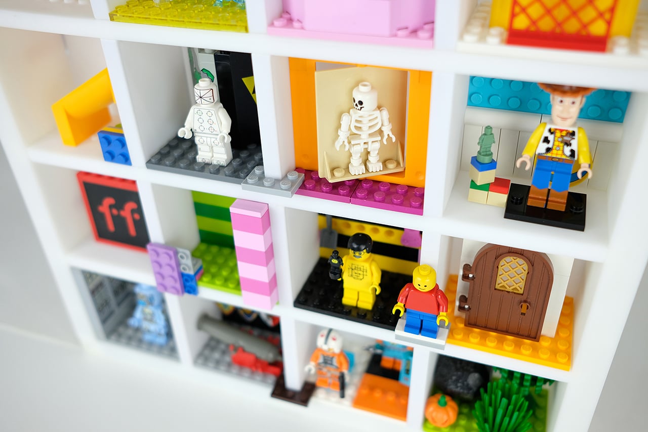
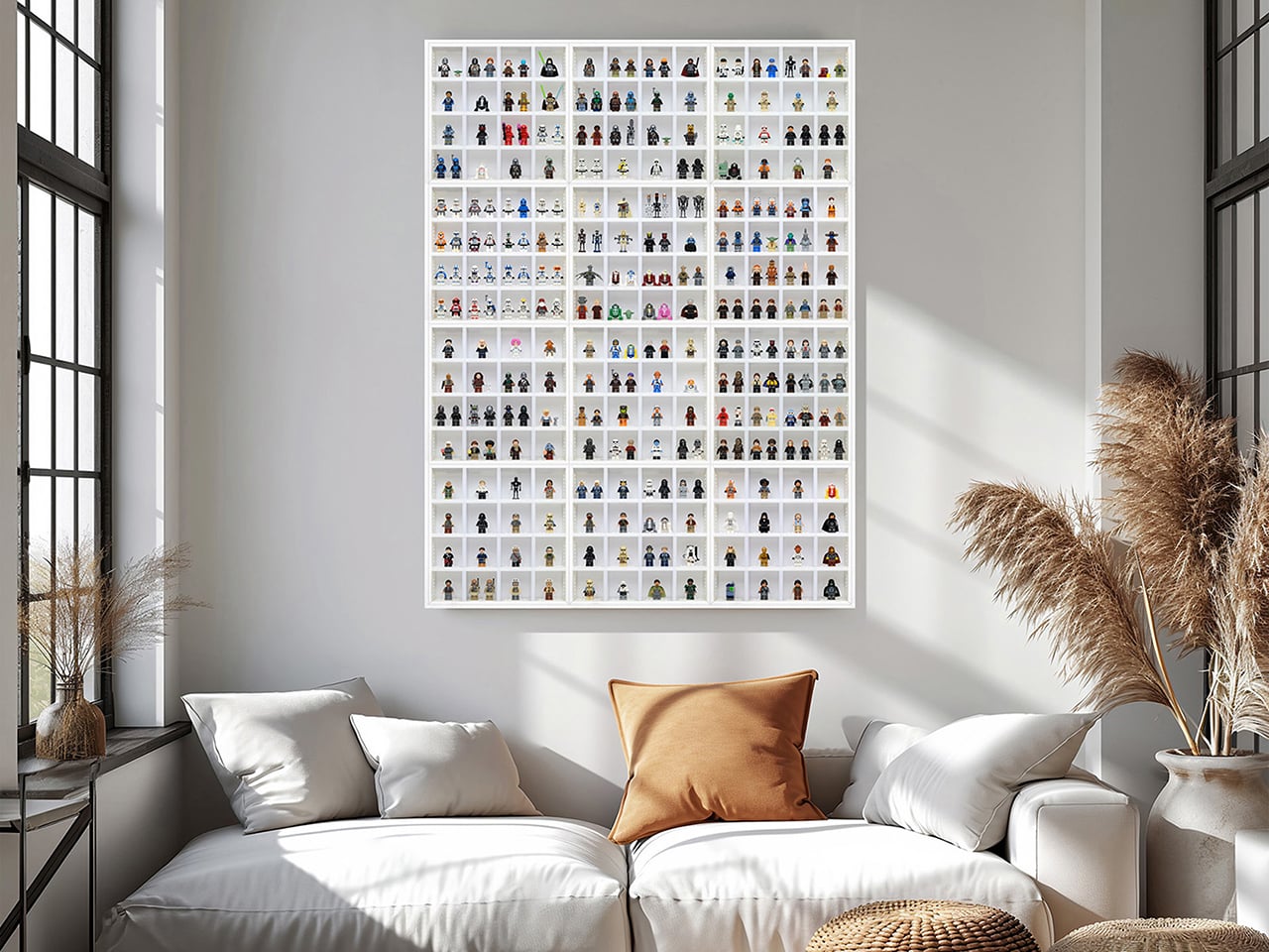
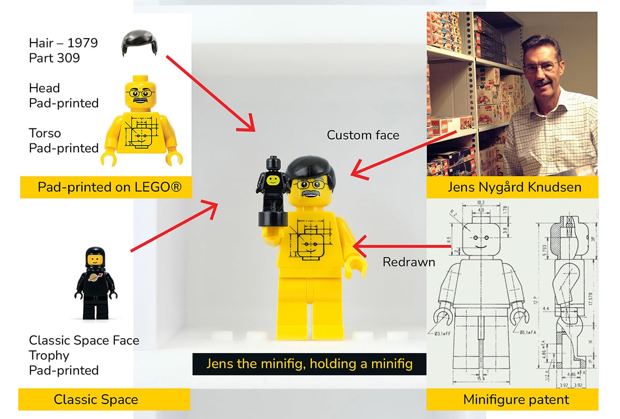
Somewhere in a closet, a perfectly good LEGO minifigure is staring through a plastic bag at the back of a cardboard box. It has a tiny printed face, a surprisingly elaborate hat, and absolutely no audience. Every serious LEGO collector knows the feeling: shelves fill up fast, display cases sell at fixed sizes, and at some point the collection starts living in labeled ziplock bags rather than anywhere it can actually be seen. LEGO has released over 775 Collectible Minifigures across 51 series since 2010, with new figures arriving three times a year, which makes the storage problem a permanent one for anyone collecting seriously. Stephen Peaple, a British-born collector now based in Perth, Australia, had thousands of them and spent four years building the solution he could not find anywhere.
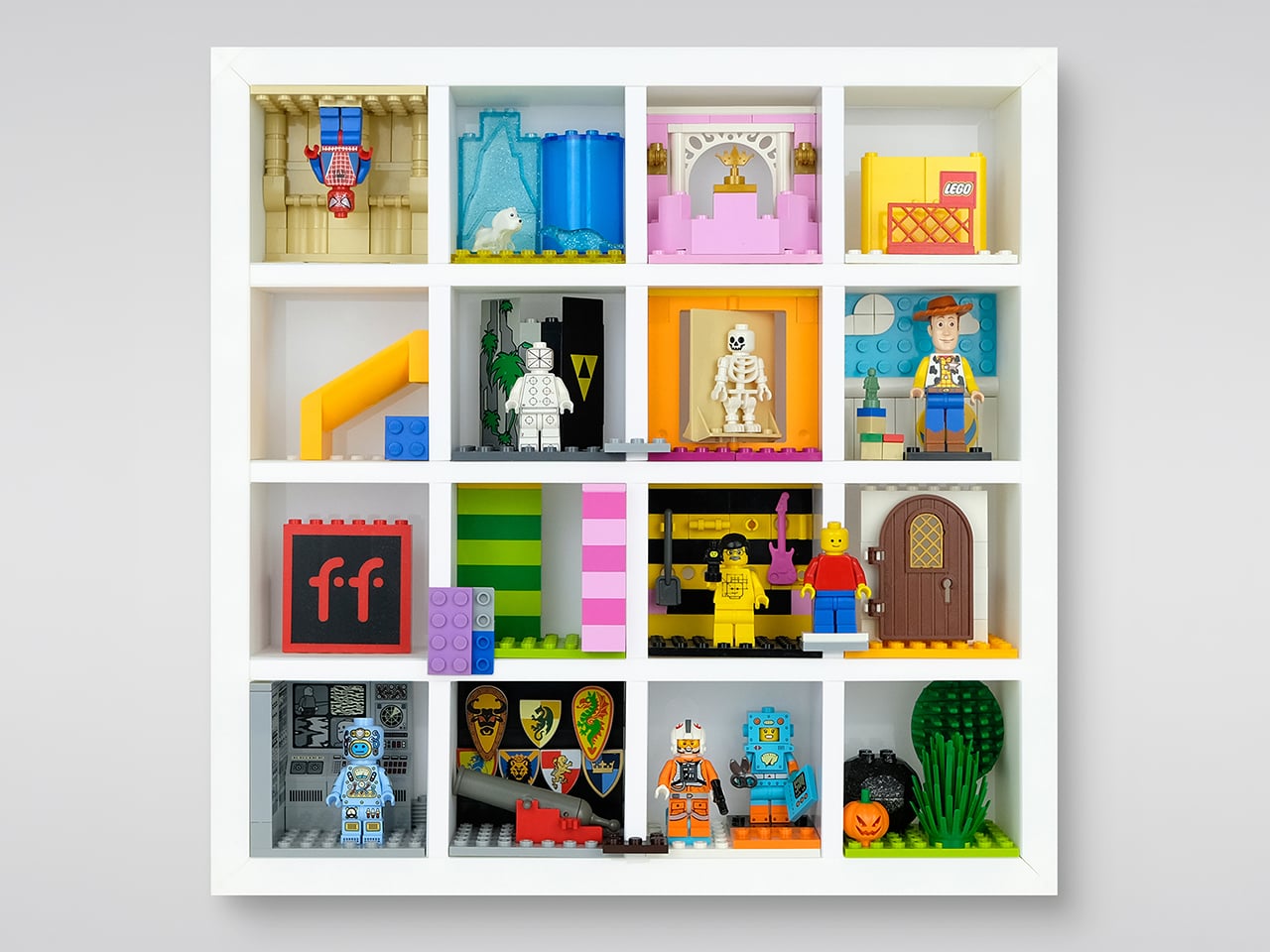
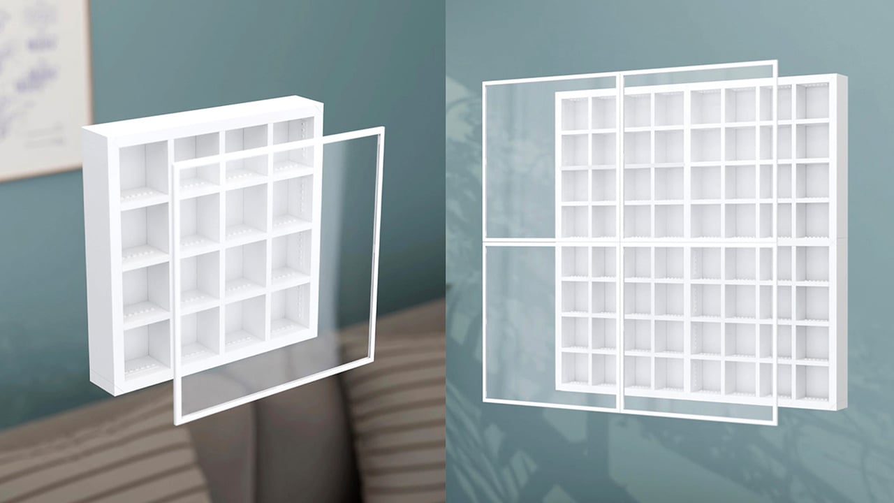
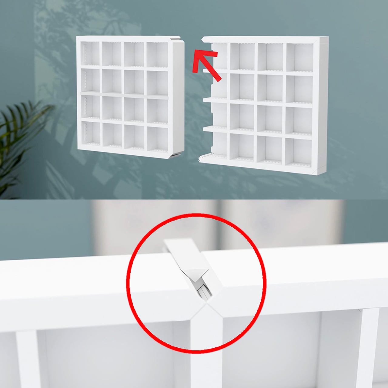
Finity Frames puts a collection on the wall in a clean white grid. A single frame carries 16 spaces, but removable dividers let you make room for bigger figures or pack in a crowd. When the collection grows, connected frames share edges so the display extends as one continuous piece without visual seams or doubled-up borders. Your next minifigure gets a spot without requiring a complete wall makeover. The system is injection-molded ABS, ships flat-packed, and the connection method that makes all of it work is patented.
A Display System That Grows With Your LEGO Collection
Every Finity Frame is built around a seamless edge connection where neighboring frames share a single border, eliminating the doubled-up edge and any visual gap at the join. This is the core innovation that solves the fixed-size problem inherent in every other display case on the market. It means you can start with a single frame for one series of figures and expand outward in any direction, at any time, without having to replace your original investment. The aesthetic is clean and continuous, looking like a single, cohesive unit no matter how large it gets.
This design approach also makes the system more efficient as it grows. Peaple makes the math explicit: the first frame measures 312mm across, and each connected frame adds just 298mm, because one edge is always shared. This reduces material waste and lowers the cost per additional frame. A 2×2 Collector, for instance, cannot be broken apart into four 1×1 Starters, since it doesn’t include the extra pieces. For context, the most prominent fixed-case competitors max out around 190 minifigures. The Finity Frames Showcase holds 1,056, and two of them together can display over 2,100 figures as a single, unified piece.
Built for Customization and Creative Play
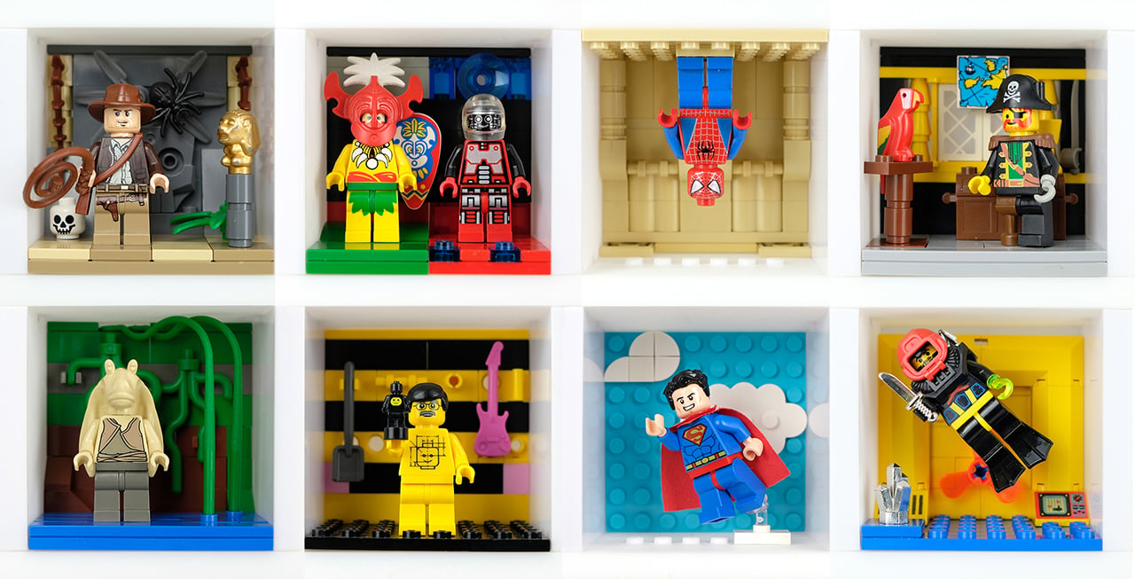
Each Finity Frame ships with three horizontal and three vertical internal slats, forming a standard 4×4 grid. This sixteen-space layout is not arbitrary; it maps exactly to one complete Collectible Minifigures series, which traditionally ships with 16 unique figures. The slats are removable in any combination, yielding 64 different internal layouts. You can pull the vertical dividers out, double-stack figures with jumper plates, and a 1×1 Starter can hold up to 88 minifigures. This flexibility lets you create custom spaces for dioramas, larger vehicles, or oversized figures like the Hulk who need a little extra room.
The system’s dimensions are precisely calibrated to the LEGO System of Play. Internal slats are exactly one brick wide, and the frame edges are exactly two bricks wide. Each compartment accepts a 6×8 LEGO plate or four 3×4 minifigure plates, the same stands that come with CMF packs. This means removing the acrylic cover turns the frame into a wall-mounted baseplate where builds can bridge continuously across spaces and frames. Peaple calls this “bridging,” a feature that turns a static display into a creative canvas. Every horizontal slat even has a built-in row of six studs for securing figures or small builds.
Designed for Collectors of All Kinds
A magnetic Perspex acrylic cover protects the collection from dust and removes in a single pull. It’s made from UV-stable material with built-in absorbers to block harmful light, preventing the slow fading that can damage valuable figures over time. The frame itself is a gallery-white, UV-treated ABS plastic, a color choice meant to disappear behind the collection rather than compete with it. Everything is designed to last, preserving the collection while keeping it easily accessible. The magnetic attachment is secure but quick, so you can get to your figures without fussing with clips or latches.
Flipping the horizontal slats 180 degrees turns the studded surfaces into flat shelves, opening the frame to almost any small-scale collectible. A single 64x64x49mm space can hold Funko Pocket POPs, Be@rbricks, Sonny Angels, or even shot glasses. Removing dividers creates double-height spaces for larger items like vintage Kenner 3¾” figures, Super7 ReAction figures, Playmobil sets, or graded collectible cards in their hard cases. It’s a true cabinet of curiosities, designed for a LEGO collection but adaptable enough for just about anything else that deserves a spot on the wall.
Five Sizes, Starting at $65 USD
The five frame sizes run from the 1×1 Starter at 12.3×12.3 inches (up to 88 minifigures) to the 4×3 Showcase at 47.4×35.7 inches (up to 1,056), with the 1×2 Duo, 2×2 Collector, and 3×2 Lifestyle filling in between. All frames run 55mm deep without the cover, 61mm with, and production units are estimated at 0.9 to 1.1kg for the 1×1 (roughly 2 lbs).
Retail pricing starts at AU$99 (roughly US$65) for the Starter and reaches AU$835 (roughly US$550) for the Showcase. Any size can be extended later through a Frame Extender on finityframes.com, where you input what you already own and order only the additional sets required. The system ships flat-packed globally, with US distribution in place through the manufacturing partner.
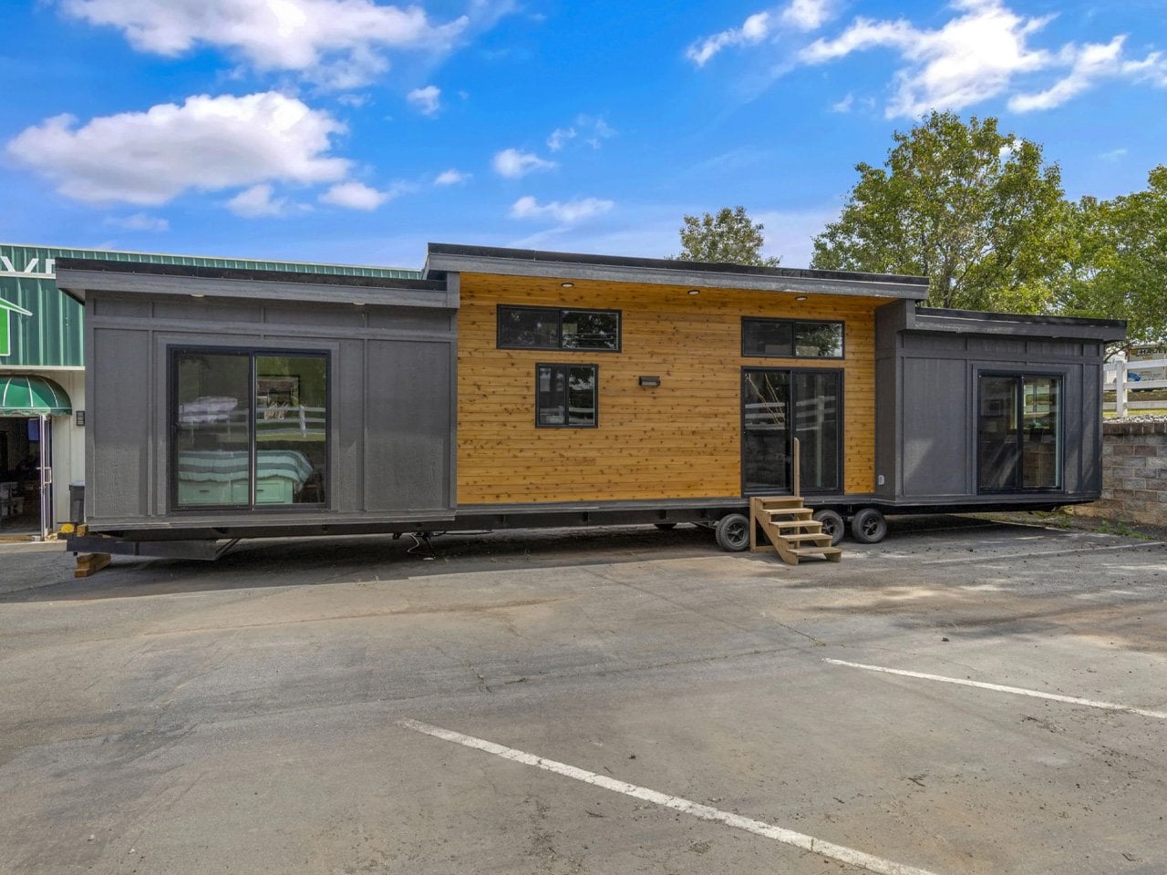
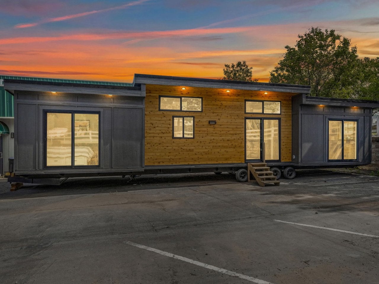
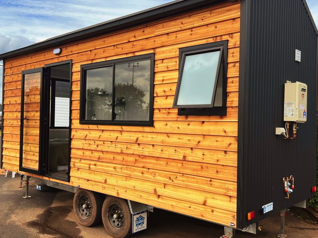
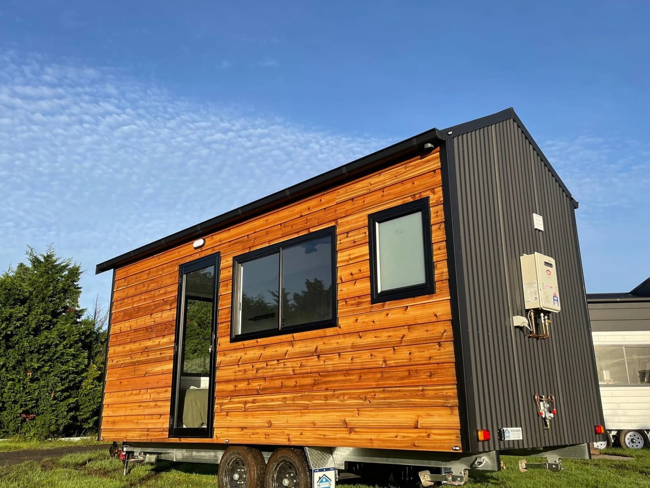
Not every home needs to shout to be heard. Highlands Tiny Homes, based in New South Wales, has built that idea into every corner of the Sierra — a single-level tiny home on wheels that measures just 6 meters in length and does absolutely nothing to apologize for it. It sits on a double-axle trailer and wears its compact footprint like a statement, not a compromise.
The exterior leans into a woodland aesthetic without overdoing it. A pitched corrugated roof, aluminium sash windows, and a considered combination of cladding and Colorbond accents give the Sierra a look that feels rooted — visually grounded in its surroundings regardless of where it’s parked. It’s the kind of exterior that photographs well in a pine clearing or beside a mountain road, reading more like an architect’s bush retreat than a prefab box.
Inside, the single-floor layout prioritizes openness over segmentation. White walls reflect the natural light that pours in through generously sized windows, while wooden countertops and bar seating in the kitchen add warmth without clutter. A ceiling fan overhead keeps things casual. The Sierra isn’t chasing the maximalist tiny-home trend of stacking every possible feature into the ceiling — it’s lean by design, and that restraint is exactly what makes it feel livable.
The kitchen claims a meaningful portion of the floor plan, which signals a priority worth noting: this is a home built for people who actually cook, not just for people who want to say they live small. The double bed doubles as a day bed and lounge area, keeping the space flexible without demanding a furniture reconfiguration every morning. The bathroom includes a glass-enclosed shower that feels considered rather than an afterthought.
Priced from US$59,000 including GST, the Sierra 6.0 sits at an entry point that makes serious compact living genuinely accessible. For those needing slightly more room, a 7.2-meter version is also available – same DNA, a little more breathing room.
The Sierra isn’t designed to impress at a trade show. It’s designed to work on a Tuesday morning when you’re making coffee and watching the light move across a wooden countertop. Highlands Tiny Homes has found a rhythm in the Sierra that many larger builds never quite locate — the specific calm that comes from a space that knows exactly what it is and refuses to be anything else.
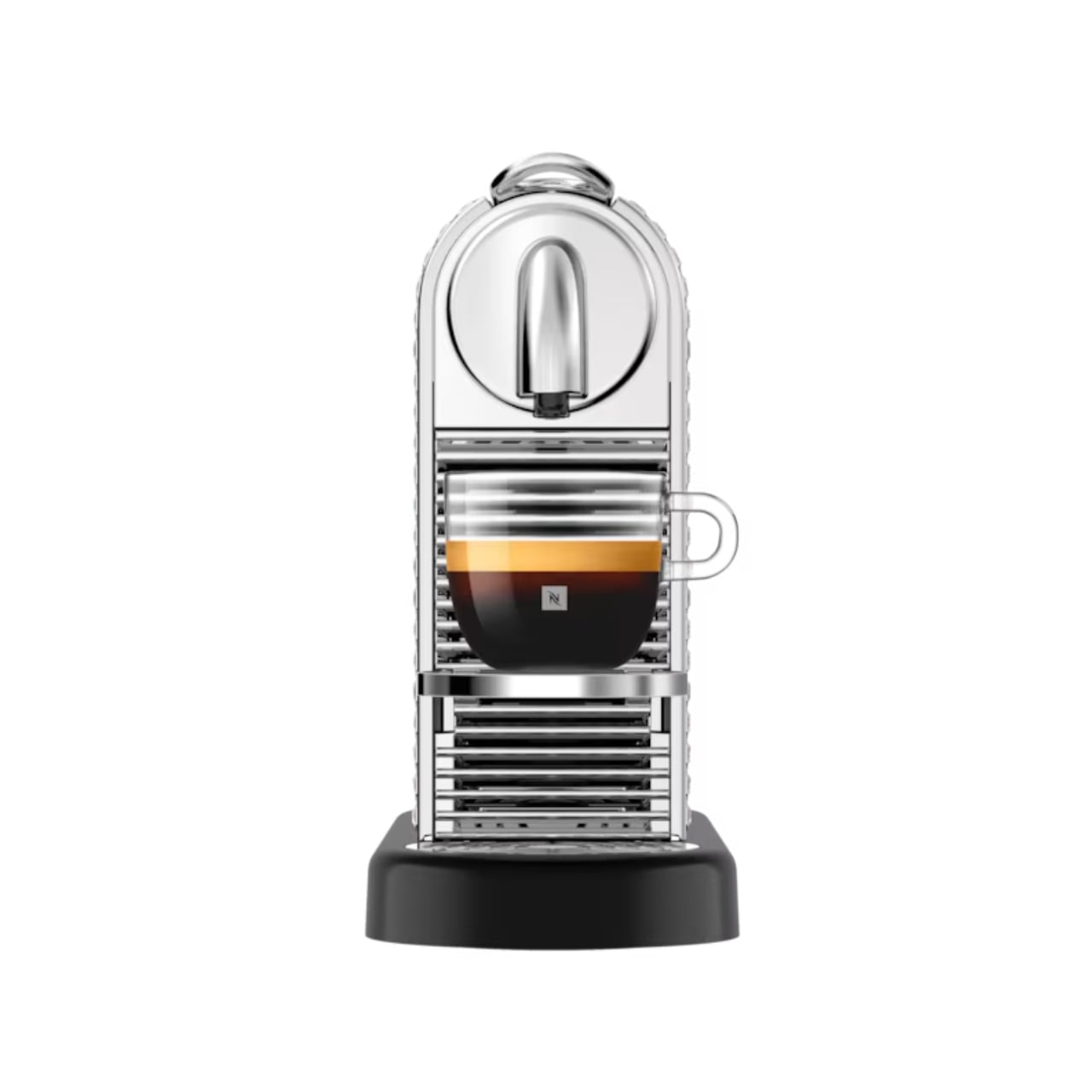
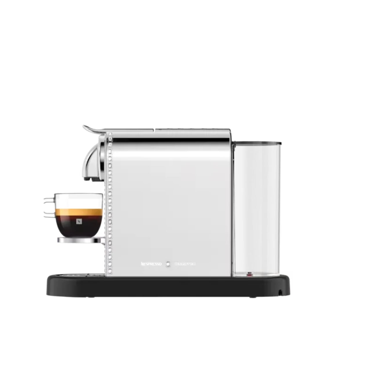
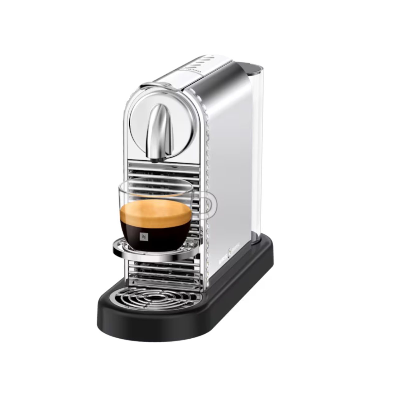
Coffee machines have an awkward relationship with the kitchen counter. We need them within reach every morning, but once the coffee is made, many look like appliances we would rather tuck away. The Nespresso x Swarovski collection takes that small design problem seriously. Its crystal-embellished CitiZ Platinum is a machine meant to stay visible, giving the coffee corner a reason to look considered even when nobody is making a cup.
That does not mean your morning coffee needs an audience. Most of us just want a reliable routine before the day gets loud. But a machine that sits out all day affects how a kitchen feels long after its job is done. I like the idea of treating that presence as part of the design, rather than pretending a frequently used appliance can somehow vanish between cups.
Designer: Nespresso x Swarovski
The limited-edition CitiZ Platinum has a silvery finish, with Swarovski crystals placed around its border. It is a noticeable change, though the machine remains recognizable as a CitiZ Platinum. That balance matters. Covering every surface in sparkle might make for a memorable photograph, but the more useful question is whether you would enjoy seeing it beside your favorite mugs on an ordinary Tuesday.
For me, the answer has less to do with luxury than with attention. Kitchens collect objects by necessity: a toaster, a kettle, a jar of spoons, the mug that never quite makes it back into the cabinet. A crystal-accented coffee machine cannot tidy that counter for you. It can, however, make one of its most permanent residents feel intentional.
The collaboration stretches beyond the machine. Nespresso and Swarovski have carried the festive look into coffee, accessories, and capsule-inspired ornaments. The collection’s packaging draws on Swarovski’s octagonal shape and color palette, so the visual idea follows you from the machine to the smaller things around it. I appreciate that continuity. A special-edition appliance can feel oddly isolated when everything accompanying it looks like business as usual.
There are limited-edition coffees in the collection, too, including Crystal Spark options for Nespresso’s Original and Vertuo systems. That gives the partnership a place in the cup as well as on the counter, though I would keep the two appeals separate. The crystals are a design choice, not a claim that the machine brews better coffee because it has been dressed up.
That distinction makes the product easier to appreciate. You do not have to believe every appliance needs a glamorous makeover to see who this is for. If you have spent time arranging a coffee station, choosing cups you enjoy holding, or finding a spot where the morning light hits just right, the machine fits into an interest you already have. It offers convenience without asking you to give up the pleasure of looking at your space.
It also makes sense as a gift for someone who already has very specific tastes. Coffee can be hard to buy for another person, especially when their preferred capsules and flavors are settled. A design-led machine is a more personal gesture, provided you know it suits their setup. I would check compatibility and availability before getting attached to the idea, particularly with a limited-edition collection.
Of course, sparkle is a matter of taste. Some kitchens look best with almost nothing on the counter; others are happier with color, collections, and objects that start conversations. This CitiZ Platinum belongs to the second group. It asks for a little space and attention, and that is either its charm or a good reason to admire it from afar.
What makes the Nespresso x Swarovski collection interesting is its modest premise beneath all the shine: everyday tools deserve design consideration, too. The machine still has coffee to make. But when that job is done, it remains part of the room. For anyone tired of choosing between a useful counter and a beautiful one, that is a lovely place to start.

 Connexion



 2.0 trimming system targets a zero-inch edge gap, according to the company, putting that leftover strip squarely on the agenda. Set for a preview at Equip Expo 2026, the robotic mower also brings solid-state LiDAR, stereo vision, and network-assisted satellite positioning. An impressive résumé, although the edge-cutting hardware is what makes me want to schedule the interview.