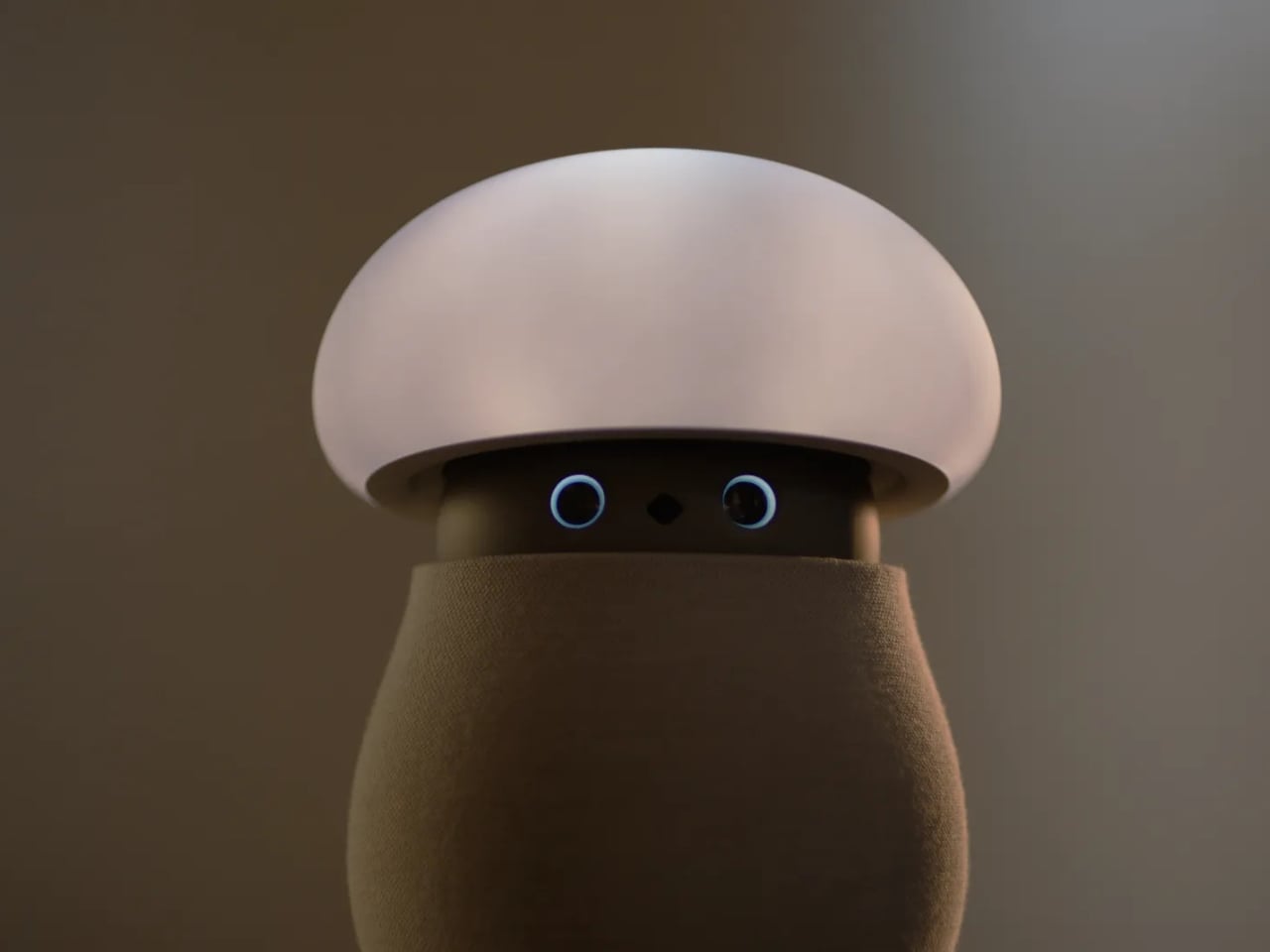
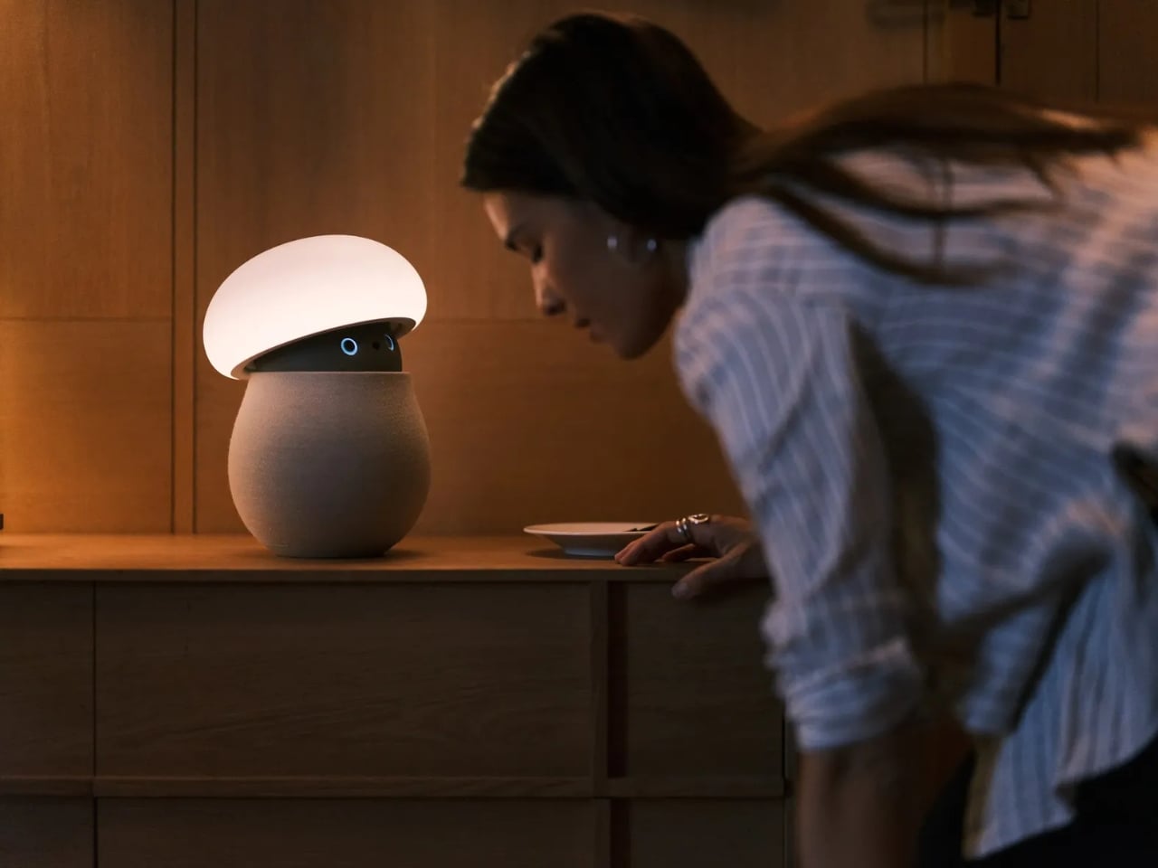
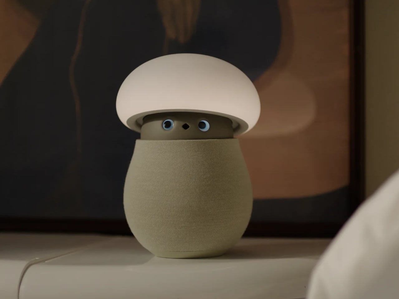
A mushroom with glowing eyes is an easier sell for my nightstand than a miniature humanoid. OKA’s Mori takes that approachable shape and gives it a specific job: offering a little company and a reason to pause, without making another screen the center of attention. Currently offered through an early-purchase program, the companion robot uses light, sound, and movement to bring some presence to a quiet room. The ambition is modest enough to feel appealing.
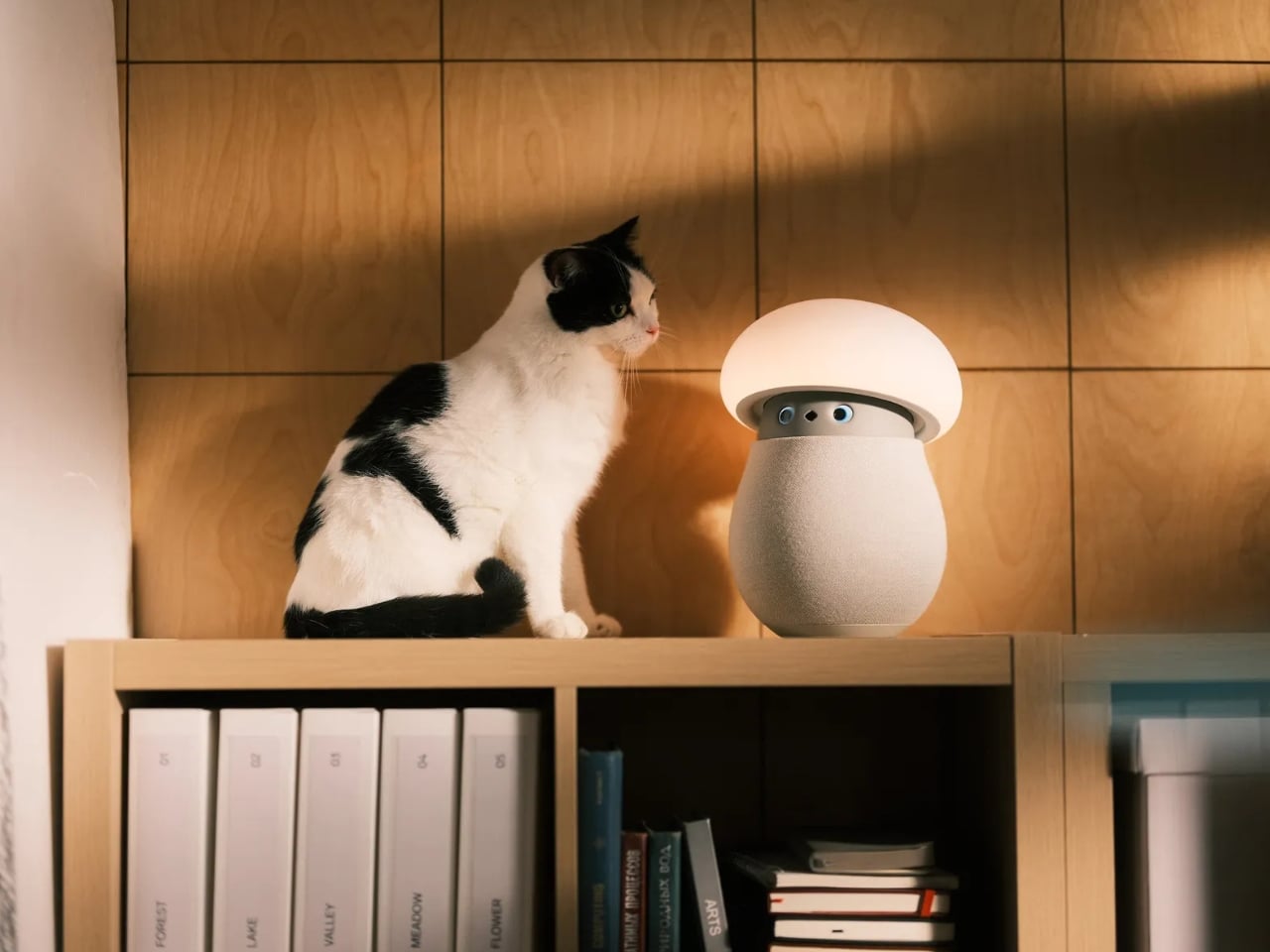
For anyone who wants to unwind without reaching for their phone, the physical design makes a good opening argument. Mori stands just under 12 inches tall at its maximum height, with a broad illuminated cap above a rounded, fabric-covered body. Two eyes peek out from underneath and the fabric contains 25 percent real wool. In the supplied photographs, the proportions suggest a small table lamp that wandered into an animated movie, then decided to stay. I’d happily make room for that silhouette.
Designer: OKA
The backstory gives that friendliness some purpose. OKA cofounder Hua Wang said he spent a decade designing mechanisms that brought people back to their phones. With Mori, he wanted a robot that belonged in a home rather than a large, intrusive machine. That’s a useful starting point. A domestic robot has to earn its place among your furniture before its intelligence becomes particularly interesting.
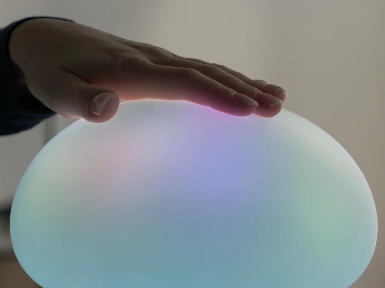
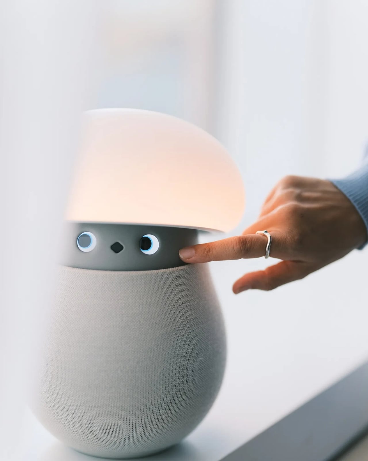
Mori’s controls lean into that furniture-friendly character. According to OKA, placing both hands on its base starts a guided breathing session, while patting its head makes the cap retract and turns it into a lamp. Light and natural soundscapes provide the setting for those breaks. I like the directness of those gestures. Touching an object to change its behavior feels appropriate here, especially when the proposed activity is stepping away from the usual sequence of opening an app, choosing a menu, and adjusting settings.
Importantly, Mori doesn’t speak in words. Its vocabulary consists of sounds, expressions, light, and movement. That limitation might be its most attractive feature. I don’t particularly want a bedside object to become another conversational obligation. A glance or a small movement leaves more room for interpretation, much like an animated character whose personality comes through before it says anything. The lamp setting also gives its owner a way to dial that personality down, with most companion reactions reduced. Cute still needs an off-ramp.
Of course, those expressive eyes come with a less whimsical consideration: sensing people inside their homes. OKA’s privacy policy says Mori’s core AI runs locally, with camera and microphone inputs processed on the device. Raw audio and image frames are discarded after processing, while recognition information can remain locally to distinguish users. The policy separately allows collection of account, device, and diagnostic information. That distinction matters. Local processing is a welcome design decision, but I’d still read the permissions before inviting a camera-equipped companion onto the dresser.
OKA also says Mori learns and becomes more individual through repeated interaction. That’s the promise I’d reserve judgment on until longer-term use establishes what actually changes. A familiar gesture could become endearing, or simply predictable. The interesting design challenge is giving Mori enough variation to sustain affection without making it demand attention. Its quiet role sets a higher bar than the adorable appearance initially suggests: it needs to remain pleasant when the novelty has worn off.
At $649 before taxes and shipping for First Access orders, Mori is an expensive experiment in companionship. That purchase includes two years of its Nature Time subscription; OKA says basic functions won’t require a paid plan, and the included subscription won’t automatically become a paid one. I’m drawn to the object, but the price makes its everyday behavior more important than its introductory charm. The real payoff would be a robot you enjoy having nearby even when you aren’t actively playing with it. A mushroom-shaped lamp already has a place in a home. Mori has to make the eyes worth paying for.
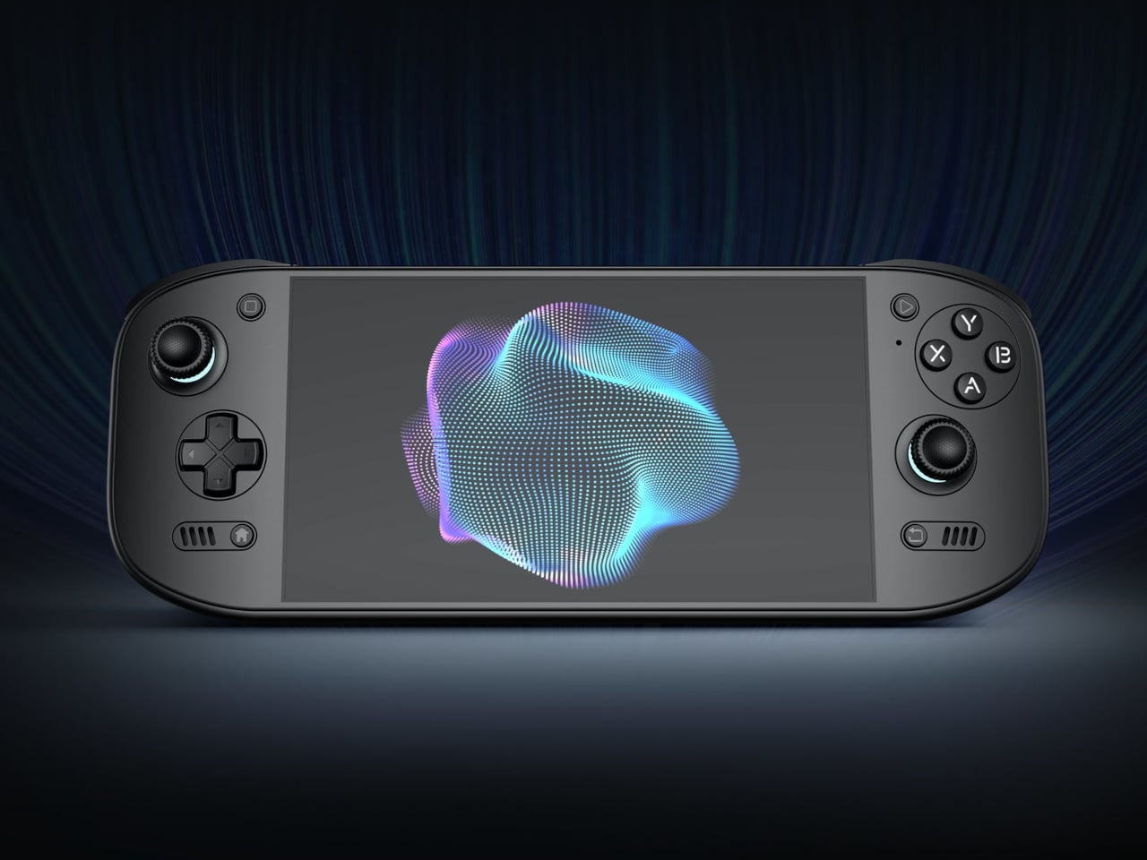
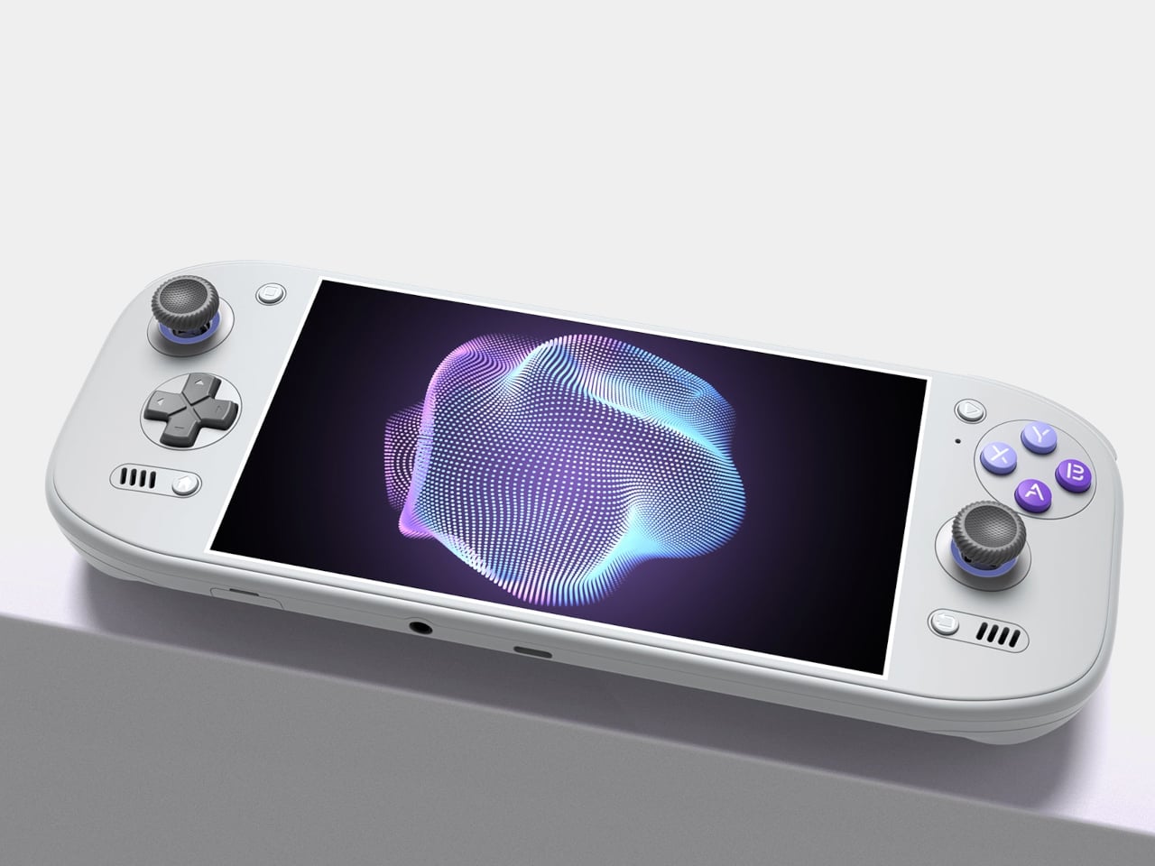
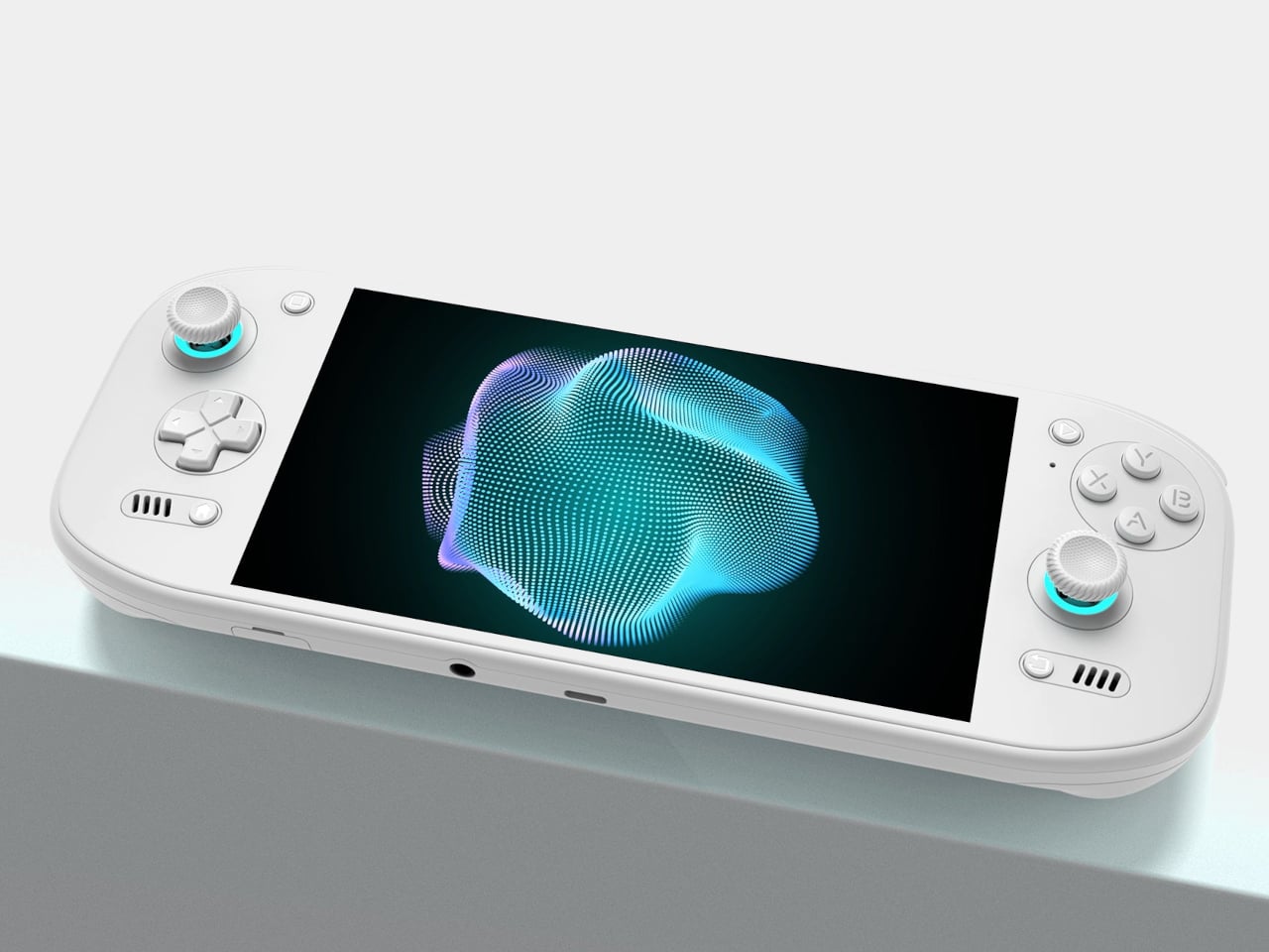
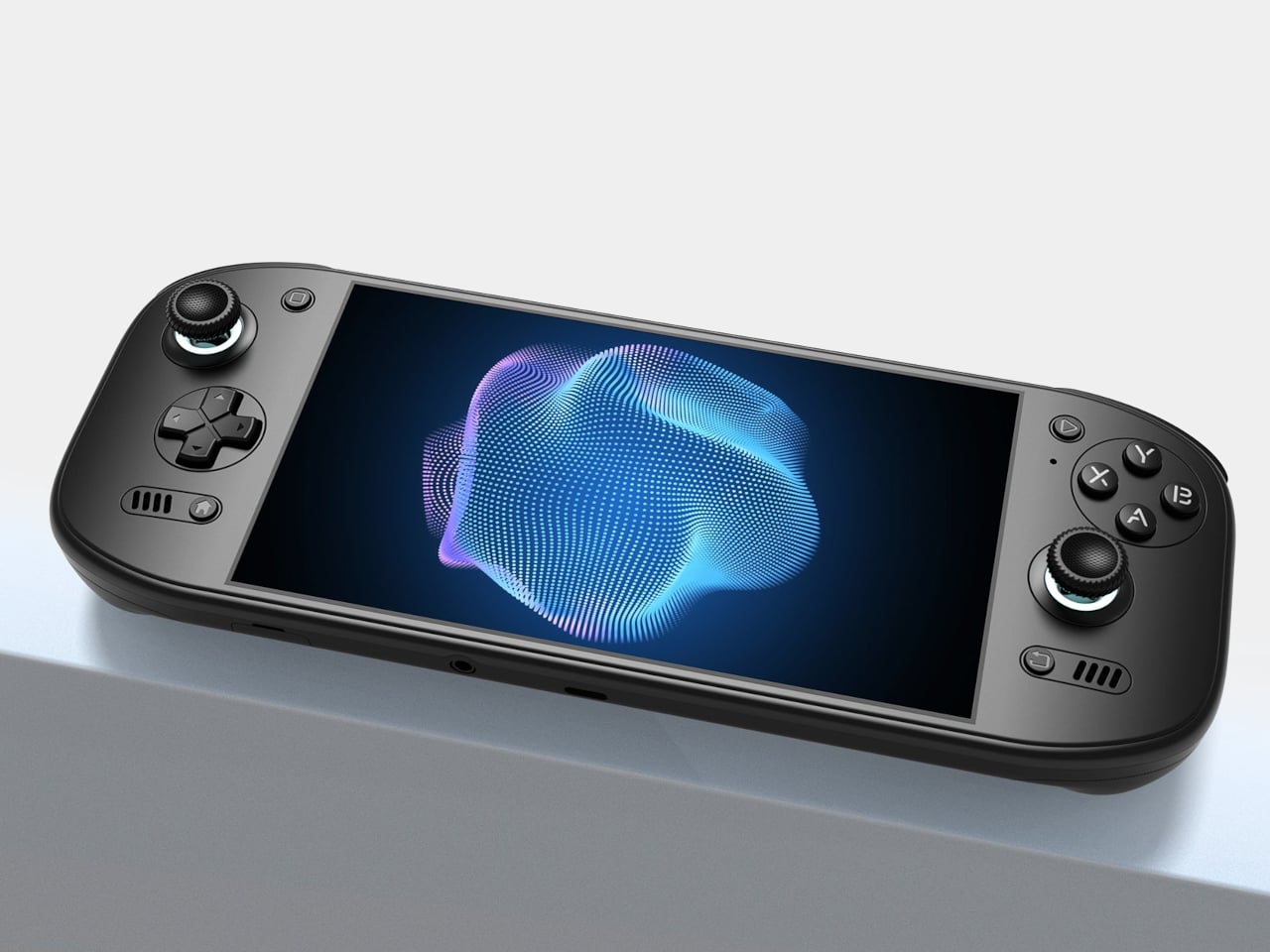
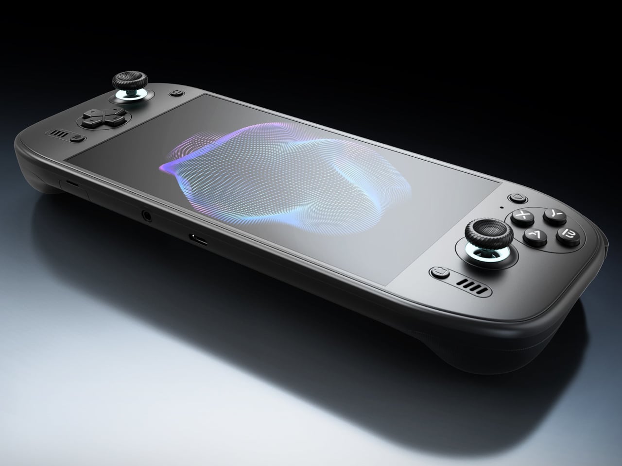
Putting a large screen on a gaming handheld is easy compared with making the whole thing comfortable to hold. AYN’s Odin 3 Portal approaches that problem with a 7-inch OLED up front and sculpted grips behind it. Now available for preorder, the Android handheld combines a broad, glass-covered face with physical controls that give your fingers somewhere other than the screen to go.
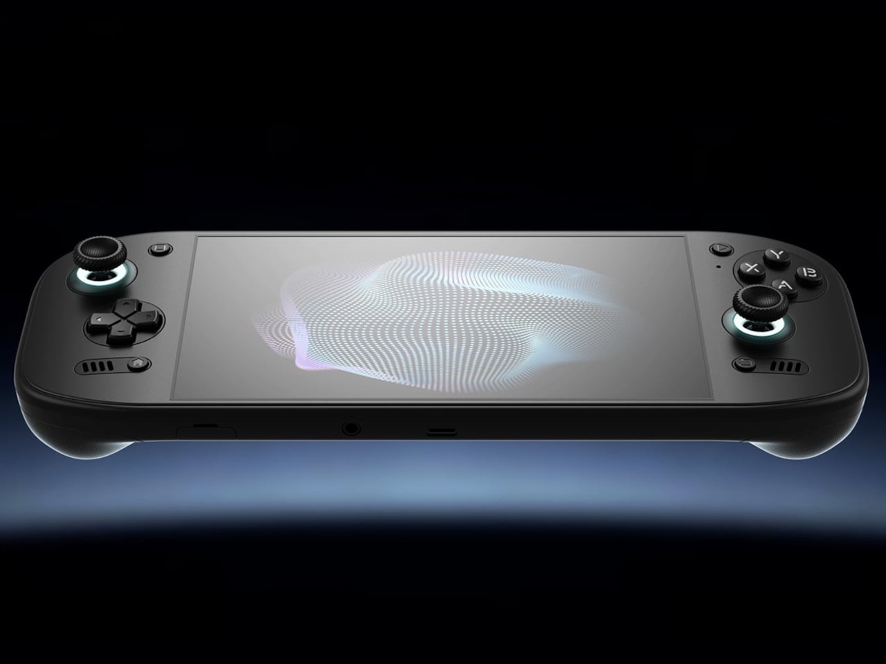
That front surface stretches across the display and surrounding control areas, giving the device a flatter, more unified appearance than a screen dropped into a chunky frame. Black keeps the boundary between panel and housing less conspicuous, while White and Cold Grey emphasize it. The latter’s purple buttons add retro flavor without turning the machine into a tribute to another console.
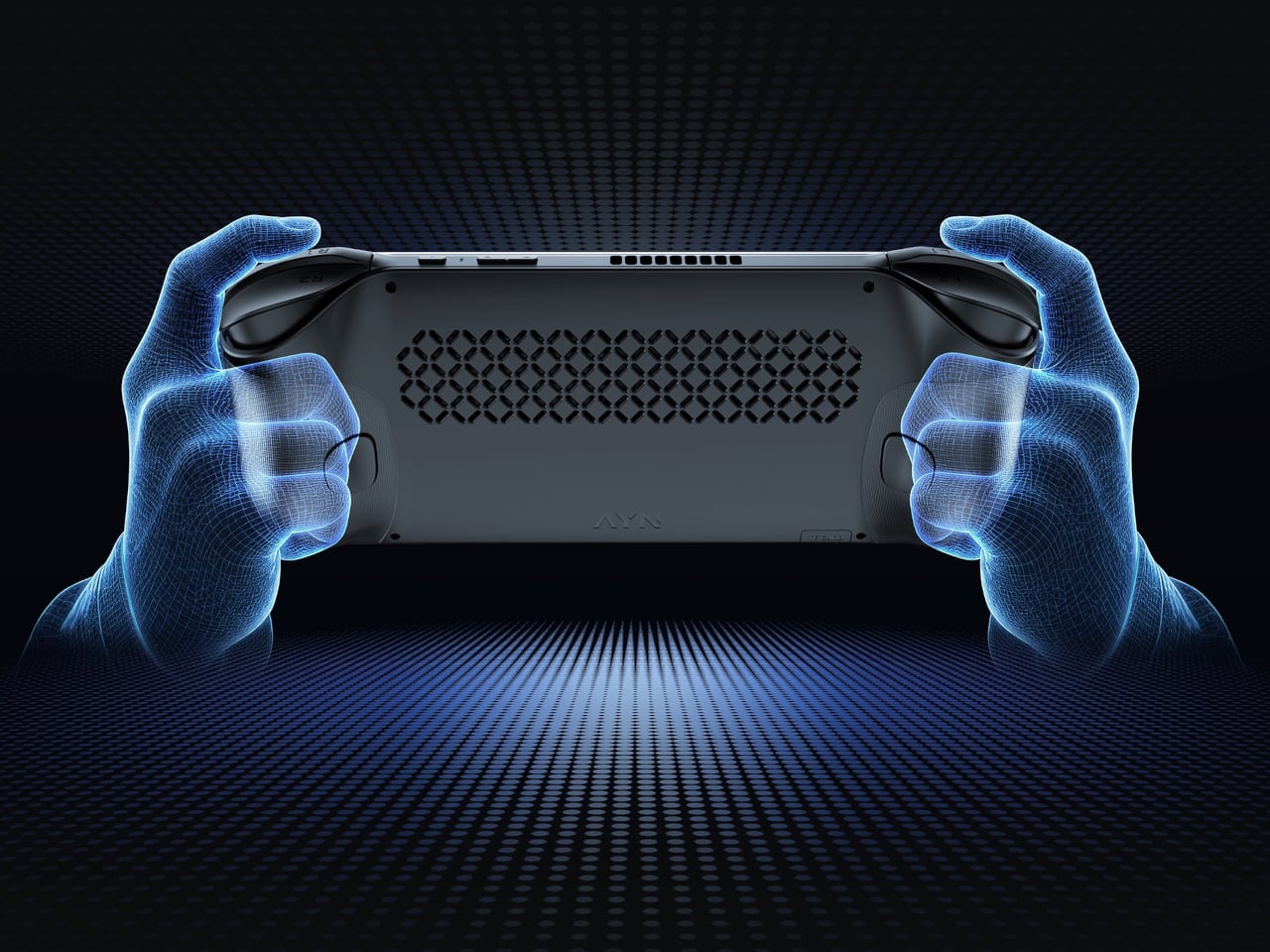
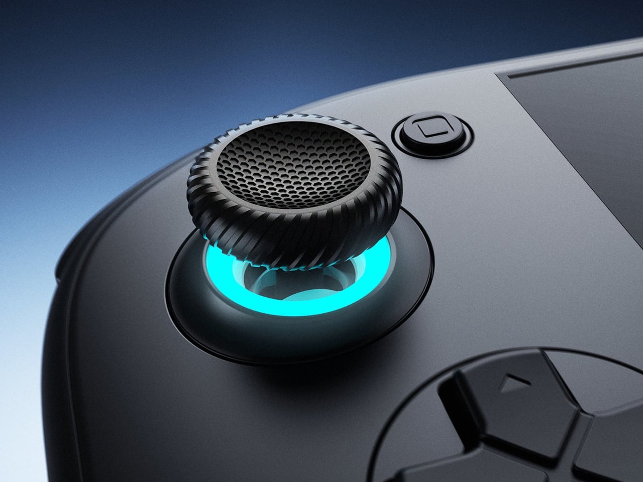
Turn it over, and the shape becomes less concerned with looking flat. Rounded bulges give your palms somewhere to settle, while textured shoulder buttons meet your index fingers above. The full-size Hall-effect sticks have ridged edges, and a dome D-pad sits below the left stick. These details aim to improve control, though actual comfort will depend on your hands and how you play.
The screen is a 1920×1080 OLED with a 120Hz refresh rate, giving supported games room to show smoother motion without asking you to peer at a tiny display. That doesn’t mean every game will run at 120 frames per second, of course, nor should you always crank it up. It depends on the game, settings, and your remaining battery.
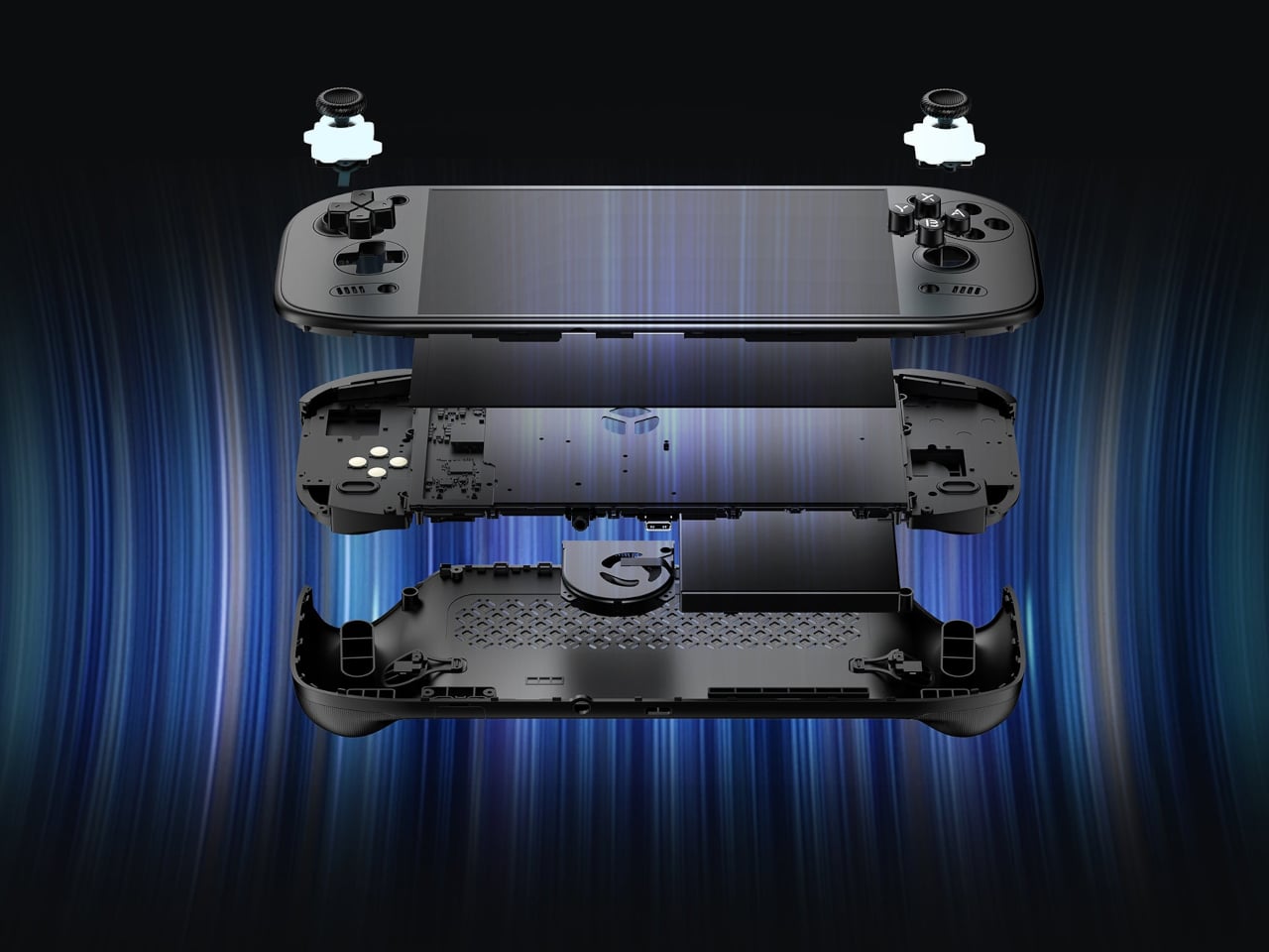
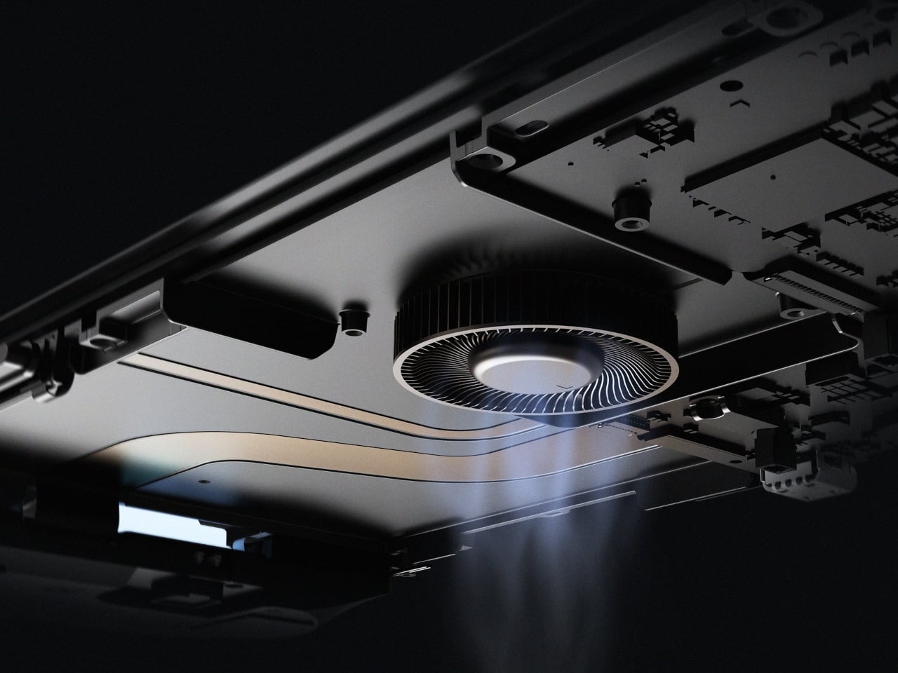
Behind that screen is Qualcomm’s Dragonwing Q8 processor, paired with Android 15 and active cooling. A broad rear grille gives the internal fan room to draw air, making ventilation part of the exterior rather than hiding it completely. That’s worth remembering when you settle in with the handheld against a cushion, since the cooling system still needs an unobstructed path to breathe.
Power comes from a 9,000mAh battery, with support for 60W charging when you need to plug back in. Actual playtime will depend on the game and screen settings, so that capacity doesn’t translate into a guaranteed afternoon away from an outlet. At about 15.9 ounces, the handheld puts weight behind that screen, especially when a quick session somehow becomes an entire evening.
Storage starts at 128GB with 12GB of RAM, while the top model offers 1TB and 16GB of RAM. There’s also a microSD slot, so choosing less built-in storage doesn’t close off future expansion. AYN specifies that no games come preinstalled, however. You’re buying the hardware for your own library and setup, not a ready-made collection of nostalgic favorites waiting behind the power button.
Launch pricing starts at $399, with the 1TB version reaching $669 and shipping expected to begin in early November 2026. The pricier configuration doesn’t buy a different screen or processor, just more memory and storage than the base model. That leaves a practical choice between keeping a larger library installed and keeping the price down, particularly when a memory card remains an option.
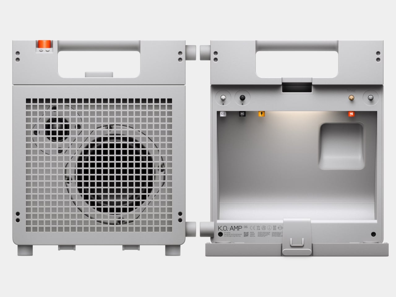
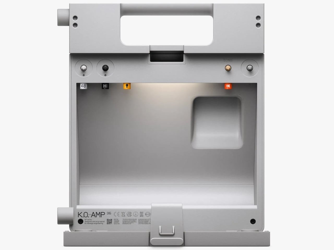
The back of Teenage Engineering’s EP-35 opens to reveal a compartment for cables and accessories. It’s a wonderfully unglamorous feature to put on a music gadget. An amp can look perfectly composed in a product photo, but taking it anywhere means figuring out where the supporting cast goes. Giving those loose pieces a home inside the speaker feels like an acknowledgment of how people actually use their equipment.
That practical streak extends beyond storage. Listed for sale at $399, the EP-35 combines a portable speaker, an instrument amplifier, and a USB audio interface. It accepts guitar, microphone, line-level, Bluetooth, and USB audio, with multiple sources able to play together. The problem it addresses is straightforward: playing guitar over a backing track, or adding vocals, shouldn’t require assembling a small equipment department. Here, those connections meet in one box.
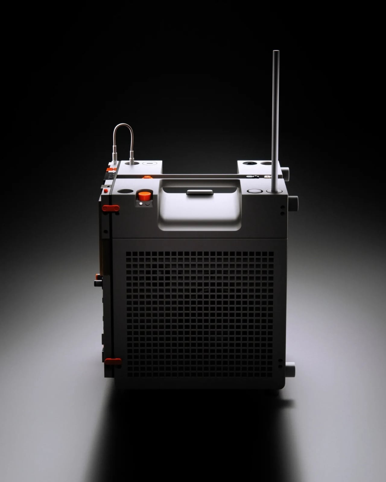
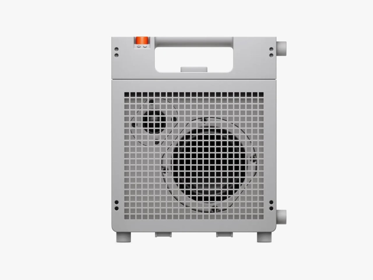
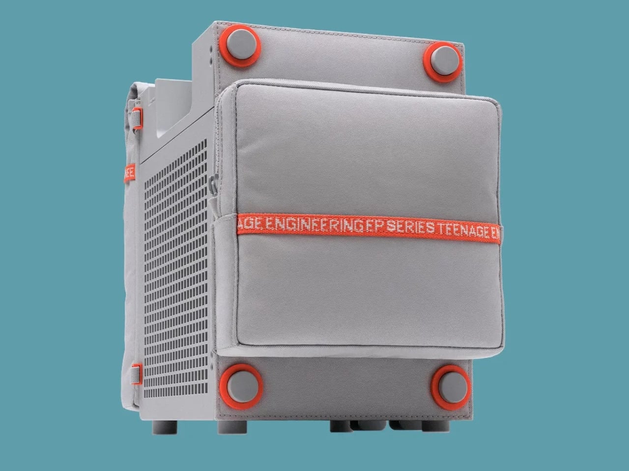
Visually, the EP-35 has the charm of equipment that might belong in a very stylish school science lab. Its gray body, square grille, integrated handle, and orange accents are deliberately matter-of-fact. I like that the speaker drivers remain visible behind the grid. They give the front a slightly awkward, almost characterful expression. Nothing about the proportions suggests an object desperate to disappear into your decor, which is part of its appeal.
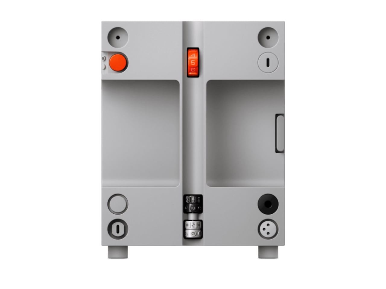
The controls make a similar impression. There are physical dials for choosing effects and adjusting their intensity, with eight presets each for guitar and microphone. That’s an approachable arrangement: select a sound, turn a control, hear what changes. I’d rather see that direct relationship on something intended for casual playing than a screen full of options. The microphone effects even include presets called “robo choir” and “frog,” which gives you a fair idea of the intended mood.
The USB audio interface is less visually entertaining but potentially more useful. Connect the EP-35 to a computer and it can serve as a recording interface, giving the same object a role at a desk after it comes home. That continuity makes sense to me. A portable device earns its shelf space more easily when it doesn’t become redundant the moment you’re near a power outlet and a laptop.
Inside the storage compartment, Teenage Engineering has also included a small camp light. It can illuminate the compartment automatically when opened, stay on, or react to incoming audio in disco mode. Tilting the speaker backward makes those LEDs display the battery level. Some of this is useful, some is cheerfully unnecessary. I’m happy with that balance. Checking a battery through a small physical gesture is a more memorable interaction than another tiny percentage readout.
Portability does need a little perspective, though. At about seven pounds, the EP-35 is something you carry by its handle, not casually toss into a small shoulder bag. Teenage Engineering rates battery life at 12 hours with the volume set to five, so that figure shouldn’t be treated as an all-day guarantee at any loudness. It’s also splash-resistant rather than waterproof. Those distinctions matter if the appealing camp light has you mentally packing it for a weekend outdoors.
There’s room to expand the setup, too. Two EP-35s can play Bluetooth audio in stereo through broadcast mode. Teenage Engineering’s instructions let you assign left and right channels by tilting each speaker before starting that mode. Connected instruments take a different route: linking their sound between speakers requires a line-out-to-line-in cable. That’s worth understanding before imagining a completely wireless mini stage. The wireless convenience applies specifically to Bluetooth playback.
For me, the $399 price makes the most sense if those musical connections will get regular use. Someone who only wants background listening would be paying for considerable capability they might never touch. Sound quality still needs a listening test; clever packaging can’t settle that question. But I appreciate the attention paid to what happens between sessions. The music stops, the cables come out, and the EP-35 gives you somewhere to put them. That’s a modest design decision with a very recognizable payoff.
Interchangeable batteries offer near-uninterrupted use
Familiar frame styling keeps the design approachable
Adjustable temples and nose pads help personalize the fit
In-view translation into 98 languages reduces the need to check a phone
CONS:
Swapping batteries require a 5-second reboot
Optional prescription lenses don't support hyperopia (farsightedness)
RATINGS:
AESTHETICS
ERGONOMICS
PERFORMANCE
SUSTAINABILITY / REPAIRABILITY
VALUE FOR MONEY
EDITOR'S QUOTE:
The INMO GO3 AI Glasses pair familiar eyewear styling with practical translation tools and the convenience of swappable batteries.
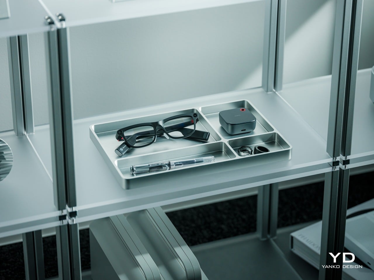
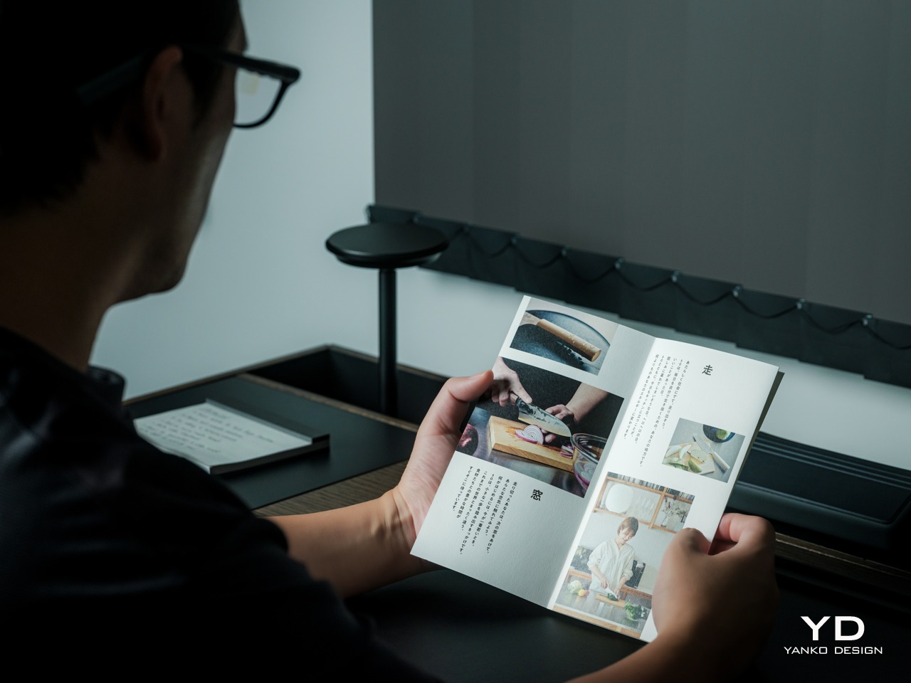
Looking down at a phone to translate a conversation can interrupt the exchange it’s supposed to help. Reading presentation notes creates a similar problem, pulling attention away from the people in front of you. The INMO GO3 AI Glasses bring those words into view instead, putting translation and presentation tools inside a familiar rectangular frame that doesn’t require a dramatic change in personal style.
That familiar shape is only part of the appeal, though. Adjustable contact points, discreet controls, and, most importantly, a replaceable battery give the GO3 a practical foundation beyond its display. Together, they suggest an approach to smart glasses that puts everyday wear on equal footing with software features. How convincingly the GO3 brings those priorities together comes down to a few details, starting with the frame itself.
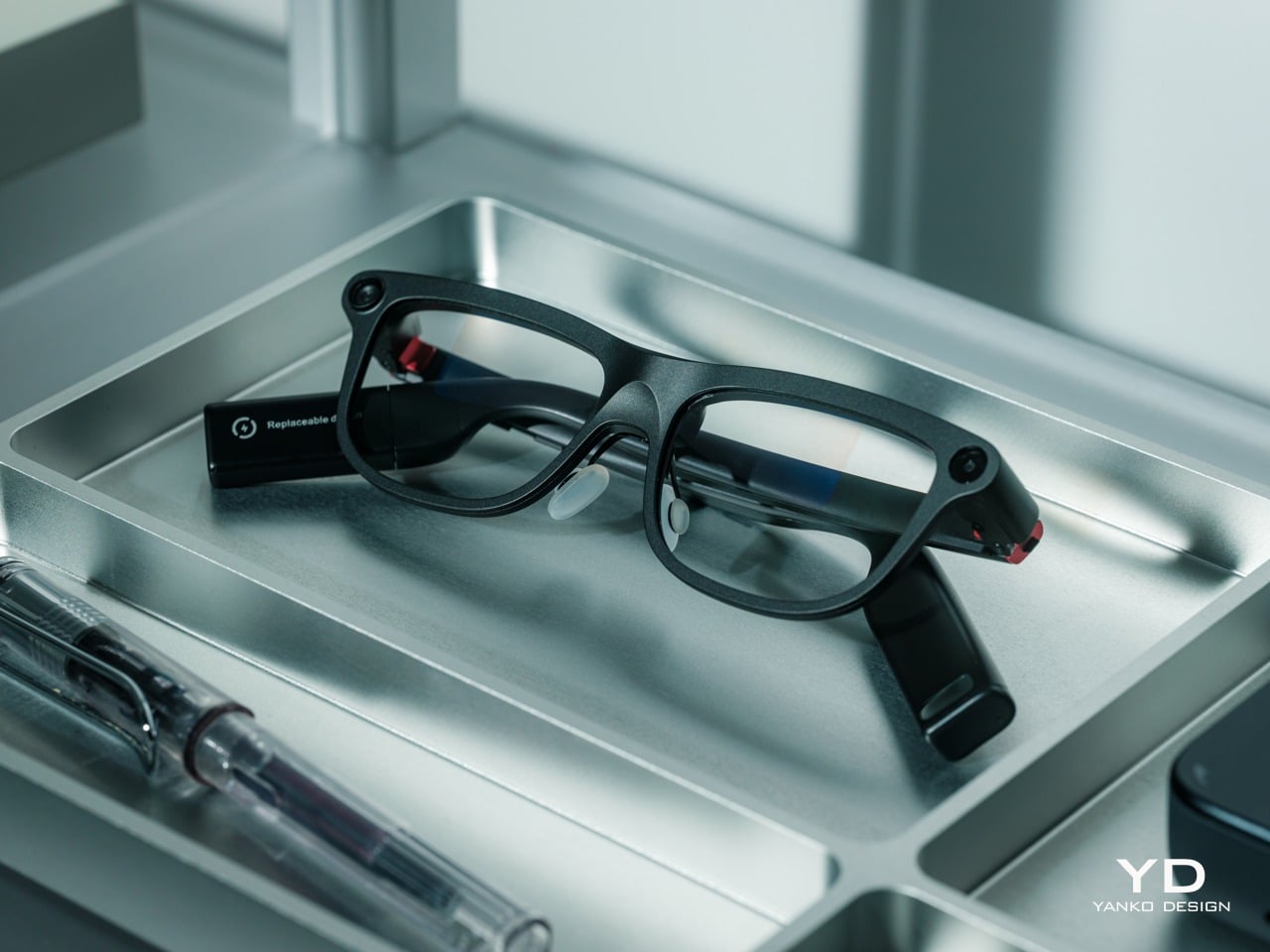
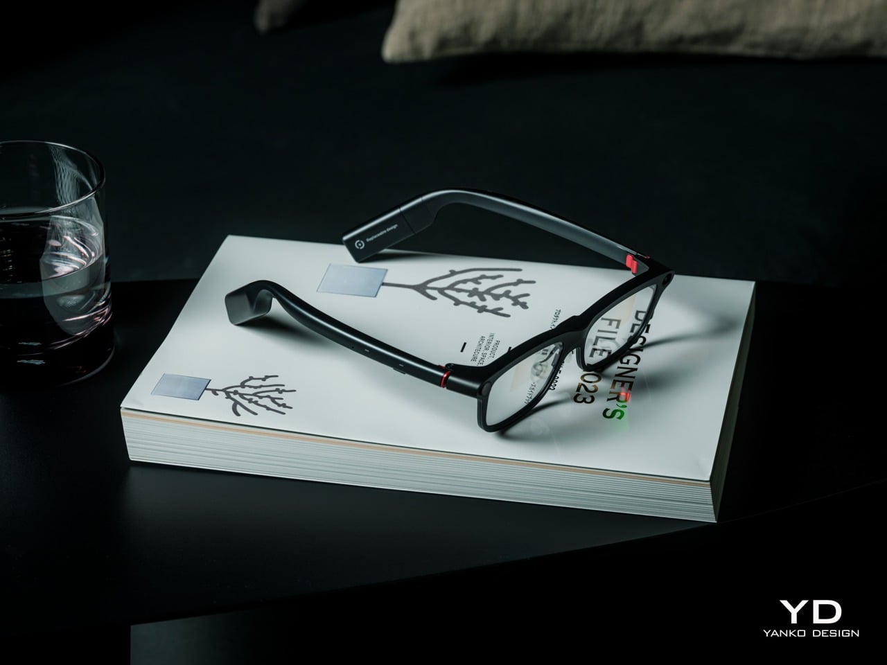
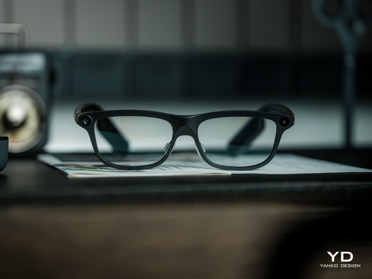
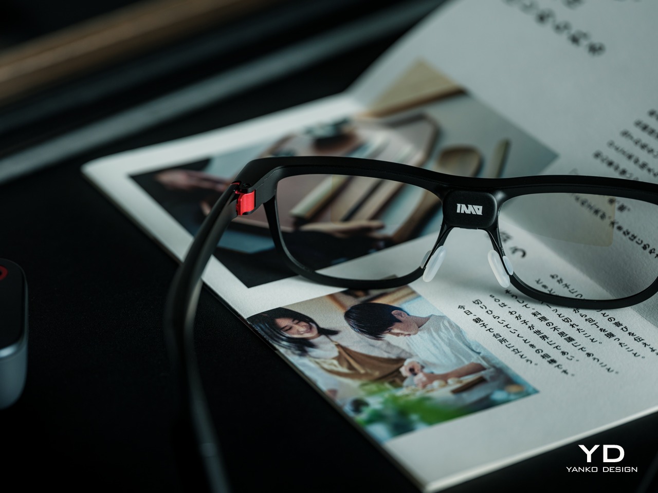
The INMO GO3’s rectangular lenses and softened corners give it the outline of conventional eyewear, although the frame has more substance than a pair of reading glasses. That’s a reasonable visual compromise, of course, given what it packs inside. The thicker brow provides room for the display hardware while giving the front a confident shape, rather than leaving its components looking like something awkwardly attached afterward.
The dark matte finish does much of the visual work. It gives the broad surfaces a quieter presence than glossy plastic would, while the small red accents around the hinges add a bit of personality. Thankfully, the color doesn’t spread across the frame. There’s enough contrast to make the details interesting without making the glasses look like equipment borrowed from a gaming setup.
The GO3 utilizes aluminum alloy and polyamide for the construction with a CNC-finished, fingerprint-resistant surface. It’s not an entirely metal object, which makes sense when you consider that the electronics also add their own weight to the equation. The frame and temples share a restrained finish instead of competing for attention through contrasting textures.
The slim temples measure around 8mm, keeping the side profile from becoming an oversized box. The curved ends retain the familiar outline of glasses, even with additional hardware inside. It isn’t dainty eyewear, admittedly, but the shape avoids the visor treatment that would make a business lunch feel like a technology demonstration.
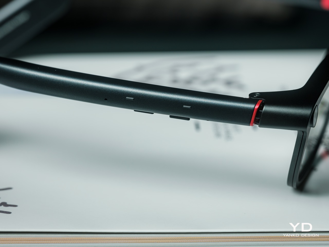
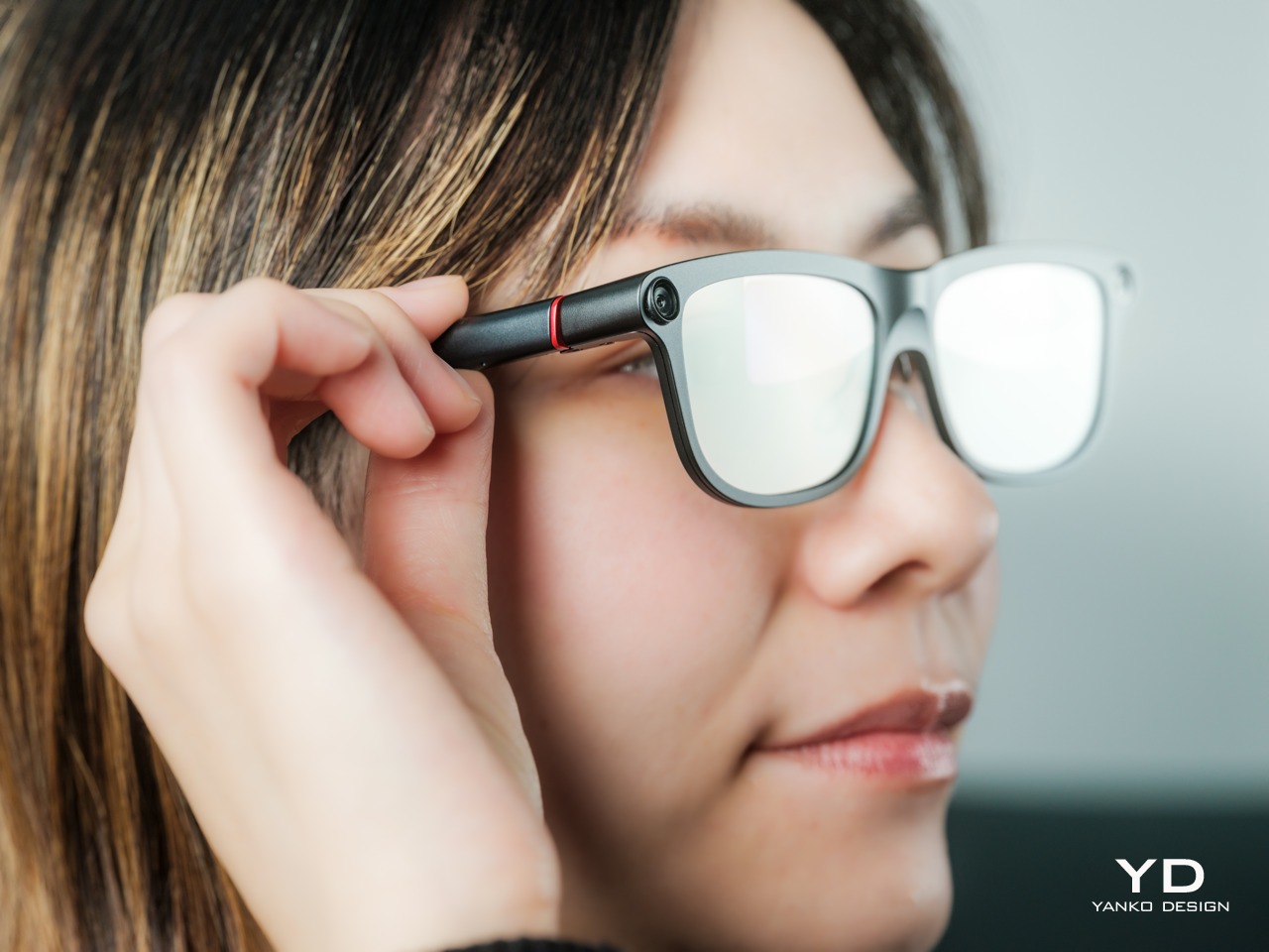
The camera is integrated into the front rather than perched above it, and the controls follow the temples. These details help the INMO GO3 read as a somewhat fashionable object instead of gadgets sharing a frame. A supplied camera cover also provides a way to obscure the lens when recording isn’t appropriate, especially given the current conversations around smart glasses.
Ergonomics
At approximately 58 grams, the INMO GO3 has the weight of electronics to accommodate as well as the frame itself. Comfort depends on more than the number on the specification sheet. The relationship between the nose pads, temples, and ears matters as much. There’s a focus on those contact points, rather than relying on a lightweight label to explain away the fitting process.
Air-cushion nose pads support the front, while the temples offer 15 degrees of adaptive movement, at least on paper. That flexibility gives the frame room to accommodate differences in head shape. Naturally, there will be cases when the head shape just won’t fit, but INMO has tried to accommodate as many head sizes as possible.
Given we’re talking about glasses, prescription support is another important piece of that everyday equation. The GO3 uses an insert system, with INMO’s current lenses supporting nearsightedness and astigmatism, though not farsightedness. That won’t cover every prescription, but it gives supported wearers a way to combine vision correction and the display.
Operating the glasses doesn’t have to depend on talking to them. Temple touch controls and physical power and GO buttons provide alternatives, while the companion app handles setup and settings. When you’re around people or somewhere that requires a degree of silence, a discreet gesture is often preferable to a spoken command, and familiar controls help make the wearable format a little less foreign.
Performance
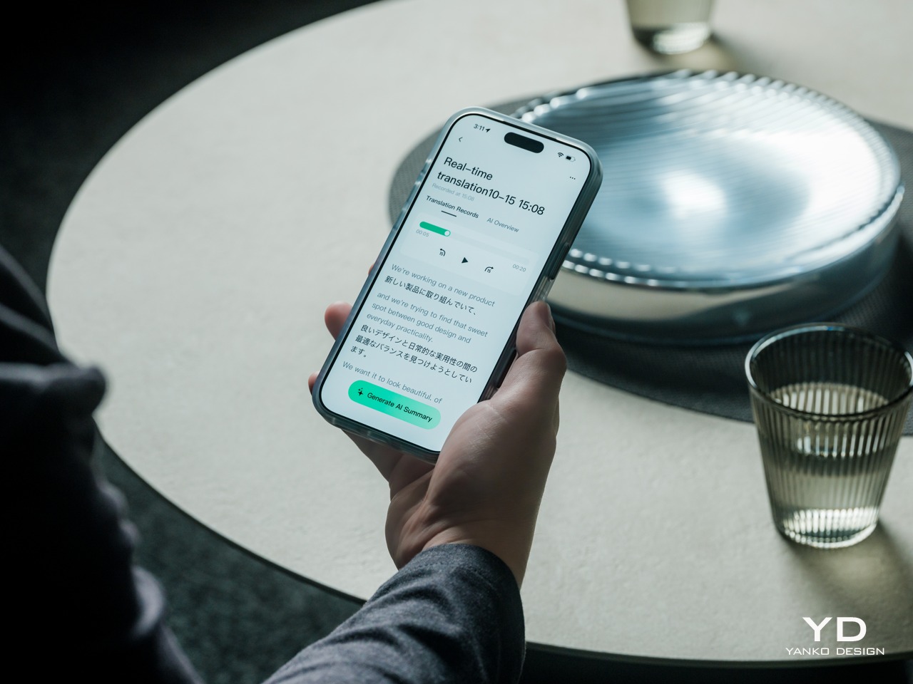
Two-Way Dialogue Translation – Read translations directly through the glasses, while the other person sees or hears your translated response on the phone.
The INMO GO3’s binocular green Micro-LED display uses optical waveguides, with a 640×480 resolution and a 30-degree field of view. Adjustable brightness is listed up to 1,500 nits, which is plenty even for the bright outdoors. That said, those specs clearly mark it as something more for text and guidance rather than a miniature cinema. Green lettering has a slightly retro character, but a translation or the next line of a speech doesn’t need a full-color backdrop to be useful.
Translation, of course, is the primary use case for these glasses, and the numbers are admittedly impressive. INMO lists 78 source languages and 98 target languages online, with subtitles appearing in view rather than on a phone held between speakers. Offline support covers nine languages on Android and 13 on iOS, and future updates promise even more. The phone still needs to stay paired to a phone, of course, but a missing internet connection needn’t end every supported conversation.
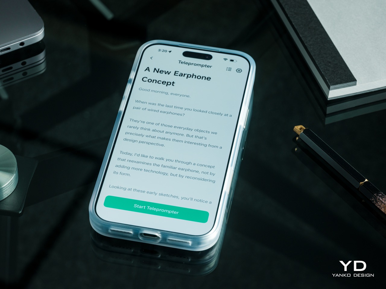
Built-In Teleprompter – Follow your script directly through the glasses.
For presentations, the teleprompter moves the script from a desk into the speaker’s field of view, allowing for a more natural-looking stage presence. There’s automatic voice-following advancement in 17 languages (including English, Mandarin, Cantonese, Japanese, Korean, German, French, Thai, Russian, Spanish, Portuguese, Polish, Arabic, Indonesian, Vietnamese, Dutch, and Italian), alongside manual scrolling from the temple. Other languages will be displayed, depending on the document uploaded by the user, but the pages for unsupported languages can’t be automatically turned by voice. Very few will be sitting close enough to realize you’re not exactly looking at them, but at least you won’t be spending half of the presentation staring down at your notes.
Photo Translation – Point the camera at written text and read its translation directly through the glasses.
The GO3 also offers features better used in meetings, such as recording, transcription, and AI summaries for later review. Walking and cycling directions, an AI assistant powered by ChatGPT and Gemini, and photo translation extend the same idea beyond work scenarios: put a useful answer nearby without making a phone screen the center of every activity.
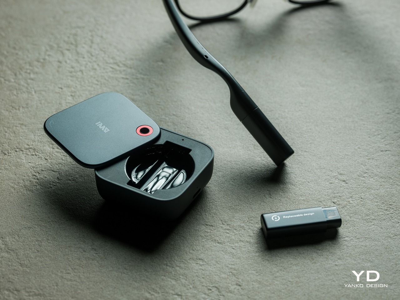
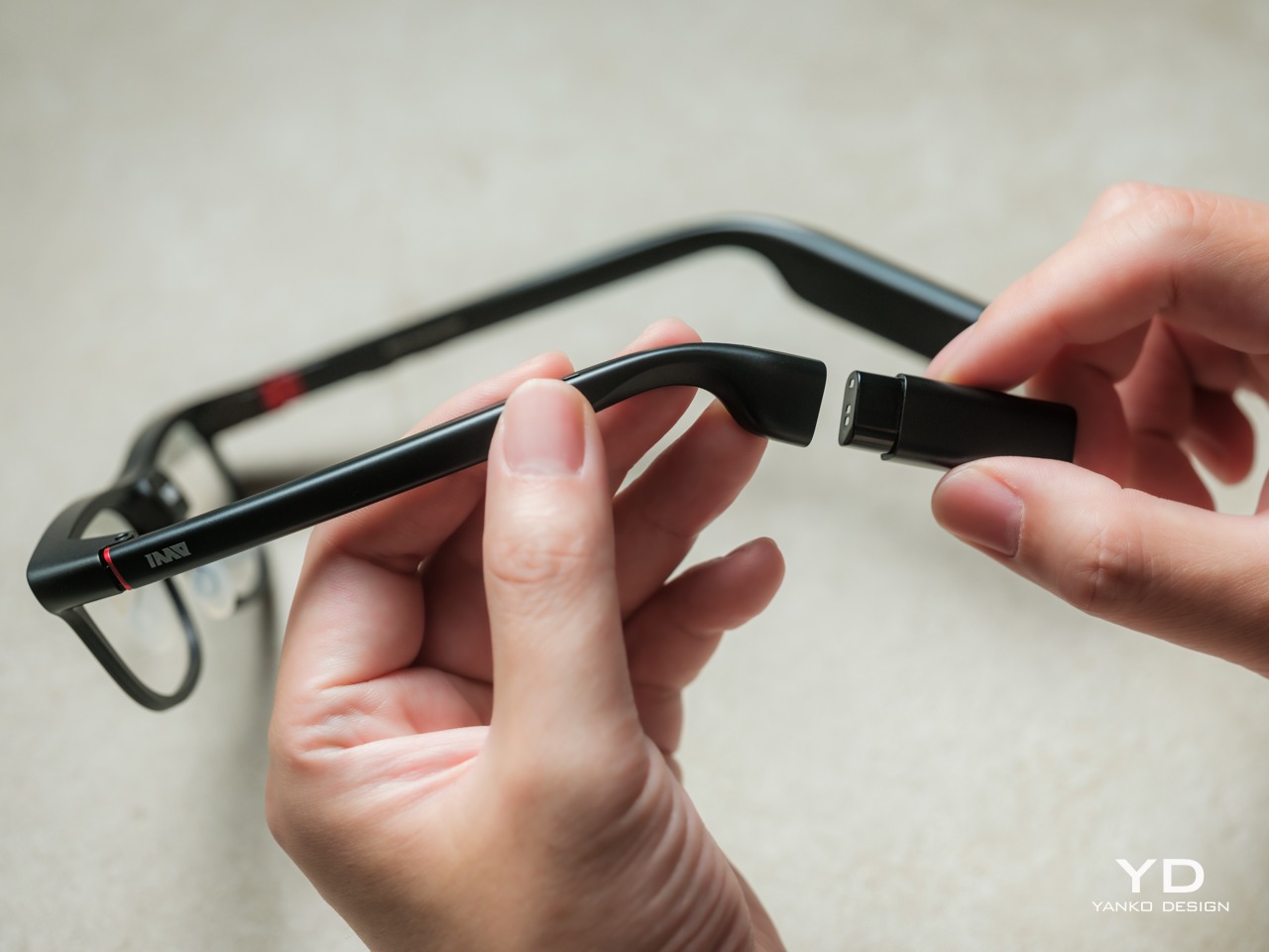
Admittedly, many AI smart glasses offer similar features, but the INMO GO3’s killer feature is its interchangeable battery system. One 270mAh battery is installed in the glasses, with one spare included. Continuous use yields around 3 hours on a full charge, which is probably more than enough for most use cases. The 1,300mAh battery charging case offers three to four more charges, so you practically get a full day’s worth in total.
Where it gets interesting is how you can swap out the dead battery on the tip of the GO3 with the spare in the charging case. It’s quick and convenient, but not entirely seamless. The glasses will shut down when you pull out the battery, but plugging a fresh one in boots it up in just a few seconds. It does mean you have to briefly stop what you’re doing or make sure you’re not in the middle of something critical, but it’s better than waiting for minutes for the glasses to charge up.
Sustainability
The replaceable battery has a longer-term benefit beyond getting through a busy afternoon. An aging power cell doesn’t automatically have to take the entire pair of glasses out of service. INMO lists a replacement battery at $49, making that component a separate ownership expense. That’s a useful piece of product design: the part expected to wear with repeated charging doesn’t have to remain permanently sealed inside.
That doesn’t establish a complete sustainability story, and there’s no need to pretend otherwise. The reviewed specifications don’t establish recycled material content, comprehensive component repairability, or an end-of-life program. The more defensible advantage is the ability to keep the same frame in service when its battery needs replacing. Thoughtful care still matters, particularly for the lenses and hinges, but accessible power replacement is a concrete place to start.
Value
At $699, currently discounted to $509, the INMO GO3 asks for a commitment beyond casual curiosity. The standard package includes the glasses, installed battery, single spare, and battery charging case. That’s a coherent starting point, with the power system already accounted for. The value comes from using the display repeatedly, rather than paying for a collection of functions that remain untouched save for a few presentations or travels abroad.
The useful comparison is between priorities, rather than a contest over the longest feature list. Camera-and-audio glasses answer a different need from eyewear that puts text in view, while entertainment-focused displays serve another purpose again. For someone moving between multilingual conversations and presentations, the GO3’s combination is easier to justify. That it can also be your travel companion and AI assistant brings added value to the table, especially when you don’t look like a walking technology advertisement.
Verdict
The INMO GO3’s most appealing quality is how its design keeps returning to recognizable habits. Wear glasses, follow a conversation, glance at a script, and change a battery when necessary. The technology adds steps of its own, of course, but the physical form doesn’t ask for an entirely new routine. Its familiar outline and adaptable contact points give the translation and presentation tools a sensible place to live.
Travelers, presenters, and people working across languages have the clearest reasons to appreciate that combination. A paired phone remains part of most workflows, and battery changes belong between tasks, but neither qualification takes away the appeal of information placed closer to the conversation. There’s something refreshingly practical about glasses that leave room for ordinary interactions, even when a little green text is helping them along.
Nvidia and Hugging Face show how a $399 duck-shaped robot learns to walk using AI simulation. Here's how Microduck works, what it costs, and when buyers may get one.
China's Unitree unveils the H2-X humanoid robot with kung fu moves and rescue demonstrations, but questions remain about its autonomy, safety and endurance.
Natural, consistent photo colors across all cameras
Strong video capability
Bright, immersive AMOLED display with thin bezel
Excellent battery life
CONS:
High price
Optional teleconverter kit limits lens options while in use
RATINGS:
AESTHETICS
ERGONOMICS
PERFORMANCE
SUSTAINABILITY / REPAIRABILITY
VALUE FOR MONEY
EDITOR'S QUOTE:
With standout cameras and top-tier hardware, the Find X10 Pro Max nails nearly every mark. Just be ready to pay for the privilege
In 2026, nearly every major phone maker is eager to add “Pro Max” to their flagship lineups. Oppo is now joining this trend with its Find X10 Pro Max. Whether you see the naming as bold or just another industry move, one thing is hard to ignore. Even when manufacturers like Oppo pack their phones with leading-edge hardware and arguably superior imaging, they still face the ongoing challenge of measuring up to Apple’s influence at the top of the market.
This device brings a massive 6.78-inch AMOLED display and debuts the industry’s first trio of 200-megapixel cameras. Its battery is also among the largest found in any mainstream smartphone. Oppo claims this phone stands out for both design and capability. After spending time with the Find X10 Pro Max, I set out to discover if this “Pro Max” truly lives up to its name or simply chases a label.
Designer: OPPO
Aesthetics
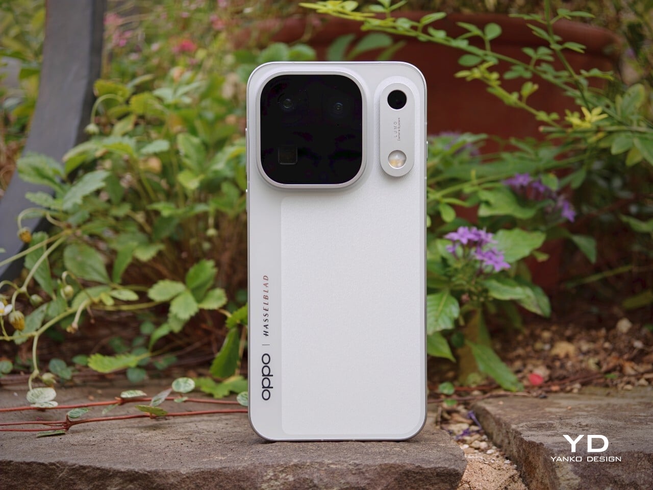
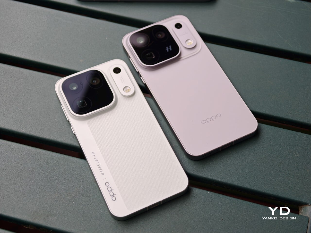
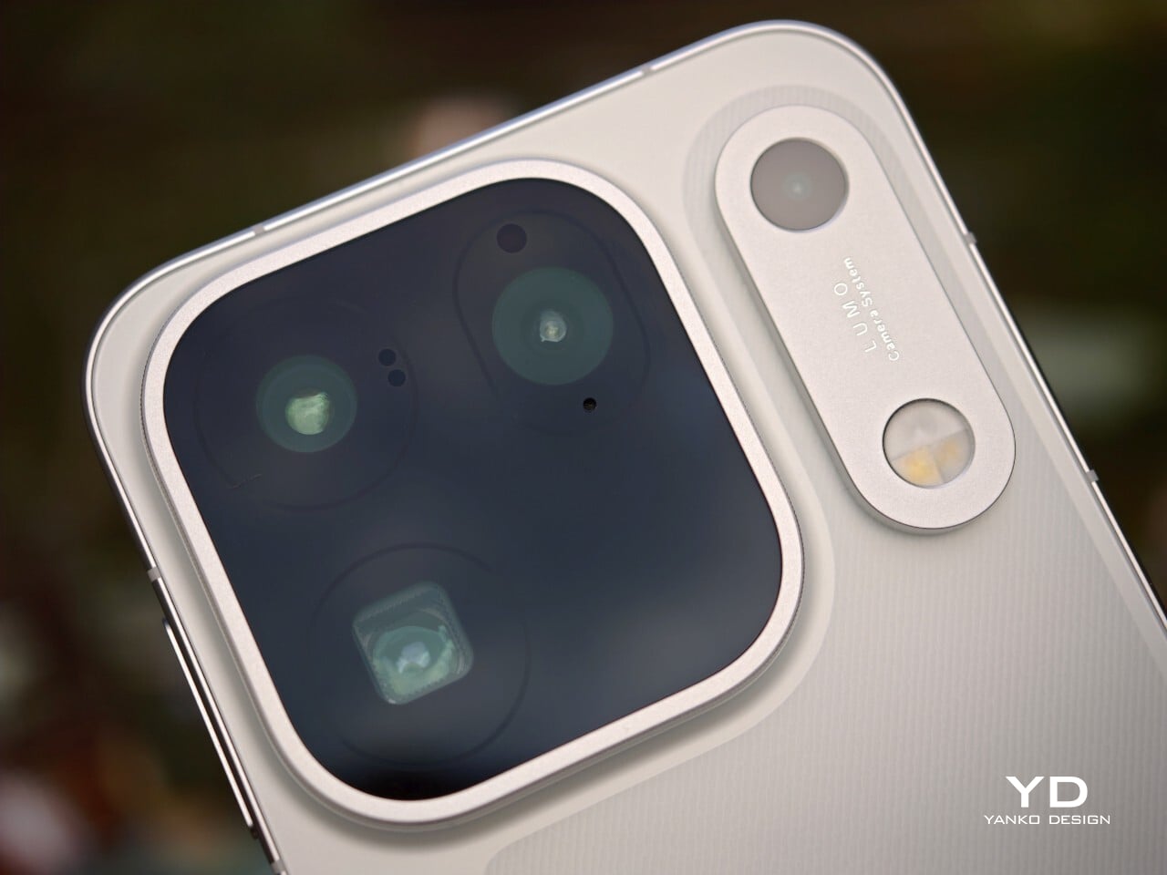
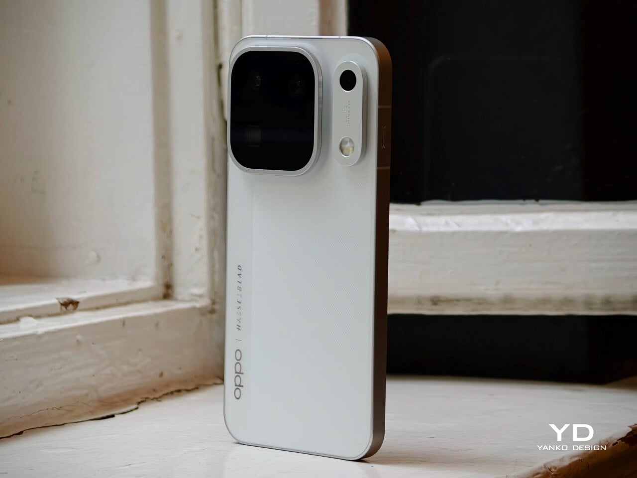
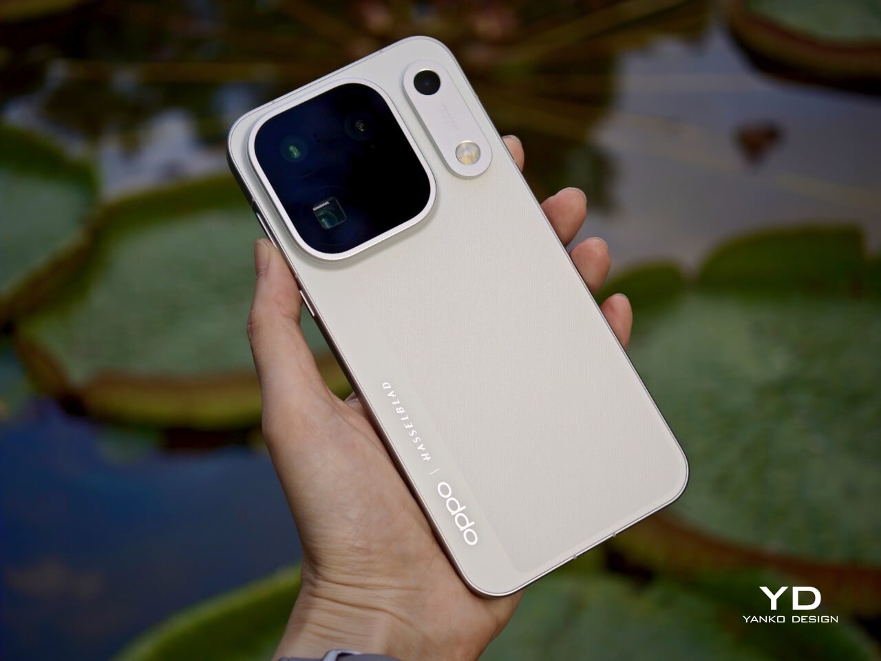
The Oppo Find X10 Pro Max carries forward some of the Find X9 Pro’s most recognizable design elements, including its signature square camera bump, now paired with an oval accent for the color sensor and LED. Oppo offers this flagship in two finishes. The Titanium Grey edition features a single sculpted piece of glass with contours that flow seamlessly into the camera area, softening the visual impact and giving the phone an understated, professional vibe. The grey itself is subtle, with hints of mauve appearing under certain lighting conditions.
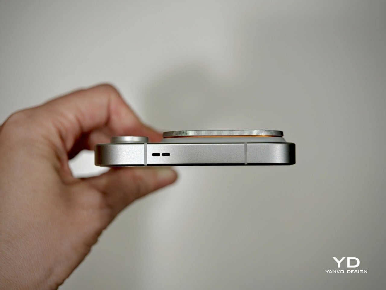
For this review, I received the Luna White edition, which channels inspiration from classic cameras and reimagines the look for a contemporary audience. The camera island sports a matte silver metallic finish with knurled detailing, highlighted by Hasselblad’s signature orange accent ring. The back showcases a subtle fabric-inspired pattern, with Oppo and Hasselblad branding on the side. While both colors exude sophistication, those who prefer darker tones or bolder shades may find themselves wishing for greater variety in the color lineup.
Ergonomics
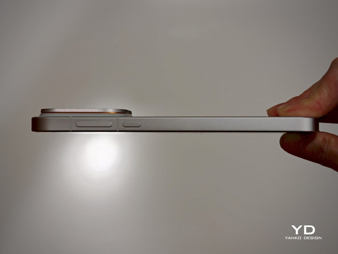
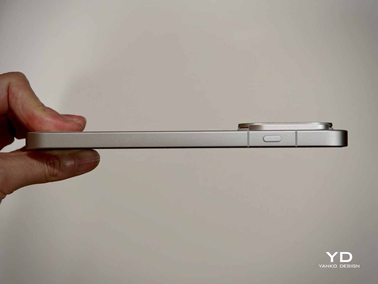
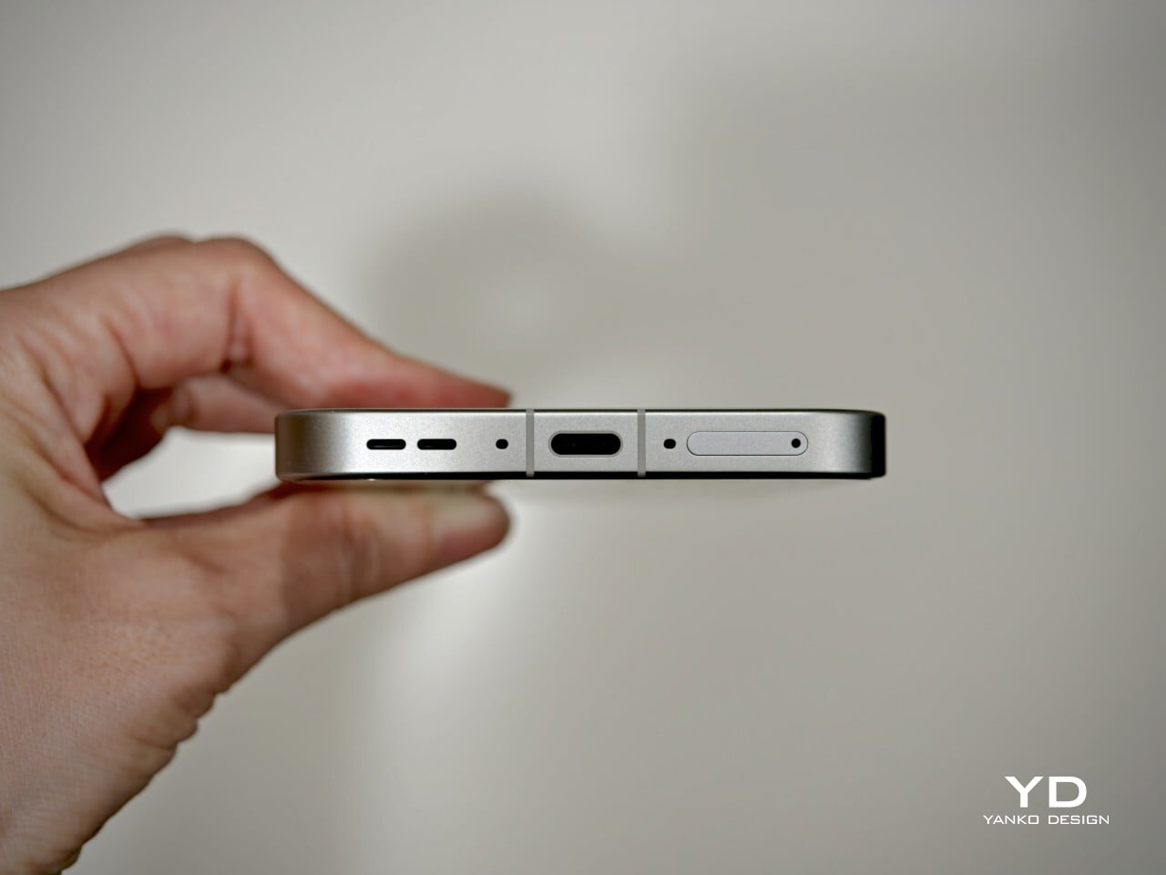
Despite its impressive size and powerful hardware, the Oppo Find X10 Pro Max manages to feel thoughtfully balanced in hand. My review unit is the global version, which comes with a substantial 8000mAh battery and weighs 235 grams (about 8.29 ounces) in Titanium Grey or 233 grams (about 8.22 ounces) in Luna White. The EU version features a slightly smaller 7150mAh battery and is a bit lighter at 228 grams (about 8.04 ounces) for Titanium Grey and 226 grams (about 7.97 ounces) for Luna White. Measuring 161.32 x 76.57 x 8.40 mm, or approximately 6.35 x 3.02 x 0.33 inches, this phone clearly fits into the large flagship category, yet its slim profile keeps it manageable.
The weight of the Find X10 Pro Max is certainly noticeable each time you pick it up, although the distribution helps maintain comfort during longer use. Both color options have a matte back and frame that do an excellent job resisting fingerprints and smudges, while also offering a velvety texture that is genuinely pleasant to touch. The device maintains a clean look throughout the day and feels luxurious with every interaction. The edges are only slightly curved, almost flat and straighter than on many other flagships, so they do not dig into your hand but may affect comfort depending on how you hold the phone over time.
Performance
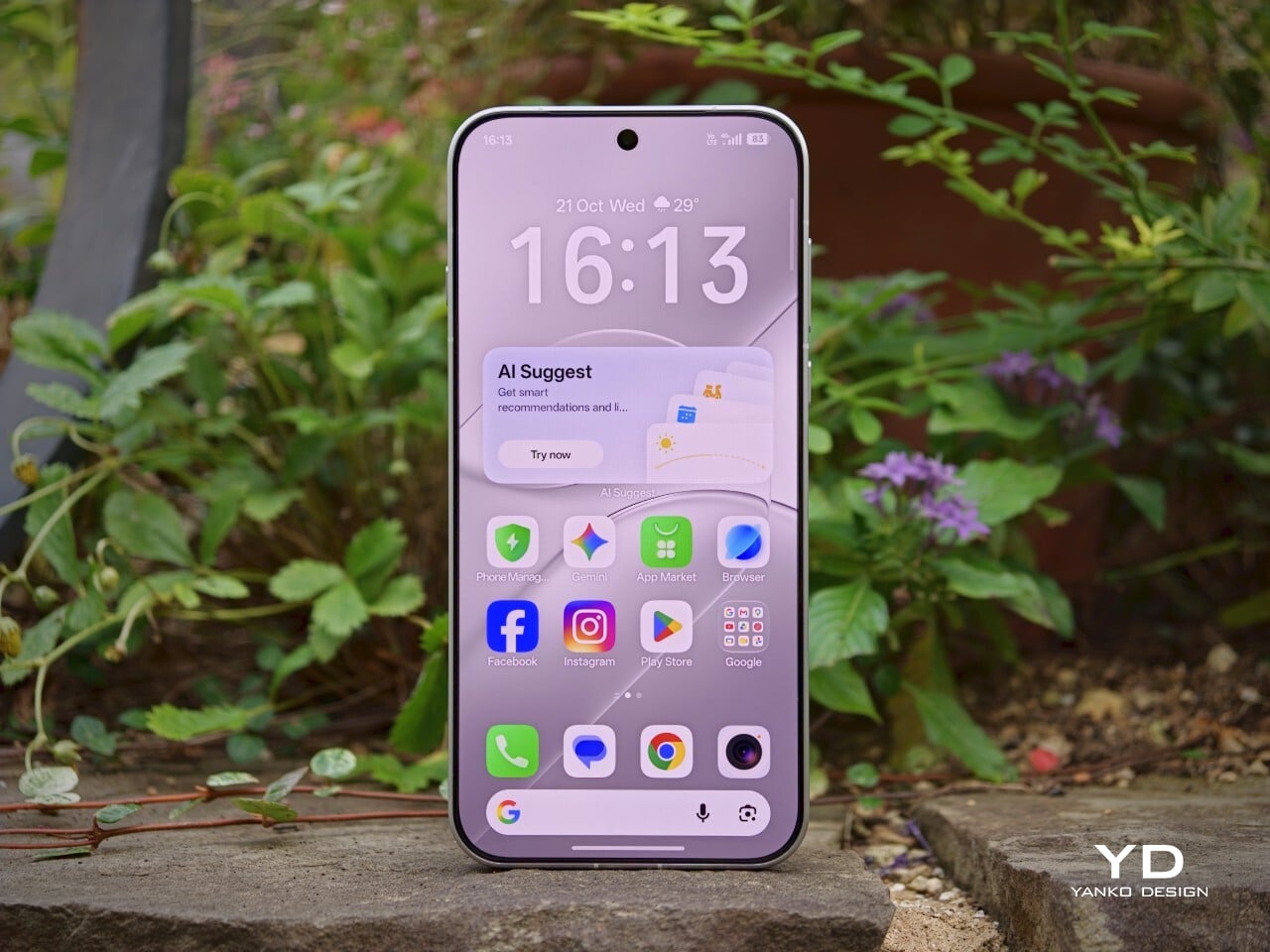
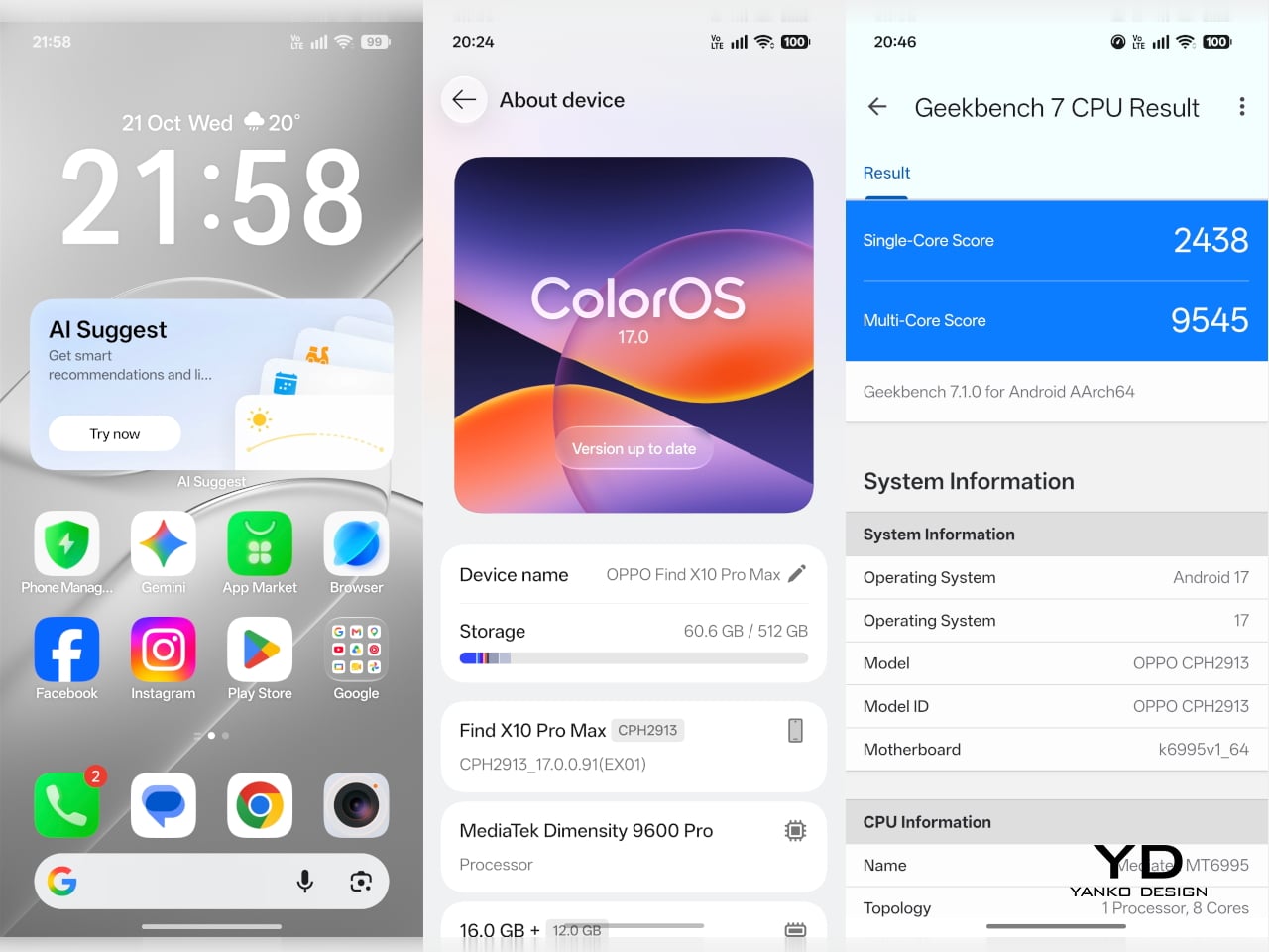
The Oppo Find X10 Pro Max delivers the kind of fluid, responsive experience you expect from a flagship. Powered by the Dimensity 9600 Pro, the phone handles daily tasks, multitasking, and demanding apps without any noticeable lag or slowdowns. ColorOS 17 brings a polished feel with more refinement than revolution, ensuring that every interaction is smooth and intuitive. Everything from app launches to switching between tasks happens with impressive speed and reliability.
The large 6.78-inch LTPO AMOLED display stands out with a sharp 2772 × 1272 resolution and vibrant colors, thanks to BT.2020 coverage and 10-bit color support. Bezels measure just 1.15mm and are perfectly symmetrical, which makes the screen feel even more expansive. With up to 3,600 nits peak HDR brightness, visibility outdoors is excellent. The adaptive refresh rate ranges from 1 to 120Hz for smooth scrolling, while 144Hz is available in select gaming scenarios for extra fluidity. The speakers provide plenty of volume, though sound quality does not really stand out.
Hasselblad Hi-Res (50MP) mode, main camera, 1x
Main Camera, 1x
Over the past few years, smartphone cameras have leaned heavily on computational processing to overcome the limitations of small lenses. Sometimes the results are impressive, but too much digital magic can leave photos looking punchy or even artificial. With the Find X10 Pro Max, Oppo takes a different route by aiming for images that genuinely match what you saw in real life. The brand continues its collaboration with Hasselblad to fine-tune color science, and this generation introduces the LUMO True Image Engine, which keeps colors believable and resists the urge to overdo sharpening or saturation.
Oppo debuts the industry’s first triple 200-megapixel camera system in the Find X10 Pro Max. You get a 200MP main camera (Samsung ISOCELL HPC, 1/1.3″, f/1.5 with OIS), a 200MP ultra-wide (Samsung ISOCELL HP5, 1/1.56″, f/2.2 with autofocus), and a 200MP periscope telephoto (Samsung ISOCELL HP5, 1/1.56″, f/2.1 with OIS). Flip the phone around and you’ll find a 50MP front camera (Samsung ISOCELL JN5, 1/2.75”, autofocus, 100° FOV).
Ultrawide, 0.5x
Telephoto, 3x
Telephoto, 6x
The headline megapixel count is only part of the story. The main sensor leverages DeepPix technology, redesigning each pixel to improve light-gathering efficiency and preserve detail even in challenging conditions. It delivers up to 17 stops of dynamic range for images full of nuance from shadow to highlight. Daylight photos are crisp and vibrant, and low-light shots stay clear and accurate.
Most flagships treat ultra-wide cameras as a weak spot, but Oppo breaks that trend by using the same large sensor in both its ultra-wide and telephoto modules as in the main camera. The ultra-wide’s 13mm-equivalent focal length provides an expansive 124-degree field of view and captures sharp images across the frame. There is still some noticeable lens distortion at the edges, which is common for lenses this wide, but overall image quality remains impressively crisp. Color consistency is another area where Oppo truly excels. Tones stay remarkably uniform across all three lenses, so your shots always look cohesive.
Ultrawide, 0.5x
Main Camera, 1x
Main Camera, 1x
Telephoto, 3x
Personally, I love shooting with the telephoto camera on the X10 Pro Max. It is genuinely a treat for anyone who enjoys zoom photography. Hasselblad Master mode is another highlight because it delivers a more natural, less processed look that gives images a classic photographic character rather than an overdone “smartphone” feel. For those who want total control, Pro mode within Hasselblad Master mode allows for granular manual adjustments.
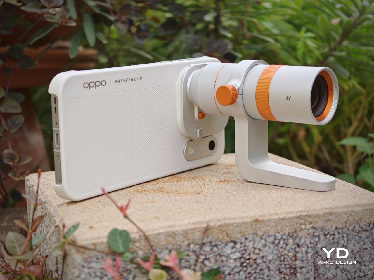
For users seeking more flexibility, Oppo offers a Hasselblad Teleconverter Kit in Luna White that includes a MagSafe-compatible case, lens adapter plate, teleconverter lens, lens bracket, shoulder strap, and pouch, all in silver or white with orange accents to match the Luna White phone version. While I love how visually unified the kit appears, attaching the lens adapter plate blocks both the main and ultra-wide lenses at once, just like on the Find X9 Pro teleconverter. This can limit your photo options when using the kit.
Telephoto Converter, 20x
Telephoto Converter, 40x
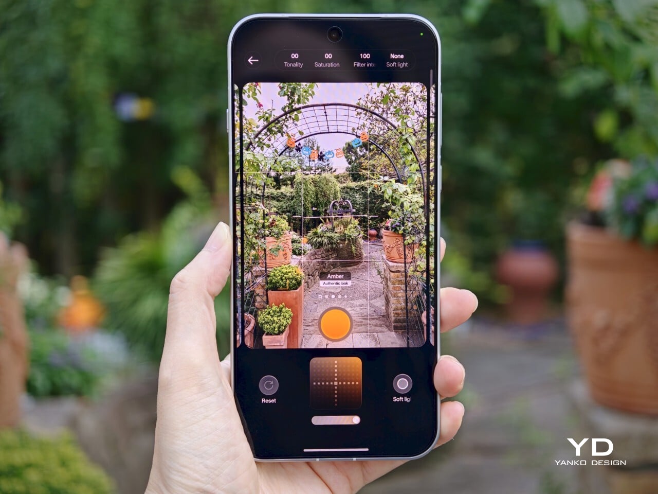
Oppo’s camera app supplies a nice set of filters. The selection is not as broad as Vivo’s catalog but still offers plenty of creative and customizable choices. Each filter lets you tweak tonality, saturation, and intensity to match your style preferences. My main gripe is with how OPPO lays out these filters: instead of small thumbnails along the bottom edge like most brands use, you only see one filter preview filling the UI at a time. This makes it tougher to quickly browse options and can slow down creative experimentation.
Filter UI
Open Gate Mode
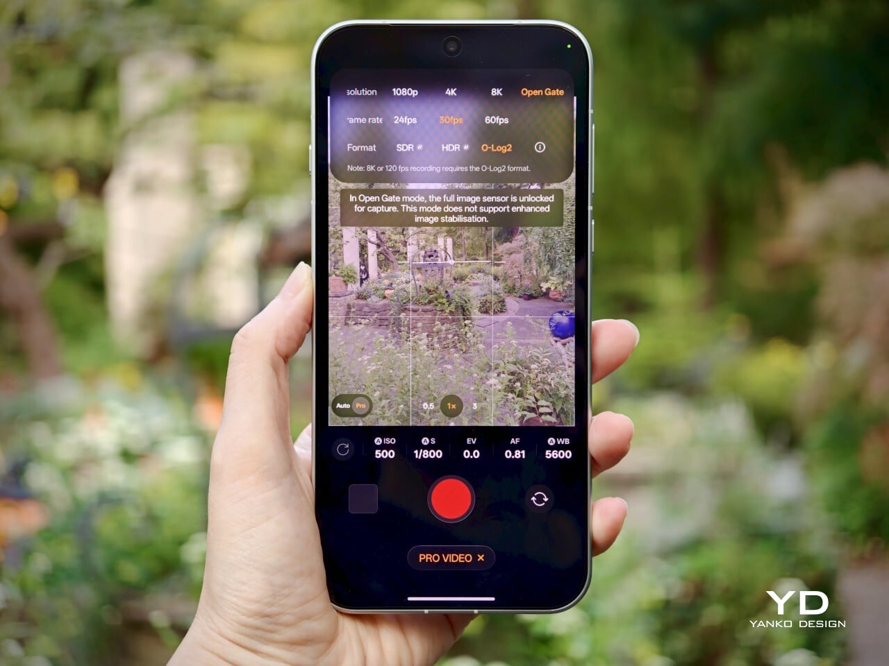
Video performance keeps pace with stills. All three rear cameras support up to 8K at 30fps, 4K at 60fps, and even 4K at 120fps for dramatic slow motion. The front camera supports up to 4K at 60fps for sharp selfies and vlogs. If you apply creative filters during recording, output is capped at 1080p at 30fps. Open Gate recording is available on all rear cameras as well, so creators can leverage every pixel for flexible cropping in post-production.
My global review unit features a massive 8000mAh battery, while the EU version is equipped with a still-impressive 7150mAh cell. Both models support fast charging, with 80W SUPERVOOC wired charging making it easy to top up quickly and 50W AIRVOOC wireless charging for added convenience. Battery life is outstanding. It easily lasts more than a full day of heavy use and can reach two days with moderate usage.
Main Camera, 1x, Night
Sustainability
Oppo positions the Find X10 Pro Max as a durable and future-proof flagship, but most of its claims align with what’s now expected at the high end. The phone comes with IP66, IP68, and IP69 ratings, so it stands up well to dust and water in a wide range of scenarios. Both the front and back are protected by OPPO Crystal Guard Glass, co-developed with Corning, promising solid scratch and drop resistance. SGS Five-Star Drop Resistance Certification adds further reassurance, though these certifications have become standard for premium smartphones.
Oppo also states that the battery should retain over 80% of its original capacity after five years of typical use, which is consistent with leading brands but does not set a new bar. The promise of five years of major Android OS updates and six years of security patches is definitely good news for long-term owners and matches current flagship expectations. That said, it would be great to see Oppo take additional steps in sustainability, such as using more recycled materials in construction and offering easier repair options, to truly stand out in this space.
Value
Official pricing was unavailable at the time of writing this review, but the Oppo Find X10 Pro Max is rumored to launch at €1,799 (about $1,900) for the 16GB+512GB EU version. This firmly places it among the highest-priced flagships on the market and marks a clear jump from last year’s Find X9 Pro (€1,299, or around $1,370) and even the Find X9 Ultra (€1,699, or about $1,790). A significant part of this price hike likely comes from soaring RAM and storage costs, driven by increased demand from the AI boom and broader tech trends.
If these figures are correct, Oppo will face an uphill battle. Even with top-of-the-line hardware and some of the best mobile imaging features available, nearly two thousand dollars is a serious investment, especially as many consumers are feeling economic pressure. The EU version of the Find X10 Pro Max is even more expensive than both the iPhone 18 Pro Max with 512GB of storage and the Samsung Galaxy S26 Ultra 512GB model in the U.S. For Oppo to justify this price point, buyers will need to be truly convinced by its unique camera system and design philosophy. Otherwise, many may find more value in established alternatives from Apple or Samsung.
Verdict
The Oppo Find X10 Pro Max stands out as a well-balanced flagship that gets almost everything right and, at times, feels nearly flawless. What really sets it apart is its excellent mobile photography, from the industry-first triple 200-megapixel camera system to the natural color science developed in partnership with Hasselblad. Everyday performance is smooth, build quality is unquestionably premium, and battery life ranks among the best available in any flagship.
On the flip side, the high price tag puts the Find X10 Pro Max in direct competition with industry giants. While it delivers top-tier hardware and leading imaging capability, buyers must be willing to stretch both their expectations and their budgets. For those who put a premium on cutting-edge camera features and want an alternative to Apple or Samsung, Oppo’s latest is a compelling choice. For everyone else, especially those mindful of budget, there are several strong alternatives on the market that may offer a more accessible fit.
We’ve gotten used to bringing along power banks when we’re out and about since we don’t want our smartphones to run low on battery during crucial moments. But now we also have to worry about other devices, like smartwatches. Some need less frequent charging than our phones, but there are still times when we forget to charge them before leaving the house. Before you know it, you find yourself needing some extra juice for your wearable.
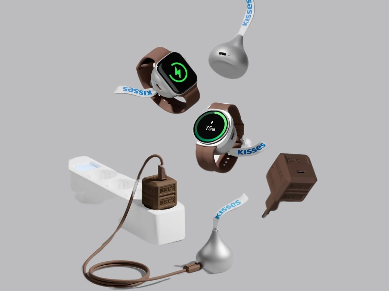
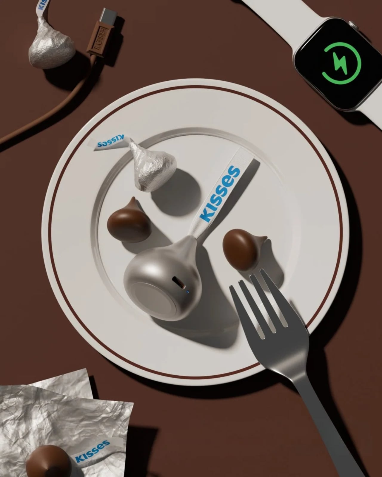
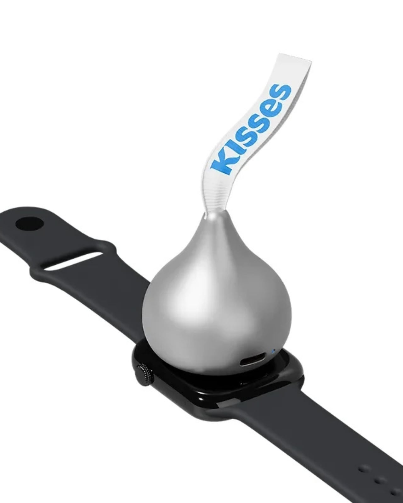
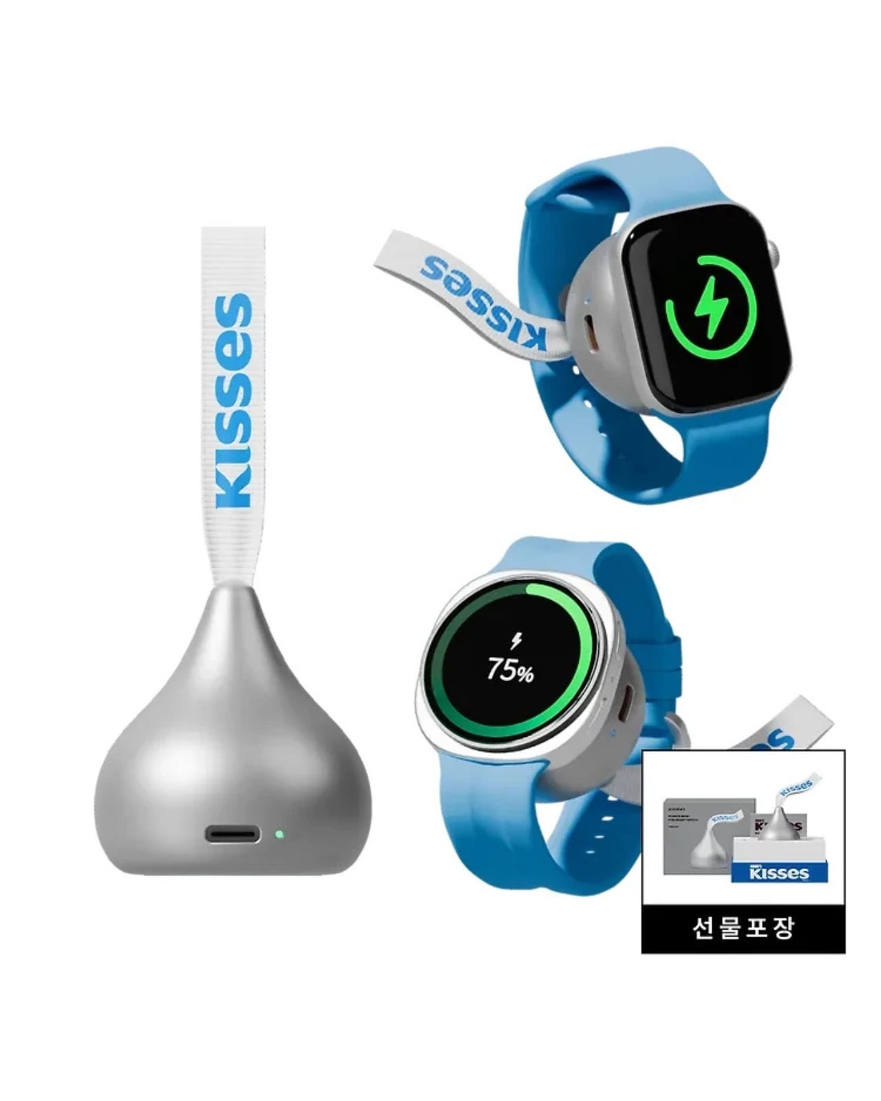
miniduct has found a very cute solution to your problem, if you’re rocking a compatible Apple Watch or Samsung Galaxy Watch, that is. Its Kisses Smart Watch Power Bank is shaped like an actual Hershey’s Kiss. Instead of satisfying your sweet cravings, though, this one will power up your smartwatch while you’re on the go. According to its product information, it has a system that aligns with your watch, but there’s also an option to charge other compatible devices through a USB-C port.
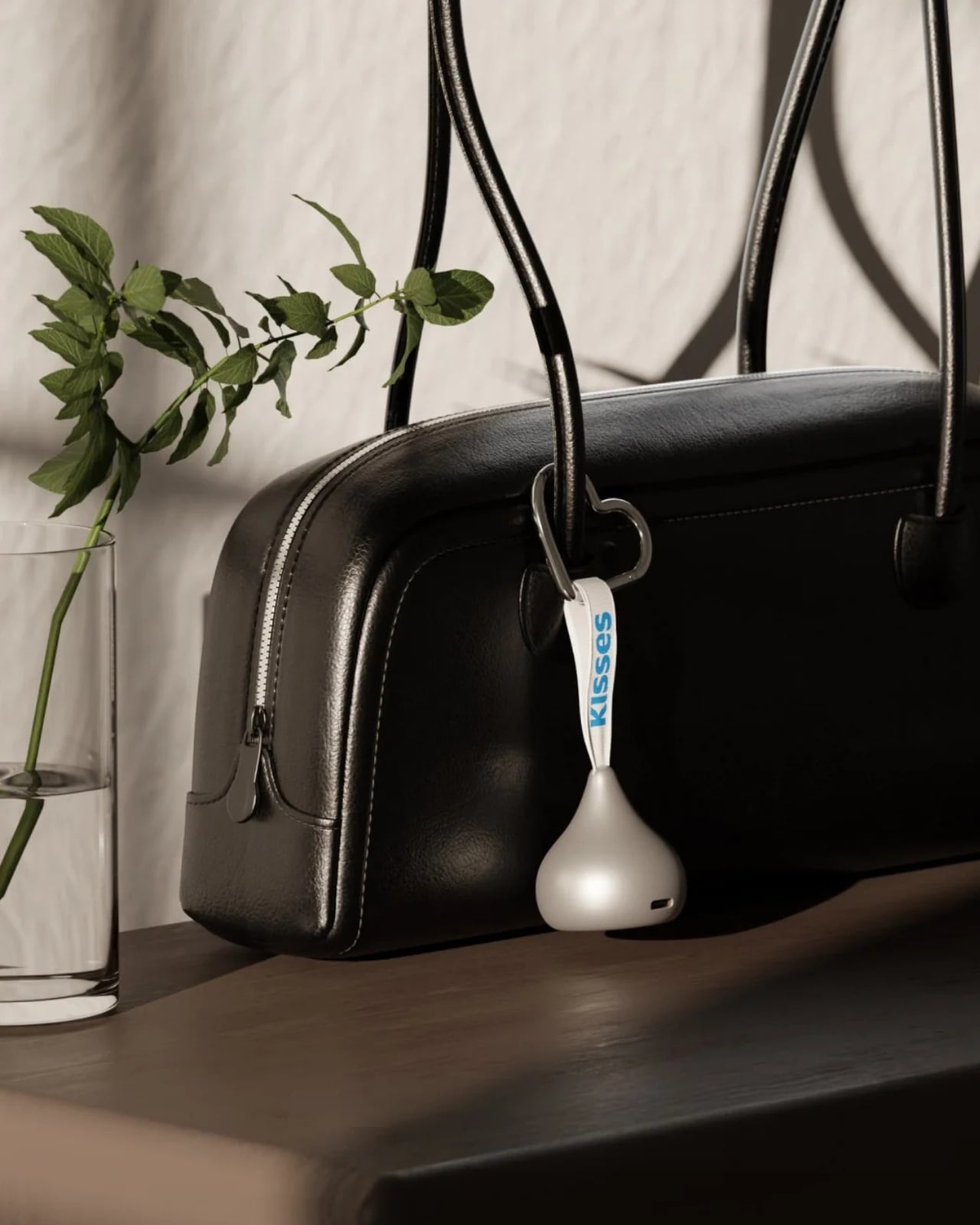
Aside from giving your smartwatch extra life when it’s about to run out of charge, this is a cleverly designed accessory that you can carry around with you. It takes the iconic silhouette of a Hershey’s Kiss and its silver-wrapper look and turns it into something other than a snack. It even comes with the tiny white ribbon bearing the word “Kisses,” which doubles as a strap for attaching the device to your bag or pouch. That’s probably the nicest design detail here: a familiar part of the candy packaging gets a practical purpose.
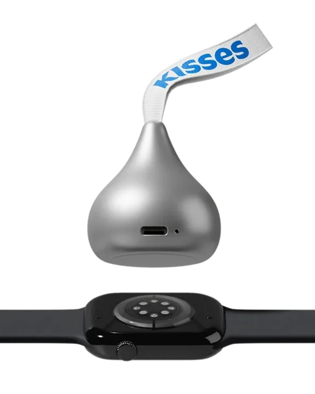
According to the published specifications, the power bank measures approximately 41 millimeters in diameter and 45 millimeters tall, excluding the ribbon. It weighs 40.2 grams, or about 1.4 ounces, and contains a 700mAh battery. That makes it a small backup for your wearable rather than a replacement for the larger power bank you might already carry for your phone.
The charging system is called Auto Fit, and miniduct describes an internal mechanism that automatically aligns with the watch being charged. Its product information explains that the magnets rotate rather than remain fixed to accommodate Apple and Galaxy watches. You’ll still want to check compatibility with your particular model before buying, rather than assume every watch generation is supported.
The chocolate shape also has a job when you put the charger down. miniduct says it positions the watch at a 20-degree viewing angle on a desk, allowing you to check the screen while it charges. You’ll need to take the watch off your wrist, so a break at your desk is a more practical charging opportunity than a workout.
Of course, the small battery comes with limitations. miniduct estimates that it can provide approximately 40% to 120% of a watch battery’s capacity, depending on the model. Some watches therefore won’t get a complete recharge. The brand also notes that features such as GPS, Bluetooth, and an always-on display can reduce the net charge gained. Think of it as an emergency reserve, not a promise of several days away from an outlet.
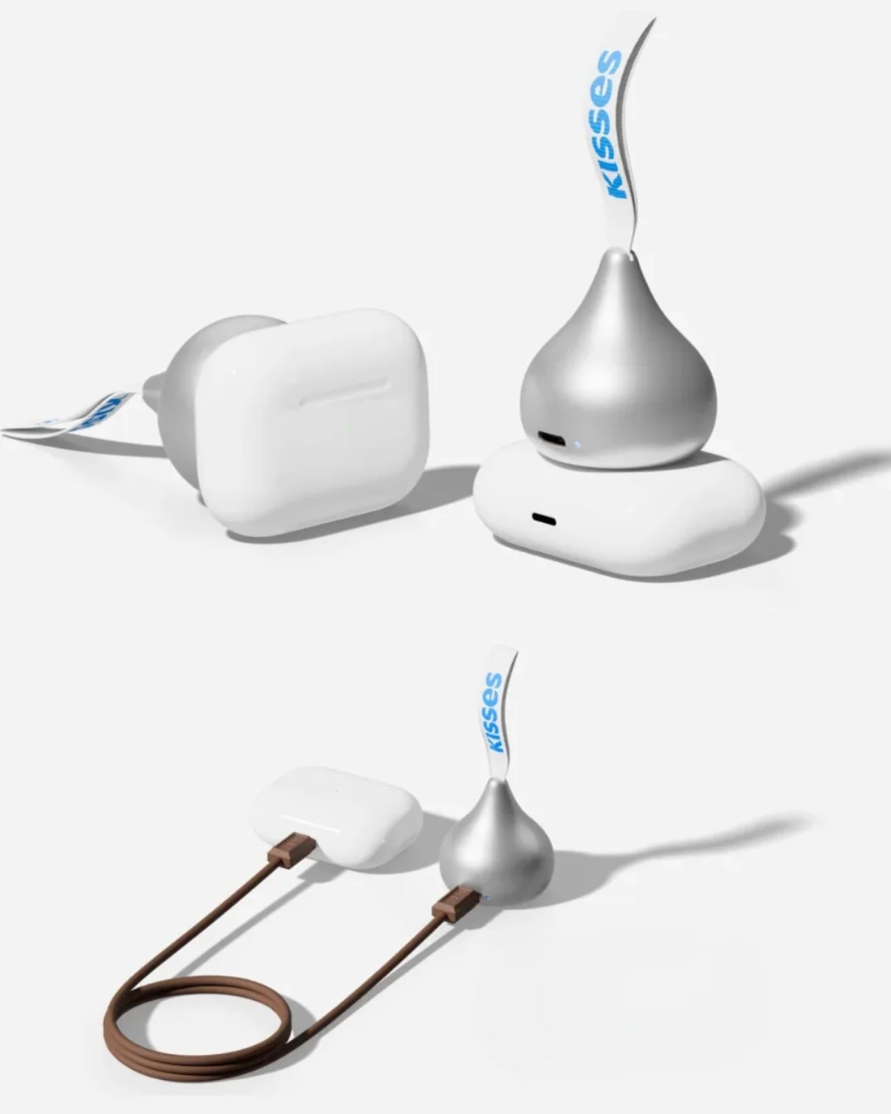
The product materials also advertise charging support for compatible earbud cases, including wireless charging for supported AirPods cases. USB-C output provides another option for compatible earbuds or an emergency phone top-up. With only 700mAh available, though, charging a phone is a secondary use rather than the main reason to buy it.
The appeal here is having a backup charger that feels like an accessory you’d actually want to bring along. The ribbon gives it a place on your bag, while the familiar shape gives it some personality when it’s sitting on your desk. You’ll still have to remember to charge the power bank itself, but at least this little reminder looks sweeter than another loose cable.
Linux support is progressing for Snapdragon X2 laptops, but missing drivers and hardware limitations mean buyers should check exact models before switching.
Cuff-style blood pressure reading with 24-hour ambulatory monitoring
Quiet measurement that didn’t disturb my sleep
Streamlined ensign and comfortable everyday fit
Good battery life
Comprehensive health and fitness tracking alongside everyday smartwatch features
CONS:
Limited third-party app selection
Not suitable for swimming or showering
RATINGS:
AESTHETICS
ERGONOMICS
PERFORMANCE
SUSTAINABILITY / REPAIRABILITY
VALUE FOR MONEY
EDITOR'S QUOTE:
The Huawei Watch D3 pairs quiet blood pressure monitoring with everyday comfort and style.
Hypertension, or high blood pressure, is a major cause of premature death worldwide and increases the risk of heart disease, stroke, and kidney damage. Nearly half of U.S. adults have it, according to the CDC. Yet it often causes no noticeable symptoms, so feeling fine does not necessarily mean your blood pressure is where it should be.
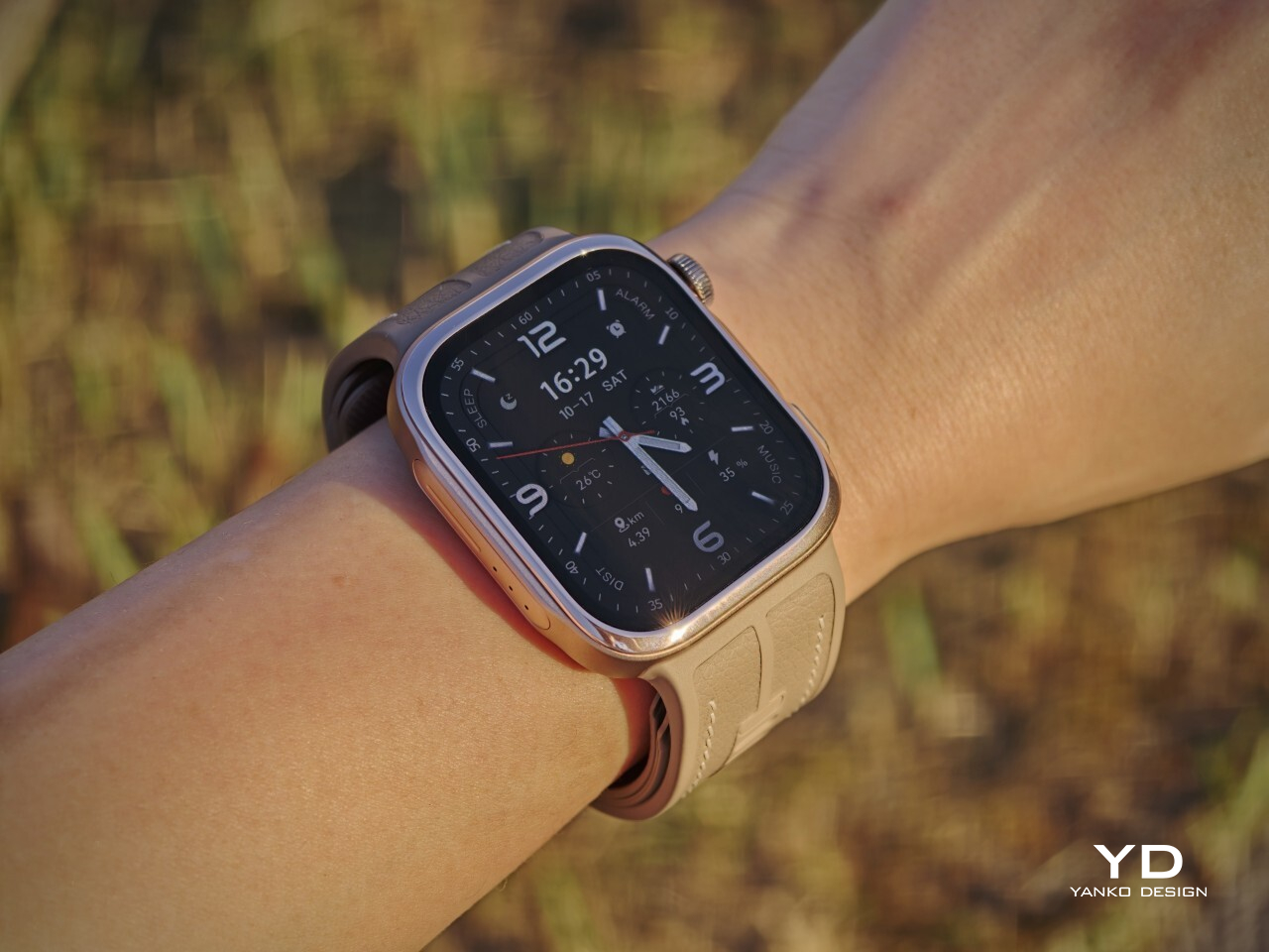
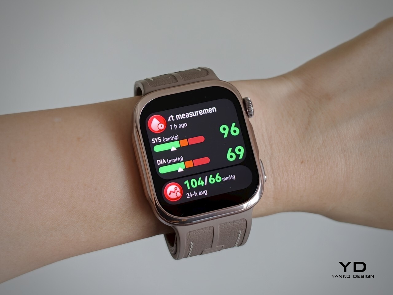
The Huawei Watch D3 puts blood pressure measurement on your wrist, using an inflatable airbag built into the strap and offering scheduled readings throughout the day and night. That sounds like a recipe for a bulky, rather clinical accessory, but the watch I received looks nothing of the sort. More importantly, it is comfortable enough that I was happy to keep wearing it, including overnight. Huawei has squeezed some unusual hardware into a familiar package, and after living with it, I am impressed by how little fuss it adds to my day.
Designer: Huawei
Aesthetics
Huawei has made the Watch D3 surprisingly discreet, and that is one of its biggest design strengths. This is a health-focused smartwatch with more going on under the surface than most, yet it does not look overly technical or awkwardly bulky. Instead, it comes across as clean, polished, and easy to wear, which helps it feel like a proper everyday smartwatch rather than a specialist device.
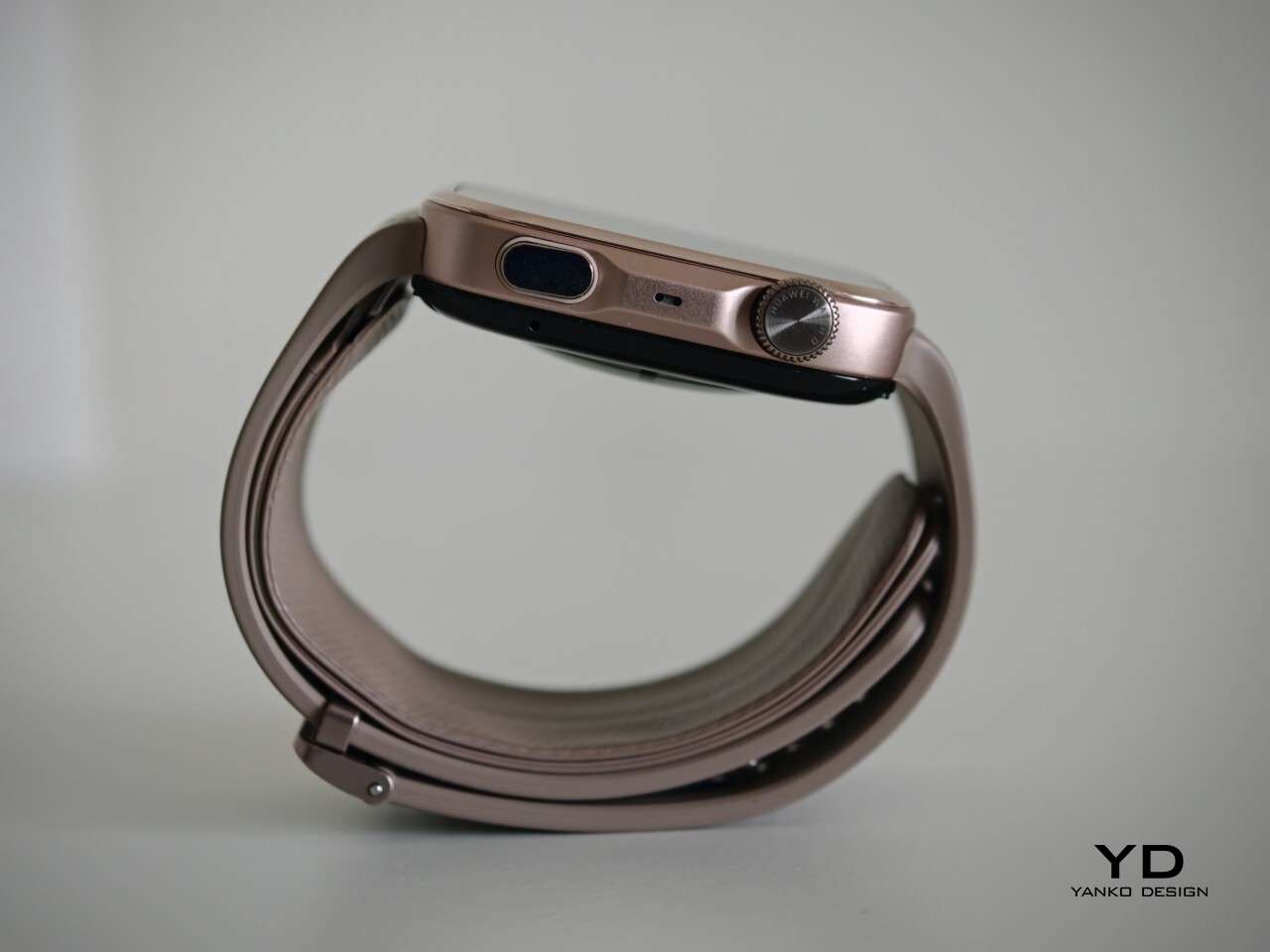
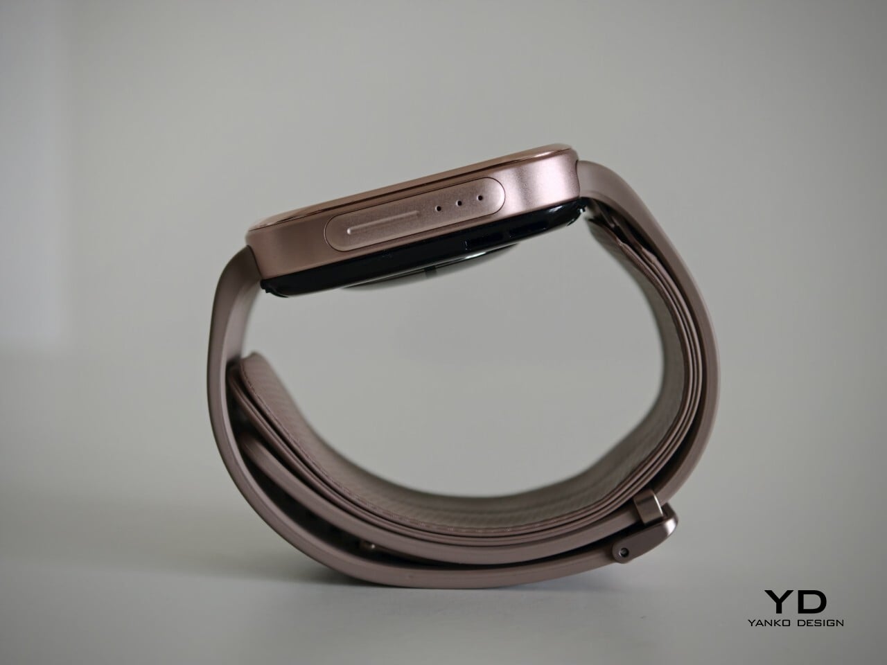
Visually, it sits somewhere between the clean familiarity of an Apple Watch and the more assertive presence of an Apple Watch Ultra, giving it a look that feels both familiar and slightly more rugged. Huawei offers the Watch D3 in three color options: White, Black, and Mocha Gold. I received the Mocha Gold version, and it gives the watch a warmer, slightly more elevated look than the other finishes. The rectangular-shaped case is paired with a color-matched fluoroelastomer strap, which also houses the airbag used for blood pressure measurement.
Ergonomics
For a smartwatch with a tiny airbag tucked into its strap, the Watch D3 is surprisingly easy to wear. On paper, it is not a small device at 1.83 x 1.61 x 0.44 inches, but it never feels ungainly or overengineered once it is actually on your wrist. The 1.92-inch rectangular display fits well and doesn’t overwhelm the wrist, keeping the overall look streamlined. Huawei has also trimmed the thickness down from 0.52 inches on the Watch D2 to 0.44 inches here, and that slimming makes a real difference. The D3 feels less like a specialist gadget and more like a smartwatch you can throw on in the morning without a second thought.
In practice, the bigger surprise is how quickly it stops feeling unusual. The Watch D3 feels like an ordinary smartwatch on the wrist in the best possible sense. The strap is inevitably thicker than a conventional smartwatch band because it contains the inflatable airbag, but I never found it cumbersome. If anything, that unusual construction fades into the background faster than expected, which is not something I would have assumed before wearing it.
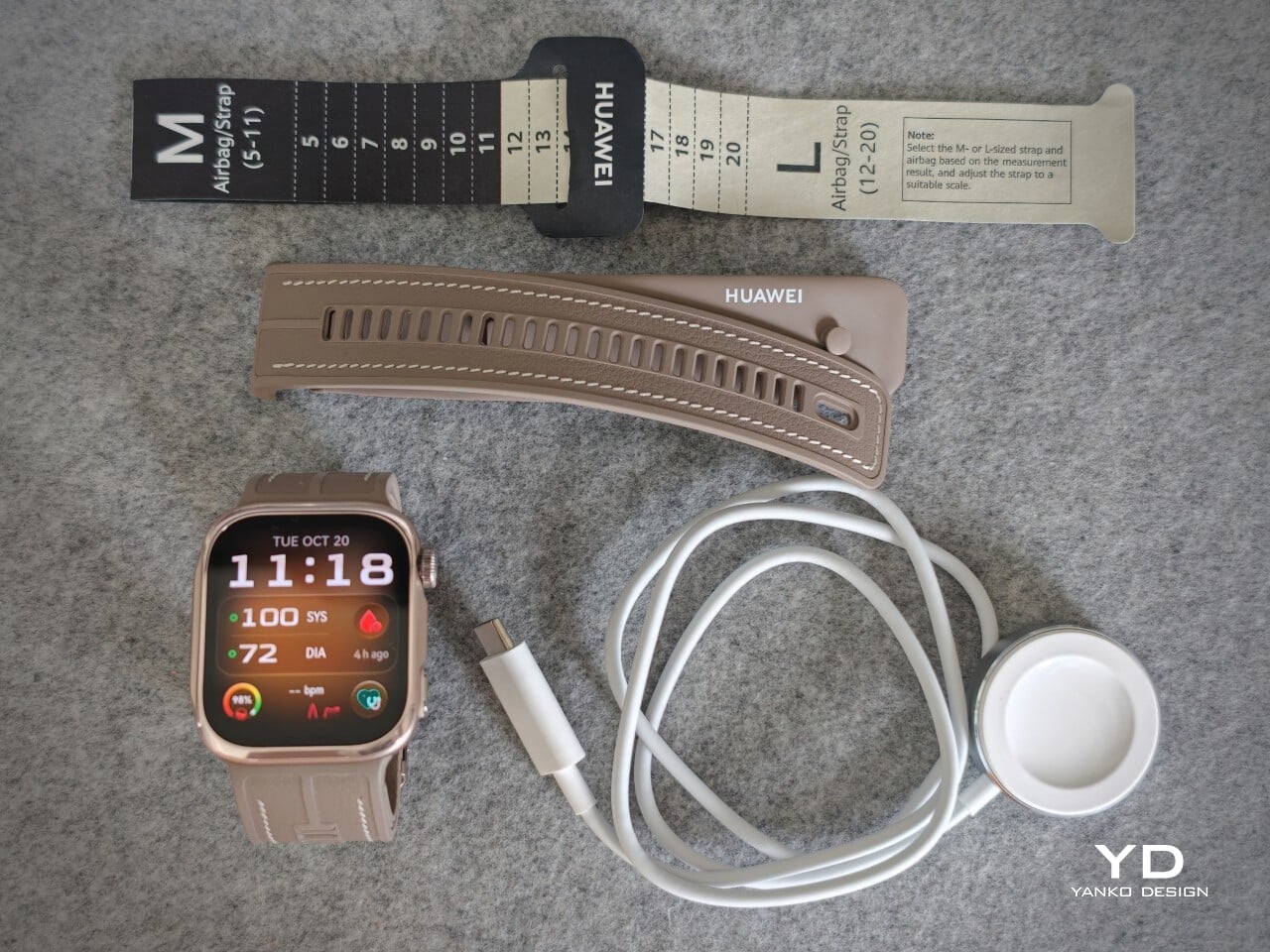
The weight helps here too. At around 1.41 ounces without the strap, the Watch D3 feels substantial enough to come across as a proper piece of hardware, but not heavy enough to become annoying over the course of a full day. Fit matters more on the Watch D3 than it does on a typical smartwatch. Huawei accounts for that with a paper measuring guide and two strap sizes. A watch built around blood pressure readings needs to fit properly, and the D3 feels better for that extra attention.
Performance
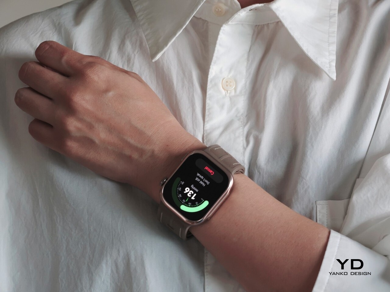
Blood pressure monitoring is the main reason to consider the Watch D3, but what surprised me first was how quiet it is. It makes virtually no sound during a reading, with the increasing pressure around my wrist providing the only obvious sign that anything is happening. The sensation is noticeable, as you would expect from an inflatable strap, but the process feels discreet enough that taking a reading does not become a bother.
There are medical credentials behind the feature, too. According to Huawei, the Watch D3’s blood pressure measurement has obtained NMPA medical device registration in China and CE certification under the European Union’s Medical Device Regulation, commonly called CE-MDR.
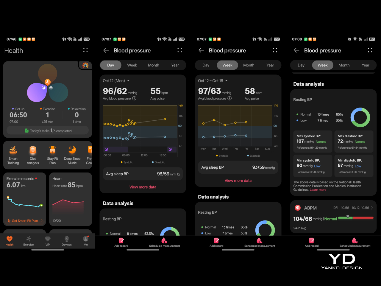
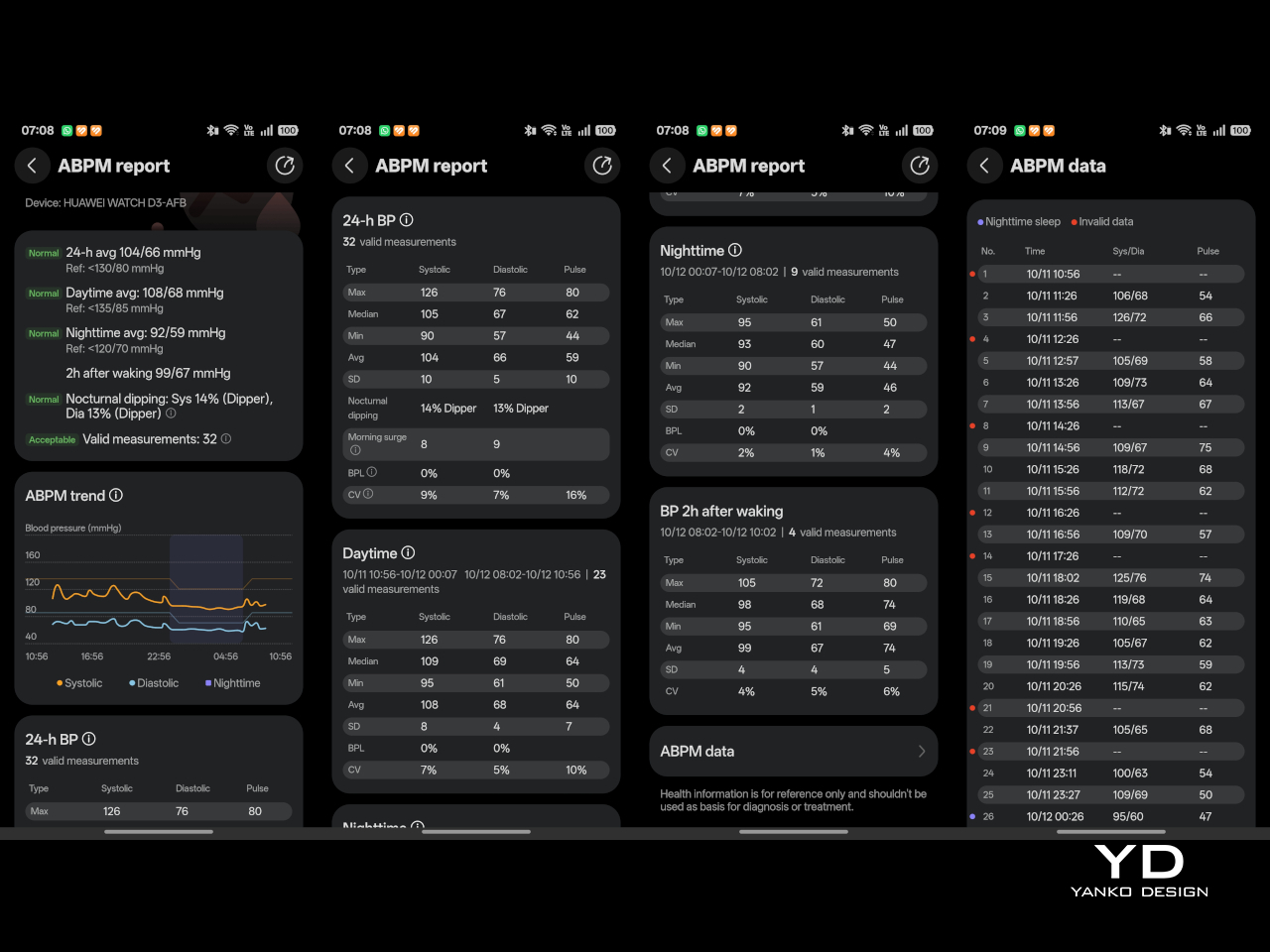
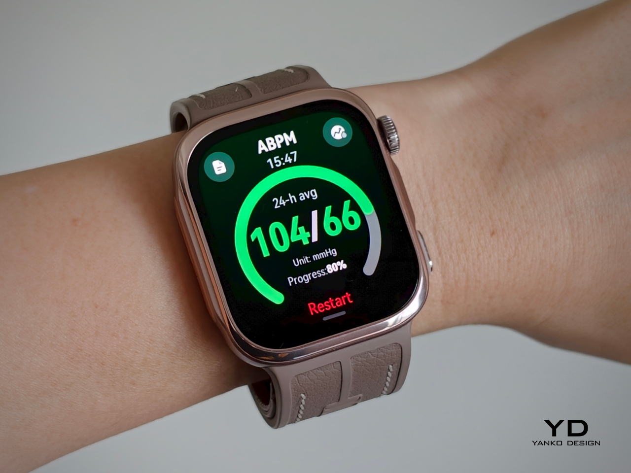
The Watch D3 also supports ambulatory blood pressure monitoring, or ABPM, which schedules repeated measurements over a 24-hour period, including while you sleep. Rather than giving you one isolated reading, it builds a record of how your blood pressure changes throughout the day and night. Huawei Health brings those results together into a report showing daytime, nighttime, and overall averages, which you can save or share with your doctor.
That does not mean you can forget about the process entirely. During waking hours, you still need to pause, keep still, and hold the watch at heart level, following the positioning instructions. You can adjust the measurement schedule rather than stick with the default intervals. Overnight, the watch takes readings automatically without requiring you to assume the daytime posture. Thankfully, those nighttime readings did not bother me or wake me up.
There is also a dedicated feature for measuring blood pressure before and after six workout types, covering indoor and outdoor running, walking, and cycling. You take an initial reading before starting, then begin another measurement within two minutes of finishing. There is a reason those changes are worth studying. Research using clinical exercise tests has linked certain blood pressure responses during exercise and recovery with a higher risk of developing hypertension or experiencing cardiovascular events later on.
Beyond blood pressure, the D3 covers heart rate, sleep, blood oxygen saturation, and skin temperature, with ECG available in supported regions. Fitness tracking is solid too, with more than 80 workout modes. It works well as an everyday companion for keeping an eye on activity, workouts, and daily movement without making every walk feel like homework.
The everyday smartwatch features are more familiar. The D3 runs HarmonyOS and works with both Android and iOS, although the experience is not identical across the two platforms. Bluetooth calling and music playback are supported, but the limited third-party app selection leaves less room to expand beyond the built-in tools.
With a compatible Android phone, you can respond to supported messages using quick replies or the on-screen keyboard. Message replies are not supported when the watch is paired with an iPhone, which is worth knowing before you buy. Offline maps are available for supported models, while NFC payment support depends on your region and the available payment service. Having NFC hardware does not automatically mean it will work with your usual cards.
Battery life has been good in my use, too. Huawei quotes up to six days under typical conditions, dropping to around one day with ABPM enabled. My typical-use results were close to that six-day claim, while I comfortably passed a day with ambulatory monitoring enabled. Measurement frequency matters here, since Huawei’s ABPM battery test uses 15-minute intervals, so your results may differ depending on your settings.
Charging speed is okay rather than especially quick, but outside ABPM sessions, I was not constantly looking for the charger. The supplied charger uses a USB-C rather than USB-A, which is a welcome change. That is one less reason to keep an older USB-A power adapter around.
Sustainability
The Watch D3 has an IP68 rating, but that is not an invitation to take it swimming or into the shower. Huawei advises against both because of the air openings used by the blood pressure system. The watch is not water- or dust-resistant while taking a measurement, so those openings need to stay clean and dry. It requires a little more care around water than you might expect from an everyday smartwatch.
The strap feels durable, although Huawei does not provide wear-test figures to put that impression into context. It is removable, so a tear would not necessarily mean replacing the whole watch, provided Huawei makes compatible replacement straps available. That is useful for keeping the D3 in service, but the broader sustainability picture remains unclear. I would have liked more information about recycled materials, repair options, and long-term software support.
Value
The Watch D3 costs £399.99 (roughly $533) in the UK and €449 (roughly $505) in Europe, so it is not exactly an impulse purchase. Whether that feels expensive depends on what you want from your watch. The D3’s appeal is having cuff-style blood pressure readings and 24-hour ambulatory monitoring in something you can wear throughout the day and overnight.
If those are features you will use regularly, the price becomes easier to justify, especially given how comfortable I found it. I am also impressed by how streamlined the whole package feels, considering the specialized hardware tucked inside the watch and strap. You are getting more than an extra health metric on a screen, without having to wear something that feels like medical equipment. If you mostly want notifications and workout tracking, though, I would be less inclined to pay for blood pressure hardware that rarely gets used.
Verdict
The Watch D3 impressed me most by making its unusual hardware so easy to live with. Blood pressure readings are quiet, the strap never felt cumbersome, and overnight measurements did not wake me up. Battery life was good, too, particularly outside ambulatory monitoring sessions. I never felt I was putting up with an awkward gadget just to use its blood pressure features.
I would still like a broader selection of third-party apps and clearer information about repair options and long-term support. The price also makes more sense if blood pressure monitoring will be a regular habit rather than an occasional curiosity. It is a tool to use alongside professional care, not a reason to diagnose yourself or change medication based on your readings. With that understood, the D3 earns my recommendation for combining useful blood pressure features with the comfort and discretion of an everyday smartwatch.
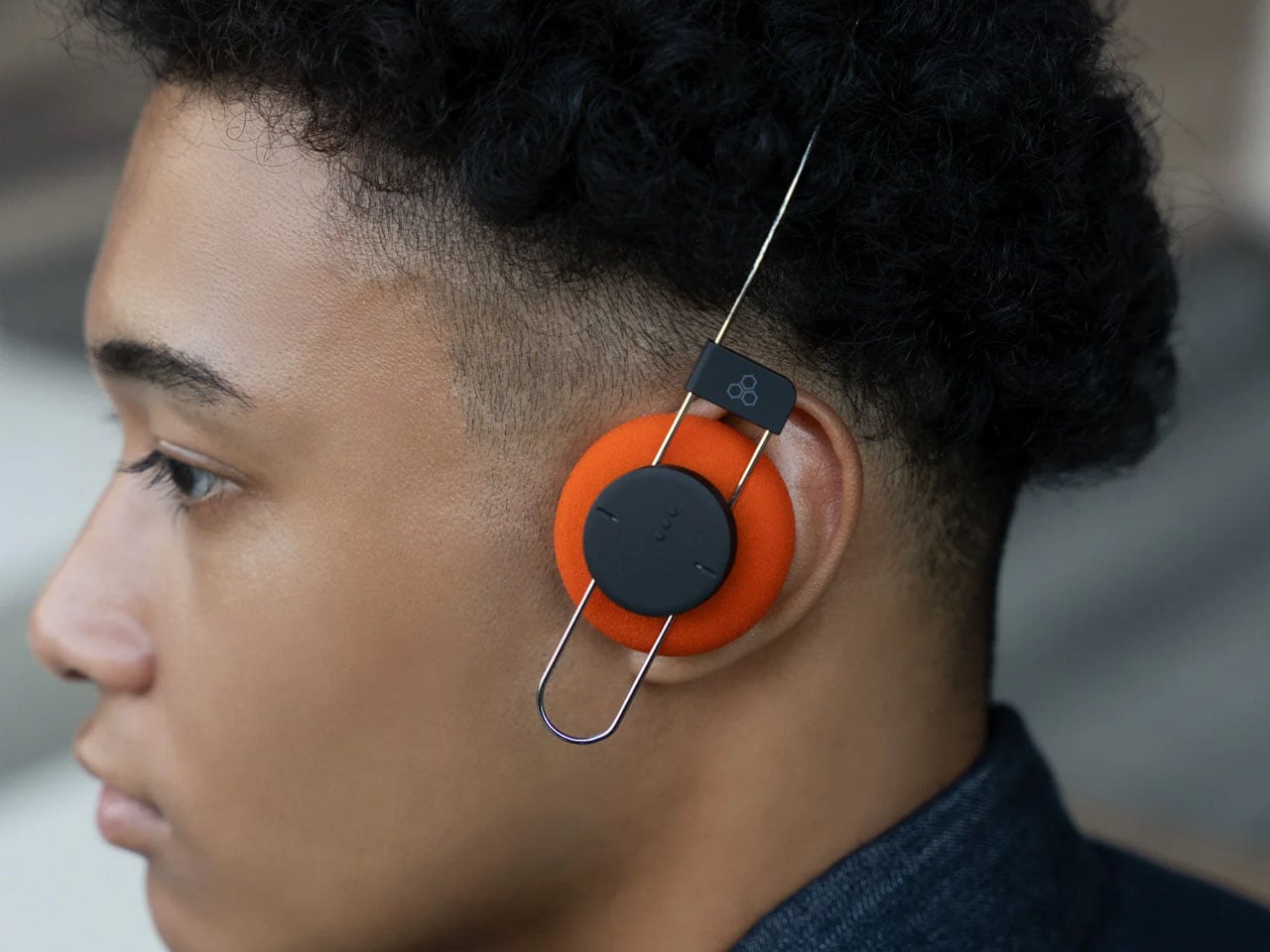
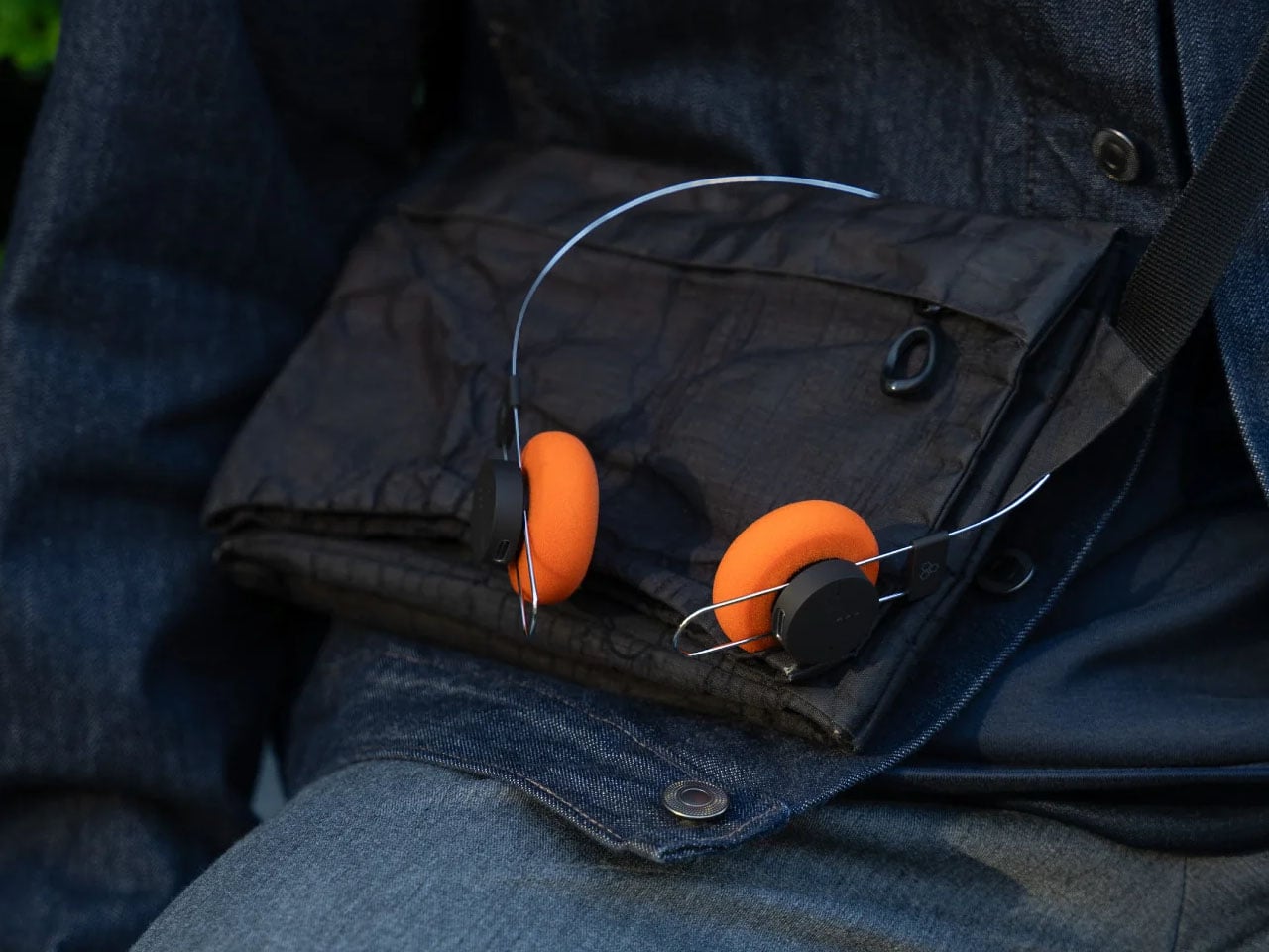
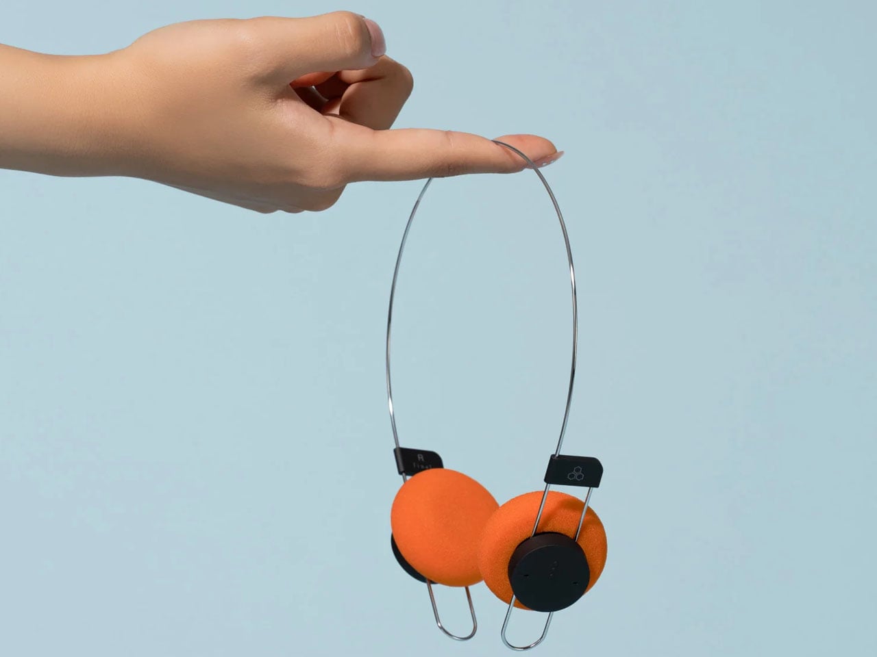
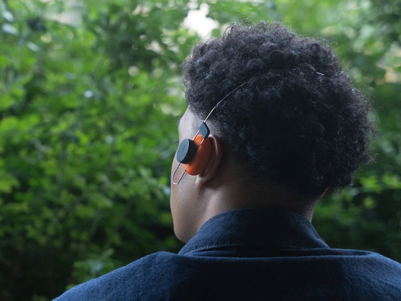
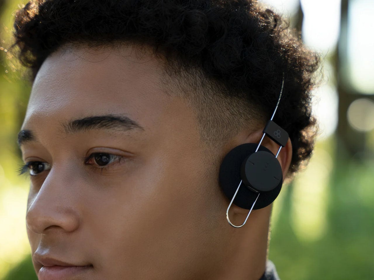
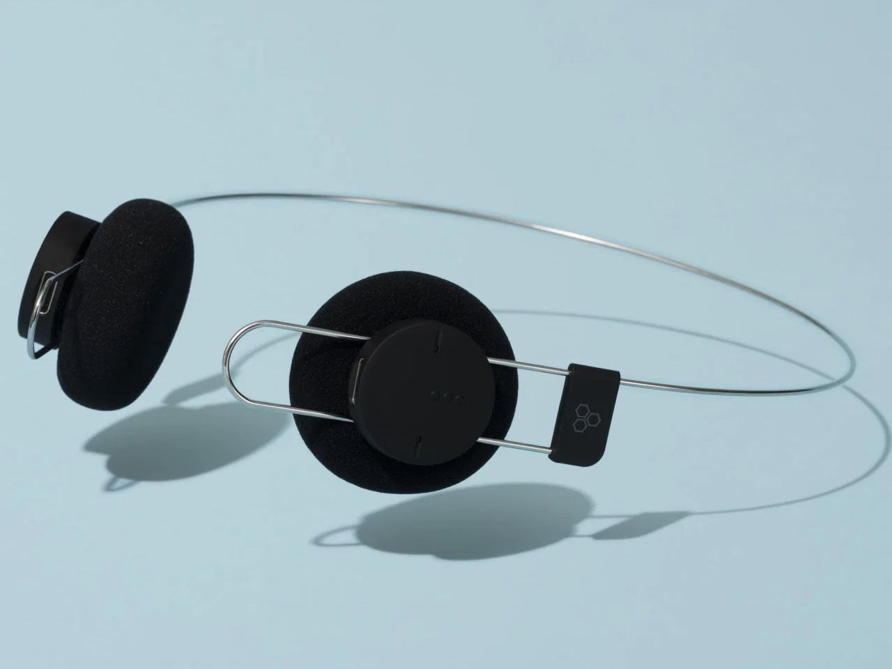
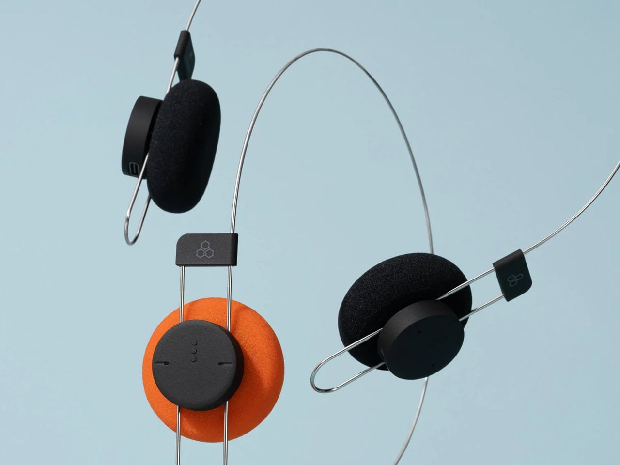
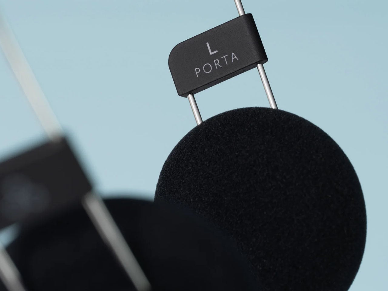
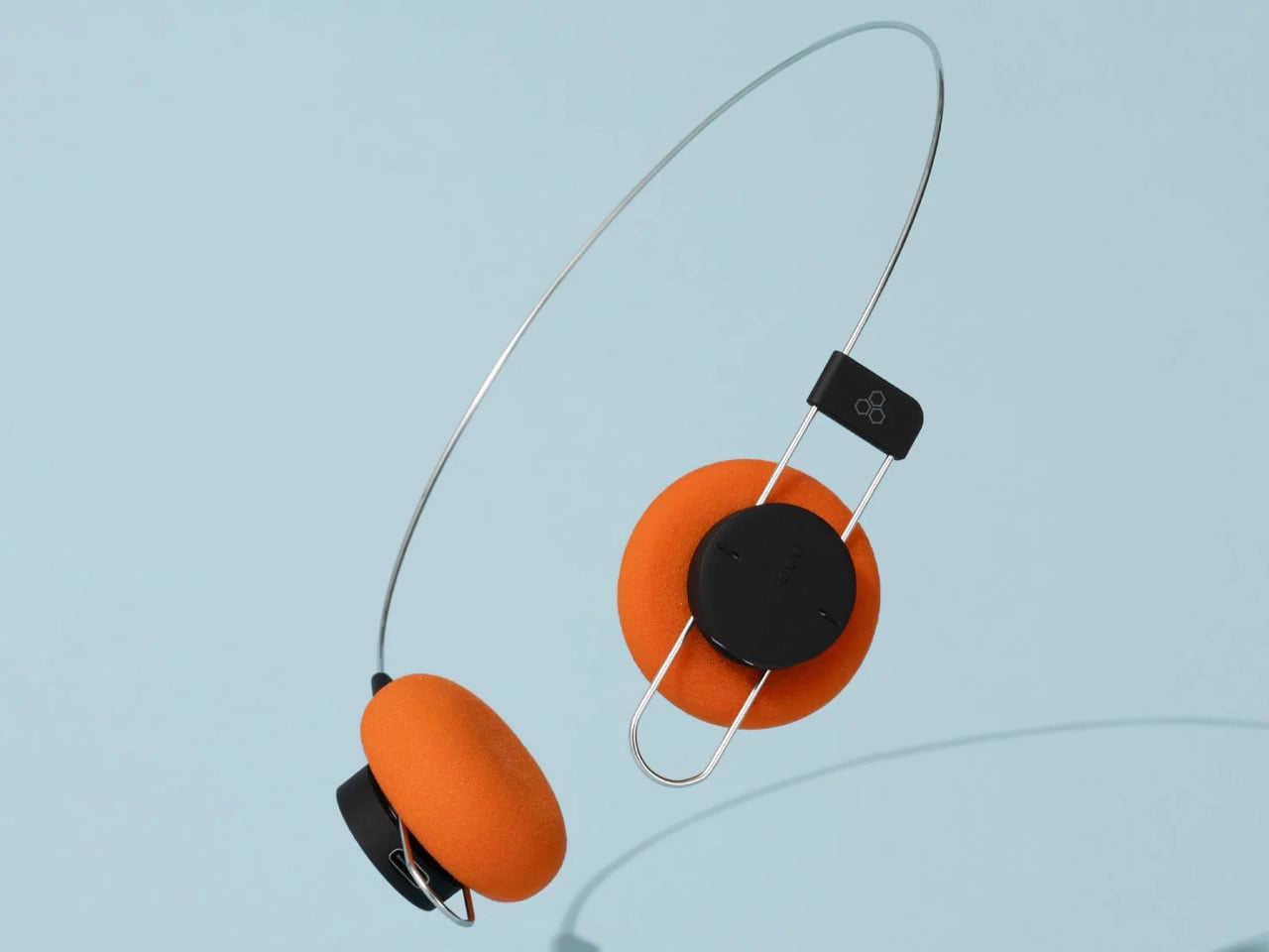
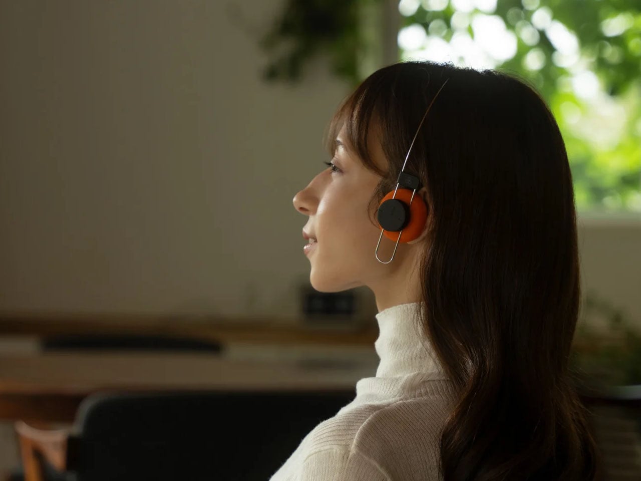
Japanese audio brand Final has introduced Porta, a pair of wireless on-ear headphones that rethink one of the most familiar elements of headphone design – the headband. Unlike most headphones with a conventional padded arch, the Porta uses a minimal, single-wire structure called AirWire, reducing the headphones’ weight to approximately 40 grams while aiming to make extended listening more comfortable.
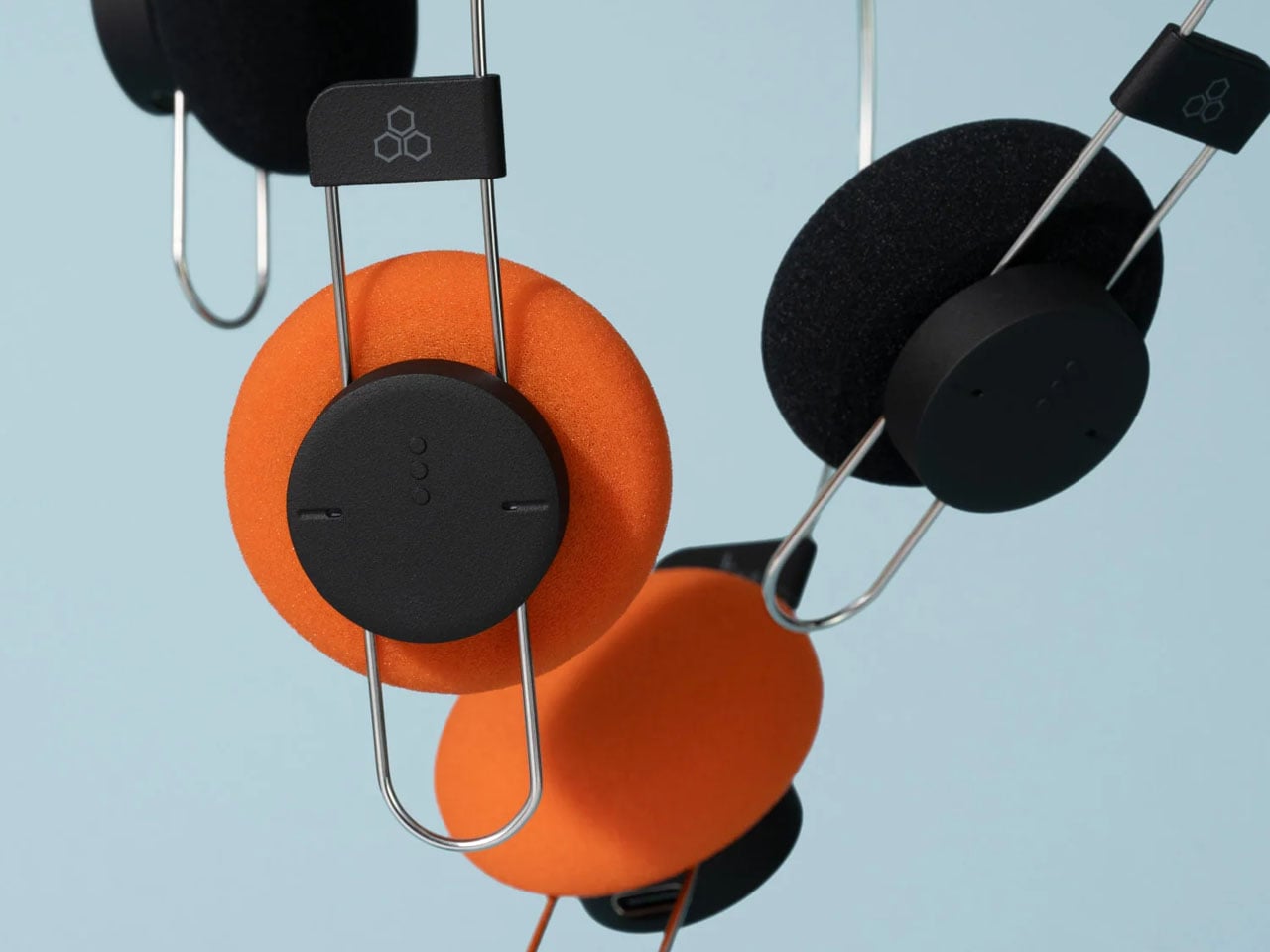
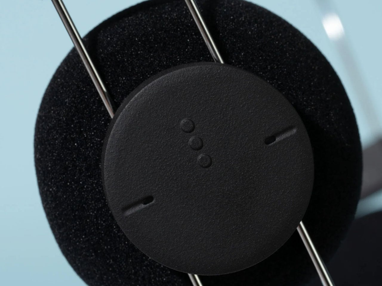
The AirWire design minimises the area of contact between the headphones and the wearer’s head. According to Final, this approach reduces pressure on the top of the head, a common source of discomfort with traditional headphones. The lightweight construction also gives the Porta an unusually stripped-back appearance, with a thin metal-like frame connecting two compact earcups. The pair of cans is a minimalist accessory that goes well with your other no-nonsense gadgets.
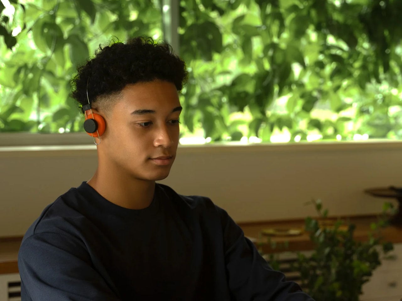
Porta’s aesthetic draws on the visual language of older portable audio equipment. Its orange ear pads recall the bright accents associated with classic Sony Walkman headphones, while a black version offers a more understated alternative. Both variants share the same main body, with the ear-pad colour providing the visual distinction. Final also plans to sell replacement ear pads separately in 2027, giving owners the option to refresh the look without replacing the entire product.
Despite its lightweight construction and retro appearance, the pair of cans incorporates modern wireless connectivity. Bluetooth 5.4 enables connection to compatible devices, while support for the SBC and AAC audio codecs provides compatibility with a broad range of smartphones and other Bluetooth audio sources. The headphones have a stated frequency response of 20Hz to 20kHz.
Final says the Porta has been tuned to deliver a lively presentation, with a sense of depth and substance in the midrange and lower frequencies. The company highlights vocal weight as a particular consideration in its sound design, addressing the challenge of maintaining a full listening experience in a lightweight headphone enclosure. These are manufacturer claims rather than independently verified performance results.
A 57mAh lithium-ion battery provides up to eight hours of music playback on a charge. Recharging takes approximately 90 minutes through USB-C, keeping the charging process straightforward. The headphones also carry an IPX4 rating, indicating resistance to water splashes, which offers some protection during everyday use and light exercise.
The design does involve trade-offs. The Porta does not offer active noise cancellation, a feature found in many contemporary wireless headphones. Its modest battery capacity and eight-hour rated playback time also place the emphasis on everyday convenience and low weight rather than extended listening between charges.
Final has priced the Porta at ¥12,800 (approximately $80), with availability in Japan scheduled for October 23, 2026. International availability has not been confirmed, although the brand sells products through its Amazon storefront.
The new Kindle Colorsoft brings updated hardware and optional page-turn accessories, while Kobo Libra Colour offers built-in buttons and stylus support for less.
Kindle Scribe combines ebook reading with handwritten notes, while reMarkable Paper Pure focuses on writing and document workflows. We compare features, costs, and usability.
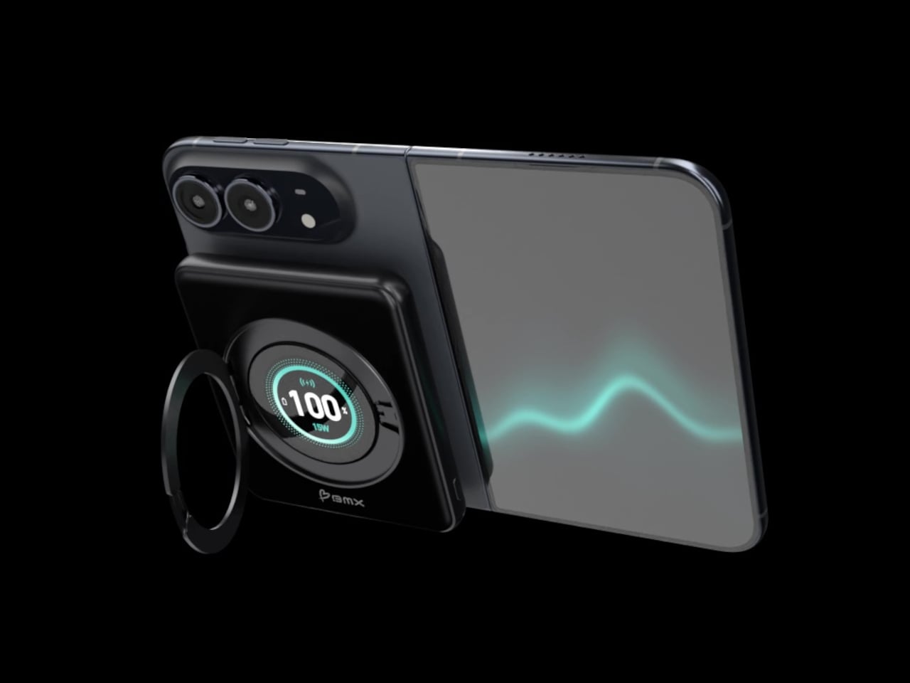
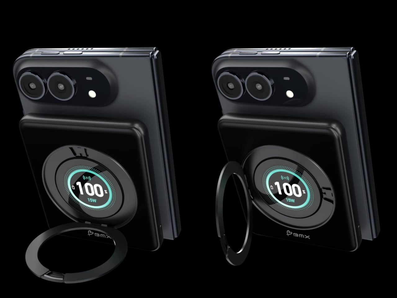
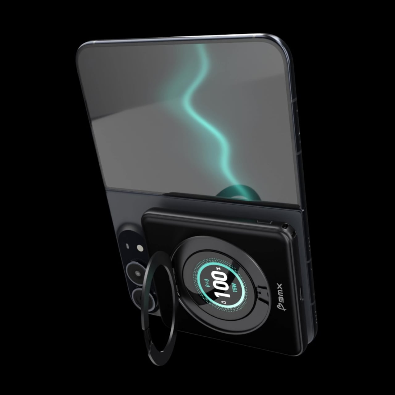
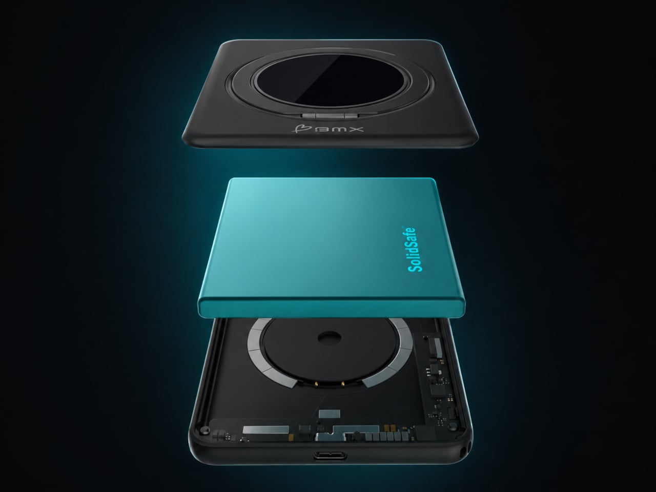
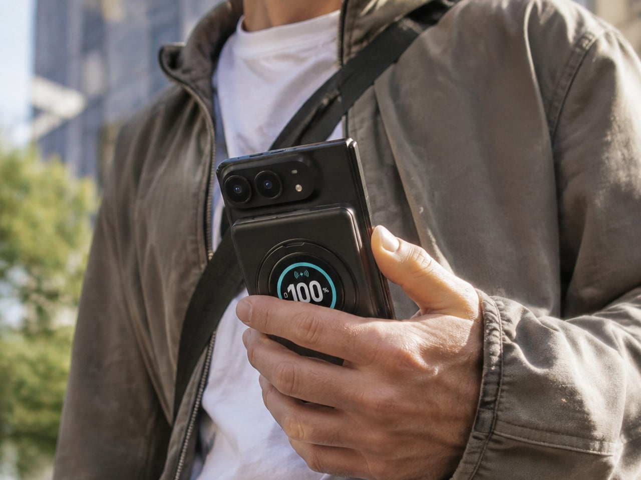
Magnetic charging makes attaching a battery easy, but it doesn’t guarantee that the battery will fit your phone’s shape. Apple’s folding iPhone Duo introduces a shorter body that gives accessories less room to stretch. BMX’s SolidSafe Duo responds with a compact, 5,000mAh power bank designed around those proportions, bringing a rotating stand, color display, and attached USB-C cable along for the ride.
The difference starts inside, where a custom-shaped battery cell lets the enclosure follow the Duo’s footprint instead of extending beyond its edges. The black, CNC-machined aluminum housing has rounded corners and a broad face that sits below the cameras. That gives the accessory a more deliberate relationship with the phone, although matching its outline doesn’t make the added thickness disappear, of course.
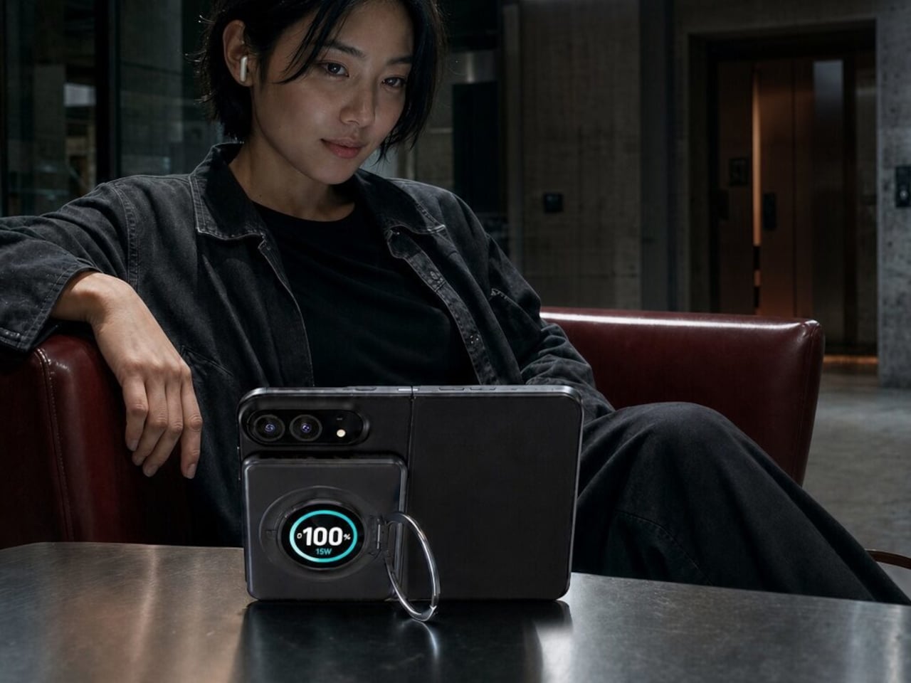
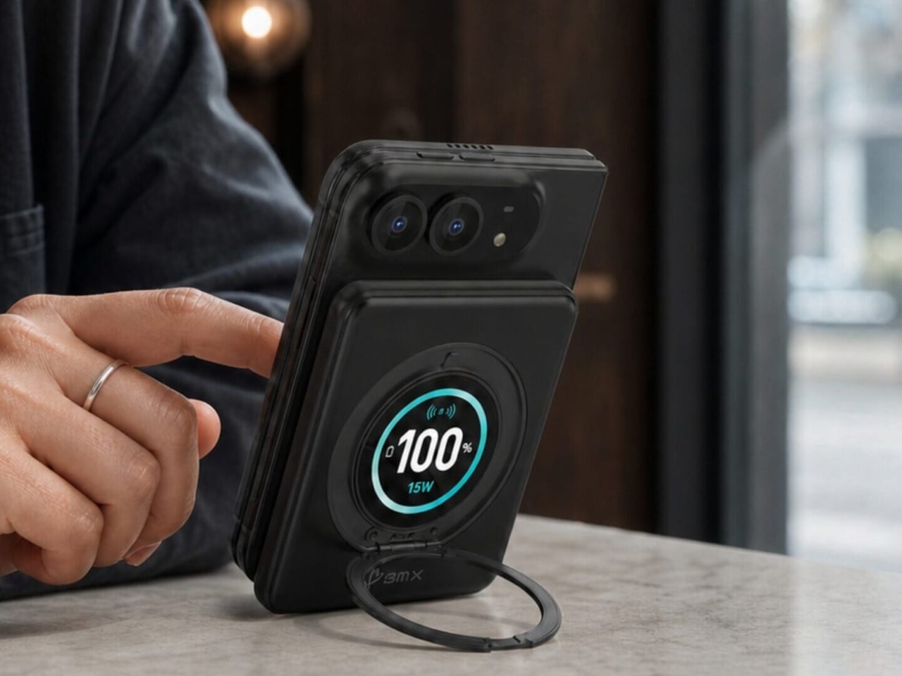
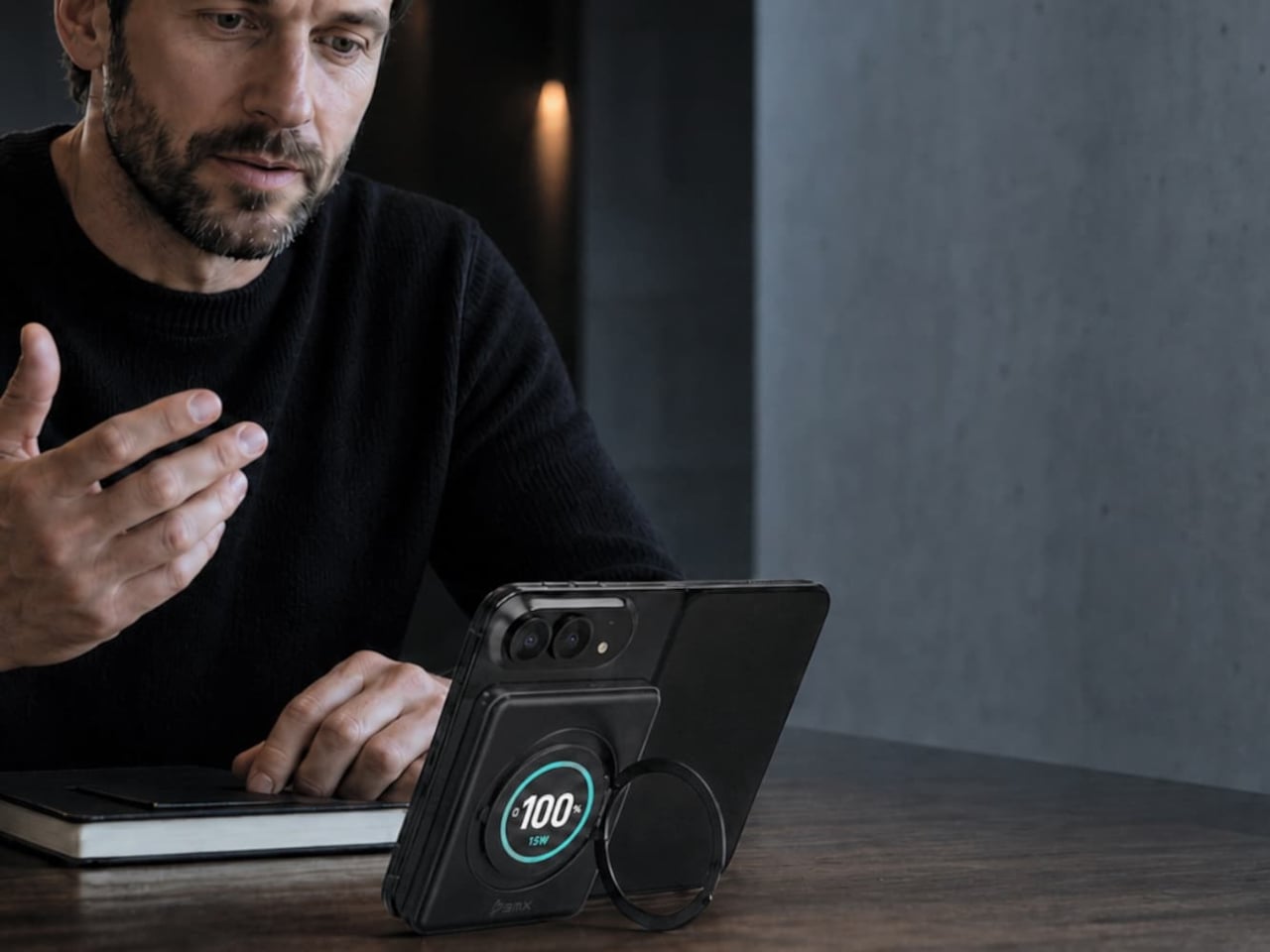
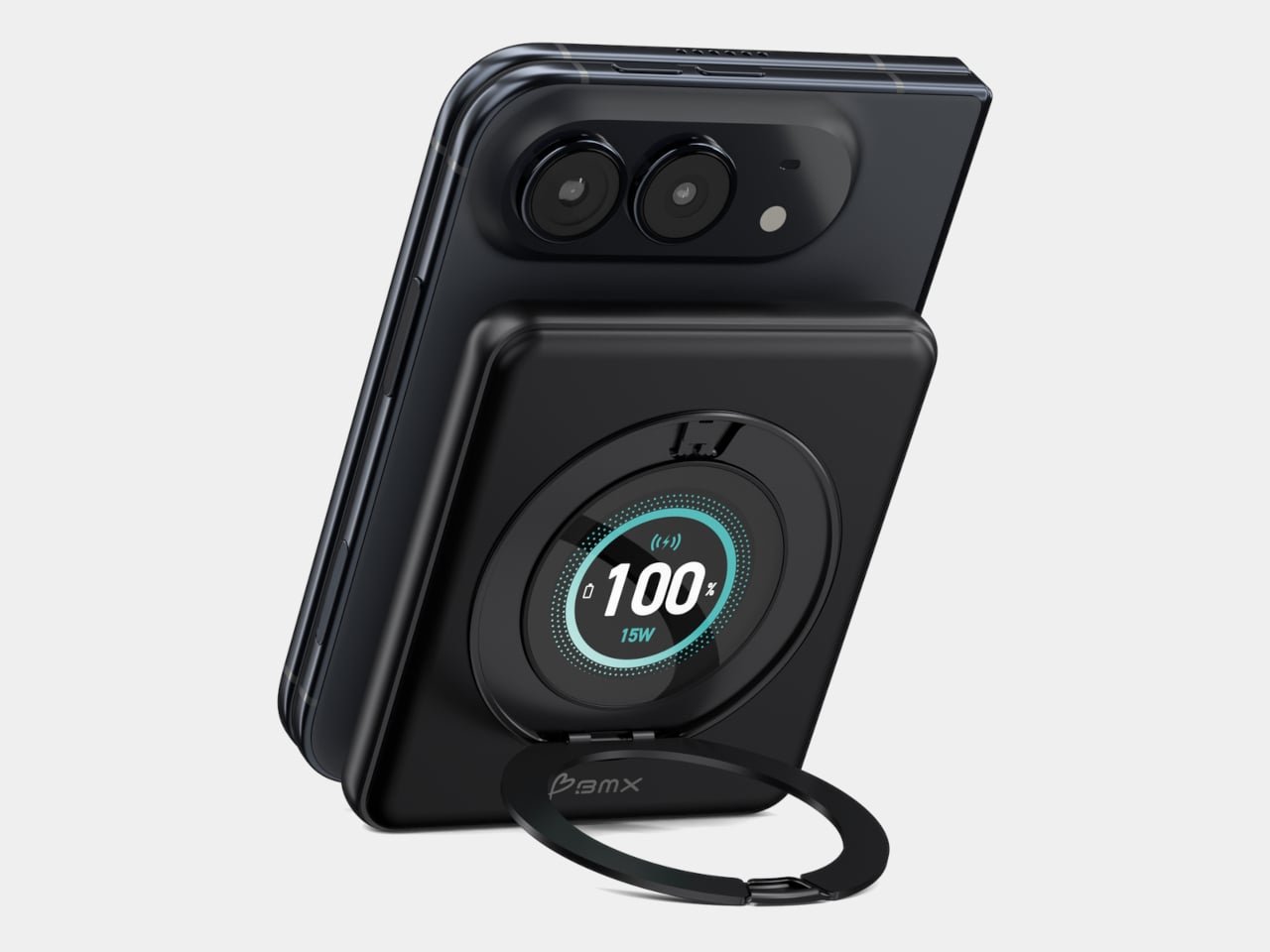
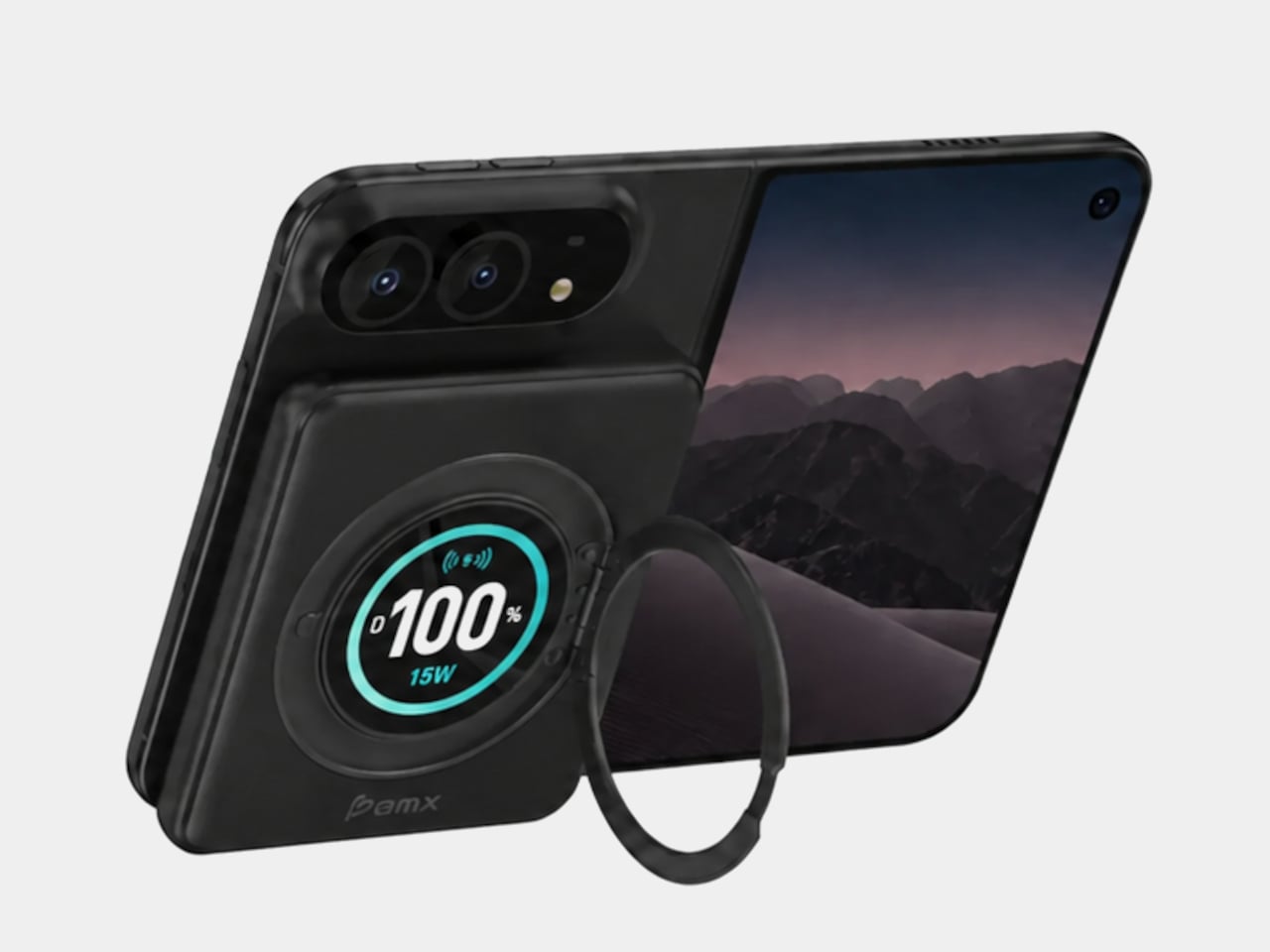
A circular ring folds out from the back and rotates 360°, giving the phone support in portrait or landscape orientation. Reading a recipe on the counter could give way to watching a video over lunch without detaching the battery. The stand makes particular sense for an unfolded screen, which offers more room to watch but also more phone to hold in your hand.
Nestled inside that ring is a full-color display showing the power bank’s remaining charge and live charging wattage. The distinction matters because the percentage belongs to the accessory, not your iPhone. It also gives you a way to check both your reserve and the current power output, rather than assuming that an attached battery is always charging at its advertised maximum speed.
The attached USB-C cable doubles as a lanyard, so wired charging doesn’t begin with a search through your bag. Plug it into a compatible device for up to 20W output, or use it to refill the power bank at up to 15W. It’s a simple detail, but it keeps the wired option available even when the rest of your charging gear is elsewhere.
Wireless charging, meanwhile, tops out at a claimed 15W, below the iPhone Duo’s supported 25W maximum. You’re getting a tailored shape rather than the phone’s fastest wireless charging. Connecting two devices also changes the numbers, splitting output between 10W over USB-C and 5W wirelessly. That could help another device through the afternoon, but neither connection retains its single-device maximum in that arrangement.
The SolidSafe name also needs a little unpacking. BMX uses semi-solid-state cells and says their reduced liquid electrolyte content helps lower fire risk compared with conventional lithium-ion batteries. That’s a reduced-risk claim, not a promise that the battery can’t fail. The rigid aluminum enclosure also helps dissipate heat, according to BMX, rather than preventing the pack from becoming warm while it charges your phone.
Available for $79.99 in the US, SolidSafe Duo adds about 0.43 inch of thickness and 4.47 ounces to your phone. Those numbers deserve as much attention as its compact outline, particularly when the phone itself already folds shut. Having a stand and cable built into the battery means fewer loose accessories to pack, but a thicker stack to slide back into your pocket.
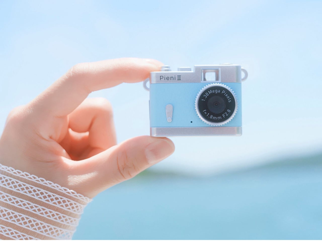
Keychain cameras have a certain appeal for those who love to carry a bit of nostalgic charm with them. Well, technically, they’re still digital cameras, but there’s a retro feel to them that appeals to those who remember taking photos before smartphones. They’re cute and tiny enough to carry as accessories, but they still let you take photos and videos to add to your collection.
Kenko Tokina has released another tiny camera to add to the fun. The Kenko Pieni III is an ultra-small digital toy camera designed to be worn as a necklace or an accessory. It comes with a neck strap for that purpose. It’s not meant to replace your bigger camera, of course, but it offers another way to take photos and videos.
Manufacturer: Kenko Tokina
This version of the Pieni camera is just over two inches wide and weighs approximately 18 grams, excluding the memory card and accessories. It comes in a classic camera-style design, so it can also serve as a camera-shaped accessory or a decorative display. But when you want to use it as an actual camera, it can capture still images at 1440 × 960 pixels and videos with audio at 720 × 480 pixels and 30 frames per second.
There’s an important detail behind those photo dimensions, though. The sensor has only 320,000 effective pixels, or 0.32 megapixels, and the camera interpolates the images to create larger files. That doesn’t give you the detail of a higher-resolution sensor. It’s worth keeping your expectations in toy-camera territory rather than expecting crisp images suitable for large prints. But I think this lo-fi aesthetic is part of the appeal of using these toy cameras as a secondary way to capture moments.
It doesn’t have a screen or a viewfinder, so you can’t preview your framing or immediately review what you’ve taken. It can be a way to enjoy capturing a spontaneous moment without worrying about making it perfect, although aiming without a preview may be a challenge for some. There’s also a difference between accepting an imperfect photo and accidentally leaving someone out of the frame, so that uncertainty is part of the trade-off.
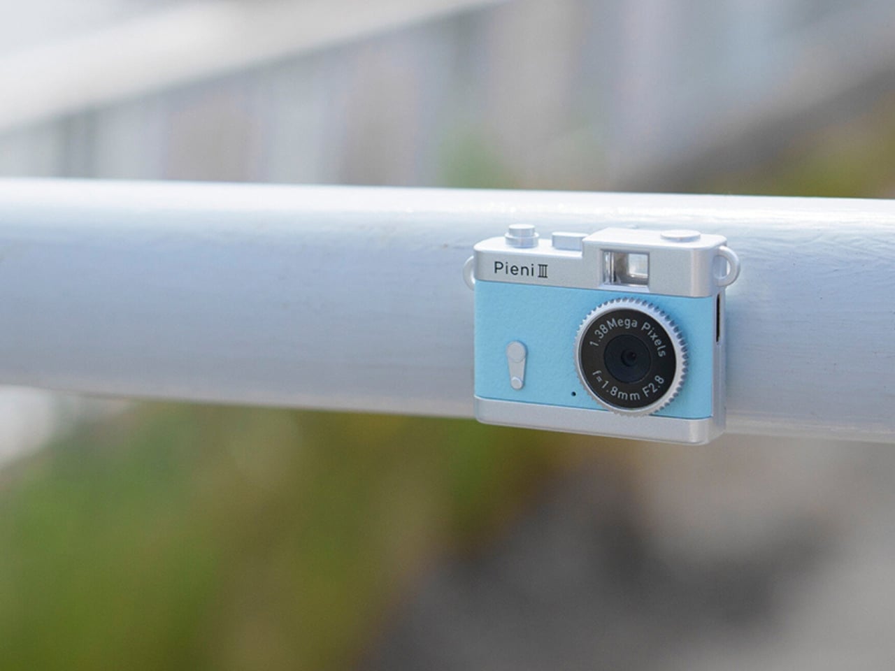
The controls are simple in number, with just two buttons. One handles power and the shutter or video recording, while the other switches between photo and video modes. LEDs indicate which mode you’re using. There aren’t many controls to navigate, although you’ll still need to learn the button presses and signals. The camera also has an integrated rear magnet, so you can attach it to compatible magnetic surfaces, such as a refrigerator or a suitable metal railing. This could be useful for recording yourself when you don’t want to hold the camera. You’ll still need to find a secure position and judge where it’s pointing, especially since there’s no screen to help you set up the shot.
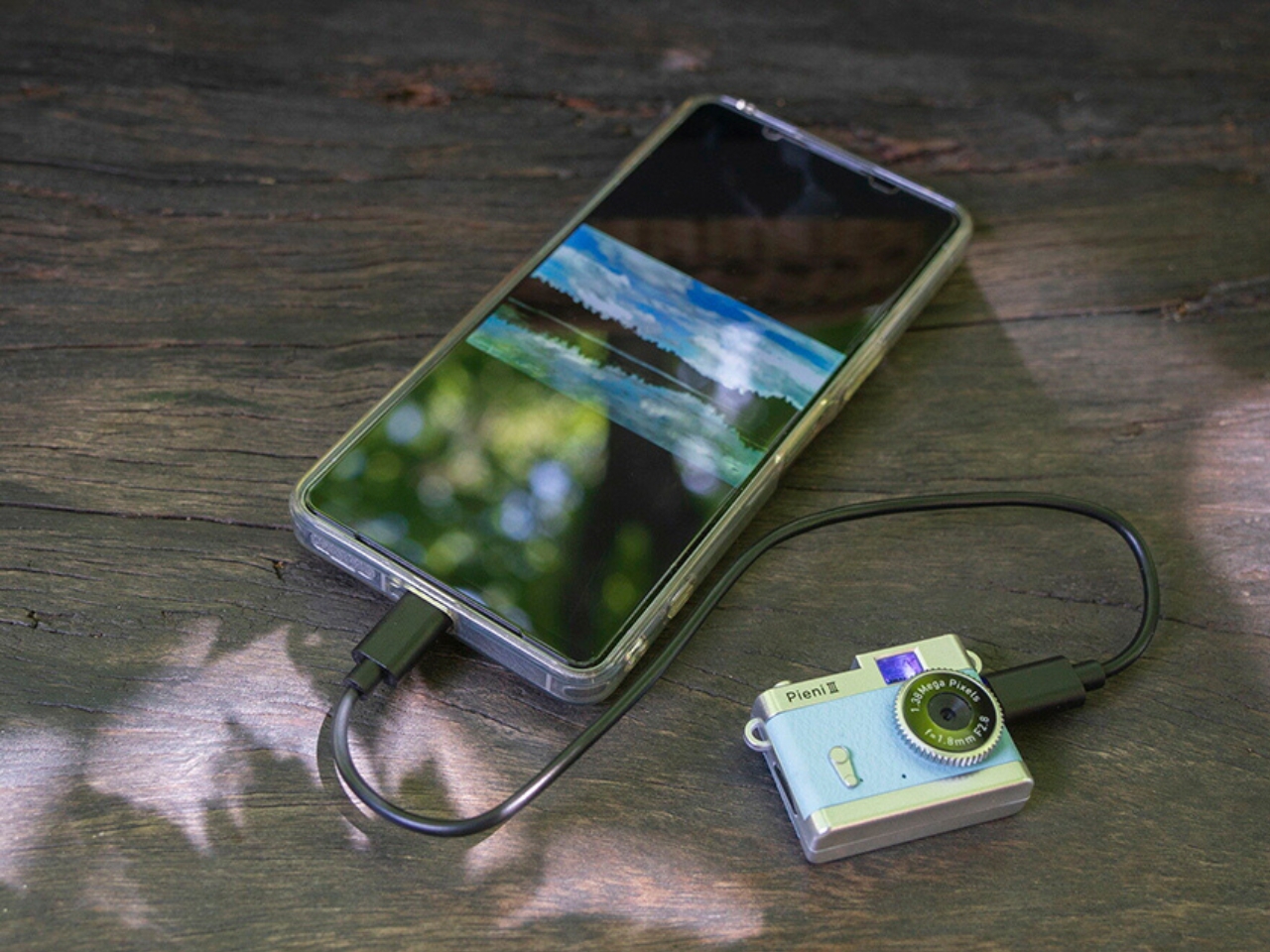
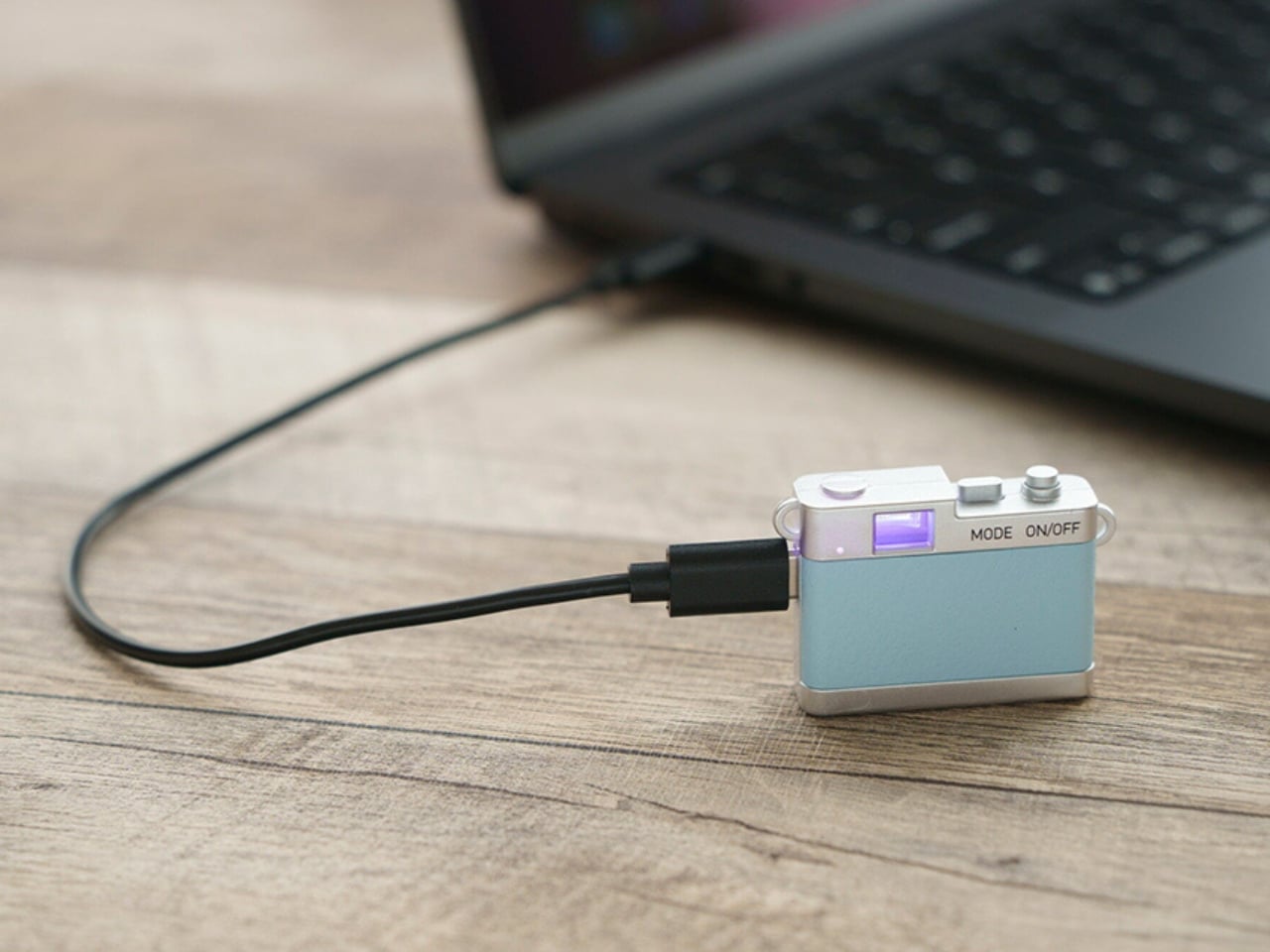
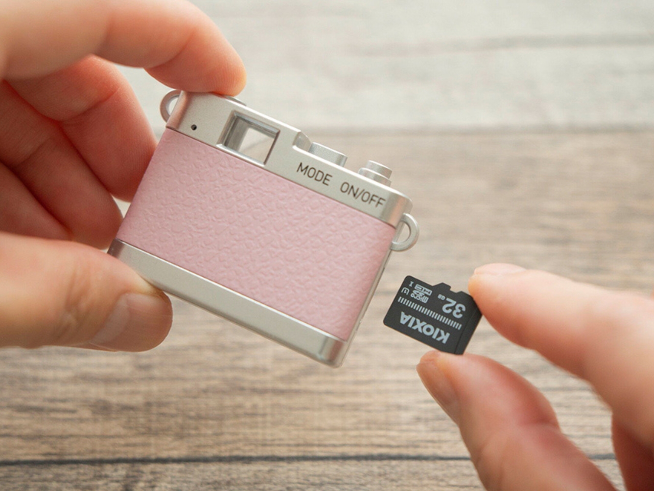
Photos and videos are saved to a separately purchased microSDHC card, with supported capacities ranging from 4 GB to 32 GB. There’s no user-accessible internal storage, so the card is something you’ll need before you start shooting. That’s a small but important extra purchase if you’re planning to give the camera as a gift. To see the results, you can connect the camera to a computer or transfer files directly to a compatible USB-C smartphone using the included USB-C-to-USB-C cable. Kenko Tokina cautions that it doesn’t guarantee compatibility with every smartphone. The USB connection also handles charging, keeping the basic setup fairly compact.
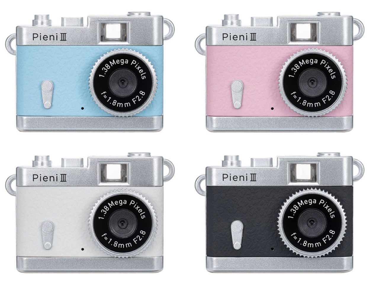
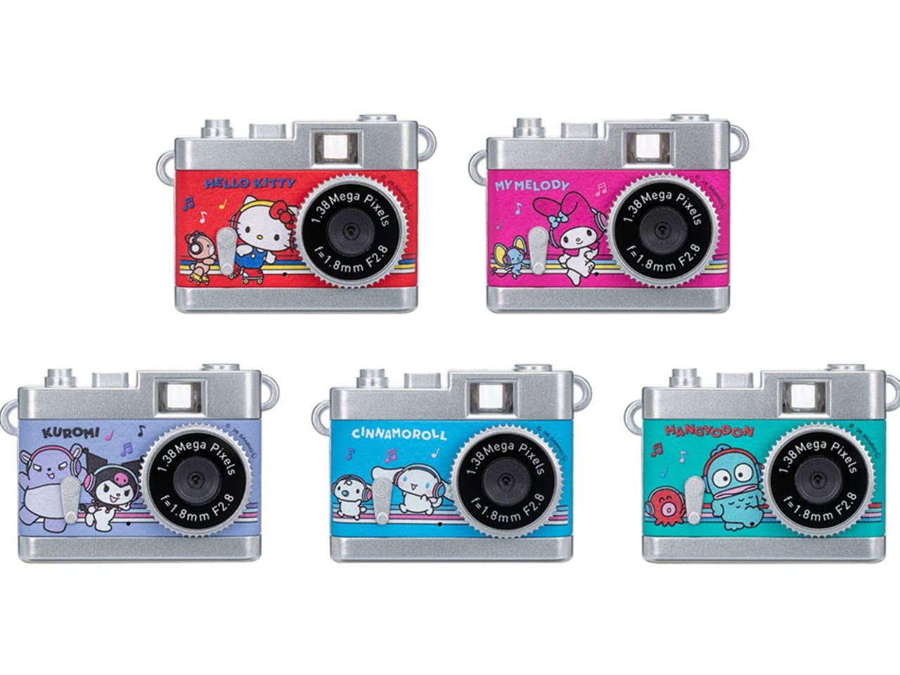
The Pieni III is available in four colors: Soda, Strawberry, Milk, and Black. There are also five character versions in the separate Sanrio Character Toy Camera STREET line, which has the same basic performance as the Pieni III. The range includes Hello Kitty, My Melody, Kuromi, Cinnamoroll, and Hangyodon.
For moments you absolutely need to capture correctly, the lack of framing and immediate review may be frustrating. But if you’re happy to take a few chances, there’s something appealing about putting the camera away without checking every shot. You get to find out later which pictures worked—and which ones missed what you were aiming for.
Innovative combination of keyboard and touchpad in one
Compact, lightweight design
Customizable gestures and sensitivity
Supports 3 Bluetooth and 1 USB-C connections
CONS:
Has a bit of a learning curve for accuracy and speed
Premium price tag
RATINGS:
AESTHETICS
ERGONOMICS
PERFORMANCE
SUSTAINABILITY / REPAIRABILITY
VALUE FOR MONEY
EDITOR'S QUOTE:
The Clevetura CLVX S brings typing and navigation together in a compact design that gives your mouse hand less traveling to do.
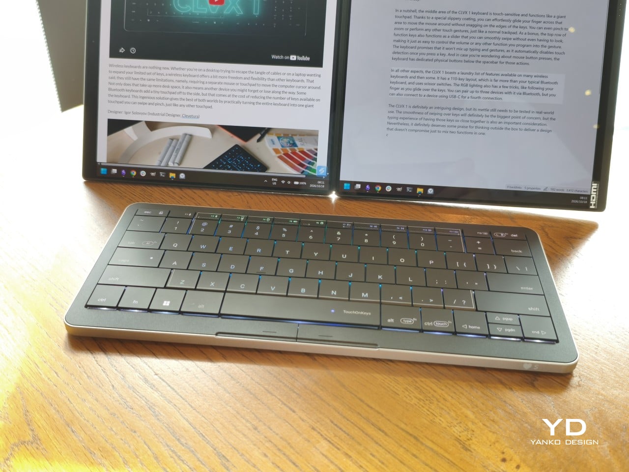
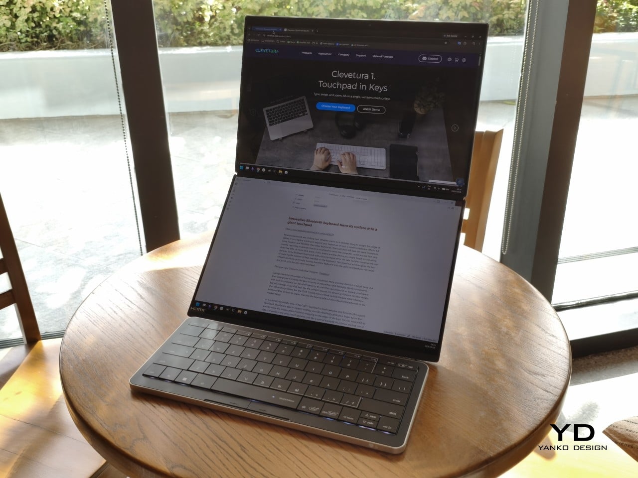
Keyboards and mice have shared our desks for decades, but our hands still have to travel between them whenever typing gives way to clicking. That familiar shuffle becomes especially noticeable when there’s barely enough room for a laptop, let alone another accessory. The Clevetura S offers an interesting solution by turning the keys themselves into a touchpad, giving your fingers another way to get around without leaving the keyboard.
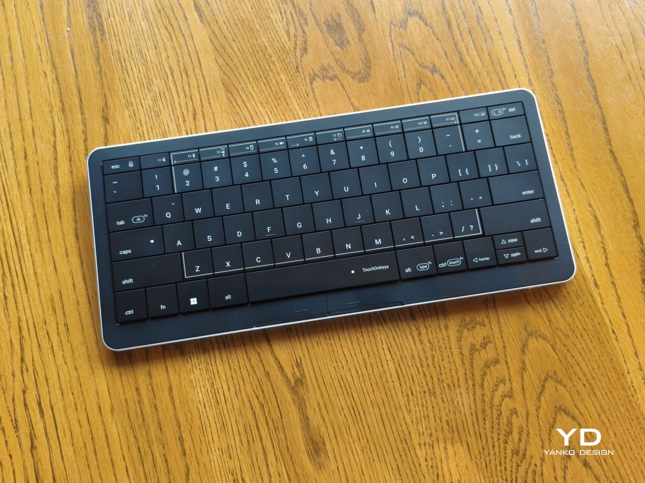
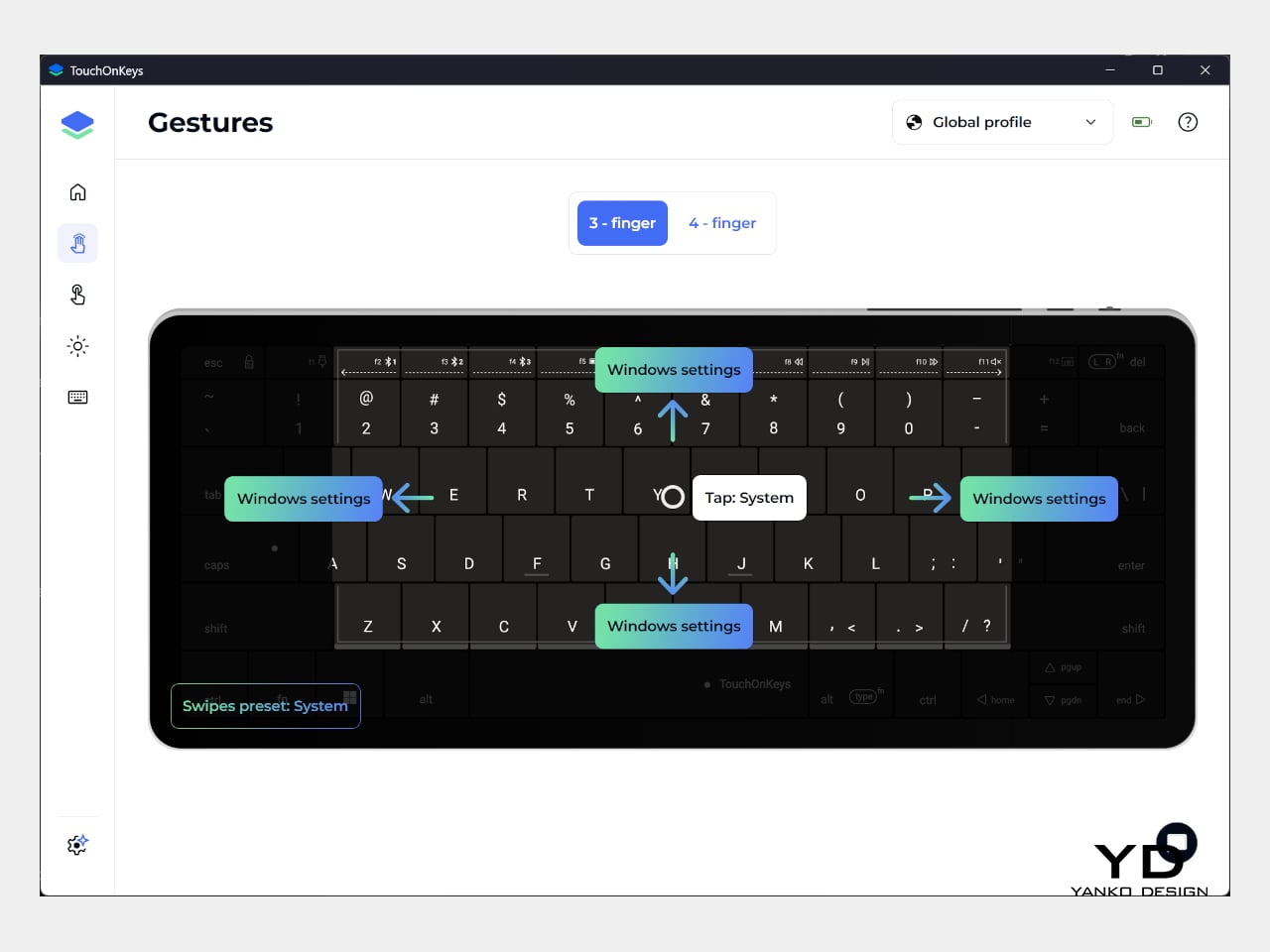
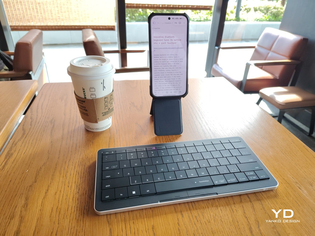
Also known as the CLVX S, this compact, 78-key keyboard brings Clevetura’s TouchOnKeys technology to a more portable design. The Windows version reviewed here can handle familiar gestures without additional software, although there’s plenty to customize if you want to. More importantly, it makes an unusual interaction surprisingly useful, even if sliding across letters and keeping resting fingers from triggering gestures take a little getting used to.
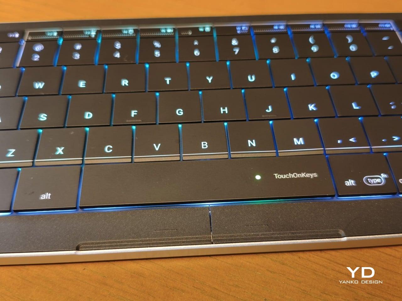
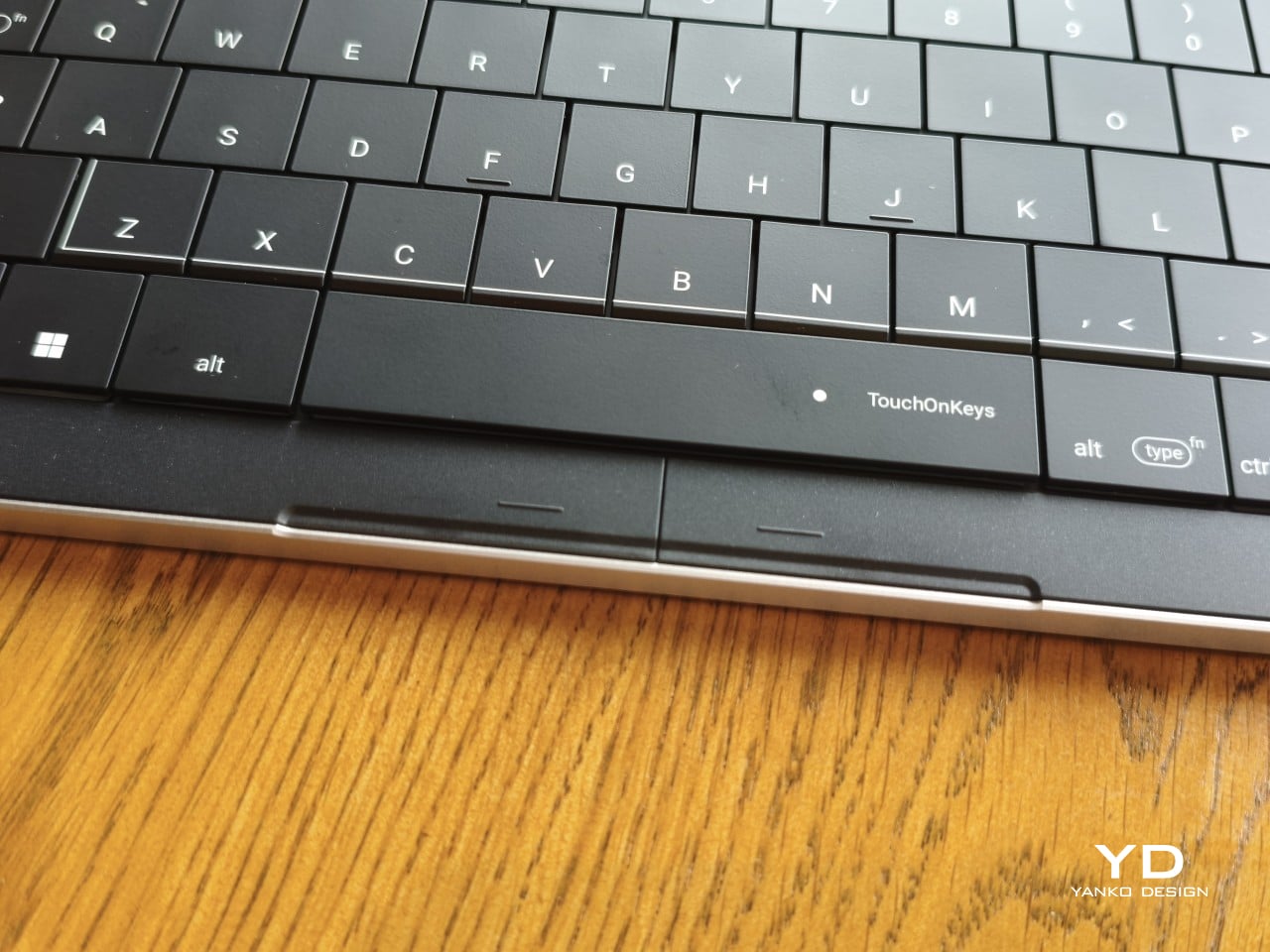
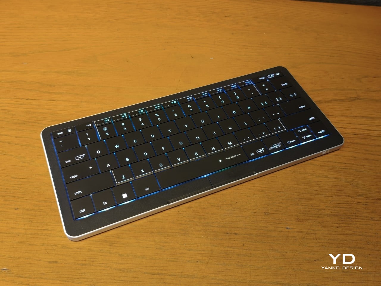
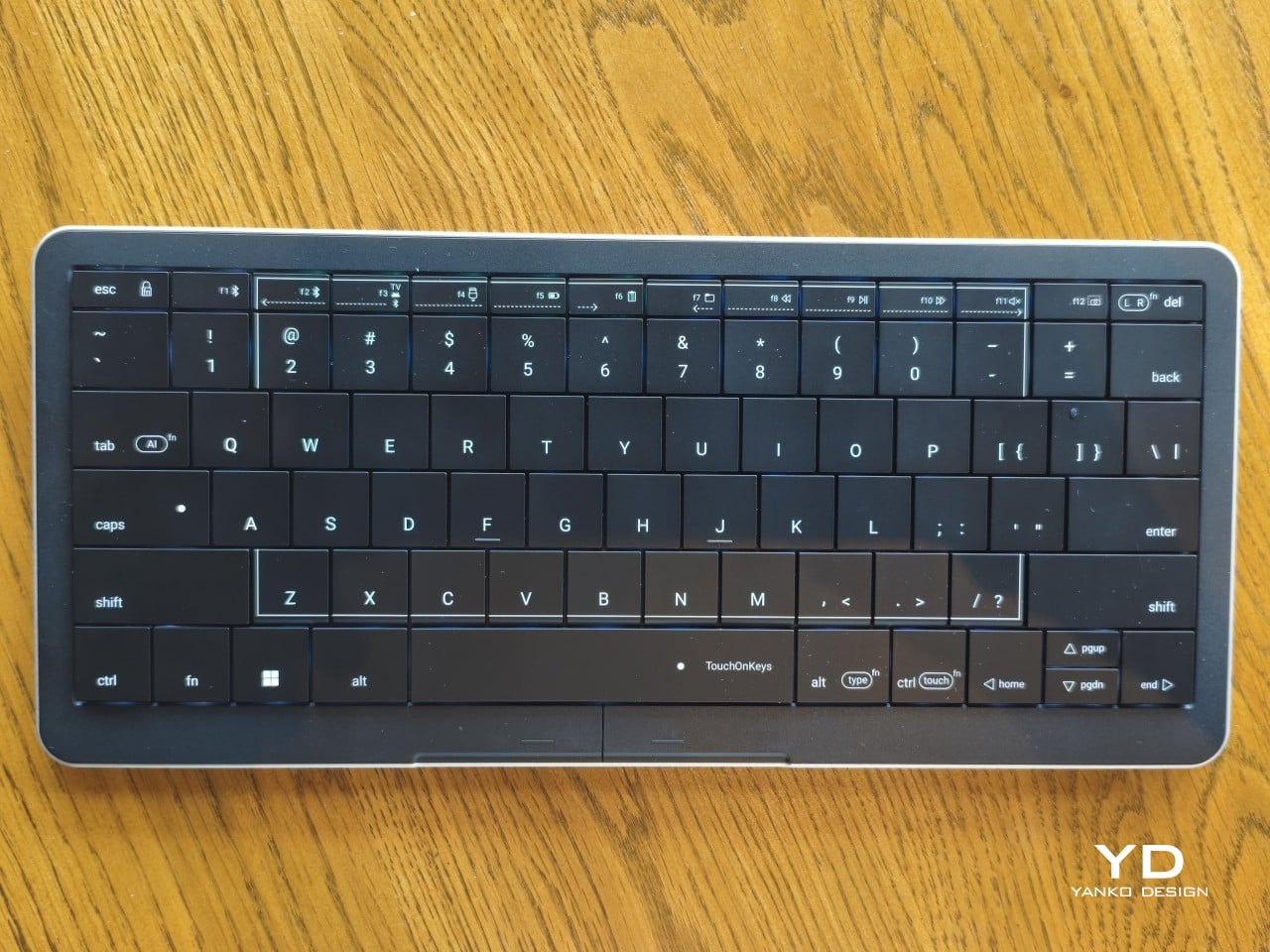
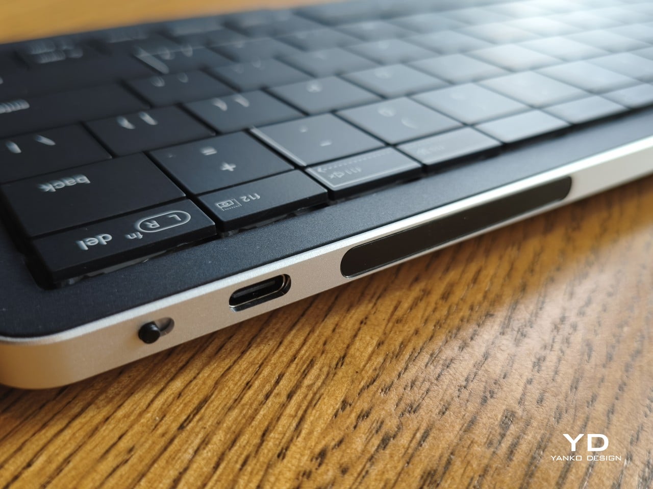
Upfront, the Clevetura S looks almost like someone forgot to leave space between the keys. The flat keycaps sit unusually close together, giving the 78-key layout a tidy, almost tiled appearance. There’s a practical reason for that, of course. Fingers need to travel across the surface as comfortably as they press down on it, and generous gaps would make that second job considerably less inviting.
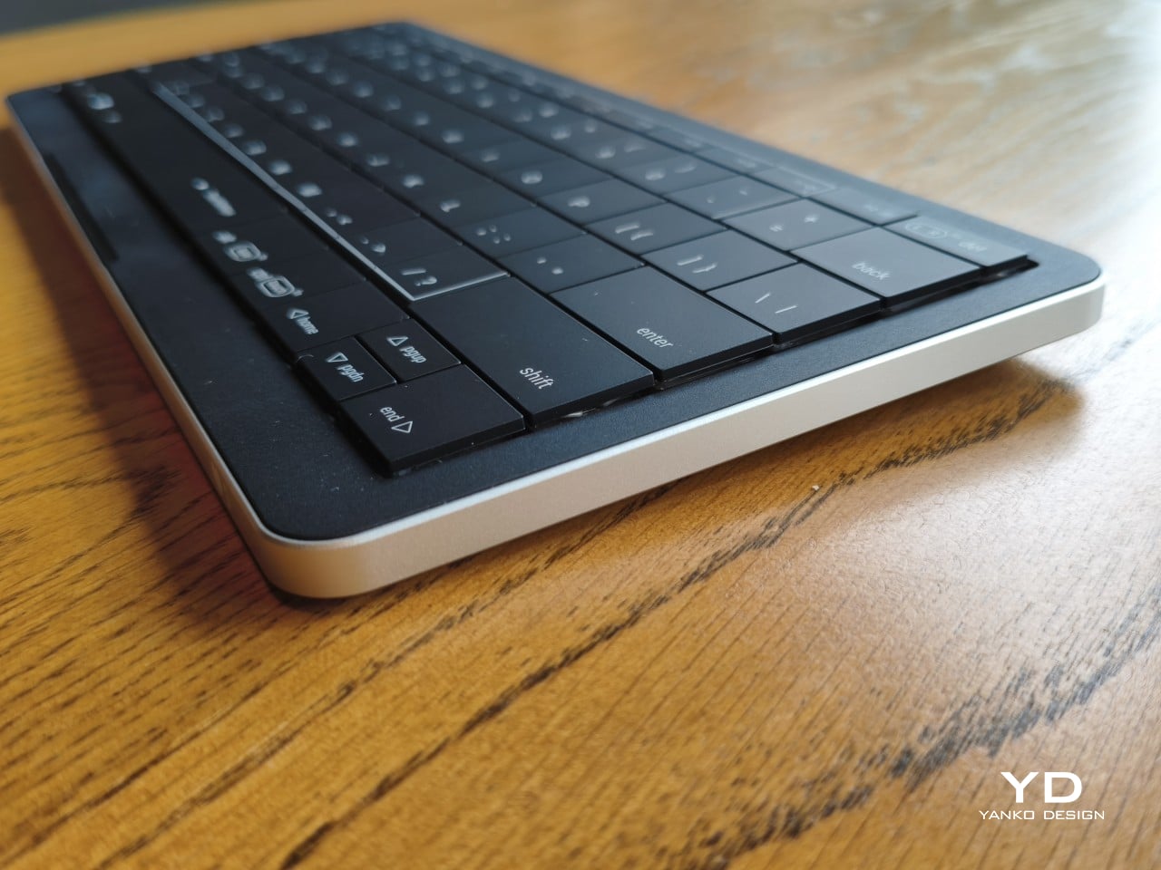
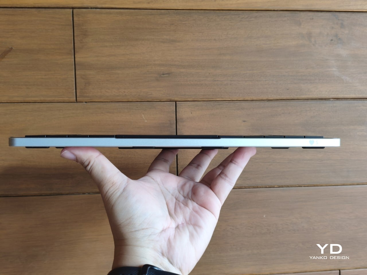
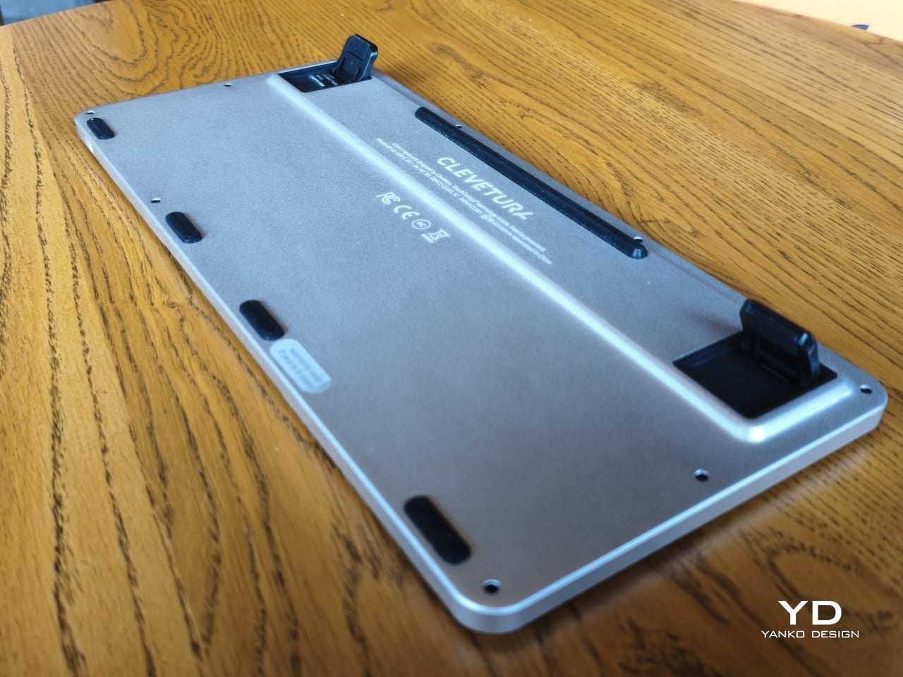
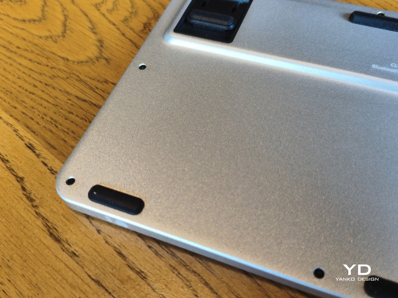
An anodized aluminum base gives the keyboard its silver lower half, while polycarbonate covers the top and ABS plastic forms the keycaps. Both black and white versions retain that silver body, which is particularly noticeable against the darker finish. I would have preferred an entirely black option for a simpler look, though the contrast does make the thin profile a little more obvious when viewed from the side.
Otherwise, there isn’t much to distract from that continuous field of keys, save for the extra markings explaining their secondary functions. Two buttons below the spacebar provide physical left- and right-click controls, recalling the arrangement on older laptops. Then there’s the per-key RGB lighting, which can turn this relatively understated keyboard into something considerably more colorful. Fortunately, those lights also have practical roles beyond decorating your desk.
Ergonomics
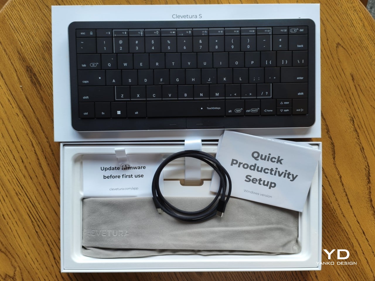
At roughly 403g, the Clevetura S doesn’t ask for much commitment when you’re packing a laptop bag. Its body measures approximately 11.5 inches wide, 5.12 inches deep, and just 0.49 inches (12.4mm) thick, making it easy to accommodate on smaller desks, too. The closely fitted keycaps don’t leave many edges sticking out, although I’d still use the included fabric pouch rather than let them rub against everything else.
The scissor switches feel familiar if you’re coming from a decent laptop keyboard, with around 1.2mm of travel. Typing is perfectly serviceable, though it probably won’t steal the attention of someone devoted to mechanical switches. Folding feet let you raise the back, but there’s only one elevated position. That keeps setup simple, provided you’re comfortable with either the flat profile or the available incline.
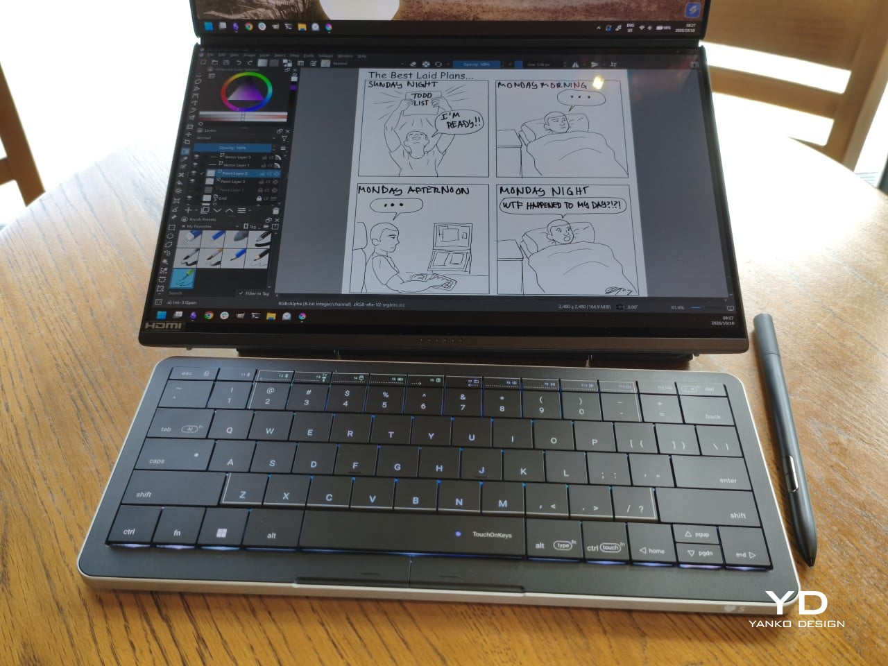
The more interesting benefit shows up when you need to scroll through a reference or reposition the cursor between sentences. Instead of reaching sideways, you can make that movement right where you’ve been typing. Your chair and screen position still matter, of course. The Clevetura S simply reduces the back-and-forth, although its flat, closely fitted keys take some getting used to when finding your usual typing rhythm.
Performance
The central key area doubles as the touchpad, automatically switching between recognizing finger movements and registering keypresses. Sliding across letters feels a little peculiar at first, but my fingers didn’t catch on the edges, and pointer control worked well. Scrolling through a document becomes especially convenient when you’re jumping back into writing every few moments. A light tap handles clicking without requiring you to press a letter.
That automatic switching does have to contend with personal habits, however. Mine involves keeping fingers on the home row, which happens to sit inside the touchpad area. This frequently triggered three-finger gestures when I hadn’t intended anything of the sort. Sensitivity adjustments and the option to disable unwanted gestures provide useful flexibility, though finding the right balance is something to budget time for rather than expect immediately.
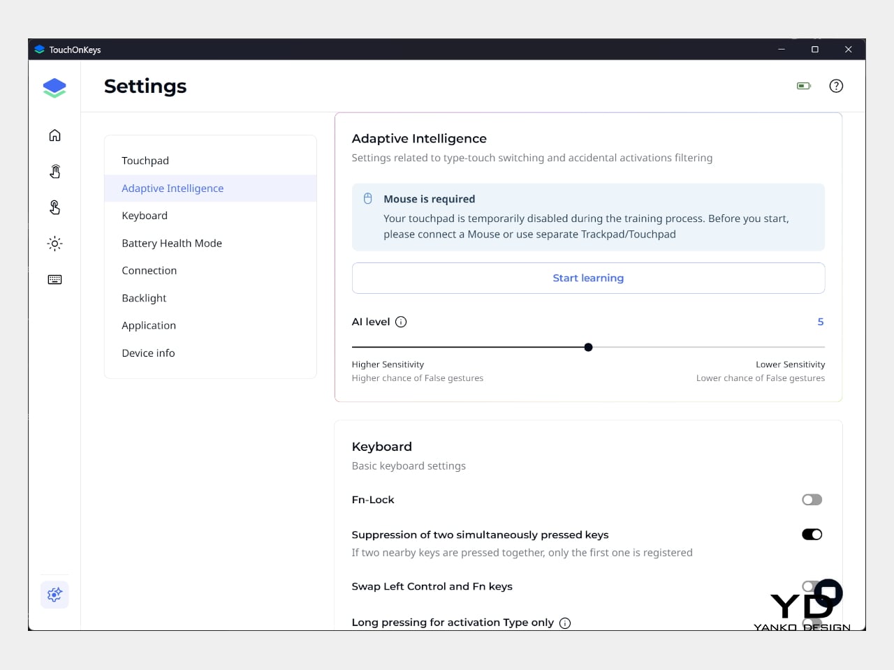
Clevetura’s Adaptive Intelligence, or AI, can help by selecting a sensitivity level after studying 10,000 typed characters. Training requires the TouchOnKeys app and a USB connection, with touch recognition disabled while it runs. A separate mouse is handy during that process, although you can pause training if necessary. Thankfully, this particular AI has a fairly modest assignment: learning when your fingers mean to type rather than swipe.
The lighting makes that second role easier to follow, and a little more entertaining, too. In my setup, a white trail followed my finger across the keys, almost like leaving a trace of magic behind. Checking the battery dims the surrounding lighting and uses illuminated number keys to show the remaining charge. Even the function row gets involved, with touch sliders for volume and backlight brightness.
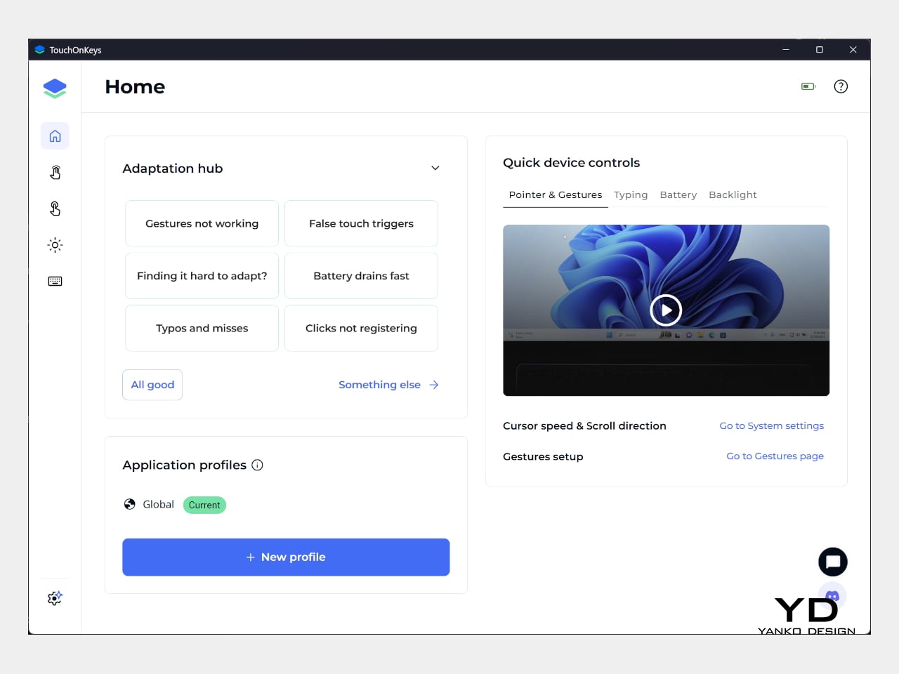
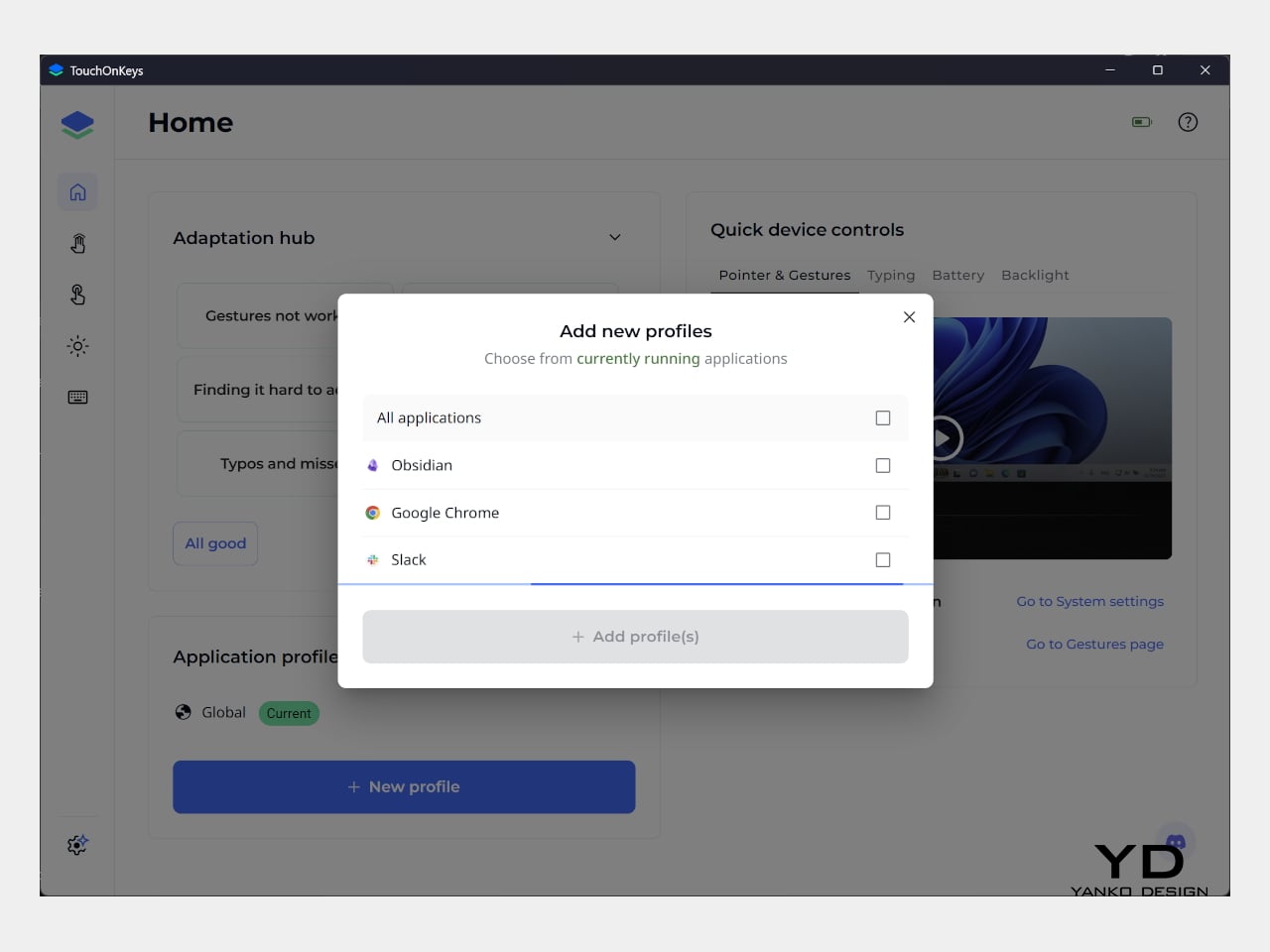
Windows recognizes supported touchpad gestures without installing additional software, but TouchOnKeys opens up more settings, including profiles for different apps. Three Bluetooth slots and a USB-C connection let you select between up to four devices, one at a time. That’s useful if your desk serves more than one computer. The cable also handles charging and provides the wired connection required for firmware updates.
Clevetura advertises up to 44 hours of continuous use without backlighting, which is an important qualification for anyone drawn to those colorful effects. That’s the manufacturer’s estimate rather than a result measured here, so it shouldn’t become a promise of weeks between charges. Wired operation remains available at a desk, while wireless endurance deserves particular attention if you’re planning to travel with the lighting switched on.
Sustainability
The aluminum and plastic construction follows a fairly familiar recipe, and there’s no documented recycled content to give the CLVX S a particular advantage on materials. Clevetura rates its keys for 3 million presses, although that remains a manufacturer specification rather than a prediction of service life. The more useful question is how easily this unusual keyboard can be maintained once everyday use starts leaving its mark.
Here, the same integration that makes TouchOnKeys possible also limits what owners can replace. Clevetura warns against removing or swapping keycaps because doing so can damage the keyboard, and the battery isn’t easily user-replaceable either. Routine surface cleaning and manufacturer support therefore matter more than they would on a board designed for tinkering. It’s worth understanding that arrangement before expecting mechanical-keyboard levels of customization or straightforward repairs.
Value
At $199, discounted from $209, the Windows model sits well above the price of many conventional compact keyboards. The extra cost is easier to understand when you consider what you’re paying for: typing and pointer control in the same footprint. Separate devices offer more freedom to choose each component, but they also need more space. Clevetura’s appeal is having those everyday functions share one portable object.
That could be particularly attractive when you’re writing code, checking references, or moving between shortcuts and controls in creative software. Quick navigation stays close, even if detailed drawing or extended pointer work still calls for a separate mouse. The Clevetura S doesn’t have to handle every task equally well to be useful. Its value depends on how often you make those small trips away from the keys.
Verdict
Combining a keyboard and touchpad sounds simple enough until your fingers have to tell the two jobs apart. Clevetura gives that idea a thoughtful physical form, from the closely fitted keys to lighting that explains what’s happening beneath your hands. My habit of resting on the home row made gesture sensitivity especially important, but the pointer control itself worked well and gave the unusual surface a practical purpose.
The Clevetura CLVX S makes the strongest impression when space is limited and typing is regularly interrupted by a scroll or a click. Its price deserves consideration, and the flat surface won’t replace everyone’s favorite keyboard feel. Still, there’s something pleasing about editing a sentence, sliding across the letters to move the cursor, and carrying on without sending a hand off to find another device.
Get the key details on Google Fitbit Edge, including health tracking, Gemini coaching, battery life, US pricing, compatibility, and which version to buy.

 Connexion