❌

Vue lecture

8 Best Gear & Gadgets of October 2026 That Turn Any Living Room Into Game Day Central

Football season turns living rooms into something closer to a clubhouse for a few hours every weekend. The right gear makes that shift effortless, pulling together sound, screen, food, and drink into one setup that actually works for a full slate of games rather than falling apart by halftime.

None of these eight picks are trying to reinvent the sport itself. They’re solving the real logistics of hosting: the can that never pours right, the cooler that goes warm by the second quarter, the speaker setup that can’t keep up with a packed room full of noise.

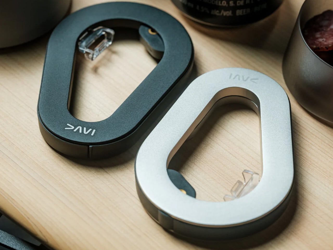
1. DraftPro Top Can Opener
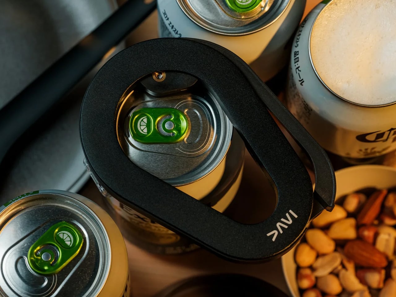
There’s a reason the first pour matters so much on game day. DraftPro removes the entire top of a can instead of just puncturing it, turning a beer or sparkling water into something closer to a glass pour, aroma included. Designed by Shu Kanno and built in Japan, the motion is smooth and controlled, with a clean edge that’s safe to drink from directly. For you, that means handing a guest a can that actually tastes like it was poured properly, without reaching for a single glass all game.

It works for more than beer too. Drop ice straight into the can for instant chilling when the cooler’s running warm, or mix a quick cocktail right inside it with zero cleanup. Compatible with domestic and international cans, it travels well between the kitchen and the couch, and the clean cut even lets you repurpose empties into planters or pen holders once the game’s over.

Click Here to Buy Now: $60.00

What We Like

  • Removes the entire top for a smooth, glass-like drinking experience
  • Works as a makeshift cocktail shaker with no extra dishes to wash

What We Dislike

  • Only a handful of units were listed in stock at the time of writing
  • Limited to cans, so bottles need a separate opener nearby

2. PhaseTherma

A great drink setup falls apart the moment the ice turns to water. Freezill solves that with PhaseTherma, a phase-change cooling core that keeps ice solid for up to 150 hours without any external power source. For you, that means setting up the drink station once before kickoff and not thinking about it again until the final whistle of a doubleheader weekend, no refills, no plugging anything in.

At $149, it reads less like a cooler and more like premium travel gear that happens to double as game day equipment. The zero power draw also means it works just as well on a porch or in a garage as it does parked next to the couch, so the setup goes wherever the crowd ends up sitting.

What We Like

  • PhaseTherma core keeps ice solid for up to 150 hours
  • Needs zero external power to maintain its cooling performance

What We Dislike

  • $149 is a real investment for what is, at its core, a cooler
  • Premium design means it’s built for care, not for rough outdoor use

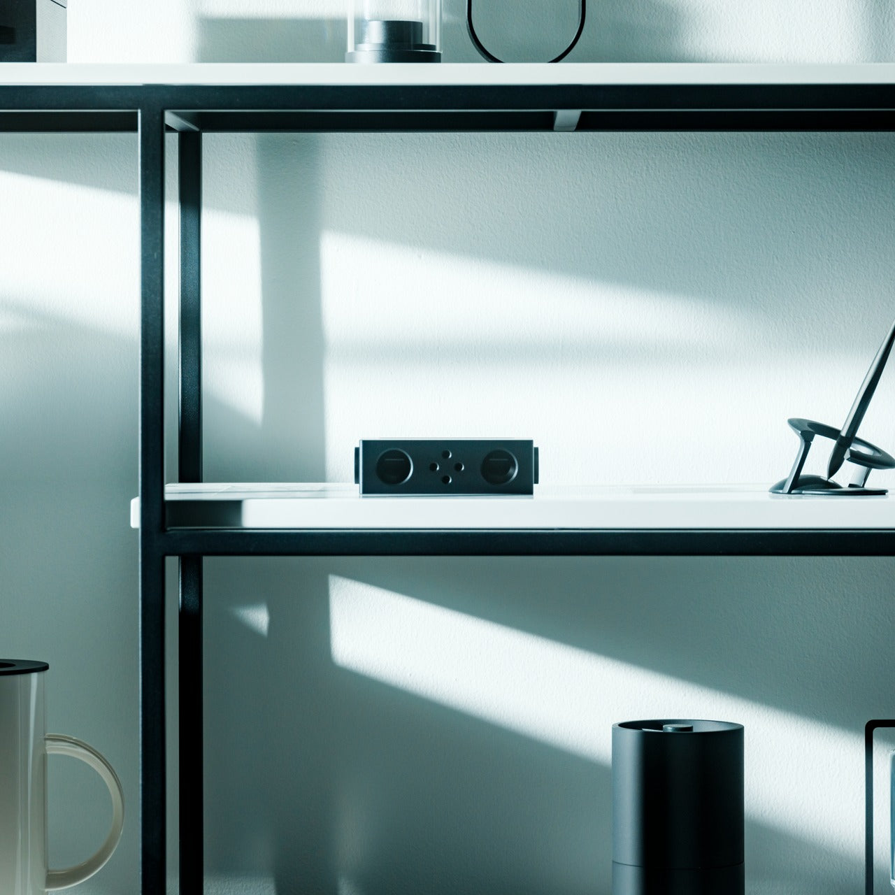
3. Battery-free Amplifying iSpeakers
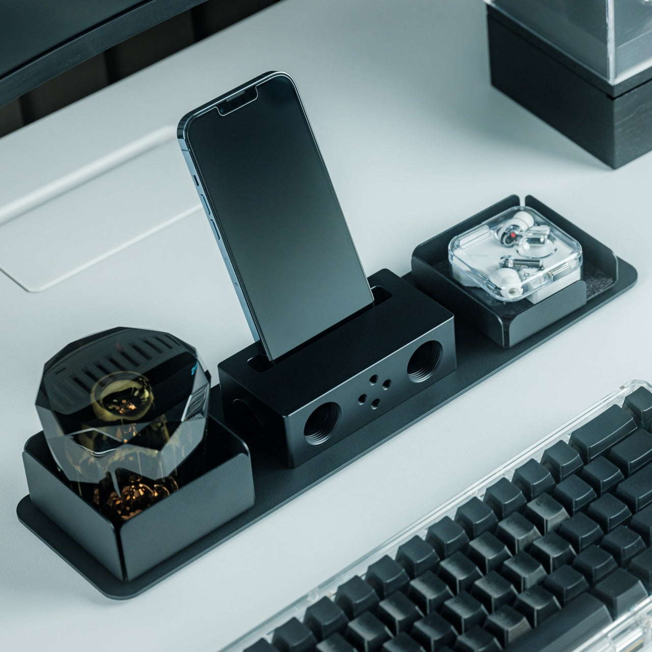
Every other speaker in the room needs something: a charge, a pairing sequence, a Wi-Fi password. This one needs nothing but your phone. Designed by Ooi Masato and machined from Duralumin, the same vibration-resistant aluminum alloy used in aircraft, it amplifies a smartphone’s built-in speaker purely through acoustic geometry. For you, that means setting it down on a side table and having sound fill the room without a single cable in sight.

The chamber’s proportions were shaped using the golden ratio, which is less a gimmick and more the reason the sound comes out as focused as it does. No app, no Bluetooth, no battery to die mid-game. Just a slot for the phone and a noticeably louder room a second later.

Click Here to Buy Now: $179.00

What We Like

  • Needs zero power, batteries, or pairing to work
  • Golden ratio proportions make it as much a desk object as a speaker

What We Dislike

  • Volume ceiling is naturally lower than a powered Bluetooth speaker
  • Only works with a phone placed inside it, not as a standalone unit

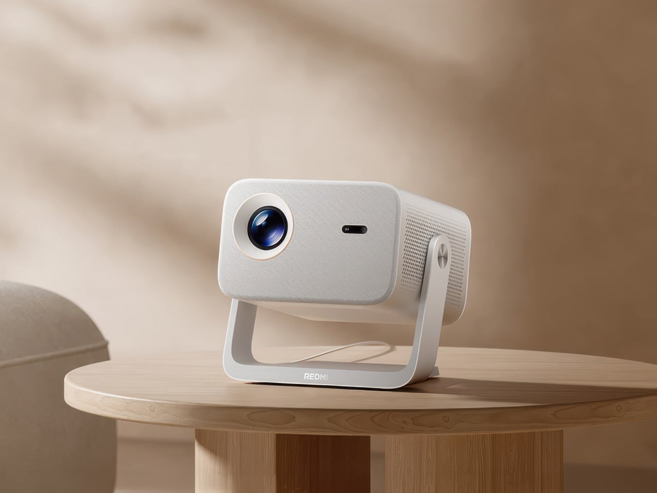
4. Xiaomi Redmi Projector 5 Pro
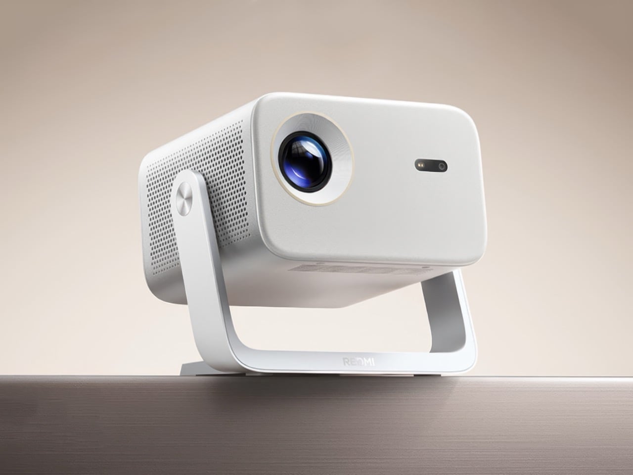
The screen is where game day actually lives, and this one makes a big one affordable. Native 1080p scales up to 120 inches, backed by 1,000 CVIA lumens, HDR10, and a 120Hz refresh rate running at just 5ms of latency. For you, that means a crisp, responsive picture that can fill an entire wall for less than the cost of a year of streaming subscriptions combined.

A metal gimbal arm swings 150 degrees, so the projector adjusts to whatever angle the room demands without needing a dedicated mount or stand. Dual HDMI and Wi-Fi 6 round out the connections, meaning a streaming box, a console, and a laptop can all stay hooked up at once without a single cable getting swapped out between games.

What We Like

  • 120-inch scaling at $281 undercuts most home theater setups by a wide margin
  • Gimbal arm adjusts 150 degrees without needing a separate mount

What We Dislike

  • 1080p native resolution means it’s not a true 4K experience
  • HDR10 support only goes so far without a properly darkened room

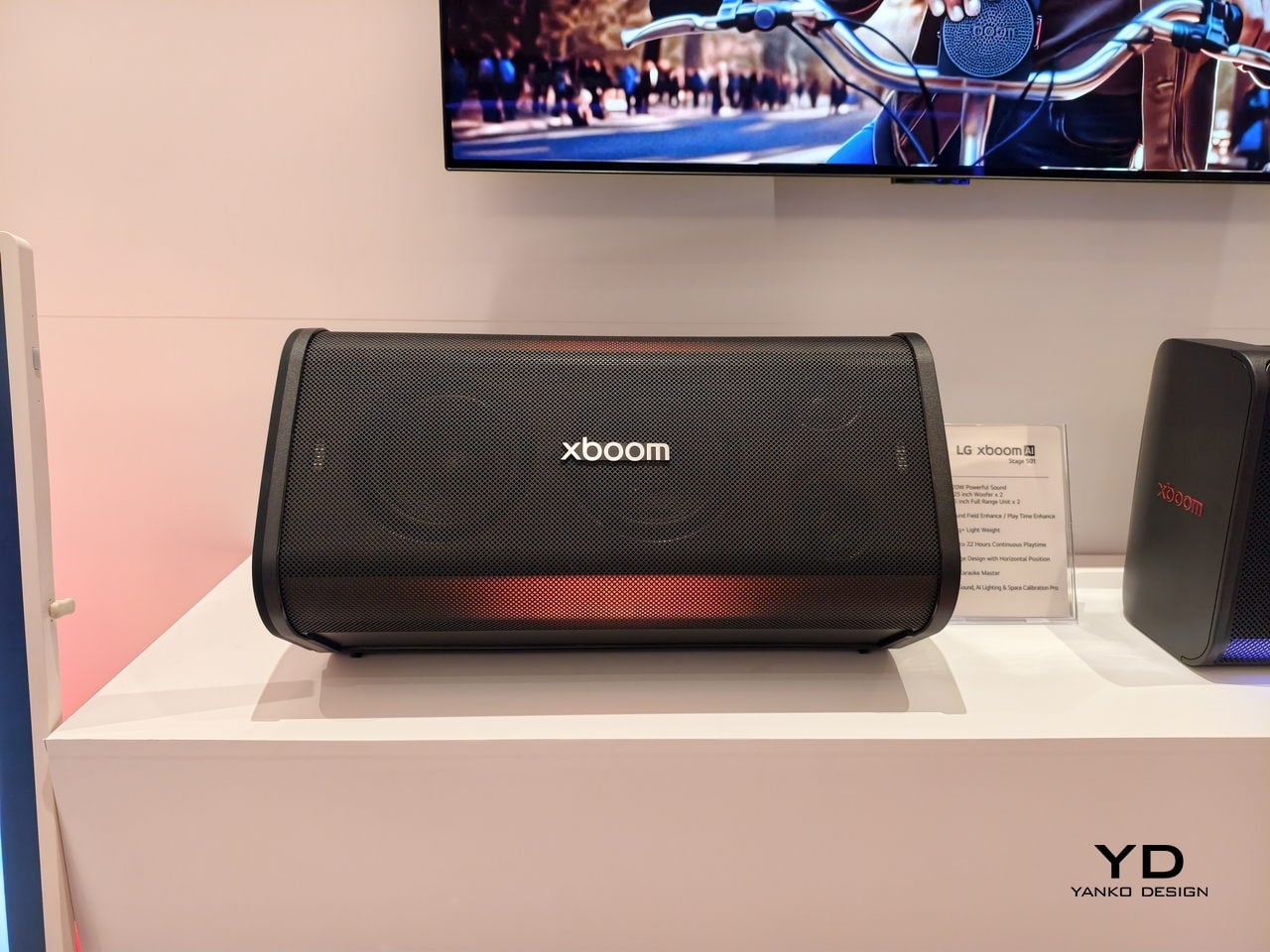
5. LG xBoom Stage 501
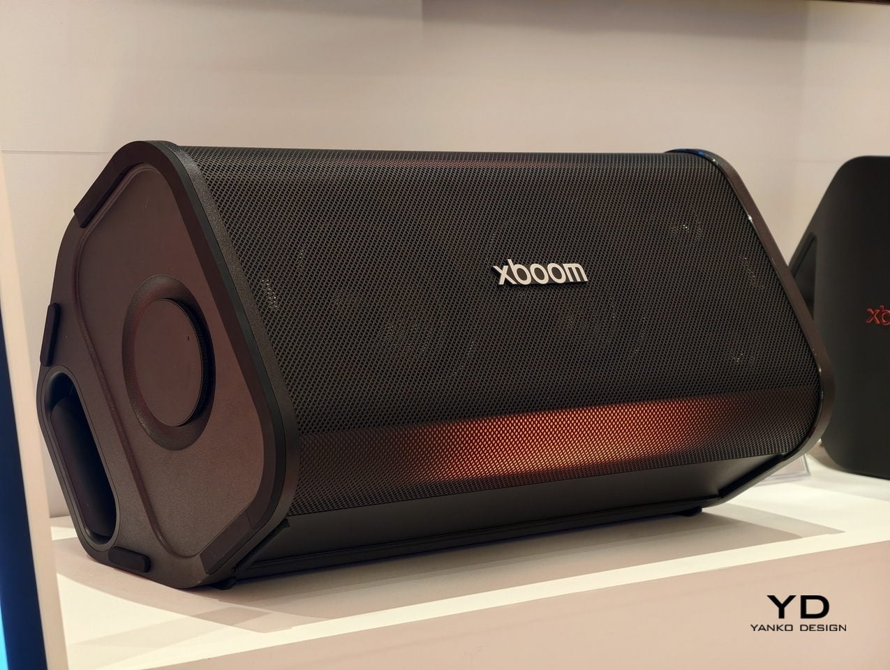
Halftime needs its own kind of energy, and this speaker is built specifically for that shift in mood. Up to 220W of output runs through dual 2.5-inch woofers and Peerless tweeters, loud enough to carry a packed room without distortion. For you, that means the moment the game pauses, the room doesn’t go quiet; it just changes gears.

The real party piece is AI Karaoke Master, which strips vocals from any song in real time using deep learning trained on more than 10,000 songs. Built around what LG calls late-night living-room chaos, it turns a halftime break into its own event, no separate karaoke machine or backing track search required.

What We Like

  • 220W output with dedicated tweeters handles a full room without strain
  • AI Karaoke Master removes vocals from any song on the spot

What We Dislike

  • At $499.99, it’s a serious commitment for occasional halftime use
  • Karaoke feature works best with a crowd actually willing to sing

6. Death Star Popcorn Maker

Snacks are half of game day, and this one earns its spot by being genuinely good at the one thing it does. A hot air vortex pops corn with close to a 98 percent success rate, no oil or butter required, while the whole unit folds back into a Death Star display piece once the popping’s done. For you, that means a snack station that’s actually fun to look at sitting on the counter between rounds, not just a plastic appliance shoved in a cabinet.

It’s a lighter note in the lineup, a conversation starter as much as a kitchen tool, and a reminder that not every piece of game day gear needs to be purely functional to earn its place in the rotation.

What We Like

  • Close to a 98 percent popping success rate without oil or butter
  • Folds back into a display piece instead of looking like leftover kitchen clutter

What We Dislike

  • Novelty shape won’t appeal to everyone’s kitchen aesthetic
  • Limited to popcorn, so it’s a single-purpose appliance taking up cabinet space

7. Took Foldable Chair

Every host eventually runs out of couch space before they run out of guests. This chair collapses into a compact case about the size of a soundbar, with a strap handle and a one-touch hinge mechanism that opens it in seconds. For you, that means extra seating that lives in a closet the rest of the week and shows up the moment the guest list grows past what the furniture can hold.

It closes the lineup on a practical note: the kind of object that doesn’t need to be clever so much as ready, there when the room fills up and out of the way the second it empties back out.

What We Like

  • Folds to the footprint of a soundbar for easy storage
  • One-touch hinge means setup takes seconds, not a wrestling match

What We Dislike

  • A folding chair will never match a couch for comfort over a long game
  • Durability of the hinge mechanism depends on how often it gets folded and unfolded

8.WiiM Bar Soundbar
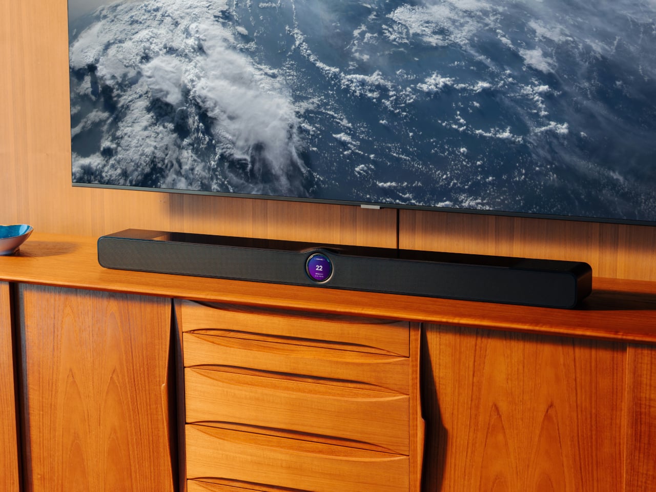
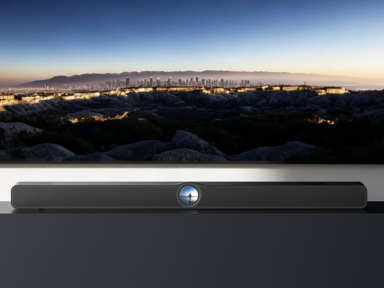
For the games that deserve real sound, not just loud sound, this soundbar fills that gap. True 3.0.2 Dolby Atmos runs through an eight-driver array, three front mid-woofers, three front tweeters, and two upward-firing full-range drivers, backed by four passive radiators for low end that doesn’t need a separate subwoofer. For you, that means commentary, crowd noise, and the snap of a tackle all land with the kind of separation a standard TV speaker can’t touch.

A 2.1-inch round touch display sits embedded in the bar’s front face, giving quick access to inputs and volume without digging for a remote between plays. It sits under the TV rather than competing for space, built for the room rather than announcing itself as the centerpiece.

What We Like

  • Eight-driver array delivers genuine Dolby Atmos without a subwoofer
  • Touch display built into the bar simplifies control mid-game

What We Dislike

  • A setup this capable asks for a TV and source worth the upgrade
  • Four passive radiators still can’t fully replace a dedicated subwoofer in a large room

The Setup That Covers the Whole Afternoon

None of these eight pieces are trying to be the loudest thing in the room. The projector and the two speaker options handle the screen and the sound, the cooler and the can opener handle the drinks, and the popcorn maker and the folding chair round out the food and seating without asking for much space in return.

What makes this lineup work isn’t novelty; it’s that each piece solves one real problem well. A host doesn’t need everything to be smart or connected. Sometimes the best upgrade is a can that pours like a glass, or a chair that disappears into a closet until the room needs it most.

The post 8 Best Gear & Gadgets of October 2026 That Turn Any Living Room Into Game Day Central first appeared on Yanko Design.
  •  

Habity’s E-Paper Bedside Clock Makes a Case for a Phone-Free Nightstand

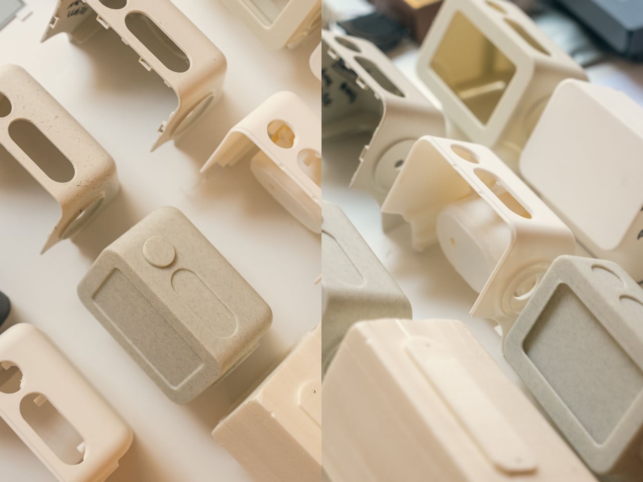
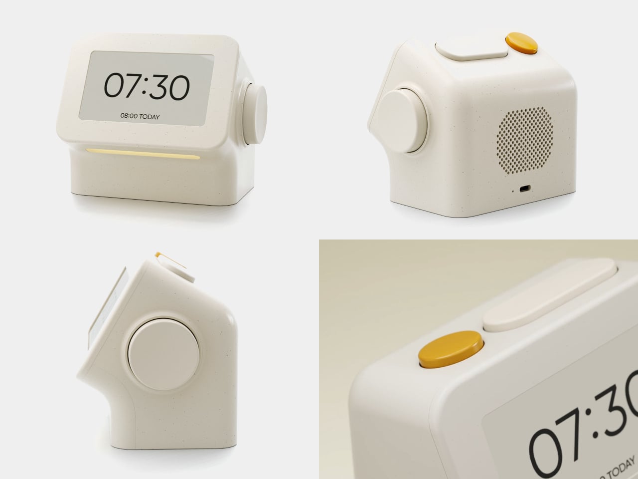
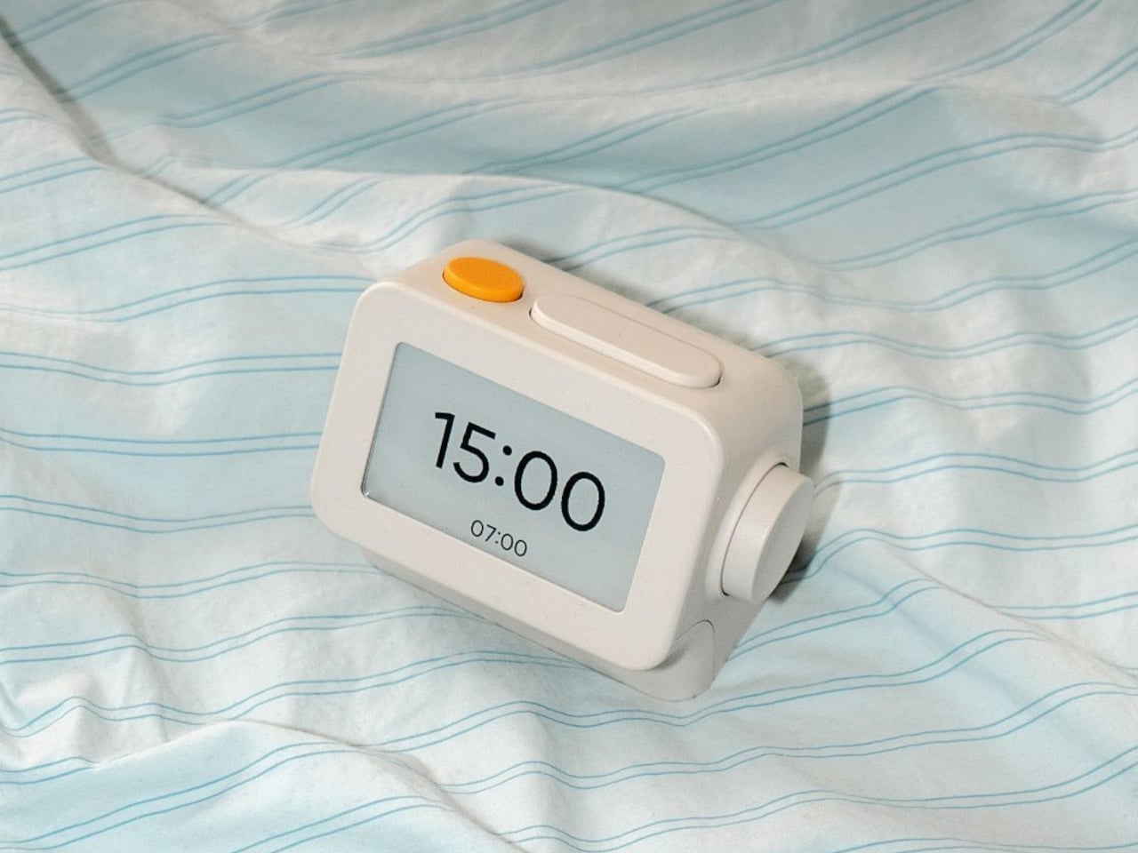
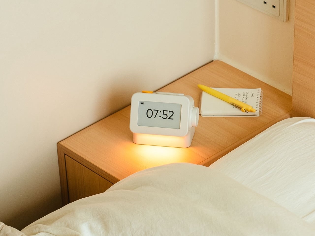
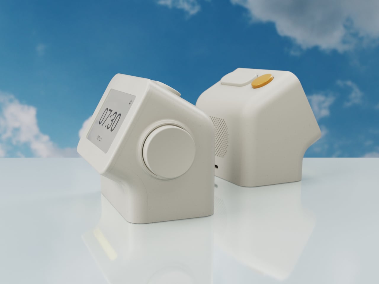
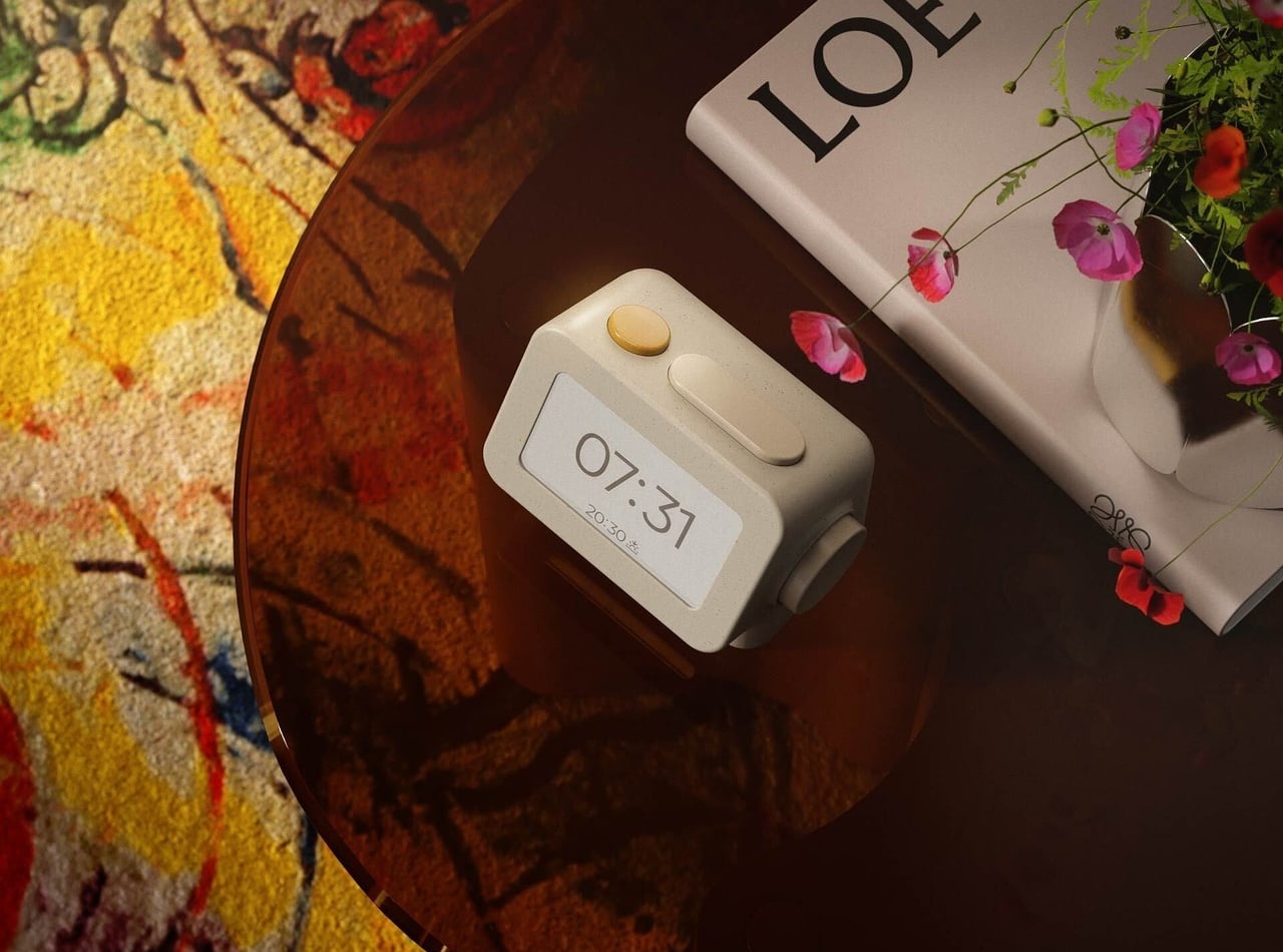
Smartphones have become rather good at convincing us they belong beside the bed, if only because we need an alarm in the morning. Unfortunately, that also puts every source of distraction within reach the moment you open your eyes. To fight that, Habity’s E-Paper Bedside Clock takes over the alarm, sleep sounds, and nightlight duties with physical controls and a display that doesn’t glow continuously, giving your phone fewer reasons to stay.

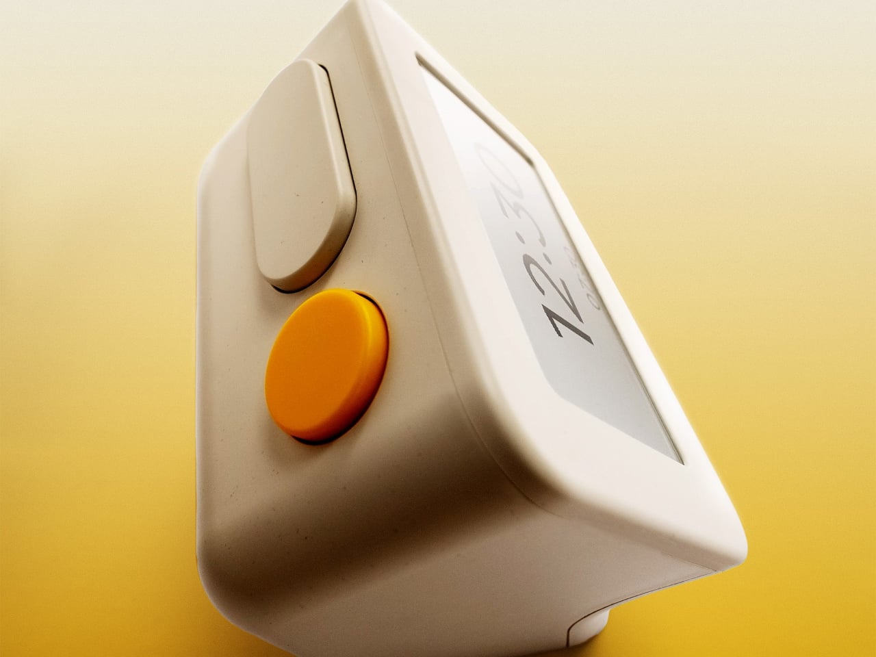
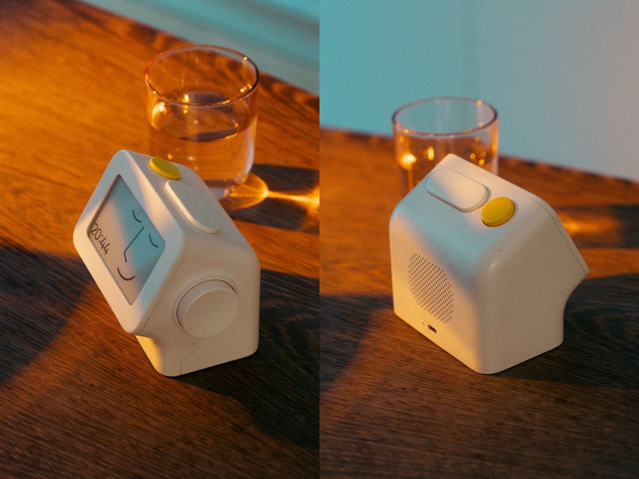
The clock has a rounded rectangular body and a slightly tilted face, but its most useful details are the ones your fingers encounter. A large side dial handles settings and volume through turning and pressing. On top, a yellow stop button sits beside a broad snooze key. Their different shapes separate two decisions you probably don’t want to confuse when you’re half asleep.

Designers: Peter Arvad, Jesper Westendahl

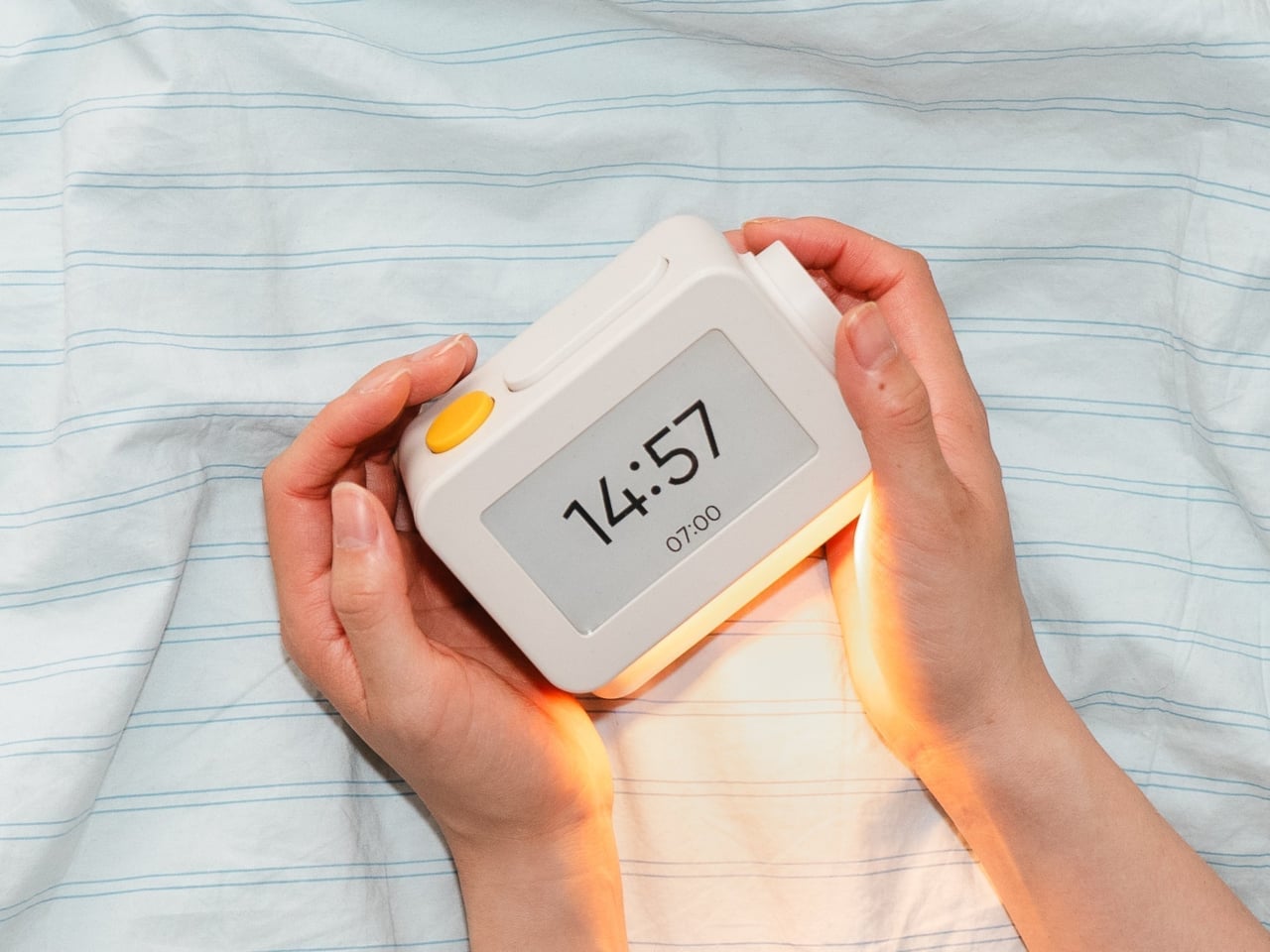
Of course, the screen is where Habity really parts ways with your phone. Its 3.7-inch e-paper display reflects ambient light rather than relying on continuous illumination. That means darkness calls for a little help. Interacting with the clock activates a warm frontlight for 10 seconds, enough for a quick check without leaving the time glowing beside your pillow all night long.

There’s also a built-in speaker for sleep sounds, which don’t need an app or subscription. Rain and ocean waves are familiar choices, but a sleeping dog and dishwasher bring a surprisingly domestic touch to the collection. Double-press the snooze button to start playback and turn the dial to change volume. Sessions can last up to eight hours, without borrowing your phone for the soundtrack.

Mornings get a little more flexibility than a single repeating alarm. Habity lets you choose weekday schedules or different wake-up times for individual days, although you’re limited to one wake-up alarm per day. The built-in light can gradually brighten up to 30 minutes beforehand. Once the alarm sounds, that broad snooze button grants another five minutes, as many times as you care to negotiate.

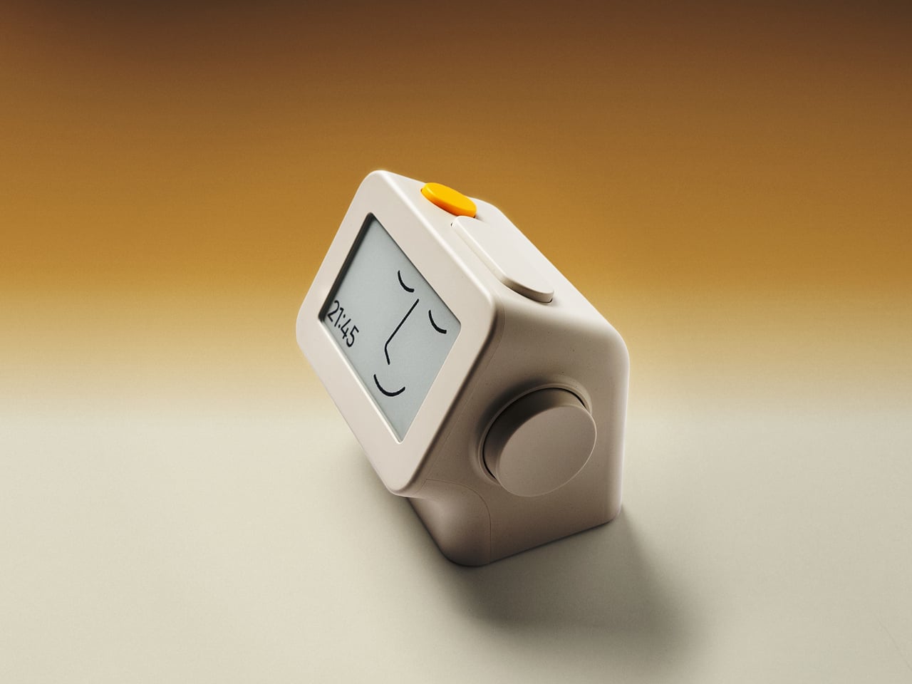
Perhaps the most curious detail is what happens when you stop touching the clock. After 10 minutes, an optional idle screen introduces an illustrated face and shrinks the time. The hour is still there, just less prominent. It’s a small concession for people who don’t want a constant reminder of how late it’s getting, and you can disable it if you’d rather keep watching the, er, watch.

Despite those straightforward controls, Habity hasn’t completely shut the door on connected features. Optional Wi-Fi provides automatic time setting and integrations with Philips Hue Bridge, Home Assistant, and Homey. That requires USB-C power, however. Leave it offline and the alarms and sounds still work, so your morning routine doesn’t need to depend on whether the router is having a good day.

Habity estimates two weeks of battery life, depending on use, but a full recharge can take up to 24 hours. You’ll want to plan that USB-C top-up rather than squeeze it in before bedtime if you’re using it unplugged. Getting one won’t move your phone to another room, of course, so you’ll still have to decide where it spends each night.

The post Habity’s E-Paper Bedside Clock Makes a Case for a Phone-Free Nightstand first appeared on Yanko Design.
  •  

PocketBook Gave Its $198 E-Reader the One Trick Old Nokia Phones Had

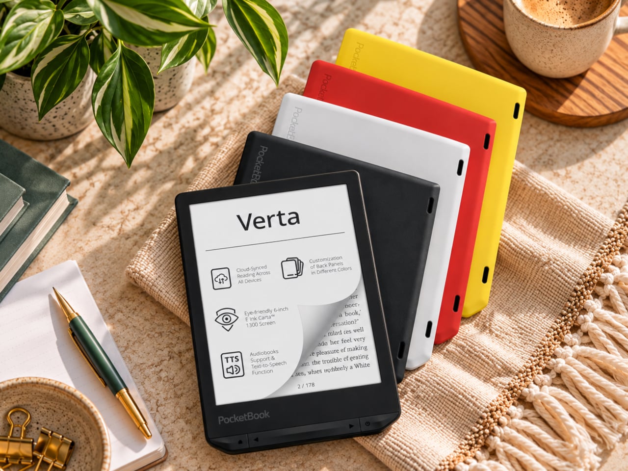
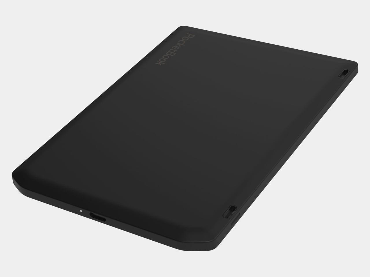
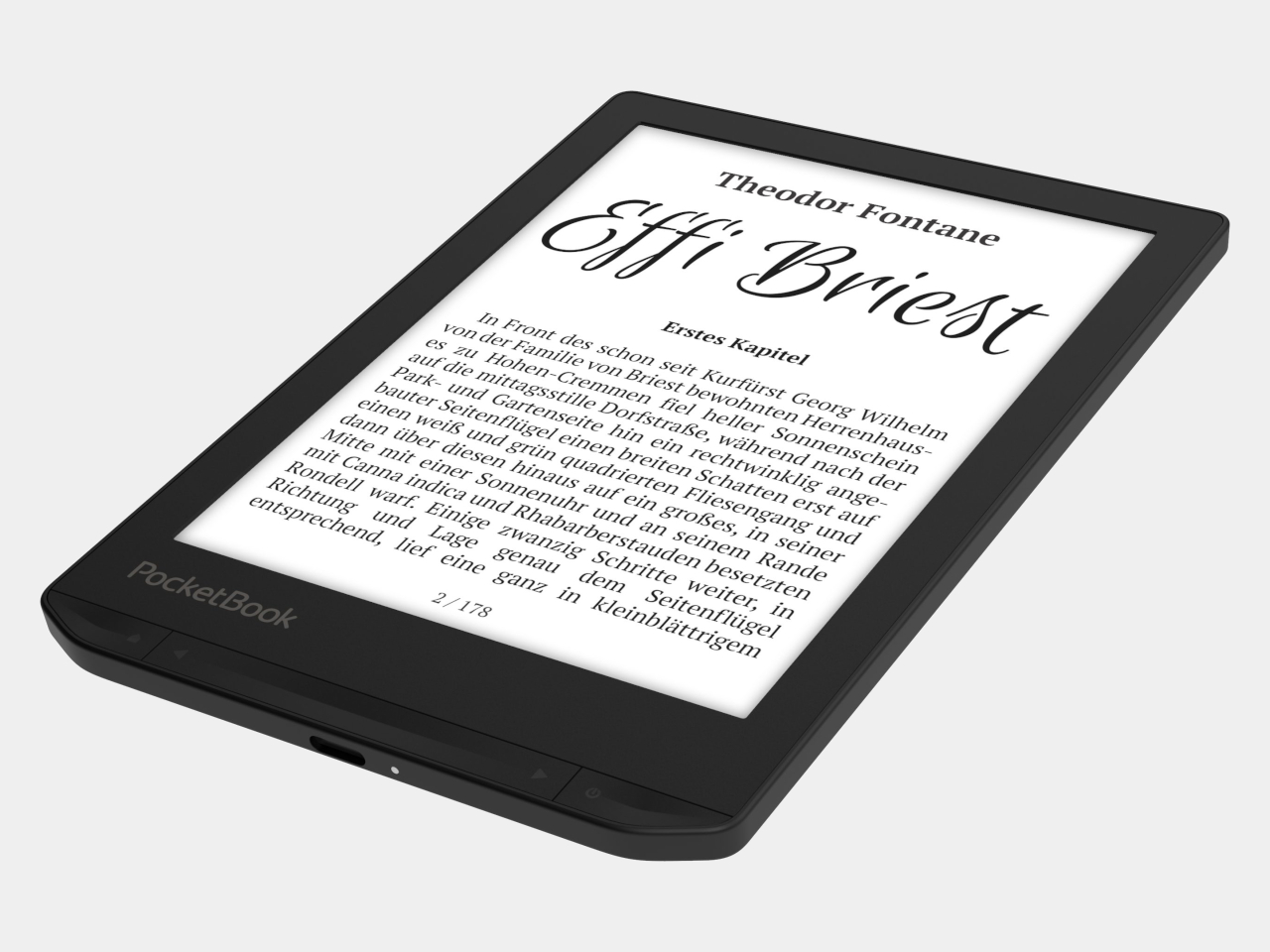
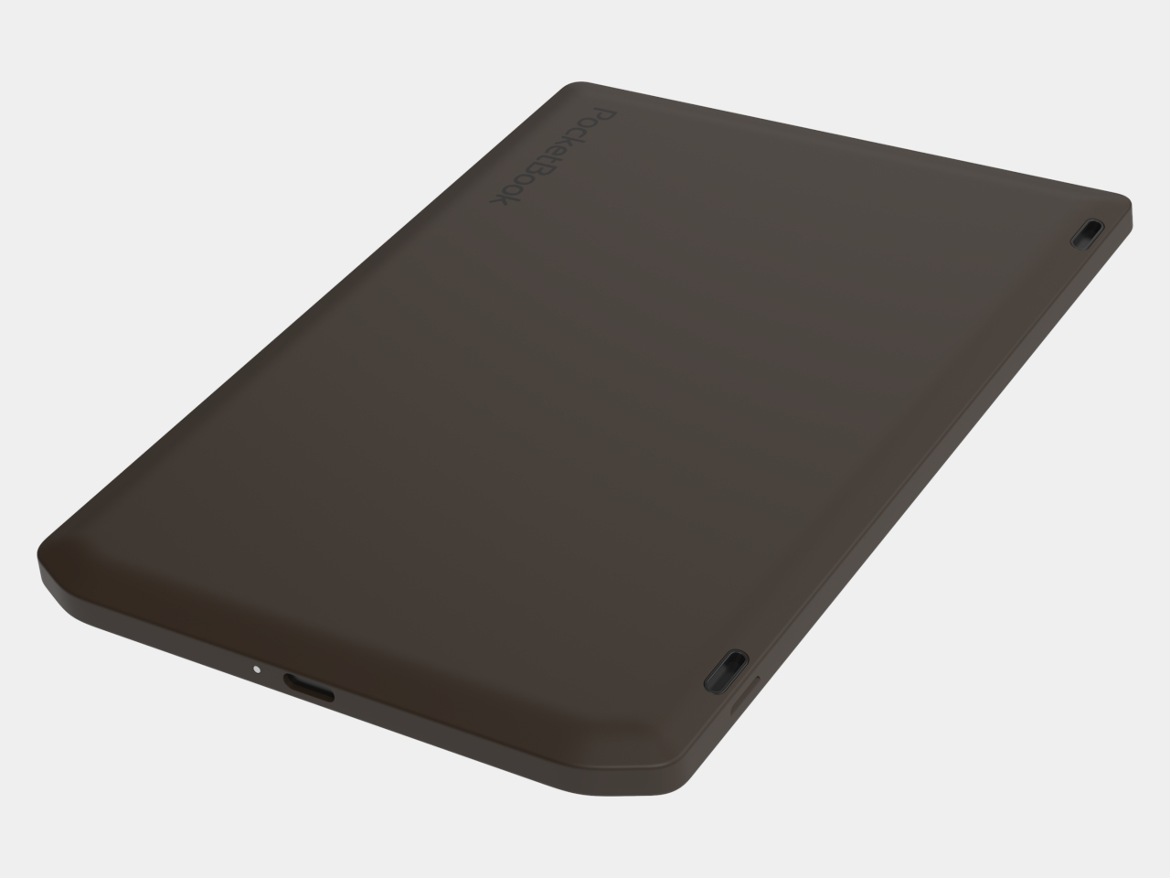
E-readers are supposed to replace physical books, but they strangely come mostly in black or gray, unlike colorful and distinctive book covers. Although not a complete design overhaul, Pocketbook’s new Verta and Verta Color e-readers offer a simple fix, and no, it doesn’t require slapping on a case. You can change the color of the e-reader by swapping the back panel while maintaining its slim shape and keeping the screen and page-turn buttons uncovered.

That’s a rather different approach to personalization than slipping on a protective cover. The interchangeable panels are sold separately, so you can keep a few colors around and switch when your taste changes. More importantly, they replace the back rather than wrapping over the front. There’s no extra flap to fold behind the reader when you settle into a chair with a book.

Designer: PocketBook

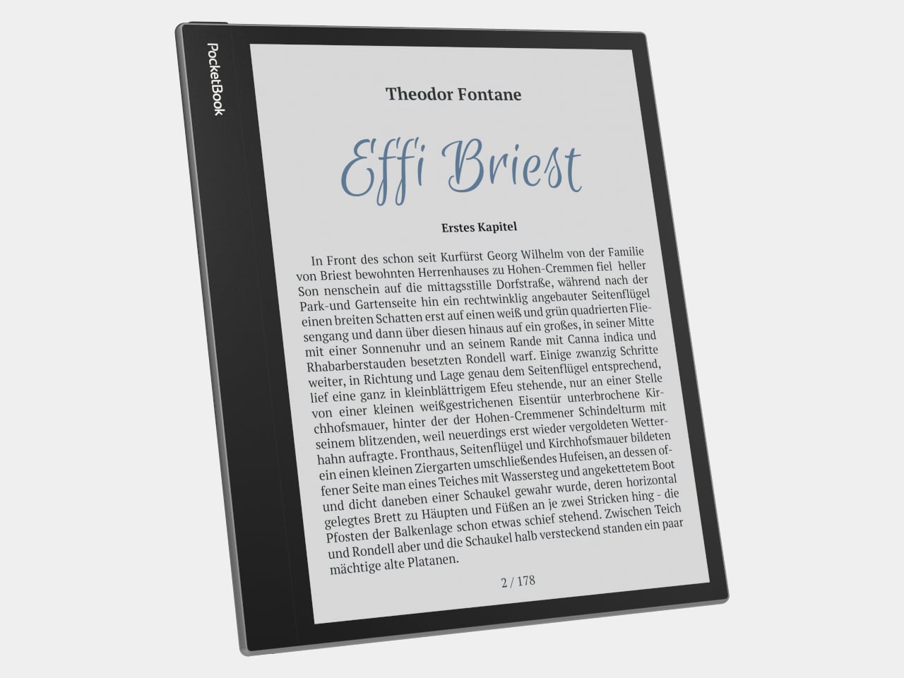
The front stays familiar in the best way. Both readers have a 6-inch touchscreen and enlarged page-turn buttons beneath it, giving your thumb another way forward when the screen is smudged or your hands are occupied. Each measures just 0.28 inches thick and weighs about 4.9 ounces, a size that suits a jacket pocket or an overstuffed bag on the commute.

Choose the regular Verta, and you get a 6-inch E Ink Carta 1300 display at 300 pixels per inch, built for the sort of long novel that makes you miss your stop. SMARTlight lets you adjust brightness and warmth as daylight disappears. It also offers Dark Mode, so you can keep reading in bed without a bright white page facing the person beside you.

The Verta Color is for readers who want their covers, illustrated pages, and comics to retain some color. Its E Ink Kaleido 3 screen renders monochrome text at 300 pixels per inch, but color drops to 150 pixels per inch. Those numbers matter if you read fine print in graphic novels; the color option gives illustrations some life, not the punch of a tablet.

Both have 16GB of storage, Wi-Fi for downloading books, and Bluetooth audio for audiobooks or text-to-speech, though you’ll need headphones or another compatible listening device. PocketBook also supports a broad range of file formats and borrowing through library apps. That flexibility comes in handy when the next book you want isn’t sitting in a single company’s store waiting for you.

An IPX4 rating gives the pair protection against splashes, not an invitation to use them in the bath. Their 1,500mAh batteries are meant to last up to two months, depending on how you read, although that figure comes from PocketBook rather than an independent test. The removable backs add personality, but they’re not a replacement for a protective case if the reader needs one.

PocketBook plans to release both in November 2026, pricing the Verta at €169 (about $198) and the Verta Color at €179 (about $209). Both are marked as coming soon on its storefront. The cleverest trick, though, is letting you change the color of something you hold for hours on end without asking a protective case to do the decorating for you.

The post PocketBook Gave Its $198 E-Reader the One Trick Old Nokia Phones Had first appeared on Yanko Design.
  •  

A $249 Smart Lock That Still Opens When You’ve Forgotten to Charge It

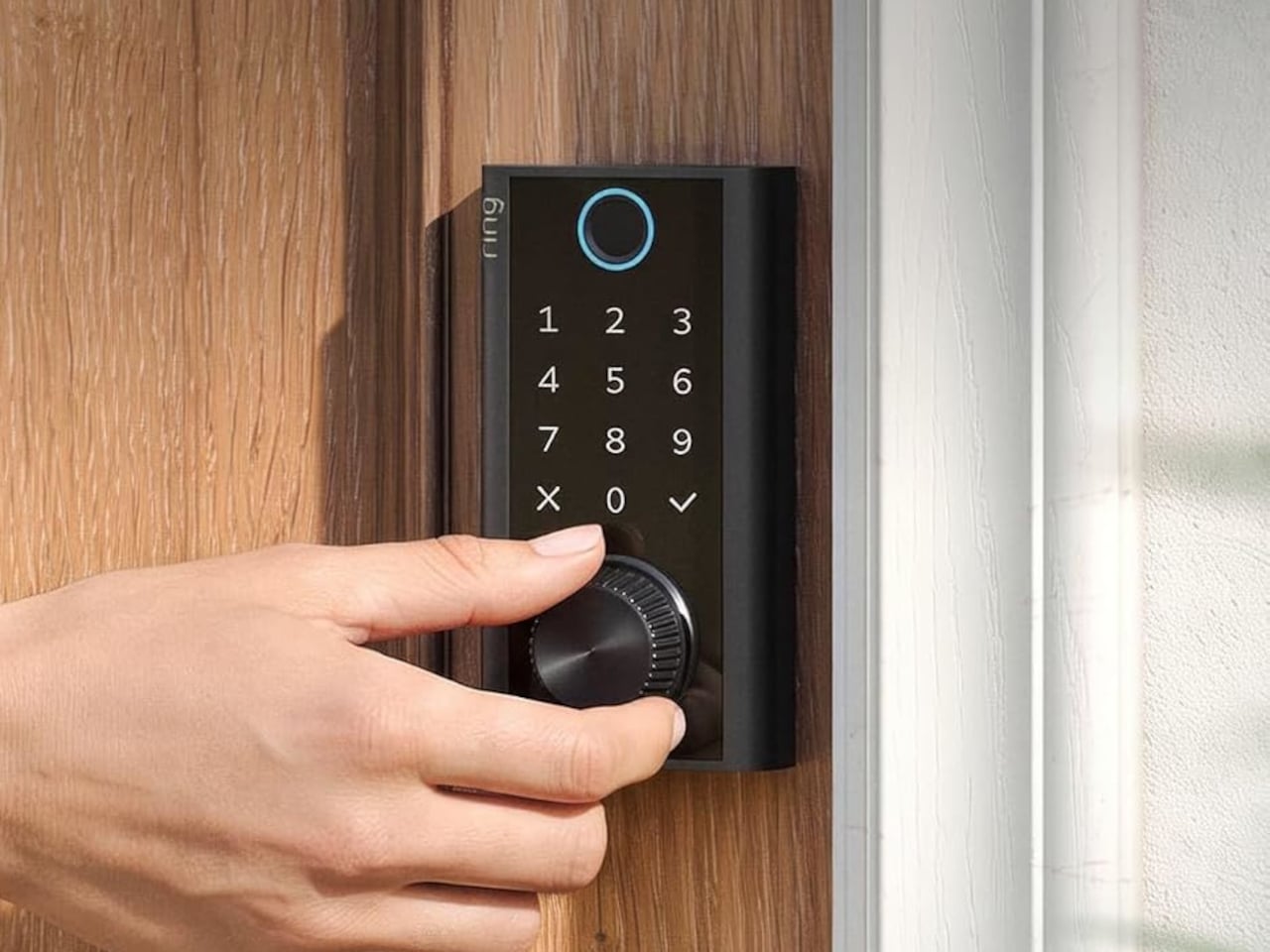
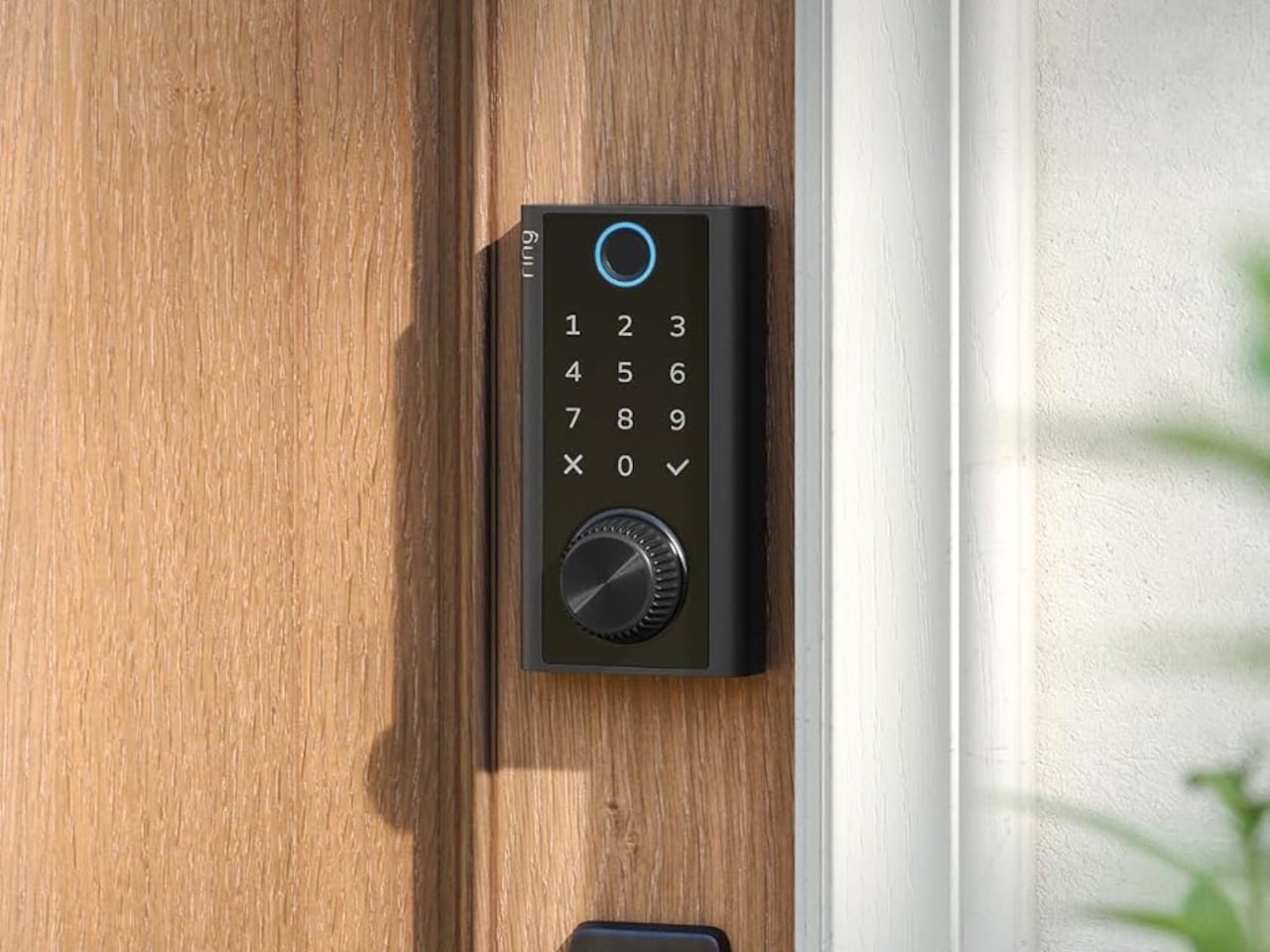
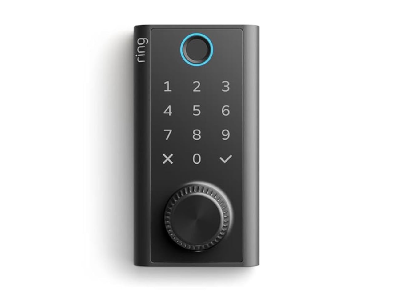
Smart locks sound like the future until you’re standing outside with groceries and the lock won’t wake up because of a dead battery. Although there are different methods to address that, Ring’s first-ever Smart Lock has a rather ingenious solution: an almost literal crank. Simply turn a dial a few times to power the keypad just long enough to key in your code.

It’s simple yet effective, and it doesn’t require you to fumble for a cover to replace the battery. The knurled dial sits beneath the backlit touchscreen keypad, with a circular fingerprint reader topping them all. All in all, the design looks more like a stack of controls instead of a deadbolt with electronics just bolted on.

Designer: Amazon

On regular days or nights, you can simply touch the fingerprint reader instead of digging for keys in your bag or pocket. You can also give a visitor a PIN that only works during a set time window. The Ring app also offers yet another way to let you in, and it also allows you to check the lock remotely, including Alexa voice control. These are the typical features you’d expect from a smart lock, but Ring does one better.

Most keyless locks require a cable or a spare battery before they even wake up, which isn’t exactly the fastest or the easiest when you only have one hand free. Ring puts that backup in that same free hand, figuratively. Simply turn the dial to “charge” the lock, almost like cranking some lever for power. It’s an almost comical analogy, but it gets the job done.

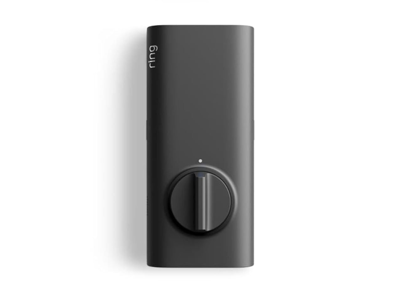
Of course, you don’t charge the Ring Smart Lock by turning the dial endlessly. That’s what the Quick Release Ultra Battery Pack is for. That battery is rechargeable, which means you don’t need to worry about extra wiring or hardware when installing the Smart Lock. It works with a standard single-cylinder deadbolt, making it immediately compatible with many doors.

One thing to note is that remote features depend on Amazon Sidewalk rather than your home Wi-Fi. That could spare you a trip back to check whether the door locked, or let you admit someone while you’re away, provided there’s coverage where you live. Ring says unlocking at the door happens locally, but Sidewalk remains a requirement for the connected functions. It’s a condition beneath the promise of convenience.

The lock can share the Ring app’s activity feed with Ring’s other products such as doorbell, cameras, and alarms, so you get a more holistic view of everything that happens at home even when you’re away. That said, it doesn’t have a camera of its own, which is a subtle nudge to get a Ring doorbell, too.

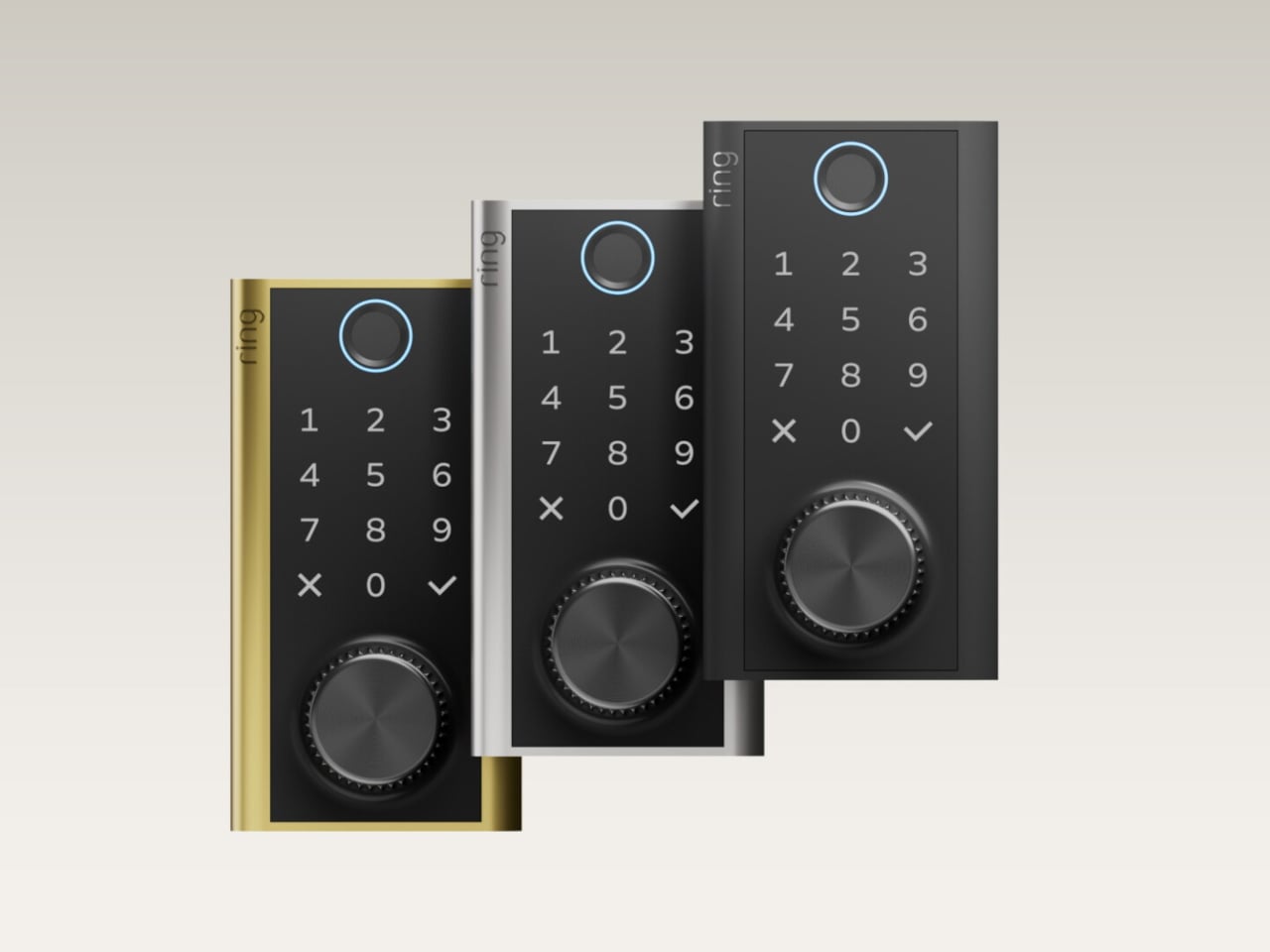
Black, silver, and brass finishes are planned, with a $249 price and U.S. availability expected in early 2027, pending regulatory authorization. For now, some details about the Ring Smart Lock have yet to be fully disclosed, including battery life. Regardless, it’s an interesting and low-tech solution to a high-tech problem that makes you feel you’re in control, even in such an emergency.

The post A $249 Smart Lock That Still Opens When You’ve Forgotten to Charge It first appeared on Yanko Design.
  •  

Corsair’s Xeneon Edge is the Stream Deck you always wanted, but bigger and better

Elgato unveiled a little box of 15 LCD buttons in 2017, priced at $149.95, and it quietly rearranged how streamers sat at their desks. The Stream Deck got so popular that Corsair bought Elgato’s gaming business in 2018. Then the obvious question hung around for years: what if the buttons were just a screen? A screen can be any button, any dial, any chart, or any chat window, and it never runs out of room for one more shortcut. Anyone who has maxed out a 15-key pad knows that pain. Corsair eventually got around to answering.

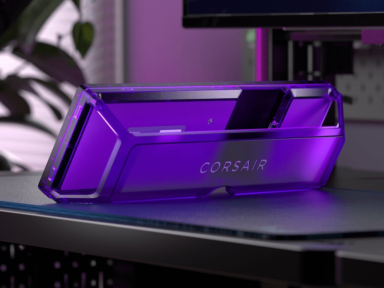
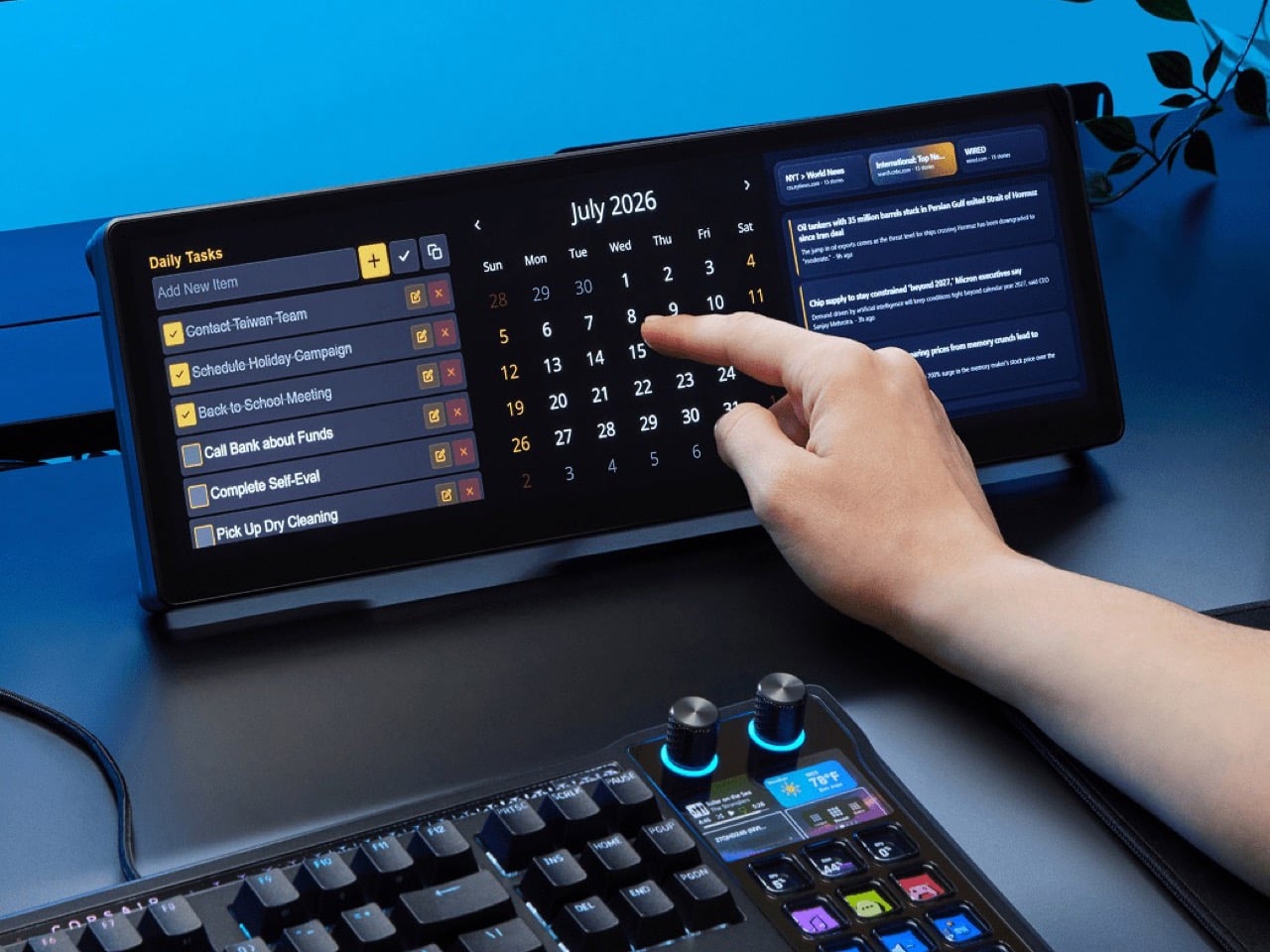
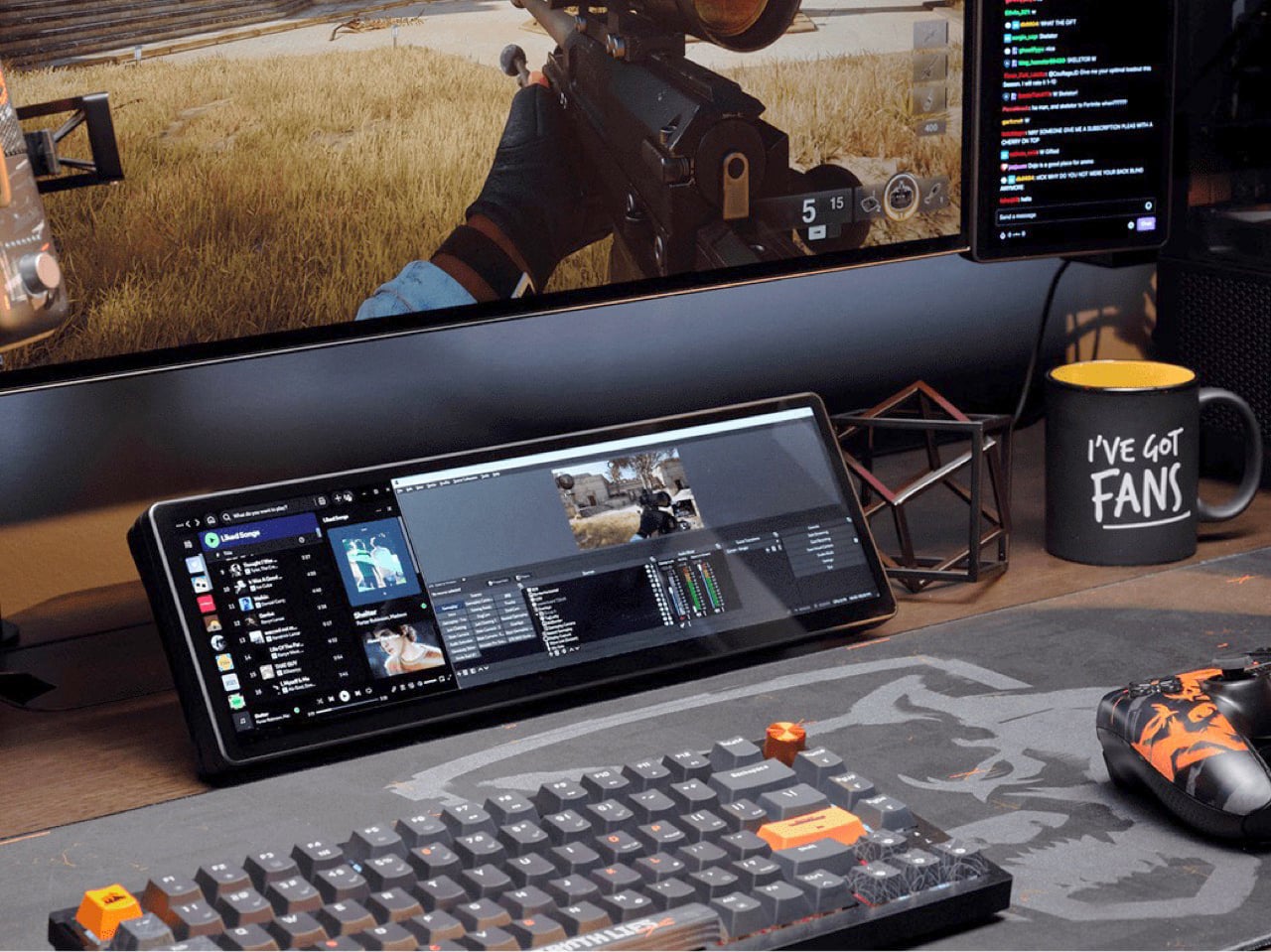
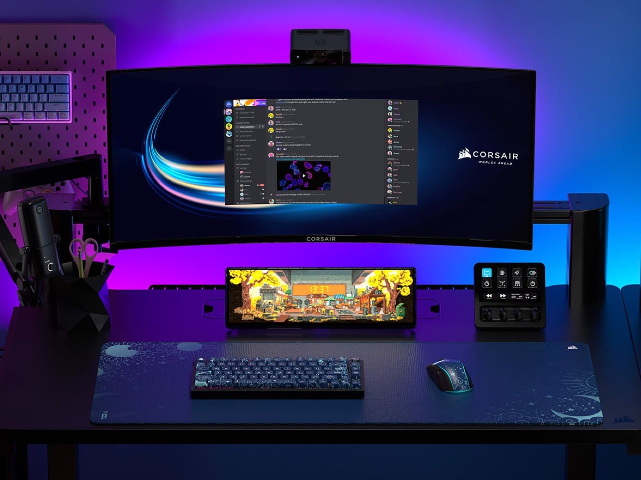
The answer is the Xeneon Edge, a 14.5-inch touchscreen with a 2560 x 720 panel and a 32:9 shape that sits under your main monitor like a very ambitious soundbar. It runs Elgato’s Stream Deck software, so your old button grid gets a much bigger canvas. Fourteen magnets, a detachable stand, and two ¼-20 threads let it live on a desk, a steel panel, or inside your PC case. It lists at $249.99 and is currently $199.99 at Corsair in the US, in all five colors.

Designer: Corsair

A 32:9 strip built for the stuff you only glance at

Think of 32:9 as two 16:9 monitors glued side by side, then shrunk until they fit beneath your main screen. The body measures about 14.6 by 4.7 by 0.8 inches (372 x 120 x 20mm) and weighs roughly 2.2 pounds (1 kg). That works out to about 183 pixels per inch, tighter than the 163 you get on a 27-inch 4K monitor, so small text stays crisp. At 720 pixels tall, the screen is shallow enough to tuck under a monitor without crowding your view. It also rotates to portrait, which turns it into a tall column beside your main display.

On a typical Tuesday, Spotify, Discord, a calendar, and your GPU temps all want a window, and your main screen is busy with actual work. Park them on the Edge and they stay put, one glance away, while you do your thing above. Video calls can live there too, so a meeting you only half-care about stays visible without eating your spreadsheet. Nothing needs alt-tabbing, and nothing gets lost behind a browser with 40 tabs. It’s the same idea as a phone propped next to your keyboard, except it’s wider, brighter, and plugged into your PC.

Fourteen magnets, two threads, and a 360mm radiator slot

Fourteen magnets sit under the plastic shell, so the Edge sticks to any steel surface without scratching it. That includes a steel desk, a PC side panel, a monitor stand, and yes, a fridge, if the cable is long enough. Inside a case, it takes the place of a 360mm radiator, a slot built for three 120mm fans, and it’s thinner than a regular case fan, so clearance is rarely an issue. Corsair also sells an LCD kit that mounts it into the side panel of the Frame 4000D and 5000D cases. Your build’s best view just got a clock and a temperature gauge.

Two ¼-20 threads on the back, the same screw size camera gear uses, let you hang the Edge from Elgato Multi-Mount hardware or any standard AV arm. That mount-anywhere thinking echoes the Elgato accessory support on Corsair’s Platform:6 desk, which we covered at its Gamescom reveal. Corsair also posts free 3D-printable accessories on Printables, including a taller stand that raises the screen behind a keyboard. The community has jumped in too, and Corsair has spotlighted a modular adapter mount from a creator named Naaackers. If you can think of a place for a screen, someone has either printed a bracket for it or soon will.

Widgets in iCUE and the Elgato Marketplace

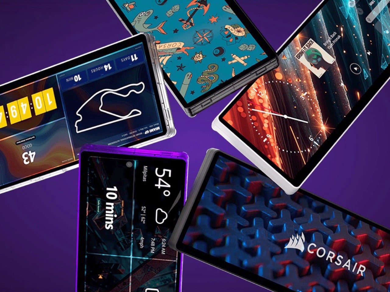
Plug it in and Windows treats the Edge as an ordinary second monitor, touch included. Corsair’s iCUE software for Windows adds widgets on top: a clock, a calendar, weather, news headlines, a task list, and system sensors showing CPU and GPU temps. Each widget lands on a grid you arrange yourself, so your layout can look as busy or as clean as you like. Since May 2026, widgets live on the Elgato Marketplace, where anyone can download or build one. Corsair’s developer docs even point to AI coding tools as a shortcut, which means a custom widget can start as a plain-English wish.

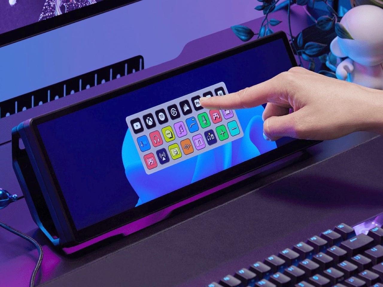
The widget that matters most for old Stream Deck fans is the native Stream Deck widget in iCUE. It drops a full grid of tappable keys onto the Edge, and you add actions in Elgato’s Stream Deck software exactly as you would for a physical deck. Resize the grid and you get more keys than any 15-button pad ever offered. Launch a game, mute your mic, switch an OBS scene, or toggle your desk lights, each with one tap. Because the screen is still a screen, the same strip can show your calendar or GPU temps right next to the keys.

A bright 2560 x 720 panel and touch that behaves like a phone

The panel is AHVA, Corsair’s version of IPS, so colors and viewing angles hold up even when you’re looking at it from the side. It runs 2560 x 720 at 60Hz with 350 nits of peak brightness, plenty for a desk lit by a window and a lamp. Touch is 5-point capacitive, the same technology as your phone, so tapping, swiping, and pinching all feel familiar. A single USB-C cable with DP Alt Mode (video over USB-C) can carry picture and power when your PC supports it. HDMI 2.0 covers everything else, and Corsair includes cables for both in the box.

Not every shell is black, either. Colors include black, white, and the translucent Atomic Purple, Crystal, and Smoke, which channel the see-through plastic of late-90s gadgets. We’ve seen that look return in a fully transparent Game Boy Color mod and Analogue’s Game Boy Color-inspired Pocket, and it suits a desk accessory just as well. Translucent plastic also makes the stand look like part of the design, not an afterthought. Pick whichever matches your keyboard, or your mood, or your last impulse buy.

Price, rivals, and where the Edge fits on your desk

The Xeneon Edge lists at $249.99 and is currently $199.99 at Corsair in the US, across all five colors, with a three-year warranty and a zero-dead-pixel guarantee. For comparison, Elgato’s 15-key Stream Deck MK.2 lists at $149.99, and the 32-key Stream Deck XL lists at $249.99. The Edge costs the same as the XL and brings an actual display to the party. ASUS makes the closest rival, the ProArt PA147CDV, a 14-inch 32:9 touchscreen with a physical dial and pen support, but it runs a lower 1920 x 550 resolution and sells for roughly twice the Edge’s list price. Cheap no-name touchscreens exist too, but most skip the magnets, the threads, and the Stream Deck tie-in.

The Stream Deck taught desks that a small control room beside the keyboard beats hunting through menus. The Edge keeps that lesson and swaps the plastic keys for pixels that can become anything. It mounts where you want it, shows what you need, and gets better as the widget library grows. It’s available now at Corsair’s site for $199.99 in the US while the current sale runs, with $249.99 as the regular price. Fifteen buttons were a good start. A 14.5-inch strip of pixels is a much better sequel.

The post Corsair’s Xeneon Edge is the Stream Deck you always wanted, but bigger and better first appeared on Yanko Design.
  •  

5 Gadgets Gen Z Actually Wants to Own Right Now

Something shifted. The generation that grew up with every song, show, and photo living inside a glass rectangle is now buying CD players, handheld consoles, and standalone cameras that do exactly one thing. It is not purely nostalgia driving this. It is the particular relief of owning something that does not send notifications, update itself overnight, or ask for your location. These are objects that simply work.

What connects these five is not a shared aesthetic or price point but a shared resistance. Each gives your hands something real to do, something that clicks, spins, or frames a shot without a screen mediating the exchange. Gen Z did not fall out of love with technology. They fell out of love with technology that treats their attention as the product. These five objects treat it as something worth protecting.

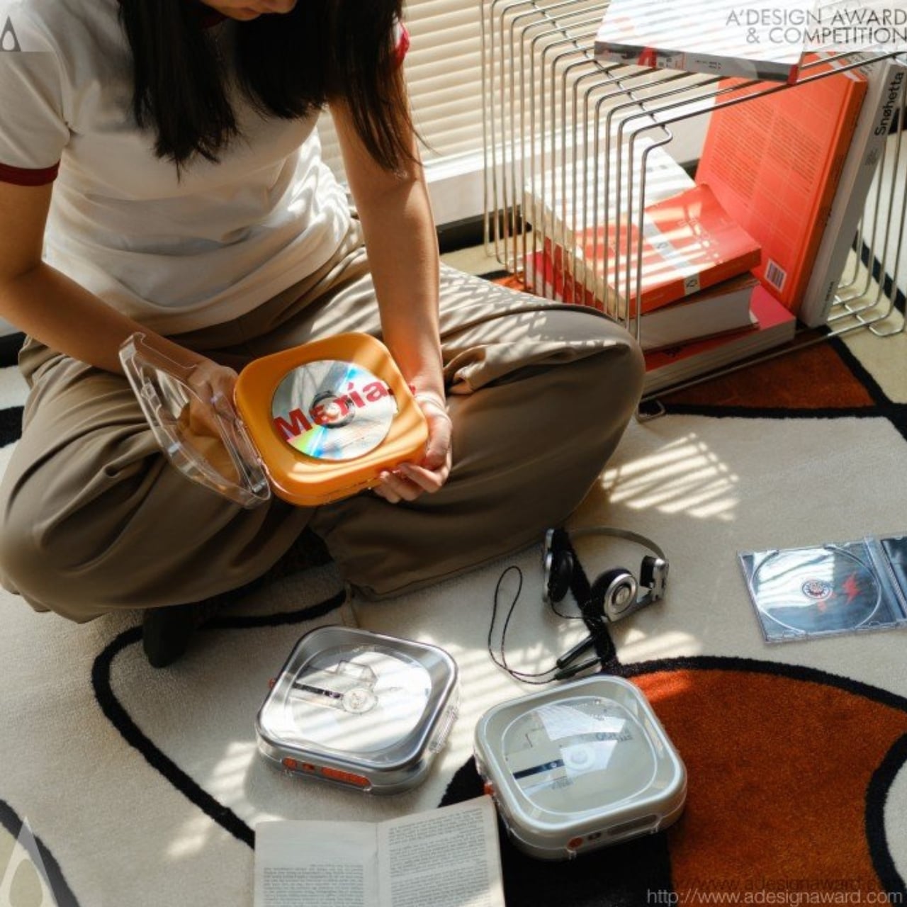
1. Syitren R400 Bluetooth CD Player

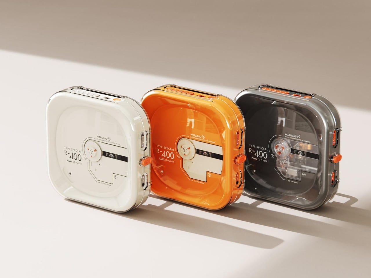
Portable CD players never disappeared, but they did stop trying. For years, the category was defined by bulky Sony boomboxes built around FM radio and cassette tapes as much as CDs. The R400, designed by ORGDOT for Syitren, is the first player in a long time that feels built for how people actually listen today. It is compact, Bluetooth 5.3-first, and designed to look as good on a desk or shelf as it does in your hand on a commute.

Under the shell, a custom Syitren pure CD core delivers a 70dB signal-to-noise ratio for clean, high-fidelity sound. Anti-vibration engineering keeps things skip-free while commuting or walking around. The shell is detachable and customizable, and a sunken charging compartment with a built-in wire groove keeps the cable from bending or fraying over time. Bluetooth or wired, car stereo or headphones, four-plus hours of continuous playback per charge, at a price that doesn’t make you choose between good design and good sound.

What we like

  • The detachable, customizable shell makes it something you can call your own, not just another piece of consumer electronics sitting on a desk.
  • Anti-vibration engineering means it is genuinely designed to be carried around, not just displayed.

What we dislike

  • Four hours of battery covers a workday comfortably but cuts short anything longer without access to a charge.
  • Sony has been quietly pulling back from portable CD players, meaning the R400 steps into a space with almost no competition to pressure it on price or performance.

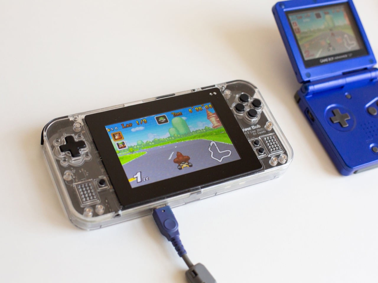
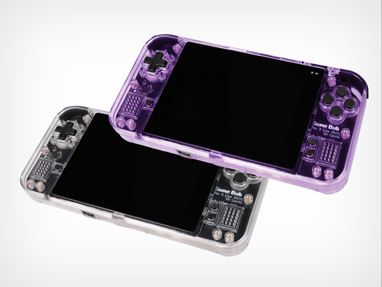
2. Game Bub

The Game Boy Advance’s design patents expired years ago, and most of what followed has been cheap emulation boxes wearing a familiar shape. Game Bub from Crowd Supply is different. It uses FPGA technology rather than software emulation, recreating the original Game Boy, Game Boy Color, and Game Boy Advance hardware at a circuit level with accuracy that emulators cannot match. The transparent shell, available in Purple and White, makes the whole thing look exactly as it should.

The horizontal GBA form factor is a deliberate choice in a market that keeps going vertical. Button placement feels natural; the shoulder buttons are where your fingers expect them, and dual one-watt stereo speakers handle classic soundtracks properly. USB-C charging, a headphone jack, a microSD slot for firmware updates, display output for big-screen play, Bluetooth Low Energy, 2.4GHz Wi-Fi, and a 3000mAh battery round out a device that earns the word ambitious.

What we like

  • FPGA accuracy means your cartridge collection plays exactly as it was designed to, not approximately as software emulation allows.
  • The horizontal form factor respects what made the GBA comfortable for long sessions, which most of the competition has quietly abandoned.

What we dislike

  • Hardware-level FPGA accuracy comes at a price point that locks out buyers who would otherwise be genuinely interested.
  • Open-source FPGA handhelds tend to have longer firmware update timelines, which requires patience from anyone buying early.

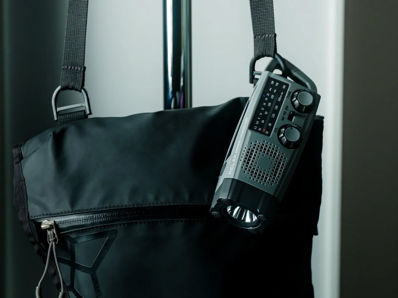
3. Clip&Go Radio

A radio that clips to your backpack and plays FM stations does not sound like a gadget Gen Z would want. The Clip&Go reframes the premise. It is compact enough to attach directly to your gear without thinking about it, built around the idea that the best emergency tool is one already useful before anything goes wrong. A built-in flashlight, hand crank, and solar panel mean it carries more utility than the dial on top suggests.

The physical radio format fits the same logic as the CD player and the handheld. It is a single-purpose device with no algorithm, no autoplay, and no recommendations. You tune a station, clip it on, and go. In a landscape where every device competes for your attention, a radio that does not know you exist feels quietly radical. At $60, it is also the most immediately ownable thing on this list.

Click Here to Buy Now: $60.00

What we like

  • The built-in hand crank and solar panel mean it works when other devices cannot, giving it a utility case that goes well beyond aesthetics.
  • The clip attachment means it genuinely travels with you rather than waiting in a bag pocket to be pulled out.

What we dislike

  • FM signal quality is location-dependent, making the listening experience inconsistent wherever coverage is thin.
  • At $60, it competes with Bluetooth speakers that do more on paper. The case for owning it rests on the single-purpose philosophy, not the spec sheet.

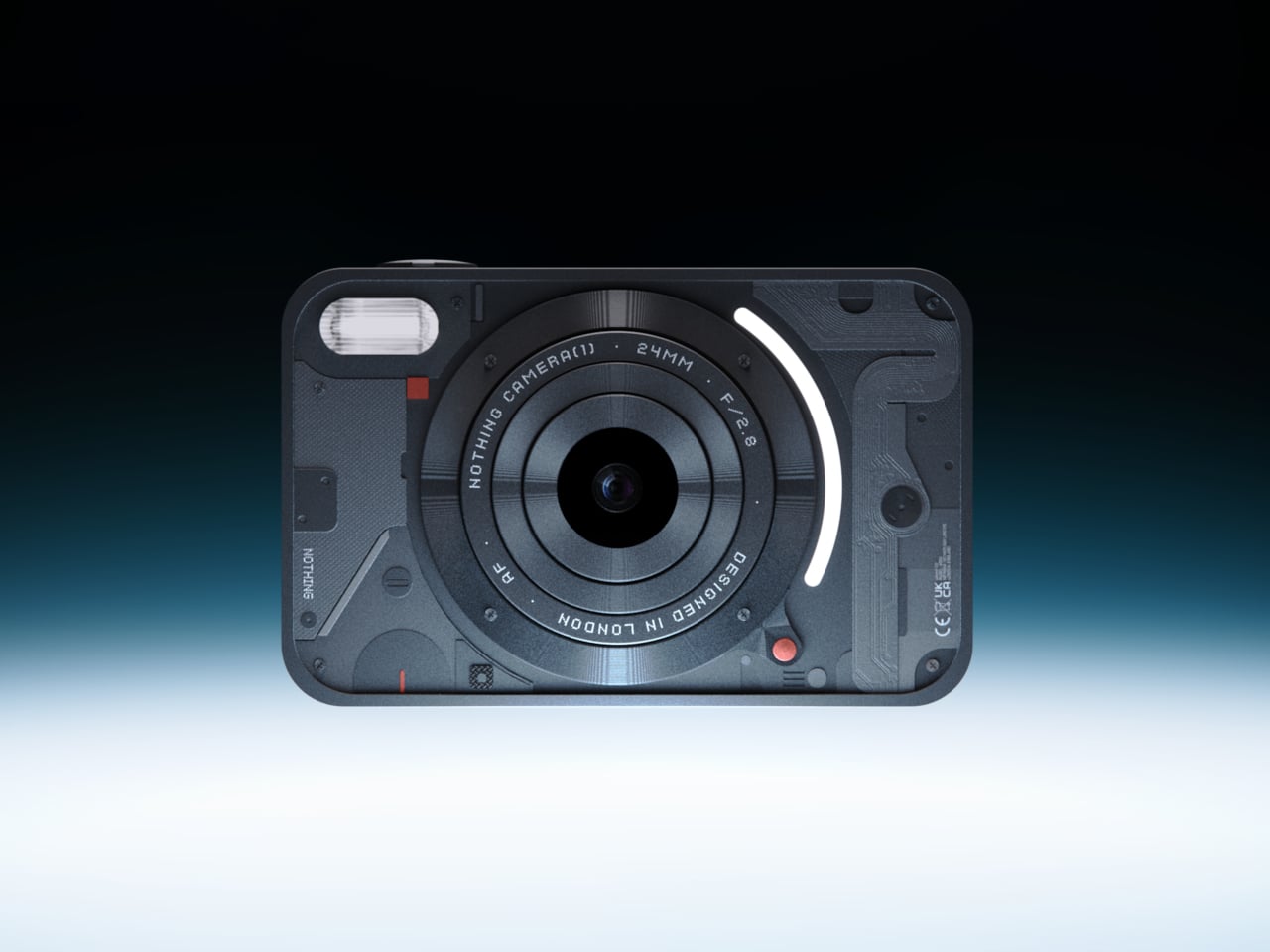
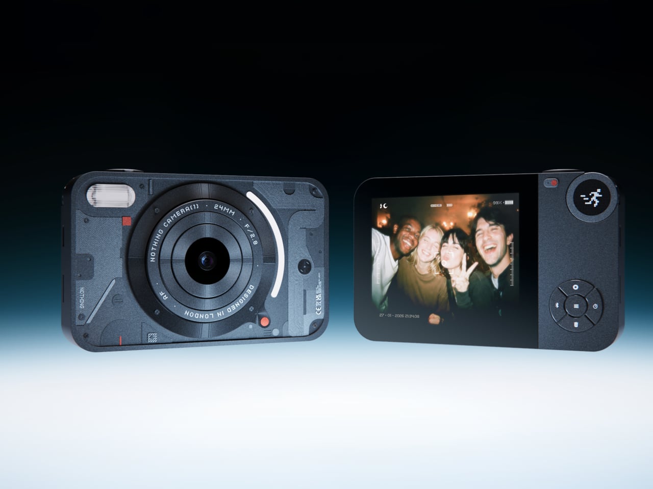
4. Camera (1)

The impulse to pick up a standalone camera again is not about megapixels. It is about separating the act of taking a photograph from the act of being on your phone. Camera (1) is a concept by designer Rishikesh Puthukudy that imagines what a modern compact could feel like if built around physical controls rather than touchscreen menus. Metal body, softly rounded corners, every main control reachable without shifting your grip or glancing away from the scene you are trying to capture.

All the main controls live on one edge: a shutter, a circular mode dial with a dot-matrix glyph display showing simple icons for stills and video, and a D-pad your thumb can reach without looking down. A light strip around the lens pulses for the self-timer, confirms focus, and signals when recording is live, replacing multi-layer software navigation with immediate, readable feedback. The design language pulls from Nothing’s transparent, hardware-forward aesthetic and pushes it into something you would actually want to carry.

What we like

  • Every main control sits within reach of one thumb and index finger, keeping your eyes on the subject rather than hunting through a menu.
  • The light strip communicates camera state through peripheral vision, a smarter solution than burying status information inside a touchscreen.

What we dislike

  • Camera (1) is a concept with no confirmed manufacturer, production timeline, or pricing, which is a real limitation for anyone wanting to own one today.
  • The visual language is closely referential to Nothing’s established aesthetic, which may read as derivative to anyone already familiar with that design direction.

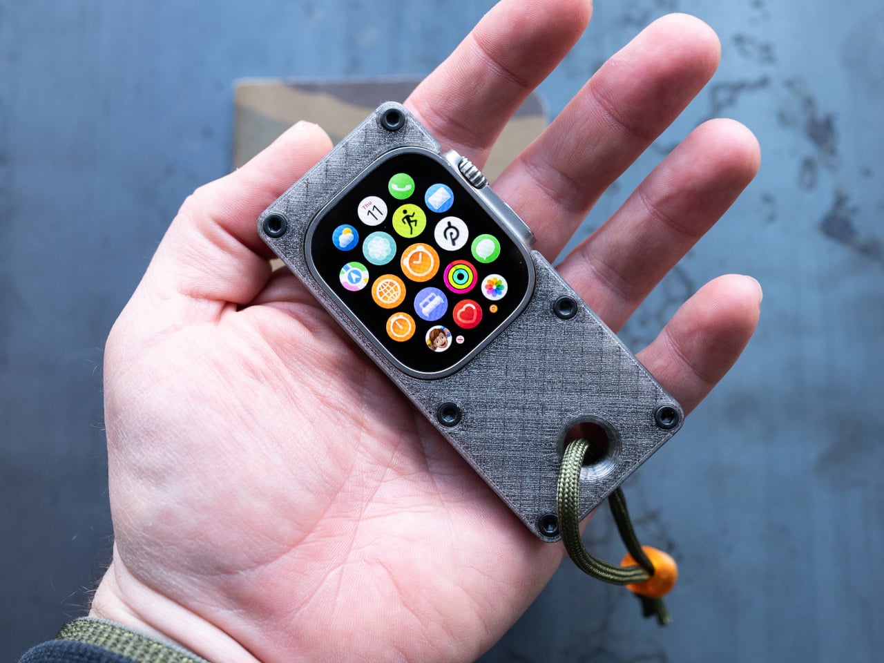
5. elrow miniphone

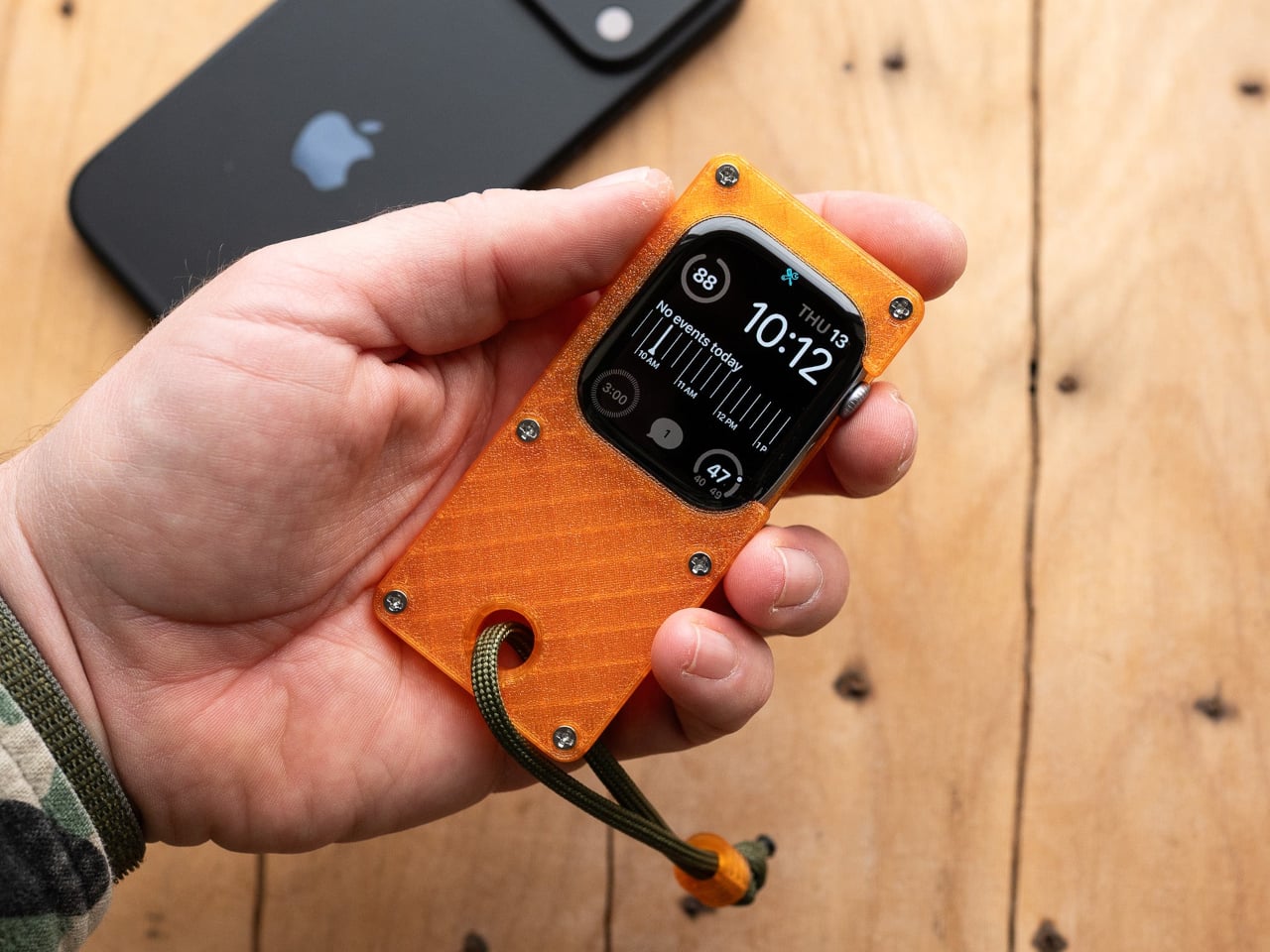
Full smartphones feel like overkill for a generation quietly walking back from maximalism. The Apple Watch on your wrist handles glances but stays awkward for anything more deliberate, and wearing both a smartwatch and an analog watch on the same arm is its own kind of compromise. The elrow miniphone is a 3D-printed case that turns an Apple Watch into a narrow, palm-sized device worn on a lanyard. The Standard fits the 46mm Series 10 and 11. The Ultra fits Apple Watch Ultra 1, 2, and 3.

Both stand around 95mm tall with textured translucent bodies and visible screws that do not attempt to hide how they were built. The back stays open so you can charge without disassembling the case. What elrow industries built is less a gadget and more a posture, a way to carry connectivity without wearing it on your wrist, freeing that space for the mechanical or analog watch you actually want to wear while keeping notifications, Apple Pay, and quick replies within reach.

What we like

  • The open back lets you charge without disassembly, removing the most frustrating everyday friction of any case.
  • Wearing connectivity on a lanyard rather than your wrist opens the door to the analog watch you have been quietly sidelining.

What we dislike

  • As a 3D-printed case, it depends entirely on which Apple Watch model you already own and is not a standalone device.
  • A lanyard-worn device requires real behavioral change to make useful day-to-day rather than just conceptually interesting.

Ownership Is the Point

What this list describes is not a generation running from technology. It is a generation learning to be selective about which technology gets to run on them. A CD player that skips the algorithm. A handheld that plays cartridges at hardware level. A camera built around a shutter click. A lanyard device that frees your wrist. A radio that does not know your name. Five objects. Five things that simply work.

The broader shift is less about any individual product and more about what owning something actually means. Streaming everything is convenient right up until nothing feels like yours. A CD on a shelf, a cartridge in a slot, a photo taken with a camera you held in your hand: these are forms of possession the subscription model quietly erased. Gen Z is taking them back, one physical object at a time.

The post 5 Gadgets Gen Z Actually Wants to Own Right Now first appeared on Yanko Design.
  •  

A Pocket Concept Built to Catch Design Ideas Before They Get Away

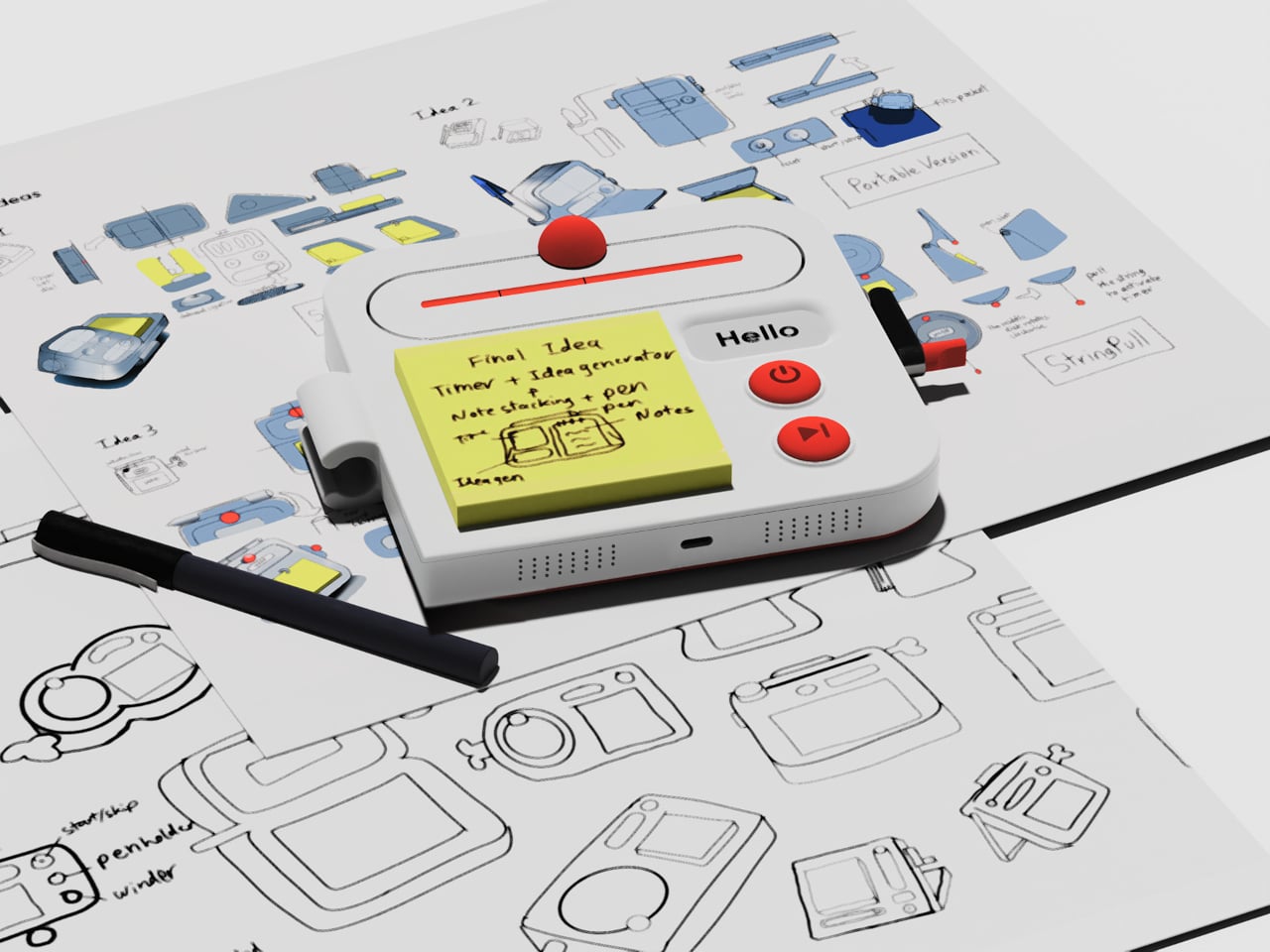
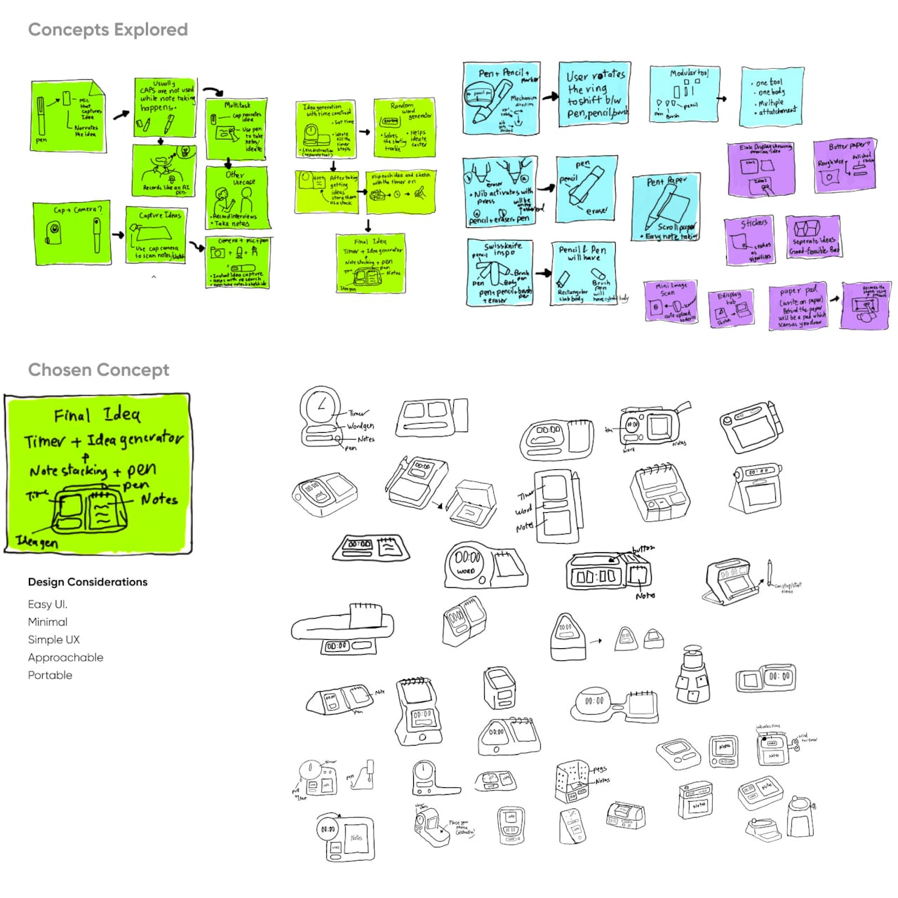
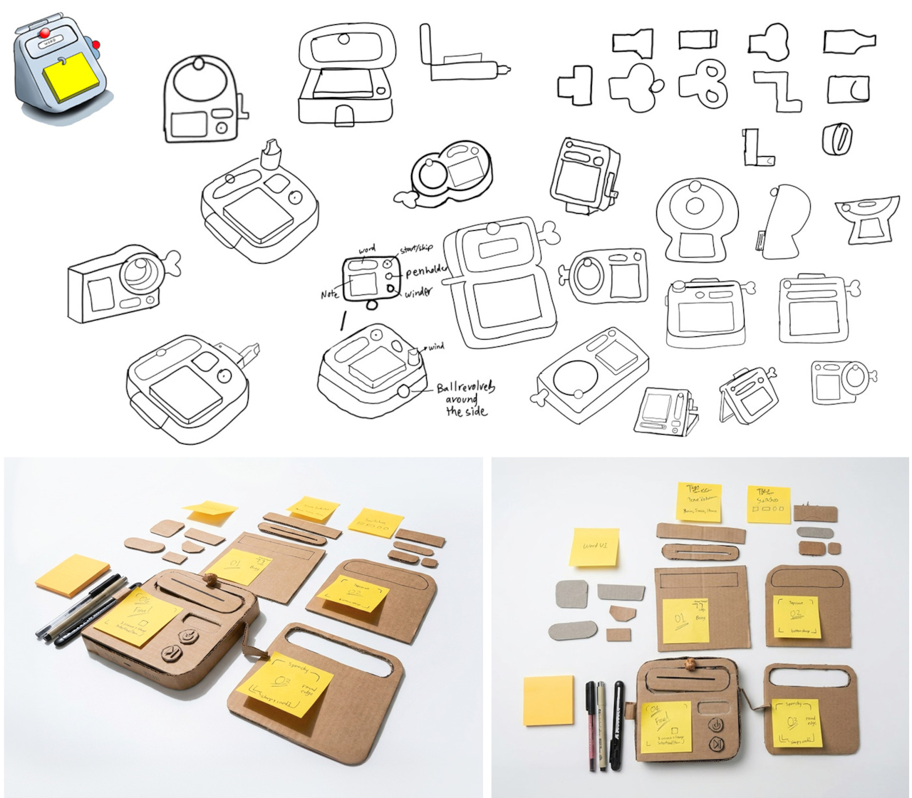
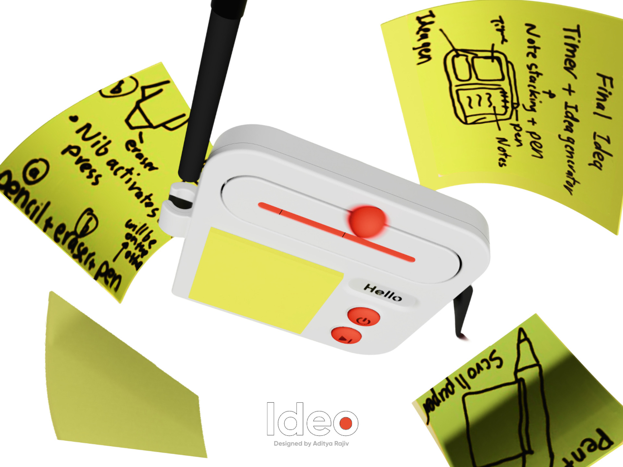
Good ideas don’t always wait until you’ve found the right pen and an empty page. For industrial designers, a quick sketch can turn into a note, then vanish while they’re looking for something to write on. Ideo is a pocket-sized concept that puts a sticky-note pad, a crank-set timer, and a random-word prompt in one place, giving those fleeting thoughts somewhere to land.

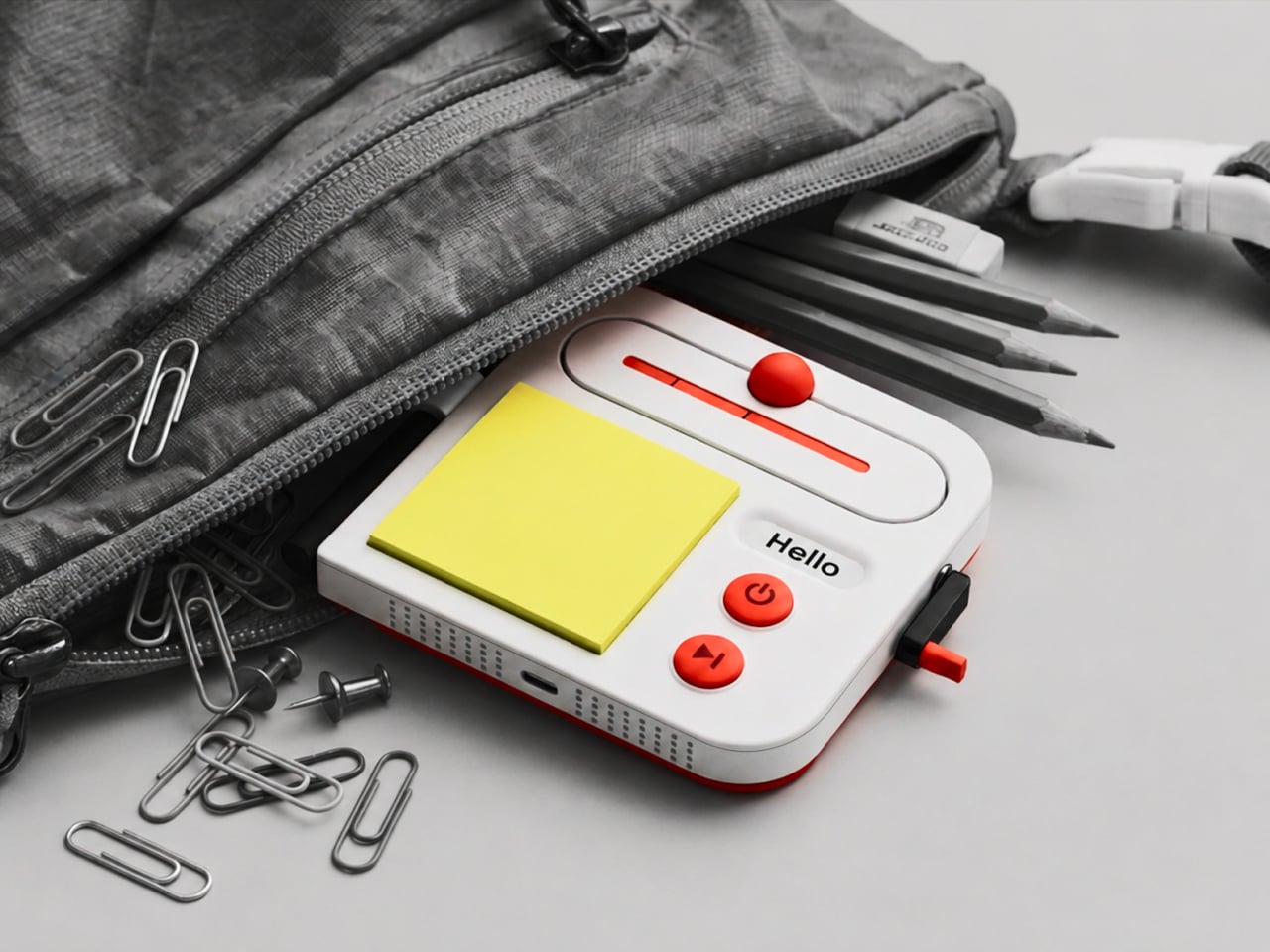
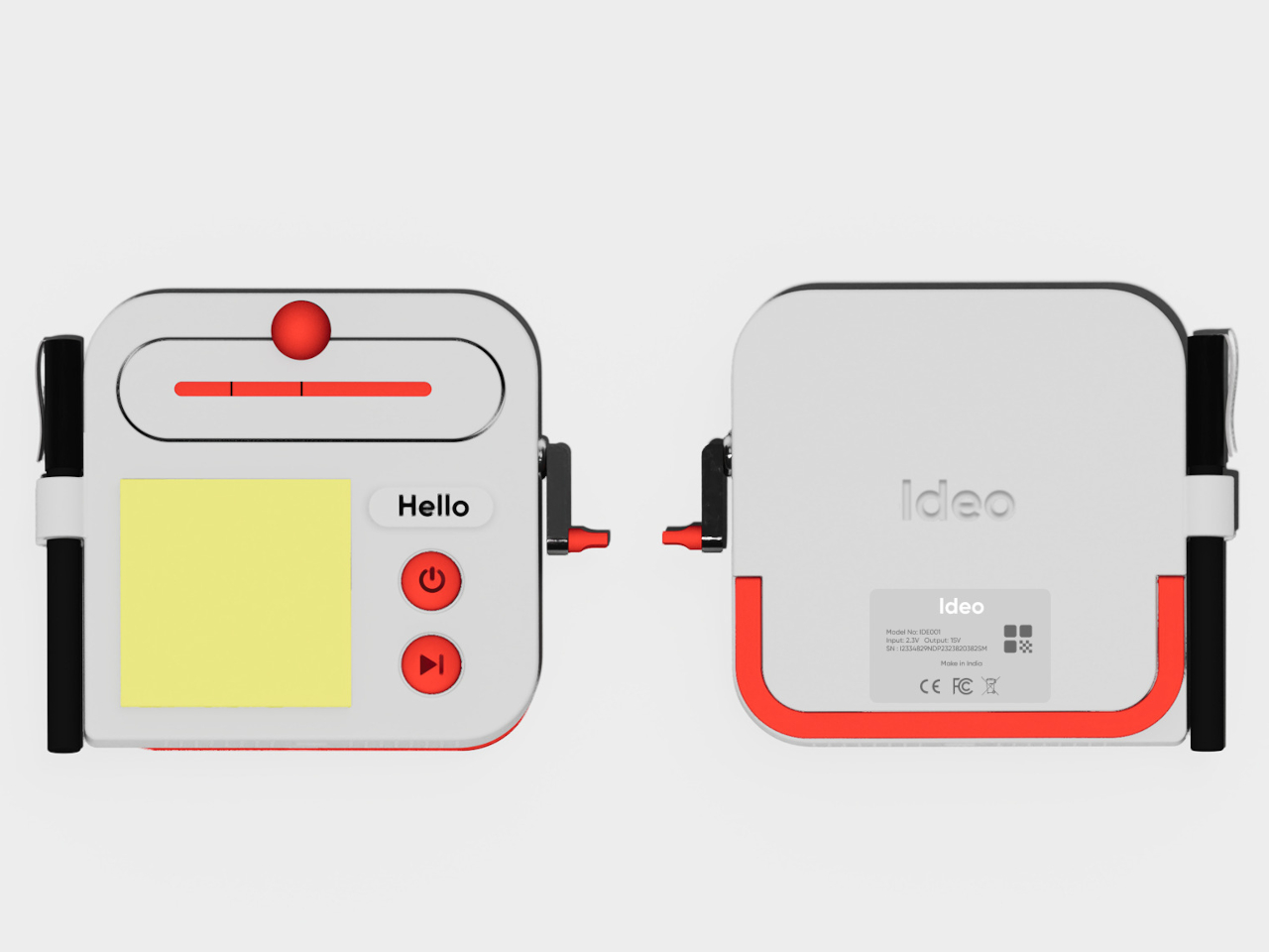
The trick isn’t to replace a sketchbook or ask a computer to finish your thinking. It’s to keep the small tools for getting started within reach. A pen clips to one side of the rounded body, while a stack of sticky notes takes up much of the front. You can jot down a shape, a measurement, or a question before it slips away.

Designer: Aditya Rajiv

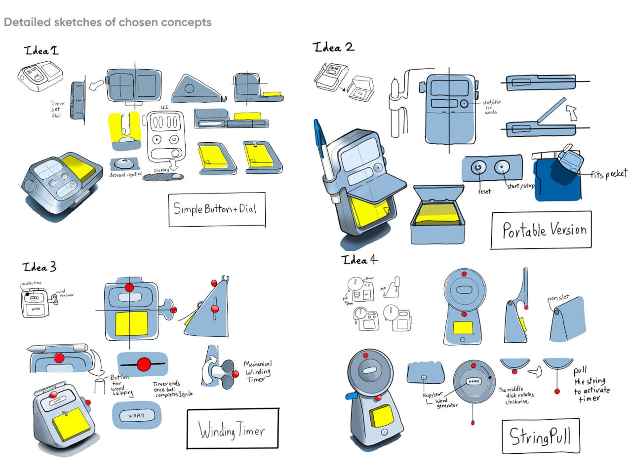
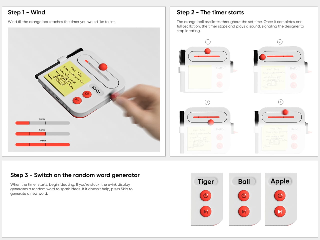
Then there’s the timer, which makes the device a little stranger than an ordinary stationery holder. Turn the crank on the side until the orange bar reaches your chosen duration, and a bright ball moves along the track as time passes. When its cycle finishes, the concept calls for a sound. That gives a short sketching session a visible beginning and end.

A blank note can be surprisingly intimidating when someone asks you for three different directions before lunch. Ideo responds with an e-ink display that presents a random word, such as “tiger” or “apple,” to nudge your thoughts somewhere unexpected. If the word doesn’t help, a physical button skips to another. This isn’t some AI that tries to take over your thinking process but, rather, a nudge to keep your pen moving.

During a workshop, you might have a few minutes to sketch a handle before the group moves on to another idea. The timer keeps that deadline obvious, while the note stays attached to the device until you’re ready to place it beside other sketches. Having the prompt nearby could help when your first drawing feels too much like the one you made yesterday.

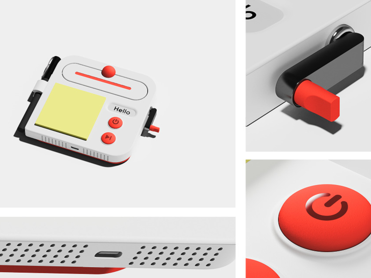
There’s a playful contrast between the quiet white housing and its red controls, with the yellow notes taking up nearly half the front. The broad knob and two large buttons look approachable rather than like the controls on a complicated drawing tablet. It almost looks like a child’s toy, which is the perfect idiom for playful and unhindered ideation.

The concept understands a small but familiar delay: the moment between having an idea and finding a place for it. A notepad and pen handle that first step, while the timer and word generator give you a reason to start drawing instead of staring at a blank sheet. Ideo is still a concept, of course, but the scramble for a pen makes its arrangement seem practical.

The post A Pocket Concept Built to Catch Design Ideas Before They Get Away first appeared on Yanko Design.
  •  

Amazon Gave Kindles Their Missing Buttons Back, as Accessories

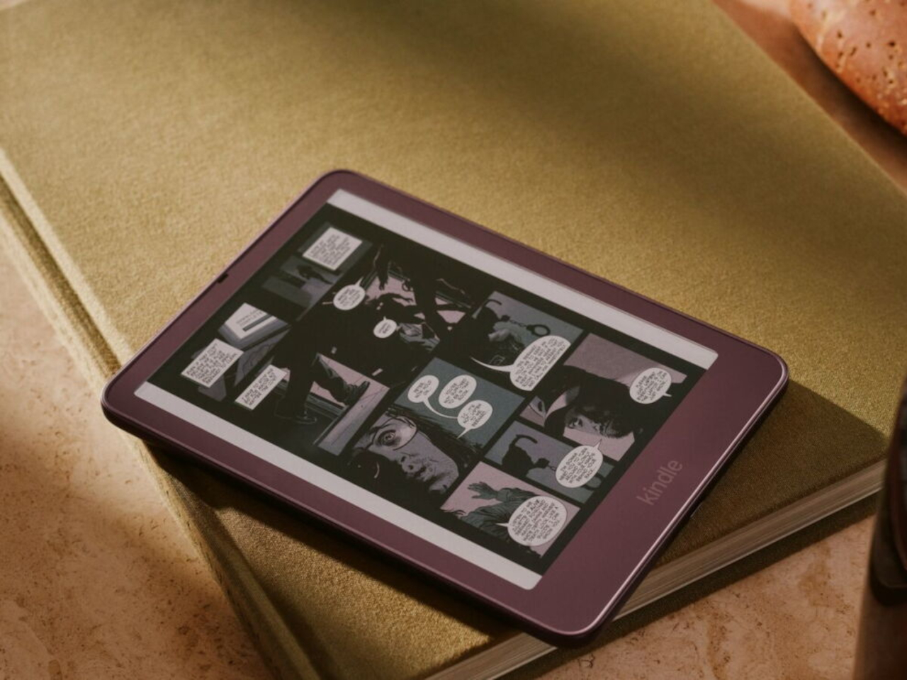
Kindles once let your thumb turn pages, but physical buttons disappeared from most of Amazon’s newer readers. That might not seem like a big loss until you’re holding a Kindle and trying not to disturb your comfortable grip. Amazon’s Kindle Click remote and Page Turn Cover offer two ways to bring that familiar press back, without adding buttons to the Kindle itself.

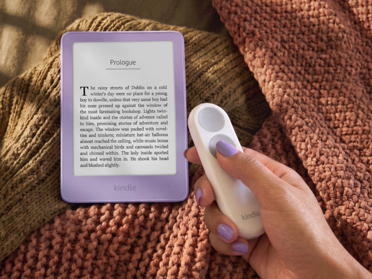
Of the two, Kindle Click makes the most sense when the device isn’t in your hands at all. Prop your Kindle on a pillow or a stand, pull a blanket over your shoulders, and the next page is a button press away. Other e-reader brands, including Boox, have already explored remotes, but Amazon’s Bluetooth version works without clipping a mechanical gadget onto the screen.

Designer: Amazon

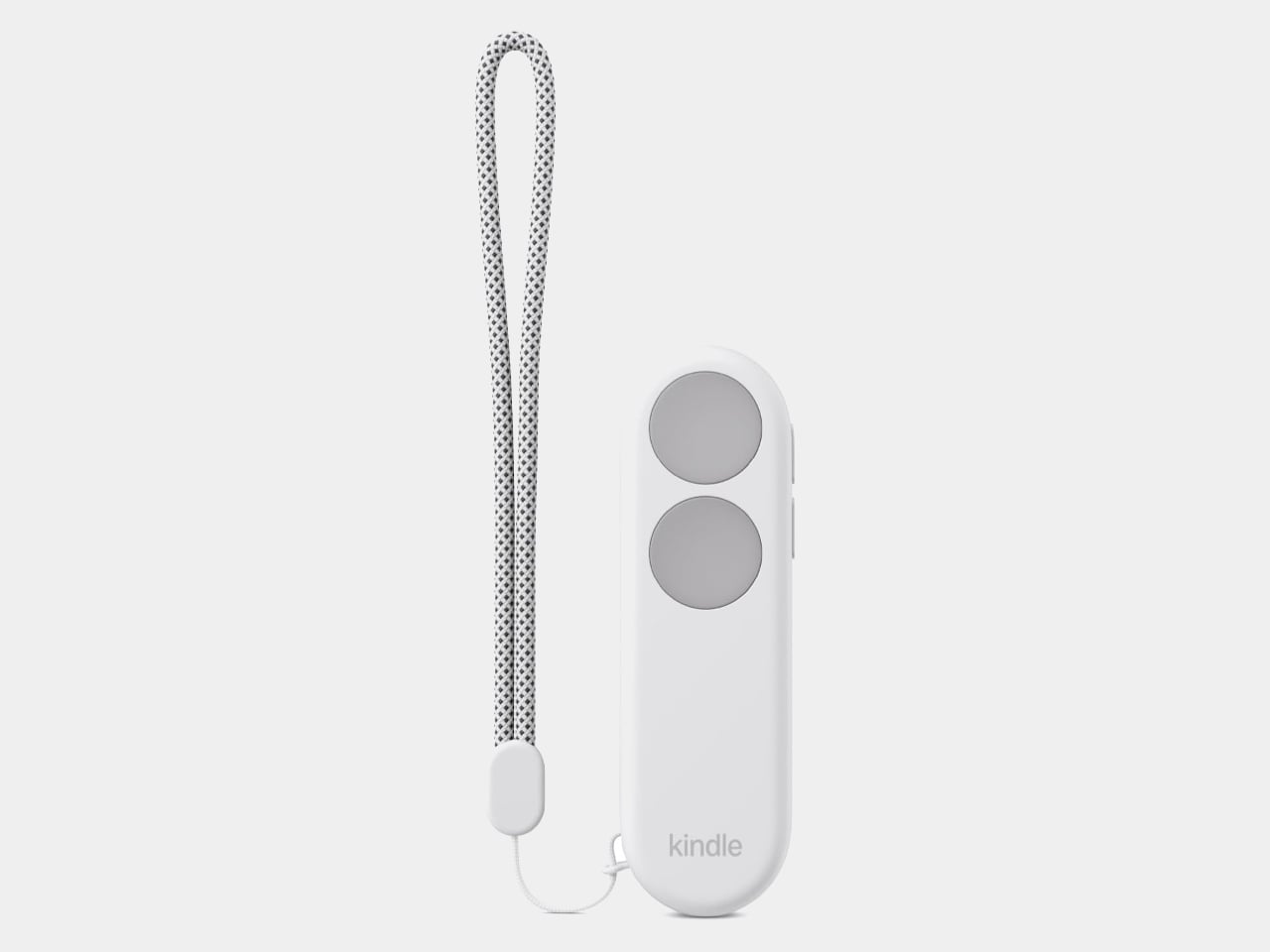
The $34.99 Kindle Click has two large, tactile buttons for moving forward or back, with smaller controls on the side for changing the screen brightness. Press both side buttons to put the Kindle to sleep, or change which main button turns forward in the settings. Its rounded body fits either hand, and a woven wrist lanyard keeps it nearby when you get up.

There’s still a little maintenance involved. Amazon says the rechargeable battery lasts for weeks, but the USB-C cable and adapter aren’t included. More importantly, Kindle Click only pairs with models released in 2024 or later. That leaves out plenty of readers who might want it most, including owners of the 2022 Kindle and 11th-generation Paperwhite. At least it doesn’t demand a particular cover.

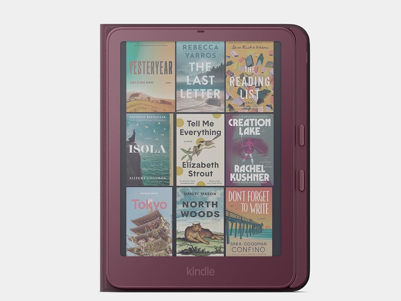
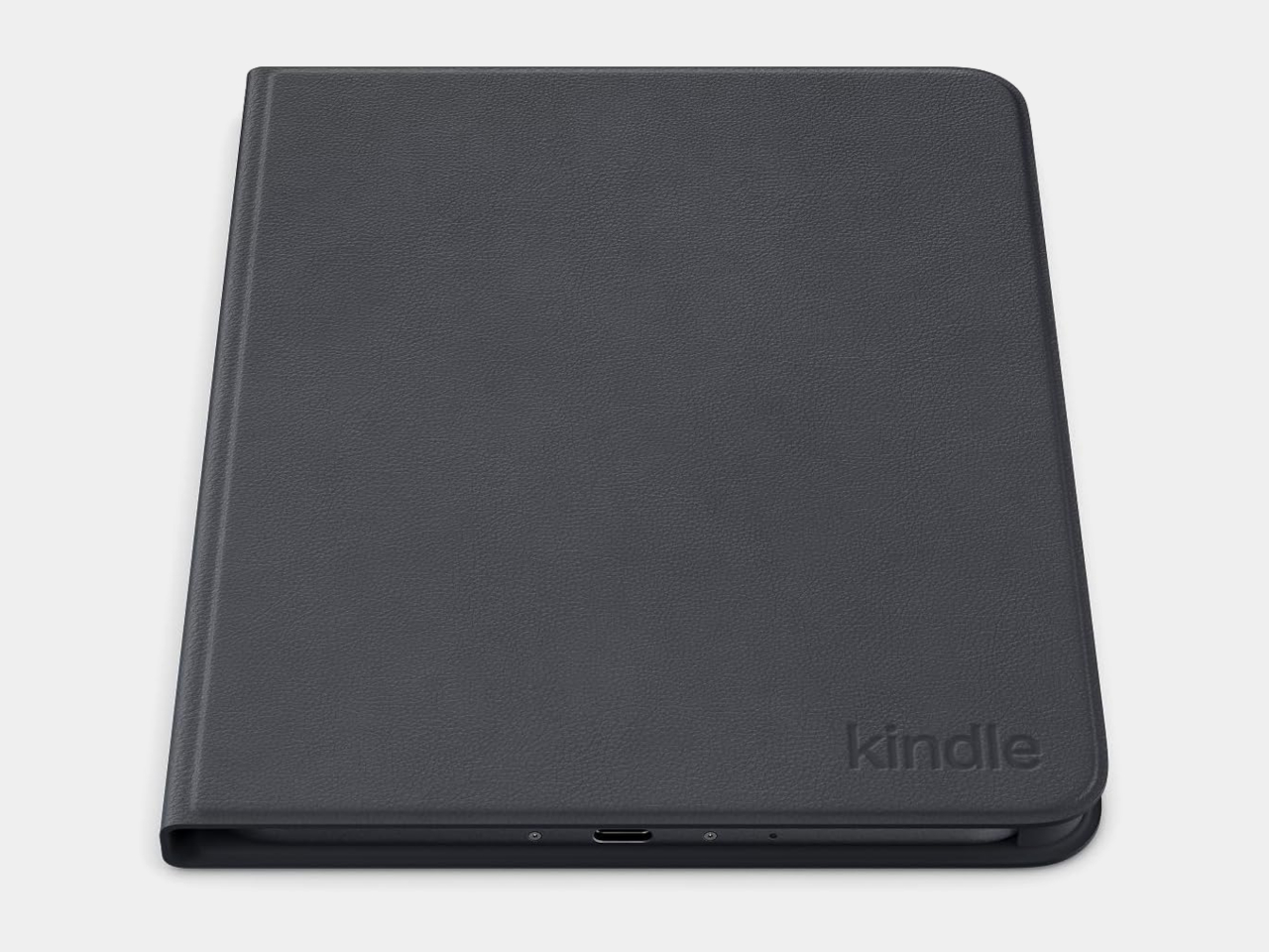
The Page Turn Cover takes the opposite approach. Instead of leaving the Kindle propped up, you hold it like any other folio-covered reader, with page-turn buttons built into the case. Fold the front back flat, and those controls remain part of your grip. The cover attaches magnetically and uses pogo pins to connect, so there’s no separate battery, Bluetooth pairing, or charging routine.

That simplicity carries through to the materials. The cover opens and closes to wake or sleep the Kindle, while a microfiber lining sits against the screen. Amazon says its plant-based leather contains more than 70% renewable biomaterials, with polyurethane making up the remainder. Graphite, Seaglass Green, and Fig offer three different looks, and both the cover and compatible Kindles carry an IPX8 water-resistance rating.

But the buttons come with a rather narrow invitation. The $79.99 cover fits only the 2026 Paperwhite Signature Edition and Colorsoft Signature Edition, so older Kindles and the standard models are out. That’s a considerable price for something that won’t fit most Kindles already in use. If you prefer reading without a case, the extra layer might also feel like an awkward trade.

Amazon hasn’t put physical page-turn buttons back on the readers themselves, and that distinction matters. The remote keeps your hand warm under the blanket while the Kindle stays put; the cover gives your thumb somewhere familiar to land when you’re holding it. Neither approach will suit every Kindle owner, but it’s nice to choose where the buttons belong instead of reaching for the screen again.

The post Amazon Gave Kindles Their Missing Buttons Back, as Accessories first appeared on Yanko Design.
  •  

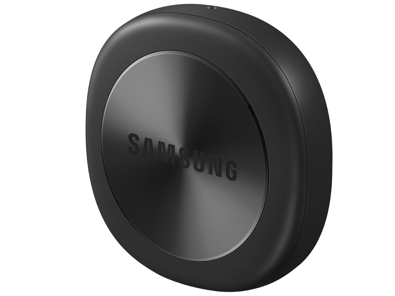
Samsung’s SmartTag3 Refuses to Die at 790 Days Battery Life

I’m the kind of person who can set down my keys, turn around, and immediately forget where they went. Wallets, earbuds, and bags have a way of disappearing at the least convenient moment, too. A smart tracker can spare you a frantic search, but only if its battery is working and its location can still be found. That makes battery life and the ability to locate an item beyond your phone’s immediate range just as important as a good-looking design.

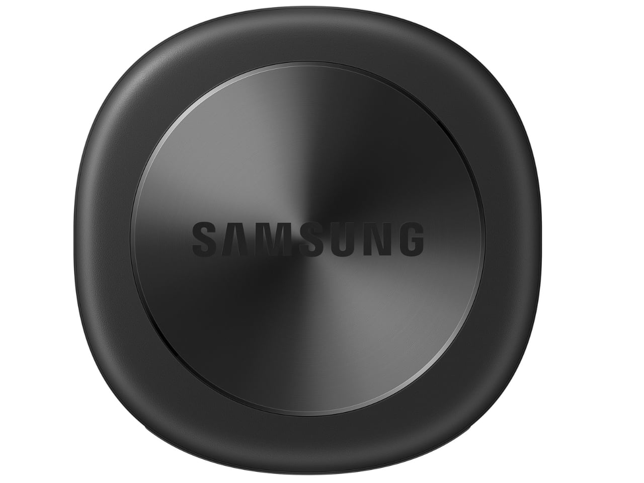
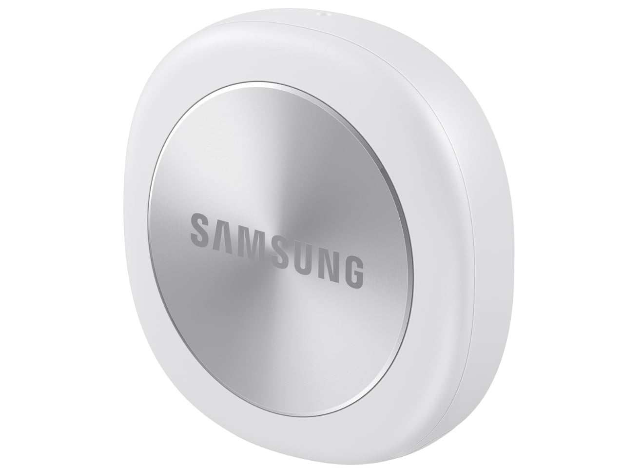
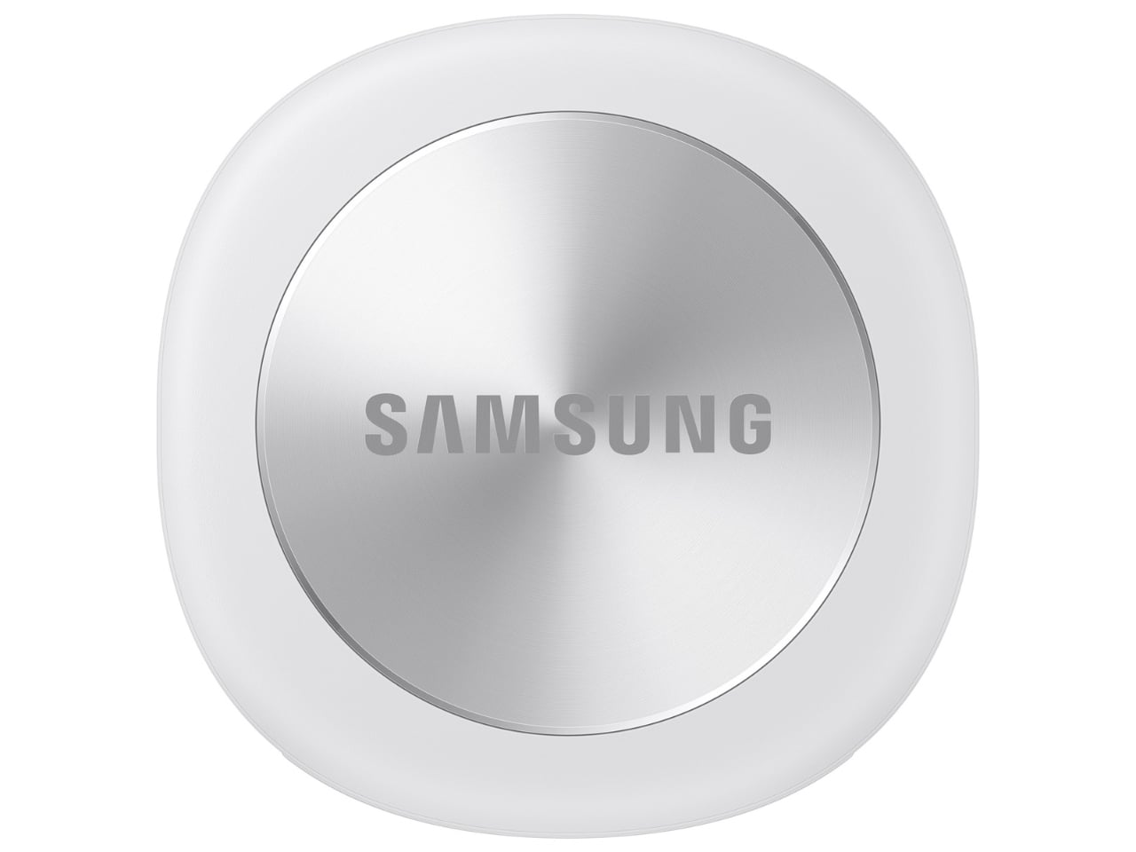
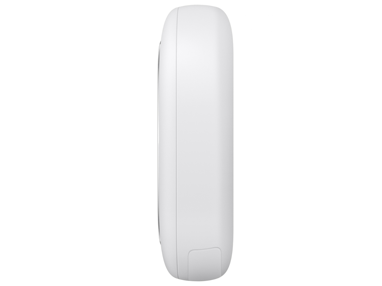
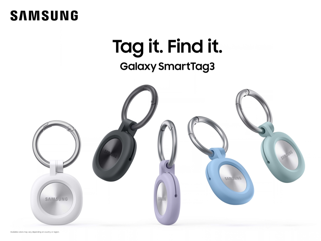
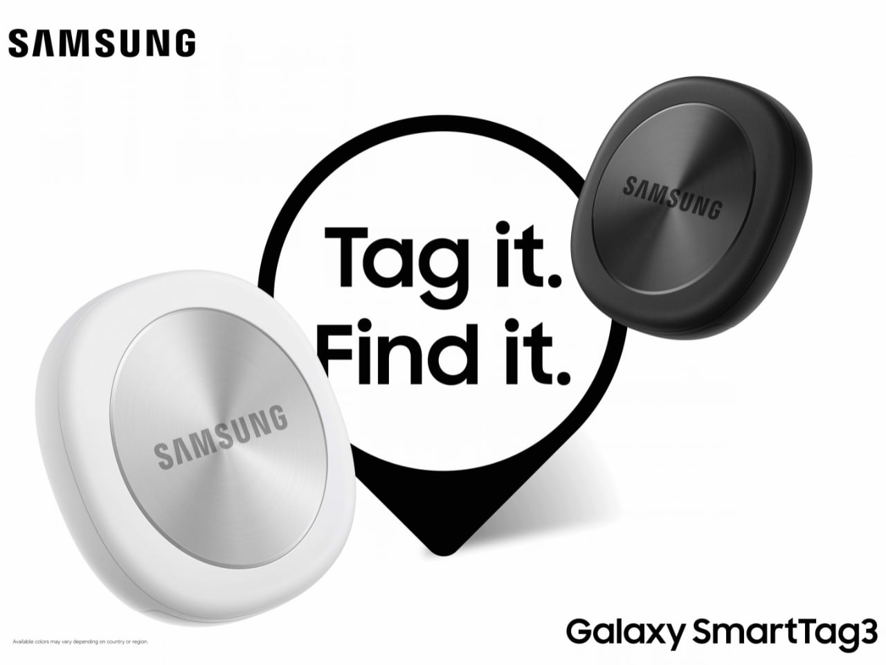
Designed by Samsung, the Galaxy SmartTag3 aims to address those everyday frustrations in a smaller package. Its rounded, nearly square shape gives it a clean look, while its reduced size should make it less noticeable on the things you carry. That matters more than it might seem. A tracker attached to a set of keys needs to be easy to live with every day, not just useful on the rare occasion those keys go missing.

Design: Samsung

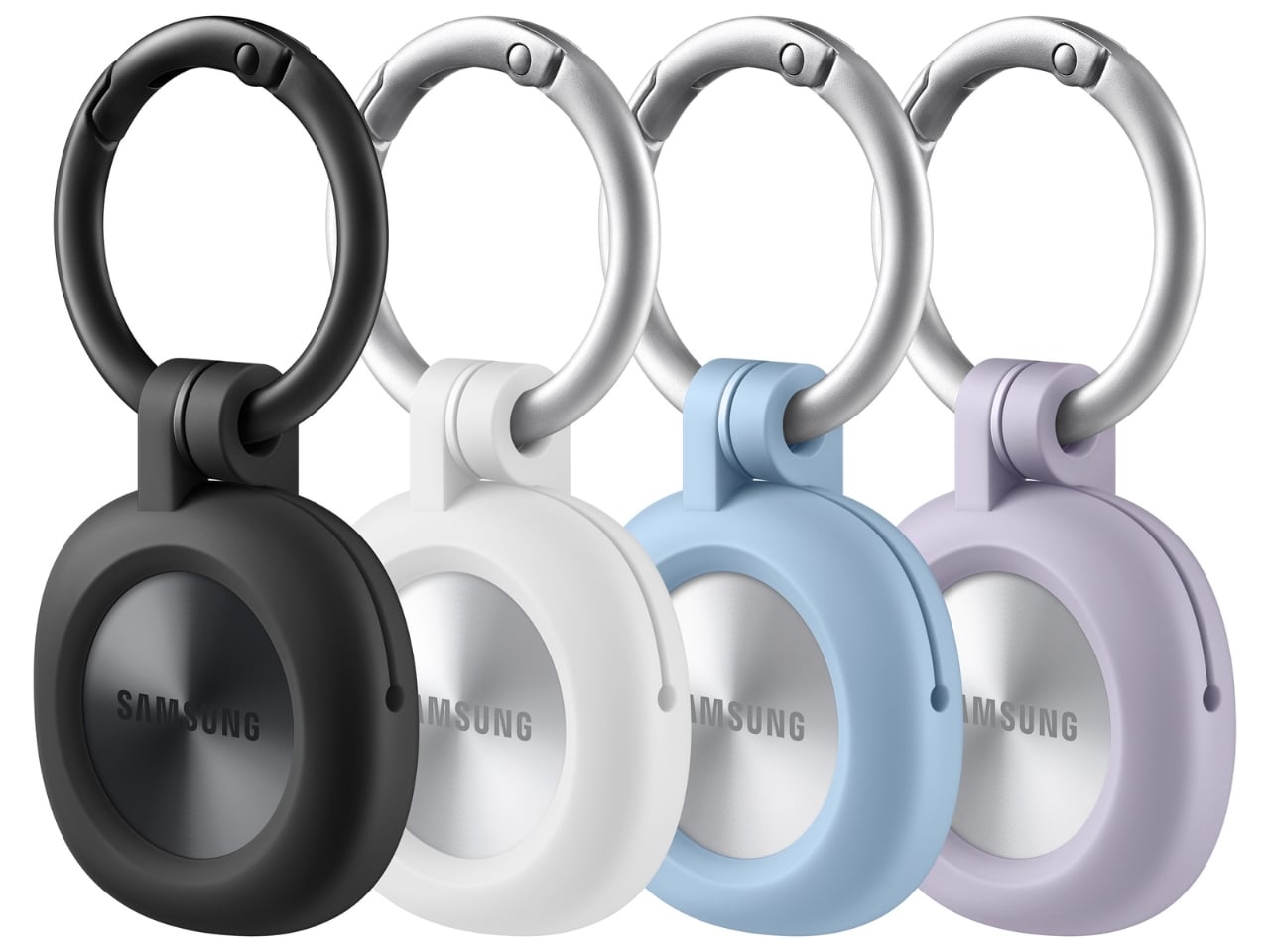
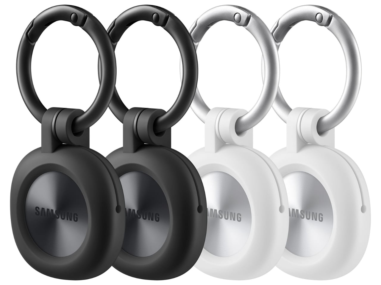
The change in shape also raises a practical question: how will you attach it to your belongings? Samsung offers a silicone case with an integrated keyring and a loop case, giving users different ways to secure the tracker to keys or a bag. The smoother outline may look better on its own, but anyone buying one for their keys should consider which attachment will work best.

Samsung says the SmartTag3 is 35% smaller by volume and 33% lighter than its predecessor. It also retains an IP67 rating, indicating resistance to dust and water under specified test conditions. That offers reassurance if the tag gets caught in the rain, though it does not mean the device is waterproof in every situation.

Battery life may be the more meaningful upgrade for anyone who has discovered a dead tracker while looking for a lost item. Samsung says the SmartTag3 can run for up to 550 days under standard usage or up to 790 days in Power Saving Mode. Those figures are based on Samsung’s testing, not a promise that every user will get the same result. Still, a tracker that needs attention less often is less likely to let you down because you forgot to check its battery.

Finding something nearby should be easier, too. Compass View uses Bluetooth 6.0 Channel Sounding to provide distance and directional guidance from up to 60 meters away, about three times farther than on the previous model, according to Samsung. It could help you narrow down where to look before you’re close enough to spot the missing item. Compass View is not available on iOS.

The other finding features are intended to help in different situations. If you leave a tagged bag behind, a Left Behind Alert could prompt you to go back for it, although that feature is also unavailable on iOS. Place Notification is designed to alert you when a tagged item enters or leaves an area you define. Location History and Movement Detection Alert may provide additional clues about where an item has been or whether it has moved. Together, these tools could help you notice a problem sooner and narrow down where to look.

Lost Mode addresses a different problem: helping someone return an item they find. With a compatible phone, a finder can scan the tag using NFC to see the contact information or short message you have registered. That could be useful for a bag left at a café or luggage separated from you during a trip. When an item is beyond your phone’s range, however, location updates depend on nearby participating Galaxy devices. The SmartTag3 should not be treated as a continuous, real-time GPS tracker.

The SmartTag3’s appeal is the combination of a compact design, long claimed battery life, and features that help at several stages of a search. It cannot prevent you from leaving your keys behind, and its alerts will not replace paying attention to your belongings. But if it helps you catch a forgotten bag before you get home, or gives you a useful clue when something disappears, it has done what a well-designed tracker should: made a small, stressful problem easier to manage.

The post Samsung’s SmartTag3 Refuses to Die at 790 Days Battery Life first appeared on Yanko Design.
  •  

This Color E-Paper Clip Is the Polaroid That Digital Photos Never Had

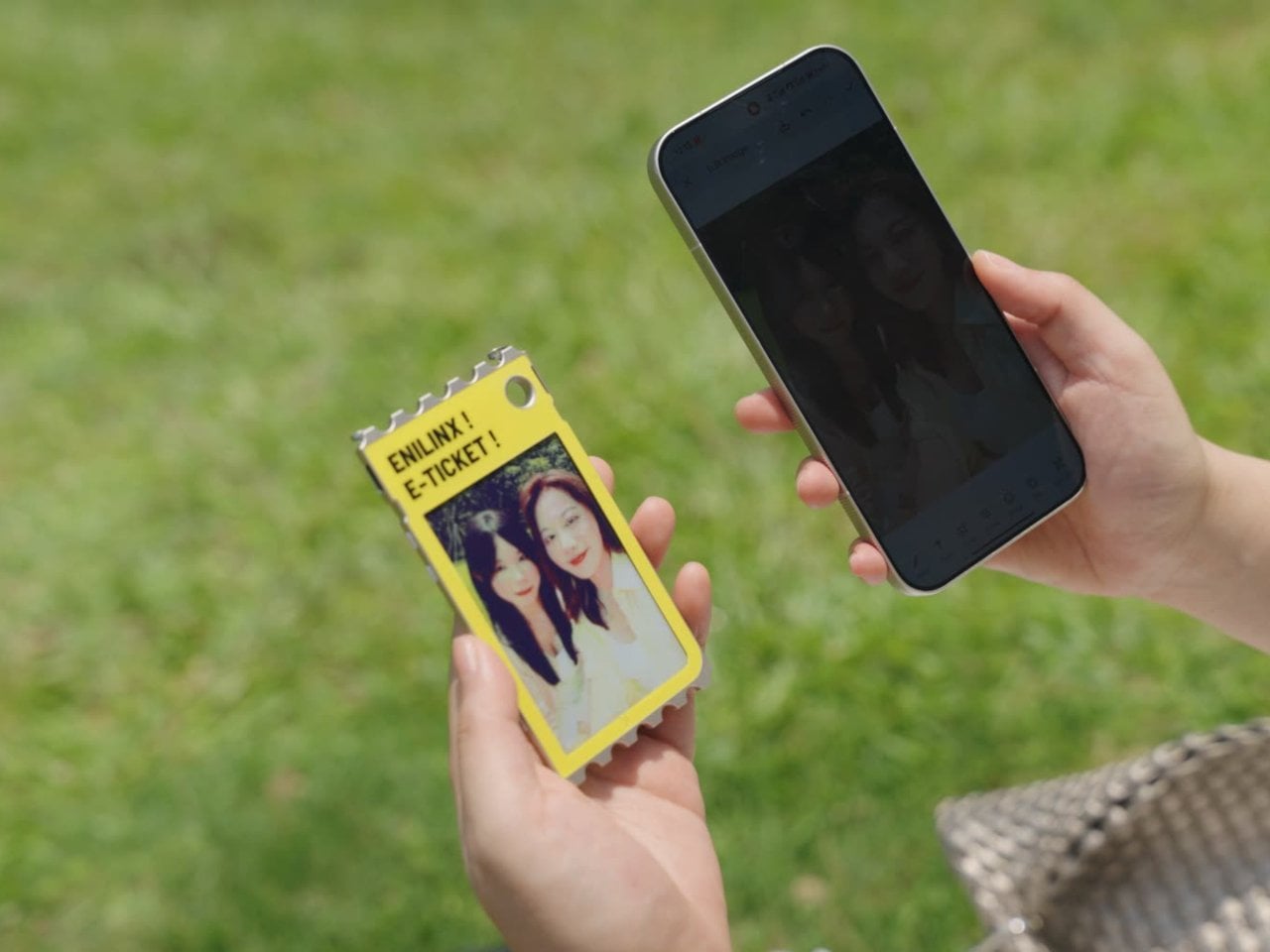
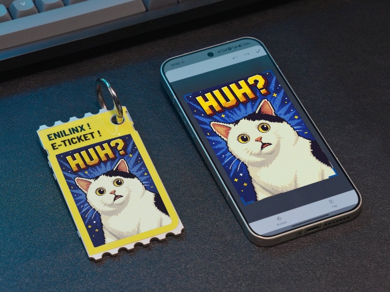
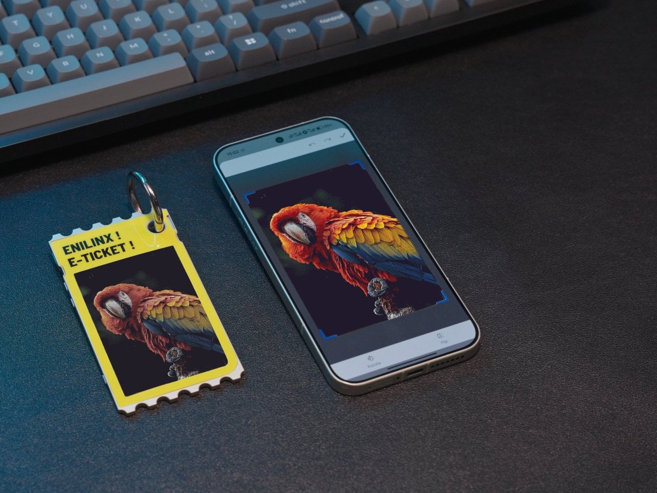
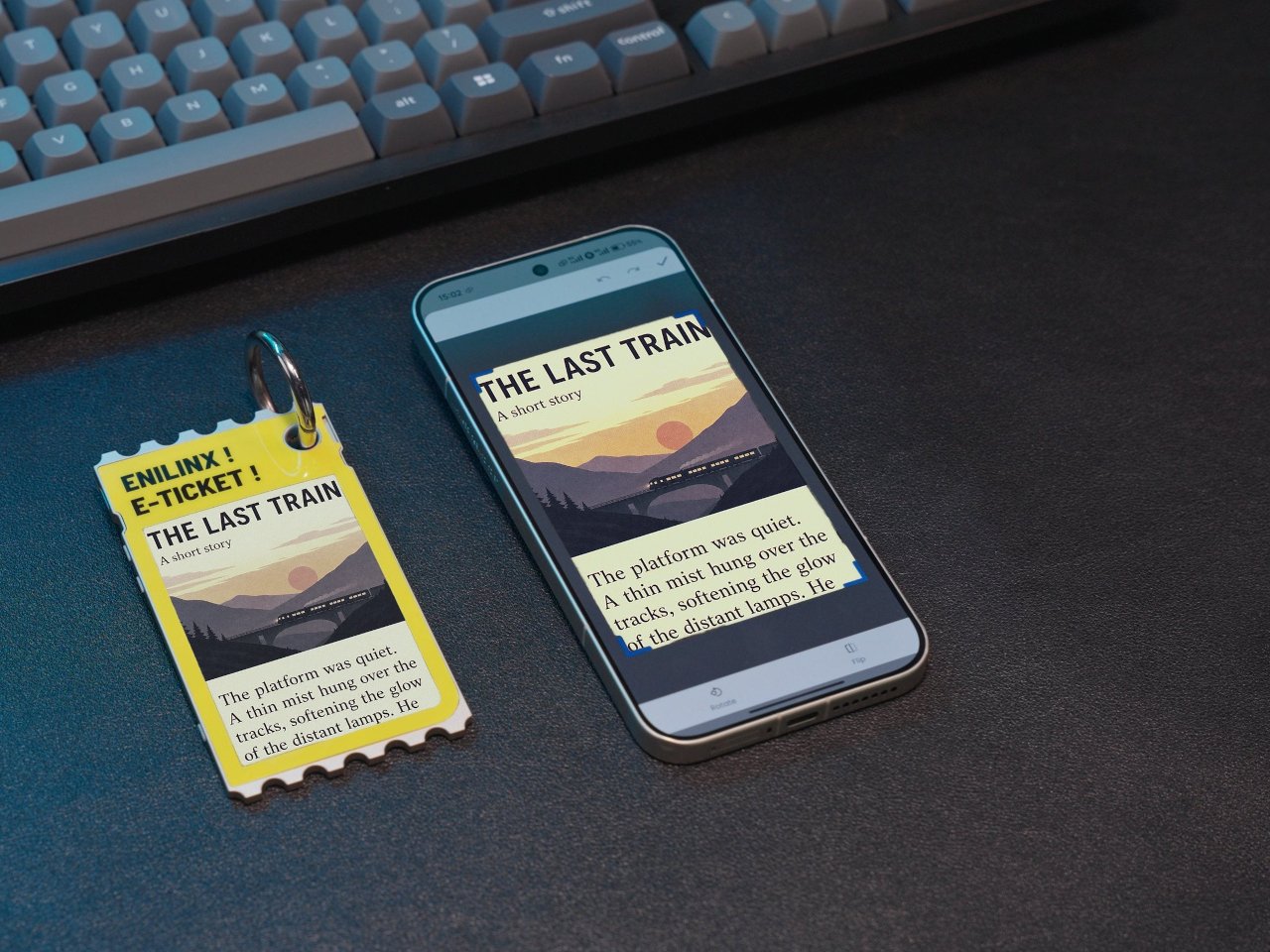
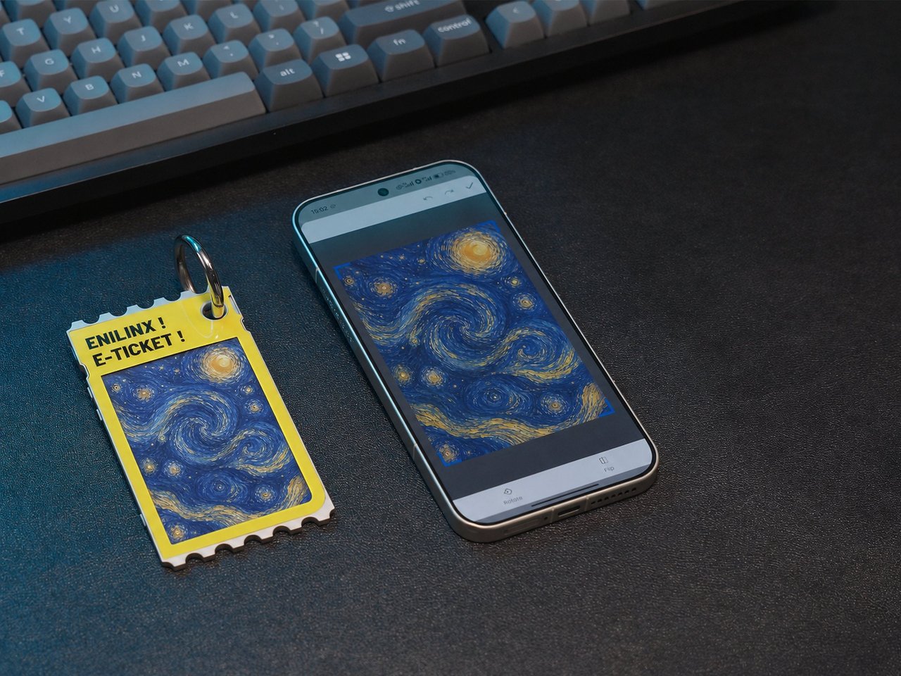
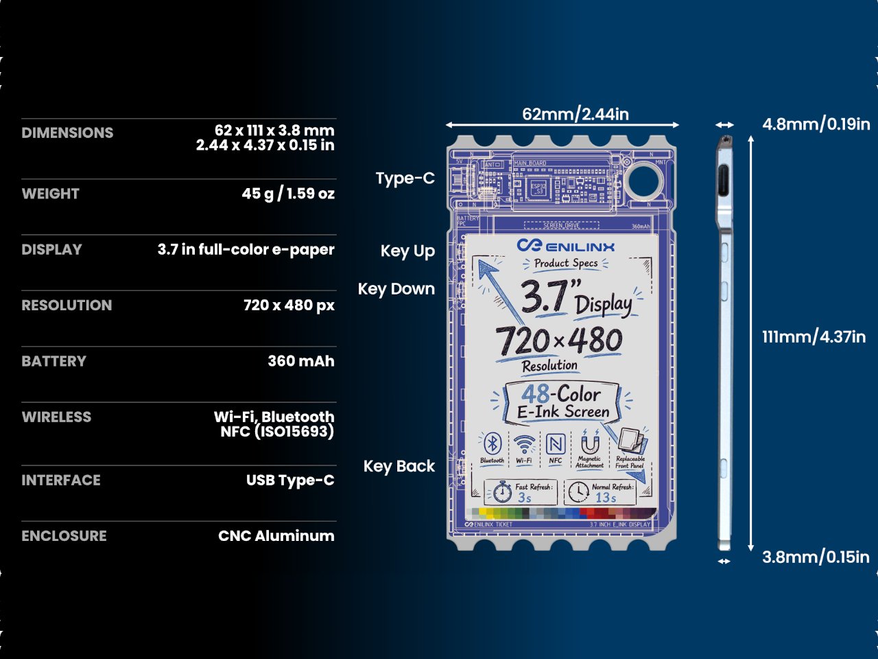
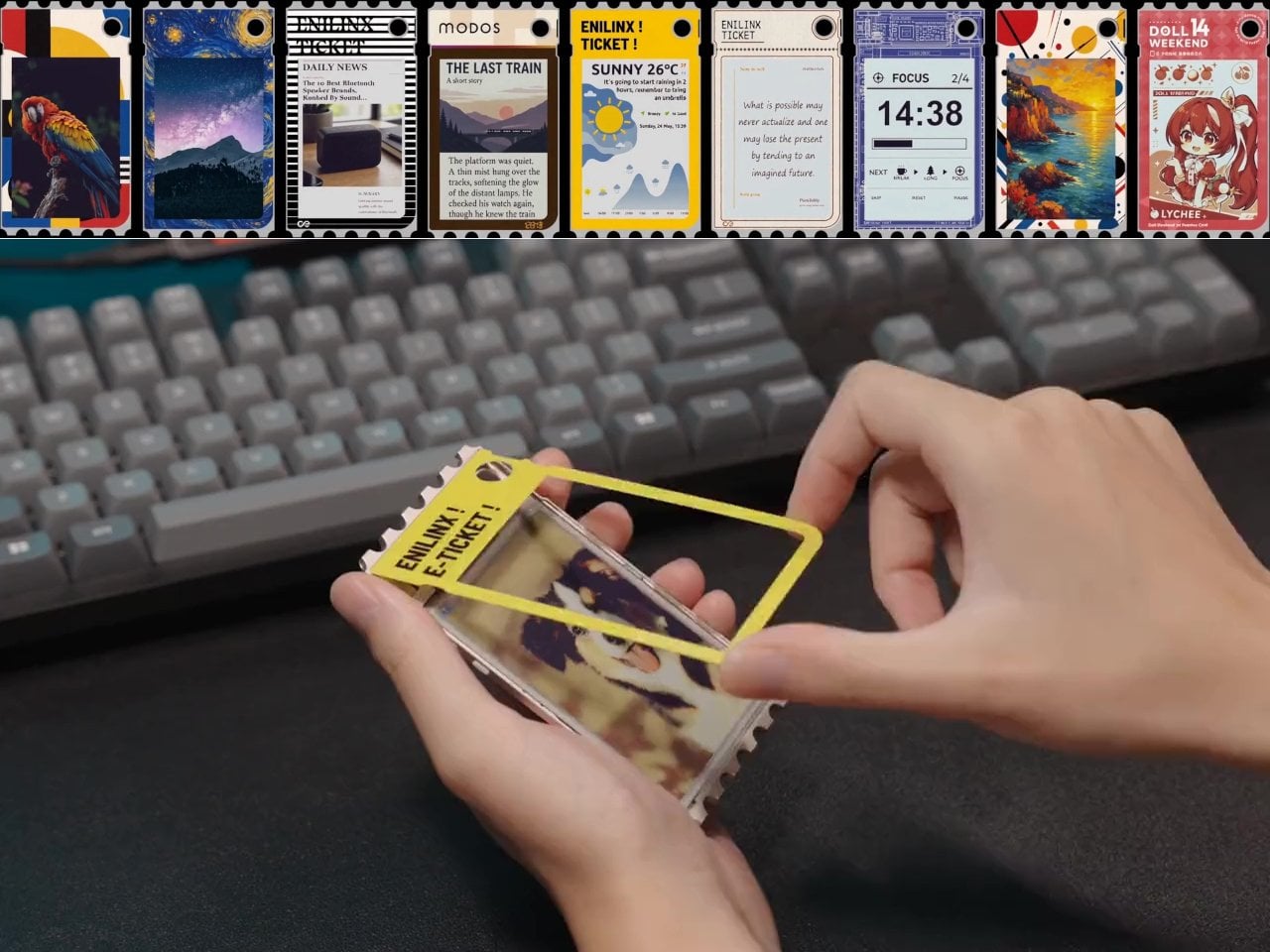
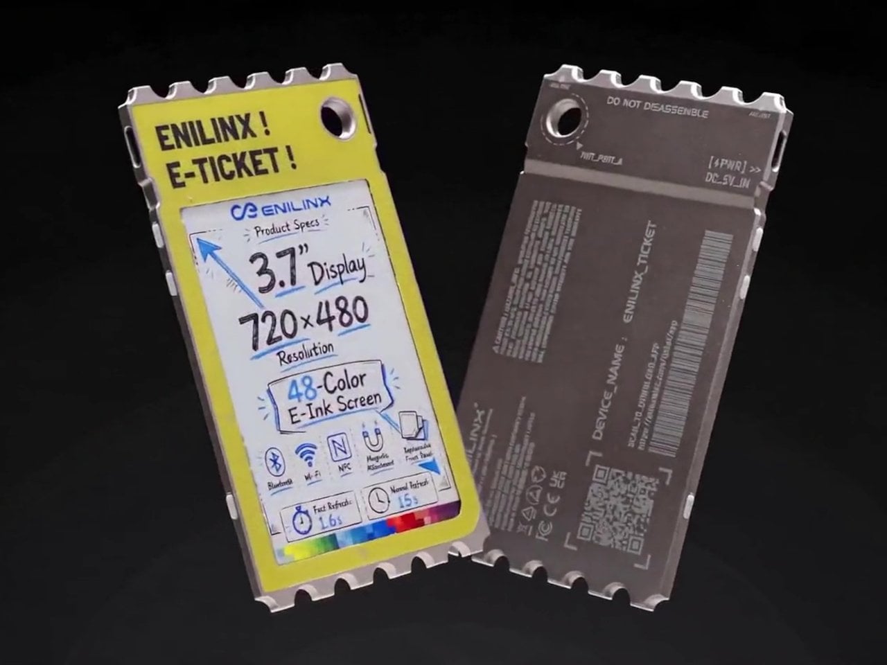
A photo you love rarely leaves the phone it was taken on, fading into a camera roll the moment the screen goes dark. TICKEY tries to pull that image back into physical space, using a 3.7-inch color e-paper panel housed in a 3.8mm aluminum shell that clips onto a bag, sits on a desk, or hangs from a badge lanyard. It’s a small object built around one simple idea: that a picture worth keeping deserves a life outside a glowing rectangle.

The panel itself is the real engineering story here. Most e-paper displays settle for a handful of muted tones and refresh rates measured in long, patient seconds. TICKEY runs on a Modos-developed driver that pushes past 48 native colors while cutting a full-quality refresh down to 13 seconds, with a faster 3-second mode available when precision matters less than speed. That gap between older e-ink hardware and this driver is wide enough to notice immediately.

Designer: ENIAC (Enilinx)

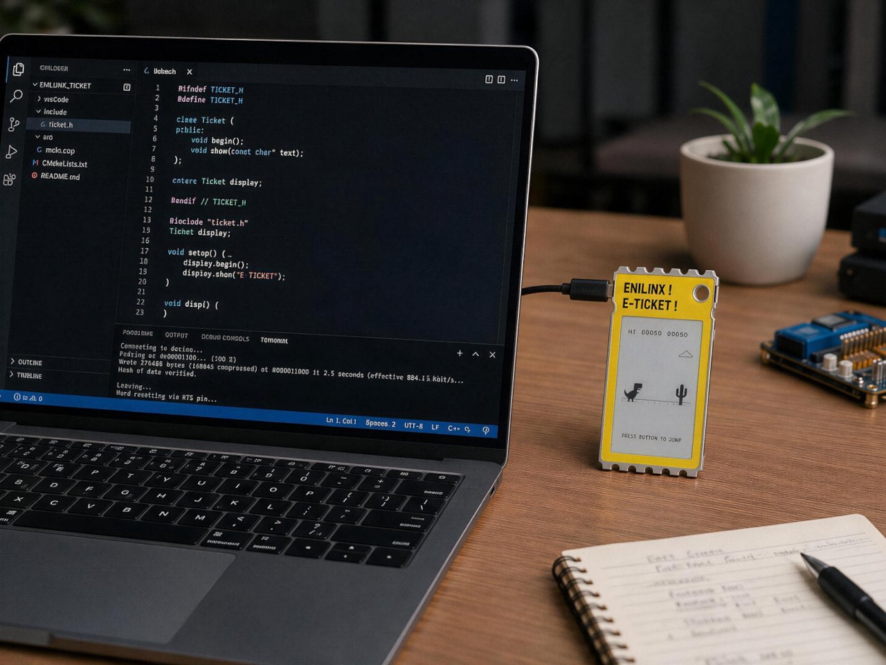
An ESP32-S3 chip handles the processing underneath, paired with Wi-Fi, Bluetooth, and NFC for getting content onto the screen without a cable in sight. A companion app lets someone edit a design on a phone and push it over wirelessly, and templates can be shared between users rather than built from scratch every time. Since the firmware is open, developers get a mature platform to build custom behavior instead of a sealed black box.

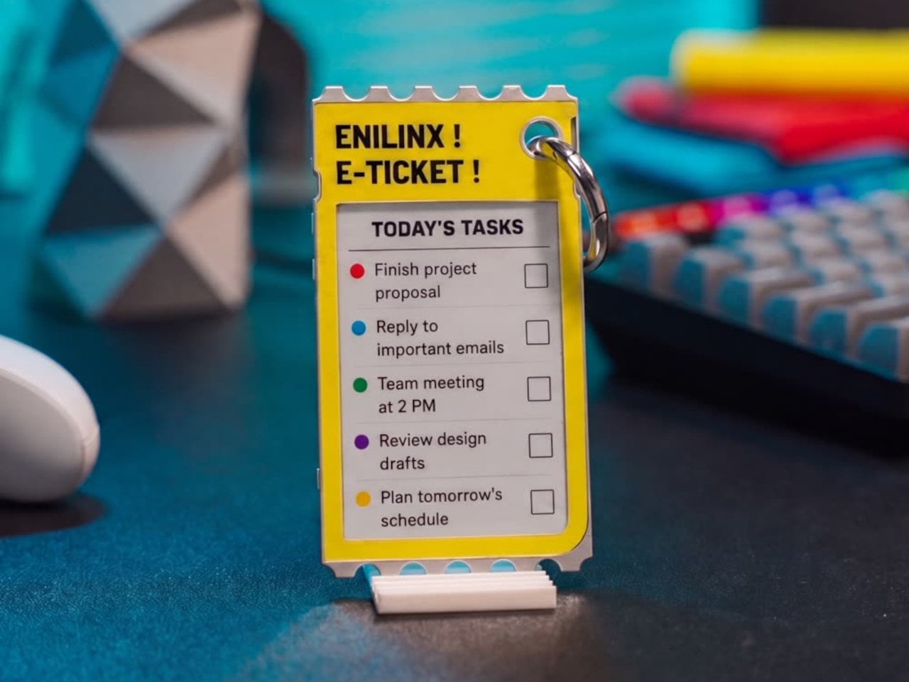
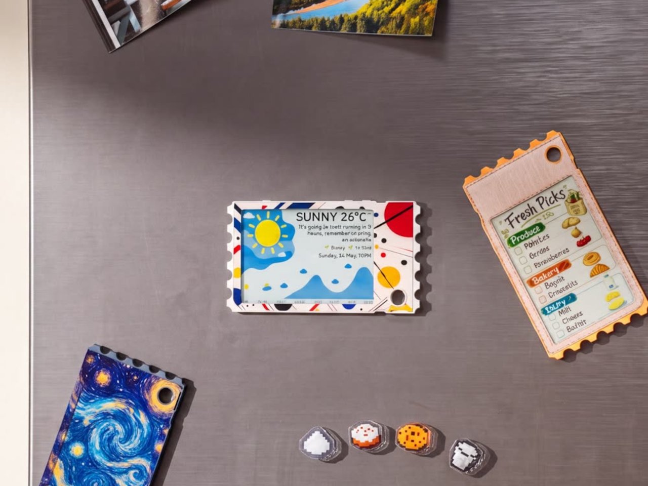
Clip it to a backpack strap before a conference, and it becomes a badge showing a name, a QR code, or contact details, updated the moment plans change instead of printed once and stuck for the day. Set it on a desk, and the same hardware turns into rotating art, swapped whenever the mood calls for something new. A magnet on the back means it holds onto a fridge door just as easily as a bag.

The 45g weight matters more than it sounds on paper, since anything heavier turns a clip-on badge into something that tugs at fabric or slides out of place by midday. Aluminum gives the shell enough rigidity to survive being tossed into a bag alongside keys and a water bottle, while staying thin enough to disappear against a jacket lapel or a laptop sleeve without adding visible bulk.

None of this asks for constant power once an image is set, since e-paper only draws current while actually changing what’s displayed. A finished screen sits there fully visible in direct sunlight, legible without a backlight fighting glare, and idle without draining a battery meant to last through a full day of moving between contexts. That’s the quiet advantage e-paper has always held over LCD, now paired with color depth that used to be out of reach.

TICKEY deliberately skips video and animation, treating that restriction as a feature rather than a compromise. A static image asks less of your attention than a screen that never stops moving, sitting calm on a bag strap or a windowsill until someone chooses to change it. Photos, event badges, or a fridge note showing today’s grocery list all fit that same quiet template, an object built to be looked at rather than constantly checked.

The post This Color E-Paper Clip Is the Polaroid That Digital Photos Never Had first appeared on Yanko Design.
  •  

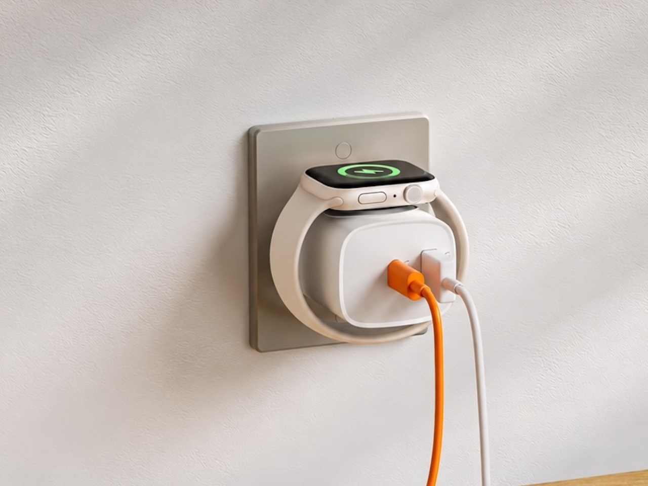
This $21 Charger Powers Your iPhone, Apple Watch, and AirPods at Once

Most of us have two or more gadgets that need constant charging, plus several chargers and cables to keep them all juiced up. That’s probably fine if you have an entire outlet strip at home or in the office, but when you’re working with a small space, or you’re traveling and on the go, it can be a real challenge to charge multiple devices at once. You end up with a tangle of cords and charging heads, or sometimes you even have to take turns charging your gadgets.

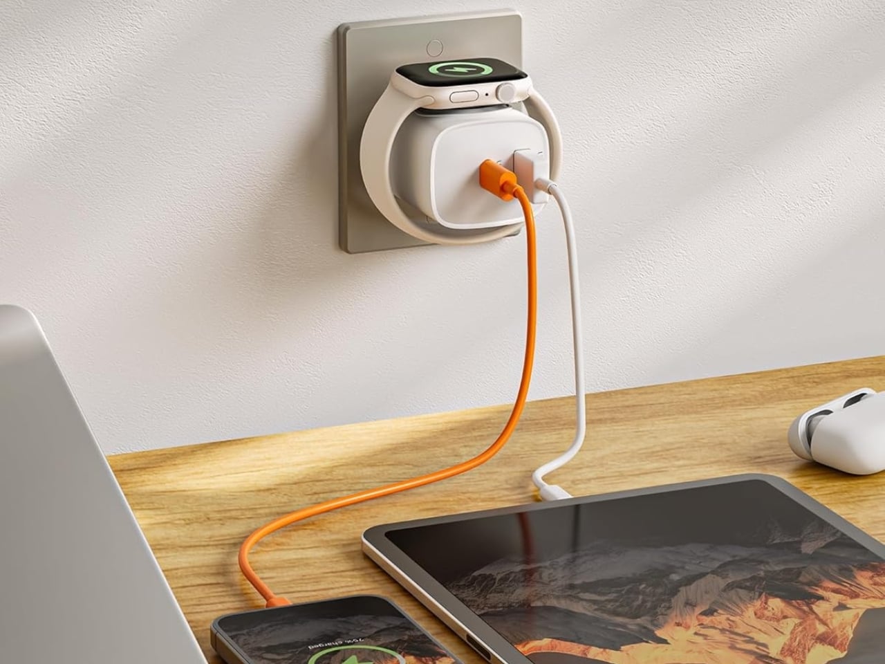
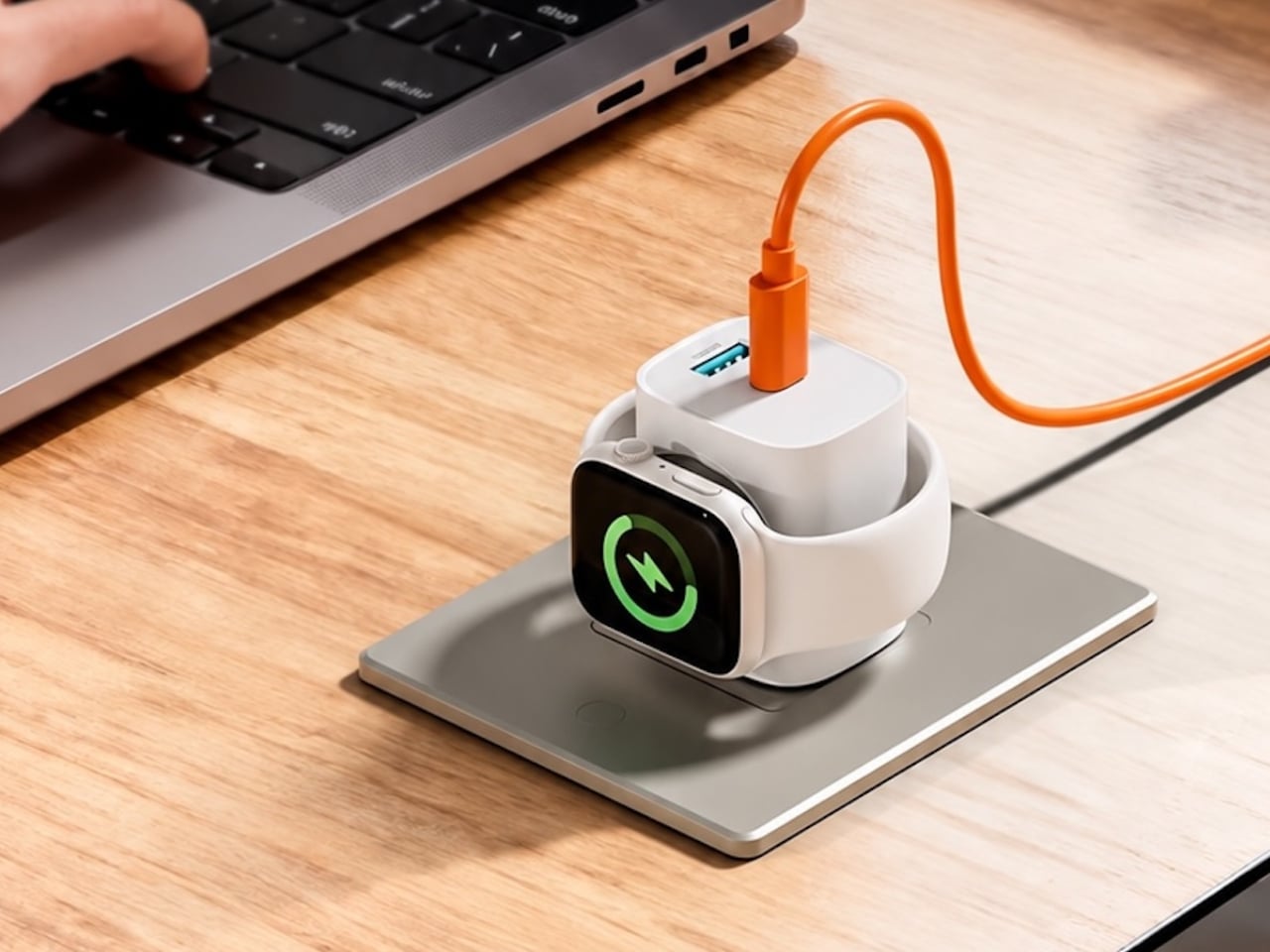
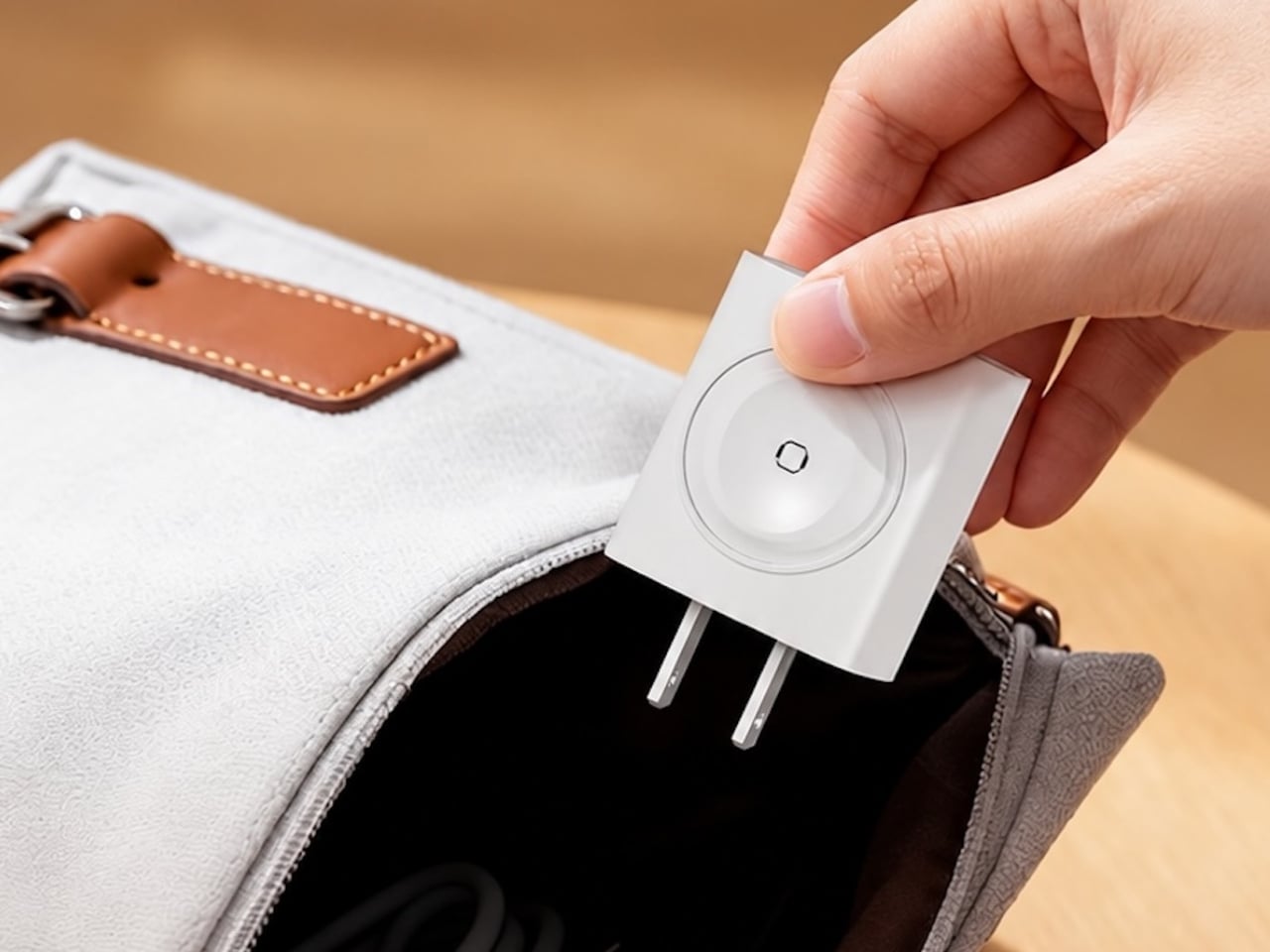
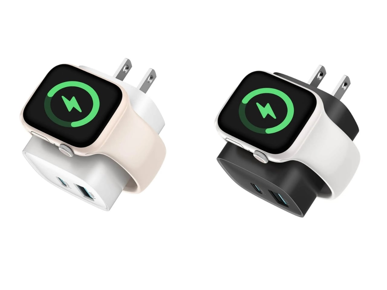
If you mostly own Apple devices or other USB-C-powered gear, the TESSAN 3-in-1 USB-C Charger may actually solve that problem for you. It’s a compact wall charger with a USB-C port, a USB-A port, and a built-in magnetic Apple Watch dock, so you only need one outlet to power up three devices at the same time.

Designer: TESSAN

This 3-in-1 charger is especially handy when you only have one outlet available but need to power up three different devices. A few years ago, this wouldn’t have been much of an issue, since most of us only had one phone to worry about. But now that owning multiple devices is the norm, charging has become an everyday hassle. What do you do when you’ve got a phone, a pair of AirPods, and a smartwatch that all need power at the same time?

TESSAN’s charger features fast charging through its 20W USB-C port, so you can get a device like the iPhone 15 up to 55 percent battery in just 30 minutes. At the same time, its 18W USB-A port can juice up an accessory simultaneously while your main device charges. It also offers broad compatibility, working with everything from the latest iPhone models to AirPods and other USB-powered devices. The real star of the show, though, is the built-in magnetic charger for your Apple Watch. There’s no separate puck or cable needed here. Instead, you get a self-aligning dock, so you won’t have to fuss with positioning your watch every time you need to charge it.

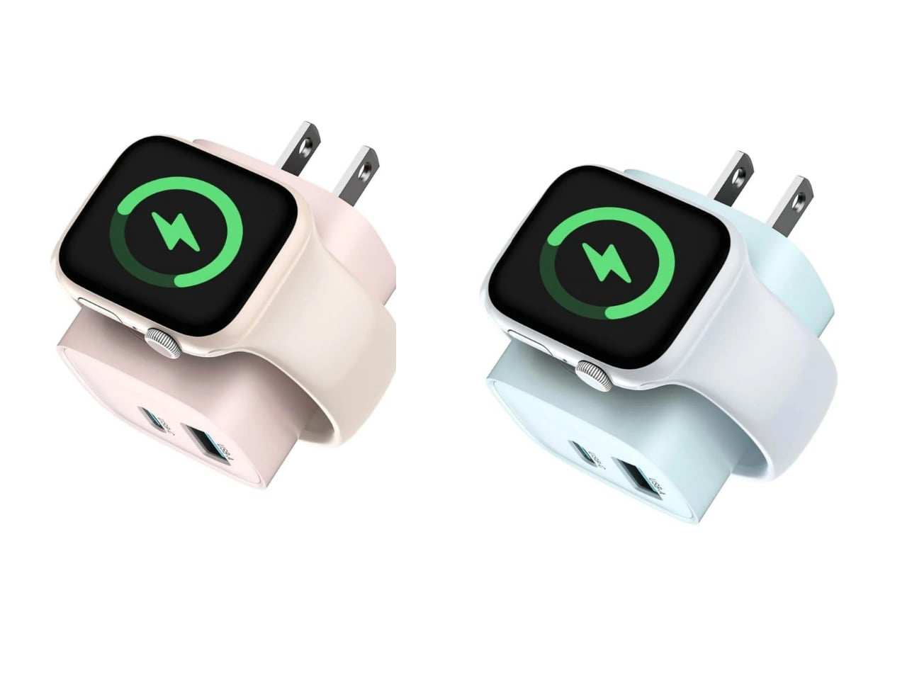
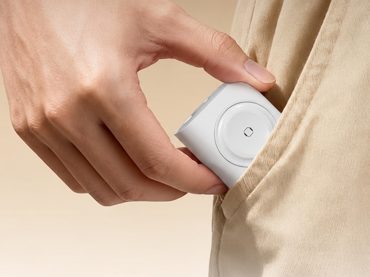
The charger comes in four finishes (white, black, pink, and blue) and is clearly designed to double as a small desk-aesthetic item, though it will likely still read as “just a charger” to most people, especially in the white colorway. Where it really shines is portability: it’s a travel-friendly device you can toss in a bag without a second thought, instead of hauling around three separate chargers that eat up space and weight in your carry-on.

How does it stack up against the competition? The most obvious comparison is Belkin, whose 3-in-1 MagSafe charging stands are the gold standard in this category. Belkin’s BoostCharge Pro and UltraCharge Pro docks charge an iPhone, Apple Watch, and AirPods wirelessly and look considerably more premium sitting on a nightstand, but they also run anywhere from $95 to $150 and require more desk real estate. TESSAN’s charger, at $20.99, skips the wireless charging bells and whistles in favor of a compact, plug-in design that’s built more for function and travel than for a styled bedside setup. If you want a showpiece charging stand for your living room, Belkin is still hard to beat. But if you want something inexpensive, pocketable, and fast enough to get you out the door in the morning, TESSAN makes a compelling case for itself as the budget-friendly, travel-first alternative.

At the end of the day, this isn’t a charger trying to be a lifestyle centerpiece. It’s a charger trying to solve a genuinely annoying, everyday problem: too many devices, not enough outlets, and not enough patience to wait in line for your turn at the power strip. For $20.99, the TESSAN 3-in-1 USB-C Charger delivers fast charging, broad compatibility, and a clever built-in Apple Watch dock in a package small enough to disappear into a laptop bag or a nightstand drawer. It won’t turn heads the way a sleek charging stand might, but it will quietly keep your phone, watch, and earbuds powered up without the usual cord chaos. For anyone juggling multiple Apple devices on a daily basis, or packing for a trip and dreading the tangle of cables, this little charger earns its spot on the “actually useful” list.

The post This $21 Charger Powers Your iPhone, Apple Watch, and AirPods at Once first appeared on Yanko Design.

  •  

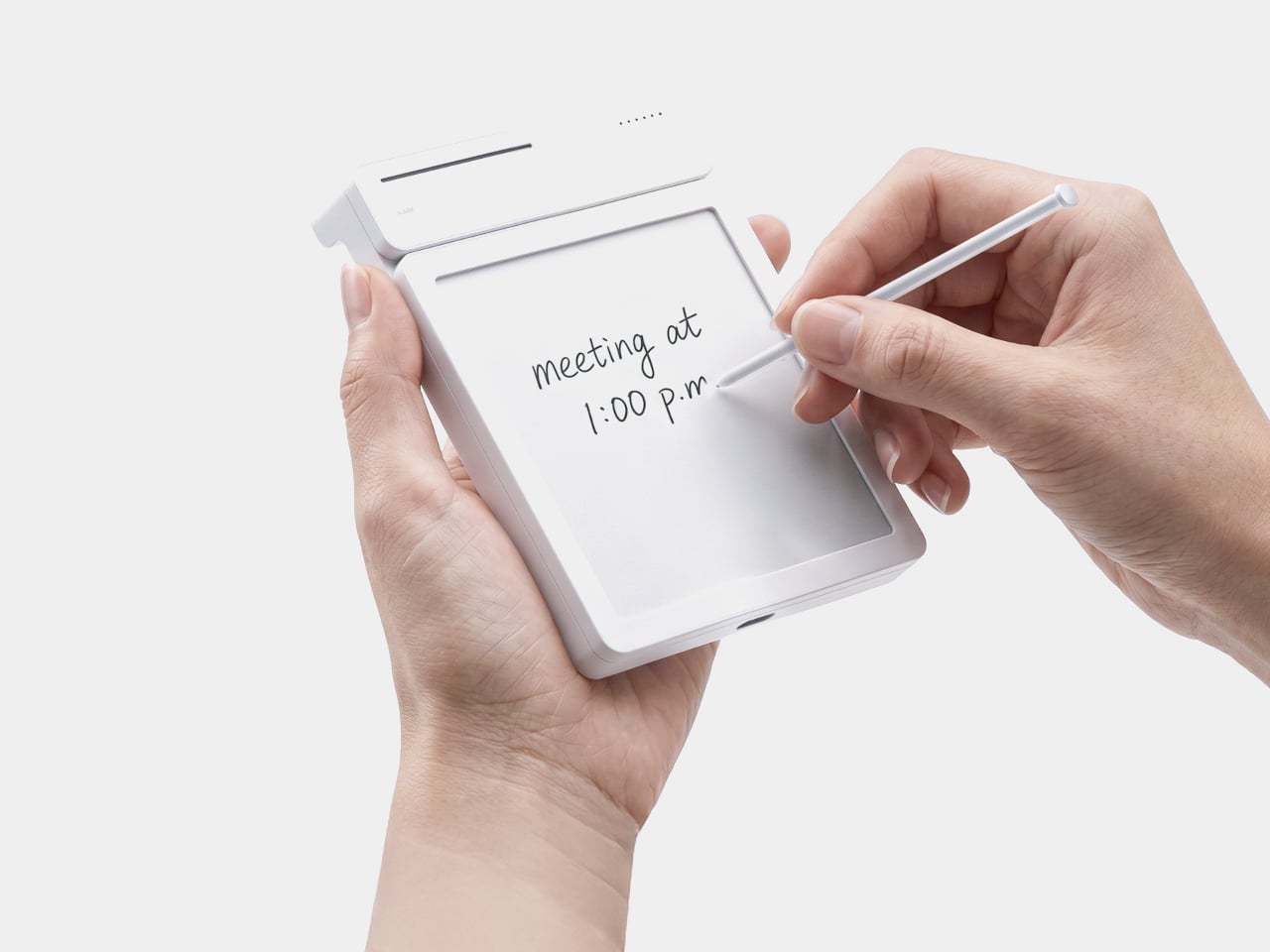
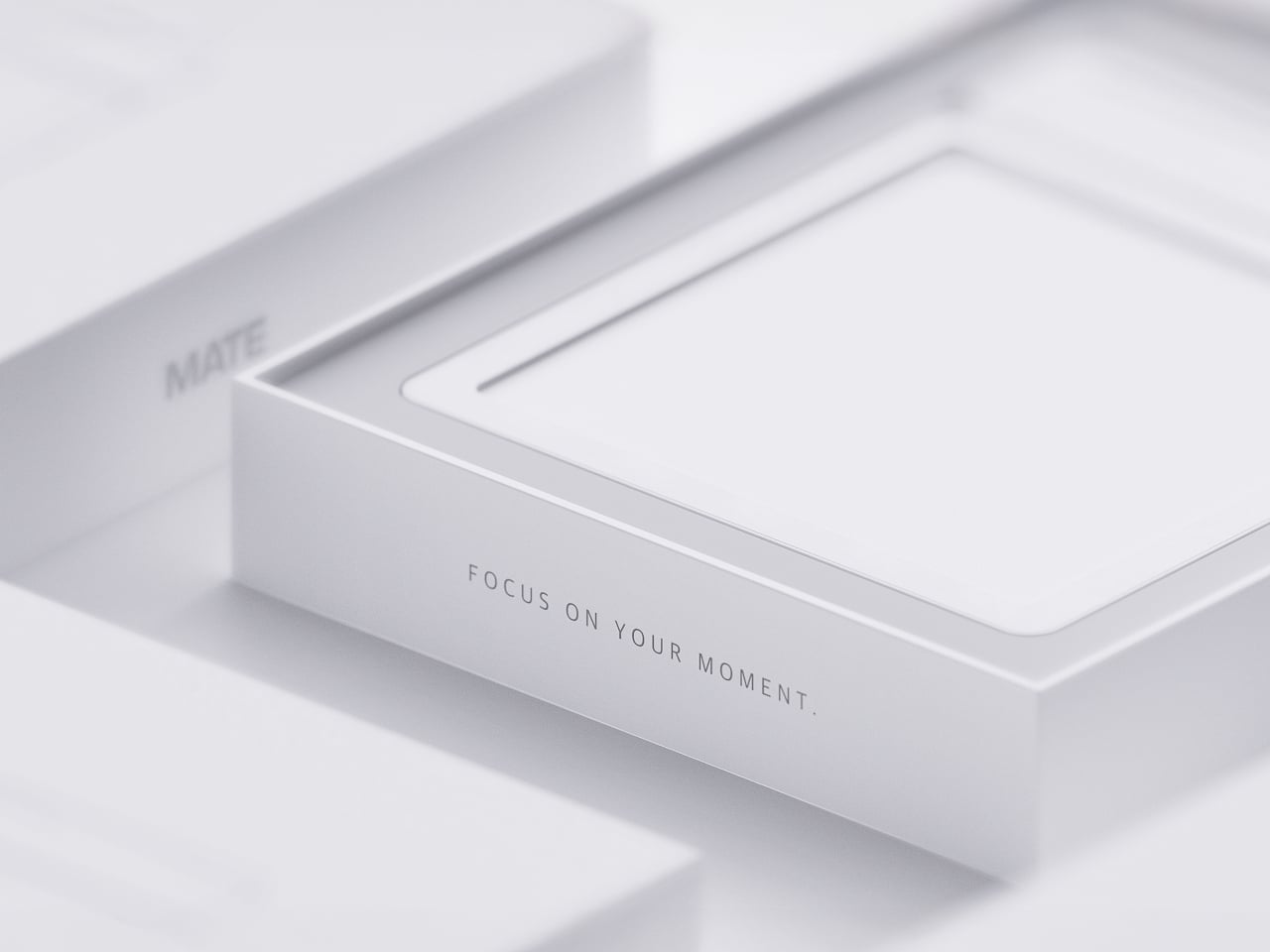
MATE Works Like a Sticky Note That Sets Its Own Alarm When You Write

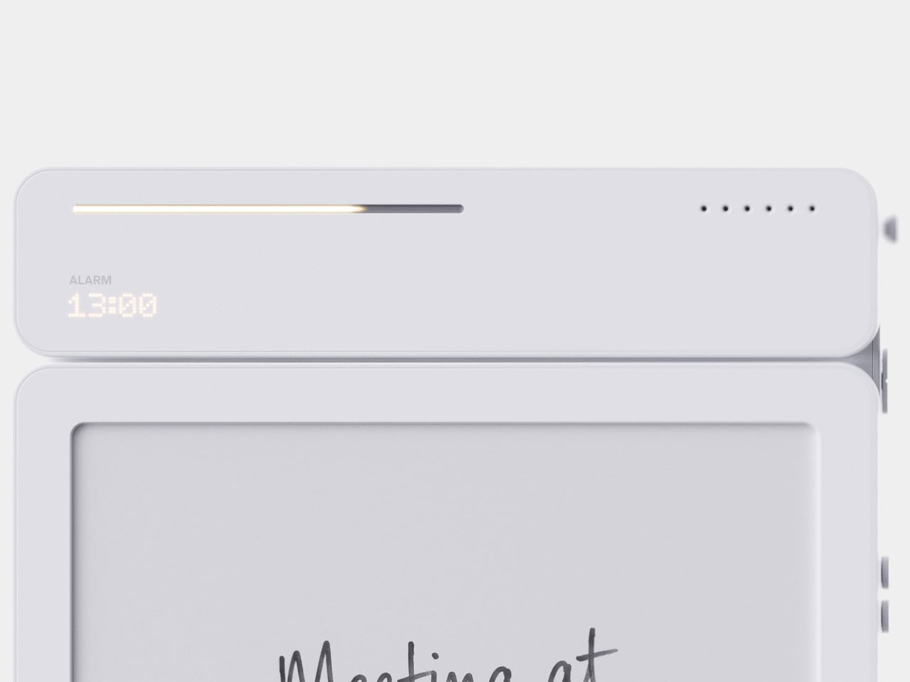
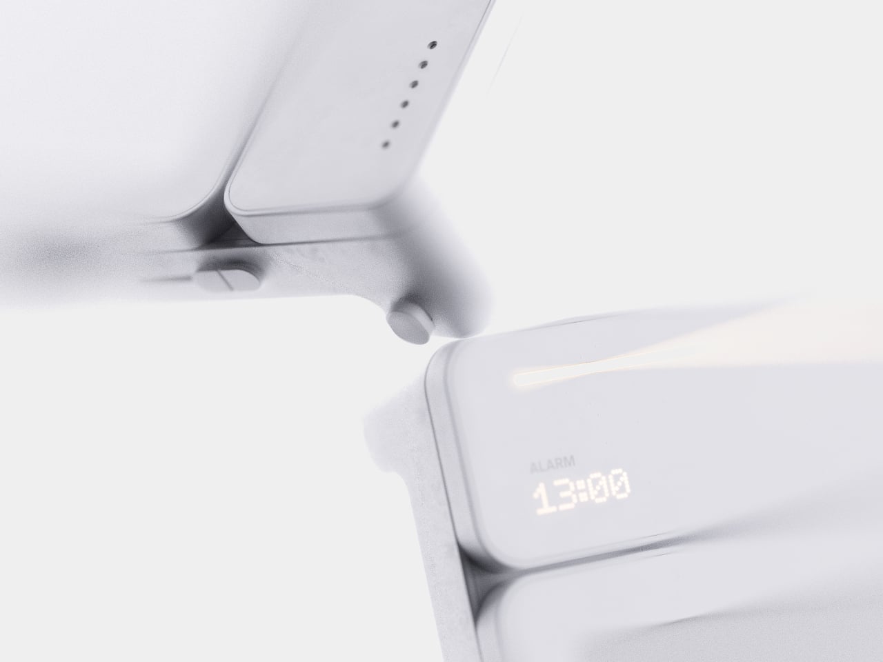
Setting a reminder on a phone means unlocking a screen, opening an app, and typing on a keyboard, three steps that break whatever train of thought led to needing the reminder in the first place. MATE skips all of that by reading your own handwriting instead. Write “meeting at 1:00 p.m.” on its E-ink panel with the built-in pen, and the device sets the alarm itself, no app, no unlocking, no menu to dig through.

That handwriting recognition is the entire premise, and it works because the device treats a note and a task as the same object rather than two separate steps. The moment it detects a time written into the text, it quietly converts that scribble into a scheduled alert running in the background. Nothing about the note’s appearance changes. It still just looks like something you jotted down on paper.

Designer: Geonwoo Kang

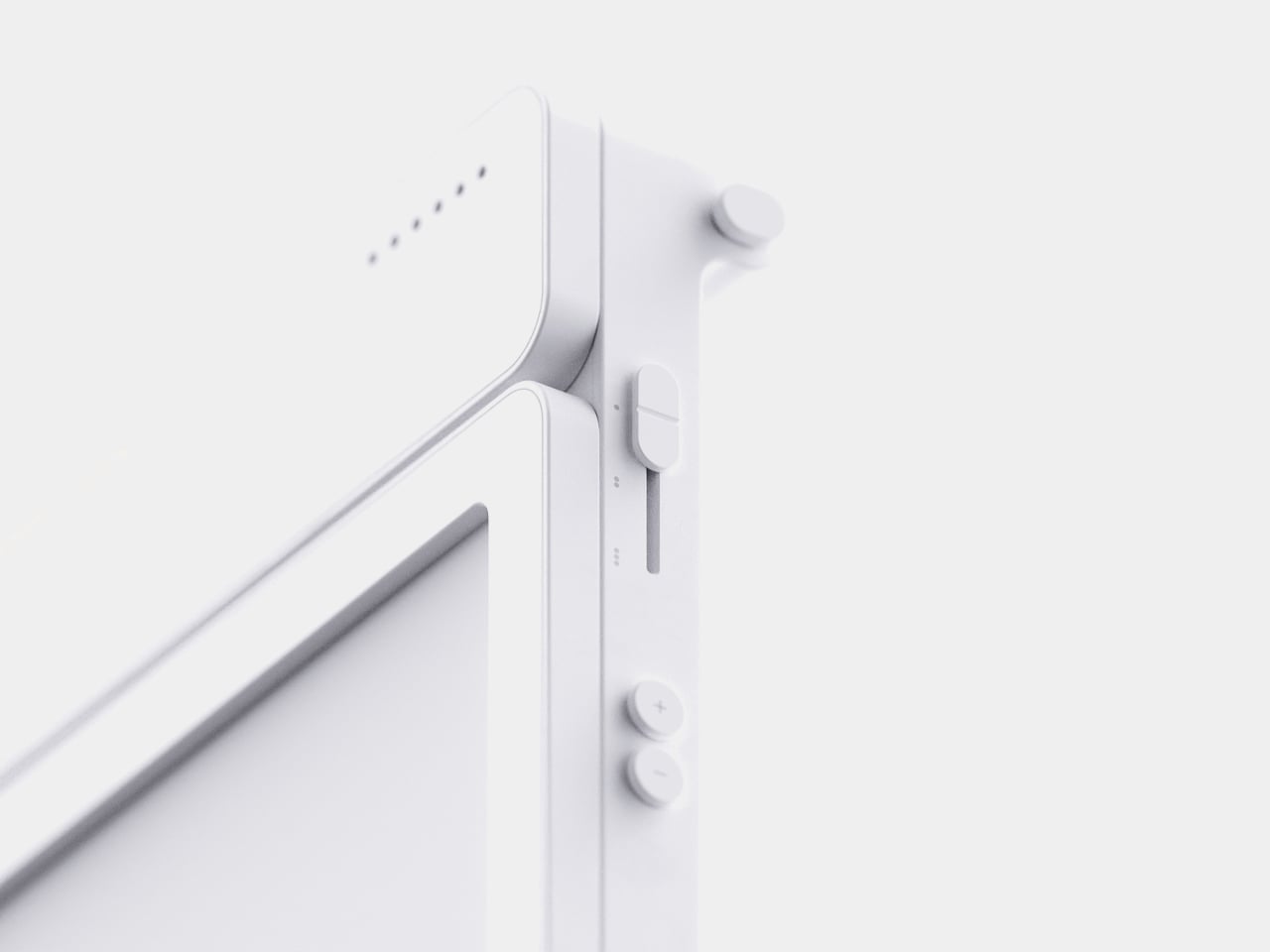
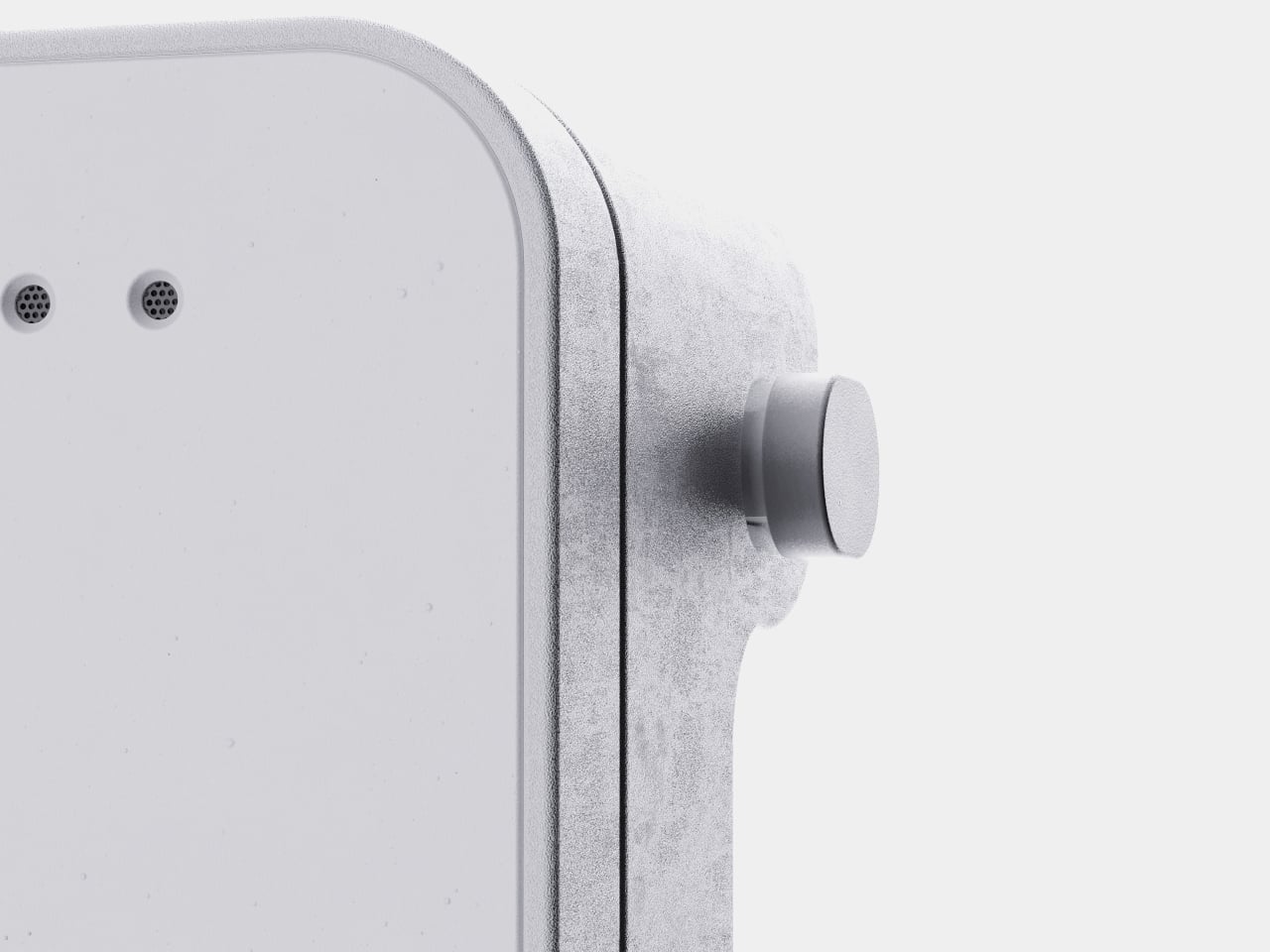
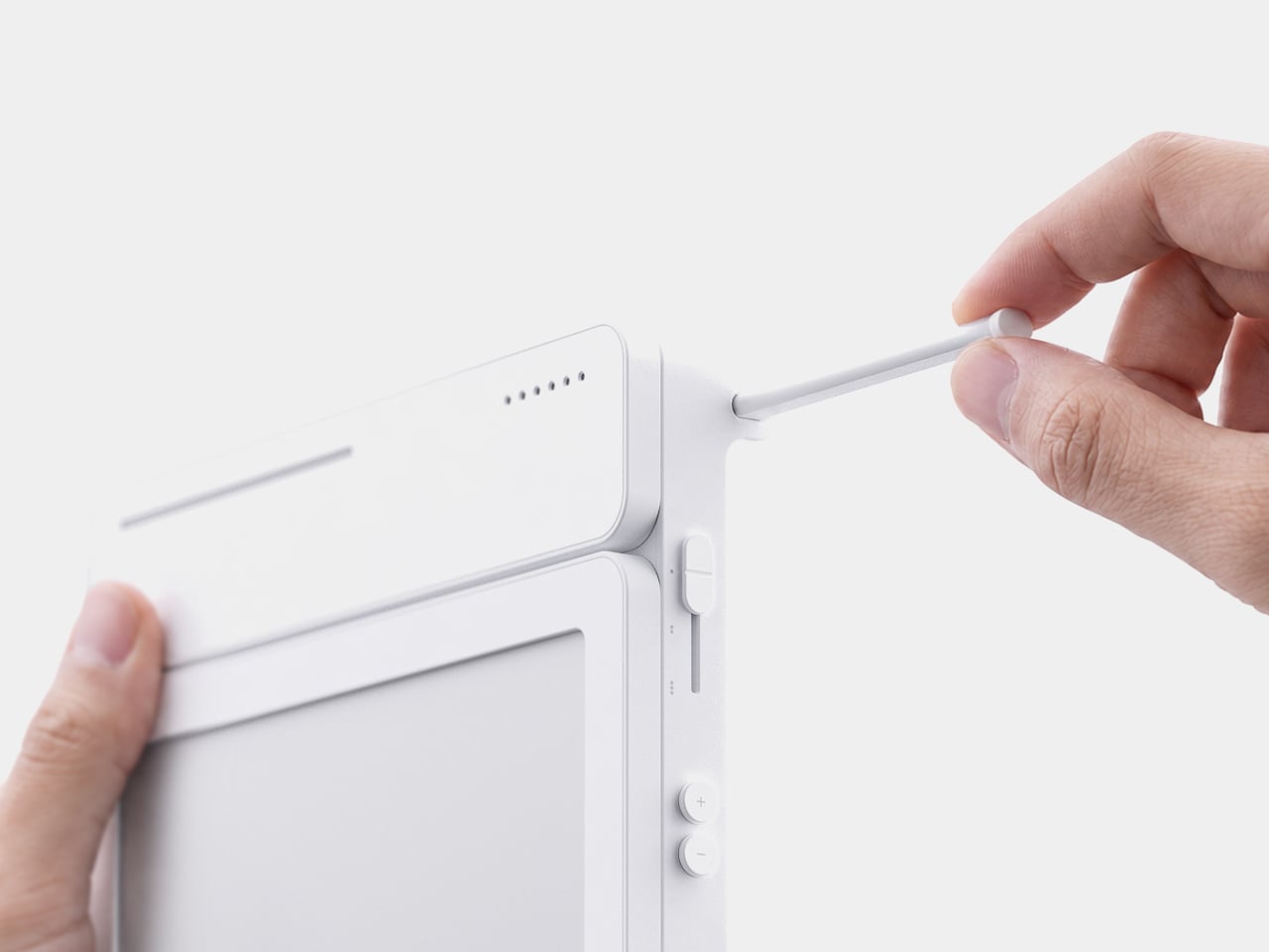
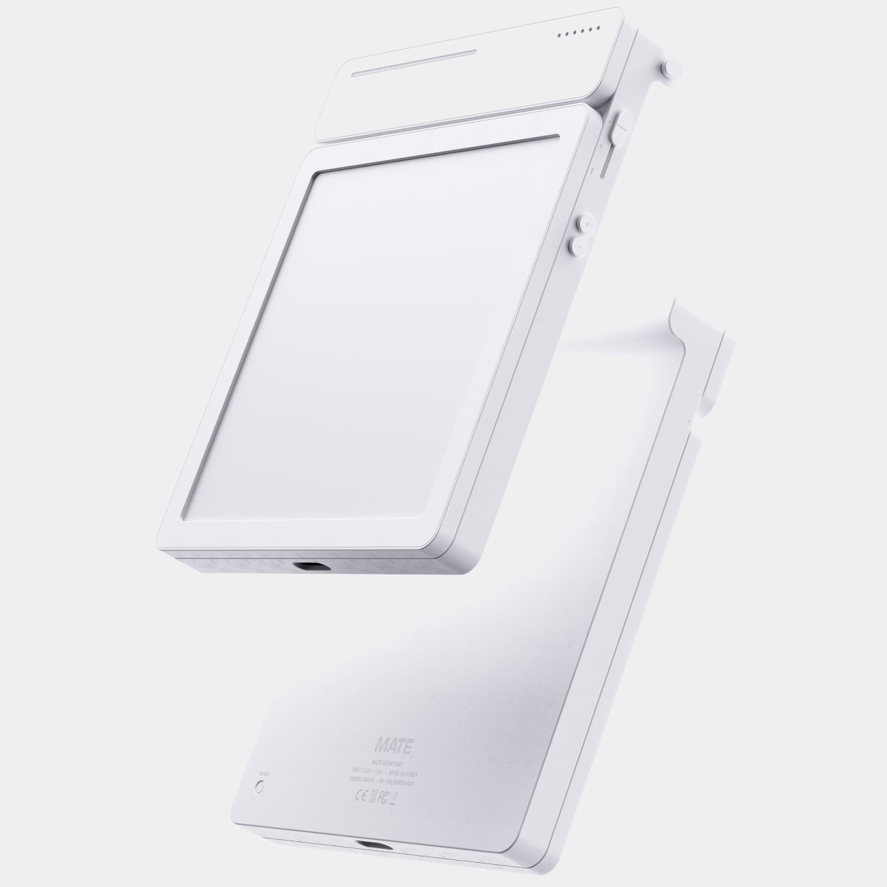
A thin LED bar along the top edge handles the countdown, giving a glance-able sense of how much time remains without requiring a full screen wake or a swipe through settings. When the set time actually arrives, the alarm sounds and stops the instant you tap the panel, keeping the entire alert cycle contained to the same physical surface where the note was written in the first place.

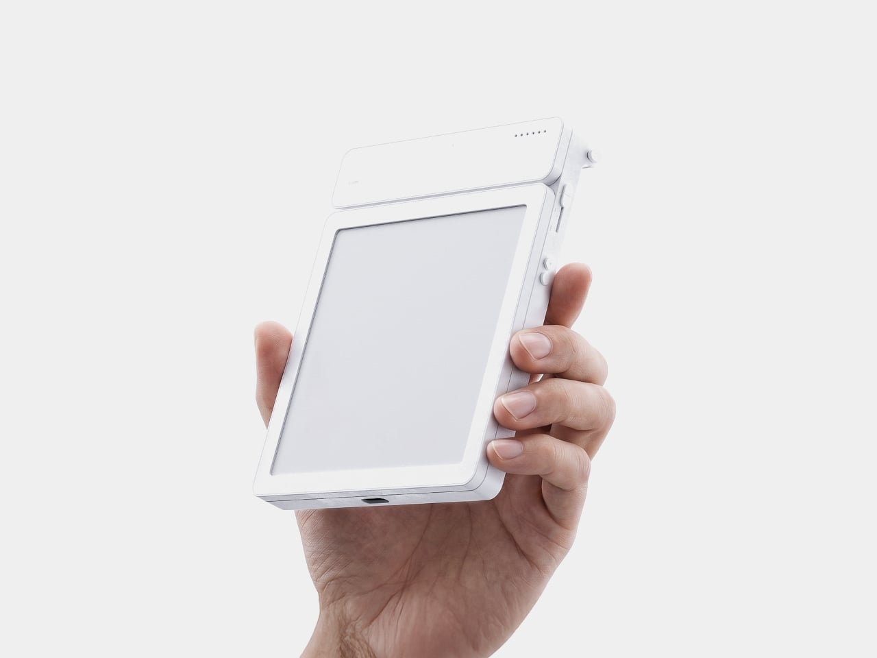
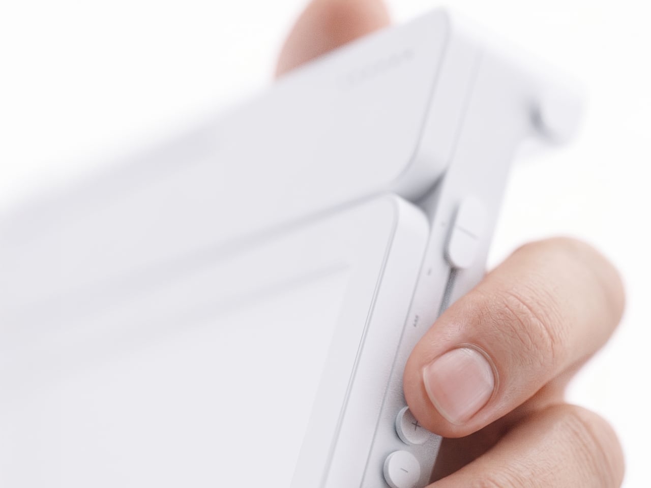
Because handwritten notes pile up fast, MATE handles multiple pages through a three-stage physical slider running down one side, letting you flip between up to three saved notes with a flick of a finger. That’s a deliberately low-tech solution to a problem most gadgets solve with a touchscreen menu, and it works specifically because a slider takes zero attention to operate correctly on the first try.

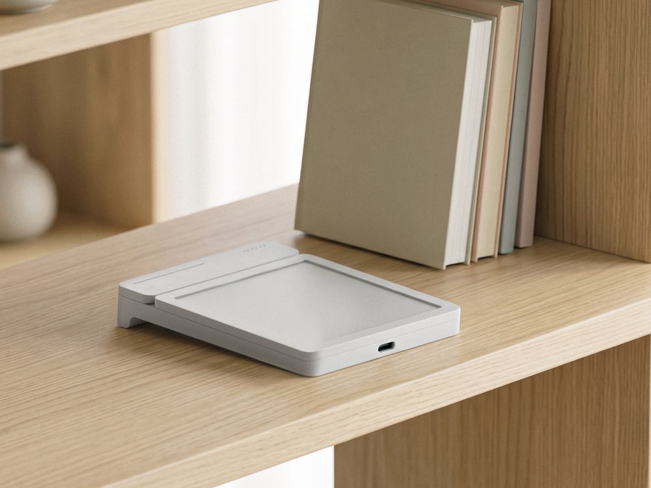
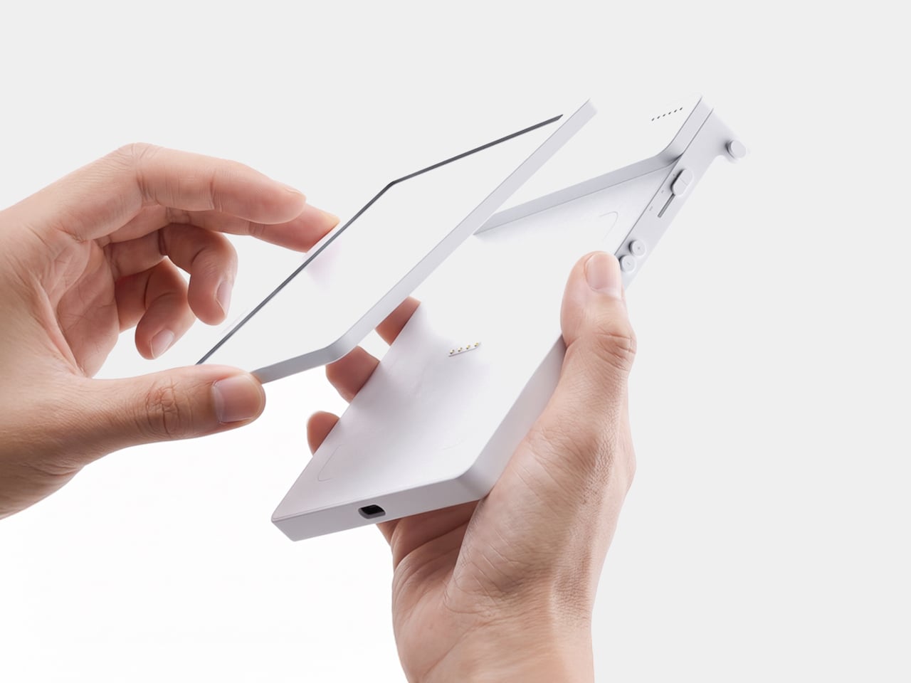
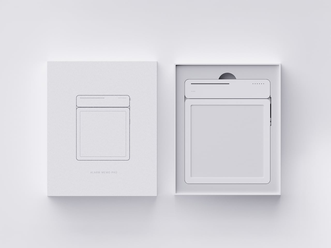
The memo pad itself doesn’t have to stay locked into the main body either. It detaches from its dock and relies on built-in magnets to stick onto a partition wall or a metal filing cabinet, turning a handheld notepad into a fixed reminder posted wherever it’s actually needed. A grocery list stuck to a fridge door works the same way a sticky note always has, just with an alarm quietly running underneath it.

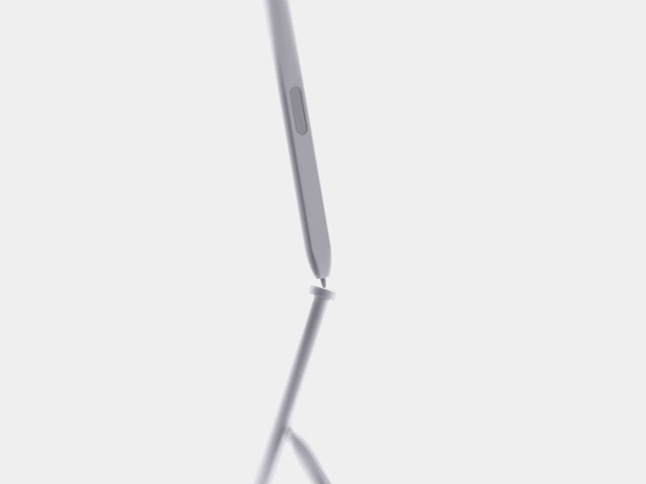
Even the pen gets a small, deliberate design decision most styluses skip. It nests into a groove at the top of the device rather than rattling around loose in a bag or a drawer, solving the single most common complaint about any stylus-based gadget: losing the one piece that makes the whole thing work. Reaching for a note and finding the pen missing defeats the entire point of a device built around spontaneous handwriting.

None of MATE’s individual pieces, the E-ink panel, the physical slider, the magnetic pad, would stand out much alone. Put together, they describe a specific kind of object: something meant to sit on a desk quietly doing one job well, catching a thought before it disappears and holding onto it until the moment it’s actually needed.

The post MATE Works Like a Sticky Note That Sets Its Own Alarm When You Write first appeared on Yanko Design.

  •  

The Wooden Box That Refuses to Let Your Phone Win

I’ve tried every trick to get my phone to leave me alone. Do Not Disturb. Grayscale mode. Leaving it in another room, which mostly just means I walk to the other room every twenty minutes to check on it. None of it works for long, because the problem was never the settings. The problem is that the phone is still there, still glowing, still capable of buzzing the second I let my guard down. Willpower is a terrible security system, and every app-based fix is still just asking me to trust myself, which is exactly the thing I can’t do at nine at night with a bag of chips in one hand.

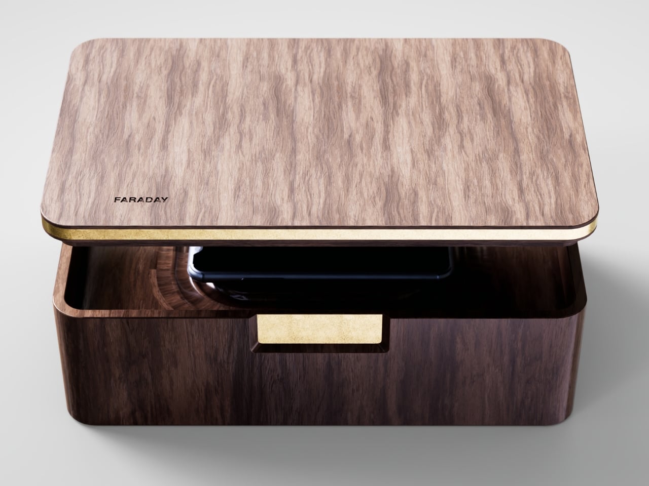
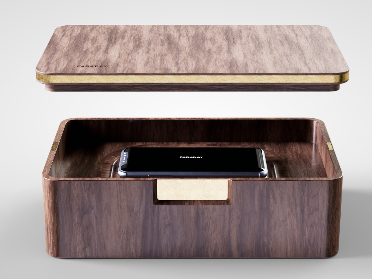
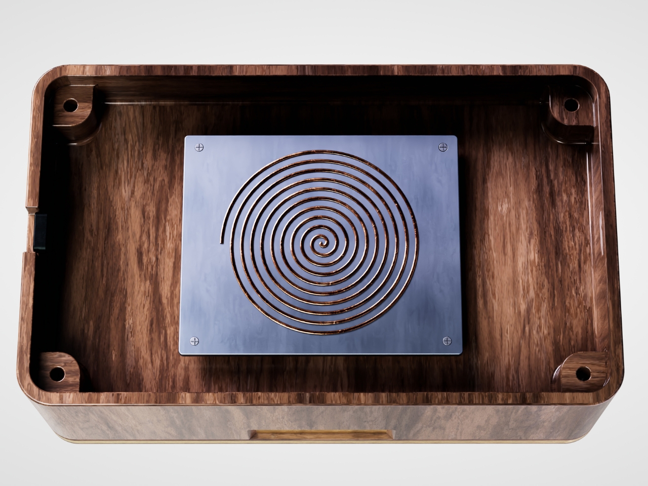
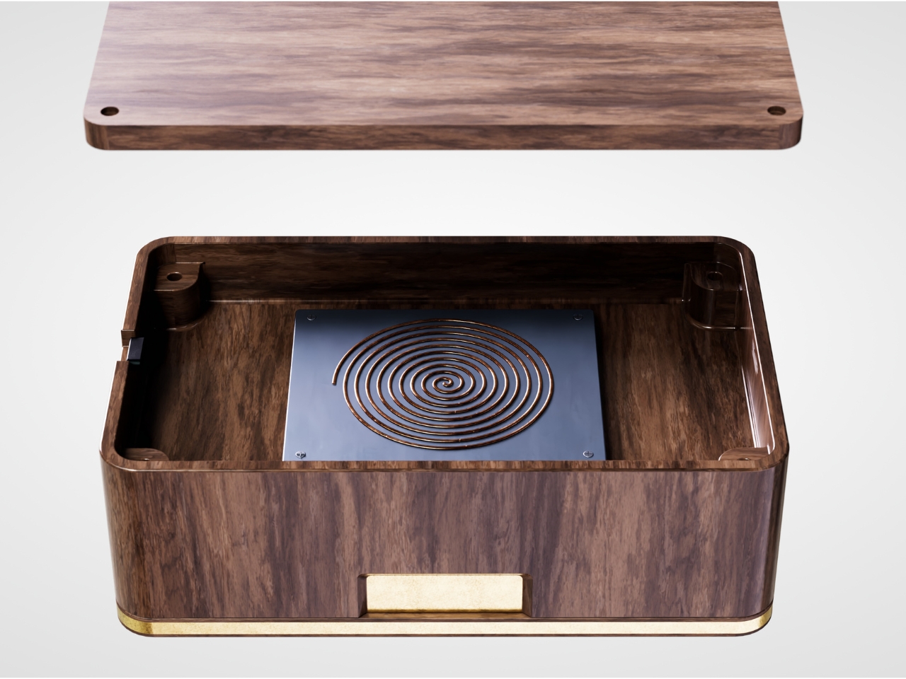
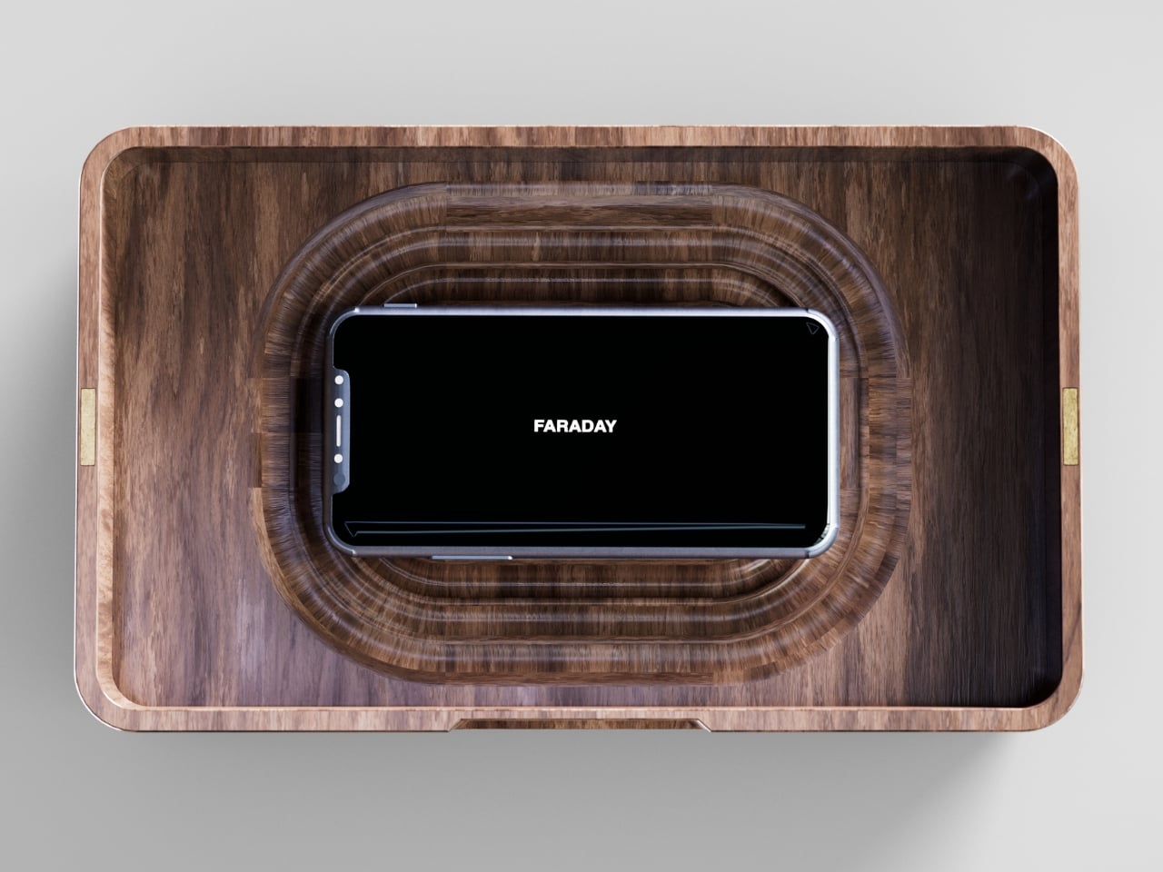
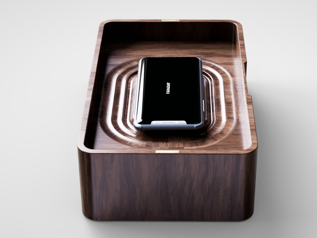
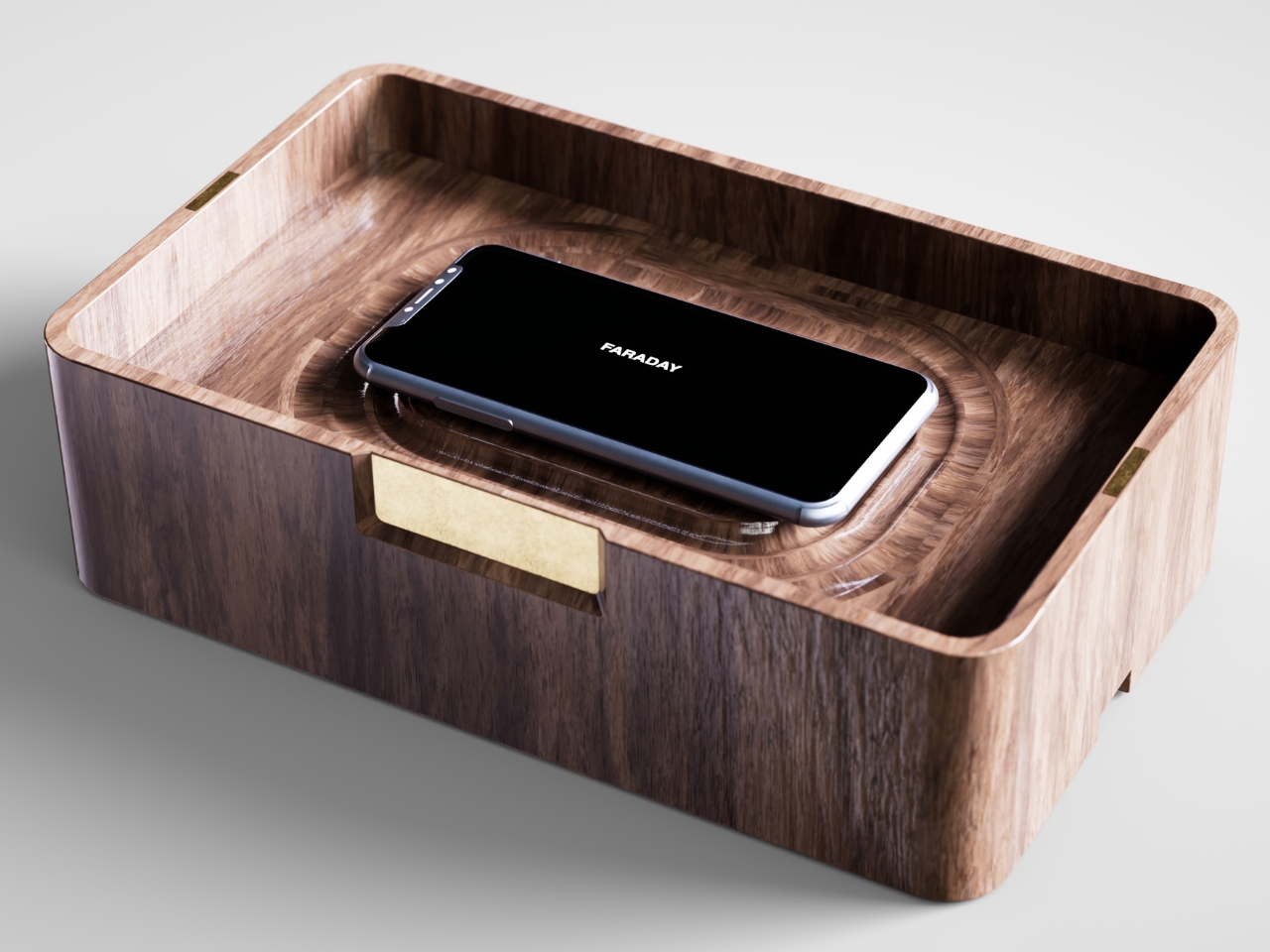
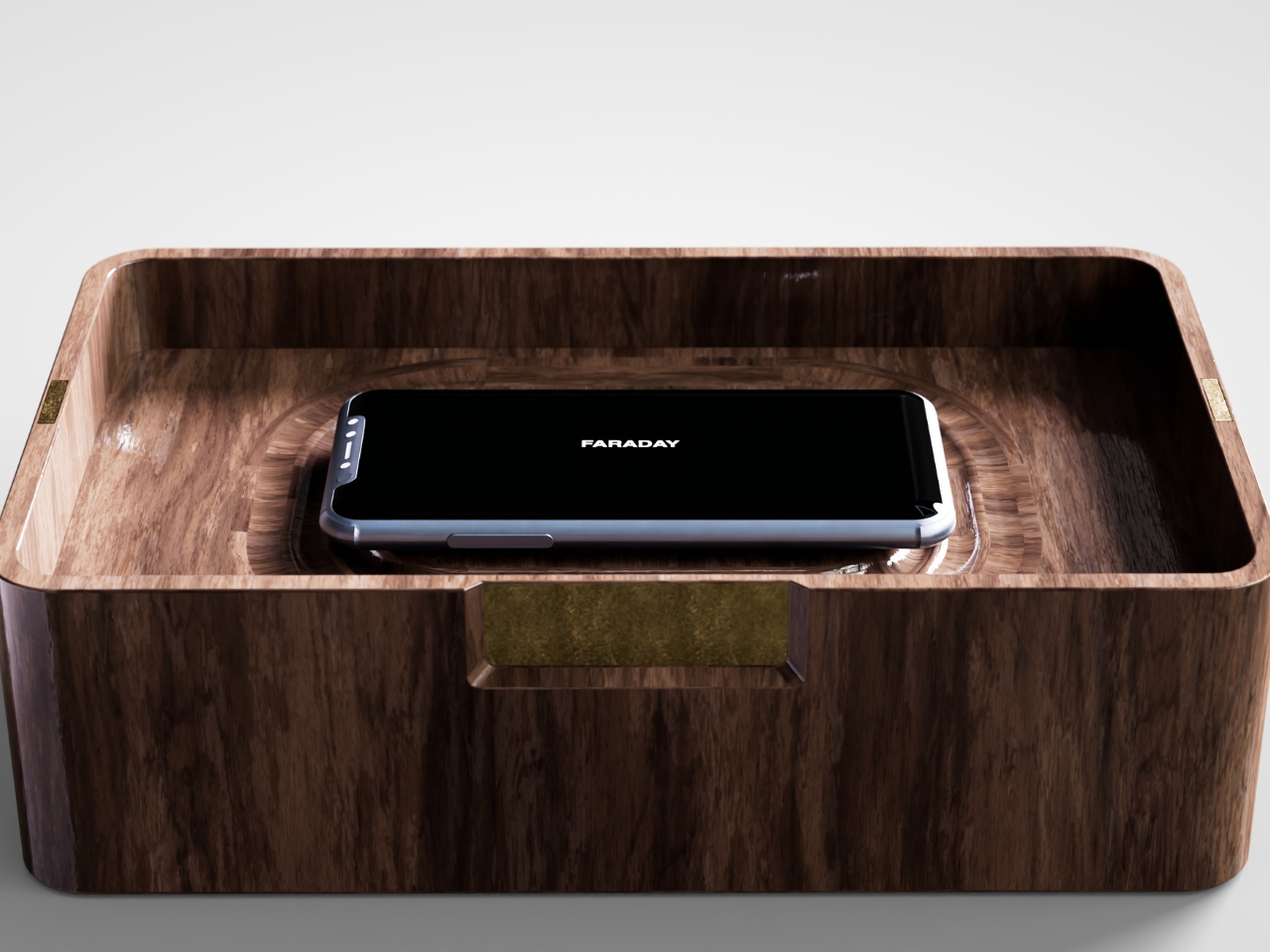
That’s the gap French industrial designer Pascal Grangier is quietly working in with FARADAY, a home object that doesn’t ask you to resist your phone. It makes resistance unnecessary. Named after the 19th-century scientist whose cage design blocks electromagnetic fields, the piece works on the same basic physics: once your phone is inside, it has no signal at all. No calls sneak through, no texts land, no app can light up your lock screen and drag your eyes back to it. You’re not disconnecting through discipline. You’re disconnecting through geometry.

Designer: Pascal Grangier

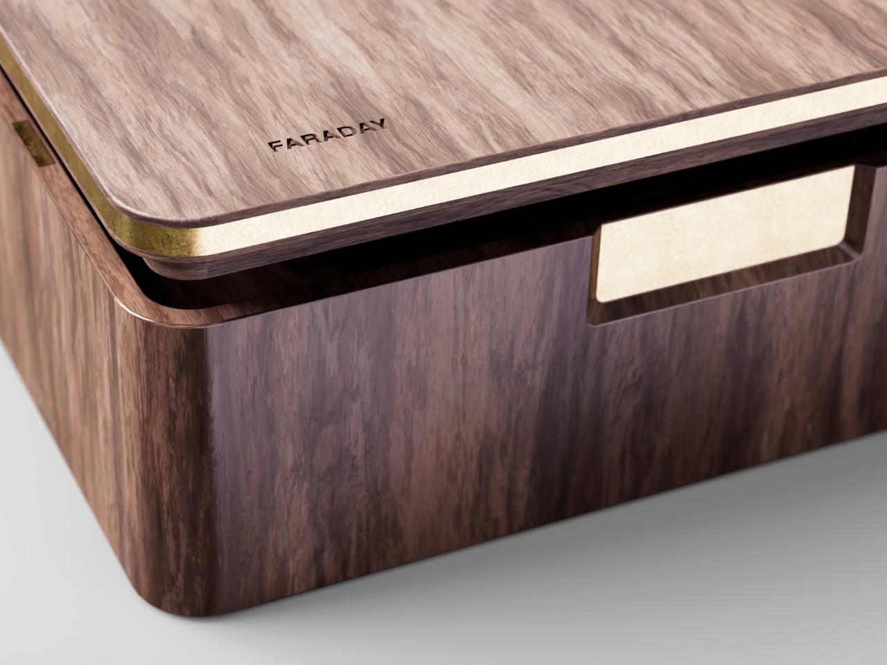
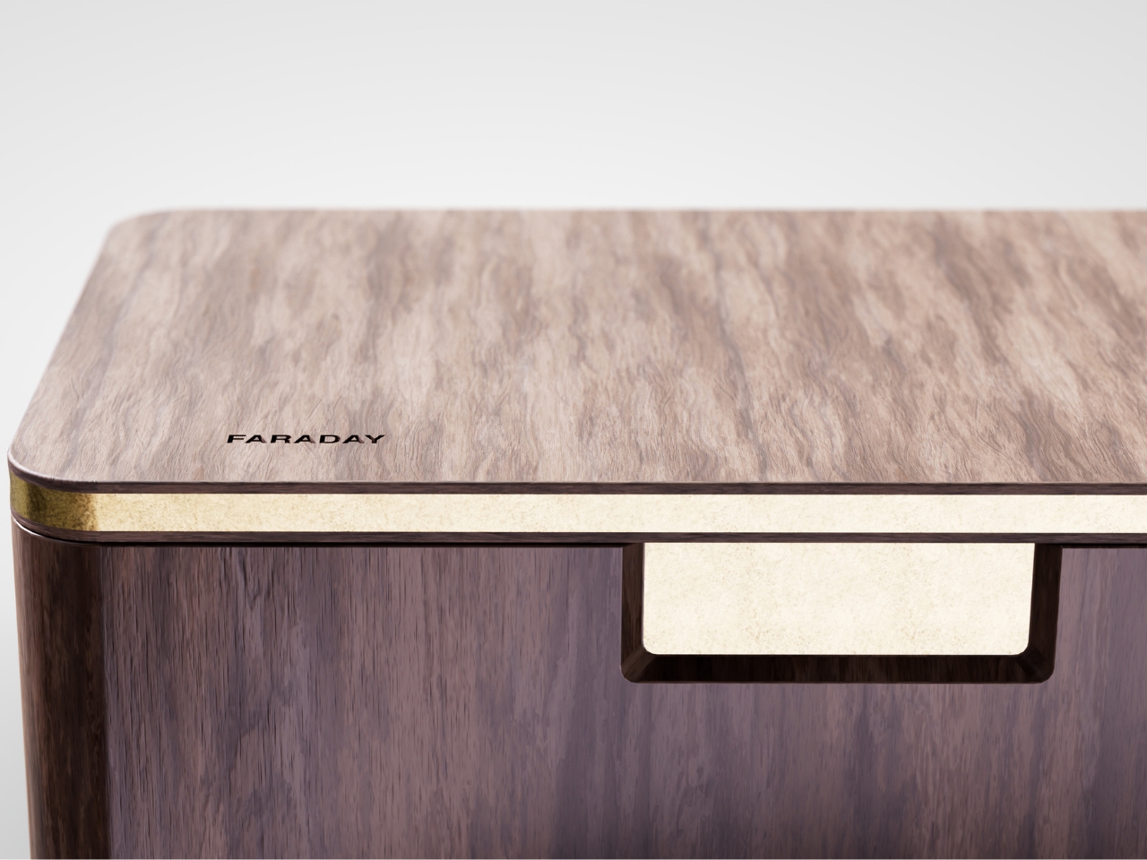
What makes this more than a novelty is the shape it comes in. Most signal-blocking products look like they were built for a hardware store, not a living room. Faraday pouches for concerts and courtrooms are floppy nylon sleeves you’d never leave out on a counter. Grangier’s version is carved from wood, with the kind of soft, rounded form you’d expect from a well-made bowl or a piece of studio furniture. It’s designed to sit on a nightstand or a kitchen counter without looking like a confession that you have a phone problem. That distinction matters more than it sounds like it should. An object you’re proud to display gets used. An object you’re embarrassed by gets shoved in a drawer and forgotten by the second week.

I think a lot about why boxes like this are showing up now, and it’s not really about phones getting worse. It’s about people finally admitting that the “just put it on silent” advice never addressed the actual craving, which is the urge to check, not the urge to hear. Silent mode still lets the dopamine loop run in the background of your brain, because you know the notifications are piling up somewhere, waiting. A Faraday enclosure removes the pile entirely. There’s nothing accumulating on the other side of that lid, so there’s nothing to be curious about later.

I don’t think objects like FARADAY are anti-technology, and I’d push back a little on anyone who frames it that way. It’s closer to how we treat food we know we’ll overeat if it’s sitting on the counter. Nobody calls it deprivation to put the cookies in a cabinet instead of banning sugar from the house. A wooden box that mutes a phone for the length of a dinner, or a weekend, or a first date, isn’t rejecting the smartphone era. It’s setting a boundary the same way a lock on a liquor cabinet does, respectfully and without lecturing anyone.

The dinner table is probably where this thing earns its keep fastest. Phone stacking, where everyone tosses their device into a pile and the first person to grab theirs pays the check, has become a real ritual at restaurants precisely because people know they need external enforcement. FARADAY takes that same instinct and gives it a permanent home, no penalty games required, no honor system to break.

Whether a hand-carved signal blocker becomes a fixture in American homes the way candles or diffusers did, I couldn’t tell you yet. But the appetite is obviously there. We keep buying productivity apps, screen time trackers, even flip phones marketed as luxury items, all chasing the same outcome Grangier reached with a block of wood and a basic law of physics. Sometimes the smartest tech solution is the one that refuses to be technology at all.

The post The Wooden Box That Refuses to Let Your Phone Win first appeared on Yanko Design.
  •  

Razer’s New Gaming Keypad Puts 31 Customizable Controls Right Under Your Hand

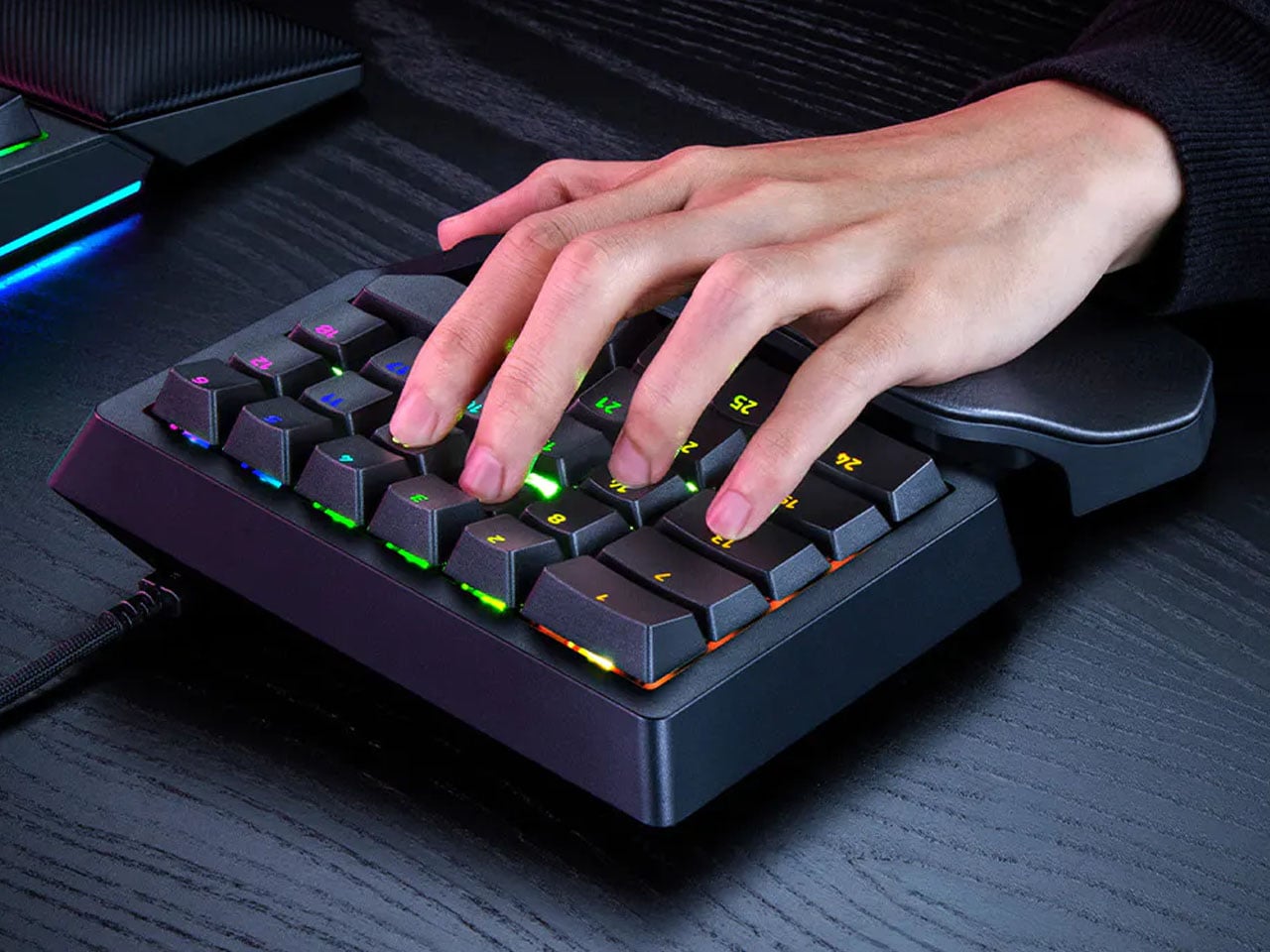
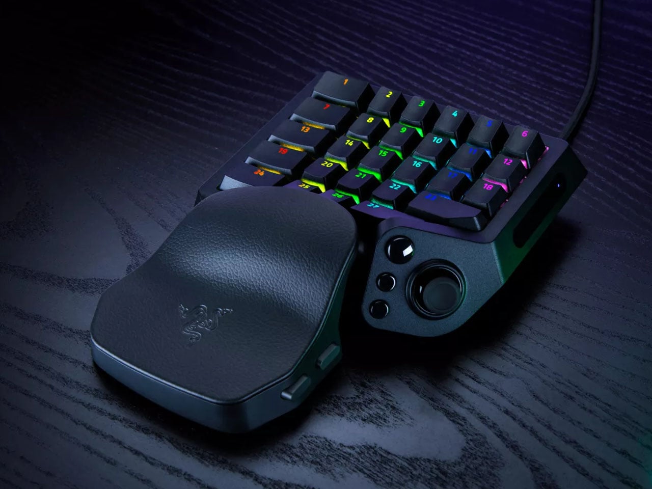
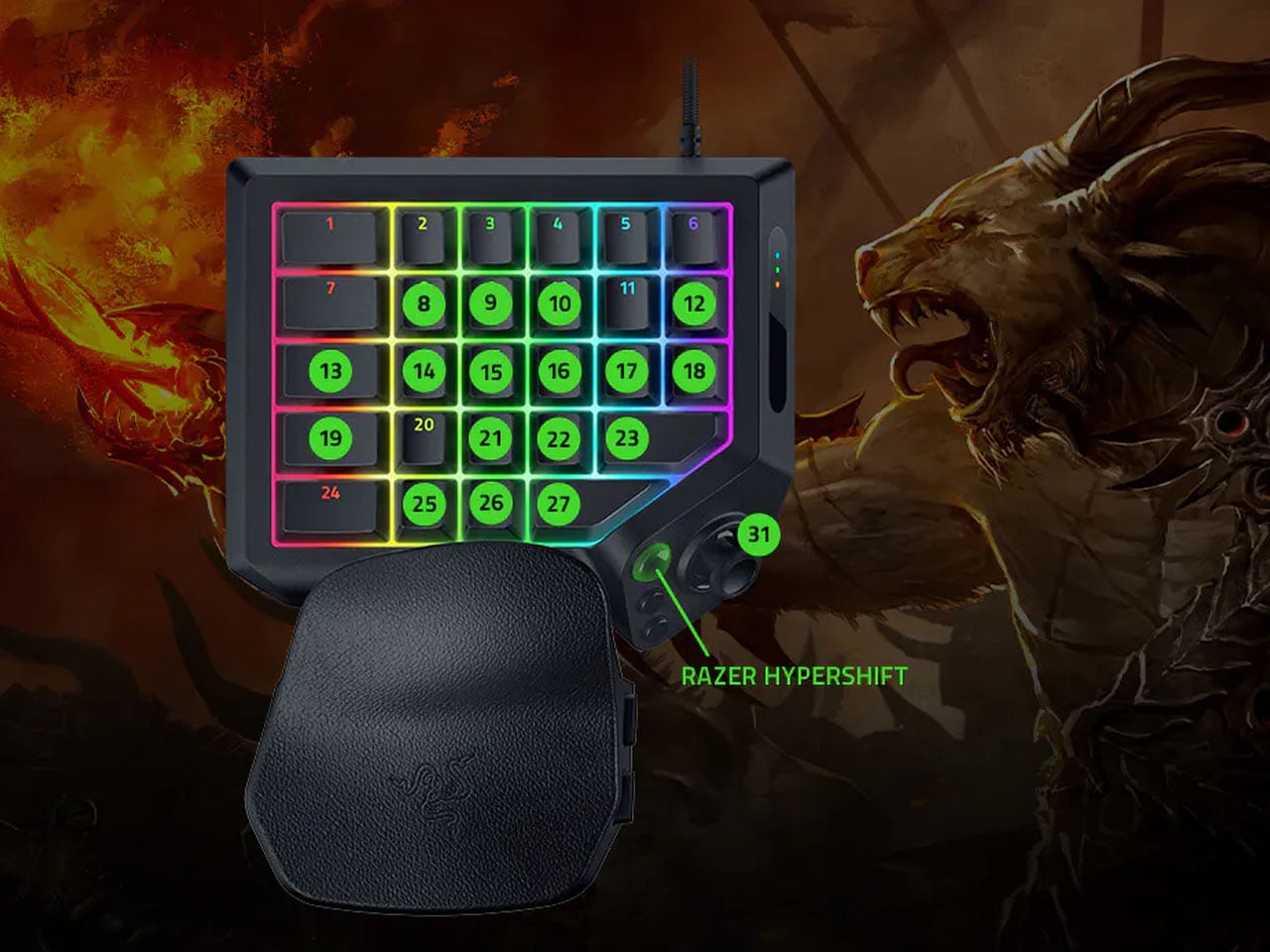
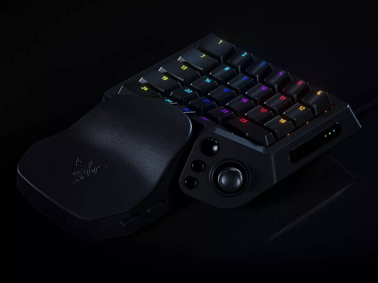
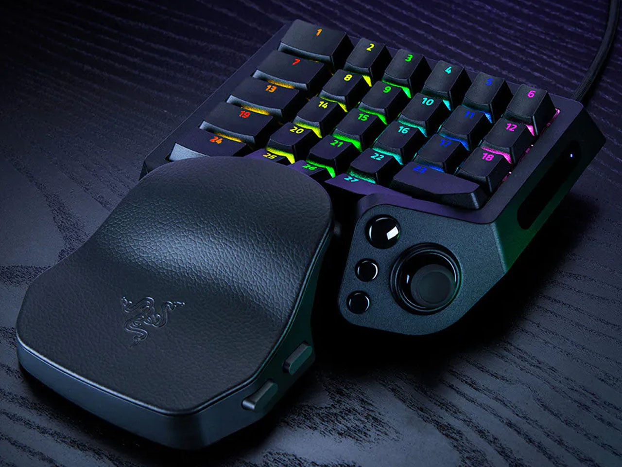
A keyboard can give you plenty of keys, but when you’re gaming, you rarely use all of them. What matters is having the right controls exactly where your hand needs them. That is the idea behind Razer’s new Tartarus V2 Pro, a one-handed gaming keypad that packs 31 programmable controls into a much smaller footprint while adding a proper analog thumbstick, something most keypads don’t have.

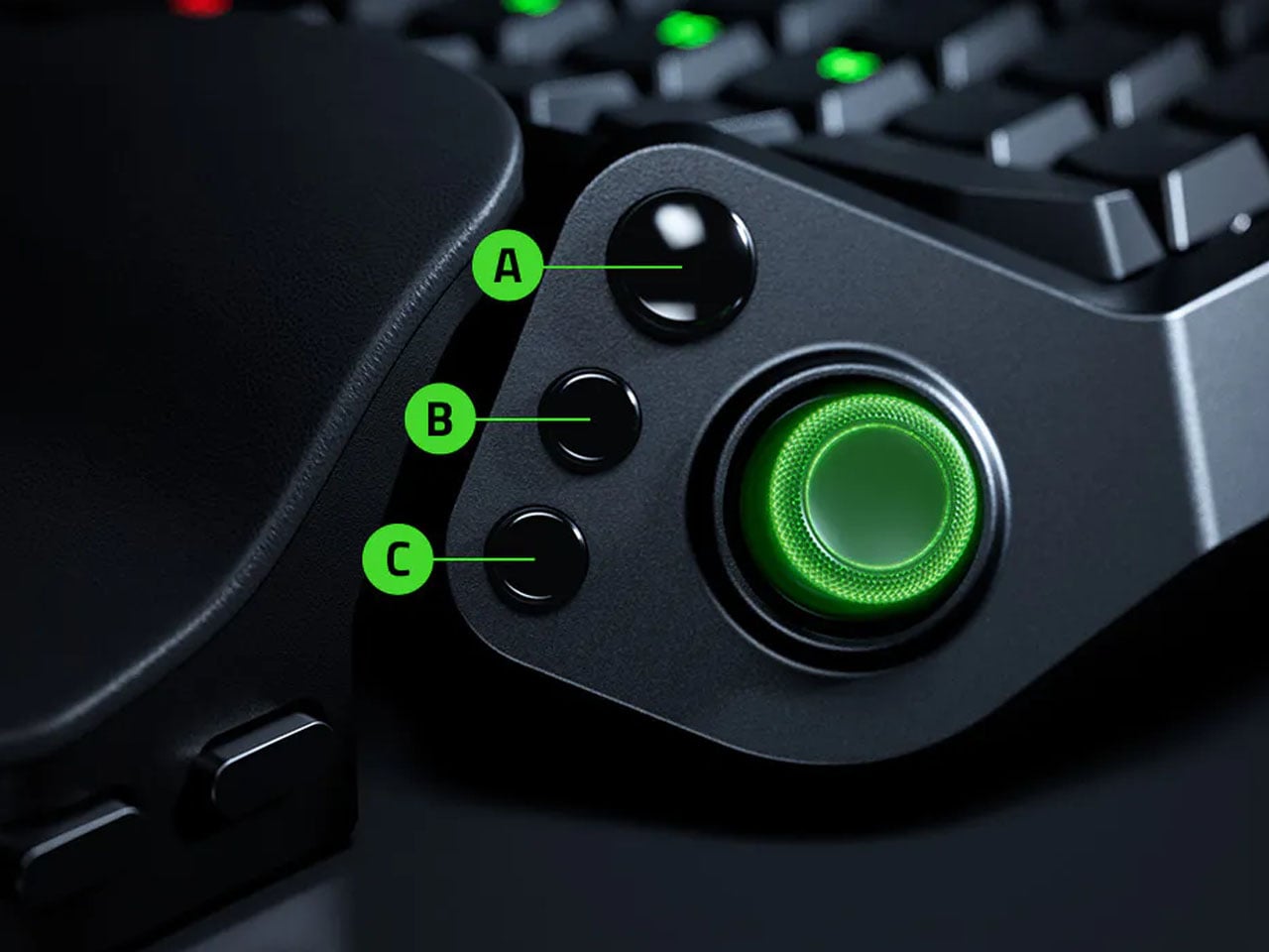
The thumbstick is one of the more interesting bits of the accessory. It uses TMR technology with anti-drift positioning and sits alongside three dedicated thumb buttons, giving the left hand a combination of keyboard and controller-style controls. The stick can handle movement, but it can also be assigned to other commands, making it useful for games that rely heavily on shortcuts, radial menus, or multiple simultaneous inputs.

Designer: Razer

Razer has also moved beyond the usual mechanical-switch approach, as Tartarus V2 Pro uses second-generation Analog Optical Switches that can recognize how far a key is pressed. Their actuation point can be adjusted anywhere between 0.1 and 4.0 mm, allowing the keys to be tuned for either quick, light presses or a more deliberate response. Rapid Trigger goes further by detecting upward movement as small as 0.1 mm, which can make repeated inputs feel considerably more immediate. Razer rates the switches for up to 100 million keystrokes.

There is plenty of control over how those inputs behave as well. Razer’s Advanced Input Control features include Snap Tap, Snap Flex, Dual-Keypress Priority, and Dynamic Keystroke. These allow players to change the way directional inputs work, prioritize simultaneous key presses, or assign different actions depending on how far a key is pressed. The wrist rest can slide outward and rotate from side to side, so the position of the hand can be adjusted instead of forcing it into one fixed angle. The keypad uses textured doubleshot PBT keycaps and a 5052 aluminum alloy top plate, with Chroma RGB lighting adding the familiar Razer touch.

True 8000 Hz HyperPolling is built in, while Razer Synapse handles deeper customization. Players can create up to 24 keymaps across three onboard profiles, with actuation and Rapid Trigger settings adjustable to suit different games. An onboard LED array also provides visual feedback without needing the software open.

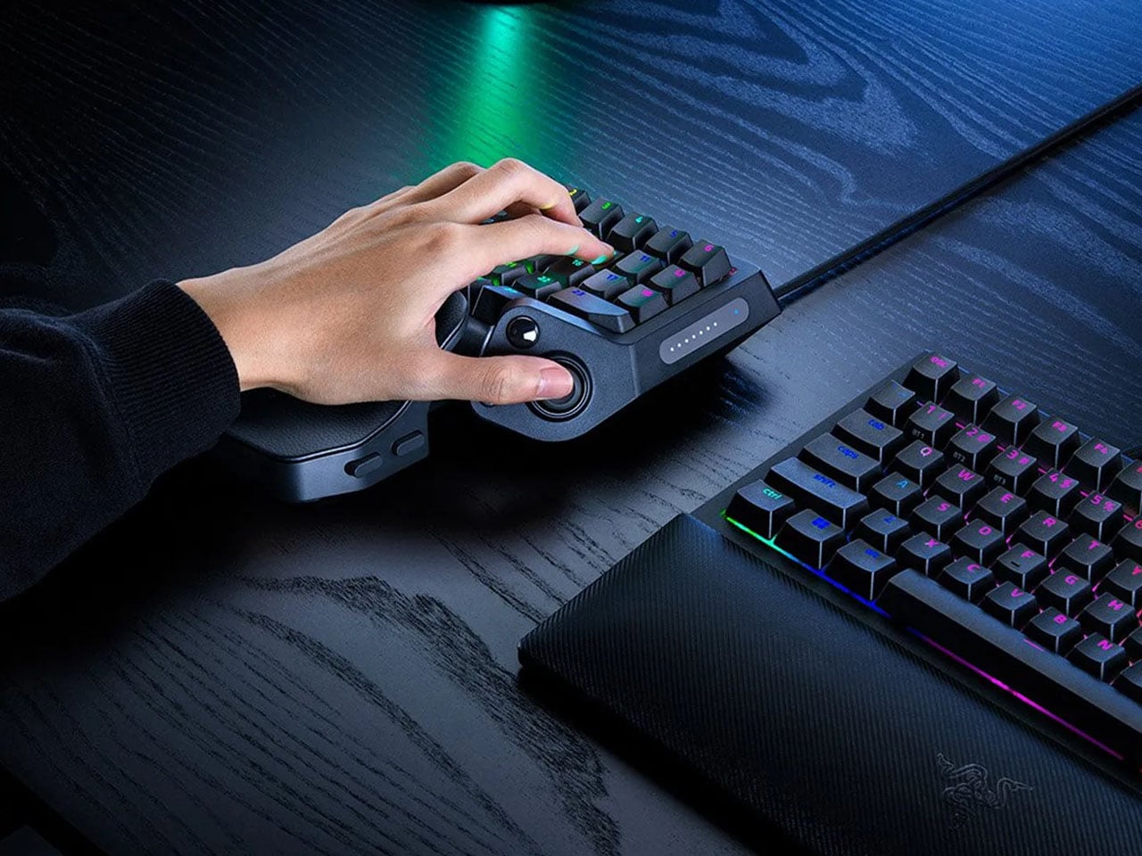
At 211 × 159 × 49 mm and 486 grams, Tartarus V2 Pro takes up far less desk space than a conventional keyboard. Priced at $199.99, the gaming accessory changes how the player’s hand interacts with a game. Instead of reaching across a keyboard for commands, movement, and shortcuts, the controls are gathered into one compact surface designed specifically around that hand.

The post Razer’s New Gaming Keypad Puts 31 Customizable Controls Right Under Your Hand first appeared on Yanko Design.
  •  

Apple is Working on Two iPhone Game Controllers Under its Beats Brand

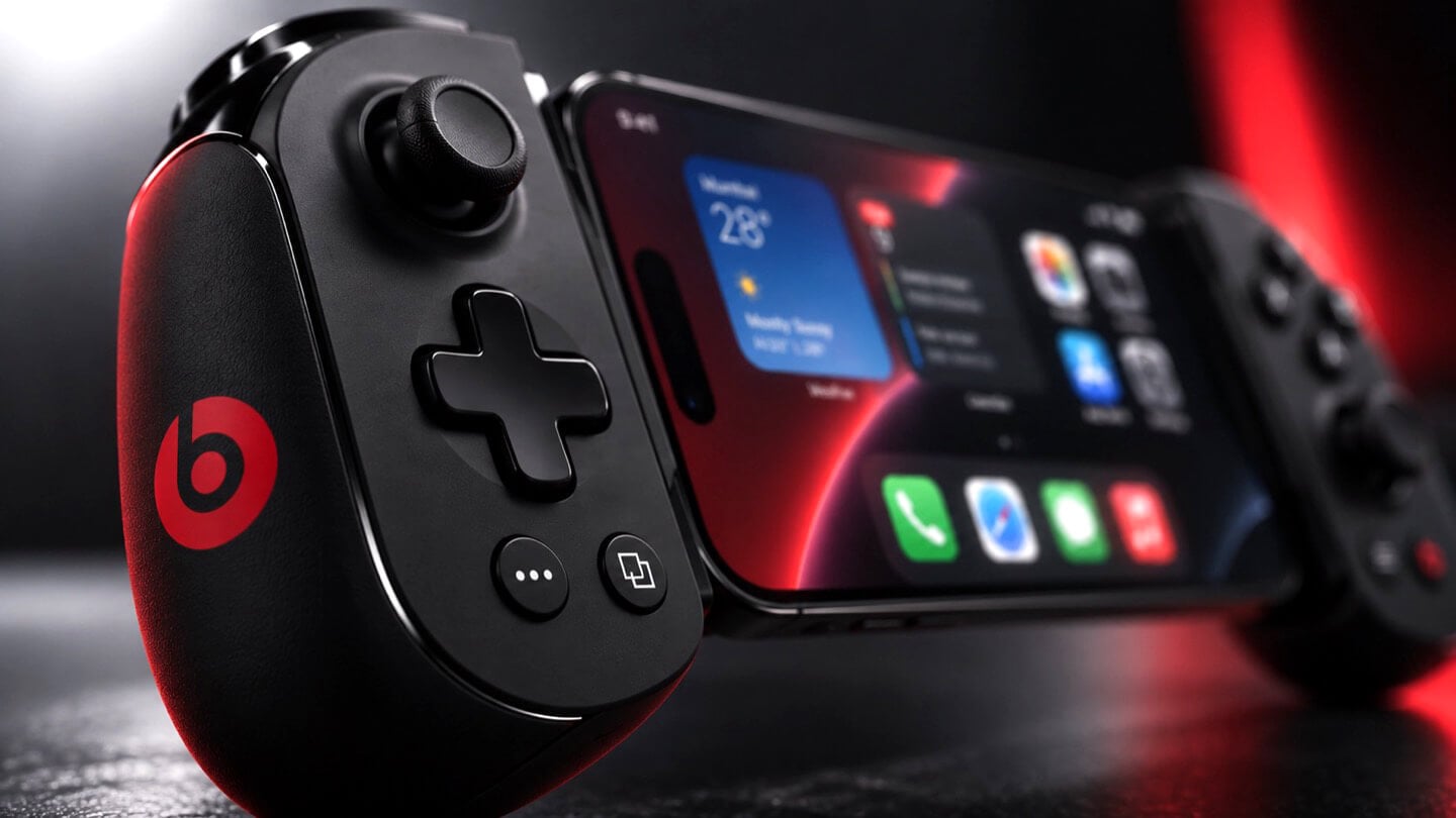
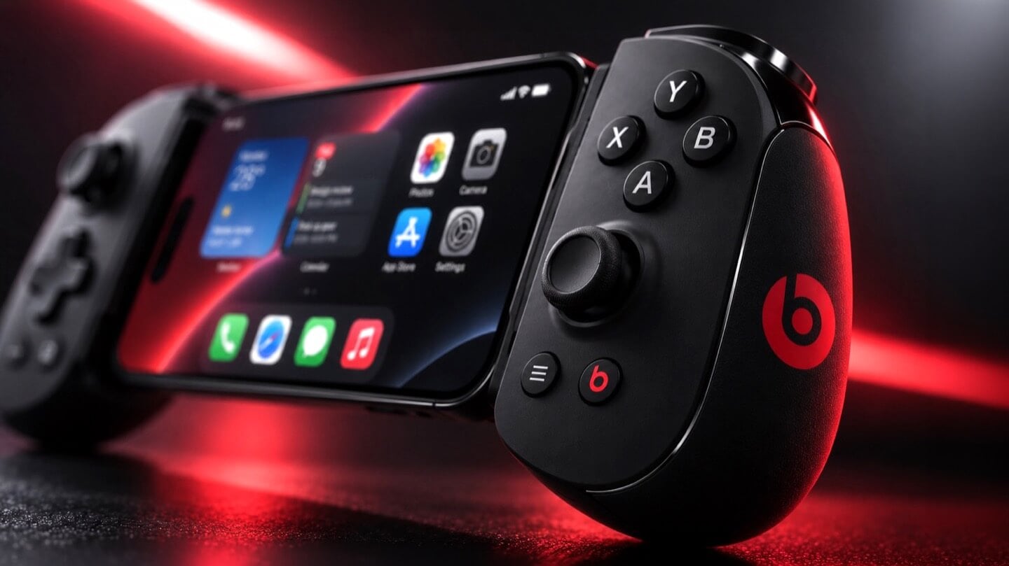
Concept Beats branded iPhone game controller, close-up on the right grip showing X, Y, A, B face buttons, thumbstick, and red Beats logo, with the clamped iPhone home screen visible at left, lit in red.

Concept Image

Apple and the gaming crowd have always had one of those relationships where you nod at each other across a party and never actually walk over. Apple makes the chips, brags about them beating a PS5 in some benchmark slide, then goes right back to talking about spreadsheets and stargazing apps. Gamers, meanwhile, buy a Steam Deck or a Switch and never think about the iPhone in their pocket as a gaming device at all. Bloomberg’s Mark Gurman just reported that Apple wants to finally cross the room, having spent over a year quietly developing its own gaming controllers for the iPhone. The bigger twist is who gets to wear the name tag. Rather than an Apple logo, the hardware is reportedly launching under Beats, the audio label Apple has been slowly turning into its lifestyle catch-all since buying it in 2014.

Code unearthed in a leaked macOS 26.7 build gives the rumor real teeth, naming two unreleased devices, T6502 and T1057, each carrying its own dedicated controller profile instead of placeholder code. Both come with the standard gamepad vocabulary, sticks, triggers, a D-pad, face buttons, the stuff every controller on the planet already has. T6502 keeps things simple and wired. T1057 adds Bluetooth, motion sensors, and a noticeably different haptic engine, suggesting more than one idea is being tested at once. Nothing is priced, dated, or confirmed, but the code alone says this has moved well past a mood board.

Designer: Apple

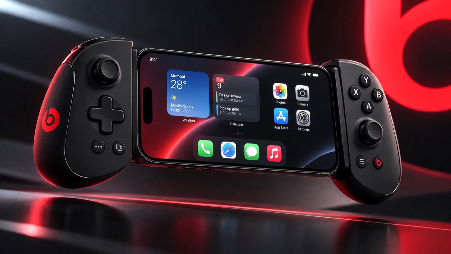
Concept Beats branded iPhone game controller shown fully assembled with an iPhone clamped in the center, both grips visible with D-pad, thumbsticks, and red Beats logos, set against a dark background with a large red Beats logo behind it.

Gurman’s sourcing on the branding is the part I keep chewing on. He says Beats executives are leading both the engineering and the product concept, not just slapping a logo on something Apple’s industrial design team already finished. His reasoning is that the culture and lifestyle around gaming controllers fits Beats better than it fits Apple, and that the sub-brand gives the company room to use cheaper materials and a louder design without dragging down the premium finish people expect from anything wearing the actual Apple logo. Read between the lines and that is Apple admitting its own aesthetic has a ceiling. Titanium and glass photograph beautifully, but nobody wants to grip a cold slab for a three-hour Genshin Impact session. Beats, with its glossy plastics and its very unserious relationship with color, is a far more honest home for an object designed to be squeezed, dropped, and thrown in a backpack pocket.

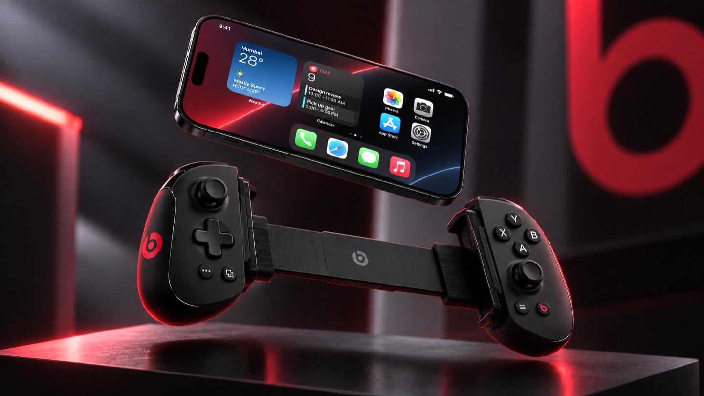
Concept Beats branded iPhone game controller in two separated halves with the iPhone floating above, left grip showing D-pad and right grip showing face buttons, both with red Beats logos, resting on a dark reflective surface.

There is a decent trade-off lurking here too, and it is worth naming before anyone gets too excited. T6502, the wired one, is basic by design, which means it will likely be the cheaper, more disposable option with none of the motion sensing or richer haptics that make a controller feel alive. T1057 sounds like the one worth wanting, but Bluetooth controllers introduce pairing friction and battery anxiety that a simple USB-C plug-in never has to deal with. Apple will have to pick a lane, or price the two far enough apart that the choice makes sense, and so far there is no signal on either price or release window. History also isn’t fully on Apple’s side. The company has floated controller ideas for years without shipping one, and it once required developers to support the Siri Remote’s accelerometer as a de facto gaming input before quietly dropping that mandate. A leaked profile in a beta build is not a keynote slide.

Close-up of the left grip of a concept Beats branded iPhone game controller, showing the D-pad, thumbstick, and red Beats logo, with the clamped iPhone visible in soft focus behind it.

Where this actually matters long term is the software Apple has already built around it. iOS 26 shipped a dedicated Games app that pulls your library, your Game Center friends, and Apple Arcade into one hub across iPhone, iPad, Mac, and Apple TV, and Arcade itself has quietly grown past 250 titles for $6.99 a month. A first-party controller, even a scrappy Beats-branded one, gives all of that infrastructure something physical to plug into, which is a very different goal from just selling more hardware. It also puts Apple in the odd position of competing with its own shelf space, since the Apple Store already sells the Backbone One and the SteelSeries Nimbus, and we covered how Backbone’s own Pro model already chases full-size ALPS sticks and forty-hour battery life at a premium price. Razer’s brand new Prio takes the opposite approach entirely, folding down to credit card size for people who would rather not carry a controller-shaped commitment at all. Apple showing up now, later than everyone, wearing someone else’s logo, says less about gaming and more about how Apple treats every category it enters late. Quietly, sideways, and only once it has found a version of itself that does not feel like Apple at all.

The post Apple is Working on Two iPhone Game Controllers Under its Beats Brand first appeared on Yanko Design.
  •  

Never Lose Your Keys Again With a Tracker That Glows in the Dark

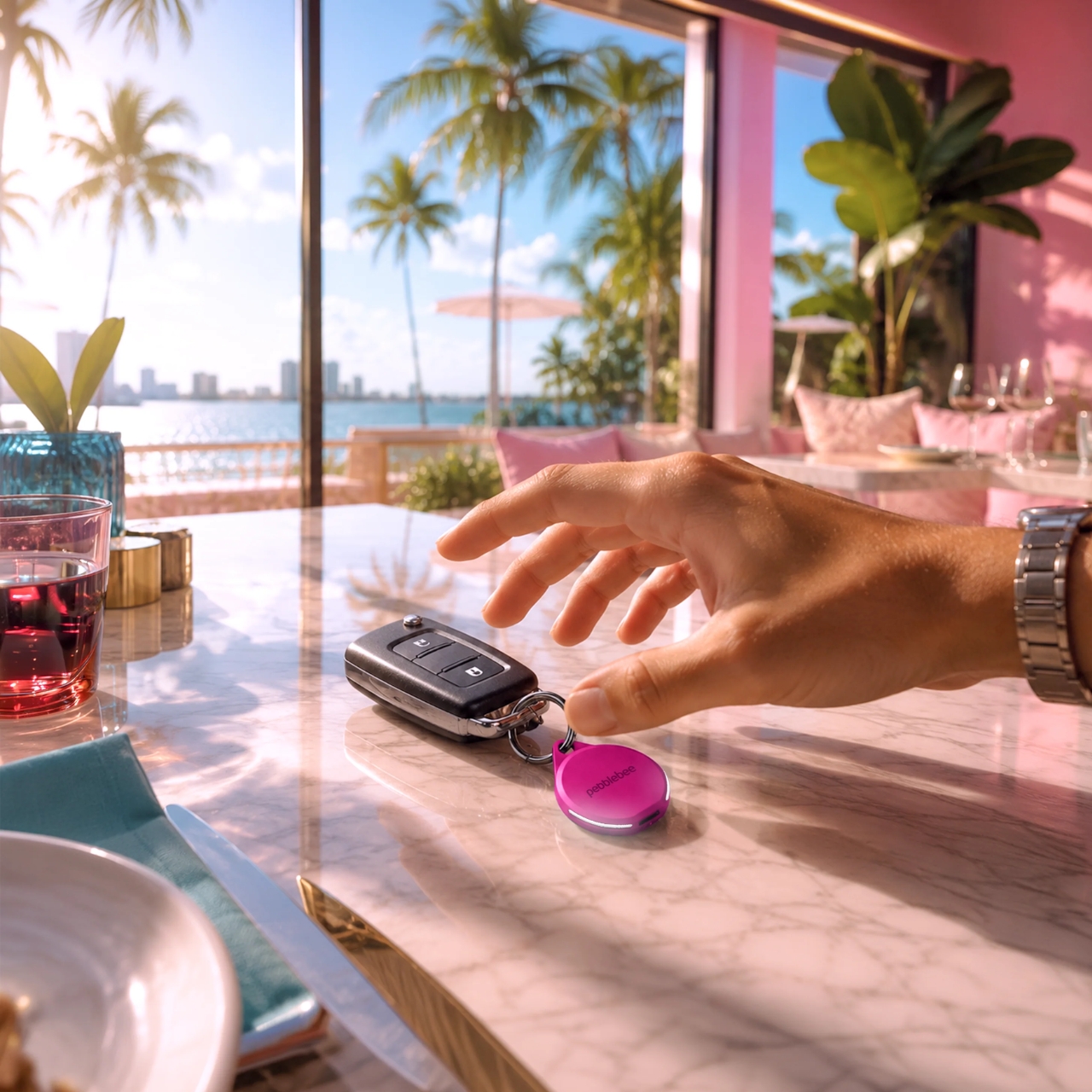
For forgetful people like me, trackers have basically become a must-have. Whether you’re clipping one onto your wallet, your car keys, your backpack, or whatever it is you absolutely cannot afford to lose, these little devices help you do exactly what they promise: keep track. The only catch is that a lot of trackers tend to look alike, and if you’re relying on appearance alone instead of the connected app, it’s easy to accidentally grab the wrong one.

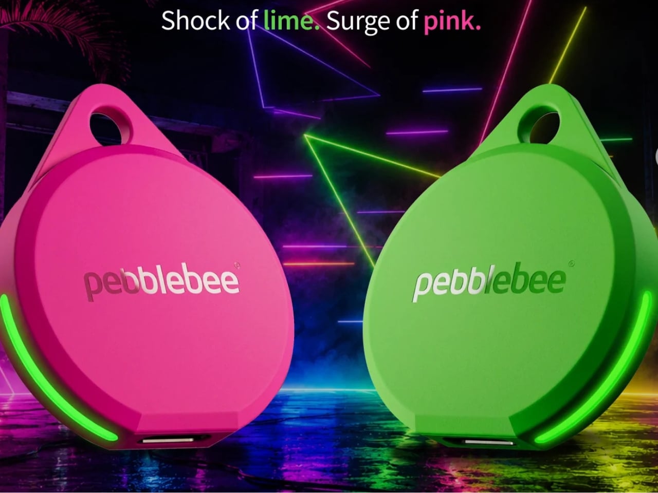
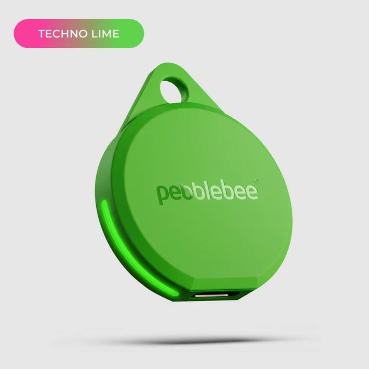
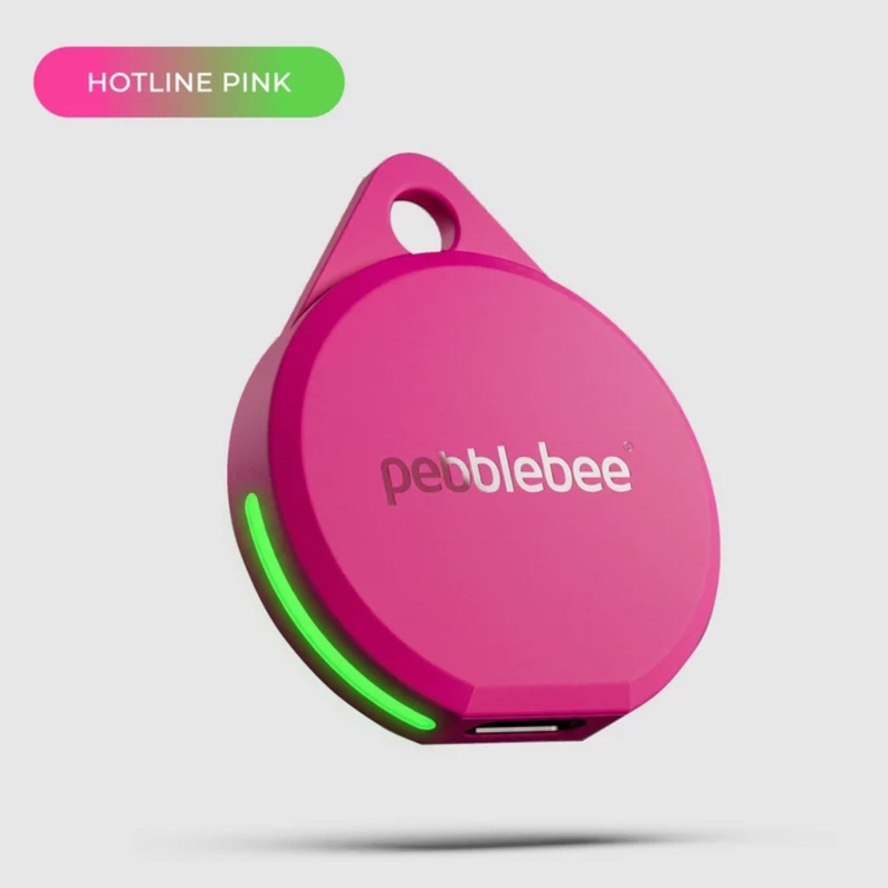
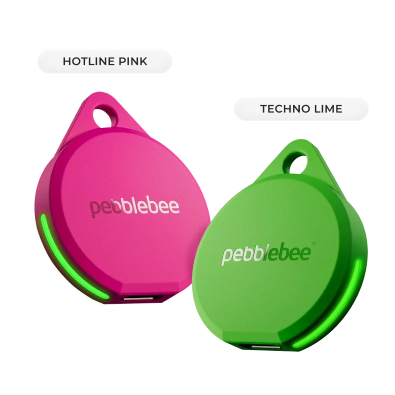
If you’re after a tracker that actually stands out, and one that can even glow in the dark, Pebblebee’s latest Evercolor drop might be exactly what you need. Evercolor is the brand’s limited-edition color program built exclusively for its Clip 5 tracker, and the newest release, called Neon Pulse, comes in two eye-catching shades: Techno Lime and Hotline Pink. Pebblebee describes the collection as perfect for “bold self-expression and a fresh-season reset,” and honestly, it’s hard to disagree.

Designer: Pebblebee

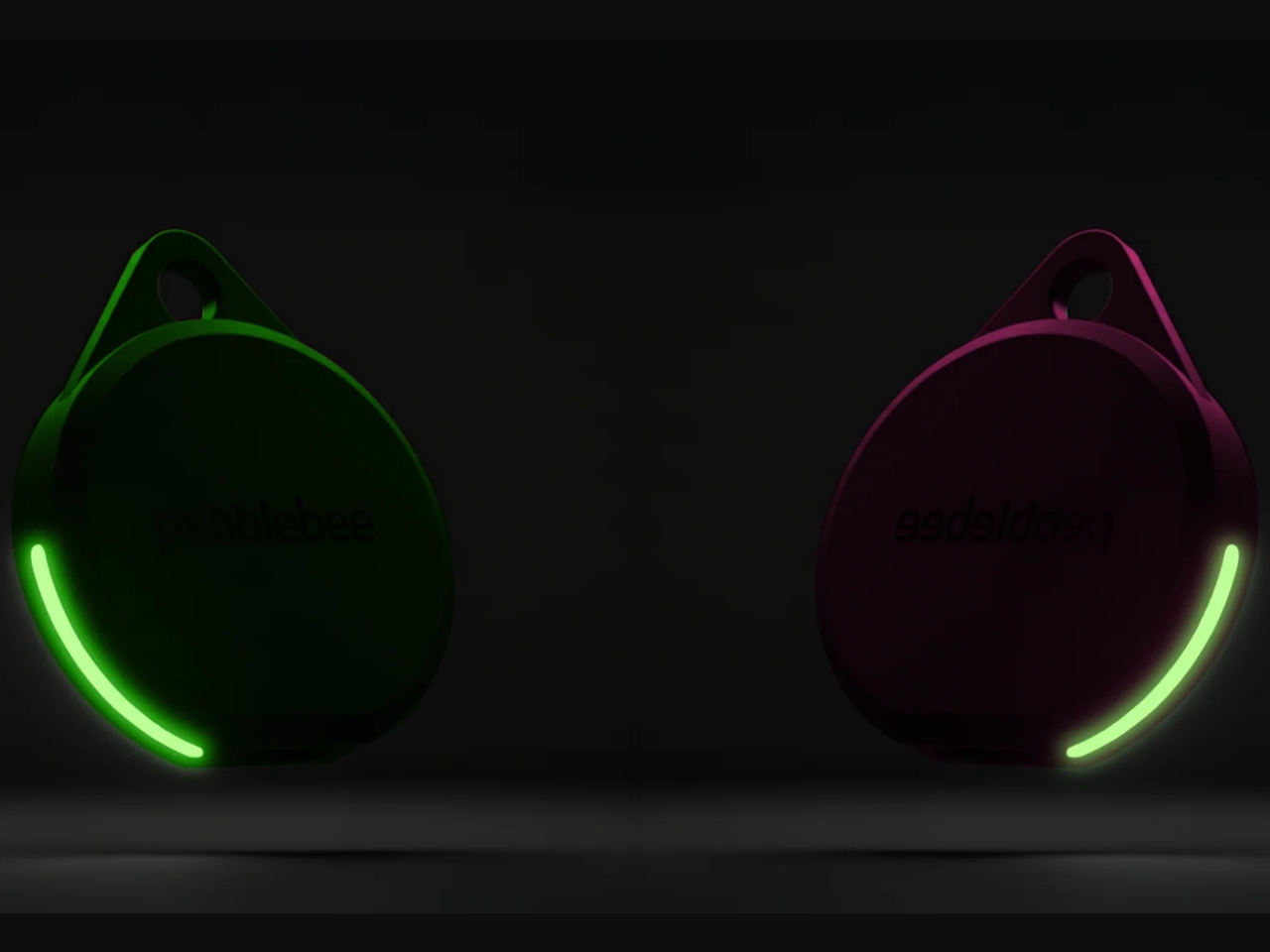
Evercolor has rolled out plenty of standout colors before, but Neon Pulse marks the first time the program has added glow-in-the-dark accents. That means your tracker stays visible even after its LED switches off, so you’re not just relying on the app to tell you where your item is. You can actually spot it in the dark, as long as it’s somewhere within eyesight.

Keep in mind that this is a limited-edition release, so if hot pink and neon green happen to be your colors, you’ll want to grab them soon. Pebblebee rolls out new Evercolor shades every twelve weeks, and once a drop sells out, it’s gone for good, no restocks. Previous collections like Freeze Frame and Heatwave Hijinks have already sold out, so if Neon Pulse catches your eye, don’t wait too long to add it to your cart.

Underneath all that color, though, it’s still the same reliable Clip 5 that Pebblebee originally released. It works with both Apple and Android devices, so you don’t have to worry about switching phones down the line. The rechargeable battery lasts up to a year on a single USB-C charge, which means no more digging through drawers for spare coin batteries. It also boasts a direct Bluetooth range of about 500 feet, roughly double what a lot of competitors offer, plus access to a global crowd-network for finding your stuff even farther away. On top of that, you get a 130dB siren, a bright LED strobe, and IP66 water resistance, so it can handle a little rain or an accidental splash without missing a beat.

It’s also worth noting that Neon Pulse still costs the same $34.99 as the standard Clip 5, so you’re not paying extra just for the fresh colorway. There’s also a free built-in safety feature called Alert, which can notify you if an unfamiliar tracker seems to be following you, a nice bit of peace of mind on top of everything else. Design-wise, the compact clip-on shape makes it look less like a tech gadget and more like an accessory for your bag, wallet, or keychain. Add in the bright, playful colorway, and it becomes even more fashionable, dare we say, kind of cool. So if your main complaint about trackers has always been that they all look the same, Neon Pulse is built to solve exactly that problem.

At the end of the day, a tracker is only useful if you can actually tell it apart from the pile of identical black and white gadgets everyone else seems to own, and if you enjoy using it enough to keep it clipped on in the first place. Pebblebee’s Neon Pulse drop checks both boxes, combining genuine utility with a design that feels personal rather than generic. Whether you’re the type who loses your keys weekly or you just want your tech to match your personality, this drop is worth a look before it disappears for good. And if pink and green aren’t quite your vibe, it might be worth keeping an eye on Pebblebee’s page anyway. With a new Evercolor drop landing every twelve weeks, there’s a good chance your perfect color combo is just around the corner.

The post Never Lose Your Keys Again With a Tracker That Glows in the Dark first appeared on Yanko Design.
  •  

Clear-Shell Game Boys Never Made the Screen Transparent, Arduview Did

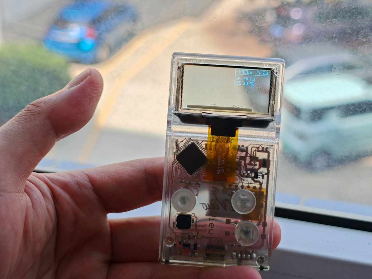
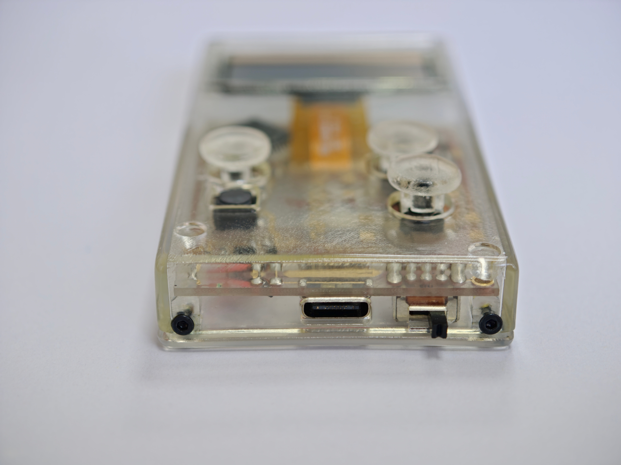
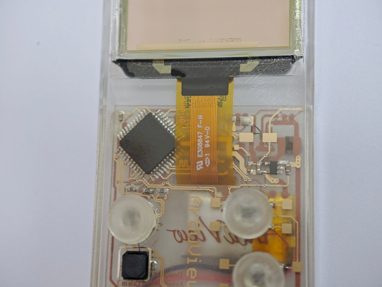
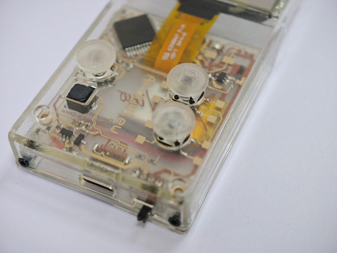
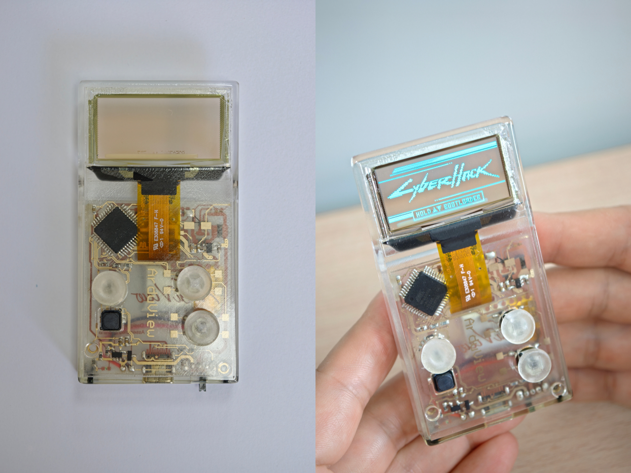
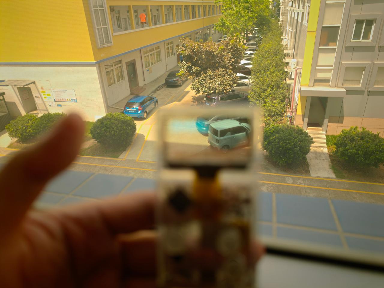
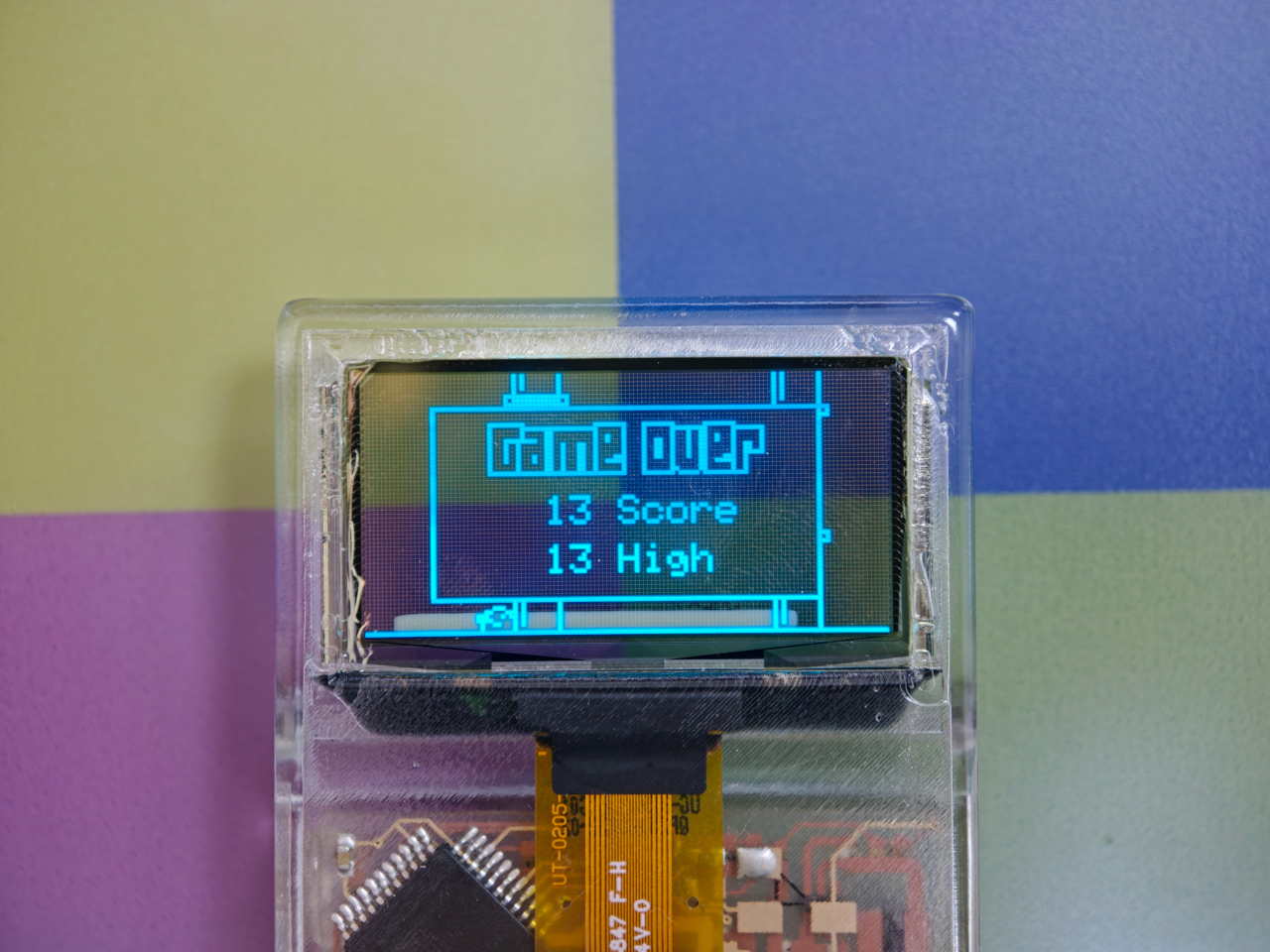
Every gadget on a desk is built to hide what makes it work. Phones, consoles, controllers, they’re all sealed slabs designed to keep the copper and silicon out of sight. Arduview refuses that logic entirely. Its shell is clear, its circuit board is clear, and its OLED display lets you watch pixels light up while seeing straight through to the components producing them.

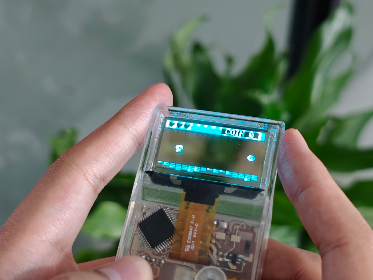
Retro handhelds have flirted with transparency before. Clear-shell Game Boys and modded Miyoo units let you glimpse a shadow of the board through tinted plastic, but the display itself stayed opaque, a black rectangle sitting in an otherwise see-through frame. Arduview closes that gap by making the screen itself transparent, so nothing on the device breaks the illusion of looking clean through it.

Designer: Louis Huang

Peer through the front and the internals aren’t just visible; they’re the entire visual identity. The board, the chip, an orange copper flex cable, the button domes, and the USB-C port all sit in plain view, arranged the way a watchmaker might arrange gears behind sapphire crystal. Nothing here was designed to be hidden later. It was designed to be looked at from day one.

That philosophy extends to how the thing works, not just how it looks. Built on Arduboy, an open-source handheld platform, Arduview skips the layers that usually complicate small electronics. There’s no app store hunting, no Wi-Fi pairing, no account setup standing between you and 400 preloaded games. Power it on and it plays, the same instant gratification that made simple handhelds addictive in the first place.

At 50 grams and roughly the footprint of a credit card, the size does real work here. A device this small and this light stops being a dedicated gaming session and starts being something you carry the way you’d carry a keychain or a pocketknife, small enough to disappear until the moment you want it. Pull it out on a train platform or set it on a desk between meetings, and it reads less like a toy and more like a curiosity someone can’t resist picking up.

That reaction seems to be the entire point. A transparent gadget invites touching in a way an opaque one never does, because there’s an implicit dare in showing your internals: come look closer. Arduview leans into that dare completely, treating the space usually reserved for a case as prime real estate for the very thing most companies spend their design budgets concealing.

Retro gaming has always had a strong current of nostalgia running through it: chunky buttons, pixel art, low-resolution charm. Arduview borrows all of that while adding something genuinely new to the mix: a device that looks like it belongs in a display case at a design museum as much as it belongs in a pocket.

The post Clear-Shell Game Boys Never Made the Screen Transparent, Arduview Did first appeared on Yanko Design.
  •  

Your Second Screen Can Finally Work With No Cables and No Outlet

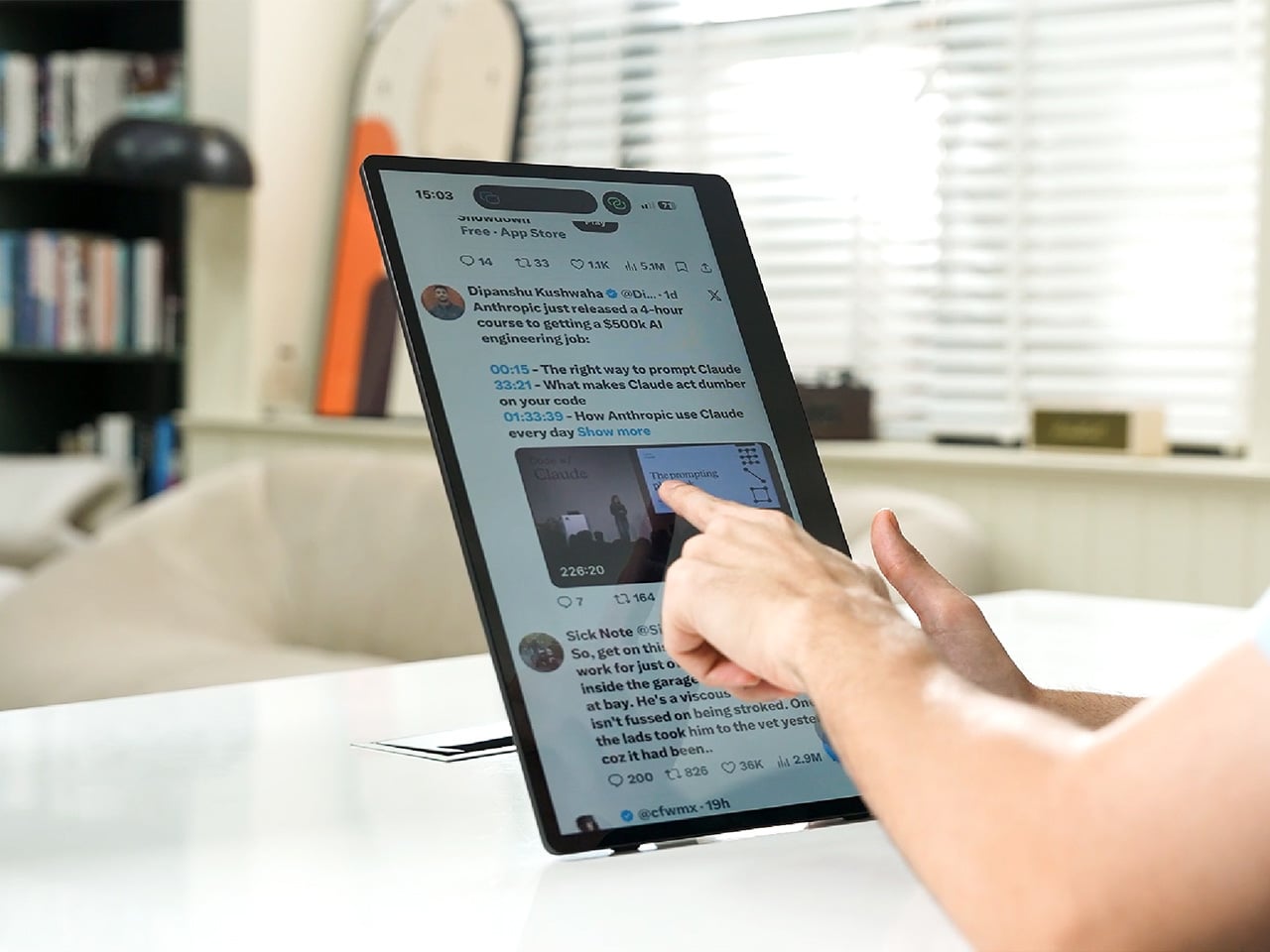
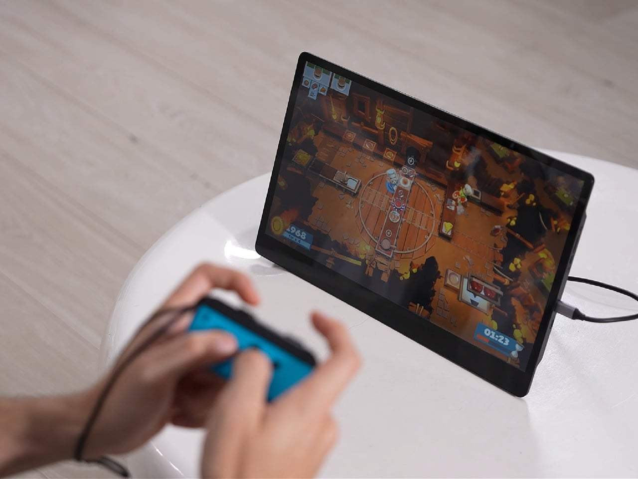
Desks are overrated. So are the cables that come with them. The 4URPC is a 15.6-inch wireless touchscreen monitor built for people who’d rather not be chained to an outlet just to get a bigger screen. It’s slim, self-powered, and ready to mirror whatever’s on your phone, tablet, or laptop the moment you need more room to work, watch, or play.

Cutting the cord doesn’t mean cutting functionality. The monitor mirrors an iPhone or Android device through a peer-to-peer wireless connection, no home Wi-Fi or app required. For streaming platforms like YouTube, Netflix, or Hulu, connecting to Wi-Fi and tapping the built-in TV Cast icon sends video to the screen. Either way, there’s no dongle to lose or cable to untangle before the movie starts.

Designer: 4URPC

Click Here to Buy Now: $219 $399 (45% off). Hurry, only 451/600 left! Raised over $181,000.

The more interesting trick happens after mirroring starts. The 10-point touchscreen can send input back to the connected phone, turning the monitor into a larger, shared control surface. Flip through photos with a friend, walk a colleague through a presentation, or hand someone the reins without handing over your phone. It’s a shift that makes shared screen time less awkward.

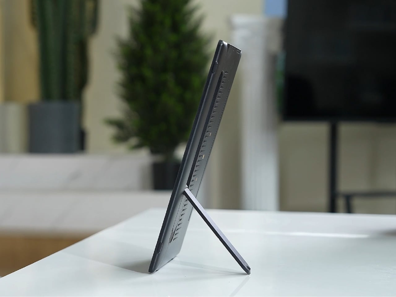
None of this would matter much if the monitor were bulky. At half an inch thick and just over 2 pounds, it’s built to disappear into a backpack rather than dominate it. The matte, textured shell keeps fingerprints and glare to a minimum, and a fold-out kickstand on the back means setup takes seconds on a desk, a kitchen counter, or the arm of a couch.

A built-in 4,000 mAh battery backs up that portability by taking the wall outlet out of the equation. Setting up on a train, in a hotel room, or on a patio doesn’t mean scouting for the nearest plug first. That same battery can lend a charge to a connected phone, turning the monitor into a backup power bank when the moment calls for it.

Plug it into a laptop with a USB-C cable, and the 4URPC switches roles, becoming an extended display rather than a wireless mirror. Dragging a browser tab, a chat window, or a reference document onto the second screen takes a second, and the touchscreen works over the wired connection. The laptop stays focused on the main task while the extra display handles everything else.

The screen also rotates between landscape and portrait without any fuss, which sounds minor until it changes how you use it day to day. Landscape suits video calls, games, and spreadsheets, while portrait mode fits scrolling through documents, reading long articles, or checking social feeds. Switching between the two takes a twist of the stand, not a trip through a settings menu.

Compatibility runs wide enough that most people won’t need to think twice before connecting. Wireless mirroring covers iPhones, Android phones running version 10 or later, MacBooks, and most Windows laptops, while the wired USB-C or HDMI input works with game consoles, streaming boxes, and the Nintendo Switch. There’s no software to install and nothing to configure; connecting the device and turning it on is the entire setup process.

Under the glass sits a 1920×1080 matte IPS panel running at 60 Hz, built more for comfortable, glare-free sessions than eye-popping color numbers. Dual USB-C ports split power delivery and video duties, small stereo speakers cover casual audio, and a VESA mount plus a standard camera screw thread add mounting options beyond the built-in stand. It’s a practical set of choices rather than a flashy one.

There’s something telling about a monitor that assumes you won’t always be sitting at the same desk tomorrow. Work has scattered across kitchen tables, coffee shops, and airport gates for a while now, and screens are only starting to catch up. The 4URPC doesn’t try to be the sharpest or brightest display around; it just tries to be wherever you happen to land next.

Click Here to Buy Now: $219 $399 (45% off). Hurry, only 451/600 left! Raised over $181,000.

The post Your Second Screen Can Finally Work With No Cables and No Outlet first appeared on Yanko Design.
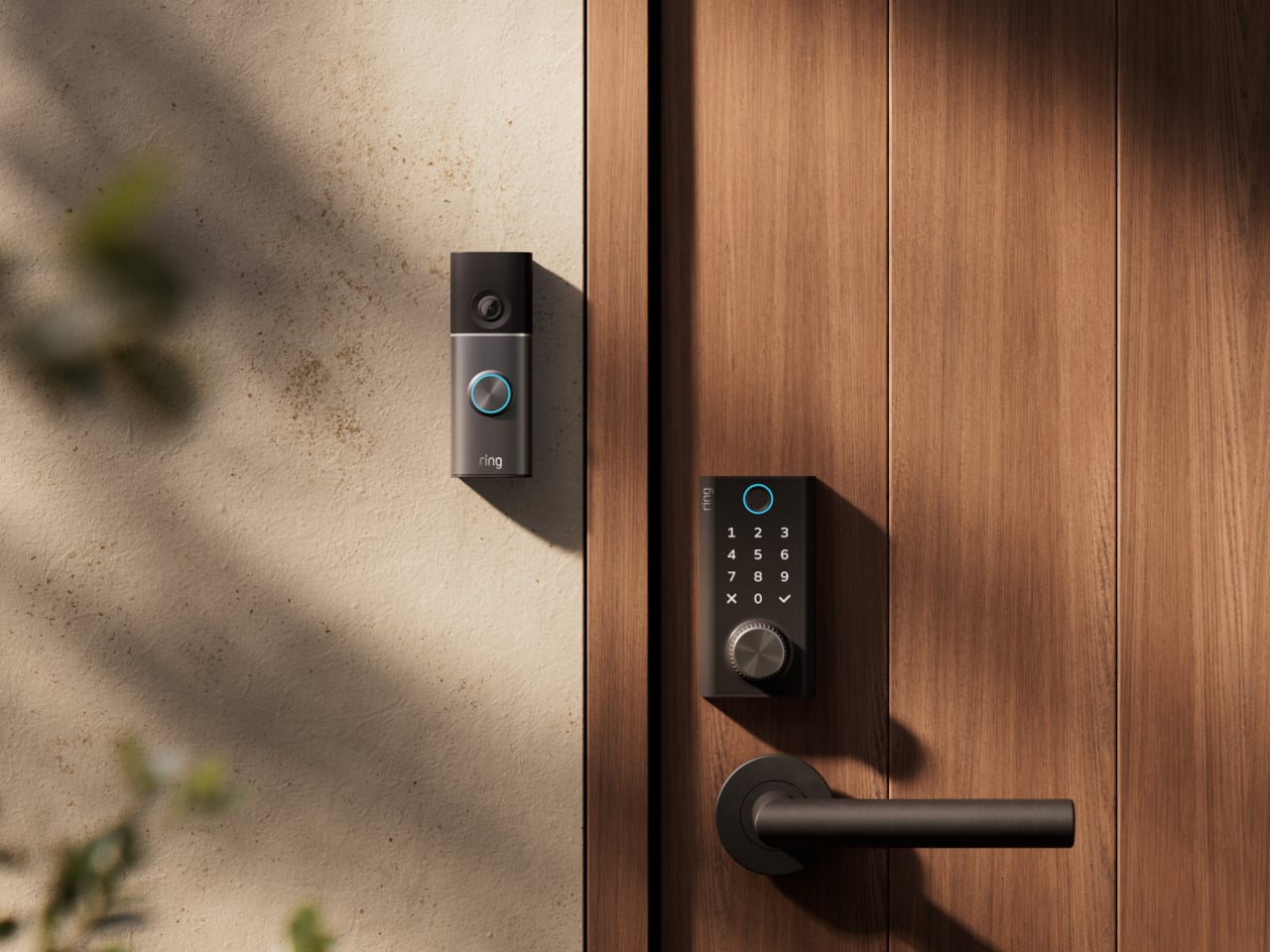
  •  

The $100 Keypad That Puts Each AI Coding Tool Behind Its Own Button

Every developer juggling AI agents right now knows the feeling of context switching until the whole workflow blurs together. Copilot suggests something in one window, Claude Code runs a task in another, and a dozen prompts live scattered across notes and muscle memory. The Logitech MX Keypad exists to collapse all of that into nine small screens sitting next to the keyboard, each one a physical shortcut into a specific piece of that chaos.

Every key on the keypad carries its own full-color LCD display, so instead of memorizing which function key does what, you glance down and see an icon that actually represents the command underneath it. Press one, and it can refactor a function, trigger a prompt macro, or hand off a task to an AI agent entirely. That small visual feedback loop turns an abstract keyboard shortcut into something closer to a labeled button on a control panel.

Designer: Logitech

What makes the hardware worth paying attention to is where Logitech chose to draw the compatibility line. Instead of building this around one coding environment, the MX Keypad works across GitHub Copilot, Claude Code, VS Code, and IntelliJ IDEA at once. A developer bouncing between an IDE and a terminal-based AI agent doesn’t need separate tools for each, just a different page of keys pulled up on the same nine buttons.

That pattern of paging matters more than it sounds. The keypad can hold multiple profiles, so switching from a Python project running through Copilot to a JavaScript refactor handled by Claude Code becomes a single tap rather than a mental reset. Anyone who has lost a train of thought hunting through browser tabs for the right prompt will recognize the value in never breaking eye contact with the code itself.

Underneath the surface, the MX Keypad ships with prebuilt plugins that Logitech had developers test directly against real coding platforms, rather than shipping generic templates and hoping they fit. An SDK opens the door further, letting teams build their own tools around internal workflows, while a community marketplace means the plugin library keeps growing without waiting on Logitech’s own release schedule.

None of that ambition comes wrapped in bulky, wasteful materials either. The body is made with recycled plastics, keeping the hardware in line with the sustainability commitments Logitech has built into its broader MX ecosystem. It is a small detail, but for a device meant to live permanently on a desk, it matters that the object itself doesn’t feel disposable.

At $99.99, the MX Keypad occupies a strange but clarifying position in a developer’s setup. It doesn’t replace a keyboard, and it doesn’t try to be an AI tool in its own right. Instead, it works like a translator between fast-moving human intent and the growing swarm of coding agents developers now manage daily, one labeled key at a time.

The post The $100 Keypad That Puts Each AI Coding Tool Behind Its Own Button first appeared on Yanko Design.
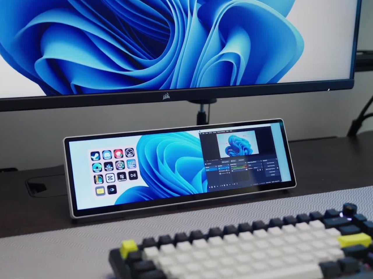
  •  

UGREEN’s Power Bank Uses Liquid Cooling, and You Can Actually Watch It

UGREEN’s MagFlow Pro treats overheating as a design problem worth solving with actual engineering, not just a bigger heat sink. This 10,000mAh magnetic power bank borrows liquid cooling from gaming PCs and squeezes it into a pocket-sized charger, aiming to keep wireless charging fast without turning your phone into a hand warmer along the way.

Qi2 charging has always had a dirty secret hiding under its magnetic convenience. Wireless systems lose up to 30% of their power as heat during transfer, which means a phone sitting at 25W often throttles down within minutes to avoid overheating. UGREEN built the MagFlow Pro around fixing that exact bottleneck rather than just chasing a bigger battery number.

Designer: UGREEN

Inside sits CryoPulse, a cooling system built around a micro-pump that circulates liquid coolant past the charging coil and other heat-generating components. Copper foil spreads that heat further, while a layout that physically separates key parts keeps warmth from concentrating in one spot. It is a scaled-down version of what keeps a gaming rig from throttling under load, just built to survive inside a phone charger.

A transparent panel on the front turns that entire process into something you can actually watch, showing coolant moving through the internal channels while your phone charges. It is an odd, almost theatrical touch for a power bank, but it doubles as reassurance that the system is doing its job. UGREEN calls it the Cyber Window, and it is hard to look away from once it is running.

That cooling translates into real numbers, too. UGREEN claims the system keeps peak surface temperatures on a phone up to 18°F below its own reference benchmark, letting a device hold onto higher wattage for longer instead of stepping down early. In practice, that means someone topping up before a flight or during a commute gets closer to advertised charging speeds instead of a slow crawl once things heat up.

A small display embedded in the shell keeps track of charging wattage, remaining battery percentage, cycle count, and cooling status, turning what used to be a guessing game into actual visible data. Paired with a built-in USB-C cable capable of 30W and a combined output of up to 45W, the MagFlow Pro can charge a phone, tablet, and another accessory simultaneously without demanding a bag full of extra cables.

If the battery degraded quickly, all of those fancy features would be pointless, so UGREEN built the cell around Dymondcell 2.0 protection, retaining more than 80% of its capacity after 800 charge cycles. It also survived seven hours of continuous overcharge testing without failure, a detail aimed squarely at anyone who leaves their charger plugged in overnight out of habit rather than necessity.

At $149.99, the MagFlow Pro costs considerably more than other 10,000mAh power banks on the market, and that price tag puts real weight behind its cooling claims. It is a bet that people charging phones daily care as much about consistent performance and battery longevity as they do about raw capacity, and that a bit of visible engineering can justify paying extra for it.

The post UGREEN’s Power Bank Uses Liquid Cooling, and You Can Actually Watch It first appeared on Yanko Design.
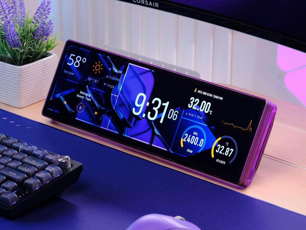
  •  
❌