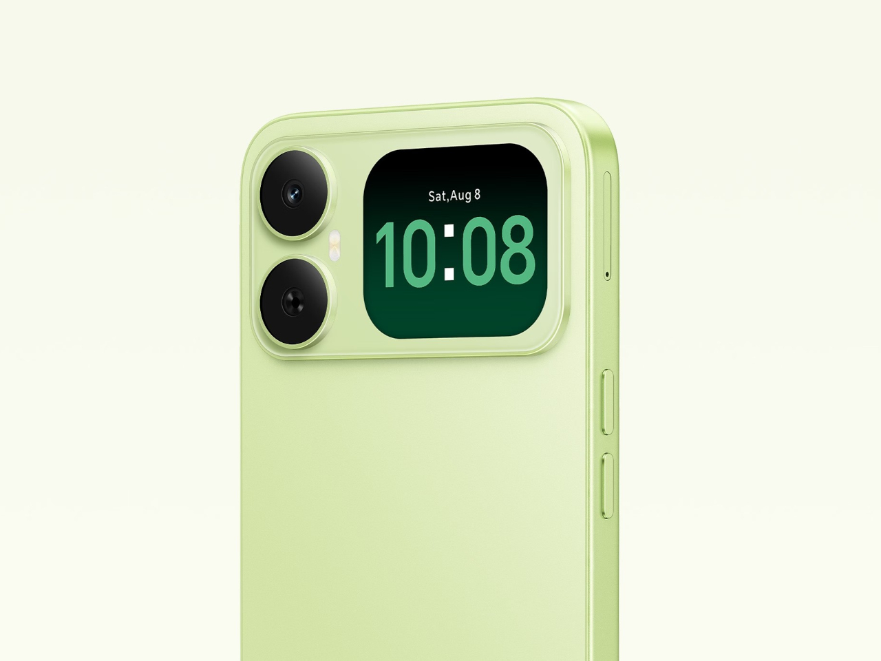
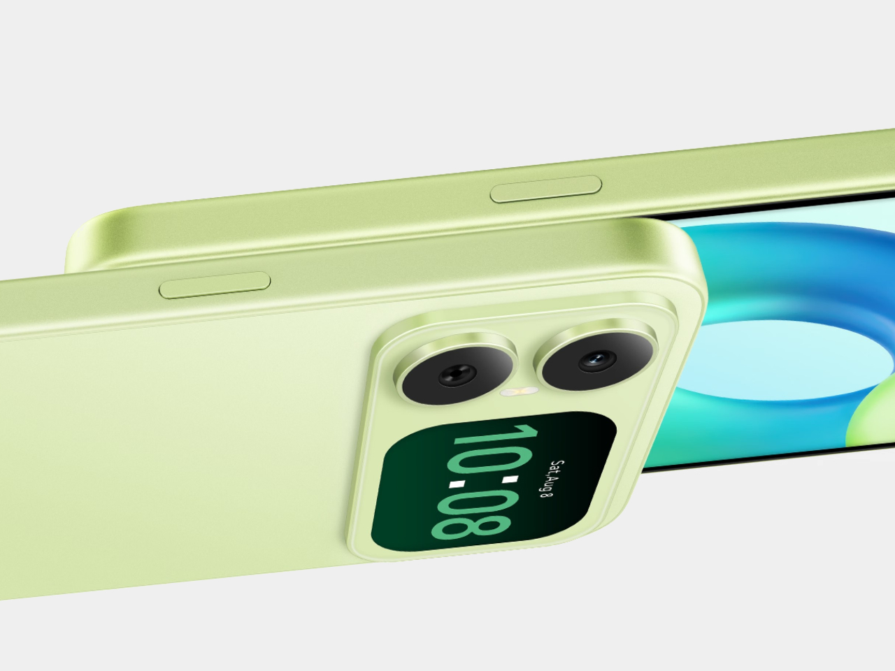
Most budget phones have one screen you stare at and a back you think about. The Honor X5d s makes that back worth a second look by placing a 2.01-inch touchscreen next to its rear camera. It shows the time and alerts, handles music, and helps you take selfies with the better camera. That’s a useful design trick for an inexpensive phone.
The camera island looks like it was built around that display, rather than having a screen tacked on afterward. Two dark circles sit beside it, although Honor lists only one rear camera. Forest Green makes the island pop against a pale back, while Midnight Black keeps things subdued. Either way, the phone’s most interesting feature is visible before you even wake it.
Designer: Honor
That rear screen makes sense when you’re trying to get everyone into a photo. Instead of extending your arm, guessing at the framing, and discovering that someone’s head is missing, you can see the shot while using the 50-megapixel rear camera. A tap on the back takes the picture. There’s also a 5-megapixel front camera, but this arrangement gives selfies another option.
Of course, a phone can’t spend all day posing for pictures. Leave the X5d s face down on a desk, and its little window can still show the time or a call alert. Music controls live there too, so skipping a song doesn’t require turning the whole device over. It’s a small convenience, but those are often the ones you keep using.
On the other side, there’s a 6.78-inch LCD for more than a glance. Its size makes room for videos, messages, and the photos you took, although the 1,576×720 resolution isn’t particularly sharp for such a large panel. The rear display doesn’t fix that limitation. It simply gives quick tasks their own place instead of asking the bigger screen to do everything.
There’s a 6,000mAh battery to keep both screens running, though the phone’s 15W wired charging might test your patience when it finally needs a refill. Honor also provides 64GB of storage and a three-card slot, letting you add a microSD card without sacrificing either SIM. That’s handy if you keep your photos and music on the phone rather than in the cloud.
Inside, the Unisoc T610 processor and 4GB of RAM tell a more familiar budget-phone story. The side-mounted fingerprint reader is convenient, but there’s nothing particularly exotic about the rest of the hardware. In South Africa, the 4GB/64GB version costs R2,499 (about $150), which puts the extra screen in reach of people who aren’t shopping for a flagship just to get a conversation-starting feature.
That display won’t replace your phone’s main screen, nor will it make the X5d s a better choice for demanding games. But it changes the small interactions that fill a day: a glance at a call, a tap to skip a song, a preview before taking a selfie. At this price, giving the back something useful to do feels refreshing.
On a passé une grosse quinzaine de jours avec le
Freo 20
, le nouveau robot aspirateur laveur de Narwal présenté à l'IFA de Berlin début septembre. Autant le dire tout de suite, c'est un des appareils du genre les plus aboutis qu'on ait fait tourner.
Sur le papier, l'aspiration grimpe à 31 000 pascals, soit le haut du panier actuel, et dans la vraie vie ça se vérifie : miettes, poussière, poils d'animaux, tout part en un seul passage, y compris le long des plinthes.
Le vrai truc qui le différencie de la concurrence, c'est côté lavage. Narwal a laissé tomber les serpillières rondes rotatives qu'on voit partout pour un rouleau microfibre de 26 cm qui couvre quasiment toute la largeur du robot, pressé au sol avec 12 newtons et alimenté en eau chauffée à 60 degrés.
Ce rouleau se rince en continu à l'eau propre pendant qu'il travaille, du coup la crasse de la cuisine ne finit pas étalée dans le salon. Une tache de café séchée disparaît sans qu'on ait besoin de repasser trois fois derrière. C'est franchement impressionnant.
Le Freo 20 va surtout très loin sur l'entretien automatique. De retour à la station, la serpillière est lavée à 100 degrés puis séchée à l'air chaud, histoire d'éviter ces odeurs de serpillière humide qui plombent la moitié des robots laveurs du marché.
La station remplit aussi le réservoir d'eau propre du robot, nettoie elle-même son bac d'eau sale et compacte la poussière dans un sac de 2,4 litres annoncé pour environ quatre mois. En pratique, on ne touche à rien, ou presque.
Les cheveux et les poils longs, le cauchemar habituel de ces machines, sont gérés par un système anti-enchevêtrement qui fait plutôt bien le job. Après plus d'une semaine avec un chat à la maison, la brosse n'a pas réclamé un seul démêlage.
Côté navigation, deux caméras couplées à de la lumière structurée, autrement dit une projection lumineuse qui mesure le relief de la pièce, reconnaissent plusieurs centaines d'objets. Câbles, chaussettes et gamelles ont été contournés proprement, et le robot franchit des seuils de 4 cm.
L'application est claire, avec une carte précise, des zones à exclure et un mode multi-cartes si vous avez un étage. Vous n'aurez qu'à porter le robot là-haut, il se repère tout seul.
La station de charge est assez grande, il faut avoir la place, mais c'est souvent le cas avec les robots aspirateurs laveurs de ce genre. Si vous avez la place ça n'est pas un problème, les finitions sont belles, le revêtement texturé ne marque ni les doigts ni la poussière, et le robot lui-même, avec ses 9,5 cm de haut, se faufile sous la plupart des meubles.
Le Freo 20 ramène sous la barre des 850 euros (
835 euros en ce moment
) des prestations qu'on trouvait jusqu'ici sur des machines facturées 1 400 euros et plus. Pour un foyer avec des sols durs et des animaux, c'est, si vous voulez mon avis, un des meilleurs achats du moment.
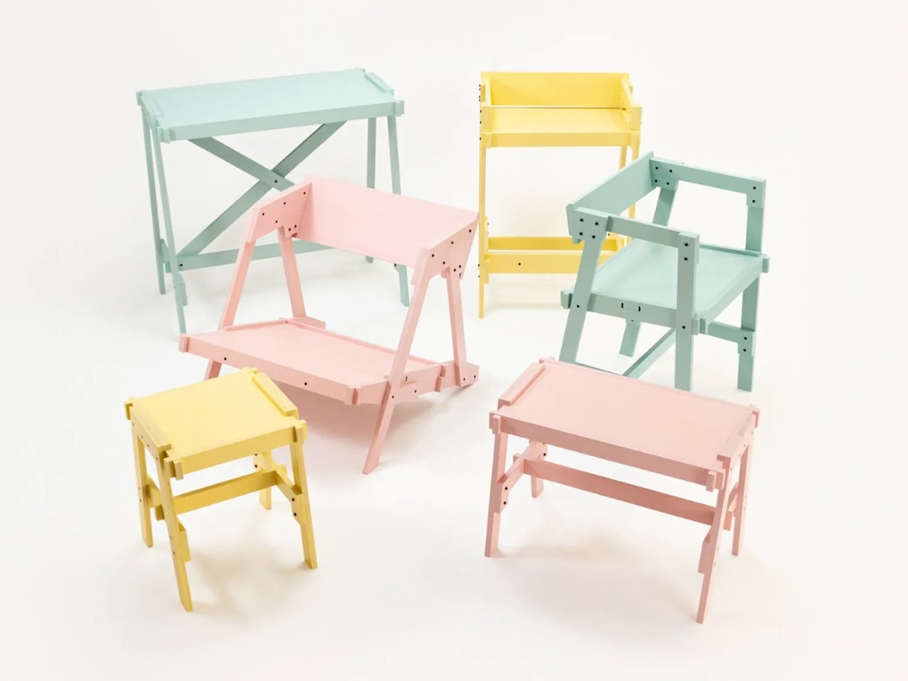
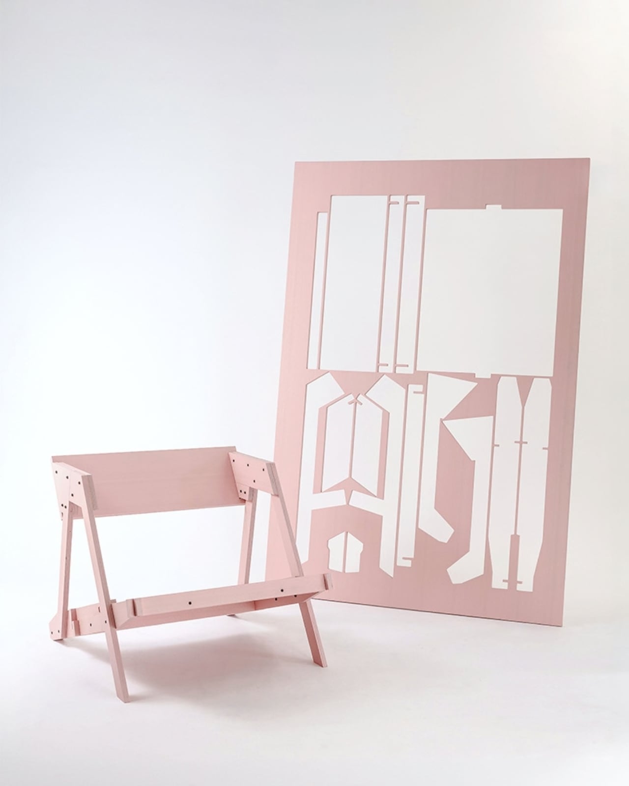
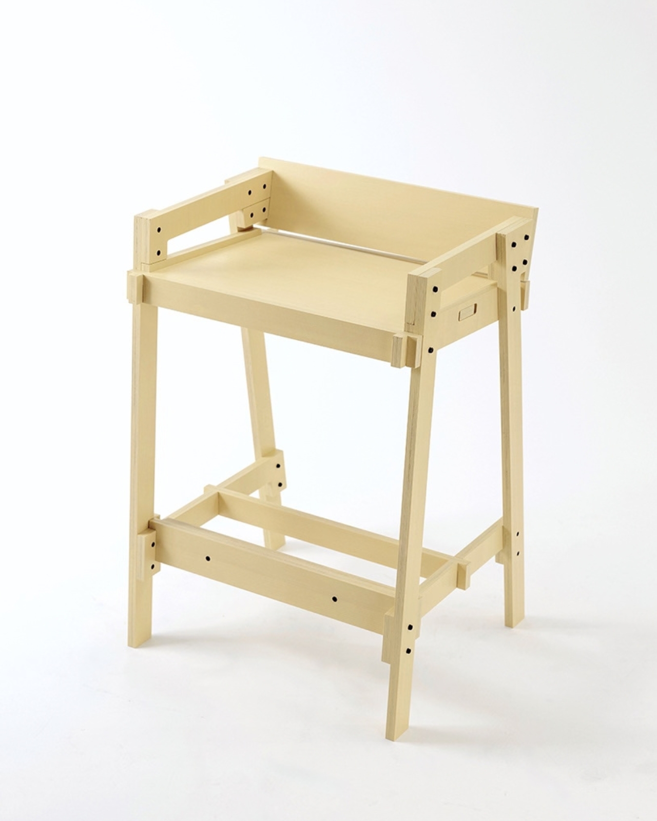
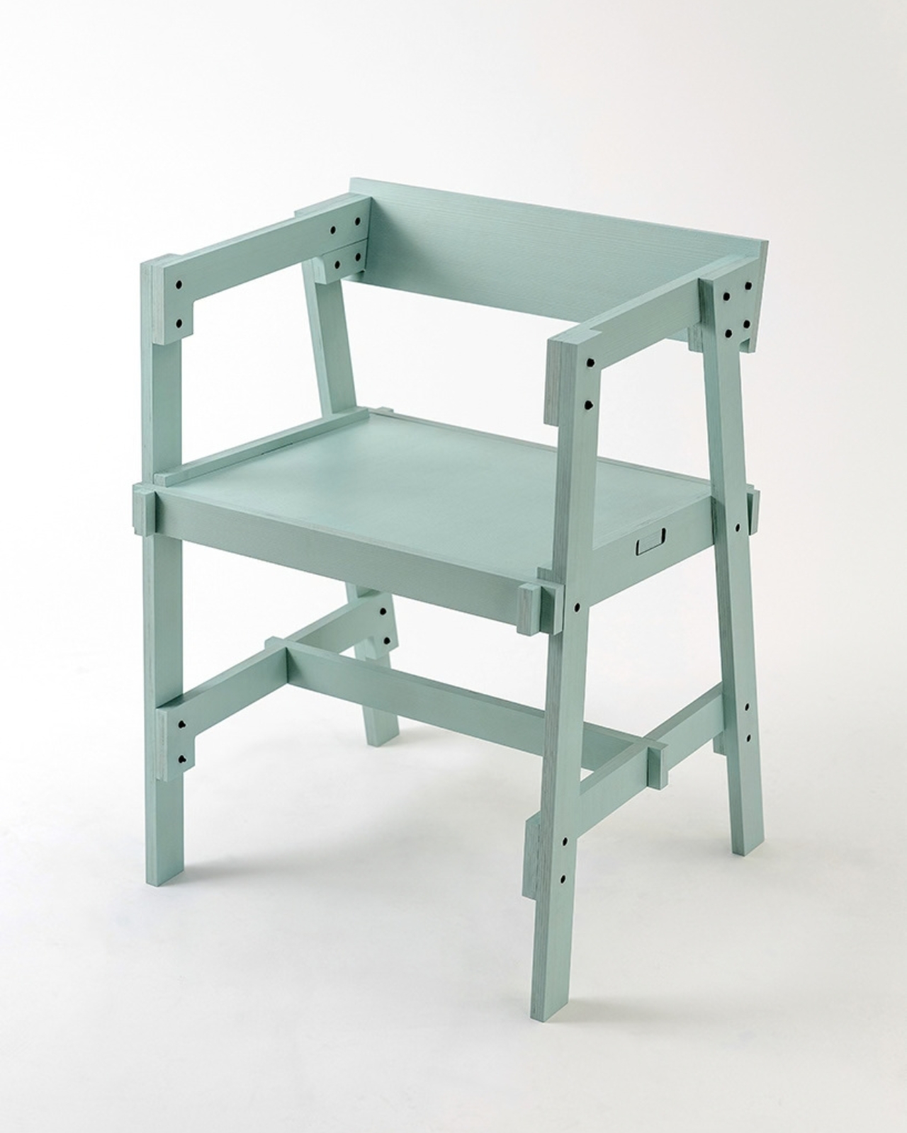
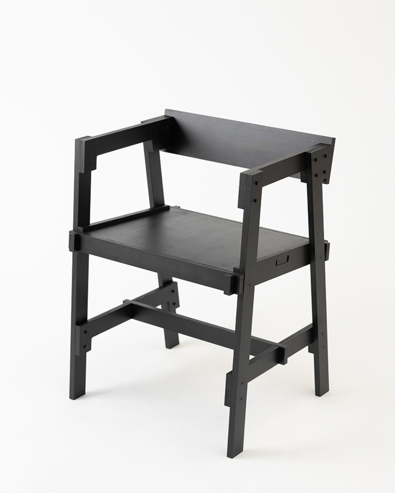
Flat-pack furniture is easy to appreciate on the day it arrives. It fits through the door, and you can usually put it together without much help. The harder test comes later: can it survive a move, come apart cleanly, or be repaired when something goes wrong? FLAT/FORM, a collection by designer Satoshi Itasaka of h220430, is built around those questions. Its pieces use bolts and nuts so they can be assembled, disassembled, repaired, and transported again.
That might sound like a modest ambition, but it changes how I look at the furniture. A dining chair is rarely a one-time purchase for a single room. It may follow you through different apartments, sit beside several tables, and get carried up more stairs than you care to count. FLAT/FORM treats that ongoing life as part of the design brief, rather than leaving it to chance after the first assembly.
Designer: h220430
The material gives the project its character. FLAT/FORM uses 15-millimeter-thick veneer panels made from Japanese cedar trees more than 100 years old, with timber supplied by Miyazaki-based forestry company GROWTHRING. A dining chair and a low table are among the pieces in the collection. Both start from flat panels, a straightforward idea that lets the wood grain do some of the visual work while the construction remains easy to understand.
I like that balance. The collection does not try to disguise how it is made. Its flat planes and visible connections make assembly feel like a considered feature, not an awkward step between opening a box and enjoying the result. That distinction matters because a piece can be visually quiet without feeling anonymous. Here, the simple construction gives the furniture a recognizable point of view, while leaving room for the cedar to be the thing you notice first.
The choice of older cedar also invites a little care in how we talk about the project. Wood with a compelling history does not automatically make a product sustainable, and a furniture collection cannot solve every problem associated with consumption. What FLAT/FORM can offer is a more specific proposition: furniture intended to come apart, travel, and be repaired instead of being treated as finished when its first arrangement stops working. That seems more useful to me than a sweeping environmental promise.
There is a practical kindness to that approach. Moving is already expensive and tiring; furniture should not add a puzzle you are afraid to solve twice. Bolts and nuts are familiar hardware, and the collection’s assembly system is intended to make disassembly possible. None of that guarantees that every move will be effortless. It does mean the designer has acknowledged that people relocate and rearrange their lives, and that a chair ought to have some chance of keeping up.
I would still want to sit in the dining chair before making any grand claims about it. Photographs can tell you plenty about proportion and material, but not how a seat feels through a long dinner. Nor does an elegant assembly concept tell you what the collection costs or how its surfaces will age in a busy home. Those are fair questions for any furniture meant to last, particularly furniture whose appeal rests partly on the idea of keeping it around.
Even with those questions open, FLAT/FORM feels refreshing because it gives flat-pack design a different priority. Convenience at delivery is helpful, but convenience at every stage afterward may be the better measure. A table that can leave one home and settle into another without becoming a burden has a value that is easy to overlook when shopping by appearance alone. Itasaka’s collection makes that overlooked part of ownership visible.
Perhaps that is the quietest, strongest idea here: furniture should be allowed to have a future. FLAT/FORM does not need to look complicated to make that point. It uses flat cedar panels and ordinary fasteners to ask a sensible question of a familiar category: what if getting a piece into your home were only the beginning of a good design? That is a question worth asking before the next box arrives at the door.
Whisky
, l'interface qui permettait de lancer des jeux Windows sur un Mac sans bidouiller Wine à la main, n'est malheureusement plus maintenue. Son dépôt est archivé et son README nous prévient que n'importe quel jeu lancé via Whisky peut péter à tout moment !! Et je sais, c'est assez insupportable de vivre avec cette épée de Damoclès au-dessus de la tête.
Alors je vais un peu soulager votre stress en vous présentant
Highball
qui est une appli Mac libre, avec une version en ligne de commande, qui installe et règle Wine, DXMT et DXVK à votre place, puis vous branche sur Steam ou sur votre bibliothèque Epic pour lancer n'importe quel jeu Windows sur votre bon vieux Mac OS. Par contre, on est sur de la bêta++ mais c'est vraiment un bon candidat à la relève de Whisky.
Pour installer Highball ça passe soit par un .dmg ou par la commande brew install --cask highball, ensuite vous cliquez sur "Get started" et il installera Rosetta si besoin, téléchargera le moteur et préparera un environnement Windows aux petits oignons. Au premier lancement, Steam déballera alors son gros client de 235 Mo, et sachez que sous Rosetta ça peut prendre de 15 à 25 minutes quand même ! Et ensuite, bah tout sera rassemblé dans le dossier ~/Library/Application Support/Highball/ . Donc si vous le supprimez, ce sera pareil qu'une désinstallation.
Le gros plus de Highball c'est surtout sa
base de compatibilité
et pour chaque jeu, l'app vous donne le mode graphique à utiliser, et signale d'avance ceux qui embarquent un anti-triche au niveau du noyau, donc ceux qui ne tourneront pas. Voilà c'est bien de le savoir avant de télécharger quoi que ce soit et de galérer avec l'install. Foutus anti-cheats !!
Moi je l'ai connecté à mon Steam et voici ce que j'obtiens :
La bibliothèque Steam dans Highball : Portal est Vérifié, Left 4 Dead 2 et Team Fortress 2 sont Communauté, THE FINALS est Bloqué
Une fois que vous avez sélectionné votre jeu, comme ici, le Portal que j'ai installé, ça vérifie si ça peut fonctionner sur votre ordinateur. Et ensuite, Highball applique pour vous la "recette" qui va bien pour que ça tourne sans encombre sur le Mac.
La fiche de Portal : vérifié sur un M1 Pro, avec la liste des réglages que Highball applique avant le lancement
Lisez quand même bien les fiches des jeux. Parce que pour certains, vous risquez d'être surpris. Par exemple, sur Red Dead Redemption 2, c'est marqué comme jouable sur un M1 Pro mais en réalité le jeu démarre et atteint le menu, mais il n'est pas jouable de manière "confortable" sur ce Mac puisque l'image saccade, et sur 16 Go, la mémoire déborde comme quand vous mettez vos grosses fesses dans la baignoire.
J'ai lancé Portal !!!
Pour le reste, il vous faudra un Mac Apple Silicon sous macOS 14 minimum. D3DMetal, le composant d'Apple, n'est pas fourni donc faut accepter la licence du Game Porting Toolkit et il se téléchargera à part (j'avais parlé de
Game Porting Toolkit 4
à sa sortie). Côté launchers, Steam et Epic passent sans souci, Rockstar et l'app EA affichent leur screen de connexion et lancent leurs jeux, mais GOG Galaxy restera malheureusement à l'état d'écran noir.
Pour ma part, j'ai lancé aussi la version remasterisée de Command & Conquer / Red Alert et ça tourne du feu de Dieu, donc je suis très content de cette install !!
Voilà les amigos, le code est sous GPL-3.0 et le projet promet qu'il n'y aura jamais d'offre payante !! Voilà, vous pouvez revendre votre licence Crossover sauf si vous avez des besoins pointus que Highball n'arrive pas à résoudre.
Microsoft is giving one of the most overlooked keys on your keyboard a surprisingly useful job in Windows 11. The humble tilde (~) key can now be used in File Explorer to quickly jump to your Windows user profile folder and the folders inside it. The change is currently being tested with Windows 11 Insider […]
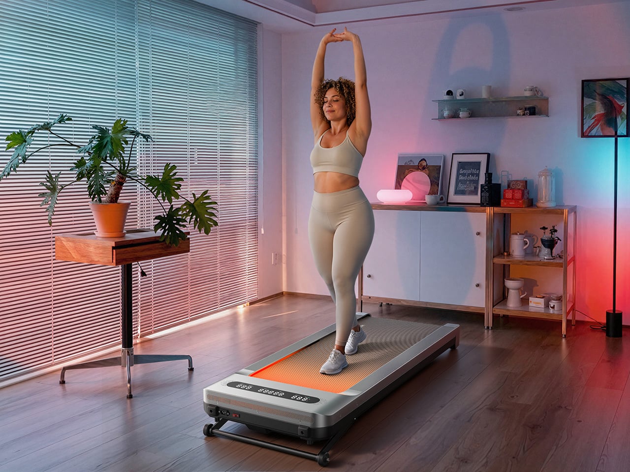
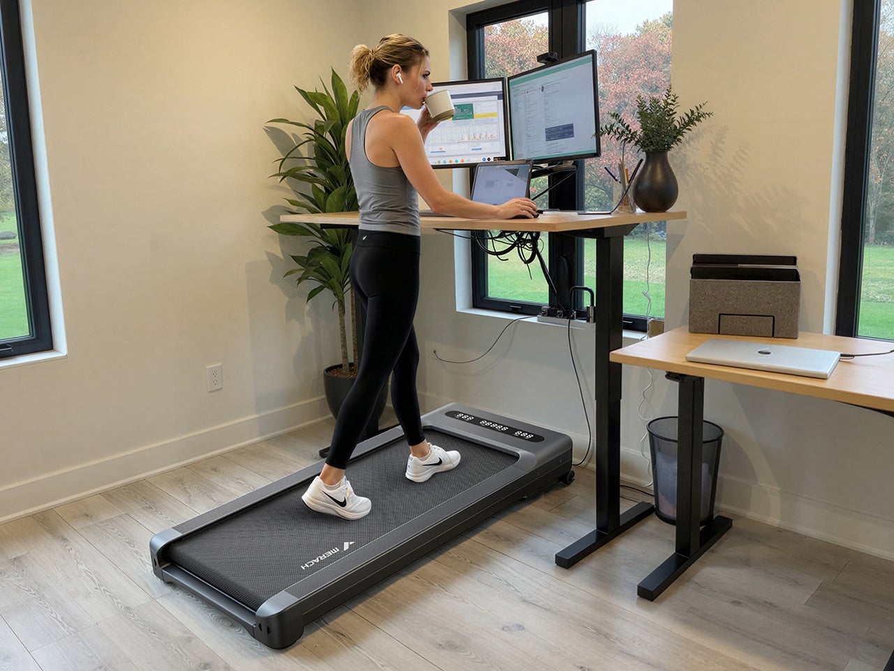
The under-desk treadmill had its moment, arriving as the perfect sidekick for our sudden work-from-home lives (can you believe it’s been six whole years?). It was the simple, brilliant answer to hitting a step count between calls and emails, and products like the original WalkingPad and the WalkingPad S1 were among the early heroes of that era. We all got one, or knew someone who did, turning home offices into miniature gyms where productivity and light cardio could finally coexist. The problem was that a lot of those machines, true to their budget price tags, started dying after six months of use. Walking pads got a reputation for being disposable, which was a shame, because the core concept was always worth taking seriously.
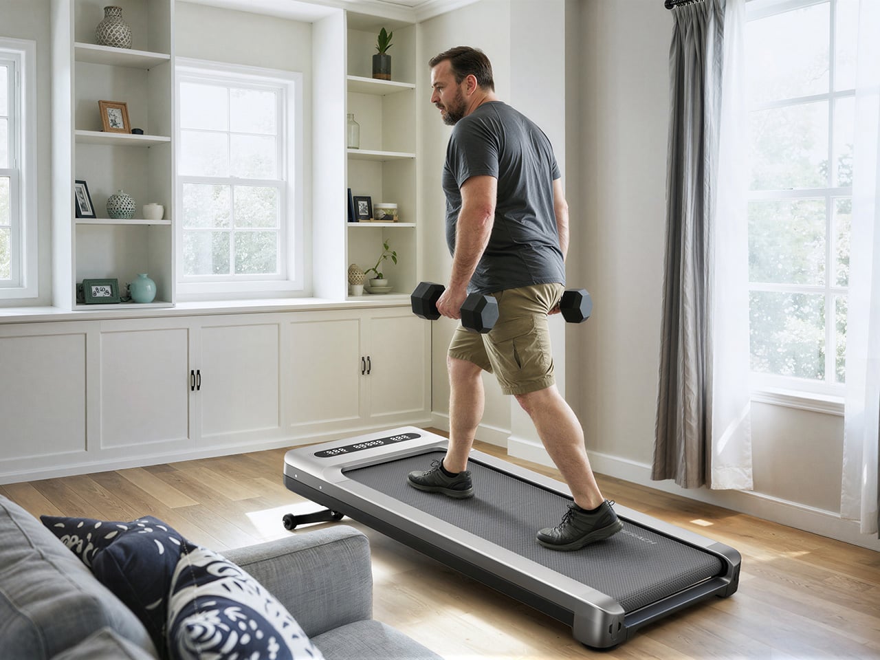
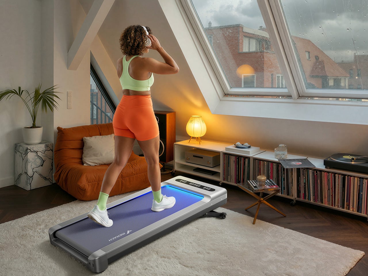
The UltraWalk W60 Plus is the clearest expression of what MERACH is building toward: a walking pad engineered with permanence at its core. When we caught the brand at IFA 2026, their first major trade show appearance despite an already loyal following built through e-commerce, the walking pad lineup stood out for build quality at a price most competitors couldn’t match. The W60 Plus has 12 automatic incline levels, a third-party SGS-certified motor, and a weight capacity that would make a full-size treadmill raise an eyebrow. Mood lighting and a Bluetooth speaker come along too, which sounds ridiculous until you realize how much more likely you are to use a machine that’s genuinely fun to be around.
Designer: MERACH
Click Here to Buy Now: $288$499.99 ($211.99 off, use coupon code “MERACHW60”). Hurry, deal ends in 48-hours!
A 3.5 HP Brushless Motor, SGS-Certified Performance, and a Frame Rated for 330 Lb
The W60 Plus runs on a 3.5 HP peak / 1.25 CHP brushless motor with a 42mm diameter and a Hall sensor for precision feedback. Brushless motors are generally more efficient and longer-lasting than brushed ones, and MERACH claims a lifespan of up to 15,000 hours here, which the brand puts against the 300 to 800-hour lifespans typical of budget walking pad motors. The weight capacity sits at 330 lbs under SGS-certified testing conditions. The heavy-duty steel frame doesn’t wobble under a real walking load, which matters more than most spec sheet comparisons. That stability is what separates a machine you’ll want to use from one you’ll come to resent.
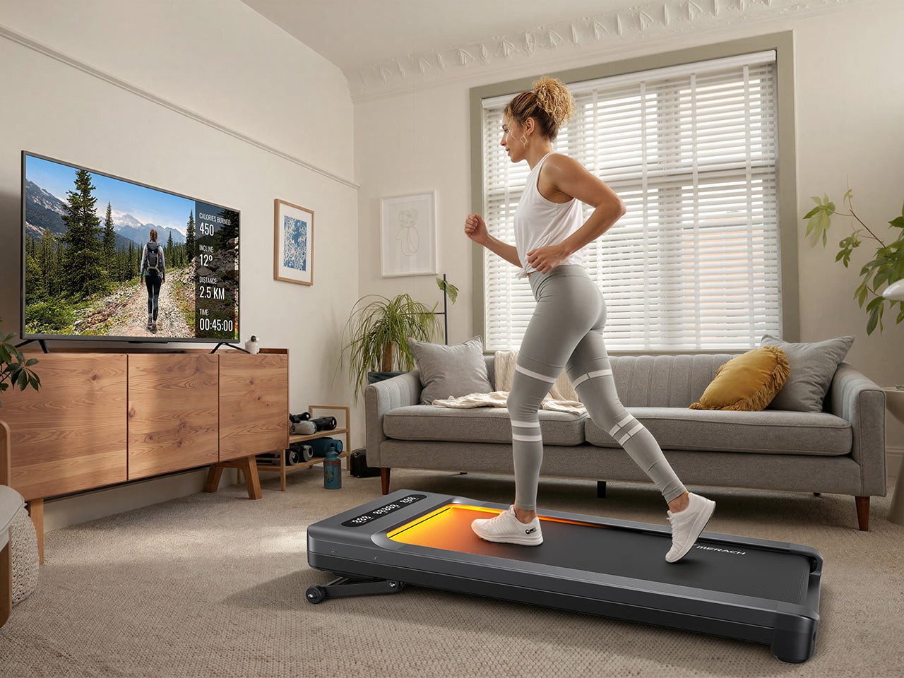
The W60 Plus passed SGS’ performance specs evaluation with flying colors. The noise testing came back at under 54 dB at medium speed with a 75 kg test load, which sits comfortably below the ambient volume of a normal conversation. At maximum speed that figure climbs to 60 dB with load, and 55 dB without, meaning the machine stays apartment-friendly even when it’s working hard. There’s also a one-touch mute function for those moments when you absolutely need silence (hello, important video calls). That noise profile lets you walk and watch TV simultaneously without either experience suffering, which is, honestly, the whole point of this category.
Twelve Auto-Incline Levels, a 16.5-Inch-Wide Deck, and a Speed Range Built for Walking
Twelve levels of automatic incline is the feature that separates the W60 Plus from the flat-and-boring competition, and for a machine in this price tier, it’s genuinely unusual. At the highest setting, it shifts from a gentle recovery walk to something that meaningfully elevates your heart rate, particularly through the posterior chain. The speed range of 0.6 to 4.0 MPH keeps things firmly in walking and light jogging territory, and that 4 MPH ceiling is worth acknowledging: this machine won’t satisfy runners. What it will do is make a 3 MPH incline walk feel like real exercise, which for most desk-workers is entirely the point. Incline transitions between levels automatically and smoothly, a detail that matters when you’re trying to maintain a rhythm.
The running deck measures 16.5 inches wide by 41.3 inches long, which MERACH puts at roughly 33% wider than the category standard. That extra width makes for a more natural gait and stride, particularly for taller users or anyone with broader hips. The non-slip surface handles uphill walking and light jogging without issue, and the length means you’re not constantly worrying about the back edge. Team USA heptathlete Annie Kunz has been using the W60 Plus for active recovery and step accumulation, describing it as a way to “jump on here and there when I feel a burst of energy.” Multi-event athletes log enormous volumes of low-intensity cross-training, and a 12-level incline walking pad fits that workflow more naturally than a flat surface ever could.
Sound-Reactive RGB Lighting, a 5W Bluetooth Speaker, and Triple-Platform App Integration
MERACH’s RGB lighting system reacts to step frequency and syncs to audio rhythm, creating a feedback loop between movement, sound, and visual stimulus that turns a walking session into something engaging. A walking pad that’s boring ends up under the sofa permanently, and MERACH clearly treats engagement as a design constraint, not an afterthought. The lighting pairs with a built-in 5W Bluetooth speaker that fills a home office without headphones, which matters when you’re walking through calls or podcasts. The whole feature cluster borrows from the cozy cardio playbook, acknowledging that for most users, habit formation is a bigger obstacle than physical capability. Make the machine enjoyable to use, and the steps take care of themselves.
Full app integration spans MERACH’s own platform, Apple Health, and Google Fit, with real-time tracking of speed, incline, calories, distance, time, and step count across all three. The MERACH app adds guided routines and custom workout programs, which pushes the W60 Plus into territory where it can coach you through a session rather than simply hosting it. An 8-button magnetic remote handles speed, incline, lighting, mute, start/stop, and program selection, and it docks magnetically to the frame when not in use. The LED display gives you a live readout of key metrics without having to pull out your phone. None of it requires a subscription, which at this price is a genuinely welcome detail.
Zero Assembly, 80 Percent Less Floor Space, and a Price That Makes Sense
The W60 Plus ships fully ready to use: unbox it, plug it into a standard 110V outlet, and step on. No assembly means no instruction booklet, no leftover mystery bolts, and no 45-minute YouTube tutorial that’s supposed to take 10 minutes. When you’re done, the vertical folding support stand lets the machine stand upright, which MERACH says cuts the floor-space footprint by up to 80%. The enlarged front transport wheels make it manageable to move even over carpet, which is where most budget transport wheel designs tend to give up. At 67.7 lbs, the W60 Plus isn’t light, so those wheels are doing real work every time you slide this thing out from under the desk.
The UltraWalk W60 Plus launched on May 26, 2026, and is available now through MERACH’s official website in a Grey finish, with the list price marked at $499.99 and the current sale price at $329.99. MERACH is also offering an extra discount code, MERACHW60, which drops the checkout price to $264.00 with free shipping, a much more aggressive number than this category usually sees for a 12-level auto-incline walking pad. The product page also offers optional accident protection from $29.99. Warranty details are not clearly surfaced in the material provided, so that part is best verified directly on MERACH’s store before publication.
Click Here to Buy Now: $288$499.99 ($211.99 off, use coupon code “MERACHW60”). Hurry, deal ends in 48-hours!
Hurricane season has a way of exposing which of your belongings are actually useful and which ones just take up drawer space. When the power goes out and the forecast turns ugly, the difference between a stressful night and a manageable one often comes down to a handful of well-designed objects rather than a garage full of supplies.
We pulled together five pieces that cover every real need during an outage, from staying informed to staying lit to staying organized. Each one earns its spot by solving a specific problem without asking you to sacrifice good design along the way.
1. Clip&Go Radio
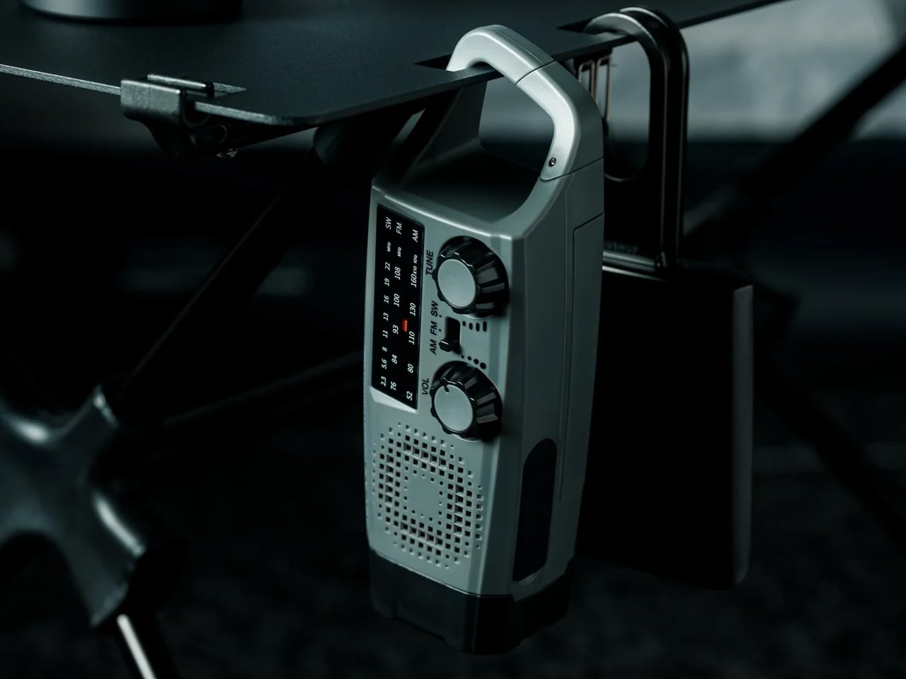
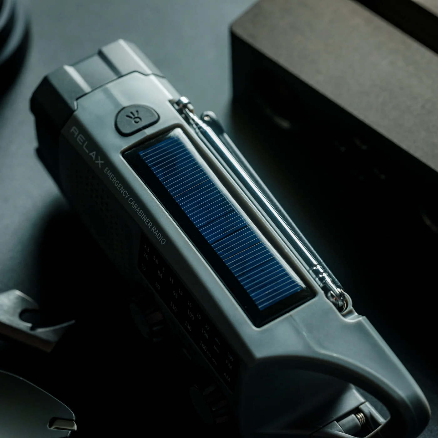
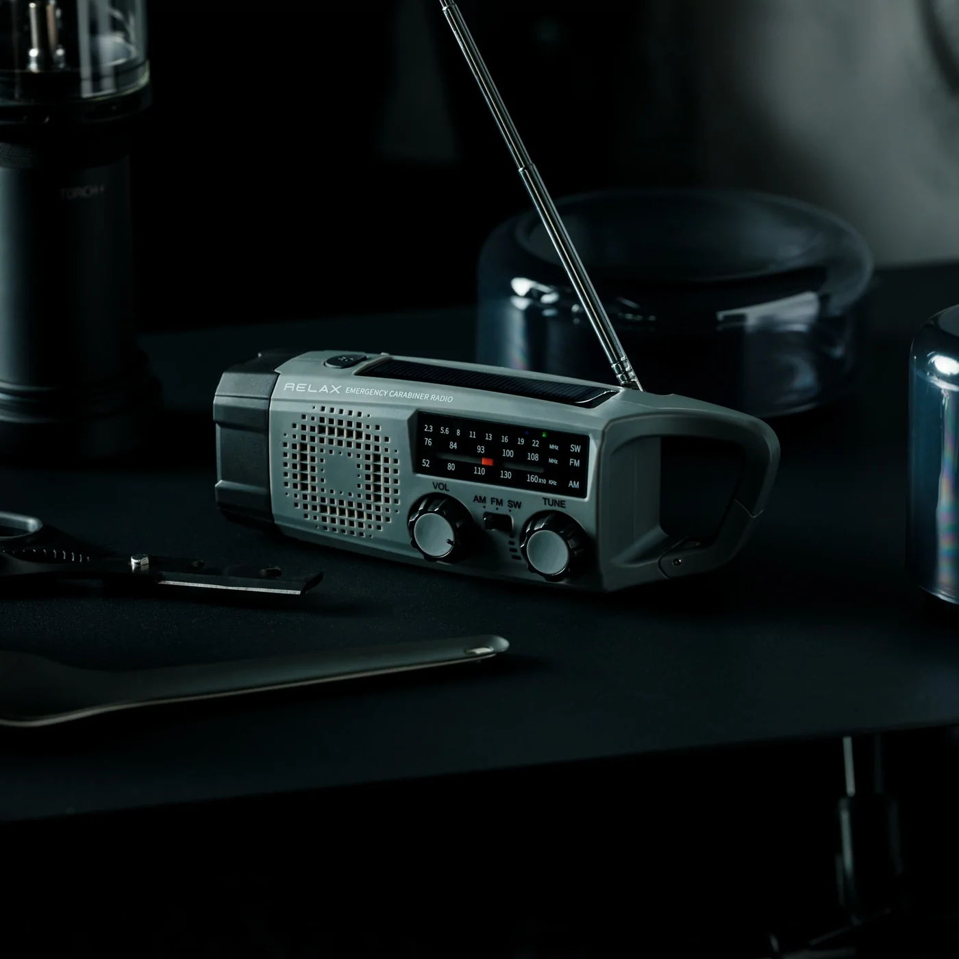
The Clip&Go Radio treats emergency information as something you should never have to search for. Its clip-on form factor means it attaches directly to a bag strap, a belt loop, or a shelf edge, staying within reach the moment a storm warning appears on your phone. It removes the radio from the back of a drawer and puts it exactly where your hand already goes.
For you, this changes what the first ten minutes of an outage actually feel like. Instead of fumbling through boxes for batteries or a charger, you already know where your radio is because it has been clipped to your bag the whole time. That small shift in habit is the difference between calm preparation and last-minute panic when the sky turns dark.
The clip mechanism means it travels with you instead of sitting forgotten until an emergency reminds you it exists
Its compact form factor means carrying it never feels like an inconvenience
What we dislike:
A clip-on build limits how much space is available for larger speaker components or extended battery life
It also means less room for the kind of display or dial controls bigger radios can offer
2. JOAT Titanium Multitool
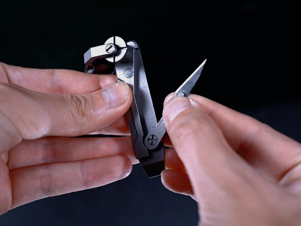
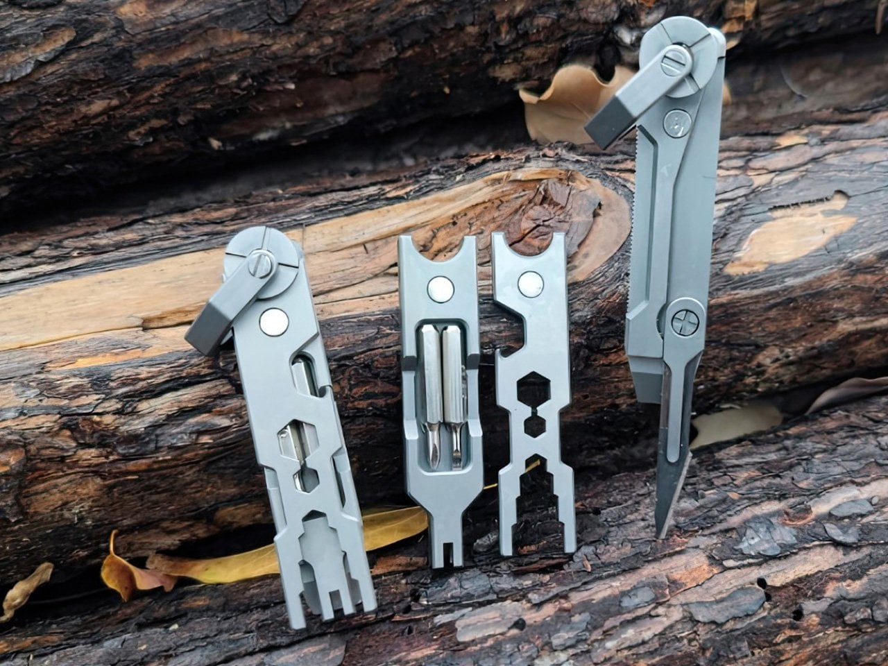
The JOAT earns its name, Jack Of All Trades, by packing six functions into a titanium body just 80mm long and weighing 1.8 ounces. Its keychain loop means it rides alongside your house keys rather than sitting in a toolbox, ready the instant a storm exposes a jammed latch, a loose screw, or a cut strap.
For you, this is the tool that handles the small mechanical failures a storm tends to create without warning. A door that swells shut in the humidity, a tarp that needs tying down, a package that needs opening in a hurry. Because it lives on your keychain, you are never without it, which matters most in the moments you did not think to plan for.
What we like:
Titanium construction resists rust and rough handling far better than standard steel builds
Its keychain-ready size means it requires zero extra thought about where to store it
What we dislike:
At 80mm, it is not built for demanding cutting tasks that a larger blade would handle more easily
Some users may miss a locking mechanism that a compact format like this does not include
3. Blackout Beam Tactical Flashlight
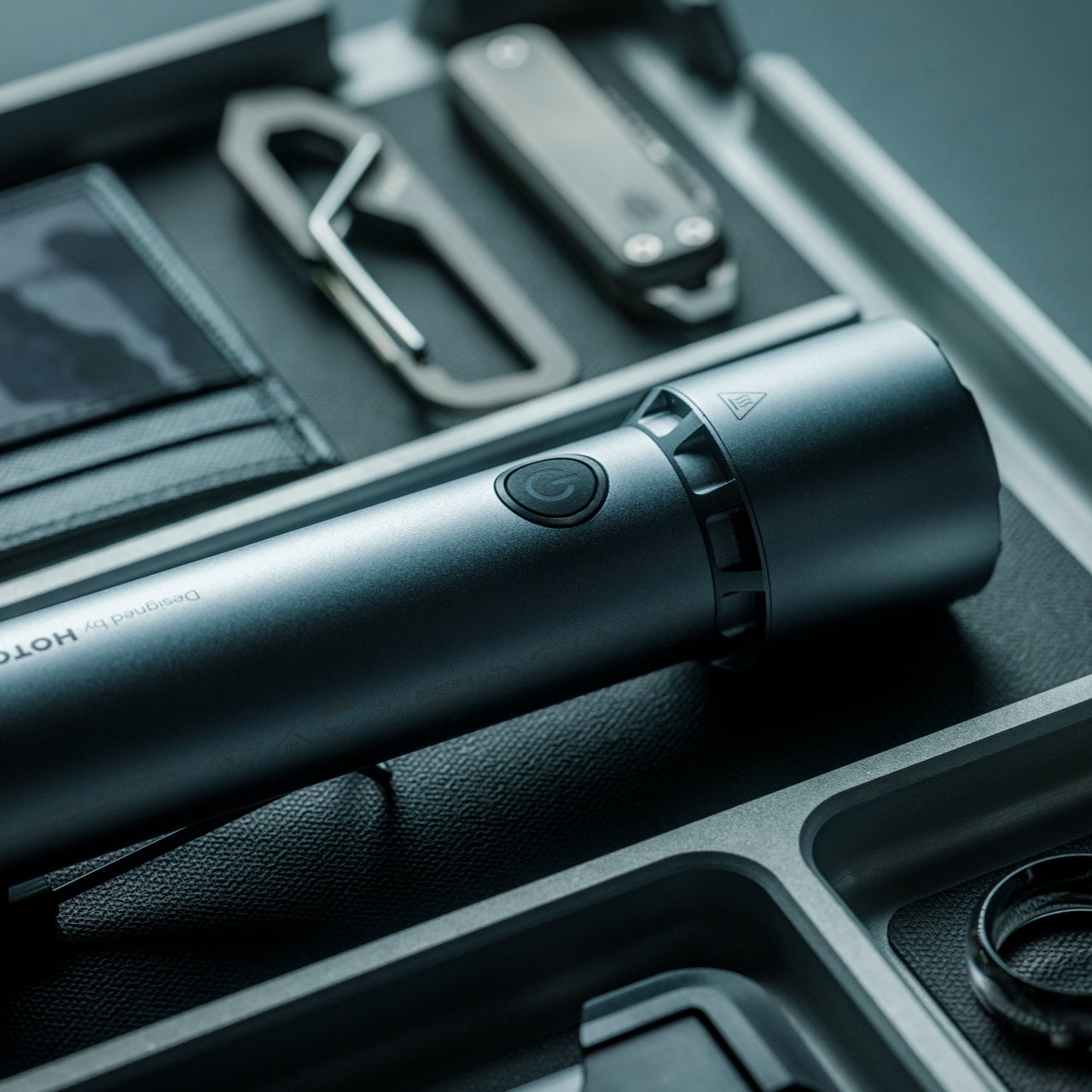
Light disappears first in a storm and gets missed the most. The Blackout Beam Tactical Flashlight is built specifically for that gap, a rugged beam designed to cut through total darkness rather than the soft glow of a phone screen running on its last bar of battery.
For you, this is about confidence more than convenience. Walking through a dark house to check on a leak, moving through a flooded yard, or signaling for help outside all become far less stressful with a flashlight built for exactly that job. It turns a genuinely unsettling situation into a manageable one, simply by giving you a beam you can trust.
Its tactical housing feels built for genuine outdoor and emergency conditions rather than casual bedside use
The focused beam design prioritizes distance and clarity over soft ambient light
What we dislike:
Tactical styling makes it bulkier and less discreet than a slim everyday carry flashlight
Depending on the build, rugged housings can add extra weight to a bag already carrying other gear
4. NESTOUT Solar Charger
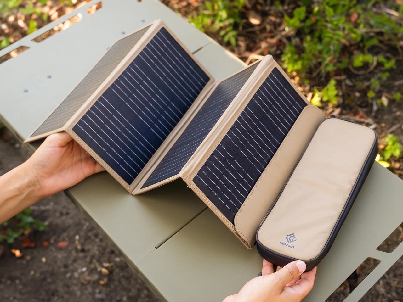
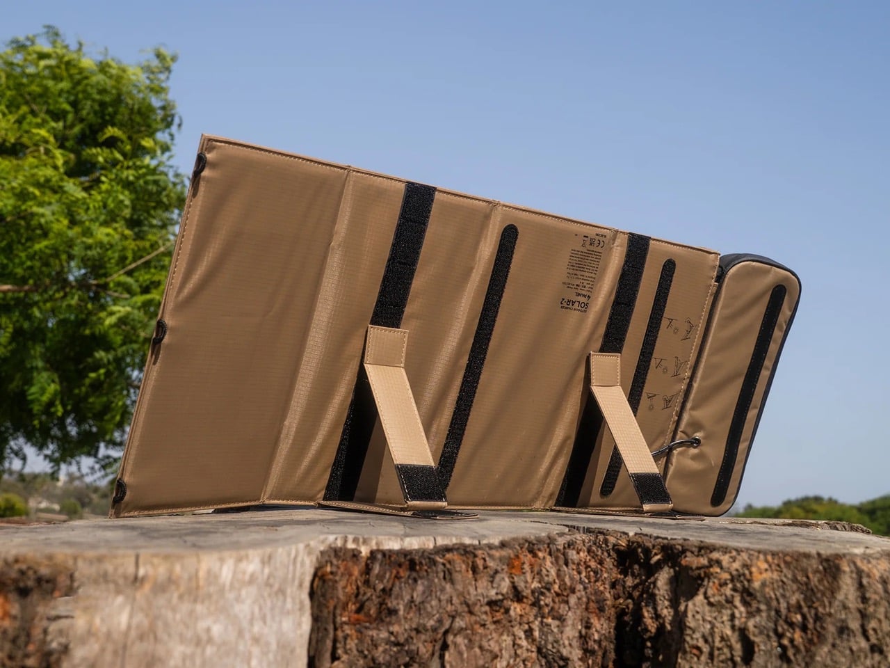
Stored battery power only lasts as long as its charge, but the NESTOUT Solar Charger keeps working as long as the sun does. Its four-panel design folds down into a compact carry format built from rugged, tan colored fabric that feels closer to durable field gear than typical consumer electronics, unfolding into a genuine power source wherever daylight reaches.
For you, this turns a short-term fix into a sustainable one during an extended outage. Instead of watching a power bank slowly drain with no way to refill it, every sunny break in the clouds becomes a chance to top your devices back up. It is the piece that keeps your kit relevant on day three of an outage, not just day one.
What we like:
The folding four-panel design packs down small enough to disappear into a bag without adding real weight
Its fabric build and neutral tone feel purpose-made for outdoor durability rather than delicate electronics
What we dislike:
Solar charging depends entirely on weather and daylight hours, which makes it unreliable during extended cloud cover
It also charges more slowly than a wall outlet, so patience becomes part of the process
5. Rux Gear Box
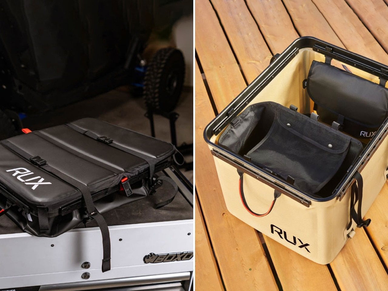
None of the gear above stays useful for long if it ends up scattered across drawers instead of ready to grab. The RUX Gear Box solves that with a collapsible body made from TPU-coated nylon that resists weather and wipes clean easily, plus a separate waterproof insert built to keep wet and dry items apart.
For you, this is the piece that turns four individual objects into one coherent system. Instead of hunting for a radio in one room and a flashlight in another while a storm closes in, everything lives in a single box that compresses flat when not in use and expands the moment you need it. It is the difference between a kit and a pile.
What we like:
The collapsible design means it takes up almost no storage space until an emergency actually calls for it
Its waterproof insert keeps sensitive gear like electronics separated from anything damp
What we dislike:
A soft-sided collapsible build offers less rigid protection than a hard shell case would
Its flexible material also means it will not stack as neatly as a traditional box-style container
Good Design Doesn’t Skip a Storm
Put together, these five objects cover the four things a real outage actually demands. Information, light, utility, and the power to keep going once the first two days have passed. None of them ask you to sacrifice good design to get there, which is exactly the point.
Hurricane season will keep arriving whether we are ready for it or not, but the objects we choose to meet it with do not have to look like they came from an emergency supply closet. These five prove that being prepared and having good taste were never mutually exclusive to begin with.
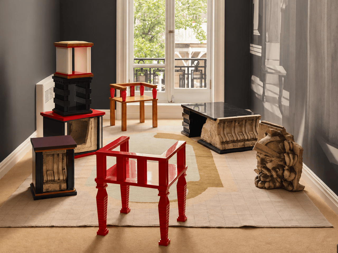
A renovation across the street from Rafael Prieto’s studio offered an unusually good view of his next project. As decorative pieces came off the facade of a Tribeca building, he arranged to save sixteen that were headed for disposal. Most of us would have watched the scaffolding go up and returned to our emails. Prieto, a Mexico-born designer and creative director based in Tribeca, had other ideas. The result is a furniture exhibition that keeps the building’s ornament alive in some very unexpected forms.
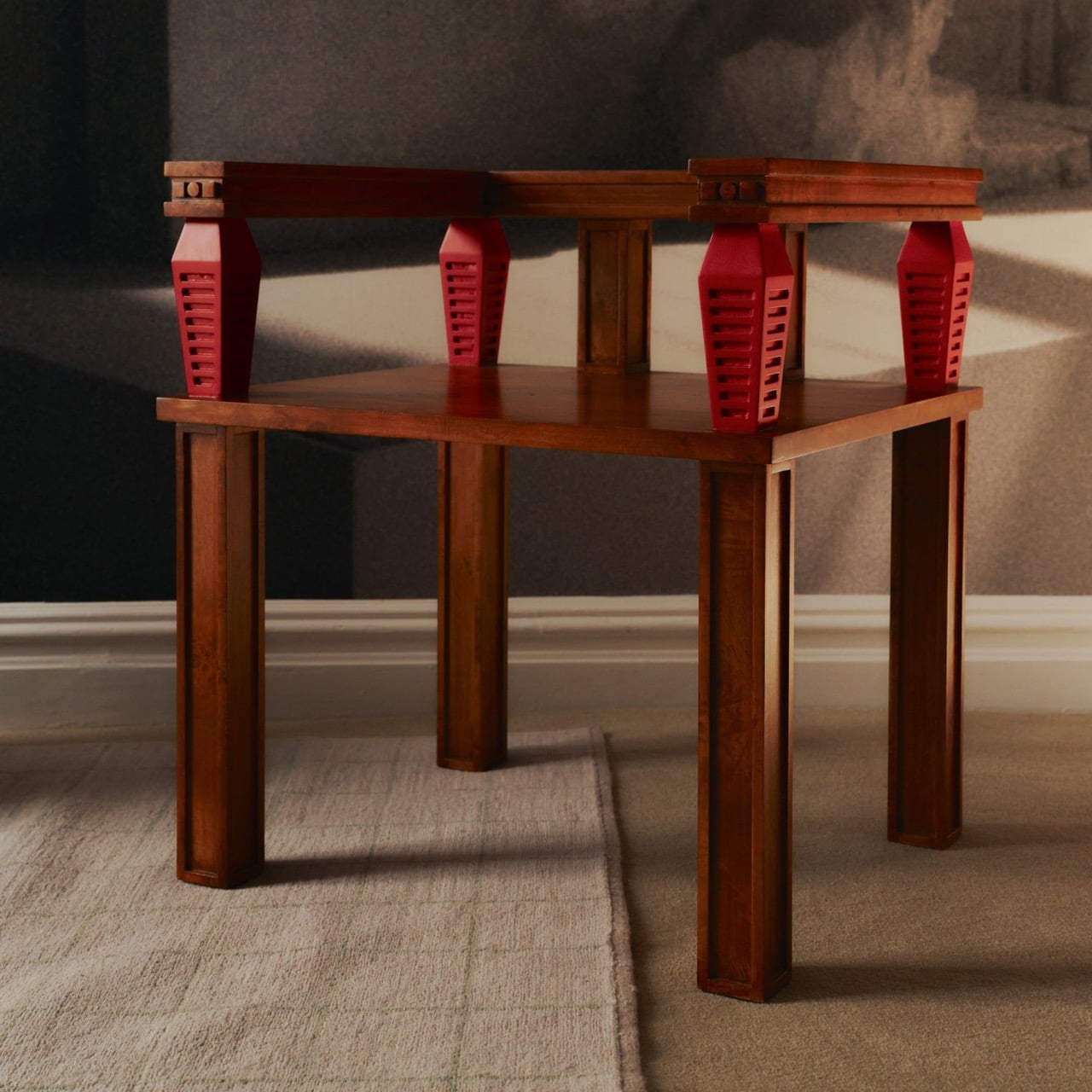
Prieto spent time with the fragments before turning them into the starting point for tables, chairs, and sculptural objects. Weathered ornament sits against painted birch, sometimes tucked inside a crisp new frame. The resulting furniture keeps its New York address close, even when its shape heads somewhere unexpected. Some pieces carry the actual stone; others borrow only its curves, grooves, and proportions. It is a show that rewards looking twice.
Designer: Rafael Prieto
The building across the street is 366 Broadway, now known as Collect Pond House, a twelve-story Beaux-Arts structure designed by Frederick C. Browne in 1908. It was once home to the Royal Typewriter Company, then became a residential co-op in 1979. The facade is densely ornamented: copper cornices, Greek key detailing, marble columns, and keystones carved into bearded faces that have been watching Tribeca change for over a century. A recent multi-year restoration replaced and conserved 65 terra cotta units. A handful of the pieces removed during that process did not make it back onto the building.
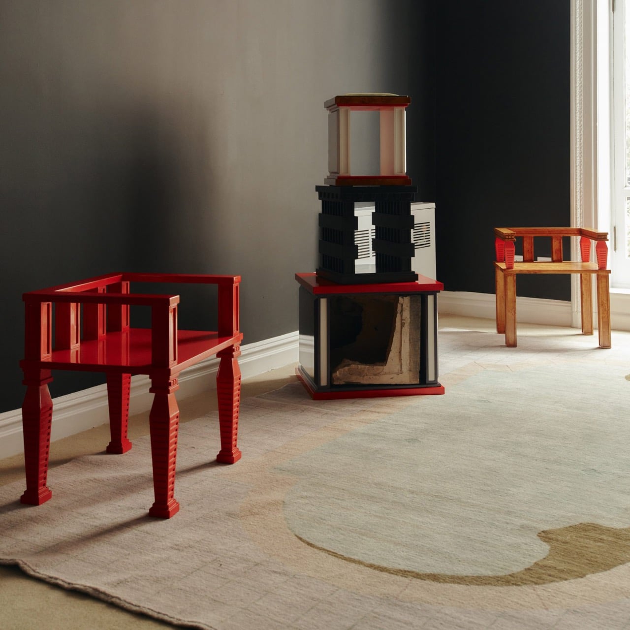
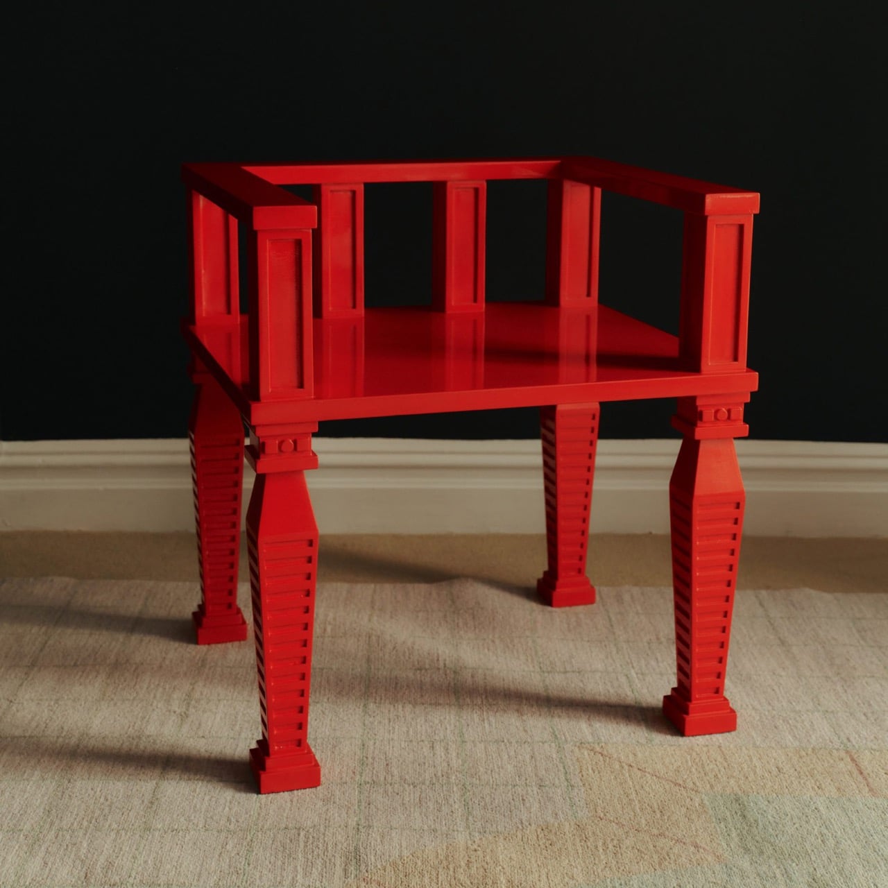
Before cutting anything, Prieto lived with the fragments in his studio for roughly a year and a half. He photographed and scanned each contour and ornament, then layered those images to pull out shapes and combinations that could inform new work. That process produced a design vocabulary rather than any direct copy of the originals. The stepped, ribbed profiles that climb the legs of the red lacquered chair came directly from this translation, somewhere between column fluting and abstracted skyline. It is a method closer to archaeology than furniture-making.
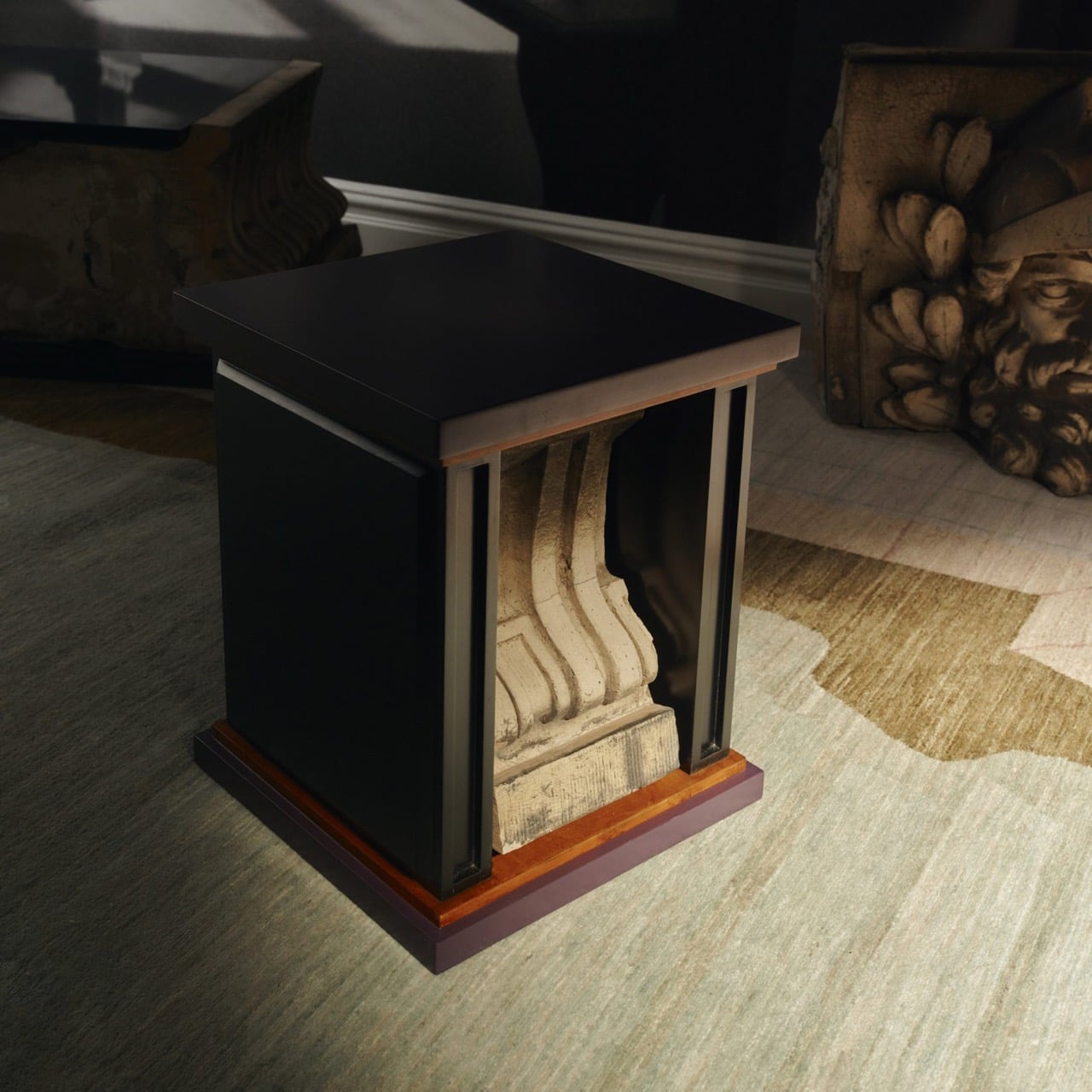
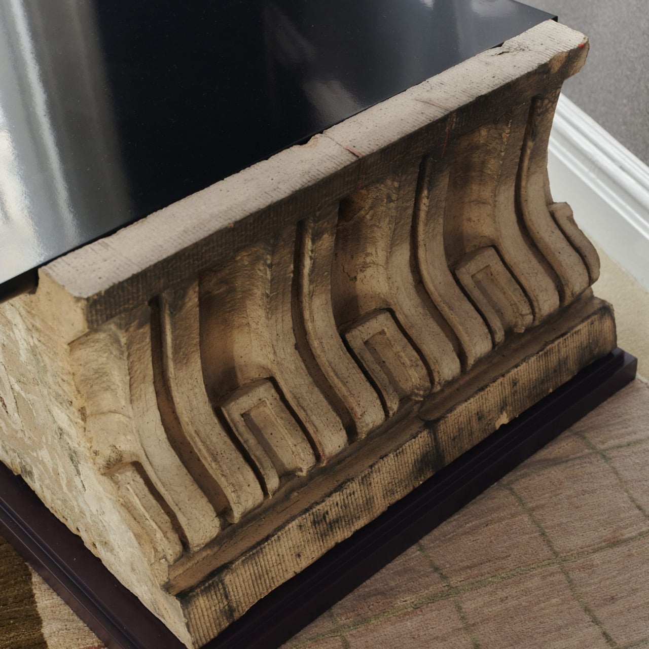
One of the standout pieces has a large carved stone cornice block sitting below a flat black painted tabletop, doing actual structural work. The stone is pale, dense, and loaded with repeating scroll forms, carrying roughly a century of New York weather on its surface. Another piece cages a smaller fragment between vertical black bars inside a cube-shaped form, the stone visible through the gaps like something on display. The medium listing for several works at the gallery confirms “Architectural Fragment” as a named material alongside painted birch. Not every piece carries original stone; some borrow only its shapes.
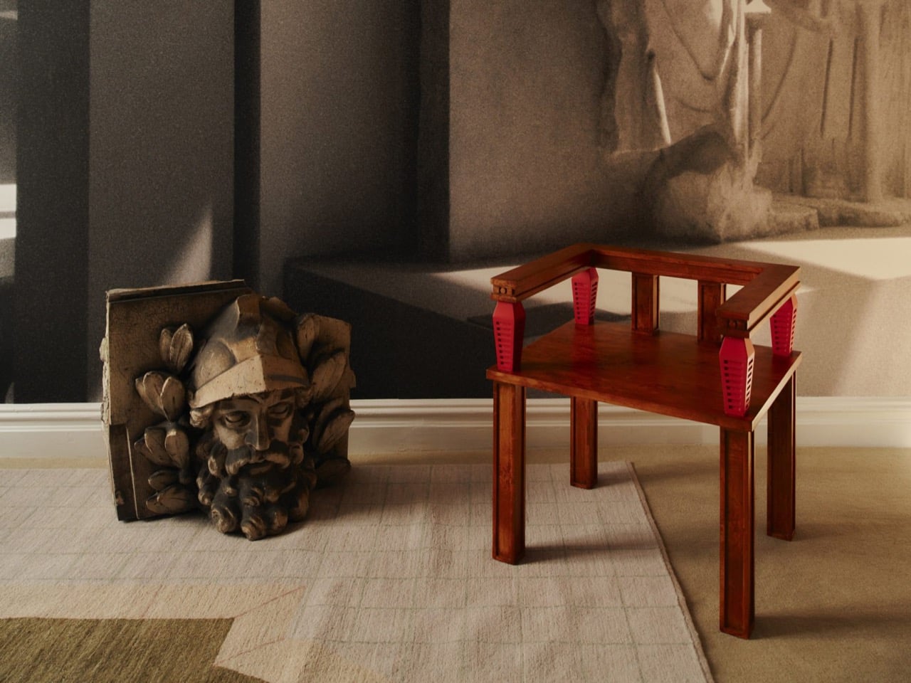
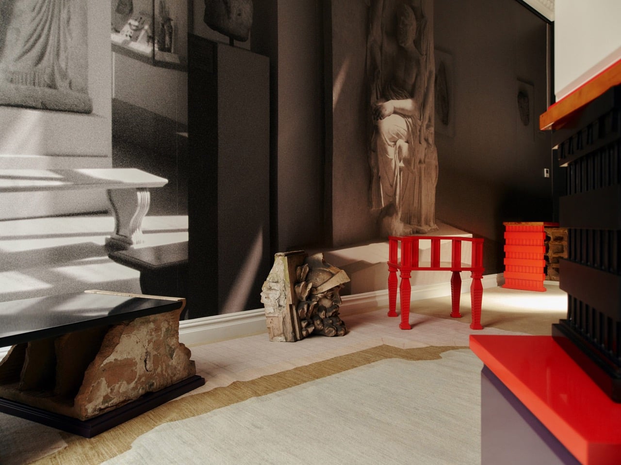
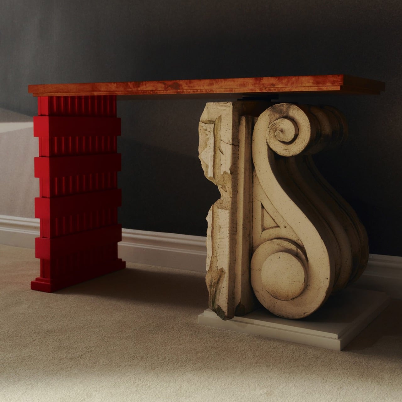
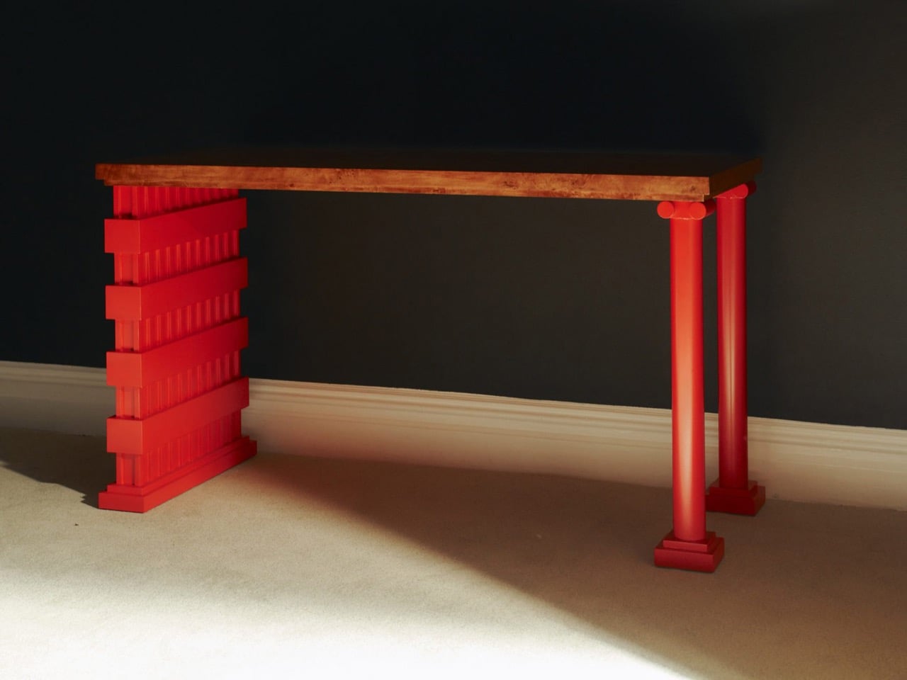
The all-red lacquered chair is the most confident piece in the show, its legs built from stacked, stepped planes that scanning and layering pulled from 366 Broadway’s fluted piers and molded profiles. Its natural birch counterpart deploys the same vocabulary in warm wood, swapping lacquer for grain and adding red geometric arm brackets at the joints. A console table makes the argument most literally: one end sits on a fabricated red plinth, the other rests on an actual salvaged Ionic stone volute, intact and weather-stained. The two supports are not supposed to match. The gallery describes this contrast as the central thread: the hard and the soft, the historic and the contemporary, running through every piece.
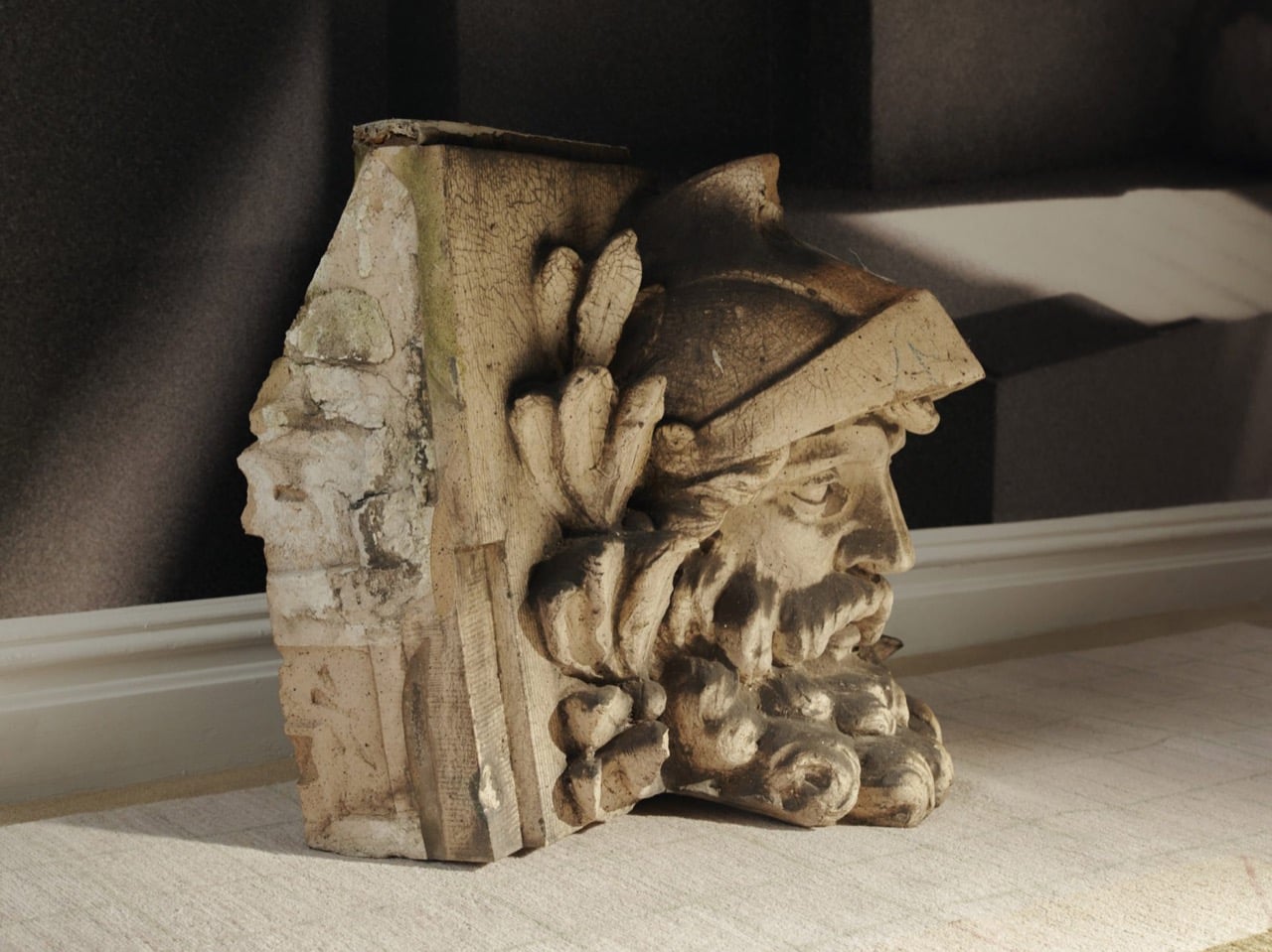
Several of the original keystones sit on the gallery floor unaltered, including one carved bearded face in a plumed helmet still stained with moss and a century of city air. Prieto’s analog photography wraps the walls in large-scale architectural murals, produced in collaboration with Wallpaper Projects. The room ends up feeling closer to a photographed ruin than a white-cube gallery, which is entirely the point. He told Family Style that “New York is its architecture,” and that most people talk about the skyline but “don’t look up.” The show does the looking for you.
‘The Future of the Past’ is Prieto’s second solo show with Emma Scully Gallery and runs through December 12 at the Upper East Side location, open Wednesday through Saturday. Pricing and availability are through the gallery directly. The question the collection keeps circling is whether furniture shaped by a building’s discarded ornament carries any of that building’s memory with it. Prieto does not seem interested in settling that question cleanly. The bearded face on the gallery floor looks like he has made his peace with the whole situation.
It’s a little strange when you think about it. People will spend weeks comparing headphones or picking the right coffee maker, yet the hair dryer, shaver, or toothbrush sitting on the bathroom counter rarely gets a second thought. Laifen’s fall lineup is built around fixing exactly that gap, treating everyday personal care tools with the same design attention usually reserved for gadgets people actually brag about owning.
The brand happens to be running one of its bigger sales of the season right now, and it covers four products that together handle nearly every step of a morning routine. Two hair dryers, an electric shaver, and an electric toothbrush, each one designed less like a bathroom appliance and more like something you’d actually want to leave sitting out in view.
Laifen SE 2: The Hair Dryer Most People Should Have Switched to by Now
Most hair dryers get the job done, until something faster comes along and makes the old one feel sluggish by comparison. The Laifen SE 2 runs on a 108,000-RPM brushless motor that pushes air at nearly 48mph, noticeably quicker than what most household dryers manage without resorting to constant blasts of heat. That speed alone cuts a few minutes off the usual routine.
What makes the SE 2 worth a second look is Temperature Cycling Mode, which alternates airflow patterns instead of holding one constant heat level, cutting down on damage from daily drying. 10 drying settings cover most hair types, and at 14.35 ounces without the cord, it’s light enough to hold through a full styling session. The matte white finish fits into almost any bathroom without effort.
Laifen Swift 4: The Dryer That Turns an Everyday Step Into a Hair Care Routine
Most people treat drying and hair care as two separate steps, applying oil or serum first and hoping the blast of hot air doesn’t undo the work. The Laifen Swift 4 folds both into one motion through its Nourishing Nozzle, which breaks essential oils into fine particles and distributes them at a steady 136°F, letting the oil work into hair while it dries instead of sitting on top of it.
Behind that trick sits a 115,000-RPM motor pushing air at nearly 51mph, with temperature checks running 1,000 times a second to keep heat steady. Six modes cover everything from a quick blast to a gentler nourishing cycle, while 400 million negative ions calm frizz and 70 million positive ions look after the scalp. It comes in three metallic finishes, none of them loud.
Laifen P3 Pro: A Shaver Built the Way Premium Gadgets Are Built
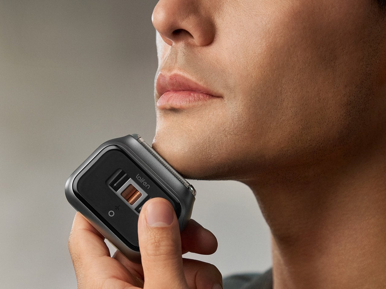
The Laifen P3 Pro Space Gray leads with a detail that has nothing to do with how close it shaves: a transparent motor window borrowed from the exhibition backs of mechanical watches, letting the internals show through instead of hiding behind plain plastic. The body itself is CNC-machined aluminum, a process that takes 9,000 seconds per unit, longer than what most flagship phones require.
At 6.3 ounces and barely bigger than a deck of cards, it slips into a dopp kit or jacket pocket without adding bulk. The dual-drive linear motor reads beard density in real time and adjusts power automatically, so thick patches don’t cause snagging. Two shaver heads handle close, short stubble, a flexible trimmer catches longer hair, and the whole thing carries an IPX7 rating for shower use.
Laifen Wave Pro: The Toothbrush That Actually Pays Attention While You Brush
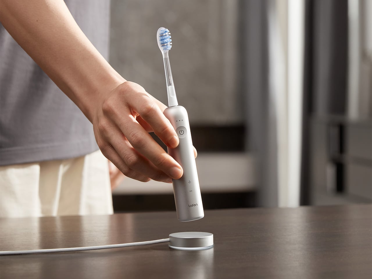
Most people’s relationship with their toothbrush doesn’t involve much thought, which is exactly the assumption the Laifen Wave Pro pushes back on. Its brush head oscillates through a 60-degree arc, wider than most sonic brushes manage, combined with 66,000 vibrations a minute, following a brushing pattern modeled on the Modified Bass technique dentists have recommended for decades. The stainless steel body signals this isn’t an afterthought.
A pressure sensor tracks how hard you’re brushing and dials back motor speed the moment it senses you’re pressing too hard, protecting gums and enamel in the process. Two modes and three intensities give 10 adjustable levels through the companion app, while wireless charging and roughly 70 days of battery life mean it rarely needs attention. A travel pouch and two brush heads round out the package.
Taken together, these four pieces cover the parts of a morning that rarely get a second thought until something better shows up and makes the old routine feel dated. Laifen built each one around a specific daily habit, from drying to shaving to brushing, and the fall lineup lands right as the season nudges people to reset those habits anyway.
Click Here to Buy Now: 96$119.99 (20% off, use coupon code “PRFALLSALE”). Hurry, deal ends in 48-hours!
56k.rip
est un site qui va exciter votre nostalgie d'ancien puisqu'il vous permet de simuler dans votre navigateur une connexion internet par modem de 1996. Vous arrivez sur un faux écran de BIOS, puis direct sur un bureau Windows 95 avec son bouton Démarrer, et ensuite pour aller sur le net, il faut double-cliquer sur l'icône Dial-Up Networking, exactement comme à l'époque !!
Sur cet "ordi" traîne également un fichier texte qui détaille la procédure en onze étapes, dont l'interdiction absolue de décrocher le téléphone de la cuisine, sinon ça vous déconnectera et faudra tout recommencer !! Argh, ça me rappelle de sales souvenirs ^^ !
Pour la connexion, le terminal déroulera du ATZ, ATDT 555-0156 et RINGING avant de lâcher un joyeux CONNECT 50666/ARQ avec le son de connexion dégeulasse qui va bien. Et environ 25 secondes plus tard, vous serez sur la page d'accueil de COMETLINK, un fournisseur d'accès fictif.
Le terminal de connexion
Et ensuite c'est là que le site fait son truc, puisque chaque page web que vous visitez sera chargée selon un "budget" d'octets lié au débit que vous avez choisi. Dans ma fenêtre de connexion, j'avais le choix entre un modem 28.8 et un modem 56K du coup j'ai pu revivre ce trauma de ma jeunesse ^^.
Une fois connecté, on peut donc surfer sur un web d'époque en mode simulateur et donc par exemple charger le site de Gary et ses photos de vacances qui mettent de loooongues minutes à s'afficher couche après couche (JPG tu connais...). L'expérience est vraiment réaliste. C'est juste dommage qu'on ne puisse pas aller sur le site de son choix, cela dit.
La page des photos de Gary en plein chargement
Après ouiiii, je sais les nerds, y'avait pas de modem 56K en 1996 puisque les premiers sont arrivés vers février 1997 (et la norme V.90 n'a été approuvée officiellement qu'en septembre 1998), mais c'est quand même rigolo d'aller fouiller ce tout petit internet d'époque avec une page sur la pêche, un livre d'or, des petites annonces, la météo et même un article qui explique ce qu'est internet... Il y a aussi du mail, un salon de chat, un démineur et un logiciel de dessin.
Bref, si vous n'avez pas connu cette époque bénie où les réseaux sociaux n'existaient pas et où Internet prenait son temps (et nous était facturé à la minute), bah ça vaut le coup pour l'expérience !
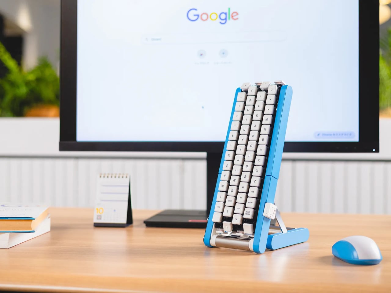
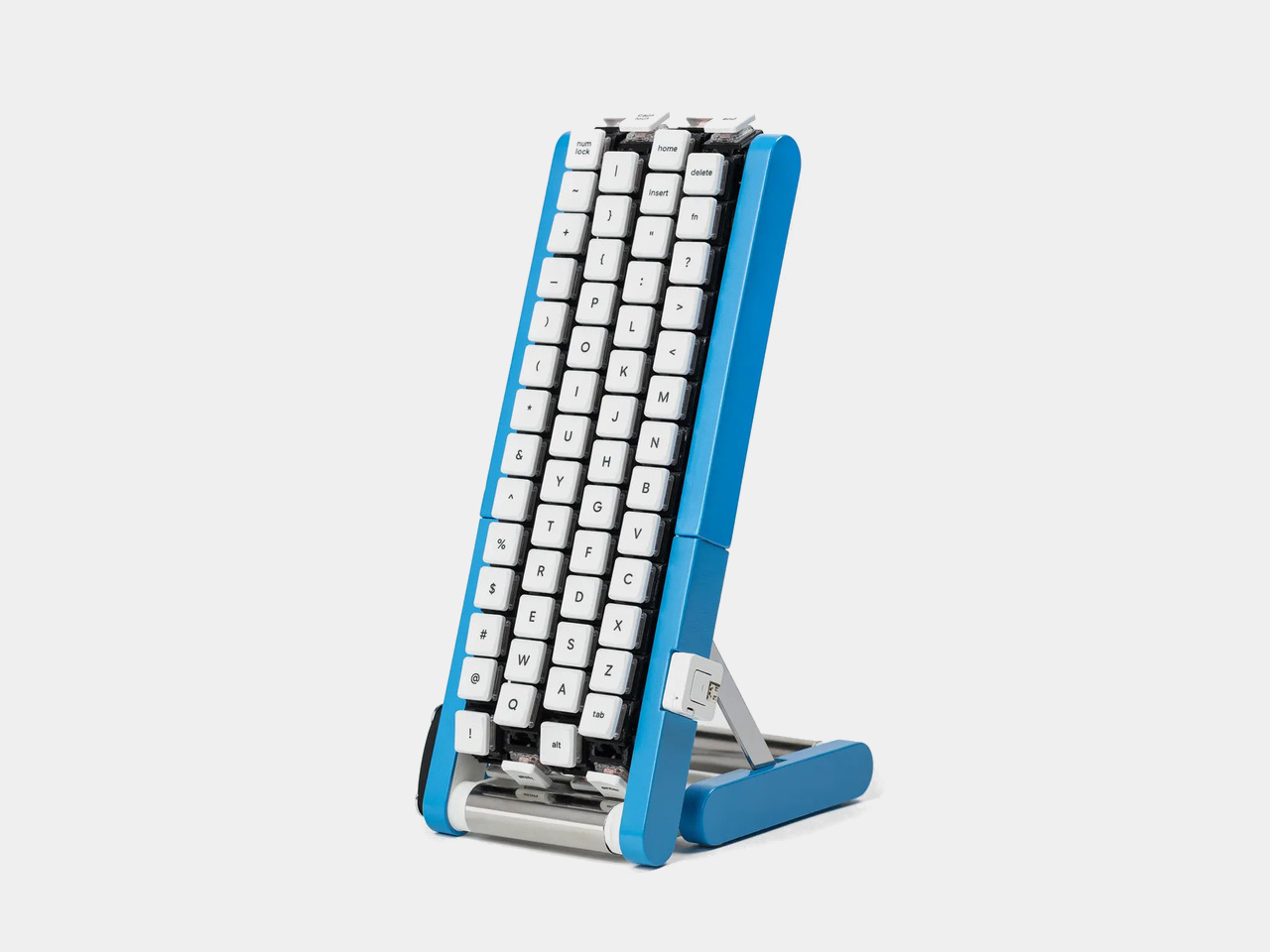
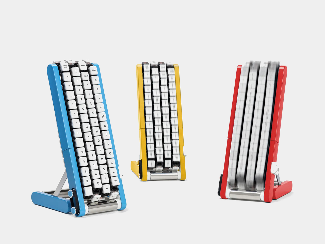
Typing with one hand usually means stretching a finger across a keyboard while the other hand holds a drink or works a mouse. Google’s Gboard team has a wonderfully impractical fix: put the keys on a conveyor belt and let them come to you. Its Rotating Keyboard stands upright on a desk, asking your finger to stay put while the letters keep moving.
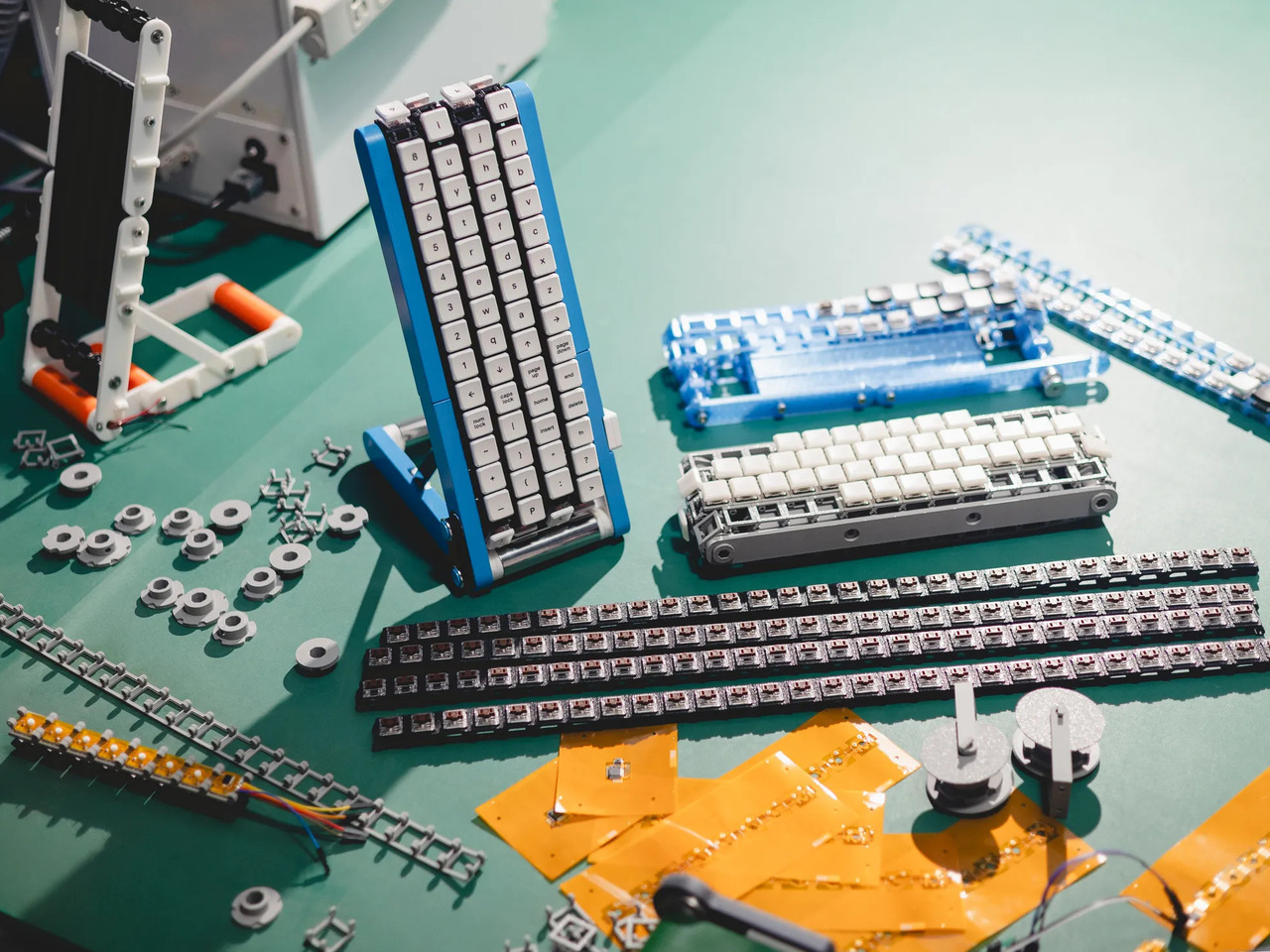
Regular keyboards assume your hands will travel between stationary keys, a reasonable arrangement that has survived decades of typing. Google reverses that relationship by mounting rows of keycaps on loops that travel around rollers. The tall blue frame and angled stand make the moving assembly feel closer to a miniature factory machine than a computer peripheral, which is probably part of the joke.
Instead of looking down for a letter, you watch for the right key to arrive and press it as it passes. Google says each belt carries 29 keys and can input both uppercase and lowercase letters. That might let one hand stay near the same spot, though it also turns typing into a timing exercise, especially when the next letter takes its time coming around.
Imagine answering an email with a cup of tea in your free hand. On a conventional keyboard, you’d either put the cup down or hunt for letters one finger at a time. Here, the moving keys do the traveling while you wait at the front of the machine. Google also suggests using your free hand on a mouse, which sounds suspiciously like extra work.
There’s an oddly earnest design lesson underneath the silliness. Questions about ergonomics often begin with who a familiar object was made for, and Google has taken that thought to a ridiculous extreme. The upright arrangement might use less horizontal desk space than a full keyboard, but it trades that footprint for height, moving parts, and the need to watch every passing key.
Google plays along with its own premise, floating ideas for faster movement, longer belts with more characters, shorter versions for phones, and different colors. None of those variations is a promised product. Even the keyboard itself isn’t headed for stores; the team has released open-source plans for a similar device instead. That keeps the joke open to anyone curious enough to build one.
The date is part of the gag, too. Google chose October 1 as a nod to the familiar 101-key keyboard, rather than waiting for April Fools’ Day. It’s the team’s 15th keyboard proposal, continuing a habit of treating ordinary typing as a problem that needs an absurdly elaborate solution. A conveyor belt is hardly the first thing most people would try.
You’re unlikely to write a novel by chasing letters around this contraption, and that isn’t really the point. Google has built a physical answer to a question no keyboard maker was asking: what if the keys did all the moving? It’s a ridiculous way to type an email, but an effective way to notice how much we expect our fingers to do.
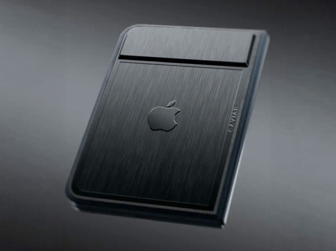
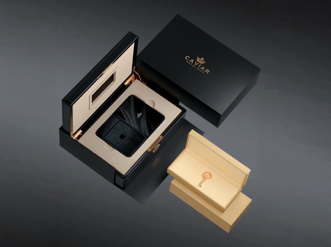
Imagine sitting at a table with friends and whipping your phone out. Your friends see it’s a foldable… then as you unfold it, the animation looks suspiciously like the iPhone Duo. Your friends are impressed, they designate you as the group photo taker… and you tell them regrettably that your iPhone Duo has no cameras. Then you add… not only does it not sport any cameras, it also costs fourteen grand.
To be honest, that scenario is entirely imaginary. Mainly for a bunch of key reasons. Caviar built this version of the iPhone Duo for privacy, championing what they call “Privacy, Minimalism, and a Refined Masculine Style.” Someone who sees truth in that ethos isn’t designated photographer material. And if they were, shelling 14k on a phone means you probably have a few extra grand to hire a photographer wherever you go. The only reason someone buys this hare-brained version of the iPhone Duo is because they can. Plain and simple.
Removing the camera stack from the back of the iPhone Duo does something unexpected: the phone becomes genuinely beautiful. That rear panel, normally dominated by the triple-lens module, turns into a single flat sheet of satin-finished black titanium. No bumps, no rings, no glass circles competing for visual real estate, just one uninterrupted surface that shifts character depending on the light hitting it. Caviar calls the inspiration “supersonic aviation aesthetics,” which sounds like marketing speak until you actually look at the product photos. A blacked-out Apple logo sits flush in the titanium, the Caviar crown marks the opposite panel in a swept fabric-like texture, and the whole thing looks less like a phone and more like a prop from a very expensive spy film.
Apple’s decision to use Touch ID for the iPhone Duo, abandoning Face ID, turns out to be what makes Caviar’s camera-free execution actually hold up. A Face ID phone needs its front camera array to function as a biometric sensor, so pulling that out would mean a very pretty device that cannot unlock. Touch ID lives in the frame rather than behind the screen, so Caviar could strip the entire camera stack, front hole-punch and rear module both, without breaking anything fundamental. Based on product images, the inner display on the Ultimate appears completely clean, no hole-punch interrupting the screen, which makes the inside as seamless as the outside. Two separate design decisions from two separate companies ended up fitting together better than either could have planned.
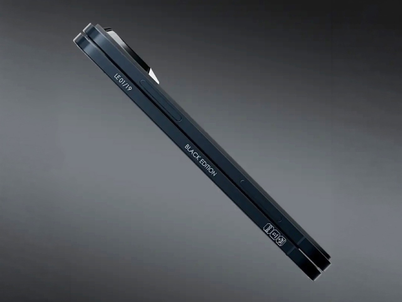
Caviar made 19 of these total. Each unit ships in a custom lockable black luxury box, presented the way a jeweler presents a watch rather than the way Apple ships a phone. A smaller gold-colored wooden case inside holds what appears to be a gold-plated commemorative coin, the kind of object that exists purely to make the unboxing feel like a ceremony. The side of the phone is engraved with a serial number too, for exclusivity. Caviar knows exactly who they are selling to, and made sure the packaging matches the energy.
Caviar has been doing this for years, taking flagship Apple hardware somewhere Apple would never go, for clients who appreciate the gesture. The formula is consistent: start with the most premium Apple product on the market, make it rarer, make it more dramatic, and let the price be the final statement. We have covered their gold-plated and titanium iPhone builds here before, and none of them committed this hard to stripping features as a form of self-expression. At $13,990 for 19 units (mind you, that’s just the 512GB variant), the Ultimate is the purest version of the Caviar argument: a phone that costs seven times its base price because it does less, and somehow makes that sound like the point.
I’m the kind of person who can set down my keys, turn around, and immediately forget where they went. Wallets, earbuds, and bags have a way of disappearing at the least convenient moment, too. A smart tracker can spare you a frantic search, but only if its battery is working and its location can still be found. That makes battery life and the ability to locate an item beyond your phone’s immediate range just as important as a good-looking design.
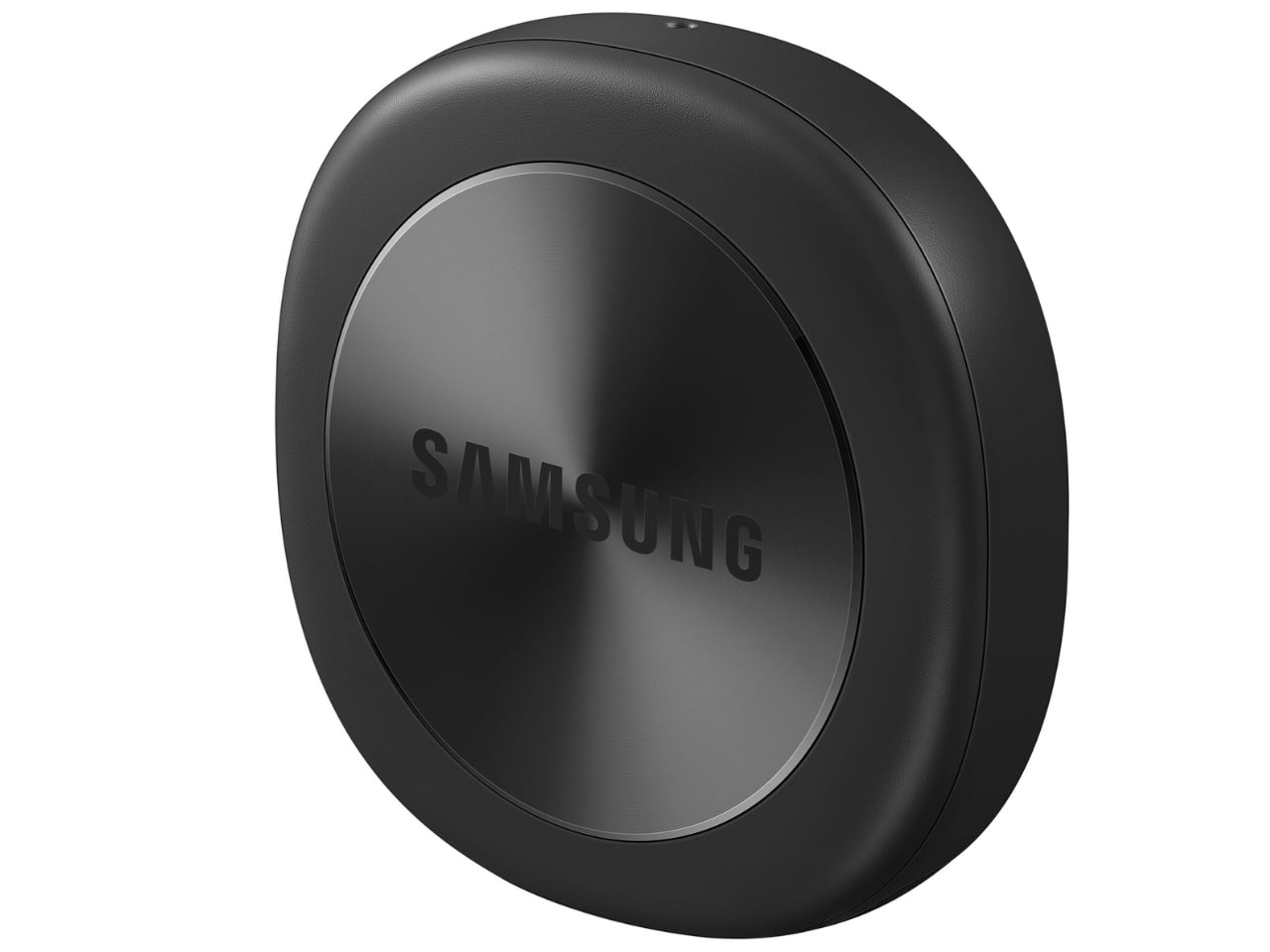
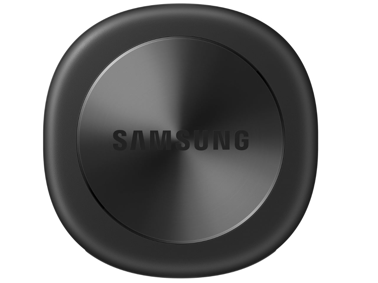
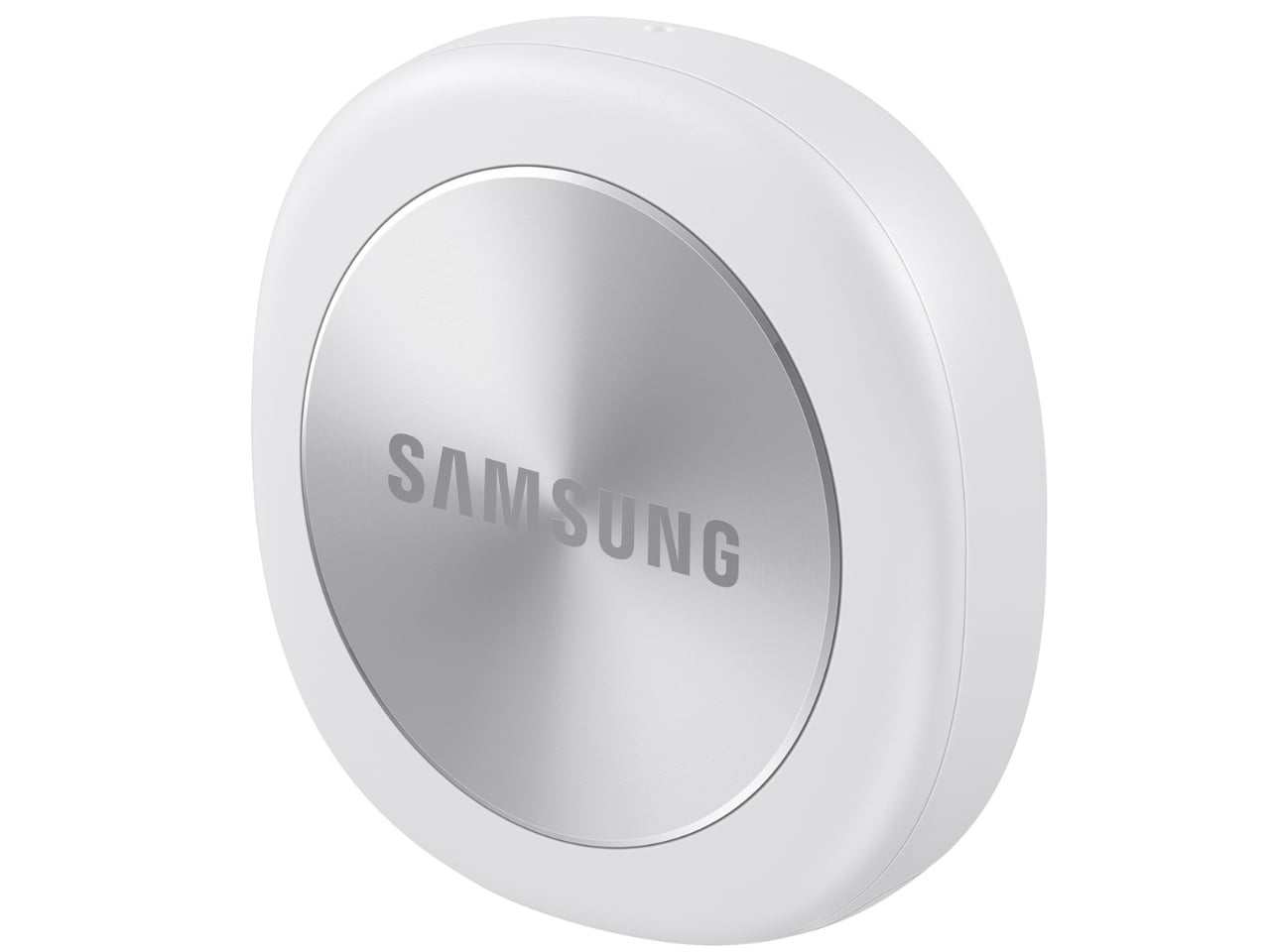
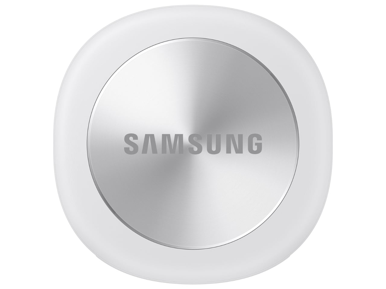
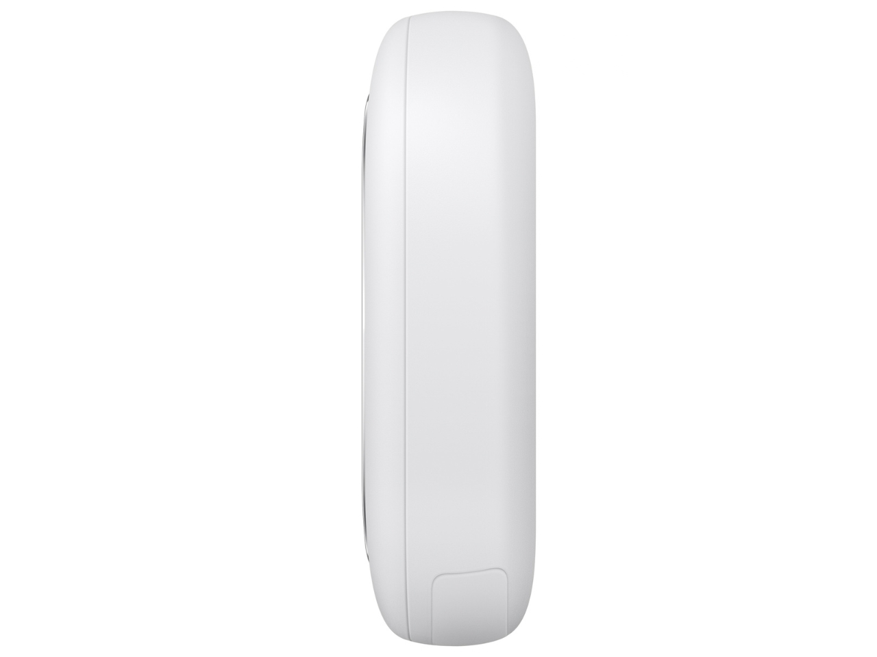
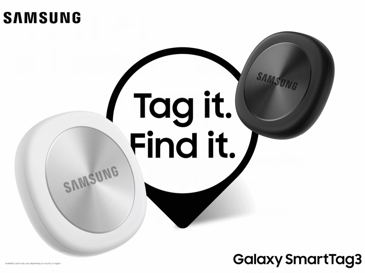
Designed by Samsung, the Galaxy SmartTag3 aims to address those everyday frustrations in a smaller package. Its rounded, nearly square shape gives it a clean look, while its reduced size should make it less noticeable on the things you carry. That matters more than it might seem. A tracker attached to a set of keys needs to be easy to live with every day, not just useful on the rare occasion those keys go missing.
Design: Samsung
The change in shape also raises a practical question: how will you attach it to your belongings? Samsung offers a silicone case with an integrated keyring and a loop case, giving users different ways to secure the tracker to keys or a bag. The smoother outline may look better on its own, but anyone buying one for their keys should consider which attachment will work best.
Samsung says the SmartTag3 is 35% smaller by volume and 33% lighter than its predecessor. It also retains an IP67 rating, indicating resistance to dust and water under specified test conditions. That offers reassurance if the tag gets caught in the rain, though it does not mean the device is waterproof in every situation.
Battery life may be the more meaningful upgrade for anyone who has discovered a dead tracker while looking for a lost item. Samsung says the SmartTag3 can run for up to 550 days under standard usage or up to 790 days in Power Saving Mode. Those figures are based on Samsung’s testing, not a promise that every user will get the same result. Still, a tracker that needs attention less often is less likely to let you down because you forgot to check its battery.
Finding something nearby should be easier, too. Compass View uses Bluetooth 6.0 Channel Sounding to provide distance and directional guidance from up to 60 meters away, about three times farther than on the previous model, according to Samsung. It could help you narrow down where to look before you’re close enough to spot the missing item. Compass View is not available on iOS.
The other finding features are intended to help in different situations. If you leave a tagged bag behind, a Left Behind Alert could prompt you to go back for it, although that feature is also unavailable on iOS. Place Notification is designed to alert you when a tagged item enters or leaves an area you define. Location History and Movement Detection Alert may provide additional clues about where an item has been or whether it has moved. Together, these tools could help you notice a problem sooner and narrow down where to look.
Lost Mode addresses a different problem: helping someone return an item they find. With a compatible phone, a finder can scan the tag using NFC to see the contact information or short message you have registered. That could be useful for a bag left at a café or luggage separated from you during a trip. When an item is beyond your phone’s range, however, location updates depend on nearby participating Galaxy devices. The SmartTag3 should not be treated as a continuous, real-time GPS tracker.
The SmartTag3’s appeal is the combination of a compact design, long claimed battery life, and features that help at several stages of a search. It cannot prevent you from leaving your keys behind, and its alerts will not replace paying attention to your belongings. But if it helps you catch a forgotten bag before you get home, or gives you a useful clue when something disappears, it has done what a well-designed tracker should: made a small, stressful problem easier to manage.
SlopTotal
est un projet qui se présente lui-même comme le "VirusTotal du texte IA", alors faut pas s'étonner que ça m'intéresse ! Vous y collez un texte, un PDF ou une URL, et ensuite 23 détecteurs le passent au crible, en parallèle à l'aide de classifieurs neuronaux, de tests statistiques et autres heuristiques. Ensuite, un score calibré de 0 à 100 résume leurs avis et doit vous dire normalement si tel ou tel texte a été écrit avec de l'IA
J'ai donc installé ça sur ma machine puis passé 36 textes divers et variés (IA et humains) dans mon instance. Parmi eux, 24 ont été écrits par Claude, ChatGPT et Gemini (12 en français, 12 en anglais), avec comme consigne d'avoir un ton neutre, et pour d'autres un ton de "blogueur" ^^. Les 12 autres textes, eux, sont humains. Je lui ai donné 6 de mes articles écrits entre 2018 et 2021 ainsi que 6 billets de blog tech en anglais publiés entre 2020 et 2021.
Voici donc mes résultats...
Sur les 12 textes humains, 4 ont été pris pour de l'IA (verdict "Likely AI-generated" ou pire), ce qui représente 33 %, et ils étaient tous en anglais !! Et sur mes 24 textes écrits par une IA, 9 ont été pris pour une réalisation humaine (verdict "Clean"), ce qui équivaut à 38 %. Ah et ils étaient tous en français.
Le README annonce pourtant mieux comme résultats donc je suis assez étonné (1 texte humain sur 66 classé "Likely AI"), mais sur d'autres genres de textes, comme la presse ou les livres et en 100% english. Alors oui, mon échantillon est petit, mais pour savoir si un texte vient d'une IA, SlopTotal ne me semble pas fiable
Le rapport de SlopTotal pour un article de 455 mots écrit par Claude : 23,6 sur 100, verdict "Clean", 4 moteurs sur 23 en alerte.
Le rapport de SlopTotal pour un billet du blog d'avril 2020 : 56,9 sur 100, "Likely AI-generated", 9 moteurs sur 23 en alerte.
Après c'est pas un nouveau problème car je pense par exemple à OpenAI qui a retiré son propre classifier en juillet 2023 parce que la précision était trop faible (
The Register
). Vanderbilt a débranché également celui de
Turnitin
le mois suivant et
des chercheurs de Stanford
ont testé en 2023, 7 détecteurs en leur faisant analyser 91 rédactions humaines TOEFL de non-anglophones et en moyenne, ils en ont pris 61 % pour de l'IA.
Toutefois, 2 études plus récentes ont également testé des détecteurs commerciaux (pas SlopTotal donc...), et sur du texte humain ancien, elles se rejoignent.
Le NBER
trouve par exemple un taux de faux positifs quasi nul chez Pangram, de 0,1 à 0,3 % chez OriginalityAI et d'environ 0,7 % chez GPTZero, sur 1 992 textes humains d'avant 2020. De son côté, le chercheur
Jonathan Karr et ses collègues
n'ont trouvé aucun positif IA en testant avec Pangram et GPTZero, des tonnes de résumés textes datés de 2013 à 2015.
Par contre, ces études divergent sur l'humanisation. Par exemple, selon le NBER, Pangram tient bon face à l'humanizer StealthGPT alors que moins de 4 % des textes IA passés par Undetectable AI restent signalés chez Karr. Ce dernier note aussi qu'à l'inverse, un résumé écrit par un humain et simplement retouché par une IA est quant à lui, signalé comme IA dans 38 à 80 % des cas. Ça pourrait expliquer pas mal de petits problèmes de "littérature" qu'on a en ce moment, looool.
Bref, installez-le pour vous faire votre propre idée, en commençant par des textes dont vous connaissez l'auteur, mais surtout pas pour "accuser" quelqu'un. Je pense d'ailleurs qu'aucun détecteur ne devrait être la seule preuve d'une accusation... Par exemple, un texte humain qui est passé dans un correcteur orthographique full IA ou alors un texte qui est dicté avec un modèle de speech to text IA peuvent très bien être reconnus comme étant des textes IA alors qu'en fait ce sont juste des textes écrits / dictés par des humains et qui ont été "un peu" modifiés ou "un peu" réorganisés par un LLM. Je dis ça parce que c'est exactement ce que fait mon application de reconnaissance vocale
Kassis
, qui dispose de fonctionnalités de correction et de réécriture... héhé.
La société de sécurité Depthfirst a publié un billet que j'ai trouvé intéressant dans lequel ils expliquent en gros que les conteneurs (Docker et compagnie) ne sont plus une barrière de sécurité suffisamment solide. La thèse du papier, c'est qu'il faut désormais partir du principe qu'un attaquant (hacker ou malware) saura sortir d'un conteneur quand il le veut, sans grande difficulté.
En effet, un conteneur comme ceux que font tourner Docker ou Kubernetes, donne à un programme l'impression d'avoir sa propre machine. Sauf qu'en réalité, il n'embarque pas de système d'exploitation. Tous les conteneurs d'un serveur passent par le même noyau Linux qui est celui de l'hôte et dont le rôle est de gérer pour eux la mémoire, le processeur ainsi que le réseau.
Toutefois, beaucoup d'organisateurs de CTF notamment s'y fient les yeux fermés et hébergent plusieurs épreuves sur le même serveur, chacune dans son conteneur, en comptant uniquement sur la sécurité de l'hôte. Mais c'est un faux sentiment de sécurité, j'en veux pour preuve ce
bulletin de sécurité
d'AWS daté de novembre 2025 où il est expliqué que l'entreprise ne considère plus les conteneurs comme une barrière de sécurité et ne s'en sert donc plus pour isoler ses clients les uns des autres.
Ce qui a changé depuis quelques mois, vous le savez, c'est le prix d'entrée de la recherche de failles puisqu'avec les modèles d'IA de pointe, même un attaquant avec des moyens modestes peut fabriquer sans effort, dès la publication d'une faille, un exploit contre des machines qui ne sont pas encore corrigées, alors qu'avant ça demandait de sérieuses compétences.
source : Depthfirst
Et les chiffres publiés par Depthfirst montrent que tout ça s'accélère puisque 249 CVE ont été publiées pour le noyau Linux en janvier, et en août on en a eu 1 650 !
Depthfirst relève également que sur les 36 CVE divulguées via le kernelCTF de Google, 13 sont réalisables via des interfaces ordinaires comme celles qu'un conteneur reçoit par défaut (dont les sockets locaux). En fait, on en croise sans le savoir dès qu'on passe systemd, Docker ou une base de données locale.
Le 24 juillet dernier, Depthfirst a même décroché une place au kernelCTF avec un exploit 0day (donc avant tout correctif) et aujourd'hui, le PoC est en accès libre sur GitHub. Rassurez-vous, côté noyau Linux, le correctif est sorti le 6 août mais malheureusement, côté Ubuntu la mise à jour au 24 septembre, affichait encore que le noyau de la 26.04 était en "Vulnerable, work in progress" et celui de la 24.04 en "Vulnerable". Bref, trouver des vulns ça va vite. Fixer ces vulns sur TOUTES les releases et les machines, ça prend du temps. Alors qu'avant c'était l'inverse. Bref, tout a été chamboulé et c'est un peu la merde maintenant niveau cybersécurité pour patcher rapidement.
Alors comment se protéger de tout ça ?
Hé bien la solution de Depthfirst va vous mettre en PLS car eux proposent carrément de ne plus partager le noyau. Ils recommandent à la place de migrer les charges non fiables vers des microVM, autrement dit des machines virtuelles légères où chaque charge aura son propre noyau.
Le projet Firecracker
en fait partie tout comme Kata Containers comme ça, en théorie, si un attaquant casse l'un de ces noyau, il ne compromet que sa propre instance et pas l'hôte dans son entièreté ni ses voisins.
Reste que Firecracker s'appuie sur KVM, la brique de virtualisation du noyau Linux de l'hôte. Et comme vous le savez, KVM a eu ses propres failles. En effet, cet été,
la faille Januscape
ouvrait en grand la porte de la machine physique à un attaquant pourtant enfermé dans sa VM, à condition bien sûr que l'hôte autorise la virtualisation imbriquée (une VM dans la VM). Alors certes, la surface d'attaque est plus petite mais loin d'être nulle.
Voilà, en attendant, si vous êtes sous Ubuntu 24.04 ou 26.04, surveillez bien la mise à dispo du prochain noyau. Canonical a d'ailleurs annoncé il y a peu, une publication hebdomadaire des noyaux pour tenter de compenser cet emballement.
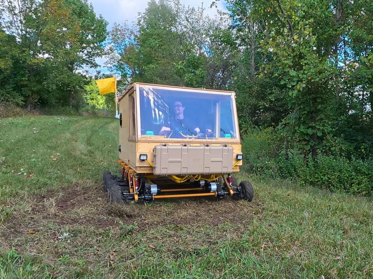
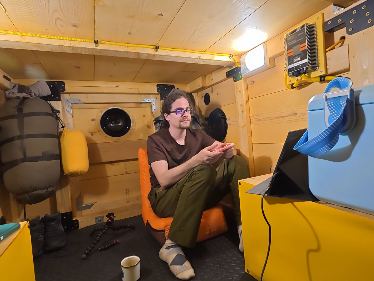
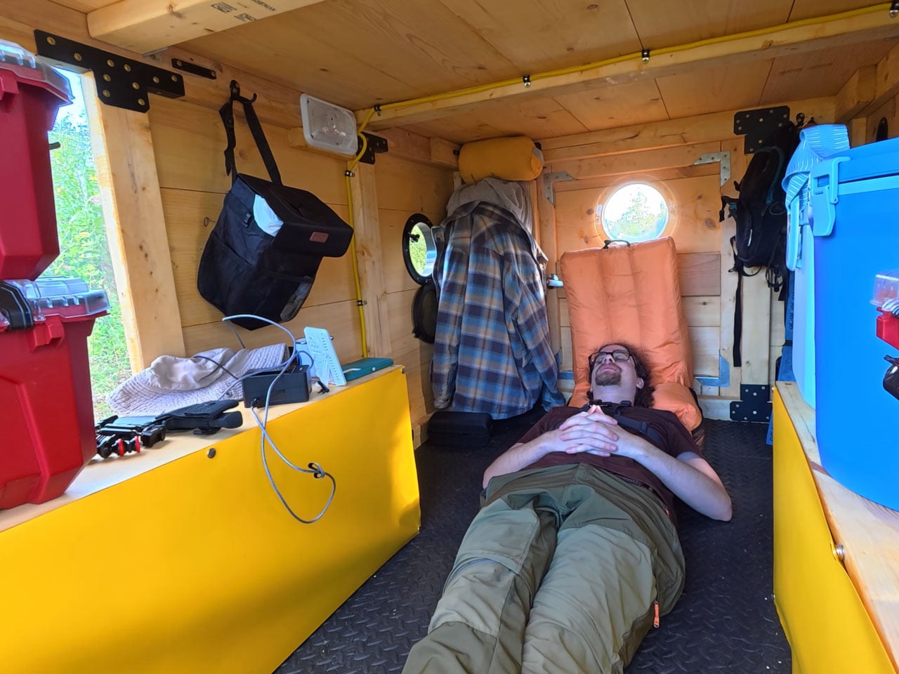
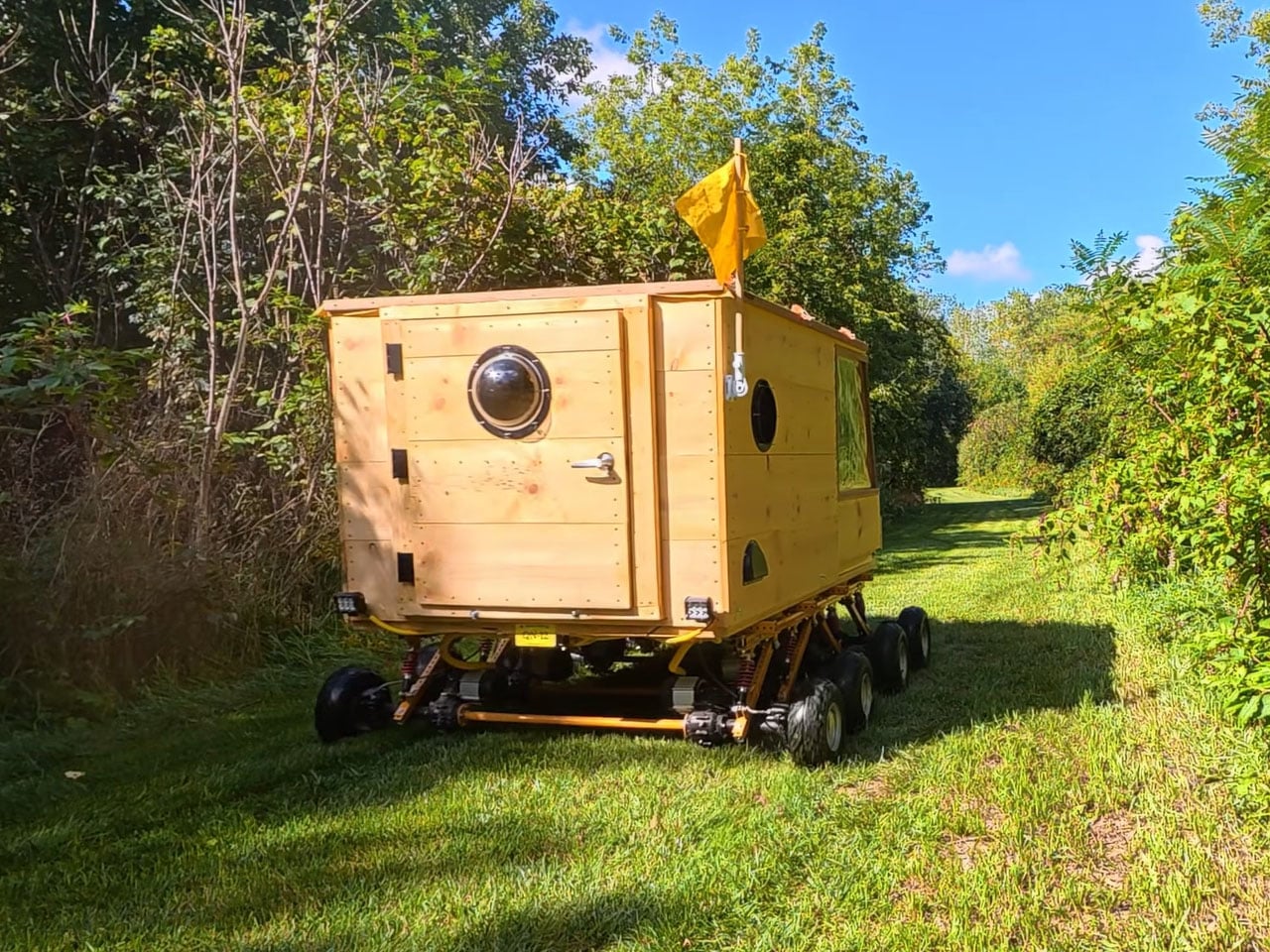
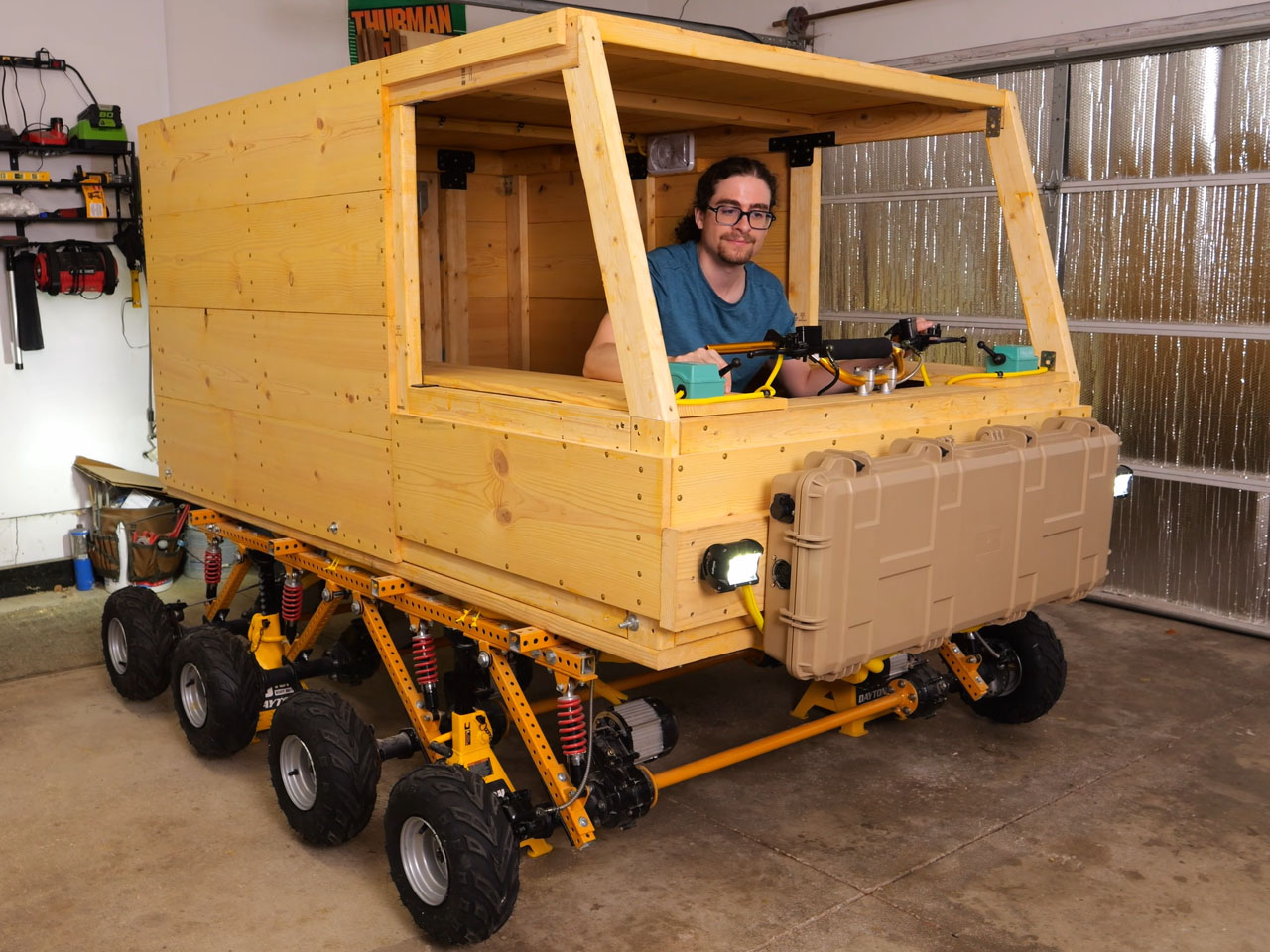
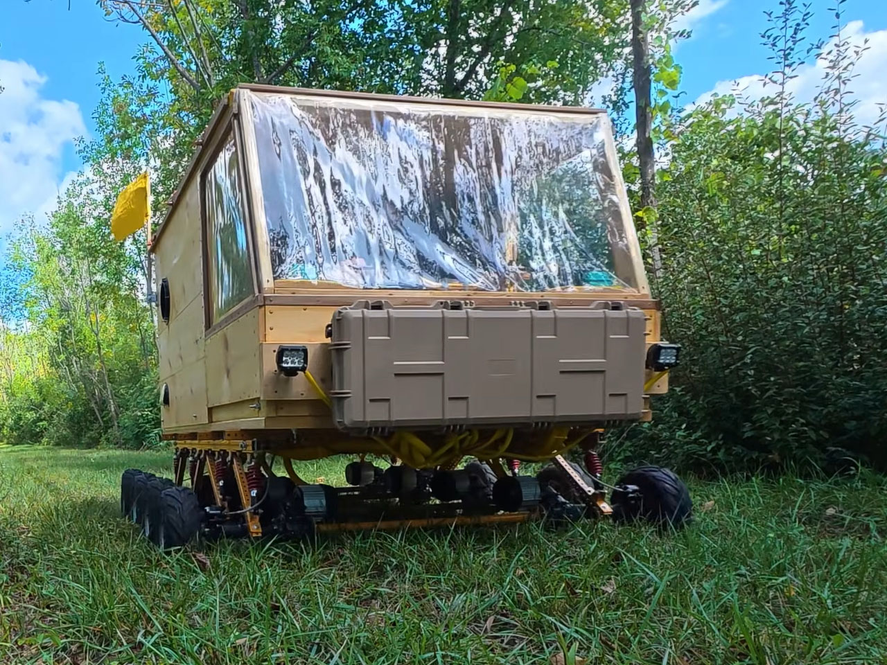
Have you been wanting to live out of an all-wooden camper? Driving solo to the pastures you visited with your father as a child but never had the opportunity to spend a night under the stars there, then brace up. You can follow the new 90-odd-minute detailed video from ambitious YouTuber Quiet Nerd, and build yourself an 8-wheel-drive electric tank-style steering wooden camper from scratch.
All you will need is tools and supplies. The brain is already applied. So even blindly following the instructions can confidently give you a near replica. That’s how elaborately detailed this entire DIY video is. When you’re ready with your cabin on eight wheels, you can, like the modder, steer it into the jungle for a fun-filled night in the wild. He had a night that belonged to him. A night with home-cooked sushi and some flat tires, and a subsequent morning with freshly-made pancakes and a broken front axle rod.
Hopefully, your experience will be much better, coz you know when too many donuts in this guy are too many. The DIYer didn’t. Anyway! That’s for the fluff; let’s now get the real creation. “This is the most ambitious, complicated, and technically challenging build I have ever attempted,” the creator reveals at the beginning of the video. If you think that’s just said for the sake of it, you can spend some time reading about his previous DIY electric camper created around a wooden bed with tank treads for wheels.
Yes, Quiet Nerd is a genius when it comes to building these electric camping rigs from scratch. He has done it in the past, this time though, this fully electric, 8-wheel-drive micro camper that steers exactly like a tank is way different and above board than what he has created. In fact, I wouldn’t be kidding if I said this camper is definitely one of the most interesting DIY projects in the recent past. If not the camper itself, the video definitely deserves appreciation for its depth.
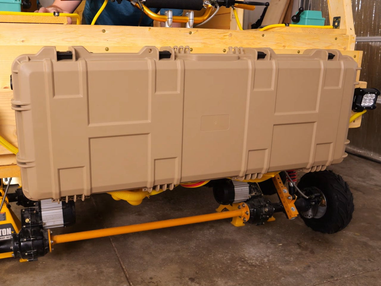
The build starts with a frame made of square punch tubing, which rests on eight separate 48-volt, 1000-watt brushless differential motors. To ensure a tank-steering mechanism for the cabin, the modder welded the differential gears in all eight gearboxes separately so they didn’t move. This meant the drivetrain on the left and right of the cabin could then work independently, which, when throttled in opposite directions, would allow the camper to perform perfect 360-degree donuts at one place.
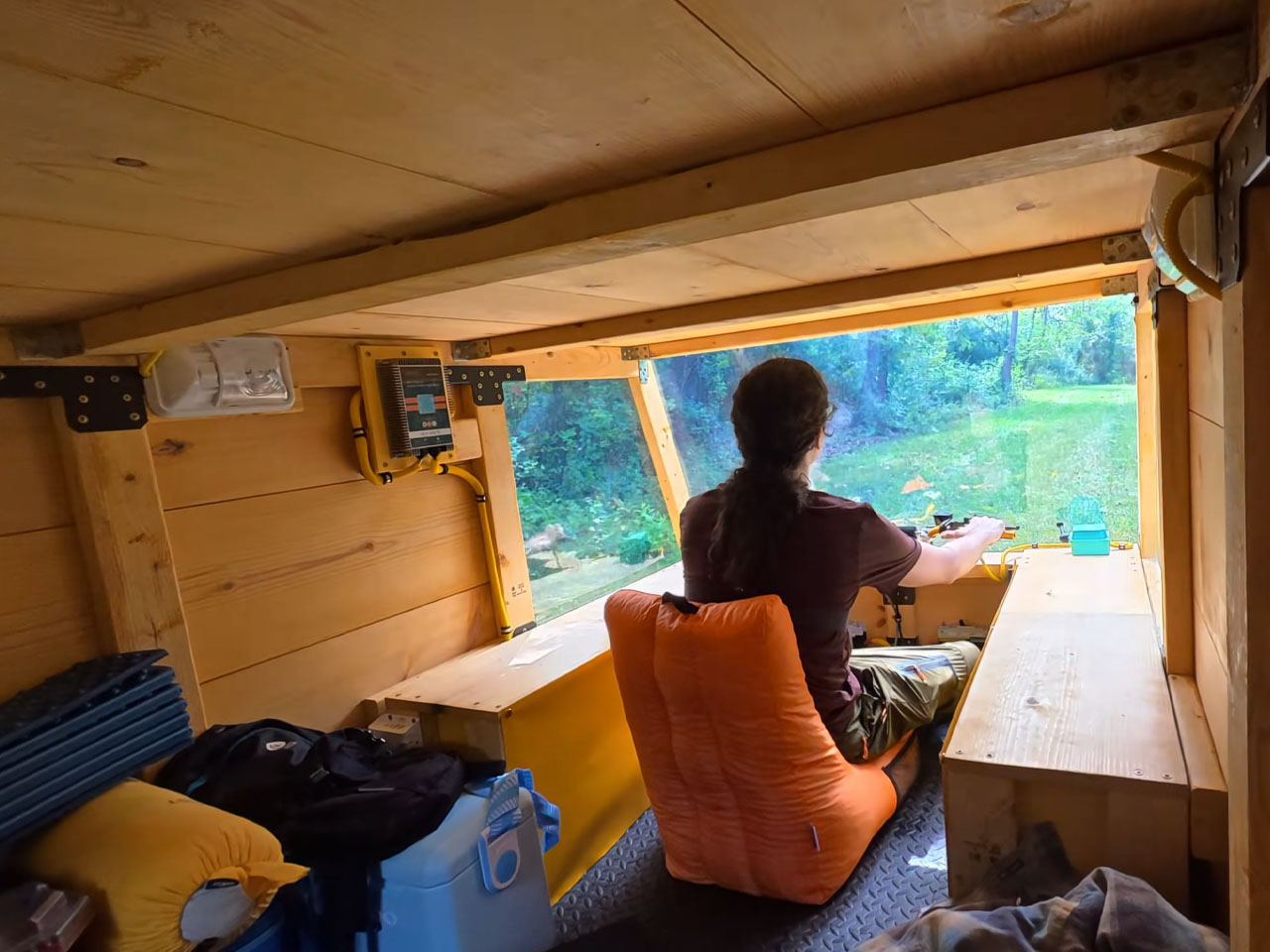
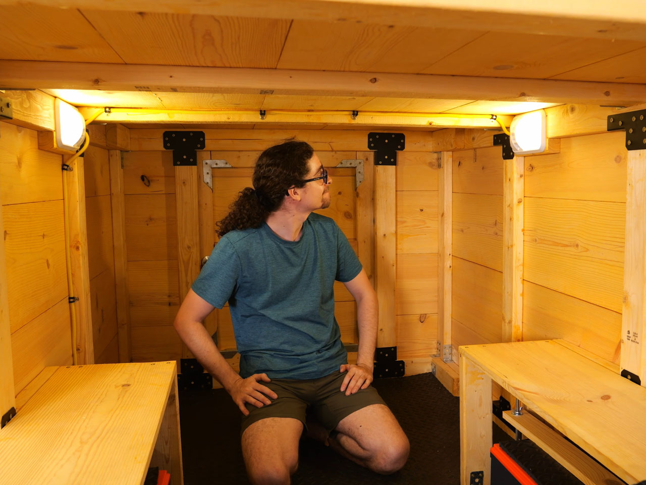
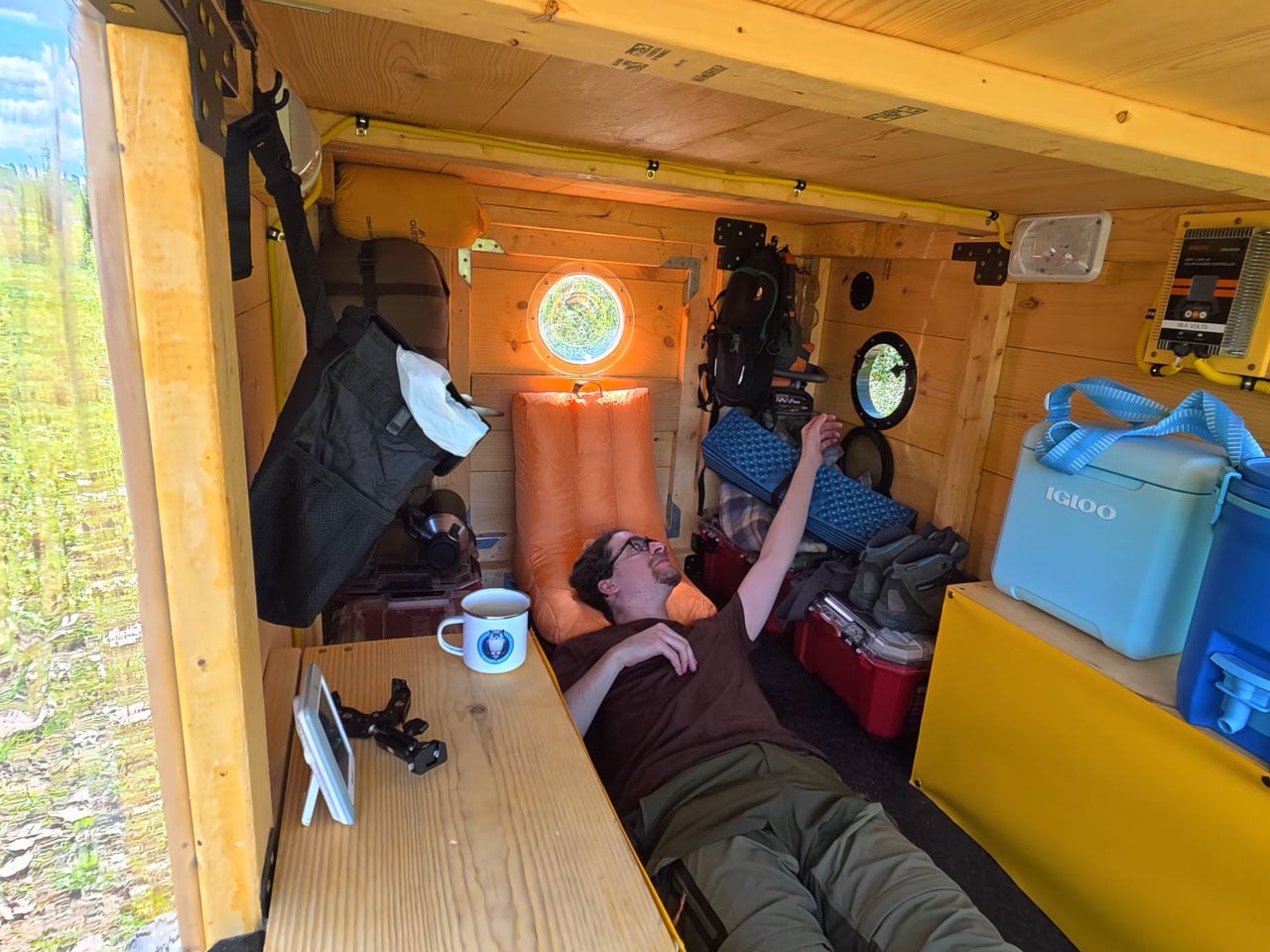
Once the frame and the drivetrain were ready, suspensions were added to each of the eight wheels, and the modder then constructed the frame of the camper’s cabin using marine-grade wood. Interlocking pine wood panels were specially created for the siding, and the door was placed at the back. The floor was laid out with interlocking gym foam puzzle mats for comfort, and for ventilation, porthole windows are mounted on each side. On the front, vinyl sheets are used for the windscreen.
The batteries onboard are hooked up to a pair of 200-watt flexible solar panels mounted on the roof, which power the camper when its running or when stationary at the camp. When everything was checked and created, Quiet Nerd took the camper for a ride in the green pastures. Besides a few flat tires and a broken axle rod, most of the time in the woods was awesome, the modder notes in the video. Nighttime donuts are my favorite, but I still believe maybe he can get welded some cutters in the square punch tubing frame and this guy can be an awesome lawn mower. Or get a few ploughs in there and while doing donuts, it can help with ploughing the area.
Most public sculpture asks you to look and keep walking. You admire the bronze figure, read the little plaque, maybe snap a photo, and move along to wherever you were actually headed. The art stays over there, behind an invisible line, and you stay over here. That gap between viewer and object is the quiet problem a lot of city parks have never solved: they install expensive, meaningful work, and then wonder why nobody lingers.
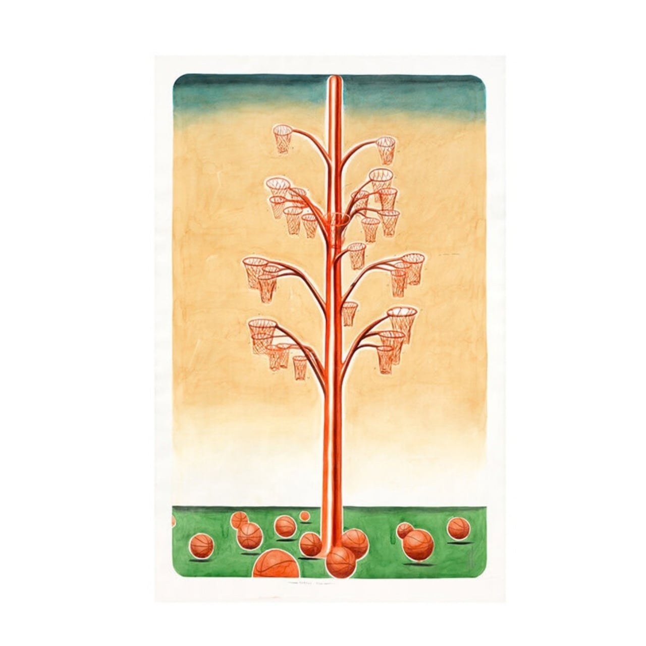
Alexandre Arrechea’s answer, installed this year at Biidaasige Park as part of Toronto’s new Lassonde Art Trail, is to remove the line entirely. Orange Functional is a twenty-foot steel tree with basketball hoops sprouting off its branches, and you’re invited to bring your own ball and start shooting. No velvet rope, no “please do not touch” energy. Just a big red tree standing at the park entrance, daring you to play.
I like that the idea took over a decade to get here. Arrechea’s archive traces the concept back to 2010, when the hoop-covered tree existed purely as sculpture, something you’d circle and photograph but never actually use. It wasn’t until a 2022 commission from Art Omi in upstate New York that he reengineered the branches so real basketballs could drop through the nets. That’s a meaningful shift for an artist. Turning a static object into a functional one means giving up some control. Once people can touch the work, they also get to misuse it, argue about it, get bored of it. Arrechea made that trade anyway, and the piece is better for it.
What sells me on the design is how little it explains itself. A basketball hoop is one of the most recognizable objects in American and Canadian public life, sitting outside driveways, gyms, and rec centers everywhere. Arrechea doesn’t reinvent it so much as multiply it until it stops making sense as sport equipment and starts reading as something closer to a fruit tree. Art Omi’s own description leans into that: as people throw the ball and it falls from hoop to grass, it evokes oranges dropping from a branch. The title does double duty, too, pairing the color with the idea of something actually working the way it looks like it shouldn’t.
Placing the sculpture at a park entrance, next to newly planted real trees, feels like the smartest curatorial choice in the whole project. It’s not tucked into a sculpture garden where only people already looking for art will find it. It’s the first thing you see walking in, competing for attention with the skyline behind it. A parent walking past with a kid who has a basketball in their bag doesn’t need to understand Arrechea’s twenty-year interest in public gathering spaces to want to stop and shoot a few hoops. The concept sells itself in about four seconds.
There’s a version of this idea that could have felt gimmicky, a photo-op sculpture built mainly for Instagram. Arrechea avoids that trap by making the interaction the entire point rather than an afterthought bolted onto a finished artwork. He’s spent over two decades returning to the basketball court as a symbol, and this piece is where that research finally gets to be useful instead of just visible. You don’t need the artist statement to enjoy it. You need a ball and about ninety seconds of patience while you figure out which branch to aim for.
Public art has a reputation problem in a lot of cities: expensive, confusing, occasionally resented by the people who live near it. Orange Functional sidesteps all of that by refusing to be precious. It asks for nothing more than a basketball and a little curiosity, and it gives back an actual reason to stop walking. That’s a rarer trade in public space than it should be.
A parking lot does not care how good your speaker sounded in the store. Too quiet for an open sky, too fragile for a cooler lid, too generic to earn a second look from anyone walking by. These five are built differently. Each earns its place in the setup before you even hit play, and holds it comfortably long after the sun disappears behind the stadium.
The best tailgate speaker is not the loudest one or the most expensive one. It is the one that handles the full arc of a Saturday outdoors without asking you to manage it. Good battery life, real weather resistance, and a design identity strong enough to start a conversation are the only criteria that matter when the truck is parked, and the grill is on. These five clear all three.
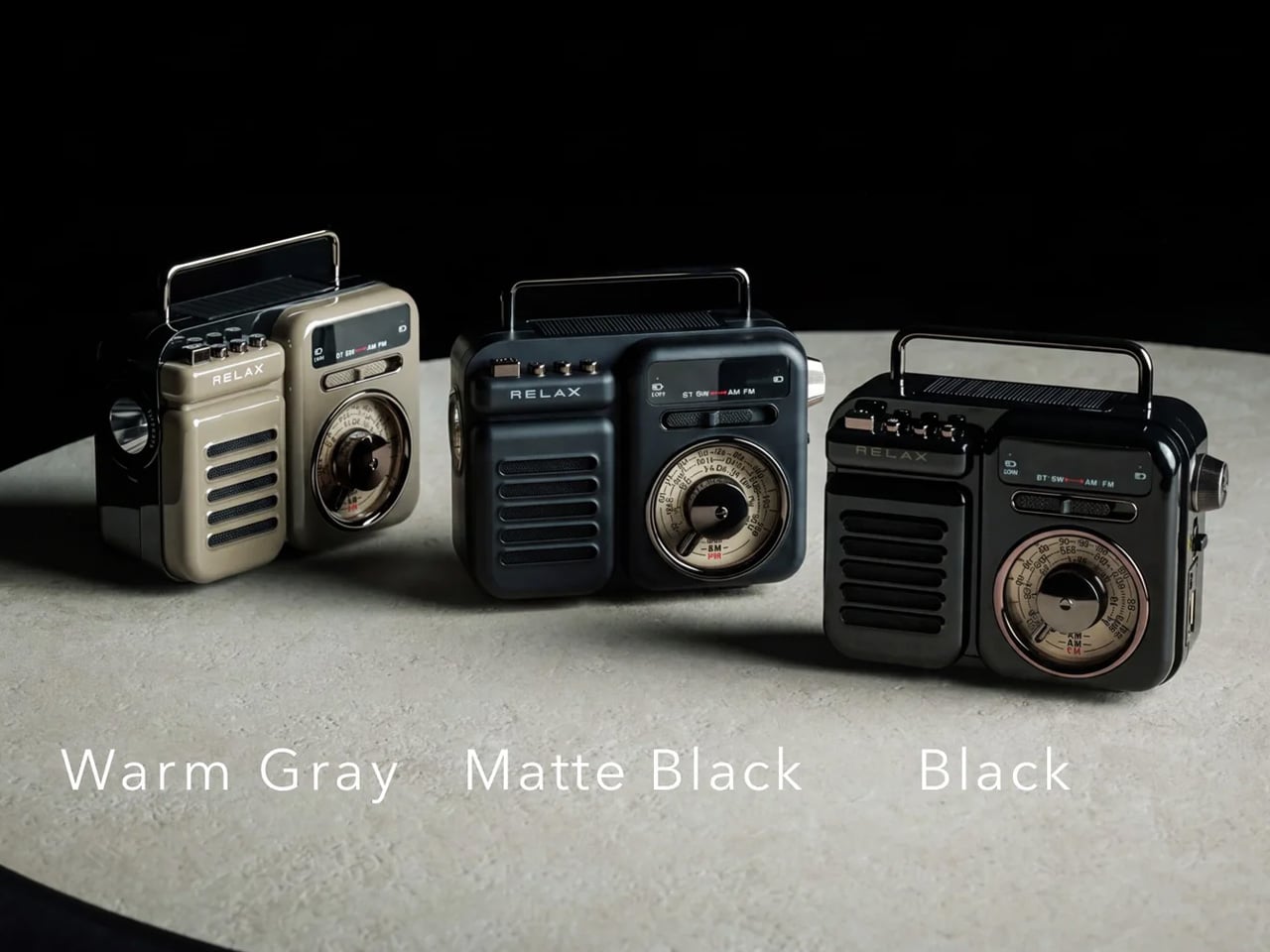
1. RetroWave 7-in-1 Radio
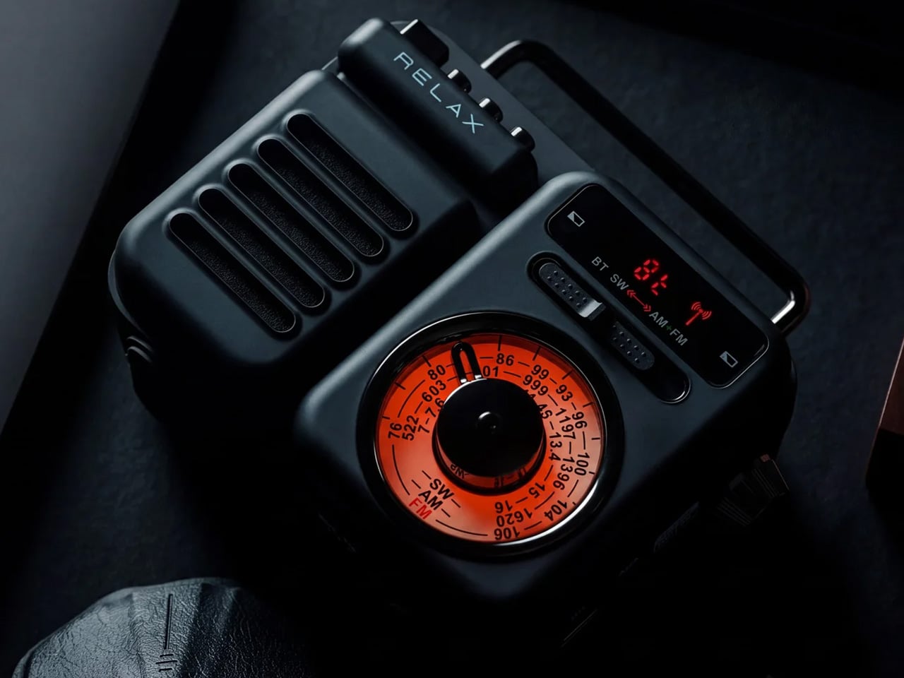
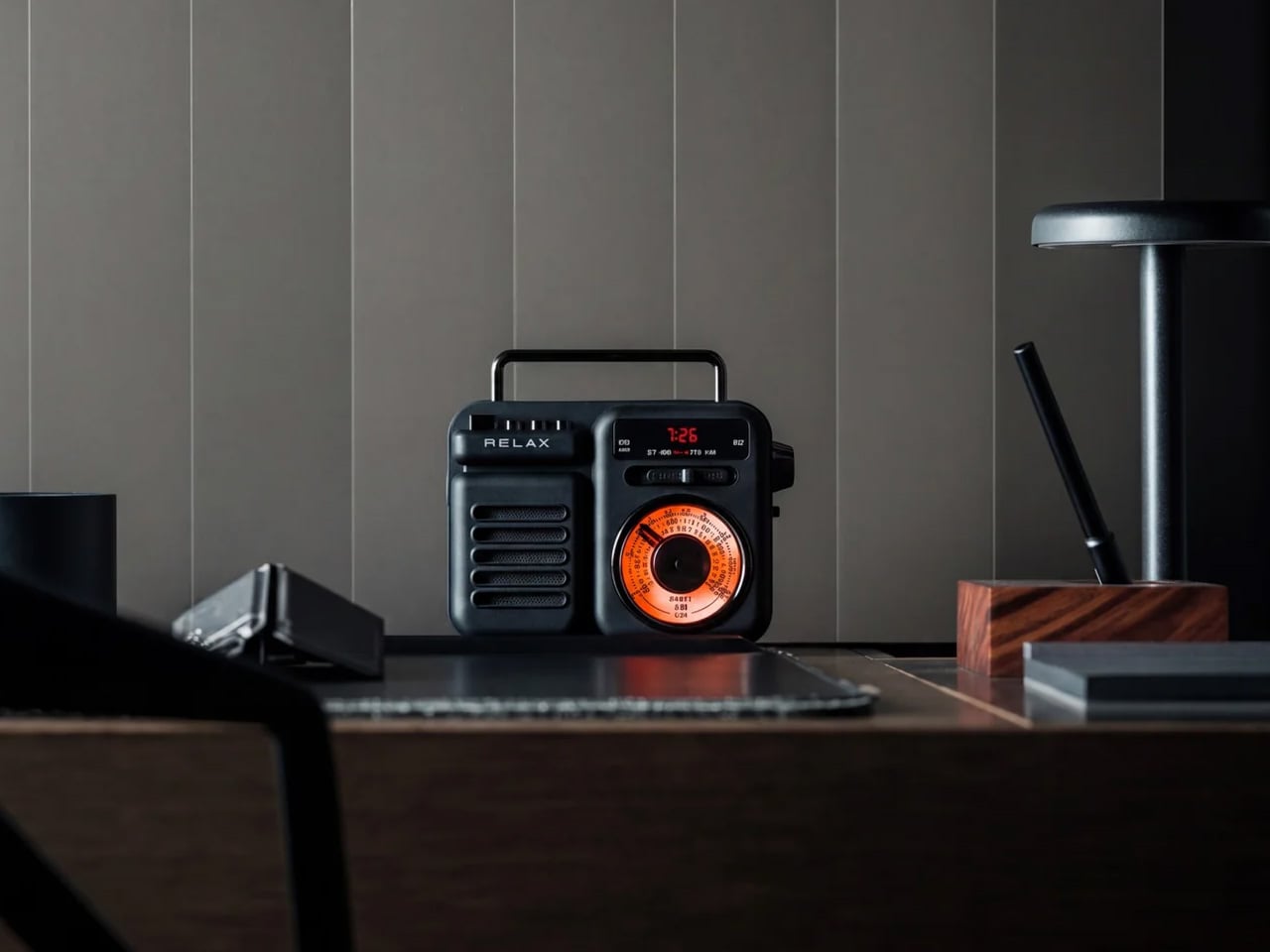
The RetroWave is not trying to look vintage. It simply does, because the people who designed it understood that warm tones and a tactile tuning dial carry a feeling that modern hardware cannot replicate on its own. For you, that distinction matters at a tailgate, where every object on the truck bed shapes the atmosphere of the whole setup whether you intended it to or not. The RetroWave earns its spot before a single note plays.
Seven functions live inside a body that reads as a single cohesive object, not a spec sheet assembled into hardware. AM/FM and shortwave radio, Bluetooth streaming, a USB charging port, and a built-in flashlight all coexist without crowding the design or complicating the interface. For you, that means one piece of gear that moves cleanly from pre-game energy to late-night wind-down without ever needing to swap anything out. It carries the whole day without announcing it.
Analog character translates immediately in outdoor settings
Seven functions in one body removes the need to bring anything else
What we dislike:
The retro aesthetic will not appeal to everyone
Battery life under sustained outdoor use has not been independently verified at publication
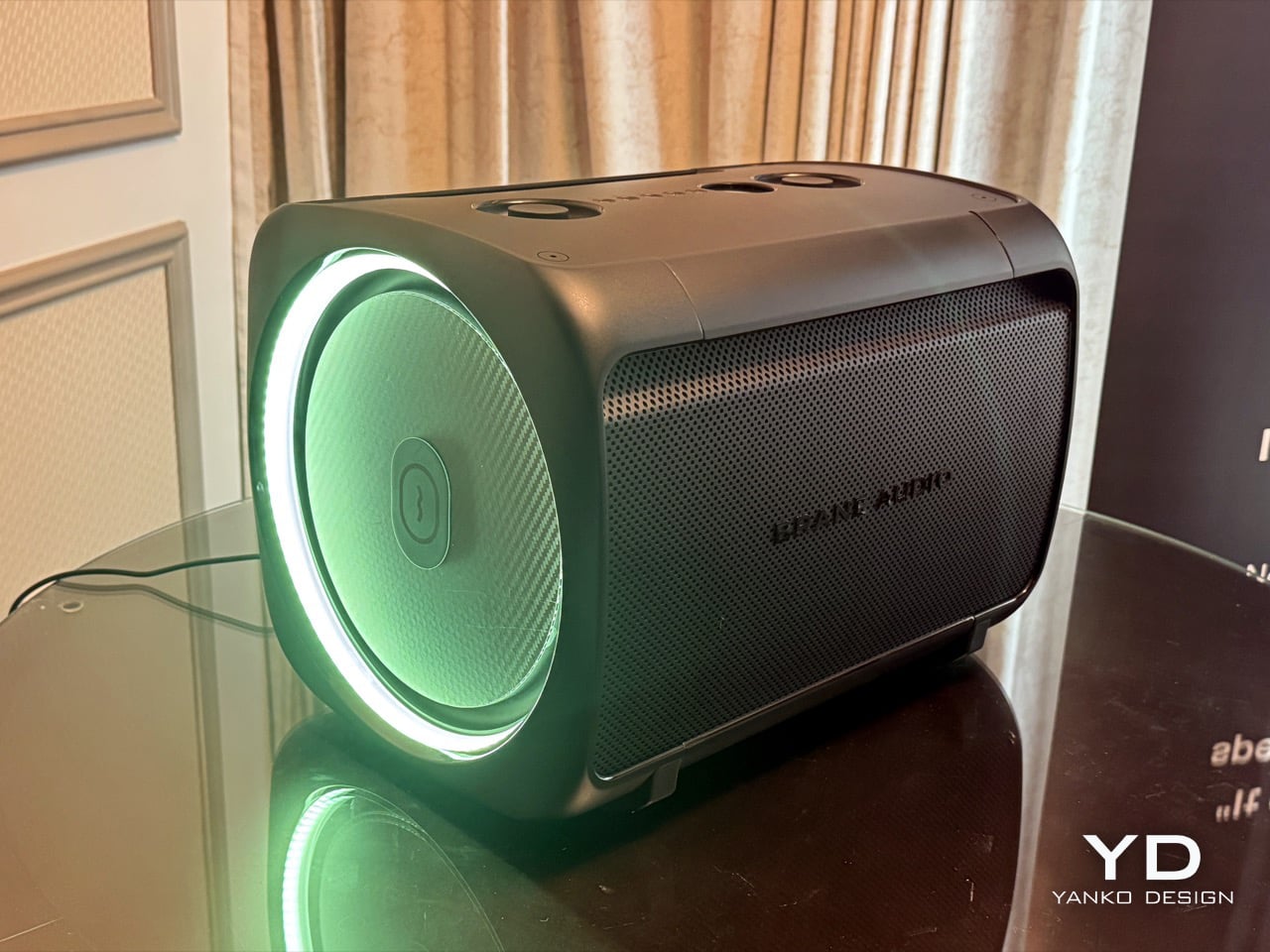
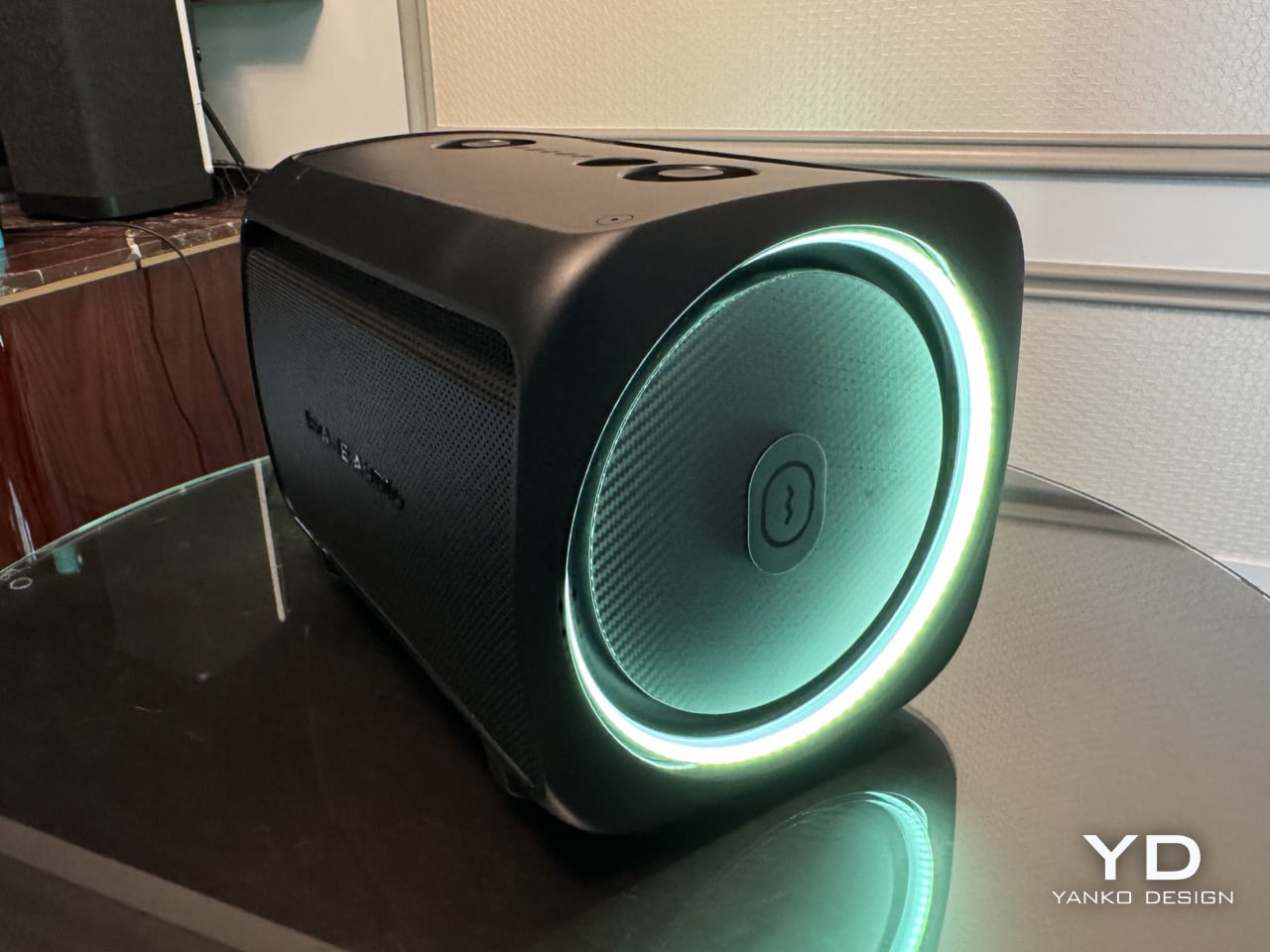
2. Brane X
Most portable speakers fake their bass. They boost the low end digitally and call it sub-bass, and it fools you indoors but gets swallowed by open air the moment you step outside. The Brane X does not fake anything. Its proprietary Repel-Attract Driver cancels internal air pressure to deliver genuine sub-bass from a body barely nine inches wide. For you, that means a speaker that actually fills a parking lot instead of politely suggesting it could.
Five drivers and four class-D amplifiers push past 200 watts combined, backed by a 72-watt-hour battery rated for twelve hours of runtime. IP57 waterproofing handles rain and the inevitable cooler spill without breaking stride. Wi-Fi streaming and Bluetooth 5.3 cover both strong and spotty signal scenarios across a large lot. For you, the ability to group up to eight units means the sound scales with the size of your crowd rather than capping out at the wrong moment.
What we like:
Genuine sub-bass output from a compact enclosure
Twelve-hour battery life clears even the longest tailgate
What we dislike:
Two hundred-plus watts at full volume will cut into runtime considerably
Wi-Fi streaming depends on stable network access in the parking lot
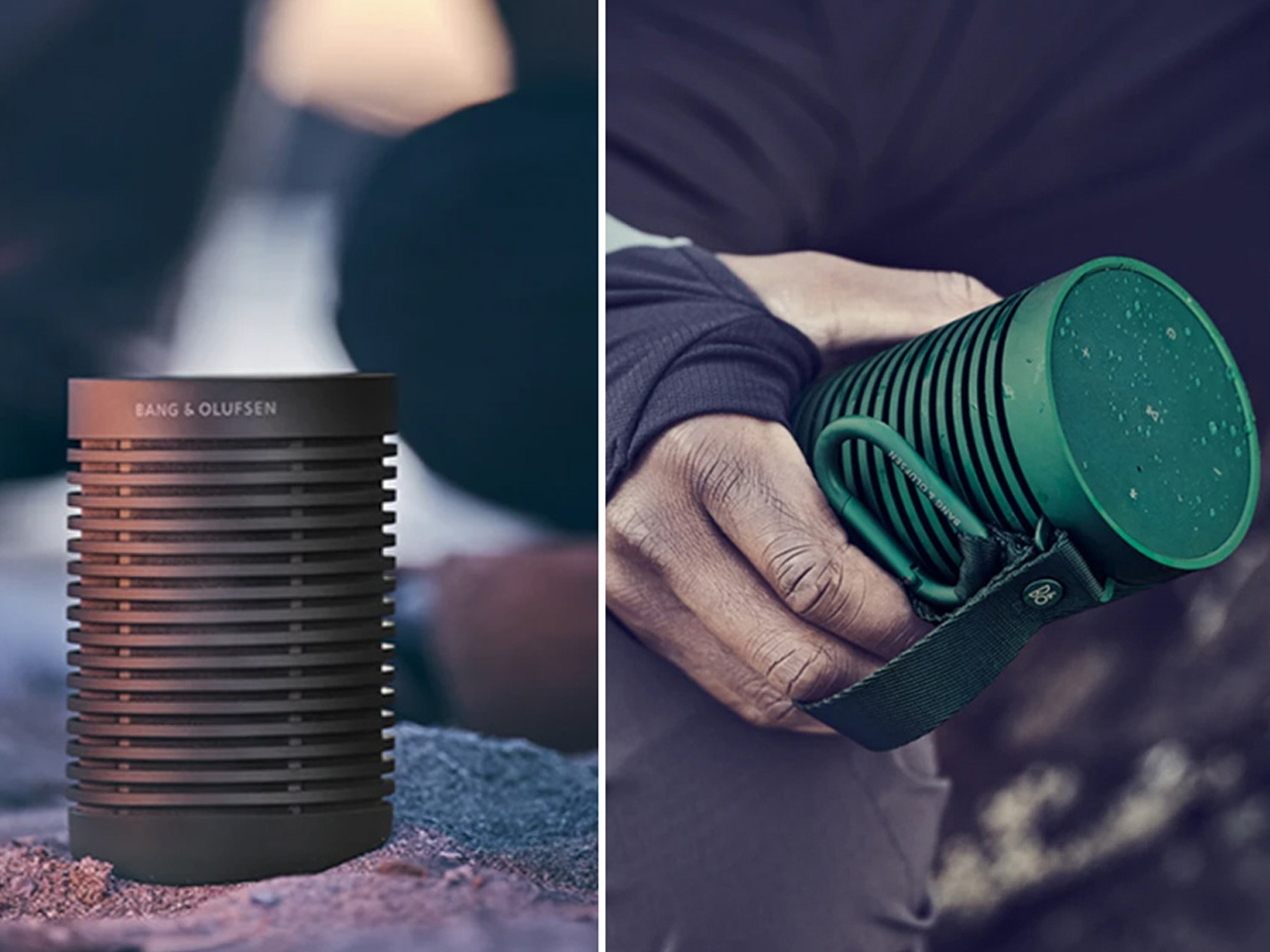
3. Beosound Explore
Bang & Olufsen built the Beosound Explore from hard-anodized aluminum instead of the polycarbonate most competitors default to, and that single decision changes how the speaker ages. Polycarbonate scratches and scuffs into a reading of neglect. Aluminum picks up honest wear and keeps looking considered. For you, that means a speaker that still belongs in your setup on its twentieth outing, rather than one that starts looking disposable before the season is halfway through.
Twenty-seven hours of battery life removes the anxiety that follows every other portable speaker through a long weekend outdoors. Dual full-range drivers produce True360 sound with no preferred listening axis, so there is no bad seat at your tailgate. IP67 water resistance covers submersion up to one meter for thirty minutes, handling every realistic outdoor scenario without fuss. For you, the carabiner strap means it travels without ceremony and arrives looking like it belongs wherever you set it down.
What we like:
Twenty-seven hours of runtime covers a full day and night without a second thought
Hard-anodized aluminum ages honestly with outdoor use
What we dislike:
The Bang & Olufsen premium is real and unavoidable
360-degree output reduces directional volume control in loud open environments
4. Battery-Free Amplifying iSpeakers
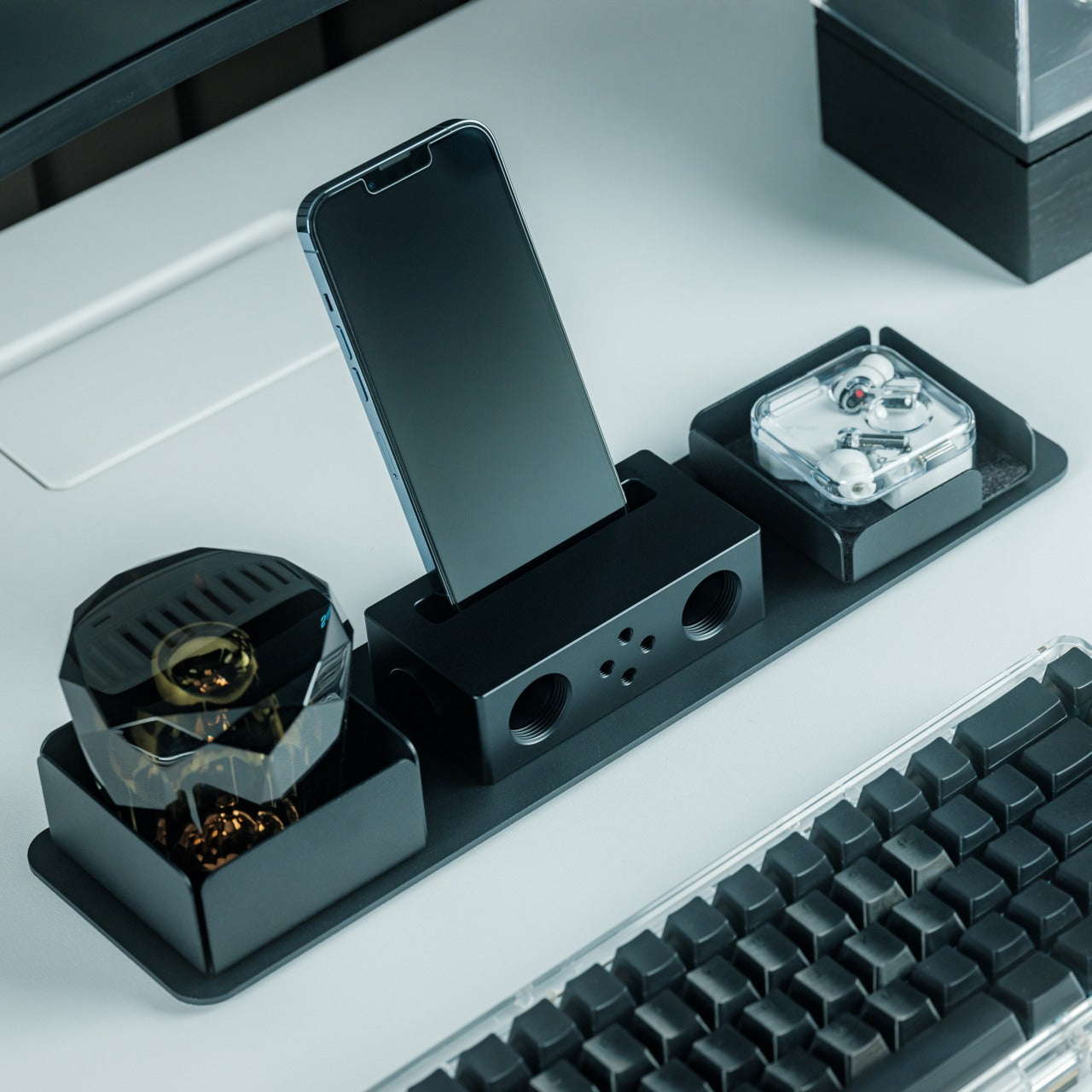
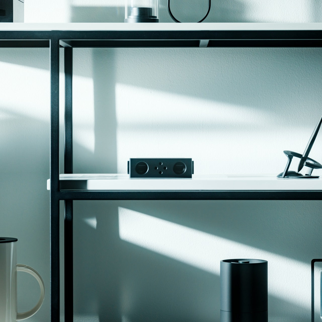
The premise sounds like a trick: a speaker that amplifies sound without drawing a single watt of power. The iSpeaker uses passive acoustic geometry instead of electronics, channeling audio through a precisely shaped horn that physically increases volume without a battery or Bluetooth chipset. For you, that means zero charging anxiety at a tailgate where outlets are not a given. It works the moment you set your phone inside it and keeps working until you leave.
The design reads as furniture as much as audio hardware, which earns it a different kind of presence at a tailgate than a traditional plastic cylinder would. It sits on the table as a deliberate object, not a forgettable gadget. For you, that matters because it communicates something about the setup before a single note plays. No cords, no app, no pairing ritual. You place it, drop your phone in, and the afternoon takes care of itself from there.
Zero battery dependency removes the most common outdoor-speaker anxiety
Passive horn amplification produces real volume with no electronics involved
What we dislike:
Output ceiling is physically limited by the horn geometry
Works only with phones that fit the cradle dimensions
5. Muzen Wild Mini
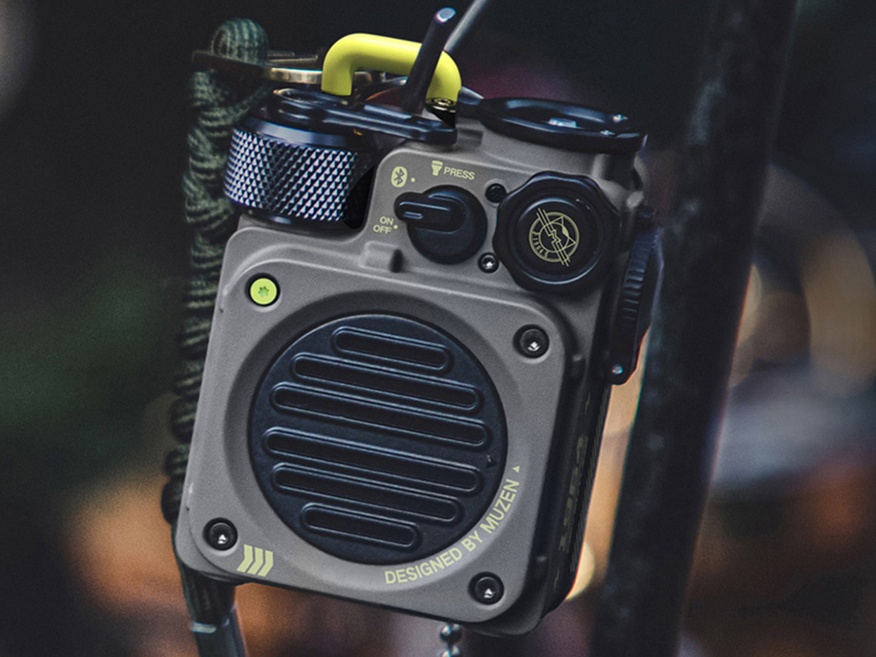
The Muzen Wild Mini looks like it was pulled from a gear locker rather than designed for a product page, and that is exactly the point. The all-metal body carries a military character that communicates durability before you ever pick it up. For you, that matters in a setting where gear gets moved, stacked, and occasionally dropped between the cooler and the truck bed. The Wild Mini does not ask to be handled carefully, which means you never have to think about it.
Bluetooth 5.0 handles the streaming, and a built-in flashlight with three lighting modes earns its place once daylight fades on the lot. A single charge delivers six hours of runtime at full volume, covering the core of a game-day schedule without needing a top-up. For you, the clip system means it attaches to a bag, a belt loop, or a tent frame with equal ease, keeping the speaker accessible without requiring a dedicated surface to set it on.
What we like:
All-metal build shrugs off drops and rough handling
The built-in flashlight adds genuine utility once the sun goes down
What we dislike:
Six hours is the shortest runtime in this group
The compact body limits total output volume compared to the larger enclosures here
The Right Speaker Makes the Saturday
None of these five ask you to compromise. The RetroWave brings analog warmth to a setting that usually defaults to generic plastic. The iSpeaker removes the charging question entirely. The Brane X delivers the bass a parking lot actually requires. The Beosound Explore brings luxury-grade materials to outdoor conditions they were genuinely built for. The Wild Mini goes anywhere without asking permission. Each pulls its weight differently, and that range is exactly the point.
A good tailgate speaker is the one you stop noticing because it never gives you a reason to worry about it. The battery holds, weather is not a factor, the sound fills the space, and the object earns a second look from whoever walks by. All five of these clear that bar. Pick the one that fits how your Saturdays actually run, and it will handle the rest without asking for much in return.
Camping has always come with a quiet trade-off. You get the freedom of being anywhere, but you give up the comfort of being somewhere. Tents leak, campers feel cramped, and cabins can’t move with you when the season changes. Atelier Lune, a US-based design studio, just built something that refuses to make you choose.
It’s called Camping House. The idea is simple to say and genuinely hard to execute: a home that tows behind a standard SUV, unfolds like a tent within a couple of hours, and then behaves like real architecture once it’s standing. Architect Na Shen, who previously worked at Gensler and Zaha Hadid Architects before starting her own studio, designed the whole structure around that tension between mobility and permanence, and you can feel that intention in every decision she made.
Designer: Atelier Lune
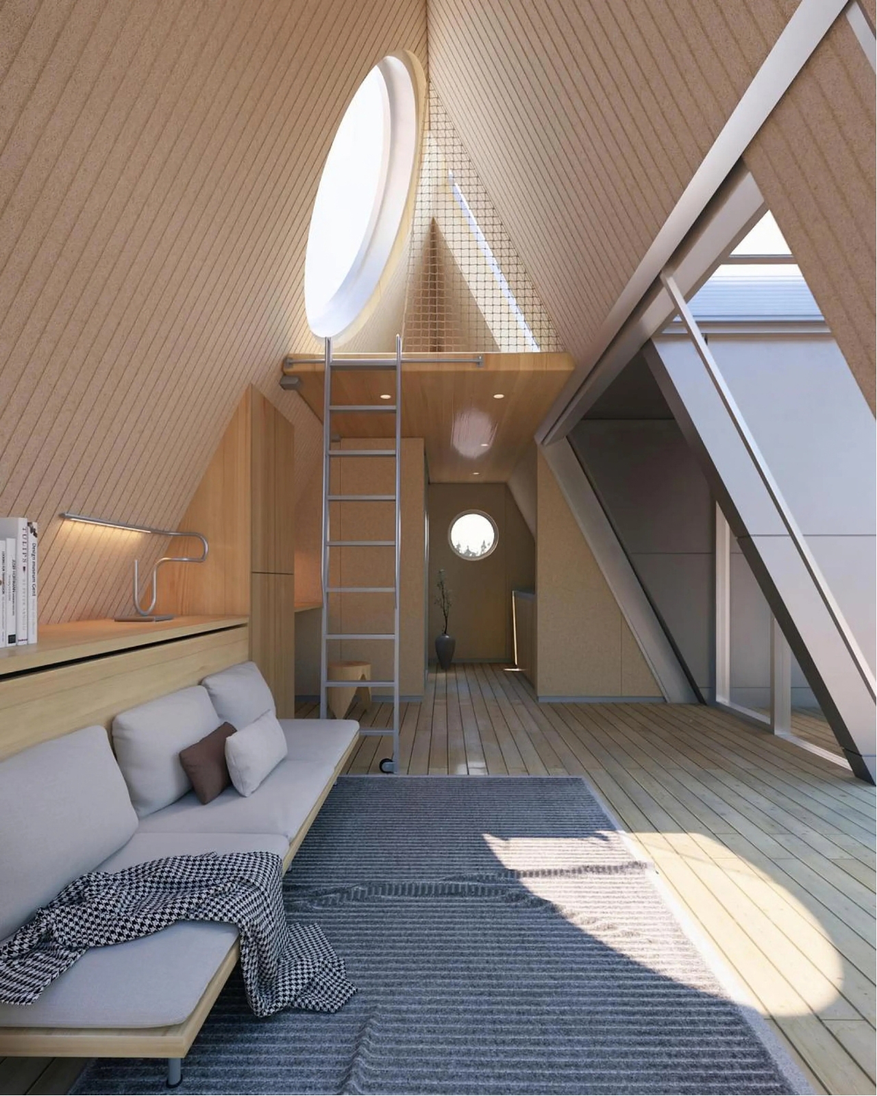
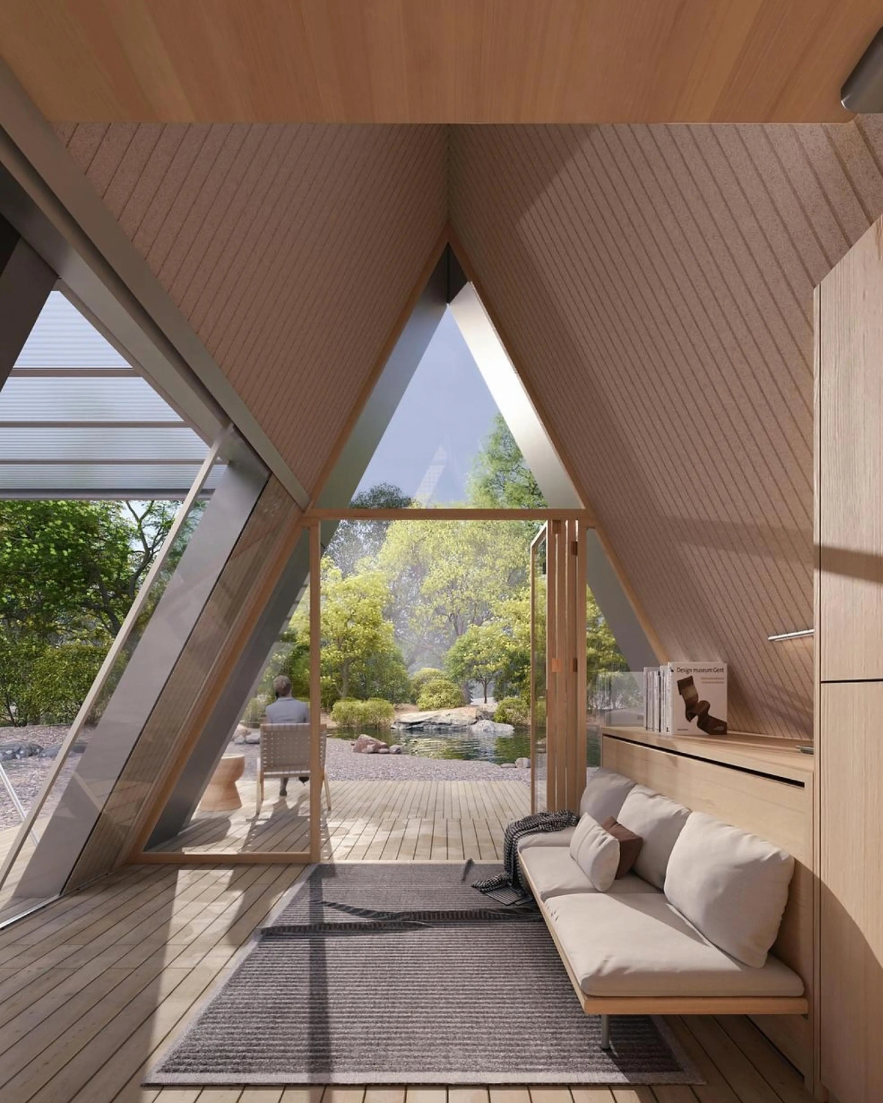
That last part is the actual innovation. Plenty of tiny homes are mobile, but most of them stay rigid once you get them there, basically a smaller box on wheels. Camping House does something different. The structure is a folding shell that fans open on-site into a steep A-frame, then locks into place with weather-sealed joints and insulated panels built to hold up through an actual winter. The A-frame isn’t just an aesthetic choice either. It’s structurally efficient, sheds rain and snow naturally, and creates a dramatic interior volume that reads much larger than the footprint suggests.
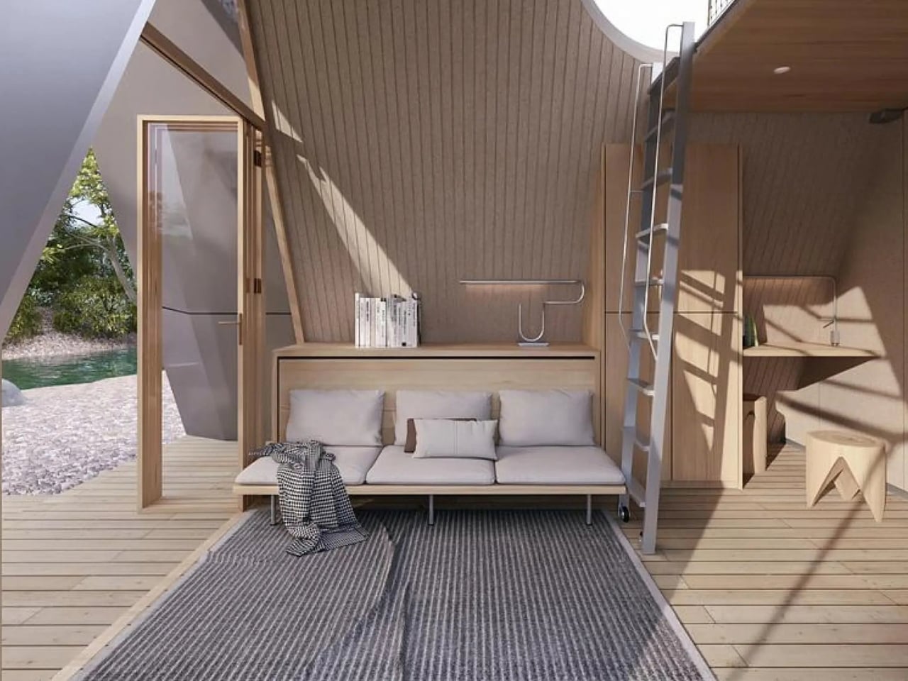
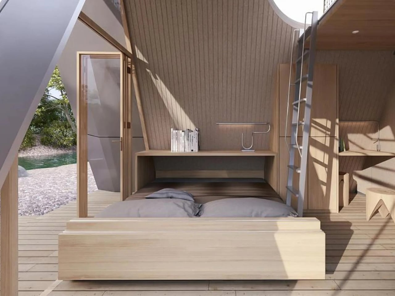
The system is built around three modules the studio calls Ports. The Residential Port handles living and sleeping, with furniture that flips from day mode to night mode in seconds. The Utility Port carries a real kitchen and a real bathroom, not a camper-van compromise version of either. The Extended Port clips on when you need a workspace, storage, or room for guests. You arrive, stabilize the base, release the hinges, and the shell swings open into a two-level interior that looks nothing like what fit on the trailer an hour earlier. The joinery and panel system that makes this possible is where most of the real design work lives, hidden in the hinges and seals rather than announced by the exterior.
What makes this feel like it’s arriving at the right moment is who it’s actually for. Remote work untethered a lot of people from a single address, and the appetite for spending real time outdoors, not just weekend camping but seasonal living, has grown alongside it. Camping House is designed with that shift in mind: off-grid solar integration, rainwater harvesting, passive cross-ventilation through a solar chimney, and no permanent foundation required. It leaves the ground beneath it essentially undisturbed, which matters if you’re setting up somewhere ecologically sensitive, or if you just don’t want to explain a poured foundation to a national forest.
There’s a practical honesty to designing for departure instead of designing for permanence. Most residential architecture asks how a building holds its ground. Camping House asks how a building lets go of it. Multiple units can even couple together into small clusters, which opens the door to uses beyond personal travel: disaster relief housing, temporary shelter during regional housing shortages, or small eco-tourism outposts that can be struck at the end of a season without leaving scars.
None of this is on the market yet. It’s a concept, and concepts have a habit of staying concepts. But two people can reportedly assemble it in under two hours, which is a modest ask for what you get in return: a structure with actual dignity, not a glorified pop-up tent with delusions of permanence.
The bigger idea Camping House is testing is whether shelter has to pick a lane between temporary and permanent. For a long time, those felt like separate categories with separate architecture. This project treats them as two settings on the same machine. Whether or not this exact version reaches driveways, the question it’s asking, why should mobility mean sacrificing comfort, feels like one more designers are going to keep chasing.
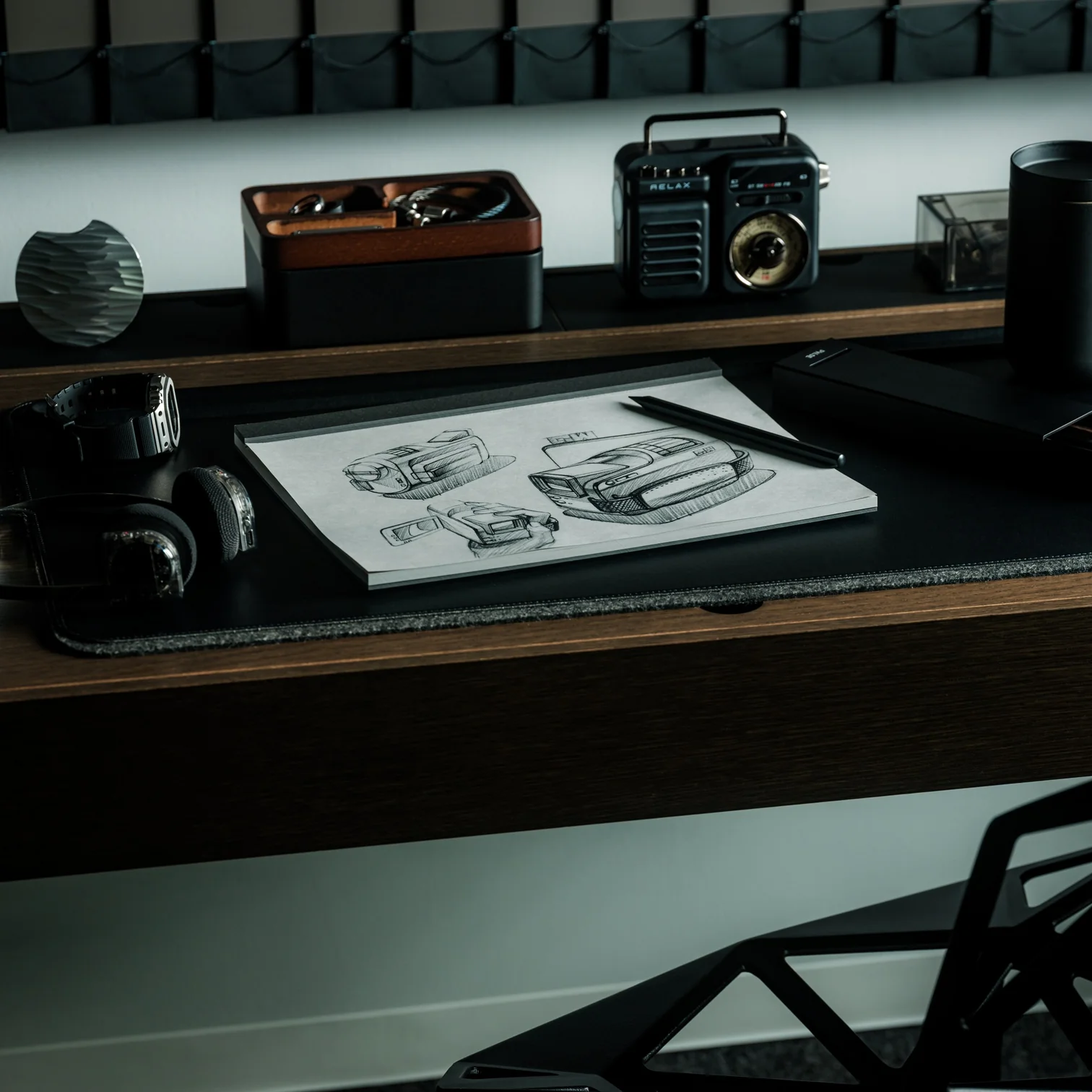
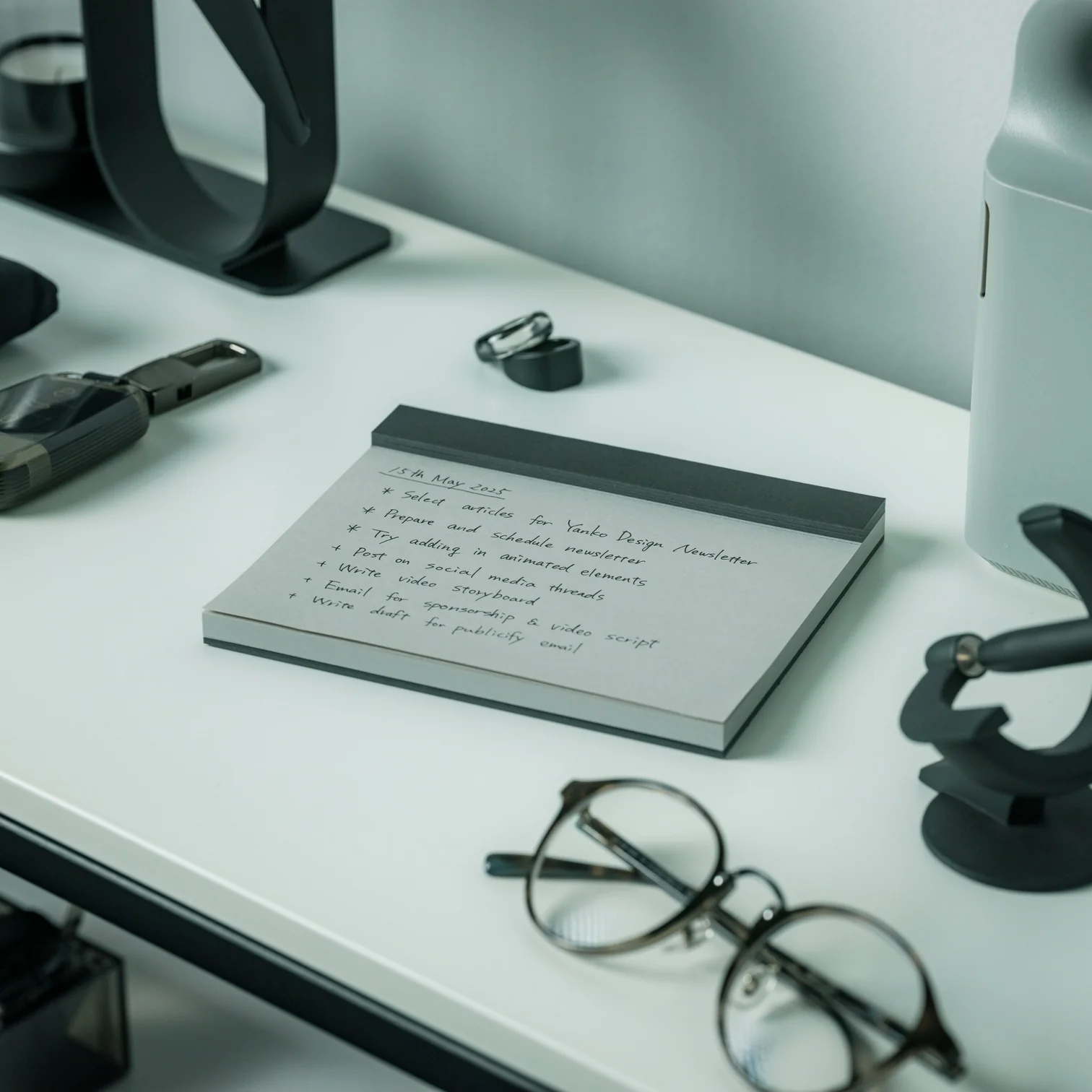
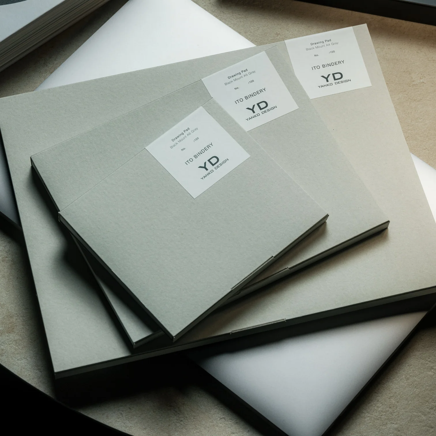
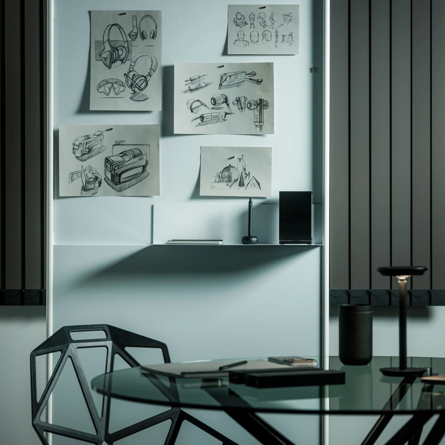
I’ve established in my previous articles that I’m not an artist and can only draw stick figures, or maybe follow paint-by-numbers-style sketches. That hasn’t stopped me from buying and collecting drawing pads and notebooks of all kinds, though. Of course, I’m not hoping I’ll eventually learn to draw or become the next Andy Warhol or anything like that. I like having these writing surfaces because I have a lot of things to write down, whether it’s for productivity, as part of my numerous journaling tools, or just somewhere to randomly write or sketch things out.
The Japanese Drawing Pad, despite having “drawing” in its name, isn’t just an art tool for artists, architects, and other visual creatives. It’s a blank, tactile surface that can be useful for anyone who likes to write, think, plan, or organize. And in a world that’s becoming an increasingly digital-analog hybrid, having a tool like this by your side whenever you need it is always a plus. It’s not just a regular drawing pad, though. It’s simply designed, but expertly crafted by masters in the bookbinding and papermaking industries, giving you paper that helps you create your own masterpiece, whether visual or written.
So if you’re like me and don’t need it for actual drawing, here are a few ways to get your money’s worth out of the Japanese Drawing Pad. No drawing skills needed.
Brain-dump Your To-Do List
For those times when you just need to mindlessly dump out all your tasks, lists, and thoughts, this is the perfect place to do it. It doesn’t have a cover, so you get straight to the blank page you need. The tear-away pages make it easy to toss the list once you’re done, or stick it somewhere you’ll actually see it.
Create a Mood Board
The drawing pad can also serve as your analog Pinterest board. Use it to brainstorm a trip itinerary, visualize an outfit for an upcoming event, or build a vision board for your next few months. The microperforated pages tear easily and cleanly, so you can arrange them side by side on a wall or corkboard.
Take Notes in a Meeting (Without a Boring Notebook)
Meetings can drag on forever, but having a unique tool to take notes with can make them feel a little less like a slog. The Drawing Pad’s gray paper and black base give it a sleeker, more distinctive look than your average notepad, so pulling it out mid-meeting feels less like a chore and more like an upgrade.
Mind-mapping and Brainstorming
Having a freeform space without any lines is ideal for when you need to jot down branching ideas, bubbles, and connections. It also comes in different sizes (A6, A5, and A4), so you can choose how much space you need for these brainstorming sessions, even if the meeting is just with yourself.
Journaling
Whether you need a space for habit tracking, junk journaling, or creative writing prompts, the premium feel of the paper will make your journaling ritual more satisfying. If you tear off the pages, you can attach them to your other journals or use the loose-leaf sheets to build a journal of your own.
Teaching Kids (or Yourself) Letters, Numbers, and Shapes
The pad can also double as a lesson space for kids who are still learning to write their letters, numbers, or shapes, offering a low-pressure surface with no stakes attached. And if you’re learning a new language that uses characters different from what you’re used to, it can be your practice space, too.
Doodling to De-stress
Even if you’re not an artist who can draw well, there may be times when you just want to doodle your stress away. Whether you’re sketching the meal you just ate, dreaming up an imaginary creature to fight off boredom, or scribbling whatever abstract shapes come to mind, the pad puts no pressure on you to be “good.” It’s simply a tactile stress outlet.
Beyond what’s already been covered, the Japanese Drawing Pad has a few more details worth knowing. Every pad is handmade by ITO Bindery, a Japanese bookbindery that’s been at it since 1938. The binding glue is still brushed on by hand, and each microperforation is checked for consistency by trained craftspeople rather than left entirely to machines. The pages themselves are premium paper (81.4 g/m²) mounted on a sturdy, recycled cardboard base, and each sheet tears away cleanly without leaving any strays behind on the page. This particular edition is also limited to just 100 individually numbered pads per size, which makes the pad feel less like a disposable notepad and more like a small, functional collectible.
At the end of the day, you don’t need to be able to draw to justify owning something this well made. A design like the ITO BINDERY × YANKO DESIGN Drawing Pad earns its keep simply by being there, ready on your desk for the next to-do list, doodle, or half-formed idea you don’t want to lose. And that’s really the beauty of building an analog habit into an otherwise digital life: it doesn’t ask much of you, just a pen, a blank page, and a few free minutes. Whether it ends up full of to-do lists, mind maps, or terrible stick-figure doodles, this drawing pad might just become one of those small, everyday objects you didn’t know you needed until it’s part of your routine.

 Connexion