❌

Vue lecture

Poco F9 Ultra Review: Great Sound, Grown-Up Design
PROS:


  • Bose-tuned speaker remains a genuine standout

  • big , bright 185Hz display

  • Huge 8,050mAh battery

  • Great performance

CONS:


  • Relatively large and heavy body will not suit everyone

  • Ultrawide still does not feel especially wide

RATINGS:

AESTHETICS
ERGONOMICS
PERFORMANCE
SUSTAINABILITY / REPAIRABILITY
VALUE FOR MONEY

EDITOR'S QUOTE:

The F9 Ultra feels like Poco growing into its strengths, with Bose-tuned sound still leading the experience.

The Poco F8 Ultra felt like a turning point for Poco. Up to that point, the brand had always been easy to understand. You bought a Poco for speed, sharp pricing, and a bit of swagger. The F8 series added something new to that formula with Bose-tuned speakers, and that changed the feel of the phone in a way a faster chip or brighter screen usually does not.

It was not just about volume or clarity. The whole device felt more built around entertainment. Games had more punch, films had more room to breathe, and even everyday audio felt less like an afterthought. The denim-inspired rear panel helped give the F8 Ultra a bit of tactile identity too, even if the finish was more denim-adjacent than truly fabric-like, but the thing that stayed with you was the sound.

Designer: POCO

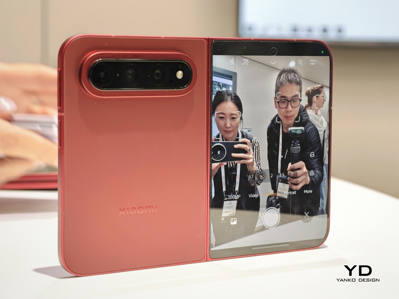
The Poco F9 Ultra takes that idea and pushes it further. Rather than treating the Bose-tuned system as a one-off flourish, Poco seems to be building on it with more confidence this time, wrapping that sound-first approach in a package that feels bigger, more polished, and more ambitious. If the F8 Ultra introduced a new side of Poco, the F9 Ultra feels like the phone that tries to make it stick.

Aesthetics

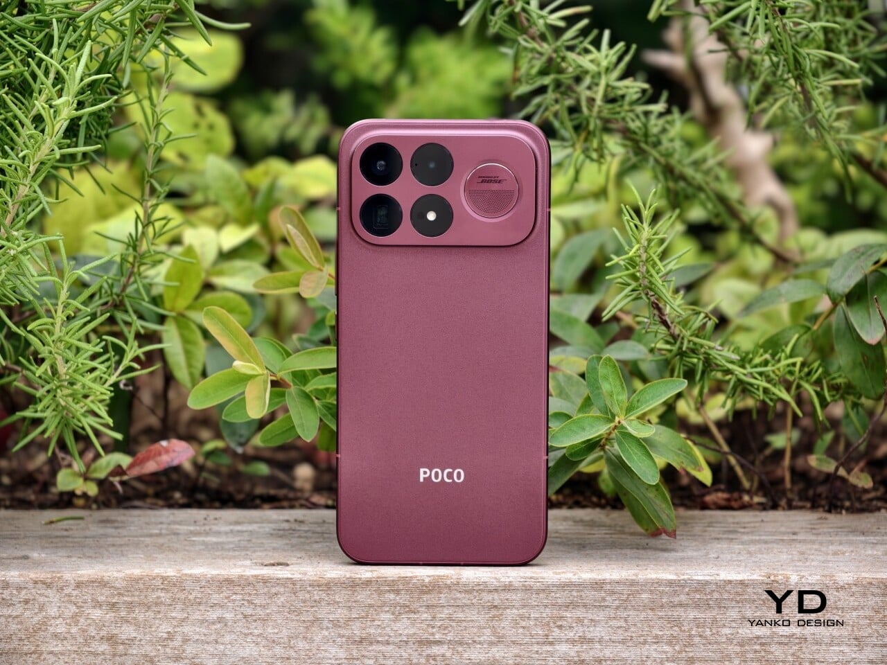
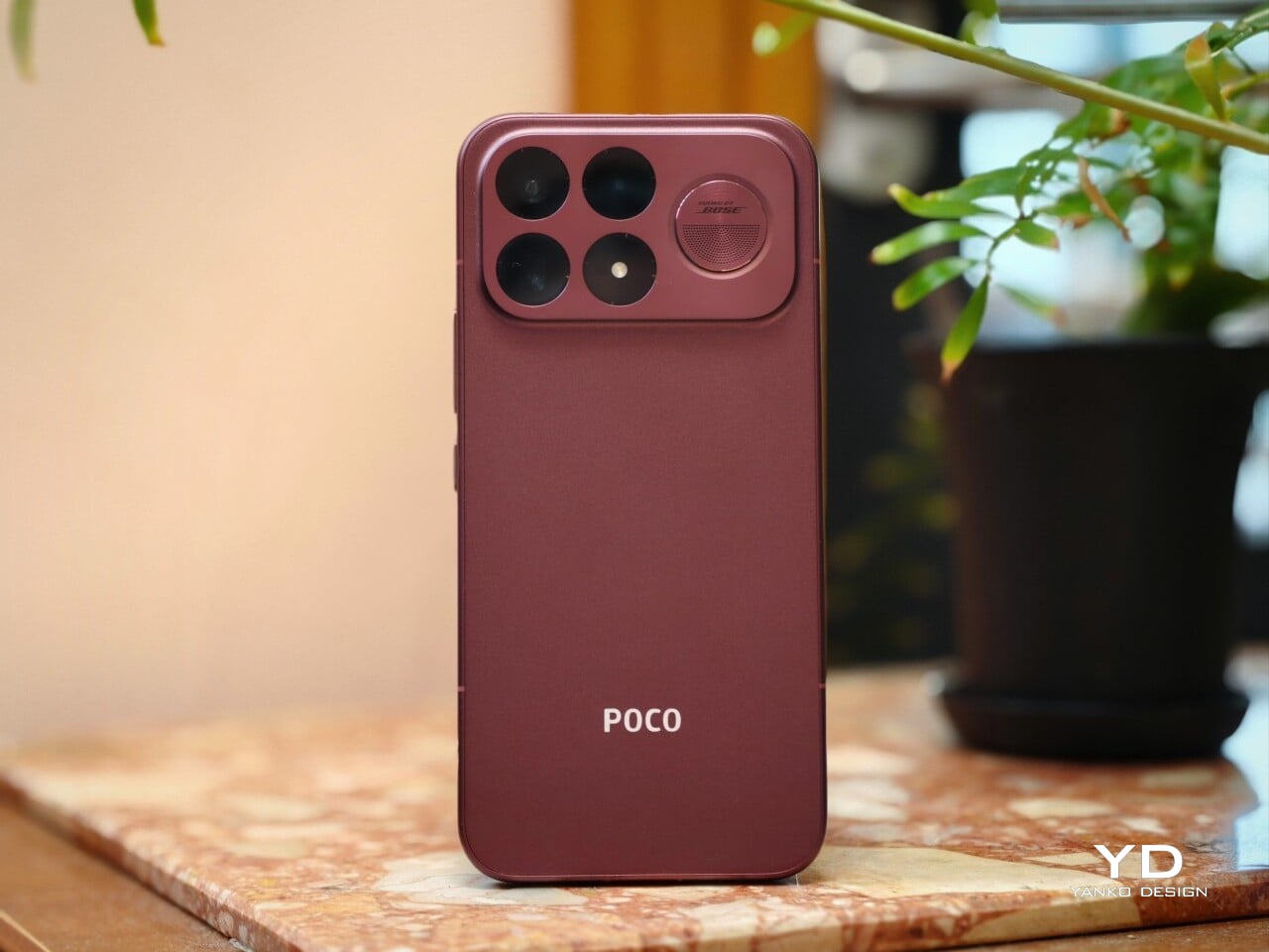
If the Poco F8 Ultra leaned young and fashionable, the Poco F9 Ultra leans sophisticated. It keeps the brand’s taste for visual confidence, but expresses it in a more restrained way, swapping tactile playfulness for cleaner lines, flatter surfaces, and a more polished sense of control.

That shift is obvious the moment you look at the back. The denim-inspired treatment from the F8 Ultra is gone, replaced by a finish that feels more metallic and more architectural. The overall silhouette is simpler, but it does not come across as plain. Instead, it feels like Poco has traded novelty for composure, letting shape and proportion do more of the work.
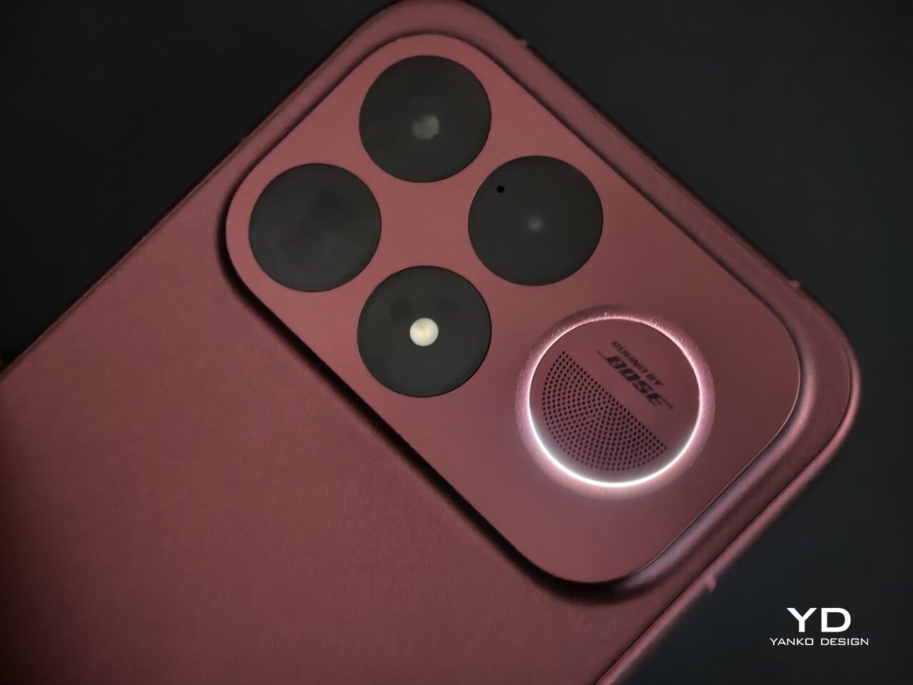
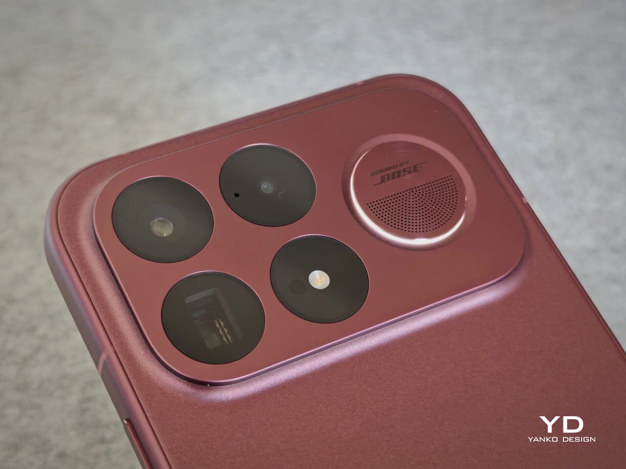
The camera island design remains largely the same as its predecessor, but it feels more resolved here. A large rectangular module sits across the top portion of the phone, housing three cameras and an LED flash in a neat 2 by 2 arrangement, with the speaker grille set off to the right. It is still a bold layout, but one that now feels less experimental and more like a defining part of the phone’s identity.

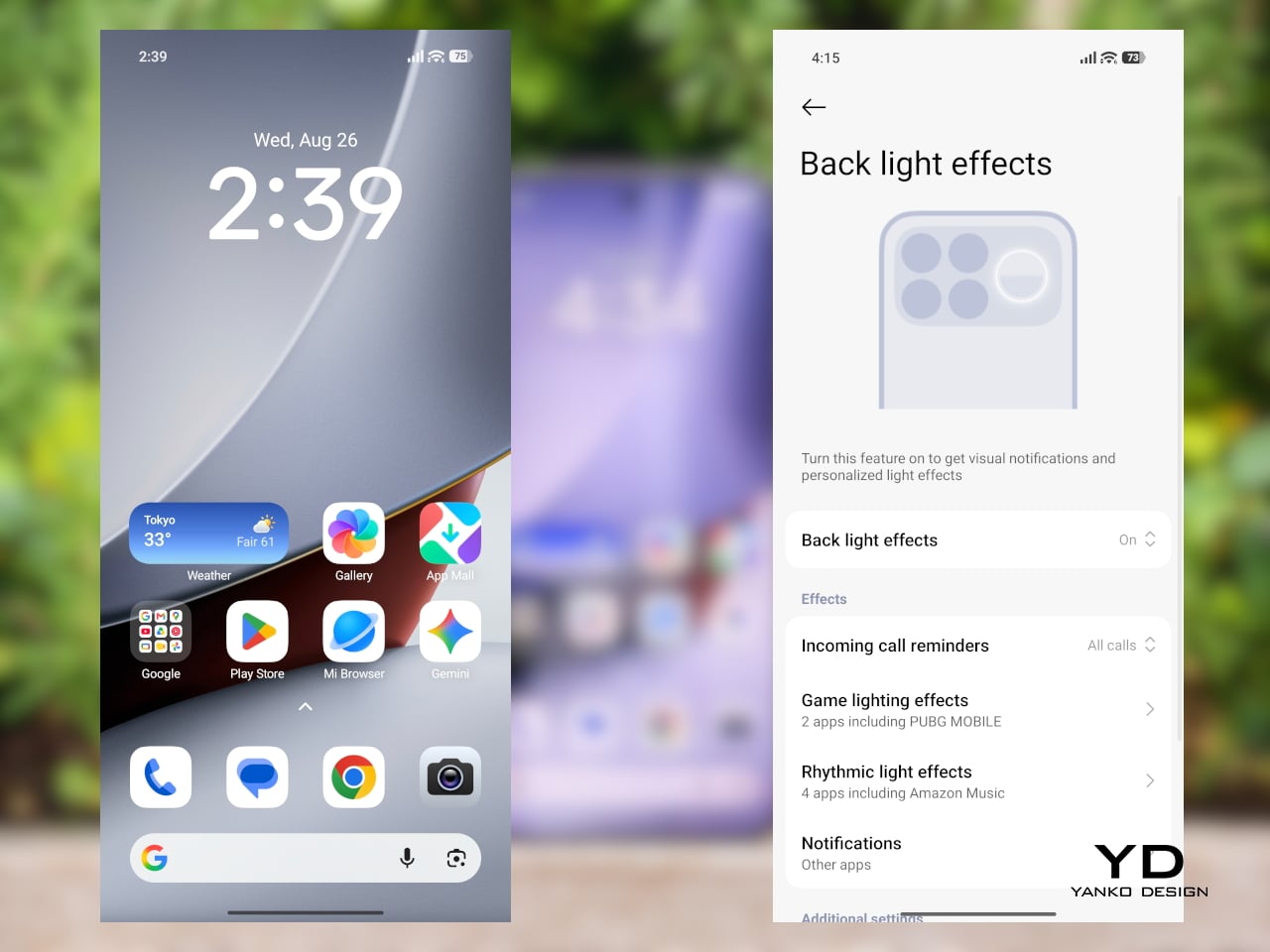
New to the F9 Ultra is a dynamic light ring built around the speaker grille. It supports personalized visual effects for incoming calls, games, and music. The effect itself appears to be fairly simple, closer to a clean white LED accent than anything overly flashy, but that may be exactly the point. It feels like Poco’s way of keeping a hint of gaming-phone energy alive without letting it overwhelm the more sophisticated direction of the design.
The two colors also tell slightly different stories. The Dark Cherry finish is the more expressive option, bringing warmth and a bit of drama without tipping into flashiness. The Black version feels more understated and technical, especially with the red side-button accent adding a small but effective point of contrast. Both work, but they speak to different moods. One is richer and more characterful, while the other is cooler and more controlled.

Ergonomics

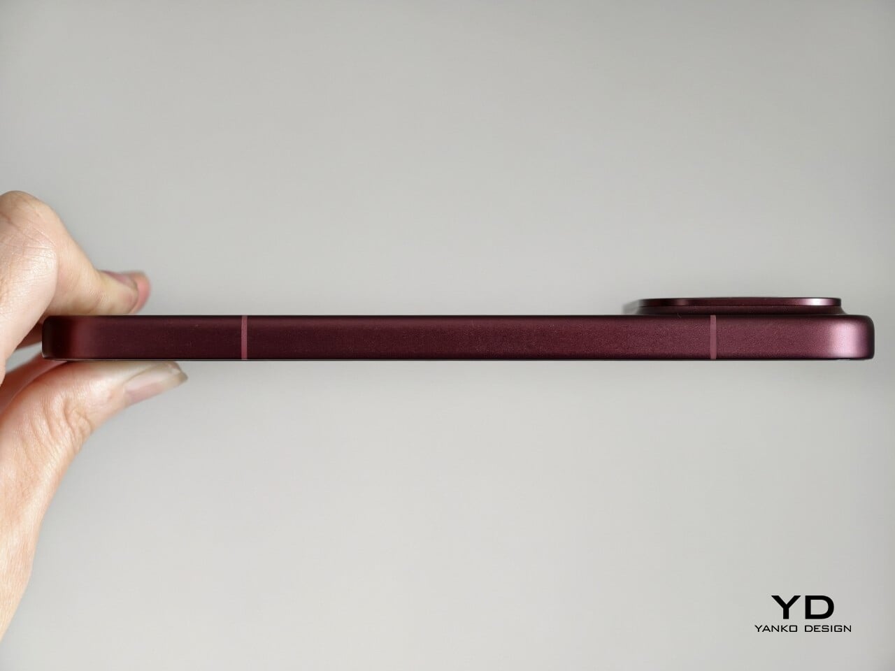
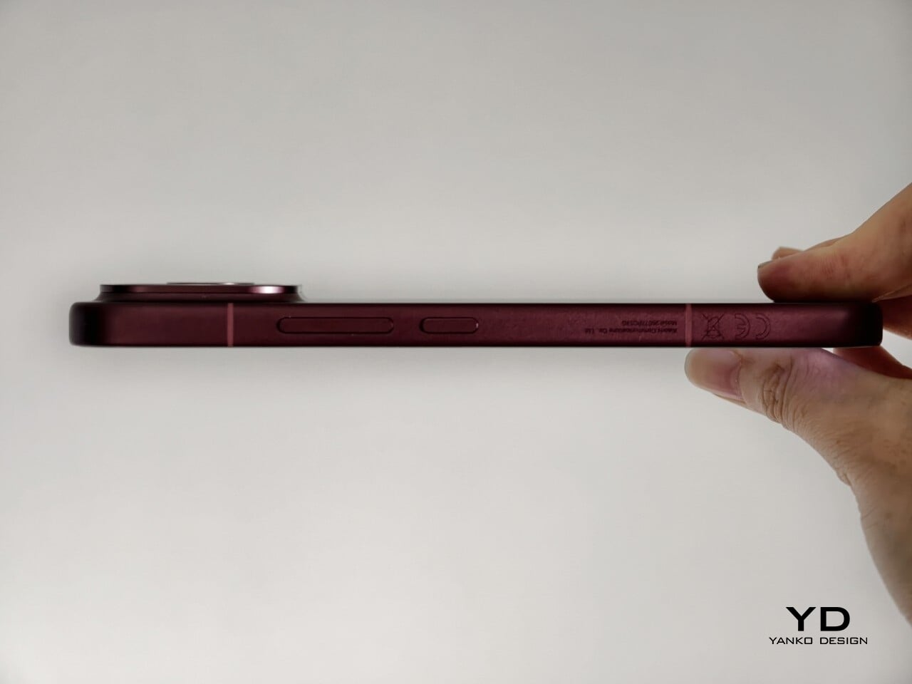
That more sophisticated look does come with a more substantial physical presence. At 235g, the Poco F9 Ultra is about 15g heavier than the F8 Ultra, and you feel that extra weight immediately. It sits firmly on the heavier side, especially in one-handed use, where its size and mass are hard to ignore.
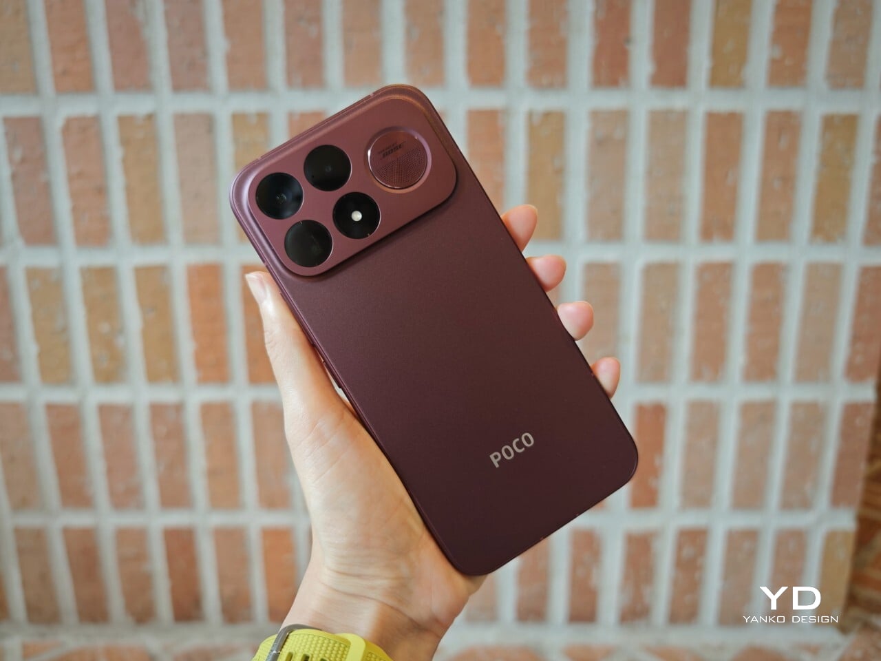
Its dimensions, 163.49 x 77.94 x 8.74mm, are broadly in line with its predecessor, so the overall footprint will feel familiar if you are coming from the older model. It is still a wide phone, though, and not the easiest to manage with one hand. The curved edges do help soften the grip and make it feel less severe than the numbers suggest, but this is still a device that feels more at home in two-handed use.
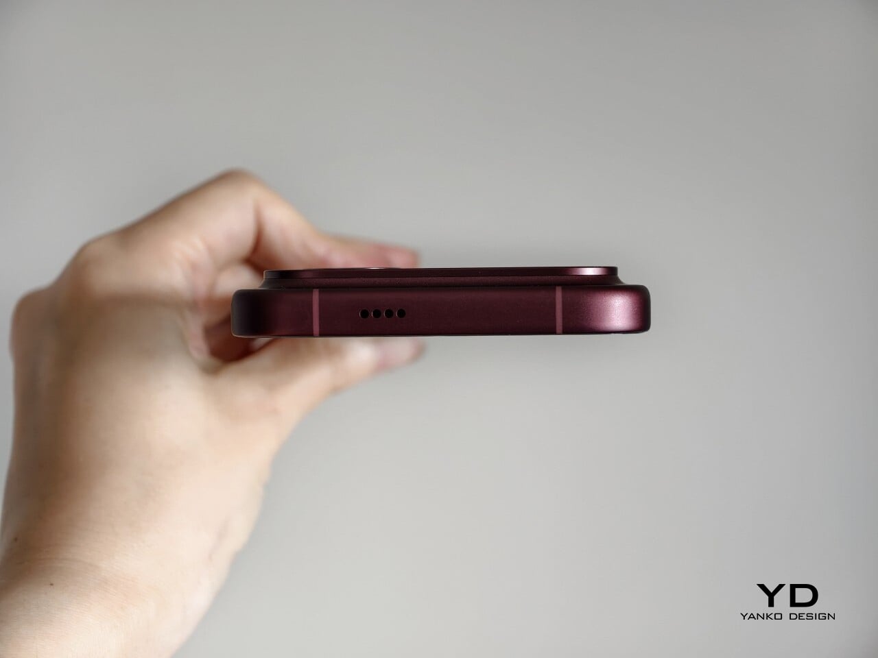
The matte finish does its part as well. It feels premium, pleasant to touch, and better at disguising smudges than a glossier surface would be. Add in the familiar button placement and unchanged in-display fingerprint scanner, and the F9 Ultra ends up feeling less like a phone you need to relearn and more like one you simply need to get used to carrying.

Performance

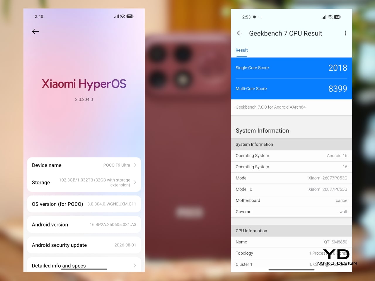
The F9 Ultra runs on Qualcomm’s Snapdragon 8 Elite Gen 5, the same flagship platform used in the F8 Ultra. Poco has also retained the VisionBoost D8, a dedicated chip aimed at improving gaming and video performance. In practice, that makes the F9 Ultra feel less like a leap in raw power and more like a refinement of an already capable performance formula.
The F9 Ultra pairs that gaming focus with a 6.9-inch 1.5K AMOLED display, and it is exactly the kind of panel you would want on a phone built around entertainment. It is large, sharp, and vibrant, with a refresh rate that gives the phone a clear performance edge in games that can actually take advantage of it. Outside of gaming, that same smoothness carries over into scrolling, animations, and general navigation, even if the practical difference becomes less dramatic in everyday use.

Brightness is another clear strength. Poco says this is the first global lineup to use the new M11 luminescent material, which helps the panel reach up to 4,500 nits in peak brightness and as high as 10,000 nits for HDR highlights. The numbers are extreme, but the more practical takeaway is that the screen stays very readable outdoors and gives bright scenes a stronger sense of punch and contrast without losing too much detail.
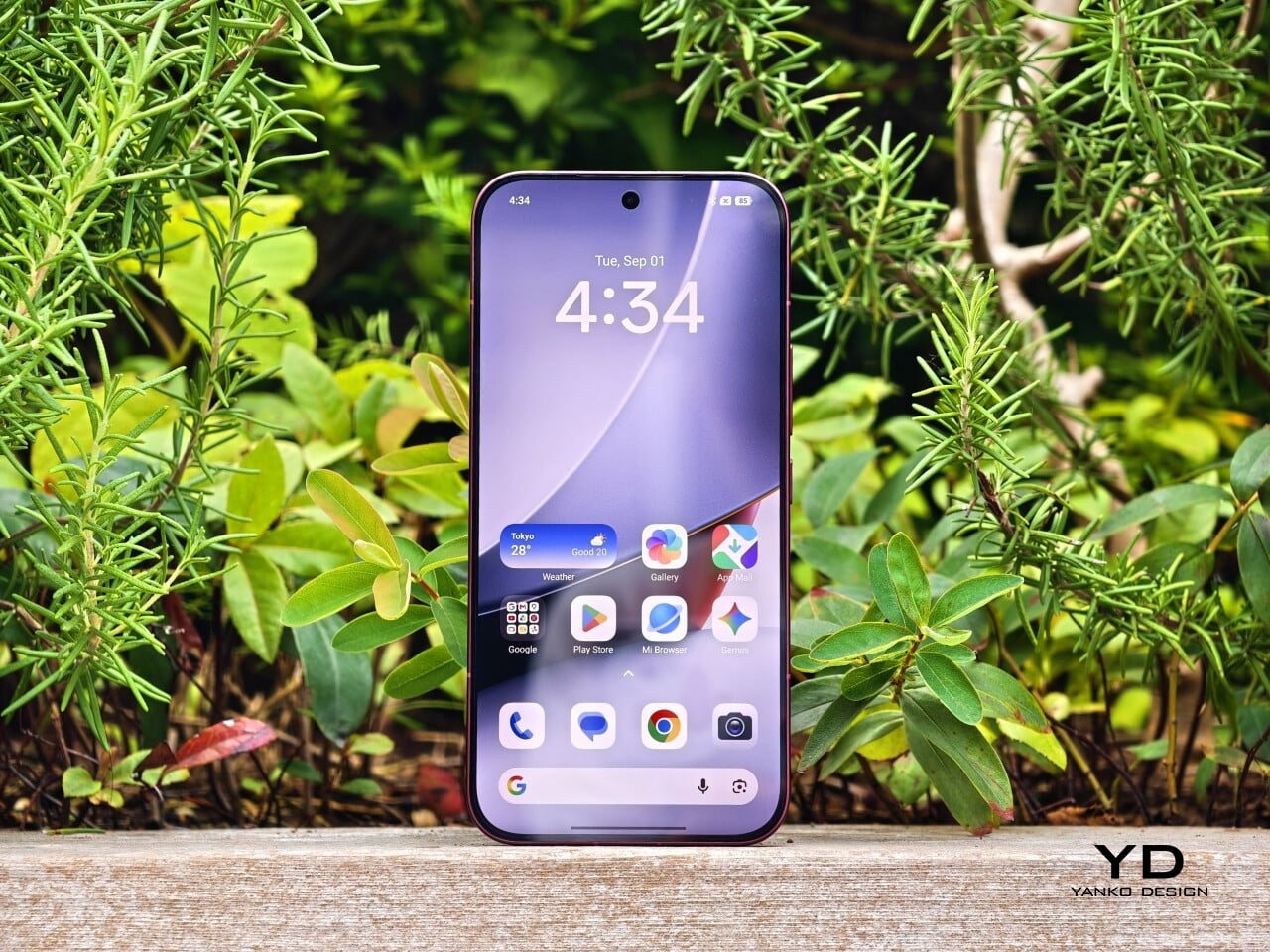
The F9 series is also Poco’s first to push to 185Hz, with support for 24 games running at a native 185fps. That sounds more dramatic than it always feels in practice, because the benefit depends heavily on the kind of game you are playing. In faster titles like Blood Strike, Crossfire: Legends, and Brawl Stars, the higher refresh rate does make a difference. Motion looks cleaner, visual updates come faster, and the game feels a little more immediate under your fingers. In slower games like Clash of Clans, Clash Royale, or Hearthstone, the gain is much smaller. You still get smoother animations and interface movement, but not the same kind of gameplay advantage.

In an hour-long session of Blood Strike at the highest graphic settings, the F9 Ultra was able to hold 185fps without any obvious frame drops. Just as importantly, it did not get uncomfortably hot, staying at around 40 degrees Celsius on the surface. There is clearly enough cooling here to keep performance from falling off over time, but the more important takeaway is that the phone stays consistent under load.

Main Camera, 1x

Portrait mode, Main Camera, 3.1x

The F9 Ultra is the second phone to come out of Poco’s partnership with Bose, which makes the collaboration feel less like a one-off experiment and more like part of the series identity. The Bose-tuned speaker system remains one of its most distinctive features, and also one of the easiest to appreciate in daily use. Poco says it has redesigned the acoustic port and upgraded the dual speakers for clearer sound and richer bass. It also keeps the sound profile presets and 10-band EQ introduced on the F8 Ultra, which means there is still plenty of room to tailor the sound to your liking.
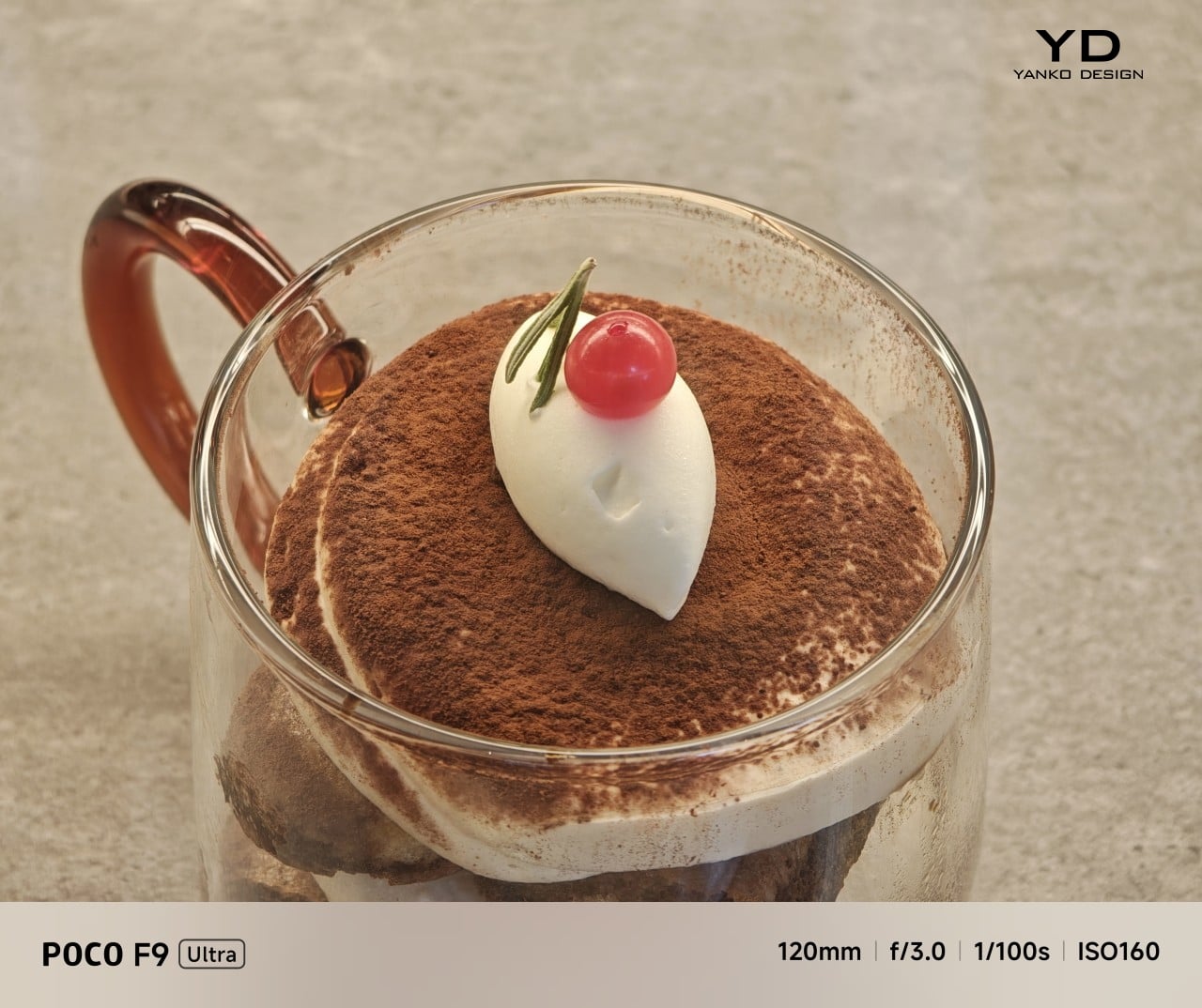
Telephoto Camera, 5x
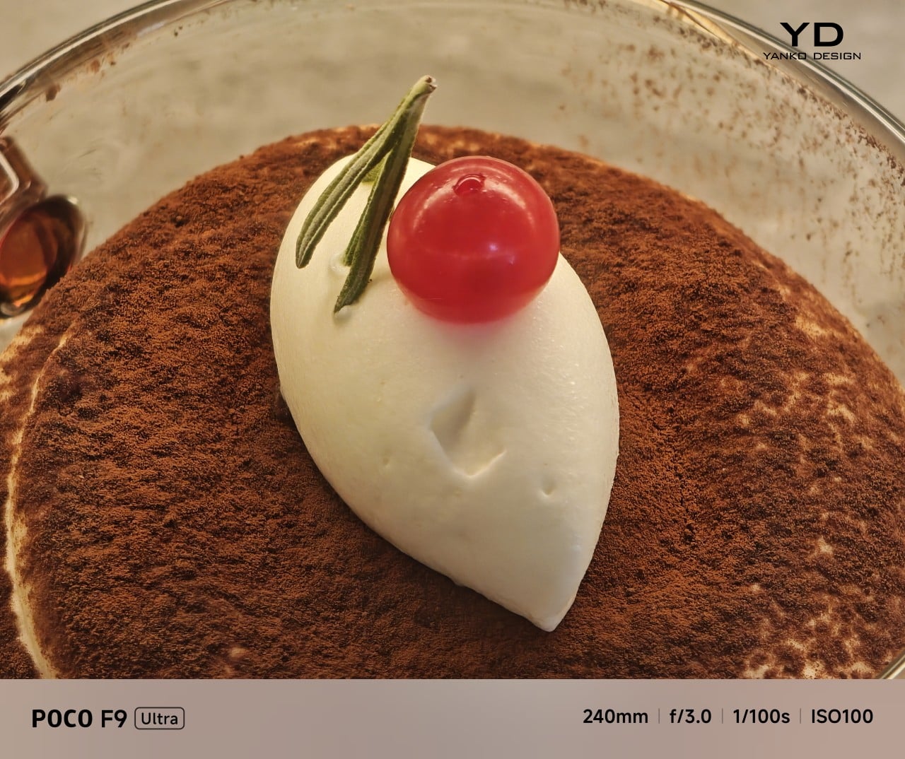
Telephoto Camera, 10x

In use, the speakers are easy to like. Just like the F8 Ultra, the F9 Ultra delivers some of the best smartphone audio you can get. The sound is fuller and more open than what most phones manage, with enough bass presence to give games, films, and music a bit more body. Dialogue comes through clearly, and the overall presentation feels less cramped than the average smartphone speaker setup.
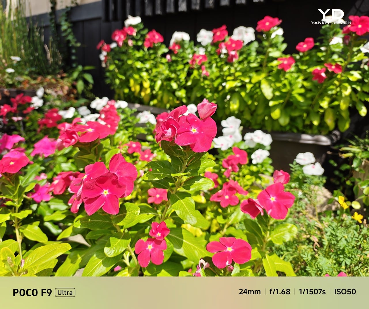
Main Camera, 1x
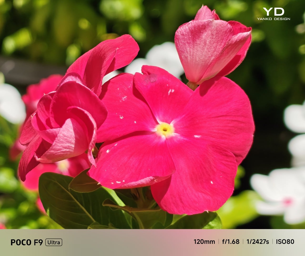
Telephoto Camera, 5x
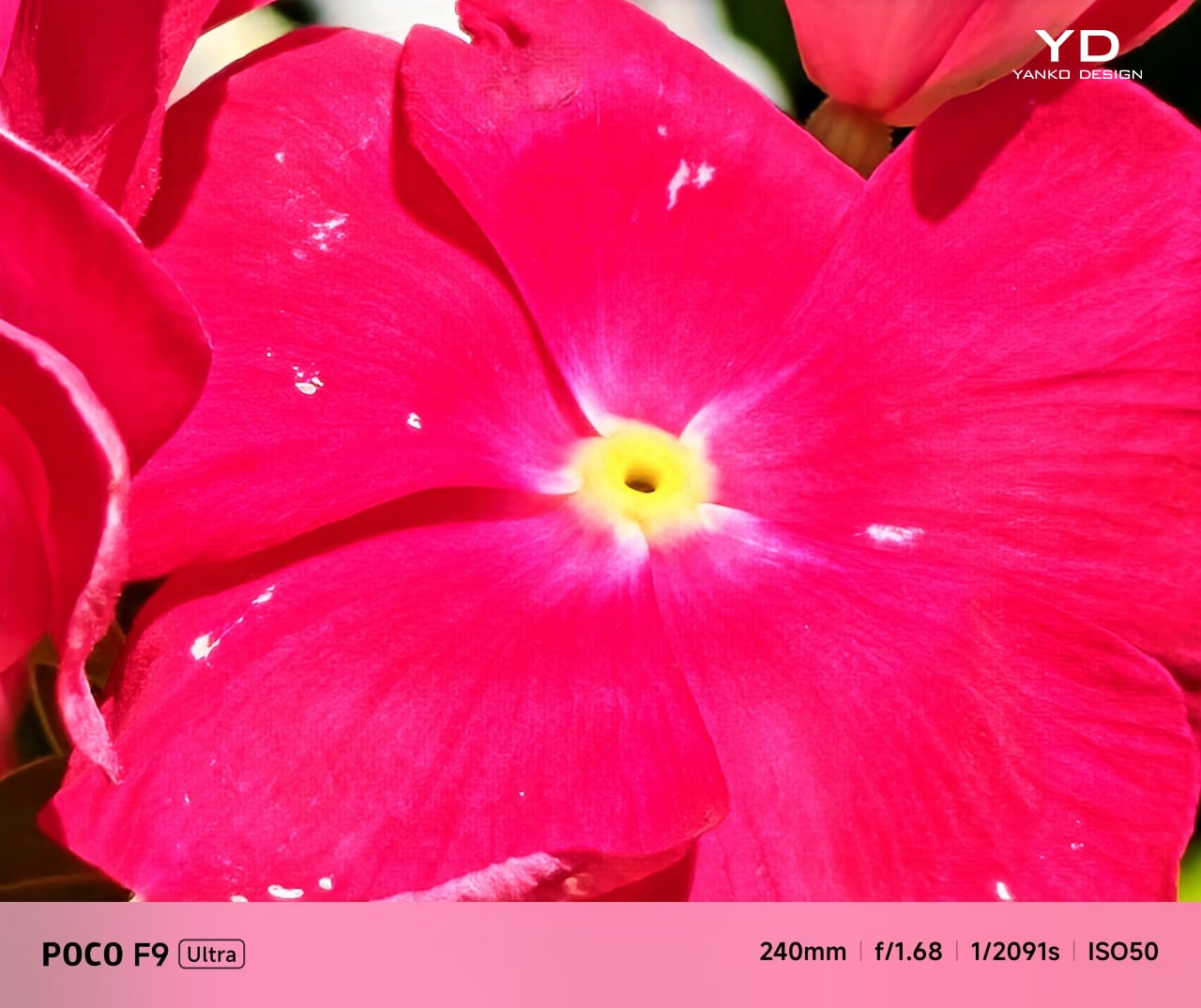
Telephoto Camera, 10x

The F9 Ultra upgrades the main camera from 50MP on the F8 Ultra to 200MP here, though the sensor itself is smaller, dropping from 1/1.31-inch to 1/1.56-inch. That makes it less a straightforward upgrade and more a different kind of tradeoff. The rest of the setup remains familiar, with a 50MP 5x telephoto, a 50MP ultrawide, and a 32MP front camera.

Poco has also made a subtle but useful change to the focal lengths. The F9 Ultra uses a 24mm-equivalent main camera and a 17mm-equivalent ultrawide, compared with 23mm and 18mm on the F8 Ultra. The shift is small, and the ultrawide still does not feel especially expansive, but the added separation between the two lenses makes the jump from main to ultrawide feel a little more purposeful.

Ultrawide Camera, 0.7x

Main Camera, 1x

Telephoto Camera, 10x

In use, the main camera captures photos with good detail, solid dynamic range, and vibrant color. The 5x telephoto is also capable, though it tends to produce images that look a bit more saturated and contrast-heavy. Video is solid too, with crisp footage and enough consistency to make the camera system feel dependable for everyday shooting.

Night Shot, Ultrawide Camera, 0.7x

Night Shot, Main Camera, 1x

Night Shot, Telephoto Camera, 5x

Night Shot, Telephoto Camera, 10x

Battery life remains one of the F9 Ultra’s biggest strengths. The 8,050mAh battery is enormous even by flagship standards, and it gives the phone a clear advantage in the kind of heavy use it is designed for. In my use, it was easy to stretch the phone across two days on a charge, which suits the F9 Ultra’s media-heavy, gaming-friendly character especially well.
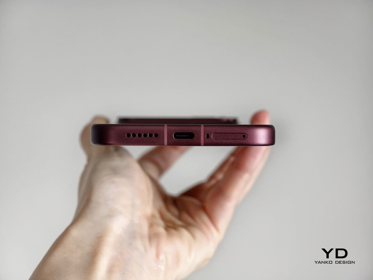
Charging is just as capable, with 100W wired and 50W wireless support, plus 27W wired reverse charging and 22.5W wireless reverse charging. It is a battery setup that feels as well-rounded as the rest of the phone.

Sustainability

The F9 Ultra is not a phone that talks much about sustainability in the material-driven sense, but it does make a decent case for longevity. Its IP68 rating and Corning Gorilla Glass 7i should help it stand up to everyday wear, which is still one of the most practical ways a phone can stay useful for longer.
Poco also promises four major Android OS updates and six years of security patches, which gives the F9 Ultra a fairly credible long-term support story. That matters because software support plays a big role in whether a phone remains worth keeping. Poco may not be leading the conversation around recycled materials or repairability here, but the basics of durability and usable lifespan are in place.

Value

The F9 Ultra starts at $799 for the 12GB/256GB version, which puts it $70 above the F8 Ultra. That is still an increase, but not an especially aggressive one in the current climate, where similar phones have seen price jumps closer to $100. Some of that restraint may come from Poco reusing the same Snapdragon 8 Elite Gen 5 platform, which likely helped balance out the rising cost of RAM and other components.
As an upgrade, though, the case is less convincing. If you already have the F8 Ultra, moving to the F9 Ultra does not make a lot of sense unless you specifically want the new design, the 185Hz display, or the 200MP main camera. As a fresh buy, however, it remains one of the best affordable flagship-level phones around. Poco may be edging upward in price, but it still knows how to deliver a lot of phone for the money.

Verdict

The Poco F9 Ultra feels like Poco settling into a formula that actually works. The design is more mature, the gaming side is still strong, and the Bose-tuned speakers remain one of the best reasons to care about the series in the first place. Add the huge battery and the 185Hz display, and you end up with a phone that feels very sure of what it wants to be.

If you already have the F8 Ultra, I do not think this is the upgrade to chase. The older phone is still good enough that the differences here feel more iterative than urgent. But if you are buying fresh, the F9 Ultra is still one of the better affordable flagship-level phones around, especially if you care as much about sound and gaming as you do about the usual specs.
The post Poco F9 Ultra Review: Great Sound, Grown-Up Design first appeared on Yanko Design.
  •  

This $21 Charger Powers Your iPhone, Apple Watch, and AirPods at Once

Most of us have two or more gadgets that need constant charging, plus several chargers and cables to keep them all juiced up. That’s probably fine if you have an entire outlet strip at home or in the office, but when you’re working with a small space, or you’re traveling and on the go, it can be a real challenge to charge multiple devices at once. You end up with a tangle of cords and charging heads, or sometimes you even have to take turns charging your gadgets.

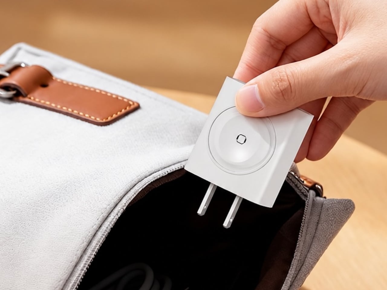
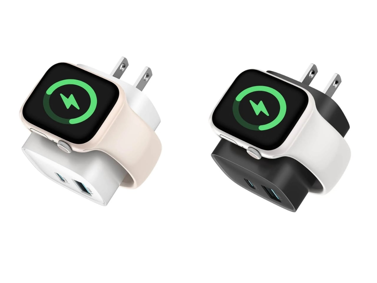
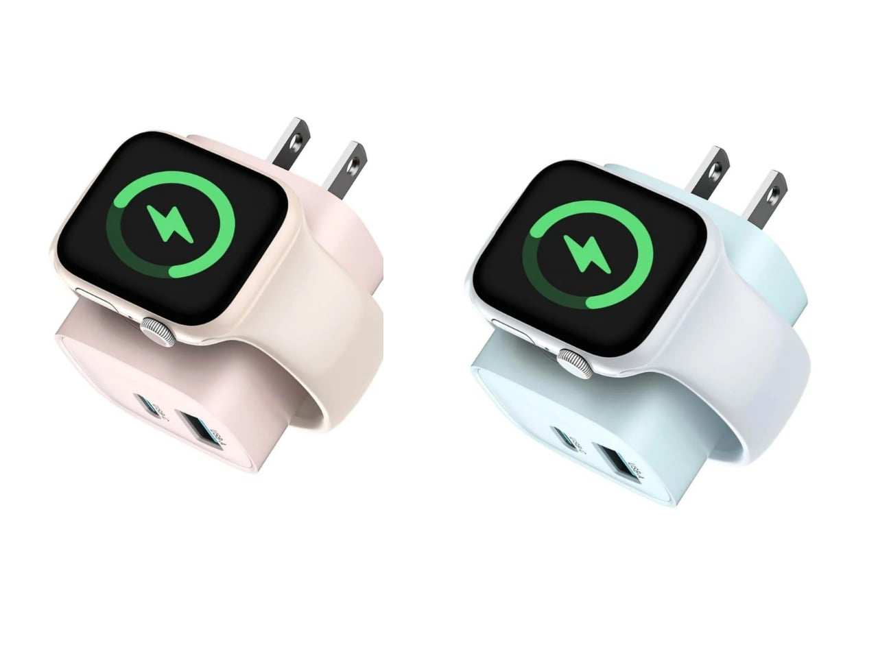
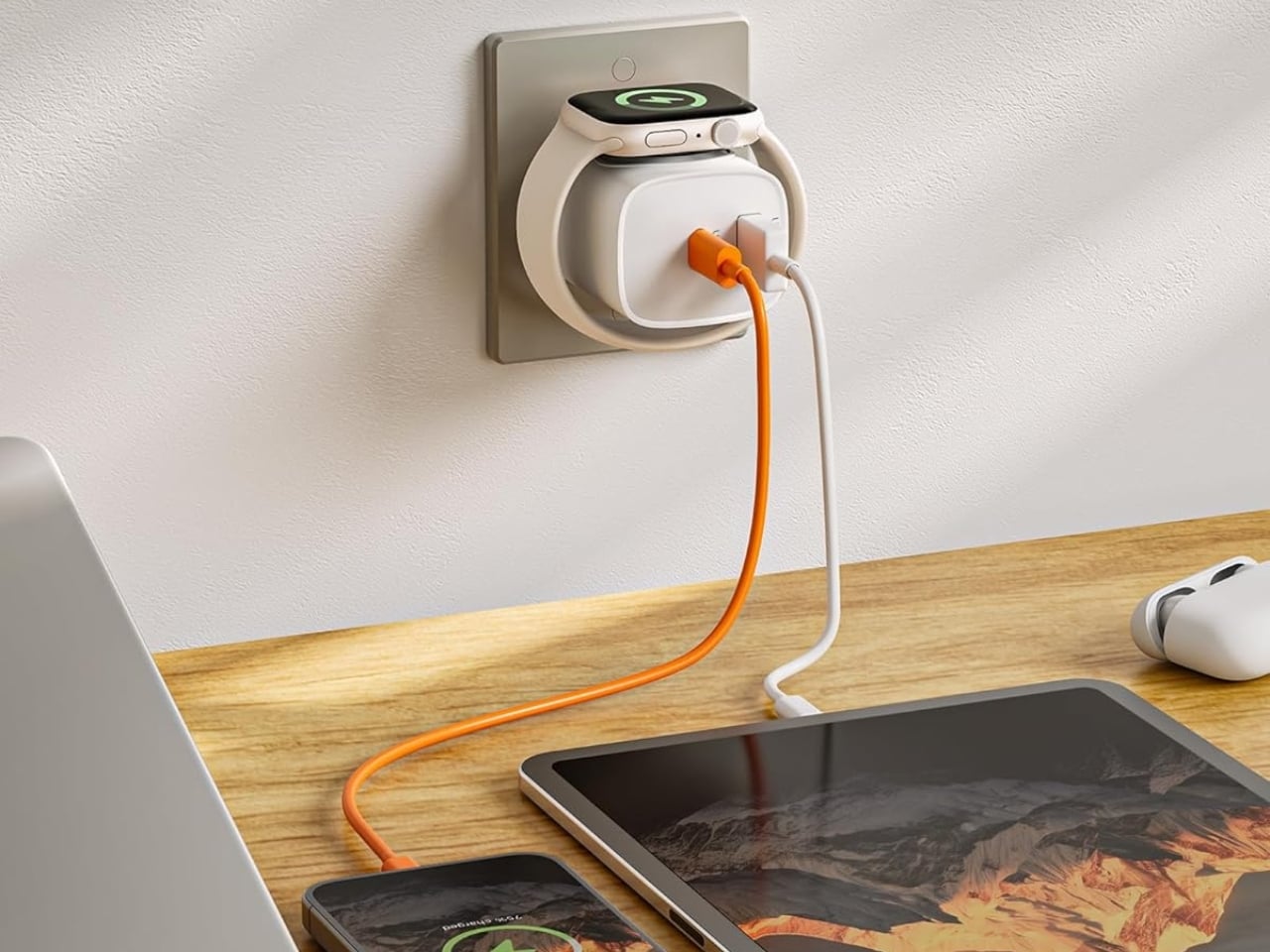
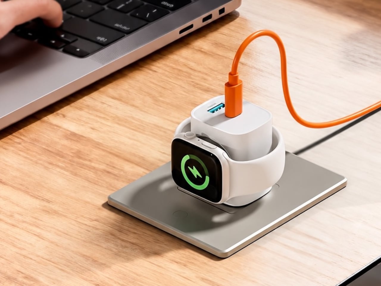
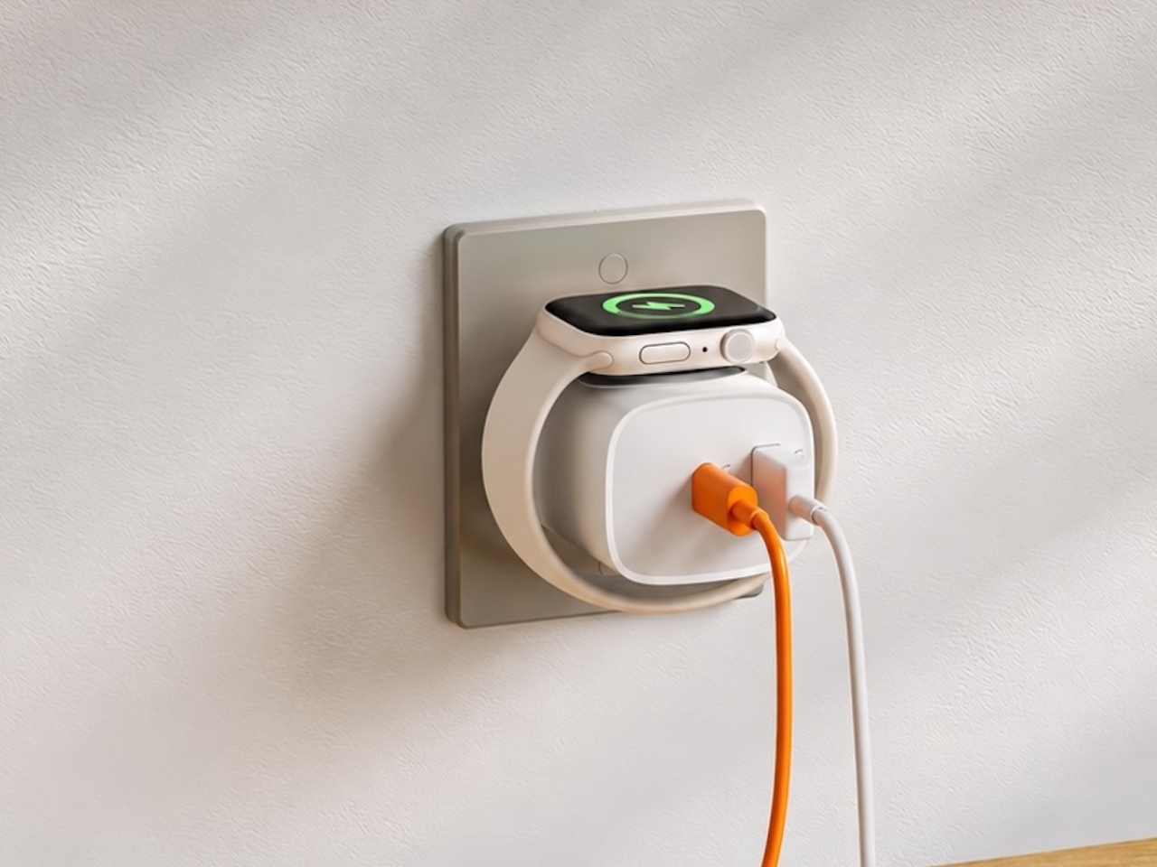
If you mostly own Apple devices or other USB-C-powered gear, the TESSAN 3-in-1 USB-C Charger may actually solve that problem for you. It’s a compact wall charger with a USB-C port, a USB-A port, and a built-in magnetic Apple Watch dock, so you only need one outlet to power up three devices at the same time.

Designer: TESSAN

This 3-in-1 charger is especially handy when you only have one outlet available but need to power up three different devices. A few years ago, this wouldn’t have been much of an issue, since most of us only had one phone to worry about. But now that owning multiple devices is the norm, charging has become an everyday hassle. What do you do when you’ve got a phone, a pair of AirPods, and a smartwatch that all need power at the same time?

TESSAN’s charger features fast charging through its 20W USB-C port, so you can get a device like the iPhone 15 up to 55 percent battery in just 30 minutes. At the same time, its 18W USB-A port can juice up an accessory simultaneously while your main device charges. It also offers broad compatibility, working with everything from the latest iPhone models to AirPods and other USB-powered devices. The real star of the show, though, is the built-in magnetic charger for your Apple Watch. There’s no separate puck or cable needed here. Instead, you get a self-aligning dock, so you won’t have to fuss with positioning your watch every time you need to charge it.

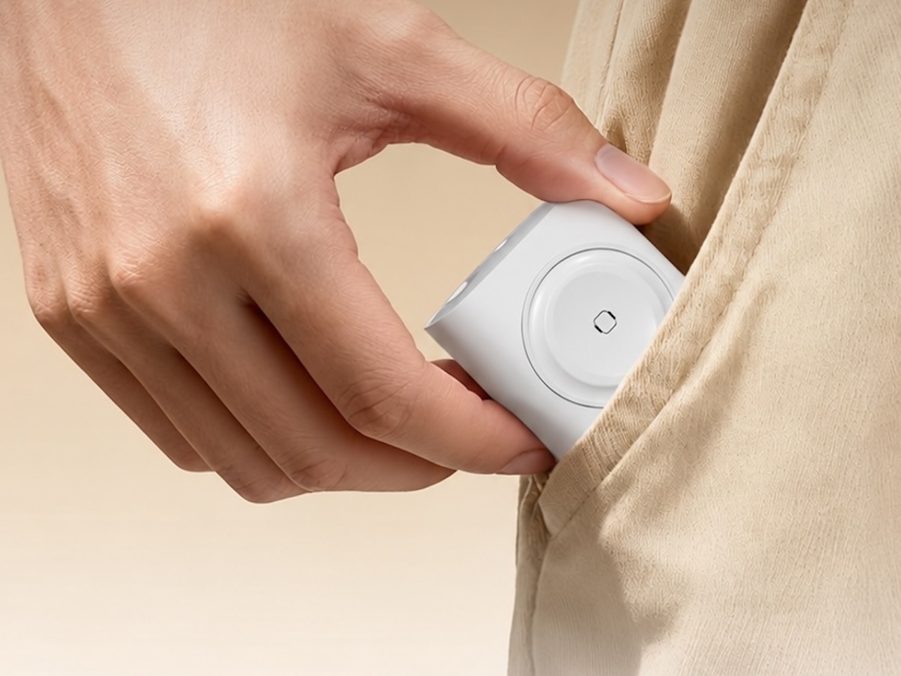
The charger comes in four finishes (white, black, pink, and blue) and is clearly designed to double as a small desk-aesthetic item, though it will likely still read as “just a charger” to most people, especially in the white colorway. Where it really shines is portability: it’s a travel-friendly device you can toss in a bag without a second thought, instead of hauling around three separate chargers that eat up space and weight in your carry-on.

How does it stack up against the competition? The most obvious comparison is Belkin, whose 3-in-1 MagSafe charging stands are the gold standard in this category. Belkin’s BoostCharge Pro and UltraCharge Pro docks charge an iPhone, Apple Watch, and AirPods wirelessly and look considerably more premium sitting on a nightstand, but they also run anywhere from $95 to $150 and require more desk real estate. TESSAN’s charger, at $20.99, skips the wireless charging bells and whistles in favor of a compact, plug-in design that’s built more for function and travel than for a styled bedside setup. If you want a showpiece charging stand for your living room, Belkin is still hard to beat. But if you want something inexpensive, pocketable, and fast enough to get you out the door in the morning, TESSAN makes a compelling case for itself as the budget-friendly, travel-first alternative.

At the end of the day, this isn’t a charger trying to be a lifestyle centerpiece. It’s a charger trying to solve a genuinely annoying, everyday problem: too many devices, not enough outlets, and not enough patience to wait in line for your turn at the power strip. For $20.99, the TESSAN 3-in-1 USB-C Charger delivers fast charging, broad compatibility, and a clever built-in Apple Watch dock in a package small enough to disappear into a laptop bag or a nightstand drawer. It won’t turn heads the way a sleek charging stand might, but it will quietly keep your phone, watch, and earbuds powered up without the usual cord chaos. For anyone juggling multiple Apple devices on a daily basis, or packing for a trip and dreading the tangle of cables, this little charger earns its spot on the “actually useful” list.

The post This $21 Charger Powers Your iPhone, Apple Watch, and AirPods at Once first appeared on Yanko Design.

  •  

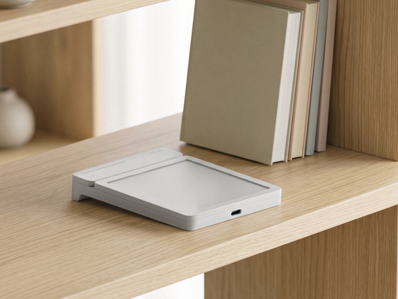
MATE Works Like a Sticky Note That Sets Its Own Alarm When You Write

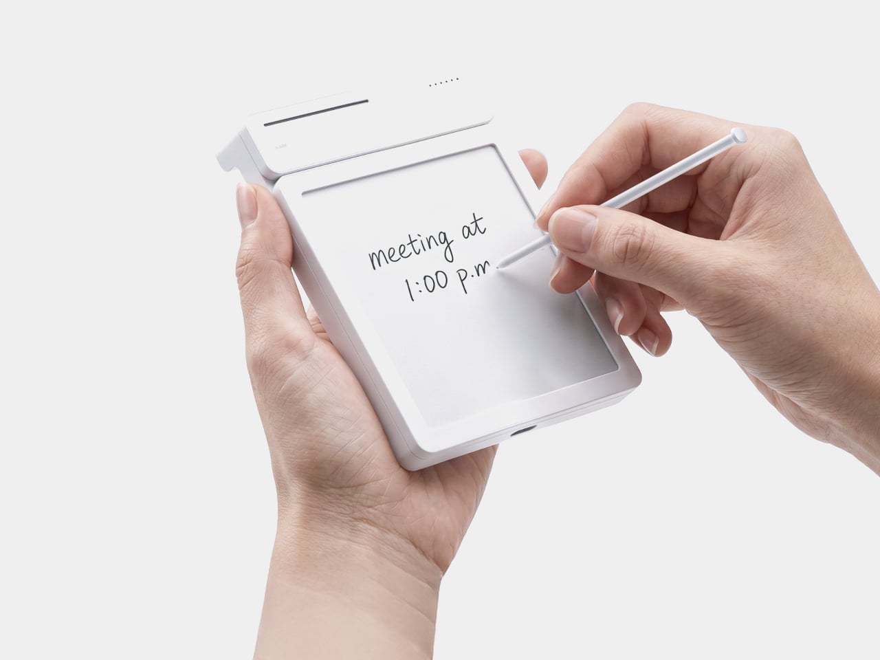
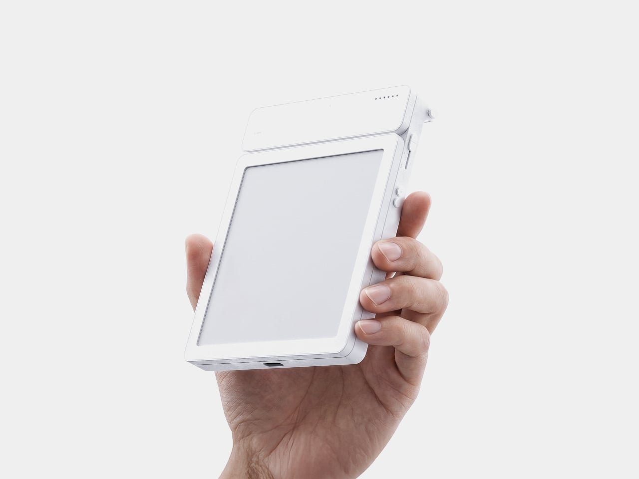
Setting a reminder on a phone means unlocking a screen, opening an app, and typing on a keyboard, three steps that break whatever train of thought led to needing the reminder in the first place. MATE skips all of that by reading your own handwriting instead. Write “meeting at 1:00 p.m.” on its E-ink panel with the built-in pen, and the device sets the alarm itself, no app, no unlocking, no menu to dig through.

That handwriting recognition is the entire premise, and it works because the device treats a note and a task as the same object rather than two separate steps. The moment it detects a time written into the text, it quietly converts that scribble into a scheduled alert running in the background. Nothing about the note’s appearance changes. It still just looks like something you jotted down on paper.

Designer: Geonwoo Kang

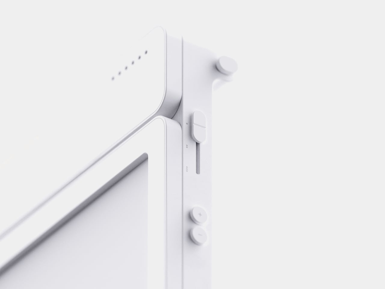
A thin LED bar along the top edge handles the countdown, giving a glance-able sense of how much time remains without requiring a full screen wake or a swipe through settings. When the set time actually arrives, the alarm sounds and stops the instant you tap the panel, keeping the entire alert cycle contained to the same physical surface where the note was written in the first place.

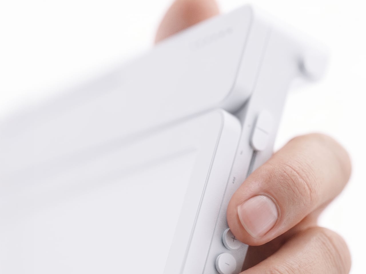
Because handwritten notes pile up fast, MATE handles multiple pages through a three-stage physical slider running down one side, letting you flip between up to three saved notes with a flick of a finger. That’s a deliberately low-tech solution to a problem most gadgets solve with a touchscreen menu, and it works specifically because a slider takes zero attention to operate correctly on the first try.

The memo pad itself doesn’t have to stay locked into the main body either. It detaches from its dock and relies on built-in magnets to stick onto a partition wall or a metal filing cabinet, turning a handheld notepad into a fixed reminder posted wherever it’s actually needed. A grocery list stuck to a fridge door works the same way a sticky note always has, just with an alarm quietly running underneath it.

Even the pen gets a small, deliberate design decision most styluses skip. It nests into a groove at the top of the device rather than rattling around loose in a bag or a drawer, solving the single most common complaint about any stylus-based gadget: losing the one piece that makes the whole thing work. Reaching for a note and finding the pen missing defeats the entire point of a device built around spontaneous handwriting.

None of MATE’s individual pieces, the E-ink panel, the physical slider, the magnetic pad, would stand out much alone. Put together, they describe a specific kind of object: something meant to sit on a desk quietly doing one job well, catching a thought before it disappears and holding onto it until the moment it’s actually needed.

The post MATE Works Like a Sticky Note That Sets Its Own Alarm When You Write first appeared on Yanko Design.

  •  

The Wooden Box That Refuses to Let Your Phone Win

I’ve tried every trick to get my phone to leave me alone. Do Not Disturb. Grayscale mode. Leaving it in another room, which mostly just means I walk to the other room every twenty minutes to check on it. None of it works for long, because the problem was never the settings. The problem is that the phone is still there, still glowing, still capable of buzzing the second I let my guard down. Willpower is a terrible security system, and every app-based fix is still just asking me to trust myself, which is exactly the thing I can’t do at nine at night with a bag of chips in one hand.

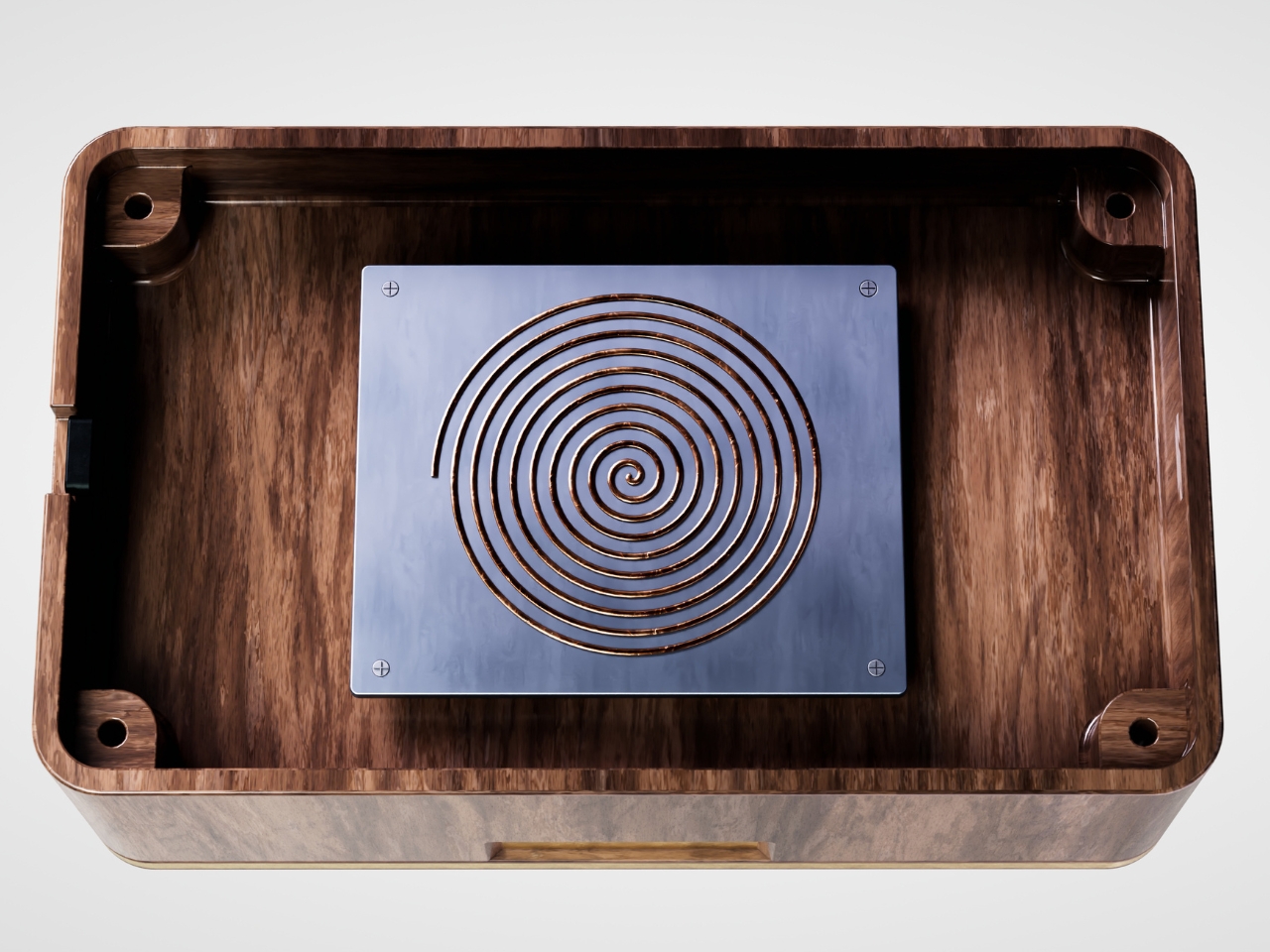
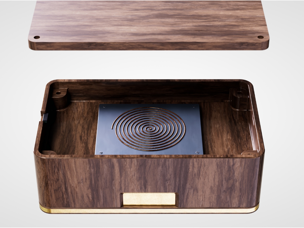
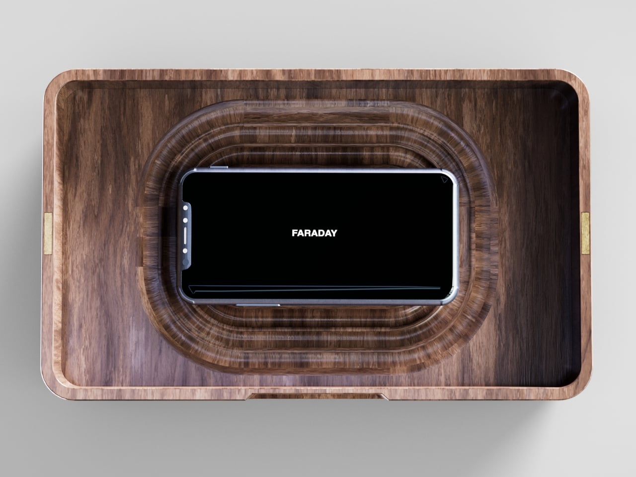
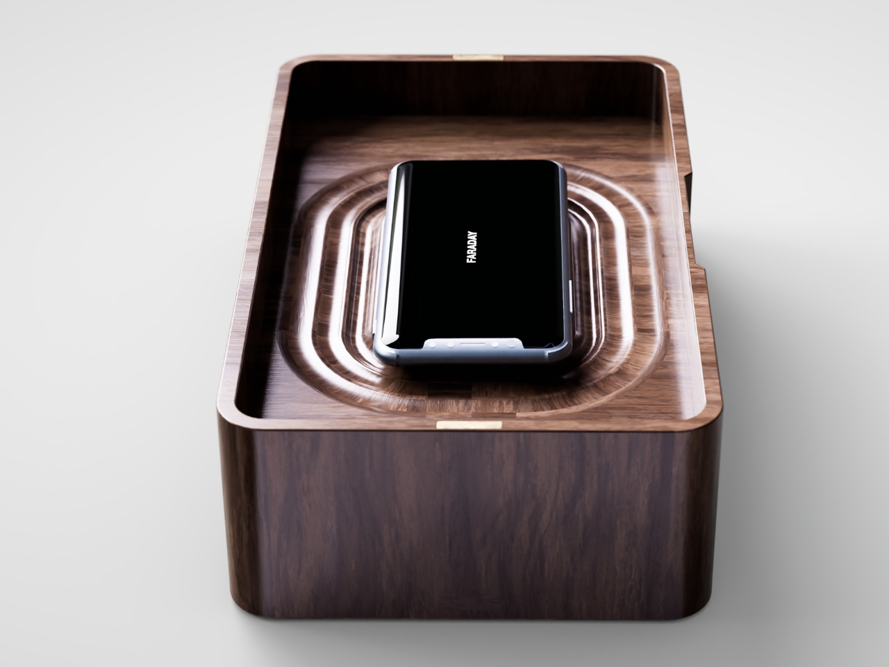
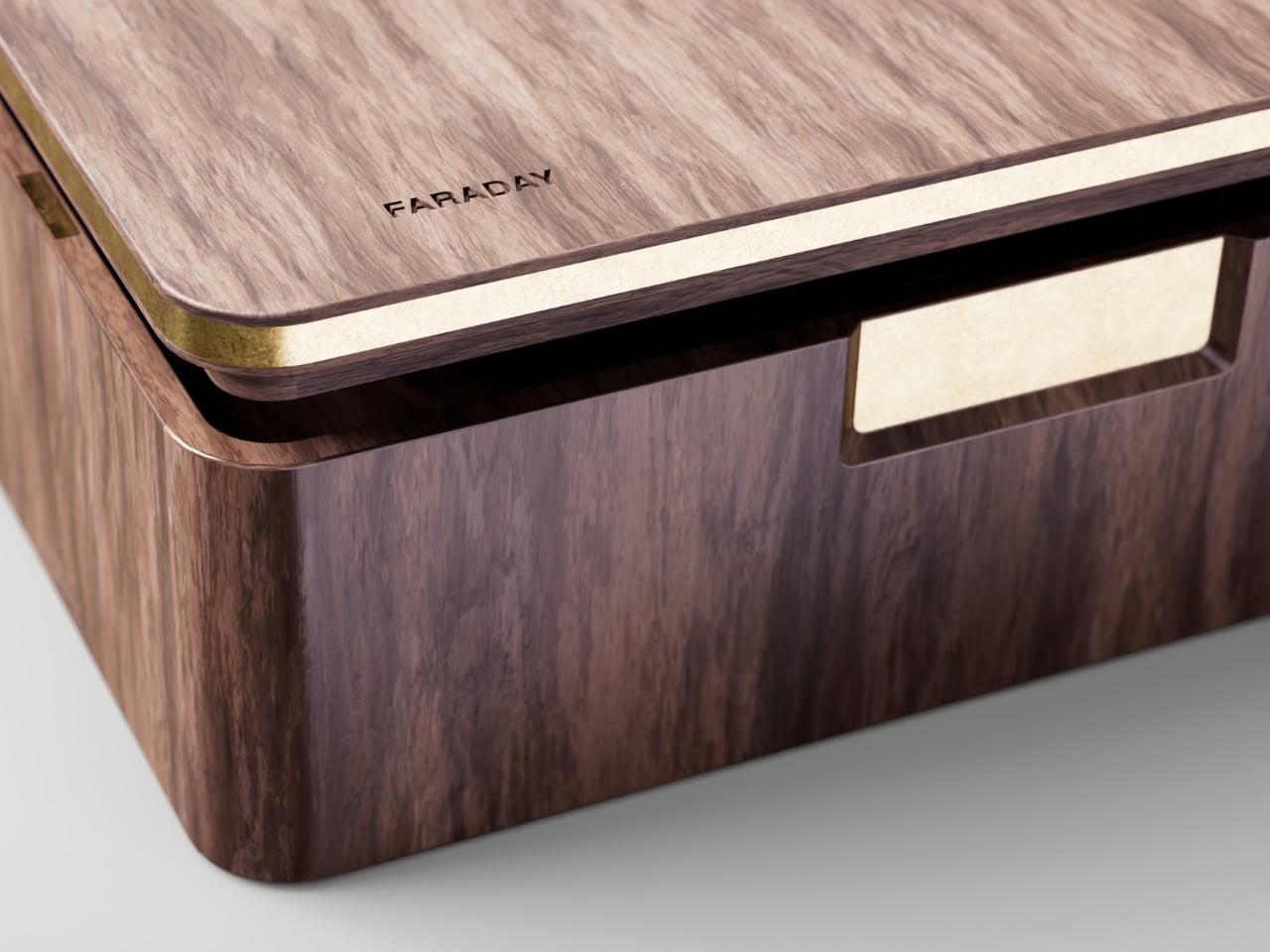
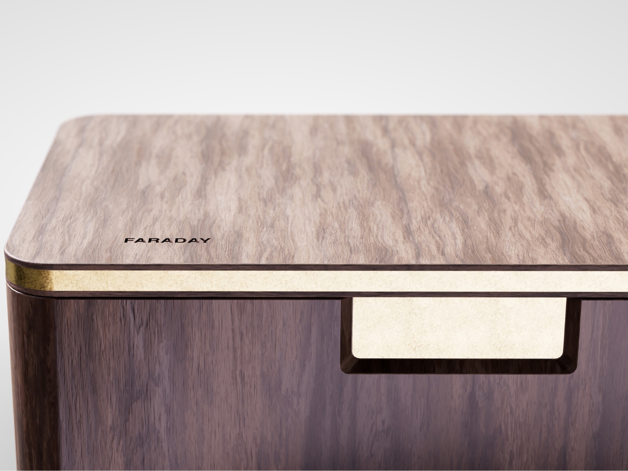
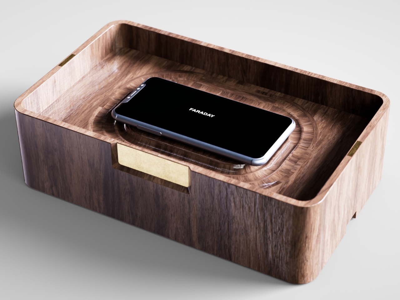
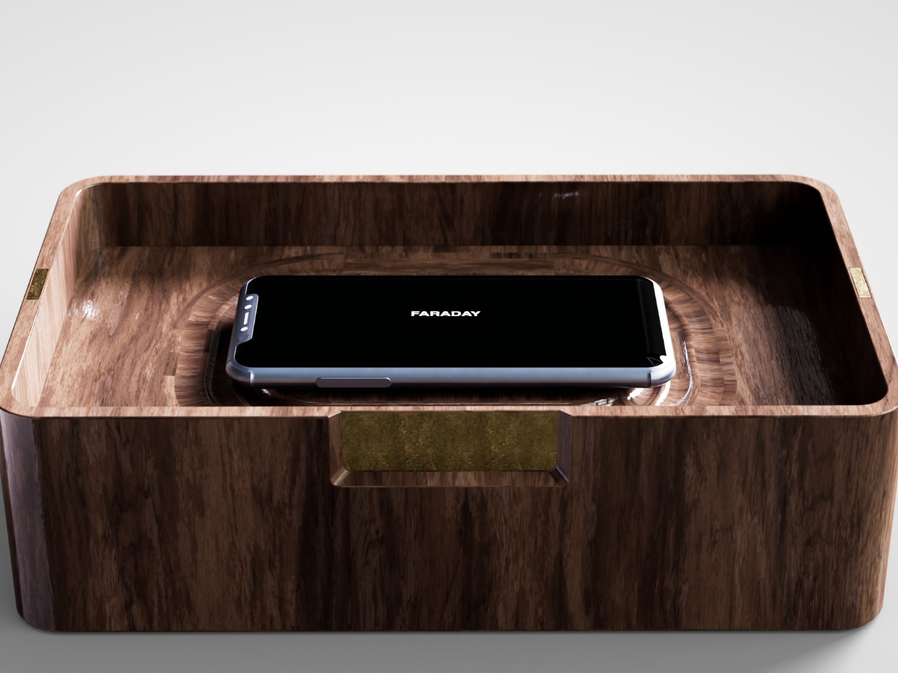
That’s the gap French industrial designer Pascal Grangier is quietly working in with FARADAY, a home object that doesn’t ask you to resist your phone. It makes resistance unnecessary. Named after the 19th-century scientist whose cage design blocks electromagnetic fields, the piece works on the same basic physics: once your phone is inside, it has no signal at all. No calls sneak through, no texts land, no app can light up your lock screen and drag your eyes back to it. You’re not disconnecting through discipline. You’re disconnecting through geometry.

Designer: Pascal Grangier

What makes this more than a novelty is the shape it comes in. Most signal-blocking products look like they were built for a hardware store, not a living room. Faraday pouches for concerts and courtrooms are floppy nylon sleeves you’d never leave out on a counter. Grangier’s version is carved from wood, with the kind of soft, rounded form you’d expect from a well-made bowl or a piece of studio furniture. It’s designed to sit on a nightstand or a kitchen counter without looking like a confession that you have a phone problem. That distinction matters more than it sounds like it should. An object you’re proud to display gets used. An object you’re embarrassed by gets shoved in a drawer and forgotten by the second week.

I think a lot about why boxes like this are showing up now, and it’s not really about phones getting worse. It’s about people finally admitting that the “just put it on silent” advice never addressed the actual craving, which is the urge to check, not the urge to hear. Silent mode still lets the dopamine loop run in the background of your brain, because you know the notifications are piling up somewhere, waiting. A Faraday enclosure removes the pile entirely. There’s nothing accumulating on the other side of that lid, so there’s nothing to be curious about later.

I don’t think objects like FARADAY are anti-technology, and I’d push back a little on anyone who frames it that way. It’s closer to how we treat food we know we’ll overeat if it’s sitting on the counter. Nobody calls it deprivation to put the cookies in a cabinet instead of banning sugar from the house. A wooden box that mutes a phone for the length of a dinner, or a weekend, or a first date, isn’t rejecting the smartphone era. It’s setting a boundary the same way a lock on a liquor cabinet does, respectfully and without lecturing anyone.

The dinner table is probably where this thing earns its keep fastest. Phone stacking, where everyone tosses their device into a pile and the first person to grab theirs pays the check, has become a real ritual at restaurants precisely because people know they need external enforcement. FARADAY takes that same instinct and gives it a permanent home, no penalty games required, no honor system to break.

Whether a hand-carved signal blocker becomes a fixture in American homes the way candles or diffusers did, I couldn’t tell you yet. But the appetite is obviously there. We keep buying productivity apps, screen time trackers, even flip phones marketed as luxury items, all chasing the same outcome Grangier reached with a block of wood and a basic law of physics. Sometimes the smartest tech solution is the one that refuses to be technology at all.

The post The Wooden Box That Refuses to Let Your Phone Win first appeared on Yanko Design.
  •  

MAKERphone 2.0 Assembles Like LEGO, Calls Like a Real 4G Phone

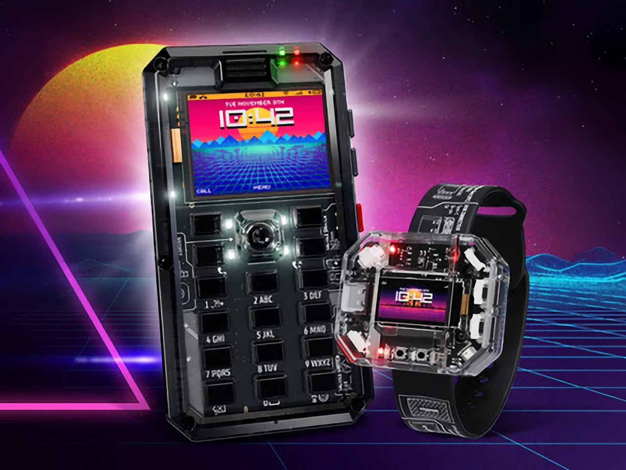
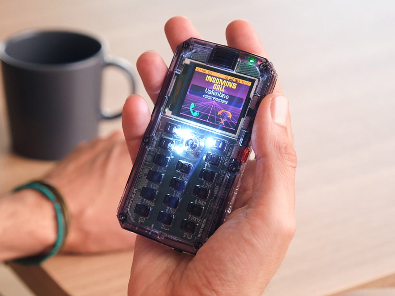
Most phones arrive finished, sealed behind glass before you open the box. MAKERphone 2.0 flips that script. It ships as loose parts that only become a phone once you build it yourself: no soldering iron, no electronics background, just a screwdriver and about two hours. Once assembled, it’s a working 4G device that makes real calls and sends texts over a live network.

The build is what really sells the design. Every piece, from the board to the display to the numpad and to the joystick, clicks or screws into place. The entire endeavor is guided by an illustrated manual that reads like a LEGO instruction booklet, with video walkthroughs for anyone who gets stuck. By the time you finish, you’ve seen the processor, the modem, and the battery close, not used them.

Designer: CircuitMess

Click Here to Buy Now: $129 $160 (24% off). Hurry, only a few left! Raised over $300,000.

Pop in a nano-SIM and the phone comes alive on 4G networks, handling calls and texts like any device off a shelf. There’s a music player, a photo and video gallery, a calendar, notes, and a handful of retro games loaded onto that small color screen. What’s missing says as much: no app store, no social feed, nothing designed to keep anyone scrolling past bedtime.

That absence is the whole appeal for anyone shopping for a kid’s first phone. It calls and texts the people a child needs to reach, without opening the door to an internet’s worth of distraction. When a kid wants a new app or game, the answer isn’t downloading one; it’s building it. Screen time stops being something to limit and starts being something to spend making.

That building happens inside VibeBoy, the phone’s companion coding studio that runs on a computer. Describe an idea in plain English, like a taco dodging falling pickles, and the AI writes code sent to the phone with one click. The goal isn’t to let AI do all the thinking but to let VibeBoy teach users to read that code, question it, and eventually rewrite it.

That teaching happens across four stages built into the same app. Beginners describe what they want and watch it appear on-screen, before moving on to reading and tweaking the Python code the AI generates. Eventually, they write their own Python and C++ from a blank file. Nobody stays at one skill level long; the ladder is designed so most people climb it faster than expected.

Six snap-on modules turn the phone into something closer to a small hardware platform than a single-purpose device. A camera module captures pixelated stills and video, a bigger speaker adds volume, and a flashlight adds utility. An environment sensor reads temperature and humidity, an infrared module controls other devices, and a bare perforated board lets anyone solder a custom circuit and plug it in.

A companion smartwatch called MAKERband follows the same idea, arriving as a kit to assemble rather than a sealed gadget. Once built, it pairs with the phone over Bluetooth and also works with iOS and Android, running 15 watchfaces and five mini-games out of the box. It connects to VibeBoy, so a custom watchface, say, a pixel cat that naps after 9 PM, is a prompt away.

The company behind it, CircuitMess, has spent years building kits like this from a small studio in Croatia. It has shipped hundreds of thousands of units to customers across more than 100 countries, developed dozens of products, and earned coverage from outlets like Wired and The Verge. Just as important, the MAKERphone 2.0 isn’t a rendering or an early prototype: the hardware is finished and ready for production.

What sticks with you isn’t any single spec but the sequence. A pile of components turns into a working phone, and that phone turns into whatever its owner decides to code next. Somewhere between the last screw and the first successful call, the device stops feeling like something you bought and starts feeling like something you actually built, one working call at a time.

Click Here to Buy Now: $129 $160 (24% off). Hurry, only a few left! Raised over $300,000.

The post MAKERphone 2.0 Assembles Like LEGO, Calls Like a Real 4G Phone first appeared on Yanko Design.
  •  

TECNO CAMON Slim 5G Review: Thinner than a Pencil, Tough as a Tank

PROS:


  • Unbelievably slim and lightweight design

  • Striking and stylish art-inspired finish

  • Large 6,000mAh battery despite slim profile

  • Exceptional durability with quad-IP rating, supporting underwater photography

CONS:


  • Modest hardware specs

  • No dedicated telephoto camera

RATINGS:

AESTHETICS
ERGONOMICS
PERFORMANCE
SUSTAINABILITY / REPAIRABILITY
VALUE FOR MONEY

EDITOR'S QUOTE:

Slim, art-inspired, and tougher than it looks, the TECNO CAMON Slim 5G packs a 6,000mAh battery into a body thin enough to turn heads.
award-icon

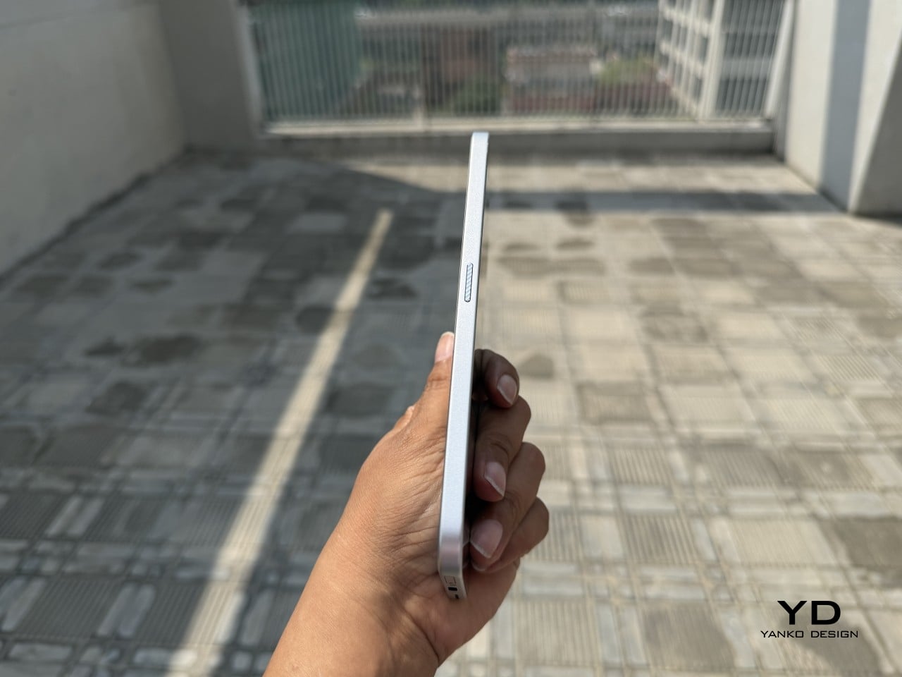
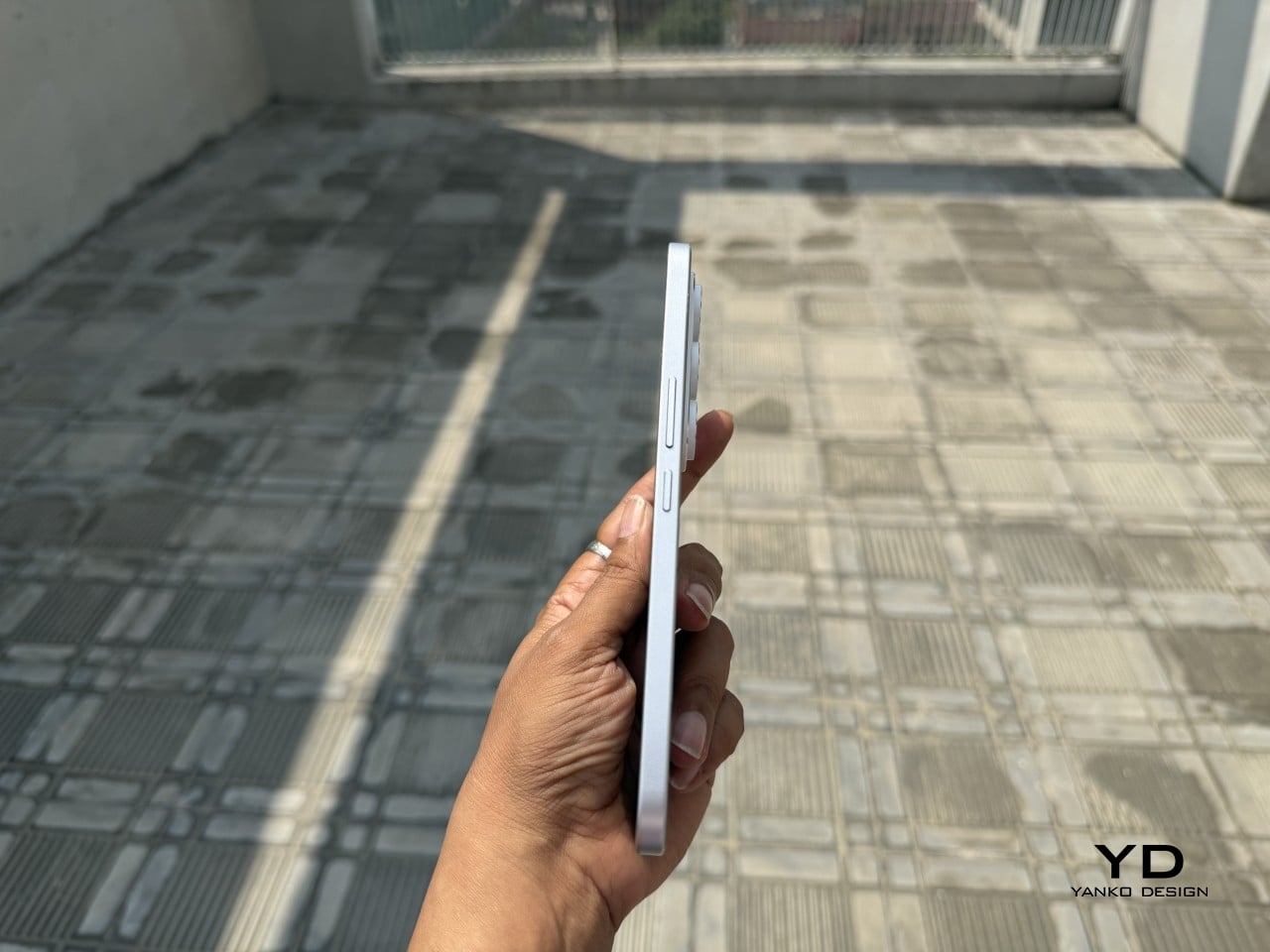
Slim phones have always come with a catch. Shave down the body and something else usually gets sacrificed: usually the battery, sometimes the durability, occasionally both. The TECNO CAMON Slim 5G doesn’t play by that old rulebook. At just 6.39mm thick, it still packs a 6,000mAh battery, 5G connectivity, and a durability rating most phones twice its thickness wouldn’t dare claim.

This review spent real time with the phone away from spec sheets, mostly to see if the design holds up once the initial wow wears off. That meant handling the Neo Mondrian finish TECNO sent for testing, carrying it through a normal week, testing the camera in situations that actually matter, and checking whether the durability claims survive contact with water and everyday clumsiness. The design conversation comes first.

Designer: TECNO

Aesthetics

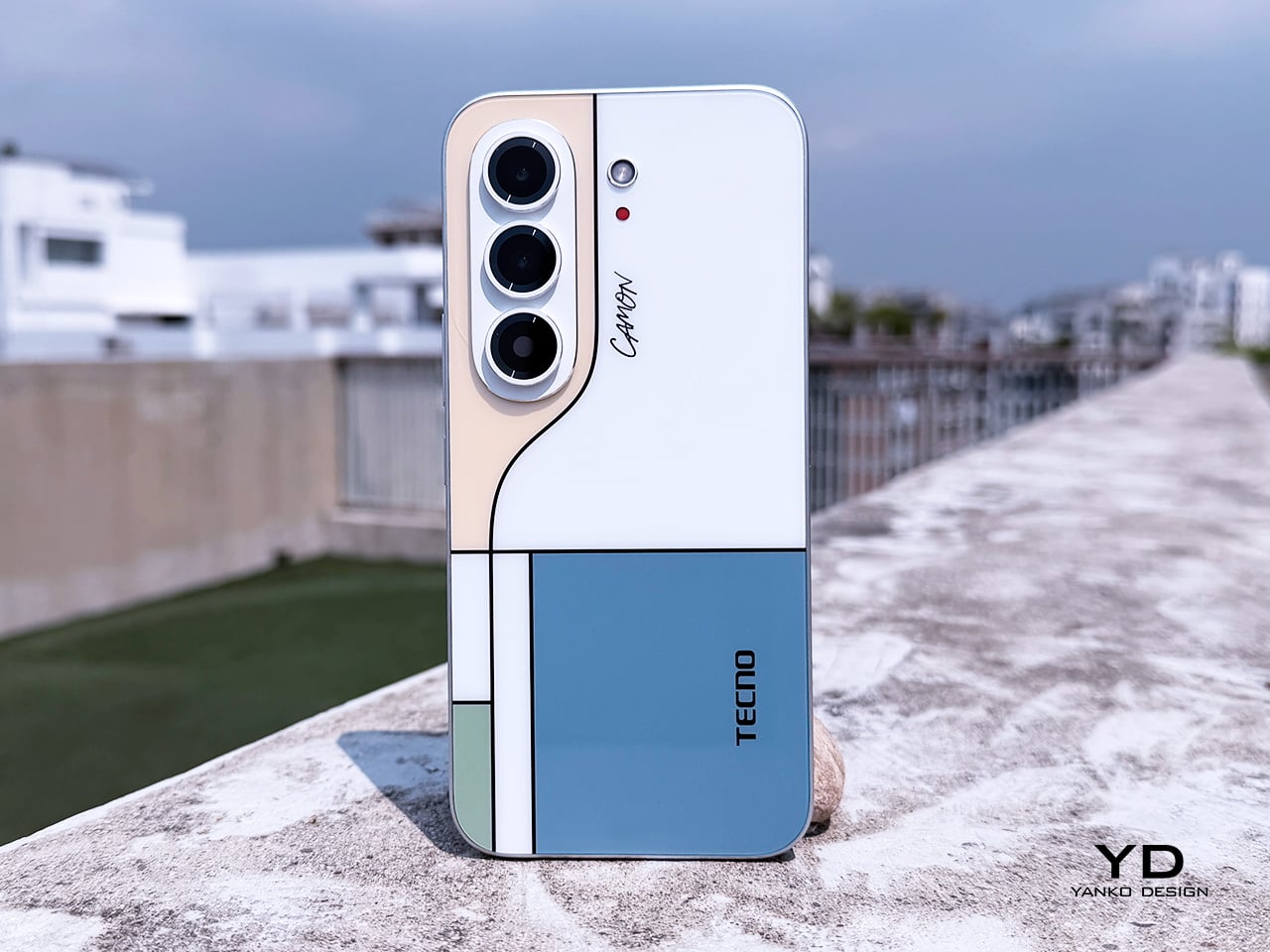
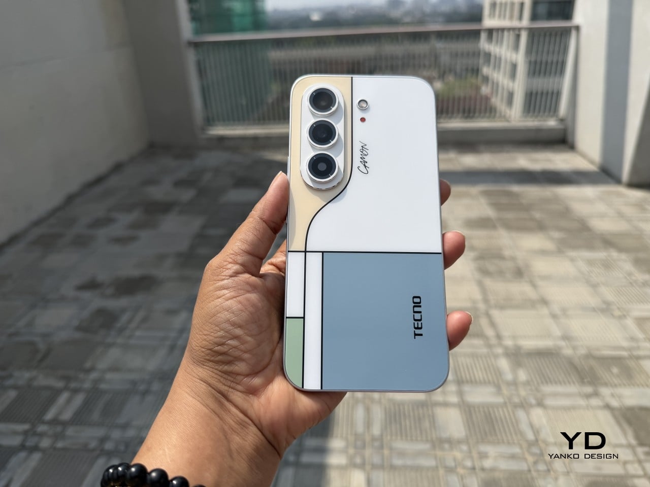
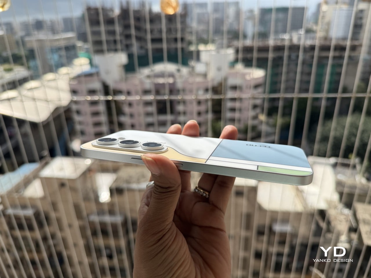
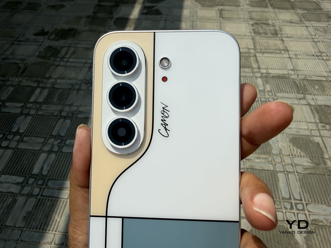
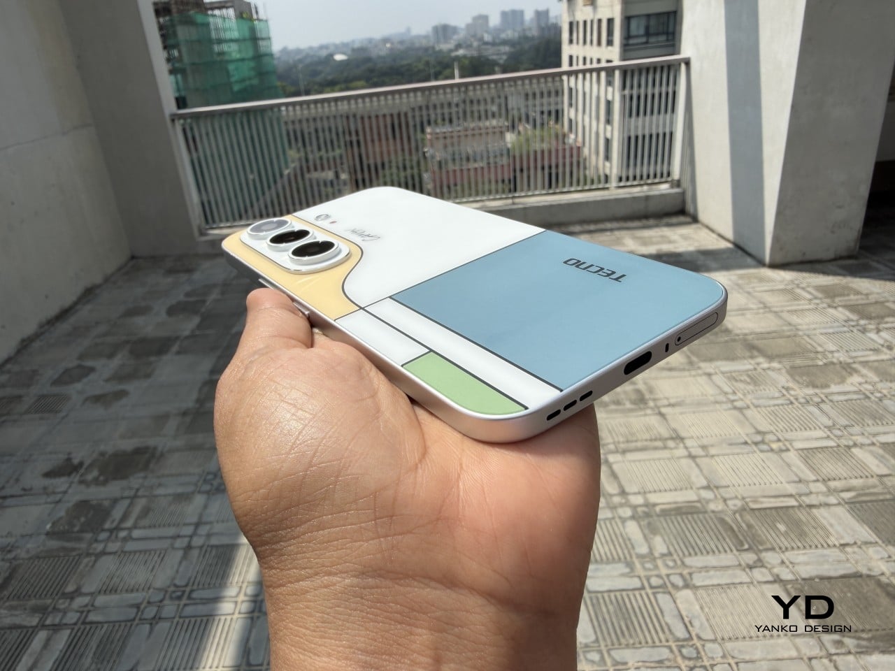
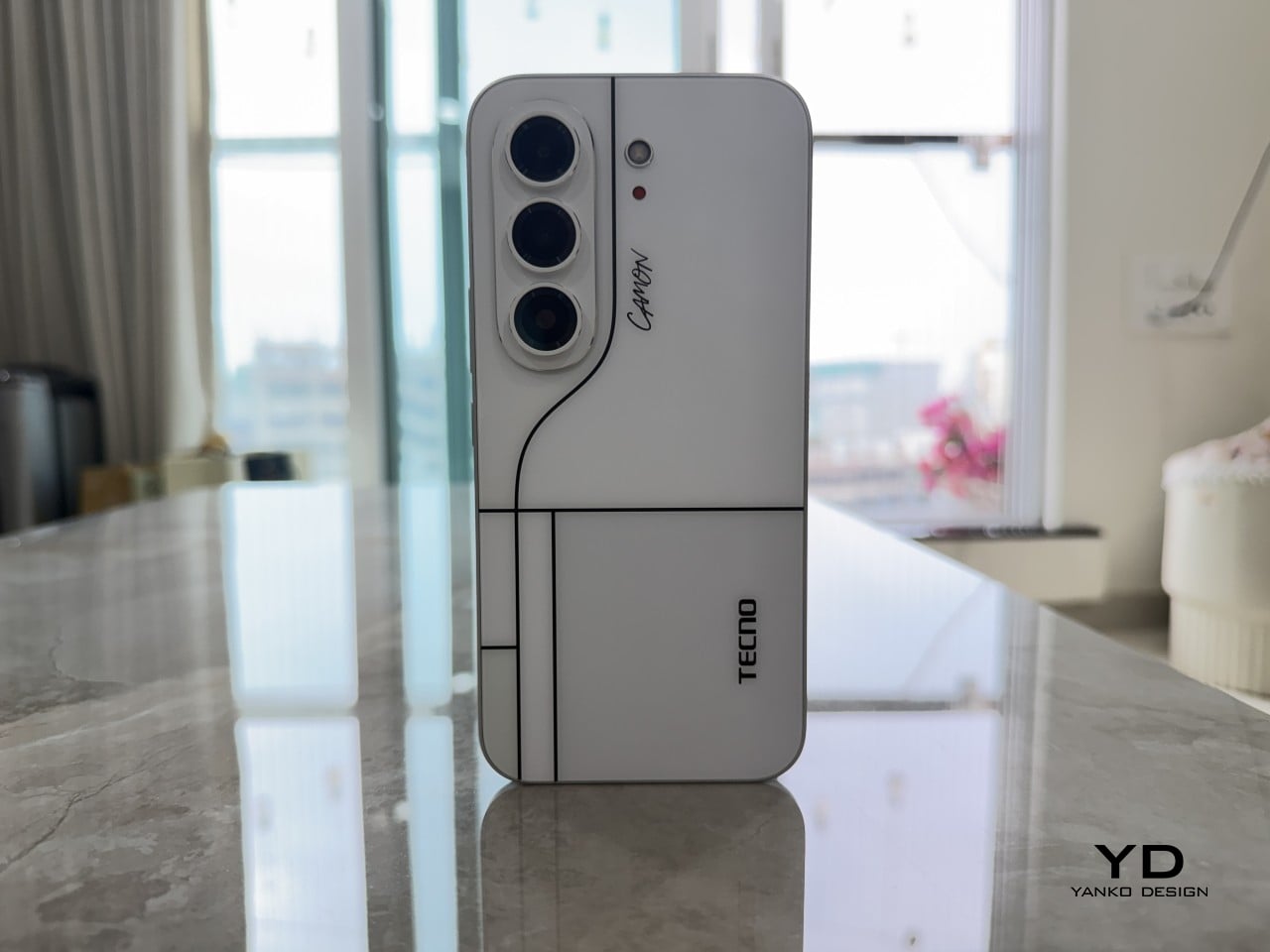
Pull the CAMON Slim 5G out in public and watch what happens. People notice a phone this thin the way they’d notice a watch too elegant for its price tag, usually with a double take and a request to hold it. TECNO carried over the swan-neck curve from the CAMON 50 series, and on a body this slender, that curve reads like a signature rather than a spec sheet footnote.

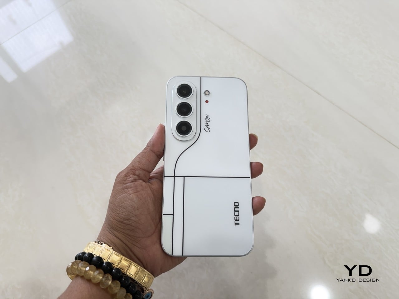
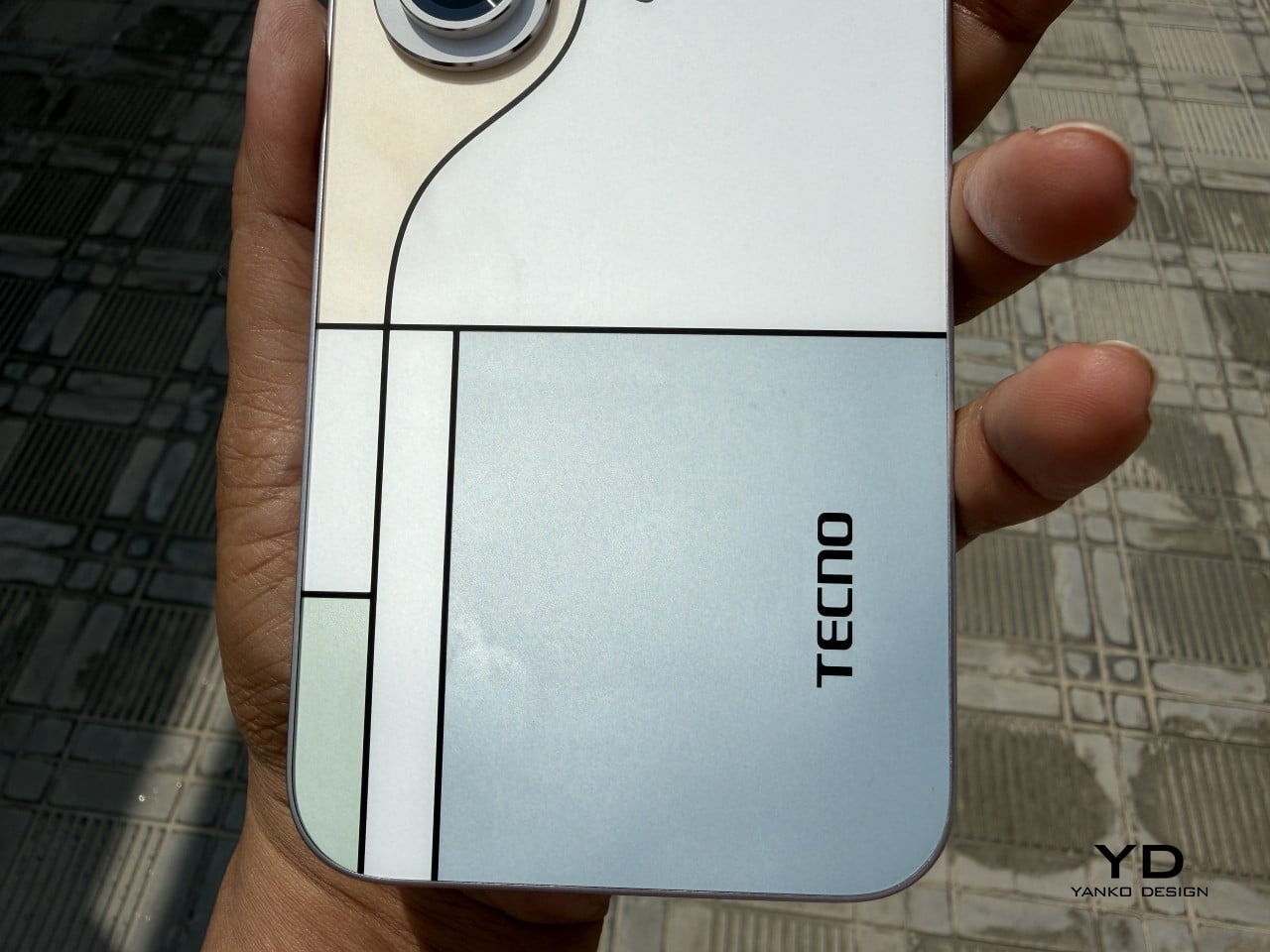
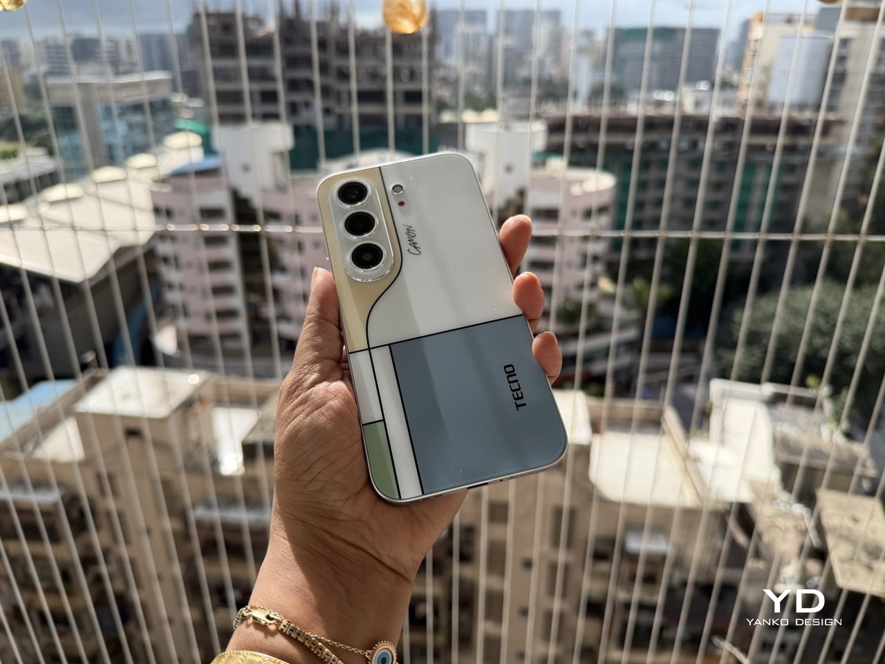
TECNO sent the Neo Mondrian colorway for this review, and it’s the strongest argument for treating a phone back as an actual canvas. Expose the panel to sunlight and yellow, green, and cyan blocks slowly bloom out of white, forming the grid Piet Mondrian made famous a century ago. It’s a photochromic trick, but watching it happen feels less like a gimmick and more like a magic show.

Neo Mondrian isn’t the only finish doing something interesting. Van Gogh Blue uses similar light-reactive techniques to make its swirling nebula pattern look like it’s actually rotating as shadows shift across it, closer to a painting than a phone back. Matisse Black leans into fluorescent green or pink color blocks that echo the artist’s cut-out work, while Burgundy Red blends fiberglass and matte texture into a warm, understated finish. Rebel Pink keeps things simpler, pairing a black body with sharp pink accents for something a little more playful.

Phone backs used to be an afterthought, something to protect rather than admire, which is why so many people slapped an opaque case on day one without a second thought. That’s changing. As manufacturers invest more in finishes, textures, and light-reactive coatings, more owners are leaving their phones bare, treating the back panel the same way they’d treat a piece of art they paid good money to display.

Ergonomics

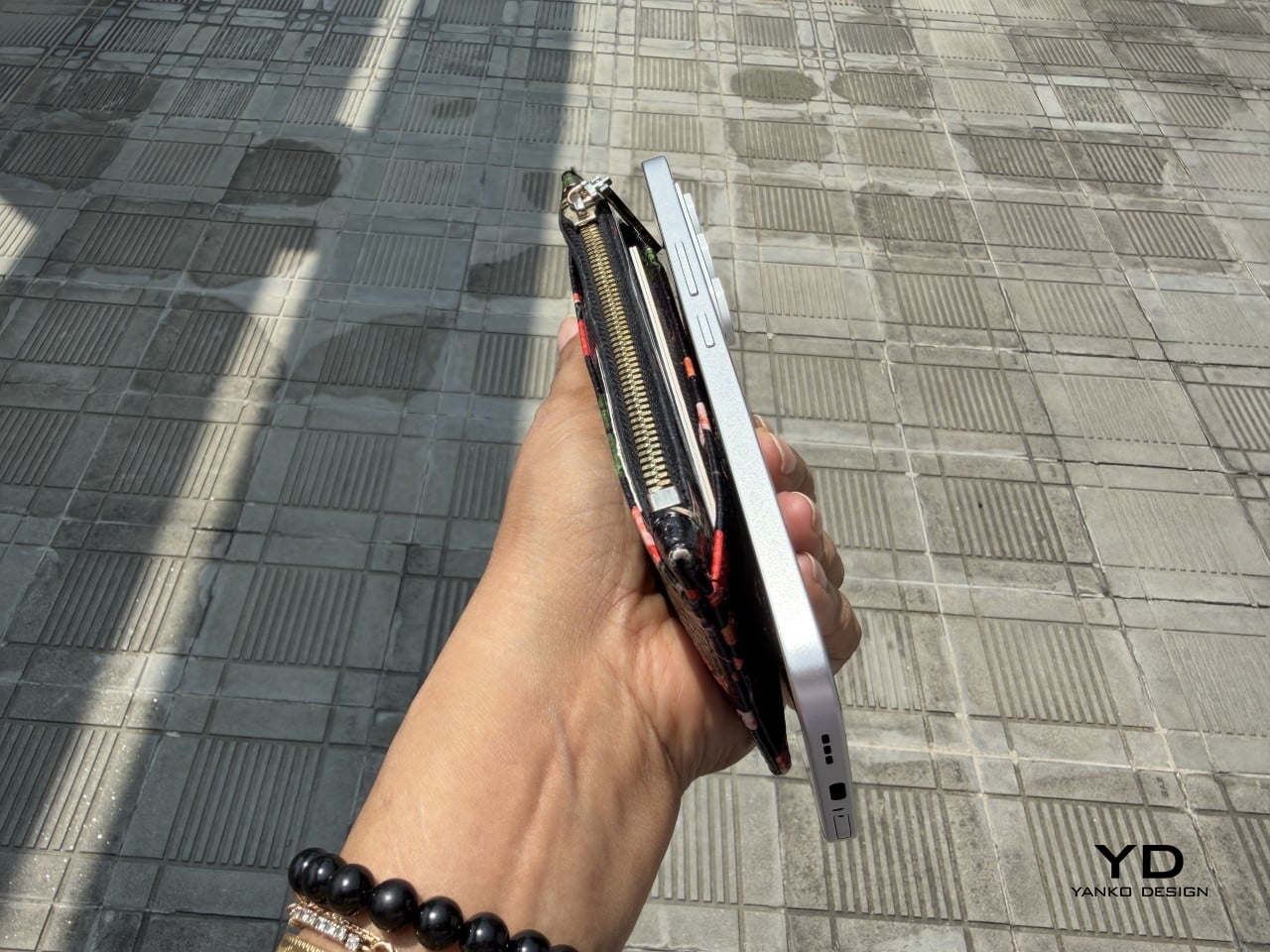
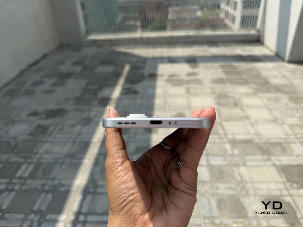
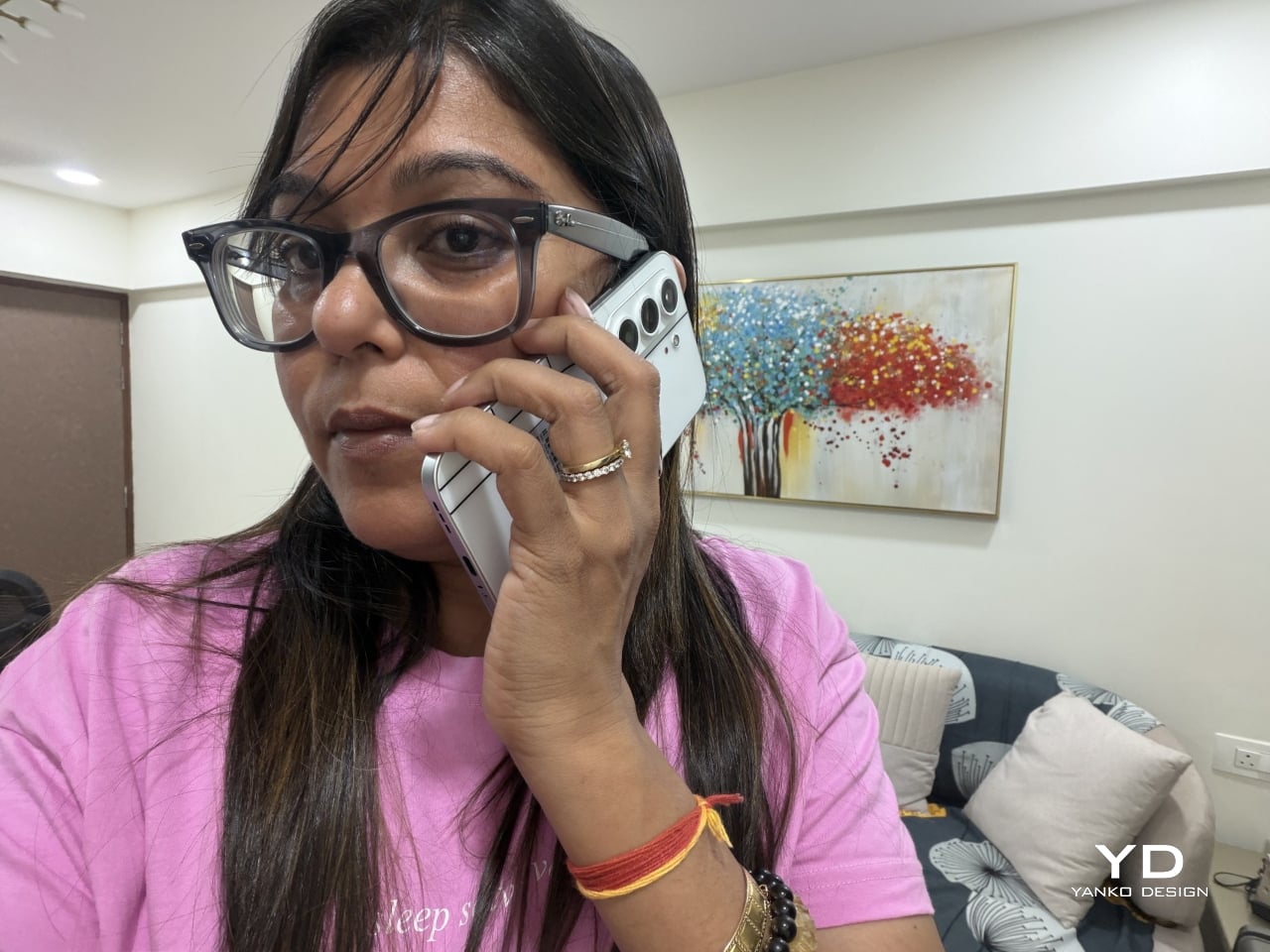
Carrying the CAMON Slim 5G is where the thin body actually pays off day to day. It slides into a front pocket without that telltale bulge, sits flat against a jacket without pulling on the fabric, and feels lighter in hand than the display size suggests. After a few days, reaching for a thicker phone almost feels like picking up a brick by comparison.

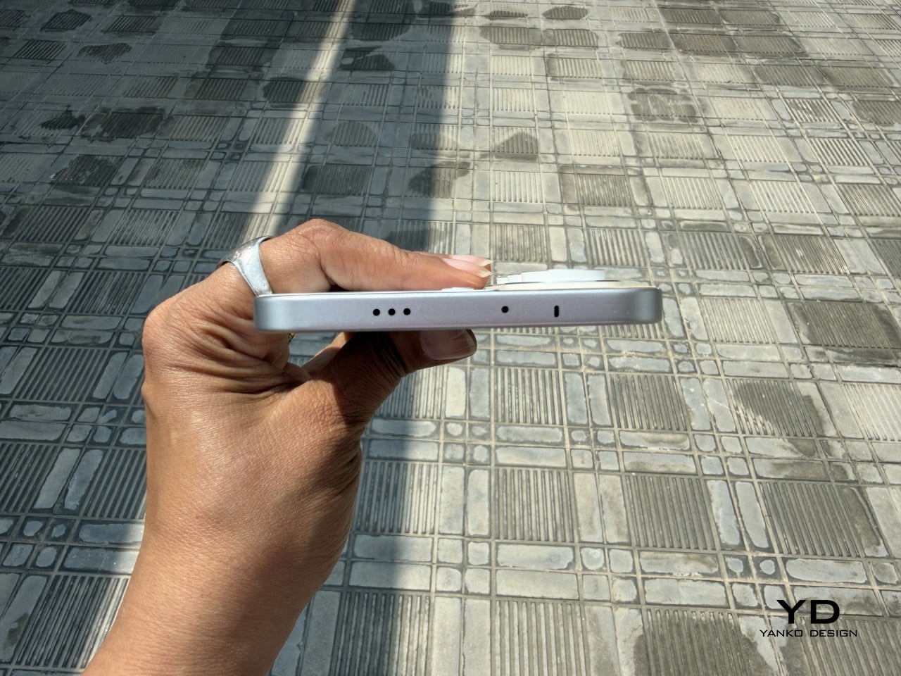
Those flat edges aren’t just a style choice borrowed from boxier design trends. They give fingers something to actually grip onto, instead of sliding off a rounded rim the way slippery slab phones tend to do. The matte texture on the Neo Mondrian panel adds even more confidence, and TECNO’s wet and oily finger recognition keeps the touchscreen responsive when hands aren’t exactly dry or clean.

Performance

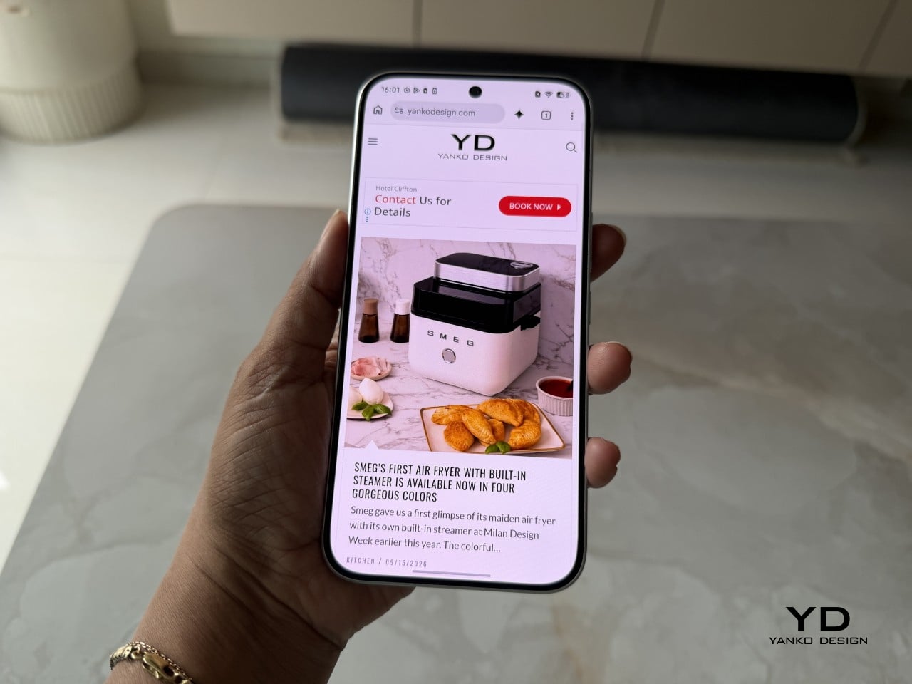
The 6.78-inch AMOLED display runs at 1.5K resolution and 144Hz, and both numbers translate into a screen that looks sharp and feels fast under a thumb. Photos pop with the kind of contrast only AMOLED delivers, video looks great for a lunch break binge, and scrolling through a feed never feels like it’s fighting the hardware. TÜV Rheinland’s low blue light certification is a nice bonus for long reading sessions.

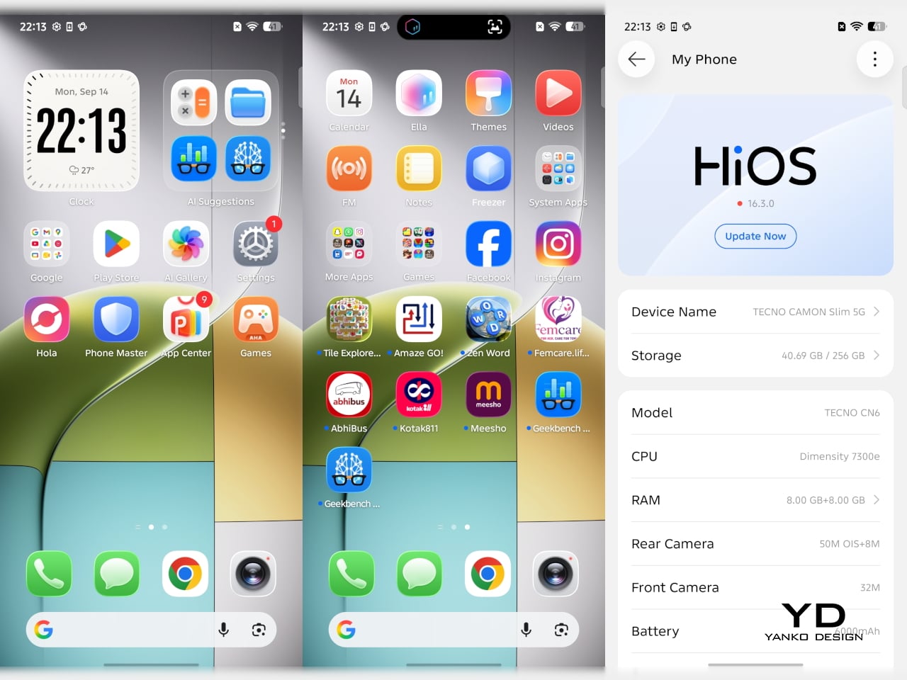
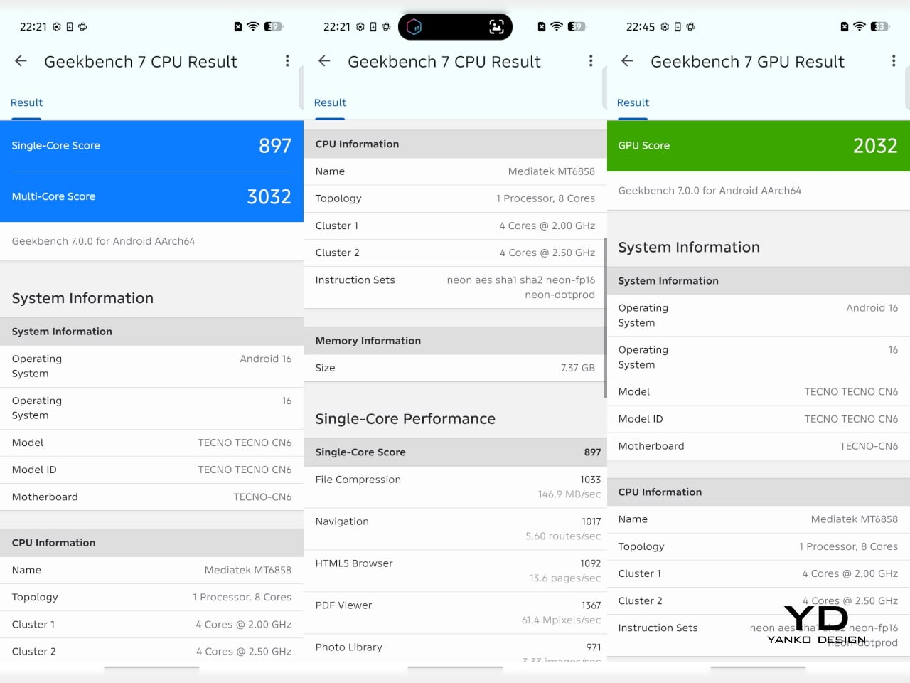
Under the hood sits a MediaTek Dimensity 7300e, a processor built for balance rather than benchmark bragging rights. It handles social apps, photo editing, and everyday multitasking without hiccups, though demanding 3D games will ask more of it than it’s built to give. The 8GB of RAM stretches to 24GB with virtual memory extension, which covers most multitasking habits without needing to close every open app.

The 50MP Sony LYTIA 700C handles most of the photography workload, and it earns that responsibility. A 1/1.56-inch sensor paired with an f/1.8 lens pulls in plenty of light for evening shots, while the closed-loop ball motor keeps focus locked even when subjects won’t sit still. The 8MP ultra-wide feels more like a footnote, and there’s no telephoto here, but the main camera rarely leaves you wanting one.

The real showstopper is the 6,000mAh battery, a number that seems almost impossible once you remember this phone measures 6.39mm thick. It comfortably carries a full day of camera use, video, and scrolling without the battery anxiety that usually comes with slim designs. That same waterproofing also unlocks a dedicated underwater photography mode, one that kicks in automatically the moment the phone senses it’s gone for a swim.

Sustainability

TECNO rates the CAMON Slim 5G at IP69K, IP69, IP68, and IP66, a combination that’s rare even among phones that don’t have to worry about staying thin. That covers everything from high-pressure water jets to dust particles to full submersion, which is a lot of technical armor for a phone this delicate-looking. Finding this rating on a 6.39mm body is the kind of detail that quietly impresses.

There’s also a MIL-STD-810 rating covering shock and drop resistance, which pairs nicely with features like Rain Touch and Waterproof Case Touch that keep the screen usable in a downpour or behind a case. This doesn’t read like a feature bolted on at the last minute. It feels like TECNO wanted this phone to survive actual daily chaos, not just look good sitting still on a shelf.

Longevity extends past the hardware, too. TECNO promises three major OS upgrades and five years of security patches, plus a 60-month smoothness certification from TÜV SÜD. That’s a meaningful commitment in a market where phones often get abandoned after two update cycles. A well-built object is worth keeping around, and TECNO seems to be betting that owners will want to hold onto this one for a while.

Value

TECNO hasn’t confirmed global pricing yet, but early indications point to somewhere around $400. At that number, buyers get a phone with genuine art-inspired finishes, a 6.78-inch 144Hz AMOLED screen, a Sony-backed 50MP camera with real stabilization, a 6,000mAh battery, and a durability rating that most phones twice the price don’t bother chasing. That’s a fairly generous list for a phone that costs less than most flagships.

Most phones in this price range make you pick a lane. Go thin, and the battery usually suffers, or the body skips water resistance entirely, or the software support runs out after a couple of years. TECNO’s five-year update promise and its layered durability ratings quietly add up to lower long-term cost, since a phone built and supported to last half a decade doesn’t need replacing as often.

This phone makes the most sense for people who are tired of carrying an identical black slab and want something that says a little more about them. It’s not the right pick for hardcore mobile gamers chasing max frame rates, or photographers who need optical zoom on tap. For nearly everyone else, it covers daily needs while looking like it belongs on a gallery shelf.

Verdict

After a few days of actual use, the 6,000mAh battery and the quad-IP rating stop feeling like marketing footnotes and start feeling like the whole point. TECNO built a phone that looks like it belongs in a design museum and still survives a rainy commute or a splash at the sink. The Neo Mondrian panel alone gives it a personality that’s genuinely hard to find anywhere near this price.

Plenty of phones ask you to choose between something beautiful and something dependable, and most buyers have quietly accepted that trade-off as the cost of owning a nice-looking device. The CAMON Slim 5G makes a strong case that the choice was never as necessary as the industry made it seem. It’s a phone that looks good on a café table and still works fine after falling off of one.

The post TECNO CAMON Slim 5G Review: Thinner than a Pencil, Tough as a Tank first appeared on Yanko Design.
  •  

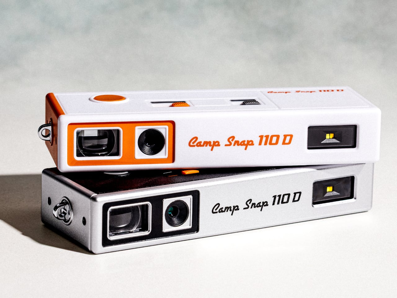
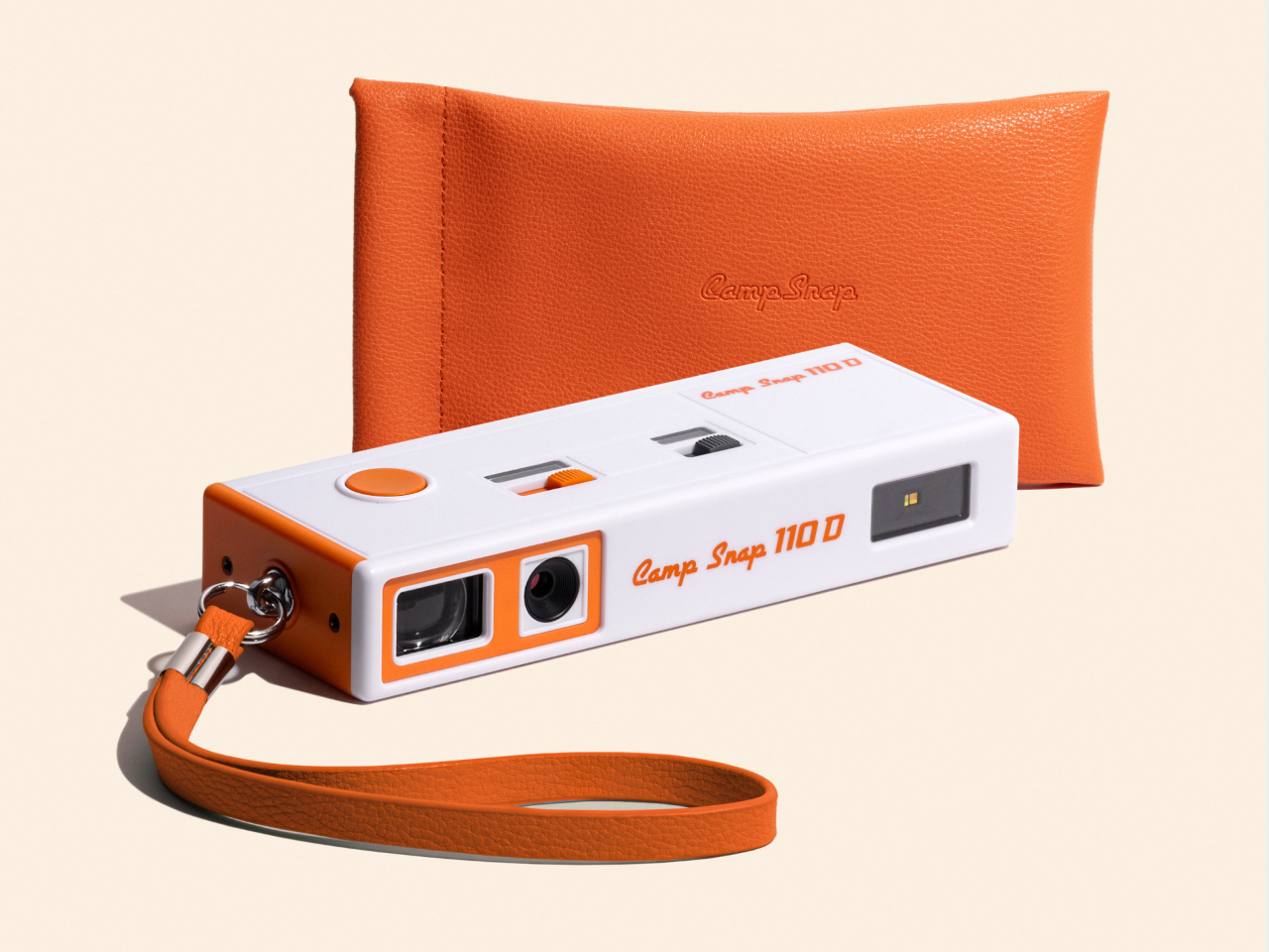
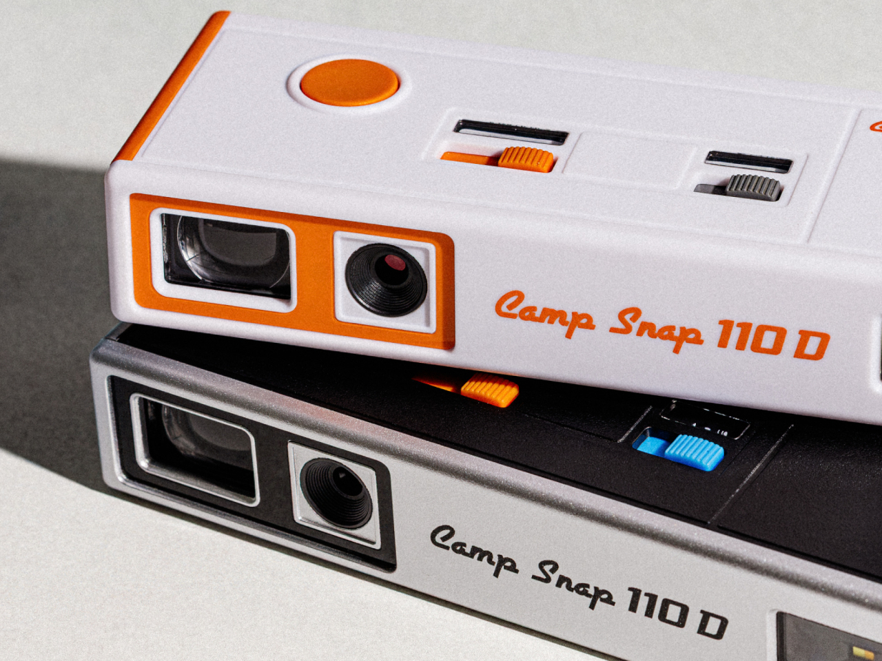
Camp Snap’s 110D Looks Like 1973 and Still Skips the Screen on Purpose

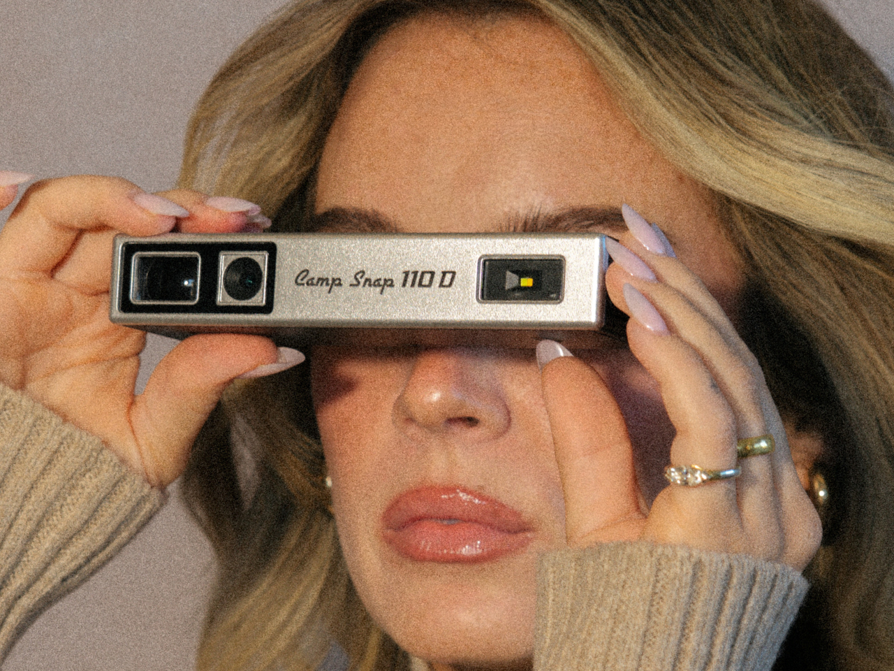
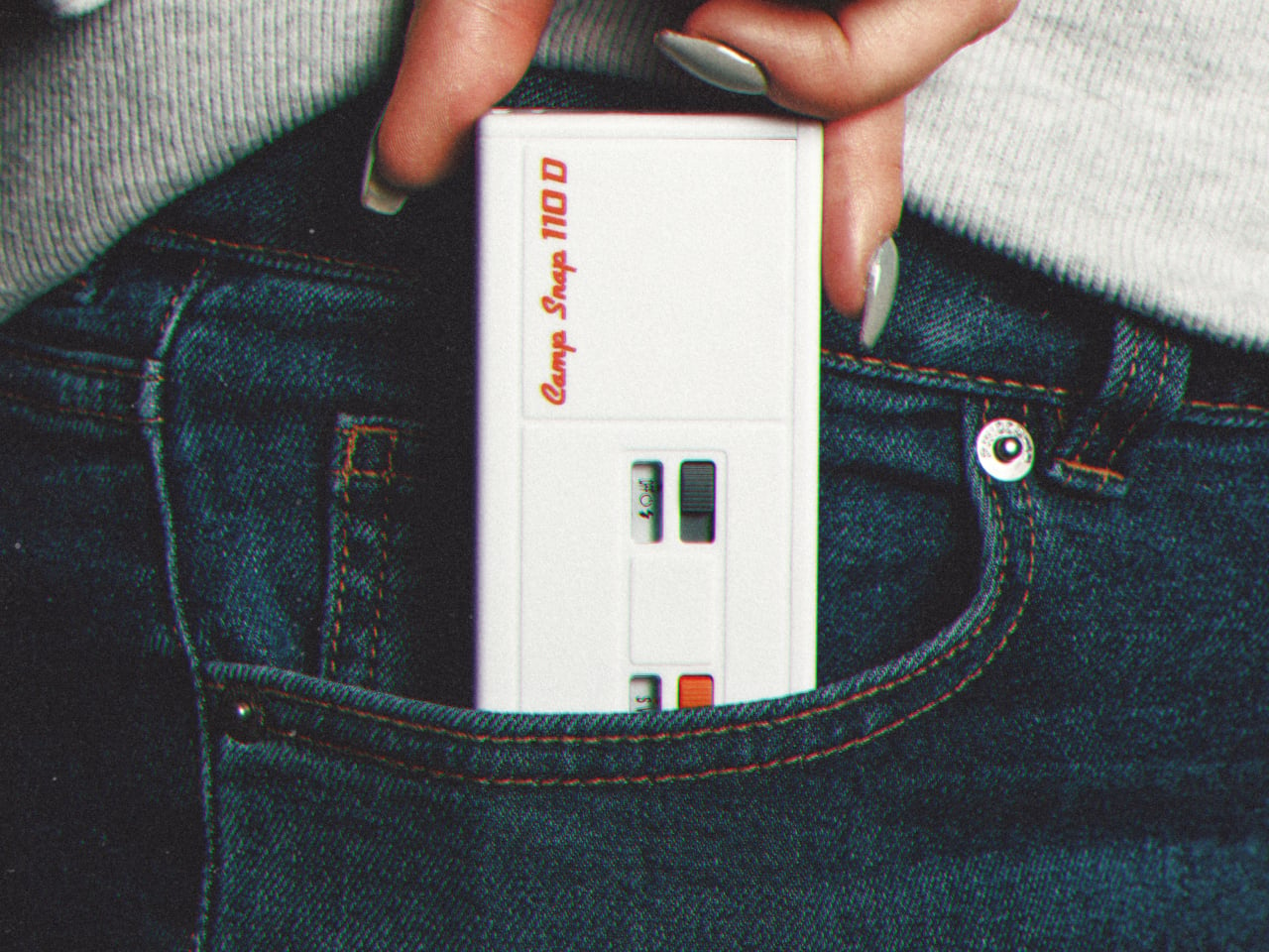
Camera design spent the last two decades chasing thinner phones and bigger screens, so a company deciding to revive a boxy, finger-length shape from the 1970s sounds like a step backward. The Camp Snap 110D proves otherwise. It borrows its elongated, pocketable body from the old 110 film format, then strips out the one feature every digital camera has trained us to expect: a screen for checking the shot you just took.

That missing screen isn’t a cost-cutting shortcut. It’s the entire point. Smartphone photography turns every outing into a loop of shooting, reviewing, deleting, and reshooting until a moment gets buried under a dozen nearly identical takes. The 110D breaks that loop by design, letting a photo exist the instant it’s taken and staying invisible until you plug the camera in later and actually look at what you captured.

Designer: Camp Snap

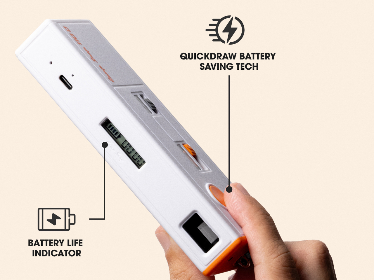
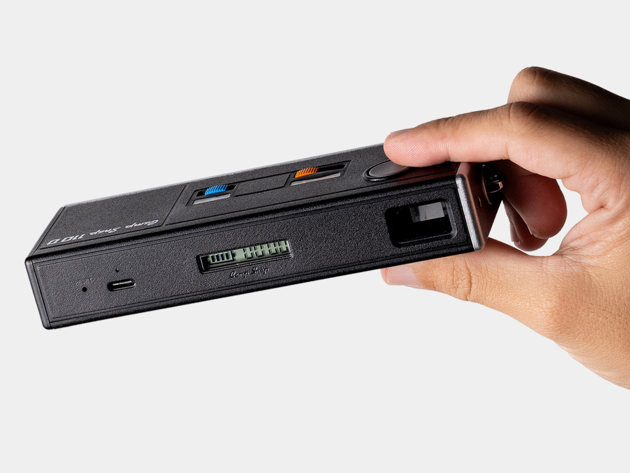
Living without a review screen also solves a problem the original 110 format never had to think about: battery life. Screens are usually the single biggest power drain in a compact camera, so removing one frees up room for improvements elsewhere. The 110D pairs that saved power with QuickDraw sleep and wake functionality, letting the camera snap awake fast enough to catch a moment instead of fumbling through a slow startup.

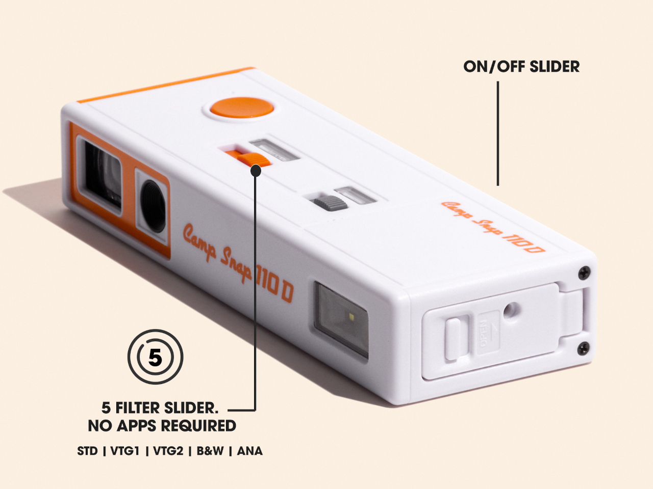
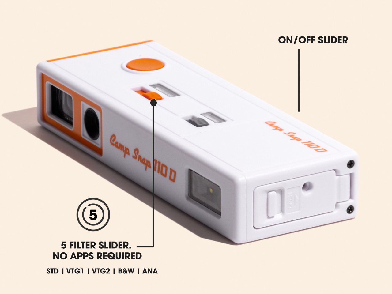
Inside that slim shell sits an 8-megapixel sensor, modest by phone camera standards on purpose, since chasing sharper resolution would work against the whole idea of embracing a lower-fidelity, more film-like result. Five built-in filters let a shooter pick a mood before pressing the shutter rather than fixing it afterward in an app, pushing the entire editing decision to before the photo exists instead of after.

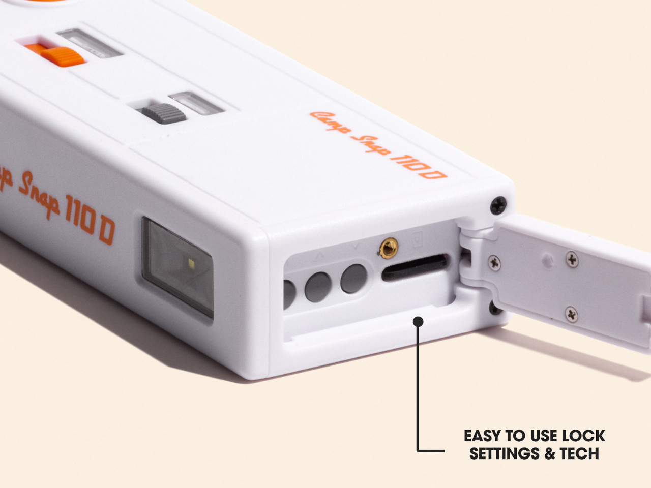
Storage runs on a microSD card, and images transfer out through a USB-C port, a small detail that keeps the retro shape from turning into an actual hassle to use. Charging works the same way, so nobody’s hunting for a proprietary cable or a dead battery with no replacement in sight. The vintage silhouette stays purely visual, while the internals stay entirely current.

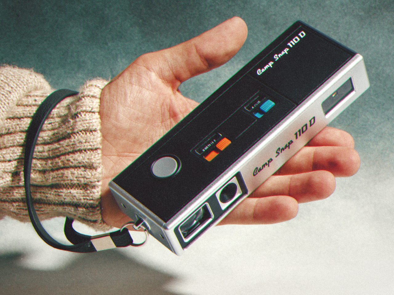
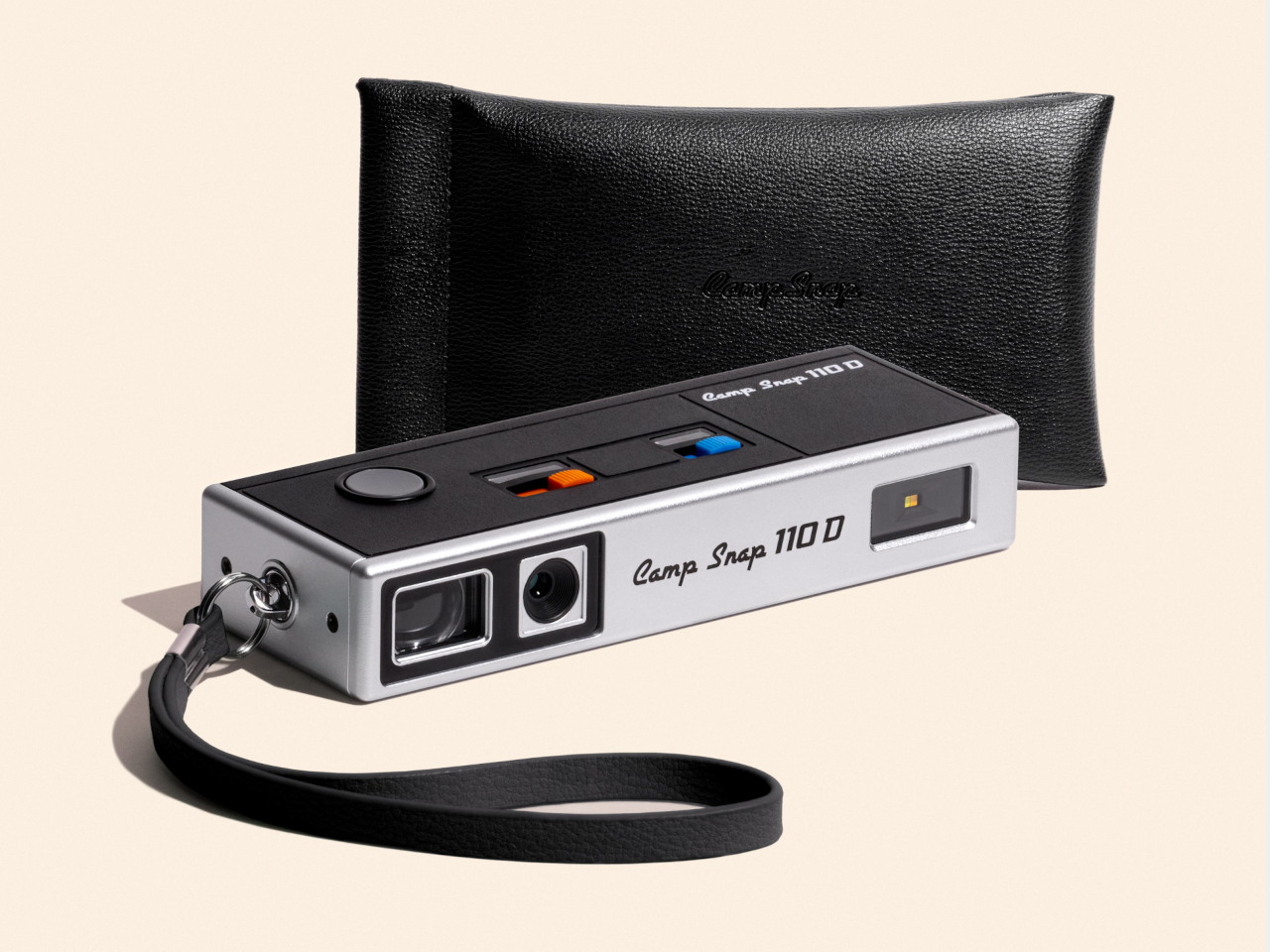
Two colorways round out the release: a black variant and a cream-and-orange combination that leans harder into the ’70s reference than the shape alone already does. Both ship with a wrist lanyard and a small carrying pouch, treating the camera less like a serious tool tucked into a bag and more like something meant to hang off a wrist at a party or a weekend trip without a second thought.

At $74.99, the 110D undercuts most instant cameras and plenty of higher-end toy cameras while offering something neither fully provides: a shape borrowed from actual photographic history rather than a generic plastic body built to look vaguely retro. That’s a specific kind of nostalgia, aimed at people who remember what a 110 camera looked like even if they never touched the film it used.

The post Camp Snap’s 110D Looks Like 1973 and Still Skips the Screen on Purpose first appeared on Yanko Design.
  •  

The 5 Best Apple Accessories Of September 2026 That Actually Improve How You Use Your Devices

The Apple ecosystem runs deep, but the devices themselves only go so far. The iPhone, Apple Watch, and iPad are remarkable pieces of hardware on their own, and yet a small category of accessories has figured out exactly what each one is missing. Not cases that just protect or cables that just charge, but objects that change the way a device feels, sounds, looks, or works from the moment you pick it up.

These five accessories do exactly that. They come from different corners of the Apple world, covering the watch, the phone, the iPad, and the kind of audio experience Apple never built its own hardware around. Each one earns its place not because it carries a name worth recognizing, but because it solves a specific frustration that was always there waiting to be noticed. Here are the ones worth knowing about right now.

1. NightWatch

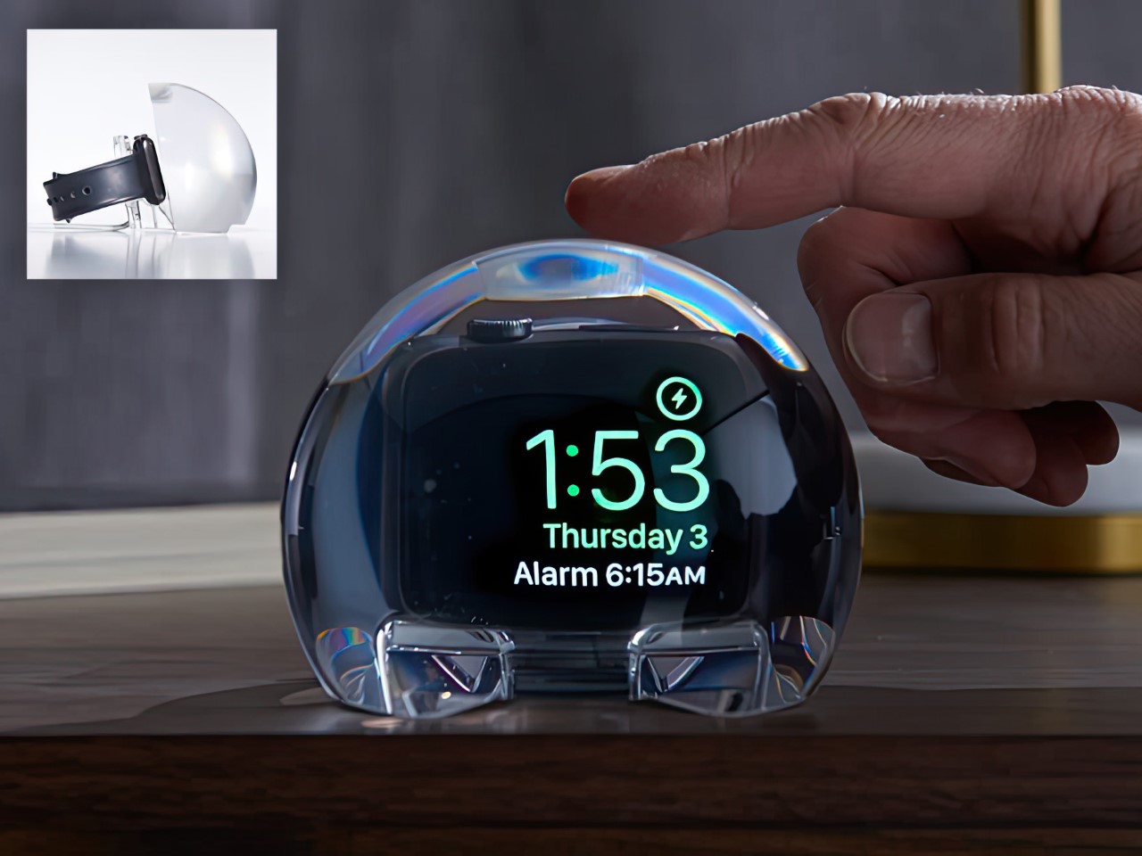
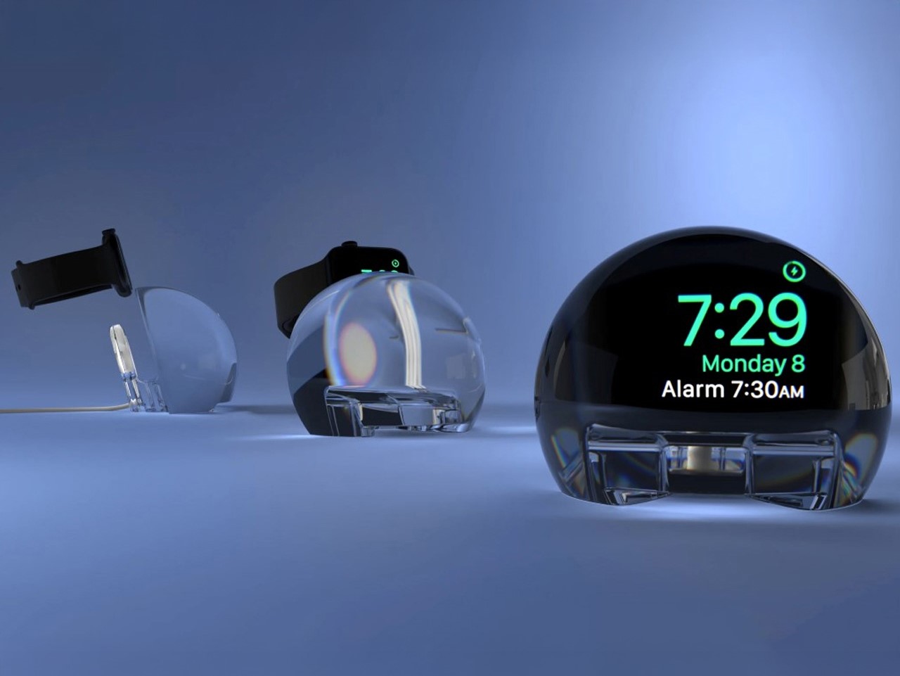
Most Apple Watch docks are functional and forgettable, a plastic puck with a magnetic charger and no ambition beyond getting your watch off your wrist for the night. The NightWatch is not that. It is a clear glass orb, roughly the size of a generous paperweight, that you set your Apple Watch inside at night. The result transforms the watch’s nightstand charging face into a magnified, glowing clock that is genuinely easier to read from across a dark room than the device alone would ever allow.

The dock works by treating the Apple Watch display as a light source and the glass sphere as a lens, drawing the time out of a small wrist-bound rectangle and spreading it into a real visual presence on the nightstand. It also includes a built-in audio amplifier that boosts the sound of your alarm, so quiet mornings stay that way until you actually need them not to be. At $69.99, it is priced more like a considered object than a cable management solution, which is exactly the spirit it deserves to be received in.

What we like

  • The magnification effect turns the Apple Watch display into a legitimate bedside clock without additional screens, apps, or setup
  • The built-in audio amplifier addresses the one genuine weakness of relying on Apple Watch nightstand mode as a morning alarm

What we dislike

  • The orb form factor is visually dominant enough that it will not suit minimalist nightstands where a small footprint matters
  • At $69.99, it costs more than several competing dock designs that handle charging equally well without the visual statement

2. Rock Paper Pencil 4.0

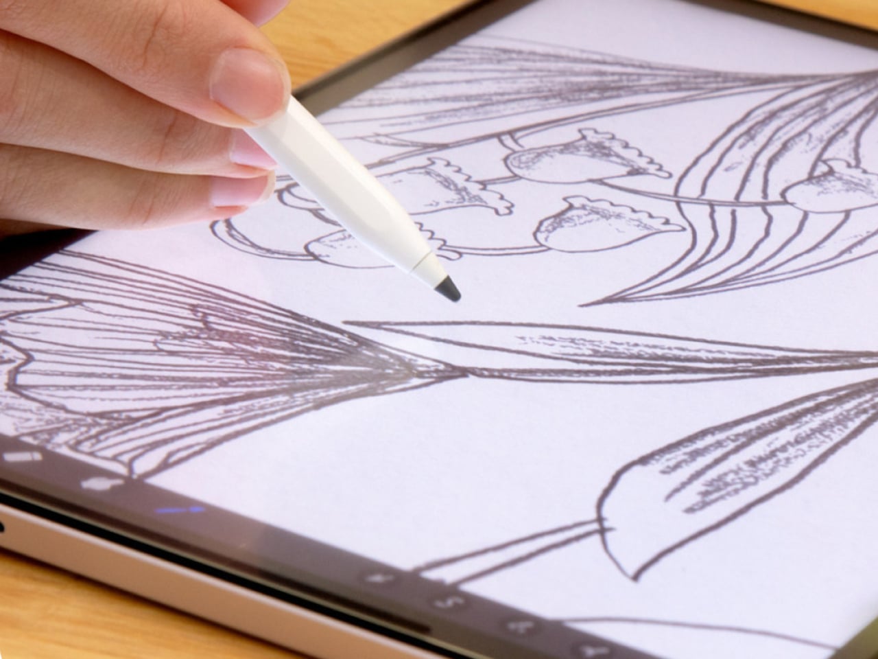
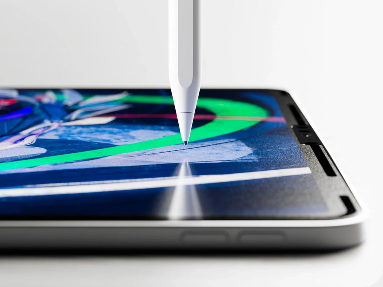
The Apple Pencil is a precision instrument that has never quite figured out how to feel like one. The glass surface beneath it is smooth and frictionless, and while that works fine for certain tasks, illustrators and note-takers spending hours drawing have always wanted something closer to real paper. Astropad’s Rock Paper Pencil addresses that gap directly: a removable, reusable nano-texture screen protector paired with custom Apple Pencil tips, and version 4.0 makes the system meaningfully better than it has ever been.

The upgrade introduces a new graphite POM tip alongside the existing steel ballpoint option, and the difference is immediately legible. The graphite tip mimics the toothy drag of a 2B pencil, a sensation that makes expressive sketching and shading feel deliberate and controlled rather than slippery and approximate. Each kit now ships with four tips in total, two graphite and two ballpoint, alongside a screen cleaning kit that should have been included from the beginning. The protector attaches via NanoCling static cling rather than adhesive, meaning it lifts off without residue and goes back on without a bubble.

What we like

  • The NanoCling system is genuinely removable and reusable, giving iPad owners a paper-feel surface on demand without permanently altering the display
  • Having both graphite and ballpoint tips in a single kit covers two distinct working styles without requiring a separate accessory purchase

What we dislike

  • The graphite tip wears down noticeably faster than the ballpoint option, which will matter to anyone putting in long, intensive drawing sessions regularly
  • The friction that makes sketching feel natural also makes smooth, fast swiping across the screen feel slightly resistant during ordinary everyday use

3. Battery-Free Amplifying iSpeakers

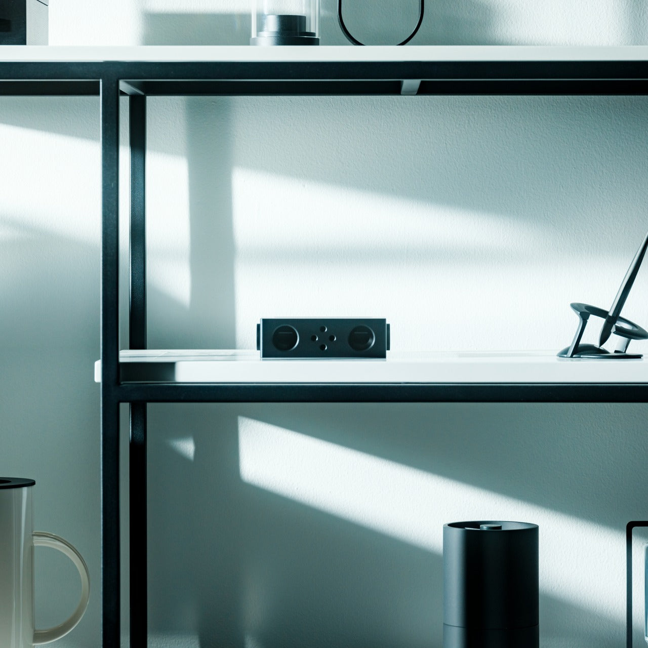
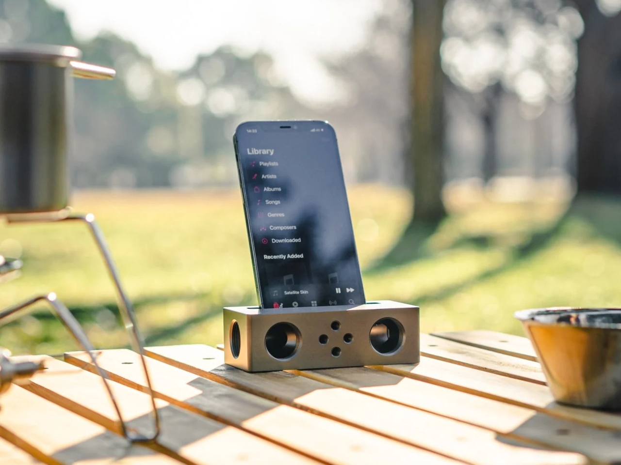
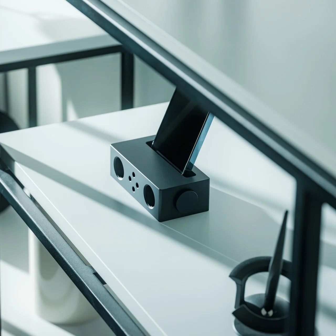
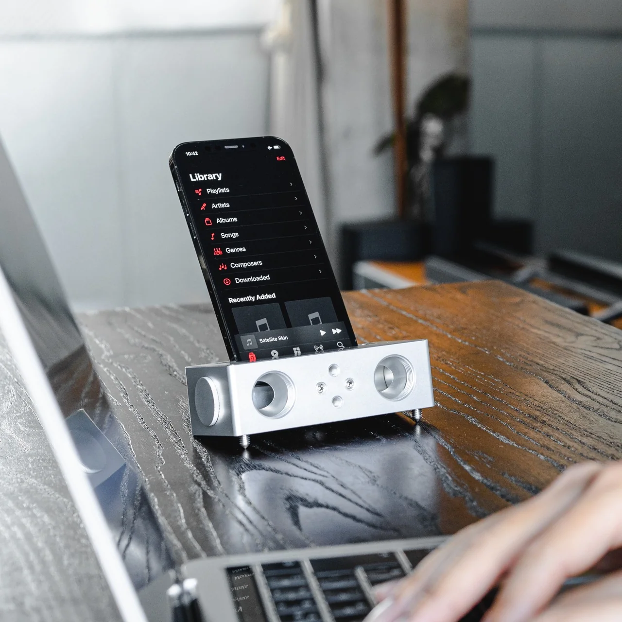
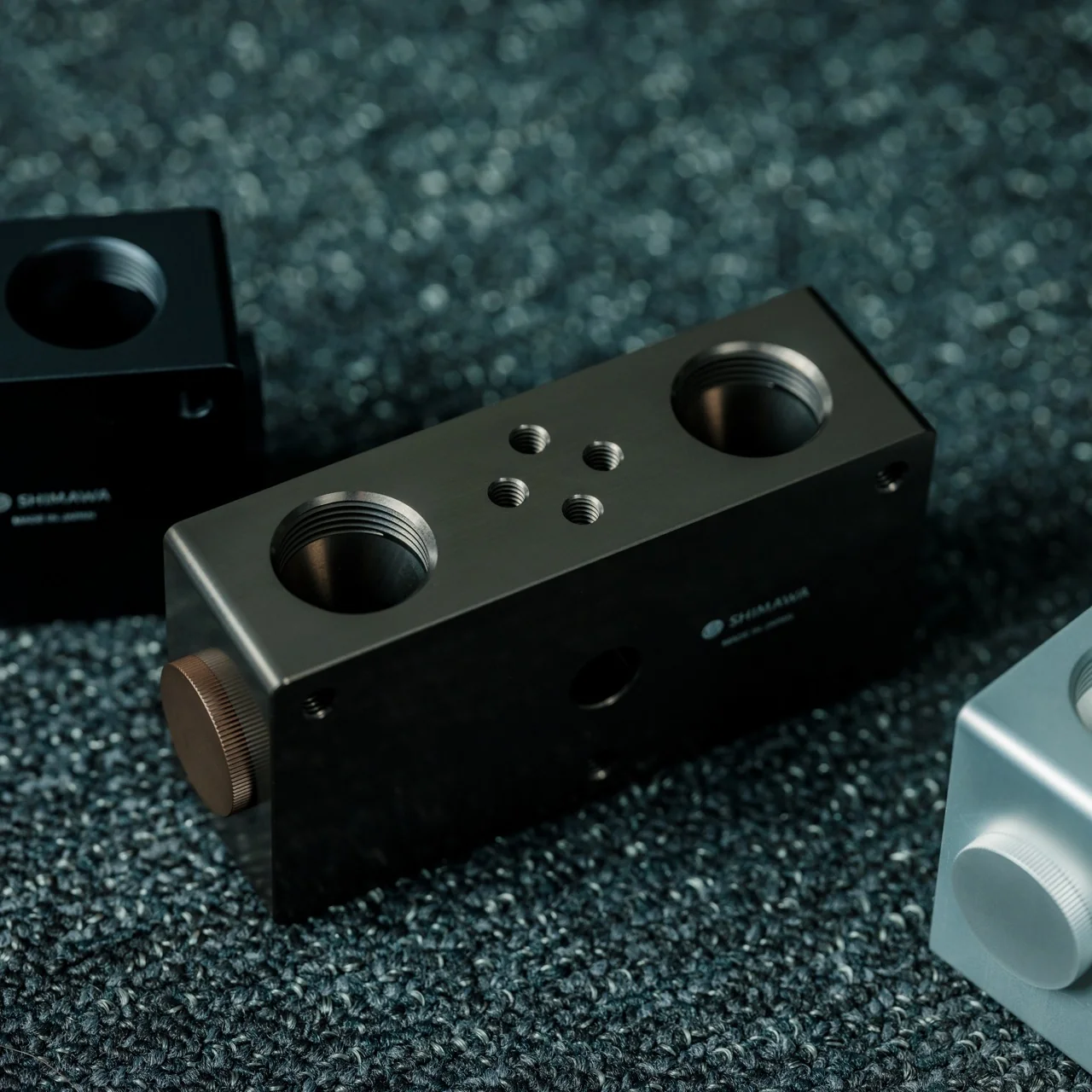
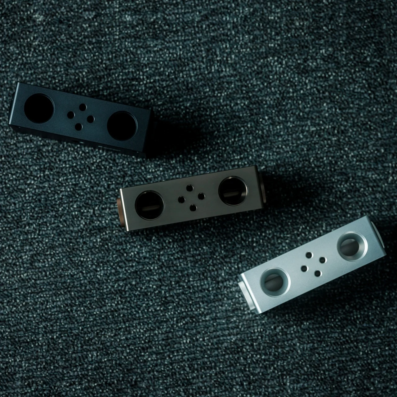
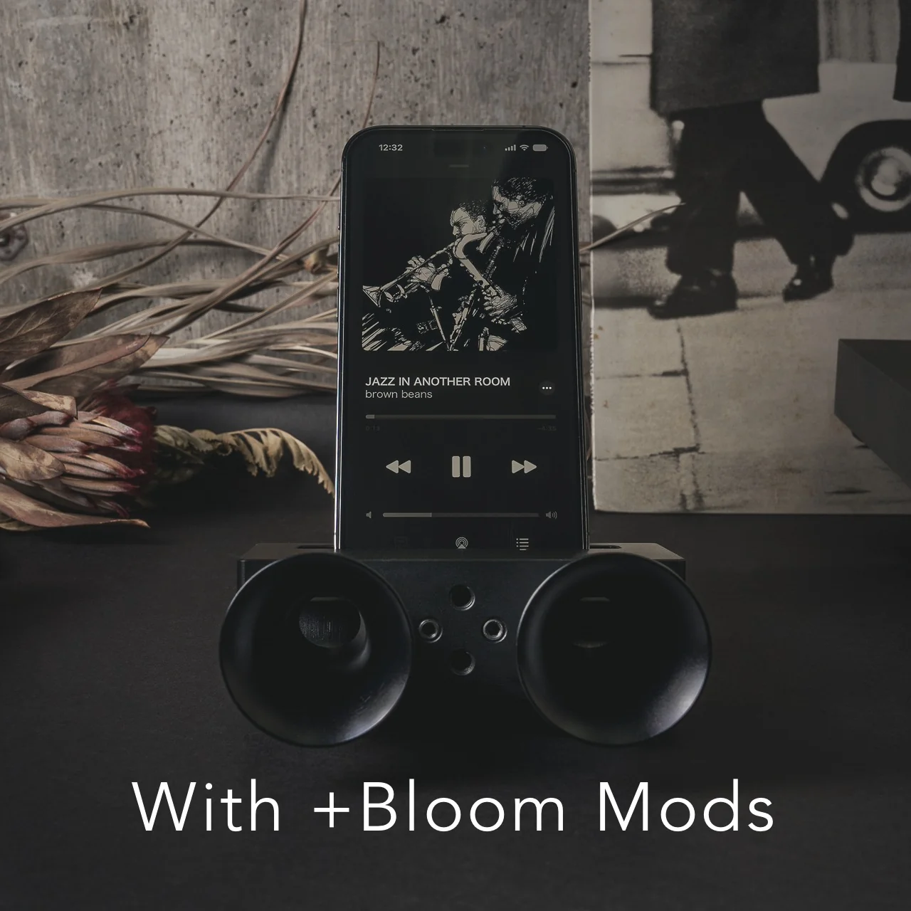
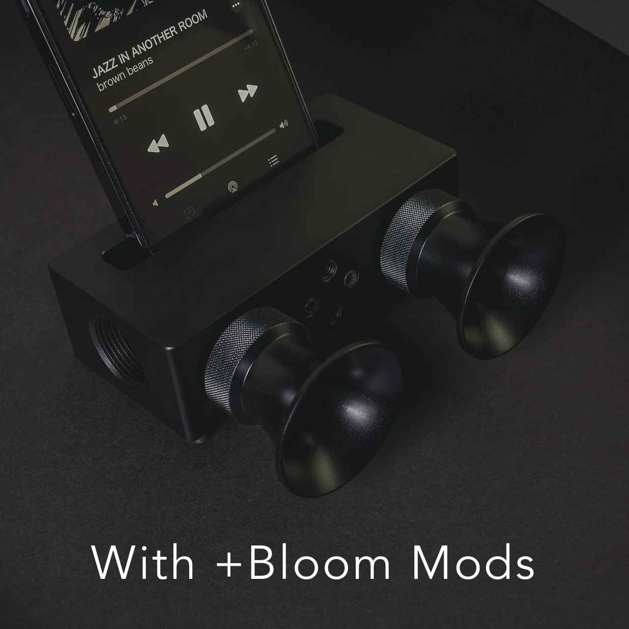
Every speaker you own asks something of you before it makes a sound. The Bluetooth speaker needs charging, and the charging case needs its own cable. The smart speaker needs a wall outlet, a WiFi password, and a company’s servers to stay online on a random Tuesday. The Battery-Free Amplifying iSpeakers, designed by Ooi Masato of Pit-A-Pat for Shimawa and made in Japan, need none of it. They need your iPhone and the physics of a sound wave moving through precision-machined metal, and that is the complete brief.

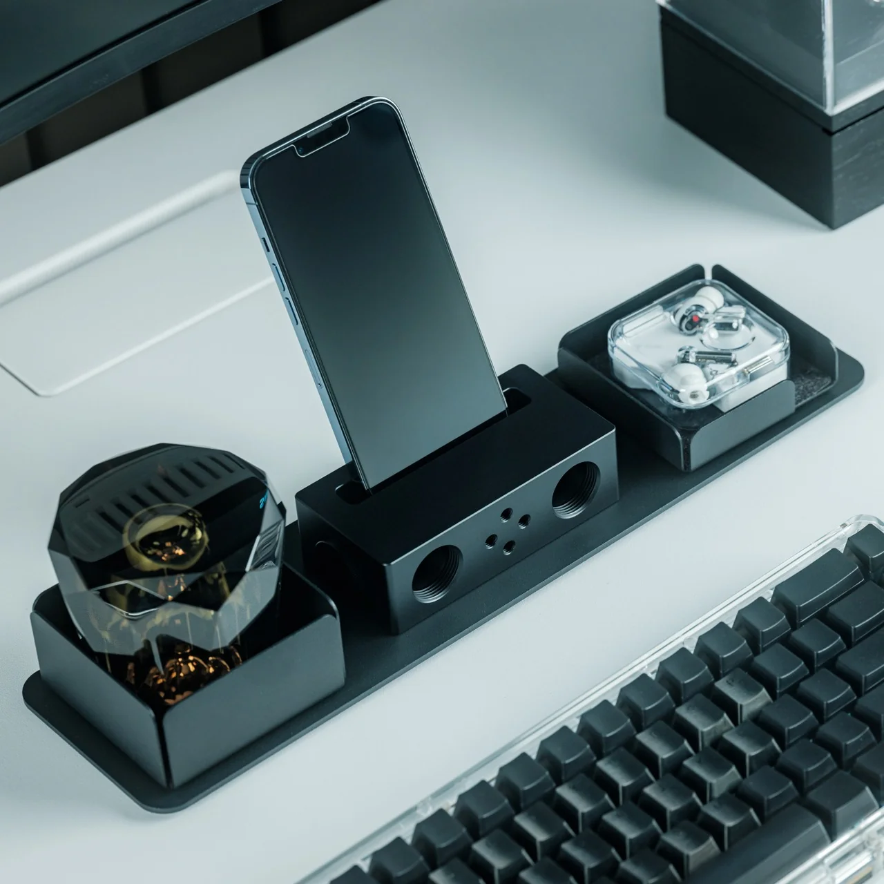
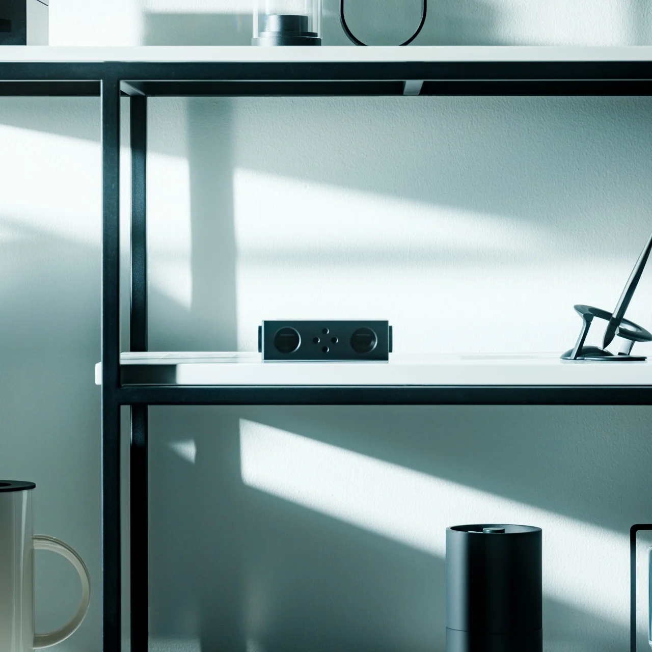
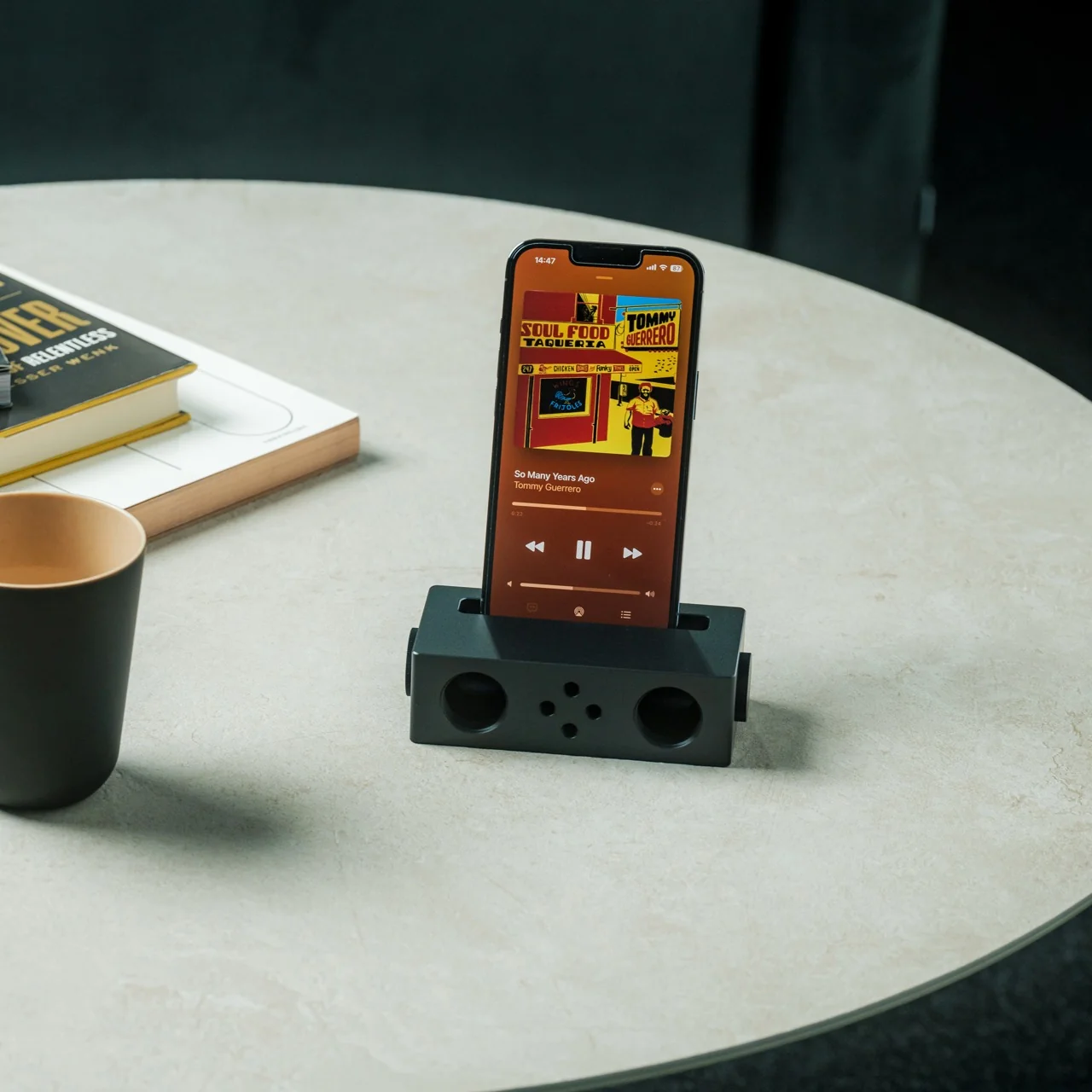
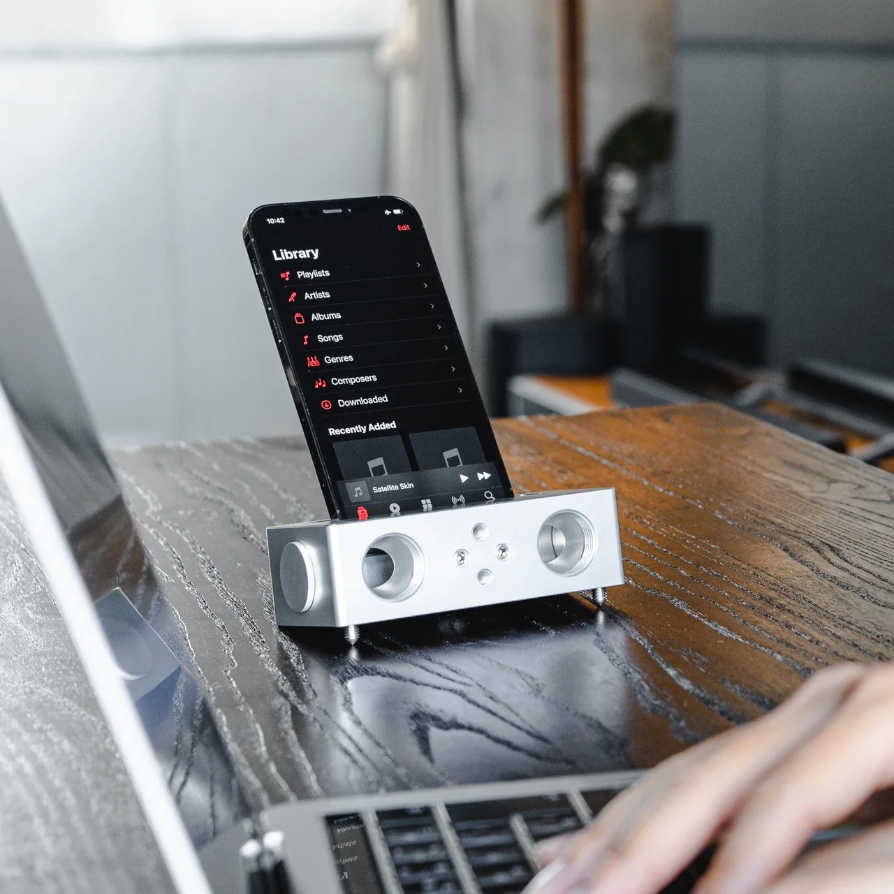
The design is straightforward: a Duralumin metal body with a slot for the phone and golden-ratio speaker apertures that channel and amplify sound through acoustic resonance, the same principle that powered phonographs before electricity reached most homes. There is no pairing, no app, no battery level to check. You set your phone in the slot, and your music gets louder and fuller, immediately.

Click Here to Buy Now: $179.00

What we like

  • Zero setup and zero charging requirements make it the simplest speaker in any room, with no ritual standing between you and better sound
  • The precision-machined Duralumin construction means there is nothing to break, replace, update, or charge, ever

What we dislike

  • At $179, it competes on price with capable Bluetooth speakers that offer far more volume, range, and flexibility for larger spaces or outdoor use
  • The phone slot is sized for specific handsets, so case thickness and phone dimensions will determine how well it actually cradles your device

4. Nomad Leather Folio

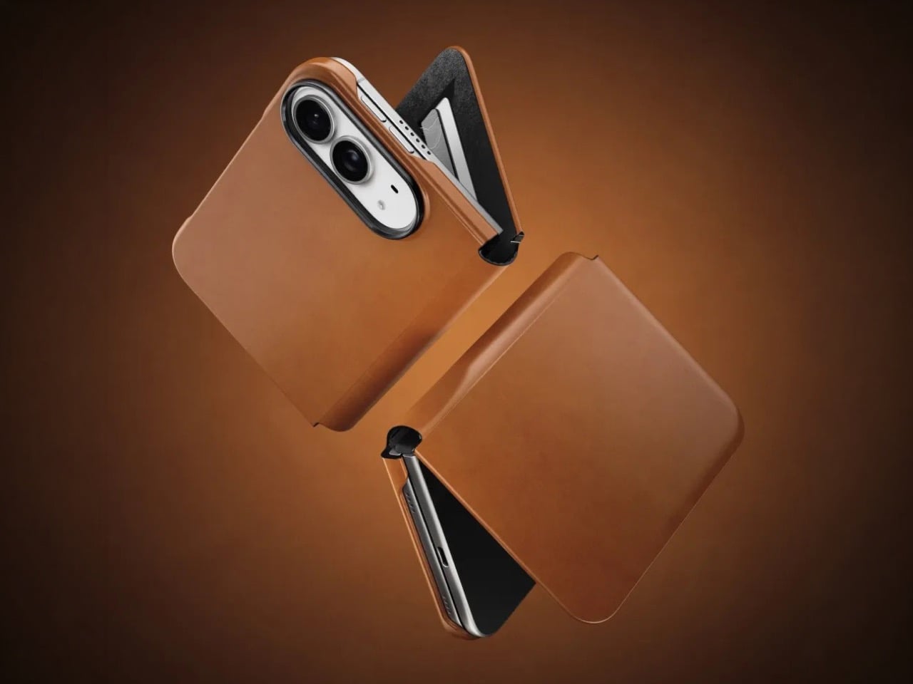
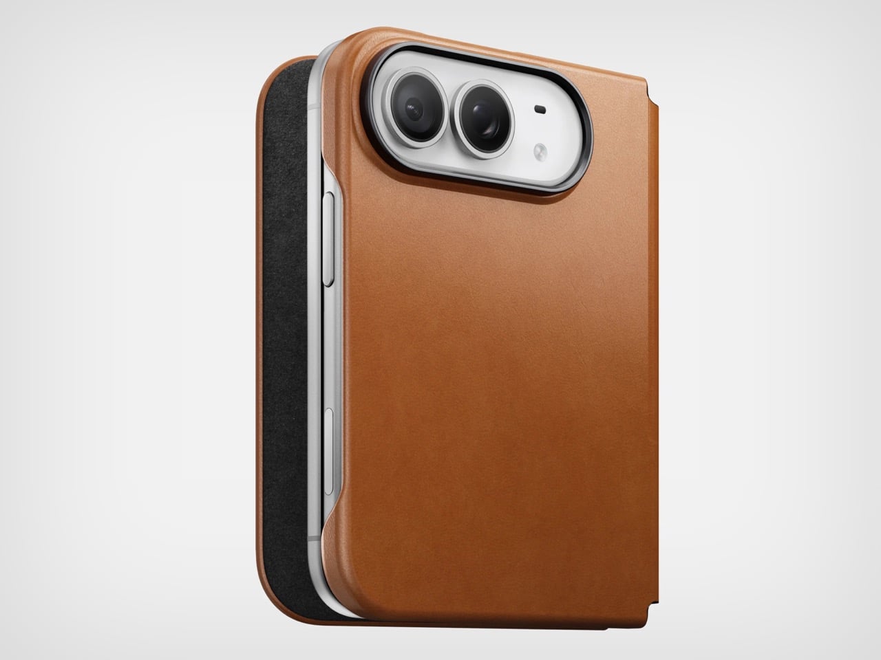
Phone cases tend to fall into two camps: those that protect the device and those that try to say something. Nomad’s Leather Folio attempts something harder: a single object that does both without looking like it is trying to do either. Crafted from Horween leather inside and out, with MagSafe compatibility and RFID blocking built in, it folds over the front of the iPhone Duo and turns what is already an expensive device into a combination that reads less like a phone and more like something a person who still carries a leather notebook would reach for without thinking twice.

Priced at $129, it is not a cheap case, but it is not pretending to be. The leather cover closes over the screen, which is either a feature or a nuisance depending entirely on how you use your phone, though for anyone who already drops it face-down out of habit, the protection is real and the payoff is legitimate. MagSafe integration means the phone charges normally through the case, and the RFID blocking handles the handful of situations where that actually matters. The overall effect is a device that feels deliberately considered in a way most cases never manage to pull off.

What we like

  • Horween leather develops a patina with use rather than aging badly, which gives the case a genuinely long useful life most materials cannot match
  • MagSafe compatibility and RFID blocking are both included without any visible hardware bulk or added thickness to the profile

What we dislike

  • The full front flap adds a step to every screen interaction that will feel like friction until the habit settles, and that adjustment can take longer than expected
  • At $129, it sits in an awkward price band between affordable everyday cases and truly premium leather goods, which makes the value case harder to land cleanly

5. RePod C1

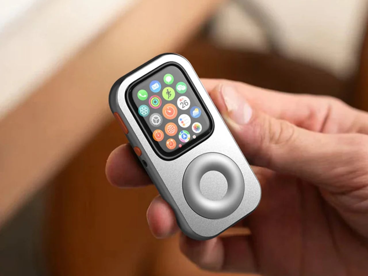
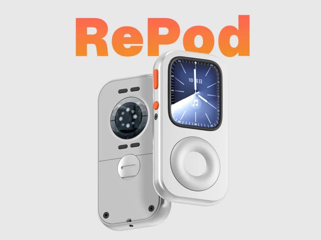
The click wheel was never just an interface. It was a tactile experience that gave early iPods a sense of ceremony that touchscreens have never quite replaced, a physical scroll mechanism that made navigating a playlist feel like it was worth doing slowly. Techpod’s RePod C1 is a $60 Apple Watch case that wraps the watch in an iPod-style shell and brings that wheel back, and what keeps it from being a novelty is one mechanical detail: the click wheel connects directly to the Apple Watch’s Digital Crown, so turning it actually does something real.

The case uses an open-back design that leaves all of the watch’s sensors fully accessible, meaning heart rate monitoring, ECG, and Apple Pay all continue to work normally. Antenna cutouts preserve Wi-Fi, Bluetooth, and cellular connectivity without compromise. The more interesting side effect is what it does to the device’s identity: sliding the watch into a pocket during a run or a commute and navigating with the Crown from inside the shell turns the Apple Watch into something that feels far more like a small, deliberate music player than a wrist-worn notification machine.

What we like

  • The mechanical connection between the click wheel and the Digital Crown makes the nostalgia functional rather than cosmetic, which is a meaningful distinction
  • The open-back design keeps every sensor and connectivity feature fully intact, so nothing about the watch’s capabilities changes when the case goes on

What we dislike

  • Adding any case to the Apple Watch introduces bulk to a device whose appeal partly depends on being thin and unobtrusive on the wrist
  • The iPod aesthetic lands clearly for one generation and reads as entirely opaque to anyone who came to Apple after the click wheel era ended

The Best Accessories Are the Ones Apple Didn’t Think to Make

Apple’s hardware is precise enough that the accessories worth paying attention to are the ones that noticed a gap the company chose not to fill. The NightWatch saw a dim nightstand clock. Astropad saw a frictionless drawing surface. Ooi Masato saw a speaker that required too much setup before it made a sound. Nomad saw a phone that could carry itself differently. Techpod saw a scroll mechanism nobody had brought back with anything real underneath it.

None of these are essential in the way a charging cable is essential. They are optional in the best sense, the kind of thing that makes a device feel more considered in the hands of whoever chose it. Whether your Apple device is a watch, a phone, or an iPad, something on this list has already figured out what was missing before you had the words for it.

The post The 5 Best Apple Accessories Of September 2026 That Actually Improve How You Use Your Devices first appeared on Yanko Design.
  •  

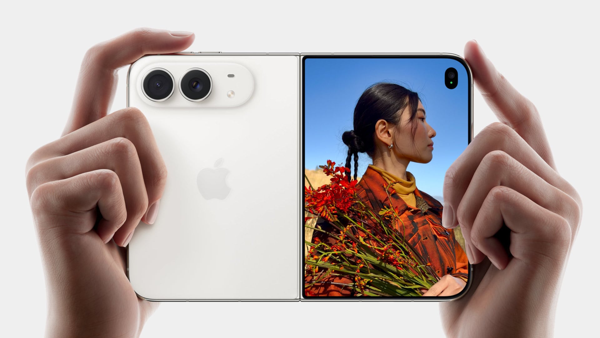
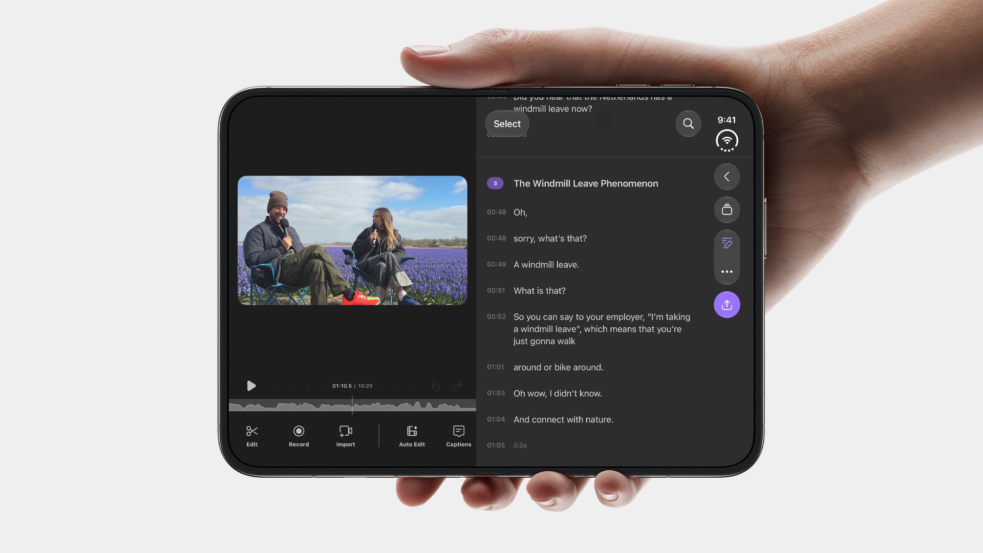
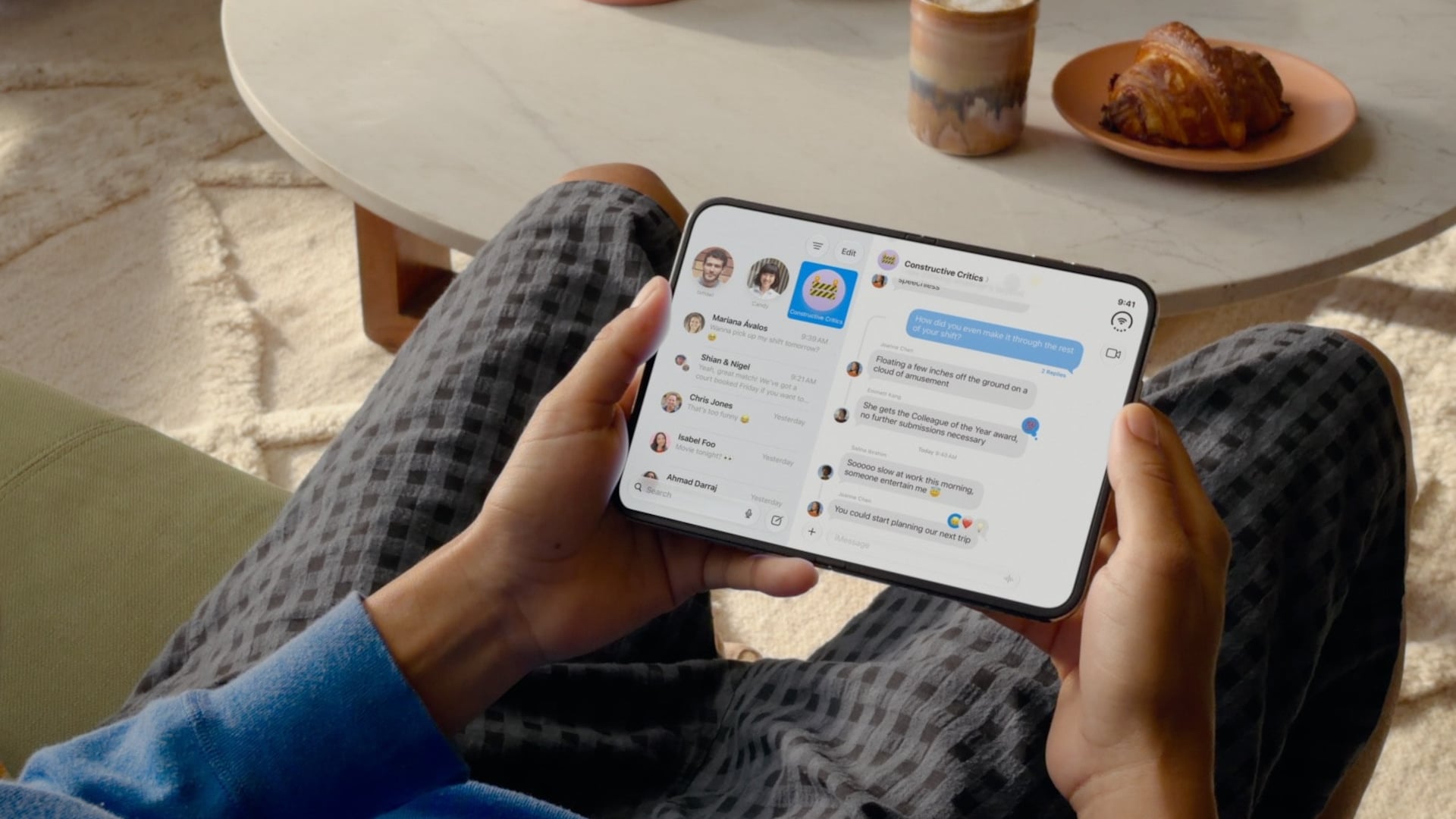
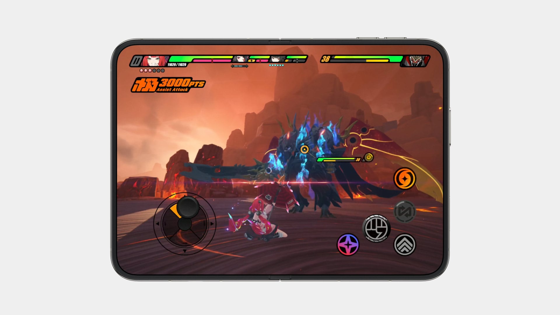
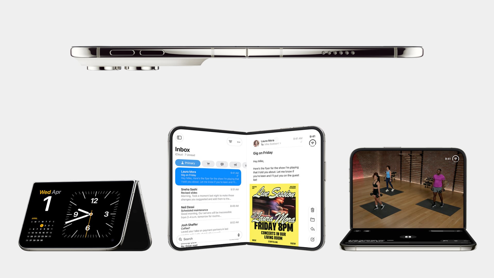
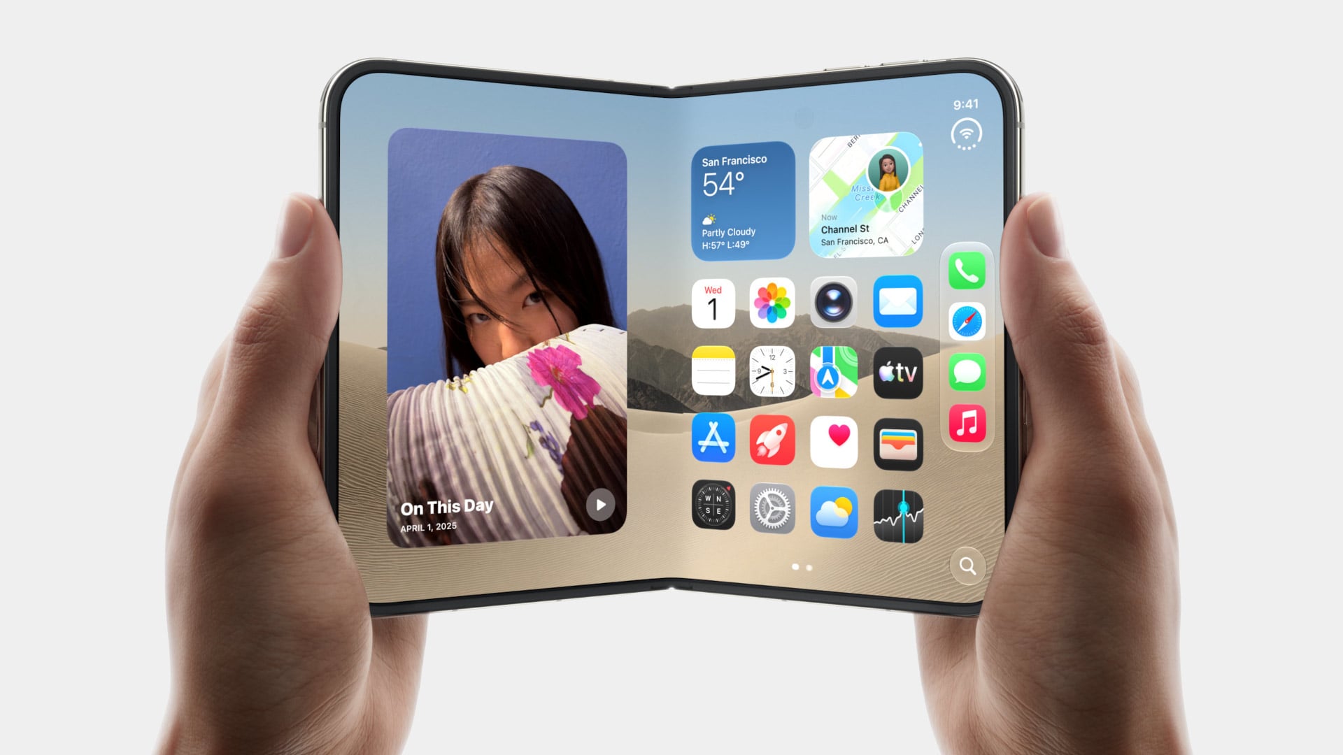
5 Things the iPhone Duo Got Right That Samsung Still Hasn’t

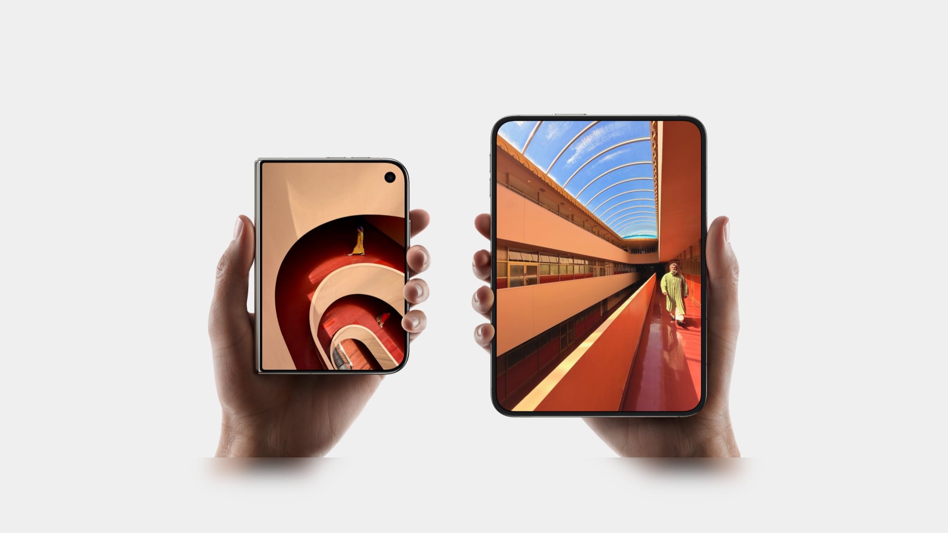
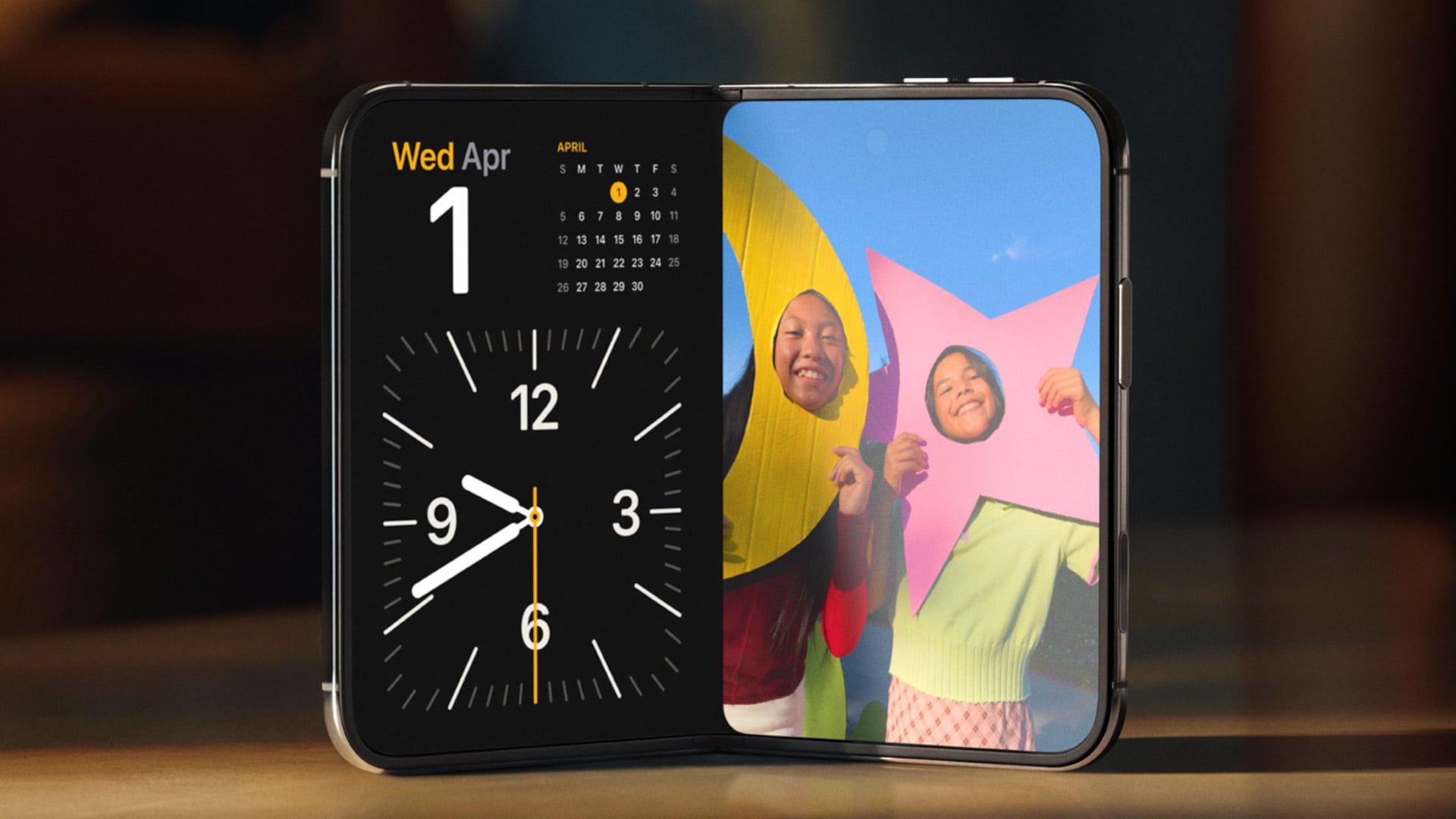
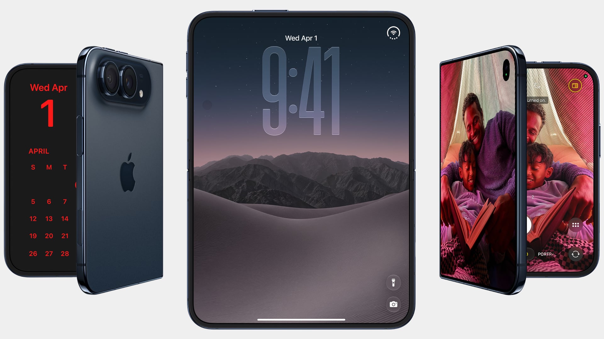
Samsung has had the folding phone conversation to itself for six years now, tweaking hinges, shrinking creases, and figuring out what a cover screen is even for. Apple waited, watched, and let its rival make every mistake first. That patience shows in the iPhone Duo, a first-generation foldable that skipped straight past problems Samsung’s Galaxy Z Fold8 still hasn’t fully solved.

None of that comes cheap, though. The Duo starts at $1,999 and costs more than the Fold8’s $1,899.99, weighs in at roughly nine ounces against the Fold8’s seven, and folds up thicker in your pocket, besides. Samsung still wins those arguments outright, and we’ll get back to that later. But set weight and price aside, because here are five places where Apple’s first foldable actually beat Samsung’s eighth attempt.

Designer: Apple

The Camera That Disappears

A foldable phone’s whole pitch is the screen, one continuous surface that opens up into something closer to a small tablet. Every notch or punch-hole cut into that surface breaks the illusion a little, reminding you that the software is still working around a sensor buried in the glass. Samsung’s Galaxy Z Fold8 has never quite escaped that compromise, even eight generations in.

The Galaxy Z Fold8 carries a 10-megapixel camera punched into both the inner and cover displays, a hole you notice every time the screen lights up. The Duo takes a different route entirely, tucking its inner selfie camera under the panel itself so nothing interrupts the display when you’re watching a movie or scrolling through photos with both halves open. The outer screen keeps a single, smaller cutout.

A Stylus Samsung Gave Up On

Samsung built its whole Note legacy around the S Pen, then carried that stylus into the first few generations of the Galaxy Z Fold before quietly dropping it this cycle. Neither the Galaxy Z Fold8 nor the Galaxy Z Fold8 Ultra bring it back, leaving a gap for anyone who used to sketch, sign, or jot notes onto that big inner display. It’s a strange retreat for a company built on that exact feature.

Samsung Galaxy Z Fold6

Apple Pencil support changes that, working on both the 5.4-inch cover screen and the 7.6-inch inner display, once it arrives. Dual-screen support lands through a software update later this year rather than at launch, so early buyers will have to wait a bit for the full experience. Still, it means signing a document or sketching an idea won’t require unfolding the phone first, something Samsung’s lineup can no longer offer.

Built to Survive the Mess

Dust is the part of durability testing everyone forgets about until it’s too late, and a folding hinge is the worst possible place for grit to sneak into. Water resistance ratings get all the marketing attention, but the dust half of an IP rating tells you whether sand at the beach or fine construction dust will actually make it past the seals and start scratching at the mechanism underneath.

The iPhone Duo carries an IP68 rating, meaning the seal is dust-tight; nothing gets through, full stop. The Galaxy Z Fold8 only manages IP48, which covers water fine but leaves that dust digit low enough that fine particles, sand, and powder aren’t actually kept out. For anyone who takes their foldable to a beach, a workshop, or just a dusty backpack, that gap matters more than it looks.

Room for Everything You Shoot

A foldable’s bigger inner screen practically begs you to shoot more video and drag around heavier files, whether that’s 4K footage, a stack of RAW photos, or a library of apps you’d never bother installing on a regular phone. Storage stops being an afterthought pretty quickly once you’re using the extra screen real estate the way it’s meant to be used, for actual creative work instead of just bigger icons.

Apple tops out the iPhone Duo at 2TB of storage, double what the Galaxy Z Fold8 offers at its 1TB ceiling. That’s the difference between planning around your camera roll on a long trip and simply forgetting storage exists as a problem. For anyone who treats their foldable as a mobile production tool rather than a bigger email client, that extra headroom ends up mattering more than the megapixel count.

Fighting the Fold’s Oldest Flaw

The crease down the middle of a folding screen has been the one problem no manufacturer has fully cracked, Samsung included, no matter how many generations they’ve shipped. Apple’s approach to the Duo’s hinge stacks a nano-texture matte layer over glide-adhesive glass and backs the whole assembly with a titanium plate, an engineering answer to a problem that’s mostly been treated as unavoidable elsewhere in the industry.

Early impressions from outlets with briefing access suggest the crease is still visible. Nobody’s claiming otherwise, but it doesn’t catch your finger or your attention the way it does on most rivals, the Galaxy Z Fold8 included. That’s worth flagging as an early read rather than a verified result, since neither phone has landed in reviewers’ hands yet. Outdoor glare handling gets similar praise, though the real test comes once these ship.

What Samsung Still Gets Right

None of this makes the Galaxy Z Fold8 a bad phone, and Samsung still wins the arguments that matter most to plenty of buyers. It’s $99.01 cheaper, noticeably lighter at roughly seven ounces against the Duo’s nine, and thinner whether it’s folded shut in your pocket or opened flat on a desk. Those are real, measurable advantages, not consolation prizes.

Apple iPhone Duo

Samsung Galaxy Z Fold8

What you’re really choosing between is a phone that’s been refined for eight generations and one making its very first attempt, price and weight included. A first try that already beats its rival on a camera, a stylus, a durability rating, storage, and a hinge design is a strong opening argument, whatever it costs to get there. Samsung’s turn to respond comes next year.

The post 5 Things the iPhone Duo Got Right That Samsung Still Hasn’t first appeared on Yanko Design.
  •  

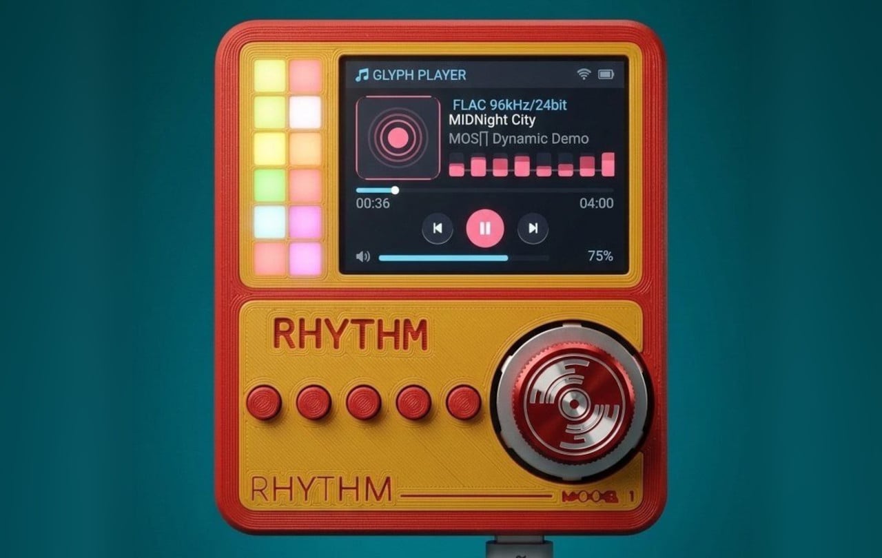
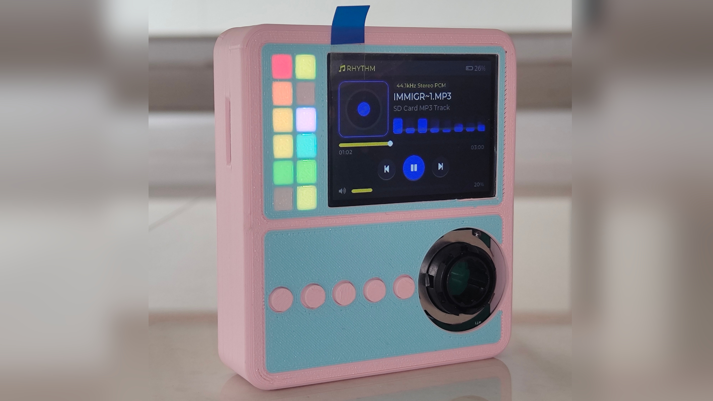
RHYTHM Is the Walkman the Smartphone Era Forgot to Build

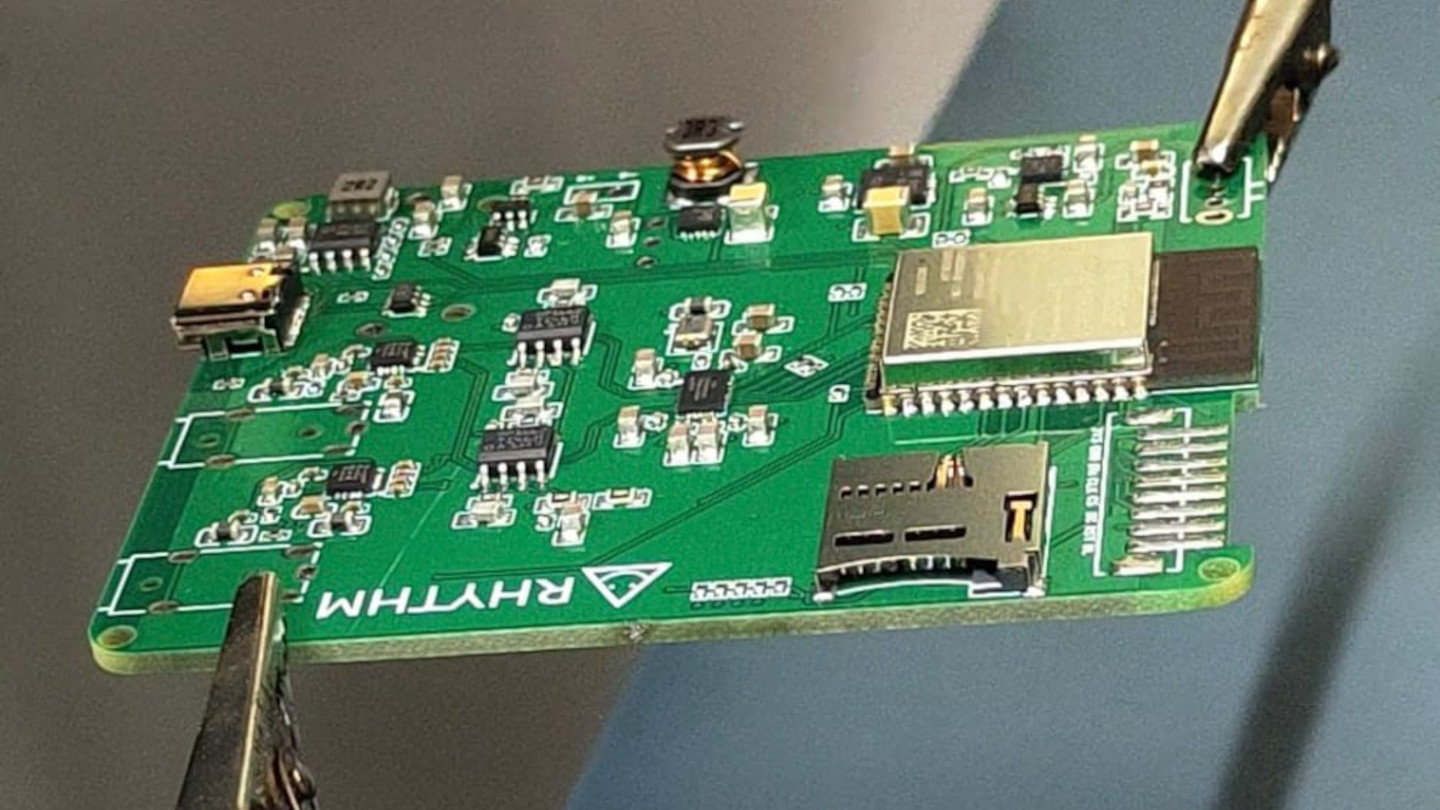
Smartphones turned music into just another notification competing for attention, a song interrupted by a text, an album broken up by a calendar alert. RHYTHM exists to undo that arrangement entirely, building a dedicated listening device from real audio components instead of borrowing a phone’s guts and bolting on a headphone jack. It’s a from-scratch digital audio player designed around one job: playing music properly, without a screen demanding anything else from you.

That commitment starts with what’s actually driving the sound. Rather than leaning on an all-in-one audio codec chip the way most budget players do, RHYTHM routes music through a genuine ESS SABRE DAC, the same category of chip found in dedicated hi-fi gear, paired with a discrete amplifier stage rather than a shortcut solution. An ESP32-S3 handles the file parsing and processing, but the actual sound reproduction runs through hardware built specifically for that job alone.

Designer: Mithilesh Gupta Konda

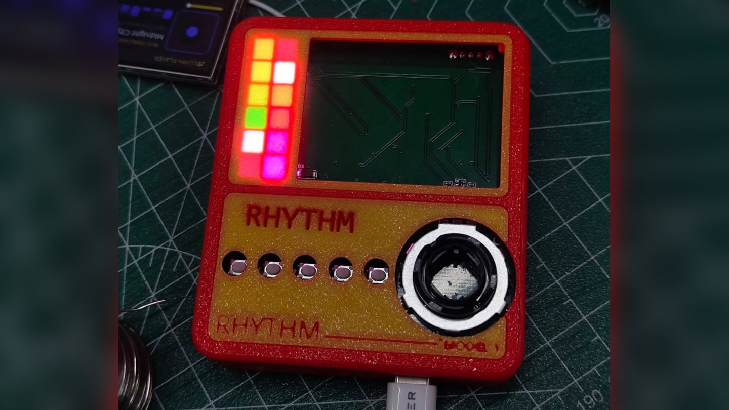
The headphone output makes the clearest case for why any of this matters. Instead of splitting one internal signal across a single jack, RHYTHM runs two completely independent, actively buffered 3.5mm outputs, each driven by its own dedicated amplifier chip. Two people can plug in two entirely different pairs of headphones, and each gets a full, uncompromised signal, no shared circuit quietly degrading whichever connection came second.

Keeping that signal clean required rethinking the power supply as much as the audio path. RHYTHM physically separates its digital logic and high-frequency switching lines from the analog circuitry that actually shapes the sound, regulating each side through its own dedicated, ultra-low-noise power regulator. It’s an unglamorous decision that never shows up in a spec sheet screenshot, but it’s exactly the kind of choice that determines whether quiet passages in a recording stay quiet.

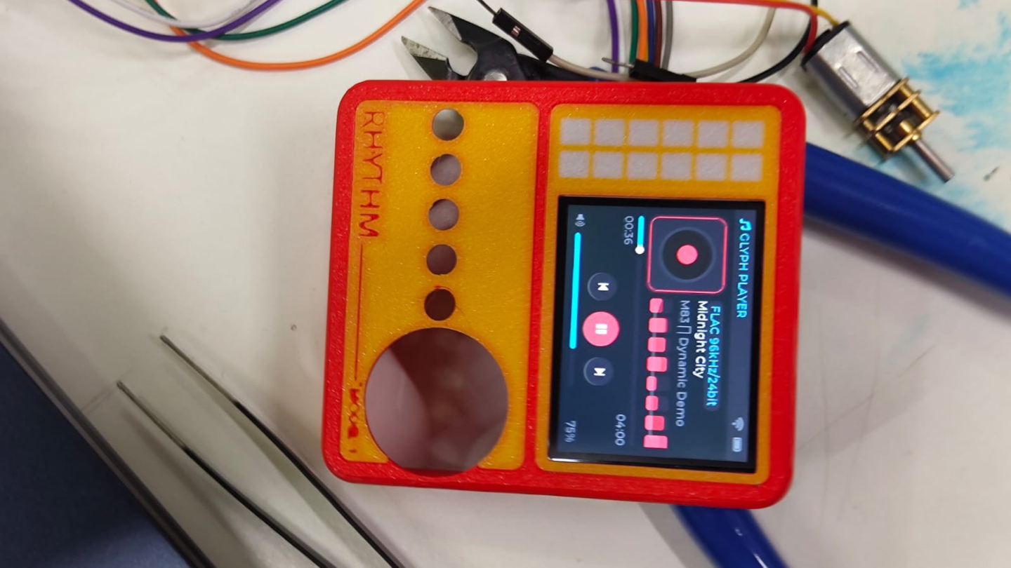
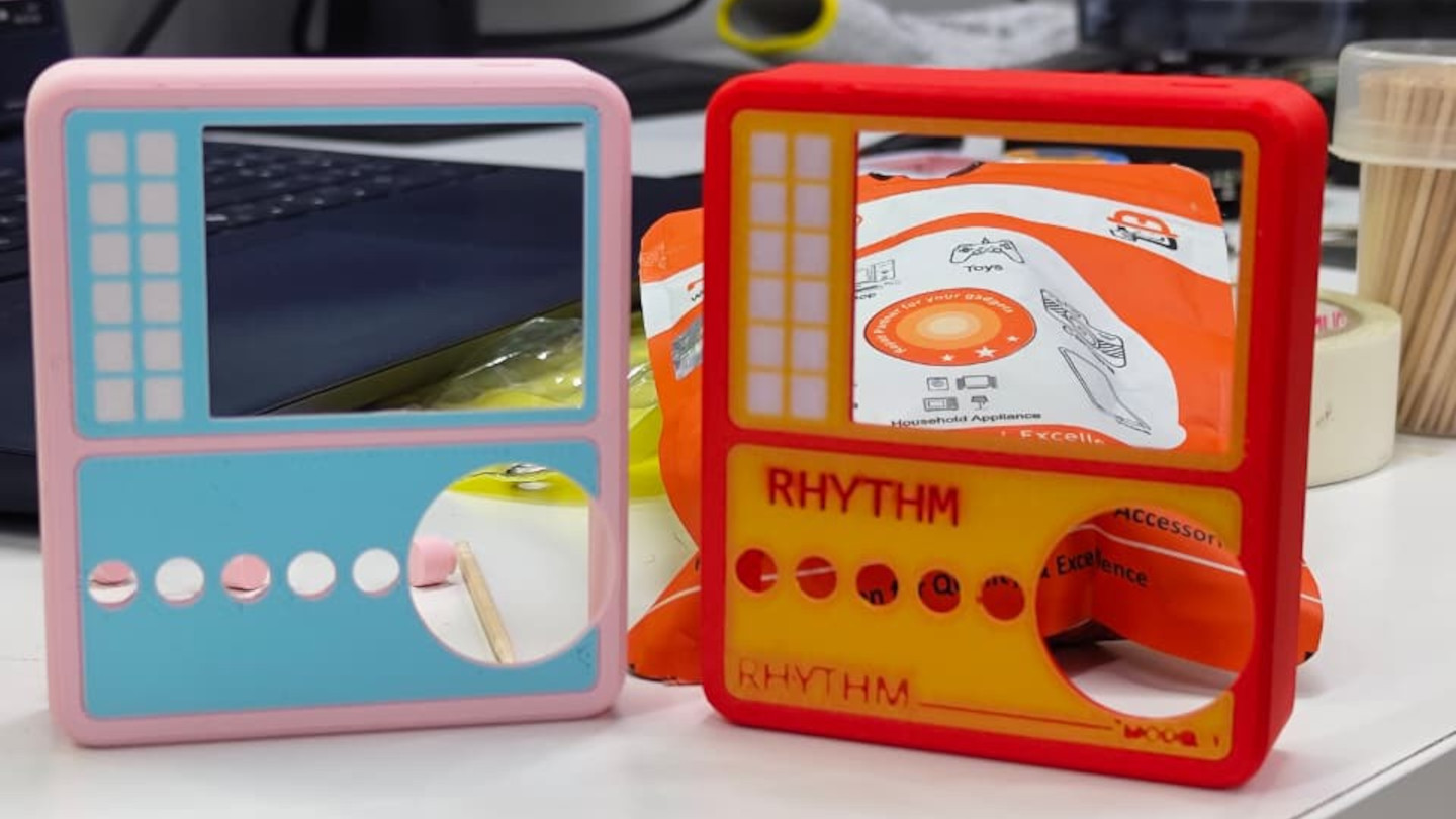
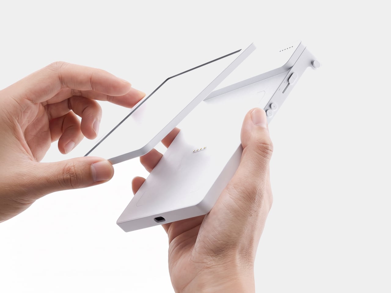
Physical control gets the same attention. A precision mechanical rotary encoder handles navigation alongside a set of tactile buttons, giving the whole interface a hands-on quality that a touchscreen simply can’t replicate. Paired with a compact 2-inch color display, the device reads less like a shrunken phone and more like a purpose-built instrument, something meant to be operated by feel in a pocket or a bag without needing to look at it.

A microSD slot rounds out the practical side, storing lossless files locally rather than depending on a streaming connection or app ecosystem. That local-first approach extends the project’s entire philosophy: RHYTHM isn’t trying to replace a phone’s convenience. Instead, it’s opting out of that convenience on purpose, trading constant connectivity for a listening experience built around a single, uninterrupted task.

The post RHYTHM Is the Walkman the Smartphone Era Forgot to Build first appeared on Yanko Design.
  •  

5 Designs That Prove Vinyl’s Comeback Was Never Just About the Music

Vinyl has returned to the cultural spotlight, but its comeback is about much more than nostalgia. A new generation is discovering records as objects of design, ritual, and personal expression. For Gen Z, vinyl offers something increasingly rare in a digital-first world: a physical relationship with music. Choosing an album, holding the sleeve, placing the record on a turntable, and listening from beginning to end creates a slower, more intentional experience.

The renewed interest in vinyl is also influencing interiors and product design. Record players are becoming sculptural objects, album covers are being displayed like artwork, and dedicated listening corners are finding their place inside contemporary homes. Here is how Gen Z is giving an old format a new visual language, transforming the record experience into a lifestyle statement.

1. Vinyl Becomes A Lifestyle

Vinyl has moved beyond the traditional collector’s shelf to become part of a broader lifestyle centered around music, design, and self-expression. Gen Z is attracted to records because they provide something that streaming cannot: a tangible connection to an artist and an album. The large-format sleeve, physical record, and carefully designed packaging create an experience that feels more substantial than tapping a song on a phone.

This shift has also made vinyl increasingly relevant to interiors. Records can sit on open shelving, lean against walls, or become part of carefully arranged listening corners. Collections communicate personality through color, artwork, typography, and genre. Instead of simply storing music, younger listeners are using their collections to shape the atmosphere and identity of their spaces.

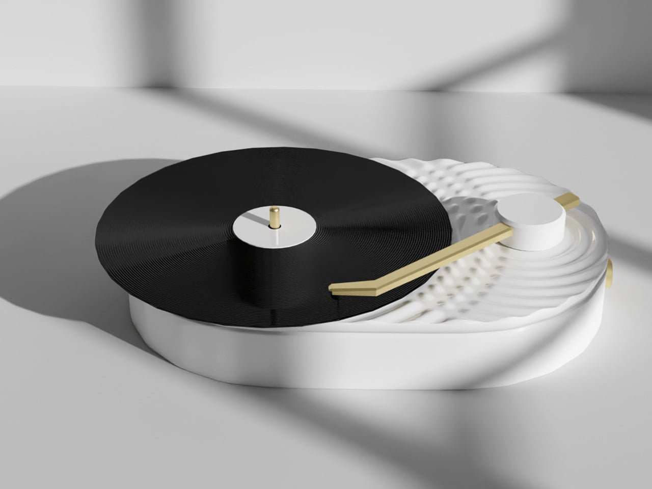
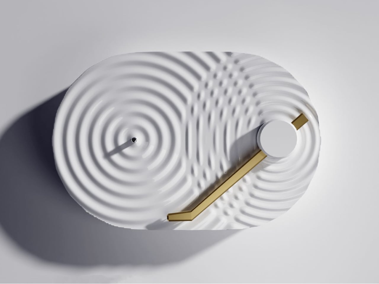
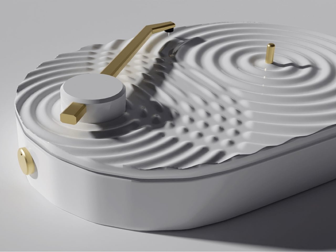
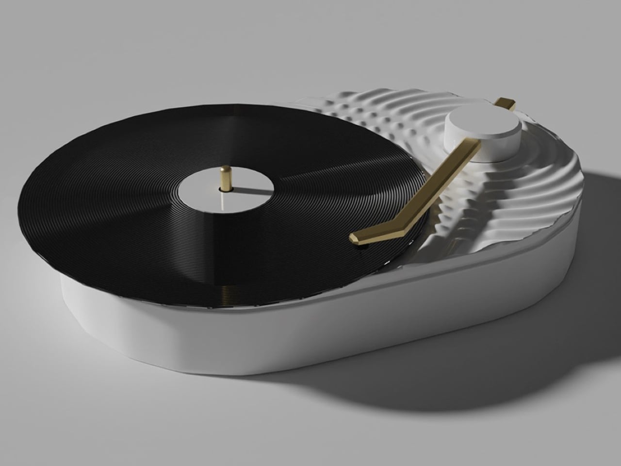
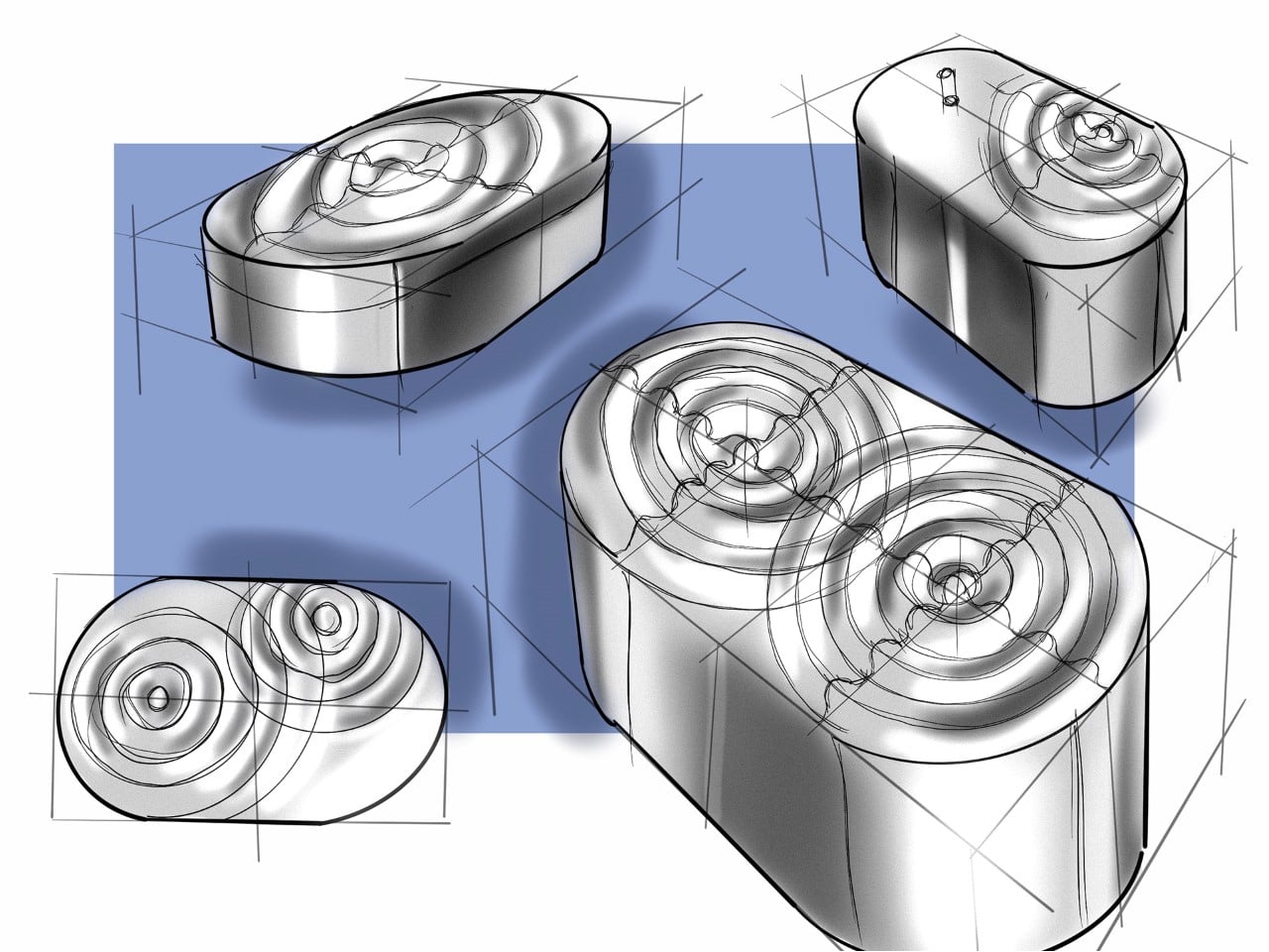
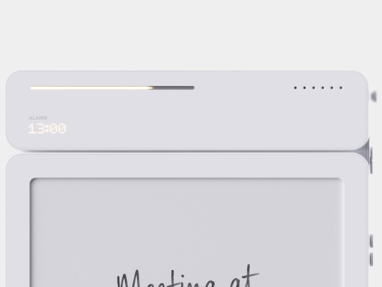
The Ripple Turntable transforms sound into a visual language, drawing inspiration from the way audio waves radiate outward from a single source. Its pristine white surface features sculpted ripples that appear to emanate from the center of the platter and the base of the tonearm, intersecting across the surface to create a striking sense of movement. The effect turns an otherwise functional audio device into an expressive sculptural object, giving the act of playing music a distinctly visual dimension.

A sleek gold tonearm introduces a subtle accent against the all-white body, while the black vinyl record provides a strong visual contrast. Its minimalist yet playful character makes it particularly suited to Scandinavian and Japanese-inspired interiors, where sculptural simplicity and thoughtful detailing take center stage.

2. The Ritual Of Listening

Streaming has made listening almost effortless, allowing users to access millions of songs instantly. Vinyl introduces a different rhythm. The listener has to select an album, remove the record from its sleeve, place it carefully on the turntable, and lower the needle. These small actions create a physical ritual that encourages greater attention.

That ritual is particularly relevant to a generation accustomed to constant notifications and rapidly changing digital content. Listening to a record can create a moment of pause, where the album becomes the focus rather than background noise. Turning the record over halfway through also introduces a natural break, making music feel like an activity rather than an endless stream of content.

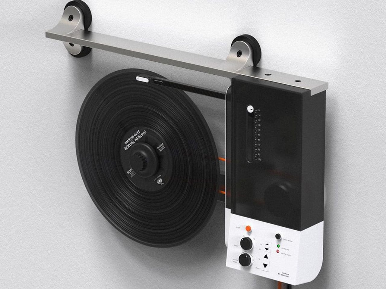
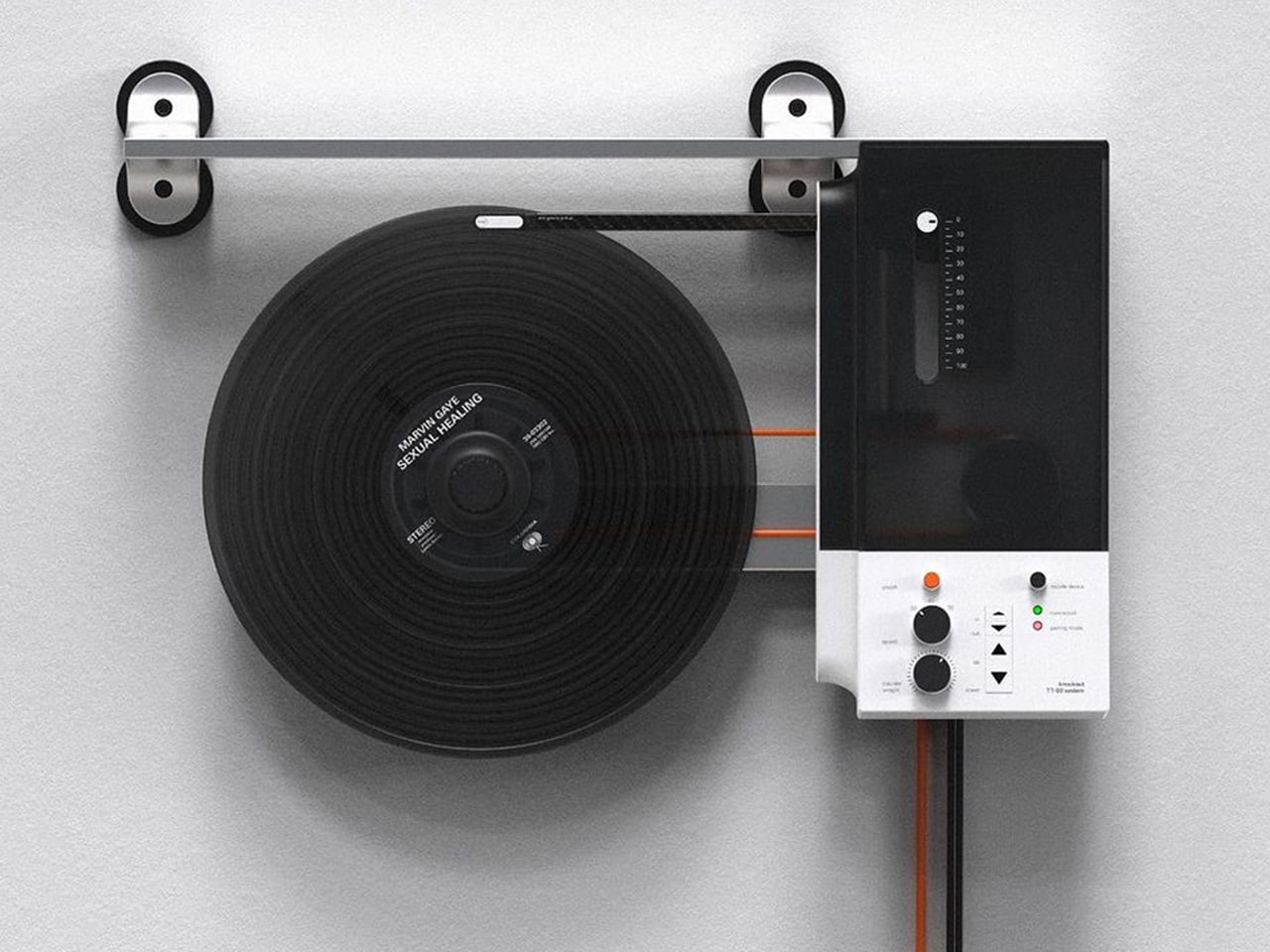
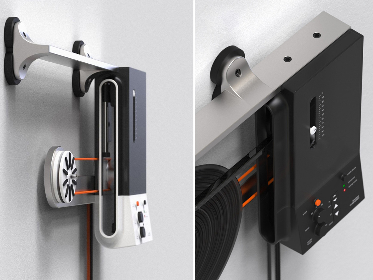
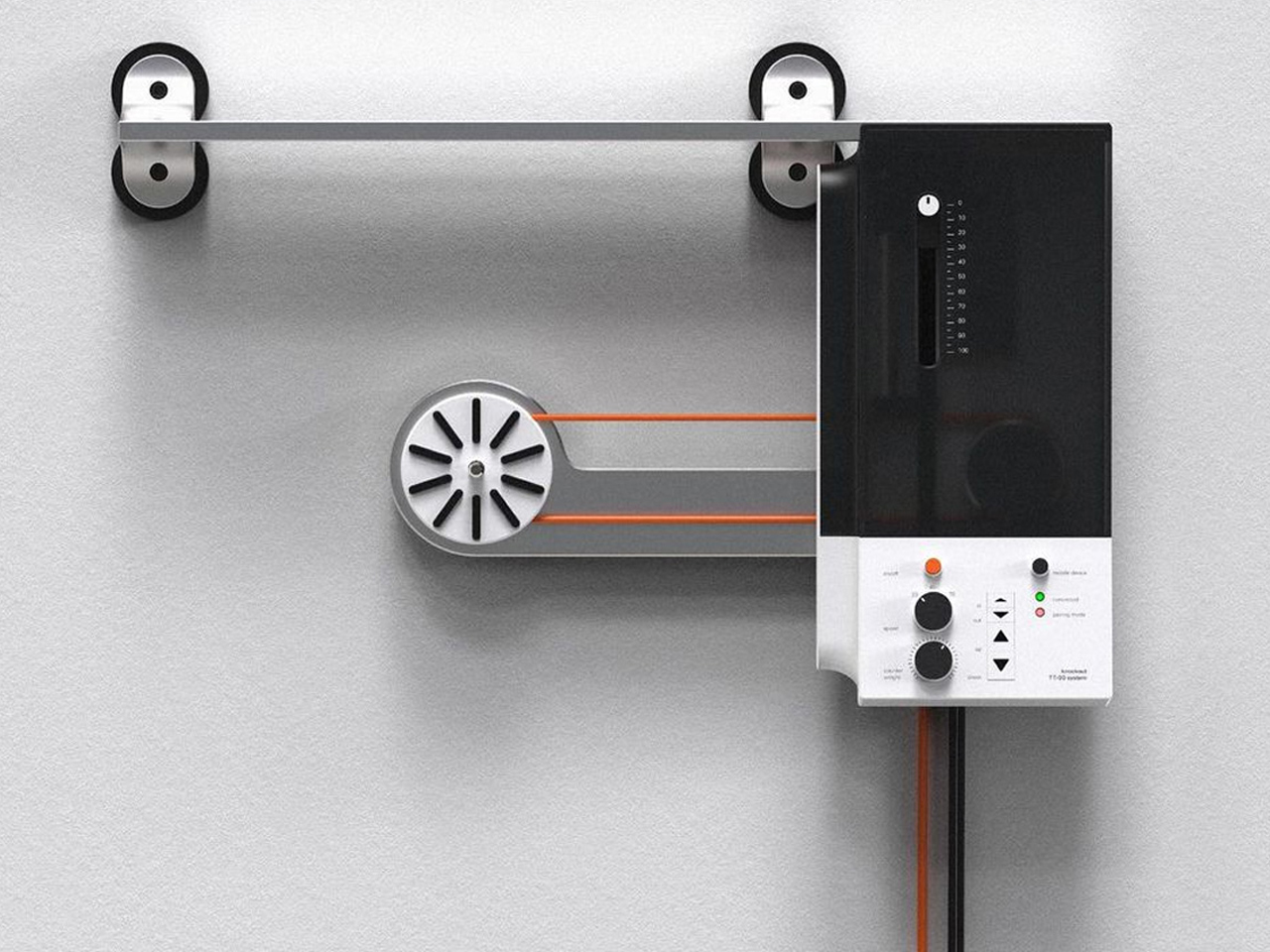
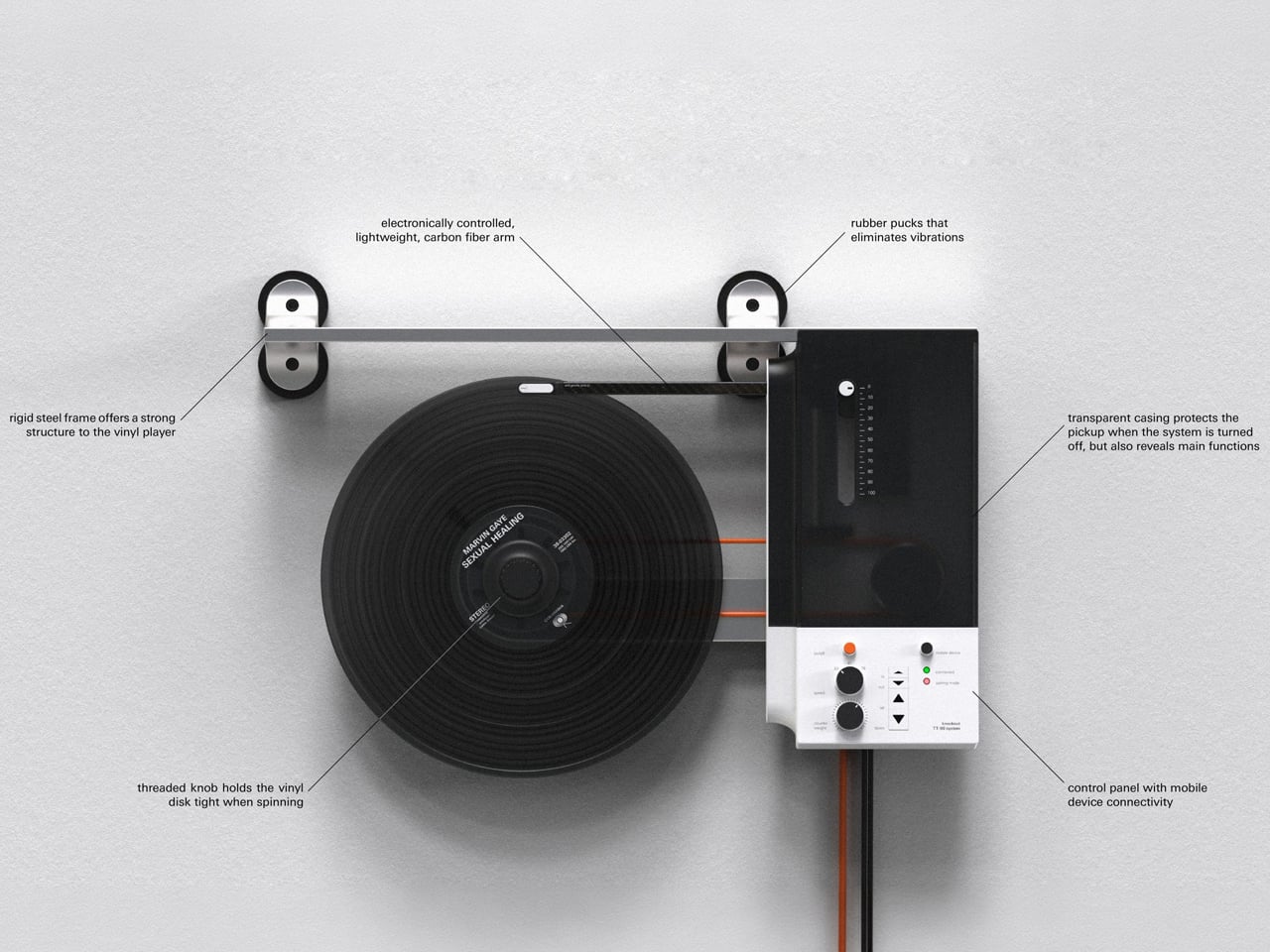
Oscar Olsson’s TT-90 System reimagines the traditional turntable by combining analog listening with contemporary digital functionality. Flipping the record player 90 degrees, the concept mounts the vinyl vertically on the wall, creating the illusion of a record floating in space as it spins beneath the needle. The unconventional format also addresses a common limitation of traditional turntables: their bulky footprint. Instead of occupying valuable furniture space, the TT-90 becomes part of the wall, transforming an everyday audio device into a striking piece of interior design. Available in black, orange, and white, its streamlined silhouette gives the familiar record player a distinctly futuristic character.

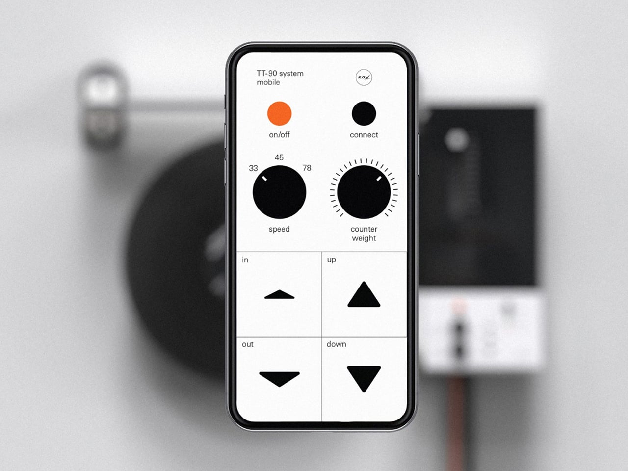
Beyond its space-saving approach, the TT-90 System introduces smartphone connectivity, allowing listeners to control playback digitally alongside onboard controls. Rubber components help reduce vibration against the wall, while a threaded knob secures the record during vertical playback. The result is a playful fusion of physical music culture, modern technology, and sculptural design.

3. Record Players Become Design

The turntable is experiencing its own design revival. Contemporary models are increasingly being designed to look at home alongside modern furniture rather than being treated purely as technical equipment. Minimal controls, warm materials, compact forms, transparent components, and sculptural bases are giving turntables a more furniture-like presence.

For Gen Z, this visual quality matters because technology is increasingly expected to contribute to a home’s aesthetic. A record player can become the centerpiece of a listening corner, positioned alongside books, plants, speakers, and carefully selected objects. The result is a more integrated approach to audio design, where performance and appearance work together instead of technology disappearing into a cabinet.

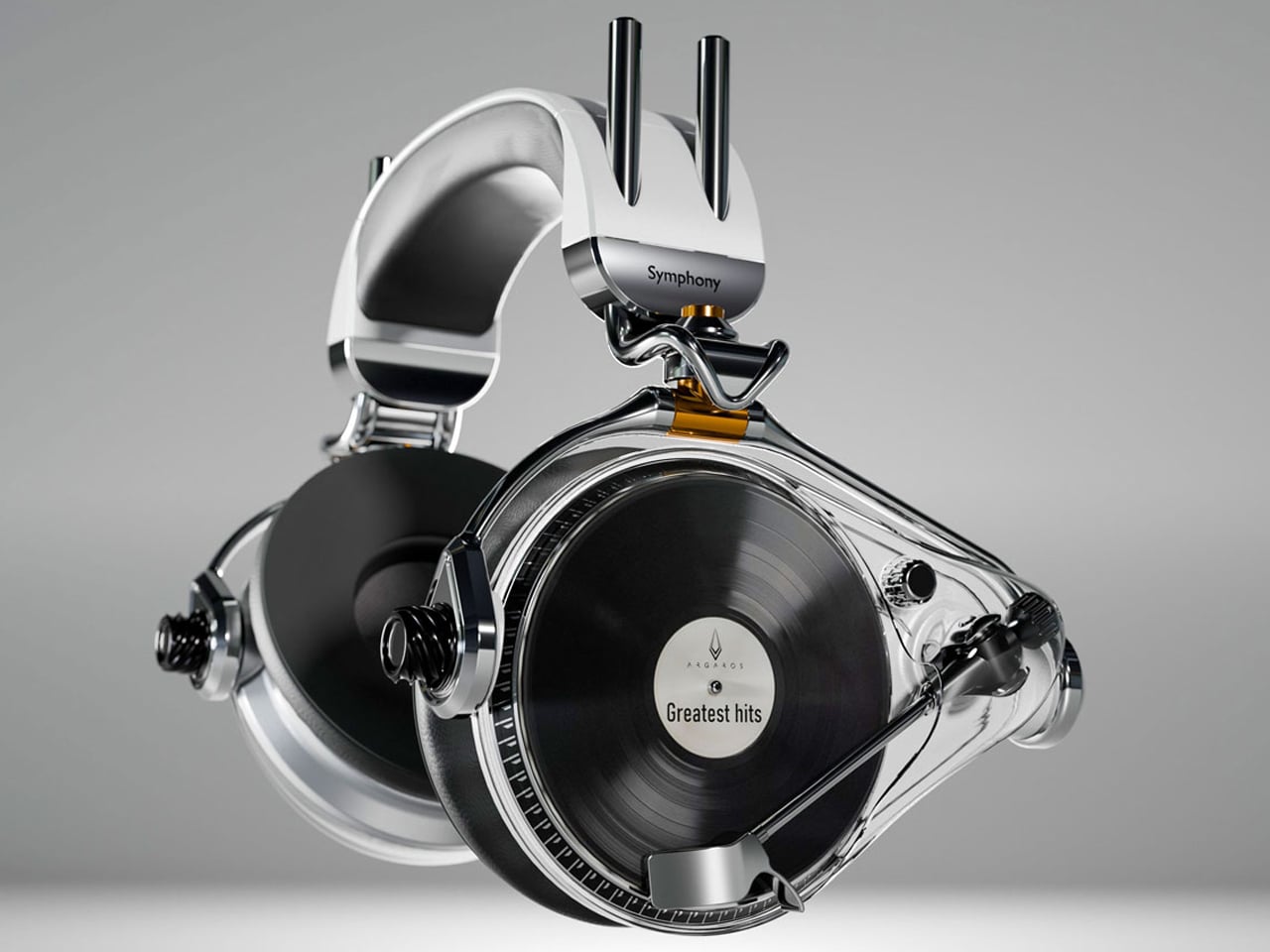
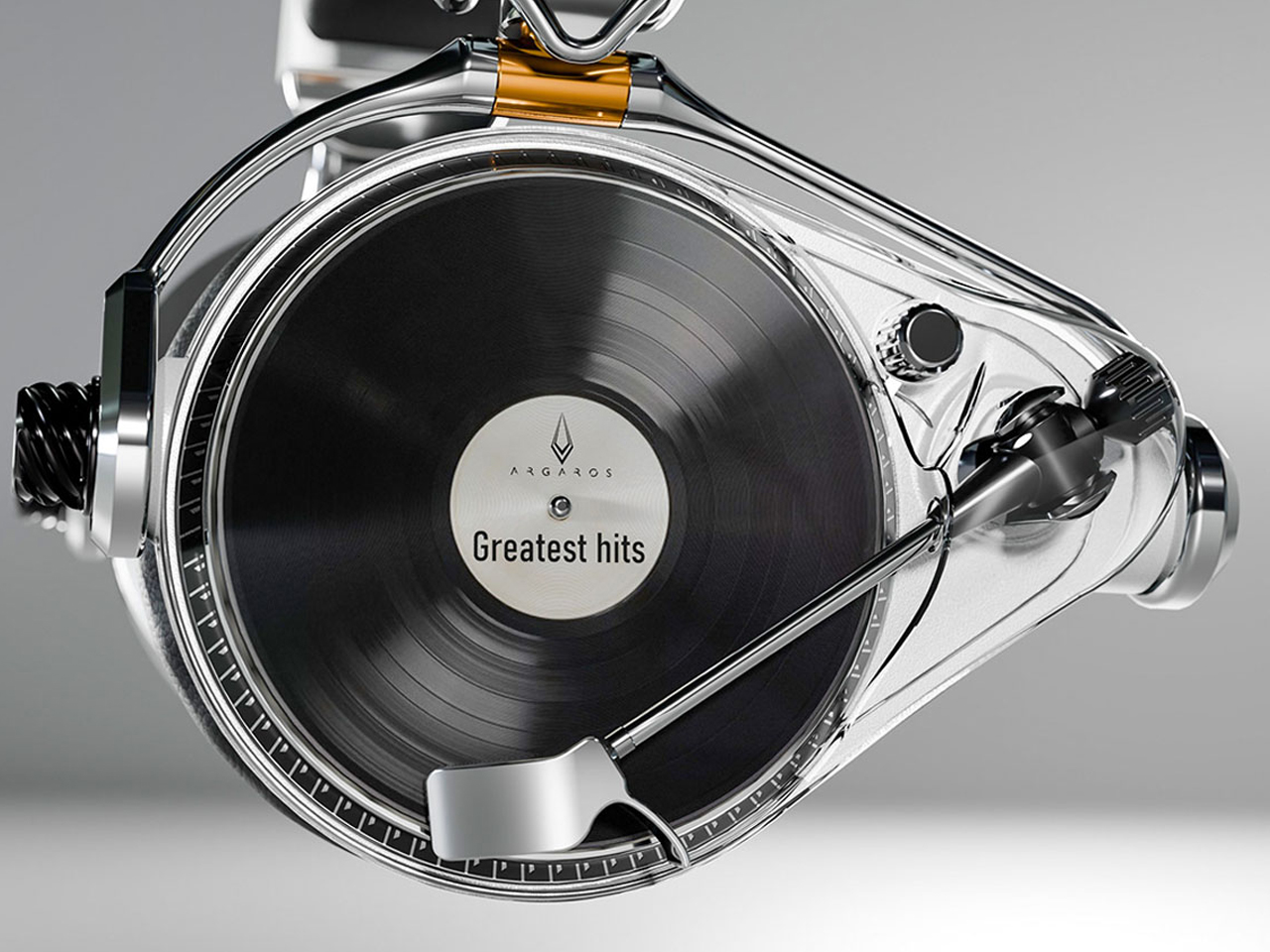
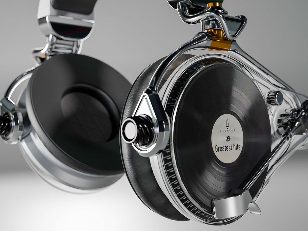
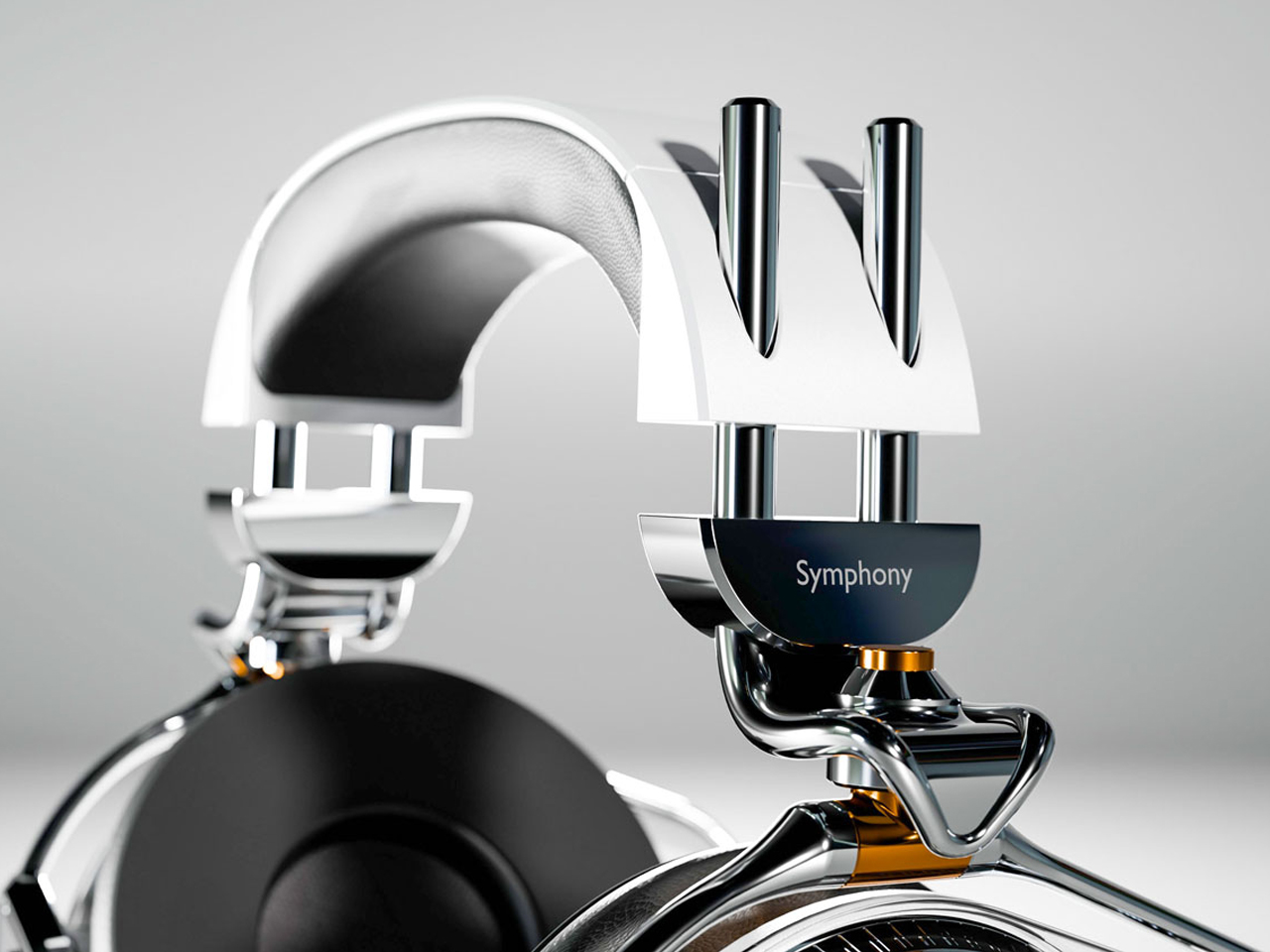
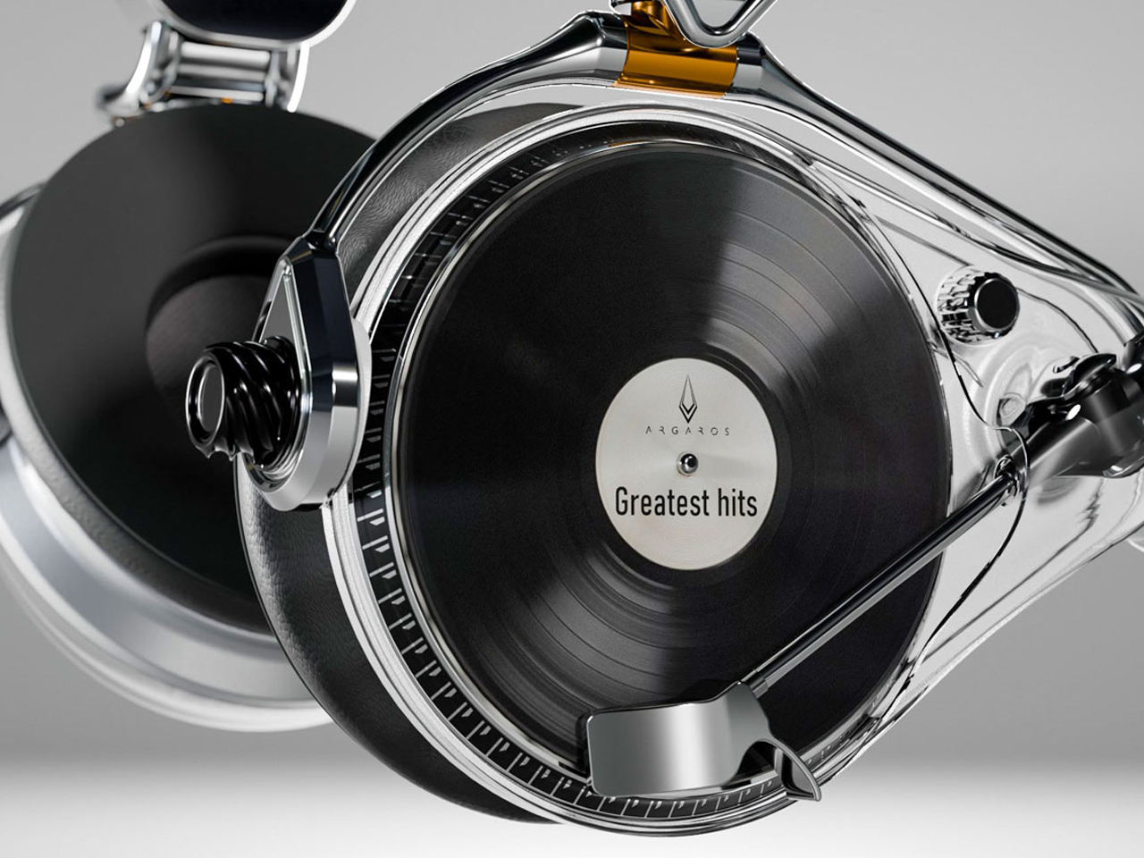
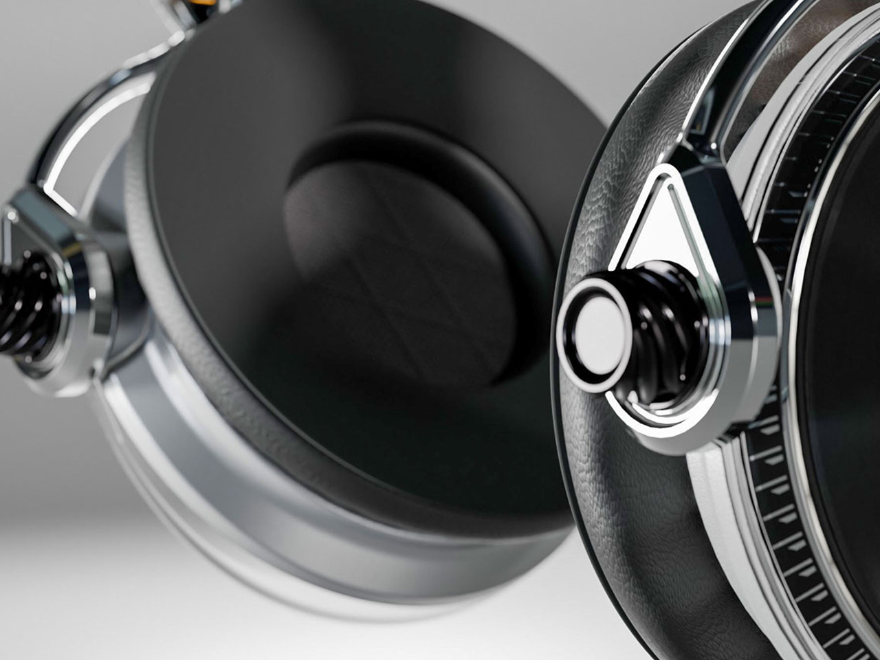
The Symphony headphones by Przemysław Wolnicki explore an intriguing meeting point between vinyl culture and contemporary personal audio. Instead of simply recreating the look of a record player, the concept translates its tactile interaction into a headphone interface. Each earcup features a miniature vinyl-inspired control surface that functions like a tiny turntable. Rotating the record allows listeners to seek forward or rewind, while the stylus controls track selection and playback. The interaction gives digital listening a physical dimension, creating a playful connection between nostalgic analog rituals and modern wireless audio.

Visually, the Symphony headphones take a distinctly premium approach. Brushed stainless steel gives the concept an audiophile-inspired character, while elongated structural elements add a futuristic, almost automotive quality to the earcups. Transparent sections introduce another layer of visual intrigue, allowing parts of the mechanism to remain visible.

4. Album Art Enters Interiors

Vinyl’s physical scale gives album artwork a presence that digital platforms cannot easily reproduce. A record sleeve can be picked up, examined, framed, displayed, or arranged as part of a larger collection. Its typography, photography, illustration, and color palette can influence the character of an entire room.

Gen Z’s interest in personalized interiors has made this particularly relevant. Rather than following perfectly coordinated design schemes, younger homeowners and renters often use meaningful objects to create spaces that feel individual. A stack of favorite records or a carefully arranged shelf can reveal musical taste while adding visual interest. Music therefore becomes part of interior storytelling, with album artwork functioning almost like a rotating gallery.

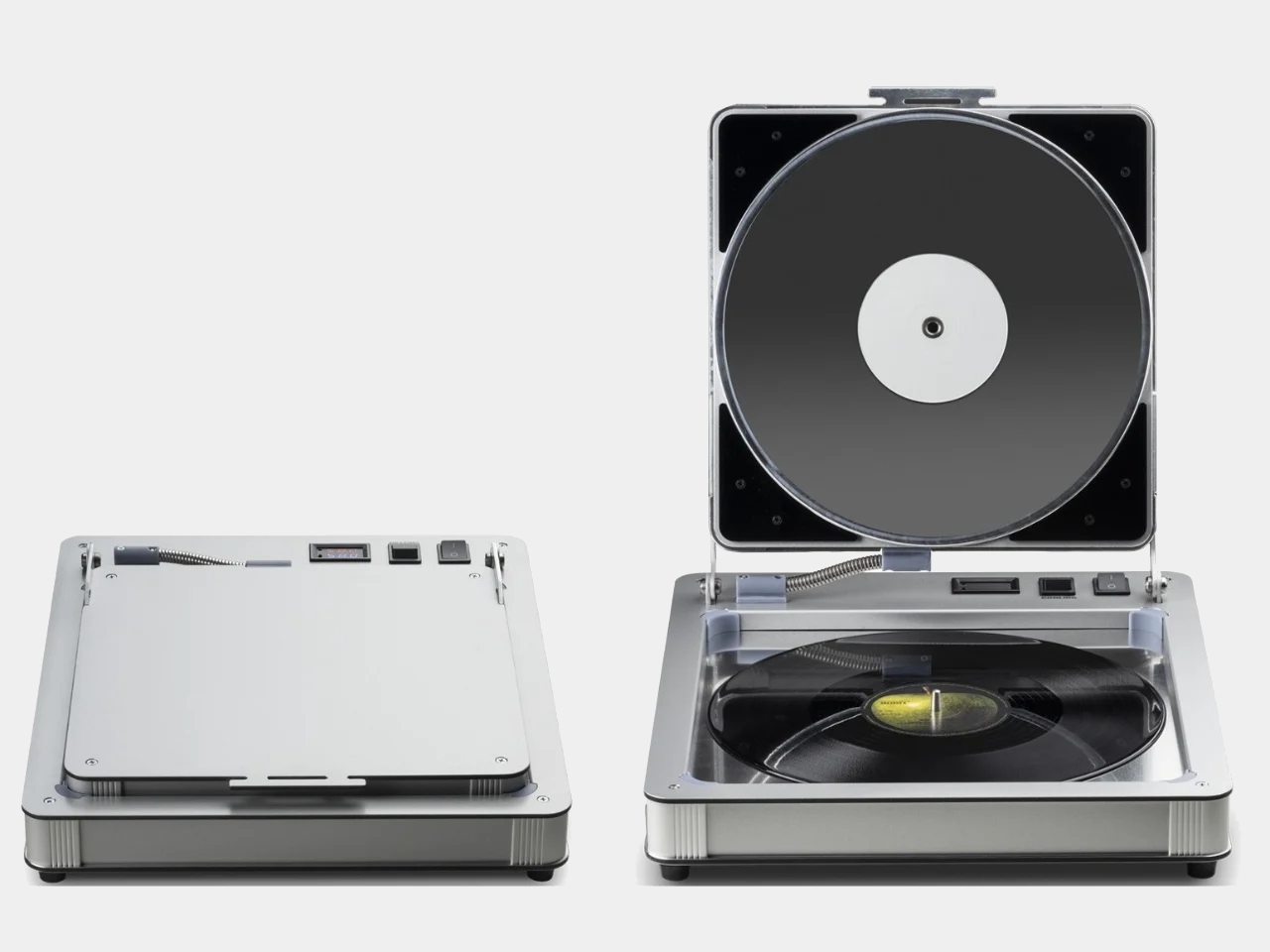
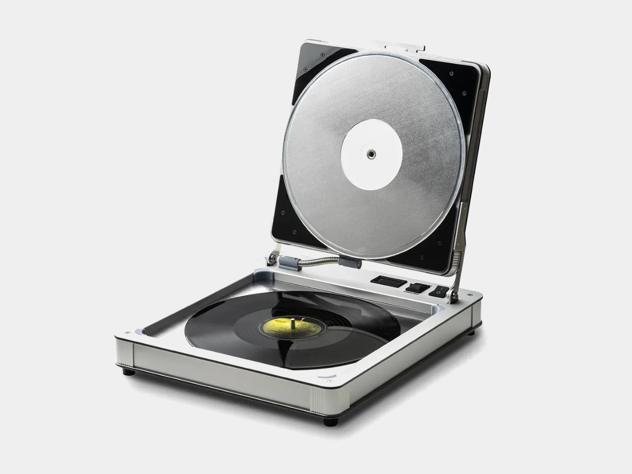
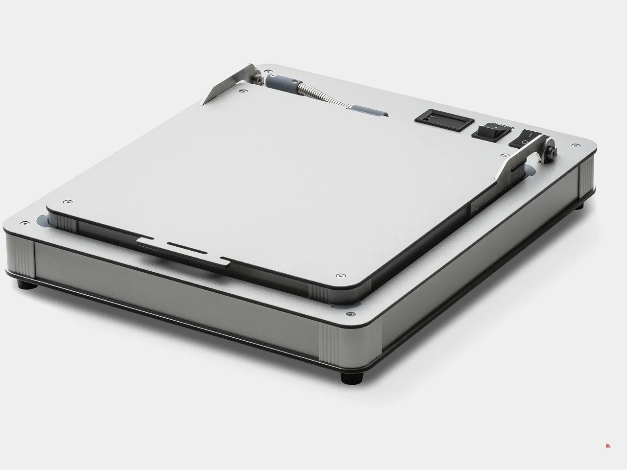
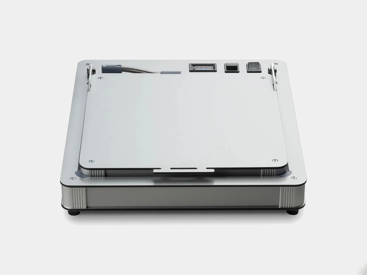
Building a vinyl collection comes with an important challenge: keeping records in excellent condition. Unlike digital music, physical records require careful storage and handling, with warping being one of the most common problems. Exposure to heat, pressure, or improper storage can distort a record’s shape, potentially causing skips, pops, and uneven playback. Pro-Ject’s Flatten it offers a dedicated solution for collectors who want to preserve their records or restore warped discs. Designed specifically for vinyl maintenance, the machine gently flattens damaged records while aiming to protect the delicate grooves responsible for their sound.

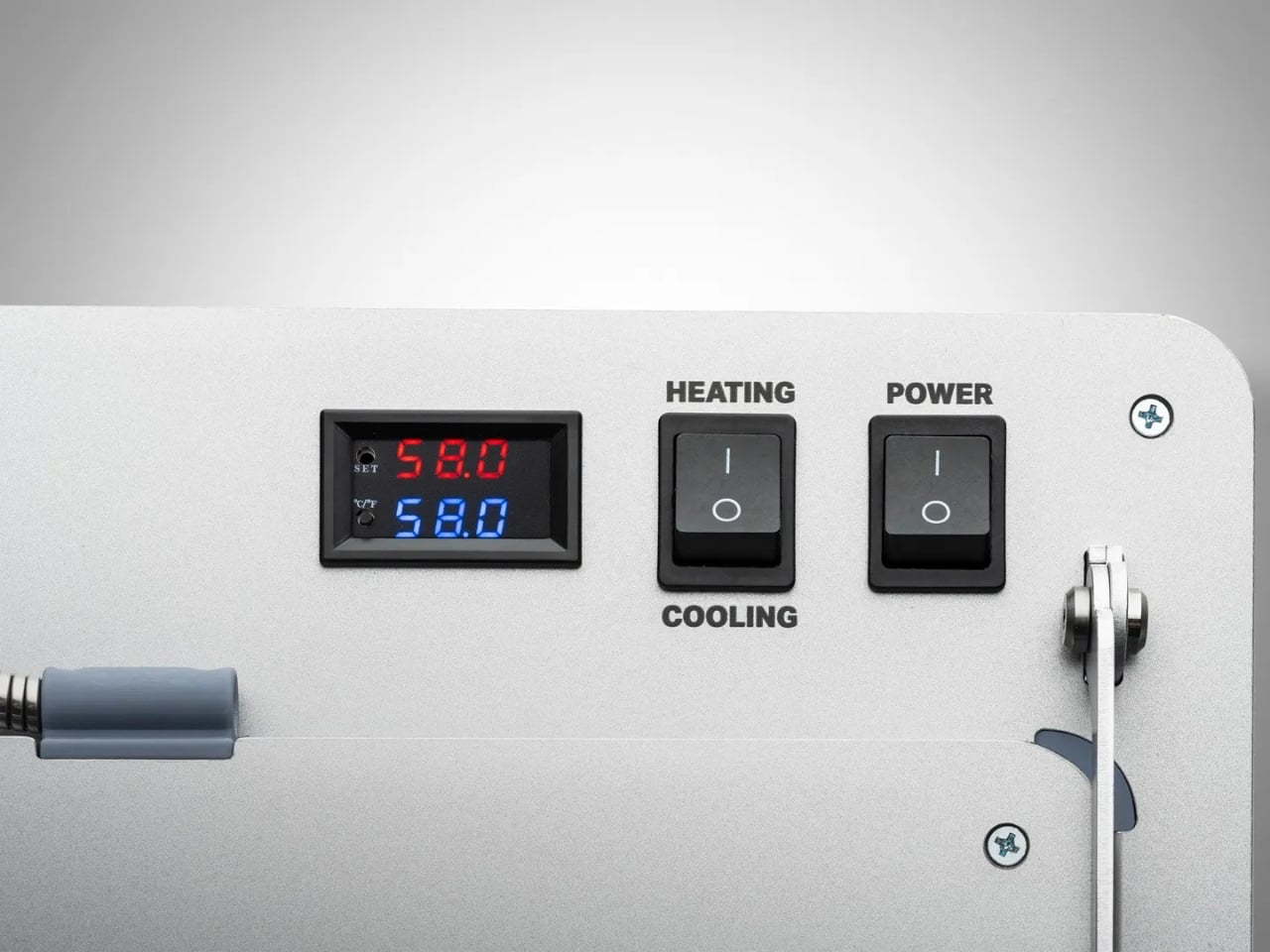
The Flatten it resembles a sophisticated record player, but instead of playing music, it uses heated aluminum plates to distribute warmth evenly across the record. Temperature controls allow users to adjust the process, while low temperature hysteresis helps maintain consistent conditions. Its solid aluminum construction gives the machine a premium, durable feel, while its straightforward operation makes it approachable even for first-time vinyl collectors.

5. A New Generation Collects

Gen Z is approaching collecting differently from previous generations. Owning vinyl does not necessarily mean building an exhaustive collection of an artist’s entire discography. Instead, younger collectors may choose albums because of their emotional significance, artwork, rarity, cultural relevance, or connection to a particular period of their lives.

Social media has further strengthened vinyl’s visual appeal. Record hauls, listening setups, shelves, packaging details, and limited-edition pressings naturally become content for visually driven platforms. Yet the appeal goes deeper than aesthetics. In an economy built around subscriptions and temporary digital access, owning a physical album offers a sense of permanence. Vinyl gives listeners something they can hold, display, revisit, and pass on.

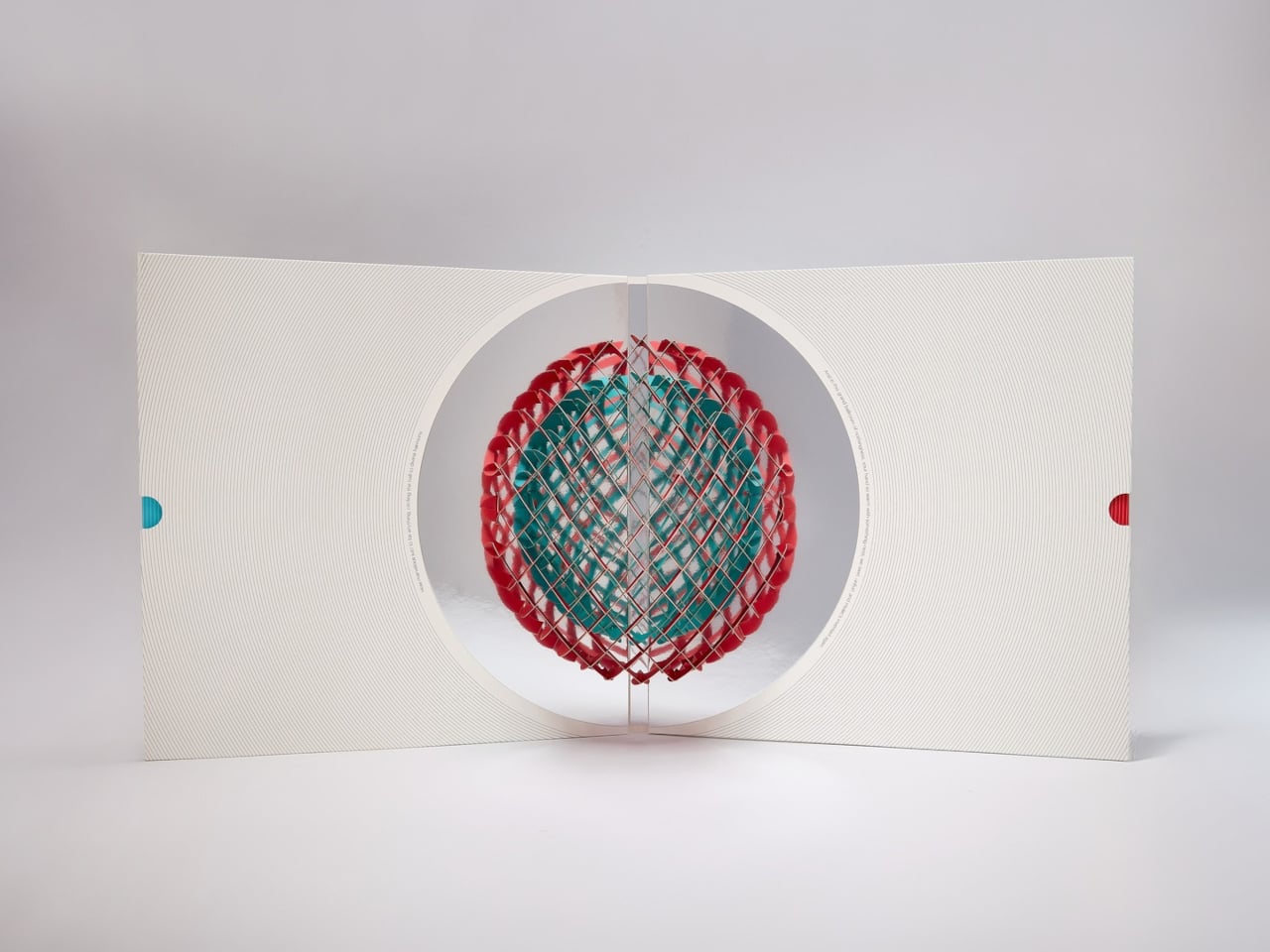
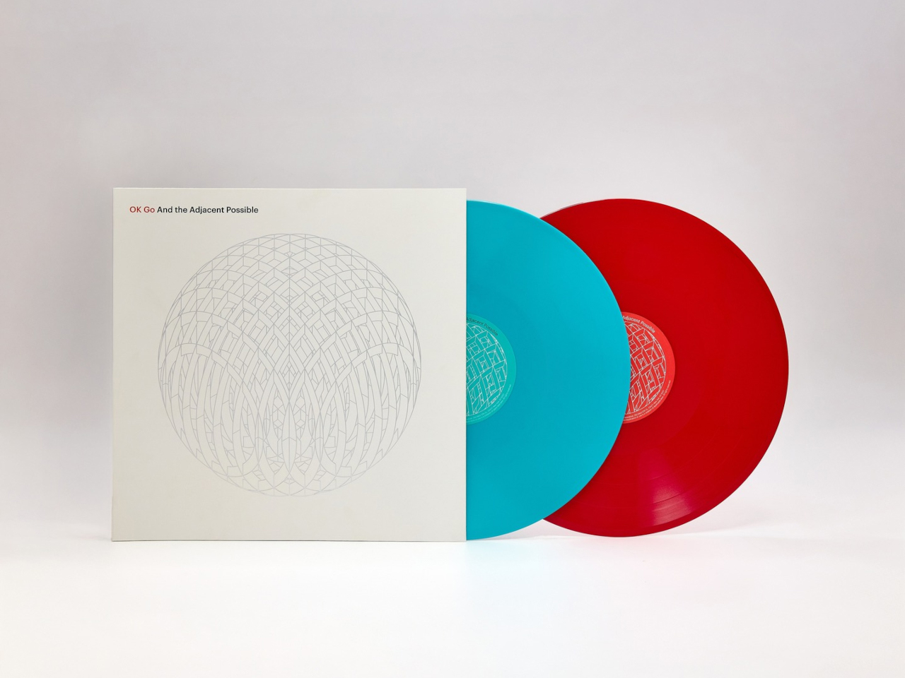
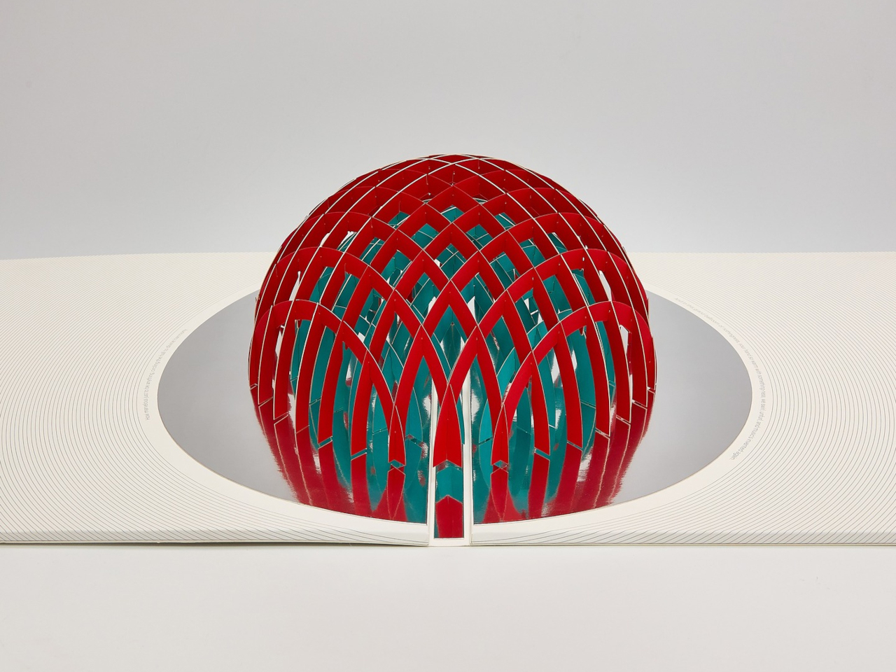
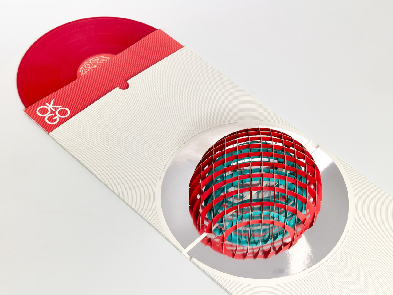
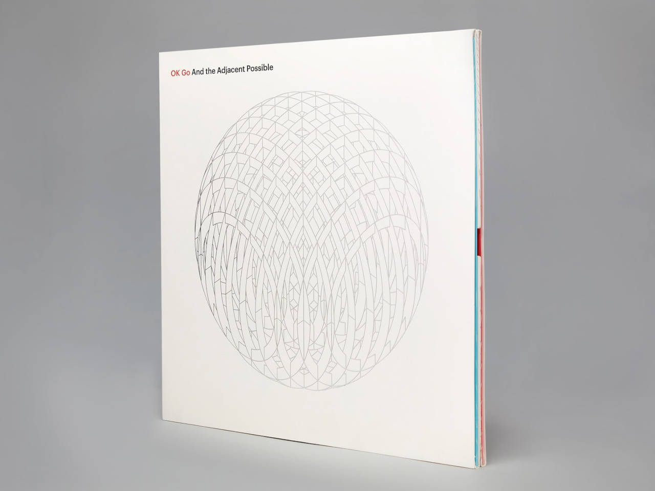
Album artwork has long played an important role in shaping how music is experienced, turning records into visual as well as auditory objects. As streaming has reduced album covers to small digital thumbnails, vinyl has restored the opportunity to create tangible, immersive packaging. OK Go embraces that potential with its album And the Adjacent Possible, featuring an inventive vinyl jacket designed by Yuri Suzuki and Claudio Ripol. The gatefold cover transforms the familiar act of opening a record into an interactive visual experience, extending the album’s creative identity beyond the music itself.

Opening the jacket reveals a three-dimensional pop-up structure featuring geometric red and green domes that rise from the surface. A reflective element beneath them creates an optical illusion, making the partial forms appear like complete spheres. The playful construction recalls the wonder of a pop-up book while maintaining a sophisticated aesthetic. Its precise folds, geometric forms, and restrained palette turn the record sleeve into a sculptural object that connects music, packaging, and interactive design.

Vinyl’s revival reflects a growing desire for tactile, intentional experiences in a digital world. Gen Z is not simply bringing records back; it is redesigning the entire experience around listening, collecting, interiors, and personal expression.

The post 5 Designs That Prove Vinyl’s Comeback Was Never Just About the Music first appeared on Yanko Design.
  •  

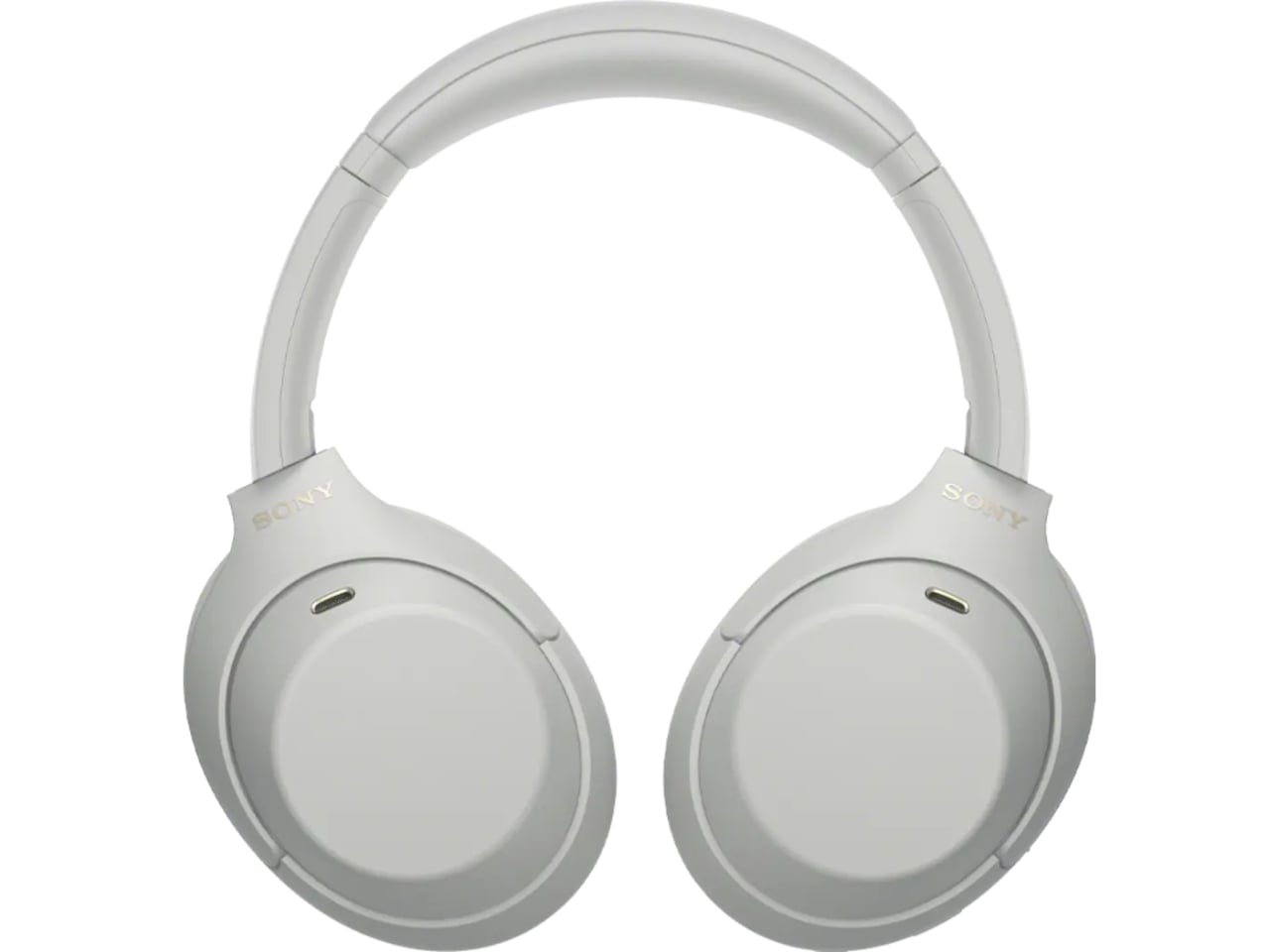
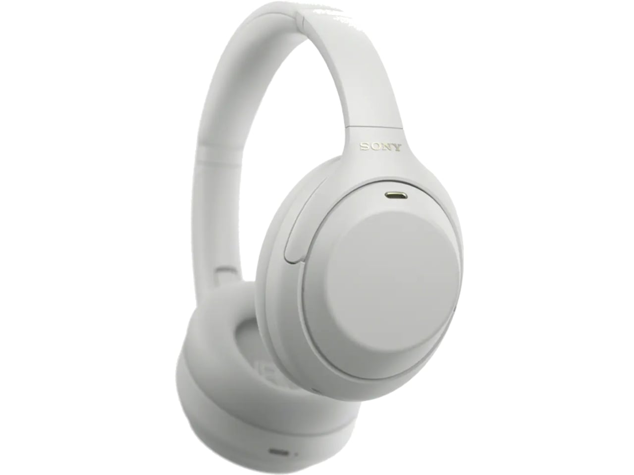
The $300 Sony Headphones Everyone Wanted Are Actually Back

Anyone who has priced out a decent pair of noise-cancelling headphones this year has felt the sticker shock. Sony’s own flagship, the WH-1000XM6, launches at $449.99, and its wilder sibling, the 1000X The ColleXion, sits even higher. Bose isn’t cheaper. Sennheiser isn’t cheaper. The whole category has quietly drifted toward the idea that “premium” now means “$400 and up,” and a lot of people who just want good ANC for their commute or their next flight have been priced out of the conversation entirely.

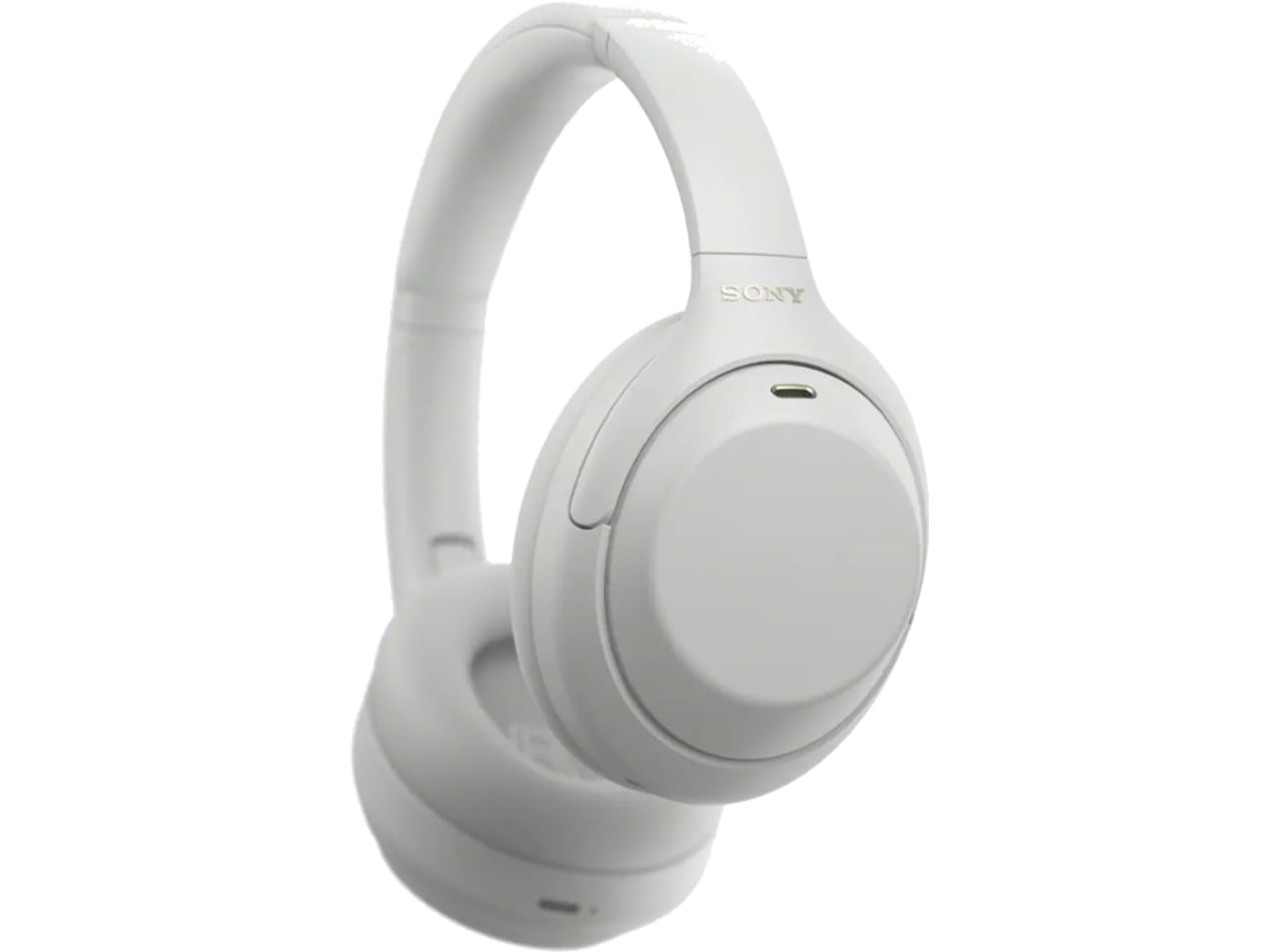
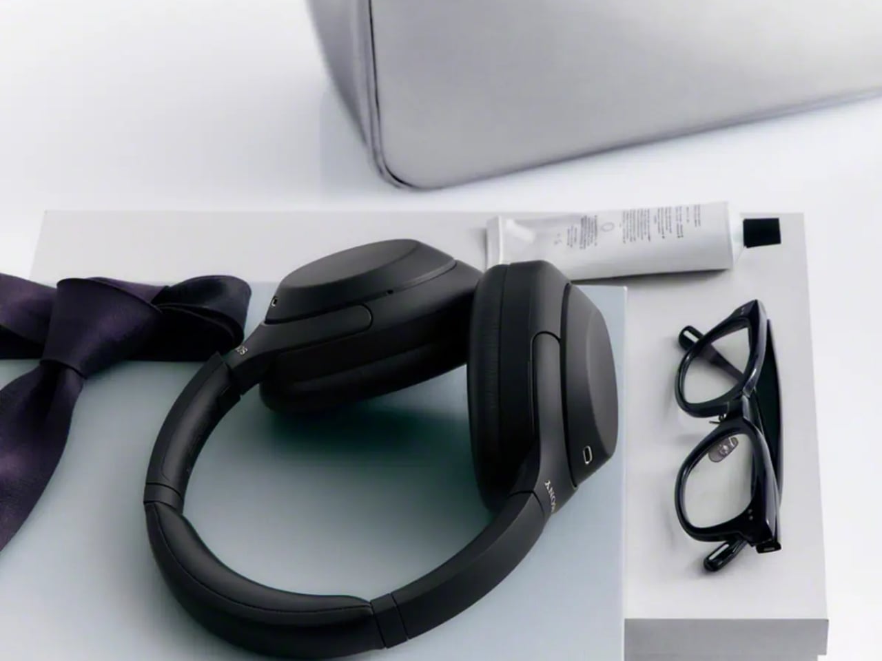
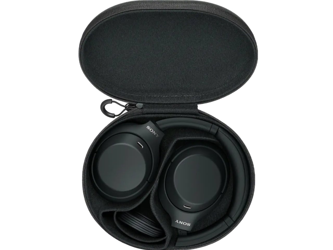
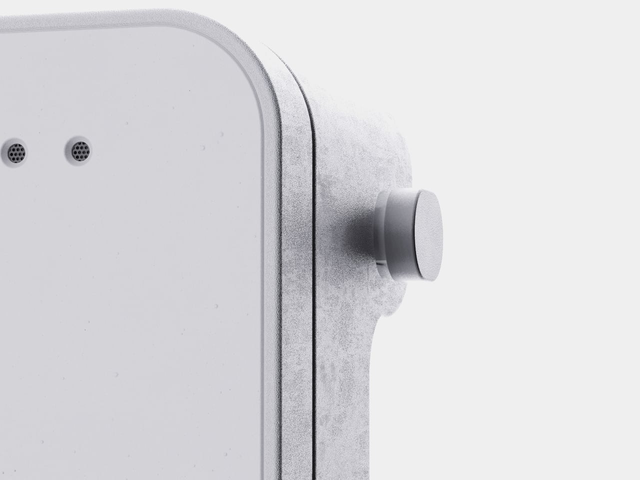
That gap is exactly what the Sony WH-1000XM4C is built to fill. Rather than chase another spec bump nobody asked for, Sony reached backward and pulled the WH-1000XM4, arguably the most decorated headphones the company has ever made, back onto shelves. It’s a strange move on paper. It’s a smart one in practice.

Designer: Sony

The original XM4 launched in 2020 at $349.99 and spent the next few years collecting best-of lists like trophies. Then Sony did what companies do: it moved on. The XM5 arrived in 2022 with a slicker profile and a bigger price tag, and the XM4 quietly slid off the roster, even as secondhand units kept trading hands and forum threads kept insisting it was still the smarter buy. That’s a telling signal. Products don’t usually get nostalgic followings this fast unless they actually solved a problem well the first time.

So here comes the WH-1000XM4C, essentially that same beloved design, tuned up and priced down to $299.99, a full fifty dollars less than what the XM4 cost at launch six years ago. Sony isn’t calling it a sequel or a flagship. It’s calling it what it is: the old favorite, finally made available again, minus the frustration of paying more for less.

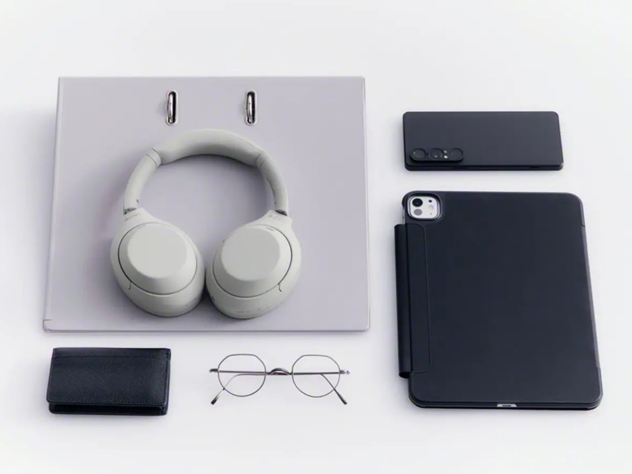
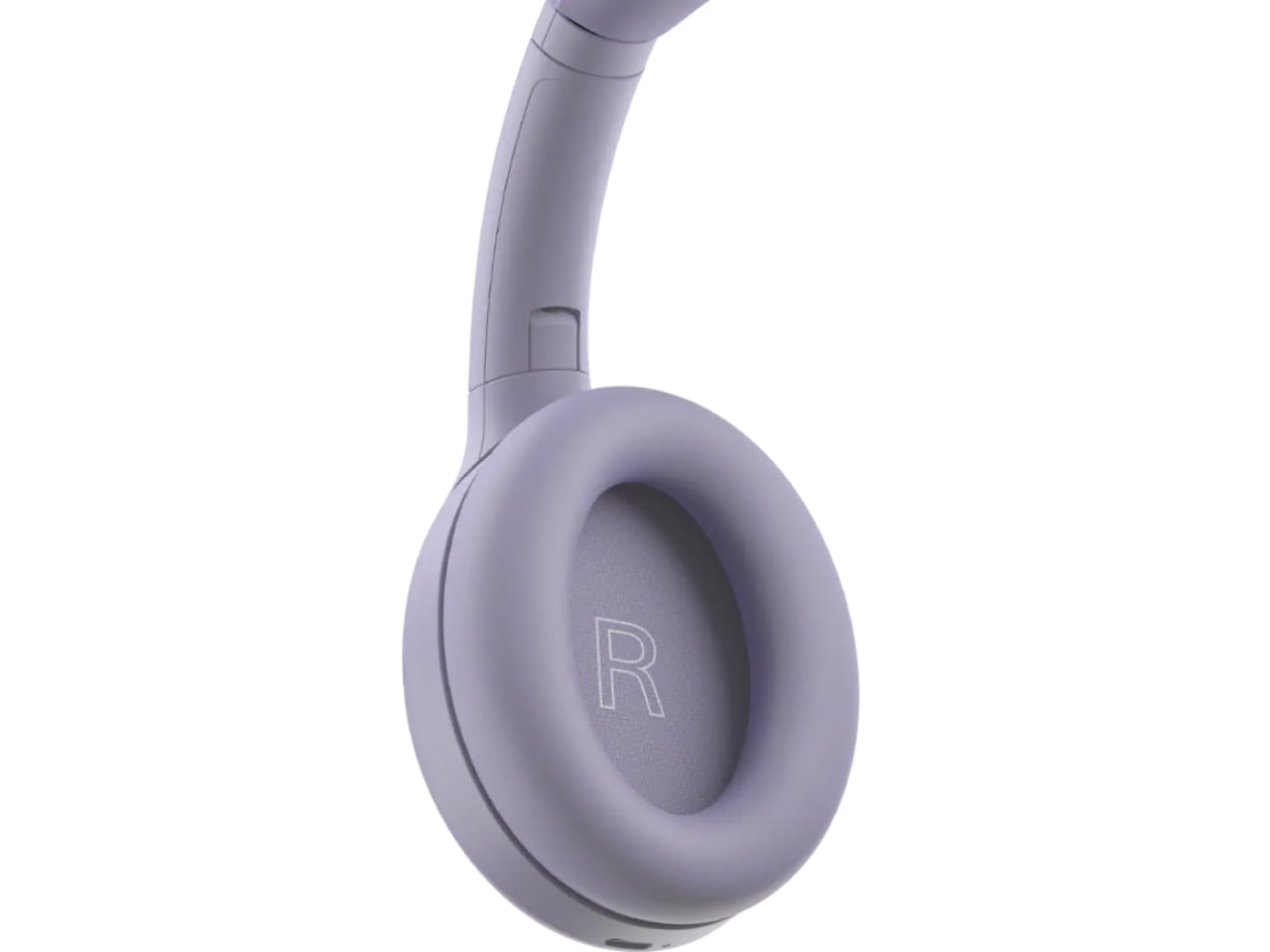
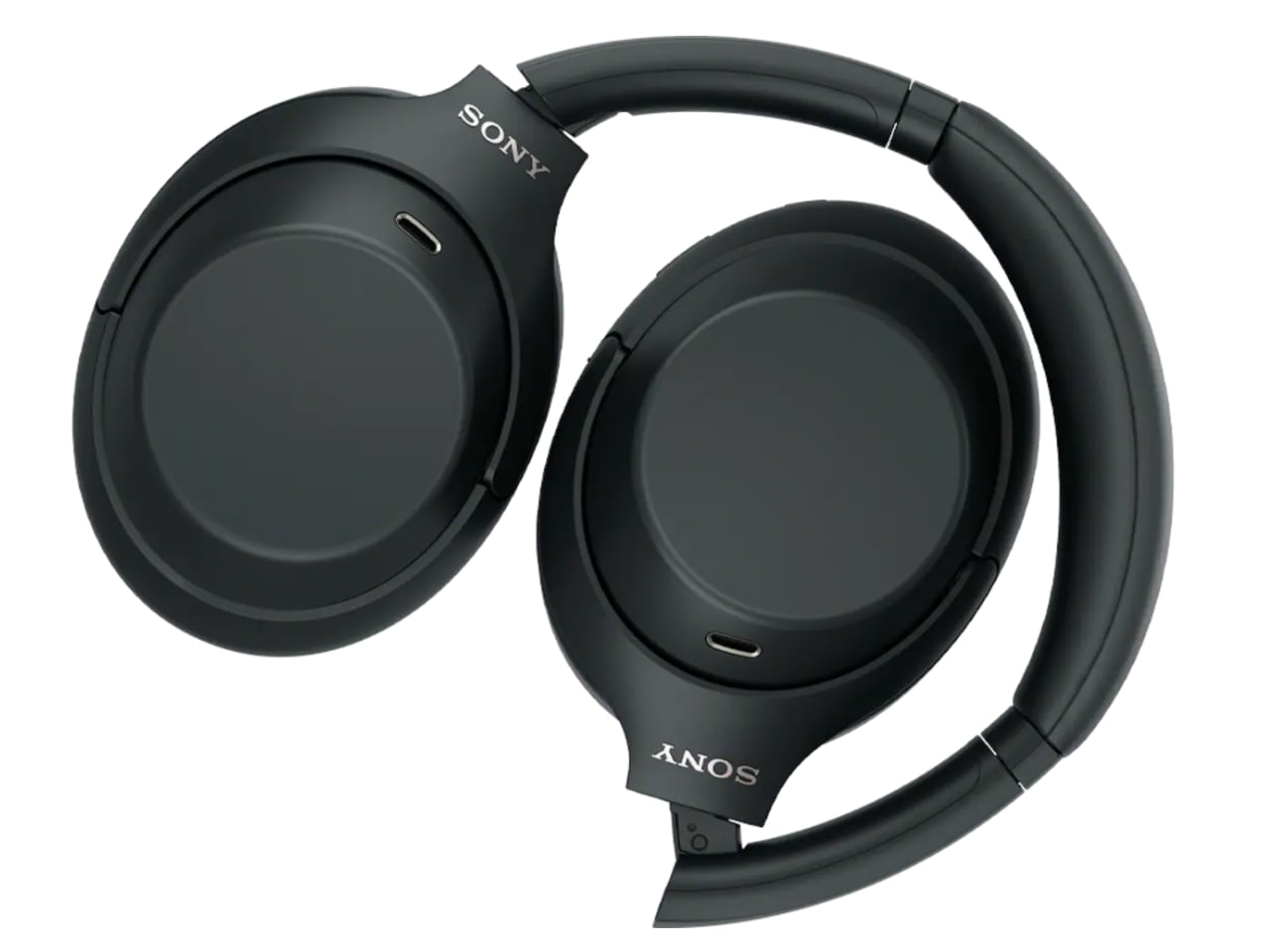
The changes are modest, and that’s sort of the point. The equalizer jumps from five bands to ten, plus a new gaming EQ, so listeners actually get more control over their sound instead of trusting Sony’s factory tuning blindly. There’s a new Lavender colorway alongside the familiar Black and Platinum Silver, a small but welcome nod to people who don’t want their headphones to look like they were designed for a boardroom. The foldable hinge and rotating ear cups are back too, which matters more than it sounds. The XM5 abandoned that folding design entirely, and the XM6 only brought it back last year. The XM4C proves that some engineering decisions age just fine.

There is one real trade-off. To meet updated battery regulations, the XM4C uses a different cell, and that shaves ANC battery life from 30 hours down to 27. Sony compensates with faster charging, three minutes on the cord for a full hour of playback, which is a fair swap for most people who top up during a commute anyway.

What I appreciate here isn’t the spec sheet. It’s the confidence behind the decision. Bringing back a six-year-old product without dressing it up as something revolutionary takes a certain honesty that most tech companies avoid. Sony isn’t pretending this is groundbreaking. It’s admitting that the formula already worked, and that not every product needs constant reinvention to stay relevant.

There’s a mild irony worth naming. Sony still sells discounted stock of the original XM4 at the same $300 price point, and by most accounts, that older pair edges out the XM4C slightly on raw sound and noise cancellation. So the company is technically competing with itself. But for shoppers, that’s not really a problem. It just means there are now two well-regarded paths into the same trusted design, instead of one shrinking window before flagship prices take over completely.

Headphones don’t usually get second chances like this. Most get replaced, discounted into clearance, and forgotten. The XM4C suggests a different approach is possible, one where a genuinely good product doesn’t have to disappear just because something newer showed up. That’s a quieter kind of innovation, but it might be the one more of the industry could stand to learn from.

The post The $300 Sony Headphones Everyone Wanted Are Actually Back first appeared on Yanko Design.
  •  

Never Lose Your Keys Again With a Tracker That Glows in the Dark

For forgetful people like me, trackers have basically become a must-have. Whether you’re clipping one onto your wallet, your car keys, your backpack, or whatever it is you absolutely cannot afford to lose, these little devices help you do exactly what they promise: keep track. The only catch is that a lot of trackers tend to look alike, and if you’re relying on appearance alone instead of the connected app, it’s easy to accidentally grab the wrong one.

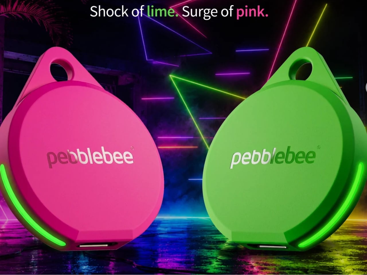
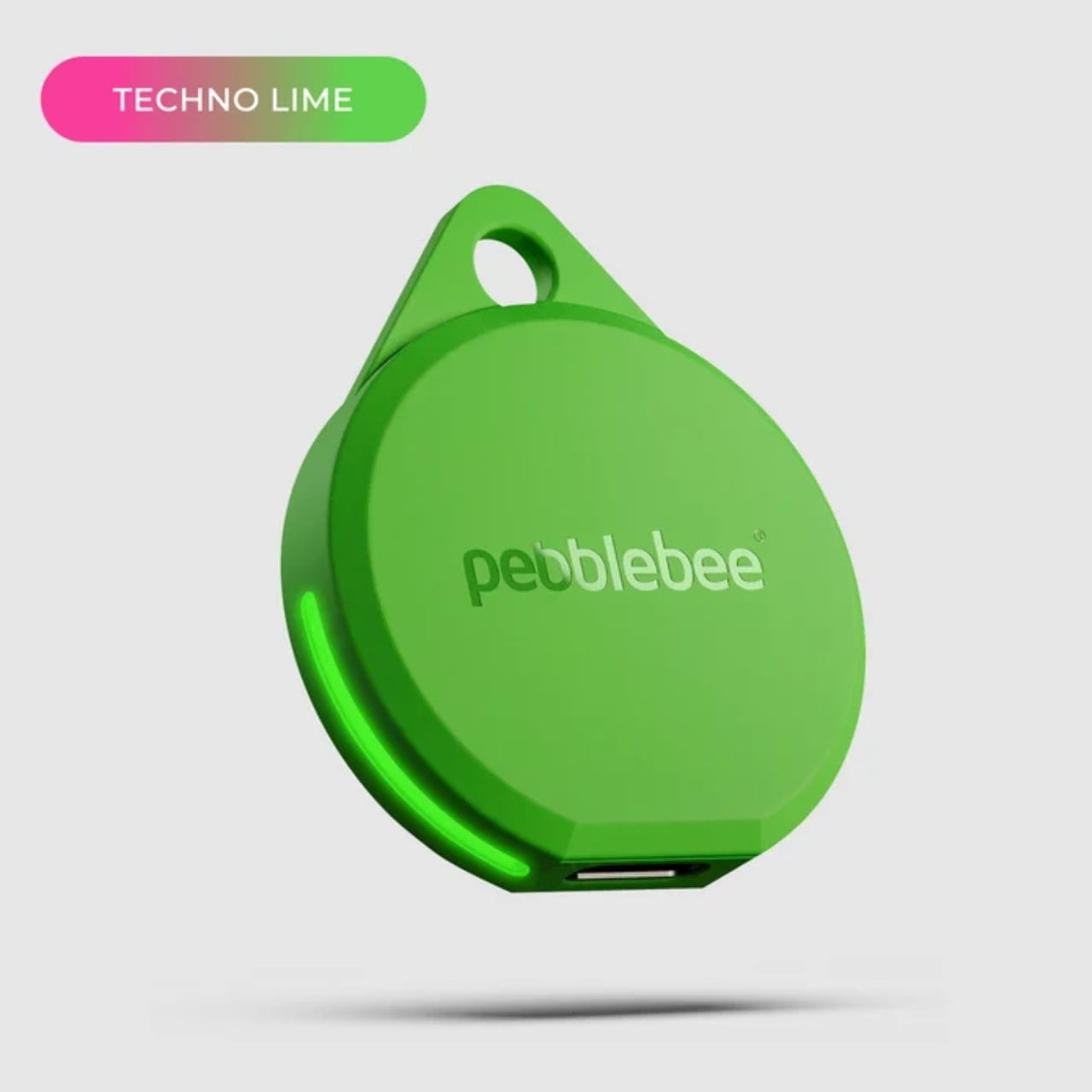
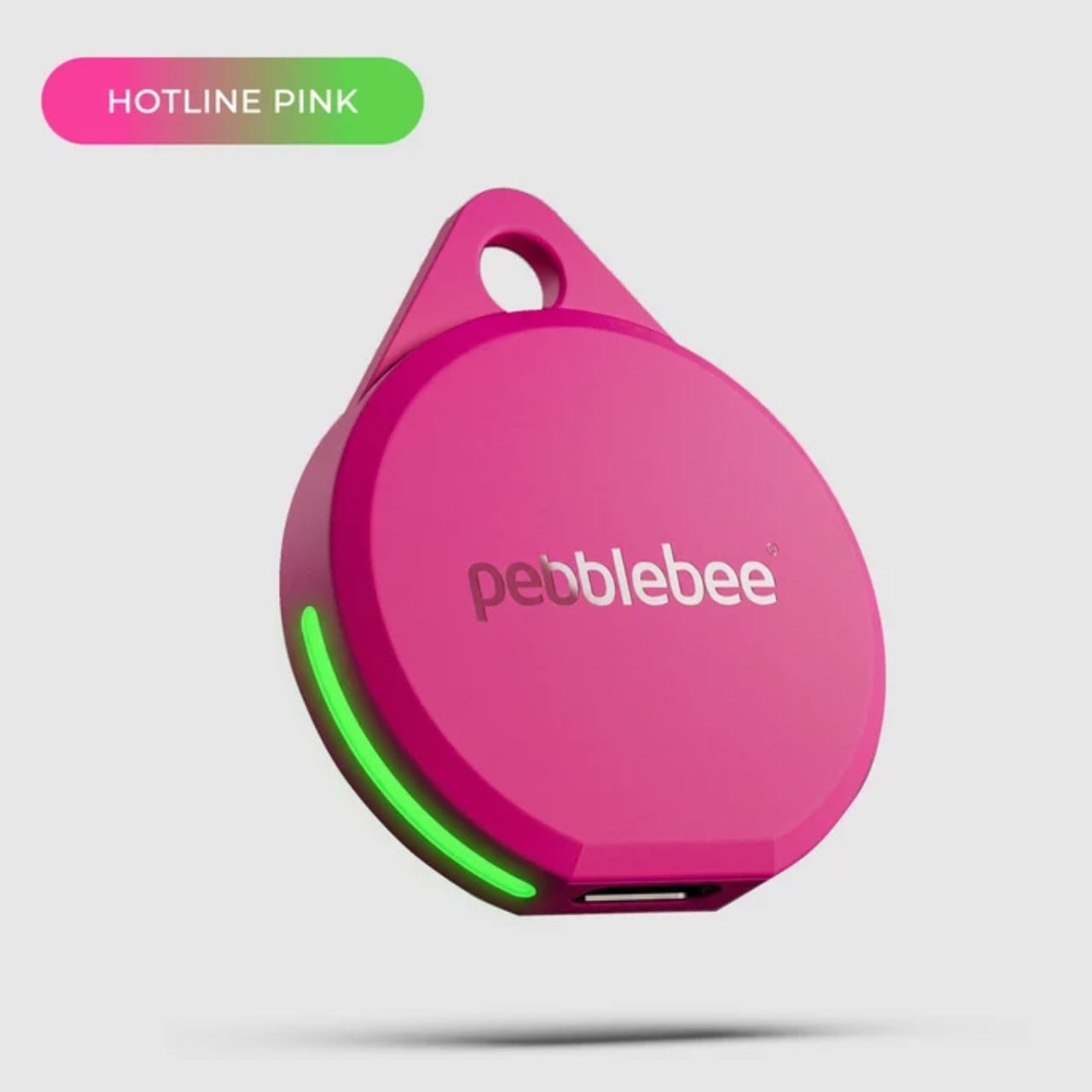
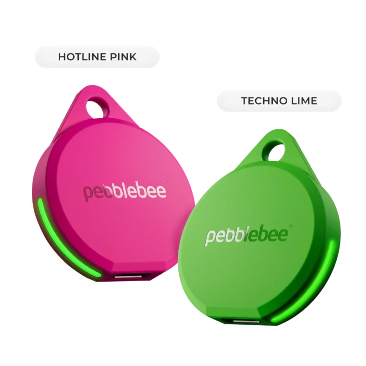
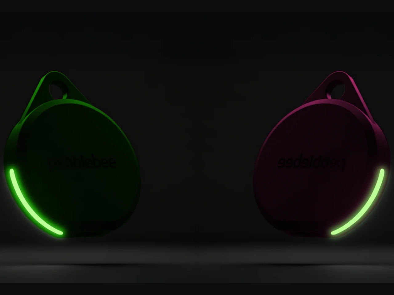
If you’re after a tracker that actually stands out, and one that can even glow in the dark, Pebblebee’s latest Evercolor drop might be exactly what you need. Evercolor is the brand’s limited-edition color program built exclusively for its Clip 5 tracker, and the newest release, called Neon Pulse, comes in two eye-catching shades: Techno Lime and Hotline Pink. Pebblebee describes the collection as perfect for “bold self-expression and a fresh-season reset,” and honestly, it’s hard to disagree.

Designer: Pebblebee

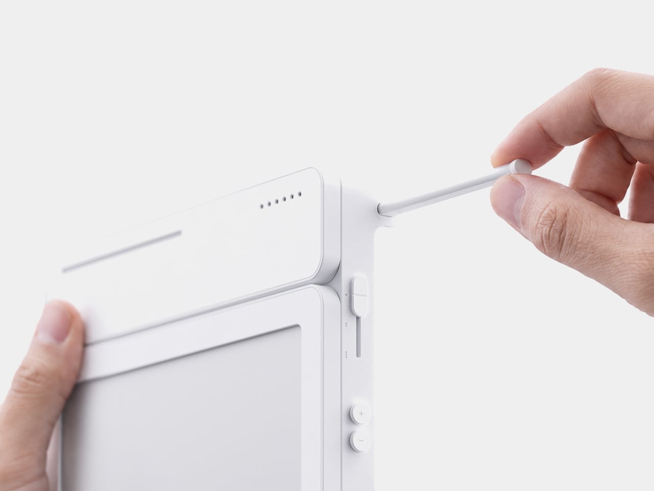
Evercolor has rolled out plenty of standout colors before, but Neon Pulse marks the first time the program has added glow-in-the-dark accents. That means your tracker stays visible even after its LED switches off, so you’re not just relying on the app to tell you where your item is. You can actually spot it in the dark, as long as it’s somewhere within eyesight.

Keep in mind that this is a limited-edition release, so if hot pink and neon green happen to be your colors, you’ll want to grab them soon. Pebblebee rolls out new Evercolor shades every twelve weeks, and once a drop sells out, it’s gone for good, no restocks. Previous collections like Freeze Frame and Heatwave Hijinks have already sold out, so if Neon Pulse catches your eye, don’t wait too long to add it to your cart.

Underneath all that color, though, it’s still the same reliable Clip 5 that Pebblebee originally released. It works with both Apple and Android devices, so you don’t have to worry about switching phones down the line. The rechargeable battery lasts up to a year on a single USB-C charge, which means no more digging through drawers for spare coin batteries. It also boasts a direct Bluetooth range of about 500 feet, roughly double what a lot of competitors offer, plus access to a global crowd-network for finding your stuff even farther away. On top of that, you get a 130dB siren, a bright LED strobe, and IP66 water resistance, so it can handle a little rain or an accidental splash without missing a beat.

It’s also worth noting that Neon Pulse still costs the same $34.99 as the standard Clip 5, so you’re not paying extra just for the fresh colorway. There’s also a free built-in safety feature called Alert, which can notify you if an unfamiliar tracker seems to be following you, a nice bit of peace of mind on top of everything else. Design-wise, the compact clip-on shape makes it look less like a tech gadget and more like an accessory for your bag, wallet, or keychain. Add in the bright, playful colorway, and it becomes even more fashionable, dare we say, kind of cool. So if your main complaint about trackers has always been that they all look the same, Neon Pulse is built to solve exactly that problem.

At the end of the day, a tracker is only useful if you can actually tell it apart from the pile of identical black and white gadgets everyone else seems to own, and if you enjoy using it enough to keep it clipped on in the first place. Pebblebee’s Neon Pulse drop checks both boxes, combining genuine utility with a design that feels personal rather than generic. Whether you’re the type who loses your keys weekly or you just want your tech to match your personality, this drop is worth a look before it disappears for good. And if pink and green aren’t quite your vibe, it might be worth keeping an eye on Pebblebee’s page anyway. With a new Evercolor drop landing every twelve weeks, there’s a good chance your perfect color combo is just around the corner.

The post Never Lose Your Keys Again With a Tracker That Glows in the Dark first appeared on Yanko Design.
  •  

The $179 iPhone Speaker That Never Needs Charging

You’ve been waiting for your favorite artist to release their latest album, counting down the hours until it finally drops on your streaming service of choice. You open your phone and press play… and you’re a little disappointed. It’s not that the album isn’t great, it’s that your phone’s speaker doesn’t do it justice. You want something to amplify that sound right now, but your external Bluetooth speaker hasn’t been charged in weeks.

The Battery-free Amplifying iSpeakers can solve that problem for you, and you won’t need a single cable or Bluetooth connection to make it happen. This “dumb” speaker is actually smart enough to rely purely on acoustic engineering, channeling and amplifying the sound waves coming out of your phone so your music, podcast, or call sounds noticeably fuller than it would through your built-in speaker alone.

Click Here to Buy Now: $179.00

Designed by Ooi Masato and made in Japan, this battery-free device lives up to its name: it uses a precision-machined metal slot that cradles whatever phone you own, instantly amplifying whatever you’re playing. There’s no pairing process, no cord to plug in, and no anxious glance at a battery icon wondering if your speaker will cut out mid-song. You set your phone down, and it just works.

Design-wise, the iSpeakers follow a clean, minimalist aesthetic that looks just as at home on a cluttered work desk as it does on a nightstand or a bookshelf. The body is shaped around the golden ratio, giving it a visual balance that feels intentional rather than accidental (the kind of object you’d leave out on display rather than tuck into a drawer). It’s compact enough to toss in a bag, so you can bring your amplified sound with you to a picnic, a hotel room, or a friend’s backyard without hunting for an outlet. And because there’s no port, connector, or wireless protocol involved, it works with virtually any phone you own, including Apple’s freshly announced iPhone 18 Pro lineup and its first ever foldable, the iPhone Ultra, unveiled at today’s “Surprise and Shine” event. All you have to do is let the speaker slot cradle your phone’s speaker grille; there’s no compatibility chart to check and no software update to wait on.

The speaker itself is milled from Duralumin, the same lightweight, vibration resistant alloy used in aircraft construction. That means you’re getting a premium feel along with genuine durability. This isn’t a flimsy accessory that’ll crack after a few drops in your bag. The Japanese craftsmanship and golden ratio proportions give it a quiet sophistication that fits in seamlessly next to your laptop or coffee mug. If you want to get more out of it, you can also pick up the +Bloom and +Jet attachments, which let you customize how the sound projects, whether that means directing it upward for a fuller room fill or downward for a more intimate listening experience.

So how does this stack up against the Bluetooth speakers already crowding your shelf? Take a brand like JBL, whose Flip series has become a go-to for portable audio. Those speakers sound great and pump out serious volume, but they still ask you to charge them, remember to pair them, and eventually deal with a battery that won’t hold a charge like it used to. The iSpeakers skip all of that by design. You’re trading a bit of raw volume and bass depth for something Bluetooth speakers simply can’t offer: a device that will sound exactly the same in ten years as it does today, with zero maintenance and zero electronic waste. At $179, it’s priced closer to a premium Bluetooth speaker than a budget one, but you’re paying for a very different kind of value: permanence, craftsmanship, and simplicity over specs and app connectivity.

At the end of the day, the Battery-free Amplifying iSpeakers isn’t trying to replace your Bluetooth speaker for a backyard party. It’s solving a much smaller, more common frustration: the moment when you just want your phone to sound better, right now, without any setup. For anyone tired of charging cords, pairing screens, and speakers that die at the worst possible moment, this is a refreshingly simple fix, and a genuinely beautiful object to boot. Sometimes the smartest tech is the kind that doesn’t need power at all.

The post The $179 iPhone Speaker That Never Needs Charging first appeared on Yanko Design.
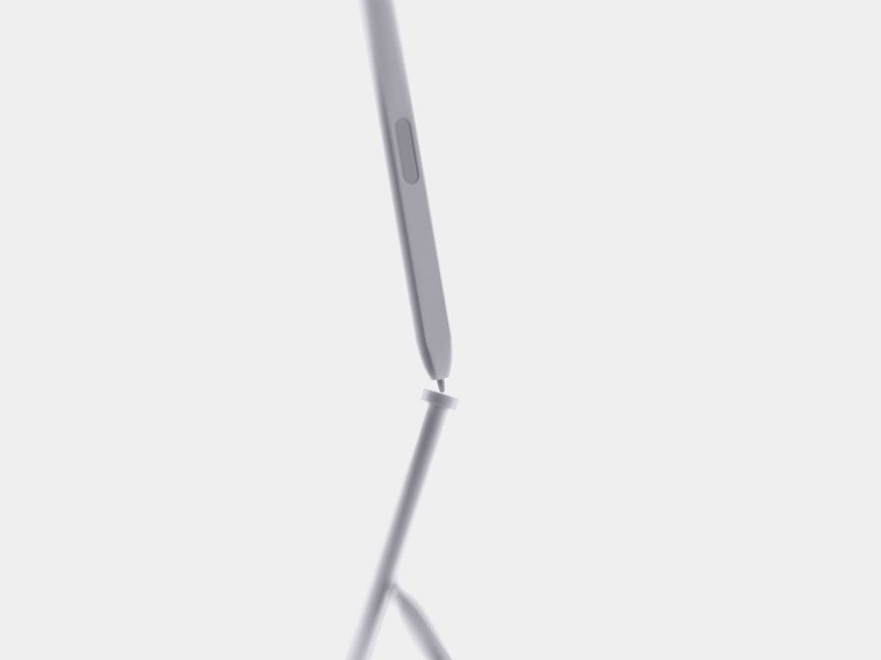
  •  

Laptops Sealed Computers Shut, ARTISAN ALTO Snaps Them Back Open

Home computers used to snap open like toolboxes, cartridges sliding in for a new game or a new skill. That idea mostly disappeared once sealed laptops took over, but the ARTISAN ALTO AT-101 brings it back with a vermilion shell that looks like it walked straight out of 1984 and a system built for how people actually tinker today. It’s a machine designed to grow alongside whatever you’re currently obsessed with.

The trapezoidal red housing wastes no time signaling its intentions. Sculpted, concave ivory keycaps sit beside red cooling louvres, and a keyboard opening cuts diagonally through the sloping side, turning what could’ve been a flat slab into something with genuine presence on a desk. This is a machine built to be looked at, not tucked behind a monitor.

Designer: Leo Botinelly

That vintage-inspired shell hides a distinctly modern expansion idea. Upright cartridges slot into place to add graphics power, sound capability, retrocomputing modes, or an AI companion, while smaller side modules handle specialist interfaces and individual projects. Recording a demo, building out a more ambitious scene, or reviving an old favorite game all become a matter of swapping in the right module rather than replacing the whole machine.

The standout pairing puts VECTOR, a compute cartridge, alongside COMPANION, an AI agent module with its own ivory-crowned housing. Together they form what the concept calls a personal cyberdeck, one where your context and your processing power both live in the same two bays. Everything from your conversation history to your working files stays local, an intentional counterpoint to how most AI tools currently function.

Five multifunction keys handle creative shortcuts without forcing a trip through a menu, while a dedicated PAUSE rocker lets you freeze, rewind, or speed through whatever’s running, treating time itself as something you can grab and adjust mid-task. A touchpad and four flush cursor keys merge into a single continuous surface on the right side, keeping navigation under the same hand that’s already resting there.

Flip the machine over and the same philosophy continues. Memory access sits in the open rather than buried under layers of casing, rear supports adjust to match your desk setup, and a single screw releases the service clamp entirely. Every one of these choices treats a computer’s insides as something worth respecting, not hiding behind warranty stickers and proprietary screws.

Around back, a compact connector panel handles the practical side of daily use. USB-C power sits alongside labeled ports for two cartridges, additional USB-C connections, LAN, HDMI, USB-A, and audio, all routed cleanly to keep cables from tangling across the front of a desk. Even the exhaust vents get a considered shape, flanking the connector panel like a pair of small turbines venting heat from all that cartridge-driven ambition.

The post Laptops Sealed Computers Shut, ARTISAN ALTO Snaps Them Back Open first appeared on Yanko Design.
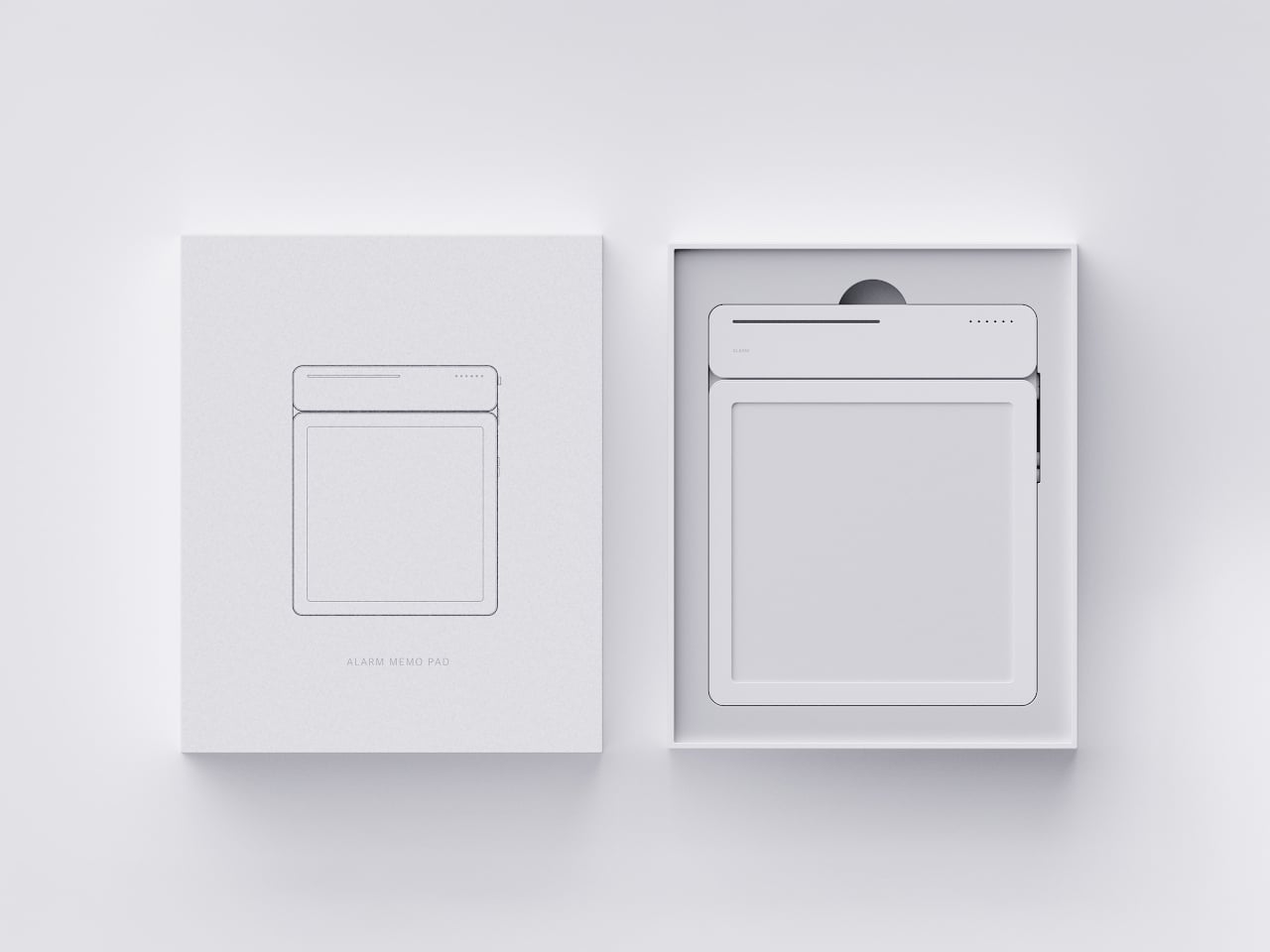
  •  

Clear-Shell Game Boys Never Made the Screen Transparent, Arduview Did

Every gadget on a desk is built to hide what makes it work. Phones, consoles, controllers, they’re all sealed slabs designed to keep the copper and silicon out of sight. Arduview refuses that logic entirely. Its shell is clear, its circuit board is clear, and its OLED display lets you watch pixels light up while seeing straight through to the components producing them.

Retro handhelds have flirted with transparency before. Clear-shell Game Boys and modded Miyoo units let you glimpse a shadow of the board through tinted plastic, but the display itself stayed opaque, a black rectangle sitting in an otherwise see-through frame. Arduview closes that gap by making the screen itself transparent, so nothing on the device breaks the illusion of looking clean through it.

Designer: Louis Huang

Peer through the front and the internals aren’t just visible; they’re the entire visual identity. The board, the chip, an orange copper flex cable, the button domes, and the USB-C port all sit in plain view, arranged the way a watchmaker might arrange gears behind sapphire crystal. Nothing here was designed to be hidden later. It was designed to be looked at from day one.

That philosophy extends to how the thing works, not just how it looks. Built on Arduboy, an open-source handheld platform, Arduview skips the layers that usually complicate small electronics. There’s no app store hunting, no Wi-Fi pairing, no account setup standing between you and 400 preloaded games. Power it on and it plays, the same instant gratification that made simple handhelds addictive in the first place.

At 50 grams and roughly the footprint of a credit card, the size does real work here. A device this small and this light stops being a dedicated gaming session and starts being something you carry the way you’d carry a keychain or a pocketknife, small enough to disappear until the moment you want it. Pull it out on a train platform or set it on a desk between meetings, and it reads less like a toy and more like a curiosity someone can’t resist picking up.

That reaction seems to be the entire point. A transparent gadget invites touching in a way an opaque one never does, because there’s an implicit dare in showing your internals: come look closer. Arduview leans into that dare completely, treating the space usually reserved for a case as prime real estate for the very thing most companies spend their design budgets concealing.

Retro gaming has always had a strong current of nostalgia running through it: chunky buttons, pixel art, low-resolution charm. Arduview borrows all of that while adding something genuinely new to the mix: a device that looks like it belongs in a display case at a design museum as much as it belongs in a pocket.

The post Clear-Shell Game Boys Never Made the Screen Transparent, Arduview Did first appeared on Yanko Design.
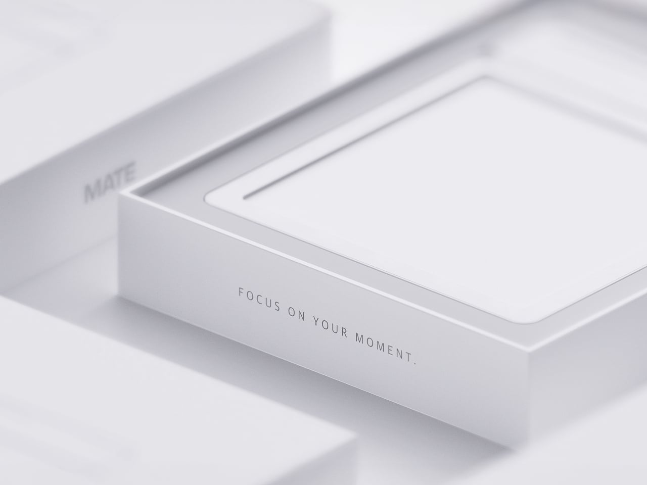
  •  

Your Second Screen Can Finally Work With No Cables and No Outlet

Desks are overrated. So are the cables that come with them. The 4URPC is a 15.6-inch wireless touchscreen monitor built for people who’d rather not be chained to an outlet just to get a bigger screen. It’s slim, self-powered, and ready to mirror whatever’s on your phone, tablet, or laptop the moment you need more room to work, watch, or play.

Cutting the cord doesn’t mean cutting functionality. The monitor mirrors an iPhone or Android device through a peer-to-peer wireless connection, no home Wi-Fi or app required. For streaming platforms like YouTube, Netflix, or Hulu, connecting to Wi-Fi and tapping the built-in TV Cast icon sends video to the screen. Either way, there’s no dongle to lose or cable to untangle before the movie starts.

Designer: 4URPC

Click Here to Buy Now: $219 $399 (45% off). Hurry, only 451/600 left! Raised over $181,000.

The more interesting trick happens after mirroring starts. The 10-point touchscreen can send input back to the connected phone, turning the monitor into a larger, shared control surface. Flip through photos with a friend, walk a colleague through a presentation, or hand someone the reins without handing over your phone. It’s a shift that makes shared screen time less awkward.

None of this would matter much if the monitor were bulky. At half an inch thick and just over 2 pounds, it’s built to disappear into a backpack rather than dominate it. The matte, textured shell keeps fingerprints and glare to a minimum, and a fold-out kickstand on the back means setup takes seconds on a desk, a kitchen counter, or the arm of a couch.

A built-in 4,000 mAh battery backs up that portability by taking the wall outlet out of the equation. Setting up on a train, in a hotel room, or on a patio doesn’t mean scouting for the nearest plug first. That same battery can lend a charge to a connected phone, turning the monitor into a backup power bank when the moment calls for it.

Plug it into a laptop with a USB-C cable, and the 4URPC switches roles, becoming an extended display rather than a wireless mirror. Dragging a browser tab, a chat window, or a reference document onto the second screen takes a second, and the touchscreen works over the wired connection. The laptop stays focused on the main task while the extra display handles everything else.

The screen also rotates between landscape and portrait without any fuss, which sounds minor until it changes how you use it day to day. Landscape suits video calls, games, and spreadsheets, while portrait mode fits scrolling through documents, reading long articles, or checking social feeds. Switching between the two takes a twist of the stand, not a trip through a settings menu.

Compatibility runs wide enough that most people won’t need to think twice before connecting. Wireless mirroring covers iPhones, Android phones running version 10 or later, MacBooks, and most Windows laptops, while the wired USB-C or HDMI input works with game consoles, streaming boxes, and the Nintendo Switch. There’s no software to install and nothing to configure; connecting the device and turning it on is the entire setup process.

Under the glass sits a 1920×1080 matte IPS panel running at 60 Hz, built more for comfortable, glare-free sessions than eye-popping color numbers. Dual USB-C ports split power delivery and video duties, small stereo speakers cover casual audio, and a VESA mount plus a standard camera screw thread add mounting options beyond the built-in stand. It’s a practical set of choices rather than a flashy one.

There’s something telling about a monitor that assumes you won’t always be sitting at the same desk tomorrow. Work has scattered across kitchen tables, coffee shops, and airport gates for a while now, and screens are only starting to catch up. The 4URPC doesn’t try to be the sharpest or brightest display around; it just tries to be wherever you happen to land next.

Click Here to Buy Now: $219 $399 (45% off). Hurry, only 451/600 left! Raised over $181,000.

The post Your Second Screen Can Finally Work With No Cables and No Outlet first appeared on Yanko Design.
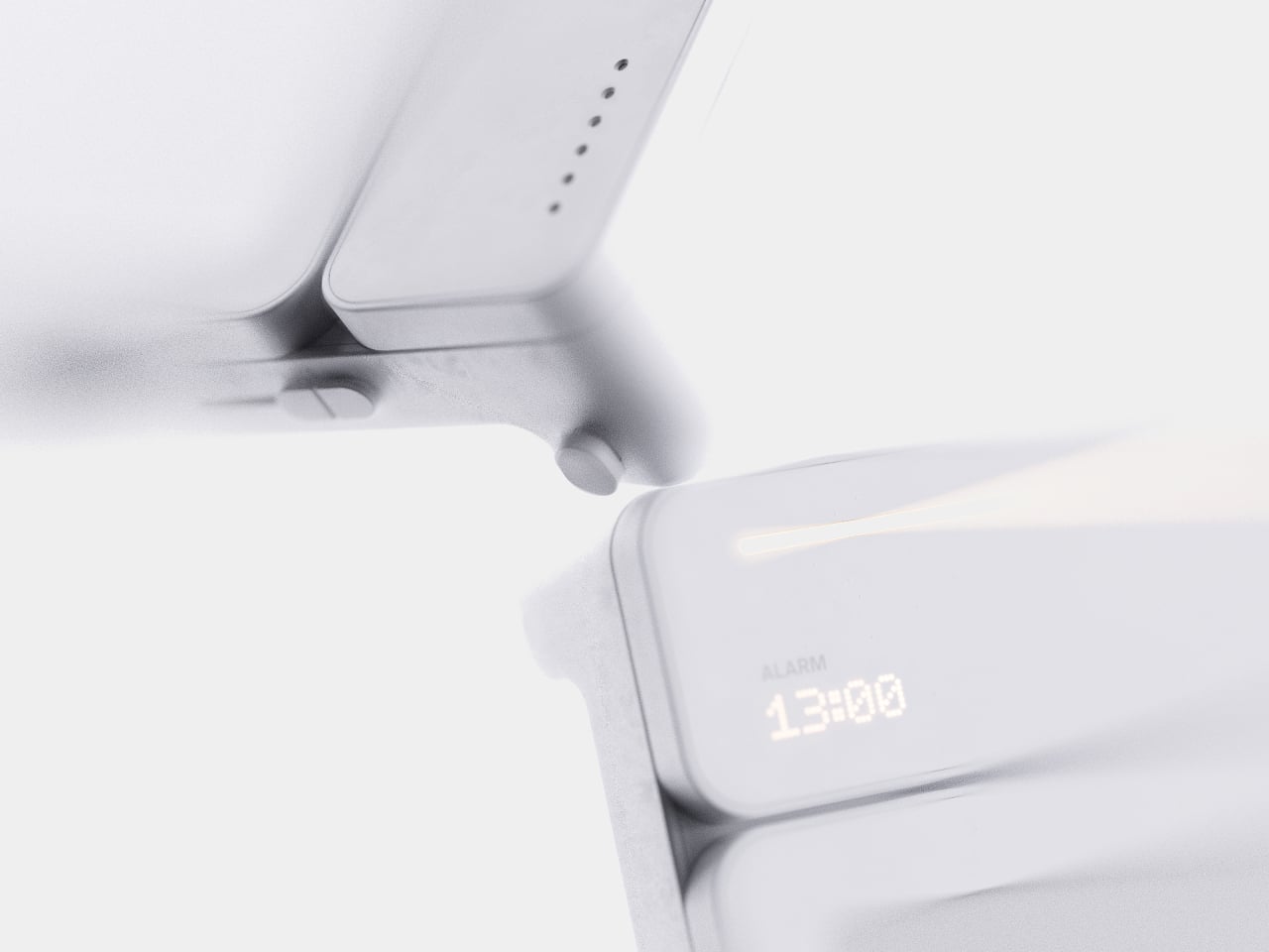
  •  

The $100 Keypad That Puts Each AI Coding Tool Behind Its Own Button

Every developer juggling AI agents right now knows the feeling of context switching until the whole workflow blurs together. Copilot suggests something in one window, Claude Code runs a task in another, and a dozen prompts live scattered across notes and muscle memory. The Logitech MX Keypad exists to collapse all of that into nine small screens sitting next to the keyboard, each one a physical shortcut into a specific piece of that chaos.

Every key on the keypad carries its own full-color LCD display, so instead of memorizing which function key does what, you glance down and see an icon that actually represents the command underneath it. Press one, and it can refactor a function, trigger a prompt macro, or hand off a task to an AI agent entirely. That small visual feedback loop turns an abstract keyboard shortcut into something closer to a labeled button on a control panel.

Designer: Logitech

What makes the hardware worth paying attention to is where Logitech chose to draw the compatibility line. Instead of building this around one coding environment, the MX Keypad works across GitHub Copilot, Claude Code, VS Code, and IntelliJ IDEA at once. A developer bouncing between an IDE and a terminal-based AI agent doesn’t need separate tools for each, just a different page of keys pulled up on the same nine buttons.

That pattern of paging matters more than it sounds. The keypad can hold multiple profiles, so switching from a Python project running through Copilot to a JavaScript refactor handled by Claude Code becomes a single tap rather than a mental reset. Anyone who has lost a train of thought hunting through browser tabs for the right prompt will recognize the value in never breaking eye contact with the code itself.

Underneath the surface, the MX Keypad ships with prebuilt plugins that Logitech had developers test directly against real coding platforms, rather than shipping generic templates and hoping they fit. An SDK opens the door further, letting teams build their own tools around internal workflows, while a community marketplace means the plugin library keeps growing without waiting on Logitech’s own release schedule.

None of that ambition comes wrapped in bulky, wasteful materials either. The body is made with recycled plastics, keeping the hardware in line with the sustainability commitments Logitech has built into its broader MX ecosystem. It is a small detail, but for a device meant to live permanently on a desk, it matters that the object itself doesn’t feel disposable.

At $99.99, the MX Keypad occupies a strange but clarifying position in a developer’s setup. It doesn’t replace a keyboard, and it doesn’t try to be an AI tool in its own right. Instead, it works like a translator between fast-moving human intent and the growing swarm of coding agents developers now manage daily, one labeled key at a time.

The post The $100 Keypad That Puts Each AI Coding Tool Behind Its Own Button first appeared on Yanko Design.
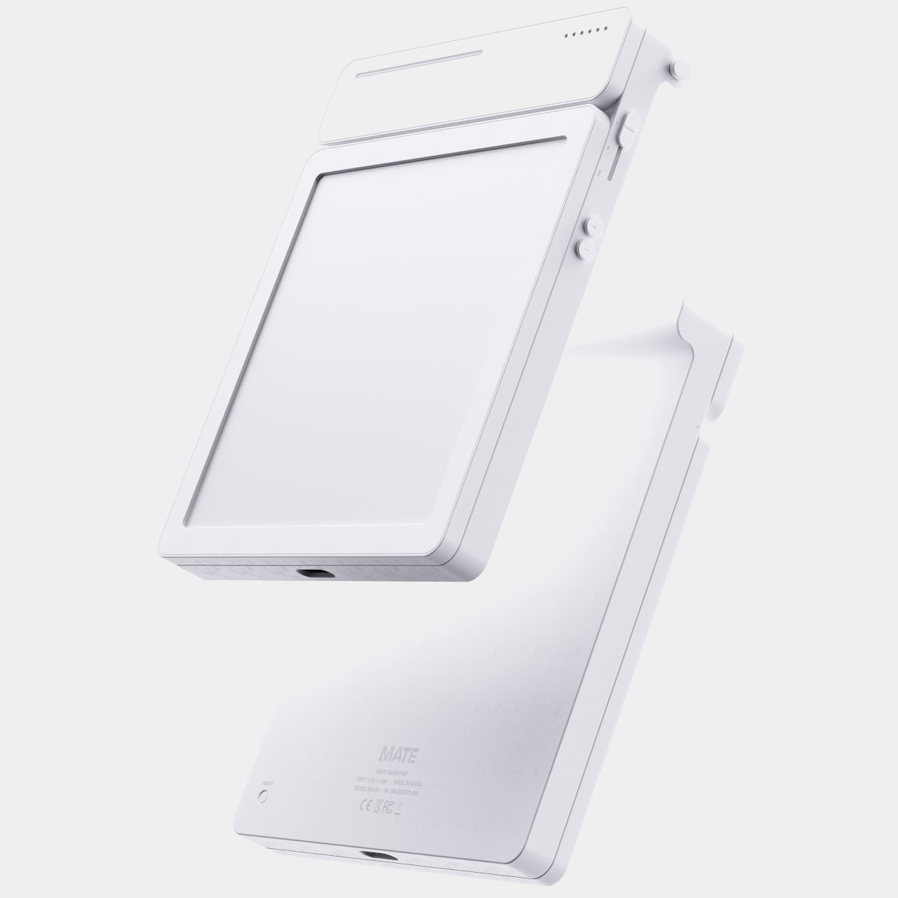
  •  

An Android Drawing Tablet With 127 Layers That Still Feels Like Paper

Most Android drawing tablets make you choose between a screen that feels like paper and hardware fast enough to keep up with a real workflow. The Kamvas Pad 12 refuses that trade-off. Huion built a 12.2-inch standalone tablet around a textured, paper-like display and paired it with enough processing power to hold 127 layers open without stuttering, treating the screen as a genuine canvas rather than a stylus afterthought.

That screen runs a 3:2 aspect ratio instead of the usual 16:9, and the difference shows up the moment you start sketching. A wider canvas means fewer awkward crops when composing a portrait or a page layout, and it doubles as a better shape for reading documents or comics without letterboxing. Combined with a 90Hz refresh rate, linework tracks the pen smoothly instead of lagging a beat behind your hand.

Designer: Huion

Canvas Glass 3.0 does the quieter work here. The surface is nano-etched for texture, so the pen tip grips the way it would on actual paper, while a soft-light treatment and anti-glare coating keep long sessions from turning into eye strain. Setting up near a window or working outdoors doesn’t wash out the display, which matters more than most spec sheets give it credit for.

The PW600C pen leans into that same philosophy of getting out of the way. It’s battery-free, weighs just 12 grams, and snaps magnetically onto the tablet body instead of needing a separate case or loop. Someone sketching on a train can toss the pen against the tablet’s edge between stops and trust it’ll still be there, without fishing through a bag for a charging cable or a lost cap.

Underneath, an eight-core MediaTek Genio 720 chip and 8GB of RAM handle the kind of multitasking that used to choke budget Android tablets, running multiple layers and apps without the frame drops that make digital painting frustrating. At 16,384 pressure levels and 60-degree tilt support, the stylus itself translates a feather-light highlight or a bold ink stroke with the kind of nuance that used to be reserved for pricier displays.

Storage tops out at 256GB onboard with room to expand to 1TB, so a growing library of finished pieces, reference photos, and half-done sketches doesn’t force anyone into constant cleanup. Android 16 and full Google Play access mean the tablet isn’t locked into a single app either. Clip Studio Paint, ibisPaint X, MediBang Paint, and Huion’s own HiPaint all come preloaded, ready for whichever workflow fits the project at hand.

Battery life rounds out the case for treating this as a genuine mobile setup instead of a tethered accessory. An 8,000mAh cell inside a 7.8mm metal body keeps the Kamvas Pad 12 running for roughly eight hours, long enough for a full day of sketching at a café or a cross-country flight without hunting for an outlet. That kind of stamina turns a drawing tablet into something closer to a sketchbook you never outgrow.

The post An Android Drawing Tablet With 127 Layers That Still Feels Like Paper first appeared on Yanko Design.
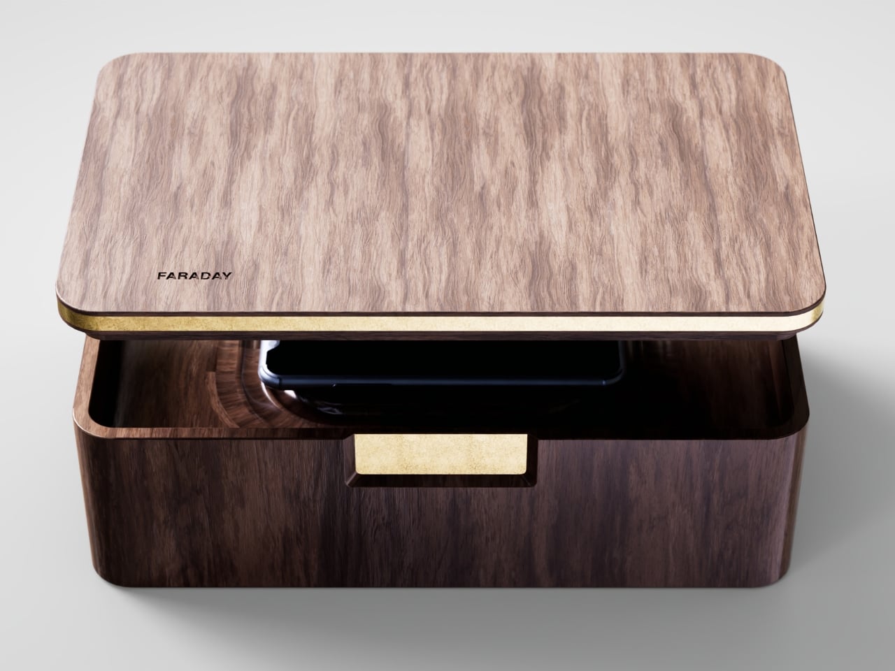
  •  

Xiaomi 18 Fold Hands-On: Got Here Before Apple, Can It Beat Samsung?

Xiaomi has chosen an interesting moment to return to foldables. The company has not released a book-style foldable since the Mix Fold 4, which launched in 2024, and now it is back with the Xiaomi 18 Fold just as compact foldables are starting to get more attention. Samsung has also added a foldable in this compact format to its lineup, and Apple is widely expected to unveil its first foldable iPhone at its September 9 event with a similar form factor in mind.

That puts the Xiaomi 18 Fold in an interesting spot. It is not just Xiaomi coming back to foldables after a break. It is also arriving just as this smaller book-style format looks like it could become the next big thing.

Designer: Xiaomi

Xiaomi is positioning the 18 Fold as its first mid-size flagship foldable. It weighs 7.73 ounces (219g), measures 0.42 inches thick when folded (10.68mm), and opens out to just 0.20 inches thick (5.02mm), with a folded footprint of 4.64 x 3.29 inches (117.8 x 83.6mm). In person, it feels thin, though not unusually thin by the standards of today’s premium foldables. More importantly, it feels expensive in a good way. The matte texture on the back and frame gives it a softer, understated finish, while the rounded corners and flat frame help the phone look clean and modern.

The unit I handled was the deep red version, and it is a bold color in person. It stands out more than the usual black or silver foldable palette without feeling too loud. It also happens to echo the deep red finish rumored for Apple’s first foldable, which makes the comparison hard to miss. The 18 Fold comes in Black, White, Red, and a Ceramic Version.

In practice, though, this is still a two-handed phone whether it is folded or unfolded. Even closed, the body is compact in one sense but still broad enough that I did not think of it as something built for easy one-handed use. That is not really a criticism. It just comes with the territory.

The outer display is a 5.38-inch panel, while the inside opens up to a 7.58-inch main screen. Xiaomi says both displays share the same aspect ratio, which is meant to make the transition from one to the other feel more natural. I could not fully judge how well that works in daily use from a short demo, but one benefit stood out right away. Video felt more immersive than on squarer foldables because there was less black bar space above and below the image.

The software also looked well suited to the shape. Animations felt smooth in my brief demo, and I did see split-screen and floating window support in action. The unfolded UI felt more like a small tablet than a stretched phone, which is what you want on a device like this. Xiaomi has also placed one speaker on the top edge and another on the bottom edge on the opposite side, which should help give the phone a more balanced stereo effect when it is open.

The hinge left a good first impression too. I cannot really say whether it felt especially firm or especially smooth, because my time with the device was limited, but it did feel sturdy. The crease was handled well too. Looking straight at the display, I only really noticed it from certain angles rather than all the time. More importantly, I could barely feel it when running a finger across the center, which was better than I expected.

Left: Xiaomi 18 Fold, Right: Galaxy Z Fold 8

Left: Galaxy Z Fold 8, Right: Xiaomi 18 Fold

Left: Galaxy Z Fold 8, Right: Xiaomi 18 Fold

I also compared the Xiaomi 18 Fold side by side with Samsung’s Galaxy Z Fold 8. Samsung’s device measures 4.88 x 3.22 x 0.38 inches when folded (123.9 x 81.9 x 9.7mm), 6.35 x 4.88 x 0.18 inches when unfolded (161.4 x 123.9 x 4.5cm), and weighs 7.09 ounces (201g), so it is a little lighter and a bit thinner than Xiaomi’s foldable in some areas. But the difference was not just about dimensions. Samsung’s inner screen was noticeably brighter to my eyes. At the same time, the Xiaomi 18 Fold had one practical advantage that stood out immediately. When placed on a desk, it did not wobble, while the Samsung did.

Left: Galaxy Z Fold 8, Right: Xiaomi 18 Fold

Left: Galaxy Z Fold 8, Right: Xiaomi 18 Fold

Top: Xiaomi 18 Fold, Bottom: Galaxy Z Fold 8

The biggest surprise for me was the camera. Xiaomi is using a 200MP Leica triple-camera system, led by a 200MP main camera and backed by a 50MP Leica periscope telephoto with an 80mm equivalent focal length. In my short time with the phone, the telephoto camera was the part that stuck with me most. I tried zoom, and the 3.5x telephoto setup immediately felt like one of the most interesting parts of the device. Stability also felt good even at higher magnification, which made the zoom feel more usable, not just more dramatic. The camera bump also did not seem overly large, and its oval-shaped, two-step raised design gives it some presence without taking over the whole back.

My time with the Xiaomi 18 Fold was brief, and this hands-on really only scratched the surface. Even so, the phone already feels like a polished return to book-style foldables. Pricing starts at RMB 10,999, or roughly $1,640, for the 12GB/256GB model, and Xiaomi said it will be available in China only for now.

The post Xiaomi 18 Fold Hands-On: Got Here Before Apple, Can It Beat Samsung? first appeared on Yanko Design.
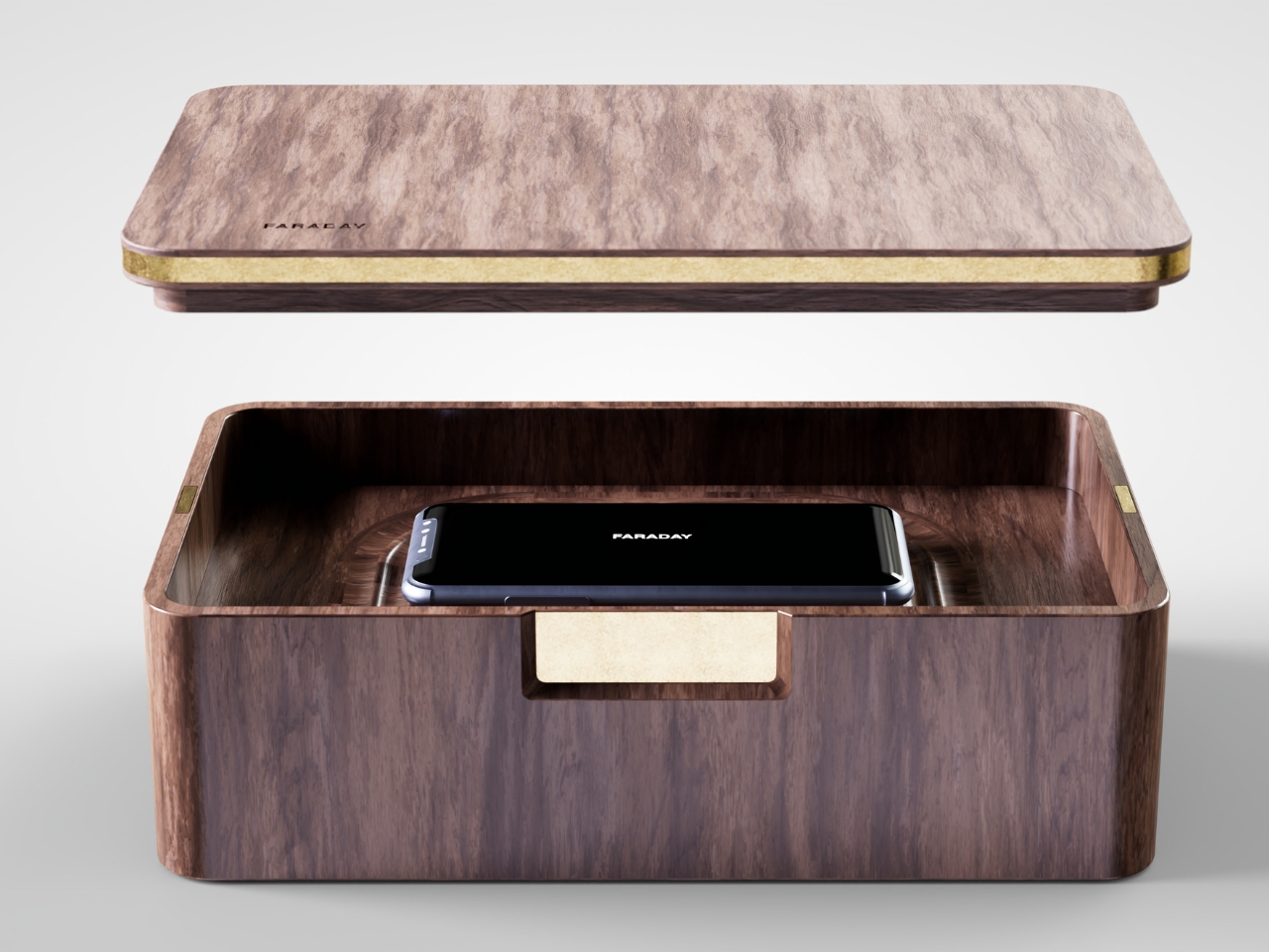
  •  
❌