❌

Vue lecture

ELEGOO DAY 2026 Invites the World to Create, Share, and Grow With Nexprint

Every idea deserves somewhere to go, and for a lot of 3D printing hobbyists, that place has been missing. ELEGOO wants to change that with ELEGOO DAY 2026, launching September 10, its annual celebration built around bringing creators together on Nexprint. This year folds in a creator fund, a design contest, new model generators, and a sale, all pointing toward one goal: getting more people to create, share, and be part of a growing community.

Most of that action happens on Nexprint, ELEGOO’s open-source 3D model platform, built on the belief that creation should be open to anyone with an idea. Think of it as the hub tying everything together: models get uploaded, tools get discovered, and creators get a real reason to keep contributing. That shift is slowly turning ELEGOO from a printer maker into a community built around making.

Designer: ELEGOO

Click Here to Submit Now | Click Here To Buy Now.
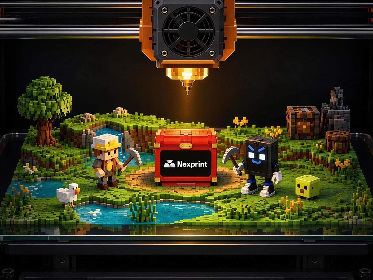
The centerpiece is the new $1,000,000 Creator Fund, ELEGOO’s way of recognizing and rewarding people for sharing 3D models on Nexprint, not just paying for output but investing in the community itself. Rewards start with your very first submission, no waiting for likes or rankings to climb first. Individual models can earn up to $100, and stacking incentives push that ceiling to $300 per model.

There’s more structure built in too. Extra rewards unlock at 3, 5, 10, 20, and 50 submissions, so consistency pays off as much as any single hit model. Monthly rankings hand exclusive prizes to the top five creators, including actual ELEGOO printers, while a new bonus-card mechanism can push individual payouts even higher. It feels less like a marketing gimmick and more like a system built to grow alongside its creators.

From September 10 to October 30, ELEGOO runs the MakeItReal contest on Nexprint, and the premise couldn’t be simpler: take a flat idea, in whatever form it takes, and give it dimension, no design background required. There’s no theme to chase, just that shift from flat to physical. Winning entries will be picked and announced on November 20, each earning up to $300 in ELEGOO coupons for the trouble.

The idea behind it is almost sentimental for a hardware company, echoing ELEGOO’s belief that 3D printing works best as a creative outlet, not a manufacturing shortcut. A photo on your phone or a doodle in a notebook can end up as something you actually hold, not just imagine. Creators don’t need advanced modeling skills to compete, either. Nexprint’s upcoming Text and Image to 3D Generator lets anyone shape a contest entry straight from a photo or a written description, no CAD needed.

That generator is one of three new tools ELEGOO just added to Nexprint, alongside a Vase Generator and a Nameplate Generator, each built to make creation easier for beginners and veterans alike. All three do the same basic job: they take a drawing, a photo, or a few typed words and turn it into a printable model within minutes. None of it replaces real design skill, but it removes the blank-page problem that stops many from starting.

Put it together, and the loop makes sense. Someone sketches an idea, runs it through a generator, shares the result on Nexprint, enters it into MakeItReal, and picks up Creator Fund rewards along the way. None of those steps demand deep technical skill. This is the connected ecosystem ELEGOO keeps referencing, not a slogan, but an actual sequence anyone can walk through starting today.

All this activity lines up with the ELEGOO DAY Sale, with discounts of up to 54% on selected products, running September 8 through 29 with regional pricing, ELEGOO’s way of putting that ecosystem into more hands. The Saturn 4 Ultra 16K brings high-resolution resin printing for detailed sculptures, jewelry prototypes, and miniatures. The Centauri Carbon 2 Combo handles multicolor prints for home décor and personalized gifts. The Mars 5 Ultra offers a smaller resin option with sharp detail for tight workspaces.

What stands out about ELEGOO DAY 2026 isn’t any single feature; it’s the shape of the whole thing. A hardware company built its business on printers, then quietly built systems for sharing, competing, and earning that turn a machine into a habit. For ELEGOO, that’s what building an ecosystem means: more chances for people to create, connect, and turn ideas into something real.

Click Here to Submit Now | Click Here To Buy Now.

The post ELEGOO DAY 2026 Invites the World to Create, Share, and Grow With Nexprint first appeared on Yanko Design.


  •  

This Supercharged Grand Tourer Was Built Using a 90-Year-Old Metal-Shaping Tool

The GTX in Riviera blue, all splitter, vents, and a rear wing that towers over the roofline.

There is a tool called an English wheel that has been shaping aluminum car panels since roughly the 1930s. It is a big metal hoop with a roller in the middle, and you push sheet metal through it by hand until it curves the way you want. It sounds like something you would find in a blacksmith’s shed, not in the workshop of a car aiming for 1,200 horsepower. Yet that is exactly the tool Coventry Metalcraft used to hand-form the body of the new Jensen Interceptor GTX, alongside laptops running computational fluid dynamics software. Old-world muscle meets new-world math, and somehow both sides showed up to the same car without arguing.

Jensen International Automotive unveiled the GTX in early September, and it is a strange beast by design. It is Jensen’s first ever clean-sheet car, built to preview a whole new Interceptor lineup, and it gets there using ten English wheels worked by more than 30 artisans, alongside digital design data from studio Avant Design and mixed-reality checks nobody in 1966 could have dreamed of. The result is a 960 bhp supercharged V8 grand tourer wearing hand-beaten aluminum panels shaped partly by algorithms. Britain’s oldest car-forming trick just got a very modern wingman.

Designer: Avant Design

Under the hood: a 6.8-liter supercharged V8 from Late Model Engines, wrapped in carbon and gold foil.

Long bonnet, fastback roofline, and a wing that ruins the original Interceptor's silhouette on purpose.

Avant Design, based out of Royal Leamington Spa, is the studio responsible for translating the original 1966 Interceptor’s proportions into something that reads as contemporary rather than costume. The long bonnet survives, the tightly drawn greenhouse survives, and the wraparound rear glass that made the original such a distinctive shape is still there, even if a towering rear wing now partially blocks the view of it. What is new is the front end, with slim horizontal LED lighting and enormous carbon intakes replacing the old car’s chrome-heavy face. Interestingly, this is not Avant’s first crack at reimagining this exact silhouette. Back in 2023, the studio quietly published a concept called the E-Ceptor, an electric take on the Interceptor with reworked rear glazing and a fresh grille graphic. The GTX effectively took that speculative sketch and gave it a supercharged V8 instead of a battery pack.

Diffuser, quad exhausts, and a wing built for lap times.

A full-width taillight and a wing pulled straight from GT3 territory.

The aluminum decision, both for the chassis and the body, was not driven by sentiment. David Duerden, Jensen International’s managing director, put it plainly when explaining why the GTX skipped carbon fiber entirely. He does not want the car riding like “a skateboard,” which is a fair concern given how punishing a stiff carbon tub can feel on a road built for a Sixties grand tourer, not a modern track special. Aluminum chassis structures are also considerably cheaper to produce in small batches, since they avoid the expensive tooling that carbon fiber demands before a single panel gets made. For a car expected to sell in the dozens rather than the thousands, that economic math matters more than bragging rights about carbon weave.

No screen, just a MoTeC dash, roll cage, and switchgear built for business.

That economic logic is exactly why the English wheel earns its keep here. Hand-forming panels sidesteps the tooling costs that would sink a low-volume carbon fiber program before it ever reached a customer. Coventry Metalcraft’s artisans still shape every piece the old-fashioned way, but they are working from digital surfaces that Avant Design refined using CFD modeling, chasing the 350 kilograms of downforce the GTX needs to behave itself at speed. It is a genuinely odd combination of a seventy-year-old forming technique and simulation software that did not exist when the original Interceptor left the Kelvin Way factory. Jensen is betting its entire comeback on that combination holding together, and so far, from what we have seen, it seems to be working rather beautifully.

The post This Supercharged Grand Tourer Was Built Using a 90-Year-Old Metal-Shaping Tool first appeared on Yanko Design.

  •  

The Bali Sculpture That Finally Makes Overshot Views Feel New

Bali has a photo problem. Not a bad one, exactly, but a familiar one: the same rice terrace, the same infinity pool angle, the same swing shot dangling over the same jungle canopy, reposted by a few million travelers who all found the identical spot through the same map pin. When a landscape gets photographed enough times, it starts to flatten out in your memory before you’ve even seen it in person. You arrive, and it feels like déjà vu instead of discovery.

That’s the quiet problem Vincent Leroy’s new installation seems to answer, even if he’d probably never put it in those terms. Tucked into the hills of Munduk, “Eccentric Lenses” is a field of Fresnel lenses mounted on posts, catching the wind and spinning on axes that aren’t centered, so nothing ever settles into a repeatable frame. Point a camera at it in the morning and again at dusk and you won’t get the same picture twice, not because the location changed, but because the lenses never stop rearranging it for you.

Designer: Vincent Leroy

Fresnel lenses are the flat, ridged discs you’d recognize from old lighthouses or projector screens, built to bend light without the bulk of a curved glass lens. Leroy has been experimenting with them for years, but this piece feels like his most site-specific use of the idea. Instead of distorting a studio backdrop, he’s pointed the lenses at Bali’s actual terrain, its rice fields, its distant volcanic peaks, its low clouds, and let the wind do the editing. Every gust nudges a lens a few degrees, and the mountain behind it splits, doubles, or slides sideways for a second before reassembling.

What I appreciate here is the restraint. There’s no motor, no app, no LED strip pretending to be magic. It’s just optics and weather, working together in a way that feels almost stubbornly analog for 2026. We’ve spent the better part of a decade being told that wonder needs a screen attached to it, that a landscape only becomes interesting once it’s been filtered, looped, or turned into a Reel. Leroy’s installation goes the opposite direction. It takes the one thing every travel photo tries to eliminate, unpredictability, and makes it the entire point.

There’s a reason kinetic art tied to natural forces keeps resurfacing right now, from wind-driven sculptures to mirror installations chasing the sun across a field. People are a little exhausted by content that behaves exactly the way it’s supposed to. A piece that changes because the wind decided to pick up speed is refreshing precisely because nobody, including the artist, can fully predict what it’ll look like an hour from now. That unpredictability used to be considered a flaw in outdoor art. Here it’s the mechanism.

It also helps that Leroy didn’t ask Bali’s landscape to hold still for him. The lenses don’t compete with the rice terraces or try to outshine the mountains; they just keep reintroducing you to them. That’s a small but telling choice. So much of contemporary installation art wants to be the main event, the thing you drove out to see. This piece works because it insists the actual landscape was always worth a second look, it just needed a nudge to prove it.

I don’t think “Eccentric Lenses” is trying to solve tourism fatigue or fix anyone’s relationship with their camera roll. But it’s hard not to read it that way anyway, especially watching footage of a single mountain peak splintering into five overlapping versions of itself, then quietly reforming into one. For a moment, an overexposed view of Bali stops feeling used up. It just feels new again, which might be the most useful trick any piece of art can pull off right now.

The post The Bali Sculpture That Finally Makes Overshot Views Feel New first appeared on Yanko Design.

  •  

RHYTHM Is the Walkman the Smartphone Era Forgot to Build

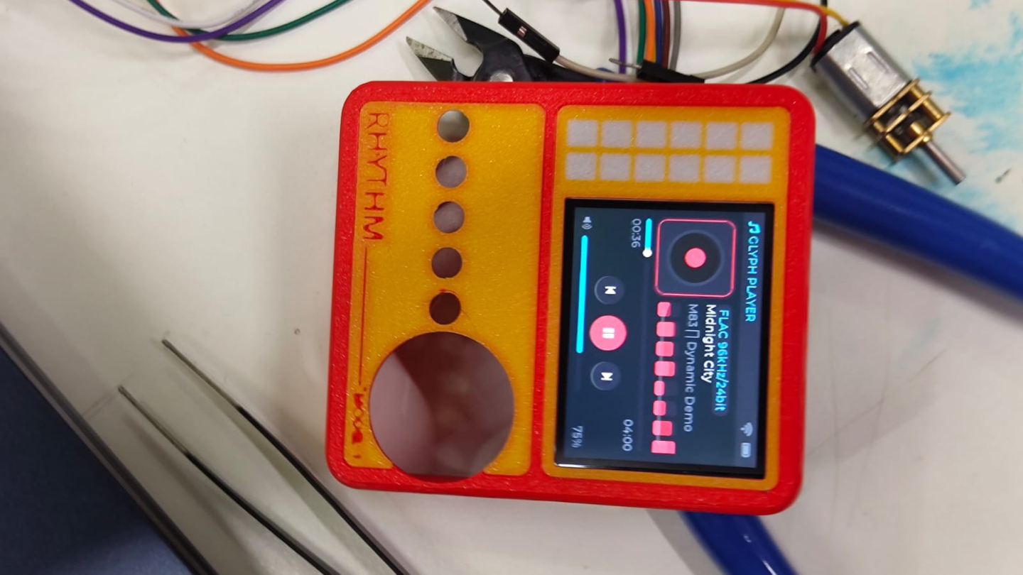
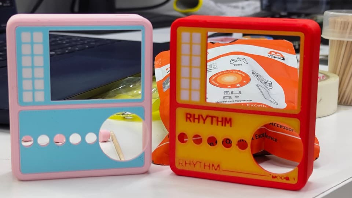
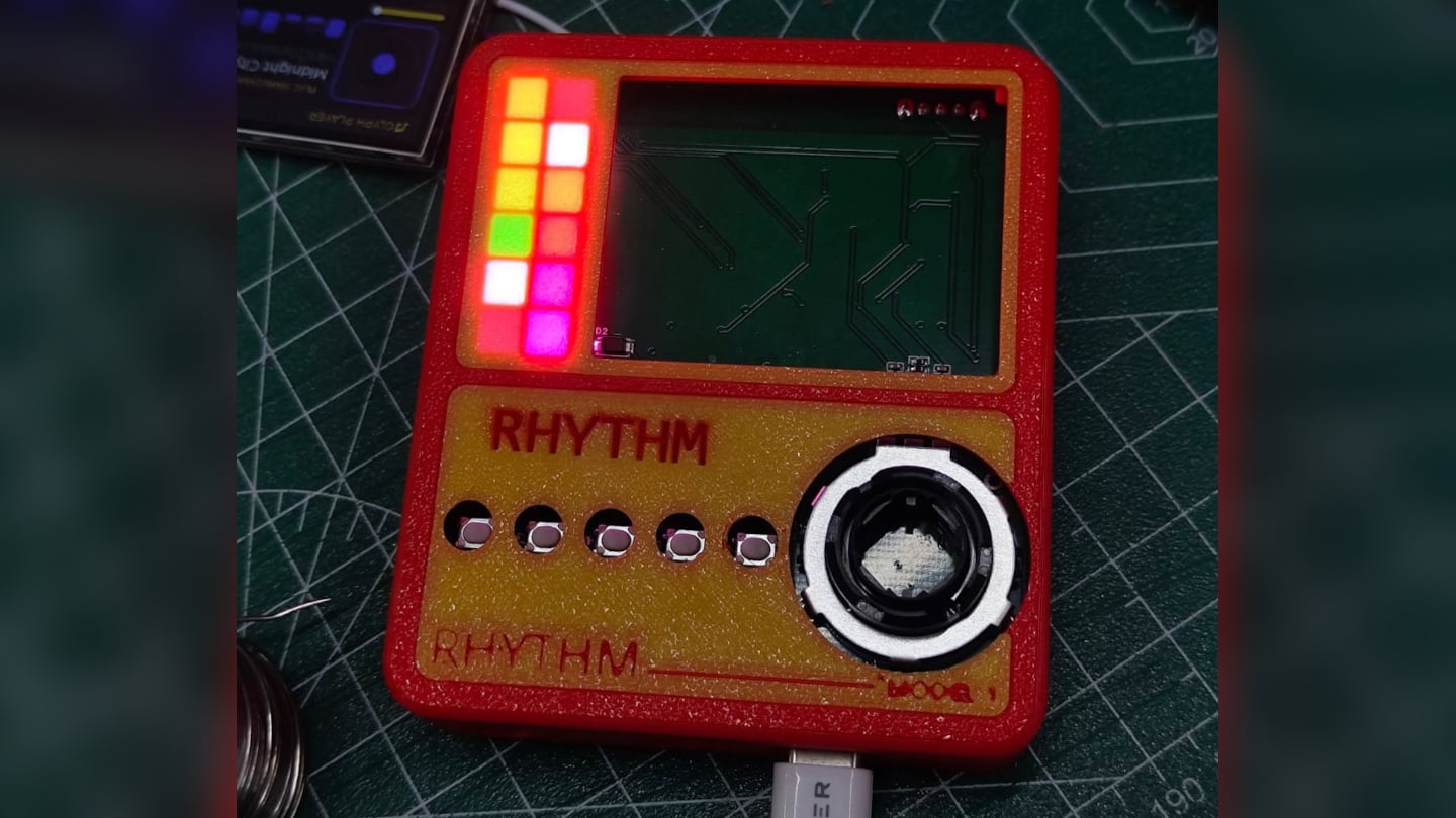
Smartphones turned music into just another notification competing for attention, a song interrupted by a text, an album broken up by a calendar alert. RHYTHM exists to undo that arrangement entirely, building a dedicated listening device from real audio components instead of borrowing a phone’s guts and bolting on a headphone jack. It’s a from-scratch digital audio player designed around one job: playing music properly, without a screen demanding anything else from you.

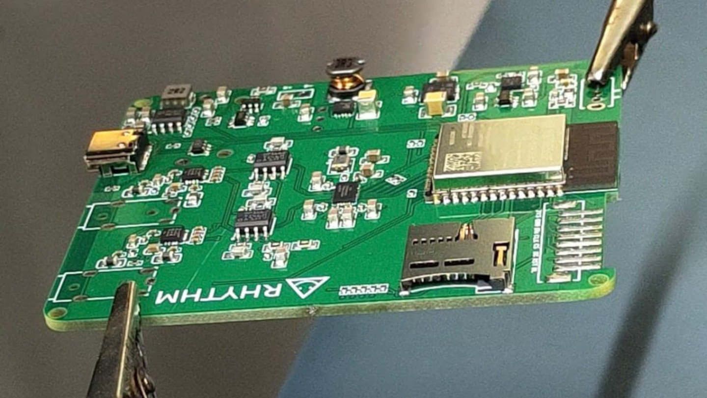
That commitment starts with what’s actually driving the sound. Rather than leaning on an all-in-one audio codec chip the way most budget players do, RHYTHM routes music through a genuine ESS SABRE DAC, the same category of chip found in dedicated hi-fi gear, paired with a discrete amplifier stage rather than a shortcut solution. An ESP32-S3 handles the file parsing and processing, but the actual sound reproduction runs through hardware built specifically for that job alone.

Designer: Mithilesh Gupta Konda

The headphone output makes the clearest case for why any of this matters. Instead of splitting one internal signal across a single jack, RHYTHM runs two completely independent, actively buffered 3.5mm outputs, each driven by its own dedicated amplifier chip. Two people can plug in two entirely different pairs of headphones, and each gets a full, uncompromised signal, no shared circuit quietly degrading whichever connection came second.

Keeping that signal clean required rethinking the power supply as much as the audio path. RHYTHM physically separates its digital logic and high-frequency switching lines from the analog circuitry that actually shapes the sound, regulating each side through its own dedicated, ultra-low-noise power regulator. It’s an unglamorous decision that never shows up in a spec sheet screenshot, but it’s exactly the kind of choice that determines whether quiet passages in a recording stay quiet.

Physical control gets the same attention. A precision mechanical rotary encoder handles navigation alongside a set of tactile buttons, giving the whole interface a hands-on quality that a touchscreen simply can’t replicate. Paired with a compact 2-inch color display, the device reads less like a shrunken phone and more like a purpose-built instrument, something meant to be operated by feel in a pocket or a bag without needing to look at it.

A microSD slot rounds out the practical side, storing lossless files locally rather than depending on a streaming connection or app ecosystem. That local-first approach extends the project’s entire philosophy: RHYTHM isn’t trying to replace a phone’s convenience. Instead, it’s opting out of that convenience on purpose, trading constant connectivity for a listening experience built around a single, uninterrupted task.

The post RHYTHM Is the Walkman the Smartphone Era Forgot to Build first appeared on Yanko Design.

  •  

Le Deathray - Le shader WebGPU qui fait redémarrer votre Mac

Auberon López vient de publier sur son blog un bouton qui freeze complètement les Mac à partir d'un simple clic dans un navigateur. Il a baptisé ça le Deathray (le rayon de la mort quoi...) et c'est un shader WebGPU diffusé via une page web des plus ordinaires, qu'il suffit d'ouvrir d'un simple clic sur un lien.

Ce qui arrive ensuite change d'une fois sur l'autre : Vous aurez le doit à la roue multicolore, ou la souris qui se fige, ou encore parfois des saletés magenta sur une partie de l'écran. Le reste de l'ordinateur, lui, va très bien et vous pouvez vous y connecter en SSH depuis une autre machine sans souci. C'est juste l'affichage qui ne répond plus, et il ne reviendra pas sauf si vous rebootez.

Le fait est que macOS surveille également son WindowServer, le processus qui dessine tout ce que vous voyez. S'il ne répond plus pendant deux minutes, le chien de garde déclenche un kernel panic et la machine redémarre ensuite toute seule. Mais vous pouvez aussi appuyer sur le bouton d'alimentation si vous êtes pressé, mais en croisant les doigts pour que votre navigateur ne rouvre pas l'onglet au redémarrage...

Le truc tient dans un seul fichier HTML, et histoire de vous expliquer un peu plus, un compute shader part dans une boucle écrite sans incrément, donc elle ne se termine jamais, et recopie indéfiniment le même vecteur en mémoire. À côté, le vertex shader qui dessine l'image lit alors cette même zone, et comme le premier ne lâche jamais la main, le second ne peut pas avancer d'un pouce.

Sauf que l'embouteillage ne reste pas cantonné au navigateur. Tous les processus qui veulent le GPU se retrouvent alors à patienter derrière, WindowServer compris, d'où l'écran figé. López dit avoir reproduit la chose dans Chrome, Firefox et Safari, sur des MacBook à puce M tournant sous macOS Tahoe. Après sur les autres systèmes testés, l'onglet rame un bon coup, puis tout rentre dans l'ordre dès qu'on ferme la page.

Mais alors pourquoi eux et pas les autres OS comme Windows ?

Hé bien parce que Windows embarque un mécanisme appelé TDR , qui repère qu'une carte graphique met plus longtemps que prévu à répondre et qui la réinitialise pour éviter que tout le système se bloque. Deux secondes par défaut, et le shader qui déconne se fait éjecter.

Alors que sur Apple Silicon, c'est un coprocesseur maison, l'ASC, qui pilote le GPU avec un firmware Apple et qui s'occupe de tout : énergie, ordonnancement des commandes, préemption des tâches. Asahi Lina , qui a retourné la puce M1 pour écrire un pilote Linux , a d'ailleurs relevé que si ce firmware plante, il n'y a qu'un moyen de s'en sortir. La seule solution c'est de redémarrer complètement la machine.

López a signalé le problème à Apple Security fin juillet. Apple a reproduit le bug, annoncé un correctif et donné un calendrier (confidentiel, donc on ne le connaîtra pas). Puis le 26 août, revirement complet d'Apple qui explique ne voir "aucune implication de sécurité dans ce rapport", lequel n'entraînera donc aucun changement dans ses produits. Le dossier est ensuite parti vers une autre équipe pour d'éventuelles "considérations d'amélioration".

En 2023 pourtant, Ron Masas d'Imperva avait déjà fait planter des Mac, des iPhone et des iPad avec un shader, en WebGL cette fois. Apple avait alors sorti le CVE-2023-40441 , noté 6,5 sur 10, et l'avait bouché en renforçant la validation des entrées pour mieux repérer les boucles folles.

Seulement voilà, sa boucle à lui était énorme mais finie, donc détectable, alors que celle du Deathray tourne pour toujours. Et une boucle infinie, la repérer à coup sûr, c'est le problème de l'arrêt ... donc personne ne sait faire.

López l'écrit d'ailleurs sur son site, les chercheurs en sécurité avec qui la question a été discutée donnent plutôt raison à Apple. Pour la firme, le résultat n'est qu'un plantage, un gel ou une perte de données récupérable, et ça ne constitue pas un réel problème de sécurité. Et sur le principe, ça se défend. Sauf que dans la vraie vie, si vous avez oublié de sauvegarder vos fichiers et que vous cliquez sur ce lien, vous l'avez dans l'os (et pas dans le "MacOS"... roh roh roh).

Donc non, il n'y a rien à installer pour empêcher ça et rien à attendre de Cupertino pour le moment. Voilà, sachez juste que n'importe quel couillon qui aura lu cet article pourra vous envoyer un petit lien par mail, façon rickroll des enfers, ce qui aura pour effet de freezer et faire redémarrer votre Mac.

Désolé !! 🤷‍♂️

Source : le billet d'Auberon López .

  •  

Pluton - Le backup chiffré qui se pilote depuis le navigateur

Restic chiffre bien vos sauvegardes, rclone sait parler à 70 services de stockage, mais connecter les deux ensemble demande d'écrire des scripts et surtout de les surveiller. Eh bien bonne nouvelle, Pluton est l'interface web qui fait ce travail à votre place.

Vous y décrivez un plan de sauvegarde via un formulaire, avec une source, une destination, une fréquence, une politique de rétention, et Pluton fabrique les commandes restic derrière. Les sauvegardes restent ainsi incrémentielles et chiffrées avant l'envoi. La destination peut être un disque local, un bucket S3, un Backblaze B2 ou un Google Drive, et le même plan peut se répliquer vers plusieurs stockages pour respecter la fameuse règle 3-2-1.

L'installer

Je vous ai préparé un petit kit IA pour ceux qui ne jurent que par leur agent :

Un dossier, deux fichiers, et c'est parti. Le docker-compose.yml d'abord, dans lequel vous montez ce que vous voulez sauvegarder en lecture seule et le dossier qui recevra les sauvegardes en écriture. Si vous êtes sur Mac, lisez l'avertissement plus bas avant de monter quoi que ce soit, car ce montage-là m'a joué un tour :

services:
 pluton:
 image: plutonhq/pluton:latest
 container_name: pluton
 restart: unless-stopped
 ports:
 - "5173:5173"
 volumes:
 - pluton-data:/data
 - ./mes-documents:/mnt/documents:ro
 - ./mes-sauvegardes:/mnt/backups
 environment:
 ENCRYPTION_KEY: ${ENCRYPTION_KEY}
 USER_NAME: ${USER_NAME}
 USER_PASSWORD: ${USER_PASSWORD}
 NODE_ENV: production
 IS_DOCKER: "true"

volumes:
 pluton-data:

Puis le .env à côté, avec vos trois secrets. Générez-les, ne les inventez pas :

printf 'ENCRYPTION_KEY=%s\nUSER_NAME=korben\nUSER_PASSWORD=%s\n' \
 "$(openssl rand -hex 16)" "$(openssl rand -hex 10)" > .env

Par contre, attention à cette ENCRYPTION_KEY, c'est le point à ne pas rater. Le compose officiel la documente comme la clé de chiffrement des snapshots restic et rclone, et c'est bien ça. Il s'agit du mot de passe de vos dépôts, c'est la même clé pour tous vos plans. Et donc la perdre, c'est perdre vos sauvegardes, et la changer rendra illisible tout ce qui a déjà été écrit. Bref, copiez-la dans votre gestionnaire de mots de passe avant d'aller plus loin, parce que le jour où vous en aurez besoin, personne ne pourra vous la redonner.

Puis faites un :

docker compose up -d

L'interface répond alors sur le port 5173 et vous demande directement les identifiants du .env. Pas d'assistant de première configuration, pas de compte à créer... en fait quand les variables sont bien configurées, Pluton s'installe tout seul au démarrage. Chez moi, entre le up -d et l'écran de connexion, il s'est donc passé moins d'une minute.

Créer le premier plan de backup

Le bouton "+ New" de l'interface ouvre un assistant en quatre écrans. Vous nommez le plan, vous gardez la stratégie "Incremental Backup" (les trois autres sont grisées, elles appartiennent à l'offre Pro), vous pointez /mnt/documents comme source et /mnt/backups comme destination, puis vous réglez la fréquence et la rétention. Le dernier écran laisse le chiffrement et la compression activés et propose de lancer la sauvegarde tout de suite, ce que j'ai fait.

Chez moi, trois fichiers de test de quelques octets sont partis en quelques secondes. Et c'est là qu'il faut regarder la bonne chose pour vérifier que ça fonctionne... Non, c'est pas la pastille verte, mais plutôt le nombre de fichiers et leur taille.

Le plan Documents juste après sa première sauvegarde.

En fait, si je vous dis ça, c'est parce que sur mon Mac, avec Docker Desktop, restic n'arrivait pas à lire les dossiers montés depuis l'hôte, et sort en erreur d'entrée/sortie sur chaque fichier. Et pourtant, Pluton affichait quand même la sauvegarde en vert avec le statut "Complete". Les colonnes disaient bien 0 fichier et 0 octet, mais le statut, lui, semblait correct... Donc si vous êtes sur Mac, prenez plutôt l'installeur de bureau, qui existe aussi pour Windows et Linux, et dans tous les cas vérifiez que les chiffres sont OK après votre première sauvegarde.

Vérifier et répéter une restauration

Votre dossier de destination contient maintenant un config, un data/, un index/, un keys/ et un snapshots/, tous illisibles en clair. C'est un dépôt restic standard, et ça se vérifie sans Pluton, avec le binaire embarqué dans le conteneur :

docker exec -e RESTIC_PASSWORD=votre_cle -e RESTIC_REPOSITORY=/mnt/backups \
 pluton restic snapshots

Vous obtenez la liste de vos snapshots avec leur taille, et avec une mauvaise clé, restic répondra "wrong password or no key found" et s'arrêtera là. Faites les deux essais car ça prouve en une fois que le chiffrement travaille, et que vos données restent récupérables même si Pluton disparaît demain.

Le menu d'une sauvegarde propose ensuite "Browse", qui ouvre le snapshot comme un explorateur de fichiers, avec la taille de chacun et un bouton pour le télécharger ou le restaurer seul.

Le contenu du snapshot, fichier par fichier, avec le téléchargement et la restauration à droite de chaque ligne

Et le "Restore" lancera un assistant qui vaut le détour puisqu'il sait restaurer vers un chemin différent de l'original. Il vous laisse choisir quoi faire des fichiers déjà présents, et surtout il génère un aperçu en dry run (à blanc quoi...) avant de toucher au disque. J'ai restauré mes trois fichiers vers un dossier séparé, puis comparé avec les originaux, et c'était identique. Faites-le une fois, tranquillement, pendant que vous n'en avez pas besoin.

Voilà, tout ça, c'est la version gratuite, pour la machine où elle tourne. Maintenant, si vous voulez piloter les sauvegardes de plusieurs machines depuis la même interface, ça passera par l'offre Pro à 59 dollars par an. Si vous voulez comparer avec un autre truc, sachez aussi que Zerobyte joue dans la même cour.

Amusez-vous bien !

Source : Pluton

  •  

Pharrell Quietly Revives Adidas’ Weirdest Y2K Water Shoe for $140

Summer never really wants to let go, and neither does my closet. Every September I face the same annoying puzzle: sandals feel done, sneakers feel too heavy, and nothing in between actually handles a wet dock, a muddy trail, and a sidewalk trip to the coffee shop without looking like safety equipment. That gap between “technical” and “wearable” has been a real problem in footwear for years, and it’s exactly the space Adidas and Pharrell Williams just walked into with the PW Water Moc.

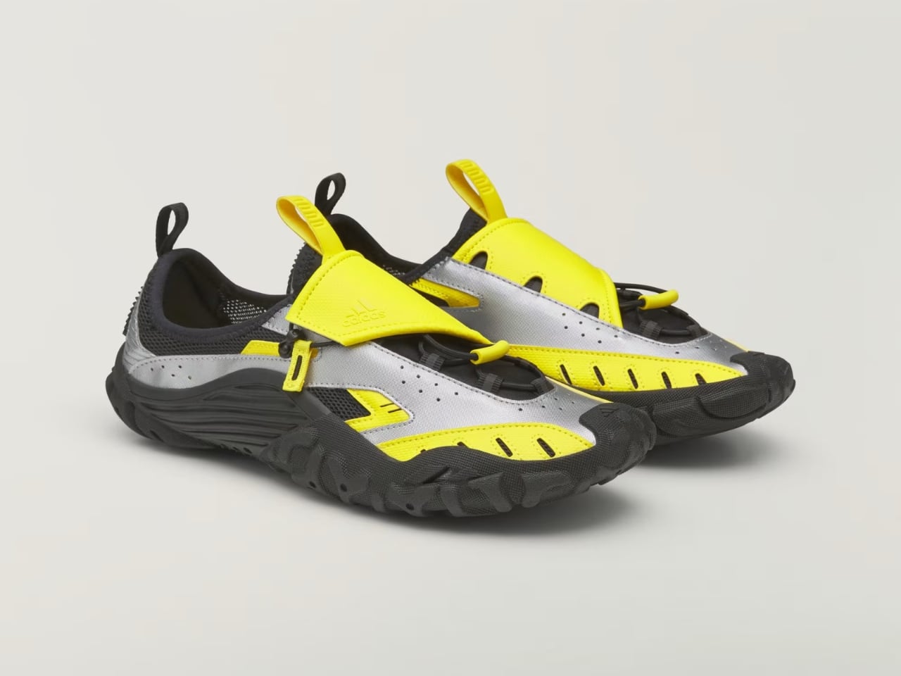
The shoe is the third release under Pharrell’s ongoing Virginia label with Adidas, and unlike the Jellyfish or the Flat Earther before it, this one isn’t chasing runway drama. It’s pulling from something a lot more obscure: the Adidas Adventure Water Moc, a shoe most people forgot existed after the early 2000s. That’s the smart move here. Instead of inventing a new gorpcore silhouette from scratch, Pharrell dug up a shoe that was already built for exactly this problem, water to land, and gave it a reason to exist again.

Designer: Pharell x Adidas

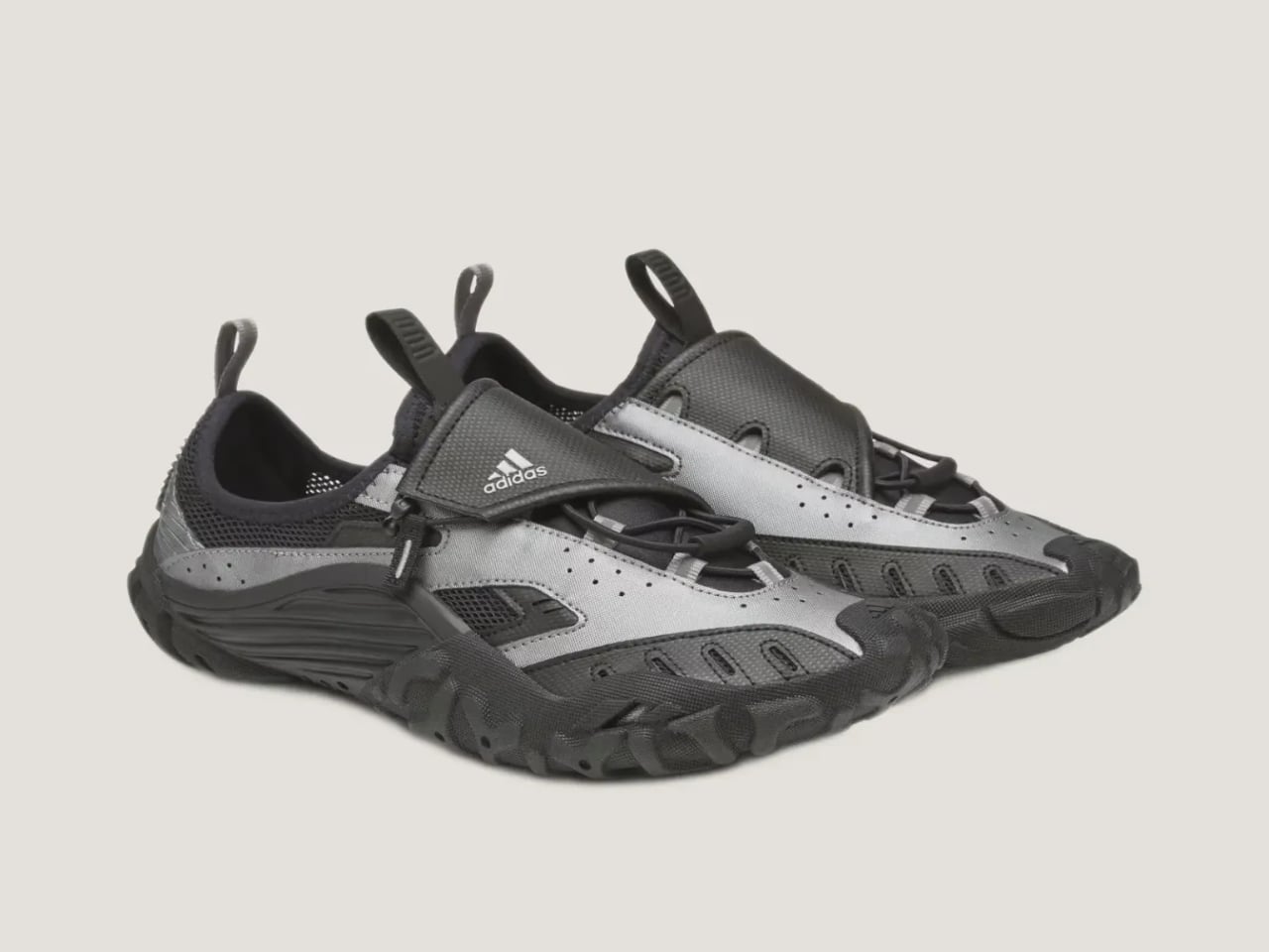
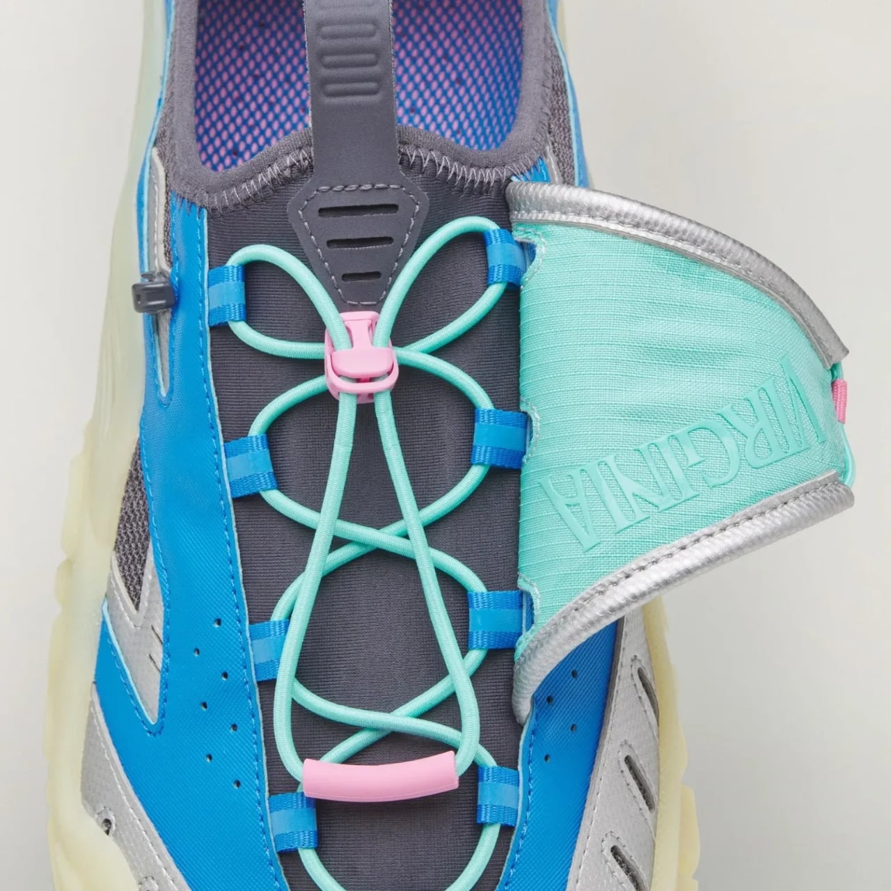
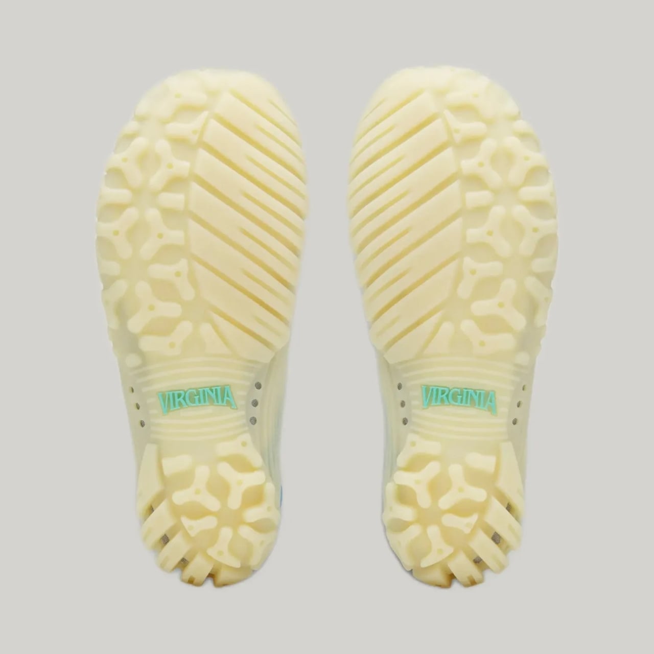
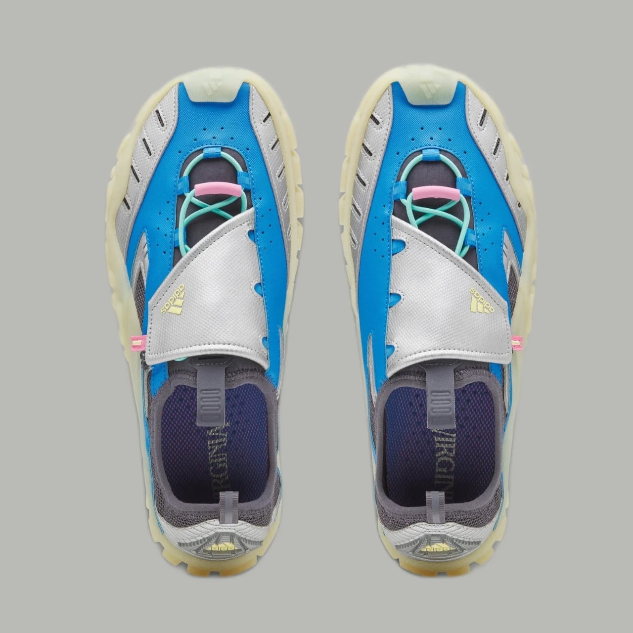
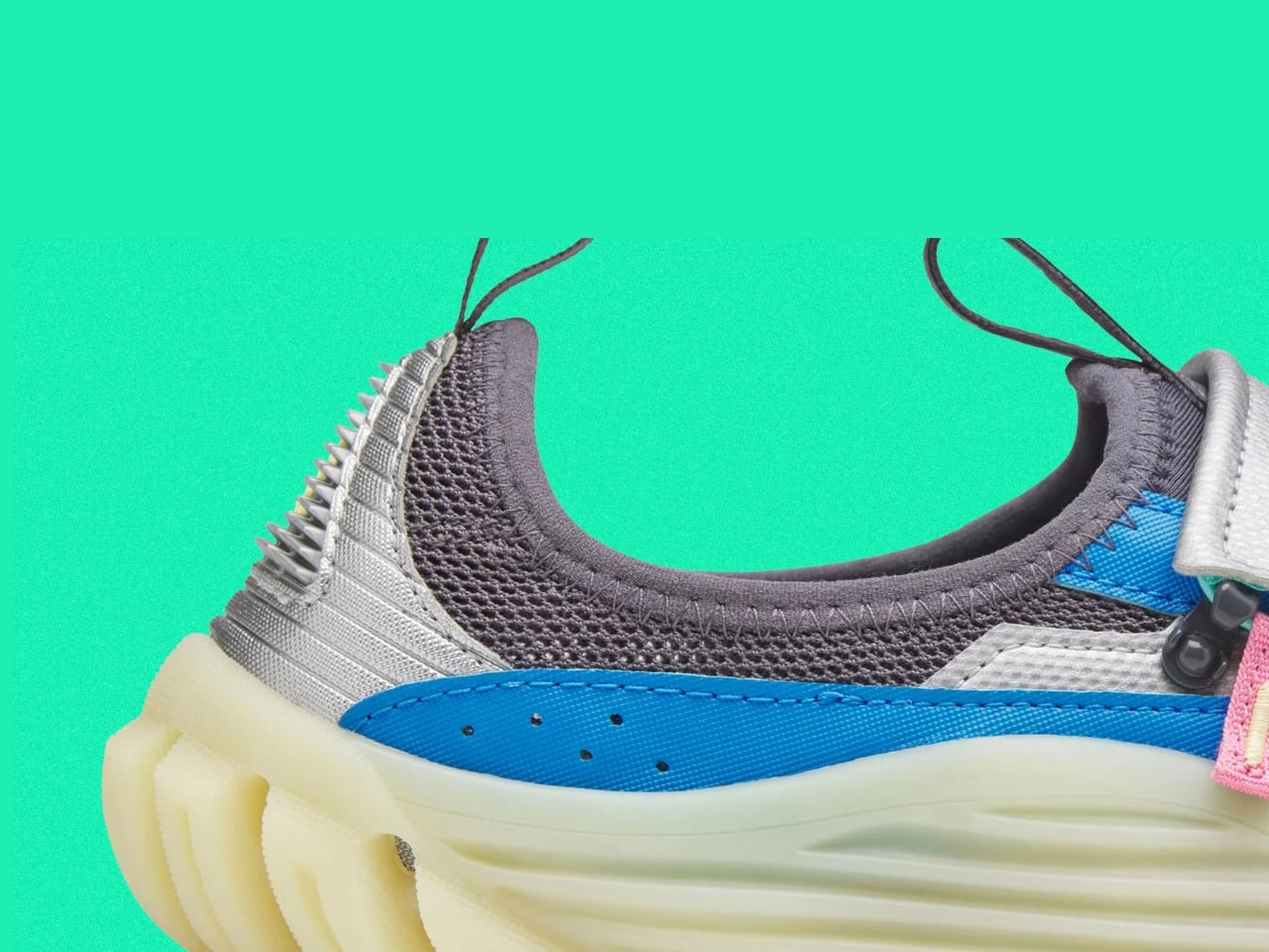
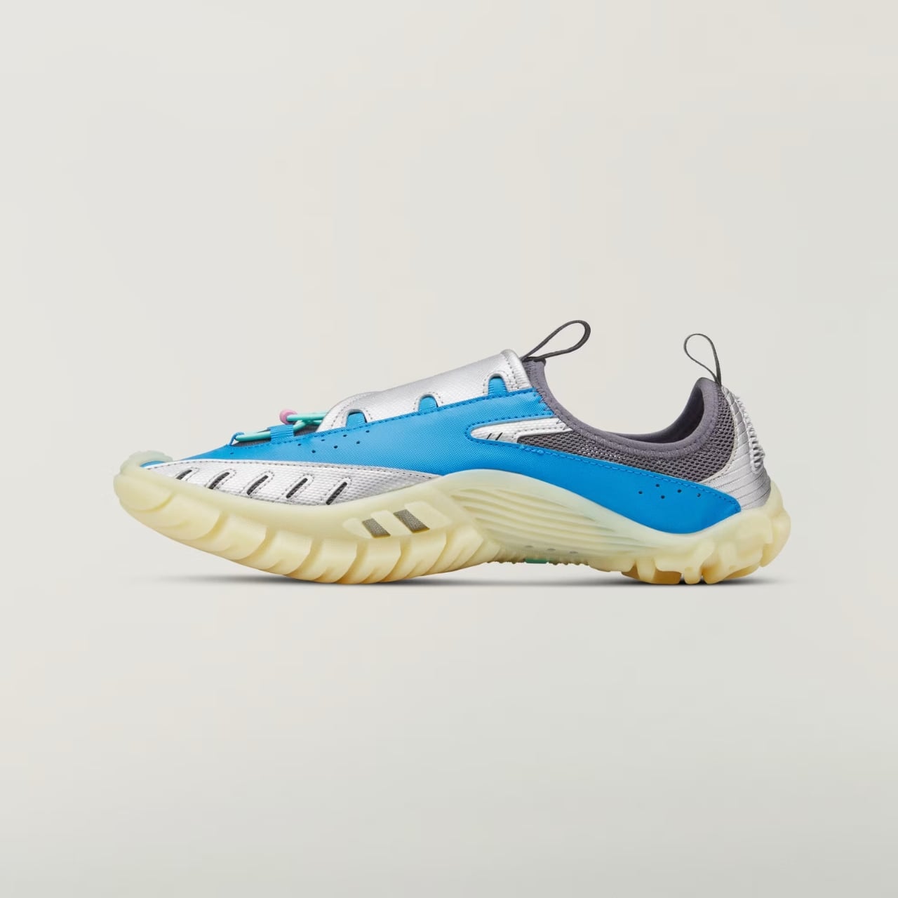
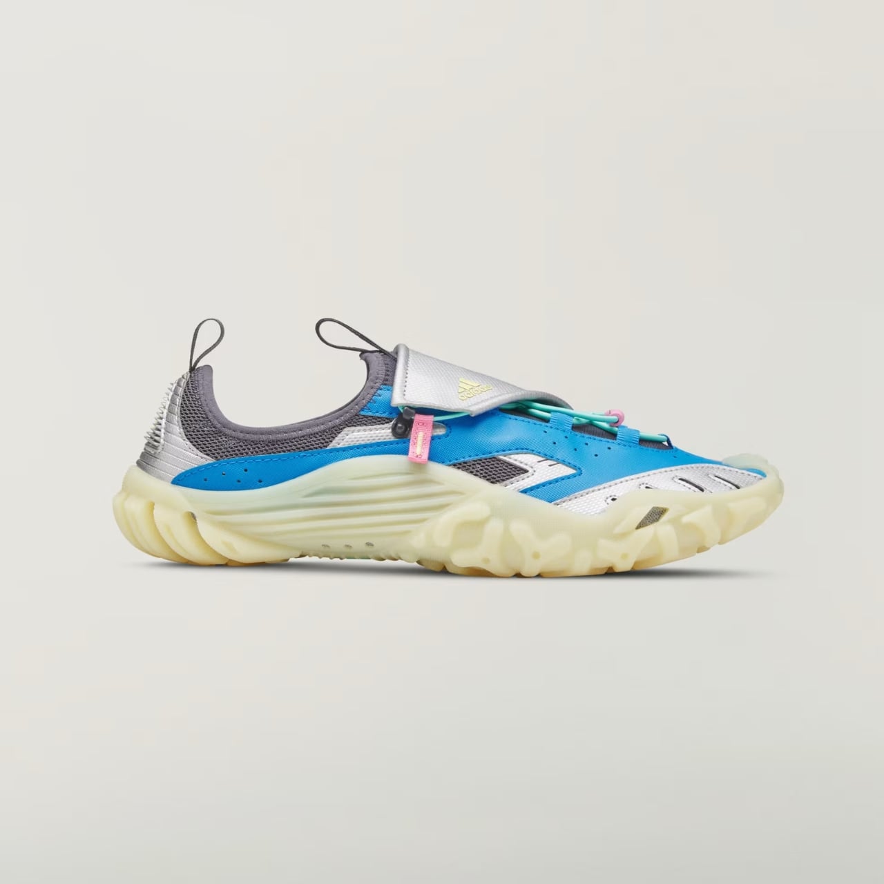
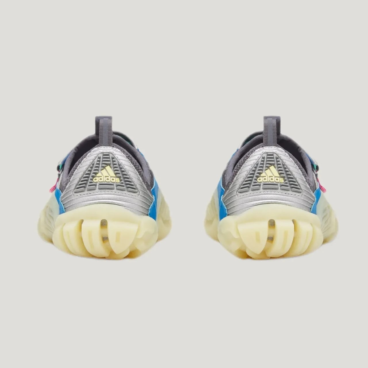
Functionally, it actually holds up. The upper mixes breathable mesh with reflective webbing, and bungee-style laces get tucked under a wide strap so you’re not fumbling with knots every time you take it off at the door. The outsole is lifted from the 2005 Carnuba Adventure Moc, which means deep, aggressive lugs instead of the flat rubber most casual slip-ons get away with. It’s a shoe that seems genuinely fine with a creek crossing, not just a shoe that photographs well near one.

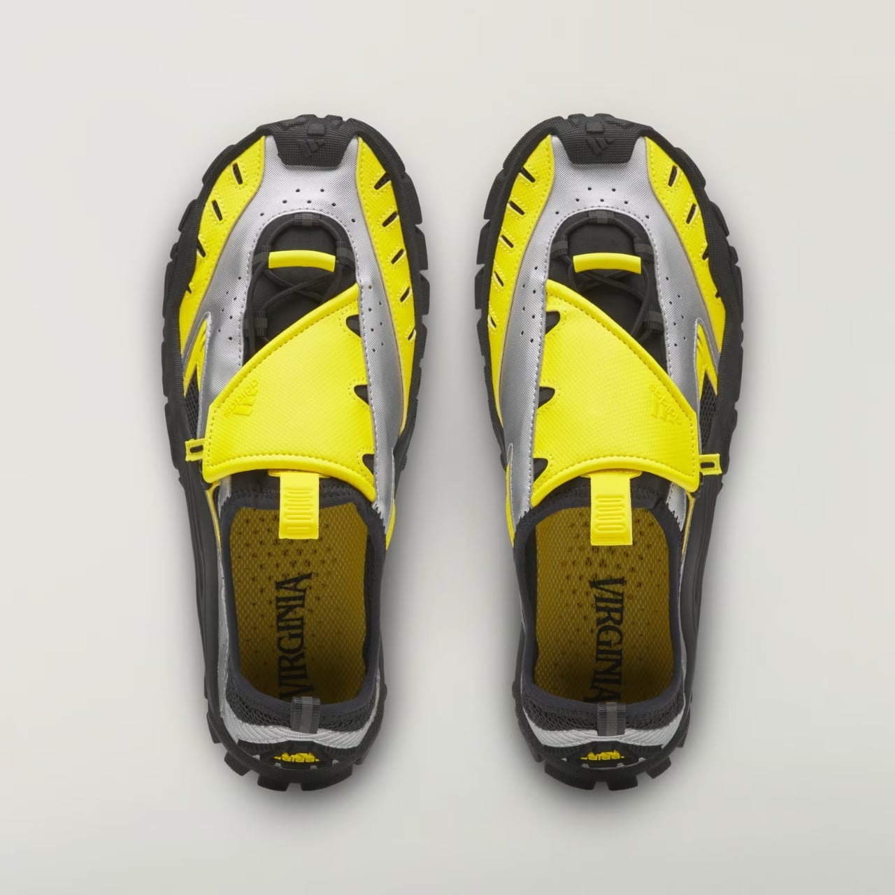
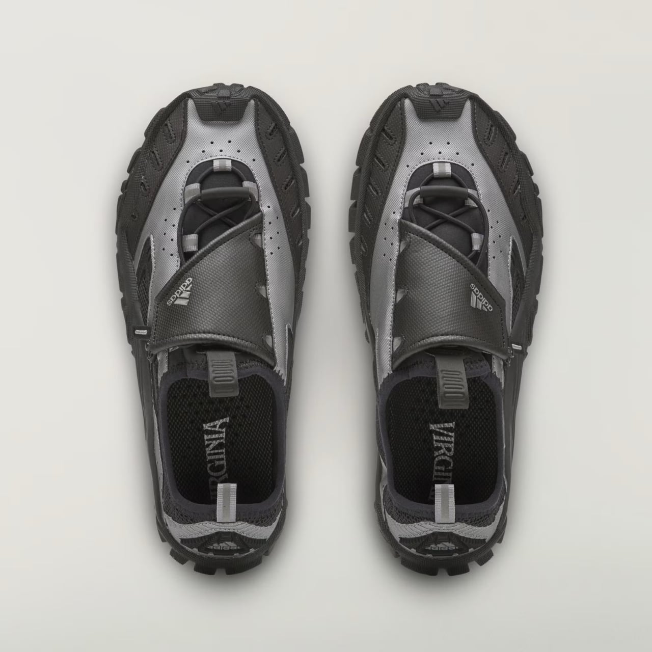
Where it gets interesting, and where I think Pharrell earns his credit, is the colorways. Adidas didn’t sand down the nostalgia to make it more palatable. The Lucid Ray Blue option comes with pink and seafoam accents that are unapologetically early-2000s, the kind of palette that would’ve looked at home on a Bratz commercial or a Limp Bizkit music video. There’s a black and silver pair for people who want the shape without the loud attitude, and a yellow colorway that splits the difference. None of them try to disguise where they came from.

I’ll admit I’m a little biased toward brands that actually go back to their own archive instead of just borrowing someone else’s aesthetic and calling it retro. Adidas has done this a few times now, quietly, and it tends to land better than the loud “vintage-inspired” drops that never point to an actual source. The Water Moc isn’t just Y2K flavored, it’s a real product from that era, rebuilt with better materials and a designer who clearly has affection for it rather than just using it as a trend hook.

At $140, it sits in a fair spot for a collaboration shoe with this much design history behind it. It’s not cheap, but it’s not asking you to pay Jellyfish-level hype pricing for something that’s essentially a reissue with upgrades. That price point also tells you who this shoe is actually for: people who want a functional water-ready shoe but refuse to wear something that looks like it belongs on a kayaking instructor.

What sneaker culture has been missing lately is a bit of goofiness that still functions. So much of the current outdoor-meets-fashion movement takes itself seriously, all muted colors and technical fabric with barely any personality. The Water Moc doesn’t ask to be taken that seriously, and that’s honestly refreshing. It’s a shoe that remembers being weird was part of the appeal the first time around.

Whether it becomes a genuine wardrobe staple or just a fun seasonal pickup probably depends on how much you already like the era it’s pulling from. But as a piece of design thinking, going back into the brand’s own closet instead of reinventing the wheel, it’s one of the more honest moves Adidas has made in a while. Sometimes the best new shoe isn’t new at all. It’s just finally getting its second summer.

The post Pharrell Quietly Revives Adidas’ Weirdest Y2K Water Shoe for $140 first appeared on Yanko Design.

  •  

Finally, One Tower Replaces Your Speaker, Lamp, and Wine Fridge

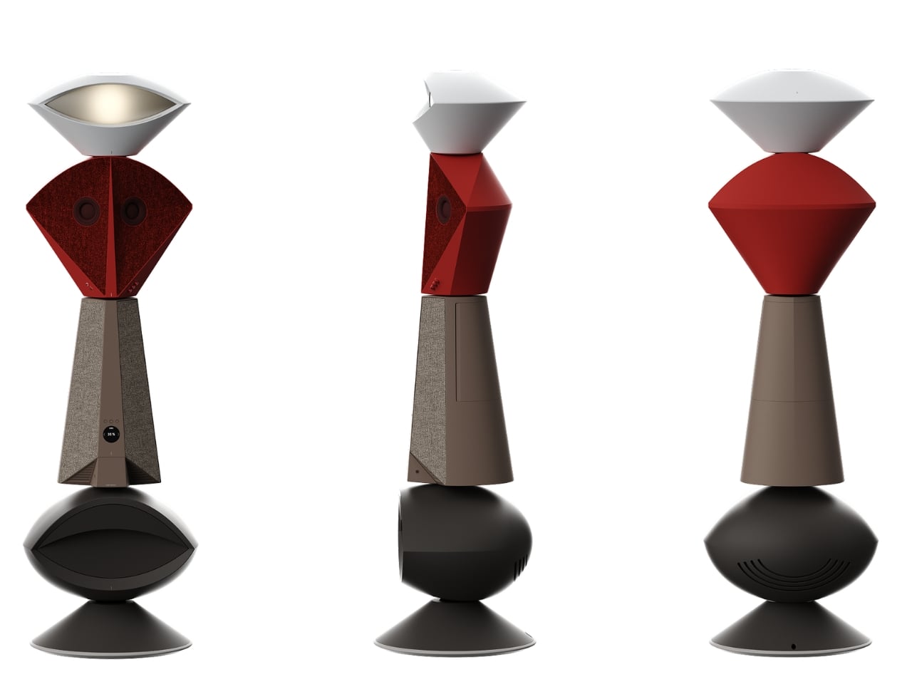
Anyone who has tried to furnish a studio apartment knows the specific defeat of running out of surfaces before you run out of gadgets. The speaker needs an outlet and a shelf. The lamp needs its own corner. The mini fridge for wine wants counter space that doesn’t exist. Each object is fine on its own, but stacked together on a single console table, they start to look like a garage sale that lost an argument with a design magazine. That is the exact problem South Korean designer Jung Hyun Kim set out to solve with Babel, a concept he built for people who live in small rooms but refuse to shrink their idea of what home should feel like.

Kim designed Babel for a very specific and very real slice of the population, twenty somethings through mid thirties starting their independent lives in modest apartments, often around 500 to 550 square feet, the kind of footprint that is common from Seoul to Brooklyn to any first apartment in a city with real rent. His answer wasn’t to make each device smaller. It was to stop thinking about furniture and electronics as separate categories entirely, and instead build a single vertical column where every function gets its own segment, stacked like a totem instead of scattered like clutter.

Designer: Jung Hyun Kim

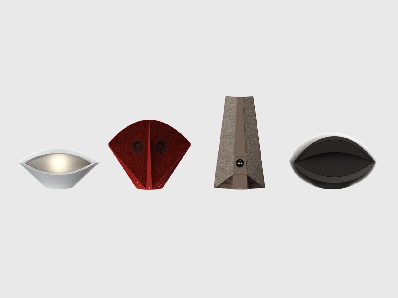
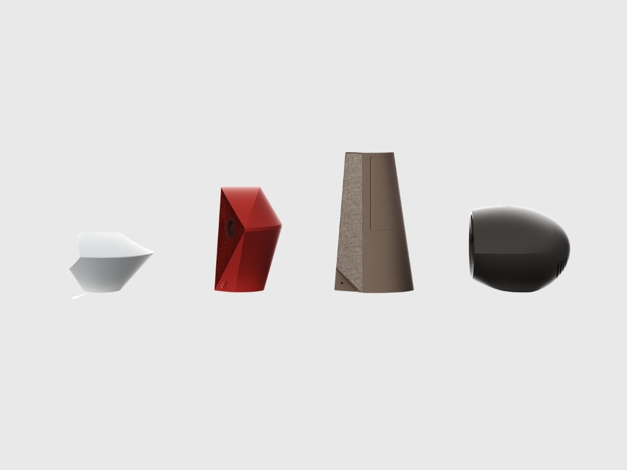
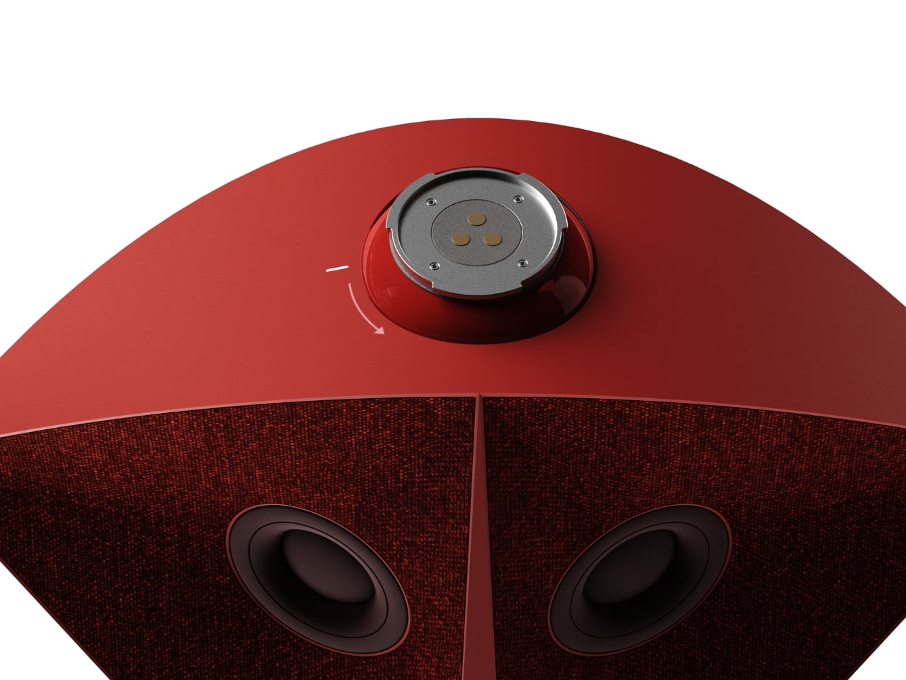
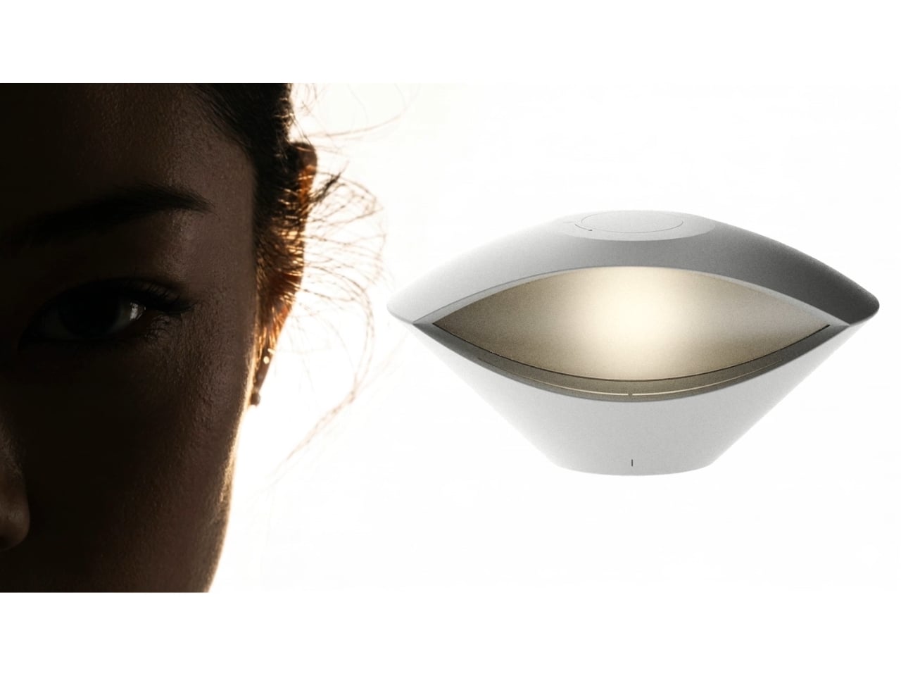
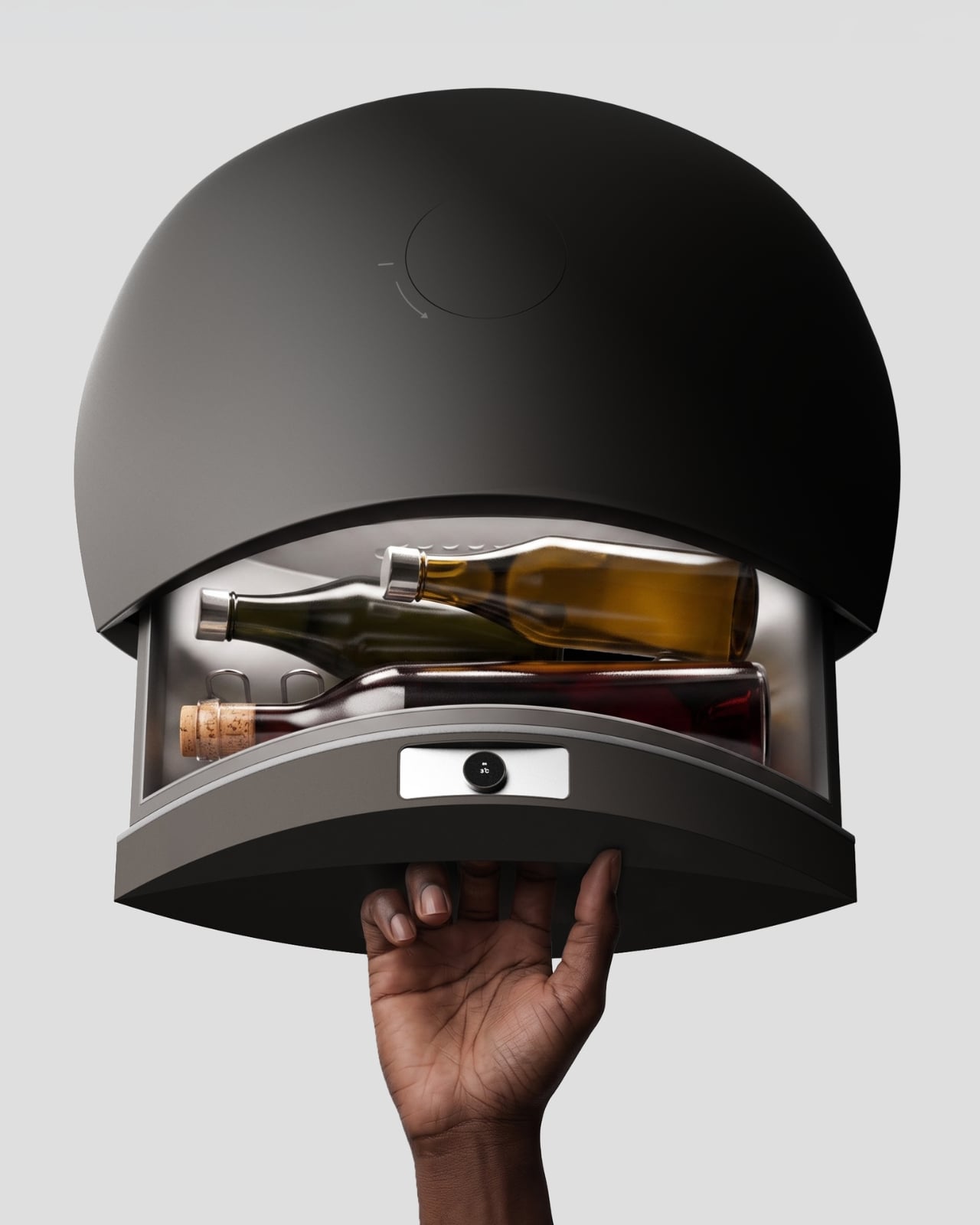
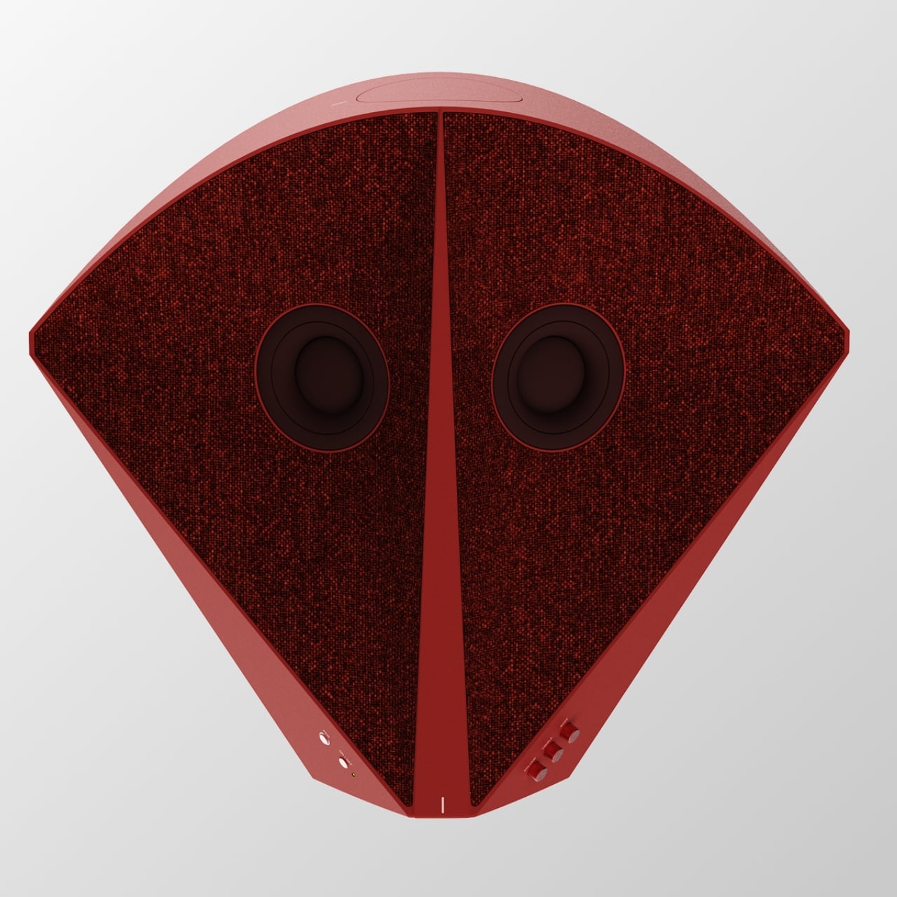
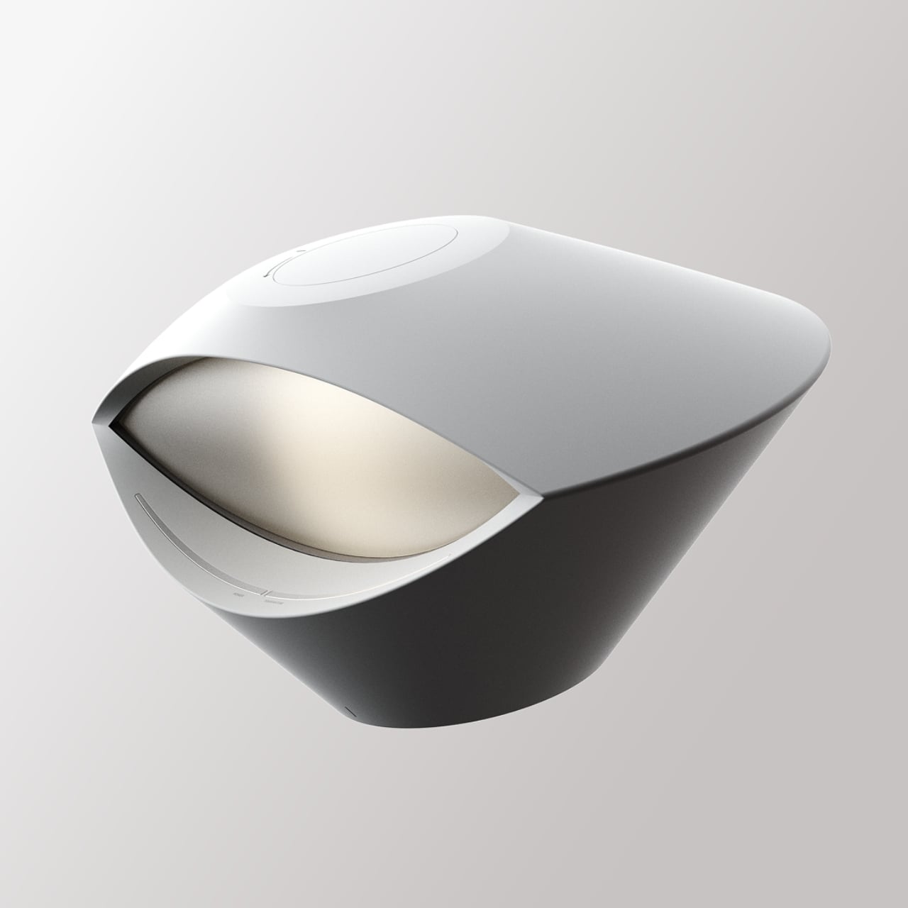
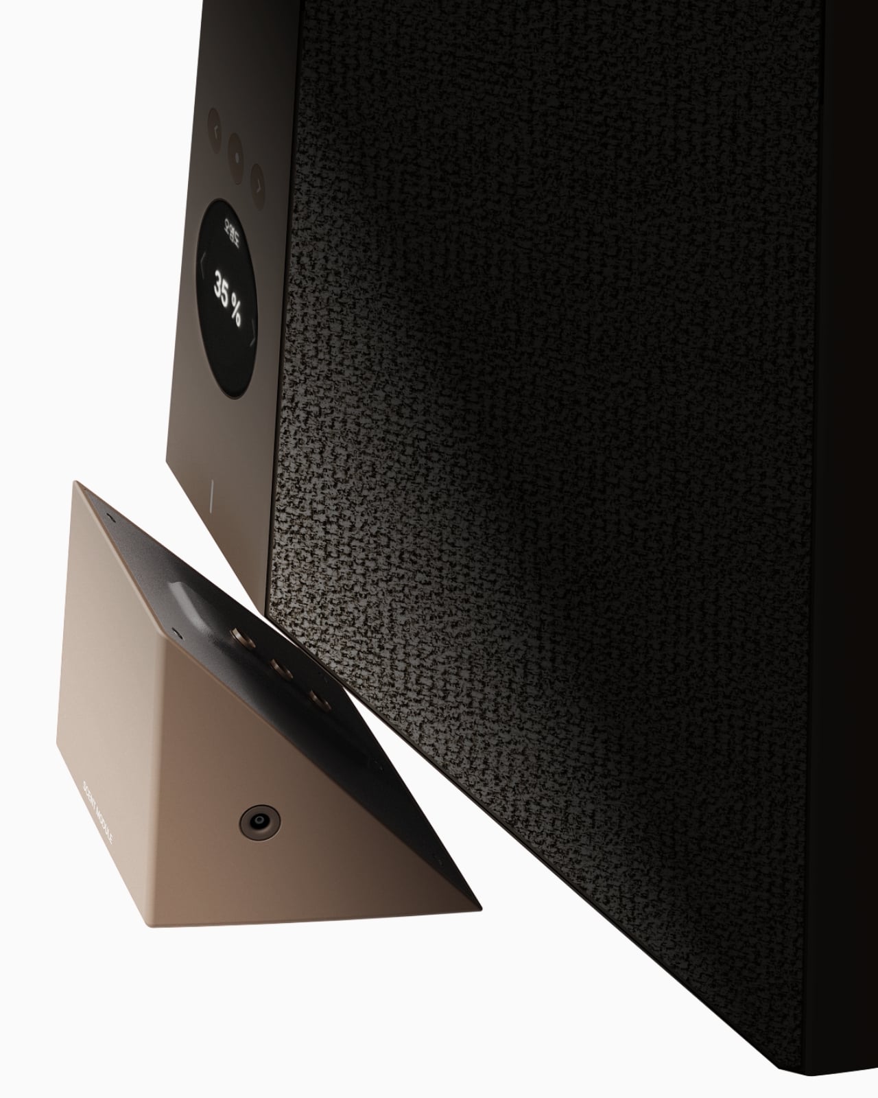
The tower reads almost like a figure standing in the room. At the top sits an eye shaped ambient lamp, its lens glowing warm and soft, the kind of light you’d want next to a couch at eleven at night. Below that, a red, fabric wrapped module houses the main speaker drivers, angled like a face with two eyes looking back at you, which is a genuinely clever piece of anthropomorphism for an object meant to live in your peripheral vision all day. The tapered midsection functions as the control hub, complete with a discreet volume display, and the whole thing terminates in a rounded black base that turns out to be a hidden drawer, a small cooling compartment for a couple of wine bottles. Four completely different jobs, one silhouette.

What makes this more than a novelty is the modularity built into the stacking logic. Nothing about Babel demands you use all four segments in one order. You can pull pieces apart, rearrange them, or run just the parts you need that week. A studio dweller might want the lamp and speaker without the bar module. Someone hosting more often might stack the drawer higher for easier reach. The design treats a small home the way a good capsule wardrobe treats a small closet, fewer pieces, each one doing more, none of them wasted.

I like that Babel doesn’t pretend the solution to small space living is owning less. It assumes you still want a good lamp, a good speaker, and a cold bottle of wine within reach, and it simply refuses to let those wants cost you three separate footprints. That feels more honest than most minimalist design advice, which tends to ask people to want less rather than design better. The name is a nice touch too, a nod to the biblical tower where many languages tried to reach the same point, which tracks neatly onto a product where lighting, sound, cooling, and control all speak different technical languages but rise from the same base.

Whether Babel ever becomes a shippable product is beside the point right now. It exists as a Behance concept, a portfolio piece from a designer who clearly thinks in systems rather than single objects, and that thinking is worth paying attention to regardless of manufacturing timelines. Apartment living isn’t getting more spacious anywhere, and the appetite for objects that look intentional rather than accumulated is only growing, especially among people who grew up curating every shelf for how it photographs. A stacked, sculptural answer to gadget clutter fits that mood perfectly.

Babel won’t fit every home, and a four function tower is a commitment, not an impulse buy. But as a piece of thinking about how to live well in less square footage, it’s one of the more clear headed ideas I’ve seen come out of a design program in a while. Sometimes the fix for too many objects isn’t fewer objects. It’s better posture.

The post Finally, One Tower Replaces Your Speaker, Lamp, and Wine Fridge first appeared on Yanko Design.

  •  

This Porsche 911 was lifted and rebuilt into a Chicago-ready urban safari car

What happens when a Porsche 911 stops worrying about staying low to the ground? Tangent Design Group has an answer. Lift it three inches, widen its stance, add chunky off-road tires, and turn one of Stuttgart’s most recognizable sports cars into something that looks ready to escape the city rather than attack a racetrack. Built in Chicago, the Urban Safari 911 is an unusual exercise in rethinking what a modern Porsche can be.

The project began in 2019, when the Chicago-based industrial design studio decided to build a Porsche without the constraints of a conventional client brief. Tangent eventually started with a 2021 Porsche 911 Carrera 4, chosen for its all-wheel-drive platform. Finished in Porsche’s Paint-to-Sample Black Olive with a tan interior, the car already had a distinctive character before the transformation began.

Designer: Tangent Design Group

Tangent approached it like a product-development exercise. The original 992 was digitally scanned, including its bumpers, fenders, wheel wells, rocker panels, and rear engine cover. That data became the foundation for developing new components that could properly integrate with the factory body and its increasingly complex electronics. Full-scale parts were then 3D-printed and physically fitted to the car to refine proportions and attachment points before final production.

The most significant change sits underneath the body. Tangent developed a bespoke three-inch lift system while retaining the Porsche’s stock suspension architecture and avoiding software errors. The additional clearance makes room for larger off-road tires and fundamentally changes the stance of the 911. On a truck, three inches might be unremarkable; on a low-slung sports car, it transforms the proportions completely. Something similar to what Vagabund Moto did in collaboration with NINE ELEVEN OUTLAW and DakarGarage to transform a Porsche 924 S into an off-road-worthy ride.

The wheels received the same level of attention. Tangent designed them in-house and worked with Brixton Forged to produce bespoke forged aluminum wheels. Full-scale printed versions were used during development to judge how the design sat against the widened body before the final wheels were manufactured. Visually, the Urban Safari combines wide fender extensions, revised rocker panels, a custom front bull bar and a pronounced ducktail-style rear wing. Auxiliary lighting and roof-mounted adventure equipment reinforce its rally-inspired character, while the graphics package borrows from historic Porsche rally liveries without simply recreating one.

That distinction is important. Tangent’s project predates Porsche’s factory 911 Dakar, having been conceived in 2019, but it draws from the same broader history of Porsche competition cars built for surfaces far removed from a racetrack. Instead of copying a classic rally car or dressing the 992 in retro cues, Tangent has created something that feels contemporary and purpose-built.

The result is currently a one-off, but Tangent is accepting inquiries about the Urban Safari kit, leaving open the possibility that its design language could eventually find its way onto other 992-generation cars.


The post This Porsche 911 was lifted and rebuilt into a Chicago-ready urban safari car first appeared on Yanko Design.

  •  

Never Lose Your Keys Again With a Tracker That Glows in the Dark

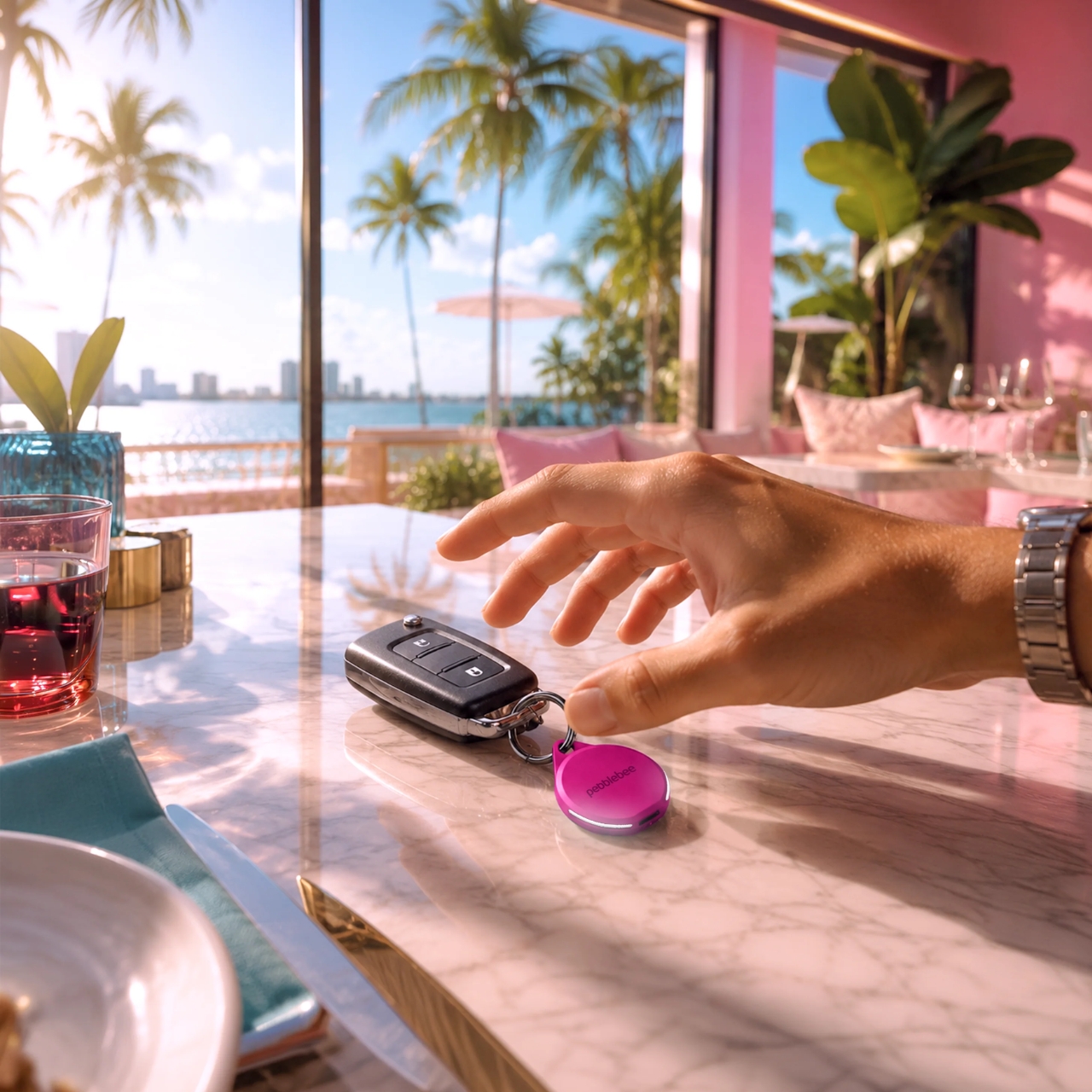
For forgetful people like me, trackers have basically become a must-have. Whether you’re clipping one onto your wallet, your car keys, your backpack, or whatever it is you absolutely cannot afford to lose, these little devices help you do exactly what they promise: keep track. The only catch is that a lot of trackers tend to look alike, and if you’re relying on appearance alone instead of the connected app, it’s easy to accidentally grab the wrong one.

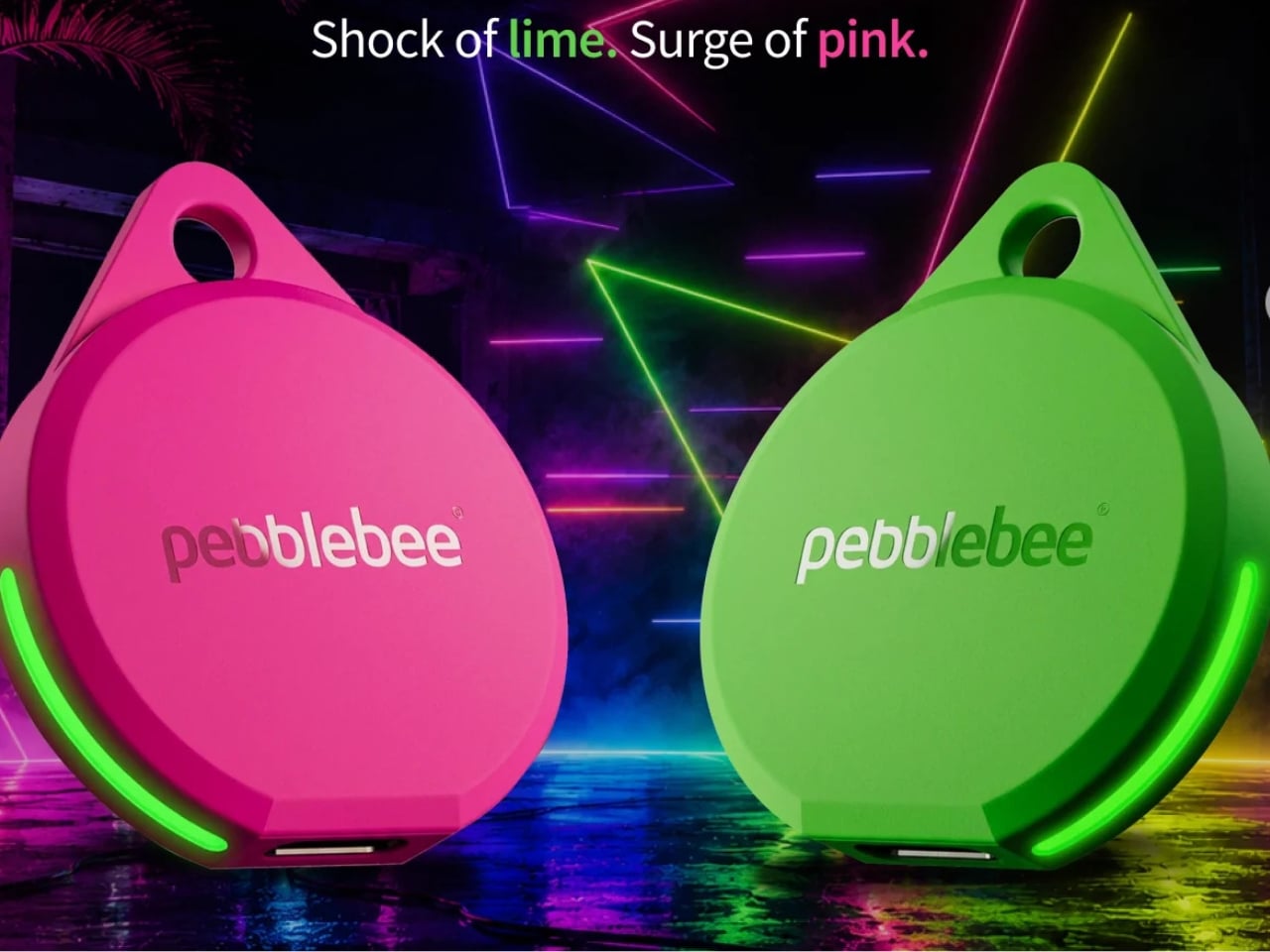
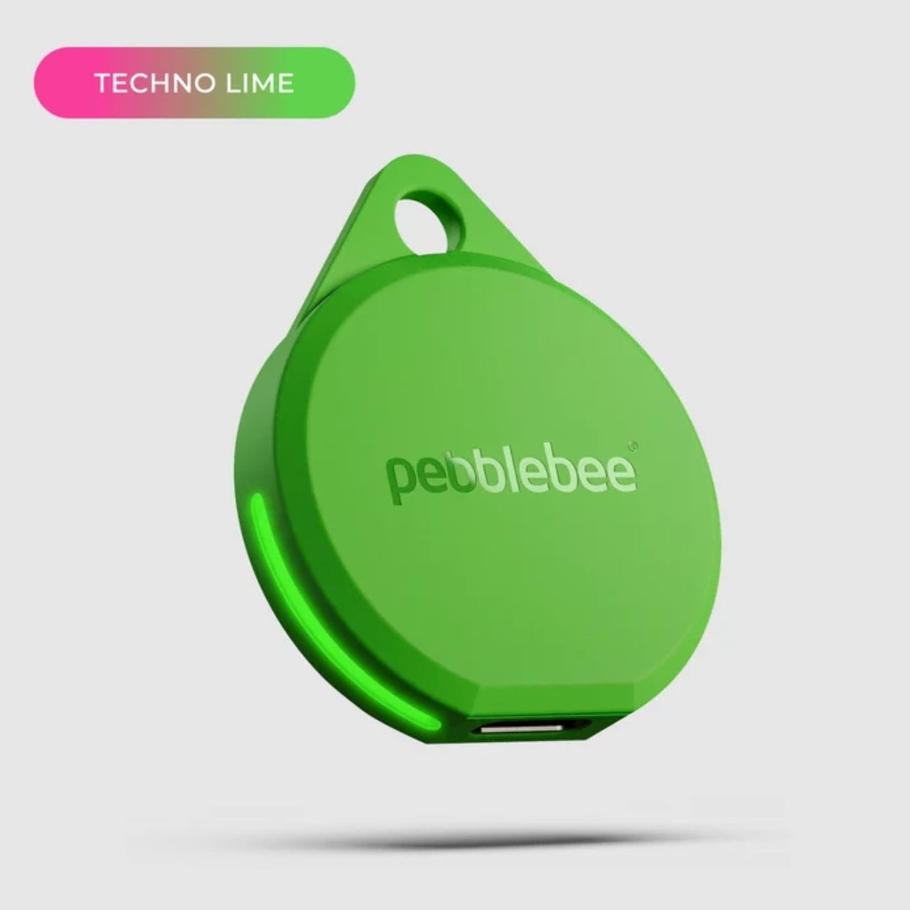
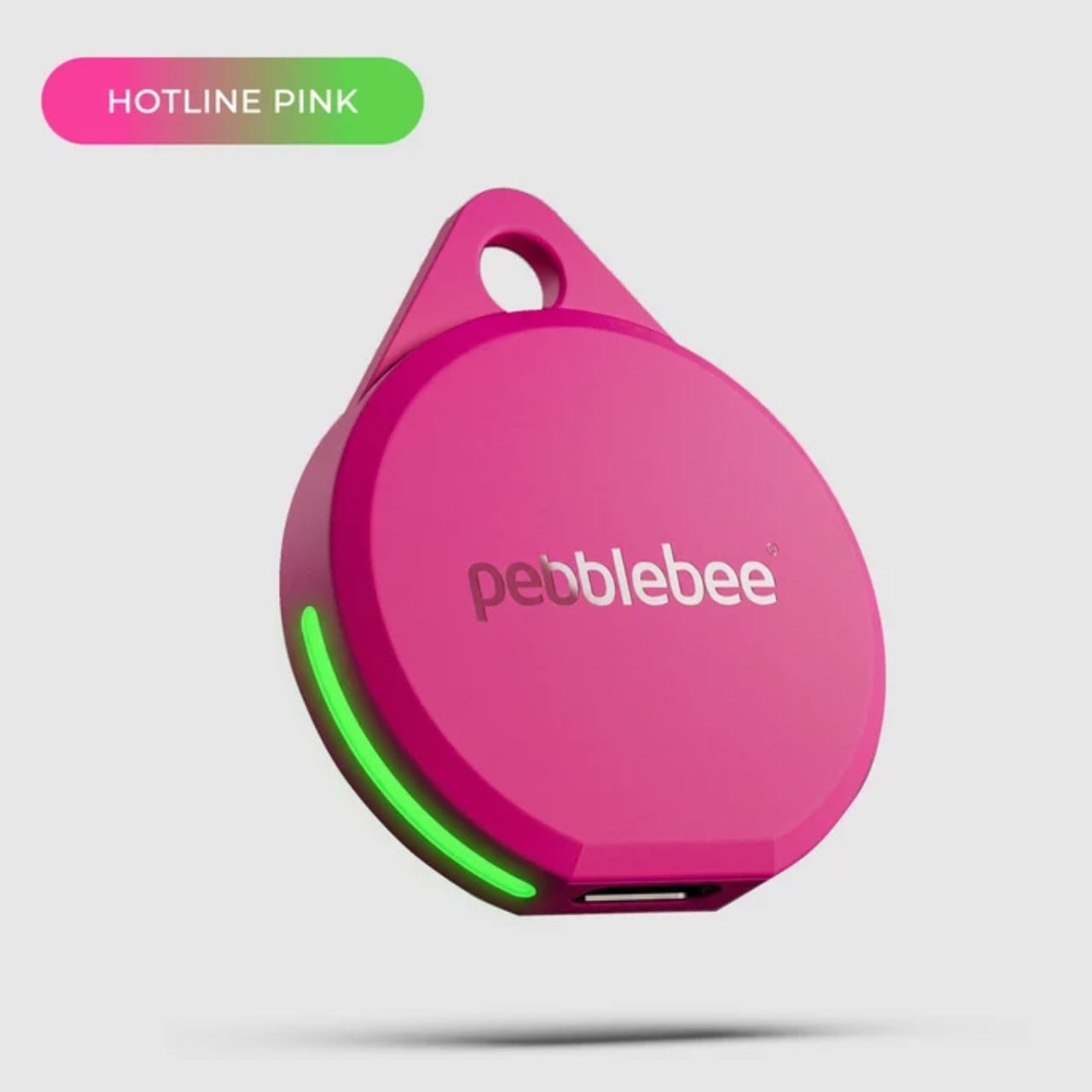
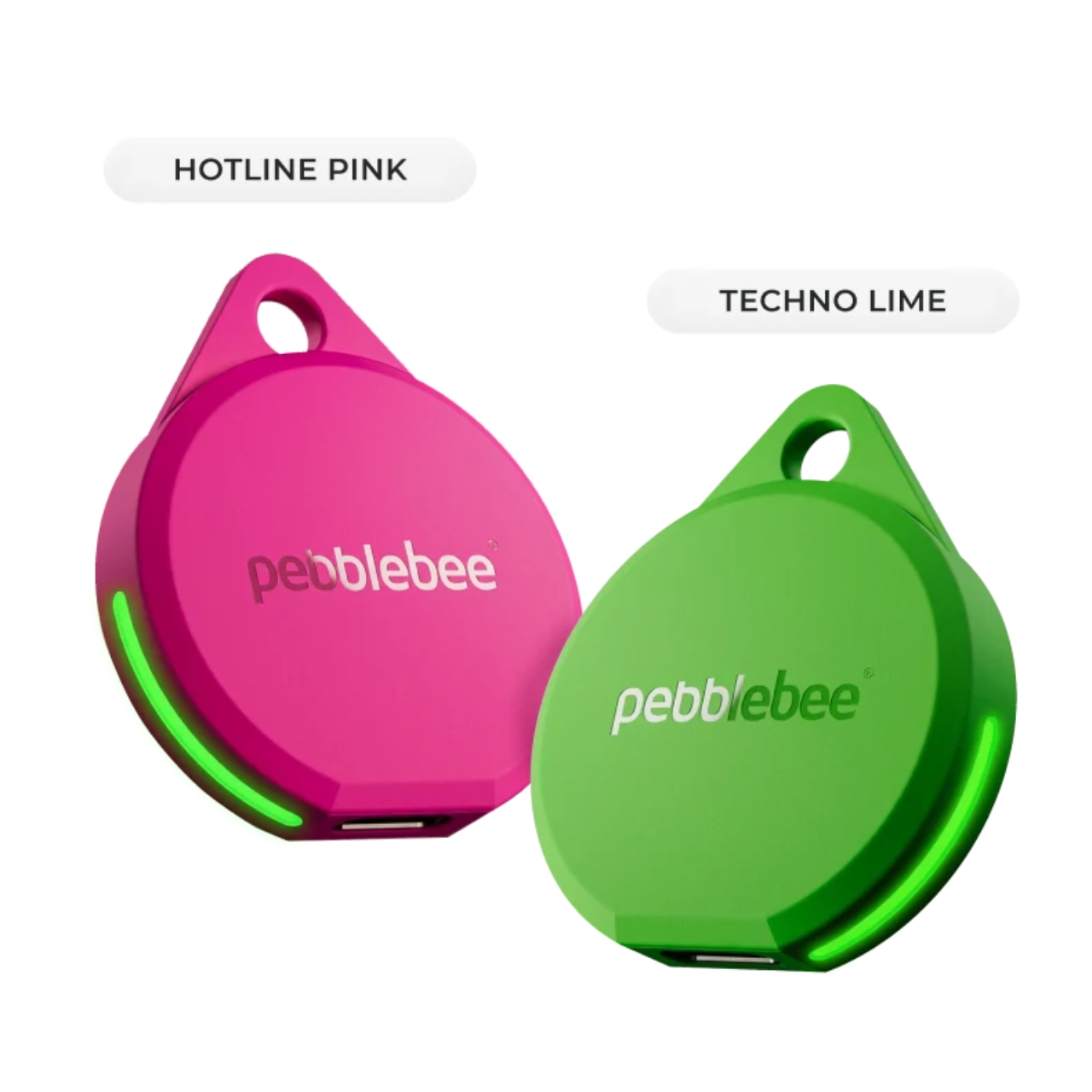
If you’re after a tracker that actually stands out, and one that can even glow in the dark, Pebblebee’s latest Evercolor drop might be exactly what you need. Evercolor is the brand’s limited-edition color program built exclusively for its Clip 5 tracker, and the newest release, called Neon Pulse, comes in two eye-catching shades: Techno Lime and Hotline Pink. Pebblebee describes the collection as perfect for “bold self-expression and a fresh-season reset,” and honestly, it’s hard to disagree.

Designer: Pebblebee

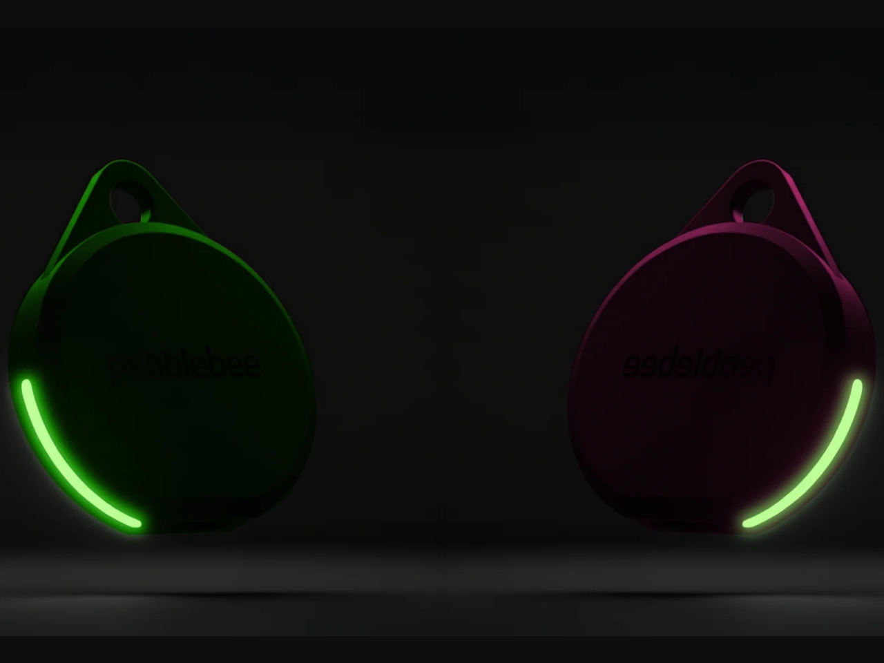
Evercolor has rolled out plenty of standout colors before, but Neon Pulse marks the first time the program has added glow-in-the-dark accents. That means your tracker stays visible even after its LED switches off, so you’re not just relying on the app to tell you where your item is. You can actually spot it in the dark, as long as it’s somewhere within eyesight.

Keep in mind that this is a limited-edition release, so if hot pink and neon green happen to be your colors, you’ll want to grab them soon. Pebblebee rolls out new Evercolor shades every twelve weeks, and once a drop sells out, it’s gone for good, no restocks. Previous collections like Freeze Frame and Heatwave Hijinks have already sold out, so if Neon Pulse catches your eye, don’t wait too long to add it to your cart.

Underneath all that color, though, it’s still the same reliable Clip 5 that Pebblebee originally released. It works with both Apple and Android devices, so you don’t have to worry about switching phones down the line. The rechargeable battery lasts up to a year on a single USB-C charge, which means no more digging through drawers for spare coin batteries. It also boasts a direct Bluetooth range of about 500 feet, roughly double what a lot of competitors offer, plus access to a global crowd-network for finding your stuff even farther away. On top of that, you get a 130dB siren, a bright LED strobe, and IP66 water resistance, so it can handle a little rain or an accidental splash without missing a beat.

It’s also worth noting that Neon Pulse still costs the same $34.99 as the standard Clip 5, so you’re not paying extra just for the fresh colorway. There’s also a free built-in safety feature called Alert, which can notify you if an unfamiliar tracker seems to be following you, a nice bit of peace of mind on top of everything else. Design-wise, the compact clip-on shape makes it look less like a tech gadget and more like an accessory for your bag, wallet, or keychain. Add in the bright, playful colorway, and it becomes even more fashionable, dare we say, kind of cool. So if your main complaint about trackers has always been that they all look the same, Neon Pulse is built to solve exactly that problem.

At the end of the day, a tracker is only useful if you can actually tell it apart from the pile of identical black and white gadgets everyone else seems to own, and if you enjoy using it enough to keep it clipped on in the first place. Pebblebee’s Neon Pulse drop checks both boxes, combining genuine utility with a design that feels personal rather than generic. Whether you’re the type who loses your keys weekly or you just want your tech to match your personality, this drop is worth a look before it disappears for good. And if pink and green aren’t quite your vibe, it might be worth keeping an eye on Pebblebee’s page anyway. With a new Evercolor drop landing every twelve weeks, there’s a good chance your perfect color combo is just around the corner.

The post Never Lose Your Keys Again With a Tracker That Glows in the Dark first appeared on Yanko Design.

  •  

Mettez à jour Plex ! (même sans savoir contre quoi)

Si vous faites tourner un Plex Media Server quelque part chez vous, sachez que le 1er septembre dernier, Plex a publié un avis de sécurité qui demande aux propriétaires de serveur de passer en 1.43.3, et aux utilisateurs de l'application Desktop de passer en 1.115.0. Les versions 1.43.2 et antérieures sont donc toutes concernées.

Et c'est à peu près tout ce que l'annonce contient... Ils évoquent "un certain nombre de problèmes de sécurité", sans un mot sur ce qui est touché, ni sur la façon dont ça s'exploite, ni sur la gravité. Plex dit avoir demandé des identifiants CVE et promet de revenir publiquement donner des détails ensuite. Mais cela fait 8 jours et pour le moment, rien. Même la base de vulnérabilités du NIST ne renvoie rien sur "Plex Media Server"...

Mais de son côté, la Shadowserver Foundation , elle, n'a pas attendu les détails. En réponse à l'avis de Plex, elle scanne Internet tous les jours à la recherche des serveurs non patchés. Et à ce jour, elle en a dénombré plus de 36 000 exposés dont 16 000 rien qu'aux États-Unis.

Mais bon, peu importe... Comme personne ne sait ce que la faille permet, inutile d'essayer de jauger le risque. La seule question qu'on doit tous se poser, c'est de savoir si nos serveurs sont joignables depuis l'extérieur. Si l'accès distant est activé, ou qu'une redirection de port sur la box ou un sous-domaine pointe dessus, vous êtes sûrement dans le lot que Shadowserver a débusqué. Pire, des cybercriminels pourraient exploiter cette vulnérabilité... Donc mettez à jour rapidement.

C'est pas sorcier. Sous Windows, macOS et Linux, vérifiez que vous êtes bien en 1.43.3 ou plus récent, et sinon le paquet vous attend sur la page de téléchargement. Pour les installations Docker, Plex renvoie au README de son dépôt. Par contre, si votre Plex tourne sur un NAS, Plex prévient lui-même que le paquet peut ne pas encore être arrivé dans le magasin d'applications du constructeur. N'attendez pas qu'il descende tout seul, récupérez-le et installez-le à la main depuis l'interface du NAS.

Et si vous vous dites qu'un serveur de films n'intéresse personne, souvenez-vous de LastPass. En 2022, les attaquants sont entrés dans l'ordinateur d'un ingénieur de la boîte par son Plex Media Server , qui était encore sur une vieille version, et sont ressortis avec les coffres chiffrés des clients.

Alors allez-y.

Source : BleepingComputer

  •  

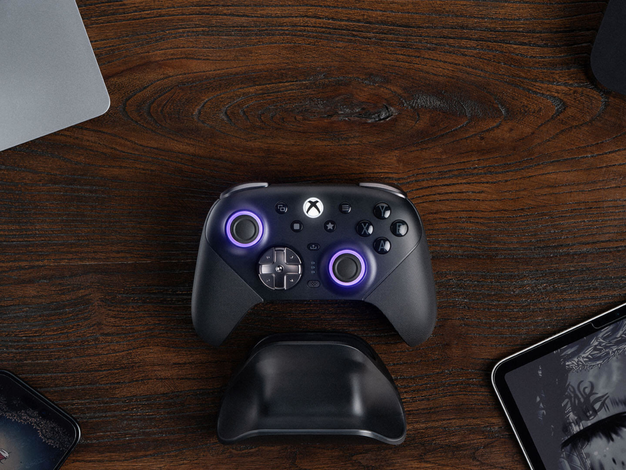
The 8BitDo Ultimate 3E Is the LEGO Set of Gaming Controllers

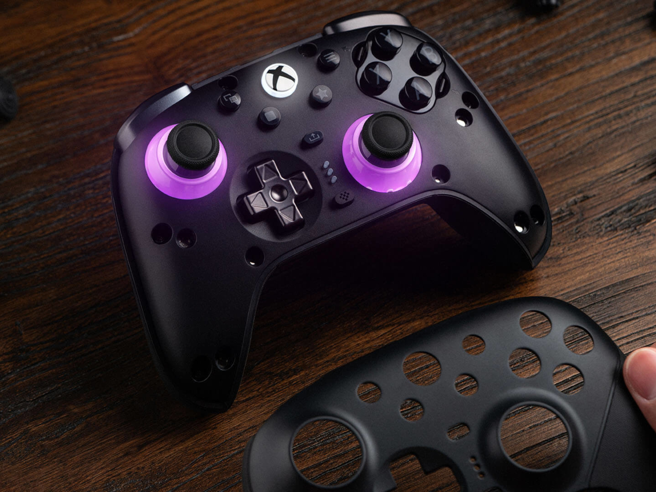
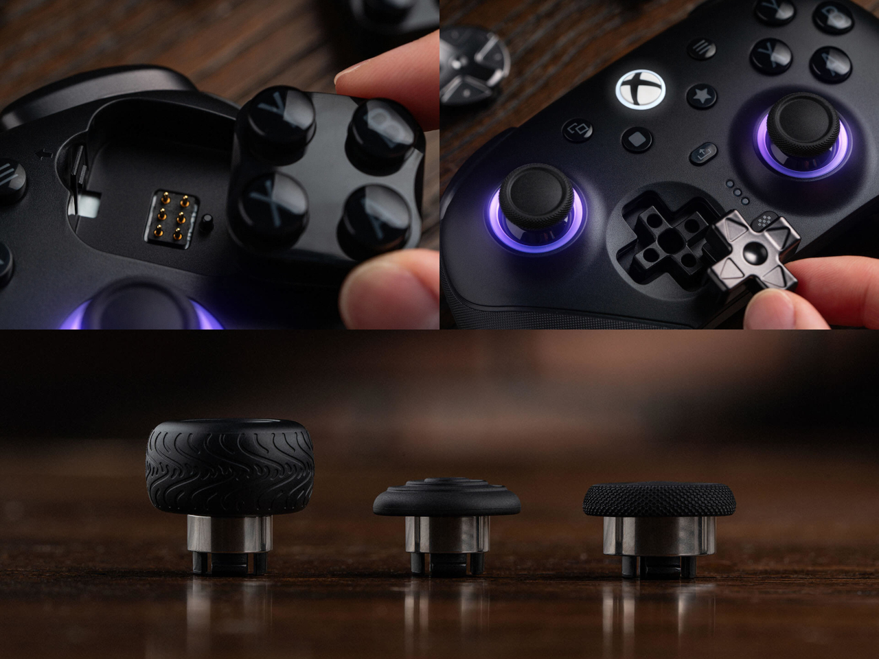
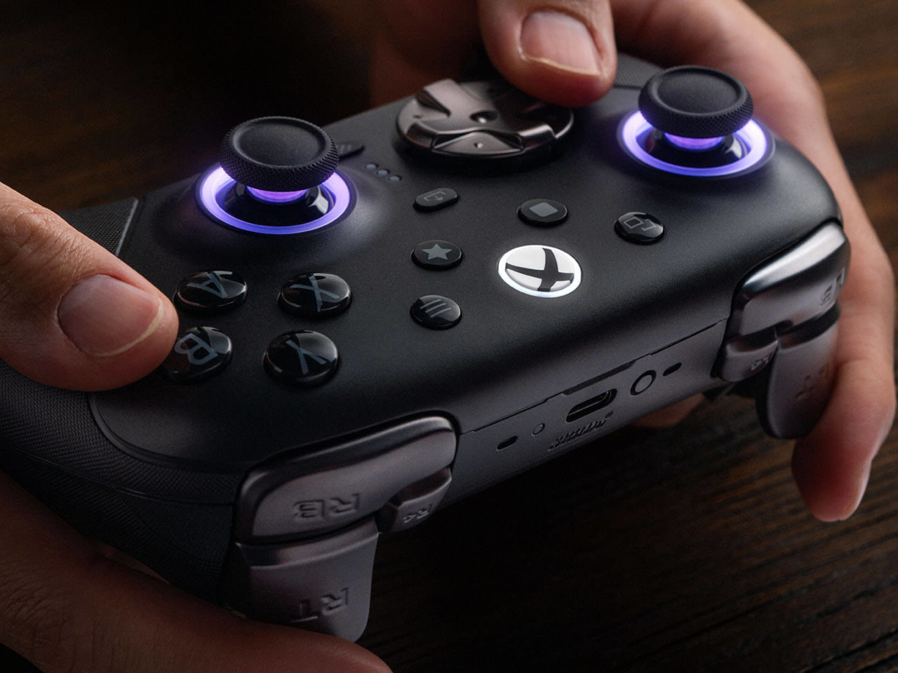
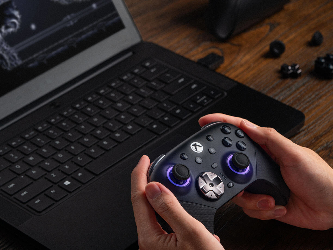
Most controllers ask you to adapt to them. The 8BitDo Ultimate 3E flips that arrangement entirely, building a controller around the idea that your hands, your genre, and your platform should decide its shape instead of the factory floor. The face buttons, the d-pad, and even the joystick tops snap in and out as swappable modules, turning what’s usually a sealed, one-size-fits-all object into something closer to a toolkit.

Pop off the magnetic faceplate and the accessory pack reveals its real purpose. A silicone membrane d-pad sits next to a tactile micro-switch version, and the joysticks come in tall, dome, and thick-neck shapes, each suited to a different grip or genre. Racing games favor a different thumb position than platformers, and for once, the hardware bends to match instead of forcing a single compromise across everything you play.

Designer: 8BitDo

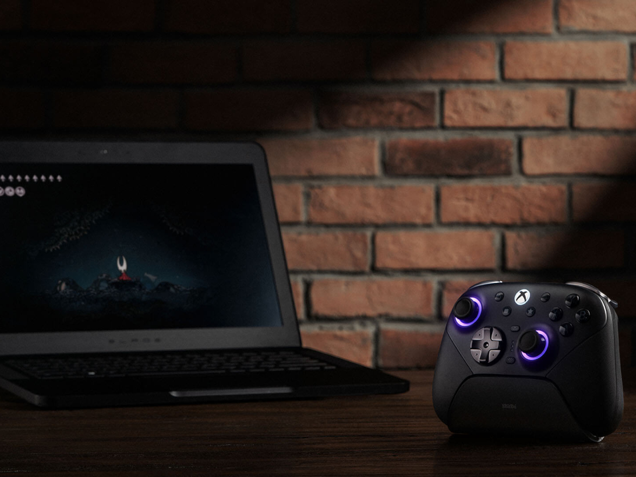
Underneath those swappable caps, the joysticks themselves run on Tunneling Magnetoresistance sensors, a technology built specifically to resist the drift that eventually creeps into analog sticks after enough hours of use. Interactive RGB fire rings pulse around the base of each stick, translating movement into visual feedback in real time, a small touch that turns an otherwise invisible input into something you can actually watch respond.

The triggers carry their own bit of adaptability. Hall-effect sensors power two selectable trigger-stop positions, letting a shooter’s hair-trigger tap coexist with a racing game’s need for a longer, more gradual pull. Switching between them takes a flick of a physical switch, not a trip through a menu, which matters when a genre change happens mid-session rather than between them.

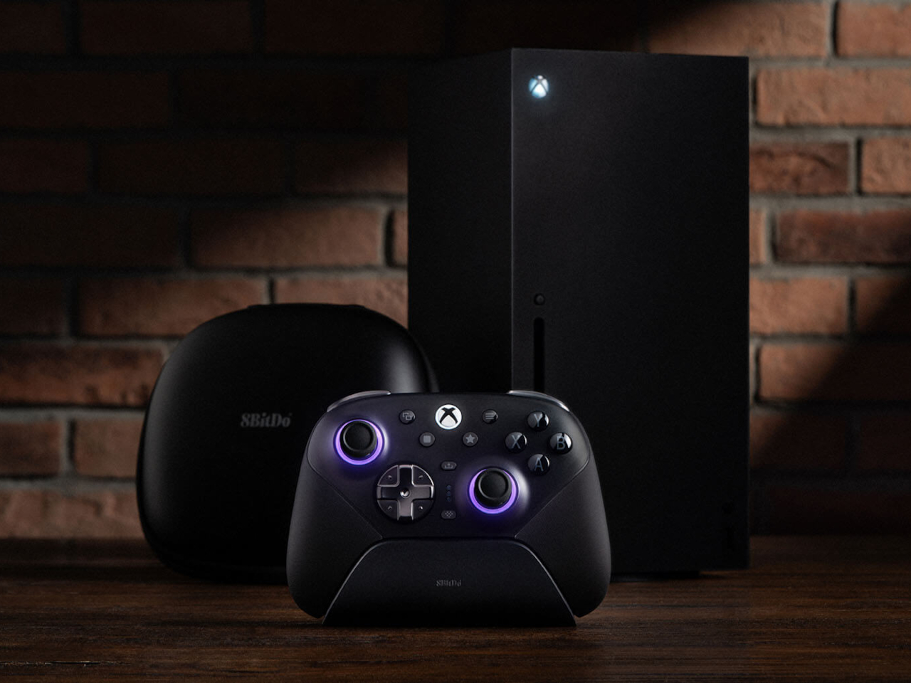
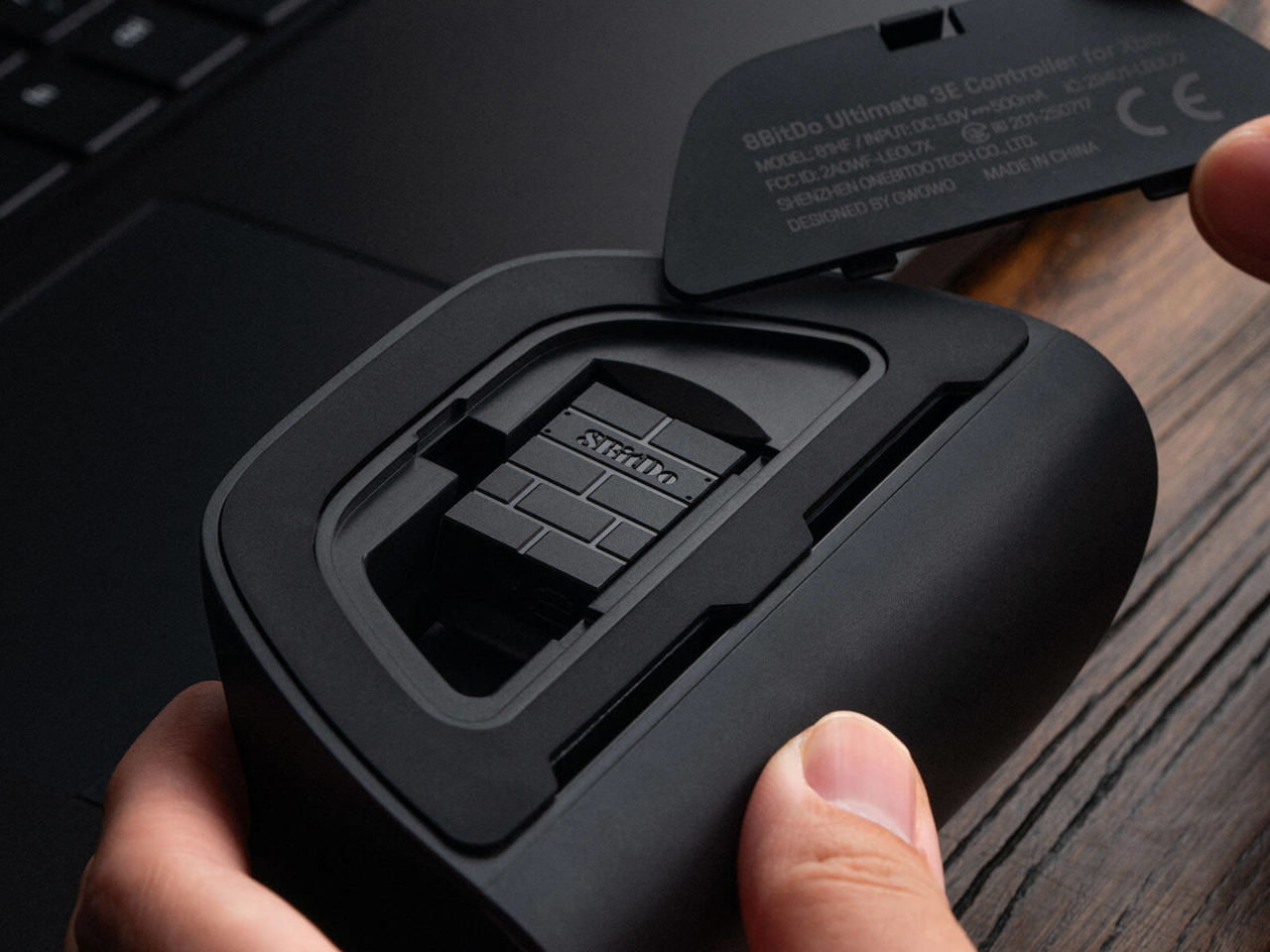
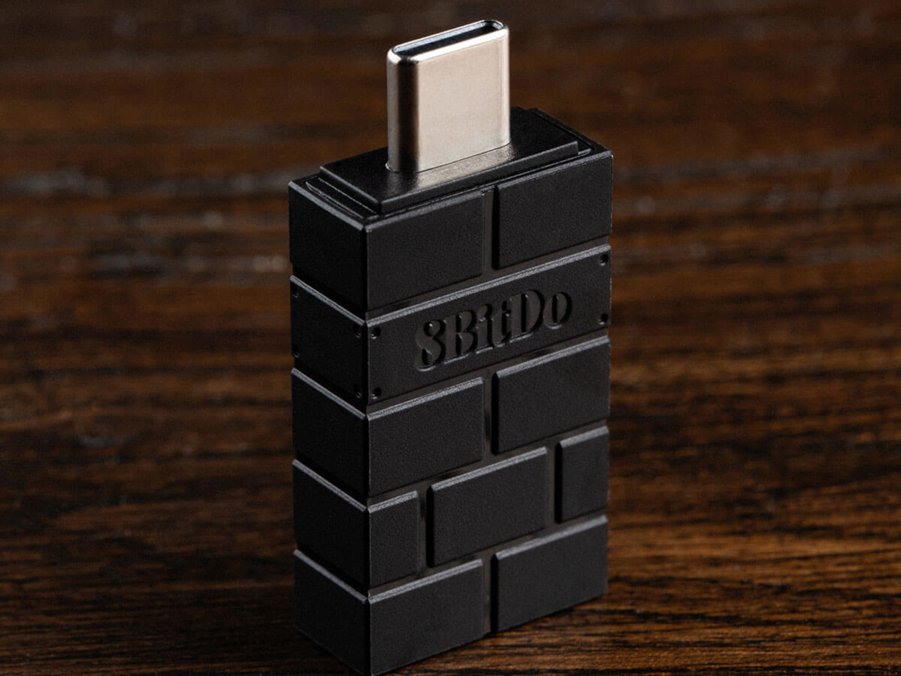
Connectivity spreads just as wide as the physical customization. The Ultimate 3E runs 2.4G wireless and wired modes for Xbox and PC, and switches to Bluetooth for mobile devices, now backed by a USB-C signal adapter for steadier range across more rooms and setups. Apple has officially signed off on compatibility too, covering iPhone, iPad, Mac, Apple TV, and even Apple Vision Pro, stretching the controller’s use well past the console it was designed around.

An integrated wireless charging dock handles power without cables cluttering a desk, while two pro-level back buttons and a pair of extra-fast bumpers add inputs for players who map more complex combinations. Three custom profiles let different games, or different people, keep their own configuration ready to load instantly, and a 3.5mm jack keeps wired headphones in the mix for anyone who still prefers a physical connection over Bluetooth audio.

None of this treats customization as an afterthought bolted onto a finished product. Every swappable piece, every sensor choice, feels like it was scoped out before the shell was ever molded, built around the idea that serious players tend to have very specific, very personal preferences about how a controller should feel in their hands.

The post The 8BitDo Ultimate 3E Is the LEGO Set of Gaming Controllers first appeared on Yanko Design.

  •  

Your Second Screen Can Finally Work With No Cables and No Outlet

Desks are overrated. So are the cables that come with them. The 4URPC is a 15.6-inch wireless touchscreen monitor built for people who’d rather not be chained to an outlet just to get a bigger screen. It’s slim, self-powered, and ready to mirror whatever’s on your phone, tablet, or laptop the moment you need more room to work, watch, or play.

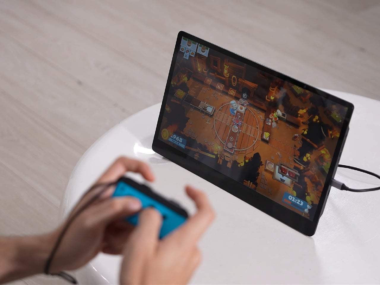
Cutting the cord doesn’t mean cutting functionality. The monitor mirrors an iPhone or Android device through a peer-to-peer wireless connection, no home Wi-Fi or app required. For streaming platforms like YouTube, Netflix, or Hulu, connecting to Wi-Fi and tapping the built-in TV Cast icon sends video to the screen. Either way, there’s no dongle to lose or cable to untangle before the movie starts.

Designer: 4URPC

Click Here to Buy Now: $219 $399 (45% off). Hurry, only 451/600 left! Raised over $181,000.

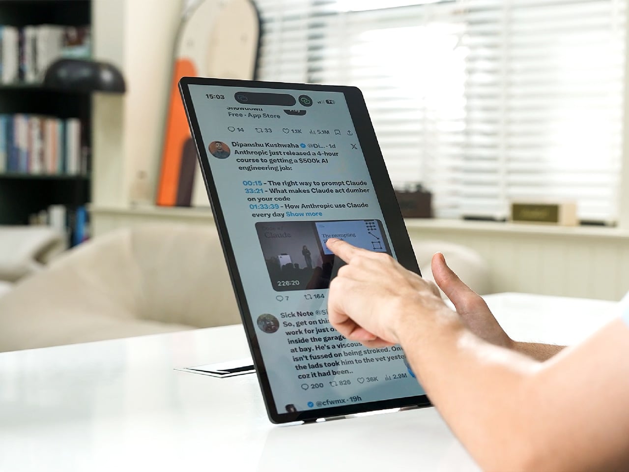
The more interesting trick happens after mirroring starts. The 10-point touchscreen can send input back to the connected phone, turning the monitor into a larger, shared control surface. Flip through photos with a friend, walk a colleague through a presentation, or hand someone the reins without handing over your phone. It’s a shift that makes shared screen time less awkward.

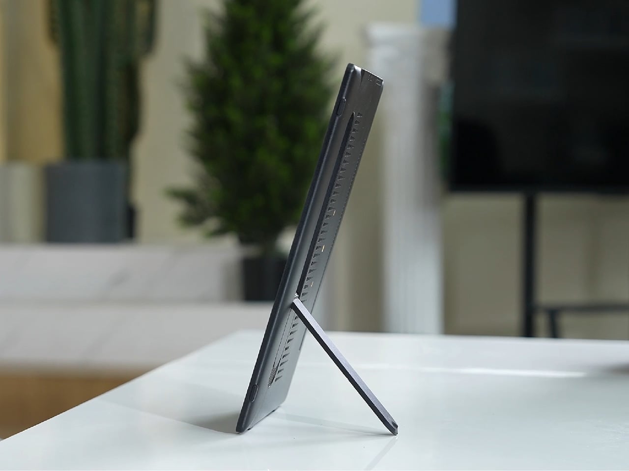
None of this would matter much if the monitor were bulky. At half an inch thick and just over 2 pounds, it’s built to disappear into a backpack rather than dominate it. The matte, textured shell keeps fingerprints and glare to a minimum, and a fold-out kickstand on the back means setup takes seconds on a desk, a kitchen counter, or the arm of a couch.

A built-in 4,000 mAh battery backs up that portability by taking the wall outlet out of the equation. Setting up on a train, in a hotel room, or on a patio doesn’t mean scouting for the nearest plug first. That same battery can lend a charge to a connected phone, turning the monitor into a backup power bank when the moment calls for it.

Plug it into a laptop with a USB-C cable, and the 4URPC switches roles, becoming an extended display rather than a wireless mirror. Dragging a browser tab, a chat window, or a reference document onto the second screen takes a second, and the touchscreen works over the wired connection. The laptop stays focused on the main task while the extra display handles everything else.

The screen also rotates between landscape and portrait without any fuss, which sounds minor until it changes how you use it day to day. Landscape suits video calls, games, and spreadsheets, while portrait mode fits scrolling through documents, reading long articles, or checking social feeds. Switching between the two takes a twist of the stand, not a trip through a settings menu.

Compatibility runs wide enough that most people won’t need to think twice before connecting. Wireless mirroring covers iPhones, Android phones running version 10 or later, MacBooks, and most Windows laptops, while the wired USB-C or HDMI input works with game consoles, streaming boxes, and the Nintendo Switch. There’s no software to install and nothing to configure; connecting the device and turning it on is the entire setup process.

Under the glass sits a 1920×1080 matte IPS panel running at 60 Hz, built more for comfortable, glare-free sessions than eye-popping color numbers. Dual USB-C ports split power delivery and video duties, small stereo speakers cover casual audio, and a VESA mount plus a standard camera screw thread add mounting options beyond the built-in stand. It’s a practical set of choices rather than a flashy one.

There’s something telling about a monitor that assumes you won’t always be sitting at the same desk tomorrow. Work has scattered across kitchen tables, coffee shops, and airport gates for a while now, and screens are only starting to catch up. The 4URPC doesn’t try to be the sharpest or brightest display around; it just tries to be wherever you happen to land next.

Click Here to Buy Now: $219 $399 (45% off). Hurry, only 451/600 left! Raised over $181,000.

The post Your Second Screen Can Finally Work With No Cables and No Outlet first appeared on Yanko Design.

  •  

Japanese Designers Just Solved the Dead Battery Diffuser Problem

There are several times a day when you’ll want to sit down and take in the aroma of your favorite essential oils. It might be early in the morning to help you wake up, right when you start work and need a boost of energy, at the end of the day when you’re relaxing, journaling, or reading, or right before bed so the scent can help you settle into a good night’s sleep. At any of those moments, your oil diffuser is your best friend, that is, unless it runs out of battery or charge right in the middle of your routine.

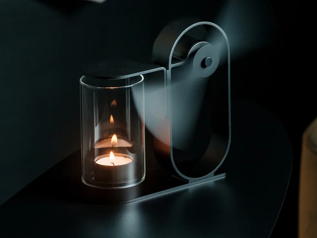
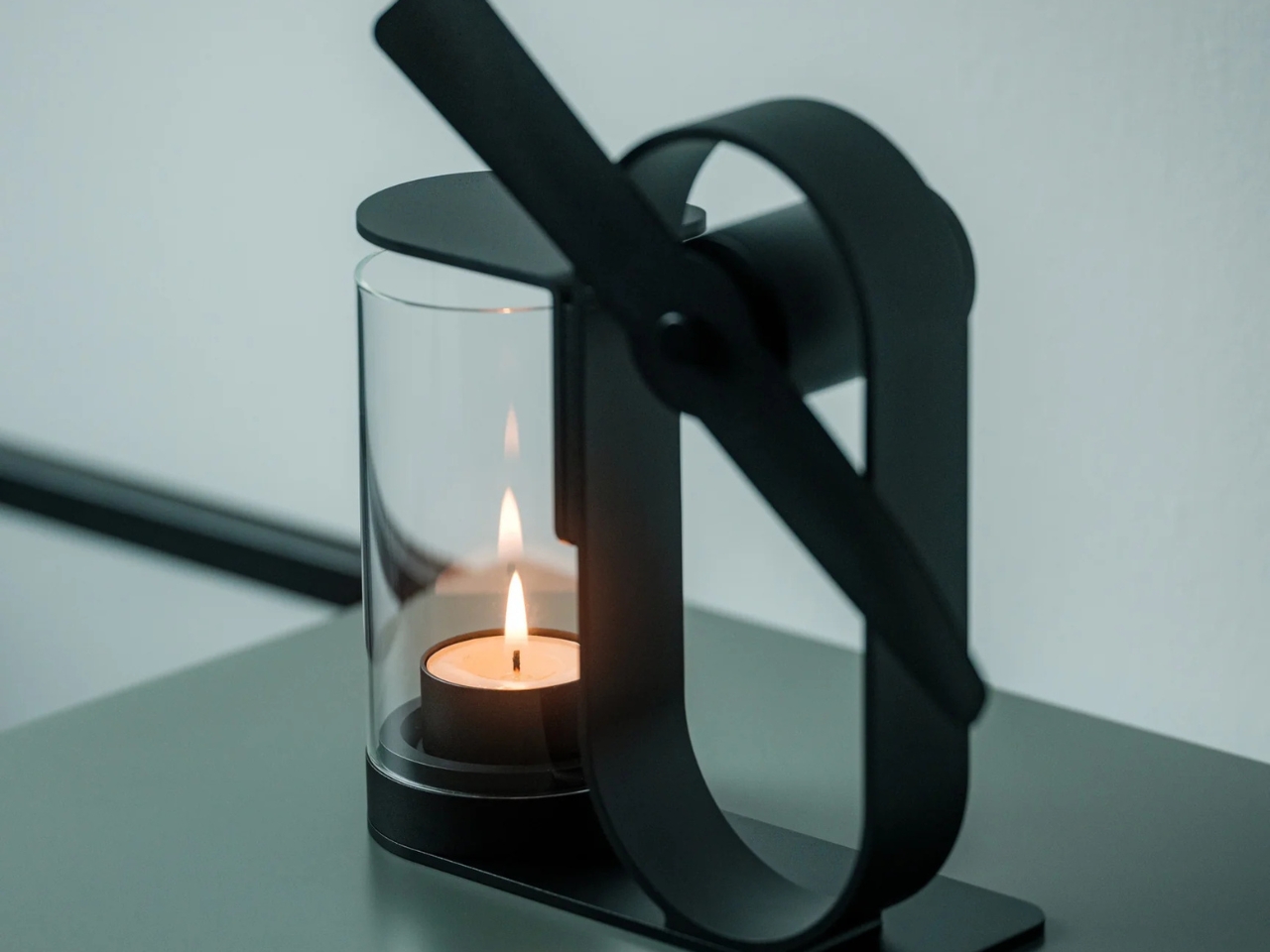
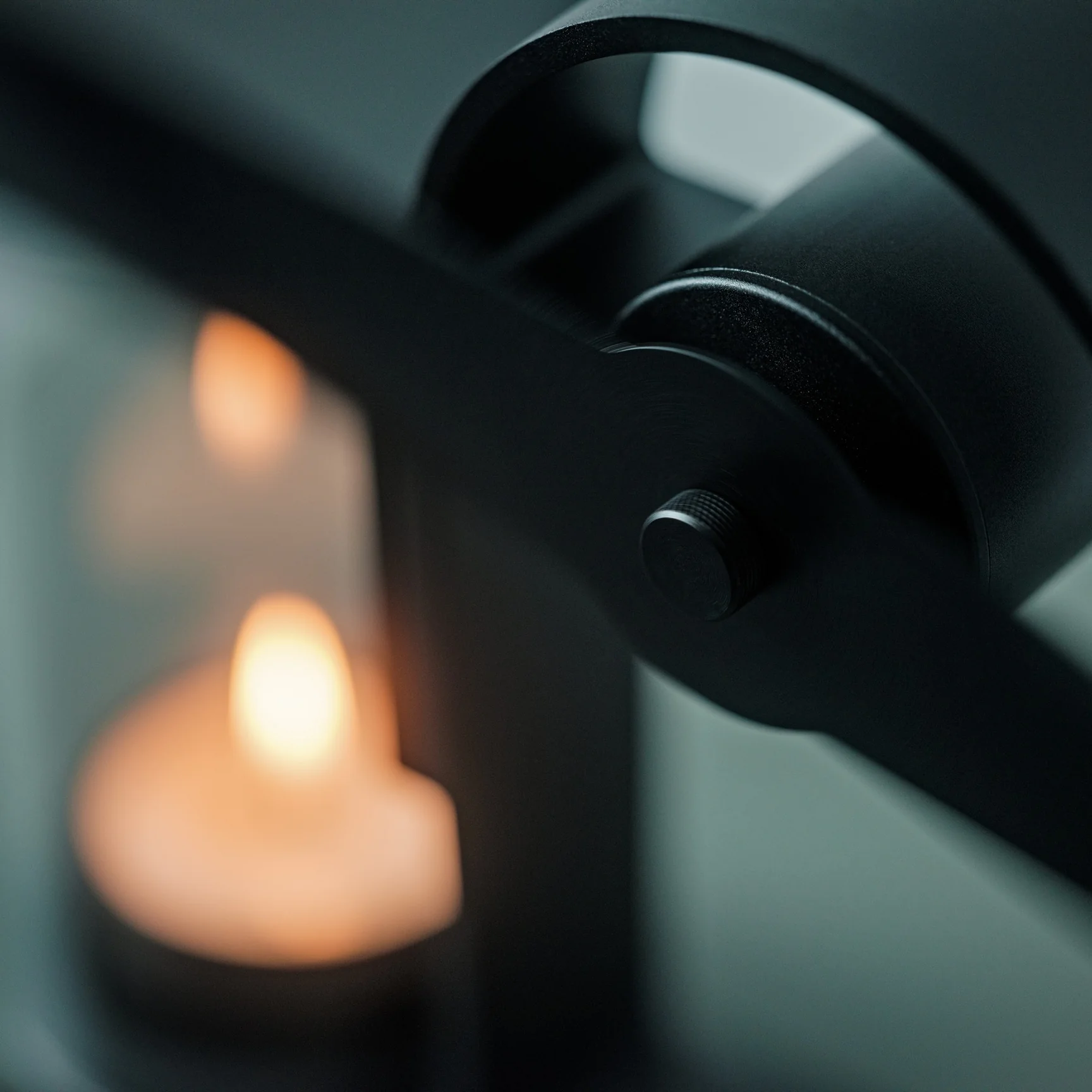
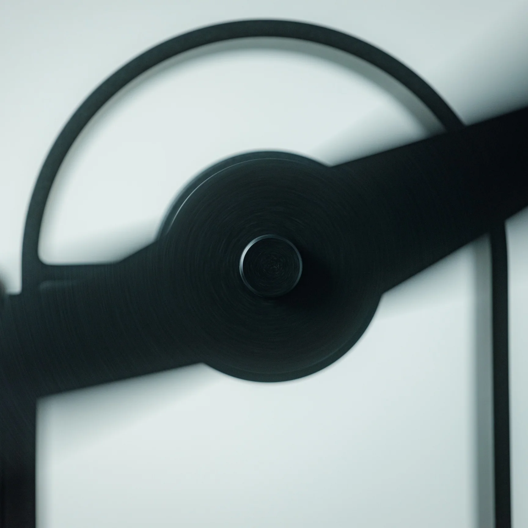
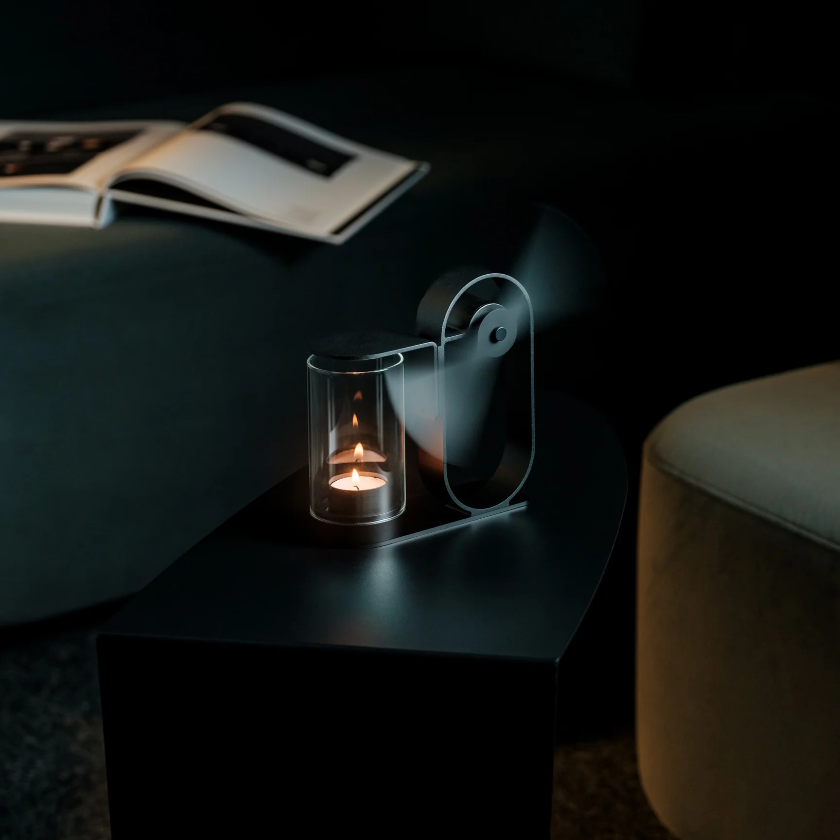
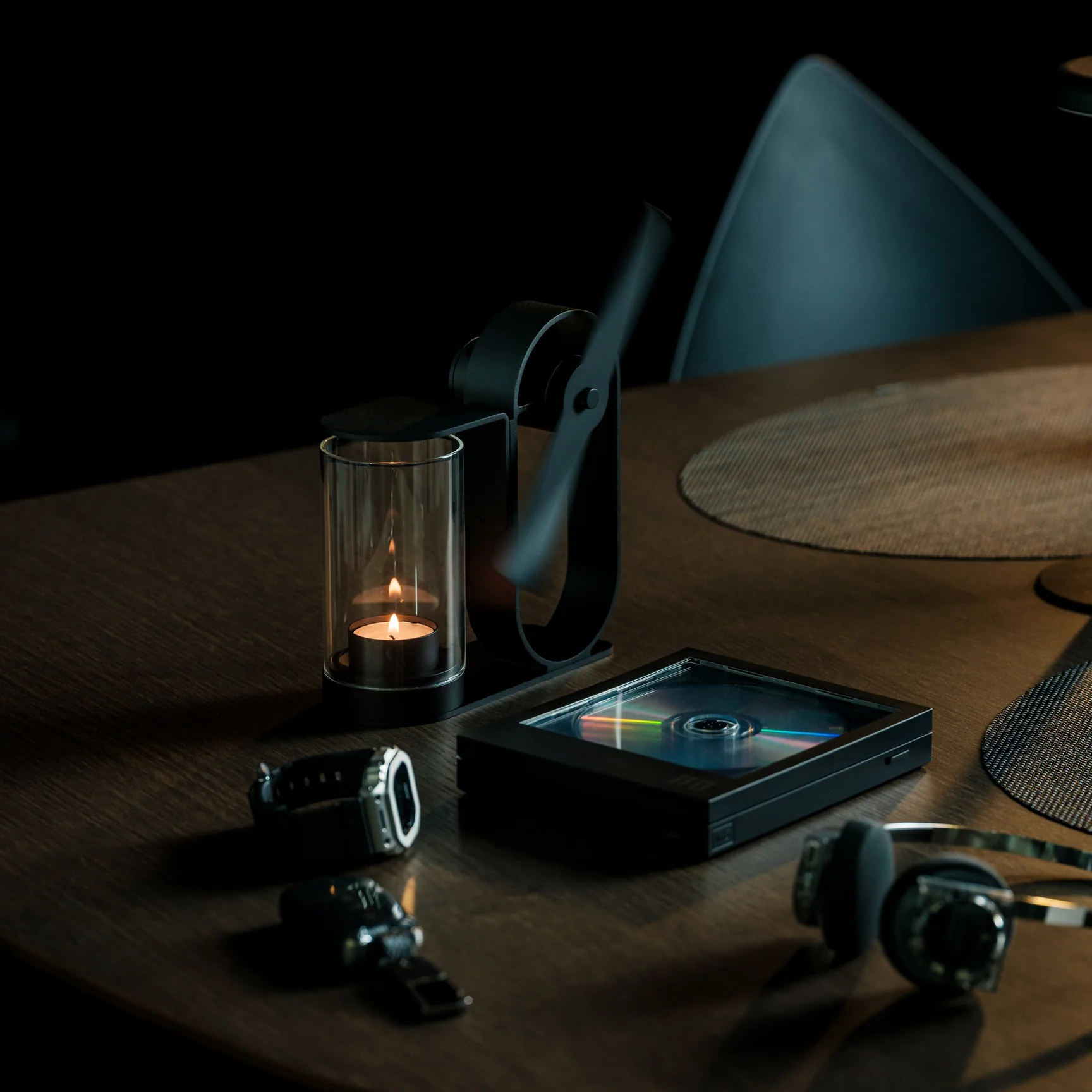
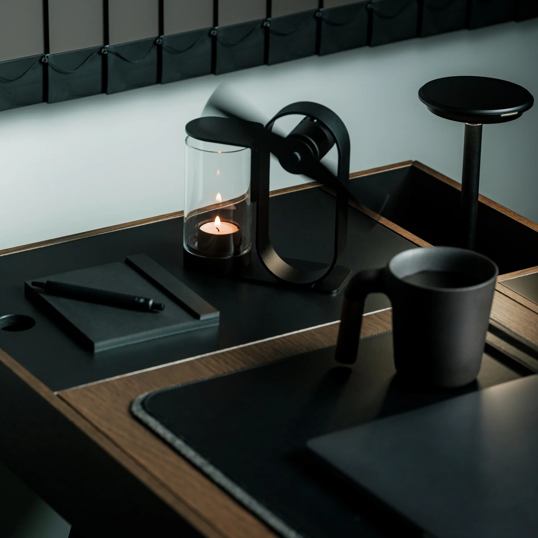
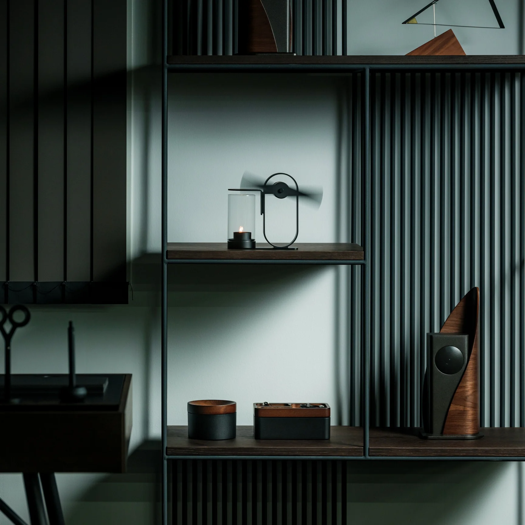
If you’re using the Battery-Free Aroma Diffuser, that’s one problem you’ll never have. As the name suggests, it’s completely battery-free and skips the fancy ultrasonic tech found in most diffusers on the market. All you need is a candle; its rising heat spins a built-in propeller that carries the scent of your essential oil of choice, and you’re all set to relax or recharge, whichever one you need. Setting it up becomes part of your morning or nighttime ritual, giving you what’s been called “magic powered by a single flame.”

Click Here to Buy Now: $290.00

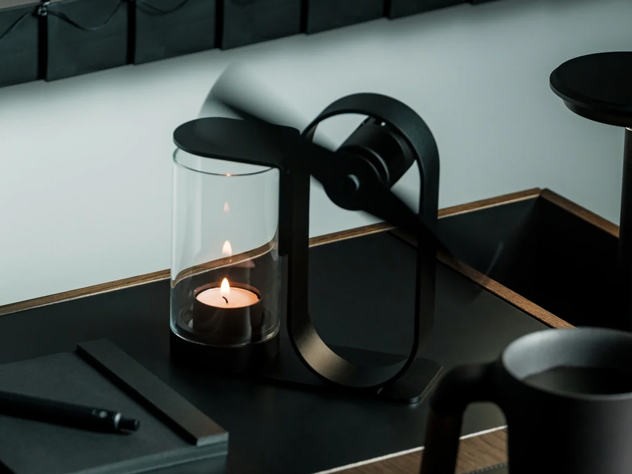
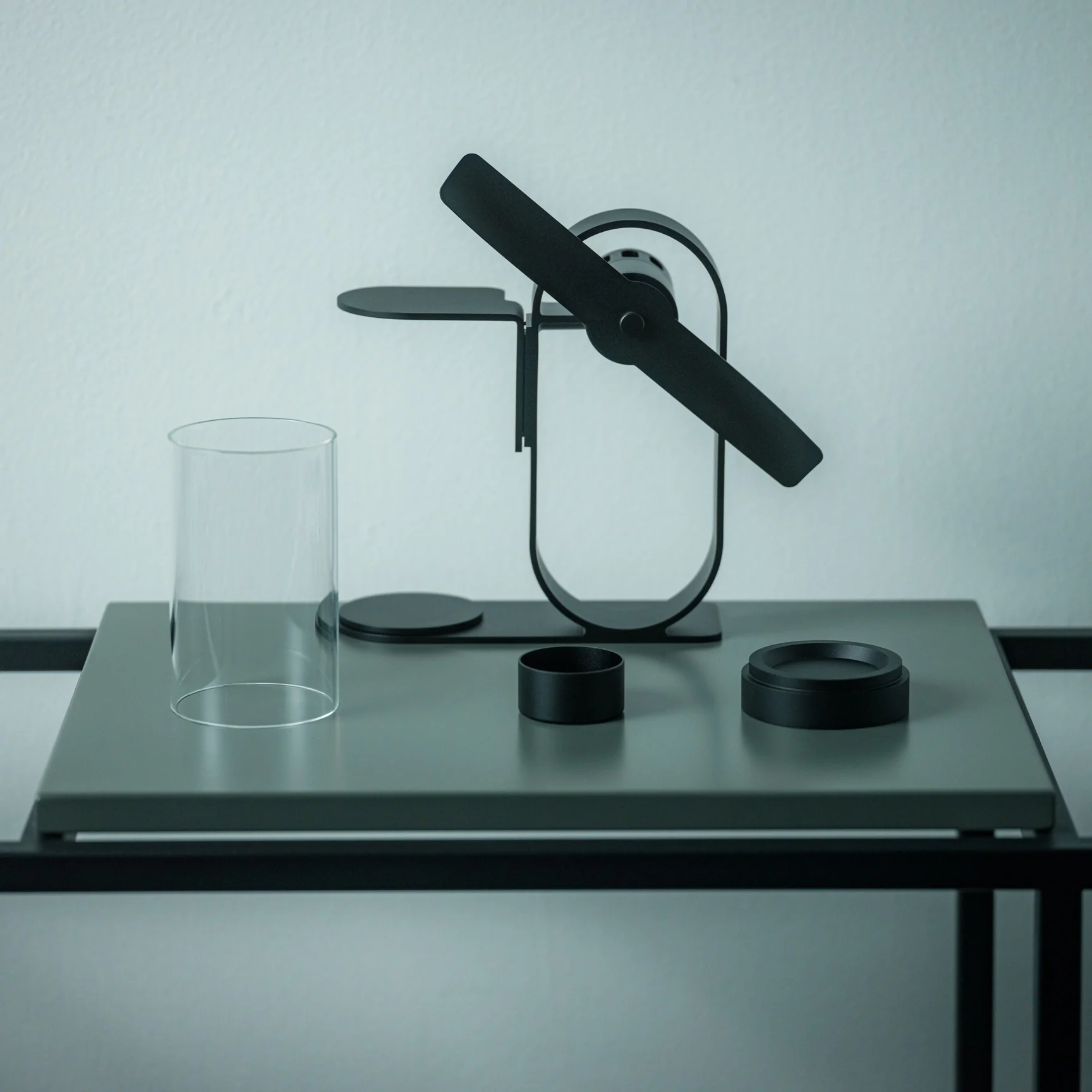
This diffuser was designed by Yu Ito and Yoshimi Kemmotsu of SOL style. Most diffusers on the market run on batteries, charging cables, and plastic ultrasonic components. This one skips all of that and works on nothing more than physics, heat, and fire. Its minimalist, elegant design only adds to the “magic” of the experience, as you watch your essential oils fill the room in a way that feels almost mystical. Because so much of the piece is transparent, you can see exactly how it works, from the flickering candle flame to the visibly spinning propeller above it.

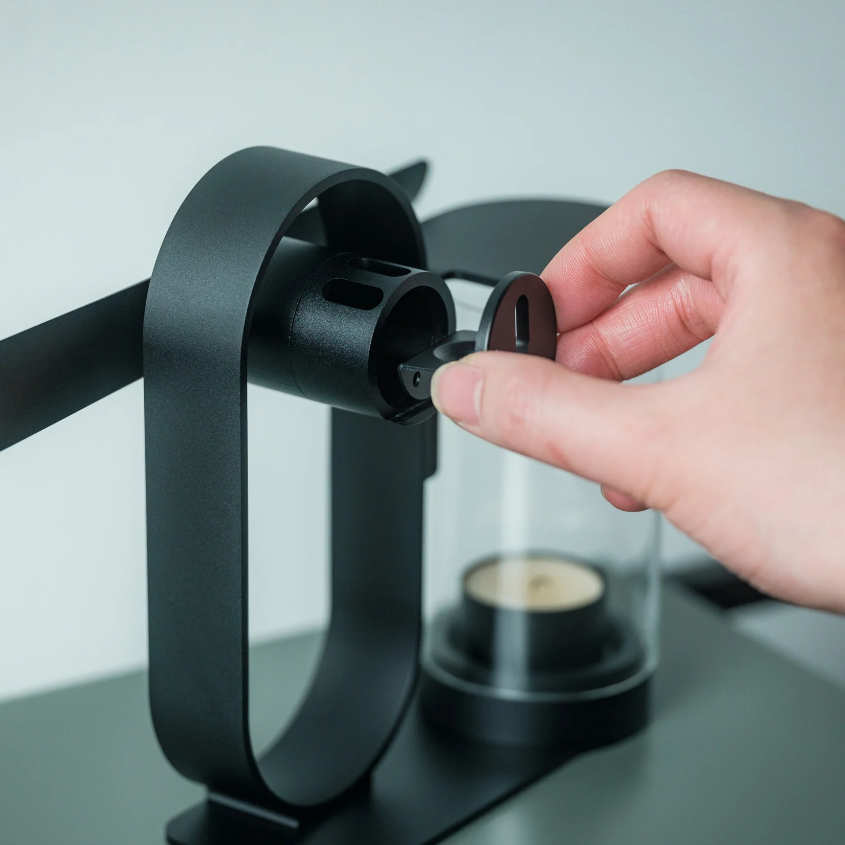
The process of using the diffuser is refreshingly simple and doesn’t involve a lot of steps. Start by placing your essential oil of choice in the dedicated compartment located at the center of the propeller. Light a candle and set the cover in place. Wait about two to three minutes for the rising heat to spin the built-in propeller, and once it’s turning, it will carry the scent of your oils and fill the space around you.

The diffuser itself is built from aluminum, glass, and iron, materials chosen for being sustainable and long-lasting, so you’re not contributing to the pile of dead batteries or broken plastic housings that come with most electric diffusers. Because it needs no outlet and no batteries, it’s also completely portable. Set it up on your dining table, your nightstand, or even take it outside for a quiet evening on the patio.

If you’ve shopped for a diffuser before, you’ve likely come across a big name like Vitruvi, whose Stone Diffuser is frequently ranked among the best overall by outlets like Wirecutter and InStyle. Vitruvi’s design is genuinely beautiful, but it’s still an electric, ultrasonic device that needs to be plugged in or charged to run. More budget-friendly brands like InnoGear and Urpower take a similar ultrasonic approach at a much lower price, but they typically trade craftsmanship and material quality for affordability, leaning on plastic components that don’t hold up as well over time.

The Battery-Free Aroma Diffuser doesn’t try to compete on mist output, app connectivity, or color-changing lights. Instead, it carves out its own lane by focusing on ritual, sustainability, and craftsmanship. You won’t get smart features or adjustable settings, but you also won’t ever need to charge it, replace a battery, or worry about internal electronics failing. It does come at a premium, priced around $249 compared to the roughly $30 to $130 range most ultrasonic diffusers occupy, but for design lovers and sustainability-minded shoppers, that price reflects a genuinely different kind of product rather than just another gadget competing on specs.

At the end of the day, the Battery-Free Aroma Diffuser isn’t trying to be the most powerful or the most tech-forward diffuser on your shelf, it’s trying to be the most memorable. Whether you’re using it to ease into your morning coffee, get into a work groove, unwind after a long day, or settle in before bed, lighting that single candle and watching the propeller slowly spring to life feels far more intentional than simply pressing a power button. It won’t die mid-session, won’t need a replacement battery, and won’t end up as e-waste a few years down the line. For anyone looking to turn aromatherapy into an actual experience rather than just another appliance to switch on, this quiet, flame-powered design might be one of the most beautiful ways to get there.

The post Japanese Designers Just Solved the Dead Battery Diffuser Problem first appeared on Yanko Design.

  •  

RSSMonster - Le lecteur RSS qui trie vos flux en local

Vous le savez, je suis un grand défenseur des flux RSS . C'est d'ailleurs pour ça que le mien est complet !! Je dois être le dernier à faire ça, alors, abonnez-vous (c'est gratuit) car ça me permet de continuer à faire ce que j'aime et ce que vous aimez aussi apparemment, puisque vous êtes de plus en plus nombreux à venir ici !

Mais bon, bref, si je vous parle de ça aujourd'hui, c'est parce que j'ai découvert RSSMonster, un lecteur de flux RSS que vous installez sur votre machine, et qui a la particularité de rapprocher tout seul les articles qui parlent du même truc et qui leur met une note.

J'ai de la lecture...

La qualité d'écriture compte pour moitié, le ton pour un quart, et le dernier quart mesure à quel point le texte est promotionnel, si bien qu'un publireportage descendra tout seul. J'ai trouvé ça plutôt malin. Et les articles qui racontent le même "fait" sont regroupés dans un Event, donc vous lisez l'actu qu'une fois sans vous fader tous les copycats.

Et le plus cool, c'est que ce tri tourne sur votre ordi, sans avoir besoin de la moindre clé d'API. Chez Miniflux ou FreshRSS, la liste officielle des fonctionnalités ne mentionne rien de tel. Quant à NewsBlur, celui-ci apprend à masquer ou surligner les articles selon ce que vous lui dites aimer, ce qui n'est pas la même chose que rapprocher deux actus pour les dédupliquer. Dans le même genre, je vous avais quand même déjà parlé d' un lecteur RSS qui s'y met aussi.

Le choix à faire

RSSMonster est livré avec deux fichiers Docker Compose. Le premier monte l'application et un collecteur de flux au-dessus de SQLite, sans un seul modèle (c'est celui de la procédure express du README). Le second ajoute MySQL, un worker dédié à l'IA et le service d'inférence, et c'est lui qui allume tout ça.

En fait, si vous choisissiez SQLite, la concurrence des traitements optionnels sera plafonnée à un, donc, ce sera un peu plus lent. Et surtout, le profil léger tel qu'il est livré ne démarre pas le worker IA et coupe l'inférence, donc pas de regroupement ni de notes tant que vous ne les activez pas à la main. Ça ira donc pour une install perso, mais si vous voulez mettre ça sur un serveur pour le partager à tous vos potes ou dans votre entreprise, je vous conseille vraiment de choisir MySQL directement. Parce qu'après, la bascule de l'un vers l'autre a l'air plus hasardeuse.

Enfin, rassurez-vous, il y aura toujours la possibilité d'exporter un fichier OPML avec tous vos abonnements et les catégories. Par contre, ça ne transporte que votre liste de flux, pas les articles déjà collectés ni ce que vous avez lu.

Installer le profil léger (SQLite)

C'est celui que je vous conseille pour commencer. Côté prérequis : git, Docker et Docker Compose. On commence par cloner le dépôt :

git clone https://github.com/pietheinstrengholt/rssmonster.git
cd rssmonster

Ensuite, faut générer deux secrets. Lancez cette commande deux fois, les résultats doivent différer :

openssl rand -hex 32

Créez un .env à la racine, lisible par vous seul :

touch .env && chmod 600 .env
JWT_SECRET=votre-premier-secret
FEVER_CREDENTIAL_SECRET=votre-second-secret

Ajoutez-y RSSMONSTER_BIND_ADDRESS=0.0.0.0 tout de suite pour y accéder depuis une autre machine, le port n'écoutant que sur la boucle locale. Et ne sautez pas les secrets, car le Compose refuse de démarrer si l'un des deux manque :

docker compose up -d

Ouvrez http://localhost:3000. Pas de compte admin par défaut, c'est le premier que vous créez qui devient l'administrateur, et notez bien vos identifiants. Ensuite, allez dans réglages puis flux, et importez ensuite votre OPML.

L'écran de connexion au premier démarrage

Et si vous voulez la version qui dépote (MySQL)

Si vous aviez déjà lancé le profil léger, coupez-le d'abord avec docker compose down, qui arrête les conteneurs sans toucher à vos données. N'y ajoutez surtout pas -v, car ça supprimera le volume et la base. Et MySQL démarrera vide et vous devrez réimporter votre OPML comme sur une install neuve.

Ensuite, ajoutez ces quatre valeurs dans le même .env, à côté de vos deux secrets :

DB_DATABASE=rssmonster
DB_USERNAME=rssmonster
DB_PASSWORD=un-mot-de-passe-solide
MYSQL_ROOT_PASSWORD=un-autre-mot-de-passe-solide

Et lancez l'autre fichier :

docker compose -f docker-compose.mysql.yml up -d --build

Ne paniquez pas si localhost:3000 ne répond pas dans la foulée. L'application attend que MySQL et l'inférence soient dispo, et celle-ci commence par télécharger ses trois modèles donc ça prend quelques minutes. Le contrôle de santé de l'outil lui laisse dix minutes, donc allez vous faire un ti café (dans sa couche ? nooon).

L'ajout d'un flux, sa catégorie et sa fenêtre de rattrapage

Voilà, amusez-vous bien.

Source : le dépôt GitHub de RSSMonster

  •  

This Japanese Bottle Opener Catches the Cap So You Never Chase It Again

When you come home after a long, hectic day, sometimes all you want to do is sink into the couch, scroll through your phone, and crack open a cold drink. But when that “cold one” happens to be a bottle of beer or soda, things do not always go according to plan. The opener slips, the cap bends and gets mangled, or it pops off and goes skittering across the counter or under the couch. It is a minor inconvenience, sure, but it has a funny way of taking a little of the relaxation out of what should be a simple, satisfying moment.

The First Pour Bottle Opener was built to fix exactly that. Made by Suwada, a legendary Japanese blacksmith house, it is an elegantly crafted tool designed to let you enjoy your drink in peace. Its flowing, sculptural silhouette also makes it a genuine piece of design rather than a purely functional gadget you shove in a drawer and forget about.

Click Here to Buy Now: $65.00

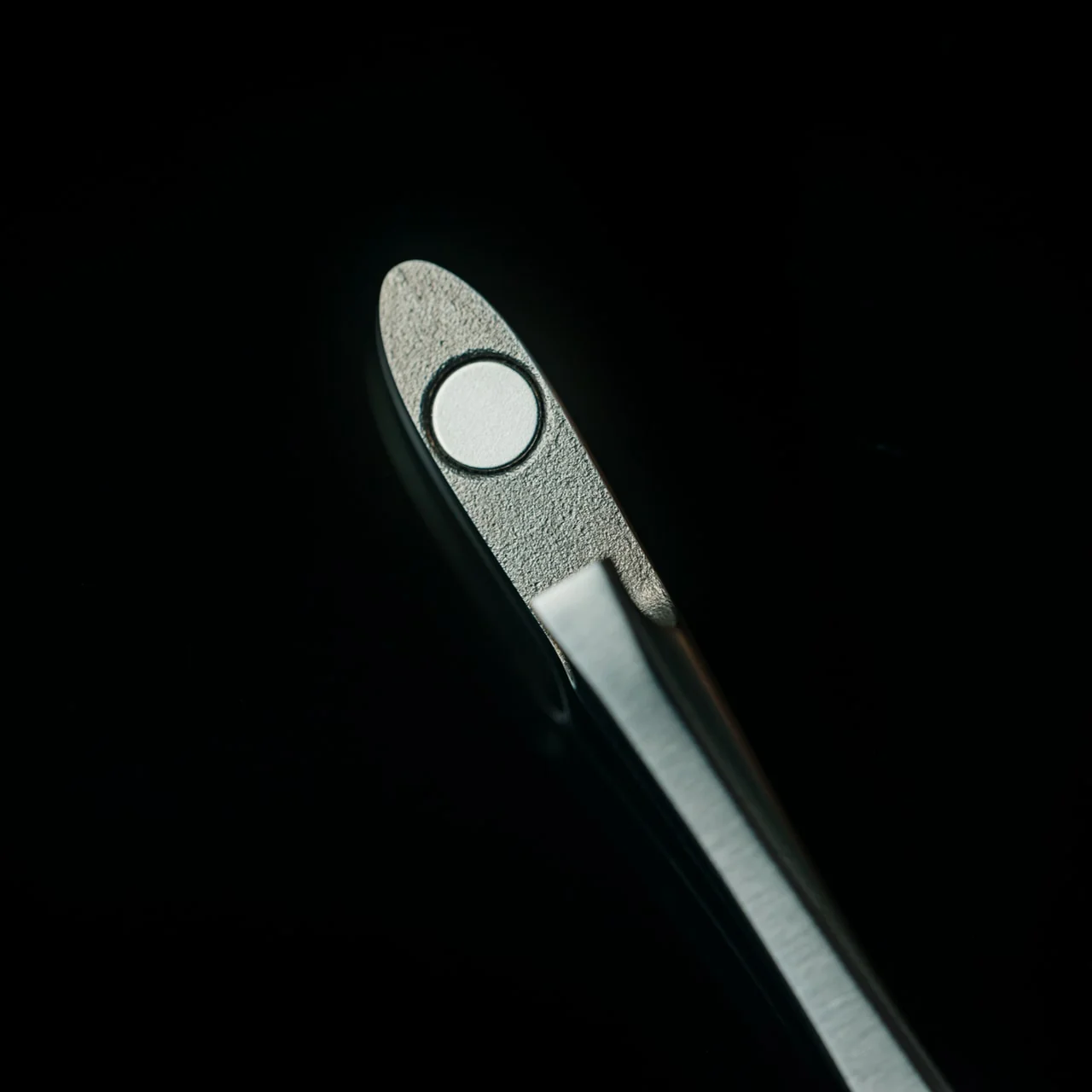
The bottle opener is forged from solid, corrosion-resistant stainless steel and finished with a hand-applied satin coat that gives it a soft, understated shine. Its shape isn’t flashy or complicated, and that’s exactly the point: the stripped-down, minimalist form is what makes it look right at home sitting out on your kitchen counter, bar cart, or shelf, instead of buried in a drawer with your corkscrews and other odds and ends. It’s also a quiet nod to Suwada’s roots. The company has been forging blades and metal tools in Tsubame-Sanjo, a Japanese region famous for generations of metalworking mastery, so the craftsmanship behind this little opener runs a lot deeper than its price tag might suggest.

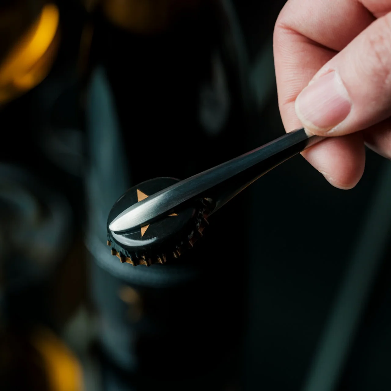
Where the First Pour really earns its keep is in the details. It opens bottle caps cleanly without bending or denting them, so you’re not left with a crushed, jagged souvenir every time you crack open a drink. It also has a built-in magnet that catches the cap the instant it pops free, rather than letting it clatter onto the counter, roll under the fridge, or scuff up your countertop. It’s a small addition, but it’s the kind of thoughtful touch a lot of openers skip entirely, and one that makes a genuine difference every single time you use it.

For comparison, a mainstream option like the OXO Good Grips Bottle Opener retails for around $10 and gets the job done just fine, thanks to a soft, non-slip handle built for everyday comfort. It’s a reliable, no-frills tool, and there’s nothing wrong with that. But it is purely utilitarian: there’s no magnet to catch the cap, no display-worthy design, and no real story behind how it’s made. At $65, the First Pour Bottle Opener costs several times more, but you’re paying for hand-applied craftsmanship, a heritage that spans centuries, corrosion-resistant stainless steel, and a magnetic cap-catch that solves a problem most openers on the market, including OXO’s, simply don’t address. It’s less an “opener versus opener” comparison and more a question of whether you want a tool that just works, or one that works beautifully and looks the part while doing it.

I don’t usually think much about something like a bottle opener when I’m shopping for my kitchen. It’s one of those tools you buy once and only think about again when it fails you. But something like the First Pour Bottle Opener makes you reconsider how small changes, whether to design or function, can matter more than you’d expect. Using it turns a mundane, thoughtless task into a small, satisfying ritual, one you can look forward to with that end-of-day (or, let’s be honest, middle-of-the-day) cold drink. Sometimes it really is the small things that make a good moment feel a little better, and this humble little tool is proof that even the objects we take for granted deserve a second look.

The post This Japanese Bottle Opener Catches the Cap So You Never Chase It Again first appeared on Yanko Design.

  •  

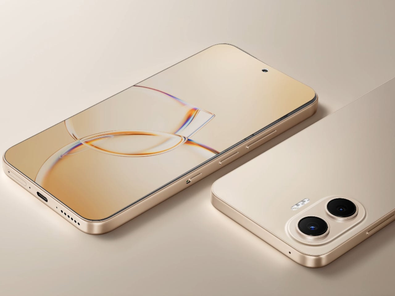
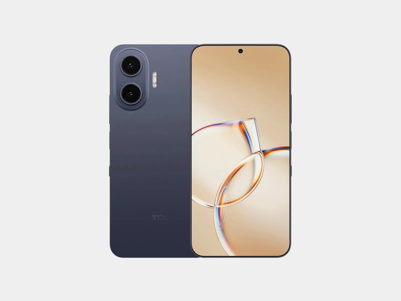
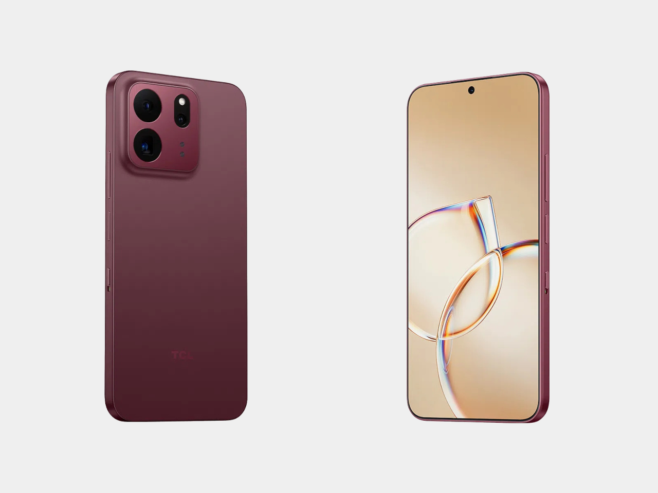
TCL’s P80 Pro and Ultra Are the Phones That Replaced Your Kindle Too

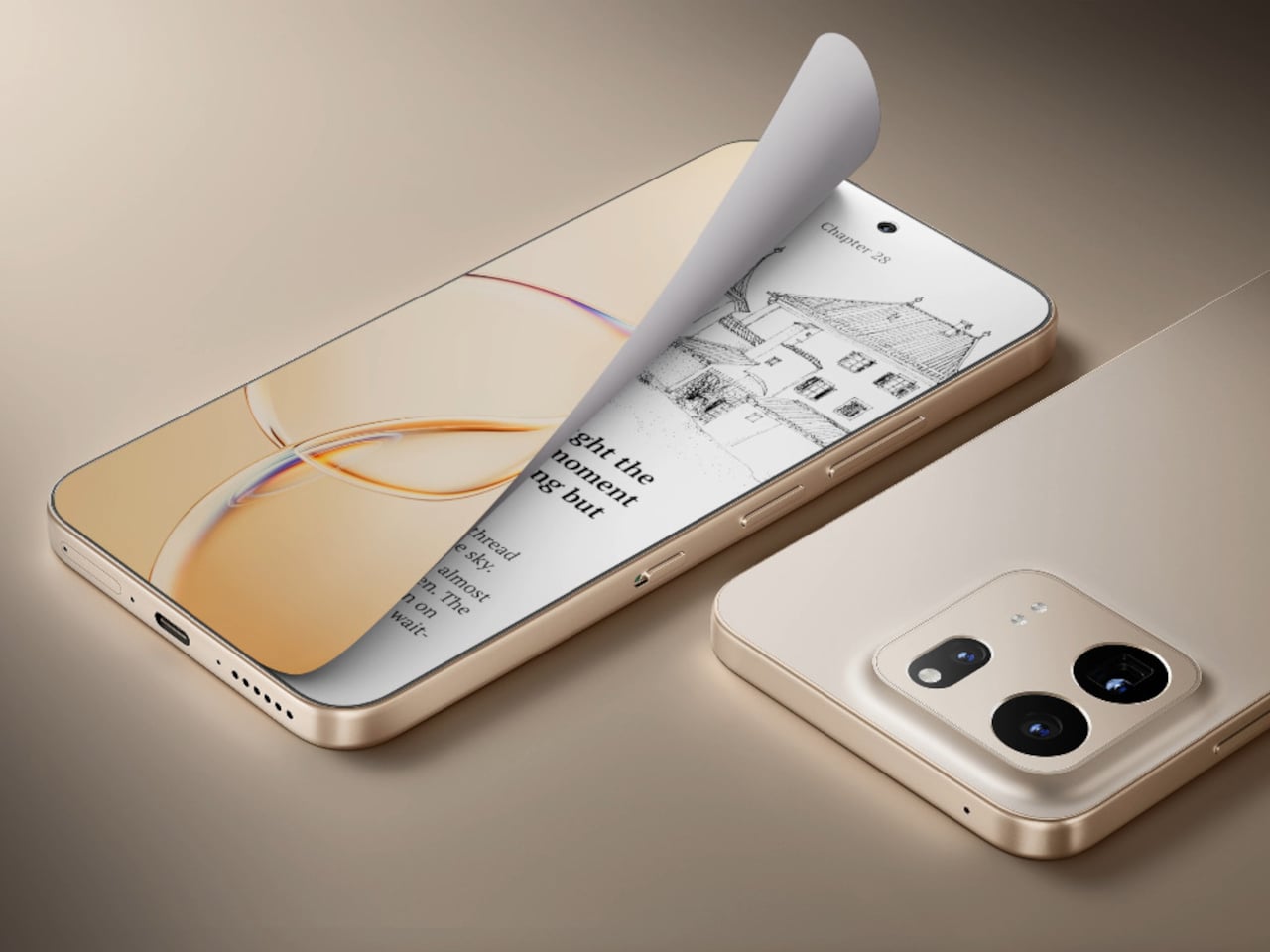
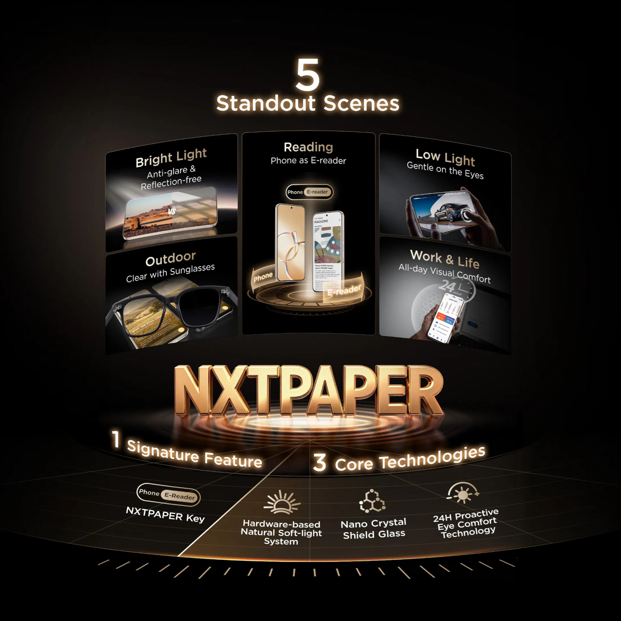
TCL’s P80 Ultra and P80 Pro prove a phone screen doesn’t have to pick one personality and stick with it. Unveiled at IFA 2026 in Berlin, both handsets fold a vivid AMOLED panel and TCL’s paper-like NXTPAPER technology into the same sheet of glass, letting the display shift moods with a flick of a switch instead of forcing a trade-off between color and comfort.

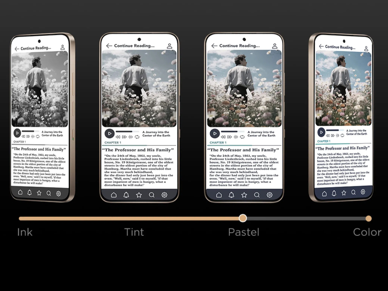
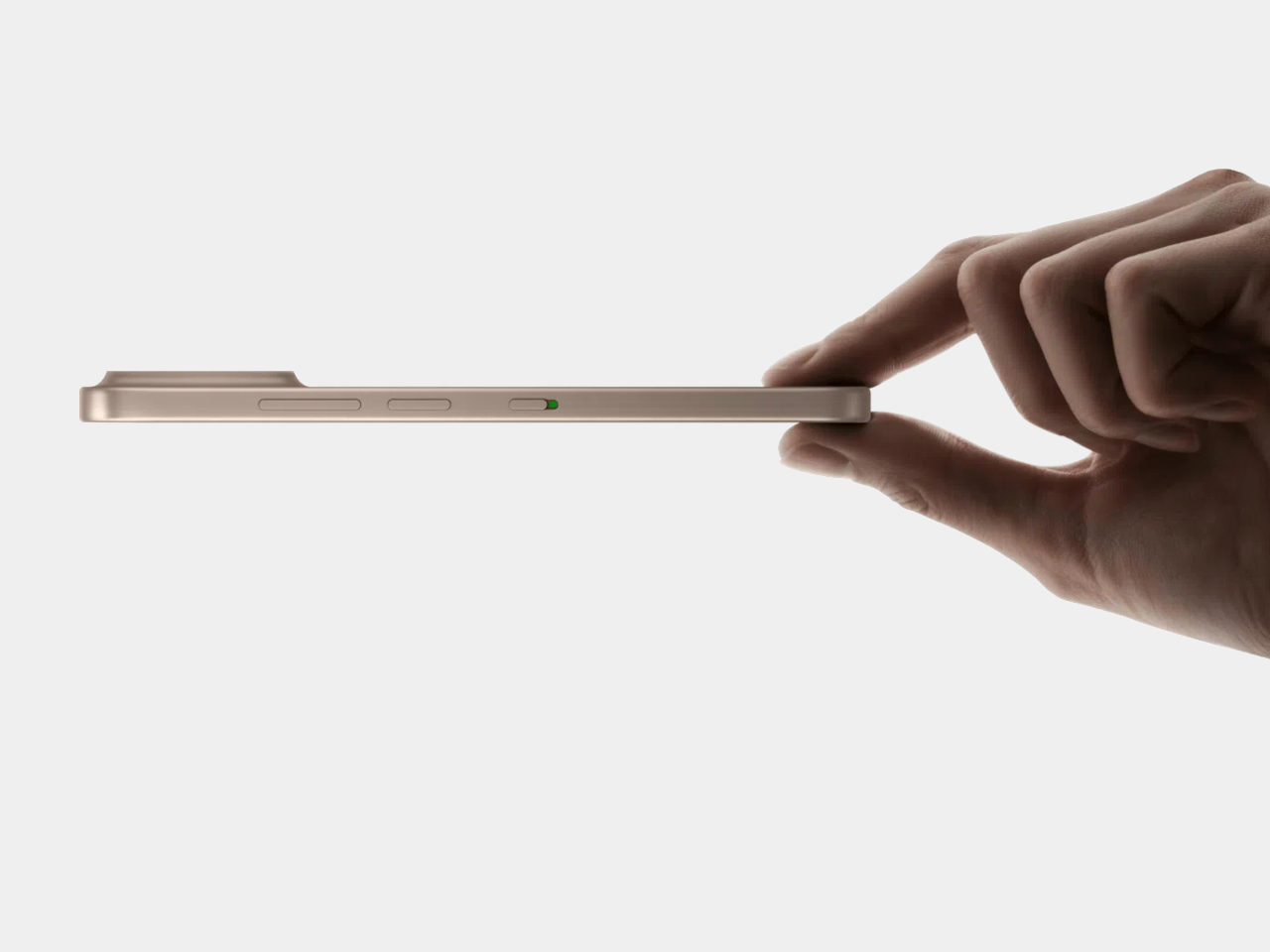
Run a finger along the frame, and you’ll find a thin slider, a small physical detail that carries plenty of weight in daily use. Slide it, and the 6.83-inch panel drops its saturation, taking on a warmer, textured look that mimics a printed page. A commuter buried in a novel or someone proofreading a document late at night gets a screen that behaves like paper, without losing the sharpness underneath.

Designer: TCL

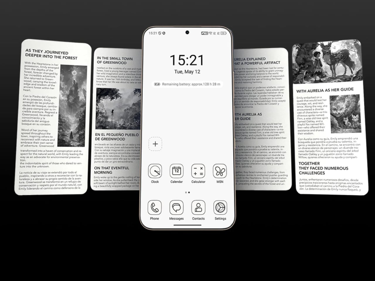
Push that same slider one notch further, and the screen drops color entirely for Max Ink Mode, a stripped layout that silences notifications except for calls and texts. It reads like a design decision as much as a software one, TCL betting people want to quiet their phone rather than mute it completely. The payoff is a battery that can stretch across roughly a week of steady reading.

That reading-first mindset carries into the software too. Both phones can convert e-books into audiobooks or podcast-style narration using on-device AI, giving Max Ink Mode a voice to lean on when eyes need a break instead of ears. It is a small addition, but it treats the slower, paper-like mode as a genuine feature rather than a bolted-on gimmick for a keynote slide.

None of that would matter if the screen looked washed out the rest of the time, so TCL leaned on a 1.5K AMOLED panel that hits 3,200 nits and covers the full DCI-P3 color range. A Nano Crystal Shield coating cuts glare enough to keep the display readable under direct sun, marking TCL’s first pairing of NXTPAPER with OLED rather than the LCD panels it used before.

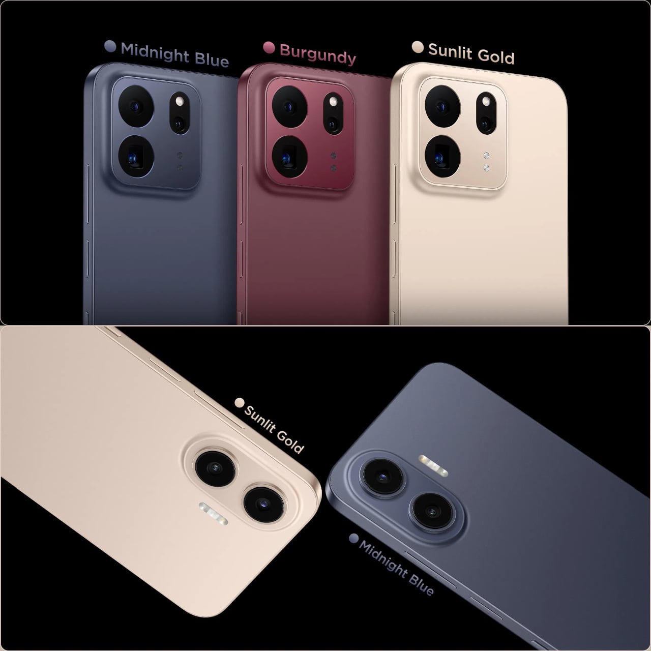
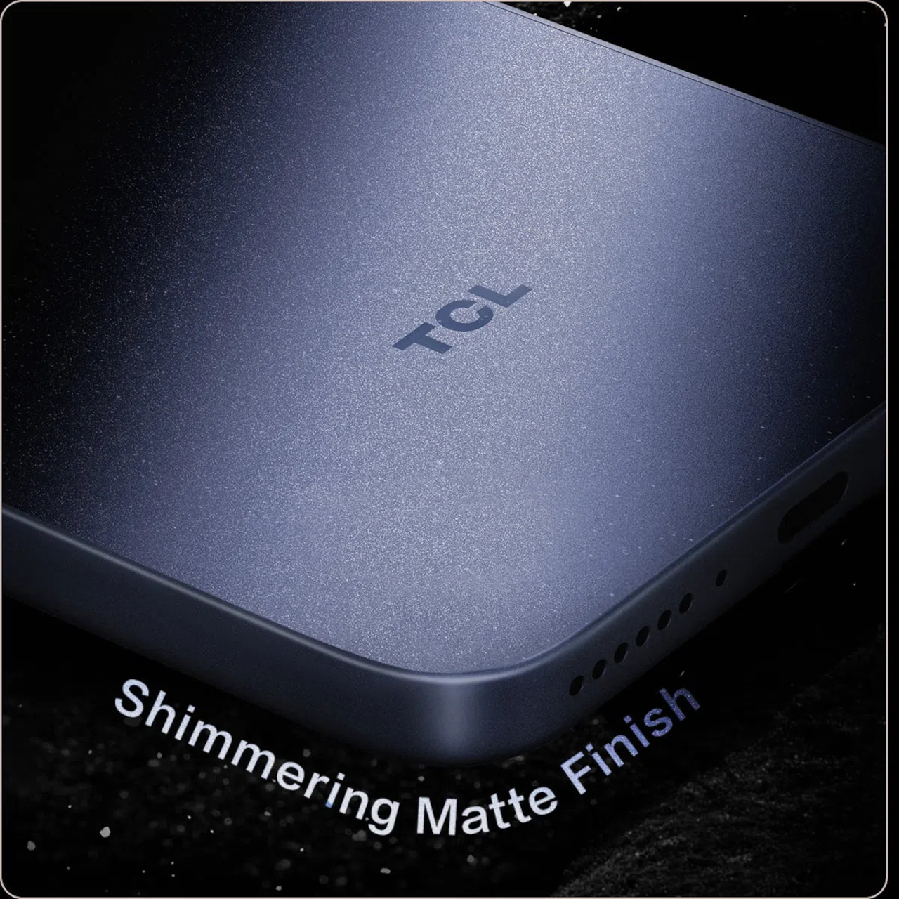
The frame wrapping that screen is aluminum rather than the plastic often found at this price, giving both phones a sturdier grip without piling on bulk. TCL backs that up with an IP68 rating against dust and water, plus MIL-STD-810H certification for the inevitable drop. Buyers get to pick between Sunlit Gold, Burgundy, and Midnight Blue, three finishes that lean more toward jewelry-box color choices than typical slab-of-glass smartphone palettes.

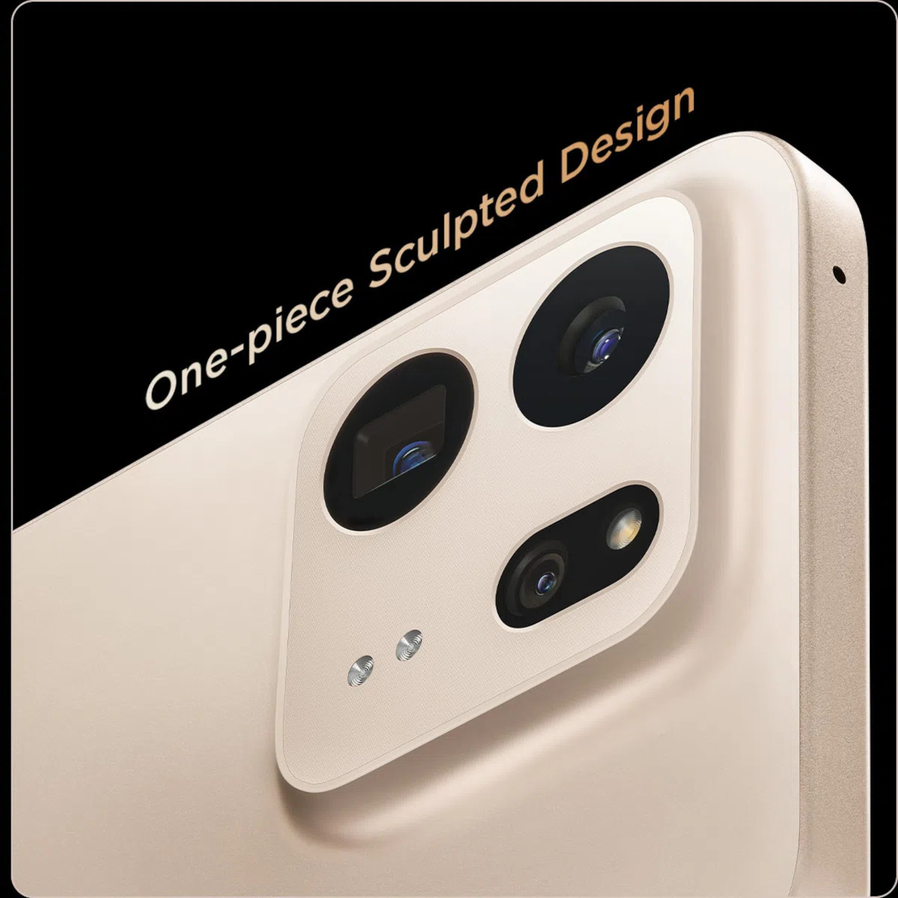
Where the two models part ways is around the back. The P80 Ultra carries a 50-megapixel main camera next to a 50-megapixel periscope lens for 3x optical zoom, tucked into a housing shaped to avoid throwing off the phone’s balance. The P80 Pro drops the periscope for a simpler dual-camera arrangement, trading reach for a slimmer build that still shares the same main sensor and 8-megapixel ultrawide.

TCL is rolling both phones out across Europe first, with the P80 Ultra priced from €549 (around $635) and the P80 Pro starting at €429 (around $500), before a Latin American launch follows in October. A wider release is expected to reach additional regions afterward. In a category full of identical glass rectangles, these two phones actually behave differently depending on what someone needs from them that day.

The post TCL’s P80 Pro and Ultra Are the Phones That Replaced Your Kindle Too first appeared on Yanko Design.

  •  

Acer’s Packard Bell Crashed IFA 2026 Like a Box of Crayons

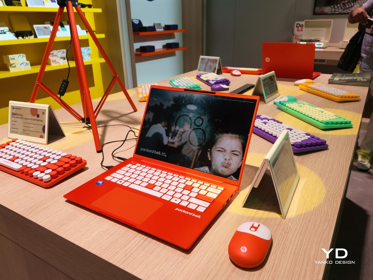
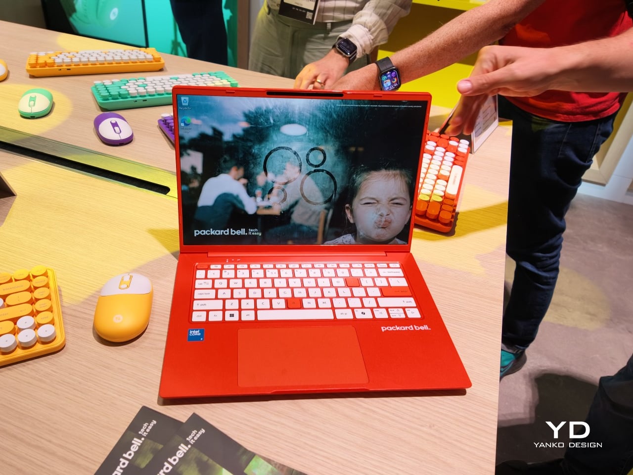
Packard Bell spent a century teaching people that new technology doesn’t have to feel intimidating, and its 100th birthday present to itself leans hard into that idea. Under Acer’s ownership, the brand relaunched at IFA 2026 with a philosophy it calls “Tech it easy,” built around a lineup that trades beige plastic and quiet corporate design for colors loud enough to notice from across a room. Four products anchor that comeback, and each one argues that everyday tech gains something when it stops taking itself so seriously.

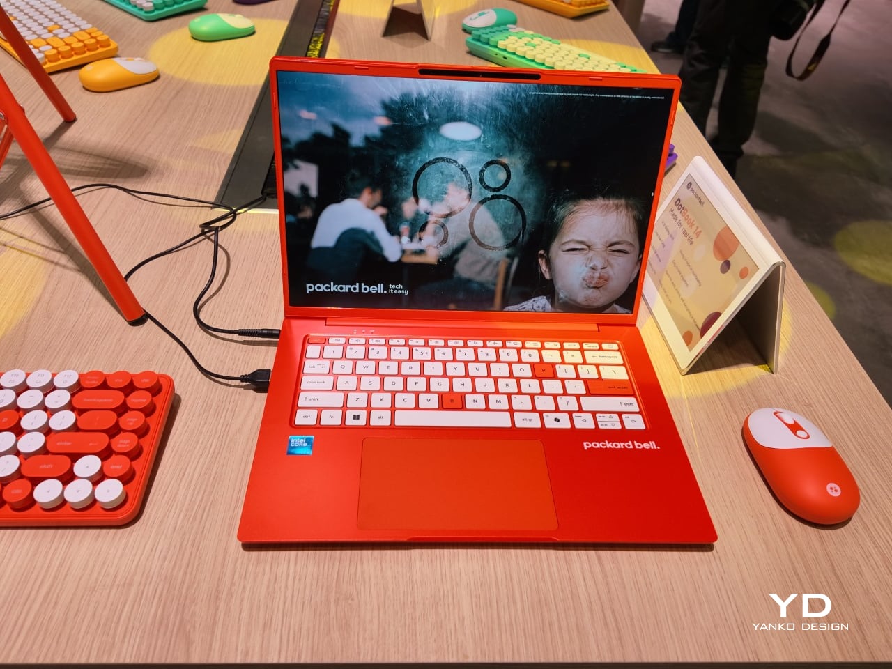
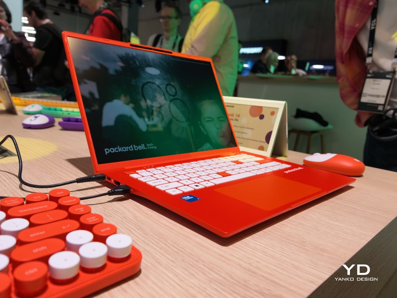
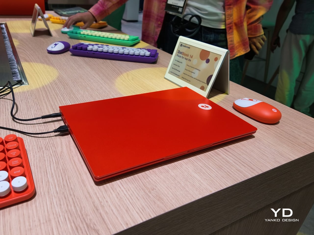
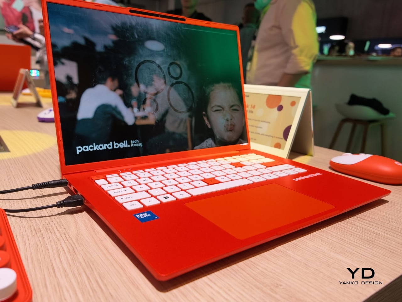
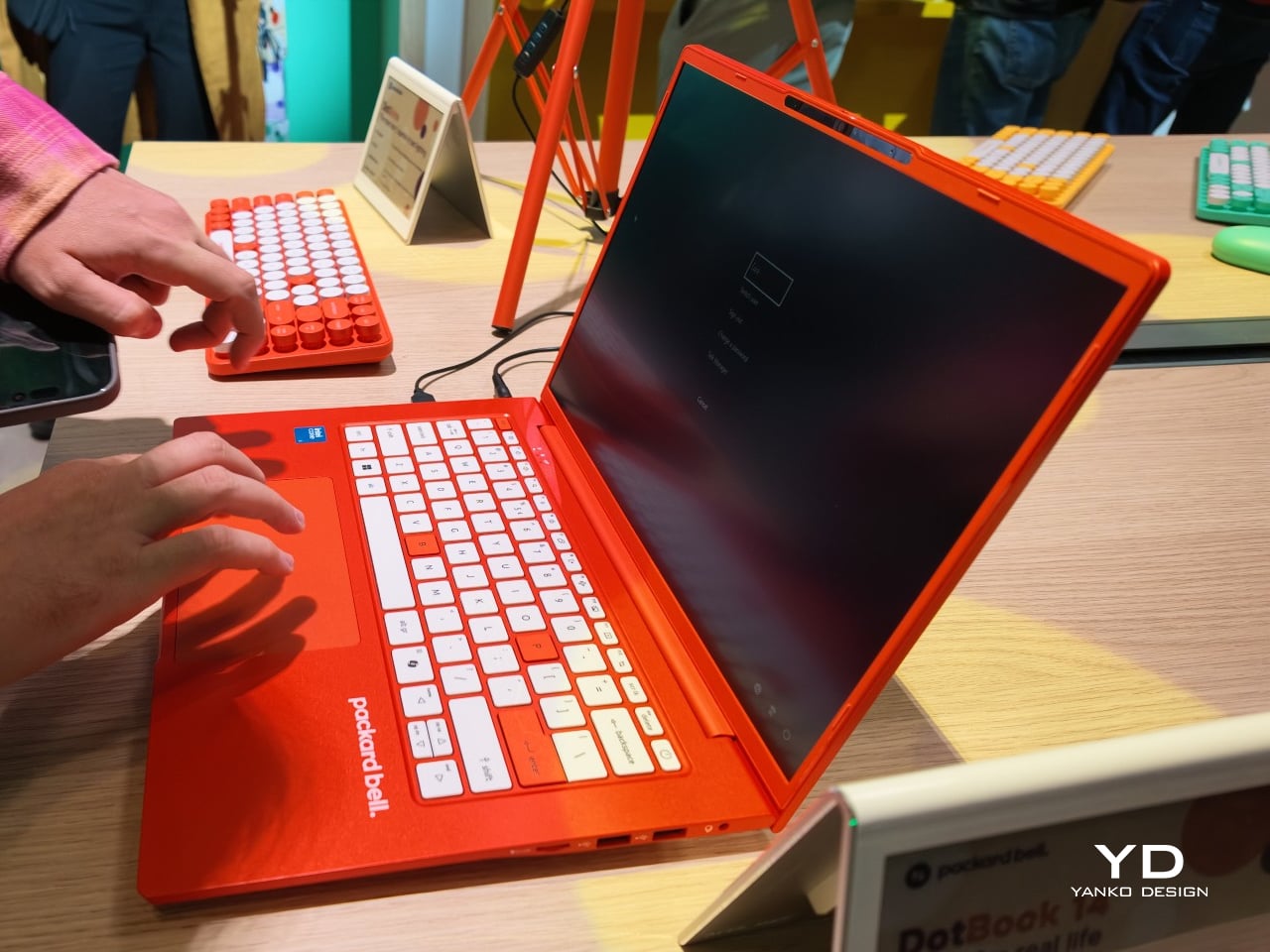
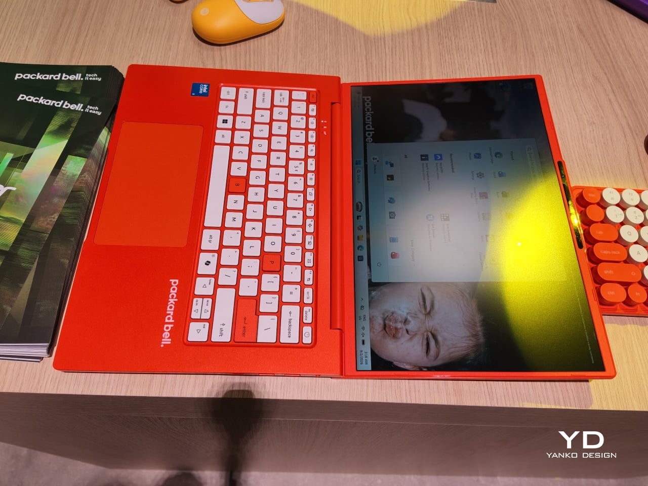
The DotBook carries the heaviest expectations as the collection’s flagship, a 14.5-inch laptop finished in a red-orange shell bright enough to spot on a crowded coffee shop table. Weighing under 1.3 kg and measuring just 17.9mm thin, it’s built for browsing, streaming, and everyday work rather than chasing benchmark scores, backed by up to 512GB of storage and 16GB of memory running quietly under Windows 11. It’s a laptop designed to disappear into a bag, not a spec sheet debate.

Designer: Acer

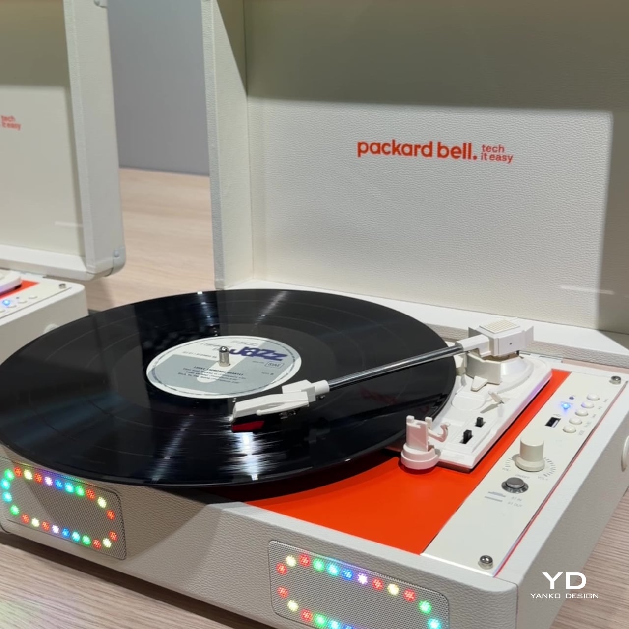
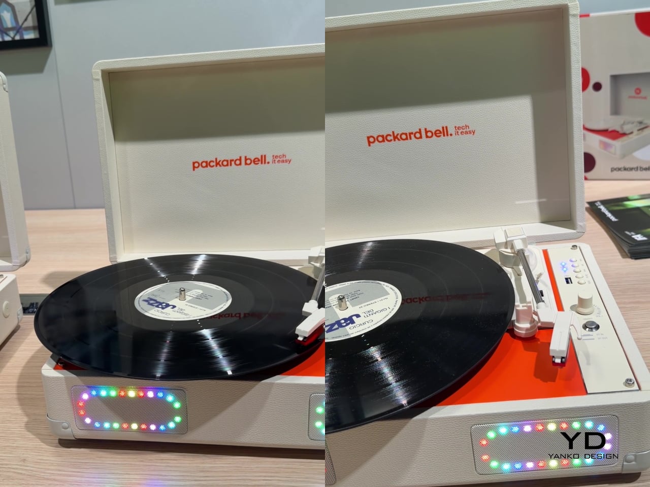
Where the DotBook plays it relatively straight, the DotLoop commits fully to spectacle. Housed inside an actual briefcase shell with a 1970s silhouette, the turntable pops open to reveal a working tonearm flanked by RGB-lit speaker grilles that glow while a record spins. Two built-in 3W speakers handle sound on their own, though Bluetooth and RCA outputs let the DotLoop hand audio off to a proper stereo system whenever the moment calls for something louder.

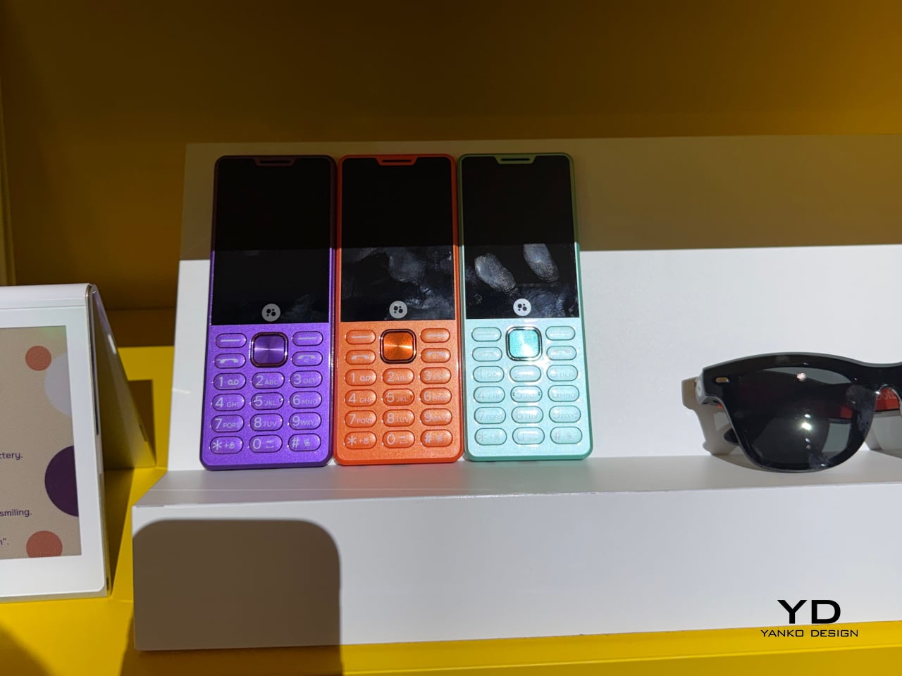
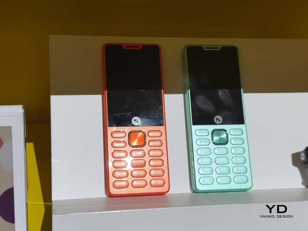
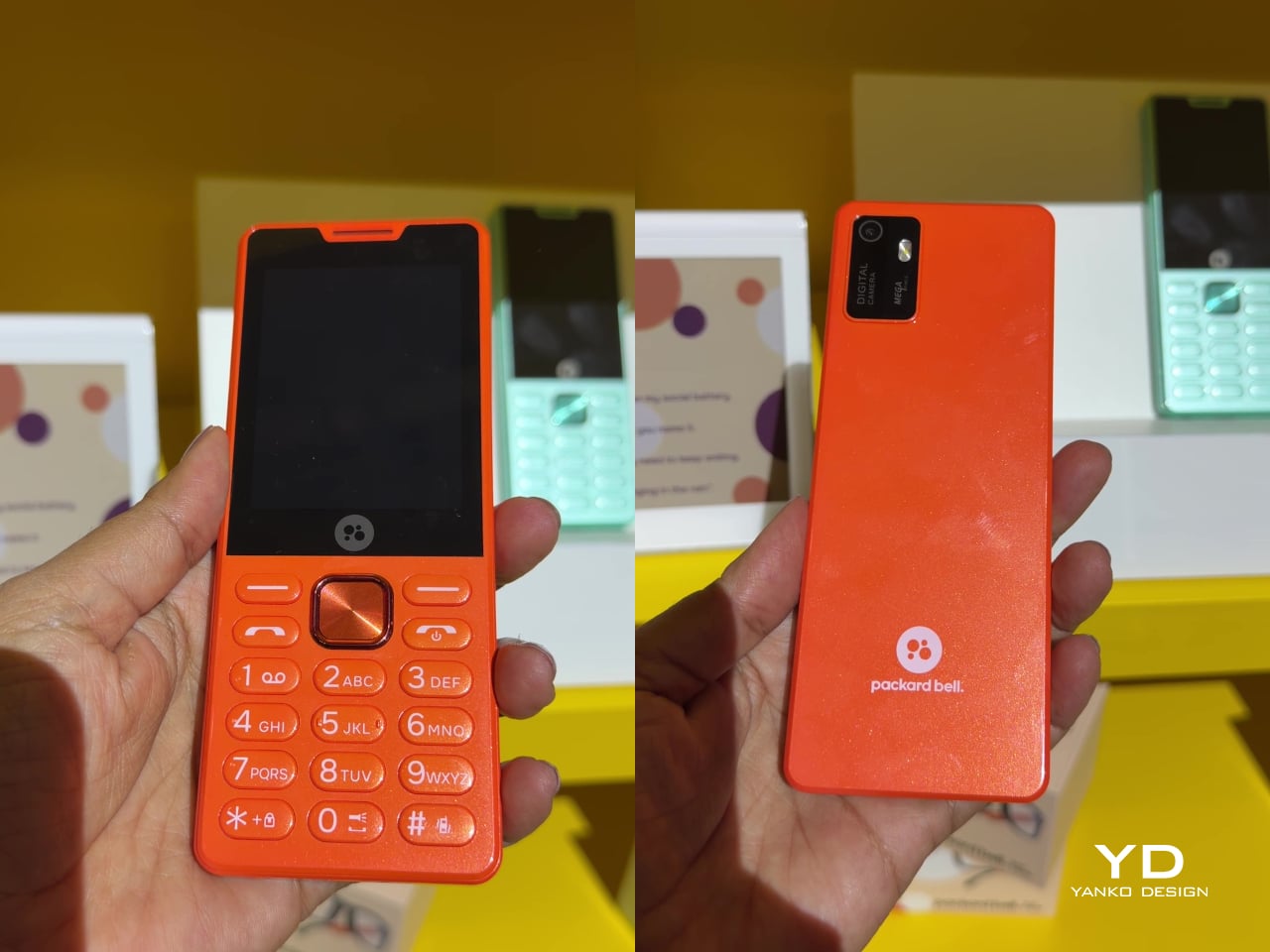
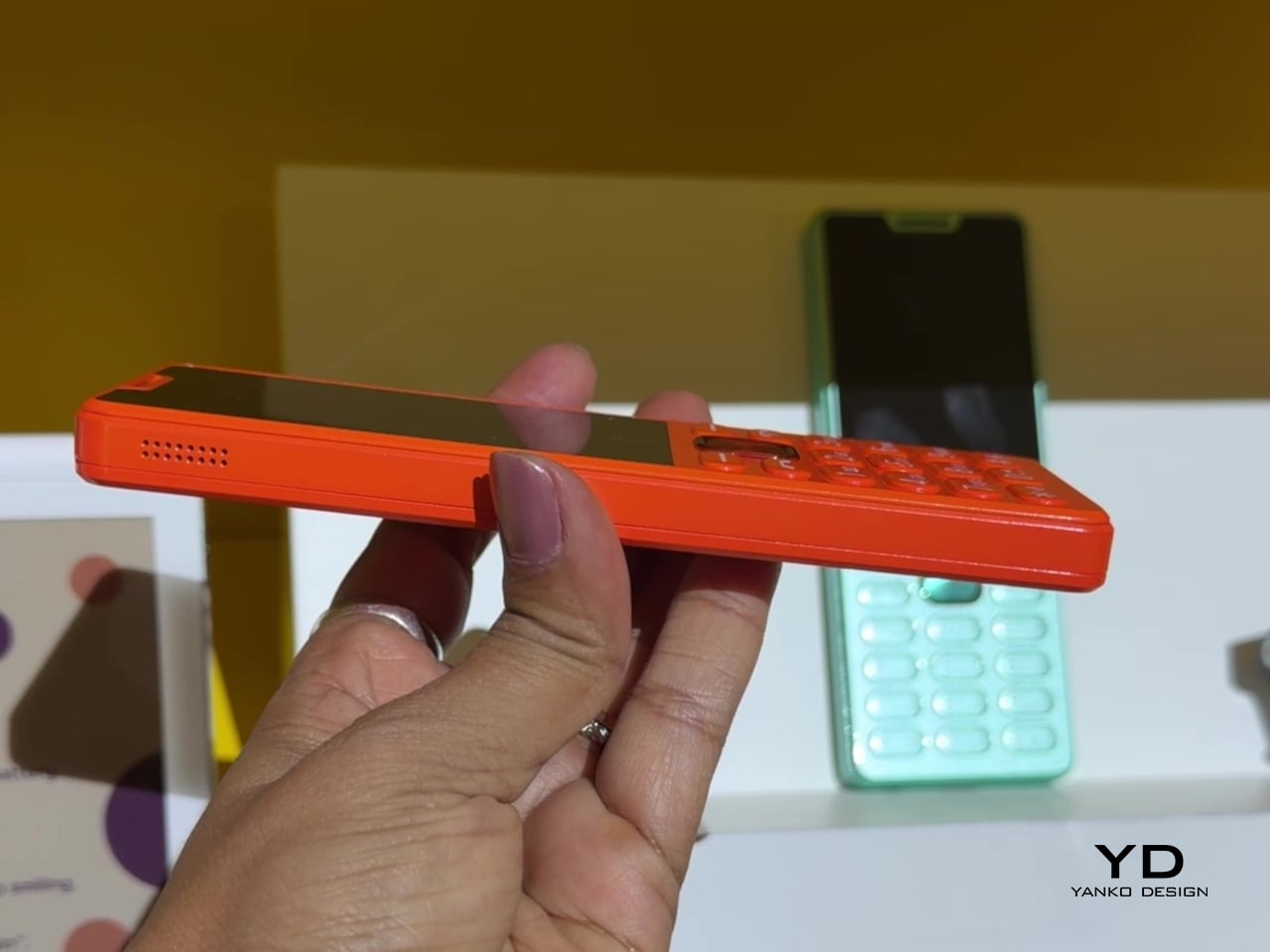
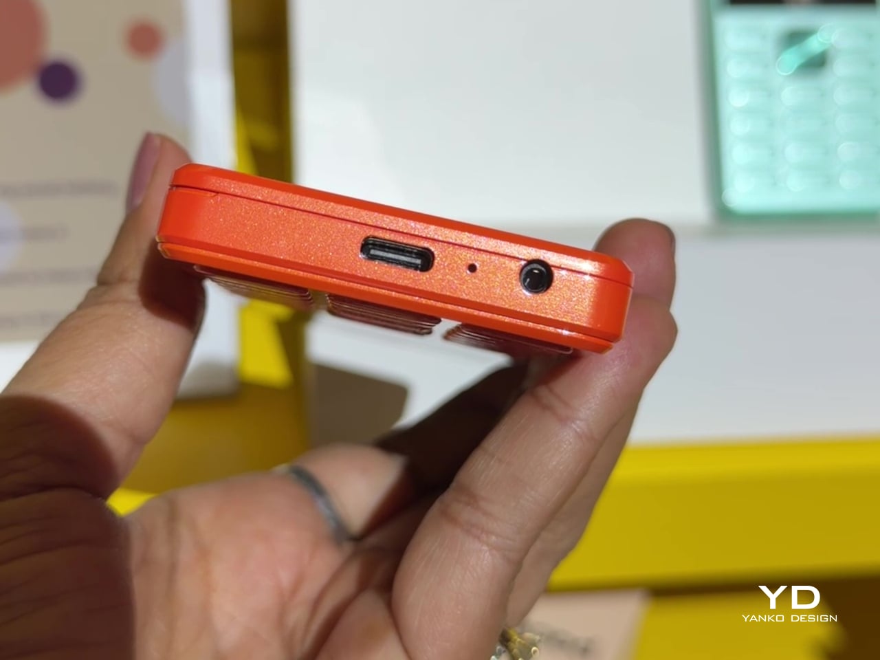
That willingness to have fun with format extends into the DotLine, a feature phone built for anyone tired of feeding a smartphone’s constant appetite for attention. A 2.8-inch display and physical keypad keep the experience deliberately simple, while an 1800mAh battery stretches across roughly two weeks between charges, a number that sounds almost mythical next to a modern flagship’s overnight anxiety. Four color options keep it from feeling like a consolation prize.

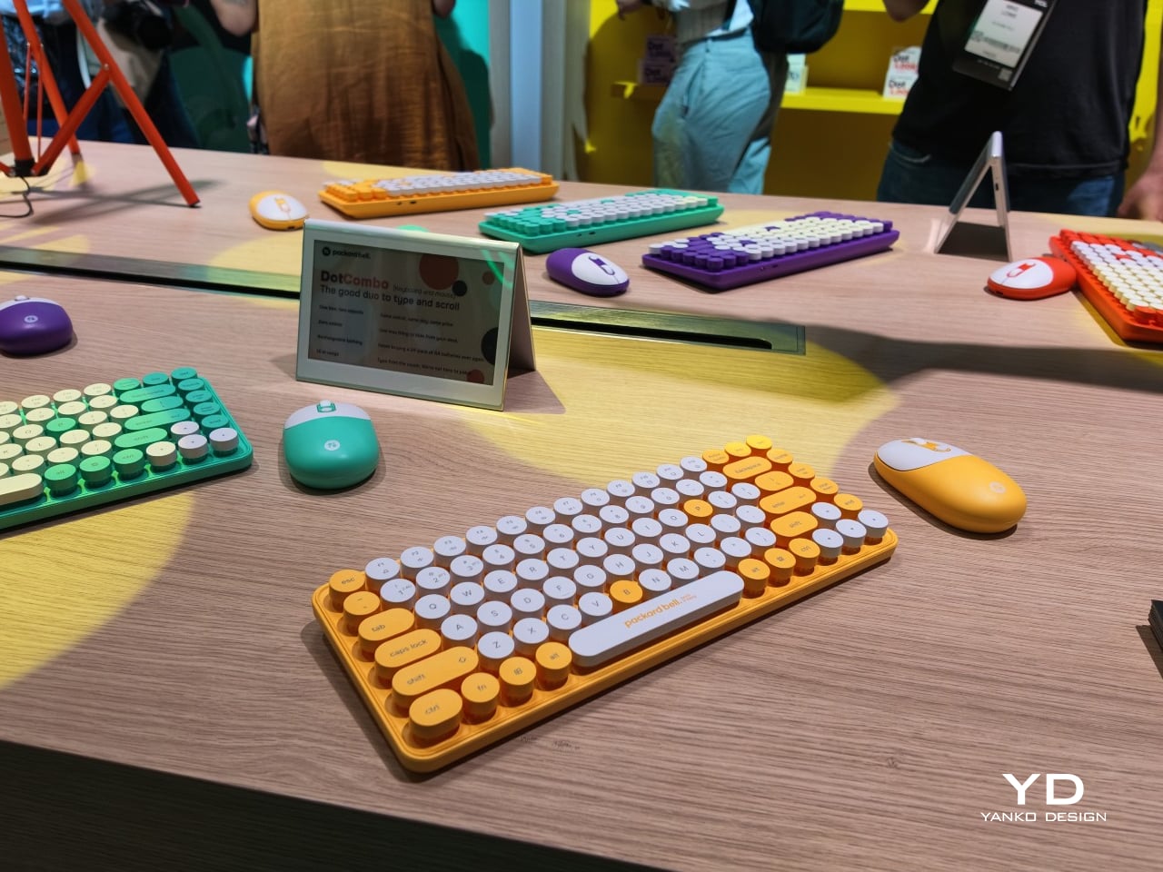
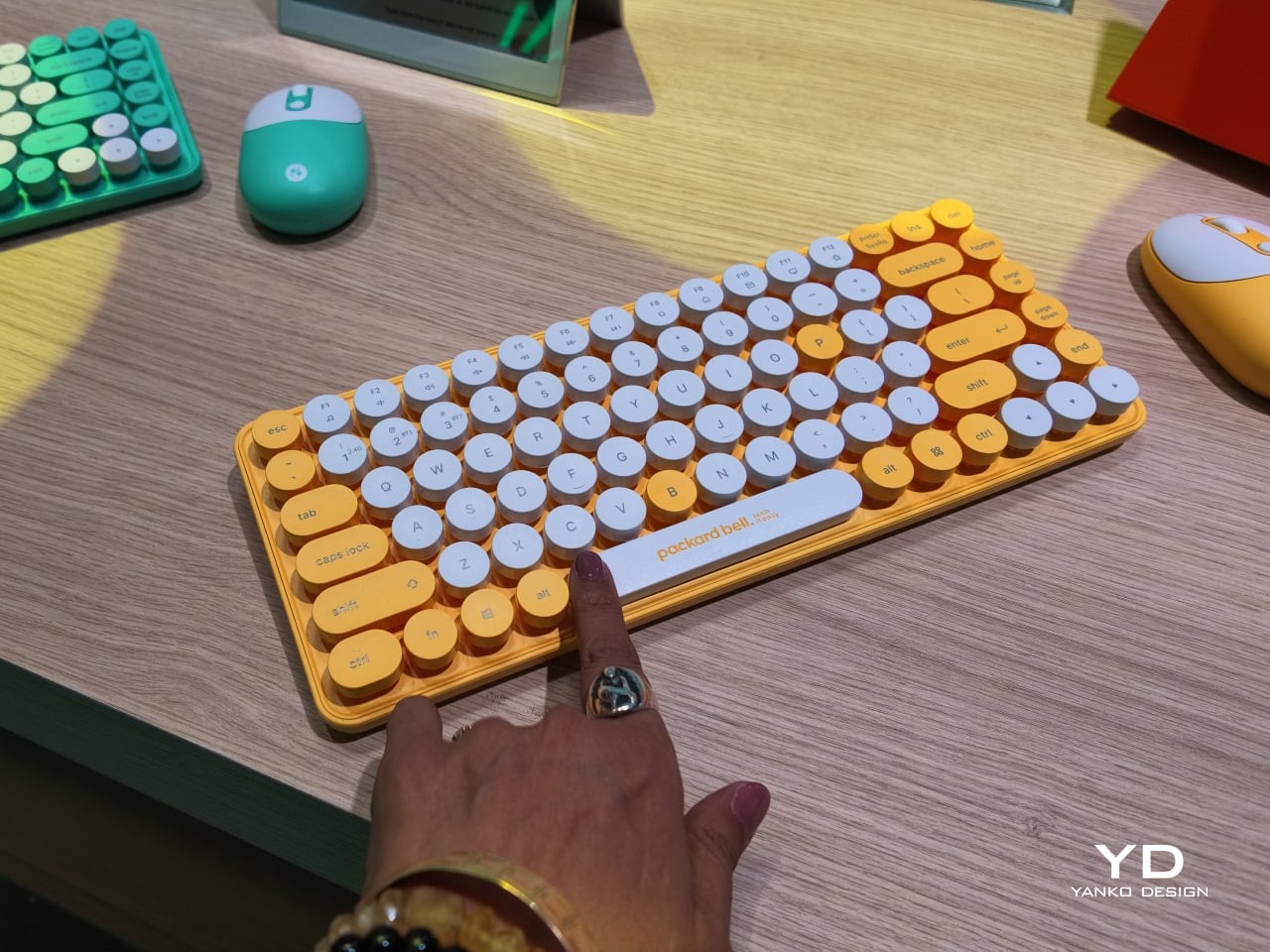
Rounding out the focus lineup, the DotCombo bundles a keyboard and mouse into a single color-matched purchase, eliminating the usual mismatched beige-on-black desk setup that so many peripherals default to. Both pieces run on rechargeable batteries good for hundreds of charge cycles, connecting over Bluetooth or a 2.4GHz receiver without a single AA battery required. Round keycaps borrowed from typewriter design give the whole thing a tactile, almost toy-like presence on a desk.

Beyond these four, Packard Bell rounds out its centennial collection with a portable speaker (DotTune), audio glasses (DotLook), a ring light for creators (DotShine), matching headphones (DotBass), and even a countertop food steamer (Steasy), all sharing the same saturated color palette and straightforward pricing. None of them ask for much attention individually, but together they paint a lineup unwilling to blend into a beige office shelf.

Pricing stays approachable across the board, with the DotBook starting around €499 (around $578), the DotLoop at €149 (around $173), the DotLine at €69 (around $80), and the DotCombo at just €39 (around $45). Packard Bell’s return proves that a century-old brand can still find something new to say, mostly by refusing to whisper it.

The post Acer’s Packard Bell Crashed IFA 2026 Like a Box of Crayons first appeared on Yanko Design.

  •  

This $119 Ultrasonic Cutter Sense Materials And Auto-Adjusts To Cut EVA Foam, Resin, PLA 3D Prints

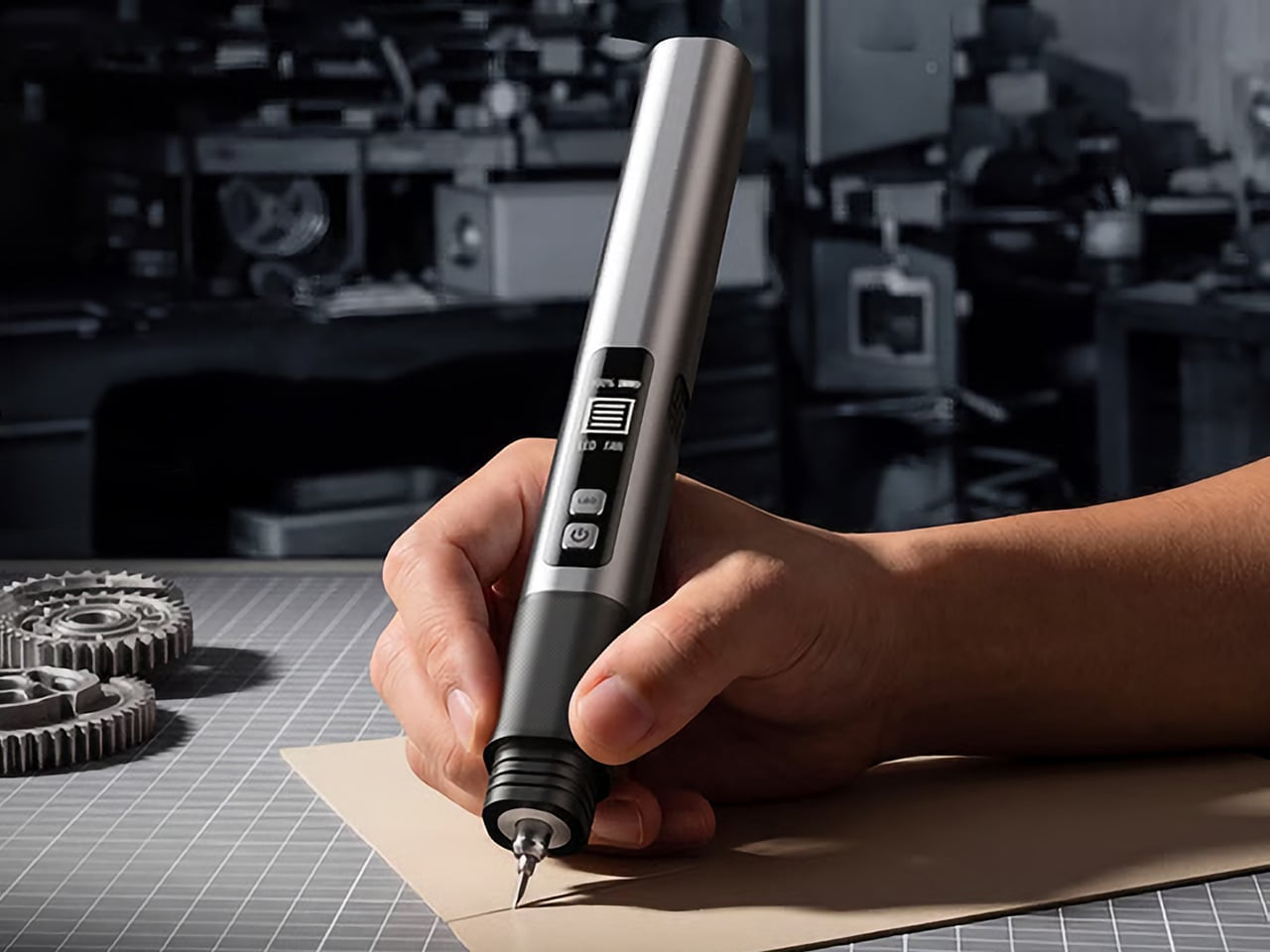
There are power tools, and then there are smart tools. A power tool gives you brute force; a smart tool gives you controlled, consistent results. Think of a simple drill that just spins versus one that manages its own torque to avoid stripping a screw. For delicate work like trimming EVA foam for a cosplay project or cleaning up support structures on a 3D print, you definitely want the smart one. The problem is, most handheld cutters are pretty basic, giving you one speed and just hoping for the best.

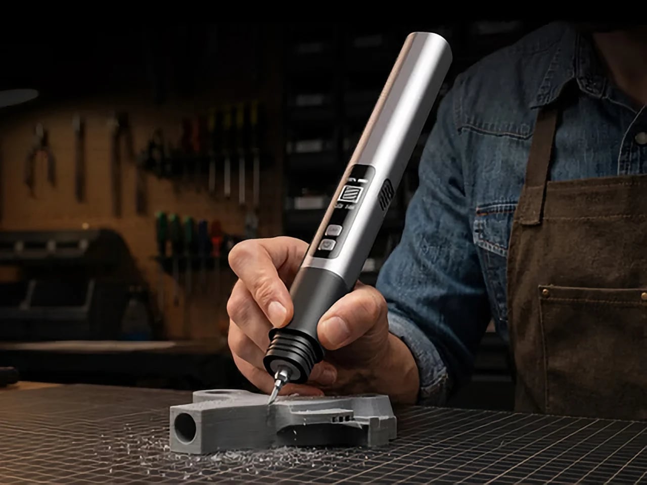
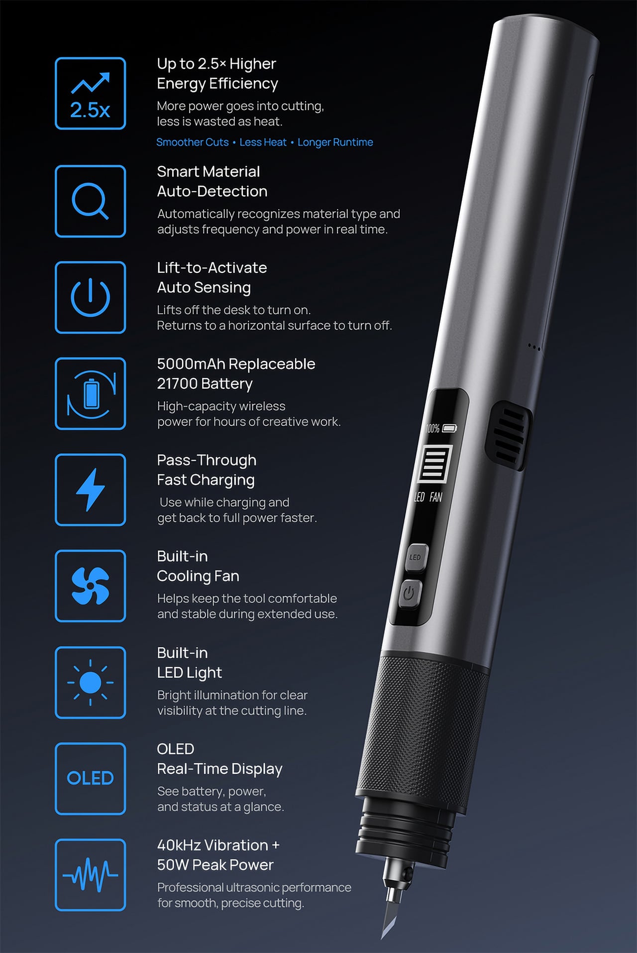
The SonicMax Slice 10 is aiming for that higher IQ. It’s a cordless ultrasonic cutter that senses the material you’re cutting and adjusts its own power output in real time. Slice through dense plastic and it pushes harder; trim the thin walls of a resin print and it eases back. This adaptive system, combined with cooling that prevents heat-related power drops, makes it feel like proper workshop equipment in the palm of your hand. It runs at 40kHz, delivers up to 50 watts of dynamic peak power, and does all of this without a single cable getting in your way.

Designer: SonicMax

Click Here to Buy Now: $119 $215 (45% off). Hurry, only 13/500 left! Raised over $124,000.

Most ultrasonic cutters on the market use transducers with a mechanical quality factor, or Qm, somewhere between 150 and 250. A higher Qm means the transducer converts electrical energy into vibration more efficiently, which directly translates to less heat generated during use. SonicMax claims a Qm of over 500 for the Slice 10, and lab data backs that up with a verified measurement of 541.1. That’s roughly two to three times higher than a typical competing tool, and it’s the foundational reason the Slice 10 can sustain longer sessions without thermal drama. That single transducer decision cascades into everything else, from runtime and cut quality to how comfortable the tool actually stays in your hand.

As the blade meets resistance, the Slice 10’s Smart Material Auto-Detection reads that feedback and adjusts power output and vibration frequency without you touching anything. Cutting through a stiff chunk of EVA foam feels different from trimming the thin walls of a resin print, and the tool responds to each material accordingly. You’re not locked into a fixed setting that works okay for most things but perfectly for nothing. The system also preserves cut quality across a long session, where material resistance can shift as the blade warms. The result is consistent cuts from the first pass to the last, regardless of what you’re running the blade through.

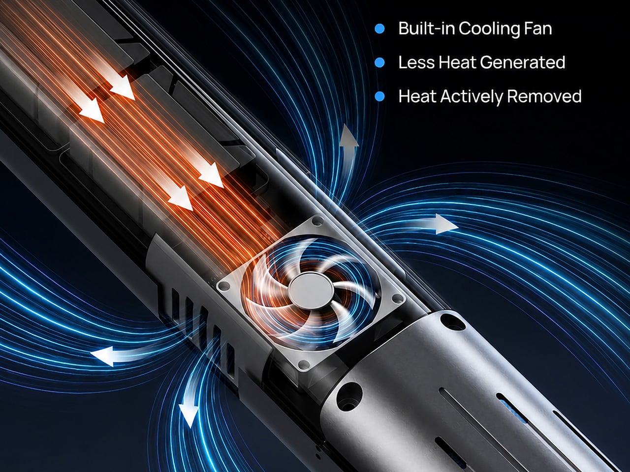
Heat is the reason most cordless ultrasonic cutters force you to stop every five to ten minutes, and the Slice 10 attacks that problem from two directions. Corded bench tools sidestep this issue by drawing steady power and dissipating heat more easily, but you give all of that up the moment you cut the cord. The high-efficiency transducer generates less heat from the start, and the built-in active cooling fan manages whatever thermal load does build up during a session. Overheat protection kicks in automatically at 80 degrees Celsius at the motherboard level, so the tool protects itself without you having to babysit it. You only appreciate how good this is after you’ve spent a session on a cutter that kept shutting itself off on you mid-cut.

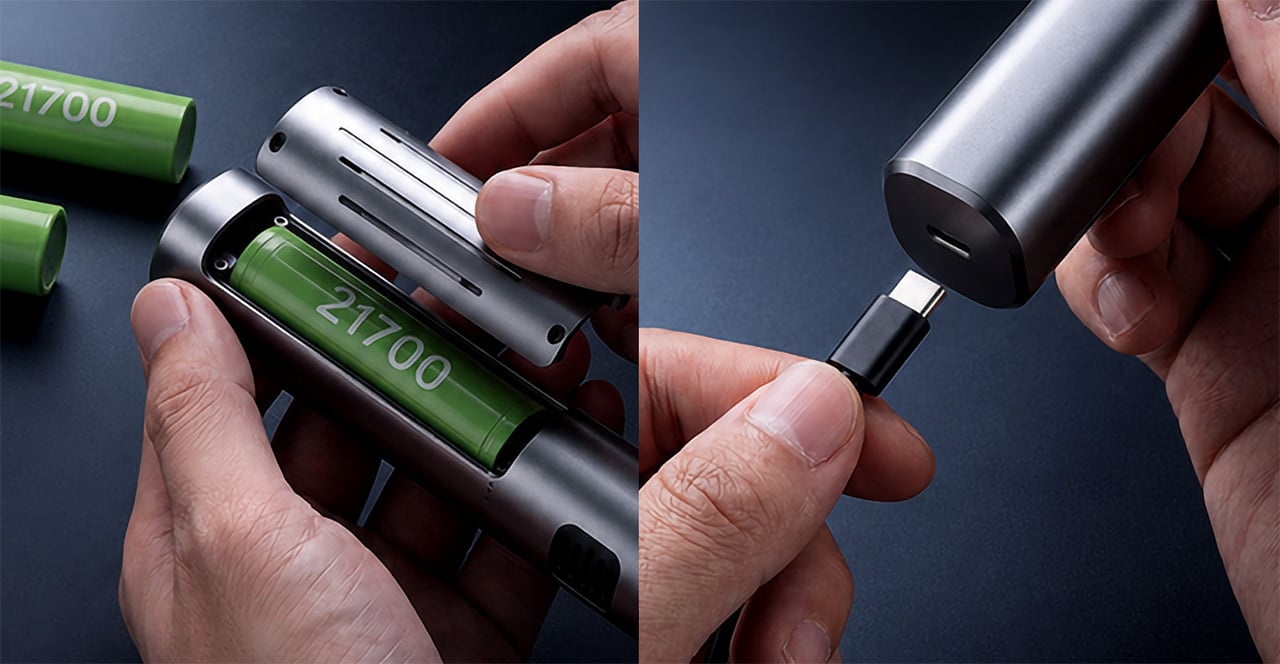
A 5000mAh 21700 lithium-ion battery powers the Slice 10, and SonicMax made it user-replaceable, which you’ll end up appreciating far more than any spec sheet number. The 21700 is a high-performance cell format found in premium flashlights and power tools, so sourcing replacements from SonicMax or compatible third-party brands should never be a problem. SonicMax’s own branded replacement cell is rated for 500 charge cycles at 80% capacity retention, a reasonable lifespan for a tool you’re actually putting to work regularly. An 18W USB-C pass-through charging system brings it from zero to full in about 70 minutes, and the tool keeps running while plugged in. Claimed runtime sits at up to four hours, and when you run low mid-project, swapping in a spare takes seconds.

Blade choice gives the Slice 10 a lot of its bench-tool personality. SonicMax offers five blade styles that let the same handheld body take on very different jobs: a Standard Utility Blade for everyday trimming, a Precision Long Blade for tighter access and more delicate reach, a Fine Chisel Blade for careful cleanup work, a Heavy Duty Chisel Blade for more aggressive material removal, and a Wide Flat Scraper Blade for broader surface work. That range matters because it turns the Slice 10 into something closer to a compact cutting system than a one-trick knife. If you’re the kind of maker who bounces between foam, plastic, supports, edges, and surface cleanup in the same afternoon, this is where the tool starts looking properly versatile.

Lift-to-Activate sensing turns the tool on when you pick it up and off when you set it down, keeping your fingers away from controls mid-session and preventing accidental activation on the bench. A small OLED display shows real-time power output and battery level, so you’re never left guessing how much runtime remains. Built-in LED lighting illuminates the cut line, which sounds like a minor detail until you’re trying to trace a clean edge on a dark-colored print at your desk at some ungodly hour. Auto-shutdown kicks in after five minutes of idle, and low-battery protection activates before the cell drops to a damaging voltage. Together, these details make the Slice 10 feel like a tool that respects your workflow rather than constantly asking you to manage it.

The Slice 10 measures 260.5mm long and 28mm across, weighing 236 grams, keeping it firmly in single-hand, pen-grip territory across long sessions. Just the Slice 10 is available for a discounted $119, and ships with 10 replaceable Standard Utility blades. Upgrade to the Maker’s Bundle for $169 and you get the Slice 10 along with 50 blades spread across the five blade profiles (standard, precision long, fine chisel, heavy duty chisel, and flat scraper) as well as a 5000mAh replacement battery. If you’re looking for versatility and pushing your prints to the max, the $50 price bump does bring a fair share of value. You can also buy extra blades and batteries as add-ons. Shipping is expected to begin mid-October 2026 with worldwide delivery available, and SonicMax has not publicly confirmed warranty terms at the time of writing.

Click Here to Buy Now: $119 $215 (45% off). Hurry, only 13/500 left! Raised over $124,000.

The post This $119 Ultrasonic Cutter Sense Materials And Auto-Adjusts To Cut EVA Foam, Resin, PLA 3D Prints first appeared on Yanko Design.

  •  

This CD Player Doesn’t Hide Its Mechanism, It Puts It on Display

If you think compact discs are a thing of the past, you probably haven’t been around a K-pop fan or a hoarder who still has their CDs from decades ago. Then there are people like me who have a stack of CDs collected over the years but no actual CD player to enjoy them on, since options that are strong on both quality and design are hard to come by.

The ClearFrame Speaker CD Player is a solid choice for anyone looking for a visually stunning player that won’t let a CD’s album art go to waste. It lets you slot the jacket art onto the front of the player so it becomes a rotating piece of wall or shelf art. Or, if you’d rather show off the mechanics, you can leave the artwork out and display the transparent body itself, watching your CD spin with all its moving (and non-moving) parts in full view.

Click Here to Buy Now: $240.00

Whenever I come across beautiful album art, I can’t help but think it’s wasted if it only ever gets seen as a tiny digital thumbnail on a streaming app. A player like the ClearFrame Speaker CD Player lets you put that kind of artwork on full display while you’re enjoying the music in your room. Seeing something that the artist, and the album art designer, worked hard on come to life while it spins gives it the justice it deserves. And if you’d rather see the clear, polycarbonate-style body become a piece of art in its own right, just take out the album cover and let it shine in all its transparent glory.

This is also an upgraded version of the original, and already popular, ClearFrame CD Player, since it now comes with a built-in speaker. That means you no longer need to hook it up to an external Bluetooth speaker or wired setup, which makes it even more flexible to display anywhere in your home. You actually have three ways to listen to your favorite CDs: through the built-in 40mm speaker, with wired headphones through the 3.5mm jack, or over Bluetooth 5.3 to external speakers or headphones if you already have a better setup you’d like to use.

Beyond the listening options, the ClearFrame Speaker CD Player was clearly designed with portability in mind. At just 454 grams (about a pound) and roughly the size of a hardcover book, it’s light enough to carry from your bedroom to your living room without a second thought. Its 1,800mAh battery gives you around six to seven hours of playback through the built-in speaker, or seven to eight hours if you’re streaming over Bluetooth, so you can enjoy a few albums back-to-back before needing to recharge via USB-C. There’s even a retro-style LED Nixie tube display that adds a warm, nostalgic touch to the whole experience, plus a 2MB SDRAM anti-shock buffer so accidental bumps won’t make your music skip.

For collectors, this player also solves a real problem: what to do with all the CDs sitting untouched in a drawer somewhere. Instead of treating them like outdated clutter, the ClearFrame gives them a reason to come back out, whether that’s a K-pop photocard-era album, a mix your best friend burned for you in high school, or a boxed set you’ve been meaning to revisit. It turns “old technology” into a genuine decor piece you’d be proud to leave out on a shelf.

If you’re looking to gift this to someone (or, let’s be honest, treat yourself), the ClearFrame Speaker CD Player comes in a few configurations depending on how you plan to display it. You can pick it up on its own, or add a wall mount, book case, or display stand, so it fits neatly into whatever corner of your home you have in mind. It isn’t the cheapest CD player on the market, but if you have a stack of CDs with nowhere to go and album art too good to keep hidden, this one earns its price tag by turning something you already own into something worth looking at every single day.

The post This CD Player Doesn’t Hide Its Mechanism, It Puts It on Display first appeared on Yanko Design.
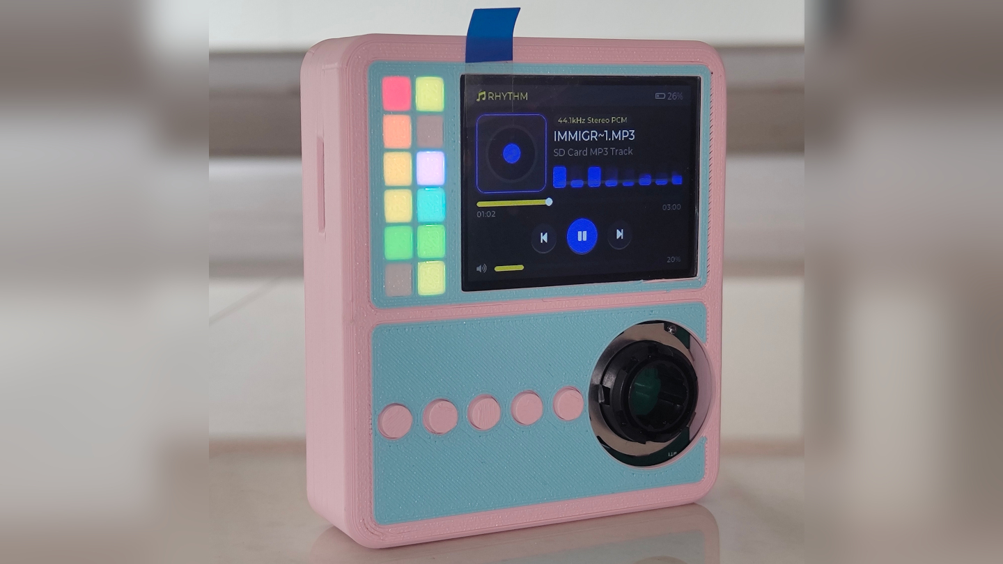
  •  
❌