Vue lecture

IKEA’s Tiny Houses Quietly Admit Your Messy Home Is Fine

Even though I have enough space to have people over, the fact that my place is terribly messy stops me from inviting family and friends. I don’t want to spend an entire day just stuffing stuff I want to hide into my boxes and closets. That’s not a design problem. That’s a me problem and more specifically, a modern life problem, and it happens to be the exact one IKEA just built a series of dollhouses to talk about.

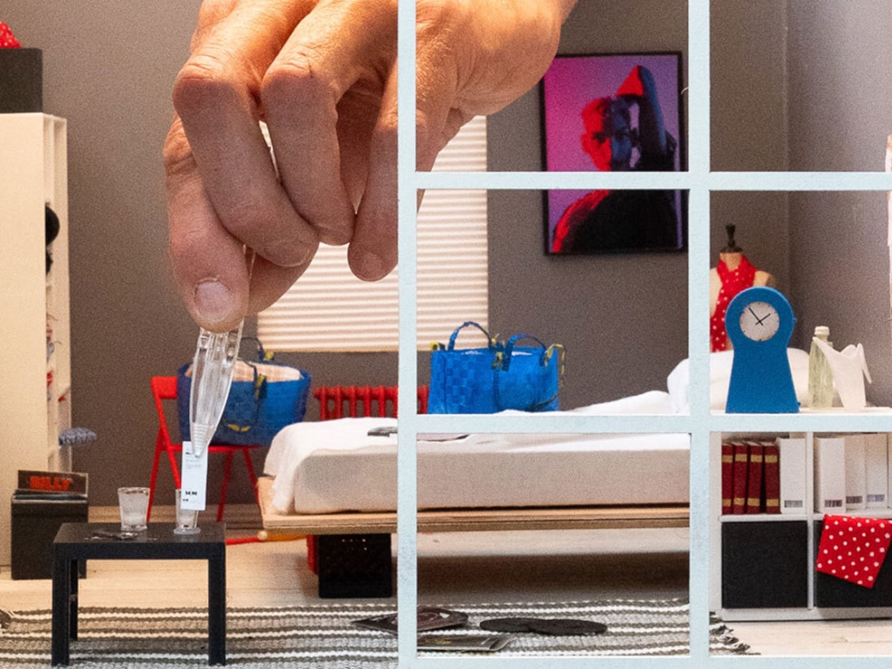
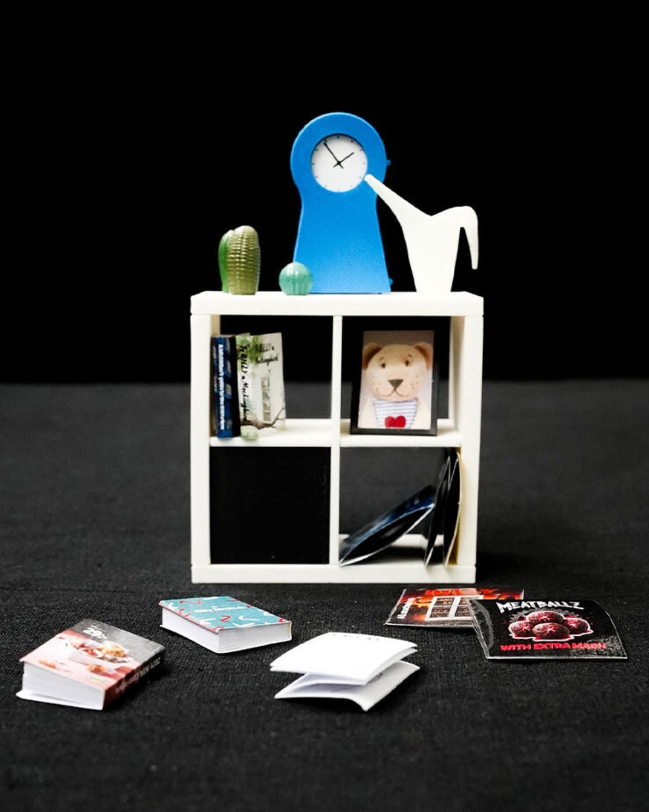
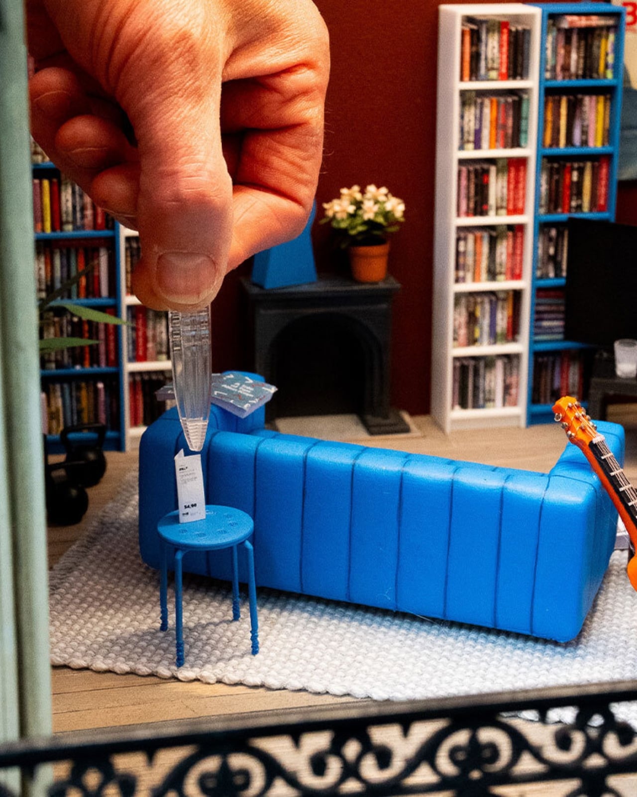
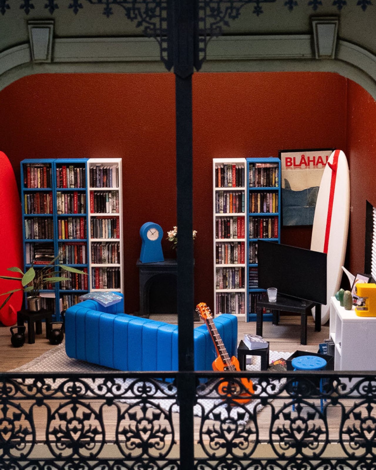
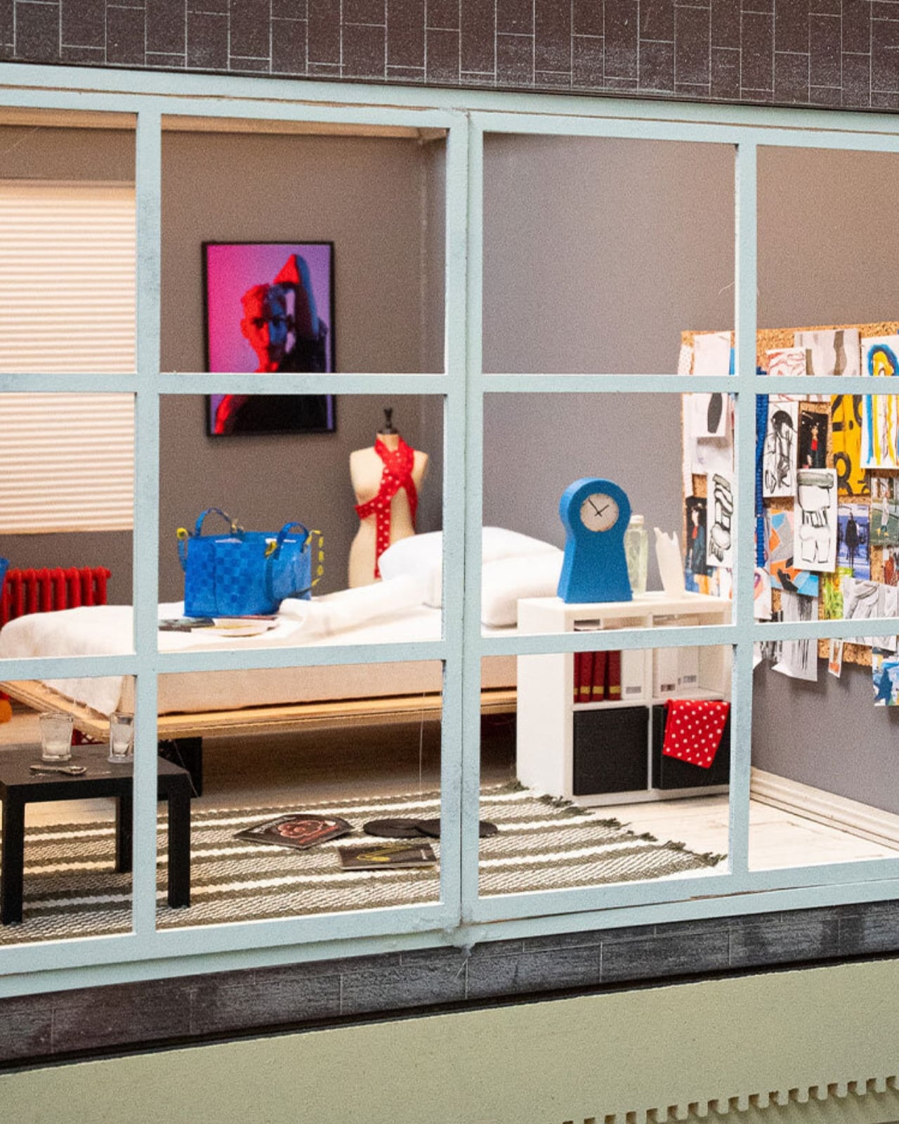
The company recently installed handcrafted miniature homes, built at a precise 1:12 scale, in public spaces across Melbourne, Chengdu, and Beijing. They’re gorgeous, obsessively detailed little things made by Stockholm-based miniature artist Christopher Robin Nordström, who goes by TokyoBuild online. But they’re not really about scale-model furniture. They’re about the fact that our homes are now expected to be office, gym, classroom, and sanctuary all at once, in the same square footage we’ve always had, while somehow still looking like a magazine spread. That expectation is exhausting, and most of us already know it.

Designer: Christopher Robin Nordström for IKEA

IKEA backed this up with a survey of more than 30,000 people across 31 countries, and the headline number is the kind of thing you want to text a friend: 59 percent said they’d rather live somewhere characterful than somewhere manicured. Not a landslide, but a real majority, and a fairly clear rejection of the sterile, everything-matches aesthetic we’ve been sold for the last decade.

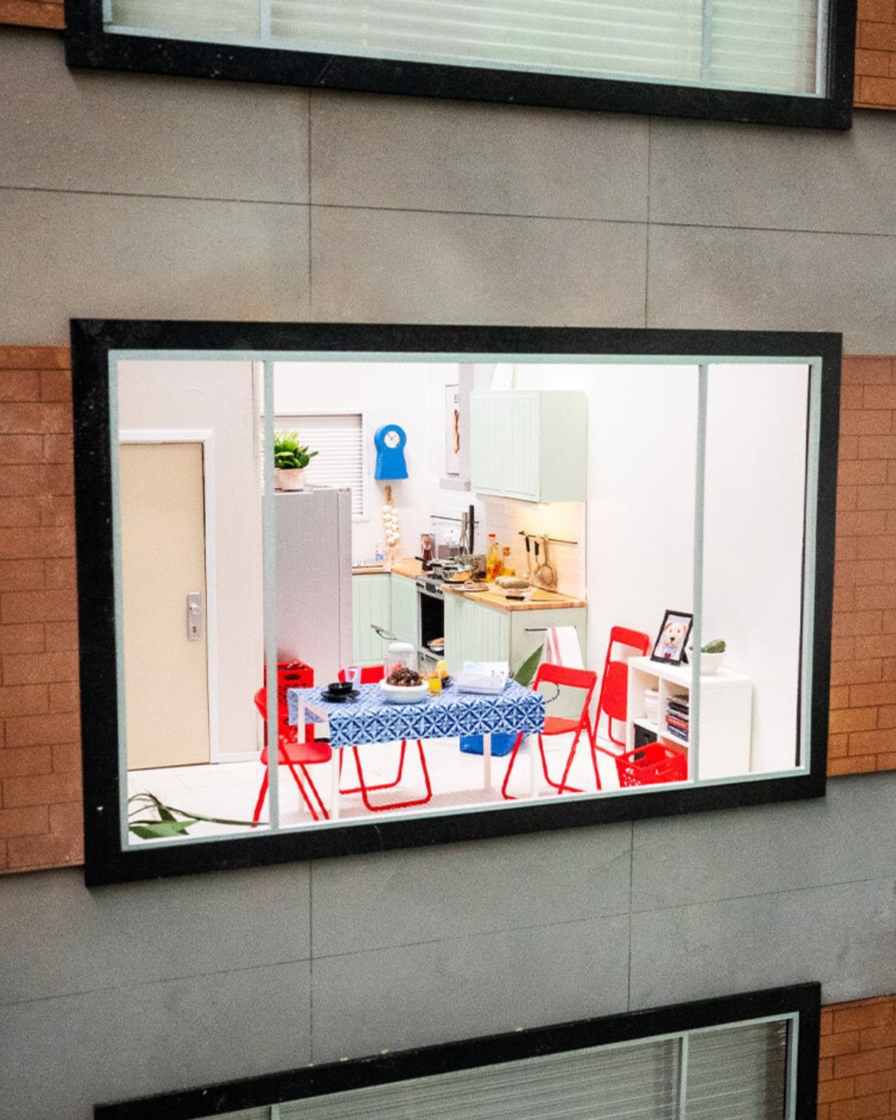
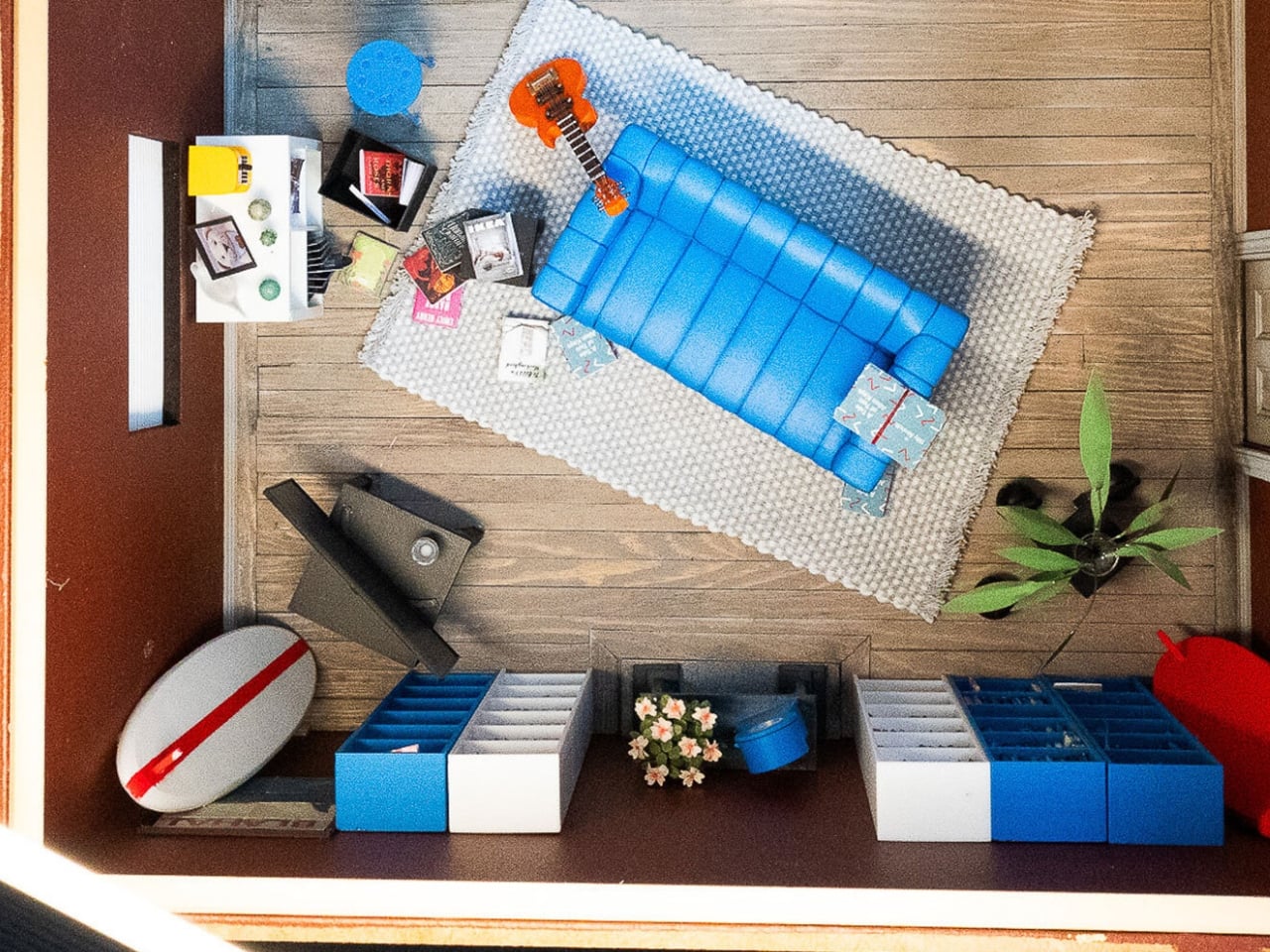
I like that the tiny houses lean into locality instead of pretending every home looks the same everywhere. The Melbourne model has a miniature BILLY bookcase stacked with tiny novels and sports memorabilia. The Chengdu and Beijing versions center on scaled-down METOD kitchens instead, because that’s where those homes actually live and breathe. It’s a small choice, but it says the quiet part out loud: nobody’s home is supposed to look like a showroom, because nobody’s life actually happens in a showroom.

Nordström said something that stuck with me more than any stat in the report. He explained that when you build in miniature, you can’t include everything, so every object has to earn its place, and you realize a home isn’t defined by how much it contains but by what people choose to make room for. That’s a graceful way to describe editing your life down to what matters, and it applies just as well at full scale as it does at one twelfth of it.

The behavioral data is where this stops feeling like a marketing campaign and starts feeling like a mirror. Nearly one in five people admit to keeping gifts they never wanted, just to avoid hurting someone’s feelings. More than a quarter hide mementos from past relationships, a habit slightly more common among men. Ten percent have actually canceled plans with friends because their place felt too messy to host, and over a third shuffle clutter from room to room right before guests arrive. Some people use their oven purely for storage, which, if I’m honest, sounds familiar to at least one junk drawer I refuse to open around visitors.

What strikes me isn’t that people are messy. It’s that so many of us are quietly performing tidiness for other people instead of actually living in our own space. IKEA’s pitch, wrapped up in tiny bookshelves and miniature kitchens, is refreshingly modest: you don’t need a renovation to fix that. You need smarter storage and permission to stop apologizing for your actual life.

The tiny houses tour wraps up soon, but IKEA Open House continues in stores through September, built around the same idea at real scale, with the kind of affordable, small-footprint fixes most of us can actually use. Whether or not you ever walk through it, the message is worth sitting with. Perfect homes are rare. Honest ones are just about everywhere, once you stop hiding them.

The post IKEA’s Tiny Houses Quietly Admit Your Messy Home Is Fine first appeared on Yanko Design.

  •  

The 5 Home Upgrades Every Pet Parent Actually Uses (Not Just Buys)

Pet furniture & products have operated under a different standard than everything else in the home for too long. The scratchy beige tower. The plastic bowl by the radiator. The mat that looks like an afterthought. That gap between what owners expect from their own furniture and what they accept for their pets is closing, and the designs collected here are evidence of that shift. These are objects that take the animal’s life seriously without surrendering the room.

This is not a list for owners who want to spoil their pets. It is a list for owners who want their home to feel coherent, and who understand that coherence includes the animal living in it. A vacuum that maps your dog’s favourite spots. A bowl that keeps a fast eater honest. A table built around the fact that the cat is going to be there anyway. Five upgrades, and one shared premise.

1. Chunky Cat Tree

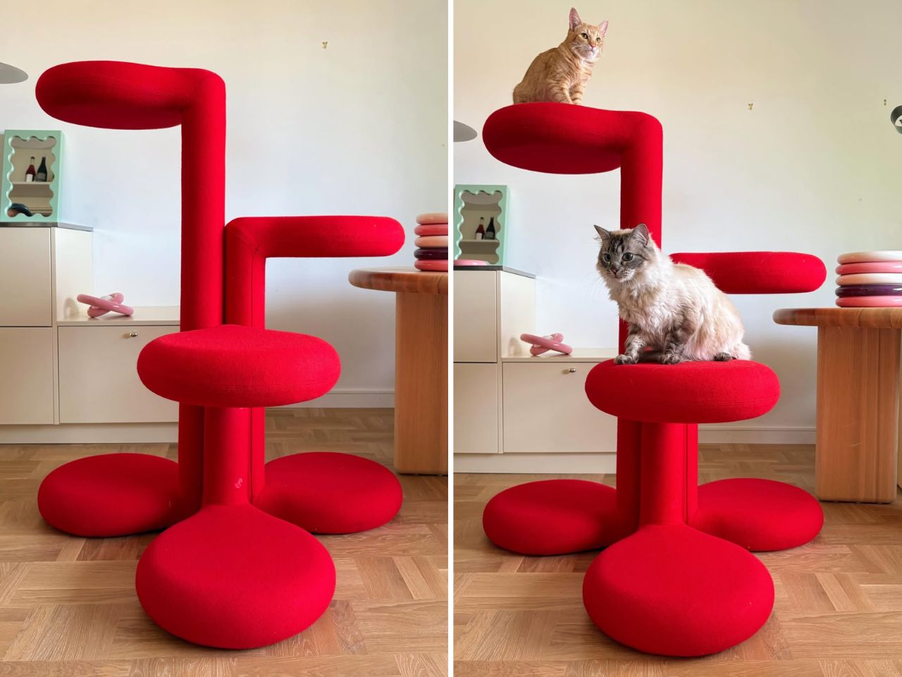
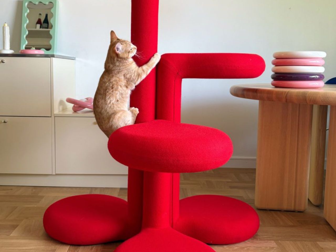
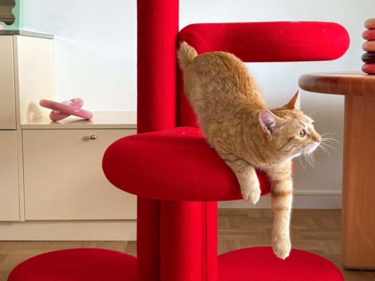
Cat trees solve a specific problem and fail at everything else. They anchor the room in exactly the wrong way, and most owners spend years working around them rather than with them. Gustaf Westman’s Chunky Cat Tree asks whether the category has to operate this way at all. The Swedish designer, known for his Chunky collection of ceramics, glassware, and home objects, has applied that same rounded vocabulary to a cat climbing structure. The result is a piece you place rather than hide.

The form carries all of Westman’s signatures: stacked volumes, inflated proportions, a material presence that reads as warm and deliberate. Made to order in Sweden, the tree is upholstered in wool across five colourways: red, yellow, purple, blue, and cobalt blue. Westman has said he designed it after years of seeing ugly cat trees and deciding the category deserved better. The comment captures the larger idea behind the object. Everything can be designed better, including the things we have come to accept as visually unpleasant.

What we like:

  • Treats cat furniture as a design category worth the same formal attention as any other home object
  • Wool upholstery and sculptural proportions earn placement in the room rather than tolerance of it

What we dislike:

  • Made to order in Sweden means lead times and pricing that will not suit everyone who falls for the visual
  • No confirmed US retail availability or price at time of writing

2. Narwal Flow 2 White

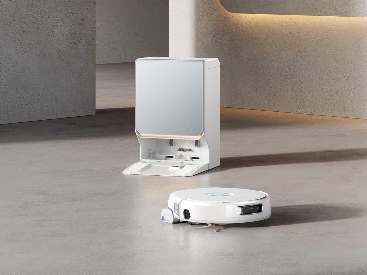
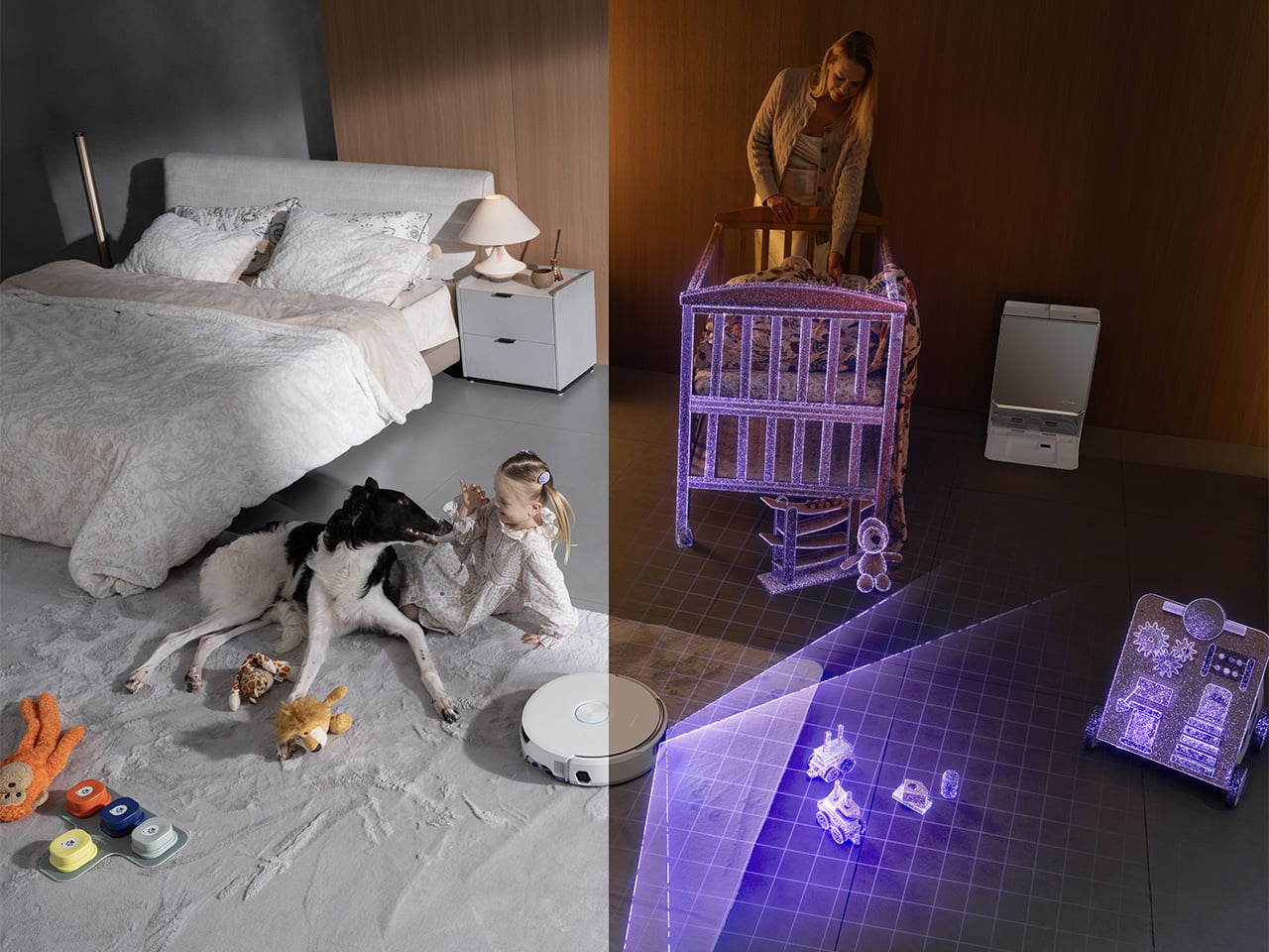
Robot vacuums and pet homes have always had a complicated relationship. Hair wraps around the brush, filters clog faster than the maintenance schedule allows, and the machine ends up parked in the corner half the time. The Narwal Flow 2 White addresses that at the hardware level before asking for any trust. A certified detangling system eliminates hair tangling. A 31,000 Pa motor handles the volume that stops most competitors mid-session. Pet Mode maps your animal’s active zones and adjusts cleaning paths accordingly.

The white colourway matters more than it sounds. Most robot vacuums read as appliances, objects you notice when working and ignore otherwise. The Flow 2 White sits closer to quiet luxury, a thing you leave in the room rather than hiding beneath furniture. Find My Pet uses the onboard camera to locate your animal from your phone on demand. A FlowWash mopping system heats water to 140 degrees for a result that goes well beyond what surface-level mop attachments typically deliver at any price.

Click Here to Buy Now: $1069.99 $1499.99 ($430 off, use coupon code “YDNARWAL”). Hurry, deal ends in 48-hours! Website Link Here.

What we like:

  • Pet Mode and the certified detangling system treat pet ownership as a design constraint rather than a marketing hook
  • Find My Pet and AI Floor Tag add genuine daily utility beyond the core cleaning function

What we dislike:

  • At $1,099.99 launch price, the commitment is significant for a category with a historically patchy reliability record

3. Sloddy

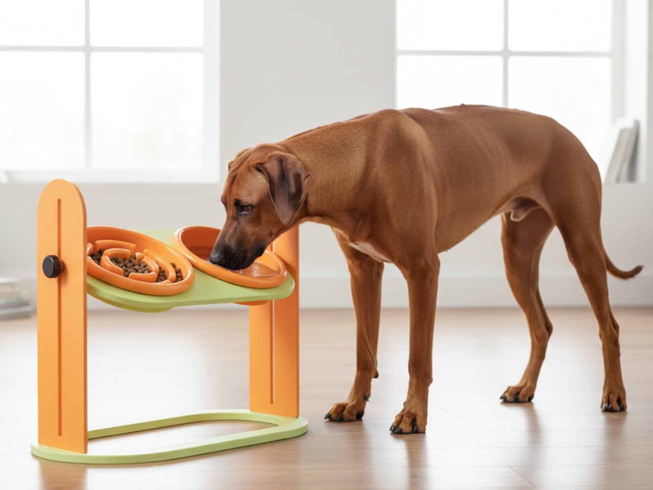
Slow feeders solve the problem once. Most dogs need about a week to learn the maze, and then mealtime returns to its previous five-second format. Designer Kyung-seo Yoo built Sloddy around that specific failure mode. The bowl ships with multiple interchangeable puzzle inserts at increasing difficulty levels, and you rotate them as the dog adapts. The challenge stays real. The eating pace stays controlled. It is a straightforward idea that the rest of the category never thought to try.

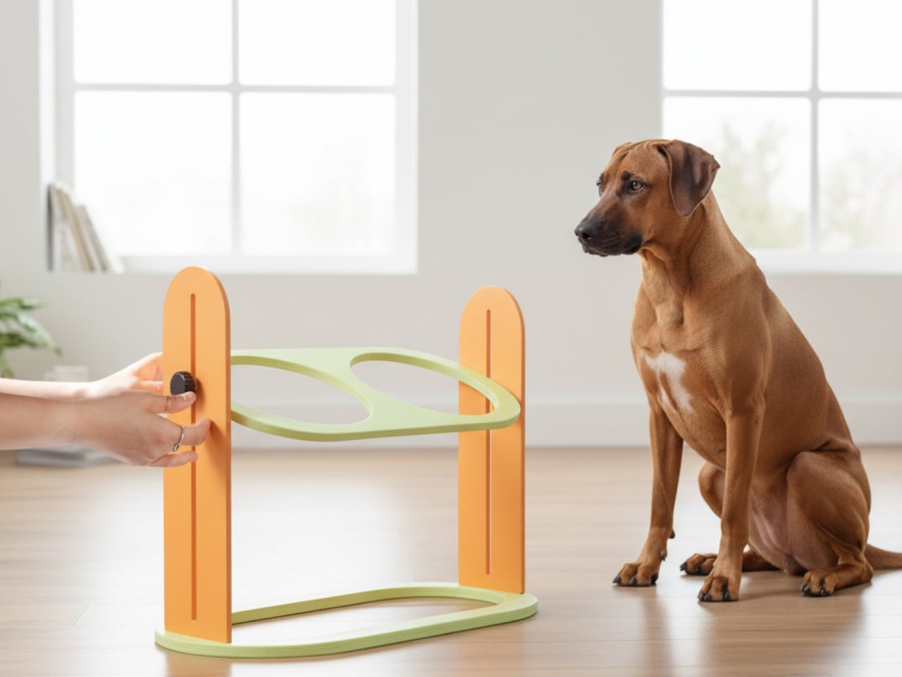
An adjustable MDF wood stand raises or lowers the bowl to match shoulder height, addressing a posture and digestion concern that most pet owners encounter long after they needed the fix. Every component disassembles fully for cleaning, with no corners that trap food beyond reach. The peachy-orange palette and warm wood base sit somewhere between kitchen object and design piece, and the recyclable cardboard packaging doubles as a storage shelf for the spare inserts once the box is opened.

What we like:

  • The modular difficulty system is the first meaningful update to the slow feeder format in years
  • Full disassembly for cleaning eliminates the trapped-food problem that makes most slow feeders a short-term purchase

What we dislike

  • The modular system only works if the owner actively manages the insert rotation — it requires consistent owner effort, and most households will default to leaving the same insert in indefinitely
  • The MDF wood stand, while visually warm, is vulnerable to water damage and splashing at feeding time, which is a daily reality with most dogs

 4. Pet Paws

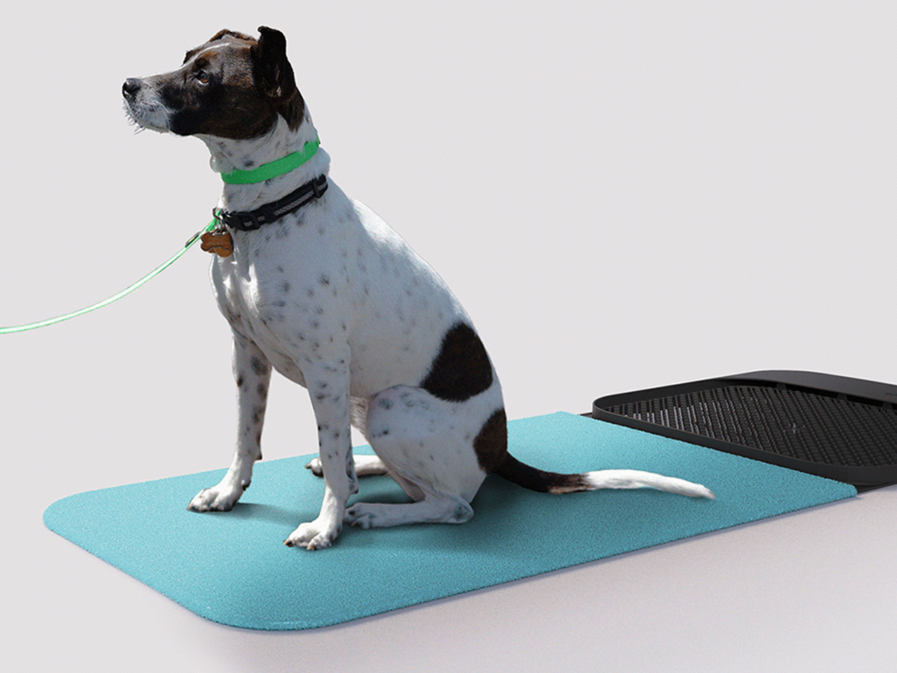
Paws are how the outdoors follows your dog into every room. Mud, grit, bacteria, and allergens come in with every return from outside, and a doormat or a towel handles it partially at best. This portable mat was designed to close that gap by combining three functions- cleaning, drying, and disinfecting- in a single object that sits where the problem actually begins. The all-in-one approach trades the multi-step routine by the door for something that takes seconds and requires nothing else.

The portability is part of the logic. A fixed solution only works at one entry point; a mat you can move adapts to wherever the animal actually comes in, which is rarely the same door every day. For households where paw hygiene connects directly to allergy management or general cleanliness standards, shortening the threshold routine without eliminating it offers something most door products never attempt: cleaning, drying, and treating in the same step, without a trip to the sink.

What we like:

  • Three-in-one functionality handles the most repetitive daily pet hygiene task without multiple products
  • Portable format adapts to wherever the animal actually enters, not just the main door

What we dislike:

  • The disinfecting function almost certainly requires a cleaning solution or refill, adding an ongoing cost and supply dependency that the headline promise of a single portable mat quietly glosses over
  • Dogs that resist paw handling or unfamiliar textures underfoot will need consistent training before the mat becomes a reliable part of the routine rather than something they walk around

5. Dinos Cat WFH Table

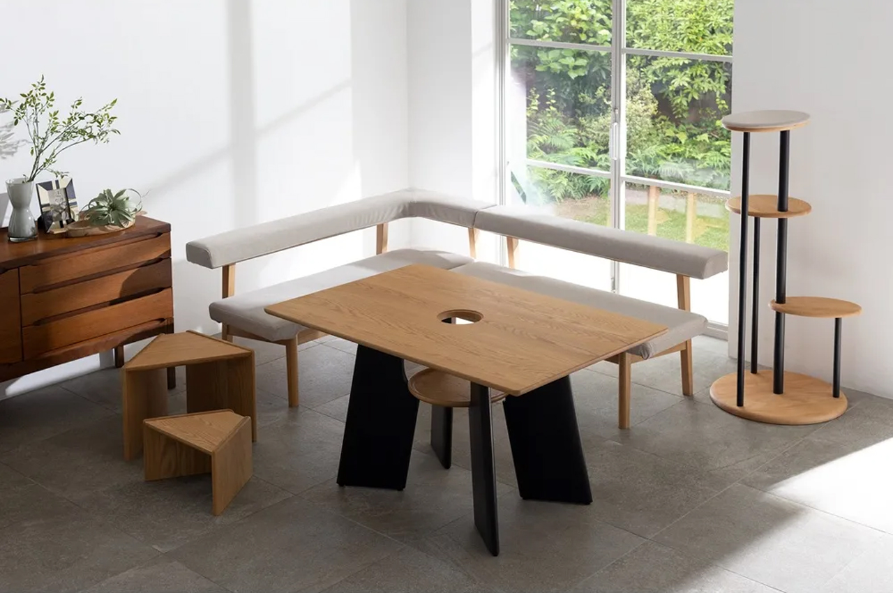
Anyone who works from home with a cat recognizes the pattern. The animal locates the warmest, most centrally placed surface in the room and treats it as its own. The desk. The keyboard. The notebook. Japanese furniture company Dinos designed a table that accepts this behavior as a given and builds around it rather than against it. A center cavity in the tabletop creates a through-hole, and a hidden perching shelf beneath gives the cat a settled spot at the same level as everything happening above.

The logic is quiet and functional. Rather than competing with the animal for desk space, the table distributes the surface so both uses fit without interrupting each other. The cat sits close enough to its owner to settle down, without walking across the keyboard to get there. For anyone who has rearranged a work setup around a cat’s habits anyway, this just makes the accommodation honest, building it into the object rather than improvising it daily with a cardboard box and a folded blanket.

What we like:

  • Treats the cat as a design parameter from the start rather than an inconvenience to be managed around
  • The hidden perching shelf reduces desk negotiation without requiring any behavioral change from the animal

What we dislike

  • The center cavity is sized and designed specifically for cats, making it a non-starter for dog owners and narrowing the audience of this roundup in a way worth flagging before recommending
  • The table assumes the cat will use the designated perch, and cats are reliably indifferent to designated anything, meaning the design works best for animals already inclined to settle rather than roam

Good Design Has No Exceptions

Pet ownership has changed faster than the objects designed around it. The animals have moved into bedrooms, onto sofas, into daily routines in ways the existing product categories have not kept pace with. What this list represents is a small group of designers who noticed that gap and decided to close it, not by producing novelties, but by applying real design thinking to objects that have been overlooked or tolerated for too long.

None of these are impulse purchases or quick fixes. They are considered responses to specific problems, and that distinction matters. A cat tree that earns its spot. A vacuum that accounts for hair before it becomes a problem. A bowl that stays challenging. A mat that completes the threshold routine in one step. A table that accepts the cat before it ever arrives. That is what good design looks like when it reaches the right problems.

The post The 5 Home Upgrades Every Pet Parent Actually Uses (Not Just Buys) first appeared on Yanko Design.

  •  

5 Home Objects That Look Like They Belong in a Design Museum but Cost Less Than a Dinner Out

The design museum makes one quiet argument. Certain objects deserve to be looked at, and how a thing is made can matter as much as what it does. Most people accept this on a Saturday afternoon in front of a Noguchi lamp or an Eames chair, then go home to a shelf full of things nobody chose with the same intention. That gap is worth closing, and it does not require a renovation budget.

These six objects cost somewhere between a round of drinks and a dinner for two. None are functional in the way a charging cable is functional. They are functional in the way a good room is, changing how a space reads and getting noticed before anyone can articulate why. That quality has very little to do with price and everything to do with knowing where to look for it.

1. Carte Blanche Ceramics

Dutch designer Annebet Philips began this collection in cardboard rather than clay, cutting shapes with deliberately uneven edges and treating the paper prototype as the design language itself rather than a step to be discarded. Belgian brand Serax carries the result through to porcelain: a coffee and tea service that has since grown to include plates, a breakfast bowl, an egg cup, and a salt and pepper set. Every piece started as a childlike cutout on a blank page. Nothing about that origin was smoothed away in production.

What makes each piece genuinely strange is that it reads as a drawing of itself. Hand-painted black lines trace every fold and seam, giving cups and saucers the flattened quality of ink on paper rather than fired ceramic. Photographed straight on, a cup collapses into what looks like a quick sketch, the handle reading as a doodled loop rather than a ceramic ear. Everything is microwave and dishwasher safe, which keeps the concept in daily use rather than retreating to a shelf nobody touches.

What we like

  • The trompe-l’oeil effect holds in person, not only in photographs
  • Dishwasher safe at a design level that rarely permits it

What we dislike

  • Sold through Serax stockists rather than one direct channel, which makes sourcing specific pieces more work than it should be
  • Hand-painted lines vary slightly between pieces, which is part of the concept but can feel inconsistent in a matched set

2. ECHO Ceramic Speaker

Most speakers announce themselves. They sit on surfaces with blinking lights and trailing cables, with the general suggestion of being placed there temporarily. Kenji Abe’s ECHO arrives from the opposite direction. It is a glazed ceramic chamber built on the acoustic logic of a seashell and a cupped hand that looks exactly like a small vase. Slide a phone underneath, and the cavity carries audio outward in soft, diffused waves. No power. No pairing. Nothing to charge or set up.

The decision to use ceramic was not incidental. Ceramic belongs to the visual grammar of a home, the language of objects that have simply always been there, and ECHO uses that familiarity to disappear into a room entirely. A guest would not identify it as a speaker. The glazed surface catches light the way pottery does, and when the phone is gone, it stays on the shelf with the composure of something that was never trying to perform in the first place.

What we like

  • Looks like a ceramic piece because it is one, not a speaker wearing a vase disguise
  • No charging, no pairing, no batteries to deplete or replace

What we dislike

  • The amplification is warm and subtle rather than loud, better suited to a quiet kitchen than a busy room
  • Designed for smartphones placed directly underneath, which limits where in a room it can be used

3. Petal Vase

Every day, thousands of tons of cut flowers are incinerated at flower markets because they reached the end of their shelf life before a buyer arrived. Rebloom Studio, a Korean design practice, collects those discarded blooms, processes them into pulp with Korean paper pulp and a natural binder, and molds the result around an interior glass cylinder. The finished piece is a vase made entirely from flowers that never got the chance to be seen by anyone.

No two Petal Vases look alike. The flowers used to make each one determine its final color, texture, and edge profile. The jagged rim, the petal compression visible in the walls, the slight asymmetry in the silhouette- all of it is preserved deliberately rather than corrected in finishing. When the vase reaches the end of its life, the biodegradable shell returns to the earth. It is one of those rare objects where the material story requires no explanation because you can already see exactly where it came from.

What we like

  • Every piece is genuinely one of a kind, not in the marketing sense but the literal one
  • The biodegradable origin is visible in the object itself rather than printed on the packaging

What we dislike

  • Availability depends on Rebloom Studio’s production schedule, and stock from a small Korean studio can be intermittent
  • The rough, irregular surface is the whole point, but buyers expecting a conventional smooth ceramic finish may need to adjust

4. Delicato Tray

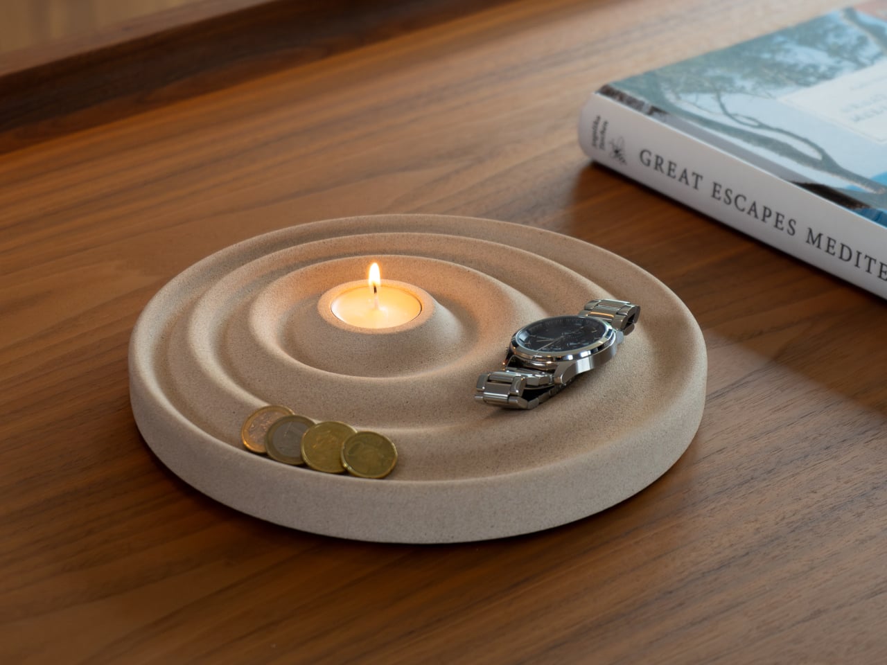
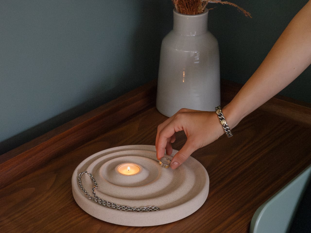
The entryway surface tells a familiar story, and it is rarely flattering. Keys land wherever there is space, coins scatter to the edges, a watch ends up beside a receipt from last week. Joao Teixeira’s Delicato Tray for Oftwise is cast from Jesmonite AC730, a water-based, fire-rated stone composite, in the form of a rippled disc. The concentric waves are asymmetric by design: wider at the outer ring for keys and glasses, tighter toward the center for rings and coins.

At the center of those ripples sits a recessed pocket sized for a tealight candle, turning the daily ritual of dropping your things at the door into something closer to a ceremony. Because the tray is hand-cast, no two are identical. Small air bubbles, subtle texture variations, and minor color shifts are natural byproducts of the process. The result is two kilograms of warm sandy stone that makes a surface look deliberately arranged before anything has been placed on it at all.

What we like

  • The hierarchy is built into the form itself, so organization becomes almost unconscious
  • Hand-cast production means no two pieces are identical, in the way that actually matters

What we dislike

  • At €235 it sits at the very top of the dinner framing, and that math depends on which dinner you have in mind
  • Currently available in one color, which limits how it integrates into darker or cooler interiors

5. Luna

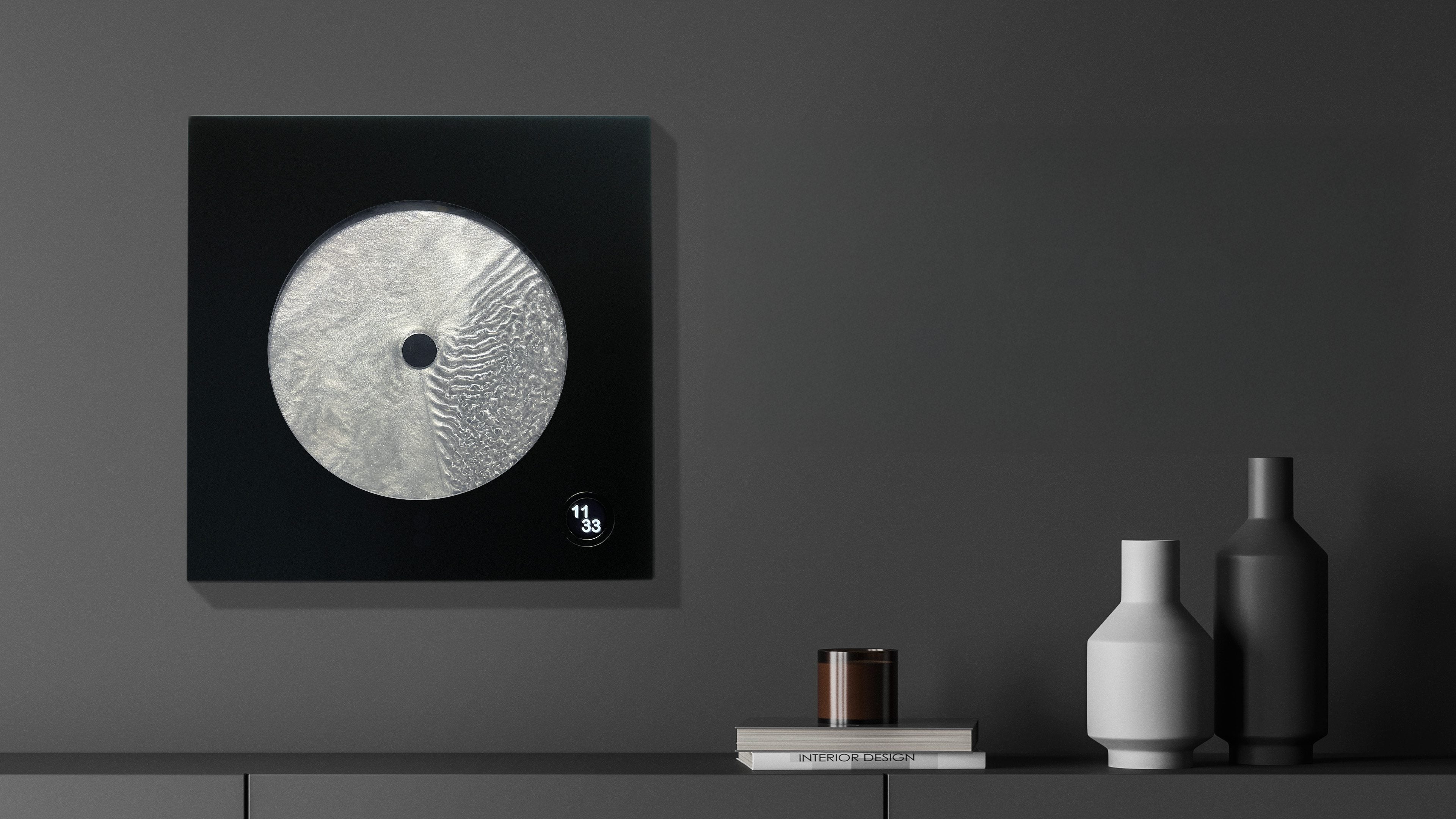
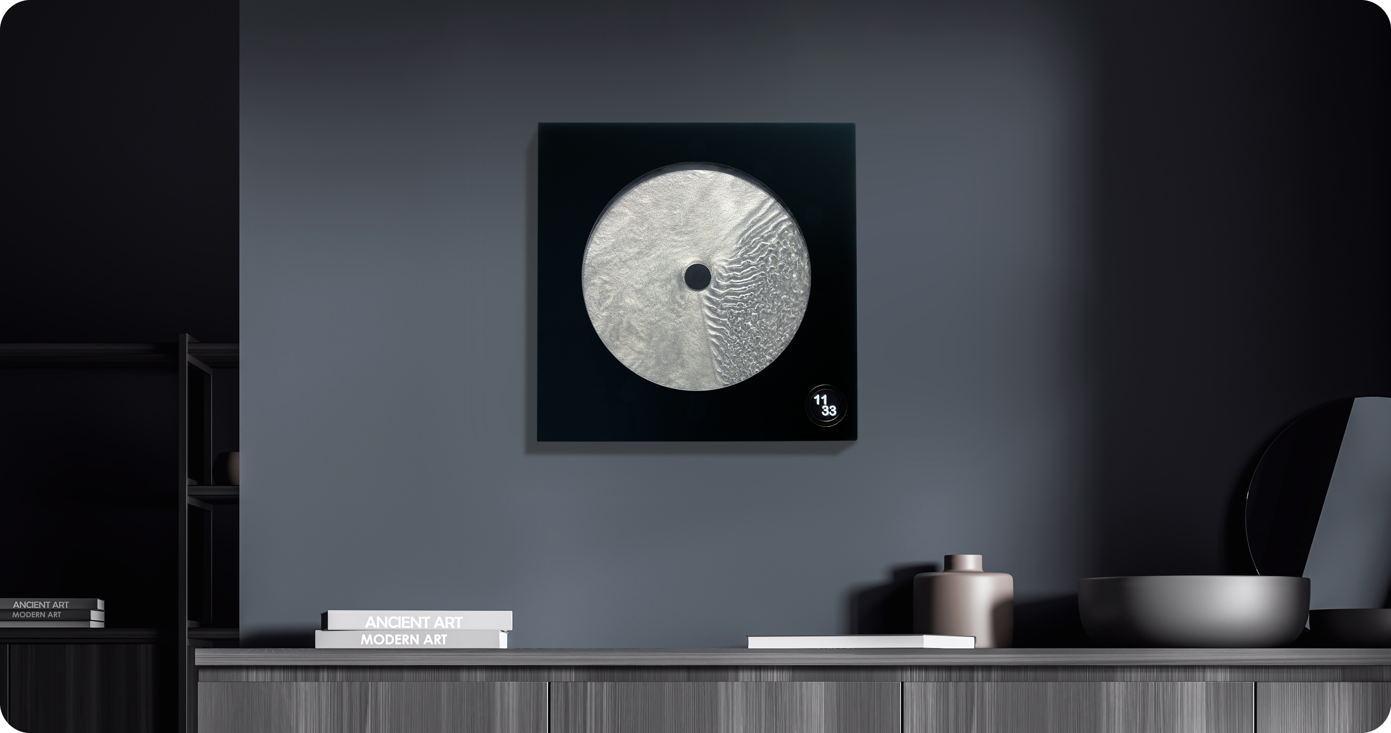
Robert Spillner spent years building components for Formula 1 teams before reversing the entire premise of his career. Instead of measuring speed, he built an object that stages time. Luna is a 400 x 400mm wall piece framed in matte black solid wood with a cast acrylic pane at its center. Inside, a single pointer moves through Zero Flow Technology, Spillner’s proprietary fluid made from distilled water, additives, micro-particles, and a small quantity of genuine lunar dust. Behind the pointer, turbulent patterns mark what has passed. Ahead of it, the liquid sits completely undisturbed.

The exact composition of the fluid is deliberately undisclosed, and that is the right call. The lunar dust is certified and billions of years old, documented with a certificate of authenticity that ships with each piece. Every Luna is signed, numbered, and limited to 99 per year, all made on demand in Germany. A small LCD touchscreen adjusts time and brightness without competing visually with the fluid. Spillner describes it as an art object with a time function, and the order of those words is correct.

What we like

  • The past-and-future visual logic is legible in the object itself, not only in the written description of it
  • Lunar dust certification and a limit of 99 per year make each piece traceable and unrepeatable

What we dislike

  • No public price is listed; the limited edition, handmade production profile suggests it sits above the other objects in this list
  • The 400mm square format demands a wall that can hold it as a singular focal point rather than one object among several

Editor’s Choice: Japanese Lantern Candle

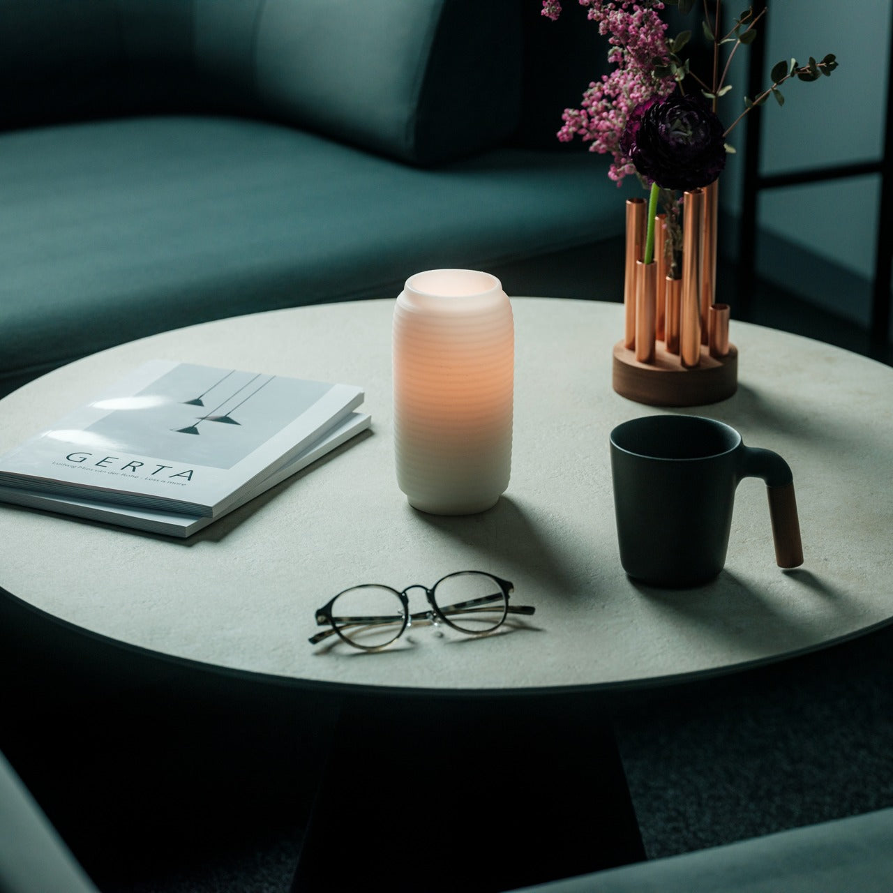
The paper lantern is one of the oldest resolved problems in lighting design. How do you carry warmth from a candle flame into a room without losing it to the hardness of the fixture? Japanese designers worked through that question for centuries and arrived at a form that required almost no further development: a collapsible structure of thin ribs and translucent paper that diffuses candlelight into a soft, directionless glow.

What separates a well-made Japanese lantern from a decorative replica is the quality of light it produces and how it behaves in a room. Warm and sourceless, candlelight filtered through translucent paper fills a corner the way natural light from a small window does, without the hard edge of a focused lamp or the flatness of overhead lighting. On the floor beside a chair or a side table, it becomes the kind of object people notice and comment on before they have thought to ask what it is.

Click Here to Buy Now: $70.00

What we like

  • The quality of diffused candlelight it produces is genuinely different from any other fixture in a room
  • Stores flat, which matters in a small apartment where every permanent object has to earn its place

What we dislike

  • Works best as ambient lighting rather than a primary source for reading or close work
  • The candle paired with it needs to suit the scale and material to get the full effect

The Best Things in a Room Are the Ones Nobody Can Quite Explain

None of these objects ask for much. A shelf, a corner, a spare stretch of counter. They do not need a gallery to earn the attention they receive. What they share is the quality of being genuinely chosen, the sense that someone worked through a problem not just until it was functional but until it was right. That difference is immediately visible and, unlike most things in a home, it does not fade with time.

The museum argument is that certain objects deserve to be seen. These six make the same case from a kitchen counter, an entryway shelf, a bedroom wall. The price point is almost beside the point, though it helps. What matters is that buying thoughtfully and buying well tend to produce the same result: a home that feels assembled by someone who paid attention, rather than one that simply accumulated things over time.

The post 5 Home Objects That Look Like They Belong in a Design Museum but Cost Less Than a Dinner Out first appeared on Yanko Design.

  •  

A 355-Square-Foot Tiny Home With Room to Actually Walk Around

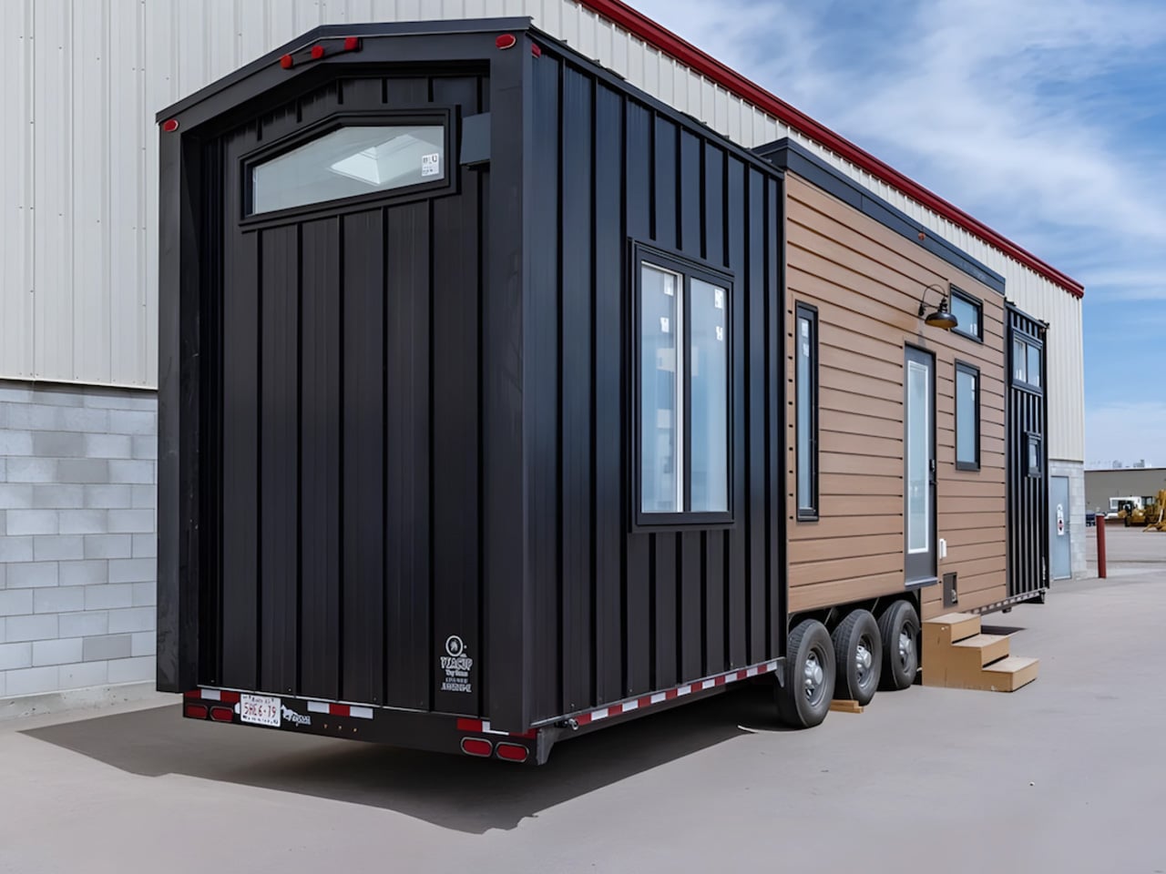
Most tiny homes are upfront about their limitations. The Florence isn’t interested in that conversation. The Florence, by Alberta-based Teacup Tiny Homes, is the argument against all of that. Sitting on a triple-axle trailer, the Florence stretches 36 feet long and 8.5 feet wide, placing it at the roomier end of the towable tiny home spectrum. Its 355 square feet of interior space is arranged with the kind of logic you’d expect from a full-size home — not an afterthought. That discipline in planning is what separates it from the crowd.

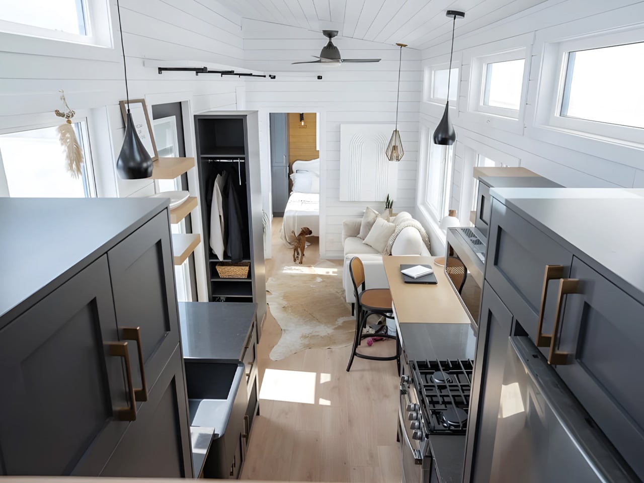
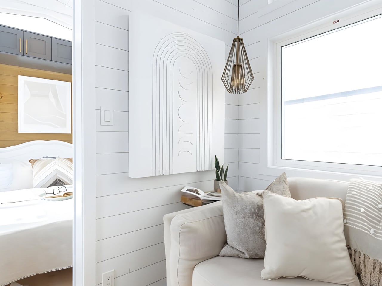
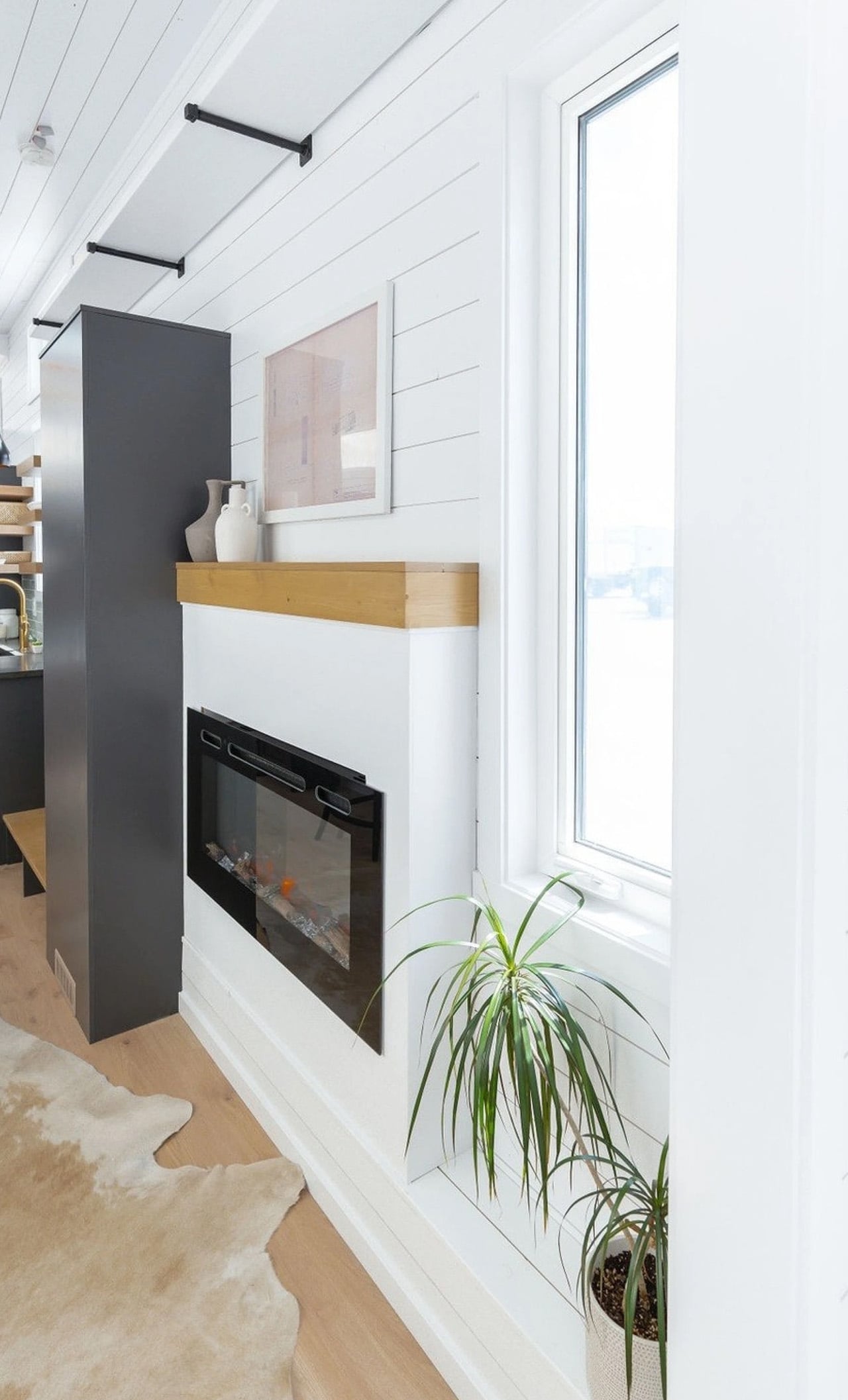
Step inside and the first thing you notice is light. White tongue-and-groove paneling wraps the walls, 11-foot vaulted ceilings push the space upward, and generous windows pull the outdoors in. The living area anchors the layout, centered around a sofa and electric fireplace, with room for a television and a large built-in storage unit near the entrance. It doesn’t read like a compromise. It reads like a considered home.

Designer: Teacup Tiny Homes

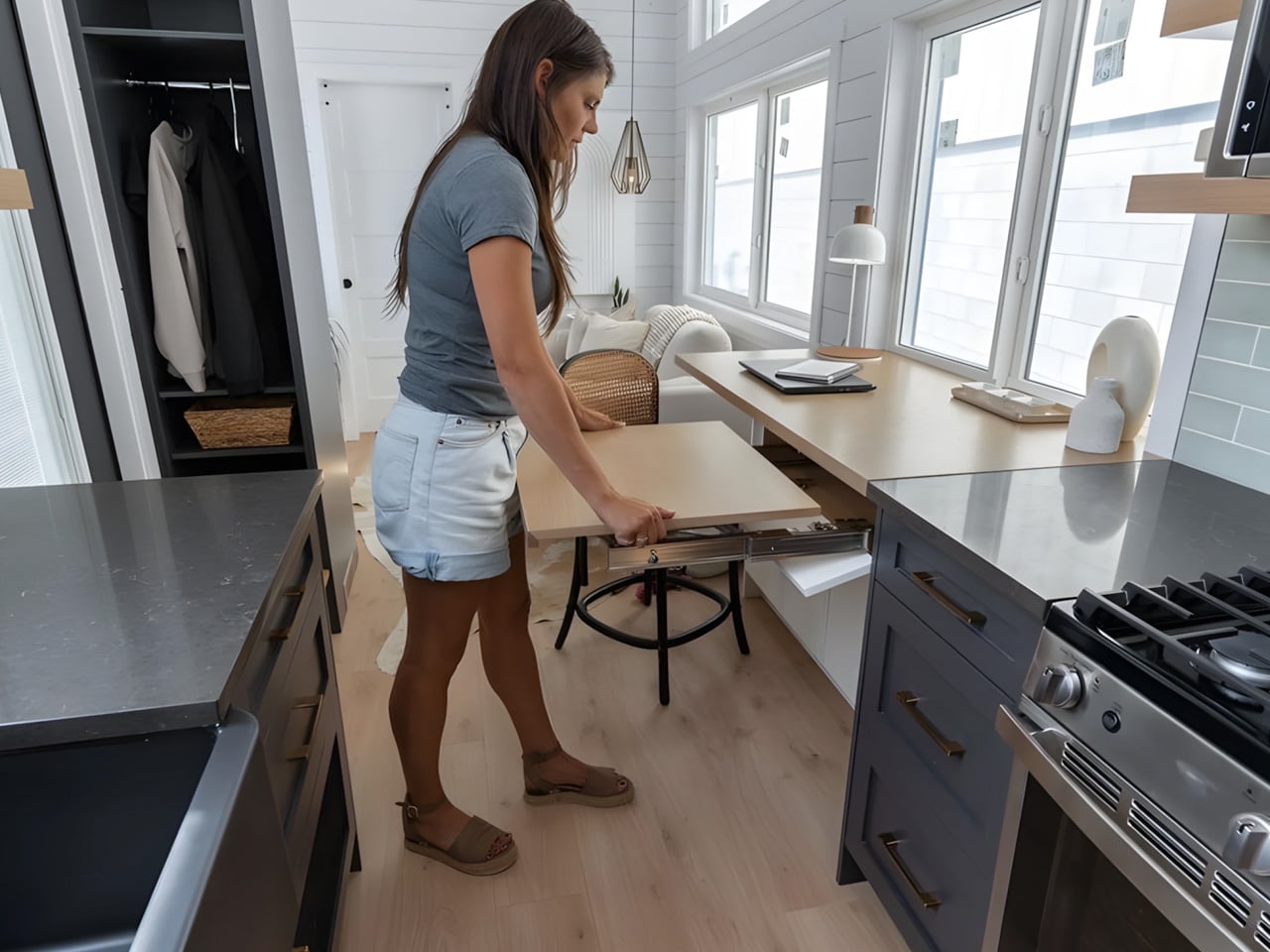
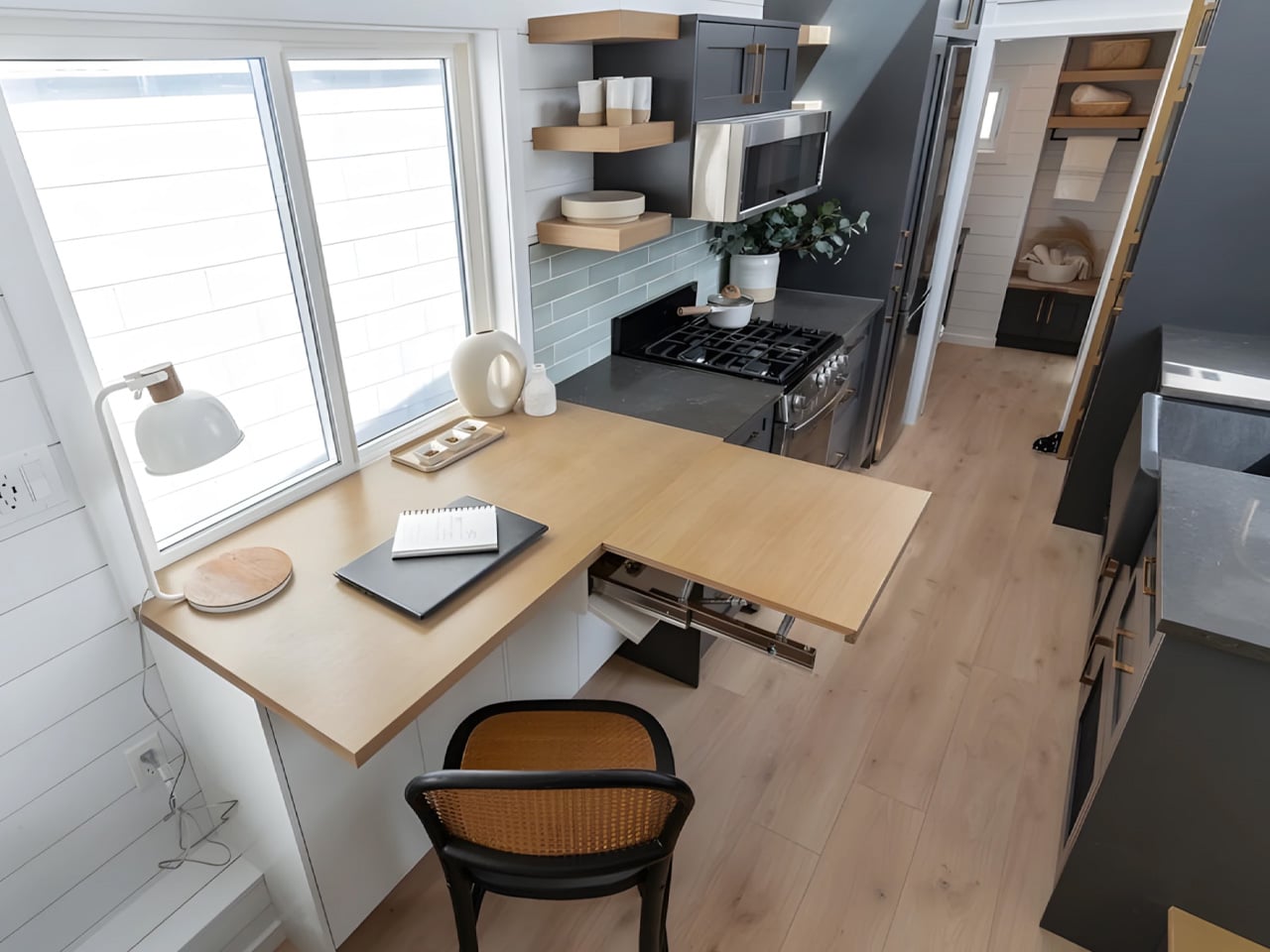
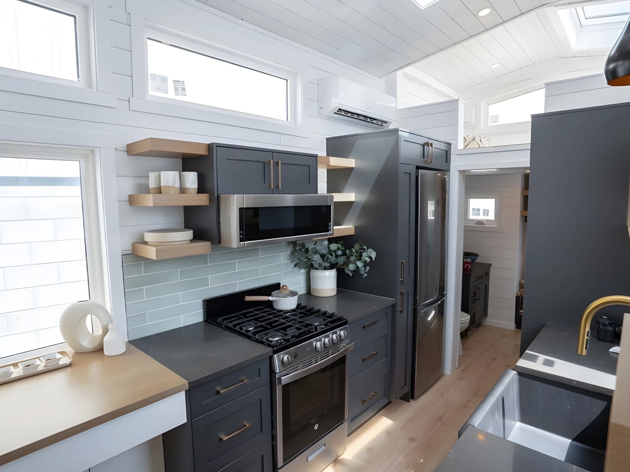
Immediately adjacent is one of Florence’s more thoughtful touches — a dining nook that doubles as a home office, complete with an extending desk and integrated storage. For remote workers or anyone who needs a dedicated workspace without sacrificing a room, this dual-function zone is quietly brilliant. The kitchen runs along the galley wall nearby, equipped with a four-burner propane stove, oven, microwave, fridge/freezer, a large sink, and storage that actually holds things.

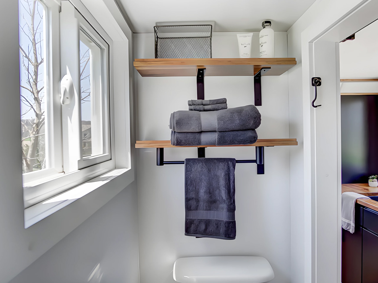
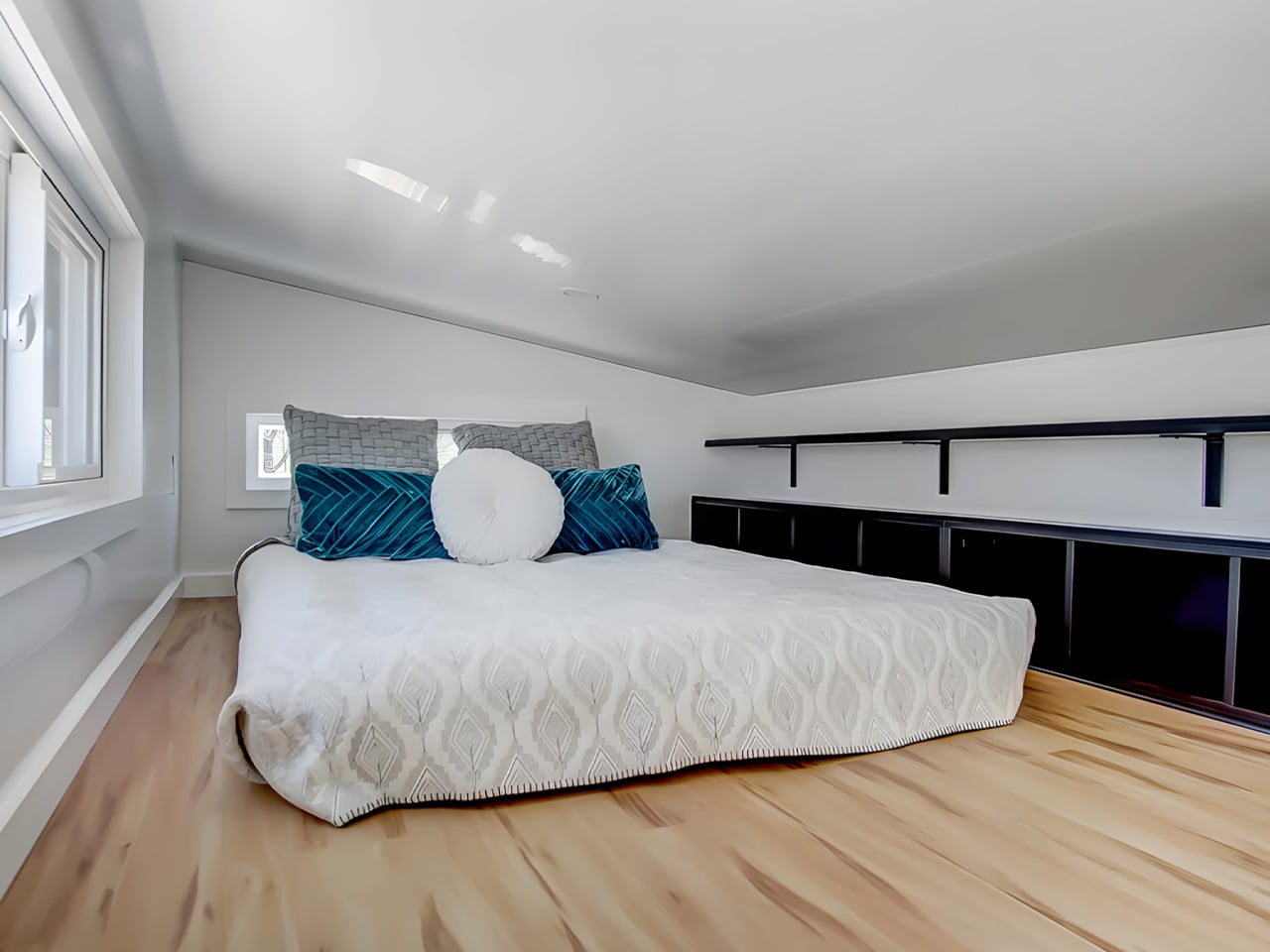
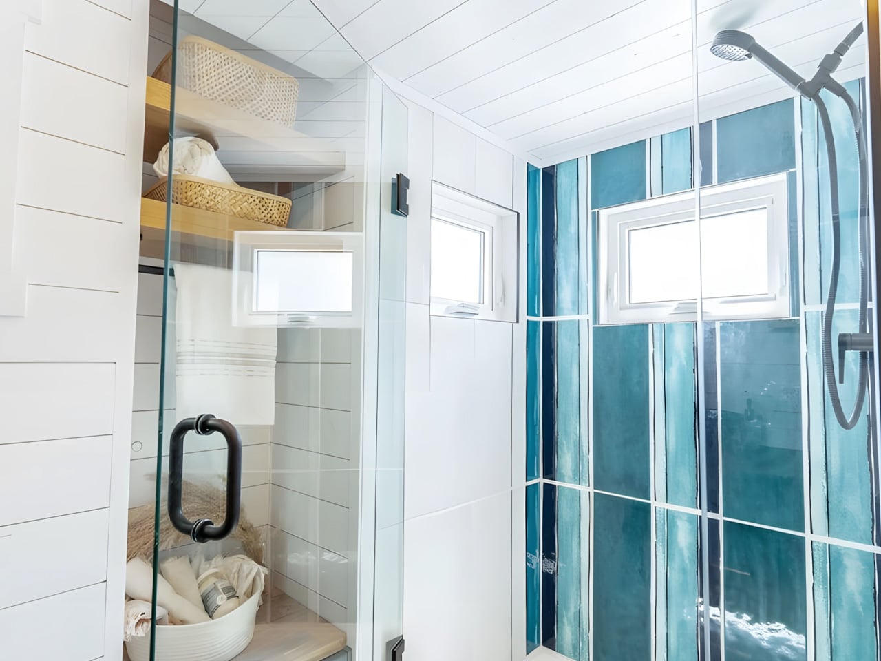
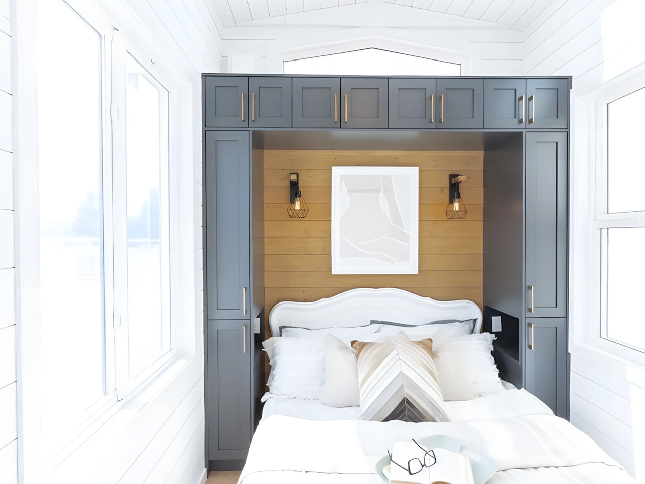
The master bedroom is located on the main floor, which is rarer than it should be in the tiny home world. Positioned next to the living area, it fits a double bed with genuine walking clearance on both sides and enough built-in storage to feel like a real room. A secondary sleeping loft sits above the kitchen and bathroom, accessed by a removable wooden ladder, offering space for a second double bed. The bathroom, tucked between the kitchen and bedroom, features a glass-enclosed shower, flushing toilet, and vanity sink.

Teacup Tiny Homes, a 100% female-owned and operated company founded in 2016, offers the Florence with a range of customization options — a soaking tub in place of the shower, choice of materials and furnishings, and permanent foundation installation if mobility isn’t the priority. Delivery runs across both the US and Canada. The Florence starts at roughly US $122,000. For a home this size, it’s a number that’s easier to justify than it might first appear.

The post A 355-Square-Foot Tiny Home With Room to Actually Walk Around first appeared on Yanko Design.

  •  

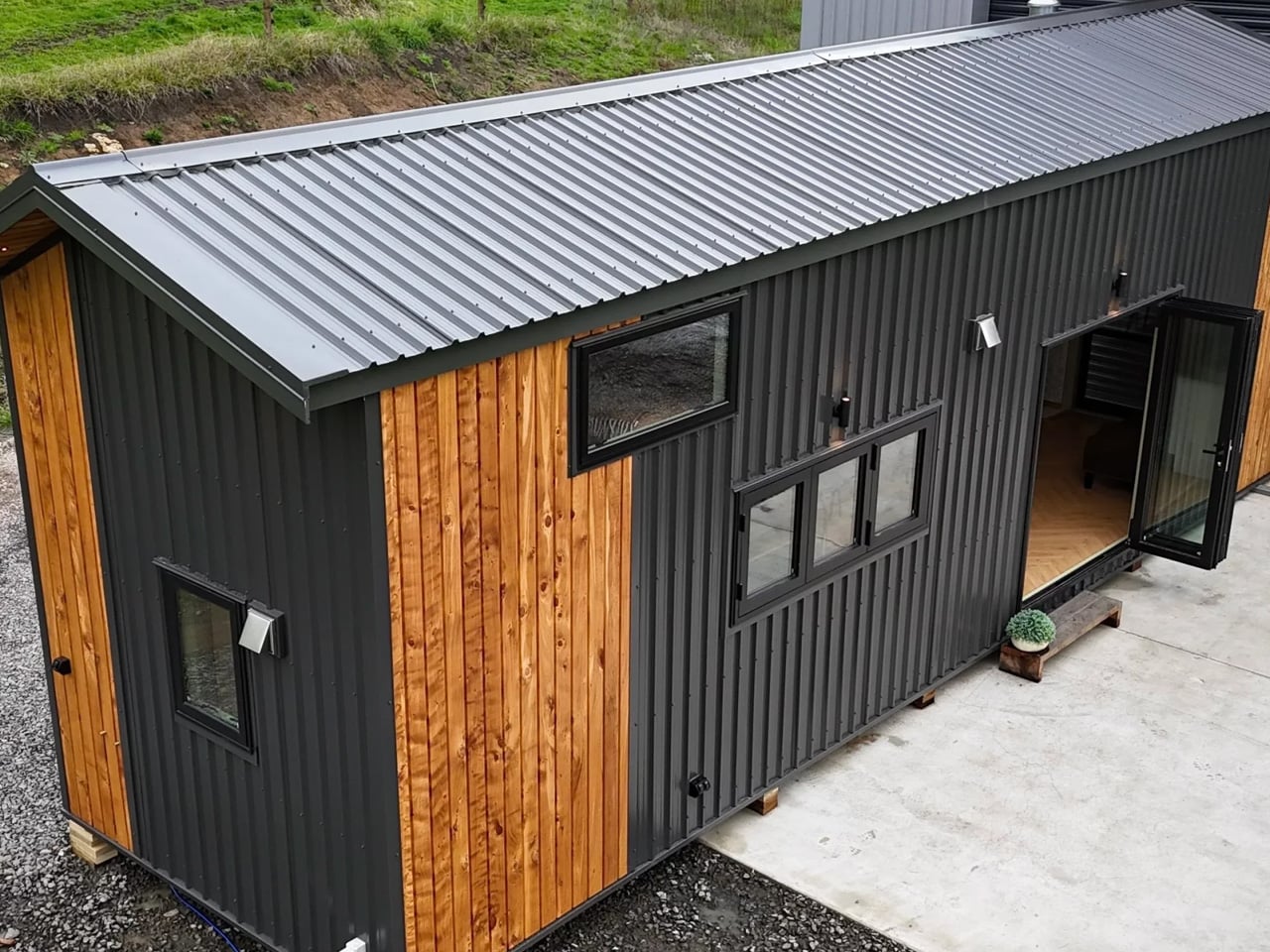
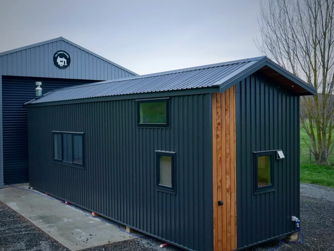
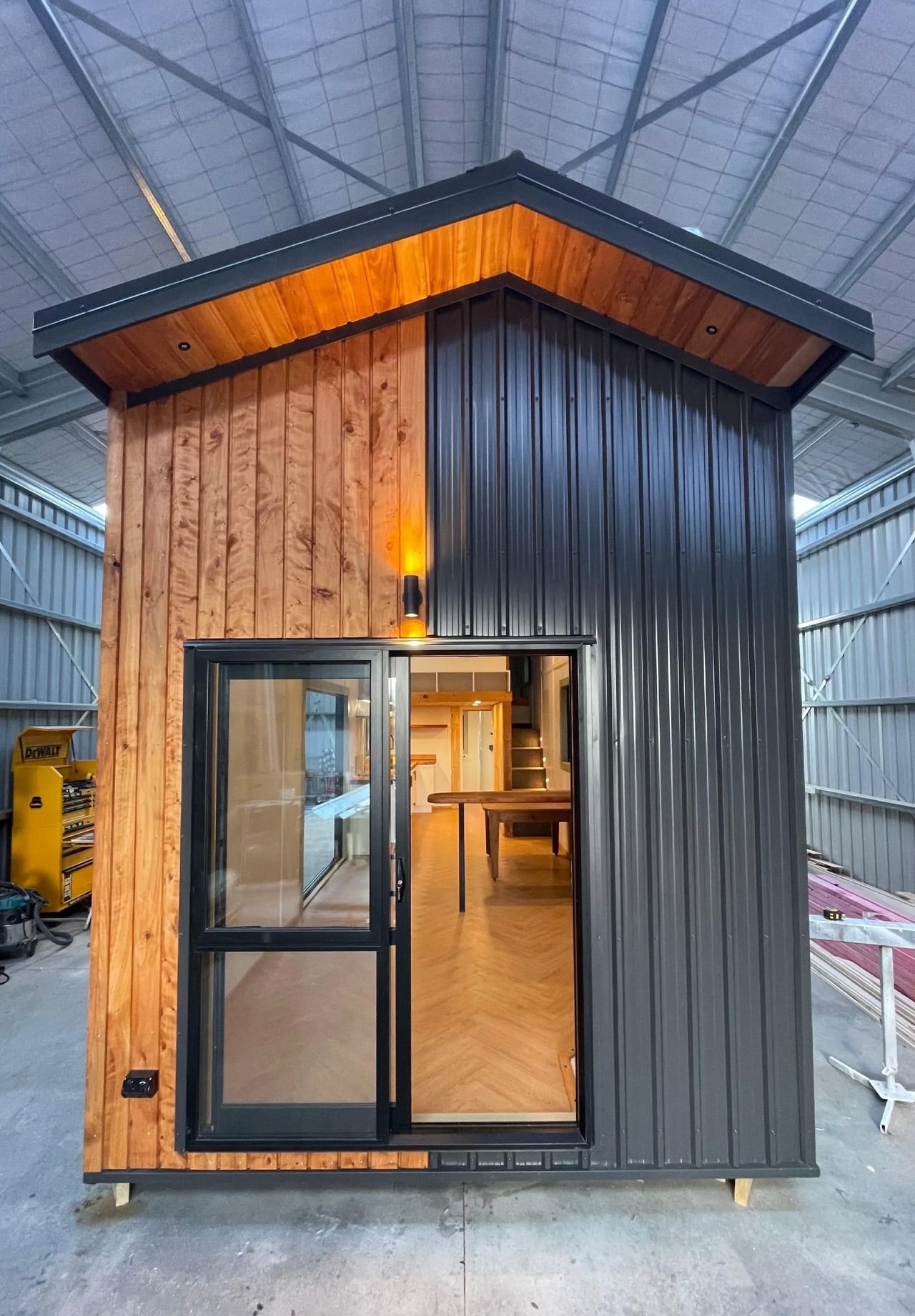
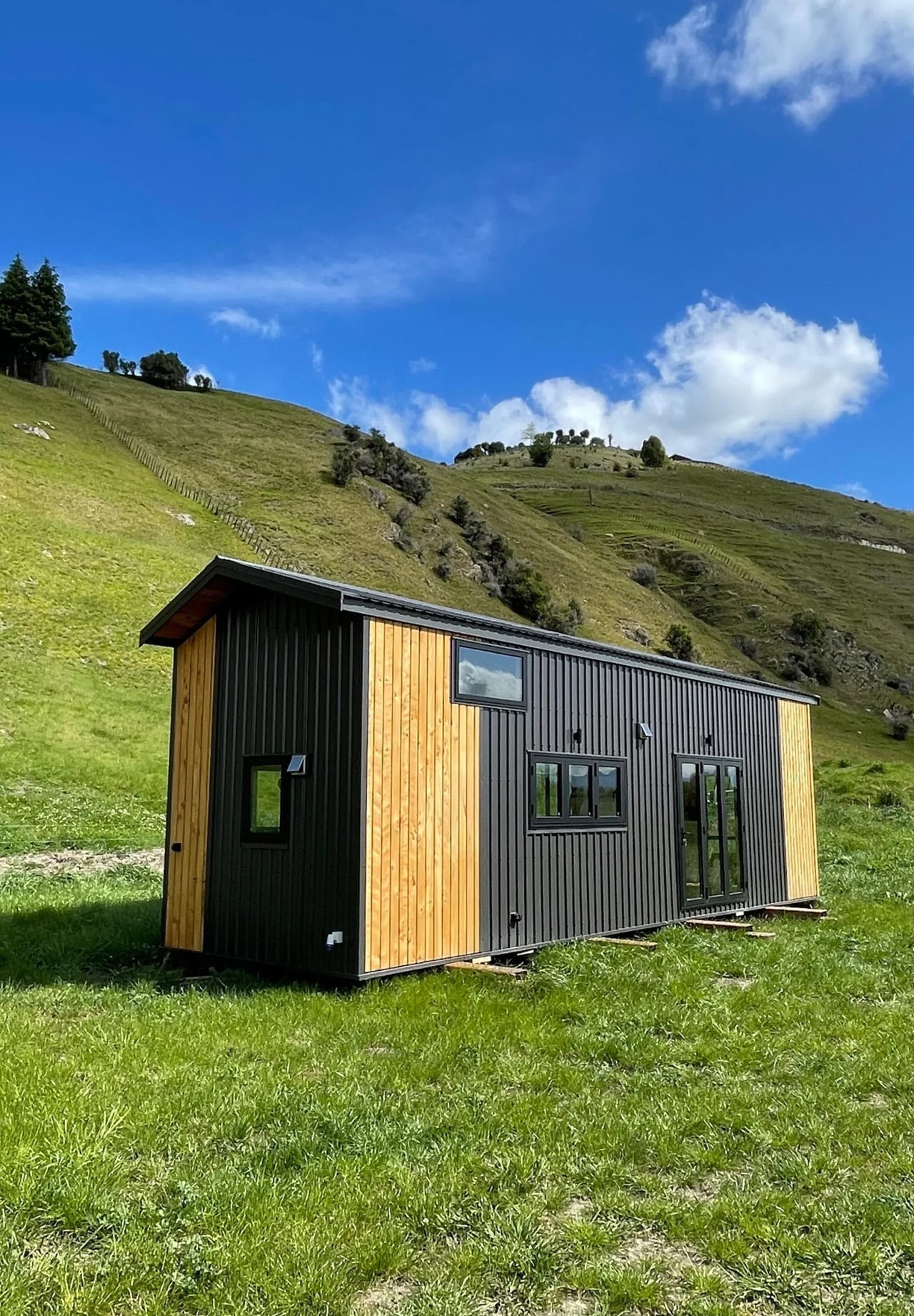
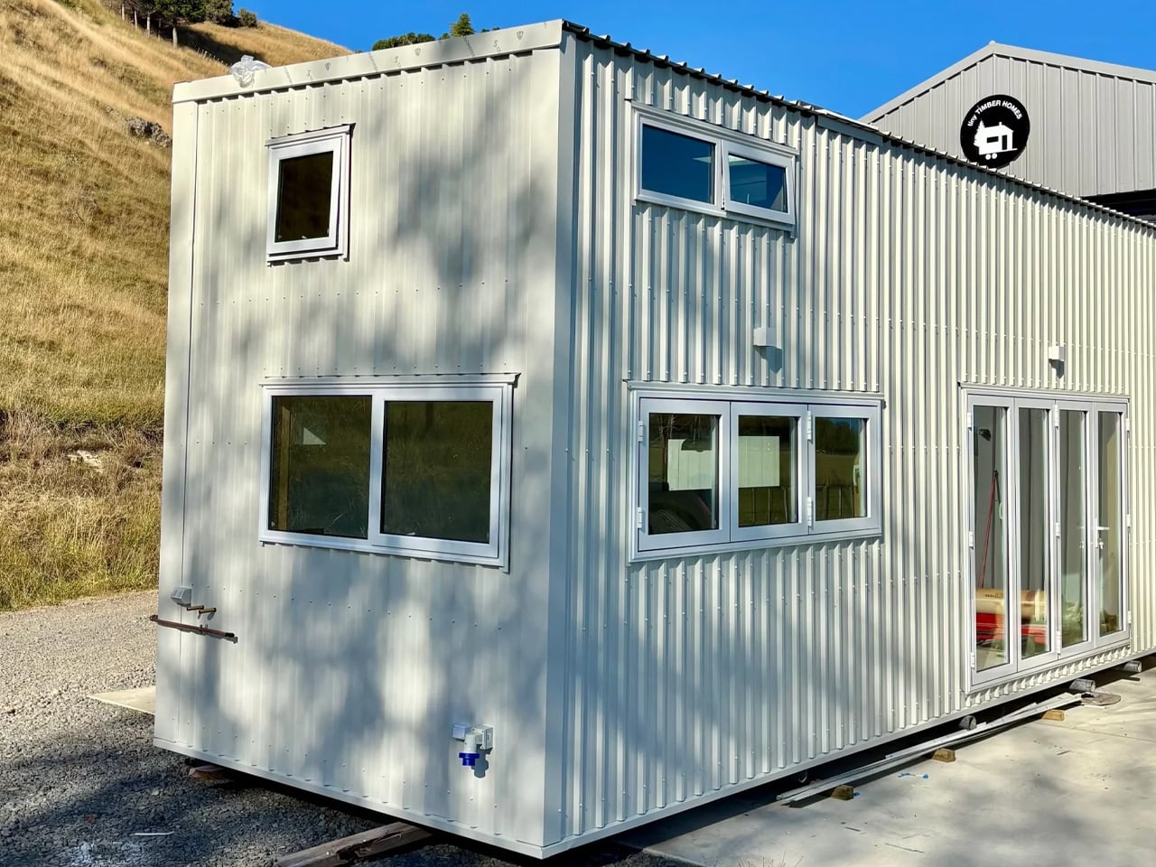
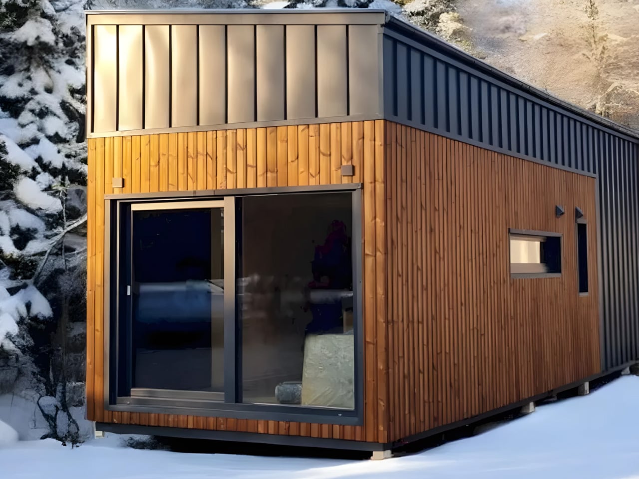
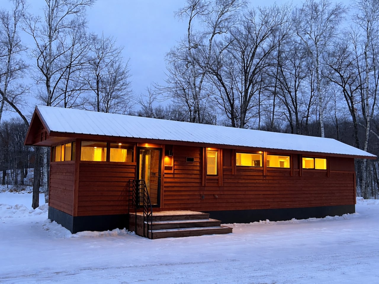
The Redwood by Tiny Timber Homes Proves Small Living Doesn’t Mean Settling

Wood has a way of telling you exactly where it’s been — and the Redwood by Tiny Timber Homes wears that history well. The Redwood leans into that quality completely — and the result is a tiny house that feels less like a compromise and more like a choice you’d make twice.

Tiny Timber Homes has built its reputation on one idea: that small spaces deserve the same craftsmanship as full-sized ones. The Redwood is perhaps the clearest expression of that philosophy. Its exterior reads immediately as intentional — warm wood cladding, clean rooflines, and a silhouette that sits confidently without trying to mimic a traditional house. It’s not cosplaying a cabin. It’s its own thing.

Designer: Tiny Timber Homes

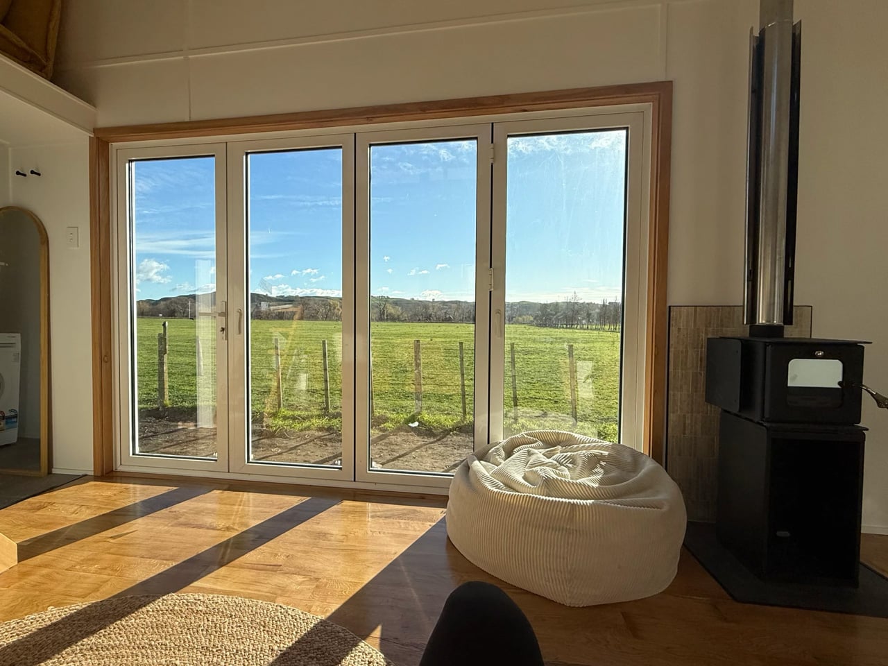
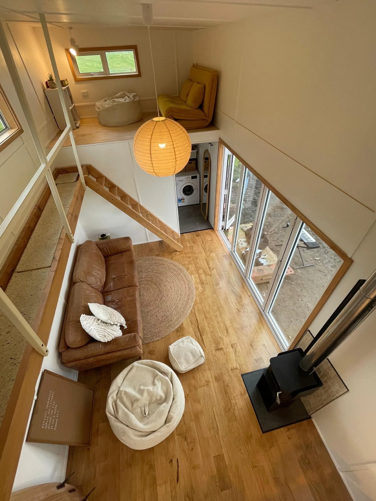
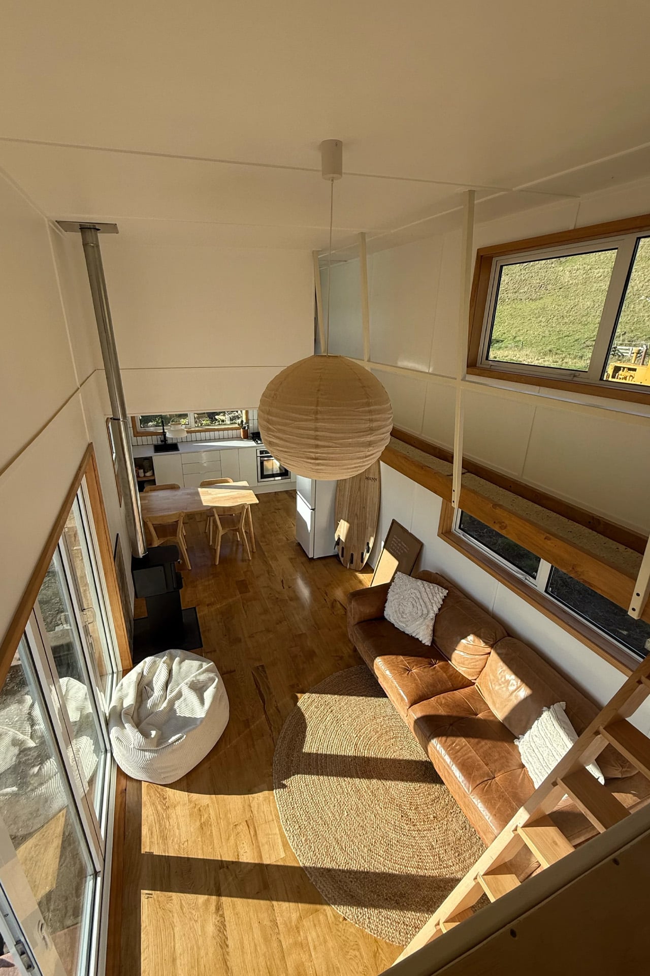
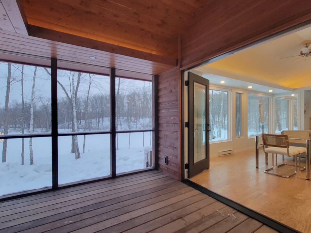
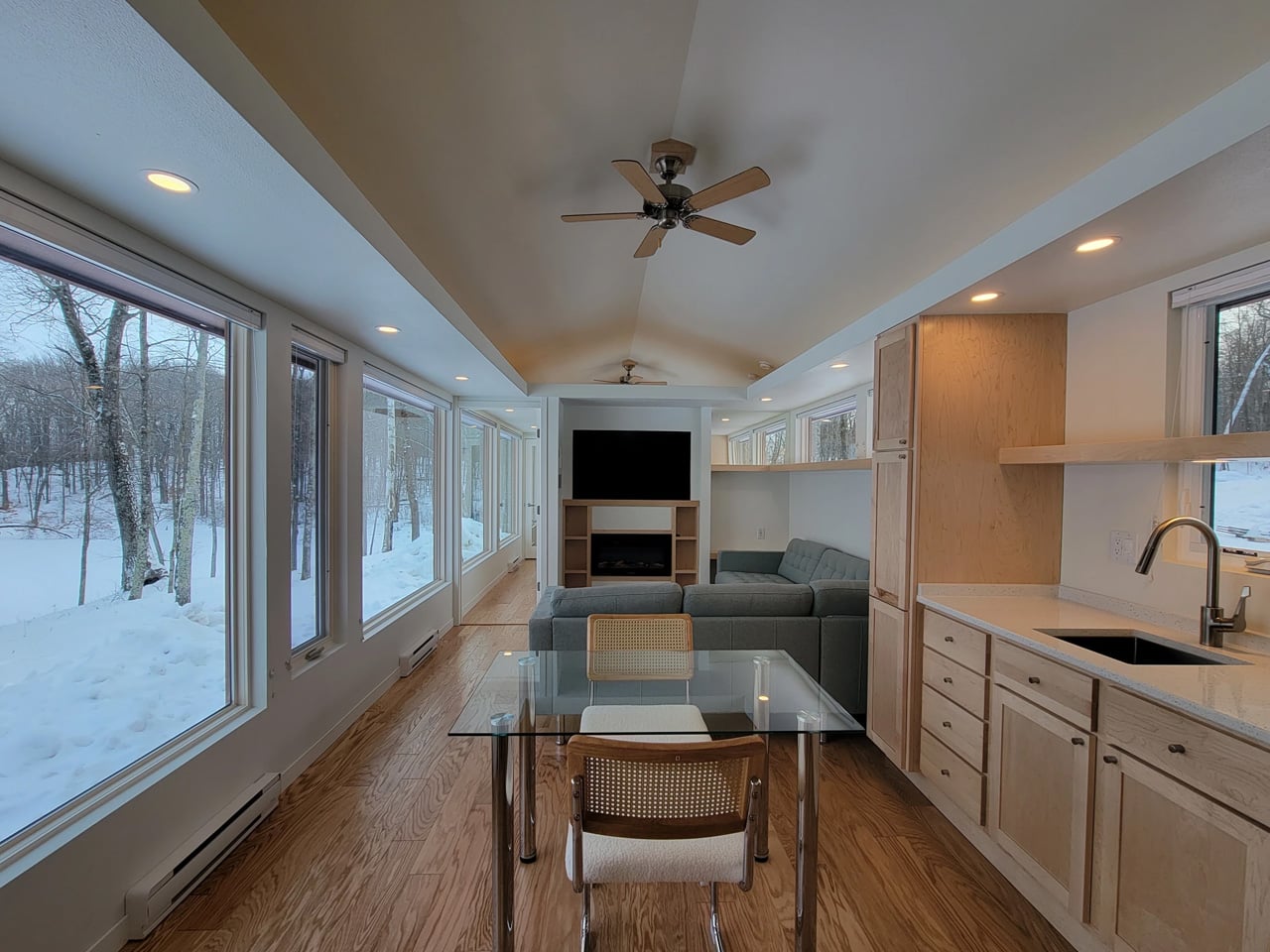
Step inside and the material language continues without interruption. Exposed timber framing lines the interior walls, giving every room a structural honesty that most tiny homes paper over with drywall and distraction. Natural light does the heavy lifting here — strategically placed windows pull the outdoors in and keep the interior from ever feeling like a box you’re trapped inside.

The kitchen is compact but considered. Counter space is used with real intention, storage is tucked where you’d actually look for it, and the layout doesn’t ask you to turn sideways to reach the sink. It’s the kind of kitchen that rewards a slower pace — coffee in the morning, dinner from scratch, no dishwasher you don’t need.

The sleeping loft sits above it all, accessible by a stair ladder that doubles as storage. From up there, the whole space reads differently. You see the structure, the grain of the wood, the way everything fits without forcing. It’s a perspective that makes you appreciate the design more, not less.

What separates the Redwood from the growing noise in the tiny home market is restraint. There’s no attempt to cram in features that don’t belong, no feature list that sacrifices livability for a spec sheet. What you get instead is a home that understands its own scale and works with it — not against it.

Tiny Timber Homes builds for people who’ve thought seriously about what they actually need from a home. The Redwood answers that question with timber, light, and a layout that respects the person living inside it. In a category full of aspirational renderings and underwhelming follow-through, that’s worth something. It looks like a home. It lives like one too.

The post The Redwood by Tiny Timber Homes Proves Small Living Doesn’t Mean Settling first appeared on Yanko Design.

  •  

This Tiny House on Wheels Lives Bigger Than It Has Any Right To

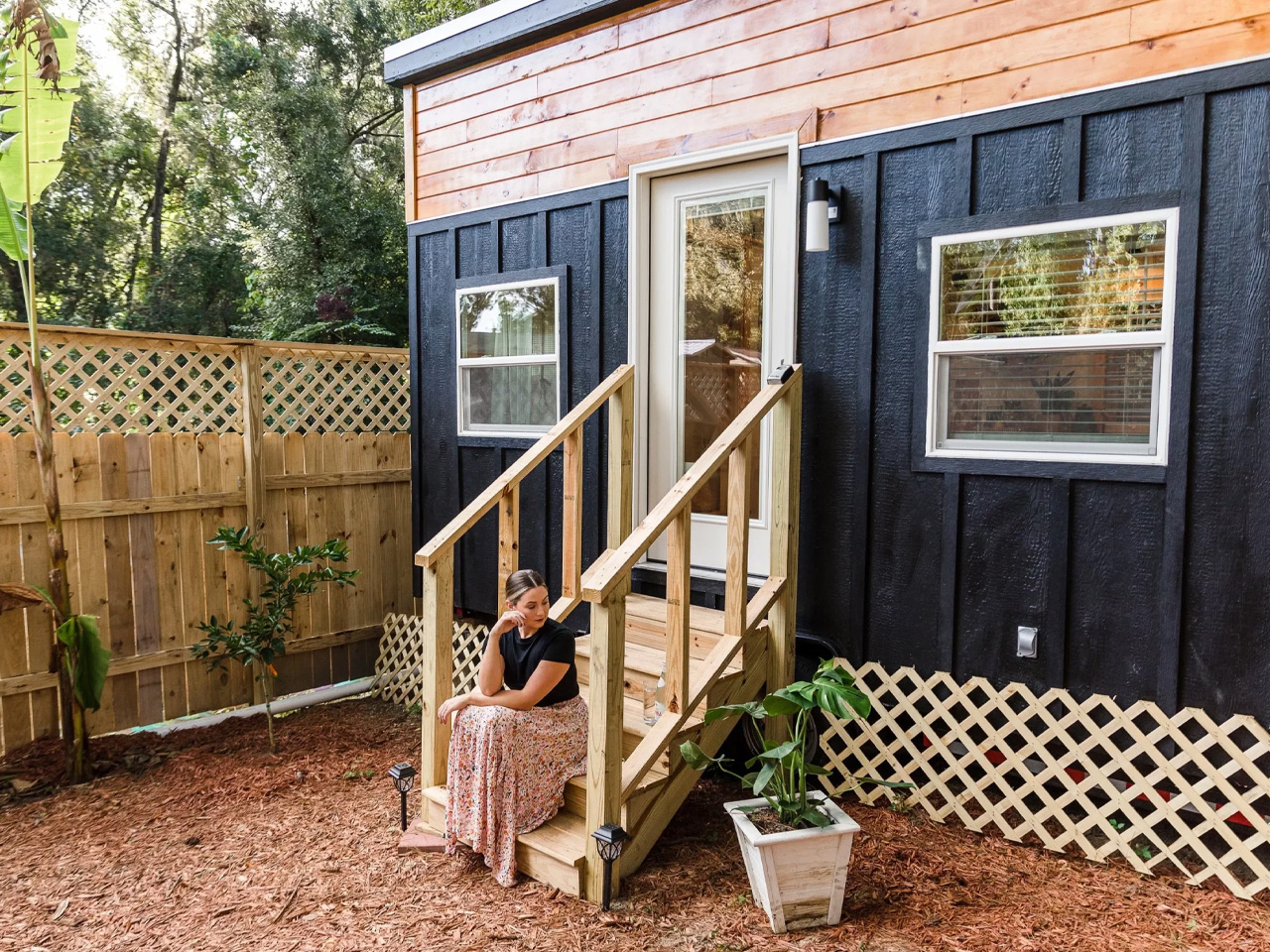
Most tiny homes ask you to make peace with the compromise. Wind River Built’s Rogue Mini skips that conversation entirely. Built in Tennessee by one of the most respected names in the tiny home space, the Rogue Mini is a trailer-mounted dwelling that treats small square footage not as a limitation, but as a design brief.

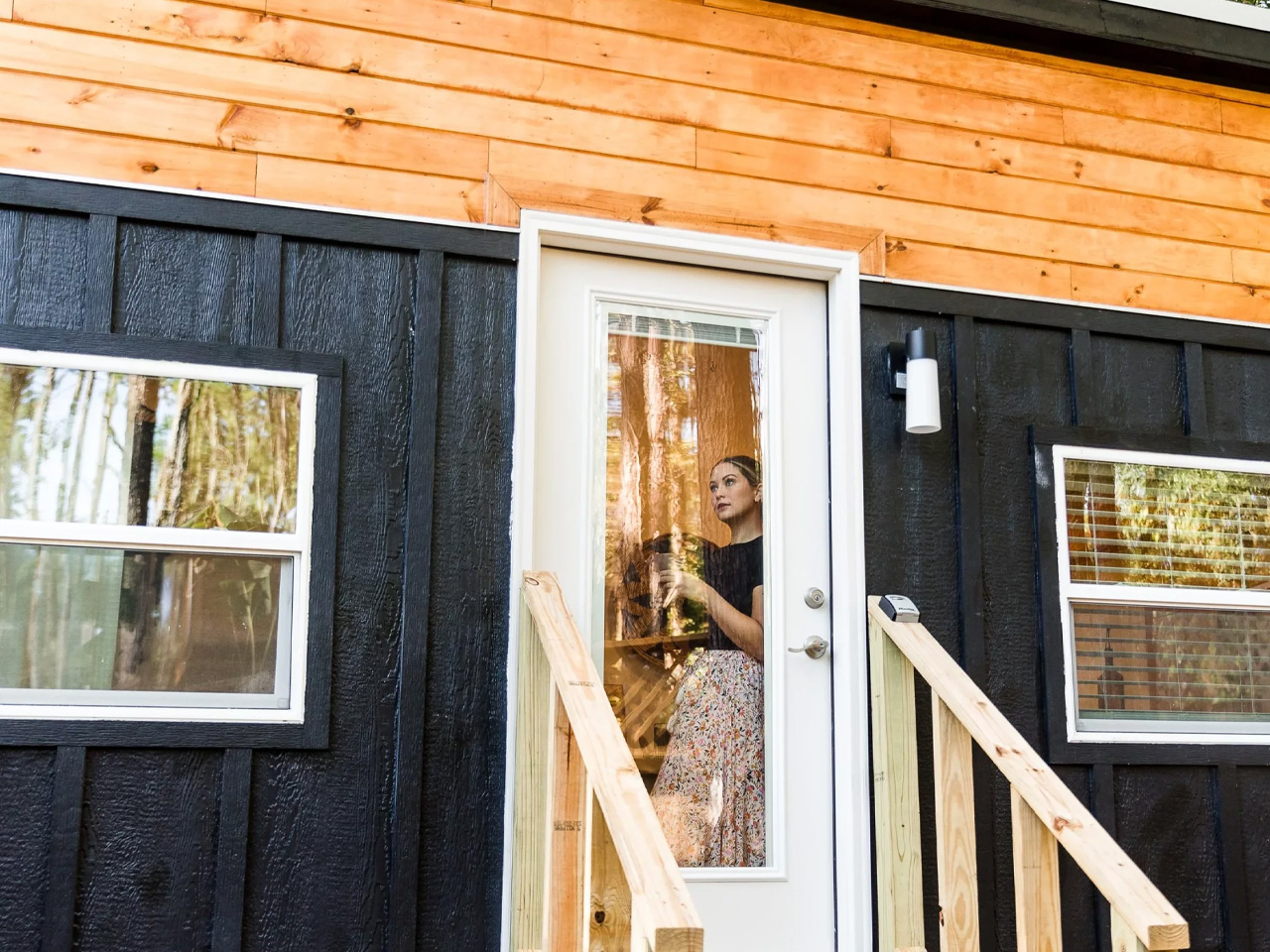
From the outside, the Rogue Mini reads clean. Board-and-batten siding, a pitched roofline, and restrained exterior detailing give it the visual composure of something far more permanent than its wheels suggest. Wind River Built has always leaned into quality construction over novelty, and the Rogue Mini reflects that. Every edge feels considered. Nothing about the exterior screams “novelty camper” — it looks like a house someone actually wants to live in.

Designer: Wind River Built

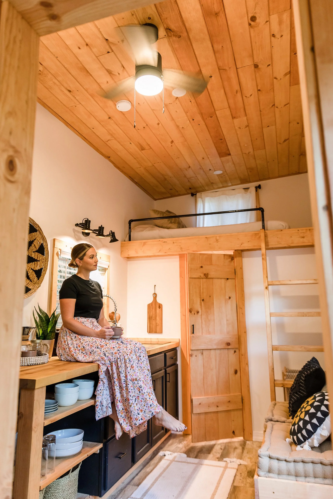
Step inside, and the interior continues that conversation. Wood-paneled walls and vaulted ceiling lines open the space upward, drawing the eye in a way that makes the square footage feel more generous than it is. The kitchen is compact but functional, with enough counter space to cook a real meal rather than reheat one. The sleeping loft sits above, accessible by a staircase or ladder depending on configuration, and offers a surprisingly comfortable retreat that feels separated from the main living area in the way a bedroom should.

What Wind River Built understands — and what a lot of tiny home builders get wrong — is that smallness only works when the details are right. Inadequate storage, poor natural light, and awkward transitions between zones make a small home feel punishing. The Rogue Mini sidesteps most of those pitfalls. Windows are placed deliberately, throwing light into corners that would otherwise collapse. Storage is woven into the structure rather than bolted on as an afterthought.

The Rogue Mini isn’t designed for the weekend warrior or the festival-goer chasing Instagram backdrops. It’s designed for someone who has genuinely decided to live differently — to trade square footage for mobility, and square footage for intention. That kind of design decision requires a builder who takes the task seriously, and Wind River Built clearly does.

At a time when housing feels increasingly abstract — prices climbing, spaces shrinking, and permanence fading — the Rogue Mini offers something rare. It chooses to make living small feel like an upgrade rather than a retreat. That’s not an easy thing to design. Wind River Built pulls it off.

The post This Tiny House on Wheels Lives Bigger Than It Has Any Right To first appeared on Yanko Design.

  •  

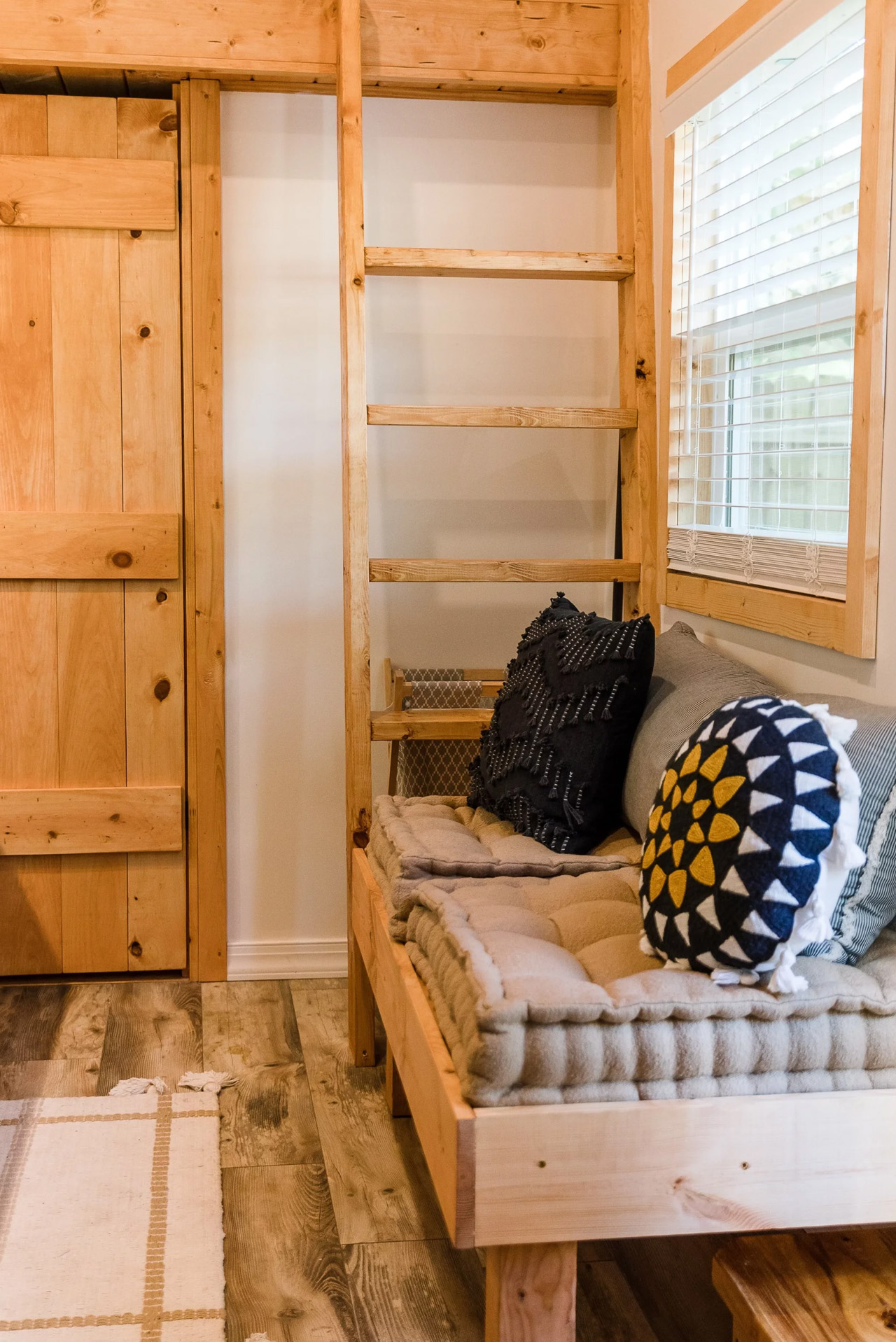
This 341-Square-Foot Tiny Home Proves You Don’t Need More Space — Just Smarter Space

Most tiny homes ask you to forgive something. The Amelia doesn’t. It speaks that language fluently — treating constraint as a design language rather than something to apologize for.

Stretching 26 feet long and 8.5 feet wide, the Amelia sits on a double-axle trailer and clocks in at 341 square feet of living space. It wears white board-and-batten siding with a maintenance-free steel base and a snap-lock metal roof — clean, unfussy, built to hold up wherever you put it. The kind of exterior that looks deliberate rather than compromised.

Designer: Teacup Tiny Homes

Step inside and the first thing you notice is the light. Generous dual-pane, low-E windows fill the living room with natural brightness, and the layout feels considered rather than cramped. There’s room for a full sofa — a sofa bed is available as an upgrade — alongside a large storage unit. A propane-powered underfloor heating system keeps the ground level comfortable year-round, complemented by a mini-split air conditioning unit and a Lunos heat recovery ventilator for air quality. The Amelia was built for Canadian winters, and it shows.

The kitchen sits just past the living area and does not ask you to compromise. A white apron-front farmhouse sink anchors the space, joined by a four-burner Furrion propane range, an oven, a fridge-freezer, a stainless over-the-range microwave, and a large pull-out pantry. Waterfall-edge marble-like countertops run along the perimeter, with an eating bar doubling as a workstation. Every detail, from the soft-close cabinet doors to the black Kohler pull-down faucet, feels chosen rather than settled for. It is the kind of kitchen that makes cooking feel like something worth doing.

A sliding door connects the kitchen to the bathroom — a thoughtful detail that keeps the living zone open. Inside, a 30×30 stand-up shower with easy-clean fiberglass walls, a custom vanity with a rectangular vessel sink, and an oversized round medicine cabinet handle the essentials without feeling like a compromise. There is also a laundry rough-in for those who want to add machines later.

Two loft bedrooms occupy the upper level. The main loft, positioned over the kitchen, fits a king-size bed behind a slatted privacy wall. The secondary loft, accessed by a removable wooden ladder above the living room, handles a queen or king with room to spare. A storage-integrated staircase is available as an upgrade and is worth it for full-time living.

The Amelia starts at roughly US$102,000 and is available for delivery across the United States and Canada. Teacup Tiny Homes, a 100% female-owned Alberta-based builder operating since 2016, offers significant customization across layouts, materials, and finishes. For a home this size, it carries a lot of conviction.

The post This 341-Square-Foot Tiny Home Proves You Don’t Need More Space — Just Smarter Space first appeared on Yanko Design.

  •  

Fiore Is a Wall Light, a Vase, and a Fragrance All at Once

Most lighting does one thing: it illuminates. If it’s beautiful, that’s a bonus. If it fits the space, you’re winning. But every once in a while, a design comes along and quietly expands the definition of what an object is supposed to be, and Fiore by Jimmy Rojas is doing exactly that.

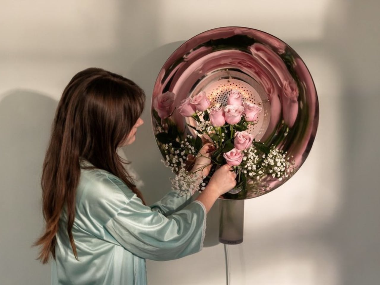
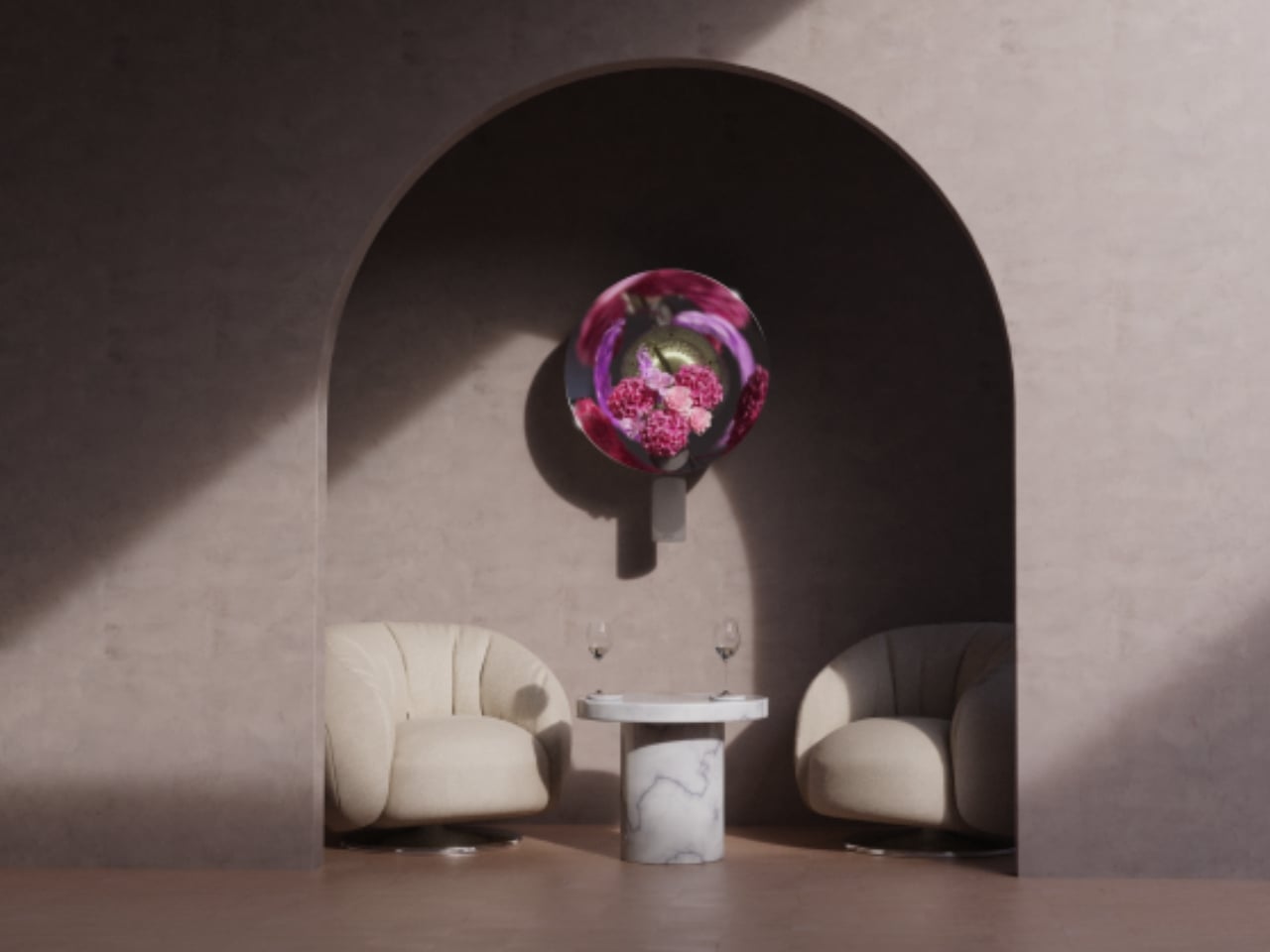
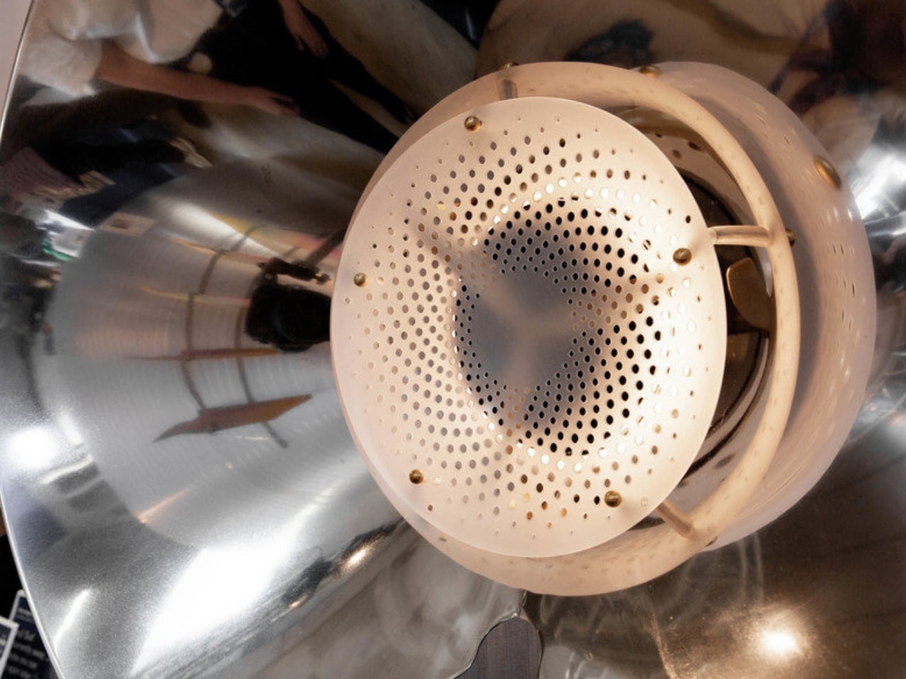
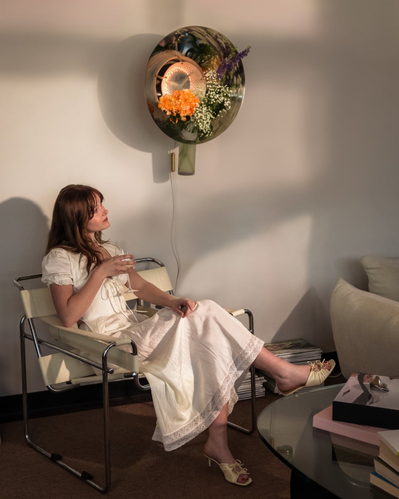
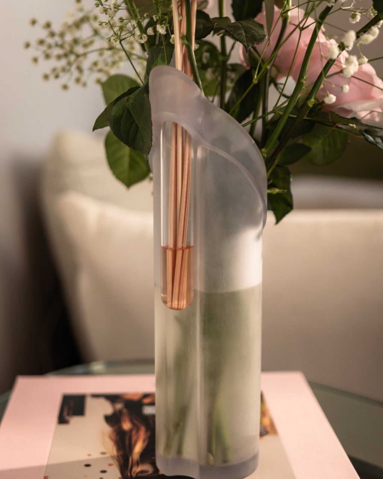
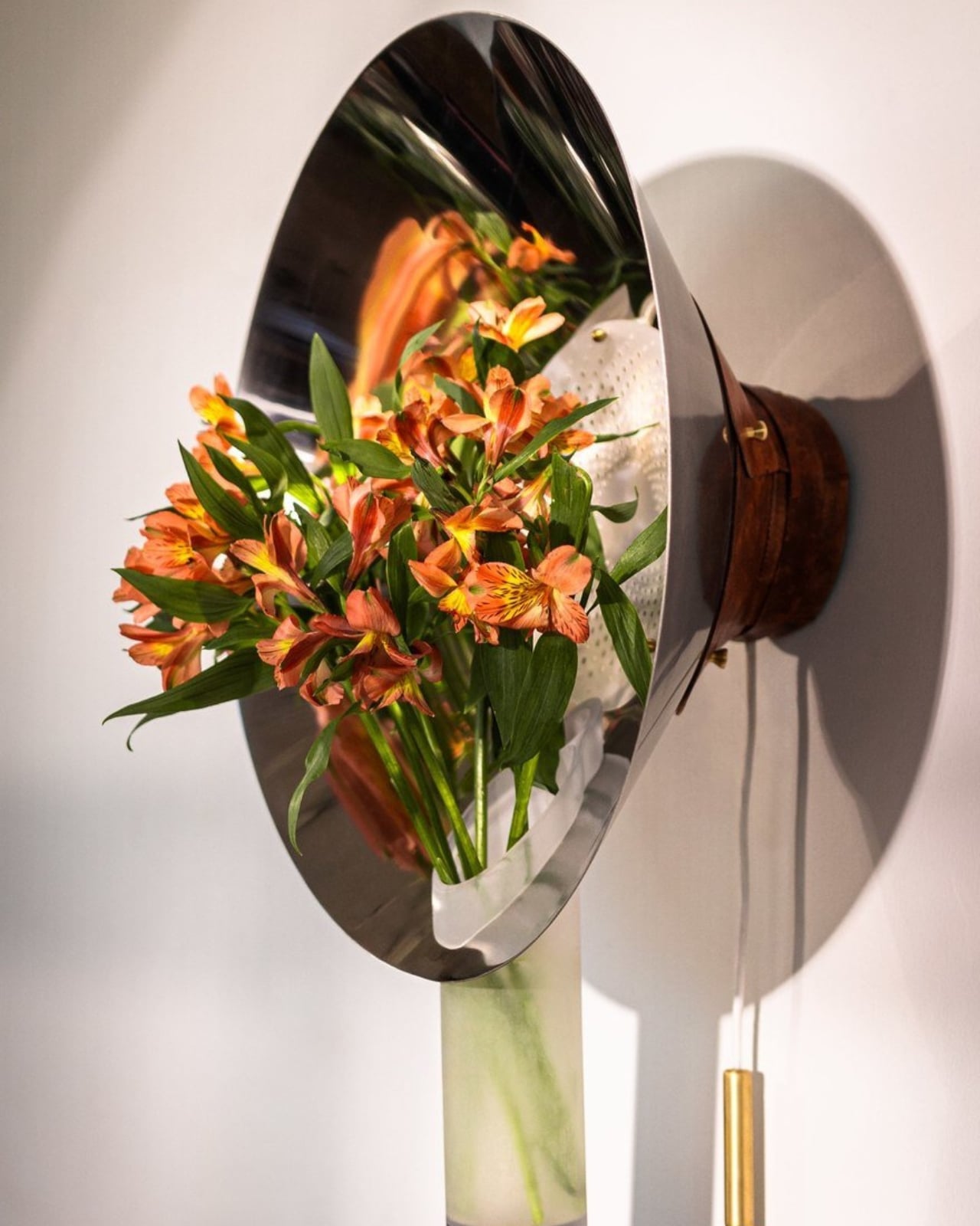
Fiore is a wall-mounted sconce, but to call it only that would be selling it short. At its core, it’s a multisensory piece that combines light, living flowers, and fragrance into a single wall-mounted object. The concept is elegantly simple: a built-in vase holds real blooms, and a signature scent designed to complement their natural aroma diffuses into the room. You’re not just looking at a beautiful light fixture; you’re experiencing it. You smell it. You watch the flowers change as the week goes on.

Designer: Jimmy Rojas

The design came out of Jimmy Rojas’ time at the Savannah College of Art and Design, and it’s been collecting recognition ever since. Fiore earned a Silver at the International Design Awards in the Conceptual Products category, was a People’s Choice honoree at the 2025 NYCxDESIGN Awards, and made its way to Salone Satellite in Milan, one of the most competitive stages for emerging designers in the world. These aren’t small accolades. They signal that the design community is paying attention, and for good reason.

What makes Fiore feel particularly relevant right now is the way it taps into something a lot of us are quietly craving: interiors that actually engage more than just our eyes. Biophilic design, the idea of bringing natural elements into our living spaces, has been a conversation in design circles for years. But Fiore takes that concept and makes it literal in the most delicate way possible. A real flower in your wall, radiating fragrance into the room. No screen, no app, no complicated setup. Just nature, light, and scent.

I’ll be honest, I have a slight bias here. I’ve always believed that the best design doesn’t announce itself loudly. It earns its place in a room by making life feel slightly better, slightly richer, in ways you notice over time rather than all at once. Fiore operates on that frequency. It’s the kind of object you come home to and slowly appreciate more as the days pass.

It’s also worth looking at how Fiore fits into the current interior design moment. Maximalism is back with force, from statement furniture to bold wallpapers to gallery walls stacked floor to ceiling. Within that landscape, Fiore manages to feel both bold and restrained. It’s wall-mounted, so it doesn’t compete for floor or shelf space. But it holds living flowers and diffuses scent, so it commands presence in a way that a standard sconce never could. Balancing those two qualities is genuinely difficult to pull off.

Rojas clearly understands that fragrance is one of the most underused tools in interior design. Candles and reed diffusers have long dominated the home fragrance space, and while they work well, they’re objects that sit on a surface and do their thing passively. Fiore integrates scent into the architecture of the room itself, into the wall, which feels like a genuinely new idea. The fact that the fragrance is designed to pair specifically with the real flowers in the vase adds another layer of intentionality that sets this apart from a concept piece that’s merely clever.

If Fiore moves into full production, there are real-world questions worth asking: how often do the flowers need replacing, what happens in winter when fresh blooms are harder to source, and whether the fragrance component can be made refillable and sustainable. Those aren’t dealbreakers, just the details that turn a great concept into a great product. But as a concept, Fiore is one of the more complete design ideas in recent memory. It knows what it wants to be, and it commits fully. Lighting has always been foundational to how a space feels. Fiore is simply asking whether it couldn’t also shape how a space smells, and how alive it feels. The answer, apparently, is yes.

The post Fiore Is a Wall Light, a Vase, and a Fragrance All at Once first appeared on Yanko Design.

  •  

This $35,000 Tiny Home Proves You Don’t Need More Than 161 Square Feet to Live Well

At 20 feet long and 8 feet wide, the Tulsi by Simplify Further Tiny Homes doesn’t try to be anything it isn’t. It has everything you need, and nothing you don’t. That restraint is exactly what makes it work. While the tiny home market is crowded with builds that either sacrifice livability for aesthetics or pile on features that inflate the price tag, the Tulsi threads the needle — landing at a starting price of $35,000 for a fully functional, NOAH-certified home on wheels.

The Florida-based builder behind it, Simplify Further, has built a reputation around the idea that quality and simplicity aren’t mutually exclusive. Their motto — “Simple Living, High Thinking” — runs through every design decision in the Tulsi. The build carries a BBB Accredited A+ rating, and its certification as an RV through NOAH means it meets a recognized standard for workmanship and safety.

Designer: Simplify Further Tiny Homes

At 161 square feet, the Tulsi packs in a kitchenette, a full bathroom with a shower stall, a flush toilet, a mini sink, a built-in seating area, a main-level queen-sized bedroom, and a loft. The loft measures 7 by 4 feet with a 36-inch height at the low side, accessible by ladder with black metal railings — tight, but functional. The height under the loft sits at 6 feet 4 inches, which means the main living area never feels like you’re ducking through a crawl space.

What sets the Tulsi apart from its contemporaries is its genuine flexibility. The main level bedroom isn’t a compromise — it’s a feature. For guests who don’t mind the loft, you could designate the loft as the main sleeping area and convert the downstairs bedroom to a living room. That kind of adaptability is rare at this price point. In the kitchen, buyers can opt for open shelving or swap seating for additional cabinet storage — a small but meaningful decision that shapes how the space actually lives day to day.

Simplify Further positions the Tulsi primarily as a guest house or mother-in-law suite — a secondary structure that gives visitors full independence without removing them from the property entirely. But the build has proven versatile enough to serve as a short-term rental, a starter home, or a full-time residence for someone drawn to the economy of small living. The Tulsi by Simplify Further seamlessly blends convenience and comfort, making it a charming addition to any property.

For a 161 square foot box on wheels, the Tulsi has quietly earned its place as one of the more thoughtfully designed entry points into tiny living — and the numbers back it up.

The post This $35,000 Tiny Home Proves You Don’t Need More Than 161 Square Feet to Live Well first appeared on Yanko Design.

  •  

Hario’s V60 Gets Its First Real Upgrade in 20 Years for $23

The original Hario V60 is the kind of object that earns its own mythology. Released in 2004, it became the face of the third-wave coffee movement: a simple cone of heat-resistant glass (or ceramic, or plastic, depending on how serious you are) that turned the morning cup into a ritual of patience and precision. Baristas loved it. Coffee nerds obsessed over it. And somewhere along the way, it became as recognizable as a kitchen object can get without appearing on a museum shelf.

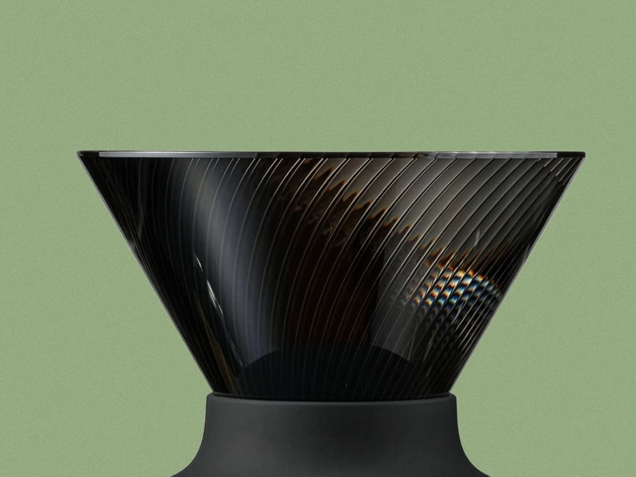
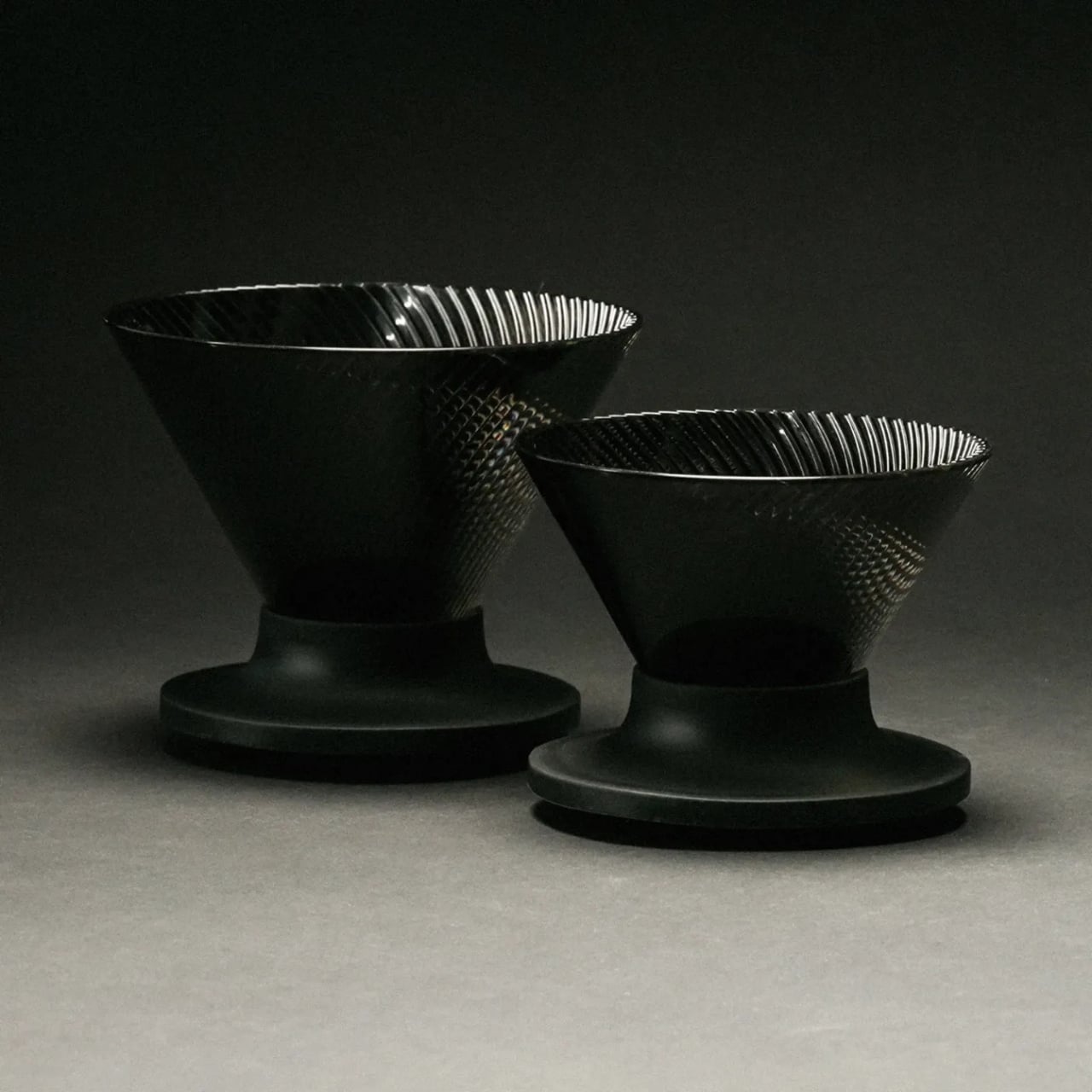
That legacy makes the V60 Dripper NEO an interesting proposition. Hario could have left well enough alone. Instead, they spent two years quietly engineering a redesign that touches the one part of the V60 nobody talks about but everyone deals with: the ribs.

Designer: Hario

The original V60’s spiral ribs are the reason it works the way it does. They create space between the paper filter and the cone wall, allowing air to escape as water flows through. The result is a controlled extraction, but one that demands attention. Get your grind wrong, pour too fast, let your focus wander, and the brew either stalls or races past the point of no return. The V60 has always been a beautiful, slightly unforgiving thing.

The NEO changes that equation with a genuinely clever structural update. Instead of a single spiral rib pattern, it introduces 72 ultra-fine vertical ribs along the upper walls of the cone, which then converge into 9 deeper ribs near the base. This dual-zone design guides water evenly down the entire wall before accelerating it through the outlet. The effect is a faster, more uniform extraction that minimizes bitterness from water lingering too long in contact with the grounds. The cup you get out the other end is cleaner, sweeter, and more vibrant, with a balanced acidity that doesn’t tip into sourness.

Two years of testing went into getting this right. Hario’s engineers ran exhaustive trials on rib counts, angles, and flow dynamics before landing on this configuration. The fact that they filed a utility model patent on the structure suggests they believe it is genuinely novel, not just cosmetically different.

The material choice is also worth noting. The NEO is made from Tritan resin, a lightweight, high-clarity plastic that handles heat retention better than standard plastic alternatives. It keeps the brewing temperature more stable from the first pour to the last, which matters more than people think. Temperature consistency is one of those variables that separates a good cup from a great one, and the NEO addresses it without requiring you to do anything differently.

For anyone already embedded in the V60 ecosystem, the compatibility factor is a quiet win. The NEO works with all existing V60 switch bases, so you don’t have to rebuild your setup from scratch. It comes in two sizes, both made in Japan, and retails for around $23.50, which is an accessible price point for a piece of equipment that functions this thoughtfully.

Not everyone is convinced, though. Since hitting the market, the NEO has sparked a genuinely divided response from the coffee community. Users describe the brew as cleaner and more tea-like, which sounds appealing until you realize that some people loved the original V60 precisely for its acidic punch and intensity. One Reddit user put it plainly: the NEO presents coffee “differently,” not necessarily better. For experienced brewers who spent years dialing in their pour technique to coax specific flavors from the classic cone, the NEO’s smoother, more forgiving nature feels less like an upgrade and more like a personality change. That’s a fair criticism. Hario didn’t make a bad V60. They made a different one, and that distinction is exactly what has the coffee internet divided.

Pour-over coffee has always had a slight gatekeeping problem. The ritual appeals to people who love it precisely because it requires care, but that same learning curve turns off anyone who just wants a good cup without turning their kitchen into a science experiment. The V60 NEO doesn’t eliminate that ritual. It just makes the margin for error a little more forgiving, which means more people get to enjoy the result without years of practice behind them.

The original V60 deserved its legacy. The NEO earns its own, just a slightly different one.

The post Hario’s V60 Gets Its First Real Upgrade in 20 Years for $23 first appeared on Yanko Design.

  •  

This Stationary Tiny Home Has More Room Than Most City Apartments

Most tiny houses ask you to make a trade-off. You get the romance of compact living, but sacrifice the one thing that makes a home feel like a home — space. Craft House, a modular builder operating across Poland, Austria, and Ireland, decided to flip that script entirely with the Samuel, a non-towable module house that prioritizes spacious full-time living over the freedom to hitch and go.

The Samuel sits at 10 meters (32 ft) long and an unusually generous 3.2 meters (10.6 ft) wide, measurements that push well beyond the European tiny home average. That extra width is deliberate. It’s what allows the interior to breathe in a way that most towable models simply can’t, opening up a layout that reads less like a cleverly compressed box and more like a well-considered apartment. The structure wears a single-pitched roof, topping out at 4.1 meters at the ridge, and is finished in engineered wood and metal, a clean pairing that reads industrial without feeling cold.

Designer: Craft House

Inside, the ground floor spans 26 square meters, with a 13-square-meter mezzanine sitting above and a 4.3-square-meter bathroom rounding out the floor plan. The layout makes room for two distinct sleeping areas, and the volume created by the sloped ceiling gives the mezzanine level a loft-like quality that larger homes often fail to capture. Optional off-grid upgrades are also on the table, making the Samuel a realistic candidate for plots far beyond urban infrastructure.

What Craft House understood when designing the Samuel is that the tiny home market has two very different buyers. There’s the nomad, always ready to hitch the trailer and head somewhere new. Then there’s the person who simply wants a well-designed, right-sized home that doesn’t carry the financial weight of a conventional build. Samuel is clearly built for the latter. By dropping the wheels and leaning into a fixed footprint, Craft House was able to allocate width and volume in ways that towable structures prohibit by law and logistics.

Priced at around US$72,000, the Samuel lands in a range that makes it a genuinely viable alternative to traditional housing in several European markets. It isn’t trying to be everything. You won’t be parking it in a new location every season. What it offers instead is something arguably more valuable: a permanent, considered space that proves small doesn’t have to mean cramped, and that the best tiny homes aren’t always the ones with the biggest adventures, but the ones that make staying put feel worth it.

The post This Stationary Tiny Home Has More Room Than Most City Apartments first appeared on Yanko Design.

  •  

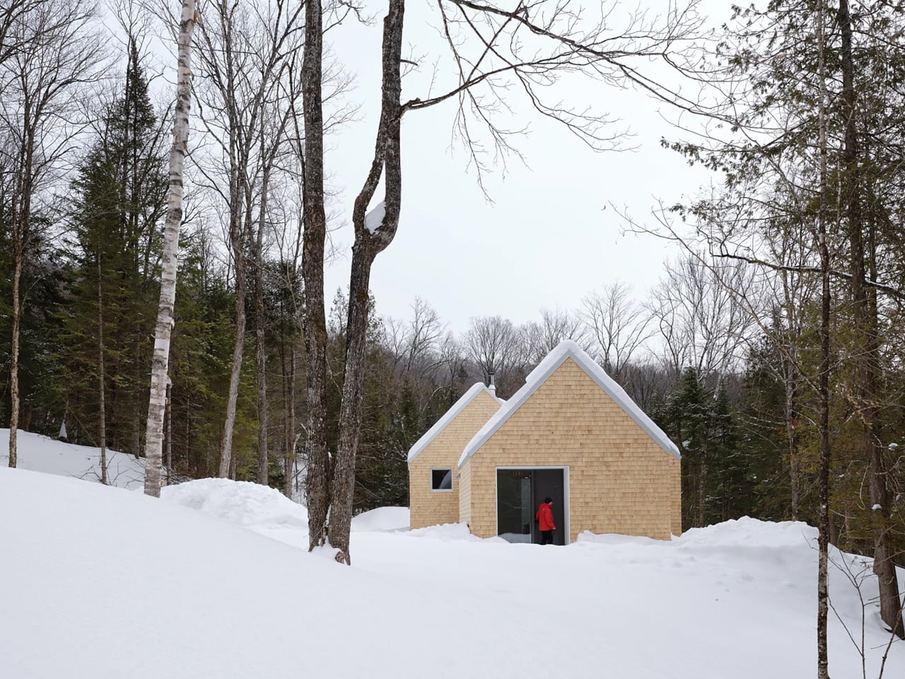
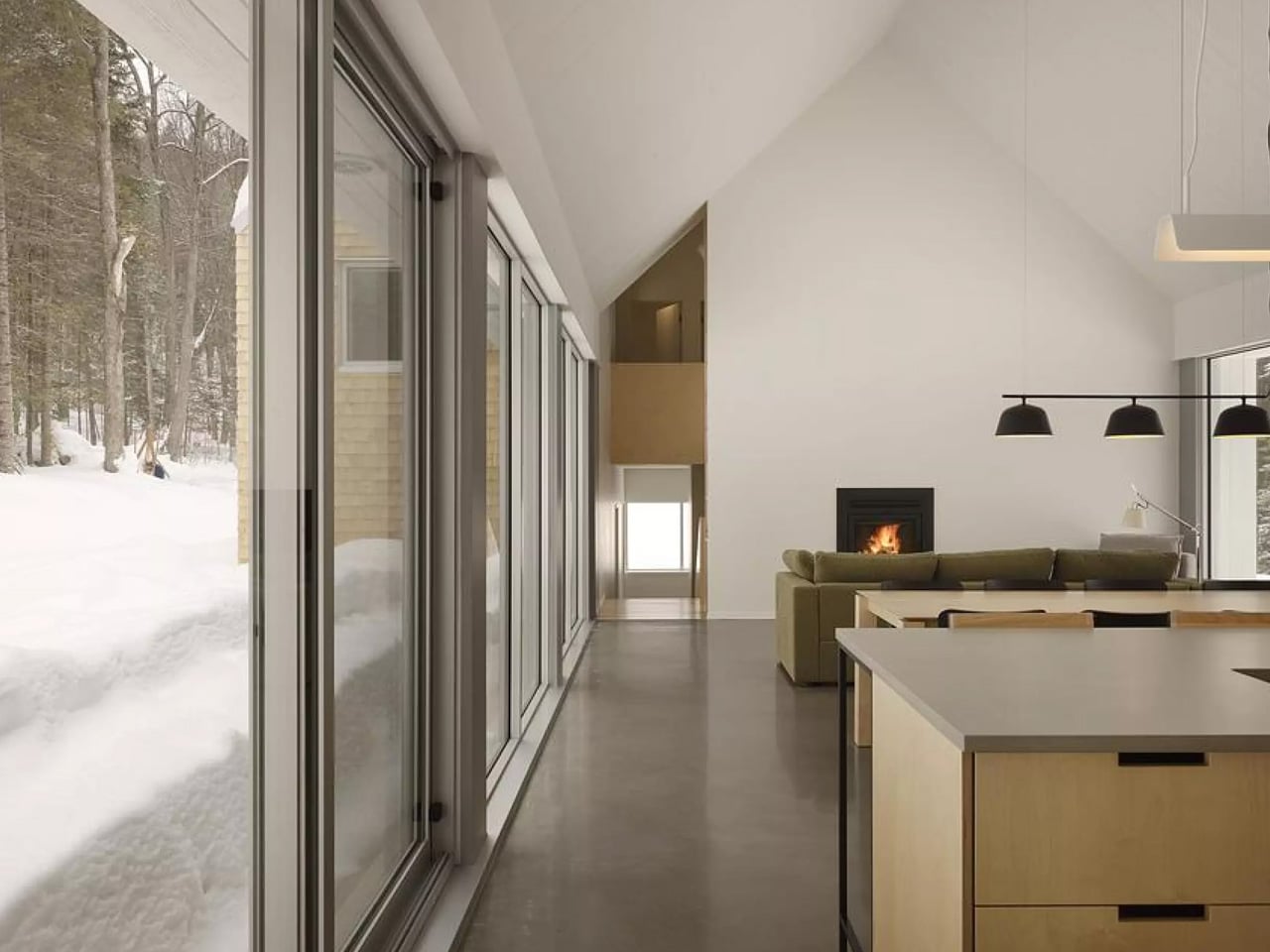
This Quebec Home Doesn’t Fight the Forest – It Disappears Into It

Certain kinds of architecture don’t announce themselves. La Maraude, the latest project by Nathalie Thibodeau Architecte, is exactly that — a compact residential dwelling tucked into the dense woodlands of Boileau, in Quebec’s Outaouais region, that earns its presence through restraint rather than spectacle. Completed in 2024, it’s one of the more quietly compelling houses to come out of Canada in recent memory.

The name itself carries meaning. ‘Maraude’ — to roam, to forage — hints at the relationship the house cultivates with its surroundings. Rather than claiming a dominant position along the river’s edge, the architects deliberately set the home deeper within the treeline, orienting the house’s interior life entirely toward the forest. It’s a gesture that shapes everything else about the project.

Designer: Nathalie Thibodeau Architects

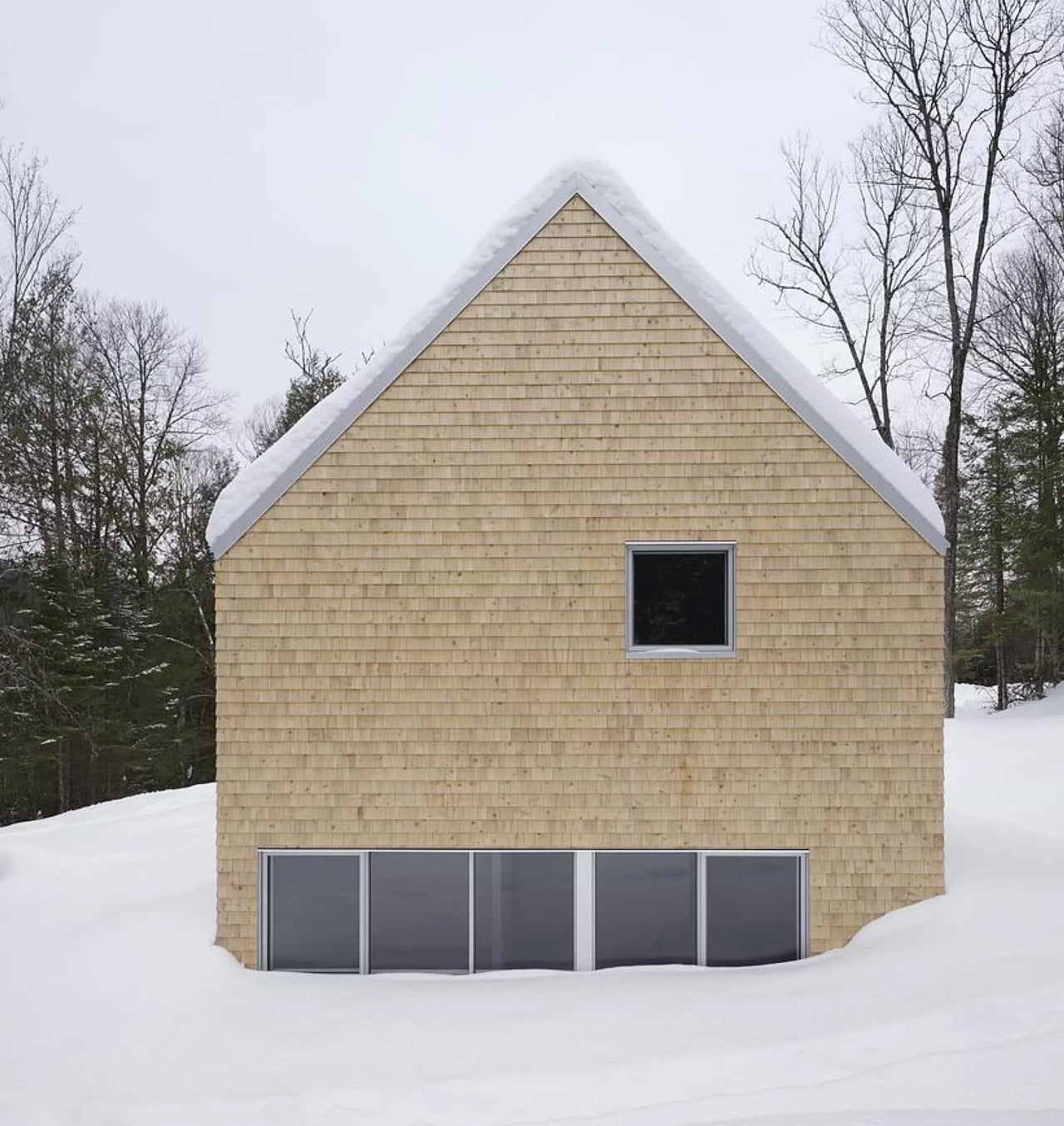
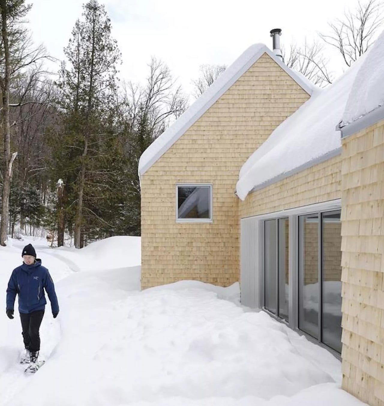
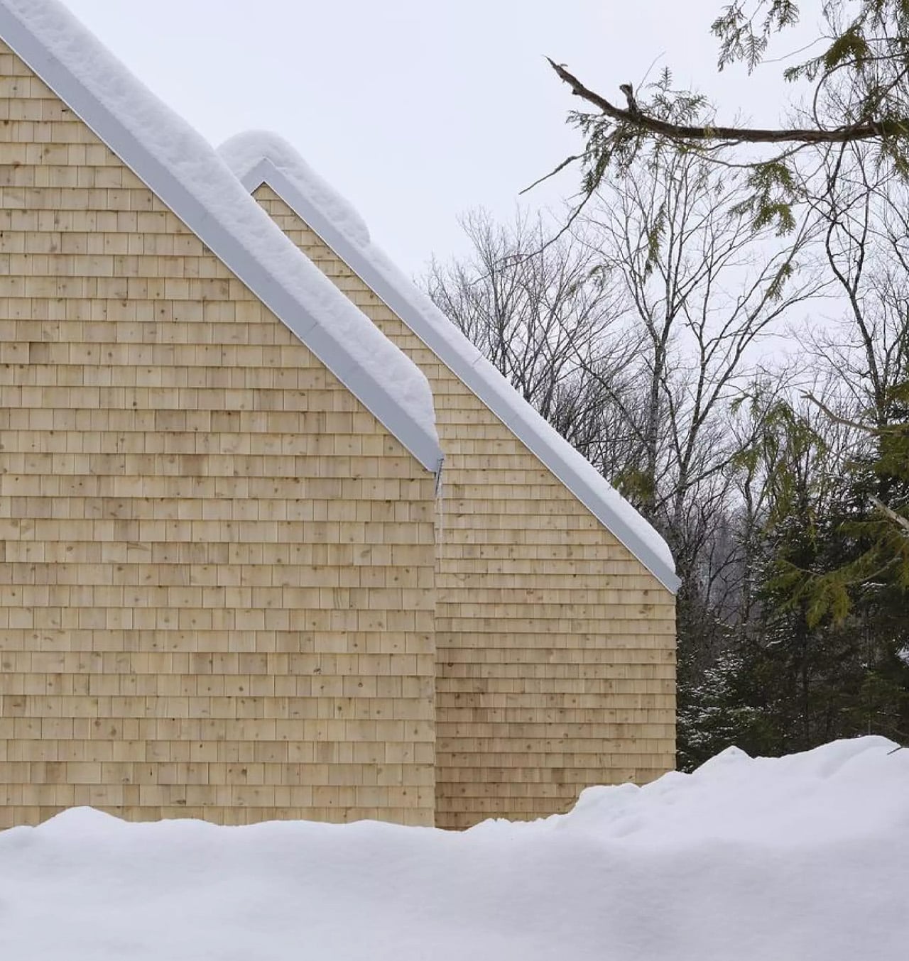
The design draws directly from Quebec’s vernacular architectural tradition — steeply pitched rooflines, grounded proportions, and a material palette that feels native to the region. The exterior is clad in natural cedar shingles and topped with a metal roof, two materials with deep roots in the local building culture. These aren’t nostalgic choices. They’re translated through a contemporary lens, stripped of ornament, reduced to their essential geometry. “Designed with particular attention to simplicity, functionality, and respect for traditional codes, La Maraude embodies a successful dialogue between contemporary architecture and local traditions,” says Nathalie Thibodeau Architecte.

What makes the spatial sequence genuinely interesting is the use of two courtyards as organizing devices. The plan doesn’t simply open to the outdoors — it pulls the forest in, fragmenting the landscape into a series of framed views that shift with the seasons. One courtyard faces north, more sheltered and partly enclosed by the building itself, oriented toward higher ground. The other faces south, brighter and more expansive, drawing the eye down toward the lower terrain. The result is a house that reads differently in every light condition, every month of the year.

The second volume, arranged over two levels in response to the site’s slope, plays a more introverted role. Openings here are smaller and precisely placed to frame specific moments within the tree canopy — quiet apertures rather than panoramic statements.

Photographed by Maxime Brouillet, La Maraude has the look of a project that will age well, both materially and culturally. It’s already being discussed as a potential anchor for a broader ensemble of small retreats on the site — a first building in what could become a considered, evolving conversation between architecture and landscape.

The post This Quebec Home Doesn’t Fight the Forest – It Disappears Into It first appeared on Yanko Design.

  •  

5 Mountain Homes That Look Carved From the Cliffs They Stand On

There is a rare, almost cinematic stillness found only in homes perched high above the world. At elevations ranging from 5,000 to over 10,000 feet, mountain residences occupy a space where clouds drift below terraces and horizons stretch endlessly. By contrast, most cities sit between sea level and roughly 1,500 feet, shaped by density, noise, and constant movement.

Life at altitude reshapes perception. The air feels sharper, the light more vivid, and architecture must respond with both resilience and sensitivity. Today’s mountain retreats move beyond the heavy, dark enclosures of the past, embracing openness, sustainability, and panoramic immersion. Here is how these homes are not just shelters but experiences designed around silence, scale, and awe.

1. A Natural Extension of the Landscape

The most refined mountain homes are conceived not as objects placed upon terrain, but as forms emerging from it. Architects study slope, wind, and geology, shaping structures that echo the lines of ridges and the layered patterns of exposed rock. Locally sourced stone, textured concrete, and weathered timber allow the residence to visually dissolve into its surroundings.

This approach softens the boundary between built space and wilderness. Walls appear to grow from the hillside, terraces align with natural contours, and expansive glazing draws the mountain indoors. The result is a dwelling that feels anchored, quiet, and inevitable, as though the landscape itself had composed the architecture.

Geometric white hotel built among tall evergreen trees, with angular façades and a central tower labeled 'ELA'.

Modern wooden building with glass lattice walls, warm interior lights, and a row of potted evergreens along the entrance.

Modern hotel bedroom with a large angular window wall, a king bed with white bedding and decorative pillows, and a seating nook nearby

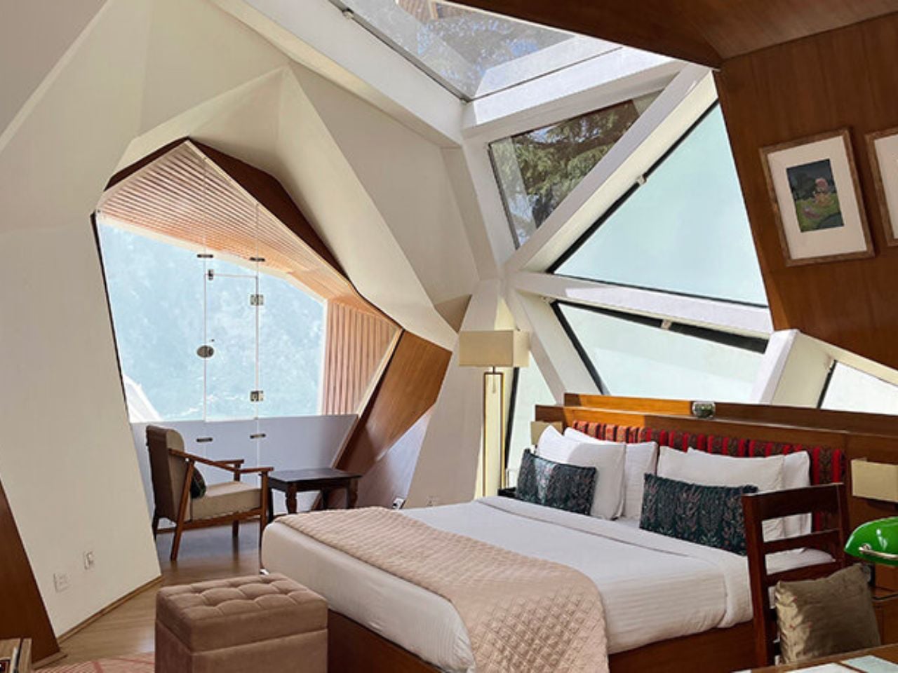
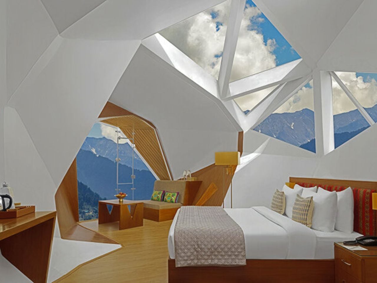
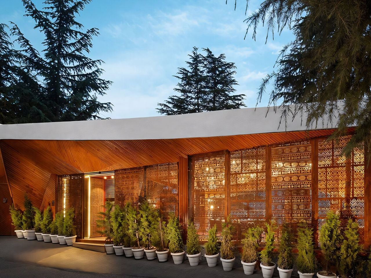
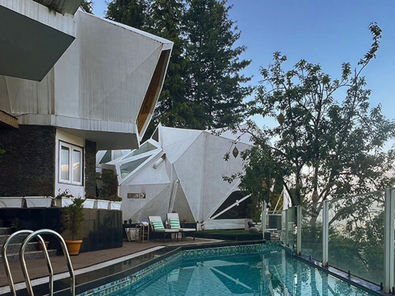
Perched high above the Naggar Valley in Himachal Pradesh, India, Eila emerges with quiet restraint rather than spectacle. Designed by MOFA Studio, the art retreat appears to rise organically from the mountainside, its fluid forms tracing the land’s natural contours instead of reshaping them. Developed through advanced computational processes, the cottages respond sensitively to slope, sunlight, and distant horizons, making the architecture feel discovered rather than imposed. A stepped masterplan descends gently along the steep terrain, preserving topsoil and natural rainwater channels while choreographing a gradual spatial experience. The journey begins at the Gate of Confluence, a stone pavilion marking the threshold into a contemplative environment where landscape, art, and structure unfold in quiet dialogue.
A spacious library lounge with white geometric ceiling, colorful wrapped columns, and circular patterned seating surrounded by bookshelves.

Modern white angular building beside a rectangular pool with glass railing and lounge chairs on a sunny day.

Modern hotel room with geometric white walls, a wooden bed and seating area, and panoramic mountain view through angular windows

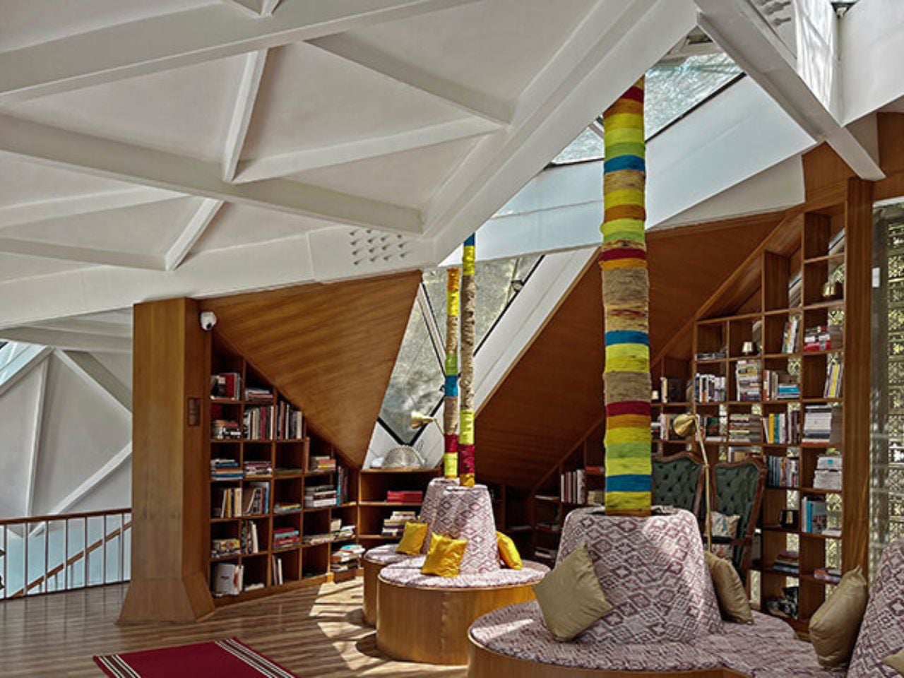
At Eila, artificial intelligence assists in refining structural and environmental performance, while human intuition guides final decisions. Biomorphic cottages formed from lightweight steel frames and thin concrete shells minimize energy use and visual impact, blending subtly into the Himalayan setting. Skylights and apertures frame the valley like living canvases, drawing light and scenery deep indoors. Locally sourced materials and vegetation-ready shells allow the retreat to evolve with its surroundings, ensuring it settles into the landscape rather than competing with it.

2. The Modern Mountain Home

The modern mountain home embraces a design language defined by clarity, restraint, and structural precision. Glass and steel replace heavy ornamentation, creating spaces that feel visually open and effortlessly connected to the outdoors. Expansive floor-to-ceiling windows dissolve traditional barriers, allowing shifting light, snow, and distant peaks to become part of the interior experience.

Beyond aesthetics, this approach is deeply functional. Industrial materials provide strength against wind, temperature swings, and heavy snowfall, while minimalist forms reduce visual weight. Clean lines, open-plan layouts, and a carefully edited palette produce a home that feels light, airy, and quietly dramatic against the rugged mountain backdrop.
Modern multi‑story house nestled in a dense pine forest with mountains in the background at sunset. A curved-roof garage is visible on the left.

Contemporary multi-story house in a forest, gray exterior, large glass windows, and a rooftop gravel terrace with seating.

Modern multi-level house with large windows in a pine forest, featuring a rooftop deck and outdoor seating.

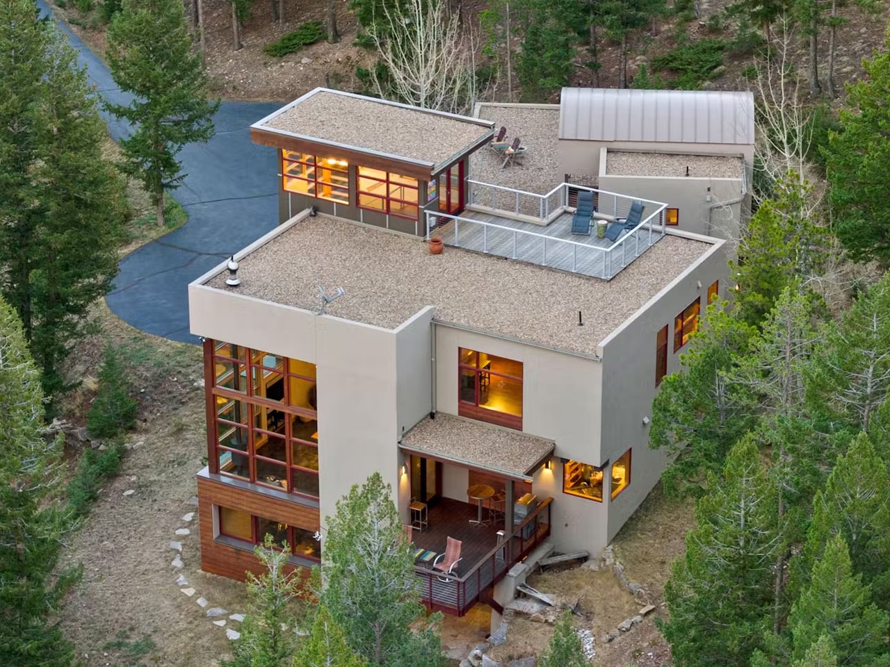
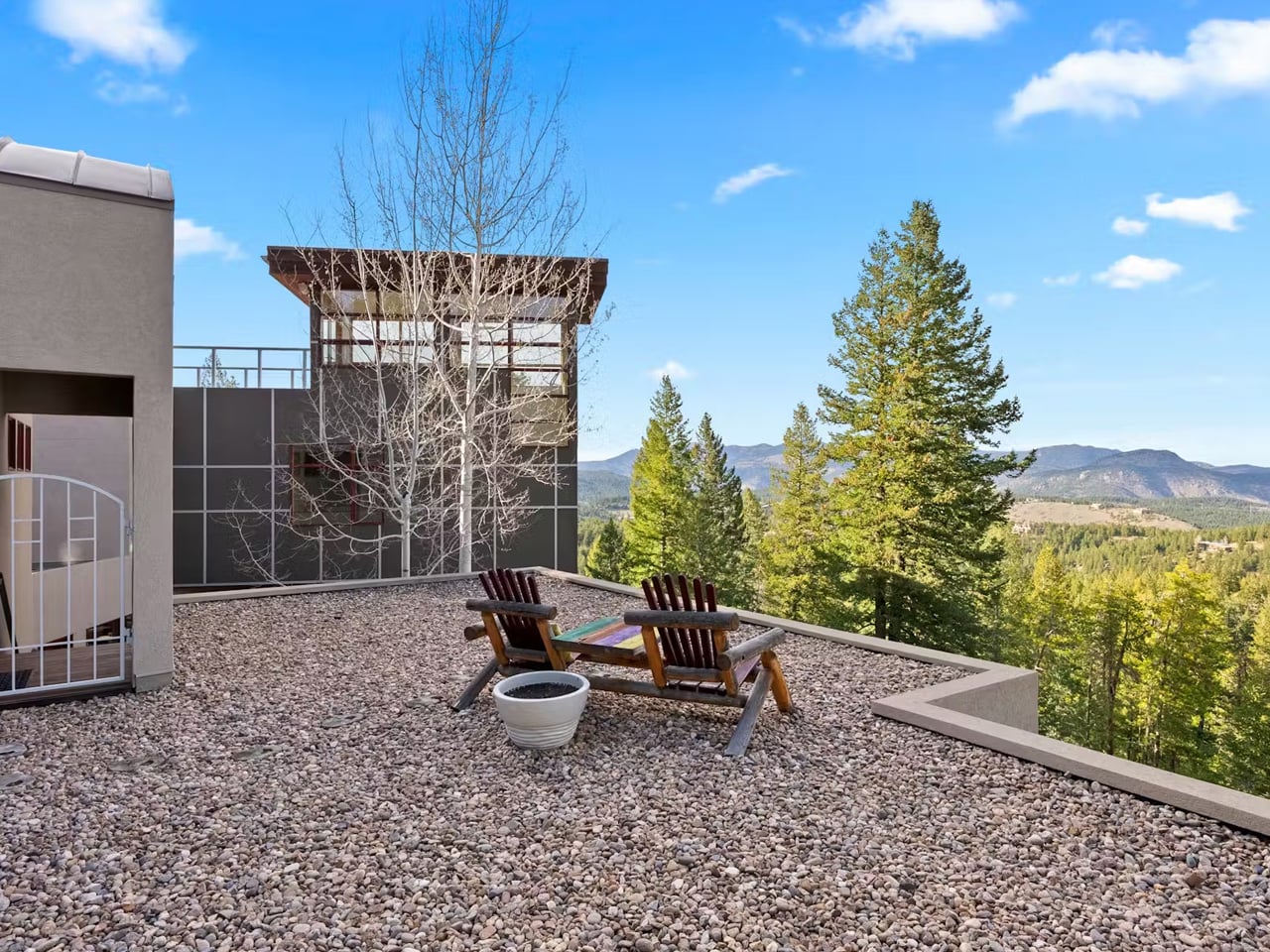
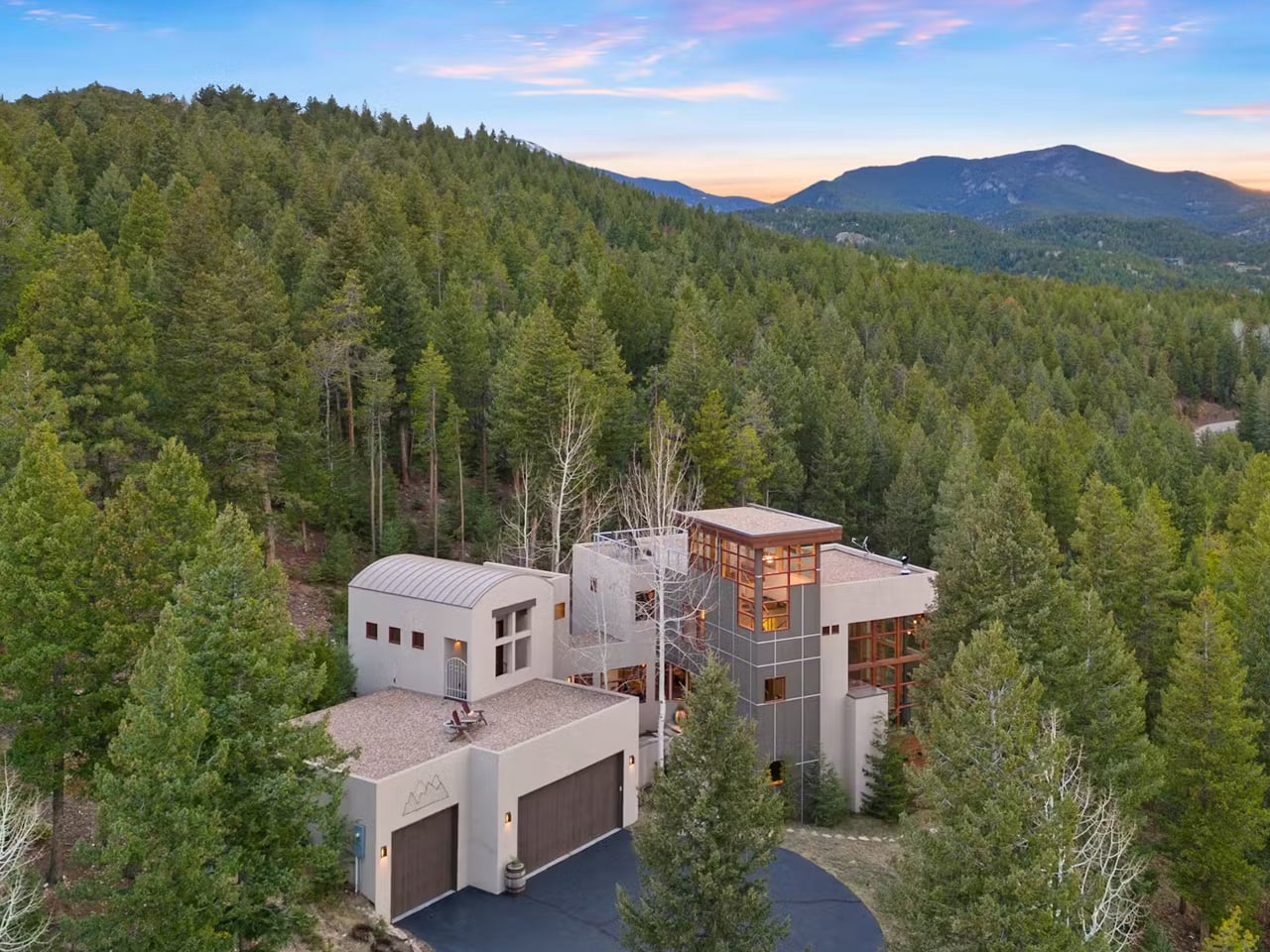
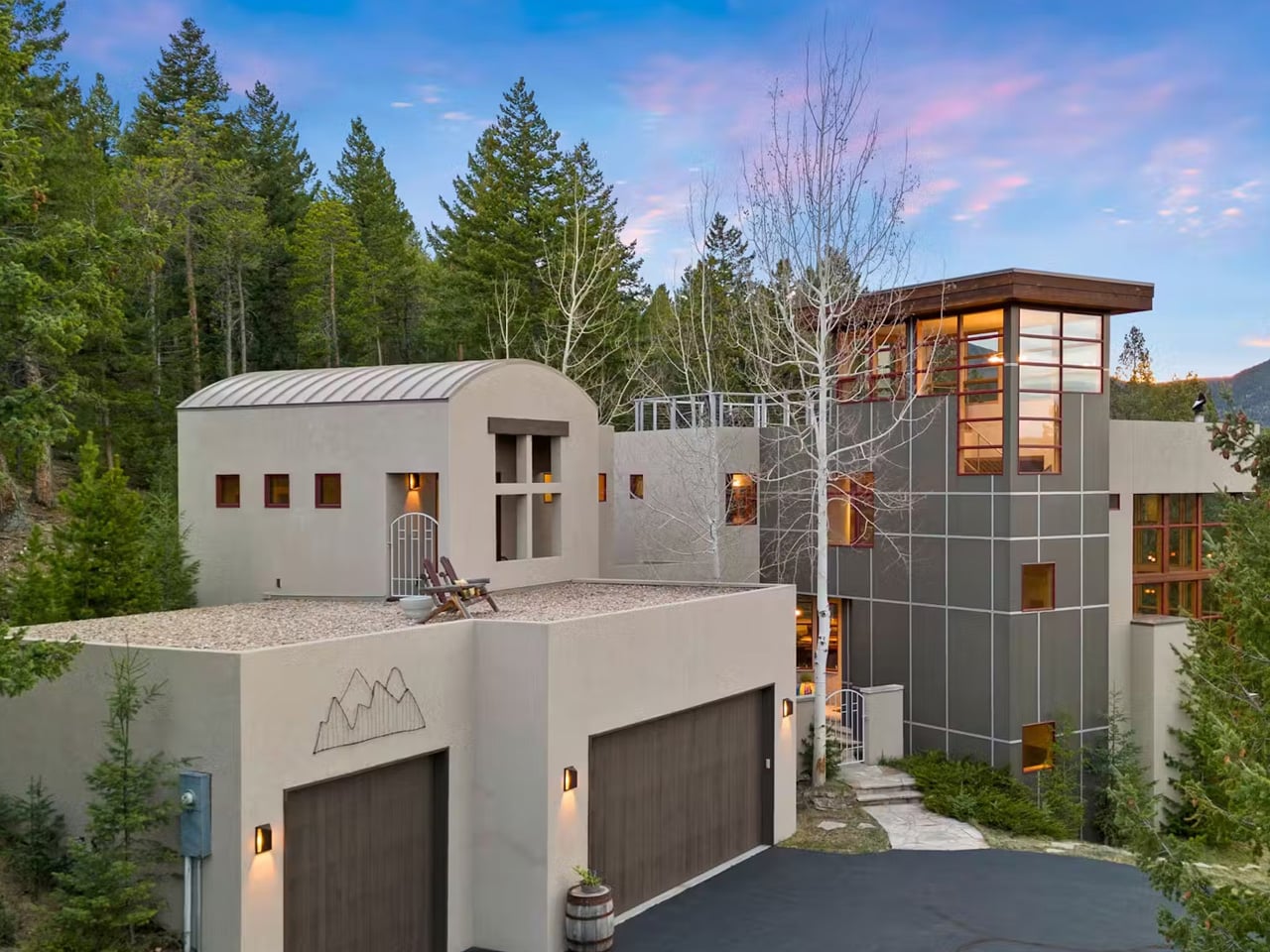
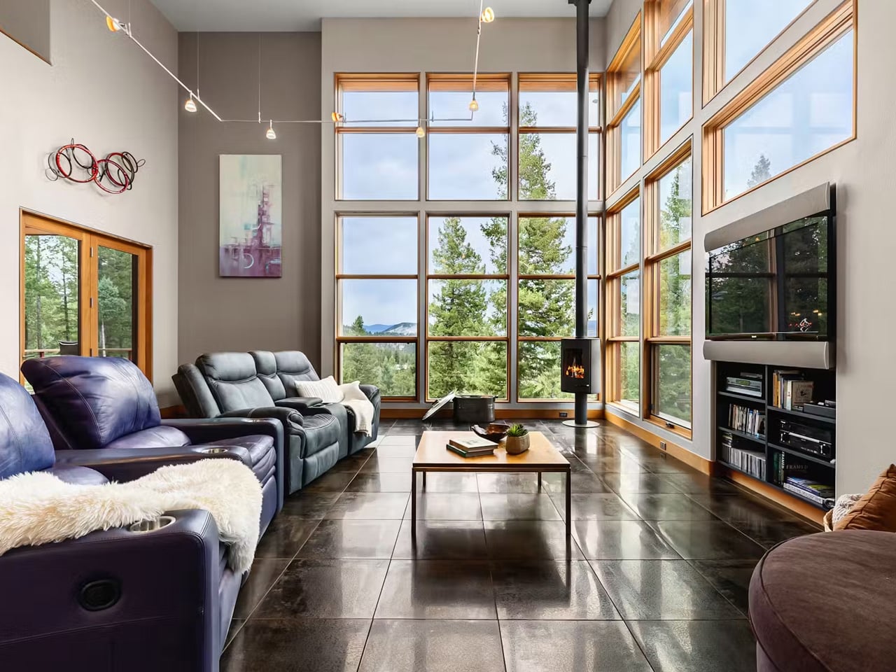
Set among the pines of Colorado and overlooking the protected expanse of Indian Peaks Wilderness, this residence by Robert Chisholm Architects embodies a grounded interpretation of mountain living. Each room is carefully oriented to frame the surrounding landscape, creating views that feel composed yet effortless. Organized around a central courtyard, the house draws daylight and mountain air deep into its core, establishing a quiet internal anchor. The spatial layout gently distinguishes communal and private zones, allowing moments of gathering and retreat to coexist without disruption. Expansive glazing pulls the horizon indoors, while walnut floors, solid fir doors, and a sculptural fireplace lend warmth and permanence to interiors defined by clarity and restraint.
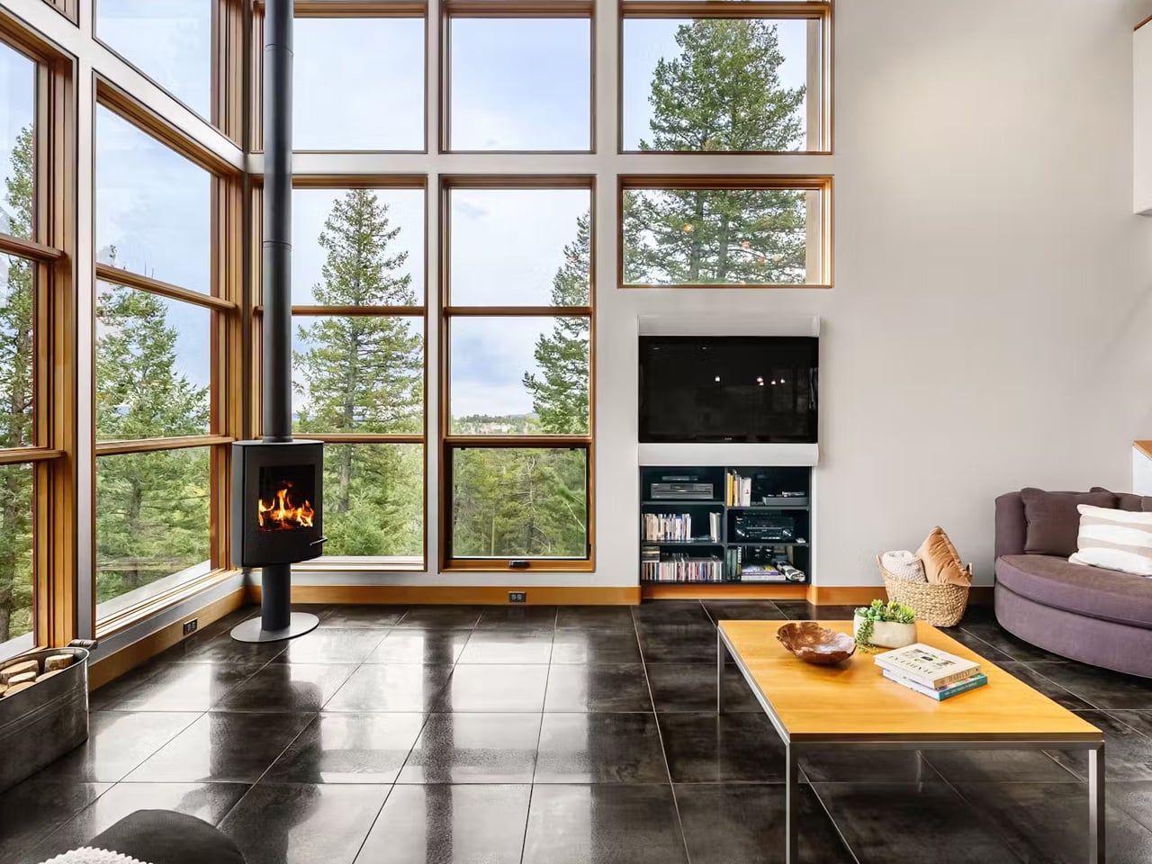
Bright living room with floor-to-ceiling windows overlooking evergreen trees, leather sofas, and a wooden coffee table.

Bright living room with a wall of tall windows, a black wood stove, and a wooden coffee table.

Rooftop patio with two wooden Adirondack chairs and a small table, overlooking trees and distant mountains.

The kitchen balances durability with artistry, anchored by a deep blue granite island that subtly mirrors the shifting mountain sky. Ash cabinetry and integrated appliances support daily routines and larger gatherings, while a discreet butler’s pantry preserves visual calm. Outdoor living unfolds across a sheltered deck and open rooftop terraces, encouraging seamless movement between interior comfort and alpine air. Practical elements, including radiant floors, dual EV chargers, and a heated garage with built-in storage, reflect thoughtful foresight. Fire-mitigated forest edges and private trails extend the experience beyond the walls, reinforcing a life closely attuned to the land.

3. Bold Angled Geometry

Snow is a breathtaking presence, but its weight demands intelligent design. Contemporary mountain architecture responds with bold, angled geometry, where steeply pitched roofs and sharply defined lines transform necessity into visual drama. These dynamic forms efficiently shed heavy snowfall while giving the structure a sense of movement and tension against the landscape.

Inside, the impact is equally compelling. Angled rooflines generate soaring ceilings, unexpected volumes, and striking plays of light. Cantilevered decks and elevated viewpoints extend living spaces outward, framing valleys and ridges like curated vistas. The result is architecture that feels daring yet purposeful, balancing engineering logic with an unmistakable sculptural presence.
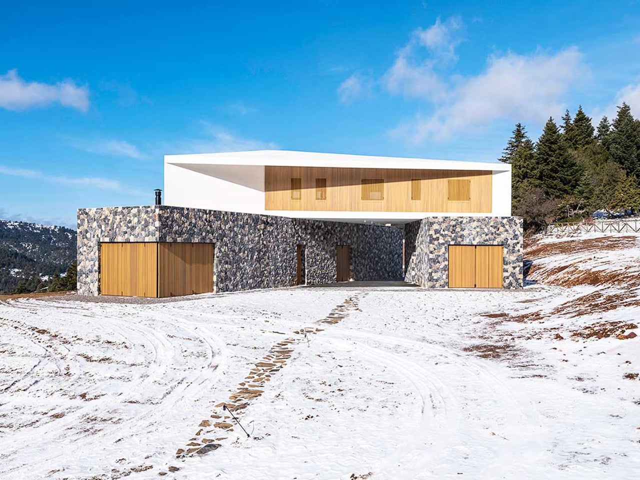
Modern two-story house with a stone base and white upper volume, wooden garage doors, set in a snowy landscape under a blue sky.

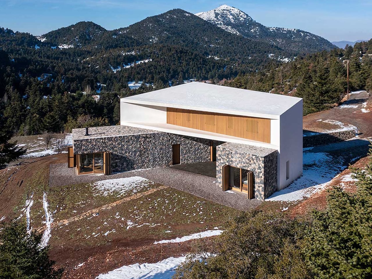
Modern house with white angular upper block and stone lower walls on a snowy hillside with forested mountains in the background.

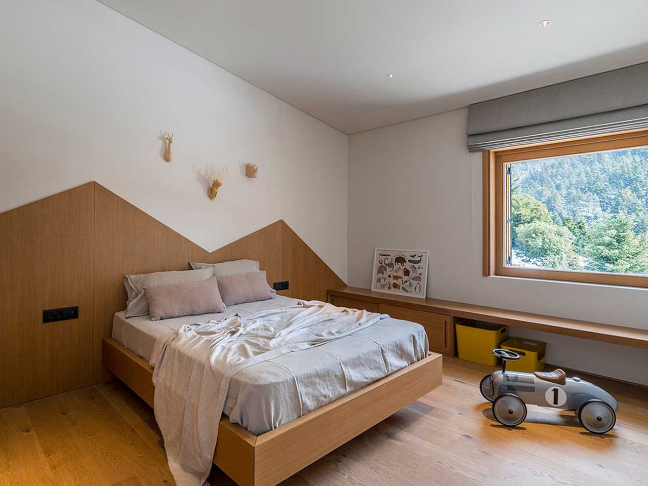
Modern bedroom with a low wooden bed, angled headboard, light bedding, and decorative deer silhouettes on the wall.

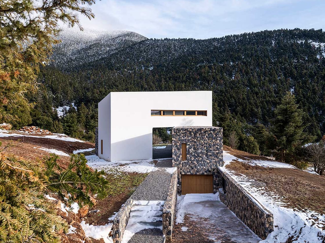
Nestled in the Helmos Mountains of Kalavryta, near the Kalavryta Ski Center, Snowfall House occupies a generous 4,000-square-metre site immersed in forested terrain. Designed by Design Over The Norms, the residence unfolds as three intersecting volumes that echo the geometry of the surrounding peaks. Two stone-clad base structures sit diagonally against the slope, anchoring the home firmly to the land, while a third white volume rests above them like a layer of settled snow. This sculptural composition allows natural light to stream through the interiors and frames uninterrupted views of the mountainous landscape throughout the day.
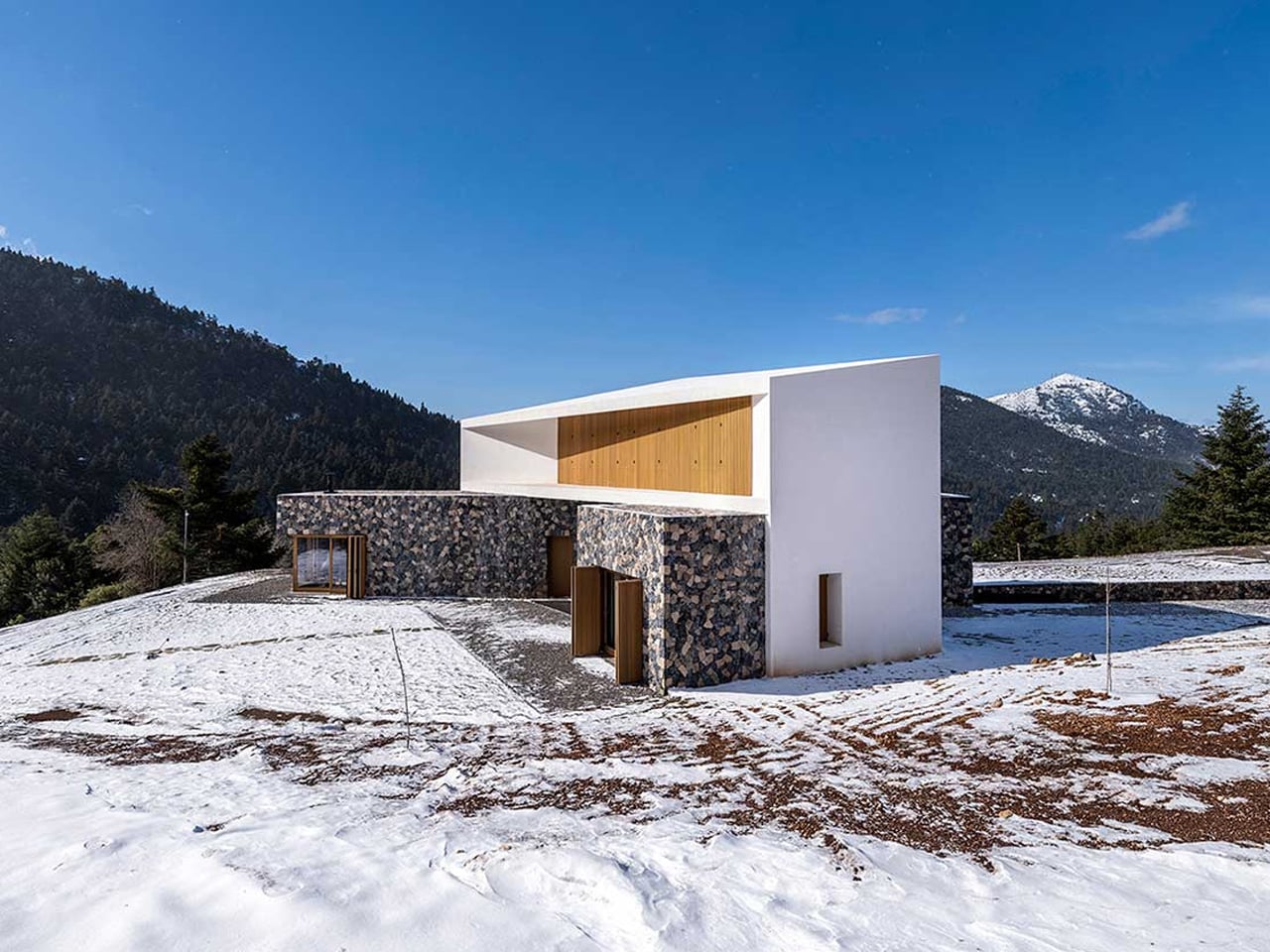
Contemporary two-story house with white and stone exterior sits on a snowy hillside against a mountainous backdrop.

Modern white cubic house with a stone tower and driveway leading to a wooden garage, set in a snowy hillside forest. (Informative)

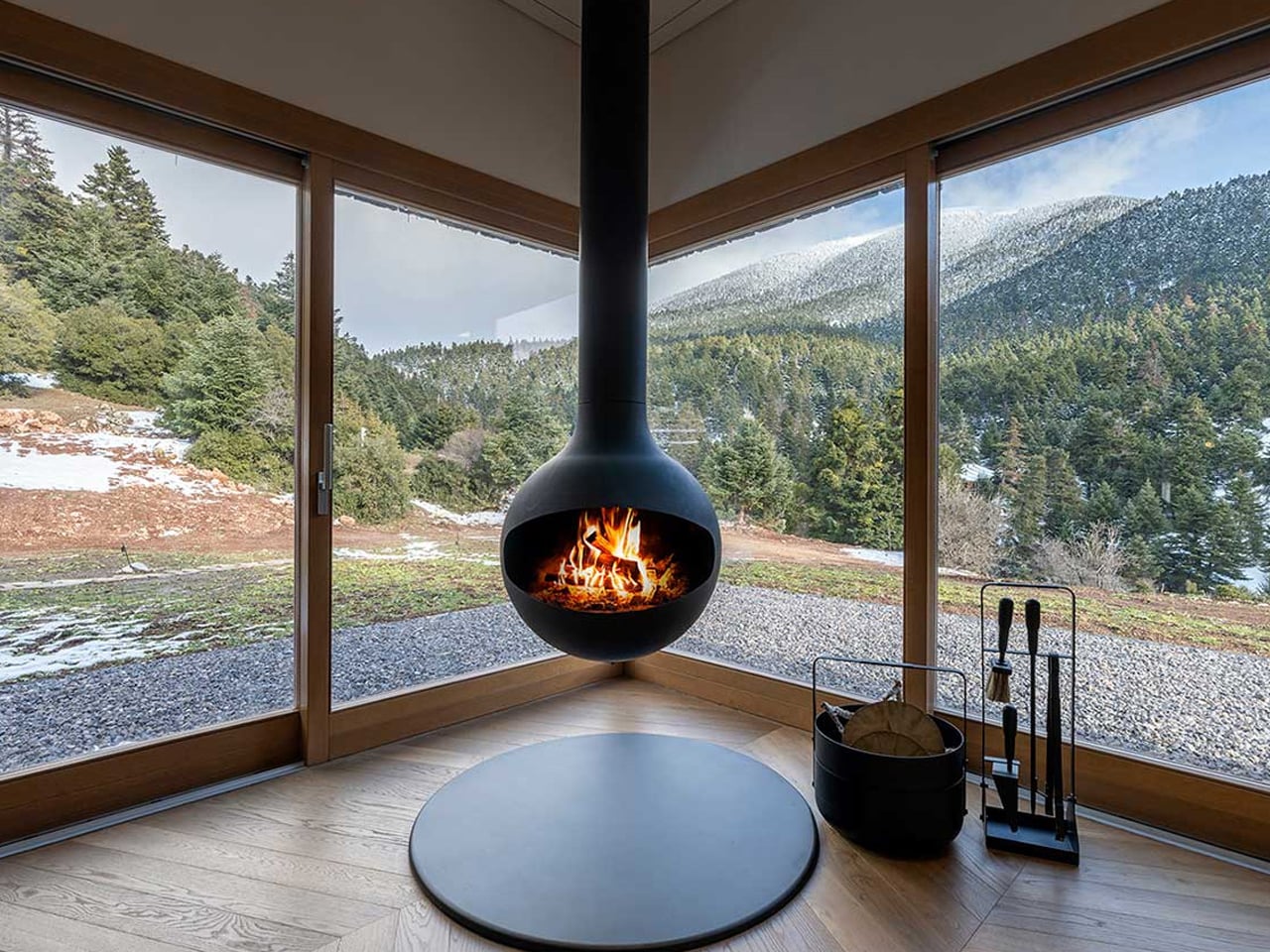
Suspended black spherical fireplace hanging in a corner with panoramic forest and snow outside, flame visible inside the stove.

The primary rectangular volume accommodates the communal living spaces and master suite, while a smaller ground-level wing functions as a private guest suite. Additional bedrooms are housed within the elevated white structure, and an underground garage discreetly conceals vehicles to preserve the natural setting. Wood and stone define the material palette, capturing the rugged textures of the region. Where the volumes intersect, a sheltered courtyard emerges, offering year-round comfort from both summer sun and winter chill. Inside, clean white walls, herringbone wood floors, and understated furnishings create a calm, timeless retreat in the Greek mountains.

4. Refined Cottage Design

For those drawn to warmth and nostalgia, the mountain cottage offers a gentler architectural expression. Stone chimneys, gabled roofs, and carefully layered façades create a sense of familiarity that feels timeless rather than trendy. Every detail, right from the window proportions to handcrafted woodwork, contributes to an atmosphere of charm and shelter.

Though often modest in scale, cottage interiors deliver a rich emotional experience. Nested layouts, soft lighting, and tactile materials cultivate a deep sense of coziness. This intimate environment forms a comforting counterpoint to the vast, windswept landscape outside, making the retreat feel protective, inviting, and profoundly human.
A modern A-frame cabin with vertical wooden slats on the upper story, glass walls on the ground floor, and a stone retaining wall surrounding the base at sunset.

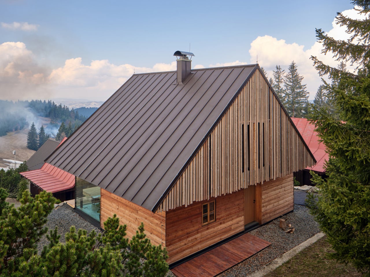
Wooden cabin with a steep metal roof, framed by pine trees under a blue sky

Wooden cabin with a steep metal roof in a forested mountain landscape.

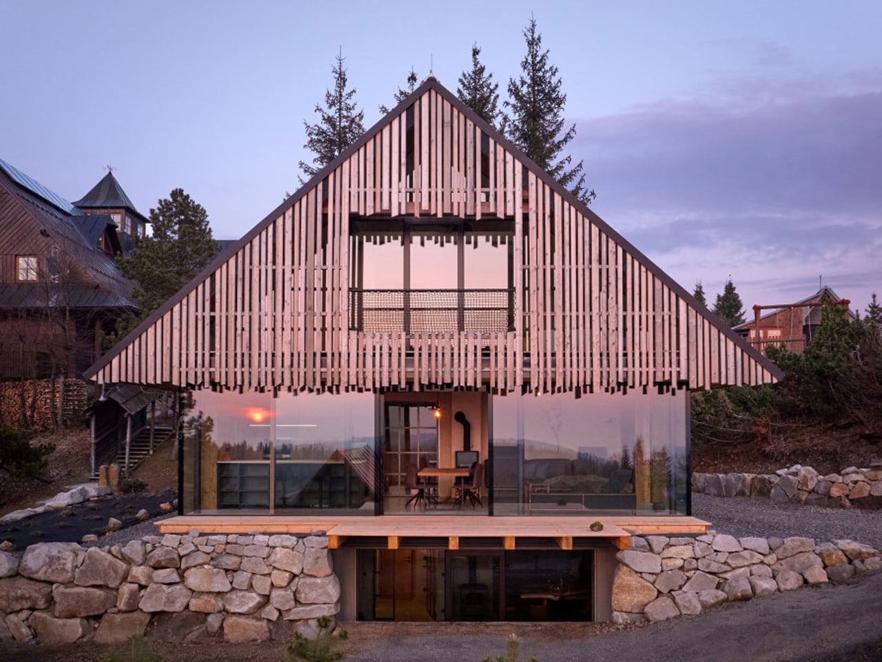
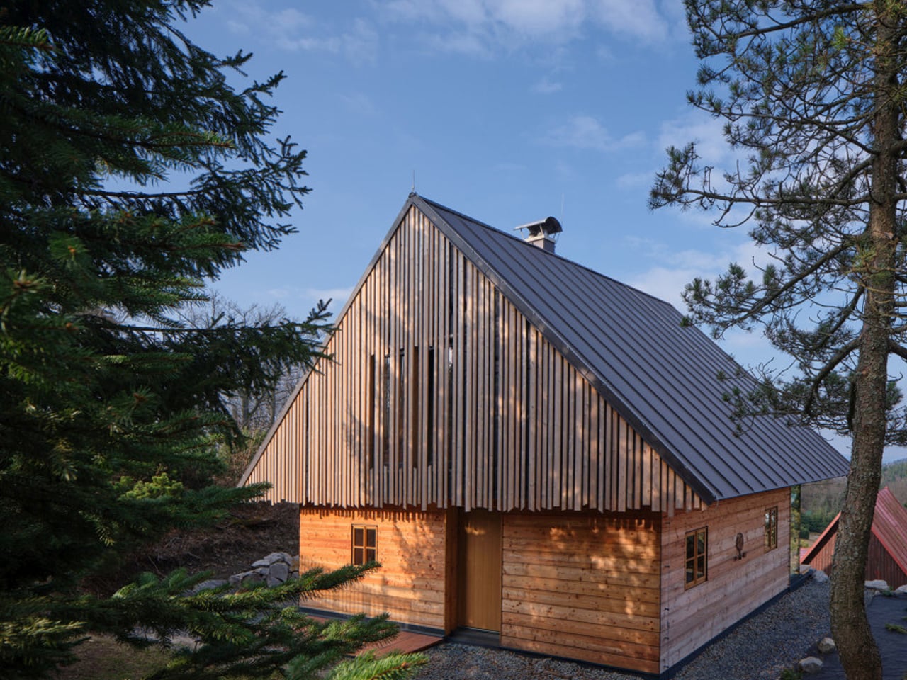
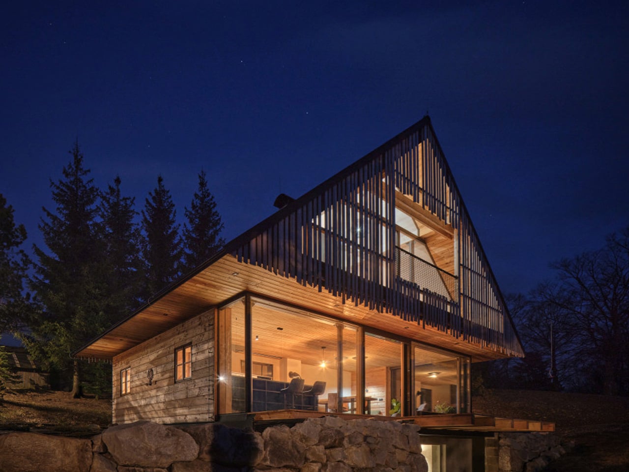
The Kohútka Cottage by SENAA architekti sits naturally within the Javorníky mountains in the Czech Republic, blending tradition with contemporary living. Designed by Jan Sedláček and Václav Navrátil, the retreat was envisioned for a local mountain complex seeking an authentic Wallachian character without compromising modern comfort. Approached from the east, the cottage reflects regional heritage through its compact windows, deep roof overhangs, and familiar log-cabin silhouette. Its steep roof and restrained detailing respond thoughtfully to the harsh mountain climate, embracing forms that have endured for generations while maintaining refined architectural clarity.
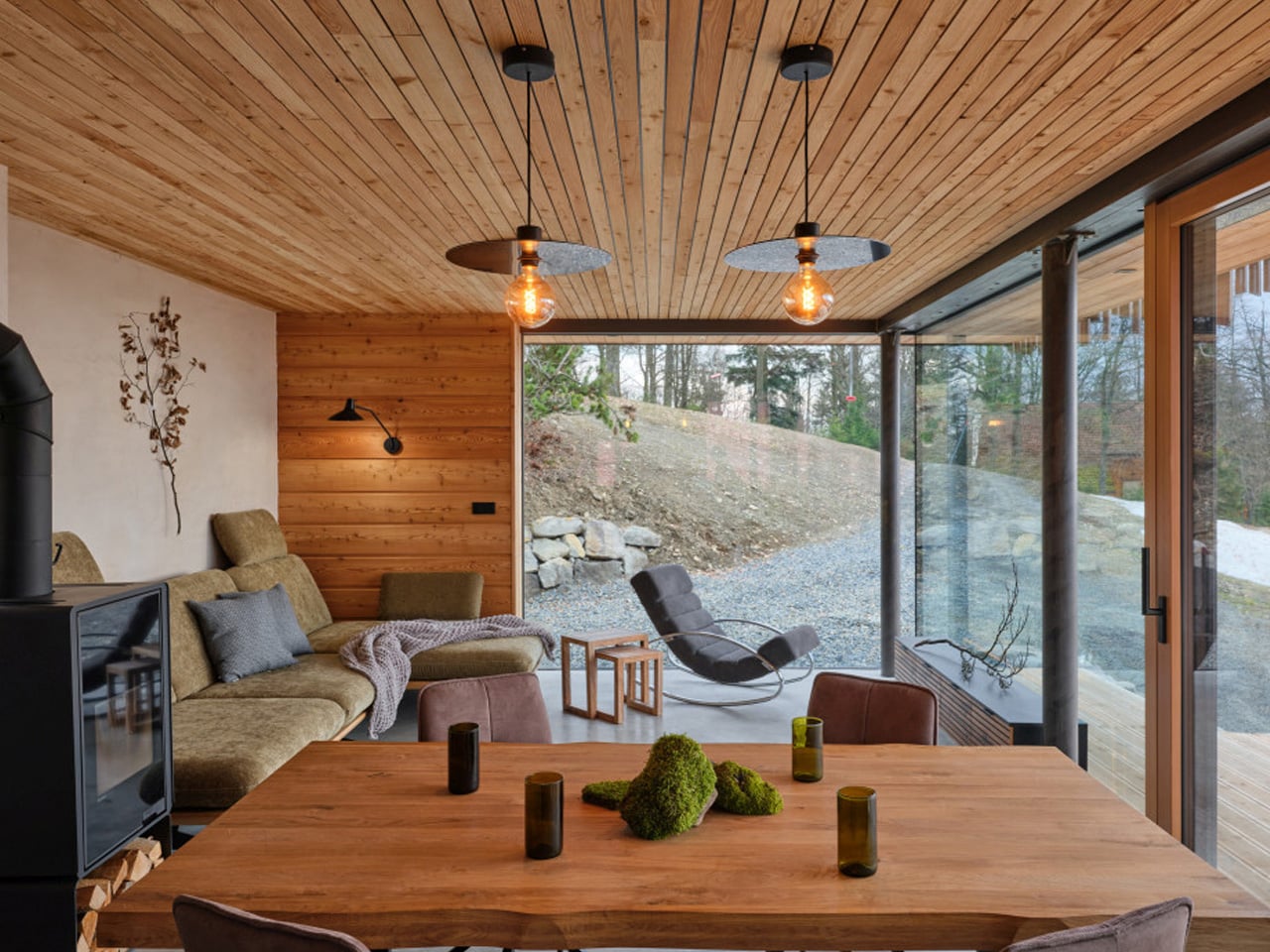
Modern timber house with a steep triangular roof, glass walls, and warm interior lights at night.

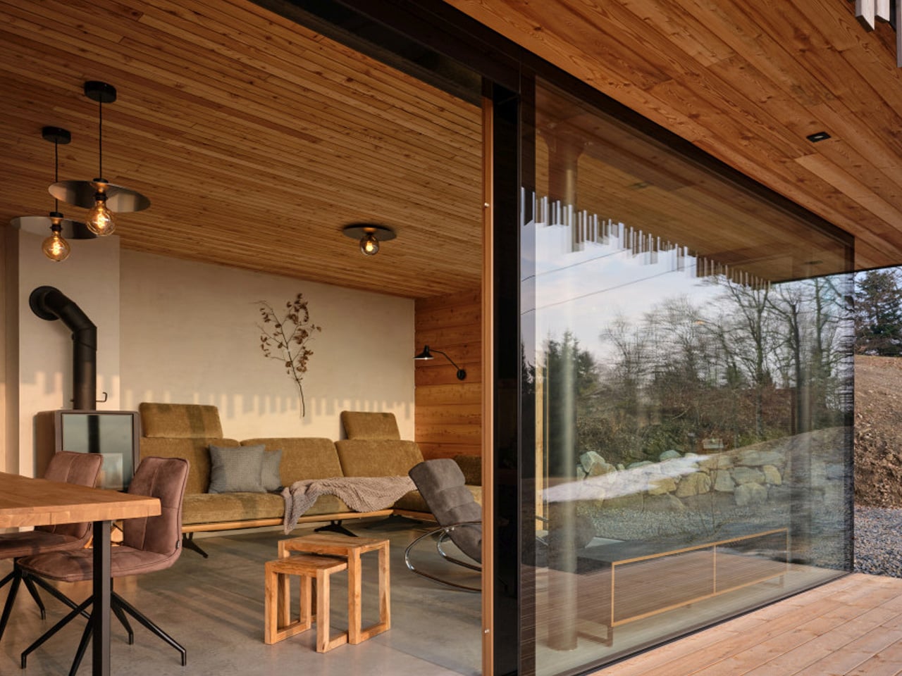
Cozy modern living room with wood panel ceiling and a large glass wall opening to a rocky outdoor area; a wooden dining table with moss centerpiece in foreground and a beige sofa area to the left.

Modern living room with wood ceiling, beige sofa, and a large glass wall opening to an outdoor area.

From the west, however, the home opens dramatically with expansive glazing that frames sweeping valley views, transforming the interior into a panoramic observatory. Constructed using prefabricated timber panels assembled in a single day, the structure minimised environmental impact while meeting low-energy standards. Inside, the sloping terrain accommodates a lower-level wellness zone with sauna and relaxation spaces, while mechanical functions remain discreetly tucked away. The result is a timeless mountain dwelling that balances sustainability, performance, and contextual sensitivity.

5. The Essential Cabin Design

The cabin remains the original archetype of mountain living, now reinterpreted through a contemporary lens. From classic A-frames to refined log structures, today’s cabins celebrate essentialism or a return to clarity, function, and honest materials. Designs emphasize compact footprints, efficient layouts, and craftsmanship that prioritizes durability over ornamentation.

At the heart of the cabin is simplicity with purpose. A central hearth anchors the space, natural textures create warmth, and every element serves a role. The aesthetic is unpretentious yet deeply intentional, fostering a direct connection to the surrounding forest. This modernized cabin embodies an off-grid spirit, where minimalism meets comfort and quiet retreat.
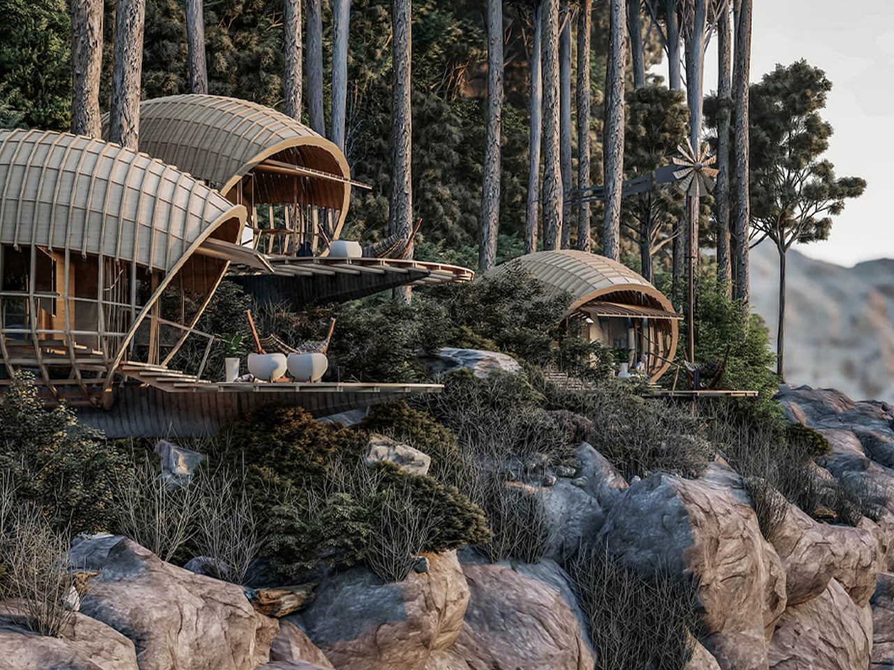
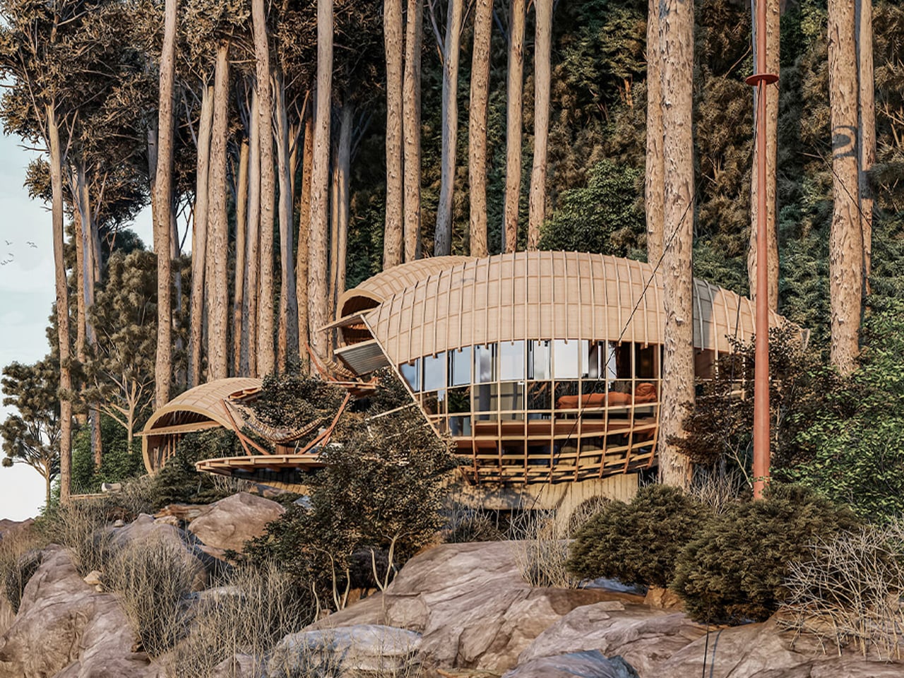
Cliffside wooden domed cabins with curved roofs, extended decks, and outdoor seating among tall pines on a rocky slope.

Circular wooden pod house with curved lattice roof nestled among tall trees on a rocky hillside.

Three rounded wooden cabins perched on a rocky cliff edge among pine trees, connected by decks with chairs and loungers.",

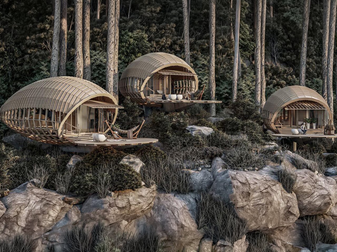
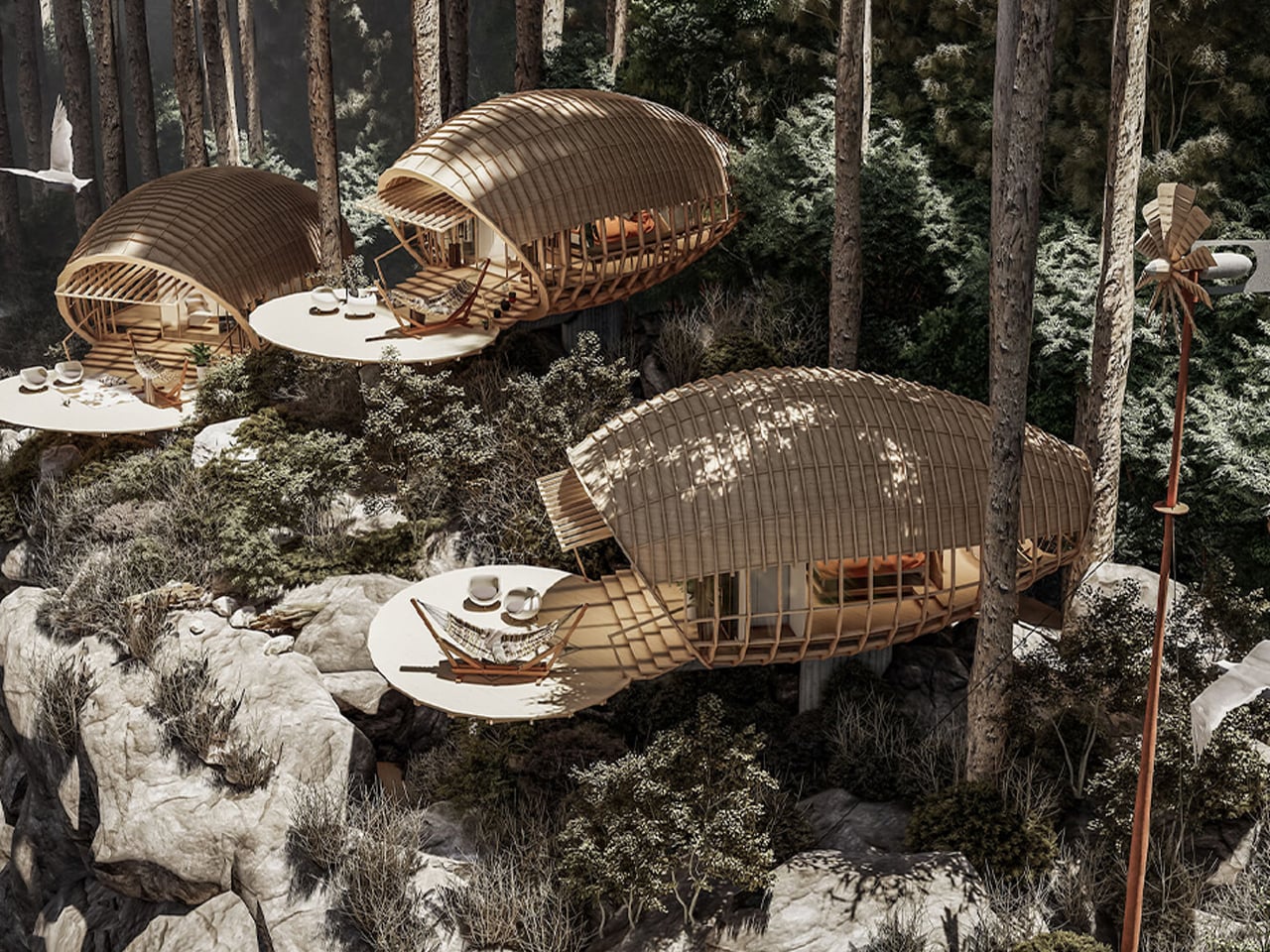
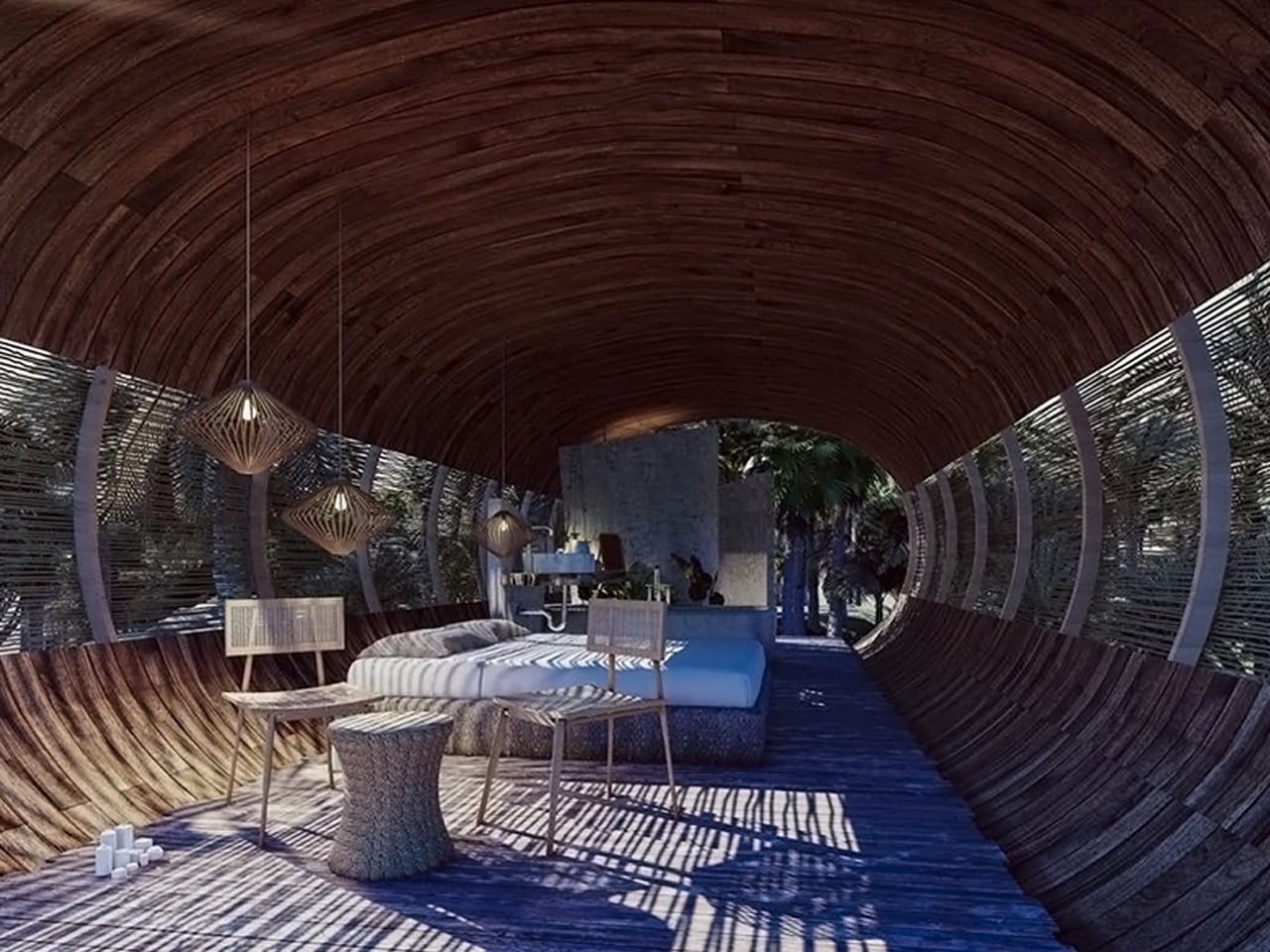
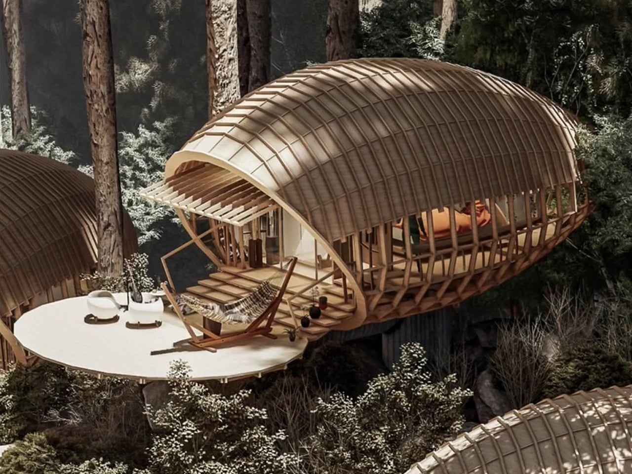
The mountain-edge cabin designed by Jorge Luis Veliz Quintana is defined by its organic geometry and strong contextual integration. Each 150 sqm unit adopts a cocoon-like form, positioned directly on large natural boulders to minimize ground intervention. The structural system combines curved timber lattices with concrete platforms that mirror the grey tonalities of the surrounding cliffs. This deliberate material, color, and finish strategy allows the architecture to visually dissolve into the rocky terrain. The sculptural envelope extends outward to form a generous terrace, reinforcing the linear relationship between interior spaces and the expansive mountain views.
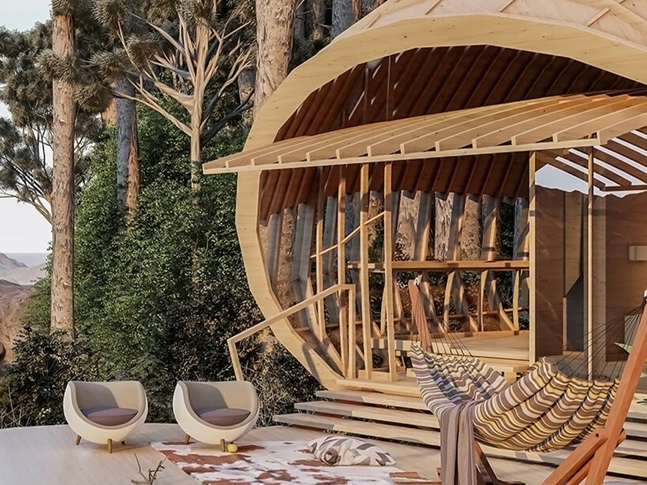
Circular wooden pavilion under construction on a deck with striped hammock, two modern chairs, and cushions amid trees and desert mountains in the background.

Curved wooden tunnel lounge with beds, chairs and hanging lanterns, casting striped shadows.

The layout is organized across two levels, responding to both topography and climate. An open-plan upper floor accommodates the bedroom and bathroom, oriented to maximize 360-degree panoramas through continuous glazing. A secondary semi-outdoor level enhances cross-ventilation and environmental responsiveness. The project was developed digitally using SketchUp for three-dimensional modelling, Lumion for rendering and environmental simulation, and Photoshop for final visual refinement, ensuring precision in form, texture, and lighting.
Wooden treehouse pod with curved lattice shell, overlooking a forest, featuring a round deck and lounge chairs on the patio.

Modern mountain homes embody a delicate union of endurance and emotion. They stand resilient against climate yet remain visually light, open, and deeply connected to nature. Whether sculptural and modern or intimate and rustic, these retreats reveal a simple truth: at greater heights, architecture must anchor us, calm us, and elevate the experience.

The post 5 Mountain Homes That Look Carved From the Cliffs They Stand On first appeared on Yanko Design.

  •  

The LUMO Grill Cooks With Light, Heats in Seconds, and Brings Charcoal Flavor Without the Smoke

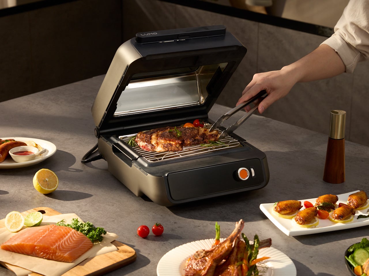
The George Foreman Grill sold more than a hundred million units, which tells you everything about how badly people want to cook without the setup, the smoke, and the outdoor requirement. What that number fails to explain is why, after thirty years of competing products, the fundamental problem remains unsolved. Every electric contact grill since 1994 has operated on the same basic principle: a hot plate pressing food against another hot plate, dripping grease onto a heating element, producing varying degrees of smoke and varying degrees of disappointment. The category has iterated endlessly on that geometry, adding digital timers and non-stick coatings and fold-flat designs, without ever questioning the physics underneath. Hong Kong startup COZYTIME is questioning them with the LUMO, a grill that cooks with focused far-infrared light instead of contact heat, and the approach changes the smoke problem by addressing it at the source.
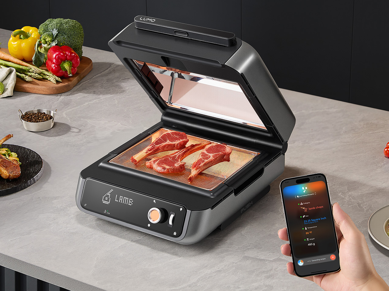
Four precision reflectors focus infrared energy at food from multiple angles simultaneously, creating 360-degree heat coverage that cooks evenly from edge to center while retaining moisture, unlike hot-air convection heating, which dehydrates food. The side-mounted heating elements keep grease physically separated from any heat source, so drippings fall into a grease tray rather than the heating tube, preventing smoke from forming at the source. No filters, no fans, no workarounds. An AI system called CookPilot uses AI Vision and two built-in sensors to automatically detect food type, thickness, surface area, temperature, and weight, then selects the ideal cooking program from a library covering over 40 food types. A swappable Flavor Module lets you add authentic smoked taste to any cook by loading pellet fuels into the module, inserting it into the LUMO, and switching to Indoor Smoker Mode, where the enclosed chamber traps and circulates smoke around the food while a tight seal keeps the home clean. COZYTIME is pricing the LUMO at $329, against a retail price of $499. This pricing is exclusively available to crowdfunding backers, and the campaign will end on May 23! If you’re interested in LUMO, pledge now before it’s gone!

Designer: COZYTIME

Click Here to Buy Now: $329 $499 (34% off). Hurry, only 159/500 left! Raised over $344,000.

We covered LUMO hands-on at CES 2026 and came away calling it “genuinely novel in a category that’s seen mostly incremental tweaks for decades.” Far-infrared radiation transfers energy directly into food molecules rather than heating surrounding air first, which is how the LUMO reaches cooking temperature in a fraction of a second, using four precision reflectors to deliver full surround heating from multiple angles, cooking up to 4x faster than traditional appliances, without long preheat times or outdoor setups. Traditional contact grills heat the plate and then conduct that energy into the protein surface, a fundamentally different thermal pathway that drives more moisture out of food in the process. COZYTIME claims the infrared approach locks in 76.6 percent of natural food juices compared to conventional methods, a figure that, if it holds in real kitchen conditions, represents an actual cooking outcome improvement rather than a specification exercise. The four-reflector geometry is the physical enabler: each reflector focuses infrared energy at the food surface from a distinct angle, eliminating cold zones and removing any need to flip.

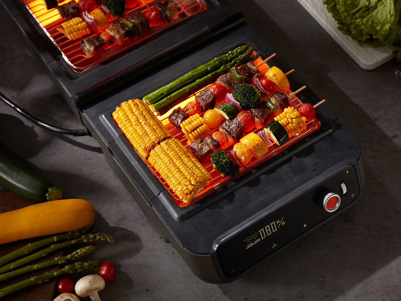
The unit handles thick steaks, skewers, quick snacks, large dinners, and even pizza, thanks to its TriForma StateShift System that allows for three different grill modes. In Indoor Smoker Mode, enclosed heating circulates warmth evenly to a maximum of 230°C (446°F), mimicking a full oven capable of pizza, casseroles, and slow-roasted steaks, and pairs with the Flavor Module for authentic smoked dishes like tender beef brisket. Fast Grill Mode hits a maximum of 270°C (518°F), where the semi-open lid concentrates heat for rapid grilling and juice-locking, delivering steakhouse-quality flavor in minutes, ideal for weeknight meals when time is short but standards aren’t. Flat Grill Mode opens to 180 degrees, creating two independent heating zones, so you can grill steaks on one side at high heat while roasting vegetables on the other, with no batch cooking and no waiting, which makes it particularly suited to dinner parties. Two heat zones running independently in a single countertop footprint is the kind of practical design decision that sounds obvious in retrospect but rarely makes it into a consumer appliance.

LUMO’s most compelling trick may be how seriously it treats flavor, because this is one of the more thoughtful attempts yet at bringing authentic charcoal-style cooking indoors. Plenty of indoor grills promise grill marks, very few deal convincingly with the taste itself. COZYTIME approaches that problem with a dedicated Flavor Module that burns pellets inside the unit’s enclosed chamber, allowing smoke to circulate around the food while the side-heat architecture keeps grease from hitting the heating elements and creating unwanted kitchen smoke. That separation is what makes the idea work. You get the smoky, grilled character people actually associate with charcoal cooking, without turning the room into part of the process. With the Flavor Module attached, the Heat Slider heats wood pellets to release rich smoky flavor during cooking, and when slid out with the griddle plate, it doubles as a high-heat searing surface for deep browning, crisp crusts, and smaller tasks like melting cheese or simmering sauces. LUMO also uses AI Vision to recognize different meats and automatically adjust heat and cooking time to match preferred doneness, from blue rare to well-done. Food-contact surfaces are made exclusively of premium food-grade stainless steel.

The LUMO app adds a layer of control that makes the grill feel more like a connected cooking platform than a standalone appliance. It offers three recipe paths, including curated official recipes from a cloud library, fully custom recipes with adjustable time and temperature for each step, and one-click AI-generated recipes created by CookPilot, with any recipe shareable through a code or posted to the LUMO community. From the app, users can track cooking progress and food status in real time, adjust temperature and timing remotely, and get notified when food is ready. That flexibility extends to the accessory ecosystem too. COZYTIME currently offers nine add-ons in total, including six cooking accessories and three additional accessories designed to broaden what the LUMO can do day to day. On the cooking side, there’s a wireless meat thermometer for real-time core temperature tracking, flavorwood pellets for smoke infusion through the Flavor Module, an extra stainless grill grate for back-to-back cooking, a fine mesh grill grate for smaller foods like shrimp and asparagus, and a Heat Slider griddle plate for intense high-heat searing up to 450°C.

Outside the cooking accessories, COZYTIME also offers a travel bag for transport and storage, plus extended coverage options for added peace of mind. Cleanup remains refreshingly low-friction, with food only touching stainless grill grates and grease trays that lift out for a quick wipe or rinse, while detachable parts are dishwasher-safe and the side-heat architecture keeps grease away from chamber walls, minimizing residue elsewhere in the unit. At 14.3 pounds, the LUMO is still portable enough to move between kitchen counter, balcony, and dining table without feeling like a project.

Retail pricing sits at $499, with the current order price at $329 – that’s a 34% reduction off the MSRP.Every unit ships with the LUMO itself with built-in Heat Slider, a region-appropriate power cord, a user manual, two stainless steel grill grates, the Flavor Module, two detachable grease trays, and a grill grate lifter. Shipping is free across the United States (excluding PR, HI, and AK), Canada, Mexico, Singapore, South Korea, Japan, Hong Kong, Australia, New Zealand, and most of Europe starting July 2026.

Click Here to Buy Now: $329 $499 (34% off). Hurry, only 159/500 left! Raised over $344,000.

The post The LUMO Grill Cooks With Light, Heats in Seconds, and Brings Charcoal Flavor Without the Smoke first appeared on Yanko Design.

  •  

UNO and Vrbo Are Renting Vacation Homes for $4 a Night

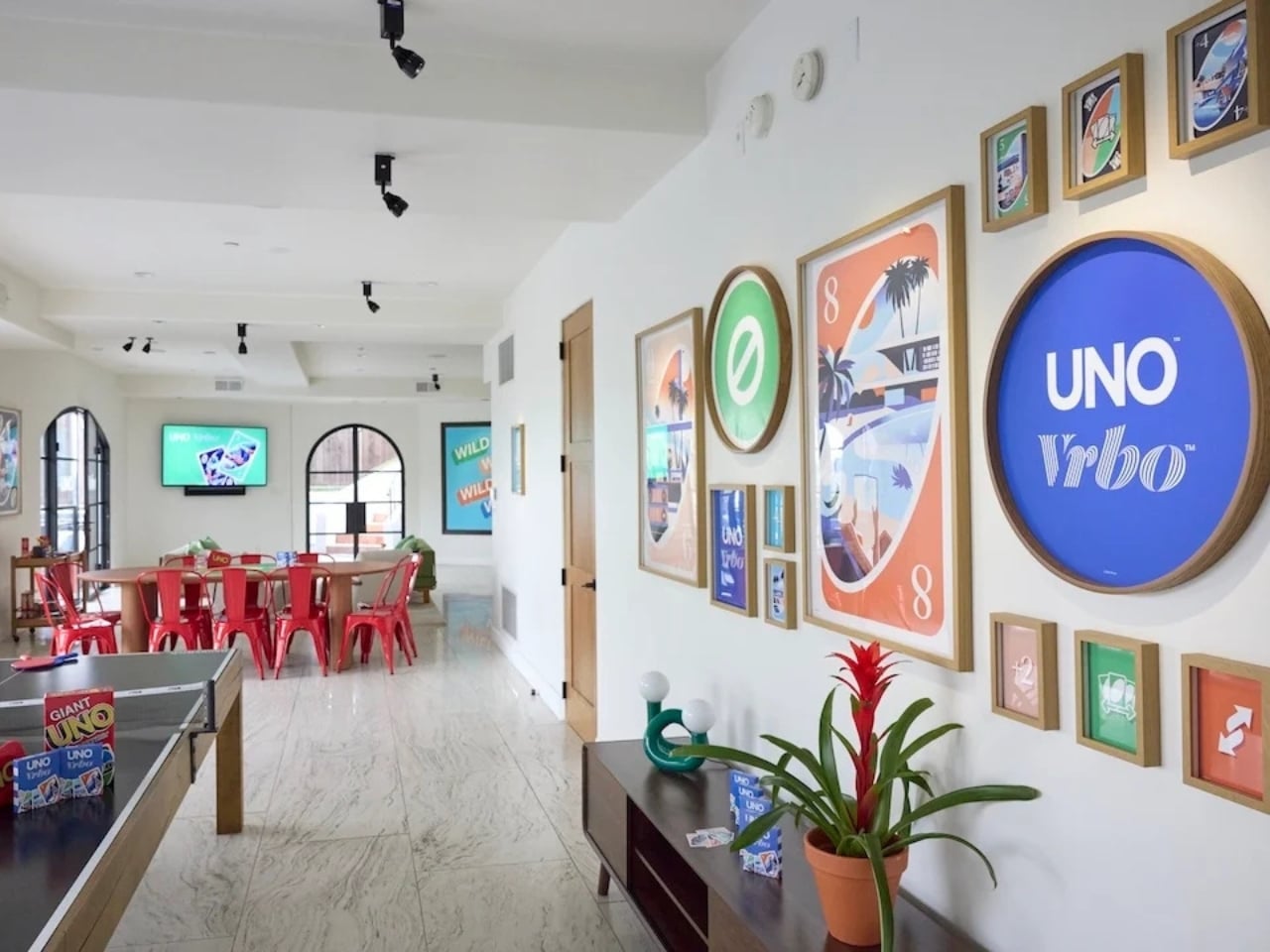
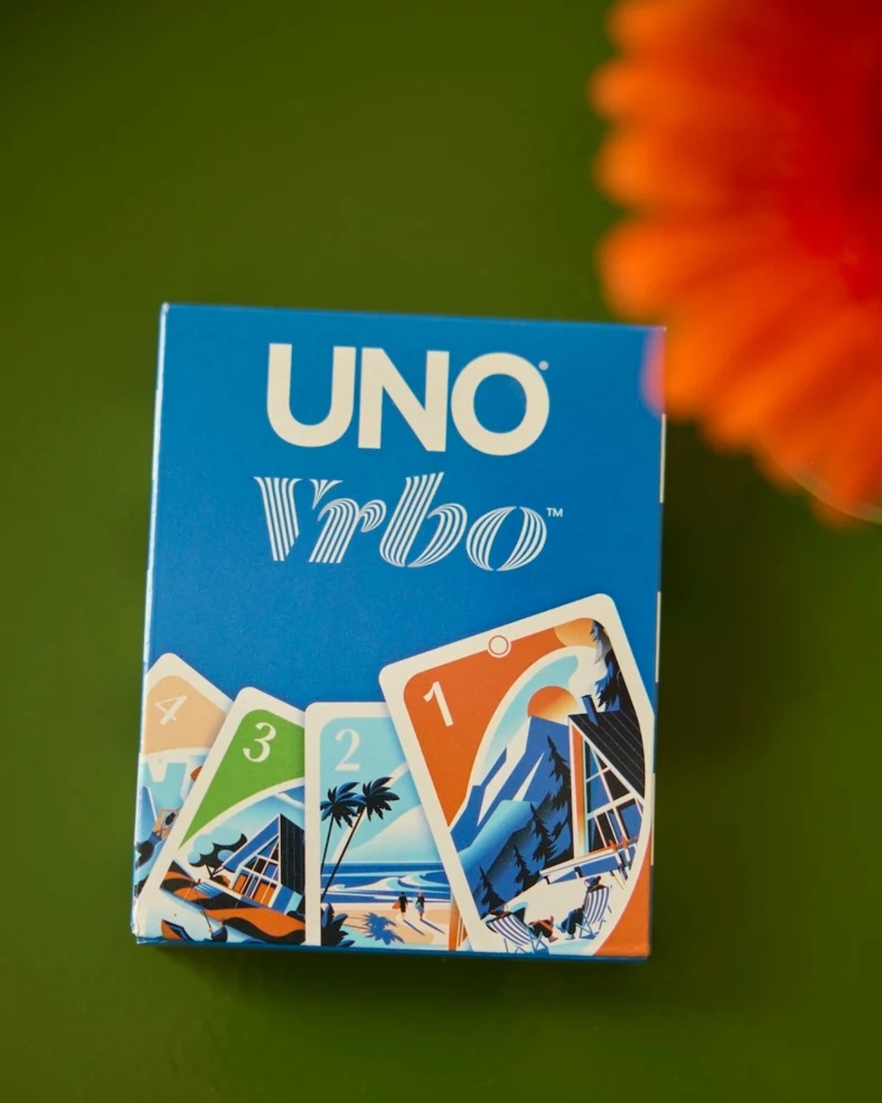
Brand collaborations are everywhere these days, but every once in a while, one lands so perfectly that you have to stop and appreciate the logic behind it. The UNO x Vrbo partnership is exactly that kind of collab. Not because it’s flashy or trying to be something it’s not, but because it genuinely makes sense.

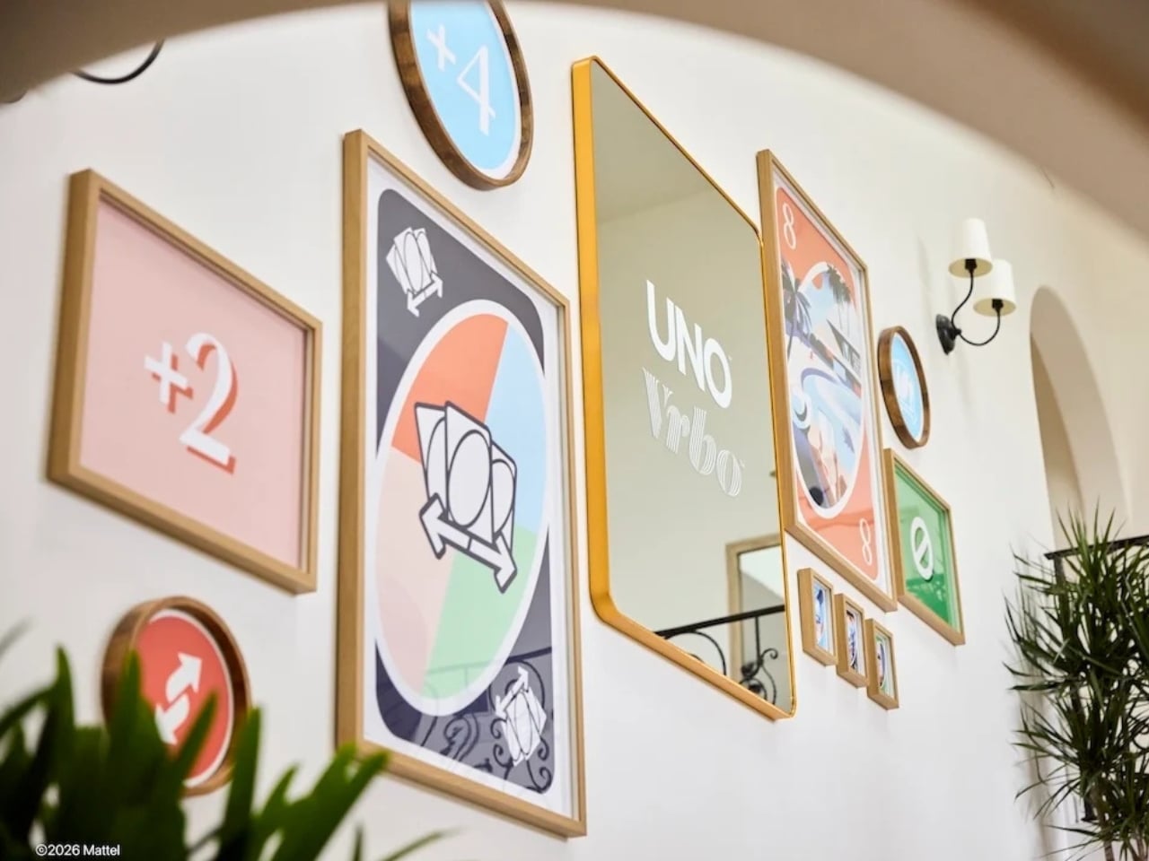
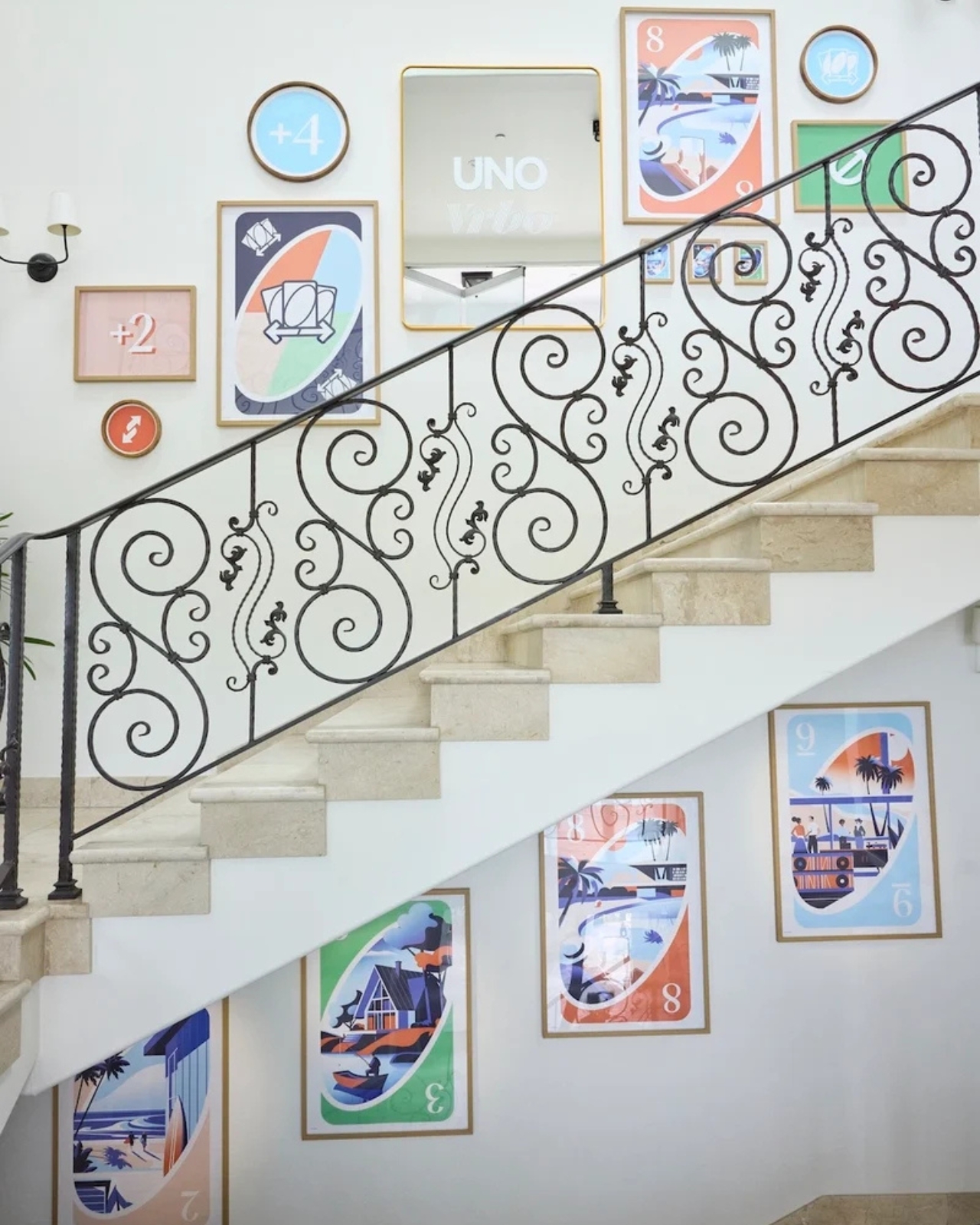
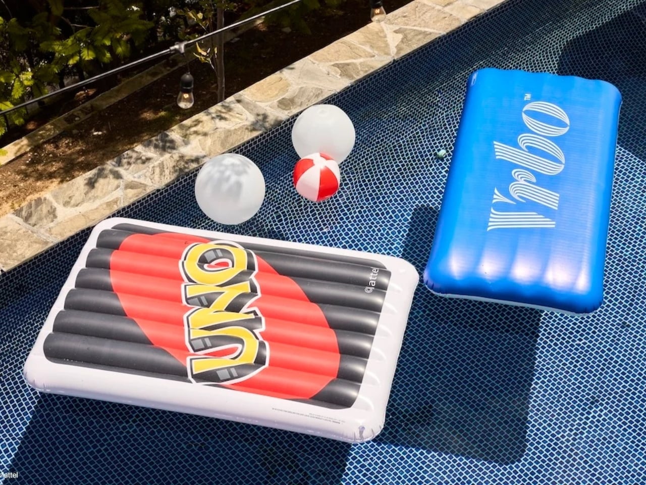
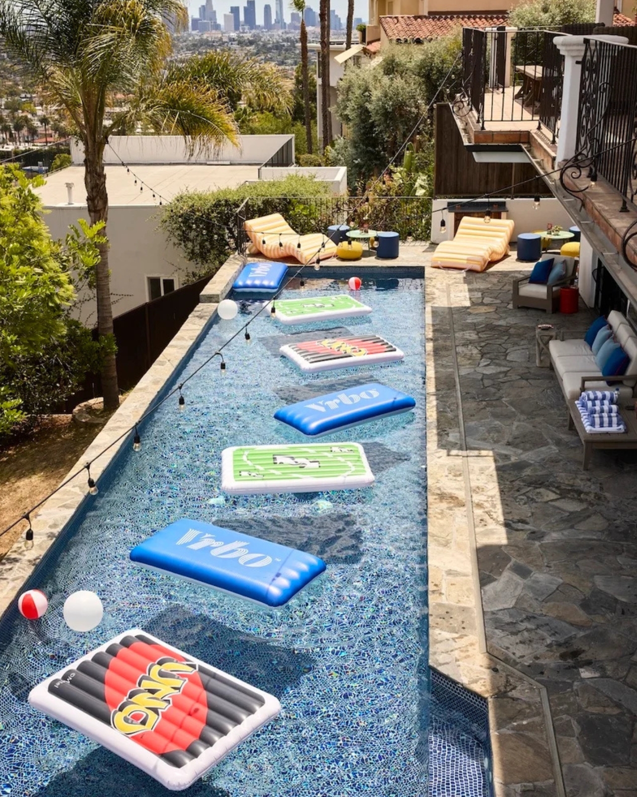
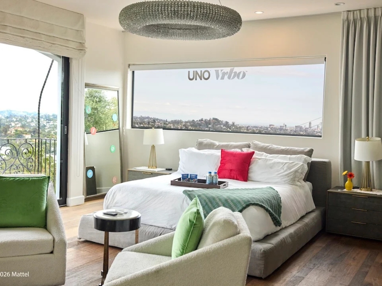
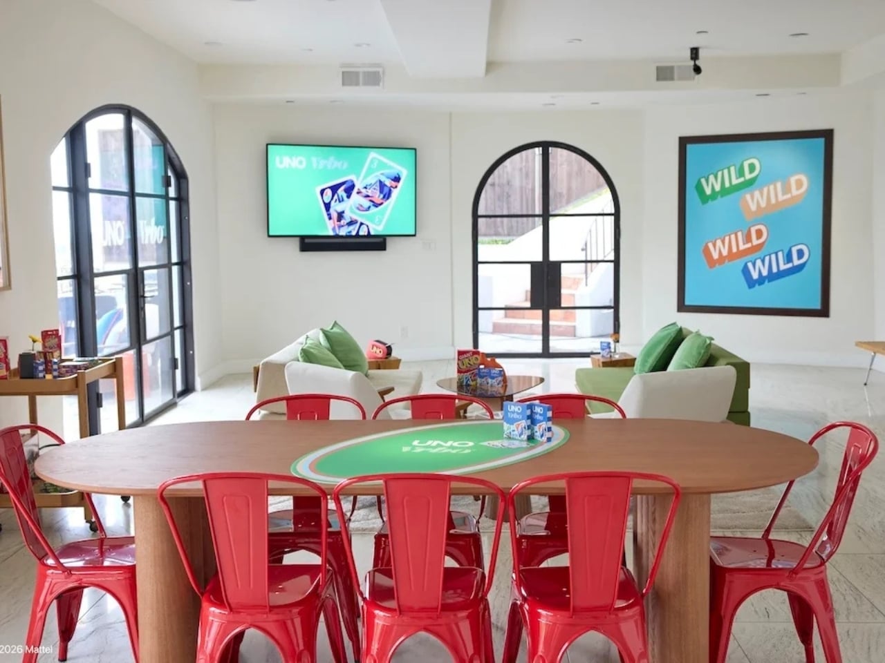
Starting May 15, Mattel and Vrbo are opening bookings for six limited-time vacation home stays built entirely around the spirit of game night. Six properties across the U.S., two tiers of experience, and one very clever price point: $4 per night. That last part is a deliberate nod to UNO’s iconic Draw 4 card (which can make or break relationships), and it’s the kind of detail that makes you smile whether you’re a brand person or not.

Designers: UNO x Vrbo

The stays are divided into two experiences. At the top end sit the two “Wild Card” homes, located in the Hollywood Hills and Texas Hill Country. These are the full production: UNO-themed décor, organized game nights, and an in-home dining experience. They’re designed for groups of up to 10 guests who want the whole immersive package, the kind of weekend that’s more curated getaway than casual vacation. Then there are the four “Play It Your Way” stays in Winter Park, Colorado; Palm Desert, California; Panama City Beach, Florida; and Atlanta, Georgia. These are a little more relaxed, but still come with a co-branded UNO x Vrbo Welcome Kit, a game room, and either a pool or hot tub. Essentially, they’re the version for people who want the fun without the fuss. All six properties are bookable for one three-night stay, Friday to Monday, on a first-come, first-served basis. Bookings open May 15 at 1 PM ET. I’ll be honest: at $4 a night, they are going to go fast.

What makes this collaboration genuinely interesting, beyond the price tag, is the attention that went into the actual product. A custom UNO deck was commissioned for this collab, illustrated by Pietari Posti, with artwork inspired by travel destinations and vacation themes. It also comes with an exclusive rule called the “Vacation Rental Swap,” which lets players swap hands with anyone at the table. It’s a small thing, but it shows that the two brands weren’t just slapping logos on a vacation home and calling it a day. They put real creative thought into what the collaboration could actually feel like to experience.

That’s the part that tends to separate a genuinely good brand collab from a lazy one. Anyone can license a logo and stick it on merchandise. Fewer brands take the time to ask what the experience should feel like from the inside, and build something around that answer. UNO, at its core, is a game about chaos and connection. You play it with people you like and you inevitably end up yelling at them. It’s social in the most fundamental way. Vrbo, meanwhile, is about giving groups a private space to actually be together without the interruptions of a hotel. Put those two things in the same room and you get something that doesn’t need to be explained.

It also helps that this collab is part of a growing relationship between Mattel and Expedia Group, Vrbo’s parent company. Mattel already appeared in an Expedia Super Bowl commercial earlier this year through the Barbie universe. So this isn’t a one-off stunt; it reads more like two brands actively figuring out how to build something together over time. For anyone who grew up playing UNO at a kitchen table, there’s an undeniable nostalgia pull here. But the campaign doesn’t lean into nostalgia as a crutch. It uses the game’s identity as a starting point and builds forward from it, which is ultimately why it works. The best collaborations don’t just remind you of something you loved. They give you a new reason to love it again.

The post UNO and Vrbo Are Renting Vacation Homes for $4 a Night first appeared on Yanko Design.

  •  

The SOMA Is the Three-Bedroom Tiny Mansion Families Have Been Waiting For

The tiny home movement has never quite figured out what to do with families. Removed Tiny Homes, a Brisbane-based builder specializing in off-grid, sustainable builds, has decided to challenge that assumption head-on. Their latest model, the SOMA, is a towable tiny house designed with families firmly in mind — three bedrooms, a generous open-plan layout, and a level of finish that earns the word “mansion” without irony.

The numbers tell a compelling story. The SOMA measures 10m x 3.4m x 4.5m, with an interior footprint of 52 square meters (560 sq ft). That 3.4-meter width is notably wider than the standard tiny house, and it shows — the interior breathes more like an apartment than a caravan. The bulk of that space is given to a large open-plan kitchen and living area, which anchors the home and keeps the social energy flowing between the kitchen island and the lounge, rather than forcing it through a narrow corridor.

Designer: Removed Tiny Homes

Three bedrooms is the headline, and it’s a legitimate one. One sits on the ground floor, while two loft bedrooms occupy the upper level — a layout that gives adults and children a sense of separated territory without requiring a second building. The bathroom is fully tiled, and early buyers receive a Luxury Living Upgrade Pack that layers in skylights and stone kitchen benchtops, elevating the interiors well beyond what you’d expect at this price point.

Outside, the SOMA arrives with a dual-siding facade — Colorbond metal panels paired with warm-toned composite or wood cladding — alongside a split roof profile and large sliding glass doors that open the interior to the outdoors. The display unit shown on the builder’s website sits on a large wooden deck, which extends the liveable footprint considerably and makes the home feel rooted, even when it isn’t.

Pricing starts at roughly USD $145,200, with further customization available at additional cost. For a three-bedroom, road-legal home of this caliber, that figure sits in a competitive space — especially when the alternative is a conventional build on land you may not be able to afford. The SOMA isn’t trying to squeeze a family into a clever floor plan. It’s making the case that tiny living, done right, doesn’t require compromise — just a smarter conversation about what space actually means.

The post The SOMA Is the Three-Bedroom Tiny Mansion Families Have Been Waiting For first appeared on Yanko Design.

  •  

Dórica Just Proved Good Design Belongs on Your Kitchen Counter

Most of us have at least one object in our home we’ve never actually looked at. The napkin holder. The fruit basket. The candle holder that’s been sitting on the same shelf for three years. We use these things daily, sometimes multiple times, and yet they exist in this strange invisible space between functional and forgotten. That’s exactly the space that Sebastián Ángeles decided to design for.

Ángeles is the founder and creative director of Dórica, a Mexico City-based contemporary furniture brand that has spent years building a quiet but increasingly well-regarded reputation for pieces that prioritize longevity over trend. Their chairs, benches, and credenzas have found their way into residential, commercial, and hospitality spaces, and the brand has been recognized as one of the most relevant contemporary furniture names coming out of Mexico. But with Prea, released in February 2026 and recently featured by Wallpaper, Ángeles shifted his focus somewhere more intimate: the objects you reach for without thinking.

Designer: Sebastián Ángeles for Dórica

Prea is labeled “Chapter II” in Dórica’s story, and the brand describes it as their first collection of everyday objects. It’s a small but considered group of pieces, including an egg basket, a fruit basket, a candelabra, and a napkin holder, each designed and produced in Mexico with a clear emphasis on wood and ceramic, clean lines, and what the brand calls “material honesty.” The pieces are not elaborate. They don’t announce themselves when you walk into a room. And that restraint is, I think, the entire point.

Wallpaper described Prea as “a study in restraint,” and that feels right. But I’d push it further. Prea is actually a philosophical statement wrapped in a very practical object. The brand’s own language around the collection is striking: “Design here does not decorate. It holds. It supports. It allows the ordinary to be seen.” That’s not the kind of copy you expect from a brand selling a napkin holder. It’s the kind of thought that makes you pause.

We talk constantly in design circles about the gap between high design and everyday life, between the gallery object and the kitchen counter. Dórica seems genuinely uninterested in that gap existing at all. The premise of Prea is that the objects living alongside our daily rituals, the things we touch without registering that we’re touching them, deserve the same level of intentionality that goes into a statement chair or a sculptural lamp. Not to make them more important than they are, but to acknowledge that they already are important. We just stopped noticing.

There’s a Mexican design perspective embedded in this that feels worth acknowledging. The brand has always positioned itself around craftsmanship and longevity rather than novelty, and Prea continues that ethos into a new category. It’s a move that says something about how Ángeles sees the role of design in everyday life: not as a luxury layer applied to living, but as something woven into the texture of it.

I’ll be honest, when I first looked at the collection, my instinct was that it seemed minimal to the point of simplicity. A fruit basket is a fruit basket. But the more I sat with the images and the thinking behind the work, the more that restraint started to feel like confidence. These pieces don’t need to perform. They just need to be present, well-made, and honest. In a market saturated with objects begging for your attention, that’s a harder thing to pull off than it looks.

Prea is also a smart move for Dórica as a brand. Entering the everyday objects category at this level of intention signals a maturity that not every furniture brand is willing to commit to. It’s easier to scale up into bigger, more visible pieces. Scaling down into the egg basket, and making it mean something, takes a different kind of confidence. If you’re the kind of person who has ever picked up a beautifully made object and held it for just a second longer than you needed to, this collection is worth seeking out.

The post Dórica Just Proved Good Design Belongs on Your Kitchen Counter first appeared on Yanko Design.

  •  

Inside the Espresso: Modern Tiny Living’s 20-Foot Tiny House on Wheels That Proves Small Can Be Bold

There’s a version of small living that doesn’t ask you to compromise. The Espresso, built by Ohio-based Modern Tiny Living on their popular Mohican platform, makes that case in just 20 feet. Bold and daring, the Espresso is a tiny house on wheels defined by deep blacks, warm wood accents, and a design sensibility that punches well above its square footage.

At its core, the Espresso is a study in restraint done right. The main floor clocks in at 160 square feet, with a 70-square-foot queen bedroom loft above, complete with custom built-ins and shelving. It’s a tight footprint by any measure, but the way the space is organized keeps it from ever feeling like it. The living room anchors one end of the home with a pull-out bench, built-in shelving, and a drop-down dining table that doubles as a desk, making it equally suited to a quiet morning or a dinner for two.

Designer: Modern Tiny Living

The kitchen is where the Espresso’s aesthetic really comes into focus. An undermount black granite sink pairs with a pull-down matte black faucet, solid wood countertops, a 9.9 cubic foot refrigerator, a two-burner propane cooktop, and a microwave, all working within a palette that feels deliberate rather than default. The matte black hardware package runs throughout the home, tying each room back to the same considered thread. Across from the kitchen, an open closet leads into the bathroom, which keeps things equally functional with a fiberglass insert shower, a flush toilet, and open shelving.

On the outside, the Espresso sits on a double-axle trailer and is finished in engineered wood with a steel roof, keeping maintenance low and durability high. A small exterior storage box handles propane bottles and similar items, quietly solving the off-grid practicalities without interrupting the clean lines of the exterior. The home weighs approximately 9,000 pounds, and its closed-cell spray foam insulation — three inches in the walls and ceilings, four in the floors — means it’s built to handle varied climates without compromise.

What makes the Espresso work isn’t any single feature. It’s the way everything adds up: the convertible furniture, the considered storage, the finish quality that makes the space feel lived-in rather than merely occupied. Modern Tiny Living designed it to deliver all the comforts of modern living in a compact, move-in-ready package, and the result is a tiny home that earns its name in more ways than one. Rich, concentrated, and hard to forget.

The post Inside the Espresso: Modern Tiny Living’s 20-Foot Tiny House on Wheels That Proves Small Can Be Bold first appeared on Yanko Design.

  •  

Studioninedots’ Light House Is a Vertical Amsterdam Home Built From Playfully Stacked Boxes

What does a home look like when you throw out the floor plan entirely? For Amsterdam-based firm Studioninedots, the answer is a tower of playfully stacked boxes, each one dedicated to a single moment in life, that rises above one of the Dutch capital’s newest neighborhoods. Completed in 2025, Light House sits on Centrumeiland, a newly developed artificial island district defined by its self-build culture and strong sustainability ambitions.

The project began with a simple brief from a couple with two children who wanted a home that would genuinely bring them together. Rather than anchoring daily life to the ground floor the way most houses do, Studioninedots dedicated each of the family’s key activities — eating, gathering, cooking, relaxing — to its own distinct volume, then arranged those volumes vertically into a single, tightly considered composition. The result is a 257-square-meter residence that feels less like a stacked building and more like a small vertical neighborhood.

Designer: Studioninedots

Movement through the home unfolds through a sequence of open passages and compressed zones, where shifts in scale produce entirely different spatial moods. Smaller, enclosed areas carve out space for focused, quieter activities, while larger voids open up visual connections across levels, dissolving any conventional sense of what is above and what is below. Hovering above the kitchen is a sheltered, secluded volume ideal for yoga or film watching, while the journey through the house culminates at the top in what the architects describe as a “holiday home” within the city. Flanked by arched ceiling-height glass openings, this 14-metre-high gathering room commands panoramic views across the IJmeer lake.

The facade does a lot of the design’s heavy lifting. A wall of square glass blocks wraps the front of the building, filtering natural light into the interior while abstracting the life inside, offering privacy without sacrificing the warmth of daylight. At night, the facade glows from within, giving the house an almost lantern-like presence on the street.

Sustainability is baked into the structure itself. Light House is built as a lightweight system using prefabricated timber components inside a steel frame, a circular and modular method that allows for flexibility, long-term adaptability, and ease of disassembly. The layout is not fixed either, as children grow and priorities shift, the home can be reconfigured to meet whatever the family needs next. Light House is a rare thing: a home that feels entirely personal yet completely considered, one where architecture quietly gets out of the way and lets life fill the space.

The post Studioninedots’ Light House Is a Vertical Amsterdam Home Built From Playfully Stacked Boxes first appeared on Yanko Design.

  •  

This Tiny House Has 30 Feet of Glass and Feels Nothing Like a Tiny House

The tiny house world has long wrestled with one unavoidable tension — the desire for light, openness, and space against the hard constraints of a compact footprint. Escape’s Shoreline Glass House doesn’t just address that tension; it dissolves it entirely. This recently completed park model is one of the most spatially generous and light-saturated tiny homes to come out of the category in recent memory, and it earns that distinction without resorting to multi-level gymnastics or lofted sleeping quarters.

What immediately sets the Shoreline Glass House apart is its commitment to single-floor living. It has a length of 47 ft (14.3 m) and an increased width of 12 ft (3.6 m), which makes for a much larger interior than is typical for the format, comparable in fact to a small apartment. That extra width is the key differentiator. Where most tiny homes feel like corridors with furniture squeezed in, the Shoreline opens up laterally, giving rooms a genuine sense of proportion that doesn’t demand you constantly recalibrate your spatial expectations.

Designer: Escape

The name earns its keep on the exterior, too. The Shoreline Glass House features a light-filled interior thanks to 30 ft (9 m) of glazing running along one wall, flooding every corner of the home with natural light throughout the day. It’s a design move that blurs the line between inside and out, making the home feel anchored to its surroundings rather than sealed off from them. Entry is through a large enclosed porch, a smart buffer zone that expands the functional living area while adding that coveted semi-outdoor layer that tiny home dwellers often sacrifice first.

Inside, the layout is open-plan, with the living and kitchen area flowing seamlessly from one end to the other. The bathroom includes a large glass-enclosed shower with a width of 5 ft (1.5 m), a specification that sounds modest until you realize most tiny house showers are barely wide enough to raise both arms. A walk-in closet rounds out the domestic comforts, alongside an oversized sofa that signals Escape’s intent clearly: this is a home designed for staying in, not just passing through.

As a non-towable park model, the Shoreline Glass House isn’t chasing the nomadic lifestyle that defines much of the tiny house market. It’s built for permanence, or at least long-term settlement, and the design reflects that. Every decision, from the floor-to-ceiling glazing to the full-width bathroom, prioritizes livability over portability. The result is a tiny house that finally makes the case that going small doesn’t have to mean giving anything up.

The post This Tiny House Has 30 Feet of Glass and Feels Nothing Like a Tiny House first appeared on Yanko Design.

  •  
❌