Vue lecture

The 5 Home Upgrades Every Pet Parent Actually Uses (Not Just Buys)
Pet furniture & products have operated under a different standard than everything else in the home for too long. The scratchy beige tower. The plastic bowl by the radiator. The mat that looks like an afterthought. That gap between what owners expect from their own furniture and what they accept for their pets is closing, and the designs collected here are evidence of that shift. These are objects that take the animal’s life seriously without surrendering the room.

This is not a list for owners who want to spoil their pets. It is a list for owners who want their home to feel coherent, and who understand that coherence includes the animal living in it. A vacuum that maps your dog’s favourite spots. A bowl that keeps a fast eater honest. A table built around the fact that the cat is going to be there anyway. Five upgrades, and one shared premise.

1. Chunky Cat Tree

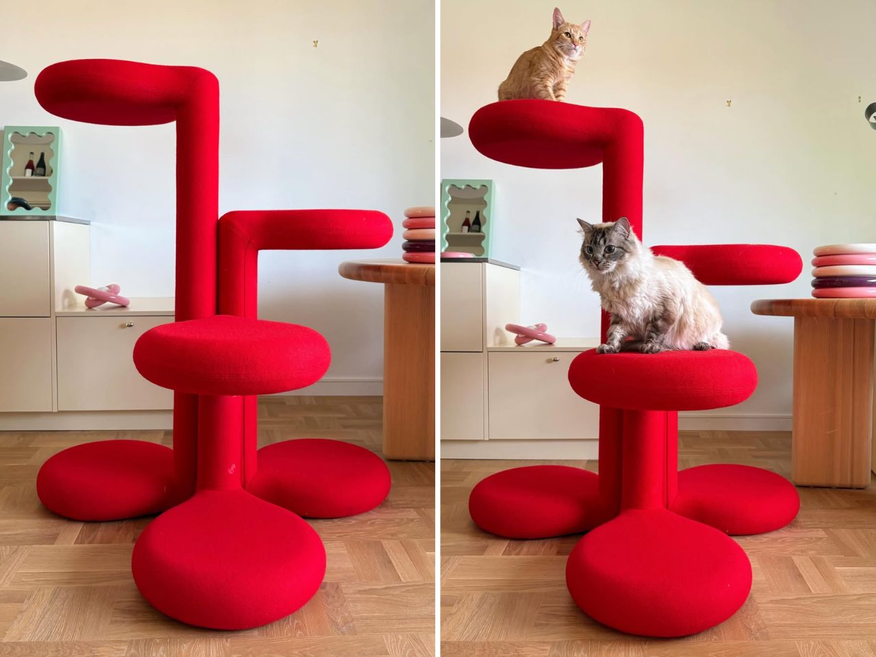
Cat trees solve a specific problem and fail at everything else. They anchor the room in exactly the wrong way, and most owners spend years working around them rather than with them. Gustaf Westman’s Chunky Cat Tree asks whether the category has to operate this way at all. The Swedish designer, known for his Chunky collection of ceramics, glassware, and home objects, has applied that same rounded vocabulary to a cat climbing structure. The result is a piece you place rather than hide.

The form carries all of Westman’s signatures: stacked volumes, inflated proportions, a material presence that reads as warm and deliberate. Made to order in Sweden, the tree is upholstered in wool across five colourways: red, yellow, purple, blue, and cobalt blue. Westman has said he designed it after years of seeing ugly cat trees and deciding the category deserved better. The comment captures the larger idea behind the object. Everything can be designed better, including the things we have come to accept as visually unpleasant.

What we like:

  • Treats cat furniture as a design category worth the same formal attention as any other home object
  • Wool upholstery and sculptural proportions earn placement in the room rather than tolerance of it

What we dislike:

  • Made to order in Sweden means lead times and pricing that will not suit everyone who falls for the visual
  • No confirmed US retail availability or price at time of writing

2. Narwal Flow 2 White
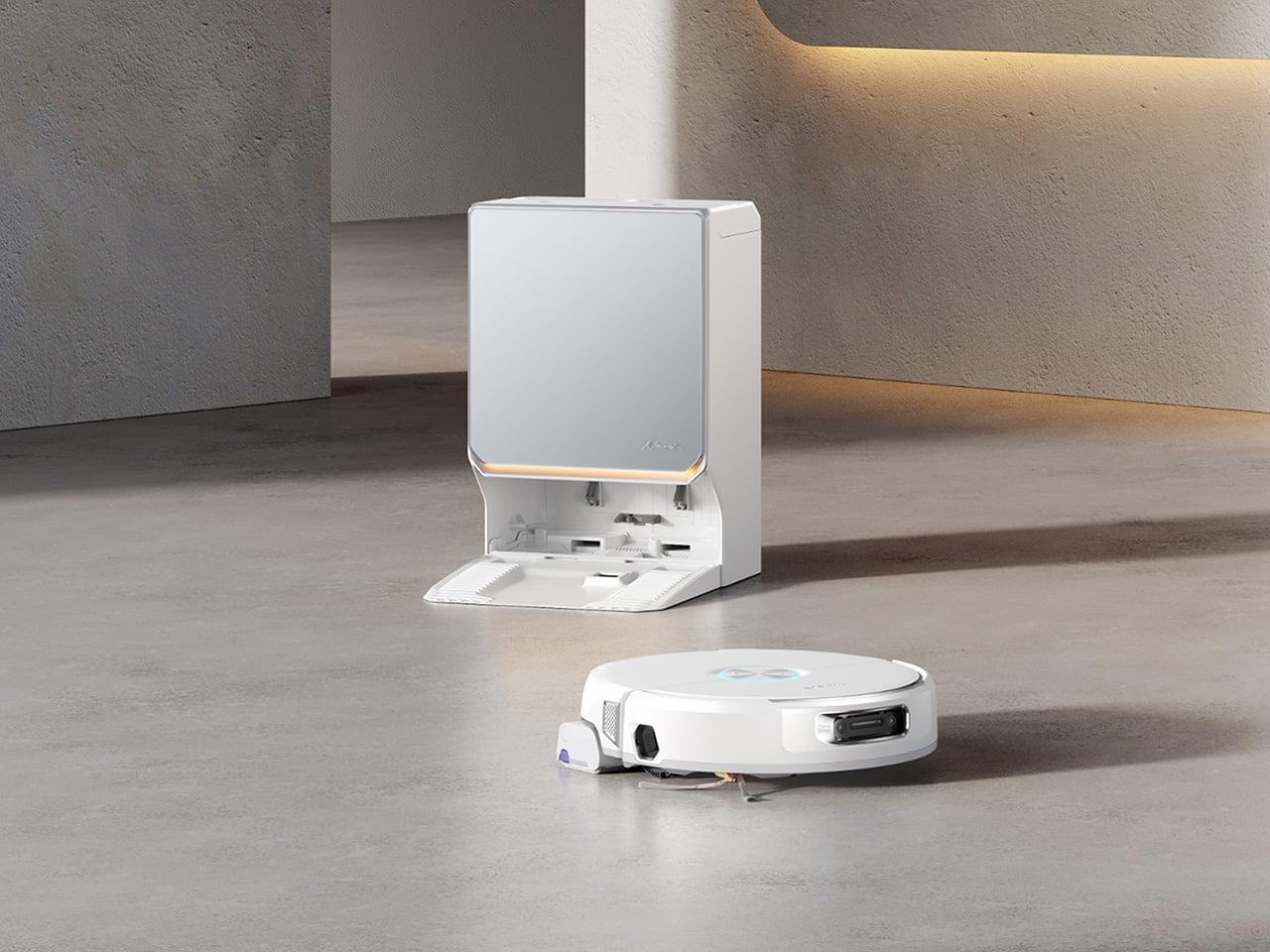
Robot vacuums and pet homes have always had a complicated relationship. Hair wraps around the brush, filters clog faster than the maintenance schedule allows, and the machine ends up parked in the corner half the time. The Narwal Flow 2 White addresses that at the hardware level before asking for any trust. A certified detangling system eliminates hair tangling. A 31,000 Pa motor handles the volume that stops most competitors mid-session. Pet Mode maps your animal’s active zones and adjusts cleaning paths accordingly.

The white colourway matters more than it sounds. Most robot vacuums read as appliances, objects you notice when working and ignore otherwise. The Flow 2 White sits closer to quiet luxury, a thing you leave in the room rather than hiding beneath furniture. Find My Pet uses the onboard camera to locate your animal from your phone on demand. A FlowWash mopping system heats water to 140 degrees for a result that goes well beyond what surface-level mop attachments typically deliver at any price.

Click Here to Buy Now: $1069.99 $1499.99 ($430 off, use coupon code “YDNARWAL”). Hurry, deal ends in 48-hours! Website Link Here.

What we like:

  • Pet Mode and the certified detangling system treat pet ownership as a design constraint rather than a marketing hook
  • Find My Pet and AI Floor Tag add genuine daily utility beyond the core cleaning function

What we dislike:

  • At $1,099.99 launch price, the commitment is significant for a category with a historically patchy reliability record

3. Sloddy
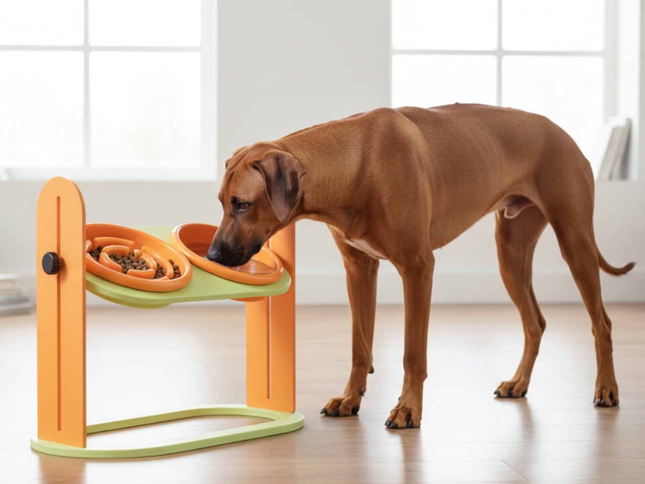
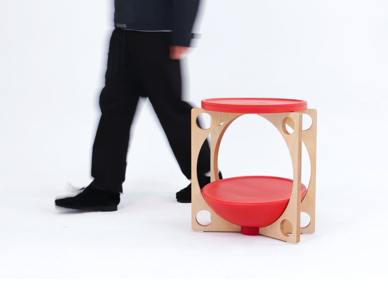
Slow feeders solve the problem once. Most dogs need about a week to learn the maze, and then mealtime returns to its previous five-second format. Designer Kyung-seo Yoo built Sloddy around that specific failure mode. The bowl ships with multiple interchangeable puzzle inserts at increasing difficulty levels, and you rotate them as the dog adapts. The challenge stays real. The eating pace stays controlled. It is a straightforward idea that the rest of the category never thought to try.

An adjustable MDF wood stand raises or lowers the bowl to match shoulder height, addressing a posture and digestion concern that most pet owners encounter long after they needed the fix. Every component disassembles fully for cleaning, with no corners that trap food beyond reach. The peachy-orange palette and warm wood base sit somewhere between kitchen object and design piece, and the recyclable cardboard packaging doubles as a storage shelf for the spare inserts once the box is opened.

What we like:

  • The modular difficulty system is the first meaningful update to the slow feeder format in years
  • Full disassembly for cleaning eliminates the trapped-food problem that makes most slow feeders a short-term purchase

What we dislike

  • The modular system only works if the owner actively manages the insert rotation — it requires consistent owner effort, and most households will default to leaving the same insert in indefinitely
  • The MDF wood stand, while visually warm, is vulnerable to water damage and splashing at feeding time, which is a daily reality with most dogs

 4. Pet Paws
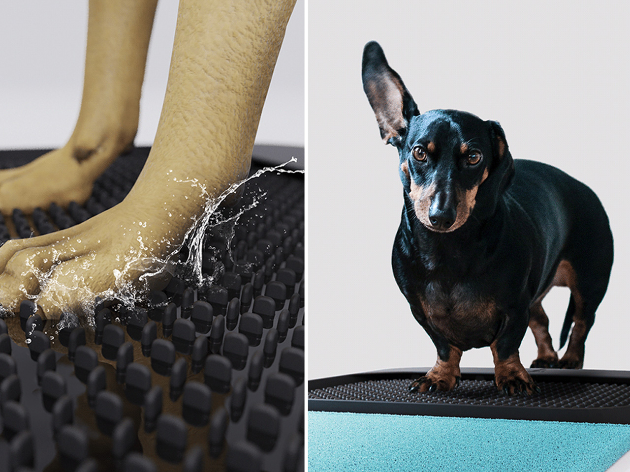
Paws are how the outdoors follows your dog into every room. Mud, grit, bacteria, and allergens come in with every return from outside, and a doormat or a towel handles it partially at best. This portable mat was designed to close that gap by combining three functions- cleaning, drying, and disinfecting- in a single object that sits where the problem actually begins. The all-in-one approach trades the multi-step routine by the door for something that takes seconds and requires nothing else.

The portability is part of the logic. A fixed solution only works at one entry point; a mat you can move adapts to wherever the animal actually comes in, which is rarely the same door every day. For households where paw hygiene connects directly to allergy management or general cleanliness standards, shortening the threshold routine without eliminating it offers something most door products never attempt: cleaning, drying, and treating in the same step, without a trip to the sink.

What we like:

  • Three-in-one functionality handles the most repetitive daily pet hygiene task without multiple products
  • Portable format adapts to wherever the animal actually enters, not just the main door

What we dislike:

  • The disinfecting function almost certainly requires a cleaning solution or refill, adding an ongoing cost and supply dependency that the headline promise of a single portable mat quietly glosses over
  • Dogs that resist paw handling or unfamiliar textures underfoot will need consistent training before the mat becomes a reliable part of the routine rather than something they walk around

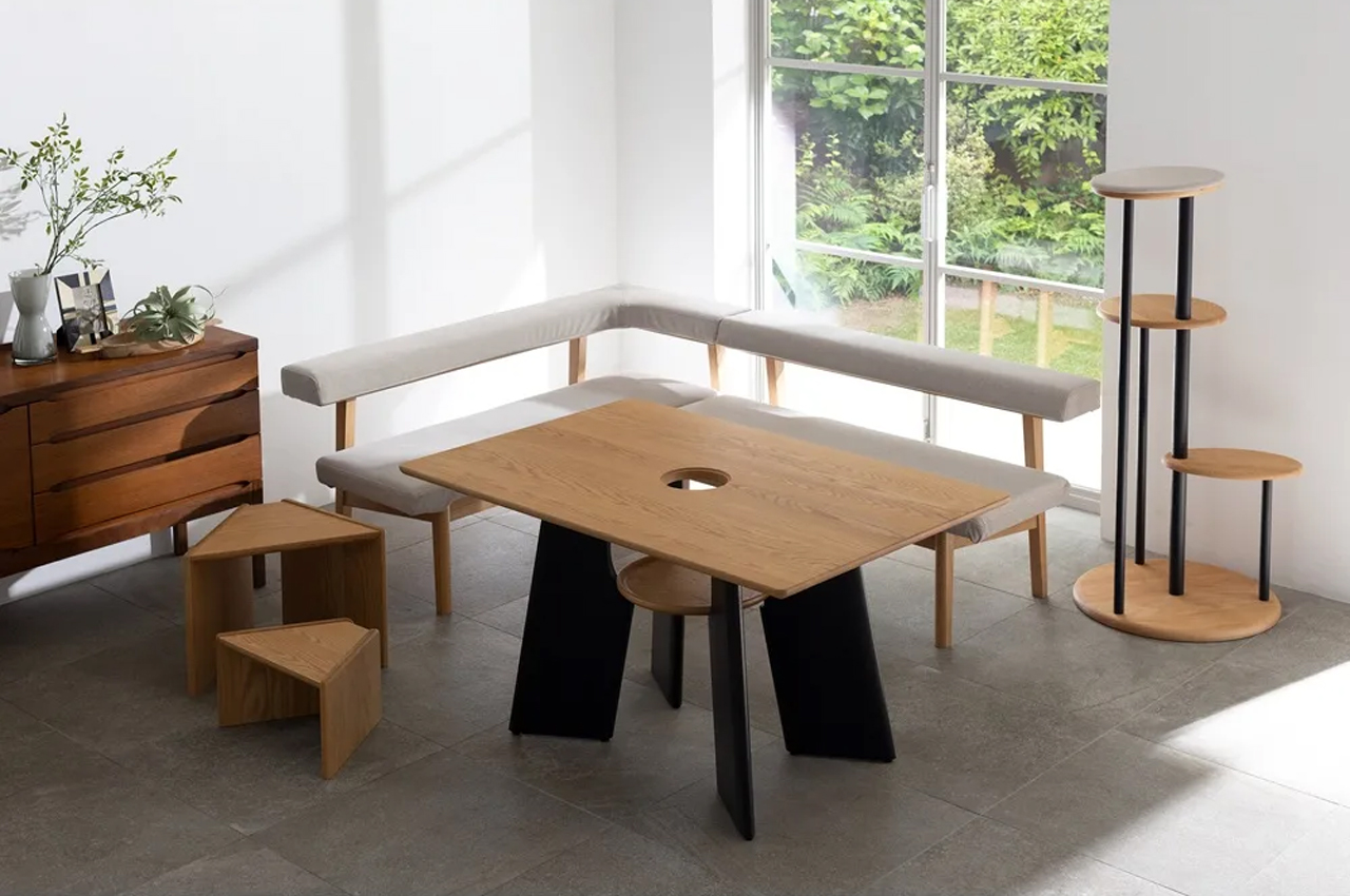
5. Dinos Cat WFH Table

Anyone who works from home with a cat recognizes the pattern. The animal locates the warmest, most centrally placed surface in the room and treats it as its own. The desk. The keyboard. The notebook. Japanese furniture company Dinos designed a table that accepts this behavior as a given and builds around it rather than against it. A center cavity in the tabletop creates a through-hole, and a hidden perching shelf beneath gives the cat a settled spot at the same level as everything happening above.

The logic is quiet and functional. Rather than competing with the animal for desk space, the table distributes the surface so both uses fit without interrupting each other. The cat sits close enough to its owner to settle down, without walking across the keyboard to get there. For anyone who has rearranged a work setup around a cat’s habits anyway, this just makes the accommodation honest, building it into the object rather than improvising it daily with a cardboard box and a folded blanket.

What we like:

  • Treats the cat as a design parameter from the start rather than an inconvenience to be managed around
  • The hidden perching shelf reduces desk negotiation without requiring any behavioral change from the animal

What we dislike

  • The center cavity is sized and designed specifically for cats, making it a non-starter for dog owners and narrowing the audience of this roundup in a way worth flagging before recommending
  • The table assumes the cat will use the designated perch, and cats are reliably indifferent to designated anything, meaning the design works best for animals already inclined to settle rather than roam

Good Design Has No Exceptions

Pet ownership has changed faster than the objects designed around it. The animals have moved into bedrooms, onto sofas, into daily routines in ways the existing product categories have not kept pace with. What this list represents is a small group of designers who noticed that gap and decided to close it, not by producing novelties, but by applying real design thinking to objects that have been overlooked or tolerated for too long.

None of these are impulse purchases or quick fixes. They are considered responses to specific problems, and that distinction matters. A cat tree that earns its spot. A vacuum that accounts for hair before it becomes a problem. A bowl that stays challenging. A mat that completes the threshold routine in one step. A table that accepts the cat before it ever arrives. That is what good design looks like when it reaches the right problems.

The post The 5 Home Upgrades Every Pet Parent Actually Uses (Not Just Buys) first appeared on Yanko Design.


  •  

The 5 Best Outdoor Gear of August 2026

August outdoor gear doesn’t get the editorial runway of spring launches or the pre-holiday push. That’s what makes it honest. The products landing in late summer have already been through a season of real conditions and arrive in the lineup on merit rather than timing. This month’s five picks cover the full range of what a serious outdoor day demands: shelter, light, cooking, carry, and sound. Each one addresses a problem its category had been handling adequately for years, then makes adequately feel like the wrong standard to have accepted.

What connects all five is a refusal to inherit the category’s old logic. A jacket that transforms into a tent. A flashlight built around actual daily carry. A backpack that zips apart into three genuinely usable bags. A speaker shaped like a jerry can, with 300 watts and a guitar input. A grill plate that reconfigures to the meal. August’s best gear doesn’t announce itself. It earns its place quietly, trip after trip.

1. Shelter Wear

Yoon Myat Su Lin designed Shelter Wear from a specific memory. The Tokyo-based fashion student experienced an earthquake in Myanmar and watched people left without temporary shelter in the critical hours before help arrived. That moment produced a single design question: what if the garment you were already wearing could become what you needed most? At first glance, the answer looks like structured techwear outerwear with a high protective collar and a silhouette that works as well in a city as on a trail.

The transformation is the design. Unclip a series of buckles, unfold the panelling, and the garment expands into a triangular tent that forms shelter around the wearer. The detachable sleeves double as backpacks before becoming structural components of the form. Ripstop materials and engineered fasteners hold the system together under real conditions, a claim validated by the YKK Special Prize at the 25th YKK Fastening Award. For anyone spending time in unpredictable terrain, Shelter Wear removes the gap between what you’re wearing and what you need.

What we like

  • The garment-to-tent transformation addresses emergency shelter at the level of what you’re already wearing, not what you remembered to pack separately
  • The YKK Special Prize validates the mechanical integrity of the fastening system well beyond the concept stage

What we dislike

  • Currently a student concept design, with production availability and final manufacturing specifications unconfirmed
  • The techwear silhouette reads as urban and may not suit every outdoor environment or wearer preference

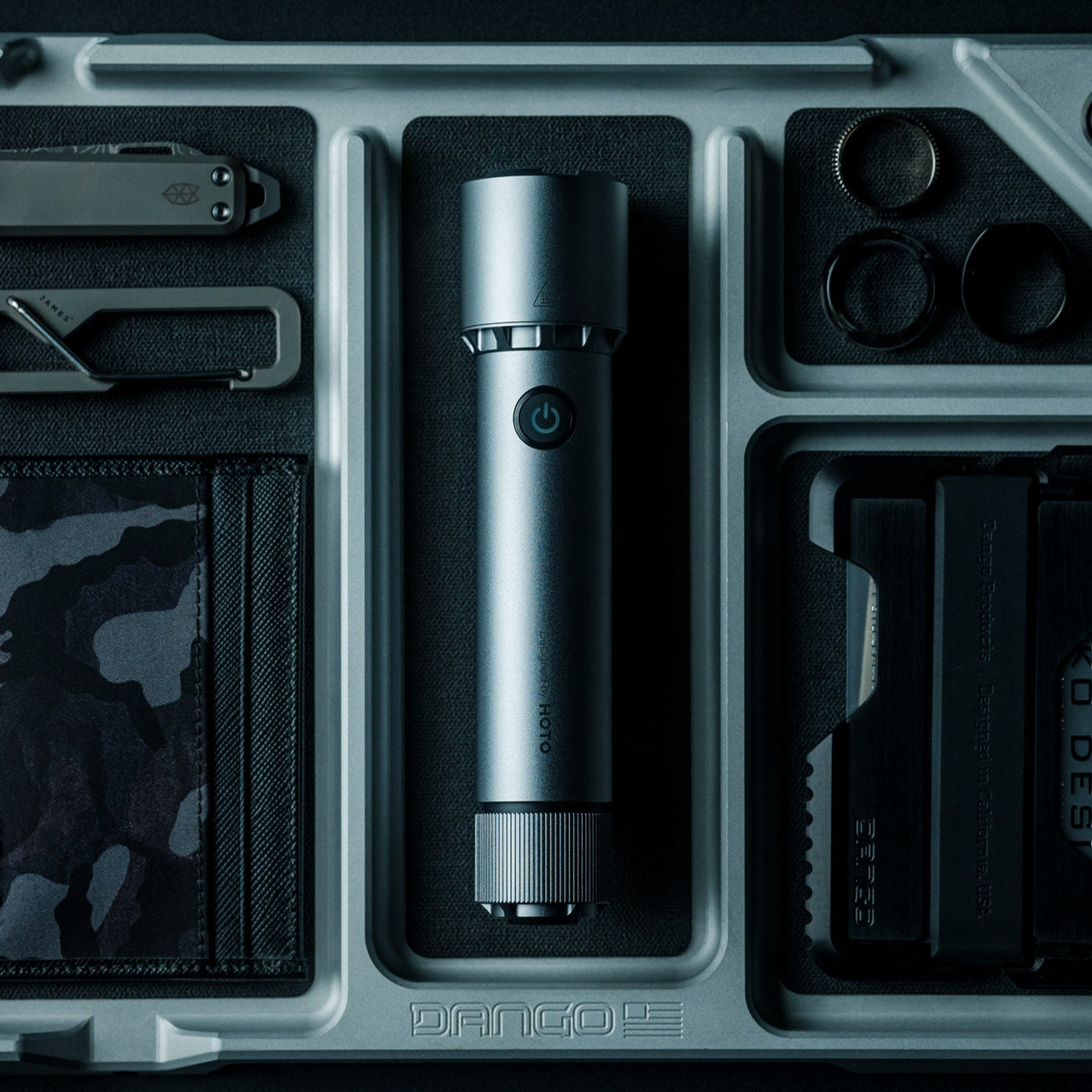
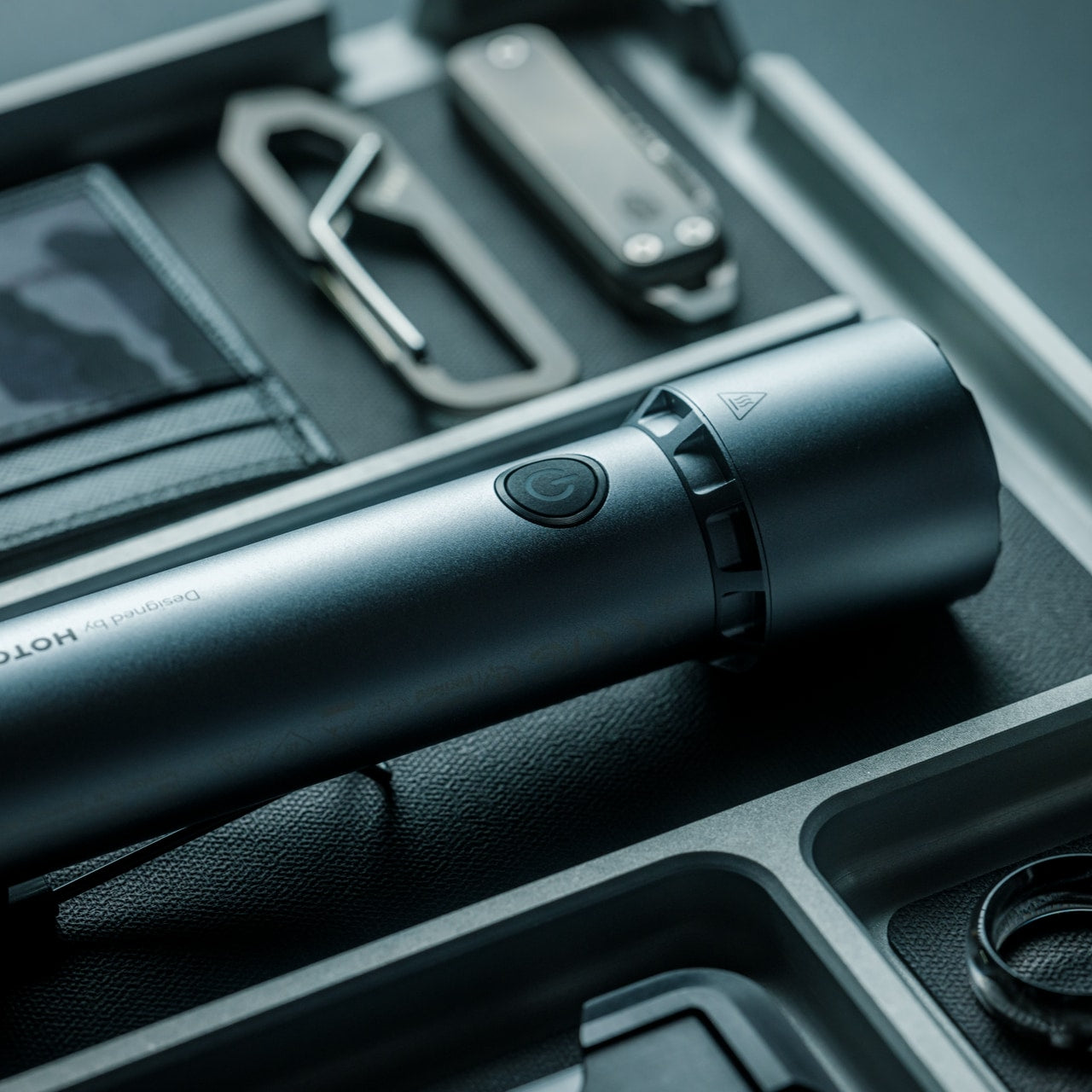
2. CasaBeam Everyday Flashlight

Most outdoor flashlights are built around a peak performance scenario: maximum output, maximum throw, maximum everything. The CasaBeam starts from the opposite end of that thinking. The “everyday” in its name is a design commitment, not a marketing qualifier. It’s sized and weighted for the person who carries their light not only on planned trail days but on every day between them, because those are often the moments that actually test whether your gear kept its promise.

That daily carry philosophy changes how the object performs for you. The pocketable form means it’s already on your person when you need it, not sitting in a pack you didn’t bring. The beam handles close-range campsite tasks and longer throws without demanding a deliberate mode change between them. For a flashlight that lives in your pocket rather than your kit bag, that standard matters every time you reach for it.

Click Here to Buy Now: $50.00

What we like

  • Sized and weighted for genuine daily carry, not just the planned outdoor days when remembering a flashlight is already obvious
  • The pocketable form keeps it accessible in the unplanned moments that a pack-stored light consistently misses

What we dislike

  • The everyday carry positioning means it isn’t optimized for the peak-output demands of technical night hiking

3. Modevo Trio

Man in a beige jacket and sunglasses walks along a sunlit urban street, carrying a large blue-and-black hiking backpack.

The design insight behind the Modevo Trio is one most bag companies avoid: a single pack that tries to be everything ends up the wrong thing across multiple scenarios. Onli Travel built the system in reverse, designing each of the three components as a genuinely usable standalone bag first, then engineering the connection points between them. The Core Pack is a 28-liter travel backpack with a clamshell opening and a functioning hip belt. The Link works as a briefcase or shoulder bag. The Go Daypack expands from 12 to 27 liters on its own.

Put all three together, and you get 58 to 73 liters of carry. Separate them mid-trip and each piece performs without producing a compromise product. Bluesign and OEKO-TEX certified water-resistant fabric with YKK zippers throughout reflects the build standard expected from a fourth-generation design. At $224 for the full Trio, it’s a considered purchase. For outdoor days that move between activities, the Modevo removes the most persistent pack complaint: that you brought the right bag for the first half of the day and the wrong one for the second.

What we like

  • Each component was designed as a standalone first, so separating the system mid-trip never produces a bag that only exists as a leftover from the combined configuration
  • Bluesign and OEKO-TEX certified fabric with YKK zippers reflects independently verified material and construction standards rather than self-reported claims

What we dislike

  • At $224 for the full Trio, the investment requires genuine confidence in modular carry as a system before committing
  • Three-bag systems introduce the real possibility of leaving one component behind when packing quickly or in low light

4. Jerry Can Speaker

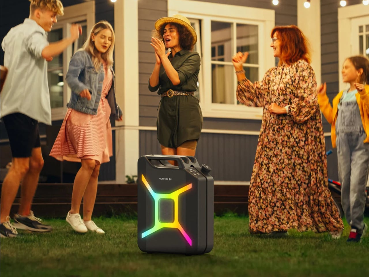
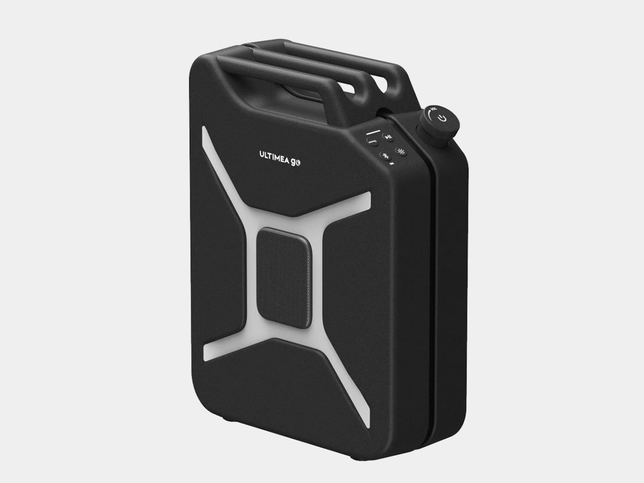
The Ultimea Go looks exactly like a jerry can. Not a loose visual reference or a softened modern take on the form: a full commitment to the fuel container silhouette, boxy proportions, handle and all. The design misdirection is deliberate, and it lands. Under that shell, dual 5-inch woofers, dual 3-inch full-range drivers, and a 1-inch tweeter deliver 300 watts of peak output through 360° omnidirectional sound that radiates in all directions rather than projecting from a single face, which matters when a crowd is gathered around it.

The guitar input is what makes this genuinely useful for you rather than just visually interesting. Two microphone inputs and direct instrument connection turn it from a passive playback device into something you can plug a guitar into at a campsite or a backyard set. Auracast support syncs up to 100 devices simultaneously without the timing offsets that come with daisy-chaining. Sixteen hours of battery and IPX4 water resistance keep it running through a full outdoor day without requiring repositioning or supervision.

What we like

  • Guitar and microphone inputs transform it from a playback device into one a musician can plug directly into on a campsite, which no comparable outdoor speaker in this class offers
  • Sixteen hours of battery and IPX4 water resistance handle a full outdoor day without monitoring, repositioning, or an overnight charge between uses

What we dislike

  • The full-commitment jerry can form is a deliberate design statement that won’t suit every camp aesthetic or setting
  • At 300W peak output, the power draw requires a reliable source, which adds planning for longer off-grid trips

5. Compact Modular Grill Plate

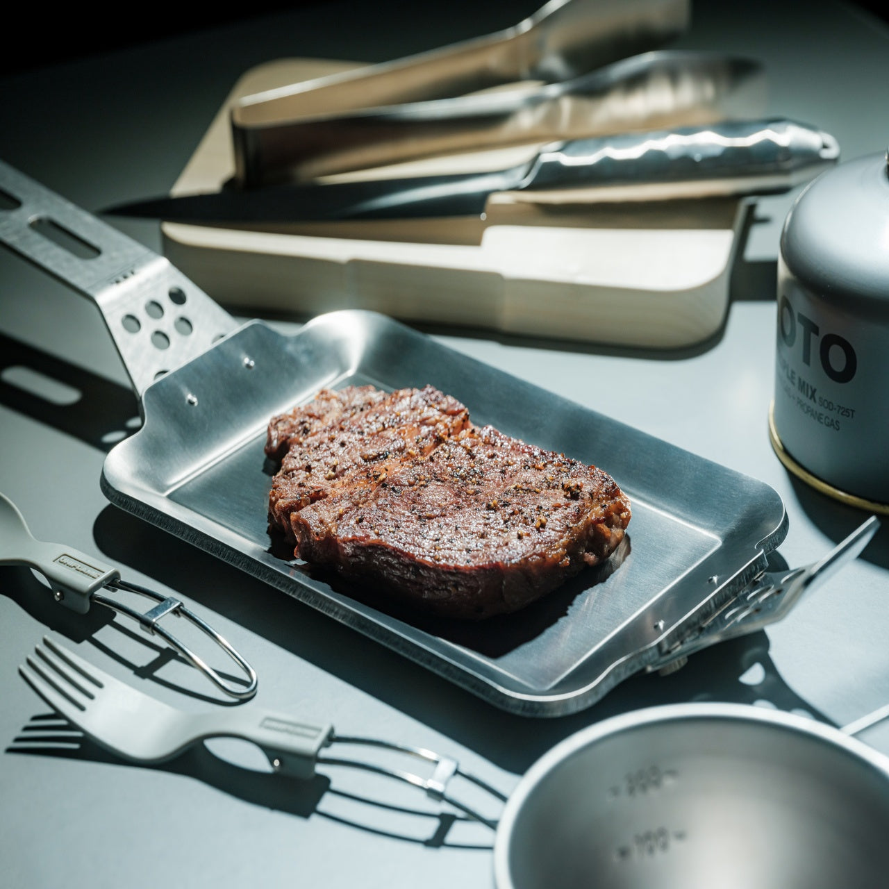
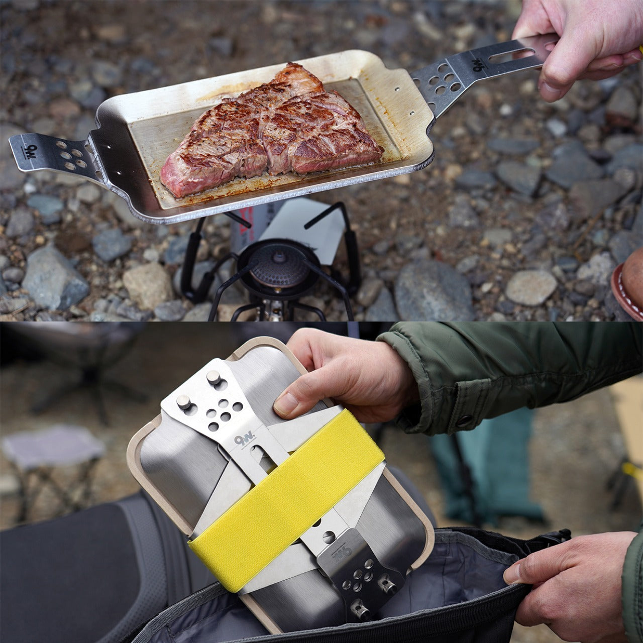
Most camp cooking surfaces commit you to a single method before you’ve decided what you’re making. The Compact Modular Grill Plate works differently. The modular design lets the surface be configured around the meal rather than the other way around, so the same piece of gear that handles a morning sear handles an evening cook without requiring a second surface in the pack. That kind of adaptability usually arrives with a bulk penalty. This one resolves the trade-off rather than asking you to live with it.

The compact form changes what you’re willing to bring on shorter trips. When cooking gear is bulky, it gets left behind. When it packs flat and reconfigures at the campsite, it earns a permanent slot in the kit. For camp cooking that doesn’t require a second thought about space, this is the surface that justifies its place on the first trip and holds it on every one that follows.

Click Here to Buy Now: $100.00

What we like

  • Modular configuration adapts to different cooking requirements without adding a second surface or additional weight to the pack
  • Compact form removes the space calculation that causes most camp cooking gear to get left at home on shorter trips

What we dislike

  • Modular systems require all components to be present and accounted for before setup, which adds a pre-trip organization step
  • Still requires a separate heat source, making it a cooking surface rather than a self-contained cooking system

The Gear Holds

The five products in August’s lineup cover every stage of a serious outdoor day. What connects them is a refusal to accept the performance floor their categories had settled on. The Shelter Wear asks why clothing stopped at decoration. The Modevo Trio asks why a single bag has to make compromises. Each product arrived here by questioning something the outdoor gear world had quietly stopped questioning, and all five are better for it.

Gear that earns long-term trust doesn’t announce itself on the first trip. It builds that trust through every trip that follows, quietly removing the small calculations and compromises that average equipment leaves behind. Take these five picks into real conditions, and the design decisions behind each one become self-evident in the best possible way. August’s outdoor gear doesn’t need a seasonal hook to justify it. It just needs the chance to perform.

The post The 5 Best Outdoor Gear of August 2026 first appeared on Yanko Design.
  •  

5 Best Back-to-Work EDC Upgrades That Actually Make Carrying Less Feel Like More

Summer does a reliable job of exposing what is wrong with your carry. Thinner clothes mean shallower pockets, and whatever has been accumulating since January starts demanding justification it cannot provide. The wallet that has been stretching since February, the key ring that jingles through every meeting corridor, the flashlight that has been dead for three weeks – they all resurface together as you pack a bag and head back. The loadout that survived winter is not the one that deserves September.

The five upgrades here share a single argument: fewer objects doing more work, or one object doing something with enough precision that the supporting cast stops being necessary. None of them ask you to carry more. Each one consolidates something you were already carrying into a form that earns its pocket space so completely you stop thinking about it. That is the standard. That is what back-to-work EDC should actually look like.

1. Olight Baton 4 Premium Edition

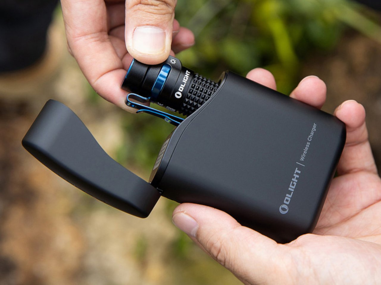
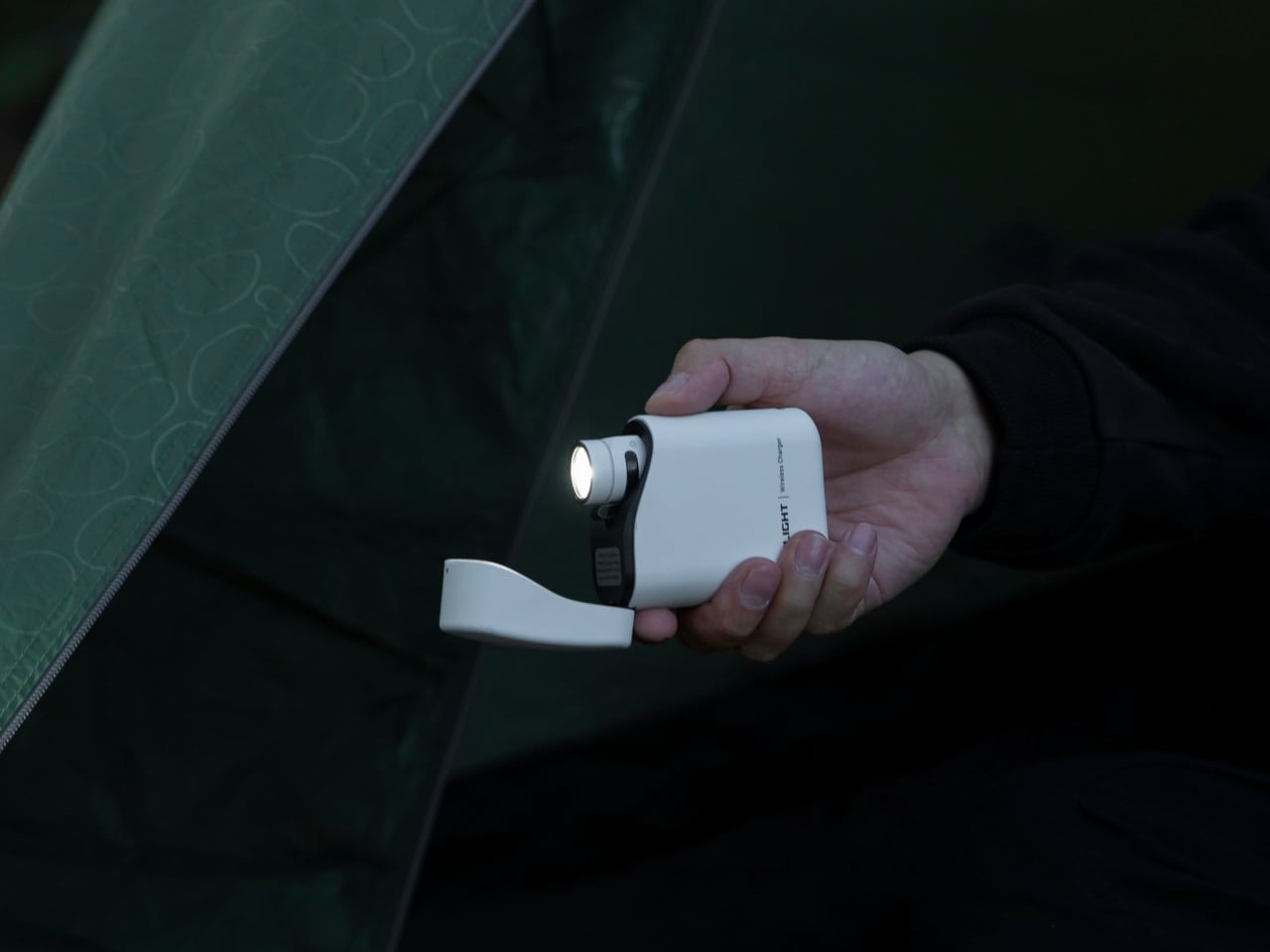
Most people heading back to work carry a flashlight and a power bank as two separate objects, in two separate compartments, with two separate charging cables neither of them can ever locate. The Baton 4 Premium settles that argument by making the charging case the second object, not the flashlight and the power bank as distinct things. The flip-top case carries 5,000mAh, recharges the Baton 4 up to five times, and allows you to activate the light without removing it from the case at all. Open the lid, press the side button, and the light fires. That single interaction collapses the gap between a flashlight that lives in a bag and one that is actually ready when something happens.

The 1,300-lumen output and IP68 waterproof rating handle the practical end of what a flashlight needs to do. The magnetic tail cap converts it into a freestanding lantern by sticking to any steel surface, removing the need for a separate camp light in most outdoor situations and proving genuinely useful in an office during a power outage. For a loadout returning to structure after a summer of loose carry habits, the Baton 4 Premium makes the case that two carry problems can be resolved by a single considered object. That is the only standard that matters right now.

What we like

  • The charging case serves as a functional 5,000mAh power bank and activates the flashlight without removing it – two carry problems resolved by one object instead of two
  • The magnetic tail cap frees both hands during stationary tasks without requiring any additional accessories, stands, or setup

What we dislike

  • Maximum brightness draws battery down faster than lower output modes, which means more frequent recharging on heavy-use days and more reliance on the case as a compensating mechanism
  • The case adds volume to the carry; users wanting the flashlight alone will need to leave the power bank function behind, which partially defeats the premise of carrying less

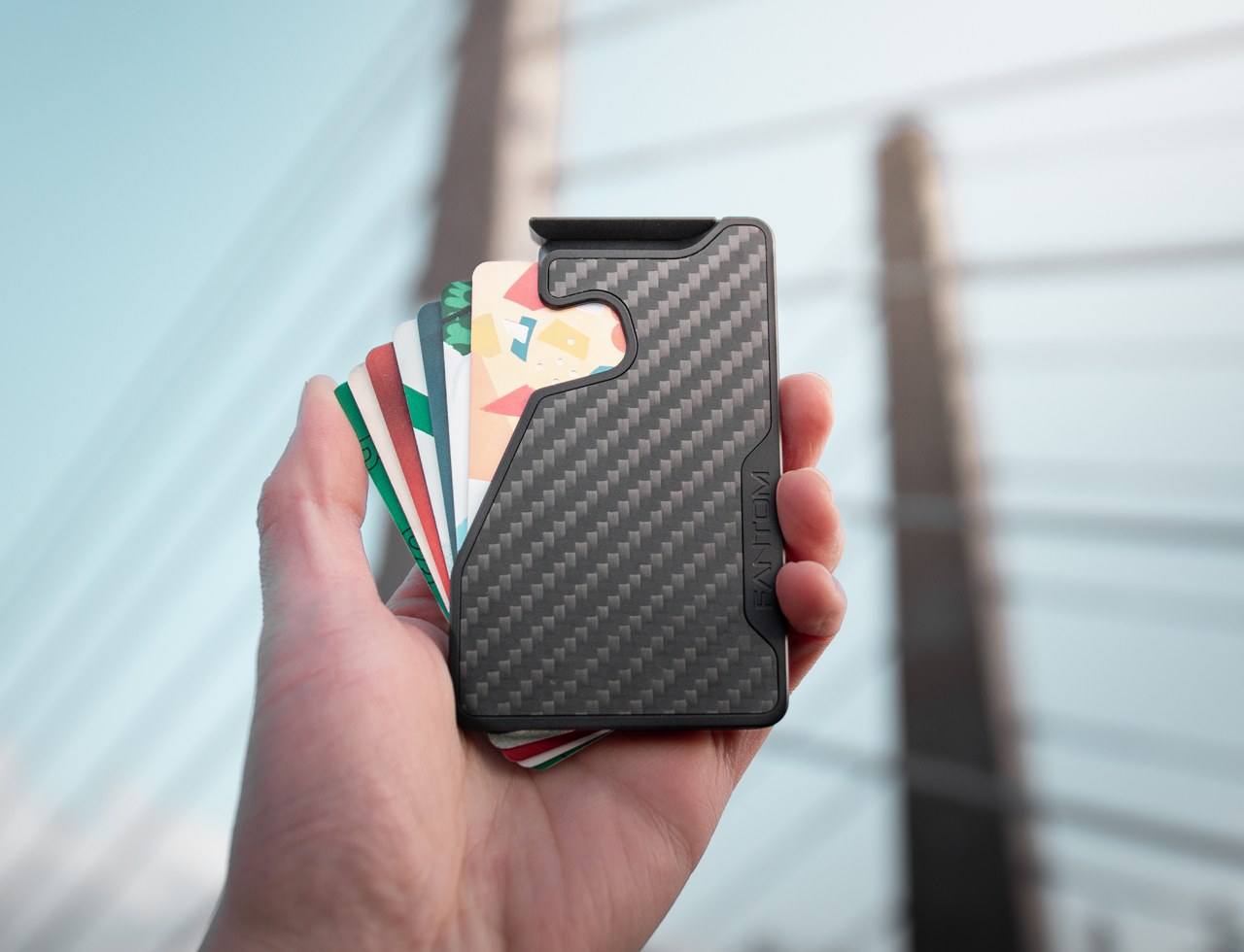
2. Fantom X Wallet

The wallet category has been failing quietly for decades. Leather stitching stretches, bifolds accumulate receipts nobody asked for, and elastic bands lose tension in months rather than years. The Fantom X approaches the problem as an engineering challenge rather than a craft one, building the chassis from machined aluminum, retaining cards mechanically, and adding a spring-loaded ejection system that fans your cards in sequence at the press of a button. Nothing in its construction is soft, which means nothing in this wallet degrades.

The design logic is borrowed from product categories where material failure is not tolerated. A bead-blasted aluminum body carries the same engineering rationale as the titanium tools that dominate the better end of the EDC market: fewer materials, one mechanism, no organic components that can rot or stretch under daily use. Cards are organized by ejection sequence rather than pocket habit, which introduces a useful kind of intentionality about what actually deserves a slot. Heading back to work with a wallet this considered makes the chaos of a stretched billfold feel like a problem you solved rather than one you are still living with.

What we like

  • Machined aluminum construction eliminates the stretching, cracking, and wear patterns that define the lifespan of leather and fabric wallets across every price bracket
  • The spring-loaded ejection fans cards in sequence, removing the fumbling that every other slim wallet format still requires at the checkout counter

What we dislike

  • The mechanical ejection system has a learning curve for anyone switching from a traditional bifold, and the first week of carry involves genuine reorientation
  • Cash carry is minimal depending on configuration, which limits practicality for anyone who still moves through the day with notes in their pocket

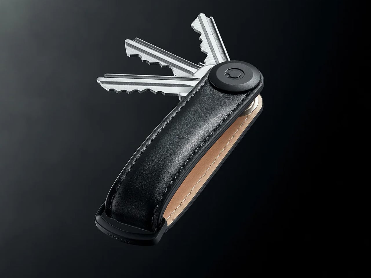
3. Orbitkey Key Organiser

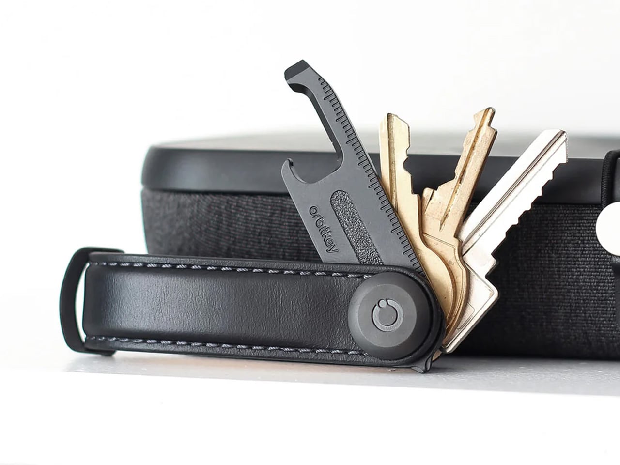
A standard key ring solves the organizational problem with the bluntness of something designed before pockets had size constraints. Keys stack against each other, jingle against everything nearby, and press ridges into the thigh pocket of work trousers for eight hours straight. The Orbitkey stacks two to seven keys flat inside a full-grain leather spine secured with stainless steel hardware, held under tension, producing no movement and no sound when the system is closed. In a pocket, it disappears entirely.

The leather exterior develops its own grain and wear pattern over years of daily use, an explicit design position about longevity that most keychain products never bother taking. The two-screw expansion system accommodates keys confidently up to its rated capacity, and a small ring attachment handles anything that does not stack flat inside the body. Five colorways run from black dress leather to warmer cognac tones, covering the full range of what a work bag demands. Heading to the office with the Orbitkey in your pocket for the first time, the first thing you notice is the absence of sound from your keys. Then you stop noticing it, and that is the point.

What we like

  • The tension stacking system eliminates key jingle, which sounds like a minor quality-of-life gain until you experience the cumulative quiet of a full working day without it
  • Full-grain leather construction ages into character rather than showing damage, signaling a product built to outlast the annual trend cycle by a significant margin

What we dislike

  • Initial key installation involves a screwdriver and careful threading – not difficult, but the setup time is a real first-use commitment that catches some buyers off guard
  • Oversized or irregularly headed keys may not stack cleanly within the system’s geometry, which is worth confirming before purchase rather than after

4. KeyUnity KK08 Titanium Carabiner Knife

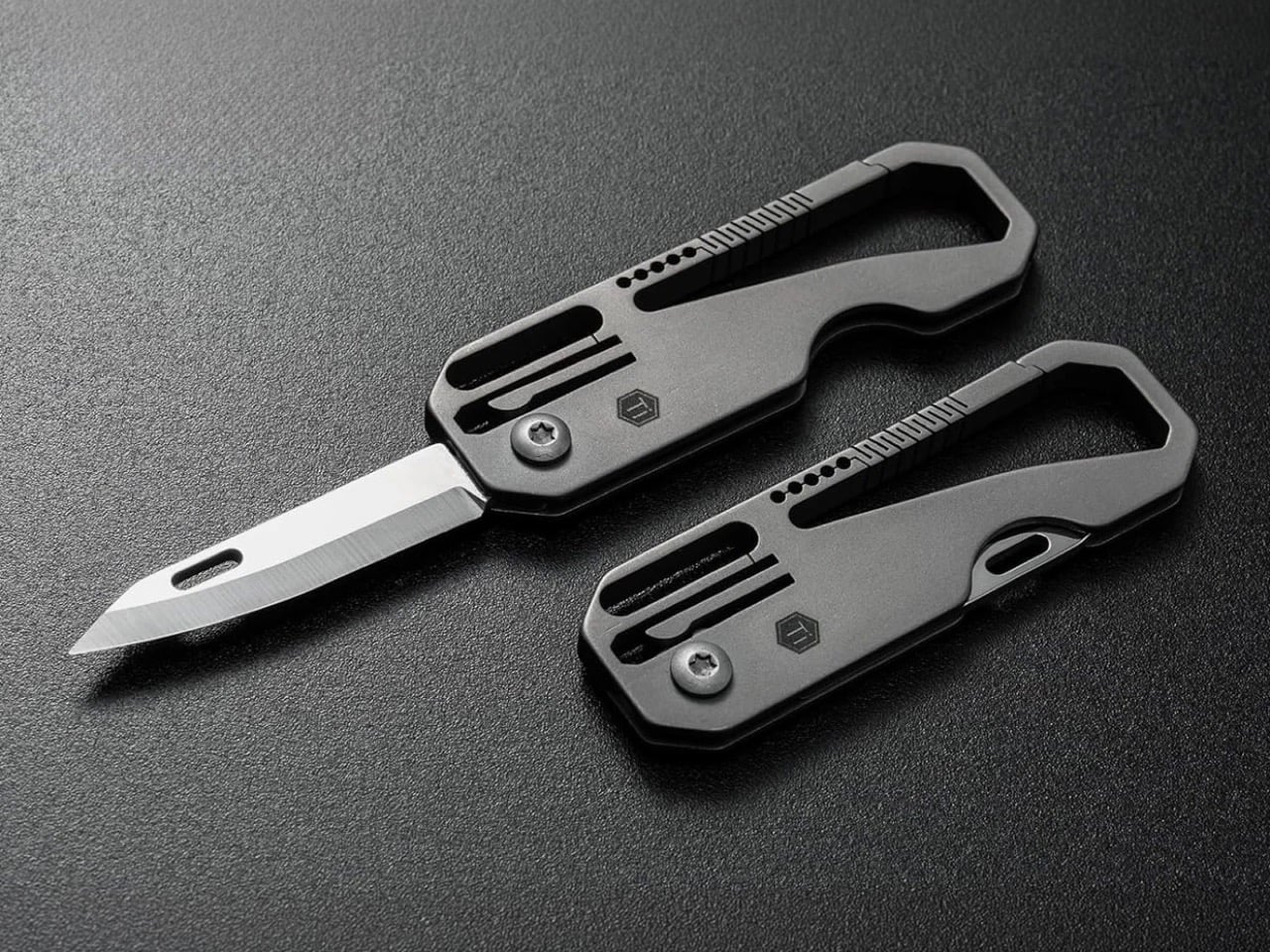
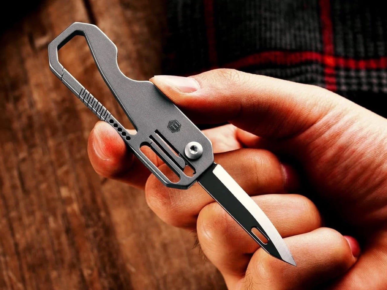
The carabiner is one of the most underutilized platforms in everyday carry. Most examples handle clipping and nothing else, occupying keychain real estate without justifying it with more than a single function. The KeyUnity KK08 corrects that by integrating a deployable blade directly into the gate of a TC4 Grade 5 titanium carabiner. One object handles clipping, carrying, and cutting without requiring any tool swap. The blade locking mechanism operates independently from the carabiner gate, keeping both functions discrete and deliberate rather than tangled.

TC4 titanium earns its place here for the same reason it appears throughout the better end of the EDC market. Corrosion-resistant, strong relative to its weight, and completely indifferent to the wear conditions that define outdoor carry. On a carabiner that lives clipped to the outside of a bag or attached to belt hardware, that resistance matters considerably more than it does for something sitting at the bottom of a pocket. The KK08 simplifies the question of what to clip things with by answering a second question at the same time – the most honest argument any carry tool can make.

What we like

  • Two functions in one form factor means the carabiner earns twice the keychain space it would otherwise occupy, which is the cleanest possible argument for carrying it daily
  • TC4 Grade 5 titanium construction handles outdoor exposure and weather without the corrosion concerns that affect steel alternatives over extended carry

What we dislike

  • The integrated blade deployment requires some familiarity with the gate mechanism before it feels genuinely intuitive in the moment you actually need it
  • Carabiner knives occupy a legal gray area in certain jurisdictions, so confirming local blade regulations before daily carry is worth the time it takes

5. Titaner Swing Ratchet System

A standard ratchet needs 15 to 30 degrees of swing arc to advance a single tooth. That is a workable trade-off in open space and a complete failure in the places where screws actually live: behind cables, inside recessed housings, angled into corners that no straight tool can reach. The Titaner Swing Ratchet compresses that arc to 4 degrees, which means it can cycle in gaps where conventional ratchets physically cannot complete a single turn. CNC-engraved directional markers on both sides of the core remove any guesswork from direction selection.

At 29.8 grams, it sits 40 percent lighter than a traditional ratchet while delivering full torque through a modular system that accepts different bit configurations. Back-to-work projects – tightening workstation hardware, adjusting studio furniture, building out a new desk setup – involve screws in confined locations far more often than they involve screws in clear, open space. A ratchet that reaches those positions at under 30 grams earns its pocket space across a full working season rather than waiting in a tool bag for a task large enough to justify the trip back to get it.

What we like

  • A 4-degree swing arc allows operation in spaces so confined that standard ratchets cannot cycle at all, solving the one problem no other tool in this roundup attempts to address
  • At 29.8 grams, it is genuinely light enough for daily carry rather than tool-bag-only use, which changes how often it actually gets reached for

What we dislike

  • The ultra-compact ratchet head can feel less assured under heavy torque loads compared to a full-sized alternative with more leverage to draw from
  • It earns its pocket space most clearly when fastener access is a regular part of your week; for purely occasional use, the weight-to-frequency ratio may not always close the argument

Editor’s Choice: ClearSlide Box Opener

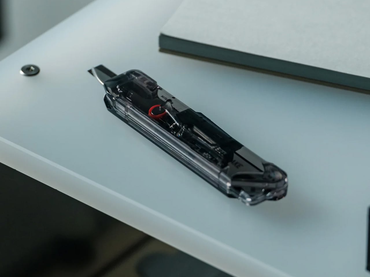
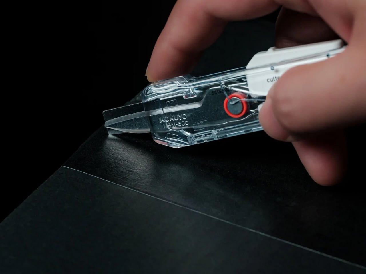
Every back-to-work loadout eventually faces the same moment: a delivery arrives, you reach for a box cutter, realize you also need scissors to deal with the tag inside, and end up setting the box down to find a second tool. The ClearSlide was designed specifically to end that exchange. A smooth sliding thumb mechanism switches between lock, cutter, and scissors in a single hand motion, then cuts with the same thumb – without ever putting the box down. It is a two-tool problem resolved by one object small enough to live on a desk or disappear into a pocket.

The 0.12-inch blade extension is deliberate rather than conservative. It slices through packaging tape cleanly while keeping enough distance from the contents that you are not second-guessing every cut. But the detail that earns it Editor’s Choice is the transparent body. The red slider and internal mechanism are fully visible through the shell as you cycle through positions, each one locking with a crisp click before releasing with a clean spring action. Instead of hiding the engineering, the ClearSlide makes watching it work part of using it – a small thing that changes the object from a utility purchase into something you actually want to keep on your desk. At $30, it is also the most straightforward decision on this entire list.

Click Here to Buy Now: $30.00

What we like

  • The single-hand sliding mechanism switches between box cutter and scissors without setting the package down – the exact problem it promises to solve, solved completely
  • The transparent body exposes every shift of the internal mechanism, turning a functional action into something worth noticing

What we dislike

  • The 0.12-inch blade is optimized for tape and packaging, not heavier cutting tasks that need more blade depth
  • Only a few units currently available, so if the ClearSlide catches your attention, the window to order without waiting is short

The Best Carry Is the One You Stop Thinking About

The best September loadout is not a longer list. It is five objects that between them cover a light, a wallet, keys, a clip, and a ratchet – each doing its job well enough that nothing else feels necessary – plus one desk tool that quietly removes a daily frustration you have been tolerating since the last time boxes started arriving. Nothing is left over. Nothing is missing. The edit is worth making now.

What changes when you get this right is not just the weight, though the weight does drop. What changes is the feeling of moving through the day without friction from the objects that are supposed to be helping you. The Baton 4 charges and illuminates from a single case. The Fantom X does not stretch. The Orbitkey does not jingle. The KK08 clips and cuts. The Titaner reaches where nothing else can. The ClearSlide handles the desk. That is the carry.

The post 5 Best Back-to-Work EDC Upgrades That Actually Make Carrying Less Feel Like More first appeared on Yanko Design.
  •  

5 Home Objects That Look Like They Belong in a Design Museum but Cost Less Than a Dinner Out

The design museum makes one quiet argument. Certain objects deserve to be looked at, and how a thing is made can matter as much as what it does. Most people accept this on a Saturday afternoon in front of a Noguchi lamp or an Eames chair, then go home to a shelf full of things nobody chose with the same intention. That gap is worth closing, and it does not require a renovation budget.

These six objects cost somewhere between a round of drinks and a dinner for two. None are functional in the way a charging cable is functional. They are functional in the way a good room is, changing how a space reads and getting noticed before anyone can articulate why. That quality has very little to do with price and everything to do with knowing where to look for it.

1. Carte Blanche Ceramics

Dutch designer Annebet Philips began this collection in cardboard rather than clay, cutting shapes with deliberately uneven edges and treating the paper prototype as the design language itself rather than a step to be discarded. Belgian brand Serax carries the result through to porcelain: a coffee and tea service that has since grown to include plates, a breakfast bowl, an egg cup, and a salt and pepper set. Every piece started as a childlike cutout on a blank page. Nothing about that origin was smoothed away in production.

What makes each piece genuinely strange is that it reads as a drawing of itself. Hand-painted black lines trace every fold and seam, giving cups and saucers the flattened quality of ink on paper rather than fired ceramic. Photographed straight on, a cup collapses into what looks like a quick sketch, the handle reading as a doodled loop rather than a ceramic ear. Everything is microwave and dishwasher safe, which keeps the concept in daily use rather than retreating to a shelf nobody touches.

What we like

  • The trompe-l’oeil effect holds in person, not only in photographs
  • Dishwasher safe at a design level that rarely permits it

What we dislike

  • Sold through Serax stockists rather than one direct channel, which makes sourcing specific pieces more work than it should be
  • Hand-painted lines vary slightly between pieces, which is part of the concept but can feel inconsistent in a matched set

2. ECHO Ceramic Speaker

Most speakers announce themselves. They sit on surfaces with blinking lights and trailing cables, with the general suggestion of being placed there temporarily. Kenji Abe’s ECHO arrives from the opposite direction. It is a glazed ceramic chamber built on the acoustic logic of a seashell and a cupped hand that looks exactly like a small vase. Slide a phone underneath, and the cavity carries audio outward in soft, diffused waves. No power. No pairing. Nothing to charge or set up.

The decision to use ceramic was not incidental. Ceramic belongs to the visual grammar of a home, the language of objects that have simply always been there, and ECHO uses that familiarity to disappear into a room entirely. A guest would not identify it as a speaker. The glazed surface catches light the way pottery does, and when the phone is gone, it stays on the shelf with the composure of something that was never trying to perform in the first place.

What we like

  • Looks like a ceramic piece because it is one, not a speaker wearing a vase disguise
  • No charging, no pairing, no batteries to deplete or replace

What we dislike

  • The amplification is warm and subtle rather than loud, better suited to a quiet kitchen than a busy room
  • Designed for smartphones placed directly underneath, which limits where in a room it can be used

3. Petal Vase

Every day, thousands of tons of cut flowers are incinerated at flower markets because they reached the end of their shelf life before a buyer arrived. Rebloom Studio, a Korean design practice, collects those discarded blooms, processes them into pulp with Korean paper pulp and a natural binder, and molds the result around an interior glass cylinder. The finished piece is a vase made entirely from flowers that never got the chance to be seen by anyone.

No two Petal Vases look alike. The flowers used to make each one determine its final color, texture, and edge profile. The jagged rim, the petal compression visible in the walls, the slight asymmetry in the silhouette- all of it is preserved deliberately rather than corrected in finishing. When the vase reaches the end of its life, the biodegradable shell returns to the earth. It is one of those rare objects where the material story requires no explanation because you can already see exactly where it came from.

What we like

  • Every piece is genuinely one of a kind, not in the marketing sense but the literal one
  • The biodegradable origin is visible in the object itself rather than printed on the packaging

What we dislike

  • Availability depends on Rebloom Studio’s production schedule, and stock from a small Korean studio can be intermittent
  • The rough, irregular surface is the whole point, but buyers expecting a conventional smooth ceramic finish may need to adjust

4. Delicato Tray

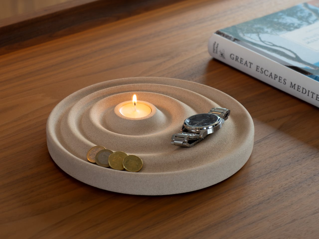
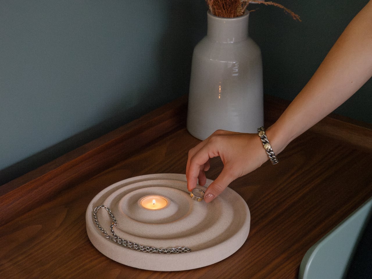
The entryway surface tells a familiar story, and it is rarely flattering. Keys land wherever there is space, coins scatter to the edges, a watch ends up beside a receipt from last week. Joao Teixeira’s Delicato Tray for Oftwise is cast from Jesmonite AC730, a water-based, fire-rated stone composite, in the form of a rippled disc. The concentric waves are asymmetric by design: wider at the outer ring for keys and glasses, tighter toward the center for rings and coins.

At the center of those ripples sits a recessed pocket sized for a tealight candle, turning the daily ritual of dropping your things at the door into something closer to a ceremony. Because the tray is hand-cast, no two are identical. Small air bubbles, subtle texture variations, and minor color shifts are natural byproducts of the process. The result is two kilograms of warm sandy stone that makes a surface look deliberately arranged before anything has been placed on it at all.

What we like

  • The hierarchy is built into the form itself, so organization becomes almost unconscious
  • Hand-cast production means no two pieces are identical, in the way that actually matters

What we dislike

  • At €235 it sits at the very top of the dinner framing, and that math depends on which dinner you have in mind
  • Currently available in one color, which limits how it integrates into darker or cooler interiors

5. Luna

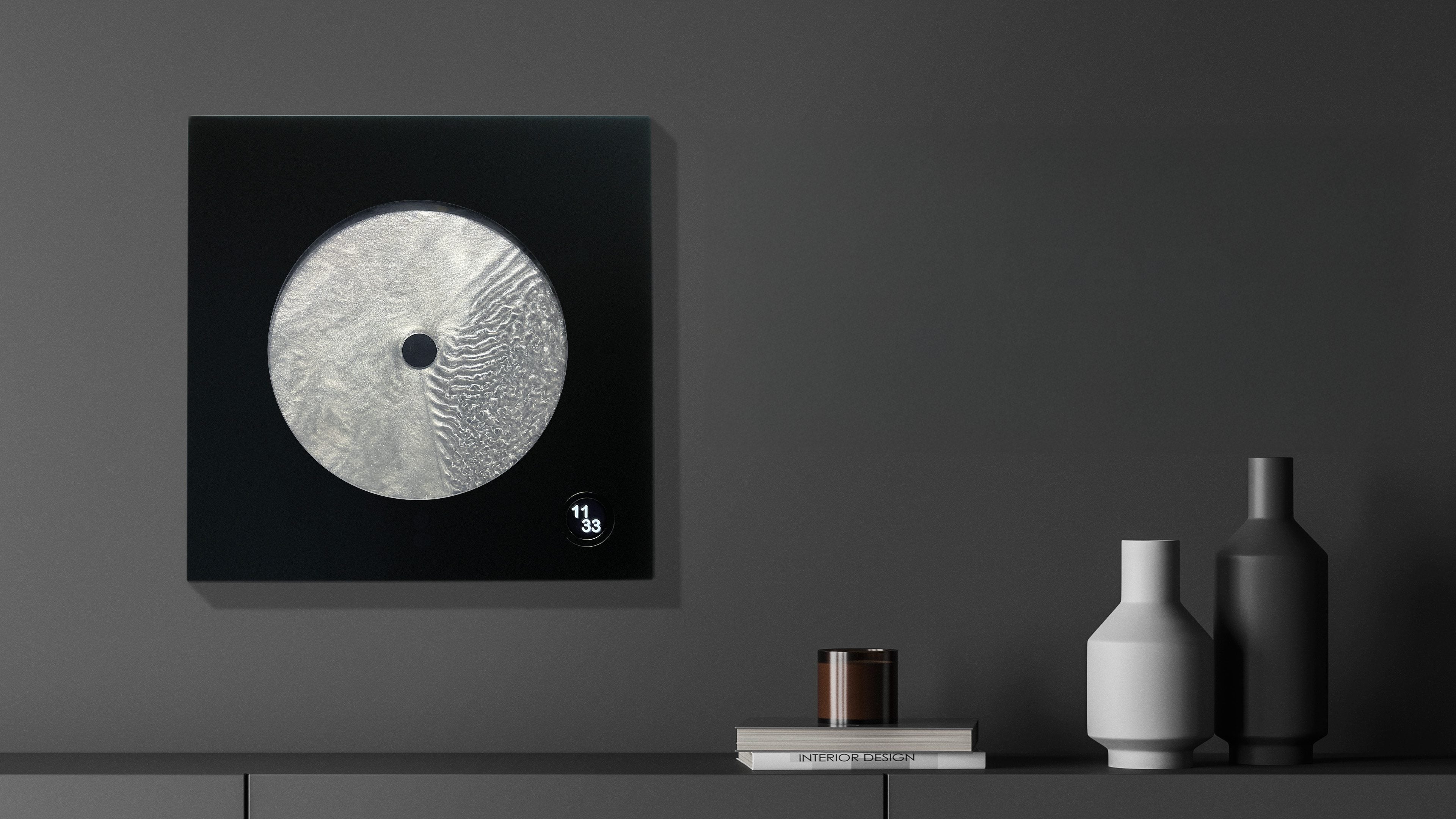
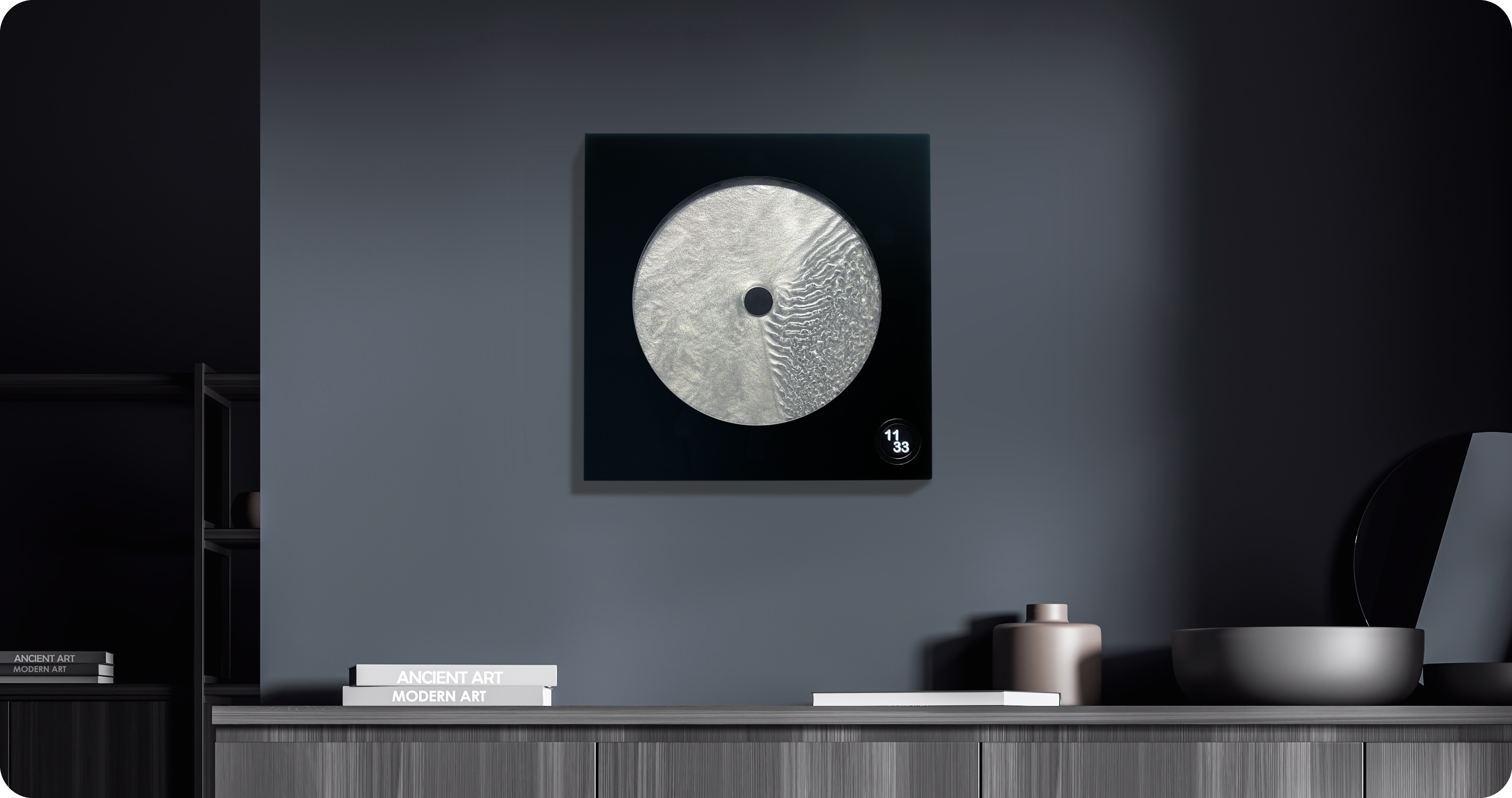
Robert Spillner spent years building components for Formula 1 teams before reversing the entire premise of his career. Instead of measuring speed, he built an object that stages time. Luna is a 400 x 400mm wall piece framed in matte black solid wood with a cast acrylic pane at its center. Inside, a single pointer moves through Zero Flow Technology, Spillner’s proprietary fluid made from distilled water, additives, micro-particles, and a small quantity of genuine lunar dust. Behind the pointer, turbulent patterns mark what has passed. Ahead of it, the liquid sits completely undisturbed.

The exact composition of the fluid is deliberately undisclosed, and that is the right call. The lunar dust is certified and billions of years old, documented with a certificate of authenticity that ships with each piece. Every Luna is signed, numbered, and limited to 99 per year, all made on demand in Germany. A small LCD touchscreen adjusts time and brightness without competing visually with the fluid. Spillner describes it as an art object with a time function, and the order of those words is correct.

What we like

  • The past-and-future visual logic is legible in the object itself, not only in the written description of it
  • Lunar dust certification and a limit of 99 per year make each piece traceable and unrepeatable

What we dislike

  • No public price is listed; the limited edition, handmade production profile suggests it sits above the other objects in this list
  • The 400mm square format demands a wall that can hold it as a singular focal point rather than one object among several

Editor’s Choice: Japanese Lantern Candle

The paper lantern is one of the oldest resolved problems in lighting design. How do you carry warmth from a candle flame into a room without losing it to the hardness of the fixture? Japanese designers worked through that question for centuries and arrived at a form that required almost no further development: a collapsible structure of thin ribs and translucent paper that diffuses candlelight into a soft, directionless glow.

What separates a well-made Japanese lantern from a decorative replica is the quality of light it produces and how it behaves in a room. Warm and sourceless, candlelight filtered through translucent paper fills a corner the way natural light from a small window does, without the hard edge of a focused lamp or the flatness of overhead lighting. On the floor beside a chair or a side table, it becomes the kind of object people notice and comment on before they have thought to ask what it is.

Click Here to Buy Now: $70.00

What we like

  • The quality of diffused candlelight it produces is genuinely different from any other fixture in a room
  • Stores flat, which matters in a small apartment where every permanent object has to earn its place

What we dislike

  • Works best as ambient lighting rather than a primary source for reading or close work
  • The candle paired with it needs to suit the scale and material to get the full effect

The Best Things in a Room Are the Ones Nobody Can Quite Explain

None of these objects ask for much. A shelf, a corner, a spare stretch of counter. They do not need a gallery to earn the attention they receive. What they share is the quality of being genuinely chosen, the sense that someone worked through a problem not just until it was functional but until it was right. That difference is immediately visible and, unlike most things in a home, it does not fade with time.

The museum argument is that certain objects deserve to be seen. These six make the same case from a kitchen counter, an entryway shelf, a bedroom wall. The price point is almost beside the point, though it helps. What matters is that buying thoughtfully and buying well tend to produce the same result: a home that feels assembled by someone who paid attention, rather than one that simply accumulated things over time.

The post 5 Home Objects That Look Like They Belong in a Design Museum but Cost Less Than a Dinner Out first appeared on Yanko Design.
  •  

Forget Your Old Loadout — 5 EDC Essentials Built for Summer 2026

Summer 2026 is a different kind of season for EDC. The carry conversation has matured past keychain gimmicks and bulk-heavy multitools into something sharper; gear that’s actually thought through, built from aerospace-grade materials, and designed with the same care as the objects that live on your desk. These five pieces represent the best of where that shift has landed: practical without being boring, minimal without being precious.

Whether you’re navigating festival crowds, weekend camping trips, or the daily urban grind, the right loadout isn’t about carrying more — it’s about carrying smarter. Each of the picks below earned its spot not through spec sheets alone, but through intentional design choices that make the experience of using them genuinely different. These are the five pieces worth making room for this summer.

1. Cubik Knife

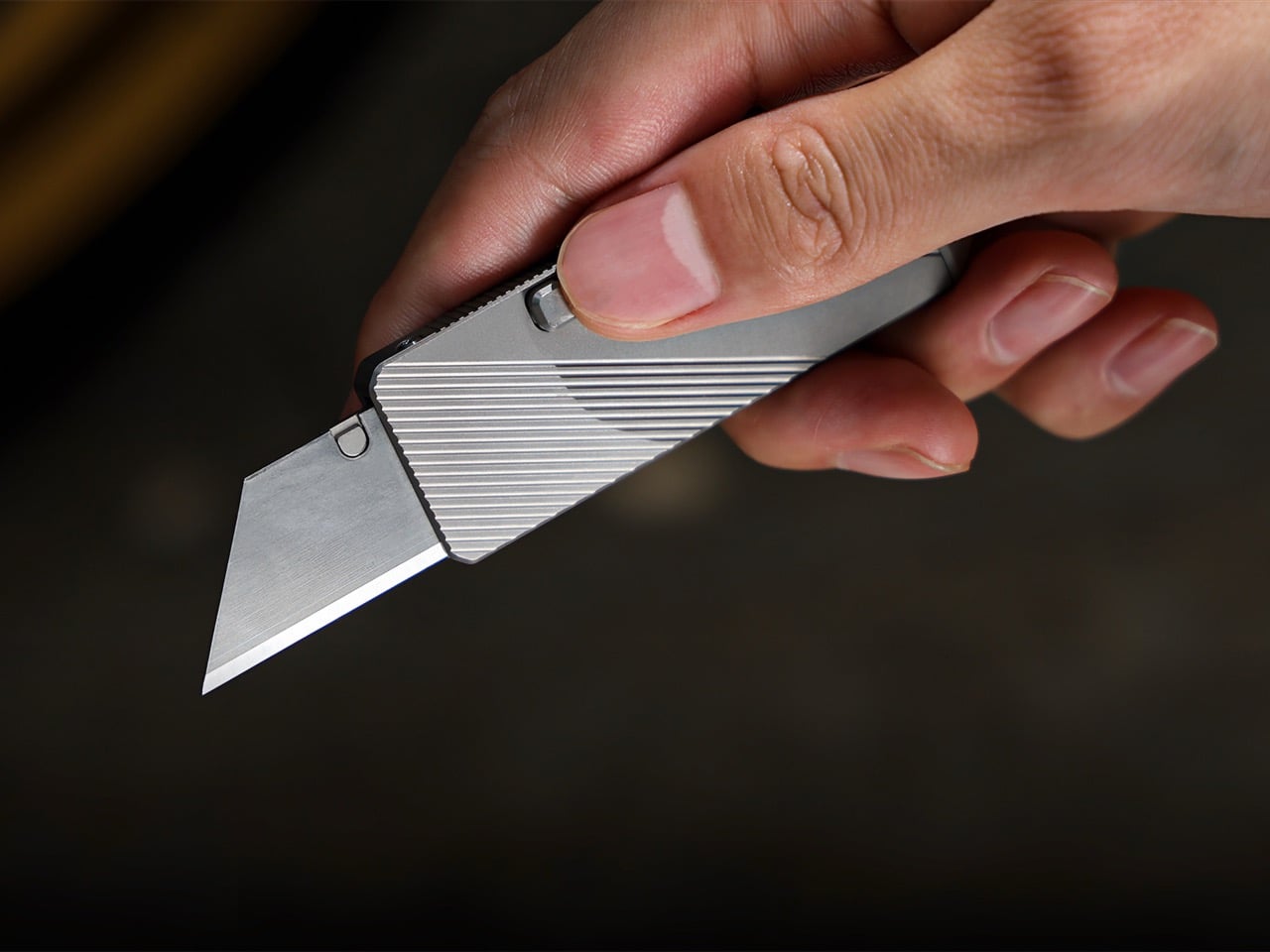
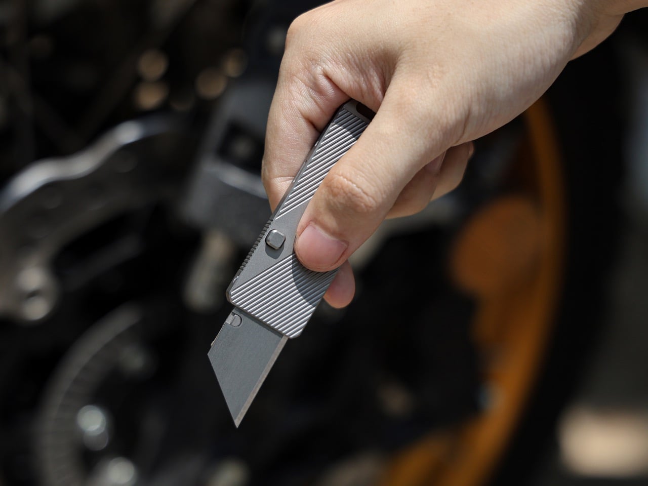
Gravity-powered deployment sounds more cinematic than practical — until you hold the Cubik. Designed by IF and machined from aerospace-grade titanium, this pocket knife opens with a button-flick and the natural pull of gravity: no springs, no mechanisms to fail, no audible snap. At 2.6 inches long, 0.98 inches wide, and just 0.2 inches thick, it slips into a pocket and disappears. The Cubik looks more like a designer flash drive than a knife, which is exactly the point — and what makes it so easy to live with every single day.

The blade runs a standard trapezoid utility format — the same geometry used to slice linoleum, roofing materials, acrylic, and thin sheet metals. When one edge dulls, flip it; when both are spent, swap it. That interchangeable format turns a consumable item into something genuinely sustainable over time. A deep-carry titanium clip keeps it flush to the pocket edge, and a tungsten carbide glass-breaker on the rear makes it a legitimate lifesaver when it counts. At $59 with five replacement blades included, it’s one of the most sensibly priced titanium tools in the category.

What we like

  • Gravity-flick deployment is spring-free, meaning zero moving parts to fail over time
  • Swappable trapezoid blades make the Cubik cost-effective and sustainable for long-term carry

What we dislike

  • The utility blade format won’t appeal to collectors who prefer a dedicated knife steel
  • Gravity deployment requires a deliberate wrist flick that takes a brief learning curve

2. 8-in-1 EDC Scissors

Most EDC scissors ask you to accept a compromise — either you get a folding design that sacrifices cutting power, or you get a rigid tool that’s too bulky to pocket. The 8-in-1 EDC Scissors from Eiger Design, available through the Yanko Design Shop, sidesteps both problems. Made in Japan and compact enough to sit in a palm at just 13 centimeters (5.1 inches) closed, it packs scissors, a knife, a lid opener, a can opener, a cap opener, a bottle opener, a shell splitter, and a degasser into a single carry-ready object.

The scissors themselves are the real story — full-strength blades that don’t rely on a collapsible pivot to achieve their compact profile, which means they cut with conviction through materials that foldable scissors would snag or mangle. The remaining seven functions are genuine, not ornamental. For summer specifically — camping weekends, beach cookouts, farmers market errands, festival packing — this is the kind of tool that earns its weight early and keeps earning it. At $53 through the YD Shop, it’s the most versatile item on this list per dollar spent.

Click Here to Buy Now: $59.00

What we like

  • Eight independent tools in a 5.1-inch, palm-sized package that’s genuinely comfortable to carry daily
  • Made-in-Japan manufacturing brings real precision to both the scissors and every secondary tool

What we dislike

  • The scissors-first form factor means the secondary tools can feel secondary in actual day-to-day use
  • Not the right call if you’re shopping for a dedicated cutting tool rather than a multitool

3. NoxTi

NoxTi is the kind of object that makes you reassess what belongs on your keychain. Designed by Xedge and built from Grade 5 titanium, it measures just 45mm and weighs 10.7 grams. The core of the piece is a tritium vial — a sealed, self-luminous insert that glows continuously for 25 years without batteries, charging, or any external power source. Quartz glass protects the vial from impact, and the titanium housing supports interchangeable vial options alongside a glass-breaker tip at the rear, making it far more than a novelty.

In practical terms, NoxTi solves a problem most EDC setups don’t realize they have: passive orientation in the dark. When your keychain is at the bottom of a bag, buried in a jacket pocket, or left on a nightstand, the glow orients you without reaching for your phone. That always-on, zero-input utility is a design philosophy most gear claims but rarely delivers.

What we like

  • Tritium vial delivers 25 years of passive, battery-free illumination with no maintenance required
  • Grade 5 titanium housing and quartz vial protection make it exceptionally durable for keychain life

What we dislike

  • At 45mm, it’s compact but will add noticeable length to an already-loaded keychain setup
  • Tritium vials are radioactive (safely contained, but a consideration for buyers who prefer chemical-free carry)

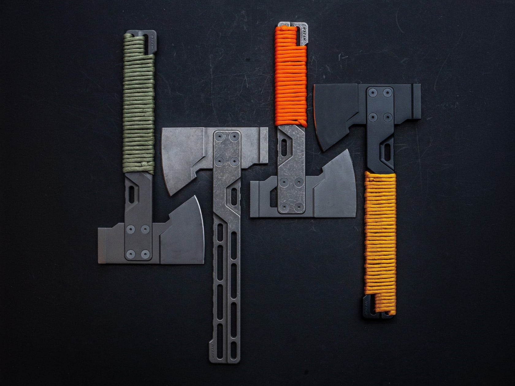
4. HYZER

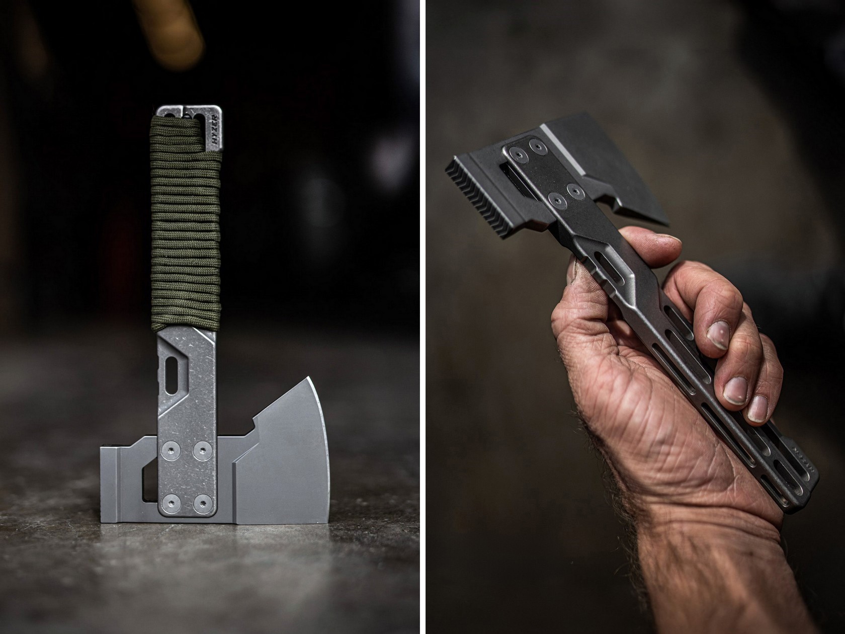
Exceed Designs doesn’t do anything conventionally, and the HYZER is the clearest proof of that. At its core, it’s a hatchet — but calling it that undersells the engineering. The handle is fully skeletonized and CNC-machined from a solid block of 6AL-4V Grade 5 titanium, available in two lengths: a full-size 9.75 inches or a compact 8.15 inches. The head runs on an infinitely modular nested system that lets you swap cutting formats without replacing the handle — a level of adaptability that no conventional hatchet even attempts.

For summer carry — backcountry hiking, basecamp setups, or serious van-life configurations — the HYZER changes the math on what a hatchet needs to be. The D2 steel axe head delivers serious chopping performance, while the titanium handle keeps the tool lighter than any steel-handled competitor in its class. The stonewashed finish gives it a visual identity that’s unmistakably premium without being precious about it.

What we like

  • The modular nested head system allows the HYZER to adapt to different cutting and splitting configurations
  • Full skeletonized Grade 5 titanium achieves meaningful weight savings without compromising structural integrity

What we dislike

  • The premium titanium and D2 material combination places this at a significantly higher price point than most seasonal carries
  • Two-handed hatchet operation demands dedicated pack space that the other four items on this list don’t require

5. BlackoutBeam Tactical Flashlight

A 2,300-lumen output in a tactical flashlight isn’t rare in 2026 — but a 2,300-lumen flashlight that looks like it belongs at a design exhibition rather than a military surplus store is still genuinely hard to find. The BlackoutBeam, available through the Yanko Design Shop at $90, pairs that blinding output with an industrial aesthetic that wears well whether it’s clipped to a backpack or sitting on a shelf. The 300-meter throw distance cuts through darkness with clinical precision, and the IP68 waterproof rating ensures it performs regardless of what summer throws at it.

Five operational modes — including strobe and pinpoint — give the BlackoutBeam tactical flexibility that goes well beyond on-off cycling. The 0.2-second instant-on response is the detail that separates tools built for designers from tools built for actual use: in a power outage, a trail emergency, or any situation where you need light immediately, that activation speed matters in a way that a spec sheet can’t fully communicate. With longer days turning into late evenings outdoors and camping season running hot, the case for a serious flashlight in your summer kit has never been more straightforward.

Click Here to Buy Now: $89.00

What we like

  • 2,300-lumen output with a 300-meter throw distance puts it firmly in professional-grade territory
  • A 0.2-second instant-on response time makes it genuinely dependable when the situation demands it

What we dislike

  • The tactical aesthetic reads as aggressive for carry setups that lean toward minimalist or everyday styling

The Best Loadout Is the One You Actually Think About

What these five pieces share isn’t material or price point…it’s intention. Every one of them was designed by someone who cared enough to solve the actual problem rather than approximate a solution. That’s the standard worth holding EDC to in 2026, and it’s becoming a higher bar to clear as the category matures and the market fills with near-misses. The best loadout is never the one with the most gear. It’s the one with the right gear.

Summer tends to be the season when carry gets edited down; lighter layers mean fewer pockets, and heat means less patience for bulk. These five designs all pass that test. They’re compact enough to disappear when you want them to and capable enough to matter when you don’t. Whether you pick up one or all five, the upgrade from whatever you’re carrying now is real.

The post Forget Your Old Loadout — 5 EDC Essentials Built for Summer 2026 first appeared on Yanko Design.
  •  

The 5 Best Tech Gadgets of May 2026

May 2026 is a good time to be paying attention. Gadgets aren’t just getting faster or thinner; the best ones this month are getting more intentional. There’s a shared thread running through every standout: each was built around a real constraint, a real behavior, or a real cultural moment, rather than a spec sheet searching for an audience. Five products rose above the rest, and each earns its spot for a distinctly different reason.

From a foldable phone that demolishes the category’s $800 price floor to a Nintendo Switch add-on that turns a gaming console into a live production rig, the range here is unusually wide. What connects them is the quality of thinking underneath. These aren’t renders looking for investment. They’re real objects designed to change how you work, listen, create, and move through a day. That’s the only brief that actually matters.

1. NASA Artemis Watch 2.0

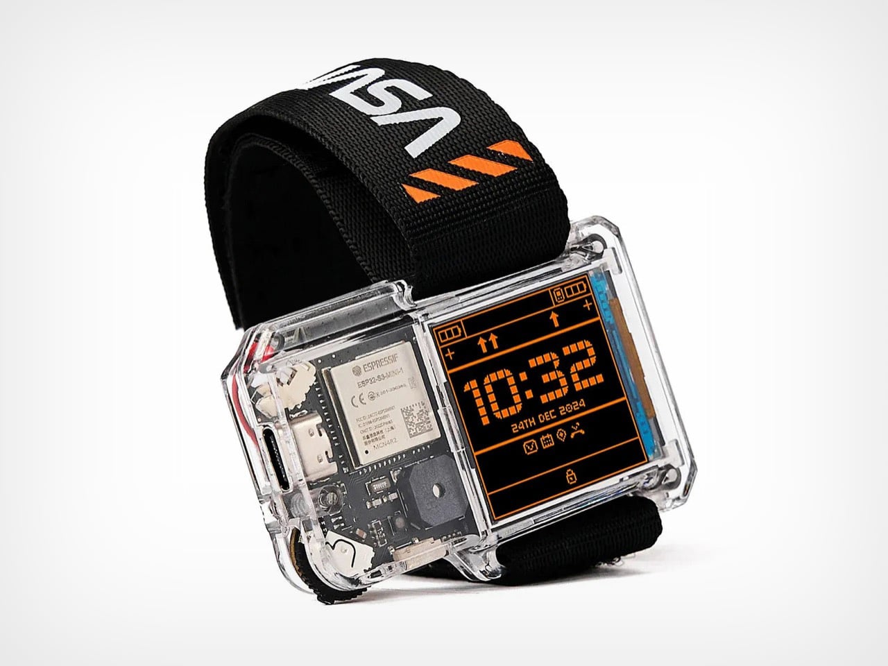
NASA’s Artemis II lifted off from Kennedy Space Center on April 1, 2026, carrying four astronauts on humanity’s first crewed lunar journey in over 50 years. CircuitMess timed the NASA Artemis Watch 2.0 directly into that cultural gravity. At $129, it’s a fully assembled, ready-to-use programmable smartwatch built around a dual-core ESP32 microcontroller, with a full-color LCD screen, accelerometer, gyroscope, compass, and temperature sensor packed into a wristband designed for anyone aged nine and up who wants more than a fitness tracker strapped to their wrist.

What makes it worth your attention is the depth it offers without demanding anything upfront. Out of the box, it pairs with iOS and Android over Bluetooth for activity tracking and notifications. When curiosity takes over, the firmware is fully open-source and reprogrammable in Python, CircuitBlocks, or the Arduino IDE. Build custom watch faces, write your own apps, and modify sensor behavior as far down as you want to go. The Artemis Watch 2.0 is one of the rarer gadgets at this price: it genuinely grows with the person wearing it.

What we like

  • Fully open-source firmware supports Python, CircuitBlocks, and Arduino, giving both beginners and experienced coders meaningful room to explore and build
  • Ships fully assembled and ready to use straight out of the box, lowering the barrier to entry without removing any of the technical depth underneath

What we dislike

  • At $129, it asks for more commitment than most impulse purchases in the kids’ tech category allow for
  • Screen performance in direct sunlight hasn’t been addressed in any available documentation

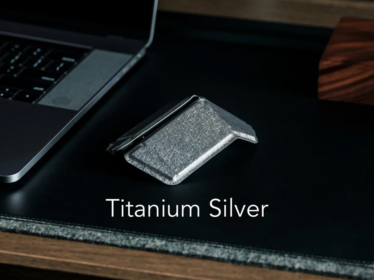
2. OrigamiSwift Mouse

Every frequent traveler has made the same quiet compromise: leave the proper mouse at home or carry something too small to work with comfortably for more than an hour. OrigamiSwift was built precisely around that problem. It’s a Bluetooth mouse that folds flat when not in use, weighs just 40 grams, and opens into full working position in under half a second. The origami-inspired form isn’t a styling exercise. It’s a structural answer to the oldest tension in portable peripherals: comfort has always cost you size.

The ergonomic shaping holds up across extended work sessions, which matters more than most product pages acknowledge. Whether you’re finalizing a presentation at an airport gate or editing documents in a co-working space, OrigamiSwift stays comfortable in your hand and disappears into a bag when you’re done. The ultra-thin profile and minimal build weight mean it never adds anything meaningful to your load. For anyone who genuinely works from wherever they happen to be, this is the mouse that finally makes sense to own.

Click Here to Buy Now: $85.00

What we like

  • 40-gram weight and flat-fold profile make it practically invisible in any bag, disappearing entirely until you actually need it
  • Sub-0.5-second activation means there’s no friction at all between being packed and being productive

What we dislike

  • Available listings don’t confirm DPI range or scroll wheel responsiveness for anyone doing precision work
  • Bluetooth-only connectivity may create compatibility friction with older desktop setups that lack wireless support

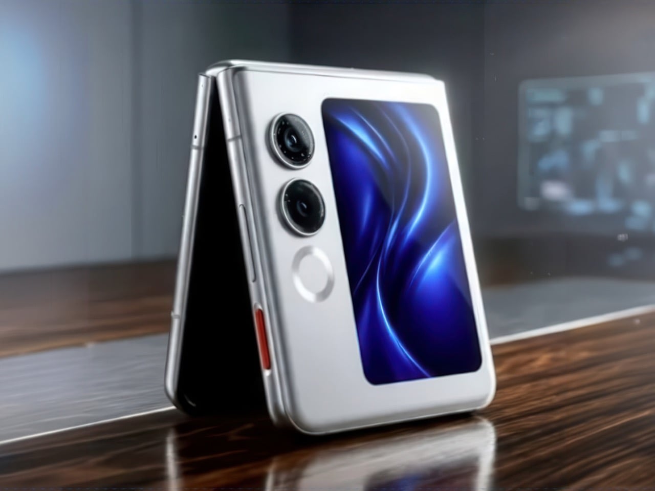
3. Ai+ Nova Flip

The foldable phone category has spent five years convincing itself that the flip experience carries a natural premium of $800 or more. Ai+ is testing that assumption head-on with the Nova Flip, launched in India at Rs 29,999, roughly $320, making it the most accessible foldable phone on the market. The inner display is a 6.9-inch AMOLED panel resolving at 2790 x 1188 pixels, complemented by a 3.1-inch AMOLED cover screen. MediaTek’s Dimensity 7300 handles processing, paired with 8GB of LPDDR4X RAM and 256GB of internal storage.

The spec list doesn’t read like a budget compromise. A 50-megapixel primary camera, a 32-megapixel front shooter, and a 4325mAh battery with 33W wired charging all hold credibly against devices at double the price. 5G, NFC, and an IP64 dust and splash rating close out a package that would feel serious in any category. The Nova Flip doesn’t just undercut the competition on price. It quietly forces a harder conversation about what the flip form factor has genuinely been worth at $1,000 all along.

What we like

  • $320 pricing opens the foldable phone experience to an entirely new audience that the category has ignored since its beginning
  • The 4325mAh battery is a genuinely surprising capacity for the flip form factor at any price point, let alone this one

What we dislike

  • The 2-megapixel depth lens reads as the weakest component in an otherwise strong and well-considered camera array
  • Long-term hinge durability at this price tier is unproven and worth tracking carefully over time

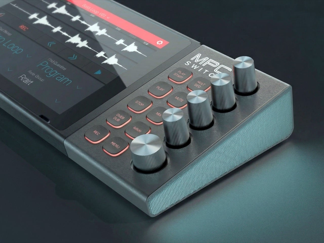
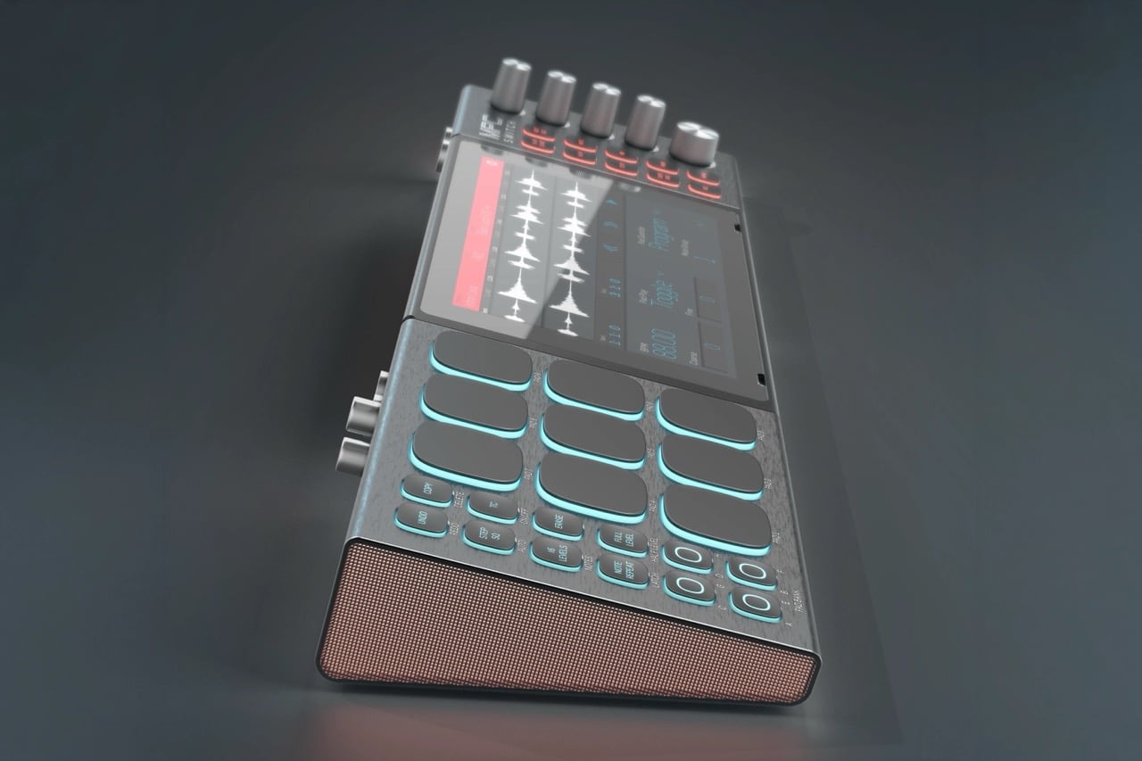
4. Akai MPC Switch

Alquemy’s Akai MPC Switch concept asks a question that feels obvious the moment someone finally puts it to you: if laptop-grade software can run on portable hardware, why can’t a capable gaming console handle serious music production? The MPC Switch is a pair of controller units designed to snap directly onto the sides of a Nintendo Switch, replacing the Joy-Cons with MIDI inputs, outputs, and a full DAW running on the console’s own screen. The control layout reflects real production workflows rather than a stylized render built for social media.

The appeal runs deeper than the novelty of the form. The concept treats the Switch as a legitimate interface surface: something you game on when you need to and produce or perform on when the moment calls for it. Swap the Joy-Cons for the MIDI setup, and you’re there. Whether Nintendo or Akai ever moves this into production is a separate question entirely, but Alquemy has made a persuasive case that the idea deserves a real answer. The best concepts don’t just look good. They make you wonder why nobody shipped it first.

What we like

  • MIDI integration and a credible DAW interface position the Switch as a serious production platform rather than a novelty peripheral
  • The Joy-Con snap mechanism makes the transition between gaming and music production genuinely seamless in concept

What we dislike

  • No confirmed production timeline means this remains aspirational, with no clear path in your hands
  • The Switch’s processing ceiling may be a real constraint for complex, multi-layer production sessions

5. StillFrame Headphones

Most headphone designs land at one of two poles: the over-ear build that announces itself before you even put it on, and the in-ear solution that disappears but gives nothing back in soundstage. StillFrame lands somewhere more considered than either. At 103 grams, it sits closer to weightless than wearable. The 40mm drivers are tuned for a wide, open soundstage that pulls spatial detail and melodic texture out of tracks that most headphones flatten into undifferentiated background noise.

Active noise cancellation closes you off when focus demands it. Transparency mode reconnects you to the room when the world around you matters more. Battery holds at 24 hours, covering a full workday, an overnight flight, and the morning after with no cable required. Switching between modes takes a single tap. StillFrame was designed around the premise that how you listen should adapt to where you are, not the other way around. That’s a harder brief to execute cleanly than it sounds, and the weight alone suggests it’s been taken seriously.

Click Here to Buy Now: $245.00

What we like

  • 103 grams is a genuinely rare achievement for an over-ear headphone carrying both ANC and full-size 40mm drivers
  • 24-hour battery life covers the kind of all-day, real-world use that most headphones in this category only claim to handle

What we dislike

  • No published information on codec support, like LDAC or aptX, for listeners who prioritize wireless audio fidelity
  • Colorway and finish options appear limited in current listings, which may be a sticking point for buyers who care about visual identity

The Only Standard That Matters Is the One You Can Feel

May 2026’s strongest gadgets share something harder to write into a spec sheet than battery life or pixel count. Each was designed around a specific friction point and resolved it with a precision that feels purposeful rather than accidental. The Artemis Watch converts a cultural moment into a learning platform. The Nova Flip resets the floor of an entire category. The OrigamiSwift solves a portability problem that dozens of mice before it never genuinely addressed.

StillFrame and the Akai MPC Switch represent opposite ends of the development spectrum, one shipping and one conceptual, but both make the same underlying argument: that considered design changes the terms of what a product is allowed to be. Whether you’re optimizing a travel bag or rethinking a music studio from a gaming console, the standard these five set is worth taking seriously. The best gadgets this month aren’t the loudest ones in the room. They’re the most resolved.

The post The 5 Best Tech Gadgets of May 2026 first appeared on Yanko Design.
  •  

5 Over-Ear Headphones That Look as Good When They’re Around Your Neck as When They’re on Your Head

The headphone has become something it was never originally designed to be: a silhouette. Worn around the neck on a subway platform or draped over a chair at a coffee shop, a great pair of over-ears communicates taste in much the same way a watch or a well-chosen bag does. The best ones are now designed with that resting moment in mind, not as an afterthought, but as a deliberate part of the brief.

What separates a good headphone from a great one is increasingly less about frequency response and more about how the object behaves when it’s not in use. The five pairs on this list earn their place on both counts. Worn on the head, they deliver. Worn around the neck, they still look like they were built by people who thought carefully about that exact resting moment, collarbone and all.

1. StillFrame Headphones

Most headphones achieve lightness by sacrificing material quality somewhere along the way. StillFrame achieves it by rethinking the entire structure from scratch. At 103 grams, it sits on your head with the kind of effortless presence most pairs spend an entire product page trying to claim. The ultra-minimal design, clean lines, no exposed hardware, and no decorative flourish anywhere on the frame is the kind of restraint that reads as confidence rather than budget constraint.

Around the neck, StillFrame does what minimal design always promises and rarely delivers: it disappears into your outfit rather than competing with it. The 24-hour battery means you’ll reach for these in the early morning and still have charge well into the evening without thinking about a cable. For anyone who wants headphones that age well, that look as right in three years as they do today, this is where the search ends.

Click Here to Buy Now: $245.00

What We Like

  • At 103 grams, this is one of the lightest over-ear headphones available without any sacrifice in build integrity, and the weightlessness is felt the moment you put them on
  • A 24-hour battery life means this pair genuinely runs from morning to night on a single charge, removing the low-battery anxiety that comes with most wireless headphones on the market

What We Dislike

  • Minimal colorway options are a direct consequence of the same design restraint that makes the StillFrame look this considered, and that trade-off is real and visible
  • With so little on the frame to grab visual attention, this pair asks you to commit fully to its design language, which rewards patience but does not suit every aesthetic

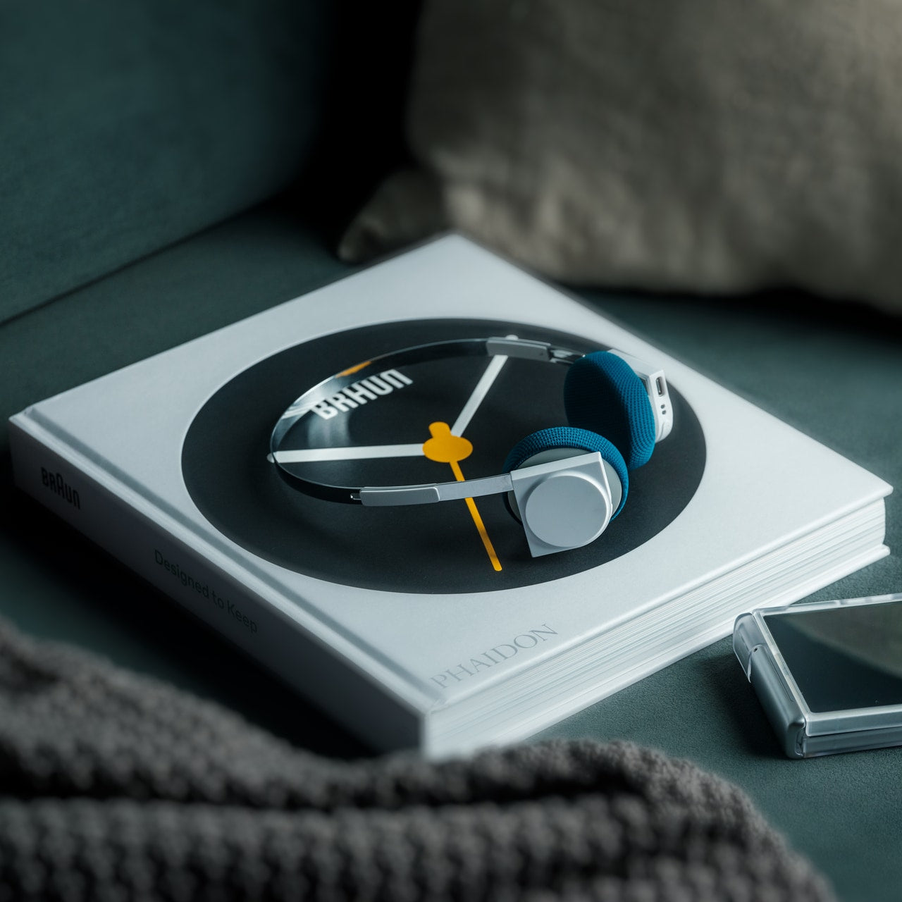
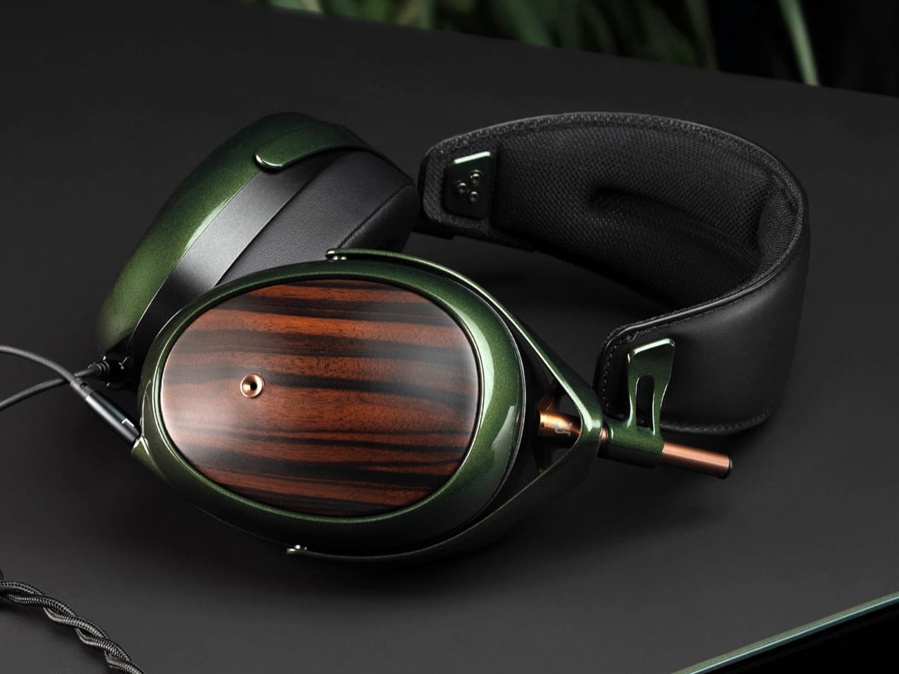
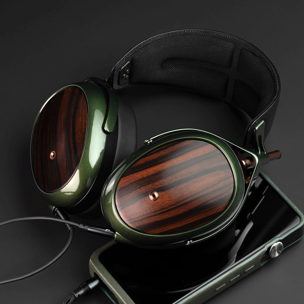
2. Meze Audio Strada

Romanian audio atelier Meze has spent two decades treating headphones as craft objects, and the Strada makes that philosophy fully explicit. Hand-carved walnut and ebony ear cups, each unique in grain and tone, sit alongside a magnetic ear pad system that snaps on and off cleanly, making them the first pair that genuinely anticipates its own aging. The leather headband drapes naturally against the collarbone. At $799, you’re investing in the idea that daily objects deserve this level of material care.

Worn around the neck, the Strada does something genuinely rare: it makes you look considered rather than plugged in. Those hand-carved wood cups catch light in a way that aluminum never quite manages, and the closed-back design delivers warmth and isolation without the clinical precision of most audiophile gear.

What We Like

  • The hand-carved wood ear cups make every unit genuinely one-of-a-kind, an unusual distinction in a product category that typically prizes consistency and uniformity above everything else
  • The magnetic ear pad system solves a real longevity problem that most headphone manufacturers still choose to ignore, making the Strada feel genuinely built for the long term from the start

What We Dislike

  • The warm, closed-back tuning leans toward intimacy over accuracy, which won’t satisfy listeners who prefer a flat, analytical sound profile for critical or reference listening sessions
  • No active noise cancellation at $799 is a deliberate aesthetic choice, but it will not suit everyone who regularly listens in open, noisy, or busy urban environments

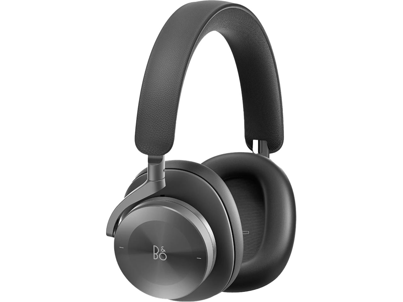
3. Bang & Olufsen Beoplay H95

 Bang & Olufsen has been designing objects that make a room better simply by existing in it since 1925. The Beoplay H95 carries that logic to your ears. Brushed aluminum arcs support lambskin ear cushions with the quiet authority of something that was never trying to impress anyone. Custom 40mm titanium drivers deliver an expansive, unhurried soundstage, and 38 hours of battery life with ANC active means you rarely need to think about charging. At $1,250, it reads as inevitable rather than expensive.

Around the neck, the H95 makes its strongest case. The slim profile rests cleanly against the collarbone, the aluminum catches light without glare, and the lambskin ages into something better than what you started with. Vogue Scandinavia named it the headphone that pairs best with the softest cashmere roll-neck and a cocooning wool coat, which is not exactly a mid-range endorsement. The tactile control dial and hard carrying case complete the picture of a brand that hasn’t needed to shout for a century.

What We Like

  • Lambskin ear cushions and brushed aluminum give the H95 a material quality that makes every other pair on this list look like it is working a little harder to impress you
  • 38-hour ANC battery life is class-leading and genuinely difficult to match at any price point, making this the pair most likely to outlast a long-haul journey without any hesitation

What We Dislike

  • At $1,250, this is a significant investment for a product category where $400 already delivers very strong audio performance from multiple well-regarded and respected manufacturers
  • The control dial is elegant but carries a subtle learning curve that takes several days of regular use to feel completely intuitive and second-nature in the hand

4. Bowers & Wilkins Px8 S2

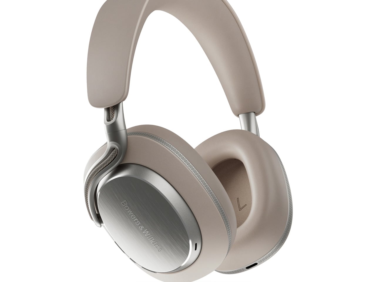
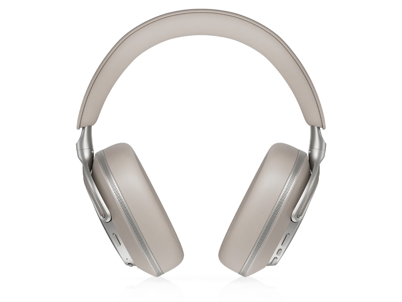
The Px8 S2 looks like it was designed by someone who spent too much time around luxury automobiles and not enough time worrying about what people thought. Diamond-quilted Nappa leather ear cups sit inside angular aluminum driver housings that don’t apologize for taking up space. Bowers & Wilkins built their reputation on speaker cabinets in British living rooms, and that obsession with material quality is fully present in the Px8 S2. At $799, it’s the most visually assertive pair on this entire list.

Worn on the head, the 40mm Carbon Cone drivers deliver a focused sound that rewards careful listening. Worn around the neck, the quilted leather and aluminum geometry create a silhouette that reads closer to jewelry than consumer electronics.

What We Like

  • The diamond-quilted Nappa leather ear cups are a genuinely distinctive design move that no other headphone brand at this price point is executing with this level of craft and conviction
  • 40mm Carbon Cone drivers bring the kind of focused sound detail that makes streaming audio feel like it might be holding something back, consistently rewarding attentive listeners on every session

What We Dislike

  • The angular form does not fold into a compact carry position, making the included case noticeably bulkier than most direct competitors when packed into a bag for daily commuting use
  • The firm clamping force is necessary for the acoustic seal, but it makes itself felt during extended listening sessions, which matters for anyone who wears headphones for several consecutive hours at a time

5. Sonos Ace

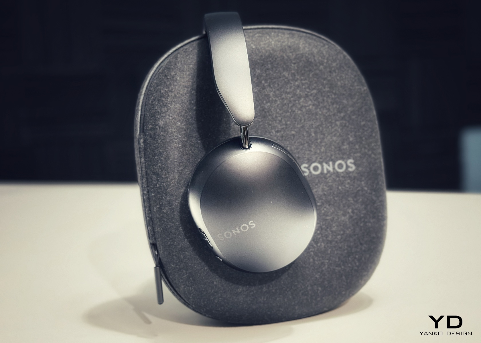
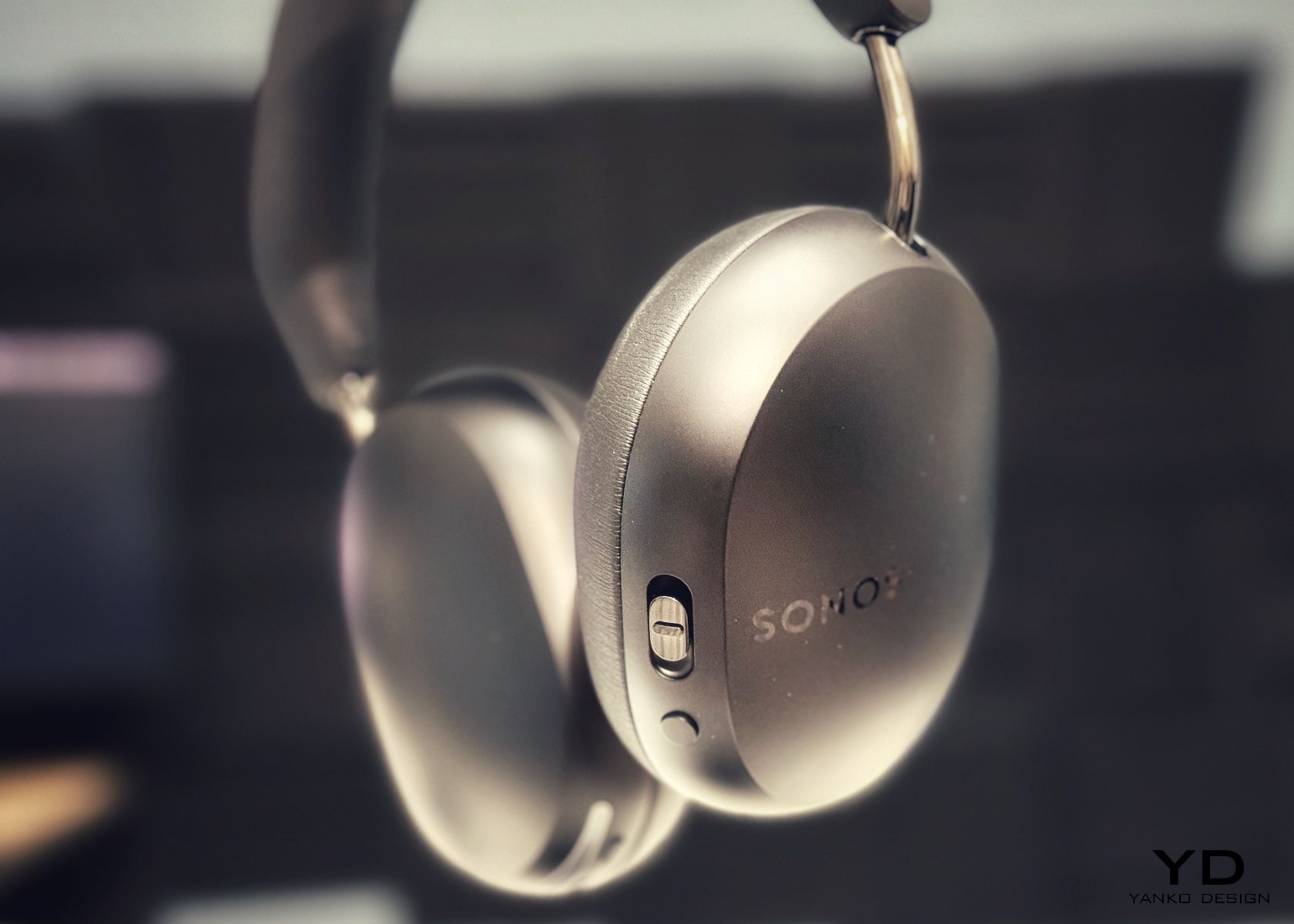
Sonos spent two decades being the most thoughtfully designed speaker company in the world before ever touching headphones. The Ace is what happens when a brand famous for restraint and material quality finally commits to an entirely new product category. Stainless steel arms, memory foam ear cushions, and a clean form in Midnight or White carry the same quiet authority as Sonos’s best home equipment. At $449, it sits below the B&O and B&W while fully matching them on design character and material coherence.

What makes the Ace genuinely stand out is what you don’t notice: no visible seams on the headband, no mismatched materials, no hardware that apologizes for itself. Active noise cancellation and a 30-hour battery complete a pair that wears as well around a neck as it sounds through the drivers, making it the most versatile pick on this list.

What We Like

  • The material cohesion across every surface, every finish, and every seam speaks one consistent and considered design language, which is an unusually disciplined achievement at the $449 price point
  • Active noise cancellation combined with a 30-hour battery puts the Ace ahead of most competitors on the two specifications that matter most for daily and travel listening

What We Dislike

  • The body is predominantly high-quality plastic rather than metal, which is a material trade-off that some buyers will feel at this price point relative to the B&O and B&W alternatives
  • Head-tracking spatial audio is most effective when paired with a Sonos home speaker system, limiting the feature’s full appeal for listeners who don’t already own Sonos hardware at home

The Best Headphones Are the Ones You Never Want to Take Off

What all five of these pairs share is a seriousness of intent that goes well beyond frequency response. They were built by companies that think about how objects live in the world, not just during a listening session, but on a train platform, at a desk, hanging around a neck. That’s a harder problem to solve than noise cancellation, and the brands that crack it tend to stay relevant far longer than those that don’t.

The range here runs from $449 to $1,250, but the price gaps matter less than they appear at first. What you’re really choosing between is design language: Romanian craft warmth, Scandinavian restraint, British precision, speaker-first material thinking, or clean minimalism that genuinely disappears. Any of these pairs earns the right to hang around your neck. The question is which one earns it in a way that feels made for how you actually move through the world/

The post 5 Over-Ear Headphones That Look as Good When They’re Around Your Neck as When They’re on Your Head first appeared on Yanko Design.
  •  

Apple Turns 50, and Its Most Ambitious Phone Hasn’t Even Launched Yet — 5 iPhone Fold Concepts

On April 1st, 2026, Apple turns 50. For a company that has spent half a century rewriting the rules of consumer technology, the milestone deserves something genuinely transformative. The Macintosh redefined personal computing. The iPod gave an entire generation a new relationship with music. The original iPhone, unveiled in 2007, combined a phone, a music player, and the internet into a single glass rectangle and made every competitor look outdated overnight. The iPhone Fold is real, and it’s coming.

Leaks from early 2026 paint a detailed picture: a book-style foldable powered by the A20 Pro chip on a 2nm process, backed by a 5,500mAh battery, with a 7.8-inch creaseless OLED inner display and a 5.5-inch outer screen. Pricing is expected to start around $2,400, and while a September announcement seems likely, most analysts believe shipments may not begin until December. Designers, modders, and concept artists have spent years filling the void with their own visions of a folding iPhone, each carrying a distinct theory about what Apple should prioritize. These five concepts map the full range of that imagination and capture exactly how much is riding on the real thing.

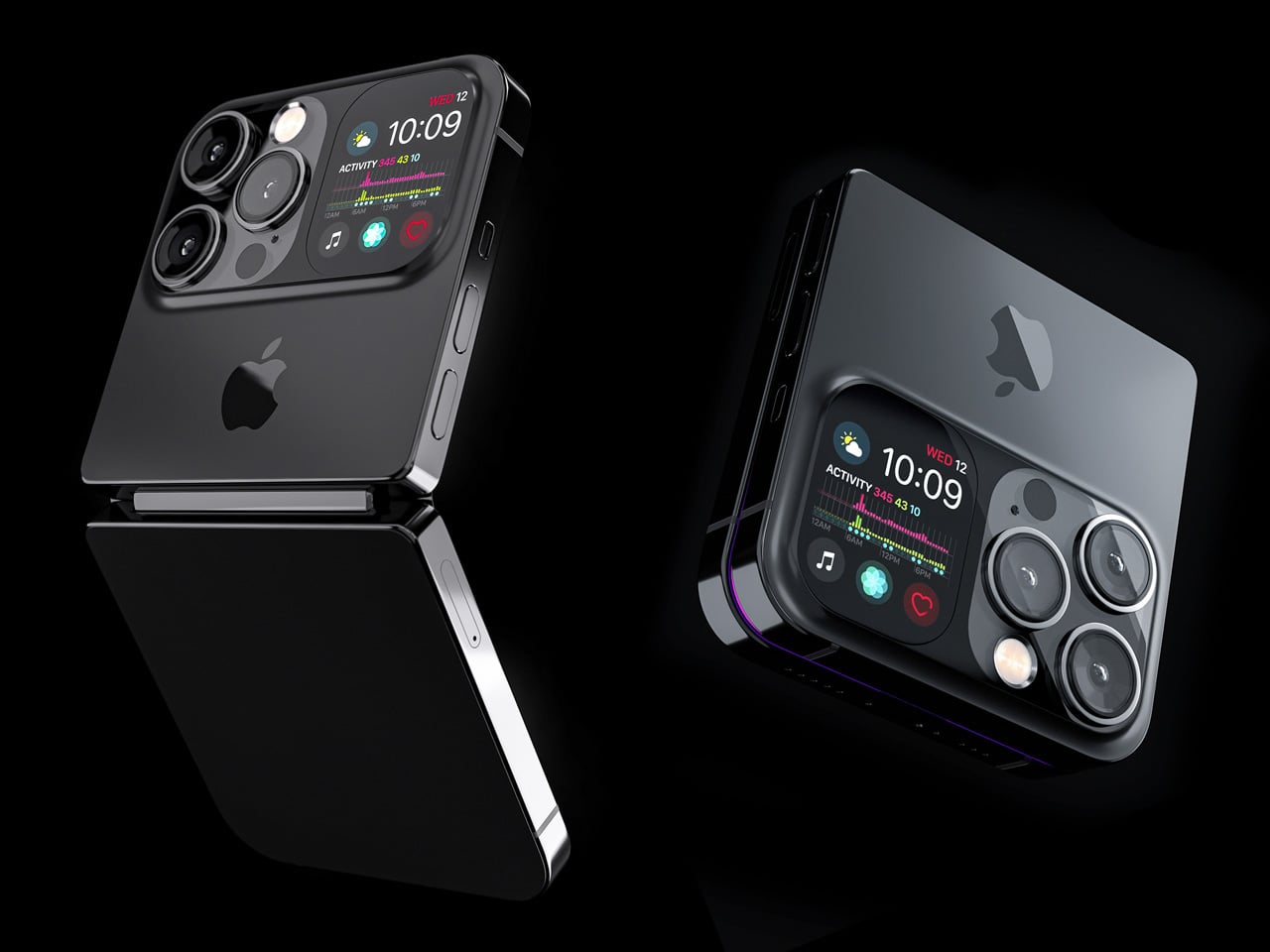
1. iPhone iFold by Michal Dufka — The Clamshell That Makes Sense

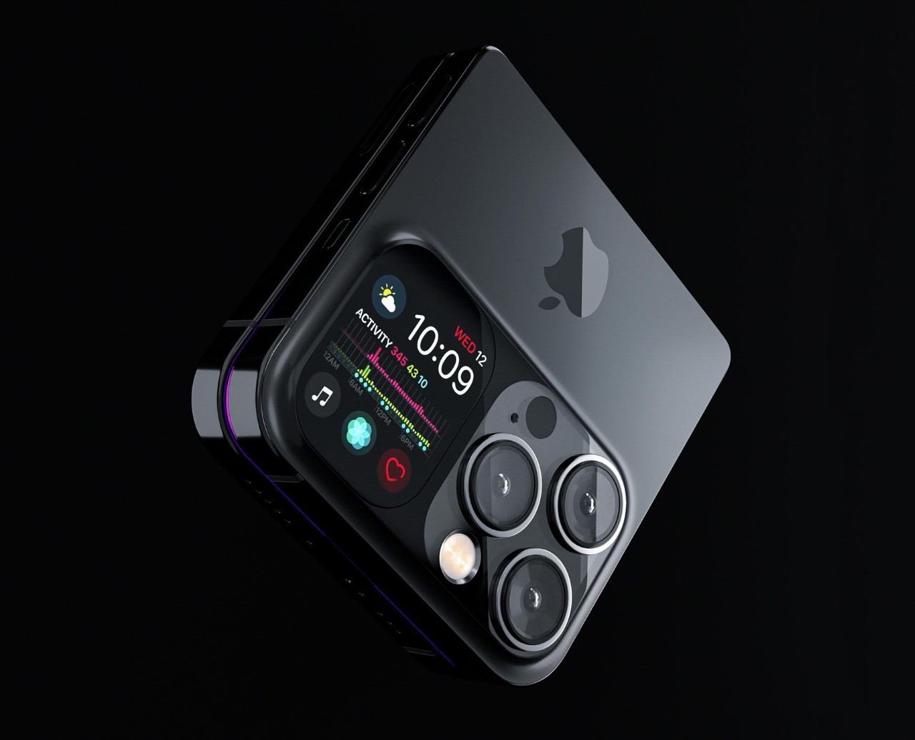
Designer Michal Dufka’s iPhone iFold is built on restraint. Rather than reinventing the iPhone’s entire identity, it applies a clamshell fold to the form factor people already love, drawing direct inspiration from the MotoRAZR and Samsung Galaxy Z Flip. The phone closes into a compact, pocketable square and opens into a full iPhone experience with a generously large display. For anyone who has quietly missed a phone that actually fits in a jeans pocket, this concept speaks to that feeling.

What sets the iFold apart is the secondary display placed beside the camera bump. When the phone is closed, that smaller screen surfaces notifications, time, and essential stats without requiring you to open the device at all. It functions almost like an Apple Watch built into the back of the phone. With Apple’s always-on display technology mature enough for this kind of ambient use, the dual-display setup feels less like speculation and more like a logical next step.

What We Like

  • The secondary display mirrors Apple Watch notification behavior, making glanceable information genuinely useful without ever opening the phone
  • The clamshell format makes the iPhone pocket-friendly for the first time in years without sacrificing screen size when it matters

What We Dislike

  • The clamshell form limits overall screen real estate compared to the expanded tablet surface that a book-style foldable provides
  • Hinge durability over sustained daily use is entirely unexplored here, and it remains the most critical engineering question for any clamshell design

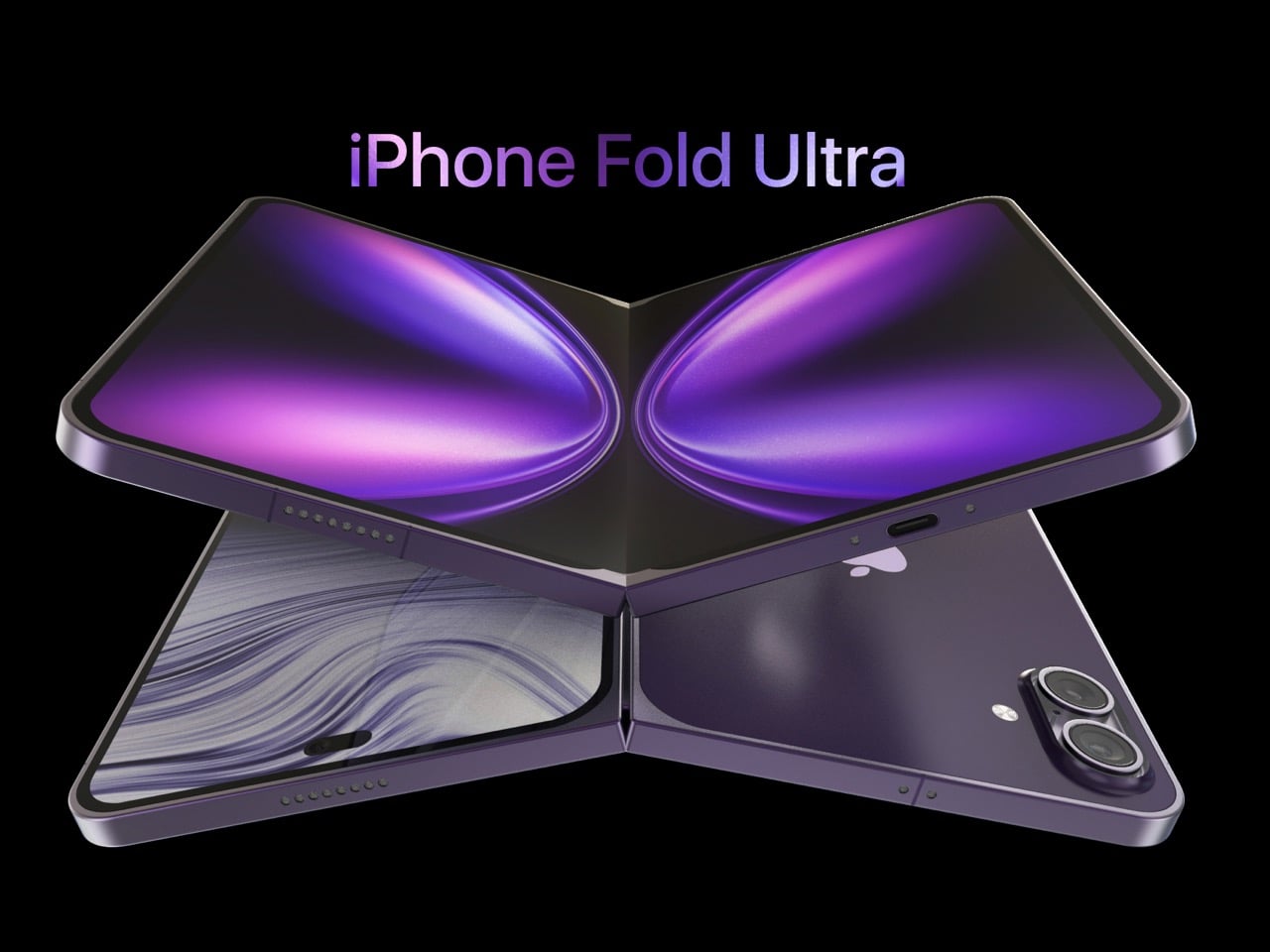
2. iPhone Fold Ultra by 4RMD — When the Specs Match the Ambition

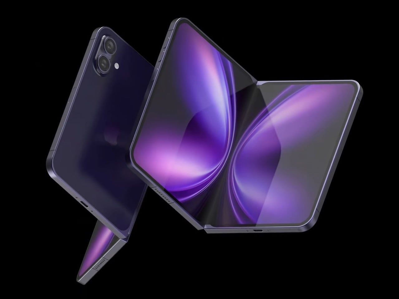
Design studio 4RMD’s iPhone Fold Ultra is grounded in credibility. Built directly from reported leaks rather than pure creative license, the concept presents a book-style foldable with dual 48MP rear cameras, a 24MP ultra-wide front camera, and the A20 Pro chip running on a 2nm process. Three color options appear across the renders: White, Black, and Deep Purple. At an estimated $2,299, this concept sits at the very top of Apple’s lineup with total conviction.

That Deep Purple colorway deserves its own moment. It is a deliberate callback to the iPhone 14 Pro’s most celebrated finish, and it lands differently on a book-style foldable. Something about that color on a device this ambitious reads as genuinely luxurious, the kind of finish that reframes a $2,299 price tag from a shock into a statement. 4RMD clearly understands Apple’s visual grammar, and this concept shows what happens when research and aesthetics share the same design space.

What We Like

  • Specs pulled from verified leaks give this concept real credibility, making it feel like a preview of what is actually coming rather than pure speculation
  • The Deep Purple colorway is a smart, crowd-pleasing callback to one of Apple’s most recognized and beloved finishes

What We Dislike

  • The “Ultra” label sets an expectation that demands exceptional build quality, and no concept can fully address whether the real device will deliver on that promise
  • Crease visibility across the inner display remains unaddressed, which continues to be the most persistent criticism of every book-style foldable on the market

3. iPhone Fold by Svyatoslav Alexandrov — The One That Replaces Two Devices

Svyatoslav Alexandrov’s iPhone Fold concept, created for the YouTube channel ConceptsiPhone, thinks in bigger terms than anything else on this list. Starting as a standard smartphone with a 6.3-inch outer display, it unfolds into a squarish 8-inch tablet that sits clearly in iPad Mini territory. This is not a phone with a bonus screen bolted on. It is a device designed to make carrying both an iPhone and an iPad feel genuinely redundant.

Alexandrov replaces Face ID with a full-display Touch ID fingerprint sensor, keeping the front notch minimal and clean. The rear carries the iPhone 12 Pro’s complete camera array: wide, ultra-wide, telephoto lenses, a LiDAR scanner, and flash. MagSafe compatibility and 5G readiness are already confirmed in the concept, adding meaningful weight to its productivity pitch. Whether the device supports the Apple Pencil is left open, but given an 8-inch inner display, its absence would feel like a missed opportunity.

What We Like

  • The full-display Touch ID is a clean and creative solution that keeps the front uncluttered while solving Face ID’s known complications on foldable form factors
  • The iPad Mini-sized inner screen makes a practical, real-world case for consolidating two devices into one without any meaningful compromise

What We Dislike

  • Removing Face ID eliminates one of the iPhone’s most seamless and trusted authentication features, which most users rely on dozens of times every day
  • Leaving Apple Pencil support unconfirmed weakens what should naturally be this concept’s strongest argument for productivity

4. iPhone Fold by Mechanical Pixel — The Foldable That Doesn’t Actually Fold

Mechanical Pixel’s concept takes the most unconventional approach on this list, and the reasoning is worth understanding. Rather than bending the iPhone itself, the design keeps the main body completely rigid and attaches a separate foldable display to the rear panel instead. The core phone experience remains exactly as people know it, maintaining the familiar dimensions and feel that iPhone users already rely on. That additional screen only enters the picture when a larger surface is specifically needed.

That rear foldable panel sits raised on a platform above the phone’s back, unfolding outward into a larger, squarish tablet surface when required. The layered profile is clearly visible from the side, giving the device a deliberately experimental and modular quality. The camera module remains in its standard position, completely unaffected by the additional display layer. The logic is unconventional, but the core argument of preserving the primary iPhone experience from any foldable compromise is genuinely hard to dismiss.

What We Like

  • Keeping the main body rigid entirely sidesteps the crease and long-term hinge durability problems that define every conventional foldable on the market today
  • The modular approach means the everyday iPhone experience is never degraded or compromised by the mechanics of the foldable element

What We Dislike

  • The raised rear platform creates an unrefined, layered side profile that sits well outside anything Apple’s design language has ever produced or endorsed
  • The prototype-like aesthetic makes it very difficult to imagine this direction surviving Apple’s notoriously demanding and detail-oriented product design process

5. iPhone V — The One Someone Actually Built

Every concept on this list exists as a digital render. The iPhone V is different. A YouTuber modder physically dismantled an iPhone X, extracted its internal components, and rebuilt the entire device inside a Motorola Razr chassis. The result is a working, folding iPhone that runs real iOS, carries a Retina-quality display, and folds in half like a classic flip phone. As a proof of concept, it is extraordinary. As a finished product, every question comes flooding in.

What makes the iPhone V genuinely compelling is not fit, finish, or polish, because it has none in any conventional sense. It is the straightforward fact that someone cared enough to prove the idea could actually work using parts that already exist. The folding mechanism and device thickness still need serious refinement. A working clamshell iPhone running authentic iOS is, in the end, a more persuasive argument for this form factor than any polished render has managed to be.

What We Like

  • The iPhone V is the only entry on this list that is fully functional, running real iOS inside an actual working clamshell device
  • Its physical existence proves the clamshell iPhone concept is viable using genuine Apple hardware, well beyond anything a render can demonstrate

What We Dislike

  • The repurposed Motorola Razr chassis produces a build that falls far short of consumer-grade fit, finish, and structural refinement
  • Hinge mechanism quality and overall device thickness remain significant engineering challenges that the mod cannot resolve, and they are exactly what Apple needs to solve

The Concepts That Made the Wait Worthwhile

Fifty years in, Apple is still the company that makes you wait. The iPhone Fold concepts here are not just exercises in creative imagination — they are a record of what designers and makers have been asking for, year after year. Some nailed the form factor. Others got the specs exactly right. A few did both. Together, they have shaped the entire conversation around a device that already feels utterly inevitable.

When the real iPhone Fold arrives, it will be measured against each of these visions. That is the power of concept design — it sets the bar before the product ships. Apple turning 50 while holding back its most ambitious device is pure theater. The design community has been writing this script for years. The only question is whether the real thing can live up to what the imagination has already built.

The post Apple Turns 50, and Its Most Ambitious Phone Hasn’t Even Launched Yet — 5 iPhone Fold Concepts first appeared on Yanko Design.
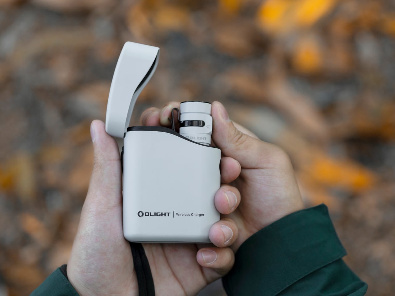
  •  

The 5 Best Furniture Designs of March 2026

March brought the kind of furniture that doesn’t need to announce itself. A student chair that shifts between sitting and lounging through physics alone. A coffee table whose legs look like they’re caught mid-step toward the door. A stool that opens from flat with a single press and no tools required. An office system built to reconfigure whenever the day asks for something different. A footstool that handles posture quietly, without making it your problem to manage.

What connects these five pieces isn’t a shared material or a shared aesthetic. What connects them is the absence of excess. Each one solves something real, and each one does it without layering on complexity to get there. That kind of restraint is harder to land than it looks. Most furniture design in 2026 is reaching for the new, for the bold, for the statement piece. These five reach for the right answer instead, and find it.

1. Tilt Chair

Manuela Hirschfeld is an industrial design student at Germany’s Hochschule Pforzheim, and her Tilt chair does exactly what the name suggests. Built from bent plywood, it shifts between upright and reclined with a single forward tilt. No levers, no hardware, just physics and balance. The restraint here is rare for student work. Most student designs reach for the complex or the speculative. Tilt strips everything back until the idea stands entirely on its own.

What makes it genuinely useful is how naturally it handles the shift between focused work and winding down. Most chairs make you choose one mode and stay there. Tilt lets your body make that call instead. Lean it forward, and the geometry changes. The bent plywood keeps it light and easy to move, so it works as well in a small apartment as it does in a studio or home office.

What We Like

  • No mechanical parts means nothing to replace or service over time
  • Dual function in a single lightweight form, no extra hardware needed

What We Dislike

  • The minimal plywood aesthetic may feel too sparse for warmer, more layered interiors
  • May not offer enough firm back support for users who need a fixed, stable position

2. Barefoot Collection

The Barefoot Collection started with a single image: a coffee table that looks like it’s walking away. The legs are carved from solid wood to simulate the arc and flex of a bare foot mid-step, while the tabletop stays completely flat and rectilinear. Stillness above, motion below. That contrast is the whole point, and it works better than it has any right to. The piece reads as coherent long before it reads as clever.

What you actually get is a coffee table that functions without apology and sparks a real conversation without ever trying to. Set a cup on it and forget the concept entirely. Then a guest walks in, does a double-take, and suddenly the room is talking. Most concept-led furniture exhausts you after a few weeks. Barefoot earns its place by being genuinely useful first and genuinely interesting second. That’s always the right order.

What We Like

  • Solid wood construction gives it real longevity, well beyond its visual appeal
  • Works as a fully functional surface while quietly holding a strong point of view

What We Dislike

  • The sculpted legs make it difficult to pair with more conventional, straight-lined furniture
  • The level of craft involved likely puts it at a higher price point

3. Press Stool

The Press Stool borrows its structural logic from folded paper. A flat sheet has no load-bearing strength, but fold it, and the forces redistribute across the geometry. Crease it further, and the form resists compression. That principle does all the work here. In its flat state, it collapses into a wide oval with a crinkled metallic silver surface that lands somewhere between industrial foil and fabric. One press and it opens. No legs, no bolts, no tools.

For anyone in a small apartment, it solves a storage problem while putting something worth looking at in the room. It ships flat, weighs little, and can slide under a bed or lean against a wall when it isn’t needed. Most fold-flat furniture looks like a compromise. The Press Stool looks intentional. The crinkled surface and gathered folded ends give it a presence that holds up even when it’s closed.

What We Like

  • Ships and stores completely flat, ideal for smaller homes and tight living spaces
  • No assembly required, the folded form does all the structural work

What We Dislike

  • The metallic silver finish is a strong statement that won’t suit every interior palette
  • Load capacity may be more limited compared to stools with conventional structural frames

4. Kylinc Modular Office System

Kylinc treats the workspace like something that should change whenever the day asks it to. Each piece rolls on oversized wheels, which makes reconfiguring your office feel genuinely effortless rather than theoretically possible. Push pieces apart for a collaboration zone, pull them together for focused work. Power management is built directly into the furniture, with smart cable organization that keeps surfaces clean without any additional accessories to track down or manage.

The benefit shows up most for people working from home across a day that never asks the same thing twice. A static configuration works well some of the time and poorly the rest. Kylinc changes that without requiring much effort, which is the real difference between a system that actually gets used and one that stays fixed out of habit. The built-in cables move with the furniture. Your layout becomes something you actually control.

What We Like

  • Oversized wheels make real reconfiguration effortless, not just possible on paper
  • Integrated power and cable management keep the workspace clean without extra accessories

What We Dislike

  • Rolling furniture may feel less stable than fixed pieces for users who prefer an anchored setup
  • A full modular system likely carries a significantly higher upfront cost than standard office furniture

5. OTTO Footstool

OTTO takes its name from the Korean roly-poly toy Ottogi, a round-bottomed figure that always rights itself because of its convex base. Designer Woonghee Ma applied that same logic to a footstool. The convex base means it rocks and shifts as your body moves throughout a long sitting session. No adjustment needed, no settings to configure. You shift weight, the stool moves with you, and that’s the whole mechanism.

For a home office that needs to support you without making a production of it, OTTO is exactly right. Most ergonomic products demand your attention to work. OTTO doesn’t. The passive rocking base handles posture support quietly while you stay focused on everything else. It also looks good, which matters more than it might seem for something you’ll look at every working day. Clean, compact, and entirely unpretentious about what it is.

What We Like

  • Passive rocking base provides ergonomic support through natural weight shifts, no settings required
  • Compact and well-proportioned, it works equally well in home and professional office settings

What We Dislike

  • The rocking motion may feel unfamiliar at first for users accustomed to fixed support
  • May not suit very low seating arrangements where foot elevation isn’t part of the setup

March Didn’t Make a Noise. It Made a Point.

What connects these five pieces isn’t an aesthetic or a material. It’s restraint. A chair that changes mode with one gesture. A table that earns its concept by being useful first. A stool that ships flat and opens in a second. A workspace that adapts without asking for your help. A footstool that supports you without ever drawing your attention to the fact that it’s doing so. That quiet confidence is what good design actually looks like in practice.

Most design coverage this month was busy chasing the big swing. The sculptural statement, the unexpected material, the idea that needs a paragraph of explanation before it lands. What these five pieces share is something quieter. They ask less of you. They make their case by fitting into your life rather than reshaping it around themselves. March didn’t produce the loudest furniture of the year. It produced some of the most considered. That’s always the better result.

The post The 5 Best Furniture Designs of March 2026 first appeared on Yanko Design.
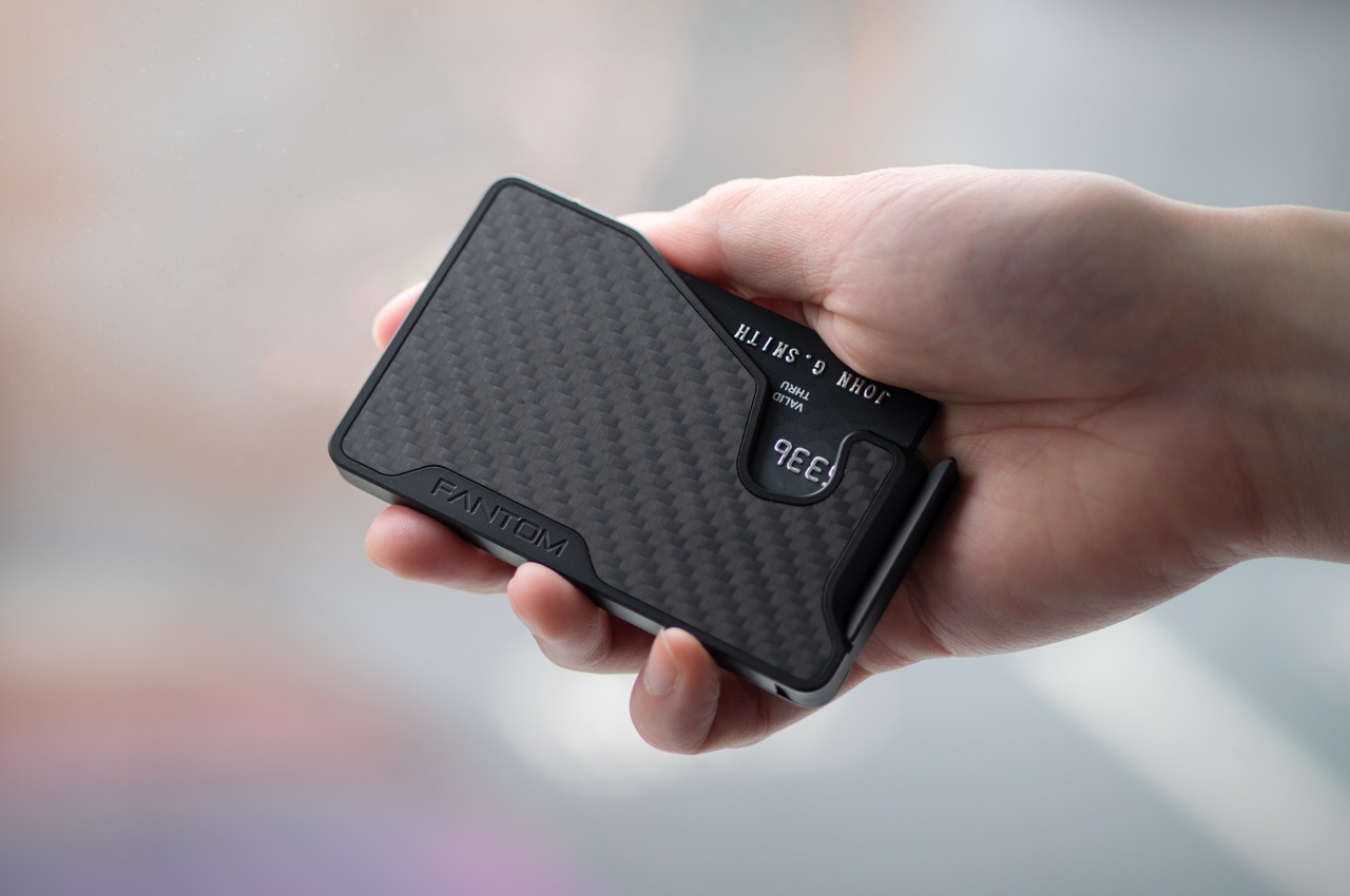
  •  
❌