Vue lecture

The Italian Lamp That Uses Toy Race Cars as Light Bulbs
Most lighting gets chosen the same way people pick curtains: functional, inoffensive, and quickly forgotten. You walk through a showroom, you point at something that won’t clash with the sofa, and that’s more or less the end of the design conversation. That’s not a criticism of how people live; it’s just an observation of how light, despite being the single most transformative element in any space, rarely gets to have fun.

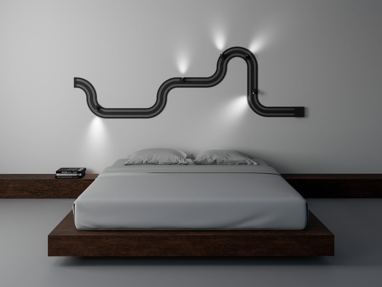
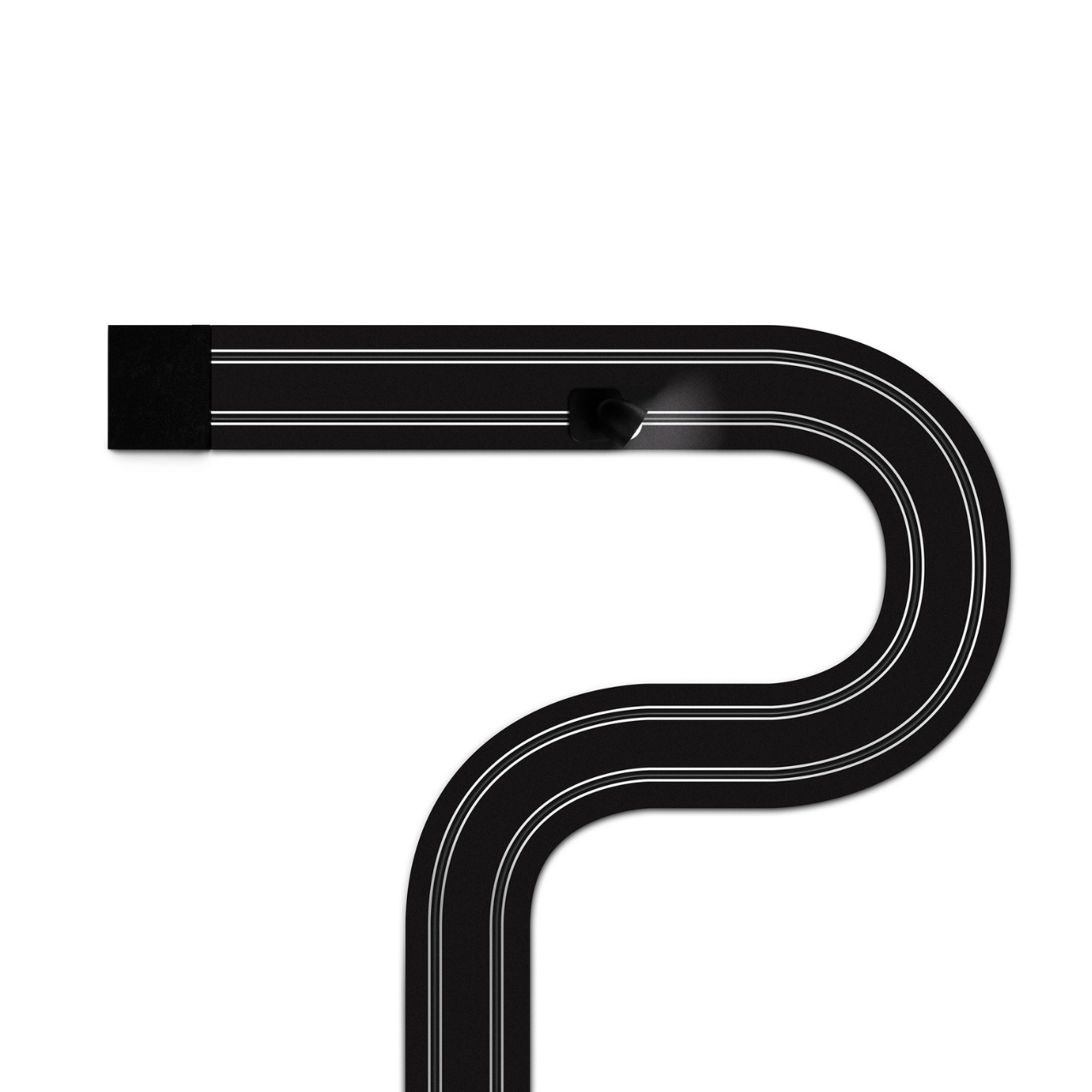
Davide Groppi’s Race of Lights is the exception to all of that. The Italian lighting brand, based in Piacenza and known for making some of the most quietly radical lamps in contemporary design, released Race of Lights in 2025. On paper, it is a modular wall lamp. In reality, it is a slot-car racing track that someone decided should also be your light source, and the whole thing somehow works beautifully.

Designer: Davide Groppi
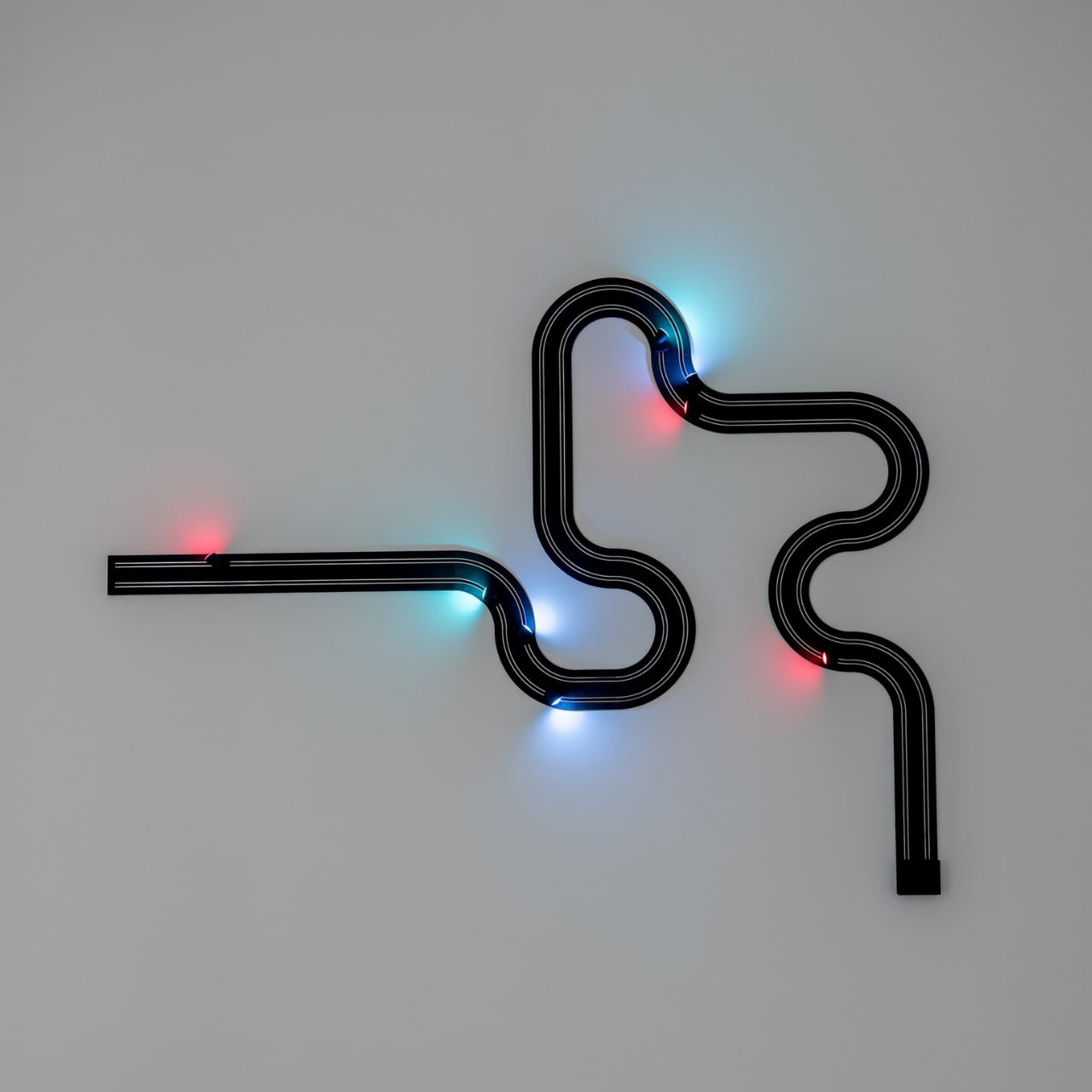
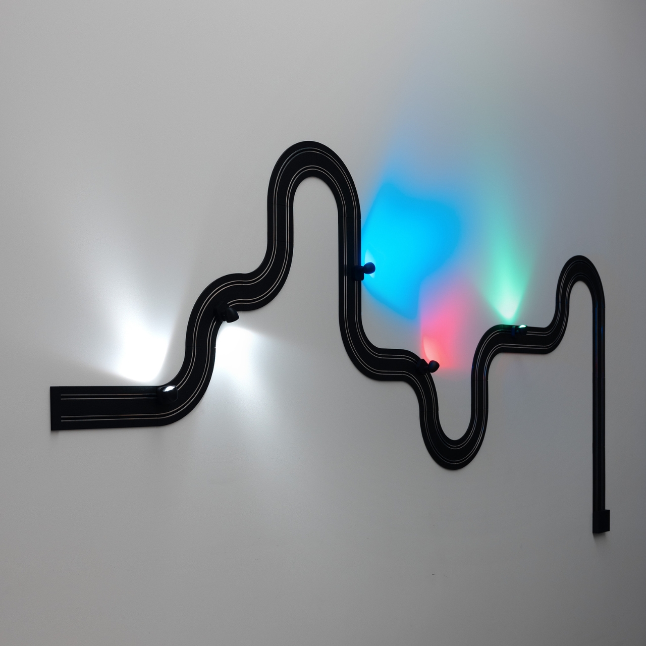
The concept is exactly what it sounds like. An electrified track, made from textured matte black polyethylene, gets mounted on the wall in whatever configuration you want. The track carries current, and the light sources are tiny car-shaped spotlights that snap into place magnetically and can be moved, repositioned, or rearranged any time the mood strikes. The basic kit includes two short straight modules, four longer sections, six curves, and four colored light-cars in green, white, blue, and red. The whole system can run up to five metres across your wall and power up to eight spotlights, each with an adjustable head so you can direct the beam exactly where you want it. This is, objectively, absurd. It is also one of the most genuinely exciting things to come out of the lighting world in years.
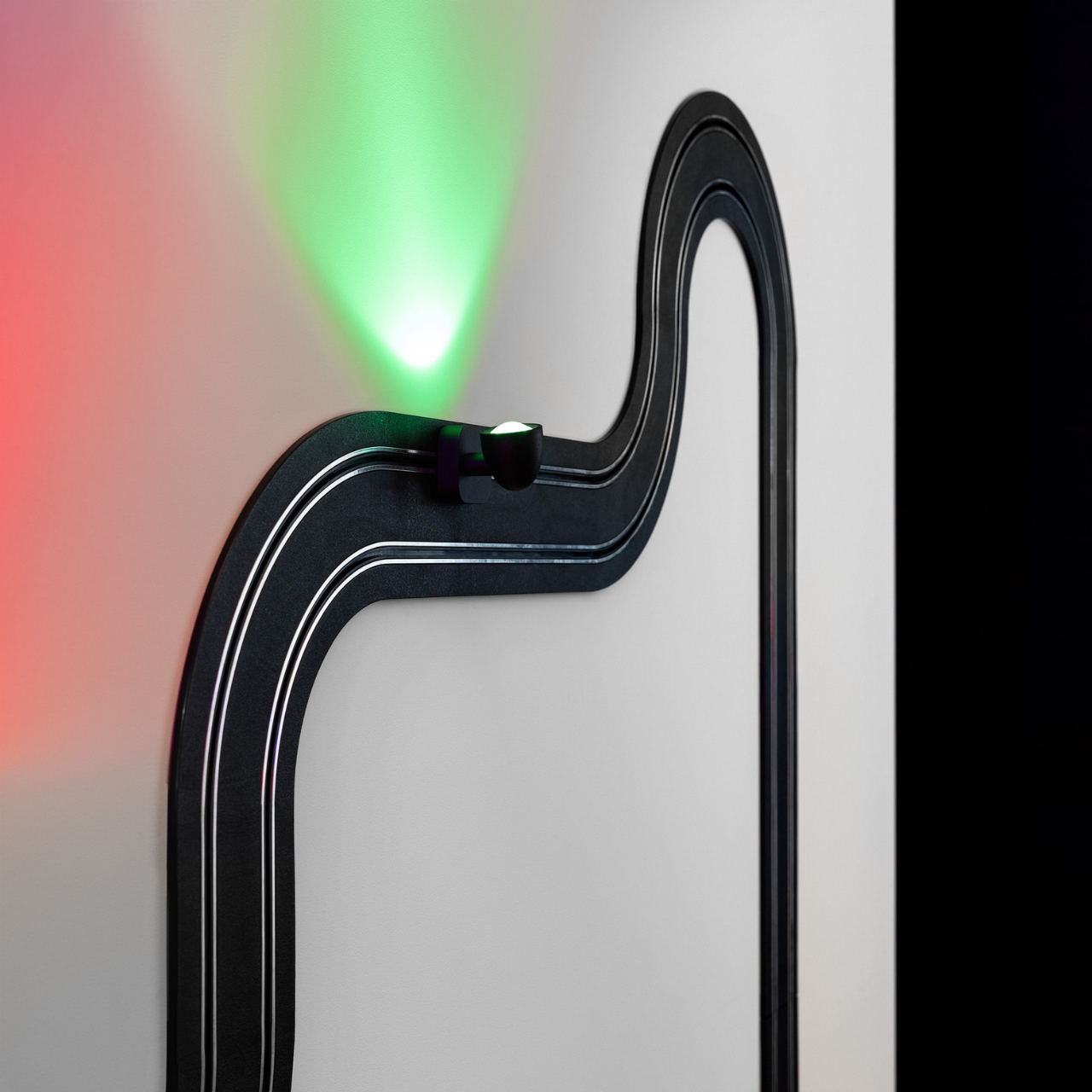
What makes Race of Lights so interesting to think about is how it sits within Davide Groppi’s broader body of work. This is a designer who built his reputation on doing less. His lamp Nulla, which won the Compasso d’Oro in 2014, measures just 18 millimetres in diameter and is practically invisible in a ceiling. The name literally translates to “nothing.” The philosophy has always been that the lamp should disappear so the light can remain. Race of Lights does not disappear. It sits on your wall, looped and curved, with little colored cars parked along the track. It makes a statement in the exact opposite direction of everything Groppi has been doing, and yet it makes complete sense.
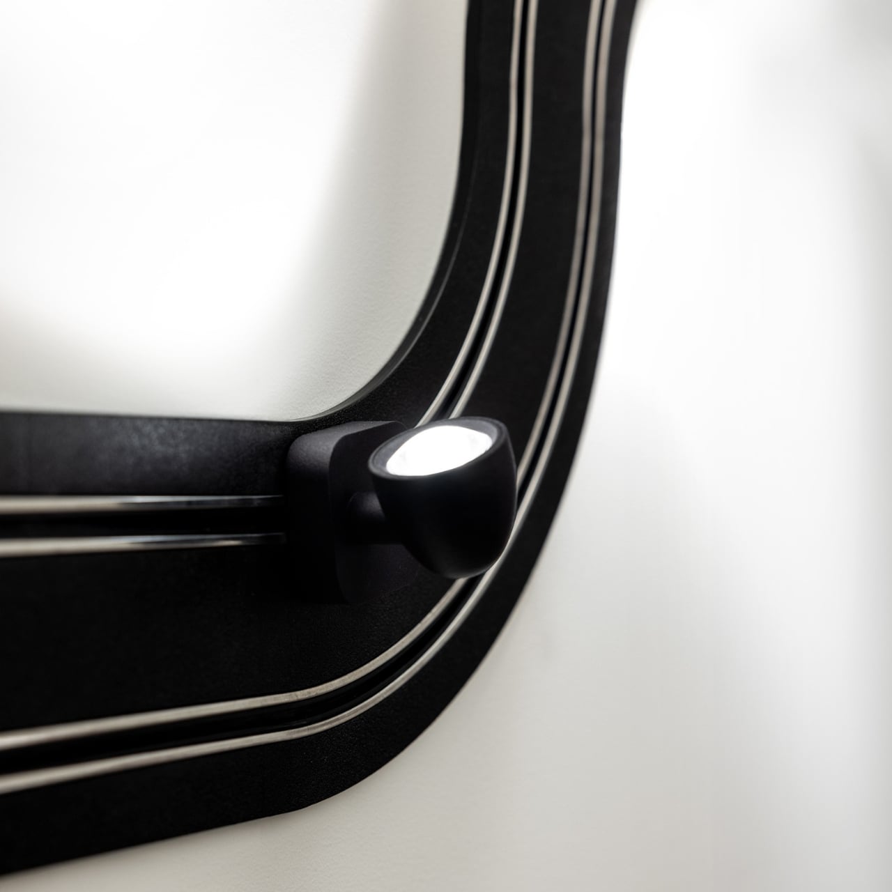
Because the brand has never really been about minimalism for minimalism’s sake. The design language has always carried a sense of emotion. Groppi has spoken about light as a tool for seduction and curiosity, about design emerging from the heart as much as the mind. Race of Lights just takes that emotional dimension and makes it literal. The inspiration was childhood, specifically the memory of electric slot-car racing sets, the kind where small cars zip around a winding track spread across the living room floor. The track moves to the wall; the cars stay put and illuminate. Play becomes design, and the object retains the spirit of the original thing it was borrowing from.
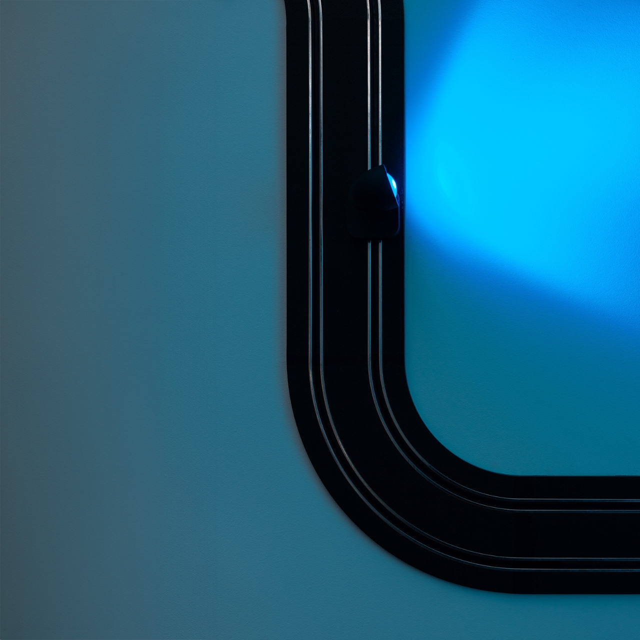
The result is a piece that functions as a legitimate lighting solution and as a conversation starter and as something closer to a sculptural installation. You can compose it in a new shape whenever you want. That kind of flexibility tends to age well in a space, because you never quite exhaust the possibilities.

Cynics will say it is a gimmick. I understand the instinct, but I think that reading misses the point. Good design has always borrowed from play. The best chairs make sitting feel effortless. The best lamps make light feel intentional. Race of Lights makes light feel like something you chose with genuine enthusiasm rather than resigned practicality.
Lighting does not have to be a decision you make and then stop thinking about. Davide Groppi has spent decades proving that point in quietly different ways. Race of Lights is just the first time the argument came painted in red, white, blue, and green, with tiny cars attached.
The post The Italian Lamp That Uses Toy Race Cars as Light Bulbs first appeared on Yanko Design.

  •  

This Cork Cactus Looks Like Decor and Acts Like 3 Pieces of Furniture

Coat stands have always occupied an awkward position in a room. They’re functional enough to keep around but rarely considered anything beyond a place to pile things on the way out the door. Pin boards face a similar problem, useful at a desk but hard to integrate into a living space without making it feel like an office. Objects that try to do both tend to resolve that tension poorly.

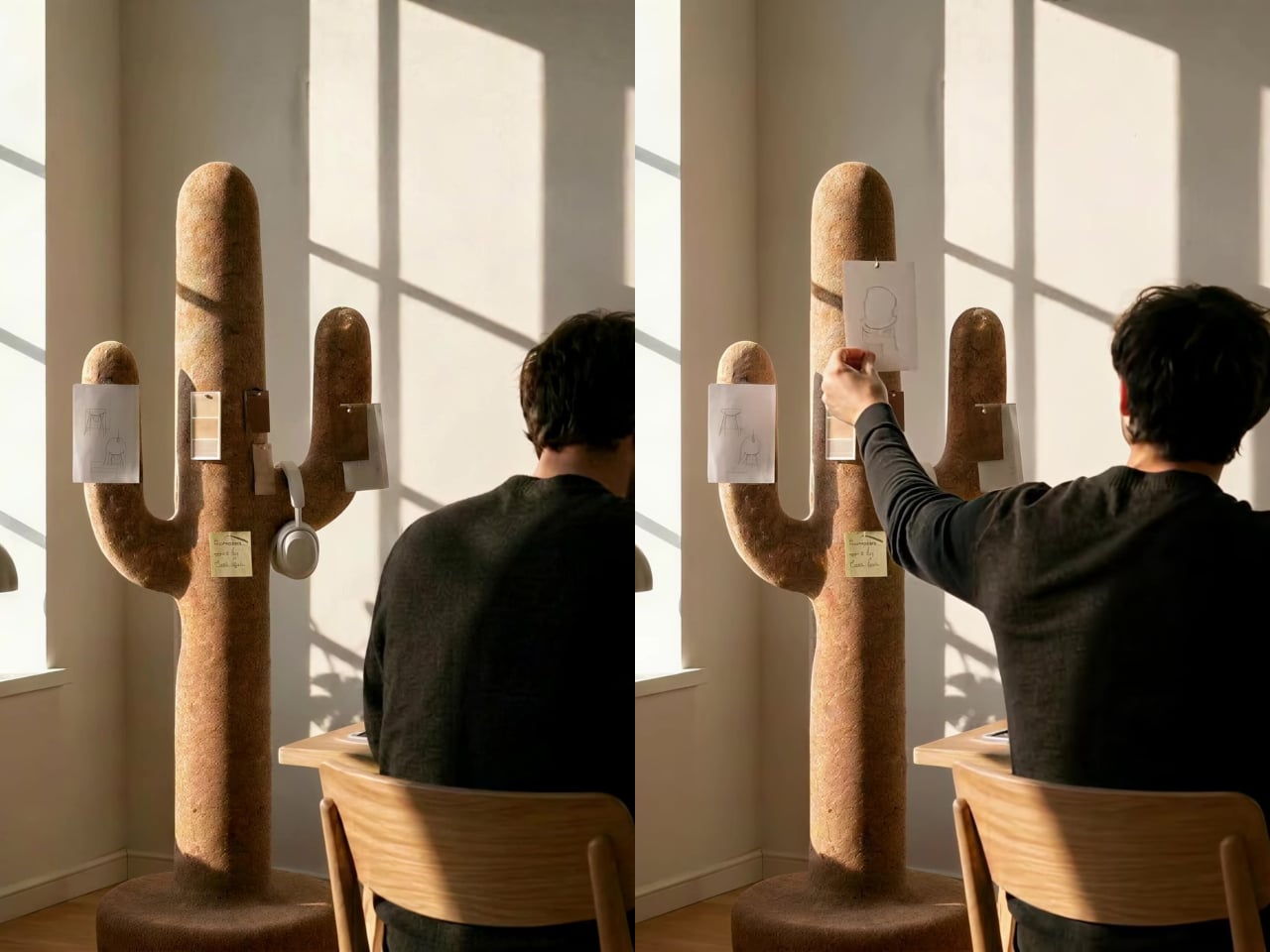
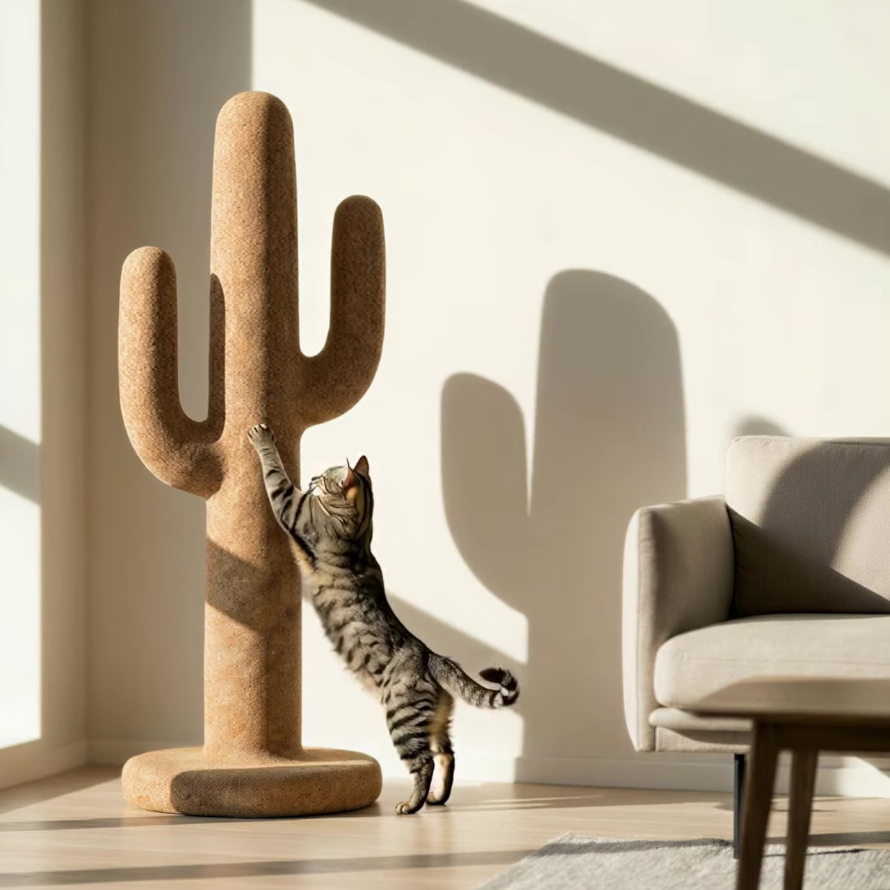
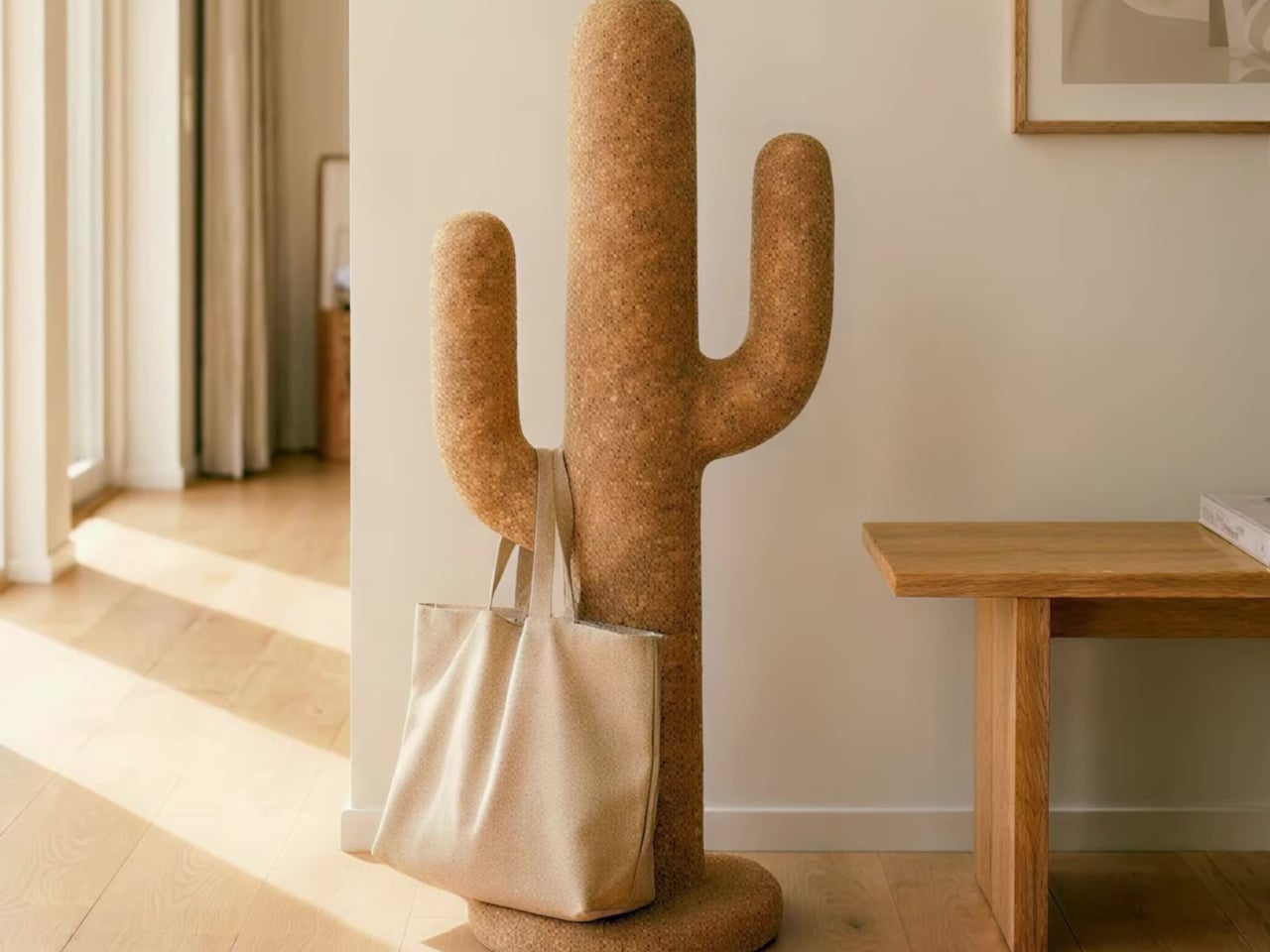
Corctus starts from a different premise. The name merges “cork” and “cactus,” which is also a fair summary of the concept: a floor-standing object shaped like a saguaro cactus, made entirely from cork, and quietly capable of handling most of what people need to keep close at hand. Rather than solving the storage problem with hooks and brackets, it solves it by making the form itself the function.

Designer: Liam de la Bedoyere (boredeye)

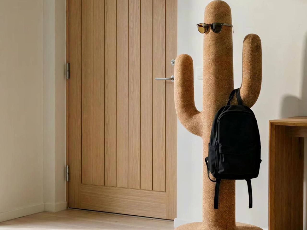
Cork is the central material here, both practically and conceptually. The surface is textured enough to grip a pair of sunglasses on the rounded top without anything extra, and receptive to pins without reinforcement or a backing board. A sketch, a sticky note, or a reference card pins straight into the body of the object wherever it’s needed, with no designated zone for it.

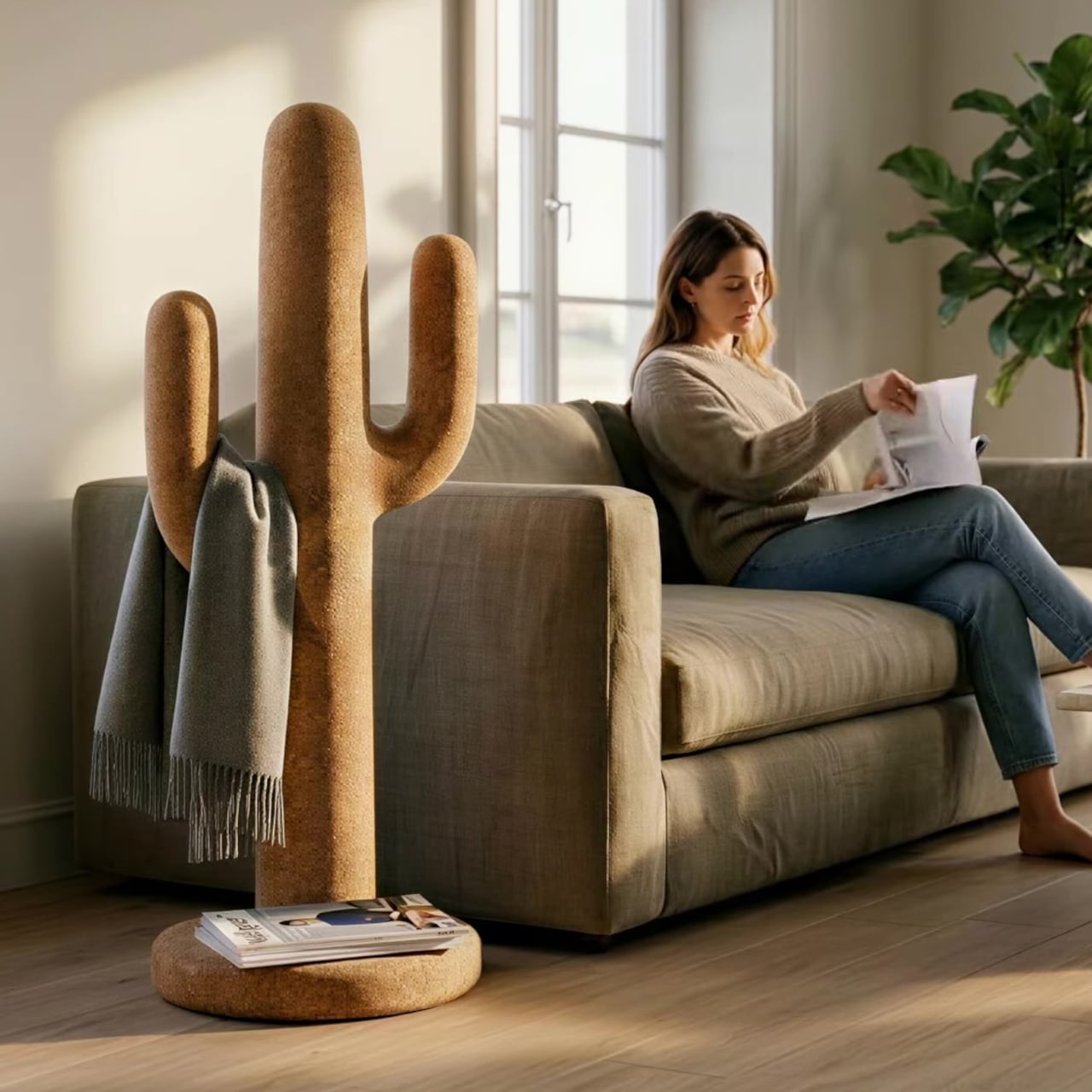
The cactus arms extend outward with a slight upward curve that happens to work exactly like a hook. A backpack hangs from one, a tote bag from another, a scarf draped over without sliding off. Headphones sit naturally over an arm when not in use. None of this requires any hardware, any dedicated accessories, or any particular intention. The geometry of the form handles all of it.

The disc-shaped base adds one more surface. Magazines stack on it, a few books sit within reach, and it grounds the form without demanding much floor space. The compact proportions keep the whole object from reading as a coat stand, which is deliberate. The intention was always a sculptural companion rather than a piece of utilitarian furniture, and the scale reflects that.

That distinction matters in practice. Next to a desk, the Corctus functions as an immediate, physical task board without a screen. Move it into a living room or hallway and it shifts roles without changing character. The warm texture of the cork sits alongside the kinds of materials, and its sandy color sits comfortably against most interior palettes.

Most multifunctional objects succeed at one thing and compromise on everything else. Corctus earns its place as a sculptural form first, and the utility follows naturally from the shape rather than being imposed on it. There are no brackets, no hooks, no panels, and no assembly decisions to make. It stands where it’s put, and the room tends to organize itself around it.

The post This Cork Cactus Looks Like Decor and Acts Like 3 Pieces of Furniture first appeared on Yanko Design.
  •  

A Coat Rack With 16 Hooks That Disappear When Not in Use

Every entryway tells a story, and most of the time, it’s one you’d rather not have visitors read. A coat draped over another coat. A bag looped onto an already-occupied hook. A scarf hanging off the edge of something that was never meant to hold it. We’ve all been there, and for some reason, we keep buying the same row-of-hooks solution as if more hooks were ever really the answer.

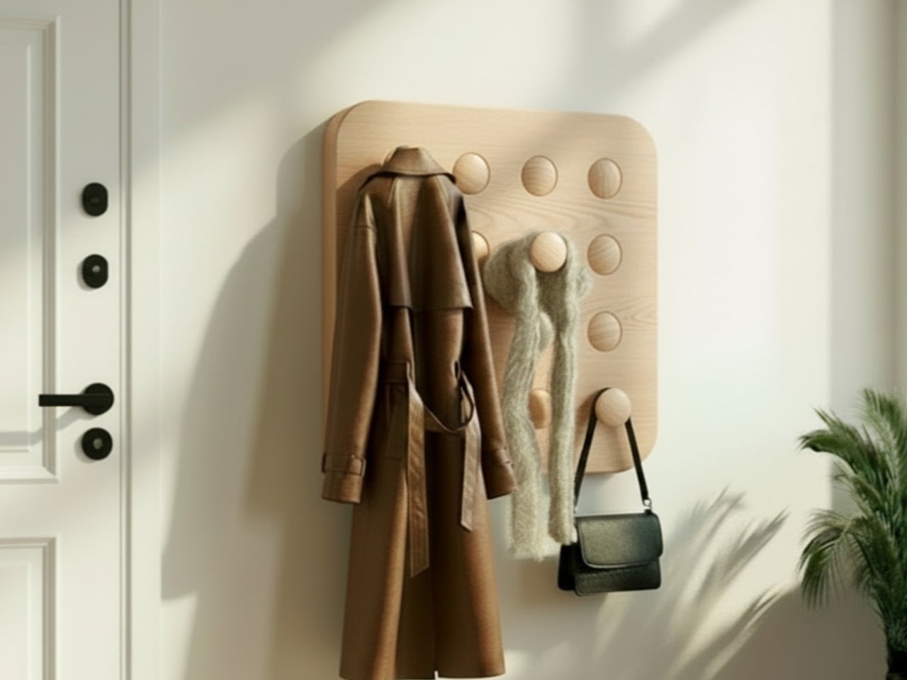
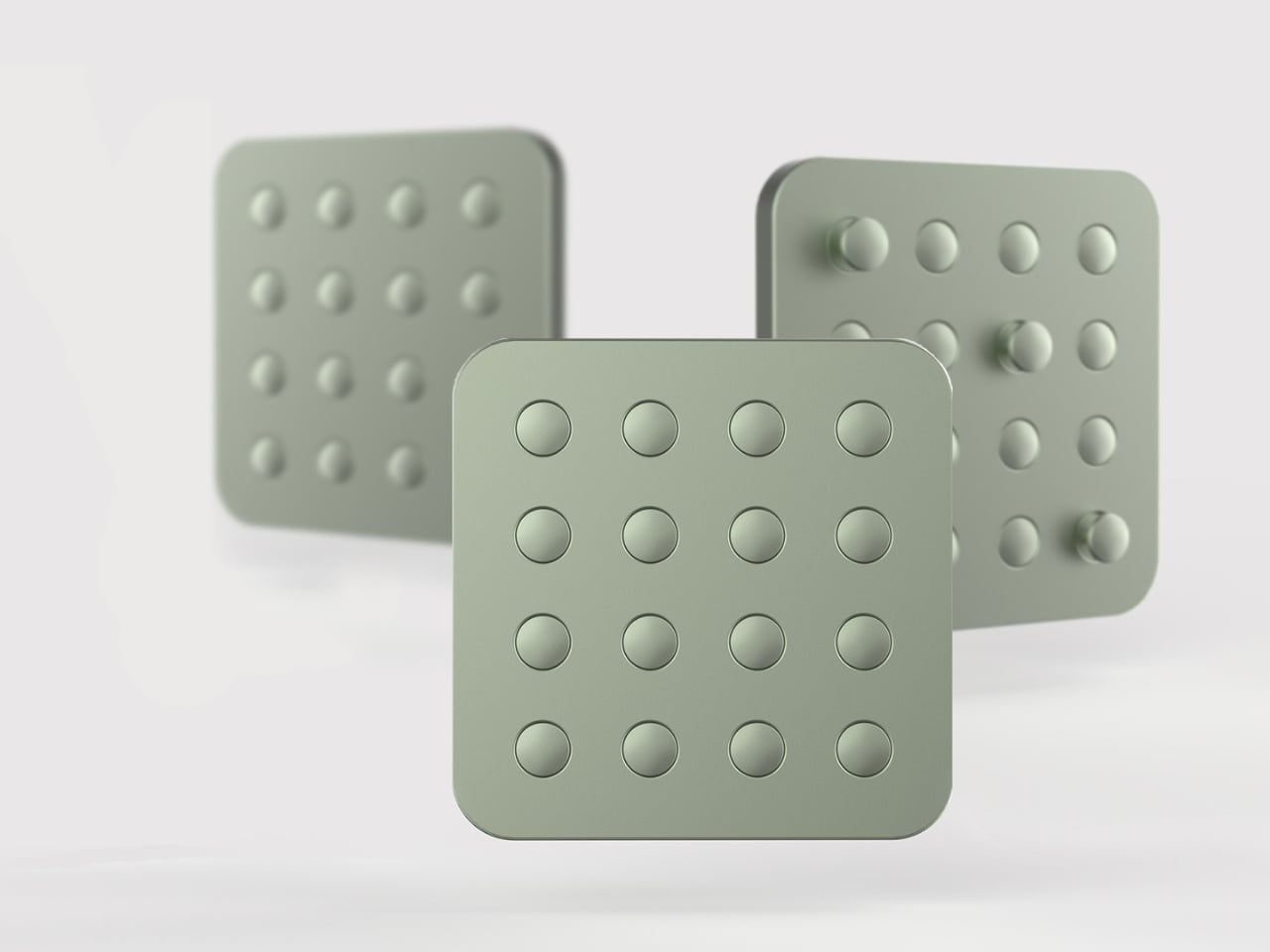
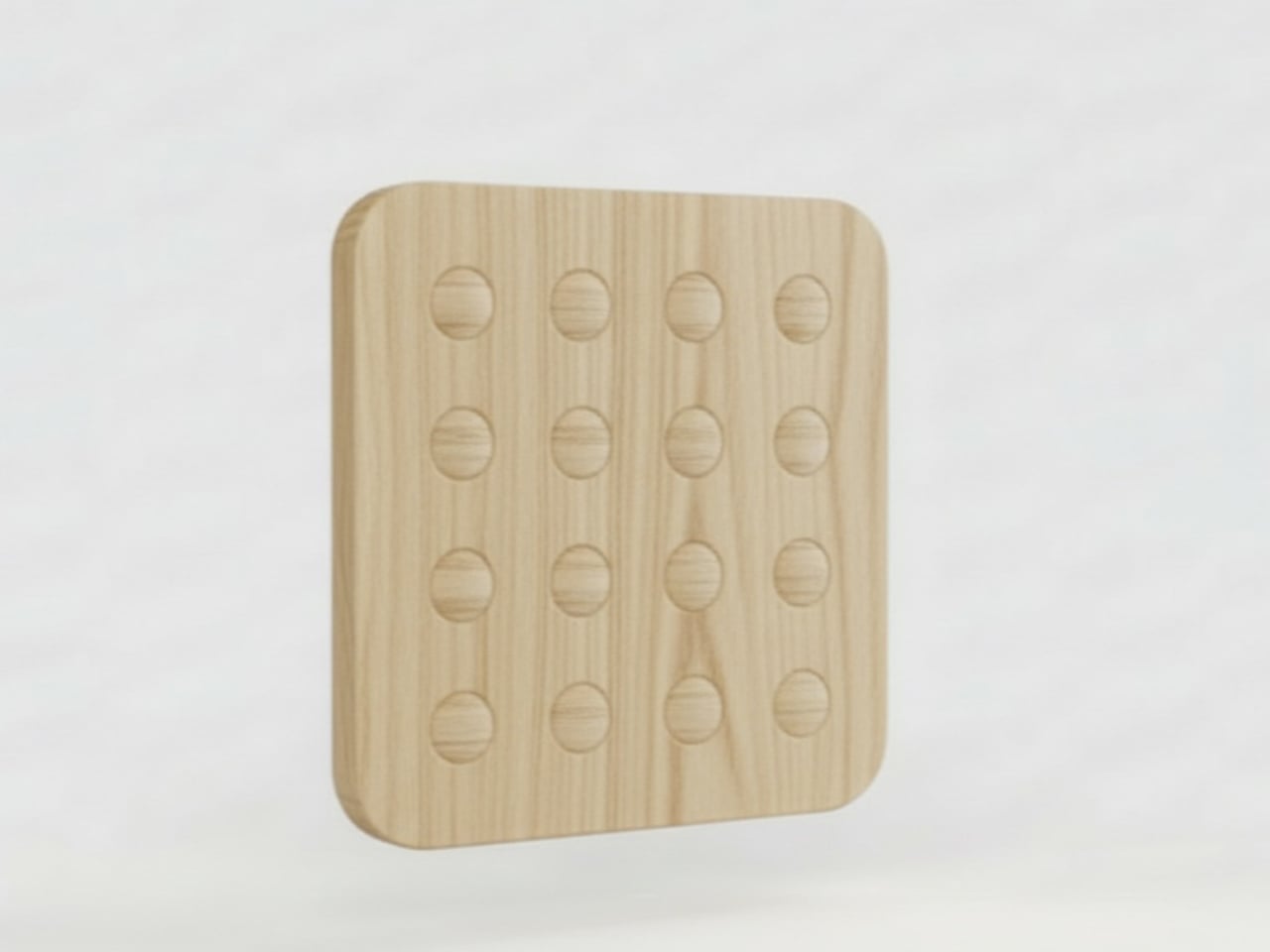
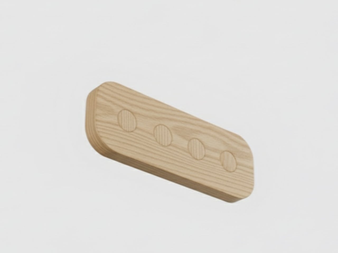
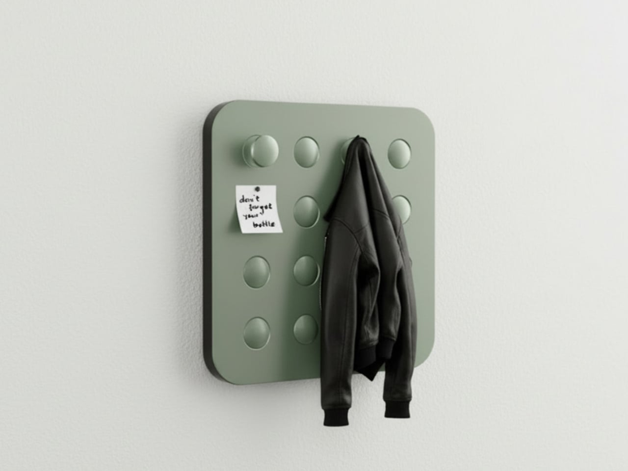
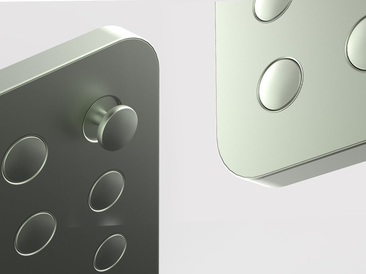
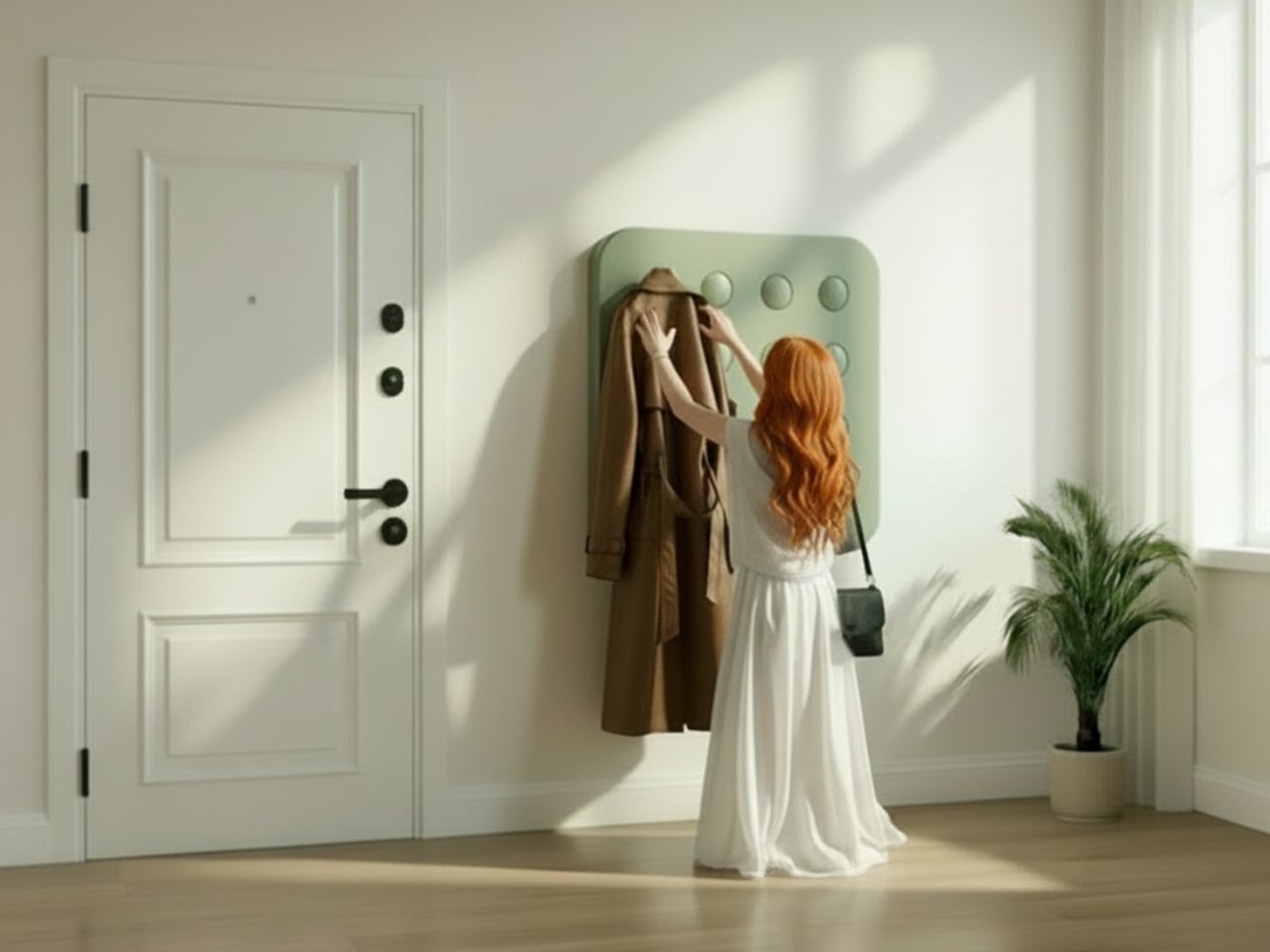
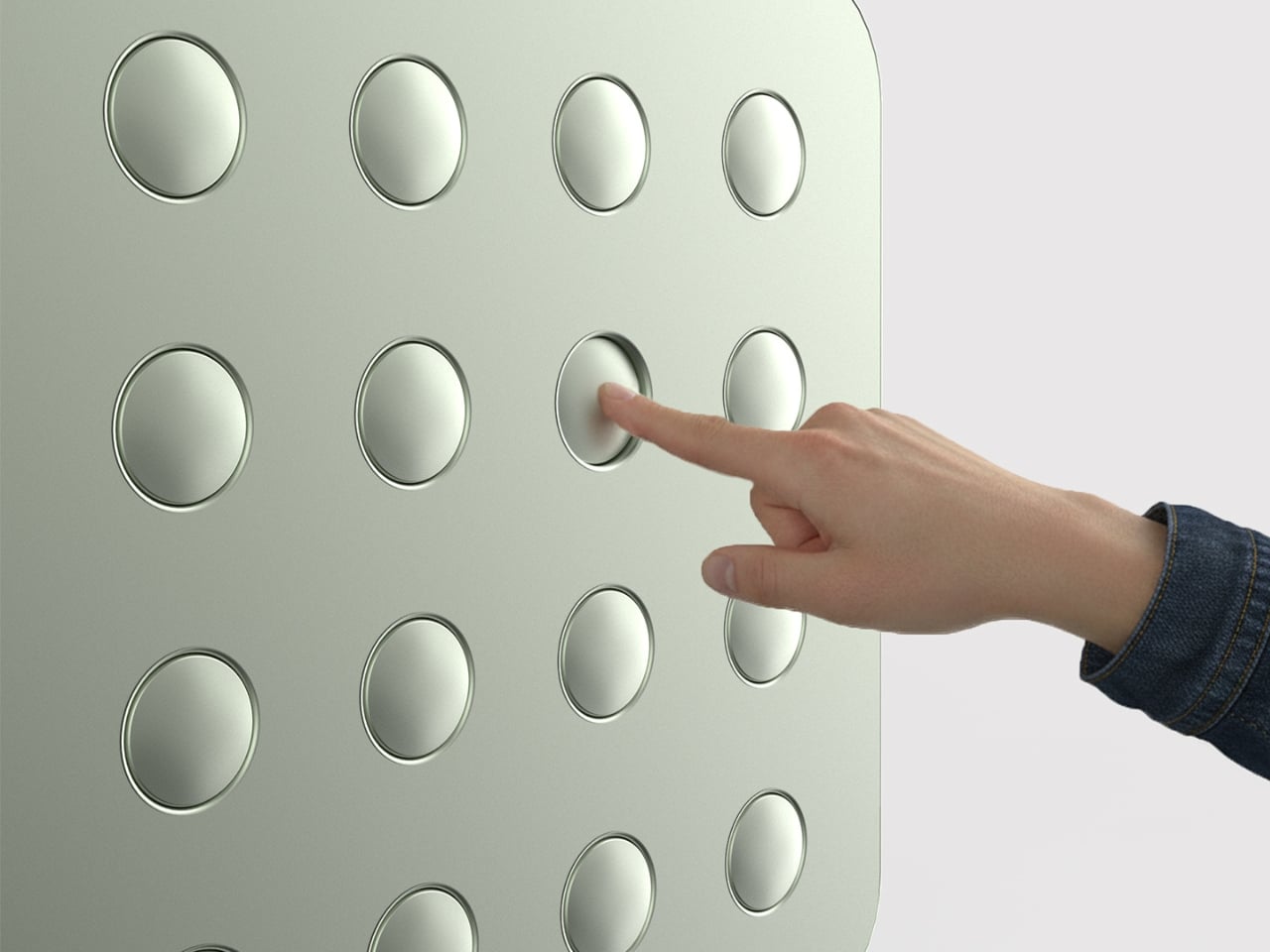
That’s what makes Elif Bulut’s coat rack concept so quietly radical. At first glance, it looks more like a piece of wall art than storage hardware. It’s a square panel with 16 circular elements arranged in a neat 4×4 grid, mounted completely flush against the wall. No hooks jutting out. No protruding arms. Just a flat, calm surface sitting there, completely unassuming, until you actually need it.

Designer: Elif Bulut

The concept is push-to-use. Press one of those circles and it extends outward into a hanging point. Press it again and it retreats back into the panel. Each circle is independently controlled, which means you decide how many hooks you want, where they go, and how many stay dormant on any given day. It’s the kind of interaction that feels satisfying in the same way clicky keyboards or popping bubble wrap does. Tactile, deliberate, and oddly fun.

1

I’ll admit that when I first saw this, my brain went straight to “pop it” fidget toys. And I don’t think that’s an accident. Bulut is working with a visual and tactile language that’s immediately familiar, maybe even nostalgic, and redirecting it toward something genuinely useful. That’s a smart design move. When a product taps into something people already instinctively want to touch, you’ve already won half the usability battle before anyone reads a word of product copy.

The design is grounded in a real observation: people pile coats on top of each other even when there are open hooks nearby. The problem was never really about the number of hooks. It was about how fixed, static structures force you to adapt to them instead of the other way around. A coat rack that responds to you, that only extends what’s needed and retreats the rest, changes that relationship entirely. The wall stays clean. The space stays calm. The hooks are there when you call for them, and invisible when you don’t.

The entryway has been chronically undervalued in home design for a long time. It’s the first thing you see when you come home and the last thing you interact with before you leave. Bulut is clearly thinking about that rhythm. One of the concept renderings even shows a small sticky note pinned to the panel, reading “don’t forget your bottle.” That single detail hits differently than any technical specification could. It grounds the whole concept in the messy, forgetful, real way people actually move through their mornings, and it signals that the designer is paying attention to life, not just surfaces.

What also works is the restraint. Bulut hasn’t tried to make this product do too much. It doesn’t track your habits, connect to an app, or announce itself as a smart home device. It’s just a better, quieter version of something we’ve had for decades. The intelligence is in the form, not the firmware. In a design landscape where everything is trying to become a gadget or justify itself with an AI feature, that choice is worth noticing.

Whether this moves from concept to production is a different conversation, but as a piece of industrial design thinking, it lands. It asks a question that sounds simple but clearly wasn’t: what if your coat rack only took up as much space, visually and physically, as you actually needed it to? The answer turns out to be a flat panel that waits patiently on your wall, ready to show up the moment you press it. That’s not a small idea dressed up in minimal aesthetics. That’s just good design.

The post A Coat Rack With 16 Hooks That Disappear When Not in Use first appeared on Yanko Design.

  •  
❌