Vue lecture

Chrome sécurise votre session dans une puce, Firefox dit non

Voici une bonne nouvelle du côté de Chrome puisque ce dernier a commencé à enfermer la clé qui signe votre session dans la puce de sécurité de votre machine, c'est-à-dire le TPM sous Windows, ou la Secure Enclave sous macOS. Le serveur envoie un défi, le navigateur le signe, et la clé privée ne sort jamais du silicium. Ainsi, un cookie de session recopié ailleurs ne suffit donc plus à entrer dans votre compte.

Ça s'appelle DBSC, pour device-bound session credentials et comme le résume Scott Helme, qui vient de déployer le protocole chez Report URI : "*L'attaquant peut voler le cookie, mais il ne peut pas répondre à un défi DBSC en le signant avec la clé privée, qui reste en sécurité sur votre appareil *".

Depuis que la double authentification et les passkeys se généralisent, voler un mot de passe ne rapporte plus grand-chose et c'est pour cela que les attaquants sont passés au cookie de session, un bout de texte qui prouve au site que vous êtes déjà bien connecté.

Ils le récupèrent avec un infostealer, ou avec une page de phishing qui relaie votre vraie connexion, comme le faisait la plateforme Tycoon 2FA démantelée par Europol . Ensuite ils collent le cookie dans leur navigateur et héritent de votre session. Et votre bonne vieille 2FA n'y change rien, puisqu'elle est déjà passée.

Donc ce DBSC c'est une bénédiction, surtout que côté utilisateur, il n'y a rien à activer.

Google a basculé ses propres comptes dessus fin mai, sur Chrome pour Windows, et il n'existe ni réglage administrateur ni réglage utilisateur pour le couper. Pour le reste du web, il faut évidemment que le site ait implémenté le protocole de son côté, et Chrome ne l'ouvre encore qu'à une partie des utilisateurs (dispo à partir de la version 147 sous Windows et 150 sous macOS).

Pour vérifier si c'est en place chez vous, ouvrez les outils de développement (F12) sur un site où vous êtes connecté, votre compte Google par exemple, onglet Application, et cherchez "device bound sessions". Si la ligne apparaît, c'est que c'est actif. Sinon, c'est que le site, votre version de Chrome ou votre machine ne suivent pas encore, et Chrome retombe alors sur la session classique sans rien casser.

Sur Firefox, en revanche, il ne faudra pas l'attendre car Mozilla a acté début août une position officielle négative sur le sujet. Les deux reproches que fait Mozilla c'est que DBSC laisse une fenêtre ouverte pendant laquelle un cookie volé reste utilisable, et que son flux de réauthentification est un protocole ad hoc qui ne colle pas à la gestion normale des cookies.

Mozilla craint aussi qu'on finisse par exiger des sites une attestation matérielle, ce qui limiterait le choix du matos... Google répond que rien de tel n'est prévu, et que faire signer chaque requête s'est révélé infaisable à grande échelle. Mais bon, cette position négative n'interdit pas une implémentation future... On verra bien. Apple, elle, n'a jamais tranché, mais a prévenu que DBSC risquait de compliquer la restauration d'un appareil depuis une sauvegarde.

Bref, aujourd'hui, ça se joue donc sur Chrome, et seulement là où le site a implémenté DBSC, mais je pense que ça s'étendra de plus en plus à l'avenir.

Source

  •  

Des puzzles à en perdre la bulle

- Article rédigé par l'ami Remouk (DansTonChat) - Merci à lui -

Licence mythique des années 90, Bubble Bobble a eu le droit à différents spin-offs, dont le tout aussi mythique Puzzle Bobble, aussi appelé Bust-a-Move ! Vous y avez sûrement joué à l'époque sur Playstation ou PC !

Ce "puzzle game" à la Tetris / Columns / Puyo Puyo, a été copié en boucle, mais jamais égalé. De nouvelles versions sont sorties au fur et à mesure des années, sans jamais trop réinventer la formule (à quoi bon ?) mais aussi, sans jamais trop apporter grand-chose de nouveau. Ce Puzzle Bobble Everybubble! fera-t-il exception ?

Ce clic autorise une connexion à Google : adresse IP transmise et traceurs possibles. En savoir plus Voir cette vidéo sur YouTube

Et bien je sais pas s'il apporte grand-chose, mais il est super super chouette ! Faut dire, je suis vraiment fan du jeu original. Ici, j'ai l'impression qu'ils ont tout amélioré et fourni une expérience super riche. Par rapport à la version pixelisée de l'époque, on gagne pas mal de choses :

Une réalisation super léchée. Le style dessin animé est super joli, très fin, les musiques entraînantes (trop ? :D), ça rend le jeu ultra lisible et agréable à jouer. Il y a des options pour régler certains effets et améliorer la lisibilité, si jamais. La maniabilité est donc très fluide, très précise.

Vu que la précision devient extrême, et pour filer un coup de pouce (j'imagine) aux gamers les moins aguerris, notre viseur nous "aide" un peu. C'est très très léger, et vraiment bien fait : on doit toujours bien viser, et ça nous permet quelques coups de génie qu'on aura pas réussi si c'était pixel-perfect (surtout vu la haute définition du jeu :D).

Côté contenu, la grande nouveauté c'est le mode multijoueur ! En plus du 1v1 qu'on connaissait déjà (jouable en ligne d'ailleurs !), il y a un mode 2v2 (superbe idée), et surtout tous les niveaux du mode histoire sont jouables jusqu'à 4 ! La disposition s'adapte en fonction du nombre, mais conserve la même mécanique / astuce. Côté contrôleurs tout est possible : clavier, gamepad, souris... (si si, même que c'est pas mal !)

Le contenu est immense, avec + de 100 niveaux à parcourir, à peu près tous aussi malins / bien conçus les uns que les autres. Voir le bout vous demandera du skill et de la patience. Perso, j'ai fini tous les niveaux mais pas avec le max d'étoiles, certains sont vraiment retors. 😅

On retrouve aussi, bien sûr, le mode "infini" à la Tetris, un marathon où il faut faire le plus gros score. Là aussi c'est pas mal corsé. Enfin (et ensuite je crois que je n'aurai rien oublié) on trouve une collab' avec Space Invaders ! Ça mélange un peu les deux jeux pour un résultat plutôt chaotique mais réussi. Lui aussi faisable en coop. :)

Voilà, donc non ça ne va pas révolutionner la licence ou le genre, mais c'est une excellente version de ce grand classique. À mon sens, c'est ce qu'il se fait de mieux dans le genre puzzle game. À la fois technique, malin, ça mélange réflexion et skill, c'est ultra mignon, y a énormément de niveaux et un bon paquet de contenus (personnages etc.) à débloquer, ça se joue à l'infini... :)

Je conseille !

Puzzle Bobble Everybubble! est dispo sur Steam et Nintendo Switch 1 & 2

  •  

Qui possède vos médias préférés ?

Aujourd'hui, je tiens à vous présenter cette extension navigateur qui colle le nom du propriétaire à côté des résultats Google dont le média est référencé, aussi bien dans la recherche Web que dans l'onglet Actualités. Ça s'appelle "Qui possède ?" et sa base de référence contient 584 médias français.

Une fois le propriétaire identifié, le badge reste affiché quand vous arrivez sur le site du média.

Au survol du badge, la chaîne de détention se déroule alors en entier, du média jusqu'au propriétaire final, avec la source de l'info. Les données viennent de l'open data d'Acrimed et du Monde diplomatique + les propres recherches de l'auteur de l'extension. Ensuite, les propriétaires sont répartis dans 7 catégories : milliardaire, famille ou propriétaire privé, groupe de presse, banque ou fonds, public, religieux, et indépendant.

Bien sûr, Korben.info est dedans, chez les indépendants, avec moi comme seul propriétaire ^^.

La base est embarquée dans l'extension, disponible sur Chrome, Firefox et Firefox Android et les permissions de celle-ci se limitent au stockage local, à 6 domaines Google et aux sites des médias référencés. Aucun serveur tiers n'est donc appelé et en plus c'est gratuit.

Et s'il manque un média, un bouton apparaîtra même dans les résultats pour le proposer. Bref, installez-la sur Chrome ou Firefox , et signalez les médias qui manquent.

Merci REDMAMBA l'auteur de l'extension pour le partage !

  •  

Amazon installe une centrale à gaz de 7,65 gigawatts pour ses data centers

Le média Distilled a recoupé trois permis de construire déposés auprès des autorités texanes avec des images satellite montrant un défrichement démarré le 24 juillet. Amazon a confirmé derrière : le projet GW Ranch, dans le comté de Pecos, est bien le sien.

La centrale est développée par Pacifico Energy sur un terrain de plus de 8 000 acres, soit environ 3 240 hectares. Elle alignera jusqu'à 35 turbines à gaz pour 7,65 gigawatts, complétées par 1,8 GW de stockage sur batteries et 750 mégawatts de solaire installés sur place.

La particularité du projet, c'est son raccordement : il n'y en a pas.

GW Ranch fonctionne en réseau privé, isolé d'ERCOT, le réseau électrique texan. Amazon a acheté le site et achètera l'électricité produite, sans passer par la file d'attente d'interconnexion qui immobilise les autres projets pendant des années. C'est le premier campus de data centers IA hors réseau de l'entreprise.

L'argument commercial est prêt depuis longtemps. Amazon explique que son campus est alimenté par une production nouvelle sur site qui n'augmentera pas la facture d'électricité des familles texanes, et techniquement, c'est exact.

Le permis délivré en janvier par la TCEQ, l'agence environnementale du Texas, autorise jusqu'à 33 millions de tonnes de CO2 par an. La centrale au charbon la plus émettrice du pays, James H. Miller Jr. en Alabama, tourne autour de 16 millions de tonnes. Le plafond texan est donc au double.

Ce chiffre reste un plafond d'autorisation et pas une prévision, puisqu'une centrale ne tourne jamais à pleine charge toute l'année. Mais un permis calibré à ce niveau signifie que l'exploitant s'est ménagé la place pour le faire.

Le calendrier est serré. Premier électron visé au premier trimestre 2027, un gigawatt en service en 2028, cinq gigawatts et plus d'ici 2031. Pacifico avait annoncé le projet à 5 GW, il est monté à 7,65 en cours de route.

Trente-cinq turbines à gaz allumées en 2026 pour faire tourner des modèles d'IA, ça pique un peu quand même.

Environ 59 projets du même genre sont annoncés aux États-Unis, pour près de 90 GW cumulés. Amazon reste signataire du Climate Pledge, qu'elle a cofondé. Interrogée sur cette situation, l'entreprise répond que le monde est différent de ce qu'il était à l'époque. Ah ben d'accord.

Source : Distilled.earth

  •  

Votre média center maison banni des nouveaux Fire TV Stick

Le Fire TV Stick 4K Select d'Amazon ne tourne pas sous Android. Il tourne sous Vega OS, un système maison basé sur Linux, et ça va foutre en l'air vos projets de player pour votre média center puisque les applications Android n'y ont plus cours, et que l'installation manuelle est verrouillée.

Il n'y a donc plus de bascule "sources inconnues" planquée dans les réglages, comme sur les Fire TV sous Android. Rien que pour faire apparaître les options développeur, il faut d'abord enregistrer l'appareil auprès d'Amazon avec un compte développeur et même comme ça, aucun APK Android ne se lancera.

Résultat, Kodi ne tourne pas ! L'application avait déjà été retirée du store d'app Amazon en 2015, mais on la réinstallait tous à la main sur les anciens sticks. Eh bien ce contournement n'est plus possible et côté Jellyfin, malheureusement, le projet n'a toujours pas sorti de client pour Vega OS.

Bref, Amazon a verrouillé la machine au nom de la sécurité et de la chasse au piratage, comme prévu puisque je vous en parlais déjà en novembre dernier . Sauf que le même verrou bloque aussi la lecture des fichiers qui dorment par exemple sur votre NAS, même si vous les avez rippés vous-même, peu importe que ce soit le dernier Avatar ou une vidéo de vacances.

Et ce n'est pas un accident de parcours sur un modèle d'entrée de gamme puisque sur sa page développeur , Amazon écrit qu'à partir du 4K Select, tous les futurs Fire TV Stick tourneront sous Vega, donc il n'y aura plus de retour arrière, désolé...

Par contre, les modèles sous Fire OS restent en vente pour l'instant, et eux acceptent toujours l'installation manuelle. Donc si vous comptiez remplacer le vôtre un jour, vérifiez le nom exact de la référence avant de commander, c'est maintenant que ça se joue !

Sur un stick qui serait déjà passé à Vega, il reste toutefois Astra, un client tiers compatible Jellyfin et Emby, dispo sur le magasin Amazon mais limité à une lecture basique. Plex passe aussi, mais en H.264 seulement, sauf à transcoder côté serveur. Et de son côté l'équipe Jellyfin dit travailler sur un vrai client Vega sans annoncer de date... Voilà, donc pour le moment c'est compliqué avec Vega mais j'ai bon espoir que des bidouilles et nouveaux outils sortent dans les mois qui viennent.

Source

  •  

CHERRY sort deux lecteurs de carte à puce qui marchent sous Linux sans pilote propriétaire

CHERRY a annoncé deux appareils à carte à puce, un clavier complet avec lecteur intégré baptisé Smart Board 1150, et un terminal séparé, le Smart Terminal ST-1150. Ils remplacent le KC 1000 SC et le ST-1144.

Une carte à puce sert ici à prouver qui vous êtes. Vous l'insérez, elle signe électroniquement un document, elle ouvre une session sur un réseau ou elle déchiffre un fichier, sans que la clé privée qu'elle contient ne sorte jamais de la puce.

Les deux appareils s'appuient sur le pilote CCID que Microsoft livre déjà dans Windows, et sur pcsc-lite sous Linux et macOS. La norme CCID permet à un lecteur de dialoguer avec le système d'exploitation sans code maison, et pcsc-lite en est l'implémentation libre côté Unix.

Aucun pilote propriétaire à installer, donc. Vous branchez et ça fonctionne, y compris sur une machine Linux, ce qui est encore assez rare pour ce type de matériel.

Screenshot

Les deux modèles embarquent aussi un contrôleur à mémoire flash, et le firmware peut être mis à jour après le déploiement. Ce genre de lecteur était jusqu'à présent figé pour toute sa durée de vie, avec les failles qu'il avait le jour de sa fabrication.

Le communiqué ne dit hélas rien sur la signature de ces mises à jour. Sur un périphérique de sécurité, la question n'a rien de cosmétique, parce qu'un firmware modifiable est aussi un firmware attaquable si personne ne vérifie d'où vient l'image installée.

Le terminal lit et écrit les cartes, pour ouvrir une porte, se connecter au réseau de l'entreprise ou valider une transaction en ligne. Il est fabriqué entièrement en Europe. CHERRY veut clairement faire les yeux doux aux administrations et aux organismes de défense, avec les certifications américaines TAA et FIPS-201 au passage, et une base lestée en métal qui permet d'y glisser la carte d'une seule main.

Le clavier ajoute pour sa part une touche Copilot, ce qui sur un poste à données sensibles est quand même quelque peu audacieux. Il existe aussi en version conforme au Trade Agreements Act américain, pour les agences fédérales et les installations militaires soumises à des règles d'approvisionnement particulières, mais bon a priori ça ne devrait pas trop vous concerner (même si on a de plus en plus de lecteurs américains depuis que le site est traduit !).

Le Smart Board 1150 est vendu 49,99 euros. Le Smart Terminal ST-1150 descend à 34,99 euros, et les deux sont disponibles dès maintenant.

J'avoue que je ne pensais plus voir sortir de nouveaux lecteurs de carte à puce en 2026.

Source : Cherry

  •  

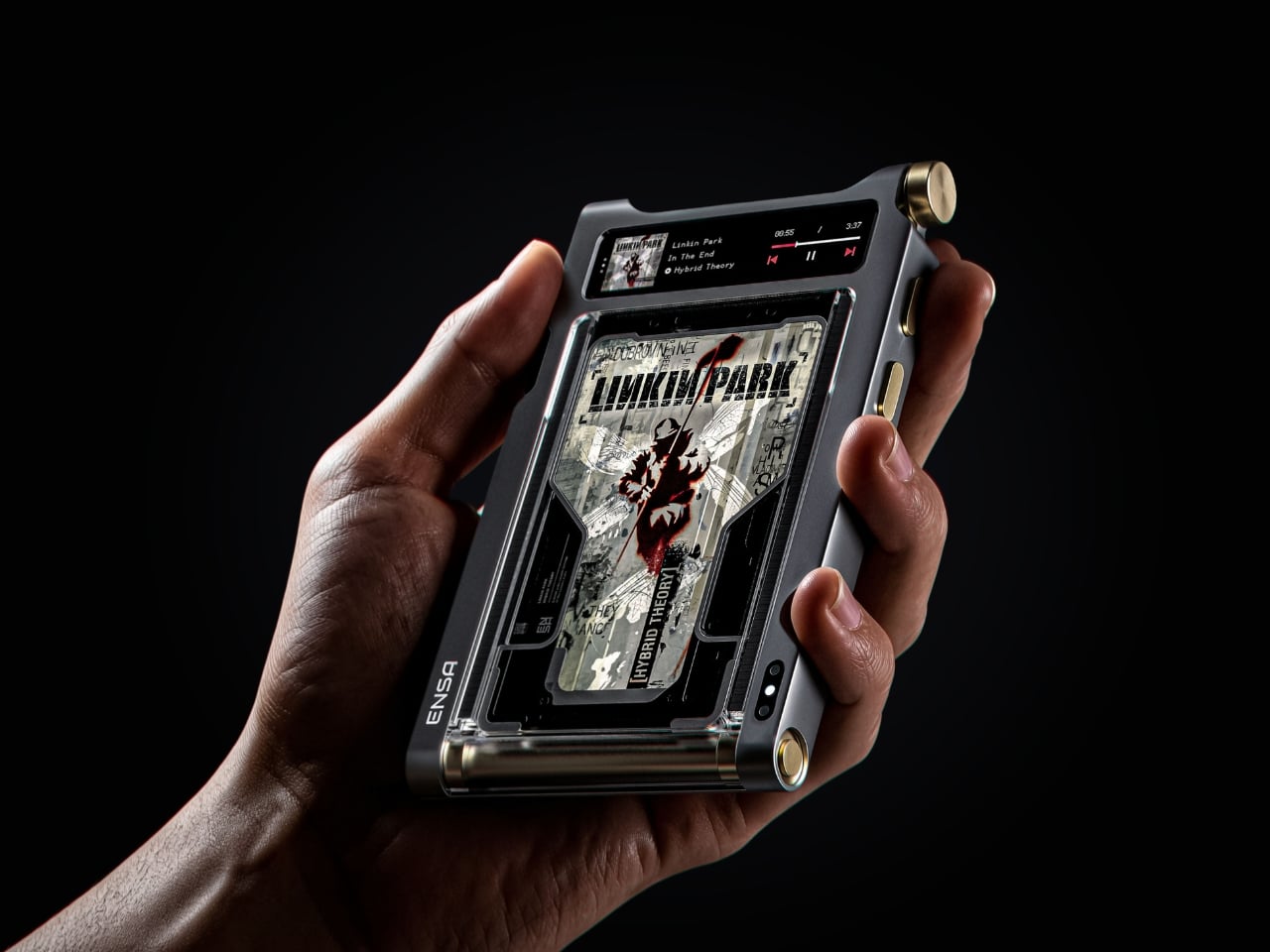
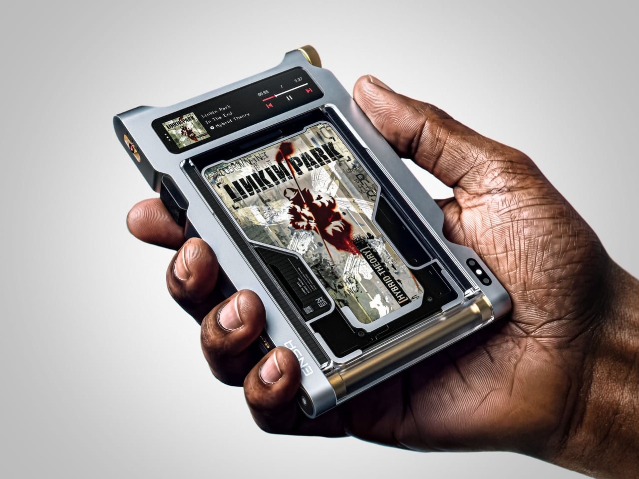
Streaming Took Something From Us. The ENSA T1 Wants It Back

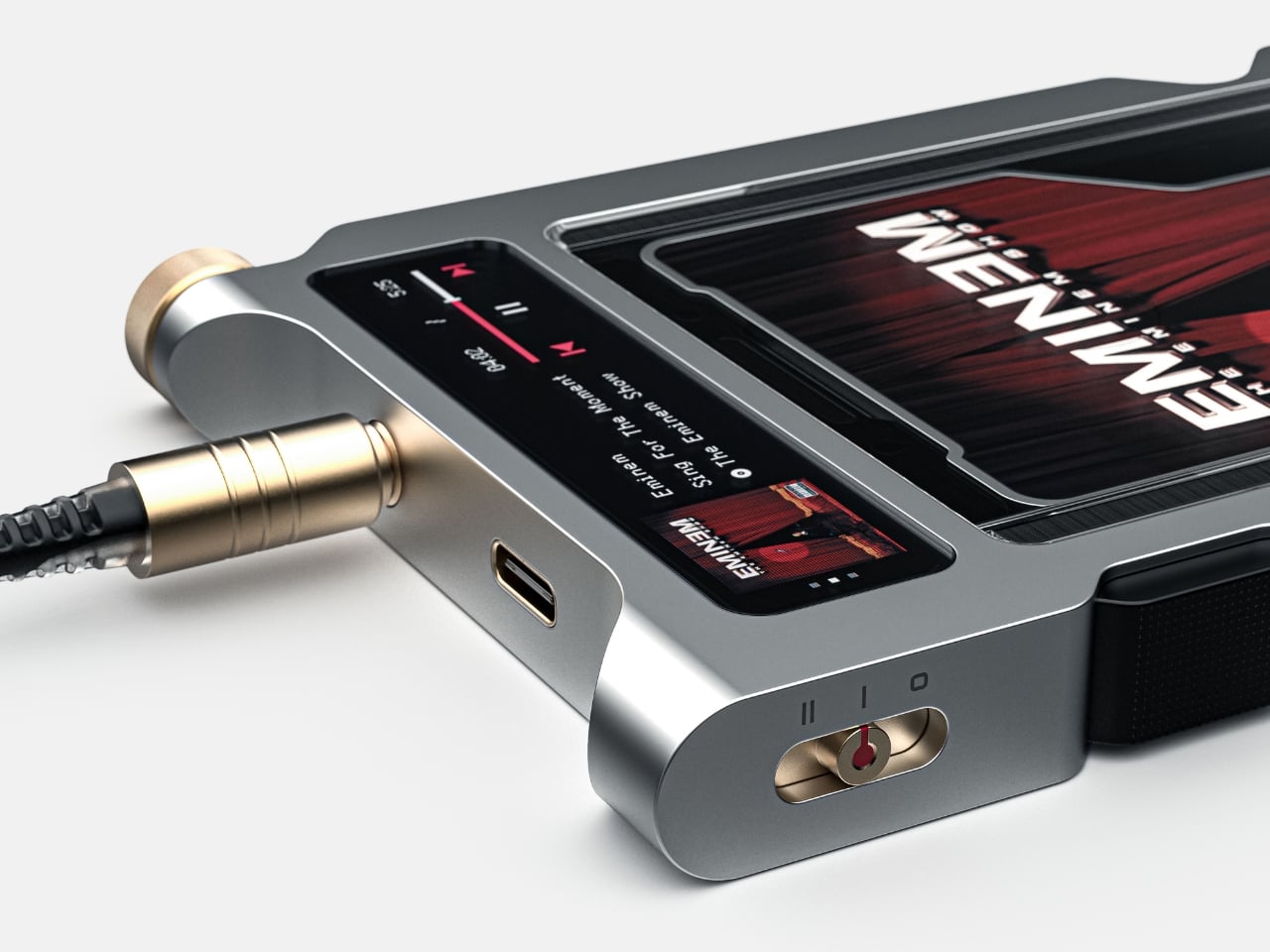
Do you remember the last time music actually demanded something of you? Not just your attention while you scrolled, but your hands. The deliberate pull of a record from its sleeve. The small, mechanical click of a CD case. The unhurried ritual that came before every song, every mood shift, every late-night session on the floor with the volume just loud enough. Vladimir Dubrovin remembers. The California-based multidisciplinary designer has been quietly building a case for returning physicality to the act of listening, and with the ENSA T1, his latest concept design, the argument gets considerably harder to dismiss.

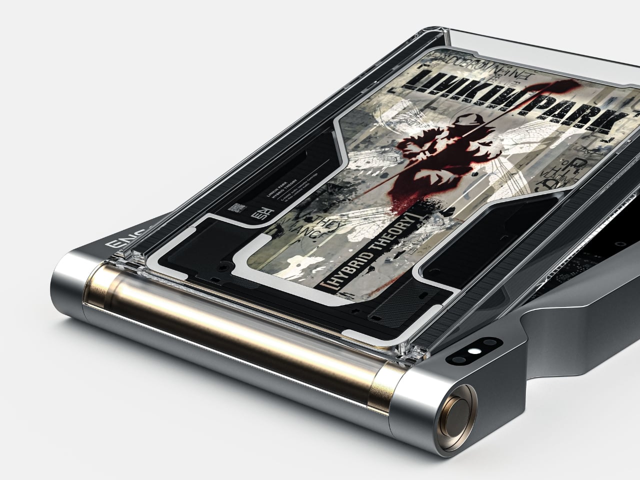
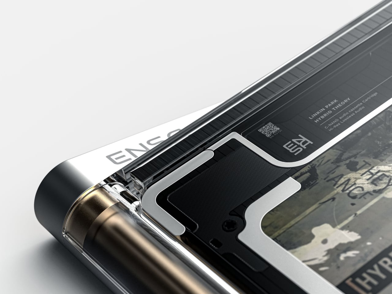
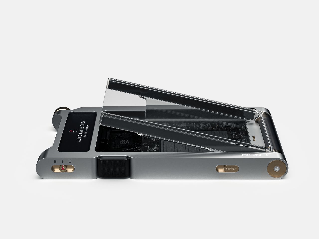
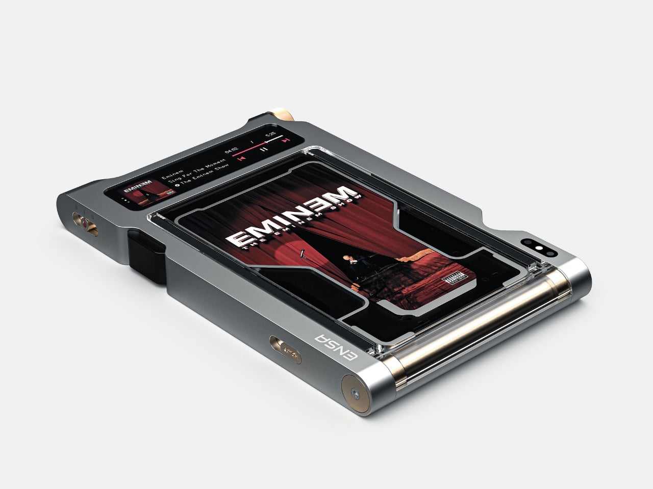
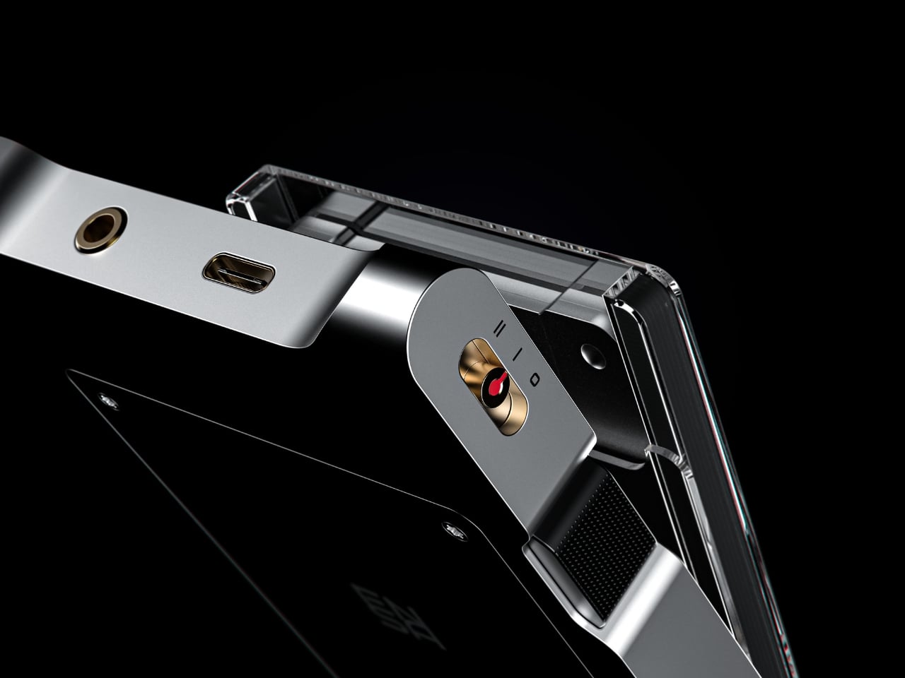
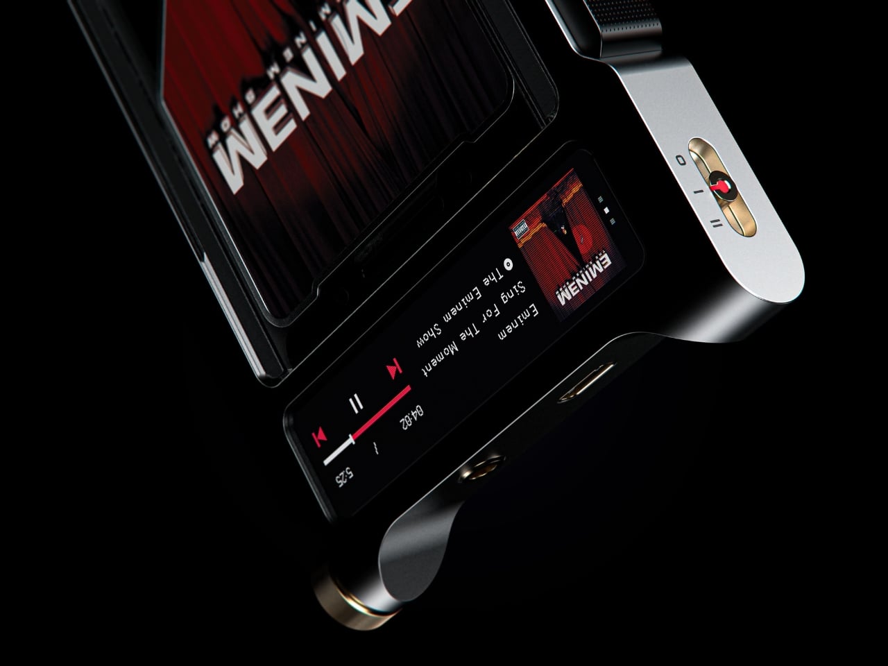
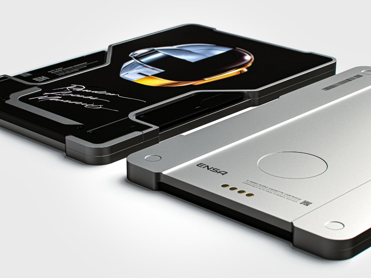
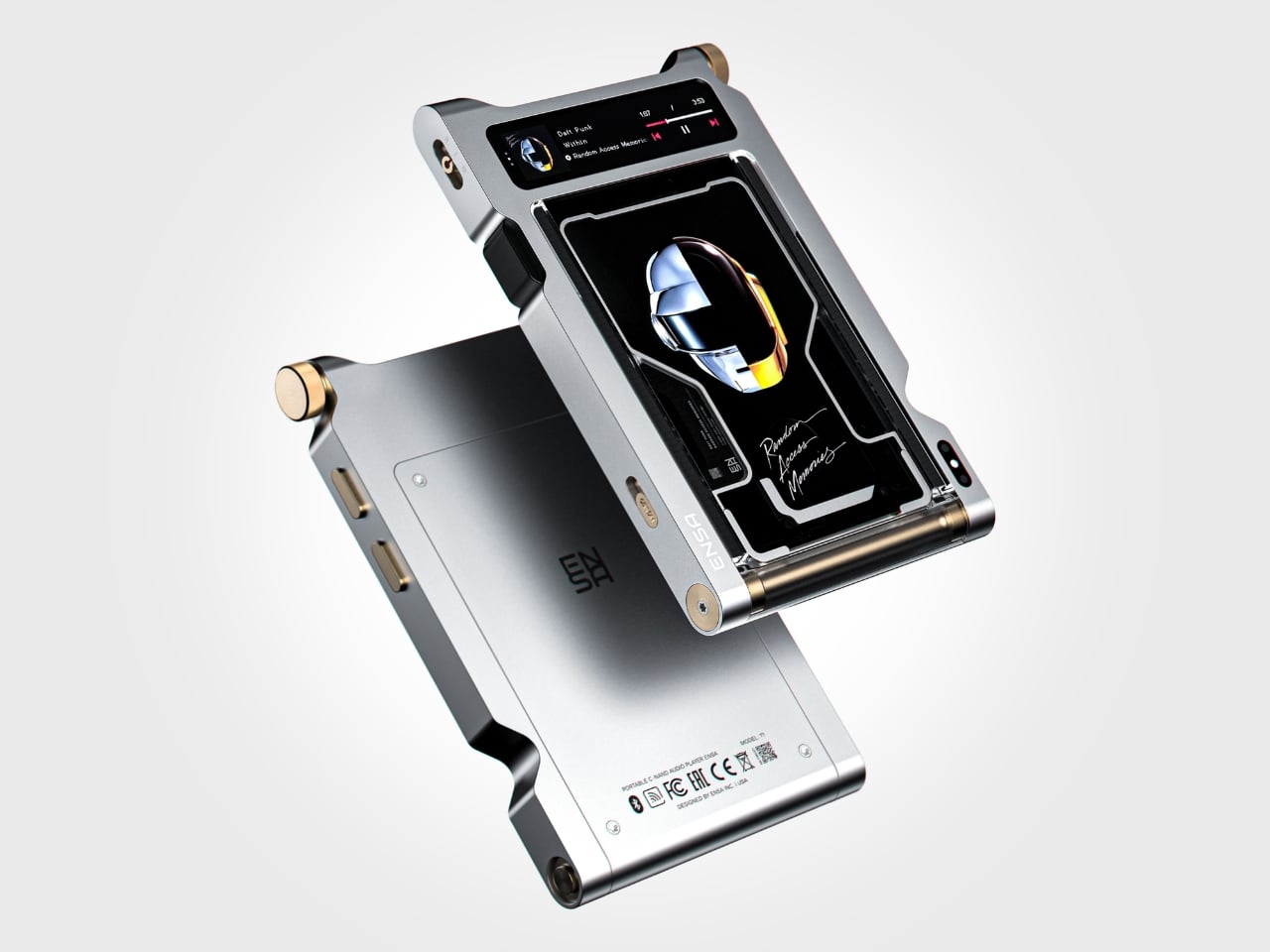
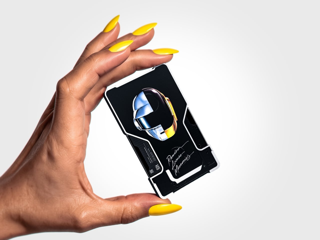
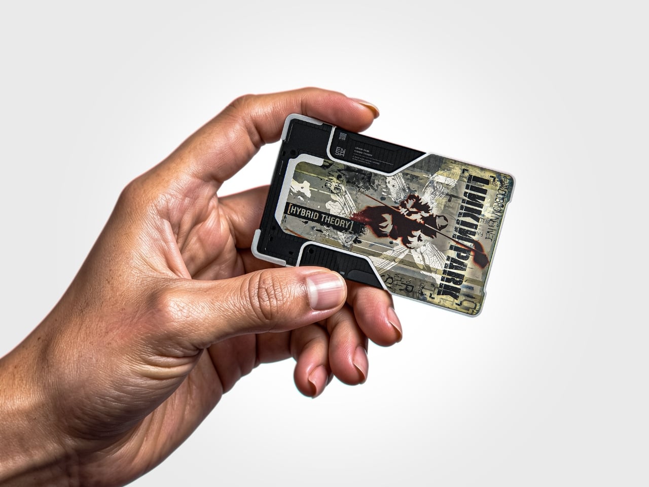
The T1 is the newest addition to Dubrovin’s ENSA line, an evolving design series that began with the ENSA P1, a portable audio player concept that reimagined what a music device could look and feel like in the post-streaming era. The P1 introduced Dubrovin’s concept of C-NAND cartridges: small, disc-shaped, solid-state storage units where each cartridge holds one complete album. There are no moving parts, no spinning mechanisms. They’re fully digital in how they handle audio, but they exist in the physical world the way vinyl does. You pick one up, turn it over, look at it, choose it. The act of choosing your music becomes deliberate again, and that matters more than it sounds.

Designer: Vladimir Dubrovin

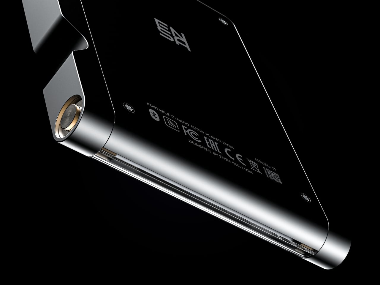
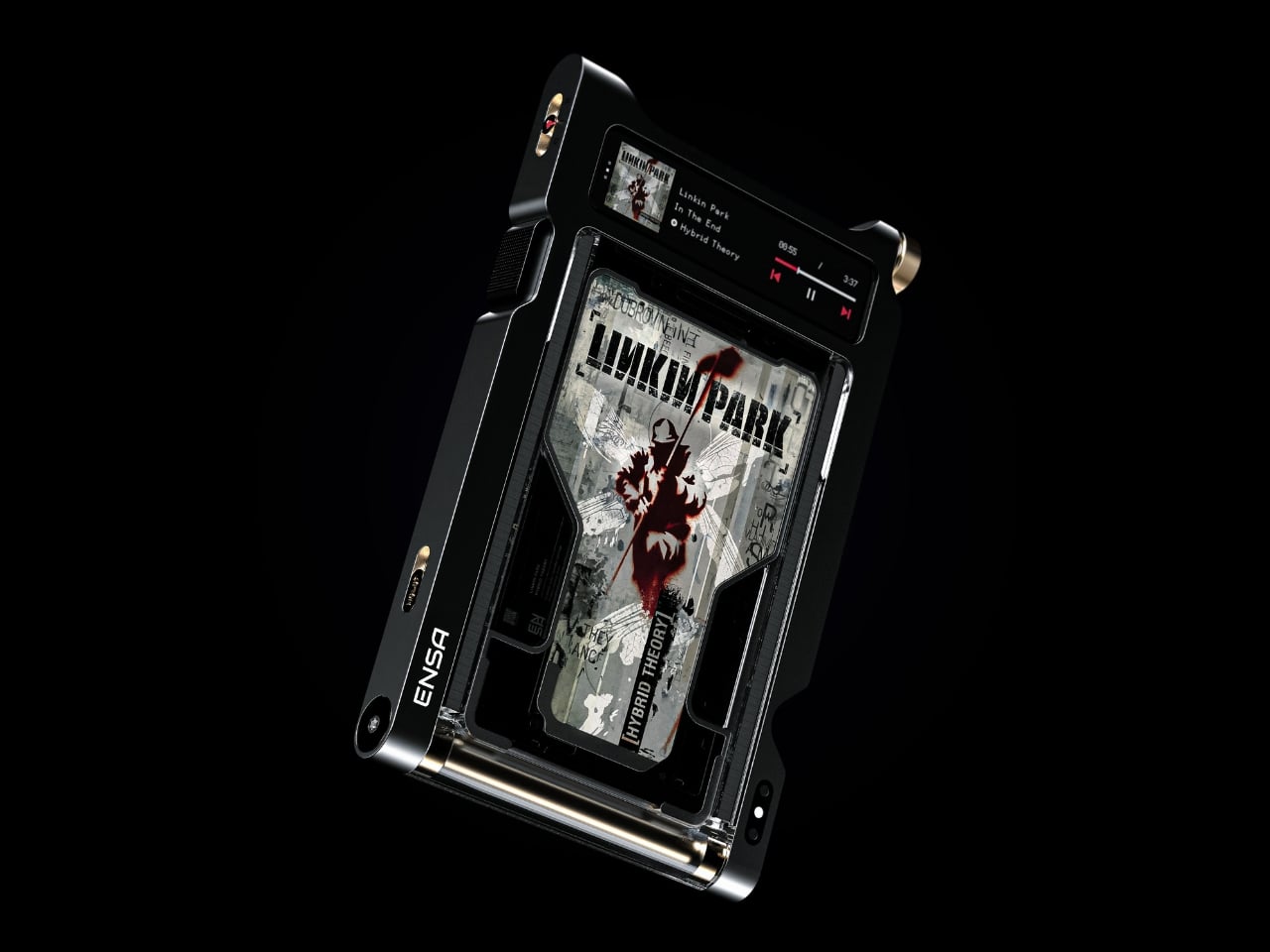
Where the P1 was built for portability and kept its design trim and pocketable, the T1 feels like the next chapter. Visually and conceptually, it carries the same DNA: clean, considered industrial design with an aluminum body and restrained detailing. But the T1 reads as something more anchored, a device you set somewhere permanent and return to, rather than slip into a bag. It’s a design that seems to understand the difference between music you consume and music you actually sit down for.

Aesthetically, Dubrovin’s approach has always felt less like tech product design and more like furniture-level thinking. The ENSA devices belong to the same visual conversation as early Braun electronics or a Dieter Rams concept sketch, where every detail either earns its place or gets removed entirely. The T1 continues that restraint. Its form doesn’t shout, which is precisely why it catches your eye. In a market saturated with speakers shaped like pebbles and smart displays with glowing rings, an audio device that looks like it was designed by someone who genuinely thought about what it means to own a piece of music is genuinely refreshing.

The broader question Dubrovin keeps posing with the ENSA project is one worth sitting with: what did we actually lose when music went weightless? Streaming solved convenience so completely that most of us never stopped to notice what the tradeoff cost. We gained access to everything and lost the kind of focus that comes from committing to a single album, from having music you could see, hold, or lend to a friend. The ENSA T1 is not trying to compete with Spotify. It’s asking whether the experience of music could mean something again, even if you have to build an entirely new format to get there.

It’s a concept project, not a product you can buy, and the realist in me knows that’s a significant caveat. Building out a new physical media format in 2026 is an uphill proposition at best. The infrastructure alone, manufacturing cartridges, convincing labels, and getting devices into homes, would require a level of industry commitment that’s difficult to imagine right now. But design concepts don’t have to ship to matter. The best ones articulate a desire most people feel but haven’t named yet, and the ENSA T1 does exactly that. The desire for music that has weight, that takes up space, that gives you something to do with your hands before the first note plays.

That’s why Dubrovin’s work keeps getting attention. The ENSA line isn’t nostalgic in the way that feels defensive or retrograde. It’s just honest about the fact that we traded something real for something convenient, and it’s asking, politely but persistently, if we’d like it back.

The post Streaming Took Something From Us. The ENSA T1 Wants It Back first appeared on Yanko Design.

  •  

Furniture Made From Wood Scraps You’d Actually Pay For

Every furniture workshop generates a particular kind of guilt. There are the offcuts, the trimmings, the odd-shaped remainders of boards that got cut to size and are now too small for anything useful, or so we assume. Most of them end up as kindling, compost, or landfill. We’ve accepted that as the cost of making things, a small fine paid for the privilege of precision. Studio Booboon is not interested in paying that fine.

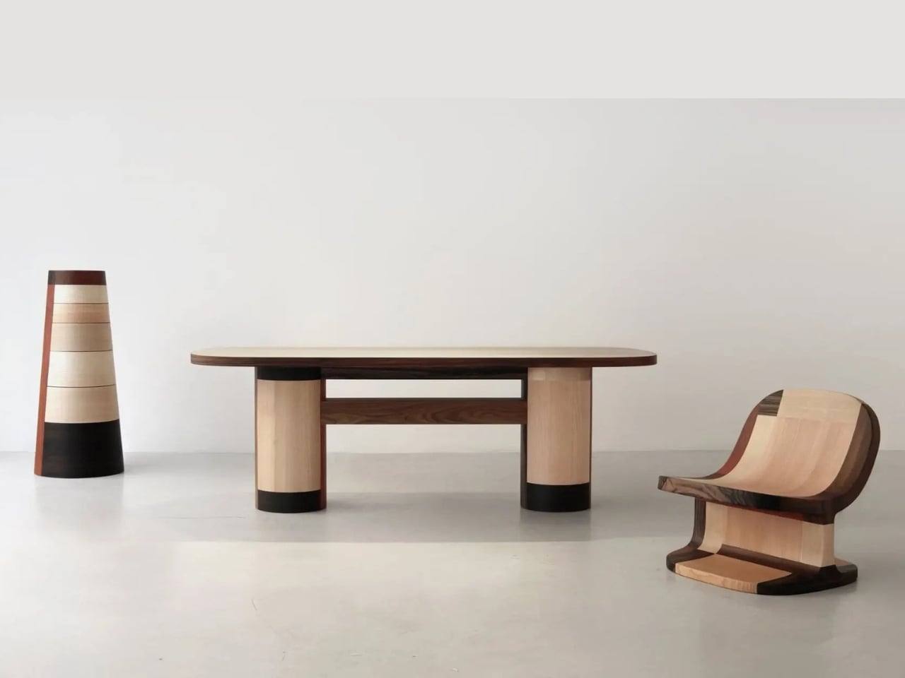
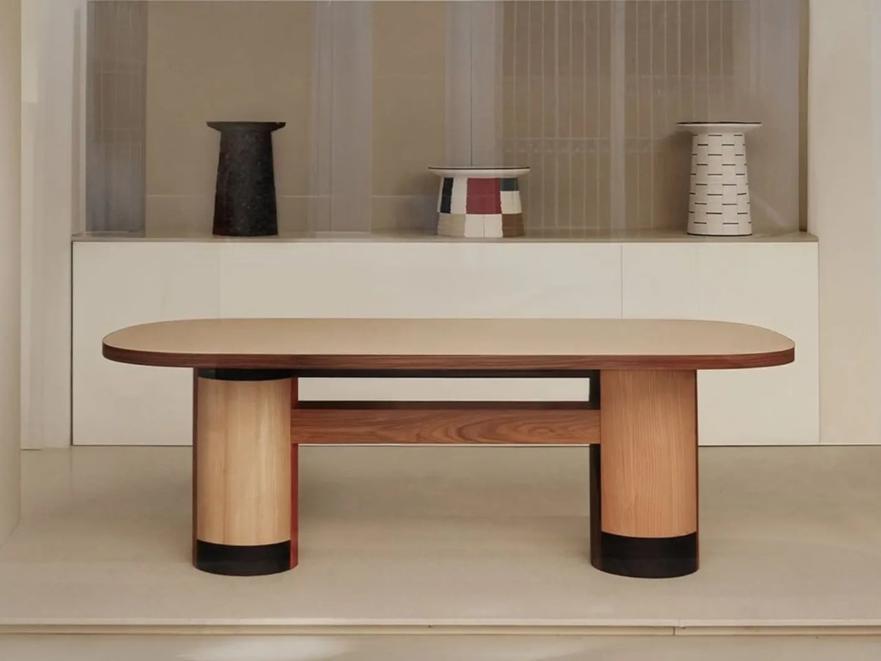
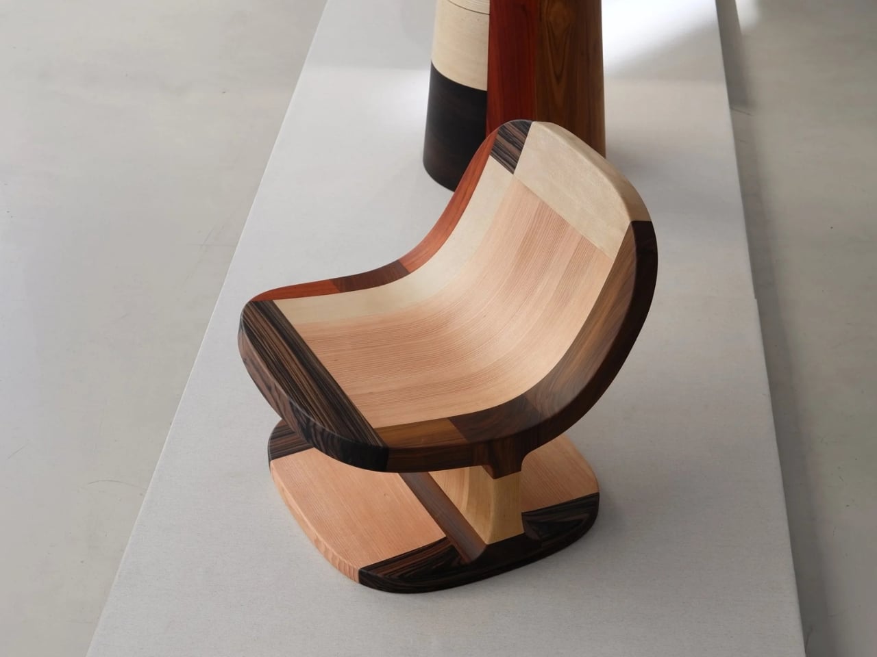
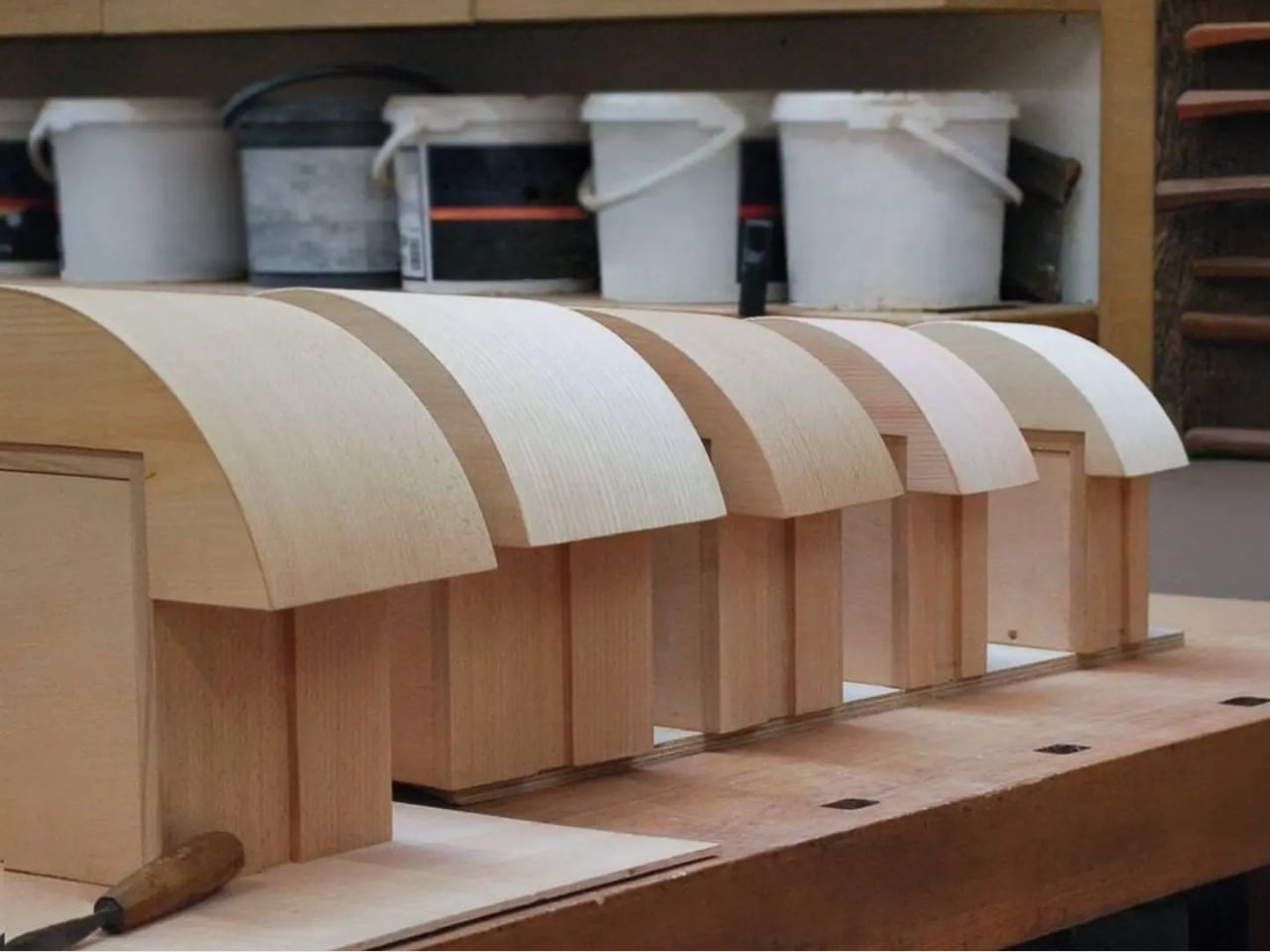
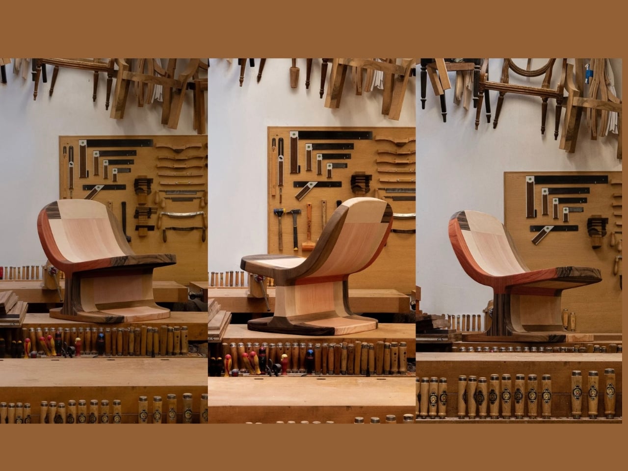
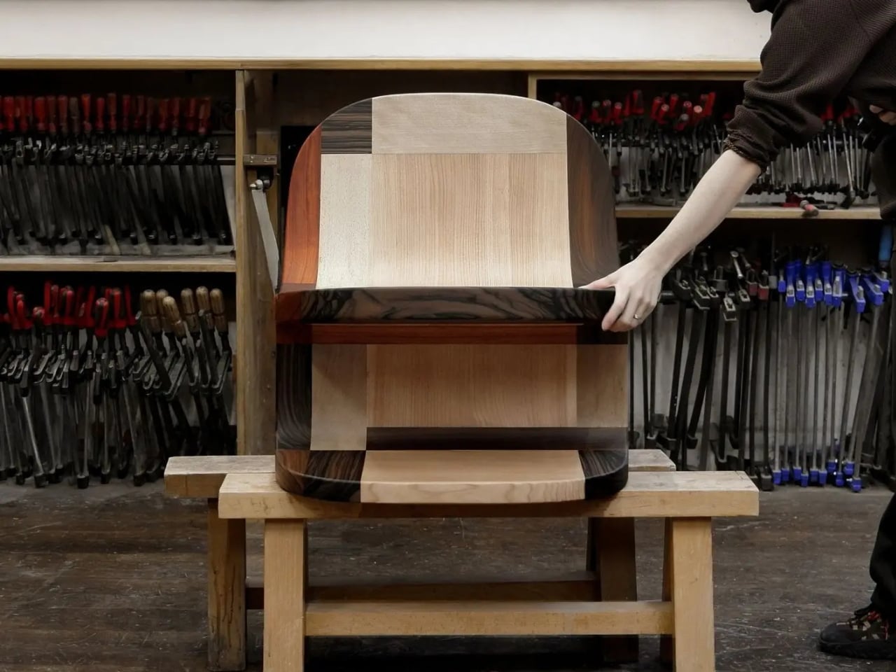
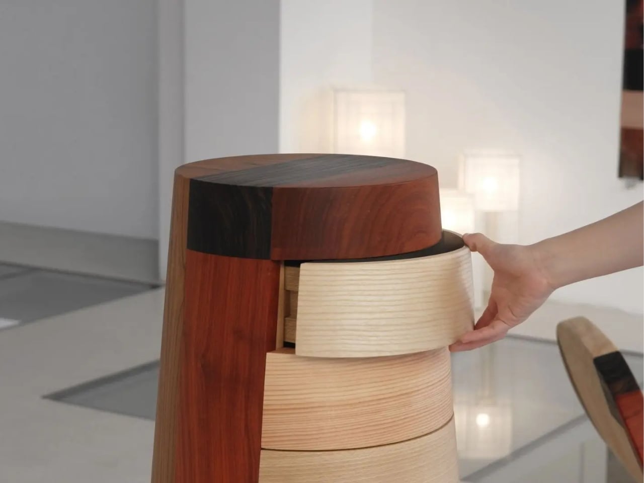
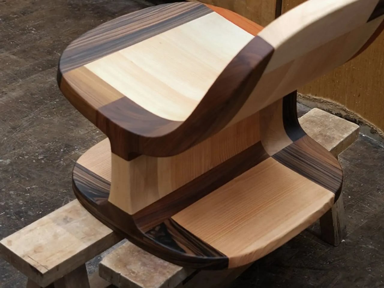
The Copenhagen-based studio, founded by Richard Bone and Jisu Yun, two designers who both trained under Japanese studio Nendo, released their latest collection, Fragments Becoming, and it’s exactly the kind of work that makes you wonder why no one thought to do it this way sooner. The collection is built entirely from timber offcuts, and before you picture something rustic or deliberately imperfect, let me be clear: these pieces are stunning. A cabinet, a dining table, and a lounge chair, each constructed from assembled fragments of discarded wood arranged with such precision and intention that the effect is closer to fine art than furniture-as-apology for sustainability.

Designer: Studio Booboon

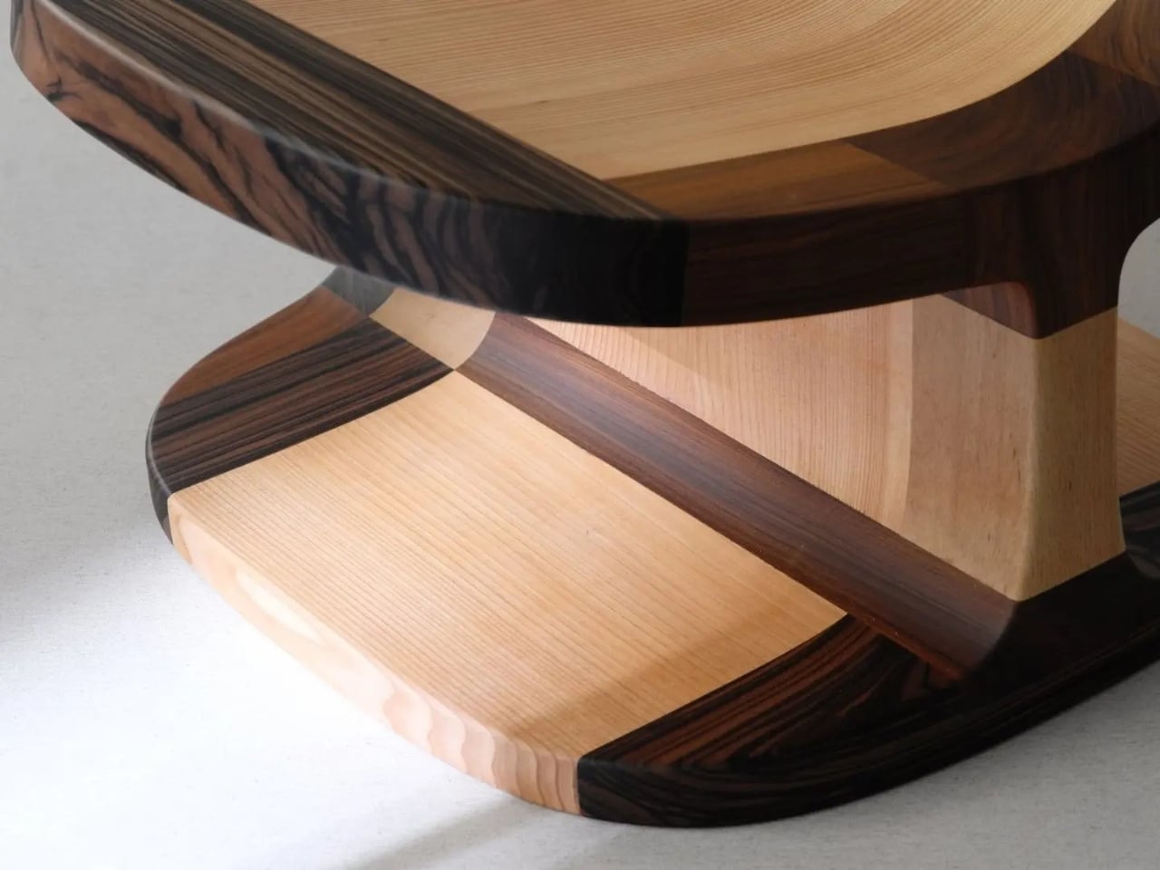
The concept the studio uses is something they call “3D marquetry,” which sounds technical but is actually a fairly elegant idea once you sit with it. Traditional marquetry, the kind you’d see on antique furniture or decorative boxes, applies a pattern to a surface. It’s essentially decoration laid on top of structure. What Studio Booboon does instead is treat each fragment of wood as the structure itself. The pattern isn’t on the cabinet door; the door is the pattern. It runs through the object’s entire volume, which means the visual logic and the physical construction are the same thing. That’s not a subtle distinction. That’s a fundamentally different philosophy.

What I appreciate about this approach is that it removes the option to hide mistakes. The studio works with unstained wood, which means every fragment has to earn its place on its own terms, no pigment masking a poor match, no stain blurring the edges. Each piece has to work compositionally before it works functionally. That kind of constraint tends to produce either chaos or brilliance, and in this case, it’s clearly the latter.

Bone and Yun bring a cross-cultural sensibility to the work that shows up in the details. Their debut collection, Playful Reappropriation, released at Milan Design Week 2024, pulled from Korean craft traditions, and Fragments Becoming continues that thread. The materials include hanji (traditional Korean paper), canvas, silk, and Ottchil, a Korean lacquer technique that adds depth without dominating the natural tones of the wood. The combination of a British RCA education, Korean craft heritage, and a shared apprenticeship at Nendo, one of the most conceptually rigorous studios in contemporary design, explains a lot about why this work feels so considered without ever feeling cold.

The collection premiered at Milan Design Week 2026 and later showed at Other Circle 2026 during 3daysofdesign in Copenhagen. That double-billing matters. Milan tends to reward spectacle, while the Copenhagen circuit rewards ideas. The fact that Fragments Becoming landed well in both contexts suggests it’s doing something more than just looking good in photographs, which, for the record, it absolutely does.

Sustainability in design has become such an overused talking point that the word barely registers anymore. Every brand gestures toward it. But there’s a difference between sustainability as a value and sustainability as a method, and Studio Booboon’s work lives in the second category. They’re not telling you the collection is responsible and letting the aesthetics carry a different message. The responsible practice is the aesthetic. The offcut isn’t hidden. It’s the whole point.

That feels rare enough to be worth paying attention to. Design tends to celebrate the new, the seamless, the perfect. Fragments Becoming makes a quiet argument that the incomplete, the leftover, and the discarded might be where the most interesting work is still waiting to happen.

The post Furniture Made From Wood Scraps You’d Actually Pay For first appeared on Yanko Design.

  •  

Honor Robot Phone Hands-on: Bold Phone With A Moving Camera Few Can Buy

After many teasers and demos, the Honor Robot Phone has finally and officially launched in China. It is also staying exclusive to the Chinese market for now, with Honor not planning an international release at this stage. That alone will make it a frustratingly out-of-reach device for many, because this is one of the rare smartphones that feels genuinely different at first glance.

Part of the reason the launch has drawn so much interest is that Honor first revealed the Robot Phone at MWC earlier this year, where it quickly became one of the event’s biggest conversation pieces. Even in a show packed with concept hardware and camera claims, this was the device that made people stop, stare, and ask how it actually worked. Now that it has moved from trade show reveal to commercial launch, the Robot Phone still feels just as unusual.

Designer: HONOR
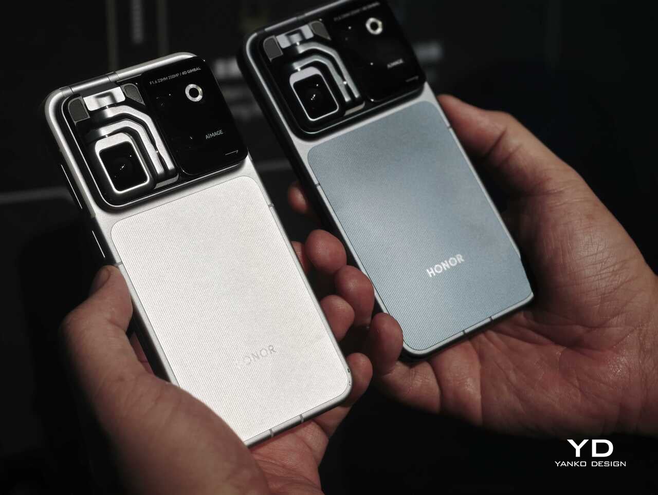
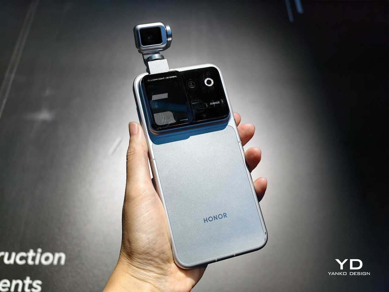
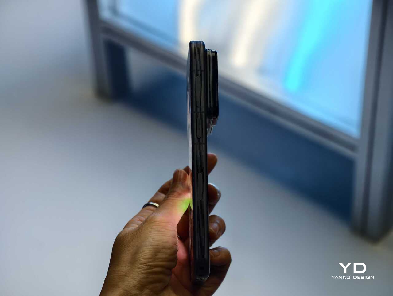
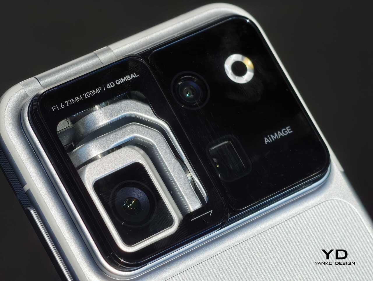
Rather than chasing attention with another familiar camera bump or an incremental spec upgrade, Honor has built a robotic gimbal directly into the phone itself. The result is a camera system that can physically move, track, tilt, and stabilize in ways a conventional flagship simply cannot. After spending time with the device, it is clear the Robot Phone is not just trying to be another premium handset with a long feature list. It is trying to pitch a new idea for what a creator-focused smartphone can be.

The big story is movement, not just megapixels

The core pitch behind the Honor Robot Phone is easy to understand once you see it in person. Honor has integrated what it calls a 4DoF Titanium Agile Gimbal into the phone, effectively turning the camera into an active moving system rather than a static sensor setup. The company says the module is 65 percent smaller than traditional gimbal solutions while also offering a 200 percent increase in structural strength, allowing it to fit inside a premium smartphone body without turning the device into a bulky experiment.
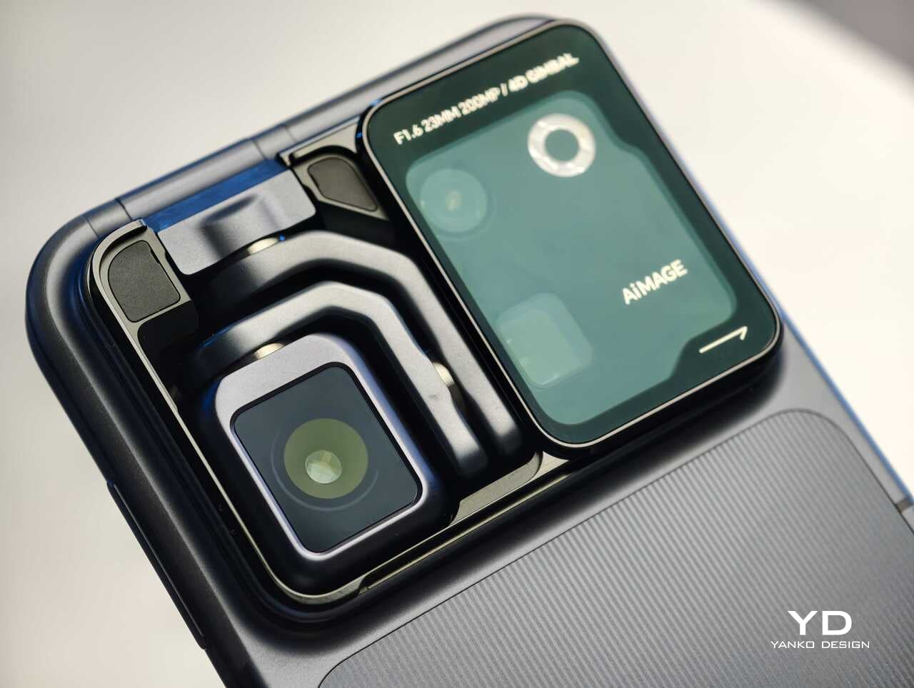
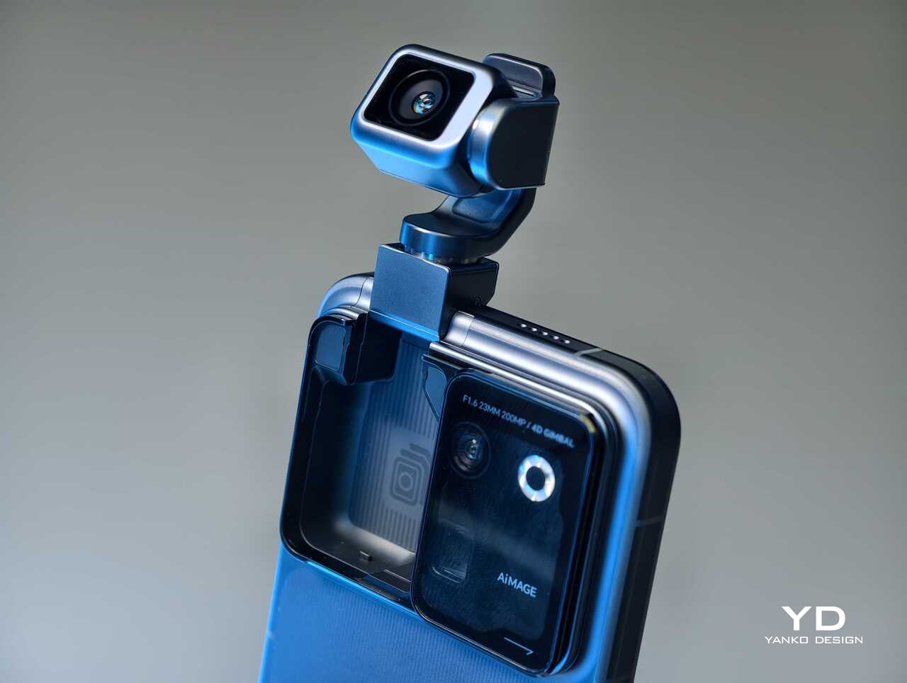
That change in hardware philosophy is what makes the Robot Phone immediately stand out. In practice, the moving camera module is meant to deliver smoother stabilization and more dynamic motion than a normal smartphone can manage on its own. Honor is also building in multiple movement modes, including Tilt Lock, First Person View, FPV Vertical, and AI SpinShot, all of which are designed to make mobile footage look more deliberate and more cinematic.

Honor is aiming this squarely at creators

The second half of the launch story is imaging. Honor says the Robot Phone is the first major product from its Cinematic Imaging Partnership with ARRI, bringing selected elements of ARRI Image Science and professional cinema workflow ideas into a smartphone. That includes ARRI LogC3 recording in ARRI CINEMA mode on the main gimbal camera, alongside ARRI Wide Gamut 3 and ARRI Looks.
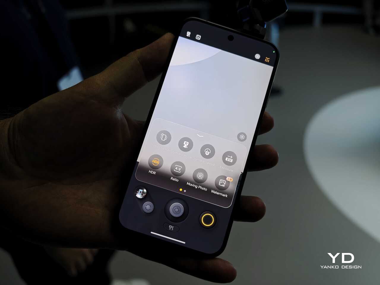
On paper, the camera hardware is also extremely ambitious. The rear setup pairs a 200MP Agile Gimbal Main Camera with a 1/1.28-inch sensor and F1.6 aperture with a 200MP periscope telephoto camera using a 1/1.4-inch sensor and 2.7x optical zoom. A 50MP ultra-wide camera completes the setup. Honor is also claiming AI noise reduction improvements, up to 14 stops of dynamic range, and a video pipeline designed to preserve more usable information for post-production.

That is a lot of technical language, but the broader message is straightforward. Honor does not want the Robot Phone to be seen as a novelty. It wants this to be taken seriously as a compact filmmaking and creator tool.

Hands-on: The Honor Robot Phone feels different right away

The most striking thing about the Robot Phone in person is that its main feature is visible. So many smartphone launches revolve around internal improvements that are difficult to appreciate without extensive testing. Here, the big idea is immediately obvious. The camera module moves. It tracks. It gives the phone a sense of physical intention that most handsets simply do not have.
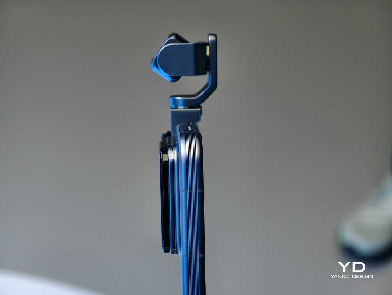
That makes the Robot Phone more memorable than most new flagships before you even get into image quality. Instead of relying entirely on software stabilization and fixed hardware, Honor is trying to introduce actual camera movement into the smartphone experience. In a short hands-on session, that makes the device feel less like a standard phone with a flashy camera and more like a compact production tool that happens to fit in your pocket.

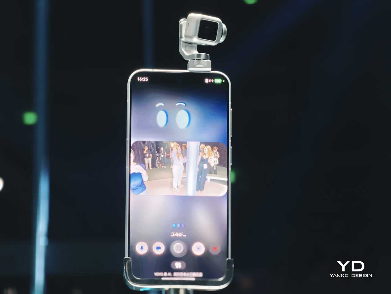
The tracking and movement features are also easier to appreciate in person than they are on a spec sheet. AI Live-Tracking, gesture controls, and voice-directed movement all sound abstract on paper. Once you see the phone physically following a subject or repositioning itself, the concept becomes much easier to understand. Whether that turns into something essential in everyday use is a bigger question, but as a first impression, the idea lands more convincingly than I expected.
Using the on-screen virtual joystick, I was able to adjust the gimbal with surprising precision. The interface crams in a lot of features, so it does take some time to learn. Even so, the gimbal feels very responsive, which helps the controls feel more intuitive once you settle in.

There is still a full flagship wrapped around the concept

Outside the headline camera hardware, Honor is still treating the Robot Phone like a proper premium device. It is powered by the Snapdragon 8 Elite Gen 5, backed by a custom cooling system that is meant to keep performance stable during longer recording sessions. There is also a 7060mAh silicon-carbon battery, with support for 120W wired charging and 50W wireless charging.
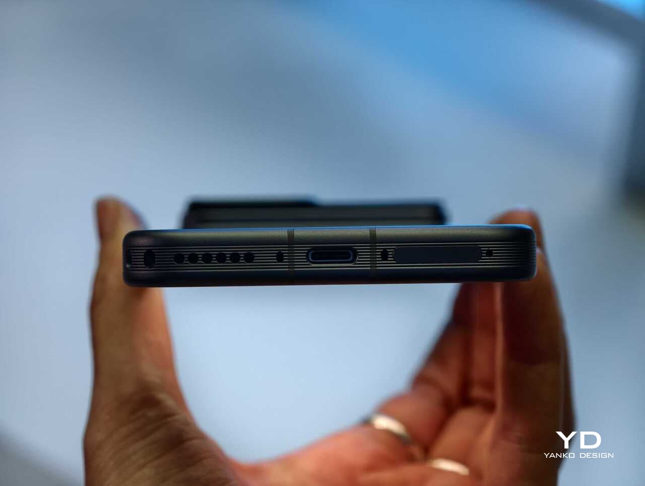
The rest of the hardware sounds suitably high-end too. Honor is using an all-metal unibody design paired with a 6.31-inch LTPO OLED display, an adaptive 1 to 120Hz refresh rate, and a claimed peak brightness of 6800 nits. On paper at least, this is not a concept phone built around one attention-grabbing trick. Honor is trying to package an experimental camera idea inside a full flagship experience.

China-only for now, and that is a shame

For now, the Honor Robot Phone is launching only in China, where it might be staying indefinitely. Honor is not planning to release the device outside China at this stage, which means this unusually creator-focused phone is set to remain a domestic-market curiosity rather than a broader global play.
That is disappointing, because the Robot Phone feels like exactly the kind of launch the smartphone market needs more of. It may not be for everyone, and there are obvious questions about durability, long-term usefulness, and whether creators will trust a built-in robotic camera system over dedicated gear. Even so, it is difficult to dismiss because the concept is so easy to understand once you see it in action.

Early thoughts

After a brief hands-on, my early take is that the Honor Robot Phone feels niche but genuinely fresh. The robotic gimbal is not just a visual gimmick for launch-day headlines. It changes the way the device presents itself, and potentially the way some people shoot with it. Whether that translates into a truly great camera phone will need more time to answer, but as a statement of intent, Honor has made one of the boldest smartphone moves of the year.

The bigger frustration is that, for now, it is a bold move that most of the world will only be able to watch from a distance. First teased at MWC earlier this year and now officially on sale in China for 9,999 yuan (roughly $1,483) for the 12GB+512GB variant and 12,999 yuan (around $1,928) for the 16GB+1TB variant, the Robot Phone is not about to become the next mainstream global flagship. Still, even as a limited-market release, it stands out as one of the most unusual and ambitious smartphones to arrive this year.
The post Honor Robot Phone Hands-on: Bold Phone With A Moving Camera Few Can Buy first appeared on Yanko Design.

  •  

You can dodge rising prices with a discount on one of Razer's best gaming keyboards — and it totally helps with your studies, too

Razer's gaming keyboards rank among the best on the market, whether you're looking to crush the competition in games or type up school reports. However, if you've ever shopped around, you've probably noticed how many are on the higher end of the affordability scale.

Crush the new semester with Razer keyboards

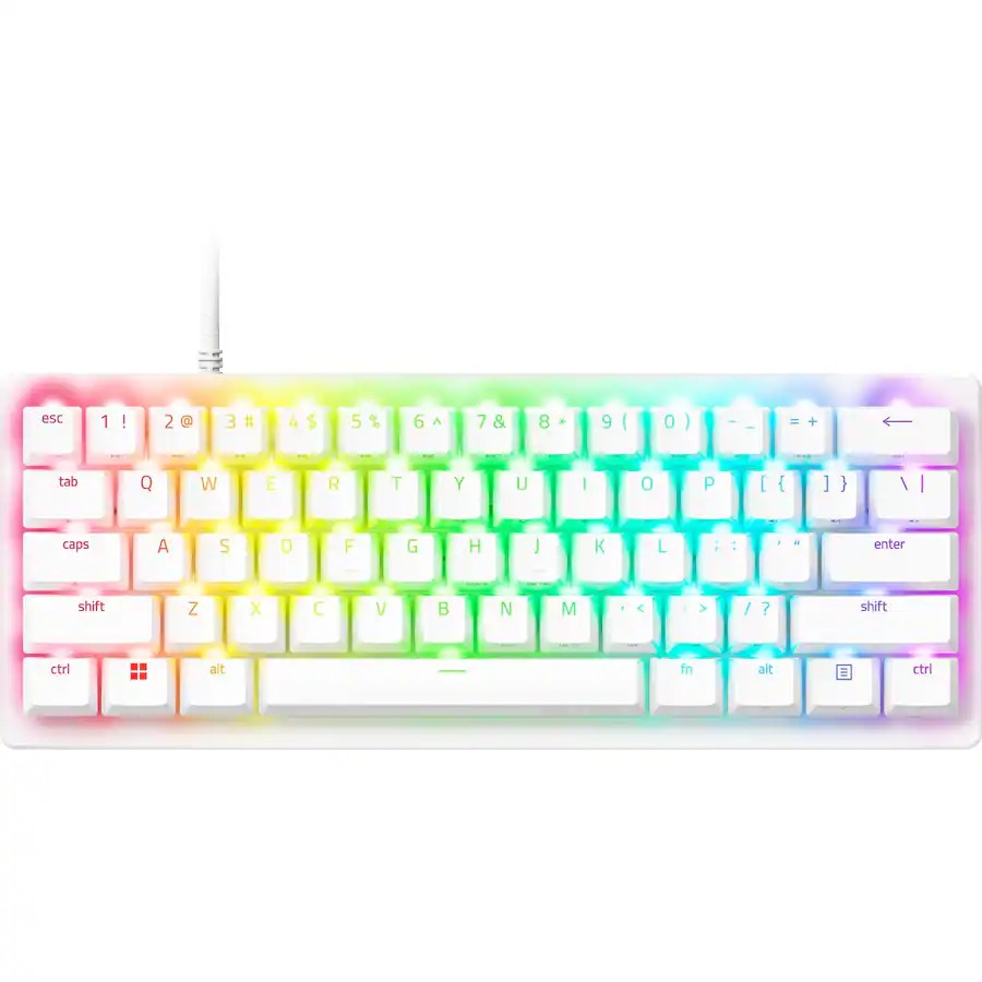
Fortunately, one of Razer's top-rated wired gaming keyboards, the Huntsman V3 Pro 60%, has managed to evade lofty pricing for a limited time, thanks to a 28% discount bringing it to $129.99 at Best Buy, giving you a chance to get a leg up on multiplayer and get a head start on your studies for less.


"Your hands are certainly going to fall in love with the textured keycaps, robust switch feel, and fantastic analog features." — Tabitha Baker, Managing Editor (Hardware) at our sister site, GamesRadar+

GamesRadar+ review: ⭐⭐⭐⭐½View Deal

What buy the Razer Huntsman V3 Pro Mini 60%?

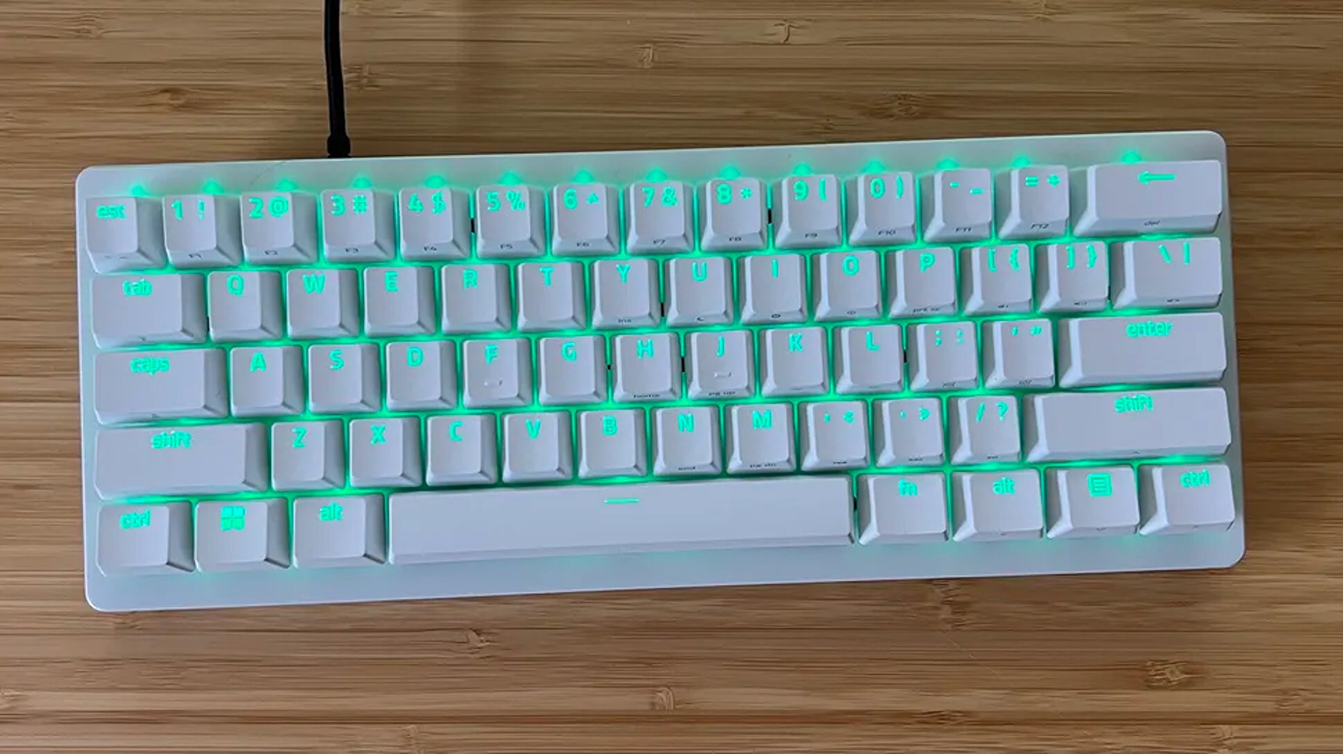
A compact white mechanical keyboard with glowing green backlighting sits on a light brown wooden desk, viewed from directly above in a top-down shot.

A top view of the Razer Huntsman V3 Pro 60% keyboard. (Image credit: GamesRadar (Tabitha Baker) | Razer)

For starters, this keyboard features Razer's Analog Optical Gen-2 switches, which grant it extremely precise and responsive input detection speeds, which can be enhanced further with a Rapid Trigger mode and adjustable actuation that ranges between 0.1 mm and 4.0 mm.

The Huntsman V3 Pro 60% also features textured double-shot PBT keycaps with a keystroke lifespan of 100-million clicks to help it endure many years of intense button mashing.

Other notable features include a sleek and compact 60% form factor that makes it very portable-friendly while saving tons of vital desk space, buttons that double as arrow keys, and a Razer Snap Tap feature, which prioritizes the latest input between two selected keys without letting go of the previous one for near-instant directional movements in action games.

The only noticeable drawbacks of this keyboard are the somewhat noisy switches with no sound dampening (as noted in GamesRadar's review), the lack of wireless connectivity, and its usually steep listing price of $179.99.

So, it's a blessing to see its high price taken down to somewhat more affordable levels thanks to Best Buy's 28% discount, especially during this general RAM crisis where almost everything else in tech has become so insanely expensive.

If you're looking for a high-quality wired gaming keyboard that doubles as a high-speed workhorse keyboard for helping you ace exams or assignments, you can't go wrong with the Razer Huntsman V3 Pro 60%.

Frequently Asked Questions

Is it wireless?

No, this keyboard connects to devices purely through wired connections via a detachable USB-C to USB-A cable.

Is compatible with consoles?

While it can connect other devices via USB connections, the Razer Huntsman V3 Pro Mini 60% keyboard's configuration software is only operable on Windows PCs.

What is it a 60% keyboard?

60% keyboards are 60 percent the size of a standard, full-sized keyboard that removes the numpad, top row function keys (F1-F12), arrow keys (although the Razer Huntsman V3 Pro 60% keys that double as arrow keys), and the navigation cluster, leaving only the main typing key area intact to save desk space and make it more portable-friendly.

Click to join us on r/WindowsCentral

Join us on Reddit at r/WindowsCentral to share your insights and discuss our latest news, reviews, and more.

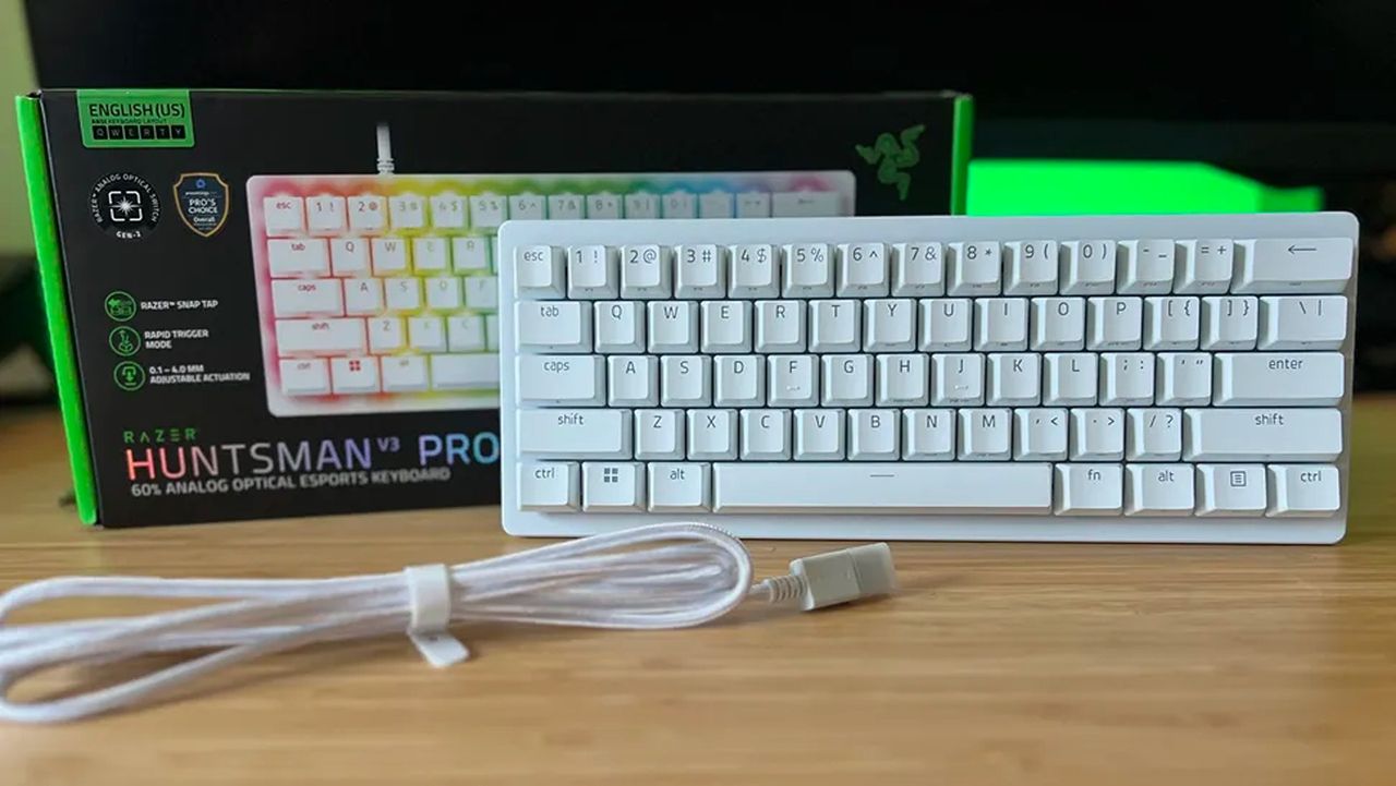
A white Razer Huntsman V3 Pro 60% analog optical esports keyboard sits in front of its black product box on a wooden desk with a coiled white cable.

The Razer Huntsman V3 Pro 60% keyboard with its box and detachable USB cable

  •  

I never thought I'd call a Razer gaming keyboard a bargain, but the wired Huntsman V3 Pro is a steal right now

Razer's gaming keyboards have consistently ranked as some of the best you could buy, and, of course, they double up as generally excellent options for work and studies. Because let's be honest, if a keyboard doesn't feel good for actual typing, then is it even doing its job?

Crush the new semester with Razer keyboards

We already praised the Huntsman V3 Pro as "the world's most advanced gaming keyboard", and for now, the downside of its high price has been solved as the tenkeyless (TKL) model drops to $124.99 at Best Buy. Compared to its original MSRP of $219.99, it's instantly a much more tempting pick.

That $95 price drop stands alongside a discount on the full-size variant that we tested, bringing that to $180.74 with a much more specific $69.25 discount. Either way, you'll gain access to Snap Tap, Razer's solution for perfect counter-strafing in FPS games that prioritizes the most recently pressed button.

Personally, I prefer to ditch the numberpad for more desk space, so the TKL is perfect for me. It's also enjoying a bigger discount right now, making it even better value.View Deal

No compromises for larger desks; this gives you everything.
"The Huntsman V3 Pro is one of the best keyboards I've ever used." — Zachary Boddy, Former Staff Writer
Windows Central review: ⭐⭐⭐⭐View Deal

What makes the Huntsman V3 Pro so good?

Image of the Razer Huntsman V3 Pro gaming keyboard.

Razer throws in a wrist rest alongside its wealth of extra keys. (Image credit: Windows Central | Zachary Boddy)

Adjustable actuation is one of those phrases that crops up around keyboards, and it's a feature that shines when you have the time to dig into it. Essentially, you can change the depth at which the optical switches underneath the keys detect a valid press, usually opting for shallow pushes during gaming and more deliberate, deeper pushes for typing.

If you're into tweaking and personalization, you'll get a lot out of it by fine-tuning the actuation and saving it to one of the on-board memory profile slots. That, paired with its brushed aluminum chassis and double-shot PBT textured keys for more durable lettering, makes for a comfortable typing experience.

On the flip side, we noted in our (full-size) Razer Huntsman V3 Pro review that the leatherette wrist rest isn't perfect, but it is magnetic, so if you'd rather use it only for typing and remove it for a night of gaming, it's easy to detach. I'd recommend giving it a fair try, as it's generally better to use something to support your wrists than nothing at all, but your mileage may vary.

Overall, this discount makes the Huntsman V3 Pro, whether TKL or full-size, an absolute bargain. Even if you don't make use of all the extra dials at first, diving into customization would help you assign them to your most-used features soon after. It's a quality wired keyboard that works just as hard for daily typing, so you could probably argue it's a back-to-school expense if you tried.

Frequently Asked Questions

Is the Huntsman V3 Pro wired or wireless?

This is a wired gaming keyboard with a braided USB Type-C to USB Type-A cable. It can be detached and replaced with a longer variant, but the keyboard will not operate wirelessly.
What's the difference between full-size and TKL?

A full-size keyboard includes a number pad and is what you might think of as a "standard" model. TKL stands for tenkeyless, and it drops the numeric keypad to save space while retaining the arrow keys and the home/end keys.

Is this a mechanical keyboard?

The Huntsman V3 Pro does not use mechanical switches; instead, it features optical key switches that operate like magnetic Hall-Effect sensors found in popular joypads to support its adjustable actuation.

Click to join us on r/WindowsCentral

Join us on Reddit at r/WindowsCentral to share your insights and discuss our latest news, reviews, and more.

Image of the Razer Huntsman V3 Pro gaming keyboard.

Razer's discounted Huntsman V3 Pro is built for gaming performance but offers a superb typing feel.

  •  

The Luxury Hotel Concept That Works Like a Food Truck for Wilderness

Luxury hotels have always had a location problem. The kinds of places that would make the most extraordinary backdrops, remote desert plains, rolling highland meadows, dramatic canyon edges, are almost never the places where a hotel can legally or practically be built. Extending infrastructure to those sites, from power grids to road access to permanent foundations, tends to either cost too much or damage the very landscape that made the location worth visiting.

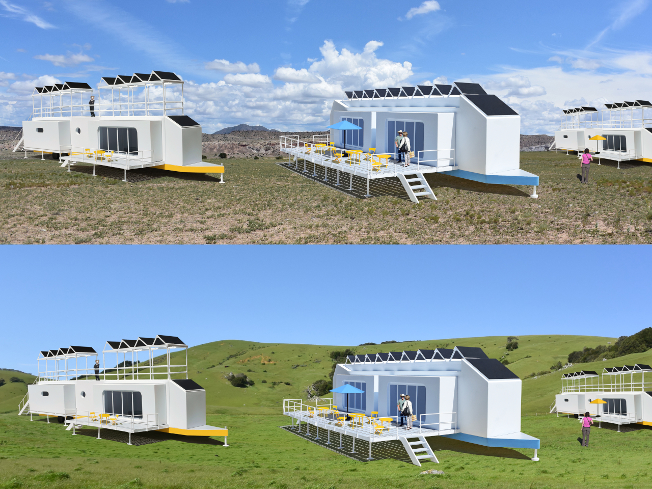
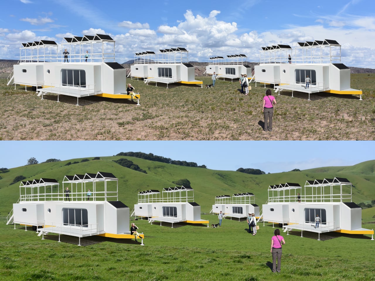
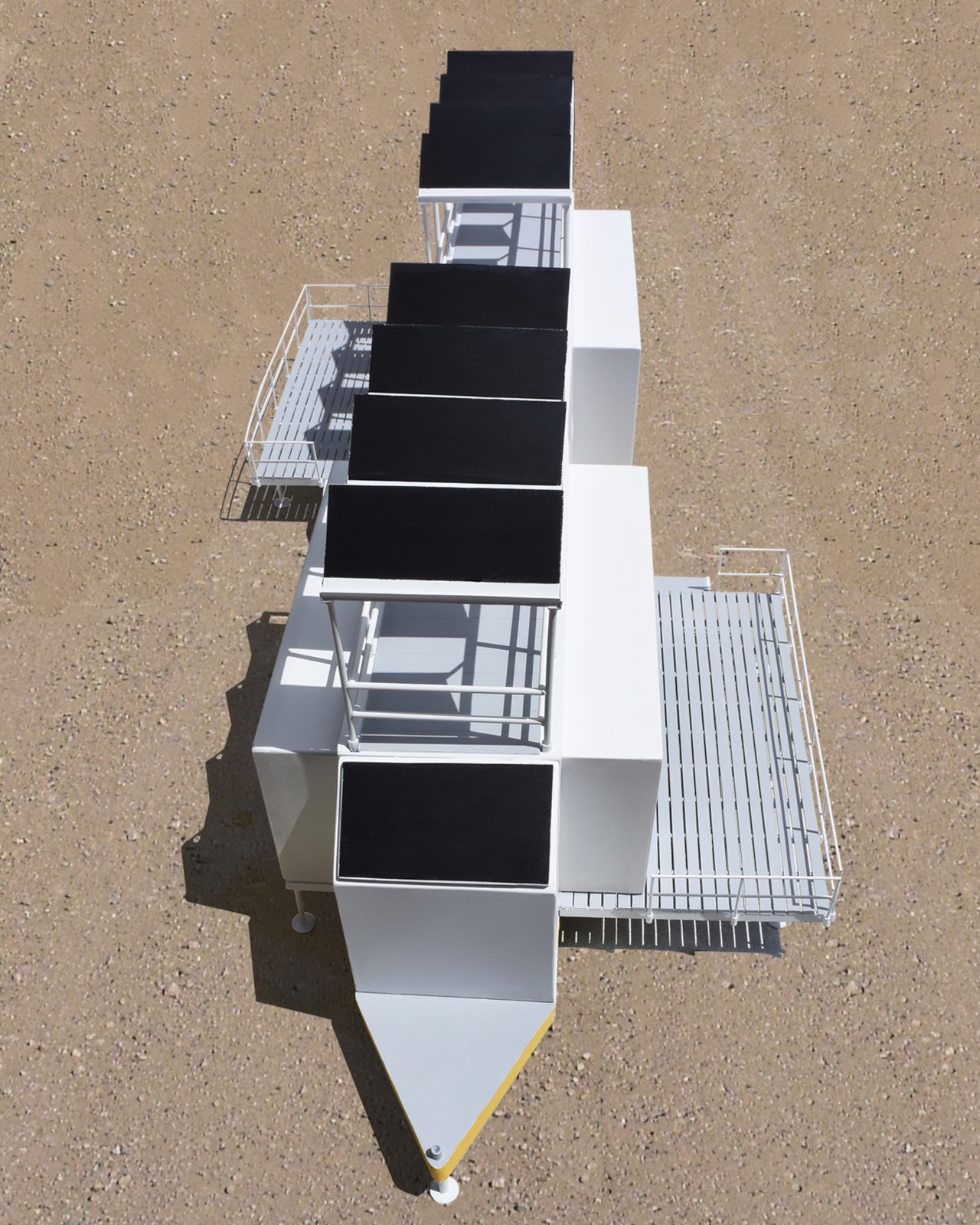
The Mobiltels concept approaches hospitality from a completely different direction. Rather than building a permanent structure and hoping the location is compelling enough, each Mobiltel unit is designed to fold into a compact, truck-towable trailer, be driven to wherever the landscape is most remarkable, and then unfold into a functioning luxury accommodation. When the stay is over, it packs up and leaves without leaving much evidence behind.

Designer: Michael Jantzen

Three distinct unit types make up the proposed resort ecosystem. The first is the guest accommodation module, which deploys into two full hotel-style rooms, each with a private bath and its own private deck. The roof extends into a communal deck shaded by solar panels that generate the electricity to power the unit, while a second panel mounted on the exterior heats the water. The entire structure, decks and all, folds back into a trailer tight enough to tow down a highway.

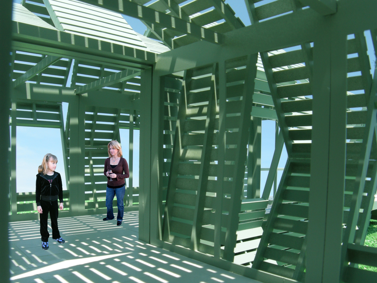
The second unit is a solar-powered café and coffee shop that unfolds to reveal four outdoor dining decks with full kitchen and restroom facilities. The third is a large shade structure intended for gatherings, private events, and communal lounging, built as a striking open lattice that collapses into a flat-load trailer for transport. Additional unit types can theoretically follow the same logic, meaning a full resort amenity list could be assembled and disassembled as needed.

The off-grid energy system is what makes the location independence real rather than theoretical. Every unit generates and manages its own power and heated water from the sun, which means no connecting to local utilities and no requiring a serviced campsite. A Mobiltel cluster can go where a road exists and terrain is flat enough to level a trailer, which is a much lower bar than conventional construction.

The environmental argument is also embedded in the temporariness. A permanent hotel in a wilderness setting modifies that setting permanently. Roads are built, foundations are poured, and the land around the structure gradually changes to accommodate the infrastructure. A Mobiltel unit lands on a site for a season, its occupants absorb the specific quality of that place, and it leaves. The landscape recovers. The next location gets the same treatment.

There’s something quietly subversive about applying a mobile home chassis to a luxury hospitality concept. Mobile homes occupy a very specific cultural position, one that doesn’t usually include rooftop communal decks and solar-heated private baths. The Mobiltels concept borrows the transport logic of one and applies it to the aesthetic ambitions of the other, with the result that a high-end resort becomes as relocatable as a food truck. The result sits somewhere between architecture and expedition equipment, which is probably exactly the right place for it.

The post The Luxury Hotel Concept That Works Like a Food Truck for Wilderness first appeared on Yanko Design.

  •  

Windows 11 File Explorer Just Fixed Key Bugs Impacting Network Drives and Everyday Navigation

If you’ve ever been frustrated by File Explorer resetting your custom layout or throwing bizarre security warnings when you’re just trying to open a file from a work server, Microsoft is finally rolling out a fix. The latest batch of Windows 11 updates brings a wave of welcome quality-of-life improvements and bug fixes directly to […]

  •  

The Echo Chair Makes 3D Printing Feel Refined

ZHA has collaborated with Spanish design brand Nagami to create the Echo Chair, a 3D-printed seat made from recycled plastic waste. Formerly known as Zaha Hadid Architects, the studio developed the chair through parametric design and large-scale additive manufacturing. Its form is fluid and sculptural, with an arched backrest that extends towards the floor and a seat that curves upwards at the sides.

The two parts look separate at first, but they are printed as one continuous piece. Both surfaces grow from the same structural edge and share the same underlying geometry. One becomes the seat, while the other rises to form the backrest and support.

Designer: ZHA and Nagami

This continuous construction gives the chair a clear sense of logic. The shape is doing several jobs at once: supporting the body, holding the structure together, and defining the overall visual character.

The Echo Chair was developed through an iterative research process at ZHA Lab and manufactured by Nagami, a brand known for its work in large-format 3D printing. The studios used recycled PETG sourced from industrial waste, including single-use medical plastics.

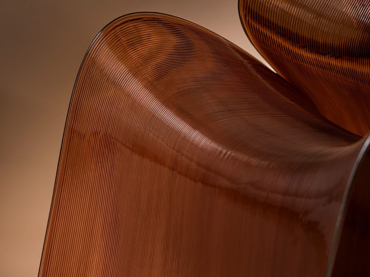
As the chair is printed layer by layer, the process leaves a ribbed texture across its surface. Those lines have been kept visible rather than hidden or polished away. That decision gives the chair much of its character. The texture follows the curves closely and makes the manufacturing process easy to read. It also gives the recycled plastic a more tactile, less generic appearance.

There is something useful in that honesty. The material is not being forced to look like timber, stone or metal. It keeps the visual qualities created by the printing process and uses them as part of the design. The surface does still reference natural materials in a subtle way. Its layered finish recalls mineral formations and carved stone, which helps the chair feel less industrial when placed in an interior.

ZHA and Nagami developed four colourways for the chair: white, black, a white-to-translucent gradient and a caramel tone made using a bio-based cork composite. The colour choices help shift the mood of the design. White makes the form feel lighter and more architectural, while black gives it a stronger, more graphic presence. The translucent version draws attention to the printing layers, and the caramel finish adds warmth to what could otherwise feel like a very technical object.

The caramel version is especially successful because it softens the synthetic quality of the plastic. It feels easier to imagine in a home, hotel lobby or lounge space, rather than only in a gallery or design exhibition. According to ZHA project design director Sebastian Andia, the goal was to turn an abundant and overlooked material into something people would genuinely want to live with. That idea matters because recycled material alone is rarely enough to make a product successful. People still need to like the object, find it comfortable and see a place for it in their environment.

The Echo Chair handles this well. Its sustainable story supports the design, rather than becoming the whole design. The seat’s raised sides create a more enclosed sitting position, while the curved backrest gives the chair a supportive and almost cocooned feel. The shape is expressive, but it still looks usable. Its scale and neutral colour options also make it easier to place than the form might suggest. It has enough presence to work as a statement piece, yet it does not depend on bright colour or decoration to stand out.

The 3D-printing process allows the chair to be produced without visible joints or separate components. This gives it a seamless appearance and keeps the connection between the digital model and final object very direct.

That connection is one of the strongest parts of the project. The manufacturing process does not sit behind the design. It shapes the design. The ribs, curves and continuous structure all come from the same production method. Each part of the chair feels related because it has been developed through the same system.

The Echo Chair continues ZHA and Nagami’s existing collaboration. Nagami launched its first collection of 3D-printed chairs in 2018, which included two designs by the architecture studio. Their latest project shows how much more refined large-scale 3D printing has become. The chair feels less like a technical experiment and more like a finished product with a clear place in contemporary interiors.

The Echo Chair is currently on display as part of London Creates at The Truman Brewery. What makes the chair interesting is the way it brings together material, form and manufacturing without overcomplicating the idea. Recycled plastic is treated as a starting point for the design, rather than something that needs to be disguised.

The post The Echo Chair Makes 3D Printing Feel Refined first appeared on Yanko Design.

  •  

Un développeur fait tourner les cinématiques de Command & Conquer sur un Atari ST de 1985

Jonas Eschenburg se tape un petit délire cet été, en portant Command & Conquer sur Atari ST, et il vient de s'occuper des cinématiques du jeu, le tout sur une machine équipée d'un Motorola 68000 cadencé à 8 MHz. Le même garçon avait déjà fait tourner Doom dessus.

Le décalage vaut le détour. Command & Conquer sort en 1995 sur PC, en VGA 256 couleurs, soit dix ans après l'Atari ST, qui affiche lui 16 couleurs en 320 par 200 points.

Envoyer les pixels bruts à l'écran est hors de question sur ce genre de matériel. La machine n'a ni le débit de lecture ni la puissance de calcul pour ça.

Ce clic autorise une connexion à Google : adresse IP transmise et traceurs possibles. En savoir plus Voir cette vidéo sur YouTube

Eschenburg a donc écrit son propre codec, baptisé STV, adapté du format VQA que Westwood utilisait à l'époque pour ses vidéos. Le principe repose sur un codebook, autrement dit un dictionnaire de petits carrés de pixels : au lieu de transmettre chaque image entière, le fichier envoie surtout des numéros qui pointent vers des motifs déjà connus du lecteur.

L'astuce est en réalité ailleurs. Les blocs sont découpés pour tomber pile sur l'organisation mémoire de l'Atari, qui range ses couleurs en plans séparés plutôt qu'en pixels contigus, ce qui permet au processeur de recopier les motifs sans passer son temps à réorganiser les bits.

La palette et le dictionnaire se mettent à jour en continu pendant la lecture, et pas une fois pour toutes au début du fichier. Ça évite le gros pâté de blocs baveux qu'on attendrait d'une compression aussi agressive.

Le tout fonctionne sur un 8 MHz d'origine. Sans accélérateur. A priori, aucun jeu Atari ST n'avait affiché de vidéo plein écran avant celui-là.

Le jeu, lui, reste beaucoup plus poussif pour le moment : quelques images par seconde en 16 couleurs, correct seulement à partir d'un Falcon, et il réclame 4 Mo de mémoire. Autour du codec, Eschenburg a publié une dizaine d'utilitaires, dont un encodeur pour fabriquer les fichiers STV et un lecteur natif pour les regarder sur la machine.

Tout est sous licence GPL sur GitHub, le portage se récupère sur itch.io, et il faut fournir ses propres fichiers du jeu d'origine puisque le projet n'a rien à voir avec EA.

Détail amusant, le son ne sort que sur STe et Falcon. Sur un ST de base, les cinématiques défilent en silence complet. La question étant maintenant de savoir si tout ça ne m'a pas donné envie de rejouer à Command and Conquer, pour ressortir mon premier pseudo de game : Moissonneuse killer (vraiment).

Source : Hackaday

  •  

The Sculptural Rocking Chair That Started as a Single Idea

Most furniture design starts with a question: How do people sit? Aleks Forystek Studio started with a completely different one. What happens when a heavy sphere presses into a structural loop? The answer, it turns out, is a chair. But not just any chair. It’s Dooal, and it might be the most conceptually satisfying piece of furniture I’ve seen this year.

The premise sounds almost too simple. A sphere meets a loop. The loop yields under the weight, compressing and curving into a form that becomes, all at once, a backrest, a seat, a leg rest, and a rocking base. One gesture, one cause-and-effect sequence, and suddenly you have a fully resolved object. The audacity of that economy is hard not to admire.

Designer: Aleks Forystek Studio

I’ll admit my first instinct when I saw the images was purely aesthetic. The black and white photography does everything right. The curves catch light in a way that makes the chair look more like a cast sculpture than a functional object, and the close-up shots reveal a fine-lined ribbed texture that layers real depth onto an already commanding silhouette. Shot in near-darkness, Dooal looks cinematic. It has the kind of presence that makes you stop mid-scroll and just sit with it for a moment.

But the longer I looked, the more the concept started doing something to me. Forystek’s Chicago-land studio describes its work as committed to “destabilizing the familiar,” and that phrase lands differently once you understand the logic behind Dooal. The chair is familiar enough, a seat you can rock in, a shape the body immediately recognizes. Yet the process that created it is almost foreign to how we typically think about furniture. No separate components engineered together. No piece-by-piece assembly of form and function. Just a single physical interaction, preserved.

That’s a philosophical statement as much as a design one. The studio’s whole methodology centers on finding the latent potential within ordinary objects, pushing past the surface of what something is to explore what it could become when a single variable changes. With Dooal, that variable is weight. Pressure. The simple, undeniable force of a sphere doing exactly what gravity asks it to do.

What makes this feel significant right now is the context we’re sitting in. We live in an era of maximal complexity, where products get layered with features, materials compete for attention, and design often signals effort rather than intelligence. Dooal does the opposite. It argues that constraint is where creativity actually lives. That stripping a design down to one decisive action can produce something richer and more resolved than a process built on a dozen competing decisions.

And it’s not just theoretical. The rocking chair is one of the oldest, most human pieces of furniture we have. It exists in farmhouse porches and modernist living rooms with equal ease. It’s comfort distilled into motion. The fact that Dooal arrives at that form through a logic of compression rather than craft tradition feels both subversive and strangely inevitable. Like the chair was always there, waiting to be discovered rather than designed.

That sphere at the base of the loop is easy to overlook in the photographs. It’s small, nestled low, nearly swallowed by shadow. But without it, none of this exists. It’s the cause the entire object is an effect of, and the fact that it remains visible in the final form is a choice that rewards people who look closely. That kind of embedded storytelling, where the origin of an object is literally written into its body, is rare in furniture design. It elevates Dooal from chair to argument.

Aleks Forystek Studio is not a household name yet. But Dooal is the kind of work that earns attention quietly. Not because it’s loud, but because it’s precise. Because it asks a stubborn, specific question and then answers it completely. Whether you care about objects for their beauty, their ideas, or the story behind them, this chair has all three. And it got there with one moment of contact.

The post The Sculptural Rocking Chair That Started as a Single Idea first appeared on Yanko Design.

  •  

The $599 AI Guitar That Finally Makes Playing Easy

At some point in their life, almost everyone has picked up a guitar, struggled with a C chord for ten minutes, and quietly put it back down. The fingertip pain. The out-of-tune strings. The YouTube tutorial that somehow assumes you already know what a fret is. Learning guitar has always had a steep and slightly humiliating entry curve, and most of us just gave up. The TemPolor Melo-D thinks that’s a problem worth solving, and the design it came up with is genuinely hard to ignore.

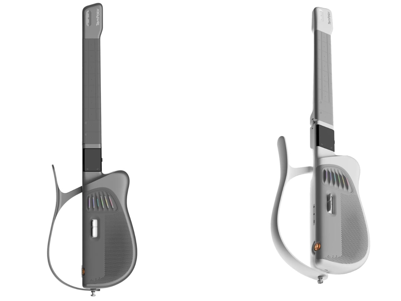
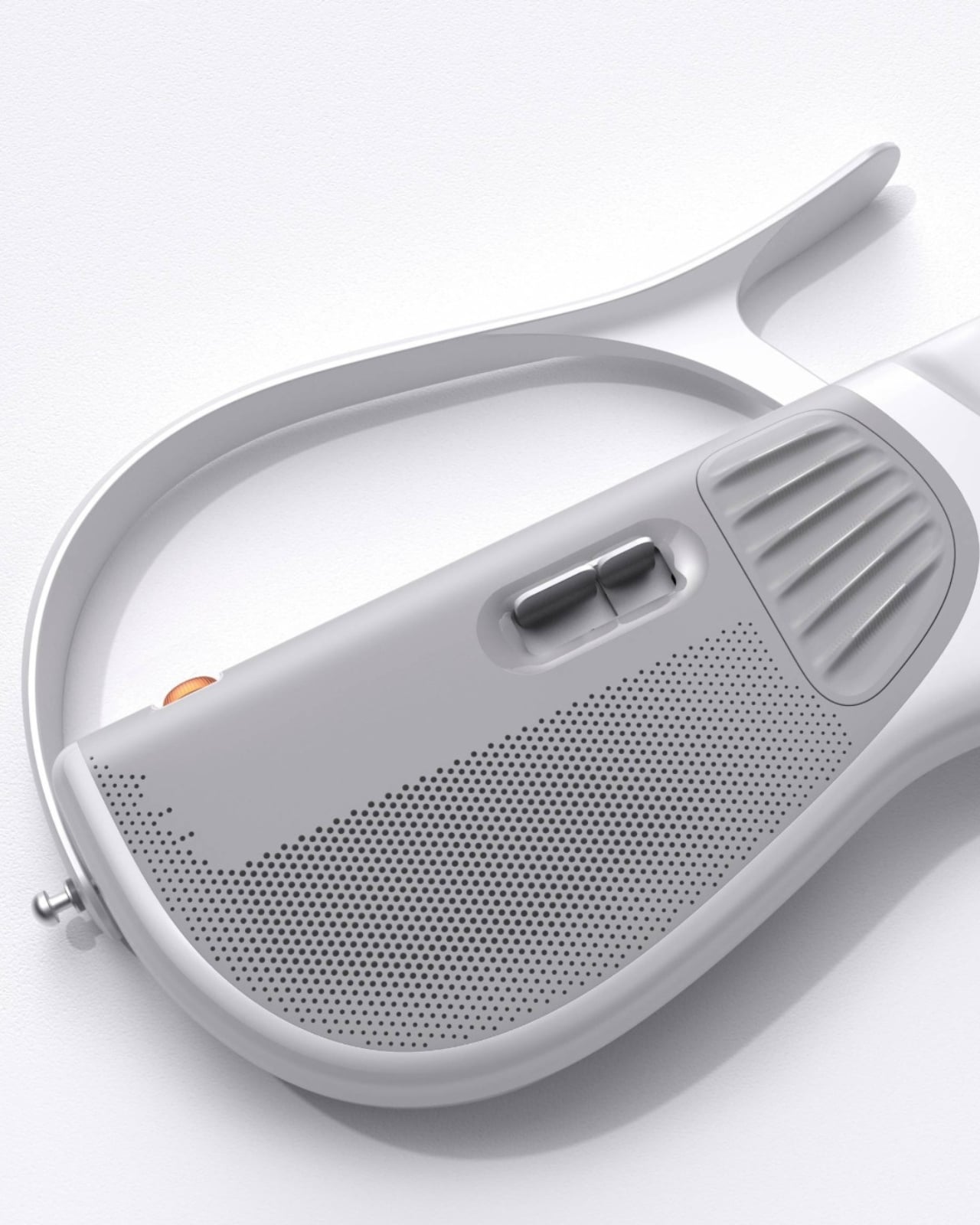
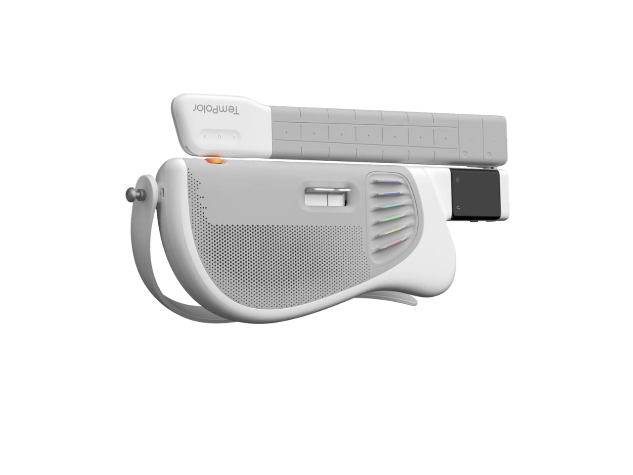
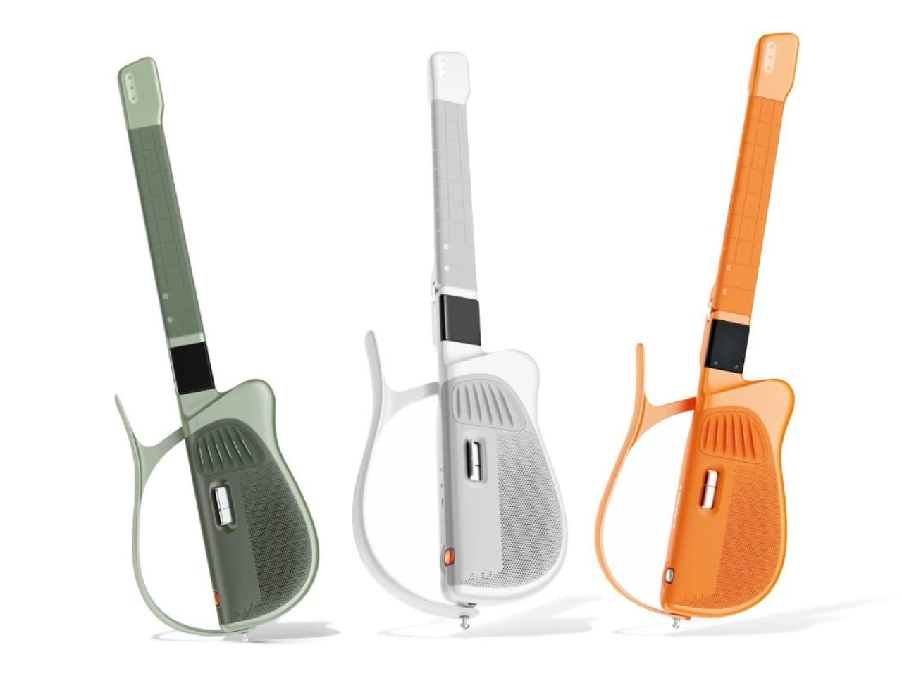
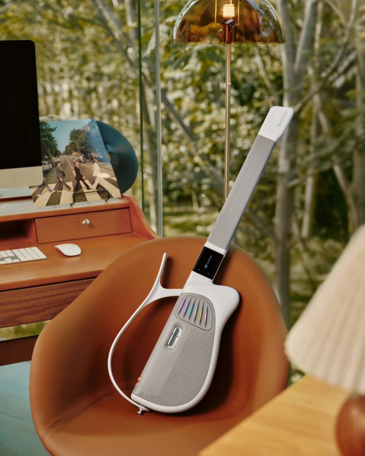
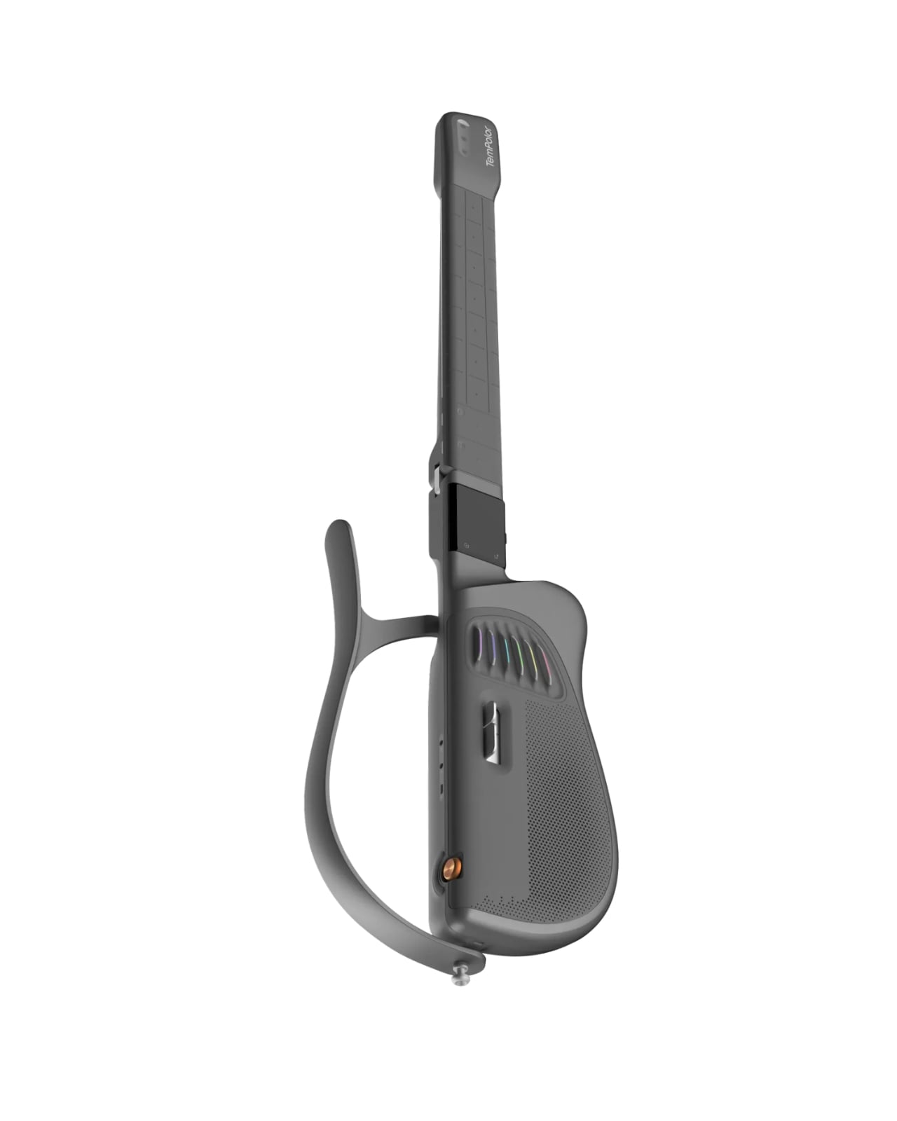
Designed by inDare Design Strategy Limited, the Melo-D is billed as the world’s first generative AI guitar, and even that description barely scratches the surface of what it actually is. On the outside, it looks like a guitar that a product designer and a tech enthusiast co-parented together. The body is sleek, the finish is pearl white, and it has a foldable build that makes it compact enough to take almost anywhere. But the real story is what happens when you turn it on.

Designer: inDare Design Strategy Limited

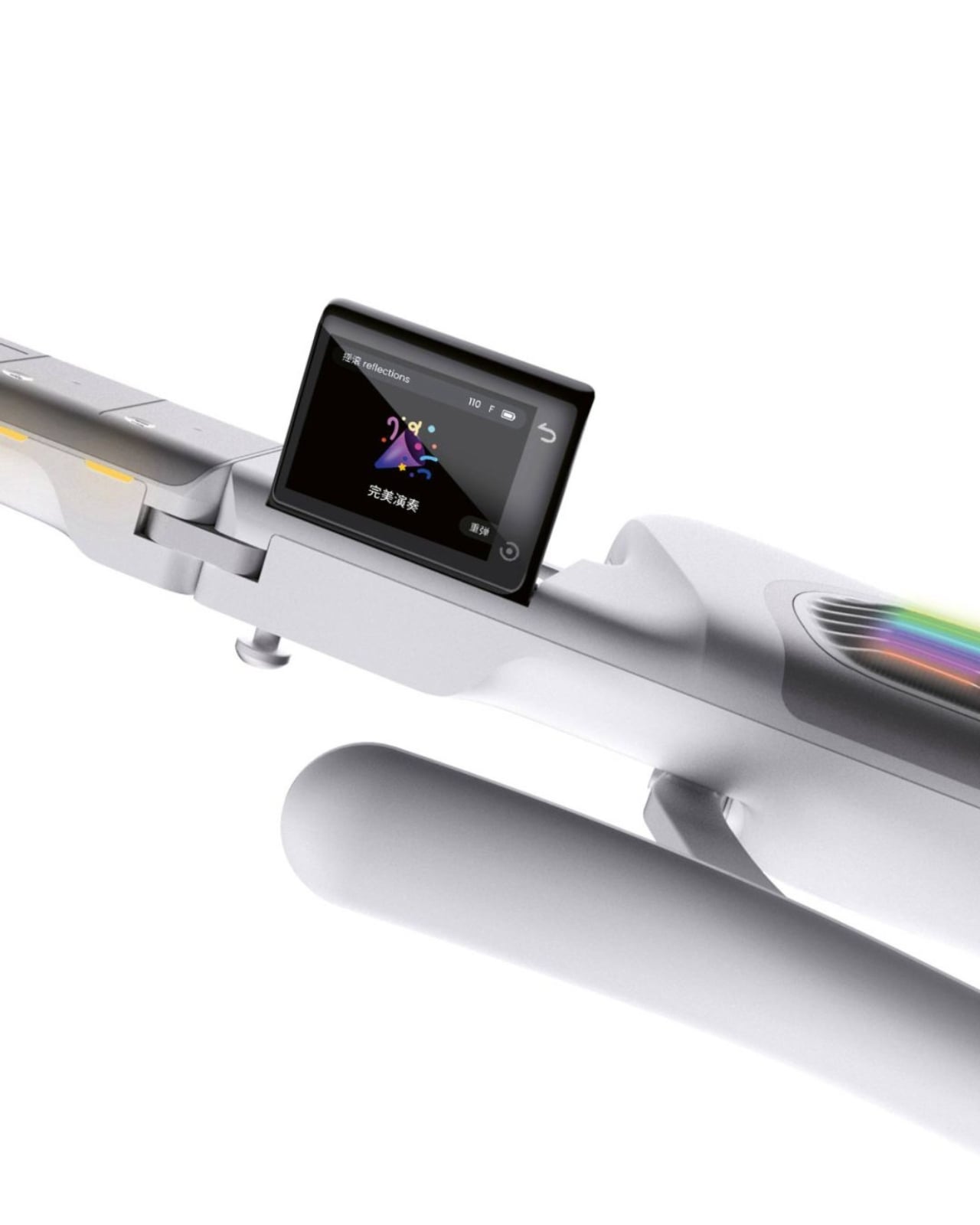
The neck is embedded with LED lights that illuminate exactly which notes to press, removing the guesswork for beginners entirely. A built-in 2.4″ LCD flip screen on the body handles chord guidance and ambient visuals without you ever needing to prop up a phone nearby. These feel like small details, but they represent a real design philosophy: the instrument itself should carry the full experience. You shouldn’t need a separate ecosystem of apps and accessories just to get started.

What makes the Melo-D genuinely interesting is the AI engine running underneath all of it. The guitar operates in three modes: solo, sing-along, and AI creation. In AI creation mode, you can hum a melody and the guitar transcribes it into a guitar solo. You can type a text prompt and it generates a song. Upload an audio file and it converts the music into playable tabs or chord charts. It even generates personalized backing tracks using emotional tags, so the sound starts to feel like yours rather than something borrowed from a practice app.

The “AI everything” wave has made it easy to be skeptical every time a product slaps the word generative onto its marketing. But the Melo-D doesn’t read as a gimmick dressed up in smart-instrument clothing. The six-string silicone system allows for real, note-by-note playing, which means it isn’t just a toy approximating the feel of music. It’s an actual instrument with training wheels you can choose to remove. The goal isn’t to replace the skill of playing guitar. It’s to lower the barrier enough that more people actually get through the door.

inDare’s design work here deserves its own mention. The studio, known for thoughtful human-centered industrial design, brought a lot of restraint to a product that could have easily become overcrowded with features. The foldable form factor, the integrated flip screen, and the silicone strings all feel like deliberate decisions, not afterthoughts. The Melo-D has also earned recognition at the iF Design Awards, which makes sense, because from a design standpoint it reads as a product with a clear and confident point of view rather than a collection of specs looking for a shell to live in.

At $599, it’s available for pre-order now with an expected ship date in September 2026. For a piece of hardware this layered, that number asks you to take it seriously, which feels appropriate for what it’s trying to do.

Learning guitar used to mean a real commitment: years of practice, a teacher, calluses, patience, and a certain willingness to sound terrible for a while. The Melo-D isn’t trying to skip all of that, but it is offering a more honest entry point for people who actually want to try. Whether you’re a complete beginner or someone who has quietly given up on the guitar more than once, it meets you where you are. And sometimes, that’s exactly the invitation you need to actually show up.

The post The $599 AI Guitar That Finally Makes Playing Easy first appeared on Yanko Design.

  •  

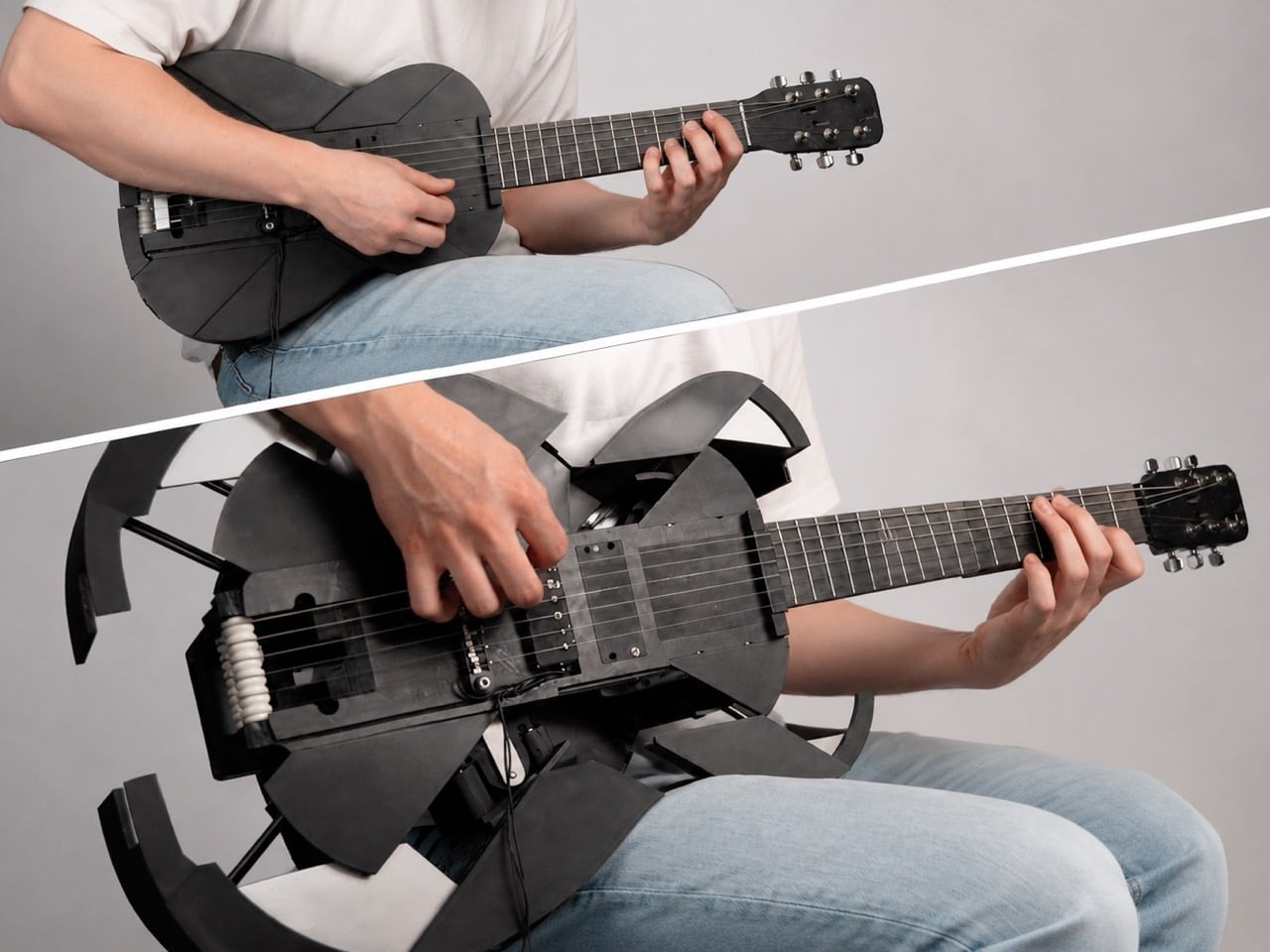
3D-Printed Ukulele Transforms Into an Electric Guitar In Just 2 Seconds

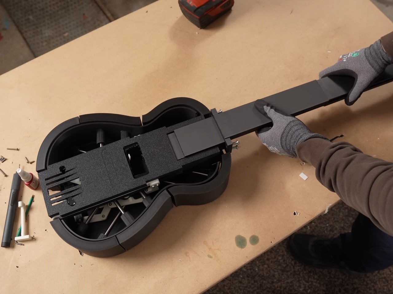
Every kid who grew up watching cars turn into robots has a soft spot for things that are not what they seem. Musician and maker Mattias Krantz never quite grew out of that phase, except instead of turning a truck into Optimus Prime, he set his sights on something smaller and arguably harder to pull off without CGI. He wanted a ukulele that could become a full size guitar on command, without falling apart in his hands. That meant solving three problems at once: growing the neck by roughly ten inches, keeping the strings in tune through that change, and expanding the body into a real guitar shape instead of a symmetrical blob. Each one turned out to be its own small nightmare.

The motivation was refreshingly petty. Ukulele players get less respect than guitar players no matter how good they get, and Krantz wanted to flip that on its head. Getting there took months of failed prototypes and a collaboration with mechanical engineer Adam Damato, who stepped in once the physics of a growing, string bearing neck got too gnarly to solve alone. What began as a joke became a real feat of mechanical design, borrowing tricks from telescoping tools, fishing reels, and an obscure folk instrument. By the end, the ukulele fit in a backpack and unfolded into a stage ready guitar in seconds.

Designers: Mattias Krantz, Adam Damato

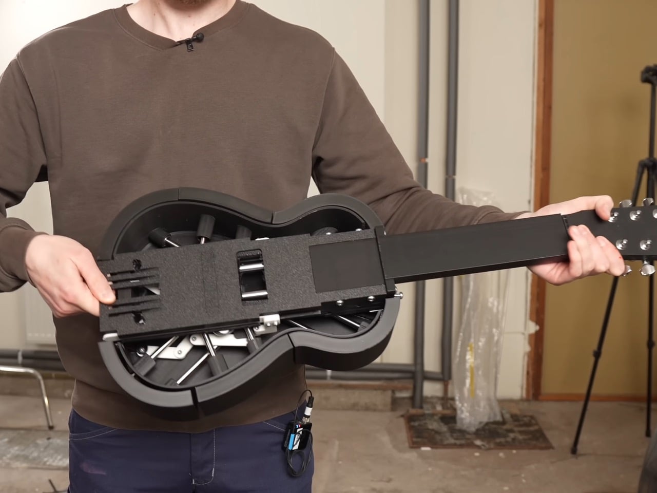
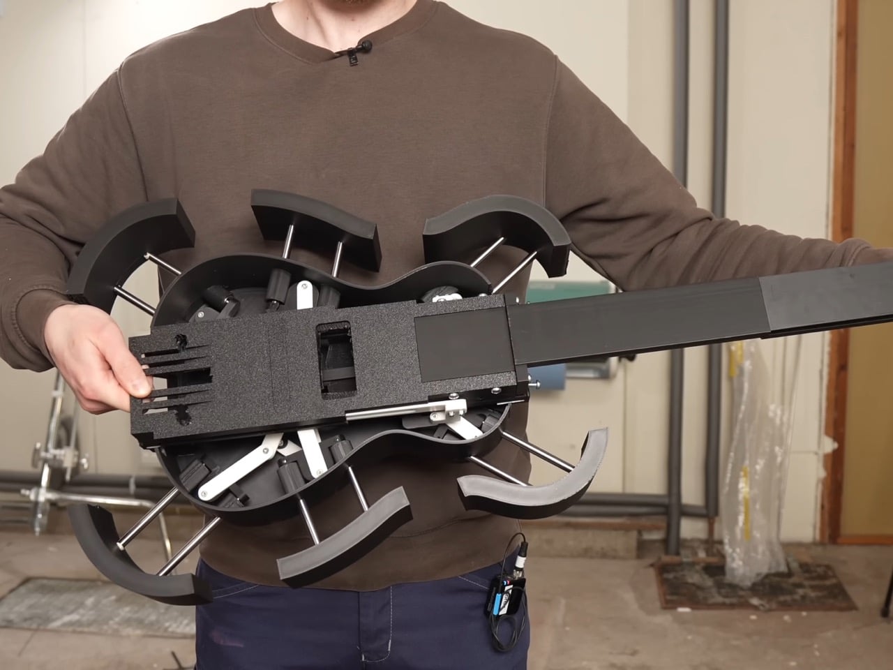
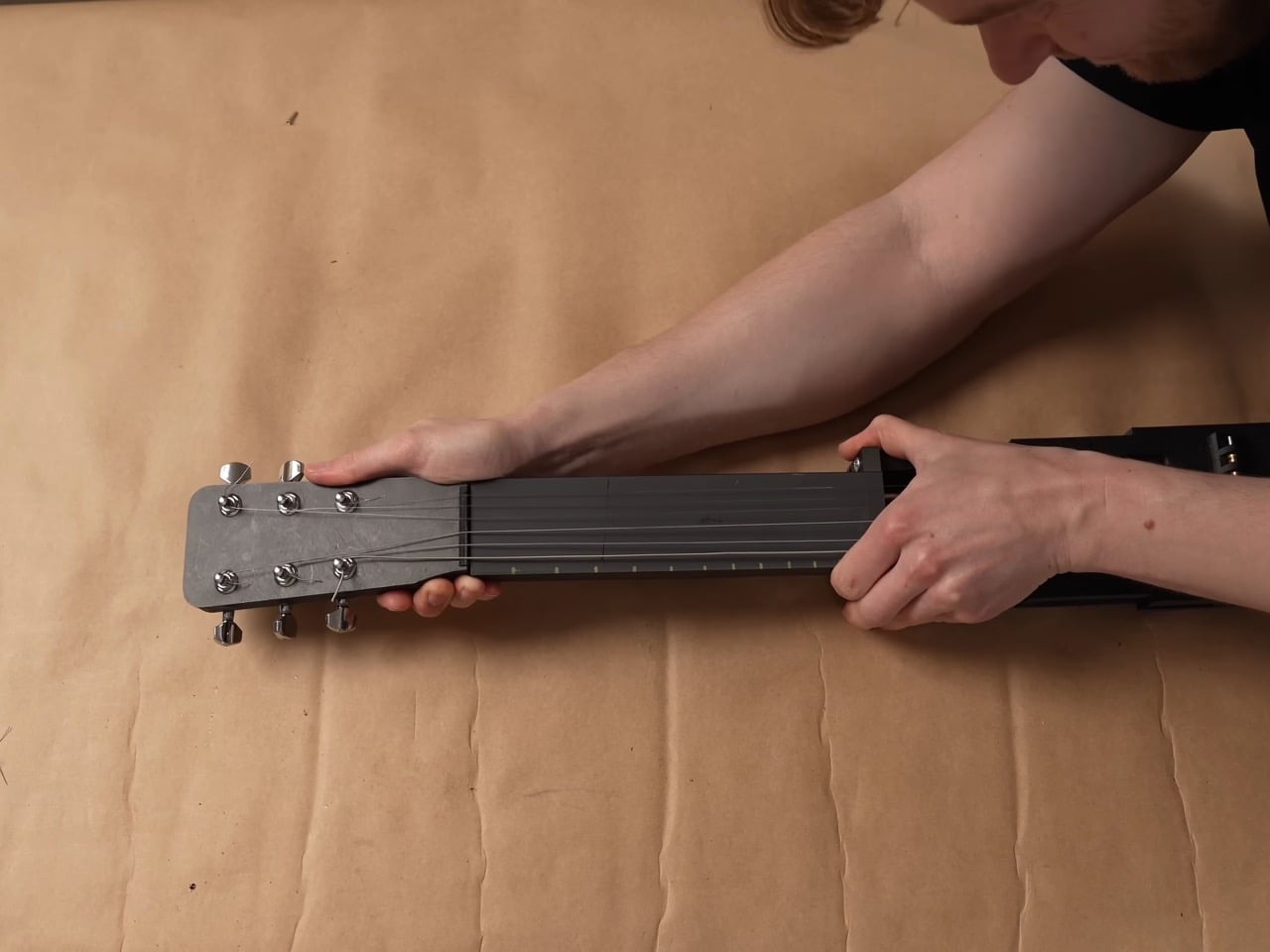
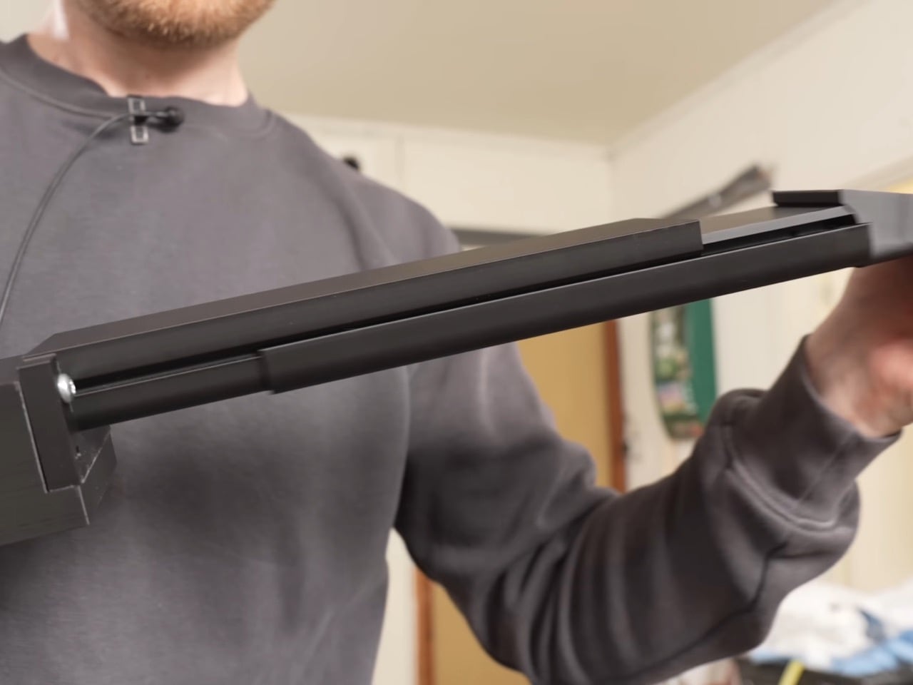
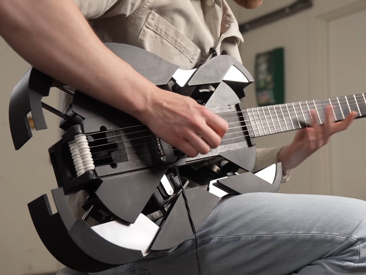
The neck telescopes straight out of the ukulele’s tiny frame, sliding one section into the next until it locks at full guitar length, gaining roughly ten inches without ever detaching from the body. A steel core runs through the sliding sections, and the joints are cut so they interlock and brace against each other the instant the neck reaches full extension. That bracing is what lets it survive eighty pounds of string tension without bowing like a fishing rod. Getting there took two failed attempts first. A folding neck, borrowed from an old instrument called the cithara orbo, worked fine on a full size guitar but was useless on a ukulele, since half a neck sat exactly where a hand needed to grip. The telescoping version solved the length problem right away, but only stopped bending once Damato worked in the steel core and reinforced joints.

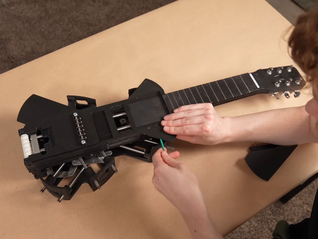
The strings are custom made, roughly twice the length of a normal set, and thread onto strategically placed rollers hidden inside the neck and body. Pull the neck out and the rollers feed slack forward, push it back in and they wind the excess back up, so the same six strings carry the instrument through both tunings without coming off. That roller system only exists because everything simpler failed first. Rubber bands solved the stretch problem but sounded worse than the ukulele they replaced. A fishing reel style rig using rope worked until the rope itself stretched, turning every transformation into tuning roulette, and swapping in non stretch rope traded that for a rope that kept snapping, once badly enough to take the guitar apart. Custom strings, ordered special and worth a twenty day wait, were the fix that finally held.

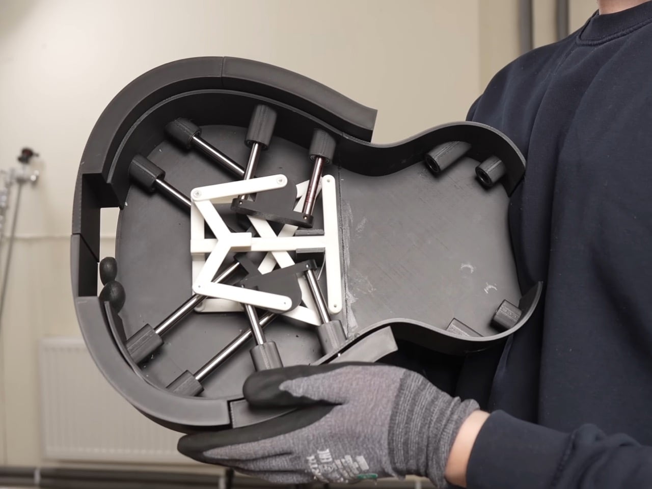
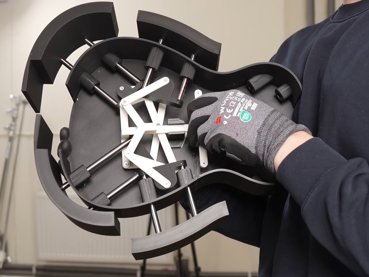
The body expands through six independently moving panels that fan outward from the ukulele’s compact shell, each one traveling a different distance and angle so the outline settles into a real guitar’s curves instead of a bloated circle. An early version of that mechanism grew symmetrically in every direction, fine for something like a banjo but wrong for an instrument with a pinched waist. Getting six panels to move independently instead of in lockstep turned one mechanical problem into six. The first panel alone took three attempts before it worked reliably, and even then only about ninety percent of the time. Adding the rest of the panels made things worse, since a hub inside was quietly blocking outward movement and jamming the whole assembly. Swapping plastic components for metal fixed it, and two days assembling hundreds of parts produced a body that finally held its shape.

None of this would matter if the transformation felt gimmicky in person, but the reception says otherwise. Onlookers at Krantz’s street performances wrote it off as just another ukulele until it unfolded mid song and changed their opinion of him. A band let him bring it on stage, and the transformation held together well enough to draw applause rather than confusion. Transforming gadgets are nothing new, but the engineering here, steel joints, custom rollers, six moving panels, earns real attention over a gimmick label. Krantz and Damato spent months on problems most builders would abandon, and the payoff works under tension, every time.

The post 3D-Printed Ukulele Transforms Into an Electric Guitar In Just 2 Seconds first appeared on Yanko Design.

  •  
❌