OpenAI has revealed Astra, an unreleased model designed to tackle complex, long-running tasks, after an internal version produced ten significant advances in mathematics and theoretical computer science. [...]
OpenAI says it has reduced the price of two GPT-5.6 models, cutting Luna's API price by 80% and Terra's by 20% as it works to make its models more efficient. [...]
Working parents of school-age children face a particular kind of worry during the hours between the end of the school day and the end of the workday. Phone calls get missed, text messages go unread, and the ones that do get through usually carry just enough information to confirm a child made it home. What they rarely carry is any sense of how the child is actually doing, and that gap tends to get filled with parental anxiety rather than reassurance.
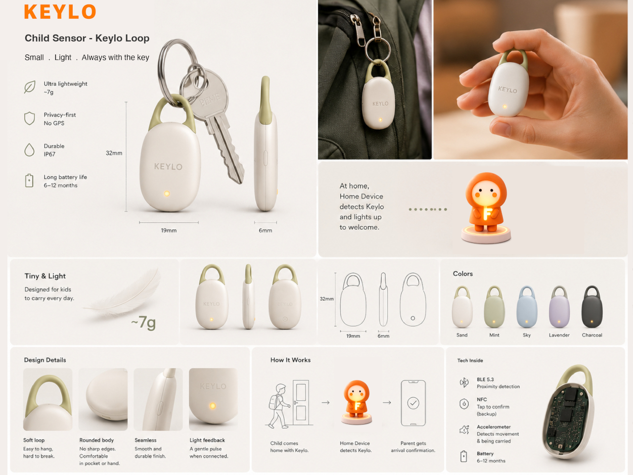
Keylo is a conceptual companion device designed around that specific gap. Rather than giving children another screen to manage or another app to navigate, it offers a single, tactile interaction: a tap that lets them express how they’re feeling. No typing, no calling, no notification chain. The child touches the device, cycles through a color to represent their emotional state, and the parent’s app receives it.
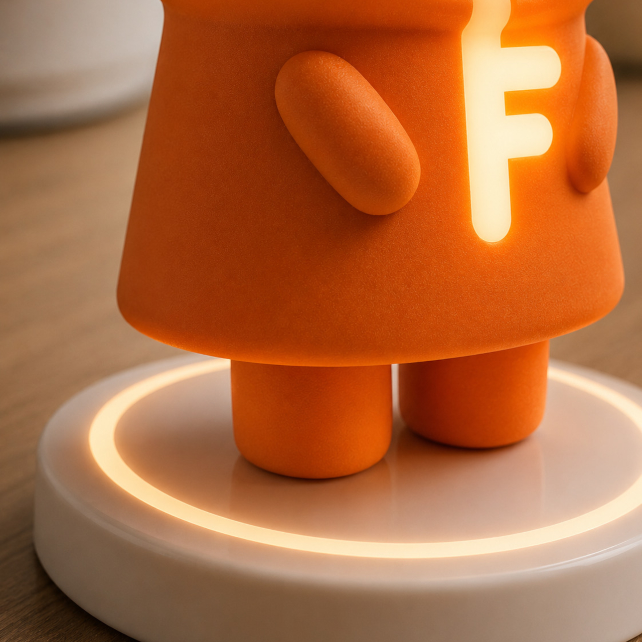
The system consists of three physical parts. The main companion unit sits on a home dock, usually somewhere a child passes when they get home. A smaller key fob clips to a backpack and travels with the child throughout the day. Both are made from soft matte silicone and deliberately avoid any screen or complex interface, giving the object a quality that’s closer to a familiar household item than a piece of consumer electronics.
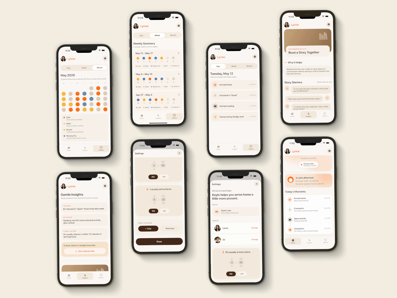
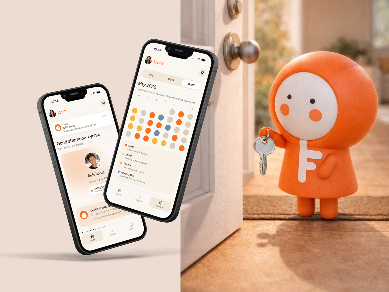
The four emotional states Keylo recognizes are kept intentionally broad. A soft orange glow indicates the child feels relaxed; bright yellow signals something more playful or energetic; a neutral white tone signals a preference for quiet or personal space; and a calm blue light carries a specific message from child to parent: I’m thinking of you. Each one is simple enough for a young child to understand and expressive enough to actually mean something when it arrives on a parent’s phone.
That arrival is handled by the companion app, which mirrors the same color language as the physical device. The distinction the project draws between this and conventional parental monitoring is deliberate. Rather than showing parents a location, a screen time report, or a camera feed, the app delivers a single emotional moment. A notification that says a child is feeling calm and playful carries a different quality of information than a location ping, and it asks for a different kind of response.
The device is designed to work without any input from the child beyond that single tap. There are no prompts to answer, no questions to read, and no follow-up required. For a child who has just walked in the door after school, the low threshold is significant; the gesture stays small enough that it doesn’t feel like a chore, which is probably the main reason most family communication apps get abandoned within a few weeks of being set up.
What Keylo explores through its design is how much emotional information can be conveyed through the simplest possible interaction. A color chosen by a child carries less data than a voice call but far more than no contact at all, and it arrives without interrupting anyone’s afternoon in the way a ringing phone does. The project makes a case for the idea that the volume of communication matters less than whether it happens at all, and on terms that feel natural to the person sending it.
Most speakers are designed to disappear. They sit on a shelf, blend into a bookcase, or hide in a cabinet, quietly doing their job until you need them and then fading back into the background. Mårten Malmnäs, a graduate from the Umeå Institute of Design, designed something that pushes back against all of that.
The Beosound Tableau is a wall-mounted audio object developed in collaboration with Bang & Olufsen. Malmnäs calls it “a fireplace for music,” an instrument not just for listening, but for living. The moment I read that, I had to stop. Because I’ve never heard a speaker described that way before, and suddenly, I couldn’t think of a more fitting comparison.
Think about what a fireplace actually does. Yes, it produces heat, but that’s almost beside the point. A fireplace creates presence. It becomes the thing a room organizes itself around. People pull their chairs toward it, conversations happen because of it, and its absence is genuinely felt. That’s a completely different design brief than “fits on your desk” or “connects to your phone.”
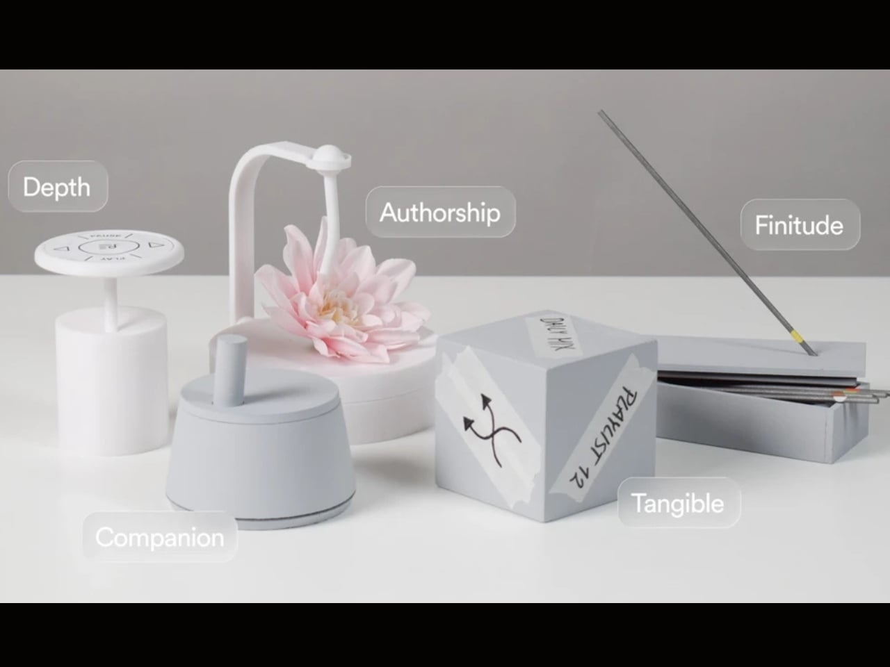
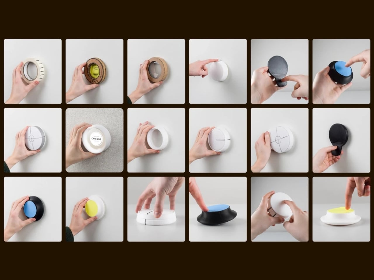
Malmnäs started the project with a design probe, a research method that explores the relationships people have with their homes, and from that came a set of experiments around values and behaviors. Eight experimental directions emerged from the ideation phase, spanning different input and output formats. Three of those directions clearly answered the design responsibilities he’d set for the project, and their shared qualities pointed toward one resolved object.
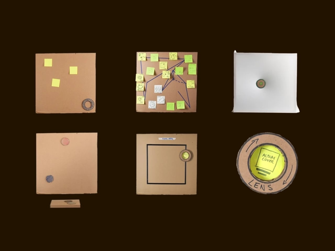
Here’s where it gets interesting. The original concept for the Tableau was screen-based, but a method called Wizard of Oz testing, where a human simulates the system to observe how people actually interact with it, pushed the design somewhere more honest. The interaction model shifted from screens to navigation by sound. And the principle that came out of it became the foundation of the whole concept: the most honest interface for a music object is music itself.
That’s a provocative idea. We’ve spent years layering more and more visual UI on top of audio experiences. Every streaming service competes on the complexity of its recommendation algorithm, the visual polish of its playlist covers, the grid of album art. Malmnäs argued the opposite, that sound should speak for sound. The result is the Sonic Token, a physical object that mediates between the listener and the Tableau. Tactile, intentional, and completely different from scrolling a touchscreen.
The Tableau is positioned as a focal thing for the home. An object to gather around and tend to. That language is deliberate, and it’s also a little radical. “Tending” to an audio object implies care and attention, a relationship rather than a transaction. You don’t tend to a Bluetooth speaker. You don’t gather around an app.
Bang & Olufsen has always occupied a rare space in the audio world, where design and sound hold equal weight, and where a product can belong in a design museum and still deliver extraordinary sound. But even by B&O’s standards, the Tableau concept asks a genuinely new question: what if the speaker were the focal point of the room, rather than just a feature of it?
There are fair questions about how a concept like this survives beyond a graduate show. The hands-on, material-driven process Malmnäs used, with 1:1 mock-ups and rigorous testing of the Sonic Token’s form and function, suggests this isn’t a vague idea dressed up in renders. It was built and tested as a real object. Whether it eventually reaches production or stays as a collaborative concept between a student designer and one of the world’s most revered audio brands is another matter.
But the value of the Beosound Tableau isn’t only in whether it ships. It’s in the question it refuses to let go of: why have we settled for speakers that ask nothing of us? The alternative, a speaker that earns its place on the wall, makes music feel like a gathering, and treats sound like something worth being present for, sounds like exactly what the living room has been missing.
Samsung’s record second-quarter earnings masked losses in its consumer-device businesses, making the Fold8 lineup more important to its Asia mobile strategy.
Apple's new Apple Upgrade program lets US customers lease iPhones, Macs, iPads, and Apple Watches. Here's how it works and whether it's better than buying.
Google will unveil the Pixel 11 on Aug. 12. Here's what Google has confirmed, what reputable reports suggest, and what remains unknown ahead of launch.
Enterprise AI adoption is accelerating, but new research suggests identity governance is lagging behind. Here's why AI agent identities are becoming a critical security challenge.
Microsoft is retiring its legacy Threat Intelligence portal on August 1. Security teams should verify licenses, permissions, investigation projects, APIs, and automated workflows before the cutoff.
Samsung Display has reportedly won Apple's exclusive OLED touchscreen contract for future MacBook Pro models, highlighting its lead in large-format display manufacturing.
The e-reader has been one of the most static product categories of the past two decades. Since the first Kindle appeared in 2007, the form factor has barely evolved: a single screen, a flat back, and dimensions roughly matching a paperback. These devices have gotten lighter, sharper, and more waterproof, but the fundamental design assumption has stayed the same. They’re books without the book part.
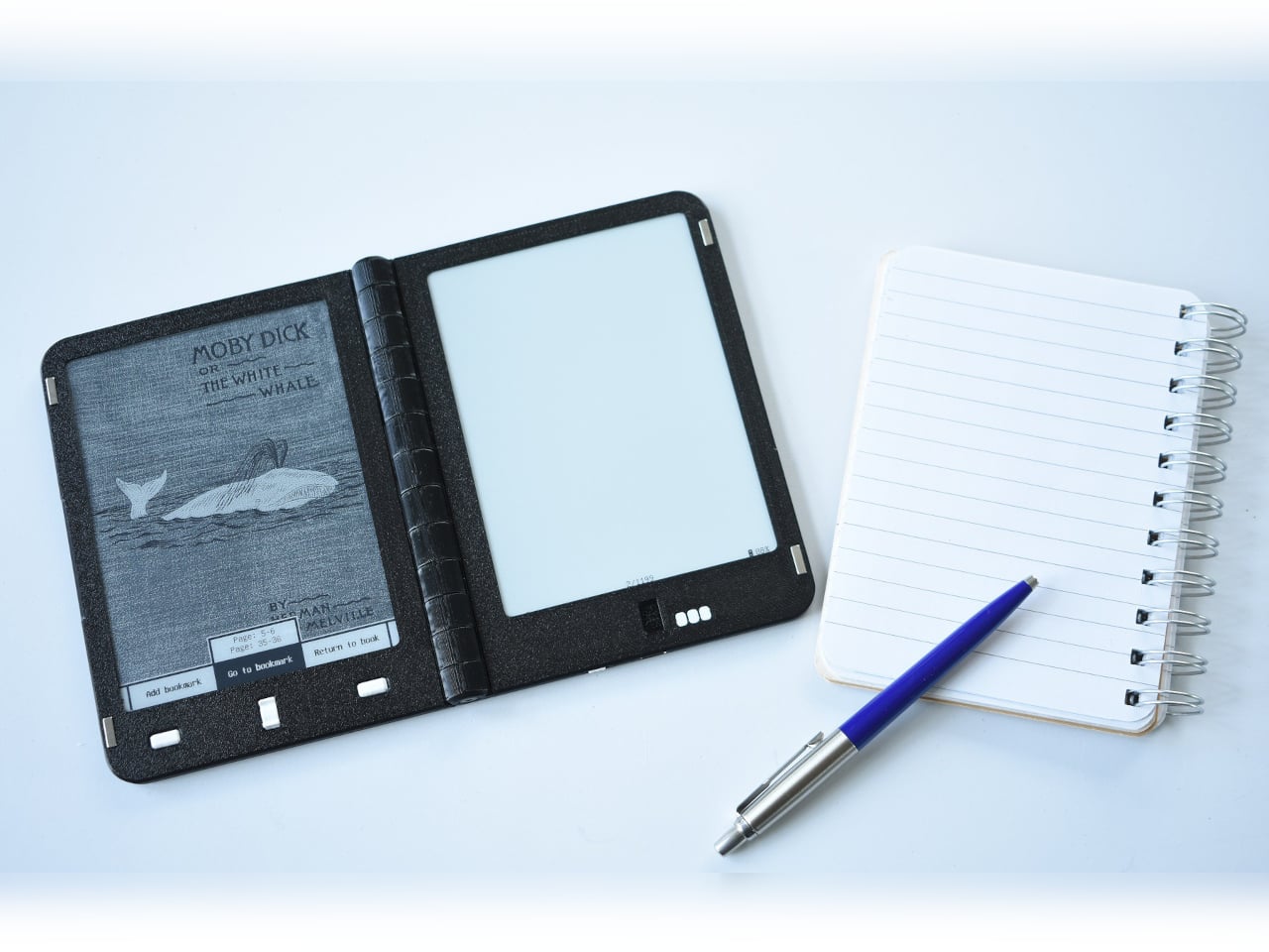
A growing number of designers have been working on a different premise: what if an e-reader actually opened like a book? One with two E Ink panels and a real hinge, held the way you’d hold a paperback, where left and right pages exist as physical space. That shared ambition has driven a small but serious cluster of projects building quietly over the past five years.
The proof that e-paper could bend
The idea of folding an E Ink display isn’t new. Back in 2020, E Ink Corporation demonstrated a hinged prototype showing that a bending e-paper panel could survive the mechanical stress of being folded. It never reached retail shelves, but it answered the one question that mattered most at the time: whether the material itself could handle the geometry of a real book.
Designer: E Ink
That prototype didn’t solve everything. It was a controlled demonstration with no commercial roadmap, no software, no battery life to speak of, and no clear form factor beyond the fold itself. What it gave the industry was proof that flexible e-paper was a viable building block rather than a permanent research curiosity. Every foldable E Ink project that came after built on that understanding.
The book illusion finally made real
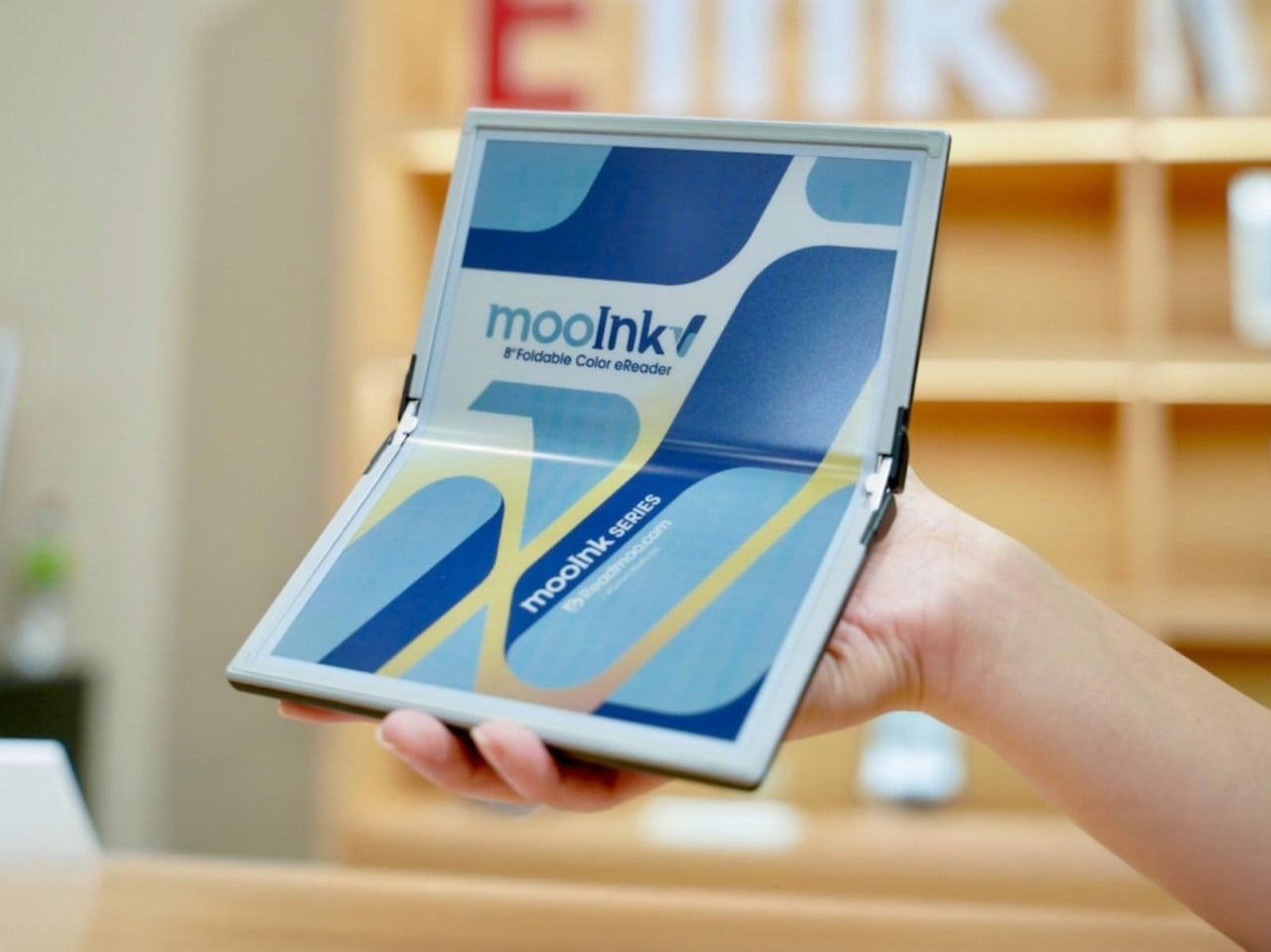
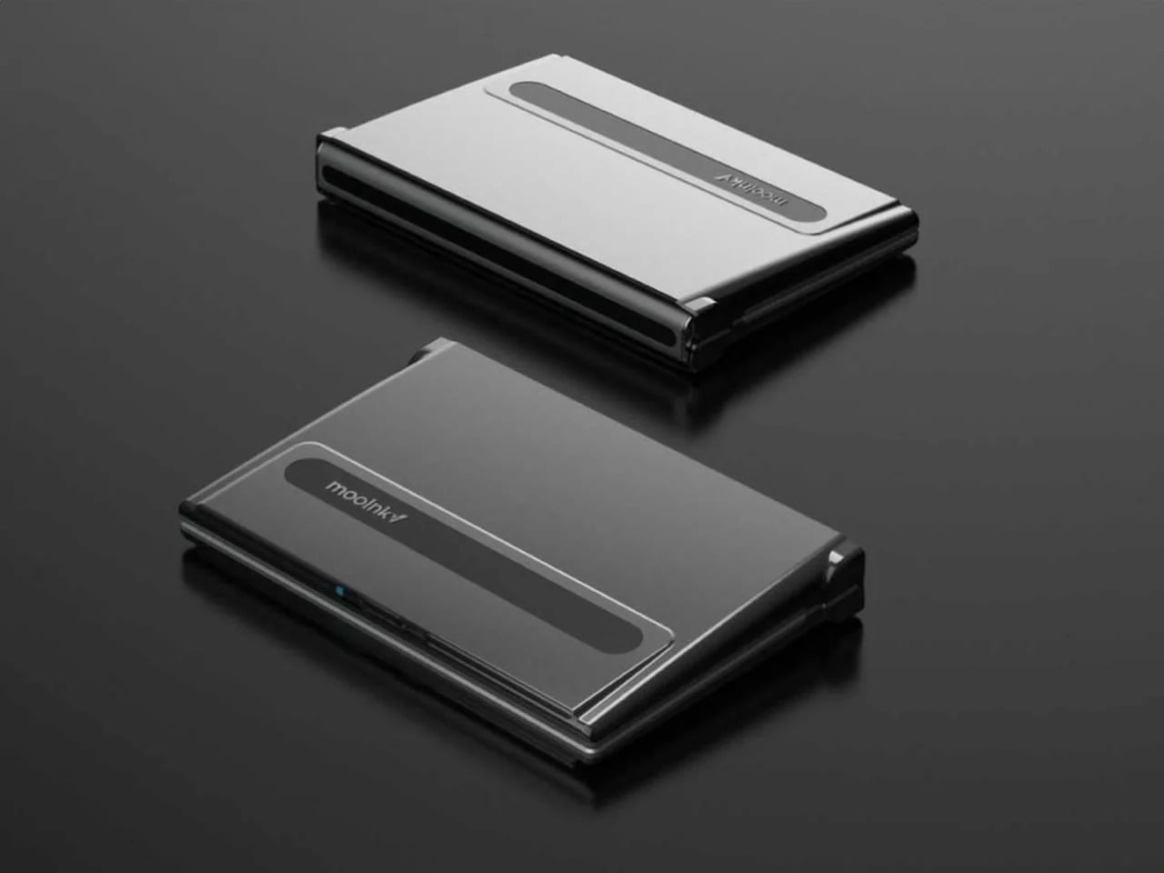
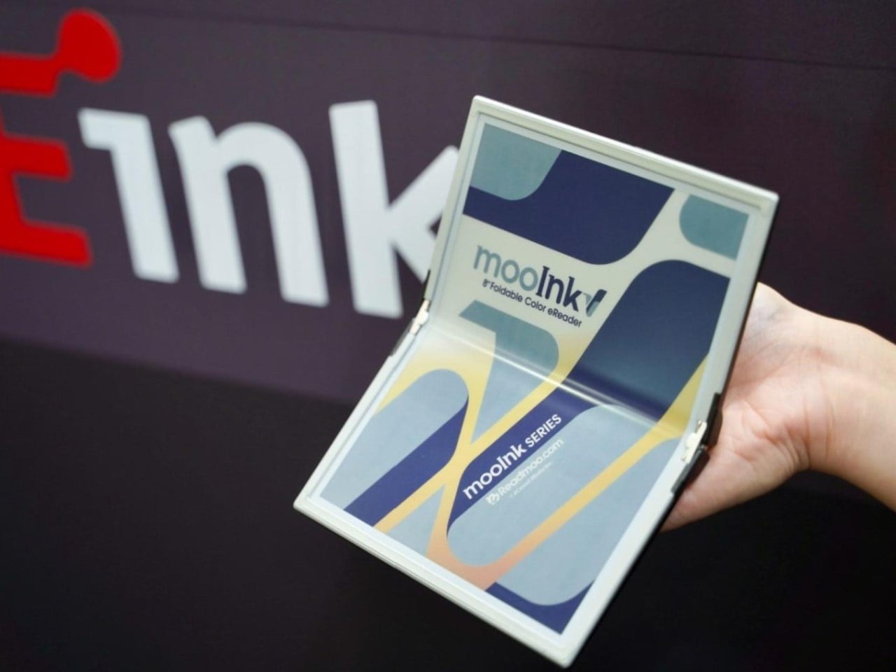
Readmoo’s Mooink V was the first design to make the flexible E Ink concept feel emotionally legible to a general audience. It’s built around an 8-inch Gallery 3 color e-paper display developed in collaboration with E Ink, one that folds down the middle to make the device small enough to pocket when closed and wide enough to feel like a slim paperback when open.
The color display matters more than it might seem. Gallery 3 renders close to 50,000 colors at 300 PPI, expanding the format beyond plain text to illustrated books, comics, and magazines. The fold reportedly passed 200,000 bending tests during development, and when fully open, the crease isn’t dramatic enough to register as a flaw so much as an honest design trade-off.
Mooink V hasn’t had the smoothest road to market, though. Despite genuine buzz at trade shows including Touch Taiwan and SID Display Week, no confirmed retail availability or street price had materialized as of mid-2026. The design made the foldable E Ink book look and feel tangible in a way earlier prototypes hadn’t. Whether it gets there commercially is a different and still open question.
Two screens, no crease
Not everyone building a book-shaped e-reader was willing to bet on a single flexible panel. A parallel design school took a more pragmatic approach: pair two conventional E Ink screens with a well-engineered hinge and let the gutter do the work. The result avoids crease anxiety entirely since neither panel has to bend, though it trades the seamless page illusion for a visible seam you’d have to accept.
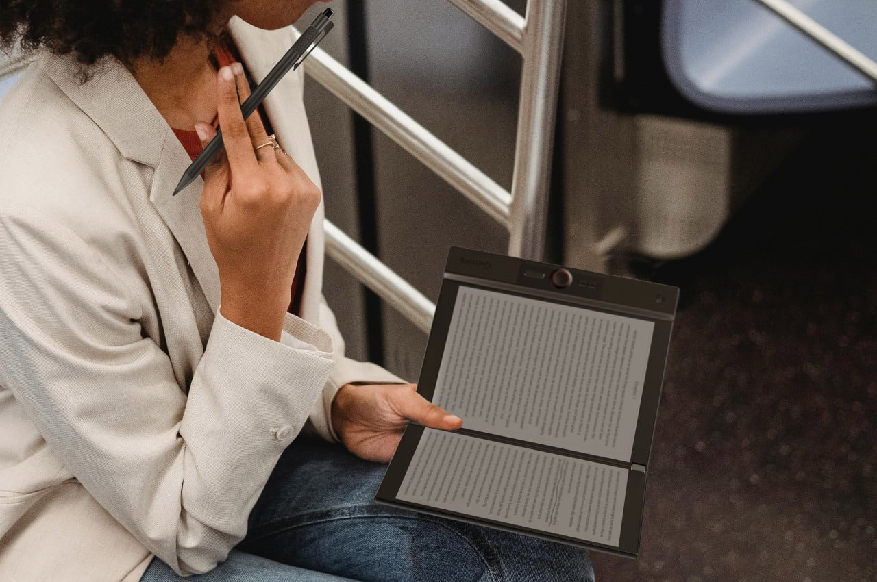
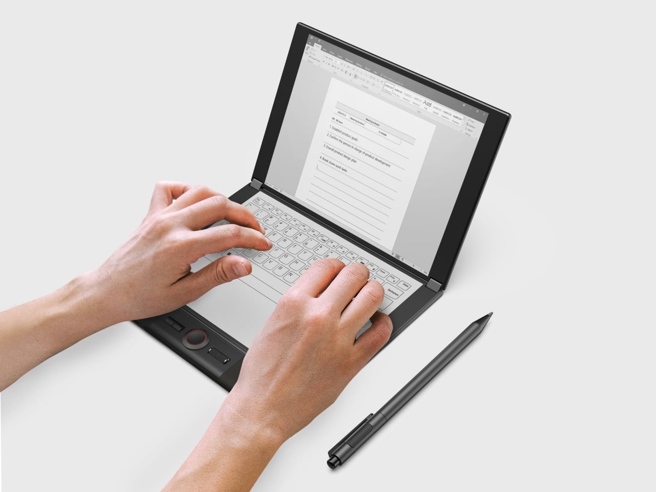
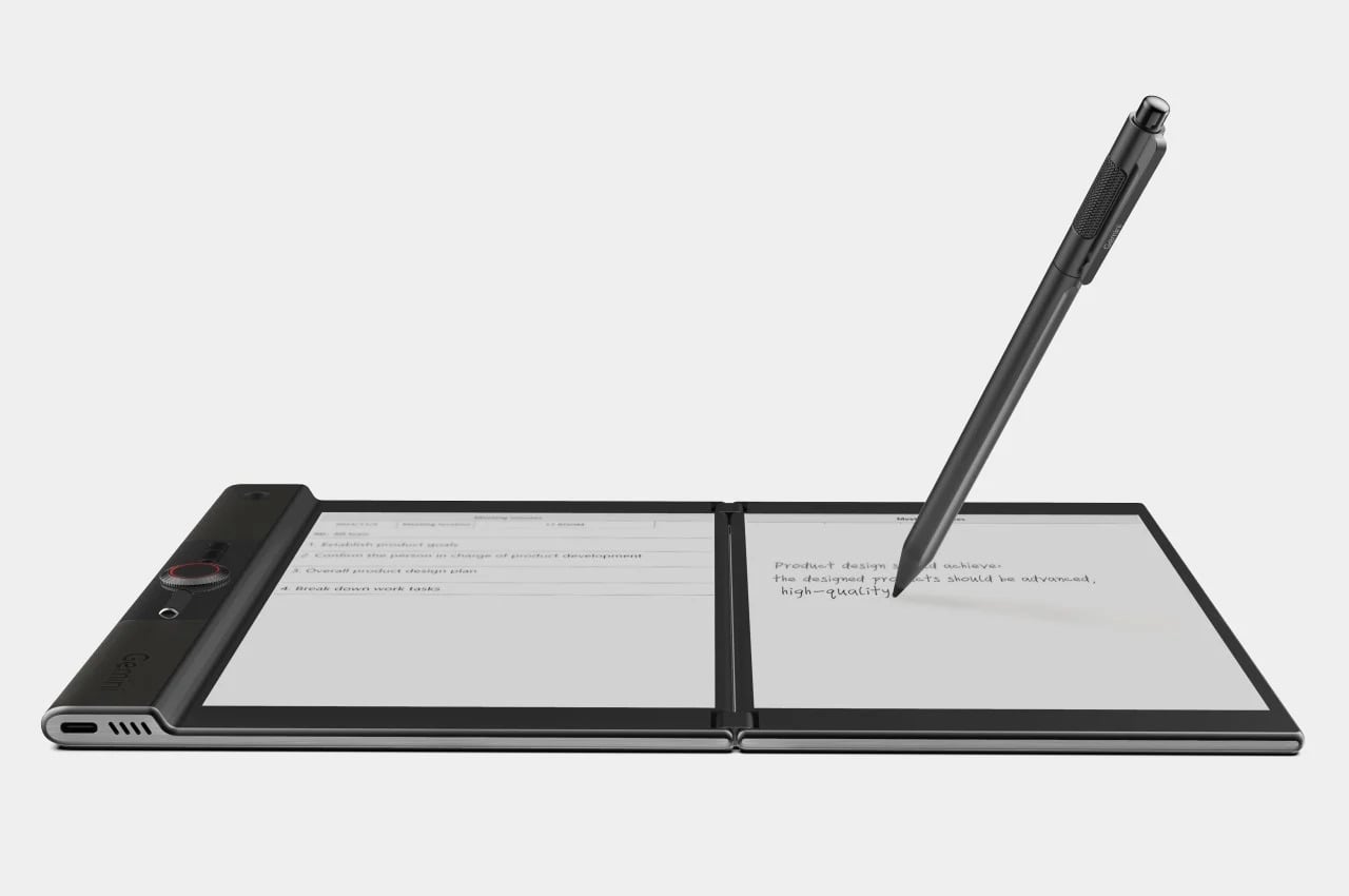
LCFC’s Gemini took the productivity angle furthest, giving both E Ink panels enough real estate to function almost like a laptop, with reading material open on one side and an active workspace on the other. The InkReader Duo concept took a more compact approach, fitting two E Ink screens into a phone-sized form, which made it feel less like a desk tool and more like a pocket notebook.
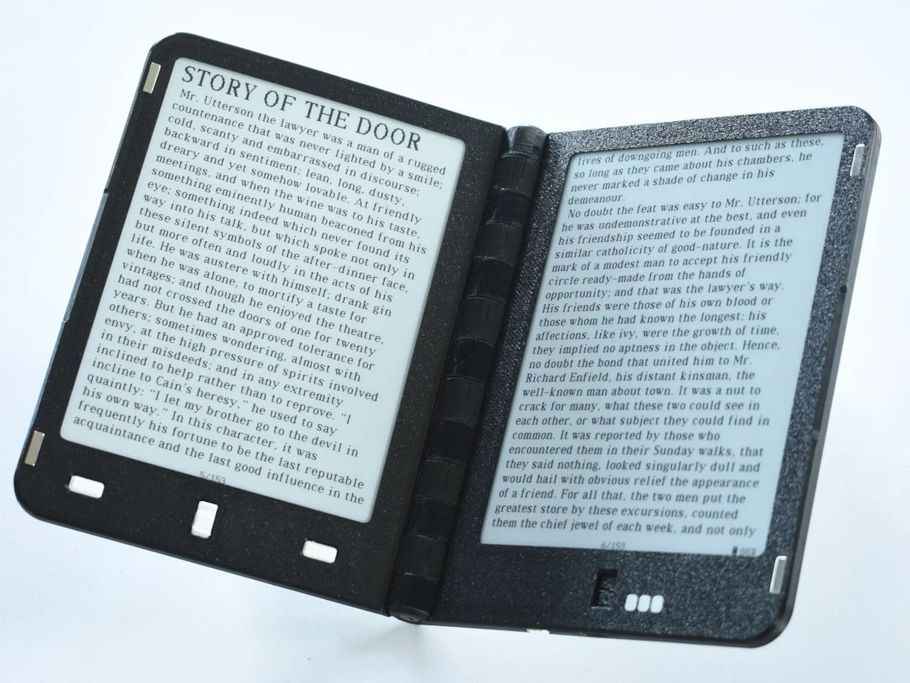
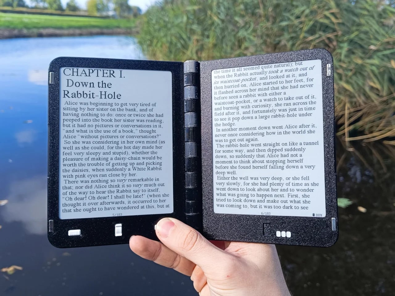
Diptyx went in a different direction altogether. Rather than chasing consumer polish, the project leaned into open-source principles, building a two-panel hinged e-reader without the lock-in that defines most commercial platforms. It isn’t the most refined interpretation of the book-shaped reader, but it made a clear point: the hardware problem was increasingly solvable, and the real challenge was getting the software and ecosystem right.
Not every dual-screen device fits cleanly into this story. The Bluegen OKPad pairs an E Ink panel with a regular LCD screen, which makes for a versatile tablet but undermines the unified reading experience that makes an E Ink book feel coherent. Switching between two fundamentally different display types introduces a visual disconnect that software bridging alone can’t fully smooth over.
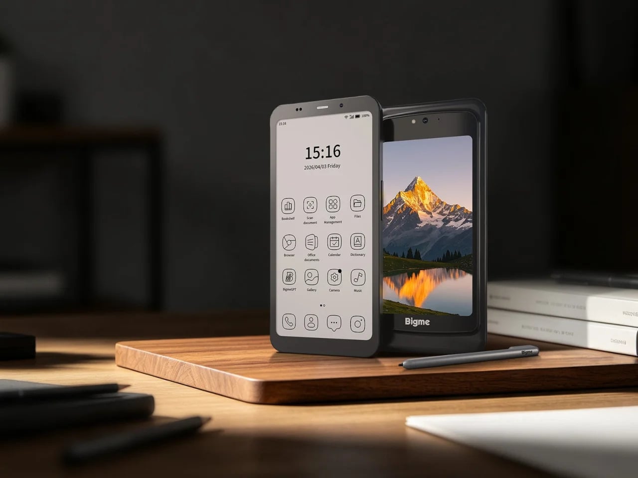
Bigme’s HiBreak Dual 2 runs into a different kind of problem. It’s a smartphone with a secondary E Ink display on the back, which is a genuinely clever idea for managing notifications and extending battery endurance, but it’s shaped and used like a phone rather than a book. A second screen doesn’t automatically recreate the spatial logic of reading a bound object.
Inkleaf is the most pragmatic entry in the foldable E Ink space so far. Instead of chasing a seamless fold, it pairs two 10.3-inch Carta E Ink panels in a notebook-style hinge, with one side for reading and the other for writing. The seam between them works as a gutter rather than a flaw, and the design doesn’t try to hide it.
That workflow proposition is what makes Inkleaf interesting beyond its form factor. Having reference material on one panel while taking notes on the other removes a friction point that every single-screen reader quietly ignores. You don’t need to switch apps, scroll back, or memorize what you just read before writing something down. It’s aimed at a different kind of reader than a Kindle typically serves.
Inkleaf is currently collecting early-access signups ahead of an August 2026 launch, with a broader public release targeted for 2027. That’s a staggered timeline worth noting: the hardware still has to prove itself beyond initial demos, and the software will matter as much as the panels themselves. Carta E Ink is a sensible fit for a writing-focused device, but actual daily use remains the real test.
What Kindle still has to answer for
None of this means the Kindle is suddenly irrelevant. Amazon’s device still wins on price, ecosystem depth, and a friction-free reading experience built up through years of software refinement. If all you want to do is buy a book and read it on a train, nothing in this group of foldable experiments beats a Paperwhite for simplicity. The incumbents aren’t losing sleep yet.
What these devices do expose is a design gap Amazon hasn’t seriously tried to close. A Kindle displays text efficiently, but it doesn’t recreate the spatial logic of reading a bound book: two visible pages, a sense of position, a natural place for margin thoughts. Those aren’t features that get patched in through a software update, which is why the form-factor conversation is overdue.
That’s what this group of foldable and dual-screen E Ink devices has been quietly building toward for the past five years. Not a product category defined by any single winner, but a shared argument about what a digital reading device could look like if it started from the book rather than the screen. Whether any of them fully delivers on that is a question 2027 will help answer.
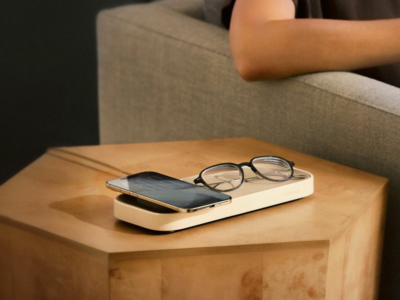
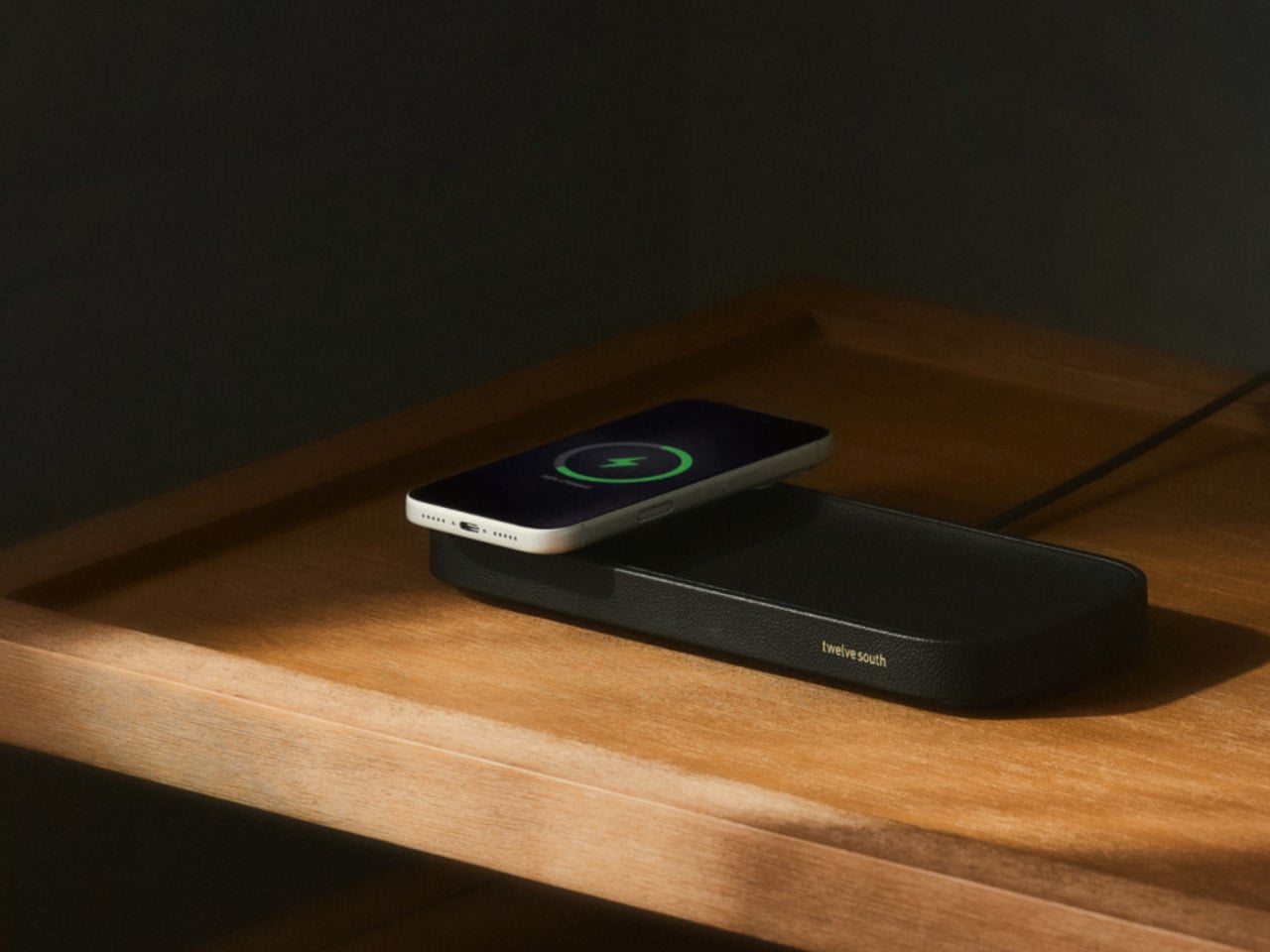
The nightstand has become one of the messiest surfaces in a home. A charging cable snaking across the top, a phone lying flat or propped against whatever happens to be nearby, maybe a watch charger completing the pile. Most accessories designed to address this solve the function while ignoring the furniture, leaving something clinical and plastic sitting next to things that actually belong in a bedroom.
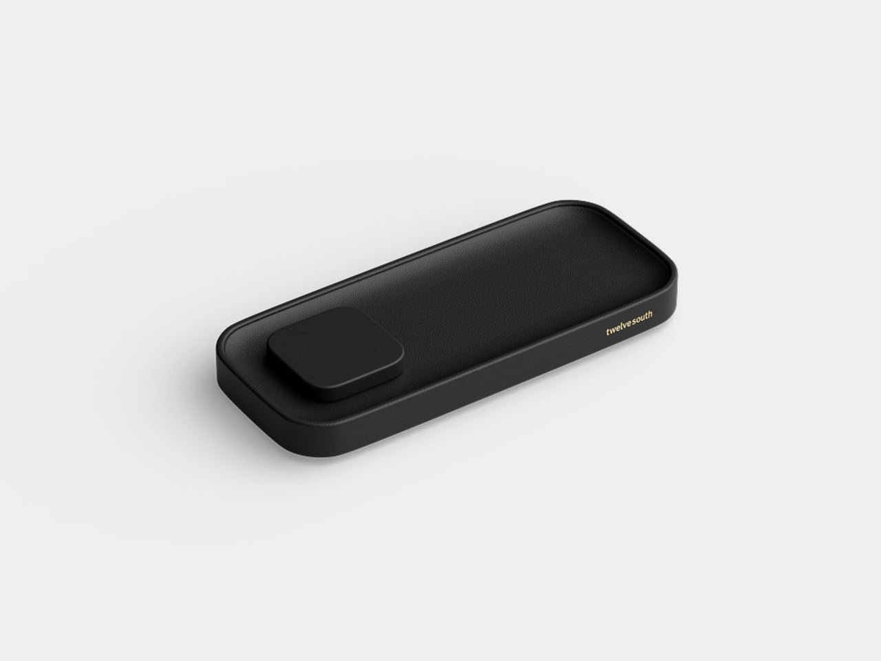
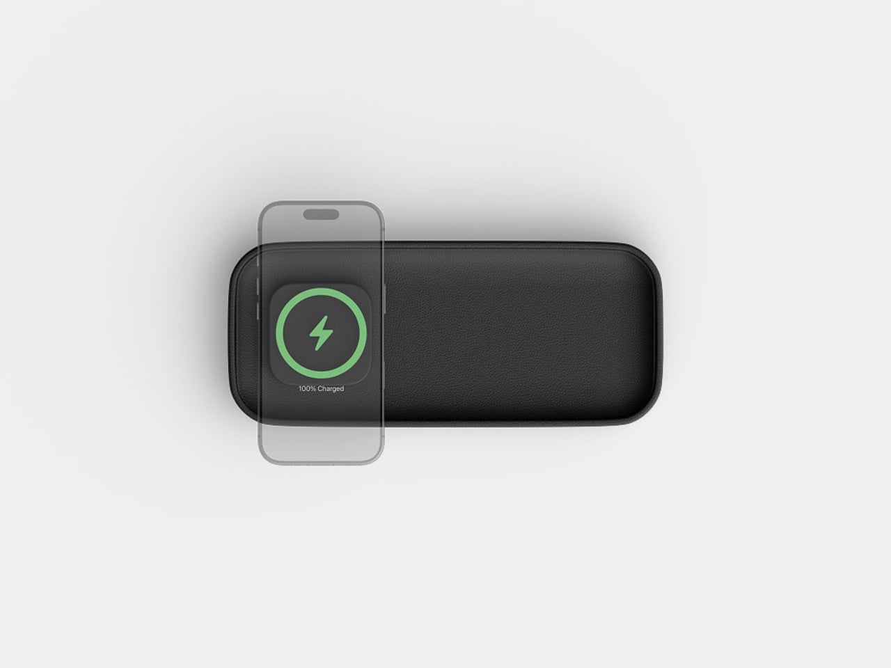
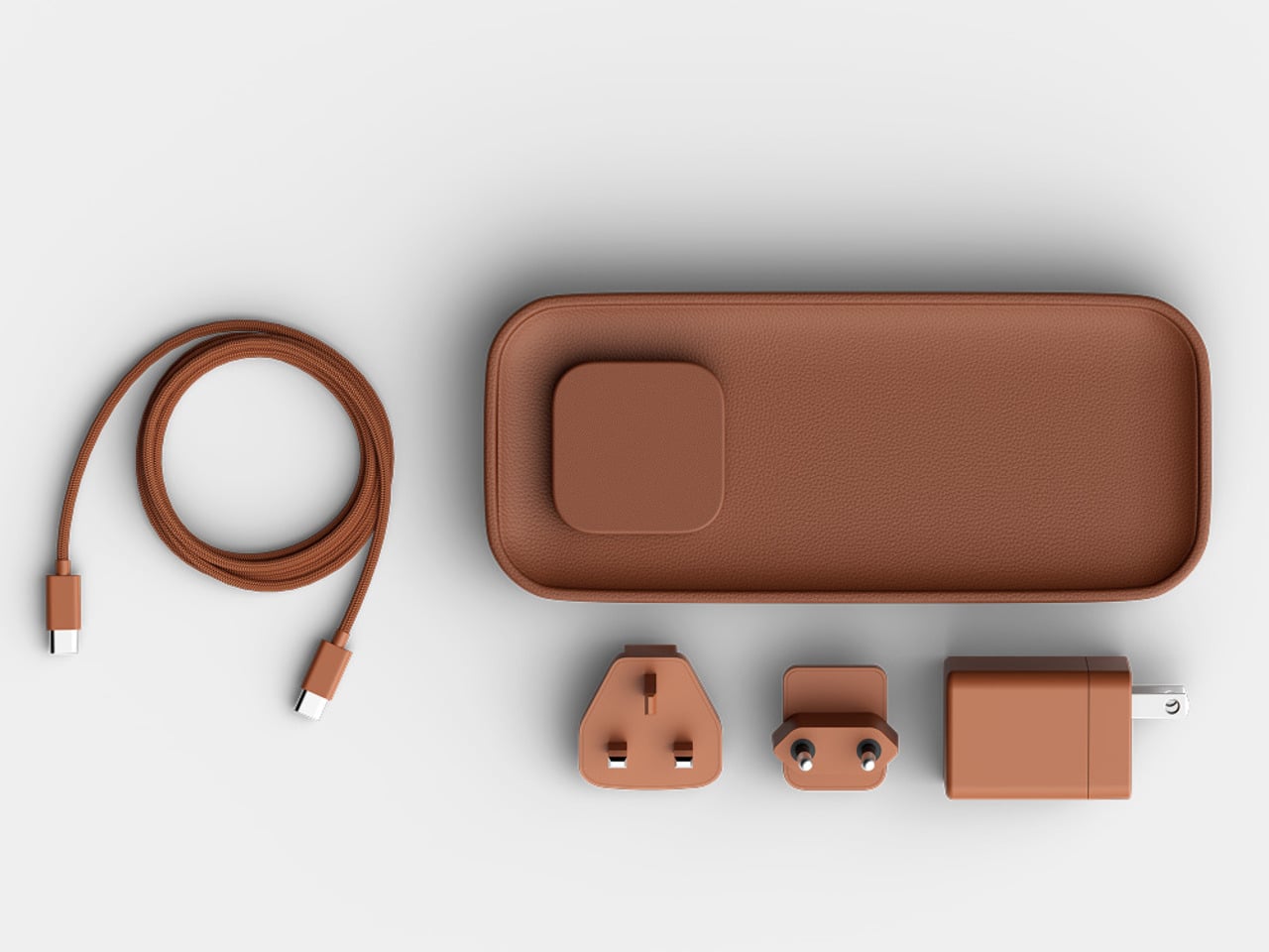
The Valet 4.25 from Twelve South approaches the problem differently. It’s a compact leather catchall tray with a 25W Qi2 wireless charger built into one end, sized specifically for nightstands and bedside tables. The idea isn’t to be a charger that fits in a room; it’s to be an object that actually belongs there, starting with its materials and ending with how it behaves overnight.
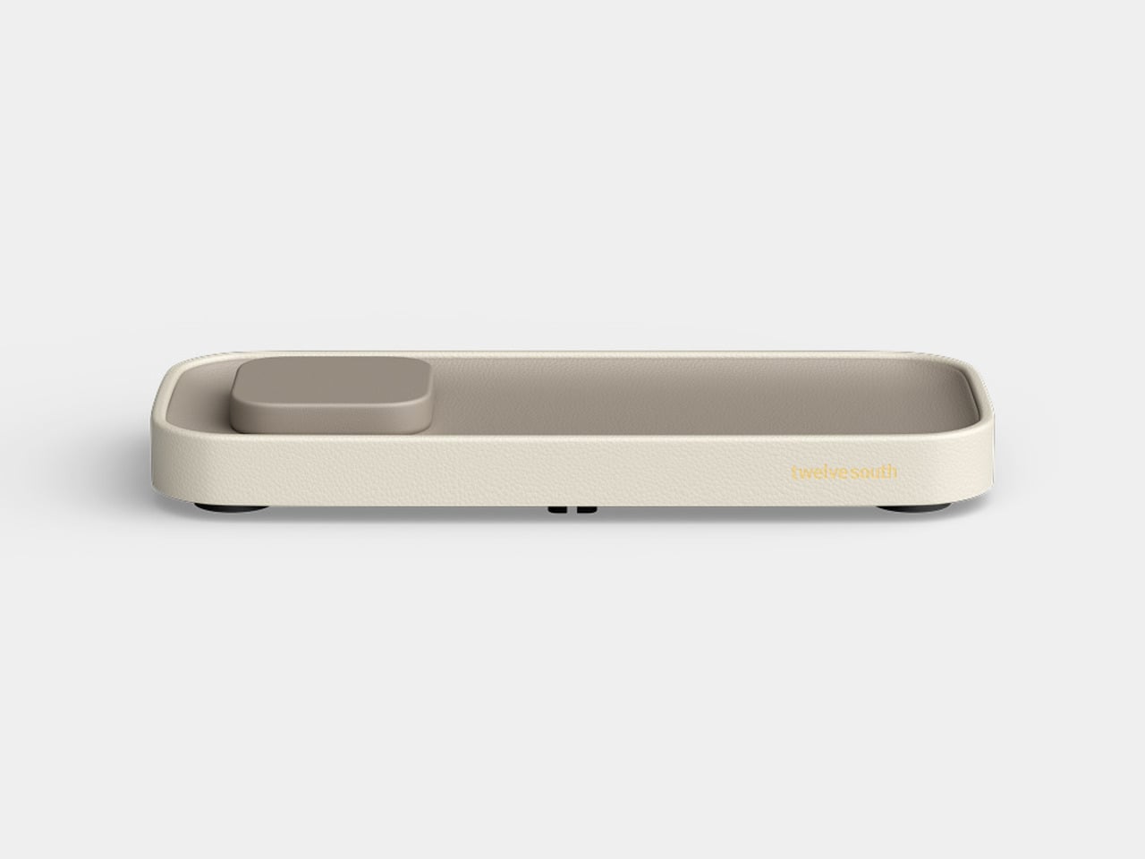
The base is a weighted zinc alloy frame wrapped entirely in Nappa leather, which keeps it planted on the surface without rubber feet or suction tricks. The tray measures 4.25 inches across, making it a tighter proposition than the brand’s original 7.5-inch Valet but considerably more appropriate for the average nightstand, where every spare inch is already committed to something else.
There’s a small but deliberate feature called the Goodnight Glow. When you set your phone down to charge, the tray pulses a soft light for eight seconds to confirm the connection, then fades completely. It doesn’t stay lit through the night. For something sitting beside you while you sleep, that restraint is more considered than it sounds, and it makes double-checking whether your phone is actually charging almost unnecessary.
The wireless output is a meaningful upgrade over the original Valet, which topped out at 15W via Qi2. The new model delivers 25W, which is the full MagSafe speed that newer iPhones can receive. The smaller size doesn’t come at the expense of performance; if anything, it corrects the one technical criticism that followed the larger model since it launched at CES earlier this year.
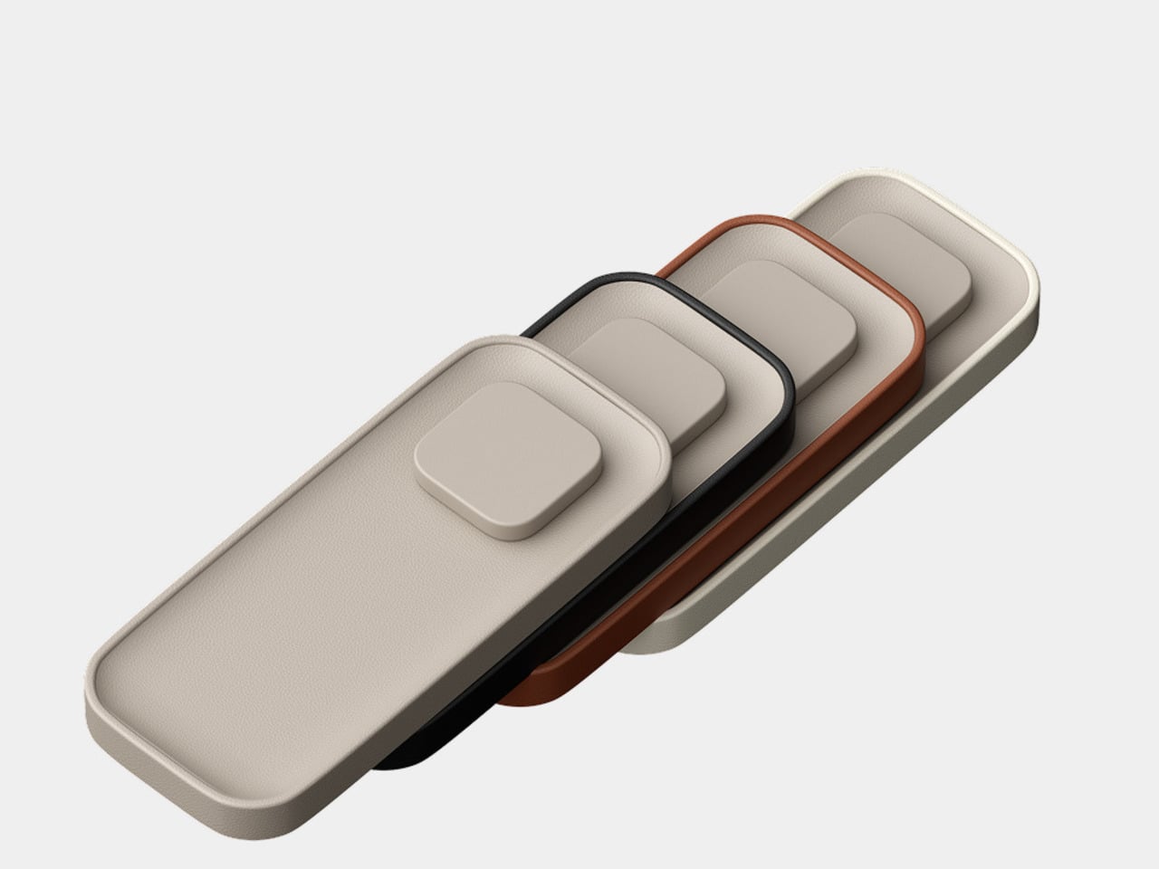
The outer frame is removable and interchangeable, available in four leather colors: black, taupe, brown, and ecru. The body itself comes in either black or taupe Nappa leather, giving you enough combination room to match most bedroom furniture without much deliberation. The tray can also be oriented four ways, letting you position the charging pad on either side or rotate the whole thing to fit a narrower nightstand.
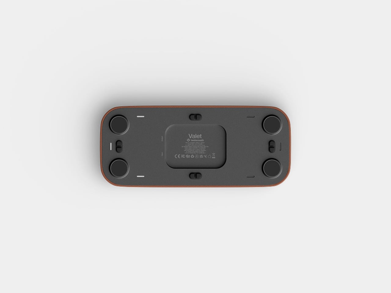
There’s a USB-C port tucked under the base for a second device, though at 10W it’s a step down from the 35W the larger Valet offers. It’ll handle a pair of earbuds or a smartwatch overnight, but it’s not fast-charging territory. The smaller tray is the other concession, reducing the landing area for everyday items compared to what the 7.5-inch version can comfortably hold alongside a phone.
At $129.99, it’s $50 less than the larger model and carries the same premium material finish. The Valet 4.25 is narrowly focused for a specific spot in the home, the kind where spending more on something you see every morning is easier to justify when it actually looks right. The Nappa leather and zinc alloy construction give it a permanence that most chargers, regardless of cost, rarely manage.

 Connexion